the car in british society - rac foundation car in british society ... 5.3 mileage driven per week...
TRANSCRIPT
The Car in British Society
Working Paper 1: National Travel Survey Refresh Ana lysis
April 2009
Scott Le Vine and Professor John Polak Centre for Transport Studies
Imperial College London
2
CONTENTS Executive summary
1. INTRODUCTION 8 2. GENERAL DRIVING PATTERNS 9
2.1 Distribution of car driving across the population 2.2 Driving patterns by high-mileage and low-mileage drivers 2.3 Incidence of multi-trip tours 2.4 Mode split for day and night time travel 2.5 Car use to access activities 2.6 Mode split for trips of different distances 2.7 Mode split for trips of different distances 2.8 Modal share of cars for selected trip purposes
3. CAR USE PATTERNS OF ZERO-CAR AND CER-OWNING HOUSEHOLDS 17
3.1 Car travel as drivers and passengers 3.2 The interaction between cars-per household and drivers-per-household (average weekly mileage) 3.3 The interaction between cars-per household and drivers-per-household (average trip distance) 3.4 Car usage by travel purpose
4. HOUSEHOLD CAR OWNERSHIP AND DRIVING ACROSS THE INCOME
SPECTRUM AND RANGE OF TOWN SIZES 21 4.1 Distribution of car driving across the population 4.2 Average weekly car driver distances for car drivers by income and town size 4.3 Ownership and use of cars for rural residents in different regions 4.4 Average car journey speed by income and town size 4.5 Average daily car travel time by income and town size 4.6 Percentage of car driver mileage and percentage of cars by income for urban and rural areas
5. INDIVIDUALS’ DRIVING LEVELS ACROSS AGE AND GENDER 30
5.1 Distribution of driving purposes by age and gender 5.2 Car ownership at the time of household formation 5.3 Mileage driven per week related to gender, age, and length of licence holding 5.4 Driving related to availability of one’s own car 5.5 Proportion of trips by driving related to gender, age group, and length of driving experience
6. INVESTIGATION OF TRAVEL FOR FOOD SHOPPING 43
6.1 Journey length for food shopping 6.2 Proportion of car owning households using cars for main food shopping
7. CAR TRAVEL AND PUBLIC TRANSPORT ACCESSIBILITY 46
7.1 Percentage of people with different levels of access to bus services 7.2 The public transport access / car ownership relationship

3
7.3 The public transport access / car use relationship 7.4 The public transport / car use relationship, by travel purpose 7.5 The public transport / car use relationship, by demographic groupings
References Appendix Procedures for estimating the measure of public transport accessibility
4
List of Figures Figure 2.1: Car driving mileage by percentile of the population (1988 to 2004) Figure 2.2: Mix of driving by journey purpose, by driving mileage (2001/04) Figure 3.1: Car travel by car-owning and non-car owning households Figure 3.2: Mix of journey purposes by driving and car passenger travel Figure 4.1: Household car ownership by income and town size Figure 4.2: Car driving distance by income and town size Figure 4.3: Driving speed by income and town size Figure 4.4: Driving time by income and town size Figure 5.1: Mix of journey purposes by age and gender Figure 5.2: Driving distance by age and duration of licence-holding Figure 5.3: Driving mileage by age Figure 5.4: Driving gender gap Figure 5.6: Car availability by age and gender Figure 5.5: Individuals by car availability Figure 7.1: Car ownership by public transport accessibility Figure 7.2: Car ownership by income and public transport accessibility Figure 7.3: Car ownership by town size and public transport accessibility Figure 7.4: Driving by public transport accessibility Figure 7.5: Driving by income and public transport accessibility Figure 7.6: Mix of journey purposes by public transport accessibility Figure 7.7: Driving by public transport accessibility and gender Figure 7.8: Driving by age, gender, and public transport accessibility
List of Tables Table 2.1: Incidence of multi-trip tours Table 2.2: Mode split for day and night time travel Table 2.3: Average duration of selected activity episodes accessed by car driving and other modes Table 2.4: Mode split for trips of different distances Table 2.5: Changes in the distribution of car trips Table 2.6: Car use for selected journey purposes Table 3.1 Per capita car trips and weekly mileage by household car ownership Table 3.2: Per capita car trips and weekly mileage by household car ownership and number of drivers in household Table 3.3 Average car trip lengths by household car ownership Table 4.1: Correlation of income and town size with weekly car driving distance Table 4.2: Ownership and use of cars by rural residents in different regions Table 4.3: Correlation of average driving speed with income and town size Table 4.4: Percentage of car driver mileage and percentage of cars by income for urban and rural areas Table 5.1: Car ownership for young married couples without children Table 5.2: Mileage driven per week related to length of license holding Table 5.3: Correlation of driving with duration of licence holding Table 5.4: Mileage driven per week for drivers aged 65+ Table 5.5: Mileage driven per week for main drivers and other drivers
5
Table 5.6: Percentage of trips by driving related to age group and length of driving experience Table 5.7: Percentage of trips by driving related to age group, length of driving experience (Men only) Table 5.8: Percentage of trips by driving related to age group, length of driving experience (Women only) Table 6.1: Journey lengths for food shopping Table 6.2: Proportion of car owning households using cars for main food shopping Table 6.3: Proportion of non-car owning households using cars for main food shopping by town size Table 6.4: Self-reported degree of difficulty in considering a switch to non-car modes of travel for main food shopping Table 7.1: Percentage of people with different levels of access to bus services Table 7.2: Walk time to nearest bus stop and frequency of service Table 7.3: Correlation of car ownership with town size and public transport accessibility Table 7.4: Time trend in car driving distance by purpose and MPTA Table 7.5: Time trend in driving by gender and MPTA
6
EXECUTIVE SUMMARY
Aims and objectives
The National Travel Survey (NTS) served as a primary data source to explore evolving patterns of car access and use in Great Britain since the earlier Car Dependence research study. The intent of the NTS analysis was to provide a macro-level overview of such trends, both as an update of similar analysis in the earlier study and to inform the other components of the present research. Methods
The NTS analysis proceeded on the basis of two complementary approaches:
1) Update the descriptive analyses in the previous Car Dependence research (which employed NTS data up to 1991) with more recent NTS datasets; and
2) Explore new lines of analysis made possible by contemporary computing power and upgrades to the NTS in recent years.
The results in this working paper provide support and additional depth of analysis for the lead findings presented in the main report of this research. Prior to producing the results reported here, the NTS for the period 1988 – 2004 were normalised to facilitate meaningful longitudinal comparisons. This process included identifying a number of variables which had been inserted or removed from the data during the analysis period or whose definitions had changed. The technical process of normalising NTS data across different years was verified with respect to DfT’s annual publications accompanying NTS releases. The time series for the NTS analyses presented in the main report was extended to 2006 following the Department for Transport’s (DfT) release of the 2005-06 datasets in mid-2008, however the analyses presented in this working paper do not include the 2005-06 datasets. An additional note pertains to the use of NTS datasets which have recently been released in “weighted” form to improve the dataset’s representativeness. The results in this working paper are based on the un-weighted NTS datasets, though differences between the two are relatively minor.1 Key findings
When the analyses are looked at in the aggregate, the set of broad trends in car access and use throughout the period 1988 – 2004 which emerged were:
• Income and age remain the best predictors of car access and car use, but the income effect is weakening over time. This appears to have largely taken place at
1 Interested readers are referred to the DfT’s reports on the NTS weighting methodologies, which can be accessed at: http://www.dft.gov.uk/pgr/statistics/datatablespublications/personal/methodology/weightingnts/
7
the bottom of the income distribution, as car ownership and driving have spread more widely through lower income levels.
• Even amongst only car drivers, higher income levels are strongly associated with
more time spent driving. Those with the highest degree of economic freedom – those in upper-income households – exercise that freedom of behaviour by choosing driving-intensive lifestyles.
• Place (defined as the size of town in which one resides, or alternatively as the service quality of public transport near one’s home) is becoming marginally more important as a car access predictor, to some extent filling the gap from the weakening income effect. Trips are also lengthening over time, and car use is most intense for long trips. Short-distance trips – though broadly falling in number – are increasingly being made by car.
• The activity purposes which generate travel are of critical and growing importance in explaining car use. Car use has increased its market share most rapidly amongst shopping and school-related trips. Where the car is head-and-shoulders more attractive than other modes – such as major food shopping – people will go to significant lengths to secure car access, including – it seems – borrowing from friends or family members living elsewhere.
• The driving gender gap is shrinking – and very faint amongst younger Britons, but is still strong in middle age and older age groups. In fact it is growing amongst senior citizens, as middle-aged men continue their differentially more driving-intensive lifestyles later in life.
8
1. INTRODUCTION The analyses are grouped into a set of categories. A number of the analyses span multiple different classes; in those cases they are grouped within the most appropriate category:
• General Driving Patterns : The analyses in this category aim to answer questions such as: For which travel purposes do different groups of drivers use their cars? and, Are driving patterns becoming more complex through trip-chaining? They are discussed in section 2.
• Car Travel and Public Transport Accessibility : These analyses explore the relationship between car travel and the level of accessibility by public transport at one’s home. They are found in section 3.
• Car Travel of Non-Car-Owning Households : In this set of analyses we consider the characteristics of the unique car travel patterns of households which do not own cars. They are located in section 4.
• Household Car Ownership and Driving across the Inco me Spectrum and Range of Town Sizes : These analyses look at how car ownership and usage have been evolving at the household-level on the basis of income and the size of town where one lives. They are found in section 5.
• Individuals’ Driving Levels across Age and Gender : This set of analyses evaluates cross-tabulations of individuals’ driving levels amongst standard demographic groupings and characteristics such as length of licence-holding. They can be found in section 6.
• Investigation of Travel for Food Shopping : The analysis concludes with a case study of travel patterns for grocery shopping. The use of cars for this travel purpose was found to exhibit several interesting properties. This discussion is located in section 7.
9
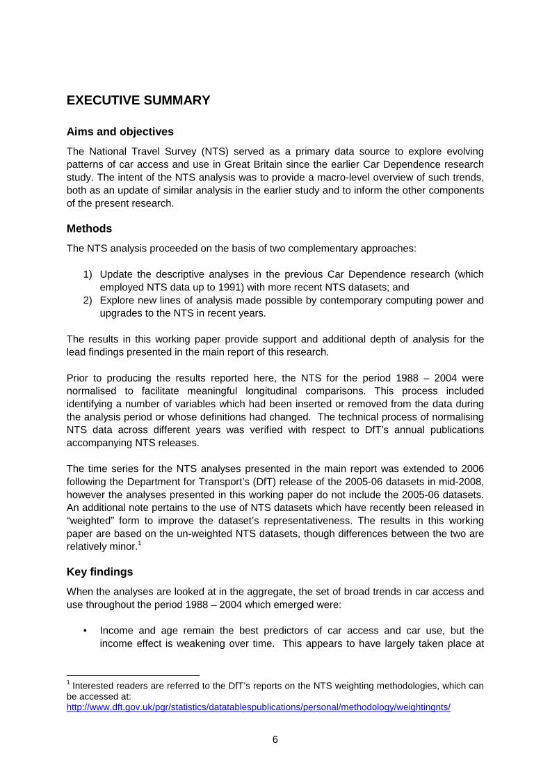
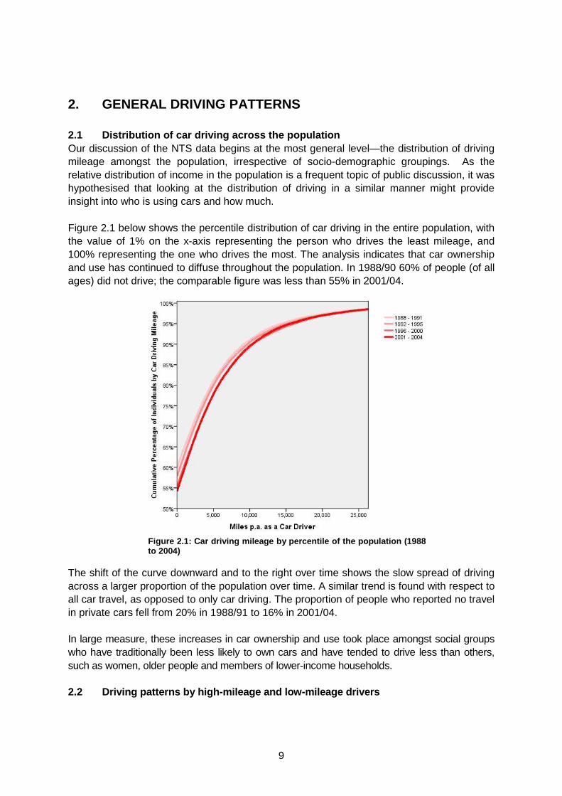
2. GENERAL DRIVING PATTERNS 2.1 Distribution of car driving across the populati on Our discussion of the NTS data begins at the most general level—the distribution of driving mileage amongst the population, irrespective of socio-demographic groupings. As the relative distribution of income in the population is a frequent topic of public discussion, it was hypothesised that looking at the distribution of driving in a similar manner might provide insight into who is using cars and how much. Figure 2.1 below shows the percentile distribution of car driving in the entire population, with the value of 1% on the x-axis representing the person who drives the least mileage, and 100% representing the one who drives the most. The analysis indicates that car ownership and use has continued to diffuse throughout the population. In 1988/90 60% of people (of all ages) did not drive; the comparable figure was less than 55% in 2001/04.
The shift of the curve downward and to the right over time shows the slow spread of driving across a larger proportion of the population over time. A similar trend is found with respect to all car travel, as opposed to only car driving. The proportion of people who reported no travel in private cars fell from 20% in 1988/91 to 16% in 2001/04. In large measure, these increases in car ownership and use took place amongst social groups who have traditionally been less likely to own cars and have tended to drive less than others, such as women, older people and members of lower-income households. 2.2 Driving patterns by high-mileage and low-mileag e drivers
Figure 2.1: Car driving mileage by percentile of the population (1988 to 2004)
10
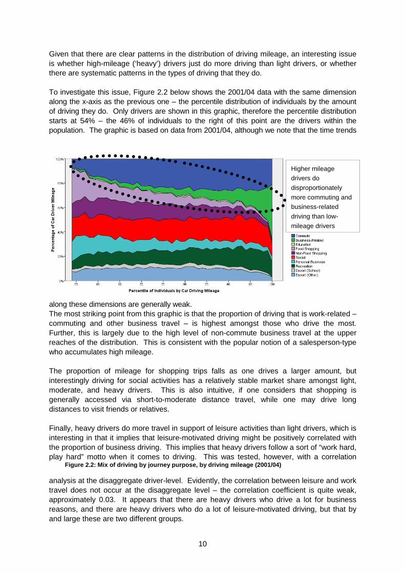
Given that there are clear patterns in the distribution of driving mileage, an interesting issue is whether high-mileage (‘heavy’) drivers just do more driving than light drivers, or whether there are systematic patterns in the types of driving that they do. To investigate this issue, Figure 2.2 below shows the 2001/04 data with the same dimension along the x-axis as the previous one – the percentile distribution of individuals by the amount of driving they do. Only drivers are shown in this graphic, therefore the percentile distribution starts at 54% – the 46% of individuals to the right of this point are the drivers within the population. The graphic is based on data from 2001/04, although we note that the time trends
along these dimensions are generally weak. The most striking point from this graphic is that the proportion of driving that is work-related – commuting and other business travel – is highest amongst those who drive the most. Further, this is largely due to the high level of non-commute business travel at the upper reaches of the distribution. This is consistent with the popular notion of a salesperson-type who accumulates high mileage. The proportion of mileage for shopping trips falls as one drives a larger amount, but interestingly driving for social activities has a relatively stable market share amongst light, moderate, and heavy drivers. This is also intuitive, if one considers that shopping is generally accessed via short-to-moderate distance travel, while one may drive long distances to visit friends or relatives. Finally, heavy drivers do more travel in support of leisure activities than light drivers, which is interesting in that it implies that leisure-motivated driving might be positively correlated with the proportion of business driving. This implies that heavy drivers follow a sort of “work hard, play hard” motto when it comes to driving. This was tested, however, with a correlation
analysis at the disaggregate driver-level. Evidently, the correlation between leisure and work travel does not occur at the disaggregate level – the correlation coefficient is quite weak, approximately 0.03. It appears that there are heavy drivers who drive a lot for business reasons, and there are heavy drivers who do a lot of leisure-motivated driving, but that by and large these are two different groups.
Higher mileage
drivers do
disproportionately
more commuting and
business-related
driving than low-
mileage drivers
Figure 2.2: Mix of driving by journey purpose, by driving milea ge (2001/04)
11
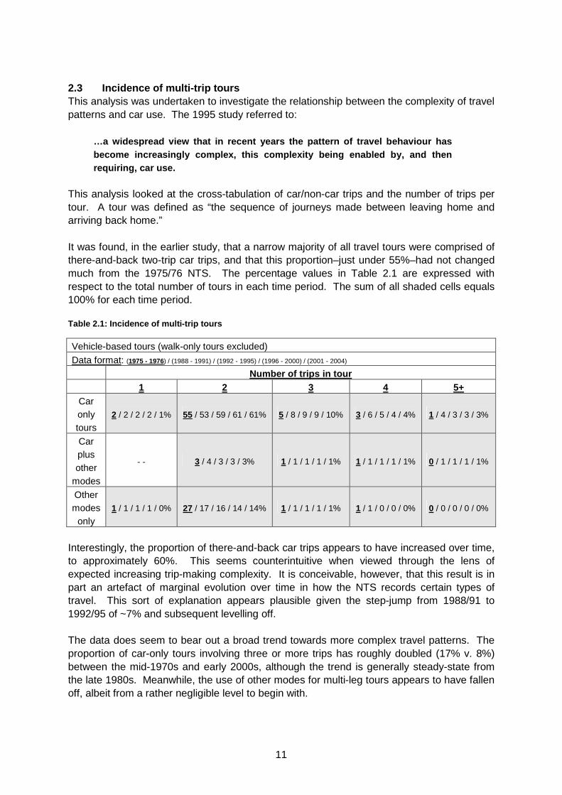
2.3 Incidence of multi-trip tours This analysis was undertaken to investigate the relationship between the complexity of travel patterns and car use. The 1995 study referred to:
…a widespread view that in recent years the pattern of travel behaviour has become increasingly complex, this complexity being enabled by, and then requiring, car use.
This analysis looked at the cross-tabulation of car/non-car trips and the number of trips per tour. A tour was defined as “the sequence of journeys made between leaving home and arriving back home.” It was found, in the earlier study, that a narrow majority of all travel tours were comprised of there-and-back two-trip car trips, and that this proportion–just under 55%–had not changed much from the 1975/76 NTS. The percentage values in Table 2.1 are expressed with respect to the total number of tours in each time period. The sum of all shaded cells equals 100% for each time period. Table 2.1: Incidence of multi-trip tours
Vehicle-based tours (walk-only tours excluded)
Data format: (1975 - 1976) / (1988 - 1991) / (1992 - 1995) / (1996 - 2000) / (2001 - 2004)
Number of trips in tour 1 2 3 4 5+
Car only tours
2 / 2 / 2 / 2 / 1% 55 / 53 / 59 / 61 / 61% 5 / 8 / 9 / 9 / 10% 3 / 6 / 5 / 4 / 4% 1 / 4 / 3 / 3 / 3%
Car plus other
modes
- - 3 / 4 / 3 / 3 / 3% 1 / 1 / 1 / 1 / 1% 1 / 1 / 1 / 1 / 1% 0 / 1 / 1 / 1 / 1%
Other modes
only 1 / 1 / 1 / 1 / 0% 27 / 17 / 16 / 14 / 14% 1 / 1 / 1 / 1 / 1% 1 / 1 / 0 / 0 / 0% 0 / 0 / 0 / 0 / 0%
Interestingly, the proportion of there-and-back car trips appears to have increased over time, to approximately 60%. This seems counterintuitive when viewed through the lens of expected increasing trip-making complexity. It is conceivable, however, that this result is in part an artefact of marginal evolution over time in how the NTS records certain types of travel. This sort of explanation appears plausible given the step-jump from 1988/91 to 1992/95 of ~7% and subsequent levelling off. The data does seem to bear out a broad trend towards more complex travel patterns. The proportion of car-only tours involving three or more trips has roughly doubled (17% v. 8%) between the mid-1970s and early 2000s, although the trend is generally steady-state from the late 1980s. Meanwhile, the use of other modes for multi-leg tours appears to have fallen off, albeit from a rather negligible level to begin with.
12
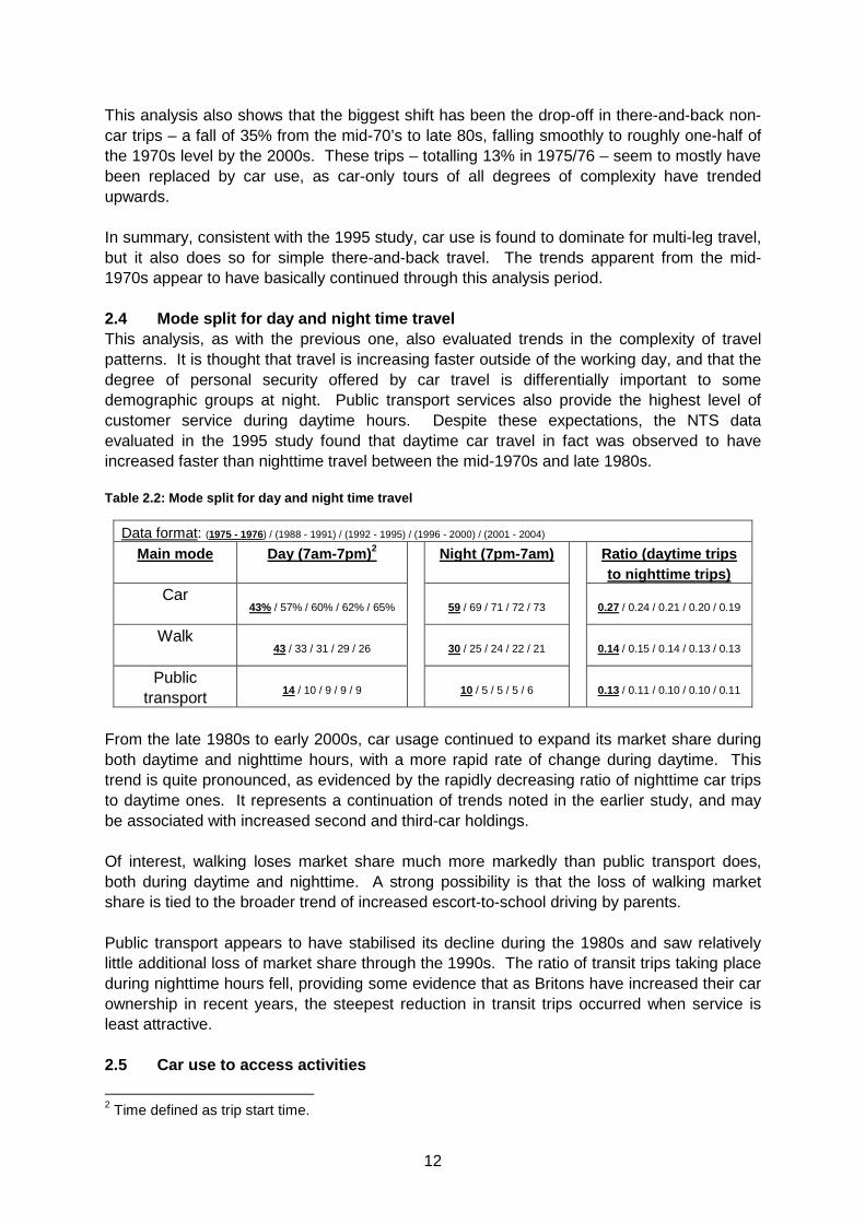
This analysis also shows that the biggest shift has been the drop-off in there-and-back non-car trips – a fall of 35% from the mid-70’s to late 80s, falling smoothly to roughly one-half of the 1970s level by the 2000s. These trips – totalling 13% in 1975/76 – seem to mostly have been replaced by car use, as car-only tours of all degrees of complexity have trended upwards. In summary, consistent with the 1995 study, car use is found to dominate for multi-leg travel, but it also does so for simple there-and-back travel. The trends apparent from the mid-1970s appear to have basically continued through this analysis period. 2.4 Mode split for day and night time travel This analysis, as with the previous one, also evaluated trends in the complexity of travel patterns. It is thought that travel is increasing faster outside of the working day, and that the degree of personal security offered by car travel is differentially important to some demographic groups at night. Public transport services also provide the highest level of customer service during daytime hours. Despite these expectations, the NTS data evaluated in the 1995 study found that daytime car travel in fact was observed to have increased faster than nighttime travel between the mid-1970s and late 1980s. Table 2.2: Mode split for day and night time travel
Data format: (1975 - 1976) / (1988 - 1991) / (1992 - 1995) / (1996 - 2000) / (2001 - 2004)
Main mode Day (7am-7pm) 2 Night (7pm-7am) Ratio (daytime trips to nighttime trips)
Car 43% / 57% / 60% / 62% / 65% 59 / 69 / 71 / 72 / 73 0.27 / 0.24 / 0.21 / 0.20 / 0.19
Walk
43 / 33 / 31 / 29 / 26 30 / 25 / 24 / 22 / 21 0.14 / 0.15 / 0.14 / 0.13 / 0.13
Public transport 14 / 10 / 9 / 9 / 9
10 / 5 / 5 / 5 / 6
0.13 / 0.11 / 0.10 / 0.10 / 0.11
From the late 1980s to early 2000s, car usage continued to expand its market share during both daytime and nighttime hours, with a more rapid rate of change during daytime. This trend is quite pronounced, as evidenced by the rapidly decreasing ratio of nighttime car trips to daytime ones. It represents a continuation of trends noted in the earlier study, and may be associated with increased second and third-car holdings. Of interest, walking loses market share much more markedly than public transport does, both during daytime and nighttime. A strong possibility is that the loss of walking market share is tied to the broader trend of increased escort-to-school driving by parents. Public transport appears to have stabilised its decline during the 1980s and saw relatively little additional loss of market share through the 1990s. The ratio of transit trips taking place during nighttime hours fell, providing some evidence that as Britons have increased their car ownership in recent years, the steepest reduction in transit trips occurred when service is least attractive. 2.5 Car use to access activities
2 Time defined as trip start time.
13
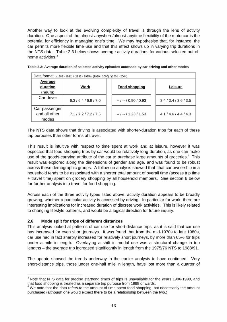
Another way to look at the evolving complexity of travel is through the lens of activity duration. One aspect of the almost-anywhere/almost-anytime flexibility of the motorcar is the potential for efficiency in managing one’s time. We may hypothesise that, for instance, the car permits more flexible time use and that this effect shows up in varying trip durations in the NTS data. Table 2.3 below shows average activity durations for various selected out-of-home activities.3 Table 2.3: Average duration of selected activity ep isodes accessed by car driving and other modes
Data format: (1988 - 1991) / (1992 - 1995) / (1999 - 2000) / (2001 - 2004)
Average duration (hours)
Work Food shopping Leisure
Car driver
6.3 / 6.4 / 6.8 / 7.0 -- / -- / 0.90 / 0.93 3.4 / 3.4 / 3.6 / 3.5
Car passenger and all other
modes 7.1 / 7.2 / 7.2 / 7.6
-- / -- / 1.23 / 1.53
4.1 / 4.6 / 4.4 / 4.3
The NTS data shows that driving is associated with shorter-duration trips for each of these trip purposes than other forms of travel. This result is intuitive with respect to time spent at work and at leisure, however it was expected that food shopping trips by car would be relatively long-duration, as one can make use of the goods-carrying attribute of the car to purchase large amounts of groceries.4 This result was explored along the dimensions of gender and age, and was found to be robust across these demographic groups. A follow-up analysis showed that that car ownership in a household tends to be associated with a shorter total amount of overall time (access trip time + travel time) spent on grocery shopping by all household members. See section 6 below for further analysis into travel for food shopping. Across each of the three activity types listed above, activity duration appears to be broadly growing, whether a particular activity is accessed by driving. In particular for work, there are interesting implications for increased duration of discrete work activities. This is likely related to changing lifestyle patterns, and would be a logical direction for future inquiry. 2.6 Mode split for trips of different distances This analysis looked at patterns of car use for short-distance trips, as it is said that car use has increased for even short journeys. It was found that from the mid-1970s to late 1980s, car use had in fact sharply increased for relatively short journeys, by more than 65% for trips under a mile in length. Overlaying a shift in modal use was a structural change in trip lengths – the average trip increased significantly in length from the 1975/76 NTS to 1988/91. The update showed the trends underway in the earlier analysis to have continued. Very short-distance trips, those under one-half mile in length, have lost more than a quarter of
3 Note that NTS data for precise start/end times of trips is unavailable for the years 1996-1998, and that food shopping is treated as a separate trip purpose from 1998 onwards. 4 We note that the data refers to the amount of time spent food shopping, not necessarily the amount purchased (although one would expect there to be a relationship between the two.)
14
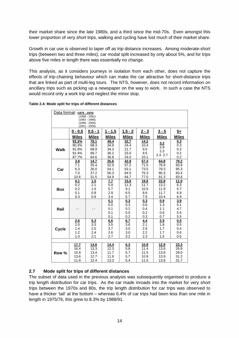
their market share since the late 1980s, and a third since the mid-70s. Even amongst this lower proportion of very short trips, walking and cycling have lost much of their market share. Growth in car use is observed to taper off as trip distance increases. Among moderate-short trips (between two and three miles), car modal split increased by only about 5%, and for trips above five miles in length there was essentially no change. This analysis, as it considers journeys in isolation from each other, does not capture the effects of trip-chaining behaviour which can make the car attractive for short-distance trips that are linked as part of multi-leg tours. The NTS, however, does not record information on ancillary trips such as picking up a newspaper on the way to work. In such a case the NTS would record only a work trip and neglect the minor stop. Table 2.4: Mode split for trips of different distan ces
Data format: (1975 - 1976) (1988 - 1991) (1992 - 1995) (1996 - 2000) (2001 - 2004)
0 - 0.5 Miles
0.5 - 1 Miles
1 - 1.5 Miles
1.5 - 2 Miles
2 - 3 Miles
3 - 5 Miles
5+ Miles
Walk
93.3% 90.3% 91.9% 91.4% 87.7%
78.1 68.3 68.9 68.7 64.6
48.4 34.9 34.3 36.2 36.8
32.7 24.4 21.7 23.0 24.0
14.2 10.4 9.5 9.5
10.1
3.2 2.8 2.3
2.4 2.7
0.3 0.3 0.3 0.2 0.2
Car
3.8 7.1 6.3 7.0
10.6
14.7 25.4 26.0 27.2 31.5
35.6 52.9 54.1 56.3 54.9
42.8 57.2 63.1 64.5 64.7
57.4 71.5 73.5 76.3 77.0
64.8 76.9 79.3 80.3 81.3
79.2 83.9 85.3 83.4 83.6
Bus
0.1 0.2 0.2 0.1 0.3
1.5 2.1 1.6 0.8 0.9
7.7 5.9 5.7 2.9 3.4
15.6 11.3 9.1 6.5 5.7
19.6 11.7 10.5 8.6 7.5
22.8 13.2 11.9 11.7 10.4
11.0 6.3 5.7 6.9 6.9
Rail - - - -
0.1 0.0 0.1 0.1 0.1
0.3 0.3 0.2 0.0 0.2
0.3 0.6 0.4 0.2 0.3
0.9 1.3 1.1 0.6 0.7
3.9 5.1 4.7 5.5 5.5
Cycle
2.6 2.0 1.4 1.2 1.0
5.3 3.3 2.5 2.4 2.1
6.6 3.5 3.7 2.6 2.7
6.7 3.6 3.0 3.0 3.2
4.4 2.1 2.6 2.2 2.3
2.9 1.8 1.7 1.7 1.5
0.5 0.5 0.4 0.6 0.5
Row %
17.7 16.4 15.9 13.6 11.9
14.6 13.3 13.4 12.7 12.4
14.4 12.3 11.7 11.9 13.3
6.3 5.8 5.7 5.7 5.4
10.8 11.4 11.5 10.9 11.5
12.9 13.9 13.8 13.9 13.8
23.3 26.8 28.0 31.2 31.7
2.7 Mode split for trips of different distances The subset of data used in the previous analysis was subsequently organised to produce a trip length distribution for car trips. As the car made inroads into the market for very short trips between the 1970s and 80s, the trip length distribution for car trips was observed to have a thicker ‘tail’ at the bottom – whereas 6.4% of car trips had been less than one mile in length in 1975/76, this grew to 8.3% by 1988/91.
15
Table 2.5: Changes in the distribution of car trips
0 - 0.5 Miles
0.5 - 1 Miles
1 - 1.5 Miles
1.5 - 2 Miles
2 - 3 Miles
3 - 5 Miles
5+ Miles
1975 - 1976 1.5% 4.9% 11.7% 6.2% 14.3% 19.1% 42.2% 1988 - 1991 2.1% 6.2% 11.9% 6.1% 14.7% 19.2% 39.8%
1992 - 1995 1.8% 6.1% 11.1% 6.3% 14.7% 18.8% 41.1%
1996 - 2000 1.6% 5.8% 11.2% 6.2% 13.9% 18.6% 42.7% 2001 - 2004 2.0% 6.3% 11.9% 5.7% 14.2% 18.0% 41.9%
However, the updated data reveal little additional change in this result—in fact it is almost exactly the same 8.3% in 2001/04. A review of the row of car use data from Table 2.4 in the previous section, interestingly enough, shows that car use increased market share in all trip lengths under five miles (and held constant for those longer than five miles.) The only plausible explanation for these two findings—increased market share across trip distances, and relatively minor changes in trip length distribution—is that the rate at which car use increased in the different trip length bands was roughly constant. 2.8 Modal share of cars for selected trip purposes This analysis in the 1995 study looked at the evolution in the car use market share for a subset of frequent trip purposes—work, shopping, education, and escorting another person. Four key points were noted:
a) In general, the longer journeys are more dominat ed by car than the shorter journeys.
b) There is a growth in the car’s share for all jou rney purposes. c) The growth of car use for very short journeys is seen not only for education
trips, but also for work and shopping. d) Car use for very short ‘escort’ trips has not grown much as a proportion of
these trips, but that is partly because they were a lready at a high level in 1975. The important observation here is that in 19 75-76 only 5.4 per cent of all trips were described as ‘escort’, and in 1988-9 1 11.8 per cent of all trips had this description, i.e. escort trips have grown broadly twice as fast as the average: this is why the fact that many of the short ones are by car is important.
Table 2.6 contains results from the more recent NTS data which shows these trends continuing through the analysis period, but tapering off especially in later years and for longer trips. Car use’s market share expanded especially markedly among short escort trips and short shopping trips. The proportion of trips described as ‘escort’ purpose stayed roughly constant.
16
Table 2.6: Car use for selected journey purposes
Data format: (1975 – 1976) / (1988 - 1991) / (1992 - 1995) / (1996 - 2000) / (2001 - 2004)
Trips by car as main mode, as percentage of all modes
Under 1 Mile 1 - 5 Miles Over 5 miles
Work
10.6% / 18.7% / 18.6% / 21.9% 52.4 / 63.5 / 67.3 / 69.2 / 67.2 72.7 / 72.0 / 75.0 / 74.1 / 72.5
Shopping
5.1 / 10.9 / 12.5 / 13.3 / 18.8 45.4 / 60.4 / 66.5 / 67.4 / 71.0 77.1 / 81.5 / 86.2 / 84.9 / 84.9
Education
5.1 / 9.5 / 11.1 / 12.4 / 12.5 20.3 / 36.4 / 38.7 / 47.7 / 44.1 22.8 / 35.5 / 36.5 / 33.8 / 35.2
Escort
23.9 / 25.2 / 25.0 / 29.1 / 34.4 84.3 / 84.7 / 87.3 / 88.3 / 86.2 98.5 / 94.4 / 94.8 / 94.5 / 94.5
17
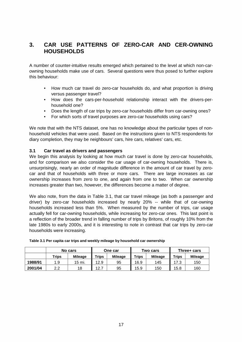
3. CAR USE PATTERNS OF ZERO-CAR AND CER-OWNING HOUSEHOLDS
A number of counter-intuitive results emerged which pertained to the level at which non-car-owning households make use of cars. Several questions were thus posed to further explore this behaviour:
• How much car travel do zero-car households do, and what proportion is driving versus passenger travel?
• How does the cars-per-household relationship interact with the drivers-per-household one?
• Does the length of car trips by zero-car households differ from car-owning ones? • For which sorts of travel purposes are zero-car households using cars?
We note that with the NTS dataset, one has no knowledge about the particular types of non-household vehicles that were used. Based on the instructions given to NTS respondents for diary completion, they may be neighbours’ cars, hire cars, relatives’ cars, etc. 3.1 Car travel as drivers and passengers We begin this analysis by looking at how much car travel is done by zero-car households, and for comparison we also consider the car usage of car-owning households. There is, unsurprisingly, nearly an order of magnitude difference in the amount of car travel by zero-car and that of households with three or more cars. There are large increases as car ownership increases from zero to one, and again from one to two. When car ownership increases greater than two, however, the differences become a matter of degree.
We also note, from the data in Table 3.1, that car travel mileage (as both a passenger and driver) by zero-car households increased by nearly 20% -- while that of car-owning households increased less than 5%. When measured by the number of trips, car usage actually fell for car-owning households, while increasing for zero-car ones. This last point is a reflection of the broader trend in falling number of trips by Britons, of roughly 10% from the late 1980s to early 2000s, and it is interesting to note in contrast that car trips by zero-car households were increasing. Table 3.1 Per capita car trips and weekly mileage by household car ownership
No cars One car Two cars Three+ cars Trips Mileage Trips Mileage Trips Mileage Trips Mil eage
1988/91 1.9 15 mi. 12.9 95 16.9 145 17.3 150 2001/04 2.2 18 12.7 95 15.9 150 15.8 160
18
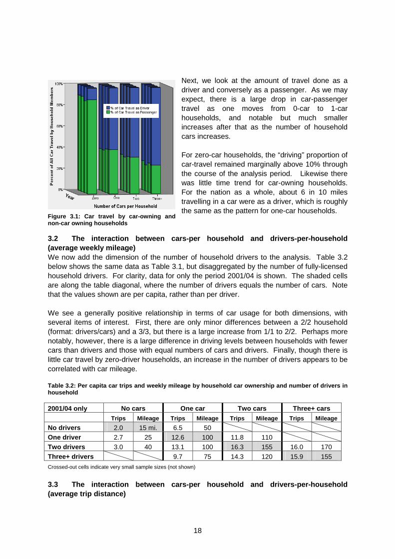
Next, we look at the amount of travel done as a driver and conversely as a passenger. As we may expect, there is a large drop in car-passenger travel as one moves from 0-car to 1-car households, and notable but much smaller increases after that as the number of household cars increases. For zero-car households, the “driving” proportion of car-travel remained marginally above 10% through the course of the analysis period. Likewise there was little time trend for car-owning households. For the nation as a whole, about 6 in 10 miles travelling in a car were as a driver, which is roughly the same as the pattern for one-car households.
3.2 The interaction between cars-per household and drivers-per-household (average weekly mileage) We now add the dimension of the number of household drivers to the analysis. Table 3.2 below shows the same data as Table 3.1, but disaggregated by the number of fully-licensed household drivers. For clarity, data for only the period 2001/04 is shown. The shaded cells are along the table diagonal, where the number of drivers equals the number of cars. Note that the values shown are per capita, rather than per driver. We see a generally positive relationship in terms of car usage for both dimensions, with several items of interest. First, there are only minor differences between a 2/2 household (format: drivers/cars) and a 3/3, but there is a large increase from 1/1 to 2/2. Perhaps more notably, however, there is a large difference in driving levels between households with fewer cars than drivers and those with equal numbers of cars and drivers. Finally, though there is little car travel by zero-driver households, an increase in the number of drivers appears to be correlated with car mileage. Table 3.2: Per capita car trips and weekly mileage b y household car ownership and number of drivers in household
2001/04 only No cars One car Two cars Three+ cars Trips Mileage Trips Mileage Trips Mileage Trips Mileage
No drivers 2.0 15 mi. 6.5 50 One driver 2.7 25 12.6 100 11.8 110
Two drivers 3.0 40 13.1 100 16.3 155 16.0 170
Three+ drivers 9.7 75 14.3 120 15.9 155
Crossed-out cells indicate very small sample sizes (not shown)
3.3 The interaction between cars-per household and drivers-per-household (average trip distance)
Figure 3.1: Car travel by ca r-owning and non-car owning households
19
We then analysed the average trip distance of care trips by zero-car and car-owning households. Table 3.3 Average car trip lengths by household car ownership
No cars One car Two cars Three+ cars Driver Passenger Driver Passenger Driver Passenger Dri ver Passenger
1988/91 9 mi. 8 7 8 8 9 8 10
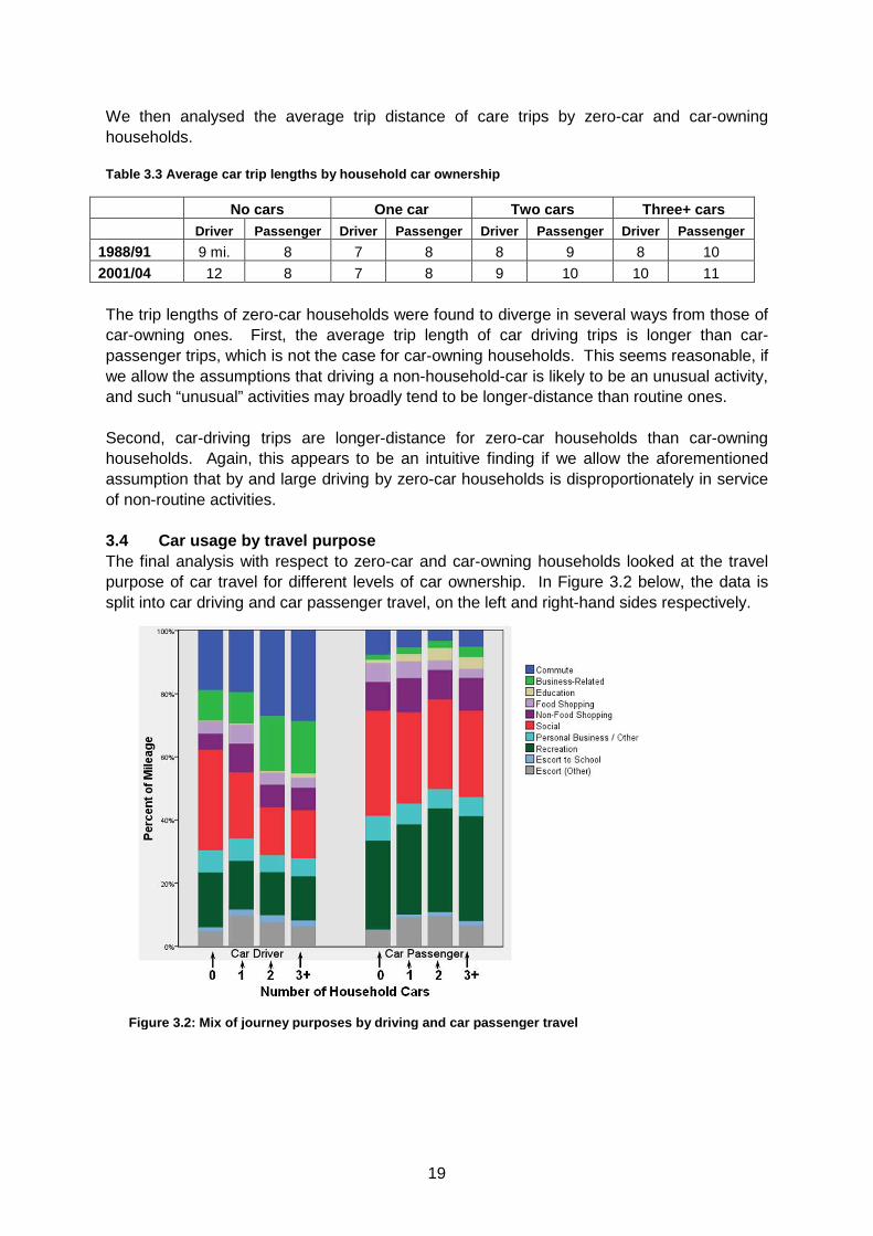
2001/04 12 8 7 8 9 10 10 11 The trip lengths of zero-car households were found to diverge in several ways from those of car-owning ones. First, the average trip length of car driving trips is longer than car-passenger trips, which is not the case for car-owning households. This seems reasonable, if we allow the assumptions that driving a non-household-car is likely to be an unusual activity, and such “unusual” activities may broadly tend to be longer-distance than routine ones. Second, car-driving trips are longer-distance for zero-car households than car-owning households. Again, this appears to be an intuitive finding if we allow the aforementioned assumption that by and large driving by zero-car households is disproportionately in service of non-routine activities. 3.4 Car usage by travel purpose The final analysis with respect to zero-car and car-owning households looked at the travel purpose of car travel for different levels of car ownership. In Figure 3.2 below, the data is split into car driving and car passenger travel, on the left and right-hand sides respectively.
Figure 3.2: Mix of journey purposes by driving and car passen ger travel
20
The most significant difference in the distributions is the larger proportion of driving that is in service of a social activity purpose. For zero-car households this category is more than 30% of their driving, which is about ½ more than one-car households and double that of households with three or more cars. One-car households do a larger proportion of chauffeuring others (the “escort” purpose categories) and shopping than zero-car households. Interestingly, the proportion of driving mileage that is commuting and other business-related travel is much larger for households with two or more cars. For travel as a car passenger, the differences in these patterns are distinctly weaker. The proportion of social travel decreases with higher car ownership, but not nearly as strongly as for driving. Car passenger travel for educational purposes increases markedly with car ownership – in essence these are the school trips that motivate the “escort to school” car driving by adults.
21
4. HOUSEHOLD CAR OWNERSHIP AND DRIVING ACROSS THE INCOME SPECTRUM AND RANGE OF TOWN SIZES
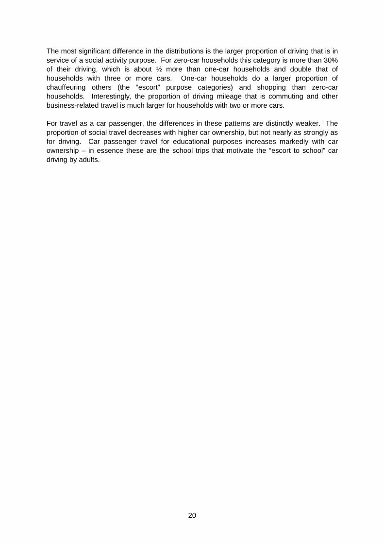
4.1 Distribution of car driving across the populati on The 1995 Car Dependence study found that a household’s income level tended to be more closely-related with whether they owned a car than the town [population] size in which one resides.
In other words, two households with similar incomes in different size cities were more likely to own the same number of cars than if they had different income levels but lived in cities of the same size.
Over the course of the period analysed, differences in car ownership at the individual and household level have somewhat declined. Amongst the upper two quintiles of the income distribution, car ownership essentially did not change over the period of analysis (1988 – 2004). This was in sharp contrast to the lowest income group, amongst which car ownership rose by nearly half in rural areas and two-thirds in the largest cities.
Further analyses indicate that the [stronger] income effect weakened over time, while the [still weaker] location effect grew in explanatory power. In other words, in recent years the type of place in which one lives has over time become a better predictor of whether they own a car. In a sense this represents the car market maturing – as the size of the city in which one resides bears a close relationship to the availability of viable non-car travel options.
Z-axis
•2001 – 2004: Furthest Bars
•1996 – 2000
•1992 – 1995
•1989 – 1991: Closest Bars
Town Population
Year
Strong increase in car ownership over time amongst low-income households
Figure 4.1: Househo ld car ownership by income and town size
22
Town Population
•2001 – 2004: Furthest Bars
•1996 – 2000
•1992 – 1995
•1989 – 1991: Closest Bars
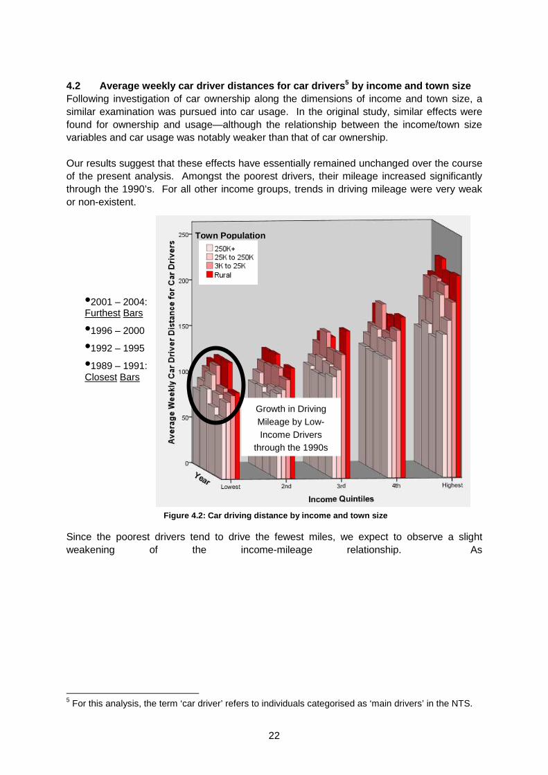
Growth in Driving Mileage by Low-Income Drivers
through the 1990s
4.2 Average weekly car driver distances for car dri vers 5 by income and town size Following investigation of car ownership along the dimensions of income and town size, a similar examination was pursued into car usage. In the original study, similar effects were found for ownership and usage—although the relationship between the income/town size variables and car usage was notably weaker than that of car ownership. Our results suggest that these effects have essentially remained unchanged over the course of the present analysis. Amongst the poorest drivers, their mileage increased significantly through the 1990’s. For all other income groups, trends in driving mileage were very weak or non-existent.
Since the poorest drivers tend to drive the fewest miles, we expect to observe a slight weakening of the income-mileage relationship. As
5 For this analysis, the term ‘car driver’ refers to individuals categorised as ‘main drivers’ in the NTS.
Figure 4.2: Car driving distance by income and town size

23
Table 4.1 shows, the results of a correlation analysis broadly suggest that the relationship between household income and car driving distance becomes less important, although the variations are marginal. The negative correlation of town size with car driving mileage, however, does not materially change over the period of analysis.
24
Table 4.1: Correlation of income and town size with weekly car driving distance
1989 – 1991 1992 – 1995 1996 - 2000 2001 – 2004
Income quintile 0.194 0.200 0.194 0.188
Town population – 0.104 – 0.105 – 0.115 – 0.105 The fact that income is much more closely related with car ownership than car usage is of note. Car ownership can be thought of as requiring one to cross the relatively high threshold of the large fixed costs of car ownership, both the capital costs of acquisition and the fixed carrying costs such as insurance, vehicle tax, and maintenance. Car usage, however, is dependent only on the automobile’s relatively low marginal costs, and once a vehicle is owned its use is subject to habit-formation effects. Hence, usage is more closely related than ownership with other-than-income characteristics. The stronger relationship of town size with car ownership than with car usage, however, is certainly not intuitive. Perhaps it can be best explained that car ownership is a binary decision, which individuals make on the basis of their expected mobility needs, while usage, being a continuous decision, is more closely-related with factors unrelated to town size. 4.3 Ownership and use of cars for rural residents i n different regions The original car dependence study found greater use of cars among rural drivers than those in towns and cities, which overlaid an income effect. Regarding low-income drivers, it was shown that:
…poorer people in more remote regions own more cars and travel further in them, than people of equivalent incomes in less rem ote areas…For higher income groups these differences reduce.
While there is significant variability in the results of this analysis due to the smaller sample sizes, it appears that this ‘gap’ in car ownership (when controlling for income) among rural residents in different parts of the country is narrowing. For instance, car ownership among the least-affluent households in Scotland and Wales increased by only 2% of adults (37% in 1989/91 to 39% in 2001/04 of adults are main drivers, as a percentage of all adults). In the South East / South West regions, however, the same measure increased by 22%, from 27% to 49%, overtaking levels in Wales / Scotland. The trend is similar when usage is investigated. It is thought that, at least in part, this effect may be due to differential economic development in the south of the country during the period of analysis. At higher income levels, conversely, the most noticeable trend is near-convergence of rural car driving within income quintiles, regardless of region.
25
Table 4.2: Ownership and use of cars by rural resid ents in different regions
% of adult residents in rural locales of select regions who are main drivers, by income quintile Data format: (1989 - 1991) / (1992 - 1995) / (1996 - 2000) / (2001 - 2004)
Region Lowest 2nd 3rd 4th Highest ALL North and Midlands
26% / 29% / 47% /
46%
43 / 44 / 49 /
56
50 / 60 / 63 /
66
66 / 69 / 72 /
75
74 / 86 / 80 /
87
55 / 62 / 63 /
69
South East and South West
27 / 41 / 48 / 49 46 / 49 / 50 /
57
58 / 61 / 66 /
67
67 / 65 / 72 /
77
81 / 82 / 83 /
86
62 / 63 / 67 /
70
Wales and Scotland
37 / 25 / 39 / 39 44 / 38 / 48 /
54
52 / 53 / 53 /
66
71 / 58 / 68 /
73
69 / 74 / 78 /
78
54 / 50 / 57 /
63
Average number of miles driven per week (by members of the population described above) North and Midlands
108 / 109 / 139 / 114 121 / 117 / 136 /
126
155 / 124 / 132 /
144
184 / 193 / 181 /
185
231 / 224 / 244 /
212
181 / 174 / 177 /
168
South East and South West
80 / 127 / 101 / 117 118 / 106 / 127 /
124
160 / 139 / 146 /
144
168 / 164 / 149 /
175
225 / 220 / 225 /
207
175 / 167 / 166 /
168
Wales and Scotland
100 / 131 / 139 / 113 127 / 125 / 109 /
128
168 / 128 / 163 /
140
183 / 144 / 189 /
137
170 / 195 / 215 /
203
153 / 147 / 171 /
150
4.4 Average car journey speed by income and town si ze The 1995 study investigated the average travel speed for car journeys. A strong negative relationship, as expected, was found between town size6 and average journey speed. This indicates that, ceteris paribus, the generalised “cost” of car usage is lower in rural locales, thereby offering the possibility that high car ownership by low-income rural residents is potentially related to two factors:
• The ‘push’ of the high accessibility provided by cars in rural areas, where other travel modes are typically uncompetitive; and
• The ‘pull’ of the lower generalised cost of car usage, as evidenced by relatively high car speeds in rural locales.
The 1995 study pointed out the likelihood that both of these factors play some part in the high car ownership and usage by low-income rural residents, but noted that observed travel patterns do not permit them to be cleanly distinguished from each other. Clearly, the recent NTS data shows that town size continues to be strongly associated with average driving speed. However, with town size controlled for, there is a residual income effect (higher income → higher average driving speed) which must be associated with other causes. We interpret the results in this regard as reflective of more subtle phenomenon, such as spatial variability at the sub-town level (i.e. the neighbourhood-level). For instance, a wealthy family in a mid-sized city may live in a section of town where fine-grained land use
6 Note that this is town size where the driver resides.
26
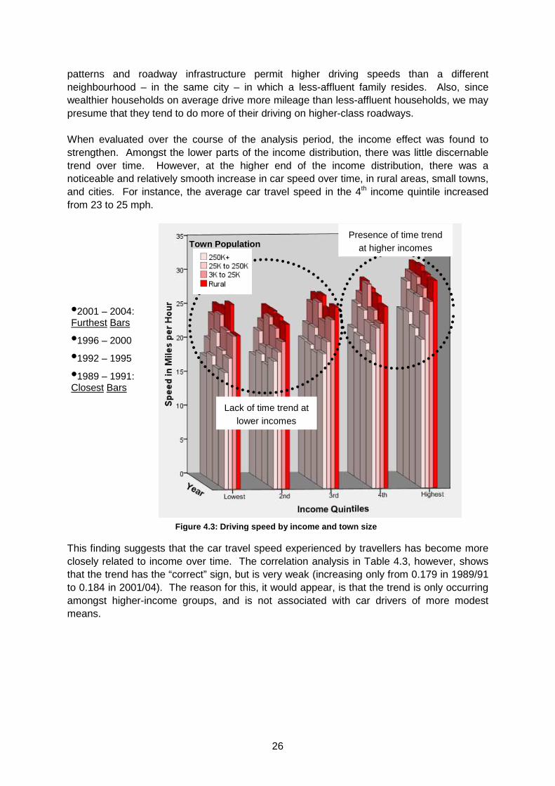
patterns and roadway infrastructure permit higher driving speeds than a different neighbourhood – in the same city – in which a less-affluent family resides. Also, since wealthier households on average drive more mileage than less-affluent households, we may presume that they tend to do more of their driving on higher-class roadways. When evaluated over the course of the analysis period, the income effect was found to strengthen. Amongst the lower parts of the income distribution, there was little discernable trend over time. However, at the higher end of the income distribution, there was a noticeable and relatively smooth increase in car speed over time, in rural areas, small towns, and cities. For instance, the average car travel speed in the 4th income quintile increased from 23 to 25 mph.
This finding suggests that the car travel speed experienced by travellers has become more closely related to income over time. The correlation analysis in Table 4.3, however, shows that the trend has the “correct” sign, but is very weak (increasing only from 0.179 in 1989/91 to 0.184 in 2001/04). The reason for this, it would appear, is that the trend is only occurring amongst higher-income groups, and is not associated with car drivers of more modest means.
•2001 – 2004: Furthest Bars
•1996 – 2000
•1992 – 1995
•1989 – 1991: Closest Bars
Town Population
Lack of time trend at lower incomes
Presence of time trend at higher incomes
Figure 4.3: Driving speed by income and tow n size
27
Table 4.3: Correlation of average driving speed wit h income and town size
A subsequent correlation analysis, this time excluding drivers in the lower 40% of the income distribution, shows a weakly-increasing relationship between income and driving speed at the top of the income distribution. A final correlation analysis was then performed, this time excluding drivers in the upper 40% of income distribution. It confirmed that the income / driving speed relationship was weaker at the lower end of the income spectrum, and marginally weakening over time.7
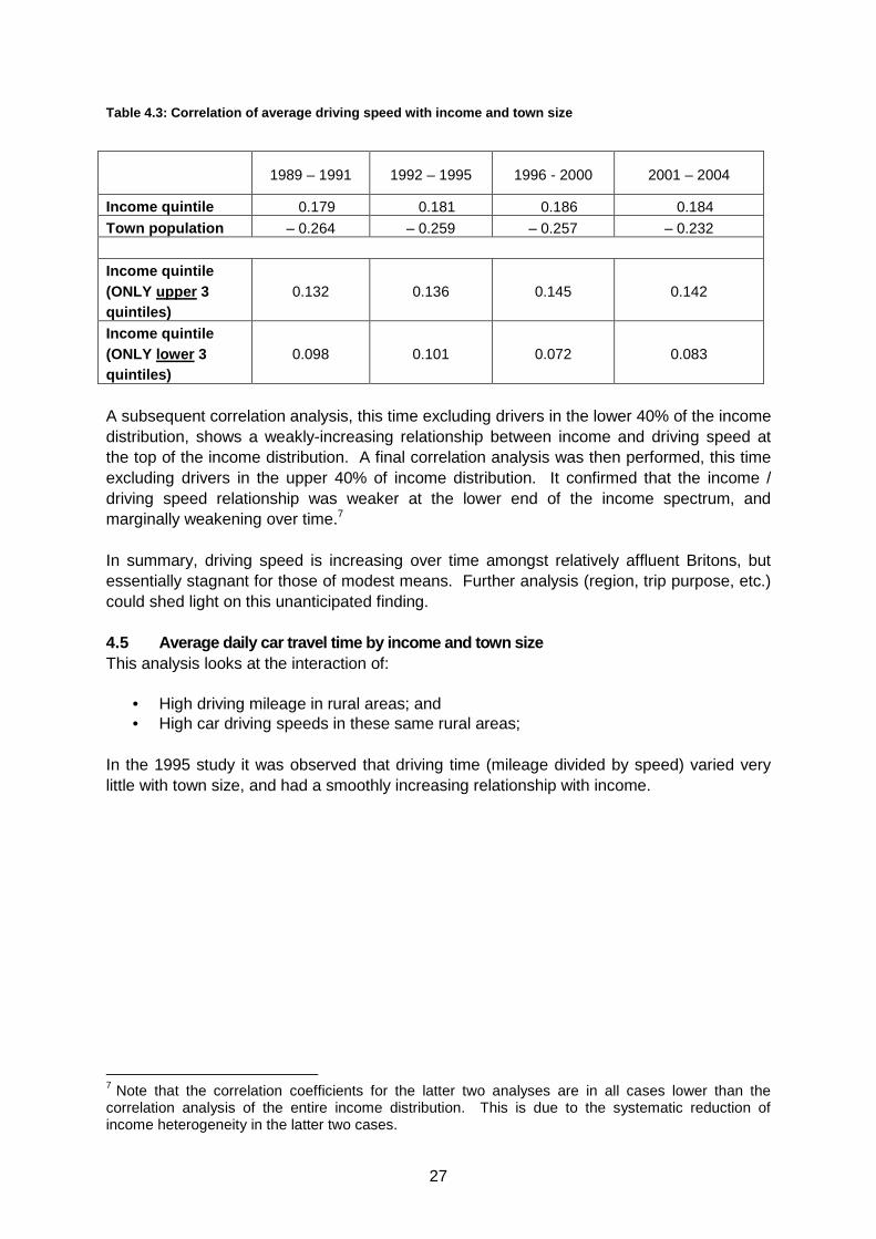
In summary, driving speed is increasing over time amongst relatively affluent Britons, but essentially stagnant for those of modest means. Further analysis (region, trip purpose, etc.) could shed light on this unanticipated finding. 4.5 Average daily car travel time by income and tow n size This analysis looks at the interaction of:
• High driving mileage in rural areas; and • High car driving speeds in these same rural areas;
In the 1995 study it was observed that driving time (mileage divided by speed) varied very little with town size, and had a smoothly increasing relationship with income.
7 Note that the correlation coefficients for the latter two analyses are in all cases lower than the correlation analysis of the entire income distribution. This is due to the systematic reduction of income heterogeneity in the latter two cases.
1989 – 1991 1992 – 1995 1996 - 2000 2001 – 2004
Income quintile 0.179 0.181 0.186 0.184
Town population – 0.264 – 0.259 – 0.257 – 0.232
Income quintile (ONLY upper 3 quintiles)
0.132 0.136 0.145 0.142
Income quintile (ONLY lower 3 quintiles)
0.098 0.101 0.072 0.083
28
This relationship has largely remained constant over time. On the margins, daily driving time has increased amongst the lowest income grouping (37 to 40 minutes), and conversely decreased amongst the highest (58 to 56 minutes). The most striking finding, however, is the consistent positive relationship of car driving time with increasing income. As transport time is typically considered to be “lost time,” the increasing amount of driving time as one moves up the income distribution was investigated. We conclude that this finding is evidence that the accessibility offered by the motorcar provides sufficient benefits to higher-income drivers to justify their high amount of time spent motoring day-to-day, relative to those of more modest means. 4.6 Percentage of car driver mileage and percentage of cars by income for urban and rural areas This analysis was undertaken in the 1995 study to help determine the existence and size of a group of rural residents who drive more than their counterparts in towns and cities. It was found that regardless of locale, the poorest residents had low car ownership and drove comparatively little. The difference between urban and rural car ownership among the least affluent, likewise, was quite small. This was evidence, it was noted, of a stronger income effect8 than location effect. It also puts an upper bound on the magnitude of this narrowly-defined low-income, rural “car dependency” effect – somewhere less than the 8% of rural driving that was done by the least-affluent drivers in the late 1980s.
8 Note a change in income groupings in this update. The 1995 analysis was based on income quartiles whereas the updated analysis uses income quintiles.
•2001 – 2004: Furthest Bars
•1996 – 2000
•1992 – 1995
•1989 – 1991: Closest Bars
Town Population
Daily driving time increases with one’s income
Figure 4.4: Driving time by income and town size
29
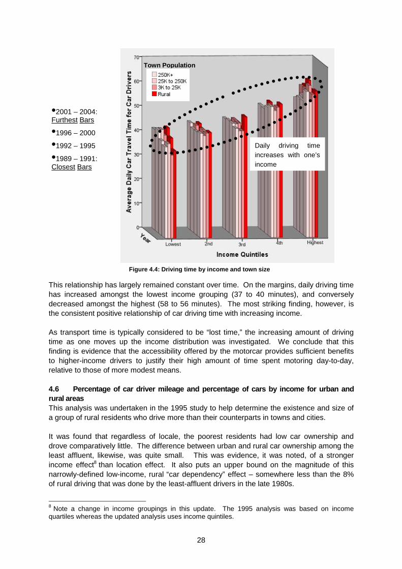
In this update with more recent data on travel patterns, the income effect continues to dominate. However, it is slowly weakening – as shown by the increasing proportion of car driving and ownership amongst the lowest-income band. To the extent that middle and upper-income people in rural areas choose to drive – or alternatively are dependent on their cars for their lifestyles – this behaviour is slowly diffusing amongst lower-income rural residents. Table 4.4: Percentage of car driver mileage and perc entage of cars by income for urban and rural areas
Data format: (1989 - 1991) / (1992 - 1995) / (1996 - 2000) / (2001 – 2004)
% of car mileage % of cars
All Rural Urban All Rural Urban Lowest
household
income quintile
(1 - 20%)
4% / 5% / 7% / 7% 4 / 5 / 8 / 6 3 / 4 / 7 / 7 6 / 7 / 10 / 9 8 / 8 / 10 / 8 6 / 7 / 9 / 10
2nd, 3rd, and 4th
Income quintiles
(21 - 80%)
57 / 55 / 56 / 57 53 / 55 / 54 /
57
58 / 55 / 56 /
57
64 / 63 / 63 /
64
59 / 63 / 61 /
64
65 / 63 / 63 /
64
Highest
income quintile
(81 - 100%)
39 / 41 / 37 / 36 42 / 39 / 38 /
38
39 / 41 / 37 /
36
30 / 30 / 28 /
26
33 / 29 / 29 /
29
29 / 30 / 27 /
26
All 100 / 100 /
100 / 100
100 / 100 / 100
/ 100
100 / 100 / 100
/ 100
100 / 100 /
100 / 100
100 / 100 /
100 / 100
100 / 100 /
100 / 100
30
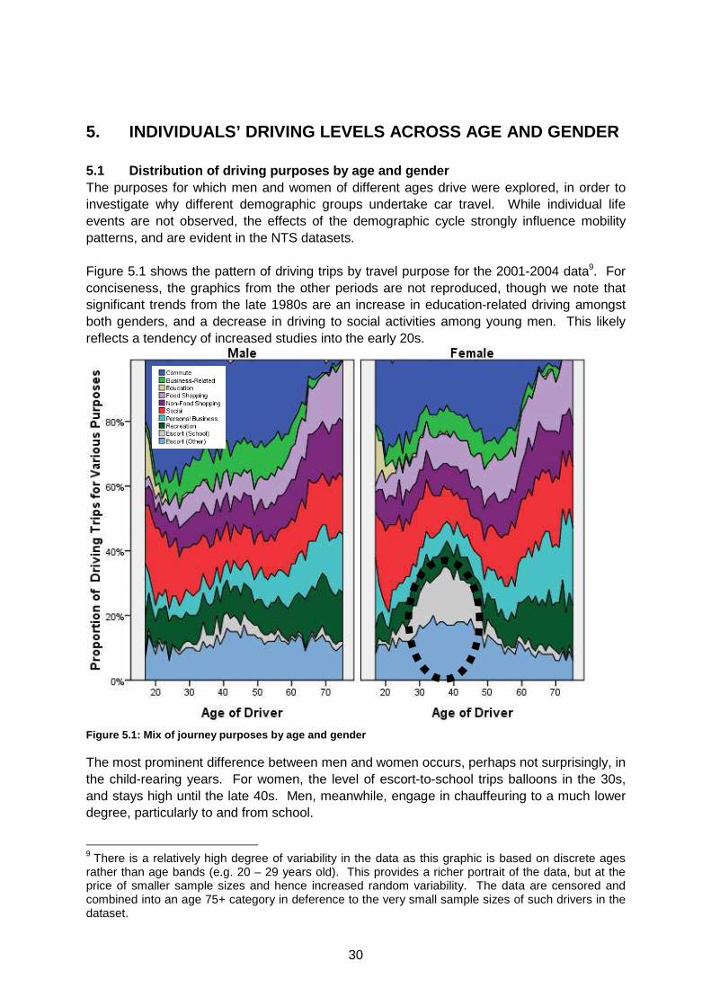
5. INDIVIDUALS’ DRIVING LEVELS ACROSS AGE AND GENDE R 5.1 Distribution of driving purposes by age and gen der The purposes for which men and women of different ages drive were explored, in order to investigate why different demographic groups undertake car travel. While individual life events are not observed, the effects of the demographic cycle strongly influence mobility patterns, and are evident in the NTS datasets. Figure 5.1 shows the pattern of driving trips by travel purpose for the 2001-2004 data9. For conciseness, the graphics from the other periods are not reproduced, though we note that significant trends from the late 1980s are an increase in education-related driving amongst both genders, and a decrease in driving to social activities among young men. This likely reflects a tendency of increased studies into the early 20s.
The most prominent difference between men and women occurs, perhaps not surprisingly, in the child-rearing years. For women, the level of escort-to-school trips balloons in the 30s, and stays high until the late 40s. Men, meanwhile, engage in chauffeuring to a much lower degree, particularly to and from school.
9 There is a relatively high degree of variability in the data as this graphic is based on discrete ages rather than age bands (e.g. 20 – 29 years old). This provides a richer portrait of the data, but at the price of smaller sample sizes and hence increased random variability. The data are censored and combined into an age 75+ category in deference to the very small sample sizes of such drivers in the dataset.
Figur e 5.1: Mix of journey purposes by age and gender
31
There is a noticeable cyclical effect in the level of women’s work-related travel, as it dips during the peak child-rearing years. Also, the level of driving for social activities drops sharply for women through their 20s, and doesn’t begin to increase again until the late 40s/early 50s. For men work trips, whether commuting or other business travel, tend to fall in importance over time, weakly at first, then more strongly approaching traditional retirement age. Driving trips for personal business seem to generally grow in importance for men and women throughout the adult years. Until the 50s, men systematically perform much more leisure-related travel than women. Later in life, however, the genders converge in their level of leisure-motivated travel. In general, after age 50, the driving patterns of men and women differ relatively little along the dimension of travel purpose. Driving to the shops, perhaps counter-intuitively, does not show pronounced differences between the genders. Women seem to do more shopping driving than men, whether for food or other types of shopping, but not by an overwhelming degree. In 2004, for instance, women as a whole made 25% more shopping trips than men. 5.2 Car ownership at the time of household formatio n Much contemporary discussion focuses on the importance of life-cycle events (marriage, childbirth, retirement, etc.) as points of turbulence in personal travel behaviour. It is thought that during times of relative life stability one is much less likely to actively reconsider existing travel choices. With respect to car ownership, it has been said that the proportion of young families starting out with both partners owning cars at the time of marriage is growing, with long-term implications for travel patterns. The NTS does not specifically inquire about when a couple married. However it was thought that the demographics group of married couples, under 30 years of age, without children could be used as a reasonable proxy for newly-married young couples. Table 5.1 shows the time-trend in car ownership. Table 5.1: Car ownership for young married couples without children
Both partners 20 – 29 years of age
Data format: (1988 - 1991) / (1992 - 1995) / (1996 - 2000) / (2001 - 2004)
No cars 10% / 13% / 6% / 17%
One car 61% / 56% / 58% / 47%
Two cars 28% / 31% / 35% / 35%
Three+ cars 1% / 1% / 1% / 1% The data shows a distinct trend of increased two-car ownership amongst this demographic group, from 28% to 35%, confirming the hypothesis about young married couples. Perhaps more noteworthy, however, is the apparent trend of increased non-car-owning amongst this group – which grew at a faster rate from 1988/91 to 2001/04. It would appear that the
32
traditional one-car family is eroding from both above and below in this group of young married couples. 5.3 Mileage driven per week related to gender, age, and length of licence holding A series of analyses were presented in the 1995 study, using other data sources, which yielded insight into how people adjust their behaviour following changes in car ownership. It was found that car acquisition was strongly associated with decreasing travel by other modes, but that car reduction was only weakly associated with the opposite effect. It was noted that:
…this suggests that acquisition of a car may be the start of a process of setting up a new travel pattern, which will take some time to establish and then will be more or less strongly entrenched depending on other factors including the policy context, provision of alternatives, etc.
The nature of the NTS datasets does not permit testing this particular hypothesis directly, although there are data elements that can be investigated for consistency with it.
In the earlier study, the relationship between the duration of licence-holding and the rate of mileage accumulation was evaluated, with a finding that driving tended to increase with the duration of licence-holding. This is updated in Table 5.2 below; the results are substantially similar – a strong positive relationship, with little change over the course of the analysis. Table 5.2: Mileage driven per week related to lengt h of license holding
Data Format: (1988 - 1991) / (1992 - 1995) / (1996 - 2000) / (2001 - 2004)
Provisional <5 Years 5-10 Year 10-25 Years >25 Years
Miles driven per week
4 / 3 / 3 / 3 84 / 78 / 86 / 88 113 / 103 / 109 / 103 124 / 126 / 128 / 126 109 / 115 / 120 / 115
A correlation analysis was then performed to quantitatively analyse changes in the relationship. No significant time trend was found, and in fact the correlation coefficients are relatively weak—implying that factors other than the duration of licence-holding affect driving mileage more strongly. Table 5.3: Correlation of driving with duration of licence holding
1988 – 1991 1992 – 1995 1996 - 2000 2001 – 2004
Miles driven per week
0.188 0.197 0.190 0.184
The analysis then proceeded to investigate how other demographic factors relate to car driving—specifically gender and age. The earlier study showed that the “duration effect” was less important for younger drivers than for older people, and that there appeared to be two distinct patterns of licence-acquisition:
There are, roughly speaking, two main patterns of l icence acquisition—people tend to acquire a licence at, or soon after, the ag e of 17, and acquire a car when
33
they feel they need or can afford one, or they acqu ire a car and licence together later in life.
There is evidence of the hypothesised habit-forming effect – or at least a cohort effect as higher levels of license-holding move through the age pyramid with the passage of time. Younger drivers tend to continue driving about the same level as they age into their 20s. But amongst drivers in their 30s and up, their duration of licence-holding has a very strong relationship with the amount that they drive. For instance, amongst drivers in their 40s, those with the longest driving experience drive about 75% more than the newest drivers.
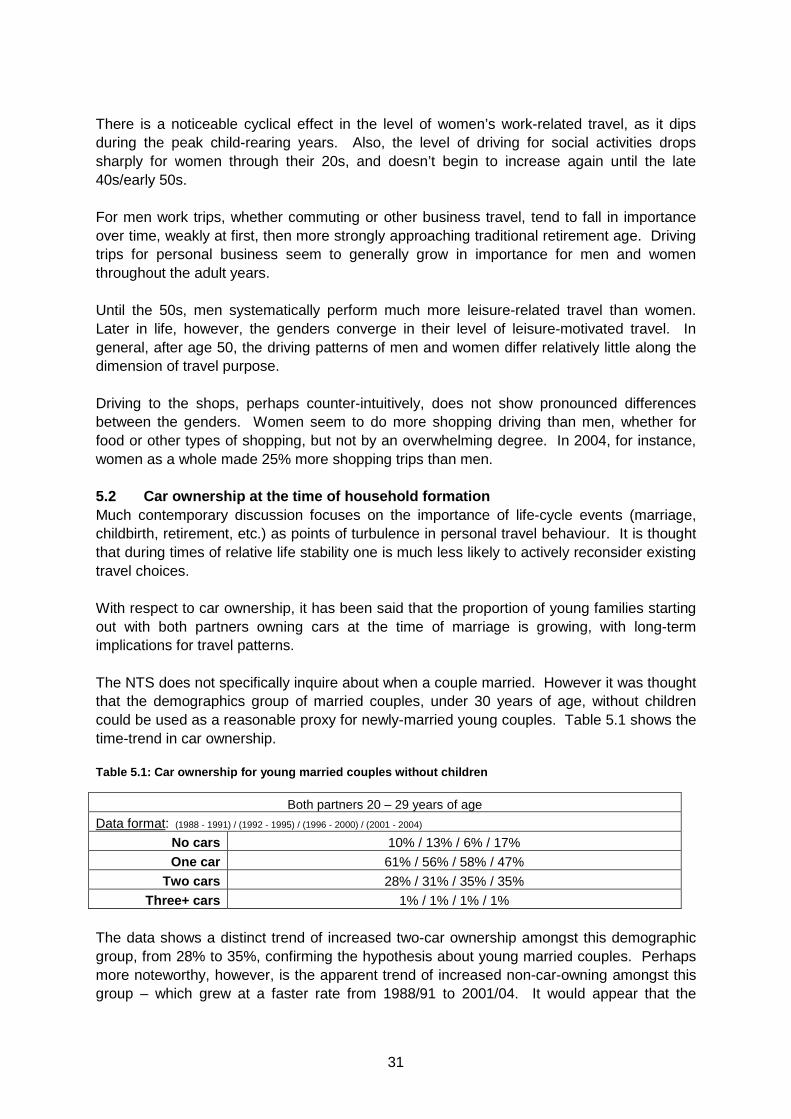
Through the period of this update analysis, the most marked change in these trends is the increased driving amongst middle-aged and older drivers with long driving histories. (See the highlighted sections of Figure 5.2.10) This is most certainly related to the cohort effects of mature drivers continuing their driving-intensive lifestyles later into life.
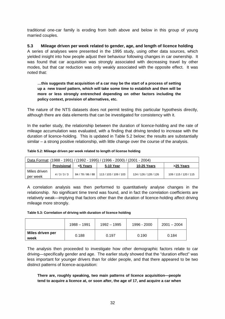
The cohort effect can also be seen when looking at the amount of driving by age, regardless of the length of licence holding. Figure 5.3 shows clearly that the strongest sustained increases in car driving are amongst those in their 50s and 60s, who seem to be continuing their high driving levels later into life (highlighted within the ellipse on the right-hand side of Figure 5.6). Of note also is that the trend amongst the youngest drivers is generally one of modestly falling car driving during the course of the analysis. This has been noted by other researchers, and is possibly due to factors such as: “the increasing difficulty of passing the driving test (including the theory test introduced in 1996); increased costs of lessons and
10 Note that categories with very small number of drivers (n<30) are censored from Figure 5.2.
•2001 – 2004: Furthest Bars
•1996 – 2000
•1992 – 1995
•1988 – 1991: Closest Bars
Presence of time trend amongst middle-aged and older who have held licenses for longer durations
Figure 5.2: Driving distance by age and duration of licence -holding
34
insurance; and more young people [being] students and unable to afford cars.” (Department for Transport 2005, p.9)
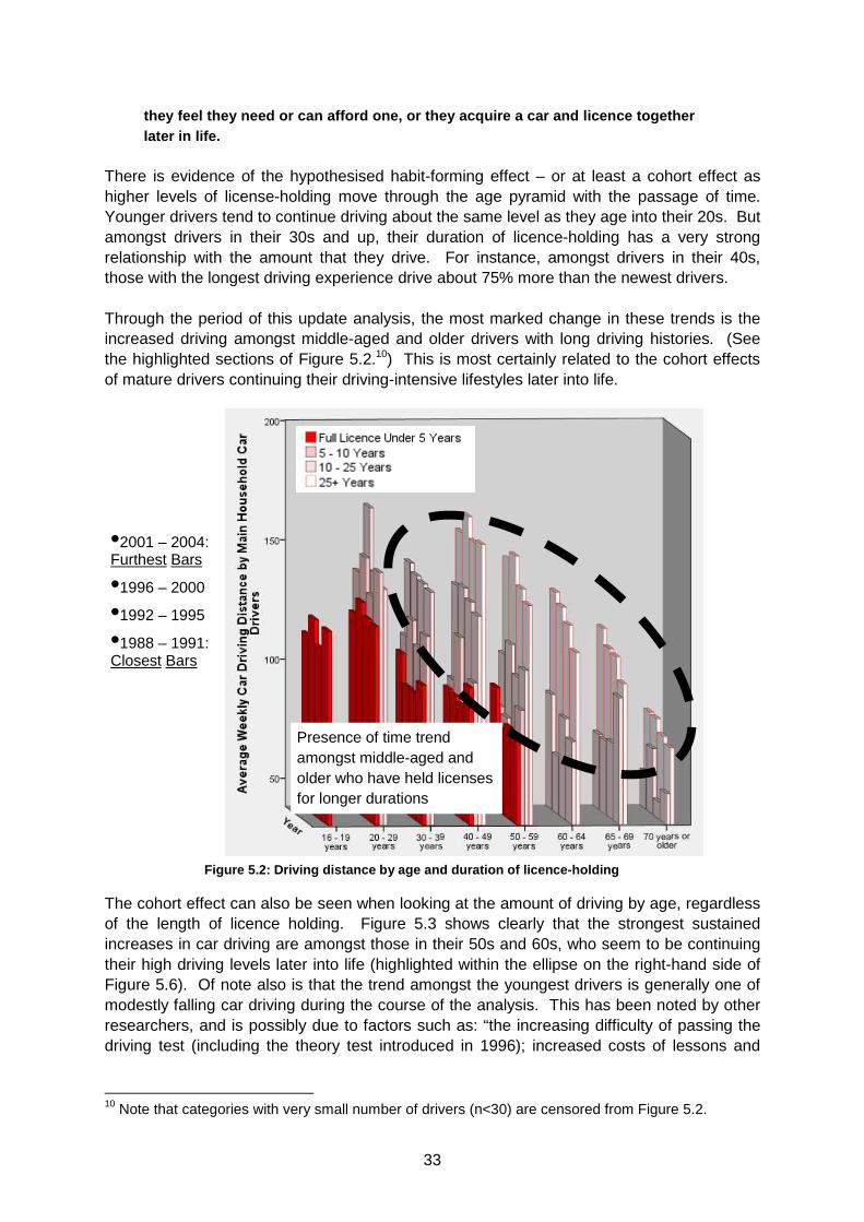
When disaggregated by gender, some interesting trends are observed. Figure 5.4 combines information from men and women drivers to present the “gender gap” in car driving by age and duration of licence holding.
Driving mileage is falling for young drivers…
…and growing amongst those later in life
•2001 – 2004: Furthest Bars
•1996 – 2000
•1992 – 1995
•1988 – 1991: Closest Bars
Figure 5.3: Driving mileage by age
Figure 5.4: Driving gender gap
35
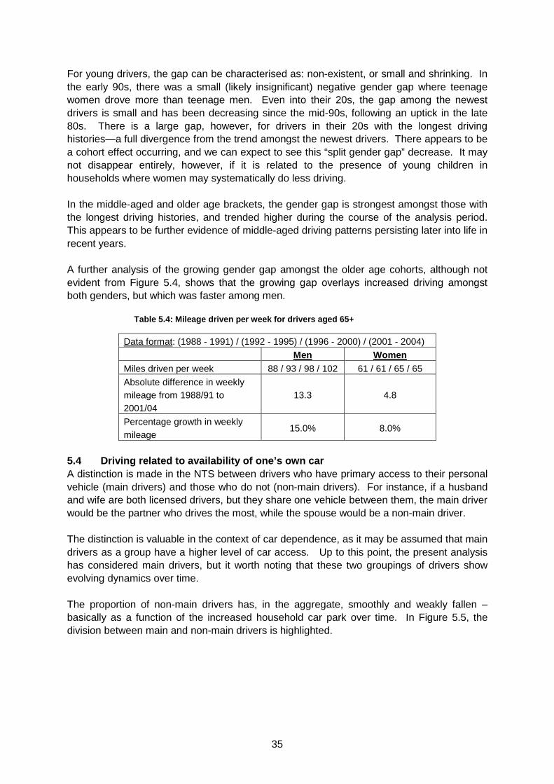
For young drivers, the gap can be characterised as: non-existent, or small and shrinking. In the early 90s, there was a small (likely insignificant) negative gender gap where teenage women drove more than teenage men. Even into their 20s, the gap among the newest drivers is small and has been decreasing since the mid-90s, following an uptick in the late 80s. There is a large gap, however, for drivers in their 20s with the longest driving histories—a full divergence from the trend amongst the newest drivers. There appears to be a cohort effect occurring, and we can expect to see this “split gender gap” decrease. It may not disappear entirely, however, if it is related to the presence of young children in households where women may systematically do less driving. In the middle-aged and older age brackets, the gender gap is strongest amongst those with the longest driving histories, and trended higher during the course of the analysis period. This appears to be further evidence of middle-aged driving patterns persisting later into life in recent years. A further analysis of the growing gender gap amongst the older age cohorts, although not evident from Figure 5.4, shows that the growing gap overlays increased driving amongst both genders, but which was faster among men.
Table 5.4: Mileage driven per week for drivers aged 65+
Data format: (1988 - 1991) / (1992 - 1995) / (1996 - 2000) / (2001 - 2004)
Men Women Miles driven per week 88 / 93 / 98 / 102 61 / 61 / 65 / 65
Absolute difference in weekly mileage from 1988/91 to 2001/04
13.3 4.8
Percentage growth in weekly mileage
15.0% 8.0%
5.4 Driving related to availability of one’s own ca r A distinction is made in the NTS between drivers who have primary access to their personal vehicle (main drivers) and those who do not (non-main drivers). For instance, if a husband and wife are both licensed drivers, but they share one vehicle between them, the main driver would be the partner who drives the most, while the spouse would be a non-main driver. The distinction is valuable in the context of car dependence, as it may be assumed that main drivers as a group have a higher level of car access. Up to this point, the present analysis has considered main drivers, but it worth noting that these two groupings of drivers show evolving dynamics over time. The proportion of non-main drivers has, in the aggregate, smoothly and weakly fallen – basically as a function of the increased household car park over time. In Figure 5.5, the division between main and non-main drivers is highlighted.
36
However, much stronger trends appear when one looks at the data across the dimensions of age and gender, as shown in Figure 5.6. For clarity, the 40-49 age bracket is highlighted, as it exhibits some noteworthy trends which are described below.
Figure 5.6: Car availability by age and gender
The proportion of men that are main drivers is stable in most age groups, with exceptions amongst the youngest (where the proportion is falling) and oldest age cohorts (where it is rising).
By contrast, the proportion of women who are main drivers is increasing amongst nearly all age groups, and at rapid rates. In the highlighted 40-49 age group, this is shown by the growing class labelled “Other Main Driver” in the upper chart (women), while this class is stable in the lower chart (men.) The clear dynamic is progressively stronger growth in
Main drivers (drivers who have a car of their own) are the proportion above this point of division Non-main drivers and non-drivers are below it.
Figure 5.5: Individuals by car availability
37
women main drivers amongst higher age groups, with the most striking changes occurring amongst women in late-middle age and senior citizens.
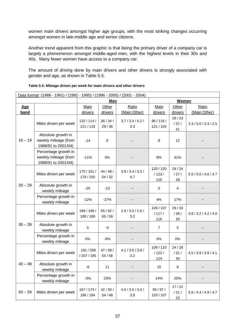
Another trend apparent from this graphic is that being the primary driver of a company car is largely a phenomenon amongst middle-aged men, with the highest levels in their 30s and 40s. Many fewer women have access to a company car. The amount of driving done by main drivers and other drivers is strongly associated with gender and age, as shown in Table 5.5. Table 5.5: Mileage driven per week for main drivers and other drivers
Data format: (1988 - 1991) / (1992 - 1995) / (1996 - 2000) / (2001 - 2004)
Men Women Age band
Main
drivers Other drivers
Ratio (Main:Other)
Main drivers
Other drivers
Ratio (Main:Other)
Miles driven per week 132 / 114 /
121 / 118
36 / 34 /
29 / 36
3.7 / 3.4 / 4.2 /
3.3
96 / 116 /
121 / 104
29 / 23
/ 37 /
41
3.3 / 5.0 / 3.3 / 2.5
Absolute growth in weekly mileage (from 1988/91 to 2001/04)
-14 0 -- 8 12 -- 16 – 19
Percentage growth in weekly mileage (from 1988/91 to 2001/04)
-11% 0% -- 8% 41% --
Miles driven per week 170 / 161 /
179 / 150
44 / 48 /
54 / 32
3.9 / 3.4 / 3.3 /
4.7
120 / 120
/ 123 /
125
24 / 24
/ 27 /
28
5.0 / 5.0 / 4.6 / 4.7
Absolute growth in weekly mileage
-20 -12 -- 5 4 -- 20 – 29
Percentage growth in weekly mileage
-12% -27% -- 4% 17% --
Miles driven per week 189 / 189 /
190 / 189
65 / 62 /
65 / 59
2.9 / 3.0 / 2.9 /
3.2
109 / 107
/ 117 /
116
29 / 33
/ 28 /
29
3.8 / 3.2 / 4.2 / 4.0
Absolute growth in weekly mileage
0 -6 -- 7 0 -- 30 – 39
Percentage growth in weekly mileage
0% -9% -- 6% 0% --
Miles driven per week 191 / 208
/ 207 / 185
47 / 58 /
54 / 58
4.1 / 3.6 / 3.8 /
3.2
109 / 110
/ 122 /
124
24 / 28
/ 31 /
30
4.5 / 3.9 / 3.9 / 4.1
Absolute growth in weekly mileage
-6 11 -- 15 6 -- 40 – 49
Percentage growth in weekly mileage
-3% 23% -- 14% 25% --
50 – 59 Miles driven per week 167 / 174 /
186 / 184
42 / 50 /
54 / 48
4.0 / 3.5 / 3.4 /
3.8
93 / 97 /
103 / 107
17 / 22
/ 21 /
23
5.5 / 4.4 / 4.9 / 4.7
38
Absolute growth in weekly mileage
17 6 -- 14 6 --
Percentage growth in weekly mileage
10% 14% -- 15% 35% --
Miles driven per week 127 / 139 /
148 / 153
24 / 18 /
35 / 38
5.3 / 7.7 / 4.2 /
4.0
75 / 82 /
80 / 90
18 / 11
/ 13 /
17
4.2 / 7.5 / 6.2 / 5.3
Absolute growth in weekly mileage
26 14 -- 15 -1 -- 60 – 64
Percentage growth in weekly mileage
20% 58% -- 20% -6% --
Miles driven per week 106 / 115 /
118 / 127
11 / 11 /
21 / 32
9.6 / 10.5 / 5.6 /
4.0
66 / 69 /
79 / 79
6 / 13 /
16 / 11
11.0 / 5.3 / 4.9 /
7.2
Absolute growth in weekly mileage
21 21 -- 13 5 -- 65 – 69
Percentage growth in weekly mileage
20% 91% -- 20% 83% --
Miles driven per week 72 / 76 /
85 / 87
5 / 4 / 7
/ 11
14.0 / 19.0 / 12.1
/ 7.9
56 / 55 /
54 / 56
7 / 4 / 8
/ 7
8.0 / 13.8 / 6.8 /
8.0
Absolute growth in weekly mileage
15 6 -- 0 0 -- 70 or More
Percentage growth in weekly mileage
21% 120% -- 0% 0% --
Several trends are apparent from this data. First, main drivers do much more driving than drivers without primary access to a car, and this gap is larger amongst older age groups. This gap is also consistently larger for women than men, and the main/non-main distinction is weakening in most demographic groups through the course of the analysis. Thus, it would appear that driving cars that are not one’s own primary vehicle is growing at a faster rate than driving one’s primary vehicle. Second, the strongest and most consistent growth took place in the late-middle age cohorts. In these demographic groups, the absolute increase in mileage was generally greater for main drivers than others, but the opposite was true measured in percentage terms. Finally, there is a systematic drop in mileage by young men, with declines or no growth amongst either main or non-main male drivers until their 40s. The opposite is true for young women. A plausible explanation for this phenomenon is that as the car park has increased there is some inter-personal substitution of car travel. For instance, whereas a traditional family several decades ago may have had one car which the husband drove, a modern two-car household enables the inter-personal sharing of car-dependent out-of-household chores. 5.5 Proportion of trips by driving related to gende r, age group, and length of driving experience This analysis is related to the previous one, but travel distance is ignored and modal share is the subject of investigation. Travel behaviour is examined along three axes: gender, age, and duration of licence holding.
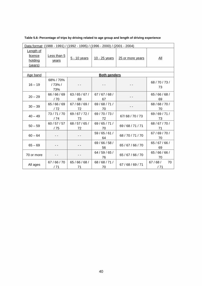
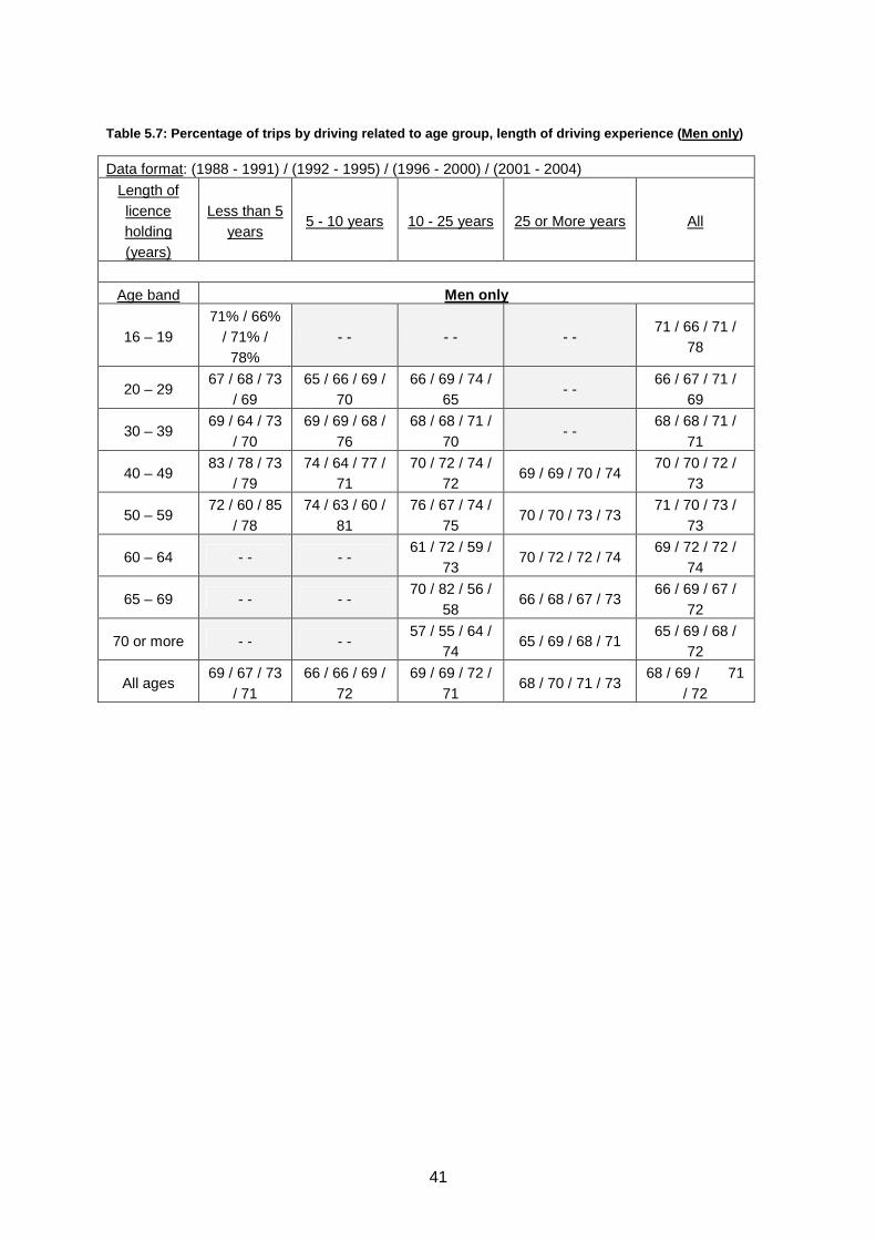
Several findings noted in the 1995 study were:
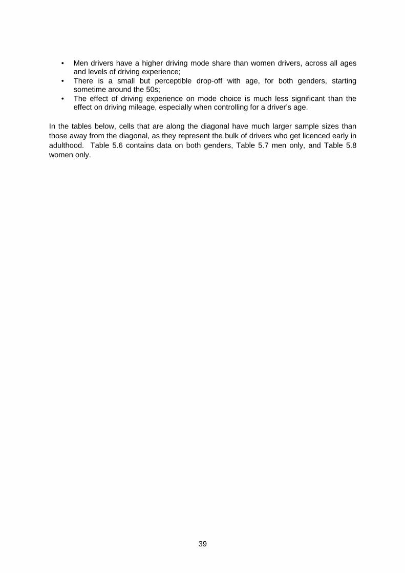
39
• Men drivers have a higher driving mode share than women drivers, across all ages and levels of driving experience;
• There is a small but perceptible drop-off with age, for both genders, starting sometime around the 50s;
• The effect of driving experience on mode choice is much less significant than the effect on driving mileage, especially when controlling for a driver’s age.
In the tables below, cells that are along the diagonal have much larger sample sizes than those away from the diagonal, as they represent the bulk of drivers who get licenced early in adulthood. Table 5.6 contains data on both genders, Table 5.7 men only, and Table 5.8 women only.
40
Table 5.6: Percentage of trips by driving related to age group and length of driving experience
Data format: (1988 - 1991) / (1992 - 1995) / (1996 - 2000) / (2001 - 2004)
Length of licence holding (years)
Less than 5 years
5 - 10 years 10 - 25 years 25 or more years All
Age band Both genders
16 – 19 68% / 70%
/ 73% / 73%
- - - - - - 68 / 70 / 73 /
73
20 – 29 66 / 66 / 69
/ 70 63 / 65 / 67 /
69 67 / 67 / 68 /
67 - -
65 / 66 / 68 / 69
30 – 39 65 / 66 / 69
/ 72 67 / 68 / 69 /
72 69 / 68 / 71 /
70 - -
68 / 68 / 70 / 70
40 – 49 73 / 71 / 70
/ 74 69 / 67 / 72 /
73 69 / 70 / 73 /
72 67/ 68 / 70 / 73
69 / 69 / 71 / 73
50 – 59 60 / 57 / 57
/ 75 68 / 57 / 65 /
72 69 / 65 / 71 /
70 69 / 68 / 71 / 71
68 / 67 / 70 / 71
60 – 64 - - - - 59 / 65 / 61 /
64 68 / 70 / 71 / 70
67 / 69 / 70 / 70
65 – 69 - - - - 69 / 66 / 58 /
56 65 / 67 / 66 / 70
65 / 67 / 66 / 69
70 or more - - - - 64 / 59 / 65 /
76 65 / 67 / 66 / 70
65 / 66 / 66 / 70
All ages 67 / 66 / 70
/ 71 65 / 66 / 68 /
71 68 / 68 / 71 /
70 67 / 68 / 69 / 71
67 / 68 / 70 / 71
41
Table 5.7: Percentage of trips by driving related to age group, length of driving experience (Men only )
Data format: (1988 - 1991) / (1992 - 1995) / (1996 - 2000) / (2001 - 2004)
Length of licence holding (years)
Less than 5 years
5 - 10 years 10 - 25 years 25 or More years All
Age band Men only
16 – 19 71% / 66%
/ 71% / 78%
- - - - - - 71 / 66 / 71 /
78
20 – 29 67 / 68 / 73
/ 69 65 / 66 / 69 /
70 66 / 69 / 74 /
65 - -
66 / 67 / 71 / 69
30 – 39 69 / 64 / 73
/ 70 69 / 69 / 68 /
76 68 / 68 / 71 /
70 - -
68 / 68 / 71 / 71
40 – 49 83 / 78 / 73
/ 79 74 / 64 / 77 /
71 70 / 72 / 74 /
72 69 / 69 / 70 / 74
70 / 70 / 72 / 73
50 – 59 72 / 60 / 85
/ 78 74 / 63 / 60 /
81 76 / 67 / 74 /
75 70 / 70 / 73 / 73
71 / 70 / 73 / 73
60 – 64 - - - - 61 / 72 / 59 /
73 70 / 72 / 72 / 74
69 / 72 / 72 / 74
65 – 69 - - - - 70 / 82 / 56 /
58 66 / 68 / 67 / 73
66 / 69 / 67 / 72
70 or more - - - - 57 / 55 / 64 /
74 65 / 69 / 68 / 71
65 / 69 / 68 / 72
All ages 69 / 67 / 73
/ 71 66 / 66 / 69 /
72 69 / 69 / 72 /
71 68 / 70 / 71 / 73
68 / 69 / 71 / 72
42
Table 5.8: Percentage of trips by driving related to age group, length of driving experience (Women onl y)
Data format: (1988 - 1991) / (1992 - 1995) / (1996 - 2000) / (2001 - 2004)
Length of licence holding (years)
Less than 5 years
5 - 10 years 10 - 25 years 25 or more years All
Age band Women only
16 – 19 62% / 74%
/ 75% / 68%
- - - - - - 62 / 74 / 75 /
68
20 – 29 65 / 63 / 66
/ 71 61 / 64 / 66 /
69 69 / 64 / 61 /
69 - -
64 / 64 / 66 / 70
30 – 39 64 / 68 / 67
/ 73 66 / 68 / 70 /
71 69 / 68 / 70 /
70 - -
68 / 68 / 70 / 70
40 – 49 66 / 59 / 68
/ 72 66 / 68 / 66 /
74 69 / 69 / 72 /
72 64 / 66 / 69 / 73
68 / 68 / 71 / 73
50 – 59 54 / 56 / 45
/ 74 66 / 54 / 66 /
69 64 / 64 / 69 /
68 62 / 64 / 66 / 68
63 / 63 / 67 / 68
60 – 64 - - - - 56 / 57 / 63 /
60 62 / 65 / 66 / 63
61 / 62 / 66 / 63
65 – 69 - - - - 67 / 56 / 59 /
56 61 / 58 / 62 / 63
63 / 57 / 62 / 62
70 or more - - - - 74 / 63 / 65 /
76 62 / 58 / 58 / 65
64 / 59 / 59 / 66
All ages 64 / 66 / 67
/ 71 63 / 65 / 68 /
70 68 / 67 / 70 /
70 63 / 64 / 66 / 68
65 / 66 / 68 / 69
For the most part, the trends identified in the earlier study continued during the update analysis period. There is a slight upward “drift” over time, evidenced in the matrix sums in the bottom right cell of each table above. Drivers of both genders are showing a greater propensity to drive across all ages and levels of driving experience. When looked at as a whole, with few exceptions – and those only at the margins – drivers new and old tended to use their cars for around seven out of ten trips by the early 2000s.
43
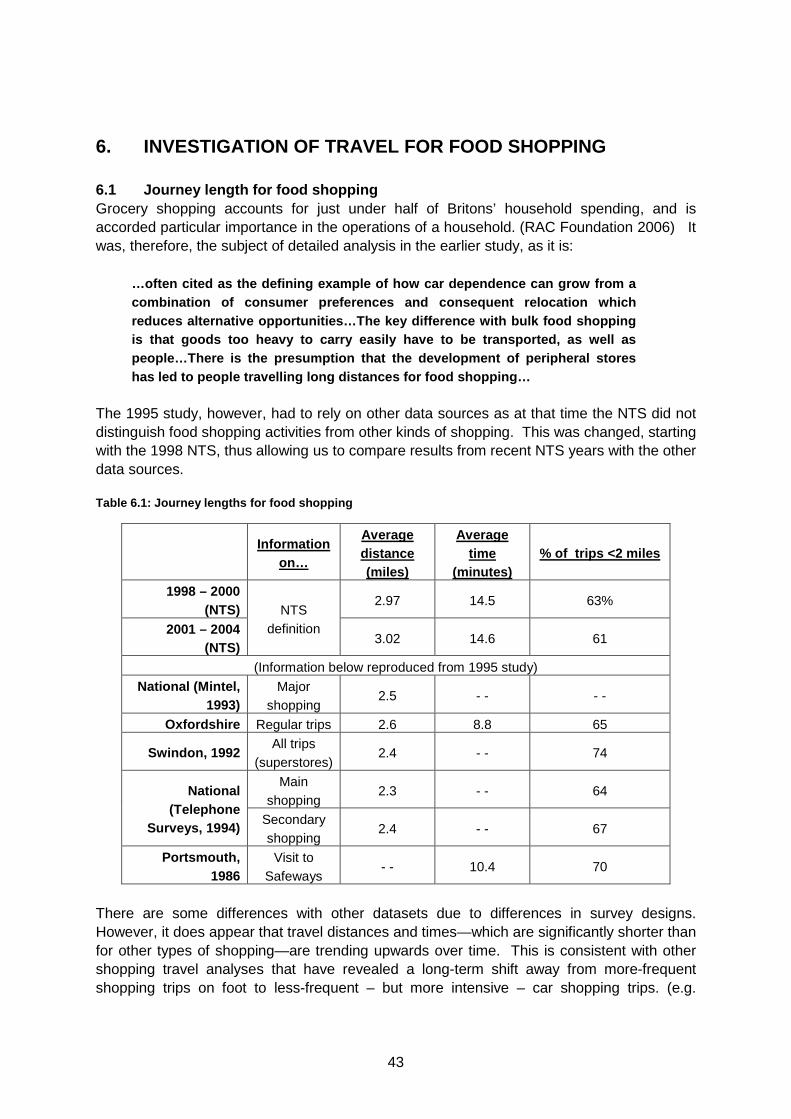
6. INVESTIGATION OF TRAVEL FOR FOOD SHOPPING 6.1 Journey length for food shopping Grocery shopping accounts for just under half of Britons’ household spending, and is accorded particular importance in the operations of a household. (RAC Foundation 2006) It was, therefore, the subject of detailed analysis in the earlier study, as it is:
…often cited as the defining example of how car dep endence can grow from a combination of consumer preferences and consequent relocation which reduces alternative opportunities…The key differenc e with bulk food shopping is that goods too heavy to carry easily have to be transported, as well as people…There is the presumption that the developmen t of peripheral stores has led to people travelling long distances for foo d shopping…
The 1995 study, however, had to rely on other data sources as at that time the NTS did not distinguish food shopping activities from other kinds of shopping. This was changed, starting with the 1998 NTS, thus allowing us to compare results from recent NTS years with the other data sources. Table 6.1: Journey lengths for food shopping
Information
on…
Average distance (miles)
Average time
(minutes) % of trips <2 miles
1998 – 2000 (NTS)
2.97 14.5 63%
2001 – 2004 (NTS)
NTS definition
3.02 14.6 61
(Information below reproduced from 1995 study)
National (Mintel, 1993)
Major shopping
2.5 - - - -
Oxfordshire Regular trips 2.6 8.8 65
Swindon, 1992 All trips
(superstores) 2.4 - - 74
Main shopping
2.3 - - 64 National (Telephone
Surveys, 1994) Secondary shopping
2.4 - - 67
Portsmouth, 1986
Visit to Safeways
- - 10.4 70
There are some differences with other datasets due to differences in survey designs. However, it does appear that travel distances and times—which are significantly shorter than for other types of shopping—are trending upwards over time. This is consistent with other shopping travel analyses that have revealed a long-term shift away from more-frequent shopping trips on foot to less-frequent – but more intensive – car shopping trips. (e.g.
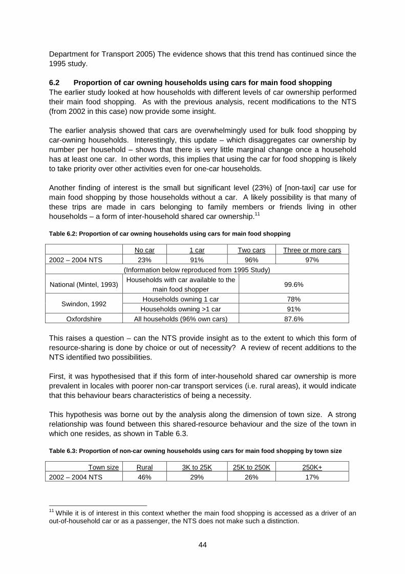
44
Department for Transport 2005) The evidence shows that this trend has continued since the 1995 study. 6.2 Proportion of car owning households using cars for main food shopping The earlier study looked at how households with different levels of car ownership performed their main food shopping. As with the previous analysis, recent modifications to the NTS (from 2002 in this case) now provide some insight. The earlier analysis showed that cars are overwhelmingly used for bulk food shopping by car-owning households. Interestingly, this update – which disaggregates car ownership by number per household – shows that there is very little marginal change once a household has at least one car. In other words, this implies that using the car for food shopping is likely to take priority over other activities even for one-car households.
Another finding of interest is the small but significant level (23%) of [non-taxi] car use for main food shopping by those households without a car. A likely possibility is that many of these trips are made in cars belonging to family members or friends living in other households – a form of inter-household shared car ownership.11 Table 6.2: Proportion of car owning households usin g cars for main food shopping
No car 1 car Two cars Three or more cars
2002 – 2004 NTS 23% 91% 96% 97%
(Information below reproduced from 1995 Study)
National (Mintel, 1993) Households with car available to the
main food shopper 99.6%
Households owning 1 car 78% Swindon, 1992
Households owning >1 car 91%
Oxfordshire All households (96% own cars) 87.6% This raises a question – can the NTS provide insight as to the extent to which this form of resource-sharing is done by choice or out of necessity? A review of recent additions to the NTS identified two possibilities.
First, it was hypothesised that if this form of inter-household shared car ownership is more prevalent in locales with poorer non-car transport services (i.e. rural areas), it would indicate that this behaviour bears characteristics of being a necessity.
This hypothesis was borne out by the analysis along the dimension of town size. A strong relationship was found between this shared-resource behaviour and the size of the town in which one resides, as shown in Table 6.3. Table 6.3: Proportion of non-car owning households u sing cars for main food shopping by town size
Town size Rural 3K to 25K 25K to 250K 250K+
2002 – 2004 NTS 46% 29% 26% 17%
11 While it is of interest in this context whether the main food shopping is accessed as a driver of an out-of-household car or as a passenger, the NTS does not make such a distinction.
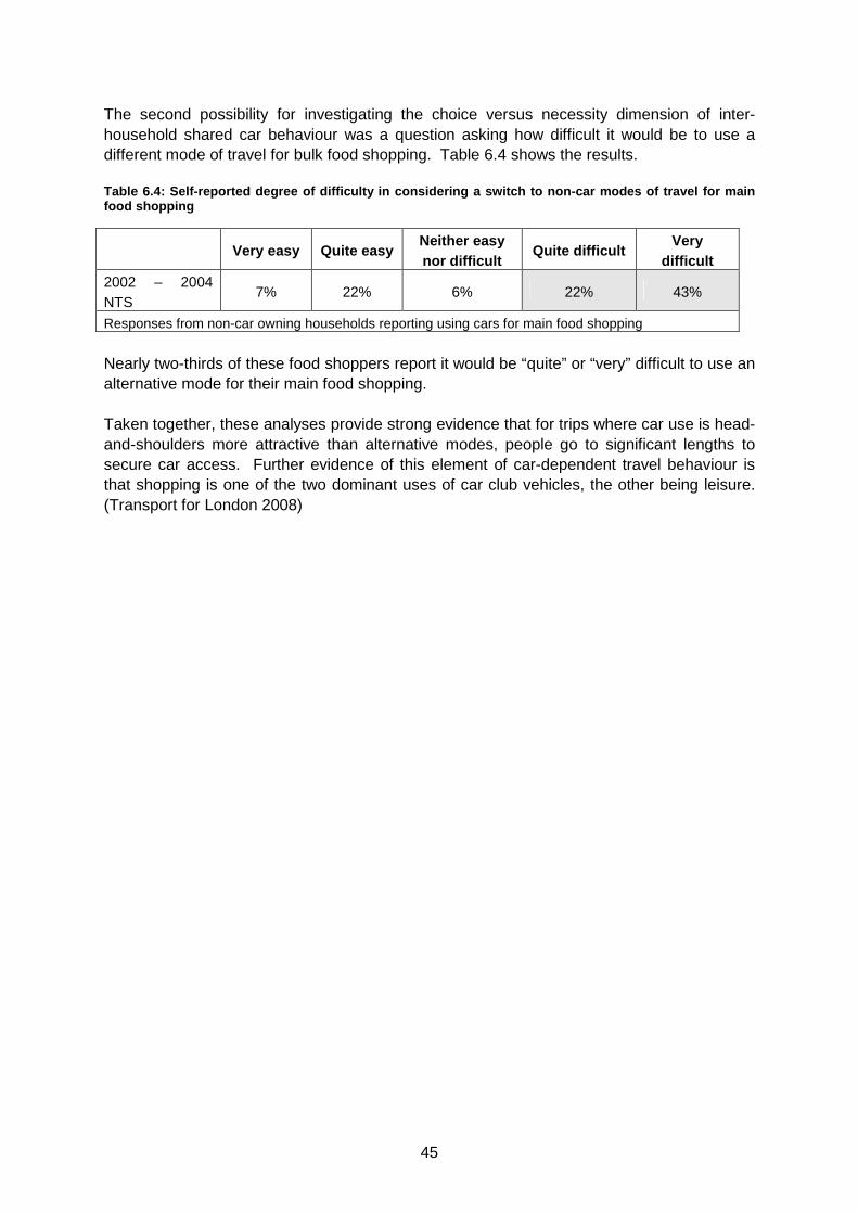
45
The second possibility for investigating the choice versus necessity dimension of inter-household shared car behaviour was a question asking how difficult it would be to use a different mode of travel for bulk food shopping. Table 6.4 shows the results. Table 6.4: Self-reported degree of difficulty in con sidering a switch to non-car modes of travel for ma in food shopping
Very easy Quite easy
Neither easy nor difficult
Quite difficult Very
difficult 2002 – 2004 NTS
7% 22% 6% 22% 43%
Responses from non-car owning households reporting using cars for main food shopping
Nearly two-thirds of these food shoppers report it would be “quite” or “very” difficult to use an alternative mode for their main food shopping.
Taken together, these analyses provide strong evidence that for trips where car use is head-and-shoulders more attractive than alternative modes, people go to significant lengths to secure car access. Further evidence of this element of car-dependent travel behaviour is that shopping is one of the two dominant uses of car club vehicles, the other being leisure. (Transport for London 2008)
46
7. CAR TRAVEL AND PUBLIC TRANSPORT ACCESSIBILITY The broadly negative relationship between car use and public transport accessibility is well-established. Within this paradigm, though, we explore a number of relevant research questions:
• How has the high-level public transport access / car ownership relationship evolved over time?
• How has the public transport access / car use relationship changed? • Which travel purposes and types of people are sensitive to these relationships,
and to what degree? Prior to undertaking these analyses, a measure of public transport accessibility (henceforth MPTA) was developed.12 A three-level measure was designed: Low, Moderate, and High public transport accessibility, which captures proximity to bus and rail service and service frequency. The analyses presented in sections 7.2 through 7.5 make use of this metric. 7.1 Percentage of people with different levels of a ccess to bus services From the analyses described above, the 1995 study concludes that:
…we can make two alternative statements about the g reater car mileage in rural areas. The first is ‘people use their cars more because th ey have to, but luckily the higher speeds enable them to do so without a greate r commitment of time.’ The second is ‘higher speeds make car use more attr active, so people make more use of their cars.’ The equivalent statements , in reverse, would apply to urban areas, especially cities. It is not possible to distinguish between these alt ernative interpretations from observed travel patterns. However, we can check to what extent the quality of public transport alternatives actually does differ in urban and rural areas.
The key finding from the earlier analysis was the much lower proportion of rural residents within a short walk13 of 15-minute-or-less service frequency.
12 The appendix describes the set of procedures. 13 Note that in the late 1990’s the bus accessibility question was modified as part of a broader effort to ease respondent burden. From 1999 the NTS stopped separately recording “under 3-minute” and “under 6-minute” walking times to bus service. Hence the merging of these categories in this analysis.
47
Table 7.1: Percentage of people with different level s of access to bus services
Walk time to nearest bus stop and frequency of service
Data format: (1988 - 1991) / (1992 - 1995) / (1996 - 2000) / (2001 - 2004)
Walk time to bus stop and frequency of service
Rural Urban14 All
<6 minutes walk from >15 minute frequency bus
2% / 6% / 2% / 2% 36 / 39 / 34 /
37
33 / 34 / 30 /
33
<6 minutes walk from <15 minute frequency bus
30 / 38 / 36 / 45 51 / 49 / 51 /
50
49 / 48 / 49 /
49
<6 minutes walk from <hourly frequency bus 43 / 33 / 38 / 28 3 / 3 / 4 / 2 8 / 7 / 7 / 6
>7 minutes from bus service 25 / 23 / 24 / 25 9 / 10 / 11 / 11
11 / 11 / 13 /
13
All 100 / 100 / 100 / 100 100 / 100 / 100 / 100 100 / 100 / 100 / 100
The data show relatively little change in bus accessibility over time. Thus, the data support the proposition from the 1995 study that disproportionately high levels of car ownership and usage in rural areas are associated with the availability of fewer alternative mobility options and vice versa in urban areas.
The steady-state levels of bus accessibility, however, are somewhat unexpected, as it is often thought that rural service levels have declined following privatisation in the mid-1980s. That this was not evident in the data is evidence of several possible effects:
• Either the reduction in rural service associated with privatisation occurred prior to 1988; or
• The NTS’ definition of ‘rural’ is not the same as the popular conception; • Any reduction in bus service levels occurred during evenings or weekends, whereas
the NTS inquires about weekday service; or • The popular notion is not borne out by the objective NTS data.
To investigate this issue, the above table was re-created for towns and cities ranging from 3,000 to 250,000 in population, excluding both rural areas and the largest cities.
14 All areas not classified as rural are considered urban.
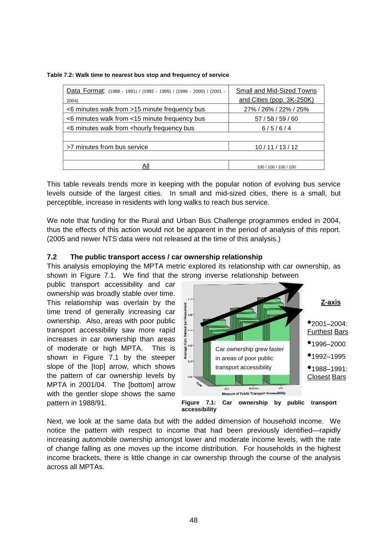
48
Z-axis
•2001–2004: Furthest Bars
•1996–2000
•1992–1995
•1988–1991: Closest Bars
Car ownership grew faster
in areas of poor public
transport accessibility
Table 7.2: Walk time to nearest bus stop and freque ncy of service
Data Format: (1988 - 1991) / (1992 - 1995) / (1996 - 2000) / (2001 -
2004)
Small and Mid-Sized Towns and Cities (pop. 3K-250K)
<6 minutes walk from >15 minute frequency bus 27% / 26% / 22% / 25%
<6 minutes walk from <15 minute frequency bus 57 / 58 / 59 / 60
<6 minutes walk from <hourly frequency bus 6 / 5 / 6 / 4
>7 minutes from bus service 10 / 11 / 13 / 12
All 100 / 100 / 100 / 100
This table reveals trends more in keeping with the popular notion of evolving bus service levels outside of the largest cities. In small and mid-sized cities, there is a small, but perceptible, increase in residents with long walks to reach bus service. We note that funding for the Rural and Urban Bus Challenge programmes ended in 2004, thus the effects of this action would not be apparent in the period of analysis of this report. (2005 and newer NTS data were not released at the time of this analysis.) 7.2 The public transport access / car ownership rel ationship This analysis emoploying the MPTA metric explored its relationship with car ownership, as shown in Figure 7.1. We find that the strong inverse relationship between public transport accessibility and car ownership was broadly stable over time. This relationship was overlain by the time trend of generally increasing car ownership. Also, areas with poor public transport accessibility saw more rapid increases in car ownership than areas of moderate or high MPTA. This is shown in Figure 7.1 by the steeper slope of the [top] arrow, which shows the pattern of car ownership levels by MPTA in 2001/04. The [bottom] arrow with the gentler slope shows the same pattern in 1988/91.
Next, we look at the same data but with the added dimension of household income. We notice the pattern with respect to income that had been previously identified—rapidly increasing automobile ownership amongst lower and moderate income levels, with the rate of change falling as one moves up the income distribution. For households in the highest income brackets, there is little change in car ownership through the course of the analysis across all MPTAs.
Figure 7.1: Car ownership by public transport accessibility
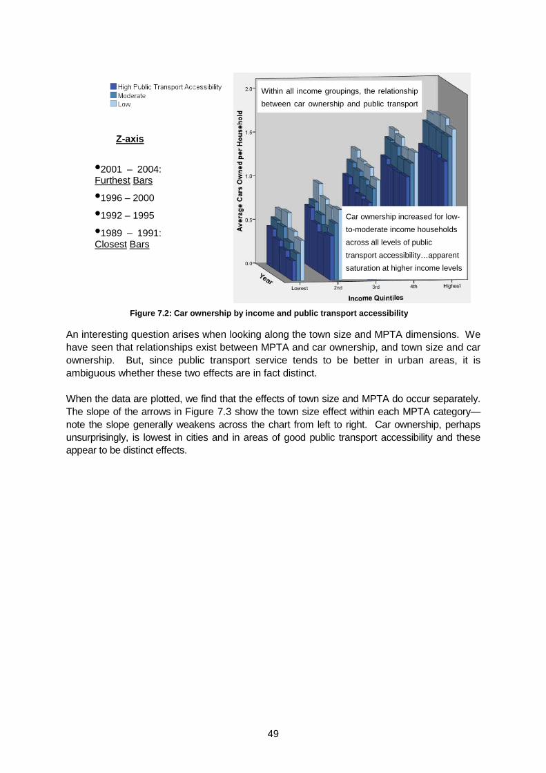
49
An interesting question arises when looking along the town size and MPTA dimensions. We have seen that relationships exist between MPTA and car ownership, and town size and car ownership. But, since public transport service tends to be better in urban areas, it is ambiguous whether these two effects are in fact distinct. When the data are plotted, we find that the effects of town size and MPTA do occur separately. The slope of the arrows in Figure 7.3 show the town size effect within each MPTA category—note the slope generally weakens across the chart from left to right. Car ownership, perhaps unsurprisingly, is lowest in cities and in areas of good public transport accessibility and these appear to be distinct effects.
Z-axis
•2001 – 2004: Furthest Bars
•1996 – 2000
•1992 – 1995
•1989 – 1991: Closest Bars
Car ownership increased for low-
to-moderate income households
across all levels of public
transport accessibility…apparent
saturation at higher income levels
Within all income groupings, the relationship
between car ownership and public transport
Figure 7.2: Car ownership by income and public transport acce ssibility
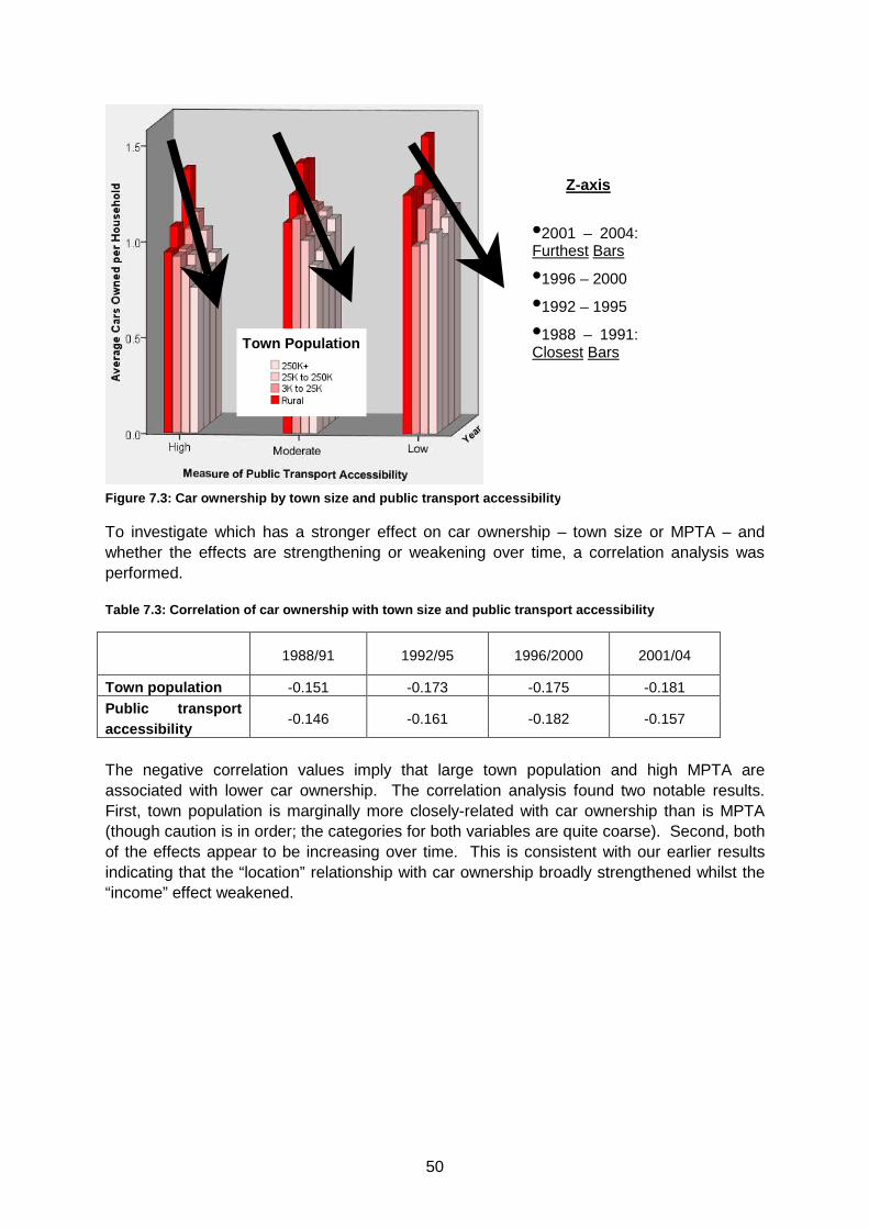
50
To investigate which has a stronger effect on car ownership – town size or MPTA – and whether the effects are strengthening or weakening over time, a correlation analysis was performed. Table 7.3: Correlation of car ownership with town s ize and public transport accessibility
1988/91 1992/95 1996/2000 2001/04
Town population -0.151 -0.173 -0.175 -0.181
Public transport accessibility
-0.146 -0.161 -0.182 -0.157
The negative correlation values imply that large town population and high MPTA are associated with lower car ownership. The correlation analysis found two notable results. First, town population is marginally more closely-related with car ownership than is MPTA (though caution is in order; the categories for both variables are quite coarse). Second, both of the effects appear to be increasing over time. This is consistent with our earlier results indicating that the “location” relationship with car ownership broadly strengthened whilst the “income” effect weakened.
Figure 7.3: Car ownership by town size and public transport a ccessibility
Town Population
Z-axis
•2001 – 2004: Furthest Bars
•1996 – 2000
•1992 – 1995
•1988 – 1991: Closest Bars
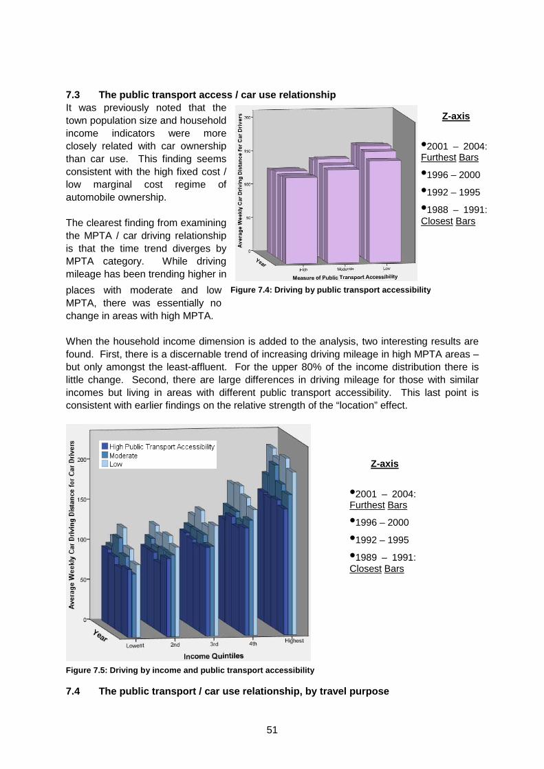
51
7.3 The public transport access / car use relations hip It was previously noted that the town population size and household income indicators were more closely related with car ownership than car use. This finding seems consistent with the high fixed cost / low marginal cost regime of automobile ownership. The clearest finding from examining the MPTA / car driving relationship is that the time trend diverges by MPTA category. While driving mileage has been trending higher in
places with moderate and low MPTA, there was essentially no change in areas with high MPTA. When the household income dimension is added to the analysis, two interesting results are found. First, there is a discernable trend of increasing driving mileage in high MPTA areas – but only amongst the least-affluent. For the upper 80% of the income distribution there is little change. Second, there are large differences in driving mileage for those with similar incomes but living in areas with different public transport accessibility. This last point is consistent with earlier findings on the relative strength of the “location” effect.
7.4 The public transport / car use relationship, by travel purpose
Z-axis
•2001 – 2004: Furthest Bars
•1996 – 2000
•1992 – 1995
•1989 – 1991: Closest Bars
Z-axis
•2001 – 2004: Furthest Bars
•1996 – 2000
•1992 – 1995
•1988 – 1991: Closest Bars
Figure 7.4: Driving by public transport accessibility
Figure 7.5: Driving by income and public transport accessibil ity
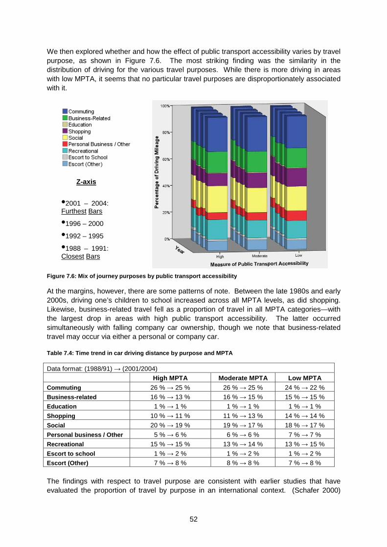
52
Z-axis
•2001 – 2004: Furthest Bars
•1996 – 2000
•1992 – 1995
•1988 – 1991: Closest Bars
We then explored whether and how the effect of public transport accessibility varies by travel purpose, as shown in Figure 7.6. The most striking finding was the similarity in the distribution of driving for the various travel purposes. While there is more driving in areas with low MPTA, it seems that no particular travel purposes are disproportionately associated with it.
At the margins, however, there are some patterns of note. Between the late 1980s and early 2000s, driving one’s children to school increased across all MPTA levels, as did shopping. Likewise, business-related travel fell as a proportion of travel in all MPTA categories—with the largest drop in areas with high public transport accessibility. The latter occurred simultaneously with falling company car ownership, though we note that business-related travel may occur via either a personal or company car. Table 7.4: Time trend in car driving distance by pu rpose and MPTA
Data format: (1988/91) → (2001/2004)
High MPTA Moderate MPTA Low MPTA Commuting 26 % → 25 % 26 % → 25 % 24 % → 22 %
Business-related 16 % → 13 % 16 % → 15 % 15 % → 15 %
Education 1 % → 1 % 1 % → 1 % 1 % → 1 %
Shopping 10 % → 11 % 11 % → 13 % 14 % → 14 %
Social 20 % → 19 % 19 % → 17 % 18 % → 17 %
Personal business / Other 5 % → 6 % 6 % → 6 % 7 % → 7 %
Recreational 15 % → 15 % 13 % → 14 % 13 % → 15 %
Escort to school 1 % → 2 % 1 % → 2 % 1 % → 2 %
Escort (Other) 7 % → 8 % 8 % → 8 % 7 % → 8 % The findings with respect to travel purpose are consistent with earlier studies that have evaluated the proportion of travel by purpose in an international context. (Schafer 2000)
Figure 7.6: Mix of j ourney purposes by public transport accessibility
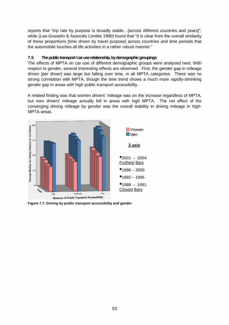
53
reports that “trip rate by purpose is broadly stable…[across different countries and years]”, while (Lee-Gosselin & Associés Limitée 1990) found that “It is clear from the overall similarity of these proportions [time driven by travel purpose] across countries and time periods that the automobile touches all life activities in a rather robust manner.” 7.5 The public transport / car use relationship, by demographic groupings The effects of MPTA on car use of different demographic groups were analysed next. With respect to gender, several interesting effects are observed. First, the gender gap in mileage driven [per driver] was large but falling over time, in all MPTA categories. There was no strong correlation with MPTA, though the time trend shows a much more rapidly-shrinking gender gap in areas with high public transport accessibility. A related finding was that women drivers’ mileage was on the increase regardless of MPTA, but men drivers’ mileage actually fell in areas with high MPTA. The net effect of the converging driving mileage by gender was the overall stability in driving mileage in high-MPTA areas.
Z-axis
•2001 – 2004: Furthest Bars
•1996 – 2000
•1992 – 1995
•1988 – 1991: Closest Bars
Figure 7.7: Driving by public transport accessibility and gen der
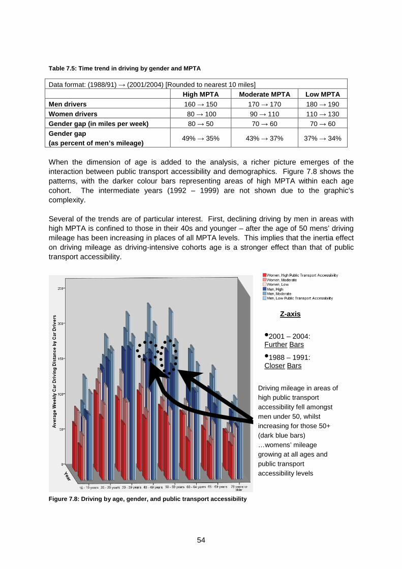
54
Table 7.5: Time trend in driving by gender and MPTA
Data format: (1988/91) → (2001/2004) [Rounded to nearest 10 miles]
High MPTA Moderate MPTA Low MPTA Men drivers 160 → 150 170 → 170 180 → 190
Women drivers 80 → 100 90 → 110 110 → 130 Gender gap (in miles per week) 80 → 50 70 → 60 70 → 60
Gender gap (as percent of men’s mileage)
49% → 35% 43% → 37% 37% → 34%
When the dimension of age is added to the analysis, a richer picture emerges of the interaction between public transport accessibility and demographics. Figure 7.8 shows the patterns, with the darker colour bars representing areas of high MPTA within each age cohort. The intermediate years (1992 – 1999) are not shown due to the graphic’s complexity. Several of the trends are of particular interest. First, declining driving by men in areas with high MPTA is confined to those in their 40s and younger – after the age of 50 mens’ driving mileage has been increasing in places of all MPTA levels. This implies that the inertia effect on driving mileage as driving-intensive cohorts age is a stronger effect than that of public transport accessibility.
Figure 7.8: Driving by age, gender, and public transport acce ssibility
Z-axis
•2001 – 2004: Further Bars
•1988 – 1991: Closer Bars
Driving mileage in areas of high public transport accessibility fell amongst men under 50, whilst increasing for those 50+ (dark blue bars) …womens’ mileage growing at all ages and public transport accessibility levels
55
For men in areas of low public transport accessibility, driving mileage grew for all groups aged 20+, falling only for men aged 16 to 19. Further, womens’ driving mileage was found to be increasing across the board – at all age bands and levels of MPTA, but most strongly in areas of high public transport accessibility.
56
REFERENCES Department for Transport (2005) National Travel Survey: 2004 Statistics Bulletin. Goodwin, P., Cairns, S., Dargay, J., Parkhurst, G., Polak, J., Stokes, G., Vythoulkas, P. (1995) Car Dependence. Prepared for the RAC Foundation for Motoring and the Environment. Lee-Gosselin & Associés Limitée, (1990); International Study of Car-Use; Prepared for Transport Canada Pickering, K., Tipping, S., and Scholes, S., (2006); Weighting the National Travel Survey: Revised Methodology Final Report. Prepared for the Department for Transport. RAC Foundation, (2006); Motoring towards 2050: Shopping and Transport Policy. Schafer, A. (2000); Regularities in Travel: An International Perspective; Journal of Transportation and Statistics; Vol 3, No. 3; p.1-31 Transport for London [TfL], (2008); Car Clubs Strategy (TfL Group Publishing)
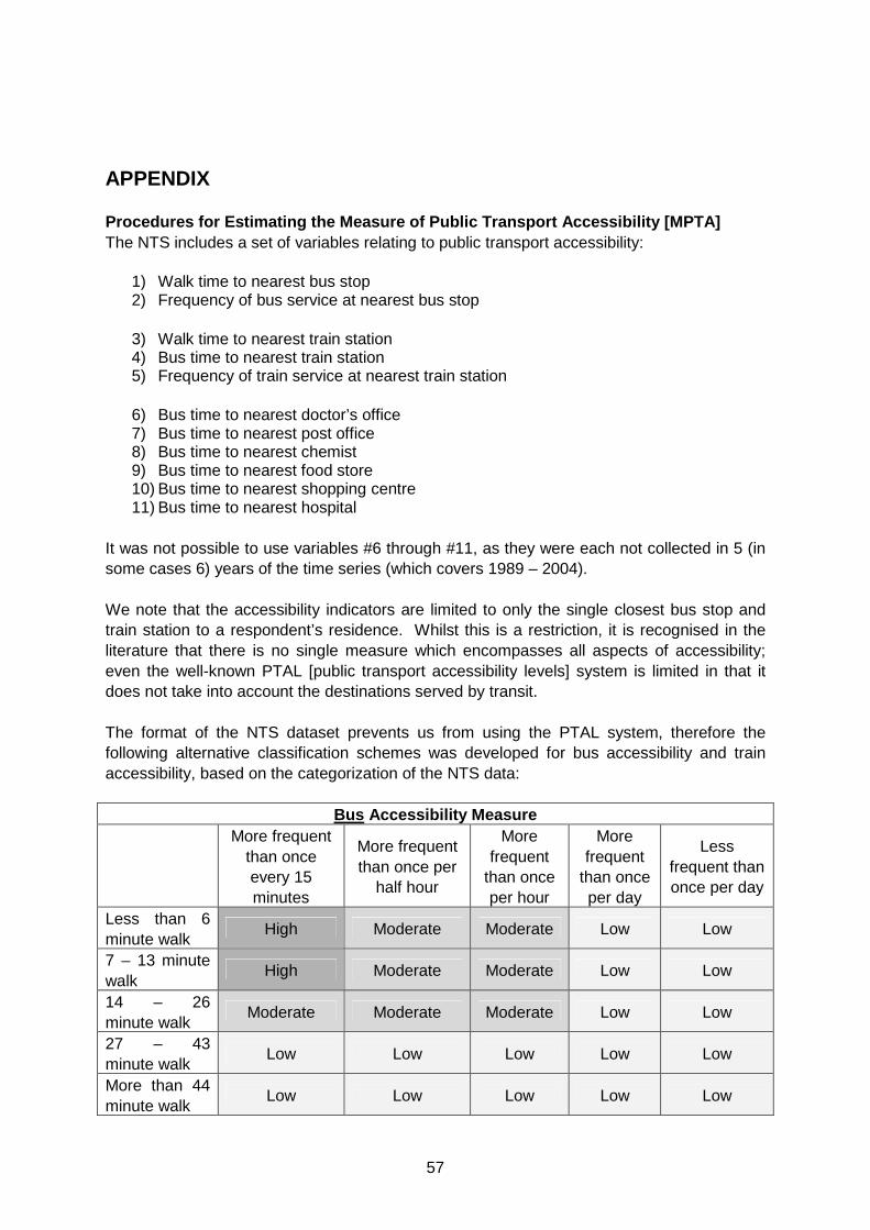
57
APPENDIX Procedures for Estimating the Measure of Public Tra nsport Accessibility [MPTA] The NTS includes a set of variables relating to public transport accessibility:
1) Walk time to nearest bus stop 2) Frequency of bus service at nearest bus stop
3) Walk time to nearest train station 4) Bus time to nearest train station 5) Frequency of train service at nearest train station
6) Bus time to nearest doctor’s office 7) Bus time to nearest post office 8) Bus time to nearest chemist 9) Bus time to nearest food store 10) Bus time to nearest shopping centre 11) Bus time to nearest hospital
It was not possible to use variables #6 through #11, as they were each not collected in 5 (in some cases 6) years of the time series (which covers 1989 – 2004). We note that the accessibility indicators are limited to only the single closest bus stop and train station to a respondent’s residence. Whilst this is a restriction, it is recognised in the literature that there is no single measure which encompasses all aspects of accessibility; even the well-known PTAL [public transport accessibility levels] system is limited in that it does not take into account the destinations served by transit. The format of the NTS dataset prevents us from using the PTAL system, therefore the following alternative classification schemes was developed for bus accessibility and train accessibility, based on the categorization of the NTS data:
Bus Accessibility Measure More frequent
than once every 15 minutes
More frequent than once per
half hour
More frequent
than once per hour
More frequent
than once per day
Less frequent than once per day
Less than 6 minute walk
High Moderate Moderate Low Low
7 – 13 minute walk
High Moderate Moderate Low Low
14 – 26 minute walk
Moderate Moderate Moderate Low Low
27 – 43 minute walk
Low Low Low Low Low
More than 44 minute walk
Low Low Low Low Low
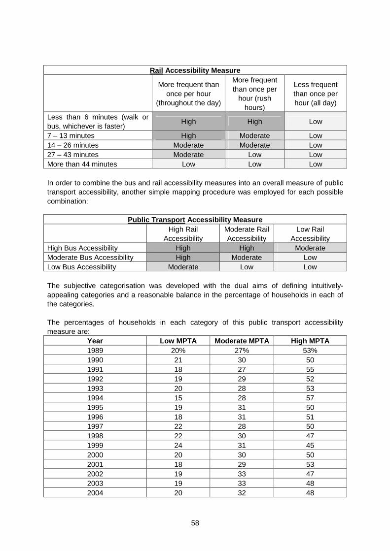
58
Rail Accessibility Measure
More frequent than once per hour
(throughout the day)
More frequent than once per
hour (rush hours)
Less frequent than once per hour (all day)
Less than 6 minutes (walk or bus, whichever is faster)
High High Low
7 – 13 minutes High Moderate Low 14 – 26 minutes Moderate Moderate Low 27 – 43 minutes Moderate Low Low More than 44 minutes Low Low Low In order to combine the bus and rail accessibility measures into an overall measure of public transport accessibility, another simple mapping procedure was employed for each possible combination:
Public Transport Accessibility Measure High Rail
Accessibility Moderate Rail Accessibility
Low Rail Accessibility
High Bus Accessibility High High Moderate Moderate Bus Accessibility High Moderate Low Low Bus Accessibility Moderate Low Low The subjective categorisation was developed with the dual aims of defining intuitively-appealing categories and a reasonable balance in the percentage of households in each of the categories. The percentages of households in each category of this public transport accessibility measure are:
Year Low MPTA Moderate MPTA High MPTA 1989 20% 27% 53% 1990 21 30 50 1991 18 27 55 1992 19 29 52 1993 20 28 53 1994 15 28 57 1995 19 31 50 1996 18 31 51 1997 22 28 50 1998 22 30 47 1999 24 31 45 2000 20 30 50 2001 18 29 53 2002 19 33 47 2003 19 33 48 2004 20 32 48