the changing structure of africa’s economies changing structure... · xinshen diao kenneth...
TRANSCRIPT
IFPRI Discussion Paper 01598
January 2017
The Changing Structure of Africa’s Economies
Xinshen Diao
Kenneth Harttgen
Margaret McMillan
Development Strategy and Governance Division

INTERNATIONAL FOOD POLICY RESEARCH INSTITUTE
The International Food Policy Research Institute (IFPRI), established in 1975, provides evidence-based policy solutions to sustainably end hunger and malnutrition and reduce poverty. The institute conducts research, communicates results, optimizes partnerships, and builds capacity to ensure sustainable food production, promote healthy food systems, improve markets and trade, transform agriculture, build resilience, and strengthen institutions and governance. Gender is considered in all of the institute’s work. IFPRI collaborates with partners around the world, including development implementers, public institutions, the private sector, and farmers’ organizations, to ensure that local, national, regional, and global food policies are based on evidence.
AUTHORS Xinshen Diao ([email protected]) is a senior research fellow in the Development Strategy and Governance Division of International Food Policy Research Institute (IFPRI), Washington, DC. Kenneth Harttgen is a senior researcher in Development Economics at ETH Zurich. Margaret McMillan is a senior research fellow in the Development Strategy and Governance Division of IFPRI, Washington, DC and a professor of Economics at Tufts University, Medford MA, US.
Notices 1. IFPRI Discussion Papers contain preliminary material and research results and are circulated in order to stimulate discussion and critical comment. They have not been subject to a formal external review via IFPRI’s Publications Review Committee. Any opinions stated herein are those of the author(s) and are not necessarily representative of or endorsed by the International Food Policy Research Institute. 2. The boundaries and names shown and the designations used on the map(s) herein do not imply official endorsement or acceptance by the International Food Policy Research Institute (IFPRI) or its partners and contributors.
3. This publication is available under the Creative Commons Attribution 4.0 International License (CC BY 4.0), https://creativecommons.org/licenses/by/4.0/.
Copyright 2017 International Food Policy Research Institute. All rights reserved. Sections of this material may be reproduced for personal and not-for-profit use without the express written permission of but with acknowledgment to IFPRI. To reproduce the material contained herein for profit or commercial use requires express written permission. To obtain permission, contact [email protected].

iii
Contents
Abstract v
Acknowledgments vi
1. Introduction 1
2. Groningen Growth and Development Center Data 5
3. Fitting Africa into the Recent Literature on Structural Change 8
4. Patterns of Structural Change across Regions and Countries 18
5. The Demographic and Health Survey Data 23
6. Conclusion 29
Appendix: Supplementary Tables 30
References 31

iv
Tables
2.1 Summary statistics 6
2.2 Sector coverage 7
2.3 Comparing this paper’s Africa sample to African countries not in sample 8
3.1 Regression results for Figure 3.1: GDP and employment shares, Africa only 12
3.2 Regression results for Figure 3.2: GDP and employment shares, full sample 15
4.1 Decomposition of labor productivity growth, 1990–2010 (using GGDC data) 20
5.1 Percentage of workers (age 25+) in agriculture, DHS Africa 25
A.1 DHS countries and years in Africa south of the Sahara in sample 30
A.2 Questions on occupation in the DHS datasets by survey phases 30
Figures
3.1 Employment shares by main economic sector, Africa 1960–2010 11
3.2 Employment shares in Africa compared with non-Africa sample, 1960–2010 14
3.3 Labor productivity gaps in Africa, 2010 16
4.1 Relative labor productivity (2010), employment shares (2000), and change in employment shares (2000–2010) 21
5.1 Comparison of changes in agriculture employment shares: GGDC versus DHS 24
5.2 Average change in the probability of working in selected occupation types 27
5.3 Agricultural employment share (%) by level of education for population age 25–59, 1998–2005 and 2006–2014 28
v
ABSTRACT
In recent years, some counties in Africa south of the Sahara (SSA) have experienced growth in their economies and improvements in living standards. Although there is some debate, it is clear that the share of the population living below the poverty line fell significantly over the past decade and a half; there has been a general decline in infant mortality rates and increased access to education; in some of the fastest-growing economies, average growth rates have been positive for the first time in decades; and since the early 1990s, real consumption in SSA has grown between 3.4 and 3.7 percent per year. The reasons behind this so-called “African growth miracle” are not well understood, and to our knowledge, this paper is the first to connect these improvements in living standards to important occupational changes.
Using data from the Groningen Growth and Development Center’s Africa Sector Database and the Demographic and Health Surveys, we show that much of SSA’s recent growth and poverty reduction has been associated with a substantive decline in the share of the labor force engaged in agriculture. This decline is most pronounced for rural females over the age of 25 who have a primary education. This has been accompanied by a systematic increase in the productivity of the labor force, as it has moved from low productivity agriculture to higher productivity services and manufacturing. We also show that although the employment share in manufacturing is not expanding rapidly, in most of the low-income SSA countries, the employment share in manufacturing has not peaked and is still expanding, albeit from very low levels. Although these patterns are encouraging, more work is needed to understand the implications of these shifts in employment shares for future growth and development in SSA.
Keywords: structural change; labor productivity; Africa; Africa south of the Sahara; SSA

vi
ACKNOWLEDGMENTS
We thank Matthew Johnson and Inigo Verduzco-Gallo for excellent research assistance and Doug Gollin, David Lagakos, and Michael Waugh for providing data. The authors would also like to thank Alan Gelb, Adam Storeygard, Doug Gollin, Remi Jedwab, William Masters, Jan Rielander, Dani Rodrik, Abebe Shimeles, Erik Thorbecke, and Enrico Spolaore for helpful comments.
This work was undertaken as part of the CGIAR Research Program on Policies, Institutions, and Markets (PIM), which is led by the International Food Policy Research Institute (IFPRI) and funded by CGIAR Fund Donors. The authors gratefully acknowledge financial support from the African Development Bank (ADB); PIM; and the Economic and Social Research Council (ESRC) and the UK government’s Department for International Development (DfID) as part of the DfID/ESRC Growth Program, grant agreement ES/J00960/1, PI Margaret McMillan. The opinions expressed here belong to the authors, and do not necessarily reflect those of PIM, IFPRI, CGIAR, ADB, ESRC, or DfID.

1
1. INTRODUCTION
It cannot be denied that Africa1 has come a long way over the past 15 years. As recently as 2000, the front cover of The Economist proclaimed Africa “the hopeless continent” (The Economist 2000). Yet recent evidence suggests that the continent is anything but hopeless. Although there is some debate as to the magnitude of the decline, it is clear that the share of the population living below the poverty line fell significantly over the past decade and a half (Sala-i-Martin and Pinkovskiy 2010; McKay 2013; Page and Shimeles 2014). In addition to the decline in monetary poverty, several researchers have documented a general decline in infant mortality rates and increased access to education (McKay 2013; Page and Shimeles 2014). Average growth rates have been positive for the first time in decades and, in some of the fastest-growing economies, have exceeded 6 percent per annum; moreover, these growth rates are likely to be underestimated. Young (2012) found that since the early 1990s, real consumption in Africa has grown between 3.4 and 3.7 percent per year, or three to four times the 0.9–1.1 percent growth reported using national accounts data; he dubbed this an “African growth miracle.”2
The reasons behind this success are not well understood. The main contribution of this paper is to show that there has been a substantial decline in the share of the labor force engaged in agriculture across much of Africa south of the Sahara (SSA). Previous researchers have shown that agriculture is by far the least productive sector in Africa (McMillan and Rodrik 2011; Gollin, Lagakos, and Waugh 2014) and that income and consumption are lower in agriculture than in any other sector (Gollin, Lagakos, and Waugh 2014). Researchers have also noted that real consumption is growing in Africa (Young 2012) and that poverty is falling (McKay 2013; Page and Shimeles 2014). To our knowledge, this paper is the first to connect these improvements in living standards to important occupational changes.
Before proceeding further, a word about the data is in order, because much has been written about the poor quality of statistics in Africa3 and because the results presented in this paper depend heavily upon the quality of the data. To be as transparent as possible, this paper only uses publicly available data.4
Thus, the two main data sources for this paper are the Africa Sector Database,5 produced by the Groningen Growth and Development Center (GGDC), and the Demographic and Health Surveys (DHS) (ICF International 2016). The GGDC database, which covers 11 African countries, was last updated in October 2014. The GGDC database includes all the countries used in McMillan and Rodrik (2011) plus two additional countries, Botswana and Tanzania. A major advantage of the GGDC data is that they cover employment and value-added at the sector level going back to 1960. These data were obtained from national statistical offices as well as from libraries across Europe (GGDC 2013). The employment data are consistent over time and are comparable to the value added data in the national accounts calculations because they are constructed using census data. Using the census data has the added benefit of capturing activity in the informal sector. However, because census data are not collected on a regular basis, growth rates in employment by sector are obtained using labor forces surveys.
1 Africa in this paper refers only to countries in Africa south of the Sahara. 2 Harttgen, Klasen, and Vollmer (2013) found no evidence supporting the claim of an African growth miracle that extends
beyond what has been reported in gross domestic product per capita and consumption figures. They argue that trends in assets can provide biased proxies for trends in income or consumption growth.
3 For recent critiques of African data, see papers by Devarajan (2013) and Jerven and Johnston (2015). 4 A previous version of this paper used additional data provided by researchers at the International Monetary Fund. Because
these data are not publicly available and because we do not have access to the original datasets, we decided not to use these countries. Most, but not all, of these countries are included in the Demographic and Health Surveys.
5 This dataset can be accessed at http://www.rug.nl/research/ggdc/data/africa-sector-database and was constructed with the financial support of the ESRC and the DFID as part of the DFID/ESRC Growth program, grant agreement ES/J00960/1, PI Margaret McMillan.

2
Using the GGDC data to compute average labor productivity by sector raises two potential measurement issues. The first and the one that has gotten the most attention in the literature6 is that the quality of the data collected by national statistical agencies in Africa has been poor. We address this issue at least in part by cross checking our estimates of changes in employment shares using the GGDC data with changes in employment shares computed using the DHS data. The DHS data are collected by enumerators working for a U.S. based consulting firm and are generally thought to be of very high quality. A comparison of changes in employment shares across datasets reveals remarkable consistency across the two datasets. Our confidence in the estimates of value added at the sectoral level is bolstered by the following facts. First, the African countries included in the GGDC database are the countries in Africa with the strongest national statistical offices and these countries have been collecting national accounts data for some time7. Second, researchers at the GGDC specialize in providing consistent and harmonized measures of sectoral value added and our view is that this expertise lends credibility to these numbers. Finally, using LSMS surveys, researchers have shown that sectoral measures of value added based on national accounts data are highly correlated with sectoral measures of consumption (Gollin, Lagakos, and Waugh 2014).
A second concern stems from the measurement of labor inputs. Ideally, instead of using the measured number of workers employed in a sector, we would use the number of hours worked in a sector. This would correct for biases associated with the seasonality of agriculture that might lead to an underestimation of agricultural labor productivity. This is a serious issue and for the purposes of this paper, we rely on work by Duarte and Restuccia (2010) who show that in a sample of 29 developed and developing countries the correlation between hours worked and employment shares is close to one and Gollin, Lagakos, and Waugh (2014) who show that correcting labor productivity measures for hours worked does not overturn the result that labor productivity in agriculture is significantly lower than labor productivity in the rest of the economy. Note that this does not mean that there are not off-farm activities in rural areas that bring in less income for example than farming. In fact, this is highly likely in very poor economies where a large share of economic activity is of a subsistence nature.8
The analysis begins by asking whether it is reasonable to compare structural change in Africa to structural change in other regions during the same period. Average incomes in Africa are significantly lower than in East Asia, Latin America, and all other regions. If countries at different stages of development tend to exhibit different patterns of structural change, the differences between Africa and other developing regions may be a result of their different stages of development. Motivated by this possibility, this paper explores how the level of employment shares across sectors in African countries compares to the level in other countries, controlling for levels of income. The findings show that African countries fit quite well into the pattern observed in other countries, with some minor exceptions. In other words, given current levels of income per capita in Africa, the share of the labor force in agriculture, services, and industry is roughly what would be expected.
Having confirmed that, in 1990, most African countries were characterized by high employment shares in agriculture, we turn to an investigation of changes in agricultural employment shares. For the eight low-income countries in the GGDC dataset, the share of the labor force engaged in agriculture from 2000 to 2010 declined by an average of 9.33 percentage points. Over this same period and for the same countries, the employment share in manufacturing expanded by about 1.46 percentage points, and the employment share in services expanded by 6.13 percentage points. Combining these data on employment shares with data on value-added, the findings show that, for 2000–2010, labor productivity in these eight low-income African countries grew at an annual average of 2.8 percent and that 1.57 percentage points of
6 See for example the special issue of the Review of Income and Wealth, Special Issue: Measuring Income, Wealth,
Inequality, and Poverty in Sub Saharan Africa: Challenges, Issues, and Findings October 2013. Volume 59, Issue Supplement S1, Pages S1-S200.
7 Zambia appears to be an exception. 8 Using LSMS-ISA data McCullough (2015) finds that correcting for hours worked reduces the gap between labor
productivity in agriculture and in other activities significantly but she provides no explanation for the large difference between her results and the results of Gollin, Lagakos, and Waugh (2014).
3
this labor productivity growth was attributable to structural change. These findings report the unweighted averages because the weighted average is dominated by Nigeria in the low-income sample and by South Africa in the high-income sample. By contrast, for 1990–1999, labor productivity growth was close to zero, and structural change was growth reducing. In the three high-income countries in the GGDC Africa Sector Database, labor productivity growth was similar to that in the eight low-income countries, but it was entirely accounted for by within-sector productivity growth.
Although these results are encouraging, they only capture the experience of 11 countries in Africa. Thus, an important goal of this paper is to expand the sample of countries to include more of the poorer countries in Africa. To this end, this paper uses the DHS, which are nationally representative surveys designed to collect detailed information on child mortality, health, and fertility, as well as on households’ durables and quality of dwellings. In addition, the DHS include information on gender, age, location, education, employment status, and occupation of women and their partners between the ages of 15 and 59. Importantly, the design and coding of variables (especially variables on the type of occupation, educational achievements, household assets, and dwelling characteristics) are generally comparable across countries and over time. Finally, the sample includes considerable regional variation—90 surveys are available for 31 African countries, and, for most countries, multiple surveys (up to six) were conducted between 1993 and 2012.
Using the DHS, this paper shows that the changes in agricultural employment shares in the sample of African countries for which there is overlap between the GGDC and the DHS are similar. It then shows that, between 1998 and 2014, the share of the labor force employed in agriculture for the countries in the DHS sample decreased by about 10 percentage points. In addition, there is a significant degree of within- and cross-country heterogeneity in the changes in agricultural employment shares. Within countries, the decline in the employment share in agriculture is most pronounced for poor, uneducated females in rural areas. Across countries, the most rapid decline occurred for rural females in Cameroon and Mozambique, while in Mali, Zimbabwe, and Madagascar, there was an increase in the share of women who reported agriculture as their primary occupation.
This work is related to work by Gollin, Lagakos, and Waugh (2014). Using contemporary data for 151 developing countries, including several from Africa, they confirmed the persistence of a sizable agricultural productivity gap, as well as a gap in income and consumption. Based on these results, they concluded that there should be large economic gains associated with a reduction in the share of employment in agriculture. Our paper differs in that it takes as given the agricultural productivity gap and shows a significant decline in the share of employment in agriculture across much of the continent.
This paper is also related to work by Duarte and Restuccia (2010) and Herrendorf, Rogerson, and Valentinyi (2014), who found that structural change is a fundamental feature of economic growth. This structural transformation continues until farm and nonfarm productivity converge, which typically occurs only at high levels of per capita income. In the United States, for example, the exodus of labor from agriculture did not end until the mid-1990s. At lower levels of income, countries that pull themselves out of poverty also exhibit positive structural change.9 The main difference between our work and these two papers is that they do not include Africa.
Most closely related to the present paper are recent studies by McMillan and Rodrik (2011) and McMillan, Rodrik, and Verduzco-Gallo (2014). Like Gollin, Lagakos, and Waugh (2014), these two studies by McMillan and others document a significant gap in productivity between agriculture and other sectors of the economy. McMillan, Rodrik, and Verduzco-Gallo (2014) showed that structural change in Africa contributed negatively to growth during the 1990s and then positively to growth during 2000–2005. However, these studies have two important limitations. First, the sample of African countries used is not representative of the poorest African countries; rather, the countries are, on average, richer, and the
9 The converse is not true, however. All countries with structural change do not also achieve poverty reduction. Structural
change into protected or subsidized sectors comes at the expense of other activities and is therefore not associated with sustained growth out of poverty for the population as a whole. Structural change is effective at reducing poverty only when people move from lower to higher productivity activities.

4
populations are more educated and healthier when compared with the rest of Africa. Second, the data in these studies do not paint an accurate picture of the most recent economic activity in Africa, because the samples used stop in 2005.
In summary, Section 2 of this paper describes the GGDC data. Section 3 documents a number of stylized facts to situate Africa within the recent literature on structural change. Section 4 outlines the methodology and the data used for measuring structural change. It also describes recent patterns of labor productivity growth across regions and countries. Section 5 describes the DHS. It then uses these data to explore the robustness of the results presented in Section 4. Section 6 concludes.

5
2. GRONINGEN GROWTH AND DEVELOPMENT CENTER DATA
To analyze the patterns of structural change and labor productivity growth in Africa relative to the rest of the world, this paper uses the 10-sector database produced by researchers at the Groningen Growth and Development Center. The data were last updated in January 2015 (Timmer, de Vries, and de Vries 2015), which is the version used here. Note that the Africa data in the paper by McMillan and Rodrik (2011) was collected by McMillan and helped generate interest in producing a longer time series of harmonized data for Africa. These data consist of sectoral and aggregate employment and real value-added statistics for 39 countries, covering the period up to 2010 and, for some countries, to 2011. Of the countries included, 30 are developing countries, and 9 are high-income countries. The countries and their geographical distribution are shown in Table 2.1, along with some summary statistics. As Table 2.1 shows, labor productivity gaps between different sectors are typically large in developing countries; this is particularly true for poor countries with mining enclaves, where few people tend to be employed at very high labor productivity.
The countries in our sample range from Ethiopia, with an average labor productivity over 2000–2010 of $1,400 (at 2005 purchasing power parity [PPP] dollars), to the United States, where average labor productivity over this same period is almost 60 times as large ($83,235). The data include 11 African countries, 9 Latin American countries, 10 Asian countries, and 9 high-income countries. China shows the fastest overall productivity growth rate (10.38 percent per annum from 2000 to 2010). At the other extreme, Italy, Singapore, Mexico, and Venezuela experienced negative labor productivity growth rates over this same period.
The sectoral breakdown used in the rest of this paper is shown in Table 2.2. Apart from mining and utilities, which are highly capital intensive and create relatively few jobs, the sectors with the highest average labor productivity for 2000–2010 are transport services, business services, and manufacturing; the sector with the lowest average labor productivity is agriculture. The developed countries tend to have the highest average labor productivity across all 10 sectors, while countries in Africa have the lowest productivity levels across all 10 sectors, with the exception of mining.
An important question regarding data of this sort is how well they account for the informal sector. The data for value-added come from national accounts, and as mentioned by Timmer and de Vries (2007, 2009), the coverage of such data varies from country to country. While all countries make an effort to track the informal sector, obviously the quality of the data can vary greatly. On employment, Timmer and de Vries (2007, 2009) relied on household surveys (namely, population censuses) for total employment levels and their sectoral distribution; they used labor force surveys for the growth in employment between census years. Census data and other household surveys tend to have more complete coverage of informal employment. In short, a rough characterization of the data would be that the employment numbers in the GGDC dataset broadly coincide with actual employment levels, regardless of formality status, while the extent to which value-added data include or exclude the informal sector heavily depends on the quality of national sources. For a detailed explanation of the protocols followed to compile the GGDC 10-Sector database, refer to Timmer, de Vries, and de Vries (2015) and “Sources and Methods” at the database’s web page: http://www.ggdc.net/databases/10_sector.htm.
We would, of course, like to have data for more African countries. In the absence of additional data for Africa, however, Table 2.3 reports the characteristics of the African countries in the GGDC sample and compares them to the characteristics of all countries in Africa. All of the data used for the comparisons in Table 2.3 come from the World Bank’s World Development Indicators. The GGDC sample includes 11 out of 48 countries from SSA. The statistics in column (2) of Table 2.3 indicate that the African countries in the GGDC sample have significantly higher GDP per capita, lower infant mortality rates, higher years of primary and secondary schooling, and bigger populations and are generally less reliant on agricultural raw material exports and resource rents than countries SSA taken as a group. A discussion of the DHS sample appears in Section 5 of this paper, which expands on the Africa sample to include more of its poor countries.

6
Table 2.1 Summary statistics
Sector with highest labor
productivity Sector with lowest labor productivity
Country Code
Economywide labor
productivity
Coefficient of variation of log
of sectoral productivity Sector
Labor productivity Sector
Labor productivity
Annual growth rate of
economywide productivity (%)
High income United States USA 83.2 0.065 Utilities 367.0 Personal services 52.3 1.68 Netherlands NLD 53.1 0.108 Mining 1745.8 Personal services 28.5 1.41 United Kingdom GBR 52.9 0.086 Mining 603.3 Agriculture 26.5 1.59 Japan JPN 52.2 0.061 Utilities 197.9 Agriculture 16.1 1.17 France FRA 49.2 0.047 Utilities 157.4 Business services 20.7 1.01 Sweden SWE 47.2 0.060 Utilities 223.0 Business services 31.6 3.44 Italy ITA 45.2 0.094 Utilities 220.0 Business services 5.2 –0.79 Denmark DNK 44.8 0.118 Mining 1787.5 Business services 17.9 0.28 Spain ESP 41.8 0.063 Utilities 222.4 Business services 16.7 0.30 Asia Singapore SGP 81.3 0.090 Utilities 274.9 Agriculture 13.4 –0.35 Hong Kong HKG 64.3 0.084 Utilities 465.6 Agriculture 20.2 3.57 Taiwan TWN 52.0 0.092 Mining 473.6 Construction 17.0 1.29 South Korea KOR 37.7 0.085 Utilities 304.0 Agriculture 18.0 2.38 Malaysia MYS 29.2 0.125 Mining 1063.5 Construction 10.7 2.75 Thailand THA 11.8 0.155 Mining 305.5 Agriculture 2.7 2.77 Philippines PHL 7.8 0.115 Utilities 79.7 Personal services 2.5 2.51 China CHN 7.4 0.127 Utilities 48.1 Personal services 1.4 10.38 Indonesia IDN 7.0 0.118 Mining 102.6 Agriculture 2.3 2.66 India IND 5.1 0.107 Utilities 40.7 Agriculture 1.7 6.38 Latin America Brazil BRA 78.2 0.100 Utilities 774.6 Personal services 25.0 0.88 Chile CHL 28.5 0.094 Mining 281.5 Agriculture 13.1 1.85 Venezuela VEN 25.9 0.114 Mining 421.3 Agriculture 10.5 –0.34 Mexico MEX 25.1 0.119 Mining 422.2 Agriculture 6.2 –0.51 Argentina ARG 23.5 0.100 Mining 326.3 Personal services 9.3 1.75 Costa Rica CRI 20.5 0.029 Transport services 31.2 Agriculture 12.5 1.77 Colombia COL 14.1 0.111 Utilities 232.8 Agriculture 6.1 1.27 Peru PER 13.7 0.107 Mining 110.7 Agriculture 3.8 3.73 Bolivia BOL 7.5 0.126 Utilities 71.8 Construction 2.8 0.77

7
Table 2.1 Continued
Sector with highest labor
productivity Sector with lowest labor productivity
Country Code
Economywide labor
productivity
Coefficient of variation of log
of sectoral productivity Sector
Labor productivity Sector
Labor productivity
Annual growth rate of
economywide productivity (%)
Africa Botswana BWA 29.9 0.126 Mining 418.8 Agriculture 1.9 2.68 South Africa ZAF 23.9 0.091 Utilities 96.8 Agriculture 4.3 2.57 Mauritius MUS 22.1 0.061 Utilities 83.0 Personal services 12.3 2.87 Nigeria NGA 5.0 0.243 Mining 1549.5 Personal services 0.8 3.81 Ghana GHA 4.6 0.091 Utilities 23.6 Trade services 2.6 2.59 Senegal SEN 4.0 0.161 Utilities 129.8 Agriculture 1.3 1.24 Kenya KEN 3.1 0.114 Utilities 32.7 Agriculture 1.6 1.09 Zambia ZMB 2.7 0.173 Utilities 36.3 Personal services 0.3 3.00 Tanzania TZA 2.5 0.163 Business services 83.0 Personal services 0.5 4.37 Malawi MWI 2.2 0.124 Mining 46.4 Agriculture 1.0 2.23 Ethiopia ETH 1.4 0.148 Mining 31.2 Agriculture 0.8 5.07
Source: GGDC dataset (Timmer, de Vries, and de Vries 2015); authors’ calculations. Note: GGDC = Groningen Growth and Development Center. All data used in this table come from GGDC. All productivity numbers are for average 2000–2010 and are in 2005 purchasing powering parity (PPP) $1,000.
Table 2.2 Sector coverage
Maximum sector labor productivity Minimum sector labor productivity
Sector Average sector labor
productivity Country Labor productivity Country Labor productivity Agriculture 14.9 United States 53.7 Ethiopia 0.66 Mining 311.2 Denmark 1,787.5 Ethiopia 2.27 Manufacturing 40.4 Brazil 121.9 Ethiopia 1.72 Utilities 155.5 Brazil 774.6 Nigeria 2.61 Construction 26.7 United States 69.5 Malawi 3.64 Trade services 25.7 Singapore 95.0 Ethiopia 2.59 Transport services 43.6 Brazil 138.9 Nigeria 2.54 Business services 42.8 United States 154.2 Nigeria 6.69 Government services 24.4 Brazil 126.0 Nigeria 1.32 Personal services 23.9 Hong Kong 114.5 Tanzania 0.33 Total economy 30.0 United States 83.2 Ethiopia 1.37
Source: GGDC dataset (Timmer, de Vries, and de Vries 2015); authors’ calculations. Note: GGDC = Groningen Growth and Development Center. All data used in this table come from GGDC. All numbers are for average 2000–2010 and are measured in 2005 PPP 1,000 dollars. The average sector labor productivity is a simple average over all countries covered by GGDC datasets.

8
Table 2.3 Comparing this paper’s Africa sample to African countries not in sample
Variable All SSA
(1) GGDC
(2) DHS (3)
DHS + GGDC (4)
GDP per capita, PPP (current international $) 4459.4 5428.9* 2668.8** 3853.0 (6577.8) (5255.4) (3277.4) (4625.2) Mortality rate, infant (per 1,000 live births) 60.38 46.88** 58.18 55.10 (22.09) (16.33) (13.71) (16.19) Years of schooling 5.257 6.880** 5.092 5.675 (2.100) (2.299) (1.942) (2.346) Years of primary schooling 3.711 4.791** 3.676 3.965* (1.369) (1.310) (1.385) (1.501) Years of secondary schooling 1.469 2.006* 1.335 1.624* (0.937) (1.308) (0.804) (1.058) Years of tertiary schooling 0.0759 0.0844 0.0805 0.0825 (0.0645) (0.0611) (0.0792) (0.0746) Agricultural raw material exports 8.561 4.017** 10.94 9.674 (% of merchandise exports) (13.59) (3.834) (14.88) (14.29) Natural resource rents (% of GDP) 14.43 9.684** 13.03 12.14 (14.81) (6.903) (9.572) (9.471) Population % of total reported 100 51.84 71.43 77.62 Number of countries 46 11 24 27
Source: World Development Indicators (World Bank 2016); GGDC dataset (Timmer, de Vries, and de Vries 2015); DHS datasets (ICF International 2016); authors’ calculations. Note: DHS = Demographic and Health Surveys; GGDC = Groningen Growth and Development Center; PPP = purchasing power parity; SSA = Africa South of the Sahara. All data in column (1) are from the 2015 version of World Development Indicators. Means are reported with the standard deviation for the relevant sample in parentheses. ** and * indicate a difference in means between the sample and the sample for all of SSA at the 99% and 95% levels, respectively. Years of schooling are for age 15+. There are 48 countries in SSA, but no data for GDP per capita are available for Angola and Somalia in 2010. Thus, the means tests are restricted to the remaining 46 countries in SSA. GGDC sample includes Botswana, Ethiopia, Ghana, Kenya, Malawi, Mauritius, Nigeria, Senegal, South Africa, Tanzania, and Zambia. DHS sample includes Benin, Burkina Faso, Cameroon, Coteô d’Ivoire, Ethiopia, Gabon, Ghana, Guinea, Kenya, Liberia, Madagascar, Malawi, Mali, Mozambique, Namibia, Niger, Nigeria, Rwanda, Senegal, Tanzania, Togo, Uganda, Zambia, and Zimbabwe. Countries excluded from both GGDC and DHS are Angola, Burundi, Cape Verde, Central African Republic, Chad, Comoros, Democratic Republic of Congo, Congo, Equatorial Guinea, Eritrea, Gambia, Guinea Bissau, Lesotho, Mauritania, São Tomé and Principe, Seychelles, Sierra Leone, Somalia, South Sudan, Sudan, and Swaziland.

9
3. FITTING AFRICA INTO THE RECENT LITERATURE ON STRUCTURAL CHANGE
Among the earliest and most central insights of the literature on economic development is the fact that development entails structural change (Lewis 1955). In most poor countries, large numbers of people live in rural areas and devote most of their time to the production of food for home consumption and local markets. In richer countries, by contrast, relatively few people work in agriculture. This is a robust and long recognized feature of the cross-sectional data from different countries (Chenery and Taylor 1968). It is also a feature of the historical experience of development in almost all rich countries. For example, Duarte and Restuccia (2010) found that, over their sample period, structural change played a substantial role in the productivity catch-up of developing countries in their sample, relative to the United States. As predicted, the gains are particularly dramatic in the sectors with international trade. They found in their sample that productivity differences in agriculture and industry between the rich and developing countries have narrowed substantially, while productivity in services has remained significantly lower in developing countries relative to rich countries. Thus, developing countries with the most rapid growth rates have typically reallocated the most labor into high-productivity manufacturing, allowing aggregate productivity to catch up.10 Duarte and Restuccia (2010) concluded that rising productivity in industry, combined with a shift in employment shares from agriculture into industry, explains 50 percent of the catch-up in aggregate productivities among developing countries over their sample period of 1950–2006.
Some stylized facts of the pattern of structural change over the course of development have emerged from the literature on structural change. As countries grow, the share of economic activity in agriculture monotonically decreases, and the share in services monotonically increases. The share of activity in manufacturing appears to follow an inverted U-shape; it increases during low stages of development as capital is accumulated, and then decreases for high stages of development where higher incomes drive demand for services and labor costs make manufacturing difficult. Herrendorf, Rogerson, and Valentinyi (2014) documented this pattern for a panel of mostly developed countries over the past two centuries, while Duarte and Restuccia (2010) documented a similar process of structural change among 29 countries for 1956–2004.
African countries have been largely absent from empirical analyses in this literature. Thus, there is little evidence on how structural change has played out in African countries since achieving independence half a century ago. A major reason for this has been absence of data, as economic data to undertake such analysis has been largely unreliable or nonexistent for most African countries. A deeper reason is poverty itself. Until recently, few African countries had enjoyed the sustained economic growth needed to trace out the patterns of structural transformation achieved in earlier decades elsewhere. The start of the 21st century saw the dawn of a new era in which African economies grew as fast as or faster than the rest of the world’s economies.
Examining the recent process of structural change in Africa and how it has interacted with economic growth could yield significant benefits. For one, the theory and stylized facts of structural change offer several predictions about the allocation of the factors of production for countries at different stages of development. In addition, because SSA is now by far the poorest region of the world, including African countries could enrich the current understanding of how structural change has recently played out around the world. Perhaps more importantly, and most pertinent to this paper, is that such an analysis could offer insight regarding the continent’s recent economic performance—both its prolonged period of weak economic growth since the 1970s and its period of stronger growth over the past decade.
10 Conversely, where the manufacturing sector stagnates and structural transformation primarily involves the reallocation of
workers into lower productivity sectors, aggregate productivity growth is slower, especially among developing countries, whose productivity in services remains low relative both to agriculture in other countries and to other sectors within the country.

10
This paper uses the GGDC data to study the evolution of the distribution of employment between sectors across levels of income experienced in Africa and how it compares with the patterns seen historically in other regions over the course of development. Using as a baseline the patterns seen in other regions historically helps gauge the extent to which structural change in Africa compares with what would be “expected” based on its income levels. Following Duarte and Restuccia (2010) and Herrendorf, Rogerson, and Valentinyi (2014), we start by aggregating the 10 sectors in the GGDC Africa Sector Database (GGDC-ASD) into three main categories: agriculture, industry, and services. This is accomplished as follows:
1. Manufacturing, mining, construction, and public utilities are combined into “industry.” 2. Wholesale and retail trade; transport and communication; finance and business services;
and community, social, personal, and government services are combined into “services.” 3. “Agriculture” is left as-is.11
In addition to these three sectors, we add a fourth category—manufacturing. For purposes of comparability with the results in Duarte and Restuccia (2010) and Herrendorf, Rogerson, and Valentinyi (2014), we also measure “development” using the log of GDP per capita in international dollars from Maddison (2010).
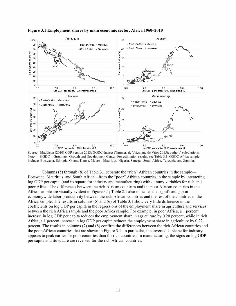
Figure 3.1 plots employment shares in agriculture, services, industry, and manufacturing on the y-axis and log GDP per capita on the x-axis for the 11 African countries in the GGDC sample for 1960–2010. The share of employment in agriculture decreases with income, while the share of employment in services and industry both increase in income. These patterns are consistent with those documented by Duarte and Restuccia (2010) and Herrendorf, Rogerson, and Valentinyi (2014) for the rest of the world. Figure 3.1 also indicates the inverted-U shape for industry that was documented in Duarte and Restuccia (2010) and Herrendorf, Rogerson, and Valentinyi (2014) for Africa, though this shape seems to be driven mostly by Botswana (green triangles), Mauritius (purple dots), and South Africa (blue triangles). Mauritius is the only country in the Africa sample with a log GDP per capita at or exceeding 9.0, the threshold identified by Herrendorf, Rogerson, and Valentinyi (2014) at which deindustrialization has occurred in the rest of the world, excluding Africa but including many other developing countries. The pattern for manufacturing appears to be similar to the pattern for industry, though, as is discussed next, regression analysis reveals a difference in the two patterns.
11 This aggregation is consistent with that used in Duarte and Restuccia (2010), who also used the pre-Africa GGDC
database (along with other sources) to construct their dataset.
11
Figure 3.1 Employment shares by main economic sector, Africa 1960–2010
Source: Maddison (2010) GDP version 2013; GGDC dataset (Timmer, de Vries, and de Vries 2015); authors’ calculations. Note: GGDC = Groningen Growth and Development Center. For estimation results, see Table 3.1. GGDC Africa sample includes Botswana, Ethiopia, Ghana, Kenya, Malawi, Mauritius, Nigeria, Senegal, South Africa, Tanzania, and Zambia.
Columns (5) through (8) of Table 3.1 separate the “rich” African countries in the sample—Botswana, Mauritius, and South Africa—from the “poor” African countries in the sample by interacting log GDP per capita (and its square for industry and manufacturing) with dummy variables for rich and poor Africa. The differences between the rich African countries and the poor African countries in the Africa sample are visually evident in Figure 3.1; Table 2.1 also indicates the significant gap in economywide labor productivity between the rich African countries and the rest of the countries in the Africa sample. The results in columns (5) and (6) of Table 3.1 show very little difference in the coefficients on log GDP per capita in the regressions of the employment share in agriculture and services between the rich Africa sample and the poor Africa sample. For example, in poor Africa, a 1 percent increase in log GDP per capita reduces the employment share in agriculture by 0.20 percent, while in rich Africa, a 1 percent increase in log GDP per capita reduces the employment share in agriculture by 0.22 percent. The results in columns (7) and (8) confirm the differences between the rich African countries and the poor African countries that are shown in Figure 3.1. In particular, the inverted U-shape for industry appears to peak earlier for poor countries than for rich countries. In manufacturing, the signs on log GDP per capita and its square are reversed for the rich African countries.

12
Table 3.1 Regression results for Figure 3.1: GDP and employment shares, Africa only (1) (2) (3) (4) (5) (6) (7) (8) Africa all Africa rich vs. Africa poor Variable Agriculture Services Industry Manufacturing Agriculture Services Industry Manufacturing lngdp –0.218*** 0.153*** 0.198*** –0.102** (0.017) (0.014) (0.054) (0.038) lngdp 2 –0.009** 0.009*** (0.003) (0.002) Lngdp x PoorAfrica –0.201*** 0.133*** 0.631* 0.375** (0.038) (0.027) (0.329) (0.155) lngdp2 x PoorAfrica –0.041 –0.026** (0.024) (0.012) Lngdp x RichAfrica –0.222*** 0.158*** 0.210*** –0.120* (0.017) (0.014) (0.049) (0.056) lngdp2 x RichAfrica –0.009*** 0.010** (0.003) (0.003) Observations 512 512 512 512 512 512 512 512 R-squared 0.517 0.388 0.359 0.211 0.517 0.390 0.368 0.229
Source: Maddison (2010) GDP version (2013); GGDC dataset (Timmer, de Vries, and de Vries 2015); authors’ calculations. Note: GGDC = Groningen Growth and Development Center. Robust standard errors are in parentheses. *** p < 0.01, ** p < 0.05, * p < 0.1. Industry includes manufacturing, mining, construction, and public utilities.

13
We also investigate the phenomenon of ‘premature de-industrialization’ in Africa, as described by Rodrik (2016), who found that the share of employment in manufacturing in developing countries is peaking at lower levels of GDP per capita than it did in today’s industrialized countries. Among the 11 African countries in our sample, 8 of them have incomes well below the level of income at which the manufacturing employment share begins to decline as identified by Herrendorf, Rogerson, and Valentinyi (2014).12 Also, in five countries—Ethiopia, Kenya, Malawi, Senegal, and Tanzania—the employment share in manufacturing is still growing. Of the high income countries in the Africa sample—Mauritius, Botswana and South Africa—Mauritius appears to have followed a path much like the high income East Asian countries in the sample in that manufacturing’s share of employment and value added reached very high levels and has only recently been replaced by similarly or more productive services. In short, it seems difficult to make the case that Africa is de-industrializing.
Thus, with the possible exceptions of Botswana and South Africa, recent patterns of employment shares in Africa appear to fit the stylized facts of other regions’ historical development.13 Though Figure 3.1 and the results in Table 3.1 suggest that the patterns of employment allocation and income for agriculture, services, industry, and manufacturing are qualitatively similar to the stylized facts based on the experience of other regions, it may be that they differ quantitatively. For instance, although Figure 3.1 confirms that the agricultural employment share and services employment share in Africa decrease and increase, respectively, with the level of income, it could be that the level of agricultural or services employment in Africa is higher than in other regions, perhaps because of resource endowments or productivity levels. Directly comparing the relationship between income levels and the distribution of employment in Africa with other regions over the past several decades indicates whether the process of structural change in Africa is playing out differently than we would expect given current levels of income.
Figure 3.2 displays employment shares in agriculture, industry, services, and manufacturing on the y-axis and log GDP per capita on the x-axis simultaneously for our sample of African countries and for the rest of the countries in the GGDC sample for the period 1960–2010. As indicated by the legend, red dots in the figure denote African countries, and blue dots denote all other countries in the sample. Two features of the data are immediately evident from the figure. First, in recent years, per capita incomes in most African countries in our sample are among the lowest seen in most of the world since 1960. Second, the distributions of employment among the African countries appear to fit quite well with those seen over the past six decades in other regions.
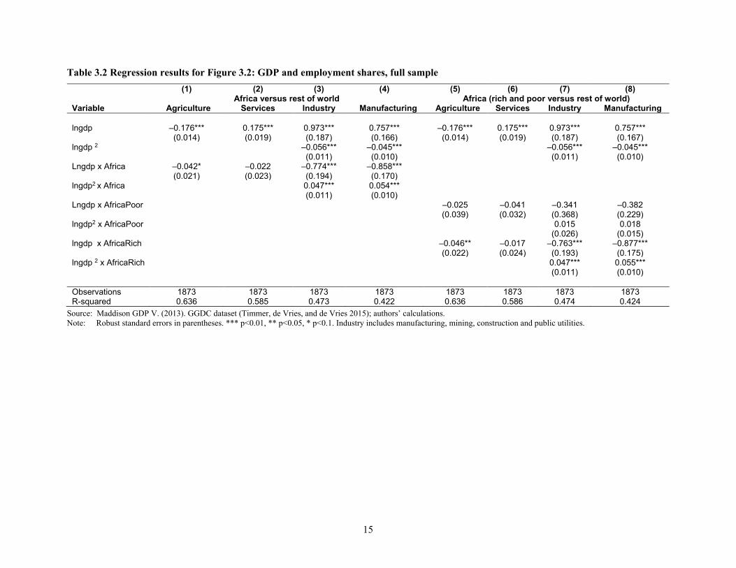
To obtain a more precise measure of the differences between our Africa sample and the rest of the world, we regress employment shares on the log of GDP per capita and its square for industry and manufacturing, an interaction between the log of GDP per capita and an Africa dummy and an interaction between the log GDP per capita squared and an Africa dummy for industry and manufacturing. The results of these regressions are reported in columns (1) through (4) of Table 3.2. In the case of agriculture, the coefficient of –0.04 on the interaction term indicates that the employment share in agriculture is falling faster as income increases in Africa as compared with the rest of the world. In other words, the line is steeper, but the magnitude of the difference is small. In the case of services, there is no statistically or economically meaningful difference between Africa and the rest of the world, as a 1 percent increase in GDP per capita is associated with a 0.18 percent increase in the employment share in services.
12 GDP per capita in the majority of African countries is also well below the lower threshold of around $6,000 (in 1990 US$)
identified by Rodrik (2016) as the turning point for employment deindustrialization. 13 Although Ghana had an employment share in manufacturing of around 14 percent in 1978, its current level of real GDP
per capita is quite a bit lower than the income level at which manufacturing employment would be expected to peak, regardless of whether Rodrik’s (2016) threshold or that identified by Herrendorf, Rogerson, and Valentinyi (2014) is used. Thus, in principle, the employment share in manufacturing should continue to grow.

14
Figure 3.2 Employment shares in Africa compared with non-Africa sample, 1960-2010
Sources: Maddison (2010) GDP version (2013); GGDC dataset (Timmer, de Vries, and de Vries 2015); authors’ calculations. Note: For estimation results, see Table 3.1. GGDC full sample includes 39 countries (see Table 2.1 for the list of the countries).
There does appear to be a significant difference between Africa and the rest of the world when it comes to industry and manufacturing. In particular, adding the coefficients on log GDP per capita and its square and the interaction of log GDP per capita and its square with the Africa dummy to the coefficients for the rest of the world—columns (3) and (4) of Table 3.2—we get the results in column (3) and (4) of Table 3.1. The implication is that at lower levels of income, the rest of the world has higher employment shares in industry than does Africa, and the inverted U-shape in industry for Africa peaks at a lower employment share in industry. However, once poor Africa is separated from rich Africa the difference persists only for rich Africa. In rich Africa—Botswana, Mauritius, and South Africa—the inverted U-shape in industry is to the left of the inverted U-shape for the rest of the world (column (7) of Table 3.2). Also, in rich Africa the employment share in manufacturing is first falling in income and then rising at an increasing rate; in other words, at the levels of GDP per capita observed in the data over the past 50 years, the pattern follows more or less an upward sloping line.14 By contrast, the size and significance of the interaction terms that include poor Africa (columns (5)–(8) of Table 3.2) indicate that the patterns observed in poor Africa appear to be similar to the patterns observed in the rest of the world.
14 Although the coefficients in the regression suggest a U-shaped relationship, when we plug actual log GDP per capita into
the fitted equation, the relationship is more linear than U-shaped.
15
Table 3.2 Regression results for Figure 3.2: GDP and employment shares, full sample (1) (2) (3) (4) (5) (6) (7) (8) Africa versus rest of world Africa (rich and poor versus rest of world) Variable Agriculture Services Industry Manufacturing Agriculture Services Industry Manufacturing lngdp –0.176*** 0.175*** 0.973*** 0.757*** –0.176*** 0.175*** 0.973*** 0.757*** (0.014) (0.019) (0.187) (0.166) (0.014) (0.019) (0.187) (0.167) lngdp 2 –0.056*** –0.045*** –0.056*** –0.045*** (0.011) (0.010) (0.011) (0.010) Lngdp x Africa –0.042* –0.022 –0.774*** –0.858*** (0.021) (0.023) (0.194) (0.170) lngdp2 x Africa 0.047*** 0.054*** (0.011) (0.010) Lngdp x AfricaPoor –0.025 –0.041 –0.341 –0.382 (0.039) (0.032) (0.368) (0.229) lngdp2 x AfricaPoor 0.015 0.018 (0.026) (0.015) lngdp x AfricaRich –0.046** –0.017 –0.763*** –0.877*** (0.022) (0.024) (0.193) (0.175) lngdp 2 x AfricaRich 0.047*** 0.055*** (0.011) (0.010) Observations 1873 1873 1873 1873 1873 1873 1873 1873 R-squared 0.636 0.585 0.473 0.422 0.636 0.586 0.474 0.424
Source: Maddison GDP V. (2013). GGDC dataset (Timmer, de Vries, and de Vries 2015); authors’ calculations. Note: Robust standard errors in parentheses. *** p<0.01, ** p<0.05, * p<0.1. Industry includes manufacturing, mining, construction and public utilities.

16
Figure 3.3 illustrates that, among the 11 African countries in the GGDC sample, the productivity gaps are indeed enormous across sectors. Each bin in the figure corresponds to one of the nine sectors in the dataset,15 with the width of the bin corresponding to the sector’s share of total employment, and the height corresponding to the sector’s labor productivity level as a fraction of average labor productivity. Agriculture, at 35 percent of average productivity, has the lowest productivity by far; manufacturing productivity is 1.7 times as high, and that in mining is 16.8 times as high. Furthermore, the figure makes evident that the majority of employment in the African sample is in the most unproductive sectors, with roughly two-thirds of the labor force in the two sectors with below-average productivity (agriculture and personal services). Based on this figure, it appears that the potential for structural change to contribute to labor productivity growth is still quite large.
Figure 3.3 Labor productivity gaps in Africa, 2010
Source: GGDC datasets (Timmer, de Vries, and de Vries 2015); authors’ calculations. Note: The sector-relative labor productivity and sector share of employment are calculated using the weighted average for the region; the country data is in 2005 purchasing power parity dollars. The total employment considers only the employment in the private sector.
The productivity gaps described here refer to differences in average labor productivity. When markets work well and structural constraints do not bind, productivities at the margin should be equalized. Under a Cobb-Douglas production function specification, the marginal productivity of labor is the average productivity multiplied by the labor share. Thus, if labor shares differ greatly across economic activities, then comparing average labor productivities can be misleading. The fact that average productivity in mining is so high, for example, simply indicates that the labor share in this capital-intensive sector is quite small. In the case of other sectors, however, there does not appear to be a clearly significant bias. Once the share of land is taken into account, for example, it is not obvious that the labor share in agriculture is significantly lower than in manufacturing (Mundlak, Butzer, and Larson 2012). Therefore, the fourfold difference in average labor productivity between manufacturing and agriculture does point to large gaps in marginal productivity.
15 Figure 3.3 excludes government services.

17
An additional concern with the data presented in Figure 3.3 is that the productivity gaps may be mismeasured. For example, differences in hours worked or human capital per worker could be driving the observed productivity gaps. However, in a recent paper, Gollin, Lagakos, and Waugh (2014) used microdata to take into account sectoral differences in hours worked and human capital, as well as alternative measures of sectoral income; after doing so, they still found large differences in productivity between agriculture and other sectors of the economy. The agricultural productivity gaps for SSA (presented by country in Appendix 3 of their paper) range from a low of 1.14 in Lesotho all the way to 8.43 for Gabon.
Thus, our preliminary analysis reveals some important stylized facts about countries in Africa. First, when the patterns of employment in Africa are compared to the patterns observed in other regions across levels of development, the pattern among our sample follows that seen in other regions for agriculture and services—that is, the agricultural employment share is decreasing in income, while the services employment share is increasing in income. Second, when the levels of employment shares are compared to the levels observed in other countries, the levels of employment shares in agriculture and services approximate the levels observed in other countries at similar levels of income. Third, all of this holds for industry and manufacturing in the eight low-income African countries. Fourth, in Botswana, Mauritius, and South Africa, the patterns in industry are similar but the levels differ, and in the case of manufacturing, the relationship between income and employment shares follows more of an upward sloping line than an inverted U-shape. Fifth, Africa is still, by far, one of the poorest regions of the world. And finally, structural change continues to remain a potent source of labor productivity growth in much of SSA.
There are a number of reasons to believe that structural change might have been delayed in much of Africa, and it is only relatively recently that much of Africa has begun to grow rapidly. Part of this had to do with the rise in commodity prices that began in the early 2000s, though Africa is also starting to reap the benefits of economic reforms and improved governance. For example, three of the fastest-growing countries in Africa—Ethiopia, Rwanda, and Tanzania—continue to grow rapidly despite the decline in commodity prices. In fact, according to the World Economic Outlook 2016 published by the IMF economic growth in Africa in 2015 only slowed down in a handful of oil exporters and is expected to rebound by 2021. To explore the nature of Africa’s recent growth, we investigate structural change in Africa, including the most recent period in history for which data are available: 2000–2010. This most recent period is important because it was during this time that Africa experienced the strongest growth in four decades. The key question is whether this growth was accompanied by labor productivity growth and structural change.

18
4. PATTERNS OF STRUCTURAL CHANGE ACROSS REGIONS AND COUNTRIES
This section begins by describing the methodology used to measure structural change. This is followed by a description of patterns of structural change across the following country groupings for 1990–1999 and for 2000–2010: Africa, Asia, and Latin America and the Organization for Economic Co-operation and Development (OECD) countries. The section concludes with a discussion of the heterogeneous experiences across the African continent.
Measuring Structural Change Labor productivity growth can be achieved in one of two ways. First, productivity can grow within existing economic activities through capital accumulation or technological change. Second, labor can move from low-productivity to high-productivity activities, increasing overall labor productivity in the economy. This can be expressed using the following decomposition:
, (1) where and refer to economywide and sectoral labor productivity levels, respectively, and is the share of employment in sector i. The Δ operator denotes the change in productivity or employment shares between t–k and t. The first term in the decomposition is the weighted sum of productivity growth within individual sectors, where the weights are the employment share of each sector at the beginning of the period. Following McMillan and Rodrik (2011), we call this the “within” component of productivity growth. The second term captures the productivity effect of labor reallocations across different sectors. It is essentially the inner product of productivity levels (at the end of the period), with the change in employment shares across sectors. When changes in employment shares are positively correlated with productivity levels, this term will be positive. Structural change will increase economywide productivity growth. Also following McMillan and Rodrik (2011), we call this second term the “structural change” term.
The second term in equation (1) could be further decomposed into a static and dynamic component of structural change, as in de Vries, Timmer and de Vries (2015). As in McMillan and Rodrik (2011), we choose not to do this because the dynamic structural change component of the structural change term is often negative but difficult to interpret. For example, when agricultural productivity growth is positive and the labor share in agriculture is falling, the term is negative, even though, on average, the movement of workers out of agriculture to other more productive sectors of the economy makes a positive contribution to structural change and economywide labor productivity growth. Moreover, structural change is, by its very nature, a dynamic phenomenon; thus, we find it counterintuitive to label a part of structural change static.
The decomposition we use clarifies how partial analyses of productivity performance within individual sectors (for example, manufacturing) can be misleading when there are large differences in labor productivities ( ) across economic activities. In particular, a high rate of productivity growth within a sector can have quite ambiguous implications for overall economic performance if the sector’s share of employment shrinks rather than expands. If the displaced labor ends up in activities with lower productivity, economywide growth will suffer and may even turn negative.
This decomposition can be used to study broad patterns of structural change within a country and across countries. An example of this type of analysis can be found in McMillan and Rodrik (2011). Individual components of the decomposition such as labor shares and within-sector changes in productivity can also be used at the country level to dig deeper into where structural change is or is not taking place and to gain a deeper understanding of the country-specific factors that drive structural change. For example, if we know that the expansion of manufacturing is a characteristic of structural
∑∑==
− ∆+∆=∆ni
tititini
ktit ppP ,,,, θθ
tP tip , ti,θ
tip ,

19
change in a particular country, we could use more detailed data on manufacturing to pinpoint which specific industries expanded, how many people were employed, and whether specific events or policies contributed to the expansion or contraction of a particular sector. For country-specific analyses of this type, refer to Structural Change, Fundamentals, and Growth: A Framework and Country Studies (forthcoming), edited by McMillan, Rodrik, and Sepulveda.
Structural Change in Africa in Comparison to Latin America and Asia The previous discussion indicated that the distribution of employment levels across sectors in our Africa sample are fairly similar to what would be “expected” based on current levels of income. We now investigate the changes in employment shares within African countries and the effect of those changes on economywide labor productivity. The analysis begins using the GGDC sample, breaking the period into two: 1990–1999 and 2000–2010. As previously noted, the early 1990s in Africa were still a period of adjustment. The period starting around 2000 marks the beginning of a rapid acceleration in growth rates across much of the continent.
Table 4.1 presents the central findings on patterns of structural change for 1990–1999 and 2000–2010 for four groups of countries: Latin America, SSA, Asia, and high-income countries. Results are presented by country for the Africa sample; weighted and unweighted averages for all four groups of the countries appear in the bottom four panels of Table 4.1. The most striking result is Africa’s turnaround. Between 1990 and 1999, structural change was a drag on economywide productivity in Africa; in the unweighted sample, overall growth in labor productivity was almost zero or negative and was largely a result of structural change in the wrong direction. From 2000 to 2010, however, structural change contributed between 0.93 and 1.25 percentage points to economywide labor productivity growth in Africa, depending on whether weighted or simple averages are used. If only the eight low-income African countries are considered, structural change contributed 1.57 percentage points to economywide labor productivity growth. Moreover, overall labor productivity growth in Africa was second only to Asia, where structural change continued to play a positive role. The biggest difference between low-income Africa and Asia for 2000–2010 is that Asia experienced significantly greater within-sector productivity growth.
Of course, the country-specific results for Africa presented in Table 4.1 indicate a great deal of heterogeneity across the countries in the sample. Between 2000 and 2010, economywide labor productivity growth was highest in the low-income countries of Ethiopia, Nigeria, and Tanzania. In all three of these countries, structural change was growth enhancing and was responsible for the majority of labor productivity growth. By contrast, in the three richest countries in the Africa sample—Botswana, South Africa, and Mauritius—labor productivity growth is almost exclusively accounted for by within-sector productivity growth. This finding is not surprising given the relatively low shares of agricultural employment in each of these three countries.
Like McMillan and Rodrik (2011), we find that structural change has made very little contribution (positive or negative) to the overall growth in labor productivity in the high-income countries in the sample. This result is as expected, because intersectoral productivity gaps tend to diminish during the course of development. Even though many of these advanced economies have experienced significant structural change during this period, with labor moving predominantly from manufacturing to service industries, this (on its own) has made little difference to productivity overall. What determines economywide performance in these economies is, by and large, how productivity fares in each sector.

20
Table 4.1 Decomposition of labor productivity growth, 1990–2010 (using GGDC data)
1990–1999 2000–2010
Variable Total Within sector
Structural change Total
Within sector
Structural change
Botswana 1.58 1.82 –0.25 2.17 2.81 –0.64 Ethiopia 0.17 –0.70 0.87 4.52 2.22 2.30 Ghana 3.20 2.53 0.67 2.68 2.07 0.61 Kenya –1.65 –4.38 2.74 0.68 0.81 –0.13 Malawi 1.53 –0.22 1.75 1.67 –1.53 3.20 Mauritius 3.47 2.42 1.05 3.41 2.91 0.50 Nigeria –0.23 10.68 –10.91 4.59 –0.91 5.49 Senegal 0.23 –0.74 0.97 1.11 –0.03 1.14 South Africa –0.57 –0.45 –0.12 2.90 2.92 –0.02 Tanzania 1.07 0.49 0.58 4.03 0.31 3.72 Zambia –3.05 –1.87 –1.19 3.24 2.71 0.54 SSA weighted average –0.40 0.68 –1.08 2.54 1.60 0.93 SSA weighted average excluding Nigeria 0.67 0.00 0.67 1.79 0.54 1.25 SSA simple average 0.52 0.25 0.27 2.82 1.69 1.13 Africa low-income, simple average 0.16 –1.13 0.28 2.81 1.24 1.57 SSA weighted average –0.40 0.79 –1.19 2.54 1.53 1.01 SSA weighted average excluding Nigeria 0.67 0.00 0.67 1.79 0.54 1.25 SSA simple average 0.52 0.87 –0.35 2.82 1.30 1.52 Africa low-income, simple average 0.16 0.72 –0.57 2.81 0.71 2.11 Africa high-income, simple average 1.49 1.26 0.23 2.83 2.88 –0.05 Asia weighted average 4.84 3.59 1.26 6.58 5.38 1.20 Asia simple average 3.98 3.20 0.79 3.37 2.97 0.39 LA weighted average 0.76 0.87 –0.11 1.61 1.18 0.44 LA simple average 0.91 0.77 0.15 0.08 0.01 0.07 High-income countries weighted average 1.46 1.32 0.13 1.23 1.26 –0.04 High-income countries simple average 1.54 1.64 –0.10 0.84 1.09 –0.25
Source: GGDC dataset (Timmer, de Vries, and de Vries 2015); authors’ calculation. Employment data for Tanzania are adjusted according to the 2012 census (National Bureau of Statistics 2014); data for Zambia are adjusted according to Resnick and Thurlow (forthcoming). Note: GGDC = Groningen Growth and Development Center; SSA = Africa south of the Sahara; LA = Latin America. The regional weighted averages are calculated using the regional data for sector value-added and sector labor employment. The sector value-added data of GGDC are converted into 2005 purchasing power parity dollars. Because of the size of Nigeria, its effect on the SSA weighted average results is large when Nigeria’s growth rate differs from other countries. Excluding Nigeria improves the departure of the simple average results from the weighted average. Africa low-income countries include Ethiopia, Ghana, Kenya, Malawi, Nigeria, Senegal, Tanzania, and Zambia, and high-income countries include Botswana, Mauritius, and South Africa.
We can gain further insight into the results by looking at the sectoral details by region for the developing countries in the sample. All numbers reported are simple averages across countries in each of the four groups. The four panels of Figure 4.1 show changes in employment shares for 2000–2010, relative labor productivity for 2010, and initial employment shares by sector for 2000. Sectors are generally ranked from highest to lowest employment share in 2000. Employment shares in 2000 are denoted by triangles, and the value of the shares is noted on the right y-axis. Clearly, countries in Africa started with the highest employment share in agriculture in 2000, at close to 60 percent for all of the African countries and 70 percent for the low-income African countries. The next highest initial employment shares in agriculture were in Asia, at more than 40 percent, and in Latin American, at less than 20 percent. By this measure, African countries clearly had (and still have) the most to gain from structural change.

21
Figure 4.1 Relative labor productivity (2010), employment shares (2000), and change in employment shares (2000–2010)
Source: GGDC datasets (Timmer, de Vries, and de Vries 2015); authors’ calculations.
Note: SSA = Africa south of the Sahara; Lprody = labor productivity. (1) For part (a), SSA all countries include Botswana, Ethiopia, Ghana, Kenya, Malawi, Mauritius, Nigeria, Senegal, South Africa, Tanzania, and Zambia. For part (b), SSA low-income countries excludes Botswana, Mauritius, and South Africa. For part (c), Asian developing countries includes China, India, Indonesia, Malaysia, Philippines, and Thailand. For part (d), Latin America includes Argentina, Bolivia, Brazil, Chile, Colombia, Costa Rica, Mexico, Peru, and Venezuela. (2) Relative Lprody means sector labor productivity divided by economywide labor productivity. (3) In 2010, the economywide labor productivity averaged $10,342 for SSA all countries, $6,006 for SSA low-income countries, $13,416 for Asian developing countries, and $28,088 for Latin American countries (all measured by 2005 purchasing power parity dollars). The simple average is used in the calculation in the figure.
In all four country groups, the share of employment in agriculture fell, with the decline greatest in low-income Africa, at 9.3 percent. The manufacturing employment share only increased in the low-income African countries, while it actually fell in the developing Asian countries and in Latin America. In all African countries, an examination of the purple diamonds indicates that average labor productivity in the sectors where employment is expanding was higher than average labor productivity in agriculture. Indeed, this is what drives the growth decomposition results presented in Table 4.1. However, the expansion of the employment share in trade services is largest. Although this sector’s average productivity is currently higher than that in agriculture, it is not clear that this gap will be maintained if more and more workers shift into this sector. Also, in all African countries, relative labor productivity in mining and utilities is extremely high. However, these sectors are highly capital intensive and unable to absorb large numbers of workers, which can be seen by examining the employment shares in 2000 by sector as denoted by the red diamonds.

22
So far, this analysis has revealed that structural change became growth enhancing in Africa during 2000–2010 and that, with the exception of manufacturing, the analysis for the other three regions remains largely similar to results presented in McMillan and Rodrik (2011). For the 11 African countries in the GGDC sample, annual labor productivity grew by an (unweighted) average of 2.82 percent, and structural change contributed an (unweighted) average of 1.13 percentage points to overall labor productivity growth. Put differently, from 2000 to 2010, structural change accounted for 40 percent of Africa’s annual labor productivity growth. This positive contribution of structural change to economywide growth paints a somewhat more optimistic picture of growth in Africa than did the results in McMillan and Rodrik (2011) and are more consistent with the results in McMillan, Rodrik, and Verduzco-Gallo (2014). The remaining sections of this paper dig into the robustness of these results using an alternative source of data for employment shares—the Demographic and Health Surveys. The paper then turns to a discussion of the broader implications of the results presented here.5. Using the DHS to Understand Structural Change
Our first objective in this section of the paper is to use the DHS data to check the robustness of the results we obtained on changes in employment shares in the previous section of the paper. There are 8 countries included in both the GGDC dataset and the DHS dataset. In addition, since structural change should be most pronounced in countries with the highest share of the labor force in agriculture and because these are almost always the poorest countries using the DHS has the added advantage of giving us a window into what is happening in the very poor African countries. The statistics in Table 2.3 confirm that the GGDC sample is biased toward the richer countries in Africa. Thus, to incorporate more of the poorer African countries into this analysis, we turn to the DHS. This section explains both the advantages and the limitations of the DHS and then provides an analysis.

23
5. THE DEMOGRAPHIC AND HEALTH SURVEY DATA
Although the DHS is not designed as a labor force survey, it does contain a module on employment status and occupation for women and men between the ages of 15 and 59. Because information on men is not provided for all DHS countries and survey rounds, this paper only uses surveys that include both women and men. Appendix Table A.1 provides a list of the surveys, by country, used in this analysis. In total, the sample contains information for about 750,000 women and 250,000 men. Because the samples are nationally representative, they include employment in both formal and informal sectors. The data do not appear to be well suited to making this distinction because many of the questions that could be used to do this were left unanswered.
An advantage of the DHS for analyzing determinants and trends of occupation types across countries and over time is that the design and coding of variables (especially those on type of occupation, educational achievements, household assets, and dwelling characteristics) are generally comparable across countries and survey rounds (see Appendix Table A.2 for a list of questions by survey round). At the household level, the DHS provides information on household socioeconomic characteristics, household structure, and family composition, enabling analysis of the distribution and determinants of occupation types by socioeconomic characteristics and of changes in the distribution over time. Note that this does not mean the original DHS files do not contain “recode” errors; we corrected these kinds of errors, and details of this procedure are available upon request.
A second and important advantage of the DHS data is that in addition to an individual’s occupation, the data contain information on the individual’s gender, age, educational status, and location. Thus, for example, the data enable an examination of changes in occupational status by location, gender, age, and educational status. A disadvantage of DHS data is that household income and expenditures are not included, though available information on household assets can be used to construct an asset index to proxy for individual or household welfare. In addition, measures of nutrition, health, and education can be combined with information on assets to gain a more complete measure of well-being.
This paper restricts the sample to African countries for which at least two DHS surveys are available, allowing us to analyze trends over time. The large coverage of countries and survey years leaves a sample size of 24 African countries, capturing the period from 1998 to 2014. As was done to check the representativeness of the GGDC sample in Section 2, we compare the countries in the DHS sample to all countries in Africa to assess the bias in the DHS sample. The results of this analysis are presented in column (3) of Table 2.3. A comparison of average infant mortality rates and education levels shows no statistical difference between the countries in the DHS sample and the rest of SSA. However, the countries in the DHS sample have an average level of GDP per capita that is significantly lower than the overall average for Africa, which is not surprising in that the DHS are funded by the United States Agency for International Development and that the mandate is to focus on the poorest countries in the world.
As noted by Young (2012), the raw DHS files include coding errors; therefore the data need to be examined on a country-by-country basis to ensure accuracy. The most glaring coding error was for Mali in 2006, when agricultural workers were accidentally classified as military workers. Coding errors such as this indicate that it is not a good idea to take the aggregate statistics provided by DHS on the Internet at face value. It also explains why, for example, some researchers have found the aggregate data on occupational shares published on the website to be unreliable. A detailed description of the way in which we arrived at our final sample is available upon request.
To assign individuals to occupational categories, we rely on the question on occupation for women and men. The DHS provides a grouped occupation variable that relies on the question that asks what the respondent mainly does for work.16 The DHS sorts respondent responses into one of eight categories: (1) not working, (2) professional/technical/managerial/clerical; (3) sales, (4) agricultural (self-
16 Variable v717: “What is your occupation, that is, what kind of work do you mainly do?”

24
employed), (5) agricultural (employee), (6) household and domestic services, (7) skilled manual, and (8) unskilled manual. For this paper, we adjust these categories in the following ways. We combine categories (4) and (5) are into a group called “agricultural occupation.” We would have liked to separate these two variables but there were not enough surveys in which this type of information was collected. We combine categories (3) and (6) into a group called “services.” We combine categories (7) and (8) into a group called “industry.” We retain category (2) in its’ original form and rename it “professional”. Finally, we retain category (1) in its original form only for adults 25 and older and split this category into “in school” and “not working,” for youth aged 15-24 years. Thus in total, we have fiver occupational categories for adults: agriculture, services, industry, professional and not working, plus a sixth category of “in school” for youth (those aged 15–24 years).
Changes in Occupational Shares over Time and across Countries in Africa This first goal in this subsection is to check whether the changes in employment shares reported in Section 4 are also apparent in the DHS data. To this end, we compare changes in employment shares in agriculture as reported in the GGDC data with changes in employment shares in agriculture in the DHS data for the eight countries for which the samples overlap. These countries are Ethiopia, Ghana, Kenya, Malawi, Nigeria, Senegal, Tanzania, and Zambia. Because the GGDC data are annual, the agricultural employment share from the GGDC is matched to the exact survey year in the DHS. For example, the DHS surveys in Kenya were conducted in 1998 and 2009; the agricultural employment shares in these two years are paired with the GGDC agricultural employment shares for 1998 and 2009. Figure 5.1 presents the results of this analysis.
Figure 5.1 Comparison of changes in agriculture employment shares: GGDC versus DHS
Source: GGDC dataset (Timmer, de Vries, and de Vries 2015) and DHS datasets (ICF International 2016); authors’ calculations. Note: DHS = Demographic and Health Surveys; GGDC = Groningen Growth and Development Center. Because the GGDC data are annual, the data for the survey years in the relevant DHS country are matched to the corresponding year in the GGDC dataset.
Because the DHS occupational categories do not correspond directly to those reported by the GGDC (except for agriculture), this analysis of the DHS data begins by focusing on the share of the population engaged in agriculture. Table 5.1 shows, by country, period, and gender, the percentage of the population who report that their primary occupation is agriculture. Since the DHS were done in waves but in different years for different countries, the period is broken into two intervals that correspond roughly to Waves 3 and 4 (1998–2005) and Waves 5 and 6 (2006–2014). This analysis focuses on the latter period
-18
-16
-14
-12
-10
-8
-6
-4
-2
0
GGDC, post 2000 DHS, post 2000

25
because this is when growth in Africa picked up; therefore, we expect to see the most significant declines in agricultural employment shares during this time. In the rare event that two surveys were conducted in one of the subperiods, the employment shares represent a simple average across survey years. Results are broken out by gender because women often report that they are not working. In addition, this exercise focuses on workers age 25 and older to avoid confounding the results with children who may be in school.
Table 5.1 Percentage of workers (age 25+) in agriculture, DHS Africa
Female Male Combined Country 1998–2005 2006–2014 1998–2005 2006–2014 1998–2005 2006–2014 Benin 0.334 0.331 0.587 0.498 0.461 0.414 Burkina Faso 0.668 0.586 0.720 0.669 0.694 0.628 Cameroon 0.577 0.390 0.529 0.391 0.553 0.391 Côte d’Ivoire 0.505 0.336 0.486 0.487 0.496 0.411 Ethiopia 0.589 0.467 0.842 0.740 0.715 0.604 Gabon 0.205 0.086 0.180 0.068 0.193 0.077 Ghana 0.373 0.325 0.513 0.441 0.443 0.383 Guinea 0.609 0.552 0.594 0.536 0.602 0.544 Kenya 0.499 0.399 0.376 0.347 0.438 0.373 Lesotho 0.326 0.197 0.290 0.422 0.308 0.310 Madagascar 0.688 0.711 0.665 0.729 0.677 0.720 Malawi 0.667 0.551 0.550 0.461 0.609 0.506 Mali 0.431 0.466 0.656 0.630 0.543 0.548 Mozambique 0.786 0.613 0.624 0.447 0.705 0.530 Namibia 0.108 0.030 0.165 0.097 0.137 0.063 Niger 0.387 0.253 0.719 0.539 0.553 0.396 Nigeria 0.242 0.195 0.381 0.342 0.336 0.287 Rwanda 0.888 0.808 0.675 0.652 0.782 0.730 Senegal 0.244 0.194 0.291 0.248 0.268 0.221 Tanzania 0.767 0.688 0.701 0.607 0.734 0.648 Togo 0.358 0.288 0.555 0.388 0.457 0.338 Uganda 0.772 0.707 0.640 0.693 0.706 0.700 Zambia 0.557 0.454 0.534 0.471 0.546 0.462 Zimbabwe 0.392 0.285 0.163 0.295 0.278 0.290 Average 1: Unweighted average 0.510 0.422 0.524 0.473 0.517 0.447 Average 2: Weighted by total labor force 0.593 0.492 0.616 0.558 0.605 0.507
Source: DHS datasets (ICF International 2016); authors’ calculations. Note: All averages at the country level are computed using survey weights. Numbers shown are for a subsample of people aged 25 or older who reported to be currently working and not attending school. Average 1 is the average for countries that have data for both genders for all periods. Average 2 is the column average for all countries weighted by the size of the labor force population (average of period).
We begin by drawing the reader’s attention to the averages at the bottom of Table 5.1. Average 1 at the bottom of Table 5.1 is the unweighted average; Average Two is the labor force weighted average across countries. This discussion focuses on the labor force weighted averages, or Average 2. For the males and females combined, the share of respondents who reported that their primary occupation is agriculture fell from around 61 percent to 51 percent, a decline of roughly 10 percentage points. This finding is similar to the percentage point decline in the share of population working in agriculture in the
26
low-income African countries in the GGDC sample (9.3 percentage points). Interestingly, this decline was more pronounced for women than for men. Thus, we can conclude, with some degree of confidence, that there has been a significant decline in the share of the labor force engaged in agriculture in Africa starting around 2000.
The second thing made clear by Table 5.1 is the enormous cross-country heterogeneity in employment shares in agriculture and in changes in employment shares in agriculture. For example, focusing on the most recent period (2006–2014), the share of females engaged in agriculture in Rwanda was 80.8 percent, while the share of females engaged in agriculture in Namibia was only 3.0 percent. The differences are equally striking for males; the share of the male population working in agriculture was 74.0 percent in Ethiopia while it was only 9.7 percent in Namibia. Although in almost all countries the share of the labor force engaged in agriculture fell, in Madagascar, the share of the labor force engaged in agriculture increased for both women and men. This increase in Madagascar is consistent with the increase in poverty in Madagascar over the same period, as pointed out by Arndt, McKay, and Tarp (2016). Although not the central focus of this paper, it is worth noting that the cross-country heterogeneity has important policy implications, some of which have been described in recent work by Dercon and Gollin (2014).
There is also significant heterogeneity across subgroups of the population. Figure 5.2 shows the average 10-year change in employment shares in selected occupations based on the DHS data. As previously noted, the occupations are grouped into the following categories: agriculture, services, professional, industry, and not working. For youth, there is the additional category of “in school.” Agriculture includes subsistence farmers and commercial farmers. Unfortunately, details about occupations are not provided on a consistent enough basis to create more disaggregated occupation codes. Services include, but are not limited to, secretaries and typists, sales clerks, street vendors, drivers, and traditional healers. Professional occupations include, but are not limited to, business owners, engineers, financiers, teachers, doctors, health professionals, lawyers, and civil servants. Industry includes skilled and unskilled manual labor. Unskilled manual labor includes, but is not limited to, garbage collectors, construction workers, and factory workers. Skilled manual labor includes, but is not limited to, masons, mechanics, blacksmiths, telephone installers, and tailors.
Figure 5.2 shows the average 10-year change in the share of the population working in each occupation by population subgroup. Because the interval between countries varies and because this analysis describes general trends, the following procedure is used to obtain estimates of the 10-year change in employment shares: For each country and occupation, we compute the change in the employment share between the first survey year and the last survey year. We then divide this change by the number of years to get an annual change in the employment share for each country and occupation subgroup. We then multiply these annual changes by 10 to get the average 10-year change in employment shares by country and occupation subgroup. To create the average across countries, we compute a labor force weighted average of the 10-year changes for each occupation subgroup. The results in Figure 5.2 are presented separately for females and males by age group. Within these groups, results are presented for both rural and urban dwellers. In each panel of the figure, urban is shaded in red diagonals, rural is shaded in blue vertical lines, and the total change in the predicted employment share is denoted with a dashed line with black diamonds.
The patterns that emerge are generally consistent with the patterns presented in Figure 4.1b, with additional nuances for population subgroups. For example, there is a decline in employment shares in agriculture for men and women age 25 and older; the decline is larger for females than for males. In addition, and not surprisingly, the biggest declines occurred in rural areas. A second pattern that emerges and that is consistent with the results in Figure 4.1b is an overall increase in the predicted share of employment in services, including professional services. One of the most interesting patterns in the figure is the fairly large increase in the share of rural youth in school. Although it is fairly well established that more children are going to school in many African countries, as primary school enrollment rates have been going up in many countries in Africa, the less well-known fact documented here is that this is not just an urban phenomenon.

27
Figure 5.2 Average change in the probability of working in selected occupation types
Source: DHS datasets (ICF International 2016); authors’ calculations. Note: DHS = Demographic and Health Surveys. Subsample of all male and female (aged 25 plus and 15-24, respectively) agricultural workers who currently are not attending school. Results are based on annual averages obtained from country-specific data for 1998–2005 and 2006–2014, which are then multiplied by 10 to get the average 10-year change in employment shares.
Finally, Figure 5.3 shows changes in agricultural employment shares by educational status, gender, and location for the population age 25–59. The left axis and the blue bars show changes in employment shares, while the red dotted line and the right axis show initial employment shares. All values reported are labor force weighted averages; the procedure for obtaining the 10-year average is the same procedure used to obtain the results in Figure 5.3. All four panels show that the employment share in agriculture is highest among the cohort of the population with no education. Employment shares in agriculture declined the most among rural females with a primary education (–12.11 percent). However, the decline was also pronounced for rural females with no education (–10.34 percent). Not surprisingly, there was very little movement in employment shares in agriculture among urban males.
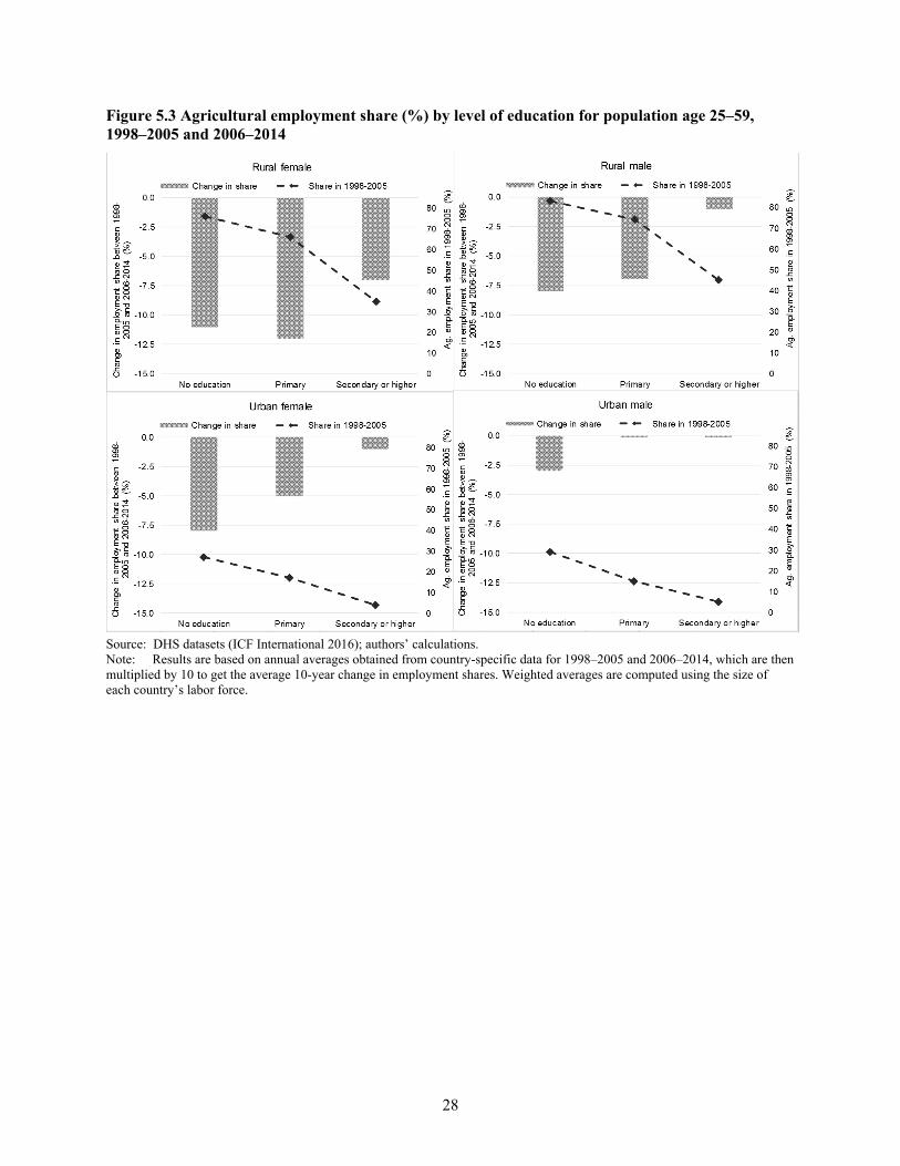
28
Figure 5.3 Agricultural employment share (%) by level of education for population age 25–59, 1998–2005 and 2006–2014
Source: DHS datasets (ICF International 2016); authors’ calculations. Note: Results are based on annual averages obtained from country-specific data for 1998–2005 and 2006–2014, which are then multiplied by 10 to get the average 10-year change in employment shares. Weighted averages are computed using the size of each country’s labor force.

29
6. CONCLUSION
Africa has been largely absent from empirical work on structural change. This paper aims to fill that gap. It begins by documenting a number of stylized facts. First, recent patterns of employment shares in Africa appear to fit the stylized facts of other the historical development in other regions. In other words, controlling for income, the quantitative patterns of employment shares in Africa are roughly what would be expected based on what has transpired elsewhere. Second, between 2000 and 2010, structural change contributed between 0.93 and 1.25 percentage points to annual labor productivity growth in Africa. Moreover, overall labor productivity growth in Africa was second only to Asia, where structural change continued to play an important positive role. There is, however, an important difference between the two regions: the share of employment in manufacturing in developing Asian countries is more than double the share of employment in manufacturing in low-income African countries.
As in other developing regions, structural change in SSA has been characterized by a significant decline in the share of the labor force engaged in agriculture. This is a positive development, because agriculture has been, on average, the least productive sector in the economies of Africa. However, unlike other developing regions, structural change in Africa has not yet been accompanied by a significant expansion in the share of the labor force employed in manufacturing. Instead, the reduction in the employment share in agriculture has been matched by a sizable increase in the share of the labor force engaged in services and a modest increase in the manufacturing sector employment in low-income African countries. These stylized facts are robust to alternative data sources. In particular, data from the DHS are used to check our estimates of changes in employment shares; similar patterns were found.
These results are encouraging and point to reasons for the real income growth in many African countries south of the Sahara and for the poverty reduction documented by Sala-i-Martin and Pinkovskiy (2010), Young (2012), McKay (2013), and Page and Shimeles (2014). However, it is important to recognize that unlike in East Asia, the employment share in manufacturing is not expanding rapidly in Africa. In East Asia’s economies, the rapid expansion of labor-intensive manufacturing for export accelerated structural change–led growth. Although manufacturing has an important role to play in the economies of Africa, it seems unlikely that it will play the same role in Africa’s economies that it played in East Asia’s economies. This is not necessarily bad news; it simply highlights the importance of investing in things like human capital and infrastructure, which can raise productivity levels in all sectors of the economy.
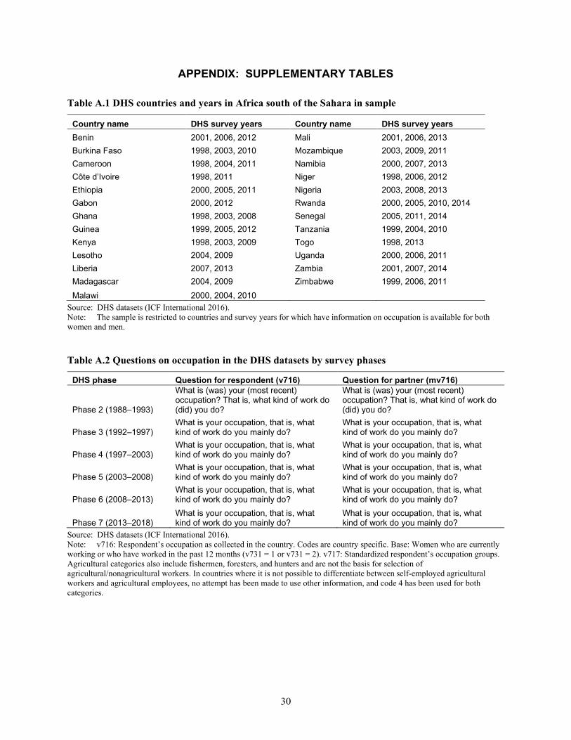
30
APPENDIX: SUPPLEMENTARY TABLES
Table A.1 DHS countries and years in Africa south of the Sahara in sample
Country name DHS survey years Country name DHS survey years Benin 2001, 2006, 2012 Mali 2001, 2006, 2013 Burkina Faso 1998, 2003, 2010 Mozambique 2003, 2009, 2011 Cameroon 1998, 2004, 2011 Namibia 2000, 2007, 2013 Côte d’Ivoire 1998, 2011 Niger 1998, 2006, 2012 Ethiopia 2000, 2005, 2011 Nigeria 2003, 2008, 2013 Gabon 2000, 2012 Rwanda 2000, 2005, 2010, 2014 Ghana 1998, 2003, 2008 Senegal 2005, 2011, 2014 Guinea 1999, 2005, 2012 Tanzania 1999, 2004, 2010 Kenya 1998, 2003, 2009 Togo 1998, 2013 Lesotho 2004, 2009 Uganda 2000, 2006, 2011 Liberia 2007, 2013 Zambia 2001, 2007, 2014 Madagascar 2004, 2009 Zimbabwe 1999, 2006, 2011
Malawi 2000, 2004, 2010 Source: DHS datasets (ICF International 2016). Note: The sample is restricted to countries and survey years for which have information on occupation is available for both women and men.
Table A.2 Questions on occupation in the DHS datasets by survey phases
DHS phase Question for respondent (v716) Question for partner (mv716)
Phase 2 (1988–1993)
What is (was) your (most recent) occupation? That is, what kind of work do (did) you do?
What is (was) your (most recent) occupation? That is, what kind of work do (did) you do?
Phase 3 (1992–1997) What is your occupation, that is, what kind of work do you mainly do?
What is your occupation, that is, what kind of work do you mainly do?
Phase 4 (1997–2003) What is your occupation, that is, what kind of work do you mainly do?
What is your occupation, that is, what kind of work do you mainly do?
Phase 5 (2003–2008) What is your occupation, that is, what kind of work do you mainly do?
What is your occupation, that is, what kind of work do you mainly do?
Phase 6 (2008–2013) What is your occupation, that is, what kind of work do you mainly do?
What is your occupation, that is, what kind of work do you mainly do?
Phase 7 (2013–2018) What is your occupation, that is, what kind of work do you mainly do?
What is your occupation, that is, what kind of work do you mainly do?
Source: DHS datasets (ICF International 2016). Note: v716: Respondent’s occupation as collected in the country. Codes are country specific. Base: Women who are currently working or who have worked in the past 12 months (v731 = 1 or v731 = 2). v717: Standardized respondent’s occupation groups. Agricultural categories also include fishermen, foresters, and hunters and are not the basis for selection of agricultural/nonagricultural workers. In countries where it is not possible to differentiate between self-employed agricultural workers and agricultural employees, no attempt has been made to use other information, and code 4 has been used for both categories.

31
REFERENCES
Arndt, C., A. McKay, and F. Tarp. 2016. “Two Cheers for the African Growth Renaissance (but not Three).” In Growth and Poverty in Sub-Saharan Africa, edited by C. Arndt, A. McKay, and T. Finn, 11–40. Oxford, UK: Oxford University Press.
Chenery, H. B., and L. Taylor. 1968, August. “Development Patterns among Countries and Over Time.” Review of Economics and Statistics 50 (4): 966–1006.
Devarajan, S. 2013, October. “Africa’s Statistical Tragedy.” Review of Income and Wealth 59: S9–S15.
Dercon, S., and D. Gollin. 2014. “Agriculture in African Development: A Review of Theories and Strategies.” Annual Review of Resource Economics 6: 471–492
de Vries, G. J, M. P. Timmer, and K. de Vries. 2015. “Structural Transformation in Africa: Static Gains, Dynamic Losses.” The Journal of Development Studies 51 (6): 674–688.
Duarte, M., and D. Restuccia. 2010. “The Role of the Structural Transformation in Aggregate Productivity.” Quarterly Journal of Economics 125 (1): 129–173.
Easterly, W. 2001. The Elusive Quest for Growth: Economists’ Adventures and Misadventures in the Tropics. Cambridge, MA, US: MIT Press.
Economist, The. 2000. “Hopeless Africa.” May 11. Accessed on April 11, 2015. www.economist.com/node/333429.
Gollin, D., D. Lagakos, and M. E. Waugh. 2014. “The Agricultural Productivity Gap.” Quarterly Journal of Economics 129 (2): 939–993.
Harttgen, K., S. Klasen, and S. Vollmer. 2013. “An African Growth Miracle? Or: What Do Asset Indices Tell Us about Trends in Economic Performance?” Review of Income and Wealth 59 (Special Issue): S37:S60.
Herrendorf, B., R. Rogerson, and Á. Valentinyi. 2014. “Growth and Structural Transformation.” In Handbook of Economic Growth, Volume 2, edited by Aghion and Durlauf, 855–941. Amsterdam: North-Holland.
ICF International. 2016. The DHS Program: Demographic and Health Surveys. Accessed April 11, 2016. http://dhsprogram.com/data/.
International Monetary Fund. 2016. World Economic Outlook. Washington, DC.
Jerven, M., and D. Johnston. 2015. “Statistical Tragedy in Africa? Evaluating the Data Base for African Economic Development.” Journal of Development Studies 51(2): 111–115.
Lewis, A. W. 1955. The Theory of Economic Growth. London: Allen and Unwin.
Maddison, A. 2010. Statistics on World Population, GDP, and Per Capita GDP, 1-2008 AD. Groningen: University of Groningen., The Netherlands.
McCullough, E. B. 2015. Labor Productivity and Employment Gaps in Sub-Saharan Africa. World Bank Policy Research Working Paper 7234. Washington, DC: World Bank.
McKay, A. 2013. “Growth and Poverty Reduction in Africa in the Last Two Decades: Evidence from an AERC Growth-Poverty Project and Beyond.” Journal of African Economies 22 (suppl. 1): i49–i76.
McMillan, M., and D. Rodrik. 2011. “Globalization, Structural Change, and Productivity Growth.” In Making Globalization Socially Sustainable, edited by M. Bachetta and M. Jansen. Geneva: International Labour Organization and World Trade Organization.
McMillan, M., D. Rodrik, and C. Sepulveda, eds. Forthcoming. Structural Change, Fundamentals, and Growth: A Framework and Country Studies. Washington, DC: International Food Policy Research Institute.
McMillan M., D. Rodrik, and I. Verduzco-Gallo. 2014. “Globalization, Structural Change, and Productivity Growth, with an Update on Africa.” World Development 63: 11–32.
Mundlak, Y., R. Butzer, and D. F. Larson. 2012. “Heterogeneous Technology and Panel Data: The Case of the Agricultural Production Function.” Journal of Development Economics 99 (1): 139–149.
32
Page, J., and A. Shimeles. 2014. Aid, Employment, and Poverty Reduction in Africa. WIDER Working Paper 2014/043. Helsinki, Finland: UN University World Institute for Development Economics Research.
Resnick, D., and J. Thurlow. Forthcoming. “The Political Economy of Zambia’s Recovery: Structural Change without Transformation?” In Structural Change, Fundamentals, and Growth, edited by M. McMillan, D. Rodrik, and C. Sepúlveda. Washington DC: International Food Policy Research Institute.
Rodrik, D. 2016. “Premature Deindustrialization.” Journal of Economic Growth 21 (1): 1–33
Sala-i-Martin, X., and M. Pinkovskiy. 2010. African Poverty Is Falling . . . Much Faster Than You Think! NBER Working Paper 15775. Cambridge, MA, US: National Bureau of Economic Research.
Tanzania National Bureau of Statistics, Office of Chief Government Statistician, President’s Office, State House and Good Governance. 2014. “Tanzania 2012 Census: Basic Demographic and Socio-Economic Profile.” Dar es Salaam: Ministry of Finance and Zanzibar: Ministry of State.
Timmer, M. P., and G. J. de Vries. 2007. A Cross-Country Database for Sectoral Employment and Productivity in Asia and Latin America, 1950–2005. Gronigen Growth and Development Centre Research Memorandum 98. Gronigen, Netherlands: University of Gronigen.
———. 2009. “Structural Change and Growth Accelerations in Asia and Latin America: A New Sectoral Data Set.” Cliometrica 3 (2): 165–190.
Timmer, M. P., G. J. de Vries, and K. de Vries. 2015. Patterns of Structural Change in Developing Countries. In Handbook of Industry and Development, edited by J. Weiss and M. Tribe, 65–83. London: Routledge.
World Bank. 2016. World Development Indicators. Accessed on April 11, 2016. http://databank.worldbank.org/data/reports.aspx?source=world-development-indicators.
Young, A. 2012. “The African Growth Miracle.” Journal of Political Economy 120: 696–739.
RECENT IFPRI DISCUSSION PAPERS
For earlier discussion papers, please go to www.ifpri.org/publications/discussion_papers. All discussion papers can be downloaded free of charge.
1597. Perspectives on the role of the state in economic development: Taking stock of the “Developmental State” after 35 years. Jordan Kyle, 2017.
1596. Imputing nutrient intake from foods prepared and consumed away from home and other composite foods: Exploring extensions of the Subramanian–Deaton cost per calorie approach. Dena M. Mwangi, John L. Fiedler, and Celeste Sununtnasuk, 2017.
1595. Estimating spatial basis risk in rainfall index insurance: Methodology and application to excess rainfall insurance in Uruguay. Francisco Ceballos, 2016.
1594. The effect of land inheritance on youth employment and migration decisions: Evidence from rural Ethiopia. Katrina Kosec, Hosaena Ghebru, Brian Holtemeyer, Valerie Mueller, and Emily Schmidt, 2016.
1593. How headquarters relocation is affected by rising wages and ownership: Evidence from China's Annual Survey of Industrial Enterprises, 1999–2008. Qingtao Wang, Kevin Chen, Longwen Chiang, and Xuanli Xie, 2016.
1592. External shocks, food security, and development: Exploring scenarios for Central America. Eugenio Diaz-Bonilla, Valeria Piñeiro, and Pablo Elverdin, 2016.
1591. The role of learning in technology adoption: Evidence on hybrid rice adoption in Bihar, India. Jared Gars and Patrick S. Ward, 2016.
1590. Building effective clusters and industrial parks. Xiaobo Zhang, 2016.
1589. Nepal’s 2072 federal constitution: Implications for the governance of the agricultural sector. Jordan Kyle and Danielle Resnick, 2016.
1588. Entitlement fetching or snatching?: Effects of arbitrage on India’s public distribution system. Suman Chakrabarti, Avinash Kishore, and Devesh Roy, 2016.
1587. Changing preferences through experimental games: Evidence from sanitation and hygiene in Tamil Nadu. Yaniv Stopnitzky, 2016.
1586. Climate change, agriculture, and adaptation in the Republic of Korea to 2050: An integrated assessment. Nicola Cenacchi, Youngah Lim, Timothy Sulser, Shahnila Islam, Daniel Mason-D’Croz, Richard Robertson, Chang-Gil Kim, and Keith Wiebe, 2016.
1585. The dark side of competition: Gender differences. Simon Chang, Kamhon Kan, and Xiaobo Zhang, 2016.
1584. Harnessing net primary productivity data for monitoring sustainable development of agriculture. Nathaniel P. Robinson, Cindy M. Cox, and Jawoo Koo, 2016.
1583. Effects of agricultural mechanization on smallholders and their self-selection into farming: An insight from the Nepal Terai. Hiroyuki Takeshima, Rudra Bahadur Shrestha, Basu Dev Kaphle, Madhab Karkee, Suroj Pokhrel, and Anjani Kumar, 2016.
1582. The agricultural sector as an alternative to illegal mining in Peru: A case study of Madre de Dios. Valeria Piñeiro, Jenny Thomas, and Pablo Elverdin, 2016.
1581. What drives diversification of national food supplies?: A cross-country analysis. Samira Choudhury and Derek Headey, 2016.
1580. Identity, household work, and subjective well-being among rural women in Bangladesh. Greg Seymour and Maria S. Floro, 2016.
1579. Youth employment, agricultural transformation, and rural labor dynamics in Nigeria. Margaret Adesugba and George Mavrotas, 2016.
1578. Farm size and effects of chemical fertilizer price on farm households: Insights from Nepal terai. Hiroyuki Takeshima, Sabnam Shivakoti, Binod Bhattarai, Madhab Karkee, Suroj Pokhrel, and Anjani Kumar, 2016.
1577. Energy use and rural poverty: Empirical evidence from potato farmers in northern China. Zihan Li, Yazhen Gong, and Kevin Z. Chen, 2016.

INTERNATIONAL FOOD POLICY RESEARCH INSTITUTE
www.ifpri.org
IFPRI HEADQUARTERS 2033 K Street, NW Washington, DC 20006-1002 USA Tel.: +1-202-862-5600 Fax: +1-202-467-4439 Email: [email protected]