the foundry
DESCRIPTION
Logo design process for a local non profit.TRANSCRIPT
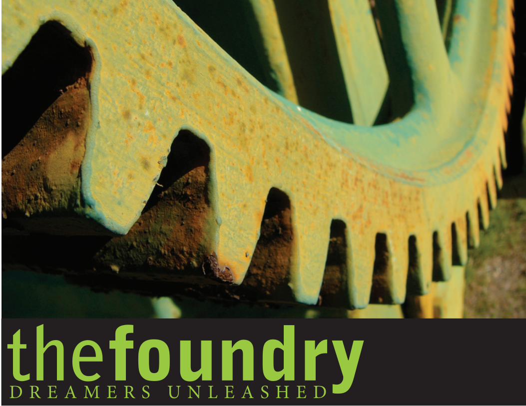
D R E A M E R S U N L E A S H E DthefoundryD R E A M E R S U N L E A S H E D
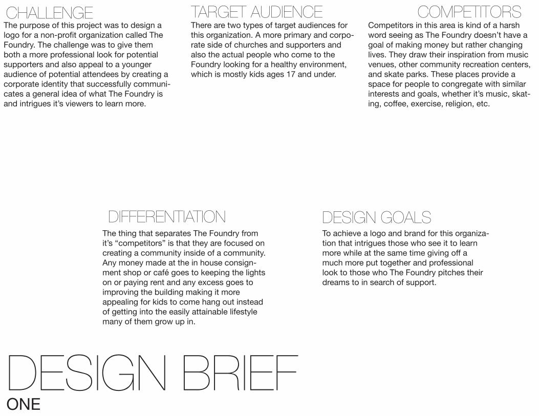
DESIGN BRIEFONE
CHALLENGE TARGET AUDIENCE
DESIGN GOALS
COMPETITORS
DIFFERENTIATION
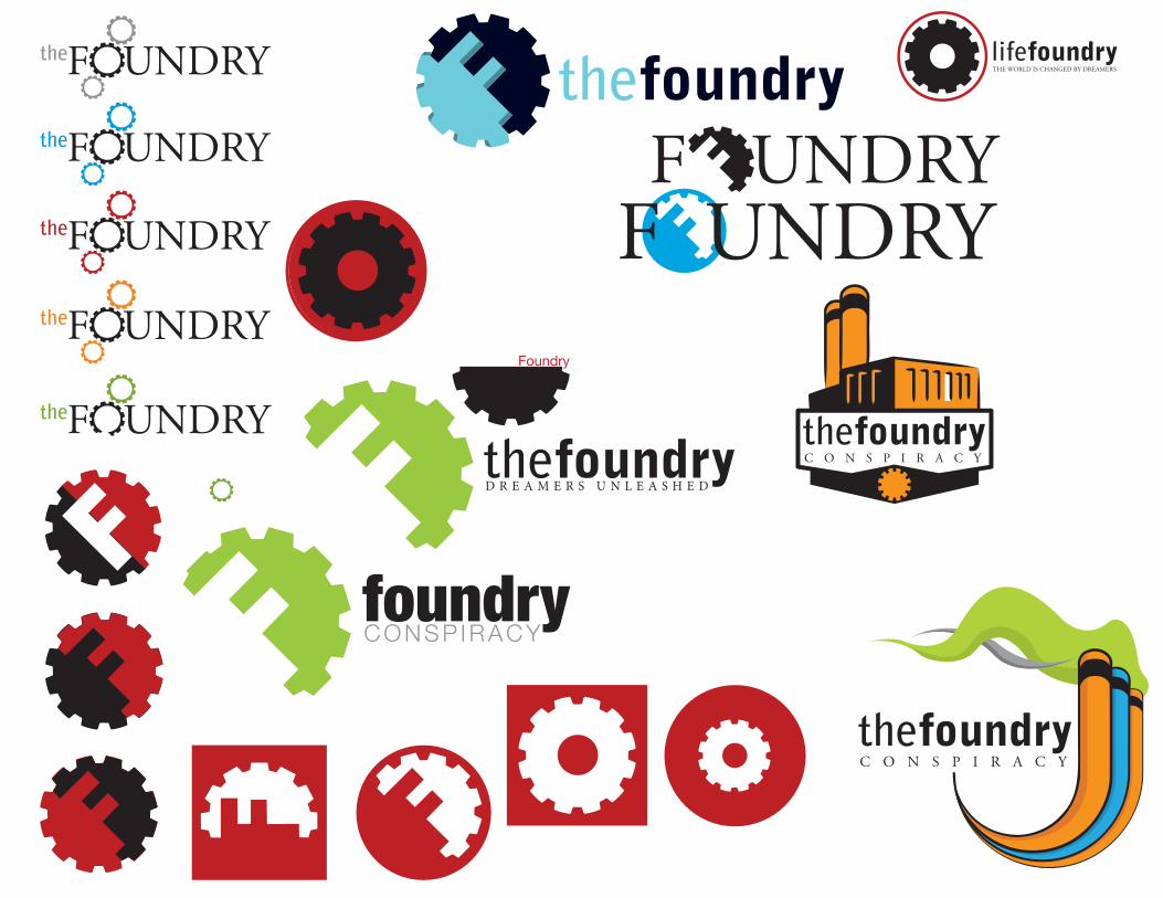
The purpose of this project was to design a logo for a non-profit organization called The Foundry. The challenge was to give them both a more professional look for potential supporters and also appeal to a younger audience of potential attendees by creating a corporate identity that successfully communi-cates a general idea of what The Foundry is and intrigues it’s viewers to learn more.
There are two types of target audiences for this organization. A more primary and corpo-rate side of churches and supporters and also the actual people who come to the Foundry looking for a healthy environment, which is mostly kids ages 17 and under.
Competitors in this area is kind of a harsh word seeing as The Foundry doesn’t have a goal of making money but rather changing lives. They draw their inspiration from music venues, other community recreation centers, and skate parks. These places provide a space for people to congregate with similar interests and goals, whether it’s music, skat-ing, coffee, exercise, religion, etc.
To achieve a logo and brand for this organiza-tion that intrigues those who see it to learn more while at the same time giving off a much more put together and professional look to those who The Foundry pitches their dreams to in search of support.
The thing that separates The Foundry from it’s “competitors” is that they are focused on creating a community inside of a community. Any money made at the in house consign-ment shop or café goes to keeping the lights on or paying rent and any excess goes to improving the building making it more appealing for kids to come hang out instead of getting into the easily attainable lifestyle many of them grow up in.
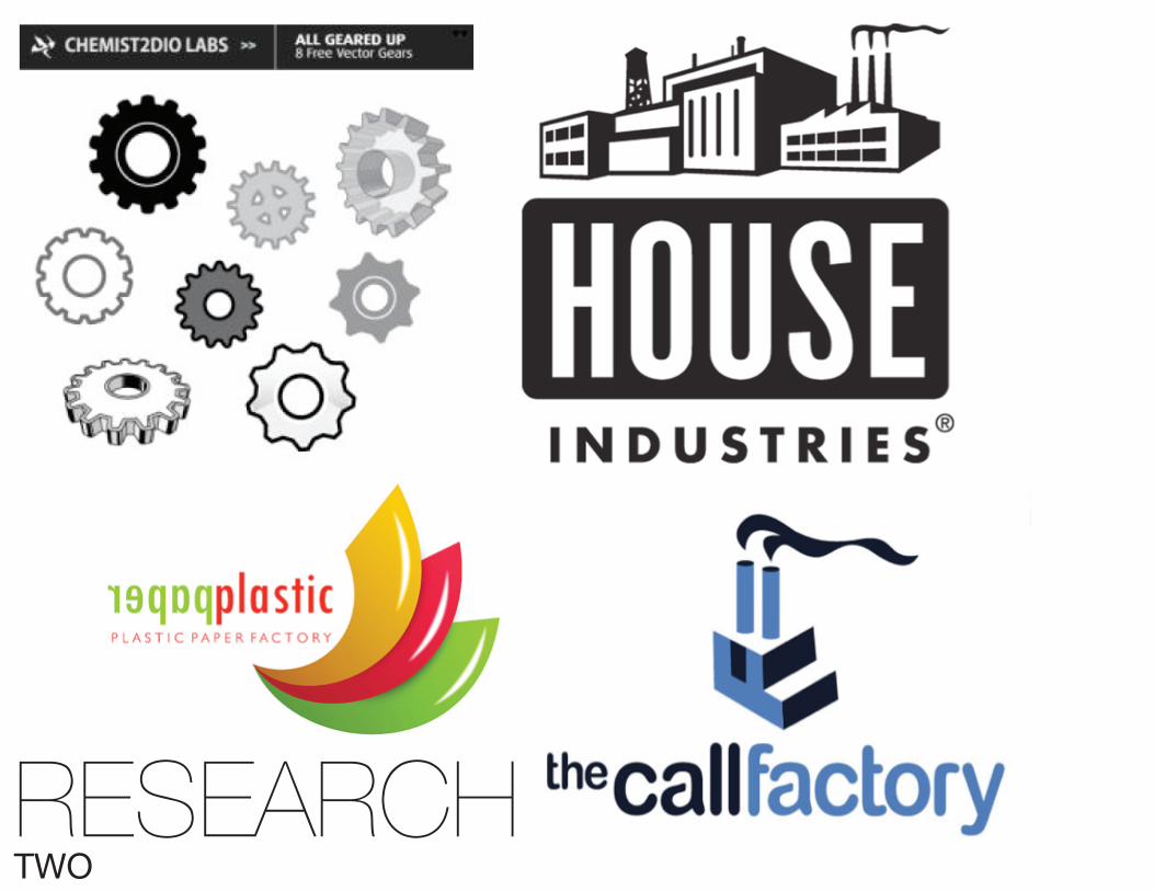
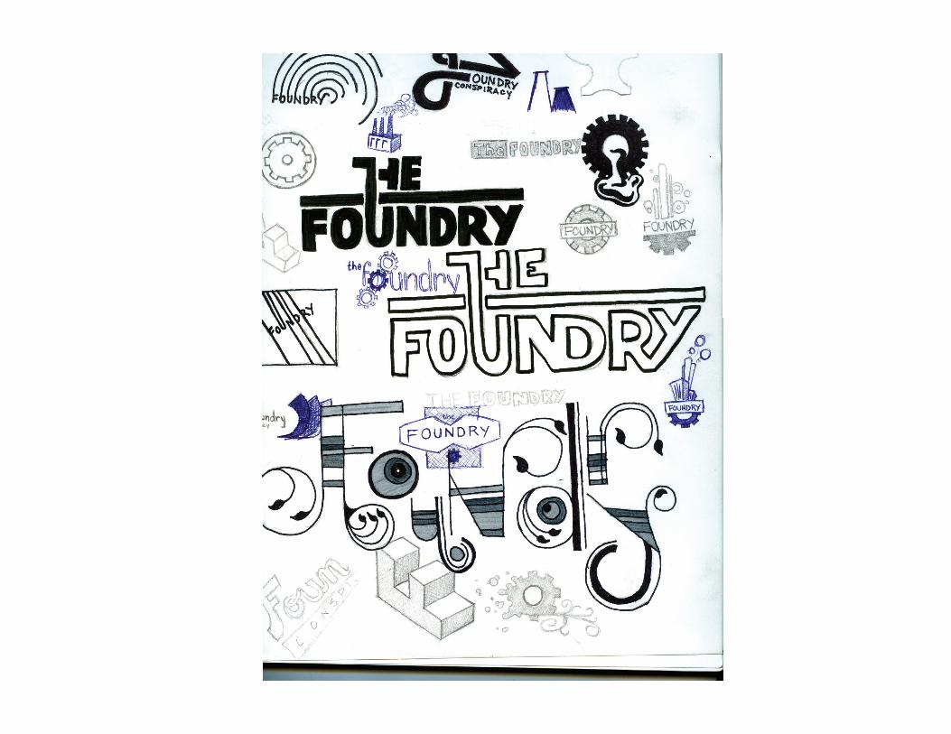
RESEARCHTWO
lifefoundryTHE WORLD IS CHANGED BY DREAMERS
thefoundry
thefoundry
C O N S P I R A C Y
UNDRYF
thefoundryC O N S P I R A C Y
the
UNDRYF
UNDRYF
the
UNDRYFthe
UNDRYFthe
UNDRYFthe
Foundry
foundryCONSP IRACY
thefoundryF
UNDRYF
D R E A M E R S U N L E A S H E D

thefoundryD R E A M E R S U N L E A S H E D
thefoundryD R E A M E R S U N L E A S H E D
FINAL SOLUTIONSEVEN
DESIGN NARRATIVEEIGHT
GOALS/OBJECTIVES REASONING OUTPUT/PRODUCTION
FINAL OUTCOMES
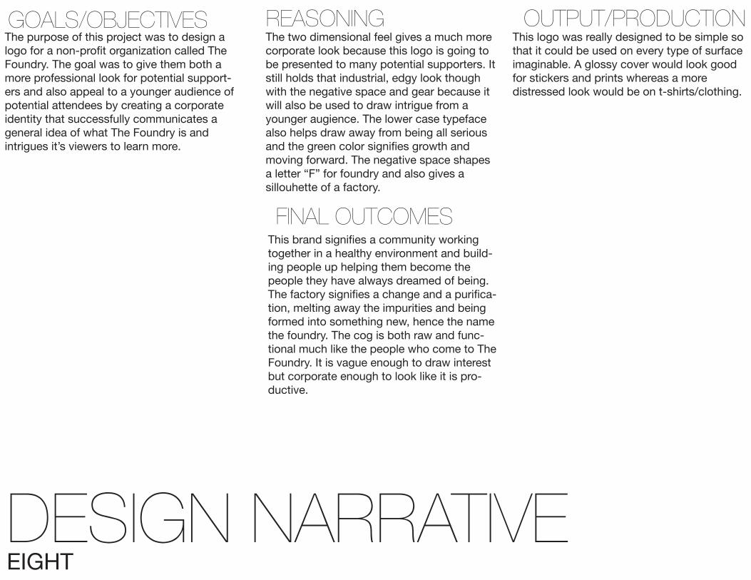
The purpose of this project was to design a logo for a non-profit organization called The Foundry. The goal was to give them both a more professional look for potential support-ers and also appeal to a younger audience of potential attendees by creating a corporate identity that successfully communicates a general idea of what The Foundry is and intrigues it’s viewers to learn more.
The two dimensional feel gives a much more corporate look because this logo is going to be presented to many potential supporters. It still holds that industrial, edgy look though with the negative space and gear because it will also be used to draw intrigue from a younger augience. The lower case typeface also helps draw away from being all serious and the green color signifies growth and moving forward. The negative space shapes a letter “F” for foundry and also gives a sillouhette of a factory.
This logo was really designed to be simple so that it could be used on every type of surface imaginable. A glossy cover would look good for stickers and prints whereas a more distressed look would be on t-shirts/clothing.
This brand signifies a community working together in a healthy environment and build-ing people up helping them become the people they have always dreamed of being. The factory signifies a change and a purifica-tion, melting away the impurities and being formed into something new, hence the name the foundry. The cog is both raw and func-tional much like the people who come to The Foundry. It is vague enough to draw interest but corporate enough to look like it is pro-ductive.