the last bear standing
TRANSCRIPT

THE LAST BEAR STANDING The economy is deeply scarred. Equity markets are massively overvalued.
The Comprehensive Bear Thesis
DECEMBER 20, 2020
All opinions included herein are solely those of the author. This does not constitute investment advice. Invest at your own risk.

1
Introduction The date is 12/20/20. As of last close, the S&P 500 sat at 3,709, the Nasdaq at 12,755 and the Dow at 30,179 – all-time highs. I am the last bear standing. Generous words to describe the market would be optimistic, enthusiastic or exuberant – a more accurate description would be blindly irrational, deranged and truly dangerous. It’s not hard to understand the enthusiasm – after suffering the fastest drawdowns of all time as it became clear that COVID19 would become a global pandemic, the market bottomed out on March 23rd, and has since embarked on the greatest rally of all time. Since late March, the S&P 500 has rallied 64%, the Nasdaq is up 80% and the Dow, 62%. What’s more is that the perception of the rally has changed dramatically from its earliest days, where it was viewed with a high degree of skepticism. Market participants now hold an almost universal view that despite eclipsing every price level ever recorded, the party has just begun. Going into 2021, some combination of Fed money printing, fiscal stimulus, vaccine hope, tech growth, and operating leverage will lead the stock market further into the stratosphere. While some Wall Street banks have issued some warnings that “extreme positioning” could cause some near-term pullback, the reassure that any such decline will merely be a speedbump on the road to Bull nirvana. Net positioning across the entire global financial universe shows that even the most ardent bears have capitulated. This viewpoint is generally predicated on the notion that while the economy took a massive hit from governmental action to contain the coronavirus, its now on a clear path to recovery, which will only be further galvanized by the distribution of vaccines and incremental government stimulus. In other words, in less than 12 months, we have digested the single largest exogenous shock and economic contraction experienced in the modern globalized economy, are already well on the road of recovery on the way to new economic highs. That the Fed will immediately step in to prevent a sudden drop in asset prices is icing on the cake. I will not go into detail on these theories – if you are interested you can simply refer most any other market commentary, which all paint the same picture. Unfortunately, none of this is true. The economy is in a dire and weakening position, and the near-term risks are to the downside. The cumulative result of the amazing “recovery” that has transpired since March has only lessened the damage of the paramedic to an economic disruption on par with the Global Financial Crisis. More importantly, real time economic indicators show that the rebounded stalled in the 3rd quarter well below pre-COVID levels, while COVID cases were consistently declining in the US. The rocket ship has run out of gas far from its destination. The path forward would be incredibly uncertain even without any further COVID19 impact, but the resurgence of the virus along predictable seasonal trend only exacerbates the circumstances. While even a much more severe winter of COVID will not have the same economic impact as the initial lockdowns, the damage can still be significant for a recovery that already slowed to a crawl. The state of the economy alone should cause significant concern to an equity investor. But that is only half of the picture. What is happening today in the market, is not merely a “detachment” from the economic circumstances, but an almost entirely unrelated stock bubble that had been slowly brewing for years but was sent into full mania this year. There are too many examples to pick from for this introduction, but this market has every single hallmark of a bubble. While “tech” names are the clear leaders of the pack, the excess extends throughout the market in froth that can only truly be described as a “stock bubble”. The level of greed in the market has extended beyond anything we have seen going back to at least the dot-com bubble. Newfound retail investors have flooded brokerage services with fresh stimulus cash and now are fully invested in the market’s riskiest names. Smart money is all too happy to join the momentum.

2
That these two things are occurring simultaneously is both surreal and frightening. These twin risks are not merely additive but rather compound through covariance. A selloff from the extreme stock prices would result in a destruction of wealth that would further deteriorate the real economy – both previous US recessions were the result of asset bubbles popping. Alternatively, a deterioration of the real economic condition could be the catalyst that pops the stock bubble. Either way they will cause a positive feedback loop that will amplify the other. While the core of this analysis will focus on the twin risks of US economic deterioration and the stock bubble, there are numerous tertiary risks that one should also consider; lingering pandemic impacts, anti-trust action, social stability, tax policy, labor policy, government budget crises, geopolitical risk, escalating hot-war tensions, a failing property market in China, etc. What becomes clear is that equity markets have reached historically mispriced levels both on an absolute basis as well as a risk adjusted basis given the economic backdrop. Recent experience in the market suggest that a drastic near term sell down is certainly a realistic possibility, but even absent a sudden crash, equities are posed to not just underperform expectations but provide negative real returns over the medium term. The only plausible caveat to this analysis is that central banks have socialized markets to the extent where price discovery has been totally removed in favor of an ever-inflating asset bubble of currency debasement. I remain skeptical of this notion, but If you believe this to be the case, it may make more sense to take your money of a spiraling fiat system before it implodes and buy real property and gold bars. However, in discussions with folks who use the “Fed put” as the ultimate backstop of their bull case, I don’t sense much fear of the implications of their own thought process. Rather like all good excuses, it is a goal-seeking rationalization that puts your analytic brain to sleep and allows your animal spirits to run free. The economy remains deeply scarred. The road to recovery is likely to be long and arduous. There is significant uncertainty in the forward forecast and downside risks abound. Equity markets have reached a frenzied euphoria and are willfully ignorant to the downside risks. Any equity investor should consider these circumstances carefully. Now is a good time to realize gains and de-risk. Protection for tail-risk downsides is prudent. Buy low – sell high.

3
Part 1: The Economy
Employment and the Stock Market One of the common refrains to justify the current market prices is that the stock market is not the economy. In retort, below is the most fundamental economic figure - US Payrolls – and the S&P 500 from 1996 through 2019. US Nonfarm Payrolls and S&P Monthly Closing Price 1996 - 2019
If the stock market is not the economy, they certainly look a lot alike. Running a simple linear regression between monthly payroll and the S&P price between January 2000 and February 2020, which spans two asset bubbles two recessions and two economic expansions and a variety of interest rate environments, results in an R-squared of 0.913 (S&P = (Payrolls – 120,755) / 10.23)1. The reasons for the this are obvious; jobs are both a reflection of economic condition of the companies that comprise the market, while also providing the income that allows consumers to spend. Over the past 25 years, the peak and trough payrolls has coincided with peak and trough of the stock market with impressive precision, albeit on a slightly lagged basis.
1 This paper uses this formula as a benchmark to approximate an implied fair market value for the S&P. This is not meant to be a comprehensive statistical analysis or a universal constant. Rather, it is a simple rule of thumb based how the two series have correlated over the past 20 years that has been very predicative through cycles and interest rate environments.

4
The buy at any price crowd may point out that regardless of the economic cycle, the S&P has appreciated by 4.8x between 1996 and 2019 despite economic cycles. But selling at the payroll peak and buying at the payroll troughs would have resulted not only a substantially improved total appreciation of 8.7x, but a significantly improved risk/return profile, since you would have been holding cash during the economic downturns. But isn’t this simply a cherry picked back-cast that would be impossible to replicate in real time? Why not simply suggest that you buy the market at its peak and sell at the top? The key difference is that the market is highly volatile on a short term basis, and therefore it is incredibly challenging to pick the high point and low points since the path upwards and downwards is jagged, and involves many ups and downs along the way. On the other hand, as demonstrated in the graph, payrolls are a very stable indicator. During an expansion It is rare that payrolls have a negative print and the rate of monthly growth is remarkably consistent. The growth rate beginning to wane for a sustained period as it did in 1999 or 2006 is a key waning sign. If that waning growth turns over into actual declines in payroll, then it’s time to sell. Now, it is not novel to suggest that payrolls are a key indicator – in fact it is one of the most closely watched economic metrics in general. But setting the baseline is incredibly important to understanding the current economic predicament.
The Global Pandemic In early 2020 it became clear that the novel coronavirus outbreak in Wuhan would not be contained and was rapidly evolving into a global pandemic. For some industries, such as airlines and rental cars, this was a truly existential threat as their businesses functionally ceased. In an effort to quell the growing outbreak, the US government, which was woefully unprepared and in denial of the earlier dangers, followed in China’s footsteps by implementing large scale lockdowns. Nearly all travel stopped, “non-essential” businesses were closed, and people were forced to work from home or file for unemployment. In a matter of weeks, millions of Americans filed for unemployment in an event that really had no historical precedent.
S&P Payrolls Diff. (yrs)
Dot Com Peak Aug-00 Feb-01 0.6
Dot Com Trough Feb-03 Apr-03 0.2
GFC Peak Jul-07 Jan-08 0.5
GFC Trough Mar-09 Dec-09 0.8

5
By April, the headline unemployment rate shot to levels unprecedented in the post-war era. US Headline Unemployment Rate through April 2020
Compared to the just two months earlier, the April payroll number of 130,303,000 represented a loss of 22,160,000 jobs, or 15% of the all jobs in the US, which appeared to eliminate the cumulative job growth since 1999. Extending the series back to 1939 in the chart above demonstrates the magnitude of the shock relative to any other period of economic disruption since before WWII. As this picture was becoming clear in late February, it sparked a liquidity run in the markets, with panicked selling across the board as equities were crushed and bond spreads blew out. Shown with daily candlesticks, you can see the immediacy and violence of the selloff:

6
S&P 500 Price – March 2019 – March 2020
Based on the importance of the payrolls to the economy and financial markets, this response was rational and expected. But this situation really was unique. Without historical guidance, market observers and economists were left to trade Letter based prediction (V, L, U, W?) about the trajectory of the economy moving forward. In general, economic forecasts from central banks and multinational organizations worked off the historical precedent which showed that job destruction would usually taper out slowly and have an extended period of recovery (see the GFC period in the graphs above as a general reference). Applying these trends to the unprecedented 22 million job losses resulted in dire predictions – some that suggested it may be 10 years before the economy is fully healed. On the other hand, the market recognized that at least some of this pessimism was unwarranted. After all, at the time the market bottomed in March 23rd, the virus spread was localized in the US, with relatively low (but growing) case numbers. China has already demonstrated that a 6-8 week lockdown could quell an outbreak so bad that it required construction of temporary hospitals. Most importantly, businesses in the US that sent their workers to the unemployment rolls were merely responding to a government-imposed restriction – many of those jobs were simply temporarily paused, not destroyed. Indeed, the April 2020 Unemployment Report said exactly that. The report showed that while the ranks of “unemployed” had increased from 2.7 million in February to 20.6 million in April, 96% of those people were listed as temporary layoffs. The number of permanent unemployed had only increased from 1.9 million in January to 2.6 million. While that two-month jump alone was enough raise it permanent unemployment back to levels of mid-2017 which would be cause for alarm in any other scenario, it was dwarfed by the headline number caused by the temporarily unemployed.

7
Total Unemployed People by Category (000s) – BLS Monthly Unemployment Report through April 2020
Yet even as the headline unemployment numbers seemed overestimate the severity of the circumstances for the newly unemployed, it also failed to capture the breath of the damage. While the total US non-farm payroll figures had fallen by 22 million as noted above, the unemployment report was showing only 18 million unemployed people. The total payroll number is as simple as it sounds. But the Unemployment figure seeks to determine the rate of joblessness only for people who are deemed to be in the workforce, which changes over time. However, the methodology the BLS uses to determine the workforce was not prepared for an event like COVID. Many people who were previously employed responded to their BLS surveys saying they were not looking for work – there are a number of rational explanations for why this was the case (prohibitive health concerns, parents who had to suddenly provide child care, or perhaps just the simple fact that businesses were shuttered by government order). As a result, there was a substantial decrease in the calculation of the civilian labor force which is also is unprecedented in the historical data including past recessions, as shown below:

8
US Civilian Labor Force (000s) – Data through November 2020
While we can’t know the specifics of every person’s situation who has fallen out of the workforce according to this methodology, we can reasonably assume that these are not people who have decided that they will no longer ever seek to work again. Even if they were, losing this segment of the workforce would still negatively impact the earnings, spending power and productive capacity of the economy. This civilian workforce contraction remains huge. As of the November 2020 report, the civilian workforce is still 4 million lower than it was in February. As a result, the current headline unemployment figure sustainably undercounts the total number of jobless people relative to the pre-pandemic baseline. All of these factors – a historic economic shock, difficult data, a crashing then surging financial market, enormous global fiscal and monetary stimulus – were playing out in the matter of weeks. But with Congress passing a $2.3bn stimulus package, the Fed (which was already viewed as the market’s Messiah) taking unprecedented action to bolster liquidity and expand its lending powers, and with equities trading at huge cheaper than they were months ago, the equity risk seemed to be to the upside. From 3/23/20 to 4/30/20, the S&P rose 30%.
The V Shaped Recovery COVID cases and deaths, which were largely concentrated in the tri-state area, peaked in early April and began to quickly subside. By May, the nationwide shutdown was giving way to a gradual and localized reopening. The national government punted the reopening process to the states, who each had different paces for lifting restriction on economic activity. Finally, after much uncertainty and prognosticating, the question of which shape the recovery would take would begin to be answered. The survey of economists whose projections are used to imply the market’s “expectation” generally expected a gradual recovery that looked like previous recessions. However, since the circumstances were altogether different from prior recessions those projections were immediately blown out of water. Between April and June, Headline unemployment fell from 14.7% to 11.1%, nearly reaching the Fed’s estimate of total job gains through the rest of the year. Both the unemployment rate and payrolls through June were showing what can only be described as the beginning of truly V-shaped recovery.

9
US Unemployment and Payrolls through June 2020
Not only was the economy “healing” faster than many had predicted, but nearly every economic activity was beating expectations. While some continued to make the case that these early job gains were the “easiest” and that the road ahead would continue to present challenges, nearly every economic indicator was crushing predictions. An Index tracking economic data vs expectations went from historic low readings in March to out-of-this world beats. Citigroup Economic Surprise Index Through July 2020
It’s hard to overestimate how this outperformance changed the markets expectations of the road ahead. After pure panic and turmoil, the economy was now bouncing back faster than any forecaster expected, and a linear extrapolation would suggest that the economy regain all lost jobs within the year. Fundamentally, there was a shift in mindsight that had profound implications. Rather than being at the early stages of a downturn, we had instead passed through the entire cycle and were on the way to new highs. Some commenters noted that “miraculously” this was the shortest recession and fastest rebound ever. By the end of the June, the S&P had reached 3,115, almost entirely regaining its March fall, and were trading at levels that represented all time highs just 8 months ago in November 2019 when the thought of a global pandemic as an equity risk was nonexistent.

10
S&P 500 Price – June 2016 - June 2020
It was the Summer of Love. Equities were soaring, dip buyers had been rewarded, business restrictions were lifted, and jobs were coming back faster than anyone had anticipated. The question now was not how much damage was done, but rather how much upside was there on the other side. The summer also conquered another important fear. The first real second surge of COVID in the US raced across the sunbelt in July, causing some limited business restrictions could reverse the progress that was made. Instead, the recovery continued largely unabated – partially due to offsetting gains in states that that were slower to lift restrictions like New York, but more importantly because the new restrictions were much more targeted than the initial broad lockdowns and impacted a much smaller portion of the workforce in those states.
Out of Gas: While markets had moved on from pondering 2020 risks in favor of pricing in 2021 upside, trouble brewed under the surface. While misinterpretation of the employment situation by economists in the March and April led to a historically inaccurate forecast of the future, now the markets were making the same mistake in the other direction. While originally, the temporary vs. permanent unemployment figures led to an overestimate of true joblessness, the return of those temporary employees also led to an overestimation of the strength of the recovery. Rather than a true recovery – the massive reduction in temporary unemployment since its extraordinary peak in April has masked the increasing rise of permanent unemployment. The graph below again shows the total unemployed people color coded by status. Throughout the miraculous V-shaped recover we are supposedly living through permanent unemployment has only increased. In November, there were 4.7 million permanently unemployed people – the highest figure since 2013.

11
Total Unemployment People by Category (000s) – BLS Monthly Unemployment Report through November 2020
Importantly, the graph above excludes the 4 million people who remain excluded from the civilian workforce. When comparing to the two previous recessions on the chart, the 2020 figures significantly underestimate the damage because of this error. To help remove this error and demonstrate on an absolute basis where we are relative to baseline, we can look simply at the Payrolls figures. As of November 2020, the US has 9.8 million fewer jobs than it did in February, permanent unemployment continues to rise. The leading edge of the V is rolling over like cooked spaghetti. From the peak to the trough of the Global Financial Crisis, the US lost a total of 8.7 million jobs. US Nonfarm Payrolls through November 2020

12
The rate of job growth has slowed dramatically since the summer and the there is still a massive hole to make up to pre-COVID levels. The implications of the past several months of data fundamentally consistently undermine the euphoria of the summer. For simplicity, below is a linear extrapolation of each month’s growth rate compared to the pre-COVID baselines. Since one expects the growth rate to slow down over time, these linear projections are the most simplified and aggressive projections one could make about the pace of recovery. Actual and Implied US Payrolls – Jan 2015 to November 2020
If the job growth in the Summer of Love were to continue, we really would be back to the baseline by mid 2021. But every month since June has shown a slowdown in growth that has pushed out that recovery time. In November, the 245,000 jobs added is only marginally higher than the 173,000 monthly average for all of 2019, meaning that it would take until 2035 at the current pace to reach the pre-COVID baseline. That effectively means that long term assumptions about the growth and size of the economy that were valid in February of 2020 no longer apply. There is no getting back to the Baseline – we are on a new, worse trajectory, and equities should reprice accordingly
Importantly, this slowdown since July has been very consistent, and has happened largely in the backdrop of decreasing COVID cases. Hospitalizations in the US hit their summer peak in July and only began to meaningfully rise
Implied Return to Remaining
Date Pre-Covid Baseline Recovery (Yrs)
May Jan-2021 0.8
June Oct-2020 0.3
July Apr-2021 0.8
August Jun-2021 0.9
September Aug-2022 2.0
October Feb-2023 2.4
November May-2035 14.6

13
by early November. The reports are a snapshot as of the 12th day of the month – so while there could be some impact seen in the November figures as the Midwest had already seen rising cases at that point, these numbers are largely unaffected by the most recent COVID surge. As grim as this reality is, the market’s have not paid mind. As of today, the S&P sits at all time highs, 64% higher than the March lows an astonishingly 10% higher than its pre-COVID peak in February 2020. The linear regression of the past 20 years, the employment circumstance alone suggests that the S&P is 42% overvalued. Given the risks that we will soon discuss, it its possible the true fair value may be considerably lower.
A Dark Path Ahead The focus of most mainstream commentators when looking forward is enthusiasm based on vaccines, stimulus and Fed backstops. But while the narrative focuses on the upside (even upsides that are ironically created by real downsides – i.e. worse job prints means more stimulus, means higher stock prices) there are significant and pressing downside risks that deserve much more attention than they receive. Three primary risks include the employment outlook, fading stimulus benefits, and permanent demand destruction. Employment Outlook The economy has 9.7 million jobs to recover just to regain the strength it had entering this year. Restaurants, travel, and hospitality have been the hardest impacted sectors, and rightly are the poster child for the unemployment crisis. But this isn’t the whole story – and perhaps oversimplifies the nature of the crisis and the ability to quickly reverse it. Breaking down the payroll changes by sector:
14
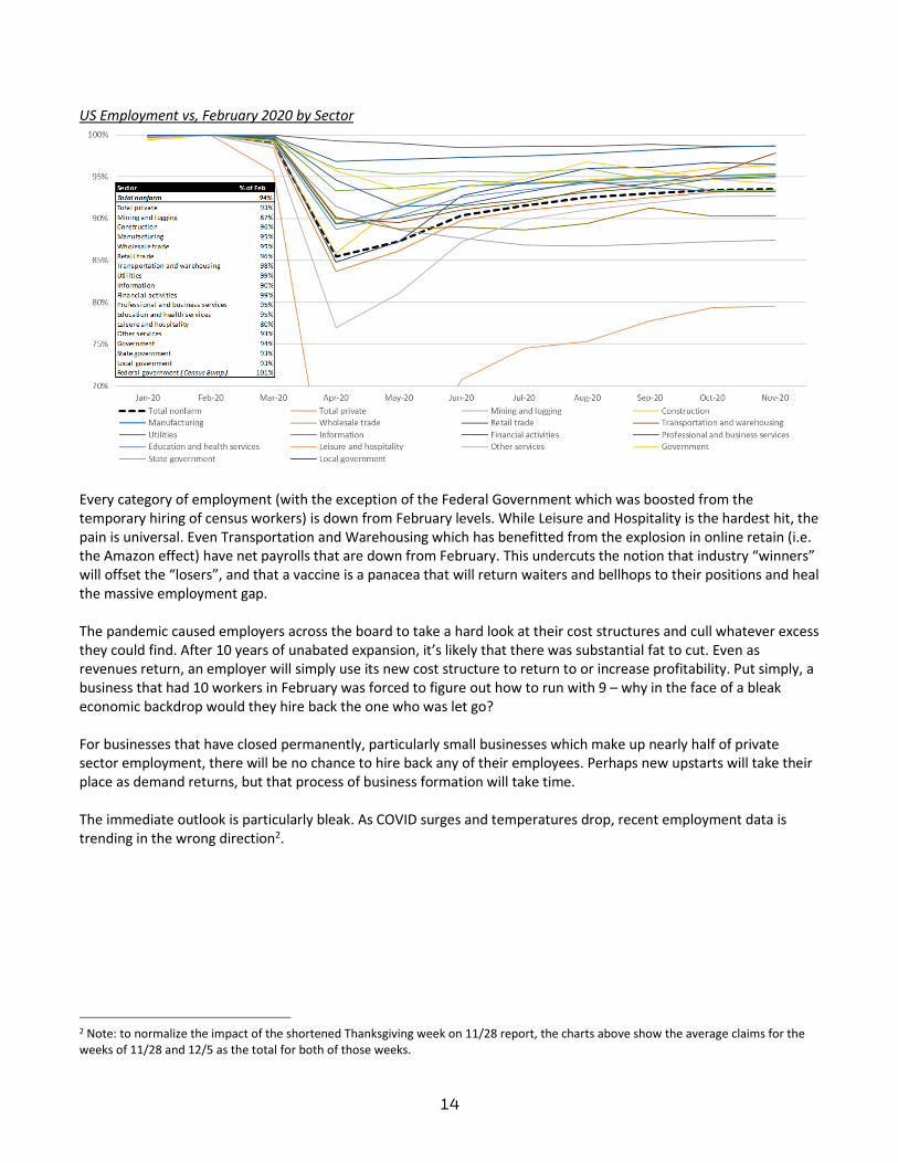
US Employment vs, February 2020 by Sector
Every category of employment (with the exception of the Federal Government which was boosted from the temporary hiring of census workers) is down from February levels. While Leisure and Hospitality is the hardest hit, the pain is universal. Even Transportation and Warehousing which has benefitted from the explosion in online retain (i.e. the Amazon effect) have net payrolls that are down from February. This undercuts the notion that industry “winners” will offset the “losers”, and that a vaccine is a panacea that will return waiters and bellhops to their positions and heal the massive employment gap. The pandemic caused employers across the board to take a hard look at their cost structures and cull whatever excess they could find. After 10 years of unabated expansion, it’s likely that there was substantial fat to cut. Even as revenues return, an employer will simply use its new cost structure to return to or increase profitability. Put simply, a business that had 10 workers in February was forced to figure out how to run with 9 – why in the face of a bleak economic backdrop would they hire back the one who was let go? For businesses that have closed permanently, particularly small businesses which make up nearly half of private sector employment, there will be no chance to hire back any of their employees. Perhaps new upstarts will take their place as demand returns, but that process of business formation will take time. The immediate outlook is particularly bleak. As COVID surges and temperatures drop, recent employment data is trending in the wrong direction2.
2 Note: to normalize the impact of the shortened Thanksgiving week on 11/28 report, the charts above show the average claims for the weeks of 11/28 and 12/5 as the total for both of those weeks.

15
Before even discussing the recent uptick in claims, it should be emphasized that since 3/21/20, every single week has registered more new unemployment claims than the peak figure from the Global Financial Crisis, and have plateaued at ~4x the 2019 average. One caveat to these figures is that given the extraordinary unemployment benefits provided by the CARES Act, and the deluge of claims that states have been forced to try to process, there has been substantial fraud that has elevated these numbers. However, even haircutting the numbers substantially to account for fraud, the situation remains dire. These weekly figures have become so regular that they are largely ignored by the market, but they are extraordinary. They indicate that employers are shedding jobs at an alarming pace that has remained consistent throughout the “recovery”. These new claims have been hidden in headline employment figures by the massive reduction in temporary unemployment but they point to an economy that on a underlying level continues to deteriorate, rather than recover. As the inventory of “temporary” job losers continue to shrink, it is just a matter of time before the economy begins losing jobs on net. A longer term drag on employment is the dire straits of state and local government budgets. While some federal support may be forthcoming, it will only begin to close the massive fiscal holes that have been blown into state and local budgets. New York City alone is facing a $60 billion shortfall over the coming four years – representing a budgetary crisis larger than any it has faced historically. Congress continues to haggle over stimulus money to help state and local, but this has been strongly opposed by Republicans who view it as bailout for states that had fiscal issues predating the panic. Even if congress does pass stimulus for state and local governments, it will not be large enough to plug the budget gaps and will be one-time in nature. For municipalities that face years of depressed economic activity, their problems are much longer term. Governments are usually slower to react than private businesses (and tend to have more unionized workforces), and so their layoffs will likely lag the private sector. Borrowing to fill near term deficits is possible, but ultimately is a stopgap measure that only exacerbates the budgetary situation in the long term. The eventual layoff of public sector

16
employees will provide a substantial drag on employment situation for years to come, as was the case in early years following the GFC. Fading Stimulus Conspicuously absent in the analysis up to this point has been the roll of government stimulus. The CARES Act was a fiscal bazooka sized in proportion to the economic evisceration of the lockdowns. The Act included a federal $600/week ($31,200 annualized) adder to typical state unemployment benefits which were being received by 20 million people in April. This benefit amounted to substantially more than the typical wages of the median person on unemployment. CARES also included “Helicopter Money” in the form of $1,200 stimulus checks per individuals and $500 per child for a substantial majority of the population - only those making over $100k/year were fully excluded. In aggregate, this amounted to roughly doubling the federal distributions of social benefits – something that is also truly unprecedented even in previous recessions: Federal Government Total Social Benefits to Persons ($ in billions)
The government injection was so large that it more than offset all the lost income in the country – in fact disposable personal income spiked as a result. Real Disposable Personal Income ($ in billions)
Given that this economic shock came so swiftly to an economy that was otherwise on strong footing, the average individual’s financial situation was generally strong, even if they had just lost their job. Now, with the economic shutdowns that caused people to massively cut expenditures and the unprecedented stimulus benefits, the average person was cash-richer than they ever have been. Total US personal savings increased from $1.4 trillion in February to $6.4 trillion in April – multiples higher than ever recorded.

17
Real Personal Savings ($ in billions)
Looking on a more personalized level, the impact to the median person of the stimulus was huge. JP Morgan Chase published the following charts on median checking account balances by income quartile with data through late October. Perhaps it is easy for those in higher income brackets to not appreciate the impact of a $1,200 check to the median household, but the JPM data emphasizes the significance of this infusion to the financial stability and spending power of the average person.
With cash balances so much higher than any historical period, no services available to spend on, and people stuck in their homes, is shouldn’t be surprising that certain spending categories like online retail are up considerably over 2019. However, when taken in the context of the unprecedented cash balances, its even more concerning that total personal consumption remains meaningfully down vs. 2019. Indeed, as all the previous charts demonstrate, the benefit of the fiscal bazooka peaked in April and is rapidly fading. The total savings have been reduced from $6.4 trillion in April to $2.4 trillion in October. Remarkably, this fade is occurring in light of the fact that as of November, nearly 20 million Americans continue to receive enhanced unemployment benefits through the various expanded federal programs, which are due to expire at year end.

18
Total US Unemployment Claims by Program (000s)
Realizing that the juice from the CARES act really has begun to dry up, Congress is now on the verge of passing a $900 billion stimulus program. This program will focus on aid to small businesses, provide funds for education, hospitals and vaccine distribution, extend many of the unemployment benefits programs for a few months, and will likely include downsized $600 stimulus checks. While this new stimulus plan would serve to provide more runway before the fiscal cliff, and will partially reload checking accounts, in aggregate it is still 60% smaller than the CARES Act. It is also almost the last large stimulus package that will be passed so long as Republicans hold onto their Senate majority following the Georgia runoff. Even in a situation where Congress was agreed on ongoing stimulus, there is a limit to how much debt can be tacked on without raising real concerns about the currency degradation and national creditworthiness. Debt as a multiple of GDP has increased dramatically in response to the past two recessions, doubling from levels just 14 years ago. The chart below will become only more dramatic once this new stimulus package is incorporated. US Public Debt / GDP

19
Further, a scenario of endless stimulus, funded by money printing could lead to a scary situation of stagflation or even hyperinflation as the productivity capacity of the economy remains severely impaired while currency devalues and prices rise. In the end stimulus softens the blow but it is not a long-term solution that can replace the arduous process of real economic recovery and growth. Permanent Demand Destruction An unspoken but important assumption that undergirds the common narrative is that the future demand outlook is fundamentally the same as pre-pandemic. While we can’t yet know for sure what demand will look like in the future, there plenty of reasons to question it. We know that the pandemic has fundamentally realigned the way many people have lived and worked since March, and it seems clear than some of those trends will not immediately revert (at least not to a pre-pandemic baseline). Companies and individuals have been forced to embrace technology like video conferencing and remote work and many have found the advantages. While this is often embraced by the long-tech crowd there is rarely a consideration of what it means at a more macro scale. Business travel, which is highly costly to companies and represents the highest margin products for airlines and hotels, has been shown to be replaceable with a nearly costless option. While in-person business travel will certainly return to some degree, it possible seems likely not to rebound 2019 levels for some extended period of time if it ever does. That may be helpful for Zoom’s user growth, but it has long term ramifications for many others in the economy that rely on those dollars to survive. The wider scale adoption of remote work represents a similar situation. The reasons why it has been largely embraced by many employees is not only because of the convenience but also because of the money that it saves – less gasoline, slower vehicle depreciation, coffee at home instead of Starbucks etc. That may be great for an individual worker, but looking at the economic ecosystems that rely on daily commutes it could be devastating. There have been articles noting how high earners have fled urban centers in favor of lower cost alternatives and prospect of semi-permanent remote work. The reason those people are leaving those cities is because they would like would like to spend less not more. For a dense commercial center like Manhattan, not only does it seem clear that there is a will be massive oversupply of office space, but also the businesses and workers that rely on those daily commuters may never see a full recovery. One man’s cost in another man’s revenue.
Other Economic Indicators While the story of jobs is critically important, the same trend can be seen in many other indicators of economic activity. Merely looking at quarterly data, obfuscates the fact that there was a rapid rebound in activity during May – August, which have either stalled below baseline levels, or have already begun to roll over. Looking at Personal Consumption Expenditures (PCE), which makes up a majority of GDP, data through October shows that the US is still down ~$300bn from the pre-COVID levels, which is comparable to the max $280bn decline in the GFC. While the figure has been increasing substantially since April, the rate of growth has also stalled out.

20
Real Personal Consumptions Expenditures through November 2020:
Looking at personal spending from another data source, Opportunity Insights, consumer spending increased sharply through July, gradually through September, but has stalled at ~3-5% below baseline – any nominal decrease in spending is incredibly rare outside a recession. (Note the bump and decline in late November is due to the impact of the holidays which can also be seen around July 4th and Labor Day). Total US Consumer Spending (Opportunity Insights):
An important note to spending is that while the total remains down, there is a very wide dispersion based on the category of spending. Retail spending is up considerably over last year, while entertainment/recreational spending is down. Restaurant spending is down, while grocery spending is up. The reasons for this are obvious, but the implications are important. Strong year-over-year growth in retail spending, for example has been cherry picked as a sign of strong recovery, but that is merely because people are non-longer spending money on things like travel in restaurants. This undercuts the notion that there will be substantial pent-up demand for these categories, and that as we enter a post-COVID world, spending in those places will propel us back to overall spending growth. The improvement that we will surely see in those categories like travel is likely to be a reallocation of spending, not simply addition of new spending. In other word’s people may buy plane tickets instead of Playstation 5s. Meanwhile, as the Fed unleashes its fire power to ensure that no large-scale company will be forced to issue dilutive equity, let alone fail, small businesses have been decimated. While small business are not reflected directly in public markets – they represent close to half of total private employment, and indirectly impact the demand for products at

21
large companies both through direct purchases as well as the purchasing power of their employees. While the charts below demonstrate the dire straits, you can also elect to simply walk around the commercial center nearest you and count the vacancies and closures. US Small Business Revenue (Opportunity Insights)
US Small Businesses Open (Opportunity Insights)
Total Small Businesses Closed - Temporary vs. Permanent (Yelp – September 2020):

22
This yelp chart (which was as of September) shows a parallel dynamic to the employment circumstances previously discussed. The rapid decline in temporarily closed businesses from April to July resulted in a decrease in the total number of closed business. But during that same period, permanent closures were increasing, and have continued since. As a result, the total businesses open peaked over the summer and since began to fall. Looking exclusively at restaurants with real-time data through mid-December, a combination of colder weather and a resurgent COVID has pummeled the industry. YoY Change in US Seated Diners (OpenTable):
This chart does not take into account take-out or delivery orders – while those orders may provide a lifeline to restaurants, they almost certainly provide a much lower margin due to delivery fees and the lack of high margin alcohol sales, and they don’t require the restaurant to employ a significant wait staff. Finally, a broad look at mobility in the US based on Google Maps direction searches shows that visits to grocery, retail, transit stations all peaked in the summer and have been slowly fading. Google Mobility Tracker:

23
Taken together, these indicators paint a consistent picture of an economy that remains in a historic recession with stalling momentum.
The Vaccine Hope: To retell mainstream narrative, all the concerns raised herein are simply temporary circumstances that will be remediated by the vaccines. The COVID vaccine is essentially a time machine back to February. Once our population is sufficiently inoculated, COVID will be defeated, people will open their pocketbooks, laid off workers will return to their previous posts and 2021 will be a year of unprecedented growth. In other words – things will return to “normal”. In fact, with all this stimulus and low rates, we are halfway on our way to a new economic boom. Perhaps the more realistic pundits would not go that far, but instead would argue that even if the full economy doesn’t totally recover, the corporate profits will, and the Fed will pump liquidity into the markets until we are all rich anyway. To be clear, the development of multiple, highly effective vaccines in record time is a huge positive for the outlook relative to a scenario in which no one existed. But context is critical. The vaccine puts a backstop on the duration of that the virus will continue to agitate the economy. It also will allow a reopening of activities like travel, entertainment and restaurants which could boost spending (to the extent its not simply reallocated from other spending categories) and boost employment in those industries. But for all the vaccine optimism there are several key caveats. While the vaccine likely provides some long-stop date for the pandemic, the earliest that significant portions of the US population will be vaccinated is in 2Q21. On the contrary the coronavirus is likely to do its worst damage in the immediate winter months, before a widespread roll out will have a material impact on the case load. By vaccinating vulnerable populations first, there likely will be a positive impact to mortality rates in the near term, but it’s unrealistic to think that the vaccine will be immediately be effective in changing near term trajectory of the virus as its commonly perceived. Already several states have taken significant measures to control the growing case loads. Major population centers like California have already put its economy on pause, and New York seems on the verge as well (these decisions are too recent to show up in the November jobs data). In other words, the vaccine doesn’t help the ICUs under growing strain today (or the perceived risk of strained ICUs), and it doesn’t stop states from imposing business killing restrictions regardless of their rationality. Second, as previously mentioned – the idea that new spending will simply be additive is inaccurate. People have been spending money through the pandemic towards goods and away from services – a reversal of spending towards services may simply be at the detriment of goods, rather than net new spending. Third, there are plenty of risks to the rollout itself. There are substantial logistical challenges to the rollout including ramping up mass manufacturing, maintaining the integrity of cold logistics chains, and the psychological challenges of convincing an adequate level of the population to volunteer to take the vaccine. Already in just the first week since the rollout began, there have been reports of severe adverse reactions to the vaccine – 3% of the those who received the vaccine experienced an immediate reaction that left them incapable of performing normal tasks in the following day, and in more extreme circumstances, there have been severe allergic reactions including anaphylactic shock. These reactions were well understood prior to the vaccination rollout, and likely don’t pose a risk anywhere close to the effects of the disease itself. However, desperate to convince people to sign up to be vaccinated, public health officials have glossed over these potential side effects. Ultimately, that will only serve to undermine credibility in the eyes of many who are already skeptical. Finally, and perhaps most importantly, the vaccine will not reverse damage that has already been inflected. For the small businesses that have closed shop, it will not matter that if “COVID is over” in mid-2021. It won’t repay back rent, restock inventories, or provide capital costs to rehire and reopen. Even for larger companies that will survive the

24
pandemic – there is no incentive to bring back workers that have been laid off, particularly since the company has had over a year to streamline their processes and function without these workers. There are even further tail risks, such as a mutation in the virus that renders the vaccine ineffective. Such a mutation was indeed identified in cross species jump between human and mink which caused Denmark to cull its entire mink population. Such a tail risk would represent even further downside, but this bear thesis is intact without even entertaining such a scenario. With time, the vaccine will likely put an end to the pandemic, but it will not be able to restore the economic devastation that pandemic brought.

25
Part 2: The Stock Bubble Tesla Price Since IPO
If you have made it this far – you may remain skeptical. If the analysis above is accurate, how is possible that the market could be so far mispriced, particularly given the uncertainty around the future. Current market prices are the de-facto scoreboard – and to date, Bears have not just been wrong but wrong by career-ending margins. But ironically, the market’s ignorance of these risks is not proof that the analysis is wrong – but rather provides further proof that a bubble exists. Indeed, irrationally ignoring fundamentals in favor of short-term momentum is how bubbles are created. In June, I began to write a detailed analytical piece that aimed to demonstrate that market and tech stocks in particularly had become extremely overvalued based on any rational bottoms up analysis. I ultimately put down the pen because I knew that no fundamental analysis was going to convince anyone that stocks like Amazon, Apple, Microsoft, Google and Facebook were overvalued, or were proof the market in general was inflated. These are the largest and most powerful companies in US history and the “beneficiaries” of COVID - they make oodles of money and continue to grow. A graph showing Apple’s P/E ratio spiking was not going convince anyone that a bubble existed.

26
However, in December the situation has changed. The warning signs have gone from technical charts to in-your-face displays of greed and irrationality. Now, we are at a point where the story is too obvious to ignore – the sentiment may finally be capable of shifting.
Recipe for a Bubble With a steadily growing economy and constant reassurance from the Fed, the market has consistently climbed for over 10 years. Since the bottoming in 2009 the S&P has risen over 5.0x. Through 2017, the rise was largely a low volatility affair – in fact shorting vol was one of the most popular retail trades before flaming out with the XIV implosion in early 2018. 2018 saw the return of volatility, with two significant selloffs; first in early 2018, then again in late 2018. While the nadir of each dip was successively lower, both dips were followed by a new rally to all time highs.
The ability of the market to continue to notch new highs even after these scares in 2018 reinforced the notion that stocks in fact only go up. The new mantra was “BTFD” or “buy the fucking dip”. Meanwhile around this same time, the big tech stocks that had provided the majority of true earnings growth in the market for much of the decade began to trade up significantly not due to underlying earnings growth but through multiple expansion. In early 2020, there were signs that a bubble was expanding. Tesla, long a bull/bear litmus test, saw its share price (which had been rangebound for years) triple in the course of weeks.
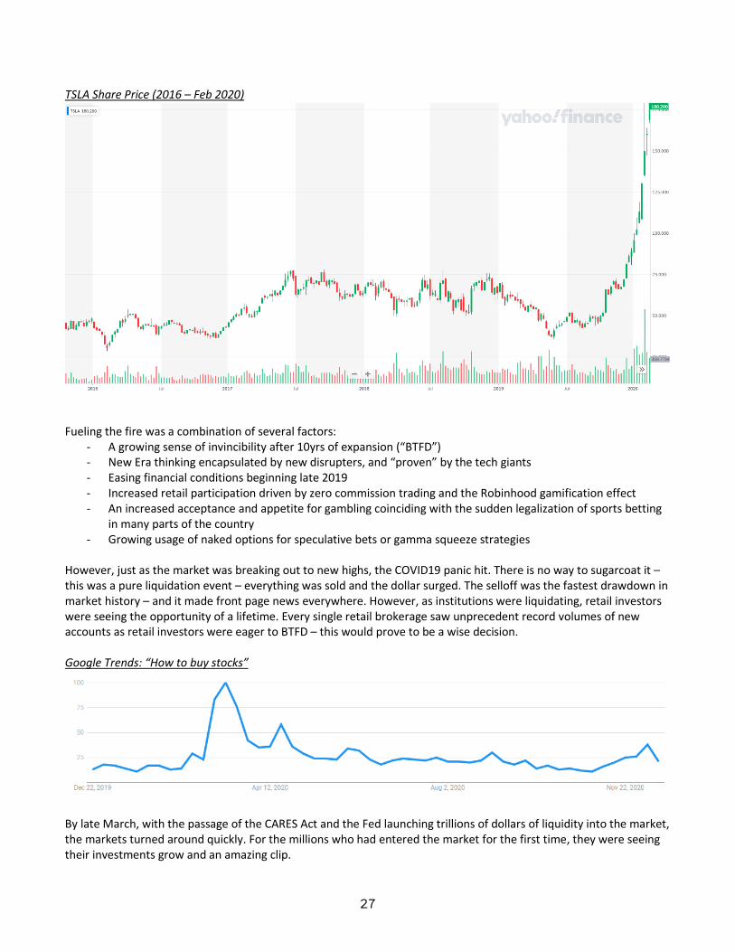
27
TSLA Share Price (2016 – Feb 2020)
Fueling the fire was a combination of several factors:
- A growing sense of invincibility after 10yrs of expansion (“BTFD”) - New Era thinking encapsulated by new disrupters, and “proven” by the tech giants - Easing financial conditions beginning late 2019 - Increased retail participation driven by zero commission trading and the Robinhood gamification effect - An increased acceptance and appetite for gambling coinciding with the sudden legalization of sports betting
in many parts of the country - Growing usage of naked options for speculative bets or gamma squeeze strategies
However, just as the market was breaking out to new highs, the COVID19 panic hit. There is no way to sugarcoat it – this was a pure liquidation event – everything was sold and the dollar surged. The selloff was the fastest drawdown in market history – and it made front page news everywhere. However, as institutions were liquidating, retail investors were seeing the opportunity of a lifetime. Every single retail brokerage saw unprecedent record volumes of new accounts as retail investors were eager to BTFD – this would prove to be a wise decision. Google Trends: “How to buy stocks”
By late March, with the passage of the CARES Act and the Fed launching trillions of dollars of liquidity into the market, the markets turned around quickly. For the millions who had entered the market for the first time, they were seeing their investments grow and an amazing clip.

28
Then came the stimulus checks. Recall, that in April as a result of stimulus, enhanced unemployment and reduction in expenditures, Americans had over $6 trillion in cash in savings account. The second bump in the google trends coincides with the distribution of the checks. Millions of Americans at home with nothing to do and more cash then they ever had were now hooked. Barstool Sports founder Dave Portnoy became the poster child for this phenomenon as he live streamed his day trading daily to thousands of eager followers. His primary advice – don’t listen to the suits, stocks only go up. Highest on Portnoy’s list of recommendations was Penn National Gaming (PENN), which had acquired Barstool shortly before the pandemic. Portnoy’s advice has paid off – despite significant loses due at their physical casinos amidst the pandemic, their stock has gone to the moon. PENN Stock Price since 2010
But of course it wasn’t just retail investors fueling the rally. After seeing stocks rise again, and with reopening hopes on the horizon institutions were back in too. Hedge funds were more than happy to ride the retail momentum wave – with Robinhood’s open API, it was you could track in real time which stocks were being bought by the newbies. Everyone was making money and everyone was getting greedy. As discussed in Part 1, the reopening data in the early summer absolutely smashed expectations. Unemployment was falling faster than any prediction, businesses that had shuttered were reopening and the Summer of Love had just begun. The summer ended with SoftBank betting billions of dollars in call options in order to squeeze the entire Nasdaq higher. By the time economic data began to falter in the fall, it was too late. The market was already in a frenzy.

29
Current Euphoria: Charts that Make you Say Hmm… Sometimes it’s easier to show than tell. S&P Forward P/E (Bloomberg)
Public Listings by Companies with Minimal or No Revenue (Wall Street Journal)

30
Call Options Volumes (Bloomberg)
SPAC Issuances by Year (SPACinsider)
Inflation Adjusted S&P Price (2019 Dollars)
You Are Here

31
Big Tech Speculative excess is not limited to just hotshot IPOs and SPACs. Rather overvaluation is originated in the pillars of the market – big tech. The 2010’s were the decade of the tech giants. The FAAMGs have demonstrated impressive growth, market dominance and cash flow. In fact, they have been the primary driver of earnings growth and capital appreciation market wide. The largest tech stocks now dwarf the size of the largest companies in any other industry. Nine of the top ten largest companies by market cap are tech companies. Top 30 Companies by Market Cap ($bn)
P/E Ratio of Top 30 Companies by Market Cap
While certain stocks like AAPL MSFT, GOOG and FB also have significant earnings that help support their gargantuan valuation, in aggregate these large tech companies are trading at a weighted average P/E multiple of 45x that is more than double all non-tech names on the list which trade at 21x. For reference, the market as a whole typically trades between 15x – 20x which comports with the average of the non-tech names on the list. While a mid-40s P/E may not

32
scream bubble, the sheer size of these companies means that even a small amount of overvaluation equates to large absolute dollar figures. For illustration, if these same tech names were to trade at 21x, their aggregate market cap would be reduced by $6.0 trillion. Before you jump to the conclusion that a 20x is an unreasonable trading multiple for a company like AAPL, below is AAPL’s forward P/E for the past decade. AAPL never traded above 20x on a forward basis until late 2019. AAPL Forward P/E (2010 – Present)
The fact that AAPL, the largest company in the world at a $2.1 trillion valuation, has seen its forward multiple almost triple in two years is a warning sign. Since 2015 AAPL’s EPS has grown from $2.32 to $3.31 today, or a 43% increase over 5 years. In contrast, its share price has increased from $25 to $125. It should also be noted that these big tech companies are now being hauled in front of Congress on nearly a weekly basis to confront concerns about their market share, monopolistic power, and business practices. One of the very few items that has bipartisan support is the agenda to rein in or break up these companies. It is clear that the market power they employ is anti-competitive and there is near universally agreement that they are too powerful as they stand today. All of this does not mean that these are not very good, valuable companies that will likely continue to grow in the future, it only means that their current market prices are overvalued. And given the weighting they represent in broader indexes should be a concern. The scale here is what’s the significant. $6.0 trillion of paper wealth has been created out of thin air in just these “blue chip” names. $6.0 trillion is about a third of US GDP, and is nearly double the size of both the CARES Act and the new $900bn stimulus package combined. Massive asset inflation creates a significant wealth effect that has likely buoyed spending and recovery in the past year, but also presents is a significant risk if it was to reverse. Looking at broader scale - here is the performance of the Nasdaq 100 since 1995.

33
Nasdaq 100 Since 1995
Debunking the Excuses: Let us front run the most common excuses to justify current market prices. Low Rates Justify Increased Valuations In response to the COVID crisis, the Fed, which has already been easing rates since 2019, dropped the Fed Funds rate to zero. The stated intent was to provide cheaper borrowing for individuals and companies. Mathematically and practically speaking lowered interest rates also increase asset values – mathematically, it decreases the discount rate and therefore increases present value, practically it allows people to take on more debt like mortgages which causes asset prices to be bid up. Given this general rule, the lower interest rates have become a go-to explanation for why stock prices are soaring that has the illusion of being backed by basic finance theory. Unfortunately, this line of thinking is quickly untangled when prodded. It is also a particularly ironic explanation since it implies current stock prices are being rationally determined by a long term cash-flow discounting. Effective Fed Funds Rate

34
First, the Fed Funds rate was at zero for nearly seven years between 2009 and 2016. If the market was indeed so sensitive to rates, then wouldn’t it have recoiled as the Fed starting hiking in 2016? The S&P hovered around 2,100 for most of 2016. Yet, despite hiking the front end of the curve by 250bps in three years, the S&P increased by 40% to over 3,000. Where was this perfect DCF machine to claw down share prices as the present values declined? You may reply “No - it’s the long term rates we care about! These are long term growth companies!” It is true that long term rates have declined to historic lows. 30-year Treasury’s today trade at ~1.5%, which is indeed tighter than the past decade, where yields generally ranged from 2.0% - 4.5%. 30-Yr Treasury Constant Maturity
Stepping back, we have to recognize absurdity in the that argument is that a ~125 bp move in 30yr rates since 2019 is solely and rationally responsible for the insanity in the market. Even if 2020 rates are historically low, the rates showed volatility to a similar degree over the past decade – did that cause massive swings in stock prices? Of course not, because stocks weren’t being priced based on the 30yr treasury rate then and they aren’t today. In fact, I would encourage anyone who uses this excuse to go and produce a DCF that justifies the equity value of AMZN ($1.6tr), TSLA ($625bn), NFLX ($232bn), SNOW ($94bn), DASH ($51bn), ABNB ($90bn) to name a few – that exercise would be illuminating in how irrationally these names trade relative to their fundamentals. The reason why rates have fallen is because of the dire global economic situation that has been described herein. Central banks expect to have keep accommodative policy to steer the economy through a deep recession and slow recovery – and bond markets are trading based on the outlook for lower global growth as well as the potential for central bank intervention in the longer end of the yield curve. Yet the equity market’s view of the world is very different – the market still believes in a V shaped recover that will usher in unprecedented growth and corporate profits. In this goldilocks scenario, wouldn’t one expect to rates to rise? If the 125bp tightening of rates justifies the rampant increase we have seen since March, then a reversion of rates to the 2019 levels should reverse all of those gains. If stocks are indeed so sensitive to longer term rates, and growth is really on the horizon, than the rate hikes should are a material risk. These explanations do not hold water – rather than are a back-solved justified for irrationality. Here is the punchline; a 125bp move in the 30yr yield will not make a bad investment a good investment. In reality, stocks trade based on their intrinsic value (i.e. earnings or cashflow) and what the market is willing to pay for that intrinsic value (i.e. multiple). Buying TSLA at 1000x P/E when its comps trade at 10x will prove to be a poor investment decision regardless of the interest rate environment.

35
The Fed Put Another common explanation is one that has existed far before the coronavirus – namely that the Fed will intervene to stop falling asset prices. The market has hung on the Fed’s every word for years – particularly in the wake of the GFC and the following decade of the quantitative easing (QE) experiment – salivating at the thought of easier financial conditions and additional liquidity. We agree that the Fed in general has shown the desire to support asset prices at any cost – moral hazard or income equality be damned. In March, the Fed really did seem to come to the rescue. However, using this explanation to remove the risk of principal loss in one of the frothiest equity markets of all time is a stretch. First, the Fed has already stretched its most powerful tools to their limits. It has already dropped the Fed Funds rate to zero – there is no room left to go. The Fed has also made it clear that it doubts the efficacy or wisdom of more extreme measures taken by other central banks like Yield Curve Control or negative interest rates. After shooting its wad in March, there is significantly less dry powder available to confront another sell-off. The most plausible scenario is injecting enormous sums of liquidity into the market. While this could have the effect of causing a melt up in prices, it will only delay the inevitable – many stocks are massively overvalued on a fundamental basis and there is nothing the Fed can do to reverse that, they can only keep the party going a little bit longer. Second, the Fed only has lending powers. In March, it expanded those powers in unprecedent ways to cover a wider range of debt securities, but it was still limited to lending. Given trend of central government control of capital markets, Its not totally implausible to think at some point in the future they may have the power to buy equities but they don’t today, and clearly wouldn’t in time to stave of a sudden sell-down. Finally – what is the strike of the put? Even if we assume the Fed will find a way to buy the SPY ETF, what price level do you reasonably expect would trigger such extraordinary intervention? As recently as March the S&P was trading close to 2,100. The S&P 500 has traded below 2,500 at some point in every year. Compared to the levels of today, there is massive downside before beginning to test those levels. Winners and Losers The final notion is easy to put to bed. Certain companies are beneficiaries and others are losers. That much is true – but refer back to the employment numbers by industry. Every private single industry is showing losses in payrolls, demonstrating the broad based nature of the downturn. For every winner there are many more losers. Another sanity check – in February, the S&P sat at was at 3,300. Today its over 10% higher – despite profits shrinking substantially, and a 9.7 million fewer jobs. It doesn’t matter how you cut it – that doesn’t add up.

36
Conclusions The economy remains deeply scarred. The road to recovery is likely to be long and arduous. There is significant uncertainty in the forward forecast and downside risks abound. Equity markets have reached a frenzied euphoria and are willfully ignorant to the downside risks. Any equity investor should consider these circumstances carefully. Now is a good time to realize gains and de-risk. Protection for tail-risk downsides is prudent. Buy low – sell high.