the printed word; from movable type to the microchip; the...
TRANSCRIPT

The CourierJULY 1988 -9 French ir.nc»
From movable type
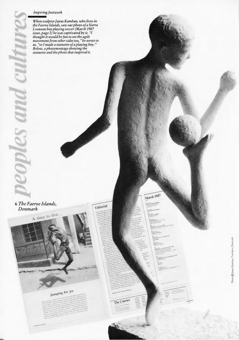
Inspiringfootwork
When sculptorfanus Kamban, who lives inthe Faeroe Islands, saw ourphoto ofa SierraLeonean boyplaying soccer (March 1987issue, page 2) he was captivated by it. "Ithought it would befun to see the agilemovement from othersides too, " he wrote tous, "so I made a statuette ofaplaying boy. "Below, a photomontage showing thestatuette and thephoto that inspired it.
V***^,.,!.>» , tat*«*1* , ,1. " ... '. '"
July 1988
Cover: Photomontage of a porcelain Chinese seal(17th century) with carved jade printing surface;¡mage of electronic circuitry produced by a com¬puter; at right, print control strip used for check¬ing the accuracy of colour proofs.Photos (seal) © Réunion des Musées nationaux, Musée Guimet,Paris; (circuitry) Betlavia © REA, Paris
Back cover: Detail of a page from the 42-lineLatin Bible printed by Johannes Gutenberg(Mainz, c. 1455), the first book printed frommovable type in the West. The typestyle is knownas Textura, a Gothic script in which the design ofthe characters produces an interwoven effect. Thedecorative initial capital was added by hand.Photo © Gutenberg Museum, Mainz, Fed. Rep. of Germany
The CourierA uindou opt» on the u-orld 4 1st year
Published monthly in 35 languages EnglishFrench Spanish Russian GermanArabic Japanese Italian HindiTamil Hebrew Persian Dutch
Portuguese Turkish Urdu CatalanMalaysian Korean Swahili Croato-Serb Macedonian Serbo-Croat
Slovene Chinese Bulgarian GreekSinhala Finnish Swedish BasqueThai Vietnamese Pashto Hausa
«From movable type to the microchipLandmarks in printingby Werner Merkli
4
10
14
16
19
20
22
25
28
32
34
35
2
'£Calligraphy and typography in Europeby Roger Druet atChristophe PlantinThe master-printer ofAntwerpby Francine de Nave
isThe desktop revolutionby Howard Brabyn
Unesco and the printed word cíComputerized typesetting in Chinaby Xu Lian-Sheng §The book situation in India
by Lokenath Bhattacharya>4rf
First impressionsArabic early printed textsby Camille Aboussouan
L 'EncyclopédieAn eighteenth-century best-sellerby Robert Darnton
Printing and society in Chinaand the West
by Tsien Tsuen-Hsuin
Glossary
The Unesco Courier goes to press
Peoples and culturesDENMARK: Inspiring footwork
Only a few years ago, it was widely contended that
one of the great transformations of modern society
was the decline of the written and printed word and
the rise to pre-eminence of the audiovisual media of
communication. Today, to paraphrase a remark
once made by the American humorist Mark Twain
when news of his own death had been prematurely
and inadvertently published, it may seem that
reports of the demise of the printed word have been
greatly exaggerated. While for centuries after the
invention of printing with movable metal type,
printing processes remained essentially unchanged,
today the production of books, periodicals and
other forms ofprinted matter is being
revolutionized by computerized type design and
photocomposition, satellite text transmission and
other new technologies. Paradoxically enough, the
development of microcomputers and "desktop
publishing" in theory at least may offer its
practitioners the extensive control over many stages
of the printing and publishing process that was
enjoyed by the European printers of 500 years ago.
This issue of the Unesco Courier presents some
landmarks in the history of printing and publishing
from the invention of paper in China 2,000 years
ago to modern electronic breakthroughs. It is
largely devoted to practical developments, ranging
from the evolution of calligraphy and typography
in late medieval Europe to methods of
computerized typesetting in modern China. Some
of the problems ofprinting and publishing in the
developing world are highlighted in an article on
the book situation in India by Lokenath
Bhattacharya, who reminds us that "the principal
factors governing publishing activities in a country
are its literacy rate, the size and nature of its
educated population, and its educational policies
and programmes".
Editor-în-chief: Edouard Glissant

FROM MOVABLE TYPE TO THE MICROCHIP
LANDMARKS IN PRINTING
BY WERNER MERKLI
WERNER MERKLI, of Switzerland, is editor of the German-languageedition of the Unesco Courier. A specialist in printing technology, he was formany years a director ofa leading Swiss publishing andprinting company, andserved as president ofthe Association ofSwiss Printing Industriesfrom 1976 to1981. He was for 25 years president of the friends of the Swiss GutenbergMuseum, Berne. Among his published works are "Vademécum. An introduc¬tion to the graphic arts", published by Hallwag, Berne (2nd ed. 1967).
FOR more than 400 years after Johannes Gutenberg'sinvention of a process of printing from movablemetal type in the fifteenth century, all type was cast
in a hand mould, the text was composed by hand, andprinting was carried out on hand presses. It was not untilthe nineteenth century that typesetting and printing pro¬cesses were mechanized. Since the mid-twentieth century,electronics and the microcomputer have revolutionizedtext composition, reproduction of illustrations and print¬ing techniques.
Papermaking
1 . The earliest picture of papermakingin Europe is this woodcut made byjostAmann for Hans Sach's "Book of
Trades", printed in Frankfurt in 1568.Although almost all steps inpapermaking are now highlymechanized, the basic process remainsunchanged. Plant fibres are separatedand wetted to produce pulp, which isfiltered on a screen, leaving a sheetfrom which the water is pressed out.The dry sheet is further compressedand treated, depending on the use forwhich it is intended.
2. Detail from a late 15th-centurywoodcut from Nuremberg showsUlman Stromer's paper mill, the
first in Germany.
3. Side view and plan ofNicolas-Louis Robert's
papermaking machine, 1798
The art of papermaking (1) was invented by the Chinese aslong ago as the second century BC (see article page 32), andtravelled westward when Chinese papermakers, taken prison¬er by the Arabs near Samarkand in AD 751, were forced todisclose their manufacturing secrets. In 1150 the art reachedSpain, and by the time of Gutenberg, paper mills had beenestablished in several European cities (2). Gutenberg thus hadat his disposal a perfect printing material that was muchcheaper than the parchment on which manuscripts wereproduced in the monasteries.
Papermaking was not mechanized until around 1800, whenthe first papermaking machine was invented by a Frenchman,Nicolas-Louis Robert, in the Didot paper mills near Paris. Itused a moving belt, and paper was made one sheet at a time (3).In 1805 the English engineer Joseph Bramah devised a paper-moulding machine which used a rotating cylinder. This de¬velopment later led to the production of continuous reels or"webs" of paper (4). The manufacture of paper is now almostentirely automated and quality control can be carried out bycomputer.
4. Machine for producing reels of paper, c. 1 820

The art of printing
Letterpress
impression
cylinder«y.
Letterpress is the oldest method ofprinting, and theonlyprocess which can use type directly. Printing is done from castmetal type or from blocks on which the image or printing areasare raised (in relief) above the non-printing areas. Ink rollerstouch only the top surface of the raised areas, and the inkedimage is transferred directly to the paper. Above, operatingprinciples of a type of letterpress machine with a flat bed and animpression cylinder.
Monastic libraries contain printed sheets dating from theninth and tenth centuries which were produced from reliefengraving on wooden blocks (5). Between 1041 and 1048, theChinese smith Bi Sheng used a technique of printing texts onpaper with movable characters made of earthenware, andprinting was also carried out with characters cast in copper ina Korean printing works in 1403. Between 1436 and 1444,Johannes Gensfleisch zum Gutenberg, of Mainz, Germany(6), developed the type mould or matrix and originated amethod of printing from movable metal type that was usedwithout important change until the twentieth century.
Gutenberg cut a punch in hard metal for every letter, accentand punctuation mark and struck it into a softer metal to makethe mould for casting identical pieces of type. The type wasmade from an alloy of lead, antimony and tin. The finishedcharacters were kept in compartmentalized typecases (7) fromwhich the text was assembled. For printing, Gutenberg built awooden worm-screw hand press (8), similar to a wine press.His printing ink consisted of a mixture of pinewood soot andlinseed oil, which was spread on the printing surface withleather pads. To ensure better absorption of the ink, the paperwas dampened before printing.
It is not surprising that the first book Gutenberg chose toprint was the Bible, for at that time it was the work most indemand. His "forty-two-line Bible" (see back cover), sonamed because of the number of lines in each column, wasprinted in Mainz between 1452 and 1455, in an edition of 200copies. The coloured initial letters to chapters and the decora¬tions were added afterwards by hand, because so far as thedesign of the type (9) and the layout was concerned Guten¬berg followed closely the model set by fine book manuscriptsin the monasteries.
The art of printing spread rapidly all over Europe. Manyefforts were made to improve the efficiency of the woodenpress, and Wilhelm Haas, a typefounder of Basel, Switzer¬land, followed the basic design of the wooden press when in1787 he developed the first all-metal hand press, which pro¬duced a better quality impression.
6. The oldest known portrait ofGutenberg. Copper engraving
from Vrais portraits et vies deshommes illustres, Paris, 1584.
5. A modern woodblock-engraver
A
DIaar.mi3D aaacinaa§1 1UL IUI JU DDDI iodoSI iai iai IE3 anac lana
m im IDI JU DDEJt man
m IUI im 1U tiaac laajBmtac IUI JU uaatia:*:u
ddqquuu EiDnaana 1naaonHi aauauuuu 1m inn nnn nrnaaOl IBU UUU JUaa
gl D BDO.jlju;;
aale
BIIDD g DBBOB
- R G
V 1
7. Illustration of typecases fromDiderot's Encyclopédie
8. Gutenberg's press reconstitutedat Leipzig in the 1 9th century. Thepress has a fixed, level lowersurface, the "bed", and a movable,
level upper surface, the "platen".The composed type, after beinglocked into a metal frame to make
the printing block or "forme", wasinked, covered with a sheet of
paper, and pressed between the twosurfaces.
9. Examples of letters Q /* % X r> r>cut by Gutenberg
to to to to c c
te ta £ bi Ir tt
t C t f f f
10. Diagram of Koenig's press(1 8 1 1), in which the platen isreplaced by an "impressioncylinder"
>
4
-1 4
|^-«JlW^
1 1. The Walter rotary press, 1 866
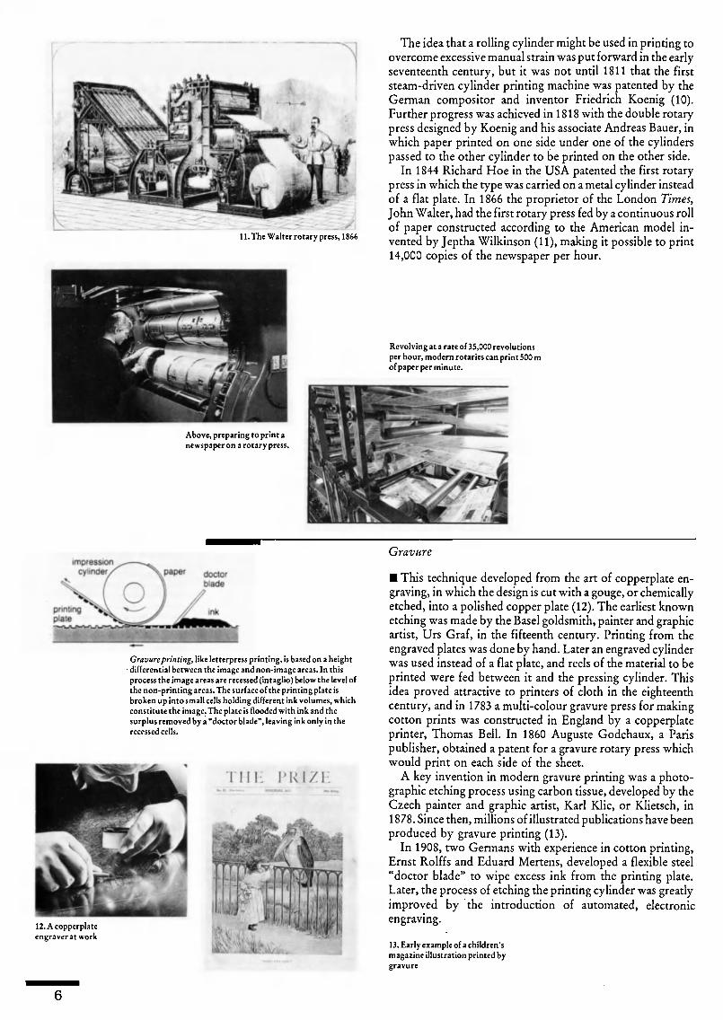
The idea that a rolling cylinder might be used in printing toovercome excessive manual strain was put forward in the earlyseventeenth century, but it was not until 1811 that the firststeam-driven cylinder printing machine was patented by theGerman compositor and inventor Friedrich Koenig (10).Further progress was achieved in 1818 with the double rotarypress designed by Koenig and his associate Andreas Bauer, inwhich paper printed on one side under one of the cylinderspassed to the other cylinder to be printed on the other side.
In 1844 Richard Hoe in the USA patented the first rotarypress in which the type was carried on a metal cylinder insteadof a flat plate. In 1866 the proprietor of the London Times,John Walter, had the first rotary press fed by a continuous rollof paper constructed according to the American model in¬vented by Jeptha Wilkinson (11), making it possible to print14,000 copies of the newspaper per hour.
Revolving at a rate of 35,000 revolutionsper hour, modern rotaries can print 500 mofpaper per minute.
Above, preparing to print anewspaper on a rotary press.
impression
cylinder paper doctor
blade
12. A copperplateengraver at work
Gravureprinting, like letterpress printing, is based on a heightdifferential between the ¡mage and non-image areas. In thisprocess the image areas are recessed (intaglio) below the level ofthe non-printing areas. The surface of the printing plate isbroken up into small cells holding different ink volumes, whichconstitute the image. The plate is flooded with ink and thesurplus removed by a "doctor blade", leaving ink only in therecessed cells.
THE PRIZE
Gravure
This technique developed from the art of copperplate en¬graving, in which the design is cut with a gouge, or chemicallyetched, into a polished copper plate (12). The earliest knownetching was made by the Basel goldsmith, painter and graphicartist, Urs Graf, in the fifteenth century. Printing from theengraved plates was done by hand. Later an engraved cylinderwas used instead of a flat plate, and reels of the material to beprinted were fed between it and the pressing cylinder. Thisidea proved attractive to printers of cloth in the eighteenthcentury, and in 1783 a multi-colour gravure press for makingcotton prints was constructed in England by a copperplateprinter, Thomas Bell. In 1860 Auguste Godchaux, a Parispublisher, obtained a patent for a gravure rotary press whichwould print on each side of the sheet.
A key invention in modern gravure printing was a photo¬graphic etching process using carbon tissue, developed by theCzech painter and graphic artist, Karl Klic, or Klietsch, in1878. Since then, millions of illustrated publications have beenproduced by gravure printing (13).
In 1908, two Germans with experience in cotton printing,Ernst Rolffs and Eduard Mertens, developed a flexible steel"doctor blade" to wipe excess ink from the printing plate.Later, the process of etching the printing cylinder was greatlyimproved by the introduction of automated, electronicengraving.
13. Early example of a children'smagazine illustration printed bygravure

Lithography and offset
The lithographic technique was discovered by chance in1 796, when the Munich dramatist Aloys Senefelder, searchingfor a economical method of printing his own work, triedwriting on a finely-ground stone surface and discovered thewater-repellent properties of his greasy, oil-based ink.
Initially, the images to be reproduced were hand-drawn ona litho stone (14) and printed on a manual press (15). Theimpression was taken by pressing the paper against the inkedstone with a scraper. Thanks to the mechanization of thistechnique with Georg Sigl's flat-bed litho press, introduced inBerlin in 1851, single and multi-colour lithographic printing(16) became very important, especially for printing packagingmaterial.
As early as 1805 Senefelder had tried to find an alternativeto the heavy litho stone, but it was not until 1904 that Ira W.Rubel and Caspar Hermann of New Jersey, USA, devised athin metal plate to carry the image to be printed. After this hadbeen inked, and the surplus ink repelled with moisture, theimage was transferred to a rubber-coated cylinder and then tothe paper (17). This form of indirect printing is known asoffset. The fact that the printing plate, the rubber blanket andpaper all ran on cylinders enabled higher printing speeds to beachieved from the start.
In the early offset litho presses, the need for dampeningoften caused serious problems and the impressions obtainedwere dull and blurred. After the Second World War, technical
improvements combined with better inks and more thickly-coated paper, resulted in sharper impressions and higher inksaturation.
Today, large electronically-controlled offset rotary presses,with several printing units in sequence, can print both sides ofthe paper, in sheets or as a continuous web, at the rate of30,000 impressions per hour (18).
impression^Cylinder/ paper
1 7. Offset lithography. Basically the offset printingpress consists of 3 revolving cylinders. The firstcylinder carries the printing plate, the second carries arubber blanket, and the third (the impression cylinder)presses the paper against the offset blanket. Otherrollers feed the paper through the press.
dampeningrollers
paper
inkingsystem dampening
, ^ systemkwater
In lithography, the printing andnon-printing areas are on the sameplane of the surface of a thin metalplate, and the definition betweenthem is maintained chemically.The printing parts of the surfacerepel water when moistened butabsorb the ink with which they arecoated, whereas the non-printingparts absorb the water and repelthe ink.
15. Wooden lithographic handpress from the time of Senefelder
16. Colour illustration by theFinnish lithographer Emilie
Topelius was reproduced in achildren's book, Sagor, published in
1847
. ¡ » i: i V
impression
cylinder
plate
cylinder
blanket
cylinder
printed
mage
1 8. An offset rotary press

Revolutions in typesetting
In the nineteenth century attempts were made to mechanizetext composition, which was still carried out line by line withindividual metal characters assembled in a composing stick(19), following a process that had not changed greatly sinceGutenberg's time. The first patent for a typesetting machinewas taken out in 1822 by William Church of Boston; otherssoon followed (20).
But the real breakthrough in the mechanical setting andcasting of type was achieved in 1884 by the German-bornwatchmaker Ottmar Mergenthaler in Cincinnati, USA, whenhe invented the Linotype machine, which could set 6,000characters per hour as compared with 1,400 by hand. In theLinotype system (21), the brass matrices in which the charac¬ters are engraved in negative form are released from thestorage magazine by typing on a keyboard, assembled into aline and moved into the casting mechanism. After casting, theentire lead line or "slug" is ejected and the matrices carriedback to their position in the storage magazine where theyremain on call for another line.
In 1897, also in the USA, the English engineer TolbertLanston separated the operations of setting and casting thetype in his Monotype machine. In the Monotype system (22),again by typing on a keyboard, a paper tape on the setting-machine was punched with a different combination of per¬forations for each character. This punched tape mechanicallycontrolled the typecasting mechanism, which cast each char¬acter individually. Because of the high quality of the typeproduced by the Monotype system, it came to occupy apredominant position in book printing.
Developments in photographic techniques led to manyattempts to replace metal type by photographing the imagesof the characters (23). A successful early application of photo-typesetting was the Lumitype system developed by twoFrenchmen, René Higonnet and Louis Moyroud, in the1940s. Production speeds exceeded 28,000 characters per houron later models. In the Monophoto, introduced in England in1950 as a development of the Monotype system, the charac¬ters could also be enlarged and reduced in size when projectedonto film.
In 1955 sensational developments in electronics soundedthe deathknell of Gutenberg's lead type. Instead of beingcontrolled by perforated tapes, typesetting machines couldnow be driven by a computer programmed to expose thecharacters onto film, permitting an output of 30,000 to100,000 characters per hour. A considerable acceleration inoutput up to 600,000 characters per hour was achieved inthe 1960s with the development of faster computers and theuse of a cathode ray tube (CRT).
Another significant development at this time was the intro¬duction of the Optical Character Recognition (OCR) readingmachine, which scans typewritten or printed text at the rate of300,000 characters per hour to produce input to a computer-driven typesetter.
Considerable improvements in text input speeds wereachieved with the introduction of integrated circuits andmicroprocessors into computer systems, as well as by theintroduction of a visual display unit on which the selectedcharacters appear as they are typed. The text can be read andcorrected on the screen (24), before being stored in thecomputer's memory. However, there is a limit to the typeset¬ting speed of machines using CRT technology, as each charac¬ter has to be picked out individually from the image matrix.
8
Another approach was adopted in 1 965 by Dr. Rudolf Hell,of Kiel, Federal Republic of Germany. In his Digiset system, ascanning device analyses each character electronically andbreaks it down into tiny squares, which are stored in thecomputer's magnetic memory in digital form. When inputtingtext, these squares are recombined on film, again using acathode ray tube, into characters of the required size andtypeface. With a initial production speed of over 1 millioncharacters per hour, this was another important breakthroughin typesetting.
In 1976, the laser beam began to be used to replace the CRTbeam for digital recording of the characters (25). The intenselight beam from photons projects a sharper, clearer typeface.Digital storage of text opens up revolutionary possibilities forits high-speed transmission throughout the world, via satelliteor fibre-optic cable.
19. The composing stick holdspieces of type. The compositor setsthe type upside down.
20. Hattersley's typesettingmachine, London, c.1870
21. Diagram ofLinotype machine
22. Early monotypekeyboard (left) andcaster (right)

The printed image
Throughout the Middle Ages, beautiful copperplate engra¬vings, etchings, woodcuts (26) and lithographic prints wereproduced by draughtsmen and painters by carving or drawingon printing blocks of wood or stone, or by engraving on metalplates. Discoveries regarding light and the theory of colour,together with the invention of photography in the nineteenthcentury, brought the potential of photographic processes tothe printing industry (27).
Although solid lines can be printed directly using theletterpress and offset processes, the intermediate tones inphotographs cannot. In 1881, the Munich copperplate en¬graver Georg Meisenbach succeeded, by photographing animage through a screen of crossed lines, in breaking down theimage into tiny dots. In the resulting positive, the closely-spaced dots combine to form the darker tones of the originalimage, and the less dense dots yield the light tones. Thescreened image can then be recorded on to a printing plate in aprocess known as halftone etching. Screening is often carriedout by electronic scanning today (28).
For the reproduction of tonal images in colour, however,three plates must be made one each to print red, blue andyellow ink. Usually, a black plate is also made, because blackink adds sharpness to the printed copy. The first step is toseparate the colours photographically in the original image.The colour separations are made by taking four separatephotographs through different filters which block out allcolours except the desired colour, and also through a halftonescreen to produce the dot pattern required for printing. Incolour printing, some of the different coloured dots fall closetogether and some are superimposed. The eye mixes thecolours of the dots on the printed page into all the tones of theoriginal. For example, what the eye sees as green is really anarea of tiny blue and yellow dots. Experiments carried out inthe USA between 1946 and 1950 led to the development of aprocess for making colour separations by electronic scanning,and by the late 1970s, following developments in electronicstechnology, the impulses from the scanner beam were digi¬tized. The tiny dots which produce the tonal values of thereproduction are then reconstituted by laser beam, either onfilm or directly onto the printing plate.
iVrnj&iua copoitdljnue DOOM
3lo.(WTfoncjncil-Unue pmticnha
23. Diagram showingoperating principles ofa phototypesettingmachine
24. Composing texton screen
26. In the early days ofEuropean printing,identical woodcuts
were sometimes used to
illustrate different
people.
27. Photo from William
Henry Fox Talbot'sPencil of Nature (1844-46), the first knownbook illustrated
entirely withphotographs
28. Electronic scanners
(right) can be used toprocess images forprinting. The image isfitted onto a revolvingdrum and reproducedby the scanner as apattern of tiny dots.Far right, halftone dotsenlarged
The electronic future
Developments in the printing industry during the comingdecades will be primarily determined by advances in electro¬nics. Desktop publishing technology (see article page 16)emerged in the 1980s for the processing of both text andimage. Using electronic pencils and brushes, computergraphics can be created directly on the screen and integratedinto the stored text. Furthermore, magnetic discs are beingdeveloped which can store over 1,000 million typographicalsigns (500,000 typewritten pages) and integrated databaseswill improve access to information.
Metal typesetting and letterpress printing processes havevirtually disappeared within a short period. Thanks to thesimplification of platemaking, however, the offset and photo¬gravure processes have survived. Electrostatic printing,whereby an electrostatically-charged plate transmits a drypowder or liquid ink toner to plain paper, and inkjet printing,in which computer-controlled jets are used to spray hundredsof thousands of electrostatically-charged drops of colour persecond onto the paper to produce text and images, are just twoof the techniques which are leading to contactless printing,instead of printing from an inked plate.

Calligraphy and typographyin Europe BY ROGER DRUET
Hittite hieroglyphicinscription from the
ancient city ofCarchemish.onthe
upper Euphrates (10thto 8th century BC).
,
V -
ABr
Above, inscription in Phoenician scripton the tomb ofAhiram, king of Byblos(10th century BC). The ancestry ofWestern alphabets can be traced backto the alphabet developed by theancient Phoenicians.
Below, letters from modern typefacesin Greek (left) and Cyrillic (right).Cyrillic, the alphabet used for Russianand other languages of the USSR, aswell as Bulgarian and Serbian, isderived from the Greek. It was
probably developed in the 9th centuryAD by 2 Greek brothers often calledthe "apostles to the Slavs", St. Cyril,for whom it was named, and St.
Methodius. Cyrillic was laterdeveloped into printing characterswhich were simplified in the early 18thcentury on the instructions ofPeterthe Great.
ABB
q6b
ALL typefaces, even the most modern digitized char¬acters designed with the help of a computer, arebased on forms of writing. This link between writ¬
ten and printed characters is particularly noteworthy in thehistory of European typographical design.
The Phoenicians and the Greeks, who invented the earlyalphabets from which Western scripts derived, were seafar¬ing and colonizing peoples who needed to carry precise andlegible messages over very long distances. Consequently thepriorities of Western writing were speed of execution andsimplicity of design.
The creation of phonetic alphabets (instead of ideographicsystems) using only twenty to thirty signs for the transcrip¬tion of language was a decisive step in a process of abstrac¬tion in which the Greeks played a leading role by consid¬erably developing the Phoenician alphabet. The alphabetthey created is the basis of the Latin characters used in manyparts of the world today.
By the fourth" century BC, the Golden Age of Hellenicthought, Ionic script had already developed the rectangularform of modern capital lettering. During the Greek andRoman classical era, writing acquired the harmonious andbalanced form which is known as lapidary because of itsresemblance to the monumental script used for inscriptionsin stone. This script with its -firmly chiselled grooves andbroad strokes which stood out well in sunlight and wereenhanced by shadow, answered a need for beauty andharmony but also expressed imperial power. Latin capital-letter script may be regarded as the basis of subsequentdevelopments in Western scripts and, later, type designs.
Cyrillic script, which was adopted by Orthodox Chris¬tians for the Slavonic languages, particularly in Russia, em¬ulated these upright, monumental styles of writing. System¬atically used as a phonetic form, it became a widelyemployed substitute for Latin script in the Slav countries.The invention of Cyrillic script, derived from a Greek bookhand, is attributed to the ninth-century Greek missionariesCyril and Methodius, and was standardized by the Byzan¬tine Emperor Constantine VII.
After the heavy quadrata, or square capitals, the basis ofall Latin scripts, and the Roman rustic capitals, an early formof cursive script, writing evolved towards the rounded uncialscript. In the ninth century, Charlemagne imposed on theHoly Roman Empire the form of small lettering now knownas Carolingian miniscule, which included most of the fea¬tures of the lower case Latin alphabet. The official adoptionof this cursive script did not bring about the disappearance ofcapital letters, but it was the dominant hand of WesternEurope throughout the ninth century and served as a modelfor later innovators until the dawn of European printing inthe fifteenth century.
With the foundation of universities in Europe in thetwelfth century, parchment became scarce. A new script,known as black-letter or Gothic, as angular and narrow asthe Gothic pointed arch, answered the needs of the moment

Printing was originally conceived as a process forthe mechanical reproduction of manuscript. Manyearly printers came to typography throughcalligraphy, and the work of some latertypographers has also been influenced by styles ofhandwriting. Right, specimen Western scriptsfrom Roman times to the 18th century.
in that it took up a minimum of space. The expression ofthought seemed to be channelled through a kind of grid. Thisdesign gave rise to two basic scripts: the rigid, verticalTextura, used primarily for liturgical texts; and a moreflexible script, Rotunda.
In the fifteenth century, the angular Gothic script, havingbeen appropriated by the lettered classes in France, becameknown as bâtarde or Bastarda. The invention and use of
spectacles also made it possible for writing to become small¬er. It was not until the end of the sixteenth century that theGermans introduced capital letters into the Gothic alphabetfor woodblock printing. Hitherto, the place of the "droppedinitials" initial letters at the beginning of a page or chapter,which covered two or three lines of text had been left
blank, to be filled in by the illuminators.For engraving, the Germans had adopted a spiky kind of
script, whose rather fussy, fractured style suggested its name,Fraktur. The great painter and engraver Albrecht Dürer,who thought that letters could be governed by mathematicallaws, undertook to impose a constructive discipline onGothic script. This admirable undertaking culminated in abalanced appearance for each character.
Around 1440, the German printer Johannes Gensfleisch,known as Gutenberg, of Mainz, took the remarkable step ofbringing together and organizing all the processes of print¬ing: punch-cutting, making matrices, type-casting, compos¬ing and the use of a hand press. Once the discovery had beenmade, the art of printing spread rapidly. The Gutenbergforty-two-line Bible (see back cover), the first great feat ofWestern printing, was printed in Gothic lettering. Sub¬sequently, Gutenberg increased his. range of typefaces toalmost 300 so that he could reproduce different scripts asaccurately as possible.
The humanist scholars of fifteenth-century Italy nevertook to Gothic script. Petrarch considered that it lookedblurred from a distance and caused eyestrain close to, as if ithad been created not to be read, but for some other purpose.The Italian Renaissance therefore turned for inspiration toclassical Antiquity, and calligraphers revived ancient monu¬mental lettering, thus returning to a simplicity and claritythat are still characteristic of printing today. The West,influenced by its artists, pursued the chimera of "divineproportion", the mathematical relationship believed to bethe key to beauty. Leonardo da Vinci sought it in the humanbody, as did Dürer and the great French typographer Geo-froy Tory, who studied the composition of letters accordingto the proportions of the human body in the Champfleury(1529), a treatise on type design.
An important event which encouraged a new approach toprinting was the sack of Mainz in 1462, which forced manyof Gutenberg's collaborators to leave the town. They tookthe secrets of printing to several European countries.Around 1470 one of them, the French engraver NicolasJenson settled in Venice, where hé drew inspiration fromhumanist scripts in designing a new type with wedge-shaped
Aa Lapidary (from 600 BC)
A Quadrata, Roman square capital
aA Rustic, Roman cursive capital
AAA Uncial, rounded capital (from 3rd century AD)
aA^ Carolingian miniscule (8th-9th century)
ap3£
Goriic(12th-15th century)
Evolution from Textura (left) to Rotunda (right)
Capital revived for initials (15th-16th century)
a Bastarda vernacu'ar script (15th century)
Aa¿L Humanist classical revival (14th-16th century)
J%a Chancery cursive script (15th-16th century)
CL Roundedbook hand (17th-18th century)
Signature of Charlemagne, c. 800 AD.The Emperor, who could not write,merely added his own flourish to themonogram painted for him by thecopyist.
Letter patterns from Champfleury,the first theoretical treatise on the
designing of type (1529), by theFrench printer Geofroy Tory, wholater became the royal printer ofKing François I.
Ornamental capital letter, left,from the Bible Historiale (c.1380) attributed to a copyistknown as Pierre Comestor
("Peter the Eater"), is one ofthe earliest Europeandepictions of a person wearingspectacles. The invention ofspectacles made it possible forwriting styles to becomesmaller.
11

is/ epíílolas mâdatcasdeílinauíc. ita nt
ïmunitur.comeatu
Uuitionê accedunt.
as/ arbitratus omnia
rçcenri/ inftigat Balratu dignamaggreir Demetrius.Quo '
ABCabc
The type created by the Frenchprinter Nicolas Jenson (c. 1420-1480) and known as "roman" is
generally considered to be the firstconsciously designed according totypographical ideals rather thanmanuscript models; Left, specimenof text printed in Jenson's roman.
These drawings show a capital andlowercase "a" in a typeface known asRomain du Roi, which was
commissioned by Louis XIV in 1692 forthe exclusive use of the royal printingworks. The drawings, made by NicolasJaugeon, a leading member of thecommittee charged with the design ofthe typeface, form part of a setprepared for the guidance of the type-cutter, Philippe Grandjean. Thecommittee turned away from theprinciples of calligraphy and designedeach letter on a mathematical basis,
using a grid subdivided into tinysquares.
Page from The Works ofGeoffrey Chaucer(\»%)the crowning achievementof William Morris'
Kelmscott Press. Critical of
the mediocrity ofcontemporary machine-produced books, Morrisreverted to the hand press,handmade paper andspecially-made ink andtypefaces. His Chaucer wasprinted in black and red,and contained 87 woodcuts
by the leading Englishpainter and designer SirEdward Burne-Jones, plusan abundance of borders,initials and ornaments
designed by Morrishimself.
The first italic typeface was cutaround 1500 by Francesco Griffofor the Venetian humanist and
publisher Aldus Manutius. Thedesign was based on the cursivewriting of the papal chanceryclerks. Left, modern Garamond
italic, named after its designer,Claude Garamond (c. 1480-1561),who was inspired by thepublications of Manutius. (Thisissue of the Courier is set in
Garamond.)
serifs. This pure and beautiful style was known as roman, aname which would in future be applied to typefaces with anupright design. Among the heirs to his workshop in thatillustrious city was the learned Aldus Manutius, one of thegreat figures in European publishing. His type designer,Francesco Griffo of Bologna, cut the first example of asloping type which became known as Aldine and is todaycalled italic. It was based on the informal cursive writingdeveloped by chancery clerks to speed their work.
The sixteenth century was the Golden Age of calligraphyin Europe, rich in great calligraphers such as Ludovico degliArrighi, Ugo da Carpi, Giovanniantonio Tagliente and Pala¬tino in Italy, Jean Beauchenne in France and Roger Aschamin England. As progress was made in copper engraving, so acursive script with slender finials (terminal hooks) emergedand came to fruition in the work of Lucas Matherot and
Louis Barbedor.
In France, where the development of printing was influen¬ced by the work of Geofroy Tory, the Estienne family wasprominent. One of its members, Robert Estienne, was print¬er to King François I. He entrusted Claude Garamond with aroyal command to cut typefaces for editions of classicalGreek texts. The famous Grecs du Roi which resulted were
uncluttered and elegant. Garamond, the first commercialtypefounder, also designed the roman and italic typefaceswhich bear his name and which played a leading role inEuropean typographical design until the end of the sixteenthcentury.
In this great humanist movement, Christophe Plantin (seepage 14), a French bookbinder who became a citizen ofAntwerp and a printer, acted as a connecting link with theNetherlands, where a great dynasty of printers, the El-zeviers, had come to the fore and would be active until the
beginning of the eighteenth century. The Elzeviers gave theirname to an elegant wedge-serif typeface.
In 1692, during the reign of Louis XIV and classicism,Abbé Nicolas Jaugeon of the French Academy of Scienceswas given the task of creating a new typeface. His design, cutby Philippe Grandjean, was called Romain du Roi and wasreserved for the exclusive use of the Imprimerie Royale theRoyal Press. This cold, majestic script was first used in 1702.
The eighteenth century was an age of elegant typographyin Britain. The typefounder William Caslon cut a highlylegible typeface which is still in use today. Caslon was thetypeface in which a Baltimore printer issued the officialcopies of the United States Declaration of Independence.Another English printer, John Baskerville, who taught cal¬ligraphy, designed a graceful, balanced typeface which revo¬lutionized typography and is still popular.
In eighteenth-century France, Louis-René Luce, engraverto King Louis XV, introduced the rational spirit of theEnlightenment and the Encyclopedists into typographicalexperimentation, while Pierre-Simon Fournier and François-Ambroise Didot invented the point system of typographicmeasurement. Both Didot's son Firmin and Giambattista
12

ABCabc
AB<Cab
Bodoni of Parma were inspired by Baskerville's work tocreate very similar forms of austere lettering with stronglycontrasting thick and thin strokes. Their work influencednineteenth-century type design in several countries.
The development of lithography, a process of printingfrom a stone surface invented in 1796 by the dramatistAloys Senefelder (see page 7), encouraged printing fromtypes based on calligraphic script with fine, supple curves.From 1830 onwards, as a result of scientific and technical
advances and the development of industry and trade, adynamic form of typography came into being through thework of typefounders such as Alexandre de Berny andThéophile Beaudoire. Egyptian, with its slab serifs, and FatFace, still widely used in the press and advertising, werehighly fashionable typefaces.
William Morris, the poet and writer who made a majorcontribution to the revival of English decorative art in thelate nineteenth century, was the leader of the Arts and CraftsMovement which took inspiration from the styles of medie¬val times. The work produced by his Kelmscott Press had astrongly individual graphic personality and exercised wideinfluence. In France, George Auriol and the painter andengraver Eugène Grasset were among the masters of ArtNouveau. The latter received support from the typefounderGeorges Peignot, who later, with his son Charles, produceda range of typefaces which would dominate printing until theadvent of phototypesetting in 1956. Peignot, designed by theFrench poster artist Adolphe Mouron Cassandre in 1937,and Bifur, a shaded script of great originality, are among thefinest typefaces cut by the Deberny and Peignot typefoundry.
Today, although computerization is widespread, there is awelcome revival of interest among young people in the art ofcalligraphy, which is encouraging the search for and creationof new designs. Outstanding modern designers of digitizedletters include the great German calligrapher Hermann Zapf;Adrian Frutiger of Switzerland; Ladislas Mandel, JoséMendoza, Albert Botón, all of France; as well as the youngFrench designer of Arin, Franck Jalleau.
We are at the dawn of a new age of typography. Letteringis no longer created by lead objects but by strokes of light.Photocomposition systems can now provide higher screenresolution, allowing sharper definition of characters, as wellas an immense variety of typefaces, offering great scope forcreativity. Soon, these machines will achieve a degree ofsensitivity close to that of handwriting, and will give typo¬graphers a degree of control over the design of lettering farsuperior to that of early electronic typesetting systems. But tosafeguard an entire heritage of craftsmanship, metal type mustnot be allowed to disappear.
ROGER DRUET, a leading French typographer and calligrapher, has beenprofessor ofgraphic design and the history ofwriting at the Ecole Supérieuredes Arts Appliqués, in Paris, since 1960. He is the author ofnumerous studieson the art ofwriting in ancient and modern times, notably La Civilisation del'Ecriture (1977).
C
Specimen letters of 2 typefaces designed in18th-century Europe, Baskerville roman (farleft) and Didot roman (left). With the creationof the typeface that bears his name, JohnBaskerville (1706-1775) made a majorcontribution to the development of Englishfine printing. Another important step towardsmodern typography was made in France, byFirmin Didot (1764-1836), whose typeface is afar cry from the flowing lines of earlier designswhich were natural to pen or brush.
A typeface known as Bifur,designed by the French artistAdolphe Mouron Cassandre in1937, and cut by the Deberny andPeignot typefoundry.
Above, Labyrinth (1981), aphotographic print by Albertas
Gurskas (born 1935), a graduate ofthe Lithuanian SSR Art Institute.
Enlargement of a letter "w",digitized for generation bycomputer. When the letter isprinted at normal size, the "steps"become, or should become,invisible.
Letters from Arin roman (below right), a newcomputer typeface designed by Franck Jalleau,of France. The design, which won an award inan international typographical designcompetition held in 1987, moves away from thesquare outlines of early digitized type andreturns to calligraphic sources. Below, a stufor the companion italic face. AB£
abc13

CHRISTOPHE
PLANTIN
The master-printer of Antwerp
BY FRANCINE DE NAVE
AaBbCcD
FRANCINE DE NAVE, Belgian historian andpalaeographer, is director of the Plantin-MoretusMuseum in Antwerp and of the Antwerp Print-Room. She is the author ofmany books and articleson the history ofAntwerp. A longer version of thepresent text has appeared in Belgique, des Maisonset des Hommes, published by Nouvelles EditionsVokaer, Brussels.
CHRISTOPHE Plantin was born
some time around the year 1520 inSaint-Avertin, near the French city
of Tours, and served his apprenticeship withthe bookbinder and bookseller Robert Macé
in Caen. In 1549, after a brief stay in Paris,he moved to Antwerp, at that time the hubof Western European trade, and set up abookbinding business.
Antwerp suited his purpose perfectly, asit was ideally situated to provide the equip¬ment and raw materials necessary to set up abindery. And since it was also a majorfinancial centre, the capital necessary to cre¬ate a business was readily available. In addi¬tion, it was a city which attracted wealthyart-lovers of all kinds.
Plantin had been in Antwerp for only afew years when, following a wound to hisarm, he abandoned bookbinding in favourof printing. The publication in 1559 of adescription of the magnificent funeral cere¬mony of the Holy Roman Emperor CharlesV, by his son Philip II of Spain, establishedPlantin's reputation, and he quickly foundhimself at the head of what would prove tobe the most important printing-house inWestern Europe during the second half ofthe sixteenth century.
Between 1563 and 1567, Plantin printedand published over 200 titles, ranging fromannotated pocket editions of the classics toliturgical works, Hebrew Bibles, richly il¬lustrated anatomical treatises and botanical
studies.
Now a man of substance, Plantin enjoyedgreat celebrity and was surrounded by acircle of influential friends and acquaint¬ances, one of whom Gabriel de Cayas,secretary" to Philip IIwas to play a decisiverole in the further development of his af¬fairs. It was Plantin's ambition to producean authoritative edition of the Old and New
Testaments; de Cayas secured financialbacking for the project from the Spanishking, who also sent to Antwerp, to serve asits specialist editor, his chaplain the hu¬manist Benedictus Arias Montanus.
The undertaking, which took five years tocomplete (1568-1573), was an outstandingsuccess: a copiously annotated edition of theBible in four languages (Hebrew, Syriac,Greek and Latin), running to eight massivevolumes in folio. This Biblia Regia or BibliaPolyglotta, as it was known, not only con¬stituted a personal triumph for Plantin; itwas also the most voluminous publicationever produced in the Netherlands by asingle printer. Its appearance marked thebeginning of the most prosperous period ofPlantin's business.
Thanks to the success of the PolyglotBible, and through the influence of AriasMontanus, Plantin, who had already ob¬tained the office of prototypus regius (royalprinter) from the Spanish monarch, wasaccorded a monopoly in the sale of missalsand breviaries in Spain and its colonies over¬seas. The lands in question rapidly became
14

Frontispiece of Plantin's masterpiece, the 8-volume Biblia Sacra or Polyglot Bible, publishedin 4 languages (Latin, Greek, Hebrew andSyriac).Photo © Rare Books and Special Collections Division, Library ofCongress, Washington, D.C.
Antwerp's Plantin-Moretus Museum is estab¬lished on the premises of Christophe Plantin'sprinting office and residence. The 16th- and17th-century printing works has been recon¬structed in the museum (above).
his most important clients, and carried hisfortunes to their zenith.
No fewer than sixteen presses were atwork in Plantin's printing-house an enor¬mous figure when it is remembered that thebiggest printer in France at the time, Es¬tienne, was operating only four. The num¬ber of his employees confirmed Plantin'sascendancy: there were 54 staff living andworking on the premises in 1574; with theaddition of those who lived or worked at
home the total must have been in the regionof 150. Work went ahead at a feverish pace;12- or 13-hour days were the norm. Eachpress had to meet a daily target of 1,250printed sheets, or 2,500 pages. But the type¬setters, printers and proof readers were byno means dissatisfied with their lot: theywere pieceworkers, and a high output com¬manded excellent rates. Plantin's workers
were among the best-paid in Antwerp.Quantity was not, however, the sole con¬
cern. Plantin insisted on the highest qualityas well. The paper mills of the southernNetherlands at the time produced only me¬diocre material, so he imported the finestpaper from Germany, and more especiallyfrom France. The type used for printing hispublications had to be perfect as well, andhe called on the best typecutters of the age:Claude Garamond, Robert Grandjean,Guillaume Le Bé and Hendrick van de
Keere, besides playing an important person¬al role in the development of typestyles inWestern Europe by importing the romanand italic typefaces currently in use inFrance.
Concerned also with the quality of the
The modern typeface known as Plantin,based on a design used by the Antwerp master-printer.
illustrations, Plantin preferred to print themfrom engraved copper plates, which pro¬duced finer lines and more delicate tones
than the wood blocks generally utilized. Ifthe latter gradually fell out of favour forbook illustrations, it was because of the
success enjoyed by Plantin's publications.Plantin was equally attentive to the con¬
tent of his books. Despite his monopoly ofthe sale of liturgical works, his presses werenot exclusively engaged in turning out mis¬sals, breviaries, antiphonaries,1 diurnals,books of hours and psalters. He appliedhimself to publishing the most outstandingliterary works of the post-humanist age:collections of the classics or of laws, princi¬ples and maxims; school books; the firstedition of Variarum lectionum libri III bythe Flemish humanist Justus Lipsius andOrigines Antwerpianae by the physicianGoropius Becanus in 1569; and, in 1574, thefirst dictionary of the Netherlandic lan¬guage, the Dictiunarium Teutónico-Lati¬num, compiled at his request by his proofreader Cornelius Kiliaan.
Tragedy came to Antwerp in 1576,against the troubled background of the warsof religion in which the Low Countrieswere embroiled for much of the second half
of the century. In what came to be known asthe "Spanish Fury", mutinous bands ofSpanish mercenaries sacked the city, mas¬sacring hundreds of its citizens, plunderingand destroying everything in their path.Plantin's printing-house was spared, but itsoutput was seriously affected. After the"Fury", Antwerp joined in the rebellionagainst Spanish absolutism. Trade with
Spain, on which the prosperity of Plantin'senterprise had depended, fell into a decline.In 1578, only six presses were functioning;after 1583 there would never again be morethan ten.
Under such circumstances, Plantin had
little choice but to work with the Repub¬lican rebels. He was appointed official print¬er to the city of Antwerp, governed at thetime by a Calvinist magistrate, and laterbecame printer to the Duke of Anjou,French ally of William of Orange, the char¬ismatic leader of the rebellion. The printing-house thus took on a new lease of life, and
works of considerable importance weresoon emerging once again from the presses.
Towards the end of 1582, Plantin had to
face another turn in his fortunes. Spanishtroops were threatening Antwerp, so heconsidered opening a branch office furthernorth, to which, if necessary, his activitiesmight be evacuated. He left Antwerp forLeiden, where his old friend Justus Lipsius,who was associated with the recently estab¬lished Calvinist University, had obtainedfor him the franchise of the university press,then he worked for a time in Cologne, butby 1585 he had returned to Antwerp.
Four years remained to the master print¬er. The publication of the MartyrologiumRomanum of Cardinal Baronius in 1589 was
Christophe Plantin's last major undertak¬ing. When he died, that same year, he leftbehind a vast enterprise, the printing-househe had created, which would survive him for
another three hundred years.
1. Books of chant melody and text in the Roman Catho¬lic Church. Editor.
dEeFfGgHhliJjKkLl15

THE DESKTOP REVOLUTION
BY HOWARD BRABYN
One of the many possibilities offered by do-it-yourself electronic publishing systems using personal computers may be tohelp developing countries meet their needs for textbooks and other printed materials.
IN 1473, explaining the somewhat slipshod appearanceof his latest publication, a printer of Parma in northernItaly declared that because rivals were about to bring
out the same text, he had had to rush it through the printingprocess "faster than you can cook asparagus".
This colourful hyperbole bears eloquent witness to theastonishingly rapid spread of publishing in the second half ofthe fifteenth century. Barely twenty-five years after Jo¬hannes Gutenberg had originated his new method of print¬ing (using movable metal type, a press and an oil-basedprinting ink), printing had spread to nearly all the majortrading centres of Europe. In the first half of the fifteenthcentury the number of manuscript books in Europe could becounted in tens of thousands; by the year 1500, more than 9million books had been printed.
The history of printing and publishing, like that of allhuman progress, is a record of the interplay between techno¬logical innovation and social change. Whilst each of thesetwo streams of human activity promotes the other, with eachin turn playing the leading role, the really crucial leaps aheadhave always been made when the two converge to become anirresistible tide. Thus, whilst it was made technically possibleby Gutenberg's discoveries, the development of printing inEurope, "The German Art" as it was at first called, wasequally a response to the spread of literacy and to the socialclimate of the Early Renaissance.
The early printers were men of many talents. Not only didthey design and cast their own typefaces, they also fulfilledthe functions of publisher, editor, printer and bookseller.
Only bookbinding and the manufacture of paper were left toothers. William Caxton, for example, the first English print¬er, was an accomplished linguist and himself translated fromthe French the first book to be published in English, TheRecuyell of the Historyes of Troye (1475), which he printedon the press he had established in Bruges.
One of the great early printer-publishers was the VenetianAldus Manutius (1449-1515). In 1490, Aldus began produc¬ing the first printed editions of many of the Greek and Latinclassics. Later he pioneered the production of cheap pocketeditions, with what for those days were large print runs of1,000 copies to keep down the cost, and commissioned thefirst italic typeface (see page 12). In 1502, he publishedDante's La Divina Commedia on which his famous imprint,the anchor and dolphin, appeared for the first time.
As the demand for books and publications of every sortgrew, the days of the great printer-publishers were num¬bered. The only way the book-hungry market could besupplied was by specialization and the division of labour. Asa consequence the world of publishing gradually took on anew form, which has lasted until modern times, with the
functions of author, publisher, printer, bookbinder andbookseller becoming separated.
Significantly, however, the name of Aldus Manutius hasbecome associated with the current revolution in the pub¬lishing world, for Paul Brainerd, the man who in 1985 coinedthe phrase "desktop publishing", is president of the AldusCorporation, the firm that produced one of the first pro¬grams capable of composing and formatting text merged
16

with graphics on a computer for subsequent output to thenew generation of printing and typesetting machines.
What exactly is desktop publishing? Basically it is theapplication of personal computers to the entire range of thepublishing process, from the typing in of the author's origi¬nal copy to the final printing of the publication. It is a meansof producing documents, complete with graphics, rangingfrom one-page information or advertising leaflets, throughbrochures and price lists, to newsletters, magazines and evenbooks, on equipment which can comfortably be housed on areasonably large desk.
. The basic equipment, or "hardware", required consists ofa computer, complete with a visual display unit (screen), akeyboard and a movement sensing device known as a mouse,an optical scanner and a laser printer. The programs, or"software", needed to operate the equipment consist of a"page description language" which translates the image onthe computer screen into a set of digital instructions that thelaser printer can follow, and a composition program to drivethe entire system.
The advent of desktop publishing was as sudden as itssocial and economic implications were profound. As recent¬ly as 1970, the text sent by a publisher to a professionalprinter would be set in "hot metal" by methods not funda¬mentally different from those used by Gutenberg and Cax-ton some 500 years earlier. By 1985, typesetting to profes¬sional standards could be achieved in the office and in the
home.
Five key technical advances made this possible:the development of a new generation of very powerful
personal computers;the development of page description languages to drive
laser printers and phototypesetters;the development of small, comparatively cheap laser
printers with a printing resolution (300 dots per inch) capa¬ble of producing output of "publishable" quality;
the development of composition languages to drive the
whole desktop system which can easily be operated by userswith very little knowledge of computers, typesetting orgraphics;
the development of scanning devices which can "read"photographs, drawings and previously typed or printed textsand feed them into a computer where they can be modified asrequired and incorporated into the document to be pro¬duced.
Coupled with the development of new manufacturingmethods which have brought the price of this equipmenttumbling down (it is now possible to buy a complete desktoppublishing system for US $10,000 or less, and prices are stillfalling), these technical advances constitute a revolution ofworldwide scope and importance.
Anyone who uses such equipment is, like Aldus Manutiusand the early printer-publishers, in a position to control theentire publishing process, from initial selection of what is tobe printed, through input of text and graphics, to finaloutput of the printed page. Only rather rudimentary meth¬ods of bookbinding are available to the desktop publisher,however, and, as in the days of Aldus Manutius, qualitybookbinding is likely, for the time being, to remain aseparate domain.
Desktop publishing has swept away most of the barriersthat for centuries have stood between those who want to
publish and their potential readers. Composition programsand page description languages have replaced the craft skillsof the printing process and handed back the choice of what isto be published to the author.
A good desktop publishing package will offer a widechoice of typeface styles and sizes, number of columns perpage, justified or unjustified text, automatic hyphenation ofwords at the end of lines, insertion of graphics and automaticflow of text around them, as well as automatic page number¬ing and spelling checking.
There is nothing now to prevent the author of a specialistor minority interest book that no publisher will handle
*&:&.'&/&.&!&&<&<£>:
4a
Left to right: inventively designed devices ormarks of 4 early European printers. WilliamCaxton (1422-1491): the printer's initials andtrade-mark; Robert Estienne (d. 1559): thephilosopher under the tree of knowledge;Christophe Plantin (1514-1589): compass onbook; Aldus Manutius (1449-1515): anchor anddolphin.
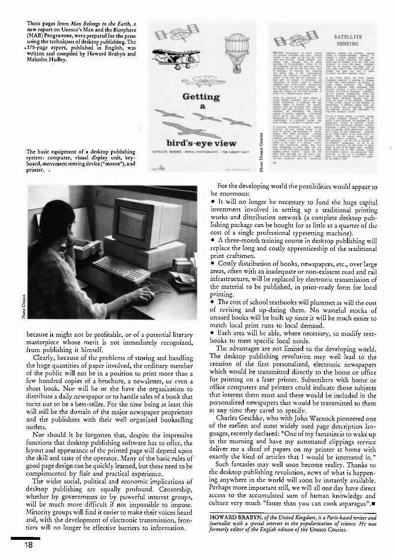
These pages from Man Belongs to the Earth, anew report on Unesco's Man and the Biosphere(MAB) Programme, were prepared for the pressusing the techniques of desktop publishing. The
.175-page report, published in English, waswritten and compiled by Howard Brabyn andMalcolm Hadley.
The basic equipment of a desktop publishingsystem: computer, visual display unit, key¬board, movement sensing device ("mouse"), andprinter. ,
SATELLITE
SENSING
I d* *«tW
bird's-eye viewSATEUITE SCMSJMG AfRUi. PHOTOGRAPH V - THE CAKOPV RAFT
Ai _C
because it might not be profitable, or of a potential literarymasterpiece whose merit is not immediately recognized,from publishing it himself.
Clearly, because of the problems of storing and handlingthe huge quantities of paper involved, the ordinary memberof the public will not be in a position to print more than afew hundred copies of a brochure, a newsletter, or even ashort book. Nor will he or she have the organization todistribute a daily newspaper or to handle sales of a book thatturns out to be a best-seller. For the time being at least thiswill still be the domain of the major newspaper proprietorsand the publishers with their well organized booksellingoutlets.
Nor should it be forgotten that, despite the impressivefunctions that desktop publishing software has to offer, thelayout and appearance of the printed page will depend uponthe skill and taste of the operator. Many of the basic rules ofgood page design can be quickly learned, but these need to becomplemented by flair and practical experience.
The wider social, political and economic implications ofdesktop publishing are equally profound. Censorship,whether by governments or by powerful interest groups,will be much more difficult if not impossible to impose.Minority groups will find it easier to make their voices beardand, with the development of electronic transmission, fron¬tiers will no longer be effective barriers to information.
For the developing world the possibilities would appear tobe enormous:
It will no longer be necessary to fund the huge capitalinvestment involved in setting up a traditional printingworks and distribution network (a complete desktop pub¬lishing package can be bought for as little as a quarter of thecost of a single professional typesetting machine).
A three-month training course in desktop publishing willreplace the long and costly apprenticeship of the traditionalprint craftsmen.
Costly distribution of books, newspapers, etc., over largeareas, often with an inadequate or non-existent road and railinfrastructure, will be replaced by electronic transmission ofthe material to be published, in print-ready form for localprinting.
The cost of school textbooks will plummet as will the costof revising and up-dating them. No wasteful stocks ofunused books will be built up since it will be much easier tomatch local print runs to local demand.
Each area will be able, where necessary, to modify text¬books to meet specific local needs.
The advantages are not limited to the developing world.The desktop publishing revolution may well lead to thecreation of tbe first personalized, electronic newspaperswhich would be transmitted directly to the home or officefor printing on a laser printer. Subscribers with home oroffice computers and printers could indicate those subjectsthat interest them most and these would be included in the
personalized newspapers that would be transmitted to themat any time they cared to specify.
Charles Geschke, who with John Warnock pioneered oneof the earliest and most widely used page description lan¬guages, recently declared: "One of my fantasies is to wake upin the morning and have my automated clippings servicedeliver me a sheaf of papers on my printer at home withexactly the kind of articles that I would be interested in."
Such fantasies may well soon become reality. Thanks tothe desktop publishing revolution, news of what is happen¬ing anywhere in the world will soon be instantly available.Perhaps more important still, we will all one day have directaccess to the accumulated sum of human knowledge andculture very much "faster than you can cook asparagus".»
HOWARD BRABYN, of the United Kingdom, is a Paris-based writer andjournalist with a special interest in the popularization of science. He wasformerly editor of the English edition of the Unesco Courier.
18

Unesco
and the printed wordOver 8,000 titles have been published byUnesco or under its auspices in over 70 lan¬guages, since the founding of the Organiza¬tion in 1946. Right, the latest edition oilndextranslationum, Unesco's annual guide toworld translations.
*""'¿«mu
I The rural press in Africa
In Africa today only 15 out of\every 1,000people are reached by daily newspapers, andthe use of the press as a medium of masscommunication presents many problems,especially in the rural areas where 80 per centof the population lives and where over 800languages are spoken. And yet the printedmedia can play an important role by bridgingthe communications gap which prevents iso¬lated farming communities from taking fullpart in national development programmesand by providing excellent follow-up mate¬rials in literacy teaching. For many yearsUnesco has co-operated with Member Statesin this field by helping to create rural news¬papers, by training journalists and by provid¬ing other forms of technical support. Onecurrent undertaking, the West and CentralAfrica News Agencies Development Project(WANAD) based in Cotonou, Benin, is serv¬ing 13 national news agencies. As part of itsactivities WANAD, which was launched in
1984 by Unesco with finance from the Feder¬al Republic of Germany, provides trainingfor journalists in the fields of internationalrelations, health, rural development and theenvironment. A sister project, SEANAD,was set up in 1986 in Southern and EasternAfrica. Above right, front pages of ruralnewspapers from 2 WANAD Member States:issue of Kpodoga, published in the Ewe lan¬guage by the Institute of Adult Education ofthe University of Ghana; special Interna¬tional Literacy Day (8 September 1987) issueof Tew Fema, published in the Kabyie lan¬guage of Togo.
I Children's books in Asia and the Pacific
Launched in 1970 by the Tokyo-based AsianCultural Centre for Unesco, the Asian/
Pacific Copublication Programme (ACP) is aventure designed to provide children incountries of Asia and the Pacific with reason¬
ably priced illustrated books. Good storiesand illustrations by authors and artists fromdifferent countries are selected and publishedin an English version. Participating coun¬tries use this master edition (as well as films ofthe colour illustrations, which are also pro¬vided free) to produce editions in their ownlanguages. ACP books have so far beentranslated into some 27 Asian languages andmore than 2.5 million copies have beenprinted. Right, illustration from Folk Talesfrom Asia for Children Everywhere (Book 6).
lynamiini
n« Cui »kI ihc Watt
"neico
I Practical training for publishers
As part of its efforts to stimulate book pub¬lishing in the developing world, Unesco hasorganized a number of regional trainingcourses for publishing personnel in Asia andthe Pacific, Latin America, Africa and the
Caribbean. Over 200 people attended thesecourses in 1986 and 1987. During a 6-weekcourse jointly undertaken by Unesco and theUniversity of the Philippines Institute ofMass Communication in December 1987,
participants were divided into 3 teams, eachof which was given a manuscript about riceand asked to prepare it for publication as anillustrated booklet. Each team had to edit the
manuscript, prepare it for typesetting, cor¬rect proofs, lay out the text, design the cover,and write publicity material. Left, the book¬lets produced by the 3 teams.
IBook development in Latin America
The Regional Centre for Book Developmentin Latin America and the Caribbean (CER-LALC) was founded in Bogotá in 1971 by anagreement between Unesco and the Govern¬ment of Colombia. Participating countriestoday are Argentina, Bolivia, Brazil, Chile,Colombia, Costa Rica, the Dominican Re¬
public, Ecuador, El Salvador, Nicaragua,Panama, Paraguay, Spain and Venezuela.The Centre aims to promote the productionand distribution of books and to encouragethe reading habit, taking account of develop¬ment programmes as well as the public andschool library systems in each country. Inaddition to the professional training courseswhich CERLALC organizes for publishingpersonnel, it has launched a copublicationprogramme of children's books for LatinAmerica. The aim is to publish good-qualitychildren's literature at low prices by sharingthe production costs between all the partici¬pating countries. The first title to be pub¬lished was "Tales, Myths and Legends forLatin-American Children", in an edition of
20,000 copies (above left, cover of the Portu¬guese version). Today publishers from 15countries are taking part in the programme,and 6 titles have been published, totalling(with reprints) 332,000 copies.
19

Computerized typesettingin China
BY XU LIAN-SHENG
THE technique of printing using mov¬able type was invented by Bi Shengin China between 1041 and 1048 and
not, as is widely believed, by JohannesGutenberg in fifteenth-century Europe. Thetype used by Bi Sheng was made of earthen¬ware, but in later times in China it became
common to use wood, enamelware or metal.
With the development of movable lead type,"hot metal" came to be used all over the
world for the mass production of printedworks.
The low cost of setting lead type, whichcould be melted down after printing so thatthe same metal was used over and over again,made this technique the mainstay of theprinting industry for centuries. With therapid progress of photocomposition,
XU LIAN-SHENG, of China, is deputy directorof the Photosetting Centre of the China ResearchInstitute of Printing Science and Technology. Healso played a leading part in the design of China'sKY Microcomputer Photosetting System.
however, and especially the computerizationof typesetting in recent years, movable leadtype has inevitably become obsolete.
In China, setting movable type has alwaysbeen a complex and exhausting job becauseof the huge number of characters in theChinese language. A typesetter has to walkbetween five or six cases of type and reachhigh and low in order to find and retrieve therequired pieces.
A modern version of this problem ariseswith computerized typesetting. A regularkeyboard will suffice for entering into thecomputer all the letters of Western lan¬guages, but has far too few keys to enter thethousands of Chinese characters.
Two methods can be used to solve the
problem. One is to make a large keyboardwith each key representing a Chinese charac¬ter, the finding and entering of which aredone by an operator. The advantage of thismethod is that the operator can see the char¬acter to be keyed in. The disadvantage is that
the keyboard has to be very large and thearrangement of the keys is extremely com¬plicated. The operator takes a long time tolearn by heart the position of each character,and searching among the mass of keys is alaborious task.
The other method is to use a keyboard thesame size as that of a Western-language com¬puter and enter each Chinese character bystriking more than one key in a certain pat¬tern which reflects the construction of that
character. A number of systems have beendeveloped in accordance with this principle;they all make use of either the vocal or thewritten features of a given character.
An operator using the vocal method has totransliterate the characters into the Chinese
Phonetic Alphabet and then key in the let¬ters. For instance, to enter the word China,
which has two characters, the operatorstrikes the letters making up the words"Zhong Guo" (the phonetic pronunciationof the word). The advantage of this method
20

Cases of metal type in the composing room of adaily newspaper in China. The Chinese writingsystem, which is ideographic rather thanalphabetic, uses several thousand characters.
©
Drawing of Wang Chen's movable wooden typeprinting process, developed in the late 13th cen¬tury, some 250 years after Bi Sheng's inventionof movable type. Right, a compositor typeset¬ting with characters ingeniously arranged inrevolving typecases to enable rapid retrieval.Left, brushing the back of a sheet of paper totake an impression from the inked printingblock.
Illustration from Science and Civilisation in China, Vol 5, Part 1,
by Tslen Tsuen-Hsuln and Joseph Needham © Cambridge Uni¬versity Press, 1985
An operator working on one of the first com¬puterized typesetters for the Chinese language,the KY Microcomputer Photosetting Systemdeveloped at the China Research Institute ofPrinting Science and Technology.Photo © Xu Lian-Sheng/Chinese edition of the Unesco Courier,Beijing
A Chinese typewriter. The tray contains some2,500 characters individually cast in lead andarranged face up. Above is a sheet of paper on aroller, and the typing mechanism, which ismoved into position above the required charac¬ter. The operator then pushes a lever which liftsthe character out of the tray and forces itagainst the inked ribbon.
is that anyone who knows the correct pro¬nunciation of the character to be keyed incan operate the machine without previoustraining. The disadvantage lies in the highrate of duplicated codes due to the fact thatthere are so many homophones in Chinese.
Various methods of text input make use ofwritten features. All Chinese characters can
be broken down into basic structural com¬
ponents, which are few in number. If thesecomponents are properly arranged on akeyboard, any Chinese character can bekeyed in by grouping them. For example, theword Jlj (country) is composed of 3£ and\_\ . Both the number of key strokes neededto enter a character and the rate of possibleduplicated codes can be reduced to a fairlylow level if the breakdown of the compo¬nents is correct. Furthermore, the operatordoes not need to know how to pronouncethe character. This method is clearly usefulsince there are so many local dialects inChina that sometimes people who live fif¬teen kilometres apart cannot understandeach other.
One practice commonly used to increaseoperating speed is the word-group method,whereby the operator strikes a single key toenter a frequently used word or phrase.
Another problem is that Chinese text maybe set either vertically or horizontally (insome magazines articles are set both ways),and a good composing system must be cap¬able of meeting these requirements. What ismore, a number of Chinese magazines pub¬lish articles containing words or passages inforeign languages, and so we also need asystem which can set Western language textsas well as those in Chinese.
With regard to output the generation bythe computer of text in the required for¬mat the biggest problem is how to copewith the mass of data involved in processinga huge number of characters each of which,for the computer, has an information con¬tent many times higher than that of an En¬glish letter. Various methods have thus beendevised for compressing this informationinto abridged form so as to take up less of thecomputer's memory. This is an area in whichthere is a need for further study and develop¬ment.
Computerized typesetting in the Chineselanguage has already made remarkable prog¬ress and, as it comes to replace metal type¬setting, will surely play an increasinglyimportant role in the Chinese printingindustry.
Below, Chinese ideograms printed using mod¬ern metal type, in different typestyles and sizes.Bottom, the basic elements of Chinese script,from which all ideograms are constructed.Illustration from Science and Civilisation in China, Vol 5, Part 1,by Tsien Tsuen-Hsuin and Joseph Needham © Cambridge Uni¬versity Press, 1985
ä $ t m pu siS ft fi W rji m
* M « W nu si* Jt # m 1$ «
tt * ti- äi m w
r. M 9 M rr »
) ~7
/ ¡
Tj V
21
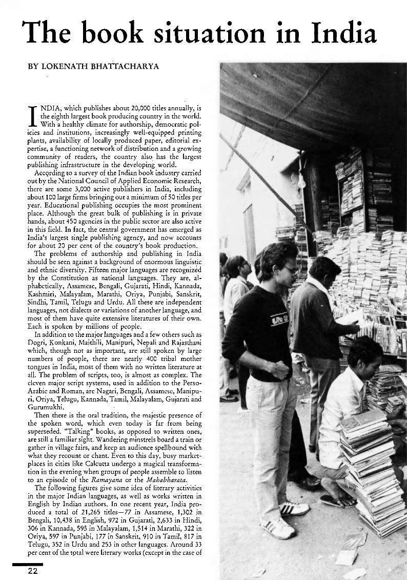
The book situation in India
BY LOKENATH BHATTACHARYA
INDIA, which publishes about 20,000 titles annually, isthe eighth largest book producing country in the world.With a healthy climate for authorship, democratic pol¬
icies and institutions, increasingly well-equipped printingplants, availability of locally produced paper, editorial ex¬pertise, a functioning network of distribution and a growingcommunity of readers, the country also has the largestpublishing infrastructure in the developing world.
According to a survey of the Indian book industry carriedout by the National Council of Applied Economic Research,there are some 3,000 active publishers in India, includingabout 100 large firms bringing out a minimum of 50 titles peryear. Educational publishing occupies the most prominentplace. Although the great bulk of publishing is in privatehands, about 450 agencies in the public sector are also activein this field. In fact, the central government has emerged asIndia's largest single publishing agency, and now accountsfor about 20 per cent of the country's book production.
The problems of authorship and publishing in Indiashould be seen against a background of enormous linguisticand ethnic diversity. Fifteen major languages are recognizedby the Constitution as national languages. They are, al¬phabetically, Assamese, Bengali, Gujarati, Hindi, Kannada,Kashmiri, Malayalam, Marathi, Oriya, Punjabi, Sanskrit,Sindhi, Tamil, Telugu and Urdu. All these are independentlanguages, not dialects or variations of another language, andmost of them have quite extensive literatures of their own.Each is spoken by millions of people.
In addition to the major languages and a few others such asDogri, Konkani, Maithili, Manipuri, Nepali and Rajasthaniwhich, though not as important, are still spoken by largenumbers of people, there are nearly 400 tribal mothertongues in India, most of them with no written literature atall. The problem of scripts, too, is almost as complex. Theeleven major script systems, used in addition to the Perso-Arabic and Roman, are Nagari, Bengali, Assamese, Manipu¬ri, Oriya, Telugu, Kannada, Tamil, Malayalam, Gujarati andGurumukhi.
Then there is the oral tradition, the majestic presence ofthe spoken word, which even today is far from beingsuperseded. "Talking" books, as opposed to written ones,are still a familiar sight. Wandering minstrels board a train orgather in village fairs, and keep an audience spellbound withwhat they recount or chant. Even to this day, busy market¬places in cities like Calcutta undergo a magical transforma¬tion in the evening when groups of people assemble to listento an episode of the Ramayana or the Mahabharata.
The following figures give some idea of literary activitiesin the major Indian languages, as well as works written inEnglish by Indian authors. In one recent year, India pro¬duced a total of 21,265 titles 77 in Assamese, 1,302 in
Bengali, 10,438 in English, 972 in Gujarati, 2,633 in Hindi,306 in Kannada, 595 in Malayalam, 1,514 in Marathi, 322 inOriya, 597 in Punjabi, 177 in Sanskrit, 910 in Tamil, 817 inTelugu, 352 in Urdu and 253 in other languages. Around 33per cent of the tptal were literary works (except in the case of
22

LOKENATH BHATTACHARYA, Bengali poet and essayist, is a formerDirector of the National Book Trust of India. He is the author of a Unescopublication, Books and Reading in India, and of The Prose Poems ofLokenath Bhattacharya (1972) and The Drum of the Guru (1979).
English, in which creative writing is negligible in India).There is also the fact that less than 7 per cent of India's totalpopulation know an Indian language other than their ownmother tongue although, since major language speakers arenot solely confined to specific areas or towns, all the Statesand Union territories are multi-lingual.
Hindi, because of the numbers of people who speak it, hasbeen declared the official language of the country and everyeffort is being made to promote its development and use atthe national level. The yearly output of publishing in Hindiis second only to that in English.
Proficiency in English, instead of hindering the growthand richness of expression in all the major Indian languages,has significantly contributed to it. Today, India ranks as theworld's third largest producer of books in English, after theUnited States of America and the United Kingdom.
The principal factors governing publishing activities in acountry are its literacy rate, the size and nature of itseducated population and since textbooks and other alliedsupplementary reading material are the mainstay of the booktrade, especially in a developing country its educationalpolicies and programmes. While literacy and reading habitsare nowhere synonymous, literacy remains the first pre¬requisite for the growth of a reading programme.
The last Indian census taken in 1981 shows the country'sliteracy rate to be about 37 per cent, registering an increase ofnearly 7 per cent over the previous figures of 1971. This
4 Browsers at a New Delhi bookstall
Typesetting by hand at the Kerala Times in theindustrial town of Ernakulam in the State of
Kerala, southwest India. According to the latest(1987) edition of Unesco's Statistical Yearbook,there were 1,334 daily newspapers in India in1984, with an estimated total circulation ofalmost 15 million.
23

Engrossed in a book, a traveller waits for histrain on Howrah station, Calcutta.
increase does not mean that there has been an appreciable fallin the number of illiterates in the country. On the contrary,due to a considerable expansion of population figures duringthe decade, India's illiterate population has increased by asmany as 48 million.
This partly explains an apparent paradox. Despite the factthat India is one of the leading book producing countries, itsper capita publishing figures remain far below the worldaverage. Similarly, the consumption of books per person peryear is as little as 32 pages in India, as against an average of2,000 pages in the industrially advanced countries. As re¬gards print-runs, the Indian average still lags far behind theinternational average books in Indian languages rarely ex¬ceed a print-run of 1,000 copies, while those in English dorather better with print-runs of between 1,000 and 2,000copies.
This notwithstanding, the progress achieved in recentyears, especially since Independence, gives grounds for opti¬mism about the future of printing and publishing in India.
Today, India's printing industry is on the threshold of arevolution as an increasing number of printers are switchingfrom hand composition to mechanical or photographic type¬setting with high-grade equipment. However, the over¬whelming majority of printing presses operative in India arestill letterpress, the rest being sheet-fed offset litho machines,mostly single colour. While much of this equipment isimported, India has now started to manufacture a widevariety of presses, offset as well as letterpress.
Considering that Gutenberg's epoch-making invention,introduced to India in 1557 by a Jesuit missionary, took onlya little over a hundred years to reach the country in an agewhen communications were much slower than today, itseems likely that new technologies will take a fraction of thattime to spread not only through the big towns, but to therural areas. Already, desktop publishing is making inroads,with the introduction of personal computers and laserprinters.
Moreover, publishing has been introduced as a course ofstudy in several Indian universities, and there are in-servicetraining facilities for editorial and production personnel.Various professional institutions, in the public as well as theprivate sectors, offer annual awards and other material bene¬fits to encourage good writing and excellence in printing.Book fairs and exhibitions are now held all over the country,and increasing numbers of books are being translated fromone Indian language to another.
Magazines pour from the press at a modernprinting plant at Faridabad, 40 km south ofDelhi. According to Unesco's Statistical Year¬book, India consumed 388,000 tonnes of news¬print, printing and writing paper in 1984, morethan twice as much as in 1970.
24
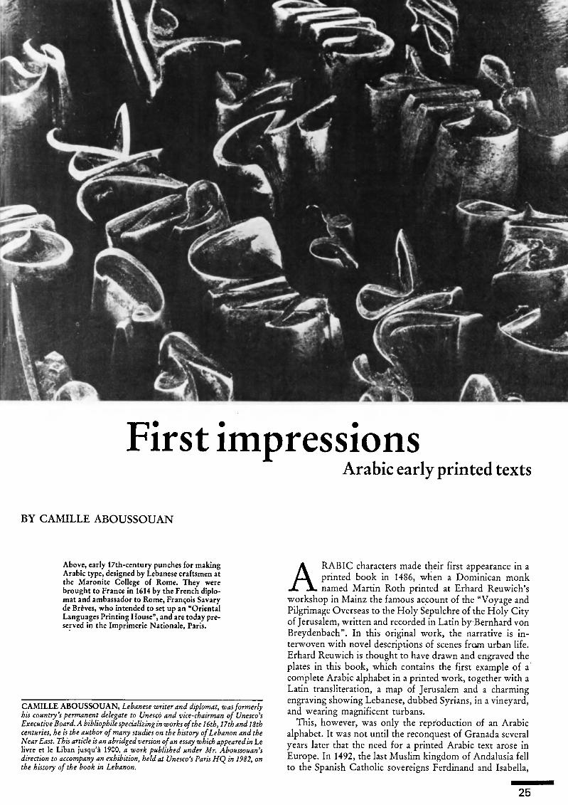
1W<^
~
Os
a*
First impressionsArabic early printed texts
BY CAMILLE ABOUSSOUAN
Above, early 17th-century punches for makingArabic type, designed by Lebanese craftsmen atthe Maronite College of Rome. They werebrought to France in 1614 by the French diplo¬mat and ambassador to Rome, François Savaryde Brèves, who intended to set up an "OrientalLanguages Printing House", and are today pre¬served in the Imprimerie Nationale, Paris.
CAMILLE ABOUSSOUAN, Lebanese writer and diplomat, was formerlyhis country's permanent delegate to Unesco and vice-chairman of Unesco'sExecutive Board. A bibliophile specializing in works ofthe 16th, 17th and 18thcenturies, he is the author ofmany studies on the history of Lebanon and theNear East. This article is an abridged version ofan essay which appeared in Lelivre et le Liban jusqu'à 1900, a work published under Mr. Aboussouan'sdirection to accompany an exhibition, held at Unesco's Paris HQ in 1982, onthe history of the book in Lebanon.
ARABIC characters made their first appearance in aprinted book in 1486, when a Dominican monknamed Martin Roth printed at Erhard Reuwich's
workshop in Mainz the famous account of the "Voyage andPilgrimage Overseas to the Holy Sepulchre of the Holy Cityof Jerusalem, written and recorded in Latin by Bernhard vonBreydenbach". In this original work, the narrative is in¬terwoven with novel descriptions of scenes from urban life.Erhard Reuwich is thought to have drawn and engraved theplates in this book, which contains the first example of acomplete Arabic alphabet in a printed work, together with aLatin transliteration, a map of Jerusalem and a charmingengraving showing Lebanese, dubbed Syrians, in a vineyard,and wearing magnificent turbans.
This, however, was only the reproduction of an Arabicalphabet. It was not until the reconquest of Granada severalyears later that the need for a printed Arabic text arose inEurope. In 1492, the last Muslim kingdom of Andalusia fellto the Spanish Catholic sovereigns Ferdinand and Isabella,
25

1.
Left, title page of the polyglot Psalter, in Latin,Hebrew, Greek, Arabic and Chaldean (a form ofSyriac), published by the Genoese Orientalscholar, Agostino Giustiniani, in 1516. Below,this flowered "aleph" (the first letter in theArabic alphabet) from the Psalter is one of thefirst ornamental letters in Arabic printing.
, l »_. r .. rt ï -! \>' a -«
The Arabic alphabet from "The art of learningthe rudiments of the Arabic language" (1505), atextbook by the Spanish scholar Pedro de Alca¬lá. Each Arabic character is transcribed into the
Latin alphabet, which is printed in a Gothictypeface.
The printing works of the University of St.Joseph has been Beirut's biggest since it wasestablished in the 19th century. Below, as de¬picted in an old engraving.
"Of*"
Medal struck by the Paris Mint to commemo¬rate an exhibition on the history of the book inLebanon, held at Unesco's Paris HQ in 1982.The medal depicts the monastery of St.Anthony at Qazhayya, in Lebanon, where thefirst printing establishment in the Arab worldwas founded around 1610. Photo © Paris Mint'
3
©
26

Ifia. ôiU JE>il. Ha. k l&a. tea«
Gulf. ©utf. ©a. JE>a. £a. 2X jfe
.3 SIC l^U\f \JIRim. tlföim. Xltbiin. flfcím. 3Lim. JLím. ©uifV
0|^Mj°|J|JJ^»& #£. ©ad. JDad. jad. $ad. «un*
-£ he hHlctíCtf. íc ^e, Ä. 6S& Í5at. Ate
ß>e. Be. Am. *in. si». $m. £af.
ye. XcmflLf.Ä.emälif.Zemälif.0iicu. Ifóc, ¡be,
ye ye.
Ct(loeronloecaratcre0rnotib:c6DcUo j claraearaoígap.laaqualcotodao fe puede J l^-^rnplirci5m'¿iolctraelatínaoocaftdlan9e.6 manera pliegalücoinuiialSíiramanoíJtncccfTida^ oelaefabcnii conoce»
c ily
who had by their marriage united the two powerful king¬doms of Aragon and Castile. Anxious to bring the Andalu-sians back to Christianity, the Spanish rulers ordered mis¬sionaries to evangelize the country again. It soon becameapparent that this goal could not be attained without usingthe Arabic language. In 1505, Archbishop Fernando deTalavera, the first prelate appointed to the new diocese, hadtwo Arabic textbooks printed for use by missionaries whocould not speak that language. The title of the first was: Artepara ligeramente saber la lengua araviga ("The art of learn¬ing the rudiments of the Arabic language"); that of thesecond: Vocabulista aravigo en letra castellana ("Arab glos¬sary in Castilian characters"). Their author, the scholarPedro de Alcalá, a native of the prestigious university city ofAlcalá de Henares near Madrid, wrote them in Latin script.The typeface is Gothic.
The first twenty-one pages of the Arte are given over togrammar, and the next twenty-seven consist of Catholicprayers in Arabic, instructions for confession in Spanish andin Arabic, the ordinary of the mass, and instructions forvotive masses, all in Arabic. By way of introduction to thevocabulary, a short three-page note explains the author'smethod of transcription: the vocabulary is in alphabeticalorder, but under each letter three separate categories containfirst verbs, then nouns and lastly adverbs, conjunctions andprepositions. The verbs are given in three forms: present,perfect and imperative; nouns are given in both the singularand the plural.
This work, which is a curiosity in the history of bothlinguistics and typography, is also the first and perhaps themost practical of all attempts to transcribe Arabic into Latincharacters. The alphabet on the twentieth page is in north
African script, and the language taught in both of Pedro deAlcalá's works is the vernacular, which the Spanish mis¬sionaries needed to communicate with the converted Moors.
In a few places, the author indicates differences between thisand the written language.
As in Breydenbach's book, the Arabic alphabet is thusreproduced, together with its Latin pronunciation, but it istranscribed from the Maghrebian calligraphy also found inAgostino Giustiniani's magnificent Psalterium Hebraeum,Graecum, Arabicum, et Chaldaicum, the first polyglot Psal¬ter, which was published in 1516 at Genoa (then a majorprinting and paper manufacturing centre) in five languages:Hebrew, Greek, Arabic, Chaldean (Syriac) and Latin.
Agostino Giustiniahi (1479-1536) belonged to the Ge¬noese branch of the Giustiniani, one of the great families ofnorthern Italy. A Dominican who became the bishop ofNebbio in Corsica, he was a learned student of Oriental
languages and a friend of great humanists such as Pico dellaMirándola, Erasmus and Sir Thomas More.
Giustiniani was the author of an audacious project topublish a polyglot edition of the Bible in Hebrew, Greek,Arabic, Syriac and Latin, which would make known allexisting versions of the Bible and enable them to be com¬pared, while also serving as an instrument for studying theselanguages. He began with the Psalter, and when this was nota commercial success, the project was abandoned. Even so, itwas a remarkable achievement for the time.
The preparation of this masterly work was an arduoustask, as Giustiniani noted in his dedication to Pope Leo X,who had written the preface: "Our work has been long ...".This can easily be imagined. At that time no matrices or fontsof Arabic type existed; the alphabets in the books of Brey-denbach and Pedro de Alcalá were printed from woodcuts,and there were few Hebrew typefaces. Moreover, the workhad to be revised by several proof-readers with knowledge ofat least three non-European languages.
It seems that Giustiniani had already ordered and tran¬scribed the texts to be published as early as 1506. It is morethan likely that the design and casting of the characters hadbeen done long before the publication of the Psalter, whichthus pushes back even further the creation of the first printedtext in movable Arabic type.
The Arabic text alone occupies a forty-one-line columncontaining an average of 160 words per page for 246 pages.The two examples of initial letters in Arabic which appear inthe book are very beautiful a flowered "aleph" in a frameand a "tah" similarly adorned. These are certainly the firstornamental letters in Arabic printing.
In 1529, Master Geofroy Tory, a French typographer,engraver and author from Bourges, published his fine treatiseon typography, the Champfleury (see page 11), in which heattacked the use of the Gothic typeface, and included anArabic alphabet with a key to its pronunciation. Meanwhile,the German, Latin and Spanish editions of Breydenbach, andits French translation by Nicolas le Huen, regularly repro¬duced the Arabic alphabet of the 1486 edition, as did Sébas¬tien Mamerot's work entitled "The journeys overseas of thenoble Godefroy de Bouillon who was King of Jerusalem. Ofthe good King Saint Louis and of several virtuous princes",which was published in the late fifteenth century.
In 1538, the French humanist Guillaume Postel, who had
accompanied the embassy sent by King François I to Con¬stantinople, and who styled himself "The Cosmopolitan", or"Citizen of the World" as we should say nowadays, publish¬ed his "Arabic Grammar" in Paris, the first of its kind to be
printed.
27

«L'ENCYCLOPEDIE »
An eighteenth-century best-seller
AS soon as the first volume of the first edition of the
supreme work of the Enlightenment, Diderot's En¬cyclopédie, reached the subscribers, in 1751, it be¬
came apparent to the authorities in France that the book wasdangerous.
It did not merely provide information about everythingfrom A to Z; it recorded knowledge according to philoso¬phic principles expounded by d'Alembert, the co-editor, inhis "Preliminary Discourse". Although he formally ac¬knowledged the authority of the Church, d'Alembert madeit clear that knowledge came from the senses and not fromRome or Revelation. The great ordering agent was reason,which combined sense data, working with the sister facultiesof memory and imagination. Thus everything man knewderived from the world around him and the operations of hisown mind.
The Encyclopédie made the point graphically, with anengraving of a tree of knowledge showing how all the artsand sciences grew out of the three mental faculties. Philoso¬phy formed the trunk of the tree, while theology occupied aremote branch, next to black magic. Thus Diderot andd'Alembert presented their work as both a compilation ofinformation and a manifestation of philosophie. They meantto merge those two aspects of the book, to make them seemlike two sides of the same coin: Encyclopedism; and the menbehind it became known not merely as collaborators but asEncyclopedists. Traditional learning, they implied, amount¬ed to nothing but prejudice and superstition.
So beneath the bulk of the Encyclopédie's twenty-eightfolio volumes and the enormous variety of its 71,818 articlesand 2,885 plates lay an epistemológica! shift that transformedthe topography of everything known to man.
The Encyclopédie was a product of its time, of mid-eighteenth-century France, when writers could not discusssocial and political questions openly, in contrast to theprerevolutionary era, when a tottering government permit¬ted a good deal of frank discussion. The book's radicalelement did not come from any prophetic vision of thefar-off French and industrial revolutions but from its at¬
tempt to map the world of knowledge according to newboundaries, determined by reason and reason alone. As itstitle page proclaimed, it claimed to be a "dictionnaire raison¬né des sciences, des arts et des métiers" that is, to measure
all human activity by rational standards and so to provide abasis for rethinking the world.
Contemporaries had no difficulty in detecting the purposeof the book, which its authors acknowledged openly in keyarticles. Diderot and d'Alembert had laid out such pleasantpaths through the arid expanses of knowledge that one couldmerely follow their lead, stopping now and then to enjoy theflowers along the way, and still have the satisfaction ofbelonging to the intellectual vanguard. One did not evenhave to read many other books, for the Encyclopédie was alibrary unto itself. The editors did not list the works that itrendered obsolete, but anyone who consulted its Discourspréliminaire would have no difficulty in distinguishing be¬tween the heavy tomes of traditional learning and the stream¬lined, modern model. From the appearance of the first
volume in 1751 until the great crisis of 1759,1 the Encyclopé¬die was denounced by defenders of the old orthodoxies andthe Old Régime, by Jesuits, Jansenists, the General Assemb¬ly of the Clergy, the Parlement of Paris, the king's council,and the pope. The denunciations flew so thick and fast, inarticles, pamphlets, and books as well as official edicts, thatthe Encyclopédie seemed doomed. But the publishers hadinvested a fortune in it, and they had powerful protectors,notably Chrétien-Guillaume de Lamoignon de Malesherbes,the liberal Directeur de la librairie, who superintended thebook trade during the crucial years between 1750 and 1763.
The scandal continued to sizzle and spread as volumes 3 to7 appeared and as skilful polemicists like Charles Palissot andJacob-Nicolas Moreau fanned the flames on the side of the
priests. On the other side, Voltaire loaned his pen and hisprestige to the cause; and Diderot and d'Alembert found theranks of their collaborators swelling with other illustriouswriters, including most of the men who were beginning to be
28

BY ROBERT DARNTON
Copyright © 1979 by the President andFellows of Harvard College
ROBERT DARNTON, ofthe USA, is Davis Professor ofEuropean Historyat Princeton University, New Jersey. He is the author of several books onFrench cultural history, including The Literary Underground of the OldRegime (1982), The Great Cat Massacre: And other Episodes in FrenchCultural History (1986) and The Business of Enlightenment a PublishingHistory of the Encyclopédie, 1775-1800 (Harvard University Press, 1979),from which this article has been extracted.
Volumes from the 18th-century French Encyc¬lopédie, ou dictionnaire raisonné des sciences, desarts et des métiers ("Encyclopedia, or ClassifiedDictionary of Sciences, Arts and Trades"),edited and published by Denis Diderot and Jeand'Alembert. The original large-format folio edi¬tion (1751-1772) consisted of 17 volumes of textand 11 volumes of plates.
identified as philosophes: Duelos, Toussaint, Rousseau, Tur-got, Saint-Lambert, d'Holbach, Daubenton, Marmontel,Boulanger, Morellet, Quesnay, Damilaville, Naigeon, Jau-court, and Grimm. They also claimed Montesquieu andBuffon, whose works they cited constantly, though it seemsthat neither wrote anything expressly for the Encyclopédie.
Nothing could have been better for business than thecontinued controversy and the volunteer corps of authors.The publishers had envisaged a first edition of 1,625 copies,but the subscriptions poured in so fast that they increased itthree times, until it reached 4,255 copies in 1754.
The Encyclopédie became smaller in size and cheaper inprice as it progressed from edition to edition.2 While theformat shrank from folio to quartp and octavo, the sub¬scription price fell and the size of the print-runs increased.Having satisfied the "quality market", the publishers tried toreach a broader public by producing in quantity.
The "democratization" of the Encyclopédie had limits,
First page of the alphabetical entries in the firstedition of the Encyclopédie.
ENCYCLOPEDIE,O U
DICTIONNAIRE RAISONNÉ
DES SCIENCES,
DES ARTS ET DES MÉTIERS-
A A
K \K
t& e.f.m. {trdft EmtyioftJ.IwW. Stitact di f komme ,
Itftmwt , A't 4* (MiMwf«r,Ci*mm. j cM*A*ft ou kmd* I» pteminc letite de l'Al¬phabet , tu lâiin. en fiant,'1" .ht tu prefqut to«« 1« Lan-(¡«et i.- 1 \ ; -'.
Onptut c jrsfidetft ee »IK-
. eu tant que lent« , «A le ligne A* (on a ,qui de tout Im Cm« de k **« cfl W pta fxile àwitaiir U M Um qu'ouvm I» bouche de pojíti[ut -Li poumont.
On ¿* q»; '* ***** Tj't/4 .!« llcbreui: «witr j en not qne fou ne vient que de U ton lotir» tt^n«kl otganctdc U parole i ic le tuiûcte on f*pnta¿mm noue nout ferrant p«« itpreTenitt c« ion «noutvitnt de IWaAa dti OtHB. 1 rt Luiat Ac let
MM pauptei de iTurnpc. ou imité le» Gre« dan«I ; rotenc H'i'iU o« douait i celte lettic. Selon letOntHBJÉni rlcraiiquet, te liC.iunnwic grnetittde P- R. p. 11. fuJr/u ne/fi ( lojOMttfnui ) ta'ffwrt~t('n*'t f âr H4*n*ifem **/ feJaw aV U+tytllt mi Mtftf0t*ti\ i>li fail »oil «fie U rvcuemeii'ion dci let*Irrt eft £u|«fí à vuiitk* dint d« Lenguct mrtitt ,tontuaa elk fe* dam leí (.»çuet »"«« Cm il r*eouftant , felón M UfAwf« 1< H. ILwcrgaftt ,qutl'a/i/t fe piononçok tuitrf»* tMM mi*tr a , feOU"lL| TT im ene ftttIOtlT p» It [> »ll .'.,'( .1'F.rl ffh* , /*/.,-.¿V. lív X. t. *j. ow ce l\ foultet, t ft« I« » Guía «m
ti Iciiret del HrKr-i; /,' cv tiu<¿ f*g*-'rfptltM.-ent entfi imttíigii, (/»V
j'aun waananenr i'fvtF Qtud *mitm\t¡
' mmn (ÇmmmtUm} ew»,eiil>tlet mile» fp.it
!.
iuiciJirk f.fl J; ïj.qnitûûpii , ,ci ; Je
mi , & leí fillet le fon de \'t , premíete votelk deftm'i** : nuil t'tft une imagnWtflon fin* fontfeinent.Quand let enf»m litMcnt tu monde ( ti que putWIt [ttniíit fait ill p <«iUn' Tait del ponmonij onenten«! le fon de datfrrutret vorfiel , Mon qnMionvtcnt fUf on omÎm U bouvkt.
On du en f«wd À , ne ^ffrt e : mA * eft du ^( rt«ip*&.i!ia , eunme Ut «wie« mjelU» de ckhic *l-
Le fo« defrf, «ttflî Wn^tte xiloide f«, et longenectuim mwtl , eV bt.f en J'»u-rci; 4e(ltoof¿d«MgrJee , At bit fcUtn n|nM. Il U>. ij dit» idiAe qjunndce mot fi^mne nn onv>*fje eju'on donne i like; Aiil cil ber* dam Uth/ , mainU , foitillme. Il vA long(Uni ».xi*, £iot chien; A: hrvfdtnt «Mflnt nremiti«pHtic du r»u - ffw/narAM ImHI dtidPfjftJtéé»M.CAmU4*Ql
Ici Ronuiai, notu muquee Te lont* , VeíiinhentJJi t.l dtxil>e , A.-U paw í/.'¿ ; i'iA nidi qu'ontioa*e de«* nnt mcWm Antroii F.h.cuh **gi , fit-Enfuit» lit iniéiettiM t» e emit kt dent n , .***/**
Enfin ili mtituum qtKlqncfou U figne ut U ftlitb«lowrM, îj'j.
On met MJinufJlini un litem ùttoiulrft fur J"*
long , *a lien dc 1/qn'on èenroet »rrafott iruci ttt« : m .it ta Htu iTécine mdßix , M*fmt , «/m » «V***on i < r » mJifa , J/daw, due. Mut il ne faut pel croentree U plupart del Giunnument , OU« not ptittnVciivoM-iH (rtte /tpièt l'a , ou unce toute aullavoyelle , qu*¿ pom mieqocí out rette voyant eeoielongac: Ib ¿etiToMnt («le /. t*** q^'iU It pío-nunfoiftv, et rent pranonciaiioM e* encoin an «¡Tiftdam not P.-ovintci ntcndkuvilcl, ou fön ptononettKif'n. tljlly í(/íti..
mtt point d'aoccnt fur la biff OU e nmmonLa fK,i tr* R w-iint rw« app- lU Umt f*Lunt ;
Jjutrj/. . |l t- fit; t chh Uilhpi'ill igiáUt et'jlu jusIic «a dc cvfM*ow«t on »tfuie , let
©
29

Sm
A/ '
od
©
Imprimerie ai Letíraí , t.;>,*
Plate from the Encyclopédie showing operationsin the composing room of a printing shop. Topleft, a compositor transfers metal type (such asthe letter "S" and the different-sized blank
spaces for separating words shown in 1) fromtypecase to composing stick (2) to make a line.Top centre, another compositor moves a line toa tray or "galley" of type where, with other lines(3) it forms part of a page. Top right, a thirdcompositor has locked two pages of type inside ametal frame and is levelling the printing surfaceready for the press.
however, because even the cheapest edition would haveseemed expensive to the common people. The book re¬mained beyond the purchasing power of peasants and arti¬sans, even though some of them may have consulted it incabinets littéraires (reading clubs).
Diderot and his collaborators had done their share of the
work, but that was only the beginning of a long processwhich culminated around 1780 with the reproduction anddistribution of their copy on a mass scale throughout Eu¬rope. The text that reached the general reading public, if notthe masses, differed somewhat from theirs, however, becauseit, too, suffered from the strains of the production process.
In his prospectus for the quarto edition (1777-1779),Joseph Duplain, a Lyonnais bookseller who managed theenterprise, had promised not only to reprint the original textin its entirety but also to improve it in three ways: to correctits numerous typographical and factual errors; to add a greatdeal of new material; and to blend the four folio volumes of
the Supplément3 into it. He never intended to produce aliteral copy of the first folio edition but rather to create asuperior version of itor at least to persuade the public thathe had done so. The correcting, augmenting and blendingwould require a great deal of editorial work, so the contractsprovided for a rédacteur. Duplain gave this job to the AbbéJean-Antoine de Laserre, an Qratorian priest and a minorliterary figure in Lyons-. Laserre therefore became the suc¬cessor of Diderot and the intermediary through which Dide¬rot's text reached most of its readers in the eighteenthcentury.
For the most part he left the text alone, not because herespected it but because he did not have time to makechanges. He worked at a furious pace, cutting out referencesto the eight volumes of plates that were not to be included inthe quarto, attaching snippets from the Suppléments to themain body of the book by bits of his own prose, and readingover the final amalgam of printed and manuscript copy that 'was to be mailed out to the printers. As a half dozen printingshops were working on different volumes at the same time,he could hardly keep up with their demand for copy.
Having sent for copy, presses, type, ink, paper, ink-ballleathers, candles, quills, imposing stones, galleys, chases, anda hundred other articles, the printing shop needed men to put
Plate from the Encyclopédie showing machineryused to wash out impurities from iron ore.
30

©
Portraits of some of the "Encyclopedists" sur¬round this scene in the Procope café in Paris, awell-known meeting place for literary figures.Anti-clockwise from top left: Buffon, Gilbert,Diderot, d'Alembert, Marmontel, Le Kain,
Jean-Baptiste Rousseau, Voltaire, Piron andd'Holbach.
the matter in motion. It ordered the workers pretty much asit ordered the equipment and ran into the same problems ofsupply and demand. But it also had to cope with thepeculiarities of printers as human beings. They had no notionof joining a firm. Instead, they worked by the job, comingand going according to the availability of tasks and their owninclination. For printing was a tramping trade. Men wentwhere they could find work, even if they had to hikehundreds of kilometres. When work abounded, they some¬times changed jobs in order to collect travel money or simplyby "caprice", as they put it. They came and went at a furiouspace during the Encyclopédie boom, which sent repercus¬sions throughout the migratory circuits of France, Swit¬zerland, and parts of Germany, producing as much competi¬tion for workers as for paper.
Psychologically, nonstandardized work must have differ¬ed considerably from the kind of work that was then beingimposed on the labouring classes in England. The pace ofwork in the factories was set by clocks and bells, by theopening and closing of gates, by fines and beatings, andultimately by the production process itself; for later, inassembly-line production, the men were reduced to "hands",and work streamed past them in an endless, undifferentiatedflow. The compositors and pressmen worked at their ownpace. They exerted some control over their production.
Some mastery over the production process did not meanthat the workers developed any special affection for the realmasters of it. The bourgeois retained most of the power andmanipulated it brutally, by hiring and firing, while theworkers responded with the few devices at their disposal.Although they may have felt some pride in their craft, theytook shortcuts and compromised on quality when it madelabour easier. The results can be seen in any copy of theEncyclopédie todayclear, crisp typography for the mostpart, but margins askew here, pages misnumbered there,uneven register, unsightly spacing, typographical errors, andsmudges all of them testimony to the activity of anony¬mous artisans two centuries ago.
In the era of the handmade book there existed a ty
pographical consciousness that disappeared sometime afterthe advent of automatic typesetting and printing. Like theirforerunners of the Renaissance, the compositors of theEncyclopédie made lines by transferring type from cases tocomposing sticks; they made pages by moving lines from thecomposing sticks to galleys; and they made formes byimposing the pages in a chase. Gompositorial practices couldgo no further in the direction of speed and efficiency untilthe introduction of mechanization, in the form of cold-metal
typesetting machines during the 1820s, Linotype in the1880s, and electronic composition today. Presswork, too,did not advance by any great leaps forward in technologybefore the adoption of the cylinder press from 1814 andsteam power in the 1830s. The Encyclopédie was printed onthe venerable common press, in essentially the same way thatbooks had been printed for the previous two or threehundred years.
A whole world had to be set into motion to bring the bookinto being. Ragpickers, financiers, and philosophers allplayed a part in the making of a work whose corporealexistence corresponded to its intellectual message. As aphysical object and as a vehicle of ideas, the Encyclopédiesynthesized a thousand arts and sciences; it represented theEnlightenment, body and soul.
1 . In January 1 759, the procureur general of the Parlement of Paris warned that behindthe Encyclopédie hovered a conspiracy to destroy religion and undermine the State. TheParlement promptly banned its sale and appointed a commission to investigate it. Butauthority over the printed word in France belonged to the king. On 8 March 1759, theConseil d'Etat reaffirmed the king's authority by revoking the book's privilege andforbidding the publishers to continue it. The Encyclopédie went onto the Indexlibrorum prohibitorum, the list of books banned by the Roman Catholic Church, on 5March, 1759, and on 3 September Pope Clement XII warned all Catholics who ownedit to have it burned by a priest or to face excommunication.2. In addition to the six versions of Diderot's basic text (three reprints of the originalfolio edition, one quarto and one octavo edition), totalling almost 24,000 copies before1789, there were two quite different works that used it as a point of departure: Felice.'sEncyclopédie d'Yverdon, printed between 1770 and 1780 at 1,600 copies, and Panck-oucke's Encyclopédie méthodique, begun in 1 782 at a print-run of approximately 5,000copies.3. The Supplément, in four folio volumes of text and one of plates, was published inParis and Amsterdam in 1776 and 1777, in a print-run of 5,250 copies. It had no formalconnection with the original Encyclopédie and involved a new group of contributorsand publishers.
31

Printing and societyin China and the West
BY TSIEN TSUEN-HSUIN
Copyright © 1985,
Cambridge University Press
OFall the products from the ancientworld, few can compare in signif¬icance with the Chinese inven¬
tions of paper and printing.Paper was invented in China some time
before the Christian era. From early in thesecond century AD its manufacture becameimproved, using new materials and superiortechniques. By the third century it had be¬come widely used in China itself and hadbegun to migrate across the Chinese bor¬ders; it reached the Western world only justprior to the modern age. Printing fromwood blocks was first practised by the Chi¬nese around 700 AD, and movable type wasused several centuries earlier than Guten¬
berg. Even the indelible ink of lampblack,which has been manufactured in the West
under the misnomer "Indian Ink", can be
traced back to Antiquity in Chinese civi¬lization. It was the introduction of these
ingenious elements that made possible massproduction of written records for widecirculation.
Paper was not invented expressly forwriting, as has often been presumed. It wasextensively used in China in the fine anddecorative arts, at ceremonies and festivals,
for business transactions and records, mon¬
etary credit and exchange, personal attire,household furnishings, sanitary and medicalpurposes, recreations and entertainments. Itwas not used for writing until perhaps earlyin the first century AD, and even then didnot entirely replace the more cumbersomebamboo and wood slips as the chief materi¬als for making books until the third century.But when it came, the use of paper enabledbooks to be cheaper and more portable,though their extensive production and widedistribution was not possible until the in¬vention of printing.
There is a long history of pre-printingtechniques in China, including the use ofseals for stamping on clays and later on silkand paper, of stencils to duplicate designs ontextiles and paper, and of the inked impres¬sions taken from stone inscriptions. Allthese processes gradually led to more effi¬cient methods of the mechanical multiplica¬tion of copies and to printing. Movable typewas introduced by the middle of the elev-
The invention of papermaking is traditionallyattributed to Tshai Lun, a Chinese court official
who developed the idea of forming a sheet ofpaper from the macerated bark of trees, hempwaste, and rags.' In the 18th-century picture,above, Tshai Lun is shown surrounded by 4attendants and with brushes and writing toolsbefore him. In foreground are a pig and a chick¬en. According to legend these animals were thefirst to separate the wet paper sheets with snoutor beak.
Illustration from Science and Civilisation in China, Vol 5, Part 1,by Tsien Tsucn-Hsuin and Joseph Needham © Cambridge Uni¬versity Press, 1985
Setting wooden movable type at the ImperialPrinting Office of the Ch'ing court, around1733.
Illustration from Science and Civilisation in China, Vol 5, Part 1,by Tsicn Tsucn-Hsuin and Joseph Needham © Cambridge Uni¬versity Press, 1985
enth century and multi-colour printingsome time in or before the twelfth century.The movable type was first made of earthen¬ware, but later various other materials, in¬
cluding wood, metal, and a variety of ce¬ramics, were also adopted.
Because of the great number of charactersin written Chinese, woodblock printing wasused far more often than movable type forbook . production in China until recenttimes. Wood blocks were simpler and moreeconomical, and could be stored easily andwere readily available when a reprint wasneeded; movable type was preferred onlyfor large-scale production of voluminousbooks. Nevertheless, both wood blocks and
movable type have gradually given way,since the mid-nineteenth century, to themodern printing press.
The prerequisites for a useful inventionincluded both the physical and the mentalreadiness for the event; besides a creative
mind and a popular demand, proper materi¬als and the essential basic techniques mustbe available. Since all the material facilities
for the invention were present in Europe aswell as in China, why did the inventionoccur in one civilization but not the other?
The early use of printing in China waschiefly due to the early invention of paper,the specialized use made of seals and rub¬bings for duplication, the greater need formechanical aid in duplicating texts writtenin a complex ideographic script, the standar¬dization of Confucian texts used for civil
service examinations and, finally, the de¬mand for great quantities of Buddhist scrip¬tures which could not be met by hand-copying. In the West, paper was not in¬troduced until a rather late date, seals were
not used as duplication devices, rubbing wasnot known until fairly recently, while print¬ers were restricted by craft unions or guilds.The relative simplicity of the alphabeticscript also lessened the need for a mechani¬cal duplication aid.
Thus the materials and techniques neces¬sary for the invention of printing were ei¬ther not developed, or did not lead in thedirection of a printing process. Further¬more, there was no such incentive or de¬
mand for huge quantities of copies as devel-
32

oped in connection with Buddhism; theneeds that did exist could be met by hand-copying. Until all these factors werechanged in the middle of the fifteenth cen¬tury, the threshold for the invention ofprinting was not reached in Western society.
Printing facilitated the economical massproduction and distribution of books andhad profound effects upon Europeanthought and society in the late fifteenth andearly sixteenth centuries. It stimulated thespirit of the Renaissance and the Reforma¬tion, which in its turn promoted furtherdevelopment of papermaking and printinguntil there was a flourishing publishing in¬dustry. It also helped to establish nationallanguages and indigenous literature, andeven to encourage nationalism itself; it pop¬ularized education, spread literacy, and in¬creased the chances of social mobility. Inshort, almost everything in the progress ofmodern civilization can be linked in one
way or another to the introduction anddevelopment of printing in the Westernworld.
Mass production of texts increased theirchance of survival or preservation and re¬duced the probability of their loss throughneglect or the destruction of single collec¬tions. But it did more than this. Wider
distribution of texts and the enlargement ofthe reading public meant that the clergy'smonopoly of learning was challenged bylaymen, including lawyers, merchants,tradesmen, and artisans, who became im¬
portant consumers of books. At the sametime, the pride of place hitherto taken byreligious works was gradually supersededby texts of humanist authors. With thisincreased readership and a broader spec¬trum of subjects, scholars became moreaware of inconsistencies and contradictions
in hallowed texts, weakening their faith inthe validity of old views, and setting thestage for the advancement of new learning.
The standardization of texts resultingfrom printing stood in contrast to the cor¬ruption that was bound to be present in allhand-copied texts. The printing press doesnot guarantee freedom from textual errors,but the requirement for multiple proof¬reading before sending to the press and thedistribution of errata to correct mistakes
after printing, paved the way for the im¬provement of future editions. The editorialfunctions of the early printers also broughtabout a degree of systematization of bookformat not to be found in the age of scribes,and this gradually created a habit of system¬atic thinking by readers, as well as promot¬ing the organization of knowledge in manydiverse fields.
For their part publishers naturally en¬couraged the growing use of the vernacularwhich brought an expanding market. Asbooks became easier to publish in nationallanguages, printing stabilized the vocabu¬lary, grammar, structure, spelling, andpunctuation of each, and, furthermore, pro-
% i\. : i ' < %.
The first portrayal of a Chinese bookshop can beseen in this detail from a 12th-century paintingentitled "The Spring Festival on the RiverBank".
moted its use. Once fiction was printed andwidely circulated, the common language be¬came firmly established; this, in its turn,facilitated the eventual growth of specificnational literatures and cultures.
The popularization of education and thespread of literacy were also closely relatedto the expansion of printing. As books be¬came cheaper and easier to obtain, morepeople were able to gain access to the print¬ed texts which eventually affected their out¬look on the world and their position in it.And, naturally enough, easier access toprinted material promoted the rise of litera¬cy, which stimulated a still greater demandfor more books.
In general, printing in Europe from thesixteenth century onwards was vigorouslyexpanded, supporting many drastic and rad¬ical changes in thought and society. On theother hand, the progress of printing in Chi¬na and other nations in East Asia was com¬
paratively constant with modest changesoccurring within a stable tradition. Thesediversities reflect the distinctive characters
of Eastern and Western cultures, especiallytheir attitudes towards material life.
Chinese society has long been dominatedby the Confucian tradition, which concerns
itself primarily with proper human relation¬ships and social order by way of moralteachings and ethics, rather than with pursu¬ance of material advance and extreme
changes in society. The high degree of socialand cultural stability over long periods inChinese history, especially from the thir¬teenth to the nineteenth century, contrastsgreatly with the constant turmoil of life andintellectual unrest during the same period inthe West.
Such different environments in China and
the West were certainly bound to affect therole of printing, and in this sense printingwas not only shaped by the political andsocial conditions of the time; it also exerted
an equal effect on those conditions. n
TSIEN TSUEN-HSUIN, Professor Emeritus ofChinese Literature and Library Science and Cura¬tor Emeritus of the Far Eastern Library at theUniversity ofChicago, is a leading worldauthorityon the history ofChinese printing. He is the authorofPaper and Printing (1985), part 1 of Volume 5 ofJoseph Needham's monumental Science and Civi¬lisation in China (Cambridge University Press),from which this article has been extracted. Notableamong his other works is Written on Bamboo andSilk: the Beginnings of Chinese Books and In¬scriptions (University of Chicago Press).
33

Glossary
blanket: the sheet of rubber or other flexible
material used to cover the impression cylinder ofan offset printing press.
block: an illustration, halftone or line art, as en¬
graved in metal for letterpress printing.
carbon tissue: paper coated with gelatin that canbe rendered photosensitive and exposed to lightbefore being applied to a metal surface of any'shape.
chase: in letterpress printing, a steel frame inwhich metal type and blocks are locked for prin¬ting or platemaking.
composing stick: in hand composition, a tool inwhich each line of type is assembled and justified.
composition: both the setting of type and thearranging of the type on the page. Some typeset¬ting systems can set whole pages at a time, whileon others each column of type must be set and theresult assembled as a page.
composition program: a set of instructions for acomputer-driven typesetter.
compositor: a person or company who sets type,also referred to as the typesetter.
continuous tone: an image that has greys orshades of colour, and which cannot be reproducedin that form by most printing methods, becausethe thickness of ink cannot be varied duringprinting. (See halftone.)
cursive: applied to flowing typefaces that re¬semble script handwriting, with connected strokesand curved lines.
cylinder or flat-bed press: a printing machine onwhich the type forme is carried on a flat bed undera revolving paper-bearing cylinder. (See rotarypress.)
digital or digitized type : that which is drawn withthe aid of a computer as steps on a grid, and storedas digital dot or line patterns, rather than as photo¬graphic images. If the dot or line density is highenough (see resolution), the result can look cleanand crisp.
dot matrix printer: forms characters by firing aseries of small needles at the printing ribbon, sotransferring dots to the paper.
face or typeface: a complete set of letters andother characters in a particular design or style.Typefaces come in families of different weights(light, medium, bold), different point sizes, anddifferent slants (roman, italic, other oblique).
font or fount: a complete set of the characters inone typeface and size.
forme or form: metal type and blocks for illustra¬tions assembled in a chase and ready for printingor platemaking.
galley: a copy of typeset material arranged incolumns instead of made up into pages. The termcomes from the galley or tray of type and the copyof typeset material that was traditionally made byhand for use in proofreading before the press ran.
Gothic or black-letter: a general term for a familyof typefaces with dark, angular characters made upof contrasting thick and thin strokes; developed inthe late Middle Ages in Germany and the normaltext type in Northern Europe in the early years ofprinting.
gravure or intaglio: any of various printing tech¬niques using an etched or engraved plate.
halftone: an image that has been broken up intotiny dots, which when viewed from normal dis¬tances create the illusion of continuous tone.
hot metal: general term for typesetting machinescasting type from molten metal. "Hot type" tech¬nologies are being increasingly replaced by "coldtype", using photographic or electronic processesto create an image.
ink jet printer: forms characters by spraying a .very fine stream of quick drying ink onto thematerial to be printed. Drops of ink are eitherelectrostatically or thermally charged as they leavea tiny nozzle.
input: data entered into a computer.
integrated circuit: minute electrical circuitscontaining thousands of electronic componentson a chip of silicon.
justify: in text composition, to space out linesuniformly to the desired length, so creating astraight-sided column of text, as here. Unjustifiedtext has a ragged edge on one or both sides of thecolumn.
laser printer: forms characters by depositing dotsof carbon onto ordinary paper. A laser typesetterdeposits points of light onto photographic paper.In each case, the characters which are output aremade up of tiny dots.
layout: the conceptual arrangement of the textand illustrations on a page. (Makeup is the actualphysical or electronic page assembly.)
letterpress: the primary form of printing, takingan impression on paper from an inked, raised(relief) printing surface.
line art: illustrations containing only blacks orwhites, with no intermediate tones, which can be
reproduced without a screening process in thesame way as text.
lithography or litho: literally, "stonewriting"printing from a dampened, flat surface usinggreasy ink, the principle being the mutual repul¬sion of oil and water. Originally the printingsurface was a porous stone but later a metal platewas used.
lower case: the small (miniscule) letters in a font oftype, so named from the. lower compartments oftypecases used in letterpress hand composition,where the most frequently used letters were kept.The capitals, or upper case letters, were kept in theupper compartments.
magazine: the case holding the matrices (moulds)on a typesetting machine.
matrix : the individual brass character moulds on a
typesetting machine.
(micro)chip: a tiny slice of silicon with electroniccircuits etched into it.
offset: the development of lithography by whichthe image is not printed direct from the plate but"offset" first onto a rubber-covered cylinder,which then performs the printing operation. (Seeblanket.)
output: data generated by computer in the re¬quired format.
photocomposition or phototypesetting: theproduction of printing copy, on film or paper, byphotographic means.
plate: the metal, paper or plastic sheet containingthe image to be placed on the printing press.
platen: a flat plate in a letterpress printing ma¬chine that presses the paper against the type forme.
platen press: a letterpress printing machine whichpresses two flat surfaces together to make theimpression.
point: a measure of size used in layout and type¬setting, most often used to indicate the size oftype.
print-run: the number of copies of a publicationto be printed.
program: a numbered list of instructions to makea computer do a particular job.
register: the correct alignment of the separateplates in colour printing.
resolution: in computers, the number of tinysquares on the screen which a particular systemcan control. The higher the resolution, the sharperthe image, thus giving better quality type andgraphics for printing purposes.
rotary press: a machine for printing from a revol¬ving cylindrical forme, usually onto a continuousreel of paper.
rotogravure: a system of intaglio printing where¬by ink contained in the cells of a printing cylinderare transferred to paper.
screening: to break up images that have conti¬nuous tones into patterns of tiny dots, with thedarker tones represented by larger or denser dots.This can be done photographically, or electroni¬cally with a scanning machine. (See halftone.)
slug: a line of type or a blank line set on atypesetting machine.
software: computer programs, as opposed tohardware, or the machinery itself.
web: a continuous reel of paper, often used onprinting machines instead of single sheets.
Photo credits
Pages 4-9: letterpress, gravure and lithographic printing diagrams© Werner Merkli, Berne, Switzerland. (1) photo © GutenbergMuseum, Mainz, Fed. Rep. of Germany. (2), (26) woodcuts fromHartmann Schedel's Liber chronicorum, Nuremberg, 1 493. (3), (4)photos © Papierfabrik Biberist, Switzerland. (5), (12), (14) photos© Werner Merkli, Berne. (6), (8) photos © Jean-Loup Charmet,Paris. (7) photo © Roger-Viollet, Paris. (11) photo © SwissGutenberg Museum, Berne; from Faulmann, Illustrierte Geschich¬te der Buchdruckerkunst, 1 882. Newspaper press photos (left) ©Béatrice Lagarde/REA, Paris (right) © Colin Rush/REA, Paris.(15), (20) photos © Swiss Gucenberg Museum, Berne. (16) photo©Finnish edition of the Unesco Courier. (17), (23) diagrams fromPocket Pal, © International Paper Company, New York. (18)photo © Maury/Jean-Claude Maillard, Pans. (21) diagram ©Bantam Books, New York. (22) photo © Dunod, 6th ed., Paris,1973 . (24) photo © Fleury/Ciric. (25) photo © Hallwag AG,Berne. (27) photo © Nicephore-Niepce Museum, Chalon-sur-Saône, France. (28) photo Gösset © Sygma, Paris.Pages 10-13 (top to bottom): photo G. Dagli Orti © HittiteMuseum, Ankara, Turkey; photo © Archaeological Museum ofBeirut, Lebanon; (p. 11): calligraphy © Roger Druet, Paris; illus¬tration from La civilisation de l'écriture, ùy Roger Druet andHerman Grégoire © Librairie Arthème Fayard, Dessain et Tolra,Paris; photo ©Jean-Loup Charmet, Paris; photo © BibliothèqueNationale, Paris; (p. 12): photo © Librairie Arthème Fayard,Dessain et Tolra, Paris; photo © Roger Druet Archives, Paris;photo © Newberry Library, Chicago, USA; (p. 13): Labyrinthphoto Unesco/Michel Claude; digitized letter © LibrairieArthème Fayard, Dessain et Tolra, Paris; Arin © Franck Jalleau,Paris.
34

The Unesco
Courier goes topress
At Unesco's Paris HQ
1. Editorial planning2. Editing text on screen3. Choosing illustrations4. Page layout and cover design
At the printer's
5. Assembly of filmed pages forplatemaking and printing6. & 7. Making printing plate8. Removing imperfections from plate9. Offset press
The Courier JULA window open on the world
Published monthly in 35 languages byUnesco, The United Nations Educational,
Scientific and Cultural OrganizationA selection in braille is published quarterlyin English, French, Spanish and Korean
Editorial, Sales and Distribution Office:Unesco, 7 Place de Fontenoy, 75700 Paris.
Editorial staff (Paris)
Managing Editor: Gillian WhitcombEnglish edition: Roy Malkin, Caroline LawrenceFrench edition : Alain Lévêque, Neda el KhazenSpanish edition: Francisco Fernandez-Santos,Miguel LabarcaArabic edition: Abdelrashid Elsadek Mahmoudi
Braille edition:
Illustrations: Ariane BaileyLayout and Design: Georges ServatResearch: Violette RingelsteinLiaison with non-Headquarters editions:Solange BelinSales and subscriptions: Henry KnobilSpecial projects: Peggy Julien
Non-Headquarters editions
Russian: Georgi Zelenin (Moscow)German: Werner Merkli (Berne)Japanese: Seiichiro Kojima (Tokyo)Italian : Mario Guidotti (Rome)Hindi: Ram Babu Sharma (Delhi)Tamil: M. Mohammed Mustafa (Madras)Hebrew : Alexander Broîdo (Tel Aviv)Persian: H. Sadough Vanini (Teheran)Dutch: Paul Morren (Antwerp)Portuguese: Benedicto Silva (Rio de Janeiro)Turkish: Mefrallgazer (Istanbul)Urdu: Hakim Monammed Said (Karachi)Catalan: Joan Carreras i Marti (Barcelona)Malaysian: Abdul ManafSaad (Kuala Lumpur)Korean: Paik Syeung-Gil (Seoul)Swahili: Domino Rutayebesibwah (Dar-es-Salaam)Croato-Serb, Macedonian, Serbo-Croat, Slovene:
Bozidar Perkovic (Belgrade)Chinese: Shen Guofen (Beijing;Bulgarian: Goran Gotev (Sofia)Greek: Nicolas Papageorgiou (Athens)Sinhala: S.J. Sumanasekera Banda (Colombo)Finnish: Marjatta Oksanen (Helsinki)Swedish: Lina Svenzén (Stockholm)Basque: Gurutz Larrañaga (San Sebastian)Thai: Savitri Suwansathit (Bangkok)Vietnamese: Dao Tung (Hanoi)Pashto: Nasir Seham (Kabul)Hausa: Habib Alhassan (Sokoto)
Subscription rates1 year: 90 French francs.Binder for a year's issues : 62 FF
Individual articles and photographs not copyrightedmay be reprinted providing the credit line reads"Reprinted from the Unesco Courier", plus date ofissue, and three voucher copies are sent to the editor.Signed articles reprinted must bear author's name.Non-copyright photos will be supplied on request.Unsolicited manuscripts cannot be returned unlessaccompanied by an international reply couponcovering postage. Signed articles express the opinionsof the authors and do not necessarily represent theopinions of Unesco or those of the editors of theUnesco Courier. Photo captions and headlines arewritten by the Unesco Courier staff. The boundarieson maps published in the magazine do not implyofficial endorsement or acceptance by Unesco or theUnited Nations. The Unesco Courier is produced inmicroform (microfilm and/or microfiche) by : (1 )Unesco, 7 Place de Fontenoy, 75700 Paris; (2)University Microfilms (Xerox), Ann Arbor,Michigan 48100, U.S.A.; (3) N.C.R. MicrocardEdition, Indian Head, Inc., 1 1 1 West 40th Street,New York, U.S.A.; (4) Bell and Howell Co., OldMansfield Road, Wooster, Ohio 4469 1 , U.S.A.
All correspondence should he addressedto the Editor-in-chiefin Paris
Imprimé en France (Printed in France) -Dépôt légal: CI -Juillet 1988.Photogravure-impression :Maury-Imprimeur S.A.Z.I. route d'Etampcs, 45330 Malesherbes.
ISSN 004 1-5278
N°7-1988-CPD-88-l-458A

^0
5novit tpiöola fonrh itoramraî aopauirmmt prtfonaura Dt omnibusoirant iufiorâ mme-mptnilü jurat
&am aurorarais
tua nuctti mirrraf*
rula pfaaraïmiiît&f tt ruautraraao
ÓanrinrintoamtriuâE«&îfJits
tetara füm i uttme atuniat noua:¿j&rdjant <B tra au illa nonfliruDo £
3 ïpi njimrra muulata.çu non unUtas m Earartiarie- rrâ prlna tanturarrjrao>rrâ fômla 3 paiuâ*B aoularâIra on ârara-a nimnaç unpturatûfiuota rourüianr. ïtgira? ht nttmtoraflou)o»nuoûiâ luteaföjmmnaf.nouoB aopt mfob-mana trâuûx-utnra quoo oí IHmo turaftannimâa}motnt^nut nirantnaB ramipoj*aras tatrs-ûr niaraajinrái îMiilir;