the roi graph - integralpmi.com
TRANSCRIPT
The ROI Graph and DuPont Formula #3 WN v.1-0.doc - 1 / 18 August 9, 2008
The ROI Graph By Walt Niehoff
Although Lou Mobley and I shared a chunk of space-time, we never visited the same local space at the same time; hence, we never met. However, through the mechanism of that strange set of coincidences that characterize a life, I learned of Lou’s work. And continuing coincidences assured a significant role for that work in my life.
In describing, Lou’s ROI graph, I’d like to do it from a historical perspective, describing some of Lou’s career and then picking up when Lou’s contributions intersected with mine.
Historical Perspective Lou Mobley’s Career at IBM Both Lou and I worked for IBM. Lou joined IBM
in Atlanta right out of engineering school at Georgia Tech (mechanical engineering) in July 1938*. [IBM01]1 Two months later, he found himself in Customer Engineering School in Endicott, New York, home also to a sales school, a Customer Administrative School, and significant manufacturing and development facilities. Endicott was the birthplace of IBM. Upon completion in January 1939, he moved to the Atlanta IBM office as a Customer Engineer†. I joined IBM in Endicott’s Development Laboratory straight out of Penn State (electrical engineering) in 1960.
Lou’s early years as a Customer Engineer, installing and repairing IBM machines and designing systems concepts and manuals, were interrupted by military service during World War II. Lou enlisted and served in Army Ordnance as a fire-control instructor and machine accounting and personnel administrator. Following his discharge from the Army in 1946, Lou returned for a Customer Engineering refresher course in Endicott. On completion, Lou stayed on – as an instructor in the Customer Administrative School, a school designed for customers with responsibility for administration of IBM systems. [IBM01] Four years later, he was assigned as Assistant to the Director of Engineering, in charge of recruiting engineering talent for the expanding IBM laboratories.
In 1954, Lou was tapped by Thomas J. Watson, Jr. to “undertake a research project leading to the eventual publication of a comprehensive history of IBM”. [IBM02]2 In 1955, Lou was named Coordinator of Data Processing Sales Promotion. [IBM03]3 Finishing up a bit more than his first decade of active employment, Lou had undoubtedly earned himself a reputation as a staff work “ace.”
Now he’s going to shine! Having found himself a home in IBM’s internal education organization, Lou became Administrative Assistant to the Education Consultant. [IBM01]. It is likely that it was in this role that Lou, as chairman of a task force, guided the study and design of a comprehensive
* A month after I was born.
† IBM Customer Engineers generally worked out of either a customer’s offices or a local IBM branch office.
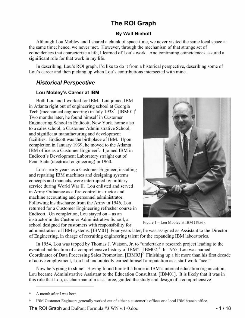
Figure 1 – Lou Mobley at IBM (1956).

The ROI Graph and DuPont Formula #3 WN v.1-0.doc - 2 / 18 August 9, 2008
management development program for IBM. The program spanned supervisory, middle-management, and executive management levels. As was often the case with IBM task forces, an organizational change resulted. In 1956, IBM established the Executive Development Department at its World Headquarters in New York City. The Director of the new department, Thomas E. Clemmons, reported directly to Thomas J. Watson, Jr., President of IBM.
The Executive Development Department, by 1959, had found permanent headquarters* at Sands Point, Long Island.4 [IBM04] The program was three-pronged:
1. IBM Executive School (1957) – Designed for middle-management, this program emphasized case history and discussion, and some of the nation’s top educators participated.
2. IBM Management School (1959) – Designed for lower than middle-management, it sought to encourage, develop, and improve approaches, attitudes, and techniques for solving management problems.
3. A program for IBM’s top executives encouraging them to participate in university and other out-company programs under outstanding authorities.
Six “Consultants” comprised the staff of the Executive Development Department, and Louis R. Mobley was among them. Lou was responsible for the Executive School program [IBM04], an involvement he would have until 1966.5 (This date is somewhat uncertain. From his own records, Lou took a leave of absence from IBM in 1965-66 to develop a Church Executive Development program.6 [MOB01])
It is during this assignment and time period that Lou Mobley developed the tools that we are interested in here.
I think it’s high time that I described how I encountered Lou’s work and my role in all this.
Encountering the Mobley Matrix and ROI Graph In the very early 1970s, the late Bob Schaffer, an
IBM colleague of mine, attended an IBM middle-management school (undoubtedly Mobley’s Executive School), and when he returned he brought home a sheet of hand-written data and a graph that intrigued me. I still have the copy that Bob made for me, and I have made a facsimile (Figure 2) for you. The plot presents two ratios (Return on Sales on the vertical axis versus Capital Turnover Ratio on the horizontal axis), which are derived from financial data generally presented on annual reports, in this case IBM’s. You get to plot one point per year, in this case 1950-1969 -- less exciting, to butcher an old expression, than watching a yacht race! The point-to-point line segments are superimposed on a family of dotted curves, which are lines of constant Return on Investment (also known as ROI), which I’ll define later).
The copy of the hand-drawn plot that Schaffer gave me has some hand-written notes from the class that I have transcribed to Figure 2. The copy quality is poor enough that I can’t be sure of some of the annotation content, but there’s enough there to stimulate interest. The notations attempt to comment on what was going on financially in a given year or time period. (A point labeled “52,” for example, is at
* The facility, formerly known as the Isaac Guggenheim Estate, also housed the IBM Country Club for New York City
area employees. IBM sold the property to the Village of Sands Point in 1994. It is now known as the Village Club of Sands Point.
Figure 2 –IBM Financial Growth 1950-1969. A facsimile of a 1970 graph. (Annotations adjacent to line segments have been added manually to reflect those in the original hand-drawn plot.)

The ROI Graph and DuPont Formula #3 WN v.1-0.doc - 3 / 18 August 9, 2008
the end of a segment that represents the year 1952. That is, a point labeled “52” represents 12/31/1952.) What is clear is that the notations were intended to illustrate how external factors and internal measures appear to affect increases or decreases in ROI. In particular, the notation “Divisional Profit Planning” is tied to the start of a remarkable period of ROI growth during the 1958-1964 period.
I’ll comment about the annotations where I can, starting at the earliest part of the path toward the upper-left corner of the plot:
1. The year 1952 saw a dramatic decrease in return on sales, resulting in more than a three percentage point loss in ROI. The annotation is “Korea Exp. US Comp. Coming.” The “Korea Exp.” part probably refers to increased expenses somehow related to the Korean War. “US Comp.” probably refers to “US Competition.”
2. The meaning of “Salesmen on Sal.” initially seems obvious, but the interpretation is not so obvious, which in turn casts doubt on the supposed meaning. I’ll leave it to the reader to rationalize this one.
3. During 1957, IBM instituted “Divisional Profit Planning.” I recall Schaffer telling me that each IBM division was expected to “plan for profit.”
4. The dramatic increase in ROI (and both return on sales and capital turnover) in 1968 was said to be a result of “Increased Sales/Rent,” that is a dramatic increase in the proportion of revenue due to outright purchases of IBM equipment as opposed to the traditional rentals.
5. “Capital Exp.” refers to the increase in capital expenditures needed to start manufacturing IBM’s System/360.
I got so interested in this plot, which reminded me of a phase-plane plot, common in engineering work, that I learned just enough about reading financial statements to be able to extract the numbers and compute Return on Sales and Capital Turnover Ratio. Starting with the 1970 IBM Annual Report, I began pulling off the numbers and adding one record a year to the copy of the data sheet given to me by Schaffer. I’m still at it.
Subsequently, I learned that Lou Mobley, in his role at the Executive School, had developed a spreadsheet format* that didn’t require a CPA certification to understand what a financial report was trying to tell you. Lou had also developed the unique format of the graph, which, at the time, was called an ROI graph.
Initially, I hand-plotted the updates for a new year right on the paper copy. In 1981, however, the point went off the paper, and, rather than start a new paper-plot, I said to myself, “Let’s do this right.”
It was fortunate that Dr. Alan Jones (another colleague) and I had written a graphics software package in an up-start programming language called APL†. We called the package APL Graphpak.‡ So, I wrote a little APL program that uses Graphpak to do the plotting.
Somewhere between 1989 and 1991 (before I retired from IBM), I learned of Mobley’s book Beyond IBM [MOB02] 7, which had some historical perspectives on the company. I’ve always been interested in IBM’s history, so I bought the book. Thumbing through it from back to front, I was astounded to find (in an appendix) an earlier copy of the plot that Schaffer introduced me to. So I read the book and discovered that the principal author, Lou Mobley, was the source of Schaffer’s plot. Moreover, it told me that Mobley was the originator of a framework for understanding financial reports that his students at Sands Point dubbed “The Mobley Matrix.”
* Understand that, at the time, this was a manual (paper and pencil) spreadsheet. It was well before the era of VisiCalc and
Excel.
† “A Programming Language,” the title of a book authored by Kenneth E. Iverson, the father of APL.
‡ How come we dropped the “c” in “pack”? When a package was saved, we were restricted to 8-character package file names. So, we figured the “c” was redundant anyway, and we named it Graphpak.

The ROI Graph and DuPont Formula #3 WN v.1-0.doc - 4 / 18 August 9, 2008
While still employed by IBM, I had a following that looked forward to seeing each year’s new point. But, after retiring, I saw few of these people from week to week, so I decided to put the plot on my web site, and I put the phrase “Mobley Matrix” somewhere in the accompanying text. Well, I was surprised to find Mobley Matrix enthusiasts come out of the woodwork.
From the time that I retired in 1991 until IBM’s beta test of APL2 for Windows, I had no access to APL. So it looked like I might have to go back to hand-plotting. It seemed obvious that this was a natural application for a spreadsheet program, and I tried both Quattro Pro and Excel.* There was no problem representing the data or plotting the year-to-year data, but I could find no way of superimposing the lines of constant ROI. (I sometimes challenged acquaintances to do this, but I guess I didn’t have any acquaintances expert with spreadsheet products.) I even resorted to writing a plotting package with Turbo Pascal, just so I could do my plot. When I eventually got APL and Graphpak back, I gave up (for a time) trying to do this with spreadsheet graphics.
This brings me to the end of my introductory story. Lou Mobley retired from IBM in 1970 after 32 years of service. Post-retirement, Lou went on to exploit his leadership training experience, founding Mobley & Associates, Inc. And, he co-authored Beyond IBM [MOB02] with Kate McKeown, which was published posthumously in 1989. (Lou died in 1988.)
Lou’s work continued to be fostered by his enthusiasts as well as by some financial consultants, notably Chuck Kremer, co-author of Managing by the Numbers [KRE01]8. This book explained the underpinnings of Mobley’s framework and was an excellent introduction to reading and interpreting financial reports.
With that background taken care of, I would like to present some graphical presentations to you, leading up to the return-on-investment (ROI) graph. To that end, here is my agenda:
1. Since all of the data to be presented comes from financial reports, I’m going to begin with some definitions. These are likely to be repetitive because they are the subject of earlier material in this book, but I find that it’s good to have foundational material nearby when introducing something new.
2. Next, I’ll illustrate some trends by plotting data over time. 3. I’ll illustrate some ratios of certain data that help with insights into financial performance. 4. The ROI plot is a plot of ratios on each axis, and I’ll illustrate a full version of that, along
with a couple of related “Return-On-x” plots. (x will be defined later.)
Until recently, the only data collected over a long period of time that was available to me was data that I gathered myself, and that was data about IBM. So I’ll use that here. I apologize to those readers who are not interested in IBM. Also, I need to make it clear to those who are interested in IBM that I am not picking on it. IBM has had some good times and some bad times, and we’ll see both in the data.
In addition, I must now throw in a disclaimer: I am not an accountant, nor do I know much at all about accounting. I am an engineer with a side-specialty in application programming. In this area, I claim only to be presenting what the authors of the two books I have cited have written. I believe I can present that faithfully. However, there is a definite risk that I might misinterpret some of the data that I will be extracting from companies annual reports. So, here, don’t trust me!
The Basics One of Lou Mobley’s key contributions was to develop a framework (the “Mobley Matrix”) for
understanding a set of financial statements generally found in companies’ annual reports and, importantly, relations among the statements. Mobley’s work was foundational; his work greatly facilitates what we are able to do today, now that computers are in the hands of just about everybody.
* When I used VisiCalc, it had no plotting capabilities!

The ROI Graph and DuPont Formula #3 WN v.1-0.doc - 5 / 18 August 9, 2008
My objective is to present Mobley’s perspective, particularly in presenting his point of view regarding the ROI plot (e.g., Figure 2). So, let’s begin.
Basic Metrics Since I want to get to the subject of the ROI graph, I will start by illustrating the key parameters in a
financial statement that drive the graph I’ll start with Sales and Net Profit. (I’ll use Net Profit After Taxes.) Also, to see the effect of taxes, let’s throw in Net Profit Before Taxes, which is Net Profit After Taxes less Income Tax Expense All of these are items from the income statement.
I have avoided urges to “embellish” these plots with annotations, titles, etc. I wanted to keep the plots simple so that my description would be “lean.” Also, I want to point out that I will occasionally use the term Gross Revenue as a synonym for Sales, depending on whether I’m trying to conform with financial statements, earlier material in this book, or Mobley’s Beyond IBM.
Now that I’ve presented the source for the data items I’m going to discuss, let’s actually take a look at some of them – over time.
Illustrating Trends
A Stacked Column Chart Figure 3 is a stacked column chart * with (1) Net
Profit After Taxes stacked on (2) Income Tax Expense (which is Net Profit Before Taxes less Net Profit After Taxes), in turn, stacked on (3) all other expenses (which is Sales less Net Profit Before Taxes). (I used to call the last “Overhead,” which is an over-simplification.)
Although the “wrinkle” preceding about 1995 is the proper behavior for the graph, it could lead to reader confusion, at least momentarily. As a result, I decided to search for some method of avoiding the confusion. Short of changing the style of the plot, I added the line segment overlay that tracks the values and makes it clear that there is a reversal going on in the subject period.
* Technically, a column chart has vertically oriented rectangles, and a bar chart has horizontally oriented rectangles.
Figure 3 – Column Chart stacking (normally from bottom to top) “Overhead,” Tax, and Profit. A line segment plot makes the profit reversal situation in 1991-1993 more apparent.

The ROI Graph and DuPont Formula #3 WN v.1-0.doc - 6 / 18 August 9, 2008
A Grouped Column Chart A simple alternative approach to the stacked
chart is to use a grouped column chart, which is shown in Figure 4. Here, the profit reversal situation is more readily apparent. However, I want to note that there is a fundamental application difference between stacking and grouping. Stacking facilitates comparing components with the whole (total of components), while grouping facilitates comparing components with one another. The sum of the components in the Figure 3 example is Sales, and the original intent was to illustrate how the expense components (two of the three) erode from the revenues derived from Sales. This comparison-to-the-whole is maintained in the Figure 4 presentation by changing the quantities plotted.
A Filled Line Plot I decided to try one additional alternative, and
that is shown in Figure 5. This is a simple stacked line plot, but with the regions between the plotted results filled. The filling enhances visualization of the components.
I like this presentation best because it nicely enhances the components and their comparison with the whole (Gross Revenue). Of course, it’s better in color. Also, the tax component is nicely shown as the sliver between Gross Revenue and Net Profit After Taxes.
I’d like to present one more plot of the trend category because it will give me the opportunity to
define three terms – 1. Assets, which is Total Assets. 2. Equity (alternately Net Worth), which is the sum of Stock and Retained Earnings. 3. Investment, which is the sum of Equity and Long-Term Investment.
(N.B., Long-Term Investment is sometimes contained implicitly in in Nonoperating Liabilities. IBM’s Annual Reports, however, do explicitly report Long-Term Investment, as do many other companies.)
Figure 4 – Column Chart grouping (left to right) Gross
Revenue, Net Profit Before Taxes, and Net Profit After Taxes.
Figure 5 – Filled plot of (top to bottom) Gross Revenue,
Net Profit Before Taxes, and Net Profit After Taxes.

The ROI Graph and DuPont Formula #3 WN v.1-0.doc - 7 / 18 August 9, 2008
Resources All three of these quantities are measures of
resources that a company has at its disposal to fulfill its primary objective (in a capitalistic economy) – producing a return (Net Profit). Assets is everything – on the top side of the balance sheet, that is. Equity is what is retained by the company from earnings plus what is invested on the part of the stockholders. Investment adds to Equity what the company has borrowed from others to help in producing a return. I decided to plot (Figure 6) these three quantities (for IBM) over time to get a feel for their relative magnitudes as well as for their ups and downs.
My main motivation in presenting these trend plots was to illustrate that the best form of presentation often depends on (1) the characteristics of the data and (2) what you wish to emphasize or de-emphasize.
Ratios We often use ratios of two quantities to facilitate analysis and understanding, for example, Efficiency
(Work-Out/Work-In). The Mobley Matrix format reports a basic expense item on the income statement called MSG&A Expense. (Marketing, Selling, General, and Administrative Expense includes what it costs a company to plan, develop, sell, and support a product, but not what it costs to build it, which is Cost of Goods Sold.) The ratio of MSG&A Expense to Sales (24 percent for IBM in 2000) gives one a feel for how in-line or out-of-line these expenses are, particularly in historical or inter-company comparisons.
Beginning in 1980, IBM began breaking out more detail of this expense, reporting (1) Selling, General, and Administrative and (2) Research, Development, and Engineering expenses. I started saving these numbers at that time, plotting the two ratios (each of these expenses with respect to Gross Revenue). (Frankly, I wanted to get a feel for how big a piece of the revenue pie we good guys in Engineering were getting compared to the piece going to those Headquarters and Sales guys, who wore green eyeshades and black hats.)
Figure 7 shows these two ratios versus time. For a long time, I was amazed at how consistently (up until 1991-1992, that is) Research and Engineering were getting about ten percent of the pie. On the other hand, Headquarters and Sales were getting three times as much. Then, the trend seems to change after 1992!
Figure 6 – Assets, Investment, and Equity.
Figure 7 – Selling, General, and Administrative and Research, Development, and Engineering expense ratios (with respect to Gross Revenue).

The ROI Graph and DuPont Formula #3 WN v.1-0.doc - 8 / 18 August 9, 2008
Sometimes one can get fooled by these
apparent trends, so I decided to look at this plot a little bit differently. I simply normalized each of the ratios with respect to its mean (over time) and plotted the results (Figure 8). I was surprised at how closely the ratios track one another when compared this way.
These ratios were of personal interest to me. But, of more general interest are ratios that assess return.
Return Return is usually represented by Net Profit. (Kremer used Net Profit After Taxes; Mobley used Net
Profit Before Taxes. I’m going to be consistent in what I do in the remainder of this chapter and use Net Profit Before Taxes simply because that is what was collected in my earliest data.) Return on x is the ratio of Return to x, where x is typically Assets, Equity, or Investment, all of which were earlier.
Let’s take a look at some trend data, again IBM’s (in Figure 9).
Illustrating Returns
Return-On-Assets, -Equity, -Investment Lou Mobley relates [MOB02] that he attended a meeting of the American Management Association
in the early 1950s where the Treasurer of Du Pont presented the formulas that his company used to
Figure 8 – Mean-normalized Selling, General, and Administrative and Research, Development, and Engineering expense ratios (with respect to Gross Revenue). (Means are respectively 27 and 8 percent.)
Figure 9 – Trends in Return on Equity, Investment, and Assets (in Percent).
The ROI Graph and DuPont Formula #3 WN v.1-0.doc - 9 / 18 August 9, 2008
assess ROI.* Mobley adopted it for instructional purposes and, in 1956, evolved the “ROI Chart” (e.g., Figure 2).
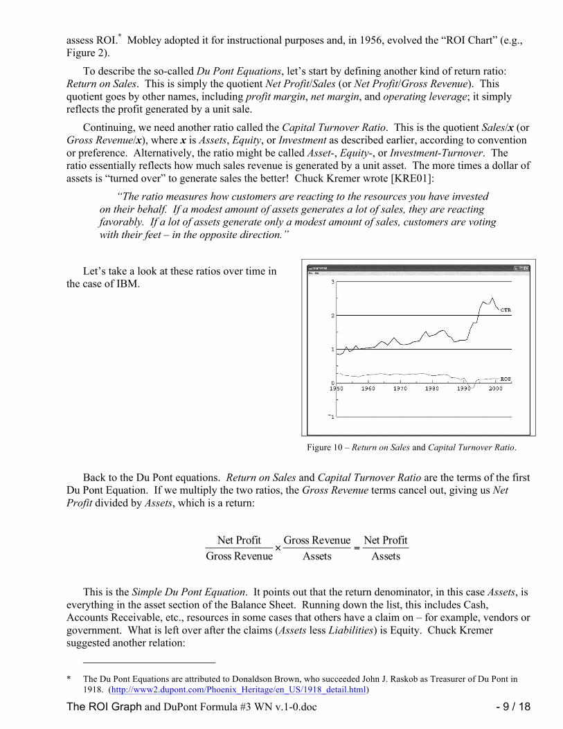
To describe the so-called Du Pont Equations, let’s start by defining another kind of return ratio: Return on Sales. This is simply the quotient Net Profit/Sales (or Net Profit/Gross Revenue). This quotient goes by other names, including profit margin, net margin, and operating leverage; it simply reflects the profit generated by a unit sale.
Continuing, we need another ratio called the Capital Turnover Ratio. This is the quotient Sales/x (or Gross Revenue/x), where x is Assets, Equity, or Investment as described earlier, according to convention or preference. Alternatively, the ratio might be called Asset-, Equity-, or Investment-Turnover. The ratio essentially reflects how much sales revenue is generated by a unit asset. The more times a dollar of assets is “turned over” to generate sales the better! Chuck Kremer wrote [KRE01]:
“The ratio measures how customers are reacting to the resources you have invested on their behalf. If a modest amount of assets generates a lot of sales, they are reacting favorably. If a lot of assets generate only a modest amount of sales, customers are voting with their feet – in the opposite direction.”
Let’s take a look at these ratios over time in the case of IBM.
Back to the Du Pont equations. Return on Sales and Capital Turnover Ratio are the terms of the first Du Pont Equation. If we multiply the two ratios, the Gross Revenue terms cancel out, giving us Net Profit divided by Assets, which is a return:
AssetsProfitNet
AssetsRevenue Gross
Revenue GrossProfitNet
=×
This is the Simple Du Pont Equation. It points out that the return denominator, in this case Assets, is
everything in the asset section of the Balance Sheet. Running down the list, this includes Cash, Accounts Receivable, etc., resources in some cases that others have a claim on – for example, vendors or government. What is left over after the claims (Assets less Liabilities) is Equity. Chuck Kremer suggested another relation:
* The Du Pont Equations are attributed to Donaldson Brown, who succeeded John J. Raskob as Treasurer of Du Pont in
1918. (http://www2.dupont.com/Phoenix_Heritage/en_US/1918_detail.html)
Figure 10 – Return on Sales and Capital Turnover Ratio.

The ROI Graph and DuPont Formula #3 WN v.1-0.doc - 10 / 18 August 9, 2008
EquityProfitNet
EquityRevenue Gross
Revenue GrossProfitNet
=×
where Equity = Assets – Liabilities.
Kremer called this the Extended Du Pont Equation and notes that the two equations are related through the ratio Assets/Equity, which he called Financial Leverage.
Mobley took this one step farther and used the following equation as the basis for his ROI Chart:
InvestmentProfitNet
InvestmentRevenue Gross
Revenue GrossProfitNet
=×
where Investment = Equity + Long-Term Indebtedness
So, we have three very similar relations based on three alternative ratios that assess return – return on Assets, on Equity, on Investment. But, for compatibility with my historical data, some of which came from Mobley, I’m going to illustrate only the third relation, which assesses Return-on-Investment (ROI), as defined by Mobley –
Return on Investment = Return on Sales Capital Turnover Ratio Since my assessment is relative to Investment here, Capital Turnover Ratio is calculated as
Gross Revenue/Investment.
An ROI Chart Let’s start working toward plotting another ROI chart (like Figure 2) that includes some updated
financial data for IBM. I’d like to use a little shorthand, and, since I’ll be plotting Capital Turnover Ratio on the x-axis and Return on Sales on the y-axis, let:
InvestmentRevenue GrossT Ratio,Turnover Capital =
Revenue GrossProfitNet S Sales,on Return =
Then, the Mobley form of the Du Pont Equation which looks at ROI becomes R = T S, where R is
Return On Investment (ROI), which I’ll loosely refer to as return. Also, to facilitate a feature of the ROI chart, recognize that for some particular profitability, R = Rk:
TRS k=
This, for constant Rk, is a curve that has a name; it’s a hyperbola.

The ROI Graph and DuPont Formula #3 WN v.1-0.doc - 11 / 18 August 9, 2008
The ROI chart, which includes 1950-2001
IBM financial data, is shown in Figure 11. Note that there are numerous curves of constant ROI, all characterized by a return value labeled to the right of the curve end. This collection of constant ROI curves would be termed a family of curves:
TRS k=
There are some attributes of this graph that raise Cain with inexperienced people trying to automate the plotting process –
1. The plot must accommodate a wide variety of return-on-sales and turnover ratio extents, hence automatic generation of scaling is called for.
2. To be acceptable, the automatic scaling should yield reasonably attractive axis labels. 3. The constant return values, which characterize the hyperbolas, must be selected from the
ranges of the return on sales and turnover ratio. The constant return values also should not be “ugly.” For example, the values illustrated are a tens value when expressed as a percentage.
ROI Comparisons I’ve picked on IBM an awful lot here, so for
one last example I’d like to include some other companies. The main difficulty in doing that is that I don’t have access to the same extent of historical data that I collected for IBM. However, many companies have been considerate enough to publish recent financial results on the Web, and even quarterly reports (10-Q) are available from the Securities and Exchange Commission (www.sec.gov). What I have chosen to do in illustration is to take Year-2001 financial results for a number of companies (Table 1) and compare them using Mobley’s ROI chart (Figure 12).
Table 1 – Year-2001 Financial Results. (Dollars in millions)
Company Gross
Revenue Net Profit
Before Taxes
Equity =
Net Worth
Long-Term Indebted-ness
Amazon.com 3,122 -567 -1,440 2,156
IBM 85,866 10,953 23,614 15,963
Krispy Kreme 301 24 126 0
Microsoft 25,296 11,525 47,289 0
Figure 11 – IBM Return On Investment 1950-2001.
Figure 12 – Year-2001 ROI comparison of Microsoft, IBM, Krispy Kreme, Amazon.com, and Silicon Graphics.

The ROI Graph and DuPont Formula #3 WN v.1-0.doc - 12 / 18 August 9, 2008
SGI 1,854 -466 -25 340
What I have tried to do here is introduce the ROI graph in the context of the guy who developed it –
Lou Mobley. I’ve also tried to emphasize how important graphical presentation can be to comprehension and understanding of financial trends.
I started with the ROI graph that served as my introduction to Mobley’s work way back in the 1960s. As I introduced the financial terminology, I illustrated corresponding data with one or more graphs of trends. Finally, I finished up with an updated version of the ROI graph.
The graphs, so far, were all generated with APL Graphpak; that’s because that’s what I use when I want to quickly plot some data or do a “what-if.” But you can use the charting facilities associated with your favorite spreadsheet program – for all except the ROI graph, that is. I mentioned that there were some characteristics of that graph that are challenging to achieve with common spreadsheet graphics.
But, never fear; there’s more to the story.
The ROI Graph Evolves Jahn Ballard and Chuck Kremer are largely responsible for helming my boat from 2001-2004. As
mentioned earlier, within a few years after my retirement, I began to post annual updates of the ROI chart for IBM on my web site. As well, I told my Mobley Matrix “war story” there. This turned out to be the key to my meeting both Jahn and Chuck. I’ll let Jahn relate the circumstances in his own words:
I met Walt because of Tom Hood, the week before I called him [Tom] for the first time in 2001. Tom had been searching the net for information on the Mobley Matrix for the dozenth time over something like five years. His motivation was that he wanted it to help his staff at the Maryland Association of CPAs understand their business model so they could become profitable again. His search turned up the graph in Figure 11. After our first call, he sent the chart showing 50 years of IBM to me, and I called Walt.
Jahn was searching for a way to make Lou Mobley’s ROI graph more widely available. We discussed it for a while. I understood the implementation issues and knew how to solve them, but knowing and having the wherewithal are sometimes quite different. I had an APL implementation, but although APL is great, especially for quick, custom analyses, it is also quite pricey. I knew other languages, but I wasn’t sure I was interested in getting into the software development business. (I find learning and programming to be fun, and I want it to stay that way.)
One thing we discussed was the possibility of a web-based ROI graph server. As a matter of fact, I developed a prototype server – in APL – and offered it to Jahn, for what it was worth, which was free. That never went anywhere because of the price of an APL license and the relative scarcity of APL programmers that would presumably be needed to provide support.
Financial Scoreboard In 2003, Jahn, Chuck, and I got our heads together on the telephone and discussed how Financial
Scoreboard, an Excel workbook implementation of the Mobley Matrix, might be enhanced by integrating an ROI graph on the Dashboard worksheet. I went ahead implemented the enhancement with VBA (Visual Basic for Applications).* Here’s what it looked like:
* I learned VBA for the occasion.

The ROI Graph and DuPont Formula #3 WN v.1-0.doc - 13 / 18 August 9, 2008
Unfortunately, we couldn’t come to terms, and the project folded. Chuck needed someone who
could maintain and otherwise support the software, and I wasn’t interested in doing that part of it. (I was having so much fun in retirement. I even offered to put my code in the public domain, but that didn’t solve either Chuck’s or Jahn’s problem, which was providing programming support.)
ROxPlot For my own purposes, I liked the idea of keeping the data source on a spreadsheet. So I decided to
adapt my VBA software to a general purpose format. Having discussed Return-On-Assets, -Equity, and –Investment until I was the proverbial blue in the face with Chuck, I decided to allow a user (with me particularly in mind) to plot Return-On-x, where x is anything the user could define on the spreadsheet. As a result, I named the program ROxPlot.
Here’s what the ROx worksheet looks like:

The ROI Graph and DuPont Formula #3 WN v.1-0.doc - 14 / 18 August 9, 2008
Three things comprise the ROxPlot worksheet:
1. A worksheet range that, column-wise, lists the Period (“Year” here), x-Turnover (“Investment Turnover” here), Return-On-Sales, and Return-On-x (“Return-On-Investment” here). Typically, the data in the worksheet range is linked from another worksheet in the workbook. This is the step that generalizes the applicability of the worksheet.
2. A chart area that has the ROx graph.
3. A Show Options button that opens a Plot Options dialog.

The ROI Graph and DuPont Formula #3 WN v.1-0.doc - 15 / 18 August 9, 2008
Plot Options Dialog The Plot Options dialog (Figure 13) gives users some
customization options. The options as illustrated generated the graph above, so you should notice that quite a few options have reasonable defaults.
The best way to learn about the plot options is to grab some data and play with the options. A full ROxPlot Guide is available. (See Public Domain Software below.)
Discussion: “A Balanced Plan” In Beyond IBM (page 185), Mobley discusses the notion of a “balanced plan.” He displays an ROI
graph for People Express in 1982-84. He asks, “How could Don Burr* have plotted, and then achieved, a balanced plan goal?” Lou answers, “First, he would have plotted his 1983 ROI of 3.68% on the chart. Then he would have drawn the shortest possible line to a desirable ROI curve for the next year.” I clearly recall Bob Schaffer relating to me when he returned from Executive School that there was an optimal way to progress from one point on the graph to a position of improved ROx, and that was to move to the target return hyperbola on a path perpendicular to the source return hyperbola, which, they said, would be the shortest path possible. This, as described by Mobley, was a so-called “Balanced Plan.”
There’s only one problem: The notions of “shortest” and “perpendicular,” in both the cases of the People Express plot and the IBM plot that Schaffer gave me, were distorted considerably by the scaling of the plot axes. For example, the return-on-sales axis in the People Express sample is highly compressed. A distance of 1.0 on the vertical axis would be about 5.5 inches long, while an equivalent distance on the horizontal axis is 1.5 inches. Try to imagine using a map scaled such that vertical distances were compressed four times more than horizontal distances, and you’ll appreciate the problem. (Try to imagine yourself navigating with it, that is.)
If you want to use the notions of “shortest” or “perpendicular,” use the “1-1 Scaling” option. It scales the plot equivalently in both directions. However, frequently, you will find that the data you have
* CEO of People Express.
Figure 13c – Plot Options dialog.

The ROI Graph and DuPont Formula #3 WN v.1-0.doc - 16 / 18 August 9, 2008
to deal with is restricted to a rather tight range. Figure 14 illustrates the effect I’m talking about. This plot is next to useless because of the compression of the earlier data points.
Figure 14 – IBM data plotted 1:1.
Gradients to the Rescue What we need to do is drop the notions of “perpendicular” and “shortest,” which are geometric
notions. What I recommend is to distinguish these notions from these words. One solution would be to substitute, “shortest as measured by algebra” or “mathematically perpendicular,” but that gets awkward. I suggest the term “normal” instead, which, in its mathematical sense, is correct.
But, regardless of how you say it, you’re still going to have problems drawing it 1:1 while trying to make proper use of the space where you want to display or print it.
A curve (in two dimensions) that is everywhere mathematically normal (or perpendicular) to a family of curves is called a gradient curve. And, corresponding to a family of curves, there is a family of gradients. As a matter of fact, the two families are mutually each others’ gradients.
The Plot Gradients option superimposes gradient curves on the plot, which can be seen in Figure 14 as faint dotted curves tracing the direction of “mathematical perpendicularity.” With the gradient curves displayed, you can follow these guide lines as showing the perpendicular or shortest path and take full advantage of your available page space at the same time.
But, is the notion of mathematical perpendicularity or mathematically shortest in any sense optimal? Mobley is silent on this. And he offers no guidance in what sense the parameters in such a plan are “balanced.”
I can tell you this much: There is a sense of optimality about progressing from one level of ROI to a higher level of ROI along a path that is normal to the hyperbolas of constant-ROx, where x is whatever you want to make it. The gradient curves trace a path of maximal rate of change in R. Beyond this, I can’t say. For one thing, the parameters that are associated with the x- and y-axes are ratios, not something real like furlongs or fortnights or dollars. Nor is the same thing represented on the y-axis as on the x-axis, as is the case with a map or navigation chart. Speaking for myself, it boggles my mind when I contemplate what could be optimal. But, as I said earlier, my financial expertise is pretty much just paying my bills on time.
The ROI Graph and DuPont Formula #3 WN v.1-0.doc - 17 / 18 August 9, 2008
I acknowledge that the concepts here are elusive. Let’s see if I can summarize: 1. If you follow one of the constant-ROx curves, there is no change in the return-on-x. (That’s
why it is said to be constant.) 2. If you follow one of the gradient curves, there is no change in the rate of change of return
with respect to the axis metrics, namely return-on-sales and x-turnover. Beyond that, notions of optimality become elusive, primarily because of the abstractness of the metrics on the x- and y-axes – return-on-sales and x-turnover, both of which are unit-less ratios.
Public Domain Software I have decided to place my ROx graph-plotting software in the public domain, relinquishing any
rights bound to me by my authorship.
The ROxPlot package will include a ROxPlot Guide and three sample Excel workbooks – for IBM (1950-2001), Enron (3Q97-3Q01), and SGI (6/30/94-12/31/01), any one of which can be used as a template for your own data. As I understand it, the ROxPlot package will be distributed for free by the Maryland Association of CPAs (http://www.macpa.org/Content/Home.aspx).
Also, the ROA-graph software (VBA) that I wrote for the Dashboard component of Financial Scoreboard will, as well, be released into the public domain along with a ROI Graph User Guide that describes how to use it. Whether this will be made available as a part of Financial Scoreboard is unclear. However, I may make it available for download from my web site.
I will provide no technical or user support for either of these software packages.
Acknowledgements I have had a great deal of fun over the years, dabbling in various software implementations of ROx
graph plotting facilities. I wish I could thank the late Bob Schaffer for that. I am thankful also to Jahn Ballard and the late Chuck Kremer for discovering me. The challenges that they presented were invigorating.
I wish to thank Dawn Stanford at the IBM Corporate Archives for digging up information on Lou Mobley that corroborates some of the details of Lou Mobley’s involvement in his 32 years with IBM.
And, thanks to Lou for inventing the ROI graph in the first place.

The ROI Graph and DuPont Formula #3 WN v.1-0.doc - 18 / 18 August 9, 2008
References 1. Business Machines, IBM (October 22, 1956). [IBM01 – Courtesy IBM Corporate Archives] 2. T. J. Watson, Jr., Memorandum: “Research Project – History of IBM” (June 24, 1954). [IBM02
– Courtesy IBM Corporate Archives] 3. IBM Executive Development Department Announcement: “Louis R. Mobley, Consultant” IBM
(undated). [IBM03 – Courtesy IBM Corporate Archives] 4. “How IBM Develops Its Management,” Business Machines, IBM (September 1959). [IBM04 –
Courtesy IBM Corporate Archives] 5. August Turak, “10 Leadership Lessons from the IBM Executive School, Forbes
(http://www.forbes.com/sites/augustturak/2012/03/02/10-leadership-lessons-from-the-ibm-executive-school/) (March 2, 2012). [TUR01]
6. Louis Mobley, “Louis R. Mobley: Resume of Achievements,” (unpublished document) (post-1970) [MOB01]
7. Lou Mobley and Kate McKeown, Beyond IBM, McGraw-Hill. (1989) [MOB02] 8. C. Kremer and R. Rizzuto, Managing By the Numbers, Perseus Publishing (2000) [KRE01]