typeface classification serif or sans serif? abcdefg abcdefgo · the first transitional (or...
TRANSCRIPT
Typography 1: Typeface Classification
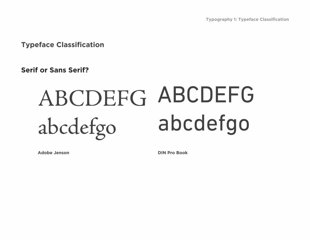
Typeface Classification
Serif or Sans Serif?
ABCDEFGabcdefgo
ABCDEFGabcdefgo
Adobe Jenson DIN Pro Book

Typography 1: Typeface Classification
Typeface Classification
Typeface or font?
ABCDEFGABCDEFGABCDEFGABCDEFG
Font: Adobe Jenson Regular
Font: Adobe Jenson Italic
Font: Adobe Jenson Bold
Font: Adobe Jenson Bold Italic
TYPEFACE FAMILY
Typography 1: Typeface Classification
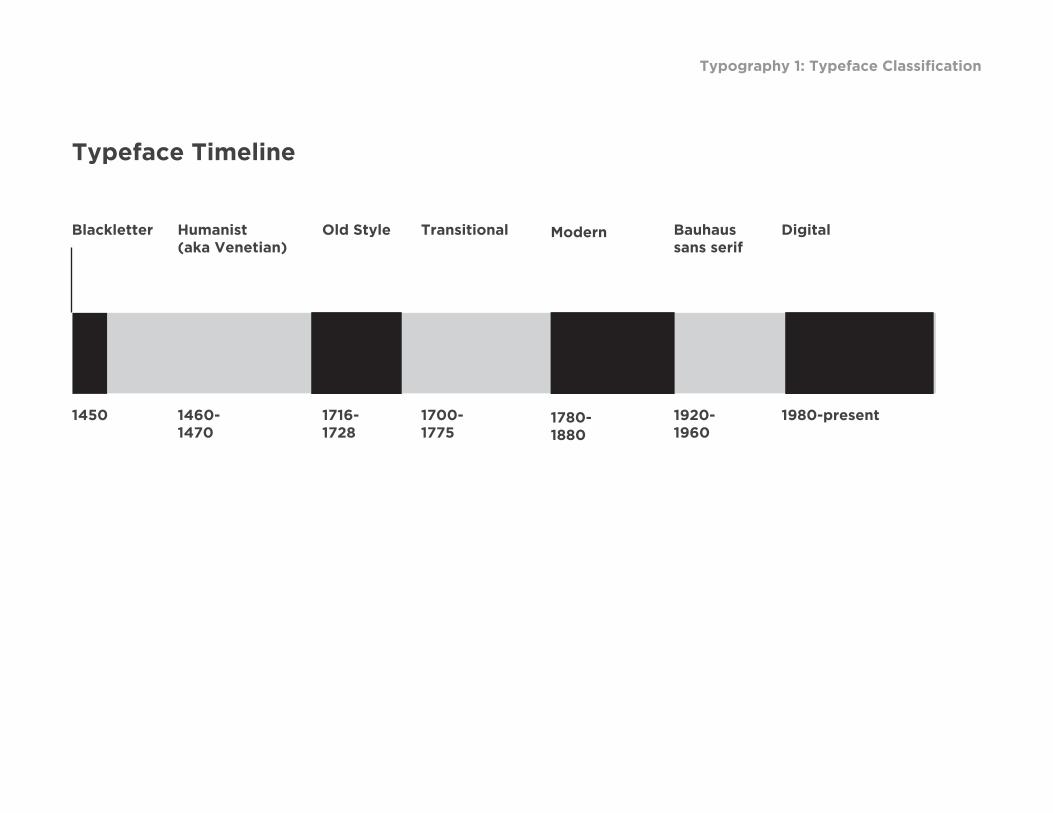
Typeface Timeline
1450
Blackletter
1460-1470
Humanist(aka Venetian)
1716-1728
Old Style
1700-1775
Transitional
1780-1880
Modern
1920-1960
Bauhaussans serif
1980-present
Digital

Typography 1: Typeface Classification
Typeface Classification
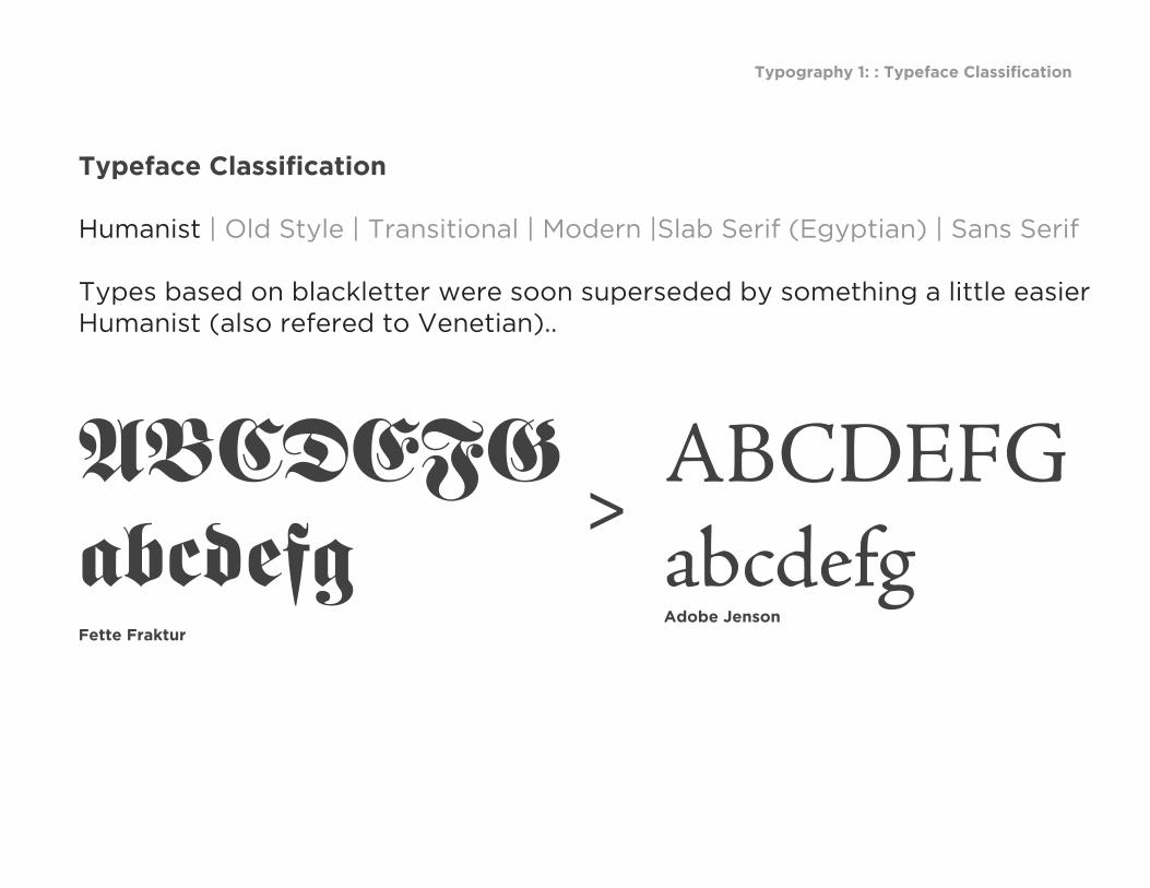
Humanist | Old Style | Transitional | Modern |Slab Serif (Egyptian) | Sans Serif
The model for the first movable types was Blackletter (also know as Block, Gothic, Fraktur or Old English), a heavy, dark, at times almost illegible — to modern eyes — script that was common during the Middle Ages.
from I Love Typography http://ilovetypography.com/2007/11/06/type-terminology-humanist-2/
Typography 1: : Typeface Classification
Fette Fraktur
Typeface Classification
Humanist | Old Style | Transitional | Modern |Slab Serif (Egyptian) | Sans Serif
Types based on blackletter were soon superseded by something a little easier Humanist (also refered to Venetian)..
ABCDEFGabcdefg
ABCDEFGabcdefgAdobe Jenson
>

Typography 1: : Typeface Classification
Typeface Classification
Humanist | Old Style | Transitional | Modern |Slab Serif (Egyptian) | Sans Serif
The Humanist types (sometimes referred to as Venetian) appeared during the 1460s and 1470s, and were modelled not on the dark gothic scripts like textura, but on the lighter, more open forms of the Italian humanist writers. The Humanist types were at the same time the first roman types.

Typography 1: : Typeface Classification
Typeface Classification
Humanist | Old Style | Transitional | Modern |Slab Serif (Egyptian) | Sans Serif
Characteristics
1. Sloping cross-bar on the lowercase “e”; 2. Relatively small x-height; 3 Low contrast between “thick” and “thin” strokes 4 Dark visual tone
from I Love Typography http://ilovetypography.com/2007/11/06/type-terminology-humanist-2/
Typography 1: : Typeface Classification
Typeface Classification
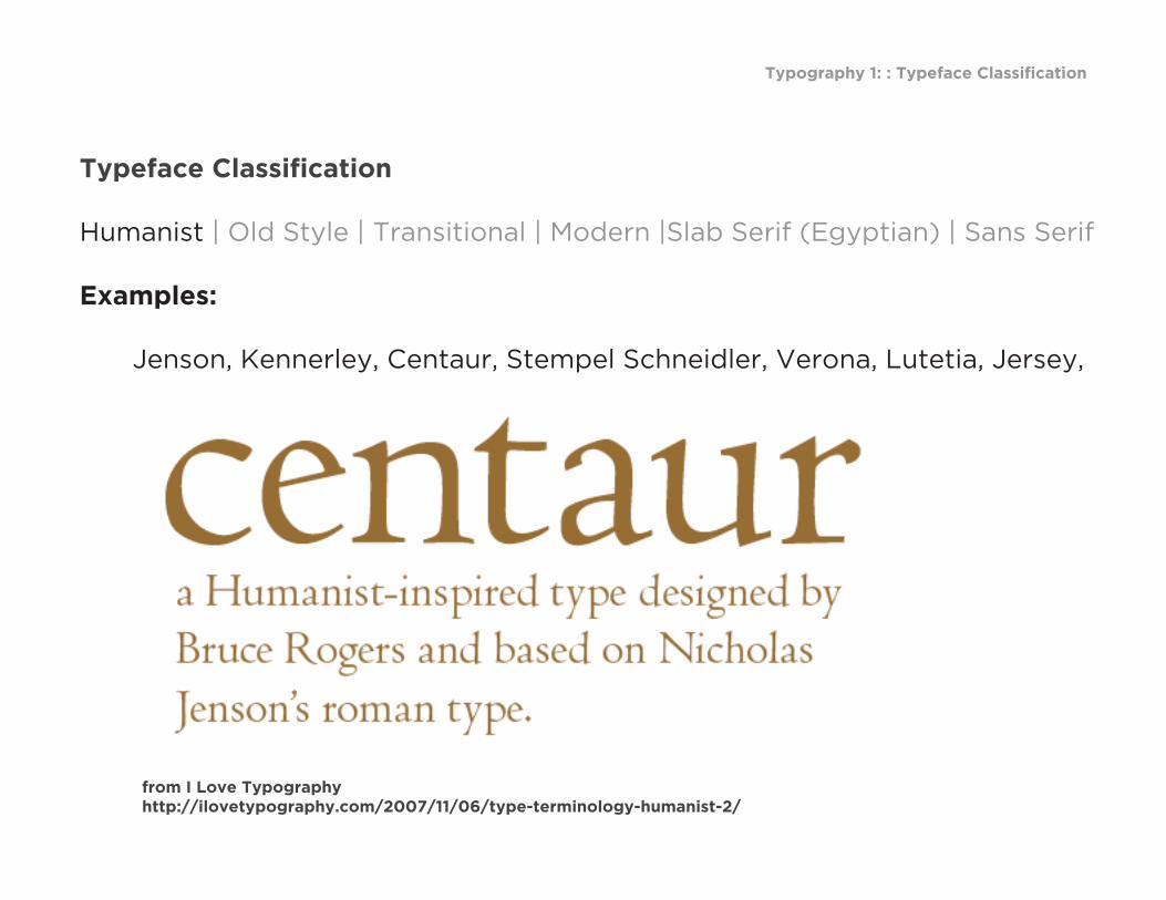
Humanist | Old Style | Transitional | Modern |Slab Serif (Egyptian) | Sans Serif
Examples:
Jenson, Kennerley, Centaur, Stempel Schneidler, Verona, Lutetia, Jersey,
from I Love Typography http://ilovetypography.com/2007/11/06/type-terminology-humanist-2/

Typography 1: : Typeface Classification
Typeface Classification
Humanist | Old Style | Transitional | Modern |Slab Serif (Egyptian) | Sans Serif
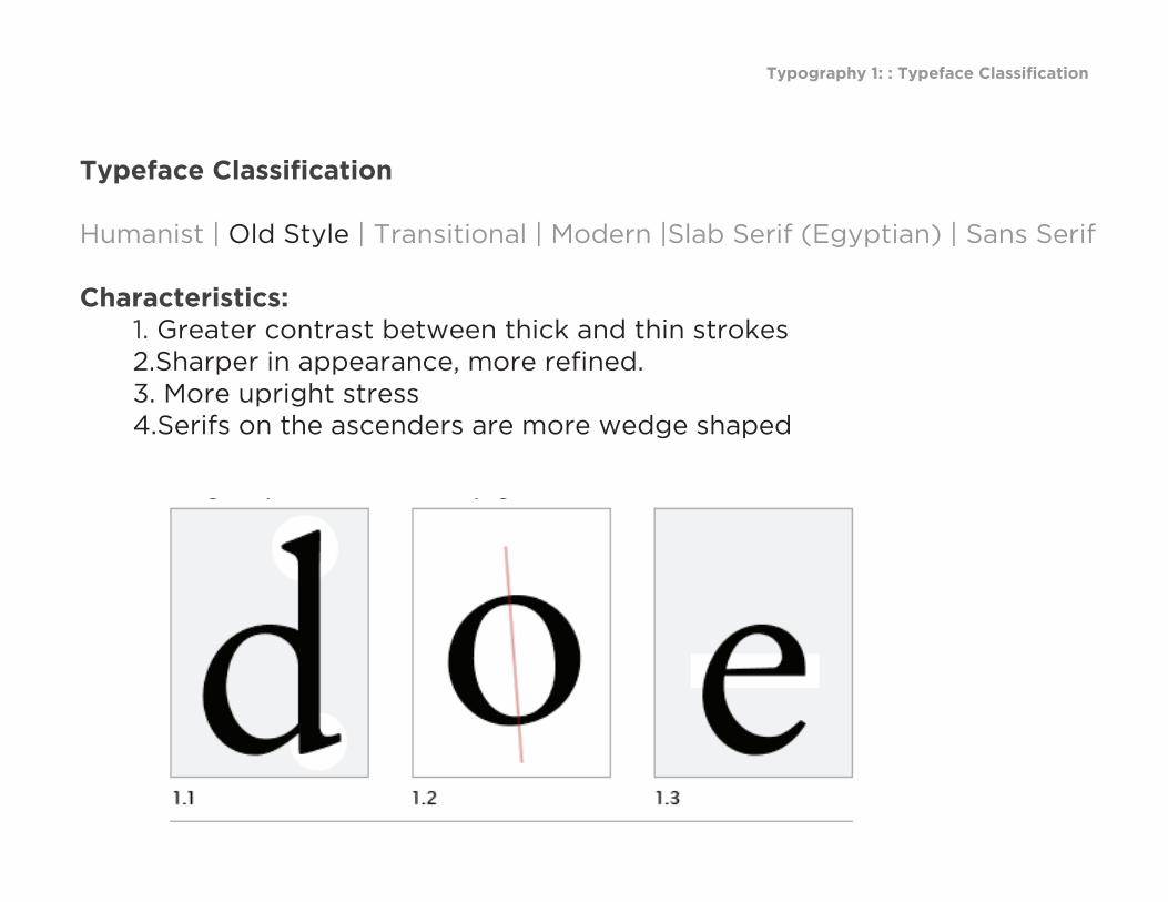
The Old Style demonstrate a greater refinement of letterforms, Most likely a result of improved punch-cutter skills. Also first italic typeface.Characteristics:
from I Love Typography http://ilovetypography.com/2007/11/06/type-terminology-humanist-2/
Typography 1: : Typeface Classification
Typeface Classification
Humanist | Old Style | Transitional | Modern |Slab Serif (Egyptian) | Sans Serif
Characteristics: 1. Greater contrast between thick and thin strokes 2.Sharper in appearance, more refined. 3. More upright stress 4.Serifs on the ascenders are more wedge shaped
from I Love Typography http://ilovetypography.com/2007/11/06/type-terminology-humanist-2/
Typography 1: : Typeface Classification
Typeface Classification
Humanist | Old Style | Transitional | Modern |Slab Serif (Egyptian) | Sans Serif
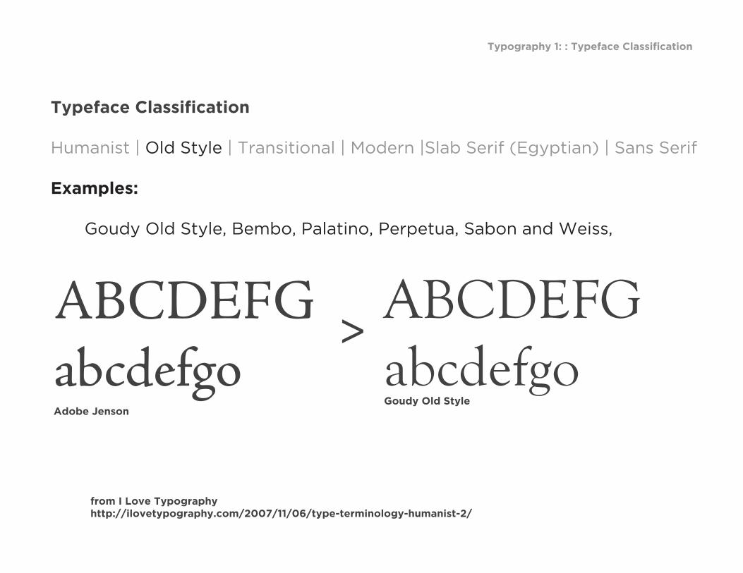
Examples:
Goudy Old Style, Bembo, Palatino, Perpetua, Sabon and Weiss,
from I Love Typography http://ilovetypography.com/2007/11/06/type-terminology-humanist-2/
ABCDEFGabcdefgoAdobe Jenson
>ABCDEFGabcdefgoGoudy Old Style

Typography 1: : Typeface Classification
Typeface Classification
Humanist | Old Style | Transitional | Modern |Slab Serif (Egyptian) | Sans Serif
The first Transitional (or Neoclassical) style typeface, the Romain du Roi or King’s Roman, commissioned by Louis XIV for the Imprimerie Royale in 1692.
from I Love Typography http://ilovetypography.com/2007/11/06/type-terminology-humanist-2/
Typography 1: : Typeface Classification
Typeface Classification
Humanist | Old Style | Transitional | Modern |Slab Serif (Egyptian) | Sans Serif
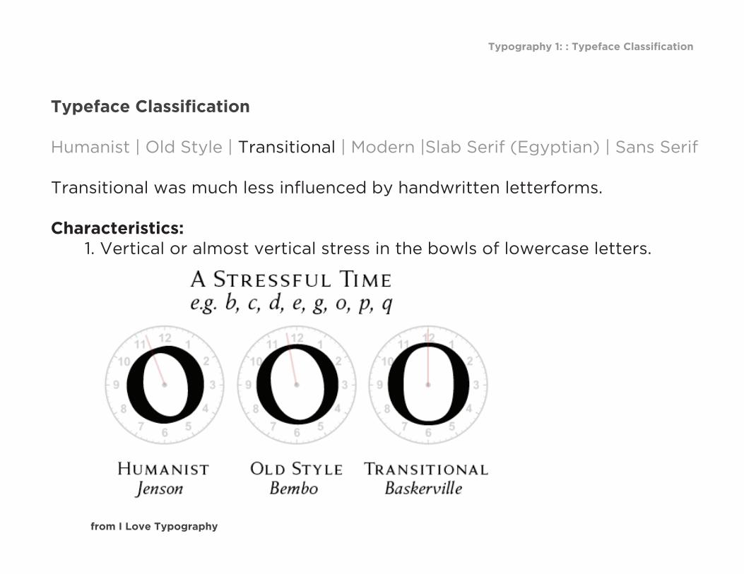
Transitional was much less influenced by handwritten letterforms.
Characteristics: 1. Vertical or almost vertical stress in the bowls of lowercase letters.
from I Love Typography

Typography 1: : Typeface Classification
Typeface Classification
Humanist | Old Style | Transitional | Modern |Slab Serif (Egyptian) | Sans Serif
Characteristics: 2. greater contrast between thick and thin (sub-) strokes:.
from I Love Typography
Typography 1: : Typeface Classification
Typeface Classification
Humanist | Old Style | Transitional | Modern |Slab Serif (Egyptian) | Sans Serif
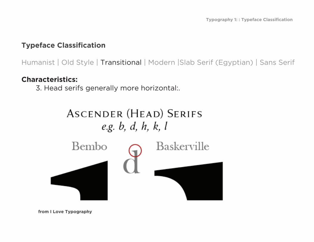
Characteristics: 3. Head serifs generally more horizontal:.
from I Love Typography
ABCDEFGabcdefgo
Typography 1: : Typeface Classification
Typeface Classification
Humanist | Old Style | Transitional | Modern |Slab Serif (Egyptian) | Sans Serif
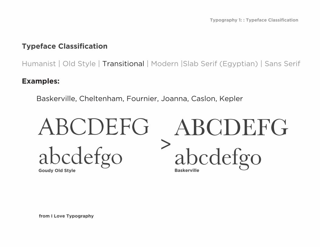
Examples: Baskerville, Cheltenham, Fournier, Joanna, Caslon, Kepler
from I Love Typography
>ABCDEFGabcdefgoGoudy Old Style Baskerville
Typography 1: : Typeface Classification
Typeface Classification
Humanist | Old Style | Transitional | Modern |Slab Serif (Egyptian) | Sans Serif
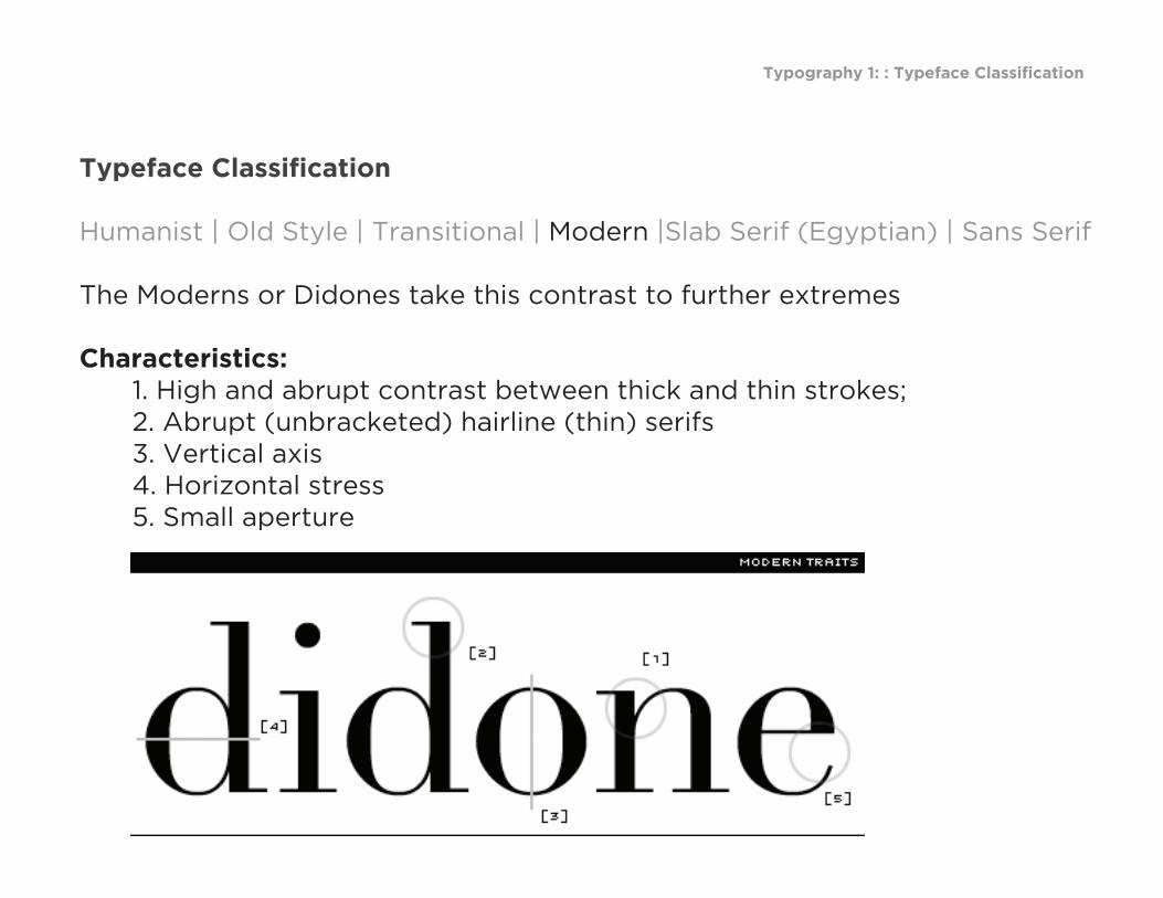
The Moderns or Didones take this contrast to further extremes
Characteristics: 1. High and abrupt contrast between thick and thin strokes; 2. Abrupt (unbracketed) hairline (thin) serifs 3. Vertical axis 4. Horizontal stress 5. Small aperture
from I Love Typography

Typography 1: : Typeface Classification
Typeface Classification
Humanist | Old Style | Transitional | Modern |Slab Serif (Egyptian) | Sans Serif
The Moderns or Didones take this contrast to further extremes
Examples: Linotype Didot, Bauer Bodoni, ITC Bodoni, Modern 20

Typography 1: : Typeface Classification
Typeface Classification
Humanist | Old Style | Transitional | Modern |Slab Serif (Egyptian) | Sans Serif
Also known as Egyptian, Square Serif, Mechanical or Mécanes.Developed primarily for advertising.
from I Love Typography

Typography 1: : Typeface Classification
Typeface Classification
Humanist | Old Style | Transitional | Modern |Slab Serif (Egyptian) | Sans Serif
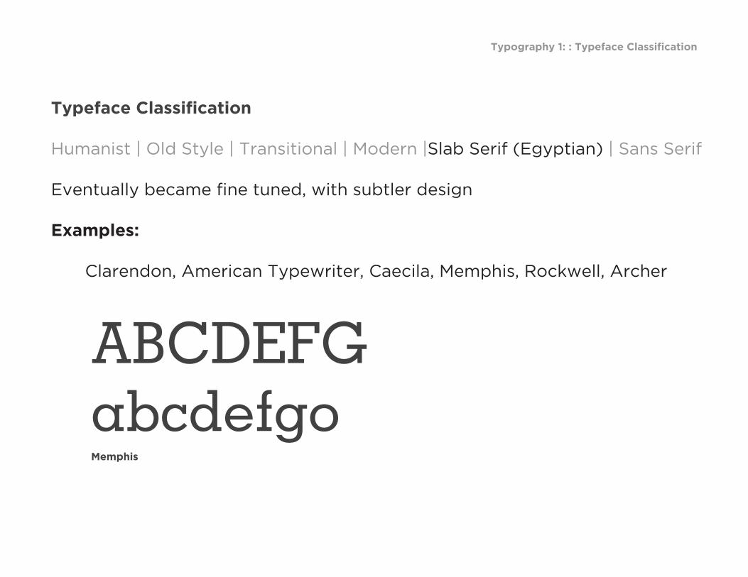
Eventually became fine tuned, with subtler design
Characteristics of Clarendon: 1. larger x heights 2. thinner serifs 3. bracketed serifs
from I Love Typography
Typography 1: : Typeface Classification
Typeface Classification
Humanist | Old Style | Transitional | Modern |Slab Serif (Egyptian) | Sans Serif
Eventually became fine tuned, with subtler design
Examples: Clarendon, American Typewriter, Caecila, Memphis, Rockwell, Archer
ABCDEFGabcdefgoMemphis
Typography 1: : Typeface Classification
Typeface Classification
Humanist | Old Style | Transitional | Modern |Slab Serif (Egyptian) | Sans Serif
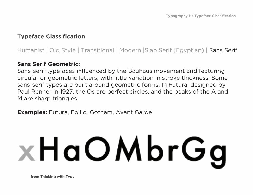
Sans Serif Geometric: Sans-serif typefaces influenced by the Bauhaus movement and featuring circular or geometric letters, with little variation in stroke thickness. Some sans-serif types are built around geometric forms. In Futura, designed by Paul Renner in 1927, the Os are perfect circles, and the peaks of the A and M are sharp triangles.
Examples: Futura, Foilio, Gotham, Avant Garde
from Thinking with Type

Typography 1: : Typeface Classification
Typeface Classification
Humanist | Old Style | Transitional | Modern |Slab Serif (Egyptian) | Sans Serif
Sans-serif Humanist Typefaces with oval shapes and variations in stroke thickness to create a more graceful, human appearance. *Sans-serif typefaces became common in the twentieth century. Gill Sans, designed by Eric Gill in 1928, has humanist characteristics. Note the small, lilting counter in the letter a , and the calligraphic variations in line weight.
Examples: Gill Sans, Meta, Frutiger
from Thinking with Type
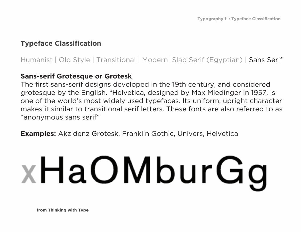
Typography 1: : Typeface Classification
Typeface Classification
Humanist | Old Style | Transitional | Modern |Slab Serif (Egyptian) | Sans Serif
Sans-serif Grotesque or Grotesk The first sans-serif designs developed in the 19th century, and considered grotesque by the English. *Helvetica, designed by Max Miedinger in 1957, is one of the world’s most widely used typefaces. Its uniform, upright character makes it similar to transitional serif letters. These fonts are also referred to as “anonymous sans serif”
Examples: Akzidenz Grotesk, Franklin Gothic, Univers, Helvetica
from Thinking with Type