typography & product title analysis. typography analysis when choosing a typeface, the viewer...
TRANSCRIPT
Typography & Product Title Analysis

Typography Analysis• When choosing a typeface, the viewer needs to be able to understand what message is trying to sent. If
the text is too small to read or all cramped together, for example, the product will not necessarily be as successful
• Beyond legibility, however, typography is important because it can be used to convey a specific mood or feeling.
LOVE WRECKEDFrom the title alone, it is clear that love is a prominent theme within the film. The ‘o’ in ‘love’ is replaced by a love heart to reinforce this. The pink/red colour scheme further connotes love and relationship.
THE WEDDING PLANNERThe typography used here is reminiscent of those concerning marriage. From this, we are able to assume this as a feature of the film. The colour scheme is also heavily used in the romance genre. >>
>>
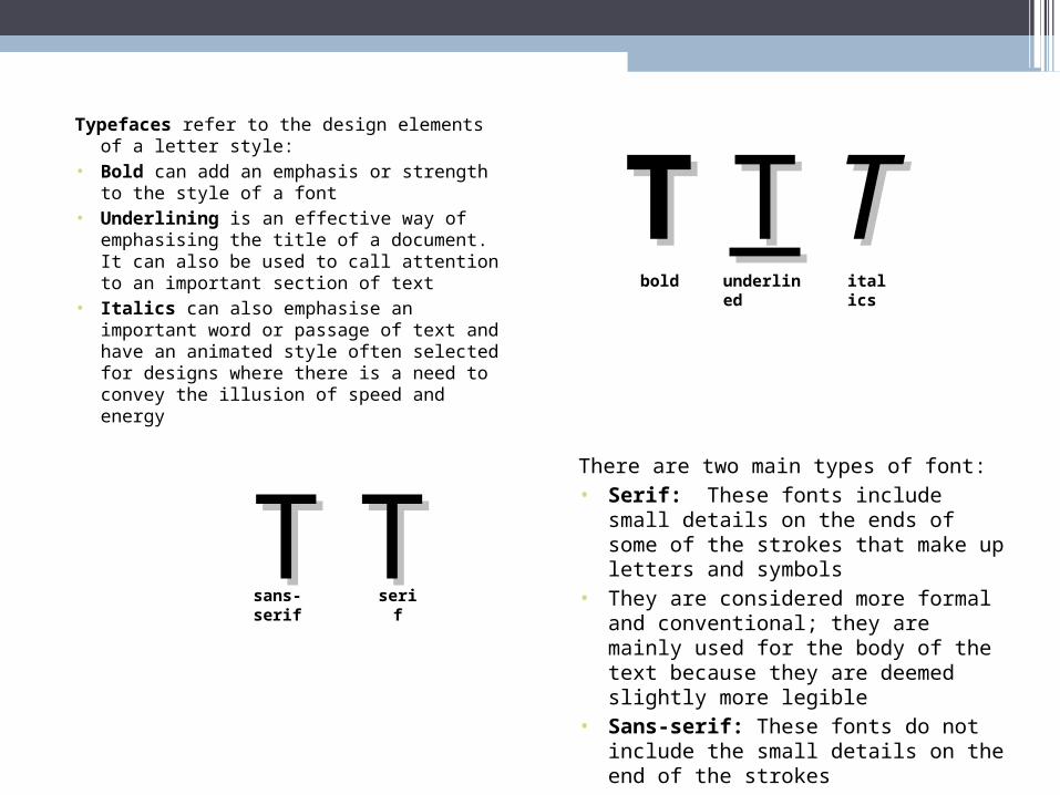
Typefaces refer to the design elements of a letter style:
• Bold can add an emphasis or strength to the style of a font
• Underlining is an effective way of emphasising the title of a document. It can also be used to call attention to an important section of text
• Italics can also emphasise an important word or passage of text and have an animated style often selected for designs where there is a need to convey the illusion of speed and energy
There are two main types of font:• Serif: These fonts include small details on the
ends of some of the strokes that make up letters and symbols
• They are considered more formal and conventional; they are mainly used for the body of the text because they are deemed slightly more legible
• Sans-serif: These fonts do not include the small details on the end of the strokes
• They are considered more informal and are mainly used for titles for emphasis
TT TT TTbold underlined italics
TT TTsans-serif serif
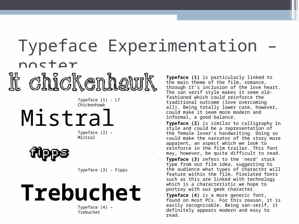
Typeface Experimentation – poster • Typeface (1) is particularly linked to the main theme of
the film, romance, through it’s inclusion of the love heart. The san serif style makes it seem old-fashioned which could reinforce the traditional outcome (love overcoming all). Being totally lower case, however, could make it seem more modern and informal, a good balance.
• Typeface (2) is similar to calligraphy in style and could be a representation of the female lover’s handwriting. Doing so could make the narrator of the story more apparent, an aspect which we look to reinforce in the film trailer. This font may, however, be quite difficult to read.
• Typeface (3) refers to the ‘nerd’ stock type from our film idea, suggesting to the audience what types of character will feature within the film. Pixelated fonts such as this are linked with technology which is a characteristic we hope to portray with our geek character.
• Typeface (4) is a more generic font, found on most PCs. For this reason, it is easily recognisable. Being san-serif, it definitely appears modern and easy to read.
Mistral
Trebuchet
Typeface (1) – LT Chickenhawk
Typeface (2) – Mistral
Typeface (3) – Fipps
Typeface (4) – Trebuchet
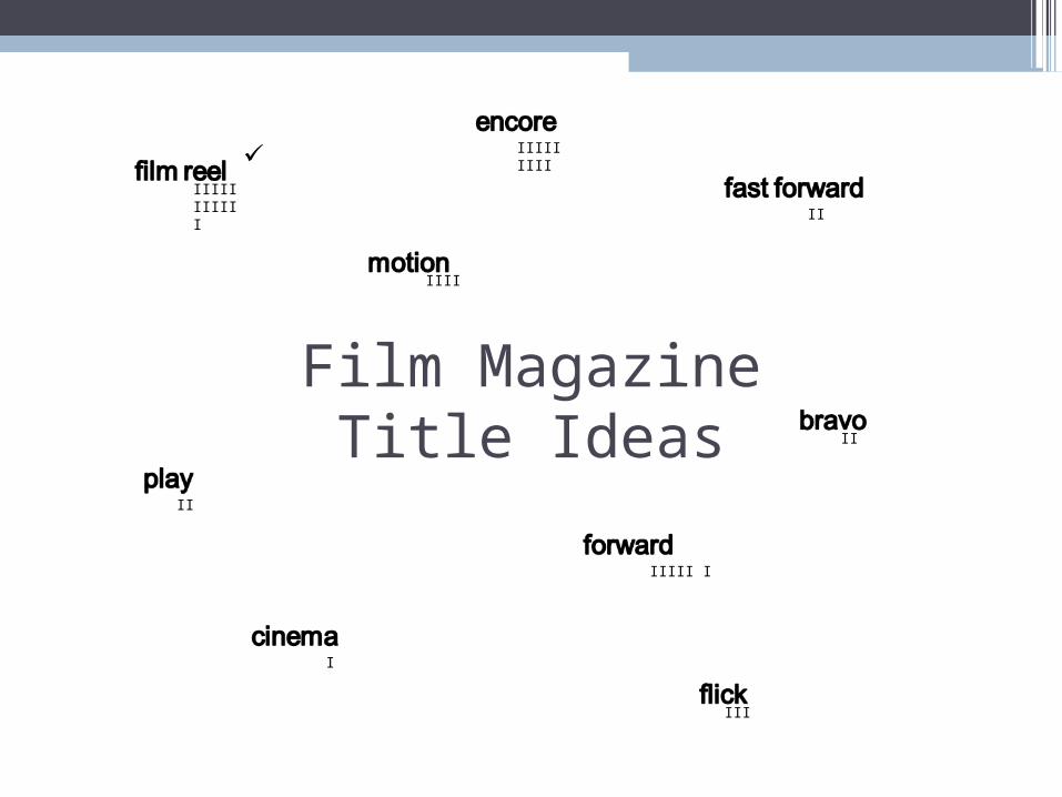
Film Magazine Title Ideas
IIII
IIIII IIIII I
IIIII IIII
II
II
IIIII I
III
II
I
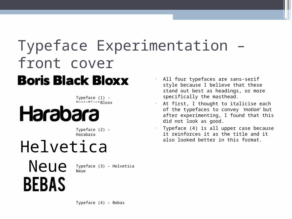
Typeface Experimentation – front cover • All four typefaces are sans-serif style because I believe
that these stand out best as headings, or more specifically the masthead.
• At first, I thought to italicise each of the typefaces to convey ‘motion’ but after experimenting, I found that this did not look as good.
• Typeface (4) is all upper case because it reinforces it as the title and it also looked better in this format.
Helvetica Neue
Typeface (1) – BorisBlackBloxx
Typeface (2) – Harabara
Typeface (3) – Helvetica Neue
Typeface (4) – Bebas
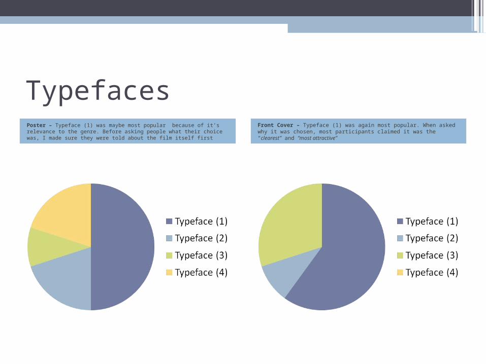
TypefacesPoster – Typeface (1) was maybe most popular because of it’s relevance to the genre. Before asking people what their choice was, I made sure they were told about the film itself first
Front Cover – Typeface (1) was again most popular. When asked why it was chosen, most participants claimed it was the “clearest” and “most attractive”