typography. typography type reset | absolute versus relative using a scale measure line height ...
TRANSCRIPT
TYPOGRAPHY
Typography
Type reset | Absolute versus Relative Using a Scale Measure Line height Examples 1 | 2 | 3
Typography
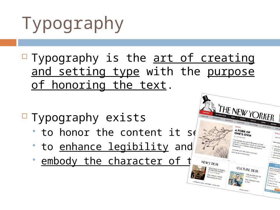
Typography is the art of creating and setting type with the purpose of honoring the text.
Typography exists to honor the content it sets to enhance legibility and embody the character of the words.
Typography
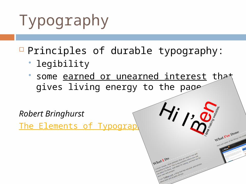
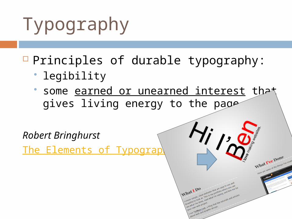
Principles of durable typography: legibility some earned or unearned interest that
gives living energy to the page.
Robert Bringhurst
The Elements of Typographic Style
Typography
Principles of durable typography: legibility some earned or unearned interest that
gives living energy to the page.
Robert Bringhurst
The Elements of Typographic Style
Typography
Typography exists to bring order to information by dividing and organizing.
It aids readers in finding what they are looking for.
RESET STYLES WITH CSS
Reset
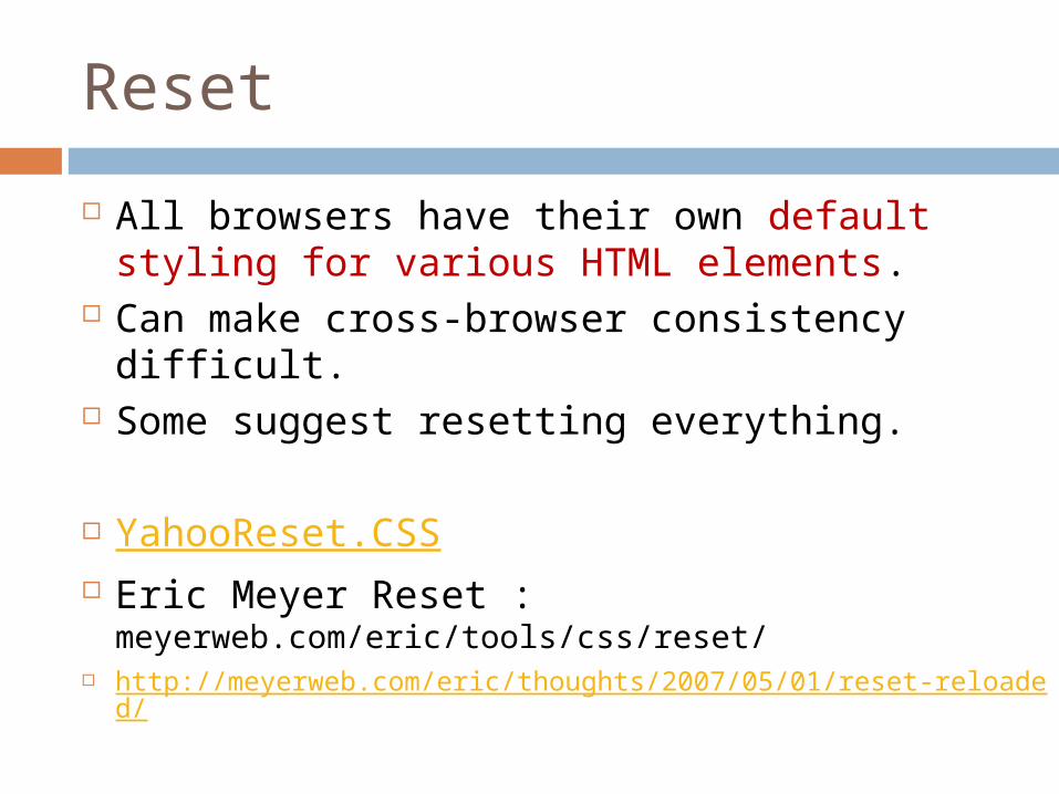
All browsers have their own default styling for various HTML elements.
Can make cross-browser consistency difficult.
Some suggest resetting everything.
YahooReset.CSS Eric Meyer Reset :
meyerweb.com/eric/tools/css/reset/ http://meyerweb.com/eric/thoughts/2007/05/01/reset-reloaded/
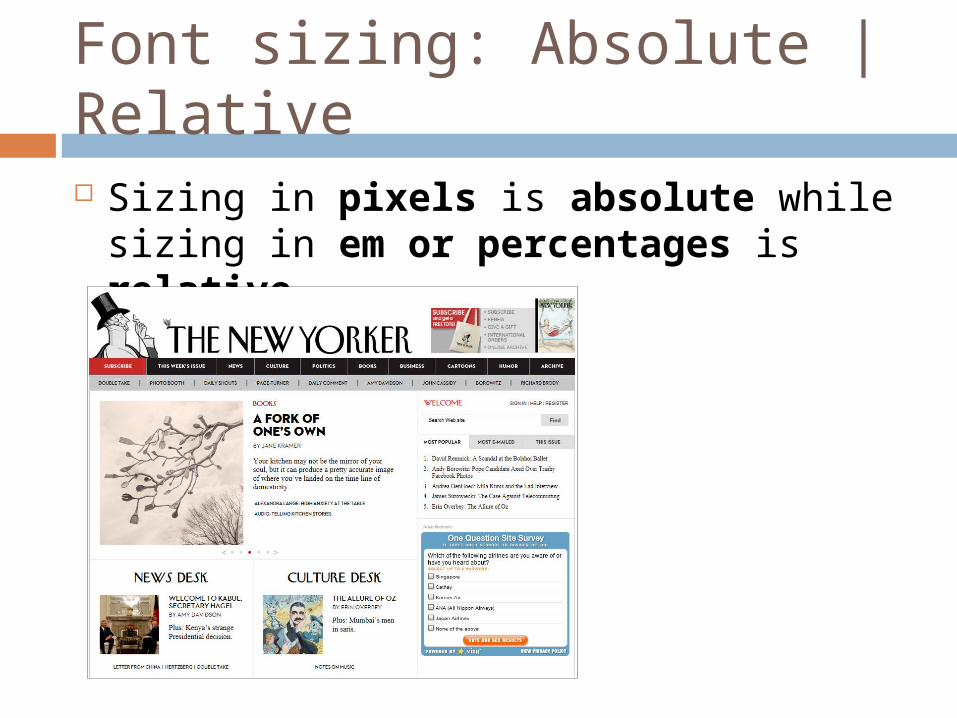
Font sizing: Absolute | Relative Sizing in pixels is absolute while sizing
in em or percentages is relative.
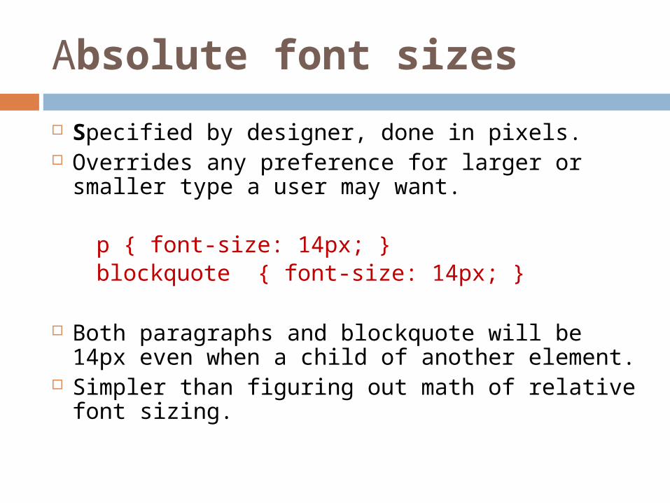
Absolute font sizes
Specified by designer, done in pixels. Overrides any preference for larger or
smaller type a user may want.
p { font-size: 14px; }blockquote { font-size: 14px; }
Both paragraphs and blockquote will be 14px even when a child of another element.
Simpler than figuring out math of relative font sizing.
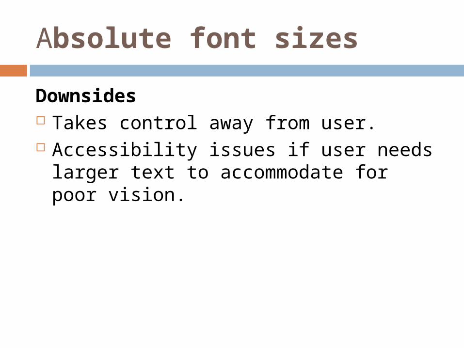
Absolute font sizes
Downsides Takes control away from user. Accessibility issues if user needs larger
text to accommodate for poor vision.
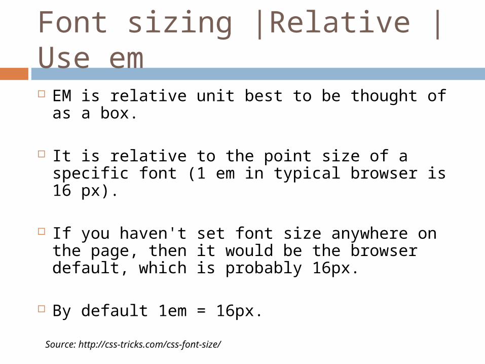
Font sizing |Relative | Use em EM is relative unit best to be thought of as a
box.
It is relative to the point size of a specific font (1 em in typical browser is 16 px).
If you haven't set font size anywhere on the page, then it would be the browser default, which is probably 16px.
By default 1em = 16px. Source: http://css-tricks.com/css-font-size/
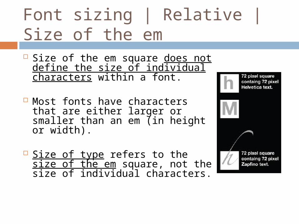
Font sizing | Relative | Size of the em Size of the em square does not
define the size of individual characters within a font.
Most fonts have characters that are either larger or smaller than an em (in height or width).
Size of type refers to the size of the em square, not the size of individual characters.
(Sizing with EM Example | EM Box *)
Font sizing | Relative
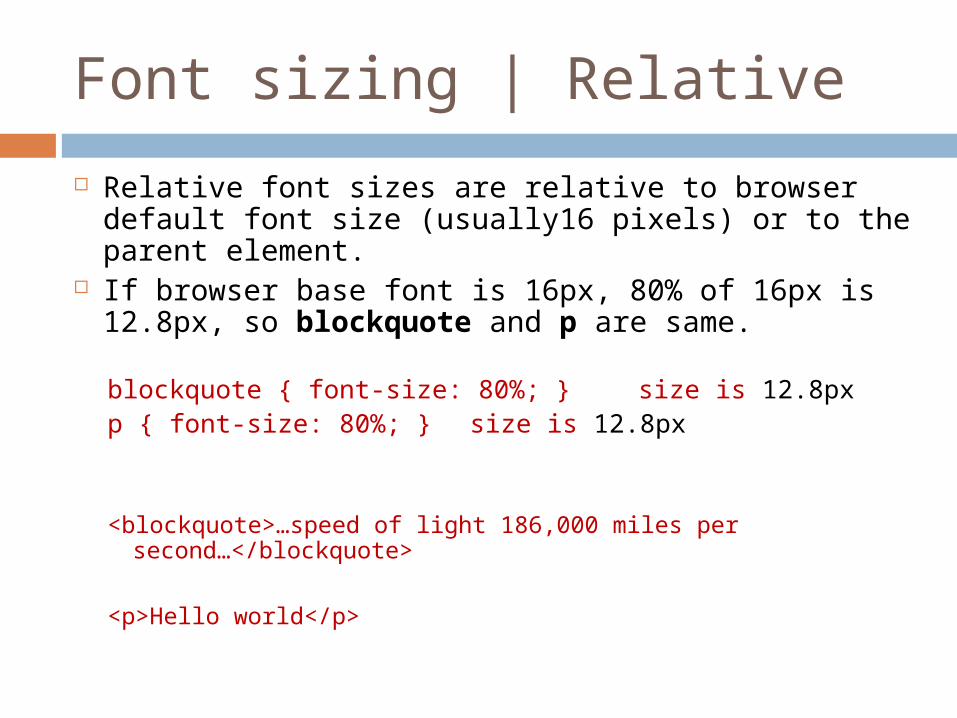
Relative font sizes are relative to browser default font size (usually16 pixels) or to the parent element.
If browser base font is 16px, 80% of 16px is 12.8px, so blockquote and p are same.
blockquote { font-size: 80%; } size is 12.8pxp { font-size: 80%; } size is 12.8px
<blockquote>…speed of light 186,000 miles per second…</blockquote>
<p>Hello world</p>
Font sizing | Relative
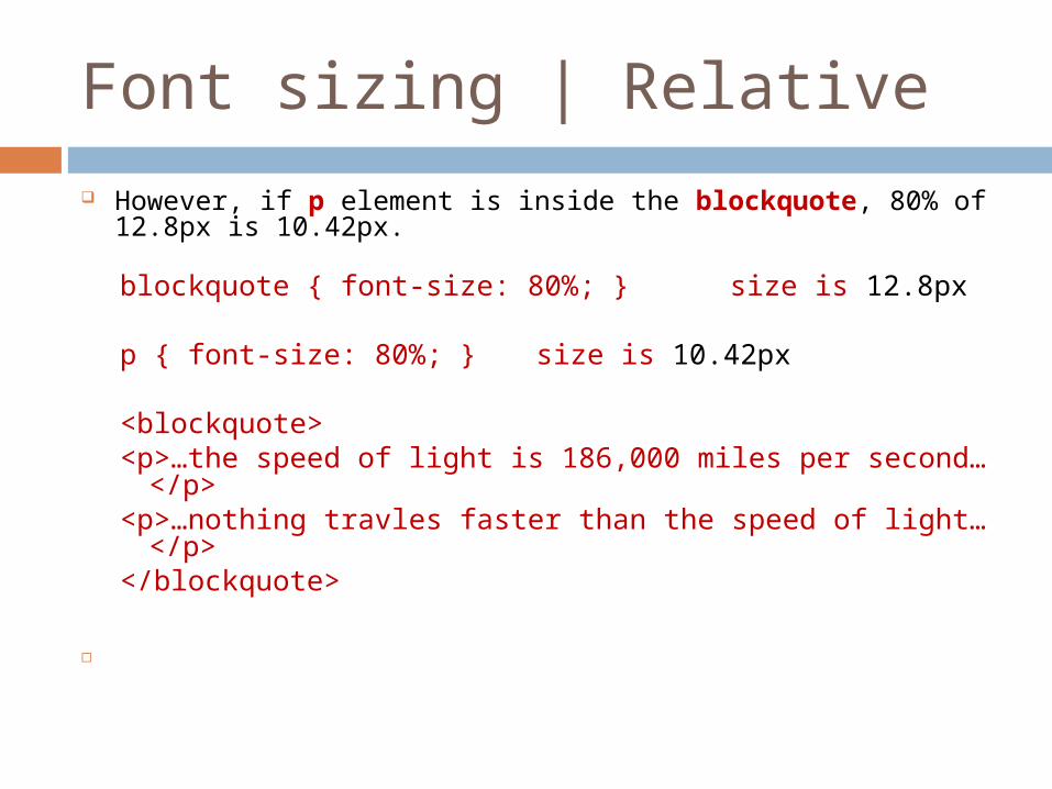
However, if p element is inside the blockquote, 80% of 12.8px is 10.42px.
blockquote { font-size: 80%; } size is 12.8px
p { font-size: 80%; } size is 10.42px
<blockquote><p>…the speed of light is 186,000 miles per
second…</p><p>…nothing travles faster than the speed of light…</p></blockquote>
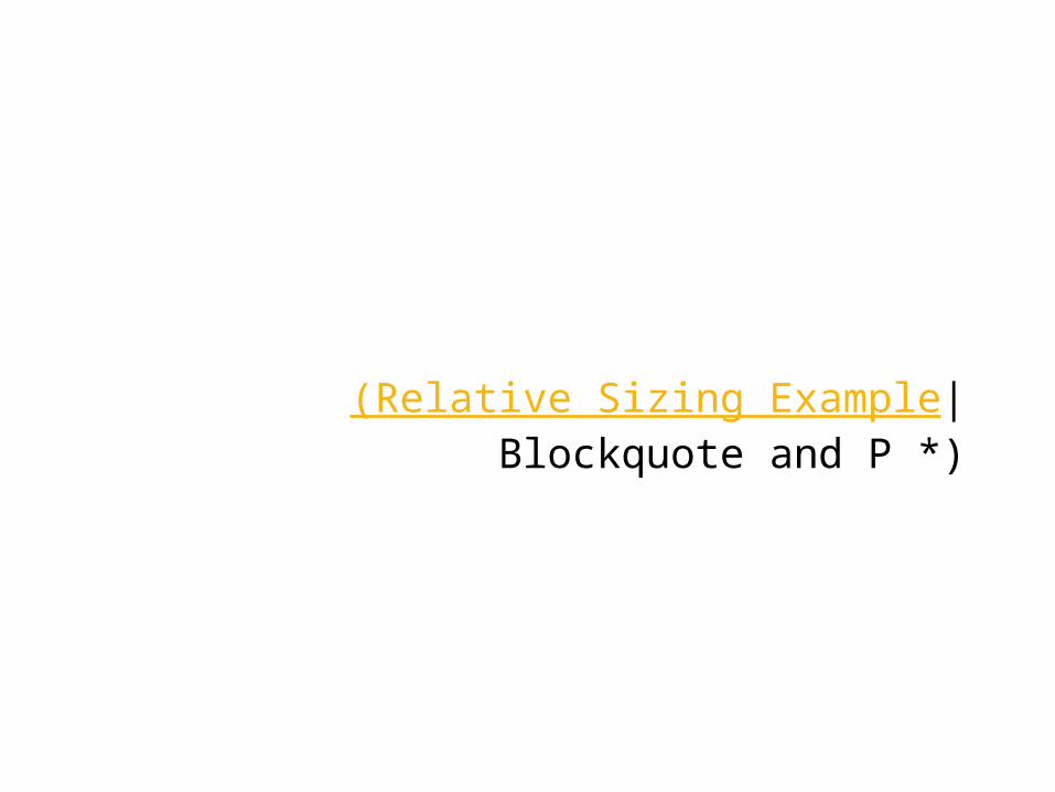
(Relative Sizing Example| Blockquote and P *)
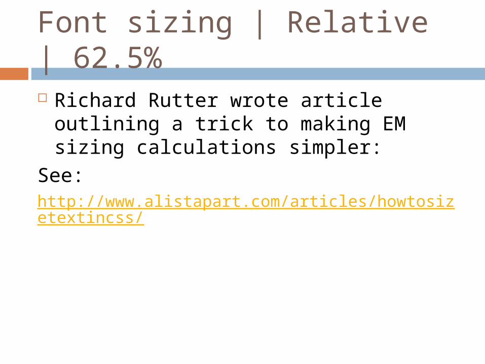
Font sizing | Relative | 62.5% Richard Rutter wrote article outlining a
trick to making EM sizing calculations simpler:
See:http://www.alistapart.com/articles/howtosizetextincss/
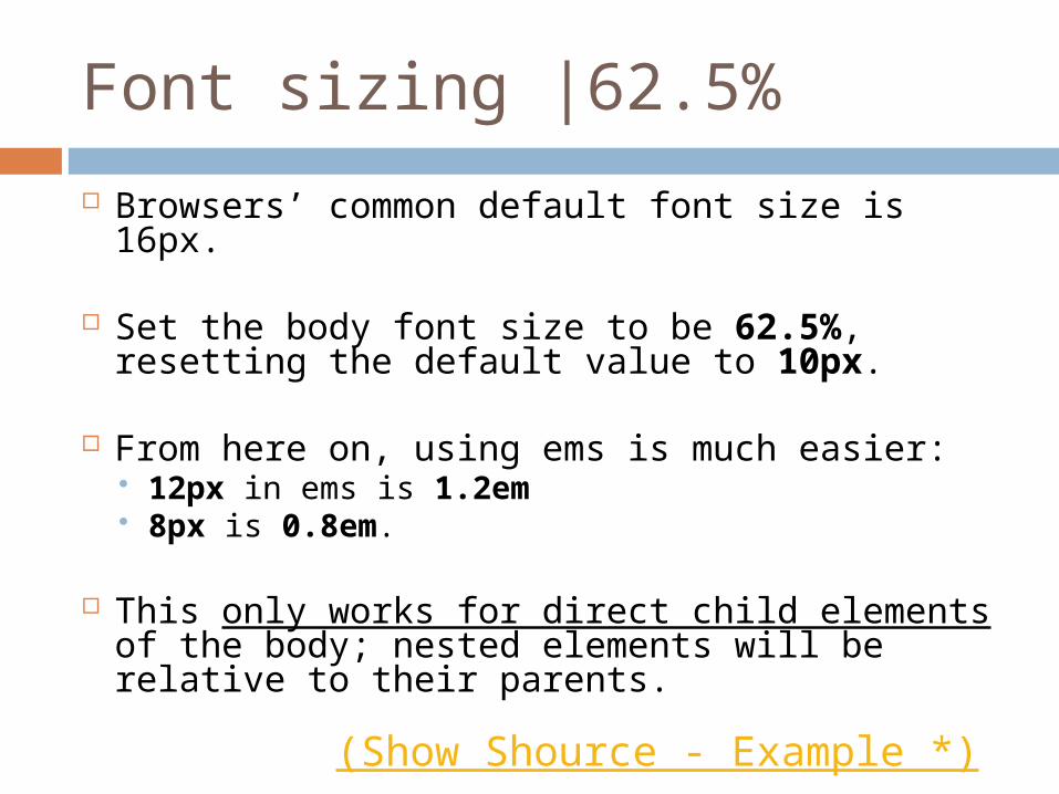
Font sizing |62.5%
Browsers’ common default font size is 16px.
Set the body font size to be 62.5%, resetting the default value to 10px.
From here on, using ems is much easier: 12px in ems is 1.2em 8px is 0.8em.
This only works for direct child elements of the body; nested elements will be relative to their parents.
(Show Shource - Example *)
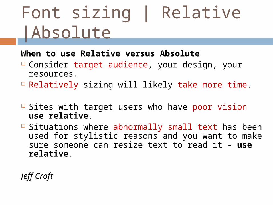
Font sizing | Relative |AbsoluteWhen to use Relative versus Absolute Consider target audience, your design, your
resources. Relatively sizing will likely take more time.
Sites with target users who have poor vision use relative.
Situations where abnormally small text has been used for stylistic reasons and you want to make sure someone can resize text to read it - use relative.
Jeff Croft
STICK IT TO A SCALE
Stick it to a scale
Stick it to a scale Use a scale when setting type. Find what suits you best for a given
project and stick to it.
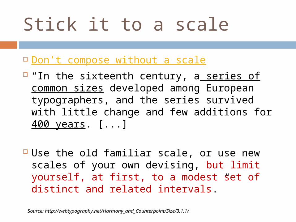
Stick it to a scale
Don’t compose without a scale “In the sixteenth century, a series of common
sizes developed among European typographers, and the series survived with little change and few additions for 400 years. [...]
Use the old familiar scale, or use new scales of your own devising, but limit yourself, at first, to a modest set of distinct and related intervals.”
Source: http://webtypography.net/Harmony_and_Counterpoint/Size/3.1.1/
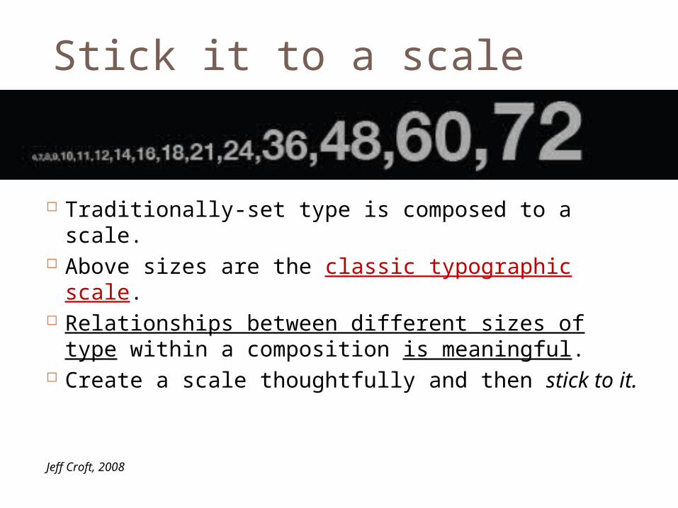
Stick it to a scale
Traditionally-set type is composed to a scale. Above sizes are the classic typographic scale. Relationships between different sizes of type
within a composition is meaningful. Create a scale thoughtfully and then stick to it.
Jeff Croft, 2008
Stick it to a scale
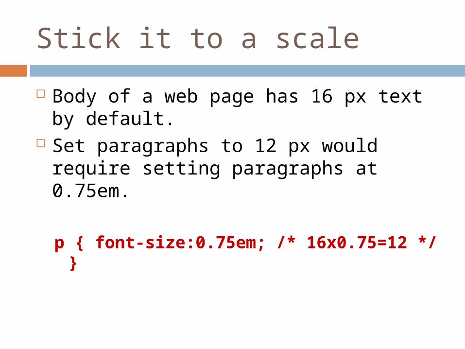
Body of a web page has 16 px text by default.
Set paragraphs to 12 px would require setting paragraphs at 0.75em.
p { font-size:0.75em; /* 16x0.75=12 */ }
Stick it to a scale
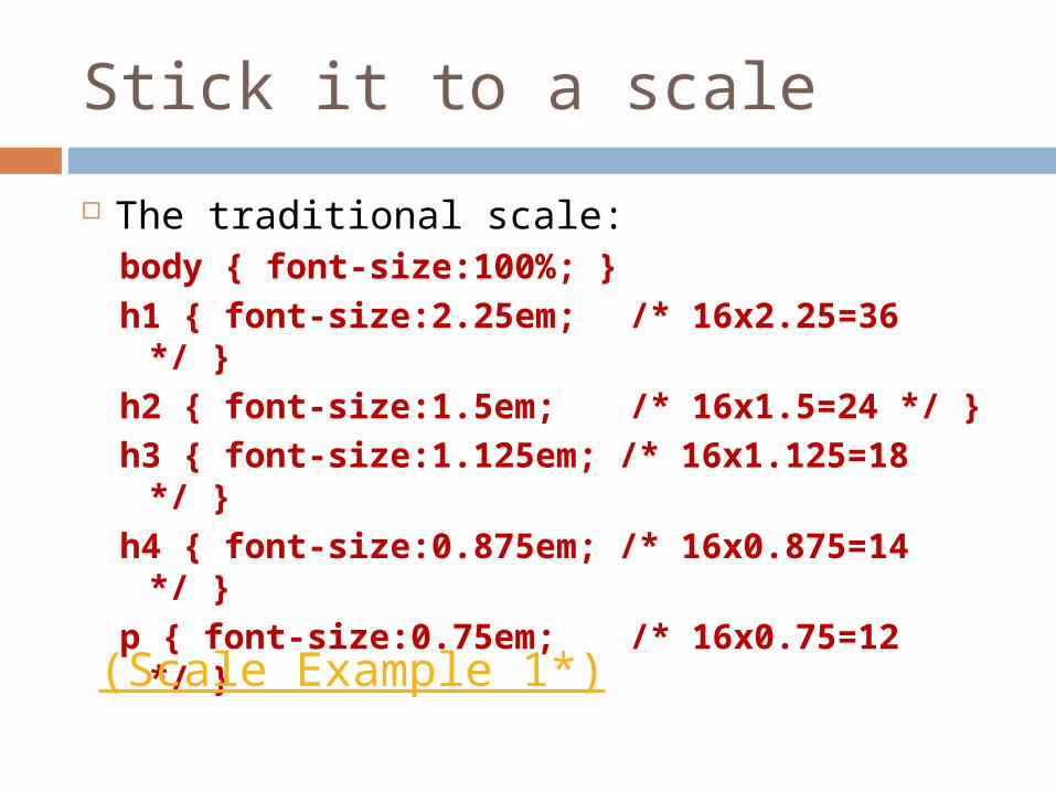
The traditional scale:body { font-size:100%; } h1 { font-size:2.25em; /* 16x2.25=36 */ } h2 { font-size:1.5em; /* 16x1.5=24 */ } h3 { font-size:1.125em; /* 16x1.125=18 */ } h4 { font-size:0.875em; /* 16x0.875=14 */ } p { font-size:0.75em; /* 16x0.75=12 */ }
(Scale Example 1*)
Stick it to a scale
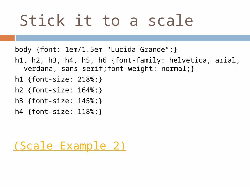
body {font: 1em/1.5em "Lucida Grande“;}
h1, h2, h3, h4, h5, h6 {font-family: helvetica, arial, verdana, sans-serif;font-weight: normal;}
h1 {font-size: 218%;}
h2 {font-size: 164%;}
h3 {font-size: 145%;}
h4 {font-size: 118%;}
(Scale Example 2)
Stick it to a scale
Stick it to a scale
Stick it to a scale
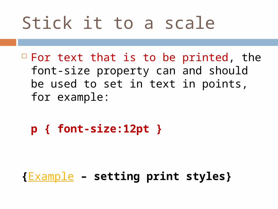
For text that is to be printed, the font-size property can and should be used to set in text in points, for example:
p { font-size:12pt }
{Example – setting print styles}
SELECT A GOOD MEASURE
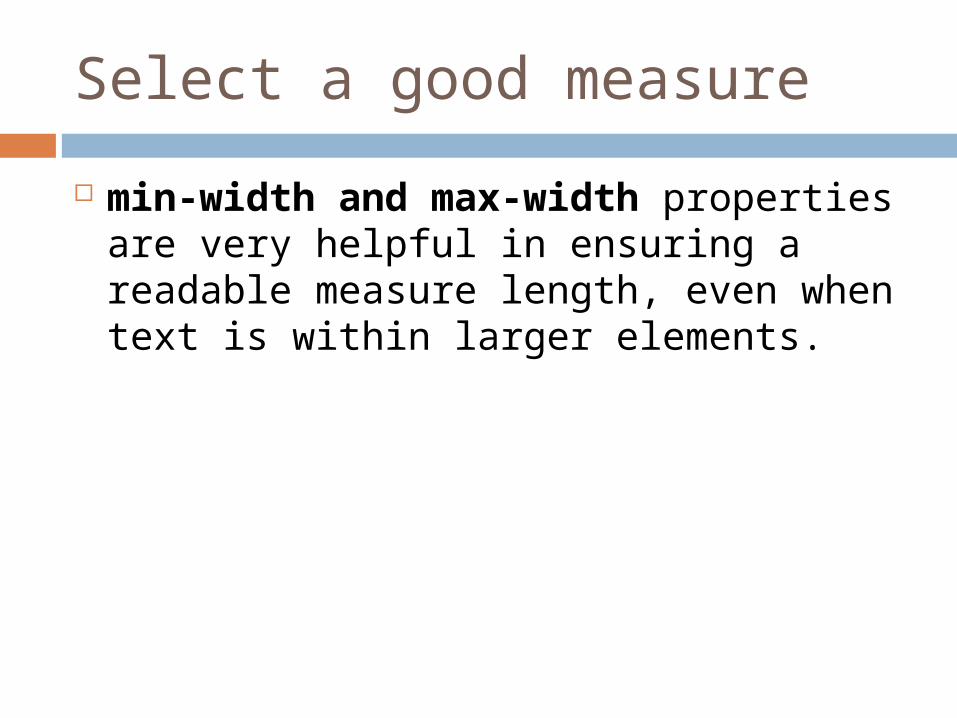
Select a good measure
Measure - length of a single line. Measure - a key element of readability.
Set with width property. Best to use ems or percentages to set
the width of blocks of text, units are directly proportional to the size of type.
Select a good measure
min-width and max-width properties are very helpful in ensuring a readable measure length, even when text is within larger elements.
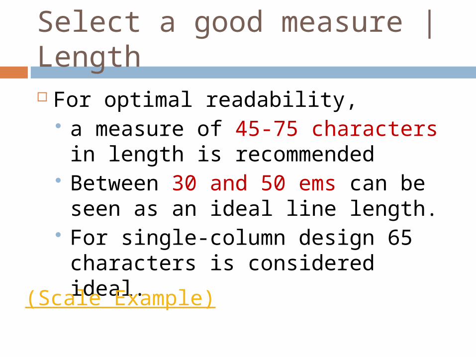
Select a good measure | Length For optimal readability,
a measure of 45-75 characters in length is recommended
Between 30 and 50 ems can be seen as an ideal line length.
For single-column design 65 characters is considered ideal.
(Scale Example)
Line Length
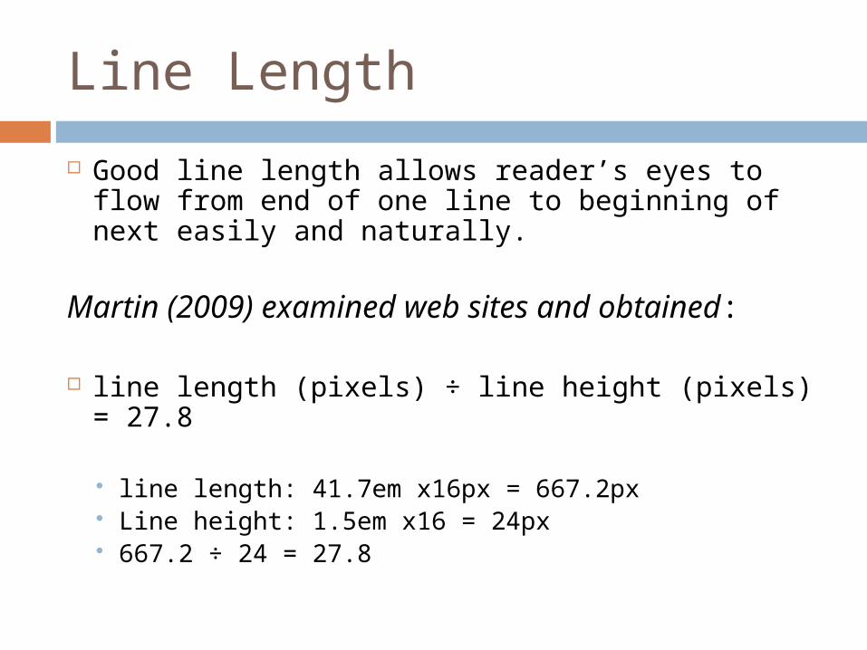
Good line length allows reader’s eyes to flow from end of one line to beginning of next easily and naturally.
Martin (2009) examined web sites and obtained:
line length (pixels) ÷ line height (pixels) = 27.8
line length: 41.7em x16px = 667.2px Line height: 1.5em x16 = 24px 667.2 ÷ 24 = 27.8
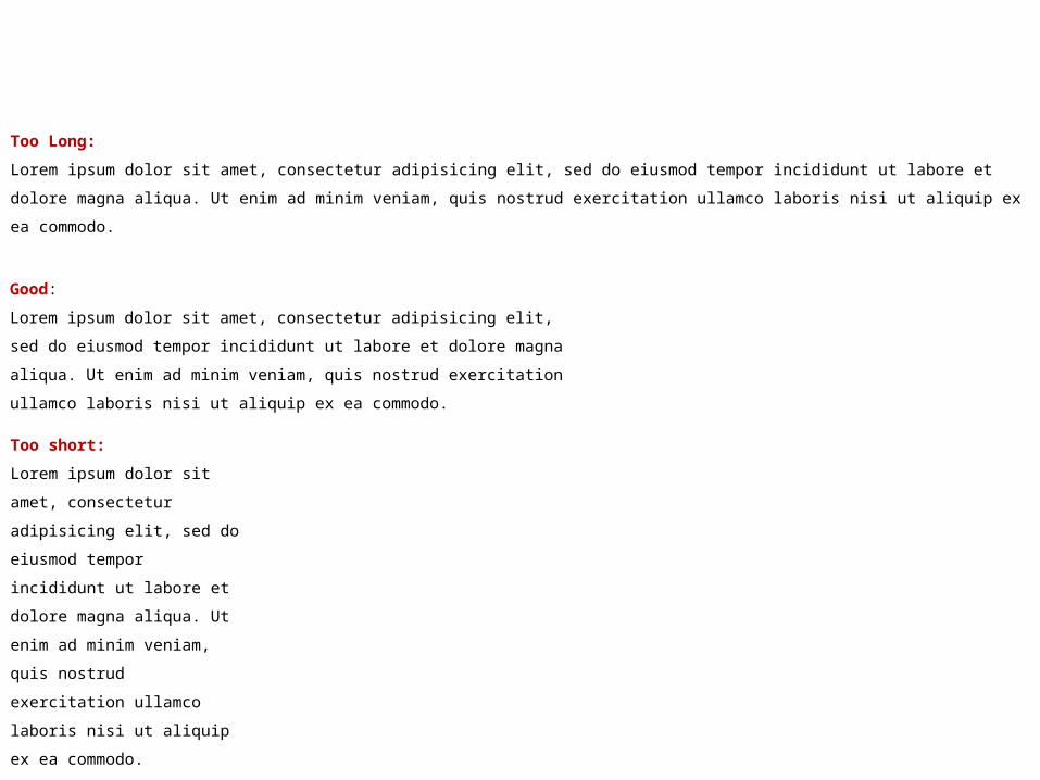
Too Long:
Lorem ipsum dolor sit amet, consectetur adipisicing elit, sed do eiusmod tempor incididunt ut labore et dolore magna aliqua.
Ut enim ad minim veniam, quis nostrud exercitation ullamco laboris nisi ut aliquip ex ea commodo.
Good:
Lorem ipsum dolor sit amet, consectetur adipisicing elit, sed do
eiusmod tempor incididunt ut labore et dolore magna aliqua. Ut enim
ad minim veniam, quis nostrud exercitation ullamco laboris nisi ut
aliquip ex ea commodo.
Too short:
Lorem ipsum dolor sit amet,
consectetur adipisicing elit,
sed do eiusmod tempor
incididunt ut labore et dolore
magna aliqua. Ut enim ad
minim veniam, quis nostrud
exercitation ullamco laboris
nisi ut aliquip ex ea
commodo.
LEADING
Leading
Space between lines of type.
Comes from traditional letterpress-style typesetting, where strips of lead are used to separate one line of text from the next.
Establishing appropriate leading is one of the fastest ways to make your site look professional.
Leading rules of thumb
Blocks of type typically need positive leading. Blocks of type do not read well with no
leading. Short elements (e.g., headers) need less
leading. Darker (heavier) type needs more leading. Sans serif type needs more leading than serif. Longer line-lengths need more leading. Shorter line-lengths require less leading.
Jeff Croft, 2008
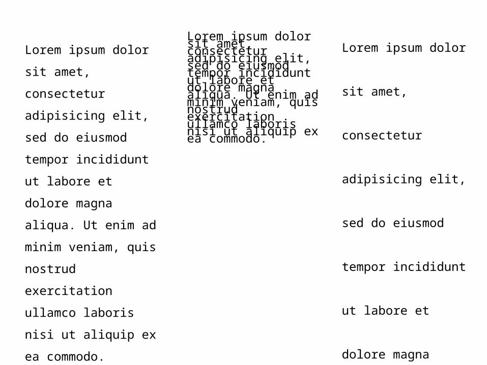
Leading
Sufficient line height makes the text ultimately more scannable.
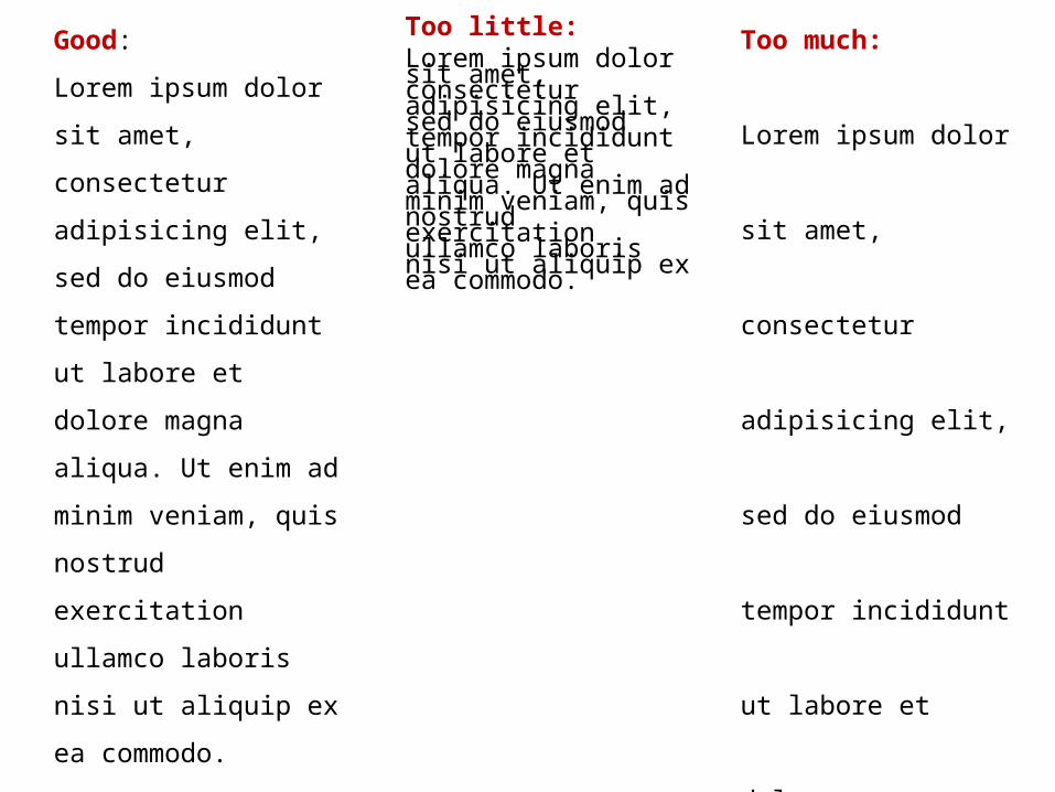
Good:
Lorem ipsum dolor
sit amet, consectetur
adipisicing elit, sed
do eiusmod tempor
incididunt ut labore
et dolore magna
aliqua. Ut enim ad
minim veniam, quis
nostrud exercitation
ullamco laboris nisi
ut aliquip ex ea
commodo.
Too little:Lorem ipsum dolor sit amet, consectetur adipisicing elit, sed do eiusmod tempor incididunt ut labore et dolore magna aliqua. Ut enim ad minim veniam, quis nostrud exercitation ullamco laboris nisi ut aliquip ex ea commodo.
Too much:
Lorem ipsum dolor
sit amet, consectetur
adipisicing elit, sed
do eiusmod tempor
incididunt ut labore
et dolore magna
aliqua. Ut enim ad
minim veniam, quis
nostrud exercitation
ullamco laboris nisi
ut aliquip ex ea
commodo.
Leading
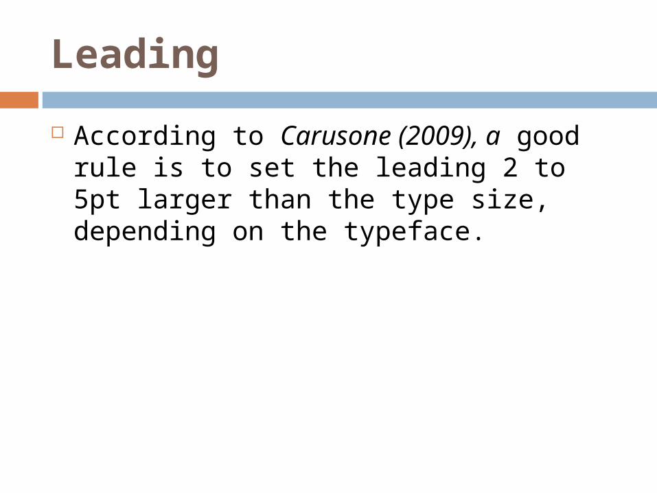
According to Carusone (2009), a good rule is to set the leading 2 to 5pt larger than the type size, depending on the typeface.
Measure | Line Height
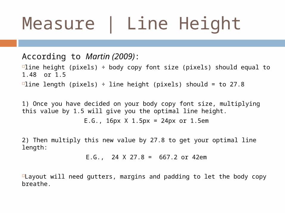
According to Martin (2009):line height (pixels) ÷ body copy font size (pixels) should equal to 1.48 or 1.5line length (pixels) ÷ line height (pixels) should = to 27.8
1) Once you have decided on your body copy font size, multiplying this value by 1.5 will give you the optimal line height.
E.G., 16px X 1.5px = 24px or 1.5em
2) Then multiply this new value by 27.8 to get your optimal line length:
E.G., 24 X 27.8 = 667.2 or 42em
Layout will need gutters, margins and padding to let the body copy breathe.
COLOR
Shades of gray
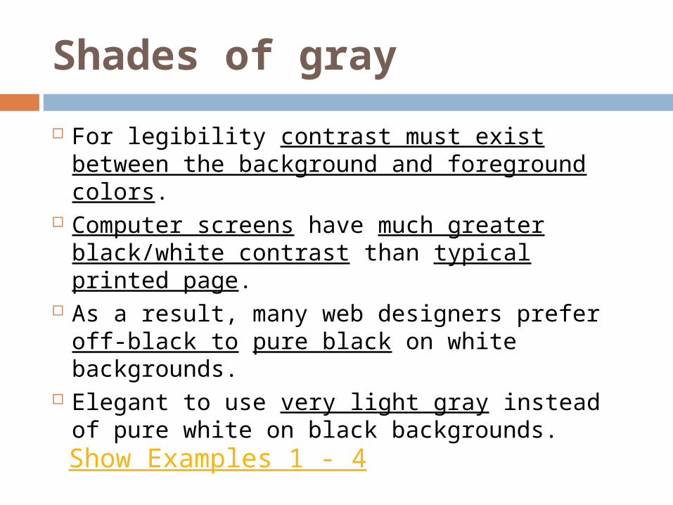
For legibility contrast must exist between the background and foreground colors.
Computer screens have much greater black/white contrast than typical printed page.
As a result, many web designers prefer off-black to pure black on white backgrounds.
Elegant to use very light gray instead of pure white on black backgrounds.Show Examples 1 - 4
Shades of gray
Make all visual distinctions as subtle as possible, but still clear and effective.
Edward Tufte
Visual Explanations
Grids
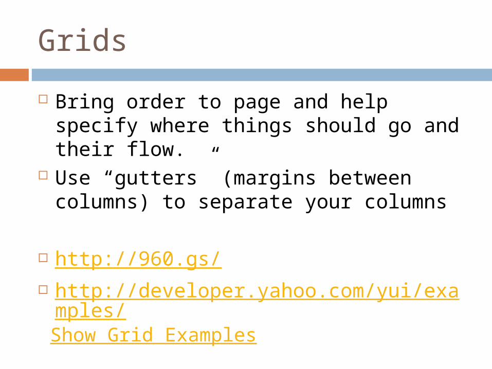
Bring order to page and help specify where things should go and their flow.
Use “gutters” (margins between columns) to separate your columns
http://960.gs/ http://developer.yahoo.com/yui/example
s/
Show Grid Examples
Additional items
Set body in a serif and headings in a san serif or visa-versa - add to visual appeal.
Set abbr and acronym elements in small caps (using the font-variant property).
Mark new paragraphs with indents, outdents, or other ornaments, drop cap and/or headers.
Simon Pascal Klein, Beautiful Web Typography
Additional items
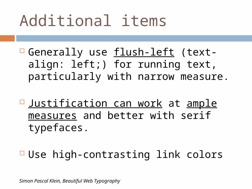
Generally use flush-left (text-align: left;) for running text, particularly with narrow measure.
Justification can work at ample measures and better with serif typefaces.
Use high-contrasting link colors
Simon Pascal Klein, Beautiful Web Typography
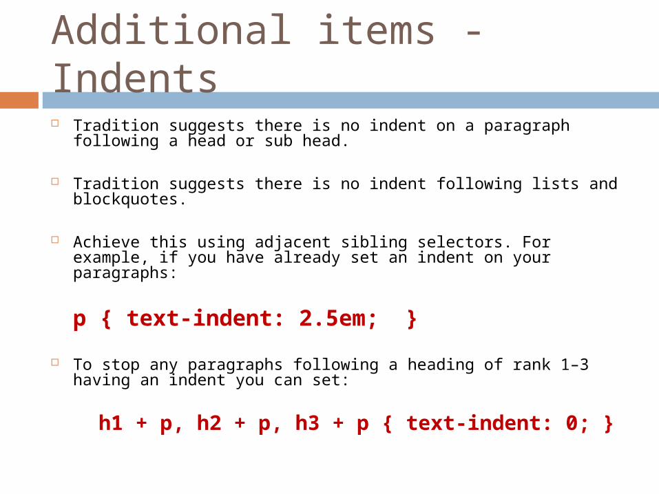
Additional items - Indents
Tradition suggests there is no indent on a paragraph following a head or sub head.
Tradition suggests there is no indent following lists and blockquotes.
Achieve this using adjacent sibling selectors. For example, if you have already set an indent on your paragraphs:
p { text-indent: 2.5em; }
To stop any paragraphs following a heading of rank 1–3 having an indent you can set:
h1 + p, h2 + p, h3 + p { text-indent: 0; }
Examples:
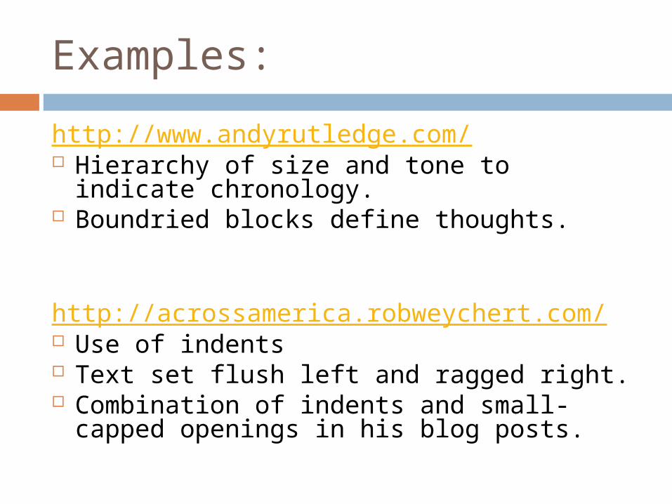
http://www.andyrutledge.com/ Hierarchy of size and tone to indicate
chronology. Boundried blocks define thoughts.
http://acrossamerica.robweychert.com/ Use of indents Text set flush left and ragged right. Combination of indents and small-capped
openings in his blog posts.
Quotes |Jon Tan
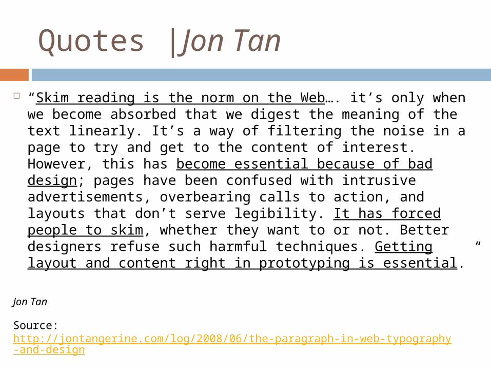
“Skim reading is the norm on the Web…. it’s only when we become absorbed that we digest the meaning of the text linearly. It’s a way of filtering the noise in a page to try and get to the content of interest. However, this has become essential because of bad design; pages have been confused with intrusive advertisements, overbearing calls to action, and layouts that don’t serve legibility. It has forced people to skim, whether they want to or not. Better designers refuse such harmful techniques. Getting layout and content right in prototyping is essential.”
Jon Tan
Source: http://jontangerine.com/log/2008/06/the-paragraph-in-web-typography-and-design
Quotes |Jon Tan
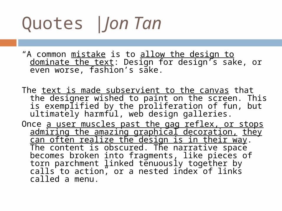
“A common mistake is to allow the design to dominate the text: Design for design’s sake, or even worse, fashion’s sake.
The text is made subservient to the canvas that the designer wished to paint on the screen. This is exemplified by the proliferation of fun, but ultimately harmful, web design galleries.
Once a user muscles past the gag reflex, or stops admiring the amazing graphical decoration, they can often realize the design is in their way. The content is obscured. The narrative space becomes broken into fragments, like pieces of torn parchment linked tenuously together by calls to action, or a nested index of links called a menu.”
Quotes |Jon Tan
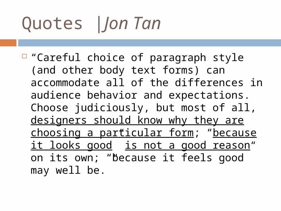
“Careful choice of paragraph style (and other body text forms) can accommodate all of the differences in audience behavior and expectations. Choose judiciously, but most of all, designers should know why they are choosing a particular form; “because it looks good” is not a good reason on its own; “because it feels good” may well be.”
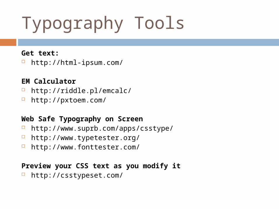
Typography Tools
Get text: http://html-ipsum.com/
EM Calculator http://riddle.pl/emcalc/ http://pxtoem.com/
Web Safe Typography on Screen http://www.suprb.com/apps/csstype/ http://www.typetester.org/ http://www.fonttester.com/
Preview your CSS text as you modify it http://csstypeset.com/
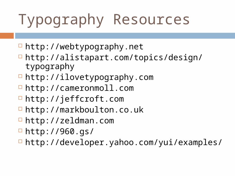
Typography Resources
http://webtypography.net http://alistapart.com/topics/design/
typography http://ilovetypography.com http://cameronmoll.com http://jeffcroft.com http://markboulton.co.uk http://zeldman.com http://960.gs/ http://developer.yahoo.com/yui/examples/
Type
Readability is one of the more important aspects of Web design usability.
Readable text affects how users process the information in the content.
Hierarchy
Typographic layout needs element of hierarchy.
Hierarchy defines how to read through content.
Shows user where to start reading. It differentiates headers from body text. Plays a huge part in how scannable a layout
is.
{Example}
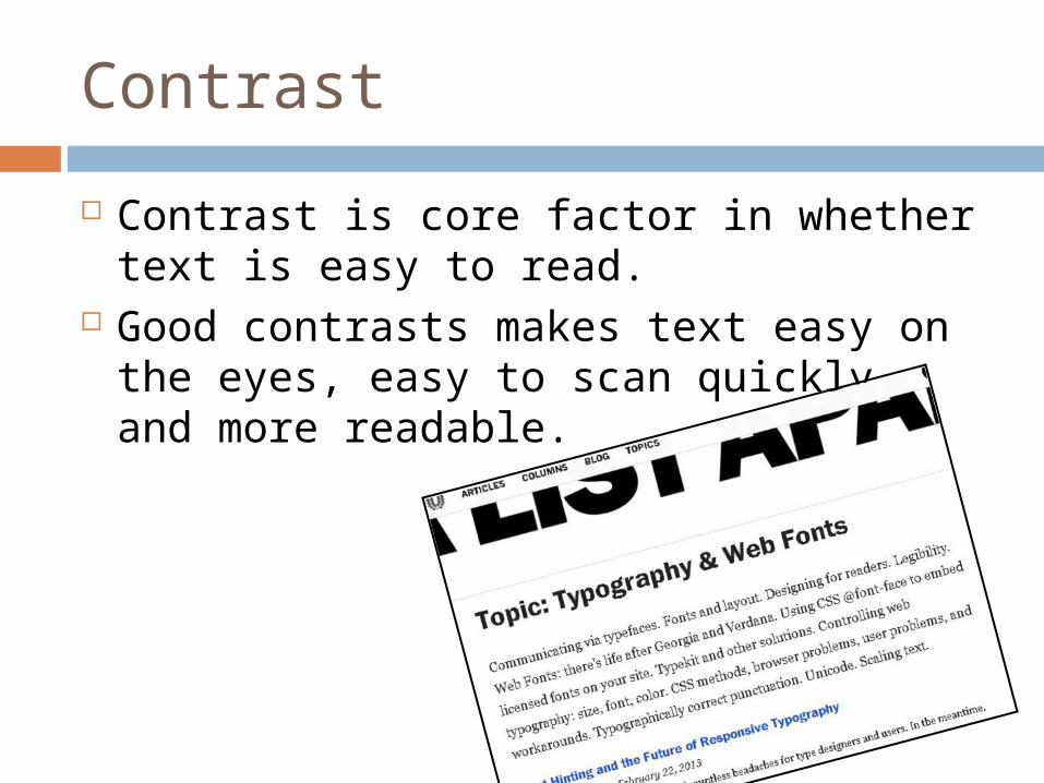
Contrast
Contrast is core factor in whether text is easy to read.
Good contrasts makes text easy on the eyes, easy to scan quickly, and more readable.
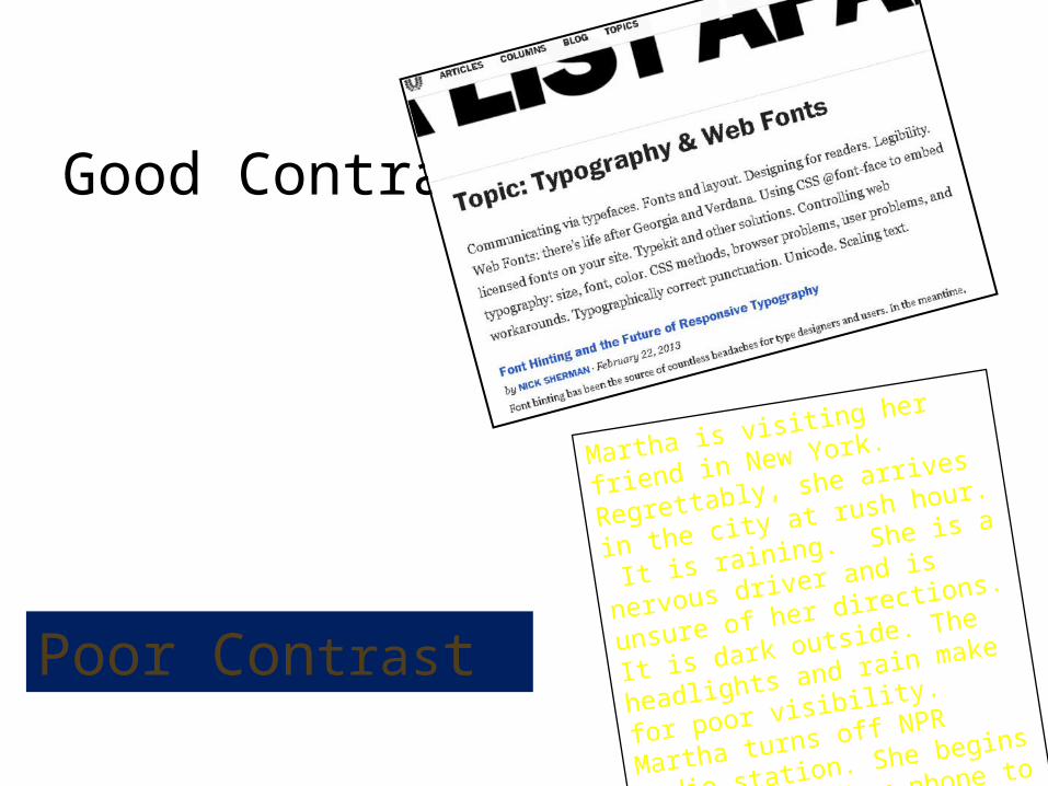
Good Contrast
Poor Contrast
Martha is visiting her friend in
New York. Regrettably, she
arrives in the city at rush
hour. It is raining. She is a
nervous driver and is unsure
of her directions. It is dark
outside. The headlights and
rain make for poor visibility.
Martha turns off NPR radio
station. She begins to reach
for her phone to access the
TJAMs app so she can log her
data but another impatient
driver, with horn sounding,
cuts in front of her.
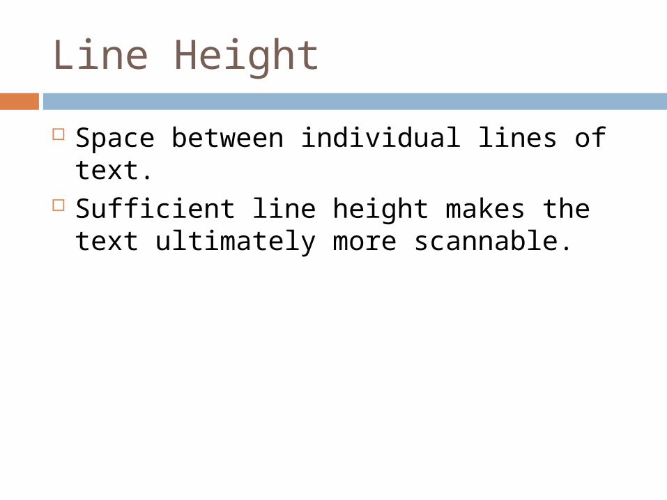
Line Height
Space between individual lines of text. Sufficient line height makes the text
ultimately more scannable.
Lorem ipsum dolor
sit amet, consectetur
adipisicing elit, sed
do eiusmod tempor
incididunt ut labore
et dolore magna
aliqua. Ut enim ad
minim veniam, quis
nostrud exercitation
ullamco laboris nisi
ut aliquip ex ea
commodo.
Lorem ipsum dolor sit amet, consectetur adipisicing elit, sed do eiusmod tempor incididunt ut labore et dolore magna aliqua. Ut enim ad minim veniam, quis nostrud exercitation ullamco laboris nisi ut aliquip ex ea commodo.
Lorem ipsum dolor
sit amet, consectetur
adipisicing elit, sed
do eiusmod tempor
incididunt ut labore
et dolore magna
aliqua. Ut enim ad
minim veniam, quis
nostrud exercitation
ullamco laboris nisi
ut aliquip ex ea
commodo.
Relative unit
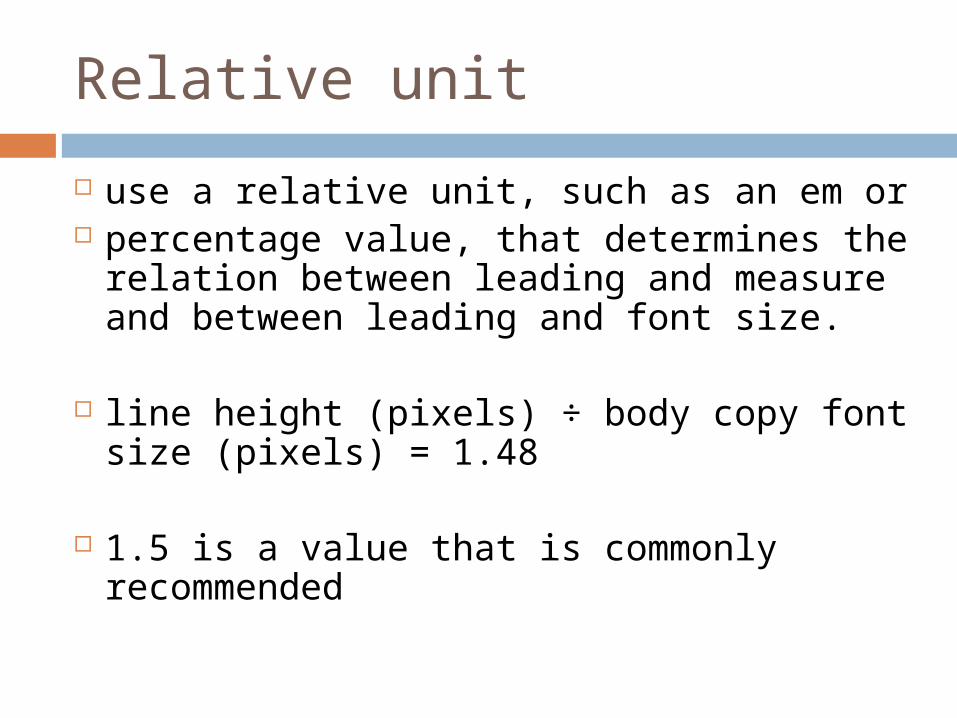
use a relative unit, such as an em or percentage value, that determines the
relation between leading and measure and between leading and font size.
line height (pixels) ÷ body copy font size (pixels) = 1.48
1.5 is a value that is commonly recommended
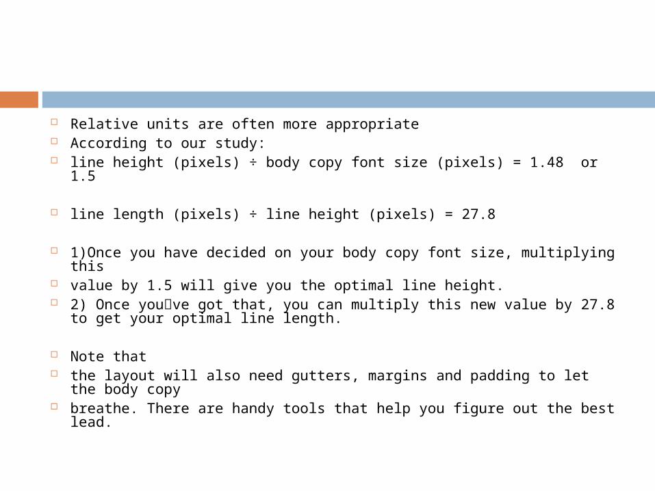
Relative units are often more appropriate According to our study: line height (pixels) ÷ body copy font size (pixels) = 1.48 or 1.5
line length (pixels) ÷ line height (pixels) = 27.8
1)Once you have decided on your body copy font size, multiplying this
value by 1.5 will give you the optimal line height. 2) Once you՚ve got that, you can multiply this new value by 27.8 to
get your optimal line length.
Note that the layout will also need gutters, margins and padding to let the
body copy breathe. There are handy tools that help you figure out the best lead.
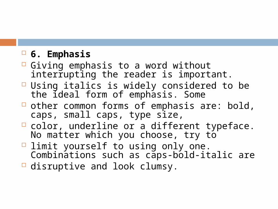
6. Emphasis Giving emphasis to a word without interrupting
the reader is important. Using italics is widely considered to be the ideal
form of emphasis. Some other common forms of emphasis are: bold,
caps, small caps, type size, color, underline or a different typeface. No
matter which you choose, try to limit yourself to using only one. Combinations
such as caps-bold-italic are disruptive and look clumsy.
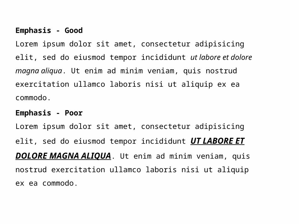
Emphasis - Good
Lorem ipsum dolor sit amet, consectetur adipisicing elit, sed do
eiusmod tempor incididunt ut labore et dolore magna aliqua. Ut
enim ad minim veniam, quis nostrud exercitation ullamco
laboris nisi ut aliquip ex ea commodo.
Emphasis - Poor
Lorem ipsum dolor sit amet, consectetur adipisicing elit, sed do
eiusmod tempor incididunt UT LABORE ET DOLORE
MAGNA ALIQUA. Ut enim ad minim veniam, quis nostrud
exercitation ullamco laboris nisi ut aliquip ex ea commodo.
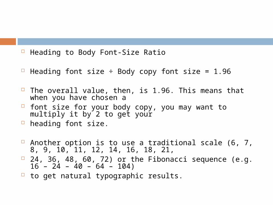
Heading to Body Font-Size Ratio
Heading font size ÷ Body copy font size = 1.96
The overall value, then, is 1.96. This means that when you have chosen a
font size for your body copy, you may want to multiply it by 2 to get your
heading font size.
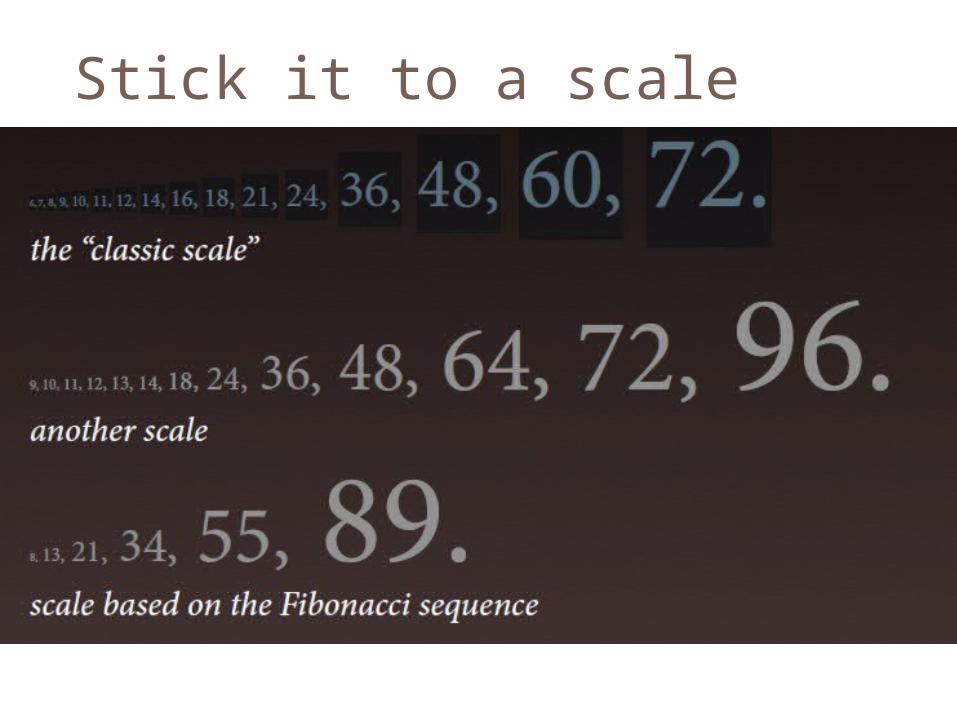
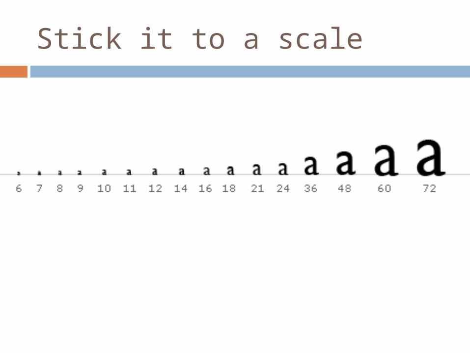
Another option is to use a traditional scale (6, 7, 8, 9, 10, 11, 12, 14, 16, 18, 21,
24, 36, 48, 60, 72) or the Fibonacci sequence (e.g. 16 – 24 – 40 – 64 – 104)
to get natural typographic results.
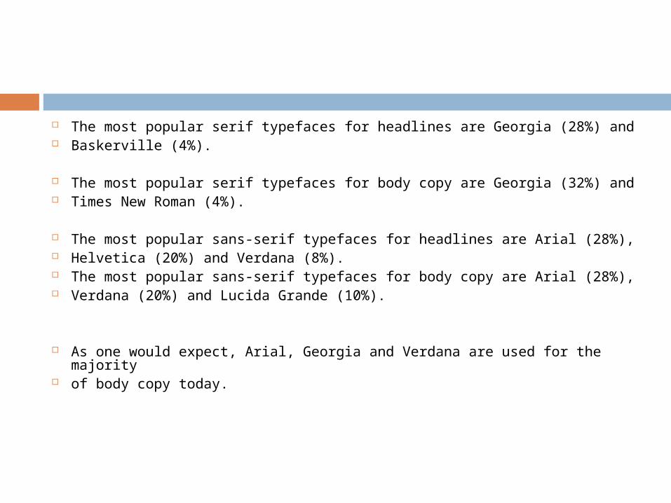
The most popular serif typefaces for headlines are Georgia (28%) and Baskerville (4%).
The most popular serif typefaces for body copy are Georgia (32%) and
Times New Roman (4%).
The most popular sans-serif typefaces for headlines are Arial (28%), Helvetica (20%) and Verdana (8%). The most popular sans-serif typefaces for body copy are Arial (28%), Verdana (20%) and Lucida Grande (10%).
As one would expect, Arial, Georgia and Verdana are used for the majority
of body copy today.
