uni studies 3 - donald bren school of information and...
TRANSCRIPT

Uni Studies 3:The Visual Display of Quantitative Information:Graphical Integrity
Assoc. Professor Donald J. PattersonUni Stu 3 Fall 2012
1Thursday, November 8, 12

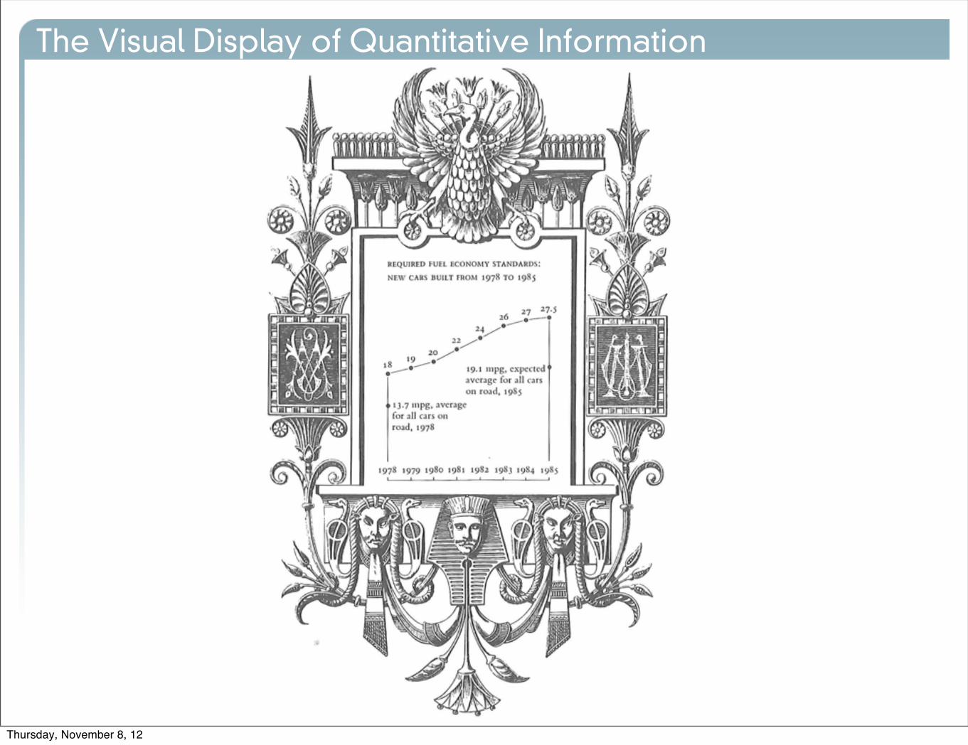
The Visual Display of Quantitative Information
•Graphical Excellence
• is the well-designed presentation of interesting data
• substance
• statistics
• design
• consists of complex ideas communicated with
• clarity
• precision
• efficiency
• is that which gives the viewer
• the greatest number of ideas
• in the shortest time
• with the least ink
Thursday, November 8, 12

Graphical Excellence begins with Graphical Integrity
The Visual Display of Quantitative Information
Thursday, November 8, 12

•Graphical Integrity
• “not lying with statistics”
• tell the truth about data
The Visual Display of Quantitative Information
Thursday, November 8, 12
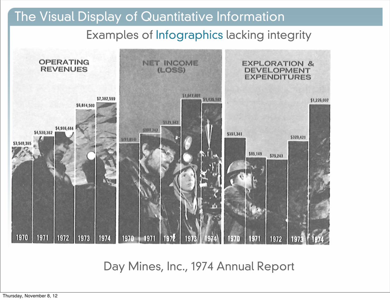
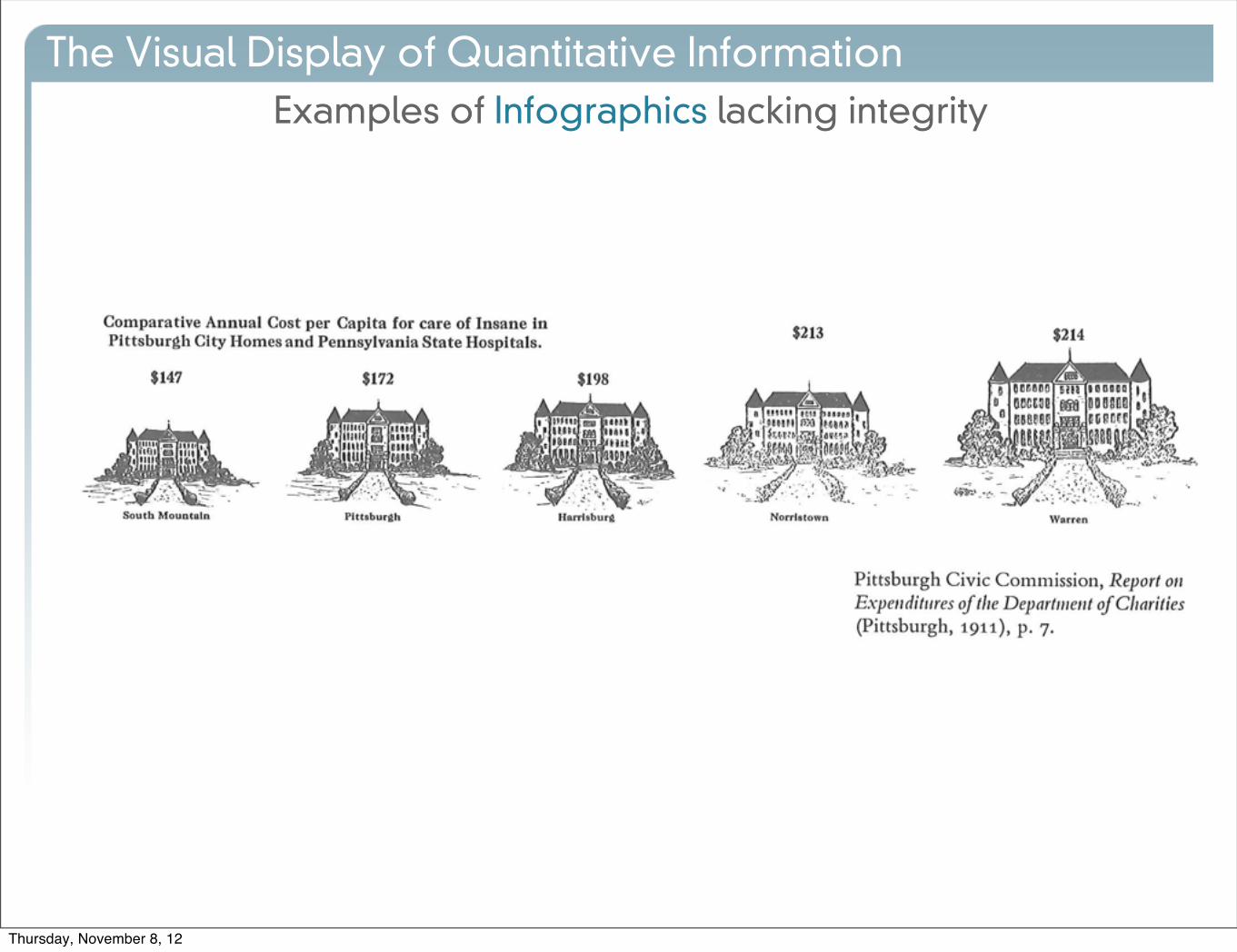
Examples of Infographics lacking integrity
The Visual Display of Quantitative Information
Day Mines, Inc., 1974 Annual Report
Thursday, November 8, 12
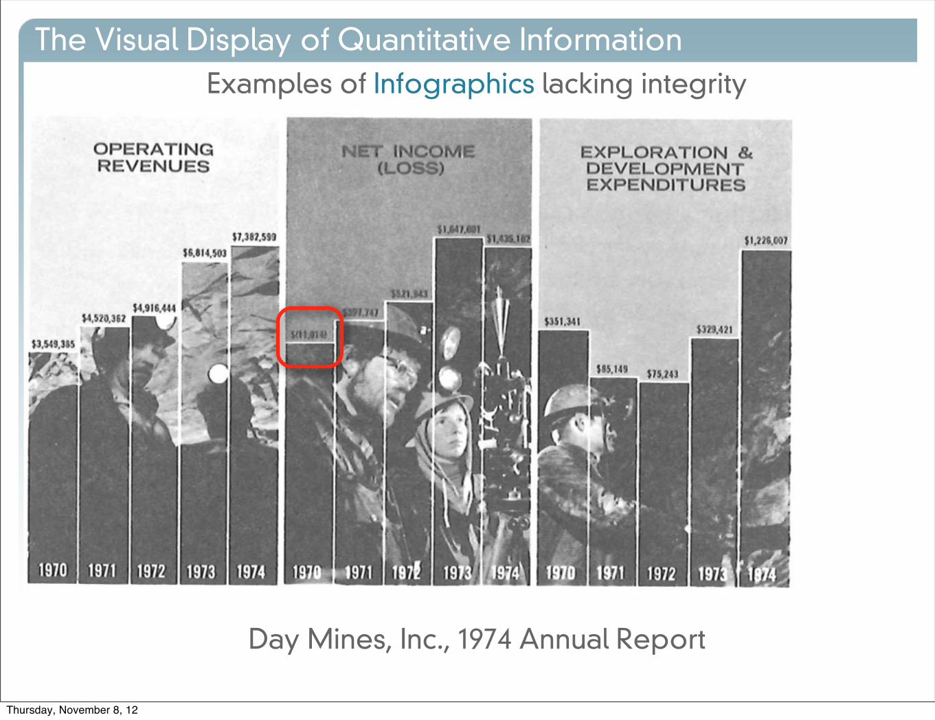
Examples of Infographics lacking integrity
The Visual Display of Quantitative Information
Day Mines, Inc., 1974 Annual Report
Thursday, November 8, 12
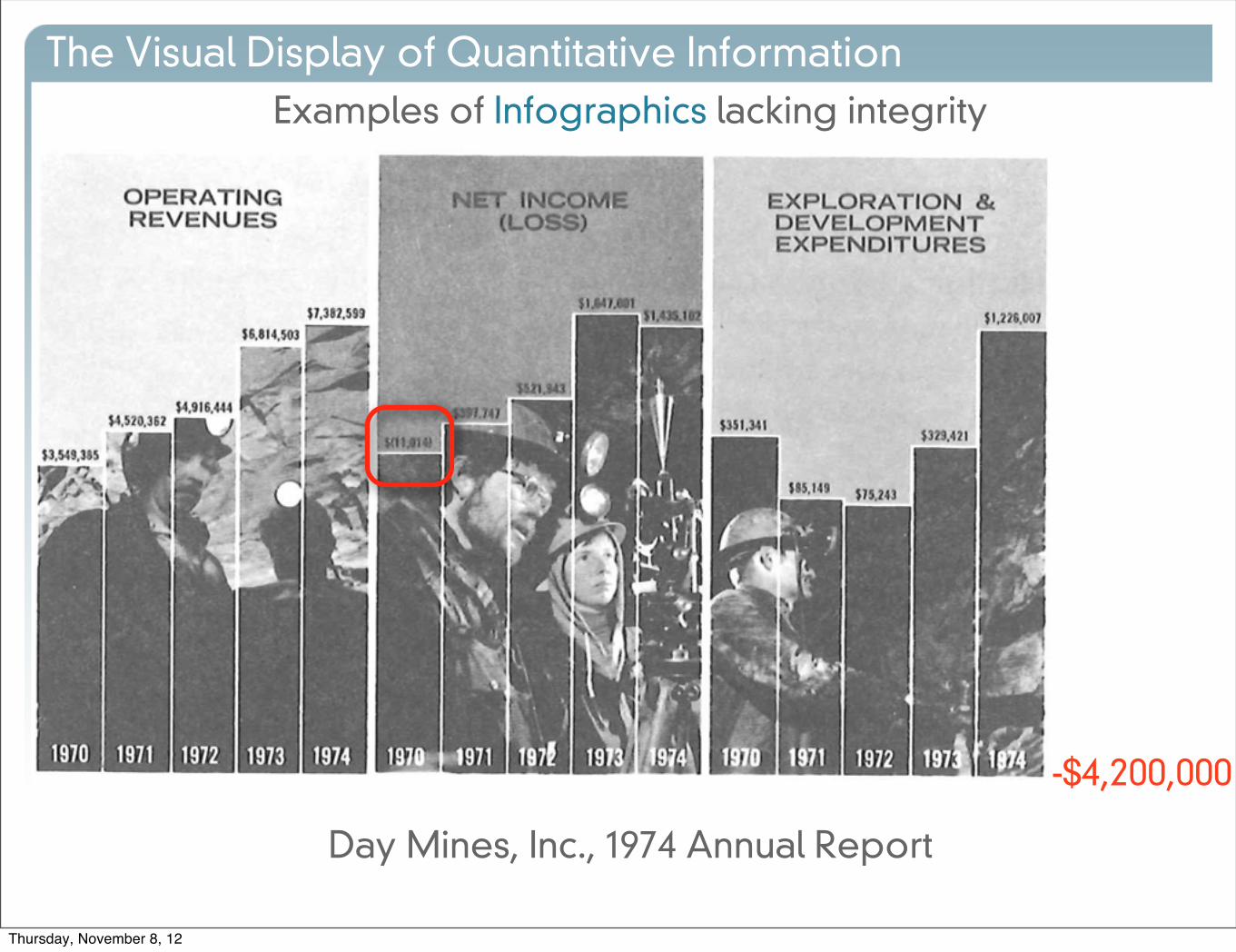
Examples of Infographics lacking integrity
The Visual Display of Quantitative Information
Day Mines, Inc., 1974 Annual Report
-$4,200,000
Thursday, November 8, 12

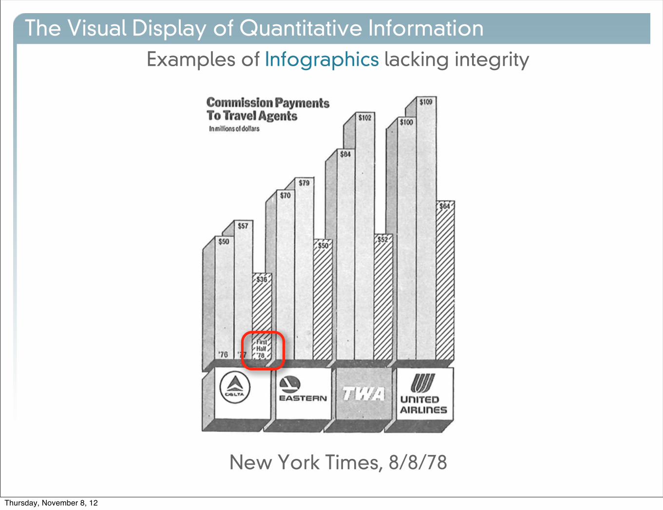
Examples of Infographics lacking integrity
The Visual Display of Quantitative Information
New York Times, 8/8/78
Thursday, November 8, 12
Examples of Infographics lacking integrity
The Visual Display of Quantitative Information
New York Times, 8/8/78
Thursday, November 8, 12
Examples of Infographics lacking integrity
The Visual Display of Quantitative Information
Thursday, November 8, 12
Let’s formalize Distortion in Infographics
The Visual Display of Quantitative Information
Thursday, November 8, 12

Let’s formalize Distortion in Infographics
The Visual Display of Quantitative Information
Thursday, November 8, 12

Let’s formalize Distortion in Infographics
The Visual Display of Quantitative Information
Perceived = Actualx
Thursday, November 8, 12
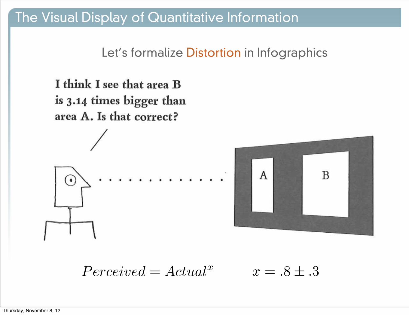
Let’s formalize Distortion in Infographics
The Visual Display of Quantitative Information
Perceived = Actualx x = .8± .3
Thursday, November 8, 12

The Visual Display of Quantitative Information
• Perceived Area
• grows more slowly than measured area
• varies between people
• changes with experience
• changes with context
• changes with loading
Thursday, November 8, 12

The Visual Display of Quantitative Information
•Guidelines
• The measurement of the graphic should be in proportion to the quantity
• Clear, detailed labels should explain distortion and events, on the graphic.
LieFactor =
size of e↵ect shown in graphic
size of e↵ect in data
Thursday, November 8, 12

The Visual Display of Quantitative Information
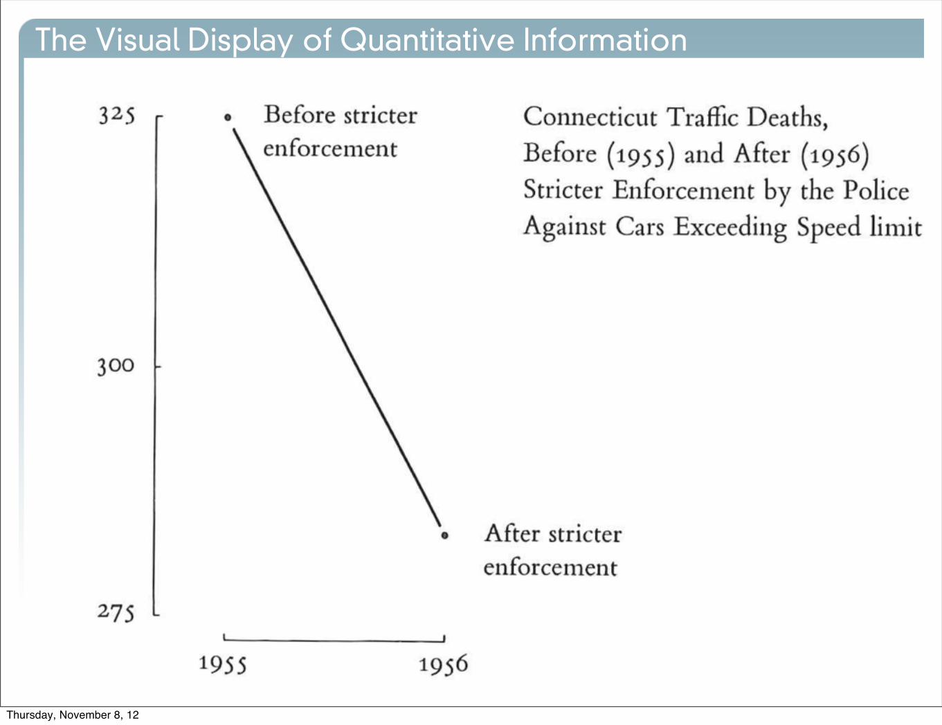
New York Times, 8/9/78
LieFactor = 14.8
Thursday, November 8, 12
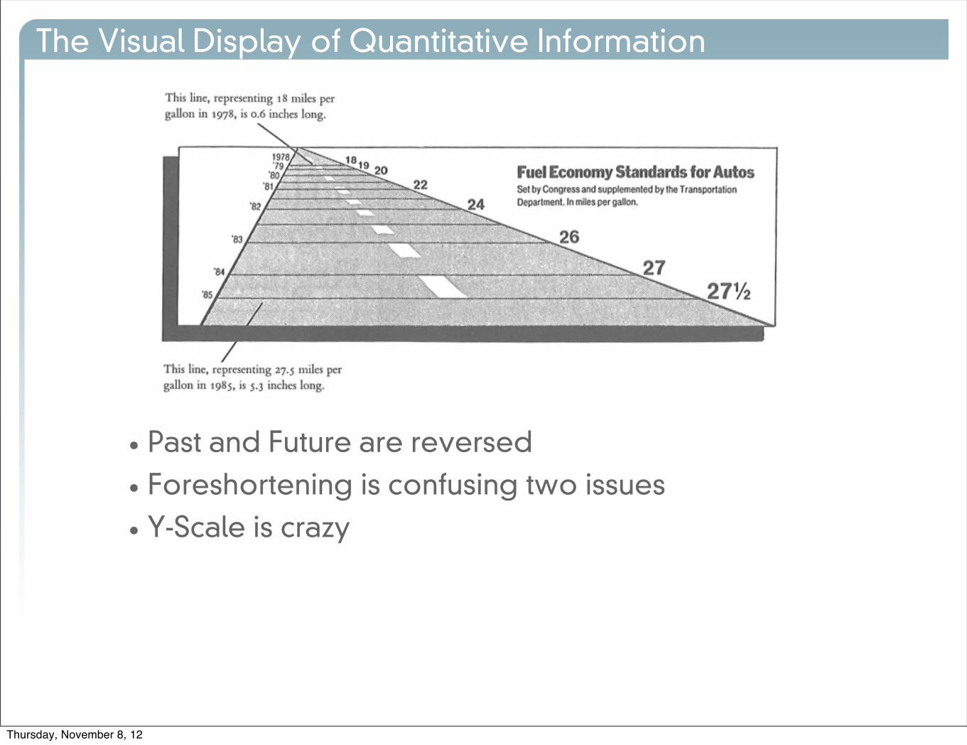
The Visual Display of Quantitative Information
• Past and Future are reversed
• Foreshortening is confusing two issues
• Y-Scale is crazy
Thursday, November 8, 12

The Visual Display of Quantitative Information
Thursday, November 8, 12
The Visual Display of Quantitative Information
Thursday, November 8, 12
The Visual Display of Quantitative Information
• Design vs Data Variation
•We expect that patterns will continue
• Don’t confuse design variation and data variation
Thursday, November 8, 12

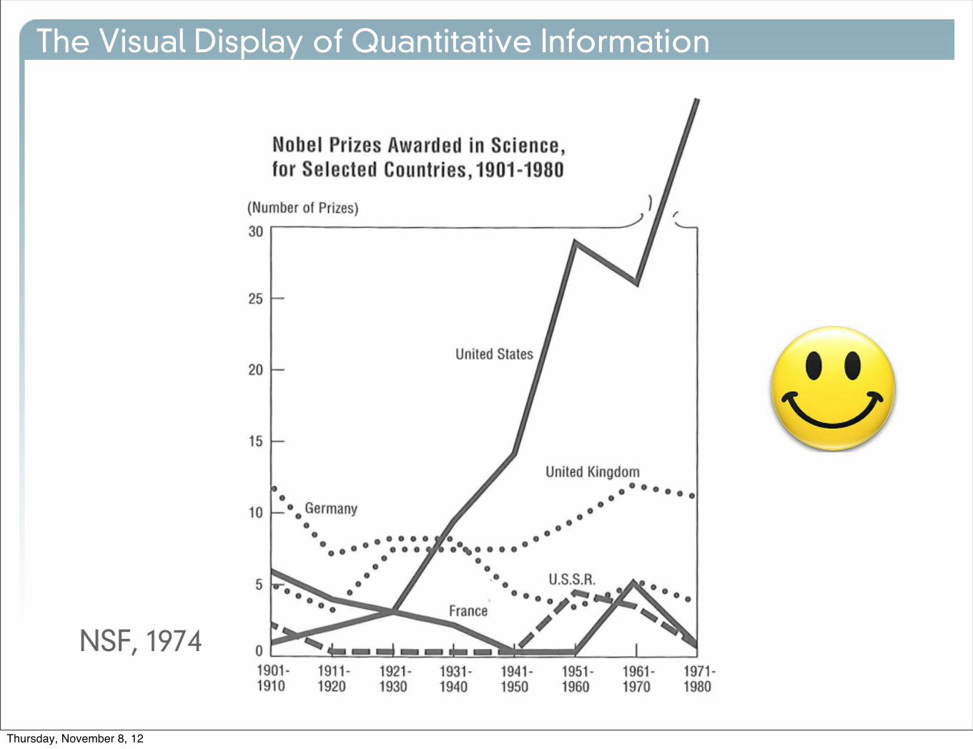
The Visual Display of Quantitative Information
NSF, 1974
Thursday, November 8, 12

The Visual Display of Quantitative Information
NSF, 1974
Thursday, November 8, 12
The Visual Display of Quantitative Information
NSF, 1974
Thursday, November 8, 12
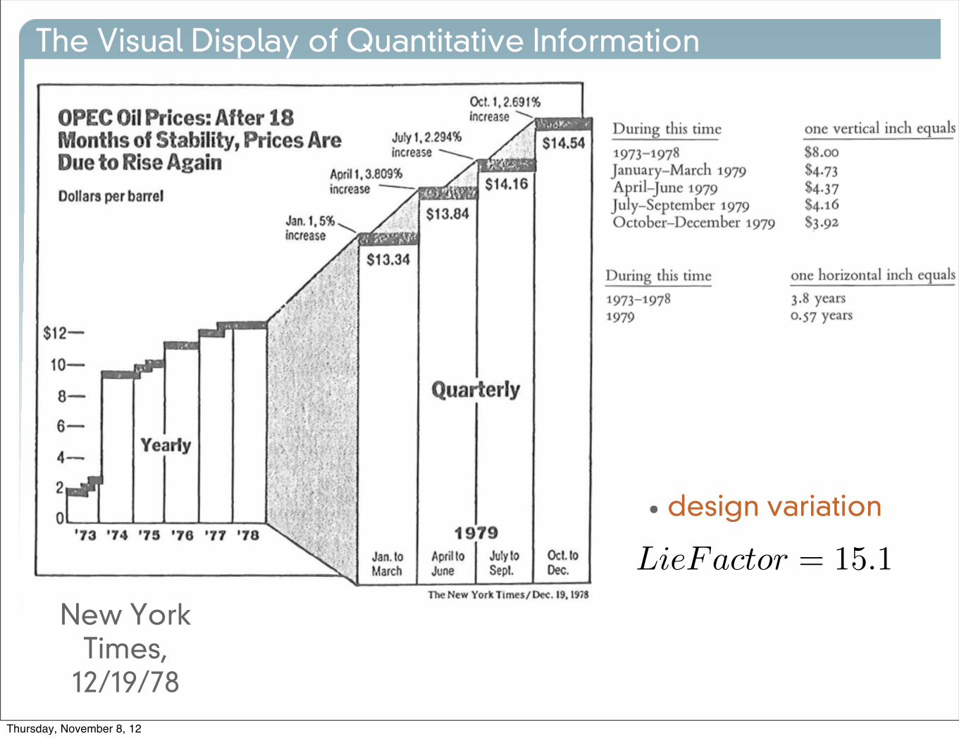
The Visual Display of Quantitative Information
New York Times,
12/19/78
• design variation
LieFactor = 15.1
Thursday, November 8, 12
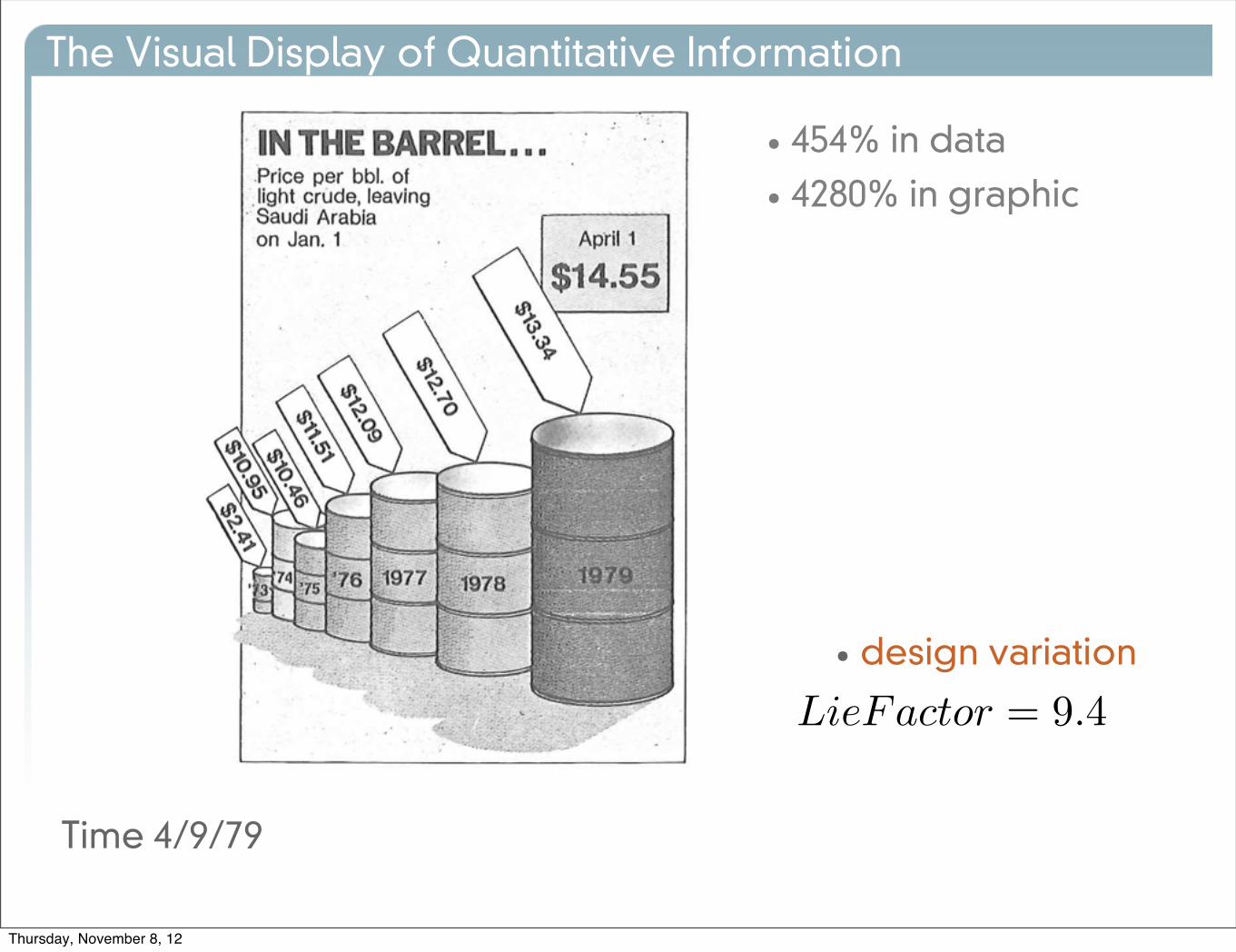
The Visual Display of Quantitative Information
Time 4/9/79
• design variation
• 454% in data
• 4280% in graphic
LieFactor = 9.4
Thursday, November 8, 12
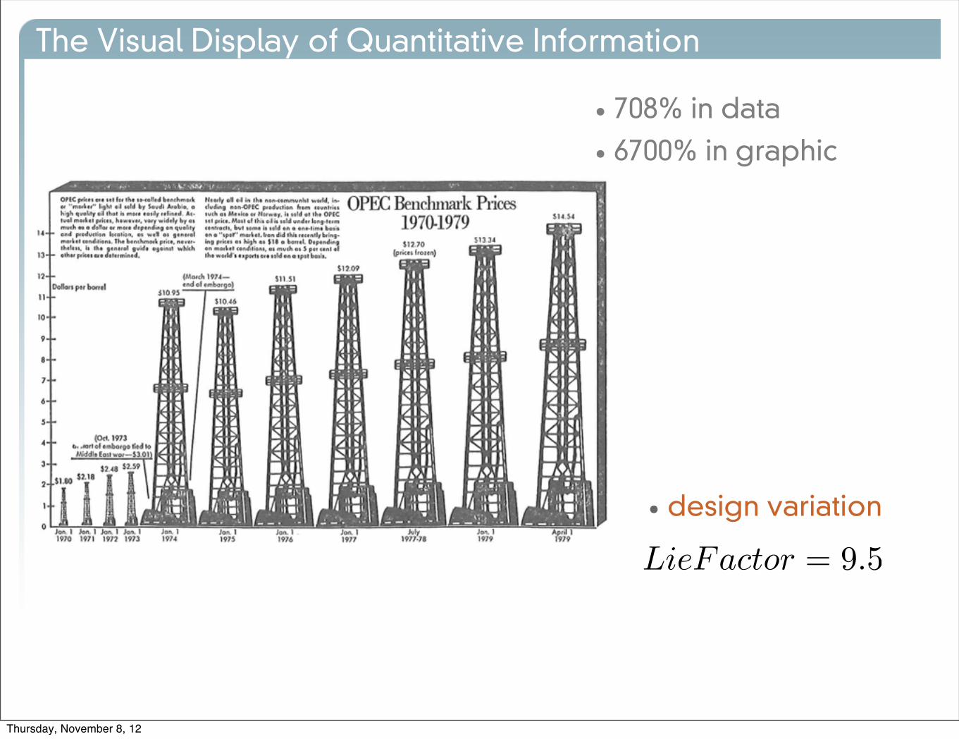
The Visual Display of Quantitative Information
• design variation
• 708% in data
• 6700% in graphic
LieFactor = 9.5
Thursday, November 8, 12

The Visual Display of Quantitative Information
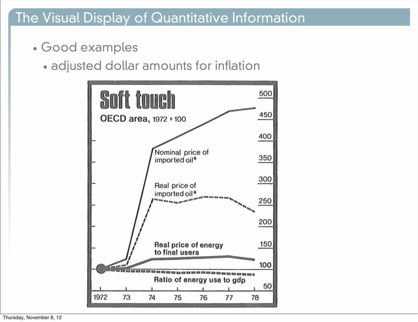
•Good examples
• adjusted dollar amounts for inflation
Thursday, November 8, 12
The Visual Display of Quantitative Information
•Good examples
• adjusted dollar amounts for inflation
Thursday, November 8, 12
The Visual Display of Quantitative Information
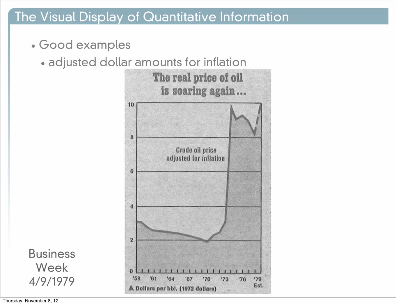
•Good examples
• adjusted dollar amounts for inflation
Business Week
4/9/1979
Thursday, November 8, 12

The Visual Display of Quantitative Information
•Good examples
• adjusted dollar amounts for inflation
Thursday, November 8, 12

The Visual Display of Quantitative Information
• Bad example
Thursday, November 8, 12
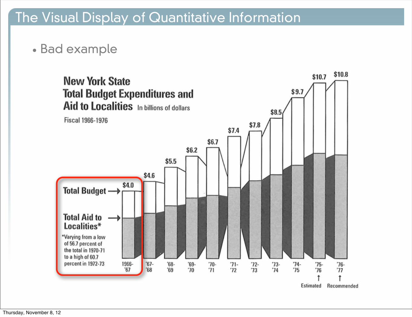
The Visual Display of Quantitative Information
• Bad example
Thursday, November 8, 12

The Visual Display of Quantitative Information
• Bad example
Thursday, November 8, 12

The Visual Display of Quantitative Information
• Bad example
Thursday, November 8, 12

The Visual Display of Quantitative Information
• Bad example
Thursday, November 8, 12
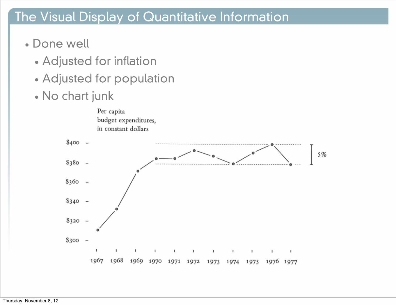
The Visual Display of Quantitative Information
• Done well
• Adjusted for inflation
• Adjusted for population
• No chart junk
Thursday, November 8, 12

The Visual Display of Quantitative Information
• Context is essential for graphical integrity
•Graphics must not quote data out of context
Thursday, November 8, 12
The Visual Display of Quantitative Information
Thursday, November 8, 12

The Visual Display of Quantitative Information
Thursday, November 8, 12

The Visual Display of Quantitative Information
Thursday, November 8, 12

The Visual Display of Quantitative Information
• Summary
• The size of the graphic should match the size of the quantity
• Labels, explanations and events should be on the graph
• Data variation should dominate, not design variation
• Time-series with money should be inflation adjusted and standardized
• The number of dimensions of data should match the number of dimensions in the graphic
•Graphics should be put in context
LieFactor = 1.0
Thursday, November 8, 12
The Visual Display of Quantitative Information
Thursday, November 8, 12

Thursday, November 8, 12