universidade de aveiro departamento de electrónica
TRANSCRIPT

Representation
(R. Spence, 2007)
Universidade de Aveiro
Departamento de Electrónica,
Telecomunicações e Informática
Beatriz Sousa Santos, University of Aveiro, 2019
Universidade de Aveiro
Departamento de Electrónica,
Telecomunicações e Informática

Data
Ah HA ! !We look at
that picture
and gain
insight
Information visualization
The process of information visualization: graphically encoded data is
viewed in order to form a mental model of that data (Spence, 2007)
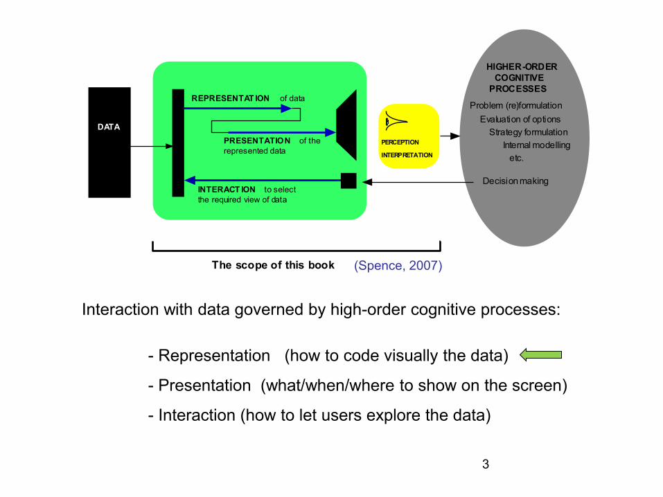
3
Interaction with data governed by high-order cognitive processes:
- Representation (how to code visually the data)
- Presentation (what/when/where to show on the screen)
- Interaction (how to let users explore the data)
DATA
PERCEPTION
INTERPRETATION
REPRESENTAT ION of data
PRESENTATION of the
represented data
INTERACT ION to select
the required view of data
The scope of this book
HIGHER-ORDER
COGNITIVE
PROCESSES
Internal modelling
Strategy formulation
Problem (re)formulation
Evaluation of options
Decision making
etc.
(Spence, 2007)

4
• The Human Visual system is the product of millions of years of
evolution
• Although very flexible, it is tuned to
data represented in specific ways
• If we understand how its mechanisms
work we will be able to produce better results

Pre-attentive attributes can help
observers to see before though
Example: Count the number of 7s
https://www.youtube.com/watch?time
_continue=121&v=AiD6etOB6qI

Another example: Count the cherries
(Ware, 2004)
But, if not properly used, may make the task more difficult
It should be carefully selected

7
Representing quantitative data using color is particularly difficult
Which map is easier to understand?
(Tufte, 1990)

• Not everyone sees color:
• The most common form of color
blindness is deuteranopia (“daltonism”)
• There are color blindness simulators
/
Deuteranopia
Tritanopia
Normal vision
http://www.colourblindawareness.org/
http://www.color-blindness.com/coblis-
color-blindness-simulator

• Other visual attributes as size, proximity are also quickly processed by
visual perception, before the cognitive processes come into play
320
260
380
280
Example: mapping numerical values
to the length of bars:
(Mazza, 2009)

Creating representations: Visual mapping:
• It is necessary to decide:
- which visual structures use to represent the data
• Some types of data can be easily mapped to a spatial
location
• Examples:
. data with a topological or geographical structure
http://www.Visualcomplexity.com
• Many types of data don’t have an easy
correspondence with the dimensions of the
physical space around us

• Three structures must be defined in the visual mapping:
- spatial substrate
- graphical elements
- graphical properties
• Graphical substrate - dimensions in physical space where the visual representation
is created (can be defined in terms of axes and type of data)
• Graphical elements - anything visible appearing in the space
points, lines, surfaces, volumes
• Graphical properties – properties of the graphical elements to which the human retina
is very sensitive - retinal variables:
size, orientation, color, texture, and shape
Graphics substrate: 2D
Graphical elements: bars
Graphical property: size

- Spatial substrate axes (x, y, …)
type of data (quantitative, ordinal, categorical)
- Graphical elements points
lines
surfaces
volumes
- Graphical properties retinal variables:
size,
orientation
texture
shape
color (depends on physiology and culture)
•

Interpretation of Bertin’s guidance
regarding the suitability of various
encoding methods to support
common tasks (Spence, 2007)
The marks are perceived as PROPORTIONAL to each other
Association Selection Order Quantity
Size
Value
Texture
Colour
Orientation
Shape
The marks canbe perceived as SIMILAR
The marks are perceived as DIFFERENT,forming families
The marks are perceived as ORDERED

The relative difficulty of assessing quantitative value as a function of
encoding mechanism, as established by Cleveland and McGill (Spence, 2007)
Length
Position
Angle
Slope
Area
Volume
Colour
Density
Most accurate
Least accurate

Procedure to follow to create visual representations of abstract data
1. Define the problem
2. Examine the nature of the data to represent
3. Determine the number of attributes
4. Choose the data structures
5. Establish the type of interaction
test several ideas …

quantitative
nature of the data to represent ordinal
categorical
univariate
number of attributes bivariate
trivariate
multivariate
linear
temporal
data structures spatial or geographical
hierarchical
network
,
static type of interaction transformable manipulable
communicate
nature of the problem explore
confirm
Next: representation methods
organized according the n. of
attributes

25
Common Visualization Techniques
for univariate, bivariate and trivariate data
Univariate data dot plot
box plot
bar chart
histogram
pie chart
…
Bivariate data scatter plot
line plot
time series
…
Trivariate data surface plot
contour plot
3D representation
bubble plot
…
Cherries
Apples
Kiwis
Grapes
Oranges
y
x
x
t
x
z
y
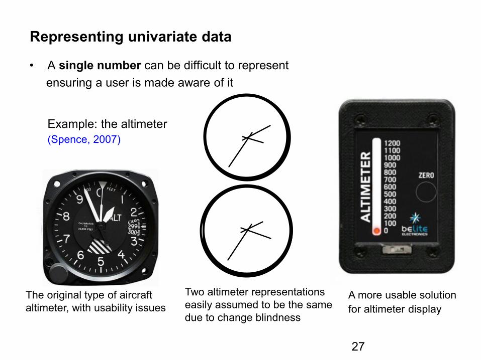
Representing univariate data
• A single number can be difficult to represent
ensuring a user is made aware of it
Example: the altimeter
(Spence, 2007)
The original type of aircraft
altimeter, with usability issues
Two altimeter representations
easily assumed to be the same
due to change blindness
2000
1600
2200
182000
stop1200
1400
A more usable solution
for altimeter display
27

Example of change blindness (Spence, 2007)

Example of change blindness (Spence, 2007)

Inattentional blindness https://www.youtube.com/watch?v=IGQmdoK_ZfY
Change blindness http://www.youtube.com/watch?v=vBPG_OBgTWg&feature=related
30

Representing univariate data (cont.)
• A more common situation consists in representing a set of values
• Well established techniques exist
• But new ones can be invented!
Example:
Price for a number of cars:
- dots on a linear scale
- box plot
(that will answer many questions:
median value, outliers,...)
60
50
40
30
20
10
Price (£K)
(Spence, 2007)
Dot plot Tukey boxplot
https://www.data-to-viz.com/caveat/boxplot.html

• much of the data is aggregated
• precise detail is often not needed
• We can represent derived values
• The histogram is a well known technique
representing derived values
• Tipping over the bars of the histogram a bargram is obtained
10-20 20-30 30-40 40-50 50-60
Price (£K)
2
4
6
8
(Spence, 2007)
10 - 12 12 - 14 16 - 18£kPrice
• Categorical or ordinal data can also be represented in bargrams
Nissan Ford Ferrari MG Cadillac
Missing characteristic:Empty bin
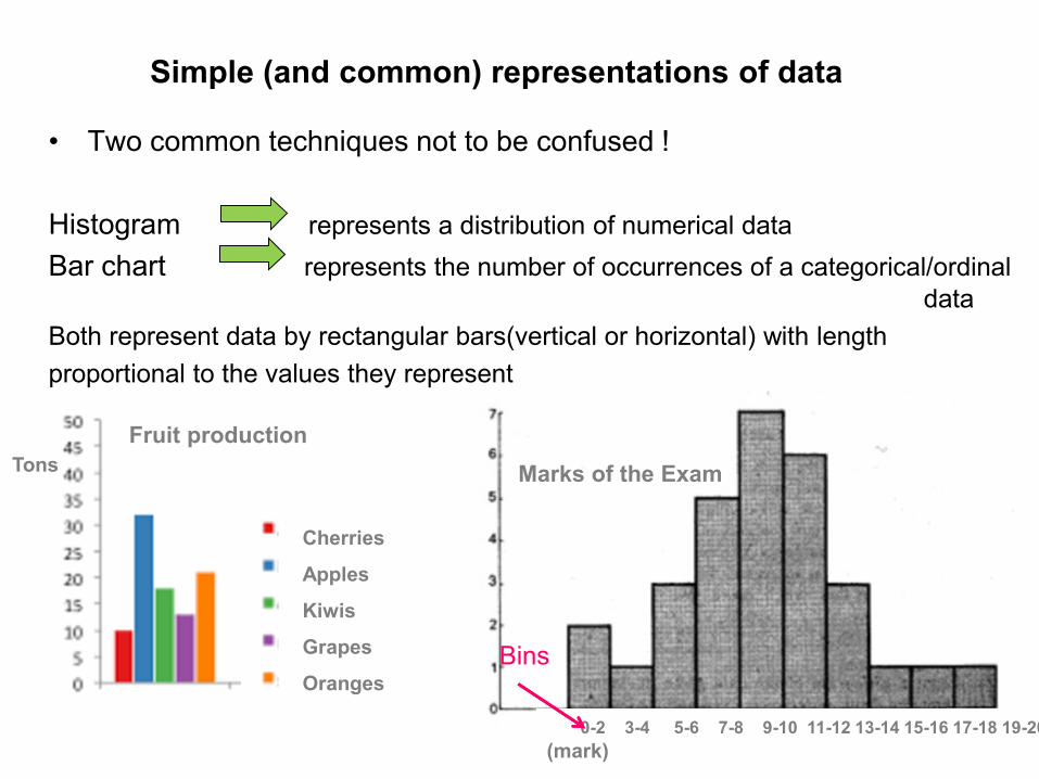
Simple (and common) representations of data
• Two common techniques not to be confused !
Histogram represents a distribution of numerical data
Bar chart represents the number of occurrences of a categorical/ordinal
data
Both represent data by rectangular bars(vertical or horizontal) with length
proportional to the values they represent
Cherries
Apples
Kiwis
Grapes
Oranges
Tons Marks of the Exam
Fruit production
Bins
0-2 3-4 5-6 7-8 9-10 11-12 13-14 15-16 17-18 19-20
(mark)


Another simple (and common) representation
36
• Pie Chart
Represents numerical proportion
The arc length of each slice (its central angle and area), is
proportional to the quantity it represents
Many experts recommend avoiding them
http://www.perceptualedge.com/articles/08-21-07.pdf
It is difficult to compare different sections of a pie chart, or
to compare data across different pie charts
Pie charts can be replaced in most cases by other plots
such as the bar chart, box plot or dot plots
https://en.wikipedia.org/wiki/Pie_chart
Native English
speaking population
Variations of pie charts:

Representing bivariate data
• The scatterplot is the conventional representation
Example: A collection of houses characterized by: - Price
- Number of bedrooms Each represented by a point on a two dimensional space
The axes are associated with these two attributes This representation affords awareness of: - general trends - local trade-offs - outliers
100 120 140 160
5 4 3 2 1
Price £
N. of bedrooms
(Spence, 2007)

• The time series is a special (and important) case of the scatterplot
• One of the axes represents time and the other some function of time
Example
Data set of 52 weekly stock prices
for 1430 stocks
The graph overview shows the entire
data providing some idea of densities
and distributions
Timeboxes limit the display to items
according to some time and price criteria
(Spence, 2007)

• Alternative representation of a time series
• More suited for gaining an initial impression of data
Example:
Level of ozone concentration over 10 years
above Los Angeles
- each square represents one day
- and is colored to indicate the ozone level
It is apparent that:
- ozone levels are higher in Summer
- the concentration has been decreasing
(Spence, 2007)

• If one attribute is more important than the other or must be examined first,
• it may be appropriate to employ logical or semantic zoom
Example:
Analyzing a list of cars:
- price is the first attribute to examine
- semantic zoom reveals data about
a second attribute
• This technique is quite general: it can encompass many attributes and many levels of progressive zoom
60
50
20
10
Pri ce (£ K)
40
30
40
30
35
FordNissanVWM erc
JagJagFordSE AT
(Spence, 2007)

Representing Trivariate data
• Since we live in a 3D world, representing trivariate data as points in a 3D
space and displaying a 2D view is natural
Price
Time
Bedrooms
AB
C
D• However, these representations
can be ambiguous
• This can be solved by interaction,
allowing the user to reorient the
representation
“for 3D to be useful, you’ ve got to
be able to move it” (Spence, 2007)

• Interaction (brushing) can help – objects identified in one view are highlighted
in the other two planes
• change blindness must be taken into account and ensure that the user
notices the highlight in the other two planes
The highlighting of houses in one
plane is brushed into the remaining
planes.
(Spence, 2007)

“Augmenting” a scatterplot: representing 5 variables
Hans Rosling's 200 Countries, 200 Years, 4 Minutes: 120 000 values
https://www.youtube.com/watch?v=jbkSRLYSojo
Income (x), Age expectancy (y) , Time (t), Continent (colour), Population (size of circle)
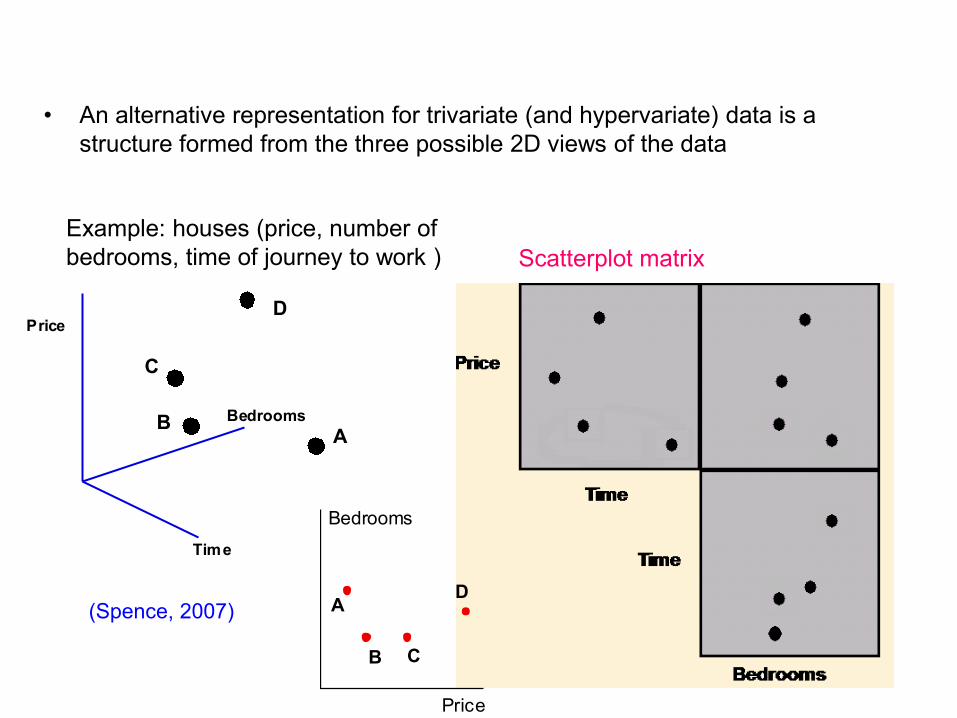
• An alternative representation for trivariate (and hypervariate) data is a
structure formed from the three possible 2D views of the data
Price
Time
Bedrooms
AB
C
D
Scatterplot matrix
Example: houses (price, number of
bedrooms, time of journey to work )
A
B C
D
Price
Bedrooms
(Spence, 2007)
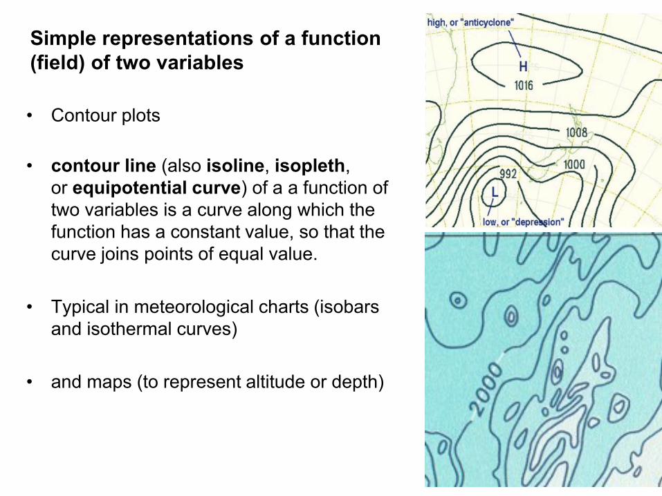
Simple representations of a function
(field) of two variables
55
• Contour plots
• contour line (also isoline, isopleth,
or equipotential curve) of a a function of
two variables is a curve along which the
function has a constant value, so that the
curve joins points of equal value.
• Typical in meteorological charts (isobars
and isothermal curves)
• and maps (to represent altitude or depth)

56
• Surface plots
• May be combined with color

Population of major cities in England,
Wales and Scotland. Circle area is
proportional to population. (Spence, 2007)
• A special category of trivariate data:
maps (latitute and longitude + a value)
Things that “pop-out”

Pre-attentive processing: Things that “pop out”
“We can do certain things to symbols to make it much more likely that they will
be visually identified even after a very brief exposure” (Ware, 2004)
Orientation
Shape Enclosure
Colour
Where is the blue square?
(Spence, 2007)

Representing Hypervariate (or multivariate) data
• Many real problems are of high dimensionality
• The challenge of representing hypervariate data is substantial and continues
to stimulate invention
• Some of the mentioned representation techniques can be scaled to represent
hypervariate data (to a limited extent)

Techniques for Hypervariate (or multivariate) data Visualization
• Coordinate plots parallel coordinate plots
star plots
• Scatterplot Matrix
• Linked histograms
• Mosaic Plots
• Icons

• Parallel coordinates plots are one of the most popular techniques for
hypervariate data
• They have a very simple basis
(Spence, 2007)

Consider a simple case of bivariate data:
1- A scatterplot represents the price and number of
bedrooms associated with two houses
2- the axes are detached and made parallel; each
house is represented by a point on each axis
3- To avoid ambiguity the pair of points representing a
house are joined and labeled
A
B
Price
Numberofbedrooms
Price Numberofbedrooms
Price Numberofbedrooms
A
B

• For objects characterized by many attributes the parallel coordinate plots
offer many advantages
A example for six objects, each characterized by seven attributes:
A B C D E F G
The trade-off between A and B, and the correlation between B and C, are
immediately apparent. The trade-off between B and E, and the correlation
between C and G, are not.
trade-off between A and B
correlation between B and C
objects
attributes
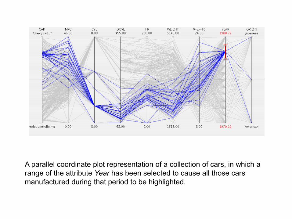
A parallel coordinate plot representation of a collection of cars, in which a
range of the attribute Year has been selected to cause all those cars
manufactured during that period to be highlighted.

Properties of parallel coordinate plots:
• Suitable to identify relations between attributes
• Objects are not easily discriminable; each object is represented by a polyline
which intersects many others
• They offer attribute visibility (the characteristics of the separate attributes are
particularly visible)
• The complexity of parallel coordinate plots (number of axes) is directly
proportional to the number of attributes
• All attributes receive uniform treatment

• Star plots have many features in common
with parallel coordinate plots
• An attribute value is represented by a point
on a coordinate axis
• Attribute axes radiate from a common origin
• For a given object, points are joined by straight lines
• Other useful information such as average values or thresholds can be
encoded
Sport
Literature
Mathematics
Physics
History
Geography
Art
Chemistry
(Spence, 2007)
object

Properties of star plots:
• Their shape can provide a reasonably rapid appreciation of the attributes of
the objects
• They offer object visibility and are suitable to compare objects
(by visibility it is meant the
ability to gain insight pre-attentively;
without a great cognitive effort)
Sport
Literature
Mathematics
Physics
History
Geography
Art
Chemistry
Bob’s performance Tony’s performance
(Spence, 2007)
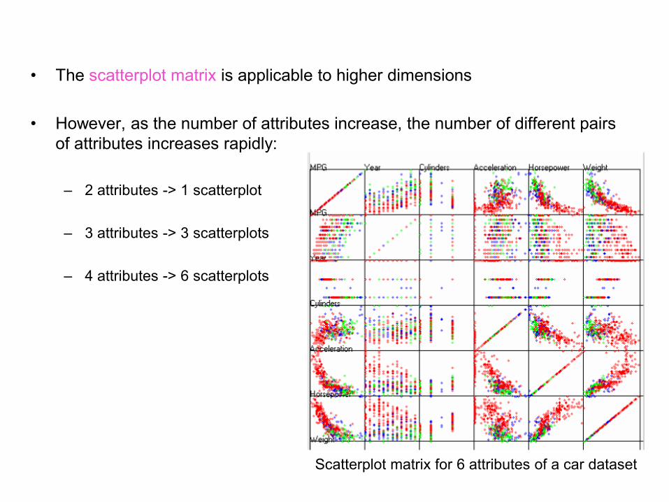
• The scatterplot matrix is applicable to higher dimensions
• However, as the number of attributes increase, the number of different pairs
of attributes increases rapidly:
– 2 attributes -> 1 scatterplot
– 3 attributes -> 3 scatterplots
– 4 attributes -> 6 scatterplots
Scatterplot matrix for 6 attributes of a car dataset

• A single scatterplot can be
used together with other
encoding techniques to
represent data of higher
dimension
https://spotfire.tibco.com/resources
/product-demonstration-
interactive/expense-analytics
https://www.mathworks.com/matla
bcentral/fileexchange/48005-
bubbleplot-multidimensional-
scatter-plots

Steps in the creation of a Mosaic Plot representing the Titanic disaster.
2201 885706285325
First Second Third Crew
Female
Male
First Second Third Crew
Female
Male
Adult
First Second Third Crew
Ch ild
Survived
Died
Survived
Died
(a) (b)
(c)(d)
Total number of passengers + crew

Chernoff Faces allow attribute values to be encoded in the features of
cartoon faces
They were originally used to study geological samples, each characterized
by 18 attributes
Icons represent a number of attributes qualitatively or quantitatively
(https://en.wikipedia.org/wiki/Chernoff_face)
y
x
A stranger
(Tufte, 2001)

Multidimensional icons representing eight attributes of a dwelling
house£400,000garagecentral heatingfour bedroomsgood repairlarge gardenVictoria 15 mins
flat£300,000no garagecentral heatingtwo bedroomspoor repairsmall gardenVictoria 20 mins
houseboat£200,000no garageno central heatingthree bedroomsgood repairno gardenVictoria 15 mins
Textual descriptions of the dwellings represented by the multidimensional icons (Spence, 2007)

• Data related glyphs (icons) seem more favored by users (Siirtola, 2005)
(doi>10.1016/j.intcom.2006.03.006)
• Direct metaphorical icons find wide application (Miller and Stasko, 2001)
http://www.youtube.com/watch?v=w_J2ojj5Fu0
• Two examples of metaphorical icons:
- with direct relation between icon and object (house icon)
- no direct relation between facial features and attributes they represent
(Chernoff faces)
The InfoCanvas

Example:
Use visualization techniques to help answer the following questions:
Is there a relation between wanted salary and experience?
How many candidates ask for a salary in [30000, 50000] and in [55000, 75000]?
How many candidates have an advanced level of English?
Education
Age
Prof.
Experience
Gender
English Wanted
salary
# (MSc/PhD) (years) (years) (F/M) (Bas/Adv) ($$/year)
1 MSc 22 0 M Advanced 36000
2 MSc 23 0 M Basic 36000
3 MSc 24 1 F Advanced 36000
4 PhD 30 7 F Advanced 72000
5 MSc 25 1 M Basic 40000
6 PhD 29 5 M Advanced 60000
7 MSc 31 7 M Advanced 55000
8 MSc 23 0 F Advanced 36000
9 MSc 26 2 F Intermediate 40000
10 PhD 32 9 M Intermediate 65000
11 BSc 30 7 M Intermediate 30000
12 PhD 40 17 F Advanced 80000
13 MSc 28 4 M Advanced 40000
… the complete table has many more candidates, but you may test with these …

Bibliography
Main Bibliography
• Spence, R., Information Visualization, Design for Interaction, 2nd ed.,
Prentice Hall, 2007
• Munzner, T., Visualization Analysis and Design, A K Peters/CRC Press, 2014
• Mazza, R., Introduction to Information Visualization, Springer, 2009
• Ware, C., Information Visualization, Perception to Design, 2nd ed.,Morgan
Kaufmann,2004
• Tufte, E., The Visual Display of Quantitative Information, 2nd ed., Graphics
Press, 2001
Acknowledgement The author of these slides is very grateful to Professor Robert Spence as he
provided the electronic version of his book figures

Links
• http://www.datavis.ca/
• http://www.infovis-wiki.net/
Prize winning pie chart! Mandelblubs: 3D Fractals