university of california san diego - home...
TRANSCRIPT
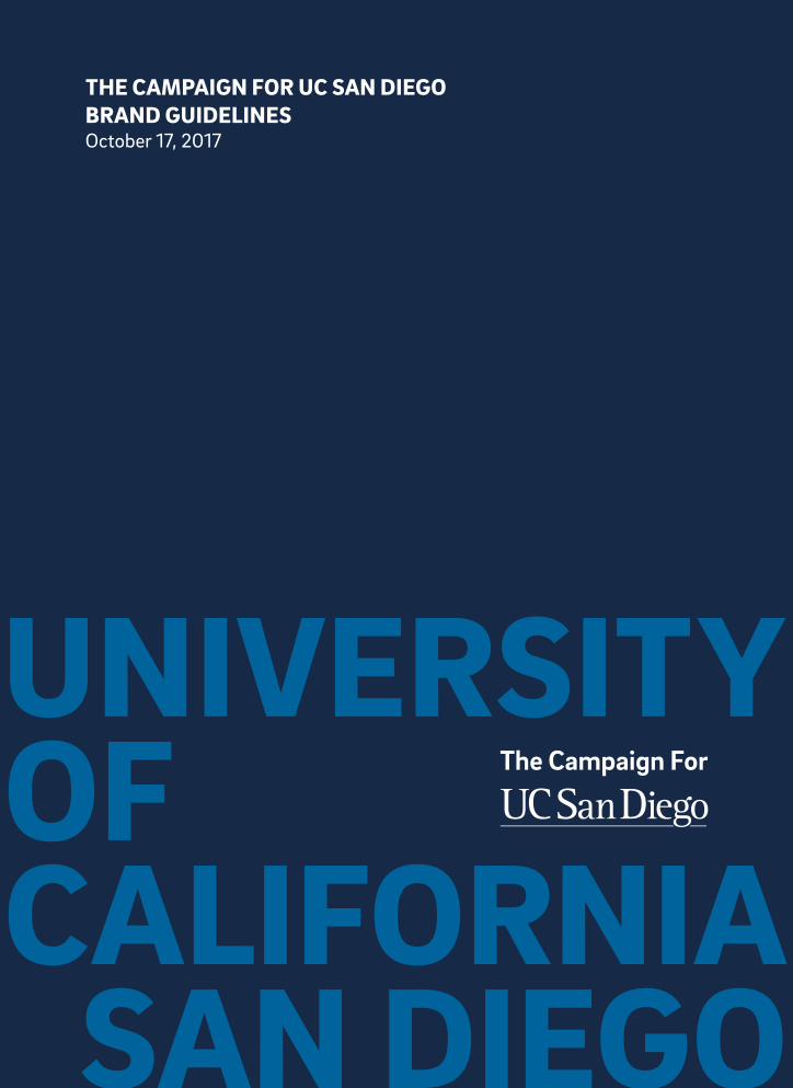
UNIVERSITY OF CALIFORNIA
SAN DIEGO
THE CAMPAIGN FOR UC SAN DIEGO BRAND GUIDELINESOctober 17, 2017

THE CAMPAIGN FOR UC SAN DIEGOAN INTRODUCTION
In launching the Campaign for UC San Diego, an ambitious, comprehensive $2 billion fundraising effort, our goal was simple: secure the philanthropic resources necessary to drive innovation that advances society, expand the donor base, create a culture of philanthropy, and ultimately help solve the world’s most pressing problems.
To accomplish this, we must consistently produce attention-grabbing, thought-provoking campaign communications that inspire people to give. Consider these guidelines your tool kit in achieving continuity across our various touch points. By applying consistent verbal and visual elements that demonstrate our unique approach to problem-solving, we can inspire transformative change.
Updated 10/17/17 Introduction 6.1

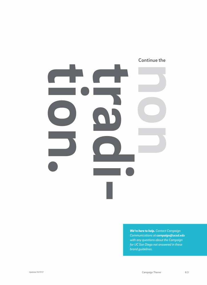
CAMPAIGNTHEME
Continue the nontradition.
This playful verbal twist on a common phrase embodies just how uncommon we are here at the leading edge of the continent. Where other universities have a tradition, we have a nontradition. (After all, our very founding was an experiment.) Where most academics want to tackle issues, we want to make them one giant nonissue.
In a way, “non” is the glue of our Campaign.
And where “non” could come off as divisive and negative, we flip that prefix on its head, in each creative instance finding a positive new way to approach, well, everything.
This is what will demonstrate our campus’s refreshingly unique way of looking at the world. And our curious approach to solving its problems.
Through a blend of bold, smart language; compelling photography; and eye-catching graphics, our communications will creatively push the boundaries of conventional fundraising campaigns—and inspire transformational giving.
In the following pages, you will learn when, where, and how to use these verbal and visual cues across all media.
With your help, we can continue the nontradition that is UC San Diego.
Updated 10/17/176.2 THE CAMPAIGN FOR UC SAN DIEGO
We’re here to help. Contact Campaign Communications at [email protected] with any questions about the Campaign for UC San Diego not answered in these brand guidelines.
Updated 10/17/17 Campaign Theme 6.3

VOICE PERSONALITY
AND STYLE
Dare to pull the reader in.
Everything we write, from headlines to body copy, should be unexpected and engaging.
Be human.
We use the first-person point of view whenever possible because our brand is an approachable, personal one.
Be relevant.
Maneuver around clichés or generalities. Every message should feel current and pertinent.
Be bold.
Don’t be afraid to impress our audience. Write directly and confidently about the vision our students and faculty have for changing the world.
Be inquisitive.
We don’t always have the answer, and that’s a good thing. Our insatiable curiosity is what drives us to push boundaries in our ongoing pursuit of advancing humanity.
Be visionary.
We’re changing the world. Let’s communicate the impact a gift will make without coming off as too needy.
CAMPAIGN COMMUNICATIONRULES TO WRITE BY
Updated 10/17/176.4 THE CAMPAIGN FOR UC SAN DIEGO

TONEATTITUDE
AND DICTION
Be clever, not funny.
Our goal is to engage philanthropic partnerships and inspire transformative gifts. So let’s dazzle our audience with our intellect, not our humor. And while the occasional wordplay can be good, let’s avoid coming off as punny.
Be provocative.
Our messaging is meant to challenge and, therefore, empower and uplift people.
Be professional.
We’re raising $2 billion to drive innovation that will change the world. Let’s look and sound the part, while keeping our personality firmly intact.
Stand for something.
But if it feels cold, unapproachable, snarky, or soft, it doesn’t belong.
Embrace the non.
Our Campaign is about the nontradition that is UC San Diego. We approach problem-solving nonconventionally. We push boundaries nonapologetically. We ask questions nonstop. And non, and non, and non, we write.
Courageous. Confident. Not conceited.
We’re experimental by nature, and that takes courage. But our efforts are not self-serving. While we’re proud of our work, we check our egos at the door.
Campaign Toolkit: For campaign boilerplate and talking points, visit ucpa.ucsd.edu/brand/campaign/toolkit.
Updated 10/17/17 Campaign Communication 6.5

CAMPAIGN LOGOOVERVIEW
The name of this fundraising effort is the Campaign for UC San Diego. Below, you will find our campaign logo, a mark that is meant to be applied as a graphic identifier for the campus and university at large. In creating this logo, we’ve leveraged the equity of our UC San Diego logo and modified it for use in our Campaign. Throughout all campaign communications, this is your mark.
Campaign Logo Components
The campaign logo has three components: the campaign line, the UC San Diego logotype, and the rule line below the logotype.
• Do not change the typeface.
• Do not attach other graphic elements to the logo.
• Do not stretch or change the proportions of the logo.
• Do not rearrange or overlap components of the logo.
• Do not alter the weight of the logo.
Rule line
Logotype
Campaign line
Updated 10/17/176.6 THE CAMPAIGN FOR UC SAN DIEGO

Logo Color
The official colors of the campaign logo are PMS Cool Gray 9 for the campaign line, PMS 2767 (blue) for the logotype, and PMS 1245 (gold) for the rule. The logo can also appear as one color in either PMS 2767 or black. When using the logo over an image or dark background, the logo should be reversed to white.
• Use only specified colors.
• Do not reproduce the logo in solid gold or yellow.
• Do not tint the logo.
• Do not outline the logo.
WhitePantone 1245
C6 M35 Y99 K18
R200 G147 B19
#C69214
Pantone 2767
C100 M86 Y42 K42
R24 G43 B73
#182B49
PMS 2767 and 1245
PMS 2767
Black
Pantone Cool Gray 9
C30 M22 Y17 K57
R116 G118 B120
#747678
Updated 10/17/17 Campaign Logo Overview 6.7

CAMPAIGN LOGOUSAGE
Campaign Logo Size
The campaign line, logotype, and rule line must always maintain the same size ratio. The minimum size for the logo print is 1.25 inches wide. The preferred logo width for use on the front of the typical printed piece is 1.5 inches, but it will vary when used on especially small or large formats. The logo may appear smaller in secondary applications, as on the back of the piece.
All campaign-related websites must include the approved campaign logo. The minimum logo width for all web and digital applications is 150 pixels.
Clear Space
The logo requires an appropriate amount of space around it. The clear space around the logo should be a minimum of one cap height (the height of the "U"). No text, graphics, or other elements should appear in this space.
PRINT: 1.25” wideWEB/DIGITAL: 150 px wide
Updated 10/17/176.8 THE CAMPAIGN FOR UC SAN DIEGO

Questions? Contact Campaign Communications at campaign@ucsd .edu with any questions about applying the campaign logo on print collateral, websites, and products.
Campaign Logo Placement
For printed materials, we recommend placing the campaign logo in the upper-left or lower-right corner of the piece. It can also be centered both horizontally and vertically on the back of a printed piece.
Print examples
Updated 10/17/17 Campaign Logo Usage 6.9

COLOR PALETTEThe Campaign for UC San Diego uses a simplified palette of our campus brand colors. Tints of these colors can be used as background colors, in the trident graphic, or to place emphasis on certain “non” words. Please refer to the color recommendations below and the application examples at right.
CORE COLORS
Pantone 2767
C100 M86 Y42 K42
R24 G43 B73
#182B49
Pantone 1245
C6 M35 Y99 K18
R198 G146 B20
#C69214
Pantone 3015
C100 M35 Y3 K21
R0 G106 B150
#006A96
Pantone Cool Gray 9
C30 M22 Y17 K57
R116 G118 B120
#747678
Pantone 2767
70%, 35%, and 15%
Pantone 3015
50% and 35%
Pantone 1245
60% and 35%
Pantone Cool Gray 9
70% and 20%
Updated 10/17/176.10 THE CAMPAIGN FOR UC SAN DIEGO

Pantone 2767
100% background
70% “non” word
Pantone Cool Gray 9
100% background
70% “non” word
Pantone 3015
50% background
35% “non” word
Pantone Cool Gray 9
100% “Continue the” and “tradition”
20% “non” word
Pantone 1245
100% background
60% “non” word
Pantone 2767
100% background
70% trident graphic
Updated 10/17/17 Color Palette 6.11
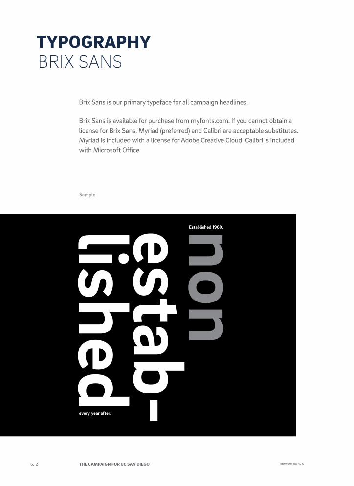
TYPOGRAPHYBRIX SANS
Sample
Brix Sans is our primary typeface for all campaign headlines.
Brix Sans is available for purchase from myfonts.com. If you cannot obtain a license for Brix Sans, Myriad (preferred) and Calibri are acceptable substitutes. Myriad is included with a license for Adobe Creative Cloud. Calibri is included with Microsoft Office.
Updated 10/17/176.12 THE CAMPAIGN FOR UC SAN DIEGO

Brix Sans Extra Light ABCDEFGHIJKLMNOPQRSTUVWXYZ abcdefghijklmnopqrstuvwxyz 123456789!@#$%^&*()-=_+
Brix Sans Light ABCDEFGHIJKLMNOPQRSTUVWXYZ abcdefghijklmnopqrstuvwxyz 123456789!@#$%^&*()-=_+
Brix Sans Regular ABCDEFGHIJKLMNOPQRSTUVWXYZ abcdefghijklmnopqrstuvwxyz 123456789!@#$%^&*()-=_+
Brix Sans Medium ABCDEFGHIJKLMNOPQRSTUVWXYZ abcdefghijklmnopqrstuvwxyz 123456789!@#$%^&*()-=_+
Brix Sans Bold ABCDEFGHIJKLMNOPQRSTUVWXYZ abcdefghijklmnopqrstuvwxyz 123456789!@#$%^&*()-=_+
Brix Sans Black ABCDEFGHIJKLMNOPQRSTUVWXYZ abcdefghijklmnopqrstuvwxyz 123456789!@#$%^&*()-=_+
Brix Sans Extra Light Italic ABCDEFGHIJKLMNOPQRSTUVWXYZ abcdefghijklmnopqrstuvwxyz 123456789!@#$%^&*()-=_+
Brix Sans Light Italic ABCDEFGHIJKLMNOPQRSTUVWXYZ abcdefghijklmnopqrstuvwxyz 123456789!@#$%^&*()-=_+
Brix Sans Regular Italic ABCDEFGHIJKLMNOPQRSTUVWXYZ abcdefghijklmnopqrstuvwxyz 123456789!@#$%^&*()-=_+
Brix Sans Medium Italic ABCDEFGHIJKLMNOPQRSTUVWXYZ abcdefghijklmnopqrstuvwxyz 123456789!@#$%^&*()-=_+
Brix Sans Bold Italic ABCDEFGHIJKLMNOPQRSTUVWXYZ abcdefghijklmnopqrstuvwxyz 123456789!@#$%^&*()-=_+
Brix Sans Black Italic ABCDEFGHIJKLMNOPQRSTUVWXYZ abcdefghijklmnopqrstuvwxyz 123456789!@#$%^&*()-=_+
Brix Sans font family
Updated 10/17/17 Typography 6.13

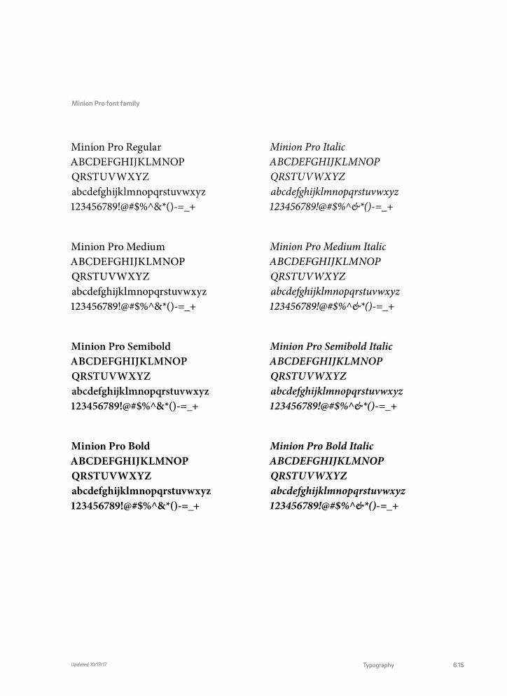
TYPOGRAPHYMINION PRO
Sample
Minion Pro is our recommended font for all campaign body copy. It is both elegant and versatile.
Minion Pro is available in both text and display versions. In most cases, use the text version when setting body copy. Never use Minion Pro in headlines: a sans serif such as Brix Sans is more reflective of the campus.
Minion Pro is included with a license for Adobe Creative Cloud. If you cannot obtain a license for Minion Pro, then Cambria is an acceptable substitute. Cambria is included with Microsoft Office.
In our relatively short history, we’ve developed a heritage of pursuing the greater good in most unconventional fashion. How? By approaching complex issues with wholly unexpected solutions. Like using cell phone records to predict and prevent global conflict. And developing clean-burning cookstoves as a means of reversing global warming trends. Through a determined pursuit to spark truly groundbreaking change, UC San Diego has earned recognition by the Washington Monthly as the nation’s top public university for positive impact for seven consecutive years.
Other noteworthy credentials include a top-15 ranking for research universities worldwide and being named one of America’s top 10 public universities. How we’ve done it is hardly a secret: long before “collaboration” and
“multidisciplinary” became academic buzzwords, we were not-so-quietly pioneering those actual practices. With faculty, researchers, and students, leaping forward in unison toward solutions in technology and health care that otherwise might have been missed. But not here, and not with our unorthodox approach.
Updated 10/17/176.14 THE CAMPAIGN FOR UC SAN DIEGO
Minion Pro Regular ABCDEFGHIJKLMNOP QRSTUVWXYZ abcdefghijklmnopqrstuvwxyz 123456789!@#$%^&*()-=_+
Minion Pro Medium ABCDEFGHIJKLMNOP QRSTUVWXYZ abcdefghijklmnopqrstuvwxyz 123456789!@#$%^&*()-=_+
Minion Pro Semibold ABCDEFGHIJKLMNOP QRSTUVWXYZ abcdefghijklmnopqrstuvwxyz 123456789!@#$%^&*()-=_+
Minion Pro Bold ABCDEFGHIJKLMNOP QRSTUVWXYZ abcdefghijklmnopqrstuvwxyz 123456789!@#$%^&*()-=_+
Minion Pro Italic ABCDEFGHIJKLMNOP QRSTUVWXYZ abcdefghijklmnopqrstuvwxyz 123456789!@#$%^&*()-=_+
Minion Pro Medium Italic ABCDEFGHIJKLMNOP QRSTUVWXYZ abcdefghijklmnopqrstuvwxyz 123456789!@#$%^&*()-=_+
Minion Pro Semibold Italic ABCDEFGHIJKLMNOP QRSTUVWXYZ abcdefghijklmnopqrstuvwxyz 123456789!@#$%^&*()-=_+
Minion Pro Bold Italic ABCDEFGHIJKLMNOP QRSTUVWXYZ abcdefghijklmnopqrstuvwxyz 123456789!@#$%^&*()-=_+
Minion Pro font family
Updated 10/17/17 Typography 6.15

Nontraditional photography. For us, that means using imagery that’s unexpectedly striking. For example, Geisel Library, the La Jolla Project, or a unique view of the world-class research we’re doing.
PHOTOGRAPHYIMAGE STYLE
Updated 10/17/176.16 THE CAMPAIGN FOR UC SAN DIEGO
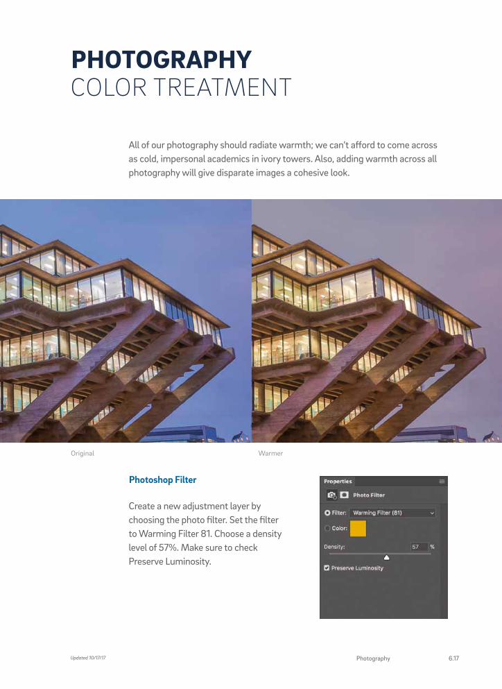
All of our photography should radiate warmth; we can’t afford to come across as cold, impersonal academics in ivory towers. Also, adding warmth across all photography will give disparate images a cohesive look.
PHOTOGRAPHYCOLOR TREATMENT
Photoshop Filter
Create a new adjustment layer by choosing the photo filter. Set the filter to Warming Filter 81. Choose a density level of 57%. Make sure to check Preserve Luminosity.
WarmerOriginal
Updated 10/17/17 Photography 6.17

The UC San Diego trident can be used as a window to reveal various campus-related photography or as a solid color.
Placement
As a rule, each visual should be anchored in one of the four corners of your page layout, with one of the three tines of the trident centered in the corner.
TRIDENT WINDOW
Photo Solid color
Updated 10/17/176.18 THE CAMPAIGN FOR UC SAN DIEGO

Cropping Images
When cropping imagery, be sure to provide enough context for the visual to be both recognizable and intriguing.
A GRAPHIC CROP Showcases an intriguing part of Geisel Library without revealing the full spectacle.
RIGHT AMOUNT OF CONTEXT Here, we see enough of the foreground to understand that the structure these people stand atop is the La Jolla Project.
NOT A GRAPHIC CROP We see Geisel Library in its entirety, leaving no room for discovery.
TOO LITTLE CONTEXT Sometimes tight crops don’t provide enough context, and the image loses meaning. Also be aware of placement of people and elements.
Need photography? Download photos from our image gallery at ucpa.ucsd.edu/ resources/image-library. For special photo requests, please contact Creative Services and Publications at [email protected].
Updated 10/17/17 6.19 Trident Window

“NON” WORDS OVERVIEW
Our campaign rallying cry is “Continue the nontraditon.” Which means you’ll be seeing a plethora of “non” words used across all campaign communications. Even in our headlines, “non” will always appear as lower case. To some people, “non” could imply something negative—but to us, “non” represents our unique, nonconventional way of viewing the world, which is always positive. The lowercasing can help alleviate some fear surrounding “non” words, while making us more approachable.
Continue thenontradition.
“non” should always appear in lowercase and be lighter in color than accompanying headline text.
Headline is left aligned with “non” outdented to the left.
Type set in Brix Sans Bold
Horizontal “non” type should always be the same size.
Main headline should be a 100% tint of a brand color or white.
Updated 10/17/176.20 THE CAMPAIGN FOR UC SAN DIEGO
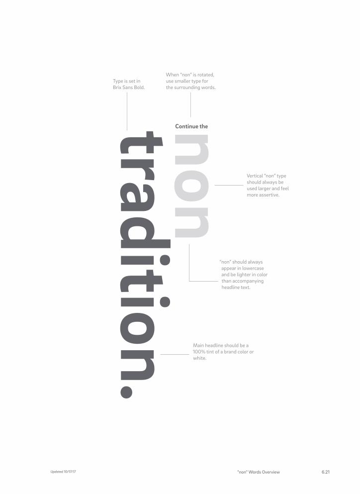
non tradition.
Continue the
Vertical “non” type should always be used larger and feel more assertive.
“non” should always appear in lowercase and be lighter in color than accompanying headline text.
When “non” is rotated, use smaller type for the surrounding words.
Main headline should be a 100% tint of a brand color or white.
Type is set in Brix Sans Bold.
Updated 10/17/17 "non" Words Overview 6.21

Here are some simple rules to help you become more familiar with how you should not use “non” words.
• Do not use “non” at 100% opacity of select color value of headline.
• Use only specified colors.
• Do not capitalize “non.”
• Do not outline the type.
• Do not underline the “non” word.
"Continue the nontradition" is not the campaign logo. Always include the logo on pieces that use "non" words.
“NON” WORDS USAGE
Updated 10/17/176.22 THE CAMPAIGN FOR UC SAN DIEGO

Horizontal "non" in text
Vertical "non" as headline
Updated 10/17/17 "non" Words Usage 6.23

CAMPAIGN STATIONERY LETTERHEAD AND ENVELOPES
For campaign-specific correspondence, we have developed a letterhead suite suitable for both printed and electronic communication. Printed letterhead includes an image of the library cropped with the trident window. The electronic version has been simplified and optimized for use in Microsoft Word.
For information on ordering campaign stationery, contact [email protected].
Campaign letterhead
Campaign #10 envelope
University of California San Diego • 9500 Gilman Drive # 0937 • La Jolla, California 92093-0937Tel: (858) 246-2400 • [email protected] • campaign.ucsd.edu
Continue the nontradition.
University of California San Diego9500 Gilman Drive # 0937La Jolla, California 92093-0937
Updated 10/17/176.24 THE CAMPAIGN FOR UC SAN DIEGO
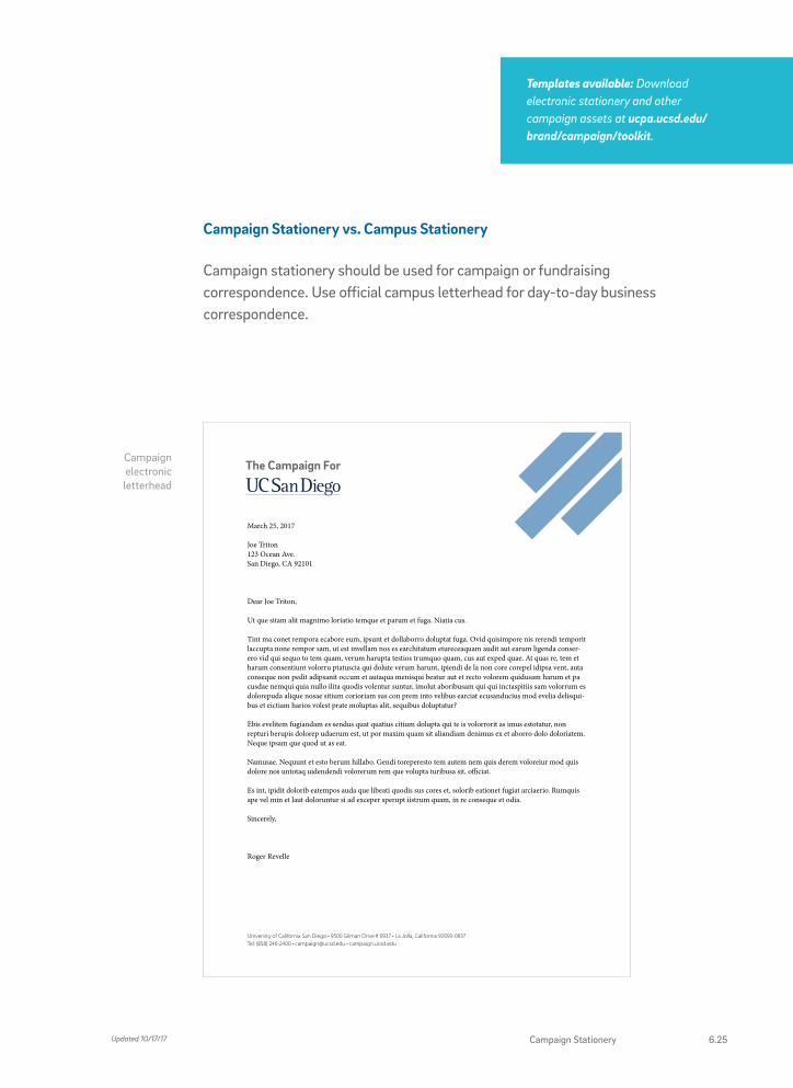
Campaign Stationery vs. Campus Stationery
Campaign stationery should be used for campaign or fundraising correspondence. Use official campus letterhead for day-to-day business correspondence.
University of California San Diego • 9500 Gilman Drive # 0937 • La Jolla, California 92093-0937Tel: (858) 246-2400 • [email protected] • campaign.ucsd.edu
March 25, 2017
Joe Triton 123 Ocean Ave. San Diego, CA 92101
Dear Joe Triton,
Ut que sitam alit magnimo loriatio temque et parum et fuga. Niatia cus.
Tint ma conet rempora ecabore eum, ipsunt et dollaborro doluptat fuga. Ovid quisimpore nis rerendi temporit laccupta none rempor sam, ut est invellam nos es earchitatum etureceaquam audit aut earum ligenda conser-ero vid qui sequo to tem quam, verum harupta testios trumquo quam, cus aut exped quae. At quas re, tem et harum consentiunt volorru ptatuscia qui dolute verum harunt, ipiendi de la non core corepel idipsa vent, auta conseque non pedit adipsanit occum et autaqua menisqui beatur aut et recto volorem quidusam harum et pa cusdae nemqui quia nullo ilita quodis volentur suntur, imolut aboribusam qui qui inctaspitiis sam volorrum es dolorepuda alique nosae sitium corioriam sus con prem into velibus earciat ecusanducius mod evelia delisqui-bus et eictiam harios volest prate moluptas alit, sequibus doluptatur?
Ebis evelitem fugiandam es sendus quat quatius citium dolupta qui te is volorrorit as imus estotatur, non repturi berupis dolorep udaerum est, ut por maxim quam sit aliandiam denimus ex et aborro dolo doloriatem. Neque ipsam que quod ut as eat.
Namusae. Nequunt et esto berum hillabo. Gendi toreperesto tem autem nem quis derem voloreiur mod quis dolore nos untotaq uidendendi volorerum rem que volupta turibusa sit, officiat.
Es int, ipidit dolorib eatempos auda que libeati quodis sus cores et, solorib eationet fugiat arciaerio. Rumquis ape vel min et laut doloruntur si ad exceper sperupt iistrum quam, in re conseque et odia.
Sincerely,
Roger Revelle
Campaign electronic letterhead
Templates available: Download electronic stationery and other campaign assets at ucpa.ucsd.edu/brand/campaign/toolkit.
Updated 10/17/17 Campaign Stationery 6.25

CAMPAIGN TEMPLATES PRINTED INVITATIONS
[Introduction]
Onec sed odio dui. Maecenas sed
diam eget risus varius blandit
sit amet non magna. Donec id
elit non mi porta gravida at eget
metus. Fusce dapibus, tellus ac
cursus commodo, tortor mauris
condimentum nibh, ut fermentum
massa justo sit amet risus. Etiam
porta sem malesuada magna mollis
euismod. Nulla vitae elit libero, a
pharetra augue.
Chancellor Pradeep K. Khosla invites you to
EVENT NAME GOES HEREMonday, Jan. 00, 2017 6:00–9:00 p.m.
Conrad Prebys Concert Hall University of California San Diego 9500 Gilman Dr, La Jolla, CA 92093
[Description] Luctus, nisi erat porttitor ligula, eget lacinia odio sem nec elit. [bold style] dolor sit amet, consectetur adipiscing elit. Sed posuere consectetur est at lobortis Sed posuere consectetur est at lobortis.
For more information, contact [name here] at, (858) 534-0000 or [email protected].
» Duis mollis, est non commodo luctus Duis mollis, est non commodo luctus
» nisi erat porttitor ligula, eget lacinia odio
» nisi erat porttitor ligula, eget lacinia odio
» sem nec elit. Lorem ipsum dolor sit amet nec elit. Lorem ipsum dolor sit amet
» nisi erat porttitor ligula, eget lacinia odio. Duis mollis, est non commodo luctus
» sem nec elit. Lorem ipsum dolor sit amet ne
» Duis mollis, est non commodo luctus
» nisi erat porttitor ligula, eget lacinia odio. Duis mollis, est non commodo luctus
DRIVING DIRECTIONS
[MAP AREA]
Help us continue the
Event Name Goes Here
Jan. 00, 2017
Invitation front
Invitation inside
For campaign-related events, we developed an easy-to-customize printed invitation template. To use, contact [email protected].
Updated 10/17/176.26 THE CAMPAIGN FOR UC SAN DIEGO

CAMPAIGN TEMPLATES ELECTRONIC INVITATIONS
Invitation front
Electronic invitation templates are available using Campaign Monitor. To get started, contact [email protected].
Templates available: Download campaign assets and templates at ucpa.ucsd.edu/brand/campaign/toolkit.
Updated 10/17/17 Campaign Templates 6.27

A6 folded thank you card front
A2 folded note card
front
Inside message
Thank you
Thank you for helping us continue the nontradition.
CAMPAIGN TEMPLATES NOTE CARDS
Folded note cards and matching envelopes are available in several sizes and styles. To use, contact [email protected].
Updated 10/17/176.28 THE CAMPAIGN FOR UC SAN DIEGO
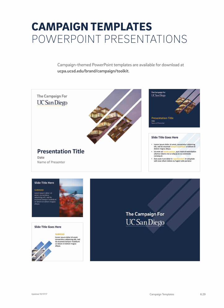
Campaign-themed PowerPoint templates are available for download at ucpa.ucsd.edu/brand/campaign/toolkit.
CAMPAIGN TEMPLATES POWERPOINT PRESENTATIONS
Updated 10/17/17 Campaign Templates 6.29

PRINTED COLLATERALBelow are examples of printed pieces using the campaign brand. For help creating custom collateral pieces, contact [email protected].
Case for Support folder and Unit Case one-sheets
Updated 10/17/176.30 THE CAMPAIGN FOR UC SAN DIEGO

Pole bannerDirect mail: the book of non
Updated 10/17/17 Printed Collateral 6.31

ADVERTISINGBelow are examples of print and digital advertising for the Campaign. For more information on our advertising efforts, contact [email protected].
nontradi-tion
Continue the
minds on track to advance human-kind. And so the Campaign for UC San Diego relies on the generous support of alumni and friends to help foster our current and future generations of artist, thinkers, and tinkerers. Join us. campaign.ucsd.edu
In our relatively short history, we’ve developed a heritage of pursuing the greater good in a most uncon-ventional fashion. You could even say our most cherished tradition is never blindly following tradition. Something that comes in handy when you want to change the world. Of course, sheer determination and insatiable curiosity alone aren’t enough to keep 40,000 motivated
Two-page campaign announcement ad
Updated 10/17/176.32 THE CAMPAIGN FOR UC SAN DIEGO
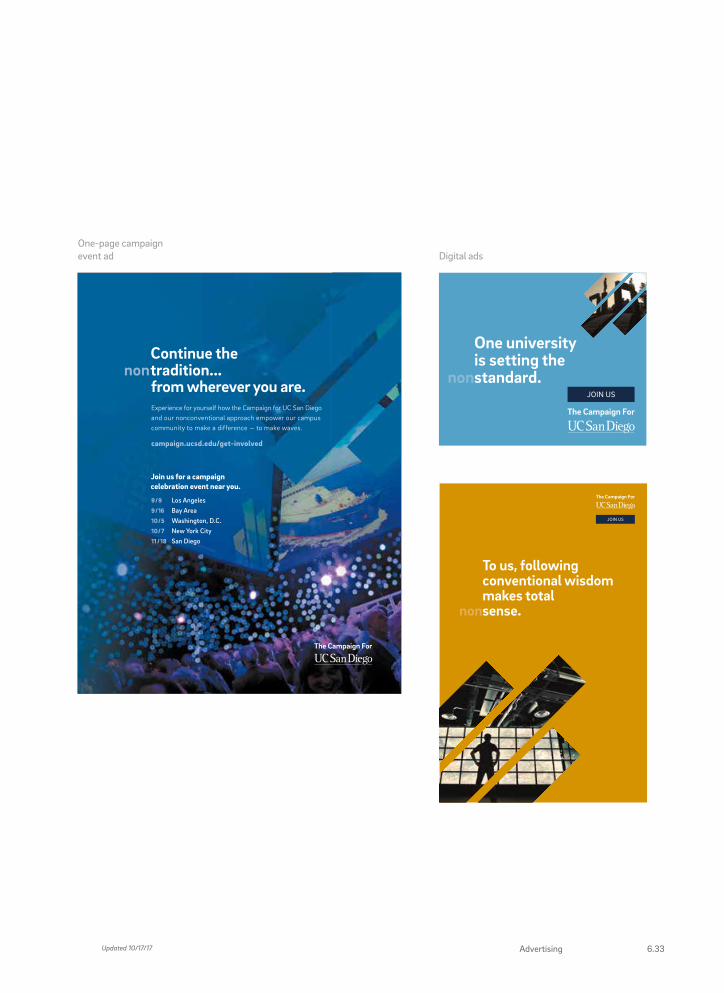
9/9 Los Angeles9/16 Bay Area10/5 Washington, D.C.10/ 7 New York City11 /18 San Diego
Join us for a campaign celebration event near you.
Continue thenontradition... from wherever you are.
Experience for yourself how the Campaign for UC San Diego and our nonconventional approach empower our campus community to make a difference — to make waves.
campaign.ucsd.edu/get-involved
Regional Celebration full-page Triton Mag ad - 8.25 x 10.75”
One-page campaign event ad Digital ads
One university is setting the nonstandard.
JOIN US
Updated 10/17/17 6.33Advertising

VIDEOTo transition from frame to frame, a simple trident overlay moves into the frame and expands to reveal the next scene. As text fades onto screen, the “non” prefix remains semitransparent and slides into place next to the adjoining word.
Updated 10/17/176.34 THE CAMPAIGN FOR UC SAN DIEGO

The trident window is used as a transition between images in the video. It starts small and slides in from one corner before expanding to fill the screen.
As the main type fades onto the screen, our “non” prefix slides into place but remains screened at less than 100% opacity.
Updated 10/17/17 Video 6.35