usability and accessibility of the "e-learning cafe" platform
TRANSCRIPT

Analysis of the "e-learning café“ platform
The analysis took place in the CERTIC department of UTAD

Analysis of the "e-learning café“ platform
• To test the accessibility of the site the following technologies were used:– morse code reader; – head mouse; – touch screen; – eye movement reader; – head pointer;
• The usability was evaluated performing:– user tests;

Analysis of the "e-learning café“ platform
• Morse code reader– the menu options are too close and have a narrow
selection area:• very difficult to select the options in the menu bars;• it requiers to much precision from the user;

Analysis of the "e-learning café“ platform
• Eye movement reader– the menu bars are very close and narrow:
• the device doesn’t read the movement alterations ;
Analysis of the "e-learning café“ platform
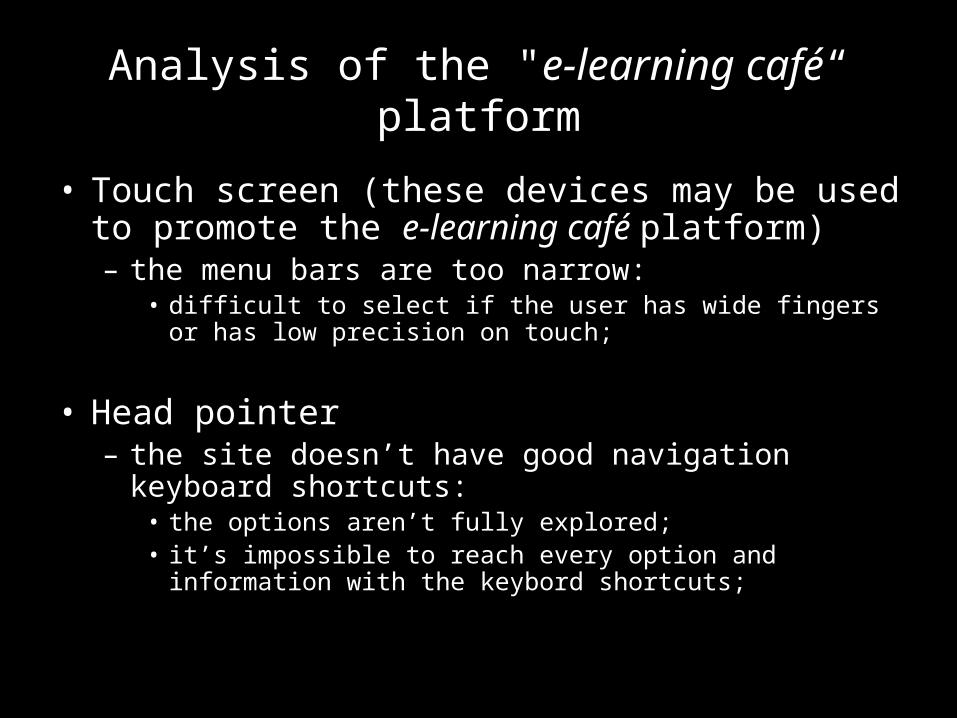
• Touch screen (these devices may be used to promote the e-learning café platform)– the menu bars are too narrow:
• difficult to select if the user has wide fingers or has low precision on touch;
• Head pointer– the site doesn’t have good navigation keyboard
shortcuts:• the options aren’t fully explored;• it’s impossible to reach every option and information with the
keybord shortcuts;

Head Pointer

Analysis of the "e-learning café“ platform
• Head Mouse– it’s impossible to do execute "drag and drop“
operations with this device:• the site has many options with this function;
– in order to read the vertical menu, the user has to turn his head to the right:
• involuntarily, the mouse will also flow to the right;
– the site proved to be very complicated to navigate with this tool:
• causes physical disconfort to the user;

Head Mouse

Analysis of the "e-learning café“ platform
• The user tests revealed some flaws in usability standards:– there are menus where the mouse arrow turns into a
handler (common indicator of a link) but when you click the option, it doesn´t lead you to a new page, it performs simply a actionscript behavior;
– in the forum option, the user has to fill out a form in case he wants to leave a message, if any errors occur during the validation, all the information the user had previously given will disapear;

Analysis of the “e-learning café“ platform
– the vertical menus were very hard to read: by instinct the user turns his head to the left in order to read the vertical information. In this case the user has to turn his head to the right in order to be able to read the information in the menu bars;