usability in multimedia - … · designing a good user interface can be a ... jakob nielsen’s 10...
TRANSCRIPT

By Pınar Koçer Aydın and
Özgür Bayram
Usability in Multimedia
1

OUTLINE:
Part 1: What is usability and what it isn’t
Part 2: Jakob Nielsen’s 10 principles
Part 3: The user experience testing
Part 4: Application of usability design (beyond the theory)
2

Part 1: What is usability and what it isn’t.
3
What is the difference between usability and functionality?
4

Functionality ensures that the product behaves according to the functional requirements and does not take into consideration design principles.
5
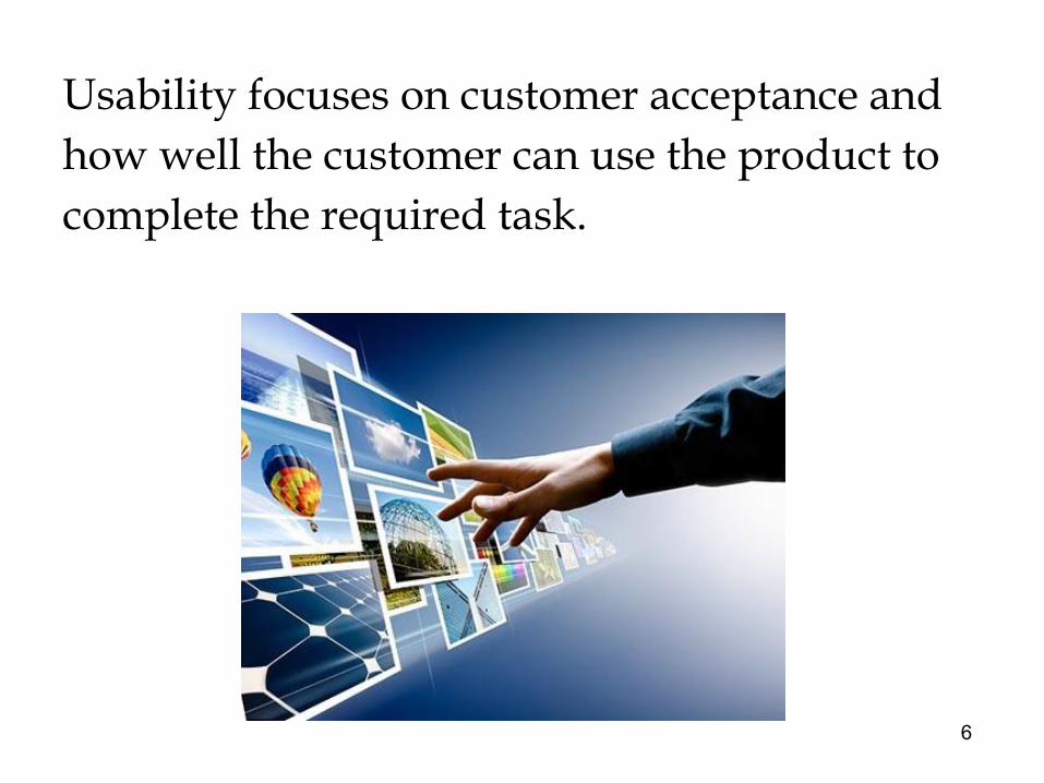
Usability focuses on customer acceptance and how well the customer can use the product to complete the required task.
6

NOW TIME FOR A QUICK POLL
https://directpoll.com/r?XDbzPBdEt8j1rJ2TlSKR5uPGtipU7g8dCOBd1Rsa0S
7

Where functionality requires the mindset of “CAN I do what I need to do, does this product work?” Usability is more about the mindset “HOW can I do what I need to do, does this make sense?”
8

The definition of usability in the ISO 9241 standard is:
"The extent to which a product can be used by specified users to achieve specified goals with effectiveness, efficiency, and satisfaction in a specified context of use"
9

NOW TIME FOR A QUICK POLL
10

Although usability can survive without multimedia, it is not possible for multimedia to achieve it’s full potential without the efficient use of usability.
11

Multimedia provides us with richer forms of representing information but this does not mean it will have good usability.
12

Designing a good user interface can be a juggling act. By trying to make the interface pleasing to the eye, functionality and ease of use might be impaired.
13

A good user interface is one that allows the user to carry out their intended actions efficiently and effectively, without causing too much of a distraction.
The best UIs aren’t the most in-your-face spectacular designs, but rather the ones that work subtly in the background to allow users to complete their tasks with ease.
14
Part 2: Jakob Nielsen’s 10 Usability Heuristics for User Interface Design
15

Jakob Nielsen
16

"the king of usability" (Internet Magazine)
"the guru of Web page usability" (The New York Times)
"the world's leading expert on Web usability" (U.S. News & World Report)
"one of the world's foremost experts in Web usability" (Business Week)
"the reigning guru of Web usability" (FORTUNE)
"perhaps the best-known design and usability guru on the Internet" (Financial Times)
17

NOW TIME FOR A SHORT VIDEO
18

The system should always keep users informed about what is going on, through appropriate feedback within reasonable time.
1. Visibility of system status
19

Visibility of system status
20

The system should speak the users' language, with words, phrases and concepts familiar to the user, rather than system-oriented terms. Follow real-world conventions, making information appear in a natural and logical order.
2. Match between system and the real world
21

Match between system and the real world
22

Users often choose system functions by mistake and will need a clearly marked "emergency exit" to leave the unwanted state without having to go through an extended dialogue. Support undo and redo.
3. User control and freedom
23

User control and freedom
24

Users should not have to wonder whether different words, situations, or actions mean the same thing.
4. Consistency and standards
25

Consistency and standards
26

Even better than good error messages is a careful design which prevents a problem from occurring in the first place. Either eliminate error-prone conditions or check for them and present users with a confirmation option before they commit to the action.
5. Error prevention
27

Error prevention
28

Minimize the user's memory load by making objects, actions, and options visible. The user should not have to remember information from one part of the dialogue to another. Instructions for use of the system should be visible or easily retrievable whenever appropriate.
6. Recognition rather than recall
29

Recognition rather than recall
30

Accelerators -- unseen by the novice user -- may often speed up the interaction for the expert user such that the system can cater to both inexperienced and experienced users. Allow users to tailor frequent actions.
7. Flexibility and efficiency of use
31

Flexibility and efficiency of use
32

Dialogues should not contain information which is irrelevant or rarely needed. Every extra unit of information in a dialogue competes with the relevant units of information and diminishes their relative visibility.
8. Aesthetic and minimalist design
33

Aesthetic and minimalist design
34

Error messages should be expressed in plain language (no codes), precisely indicate the problem, and constructively suggest a solution.
9. Help users recognize, diagnose, and recover from errors
35

Help users recognize, diagnose, and recover from errors
36

Even though it is better if the system can be used without documentation, it may be necessary to provide help and documentation. Any such information should be easy to search, focused on the user's task, list concrete steps to be carried out, and not be too large.
10. Help and documentation
37

Help and documentation
38

Now please enter our course on ITS Learning and find out if you have read the following article through a feature on the system which tells you:‘Redundancy Effect’ (2012) by Yavuz Samur which was posted during the course.
The usability of ITS Learning
39

ITS learning - Ayşegül Pamukçu
40

Ayşegül Pamukçu: Itslearning is a beneficial online tool for sharing information with both advantages and disadvantages. It is highly practical regarding automatic assessment, instant feedback and designing your own materials. The system is user-friendly in terms of error prevention since it asks you if you are sure to delete an item when you click «delete» button. There are some features of the system which we have been trying to develop and update. For instance, the system does not accept apostrophes and spaces in the students’ answers all the time when it comes to tests. Also, the feature of finding a file by searching it on the system is weak because it also gives you many results you are not searching for. If you do not use a specific program to embed a ppt, students can not navigate through the ppt without downloading it first. Bottom line, it is a practical program which is developing day by day.
41

Part 3: User experience testing
42

What is meant by the user experience?
How do you feel when using ITS Learning?
How do you feel when using Facebook?
43

“The first requirement for an exemplary user experience is to meet the exact
needs of the customer, without fuss or bother. Next comes simplicity and
elegance that produce products that are a joy to own, a joy to use.
True user experience goes far beyond giving customers what they say they
want, or providing checklist features. In order to achieve high-quality user
experience in a company’s offerings there must be a seamless merging of
the services of multiple disciplines, including engineering, marketing,
graphical and industrial design, and interface design.”
Don NormanFounder of the UX term and partners with Jakob Nielsen in Nielsen Norman Group
44

For a good user experience, multimedia should hold the following characteristics:
Source: Peter Morevillehttp://semanticstudios.com/user_experience_design/ 45

Even if the usability for finding a film is perfect, the user experience (UX) will be poor for a user who wants information about a small independent release if the underlying database only contains movies from the major studios.
Jakob Nielsen
46

NOW TIME FOR A SHORT VIDEO
47

Part 4: Application of usability design (beyond the theories)
48
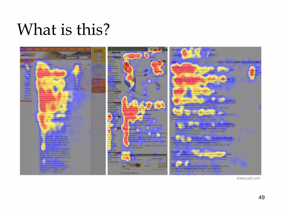
What is this?
49

There are detailed scientific tests and research on how people use multimedia and how best to meet their needs. The previous slide shows that people read web sites in an F shape form.
50

What appears at the top of the page vs. what’s hidden will always influence the user experience. Users do scroll, but only if what’s above the fold is promising enough.
The page fold
51

We don’t go to a page, see useless and irrelevant content, and scroll out of the blind hope that something useful may be hidden 5 screens down.
What we find at the top of the page helps us decide to continue scrolling, navigate to another page, try another site, or abandon the task altogether.
52

Is this a good design? (the fold)
53

How about this?
54

NOW TIME FOR A QUICK TEST
55
And finally, a short activity you are all familiar with.
56