usability interview report - john yesko
TRANSCRIPT

Usability Interview ReportSITENAME Intranet
COMPANY Pharmaceutical Products, Inc.
15 October 2004

1SITENAME Usability Interview Report
Overview During the week of September 13, 2004, closerlook conducted usability interviews with several
COMPANY employees from various departments.
The goals of the sessions were to learn:
• how employees typically use SITENAME
• what areas or features are used most often
• what kinds of problems users encounter while working with the site
Key insights from the sessions are detailed below. In addition, all of the observations in our previous
document User Experience Audit (June 2003) were confi rmed by the usability interviews and still
hold true. Therefore, topics covered in that review are generally not repeated here. The exceptions
are specifi c subjects about which additional insights have been gained in the usability sessions.
Interested parties should review User Experience Audit in concert with this report to understand the
complete assessment of SITENAME.
SITENAME Home page

2SITENAME Usability Interview Report
Nine sessions were held, with participants of the following titles:
1. Senior Marketing Purchasing Assistant
2. Marketing Exhibit Services (group of 8)
3. Contracts
4. Director of R&D Operations
5. MIS, Sales
6. Prevacid Sales Representative
7. Human Resources Business Consultant
8. VP of Finance
9. Senior Administrative Assistant
The average reported frequency of use of SITENAME was one to three times per day. Answers
ranged from “a couple times a week” to “many times throughout the day.”
Participants

3SITENAME Usability Interview Report
The SITENAME extranet is used in two primary ways:
1. Core Departmental ApplicationsMany departments at COMPANY have their own custom applications within SITENAME. Typically
these are tools that employees use on a very regular basis–often daily–to perform their core tasks.
One example is the “Territory Manager,” which fi eld sales reps use to track sales performance, trends,
physician prescribing information, etc.
\
Another example is the Exhibit Services group within Marketing, which has a few applications that
they use daily, including tools for COMAC maintenance, job tracking, and exhibit site management.
In most cases, these tools have been developed by department-specifi c or central MIS staff, in
concert with the particular group that will be using the tools. By and large, this collaboration seems to
have resulted in useful applications that are customized to the workfl ow of the particular department.
While these applications are critical to the daily work of a small set of COMPANY employees, they are
of little interest to the general employee population.
Usage Patterns
\
Territory Manager within Sales area
4SITENAME Usability Interview Report
For these reasons, we are considering the usability of these tools to be beyond the scope of
closerlook’s analysis of SITENAME. Understanding how employees use these applications is
helpful background information. However, the details of how each tool works do not substantially
affect the overall usability of SITENAME, which is our main area of focus for this engagement. Each
department’s suite of custom tools would easily be a project in itself, with its own potential task
analysis, user experience, information architecture, etc.
2. General Interest AreasThe parts of SITENAME outside of the departmental applications can be considered of general
interest to all employees. These features are used by employees regularly, but not as the core
components of their jobs. They are typically information sources, rather than interactive tools.
Some examples include human resources information (benefits, payroll, etc.), calendars, employee
directories, and communications from corporate. There seem to be very few cases where an
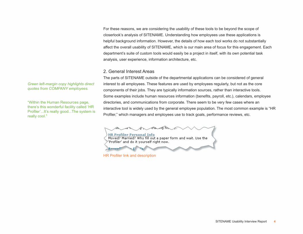
interactive tool is widely used by the general employee population. The most common example is “HR
Profiler,” which managers and employees use to track goals, performance reviews, etc.
HR Profiler link and description
“Within the Human Resources page, there’s this wonderful facility called ‘HR Profiler’...It’s really good...The system is really cool.”
Green left-margin copy highlights direct quotes from COMPANY employees.

5SITENAME Usability Interview Report
By far the most common feedback in our usability test sessions was that users had difficulty finding
information. One result is a perceived lack of information on SITENAME. This, in turn results in
a perceived lack of relevance of the site. Clearly there is a tremendous amount of information
on SITENAME, and countless individuals have spent a lot of time publishing it. However, while a
particular nugget of information may very well be available on the site, if users can’t find it, it may as
well not be there.
There are several reasons why users have trouble finding information on SITENAME:
Departmental vs. General InterestIn the discussion above, we point out the two main types of information on SITENAME–
“departmental” and “general interest.” Users of the site understand the difference. After all, it’s easy
for them to distinguish among applications they need every day, content they occasionally access,
and information that doesn’t really apply to their work at all.
The problem is that SITENAME is generally not organized to reflect this distinction. Content that
is published or distributed from a particular COMPANY department is found in that department’s
“bucket,” whether it’s of general interest to all employees or an esoteric feature used only by that
department. Rather than organizing content according to user needs–which is the optimal model–this
system arranges content according to the COMPANY corporate structure.
Information Finding
“There are very few people who know that in SITENAME we have online training...it’s in the MIS area. Normally there would be no reason for you to go in that area. Everything has become very departmentalized...and in doing so, everything is lost.”
“There’s a lot of information on SITENAME, it’s just not well organized.”

6SITENAME Usability Interview Report
Misplaced ContentPerhaps the most glaring shortcoming of the general interest
content on SITENAME is simply the difficulty locating it.
Beyond the “general interest vs. departmental” issues
mentioned previously, content is often buried several layers
deep, and/or placed in areas where users do not expect to find
it.
This confusing organization is apparent immediately on the
home page. On the right side, the links are listed under four
main headings. While one of the headings is “Directories,” the
item “COMPANY Hotel Preferred Directory” does not reside
under it.
As another example, the area “iNav” on SITENAME is a legacy, somewhat freestanding repository of
regulatory documents. These documents may be better placed in other areas, but their placement in
“iNav” forces users to check more than one place when trying to find them.
Confusing grouping
(Speaking about phone information)“It’s so buried down in Finance, why would someone come in and look for phone things in Finance?”
(Speaking about iNav)“We would all love to have one place to find the same kind of information. Put all my guidelines in one place.”
“The reality is that SITENAME isn’t the first thing that comes to my mind when someone asks me a question, because it always seems to be such a problem finding stuff, so I’ll go somewhere else before I go here.”
7SITENAME Usability Interview Report
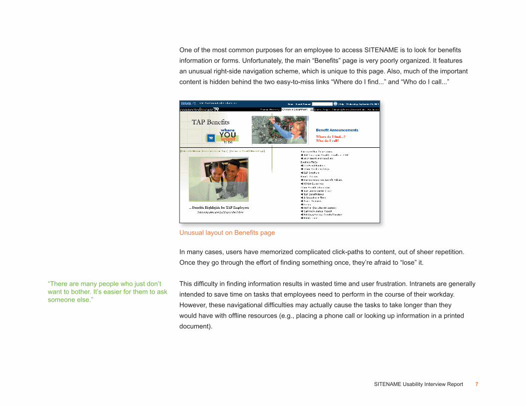
One of the most common purposes for an employee to access SITENAME is to look for benefi ts
information or forms. Unfortunately, the main “Benefi ts” page is very poorly organized. It features
an unusual right-side navigation scheme, which is unique to this page. Also, much of the important
content is hidden behind the two easy-to-miss links “Where do I fi nd...” and “Who do I call...”
In many cases, users have memorized complicated click-paths to content, out of sheer repetition.
Once they go through the effort of fi nding something once, they’re afraid to “lose” it.
This diffi culty in fi nding information results in wasted time and user frustration. Intranets are generally
intended to save time on tasks that employees need to perform in the course of their workday.
However, these navigational diffi culties may actually cause the tasks to take longer than they
would have with offl ine resources (e.g., placing a phone call or looking up information in a printed
document).
Unusual layout on Benefi ts page
“There are many people who just don’t want to bother. It’s easier for them to ask someone else.”

8SITENAME Usability Interview Report
Unclear LabelingIntuitive labeling of sections and links is one key to users’ ability to move efficiently through a website.
On SITENAME, there are many labels that are vague or misleading.
The result is the same as discussed above–user frustration and slow task completion.
The home page headings mentioned above (“Resources,”
“Departments,” “Directories” and “Sales Toolkit”) fall into this
category as well. Because the heading names are so vague,
users can not understand or predict which will contain a
particular link. Consequently, the groupings are essentially
arbitrary. This shortcoming is exacerbated by the expanding-
and-collapsing structure of those four areas, as users have
to guess which bucket to expand, hoping it will contain the
link they’re looking for.
Vague labels
Unclear section headers
“Relizon...It sounds like a drug name.”

9SITENAME Usability Interview Report
RedundancyLinks to many content pages are repeated in several sections of the site. While some redundancy
is expected, it seems to be extreme on SITENAME. This repetition causes a few different problems.
First, users can become confused, thinking when they see a second or third occurrence of a particular
link, that it actually leads to different content than the first time. Again, wasted time is the result as
employees click to the same page over and over again. In our usability interviews for SITENAME,
this often happened when users were having trouble finding a piece of content. After an initial
unsuccessful visit to a certain page, they would see another promising link elsewhere, only to find that
it led to the same page.
Also, the redundancy of links adds unnecessary clutter to pages. On a site that is already very link-
heavy, every opportunity should be taken to simplify the interface. Finally, link redundancy adds to
an overall sense of disorganization. It seems that the owners of the site weren’t sure where to place
the links, and repeated them in several place in an attempt to cover all bases. Users who experience
it tend to be “turned off” by the site in general, and walk away with negative impressions of the
company at large.

10SITENAME Usability Interview Report
The perception of many of our interviewees was that
the content on SITENAME is outdated. Therefore,
even when they were able to successfully find a
piece of information, its accuracy was considered
questionable to them. SITENAME contains an
immense amount of information, but employees
seemed that they would trade the breadth of informaton for timeliness.
One very prominent example is the
Calendar. When the user first clicks on
it and sees the company-wide month
view, no events show up. While clicking
around the calendar does reveal some
department-specific entries, the overall
perception was that it was not being
maintained. If employees check this
calendar once or twice and find that it
isn’t up to date, they’re unlikely to ever
go there again. In fact, many users
stated just that–they simply don’t use
this calendar.
The recently-developed newsletter Tapline seems to be the only part of SITENAME that users
count on for timely news or updates. Otherwise, they tend to depend more on Lotus Notes for this
information. In fact, Tapline is also available through Lotus Notes, and many users reported accessing
it from there rather than SITENAME.
Abandoned Content
Empty calendar
“What bugs me [is that] web pages for individual departments are not kept up to date...This person has not been with the company for–oh gee–two years. I hate that. I’m not sure what value these web pages add.”
“When it’s not kept up to date, it’s confusing. It’s erroneous information.”
(Speaking about Tapline)“I think it’s important that we do have some means of communication to pull in the field people with the home office. There’s not too much information there, which is a good thing.”

11SITENAME Usability Interview Report
SITENAME has a few tools that, while well-intentioned, are difficult to use. Therefore, they are simply
not used by the vast majority of employees. The most visible example is the left side of the Home
page. The two features “My SITENAME Links” and “My Department” are intended to provide some
level of personalization on the Home page. However, their operation is a mystery to most users.
Those who actually had links set up under “My Department” usually reported that they were there
already when they got their computer–they did not set them up themselves and didn’t know how to.
Virtually no user had any links set up under “My SITENAME Links.” The reason is clear–the method
for creating the links is very difficult to find. The key happens to be the small “My Links+” link at the
top right of interior pages. But since there’s no reference to that on the Home page, and it is named
differently than the feature is on the Home page, users have no idea. To learn this secret, employees
would have to wade deep into the “Help” content, or select the “My Links+” link on a whim.
Challenging TechnicalFeatures
“My SITENAME Links” feature and the hard-to-find key to it

12SITENAME Usability Interview Report
Another feature that doesn’t work optimally is Search. While using it is simple enough, users reported
search results as being generally unhelpful. The Search feature often could not find documents that
were known to be on the site, even when their titles were typed in precisely. Several users stated that
they never use the Search function because it hasn’t worked properly in the past.“I think the search engine is pretty weak. That’s critically important.”
(Speaking about Search)“I have tried it in the past, but it hasn’t worked, so I’ve given up.”
13SITENAME Usability Interview Report
While the following usability observations are not as critical as those above, they are worth noting.
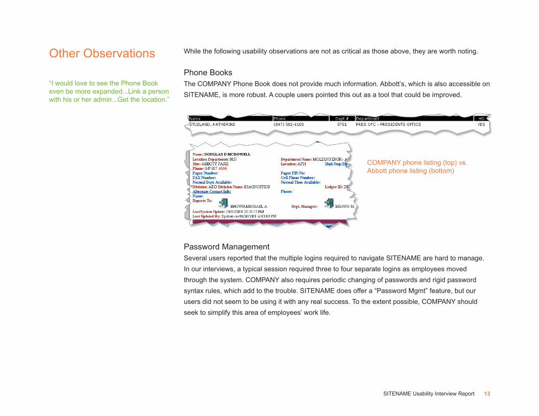
Phone BooksThe COMPANY Phone Book does not provide much information. Abbott’s, which is also accessible on
SITENAME, is more robust. A couple users pointed this out as a tool that could be improved.
Password ManagementSeveral users reported that the multiple logins required to navigate SITENAME are hard to manage.
In our interviews, a typical session required three to four separate logins as employees moved
through the system. COMPANY also requires periodic changing of passwords and rigid password
syntax rules, which add to the trouble. SITENAME does offer a “Password Mgmt” feature, but our
users did not seem to be using it with any real success. To the extent possible, COMPANY should
seek to simplify this area of employees’ work life.
Other Observations
COMPANY phone listing (top) vs.Abbott phone listing (bottom)
“I would love to see the Phone Book even be more expanded...Link a person with his or her admin...Get the location.”

14SITENAME Usability Interview Report
TrainingVery little training or orientation on the SITENAME site is being done with new employees. Most users
reported finding their way around the site themselves, or informally getting tips from co-workers.
While training would be helpful, a better-organized site would eliminate much of the need for it.
The exception is use of core departmental applications, where employees need (and seem to be
receiving) specialized training.
AccessOutside users with dial-up Web accounts report very slow performance on SITENAME. There are a
myriad of technical issues that could be contributing to this problem. However, users with broadband
Internet connections seemed to be satisfied with the site’s performance.
NameThere has been some discussion of changing the name “SITENAME.” When asked, only one of our
participants expressed any feedback about the name, and she was fairly neutral about it. The name
is also very-well socialized throughout COMPANY–everyone uses the name and know what it is.
Therefore, little justification to change the name seems to exist.
Graphic DesignUsers’ opinions of the graphic design of SITENAME was very neutral. No one seemed to like it or
dislike it strongly, although a few employees suggested that an update would be in order.
“COMPANY is a good company, but not when it comes to training.”
15SITENAME Usability Interview Report
Based on our usability interviews, the overall recommendation for improving SITENAME is the same
as that described in the User Experience Audit of June, 2003. SITENAME would benefit greatly from
a comprehensive user-centered re-design with the following goals:
• enhance clarity and consistency of navigation and search
• organize the site around employee needs and usage patterns
• strengthen the credibility of the site (and by extension, COMPANY) by providing accurate,
up-to-date information
closerlook’s Information Architecture and Graphic Design processes will begin to address these goals
in our next set of project deliverables.
Usability Recommendations