user-interface design for air-travel booking: a … · user-interface design for air-travel...
TRANSCRIPT

Copyright © 2000 by Aaron Marcus and Associates, Inc., www.AmandA.com , Page 1
User-Interface Design for Air-Travel Booking:A Case Study of Sabre
Aaron Marcus, PresidentAaron Marcus and Associates, Inc., California and New York, USA
CA Tel: 510-601-0994, CA Fax: 510-547-6125, Email:[email protected], Web:
ABSTRACTThe paper explains the development of the Sabre air travelbooking user-interface design, which transformed a text-based frame-oriented legacy system into a graphical versionused by one-third of the world's travel agents. Designexplorations, issues, and resolutions are discussed.
KeywordsUser interface, design, Sabre, travel
INTRODUCTIONIn 1994, Sabre contacted Aaron Marcus and Associates,Inc. (AM+A), to assist in the development of revolutionarychanges to the Sabre air travel booking system, one of theworld's largest private online systems, which wasoriginally created in the 1970s. This case study summarizesthe design of some parts of the user interface (UI) during along, complex, often challenging, but interesting series ofdesign tasks during 1994-99. In many ways, thedevelopment process was exemplary, involving all of thestandard procedures: planning, research, analysis, design,evaluation, documentation, and training. Among the propersteps, interesting mis-steps occurred; some of these arediscussed below.
The development of a user interface requires the analysisof the business model, marketing and engineering needs,the user environment, the user's personas, roles, objectives,goals, and tasks. Ultimately, the design team must designthese essential components:
- Metaphors: Concepts via words, images, sounds, tactileexperience
- Mental models: Organization of data, functions, tasks,roles, people
- Navigation: Movement through content and tools,dialogue
- Interaction: Input/output techniques, feedback
- Appearance: Visual, auditory, tactile characteristics
The earliest phase of AM+A's efforts involved metaphordesign, in which the Planet Sabre concept emerged,represented on the home page by a full-screen image of aworld with large icons representing primary applications.One of these was an airplane that stood for air travelbooking. This paper primarily concerns the design of thismission-critical air booking application, from which Sabrederives most of its income. The design of the user interfacefor this application was intended to serve as a product-identity standard for approximately 18 other applications.
SABRE AND TRAVEL-MARKET BACKGROUND
Sabre, originally part of American Airlines until itseparated in 1998, publishes travel data and enablesbooking of travel. Max Hopper of American Airlinesoriginally set up the Sabre (Semi-Automated Business-Related Environment) system in 1973-76 on mainframecomputers in Oklahoma, with a backup duplicate in NewEngland. Upgrades in the software have taken placecontinuously over the last 25 years.
In 1996, Sabre users on 120,000 terminals around theworld did $970 million in air bookings. The systemreceived up to one billion hits per day to 42 terabytes ofdetailed data about almost every airplane in the air, as wellas car rentals and hotel reservations. The data is suppliedby the airline, car rental, and hotel rental informationproviders, which have varying update frequencies, dataformats, and business relations with Sabre. The Sabresystem is available in six languages: English, Spanish,French, German, Portuguese, and Italian. Sabre runsreservations, plus the world-travel infrastructure, e.g.,maintenance of schedules. Every commercial plane thattakes off sends a signal to Sabre's computers. The systemis able to deal with high volume of data traffic, security,and complexity. Unfortunately, the history of its evolutionmakes it also difficult, costly, and risky to change. Thesystem was character-based, oriented to private dial-up,with few local-area network features, but graduallyimplemented a Windows 3.1 and Windows 95 interimgraphical application front-ends to the database. Bydeveloping a generalized data streaming (GDS) technique,Sabre was able to move in the late 1990s to a radicallydifferent, more interactive, more graphical approach.
Some background of Sabre in the travel industry ishelpful to understand the context of the user-interfacedesign for Planet Sabre. There are three distributionchannels for Sabre's information: large and small travelagencies (under 15 persons), corporate officess (in-house,group, and individual), and consumers (families andindividuals). The development of Planet Sabre primarilyaimed at the agencies and corporate offices. Travelocityemerged as a consumer online access to Sabre data, with farfewer functions than were available to professionals.
At the time of the initiation of the project, Sabre and itsmain competitors, Galileo and Amadeus, approximatelysplit the world market for travel agency informationprovision, with Worldspan a trailing player and with manylocal national players, e.g., in Japan. All of these systemswere moving to graphical user-interface solutions. In the

Copyright © 2000 by Aaron Marcus and Associates, Inc., www.AmandA.com , Page 2
meantime, Sabre, newly becoming a software developmentcompany, not an adjunct internal data processing center toan airline, sought to leap ahead of its competitors with avery innovative approach, which was risky, because, amongother factors, it would alter the familiar way travel agentsinteracted with "Mother Sabre." There were other pressureson travel agents in the late 1990s: fee caps imposed by theairlines led to legal action by the agencies, and agencyowners wanted more productive workers with lower payscales. Travel agents as intermediaries felt threatened bydirect consumer booking via the Web. In reinventing theproduct, and specifically its user interface, Sabre was tryingto improve its relation to its customers, the travel agencies.The current online system involved users (travel agencyemployees) as subscribers as well as associates (airlines, carrental companies, and hotels) who supply and "advertise"data. Both groups, who contribute income to Sabre, mustbe accommodated in the user interface.
Sabre's objectives included: dramatically changing theair booking process, lowering help-desk calls, developing abest-of-class product, enabling agencies to achieve costsaving, and increasing revenue from airlines.
Technical and marketing requirements included:converting a command-line UI to a graphical UI, becomingeasy to use, satisfying power users, enhancing airlinedifferentiation for marketing, and satisfying corporatecustomers (time-sensitive booking) as well as leisurecustomers (budget-sensitive) booking.
Constraints included: complying with internationalgovernment regulations, not overwhelming the hostcomputer, being Internet- and global-ready, andaccomodating 14-inch monitors, 256 colors, and typicalhost data transfer loads.
The development team structure was similar to otherproduct developments and included the client, designers,engineers, and other contractors. AM+A provided 3-4designer/analysts and Macromedia Lingo scripters, whobuilt the prototype UI designs. Two independent travelagents near AM+A and approximately 4 Sabre staff servedas subject matter experts. Sabre provided approximately 4in-house and contracted usability analysts andapproximately 40 mainframe and Java programmers. Thework primarily took place at AM+A's offices in Californiaand New York and at Sabre's headquarters at the Dallas-FortWorth Airport in Texas.
DEVELOPMENT PROCESSThe previous design is shown in Figure 1. A typical screenshowed 24 lines by 80 character frame-based views ofportions of the data. Travel agents had to memorizeapproximately 125 non-intuitive alphanumeric codes toretrieve the data. Like many systems dating from the early1970s, the data was organized to suit database needs, notuser task flows.
AM+A interviewed many Sabre staff and travel agents.Two travel agents "lived" in AM+A's offices half-time forone month so that AM+A staff could interview them andobserve them in detail. AM+A acted almost as industrialanthropologists and archeologists to find out how Sabre
had evolved over 25 years, with minimal manuals availableand no demo versions available to outsiders. For example,no one at Sabre could provide a data dictionary of thesystem, although they were sure there was one somewhere.
During a multi-year engagement, AM+A studied users;wrote analysis and recommendation reports; designedscreens, step-through "slide shows" and interactiveprototypes using Macromedia Director; and wrote/designedguidelines and specifications, including Web-basedversions, which were then immediately posted andavailable to all members of the development team. Bydirect decision of the Sabre project management, who weremarketing representatives, AM+A had relatively littlecontact with engineering. AM+A's assigned designobjective was to think "out of the box" and design whatwas innovative and appropriate to the users, but stillfeasible. Sabre intended to confer with engineeringseparately, and eventually implement the practical versionof the designs. A predictable "bump in the road" camewhen the almost final designs were investigated byengineering, as noted below.
In the early stages of content analysis, AM+A observedthe plethora of functionality, discovered what seemed to bethe essential functions of the product (the key data analysisand booking elements), and helped to uncover secondaryfunctions (booking bins or "shopping carts" of possibleitineraries). In all stages of discovery, the team looked for"WIIFMs" (what's in it for me?) that might provideunexpected utility or appeal benefits to users at low cost todevelopment. An example was the ability of users to movegraphically by direct manipulation an animated icon of aperson from one seat to another in a diagrammaticdepiction of the plane interior. This seemed to delightusers.
The design process went through four main cycles:initial, extension, redesign, and documentation. Thefundamental metaphors became clear: space, time, money,and circumstances (i.e., key secondary attributes, such asseat location, size of aircraft, etc.). Sabre conductedindependent formal task analyses, using in-house staff aswell as Jenny Redisch Associates, to study fifteen USAtravel agencies. AM+A used two local travel agents tostudy their work process and to critique AM+A iterativedesigns, from high-level concepts to detailed widgets.These two persons represented two genders, two strong pro-and con- technology orientations, and two strong pro- andcon-geography orientations (need for and use of maps).AM+A's focused UI design goal was to combine schedules,fares, and rules into one screen rather than the disparatelocations of the previous version of Sabre. Thedysfunctional previous situation was described with theanalogy of shopping in a supermarket and finding that allof the products were for sale in the aisles, but all of theprices were located somewhere else in the store.
The initial design quickly demonstrated the generalsolution to metaphors, mental model, navigation,interaction, and appearance. These demos that AM+Adesigned and built enabled Sabre to convey the design tostakeholders and to obtain feedback. Task analysis then

Copyright © 2000 by Aaron Marcus and Associates, Inc., www.AmandA.com , Page 3
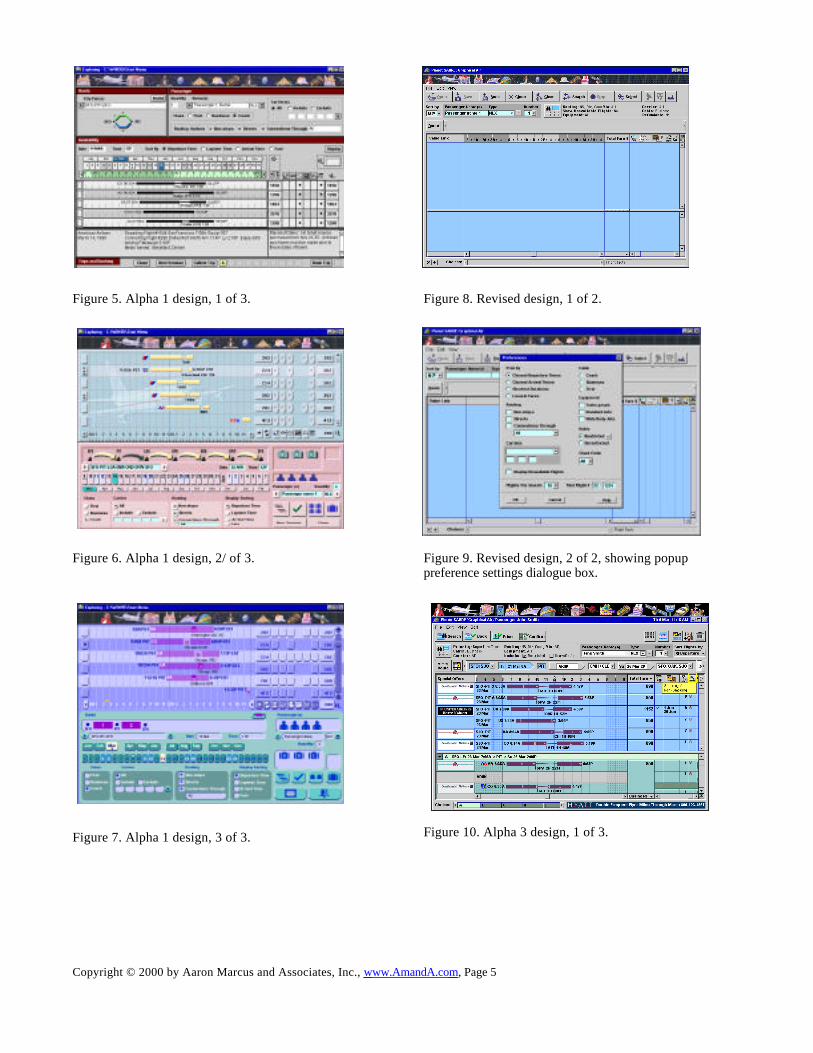
drove further refinements, especially to the mental modeland navigation. As stated earlier, Sabre preferred that therebe initially few technical constraints on design solutions inorder to explore the design space of what might/shouldhappen, not what must happen. The designs emphasizeddirect manipulation and standard best practices of graphicalUI design. Figures 2-7 show examples of air travel datavisualization, initial step-through, and Alpha 1 designs.
AM+A devised many information-visualizationtechniques to show time, spatial routing, and fare/ticketingattributes. Such charts, maps, and diagrams enabled users,in theory, to examine patterns of data more effectively.After discussions with travel agents, it became apparentthat many of these information-visualization techniqueswere "nice, but not necessary." They did not provide thesought-for WIIFMs for travel agents, who wished to bookquickly, i.e, to use, not appreciate data. As is apparent inFigure 4, the primary visualization technique that provedvaluable was the display of airline and travel timelines,which could show (eventually, as indicated in later figureslike Figure 14) individual airline logos (as an extraadvertisement paid for by airlines), travel duration, size ofaircraft, direct/non-direct trip segments, and take-off/landing times.
The intial step-throughs helped potential usersunderstand the new visualization of work flow. A cartoonballoon added to the screen in Figure 4 was an earlyattempt to conveyed the presumed dialogue protocol.
The Alpha 1 designs (Figures 5-7) explored different layoutdetails. Note the early attempts in Figure 5 to depictremnants of a map/geography symbolism, which was laterexpressed simply as a horizontal linear widget in Figures 6and 7. Different color schemes also appeared, includingAmerican Airlines corporate colors (red) until Sabreseparated from that airline. Many strongly colored versionswere tried. Users as well as Sabre staff expressedpreferences, and these influenced, but did not completelydetermine later design decisions, which focused on mutedcolors, minimal color highlights, and a neutral gray colorscheme. In the design-style environment of 2000,influenced by Apple's iMac candy colors, AM+A's earliercolor palettes might have fared differently.
Refining and extending the design were the next twophases (Figures 8-12). Figures 8-9 show later designs thatadded functions to the existing framework and perfectedthe workflow details. AM+A continually revised thedesigns, seeking to optimize how both novice and expertusers could be accommodated. This was accomplished inpart by designing a data entry field for initial flight datathat could use the command entry text formats known toolder users. The system would construct graphical widgetson the fly in which both novice and expert users couldcontinue interaction. See for example the long horizontalwidget above the flight bars in Figure 10.
DOCUMENTATION AND EVALUATIONRegarding documentation: One of AM+As tasks was toname, define, and illustrate all the new controls and otherobjects in the UI. To achieve co-ordinated development,
AM+A constructed a graphical object dictionary andcirculated the document among all developers. AM+A alsodeveloped an interactive specifications document that couldbe posted on the Web and could provide developers withthe latest version of evolving standards.
Sabre and AM+A conducted evaluations with focusgroup meetings in which users were able to view concretevisualizations of the product. Sabre also was able to use theinitial prototypes to secure appropriate additional fundingfrom top management, and feedback from the airlines. Thefeedback from users determined that the intial designs hadtoo much overview and drill-down from general to specificdata. Agents preferred to move quickly to a data point thenbranch out.
Sabre conducted extensive videotaped and annotatedusability tests in North America, Europe, and LatinAmerica with the later designs. Note that interactiveMacromedia Director-based prototypes with small demodatabases were sufficient to gain crucial comprehension,memory, and performance results. Reports from these testscontinued to influence the designs, particularly with thedilemmas of accommodating novice and expert users whowere not/were familiar with either Microsoft Windows orSabre's applications suite. When Sabre achieved 80% of itsusability goals, in terms of good comprehension and lackof mistakes, they would decide to move on to other issues.
TWO MAJOR DETOURS, THEN FINAL DESIGNSA major detour in development occurred when technical
constraints required some changes to account for likely hostsoftware response times and database construction.Engineering had finally been able to make its voice heardsufficiently. Sabre implementors analyzed the feasability ofthe design and proposed changes. Fortunately, the reviseddesign was able to quickly account for these changes withsome additional buttons and further refinements in layout,as shown in Figure 13. AM+A continually defended itsdesigns against work-arounds that would compromise thequality of the air booking application and its role as astandard for others in the suite of approximately 18 otherapplications that would base their approach on the premiereapplication.
Another significant detour was the, at the time, startlingaddition to screen real estate of special-offer marketingmessages by Sabre's associates, the air, car, and hotelvendors. From the viewpoint of the Web in 2000, it iscommonplace for ads to appear in every possible screenlocation, but Sabre's applications were emerging from text-based mainframe applications to graphical UI performanceapplications. This new component was like inserting apopup advertisement by Nike just because the user hadtyped the word "shoes" in editing a word-processing file.The design was able to absorb this communicationcomponent, also. Sabre tested the users' tolerance formarketing messages and found that it made good businesssense from both of its "customers," the informationproviders and the users. The space available and the tone ofthe ads changed. What began as small items of messages inFigure 10 and 13 became larger areas in Figure 14.

Copyright © 2000 by Aaron Marcus and Associates, Inc., www.AmandA.com , Page 4
The final design (Figure 14), harmoniously balanced allforces of business, marketing, engineering, users,information providers, usability analysts, and UI designers.The application was rolled out in August 1999. Salesfigures and other data about user reactions areunderstandably proprietary and not available to the authorat this time. The UI design of the air booking applicationhas continued, nevertheless, to influence other applications,such as ticketing, cruises, seat selection (Figure 15), etc.
CONCLUSIONSThe Sabre project offered an independent user-interfacedesign team an unusually fine, long-term opportunity tocontribute to the development of an innovative product.Outstanding in the process was the leadership shown by theSabre team, in particular Michael Sites of Sabre, inplanning for, funding, and conducting the necessary stepsof user analysis and usability testing of designs, untilpreviously specified usability goals were achieved.
Many compromises became necessary when all business,engineering, marketing, and design/communicationrequirements were taken into account. Nevertheless, AM+Abelieves it was able to keep overall UI design quality highthrough effective planning for the design process, use ofrapid prototypes, and continuous ongoing mutuallyrespectful discussions, explanations, and occasionallyheated debates with other team members. AM+A feels itwas able to accomplish innovative approaches to the designof metaphors, mental models, navigation, interaction, andappearance that led to break-throughs in usability andacceptance in the user experience of a world-class product.
ACKNOWLEDGEMENTSThe author acknowledges current and former members ofAM+A, including John Armitage, Lynne Ching, KevinDeLaere, Volker Frank, Edward Guttman, WolfgangHeidrich, Jo Ann Pacho, Tony Sokolowski, BethanySmith, Pamela Tien, Andrew Thompson, and Karl Wieser.
The author would also like to thank Sabre travel agentsDavid Smith and Ellen Ben Shalom. Finally, the authorthanks and acknowledges Sabre staff who made thisproject possible, including Leslie Cahill, Kevin Gutekunst,Mike De la Hoz, Ken Keim, James Kinnard, Michael Sites,Daria Slivka, and Chuck Thackston. In addition numerousother contractors to AM+A and Sabre are acknowledged.
REFERENCESMarcus, Aaron, “Global User-Interface Design for theWeb,” in Stephanidis, Constantine, Ed., User Interfacesfor All, Lawrence Erlbaum Associates, Inc., 2000, in press.
Marcus, Aaron, Graphic Design for ElectronicDocuments and User Interfaces, Addison-Wesley, ReadingMA, 1992, ISBN 0-201-10745-7.
Marcus, Aaron, “Chapter 19: Graphical User Interfaces,”in Helander, M., Landauer, 0 T.K., and P. Prabhu, P.,Eds., Handbook of Human-Computer Interaction, ElsevierScience, B.V., The Hague, Netherlands, 1997, ISBN 0-444-4828-626, pp. 423-44.
Wildbur, Peter, and Michael Burke, InformationGraphics: Innovative Solutions in Contemporary Design,
Thames and Hudson, London, 1999, ISBN 0-500-28077-0.Contains extensive AM+A project figures, including Sabre.
FIGURES
Figure 1. Typical original Sabre text screen.
Figures 2 and 3. Intial air data visualizations.
Figure 4. Initial step-through prototype.
Copyright © 2000 by Aaron Marcus and Associates, Inc., www.AmandA.com , Page 5
Figure 5. Alpha 1 design, 1 of 3.
Figure 6. Alpha 1 design, 2/ of 3.
Figure 7. Alpha 1 design, 3 of 3.
Figure 8. Revised design, 1 of 2.
Figure 9. Revised design, 2 of 2, showing popuppreference settings dialogue box.
Figure 10. Alpha 3 design, 1 of 3.

Copyright © 2000 by Aaron Marcus and Associates, Inc., www.AmandA.com , Page 6
Figure 11. Alpha 3 design, 2 of 3, showing new Bins.
Figure 12. Alpha 3 designs, 3 of 3, showing popupdialogue box of Total Fare Breakdown.
Figure 13. Redesign
Figure 14. Final Design
Figure 15. Seat Selection application.

Copyright © 2000 by Aaron Marcus and Associates, Inc., www.AmandA.com , Page 7