user manual - genevestigator · curated and quality controlled public and private gene expression...
TRANSCRIPT

User Manual
May 2018

Page | 1
Chapter 1 Introduction to GENEVESTIGATOR® 4
1.1 What is GENEVESTIGATOR®? 4
1.1.1 The concept of meta-profiles 4
1.1.2 Software components 6
1.1.3 Requirements 6
1.2 Types of analysis 7
1.3 User interface of the analysis tool 8
1.4 Analysis workflow 8
1.4.1 Get Started 9
1.4.2 Organism and data selection 10
1.4.3 Selecting genes of interest 14
1.4.4 Tool selection 18
1.5 Viewing results 19
1.5.1 The different type of plots 19
1.5.2 Visualization of the expression in log or linear scales 21
1.5.3 Expression potential and signal background 21
1.5.4 Meaning of "absolute" expression values in GENEVESTIGATOR® 21
1.5.5 Working with multiple selections 22
1.5.6 Editing copying or deleting an existing selection 22
1.5.7 Additional information about experiments or genes 23
1.5.8 Displaying different gene model 23
Chapter 2 SINGLE EXPERIMENT ANALYSIS 24
2.1 The Samples tool 24
2.1.1 Getting started 24
2.1.2 Features 24
2.1.3 Statistics 25
2.2 The Differential Expression tool 25
2.2.1 Getting started 26
2.2.2 Features 27
2.2.3 Statistics 28
Chapter 3 COMPENDIUM WIDE ANALYSIS: CONDITION SEARCH TOOLS 29
3.1 Overview of CONDITION SEARCH TOOLS 29
3.2 General features available for the CONDITION SEARCH TOOLS 29
3.2.1 Detailed view and experimental / clinical parameters 29
3.2.2 HELP button 30
3.3 The Anatomy tool 30

Page | 2
3.3.1 Getting started 30
3.3.2. Features 30
3.3.3. Statistics 31
3.4 The Cell Lines tool 32
3.4.1 Getting started 32
3.4.2 Features 32
3.4.3. Statistics 32
3.5 The Cancers tool 33
3.5.1 Getting started 33
3.5.2 Features 34
3.5.3. Statistics 34
3.6 The Perturbations tool 36
3.6.1 Getting started 36
3.6.2 Features 36
3.6.3 Statistics 38
3.7 The Development tool 38
3.7.1 Getting started 38
3.7.2 Features 39
Chapter 4 COMPENDIUM WIDE ANALYSIS: GENE SEARCH TOOLS 40
4.1 Overview of GENE SEARCH TOOLS 40
4.2 GENE SEARCH across Anatomy, Cell Lines, Cancers and Development 40
4.2.1 Getting started 40
4.2.2 Features 42
4.2.3 Statistics 43
4.3 GENE SEARCH across Perturbations 43
4.3.1 Getting started 43
4.3.2 Features 44
4.3.3 Statistics 45
4.4 The RefGenes tool 46
4.4.1 Getting started 47
4.4.2 Features 48
4.4.3 Statistics 48
4.5 The Ortholog Search tool 48
4.5.1 Getting started 48
4.5.2 Features 48
4.5.3 Statistics 50
Chapter 5 COMPENDIUM WIDE ANALYSIS: SIMILARITY SEARCH TOOLS 52

Page | 3
5.1 The Hierarchical Clustering tool 52
5.1.1 Getting started 52
5.1.2 Features and Statistics 53
5.2 The Co-Expression tool 54
5.2.1 Getting started 54
5.2.2 Features 55
5.2.3 Statistics 57
5.3 The Signature tool 57
5.3.1 Getting started 57
5.3.2 Features 59
5.3.3 Statistics 60
5.4 The Biclustering tool 60
5.4.1 Getting started 61
5.4.2 Features 61
5.4.3 Statistics 62
5.5 The Gene Set Enrichment tool 64
5.5.1 Getting started 64
5.5.2 Features 65
5.5.3 Statistics 66
5.5.4 Alternative use case 66
Chapter 6 Saving results and exporting figures & data 67
6.1 Saving workspaces 67
6.2 Exporting figures 67
6.3 Exporting data from figures 68
6.4 Exporting entire studies or data compendia 69
Chapter 7 Data normalization for microarray 70
7.1 Data normalization in GENEVESTIGATOR® 70
Chapter 8 Expression quantification for RNA sequencing data 72
8.1 Meaning of expression values 72
8.2 Computation of expression values 72
Chapter 9 Quality control 73
9.1 General principles and goal 73
References 74
Page | 4
Chapter 1
Introduction to GENEVESTIGATOR®
1.1 What is GENEVESTIGATOR®?
GENEVESTIGATOR® is an innovative search engine to investigate in a single analysis gene
transcriptional regulation across thousands of experimental conditions. It nicely summarizes data by
condition types such as tissues, cancers, diseases, genetic modifications, external stimuli, or
development (see Chapter 3) based on the concept of meta-profile as described below (Chapter 1.1.1).
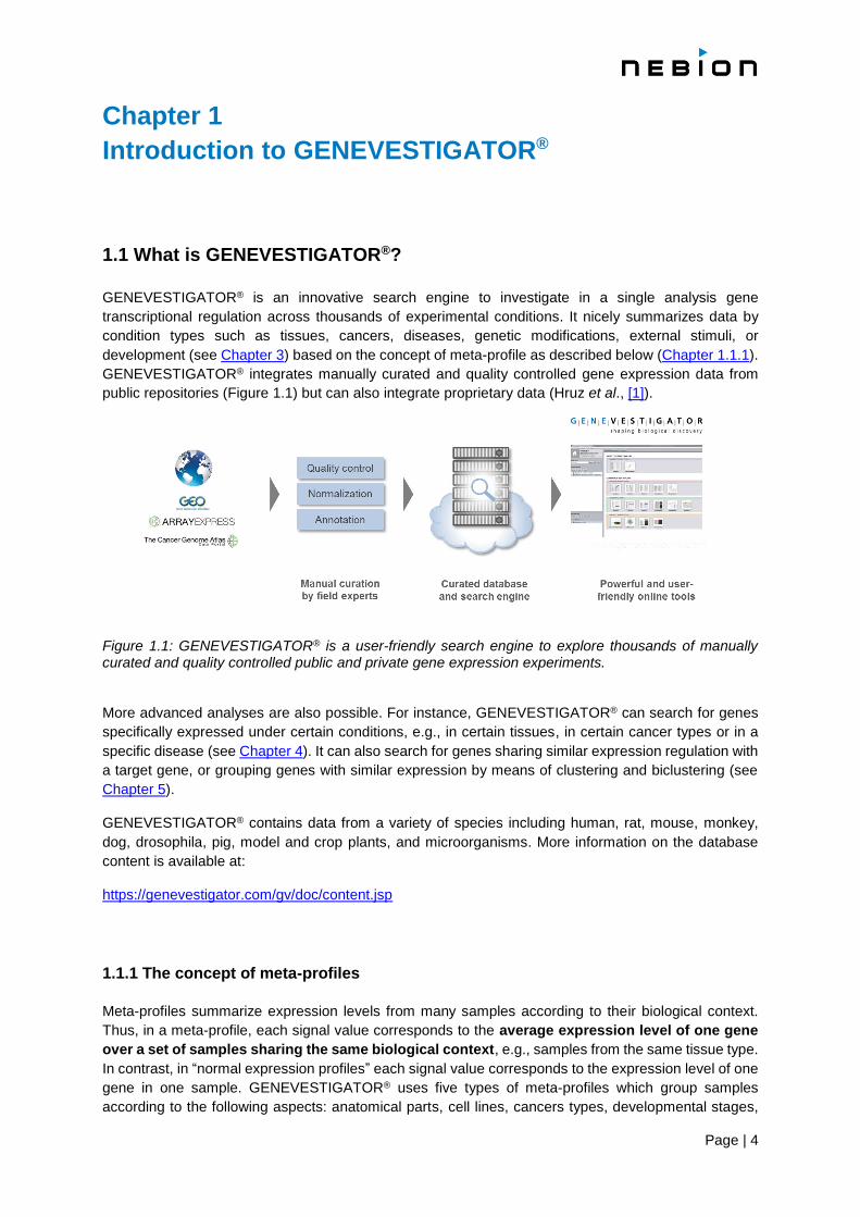
GENEVESTIGATOR® integrates manually curated and quality controlled gene expression data from
public repositories (Figure 1.1) but can also integrate proprietary data (Hruz et al., [1]).
Figure 1.1: GENEVESTIGATOR® is a user-friendly search engine to explore thousands of manually curated and quality controlled public and private gene expression experiments. More advanced analyses are also possible. For instance, GENEVESTIGATOR® can search for genes
specifically expressed under certain conditions, e.g., in certain tissues, in certain cancer types or in a
specific disease (see Chapter 4). It can also search for genes sharing similar expression regulation with
a target gene, or grouping genes with similar expression by means of clustering and biclustering (see
Chapter 5).
GENEVESTIGATOR® contains data from a variety of species including human, rat, mouse, monkey,
dog, drosophila, pig, model and crop plants, and microorganisms. More information on the database
content is available at:
https://genevestigator.com/gv/doc/content.jsp
1.1.1 The concept of meta-profiles
Meta-profiles summarize expression levels from many samples according to their biological context.
Thus, in a meta-profile, each signal value corresponds to the average expression level of one gene
over a set of samples sharing the same biological context, e.g., samples from the same tissue type.
In contrast, in “normal expression profiles” each signal value corresponds to the expression level of one
gene in one sample. GENEVESTIGATOR® uses five types of meta-profiles which group samples
according to the following aspects: anatomical parts, cell lines, cancers types, developmental stages,

Page | 5
and perturbations types. The “Perturbations” meta-profile comprises responses to various experimental
conditions (drugs, chemicals, hormones, etc.), diseases, and genotypes. All samples in the database
are annotated according to these biological dimensions. For each meta-profile, the summarization leads
to a matrix of genes versus categories as shown below (Figure 1.2).
Figure 1.2: Schematic representation of the meta-profile concept. Expression values from a large number of samples (top) are summarized into meta-profiles (bottom) according to their annotations.
Most categories are populated with several samples, thereby providing a robust estimate for the
expression of genes within these categories. An analysis based on meta-profiles requires that sample
signal values are comparable between the different experiments and, generally, between laboratories.
Several lines of evidence support the validity of the summarization into meta-profiles as performed in
GENEVESTIGATOR®. For example, Prasad et al. [2] demonstrated that transcriptome variations due to
the tissue of origin are much larger than the variations due to perturbations or lab effects. Therefore,
summarizing tissue-specific expression by grouping data from various experiments provides a relatively
good estimate for the expression level of a gene in a given tissue. Likewise, good representative
expression meta-profiles can be obtained for development, cell lines and cancers. For the
“Perturbations” meta-profile, however, results are created by comparing groups of samples from
individual experiments. Data from multiple experiments are not mixed to create a single value. As a
result, this tool contains large compendia of response types collected from many experiments.
Page | 6
1.1.2 Software components
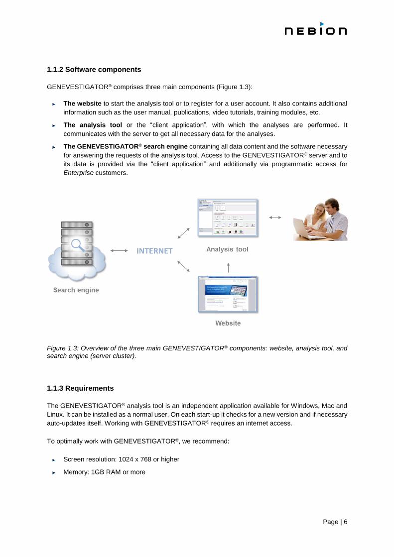
GENEVESTIGATOR® comprises three main components (Figure 1.3):
The website to start the analysis tool or to register for a user account. It also contains additional
information such as the user manual, publications, video tutorials, training modules, etc.
The analysis tool or the “client application”, with which the analyses are performed. It
communicates with the server to get all necessary data for the analyses.
The GENEVESTIGATOR® search engine containing all data content and the software necessary
for answering the requests of the analysis tool. Access to the GENEVESTIGATOR® server and to
its data is provided via the “client application” and additionally via programmatic access for
Enterprise customers.
Figure 1.3: Overview of the three main GENEVESTIGATOR® components: website, analysis tool, and search engine (server cluster).
1.1.3 Requirements
The GENEVESTIGATOR® analysis tool is an independent application available for Windows, Mac and
Linux. It can be installed as a normal user. On each start-up it checks for a new version and if necessary
auto-updates itself. Working with GENEVESTIGATOR® requires an internet access.
To optimally work with GENEVESTIGATOR®, we recommend:
Screen resolution: 1024 x 768 or higher
Memory: 1GB RAM or more

Page | 7
1.2 Types of analysis
In GENEVESTIGATOR® analyses can be performed at two “data levels”:
SINGLE EXPERIMENT ANALYSIS: to visualise the expression of genes across individual experiments
(Samples tool see Chapter 2.1) or to quickly and easily analyse a particular experiment
(Differential Expression tool, see Chapter 2.2)
COMPENDIUM-WIDE ANALYSIS: to easily visualise the expression across thousands of experiments
in a single analysis (see Chapters 3, 4 and 5)
The COMPENDIUM-WIDE ANALYSIS consists of three toolsets allowing specific types of queries (Figure 1.4):
CONDITION SEARCH TOOLS to easily find out which conditions regulate up to 400 genes of interest
(see Chapter 3)
GENE SEARCH TOOLS to search the entire content for genes that are specifically expressed in a
chosen set of conditions (a specific tissue type, cell line, cancer type, or perturbation) (see Chapter
4). It also contains the RefGenes tool to find the best reference genes for normalizing RT-qPCR
experiments (see Chapter 4.4) and the Ortholog Search tool to quickly find the most likely
functional ortholog across species (see Chapter 4.5)
SIMILARITY SEARCH TOOLS to find relationships between genes. This toolset groups various tools
for Hierarchical clustering and Biclustering, Co-expression and Gene Set Enrichment
analyses and Signature search. It focuses on the identification of groups of genes having similar
expression profiles within a dataset, or conditions having similar expression signatures (see
Chapter 5)
Figure 1.4: The three toolsets of the COMPENDIUM-WIDE ANALYSIS in GENEVESTIGATOR®. A: the CONDITION SEARCH TOOLS help you find conditions regulating your genes of interest. B: the GENE SEARCH
TOOLS help you find genes having specific expression profiles, such as biomarkers. C: the SIMILARITY
SEARCH TOOLS help you interpret your results and infer regulatory networks.

Page | 8
1.3 User interface of the analysis tool
The interface of the GENEVESTIGATOR® analysis tool has the following main components (Figure 1.5):
1. “Home” button and field indicating the toolset currently in use e.g., SINGLE EXPERIMENT TOOLS
2. “Data Selection” panel holding folders containing the selected biological samples
3. “Gene Selection” panel holding all folders containing the genes of interest that you entered
4. Tabs to select analysis tools within a toolset
5. Tool overview and results panel where the result of an analysis is displayed
Figure 1.5: Main components of the user interface. 1) “Home” button, 2) “Data Selection” panel, 3) “Gene Selection” panel, 4) Tabs for tools, and 5) Tool overview and results panel. Note: The Cell Lines and Cancers tools are specific for the biomedical community.
1.4 Analysis workflow
The entire curated gene expression data content of GENEVESTIGATOR® can be explored all at once
or only a subset of it can be used. Typically, an analysis runs on a choice of data and genes consisting
of n samples and m genes. This [m x n] matrix defining experimental conditions and genes is the basis
for most types of analyses. The results are produced from the combination of data from this matrix and
sample annotation information (meta-data). The choice of working with the entire content or only a
subset depends on the type of biological questions to be answered (Figure 1.6.). For example, to check
how five genes respond to the complete compendium of drugs, two selections must be created:
1. All samples (n)
2. The five genes (m) of interest
The following sections provide more details about each step.

Page | 9
Figure 1.6: Different types of analysis can be done depending on the type and volume of the content selected.
1.4.1 Get Started
By clicking on the “GET STARTED” button a dialogue listing the main uses cases will open (Figure 1.7).
On the right panel instructions on how to perform the selected analysis (highlighted in blue in the left
panel) can easily be followed.
Figure 1.7: “GET STARTED” button and dialogue. The left panel displays a list of the main use cases. The right panel contains some information and instruction on how to perform the selected analysis.
Page | 10
1.4.2 Organism and data selection
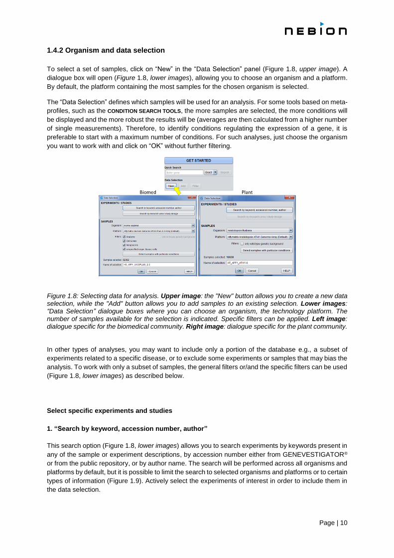
To select a set of samples, click on “New” in the “Data Selection” panel (Figure 1.8, upper image). A
dialogue box will open (Figure 1.8, lower images), allowing you to choose an organism and a platform.
By default, the platform containing the most samples for the chosen organism is selected.
The “Data Selection” defines which samples will be used for an analysis. For some tools based on meta-
profiles, such as the CONDITION SEARCH TOOLS, the more samples are selected, the more conditions will
be displayed and the more robust the results will be (averages are then calculated from a higher number
of single measurements). Therefore, to identify conditions regulating the expression of a gene, it is
preferable to start with a maximum number of conditions. For such analyses, just choose the organism
you want to work with and click on “OK” without further filtering.
Figure 1.8: Selecting data for analysis. Upper image: the "New" button allows you to create a new data selection, while the "Add" button allows you to add samples to an existing selection. Lower images: “Data Selection” dialogue boxes where you can choose an organism, the technology platform. The number of samples available for the selection is indicated. Specific filters can be applied. Left image: dialogue specific for the biomedical community. Right image: dialogue specific for the plant community.
In other types of analyses, you may want to include only a portion of the database e.g., a subset of
experiments related to a specific disease, or to exclude some experiments or samples that may bias the
analysis. To work with only a subset of samples, the general filters or/and the specific filters can be used
(Figure 1.8, lower images) as described below.
Select specific experiments and studies
1. “Search by keyword, accession number, author”
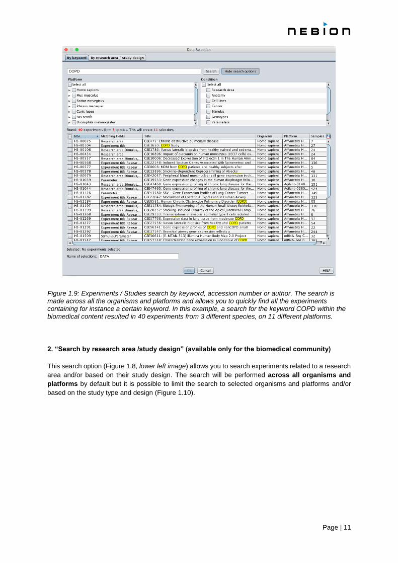
This search option (Figure 1.8, lower images) allows you to search experiments by keywords present in
any of the sample or experiment descriptions, by accession number either from GENEVESTIGATOR®
or from the public repository, or by author name. The search will be performed across all organisms and
platforms by default, but it is possible to limit the search to selected organisms and platforms or to certain
types of information (Figure 1.9). Actively select the experiments of interest in order to include them in
the data selection.
Page | 11
Figure 1.9: Experiments / Studies search by keyword, accession number or author. The search is made across all the organisms and platforms and allows you to quickly find all the experiments containing for instance a certain keyword. In this example, a search for the keyword COPD within the biomedical content resulted in 40 experiments from 3 different species, on 11 different platforms.
2. “Search by research area /study design” (available only for the biomedical community)
This search option (Figure 1.8, lower left image) allows you to search experiments related to a research
area and/or based on their study design. The search will be performed across all organisms and
platforms by default but it is possible to limit the search to selected organisms and platforms and/or
based on the study type and design (Figure 1.10).
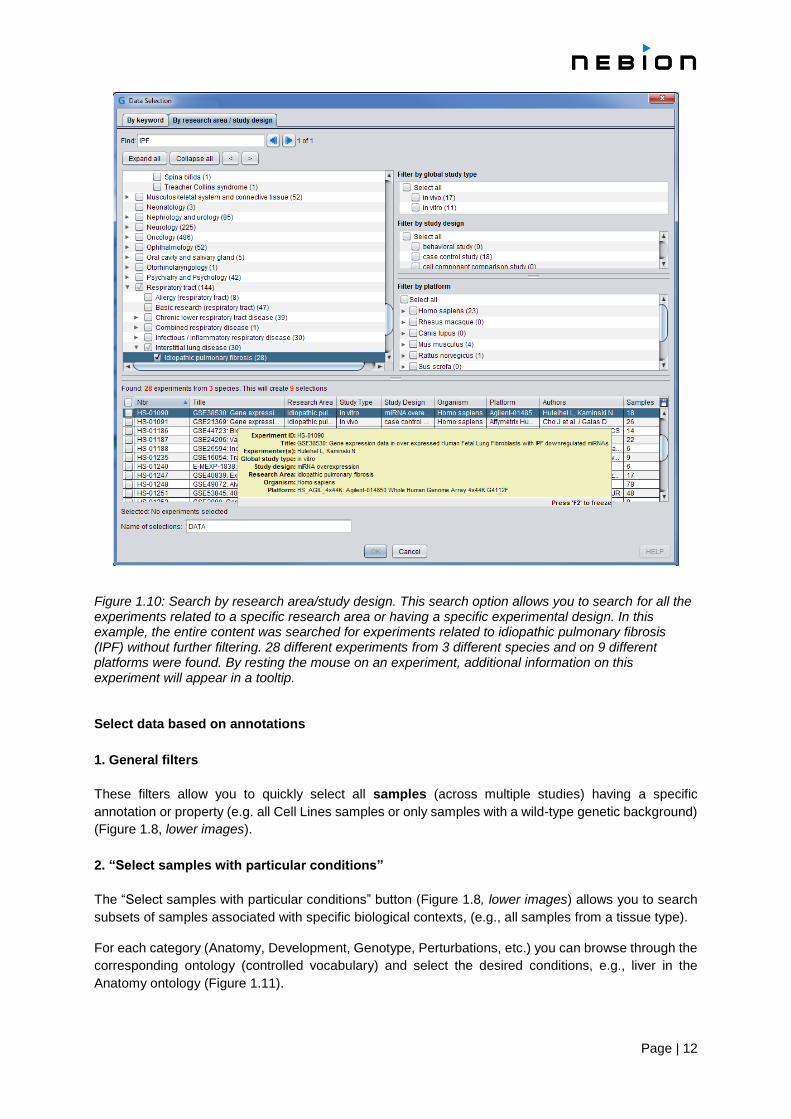
Page | 12
Figure 1.10: Search by research area/study design. This search option allows you to search for all the experiments related to a specific research area or having a specific experimental design. In this example, the entire content was searched for experiments related to idiopathic pulmonary fibrosis (IPF) without further filtering. 28 different experiments from 3 different species and on 9 different platforms were found. By resting the mouse on an experiment, additional information on this experiment will appear in a tooltip. Select data based on annotations
1. General filters
These filters allow you to quickly select all samples (across multiple studies) having a specific
annotation or property (e.g. all Cell Lines samples or only samples with a wild-type genetic background)
(Figure 1.8, lower images).
2. “Select samples with particular conditions”
The “Select samples with particular conditions” button (Figure 1.8, lower images) allows you to search
subsets of samples associated with specific biological contexts, (e.g., all samples from a tissue type).
For each category (Anatomy, Development, Genotype, Perturbations, etc.) you can browse through the
corresponding ontology (controlled vocabulary) and select the desired conditions, e.g., liver in the
Anatomy ontology (Figure 1.11).

Page | 13
Figure 1.11: The “Select samples with particular conditions” dialogue box. With this filter, samples can be selected based on their annotation, for instance all samples from liver can be quickly selected.
3. Filter data by experimental/clinical parameters
Once a data selection has been created, the samples from this selection can be filtered based on
experimental/clinical parameters by clicking on “Filter” in the “Data Selection” panel (Figure 1.12). The
samples (from the selection in focus) containing the deselected parameters will be removed from the
analysis, e.g., if you deselect “diseased”, all samples from diseased patients will be deselected. This
filter is specific for the biomedical data.
Figure 1.12: Experimental / clinical parameters filter. This filter allows you to quickly select subsets of samples based on the experimental or clinical parameter across the whole “Data Selection” (e.g. only samples from healthy patients).
Page | 14
A note about the platforms:
For some organisms, GENEVESTIGATOR® contains expression data from multiple types of platforms,
e.g., different generations of Affymetrix GeneChip® arrays. On these arrays, individual genes are
frequently represented by a different set of probes (see Chapter 1.4.3 for the definition of a probe).
Expression measurements for a given gene may be targeting different transcript regions or splice
variants and are not necessarily comparable between platforms. Therefore, to keep the analysis results
easily interpretable, data from different array types are not mixed. Thus, a sample selection always
contains only datasets from the same platform.
A note about the replicates:
Experiments are often repeated to increase the robustness of the results (biological replicates) or the
same samples from a given experiment are measured multiple times (technical replicates). In
GENEVESTIGATOR®, almost all replicates are biological replicates. Replicates have the same sample
name up to the suffix “_rep_1”, “_rep_2”, etc.
1.4.3 Selecting genes of interest
The Samples tool, the CONDITION SEARCH TOOLS and SIMILARITY SEARCH TOOLS help you prioritize or
interpret a list of genes by visualizing these genes against various biological contexts or grouping them
according to their similarity of expression. Therefore, a list of genes must be entered prior to the analysis.
In contrast, no list of genes is required for the GENE SEARCH TOOLS as these tools aim at identifying novel
genes with particular properties.
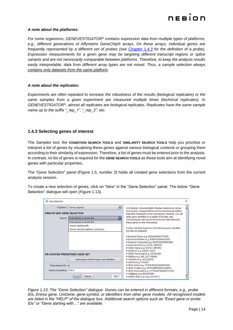
The “Gene Selection” panel (Figure 1.5, number 3) holds all created gene selections from the current
analysis session.
To create a new selection of genes, click on "New" in the “Gene Selection” panel. The below “Gene
Selection” dialogue will open (Figure 1.13).
Figure 1.13: The “Gene Selection” dialogue. Genes can be entered in different formats, e.g., probe IDs, Entrez gene, UniGene, gene symbol, or identifiers from other gene models. All recognised models are listed in the “HELP” of the dialogue box. Additional search options such as “Exact gene or probe IDs” or “Gene starting with…” are available.

Page | 15
With microarrays, expression levels are measured by probes targeting particular transcript regions. For
this reason, the results displayed in GENEVESTIGATOR® correspond to the expression values of these
probes (see below for the definition of a probe). The GENEVESTIGATOR® database contains a
mapping of these probes to gene identifiers (gene model) such as Entrez, ENSEMBL, UniProt, or gene
symbol, so you can enter gene identifiers in any of these supported formats. Lists of identifier formats
available for the selected organism are available in the “Gene Selection” dialogue under “HELP”.
A note about the probe definition:
In some microarray technologies, the expression level of a gene is measured by a single probe. In
others, multiple probes are measured and summarized into a single value per gene. Furthermore,
different terms are used for groups of multiple probes, e.g. “probe set” for Affymetrix. As
GENEVESTIGATOR® contains data from several types of microarray platforms, we are using the term
“probe” to define a probe or a probe set representing a given gene. Whenever a piece of information is
specific to Affymetrix, we use the Affymetrix “probe set” terminology. By extension, the term “probe” is
used in GENEVESTIGATOR® in the sense of measurement unit for other technologies like RNAseq and
proteomic.
Additional options to enter gene IDs are provided:
1. Exact gene or probe IDs
2. Genes starting with…: to search all genes of a family, e.g. COX
3. Gene and description…: to create a list of genes with similar functions, e.g. “receptor kinase”
Enter your list of genes. By default, the best probe for the entered genes will be automatically chosen
(see below for the definition of best probe). By automatically selecting the best probes for a gene, the
selected genes are linked to an organism but not to a specific platform. Consequently, the same gene
selection can be used with data selections from different platforms. Nevertheless, as some platforms do
not measure all genes and as all gene models are not mapped on each platform, it can happen that
some genes of the selection will not be found on all platforms (Figure 1.14). In this case, a warning will
be displayed on top of the results panel.
Figure 1.14: Gene Selection used for analysis on different platforms. As some genes are not measured on all platforms, it may happen that genes from a “Gene Selection” are not measured on certain platforms.
Page | 16
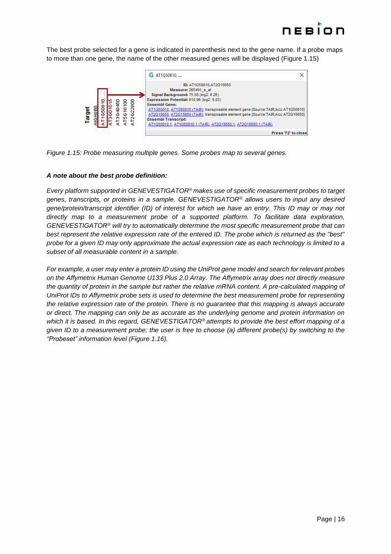
The best probe selected for a gene is indicated in parenthesis next to the gene name. If a probe maps
to more than one gene, the name of the other measured genes will be displayed (Figure 1.15)
Figure 1.15: Probe measuring multiple genes. Some probes map to several genes. A note about the best probe definition:
Every platform supported in GENEVESTIGATOR® makes use of specific measurement probes to target
genes, transcripts, or proteins in a sample. GENEVESTIGATOR® allows users to input any desired
gene/protein/transcript identifier (ID) of interest for which we have an entry. This ID may or may not
directly map to a measurement probe of a supported platform. To facilitate data exploration,
GENEVESTIGATOR® will try to automatically determine the most specific measurement probe that can
best represent the relative expression rate of the entered ID. The probe which is returned as the "best"
probe for a given ID may only approximate the actual expression rate as each technology is limited to a
subset of all measurable content in a sample.
For example, a user may enter a protein ID using the UniProt gene model and search for relevant probes
on the Affymetrix Human Genome U133 Plus 2.0 Array. The Affymetrix array does not directly measure
the quantity of protein in the sample but rather the relative mRNA content. A pre-calculated mapping of
UniProt IDs to Affymetrix probe sets is used to determine the best measurement probe for representing
the relative expression rate of the protein. There is no guarantee that this mapping is always accurate
or direct. The mapping can only be as accurate as the underlying genome and protein information on
which it is based. In this regard, GENEVESTIGATOR® attempts to provide the best effort mapping of a
given ID to a measurement probe; the user is free to choose (a) different probe(s) by switching to the
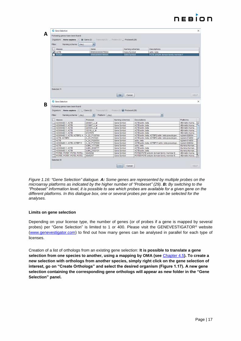
“Probeset” information level (Figure 1.16).
Page | 17
Figure 1.16: “Gene Selection” dialogue. A: Some genes are represented by multiple probes on the microarray platforms as indicated by the higher number of “Probeset” (29). B: By switching to the “Probeset” information level, it is possible to see which probes are available for a given gene on the different platforms. In this dialogue box, one or several probes per gene can be selected for the analyses. Limits on gene selection
Depending on your license type, the number of genes (or of probes if a gene is mapped by several
probes) per “Gene Selection” is limited to 1 or 400. Please visit the GENEVESTIGATOR® website
(www.genevestigator.com) to find out how many genes can be analysed in parallel for each type of
licenses.
Creation of a list of orthologs from an existing gene selection: It is possible to translate a gene
selection from one species to another, using a mapping by OMA (see Chapter 4.5). To create a
new selection with orthologs from another species, simply right click on the gene selection of
interest, go on “Create Orthologs” and select the desired organism (Figure 1.17). A new gene
selection containing the corresponding gene orthologs will appear as new folder in the “Gene
Selection” panel.

Page | 18
Figure 1.17: User interface of GENEVESTIGATOR®, with its four toolsets and their individual tools.
1.4.4 Tool selection
Once a “Data Selection” and eventually a “Gene Selection” (mandatory for the Samples tools, all the
CONDITION SEARCH TOOLS and SIMILARITY SEARCH TOOLS) have been defined, several types of analyses
can be performed. As mentioned above (see Chapter 1.2), four main toolsets exist and each toolset
consists in several individual tools (Figure 1.18). To start working with a tool, click on the corresponding
icon. You can then switch tool by either going on the “Home” button (Figure 1.5, number 1) or you can
change tool within a toolset by going on the different Tabs (Figure 1.5, number 4). The different types
of queries are described in the next chapters (see Chapters 2, 3, 4 and 5).
Figure 1.18: User interface of GENEVESTIGATOR®, with its four toolsets and their individual tools.

Page | 19
1.5 Viewing results
For the Samples tool (see Chapter 2.1) and the CONDITION SEARCH TOOLS (see Chapter 3), the results
are immediately displayed based on the data and gene selections. The Differential Expression tool
(see Chapter 2.2), the GENE SEARCH TOOLS (see Chapter 4) and the SIMILARITY SEARCH TOOLS (see
Chapter 5) require additional choice and therefore have to be triggered using the “Run” button.
The results can be display in various formats, the choice of which mainly depends on the number of
genes you would like to visualize.
1.5.1 The different type of plots
Boxplots consist of boxes, whiskers and outliers. The box delimits the upper and lower quartiles
(IQR), while whiskers represent the lowest datum still within 1.5 IQR from the lower quartile,
and the highest datum still within 1.5 IQR from the upper quartile. Outliers, represented as stars,
are values outside this range. Only one gene can be represented at the time. For boxplots of
absolute expression values (see Chapter 1.5.4 for the meaning of absolute expression values),
a bar above the plot indicates which expression values can be considered "LOW", "MEDIUM"
or "HIGH". These ranges are determined by looking at all expression values of all genes over
all samples for the platform in use. "LOW" corresponds to the first quartile, "MEDIUM" to the
interquartile range and "HIGH" to the fourth quartile (see Chapter 1.5.4, Percentiles). This type
of representation is only available in some of the CONDITION SEARCH TOOLS and in the RefGenes
tool, where data from several samples are aggregated per category (Figure 1.19).
Figure 1.19: In the boxplot representation, the aggregated measurement value for each category is displayed as a box, whiskers and eventually outliers.
Scatterplots consist of a dot for the mean expression level and error bars showing the standard
error of the mean. Depending on the context, signals are either shown as “ratios” (experimental
versus control values) or as “absolute” expression values. For scatterplots of absolute
expression values, a bar above the plot indicates which expression values can be considered
"LOW", "MEDIUM" or "HIGH" as described above for the boxplots.
o Scatterplots can display up to 10 genes simultaneously using 10 easily distinguishable
colors. Colors can be assigned to a gene by dragging a color from the color palette on
the selected gene ("Change color" option in the “Gene Selection” panel).
Heatmaps are of two types in GENEVESTIGATOR®, differing by the kind of expression values.
o Absolute values (blue-white or burgundy-white color-coding for linear or log scales,
respectively) (Figure 1.20, A). They are normalized to the expression potential of each
gene (see below). The darkest blue or burgundy color represents the “maximum” level
of expression for a given probe across all measurements available in the database for
this probe. As consequence, color intensities can only be compared between
elements from the same probe but not with those from other probes. In other words,
a light color only means that a gene is weakly expressed compared to its expression
potential. Another gene can have a much darker color with a lower expression value, if
Page | 20
it has a lower expression potential. This scaling with the expression potential allows you
to compare patterns between genes and ensures that most expression values are in a
useful color-range. If you are interested in comparing the absolute expression values
between genes, switch from the heatmap view to the scatterplot view.
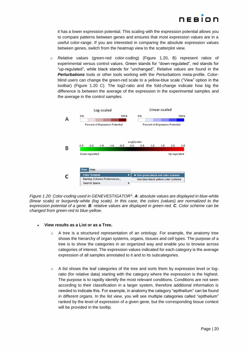
o Relative values (green-red color-coding) (Figure 1.20, B) represent ratios of
experimental versus control values. Green stands for “down-regulated”, red stands for
“up-regulated”, while black stands for “unchanged”. Relative values are found in the
Perturbations tools or other tools working with the Perturbations meta-profile. Color-
blind users can change the green-red scale to a yellow-blue scale (“View” option in the
toolbar) (Figure 1.20 C). The log2-ratio and the fold-change indicate how big the
difference is between the average of the expression in the experimental samples and
the average in the control samples.
Figure 1.20: Color-coding used in GENEVESTIGATOR®. A: absolute values are displayed in blue-white (linear scale) or burgundy-white (log scale). In this case, the colors (values) are normalized to the expression potential of a gene. B: relative values are displayed in green-red. C. Color scheme can be changed from green-red to blue-yellow.
View results as a List or as a Tree.
o A tree is a structured representation of an ontology. For example, the anatomy tree
shows the hierarchy of organ systems, organs, tissues and cell types. The purpose of a
tree is to show the categories in an organized way and enable you to browse across
categories of interest. The expression values indicated for each category is the average
expression of all samples annotated to it and to its subcategories.
o A list shows the leaf categories of the tree and sorts them by expression level or log-
ratio (for relative data) starting with the category where the expression is the highest.
The purpose is to rapidly identify the most relevant conditions. Conditions are not seen
according to their classification in a larger system, therefore additional information is
needed to indicate this. For example, in anatomy the category “epithelium” can be found
in different organs. In the list view, you will see multiple categories called “epithelium”
ranked by the level of expression of a given gene, but the corresponding tissue context
will be provided in the tooltip.

Page | 21
1.5.2 Visualization of the expression in log or linear scales
Expression values are given either in linear scale or in a logarithmic scale. Linear values are intended
to be proportional to gene expression, while logarithmic values are obtained from the linear values by
the formula log2 (v+1) where v is the linear value. We use log2 (v+1) instead of log2 v to avoid negative
expression values and an excessive sensitivity to small changes in low expression values.
In the Samples tool and in the CONDITION SEARCH TOOLS, the values can be visualized and the
analyses carried out either in the linear or in the logarithmic scale.
In the logarithmic scale and when working with the average expression level of a gene (like in the
CONDITION SEARCH TOOLS), the displayed result is the average of the logarithmic values and not the
logarithm of the average value. Consequently, the ranking of averaged gene expression values can
be different in logarithmic and linear scales e.g., in which tissue a gene is most expressed can be
different between logarithmic and linear scale.
1.5.3 Expression potential and signal background
The expression potential of a gene (probe) is a robust indicator for the maximal expression level of this
gene. It represents the top percentile (= 99th percentile) of all expression values for this gene. The
expression potential value is reported in the pop-up window over a gene/probe name.
The signal background is calculated as the first percentile of all expression values for this gene. The
signal background value is reported in the pop-up window over a gene/probe name.
Getting additional information
Additional information, such as the actual expression values, the list of experiments included in the
calculation of a mean, etc. is available in the tooltips that appear when the mouse pointer rests on an
element for a moment (see Chapter 1.5.7).
1.5.4 Meaning of "absolute" expression values in GENEVESTIGATOR®
The expression values in GENEVESTIGATOR® are calculated using standard normalization methods
for the different microarray platforms and scaled between experiments to make the expression values
comparable, (see Chapter 7). The "absolute" expression values shown are called "absolute" because
they represent expression values of a gene in a sample (or group of samples) as opposed to a ratio or
relative value that compares the expression in treatment samples to the expression in control samples.
However, the "absolute" expression values are not really absolute as it is practically impossible to
determine an absolute quantity like the number of mRNA transcripts per cell. Most methods for
quantifying expression therefore report the expression value compared to some "average" expression
of all genes in the sample (or experiment). For comparability, the microarray expression values in
GENEVESTIGATOR® are scaled such that the average (trimmed mean) is equal to 1000. This gives a
rough indication of the strength of expression. Which expression values are "HIGH" or "LOW" is based
on the calculation of percentiles.

Page | 22
Percentiles
The Xth percentile is calculated by pooling all expression values in question, sorting them and then
picking the expression value for which X percent of the values are smaller than this value. Typical values
include the lower quartile (25th percentile) (“LOW”), median (50th percentile) (“MEDIUM”), upper quartile
(75th percentile) (“HIGH”). The interquartile range (IQR) is defined as the range between the 25th
percentile and the 75th percentile. Consequently, half of the expression values lies within the IQR.
1.5.5 Working with multiple selections
Multiple selections for genes and data can be created. Switching between them is done by a simple
click on the corresponding folder. The analysis tools will then display data based on the new combination
of samples and genes defined by the selections in focus highlighted in light blue. For each panel, only
one selection can be in focus at the same time. The data and the gene selections in focus must be
compatible, i.e., they must be based on the same organism and eventually platform if the “automatically
choose best probe” option was not used to create the gene selection.
1.5.6 Editing copying or deleting an existing selection
An existing data or gene selection can be edited, or deleted by right-clicking on the folder in focus. A
gene selection can also be copied to the clipboard. A context menu appears with the corresponding
functions (Figure 1.21).
Figure 1.21: Editing, copying or removing a folder from the “Data Selection” or the “Gene Selection”. The genes contained in a folder can also be copied to the clipboard either as “Gene Identifiers” or as “Probe”.

Page | 23
1.5.7 Additional information about experiments or genes
Additional information about individual experiments, samples or genes is available in the tooltips that
appear when resting the mouse over the elements (Figure 1.22). Many of these tooltips contain links to
other sources of information, e.g., to the repository containing the original raw expression data. To click
on such a link, freeze the tooltip by pressing “F2” on the keyboard. The links will open in your browser
(not in the GENEVESTIGATOR® application). Make sure that your browser allows pop-up windows for
www.genevestigator.com.
Figure 1.22: Tooltip examples for a sample (left image) or a gene (right image). The links to external pages are highlighted in blue. Please note that the pages will open in your browser and not in the GENEVESTIGATOR® analysis tool.
1.5.8 Displaying different gene model
Various gene identifier formats are recognised and available in GENEVESTIGATOR®. To select
another format, go in the toolbar, click on “View” and select “Gene Labels” (Figure 1.23). A “Gene
Label Preferences” dialogue will open and allow you to set up your preferences per organism. The
preferred format will be used in the results displayed in GENEVESTIGATOR®.
Figure 1.22: Gene identifier format. For each organism, several gene identifier formats are available. A drop-down menu allows you to select one of them per organism. These preferences will be used to display the results obtained for an analysis.
Page | 24
Chapter 2
SINGLE EXPERIMENT ANALYSIS
2.1 The Samples tool
The Samples tool displays the expression values of selected genes across selected samples (Figure 2.1).
2.1.1 Getting started
1. Create a “Data Selection” (see Chapter 1.4.2)
2. Create a “Gene Selection” (see Chapter 1.4.3)
The plot will automatically be generated (see Figure 2.1). Several options to display the results are
available and described in the next section
Figure 2.1: Screenshot of the results obtained with the Samples tool for CA3 and AMPD1 on studies from the Affymetrix Human 133 Plus2 platform. The expression levels of the selected genes are displayed across selected samples. The samples are sorted based on the expression value of CA3 (gene in focus) and ordered as of the experimental design. Users of the Enterprise version can see all sample annotations displayed on the right of the plot and can sort samples by these annotations.
2.1.2 Features
The plot has the following features:
In the scatterplot view, up to 10 genes can be displayed using a palette of 10 distinct colors. In
the heatmap view, up to 400 genes can be viewed in parallel

Page | 25
Expression intensities are represented by dots as obtained from quantile normalization (e.g.
RMA for Affymetrix data) or TPM (for RNA-Seq data)
The unsorted order of the samples on the plot is defined by the curators and reflects the logic
design of the experiment
Within each individual experiment, the samples can be sorted based on the expression values
for the gene in focus (from the highest expression to the lowest)
By resting the mouse on a “dot” or on a sample, additional information will appear in a tooltip.
This tooltip can be frozen / closed by pressing ‘F2’
Creation of gene signatures for use in other tools
It is possible to export the list of genes together with the corresponding expression values (“signatures”)
from a chosen sample (or group). To create such a “signature”, select the sample (group) of interest and
click in the toolbar on the Signature: “Copy” “New” or “Add” buttons.
The “signature” will appear in the “Gene Selection” panel with a “S” tag.
A “signature” can be opened directly in the Signature tool (see Chapter 5.3) and allows you to compare
it with data from other studies. Doing such a comparison is useful to find other studies giving similar or
opposite results, or to verify the nature of a given sample. This export feature exists for most tools.
Visualize expression by group
For each level of annotation, it is possible to plot the expression by groups. This can be achieved by
clicking on the “Plot groups…” button and then selecting the levels for which groups must be created
(e.g. Anatomical part), or by clicking on the header of the annotation table that is on the right side of the
plot. In both cases, a “detailed view” panel will appear showing the group-level expression plots. Care
has to be taken on what is selected and actually being compared, since the tool allows cross-study
comparisons without limitations, but not all comparisons necessarily make biological sense. Also, batch
or study effects must be considered when selecting data for such a group-level visualization.
2.1.3 Statistics
All microarray data in GENEVESTIGATOR® are normalized at two levels: RMA within experiments
and trimmed mean adjustment to a target for normalization between batches or experiments (see
Chapter 7). This combination makes data highly comparable between different experiments. The
microarray data that you see in the Samples tool are normalized with this scheme, and the resulting
signal values are indicated in the tooltips. RNAseq do not require such normalization (see Chapter 8).
2.2 The Differential Expression tool
The Differential Expression tool allows you to quickly and easily find the genes that are significantly
differentially expressed between two conditions within an experiment from the GENEVESTIGATOR®
database e.g., a treatment versus a control condition.

Page | 26
A video tutorial for this tool is available on the following link or directly from the tool (button with camera
icon) (Figure 2.2 A).
https://genevestigator.com/gv/doc/video_tutorials.jsp
2.2.1 Getting started
1. Select an experiment of interest
Go in in “Select individual experiments” in the “Data Selection” dialogue box (see Chapter 1.4.2). If you
already have a “Data Selection” comprising several experiments, the first one of the list will be
selected by default and displayed in this dialogue. However, it is possible to select another experiment
using the drop-down menu in the “Define Comparison” dialogue box (Figure 2.2 B)
2. Define the groups you want to compare
Click on “Define Comparison” or on “Edit” (Figure 2.2 A). In the dialogue box that opens (Figure 2.2 B),
select the samples for groups X & Y. Some predefined comparisons may be available under
“Comparison” (Figure 2.2 B, orange rectangle). These comparisons have been manually defined by
our curators and can be used as such or edited. Various parameters describing the different samples
are listed in the right panel (Figure 2.2 B, red rectangle) or in the samples tooltip (see Chapter 1.5.7).
Figure 2.2: The Differential Expression tool’s toolbar (A) and the “Define Comparison” dialogue box (B). In this dialogue box, a drop-down menu of “Experiment” allows you to select an experiment of interest (from your “Data Selection” in focus) and define the two groups of samples to be compared. Some predefined groups may be available in the drop-down menu of “Comparison”. Experimental parameters are listed on the right next to the corresponding samples. A click on the camera icon (toolbar) will open a page in your browser containing a video tutorial explaining how to use the tool.

Page | 27
3. Run the analysis
Once a comparison is defined, click on the “Run” button to start the differential expression analysis.
Several parameters can be adjusted (False-Discovery Rate, visualization plots, log-ratio, only up- or
down-regulated genes) (Figure 2.3, framed in red and see Chapter 2.2.2). The resulting genes are
represented on a scatterplot (Figure 2.3 A) or on a volcanoplot (Figure 2.3 B) and listed in the adjacent
table. The resulting genes or selected subsets of genes or a signature (list of genes with their
corresponding expression values for the displayed comparison) (see Chapter 2.1.2) can be copied to
the clipboard, used to create a new “Gene Selection” or added to an existing selection (Genes: “Copy”,
“New” or “Add” buttons or Signature: “Copy”, “New” or “Add” buttons in the toolbar (Figure 2.3 A, framed
in blue).
Figure 2.3: Screenshot displaying the genes that are differentially expressed in the experiment
GSE1145. The adjustable parameters are framed in red. In A the results are displayed as scatterplot
and in B using a Volcanoplot.
2.2.2 Features
The “Edit” button allows you to quickly modify the samples for both groups or switch to
experiment. Note that you need to restart the analysis after having made some changes
All differentially expressed genes can be displayed
It is possible to visualize only a subset of genes (up regulated or down regulated) or all
dysregulated genes
Changing the FDR and Ilog-ratioI by moving the corresponding sliding bars will trigger an on-
the-fly recalculation and GENEVESTIGATOR® will display the new results
A lasso allows you to “capture” only a subset of genes for further analyses
As for the Samples tool, it is possible to create and export gene signatures from this tool (see
Chapter 2.1.2)

Page | 28
2.2.3 Statistics
The genes are filtered using 3 different methods:
The genes are filtered by their log fold change
Computation of p-values:
For microarray data, the p-values are computed according to the Limma algorithm (Smyth,
[4]). This algorithm can be seen as an extension of the classical t-test that uses an improved
variance estimate computed from the expression data of all genes measured in an
experiment.
For RNA sequencing data, the p-values are computed by the Voom algorithm (Law, [5] ) for
genes with sufficient read counts and by a simplified version of the edgeR algorithm for small
counts. The Voom algorithm is a refinement of Limma that uses the dependence between the
expression of a gene and the precision of the measure of this expression to better estimate
the error of the expression for each gene. The Voom algorithm performs badly for genes with
very low read counts. We thus use a simplified version of the procedure used in edgeR to
compute p-values for genes with low counts. Essentially, this procedure is a variant of Fisher's
exact test using a negative binomial distribution whose parameters are estimated by the
method of moments.
The false discovery rate (FDR) (Benjamini and Hochberg, [3]) is controlled by applying the
Benjamin-Hochberg procedure to compute the threshold under which the p-values are
considered sufficiently small. This threshold is used to do a second round of filtering

Page | 29
Chapter 3
COMPENDIUM WIDE ANALYSIS: CONDITION SEARCH TOOLS
3.1 Overview of CONDITION SEARCH TOOLS
The CONDITION SEARCH TOOLS allow you to find out which conditions regulate the expression of your
genes of interest. All the tools (Figure 3.1) display meta-profiles as described above (see Chapter 1.1)
and allow a rapid identification of the conditions affecting the expression of selected genes, e.g., to
identify mutations leading to an up- or down-regulation of these genes. The CONDITION SEARCH TOOLS
are instrumental in discovery research, validation of existing hypotheses, or in generating new
hypotheses that can be tested in the laboratory.
Figure 3.1: Screenshot of the CONDITION SEARCH toolset. The Cell Lines and Cancers tools are specific for the biomedical community.
3.2 General features available for the CONDITION SEARCH TOOLS
3.2.1 Detailed view and experimental / clinical parameters
Each category (or comparison for the Perturbations tool) consists of one or several samples. You can
get a detailed viewed of all the samples aggregated/comprised in a leaf node category/comparison by
clicking on a category/comparison of interest (or on several categories by using the control button on
the keyboard). A new panel will open at the bottom showing the expression values of your selected
genes across all individual samples from this category/comparison (Figure 3.2). On the right of this
additional panel, you will find the various experimental parameters attributed to each sample.
In the detailed view, individual samples or samples with specific experimental parameters can
be removed from the samples list by clicking on the cross next to a sample or an experimental
parameter (Figure 3.2). GENEVESTIGATOR® will recalculate on-the-fly the new results based
on this new composition of samples. The reset button on the toolbar allows you to return to the
original composition of samples. Note that the filtering used at this level e.g., removal of all
patients 60+ years within a chosen cancer type, will only remove samples within this category.
All other categories will still contain these patients. To remove all samples with a particular
parameter, see Chapter 1.4.2.2 filter # 3. The samples listed in the detailed view can be used
to either create a new “Data Selection” (“New” button) or to be added to an existing one (“Add”
button). As for the Samples tool, it is possible to create and export gene signatures from the
detailed view (see Chapter 2.1.2).

Page | 30
Figure 3.2: Detailed view of the “Diaphragm” meta-profile in the Anatomy tool for the human CA3 gene on the Affymetrix Human 133 Plus2 platform. All or only distinct parameters can be displayed. The red crosses highlight the possibility of removing, in the detailed view, individual samples or all the samples sharing a common parameter. The new results will be recalculated on-the-fly. The reset button restores all samples at once.
3.2.2 HELP button
Supplementary information for each tool (features, statistics, etc.) is available under the “HELP” button
of the toolbar.
3.3 The Anatomy tool
The Anatomy tool displays how strongly genes of interest are expressed in different anatomical
categories, including organs, tissues, cell cultures from primary cells but does not contain data from
cancer nor cell lines samples - cancer data are found in the Cancers tool (see Chapter 3.5) and cell
lines data in the Cell Lines tool (see Chapter 3.4). In the Anatomy tool, data are plotted against a tree
of anatomical categories.
3.3.1 Getting started
1. Create a “Data Selection” (see Chapter 1.4.2)
2. Create a “Gene Selection” (see Chapter 1.4.3)
The plot will automatically be generated (see Figure 3.3). Several options to display the results are
available and described in the next section. By default the “Boxplot-List” view will be displayed (see
Chapter 1.5).
3.3.2. Features
Three types of graphs are available, a boxplot (1 gene), a scatterplot (up to 10 genes) and a
heatmap (up to 400 genes)
The categories can be visualized either as tree or as a list where the categories are ordered
based on the expression levels
For all types of graphs, results can be displayed in linear or in log2 scale
A ladder indicating “LOW”, “MEDIUM” and “HIGH” is displayed above the boxplot and the
scatterplot, providing a general indication of expression level. MEDIUM is the interquartile range
of all expression values for a particular platform (see Chapter 1.5.4)

Page | 31
By resting the mouse on a “result” or on a category additional information will appear in a tooltip.
This tooltip can be frozen / closed by pressing ‘F2’
A panel with a detailed view of all samples comprised within a category is obtained by clicking
on it. The expression value as well as experimental parameters for each sample will be
individually displayed (see Chapter 3.2.1). Note that a multiple selection is possible (Ctrl + click)
As for the Samples tool, it is possible to create and export gene signatures from this tool (see
Chapter 2.1.2)
Figure 3.3: Screenshots of the results obtained with the Anatomy tool for the human CA3, AMPD1 and TPM2 genes on the Affymetrix Human 133 Plus2 platform. The number of samples for each category is listed on the right. Left image: the Boxplot-list view displays results for a single gene (probe) listing the tissues showing the highest expression on top. Right image: the Heatmap-tree view displays results for up to 400 genes (probes). The categories are displayed as nodes of a tree. Each node can be expanded or collapsed.
3.3.3. Statistics
The expression values displayed in the Anatomy tool represent the average expression for a given
gene in a particular tissue across all selected samples. When the anatomical parts are shown as a
tree, parent nodes represent the average expression of all samples within this branch. The number of
samples aggregated in each category to calculate this average is indicated on the right of the graph. In
the boxplot view, the whiskers represent the lowest datum still within 1.5 IQR from the lower quartile,
and the highest datum still within 1.5 IQR from the upper quartile. Outliers, represented as stars, are
values outside this range. In the scatterplot view, the whiskers indicate the standard error of the mean.
Additional statistical parameters such as mean, standard error, 95% confidence interval are available
by resting the mouse on a result (see Chapter 1.5.7).

Page | 32
3.4 The Cell Lines tool
The Cell Lines tool displays the expression level of genes across various cell lines.
3.4.1 Getting started
1. Create a “Data Selection” (see Chapter 1.4.2)
2. Create a “Gene Selection” (see Chapter 1.4.3)
The plot will automatically be generated (see Figure 3.4). Several options to display the results are
available and described in the next section. By default, the “Boxplot-List” view will be displayed (see
Chapter 1.5).
3.4.2 Features
Three types of graphs are available, a boxplot (1 gene), a scatterplot (up to 10 genes) and a
heatmap (up to 400 genes)
The categories can be visualized either as tree or as a list where the categories are ordered
based on the expression levels
For all types of graphs, results can be displayed in linear or in log2 scale
A ladder indicating “LOW”, “MEDIUM” and “HIGH” is displayed above the boxplot and the
scatterplot, providing a general indication of expression level. MEDIUM is the interquartile range
of all expression values for a particular platform (see Chapter 1.5.4)
By resting the mouse on a “result” or on a category additional information will appear in a tooltip.
This tooltip can be frozen / closed by pressing ‘F2’
A panel with a detailed view of all samples comprised within a category is obtained by clicking
on it. The expression value as well as experimental parameters for each sample will be
individually displayed (see Chapter 3.2.1). Note that a multiple selection is possible (Ctrl + click)
Categories representing normal tissues can be added to the plot by ticking the “show anatomy”
box (Figure 3.4), to easily compare expression between cell lines and normal tissues
Hierarchical clustering of a set of genes across Cell Lines or Cell Lines + Anatomy + Cancers
meta-profiles can be easily performed with the Hierarchical Clustering tool (see Chapter 5.1)
As for the Samples tool, it is possible to create and export gene signatures from this tool (see
Chapter 2.1.2)
3.4.3. Statistics
The expression values displayed in the Cell Lines tool represent the average expression for a given
gene in a particular cell line across all selected samples. When the cell lines are shown as a tree, parent
nodes represent the average expression of all samples within this branch. The number of samples
aggregated in each category to calculate this average is indicated on the right of the graph. In the boxplot
view, the whiskers represent the lowest datum still within 1.5 IQR from the lower quartile, and the highest
datum still within 1.5 IQR from the upper quartile. Outliers, represented as stars, are values outside this
range. In the scatterplot view, the whiskers indicate the standard error of the mean. Additional statistical
parameters such as mean, standard error, 95% confidence interval are available by resting the mouse
on a result (see Chapter 1.5.7).

Page | 33
Figure 3.4: Screenshot of the Cell Lines tool showing in a Boxplot-tree the expression of the human LINGO1 gene on the Affymetrix Human Genome U133 Plus2 platform across the normal tissues and the cell lines (neoplastic and non-neoplastic cell lines).
3.5 The Cancers tool
The Cancers tool displays how strongly genes of interest are expressed in different cancer types. The
cancer data classification is compliant with international standards (ICD-10 and ICD-O3). By default,
only data from cancer samples are displayed, but non-cancer data (normal tissues and cell lines) can
be added by ticking the "show anatomy" and/or ”show cell lines” boxes respectively in the toolbar (Figure
3.5, lower image). Results can be displayed as a sorted list of cancer types, or as classification tree of
cancer types.
3.5.1 Getting started
1. Create a “Data Selection” (see Chapter 1.4.2)
2. Create a “Gene Selection” (see Chapter 1.4.3)
The plot will automatically be generated (see Figure 3.5). Several options to display the results are
available and described in the next section. By default the “Boxplot-List” view will be displayed (see
Chapter 1.5).
Page | 34
3.5.2 Features
Three types of graphs are available, a boxplot (1 gene), a scatterplot (up to 10 genes) and a
heatmap (up to 400 genes)
The categories can be visualized either as tree or as a list where the categories are ordered
based on the expression levels
For all types of graphs, results can be displayed in linear or in log2scale
A ladder indicating “LOW”, “MEDIUM” and “HIGH” is displayed above the boxplot and the
scatterplot, providing a general indication of expression level. MEDIUM is the interquartile range
of all expression values for a particular platform (see Chapter 1.5.4)
By resting the mouse on a “result” or on a category additional information will appear in a tooltip.
This tooltip can be frozen / closed by pressing ‘F2’
A panel with a detailed view of all samples comprised within a category is obtained by clicking
on it. The expression value as well as experimental parameters for each sample will be
individually displayed (see Chapter 3.2.1). Note that a multiple selection is possible (Ctrl + click)
Categories representing normal tissues and cell lines can be added to the plot by ticking the
“show anatomy” and/or “show cell lines” boxes (Figure 3.5, lower image), to easily compare
expression between cell lines and normal tissues
Hierarchical clustering of a set of genes across Cell Lines or Cell Lines + Anatomy + Cancers
meta-profiles can be easily performed with the Hierarchical Clustering tool (see Chapter 5.1).
As for the Samples tool, it is possible to create and export gene signatures from this tool (see
Chapter 2.1.2).
3.5.3. Statistics
The expression values displayed in the Cancers tool represent the average expression for a given gene
in a particular cancer across all selected samples. When cancers categories are shown as a tree, parent
nodes represent the average expression of all samples within this branch. The number of samples
aggregated in each category to calculate this average is indicated on the right of the graph. In the boxplot
view, the whiskers represent the lowest datum still within 1.5 IQR from the lower quartile, and the highest
datum still within 1.5 IQR from the upper quartile. Outliers, represented as stars, are values outside this
range. In the scatterplot view, the whiskers indicate the standard error of the mean. Additional statistical
parameters such as mean, standard error, 95% confidence interval are available by resting the mouse
on a result (see Chapter 1.5.7).

Page | 35
Figure 3.5: Screenshot of the results obtained with the Cancers tool for human CA3 gene on the Human 133 Plus2 platform with the boxplot-tree view. The categories are displayed as nodes of a tree. The number of samples for each category is listed on the right. Upper image: only the cancer data are displayed. All the categories are collapsed beside cancers of bone/articular cartilage. Lower image: the anatomy data and cell lines have been added to the graph (“show anatomy” “show cell lines” checkboxes respectively).
Page | 36
3.6 The Perturbations tool
The Perturbations tool provides a summary of gene expression responses to a wide variety of
perturbations, such as chemicals, diseases, hormones, stresses, mutations, etc. Its purpose is to easily
identify experimental conditions causing an up-regulation or down-regulation of genes of interest.
In contrast to all the other tools, in which the level of gene expression is shown, the Perturbations tool
represents relative values from a comparison of experimental versus control samples (see Chapter 1.5).
Each item in the list of Perturbations is a comparison between samples belonging to the same
experiment. If the same biological condition is tested in several independent experiments, this condition
will appear multiple times in the list as separate comparisons. The values reflect up- or down-regulation
of genes and are given as ratios (linear scale) or log2-ratios (log
2 scale). These ratios indicate how big
the difference is between the average of the expression in the experimental samples and the average
in the control samples.
3.6.1 Getting started
1. Create a “Data Selection” (see Chapter 1.4.2)
2. Create a “Gene Selection” (see Chapter 1.4.3)
The plot will automatically be generated (see Figure 3.6). Several options to display the results are
available and described in the next section. By default, the “Scatterplot-List” view will be displayed (see
Chapter 1.5).
3.6.2 Features
Two types of graphs are available, a scatterplot (up to 10 genes) and a heatmap (up to 400
genes)
The categories can be visualized either as tree or as a list where the categories are ordered
based on the expression levels. In the “-Tree“ view, the perturbations are classified according
to their types (chemical, drug, disease, etc...)
For all types of graphs, results can be displayed in linear or in log2 scale (displayed by default)
For the scatterplot, a ladder indicates the fold-change (“down-regulated” on the left,
“upregulated” on the right)
For the heatmap, the ratios are displayed by default using a green-red color-coding but can be
changed to blue-yellow (see Chapter 1.5.1) (Figure 1.19, C)
By resting the mouse on a “result” or on a comparison additional information will appear in a
tooltip. This tooltip can be frozen / closed by pressing ‘F2’
A panel with a detailed view of all samples comprised within a comparison is obtained by clicking
on it. The expression value as well as experimental parameters for each sample will be
individually displayed (see Chapter 3.2.1). Note that a multiple selection is possible (Ctrl + click)
Comparisons can be filtered by p-value (significant changes in expression between
experimental and control samples via nominal t-tests) and /or by fold-change
The relevant Perturbations can easily be used to create a new “Data Selection” or added to an
existing one (Figure 3.7) for further analysis with the SIMILARITY SEARCH TOOLS, e.g., using the
Co-Expression tool to find genes responding to the same Perturbations and expressed in the
same tissues (see Chapter 5.2).
Page | 37
As for the Samples tool, it is possible to create and export gene signatures from this tool (see
Chapter 2.1.2)
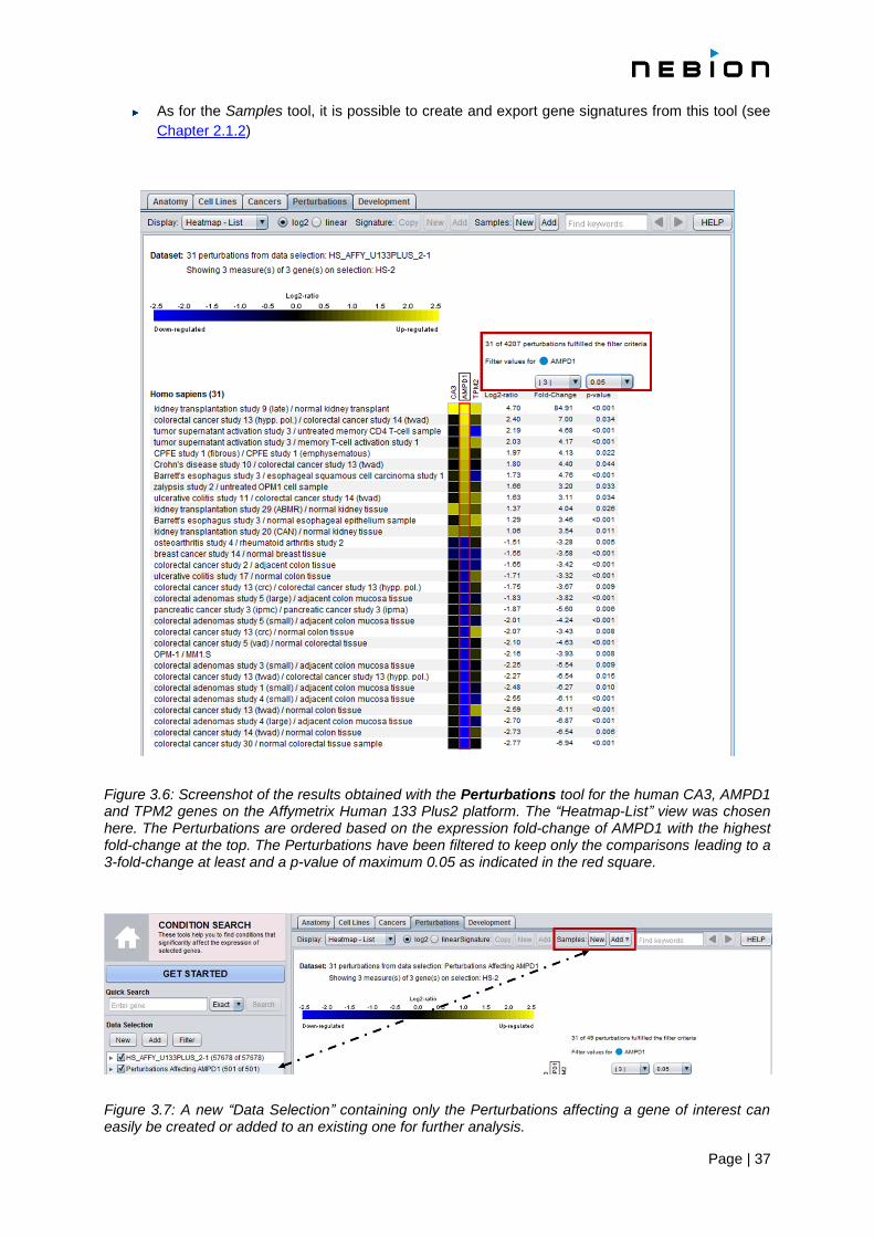
Figure 3.6: Screenshot of the results obtained with the Perturbations tool for the human CA3, AMPD1 and TPM2 genes on the Affymetrix Human 133 Plus2 platform. The “Heatmap-List” view was chosen here. The Perturbations are ordered based on the expression fold-change of AMPD1 with the highest fold-change at the top. The Perturbations have been filtered to keep only the comparisons leading to a 3-fold-change at least and a p-value of maximum 0.05 as indicated in the red square.
Figure 3.7: A new “Data Selection” containing only the Perturbations affecting a gene of interest can easily be created or added to an existing one for further analysis.

Page | 38
3.6.3 Statistics
Each category (= comparison) is composed of experimental samples versus control samples coming from a single experiment. For each gene/probe ID, the value shown while called the log-ratio is actually the difference between
the mean log expression for experimental samples and the mean log expression for control samples.
The log-ratio and the fold-change indicate how big the difference is between the average expression in
the experimental samples and the average expression in the control samples.
The p-value takes into account not only the difference in the averages but also the variance and size
of the two sample groups. A low p-value indicates that the averages are different and that this is
probably not a coincidence, the average for a high number of replicates is likely to be clearly different.
For microarrays data, the p-values are computed using the t-test.
For RNA sequencing data, the t-test is slightly modified to take into account the discrete nature of the
underlying read mapping data.
3.7 The Development tool
The Development tool summarizes the expression of genes across distinct stages of development of
an organism’s life cycle. Each organism has its own developmental stage ontology: from the fertilized
egg cell via embryo, fetus and new born up to the adult organism for mammalian organisms, or from the
germinated seed up to the senescent plant for higher plants. This tool is not available for human data
as for ethical reasons, no data on pre-natal stages of development are obtainable. Although the samples
could theoretically be partitioned into more fine-grained development categories, generally between 10
and 15 stages are defined for each organism. This is to diminish the dominance of local experimental
conditions that affect the expression of genes but are not related to the developmental stage itself. As a
result, each stage comprises up to several hundred samples from which the average values are
calculated. Nevertheless, the Development tool must be interpreted with caution. Large patterns reveal
a general trend, but local peaks may be the result of specific conditions occurring at that particular stage
of development.
3.7.1 Getting started
1. Create a “Data Selection” (see Chapter 1.4.2)
2. Create a “Gene Selection” (see Chapter 1.4.3)
The plot will automatically be generated (see Figure 3.8). Several options to display the results are
available and described in the next section. By default, the scatterplot view will be displayed (see
Chapter 1.5). For a given probe/gene, the expression value indicated for a given stage of development
is the simple average of expression of all samples annotated as such.

Page | 39
3.7.2 Features
Two types of graphs are available, a scatterplot (up to 10 genes) and a heatmap (up to 400
genes)
For all types of graphs, results can be displayed in linear or in log2 scale
A ladder indicating “LOW”, “MEDIUM” and “HIGH” is displayed above the boxplot and the
scatterplot, providing a general indication of expression level. MEDIUM is the interquartile range
of all expression values for a particular platform (see Chapter 1.5.4)
By resting the mouse on a “result” or on a category additional information will appear in a tooltip.
This tooltip can be frozen / closed by pressing ‘F2’
Figure 3.8: Screenshot of the results obtained for 3 genes of Oryza sativa (rice) with the Development tool on the Affymetrix OS_51K platform. One of them (LOC_Os10g13800) is expressed in a fairly constant way during the development while the 2 others (LOC_Os04g26550, LOC_Os07g48620) have a clear peak at the flowering stage.

Page | 40
Chapter 4
COMPENDIUM WIDE ANALYSIS: GENE SEARCH TOOLS
4.1 Overview of GENE SEARCH TOOLS
While the CONDITION SEARCH TOOLS (see Chapter 3 and Figure 3.1) allow you to investigate the
expression of selected genes across various conditions, the GENE SEARCH TOOLS (Figure 4.1) do the
opposite: they help you identify genes that are specifically expressed in a chosen set of conditions
(“target categories”) compared to a larger set of “base” categories. A typical example is the search for
biomarker genes e.g., specifically up-regulated in response to a perturbation but minimally regulated in
all other perturbations. Such queries are available for all types of meta-profiles, i.e., for Anatomy, Cell
Lines, Cancers, Perturbations and Development. For the Anatomy, Cell Lines, Cancers and
Development tools, results show absolute expression values in selected categories, whereas for the
Perturbations tool, results show relative values (log2-ratios) (see Chapter 1.5).
Additionally, the GENE SEARCH TOOLS comprise the RefGenes tool (see Chapter 4.4) to quickly find
genes having the highest stability of expression across a chosen set of conditions and the Ortholog
Search tool (see Chapter 4.5) to find most likely functional orthologous gene in other species.
Figure 4.1: Screenshot of the GENE SEARCH toolset. The Cell Lines and Cancers tools are specific for the biomedical community.
4.2 GENE SEARCH across Anatomy, Cell Lines, Cancers and Development
4.2.1 Getting started
To search for genes specifically expressed in chosen anatomical parts, cell lines, cancers, or
developmental stages, proceed as follows:
1. Create a “Data Selection” (see Chapter 1.4.2)
E.g., “Homo sapiens” and “Human133-2: Human Genome 47k array”. For most analyses, a selection containing the largest possible number of samples is recommended
2. Click on the icon of the tool you want to use, e.g., Anatomy (Figure 4.1)
3. Choose one or several target categories, for which you want to find specifically expressed genes
4. Select the categories against which you want to run the analysis
By default, the search will be made against all other categories, but it is possible to compare your “Target” category (-ies) against only a subset of “Base” categories. To use this feature, mark the checkbox “show bases” in the toolbar” (Figure 4.2, red rectangle). Deselect all bases by clicking on the top checkbox, just below the column called “Base”. Select your “Target” category (-ies), and then the “Base” categories against which you would like to specifically run

Page | 41
the comparison, e.g., anatomical category "Umbilical cord" against all the other gestational structures.
Note that for the tool to work well, the set of “Base” categories should be significantly larger than the set of “Target” categories.
Figure 4.2: Target and Base selection. By limiting the search of gene specific to umbilical cord against only the categories (“Base”) “gestational structure” as shown in A, the algorithm will only consider the categories selected as “Base” in the search. The expression of the resulting genes will be displayed in the other categories and can be relatively high as shown in B.
5. Choose the number of genes to be displayed in the “Limit” dropdown list (toolbar) (Figure 4.3)
By default, 10 genes will be displayed
6. Click on "Run"
Figure 4.3: The toolbar for the Anatomy, Cell Lines, Cancers, Perturbations and Development tools. From left to right: the “Run” button to start the analysis; the “Reset” button to reset all “target” and “base” selections ; the “show bases” checkbox to display the bases categories against which the analysis is performed; the “show anatomy” checkbox (specific to the Cell Lines and Cancers tools) to add normal tissues to the plot; the “ show cell lines” checkbox (specific to the Cancers tool) to add cell lines to the plot; the “Limit” dropdown menu to define the number of genes being displayed; the “Copy”, “New”, “Add” buttons to copy a list of genes (e.g. in Excel), to create a new “Gene Selection” with it or add it to an existing selection (genes are actually copied as probe IDs); the “HELP” button to obtain more information.
Page | 42
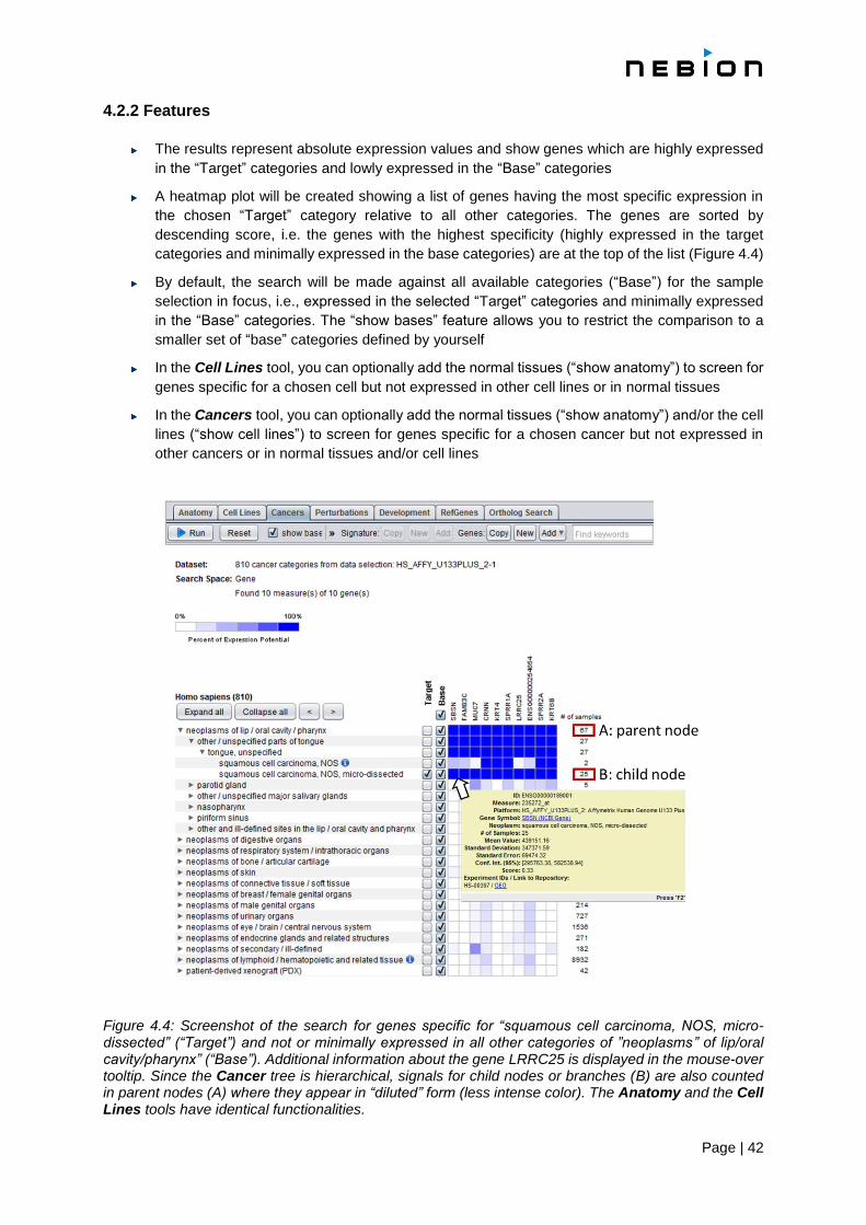
4.2.2 Features
The results represent absolute expression values and show genes which are highly expressed
in the “Target” categories and lowly expressed in the “Base” categories
A heatmap plot will be created showing a list of genes having the most specific expression in
the chosen “Target” category relative to all other categories. The genes are sorted by
descending score, i.e. the genes with the highest specificity (highly expressed in the target
categories and minimally expressed in the base categories) are at the top of the list (Figure 4.4)
By default, the search will be made against all available categories (“Base”) for the sample
selection in focus, i.e., expressed in the selected “Target” categories and minimally expressed
in the “Base” categories. The “show bases” feature allows you to restrict the comparison to a
smaller set of “base” categories defined by yourself
In the Cell Lines tool, you can optionally add the normal tissues (“show anatomy”) to screen for
genes specific for a chosen cell but not expressed in other cell lines or in normal tissues
In the Cancers tool, you can optionally add the normal tissues (“show anatomy”) and/or the cell
lines (“show cell lines”) to screen for genes specific for a chosen cancer but not expressed in
other cancers or in normal tissues and/or cell lines
Figure 4.4: Screenshot of the search for genes specific for “squamous cell carcinoma, NOS, micro-dissected” (“Target”) and not or minimally expressed in all other categories of ”neoplasms” of lip/oral cavity/pharynx” (“Base”). Additional information about the gene LRRC25 is displayed in the mouse-over tooltip. Since the Cancer tree is hierarchical, signals for child nodes or branches (B) are also counted in parent nodes (A) where they appear in “diluted” form (less intense color). The Anatomy and the Cell Lines tools have identical functionalities.

Page | 43
he “Copy” button in the toolbar allows the export of the list of the resulting. By clicking on the
button, the list of genes is copied to the computer's clipboard and can be inserted into any other
application or into the GENEVESTIGATOR® “Gene Selection” dialogue by pressing "CRTL + V"
By clicking on the “New” button, the list of genes resulting from the search will be copied directly
into a new folder in the “Gene Selection” panel and can be used as list of genes for further
analysis with other tools. The list of identified genes can also be added to an existing gene
selection by clicking on the “Add” button
As for the Samples tool, it is possible to create and export gene signatures from these tools
(except from the Development tool) (see Chapter 2.1.2)
Under the “HELP” button you will find additional information about the tool you are currently
using
For microarray data, the search for genes is done with probe IDs, since they represent the
physical units measured on the arrays. Nevertheless, the plot legends will display corresponding
gene model identifiers as selected in “Gene Label” (see Chapter 1.5.8) and the corresponding
probe will be indicated in parenthesis.
4.2.3 Statistics
The results represent absolute expression values and show genes which are highly expressed in the
“Target” categories and lowly expressed in the “Base” categories. More specifically, the score for each
gene is defined as the sum of average signal values of all “Target” categories divided by the sum of
average signal values of all “Base” categories. A score of 0.9 therefore means that 90% of the sum of
all average signal values is within the “Target” categories. More precisely the score K of gene g (Kg) is
calculated as:
where si,g is the average expression for category i and gene g, T is the set of all “Target” categories and
B is the set of all “Base” categories. You can find the score for each gene by pointing the mouse to any
cell of the heatmap (Figure 4.4). The score Kg is calculated for all genes and the highest scoring genes
are displayed in a heatmap
4.3 GENE SEARCH across Perturbations
4.3.1 Getting started
The Perturbations tool provides a summary of gene expression responses to a wide variety of
Perturbations, such as chemicals, diseases, hormones, stresses, mutations, etc. The basic workflow is
similar as described above (see Chapter 4.2.1), except that you must specify if they are looking for
genes that are up- or down-regulated in the “Target” categories:
1. Create a “Data Selection” (see Chapter 1.4.2)
E.g., “Homo sapiens” and “Human133-2: Human Genome 47k array”. For most analyses, a selection containing all samples is recommended
2. Click on the icon of the Perturbations tool (Figure 4.1)

Page | 44
3. Choose one or several “Target” categories, for which you want to find specifically up- or down-
regulated genes. It is highly recommended to start the search with a single “Target” category and to
add further categories of interest only if they show similar expression profiles than the initial “Target”
category. This can be done iteratively until a distinct profile appears grouping Perturbations causing
common responses (Figure 4.5)
4. Choose the number of genes to be displayed in the “Limit” dropdown list (toolbar) (Figure 4.3). By
default, 10 genes will be displayed.
6. Click on "Run"
4.3.2 Features
In the Perturbations tool, results are represented as expression log2-ratios
A heatmap plot will be created showing a list of genes having the most specific expression in
the chosen “Target” category relative to all other categories. The genes are sorted by
descending score, i.e. the genes with the highest specificity (highly expressed in the “Target”
categories and minimally expressed in the “Base” categories) are at the top of the list (Figure
4.5).
By default, all “Base” categories are selected but can be modified by clicking on “show bases”
and then selecting only a subset of “Base” categories
The “Copy” button in the toolbar allows the export of the list of genes identified in a gene search.
By clicking on the button, the list of genes (more exactly: probe IDs) is copied to the computer's
clipboard and can be inserted into any other application or into the GENEVESTIGATOR® “Gene
Selection” dialogue by pressing "CRTL + V".
By clicking on the “New” button, the list of genes resulting from the search will be copied directly
into a new folder in the “Gene Selection” panel and can be used as list of genes for further
analysis with other tools. The list of identified genes can also be added to an existing gene
selection by clicking on the “Add” button.
As for the Samples tool, it is possible to create and export gene signatures from this tool (see
Chapter 2.1.2)
Under the “HELP” button you will find additional information about the tool you are currently
using.
For microarray data, the search for genes is done with probe IDs, since they represent the
physical units measured on the arrays. Nevertheless, the plot legends will display corresponding
gene model identifiers as selected in “Gene Label” (see Chapter 1.5.8) and the corresponding
probe will be indicated in parenthesis.

Page | 45
Figure 4.5: Screenshot of a search across Perturbations for Human. Genes down-regulated in acute coronary syndrome were search. The search was carried out against all Perturbations (all “Base” categories, default setting). As illustrated above, these genes are very specifically downregulated in this condition but show minimal change of expression in other categories.
4.3.3 Statistics
The score Kg measures how specific the up- and down-regulation of a gene is in the “Target” categories
compared to the “Base” categories. Additionally, the ratio threshold option (in the toolbar and by default
set to 0.5) allows you to discard all genes having an expression log2-ratio below the given threshold in
at least one of the chosen “Target” categories. The score Kg is calculated as:

Page | 46
where si,g is the meta-profile log2–ratio for category i and gene g, Tu is the set of all “Target” categories
in the up-regulated group, Td is the set of all “Target” categories in the down-regulated group, B+ is the
set of all “Base” categories with positive log-ratios (si,g > 0) and B- is the set of all “Base” categories
with negative log-ratios (si,g < 0). You can find the score for each gene by pointing the mouse to any
cell of the heatmap. The score Kg is calculated for all genes and the highest scoring genes are
displayed in a heatmap.
4.4 The RefGenes tool
Reference genes (frequently also called "housekeeping genes") are often used as internal controls in
transcript quantification assays such as qRT-PCR. In many laboratories, reference genes from
commercial panels such as GAPDH or ACTB are routinely used to normalize qRT-PCR raw data.
Unfortunately, under many conditions these commonly used genes are inappropriate for normalization
because their expression is not universally stable as reported in several independent studies.
RefGenes is a new type of tool that allows the identification of the genes having the highest stability of
expression across a chosen set of conditions. Rather than testing a handful of “housekeeping” genes,
RefGenes selects candidate genes from the entire genome (Hruz et al., [9]). The primary objective is to
provide scientists performing qRT-PCR experiments an objective choice of reference genes specific for
their experimental context. As GENEVESTIGATOR® contains data covering hundreds of different
experimental conditions, it is often possible to choose a group of conditions very similar to that of one's
own qRT-PCR experiment and to find the most stable genes within this group, e.g., same tissue type.
Ideally, reference genes have two characteristics:
They must have a stable level of expression across the conditions being compared
Their overall expression level is preferably similar to that of the target gene(s) being amplified
by PCR (there are several practical and theoretical reasons for this, although this is not an
absolute requirement)
The RefGenes tool can fulfill both conditions by allowing you to a) choose conditions closely related to
your experiment, and b) choose the optimal range of transcript abundance of candidate reference genes
by comparing with the expression range of your target gene(s). It then computes the variance of
expression for each gene (probe) across the chosen conditions and selects the 20 best scoring genes
(i.e. those with lowest variance).
The Figure 4.6 shows an example for mouse small intestine tissue represented by 176 samples on the
Affymetrix Mouse Genome 430 2.0 Array. Five commonly used reference genes (first 5 genes shown in
various colors in the upper part of the plot) were given as target and a search for gene very stably
expressed in this tissue was made using RefGenes. The expression range is automatically defined by
the expression range of the given target genes but can be changed. The top-scoring reference genes
found by RefGenes are shown “Refence genes” section of the plot. As shown here, all 5 commonly
used reference genes have a large variance in expression across these samples, whereas the reference
gene candidates proposed by RefGenes show lower variance.
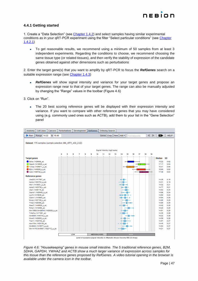
Page | 47
4.4.1 Getting started
1. Create a “Data Selection” (see Chapter 1.4.2) and select samples having similar experimental conditions as in your qRT-PCR experiment using the filter “Select particular conditions” (see Chapter 1.4.2.1)
To get reasonable results, we recommend using a minimum of 50 samples from at least 3
independent experiments. Regarding the conditions to choose, we recommend choosing the
same tissue type (or related tissues), and then verify the stability of expression of the candidate
genes obtained against other dimensions such as perturbations
2. Enter the target gene(s) that you want to amplify by qRT-PCR to focus the RefGenes search on a
suitable expression range (see Chapter 1.4.3)
RefGenes will show signal intensity and variance for your target genes and propose an
expression range near to that of your target genes. The range can also be manually adjusted
by changing the “Range” values in the toolbar (Figure 4.6)
3. Click on “Run”.
The 20 best scoring reference genes will be displayed with their expression intensity and
variance. If you want to compare with other reference genes that you may have considered
using (e.g. commonly used ones such as ACTB), add them to your list in the “Gene Selection”
panel
Figure 4.6: “Housekeeping” genes in mouse small intestine. The 5 traditional reference genes, B2M, SDHA, GAPDH, YWHAZ and ACTB show a much larger variance of expression across samples for this tissue than the reference genes proposed by RefGenes. A video tutorial opening in the browser is available under the camera icon in the toolbar.
Page | 48
4.4.2 Features
The results are displayed as boxplots
The expression range in which the most stable genes are search is automatically defined by the
entered target genes but can manually be changed
The “Copy”, “New” and “Add” features described for the other GENE SEARCH TOOLS are also
present in RefGenes (see Chapter 4.2.1)
Step-by-step instructions and more information about the tool, including a 3-min video, are
available on the RefGenes website www.refgenes.org. The video tutorial is also available
directly in the tool by clicking on the camera icon or on the following link:
https://genevestigator.com/gv/doc/video_tutorials.jsp
4.4.3 Statistics
The expression values displayed in the RefGenes tool represent the average expression for a given
gene across all selected samples. The expression values are “normalized” as described in Chapter 7
for microarray data and Chapter 8 for RNAseq data.
In the boxplots, the whiskers represent the lowest datum still within 1.5 IQR from the lower quartile, and
the highest datum still within 1.5 IQR from the upper quartile. Outliers, represented as stars, are values
outside this range. Median value and standard deviation are indicated on the right of the plot. Additional
statistical parameters are available by resting the mouse on a result (see Chapter 1.5).
4.5 The Ortholog Search tool
The Ortholog Search tool allows you can quickly and easily find the most likely functional orthologs to
a gene of interest in other species. The uniqueness of this tool lies in the fact that it uses both
sequence and expression data to predict the most likely functional orthologs.
4.5.1 Getting started
1. Create a “Gene Selection” (see Chapter 1.4.3)
2. Click on “Run”
4.5.2 Features
The results will be displayed in a table grouped by organism (Figure 4.7). For each gene, a
sequence based score (PAM) and an expression based score will be shown. The shade of the
color and the displayed numerical value indicate the distance of the orthologous gene to the
query gene. The PAM is provided by the OMA database. The expression based score is
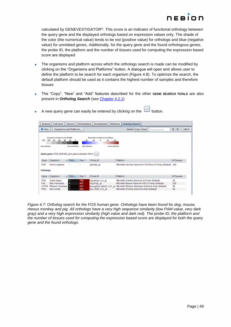
Page | 49
calculated by GENEVESTIGATOR®. This score is an indicator of functional orthology between
the query gene and the displayed orthologs based on expression values only. The shade of
the color (the numerical value) tends to be red (positive value) for orthologs and blue (negative
value) for unrelated genes. Additionally, for the query gene and the found orthologous genes,
the probe ID, the platform and the number of tissues used for computing the expression based
score are displayed
The organisms and platform across which the orthologs search is made can be modified by
clicking on the “Organisms and Platforms” button. A dialogue will open and allows user to
define the platform to be search for each organism (Figure 4.8). To optimize the search, the
default platform should be used as it contains the highest number of samples and therefore
tissues
The “Copy”, “New” and “Add” features described for the other GENE SEARCH TOOLS are also
present in Ortholog Search (see Chapter 4.2.1)
A new query gene can easily be entered by clicking on the button.
Figure 4.7: Ortholog search for the FOS human gene. Orthologs have been found for dog, mouse, rhesus monkey and pig. All orthologs have a very high sequence similarity (low PAM value, very dark gray) and a very high expression similarity (high value and dark red). The probe ID, the platform and the number of tissues used for computing the expression based score are displayed for both the query gene and the found orthologs.
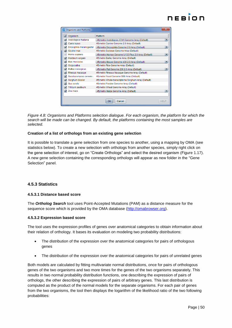
Page | 50
Figure 4.8: Organisms and Platforms selection dialogue. For each organism, the platform for which the search will be made can be changed. By default, the platforms containing the most samples are selected. Creation of a list of orthologs from an existing gene selection
It is possible to translate a gene selection from one species to another, using a mapping by OMA (see
statistics below). To create a new selection with orthologs from another species, simply right click on
the gene selection of interest, go on “Create Orthologs” and select the desired organism (Figure 1.17).
A new gene selection containing the corresponding orthologs will appear as new folder in the “Gene
Selection” panel.
4.5.3 Statistics
4.5.3.1 Distance based score
The Ortholog Search tool uses Point-Accepted Mutations (PAM) as a distance measure for the
sequence score which is provided by the OMA database (http://omabrowser.org).
4.5.3.2 Expression based score
The tool uses the expression profiles of genes over anatomical categories to obtain information about
their relation of orthology. It bases its evaluation on modeling two probability distributions:
The distribution of the expression over the anatomical categories for pairs of orthologous
genes
The distribution of the expression over the anatomical categories for pairs of unrelated genes
Both models are calculated by fitting multivariate normal distributions, once for pairs of orthologous
genes of the two organisms and two more times for the genes of the two organisms separately. This
results in two normal probability distribution functions, one describing the expression of pairs of
orthologs, the other describing the expression of pairs of arbitrary genes. This last distribution is
computed as the product of the normal models for the separate organisms. For each pair of genes
from the two organisms, the tool then displays the logarithm of the likelihood ratio of the two following
probabilities:

Page | 51
The probability that the observed expression of the two genes results from orthologous genes
The probability that the observed expression of the two genes results from non-orthologous
genes
The relevance of the likelihood ratio can be seen as a consequence of the Neyman–Pearson Lemma.
(See Simple-vs-simple_hypotheses on Wikipedia.) According to Bayes Theorem, the likelihood ratio,
(also called Bayes factor) is exactly what is needed to compute a posterior estimate of the probability
that two given genes are ortholog from prior probabilities. Typically, the prior probability will come from
sequence information. Alternatively, the likelihood ratio can simply be used as an indicator of
orthology.
Page | 52
Chapter 5
COMPENDIUM WIDE ANALYSIS: SIMILARITY SEARCH TOOLS
The SIMILARITY SEARCH TOOLS allow the grouping of your genes of interest according to their similarity
across chosen expression profiles or to find conditions generating a similar expression pattern than a
given signature. This toolset currently consists of four different tools (Figure 5.1):
Figure 5.1: SIMILARITY SEARCH toolset comprising four individual tools.
The Hierarchical Clustering tool, based on the classical approach that was initially proposed
by Eisen et al., [6] for clustering gene expression data.
The Co-Expression tool, to identify genes being the most correlated to a target gene across a
dataset you defined.
The Signature tool, to identify experimental conditions causing similar biological responses as
in your own experiment based on expression values that you enter.
The Biclustering tool, based on a more recent approach that looks at similarity of gene
expression under subsets of conditions rather than across all conditions (for an assessment of
different methods, see Prelic et al., [7]). What makes the GENEVESTIGATOR® cluster analysis
different than other clustering software is its integration with a large curated database. Thus, it
is possible to cluster genes based on meta-profiles, i.e., within their biological context.
5.1 The Hierarchical Clustering tool
The Hierarchical Clustering tool helps you group genes and/or conditions having similar profiles
across all conditions or genes selected, respectively. It works on the expression matrix defined by
the current sample and gene selections. Different options influencing the clustering results are available
via drop-down lists in the toolbar (Figure 5.2).
5.1.1 Getting started
1. Create a “Data Selection” (see Chapter 1.4.2)
2. Create a “Gene Selection” (see Chapter 1.4.3)
3. Select a biological context (Samples, Anatomy, Development, Perturbations, Cell Lines Cancers,
Anat./Cancer/Cell.) from the drop-down menu in the toolbar (Figure 5.2)

Page | 53
4. Click on “Run”
A heatmap will automatically generated for the chosen profile with the entered genes and the
samples selected sample
Figure 5.2: Toolbar of the Hierarchical Clustering tool cut in two parts. Diverse options are available to adapt the clustering to your requirements. Drop-down lists allow you to choose the biological context (or profile), the type of distance measure and leaf-ordering that will be used.
5.1.2 Features and Statistics
The Hierarchical Clustering algorithm allows you to cluster the matrix in one or in both
directions, i.e., group genes with similar expression patterns across the selected conditions, or
group conditions with similar expression patterns for the selected genes. Select the checkboxes
"Genes" or "Conditions" in the toolbar accordingly (Figure 5.2).
The “distance measure” option: similarities between expression profiles can be determined
using different measures. Possible settings are: Pearson correlation, Euclidian distance,
Manhattan distance. In GENEVESTIGATOR®, Euclidian distance is set as default. Additionally,
GENEVESTIGATOR® uses average linkage with the chosen distance measure to calculate the
distance between two clusters. Different “distance measures” are available in a drop-down list
in the toolbar (Figure 5.2)
The “leaf-ordering” option: in a clustering tree, branches can be turned either way at each
node. Leaf ordering consists of turning the branches around so that similar vectors (i.e., clusters
with similar patterns) are positioned close to each other (from left to right) but the clustering tree
remains the same. There are situations, such as a time-course or a dose response series, where
leaf-ordering can be very useful to obtain a better visualization. The ordering of the leaves is
computationally more intensive than the clustering itself. Despite the use of the fastest known
algorithm for leaf ordering (Bar-Joseph et al., [8]) it can take several dozen seconds for large
data matrices. Therefore, the tool was specified to apply leaf-ordering by default for small
matrices but to be optional for larger matrices (default is then set to "no leaf-ordering”). Figure
5.3 demonstrates the benefits of a well-chosen leaf-ordering.
Individual branches of the gene cluster for the can be selected and the list of genes copied to the clipboard ("Copy"), to a new gene selection ("New"), or added it to an existing gene selection ("Add") (Figure 5.2).

Page | 54
Individual branches of the conditions cluster can be selected and the list of samples included in these conditions copied to the clipboard ("Copy"), to a new “Data Selection” selection ("New"), or added it to an existing “Data Selection” ("Add") (Figure 5.2).
As for the Samples tool, it is possible to create and export gene signatures from this tool (see
Chapter 2.1.2)
Figure 5.3: Hierarchical clustering of genes against the Development meta-profile in Arabidopsis. A: Hierarchical clustering without leaf-ordering. B: Hierarchical clustering with leaf-ordering. Leaf-ordering allows a better visualization of sequential processes, such as developmental stages (shown here) or time-course experiments. The trees are identical, only the branches and leaves are in a different order.
5.2 The Co-Expression tool
The Co-Expression tool helps you identify genes having the most similar profile to a target gene
across a dataset selected or created from the database. As the GENEVESTIGATOR® engine processes
the correlations on-the-fly, any dataset (i.e. a selection of samples) can be defined, representing either
individual experiments or experimental conditions relevant for the target gene.
Ideally, this tool is used in combination with other tools of the CONDITION SEARCH TOOLSET. For instance,
the conditions relevant for a target gene can be identified with the Perturbations tool or a correlation
can be made only against a subset of samples from a given disease area.
5.2.1 Getting started
1. Create a “Data Selection” (see Chapter 1.4.2)
The choice of dataset underlying a correlation analysis is absolutely crucial. We strongly
recommend for instance to first identify the conditions that are relevant for a target gene using
the Perturbations tool from the CONDITION SEARCH TOOLS and to create a “Data Selection” with
these conditions (see Chapter 3.6.2). Then, to run a correlation using the Perturbations profile.

Page | 55
2. Create a “Gene Selection” (see Chapter 1.4.3)
If you have a list of genes, the target gene is the first marked gene in the list. You can define a
new target gene by creating a new gene selection (“New” button in the “Gene Selection” panel)
or by clicking on in the results panel (Figure 5.4).
3. Select a biological context (Samples, Anatomy, Development, Perturbations, Cell Lines,
Cancers, Anat./Cancer/Cell.) from the drop-down menu in the toolbar (Figure 5.4)
4. Click on “Run”
Figure 5.4: Toolbar of the Co-Expression tool. Several parameters must be selected from drop-down menus: the biological context, the number of gene to be displayed and the type of correlation. The
target gene can be changed directly in the result panel by clicking on the button. A video tutorial opening in the browser is available under the camera icon.
5.2.2 Features
By default, the target gene is the first marked gene in the gene selection in focus
Since GENEVESTIGATOR® processes the correlations on-the-fly, any dataset composed of
individual samples (Samples) or of summarized data into meta-profiles Anatomy,
Development, Cancers, Perturbations, Anat./Cancer/Cell) can be selected
The number of genes to be displayed can be selected in the “Limit” drop-down menu in the
toolbar (Figure 5.4)
Two types of correlations (“Positive” or “Negative”) are available
The tool will correlate all genes (more precisely: all probes) against the target gene (probe)
across the profiles generated from the selected dataset. The resulting genes are displayed in
the circular plot and described in the adjacent table (Figure 5.5)
The “Copy”, “New” and “Add” features described for the other GENE SEARCH TOOLS are also
present in the Co-Expression tool (see Chapter 4.2.2) and the co-expressed genes can easily
be further analyzed using other tools like the Hierarchical Clustering tool (see Chapter 5.1)

Page | 56
Figure 5.5: Co-expression analysis for the human PSCK9 gene. A: the correlation was done with the conditions in which PCSK9 is significantly regulated using the Perturbations tool from the CONDITION
SEARCH TOOLS and using the Perturbations profile. The 50 co-expressed genes are displayed on a circular plot. A cluster of mutually correlated gene is apparent. B: both correlation scores can be changed by sliding the cursor along the correlation scales. The correlation score can be used to filter the number of correlated genes to be displayed. The mutual correlation score will allow visualizing connections between mutually correlated genes. C: the 50 resulting genes are listed and described in an adjacent table and can be copied to the clipboard or used to create a new gene selection. The highlighted gene corresponds to the red squared dot in the plot.
Page | 57
In the circular plot, the target gene is in the center and the correlated genes are displayed around
it at a distance corresponding to their correlation with the target (see Chapter 5.2.3). The closer
they are to the center, the higher their correlation with the target gene across the selected
dataset (see axis indicating Pearson's correlation coefficients). The positions around the center
are determined by hierarchical clustering with optimal leaf-ordering, i.e., genes that more
strongly correlate with each other than with the remaining genes will group together. This allows
you not only to identify genes having a strong correlation with a given target gene, but to get an
idea whether there are groups of differently regulated genes that correlate well with the target
gene. To visualize this grouping more easily, it is possible to add an edge between each pair of
genes that have a correlation coefficient above a chosen threshold. The threshold can be
defined manually using the slide bar below the plot (Figure 5.5)
A video tutorial is available for this tool directly from the tool (camera icon) or under the following link: https://genevestigator.com/gv/doc/video_tutorials.jsp
5.2.3 Statistics
In the current version of this tool, we have chosen the Pearson correlation coefficient as measure of
similarity between genes, both for identifying co-expressed genes as well as to define the pairwise
correlation between genes in the plot. This score is calculated on log2-scaled expression data that is
processed from the GENEVESTIGATOR® database. To learn more about how data are normalized in
GENEVESTIGATOR®, please see Chapter 7 (microarray data) and Chapter 8 (RNAseq data). The
positioning of the dots in the plot is obtained by a circularized hierarchical clustering with average linkage
and optimal leaf-ordering.
5.3 The Signature tool
The Signature tool allows you to put your own results into the context of thousands other experiments.
It allows user to enter any gene expression signature obtained e.g. by RT-qPCR, RNASeq or microarray
and compare it against the entire GENEVESTIGATOR® content. A signature consists of a list of genes
and the corresponding values of expression level or log2-ratio. The Signature tool will then correlate the
entered signature against expression data from all the curated experiments of the “Data Selection” and
output those conditions having most similar/different profile.
5.3.1 Getting started
1. Create a “Data Selection” (see Chapter 1.4.2)
Ideally you should select the default platform for an organism to search against the maximum
number of conditions.
2. Click on the “Enter Signature” button present in the toolbar (Figure 5.6)
3. In the “Enter Signature” dialogue (Figure 5.7) enter a signature of at least 8 genes or probe IDs and
the corresponding expression values (either by typing them or pasting them) and specify:
The scaling of data: linear or log-scale
The type of expression data: absolute or relative values

Page | 58
Figure 5.6: The toolbar of the Signature tool toolbar cut in two parts. The “Run” and “Enter Signature” buttons are in red rectangles. Analysis parameters such as the type of profile, type of similarity and the type of distance are available in drop-down lists. A video tutorial opening in the browser is available under the camera icon.
Figure 5.7: The “Enter Signature” dialogue. The Organism is defined based on the “Data Selection” in focus. A minimum of 8 genes or probe IDs are required. The genes and expression values can be manually entered or directly pasted from another file. Both the “Scaling of data” and the “Type of data” must be defined.
5. Choose from the drop-down menu in the toolbar the type of profile GENEVESTIGATOR® should
search through (Figure 5.6)
Absolute expression values will allow you a search across the Samples, Anatomy, Cell Lines,
Cancers or Development profiles
Relative expression values, will allow you a search across the Perturbations profile
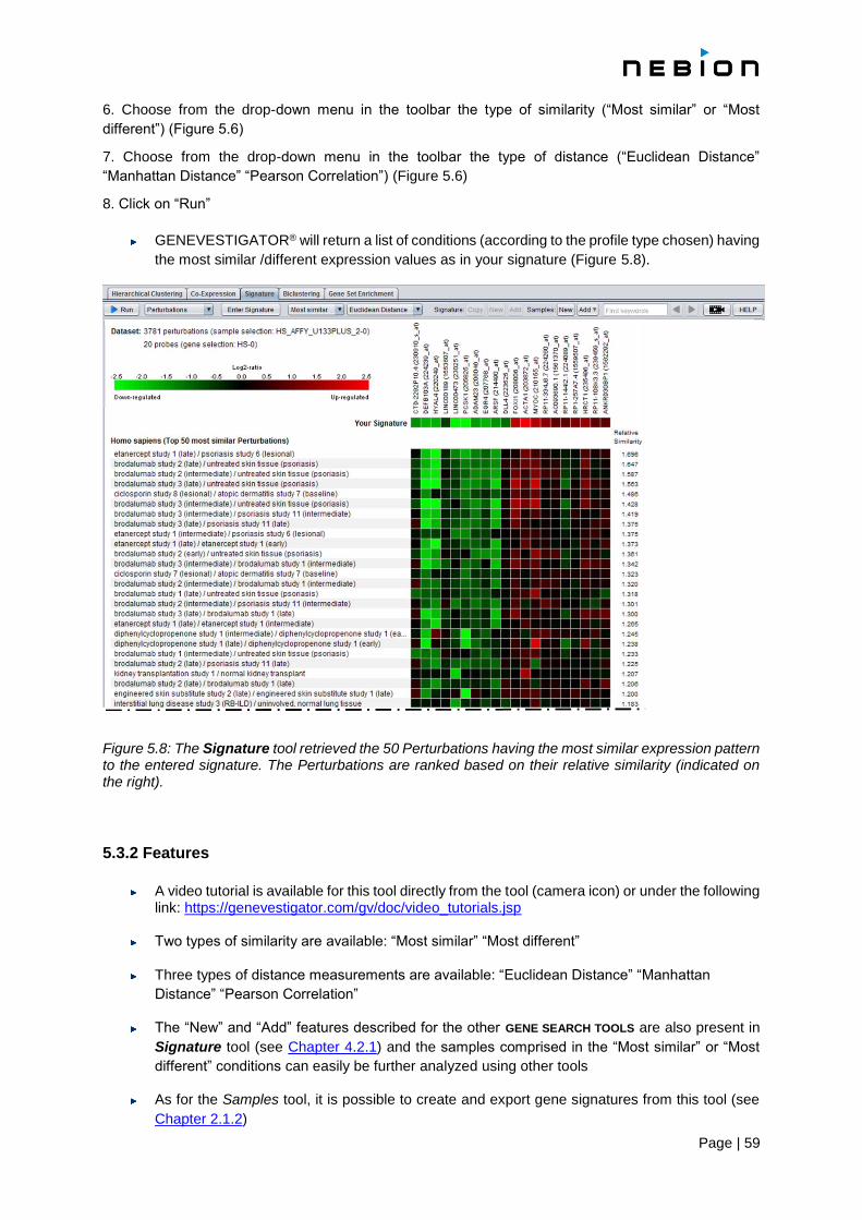
Page | 59
6. Choose from the drop-down menu in the toolbar the type of similarity (“Most similar” or “Most
different”) (Figure 5.6)
7. Choose from the drop-down menu in the toolbar the type of distance (“Euclidean Distance”
“Manhattan Distance” “Pearson Correlation”) (Figure 5.6)
8. Click on “Run”
GENEVESTIGATOR® will return a list of conditions (according to the profile type chosen) having
the most similar /different expression values as in your signature (Figure 5.8).
Figure 5.8: The Signature tool retrieved the 50 Perturbations having the most similar expression pattern to the entered signature. The Perturbations are ranked based on their relative similarity (indicated on the right).
5.3.2 Features
A video tutorial is available for this tool directly from the tool (camera icon) or under the following link: https://genevestigator.com/gv/doc/video_tutorials.jsp
Two types of similarity are available: “Most similar” “Most different”
Three types of distance measurements are available: “Euclidean Distance” “Manhattan
Distance” “Pearson Correlation”
The “New” and “Add” features described for the other GENE SEARCH TOOLS are also present in
Signature tool (see Chapter 4.2.1) and the samples comprised in the “Most similar” or “Most
different” conditions can easily be further analyzed using other tools
As for the Samples tool, it is possible to create and export gene signatures from this tool (see
Chapter 2.1.2)

Page | 60
Creation of gene signatures for use in other tools
So far, it has been possible from certain tools in GENEVESTIGATOR® to copy a list of genes either to
the clipboard or to a gene selection. This function has now been enhanced to allow exporting the list of
genes together with the corresponding expression values (“signatures”) from a given condition. To
create such a “signature”, select the condition of interest (Anatomy or Perturbations), and click in the
toolbar on the Signature: “Copy” “New” or “Add” buttons.
The “signature” will appear in the “Gene Selection” panel with a “S” tag.
A “signature” can be opened directly in the Signature tool and allows you to compare it with data from
other studies. Doing such a comparison is useful to find other studies giving similar or opposite results,
or to verify the nature of a given sample.
5.3.3 Statistics
The results show conditions which are similar or different to the entered genes and expression values.
The level of similarity is given as “relative similarity” and indicates the degree of their resemblance: The
higher the value, the higher the similarity relative to the average similarity.
More precisely if the similarity si is defined as 1/di with di the distance of category i to the signature, then
the relative similarity R of a category c is calculated as
where si is the similarity of category i and I the set of all conditions.
For statistical reasons, expression similarity measures are calculated on log-scaled data. Therefore, if
the data entered is in linear scale, it will be log-transformed by the tool for the calculation of similarity.
5.4 The Biclustering tool
In contrast to the Hierarchical Clustering tool, which groups genes by measuring their similarity of
expression across all selected conditions, the Biclustering tool identifies groups of genes that exhibit
similarity only in a subset of conditions, irrespective of their expression profiles in other conditions.
The rationale for using biclustering is that each gene has its own individual set of regulators and under
certain conditions share common regulation with other genes. Therefore, the Biclustering tool searches
for modules of co-regulated genes, in subsets of conditions under which they are regulated the same
way, irrespective of how they are regulated under other conditions.
Several biclustering algorithms have recently been developed for the analysis of expression data. For
an empirical comparison see Prelic et al., [7].

Page | 61
5.4.1 Getting started
1. Create a “Data Selection” (see Chapter 1.4.2)
2. Create a “Gene Selection” (see Chapter 1.4.3)
3. Choose from the drop-down menu in the toolbar the type of profile (Samples, Anatomy,
Development, Perturbations, Cell Lines, Cancers, or Anat./Cancer/Cell.) (Figure 5.9)
For the Perturbations dimension, specify if you are looking for modules of genes that are
commonly “up” or commonly “down” regulated, or both up- and down-regulated (Figure 5.10)
4. Click on “Run”
Figure 5.9: Toolbar of the Biclustering tool cut in two. The drop-down menu to select a profile is open and the binary matrix box is unchecked. A video tutorial opening in the browser is available under the camera icon.
4. Click on “Run”
Identifying a list of interesting biclusters requires in many cases several runs. A critical issue is
the running time as the number of biclusters can get huge depending on the settings and size
of the matrix and it is easily possible to specify settings for which the algorithm would require
hours to complete. Thus, it is best to start with a high discretization threshold, e.g., one leading
to approximately 5-10% black cells in the discrete matrix and high numbers for the minimal
factors and minimal genes settings, e.g., 5x5 or more. If no biclusters or only a small number of
biclusters are found, these numbers can then be reduced step by step for further runs (Figure
5.10).
The list of biclusters identified in a run is displayed on the right. Selecting one of the biclusters
re-orders the matrix in such a way that this bicluster appears in the upper left corner of the
matrix.
5.4.2 Features
A video tutorial is available for this tool directly from the tool (camera icon) or under the following link: https://genevestigator.com/gv/doc/video_tutorials.jsp

Page | 62
As in the Hierarchical Clustering tool, a list of genes can be displayed against various
biological dimensions (Samples, Anatomy, Development, Perturbations, Cell Lines,
Cancers, Anat./Cancer/Cell.).
A list of genes can be displayed against various
Discretization “Threshold” is set at 0.8 by default but another value can be entered. To verify
your choice, visualize the matrix by clicking the “binary matrix” checkbox –the discretized matrix
will be displayed instead of the original expression matrix. Ideally, the number of black cells
should only represent a small percentage of the whole matrix (5-10% of black cells) (Figure
5.10).
The “min factors” and “min probes” options can be used to specify the minimal numbers of
factors and genes that a bicluster must contain. By default, both are set to 5 (Figure 5.9).
As in other tools, the "Copy" "New" and "Add" buttons can be used to export the gene list to the
clipboard, to create a new gene selection, or to add the list to an existing gene selection (see
Chapter 4.2.1)
As for the Samples tool, it is possible to create and export gene signatures from this tool (see
Chapter 2.1.2)
For the Perturbations profiles, you can specify whether you want to find biclusters of
upregulated genes or downregulated genes or biclusters with genes that changed their
expression in either direction
5.4.3 Statistics
GENEVESTIGATOR® uses the BiMax algorithm (Prelic et al., [7]) because it is an exact algorithm that
identifies all biclusters in a matrix. The algorithm works on a binary matrix (i.e., data having two states
for instance, up-regulated versus not up-regulated). The expression data matrix is first discretized to 0
and 1 according to a user-specified threshold, e.g., the expression data are categorized into either
“changed” (black) versus “not changed” (white). Based on this binary matrix, BiMax identifies all maximal
biclusters where a bicluster is defined as a set of genes and a set of conditions for which all values are
1 and where “maximal” means that this bicluster is not completely contained in any other bicluster.
Specifying a threshold
In case of the Perturbations profiles, the threshold is specified as a log ratio between treatment and
control. A threshold of 1 is equivalent to two-fold upregulation, a threshold of 2 is equivalent to four-fold
upregulation and a threshold of -1 is equivalent to two-fold down regulation. For all other profiles which
show absolute expression values, the discretization is based on the percentage of the expression
potential (in log scale). The expression potential estimates the maximum expression level that a gene
can reach. Thus, a threshold of 0.5 for example marks all genes as highly expressed that reach half of
their expression potential.
Limitations
The biclustering tool has several limitations to help prevent crashes on the client. The first is that no
matrix greater than 250,000 elements (e.g. 500x500, 200x1250, 10x25000, etc...) can be biclustered.
In addition, if the algorithm encounters many biclusters during evaluation, it will abort computation and
return with a warning message.

Page | 63
Figure 5.10: Biclustering of genes with the Perturbations profile for Human. In the bottom image, the matrix was discretized into 0 (white; below threshold) and 1 (black; above threshold). The selected bicluster is placed at the top left corner.
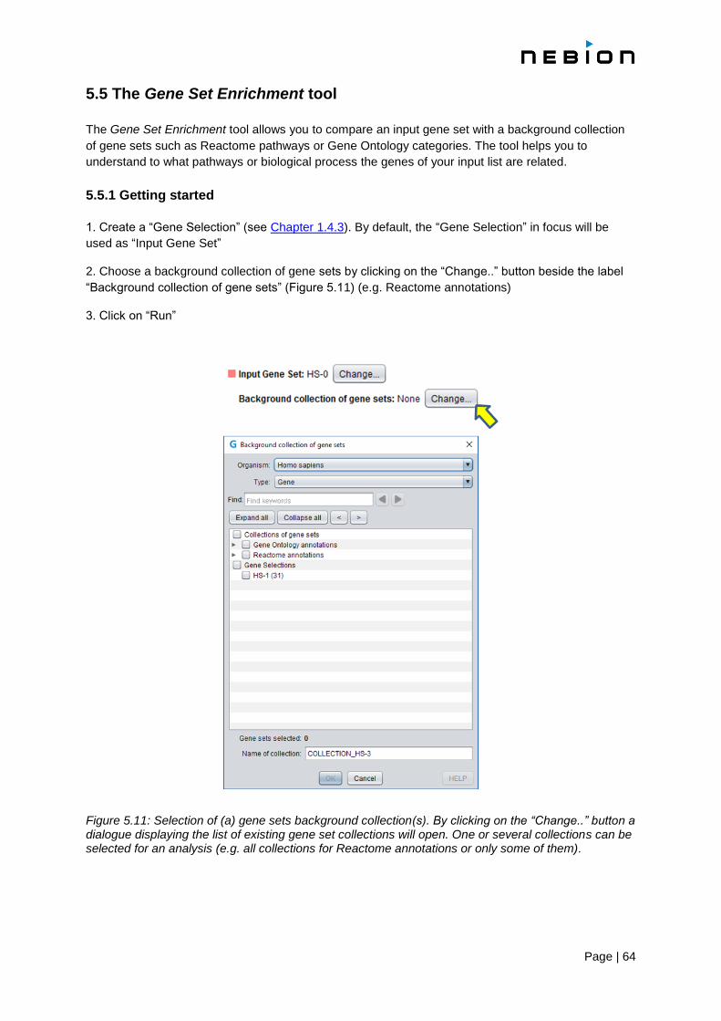
Page | 64
5.5 The Gene Set Enrichment tool
The Gene Set Enrichment tool allows you to compare an input gene set with a background collection
of gene sets such as Reactome pathways or Gene Ontology categories. The tool helps you to
understand to what pathways or biological process the genes of your input list are related.
5.5.1 Getting started
1. Create a “Gene Selection” (see Chapter 1.4.3). By default, the “Gene Selection” in focus will be
used as “Input Gene Set”
2. Choose a background collection of gene sets by clicking on the “Change..” button beside the label
“Background collection of gene sets” (Figure 5.11) (e.g. Reactome annotations)
3. Click on “Run”
Figure 5.11: Selection of (a) gene sets background collection(s). By clicking on the “Change..” button a dialogue displaying the list of existing gene set collections will open. One or several collections can be selected for an analysis (e.g. all collections for Reactome annotations or only some of them).
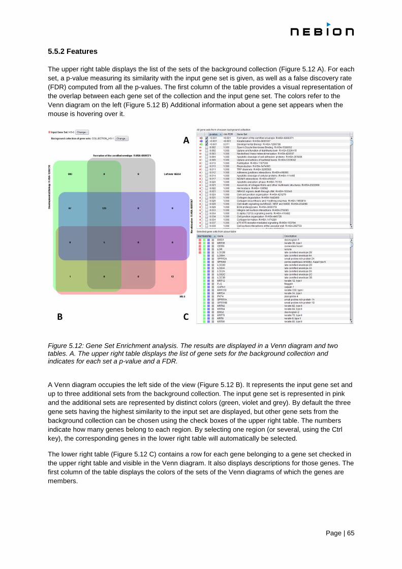
Page | 65
5.5.2 Features
The upper right table displays the list of the sets of the background collection (Figure 5.12 A). For each
set, a p-value measuring its similarity with the input gene set is given, as well as a false discovery rate
(FDR) computed from all the p-values. The first column of the table provides a visual representation of
the overlap between each gene set of the collection and the input gene set. The colors refer to the
Venn diagram on the left (Figure 5.12 B) Additional information about a gene set appears when the
mouse is hovering over it.
Figure 5.12: Gene Set Enrichment analysis. The results are displayed in a Venn diagram and two tables. A. The upper right table displays the list of gene sets for the background collection and indicates for each set a p-value and a FDR. A Venn diagram occupies the left side of the view (Figure 5.12 B). It represents the input gene set and
up to three additional sets from the background collection. The input gene set is represented in pink
and the additional sets are represented by distinct colors (green, violet and grey). By default the three
gene sets having the highest similarity to the input set are displayed, but other gene sets from the
background collection can be chosen using the check boxes of the upper right table. The numbers
indicate how many genes belong to each region. By selecting one region (or several, using the Ctrl
key), the corresponding genes in the lower right table will automatically be selected.
The lower right table (Figure 5.12 C) contains a row for each gene belonging to a gene set checked in
the upper right table and visible in the Venn diagram. It also displays descriptions for those genes. The
first column of the table displays the colors of the sets of the Venn diagrams of which the genes are
members.

Page | 66
5.5.3 Statistics
The similarity between the input gene set and the background gene sets is indicated using
a p-value. The p-value for a pair of gene sets is the probability that two random sets of the
same size have an at least equally large intersection. The p-values are calculated by a
method usually known as the hypergeometric test or Fisher's exact test. Since the test
corresponds to the rather unrealistic null hypothesis that the genes of one set were chosen
at random independently, its results should usually be used heuristically.
5.5.4 Alternative use case
Besides being used to compare an input gene set to a large predefined collection of sets,
the tool can also be used to examine the relationship between a few selected gene sets
(either gene selections or predefined gene sets). More precisely, two (or more) gene lists
that we were either created from a GENEVESTIGATOR® tool or imported from another
application can be compared in order to find the genes shared between the lists. In this
second case, one set of interest should be used as input set, while the other sets of
interest should be taken as "Background collection of gene sets".
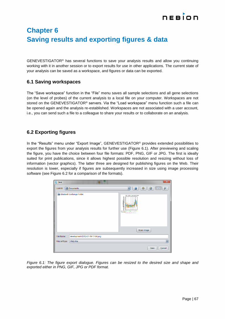
Page | 67
Chapter 6
Saving results and exporting figures & data
GENEVESTIGATOR® has several functions to save your analysis results and allow you continuing
working with it in another session or to export results for use in other applications. The current state of
your analysis can be saved as a workspace, and figures or data can be exported.
6.1 Saving workspaces
The “Save workspace” function in the “File” menu saves all sample selections and all gene selections
(on the level of probes) of the current analysis to a local file on your computer. Workspaces are not
stored on the GENEVESTIGATOR® servers. Via the “Load workspace” menu function such a file can
be opened again and the analysis re-established. Workspaces are not associated with a user account,
i.e., you can send such a file to a colleague to share your results or to collaborate on an analysis.
6.2 Exporting figures
In the “Results” menu under “Export Image”, GENEVESTIGATOR® provides extended possibilities to
export the figures from your analysis results for further use (Figure 6.1). After previewing and scaling
the figure, you have the choice between four file formats: PDF, PNG, GIF or JPG. The first is ideally
suited for print publications, since it allows highest possible resolution and resizing without loss of
information (vector graphics). The latter three are designed for publishing figures on the Web. Their
resolution is lower, especially if figures are subsequently increased in size using image processing
software (see Figure 6.2 for a comparison of the formats).
Figure 6.1: The figure export dialogue. Figures can be resized to the desired size and shape and exported either in PNG, GIF, JPG or PDF format.
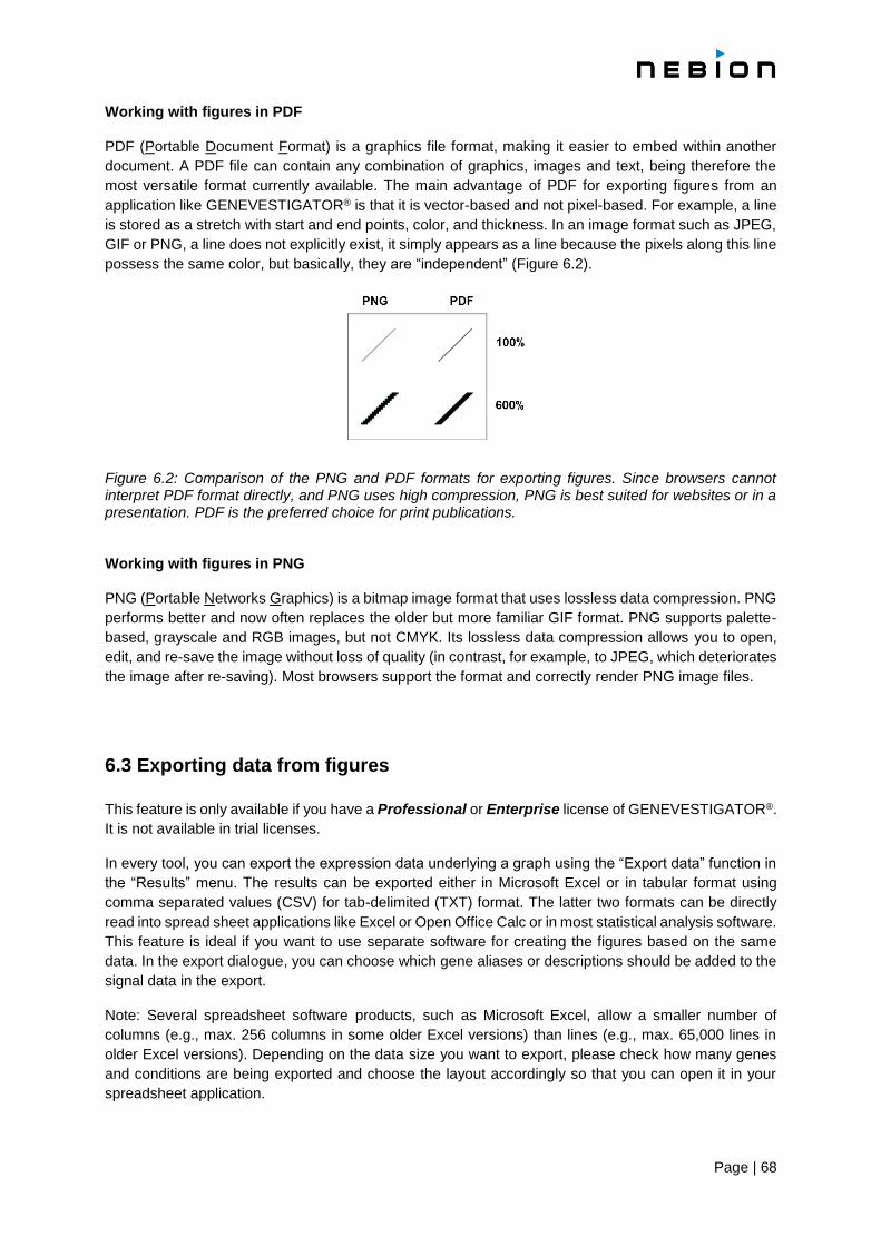
Page | 68
Working with figures in PDF
PDF (Portable Document Format) is a graphics file format, making it easier to embed within another
document. A PDF file can contain any combination of graphics, images and text, being therefore the
most versatile format currently available. The main advantage of PDF for exporting figures from an
application like GENEVESTIGATOR® is that it is vector-based and not pixel-based. For example, a line
is stored as a stretch with start and end points, color, and thickness. In an image format such as JPEG,
GIF or PNG, a line does not explicitly exist, it simply appears as a line because the pixels along this line
possess the same color, but basically, they are “independent” (Figure 6.2).
Figure 6.2: Comparison of the PNG and PDF formats for exporting figures. Since browsers cannot interpret PDF format directly, and PNG uses high compression, PNG is best suited for websites or in a presentation. PDF is the preferred choice for print publications. Working with figures in PNG
PNG (Portable Networks Graphics) is a bitmap image format that uses lossless data compression. PNG
performs better and now often replaces the older but more familiar GIF format. PNG supports palette-
based, grayscale and RGB images, but not CMYK. Its lossless data compression allows you to open,
edit, and re-save the image without loss of quality (in contrast, for example, to JPEG, which deteriorates
the image after re-saving). Most browsers support the format and correctly render PNG image files.
6.3 Exporting data from figures
This feature is only available if you have a Professional or Enterprise license of GENEVESTIGATOR®.
It is not available in trial licenses.
In every tool, you can export the expression data underlying a graph using the “Export data” function in
the “Results” menu. The results can be exported either in Microsoft Excel or in tabular format using
comma separated values (CSV) for tab-delimited (TXT) format. The latter two formats can be directly
read into spread sheet applications like Excel or Open Office Calc or in most statistical analysis software.
This feature is ideal if you want to use separate software for creating the figures based on the same
data. In the export dialogue, you can choose which gene aliases or descriptions should be added to the
signal data in the export.
Note: Several spreadsheet software products, such as Microsoft Excel, allow a smaller number of
columns (e.g., max. 256 columns in some older Excel versions) than lines (e.g., max. 65,000 lines in
older Excel versions). Depending on the data size you want to export, please check how many genes
and conditions are being exported and choose the layout accordingly so that you can open it in your
spreadsheet application.
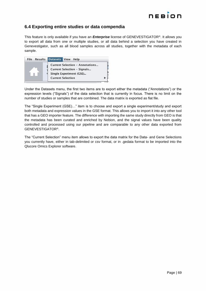
Page | 69
6.4 Exporting entire studies or data compendia
This feature is only available if you have an Enterprise license of GENEVESTIGATOR®. It allows you
to export all data from one or multiple studies, or all data behind a selection you have created in
Genevestigator, such as all blood samples across all studies, together with the metadata of each
sample.
Under the Datasets menu, the first two items are to export either the metadata (“Annotations”) or the
expression levels (“Signals”) of the data selection that is currently in focus. There is no limit on the
number of studies or samples that are combined. The data matrix is exported as flat file.
The “Single Experiment (GSE)…” item is to choose and export a single experiment/study and export
both metadata and expression values in the GSE format. This allows you to import it into any other tool
that has a GEO importer feature. The difference with importing the same study directly from GEO is that
the metadata has been curated and enriched by Nebion, and the signal values have been quality
controlled and processed using our pipeline and are comparable to any other data exported from
GENEVESTIGATOR®.
The “Current Selection” menu item allows to export the data matrix for the Data- and Gene Selections
you currently have, either in tab-delimited or csv format, or in .gedata format to be imported into the
Qlucore Omics Explorer software.

Page | 70
Chapter 7
Data normalization for microarray
The decision of which algorithm to choose for normalization depends, besides statistical considerations,
on several factors such as experimental design, number of arrays to analyze, diversity of tissue types
being analyzed, and type of data integration. The GENEVESTIGATOR® database hosts data from a
variety of platforms and a wide variety of experimental conditions and designs. The
GENEVESTIGATOR® Team has extensively tested a variety of methods and has chosen robust
methods that best fulfill the requirements of single- and multi-experiment analysis.
7.1 Data normalization in GENEVESTIGATOR®
GENEVESTIGATOR® does not consist of a mere collection of curated experiments analyzed
individually. The essence of GENEVESTIGATOR® is to integrate all experiments and perform meta-
analysis across thousands of experiments.
We therefore looked for a method delivering:
1. Robust values for comparisons within individual experiments.
o precise differential expression analysis between groups of experimental variables
o compare absolute expression values between samples
o 2. Approximate values for comparisons between experiments.
o aggregate data across all experiments to generate meta-profiles for anatomy or
cancer
o roughly compare absolute expression values across different studies to find those with extreme expression values (+/- 5% is acceptable for this purpose)
After intensively testing several methods, we decided to use a two-step approach:
STEP 1: a quantile normalization for samples from a given experiment and subsequently
STEP 2: a global scaling scheme for adjusting between experiments.
STEP 1: raw data is processed using quantile normalization as e.g. implemented for RMA in
Bioconductor.
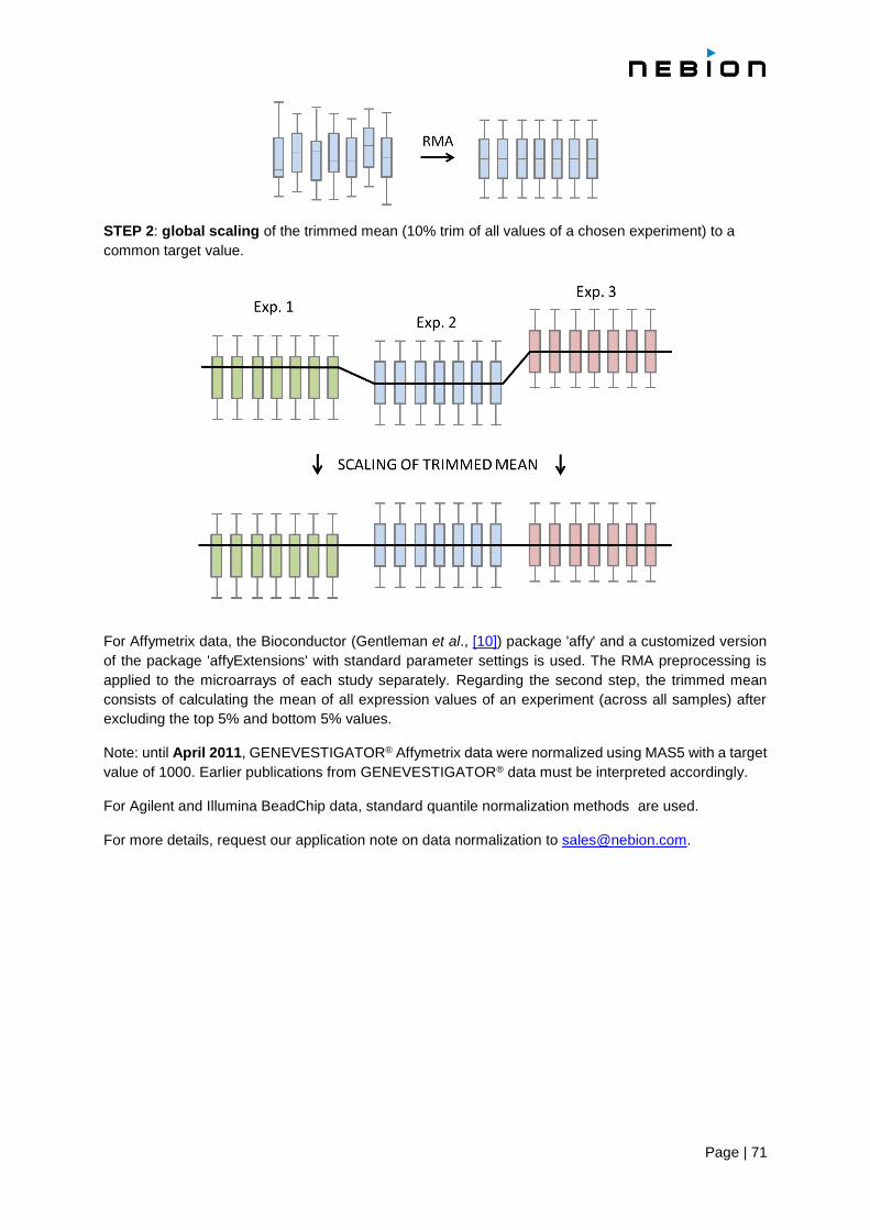
Page | 71
STEP 2: global scaling of the trimmed mean (10% trim of all values of a chosen experiment) to a
common target value.
For Affymetrix data, the Bioconductor (Gentleman et al., [10]) package 'affy' and a customized version
of the package 'affyExtensions' with standard parameter settings is used. The RMA preprocessing is
applied to the microarrays of each study separately. Regarding the second step, the trimmed mean
consists of calculating the mean of all expression values of an experiment (across all samples) after
excluding the top 5% and bottom 5% values.
Note: until April 2011, GENEVESTIGATOR® Affymetrix data were normalized using MAS5 with a target
value of 1000. Earlier publications from GENEVESTIGATOR® data must be interpreted accordingly.
For Agilent and Illumina BeadChip data, standard quantile normalization methods are used.
For more details, request our application note on data normalization to [email protected].
Page | 72
Chapter 8
Expression quantification for RNA sequencing data
8.1 Meaning of expression values
RNA sequencing is a method for measuring gene expression for more information please visit:
http://rnaseq.uoregon.edu
Gene expression is measured in TPM (transcript per million). The TPM of a gene or an isoform is the
expected number of mRNA transcribed from this gene or isoform in a hypothetical sample of 1 million
mRNA.
In GENEVESTIGATOR® while expression is measured in TPM, behind the scene, the number of
reads mapping to each transcript (expected counts) is also used to quantify the uncertainty of
measurement.
8.2 Computation of expression values
TPM and expected counts are obtained by mapping libraries of reads to transcriptome references. An
alignment is calculated by Bowtie [16] and used by RSEM [17] to compute both TMP and expected
counts.

Page | 73
Chapter 9
Quality control
9.1 General principles and goal
Since the experiments from GENEVESTIGATOR® were performed in many different labs, NEBION has
no control over experimental design, sample preparation and processing. Therefore, we ensure the
quality of the samples using quality control (QC) on the raw data and the expertise of the curators
An extensive QC analysis is performed for every experiment to detect samples of mediocre quality.
Often there are no fixed thresholds to qualify samples as problematic, because parameter ranges can
vary between organisms and platforms.
Major differences in QC statistics can occur between organisms and sometimes between microarray
platforms. Therefore, besides understanding the meaning of each of the QC plots, probably the most
critical point is that the results should be consistent between samples from a given experiment,
especially between biological and/or technical replicates, and an experiment from a given organism
and platform should be consistent with other experiments from the same organism and platform.
For microarray technology, the GENEVESTIGATOR® QC analysis is performed with the R statistical
analysis software using a variety of packages and libraries. For Affymetrix data, we use customized
versions of the simpleaffy and affyQCReport packages (and depending packages) from Bioconductor.
For Agilent and Illumina arrays, we created QC reports using various Bioconductor libraries.
The GENEVESTIGATOR® QC pipeline includes several probe-level analyses checking signal intensity
and variance, RNA degradation, border elements, and array-to-array correlation. Samples are excluded
from GENEVESTIGATOR® if the QC shows unusually high variance, high RNA degradation levels,
overall low signal levels (poor hybridization or labeling), or if a sample shows poor correlation with
replicate samples from the same experimental condition.
For RNA sequencing, the GENEVESTIGATOR® QC analysis is performed with FastQC and custom
scripts displaying information using the output of RSEM.
The GENEVESTIGATOR® QC pipeline includes graphs obtained from FastQC giving information about
reads and their quality. The pipeline also includes a sequence of plots describing how the reads map to
the reference transcriptome, the distribution of expression among transcripts and correlation of
expression between samples.
Page | 74
References
[1] Hruz T, Laule O, Szabo G, Wessendorp F, Bleuler S, Oertle L, Widmayer P, Gruissem W and
Zimmermann P. Genevestigator V3: a reference expression database for the meta-analysis of
transcriptomes. Advances in Bioinformatics 2008, 420747 [Full Text]
[2] Prasad A, Suresh Kumar S, Dessimoz C, Bleuler S, Laule O, Hruz T, Gruissem W, and
Zimmermann P. Global regulatory architecture of human, mouse and rat tissue transcriptomes.
BMC Genomics 2013, 14:716. [Abstract]
[3] Benjamini Y and Gochberg Y. Controlling the false discovery rate: a practical and powerful
approach to multiple testing. J Roy Statist Soc Ser B (Methodological) 1995, 57:289-300.
[4] Smyth G.. Linear models and empirical bayes methods for assessing differential expression in
microarray experiments. Stat Appl Genet Mol Biol. 2004, 3 (1). [Abstract]
[5] Law C, Chen Y, Shi W, Smyth G. Voom: precision weights unlock linear model analysis tools
for RNA-seq read counts. Genome Biology 2014, 15:R29
[6] Eisen MB, Spellman PT, Brown PO, Botstein D. Cluster analysis and display of genome-wide expression patterns. Proc Natl Acad Sci U S A 1998, 95 (25): 14863–14868
[7] Prelic A, Bleuler S, Zimmermann P, Wille A, Bühlmann P, Gruissem W, Hennig L, Thiele L, and Zitzler E. A systematic comparison and evaluation of biclustering methods for gene expression data. Bioinformatics 2006, 22: 1122–1129
[8] Bar-Joseph Z, Demaine ED, Gifford DK, Srebro N, Hamel AM, and Jaakkola TS. K-ary clustering with optimal leaf ordering for gene expression data. Bioinformatics 2003, 19 (9): 1070-1078 [Abstract]
[9] Hruz T, Wyss M, Docquier M, Pfaffl MW, Masanetz S, Borghi L, Verbrugge P, Kalaydjieva L,
Bleuler S, Laule O, Descombes P, Gruissem W and P Zimmermann. RefGenes: identification
of reliable and condition specific reference genes for RT-qPCR data normalization. BMC
Genomics 2011, 12: 156 [Abstract] [PDF]
[10] Gentleman RC, Carey VJ, Douglas MB, Bolstad B, Dettling M, Dudoit S, Ellis B, Gautier L, Ge Y, Gentry J, Hornik K, Hothorn T, Huber W, Lacus S, Irizarry R, Leisch F, Li C, Maechler M, et al.. Bioconductor: open software development for computational biology and bioinformatics. Genome Biol 2004, 5: R80
[11] Bolstad BM, Irizarry RA, Astrand M, and Speed TP. A Comparison of Normalization Methods for High Density Oligonucleotide Array Data Based on Bias and Variance. Bioinformatics 2003, 19 (2): 185-193
[12] Irizarry RA, Bolstad BM, Collin F, Cope LM, Hobbs B and Speed TP. Summaries of Affymetrix GeneChip probe level data. Nucleic Acids Research 2003, 31 (4): e15
[13] Irizarry RA, Hobbs B, Collin F, Beazer-Barclay YD, Antonellis KJ, Scherf U, and Speed TP Exploration, Normalization, and Summaries of High Density Oligonucleotide Array Probe Level Data. Biostatistics 2003, 4 (2): 249-264
[14] Huber W, von Heydebreck A, Sültmann H, Poustka A, and Vingron M. Variance stabilization applied to microarray data calibration and to the quantification of differential expression. Bioinformatics 2002, 18 (1): S96-S104 (ISMB 2002)
Page | 75
[15] Li C and Wong WH. Model-based analysis of oligonucleotide arrays: model validation, design issues and standard error application. Genome Biology 2001, 2 (8): research0032.1-0032.11
[16] Langmead B, Trapnell C, Pop M and Slzberg SL. Ultrafast and memory-efficient alignment of short DNA sequences to the human genome. Genome Biology 2009, 10:R25
[17] Li B and Dewey CN. RSEM: accurate transcript quantification from RNA-Seq data with or without a reference genome. BMC Bioinformatics 2011, 12:323