using disaster induced closures to evaluate discrete
TRANSCRIPT

Using Disaster Induced Closures to Evaluate Discrete
Choice Models of Hospital Demand∗
Devesh RavalFederal Trade Commission
Ted RosenbaumFederal Trade Commission
Nathan E. WilsonFederal Trade Commission
September 22, 2021
Abstract
While diversion ratios are important inputs to merger evaluation, there is little evidence abouthow accurately discrete choice models predict them. Using a series of natural disasters thatunexpectedly closed hospitals, we compare observed post-disaster diversion ratios to those pre-dicted from pre-disaster data using standard models of hospital demand. We find that allstandard models consistently underpredict large diversions. Both unobserved heterogeneity inpreferences over travel and post-disaster changes to physician practice patterns could explainsome of the underprediction of large diversions. We find a significant improvement using mod-els with a random coefficient on distance.
JEL Codes: C18, I11, L1, L41
Keywords: hospitals, natural experiment, patient choice, diversion ratio, antitrust
∗We would like to thank Jonathan Byars, Gregory Dowd, Aaron Keller, Laura Kmitch, and Peter Nguonfor their excellent research assistance. We also wish to express our appreciation for audiences and ourdiscussants – Nathan Miller, Yair Taylor, Alex Fakos, Rob Porter, Kate Ho, and Vincent Pohl – at the 2015AEA Meetings (Boston, MA), 2015 DC IO Day (Washington, DC), 2015 IIOC (Boston, MA), 2015 QMEConference (Boston, MA), 2015 FTC Microeconomics Conference (Washington, DC), and 2019 ASHEcon(Washington, DC). This article was previously circulated as “Industrial Reorganization: Learning AboutPatient Substitution Patterns from Natural Experiments”. We would also like to thank Cory Capps, ChrisGarmon, Marty Gaynor, Dan Hosken, Ginger Jin, Sam Kleiner, Francine Lafontaine, Jason O’Connor, DaveSchmidt, Charles Taragin, Bob Town, and anonymous FTC referees for their detailed comments on thearticle, as well as editor Marc Rysman and two anonymous referees at RAND. The views expressed in thisarticle are those of the authors. They do not necessarily represent those of the Federal Trade Commissionor any of its Commissioners.
1

1 Introduction
Directly measuring the extent to which products are substitutes has become fundamental to
horizontal merger analysis. One measure of substitutability is the diversion ratio, which, in
the posted price context, is defined as the share of consumers who switch from one specific
product to another in response to a marginal price change (Farrell and Shapiro, 2010). The
US Department of Justice (DOJ) and Federal Trade Commission (FTC) added this metric
to the 2010 Horizontal Merger Guidelines, characterizing it as a measure of “the extent of
direct competition” between merging parties’ products.
The FTC and DOJ now use diversion ratios outside of their original posted price con-
text to characterize the intensity of competition between merging parties, adjusting the
measure to reflect the price setting mechanism. In particular, the FTC regularly uses the
choice-removal diversion ratio as a measure of substitutability in negotiated price settings
like hospital markets (e.g., Farrell et al., 2011; Capps et al., 2019). Whereas the standard di-
version ratio measures substitution in response to marginal price changes, the choice-removal
diversion ratio is defined as the share of patients who switch from hospital A to hospital B
if hospital A is no longer available in their choice set.
Ideally, one would estimate the choice-removal diversion ratio by observing the share of
patients that would have chosen hospital A if it were available but instead go to hospital B
after hospital A is removed from patients’ choice sets. This is analogous to what would occur
if the hospital were excluded from a private insurer’s network of covered providers. However,
exogenous breakdowns in contracting between hospitals and managed care organizations are
2
rarely, if ever, available. As a result, economists typically estimate choice-removal diversion
ratios using discrete choice demand models that do not include this type of variation. Despite
choice-removal diversion ratios’ importance to the study of health care markets and antitrust
policy, it is unknown how well frequently used econometric models recover them.
We address this question by comparing econometric models’ predictions of choice-removal
diversion ratios to observed diversion patterns following the unexpected closures of six dif-
ferent hospitals. Specifically, we exploit the effects of four natural disasters that temporarily
closed a variety of hospital types (e.g., small community hospital, academic medical center,
etc.) in urban, suburban, and rural markets. The natural disasters allow us to measure
the recapture of the destroyed hospital’s patients by other area hospitals. Our experimental
setting thus approximates the counterfactual exercise of an insurer excluding a hospital from
a network.
Using pre-disaster data, we estimate eight different demand models that have been used
in research and policy analysis. All of these models are variations of the discrete choice logit
framework. They differ in what assumptions are imposed about the role observable patient
heterogeneity may play in determining hospital choices.
Across all of the disasters, we find that all of the demand models consistently underpredict
choice-removal diversion to hospitals with large observed diversion ratios. A ten percentage
point increase in the observed diversion ratio increases the gap between the predicted and
observed diversion ratios by 3.5 to 4.3 percentage points. However, some models perform
better at predicting choice-removal diversion ratios than others. Demand models that include
as covariates alternative specific constants – a measure of vertical differentiation – and patient
travel time – a measure of horizontal differentiation – perform significantly better than those
3

without either one of these elements. Among the models that include both of the elements,
there is little difference in the accuracy of predictions of choice removal diversion ratios.
Differences in the disutility of travel across patients are one likely explanation for our
findings. On average, we underpredict diversion to nearby hospitals, which could be due
to patients of the destroyed hospital having a greater disutility of travel than the average
patient in the service area. We account for such heterogeneity by including a random coef-
ficient on travel time, and find a 20 to 25% improvement in model performance. Given this
improvement, one may want to include random coefficients in demand models even when
rich microdata allows flexible controls for observed heterogeneity.
Another potential explanation for our findings is changes in the physicians that patients
see. Typically, physician referrals are not included in models of hospital demand, including
all of the models we estimate. We can, however, examine changes in physician labor supply
using data on operating physicians for the New York disasters. For the NYU closure, we
substantially underpredict diversion to the hospital that saw a large influx of NYU physicians
post-disaster. In general, we find a massive decline in admissions associated with doctors
from the destroyed hospitals. If patients went to different physicians after the disaster,
demand post-disaster could be quite different than demand pre-disaster.
Overall, we add to the growing body of work using quasi-exogenous variation to assess
the performance of econometric models. This literature stems from LaLonde (1986), and
recent contributions include Todd and Wolpin (2006) and Pathak and Shi (2014). Within
this literature, our article is most similar to that of Conlon and Mortimer (forthcoming), who
also use experimental data to evaluate diversion estimates. We view our respective analyses
as complementary. Although both studies examine diversion ratios using variation arising
4

from the elimination of a choice, Conlon and Mortimer (forthcoming)’s setting is a posted
price one, where the economically relevant diversion ratio is from a small price change. In
contrast, we study a bargaining setting in which the diversion ratio of interest also involves
removing a choice from consumers’ choice sets. Moreover, we formally assess the role for
unobservable heterogeneity even when rich data on consumer and product characteristics are
available.
Our article also contributes to the literature on hospital competition and merger eval-
uation.1 Our results suggest that using standard discrete choice demand models may be a
useful, albeit imperfect, means of estimating choice-removal diversion ratios. As we have
noted, these diversion ratios are an important input into hospital merger analysis. Providers
and payers also use these models to predict demand for providers’ services.
Finally, our article is related to Raval et al. (2021), which studies how machine learning
models perform in changing choice environments. Using variation from the same set of natu-
ral disasters described in this article, that article studies machine learning models’ predictive
accuracy for individuals’ choices. In contrast, we focus here on traditional econometric mod-
els’ performance in predicting aggregate diversion ratios and the policy implications of those
estimates.
The article proceeds as follows. In Section 2, we briefly lay out why the choice-removal
diversion ratio is a means of gauging the potential harm from horizontal mergers when prices
are negotiated. We describe the disasters, research design, and data in Section 3 and we
discuss the specifications we focus on in this article and model estimation in Section 4. In
1Studies include Capps et al. (2003), Gowrisankaran et al. (2015) and Garmon (2017), as well as theliterature surveyed in Gaynor et al. (2015).
5

Section 5, we show that all of our models underpredict large diversions, but that some models
do better than others. We examine explanations for why we underestimate large diversions
in Section 6. Section 7 concludes.
2 Background
The marginal price change diversion ratio was derived in the context of posted-price markets
in which consumers directly face price differences across products. However, in markets for
health care providers, most patients do not directly face price differences across providers
as long as providers are in patients’ network of covered providers from their managed care
organization (MCO). Given this dynamic, the antitrust analysis of these mergers has focused
on provider competition for inclusion in MCO networks (Capps et al., 2019). We explain
below why the choice-removal diversion ratio serves as an important quantitative metric for
the post-merger loss of that competition.
The agencies, following the recent academic literature on hospital competition, model
interactions between MCOs and health care providers as a series of independent bilateral
negotiations over the price the MCO will pay for care provided to its beneficiaries that
receive care at the provider.2 In this framework, consider a market where two hospitals
plan to merge. The pre-merger price paid to each hospital reflects the value each hospital
contributed to the MCO’s network. This value is a function of their substitutability to the
other merging party as well as any additional hospitals in the network. If patients saw
2A “Nash-in-Nash” concept is typically used to model equilibrium outcomes. For the use of this approachby the US antitrust agencies, see Capps et al. (2019) or Farrell et al. (2011). For its use in the academicliterature, see Gaynor et al. (2015), Gowrisankaran et al. (2015), or Ho and Lee (2017).
6

the two merging hospitals as particularly substitutable, the choice removal diversion ratios
between them would be high. This would imply that the value each would add to an MCO’s
network in isolation is small. If one of the hospitals was excluded then those patients who
would have gone to the newly excluded hospital would end up at the other with negligible
loss in welfare.
Once the hospitals merge, however, the combined system will be in a much stronger
position in its negotiations with the MCO. Now, rather than having the outside option be a
network that still included many patients’ (close substitute) second choice, the value of the
MCO’s outside option will depend upon the attractiveness of the remainder of its network
to patients who lost their first two choices. The diminished value of this outside option
leads to higher post-merger prices (Gaynor et al., 2015). If the system instead bargains on
a hospital-by-hospital basis, its post-merger outside option if it fails to reach an agreement
for one of the hospitals will internalize the recapture of many of the patients that would
have gone to the excluded hospital. All else equal, this too will lead to higher post-merger
negotiated prices (Garmon, 2017).
Thus, the choice-removal diversion ratio, our focus in this article, captures the extent
to which a given hospital is the second choice of another hospital’s patients, which is the
relevant notion of diversion for these markets. Although the choice-removal diversion ratio
is not discussed in the 2010 Horizontal Merger Guidelines, the close connection to how
competition takes place in provider markets have led them to be used in the FTC’s analysis
of hospital mergers (Capps et al., 2019; Farrell et al., 2011), official FTC court filings in
support of FTC challenges to hospital mergers, and in court by testifying experts.3
3For an expert report, see Capps et al. (2019, p. 453). For FTC complaints, see
7

3 Data
Disasters
To study the accuracy of estimated choice-removal diversion ratios, we use the unexpected
closures of six hospitals following four natural disasters. Table Ia lists the locations of the
disasters, when they took place, the nature of the event, and the hospital(s) affected. The
Northridge earthquake destroyed St. John’s Hospital in Santa Monica, a neighborhood of
Los Angeles. Two tornadoes hit Sumter Regional Hospital in rural Georgia and Moore
Medical Center in suburban Oklahoma City. Finally, Superstorm Sandy hit New York City
and closed three hospitals – NYU Langone, Bellevue Hospital Center, and Coney Island
Hospital. NYU Langone is one of the top academic medical centers in the country, Bellevue
Hospital is the flagship of the New York City public hospital system, and Coney Island
Hospital is the local hospital of the Coney Island neighborhood.
Our sample thus includes disasters affecting urban markets as well as rural markets, and
elite academic medical centers as well as community health centers. A significant advantage
of the heterogeneity in location and hospital type is that any results consistent across these
different settings are likely to have high external validity.
Our analysis relies on comparing predictions based on models estimated on data from
the period before the disaster (“pre-period”) to admissions taking place after the disaster
(“post-period”). Table Ib lists the closure and reopening dates for each of the destroyed
www.ftc.gov/enforcement/cases-proceedings/141-0191-d09368/penn-state-hershey-medical-
center-ftc-commonwealth and www.ftc.gov/enforcement/cases-proceedings/1410231/ftc-v-
advocate-health-care-network.
8
hospitals as well as our delineations of the pre- and post-periods for each of the hospitals.
We exclude the period immediately surrounding the disaster to avoid including injuries from
the disaster. This also serves to ensure that the choice environment resembles the pre-period
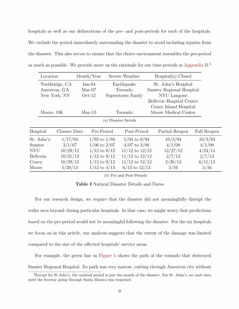
as much as possible. We provide more on the rationale for our time-periods in Appendix B.4
Location Month/Year Severe Weather Hospital(s) Closed
Northridge, CA Jan-94 Earthquake St. John’s HospitalAmericus, GA Mar-07 Tornado Sumter Regional HospitalNew York, NY Oct-12 Superstorm Sandy NYU Langone
Bellevue Hospital CenterConey Island Hospital
Moore, OK May-13 Tornado Moore Medical Center
(a) Disaster Details
Hospital Closure Date Pre-Period Post-Period Partial Reopen Full Reopen
St. John’s 1/17/94 1/92 to 1/94 5/94 to 9/94 10/3/94 10/3/94Sumter 3/1/07 1/06 to 2/07 4/07 to 3/08 4/1/08 4/1/08NYU 10/29/12 1/12 to 9/12 11/12 to 12/12 12/27/12 4/24/14Bellevue 10/31/12 1/12 to 9/12 11/12 to 12/12 2/7/13 2/7/13Coney 10/29/12 1/12 to 9/12 11/12 to 12/12 2/20/13 6/11/13Moore 5/20/13 1/12 to 4/13 6/13 to 12/13 5/16 5/16
(b) Pre and Post Periods
Table I Natural Disaster Details and Dates
For our research design, we require that the disaster did not meaningfully disrupt the
wider area beyond closing particular hospitals. In that case, we might worry that predictions
based on the pre-period would not be meaningful following the disaster. For the six hospitals
we focus on in this article, our analysis suggests that the extent of the damage was limited
compared to the size of the affected hospitals’ service areas.
For example, the green line in Figure 1 shows the path of the tornado that destroyed
Sumter Regional Hospital. Its path was very narrow, cutting through Americus city without
4Except for St John’s, the omitted period is just the month of the disaster. For St. John’s, we omit datauntil the freeway going through Santa Monica was reopened.
9

Figure 1 Damage Map in Americus, GA
Note: The green area indicates the damage path of the tornado. The zip codes included in theservice area are outlined in pink. Sources: City of Americus, GA Discharge Data
affecting the rural areas surrounding Americus. The tornado in Moore, OK had a similar
effect for the city of Moore relative to its suburbs. For Superstorm Sandy, storm damage was
mostly limited to areas adjacent to the East River or Long Island Sound. Seismic damage
from the Northridge Earthquake was more scattered, with much more damage in Santa
Monica than neighboring areas. We provide details for all the disasters, including maps, in
Appendix A.
Overall, the evidence suggests that the disasters’ effect on the relative desirability of
different hospitals can be mostly limited to the exclusion of the destroyed hospital from
patient’s choice sets. Nevertheless, there were some changes to the patient population or
providers in the affected areas following the disasters. We examine whether such changes
could explain our results in Section 5 and Section 6, as well as in Web Appendix ??.
10

Data Sources and Variables
We rely on several sources of data in our analysis. For patient information, we use detailed
discharge data collected by the departments of health for the states where disasters took
place.5 For each state, the discharge datasets provide a census of all inpatient episodes for
each licensed hospital located within the state; an inpatient episode is defined as a patient
admitted to the hospital where the visit lasted at least 24 hours. For each admission, the
data provide the date of admission and discharge, patient’s zip code of residence, diagnosis on
admission, and a variety of demographic characteristics, including age and sex. In addition,
we can construct the DRG weight, a commonly used measure of disease acuity developed
by Medicare, based on available diagnosis and procedure codes. An important variable is
patients’ travel time to hospitals; we use ArcGIS to calculate the travel time, including traffic,
between the centroid of the patient’s zip code of residence and each hospital’s address.
We obtain hospital characteristics from the annual American Hospital Association (AHA)
Guide and Medicare Cost Reports. These data include such details as for-profit status,
whether or not a hospital is an academic medical center or a children’s hospital, the number
of beds, the ratio of nurses to beds, the presence of different hospital services such as an
MRI, trauma center, or cardiac intensive care unit, and the number of residents per bed.6
5Background details on these data sets are available at the websites of the New York(https://www.health.ny.gov/statistics/sparcs/), Georgia (https://www.gha.org/GDDS), Okla-homa (https://www.ok.gov/health/Data_and_Statistics/Center_For_Health_Statistics/Health_Care_Information/Hospital_Discharge_&_Outpatient_ASC_Surgery_Data/index.html), and Califor-nia (https://oshpd.ca.gov/data-and-reports/healthcare-utilization/inpatient/) state healthdepartments.
6For a few hospitals in California, New York and Oklahoma, the AHA and Medicare CostReports contain data on the total hospital system rather than individual hospitals. For theAHA Guide, see http://www.ahadataviewer.com/book-cd-products/AHA-Guide/. For the MedicareCost Reports, see http://www.cms.gov/Research-Statistics-Data-and-Systems/Files-for-Order/
CostReports/index.html?redirect=/costreports/.
11
Affected Patients and Hospitals
In order to identify the set of patients and hospitals affected by the loss of the destroyed
hospital, we first identify patients whose choice set was affected by a disaster. All of our
destroyed facilities are general acute care (GAC) hospitals; therefore, we exclude patients
going to specialty (e.g., long-term care or psychiatric) hospitals. Such facilities are primarily
focused on treating patients with different diagnoses and conditions than the destroyed
hospitals. We also exclude patients who do not have, or are unlikely to have had, autonomy
in their hospital choice, such as newborns and court ordered admissions, as well as patients
who are likely to consider a broader set of hospitals than just general acute care hospitals
given their condition, such as those with psychiatric or eye issues.
We drop newborns, transfers, and court-ordered admissions. Newborns do not decide
which hospital to be born in (admissions of their mothers, who do, are included in the
dataset). Similarly, government officials or physicians, and not patients, may decide hospi-
tals for court-ordered admissions and transfers. We drop diseases of the eye, psychological
diseases, and rehabilitation based on Major Diagnostic Category (MDC) codes, as patients
with these diseases may have other options for treatment beyond general hospitals. We also
drop patients whose MDC code is uncategorized (0), and neo-natal patients above age one.
We also exclude patients who are missing gender or an indicator for whether the admission
is for a Medical Diagnosis Related Group (DRG).
We then construct the 90% service area for each destroyed hospital using the discharge
data, which we define as the smallest set of zip codes that accounts for at least 90% of the
hospital’s admissions. Because this set may include areas where the hospital is not a major
12

competitor, we exclude any zip code where the hospital’s share in the pre-disaster period
is below 4%. Our approach assumes that any individual that lived in this service area and
required care at a general acute care hospital would have considered the destroyed hospital
as a possible choice.
Having established the set of patients affected by the loss of a choice, we turn to defining
the set of relevant substitute hospitals. We identify these as any general acute care hospital
that has a share of more than 1% of the patients in the 90% service area, as defined above, in
a given month (quarter for the smaller Sumter and Moore datasets) prior to the disaster. We
combine all general acute care hospitals not meeting this threshold into an “outside option.”
Descriptive Statistics
Table II displays some characteristics of each destroyed hospital’s market environment, in-
cluding the number of admissions before and after the disaster, the share of the service
area that went to the destroyed hospital prior to the disaster, the share of the population
that went to the “outside option” prior to the disaster, the number of zipcodes in the ser-
vice area, and the number of rival hospitals. We also show the average acuity of patients
choosing the destroyed hospital during the pre-disaster period as measured by average DRG
weight.7 DRG weights are designed to reflect the resource intensity of patients’ treatments.
Therefore, differences in the average weights across hospitals reflect variation in treatment
complexity.
Table II indicates that Sumter Regional’s service area likely experienced a massive change
7In this article, when we use the term “DRG weight”, we mean the DRG weight used by the Centers forMedicare and Medicaid Services. Since 2007, these are officially called MS-DRG weights.
13

from the disaster; the share of the destroyed hospital in the service area was over 50 percent.
For the other disasters, the disruption was smaller though still substantial as the share of
the destroyed hospital in the service area ranges from 9 to 18 percent. Thus, patients’ choice
environments are likely to have changed substantially after the disaster.
Table II also shows that we have a substantial number of patient admissions before and
after each disaster with which to parameterize and test the different models. The number of
admissions in the pre-period and post-period datasets ranges from the thousands for Moore
and Sumter to tens of thousands for the New York hospitals and St. John’s.8
Table II Descriptive Statistics of Affected Hospital Service Areas
Pre-Period Post-Period Zip Choice Set Outside Option Destroyed DestroyedAdmissions Admissions Codes Size Share Share Acuity
Sumter 6,940 5,092 11 15 3.6 50.4 1.02StJohns 97,030 18,130 29 21 9.1 17.4 1.30NYU 79,950 16,696 38 19 11.0 9.0 1.40Moore 9,763 3,920 5 12 1.8 11.0 0.93Coney 46,588 9,666 8 17 7.4 18.2 1.16Bellevue 46,260 9,152 19 20 8.0 10.8 1.19
Note: The first column indicates the number of admissions in the pre-period data, the secondcolumn the number of admissions in the post-period data, the third column the number of zip codesin the service area, the fourth column the number of choices (including the outside option), the fifthcolumn the share of admissions in the pre-period from the 90% service area that went to the outsideoption, the sixth column the share of admissions in the pre-period from the 90% service area thatwent to the destroyed hospital, and the seventh column the average DRG weight of admissions tothe destroyed hospital in the pre-period data.
4 Estimation
Most models of hospital demand (e.g., Capps et al., 2003; Ho, 2006; Gaynor et al., 2013;
Gowrisankaran et al., 2015; Ho and Lee, 2019) use similar parameterizations for patient
8The New York service areas do overlap. The service area for NYU is much larger than Bellevue. NYUhas a 3.9 percent share in the Coney service area and 9.5 percent share in the Bellevue service area, andBellevue has a 5.7 percent share in the NYU service area.
14

preferences. In particular, they assume that patient i’s utility for hospital j is given by:
uij = δij + εij, (1)
where εij is distributed type I extreme value (logit). The patient has a choice set of J
hospitals. The logit assumption implies that the probability that patient i receives care at
hospital j is:
sij =exp(δij)∑k∈J exp(δik)
. (2)
Given (2), in the event that hospital j is removed from i’s choice set, the likelihood that
i chooses to receive care at k – as opposed to other hospitals in J – will be:
Djki =
exp(δik)
1 − exp(δij). (3)
Here, Djki represents the choice removal diversion ratio from j to k for patient i. Constructing
the overall population’s choice removal diversion ratio for j to k involves averaging across
the Djki ’s for all patients i in the market. We denote this overall choice removal diversion
ratio Djk. This calculation presumes that patients would not continue seeking treatment
from j after it disappears from J .
15
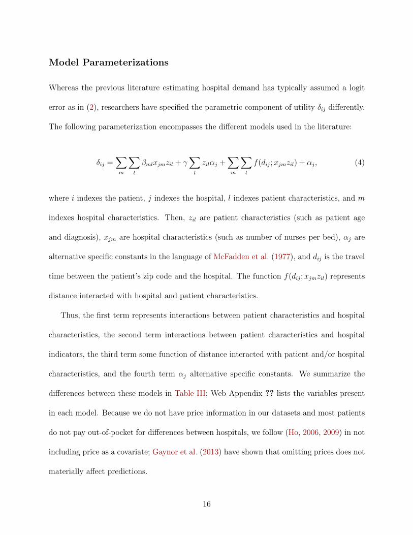
Model Parameterizations
Whereas the previous literature estimating hospital demand has typically assumed a logit
error as in (2), researchers have specified the parametric component of utility δij differently.
The following parameterization encompasses the different models used in the literature:
δij =∑m
∑l
βmlxjmzil + γ∑l
zilαj +∑m
∑l
f(dij;xjmzil) + αj, (4)
where i indexes the patient, j indexes the hospital, l indexes patient characteristics, and m
indexes hospital characteristics. Then, zil are patient characteristics (such as patient age
and diagnosis), xjm are hospital characteristics (such as number of nurses per bed), αj are
alternative specific constants in the language of McFadden et al. (1977), and dij is the travel
time between the patient’s zip code and the hospital. The function f(dij;xjmzil) represents
distance interacted with hospital and patient characteristics.
Thus, the first term represents interactions between patient characteristics and hospital
characteristics, the second term interactions between patient characteristics and hospital
indicators, the third term some function of distance interacted with patient and/or hospital
characteristics, and the fourth term αj alternative specific constants. We summarize the
differences between these models in Table III; Web Appendix ?? lists the variables present
in each model. Because we do not have price information in our datasets and most patients
do not pay out-of-pocket for differences between hospitals, we follow (Ho, 2006, 2009) in not
including price as a covariate; Gaynor et al. (2013) have shown that omitting prices does not
materially affect predictions.
16

Our first and simplest model, AggShare, relies exclusively on a set of alternative specific
constants αj to model δ. In other words, all patients within the relevant area have, up to
the logit shock, the same preferences for each hospital. In this framework, patient choice
probabilities are proportional to observed aggregate market shares and can be estimated
with aggregate data.
The most important differentiator among models that allow for patient-level hetero-
geneity is whether or not they assume that patients’ choices can be modeled exclusively in
“characteristics” space (Lancaster, 1966; Aguirregabiria, 2011). We consider two models,
CDS and Char, that model δ using just interactions between patient attributes (age, sex, in-
come, condition, diagnosis) and hospital characteristics (for-profit status, teaching hospital,
nursing intensity, presence of delivery room, etc.) and several interactions between patient
characteristics and travel time. They differ in which patient and hospital characteristics they
include as covariates. In both models, γ and αj are set to zero. CDS is based on Capps et
al. (2003), whereas Char is based on one of the models in Garmon (2017).
Four models include alternative specific constants αj and functions thereof zilαj in ad-
dition to some measures of patient-level heterogeneity. These models differ in their sets of
included variables other than the hospital indicators. The first model, Time, is based on May
(2013), and just includes a set of hospital indicators, travel time, and travel time squared.
The second model, Ho, is based on Ho (2006), and includes αj and interactions between
hospital characteristics and patient characteristics, so βil is non zero. However, it excludes
interactions with hospital indicators, so γ is always zero. The third model, GNT, is based
on Gowrisankaran et al. (2015), and includes a large set of interactions between travel time
and patient characteristics. However, it includes only a small number of interactions of hos-
17

pital indicators and hospital characteristics with patient characteristics. Finally, we consider
a fourth model, Inter, that includes interactions of hospital indicators with acuity, major
diagnostic category, and travel time as well as interactions between patient characteristics
and travel time.
Our final model, Semipar, is a semiparametric bin estimator similar to that outlined in
Raval et al. (2017), and does not use data on hospital characteristics. Instead, it parameter-
izes δih by partitioning the space of all patients into a large set of groups, and then assuming
homogeneous preferences within each of those groups. Deterministic utility is δih = δg(zi)h for
some set of groups g(zi) that depend upon patient characteristics zi. Given a set of groups,
predicted choice probabilities can be estimated as the empirical shares of hospitals within
each group.
We place all patients in groups based on their zip code, disease acuity (DRG weight),
age group, and area of diagnosis (MDC). Any patient in a group above the minimum group
size is assigned choice probabilities based upon the share of patients in that group that go to
the various hospitals. We then drop a characteristic, reconstruct groups, and again compute
group-level shares for the full set of patients, both those previously grouped and those not
previously grouped. We drop characteristics in the reverse order listed above (i.e., MDC,
age group, etc.) Then, all patients who have not yet been assigned a choice probability and
are in groups above the minimum group size are assigned a choice probability based on that
round’s group-level shares. We continue until all patients are assigned a choice probability
or there are no more covariates to group on.
Using this approach, we can compute the choice removal diversion ratios using the esti-
mated δjg. We set a minimum group size of 50; more details on our implementation of this
18

estimator are in Web Appendix ??.
Table III Summary of Tested Models
Model Spatial Differentiation Hospital Quality Patient Interactions
AggShare No Indicators No
Char (Garmon, 2017) Travel Time Characteristics Yes
CDS (Capps et al., 2003) Travel Time Characteristics Yes
Time (May, 2013) Travel Time Indicators No
Ho (Ho, 2006) Travel Time Both Yes
GNT (Gowrisankaran et al., 2015) Travel Time Both Yes
Inter Travel Time Indicators Yes
Semipar (Raval et al., 2017) Zipcode (Groups) Indicators Yes (Groups)
Note: Each row is a stylized depiction of a given model. The first column gives the model“name” we use in the article and the citation (if applicable), the second column how the modelincorporates spatial differentiation, the third column how the model incorporates differing hospitalquality (through hospital characteristics, indicators, or both), and the fourth column whether themodel incorporates interactions with patient characteristics, which may include race, sex, and age,as well as the different diagnoses and procedures they have and their relative severity.
Diversion Ratios
Because the logit implies individual level proportional substitution to all other choices when a
given choice is removed from the choice set, the choice probabilities are sufficient to compute
diversion ratios. Thus, for each model, we can estimate diversion ratios by using the models’
predicted choice probabilities.
Under these assumptions, the predicted (aggregate) diversion ratio from the destroyed
19

hospital j to non-destroyed hospital k is:
Djk =∑i
sik1 − sij︸ ︷︷ ︸Dijk
sij∑i sij︸ ︷︷ ︸wij
, (5)
where sij is the predicted probability that patient i chooses to go to hospital j. The aggregate
diversion ratio Djk is thus a weighted average of the patient level diversion ratios Dijk. The
weights, wij, are given by each patient i’s expected share of overall hospital admissions at
the destroyed hospital. All of these choice probabilities are estimated on data from the
pre-period, as would be done in a prospective merger analysis.
Because we observe patient choices post-disaster, we can also compute the observed ag-
gregate diversion ratio for hospital k as the share of hospital j’s patients that hospital k
captured following the destruction of hospital j. In other words,
Djk
observed=spostk − s
prek
sprej
, (6)
where spostk is the post merger share of hospital k, s
prek is the pre-merger share of hospital
k, and sprej is the pre-merger share of the destroyed hospital. These shares are all computed
based upon the full patient population in each period.
As we describe in Section 5, we compare the predicted diversion ratios from the models
estimated on the pre-period data (Djk) to the observed diversion ratios following the natural
disaster (Djk
observed). Ideally, we need the choice environments to be identical except for
the elimination of the destroyed hospital. In particular, we want that:
1. The distribution of preferences over facilities in the post-disaster period is identical to
20

the pre-disaster distribution,
2. The types of patients going to the hospital do not change, and
3. The characteristics of non-destroyed hospitals do not change.
Given these conditions, the observed diversion ratio calculated using the variation in choice
sets caused by the disaster is an unbiased estimate of the true diversion ratio. We compare
this unbiased estimate to those derived from our logit choice models estimated on pre-disaster
data. We examine whether violations of these conditions explain our findings in Section 6.
Implementation
We estimate all of the models separately for each experiment. For all of the models except
Semipar, we use maximum likelihood for estimation on patient-level discharge data from the
pre-disaster period. We report details of our model estimates for these models, including
the number of parameters in the model, the estimated log likelihood of the model, the
AIC and BIC criteria, and McFadden’s pseudo R2, in Web Appendix ??. Inter minimizes
the AIC criterion for five of the six experiments and the BIC criterion for three of the
six experiments. Ho minimizes the AIC criterion for Bellevue and the BIC criterion for
Bellevue and Coney. GNT minimizes the BIC criterion for Sumter. For Semipar, we employ
the algorithm described in Appendix ?? to estimate choice probabilities on patient-level
discharge data from the pre-disaster period.
Given model estimates of choice probabilities, we can predict diversion ratios from the
destroyed hospital to all other hospitals using (5). We also recover observed diversion ratios
with (6) using the pre-period and post-period data. For the New York hospitals, our pre-
21

dicted and observed diversion ratios are based on all hospitals in the choice set taken out of
service due to the disaster.
To compute standard errors, we take into account sampling variation in both the pre-
period, where it will affect both observed diversion ratios and predicted diversion ratios
through model estimates of choice probabilities, and in the post-period data, where it will just
affect observed diversion ratios. We account for sampling variation through 200 bootstrap
replications of the pre-period data and post-period data; we re-estimate all the models
and recalculate both model predicted and observed choice removal diversion ratios on these
bootstrap samples. Because our estimates have sampling bias, we use the bootstrap estimates
to bias correct our estimates and compute 95% confidence intervals.
For two models, diversion estimates could not be calculated for every individual for some
of the bootstrap samples of the Sumter disaster.9 For both models, the number of such
circumstances is small, with the average number of admissions with a missing diversion
between 7 and 12. We exclude individuals for whom diversions can not be calculated from
our estimates for these bootstrap samples.
5 Predictive Performance
Across all of the experiments, we estimate 94 choice removal diversion ratios from the
destroyed hospitals to others in patients’ choice sets, including the outside option. We
quantify the quality of model predictions using the prediction error, which we define as
9These issues arise for the Semipar model because for some set of individuals the probability of going tothe destroyed hospital is one in the bootstrap samples, and for the Ho model owing to a particular interactionterm being inestimable.
22
Djk−Djk
observed. For example, if the predicted choice removal diversion ratio for a hospital
was 15%, and the observed post-disaster diversion ratio 20%, then the prediction error would
be -5%.
We then compare the prediction error to the observed diversion ratio for the Semipar
model in Figure 2a. In order to facilitate comparisons across alternative specifications, we
evaluate models on the slope of the linear best fit line of the prediction error on the observed
diversion ratio. The slope of this line will be negative when larger observed diversion ratios
have a greater prediction error, and larger in magnitude when the bias is larger. Thus, we
view a model as better predicting aggregate diversion ratios when the magnitude of the slope
is smaller.
Using the linear best fit line, the prediction error is -5% when the observed diversion
ratio is 20%. The slope of the linear best fit line is -0.35, so a one percentage point increase
in observed diversion ratio is associated with an average 0.35 percentage point decrease in
the prediction error for the Semipar model. Thus, we tend to substantially underpredict
large observed diversion ratios.
One potential explanation for these findings is that the composition of patients changes
after the disaster because patients defer treatment following the disaster. All else equal, one
might think that such deferrals would be more pronounced for elective procedures, rather
than urgent or emergency admissions. If such patients have consistently different tastes, such
as a greater disutility from travel, then this might produce results akin to those we find.
To address this possibility, we re-estimate all of the models using only non-elective admis-
sions. We then examine the predictive performance of our models for non-elective admissions
23

(a) Full Sample
(b) Non Elective Sample
Figure 2 Prediction Error By Observed Choice Removal Diversion Ratio
Note: Each point represents the diversion ratio to a hospital from one of the six experiments. Theblue line is the linear regression line through the points, and the grey shading the 95% confidenceinterval for the linear regression line. The left figure contains the results for the full sample and theright figure contains the results for the non-elective sample.
24

before and after the disaster.10 Figure 2b presents the analogue to Figure 2a for the non-
elective sample. It shows similar patterns to those for the full sample. The slope coefficient
on the best fit line is −0.43 for the Semipar model for the non-elective sample, compared to
−0.35 for the full sample, so the models perform worse on the non-elective sample.11
We now focus the remainder of our analysis on the non-elective sample. We present the
full sample analogues of all figures and tables in Web Appendix ?? and Web Appendix ??.
In addition, to compare across models and disasters, we focus on the slope of the best fit
line in a regression of the prediction error on observed diversion ratios:
Cov(Djk −Djk
observed, Djk
observed)
V ar(Djk
observed)
(7)
The slope directly connects to Figure 2 as it is the slope of the blue best fit line, and is
negative if larger observed diversion ratios imply greater underprediction of the diversion
ratio as it grows larger. Given that diversion ratios sum to one, the intercept of the best
fit line is a function of the slope parameter, so the slope shows the degree of bias in the
estimates.
More formally, the y intercept in the regression of the prediction error on observed diver-
sion ratios is equal to −β1TN
, where T is the number of experiments, N is the total number of
hospitals across all experiments, and β1 the slope coefficient as above. To see this, consider
that we model Dpredictedkt −Dobserved
kt = β0 + β1Dobservedkt + εkt, where k indexes hospitals and t
markets. Because within each market the sum of both the predicted and observed diversion
10We define non-elective admissions as admissions coded as “Emergency” or “Urgent” in the admissiontype variable or coded as a labor and delivery, either through the admission type variable (if applicable) ora Major Diagnostic Category (MDC) of 14.
11Descriptive statistics for the sample of non-elective patients is presented in Table ?? in Web Appendix ??.
25

●
●
●
●
●
●
Bellevue
Coney
Moore
NYU
StJohns
Sumter
−0.75 −0.50 −0.25 0.00
Slope Coefficient
(a) By Experiment (for Semipar)
●
●
●
●
●
●
●
●
Semipar
Inter
GNT
Ho
Time
CDS
Char
AggShare
−0.6 −0.4 −0.2 0.0
Slope Coefficient
(b) By Model
Figure 3 Slope Coefficient of Observed Choice Removal Diversion Ratios on PredictionError, Non-Elective Sample
Note: The left figure depicts the slope of the observed diversion ratio on the prediction error byexperiment for the Semipar model, whereas the right figure depicts the same by model. Bars repre-sent 95% confidence intervals computed from 200 bootstrap replications; we also apply a bootstrapbias correction. See Table ?? and Table ?? for tables of the estimates and confidence intervals usedto generate these figures.
ratios must sum to one and∑
k εk = 0, we have 0 = Nβ0 + T β1, where the hat denotes an
estimated value. Then solving for β0 yields the expression above.
We depict this slope for each experiment for the Semipar model in Figure 3a. The finding
that we consistently underpredict large diversion ratios is not being driven by particularly
poor predictive performance in one disaster. The slope coefficient is between −0.5 and
−0.75 for four disasters, and we can reject that the slope is equal to zero for all disasters
but Bellevue.
Figure 3b demonstrates that we underpredict high diversion ratio hospitals in all of
the models we estimate. However, the models can be divided into two groups in terms
of their accuracy. The aggregate share model, and the two models that do not include
26

alternative specific constants, Char and CDS, have slope coefficients of around -0.6, so a 10
percentage point increase in the observed diversion ratio decreases the prediction error by
6 percentage points. By contrast, models that use the individual level data to allow spatial
differentiation, and also allow unobserved vertical quality via alternative specific constants
have slope coefficients of slightly under -0.4 on average. That is, the magnitude of the slope
coefficient declines by 25 to 30 percent when accounting for these two features of demand in
the model.
To understand what may be driving the differences across models, we decompose the
choice removal diversion ratio from hospital j to hospital k (Djk) into two components12:
Djk =∑i
Dijk sij∑i sij
= E[Dijk]︸ ︷︷ ︸Individual
+Cov(Dijk, sij)
E(sij)︸ ︷︷ ︸Heterogeneity Factor
. (8)
The first term is the average individual level (indexed by i) choice removal diversion ratio in
the data. The second term, which we call the “heterogeneity factor”, increases when patients
with a larger probability of going to the destroyed hospital j also have a larger probability
of going to hospital k.
In Figure 4, we depict the slope coefficient of the observed diversion ratio on the prediction
error after either including the heterogeneity factor in the predicted diversion in red, or
excluding it in blue. The models that perform badly do so for different reasons. The
12The derivation is below:
Djk =∑i
Dijk sij∑i sij
=1
N
∑i
Dijk +∑i
Dijk(sij∑i sij
− 1
N) =
1
N
∑i
Dijk +
∑i D
ijk(sij − 1N
∑i sij)
1N
∑i sij
= Ei[Dijk] +
Covi(Dijk, sij)
Ei(sij)
27

Semipar
Inter
GNT
Ho
Time
CDS
Char
AggShare
−0.6 −0.4 −0.2 0.0
Slope Coefficient
Individual Individual + Heterogeneity
Figure 4 Decomposition of Average Predicted Diversion, Non-Elective Sample
Note: We report the slope coefficient of the observed diversion ratio on the prediction error basedupon the average individual diversion ratio in blue, and based upon the individual diversion ratioplus the heterogeneity factor (i.e. the total predicted diversion) in red, for each model. Each termis as defined in the text. See Table ?? for a table of the estimates and confidence intervals usedto generate this figure and Figure ?? and Table ?? for the equivalent figure and table for the fullsample.
28

magnitude of the slope coefficient for AggShare excluding the heterogeneity factor is smaller
than for CDS and Char. However, its heterogeneity factor is zero as it does not allow for
any heterogeneity in choice probabilities.
For the CDS and Char models, the decrease in magnitude of the slope coefficient due to
the heterogeneity factor is similar to the models that perform well. However, the magnitude
of the slope coefficient based on the prediction error using just the expected individual diver-
sion ratio is much greater than the other models. Therefore, these models perform poorly for
different reasons – the aggregate share model does not allow for horizontal differentiation,
whereas CDS and Char are worse at estimating vertical quality because they do not allow
for alternative specific constants.
In addition, all of the models that include alternative specific constants and controls for
patient location – Time, Ho, GNT, Inter, and Semipar – have similar values of the slope
coefficient including, and excluding, the heterogeneity factor. This similar performance is
despite the fact that they vary substantially in the degree of heterogeneity they allow across
different types of patients. For example, Time allows no heterogeneity in preferences over
vertical quality or travel time across patients, whereas Semipar allows preferences to vary
in an unrestricted fashion across many narrowly defined groups. This similarity suggests
that allowing greater heterogeneity on observed patient characteristics does not consistently
improve estimates of diversion ratios.
29

6 Mechanisms
We now examine why all of the models underpredict large diversion ratios. First, we show
that we underpredict diversion to nearby hospitals and overpredict diversion to the outside
option. One explanation for this is unobserved heterogeneity in the disutility for travel. We
then estimate random coefficient models that allow such unobserved heterogeneity, and find
significant improvements in model performance. Second, we examine the effects of potential
changes to physician labor supply due to the disaster. Finally, we consider a number of other
potential explanations, and find evidence against explanations due to capacity constraints
and changes in patient composition.
Preference Heterogeneity in Travel Time
The average prediction error increases with the average distance of a hospital to patients in
the service area. Figure 5a replicates Figure 2b, except with average travel time expressed as
a percentage of the market average travel time on the X axis. Because the hospitals grouped
in the outside option are typically located farther away than the other choices, we assign the
outside option hospitals (shown in red on the figure) the maximum travel time of any choice
in the choice set.
Figure 5a shows that the Semipar model underpredicts diversion to hospitals with less
than the average travel time, and overpredicts diversion to more distant hospitals and, espe-
cially, the outside option. Figure 5b depicts the average prediction error for each model for
hospitals that are below the average distance, above the average distance, or either above
30

the average distance or the outside option. For the Semipar model, the average prediction
error is -1.2 percentage points for hospitals in the choice set less than the average travel time
away from the destroyed hospital. By contrast, the average prediction error is 0.1 percentage
points for hospitals more than the mean time away, and 0.86 percentage points for hospitals
more than the mean time away or the outside option. For the outside option, the average
prediction error is a full 7.4 percentage points!
(a) By Model
●
●
●
●
●
●
●
●
Semipar
Inter
GNT
Ho
Time
CDS
Char
AggShare
−2 −1 0 1
Average Prediction Error (pp)
Travel Time ●Below Average Above Average Above Average or Outside Option
(b) Average Prediction Error by Distance Group
Figure 5 Prediction as a Function of Distance, Non-Elective Sample
Note: First panel shows the prediction error as a function of the average travel time to thehospital expressed as a percent of the average travel time in the market. Second panel presents theaverage prediction error, differentiating between hospitals whose travel time is below average for theirmarket, above average for their market, or above average plus the Outside Option. Bars represent95% confidence intervals computed from 200 bootstrap replications; we also apply a bootstrap biascorrection. See Table ?? for tables of the estimates and confidence intervals used to generate thesefigures.
Observed Consumer Heterogeneity The estimates above showed that we underpredict
diversion to nearby hospitals and substantially overpredict the outside option. One explana-
tion for these results is that the models we estimate are missing interactions between travel
time and components of consumer heterogeneity.
Many of the models we estimate allow for both the effects of patient location and hospital
31

quality to vary by patient characteristics, including diagnosis, race, gender, and age. In
Figure 6, we show that interactions with such characteristics do improve predictions of
individual patients’ choices. We measure the quality of patients’ choice predictions by the
share of individual predictions that are correctly predicted, in that the patient goes to the
hospital predicted to be most likely by the econometric model. In general, models allowing
more individual heterogeneity do a better job predicting patients’ choices.
AggShare CDS
Char
GNT
Ho Inter
SemiparTime
● ●
●
●
● ●
●●
−0.60
−0.55
−0.50
−0.45
20 25 30 35 40 45
Individual Percent Correct
Slo
pe (
Div
ersi
ons)
Figure 6 Average Percent Correct of Individual Predictions vs. Slope Coefficient of Ob-served Diversion Ratio on Prediction Error, Non-Elective Sample
Note: The Figure compares the slope coefficient of the observed diversion ratio on the predictionerror to the average percentage of individual choices correctly predicted. Bars represent 95% confi-dence intervals computed from 200 bootstrap replications; we also apply a bootstrap bias correction.See Table ?? and Table ?? for estimates and confidence intervals used to generate the figure.
However, better predictions of individual choices are not associated with better predic-
tions of diversion ratios. For example, whereas Semipar is, on average, the best performing
32

of the models in predicting individual patient choices following the disasters, it has approx-
imately the same slope coefficient as Time, which does much worse at predicting patient
choices. These results suggest that allowing for preference heterogeneity using observed pa-
tient characteristics better fits the individual component of patient choice, but does not help
to predict the common component across patients that may be more relevant for aggregate
diversion ratios.
Unobserved Consumer Heterogeneity Instead, patients may differ in their willingness
to travel in ways that our observed characteristics do not capture. Patients who would have
gone to the destroyed hospital, and so were forced to switch, could have less willingness to
travel than the “average” patient in the service area in the pre-period. In that case, patients
who traveled long distances in the pre-disaster period might provide poor comparisons for
otherwise observably similar patients in the post-disaster period.
We test the hypothesis that patients have heterogeneous travel costs by estimating a series
of random coefficient logit models that allow for a normally distributed random coefficient
on travel time. Because of the computational cost, we restrict attention to the simple
Time model that includes only travel time and hospital specific indicators as explanatory
variables. Using this approach, we trace out the post-disaster predictive performance of
different standard deviations of the random coefficient on travel time. As in our previous
analysis, we estimate each model for a given standard deviation of the random coefficient on
the pre-disaster data and then test its predictive power on the post-disaster data. However,
unlike our previous analysis, this approach implicitly uses the post-disaster variation to
estimate the standard deviation of the random coefficient.
33

We make a number of modifications to our baseline analytical framework to facilitate
estimation of the random coefficient models. First, patients with a greater disutility for
travel will likely have a lower utility from the outside option, because patients going to the
outside option typically travel further than for the other options. For each disaster, we set
the distance of the outside option to the maximum distance from any patient zip code to
any hospital in the choice set. In practice, this means we are setting the outside option to
zero (as before) but all other choices have their distance and squared distance as time −
max time and (time2 − max time2), respectively.
Second, the random coefficient on travel time is a draw from a normal distribution mul-
tiplied by the distance coefficient estimate from the model without a random coefficient. We
do this to scale the variance for each disaster in a way that allows for cross-disaster com-
parisons of the standard deviation of the random coefficient. We then allow the standard
deviation of this normal distribution to vary along a grid evenly spaced between 0 and 1.5.
Using the post-disaster data, we compute the mean squared error between predicted and
observed diversion ratios for each standard deviation of the random coefficient. In Figure 7,
we show the Mean Squared Prediction Error as a function of the standard deviation of the
random coefficient. In this figure, the mean squared error is averaged over all of the disasters.
Adding the random coefficient improves the models’ predictions of diversion ratios.
We use two different approaches to estimate the standard deviation over the grid con-
sidered. In the first, Common SD, we compute the optimal standard deviation averaging
across all experiments (the approach in Figure 7). One concern with this approach is that
we overfit the data by adding in the variation of the random coefficient as a free parameter.
Therefore, in the second, LOO SD, we use a leave one out approach, picking the grid value
34

for a given experiment that minimizes prediction errors for all other experiments. In this
implementation, there is no concern of overfitting, as the data set of the estimation differs
from that of testing the predictions.
Figure 7 MSE by Standard Deviation of Random Coefficient
Note: This figure shows the mean squared prediction error (MSE) of the Common SD class ofmodels described in the text, where the models vary by the standard deviation of the randomcoefficient.
In Figure 8a, we present the slope coefficient between the actual choice removal diversion
ratio and the prediction error for the different models. Consistent with the results in Figure 3,
we find that, without a random coefficient on travel time, the slope coefficient is −0.43.
However, the slope coefficient falls in magnitude to approximately −0.35 for Common SD
and −0.32 for the LOO SD models. In Figure 8b, we compare the random coefficient models
to the Zero SD model. This graph shows a 20% decline in magnitude of the slope coefficient
35

●
●
●
Common SD
LOO SD
Zero SD
−0.5 −0.4 −0.3 −0.2 −0.1 0.0
Slope Coefficient
(a) By Model
●
●
●
Common SD
LOO SD
Zero SD
70 80 90 100
Slope Relative to Zero SD Model
(b) Correlation by Distance
Figure 8 Random Coefficient Relative Performance
Note: The left panel presents the slope of the observed diversion ratio on the prediction error.The right panel depicts the slope for a model relative to that for the Zero SD model. 95% confidenceintervals are computed from 200 bootstrap replications; we also apply a bootstrap bias correction.See Table ?? for estimates and confidence intervals used to generate the figure.
for LOO SD and 25% for Common SD relative to Zero SD. We can reject the null hypothesis
of no improvement.
Overall, we take these results as evidence that preference heterogeneity in travel time
could explain some of the underprediction of diversion to nearby hospitals, and overpre-
diction of diversion to the outside option. More generally, they suggest that allowing for
unobserved heterogeneity through random coefficients may lead to better predictions even
when economists have access to rich individual level data that allows them to model observed
heterogeneity.
Physician Labor Supply
Another set of explanations for our findings is the interaction between physician choice and
hospital choice. As Ho and Pakes (2014) point out, demand models estimate a “reduced
form” referral function that combines patient preferences and physician referral patterns.
36
The model specifications described in Section 4 do not include a role for physician choice,
because referring physicians are not observed in most hospital discharge datasets. Physician
choice could affect our analysis in three major dimensiosn.
First, even if the disaster does not affect physician labor supply, both Beckert (2018)
and Raval and Rosenbaum (2021) show that accounting for referral patterns can lead to
substantially different substitution patterns between hospitals. The clinicians of patients
who went to the destroyed hospital might have different referral patterns than the clinicians
of other patients in the service area. Thus, we might underpredict certain hospitals if the
clinicians of patients who went to the destroyed hospital tend to refer to those hospitals.
We illustrate how referring patterns can distort diversion ratios through the following ex-
ample in which the referring physician induces the patient’s consideration set. Patients are
differentiated by their unobserved referring clinician; pre-disaster 50% go to the destroyed
hospital, 15% to hospital A and 35% to hospital B. There are two referring clinicians. Clin-
ician 1, who cares for half of all patients, refers to all hospitals, with shares of 40% to the
destroyed hospital, 30% to A, and 30% to B. Clinician 2, who cares for the other half, in-
cludes only the destroyed hospital and hospital B in patient consideration sets, with shares of
60% to the destroyed hospital, 0% to A, and 40% to B. Assuming diversion proportional to
share, we would estimate diversions of 30% to A and 70% to B from the destroyed hospital.
However, because 40% of the destroyed hospitals patients come from clinician 1 and 60%
from clinician 2, the true diversion ratio to A is 0.4*0.5 = 20% and to B is 0.4*0.5 + 0.6*1
= 80%. Thus, the model underpredicts the higher diversion by not accounting for referral
patterns.
Another potential explanation for our findings is that physicians switch hospitals or lo-
37

cations post-disaster. If operating physicians at the destroyed hospitals moved to underpre-
dicted hospitals, this could explain our findings. We examine this explanation for the New
York hospitals, where we have data on operating physicians both pre- and post-disaster.
We do find evidence that physicians moving to a different hospital may have affected
diversion ratios for the NYU service area. For regular NYU clinicians, 45% of the admissions
in the post-disaster period were at Lenox Hill hospital.13 This is consistent with reports that
Lenox Hill actively welcomed NYU physicians to practice there post-disaster.14 Our models
considerably underpredict diversion to Lenox Hill for NYU; Semipar predicts a diversion
ratio of 7.0% compared to an observed diversion of 20.0%.15 Lenox Hill is the only large
observed diversion ratio for NYU that we underpredict. Notably, we did not find similar
patterns for regular Bellevue and Coney Island clinicians.
Third, physicians at the destroyed hospitals might not practice at all until the hospital
is rebuilt, forcing patients to switch doctors as well as hospitals. Their new doctors might
have substantially different referral patterns than their old doctors, so that demand post-
disaster is quite different from demand pre-disaster. We indeed find that the level of total
admissions at all hospitals for physicians who were regular doctors at the destroyed hospital
fell substantially, by 60% for doctors at NYU, 87% for doctors at Bellevue, and almost
94% for doctors at Coney.16 If patients switch to doctors located closer to them, and their
new doctors also prefer nearby hospitals, we might expect greater diversion to proximate
13To maximize observations, we do not limit attention to non-elective admissions for this exercise. However,the same pattern is evident in the non-elective sample.
14See https://www.nytimes.com/2012/12/04/nyregion/with-some-hospitals-closed-after-
hurricane-sandy-others-overflow.html.15In the overlapping Bellevue service area, Semipar predicts a diversion ratio of 6.1% to Lenox Hill com-
pared to an observed diversion of 14.4%. This could, at least in part, reflect the fact that our diversion ratiosfor New York combine multiple destroyed hospitals.
16We define a “regular doctor” as one with at least 30 admissions in January through September of 2012.
38

hospitals.
Additional Explanations
Capacity Constraints Post-merger, if some hospitals faced capacity constraints inhibit-
ing their ability to accommodate all of the patients that wished to receive care, our models
would overpredict diversion to them and underpredict diversion to other hospitals. We ex-
amine this issue in our different markets using information on the total number of patients
admitted and the number of beds. We measure capacity as the number of admitted patients
divided by the number of beds, and define a hospital as “capacity constrained” if its capacity
is above 90%. For the Sumter and St. John’s disasters, we have data on the date that each
patient was admitted and discharged, and so can explicitly measure capacity for each day.
For the Moore and Sandy disasters, we have data on the month of admission and discharge.
We thus calculate monthly capacity as a sum of each patient’s length of stay for patients
admitted in that month divided by the total number of days in the month. Although crude,
we compare this capacity measure to true capacity for the hospitals in the choice set for
Sumter and find that it is approximately unbiased.
For the most part, we do not see evidence of hospitals facing binding capacity constraints,
let alone that the disaster created such problems. No hospitals are capacity constrained
using our capacity utilization measure for Sumter and Moore. For St. John’s in California,
only one hospital is capacity constrained both before and after the disaster. In New York,
however, five hospitals move from never constrained before the disaster to constrained in
both months after the disaster. All five are in Coney Island’s choice set, two in NYU’s,
39

and one in Bellevue’s. Contrary to what we would expect if the new capacity constraints
drove our results, we underpredict diversion for three of these hospitals and correctly predict
diversion for two. Thus, it does not appear that capacity constraints explain our findings.
Strategic Investments Our findings could also be explained by hospitals making strategic
investments in quality post-disaster. For example, if competitor hospitals targeted outreach
to patients living near the destroyed hospital, such strategic investments might have affected
patients’ preferences over the options available to them. Because switching costs for hospitals
are large (Shepard, 2016; Raval and Rosenbaum, 2018), the destruction of the hospital, by
forcing patients to switch, may have incentivized competitors to try to attract the destroyed
hospital’s patients while doing so was relatively easy. To account for the observed patterns,
we would need these investments to occur disproportionately at more proximate, highly-
desired hospitals.
Unfortunately, such strategic investments are difficult to observe in the data available to
us. However, we can see merger activity, which might be indicative of an interest in serving
affected patients. Following two disasters, we do see a hospital with a large diversion ratio
from the destroyed hospital attempting to merge with the destroyed hospitals once they
were rebuilt. After the Northridge earthquake, UCLA Medical Center, which had a large,
underpredicted diversion, attempted to purchase St. John’s, the destroyed hospital. After
merger talks broke down approximately one year following the disaster, UCLA bought Santa
Monica Hospital, the only other hospital in Santa Monica. In Georgia, Sumter Regional, the
destroyed hospital, merged with Phoebe Putney, which also had a large and underpredicted
diversion post-disaster.
40

Such merger activity might reflect post-disaster strategic investments. Alternatively,
rebuilding a hospital is a major capital investment and engaging in a merger may have been
the best way to secure the required funds to rebuild the destroyed hospitals.
Change in Patient Composition As noted already, one possible explanation for the
prediction error that we find would be changes in patient composition post-disaster. We
have already restricted attention to non-elective visits, but there might have been other
types of changes. For example, patients could have left the service area after the disaster,
perhaps because their homes or workplaces were damaged. In Table IV, we examine this
issue by reporting the number of admissions per month in the pre-disaster period compared
to the post-disaster period. The number of admissions per month post-disaster falls in all
service areas except NYU, ranging from 3 percent for Coney, 5 percent for St. John’s,
8 percent for Bellevue, and 11 percent for Sumter and Moore. This likely reflects some
extensive margin in inpatient admissions, consistent with the findings of Petek (2016) from
hospital exits. We do not find major changes in case mix after the disaster, except for a
rise in pregnancy admissions across the service areas (which are hard to defer) and a fall in
the under 18 share of patients for Sumter and Moore. Thus, the data do not reveal obvious
changes to patient populations before and after the disaster. We further examine changes in
patient composition in Web Appendix ??.
Another reason why patient composition could change is that post-disaster damage could
affect patients, either because they move residence, have disaster related medical complica-
tions, or face income shocks because the disaster affected their job. We examine this possi-
bility for the Sumter, Coney, and St. John’s experiments by removing zip codes with greater
41

Experiment Pre-Period Post-Period Percent Change
Sumter 371.20 329.20 -11.30StJohns 2728.20 2589.20 -5.09NYU 6335.30 6357.00 0.34Moore 393.20 350.10 -10.95Coney 3664.00 3560.00 -2.84Bellevue 3650.60 3357.50 -8.03
Table IV Admissions Per Month by Period, Non-Elective Sample
disaster related damage.
For Sumter, we remove the two zip codes comprising the city of Americus; the destruction
of the Americus tornado was concentrated in the city of Americus. For Coney Island, we
remove three zip codes which had the most amount of damage after the disaster, as based
on post-disaster claims to FEMA; these zip codes are on the Long Island Sound and thus
suffered more from flooding after Sandy. For St. John’s, we remove zip codes with structural
damage based on zip code level data from an official report on the Northridge disaster for the
state of California. This procedure removes 9 zip codes, including all 5 zip codes in Santa
Monica.17
We do not remove any areas for NYU or Bellevue, as the area immediately close to these
hospitals had very little post-Sandy damage. For Moore, removing the zip codes through
which the tornado traversed would remove almost all of the patients from the choice set, so
we do not conduct this robustness check for Moore.
The areas removed tend to have higher market shares for the destroyed hospital. Thus,
17The zip codes removed are 31719 and 31709 for Sumter; 90025, 90064, 90401, 90402, 90403, 90404,90405, 91403, and 91436 for St. John’s; and 11224, 11235, and 11229 for Coney. See http://www.arcgis.
com/home/webmap/viewer.html?webmap=f27a0d274df34a77986f6e38deba2035 for Census block level esti-mates of Sandy damage based on FEMA reports. The US Geological Survey defines MMI values of 8 andabove as causing structural damage. See ftp://ftp.ecn.purdue.edu/ayhan/Aditya/Northridge94/OES%
20Reports/NR%20EQ%20Report_Part%20A.pdf, Appendix C, for the Northridge MMI data by zip code.
42

removing destroyed areas cuts Sumter’s market share from 51 percent to 30 percent, St.
John’s market share from 17 to 14 percent, and Coney’s from 16 to 9 percent. We then
compare the slope coefficient of the observed diversion ratio on the prediction error for all
patients for these three experiments to just patients living in zip codes with less damage in
Figure 6.
The magnitude of the slope coefficient is higher just examining patients that lived in
locations with less disaster damage, making it unlikely that such damage can explain our
results. For example, for Semipar, the slope coefficient is −0.37 for all patients for these three
experiments, compared to −0.46 for patients living in locations with less disaster damage.
Finally, the demand models we estimate can take changes in observed patient character-
istics into account when predicting diversion ratios. We do so by using estimates of all the
models from pre-disaster data, as before, but estimating hospital probabilities for the post-
period patients as well as pre-period patients. Formally, this estimate of the diversion ratio
from j to k is the average hospital probability for k in the post-disaster period minus the
average hospital probability for k in the pre-disaster period, divided by the average hospital
probability for j in the pre-disaster period:
Djk =
1Npost
∑i∈Ipost sik −
1Npre
∑i∈Ipre sik
1Npre
∑i∈Ipre sij
, (9)
where sik is the predicted probability that patient i chooses to go to hospital k, and Ipost and
Ipre are the set of patients in the post-disaster period and pre-disaster period, respectively.
We find almost exactly the same patterns of underprediction of large diversion ratios
using the composition adjusted estimates. For Semipar, the slope coefficient is −0.41 (95%
43
●
●
●
●
●
●
●
●
Semipar
Inter
GNT
Ho
Time
CDS
Char
AggShare
−0.8 −0.6 −0.4 −0.2 0.0
Slope Coefficient
Patients ●All Less Damaged Areas
Figure 9 Slope Coefficient of Observed Diversion Ratio on Prediction Error By DisasterDamage, Non-Elective Sample
Note: The figure depicts the slope of the observed diversion ratio on the prediction error. Thefigure uses only data from the Coney, St. John’s, or Sumter experiments, and includes either allpatients or patients in zip codes with less disaster damage. Bars represent 95% confidence intervalscomputed from 200 bootstrap replications; we also apply a bootstrap bias correction. See Table ??,and Table ?? for tables of the estimates and confidence intervals used to generate this figure.
CI (−0.46,−0.36)) after adjusting for composition, compared to −0.43 using our baseline
diversion estimates.
7 Conclusion
In this article, we compare estimates obtained from econometric models to those obtained
from exogenous quasi-experiments. Our qualitative conclusions are robust across markets.
First, we find that standard models of hospital demand substantially underpredict large
44
diversion ratios. Second, models allowing spatial differentiation and including alternative
specific constants are substantially better at predicting diversion ratios than other models.
Third, we do not find that models that allow greater heterogeneity on observed patient
characteristics, and so predict individual choices better, are also better at predicting diversion
ratios.
However, even with rich micro-data, there can still be important unobserved heterogene-
ity in preferences. One explanation for our findings is that patients differ in their disutility
for travel time, which might explain why we tend to underpredict nearby hospitals and over-
predict the outside option hospital. We find a significant improvement in the prediction of
diversion ratios after allowing for patient heterogeneity in travel time via random coefficients.
Separately, physician labor supply could also change due to the disaster, with physicians
switching to different hospitals or not practicing during the disaster. Such changes in physi-
cian labor supply would affect patient choice when physician referral patterns are important.
Better understanding how physician choice interacts with hospital choice is extremely impor-
tant, especially as mergers that combine hospitals and physician groups have become more
common.
Overall, the main potential limitation of our findings lies in the difference between a
hospital becoming unavailable to patients as a result of a natural disaster and a hospital
becoming unavailable as a result of an inability to agree on contractual terms. First, the
aftermath of the disaster may induce more short run changes in patient behavior than a
network exclusion. Second, a breakdown of hospital-payer negotiations would make the
hospital unavailable to the customers of that payer, rather than all patients, and these
customers could switch to a different insurer. We hope that future research can clarify the
45

extent to which such factors could lead to different patterns than we identify here.
46

References
Aguirregabiria, Victor, “Empirical Industrial Organization: Models, Methods, and Applica-tions,” mimeo, 2011.
Beckert, Walter, “Choice in the presence of experts: The role of general practitioners in patientshospital choice,” Journal of Health Economics, 2018, 60, 98–117.
Berry, Steven T, “Estimating Discrete-Choice Models of Product Differentiation,” The RANDJournal of Economics, 1994, pp. 242–262.
Capps, Cory, David Dranove, and Mark Satterthwaite, “Competition and Market Powerin Option Demand Markets,” RAND Journal of Economics, 2003, 34 (4), 737–763.
, Laura Kmitch, Zenon Zabinski, and Slava Zayats, “The Continuing Saga of HospitalMerger Enforcement,” Antitrust Law Journal, 2019, 82 (2), 441–496.
Conlon, Christopher T. and Julie Holland Mortimer, “Empirical Properties of DiversionRatios,” The RAND Journal of Economics, forthcoming.
Farrell, Joseph and Carl Shapiro, “Antitrust Evaluation of Horizontal Mergers: An EconomicAlternative to Market Definition,” The BE Journal of Theoretical Economics, 2010, 10 (1), 1–39.
, David J. Balan, Keith Brand, and Brett W. Wendling, “Economics at the FTC: Hos-pital Mergers, Authorized Generic Drugs, and Consumer Credit Markets,” Review of IndustrialOrganization, 2011, 39 (4), 271–296.
Garmon, Christopher, “The Accuracy of Hospital Merger Screening Methods,” The RANDJournal of Economics, 2017, 48 (4), 1068–1102.
Gaynor, Martin, Kate Ho, and Robert J. Town, “The Industrial Organization of Health-CareMarkets,” Journal of Economic Literature, 2015, 53 (2), 235–284.
Gaynor, Martin S., Samuel A. Kleiner, and William B. Vogt, “A Structural Approachto Market Definition with an Application to the Hospital Industry,” The Journal of IndustrialEconomics, 2013, 61 (2), 243–289.
Gowrisankaran, Gautam, Aviv Nevo, and Robert Town, “Mergers when Prices are Ne-gotiated: Evidence from the Hospital Industry,” American Economic Review, 2015, 105 (1),172–203.
Ho, Kate and Ariel Pakes, “Hospital Choices, Hospital Prices, and Financial Incentives toPhysicians,” American Economic Review, 2014, 104 (12), 3841–3884.
and Robin S Lee, “Insurer competition in health care markets,” Econometrica, 2017, 85 (2),379–417.
and Robin S. Lee, “Equilibrium Provider Networks: Bargaining and Exclusion in Health CareMarkets,” American Economic Review, February 2019, 109 (2), 473–522.
Ho, Katherine, “The Welfare Effects of Restricted Hospital Choice in the US Medical CareMarket,” Journal of Applied Econometrics, 2006, 21 (7), 1039–1079.
47

, “Insurer-Provider Networks in the Medical Care Market,” The American Economic Review,2009, 99 (1), 393–430.
LaLonde, Robert J., “Evaluating the Econometric Evaluations of Training Programs with Ex-perimental Data,” The American Economic Review, 1986, pp. 604–620.
Lancaster, Kelvin J., “A New Approach to Consumer Theory,” The Journal of Political Econ-omy, 1966, pp. 132–157.
May, Sean M., “How Well Does Willingness-to-Pay Predict the Price Effects of Hospital Merg-ers?,” mimeo, 2013.
McFadden, Daniel, Antti Talvitie, Stephen Cosslett, Ibrahim Hasan, Michael Johnson,Fred Reid, and Kenneth Train, Demand Model Estimation and Validation, Vol. 5, Instituteof Transportation Studies, 1977.
Pathak, Parag A. and Peng Shi, “Demand Modeling, Forecasting, and Counterfactuals, PartI,” Technical Report, National Bureau of Economic Research 2014.
Petek, Nathan, “The Marginal Benefit Hospitals: Evidence from Entries and Exits,” mimeo,2016.
Raval, Devesh and Ted Rosenbaum, “Why Do Previous Choices Matter for Hospital De-mand? Decomposing Switching Costs from Unobserved Preferences,” Review of Economics andStatistics, 2018, 100 (5), 906–915.
and , “Why is Distance Important for Hospital Choice? Separating Home Bias from TransportCosts,” Journal of Industrial Economics, 2021, 69 (2), 338–368.
, , and Nathan E. Wilson, “How do machine learning algorithms perform in predictinghospital choices? evidence from changing environments,” Journal of Health Economics, 2021,78, 102481.
, , and Steven A. Tenn, “A Semiparametric Discrete Choice Model: An Application toHospital Mergers,” Economic Inquiry, 2017, 55, 1919–1944.
Shepard, Mark, “Hospital Network Competition and Adverse Selection: Evidence from the Mas-sachusetts Health Insurance Exchange,” 2016.
Todd, Petra E. and Kenneth I. Wolpin, “Assessing the Impact of a School Subsidy Program inMexico: Using a Social Experiment to Validate a Dynamic Behavioral Model of Child Schoolingand Fertility,” The American Economic Review, 2006, pp. 1384–1417.
48

A Disaster Details
In this section, we give a brief narrative description of the destruction in the areas surrounding thedestroyed hospitals, as well as maps for the disasters. In each figure, zip codes in the service areaare outlined and disaster damage is shaded as indicated.
St. John’s (Northridge Earthquake)
On January 17th, 1994, an earthquake rated 6.7 on the Richter scale hit the Los Angeles Metropoli-tan area 32 km northwest of Los Angeles. This earthquake killed 61 people, injured 9,000, andseriously damaged 30,000 homes. According to the USGS, the neighborhoods worst affected by theearthquake were the San Fernando Valley, Northridge and Sherman Oaks, whereas the neighbor-hoods of Fillmore, Glendale, Santa Clarita, Santa Monica, Simi Valley and western and central LosAngeles also suffered significant damage.18 Over 1,600 housing units in Santa Monica alone weredamaged with a total cost of $70 million.19
Figure 14 shows that the damage in the Los Angeles area was more widespread than the otherdisasters; we depict the intensity of earthquake shaking with darker green shading. Whereas theSanta Monica area was particularly hard hit, many areas nearby received little structural damagefrom the earthquake.
The earthquake damaged a number of major highways of the area; in our service area, the mostimportant was the I-10 (Santa Monica Freeway) that passed through Santa Monica. It reopened onApril 11, 1994.20 By the same time, many of those with damaged houses had found new housing.21
Santa Monica Hospital, located close to St. John’s, remained open but at a reduced capacity of178 beds compared to 298 beds before the disaster. In July 1995, Santa Monica Hospital mergedwith UCLA Medical Center.22 St. John’s hospital reopened for inpatient services on October 3,1994, although with about half of the employees and inpatient beds and without its North Wing(which was razed).23
Sumter (Americus Tornado)
On March 1, 2007, a tornado went through the center of the town of Americus, GA, damaging993 houses and 217 businesses. The tornado also completely destroyed Sumter Regional Hospital.An inspection of the damage map in Figure 1 and GIS maps of destroyed structures suggeststhat the damage was relatively localized – the northwest part of the city was not damaged, andvery few people in the service area outside of the town of Americus were affected.24 Despite thetornado, employment remains roughly constant in the Americus Micropolitan Statistical Area afterthe disaster, at 15,628 in February 2007 before the disaster and 15,551 in February 2008 one year
18See http://earthquake.usgs.gov/earthquakes/states/events/1994_01_17.php.19See http://smdp.com/santa-monicans-remember-northridge-earthquake/131256.20See http://articles.latimes.com/1994-04-06/news/mn-42778_1_santa-monica-freeway.21See http://www.nytimes.com/1994/03/17/us/los-angeles-is-taking-rapid-road-to-recovery.
html?pagewanted=all.22See http://articles.latimes.com/1995-07-21/business/fi-26439_1_santa-monica-hospital-
medical-center.23See http://articles.latimes.com/1994-09-23/local/me-42084_1_inpatient-services.24See https://www.georgiaspatial.org/gasdi/spotlights/americus-tornado for the GIS map.
49

later.25
Although Sumter Regional slowly re-introduced some services such as urgent care sooner, theydid not reopen for inpatient admissions until April 1, 2008 in a temporary facility with 76 bedsand 71,000 sq ft of space. Sumter Regional subsequently merged with Phoebe Putney Hospital inOctober 2008, with the full merge completed on July 1, 2009. On December 2011, a new facilitywas built with 76 beds and 183,000 square feet of space.26
NYU, Bellevue, and Coney Island (Superstorm Sandy)
Superstorm Sandy hit the New York Metropolitan area on October 28th - 29th, 2012. The stormcaused severe localized damage and flooding, shutdown the New York City Subway system, andcaused many people in the area to lose electrical power. By November 5th, normal service had beenrestored on the subways (with minor exceptions).27 Major bridges reopened on October 30th andNYC schools reopened on November 5th.28 By November 5th, power was restored to 70 percent ofNew Yorkers, and to all New Yorkers by November 15th.
FEMA damage inspection data reveals that most of the damage from Sandy occured in areasadjacent to water.29
We depict the flooding from Hurricane Sandy in Figure 11 to Figure 13 for each of the serviceareas in green shading. Flooding primarily affected areas adjacent to water. The actual damage inManhattan from Sandy – most of which classified by FEMA as “Minor” damage – was concentratedin a relatively small part of the Manhattan hospitals’ service areas. For Coney Island, most of theflooding affected the three zip codes at the bottom of the service area that are directly adjacent toLong Island Sound. Even at the island tip, most block groups suffered less than 50 percent damage.
NYU Langone Medical Center suffered about $1 billion in damage due to Sandy, with its maingenerators flooded. Although some outpatient services reopened in early November, it partiallyreopened inpatient services on December 27, 2012, including some surgical services and medicaland surgical intensive care. The maternity unit and pediatrics reopened on January 14th, 2013.30 Although NYU Langone opened an urgent care center on January 17, 2013, a true emergencyroom did not open until April 24, 2014, more than a year later.31
Bellevue Hospital Center reopened limited outpatient services on November 19th, 2012.32 How-ever, Bellevue did not fully reopen inpatient services until February 7th, 2013.33 Coney Island Hos-pital opened an urgent care center by December 3, 2012, but patients were not admitted inpatient.
25See http://beta.bls.gov/dataViewer/view/timeseries/LAUMC131114000000005;jsessionid=
212BF9673EB816FE50F37957842D1695.tc_instance6.26See https://www.phoebehealth.com/phoebe-sumter-medical-center/phoebe-sumter-medical-
center-about-us and http://www.wtvm.com/story/8091056/full-medical-services-return-to-
americus-after-opening-of-sumter-regional-east.27See http://web.mta.info/sandy/timeline.htm.28See http://www.cnn.com/2013/07/13/world/americas/hurricane-sandy-fast-facts/.29See the damage map at https://www.huduser.gov/maps/map_sandy_blockgroup.html.30See http://www.cbsnews.com/news/nyu-langone-medical-center-partially-reopens-after-
sandy/.31See http://fox6now.com/2013/01/17/nyu-medical-center-reopens-following-superstorm-
sandy/ and http://www.nytimes.com/2014/04/25/nyregion/nyu-langone-reopens-emergency-room-
that-was-closed-by-hurricane-sandy.html.32See http://www.cbsnews.com/news/bellevue-hospital-in-nyc-partially-reopens/.33See
http://www.nbcnewyork.com/news/local/Bellevue-Hospital-Reopens-Sandy-Storm-East-River-
Closure-190298001.html.
50

Figure 10 Damage Map in Moore, OK
Note: The green area indicates the damage path of the tornado. The zip codes included in theservice area are outlined in pink. Sources: NOAA, OK Discharge Data
It had reopened ambulance service and most of its inpatient beds by February 20th, 2013, althoughat that time trauma care and labor and delivery remained closed. The labor and delivery unit didnot reopen until June 13th, 2013.34
Moore (Moore Tornado)
A tornado went through the Oklahoma City suburb of Moore on May 20, 2013. The tornadodestroyed two schools and more than 1,000 buildings (damaging more than 1,200 more) in the areaof Moore and killed 24 people. Interstate 35 was briefly closed for a few hours due to the storm.35
We depict the tornado’s path in Figure 10 in green; although some areas were severely damaged,nearby areas were relatively unaffected.36
Emergency services, but not inpatient admissions, temporarily reopened at Moore MedicalCenter on December 2, 2013. Groundbreaking for a new hospital took place on May 20, 2014, andthe new hospital reopened in May 2016.37
34See http://www.sheepsheadbites.com/2012/12/coney-island-hospital-reopens-urgent-care-
center/, http://www.sheepsheadbites.com/2013/02/coney-island-hospital-reopens-er-limited-
911-intake/, and http://www.sheepsheadbites.com/2013/06/photo-first-post-sandy-babies-
delivered-at-coney-island-hospital-after-labor-and-delivery-unit-reopens/.35See http://www.news9.com/story/22301266/massive-tornado-kills-at-least-51-in-moore-
hits-elementary-school.36See http://www.srh.noaa.gov/oun/?n=events-20130520 and http://www.nytimes.com/
interactive/2013/05/20/us/oklahoma-tornado-map.html for maps of the tornado’s path.37See https://www.normanregional.com/en/locations.html?location_list=2 and http://kfor.
com/2013/11/20/moore-medical-center-destroyed-in-tornado-to-reopen-in-december/.
51
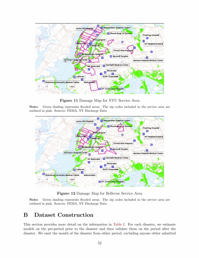
Figure 11 Damage Map for NYU Service Area
Note: Green shading represents flooded areas. The zip codes included in the service area areoutlined in pink. Sources: FEMA, NY Discharge Data
Figure 12 Damage Map for Bellevue Service Area
Note: Green shading represents flooded areas. The zip codes included in the service area areoutlined in pink. Sources: FEMA, NY Discharge Data
B Dataset Construction
This section provides more detail on the information in Table I. For each disaster, we estimatemodels on the pre-period prior to the disaster and then validate them on the period after thedisaster. We omit the month of the disaster from either period, excluding anyone either admitted
52

Figure 13 Damage Map for Coney Island Service Area
Note: Green shading represents flooded areas. The zip codes included in the service area areoutlined in pink. Sources: FEMA, NY Discharge Data
or discharged in the disaster month. The length of the pre-period and post-period in generaldepends upon the length of the discharge data that we have available. Table Ib contains thedisaster date and the pre-period and post-period for each disaster, where months are defined bytime of admission.
NYU hospital began limited inpatient service on December 27, 2012; unfortunately, we onlyhave month and not date of admission and so cannot remove all patients admitted after December27th. Right now, we drop 65 patients admitted in December to NYU; this patient population isvery small compared to the size and typical capacity of NYU.
For California, we exclude all patients going to Kaiser hospitals, as Kaiser is a vertically in-tegrated insurer and almost all patients with Kaiser insurance go to Kaiser hospitals, and veryfew patients without Kaiser insurance go to Kaiser hospitals. This is in line with the literatureexamining hospital choice in California including Capps et al. (2003). We also exclude Februarythough April 1994, as the I-10 Santa Monica freeway that goes through Santa Monica only reopensin April.
53

Figure 14 Damage Map in Los Angeles, CA
Note: Darker green areas indicate the earthquake intensity measured by the Modified MercalliIntensity (MMI); an MMI value of 7 reflects non-structural damage and a value of 8 moderatestructural damage. The areas that experienced the quake with greater intensity were shaded in adarker color, with the MMI in the area ranging from 7-8.6. Any areas with an MMI of below 7were not colored. The zip codes included in the service area are outlined in pink. Sources: USGSShakemap, OSHPD Discharge Data
54