using patterns
DESCRIPTION
graphic art portfolioTRANSCRIPT

Jackie Mujica
Graphic Design Portfolio
Using
Patterns


Jackie Mujica
Graphic Design Portfolio
Using
Patterns


table of
contents
00: Introduction 3
01: A Classic Combination 5
02: Essential Variety 11
03: Holy Basil Leaves 17
04: Random Words 23
05: Mapping a New Route 27
06: Building Differently 35
07: Then and Now 41
08: A Plan to Thrive 51
09: Patterns of the Sea 59
10: Vintage Perfection 65

Using PatternsBook design copyright 2011 by Jacquelyn MujicaPublished by Jacquelyn Mujica for course num-ber GR. 460, Senior Portfolio, taught online by Jeremy Stout in the Fall, 2011 at the Academy of Art University, San Francisco, CA. Printed and bound by Blurb, www.blurbcom. The text in this book was set in Din.

A Brief
Introduction
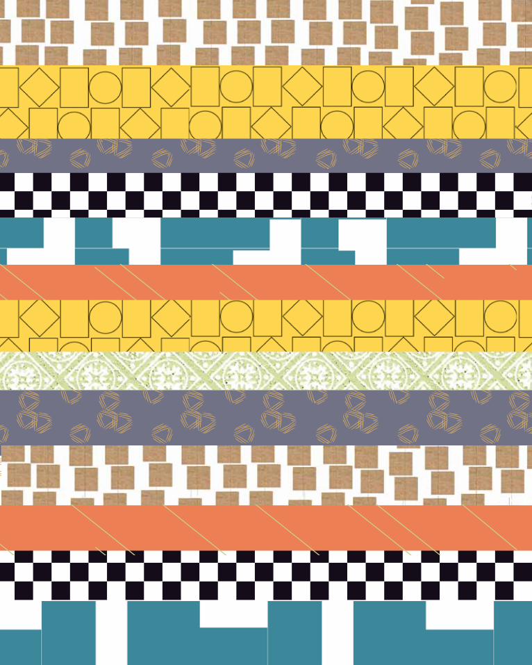
Elements, alignment, repetition —this is how we see, recognize and create patterns. Patterns of behavior, and patterns of the natural world, are the structures of life. Our ability to see patterns in life helps make the world more understand-able and easier to design.

01

6 Using Patterns Portfolio Jackie Mujica

A Classic
Combination
A Classic Combination 7
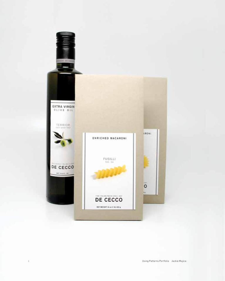
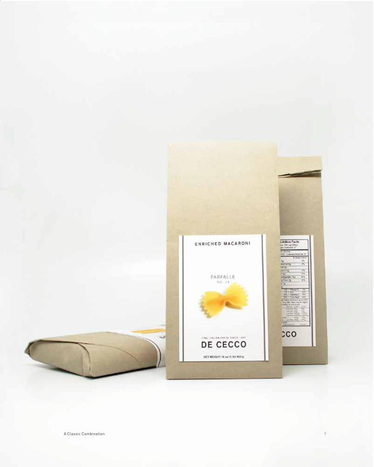
DeCecco is known for high quality pasta, but is not as well known for its olive oil, which became part of the company in 1986. The DeCecco olive oil is extra virgin and made exclusively from Italian olives. DeCecco believes olive oil is like fine wine, and it retains some of the terroir of the region. The olive oil and pasta are on supermarket shelves, finer food stores and gourmet boutiques.
Breaking with DeCecco’s traditional image, adopted in 1908, the farm girl carry-ing wheat on the logo was replaced by simple logo text. The change was to make DeCecco more appealing to upscale consumers. The design was simplified, with olive oil and pasta labels more unified.
project title DeCecco Olive Oil and Pasta Redesign
project category Packaging
class name Packaging Design 2
instructor Thomas McNulty
typeface Akzidenz Grotesk
project objectives Create new packaging for three different flavors of olive oil, or bread, or pasta

8 Using Patterns Portfolio Jackie Mujica
A Classic Combination 9

02

12 Using Patterns Portfolio Jackie Mujica

Essential
Variety
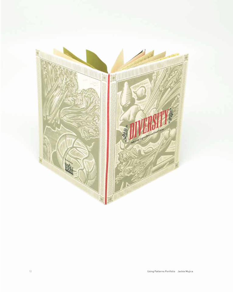
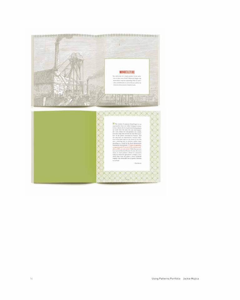
Diversity is a book about the ill effects of factory farming which results in the elimination of crop diversity. It is healthier for crops and people to keep many diverse varieties of plants growing, rather than depend on one crop which might develop a fatal flaw and fail.
The woodcuts and typeface refer back to an earlier time, when local farmers grew hundreds of varieties of different types of vegetables and fruits, and flavor and tradition were supreme.
project title Diversity book
project category Book
class name Graphic Design 3
instructor Tia Stoller
typeface Pall Mall, Adobe Wood Type, Chaparral
project objectives Choose an environmental issue for a book
Essential Variety 13
14 Using Patterns Portfolio Jackie Mujica

Essential Variety 15

03

18 Using Patterns Portfolio Jackie Mujica

Tea of
Holy Basil
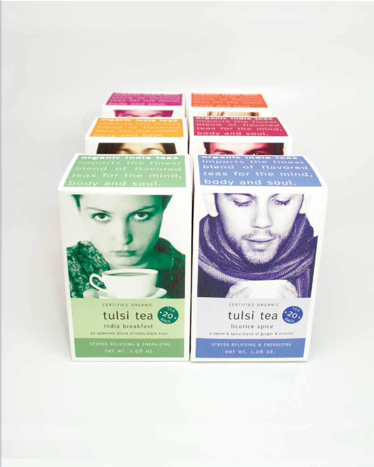
Organic India makes Tulsi Tea and their company’s mission is to produce healthy herbal teas and herbal supplements while running an environmentally friendly and conscientious company. They support local Indian farmers by buying tulsi plants, a traditional Indian healing herb, from them. Some health claims for the tulsi herb include benefits such as stress-relief and immune system support.
Tulsi tea packaging was updated to appeal to a larger market than only herbal drinkers. The tea packages are differentiated by color and image, each with a different, engaging tulsi drinker on each flavor. The colors are a marked change from the original packaging Tulsi Tea package which was made of light-weight board in dull colors.
project title Tulsi Tea Packaging
project category Packaging
class name Packaging Design 2
instructor Thomas McNulty
typeface Meta
project objectives Choose a tea company and revise their packaging
Tea of Holy Basil 19

20 Using Patterns Portfolio Jackie Mujica

Tea of Holy Basil 21

04


24 Using Patterns Portfolio Jackie Mujica

Random
Words
We were assigned random words to create an identity. I listed for the first word, blue, some associated words for blue, then made sketches. For ruin, the second word, I listed associated words and did some sketches. Then I made sketches of some possible combinations of words, such as dismembered blue group figures, a blue architectural folly, and a warbled blue note. The final logo is an image of a ruined blues guitar.
project title Blue Ruin Stationery
project category Identity 1
class name Identity 1
instructor Christopher Simmons
typeface American Typewriter
project objectives Create a personal stationery system based on two assigned words: blue and ruin
Random Words 25
05

28 Using Patterns Portfolio Jackie Mujica

Mapping a
New Route
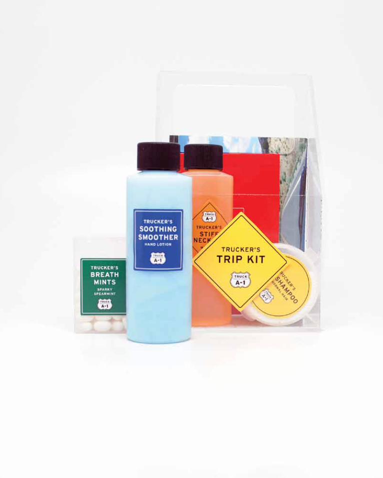
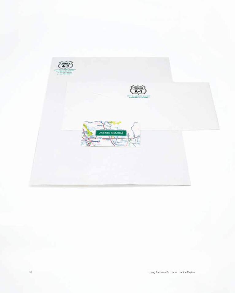
Many potential drivers join the industry through training schools such as A-1. According to a Wall Street Journal article, many of the new students for driving schools are couples, who plan to work and travel together.
The purpose of the kit is a giveaway gift from the school. The travel kit contains useful and fun items for a traveling team, all intended to keep the team func-tioning, clean and amused.
The stationery and logo for the school reflect the essentials for truckers: maps and highway signs. Item labels are also the shapes of highway signs.
project title A-1 Truck Driving School
project category Identity
class name Identity 1
instructor Christopher Simmons
typeface Interstate
project objectives Create an identity for an assigned Yellow Pages listing, A-1 Truck Driving School
Mapping a New Route 29

30 Using Patterns Portfolio Jackie Mujica

Mapping a New Route 31
32 Using Patterns Portfolio Jackie Mujica

Mapping a New Route 33

06


36 Using Patterns Portfolio Jackie Mujica
Building
Different
The green building book covers materials and methods for environmentally- based building and remodeling. Some chapters are devoted to materials, with an overview of available options, and others are devoted to methods of building better and greener. Other chapters cover green ideas for managing the build-ing’s heating, cooling, and insulation.
The layout was designed to reflect working, or construction, drawings. Folios include dimension lines; type on the side of the pages reflects the usual method of listing information and instructions on construction or architectural drawings.
project title Green Building Guide
project category Book
class name Typography 3
instructor Jennifer Sterling
typeface Roti Sans Serif
project objectives Design an informational book
Building Different 37

38 Using Patterns Portfolio Jackie Mujica

Building Different 39

07


42 Using Patterns Portfolio Jackie Mujica
Then
and Now
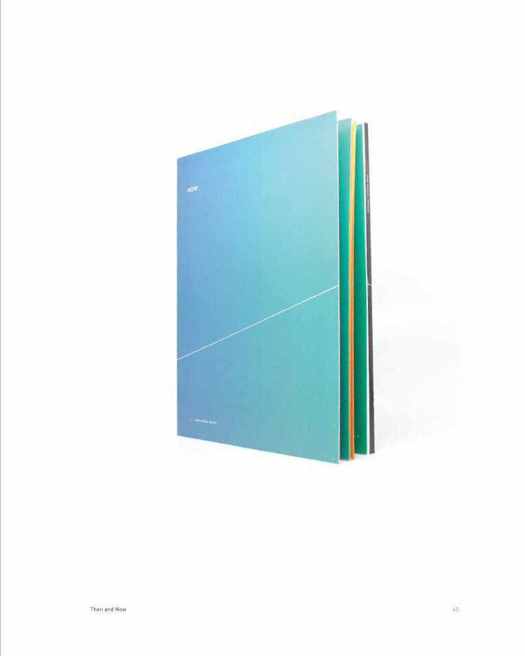
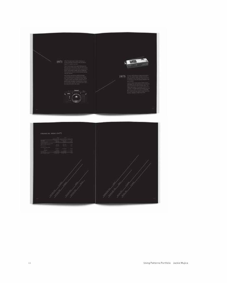
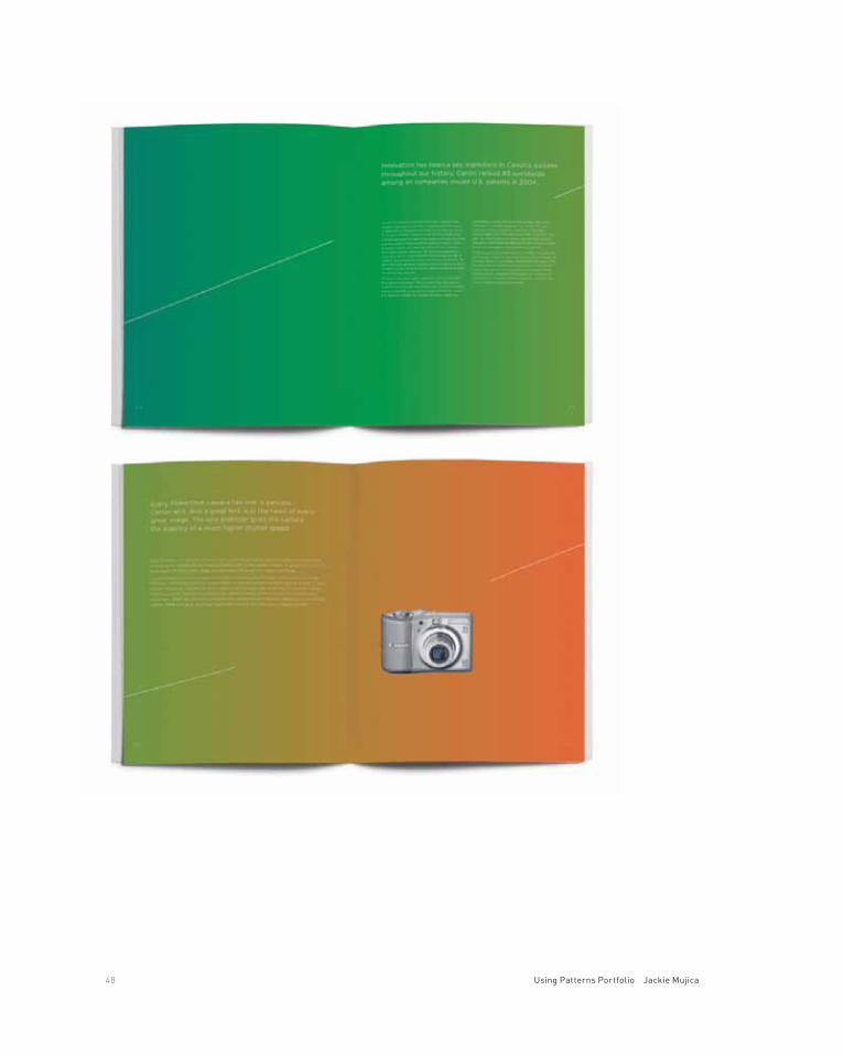
This project is the annual report for Canon, emphasizing the history of their innovation and their future innovation. Canon built the first 35 mm camera in Japan in 1935. Their innovation continued as Canon added new products as the technology allowed. Today, they are known for quality cameras, office equip-ment, and a variety of lenses.
The original Canon annual report is a long, complicated report for a world-wide company with many divisions and products. The revision gave Canon more per-sonality. The z-fold cover emphasizes that they are a company with long history, but also committed to innovation and the future.
project title Canon Annual Report
project category Annual Reports
class name Print 2
instructor Kelly Conley
typeface Gotham
project objectives Choose a corporation and revise their annual report
Then and Now 43

44 Using Patterns Portfolio Jackie Mujica
Then and Now 45
46 Using Patterns Portfolio Jackie Mujica

Then and Now 47
48 Using Patterns Portfolio Jackie Mujica

Then and Now 49

08


52 Using Patterns Portfolio Jackie Mujica

A Plan to
Thrive
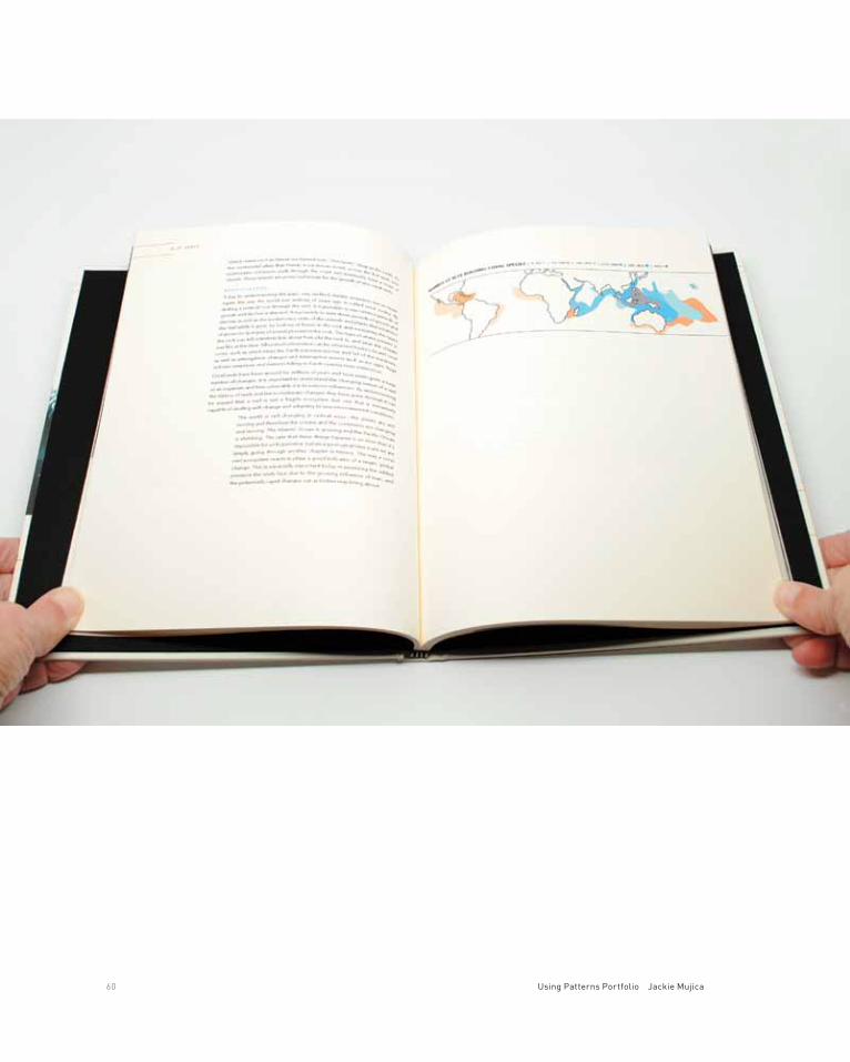
The new retail store is The Magic Bean store, which emphasizes health values of organic beans and enhanced beans and related products. The store will be of interest to cooks, chefs and anyone following or interested in a healthy diet, including vegetarian and vegans. The retail stores will introduce beans as a pre-mier health and upscale food product and also provide learning opportunities to teach the health benefits of beans, the history of beans, and the preparation of gourmet beans and related foods.
project title The Magic Bean Store
project category Packaging
class name Packaging 4
instructor Thomas McNulty
typefaces Emmascript MVD std, Gotham
project objectives Create a new retail store brand image and product that does not currently exist. Create 15-20 products, including sub-brands
A Plan to Thrive 53

54 Using Patterns Portfolio Jackie Mujica

A Plan to Thrive 55

56 Using Patterns Portfolio Jackie Mujica

A Plan to Thrive 57

09

60 Using Patterns Portfolio Jackie Mujica
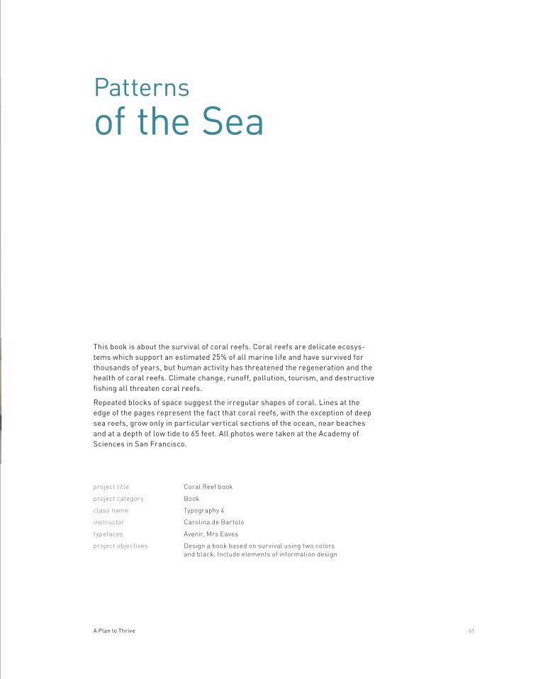
Patterns
of the Sea
This book is about the survival of coral reefs. Coral reefs are delicate ecosys-tems which support an estimated 25% of all marine life and have survived for thousands of years, but human activity has threatened the regeneration and the health of coral reefs. Climate change, runoff, pollution, tourism, and destructive fishing all threaten coral reefs.
Repeated blocks of space suggest the irregular shapes of coral. Lines at the edge of the pages represent the fact that coral reefs, with the exception of deep sea reefs, grow only in particular vertical sections of the ocean, near beaches and at a depth of low tide to 65 feet. All photos were taken at the Academy of Sciences in San Francisco.
project title Coral Reef book
project category Book
class name Typography 4
instructor Carolina de Bartolo
typefaces Avenir, Mrs Eaves
project objectives Design a book based on survival using two colors and black. Include elements of information design
A Plan to Thrive 61

62 Using Patterns Portfolio Jackie Mujica

A Plan to Thrive 63

10

66 Using Patterns Portfolio Jackie Mujica

Vintage
Perfection
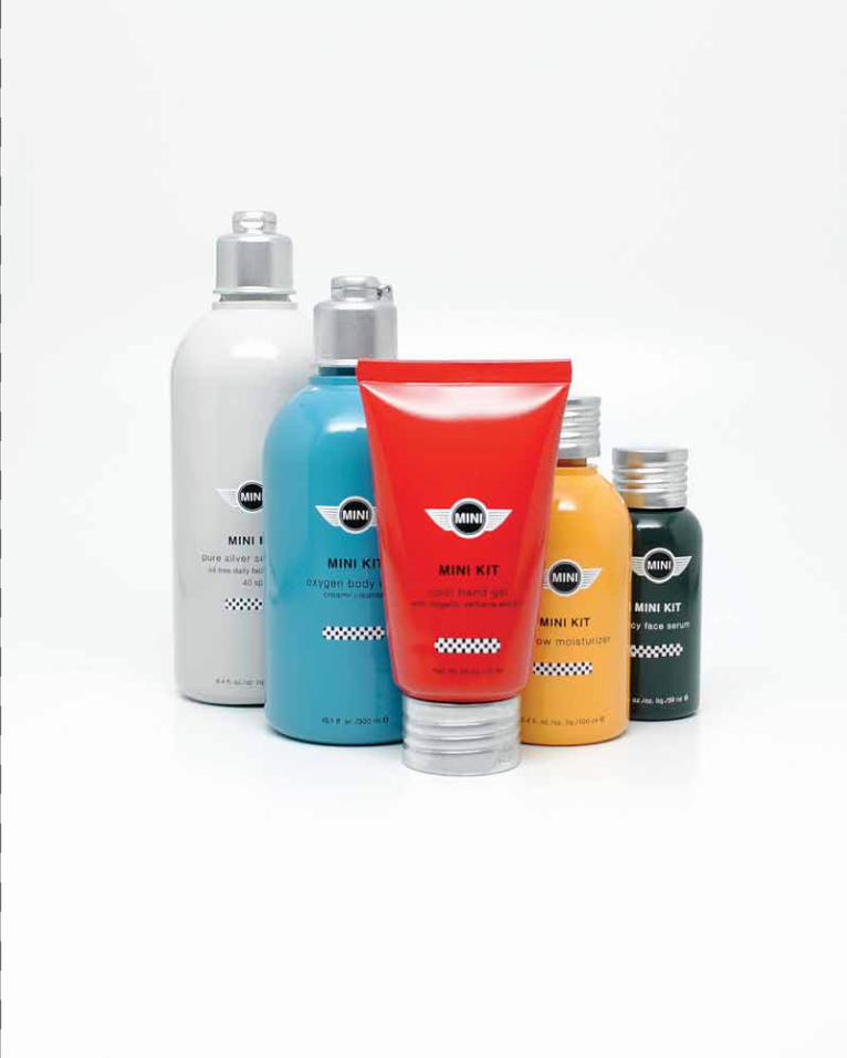
The MINI Cooper revival by BMW has created new devotees to a car with a long history and collectors’ interest. The car is classic and fun. The skin care line is designed to capture the aura of the MINI.
The skin care line mimics the colors and shapes of the MINI with the colors of the bottles and cans painted to match the actual MINI colors. The bottles have a rounded, friendly shape imitating the sculpture of the MINI and silver tops imitate the chrome car trim, and racing checks are the final touch.
project title MINI Cooper Skin Care
project category Packaging
class name Packaging Design 3
instructor Thomas McNulty
typeface Helvetica
project objectives Create a new line of skin care products and in-store display. Select a brand know for an entirely different category than skin care.
Vintage Perfection 67

68 Using Patterns Portfolio Jackie Mujica

Vintage Perfection 69

And a
Thank You
Thank you to the Academy of Art University for making this education available and to the instructors for their guidance. Thank you to my instructor for this course, Jeremy Stout, for advice, direction, and patience.
And to Michael, thank you for your patience and help, and thank you especially for occasionally taking me away from it all.


