using real world data - texas instruments
TRANSCRIPT
2
Linda Tetlow | Ian Galloway | Adrian Oldknow
STEM ACTIVITIES WITH TI-NSPIRE
Using Real World Data

3Using Real World Data_Introduction
Why use TI-Nspire with real world data?
The data handling features of TI-Nspire and the emphasis in the new secondary curriculum
on real-life contexts, curriculum opportunities and cross-curricular dimensions, all combine
to give a strong rationale for introducing activities using TI-Nspire which use real data and
link STEM subjects.
There is now a wealth of data available on the Internet in a variety of forms. TI-Nspire can
make use of this data as it has the facility to copy and paste information from tables and
spreadsheets into a Lists & Spreadsheet page. It is then possible to manipulate, display
and analyse this data in a variety of ways using facilities from ‘Data & Statistics’. It is also
possible to further analyse or attempt to model the data by inserting movable lines,
plotting functions or fi tting a variety of functions using diff erent forms of regression.
STEM ACTIVITIES WITH TI-NSPIRE
USING REAL WORLD DATA
INTRODUCTION
Mathematics and statistical education
In 2005 there was a review of the Mathematics curriculum and wide-ranging research was
undertaken into the part that statistical education should play in this. The results of this were
contained in a report from the Royal Statistical Society’s Centre for Statistical Education in
association with QCA (now QCDA).
The key features of this report are that though it was felt that statistical education should
be set in contexts from other curriculum areas especially Science, it should still be delivered
by mathematics teachers. The mathematics teachers would however need to be supported
by appropriate resources and background information.
http://www.rsscse.org.uk/qca/recommendations.htm
Sets of materials for teachers for 8 activities were produced jointly by the RSS and QCA. One
of these is ‘What’s in your bowl?’ which looks at the nutritional content of breakfast cereals
and is linked to one of the activities in this booklet.

4
Curriculum opportunities
The new curriculum in England gives considerable importance to curriculum
opportunities in both mathematics and science and also to cross-curricular
dimensions which include
the following:-
• healthy lifestyles
• global dimension and sustainable development
• technology and the media
• creativity and critical thinking
Real world data activities
The QCA/RSS report conclusions combined with the availability of data over the
internet and the range of facilities of Ti-Inspire provide a wealth of opportunities
for STEM activities using real world data. The examples of data chosen for use in
the activities in this booklet fi t into two main headings:-
Modelling
Some activities off er opportunities to try to fi nd formulas or to fi t functions
to scientifi c data to model it mathematically.
Handling data cycle
Other activities off er opportunities to examine real-world data to
• See what the data show and fi nd representations to illustrate
these fi ndings more clearly.
• Make and test hypotheses using a student-centred problem
solving approach.
Collect dataInterpret & discuss
Process & represent
Specify & Plan
This might include
• looking for trends in data and predicting future results
• comparing sets of data, presenting and analysing results and
justifying conclusions

5
page 6 1 Investigating the nutritional content of breakfast cereals
Learners can make and test hypotheses comparing nutritional contents of breakfast
cereals, including interpretation and using inequalities.
13 2 Hydrocarbons
This activity looks at the structure of diff erent groups of hydrocarbons and investigates
mathematical patterns and relationships between their chemical structures and formulas.
18 3 Perfect pitch
This activity looks for connections between frequencies of musical note sequences and
considers wavelengths. It also considers geometric sequences and looks at historical
and cultural links.
23 4 Compare the weather
This activity investigates diff erent aspects of world weather data for a range of diff erent
climate extremes. Students are invited to read and interpret a large table of data and to fi nd
eff ective ways to display and analyse subsets of this data in order to illustrate comparisons.
29 5 Hurricane force
This activity looks at interpreting weather station data, considers wind speed and can be
extended to more advanced mathematics, by fi tting functions to the Beaufort and Torro scales.
38 6 Carbon dating
This activity looks at Carbon Dating and Radioactive decay, interpreting graphs and comparing
functions and can be extended to include inverse and exponential functions, logarithms,
diff erential equations and scientifi c theory.
44 7 Reaction times
Learners can make hypotheses about reaction times and set up an experiment to test
hypotheses, then make use of TI-Nspire to illustrate and analyse their data. This activity is
suitable for project work and could be extended using more advanced statistical techniques.
CONTENTS
About the activities
All the activities in this booklet contain some background scientifi c or other
information together with links to appropriate websites for further information
and other resources. Many of the activities are suitable for a range of ages and
aptitudes with more challenging ideas being suggested as extension activities.
The introduction to the activities gives some idea of the subject content and the
Ti-Nspire features that could be used. Some activities have additional information
such as teachers’ notes, further background information or additional advice for
students including getting started with Ti-Nspire. Information to help get started
with using Ti-Nspire features is also included in the booklet ‘STEM activities with
Ti-Nspire: Introduction’. Further information and Ti-Nspire fi les for the activities
can be found at www.nspiringlearning.org.uk
Using Real World Data_Introduction

6
1Chapter
Investigating the
nutritional content
of breakfast cereals

7
Introduction
This activity makes use of TI-Nspire data-handling facilities to investigate
the nutritional contents of breakfast cereals. This activity could provide an
introduction to data entry and other features of Lists & Spreadsheets and
encourage the use of ICT. The introduction to the activity using the ‘traffi c light’
food labelling system enables students to meet and work with inequalities in a
real context.
The main activity suggests possible lines of enquiry and provides a small
database of information on a selection of breakfast cereals in a TI-Nspire fi le,
with a few examples of how such data might be explored and analysed. Ideally
students should pose their own questions and select or collect their own data
to analyse using the Handling data cycle. Suggestions for where to obtain
further data are given.
Background informationThere is a wide range of information on the Internet about the nutritional
content of foods including on manufacturers and fast food restaurant chain
websites. Some examples of these, together with other sources of nutritional
information are given later in the activity.
Sources of further ideas:One school in the QCDA ‘Engaging mathematics for all learners’ project http://
www.qcda.gov.uk/22221.aspx, set their students the task of posing their
own questions comparing diff erent types of meals from a well know fast food
restaurant chain.
‘What’s in your bowl?’
The Royal Statistical Society in association with QCDA have produced and
trialled data-handling lesson materials; http://www.rsscse.org.uk/qca/
resources0.htm. There are eight activities one of which is ‘What’s in your bowl’.
The activity is aimed at 11-14 year olds. Lesson suggestions, background
information, teachers’ notes, pupil worksheets and a PowerPoint presentation
can be found at http://www.rsscse.org.uk/qca/resource7.htm.
The emphasis is on pupils suggesting their own questions, planning which data
to collect and how to collect it and planning how to organise and analyse the
data and communicate their fi ndings.
Using TI-NspireThe TI-Nspire activity gives students a sample data fi le and instructions for
how to manipulate it. They can then go on to plan their own investigation and
collect and analyse their own data. Some sources of internet data are in table
or spreadsheet form. These can be copied and pasted into a List & Spreadsheet
page of TI-Nspire. It may be easier to paste larger data sets into a spreadsheet
such as Microsoft Excel fi rst, and then to copy and paste extracts from this into
the TI-Nspire. Examples of particular TI-Nspire features which might be useful
are also given in the STEM Activities Introduction booklet.
fi g_01
Using Real World Data_Section 1
8
The Activity
The RSS QCA activity ‘What’s in your bowl?’ has discussion suggestions and
lesson ideas and recommends a number of websites for further information.
Two possible starting points for discussion are suggested below, the fi rst of
which could link into the second.
Recommended Daily Allowances (RDA)
The guideline daily amounts for adults are usually quoted as
Possible Discussion Points: • What does this mean?
• Which types of food contain carbohydrate, sugar, fat, fi bre etc?
• Which of these should you only eat in moderation and the fi gure shown
is the maximum recommendation?
• Which of these are important and you should aim to eat at least as much
as the amount shown?
• How well do you think your food intake for an average day compares with this?
• How could you fi nd out?
• How is food labelled to help you fi nd out?
More information on the traffi c light system for labelling is given below.
The TI-Nspire fi le gives information obtained from a number of breakfast cereal
packets. The RSS QCA activity has information from a number of breakfast
cereals. It would also be useful to have some examples of cereal packets for
students to view
Some points to note:
• Men, women and children: The above fi gures are the most common ones
quoted. The fi gures shown are sometimes given as the fi gures for women
with those for men being slightly higher and those for children being
slightly lower. These fi gures could be increased for people with a very active
lifestyle. A factsheet of food labels is available from http://www.bda.uk.com/
Downloads/foodlabels.pdf
• Portion size: The fi gures used in the TI-Nspire fi le for Breakfast cereals are
for 100 grams of cereal not an average portion with milk. Portion sizes for
diff erent cereals vary and the size suggested by the manufacturer is shown in
a column on the spreadsheet. However, research has shown that the average
portion size actually used tends to be considerably greater than that the
manufacturers’ suggestions.
• Salt and sodium: The TI-Nspire spreadsheet contains the fi gure for salt. Most
packets now have both sodium and salt mentioned, but some manufacturers’
websites only give the sodium content. The salt content would be 2.5 times
the fi gure given for sodium.
Energy 2000Kcal
Protein 45g
Carbohydrate ( of which sugars) 230g (90g)
Fat ( of which saturates) 70g (20g)
Fibre 24g
Salt ( of which sodium) 6g (2.4g)

9
• Maximum or minimum: For some of the contents such as salt, sugar and fat
the fi gure is a recommended daily maximum while for others such as fi bre
and protein it is a minimum. This is an important discussion point.
Traffi c light food labellingTo simplify checking the nutritional content of food, the Food Standards Agency has
introduced a ‘Traffi c light’ food labelling system on the front of some food packets.
Green means low (good) Amber means medium (fair) Red means high (bad)
Low(Green)Per 100g
Medium (Amber) Per 100g
High (Red)Per 100g
Foods are also labelled as High (red) if one portion contains
Fat ≤ 3.0g > 3.0g≤ 20.0g
> 20.0g > 21.0g
Saturated fat ≤ 1.5g > 1.5g≤ 5.0g
> 5.0g > 6.0g
Sugars ≤ 5.0g > 5.0g≤ 12.5g
> 12.5g > 15.0g
Salt ≤ 0.30g > 0.30g≤ 1.50g
> 1.50g > 2.40g
Note: Most manufacturers only include the total fi gure for sugars. Some sugars
are naturally occurring (e.g. in fruit added to breakfast cereals) and some sugar
may be added in the processing. There are some variations in the traffi c light
labelling for the two types but this has not been included here.
Initial activity
Students look at the contents of the breakfast cereals and try to apply the
‘Traffi c light’ labelling system to the salt, sugar, fat and saturated fat content
of them. The RSS QCA activity has a work sheet for this.
How can you quickly identify which cereals are green, amber or red
for fat, sugars etc.? fi g_02
One way to do help with this is to
• display the data in a ‘dot plot’ on a Data & Statistics page and then to
• add two ‘movable lines’ (menu 4)and to
• grab and drag these lines to the appropriate places getting the fi gure
displayed as close as possible ( this could be practice at interpreting
inequalities and decimal numbers)
• line 1: to the boundary between green and amber
( 5.0g for sugar, 0.3g for salt)
• line 2: between amber and red (12.5g for sugar, 1.5g for salt)
Which cereals would have green, amber, red labels? fi g_03
This can give a feel for the boundaries and a quick picture of the results but is
not very accurate.
• If the cereals were numbered, the data could be displayed as a scatter plot
from menu 1 on a Data & Statistics page.
• Boundary lines could be entered as functions using ‘Plot function on menu 4.
(Note: Y window setting was increased)
• A Graphs page could also be used.
fi g_02
fi g_03
Using Real World Data_Section 1

10
Main Activity
Investigating the nutritional content of breakfast cereals
1. Pose questions
After the initial discussions and activity hopefully students have some ideas
of the sort of questions they might consider about the nutritional content of
breakfast cereals.
Students may wish to group cereals under certain headings for comparison such as
• main cereal content – wheat/ oats or wholegrain/ others
• specifi c additions – honey ; chocolate ; nuts; fruit
Teachers may wish to guide this discussion if they want to encourage specifi c
statistical concepts and processes such as comparing two distributions or
looking for possible correlation. For example:-
• Do chocolate cereals contain more sugar than honey cereals?
• Do cereals with more sugar contain less protein?
2. Collect data
Having decided on the question they wish to investigate, students could use
the given spreadsheet on the website at www.nspiringlearning.org.uk and
make their own additions or set up their own spreadsheet using instructions
in the STEM Activities Introduction booklet. Possible sources of data are:-
• The spreadsheet in the TI-Nspire fi le which has a mixture of fi gures from
diff erent sources
• Information on cereal packets
• Information on manufacturers’ web sites.
• Data from the RSS QCDA activity ‘What’s in your bowl? ’
• The activity does not need to be comparing breakfast cereals. Fast food
restaurants also have comprehensive data on their web sites about the
contents of their food.
Breakfast cereals
http://www.kelloggs.co.uk/products/
http://caloriecount.about.com/quaker-oats-nutrition-m2
http://www.cerealpartners.co.uk/
http://www.weetabix.co.uk/nutrition/
Others
http://nutrition.mcdonalds.com/nutritionexchange/nutrition_facts.html#download
http://www.burgerking.co.uk/nutrition
http://www.wimpy.uk.com/menu-bgr.html
http://www.pizzahut.co.uk/restaurants/menus--deals/dietary-information.aspx
Analyse and present the data & Interpret and Discuss
There are further ideas for doing this in the activity ‘Reaction Times’ and in the
STEM Activities Introduction booklet. Students should already have collected
appropriate data to answer their questions.

11
Example A – Looking for correlation fi g_04 / 05
– Do cereals with more sugar contain less protein?
• Insert a ‘Data & Statistics’ page
• From menu 2 select ‘Add X variable’ and select protein (or sugar)
• Then select ‘Add Y variable’ and choose sugar (or protein)
• What does the diagram show?
• Does it look like there is reasonable correlation between these fi gures?
What type of correlation?
• Would a line of best fi t be appropriate?
• What would this show?
• What else could you use? ( More advanced students)
Example B – Comparing distributions
– Do fruit cereals contain more fi bre than non- fruit cereals? fi g_06
Note that the spreadsheet of data in the TI-Nspire sample fi le contains a mixture
of cereals and has not been set up for a specifi c question such as the one
posed here, so this is used as an example of the use of TI-Nspire and not of
a good investigation.
• Open a New Document and Copy and paste the two sets of data for the
diff erent types of cereals into separate Lists & Spreadsheet pages in the
same document. fi g_07
• You will need to manually insert the column headings and should ensure
that you use diff erent names for the two pages ( note that the second page
has kcalf, proteinf etc)
fi g_04
fi g_05
fi g_06
fi g_07
Using Real World Data_Section 1

12
fi g_08
fi g_09
A Box plot is a quick way to compare and analyse these two sets of data
• First insert a Data & Statistics page and set the caption to the appropriate
data set e.g. cereal.
• Then ‘Add X variable’ (menu 2) or move to the centre of lower edge of the
screen and select variable. Choose the variable from the list e.g. fi bre for
cereal or fi bref for fruitcereal.
• This will give you a dot chart. Then from menu 1 select Box plot. Repeat for
the second set of data.
• The two diagrams above fi g_08 / 09 were produced automatically using
the default scale settings. Menu 5 and ‘Window settings’ could be used to set
them to the same window for comparison. They could also be shown side
by side by changing the page layout.
What questions would you ask about these two diagrams and what they
showed? The mean, median, quartiles and maximum and minimum values can
all be found from these box plots or by using the spreadsheet and catalogue
features to do the calculations.

13
2Chapter
Hydrocarbons
Using Real World Data_Section 2

14
Introduction
Mathematically this activity is similar to many others which involve spotting
patterns, fi nding term to term and nth term formulas. The main diff erence in
the activity is that the problem itself comes from Chemistry and the formulas
are actual Chemical formulas, so that a genuine connection can be made
between subjects and it gives a real world reason for looking for general
formulas. The availability of information on the internet also means that
students can make predictions using mathematics and then fi nd out more
about hydrocarbons and see whether their predictions are correct using Internet
research. Some students will inevitably fi nd the general chemical formulas from
internet research, so the challenge then is to use the patterns in the chemical
structure diagrams to explain why these general rules work.
This activity can make use of a number of features of TI-Nspire without much
prior experience so not only does TI-Nspire give the user the facility to link
together diff erent aspects of the activity, but the activity itself could also provide
an introduction to some of the features of the handheld or software.
Hydrocarbons activity | Alkanes
Atoms of carbon combine with atoms of hydrogen to form hydrocarbons.
Carbon atoms have valency 4. This means that each carbon atom has 4 bonds
which can link to other atoms. Hydrogen atoms only have a single bond.
Saturated hydrocarbons or alkanes are the simplest type of hydrocarbon.
The atoms are linked in a straight chain. They are composed entirely of single
bonds and are saturated with hydrogen i.e. every bond is used.
The fi rst 3 alkanes are shown. They are methane CH4 fi g_10; ethane C2H6 fi g_11;
propane C3H8 fi g_12
• Can you predict what alkanes with more carbon atoms will look like? You
could use pencil and paper to do this or you could try a Geometry page to
draw these. fi g_12 shows Propane using small circles for carbon, points for
hydrogen and line segments for the bonds.
• Can you suggest any connections between the number of carbon atoms and
• the number of hydrogen atoms
• the number of bonds
• the chemical formulas
• Can you complete more rows and columns of the table below?
You could use a ‘Lists & Spreadsheet’ page to help you do this.
(fi g_17 / 18 / 19 on page 17)
NameCarbon atoms
Hydrogen atoms
Number of bonds
Chemical formula
Methane 1 4 4 CH4
Ethane 2 6 7 C2H6
Propane 3
Butane 4
Pentane 5
Hexane
fi g_12
fi g_13
fi g_10
fi g_11
15
• Could you predict what happens for other saturated hydrocarbons such as
Decane which has 10 carbon atoms?
• Could you suggest any general formulas and predict other hydrocarbons and
their formulas?
• Can you explain the methods that you used to fi nd patterns and formulas?
You could use a ‘Notes’ page for your explanation, but you might also have
used formulas in a spreadsheet page or fi tted functions to a graph. (There is
a helpsheet for students with more information about doing this.)
• Can you explain why your rules work? How do the patterns in the diagrams
of the chemicals help to explain this?
• What else can you fi nd out about hydrocarbons? (Possible internet research)
Extension activity | Alkenes and alkynes
Unsaturated hydrocarbons have one or more double or triple bonds between
carbon atoms.
Those with one double bond are called alkenes.
Those with a triple bond are called alkynes
Alkenes
The fi rst two alkenes are Ethene C2H4 and Propene C3H6
• Can you sketch some more alkenes and predict possible connections
between the number of carbon atoms and the number of hydrogen atoms,
bonds and the chemical formula? You might fi nd a table useful like the one
used for alkanes.
The fi rst two alkenes (2 and 3 carbon atoms) are shown in fi g_14 and fi g_15
and have a unique structure. The diagram for Propene has been drawn with
the double bond on the left, but the structure would be the same if the mirror
image was drawn i.e. the double bond on the right.
The structure for Propene could be broken down as CH2= CH-CH3
Alkenes with 4 or more carbon atoms can have more than one structure.
Butene (4 carbon atoms) for example can have the double bond either in the
centre or at one side of the chain of carbon atoms.
• Does the drawing and structure make any diff erence to the number of
hydrogen atoms, bonds or the chemical formula?
• Can you predict the number of diff erent structures for alkenes depending
on the number of carbon atoms and use the diagrams to explain how your
rules work?
Alkynes
What rules and formulas can you predict for alkynes which have one triple bond
between carbon atoms?
The fi rst alkyne is Ethyne C2H2. fi g 16
Can you fi nd any other types of hydrocarbons?
fi g_15
fi g_14
fi g_16
Using Real World Data_Section 2

16
Possible further extension activity
Alkanes may be gases, liquids or solids at room temperature. Their boiling points
and solidifi cation points vary. The more carbon atoms there are the lower the
boiling point so a further more advanced extension activity could be to search
for a connection between the boiling point or solidifi cation point and the
number of carbon atoms. This has important practical considerations which
might be relevant to students, for example which to use as fuel for camping
stoves in diff erent climatic conditions. http://library.thinkquest.org/3659/
orgchem/alkanes.html
Sources of further informationAn internet search will give a lot more information about alkanes, alkenes and
alkynes. Some sites such as Wikipedia give rather too much information which
can be very daunting and complex. Some sites go straight to the chemical
formula. Searches under the three individual headings can prove more useful
than a general search for ‘hydrocarbons’. These are some examples:
http://www.chemguide.co.uk/organicprops/alkanes/background.html#top
http://www.chemguide.co.uk/organicprops/alkenes/background.html#top
http://hyperphysics.phy-astr.gsu.edu/HBASE/Organic/alkane.html
http://hyperphysics.phy-astr.gsu.edu/hbase/Organic/alkene.html
http://library.thinkquest.org/3659/orgchem/alkanes.html
http://www.gcsescience.com/ihydrocarbons.htm
http://library.thinkquest.org/3659/orgchem/alkenes-alkynes.html
Further help for students
1. Using formulas in a spreadsheet
One way to test out formulas is to open a ‘Lists & Spreadsheet’ page and enter
the information in the table. You could then test out your formulas by entering
them into the spreadsheet.
To enter a formula for a particular cell type “=” followed by the cell label e.g. “B5”
and the operation e.g. “+1”. Such formulas can be copied and pasted down a row.
Press enter to see if you get the value you want.
If you have a general formula you can enter this in the cell at the top of a column.
For example if you thought that the number of hydrogen atoms is equal to one
more than three times the number of carbon atoms you could type in
• “= 3*carbon + 1”in the shaded cell at the top of a new column or
• “=3*b[] + 1” since column B has the carbon fi gures in.
Square brackets [] indicate a column.
• Press enter and see if the values in the new column agree with those in the
hydrogen column.
• If they don’t match why do you think this is?
• Can you fi nd a rule that does work?
• What about formulas for the number of bonds or for the general chemical
formula?
fi g_18
fi g_17
fi g_19

17
2. Fitting a formula to a Scatter Plot
Another way to look for patterns and rules is to open a Graphs page and plot
points where the x-coordinate is one of the values (say the number of carbon
atoms) and the y coordinate is the value that goes with it from another column
(say the number of hydrogen atoms).
• Open a Graphs & Geometry page.
• From menu 4 select ‘zoom quadrant 1’ then from menu 3 select ‘Scatter Plot’
• Use the arrow keys in the boxes to set x and y to the variables that you want
from the spreadsheet columns - in this case ‘carbon’ for x and ‘hydrogen’
for y. You can type these in or use the ‘vars’ menu. This will give you a
scatterplot for all the values you have entered in these columns.
• The next step is to try to fi t the graph of a function, so from menu 3
select ‘function’ and type in your rule after ‘f1(x) =’in the entry line at the
foot of the screen.
For example if you think that hydrogen atoms = 3* carbon atoms + 1, type in
f1(x) =3*x+1
Some questions to think about• Does the graph fi t the points on the scatterplot?
• Can you fi nd a rule which does fi t?
• What are the connections between the points in your table, the function for
the graph and your rule?
• What other rules can you fi nd connecting the number of carbon atoms
to other features of hydrocarbons such as the number of bonds or the
chemical formula?
• Can you explain how the rules you have found can be obtained by looking at
the diagrams for the chemical structure?
Extension suggestionsTry to set up a new document with a ‘Lists & Spreadsheet’ page so that you can
investigate ‘Alkenes’ or ‘Alkynes’
Find out more about alkanes, alkenes and alkynes by doing some internet
research. How well do your formulas match? What else could you investigate?
fi g_20
Using Real World Data_Section 2

18
3Chapter
Perfect pitch

19
Introduction
This activity looks at connections and patterns in the frequencies and
wavelengths of musical notes, and links mathematics to music and science.
The mathematics starts by looking at rules to get from one term to the next
in a sequence and can lead into reciprocal functions and geometric sequences.
Using TI-Nspire can make both the mathematics and the science more accessible.
Background information
Have you ever thought about how musical notes are produced? What happens
when you pluck a guitar string or press a key on a keyboard? What makes high
or low notes? Vibrations of strings or columns of air produce sound waves.
Sound waves are longitudinal waves. The vibration is in the direction that the
wave travels. The number of complete vibrations or cycles per second that
produce a particular note is called the frequency and is measured in Hertz (Hz).
In recent centuries the frequencies of notes played by diff erent instruments of
an orchestra have been standardised using a ‘well-tempered scale’ so that they
sound in tune with each other despite being in diff erent keys. The instruments
of an orchestra all tune up before playing to a particular note – the A above
middle C on a piano often referred to as A4 with a standardised frequency of
440Hz. This is shown in the diagram fi g_21. Diff erent systems of labelling notes
can be found but just two systems will be referred to in this activity.
A0 C1 C2 C3 C4
Middle C
A4
440Hz
(concert pitch)
C5 C6 C7 A7
fi g_21
1. Using conventional names for notes
One system is to start at C0 which is below the usual lowest note on a
full-sized piano keyboard and each octave after that will be C1, C2, C3, etc
as shown in the image fi g_21.
Between the white notes shown on the keyboard the black notes are either fl ats
or sharps. They are named after the adjacent white notes. If they are slightly below
the note then they are fl ats (b) and slightly above then they are sharps (#). For
example the black key between an A and a B could be labelled either A# or Bb
Using Real World Data_Section 3
20
2. The MIDI system
The MIDI system for electronic musical instruments and computers uses a
straight count starting with note 0 for C-1 at 8.1758 Hz up to note 127 for G9
at 12,544 Hz.
C-1 and G9 are outside the range of the piano keyboard shown. C-1 is one octave
below C0 and 2 octaves below C1 which is the fi rst C to be shown on the keyboard
above. At the other end G9 is almost 2 octaves above the highest note shown.
The table below shows some examples of notes that are on the piano keyboard
using both labelling systems.fi g_22
fi g_24
fi g_23
fi g_25
21 22 23 24 25 26 27 28 29 30
A0 A#0/Bb0
B0 C1 C#1/Db1
D1 D#1/Eb1
E1 F1 F#1/Gb1
The activity
At the end of this activity is an extract from a set of data relating note numbers,
names, frequencies and wavelengths.
• Do you notice any patterns or possible relationships in the table?
• Can you spot any patterns in the note frequencies?
• What sort of relationship do you think there is between the frequency
and the wavelength?
• How can you use the facilities of TI-Nspire to help you with this?
Some ideas and hints to get startedHere are two possibilities that you could think about investigating.
Note frequenciesLooking for sequences, patterns, predictions and rules
• You could look fi rst at the A notes since A4 is the one used for
orchestral tuning.
- What do you notice about the frequencies of the A notes starting with A1?
- Can you fi nd a rule to get from the frequency of one A note to the
frequency of the one above?
- Can you fi nd a rule connecting the note number to the frequency?
There is a tns fi le on the website at www.nspiringlearning.org.uk with this
information partly set up to help you. You could try out your rule by inserting
a ‘Data & Statistics’ page and graphing ‘anote’ (the A note number) on the x-axis
against ‘afreq’ (the corresponding frequency) on the y-axis. Use ‘plot function’
to try out your rules.
• You could then go on to look at sequences of other notes such as C
and so on. Can you fi nd any general patterns or rules?
• Can you fi nd a general rule to match all the data in the table? You could try
using a ‘Data & Statistics ‘page and graph the note numbers against their
frequency. Then try diff erent types of regression on menu 4 to see if you can
fi nd a function that fi ts the graph.
• An interval of one note is called a semi-tone; two notes would be a tone for
example from C1 to D1. The Pythagoreans (followers of Pythagoras) were
intrigued by musical harmony and tried to describe it mathematically.
They reckoned that to raise a note by one tone you needed to increase

21
the frequency by multiplying by 9–8. How well does this rule fi t the data
in the table?
Frequency and wavelengthWhat is the relationship?
• Look at the data. What happens to the wavelength as the frequency
increases?
• What sort of relationship is this? Why?
• What would a graph of this relationship look like? Can you fi nd an equation?
• What do you think wavelength means? How could you work it out if you
knew the frequency of the note?
Hints
• You could try inserting an extra column in the spreadsheet and putting in a
formula to multiply the frequency by the wavelength. What do you notice?
How could this information help you to fi nd an equation for the graph?
• You could try using a ‘Data & Statistics ‘page and ‘Plot function’ on menu
4 to help you. What do you notice?
• The speed that sound travels is approximately 344 metres per second.
How is this related to frequency and wavelength?
Additional notes for teachers including possible solutions.
A notes fi g_22 / 23
Separating out the A notes makes it much easier to spot that the frequency
doubles when the note goes up one octave (fromA0 to A1 etc) A ‘Data &
Statistics’ page could be used with ‘plot function’ to test out a possible rule.
Students could then go on to try to predict and test rules for sequences of
other notes such as C.
All notes fi g_24 / 25 / 26
If doubling the frequency takes the note up one octave or 12 semitones,
what would you need to multiply the frequency by to raise the note by just
one semitone?
There are several possible approaches.
• One would be to use ‘exponential regression’ to fi t an equation to the graph
and then to look at the signifi cance of the numbers in the graph equation.
• Another would be to try to calculate the common ratio (r) between
successive terms and then use this to ‘fi t a function’ to the graph.
Note that r = 12√–2
Wavelength and frequency fi g_27
Hopefully students will recognise at least some of these features
• As frequency increases wavelength decreases
• One is inversely proportional to the other
• The graph will be similar to that of the reciprocal function y = 1/x
• An alternative form of the equation of the graph would be x*y = constant
• frequency * wavelength = speed of sound If students insert a column in
the spreadsheet and use this to multiply the frequency by the wavelength
this will give the constant in the equation which is the speed of sound.
‘Plot function’ can then be used to test this out.
34432 is the speed of sound in cm/sec
fi g_26
fi g_27
Using Real World Data_Section 3

22
Further ideas. fi g_28
Students could also investigate the graphs of note number against wavelength.
See the Calculator page in the previous example for further information on this.
The Pythagoreans used 9–8. as the ratio between successive tones (2 semi-tones
or notes).
This is a good approximation to 6BN2 . Various calculations could be done to show
this on a calculator page.
Further information http://www.phy.mtu.edu/~suits/notefreqs.html
http://en.wikipedia.org/wiki/Equal_temperament
http://en.wikipedia.org/wiki/MIDI
http://www.phy.mtu.edu/~suits/NoteFreqCalcs.html
fi g_28
Mid
i no
te
nu
mb
er.
No
te
Fre
qu
en
cy
(Hz)
Wav
ele
ng
th
(cm
)
Mid
i no
te
nu
mb
er
No
te
Fre
qu
en
cy
(Hz)
Wav
ele
ng
th
(cm
)
Mid
i no
te
nu
mb
er
No
te
Fre
qu
en
cy
(Hz)
Wav
ele
ng
th
(cm
)
12 C0 16.35 2100 34 A#1/Bb1 58.27 592 56 G#3/Ab3 207.65 166
13 C#0/Db0 17.32 1990 35 B1 61.74 559 57 A3 220 157
14 D0 18.35 1870 36 C2 65.41 527 58 A#3/Bb3 233.08 148
15 D#0/Eb0 19.45 1770 37 C#2/Db2 69.3 498 59 B3 246.94 140
16 E0 20.6 1670 38 D2 73.42 470 60 C4 261.63 132
17 F0 21.83 1580 39 D#2/Eb2 77.78 444 61 C#4/Db4 277.18 124
18 F#0/Gb0 23.12 1490 40 E2 82.41 419 62 D4 293.66 117
19 G0 24.5 1400 41 F2 87.31 395 63 D#4/Eb4 311.13 111
20 G#0/Ab0 25.96 1320 42 F#2/Gb2 92.5 373 64 E4 329.63 105
21 A0 27.5 1250 43 G2 98 352 65 F4 349.23 98.8
22 A#0/Bb0 29.14 1180 44 G#2/Ab2 103.83 332 66 F#4/Gb4 369.99 93.2
23 B0 30.87 1110 45 A2 110 314 67 G4 392 88
24 C1 32.7 1050 46 A#2/Bb2 116.54 296 68 G#4/Ab4 415.3 83.1
25 C#1/Db1 34.65 996 47 B2 123.47 279 69 A4 440 78.4
26 D1 36.71 940 48 C3 130.81 264 70 A#4/Bb4 466.16 74
27 D#1/Eb1 38.89 887 49 C#3/Db3 138.59 249 71 B4 493.88 69.9
28 E1 41.2 837 50 D3 146.83 235 72 C5 523.25 65.9
29 F1 43.65 790 51 D#3/Eb3 155.56 222 73 C#5/Db5 554.37 62.2
30 F#1/Gb1 46.25 746 52 E3 164.81 209 74 D5 587.33 58.7
31 G1 49 704 53 F3 174.61 198 75 D#5/Eb5 622.25 55.4
32 G#1/Ab1 51.91 665 54 F#3/Gb3 185 186 76 E5 659.26 52.3
33 A1 55 627 55 G3 196 176

23
4Chapter
Compare the weather
Using Real World Data_Section 4

24
Introduction
Being able to interpret data from a large data set such as in a spreadsheet
table and to choose appropriate methods to display and analyse this data
is an important functional skill and is useful across the school curriculum.
Conventional spreadsheet software often off ers a bewildering selection of
display features many of which could be at best inappropriate for displaying
data eff ectively. TI-Nspire off ers a good range of clear display options which can
help students to make decisions about appropriate forms of display.
This activity gives students a large table of weather data facts and fi gures chosen
from places around the world that display very diff erent weather patterns. They
are asked to consider the data and to discuss and make comments and notes
about what they notice. They can then go on to use the facilities of TI-Nspire to
display the data to illustrate their fi ndings. They can also analyse the data using
a variety of statistical calculations.
The activity
Discussion points
The activity could begin with some class discussion about weather around
the world.
What fi gures do you think might be on record?
Why would you want to know about the climate?
• What would you like your holiday or school trip weather to be like?
How does this vary with the time of year?
Are some months in some places best avoided?
• Who else might want to know about the weather and why?
For example which locations might be most suitable for solar energy;
where is home insulation important; where and when would de-icing
measures for roads be needed etc ?
Students could then be asked to consider some data and to discuss and make
comments and notes about what they notice. For example:
• What do you notice about the monthly rainfall in the places shown in the
table in the tns fi le?
• Which places have very diff erent monthly rainfall?
• How could you display this information so that you can see these
diff erences at a glance?
• What other information could you fi nd from the table that would help you
compare rainfall over the year? (Further details in the Teachers notes later)
Sources of data for discussion• There is a fi ve page spreadsheet with weather data from 20 diff erent world
locations (source of the information: Hutchinson World Weather guide.
Helicon publishing Ltd). The fi le contains
• mm of rain: average number of millimetres of rain falling per month
• sunshine hours: the average number of hours of sunshine in each month
of the year
• rainy days: the average number of days per month when rain fell
• min temp: the average daily minimum temperature
• max temp: the average daily maximum temperature

25
• There is also a prepared tns fi le containing the fi rst page of the spreadsheet
data on average number of millimetres of rain falling per month. Further
pages could be copied and pasted into new tns fi les.
• Further details of the places used in these fi les are shown below.
Place Country Latitude (nearest degree) Place Country Latitude (nearest degree)
Antofagasta Chile 23 deg South Las Vegas USA 36 deg North
Auckland New Zealand 37 deg South London England 51 deg North
Bangkok Thailand 14 deg North Moscow Russia 56 deg North
Beijing China 40 deg North Mumbai India 19 deg North
Bergen Norway 60 deg North Oban Scotland 56 deg North
Darwin Australia 12 deg South San Francisco USA 38 deg North
Death Valley USA 36 deg North Seville Spain 37 deg North
Innsbruck Austria 47 deg North Tokyo Japan 36 deg North
Irkutsk Russia 52 deg North Ulanbator Mongolia 48 deg North
Islamabad Pakistan 34 deg North Urumqi China 44 deg North
• Sites in the UK can be compared using the LGFL weather station site
http://weather.lgfl .org.uk/
There is more information about what this shows in the activity ‘Hurricane Force’.
The Table view of the LGFL site (shown below) gives all the currently available
live readings. This site also has historical data. The number of readings and
the lack of great variation in the UK data on this site makes comparisons more
diffi cult to see quickly.
fi g_29
Using Real World Data_Section 4

26
• The Meteorological Offi ce also has sets of data http://www.metoffi ce.gov.
uk/weather/
Using TI-Nspire
Given the prepared tns fi le containing the rain data, students could start by
considering this fi rst. Then for later comparisons they or the teacher could
prepare further fi les by copy and pasting data from the other pages of the Excel
spreadsheet. Students could be asked to:
• Write about what they think the data shows in a notes page.
• There are some notes to help later in this activity and also more
detailed instructions for producing diff erent charts in the STEM Activities
Introduction booklet.
ExamplesThese are just a few examples of the sort of display that students could
use. Many are possible and there are other examples in the STEM Activities
Introduction booklet and in the activity ‘Reaction times’. Ideally students will
try out a variety and discuss which ones work well and which are not so clear.
Teachers can then decide whether to share these examples with their students
and at what stage to do this. This might be
• after students have had some opportunity to experiment for themselves with
diff erent forms of display or
• teachers may prefer to show them an example fi rst and then let students
choose which cities and data would produce interesting looking results.
Both ‘Quick graph’ on the ‘Lists & Spreadsheet’ menu or the default graph
on inserting a ‘Data & Statistics’ page allow multiple entries for variables on they
axis. Select ‘add variable’ to do this. Note that ‘connect data points’ has
been selected.
fi g_30 shows the number of rainy days in diff erent months of the year in
four world cities. The graph legend fi g_31 shows which symbols represent
which places.
This type of chart can show the monthly rainfall pattern.
In fi g_32 a ‘box plot’ has been used to compare the monthly rainfall in two cities.
• What does this show? ( See STEM Activities Introduction booklet)
• What information does this give that the chart above doesn’t show?
• What information is shown in the fi rst example that cannot be seen here?
fi g_30
fi g_31
fi g_32

27
Additional information | Weather dataAll the data is in a 5 page Microsoft Excel spreadsheet ‘Weather data’
Data from individual pages, columns or rows can be copied and pasted into
a TI-Nspire fi le or individual items of data could be entered manually.
This is what the fi ve pages look like.
Millimetres of rain falling on average in each month of the year fi g_34
Statistical calculationsThe main aim of this activity is to encourage students to think about eff ective
ways of displaying data, but calculations could also be used for comparison.
(Further details are in the STEM Activities Introduction booklet and in the activity
‘Reaction times’.) Data could be read off from the box plot but in fi g_33 the
mean annual rainfall has been calculated by inserting an extra row at the foot
of the table and using ‘mean’ from the catalogue.
fi g_33
fi g_34
fi g_35
Average number of hours of sunshine per day for each month of the year
fi g_35
Using Real World Data_Section 4
28
fi g_37
fi g_38
fi g_36
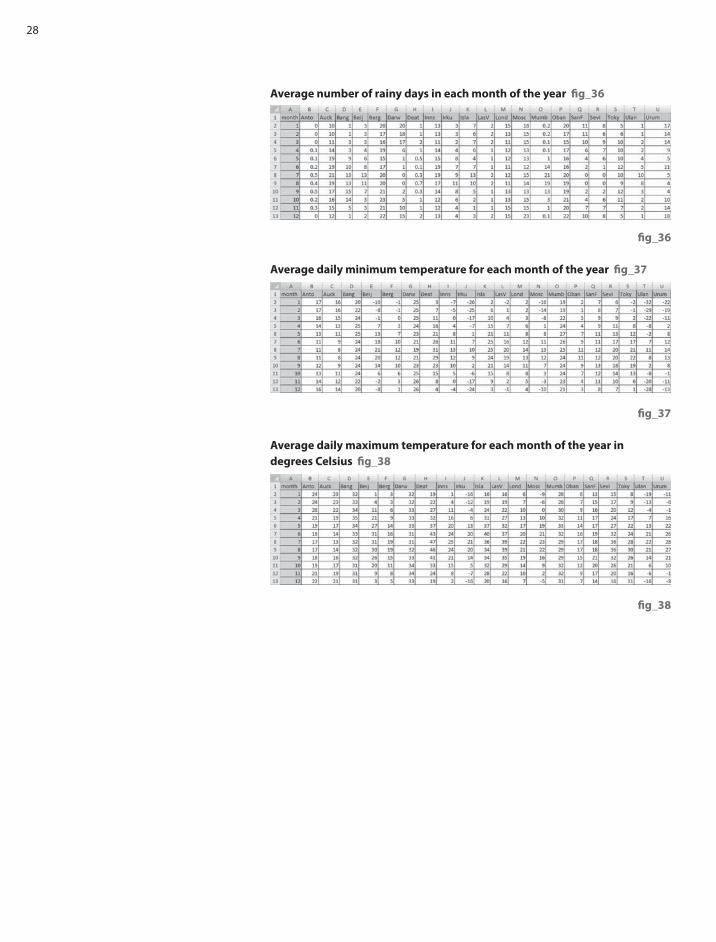
Average number of rainy days in each month of the year fi g_36
Average daily minimum temperature for each month of the year fi g_37
Average daily maximum temperature for each month of the year in
degrees Celsius fi g_38

29
5Chapter
Hurricane force
Using Real World Data_Section 5

30
Introduction
Working with and converting between compound units such as metres per
second and kilometres per hour is an unexciting but necessary task in both
mathematics and science. TI-Nspire can make the process easier to understand
by the use of formulas in spreadsheets and conversion graphs. Hopefully the
context that this activity is set in using live weather station data and wind speed
scales including those for hurricanes and tornadoes can make the task more
relevant and interesting.
This activity is in two parts initially with a further extension (part 3) for more
advanced work.
Part 1 | Weather station information
This gives an introduction to weather information by looking at live weather
station data and off ering an opportunity to discuss the information shown
and the units used. Teachers can decide the extent to which they wish to use
the weather station and other background information as well as the depth
of the discussion and follow up activities. There is a supplementary sheet of
background information.
Part 2 | Using TI-Nspire
Weather forecasters need to be able to collect weather data from around the
world where it may be displayed in a variety of diff erent units varying from
miles per hour, metres per second, knots and using the Beaufort scale (such
as Hurricane Force) in shipping forecasts. Students are given a task to ‘set up
TI-Nspire so that a weather forecaster could use it to quickly convert the wind
speeds here in m/s into other units including the Beaufort scale’.
Part 3 | More about the Beaufort scale
Interesting results can be obtained by trying to fi t a function to the mean wind
speeds for each wind force on the Beaufort scale. More information about this is
given later in ‘additional notes for teachers’
The activity
Part 1 | Weather station information
The London Grid for Learning Networked Weather Station http://weather.lgfl .org.
uk/ displays live weather data updated every minute from a number of weather
stations in England and Wales. The default view shows a number of dials to read
and interpret. Reading these dials and interpreting the information is a valuable
functional skill for both mathematics and science. The data collected also provides a
starting point for discussions about weather- barometric pressure; humidity; rainfall;
ultraviolet index; solar radiation; wind speed. The data gives a real context for
exploring the scientifi c units used and methods for converting from one compound
unit such as metres per second to others such as miles per hour or knots.
Information given on the weather station
• Temperature in degrees Celsius and wind chill temperature
• Barometric pressure in hectoPascals ( equivalent to millibars)
• Rain rate in mm/hr
• Days with no rain
• Wind direction and average speed in metres per second
• Outside humidity as a percentage

31
• Solar radiation in Watts per square metre
• Ultra violet index on a scale from 1 -10
fi g_39
Introduction
Find a weather station on the LGfl site that has live data. This could be the
nearest one to where you live. Note that not all the stations are recording
all the time. Look at the dials and see what you can fi nd out about the
weather. Try weather stations in diff erent parts of the country. How does the
weather compare?
Some possible questions to ask
• What do you notice?
• Which dials are easy to read? Which need a bit more thought?
What do they mean?
• What do you already know about weather from listening to weather
forecasts? Terms? Units of measurement?
• What do you know about pressure – what would a high or low fi gure be?
What eff ect is this likely to have on the weather?
• What do you think the solar radiation dial shows? How could this be useful?
• What does UV index mean? Why would you want to know this?
• What about relative humidity?
• What about wind speed? These are given in metres per second. How are they
usually given on weather forecasts? What about shipping forecasts? Which
would mean the most to you?
• How would you describe the information given here to someone else so that
they understood the weather in this location? Which units would you use?
For example:- Wind speeds can be given in a variety of ways. The LGfl weather
station gives the speed in metres per second. Is this the usual way it is shown
on weather maps? How is it given on television forecasts? Sometimes
wind speeds could be in miles per hour, kilometres per hour, knots (nautical
miles per hour) and also using the Beaufort scale (Force 1- 12)or higher for
hurricanes using the Torro scale.
Using Real World Data_Section 5

32
Part 2 | Using TI-Nspire – Instructions for students
The taskYour task is to set up TI-Nspire so that a weather forecaster could use it to
quickly convert the wind speeds here in m/s into other units including the
Beaufort scale? You could use Spreadsheets and formulae, conversion graphs
or conversion algorithms.
What instructions would you give to the weather forecaster so that he could
use the TI-Nspire.?
Getting startedEntering data into a spreadsheet
Wind speeds from a variety of locations could be entered into the fi rst column
of a ‘Lists & Spreadsheet’ page and then further columns set up to convert these
into diff erent units.
The following example fi g_40 has taken values for wind speeds in metres
per second from the Beaufort scale. For example Force 5 on the Beaufort scale
(described as fresh breeze) varies between 8.0 and 10.7 metres per second. 8.0
is the lower speed in mps entered into column B and 10.7 is in column C.
More information at http://www.metoffi ce.gov.uk/weather/marine/guide/
beaufortscale.html (Note that TI-Nspire will only accept single words in
spreadsheet cells. Hence violentstorm!)
Converting the wind speed data into other units
Could you set up a table or charts that others could use to convert this information
into other units for example change metres per second into km per hour?
These are some possibilities:-
• You could insert a calculator page and try out a calculation for one of the
speeds shown in the table. Does the answer seem reasonable? Can you fi nd
an alternative method that you could use to check? Can you express this as a
general rule?
• You could set up extra columns on the spreadsheet and put formulas into
each column. There are instructions for doing this in the STEM Activities
Introduction booklet. There is also an example for this below.
• You could set up conversion graphs to change from one unit to another, or to
convert a speed to the Beaufort scale. There are two examples for this below.
Fig_41 uses a ‘Data & Statistics ‘page to obtain a graph and fi g_41a uses a
Graphs page.
Conversion formulas | Using a Spreadsheet page fi g_42
• Open the tns fi le or set up one of your own by entering data into a
‘Lists & Spreadsheet’ page like the one shown earlier.
• Add names in the white cells at the top of extra columns for converting
the data – such as
• Kmperhr
• Mph
• Knots
• Enter a formula in the grey formula cell below the column title for example
to convert the fi gures in column b to kilometres per hour you could type in
b[]*3600/100 Why does this work? Could it be written in a simpler way?
• What other columns and formulas could you add?
Type square brackets [] to indicate a column.
fi g_40
fi g_42
fi g_41
fi g_41a

33
Conversion graphs – Beaufort scale | Using a Data & Statistics page. fi g_42
One way to convert speeds to the Beaufort Scale is to use the data in the table.
• From the Home screen (‘Insert’ for software) select ‘5: Data & Statistics’
• Move to the x-axis, select ‘enter variable’ and choose Beaufortscale.
• Move to the y-axis and choose ‘lowermps’ then select CTRL menu
(right click for software) and ‘add y variable’ . Then select ‘uppermps’
• To convert a particular speed say 29mps to the scale select menu 4 and ‘plot
function’ enter f(x) = 29. This is Force 11 on the Beaufort scale. How can you
tell from the graph?
• If you have more columns on your table you could do this for other units.
The data in the table could also be used to set up conversion graphs for other
pairs of units, but if formulas have been used in the table then these could be
used as functions in a Graphs page.
Conversion graphs – Graphs of functions | Using a Graphs page. fi g_43
• Insert a Graphs page from the Home screen on the handheld or ‘Insert’ on
the software.
• From menu4 select ‘window settings’: Then set the window to the required
size depending on the units to be converted. Use the arrow keys to move
down the settings table. The example shown is for converting from km per
hour to knots.
• From menu1 select ‘6: Text’ and label the x-axis as the value that you know
and the y-axis as the value you want to fi nd out.
• Next enter the formula you have worked out to convert from x to y. Your
formula should contain an ‘x’. In this case from km per hour(x) to knots(y).
One possible formula for y would be y = f(x) = x/1.86 Why? Can you fi nd
other ways? Is this formula accurate enough?
• To use the conversion graph: from menu 7 ‘Points and Lines’ select 2: ‘Point
On’, move to the graph line and put a point on the graph. Then using the
hand tool (for software- select the pointer from menu 1), grab the point
and drag it to an appropriate point on the graph to read off the fi gures.
In the example shown 60 km per hour is approximately 32.3 knots.
Part 3 | Hurricanes, tornadoes and fi tting functions
You can fi nd out more about the Beaufort scale at
http://en.wikipedia.org/wiki/Beaufort_scale
The foot of this web page has links to hurricane scales such as the Saffi r-Simpson
hurricane scale and the Torro scale for classifying tornado wind speeds.
These scales could be used to extend the Beaufort scale to higher numbers.
The taskIf you use a ‘Data & Statistics’ page to plot the mean speeds (average of the lower
and upper speeds) in metres per second for each point on the Beaufort scale,
can you fi nd a function that will fi t this data? Some possibilities are:-
• use the plot function option on menu 4 to try to fi nd a function that will fi t
the Beaufort scale data.
• use one of the regression options to fi nd a suitable function.
The page on the Torro scale may give you some ideas to check out.
You could try this for diff erent units.
fi g_43
fi g_44
Using Real World Data_Section 5

34
Additional notes for teachers
Further information about the terms and the units used together with useful
web links is in the document ‘Weather data facts and fi gures’
Accuracy Teachers may feel it is useful to discuss with students issues relating to the degree
of accuracy required and how and whether to fi x the document settings. This could
also apply to upper and lower bounds such as those used for the Beaufort scale e.g.
5.5-7.9 and 8.0 – 10.7 and whether to plot these as 5.45-7.95 and 7.95 -10.75 etc
(Note that the tns fi le has been set to one decimal place to fi t the Beaufort
scale fi gures but this may not be accurate enough for other calculations. )
Alternatively you may prefer just to fi x the number of decimal places to 1 and
to leave the Beaufort scale fi gures as they are without further discussion.
To fi x the document settings using the software go to ‘File’; then ‘settings’;
then ‘document settings’; then ‘display digits’ fi g_45. On the handheld
Home screen, select 5: ‘Settings and Status’ then 2: ‘Settings’ and 1: ‘General’
then ‘Display Digits’. fi g 45 and fi g 45a
Calculations
There are many diff erent ways to go about the calculations and encouraging
students to look for alternatives or simplifi cations will help self checking. There
are a variety of diff erent possibilities in the information on the Weather data
facts and fi gures sheet. The simplest forms will also be easier to insert into the
spreadsheet or as functions for conversion graphs.
Extension ideas
Graph fi tting for the mean speed in mps on the Beaufort scale
http://en.wikipedia.org/wiki/TORRO_scale
The function shown plotted in fi g_46 which comes from the Torro web page,
gives a god fi t to the mean speed in metres per second.
Weather data facts and fi gures
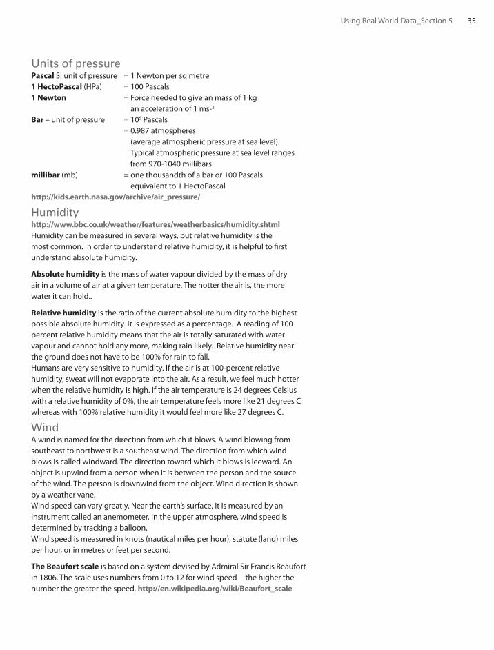
Atmospheric pressure Atmospheric pressure is measured using a barometer, in units of millibars (mb),
hectoPascals (hPa), or centimetres or inches of mercury. Variations in atmospheric
pressure can aff ect the weather as air fl ows from regions of high pressure to those
with low pressure. Atmospheric pressure also depends on altitude as the higher
you are above sea level the less air is above you pressing down. Pressures from
weather stations are usually adjusted so they give fi gures for sea level.
On a weather chart, lines joining places with equal sea-level pressures are called
isobars. Weather charts showing isobars indicate anticyclones (areas of high
pressure) and depressions (areas of low pressure). More information is available
from http://www.bbc.co.uk/weather/features/weatherbasics/airpressure.shtml
This page also has links to high pressure and low pressure.
http://en.wikipedia.org/wiki/Atmosphere_(unit)
www.globe.gov/trr-ppt/pressure.ppt has a PowerPoint presentation to
download about barometric pressure.
The National Physical Laboratory has an on-line barograph
http://resource.npl.co.uk/pressure/pressure.html
fi g_45
fi g_45a
fi g_46
35
Units of pressurePascal SI unit of pressure = 1 Newton per sq metre
1 HectoPascal (HPa) = 100 Pascals
1 Newton = Force needed to give an mass of 1 kg
an acceleration of 1 ms-2
Bar – unit of pressure = 105 Pascals
= 0.987 atmospheres
(average atmospheric pressure at sea level).
Typical atmospheric pressure at sea level ranges
from 970-1040 millibars
millibar (mb) = one thousandth of a bar or 100 Pascals
equivalent to 1 HectoPascal
http://kids.earth.nasa.gov/archive/air_pressure/
Humidityhttp://www.bbc.co.uk/weather/features/weatherbasics/humidity.shtml
Humidity can be measured in several ways, but relative humidity is the
most common. In order to understand relative humidity, it is helpful to fi rst
understand absolute humidity.
Absolute humidity is the mass of water vapour divided by the mass of dry
air in a volume of air at a given temperature. The hotter the air is, the more
water it can hold..
Relative humidity is the ratio of the current absolute humidity to the highest
possible absolute humidity. It is expressed as a percentage. A reading of 100
percent relative humidity means that the air is totally saturated with water
vapour and cannot hold any more, making rain likely. Relative humidity near
the ground does not have to be 100% for rain to fall.
Humans are very sensitive to humidity. If the air is at 100-percent relative
humidity, sweat will not evaporate into the air. As a result, we feel much hotter
when the relative humidity is high. If the air temperature is 24 degrees Celsius
with a relative humidity of 0%, the air temperature feels more like 21 degrees C
whereas with 100% relative humidity it would feel more like 27 degrees C.
WindA wind is named for the direction from which it blows. A wind blowing from
southeast to northwest is a southeast wind. The direction from which wind
blows is called windward. The direction toward which it blows is leeward. An
object is upwind from a person when it is between the person and the source
of the wind. The person is downwind from the object. Wind direction is shown
by a weather vane.
Wind speed can vary greatly. Near the earth’s surface, it is measured by an
instrument called an anemometer. In the upper atmosphere, wind speed is
determined by tracking a balloon.
Wind speed is measured in knots (nautical miles per hour), statute (land) miles
per hour, or in metres or feet per second.
The Beaufort scale is based on a system devised by Admiral Sir Francis Beaufort
in 1806. The scale uses numbers from 0 to 12 for wind speed—the higher the
number the greater the speed. http://en.wikipedia.org/wiki/Beaufort_scale
Using Real World Data_Section 5

36
The Torro scale is an extension of the Beaufort scale for tornadoes and
hurricanes. T0 is equivalent to force 8 on the Beaufort scale, T
1 is equivalent to
force 10, T2 to force 12 and so on. http://en.wikipedia.org/wiki/TORRO_scale
The World Meteorological Organization has adopted the knot as the
international unit for measuring wind speed. http://science.howstuff works.com/
wind-info.htm
Further information for converting wind speeds into diff erent forms.
For all these conversions a suitable degree of accuracy can be agreed
by discussion.
1 hour = 60 minutes: 1 minute = 60 seconds
1 mile = 1760 yards: 1 yard = 3 feet; 1 foot = 12 inches
1 mile is approximately 1609.34 metres (In athletics a metric mile is taken
as 1600 metres)
How would you convert one mile to metres if the only fact that you knew
was that one inch is approximately 2.54cm?
Nautical miles1 nautical mile is approximately 1852 metres or 6076 feet or 1.15 miles or use
the facts below.
• One nautical mile makes an angle of one minute (60 minutes = 1 degree)
at the centre of the earth.
• You can estimate how long a nautical mile is if you know the radius of the
earth (3963 miles or 6378 km)
Solar radiationOutside the earth’s atmosphere, solar radiation has an intensity of approximately
1370 watts/metre2. This is the value at the top of the atmosphere and is called
the Solar Constant.
On the surface of the earth on a clear day, at noon, the direct radiation from the
sun will be approximately 1000 watts/metre2 in many places. The energy from the
sun can be captured using solar panels. The availability of energy is aff ected by
the location and factors such as latitude, height above sea level, season, and time
of day. The biggest factors aff ecting the available energy in a particular location
are cloud cover and other weather conditions.
Units
The watt (symbol: W) is a unit of power in the International System of Units
(SI). One watt is equivalent to 1 joule (J) of energy per second. For mechanical
energy, one watt is the rate at which work is done when an object is moved at a
speed of one metre per second against a force of one Newton.
1W = 1Js-1 = 1kgm2s-3 = 1Nms-1
For electrical energy: Work is done at a rate of one watt when one ampere fl ows
through a potential diff erence of one volt.
Solar radiation is measure in watts per square metre W/m2
fi g_47

37
Ultra violet indexThe UV index is an international standard measurement of how strong the
ultraviolet (UV) radiation from the sun is at a particular place on a particular day.
Its purpose is to help people to eff ectively protect themselves from UV light.
Excessive exposure causes sunburns, eye damage, skin aging, and skin cancer.
Public-health organizations recommend that people protect themselves when
the UV index is 3 or higher.
The UV index is a linear scale. An index of 0 corresponds to zero UV radiation
such as at night. An index of 10 corresponds roughly to mid-day sun and a clear
sky. Indices greater than 11 are quite common in the southern hemisphere
where the Ozone layer is depleted. The numbers are related to the amount
of UV radiation reaching the surface of the earth, measured in W/m2, but the
relationship is not simple and cannot be expressed in physical units. The UV
index is however designed to give a good indication of likely skin damage.
General information
http://science.howstuff works.com/meteorological-terms-channel.htm
http://www.metoffi ce.gov.uk/education/teachers/indepth_understanding.html
http://www.metoffi ce.gov.uk/education/index.html
Weather for sailors: This web site shows a world map which can display a variety
of weather observations such as barometric pressure. http://www.sailwx.info/
index.html
Using Real World Data_Section 5

38
6Chapter
Carbon dating

39
Introduction
This activity looks at radioactive decay and how it is used in particular for carbon
dating archaeological remains.
The use of TI-Nspire and the very quick and straightforward way that appropriate
data can be inserted into a ‘Lists & Spreadsheet’ page and a suitable curve can
be fi tted to the data, could help to make this topic much more accessible to
younger students. They can make use of the graph and ‘Graph trace’ to fi nd
useful information without needing to worry about the meaning of ‘exponential
’or interpreting the equation shown.
There are possibilities for extending the activity to look at more advanced
mathematics such as the form of the exponential regression function and
the theory behind exponential decay, including topics such as integration,
exponential functions and logarithms.
Background informationThe ‘How stuff works’ website at science.howstuff works.com/carbon-14.htm
has several pages of useful information about carbon dating and also a video
clip which could be used as an introduction to class discussion. There is a
summary here and further information from this and other websites in the
Additional information section at the end of the activity. Also included in
the additional information is a section containing further mathematical
details and some solutions which could be used depending on the age
and background of the class.
Cosmic rays enter the earth’s atmosphere in large numbers every day. It is not
uncommon for a cosmic ray to collide with an atom in the atmosphere, creating
a secondary cosmic ray in the form of an energetic neutron, and for these
energetic neutrons to collide with nitrogen atoms. When the neutron collides, a
nitrogen-14 (seven protons, seven neutrons) atom turns into a carbon-14 atom
(six protons, eight neutrons) and a hydrogen atom (one proton, zero neutrons).
Carbon-14 is radioactive, with a half-life of about 5,700 years.
The carbon-14 atoms that cosmic rays create combine with oxygen to form
carbon dioxide, which plants absorb naturally and incorporate into plant fi bres
by photosynthesis. Animals and people eat plants and take in carbon-14 as
well. The ratio of normal carbon (carbon-12) to carbon-14 in the air and in all
living things at any given time is nearly constant. Maybe one in a trillion carbon
atoms are carbon-14. The carbon-14 atoms are always decaying, but they are
being replaced by new carbon-14 atoms at a constant rate. At this moment, your
body has a certain percentage of carbon-14 atoms in it, and all living plants and
animals have the same percentage.
Using Real World Data_Section 6

40
As soon as a living organism dies, it stops taking in new carbon. The ratio of
carbon-12 to carbon-14 at the moment of death is the same as every other living
thing, but the carbon-14 decays and is not replaced. The carbon-14 decays with
its half-life of 5,700 years, while the amount of carbon-12 remains constant in
the sample. By looking at the ratio of carbon-12 to carbon-14 in the sample and
comparing it to the ratio in a living organism, it is possible to determine the age
of a formerly living thing fairly precisely.
Important note Because the half-life of carbon-14 is 5,700 years, it is only
reliable for dating objects up to about 60,000 years old. However, the principle
of carbon-14 dating applies to other isotopes as well. Potassium-40 is
another radioactive element naturally found in your body and has a half-life
of 1.3 billion years. Other useful radioisotopes for radioactive dating include
Uranium -235 (half-life = 704 million years), Uranium -238 (half-life = 4.5 billion
years), Thorium-232 (half-life = 14 billion years) and Rubidium-87 (half-life =
49 billion years).
The Activity
Half life is defi ned as the time taken for the activity of a given amount of a
radioactive substance to decay to half of its initial value. The lifetime of an
individual radioactive atom is unpredictable but for a large number of similar
atoms the average lifetime is quite predictable.
For carbon-14 with a half life of approximately 5700 years this means that if
something had been dead for 5700 years, you would expect the proportion of
carbon-14 atoms to be 50% of that found in any living animal or plant specimen.
This information can be used to date archaeological remains such as animal and
human skeletons or wooden objects such as boats.
For really old remains such as some fossils, this method cannot be used because
the number of carbon-14 atoms remaining after this time is too small. There are
other radioactive isotopes in the human body which could be used instead such
as Potassium-40 which has a half-life of 1.3 billion years.
The Task
How could you set up a TI-Nspire so that you could use it to:-
• fi nd the percentage of carbon-14 atoms remaining in specimens
of diff erent ages or
• fi nd the age of a specimen if you knew the percentage of
carbon-14 atoms remaining
When you have set your graph up and can trace values from it, try setting your
own questions and using the graph to answer your questions or those of others.
For example:-
• How many years will it be before approximately one third of the carbon-14
atoms have decayed?
• What percentage of carbon-14 atoms are likely to remain after 60 000 years?

41
Getting startedTry to put more information into the columns in this table for carbon 14
(Half life 5700 years)
Now try to enter this information into a ‘Lists & Spreadsheet’ page of TI-Nspire.
Set up the spreadsheet fi g_48
Instructions to set up a spreadsheet page are given in the STEM Activities
Introduction booklet. There is also a sample fi le already set up for this activity.
Insert a ‘Data & Statistics’ page fi g_49
• from menu 2 select ‘Add X variable’ and select ‘time’
• from menu 2 select ‘Add Y variable’ and select percent
• This will give you a Scatterplot.
Fit a curve to the data fi g_50
• From menu 4 choose ‘regression’ and select ‘show exponential’
Don’t be put off by the term ‘exponential’ or the equation shown.
What you want is a curve that is a good fi t to the points.
• You may prefer to drag the equation out of the way.
Reading from the graph fi g_51
To read off values from the graph go to menu 4 and ‘Graph Trace’. You can
grab the point and move it along the graph so that you can read values
from the graph.
Changing the graph scales fi g_52
If you wish to go beyond the values shown you can change the window setting
by going to menu 5; select ‘window settings’ and change maximum x value for
example to 70 000
• You could also change the window settings (menu 5) to zoom in for greater
accuracy or to zoom out.
Extension Activities
Radioactive decay Students could use a similar method to set up tables and graphs and look at
the half life for other radioactive substances. They could compare the graphs
that they get and look for similarities and patterns in the functions for the
exponential regression curves.
Form of the regression function
TI-Nspire gives exponential regression functions in the form k*ax
For this activity the regression function gives the percentage of the isotope
remaining as 100*ax where a is a constant which varies with the half life of
the isotope.
year 0 ? ? ?
Percentage of carbon-14 100% 50% ? ?
fi g_48
fi g_49
fi g_50
fi g_51
fi g_52
Using Real World Data_Section 6

42
Students could investigate the relationship between the value of the constant
and the half life.
• Choose a suitable range of half lives to work with (Note: Half lives of 1 year
or half a year give interesting results). There are a large number of websites
giving information about the half lives of radioactive isotopes such as
http://www.buzzle.com/articles/list-of-radioactive-elements.html or
http://www.iem-inc.com/toolhalf.html and some examples are listed below.
• Repeat the steps 1-3 above with diff erent half lives. For each one note the
constant (a) in the regression function 100*ax
• Complete a second spreadsheet with columns for the half life and the
constant and look for possible patterns and rules.
• Look for possible functions that might fi t the data. This time you will
need to use ‘plot function’ on menu 4.
Can you derive this relationship by considering the theory behind
exponential decay?
These are a few examples of half lives
Notes for teachers
Possible solutionsThese are some examples of the constants in the regression equation for
diff erent half lives. They have been entered into a new spreadsheet fi g_53
• The inclusion of half lives of 0.5, 1 and 2 makes it easier to spot a possible
connection as shown in the screen shot fi g_54.
• Possible formulas could be tested by inserting into the formula cell in the
next spreadsheet column.
isotope Half-life isotope Half-life
Uranium 238 4.5 billion years Americum 241 450 years
Uranium 235 700 million years Ruthenium 106 1 year
Uranium 234 245 000 years Xenon 137 4 minutes
Plutonium 239 24 300 years Tritium (Hydrogen 3) 12 years
Caesium 137 30 years Curium 242 163 days (appx. ½ year)
Thorium 232 14 years Curium 243 35 years
Strontium 90 28 years Curium 244 18 years
Cobalt 60 5 years Antimony 125 2 years
Iodine 125 and 131 8 days

43
fi g_53
fi g_54
Further theory
If N is the number of atoms at time t, the rate of decrease of N is proportional
to the number of atoms remaining.
where λ is a constant called the radioactive decay constant.
If the number of atoms at time zero is N0 then N
0 = ec and N = N
0e-λ t
The fraction of atoms remaining will be
For half life where t = t1/2
(1)
In the TI-Nspire example the percentage remaining is of the form 100*ax so the
fraction remaining is ax where x represents time.
If at = e-λ t then t.lna = –λ t and λ = −lna (2)
(1) and (2) give
λ t1/2 = ln2 and λ t1/2
= −t1/2 lna thus lna =
This gives a in the TI-Nspire regression formula as
which matches the graph shown.
Radioactive Decay Constant
The rate of radioactive decay is typically expressed in terms of either the
radioactive half-life, or the radioactive decay constant. They are related
as follows: fi g_55
The decay constant is also sometimes called the disintegration constant. The
half-life and the decay constant give the same information, so either may be
used to characterize decay. Another useful concept in radioactive decay is the
average lifetime. The average lifetime is the reciprocal of the decay constant
as defi ned here.
http://hyperphysics.phy-astr.gsu.edu/Hbase/Nuclear/halfl i2.html#c4
A number of websites have information including the theoretical background
for example:
http://hyperphysics.phy-astr.gsu.edu/Hbase/Nuclear/halfl i2.html#c3
http://en.wikipedia.org/wiki/Half_life
http://www.gcsescience.com/prad16-half-life.htm
http://hyperphysics.phy-astr.gsu.edu/Hbase/Nuclear/halfl i2.html#c1
http://en.wikipedia.org/wiki/Radioactive_contamination
http://library.thinkquest.org/27948/decay.html
http://www.buzzle.com/articles/list-of-radioactive-elements.html
dN— = -λNdt
1— t1/2
a = 2-
1— t1/2
a = 2
1— t1/2
ln2 c
N— = e-λ t
N0
N = e-λ t + C = ec . e-λ t
N— = N
0
1— 2
1= — 2
ln2= — λ
= 2
= ln2c c c ce-λ t1/2 e-λ t1/2 λ t1/2 t 1/2
ln N = -λ t + C
1— = dN =N
-λdt∫ ∫
fi g_55
Using Real World Data_Section 6

44
7Chapter
Reaction times
45
Introduction
Experiments to test and compare reaction times off er opportunities for
hypothesis testing and devising and setting up experiments in a scientifi c way
to control as many variables as possible. A wide range of data handling skills
at varying levels can be used to display and analyse the data and consider the
signifi cance of the results. TI-Nspire will display results in a variety of ways and
do a wide range of statistical calculations. This means that less experienced
students can access statistical displays and measures to analyse in order to test
their theories that might otherwise have been too complex or time consuming.
The stages in the data handling cycle will require the students to:-
1. Pose a question about ‘Reaction times’ and plan how they will collect data
to try to answer it.
2. Collect the data
3. Represent and analyse their data
4. Interpret and discuss their results
Possible questions for students to think about.
• What factors could infl uence reaction times? Which one(s) will you consider?
What question will you ask?
At the planning stage students need to consider all the factors that might
infl uence the results of their tests and what precautions they need to take to
ensure that the test is the same for everyone taking it.
• What data will you record, how will you record it?
How can you set up the experiment to collect the data and ensure they are
reliable and not infl uenced by other factors?
• Have you collected all the data you need? Were there any problems which
might infl uence the results?
• How will you enter the data into TI-Nspire and which features will you use to
display and analyse your results?
• What conclusions did you reach? Can you explain your conclusions to others
using your display to back up your conclusions? Would you expect to get
similar results if you repeated the experiment? Did you answer your original
question or do you need to collect more data or repeat the experiment?
Advanced level students could also consider the signifi cance of their results.
Activity
Posing the question
There needs to be some initial whole group discussion about reaction times and the
factors that might aff ect them. Ideally the class will suggest the factors which might
infl uence reaction times, and then decide on a question that they would like their
group to answer, bearing in mind the constraints of the individual classroom.
These are some possible discussion points:-
• gender diff erences
• preferred/ non- preferred hand
• distractions e.g. noise, conversations,
• alertness – time of day; before or after food, lack of sleep, after caff eine
• Do you get better if you practice with a particular test?
• Do diff erent tests produce similar results?
Using Real World Data_Section 7

46
• Do you need to have particularly good reactions to play some sports in
which case do players of these sports perform better in reaction time tests?
Some examples
• The BBC programme ‘Bang goes the theory’ http://www.bbc.co.uk/bang/ has
launched an experiment to collect data to see whether brain training exercises
do really improve performance over a period of time. Amongst the tests they
are trying are tests for ‘Reaction times’.
• The BBC Science pages also have a reaction time test which is linked to a
page about sleep and how sleep deprivation and also caff eine can aff ect
reaction time. http://www.bbc.co.uk/science/humanbody/sleep/sheep/
reaction_version5.swf
• Recent evidence suggests that driver’s reaction times are aff ected if they are
having a mobile phone conversation even if the phone is a hands-free one.
• Some internet reaction timers (see below) use diff erent shapes or colours –
do these infl uence the results? Most tests are initiated by the computer
but the Nrich website test is initiated by the person being tested- does
this make a diff erence? How do the ruler experiments compare?
Setting up the experiment and collecting the data. These are some things that you might wish your students to consider when
setting up their experiments.
• Reproducibility – What rules do you need to set to ensure the experiment
is the same for everyone?
• Reliability – How reliable are your results? Would the same thing happen
if the experiment was repeated?
• Interaction – How can you ensure that later people tested will not be
infl uenced by what was done before?
• Representative groups – If a larger scale experiment is involved, how
can you ensure that the sample you choose is really representative of
the whole population?
Practical experiments using a ruler The tester holds a ruler (30cm or longer) against a wall with the zero mark at
the bottom. The person being tested puts a fi nger at the zero mark just clear of
the ruler. The ruler is then dropped and has to be stopped by the outstretched
fi nger (there are pictures on the websites in the two example below).
The distance the ruler drops before it is stopped is then recorded. Repeat several
times. What precautions do you need to take to ensure the results are fair?
(See the notes above.)
This experiment measures reaction times using distances. These can be
converted into times using an approximate rule that in t seconds the distance
travelled d = 5t2 metres. How will this help you to convert distances in
centimetres into times in seconds? (See teacher’s notes)
Practical Biology website http://www.practicalbiology.org/areas/intermediate/
control-and-communication/refl ex-actions/measuring-reaction-time-of-a-
human-refl ex-action,88,EXP.html gives details of a practical experiment
in Biology using metre rules to compare reaction times before and after
drinking caff eine.

47
The Royal Statistical Society’s Centre for Statistical education (RSSCSE) has links
in their resource section to activities from a Schools council project one of
which is ‘Reaction Times’ under a general heading of ‘Practice makes perfect’.
http://old.rsscse.co.uk/pose/level1/book6/sectionb.htm
Internet Reaction TimersThere are several websites that will collect data on Reaction Times. These are
quick to use so students working in pairs could collect their data one pair at a
time using one computer in a classroom, while another activity was going on.
They will need to make decisions on how many samples to take, whether to
write each individual result down or whether to put the average of fi ve, which
some websites give. These are some examples:-
1 Sheep dash from BBC Science http://www.bbc.co.uk/science/humanbody/
sleep/sheep/reaction_version5.swf
On this website, which is part of the BBC websites Science section about
sleep, you have to click the mouse when you see a sheep break for freedom.
The average of fi ve attempts is given. The times are given to one thousandth
of a second which is a greater degree of accuracy than other web sites. [You
may want to reach a collective decision about what to do with penalty results
(3 seconds) for false starts as these can distort the data, but may be worth
investigating separately. Sets of fi ve which included penalty scores were
ignored in the sample fi le shown below.] The idea on this Science section of
the website is to see how factors such as drinking caff einated drinks or lack
of sleep aff ect reaction times.
2 http://getyourwebsitehere.com/jswb/rttest01.html
This reaction timer is a set of traffi c lights set to red. Click when they change
to green. Average of sets of fi ve results is given.
3 http://www.mathsisfun.com/games/reaction-time.html
For this reaction timer you click when a small circle changes from yellow to
red. Average of sets of fi ve results.
4 http://nrich.maths.org/public/viewer.php?obj_id=6044
For the NRich reaction timer you click the mouse to make a star disappear
and then click again when it reappears. As you eff ectively choose the start
time yourself for this reaction timer, does this produce diff erent results from
other timers?
5 Experiments at school http://www.experimentsatschool.ntu.ac.uk/
experiments/reaction/
has experiments to collect data but you can also download data sets from
other schools or from diff erent parts of the world.
Entering and displaying the data.
Ideally in this activity students will pose their own questions and collect
appropriate data. How they choose to analyse and display their data will then
depend on the question that they posed initially. There are notes in the STEM
Activities Introduction booklet about entering data and some forms of display.
The notes for students at the end of this activity show examples of diff erent
forms of analysis and display with questions about these to help them get some
ideas, but it is important to state that the examples of data collected for these
examples is from too small a sample to provide valid conclusions.
Using Real World Data_Section 7

48
Interpreting and discussing results.
Students need to analyse their results with regards to the question that
they posed initially.
• Can they backup their fi ndings with statistical displays and calculations?
• Would they expect to get similar results with a diff erent group of people?
• How do their fi ndings compare with others?
• Do they need to repeat the experiment under diff erent or stricter conditions?
Additional notes for teachers
Distance to time conversion for ruler experiment.
If using the practical experiment with rulers the distances can be converted
into times. Depending on the students you may want to do one or more of:-
• Explain why the approximate rule d = 5t2 works (NB d is in metres, t is in
seconds and the acceleration due to gravity g is taken as 10ms-2)
• Ask them to rearrange the rule into one to fi nd t.
• Show them how to insert an extra column into the spreadsheet with a
formula to change d into t.
Notes on displays featured in ‘Further help for Students’Quick graphs: The line shown has a very small negative gradient which would
suggest improvement over time but this needs discussing as pupils need to
realise the dangers of extrapolating in this way.
Box plots: The outlier in the lower box plot- the person being tested using
‘Sheep dash’ reckoned that this was a fl uke and that he had actually jumped the
gun and made a false start for this score. He thought it was just luck as it was so
close to the actual sheep leaving that with the mouse delay the computer hadn’t
picked it up. It should have given him a 3 second penalty.
Histograms: For more advanced students if more data are collected – how well
does the data fi t a normal distribution?
Analysis: It is a useful skill for students to be able to interpret the data table and
select appropriate information such as –x from the large array of other items that
they may not understand.
Further help for students
Entering the data | An example
You will need to record data manually for most of the experiments given above.
This could be done by entering the data directly into a ‘Lists & Spreadsheet’ page
of a TI-Nspire.
The example fi g_56 shows data from 20 tries by two people both right
handed, one female (1) and one male (2) using right and left hands with
the BBC ‘Sheep Dash’ test.
Important: This example has been chosen to illustrate the use of a variety
of TI-Nspire features and it is important to realise that it is not a good
example of collecting data to answer a specifi c question and that there is
insuffi cient data here to reach any valid general conclusions. It would be
much better to concentrate on one question at a time rather than 3 questions
as here which could be:
fi g_56

49
• Does the male have faster reactions than the female?
• Do the two people have faster reactions with their preferred hand?
• Do the two people improve their reaction times during the tests that
they do?
Displaying the data | ‘Quick graphs’ example
There is an option to display a graph directly from the spreadsheet page.
• Click on a column you wish to illustrate. From menu 3 select ‘Quick Graph’
• Select the axes in turn and set each axis to the data you wish to display
(use tab on the handheld)
• The graph below shows right hand against trial number. Menu 2 and ‘Connect
data points’ was used to join the points. Do you think this person is getting
better as time goes on?
• With the graph selected, from menu 4 choose ‘Regression’ and ‘Show linear’.
This adds a straight line to best fi t the points.
• Why might you choose to display your data in this way?
What question could it answer?
• In which direction is this line going?
• What does this tell you?
• What other information can you obtain from the equation of the graph?
fi g_59fi g_58fi g_57
Example using a ‘Data & Statistics’ page | Using two y variables
Insert a ‘Data & Statistics page. Set the axes as before. CTRL menu will give
you the option to add another y variable and to get a second set of data for
the second person. This means you can display two graphs simultaneously.
The example graph shown compares the right hand performance of two people.
• Is this a good way to display the results?
fi g_60
Using Real World Data_Section 7
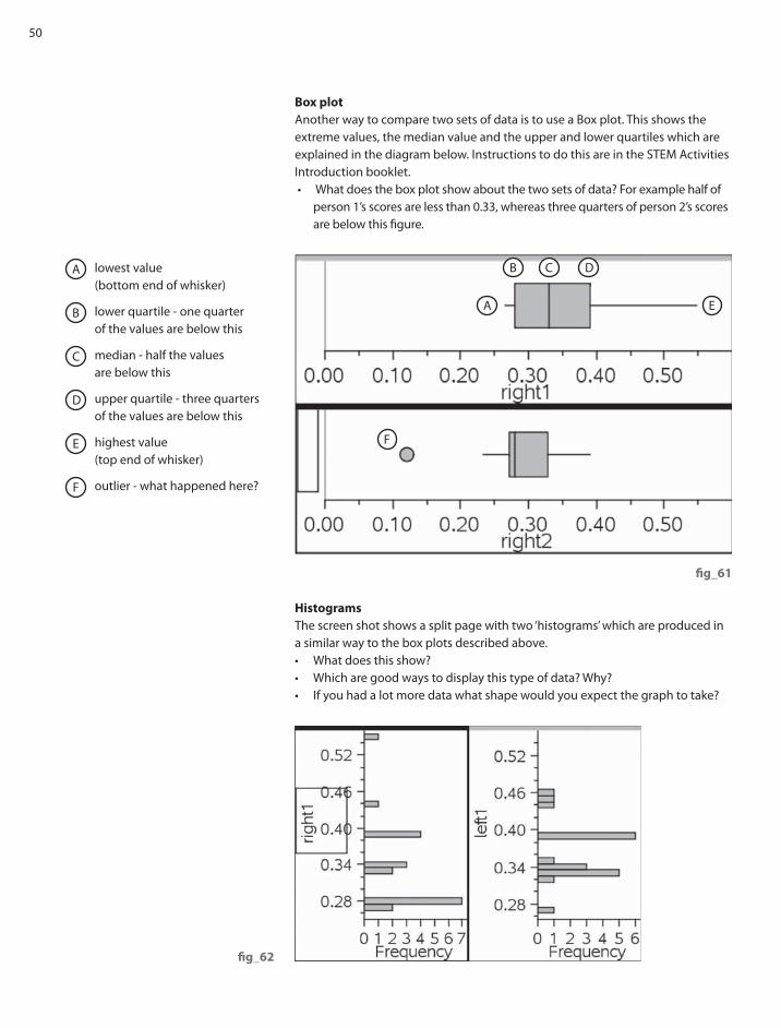
50
Box plot
Another way to compare two sets of data is to use a Box plot. This shows the
extreme values, the median value and the upper and lower quartiles which are
explained in the diagram below. Instructions to do this are in the STEM Activities
Introduction booklet.
• What does the box plot show about the two sets of data? For example half of
person 1’s scores are less than 0.33, whereas three quarters of person 2’s scores
are below this fi gure.
fi g_61
Histograms
The screen shot shows a split page with two ‘histograms’ which are produced in
a similar way to the box plots described above.
• What does this show?
• Which are good ways to display this type of data? Why?
• If you had a lot more data what shape would you expect the graph to take?
fi g_62
lowest value
(bottom end of whisker)
lower quartile - one quarter
of the values are below this
median - half the values
are below this
upper quartile - three quarters
of the values are below this
highest value
(top end of whisker)
outlier - what happened here?

51
This gives
I J K L
Right 1 Right 2 Left 1 Left 2
fi g_63
fi g_64
Analysing the data
A lot of analysis can be done from statistical diagrams such as box plots which
show min, max, median and lower and upper quartiles.
Data analysis: From the original spreadsheet other information can be found by
selecting menu ‘Stat calculations’ and ‘one variable statistics’. Select the number
of lists you want to do this for. Four lists were used in this example. Then select
the titles for each list and select the fi rst column to put the results in – in this
case column I was used.
You can use this to compare the mean scores ( –x ) and median scores as well as
other fi gures such as the minimum and maximum values and the lower and
upper quartiles (Q1 and Q
2). Don’t be put off by the large number of fi gures in
the table and just concentrate on those that might be useful.
How signifi cant are your results? (For Advanced level students) - TI-Nspire has
the facility for performing signifi cance tests and fi nding confi dence intervals.
How could these be used?
Using Real World Data_Section 7

1
TI-Nspire™ is a trademark of Texas Instruments. All trademarks are the property of their respective owners.
Texas Instruments reserves the right to make changes to products, specifi cation, services and programs without notice.
© 2010 Texas Instruments
STEM activities with TI-Nspire
The coming decade will see an increasing need for a
fl exible work force possessing a wide range of skills in
Science, Technology, Engineering and Mathematics
(STEM) in order to meet the needs of the new high level
industries and to be able to produce technologically
complex products. The booklets in this series were
developed with this need in mind. They aim to provide
stimulating activities which link aspects of STEM and
at the same time encourage the use of technology
and an awareness of its potential.
Why use TI-Nspire for STEM subjects?
TI-Nspire provides a learning platform which dynamically
links a variety of ICT applications including documents,
graphs, geometry, statistics, spreadsheets, data logging
and a calculator. This dynamic linking assists students in
making connections not only between diff erent areas of
mathematics but also with other areas of the curriculum
and STEM subjects in particular.
There is now a wealth of data available on the Internet
in a variety of forms which can be copied directly into
TI-Nspire. Data can also be captured by linking to a variety
of data logging devices such as motion sensors or by
recording manually or using video analysis. It is then
possible to manipulate, display and analyse this data
in a variety of ways or to try to model the data using
a variety of data handling and function plotting tools.
About the booklets
All the activities contain some background scientifi c
or other information together with links to appropriate
websites. Many of the activities are suitable for a range
of ages and aptitudes with more challenging ideas being
suggested as extension activities. Further information
and TI-Nspire fi les for the activities can be found at
www.nspiringlearning.org.uk.
There are fi ve booklets in the series:
Introduction - contains a brief introduction and
instructions for getting started using some of the features
of TI-Nspire that are used frequently in the other booklets.
Capturing data: Modelling and Interpretation - contains
activities which use a variety of data logging probes to
collect real data and analyse it further.
Using real world data - contains activities which investigate
and analyse data in a variety of ways from ready-made or
easily generated data sets in a variety of contexts.
Mathematics in motion - contains investigations into
modelling motion based on diff erent forms of data
collection: manual, video and data logging.
Computer graphics - brings together a number of
diff erent mathematical approaches which are used by
computer programmers to create and manipulate images;
techniques that have now found their way into “virtual
reality”. These activities make use of TI-Nspire applications
especially Graphs and Geometry.