using sas/graph to display performance and capacity data richard s. ralston
TRANSCRIPT

Using SAS/Graph to Display Performance and Capacity Data
Richard S. Ralston

Abstract
This presentation shows a few useful tips and information for developing graphs using SAS/Graph. The presentation then focuses on building and using heat charts to display performance and capacity data in an interesting and usable manner. Heat charts provide the ability to visualize 3 dimensional data in 2 dimensions. The techniques used are platform independent, although the work was done on the z/OS platform.

What You Need to Develop Graphs
SAS Base SAS Graph Online Resources: A list at the end and
throughout this presentation
Patience!!

Useful Stuff
ODS Styles GOPTIONS Generating a Graph Colors Better Axis Labels

ODS (Output Delivery System) 1
Provides enhanced formatting and report grouping capability for SAS output
Part of SAS base Version 7 and earlier was printer oriented
PDF was an option Started in SAS version 8 Build Web output (HTML, Java, etc.) In SAS 9 and beyond ODS becomes even more essential for
delivering output ODS provides the structure and format for output Good Source: Output Delivery System: The Basics, Lauren E.
Haworth, SAS Publishing, 2001 Online SAS 9 manuals available at:
http://support.sas.com/onlinedoc/913/docMainpage.jsp

ODS 2
ODS HTML BODY="CECLPBY“ (URL="'RSR1413.CAPRPTS.HTML(CECLPBY)'") CONTENTS="CECLPBYC“ (URL="'RSR1413.CAPRPTS.HTML(CECLPBYC)'") FRAME="CECLPBYF" (URL="'RSR1413.CAPRPTS.HTML(CECLPBYF)'" TITLE="CPC CPU Utilization By LPAR" ) PATH=sasrpt GPATH=sasgif (URL="'RSR1413.CAPRPTS.GIF(CECLPBY)'") ANCHOR="ANCHOR" RECORD_SEPERATOR=NONE GTITLE STYLE=styles.test ;
Sample ODS HTML Statement, z/OS oriented for PDSE

ODS 3
ODS LISTING CLOSE;
Insert graph proc here
ODS HTML CLOSE;
ODS LISTING;

Style Templates
Define the style (look) of the output Handful of predefined Styles Not well documented PROC TEMPLATE used to create/modify styles http://support.sas.com/rnd/base/topics/templateFAQ/
Template.html Output Delivery System: The Basics, Lauren E.
Haworth, SAS Publishing, 2001 Instant ODS: Style Templates for the SAS Output
Delivery System, Bernadette Johnson, SAS Publishing, 2003
Web Development with SAS by Example, Frederick E. Pratter, SAS Publishing, 2003

Graphics Options%MACRO gopts (x=1000,y=620); GOPTIONS RESET=ALL; GOPTIONS DEVICE=GIF NOCHARACTERS GUNIT=PT AUTOSIZE=OFF BORDER CTEXT = BLUE CBACK = WHITE XPIXELS=&x YPIXELS=&y HTEXT = 10 HTITLE = 16 COLORS=(BLACK RED GREEN BLUE PURPLE VIOLET ORANGE YELLOW PINK CYAN MAGENTA BROWN GOLD LIME GRAY LILAC MAROON SALMON TAN CREAM LTGRAY VILG /*vivid yellow green*/ VIG /*vivid green*/ STR /*strong red*/ MOOL /*moderate olive*/ VIB /*vivid blue*/ BIP /*brilliant purple*/ VIY /*vivid yellow*/ VIBG /*vivid bluish green*/ BIV /*brilliant violet*/ VIYPK /*vivid yellowish pink*/ VIRO); /*vivid reddish orange*/ %MEND gopts;

Generating a Graph%gopts; TITLE1 COLOR=BLUE HEIGHT=14 'MSU Usage';
TITLE2 COLOR=BLUE HEIGHT=11 "&daydate";
FOOTNOTE1 JUSTIFY=LEFT COLOR=BLUE
HEIGHT=8 FONT=SWISS 'Source: SMF/MICS DETAIL2.HARCPUnn Data';
SYMBOL1 COLOR=MAGENTA
INTERPOL=JOIN HEIGHT=5 VALUE=DOT; SYMBOL2 COLOR=GREEN
INTERPOL=JOIN HEIGHT=5 VALUE=DIAMOND; SYMBOL3 COLOR=ORANGE
INTERPOL=JOIN WIDTH=2 VALUE=NONE; SYMBOL4 COLOR=RED INTERPOL=JOIN WIDTH=3 VALUE=NONE; AXIS1 LABEL=(ANGLE=90 HEIGHT=12
FONT=SWISSB 'MSU Consumption') VALUE=(FONT=SWISS HEIGHT=9);
AXIS2 ORDER=('00:00:00'T TO '24:00:00'T BY '01:00:00'T)
VALUE=(ANGLE=90 FONT=SWISS HEIGHT=9)
LABEL=(FONT=SWISSB HEIGHT=12 'Time of Day');
LEGEND1 FRAME CBORDER=BLUE LABEL=NONE VALUE=(HEIGHT=8 FONT=SWISSB);
PROC GPLOT DATA=lpar;
PLOT (lparlac lparused lpardef lparmsu)*time /
NAME='MSULP' DES='#BYVAL(lparname)'
OVERLAY HAXIS=AXIS2 VAXIS=AXIS1 HMINOR=3 VMINOR=9 VZERO AUTOVREF LVREF=1 CVREF=BLUE CAXIS=BLUE CTEXT=BLUE LEGEND=LEGEND1;
BY lparname; RUN; QUIT;

Graphics Web Page

Colors
GIF defaults to Black, Red, Green, Blue, Cyan, Magenta, Gray, Pink, Orange, Brown, White
Broad spectrum of colors available Specify the ones you want in GOPTIONS
Already demonstrated http://support.sas.com/onlinedoc/913/getDoc/en/grap
href.hlp/colors-specify-color.htm Good Documentation
http://ftp.sas.com/techsup/download/sample/graph/other-colors.html Program to display a palette of colors - FULLPALT
Autolib member COLORMAC Macros to custom define colors

FULLPALT - Output
16 pages of output, Run in PC SAS

COLORMAC - Color Definition Macros Define custom colors Macro is in SAS Autolib Contains many macros to help define colors Documentation is inside COLORMAC One line of source code is > 72 characters To access from z/OS use the following code to
load it:%LET OPT_S2= %SYSFUNC(GETOPTION(S2)); /* GET CURRENT S2=
OPTION */ OPTIONS S2=0; /* RESET TO ZERO */ %INCLUDE 'SAS.AUTOLIB(COLORMAC)'; OPTIONS S2=&OPT_S2; /* RESTORE OPTION */
/* now you can invoke macros from COLORMAC member */
Thanks to Scott Barry – SBBWorks, Inc.

Workload Utilization - Traditional

Workload Utilization - Better

X Axis code
%MACRO xaxis; %DO i=1 %TO 124; &&laxis&i %END;%MEND xaxis;
DATA _NULL_;DO i = 1 to 124; IF MOD(i,4) = 0 THEN DO; q=i/4; IF q>24 THEN q=q-24; CALL SYMPUT('laxis‘ || LEFT(i),"'“ || TRIM(LEFT(PUT(q,2.))) || "'"); END; ELSE CALL SYMPUT('laxis‘ || LEFT(i),"'“ || ' ‘ || "'"); END;
AXIS2 ORDER=("&begxg"DT TO "&endx"DT BY '00:15:00'T) LABEL=(HEIGHT=10 FONT=SWISSB 'Time of Day') VALUE=(HEIGHT=7 FONT=SWISS %xaxis);

Heat Chart!
Visualization of Performance Data – James Holtman, CMG2005 Used withoutpermission
The chart uses colorto represent ranges of values. The colors in this example range from blue (cool colors) for low values to reds (intense) for high values.
You can display a lot of data in a single chart.

Value of Heat Charts
Show 3 dimensional data in 2 dimensions Visual representation Quick view of data You’ve seen them for temperature maps of
the US in Newspapers They have also been
used in topographic maps
to show altitude.

Currently Developed and Used Heat Charts Monthly CPU Utilization
By LPAR BY CEC
Month to Date CPU Utilization 30 Busiest DASD Devises
Daily by SYSPLEX and LPAR MSU Usage by Workload
Daily by LPAR WLM Service Class Performance Index
Daily by LPAR

z/Series CPU Usage Heat Charts

Monthly LPAR MSU Usage

Monthly CPC MSU Usage

Month to Date Views

Busy Disks 1

Busy Disks 2

Busy Disks 3

Workload Utilization – Heat Chart

WLM Service Class Performance Index

How Do You Make a Heat Chart?
Not a lot of SAS documentation available Started with PROC GCONTOUR
Doesn’t work right Will develop the table ranges correctly, but if no data
exists for a given data range, GCONTOUR will ‘slide’ down the color symbols list
Example: For 20 levels if there is no data for level 10 then level 11 gets the level 10’s color, level 12 get sthe level 11 color, etc. however the legend shows all level colors correctly
SAS problem Tips and Tricks: Using SAS/Graph Effectively
A. Darrell Massengill, SAS http://www2.sas.com/proceedings/sugi30/090-30.pdf http://support.sas.com/rnd/papers/sugi30/sasgraph_src
.zip - source code for graphs in paper

GCONTOUR Sample
PROC GCONTOUR example 4.

Inspiration!

Spectrum.sas Output

Determining Heat Range Colors

Heat Range Colors
GOPTIONS DEV=gif COLORS=(BWH /*bluish white*/ VPAB /*very pale blue*/ VLIB /*very light blue*/ LIB /*light blue*/ STB /*strong blue*/ PALG /*pale yellow green*/ LILG /*light yellow green*/ BILG /*brilliant yellow green*/ VILG /*vivid yellow green*/ GREEN %cns (light yellow)
GOLD %cns (yellowish orange) ORANGE %cns (reddish orange) LIYPK /*Light yellowish pink*/ STYPK /*strong yellowish pink*/ VIYPK /*vivid yellowish pink*/ RED STR /*strong red*/
WHITE BLACK);
The %cns macro is defined in the COLORMAC macro definitions.The best usage documentation is inside COLORMAC.

Building Heat Charts
Customized levels for each chart requires a separate invocation of PROC GPLOT for each chart.
Build a macro to generate heat charts, customizing the axis's and legend (levels)
Using PROC GPLOT Assume each level is a separate line Plotting 20 lines (1 per level) maximum No connecting line between points
20 overlapping scatter plots

Code 1
Determine level
PROC SUMMARY DATA=cpusage; VAR hwmsu; BY sysname; OUTPUT MAX(hwmsu)=maxhwmsu OUT=maxmsu; DATA cpusage2; MERGE cpusage maxmsu; BY sysname; level=INT(usedmsu/(maxhwmsu/20))+1; incr=maxhwmsu/20; *level=INT(usedmsu/ROUND(maxhwmsu/20))+1;IF level=21 THEN level=20;

Code 2
Graphics Setup
FOOTNOTE1 JUSTIFY=LEFT COLOR=BLUE HEIGHT=8 FONT=SWISS 'Source: SMF/MICS DETAIL2.HARCPU99/WLMSEC99 Data'; AXIS1 LABEL=(HEIGHT=12 FONT=SWISSB 'Time of Day') ORDER=('00:00:00'T TO '24:00:00'T BY '1:00:00'T) MINOR=(NUMBER=3 COLOR=BLUE) MAJOR=(COLOR=BLUE) VALUE=(ANGLE=90 FONT=SWISS HEIGHT=9); AXIS2 VALUE=(FONT=SWISS HEIGHT=8) MAJOR=(COLOR=BLUE) ORDER=("&sdate"D TO "&edate"D) MINOR=NONE LABEL=(ANGLE=90 HEIGHT=12 FONT=SWISSB 'Date'); TITLE1 COLOR=BLUE HEIGHT=16 FONT=SWISSB 'Monthly Plot of MSU Usage'; TITLE2 COLOR=BLUE HEIGHT=14 FONT=SWISSB "For the Month of &month &year"; SYMBOL1 INTERPOL=NONE VALUE=U FONT=MARKER H=8.5; %MACRO lgnd; %DO i=1 %TO 20; &&lval&i %END; %MEND lgnd;
%lgnd macro used to display legend values.
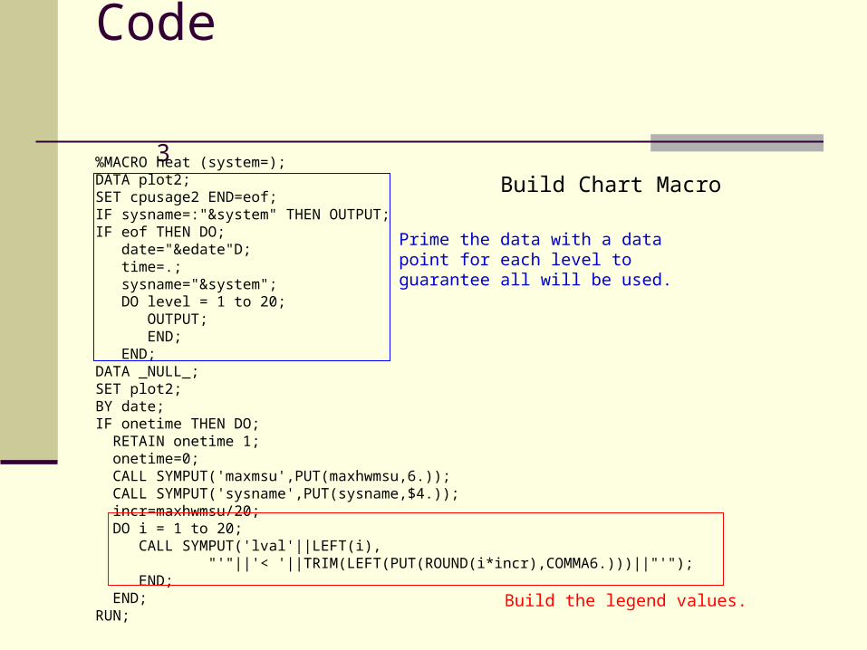
Code 3
%MACRO heat (system=); DATA plot2; SET cpusage2 END=eof; IF sysname=:"&system" THEN OUTPUT; IF eof THEN DO; date="&edate"D; time=.; sysname="&system"; DO level = 1 to 20; OUTPUT; END; END; DATA _NULL_; SET plot2; BY date; IF onetime THEN DO; RETAIN onetime 1; onetime=0; CALL SYMPUT('maxmsu',PUT(maxhwmsu,6.)); CALL SYMPUT('sysname',PUT(sysname,$4.)); incr=maxhwmsu/20; DO i = 1 to 20; CALL SYMPUT('lval'||LEFT(i), "'"||'< '||TRIM(LEFT(PUT(ROUND(i*incr),COMMA6.)))||"'"); END; END; RUN;
Build Chart Macro
Prime the data with a data point for each level to guarantee all will be used.
Build the legend values.

Code 4
LEGEND1 FRAME CBORDER=BLUE VALUE=(HEIGHT=9 FONT=SWISS %lgnd) LABEL=(HEIGHT=9 FONT=SWISSB 'Used HW MSUs'); TITLE3 COLOR=BLUE HEIGHT=12 FONT=SWISSB "&sysname"; %LET days=%SYSEVALF("&edate"D-"&sdate"D+1); %LET note=1; %IF &days<31 & &maxmsu<1000 %THEN %DO; %LET loop=%SYSEVALF(31-&days); %DO i=1 %TO &loop; %LET note=%EVAL(¬e+1); FOOTNOTE¬e FONT=SWISS HEIGHT=9 ' '; %END; %END; %IF &days<30 & &maxmsu>1000 %THEN %DO; %LET loop=%SYSEVALF(30-&days); %DO i=1 %TO &loop; %LET note=%EVAL(¬e+1); FOOTNOTE¬e FONT=SWISS HEIGHT=9 ' '; %END; %END;
Adding footnotes to fill up the graph area.In some cases, thin white lines appeared between the rows.

Code 5
PROC GPLOT DATA=plot2; PLOT date*time=level / SKIPMISS AUTOVREF VZERO NAME='MHEAT' DES="&sysname" HAXIS=AXIS1 VAXIS=AXIS2 LVREF=1 CVREF=WHITE CAXIS=BLUE CTEXT=BLUE LEGEND=LEGEND1; RUN;QUIT; %IF ¬e>1 %THEN %DO; FOOTNOTE2; /*Remove extra footnotes */ %END; %MEND heat;

Code 6
ODS LISTING CLOSE; /* SYSA */ %heat (system=SYSA); /* SYSD */ ODS PROCLABEL=' '; %heat (system=SYSD); /* SYSF */ ODS PROCLABEL=' '; %heat (system=SYSF); /* SYSI */ ODS PROCLABEL=' '; %heat (system=SYSI); /* SYSS */ ODS PROCLABEL=' '; %heat (system=SYSS); /*wrap up*/ ODS HTML CLOSE; ODS LISTING;
Invoke macro for each chart

Disk Code 1
drive= devaddr || '-' || volser; ....PROC SORT DATA=dvamax; BY sysname drive; DATA dvamax; RETAIN ricknum; SET dvamax; BY sysname drive; IF FIRST.sysname THEN ricknum=0; ricknum+1; ....%MACRO yaxis; %DO i=1 %TO &tot; &&yaxis&i %END; %MEND yaxis; ....
The y axis values must be numeric for plotting. Therefore they are assigneda value (ricknum).
%yaxis macro to place real y axis labels on the axis.

Disk Code 2
DATA _NULL_; SET plot2 END=eof; BY ricknum; IF onetime THEN DO; RETAIN onetime 1; onetime=0; CALL SYMPUT('sysname',PUT(sysname,$4.)); incr=maxsscrt/20; DO i = 1 to 20; CALL SYMPUT('lval'||LEFT(i), "'"||'< '||TRIM(LEFT(PUT(ROUND(i*incr),COMMA6.)))||"'"); END; END; IF FIRST.ricknum THEN CALL SYMPUT(‘yaxis'||LEFT(ricknum),"'"||TRIM(LEFT(drive))||"'"); IF eof THEN DO; CALL SYMPUT('tot',LEFT(ricknum)); END; RUN; ....
Building legend values for the %lgnd macro.
Assign y axis labels for the%yaxis macro.

Disk Code 3
LEGEND1 FRAME CBORDER=BLUE VALUE=(HEIGHT=9 FONT=SWISS %lgnd)
LABEL=(HEIGHT=9 FONT=SWISSB 'Start IOs per Second');
AXIS2 VALUE=(FONT=SWISS HEIGHT=8 %yaxis)
ORDER=(1 TO &tot BY 1) MINOR=NONE MAJOR=(COLOR=BLUE)
LABEL=(ANGLE=90 HEIGHT=10 FONT=SWISSB 'Disk Drive');
.... Similar PROC GPLOT code goes here
Where Am I Going Next
Templates Convince SAS that GCONTOUR has a
problem Keep refining heat range colors & ranges Other Uses
Monthly & MTD views of various applications CICS & DB2 transaction volumes
Daily – top 30 Transactions Monthly & MTD usage patterns Response time?
Temp/workspace usage?

Thanks!
Patricia Wingfield Scott Barry Al Sherkow James Holtman Various SAS support people


Additional Documentation Sources
SAS Documentation - http://support.sas.com/onlinedoc/913/docMainpage.jsp
SAS – Michael Hines, Richard S. Ralston - http://www.cmg.org/measureit/issues/mit35/m_35_11.html
Show Your Graphs and Tables at Their Best on the Web with ODS, Francesca Pierri, LeRoy Bessler - http://www2.sas.com/proceedings/sugi27/p220-27.pdf
Web Communication Effectiveness: Design and Methods to Get the Best out of ODS, SAS, and SAS/Graph, LeRoy Bessler - http://www2.sas.com/proceedings/sugi28/130-28.pdf
Inform and Influence with Image and Data: Communication-effective Web Design for ODS, SAS, and SAS/Graph, LeRoy Bessler - http://www2.sas.com/proceedings/sugi27/p139-27.pdf