usinginteractive!datatools!in!...
TRANSCRIPT

1 Using Interactive Data Tools in Mathematics – Professional Development Project Contract – University of Southern Maine 2014
Using Interactive Data Tools in Mathematics Professional Development
Project Report
University of Southern Maine 2014
Pam Buffington, Ph.D. Carlene Kaler
Education Development Center (EDC)
8/30/2014

2 Using Interactive Data Tools in Mathematics – Professional Development Project Contract – University of Southern Maine 2014

3 Using Interactive Data Tools in Mathematics – Professional Development Project Contract – University of Southern Maine 2014
Contents 1 Executive Summary………………………………………………………………………… p. 4
2 Introduction….....………………………………………………………………...…………… p. 5
3 Project Phases….....……………………………………………………………..………….... p. 7 4 Context................................................................................................................................. p. 10
5 Data Analysis..................................................................................................................... p. 13 6 Conclusion.......................................................................................................................... p. 23
7 Appendices......................................................................................................................... p. 24
A. Data Analysis & Summarizing Distributions Activity Background... p. 24 B. Data Analysis and Summarizing Distributions Activity………………... p. 26
C. Group Data Recording Activity Sheets …………………………………….….. p. 30 D. Wolfram Alpha Statistics and Data Analysis............................................... p. 32
E. Making Dot Plots and Box and Whisker Plots……...........................….….. p. 33
F. Mechanics of Making Dot Plots and Box and Whisker Plots…...….….. p. 35 G. Exploring Data: Summarizing and Describing Pre-‐Assessment.……. p. 37
H. Summarizing and Describing Pre-‐Assessment Coding Guide…..…… p. 40
I. Exploring Data: Summarizing and Describing Post-‐Assessment......... p. 43 J. Summarizing and Describing Post-‐Assessment Coding Guide……….. p. 46
K. Data and Sense Making with Sensors and Probes – Agenda…………. p. 49

4 Using Interactive Data Tools in Mathematics – Professional Development Project Contract – University of Southern Maine 2014
1. Executive Summary
The goal of the Using Interactive Data Tools in Mathematics Professional Development
Project was to develop, conduct, and test professional development for middle level
educators to support the effective use of interactive technology for learning targeted data
and statistics mathematics standards and practices as outlined in the Common Core State
Standards. The professional development included embedded research-‐based instructional
strategies and approaches, as well as activities that used example student lesson materials.
Project resources include brief pre/post assessments, interactive applets, student activities,
teacher aids, and other materials. The assessments were designed to measure key aspects
of the targeted data and statistics mathematics standards and practices within the student
lessons. Student performance on the assessments was scored and analyzed by project staff.
Participants were recruited for the professional development and to serve as control
teachers. The control classrooms targeted the same learning goals as the intervention
classrooms. The control teachers, however, taught these classes in a business-‐as-‐usual
fashion. While they administered the pre-‐assessment prior to instruction and the post
assessment following instruction, the control teachers were not provided professional
development or the designed activities. Both intervention and control teachers received
incentives for participation after the intervention was completed, including data collection
sensors (temperature probe and motion detector), analysis software, and supporting
professional development.
A total of 5 intervention and 2 control teachers participated in the study. All students that
completed pre assessments and post assessments were included in the analysis. The
sample included 187 students in intervention classrooms and 81 students in control
classrooms. All classes that participated in the intervention, as well as those participating in
the business as usual classes, showed gains on the post assessment. The intervention
classrooms showed slightly greater gains overall, with the mean pre-‐post increase for
intervention students 3.83 points greater than for control students (effect size of 0.13).
Comparing quartile increases for intervention and control groups, all quartiles had greater
increases for intervention students, with a mean additional quartile increase of 3.07 points.
The intervention classrooms also had the highest individual classroom pre-‐post mean score
increase (32.05 points) and the highest individual post assessment score (95 points).

5 Using Interactive Data Tools in Mathematics – Professional Development Project Contract – University of Southern Maine 2014
2. Introduction
The Using Interactive Data Tools in Mathematics Professional Development Project took advantage of the potential of interactive tools and resources, combined with training and appropriate technological hardware, to support classroom technology
integration designed to improve grades 7-‐ 8 student mathematics achievement and technological literacy. The content focus of the professional development intervention was topics critical to be prepared for high school data and statistics. The professional
learning activities and student lessons targeted skills and abilities needed to create and interpret dot plots and box plots, the analysis of real life data sets based on their summaries and graphical representations, the interpretation of measures of center and
variability, and the development of understanding of the meaning of these data in context.
Table 2.1. Targeted Common Core State Standards Statistics and Probability (Grade 6) Summarize and Describe Distributions.
3. Recognize that a measure of center for a numerical data set summarizes all of its values with a single number, while a measure of variation describes how its values vary with a single number. Summarize and describe distributions. 4. Display numerical data in plots on a number line, including dot plots and box plots. 5. Summarize numerical data sets in relation to their context, such as by: a. Reporting the number of observations. b. Describing the nature of the attribute under investigation,
including how it was measured and its units of measurement. c. Giving quantitative measures of center (median and/or mean)
and variability (interquartile range and/or mean absolute deviation), as well as describing any overall pattern and any striking deviations from the overall pattern with reference to the context in which the data were gathered.
d. Relating the choice of measures of center and variability to the shape of the data distribution and the context in which the data were gathered.
Note: While these standards and indicators in found in the Grade 6 CCSS, they must be mastered by the end of the 8th grade year to be prepared for high school mathematics.

6 Using Interactive Data Tools in Mathematics – Professional Development Project Contract – University of Southern Maine 2014
Table 2.2. High School Common Core State Standards Statistics and Probability (High School) Interpreting Categorical and Quantitative Data S-‐ID
Summarize, represent, and interpret data on a single count or measurement variable 1. Represent data with plots on the real number line (dot plots,
histograms, and box plots). 2. Use statistics appropriate to the shape of the data distribution to
compare center (median, mean) and spread (interquartile range, standard deviation) of two or more different data sets.
3. Interpret differences in shape, center, and spread in the context of the data sets, accounting for possible effects of extreme data points (outliers).
4. Use the mean and standard deviation of a data set to fit it to a normal distribution and to estimate population percentages. Recognize that there are data sets for which such a procedure is not appropriate. Use calculators, spreadsheets, and tables to estimate areas under the normal curve.

7 Using Interactive Data Tools in Mathematics – Professional Development Project Contract – University of Southern Maine 2014
3. Project Phases
The project spanned one half of a year and included multiple phases from participant recruitment to final data analysis.
Phase 1: Participant Recruitment
Participants were recruited from four different schools. The primary criteria for recruitment was that the teachers involved were teaching middle level students, had at least minimal comfort with technology, were planning to teach the targeted data and
statistics standards, and were willing to administer the pre assessment prior to instruction and the post assessment after the instruction of the targeted standards. Participants were recruited from schools across a range of sizes and locations in the
state. Participants had a range of experience and taught students with varied demographic characteristics (described more fully in section 4 below).
Phase 2: Materials Development
The project resources developed included instructional materials that focused on food and food scarcity and were based on real life data that could be accessed on the Internet and explored more
deeply. These materials were supplemented by
scaffolding and enrichment resources including
an iPad applet (Figure 3.1) created for this project (with
accompanying lesson materials), a resource sheet to support the use of the online data/knowledge engine for lesson
extension activities, and a resource created that incorporated online videos to build prerequisite skills related to the construction of a box and whisker plot.
Figure 3.1. Image of iPad Applet

8 Using Interactive Data Tools in Mathematics – Professional Development Project Contract – University of Southern Maine 2014
The list below describes the lesson materials:
• A lesson planning template that included the topic of the lesson, the targeted learning standards, national standards targeted, the goals of the lesson, and the
assessment targets of the lesson. (Appendix A) • Lesson Exploration Sheet – Exploring Data: Summarizing and Describing Calorie
Consumption (Appendix B)
• A reference sheet that included the data organized in groupings based on partner groupings in lesson plan design in case the Internet was not accessible (if the network was down). (Appendix C)
• Wolfram Alpha Statistics and Data Analysis Tools Handout – Extension Support (Appendix D)
• Making Sense of Box and Whisker Plots applet support handout (Appendix E)
• The Mechanics of Making Box & Whisker Plots scaffolding support (Appendix F) • The Pre-‐Assessment (Appendix G ) • The Pre-‐Assessment Coding Guide (Appendix H)
• The Post-‐Assessment (Appendix I) • The Post-‐Assessment Coding Guide (Appendix J)
In addition to the developed teacher materials, an excerpt from the NCTM developed
Navigating through Data Analysis I was included that provided a framework to support an understanding of the cycle of inquiry in data analysis including 1) Pose the Question, 2) Collect the Data, 3) Analyze the Data, and 4) Interpret the Results. This reading
outlined the importance of this data inquiry cycle and the need to interrogate the data. This excerpt also does an excellent job of differentiating a variety of types of graphs and includes definition, purpose, and example. This resource was used in the training to set
a context for the use of the developed materials and served to deepen understanding of the types of graphs embedded within the targeted standards.
Phase 3: Professional Development Intervention
The 7.5-‐hour face-‐to-‐face training for the intervention teachers was conducted in two locations due to the realities of scheduling. The first training was conducted with one participating teacher in a southern Maine location, and the other four teachers were

9 Using Interactive Data Tools in Mathematics – Professional Development Project Contract – University of Southern Maine 2014
trained at a school located in a coastal area of Maine. All the materials, including the pre and post assessments, were provided to these teachers during the training. The control teachers were provided the assessments prior to their instructional unit targeting these
standards as well. The training was an immersion experience in which the intervention teachers took the assessment and engaged with each of the resources. Two and a half hours was provided for the teachers to engage both as learners and to reflect on the
materials and professional learning experience as teachers. There were opportunities for collegial sharing and planning of the use of the materials with the students.
Phase 4: Lesson Implementation
The lessons were conducted during a three-‐week window. This timeframe was provided for both control and intervention teachers in order to accommodate local schedules and allow for the intervention teachers to use any or all of the materials
provided in the training. The assessments were administered prior to and after instruction. The assessments were collected for coding/scoring.
Phase 5: Incentives Training
Additional training materials were developed to support the use of the data sensors (temperature probe and motion detector) and software that would be provided to all participants including control and intervention teachers. The training was conducted at
two locations and the hardware and associated software was distributed. (See Appendix K.)
Phase 6: Data Analysis
Over 256 pre assessments and over 256 post assessments were collected from teachers. Coding guides were created and coder training was provided to EDC staff. The assessments were coded by EDC staff based on the established coding guides. (See
Appendices 7-‐10.)

10 Using Interactive Data Tools in Mathematics – Professional Development Project Contract – University of Southern Maine 2014
4. Context
The project included participants from four Maine school districts ranging in size from small rural to small city. Each district participates in the Maine Learning Technology Initiative in which all students and teachers at grades 7 and 8 are provided 1-‐to-‐1
devices. The assessments and instructional activities were completed in the spring of 2014.
Description of Participants
The project included seven middle level teachers; five engaged in the intervention and two served as controls. The control teachers received delayed treatment by engaging in professional development after completion of student post assessments. The seven
teachers ranged in years of experience from 3 years of experience to 26 years of experience. The mean number of years experience for all teachers participating was 13.7 years. (See Table 4.1.) The two control teachers had a mean of 18.5 years teaching,
compared to a mean of 11.8 years for the intervention teachers. Five of the teachers taught mathematics for all or nearly all their teaching years, while two teachers only taught mathematics for three years and taught science the remaining years (see Table
4.2). The control teachers taught mathematics for a mean of 18 years, whereas the intervention teachers taught mathematics for a mean of 11.8 years.
Table 4.1. Participant Teaching Experience

11 Using Interactive Data Tools in Mathematics – Professional Development Project Contract – University of Southern Maine 2014
Table 4.2. Participant Teaching Experience (Mathematics)
The level of educational attainment varied and included Bachelor of Science (BS), BS plus Masters (MA), and BS+MA plus additional
credits or contact hours. The majority of teachers in the project—including the two control teachers—had a BS (57.1%), followed by 28.6%
with a BS+MA, with only 1 person with more than BS+MA (14.3%). (See Table 4.5.)
Table 4.3. Educational Attainment
The areas of certification included Mathematics, Science, and Language Arts with three participants certified K-‐8, two certified 7-‐12, one certified 5-‐12, and one unspecified.
Four teachers had a degree in mathematics, two in science, and one in engineering. Both control teachers were certified 7-‐12 mathematics, including one also certified K-‐8 general elementary (Table 4.4).
Figure 4.1. Level of Education

12 Using Interactive Data Tools in Mathematics – Professional Development Project Contract – University of Southern Maine 2014
Table 4.4. Certification Level and Area of Certification
K-‐8; Content Area: Mathematics 7-‐12 Mathematics 5-‐12 Mathematics K-‐8 General Ed with a concentration in science K-‐8: Mathematics, Science, LA 7-‐12 Mathematics K-‐8 General Elementary Mathematics (Note – Engineering training prior to teaching)
The teachers ranged in levels of comfort with technology from somewhat comfortable to very comfortable (Table 4.5). The control teachers rated their comfort levels as “somewhat comfortable” and “comfortable”. The control teachers had both received
professional development in technology integration in middle level mathematics in the past. When analyzed by years of experience teaching, the reported level of comfort with technology overall was inversely related to years of experience (Figure 4.2).
Table 4.5. Teacher Comfort Level with Technology
Self-‐Rating
Not Comfortable Somewhat Comfortable
Comfortable Very Comfortable
Number of teachers (intervention and control)
0 2 4 1
Figure 4.2. Teacher Comfort Level with Technology and Teaching Experience

13 Using Interactive Data Tools in Mathematics – Professional Development Project Contract – University of Southern Maine 2014
5. Data Analysis
The pre and post assessments were administered in classrooms in all four participating districts. There were a total of seven middle level teachers: five intervention teachers and two control teachers. Five of the teachers taught mathematics and two taught
science. The seven teachers administered the assessments in 13 groups. In all, 268 students completed both the pre assessment and the post assessment (Table 5.1). Students who completed only one assessment are excluded from the analysis.
Table 5.1. Class and Student Information
School # Teacher #
(restarts at 1 for each school)
# of Classes
Total Student Count
Notes
1 (Control) 1 2 28 Teacher ID 1.1 (control, math) 1 (Control) 2 3 53 Teacher ID 1.2 (control, math)
2 (Intervention)
1 1* 68 Teacher ID 2.1 (intervention, math) *Note that This teacher works on a middle school team and did not disaggregate the students by individual classes, so the data is listed as 1 class (only) and is analyzed as a single group
3 (Intervention) 1 3 53 Teacher ID 3.1 (intervention, math)
4 (Intervention) 1 2 37 Teacher ID 4.1 (intervention, math)
4 (Intervention) 2 1 15 Teacher ID 4.2 (intervention, science)
4 (Intervention) 3 1 14 Teacher ID 4.3 (intervention, science)
Control Classrooms
The control teachers were both located in the same middle school. Collectively they
administered both pre and post assessments to 81 students across 5 classes. The total pre-‐post increase in the mean score for all control students is 20.13 points, from 35.75 points to 55.88 points (Figure 5.1). Among all control classrooms, student results rose
for each quartile from the pre to the post assessment. The highest individual score (maximum) among the 81 control students rose 18 points from the pre assessment to the post assessment, and the lowest individual score (minimum) rose 15 points. All of
the first 3 quartile values had similar gains pre to post, with the quartile 1, the median, and the quartile 3 values all increasing pre to post by approximately 21 points.

14 Using Interactive Data Tools in Mathematics – Professional Development Project Contract – University of Southern Maine 2014
Figure 5.1. Assessment Information for All Control Students
The paragraphs and figures below discuss and display classroom level data for control
teachers. Control teacher 1.1 administered the assessment to 28 students across two classrooms. Classroom 1.1.1 results (Figure 5.2) show that the classroom mean score for the assessments rose pre to post by 22.48 points, from 22.63 points to 45.1 points.
Figure 5.2. Assessment Information for Control Class 1.1.1
Classroom 1.1.2 results (Figure 5.3) show that the mean score for the pre assessment is 30 points and the post assessment mean is 51.88 points, with an overall gain of 21.88 points.
Pre Assessment
Post Assessment
Pre Assessment
Post Assessment

15 Using Interactive Data Tools in Mathematics – Professional Development Project Contract – University of Southern Maine 2014
Figure 5.3. Assessment Information for Control Class 1.1.2
Control teacher 1.2 administered the assessments in three classrooms and collected
matched pre-‐post assessments from 53 students. The mean score for classroom 1.2.1 (Figure 5.4) rose by 18.9 points, from 42.68 points on the pre assessment to 61.58 points on the post assessment.
Figure 5.4. Assessment Information for Control Class 1.2.1
Pre Assessment
Post Assessment
Pre Assessment
Post Assessment

16 Using Interactive Data Tools in Mathematics – Professional Development Project Contract – University of Southern Maine 2014
Classroom 1.2.2 results (Figure 5.5) show that the mean score for the pre assessment is 50 points and the post assessment mean is 64.14 points, with an overall gain of 14.14 points.
Figure 5.5. Assessment Information for Control Class 1.2.2
The mean score for classroom 1.2.3 (Figure 5.6) rose 22.66 points from the pre
assessment to the post assessment (from 34.18 points to 56.84 points).
Figure 5.6. Assessment Information for Control Class 1.2.3
Pre Assessment
Post Assessment
Pre Assessment
Post Assessment

17 Using Interactive Data Tools in Mathematics – Professional Development Project Contract – University of Southern Maine 2014
Intervention Classrooms
The intervention teachers taught in three different middle schools. Collectively they administered both pre assessments and post assessments to 187 students in 8 classes.
The mean pre assessment score is 34.83 points and the mean post-‐assessment score is 58.79 points, for a total mean score increase for all intervention students of 23.96 points (Figure 5.7). This increase is 3.83 points higher than the increase in pre-‐post
mean scores for all control students (20.13 points).
The highest individual score (maximum) for the 187 intervention students rose 20 points (from 75 points to 95 points), and the lowest individual score (minimum) rose
15 points (from 5 points to 20 points). Similarly to the control students, all of the quartile values increased pre to post. However, the increases for all quartiles were greater for the intervention students than for the control students. Including all four
quartiles (quartile 1, the median, the quartile 3, and maximum values), the control students had a mean quartile pre-‐post increase of 20.06 points, compared to a mean quartile pre-‐post increase of 23.13 points for intervention students.
Table 5.2 below summarizes the quartile gains for both control and treatment schools. The greatest increases overall were for the mid-‐range scores for intervention students, with median and quartile 3 values increasing by 25 points.
Table 5.2. Minimum and Quartile Pre-‐Post Increases for Control and Intervention Students
Statistic
Pre-‐Post Point Increase for
Control Students (n=81)
Pre-‐Post Point Increase for Intervention Students (n=187)
Additional Intervention Increase
(difference of pre-‐post point increases;
intervention minus control)
Minimum 15 15 0
Quartile 1 (Q1) 20.75 22.5 1.75
Median (Q2) 21 25 4
Quartile 3 (Q3) 20.5 25 4.5
Maximum (Q4) 18 20 2
Mean Gain for the 4 Quartiles (does not include increase of minimum) 20.06 23.13 3.07

18 Using Interactive Data Tools in Mathematics – Professional Development Project Contract – University of Southern Maine 2014
The highest post assessment score overall among all students is 95 points, earned by an intervention student. This is 13 points higher than the maximum post assessment score among the control students (82 points). The minimum post assessment scores for both
intervention and control students are 20 points.
Figure 5.7. Assessment Information for All Intervention Students
The following paragraphs and figures discuss and display classroom level data for
intervention teachers. Intervention teacher 2.1 administered the assessment to 68 students across multiple classrooms and combined the results as one group. Classroom 2.1.1 results (Figure 5.8) show that the mean score for the pre assessment is 27.02
points and the post assessment mean is 50.65 points, with an overall gain of 23.63 points.
Figure 5.8. Assessment Information for Intervention Class 2.1.1
Pre Assessment
Post Assessment
Pre Assessment
Post Assessment

19 Using Interactive Data Tools in Mathematics – Professional Development Project Contract – University of Southern Maine 2014
Intervention teacher 3.1 administered the assessment to 53 students across 3 classrooms. Classroom 3.1.1 results (Figure 5.9) show an increase in mean scores of 22.81 points, from the pre assessment mean of 35.83 points to the post assessment
mean of 58.64 points.
Figure 5.9. Assessment Information for Intervention Class 3.1.1
Classroom 3.1.2 results (Figure 5.10) show that the mean score increased by 16.7 points from the pre assessment to the post assessment (from 46.1 points to 62.8
points).
Figure 5.10. Assessment Information for Intervention Class 3.1.2
Pre Assessment
Post Assessment
Pre Assessment
Post Assessment

20 Using Interactive Data Tools in Mathematics – Professional Development Project Contract – University of Southern Maine 2014
Classroom 3.1.3 results (Figure 5.11) show that the mean score for the pre assessment is 35.88 points, the post assessment mean is 58.78 points, and the gain in mean scores is 22.9 points.
Figure 5.11. Assessment Information for Intervention Class 3.1.3
Intervention teacher 4.1 administered the assessment to 37 students across 2 classrooms. Classroom 4.1.1 results (Figure 5.12) show that the mean score for the pre assessment is 39.05 points and the post assessment mean is 71.11 points, with a pre-‐
post mean score increase of 32.05 points.
Figure 5.12. Assessment Information for Intervention Class 4.1.1
Pre Assessment
Post Assessment
Pre Assessment
Post Assessment

21 Using Interactive Data Tools in Mathematics – Professional Development Project Contract – University of Southern Maine 2014
Classroom 4.1.2 results (Figure 5.13) show that the mean score for the pre assessment is 40.36 points and the post assessment mean is 62.47 points, with an overall gain of 22.11 points.
Figure 5.13. Assessment Information for Intervention Class 4.1.2
Intervention teacher 4.2 administered the assessment to 15 students in one classroom. This teacher taught middle school science. Classroom 4.2.1 results (Figure 5.14) show that the mean score for the pre assessment is 34.87 points, the post assessment mean
score is 55.73 points, and the mean score increased by 20.87 points from the pre-‐assessment to the post-‐assessment.
Figure 5.14. Assessment Information for Intervention Class 4.2.1
Pre Assessment
Post Assessment
Pre Assessment
Post Assessment

22 Using Interactive Data Tools in Mathematics – Professional Development Project Contract – University of Southern Maine 2014
Intervention teacher 4.3 administered the assessment to 14 students in one classroom. This teacher taught middle school science. Classroom 4.3.1 results (Figure 5.15) show that the mean score for the pre assessment is 45 points, the post assessment mean is
76.07 points, with the mean score increasing by 31.07 points.
Figure 5.15. Assessment Information for Intervention Class 4.3.1
Pre Assessment
Post Assessment
23 Using Interactive Data Tools in Mathematics – Professional Development Project Contract – University of Southern Maine 2014
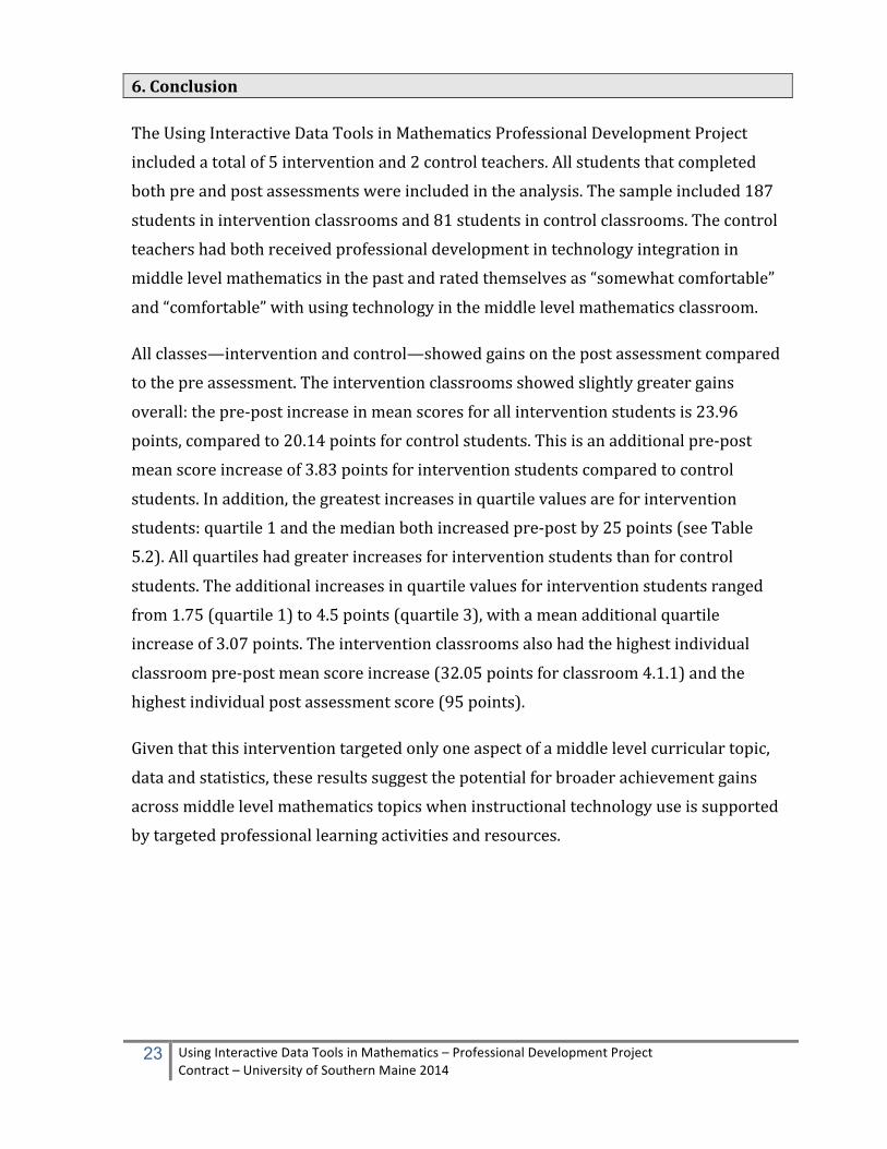
6. Conclusion
The Using Interactive Data Tools in Mathematics Professional Development Project included a total of 5 intervention and 2 control teachers. All students that completed both pre and post assessments were included in the analysis. The sample included 187
students in intervention classrooms and 81 students in control classrooms. The control teachers had both received professional development in technology integration in middle level mathematics in the past and rated themselves as “somewhat comfortable”
and “comfortable” with using technology in the middle level mathematics classroom.
All classes—intervention and control—showed gains on the post assessment compared to the pre assessment. The intervention classrooms showed slightly greater gains
overall: the pre-‐post increase in mean scores for all intervention students is 23.96 points, compared to 20.14 points for control students. This is an additional pre-‐post mean score increase of 3.83 points for intervention students compared to control
students. In addition, the greatest increases in quartile values are for intervention students: quartile 1 and the median both increased pre-‐post by 25 points (see Table 5.2). All quartiles had greater increases for intervention students than for control
students. The additional increases in quartile values for intervention students ranged from 1.75 (quartile 1) to 4.5 points (quartile 3), with a mean additional quartile increase of 3.07 points. The intervention classrooms also had the highest individual
classroom pre-‐post mean score increase (32.05 points for classroom 4.1.1) and the highest individual post assessment score (95 points).
Given that this intervention targeted only one aspect of a middle level curricular topic,
data and statistics, these results suggest the potential for broader achievement gains across middle level mathematics topics when instructional technology use is supported by targeted professional learning activities and resources.

24 Using Interactive Data Tools in Mathematics – Professional Development Project Contract – University of Southern Maine 2014
APPENDIX A

25 Using Interactive Data Tools in Mathematics – Professional Development Project Contract – University of Southern Maine 2014

Student # : _____________________________ School # ______ Class # _______
26 Using Interactive Data Tools in Mathematics – Professional Development Project Contract – University of Southern Maine 2014
Background: This lesson is designed to provide an opportunity for you to explore worldwide calorie consumption. You will collect data and use tools and methods to make sense of that data. According to the Food and Agriculture organization of the United Nations, the average minimum daily energy requirement is about 1,800 kilocalories1. If people consume less than that they are hungry and don’t have enough energy to perform daily activities. If a person consumes more than 1,800 kilocalories on average, and don’t burn those calories through daily activity or exercise, the unused calories are stored as fat. You will show that you can:
• display data in tables, line plots, and boxplots • use the measures of center (mean, median, and mode) and spread to analyze and interpret the data • explain how and why additional data affects the situation
Part I: 1. Access to food varies considerably across the world. You will collect data about the
average number of calories consumed daily by people in different countries and enter it into the tables below:
Continent 1: _________________________________ Continent # __ : ________________________________ Group 1 (x) Group 2 (o) No. Country Kilocalories No. Country Kilocalories 1. Bahamas 1. 2. Belize 2. 3. Canada 3. 4. Costa Rica 4. 5. Cuba 5. 6. El Salvador 6. 7. Guatemala 7. 8. Haiti 8. 9. Mexico 9. 10. United States 10.
2. Create a line plot of this data (x’s and o’s)
3. What do you notice about the two sets of data?
1 http://en.wikipedia.org/wiki/List_of_countries_by_food_energy_intake
Exploring Data: Summarizing and Describing Calorie Consumption
APPENDIX B

Student # : _____________________________ School # ______ Class # _______
27 Using Interactive Data Tools in Mathematics – Professional Development Project Contract – University of Southern Maine 2014
4. List the average Kilocalories used in each country from least to greatest: Continent List (Least to Greatest)
Group 1: North America
Group 2:
5. Review the tables and line plots above and determine the following measures of center for each data set:
Question Data Set: North America Data Set: a) What number of kilocalories occurs most often (mode) in each data set?
b) What is the median number of kilocalories for the countries in each data set?
c) What is the average number (mean) of kilocalories in each data set?
d) What are the minimum, maximum, and range of the kilocalories in each data set?
Min: Max: Range:
Min: Max: Range:
6. Which of these measures of center (mean, median, mode) do you think best describes the data provided in
the table for North America? Provide an argument supported by data to justify your answer.
7. Put the data from the tables for each continent into the GeoGebra App to create two boxplots. The boxplot for North America is shown below. Add the boxplot of your second continent to the graph below. Place an X
North America

Student # : _____________________________ School # ______ Class # _______
28 Using Interactive Data Tools in Mathematics – Professional Development Project Contract – University of Southern Maine 2014
on the graph where the recommended amount of daily kilocalories exists. (~ minimum of 1800 kilocalories)
8. Review the two boxplots in the graph above. Consider the measures of center and spread for each continent. a) Which continent has the largest range of kilocalories? (Provide the range)
b) Describe where the middle 50% of the data lies for North America. (Use your measures of center and 2nd and 3rd quartile values in your explanation.)
c) Describe where the middle 50% of the data lies for your second continent. (Use your measures of center and 2nd and 3rd quartile values in your explanation.)
d) Describe the relationship between the average kilocalories consumed daily of the two continents.
Student # : _____________________________ School # ______ Class # _______
29 Using Interactive Data Tools in Mathematics – Professional Development Project Contract – University of Southern Maine 2014
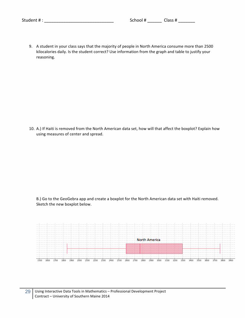
9. A student in your class says that the majority of people in North America consume more than 2500
kilocalories daily. Is the student correct? Use information from the graph and table to justify your reasoning.
10. A.) If Haiti is removed from the North American data set, how will that affect the boxplot? Explain how using measures of center and spread. B.) Go to the GeoGebra app and create a boxplot for the North American data set with Haiti removed. Sketch the new boxplot below.

Student # : _____________________________ School # ______ Class # _______
30 Using Interactive Data Tools in Mathematics – Professional Development Project Contract – University of Southern Maine 2014
Continent 1: North America Continent 2: Asia Group 1 Group 2 No. Country Kilocalories No. Country Kilocalories 1. Bahamas 1. Afghanistan 2. Belize 2. Bangladesh 3. Canada 3. Burma 4. Costa Rica 4. Cambodia 5. Cuba 5. China 6. El Salvador 6. Indonesia 7. Guatemala 7. Iraq 8. Haiti 8. Pakistan 9. Mexico 9. Saudi Arabia 10. United States 10. Thailand
Notes:
Continent 1: North America Continent 3: Europe Group 1 Group 2 No. Country Kilocalories No. Country Kilocalories 1. Bahamas 1. Belgium 2. Belize 2. Croatia 3. Canada 3. Denmark 4. Costa Rica 4. France 5. Cuba 5. Greece 6. El Salvador 6. Italy 7. Guatemala 7. Portugal 8. Haiti 8. Poland 9. Mexico 9. Spain 10. United States 10. United Kingdom
Notes: Continent 1: North America Continent 4: Africa
APPENDIX C

Student # : _____________________________ School # ______ Class # _______
31 Using Interactive Data Tools in Mathematics – Professional Development Project Contract – University of Southern Maine 2014
Group 1 Group 2 No. Country Kilocalories No. Country Kilocalories 1. Bahamas 1. Angola 2. Belize 2. Burundi 3. Canada 3. Congo 4. Costa Rica 4. Kenya 5. Cuba 5. Namibia 6. El Salvador 6. Rwanda 7. Guatemala 7. Senegal 8. Haiti 8. Somalia 9. Mexico 9. Sudan 10. United States 10. Zambia
Notes:
Continent 1: North America Continent 5: South America Group 1 Group 2 No. Country Kilocalories No. Country Kilocalories 1. Bahamas 1. Argentina 2. Belize 2. Bolivia 3. Canada 3. Brazil 4. Costa Rica 4. Chile 5. Cuba 5. Columbia 6. El Salvador 6. Ecuador 7. Guatemala 7. Guyana 8. Haiti 8. Paraguay 9. Mexico 9. Uruguay 10. United States 10. Venezuela
Notes:

Student # : _____________________________ School # ______ Class # _______
32 Using Interactive Data Tools in Mathematics – Professional Development Project Contract – University of Southern Maine 2014
Wolfram Alpha Statistics and Data Analysis Tools Getting Started
• Open the Wolfram Alpha App (Or launch Safari and go to the Wolfram Alpha Website) • Enter the data within braces
{25, 35, 10, 17, 29, 14, 21, 31} • Click on the = sign to compute
• Additional statistics and data analysis commands below
APPENDIX D

Student # : _____________________________ School # ______ Class # _______
33 Using Interactive Data Tools in Mathematics – Professional Development Project Contract – University of Southern Maine 2014
Background: GeoGebra is a free, creative commons mathematics tool that can be used to explore and understand mathematics more deeply. It can be used for a number of purposes including graphing data and functions. You can use GeoGebra on a variety of computers and mobile tablets. You can also access a number of pre-‐made free applets on GeoGebraTube online. In this activity you will create Dot Plots and Box & Whisker Plots in GeoGebra. Part I: To create a Dot Plot in GeoGebra you need to enter a command in the input line of GeoGebra: DotPlot [http://wiki.geogebra.org/en/DotPlot_Command ]
DotPlot[ <List of Raw Data> ] Returns a dot plot for the given list of numbers, as well as the list of the dot plot points. Example: DotPlot[{2, 5, 3, 4, 3, 5, 3}]
11. Below is a table of values of the number of undernourished persons in each country
No. Country Million Undernourished
Persons 1. Brazil 13.6 2. Cameroon 2.7 3. Congo 1.4 4. Ethiopia 32.1 5. Guatemala 4.6 6. Haiti 5.1 7. Peru 3.5 8. Yemen 7.4
Data from http://www.fao.org/hunger/en/#jfmulticontent_c130584-‐2
12. Create a dot plot by entering DotPlot[13.6, 2.7, 1.4, 32.1, 4.6, 5.1, 3.5, 7.4] into the input bar in the GeoGebra App.
13. Show the dot plot below:
Making Dot Plots and Box & Whisker Plots in GeoGebra
APPENDIX E

Student # : _____________________________ School # ______ Class # _______
34 Using Interactive Data Tools in Mathematics – Professional Development Project Contract – University of Southern Maine 2014
Create a Box and Whisker Plot in GeoGebra BoxPlot http://wiki.geogebra.org/en/BoxPlot_Command
BoxPlot[yOffset, yScale, List of Raw Data] Creates a box plot using the given raw data and whose vertical position in the coordinate system is controlled by variable yOffset and whose height is influenced by factor yScale. Example: BoxPlot[0, 1, {2, 2, 3, 4, 5, 5, 6, 7, 7, 8, 8, 8, 9}] Quartile 1 and Quartile 3 Commands Q1[2, 2, 3, 4, 5, 5, 6, 7, 7, 8, 8, 8, 9] Q3[2, 2, 3, 4, 5, 5, 6, 7, 7, 8, 8, 8, 9]
14. Use the data from the table on page 1 to create a Box and Whisker Plot in GeoGebra. (Also included below) BoxPlot [ 4, 1, {13.6, 2.7, 1.4, 32.1, 4.6, 5.1, 3.5, 7.4} ] a) Where is the left tail? (minimum) b) Where is the right tail? (maximum) c) What is the median? d) Where are the ends of the box located? (Q1 and Q3)
5. Make a new BoxPlot with Ethiopia (32.1 million) removed. BoxPlot[8,1,{ 13.6, 2.7, 1.4, 4.6, 5.1, 3.5, 7.4}]
a) Describe what has changed on the boxplot: b) What happened to the value of the median?

Student # : _____________________________ School # ______ Class # _______
35 Using Interactive Data Tools in Mathematics – Professional Development Project Contract – University of Southern Maine 2014
Background: In this activity you will view and animation and video that explain how to create a Box & Whisker Plot. Part I: Go to the Wiki How site to find out about Box & Whisker Plots:
15. List the 10 steps to creating a Box & Whisker Plot.
16. Explain how to find a median when there is an even number of values in the set.
The Mechanics of Making Box & Whisker Plots
APPENDIX F

Student # : _____________________________ School # ______ Class # _______
36 Using Interactive Data Tools in Mathematics – Professional Development Project Contract – University of Southern Maine 2014
17. Explain how to find a median when there are an odd number of values in the set. Other Related YouTube Videos:
https://www.youtube.com/watch?v=GMb6HaLXmjY

Student # : _____________________________ School # ______ Class # _______
37 Using Interactive Data Tools in Mathematics – Professional Development Project Contract – University of Southern Maine 2014
Task Background: This assessment task is designed to provide an opportunity for you to show what you know and understand about tools and methods to make sense of data. You will be given data about the number of calories in a variety of foods and you will be asked to describe what you know about these foods based on that data. You will show that you can:
• display data in a line plots and boxplots • use the measures of center (mean, median, and mode) and spread to analyze and
interpret the data • explain how and why additional data affects the situation
Background: You are provided tables of data below in order to gain a better understanding of food sources and the amount of calories they provide to be used as energy for daily activities, or if unused stored as fat. The calories of 3 ounces of each of the following fruits are shown in the table on the right: 1. Create a line plot using the calorie data about the fruits above (10 pts.)
Number of Calories
2. Review the table and line plot and determine the following measures of center: (5 pts. ea.) a) What is the number of calories that occurs most often (mode) in this fruit sample? ____________
b) What is the median number of calories for all of the fruits listed? __________________
c) What is the average number (mean) of calories for the fruits listed? _______
d) What is the range of the data
3. Which of these measures of center (mean, median, mode) do you think best describes the data provided in the table about calories of fruit? Provide an argument supported by data to justify your answer. (20 pts.)
Exploring Data: Summarizing and Describing Foods By Calories (Pre)
APPENDIX G
Student # : _____________________________ School # ______ Class # _______
38 Using Interactive Data Tools in Mathematics – Professional Development Project Contract – University of Southern Maine 2014
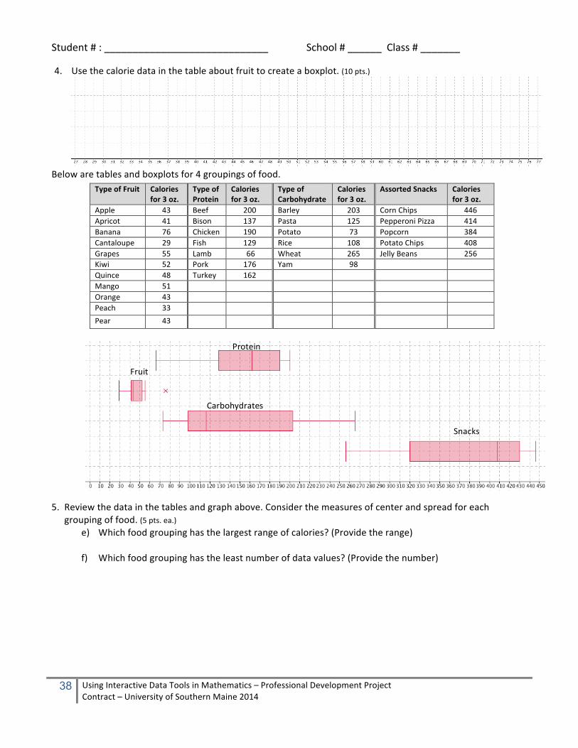
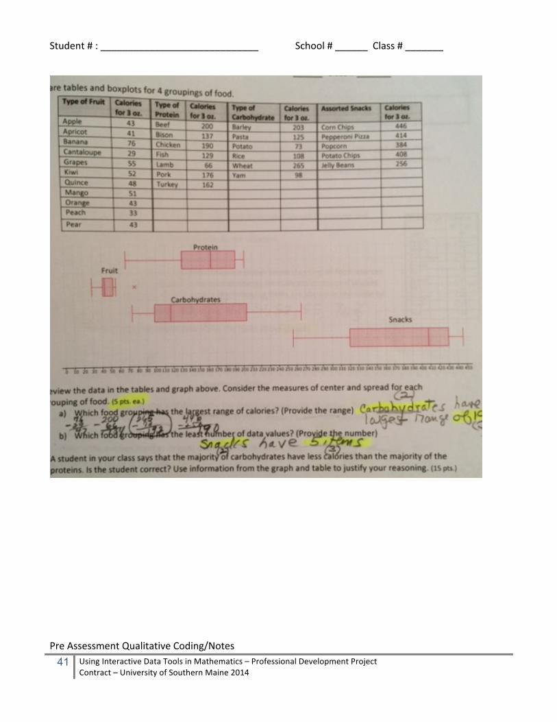
4. Use the calorie data in the table about fruit to create a boxplot. (10 pts.)
Below are tables and boxplots for 4 groupings of food.
Type of Fruit Calories for 3 oz.
Type of Protein
Calories for 3 oz.
Type of Carbohydrate
Calories for 3 oz.
Assorted Snacks Calories for 3 oz.
Apple 43 Beef 200 Barley 203 Corn Chips 446 Apricot 41 Bison 137 Pasta 125 Pepperoni Pizza 414 Banana 76 Chicken 190 Potato 73 Popcorn 384 Cantaloupe 29 Fish 129 Rice 108 Potato Chips 408 Grapes 55 Lamb 66 Wheat 265 Jelly Beans 256 Kiwi 52 Pork 176 Yam 98 Quince 48 Turkey 162 Mango 51 Orange 43 Peach 33 Pear 43
5. Review the data in the tables and graph above. Consider the measures of center and spread for each grouping of food. (5 pts. ea.)
e) Which food grouping has the largest range of calories? (Provide the range)
f) Which food grouping has the least number of data values? (Provide the number)
Fruit
Carbohydrates
Protein
Snacks

Student # : _____________________________ School # ______ Class # _______
39 Using Interactive Data Tools in Mathematics – Professional Development Project Contract – University of Southern Maine 2014
6. A student in your class says that the majority of carbohydrates have less calories than the majority of the proteins. Is the student correct? Use information from the graph and table to justify your reasoning. (15 pts.)
7. If wheat is removed from the carbohydrates, how will that effect the boxplot? Explain how using measures of center and spread. (15 pts.)

Student # : _____________________________ School # ______ Class # _______
40 Using Interactive Data Tools in Mathematics – Professional Development Project Contract – University of Southern Maine 2014
Data Study – Qualitative Pre
APPENDIX H
Student # : _____________________________ School # ______ Class # _______
41 Using Interactive Data Tools in Mathematics – Professional Development Project Contract – University of Southern Maine 2014
Pre Assessment Qualitative Coding/Notes

Student # : _____________________________ School # ______ Class # _______
42 Using Interactive Data Tools in Mathematics – Professional Development Project Contract – University of Southern Maine 2014
Question # Points
Response Notes
Q 4 – 20 points • Mean (or average) is NOT the best measure of center as 46 is larger than either Mode or Median (referencing NOT mean) • The 76 makes the mean larger than typical data • Mode & Median are both 43 so either could be best • Middle and most are the same number • 4 pieces of data are located between 41 and 43 • Referencing cluster or clump (in numbers or words) • Lowest fruit is 29 and highest is 76 but most is between 41 and 52
5 points for correct measure of center (either mode or median) 10 points for any 2 or more of the bullets listed
Q6 – 15 points • The student is correct • The median of the Carbohydrates is 116.5 • Half (or 50%) of the Carbs are below 116.5 • The Q1 of the proteins is 129 so 75% of proteins are above 129 so only 25% are below 129 where more than 50% of Carbs are below 129 • See drawing, if 116.5, 129, 50%, 75% … shown
5 points for “student is correct” 10 points for any 2 or more of the other bullets listed
Q7 – 15 points • The spread will be less • See drawing • New right tail (55) • Median stays the same • Minimum stays the same • Median stays the same • Data is more compact (between 29 and 55) • 75% now below 51
5 points for any of the bullets listed up to 15 points

Student # : _____________________________ School # ______ Class # _______
43 Using Interactive Data Tools in Mathematics – Professional Development Project Contract – University of Southern Maine 2014
Task Background: This assessment task is designed to provide an opportunity for you to show what you know and understand about tools and methods to make sense of data. You will be given data about the number of calories in a variety of foods and you will be asked to describe what you know about these foods based on that data. You will show that you can:
• display data in a line plots and boxplots • use the measures of center (mean, median, and mode) and spread to analyze and
interpret the data • explain how and why additional data affects the situation
Background: You are provided tables of data in order to gain a better understanding of food sources and the amount of calories they provide to be used as energy for daily activities, or if unused, stored as fat. The calories of 3 ounces of each of the vegetables are shown in the table on the right:
8. Create a line plot using the calorie data about the vegetables above (10 pts.)
Number of Calories
9. Review the table and line plot and determine the following measures of center: (5 pts. ea.) a) What is the number of calories that occurs most often (mode) in this vegetable sample? ______
b) What is the median number of calories for all of the vegetables listed? ______
c) What is the average number (mean) of calories for the vegetables listed? _______
d) What is the range of the vegetable data? _________
10. Which of these measures of center (mean, median, mode) do you think best describes the data provided in the table about calories of the given vegetables? Provide an argument supported by data to justify your answer. (20 pts.)
Exploring Data: Summarizing and Describing Foods By Calories (Post)
APPENDIX I
Student # : _____________________________ School # ______ Class # _______
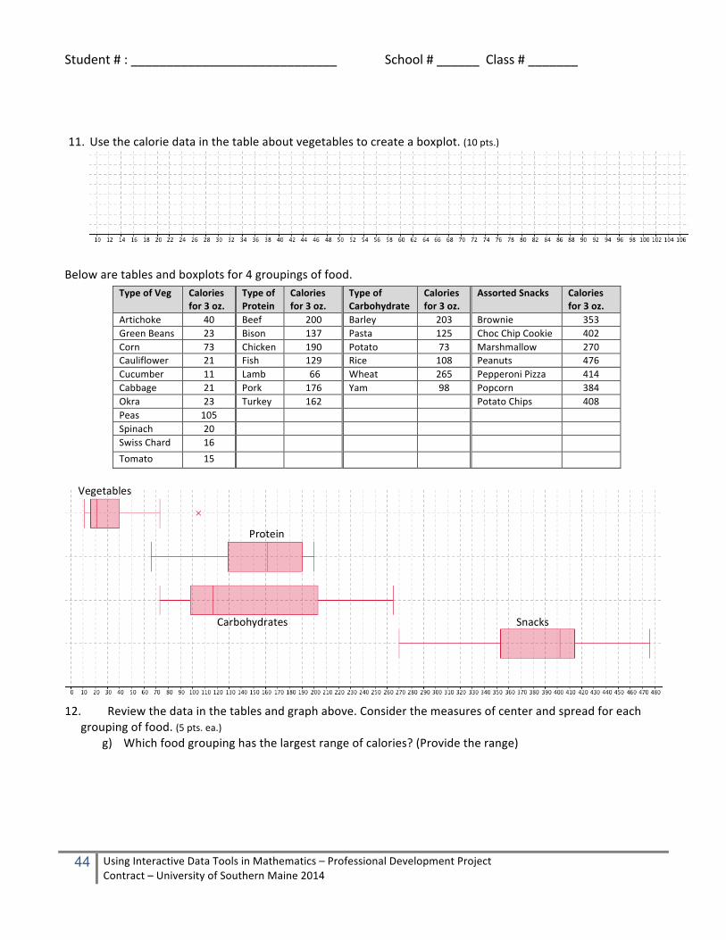
44 Using Interactive Data Tools in Mathematics – Professional Development Project Contract – University of Southern Maine 2014
11. Use the calorie data in the table about vegetables to create a boxplot. (10 pts.)
Below are tables and boxplots for 4 groupings of food.
Type of Veg Calories for 3 oz.
Type of Protein
Calories for 3 oz.
Type of Carbohydrate
Calories for 3 oz.
Assorted Snacks Calories for 3 oz.
Artichoke 40 Beef 200 Barley 203 Brownie 353 Green Beans 23 Bison 137 Pasta 125 Choc Chip Cookie 402 Corn 73 Chicken 190 Potato 73 Marshmallow 270 Cauliflower 21 Fish 129 Rice 108 Peanuts 476 Cucumber 11 Lamb 66 Wheat 265 Pepperoni Pizza 414 Cabbage 21 Pork 176 Yam 98 Popcorn 384 Okra 23 Turkey 162 Potato Chips 408 Peas 105 Spinach 20 Swiss Chard 16 Tomato 15
12. Review the data in the tables and graph above. Consider the measures of center and spread for each grouping of food. (5 pts. ea.)
g) Which food grouping has the largest range of calories? (Provide the range)
Vegetables
Carbohydrates
Protein
Snacks

Student # : _____________________________ School # ______ Class # _______
45 Using Interactive Data Tools in Mathematics – Professional Development Project Contract – University of Southern Maine 2014
h) Which food grouping has the least number of data values? (Provide the number)
13. A student in your class says that the majority of carbohydrates have less calories than the majority of the proteins. Is the student correct? Use information from the graph and table to justify your reasoning. (15 pts.)
14. If marshmallow is removed from the snacks data, how will that effect the boxplot below? Explain how using measures of center, spread, and other features of the boxplot. (15 pts.)

Student # : _____________________________ School # ______ Class # _______
46 Using Interactive Data Tools in Mathematics – Professional Development Project Contract – University of Southern Maine 2014
APPENDIX J

Student # : _____________________________ School # ______ Class # _______
47 Using Interactive Data Tools in Mathematics – Professional Development Project Contract – University of Southern Maine 2014

Student # : _____________________________ School # ______ Class # _______
48 Using Interactive Data Tools in Mathematics – Professional Development Project Contract – University of Southern Maine 2014
Post Assessment Qualitative Coding/Notes Question # Points
Response Notes
Q 4 – 20 points • Mean (or average) is NOT the best measure of center as 33.45 is larger than either Mode or Median (referencing NOT mean) • The 105 makes the mean larger than typical data • Mode & Median both have 21 so either could be best • Middle and most are the same number • 4 pieces of data are located between 21 and 23 • Referencing cluster or clump (in numbers or words) • Lowest veggie is 11 and highest is 105 but most is between 16 and 40 (Cluster between 15-‐23)
5 points for correct measure of center (either mode or median) 10 points for any 2 or more of the bullets listed
Q6 – 15 points • The student is correct • The median of the Carbohydrates is 116.5 • Half (or 50%) of the Carbs are below 116.5 • The Q1 of the proteins is 129 so 75% of proteins are above 129 so only 25% are below 129 where more than 50% of Carbs are below 129 • See drawing, if 116.5, 129, 50%, 75% … shown
5 points for “student is correct” 10 points for any 2 or more of the other bullets listed
Q7 – 15 points • The spread will be less • See drawing • Mean goes up from 386.7 to 406.16 • New left tail (353) • Median goes up • Minimum goes up • Data is more compact (between 353 and 476) • 75% now above 384
5 points for any of the bullets listed up to 15 points

Student # : _____________________________ School # ______ Class # _______
49 Using Interactive Data Tools in Mathematics – Professional Development Project Contract – University of Southern Maine 2014
APPENDIX K