ux process case study
TRANSCRIPT
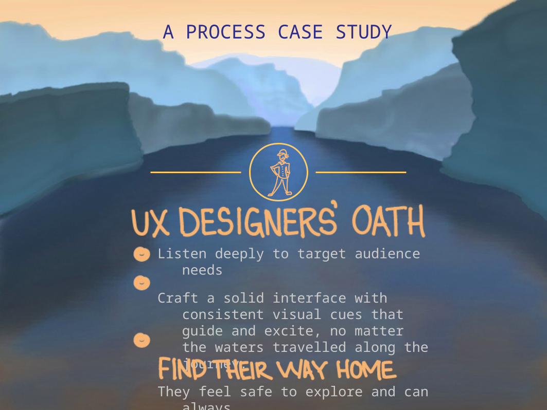
Listen deeply to target audience
needs
Craft a solid interface with consistent visual cues that guide and excite, no matter the waters travelled along the journey.
They feel safe to explore and can always
A PROCESS CASE STUDY
GOAL: To move website audience from “user” to “participant”
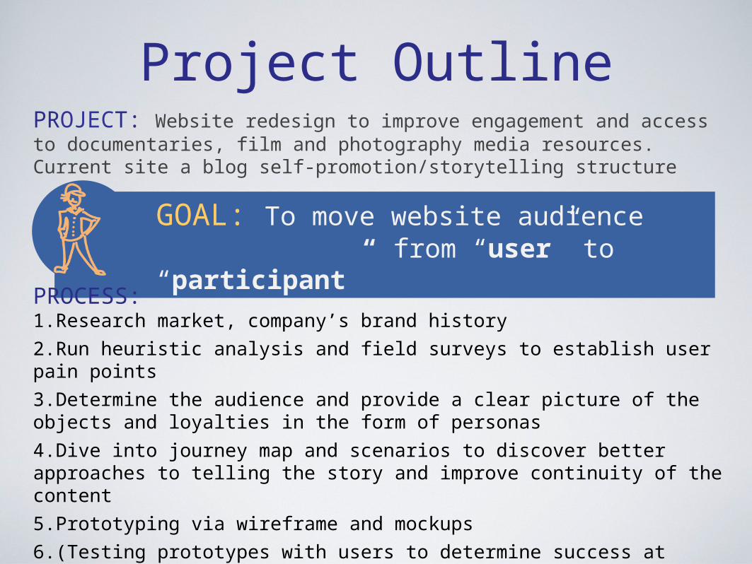
Project OutlinePROJECT: Website redesign to improve engagement and access to documentaries, film and photography media resources. Current site a blog self-promotion/storytelling structure
PROCESS:1.Research market, company’s brand history
2.Run heuristic analysis and field surveys to establish user pain points
3.Determine the audience and provide a clear picture of the objects and loyalties in the form of personas
4.Dive into journey map and scenarios to discover better approaches to telling the story and improve continuity of the content
5.Prototyping via wireframe and mockups
6.(Testing prototypes with users to determine success at connecting)
7.(Iterating to released version)

A HEURISTIC REVIEW and usability test of the current site showed numerous wayfinding and structural pain points.
The key to a successful experience appeared to be providing users with structure, continuity and consistent visual queues to achieve a fun, fluid and guided discovery for user.
MARKET RESEARCH and survey analysis only managed to generated more questions.
a.Are the media files being given proper billing? If more
prominent could that increase customer participation across multiple channels?
b.Establish new target audience
Discovery Phase Findings
B. Lacks value proposition (VP)
C. Content organization:Blog structure of viewing media stories by date diffuses message and engagement
OLD WEBSITE
Site-wide wayfinders & standards: missing navigation, no bread crumbs, no story flow continuity, visual library inconsistent, and so on, leaves the user without guidance
D. Scroll-nav disappears
E. Layout decisions: stories alternate from one side of page to the other
A. Missing tagline

FURTHER ANALYSIS supported restacking the deck of the site’s structure, to shift from a blog structure to an educational media resource structure.
Research supported a change of the target audience once site prioritiesshifted from a dated blog structure to an educational / informational structure
Data helped to identify the best audience profile as women, 20-30 years of age. Next… set personas and test.
Discovery Phase Findings

Prototyping
A. Fixed visual cues, added tagline, adjusted navigation
B. Cover stories: categorized, topics clearly labeled
C. Community participation is the “value proposition”. The media library is the unfair advantage of a historic brand
D. Interactive map for easy navigation to media files from specific regions
Wayfinders & standards in place for guided user journey and discovery
After gathering data from user testing and surveys, the team determined the best content presentation for the new target audience. The design emphasized searchable, clearly categorized access to all of the media stories and resources they need, while honoring the historic brand.

DiscoveryTo meet goal, identify the key value proposition in order to move the website audience from “user” to “participant”.
•Letting go of existing agendas•Listening to real people with real interests•Ask the user
Relationships are formed through deep listening.
User-centric solutions are found the same way through listening to real peoples and their real needs.