ux research on the harvard iqss data science website
TRANSCRIPT

IQSS Data Science at
Harvard University
Fall 2014 Usability & User Experience Research
Instructor: Rong Tang
Yeseul Song, Dorice Moylan, Sarah Al-Mahmoud

Introduction
Research Procedure
Results
Recommendations
Contents
Introduction
Introduction and Context
Test Objectives
Target System Description
Literature Review
Introduction and Context
4
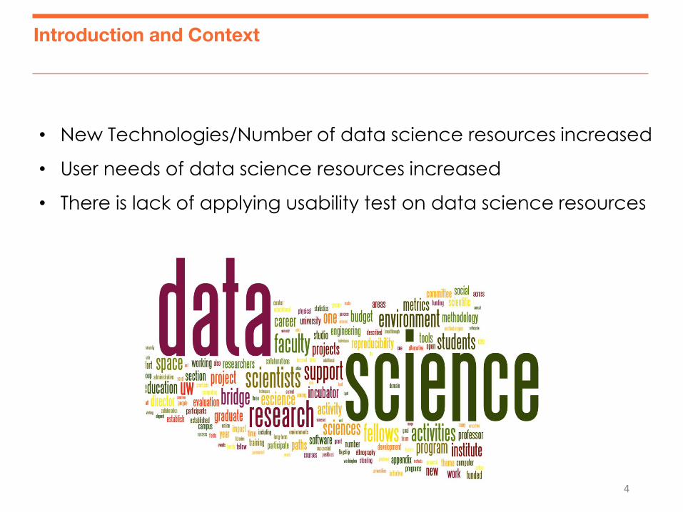
• New Technologies/Number of data science resources increased
• User needs of data science resources increased
• There is lack of applying usability test on data science resources
Test Objectives
5
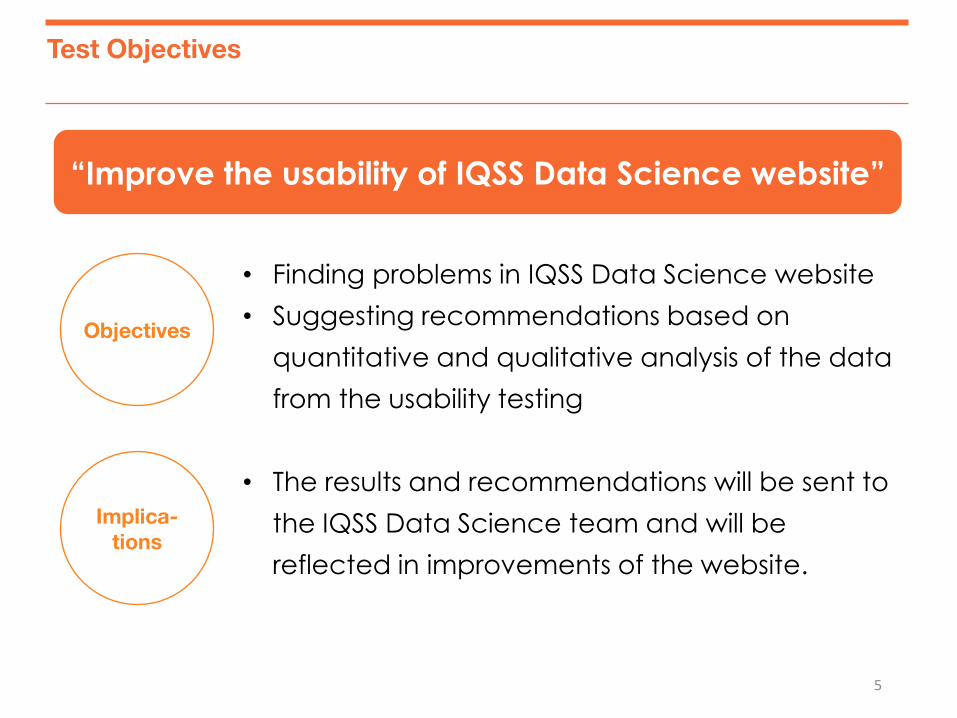
• Finding problems in IQSS Data Science website
• Suggesting recommendations based on
quantitative and qualitative analysis of the data
from the usability testing
• The results and recommendations will be sent to
the IQSS Data Science team and will be
reflected in improvements of the website.
Objectives
Implica-
tions
“Improve the usability of IQSS Data Science website”
Target System Description
6
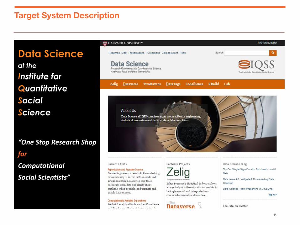
Data Science at the
Institute for
Quantitative
Social
Science
“One Stop Research Shop
for
Computational
Social Scientists”
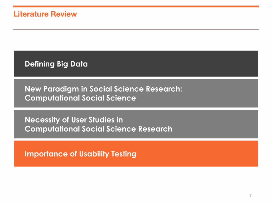
Literature Review
7
Defining Big Data
New Paradigm in Social Science Research: Computational Social Science
Necessity of User Studies in
Computational Social Science Research
Importance of Usability Testing
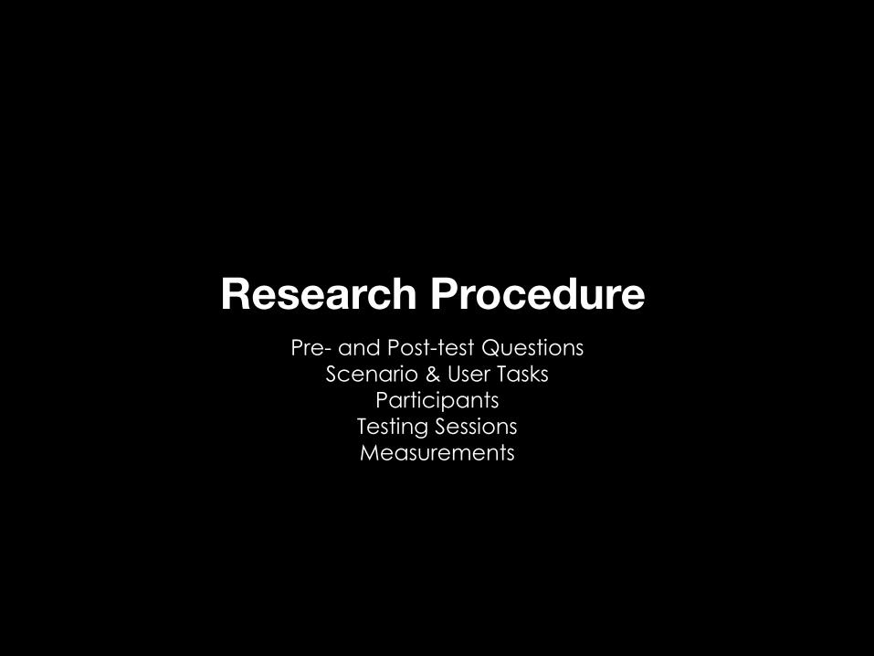
Research Procedure
Pre- and Post-test Questions
Scenario & User Tasks
Participants
Testing Sessions
Measurements
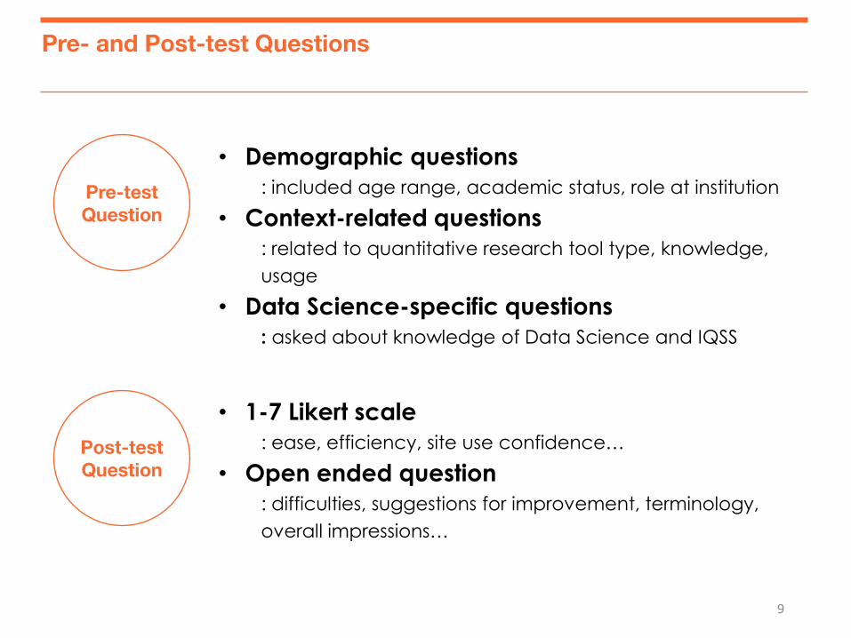
Pre- and Post-test Questions
9
• Demographic questions
: included age range, academic status, role at institution
• Context-related questions
: related to quantitative research tool type, knowledge,
usage
• Data Science-specific questions
: asked about knowledge of Data Science and IQSS
Pre-test
Question
Post-test
Question
• 1-7 Likert scale
: ease, efficiency, site use confidence…
• Open ended question
: difficulties, suggestions for improvement, terminology,
overall impressions…
10
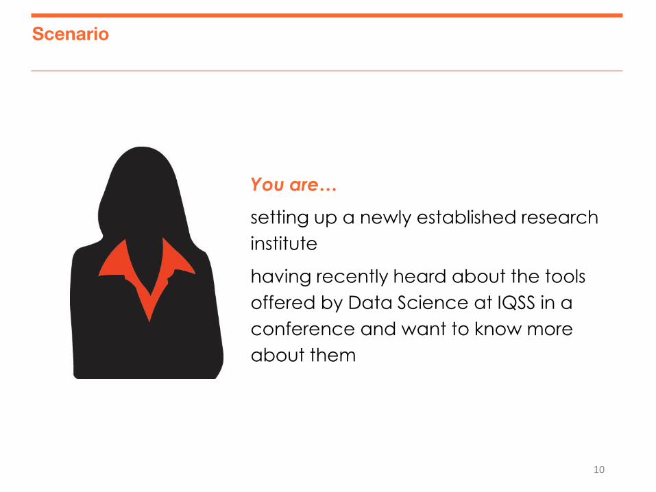
Scenario
You are…
setting up a newly established research
institute
having recently heard about the tools
offered by Data Science at IQSS in a
conference and want to know more
about them
11
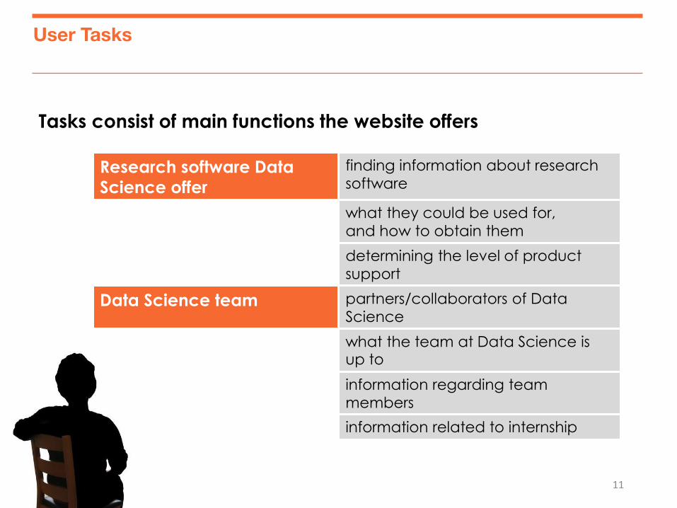
Tasks consist of main functions the website offers
Research software Data
Science offer
finding information about research
software
what they could be used for,
and how to obtain them
determining the level of product
support
Data Science team partners/collaborators of Data
Science
what the team at Data Science is up to
information regarding team
members
information related to internship
User Tasks
12
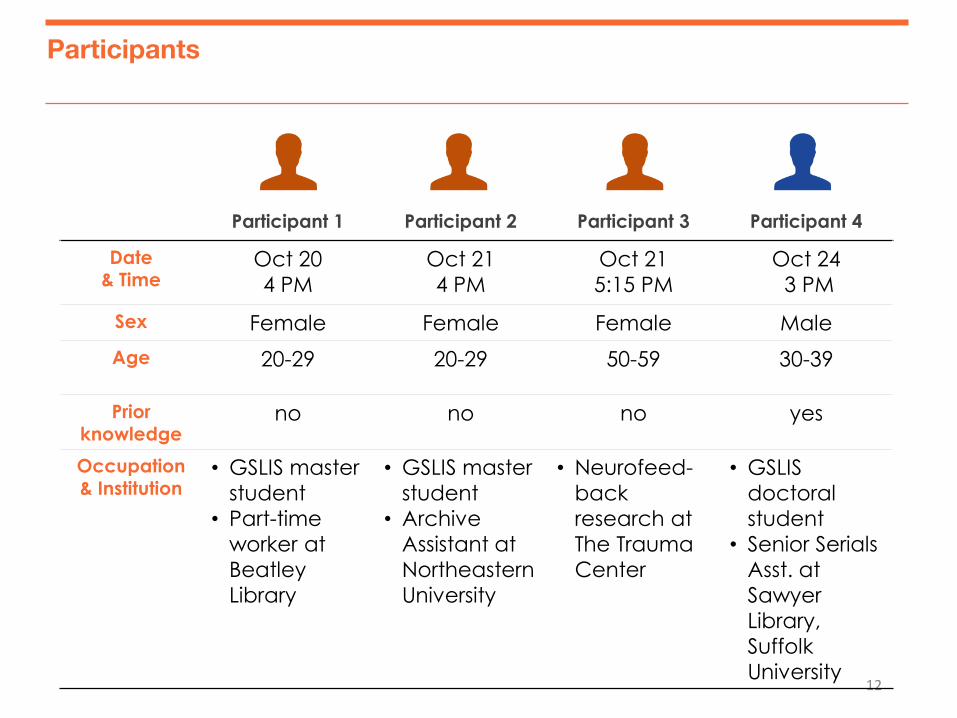
Participant 1 Participant 2 Participant 3 Participant 4
Date & Time
Oct 20
4 PM
Oct 21
4 PM
Oct 21
5:15 PM
Oct 24
3 PM
Sex Female Female Female Male
Age 20-29 20-29 50-59 30-39
Prior knowledge
no no no yes
Occupation
& Institution • GSLIS master
student
• Part-time
worker at
Beatley
Library
• GSLIS master
student
• Archive
Assistant at
Northeastern
University
• Neurofeed-
back
research at
The Trauma
Center
• GSLIS
doctoral
student
• Senior Serials
Asst. at
Sawyer
Library,
Suffolk
University
Participants
13
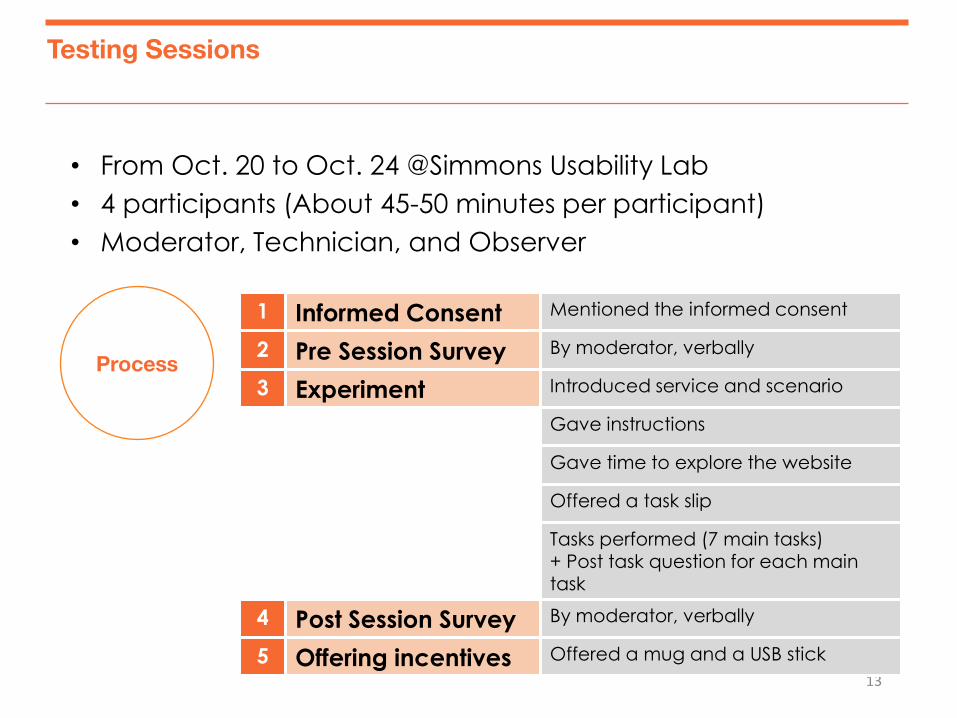
• From Oct. 20 to Oct. 24 @Simmons Usability Lab
• 4 participants (About 45-50 minutes per participant)
• Moderator, Technician, and Observer
Process
1 Informed Consent Mentioned the informed consent
2 Pre Session Survey By moderator, verbally
3 Experiment Introduced service and scenario
Gave instructions
Gave time to explore the website
Offered a task slip
Tasks performed (7 main tasks) + Post task question for each main task
4 Post Session Survey By moderator, verbally
5 Offering incentives Offered a mug and a USB stick
Testing Sessions
14
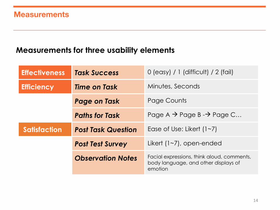
Effectiveness Task Success 0 (easy) / 1 (difficult) / 2 (fail)
Efficiency Time on Task Minutes, Seconds
Page on Task Page Counts
Paths for Task Page A Page B - Page C…
Satisfaction Post Task Question Ease of Use: Likert (1~7)
Post Test Survey Likert (1~7), open-ended
Observation Notes Facial expressions, think aloud, comments,
body language, and other displays of
emotion
Measurements
Measurements for three usability elements
Results
General Observations
Quantitative Results
Top 3 & Other Problems
Heuristic Results
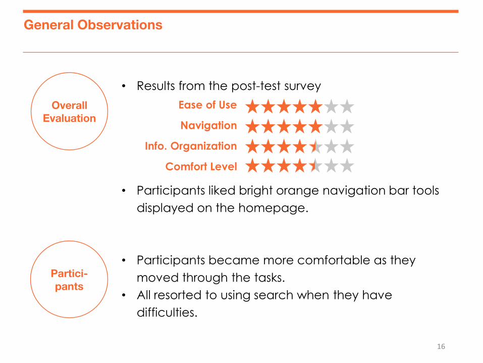
General Observations
16
Partici-
pants
• Results from the post-test survey
• Participants liked bright orange navigation bar tools
displayed on the homepage.
• Participants became more comfortable as they
moved through the tasks.
• All resorted to using search when they have
difficulties.
Overall
Evaluation
Ease of Use
Navigation
Info. Organization
Comfort Level
17
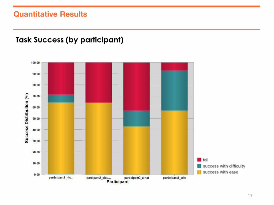
Task Success (by participant)
Quantitative Results
18
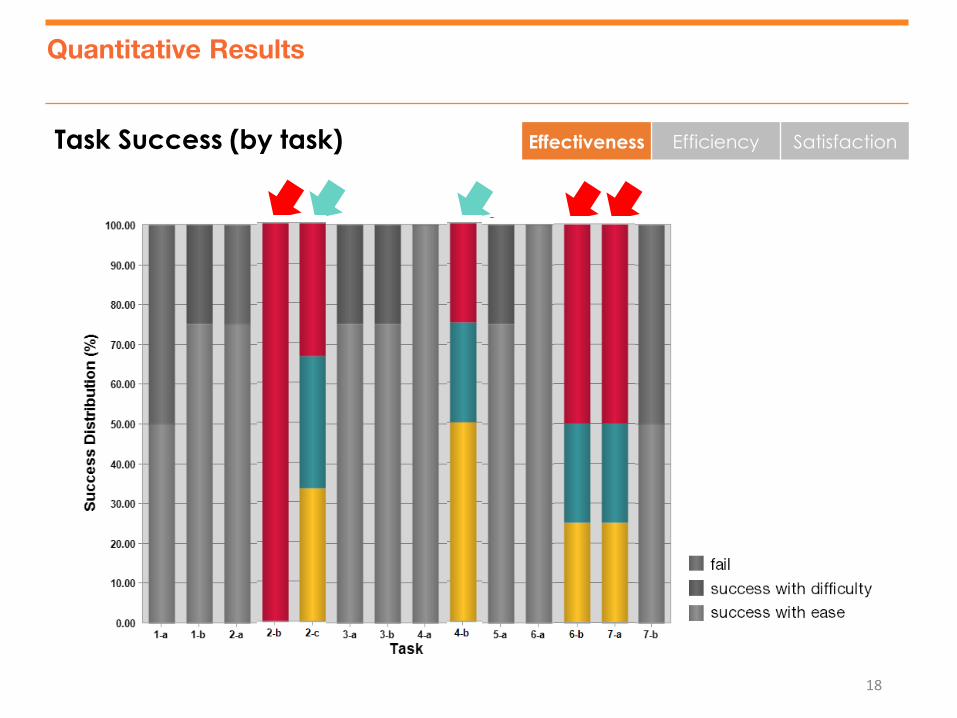
Task Success (by task)
Quantitative Results
Effectiveness Efficiency Satisfaction
19
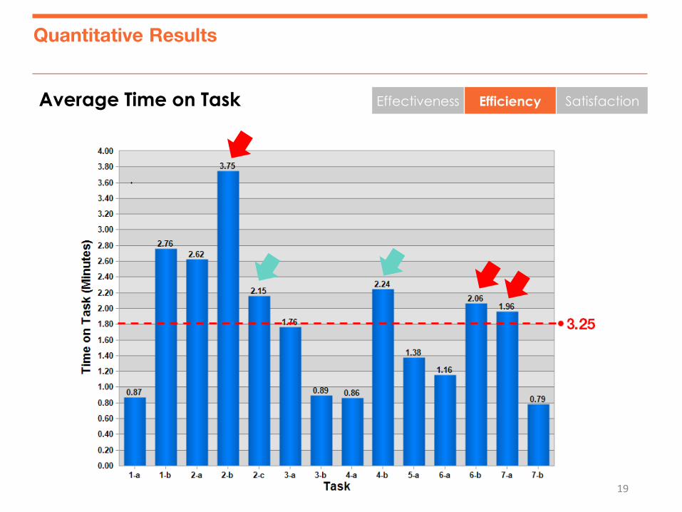
Quantitative Results
Effectiveness Efficiency Satisfaction Average Time on Task
20
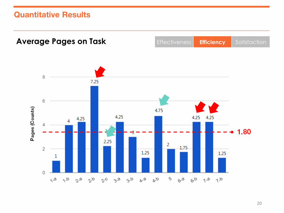
Average Pages on Task
Quantitative Results
Effectiveness Efficiency Satisfaction
21
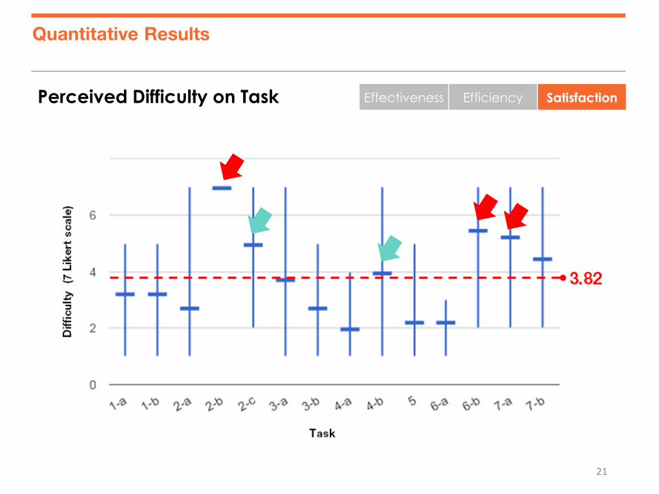
Perceived Difficulty on Task
Quantitative Results
Effectiveness Efficiency Satisfaction
22
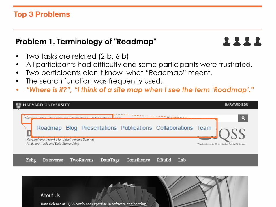
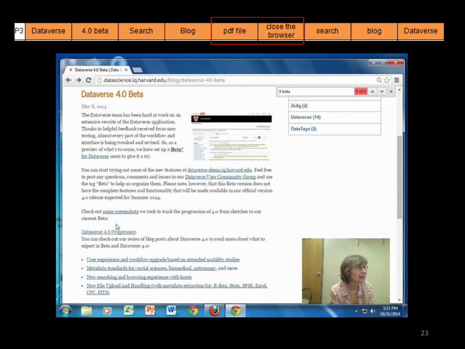
Problem 1. Terminology of "Roadmap"
Top 3 Problems
Two tasks are related (2-b, 6-b)
All participants had difficulty and some participants were frustrated.
Two participants didn’t know what “Roadmap” meant.
The search function was frequently used.
“Where is it?”, “I think of a site map when I see the term ‘Roadmap’.”
23
24
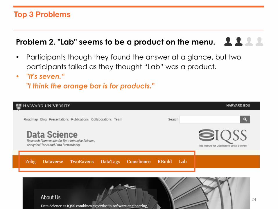
Problem 2. "Lab" seems to be a product on the menu.
Top 3 Problems
Participants though they found the answer at a glance, but two
participants failed as they thought “Lab” was a product.
"It's seven.“
"I think the orange bar is for products."

25

26
Problem 3. Confusion of the terminology: “Lab" and “Team”
Top 3 Problems
Participants were confused among two menus.
“Why is this under ‘Lab’? It should be under ‘Job/Opportunities’.”
27
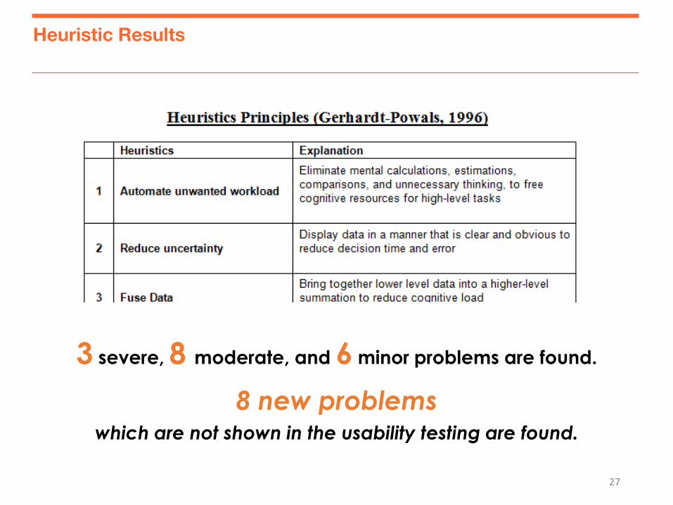
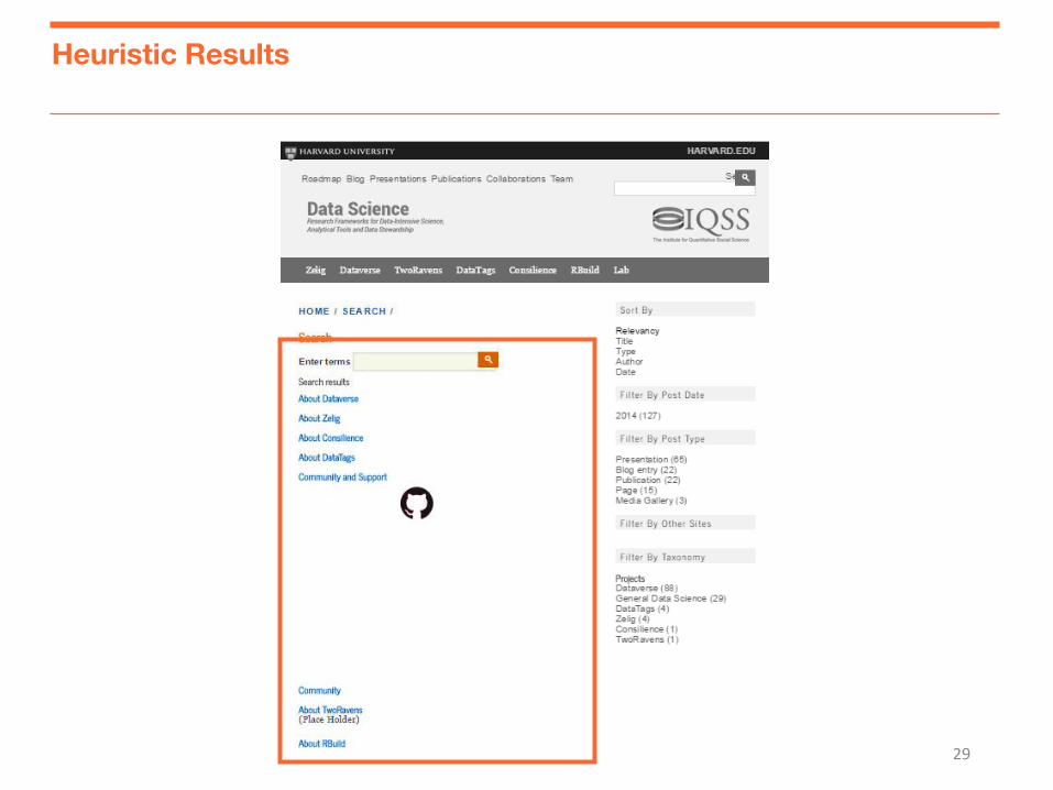
Heuristic Results
3 severe, 8 moderate, and 6 minor problems are found.
8 new problems which are not shown in the usability testing are found.
28
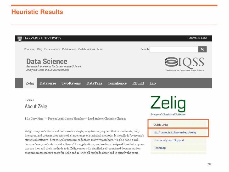
Heuristic Results
29
Heuristic Results
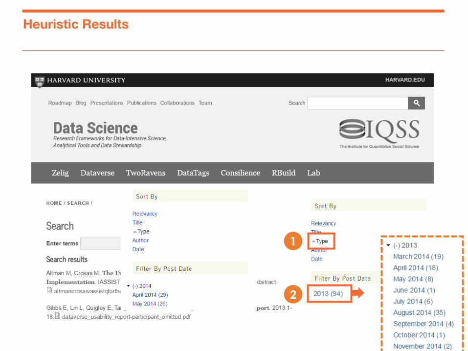
30
Heuristic Results
1
2

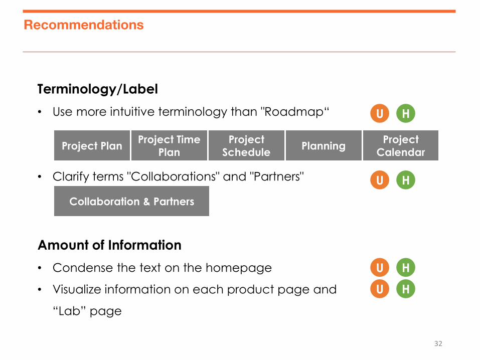
Recommendations
32
Recommendations
H U
H U
H U
Terminology/Label
• Use more intuitive terminology than "Roadmap“
• Clarify terms "Collaborations" and "Partners"
Amount of Information
• Condense the text on the homepage
• Visualize information on each product page and
“Lab” page
Project Plan Project Time
Plan
Project
Schedule Planning
Project
Calendar
Collaboration & Partners
H U
H U
33
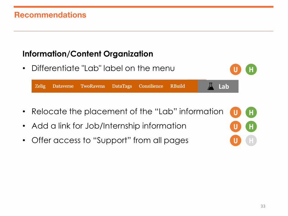
Recommendations
Information/Content Organization
• Differentiate "Lab" label on the menu
• Relocate the placement of the “Lab” information
• Add a link for Job/Internship information
• Offer access to “Support” from all pages
H U
H U
H U
H U
Lab
34
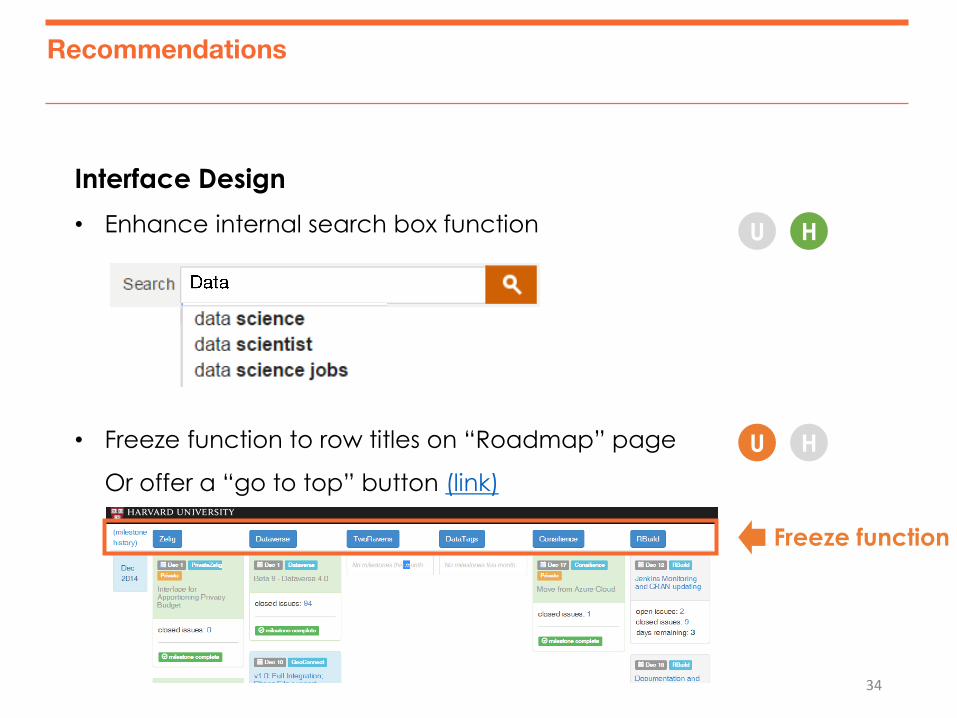
Recommendations
Interface Design
• Enhance internal search box function
• Freeze function to row titles on “Roadmap” page
Or offer a “go to top” button (link)
H U
H U
Freeze function
“Any Questions?”
36
37
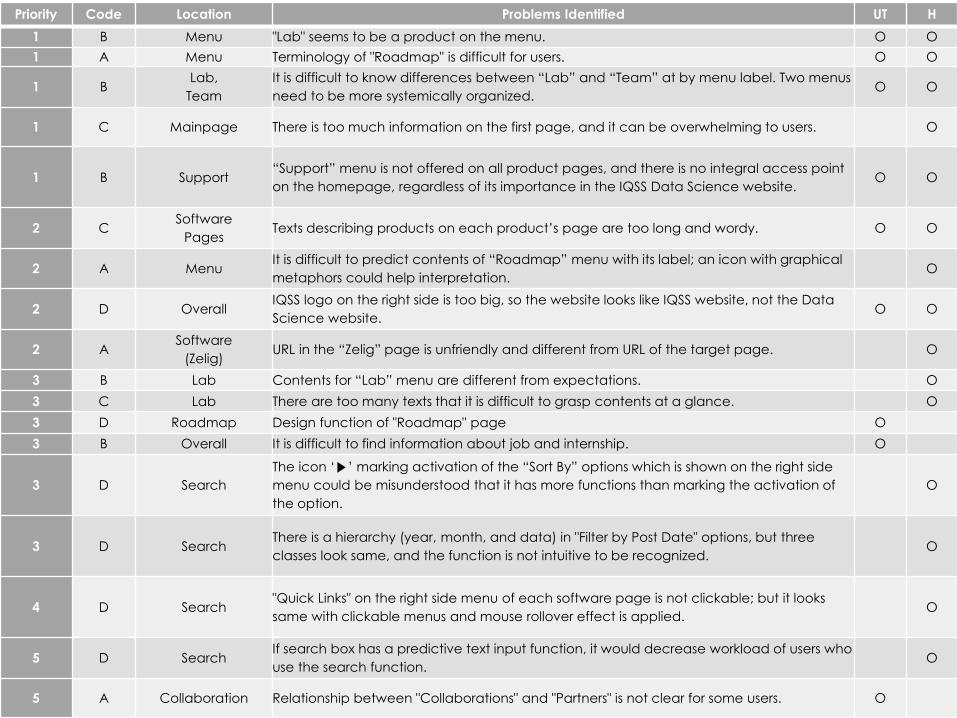
Other Problems
Priority Code Location Problems Identified UT H
1 B Menu "Lab" seems to be a product on the menu. O O
1 A Menu Terminology of "Roadmap" is difficult for users. O O
1 B Lab,
Team
It is difficult to know differences between “Lab” and “Team” at by menu label. Two menus
need to be more systemically organized. O O
1 C Mainpage There is too much information on the first page, and it can be overwhelming to users. O
1 B Support “Support” menu is not offered on all product pages, and there is no integral access point
on the homepage, regardless of its importance in the IQSS Data Science website. O O
2 C Software
Pages Texts describing products on each product’s page are too long and wordy. O O
2 A Menu It is difficult to predict contents of “Roadmap” menu with its label; an icon with graphical
metaphors could help interpretation. O
2 D Overall IQSS logo on the right side is too big, so the website looks like IQSS website, not the Data
Science website. O O
2 A Software
(Zelig) URL in the “Zelig” page is unfriendly and different from URL of the target page. O
3 B Lab Contents for “Lab” menu are different from expectations. O
3 C Lab There are too many texts that it is difficult to grasp contents at a glance. O
3 D Roadmap Design function of "Roadmap" page O
3 B Overall It is difficult to find information about job and internship. O
3 D Search
The icon ‘▶’ marking activation of the “Sort By” options which is shown on the right side
menu could be misunderstood that it has more functions than marking the activation of
the option.
O
3 D Search There is a hierarchy (year, month, and data) in "Filter by Post Date" options, but three
classes look same, and the function is not intuitive to be recognized. O
4 D Search "Quick Links" on the right side menu of each software page is not clickable; but it looks
same with clickable menus and mouse rollover effect is applied. O
5 D Search If search box has a predictive text input function, it would decrease workload of users who
use the search function. O
5 A Collaboration Relationship between "Collaborations" and "Partners" is not clear for some users. O
38
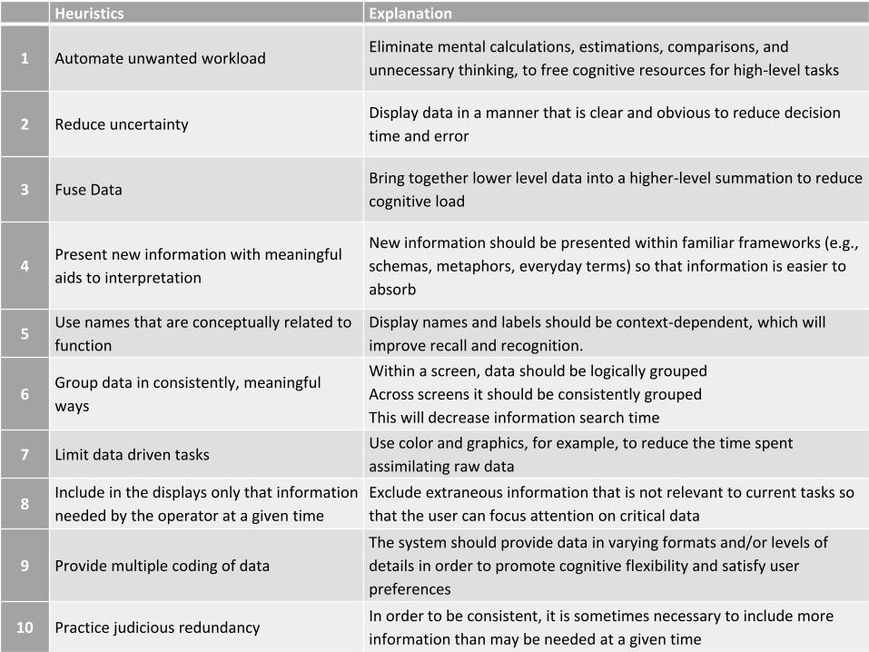
Heuristics Explanation
1 Automate unwanted workload Eliminate mental calculations, estimations, comparisons, and
unnecessary thinking, to free cognitive resources for high-level tasks
2 Reduce uncertainty Display data in a manner that is clear and obvious to reduce decision
time and error
3 Fuse Data Bring together lower level data into a higher-level summation to reduce
cognitive load
4 Present new information with meaningful
aids to interpretation
New information should be presented within familiar frameworks (e.g.,
schemas, metaphors, everyday terms) so that information is easier to
absorb
5 Use names that are conceptually related to
function
Display names and labels should be context-dependent, which will
improve recall and recognition.
6 Group data in consistently, meaningful
ways
Within a screen, data should be logically grouped
Across screens it should be consistently grouped
This will decrease information search time
7 Limit data driven tasks Use color and graphics, for example, to reduce the time spent
assimilating raw data
8 Include in the displays only that information
needed by the operator at a given time
Exclude extraneous information that is not relevant to current tasks so
that the user can focus attention on critical data
9 Provide multiple coding of data
The system should provide data in varying formats and/or levels of
details in order to promote cognitive flexibility and satisfy user
preferences
10 Practice judicious redundancy In order to be consistent, it is sometimes necessary to include more
information than may be needed at a given time