ux usability testing
DESCRIPTION
For unionstation.orgTRANSCRIPT
�1
Marguerite Job
Intro to Web Publishing
October 22
Usability Test For unionstation.org
Test Preparation
To prepare for the tests, I first looked through the website myself. After looking around
the home page to get a feel for the website, I went through each of the four tasks to find out the
solutions for each one.
First, I gave the homepage a look-over. I expected a dropdown menu when I hovered
over category on the navigation bar, since I’m used to sites doing performing that action. It did
not happen. I clicked a category thinking maybe a dropdown menu would appear if I did that, but
I was directed to a different page, instead.
The layout of the site is well done. Content isn’t cluttered and it’s easy to navigate what
the site is about from below the fold.
I saw Science City was heavily promoted by the website. This was true for both the
feature content area, the navigation bar, and the content above the fold. Since I have been to
Union Station before, I know that there are other things besides Science City. Visitors to the site
who are not familiar with Union Station from out-of-state, or not from the area might not know
this, however.
I didn't have any issues with any of the tasks, except for task three. There were some
misleading terms used, but this is explained further with the testers.
�2
Choosing Participants
Tester 1: Jacob
For tester 1, I choose Jacob. He easily played along with the tasks given to him and gave
a detailed analysis of his experience on the site.
Jacob’s a 21-year-old man currently working a part-time job at Sam’s Club while going to
college. He regularly uses the internet on his phone, computer, and platforming device. Jacob
mostly uses the internet to go onto online forums, social media, and streaming services/YouTube.
Currently, he uses the internet frequently to complete homework assignments. He also shops
online from time to time.
He is a “high experience” tester. Jacob has used sites to do things similar to what tasks he
performed (i.e. seeing what movies are playing and ordering tickets from fandango.com).
Environment for Tester 1:
• Location of test: The test was conducted at Jacob’s house. He mostly uses the
internet at his home. This makes it so that it’s close to how he would use the site if he
wasn’t being tested.
• Physical Environment: His home is relatively clean with some clutter and there was
very little lighting. The only distractions was his cat and the television, which was
streaming a movie.
• Technical Environment: Jacob uses an HP Pavillon G6, which has a screen
resolution of 1366 x 768 pixels. He regularly uses Google Chrome as a browser. The
only plug-in he uses is an ad-blocker.
�3
Tester 2: Gail
Gail was chosen because she explained what she did while she performed the tasks. She
also gave adequate feedback, so usability issues with the site can be identified and corrected.
Gail’s a 45-year-old woman working part-time at a retail store. She mostly uses the
internet for online shopping and social media. She’s my “low-experience” user. However, she,
too, has used sites like fandango.com to find out movie times and to purchase tickets in advance.
Environment for tester 2:
• Location of test: The test for Gail was taken in her house. She mostly uses the
internet at her home.
• Physical Environment: Her home is cluttered and kind of messy. The lighting in the
living room, where the test was conducted, was very well lit.
• Technical Environment: Gail uses an 15” MacBook Pro with retina display, which
has a resolution of 2560x1600 pixels. She uses Google Chrome as her browser. She
does not use any plug-ins for her browser.
Test Results
Initial Site Thoughts:
Tester 1:
Jacob noticed right away that the web site heavily advertised for Science City. He
mentioned that it looked like that was the only thing there when he first went to the homepage. It
�4
wasn’t until he scrolled down the page that there would be other exhibits and activities to visit at
Union Station.
He also mentioned the layout of the site didn't look too cluttered. The site, initially might
be easy to navigate.
Tester 2:
Gail also noticed that the website heavily advertised Science City. Until she scrolled
further on the homepage, she thought Science City was the only thing at Union Station. She
mentioned “plan your visit” might be for teachers to set up visit days for their students, not the
everyday visitor. Overall, she liked the layout of the site since it didn't “bombard” her with
information.
Task 1: Scenario: You are bringing your grandmother to Union Station for a Sunday
afternoon outing, She can’t walk more than about 50 steps at a time. Determine whether or not
there will be a wheelchair available for her to use.
Tester 1:
Jacob assumed he would find “Guest Amentities” under “Plan Your Visit.” He wasn't sure
if he would find it there since he expected a hover-down menu. He clicked on “Plan Your Visit”
and scrolled through the page with the laptop’s trackpad until he found “Guest Amenities.”
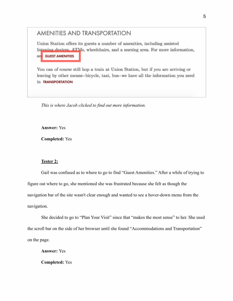
Since “Guest Amenities” looked like a link, Jacob clicked on it. He found out more
information about accommodations he could receive, and where/how to get those.
�5
This is where Jacob clicked to find out more information.
Answer: Yes
Completed: Yes
Tester 2:
Gail was confused as to where to go to find “Guest Amenities.” After a while of trying to
figure out where to go, she mentioned she was frustrated because she felt as though the
navigation bar of the site wasn't clear enough and wanted to see a hover-down menu from the
navigation.
She decided to go to “Plan Your Visit” since that “makes the most sense” to her. She used
the scroll bar on the side of her browser until she found “Accommodations and Transportation”
on the page.
Answer: Yes
Completed: Yes
�6
Recommendations to improve UX for this task:
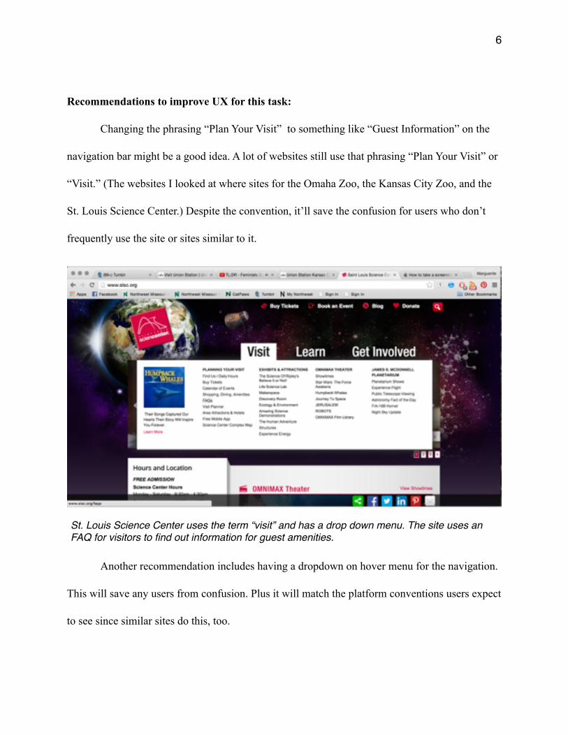
Changing the phrasing “Plan Your Visit” to something like “Guest Information” on the
navigation bar might be a good idea. A lot of websites still use that phrasing “Plan Your Visit” or
“Visit.” (The websites I looked at where sites for the Omaha Zoo, the Kansas City Zoo, and the
St. Louis Science Center.) Despite the convention, it’ll save the confusion for users who don’t
frequently use the site or sites similar to it.
Another recommendation includes having a dropdown on hover menu for the navigation.
This will save any users from confusion. Plus it will match the platform conventions users expect
to see since similar sites do this, too.
St. Louis Science Center uses the term “visit” and has a drop down menu. The site uses an FAQ for visitors to find out information for guest amenities.
�7
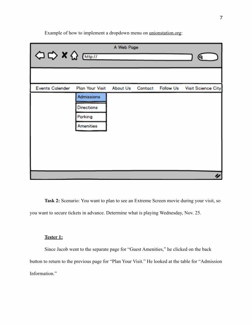
Example of how to implement a dropdown menu on unionstation.org:
Task 2: Scenario: You want to plan to see an Extreme Screen movie during your visit, so
you want to secure tickets in advance. Determine what is playing Wednesday, Nov. 25.
Tester 1:
Since Jacob went to the separate page for “Guest Amenities,” he clicked on the back
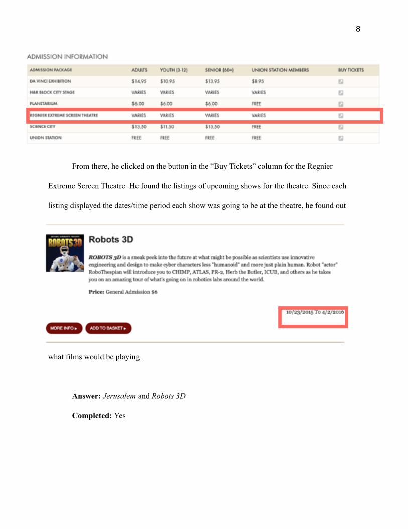
button to return to the previous page for “Plan Your Visit.” He looked at the table for “Admission
Information.”
�8
From there, he clicked on the button in the “Buy Tickets” column for the Regnier
Extreme Screen Theatre. He found the listings of upcoming shows for the theatre. Since each
listing displayed the dates/time period each show was going to be at the theatre, he found out
what films would be playing.
Answer: Jerusalem and Robots 3D
Completed: Yes
�9
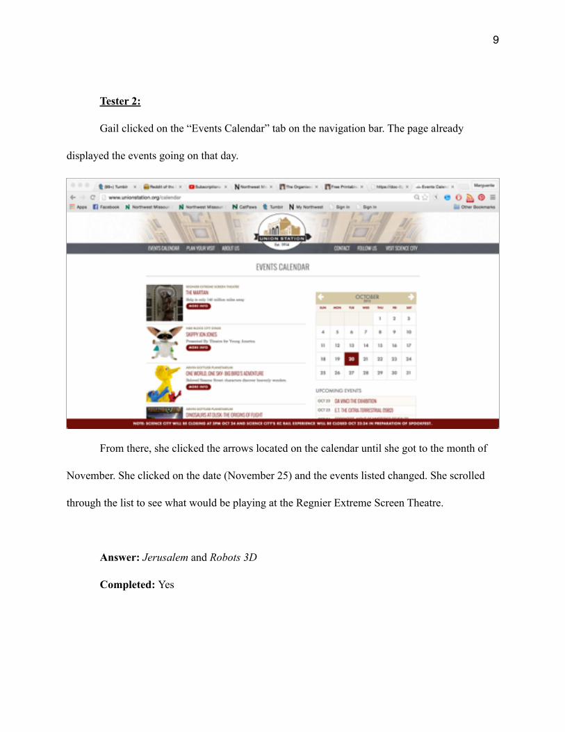
Tester 2:
Gail clicked on the “Events Calendar” tab on the navigation bar. The page already
displayed the events going on that day.
From there, she clicked the arrows located on the calendar until she got to the month of
November. She clicked on the date (November 25) and the events listed changed. She scrolled
through the list to see what would be playing at the Regnier Extreme Screen Theatre.
Answer: Jerusalem and Robots 3D
Completed: Yes
�10
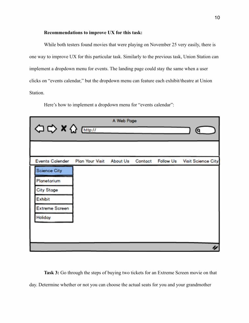
Recommendations to improve UX for this task:
While both testers found movies that were playing on November 25 very easily, there is
one way to improve UX for this particular task. Similarly to the previous task, Union Station can
implement a dropdown menu for events. The landing page could stay the same when a user
clicks on “events calendar,” but the dropdown menu can feature each exhibit/theatre at Union
Station.
Here’s how to implement a dropdown menu for “events calendar”:
Task 3: Go through the steps of buying two tickets for an Extreme Screen movie on that
day. Determine whether or not you can choose the actual seats for you and your grandmother
�11
will have wheelchair compatible seating. [Take this step all the way through the process, and
only stop when asked to enter credit card information].
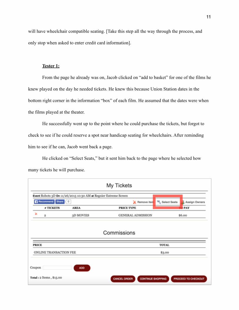
Tester 1:
From the page he already was on, Jacob clicked on “add to basket” for one of the films he
knew played on the day he needed tickets. He knew this because Union Station dates in the
bottom right corner in the information “box” of each film. He assumed that the dates were when
the films played at the theater.
He successfully went up to the point where he could purchase the tickets, but forgot to
check to see if he could reserve a spot near handicap seating for wheelchairs. After reminding
him to see if he can, Jacob went back a page.
He clicked on “Select Seats,” but it sent him back to the page where he selected how
many tickets he will purchase.

�12
“What the f*ck?” was his immediate response. He clicked on “add to basket” and looked
at the next page for awhile to figure out if there was somewhere else he could go. Then he
proceeded to the check out to see if he could select seats from there. He did not find anything
where he could possibly figure out the information.
“I literally don’t know what to do,” he said before asking me for the next task.
Completed: No
Tester 2:
From the page she was on, Gail clicked “more info” to see if she could buy tickets that
way. She mentioned that the text for the information about the dates the movie played overlapped
the “buy tickets” and it annoyed her.
She clicked on it and proceeded to select how many tickets she needed. Before checking
out, Gail clicked on “select seats” hoping to be able to pick out the seats near seating for
wheelchairs. She got the same results as Jacob.
She opened another tab and went to unionstation.org. She went to the “Plan Your Visit”
page. Gail did not find what she needed on that page either. She gave up and closed the tab. She
proceeded to check out on the page where she was in the process of buying tickets.
Completed: No
�13
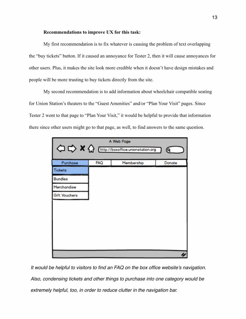
Recommendations to improve UX for this task:
My first recommendation is to fix whatever is causing the problem of text overlapping
the “buy tickets” button. If it caused an annoyance for Tester 2, then it will cause annoyances for
other users. Plus, it makes the site look more credible when it doesn’t have design mistakes and
people will be more trusting to buy tickets directly from the site.
My second recommendation is to add information about wheelchair compatible seating
for Union Station’s theaters to the “Guest Amenities” and/or “Plan Your Visit” pages. Since
Tester 2 went to that page to “Plan Your Visit,” it would be helpful to provide that information
there since other users might go to that page, as well, to find answers to the same question.
It would be helpful to visitors to find an FAQ on the box office website’s navigation.
Also, condensing tickets and other things to purchase into one category would be
extremely helpful, too, in order to reduce clutter in the navigation bar.
�14
My last recommendation is to add an FAQ page to the ticket purchasing site for Union
Station. This page should include information about wheelchair compatible seating. There should
be a link to it in the navigation. This will save visitors time from having to open another tab.
Task 4: Scenario: You’d like to spend some time walking around Union Station during
your visit, but you want to be sure enough areas will be wheelchair-friendly. Go through the
steps to send an email to the appropriate person/department to inquire about wheelchair access
throughout all areas of Union Station. [Take this step all the way through the process, and stop
only when the actual email could be written and sent.]
Tester 1:
Jacob went back to the Union Station homepage. From there, he clicked on contact.
Scrolling through the information, he was unsure of who exactly to contact. He assumed that
[email protected] might be the right department to contact.
He clicked on the email address expecting it to open up his gmail account and pop-up a
“compose email” window. However, it did not do that. So, he copied and pasted the address into
the “send to” bar for when he would compose a message and stopped there.
Answer: [email protected]
Completed: Yes
Tester 2:
�15
Gail siad that she should probably go back to the homepage to figure out who to contact.
She clicked on the Union Station logo above the website for purchasing tickets from Union
Station. However, it took her back to the landing page for boxoffice.unionstation.org.
Gail went back to the homepage by typing in the URL. She clicked on “Contact” in the
navigation bar. She assumed that [email protected] was her “best bet” for who to
contact. She clicked on the email address since it looked like a link. For her, clicking on the link
opened up a “compose message” window on her gmail account.
Answer: [email protected]
Completed: Yes
Recommendations to improve UX for this task:
My first recommendation is to have the Union Station logo on the purchasing site to link
back to union unionstation.org. Visitors will expect to be able to do that and will save them the
frustration of clicking on the logo only to go to the landing page of the purchasing site My
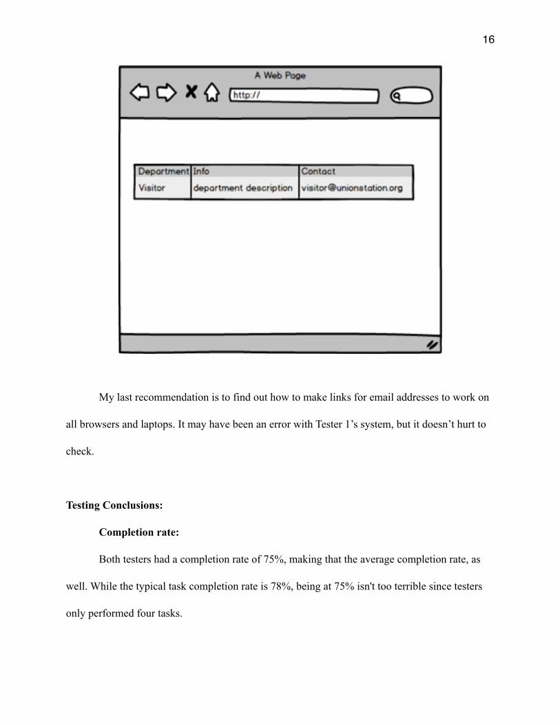
second recommendation is to have information about each department contact. This will help
visitors know exactly what each department does, so that they know exactly where to direct their
questions. Here’s an example of how to implement that: (on the next page)
�16
My last recommendation is to find out how to make links for email addresses to work on
all browsers and laptops. It may have been an error with Tester 1’s system, but it doesn’t hurt to
check.
Testing Conclusions:
Completion rate:
Both testers had a completion rate of 75%, making that the average completion rate, as
well. While the typical task completion rate is 78%, being at 75% isn't too terrible since testers
only performed four tasks.
�17
Similarities and differences:
Both testers used Google Chrome as there browser. Further testing on different browsers
might be need since Google Chrome is more than likely not used by every visitor.
Both testers, however, did not try to complete Task 2 the same way. (Tester 1 went
through the “Admissions” table on the “Plan Your Visit” page. Tester 2 went to the “Events
Calendar” page). This is good since the task could be completed in different ways to get the same
answer. Not all visitors to the site will do the same thing to get the same answers, too.
Tester 1, unlike Tester 2, clicked on the link “Guest Amenities” on the “Plan Your Visit”
page to find out more information. Which is great that the site offers that, since visitors might be
wanting to find out more information, too.
Heuristic done well:
One heuristic Union Station does well is “consistency and standards.” Like other sites
similar to Union Station (i.e. St. Louis Science Center), Union Station uses terms like “plan your
visit” and “events calendar.”
Another is “aesthetic and minimalist design.” The site is rather simplistic in design. It
also doesn't overload visitors with information on its pages.
“Match between system and real world” is a heuristic that was done well, to an extent.
There was no language on the site that confused the testers. However, there is some misleading
phrases, such as “select seats.” The site does well with “user control and freedom” and
“flexibility and efficiency of use,” too. The site gives visitors multiple ways to solve problems.
�18
The last heuristic done well is “error prevention.” It’s hard for a visitor to make a mistake
on the website. Despite the wording on “select seats” on Task 3 being misleading, no errors were
made on the testers end of thing. However, feedback for knowing if they did anything wrong
would be a good thing.