tutorials.render-test.comtutorials.render-test.com/worddocs/shaders.docx · web viewneutrality....
TRANSCRIPT
Shaders - What are they and how do they work?
What is a Shader you ask? Simply put, a Shader is the composite of all the different kinds of texture maps used to create a finished material for 3D rendering. If you use polygons for the makeup of your 3D models or meshes, then you would use texture maps to make up the Shader. This Shader would be used as the paint for that very same 3D model.
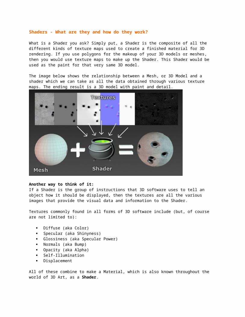
The image below shows the relationship between a Mesh, or 3D Model and a shader which we can take as all the data obtained through various texture maps. The ending result is a 3D model with paint and detail.
Another way to think of it:If a Shader is the group of instructions that 3D software uses to tell an object how it should be displayed, then the textures are all the various images that provide the visual data and information to the Shader.
Textures commonly found in all forms of 3D software include (but, of course are not limited to):
Diffuse (aka Color) Specular (aka Shinyness) Glossiness (aka Specular Power) Normals (aka Bump) Opacity (aka Alpha) Self-Illumination Displacement
All of these combine to make a Material, which is also known throughout the world of 3D Art, as a Shader.
Breaking down a Shader into Textures
We will begin by breaking these images down based on what they do for us and try to get a better understanding of why they do, what they do. In order to understand what makes a Shader function in the virtual world, we first have to understand how humans actually see what we do in the real world.
The Mechanics of VisionIn the real world, light interacts with objects in two (2) ways; it is either Absorbed or Reflected. When humans look at an object, what they see is actually the result of the light that is reflected by the surface of the object.
For example: If we set our gaze upon a shiny red teapot... why exactly is it red? How do our eyes perceive it as a red teapot in the first place?
The human eye consists of 3 color cones which we use and combine together to see all the colors in the visible spectrum, our rainbow. These 3 cones allow us to see all the colors of the rainbow but to put things in perspective think about this:
Butterflies have 5 color cones in their eyes. They see colors that we couldn’t even possibly imagine or perceive.
Dogs only have 2 color cones, green and blue. These two cones allow dogs to visually perceive blues, greens, and a little bit of yellow where they overlap. A dog can never understand what it is like to see a rainbow the way we do.
Mantis Shrimp have 16 color cones! In our wildest of imaginations, we couldn’t even begin to fathom what they are capable of seeing.
So back to us humans, we see the world (and the surfaces of the objects in it) based on the portion of this visible color spectrum that is reflected back at our eyes.
In other words we see a red teapot, because whatever material our teapot is made out of, will only REFLECT most of the color Red in the color spectrum and absorb almost all of the other colors (Greens and Blues). It is the reflected red light, which gives us the visual of a Red Teapot.
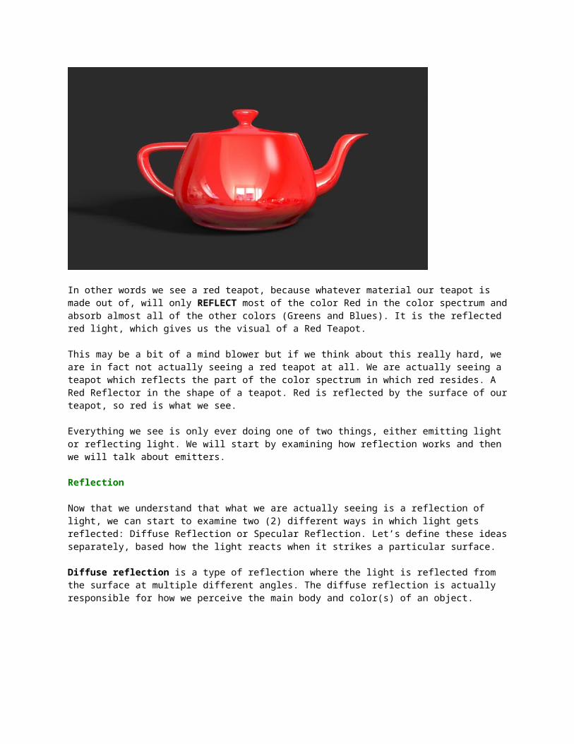
This may be a bit of a mind blower but if we think about this really hard, we are in fact not actually seeing a red teapot at all. We are actually seeing a teapot which reflects the part of the color spectrum in which red resides. A Red Reflector in the shape of a teapot. Red is reflected by the surface of our teapot, so red is what we see.
Everything we see is only ever doing one of two things, either emitting light or reflecting light. We will start by examining how reflection works and then we will talk about emitters.
Reflection
Now that we understand that what we are actually seeing is a reflection of light, we can start to examine two (2) different ways in which light gets reflected: Diffuse Reflection or Specular Reflection. Let’s define these ideas separately, based how the light reacts when it strikes a particular surface.
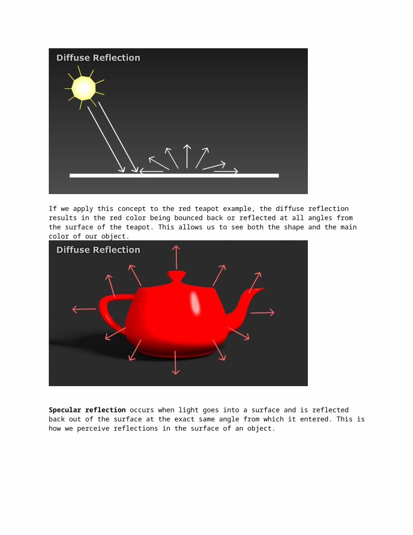
Diffuse reflection is a type of reflection where the light is reflected from the surface at multiple different angles. The diffuse reflection is actually responsible for how we perceive the main body and color(s) of an object.
If we apply this concept to the red teapot example, the diffuse reflection results in the red color being bounced back or reflected at all angles from the surface of the teapot. This allows us to see both the shape and the main color of our object.
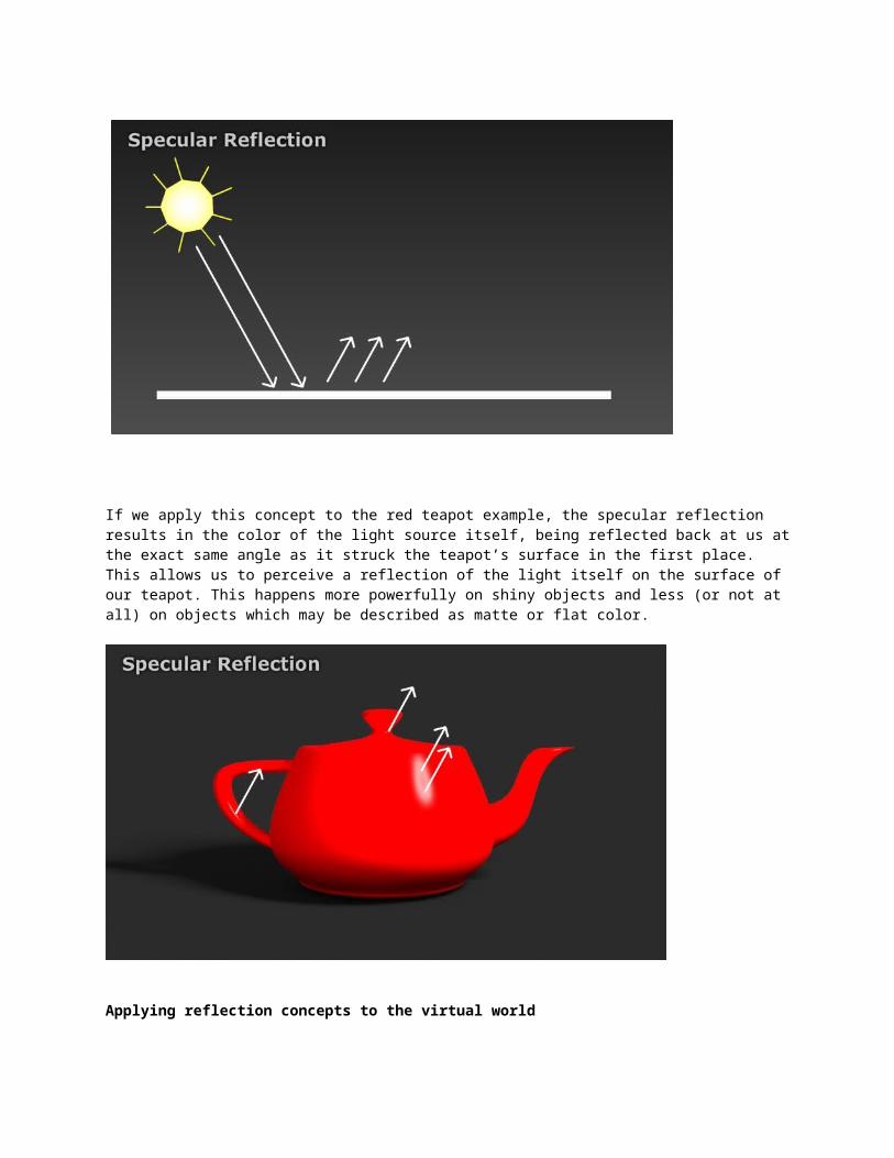
Specular reflection occurs when light goes into a surface and is reflected back out of the surface at the exact same angle from which it entered. This is how we perceive reflections in the surface of an object.
If we apply this concept to the red teapot example, the specular reflection results in the color of the light source itself, being reflected back at us at the exact same angle as it struck the teapot’s surface in the first place. This allows us to perceive a reflection of the light itself on the surface of our teapot. This happens more powerfully on shiny objects and less (or not at all) on objects which may be described as matte or flat color.
Applying reflection concepts to the virtual worldThe diffuse reflection color gives us the majority of the object's makeup. In the virtual world, this is why we use our Diffuse texture slots to create the main color (or texture) of our 3D objects. The same idea for specular reflection translates into the virtual world for how shiny a particular object is and gives us reflections, hotspots, and glares.
Physical/Chemical Makeup of Materials
We have examined reflection in its most basic form but, of course, we cannot leave it at that. At this point, getting something to react “realistically” requires some additional information. We also need to consider which materials make-up an object, because the physical/chemical makeup may determine whether the specular reflections remain true to the color of the light or whether they are tinted by the actual color of the object.
The image below breaks up 4 different materials by their diffuse color and their specular color. The Dielectric materials on the left hand side show a specular color of white and are not tinted by the color of the wood or plastic. The Conductive materials on the right show the specular highlights/reflections to be tinted by the color of the blue and gold metals.
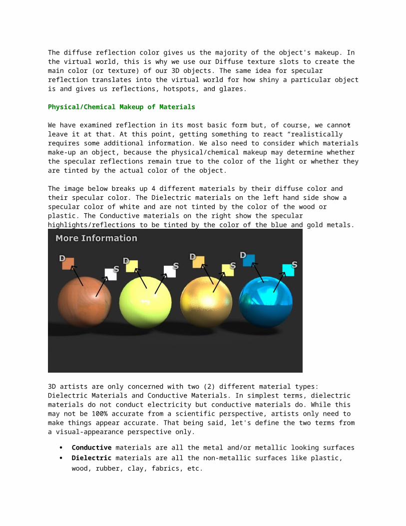
3D artists are only concerned with two (2) different material types: Dielectric Materials and Conductive Materials. In simplest terms, dielectric materials do not conduct electricity but conductive materials do. While this may not be 100% accurate from a scientific perspective, artists only need to make things appear accurate. That being said, let's define the two terms from a visual-appearance perspective only.
Conductive materials are all the metal and/or metallic looking surfaces Dielectric materials are all the non-metallic surfaces like plastic, wood, rubber, clay,
fabrics, etc.
Creating the Look of a Conductive Material
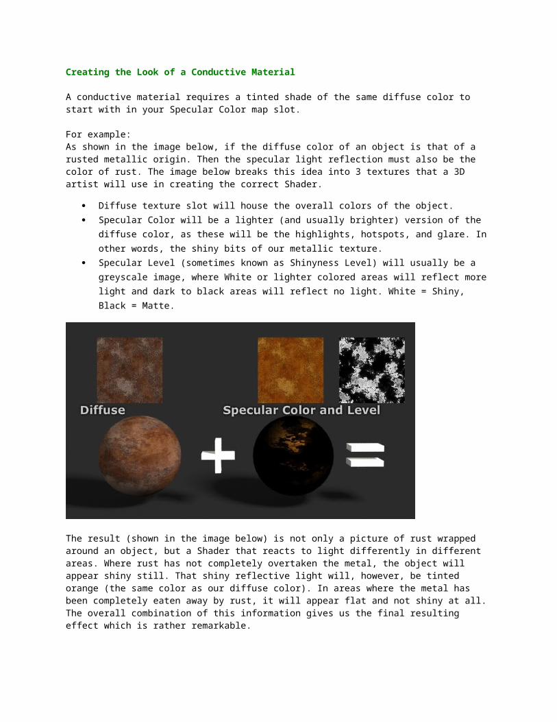
A conductive material requires a tinted shade of the same diffuse color to start with in your Specular Color map slot.
For example:As shown in the image below, if the diffuse color of an object is that of a rusted metallic origin. Then the specular light reflection must also be the color of rust. The image below breaks this idea into 3 textures that a 3D artist will use in creating the correct Shader.
Diffuse texture slot will house the overall colors of the object. Specular Color will be a lighter (and usually brighter) version of the diffuse color, as
these will be the highlights, hotspots, and glare. In other words, the shiny bits of our metallic texture.
Specular Level (sometimes known as Shinyness Level) will usually be a greyscale image, where White or lighter colored areas will reflect more light and dark to black areas will reflect no light. White = Shiny, Black = Matte.
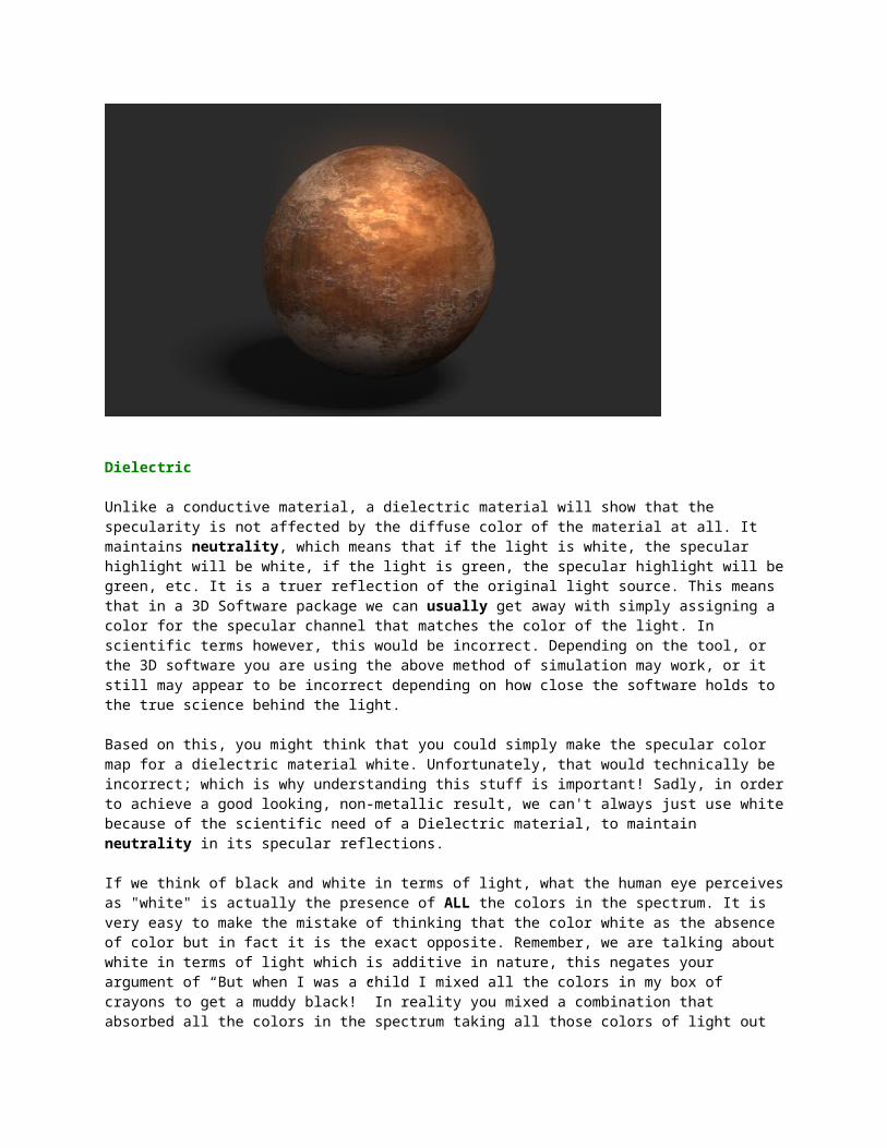
The result (shown in the image below) is not only a picture of rust wrapped around an object, but a Shader that reacts to light differently in different areas. Where rust has not completely overtaken the metal, the object will appear shiny still. That shiny reflective light will, however, be tinted orange (the same color as our diffuse color). In areas where the metal has been completely eaten away by rust, it will appear flat and not shiny at all. The overall combination of this information gives us the final resulting effect which is rather remarkable.
Dielectric
Unlike a conductive material, a dielectric material will show that the specularity is not affected by the diffuse color of the material at all. It maintains neutrality, which means that if the light is white, the specular highlight will be white, if the light is green, the specular highlight will be green, etc. It is a truer reflection of the original light source. This means that in a 3D Software package we can usually get away with simply assigning a color for the
specular channel that matches the color of the light. In scientific terms however, this would be incorrect. Depending on the tool, or the 3D software you are using the above method of simulation may work, or it still may appear to be incorrect depending on how close the software holds to the true science behind the light.
Based on this, you might think that you could simply make the specular color map for a dielectric material white. Unfortunately, that would technically be incorrect; which is why understanding this stuff is important! Sadly, in order to achieve a good looking, non-metallic result, we can't always just use white because of the scientific need of a Dielectric material, to maintain neutrality in its specular reflections.
If we think of black and white in terms of light, what the human eye perceives as "white" is actually the presence of ALL the colors in the spectrum. It is very easy to make the mistake of thinking that the color white as the absence of color but in fact it is the exact opposite. Remember, we are talking about white in terms of light which is additive in nature, this negates your argument of “But when I was a child I mixed all the colors in my box of crayons to get a muddy black!” In reality you mixed a combination that absorbed all the colors in the spectrum taking all those colors of light out of the equation. Remember that we are speaking only in terms of light here. (Are you starting to see how our initial idea of what we see is in fact, actually, a reflection of light and not a true color is so important?)
If all we are truly seeing is reflected light, then when we see white or grey, it actually contains all the colors of the rainbow stacked right on top of each other. So if we want a true dielectric material, then we need to neutralize the specular color by using the inverse of the diffuse color in the specular color channel. Meaning it will reflect all the colors of the rainbow except the color of our diffuse channel which is canceled out by the invert of our specular channel.
For example, in the image below, we have this rather orange/brown colored wood grain texture. The invert of the oranges would be blues. Subsequently, if we include this as the color of our specular content, it will cancel-out the orange completely. In fact, this eradicates the orange reflections from the specular highlights all together. By adding the opposing color of light to the mix we can neutralize the specular reflection using the inverse of the diffuse. This is subtle, but much more accurate than simply using the color white as a specular channel. White would contain the oranges in our wood grain as well, instead we end up reflecting every color in the spectrum … except the oranges found in our diffuse.
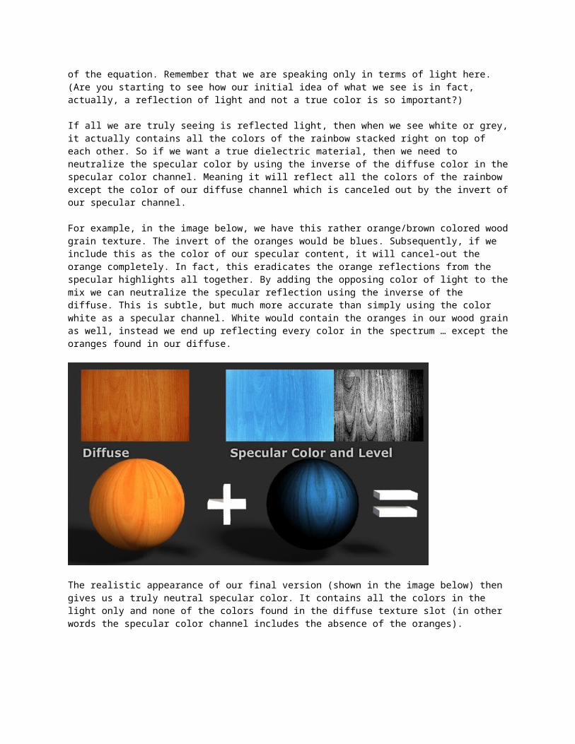
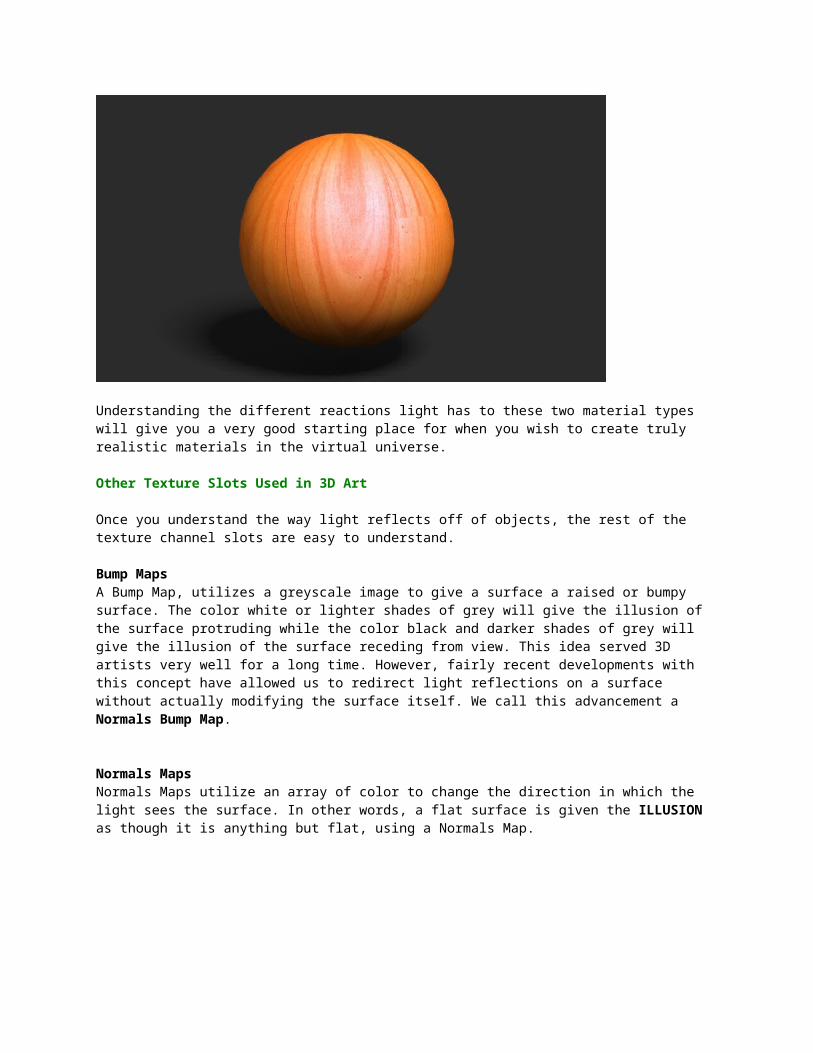
The realistic appearance of our final version (shown in the image below) then gives us a truly neutral specular color. It contains all the colors in the light only and none of the colors found in the diffuse texture slot (in other words the specular color channel includes the absence of the oranges).
Understanding the different reactions light has to these two material types will give you a very good starting place for when you wish to create truly realistic materials in the virtual universe.
Other Texture Slots Used in 3D Art
Once you understand the way light reflects off of objects, the rest of the texture channel slots are easy to understand.
Bump MapsA Bump Map, utilizes a greyscale image to give a surface a raised or bumpy surface. The color white or lighter shades of grey will give the illusion of the surface protruding while the color black and darker shades of grey will give the illusion of the surface receding from view. This idea served 3D artists very well for a long time. However, fairly recent developments with this concept have allowed us to redirect light reflections on a surface without actually modifying the surface itself. We call this advancement a Normals Bump Map.
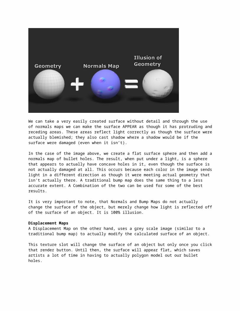
Normals MapsNormals Maps utilize an array of color to change the direction in which the light sees the surface. In other words, a flat surface is given the ILLUSION as though it is anything but flat, using a Normals Map.
We can take a very easily created surface without detail and through the use of normals maps we can make the surface APPEAR as though it has protruding and receding areas. These areas reflect light correctly as though the surface were actually blemished; they also cast shadow where a shadow would be if the surface were damaged (even when it isn’t).
In the case of the image above, we create a flat surface sphere and then add a normals map of bullet holes. The result, when put under a light, is a sphere that appears to actually have concave holes in it, even though the surface is not actually damaged at all. This occurs because each color in the image sends light in a different direction as though it were meeting actual geometry that isn't actually there. A traditional bump map does the same thing to a less accurate extent. A Combination of the two can be used for some of the best results.
It is very important to note, that Normals and Bump Maps do not actually change the surface of the object, but merely change how light is reflected off of the surface of an object. It is 100% illusion.
Displacement Maps A Displacement Map on the other hand, uses a grey scale image (similar to a traditional bump map) to actually modify the calculated surface of an object.
This texture slot will change the surface of an object but only once you click that render button. Until then, the surface will appear flat, which saves artists a lot of time in having to actually polygon model out our bullet holes.
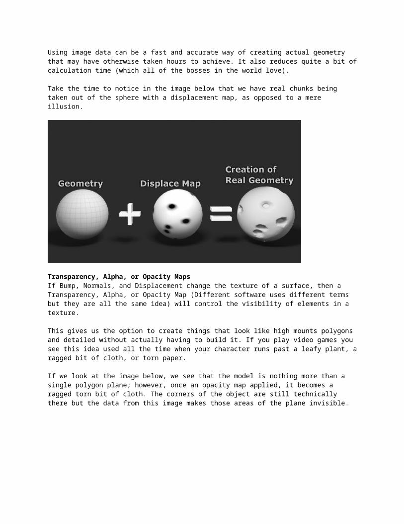
Using image data can be a fast and accurate way of creating actual geometry that may have otherwise taken hours to achieve. It also reduces quite a bit of calculation time (which all of the bosses in the world love).
Take the time to notice in the image below that we have real chunks being taken out of the sphere with a displacement map, as opposed to a mere illusion.
Transparency, Alpha, or Opacity Maps If Bump, Normals, and Displacement change the texture of a surface, then a Transparency, Alpha, or Opacity Map (Different software uses different terms but they are all the same idea) will control the visibility of elements in a texture.
This gives us the option to create things that look like high mounts polygons and detailed without actually having to build it. If you play video games you see this idea used all the time when your character runs past a leafy plant, a ragged bit of cloth, or torn paper.
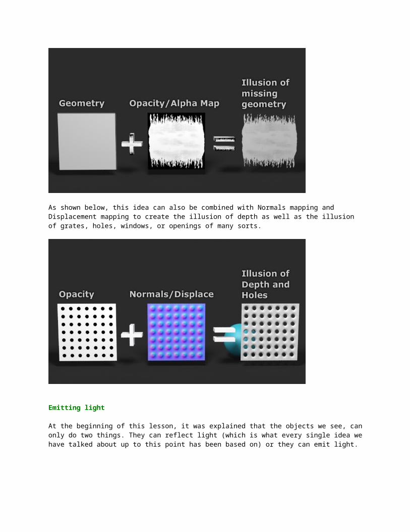
If we look at the image below, we see that the model is nothing more than a single polygon plane; however, once an opacity map applied, it becomes a ragged torn bit of cloth. The corners of the object are still technically there but the data from this image makes those areas of the plane invisible.
As shown below, this idea can also be combined with Normals mapping and Displacement mapping to create the illusion of depth as well as the illusion of grates, holes, windows, or openings of many sorts.
Emitting light
At the beginning of this lesson, it was explained that the objects we see, can only do two things. They can reflect light (which is what every single idea we have talked about up to this point has been based on) or they can emit light.
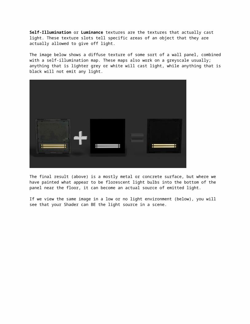
Self-Illumination or Luminance textures are the textures that actually cast light. These texture slots tell specific areas of an object that they are actually allowed to give off light.
The image below shows a diffuse texture of some sort of a wall panel, combined with a self-illumination map. These maps also work on a greyscale usually; anything that is lighter grey or white will cast light, while anything that is black will not emit any light.
The final result (above) is a mostly metal or concrete surface, but where we have painted what appear to be florescent light bulbs into the bottom of the panel near the floor, it can become an actual source of emitted light.
If we view the same image in a low or no light environment (below), you will see that your Shader can BE the light source in a scene.
Summary
Hopefully, this has helped to break down the overall idea of Shaders and Materials into some easy to swallow, bite-sized chunks. This information will become more evident as we move through the course and put many of these ideas into practice.
Be sure to keep the theory behind how light and color work in the back of your mind while creating 3D art. What is art at all, if not the study and replication of how light and colors behave in the real world. You will find that having a good understanding how light and color works in the real world will enable you to make your 3D worlds even more amazing.
With a good understanding of how each individual piece of these Shaders work, you can create some rather wonderful effects, which will bring your scenes and 3D models to life in a much more realistic way.
Try adding and modifying each of these ideas into one glorious Shader that does the work of an advanced polygon modeler and lighter, without ever having to change the surface of your objects.
A Sphere like the one below which has no other changes to the underlying model, the details are created with the combination and understanding of Shaders and how they work both in the reality and in 3D.