objectivesrigneymhs.weebly.com/.../5/37155367/notes_2.2_stats_2e.docx · web viewobjectives...
TRANSCRIPT

SECTION 2.2: FREQUENCY DISTRIBUTIONS AND THEIR GRAPHS
OBJECTIVES
1. Construct frequency distributions for quantitative data2. Construct histograms3. Determine the shape of a distribution from a histogram4. Construct frequency polygons and ogives
OBJECTIVE 1CONSTRUCT FREQUENCY DISTRIBUTIONS FOR QUANTITATIVE DATA
To summarize quantitative data, we use a ________________________________________
just like those for qualitative data. However, since these data have no natural categories, we
divide the data into ____________________. Classes are intervals of equal width that cover all
values that are observed in the data set.
The __________________________________ of a
class is the smallest value that can appear in that
class.
The __________________________________ of a
class is the largest value that can appear in that class.
The __________________________________ is the
difference between consecutive lower class limits.
1

SECTION 2.2: FREQUENCY DISTRIBUTIONS AND THEIR GRAPHS
CHOOSING CLASSES
Every observation must fall into one of the classes. The classes must not overlap. The classes must be of equal width. There must be no gaps between classes. Even if there are no observations in a class, it
must be included in the frequency distribution.
CONSTRUCTING A FREQUENCY DISTRIBUTION
Following are the general steps for constructing a frequency distribution:
Step 1: Choose a class width.
Step 2: Choose a lower class limit for the first class. This should be a convenient number that is slightly less than the minimum data value.
Step 3: Compute the lower limit for the second class, by adding the class width to the lower limit for the first class:Lower limit for second class = Lower limit for first class + Class width
Step 4: Compute the lower limits for each of the remaining classes, by adding the class width to the lower limit of the preceding class. Stop when the largest data value is included in a class.
Step 5: Count the number of observations in each class, and construct the frequency distribution.
2
SECTION 2.2: FREQUENCY DISTRIBUTIONS AND THEIR GRAPHS
EXAMPLE: The emissions for 65 vehicles, in units of grams of particles per gallon of fuel, are given. Construct a frequency distribution using a class width of 1.
SOLUTION:
Class Frequency
0.00 – 0.99
1.00 – 1.99
2.00 – 2.99
3.00 – 3.99
4.00 – 4.99
5.00 – 5.99
6.00 – 6.99
3
1.5 0.87 1.12 1.25 3.46 1.11 1.12 0.88 1.29 0.94 0.64 1.31 2.491.48 1.06 1.11 2.15 0.86 1.81 1.47 1.24 1.63 2.14 6.64 4.04 2.48
1.4 1.37 1.81 1.14 1.63 3.67 0.55 2.67 2.63 3.03 1.23 1.04 1.633.12 2.37 2.12 2.68 1.17 3.34 3.79 1.28 2.1 6.55 1.18 3.06 0.48
0.25 0.53 3.36 3.47 2.74 1.88 5.94 4.24 3.52 3.59 3.1 3.33 4.58

SECTION 2.2: FREQUENCY DISTRIBUTIONS AND THEIR GRAPHS
RELATIVE FREQUENCY
Given a frequency distribution, a relative frequency distribution can be constructed by computing the relative frequency for each class.
Relative Frequency =
EXAMPLE: Construct a relative frequency distribution for the car emissions data in the last example.
SOLUTION:Class Frequency Relative Frequency
0.00 – 0.99
1.00 – 1.99
2.00 – 2.99
3.00 – 3.99
4.00 – 4.99
5.00 – 5.99
6.00 – 6.99
4

SECTION 2.2: FREQUENCY DISTRIBUTIONS AND THEIR GRAPHS
OBJECTIVE 2CONSTRUCT HISTOGRAMS
Once we have a frequency distribution or a relative frequency distribution, we can put the
information in graphical form by constructing a ____________________. A histogram is
constructed by drawing a rectangle for each class. The heights of the rectangles are equal to the
frequencies or the relative frequencies, and the widths are equal to the class width.
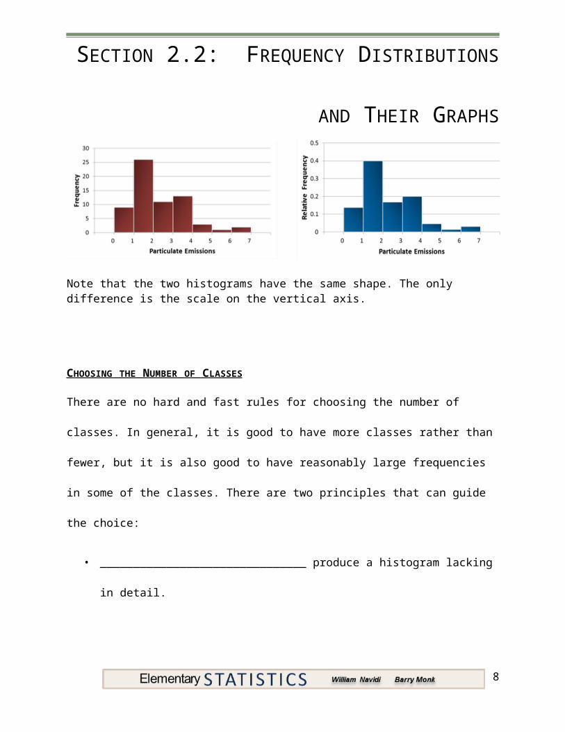
EXAMPLE: The frequency histogram and relative frequency histogram are given for the particulate emissions data.
Note that the two histograms have the same shape. The only difference is the scale on the vertical axis.
5

SECTION 2.2: FREQUENCY DISTRIBUTIONS AND THEIR GRAPHS
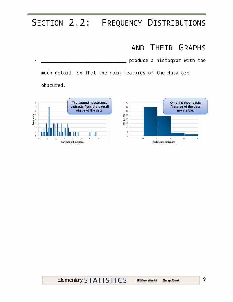
CHOOSING THE NUMBER OF CLASSES
There are no hard and fast rules for choosing the number of classes. In general, it is good to
have more classes rather than fewer, but it is also good to have reasonably large frequencies in
some of the classes. There are two principles that can guide the choice:
• _______________________________ produce a histogram lacking in detail.
• _______________________________ produce a histogram with too much detail, so
that the main features of the data are obscured.
6

SECTION 2.2: FREQUENCY DISTRIBUTIONS AND THEIR GRAPHS
HISTOGRAMS ON THE TI-84 PLUS
The following steps will create a histogram for the particulate emissions data on the TI-84 PLUS.
Step 1: Enter the data in L1.
Step 2: Press 2nd,Y=, then 1 to access the Plot1 menu. Select On and the histogram plot type.
Step 3: Press Zoom, 9 to view the plot.
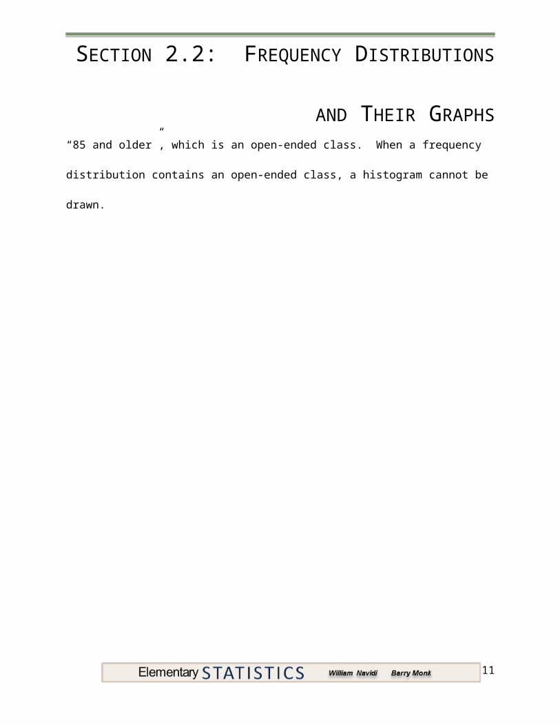
OPEN-ENDED CLASSES
It is sometimes necessary for the first class to have no lower limit or for the last class to have no
upper limit. Such a class is called _______________________________. The following
frequency distribution presents the number of deaths in the U.S. due to pneumonia for various
age groups. Note that the last age group is
“85 and older”, which is an open-ended
class. When a frequency distribution
contains an open-ended class, a histogram
cannot be drawn.
7
Age Number of Deaths5 – 14 69
15 – 24 17825 – 34 29935 – 44 87545 – 54 187255 – 64 309965 – 74 628375 – 84 17,775
85 and older 27,758
SECTION 2.2: FREQUENCY DISTRIBUTIONS AND THEIR GRAPHS
HISTOGRAMS FOR DISCRETE DATA
When data are discrete, we can construct a frequency distribution in which each possible value of the variable forms a class. The following table and histogram presents the results of a hypothetical survey in which 1000 adult women were asked how many children they had.
Number of Children Frequency0 4351 1752 2223 1124 385 96 77 08 2
8
SECTION 2.2: FREQUENCY DISTRIBUTIONS AND THEIR GRAPHS
OBJECTIVE 3DETERMINE THE SHAPE OF A DISTRIBUTION FROM A HISTOGRAM
A histogram gives a visual impression of the “shape” of a data set. Statisticians have developed
terminology to describe some of the commonly observed shapes. A histogram is
_______________________________ if its right half is a mirror image of its left half. There are
very few histograms that are perfectly symmetric, but many are approximately symmetric. A
histogram with a long right-hand tail is said to be ____________________________________.
A histogram with a long left-hand tail is said to be ____________________________________.
MODES
A peak, or high point, of a histogram is referred to as a mode. A histogram is
___________________________ if it has only one mode, and ___________________________
if it has two clearly distinct modes.
9

SECTION 2.2: FREQUENCY DISTRIBUTIONS AND THEIR GRAPHS
OBJECTIVE 4CONSTRUCT FREQUENCY POLYGONS AND OGIVES
CLASS MIDPOINTS
Some graphs used for representing frequency or relative frequency distributions require class midpoints. The midpoint of a class is the average of its lower class limit and the lower class limit of the next class.
Class Midpoint =
EXAMPLE: Consider the classes in the particulate emissions data from earlier in this section find the class midpoints.
SOLUTION:Class Class Midpoint Frequency
0.00 – 0.99 9
1.00 – 1.99 26
2.00 – 2.99 11
3.00 – 3.99 13
4.00 – 4.99 3
5.00 – 5.99 1
6.00 – 6.99 2
10
SECTION 2.2: FREQUENCY DISTRIBUTIONS AND THEIR GRAPHS
FREQUENCY POLYGON
Although histograms are the most commonly used graphical display for representing a
frequency distribution, there are others. One of these is the ____________________________.
A frequency polygon is constructed by plotting a point for each class. The x coordinate of the
point is the class midpoint and the ycoordinate is the frequency. Then, all points are connected
with straight lines.
EXAMPLE: Consider the classes in the particulate emissions data from earlier in this section. Construct a frequency polygon.
11

SECTION 2.2: FREQUENCY DISTRIBUTIONS AND THEIR GRAPHS
OGIVES AND CUMULATIVE FREQUENCY
Another type of graphical representation of frequency distributions is called an _____________
______________________. Ogives plot values known as _______________________________
___________________________. The cumulative frequency of a class is the sum of the
frequencies of that class and all previous classes.
EXAMPLE: Consider the classes in the particulate emissions data from earlier in this section compute the cumulative frequencies.
SOLUTION:Class Frequency Cumulative Frequency
0.00 – 0.99 9
1.00 – 1.99 26
2.00 – 2.99 11
3.00 – 3.99 13
4.00 – 4.99 3
5.00 – 5.99 1
6.00 – 6.99 2
12
SECTION 2.2: FREQUENCY DISTRIBUTIONS AND THEIR GRAPHS
An ogive is constructed by plotting a point for each class. The x coordinate of the point is the
upper class limit and the y coordinate is the cumulative frequency. Then, all points are
connected with straight lines.
13

SECTION 2.2: FREQUENCY DISTRIBUTIONS AND THEIR GRAPHS
YOU SHOULD KNOW …
How to construct a frequency and relative frequency distribution for quantitative data
How to construct and interpret histograms
The guiding principles for choosing the number of classes in a histogram
How to construct a histogram on the TI-84 PLUS calculator
Some possible shapes of a data set including:
o Symmetric
o Skewed to the right (positively skewed)
o Skewed to the left (negatively skewed)
o Unimodal
o Bimodal
How to construct and interpret frequency polygons and ogives
14