virtual environments module 2
DESCRIPTION
Design Module 2TRANSCRIPT
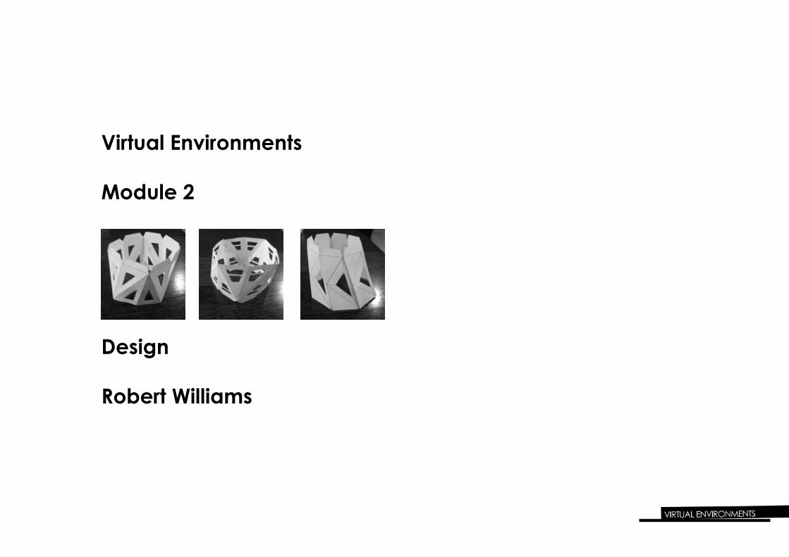
Design
Robert Williams
Virtual Environments
Module 2
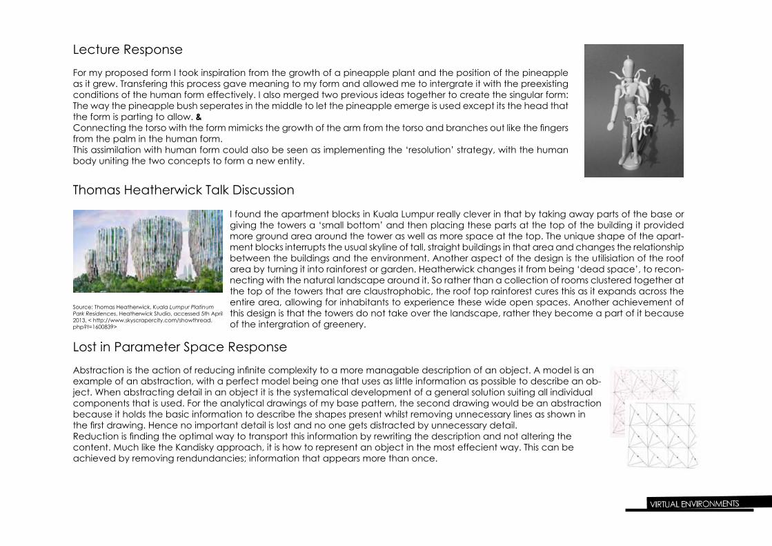
Lecture Response
For my proposed form I took inspiration from the growth of a pineapple plant and the position of the pineapple as it grew. Transfering this process gave meaning to my form and allowed me to intergrate it with the preexisting conditions of the human form effectively. I also merged two previous ideas together to create the singular form:The way the pineapple bush seperates in the middle to let the pineapple emerge is used except its the head that the form is parting to allow. &Connecting the torso with the form mimicks the growth of the arm from the torso and branches out like the fingers from the palm in the human form.This assimilation with human form could also be seen as implementing the ‘resolution’ strategy, with the human body uniting the two concepts to form a new entity.
I found the apartment blocks in Kuala Lumpur really clever in that by taking away parts of the base or giving the towers a ‘small bottom’ and then placing these parts at the top of the building it provided more ground area around the tower as well as more space at the top. The unique shape of the apart-ment blocks interrupts the usual skyline of tall, straight buildings in that area and changes the relationship between the buildings and the environment. Another aspect of the design is the utilisiation of the roof area by turning it into rainforest or garden. Heatherwick changes it from being ‘dead space’, to recon-necting with the natural landscape around it. So rather than a collection of rooms clustered together at the top of the towers that are claustrophobic, the roof top rainforest cures this as it expands across the entire area, allowing for inhabitants to experience these wide open spaces. Another achievement of this design is that the towers do not take over the landscape, rather they become a part of it because of the intergration of greenery.
Source: Thomas Heatherwick, Kuala Lumpur Platinum Park Residences, Heatherwick Studio, accessed 5th April 2013, < http://www.skyscrapercity.com/showthread.php?t=1600839>
Abstraction is the action of reducing infinite complexity to a more managable description of an object. A model is an example of an abstraction, with a perfect model being one that uses as little information as possible to describe an ob-ject. When abstracting detail in an object it is the systematical development of a general solution suiting all individual components that is used. For the analytical drawings of my base pattern, the second drawing would be an abstraction because it holds the basic information to describe the shapes present whilst removing unnecessary lines as shown in the first drawing. Hence no important detail is lost and no one gets distracted by unnecessary detail.Reduction is finding the optimal way to transport this information by rewriting the description and not altering the content. Much like the Kandisky approach, it is how to represent an object in the most effecient way. This can be achieved by removing rendundancies; information that appears more than once.
Thomas Heatherwick Talk Discussion
Lost in Parameter Space Response
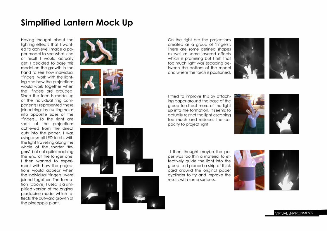
Simplified Lantern Mock Up
Having thought about the lighting effects that I want-ed to achieve I made a pa-per model to see what kind of result I would actually get. I decided to base this model on the growth in the hand to see how individual ‘fingers’ work with the light-ing and how the projections would work together when the ‘fingers are grouped. Since the form is made up of the individual ring com-ponents I represented these joined rings by cutting holes into opposite sides of the ‘fingers’. To the right are shots of the projections achieved from the direct cuts into the paper. I was using a small LED torch, with the light travelling along the whole of the shorter ‘fin-gers’, but not quite reaching the end of the longer one. I then wanted to experi-ment with how the projec-tions would appear when the individual ‘fingers’ were joined together. The forma-tion (above) I used is a sim-plified version of the original plastacine model which re-flects the outward growth of the pineapple plant.
On the right are the projections created as a group of ‘fingers’. There are some defined shapes as well as some layered effects which is promising but I felt that too much light was escaping be-tween the bottom of the model and where the torch is positioned.
I tried to improve this by attach-ing paper around the base of the group to direct more of the light up into the formation. It seems to actually restrict the light escaping too much and reduces the ca-pacity to project light.
I then thought maybe the pa-per was too thin a material to ef-fectively guide the light into the group, so I placed a strip of thick card around the original paper cyclinder to try and improve the results with some success.
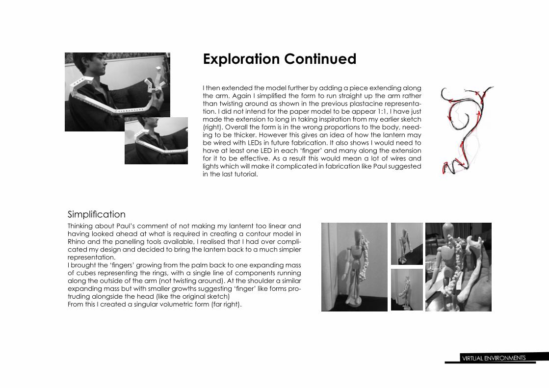
I then extended the model further by adding a piece extending along the arm. Again I simplified the form to run straight up the arm rather than twisting around as shown in the previous plastacine representa-tion. I did not intend for the paper model to be appear 1:1, I have just made the extension to long in taking inspiration from my earlier sketch (right). Overall the form is in the wrong proportions to the body, need-ing to be thicker. However this gives an idea of how the lantern may be wired with LEDs in future fabrication. It also shows I would need to have at least one LED in each ‘finger’ and many along the extension for it to be effective. As a result this would mean a lot of wires and lights which will make it complicated in fabrication like Paul suggested in the last tutorial.
Thinking about Paul’s comment of not making my lanternt too linear and having looked ahead at what is required in creating a contour model in Rhino and the panelling tools available, I realised that I had over compli-cated my design and decided to bring the lantern back to a much simpler representation. I brought the ‘fingers’ growing from the palm back to one expanding mass of cubes representing the rings, with a single line of components running along the outside of the arm (not twisting around). At the shoulder a similar expanding mass but with smaller growths suggesting ‘finger’ like forms pro-truding alongside the head (like the original sketch)From this I created a singular volumetric form (far right).
Exploration Continued
Simplification
Front
SideTop
Back
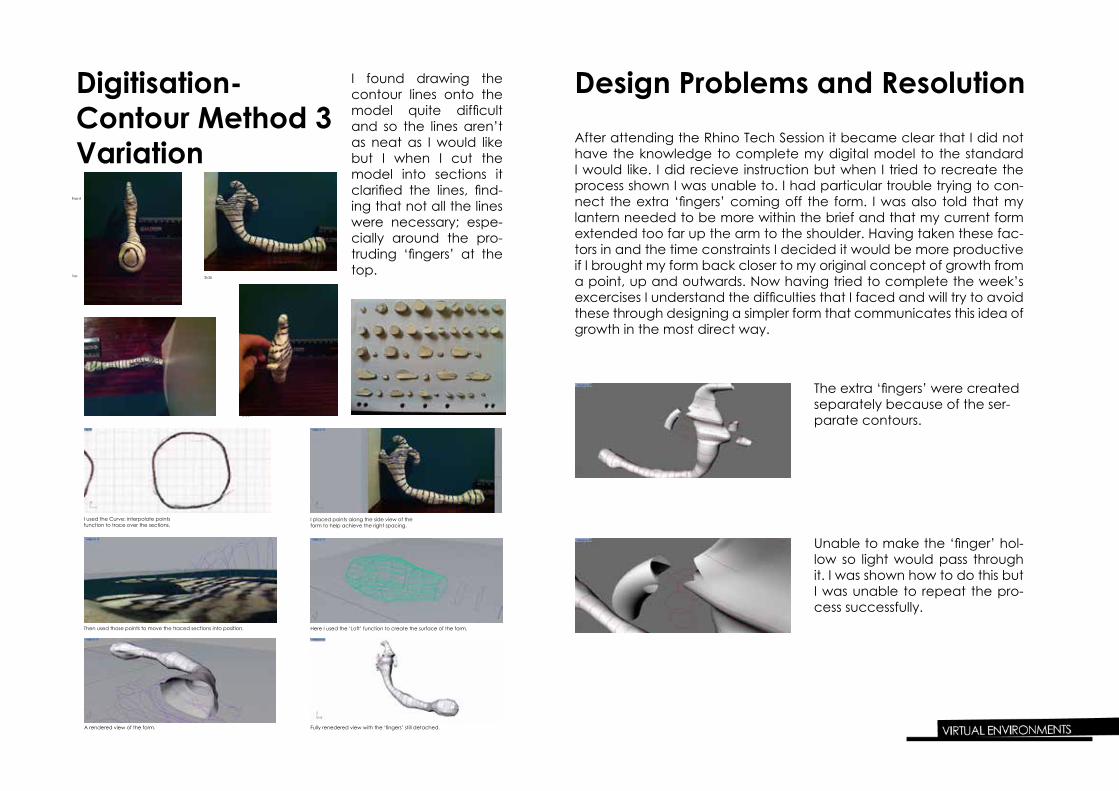
Digitisation- Contour Method 3 Variation
I found drawing the contour lines onto the model quite difficult and so the lines aren’t as neat as I would like but I when I cut the model into sections it clarified the lines, find-ing that not all the lines were necessary; espe-cially around the pro-truding ‘fingers’ at the top.
I used the Curve: interpolate points function to trace over the sections.
I placed points along the side view of the form to help achieve the right spacing.
Then used those points to move the traced sections into position. Here I used the ‘Loft’ function to create the surface of the form.
A rendered view of the form. Fully renedered view with the ‘fingers’ still detached.
Design Problems and ResolutionAfter attending the Rhino Tech Session it became clear that I did not have the knowledge to complete my digital model to the standard I would like. I did recieve instruction but when I tried to recreate the process shown I was unable to. I had particular trouble trying to con-nect the extra ‘fingers’ coming off the form. I was also told that my lantern needed to be more within the brief and that my current form extended too far up the arm to the shoulder. Having taken these fac-tors in and the time constraints I decided it would be more productive if I brought my form back closer to my original concept of growth from a point, up and outwards. Now having tried to complete the week’s excercises I understand the difficulties that I faced and will try to avoid these through designing a simpler form that communicates this idea of growth in the most direct way.
The extra ‘fingers’ were created separately because of the ser-parate contours.
Unable to make the ‘finger’ hol-low so light would pass through it. I was shown how to do this but I was unable to repeat the pro-cess successfully.
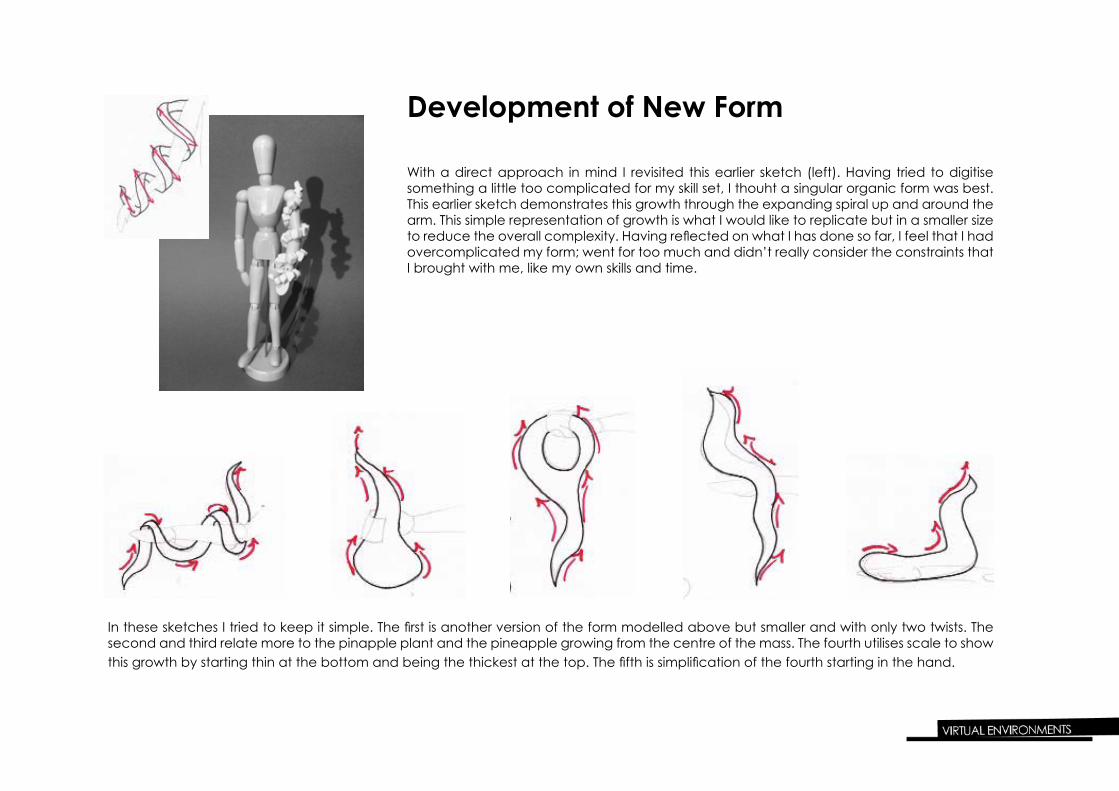
Development of New Form
With a direct approach in mind I revisited this earlier sketch (left). Having tried to digitise something a little too complicated for my skill set, I thouht a singular organic form was best. This earlier sketch demonstrates this growth through the expanding spiral up and around the arm. This simple representation of growth is what I would like to replicate but in a smaller size to reduce the overall complexity. Having reflected on what I has done so far, I feel that I had overcomplicated my form; went for too much and didn’t really consider the constraints that I brought with me, like my own skills and time.
In these sketches I tried to keep it simple. The first is another version of the form modelled above but smaller and with only two twists. The second and third relate more to the pinapple plant and the pineapple growing from the centre of the mass. The fourth utilises scale to show this growth by starting thin at the bottom and being the thickest at the top. The fifth is simplification of the fourth starting in the hand.
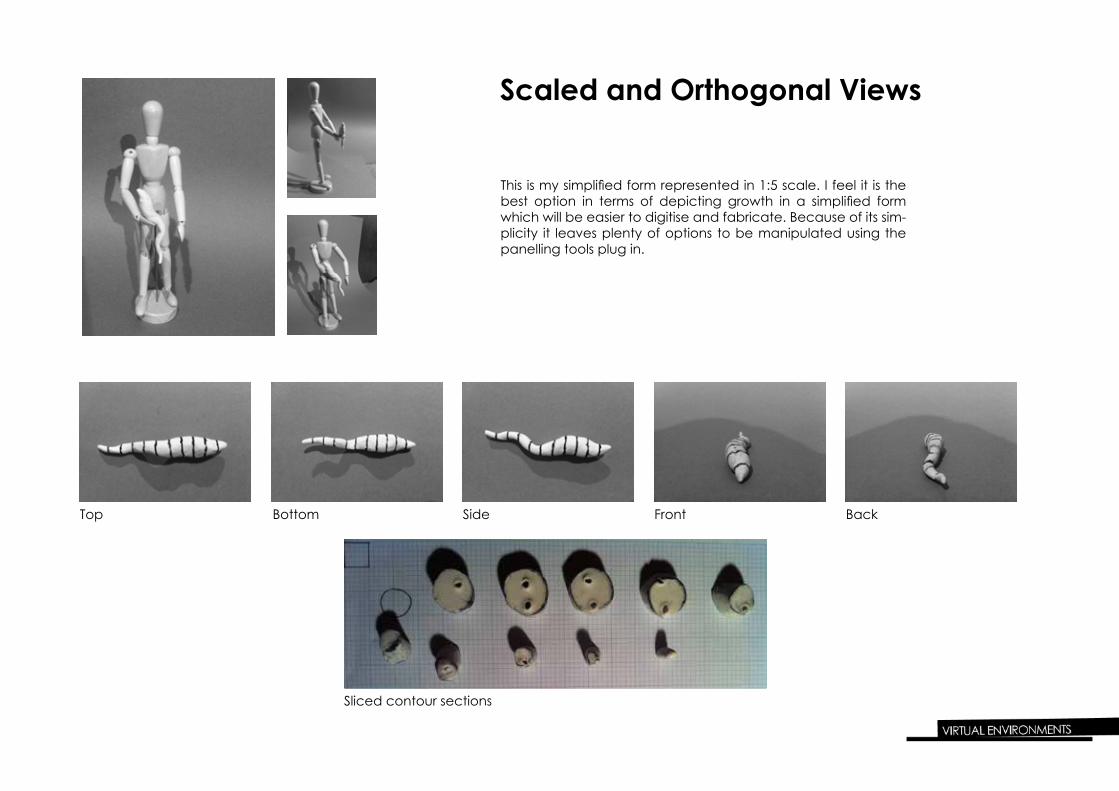
This is my simplified form represented in 1:5 scale. I feel it is the best option in terms of depicting growth in a simplified form which will be easier to digitise and fabricate. Because of its sim-plicity it leaves plenty of options to be manipulated using the panelling tools plug in.
Top Bottom Side Front Back
Sliced contour sections
Scaled and Orthogonal Views
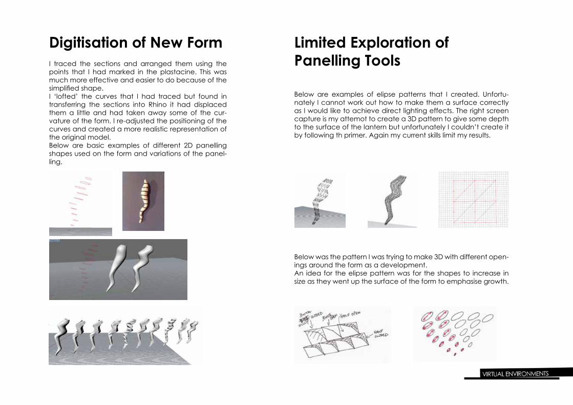
Digitisation of New FormI traced the sections and arranged them using the points that I had marked in the plastacine. This was much more effective and easier to do because of the simplified shape. I ‘lofted’ the curves that I had traced but found in transferring the sections into Rhino it had displaced them a little and had taken away some of the cur-vature of the form. I re-adjusted the positioning of the curves and created a more realistic representation of the original model.Below are basic examples of different 2D panelling shapes used on the form and variations of the panel-ling.
Limited Exploration of Panelling Tools
Below are examples of elipse patterns that I created. Unfortu-nately I cannot work out how to make them a surface correctly as I would like to achieve direct lighting effects. The right screen capture is my attemot to create a 3D pattern to give some depth to the surface of the lantern but unfortunately I couldn’t create it by following th primer. Again my current skills limit my results.
Below was the pattern I was trying to make 3D with different open-ings around the form as a development.An idea for the elipse pattern was for the shapes to increase in size as they went up the surface of the form to emphasise growth.
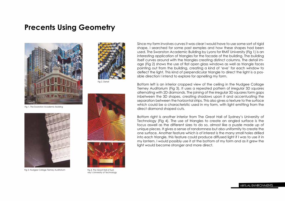
Precents Using Geometry
Since my form involves curves it was clear I would have to use some sort of rigid shape, I searched for some past exmples and how these shapes had been used. The Swanston Academic Building by Lyons for RMIT University (Fig 1) is an interesting application of triangles for the facade of the building. The building itself curves around with the triangles creating distinct columns. The detail im-age (Fig 2) shows the use of flat open glass windows as well as triangle faces pointing out from the building, creating a kind of ‘eve’ for each window to deflect the light. This kind of perpendicular triangle to direct the light is a pos-sible direction I intend to explore for apnelling my form.
Bottom left is an interior cropped view of the ceiling in the Nudgee Collage Tierney Auditorium (Fig 3). It uses a repeated pattern of irregular 3D squares alternating with 2D diamonds. The joining of the irregular 3D squares form gaps inbetween the 3D shapes, creating shadows upon it and accentuating the separation between the horizontal strips. This also gives a texture to the surface which could be a characteristic used in my form, with light emitting from the direct diamond shaped cuts.
Bottom right is another interior from The Great Hall of Sydney’s University of Technology (Fig 4). The use of triangles to create an angled surface is the focus aswell as the different sizes to do so, almost like a puzzle made up of unique pieces. It gives a sense of randomness but also uniformity to create the one surface. Another feature which is of interest is the many small holes drilled into each triangle, this feature could produce diffused light if I was to use it in my lantern. I would possibly use it at the bottom of my form and as it grew the light would become stronger and more direct.
Fig 1. The Swanston Academic Building
Fig 2. Detail
Fig 3. Nudgee Collage Tierney Auditorium Fig 4. The Great Hall of Syd-ney’s University of Technology
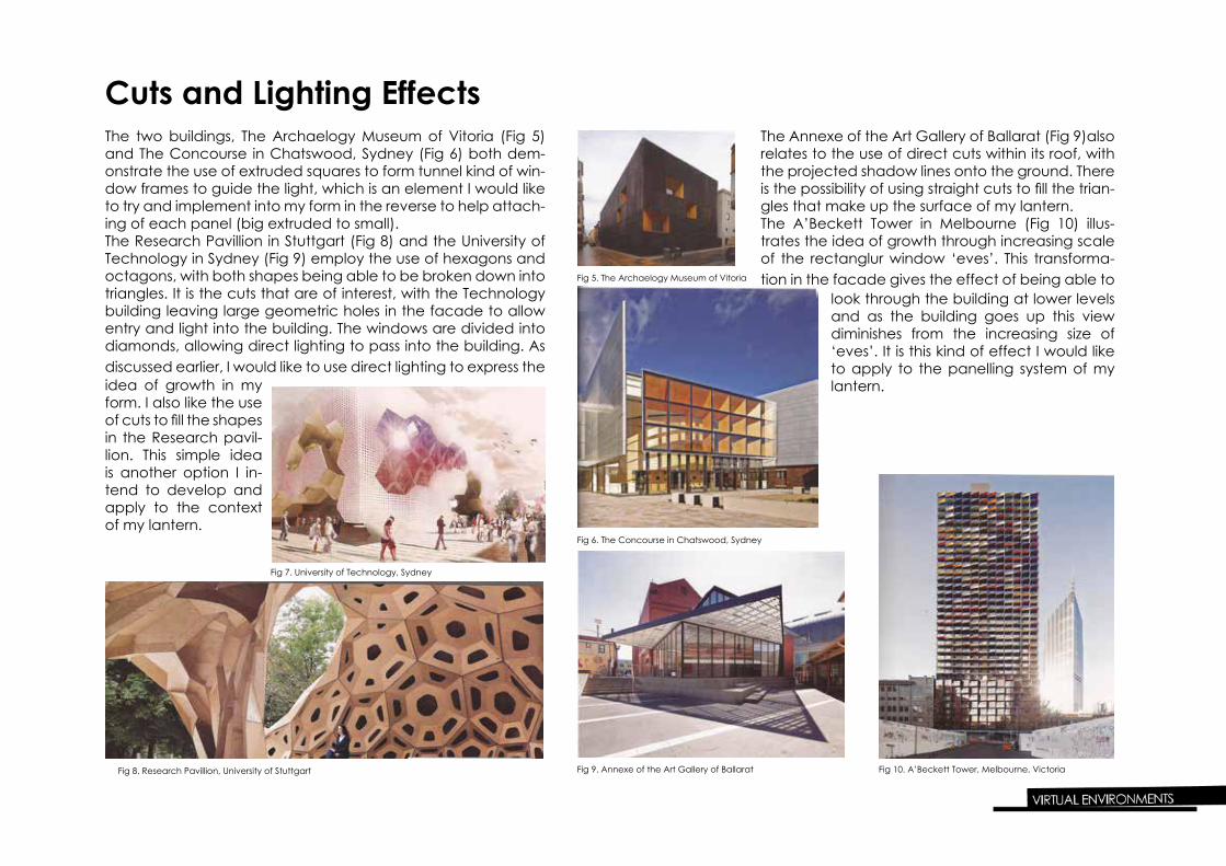
Cuts and Lighting EffectsThe two buildings, The Archaelogy Museum of Vitoria (Fig 5) and The Concourse in Chatswood, Sydney (Fig 6) both dem-onstrate the use of extruded squares to form tunnel kind of win-dow frames to guide the light, which is an element I would like to try and implement into my form in the reverse to help attach-ing of each panel (big extruded to small). The Research Pavillion in Stuttgart (Fig 8) and the University of Technology in Sydney (Fig 9) employ the use of hexagons and octagons, with both shapes being able to be broken down into triangles. It is the cuts that are of interest, with the Technology building leaving large geometric holes in the facade to allow entry and light into the building. The windows are divided into diamonds, allowing direct lighting to pass into the building. As discussed earlier, I would like to use direct lighting to express the
Fig 5. The Archaelogy Museum of Vitoria
Fig 6. The Concourse in Chatswood, Sydney
Fig 7. University of Technology, Sydney
Fig 8. Research Pavillion, University of Stuttgart Fig 9. Annexe of the Art Gallery of Ballarat Fig 10. A’Beckett Tower, Melbourne, Victoria
idea of growth in my form. I also like the use of cuts to fill the shapes in the Research pavil-lion. This simple idea is another option I in-tend to develop and apply to the context of my lantern.
The Annexe of the Art Gallery of Ballarat (Fig 9)also relates to the use of direct cuts within its roof, with the projected shadow lines onto the ground. There is the possibility of using straight cuts to fill the trian-gles that make up the surface of my lantern. The A’Beckett Tower in Melbourne (Fig 10) illus-trates the idea of growth through increasing scale of the rectanglur window ‘eves’. This transforma-tion in the facade gives the effect of being able to
look through the building at lower levels and as the building goes up this view diminishes from the increasing size of ‘eves’. It is this kind of effect I would like to apply to the panelling system of my lantern.
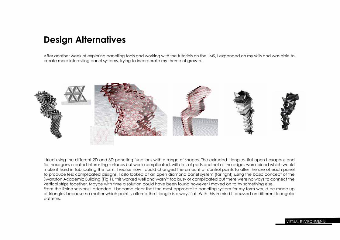
Design Alternatives
I tried using the different 2D and 3D panelling functions with a range of shapes. The extruded triangles, flat open hexagons and flat hexagons created interesting surfaces but were complicated, with lots of parts and not all the edges were joined which would make it hard in fabricating the form. I realise now I could changed the amount of control points to alter the size of each panel to produce less complicated designs. I aslo looked at an open diamond panel system (far right) using the basic concept of the Swanston Academic Building (Fig 1), this worked well and wasn’t too busy or complicated but there were no ways to connect the vertical strips together. Maybe with time a solution could have been found however I moved on to try something else.From the Rhino sessions I attended it became clear that the most appropraite panelling system for my form would be made up of triangles because no matter which point is altered the triangle is always flat. With this in mind I focussed on different triangular patterns.
After another week of exploring panelling tools and working with the tutorials on the LMS, I expanded on my skills and was able to create more interesting panel systems, trying to incorporate my theme of growth.
Design Alternatives Continued
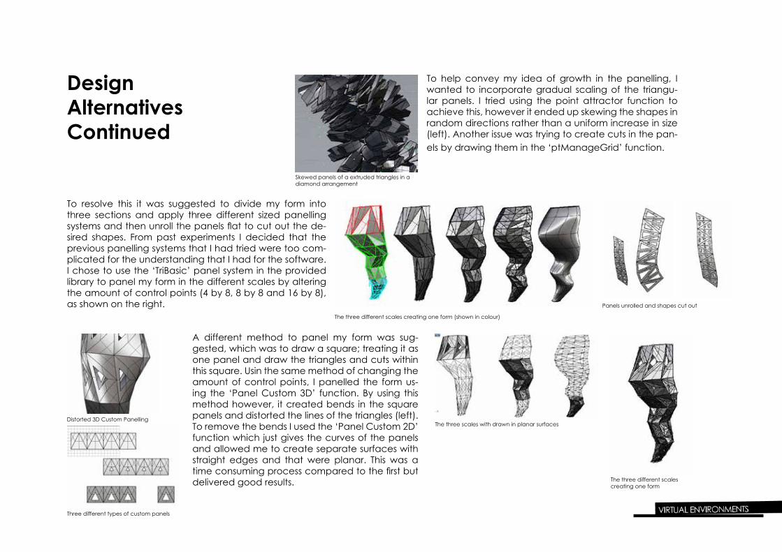
To help convey my idea of growth in the panelling, I wanted to incorporate gradual scaling of the triangu-lar panels. I tried using the point attractor function to achieve this, however it ended up skewing the shapes in random directions rather than a uniform increase in size (left). Another issue was trying to create cuts in the pan-els by drawing them in the ‘ptManageGrid’ function.
To resolve this it was suggested to divide my form into three sections and apply three different sized panelling systems and then unroll the panels flat to cut out the de-sired shapes. From past experiments I decided that the previous panelling systems that I had tried were too com-plicated for the understanding that I had for the software. I chose to use the ‘TriBasic’ panel system in the provided library to panel my form in the different scales by altering the amount of control points (4 by 8, 8 by 8 and 16 by 8), as shown on the right.
A different method to panel my form was sug-gested, which was to draw a square; treating it as one panel and draw the triangles and cuts within this square. Usin the same method of changing the amount of control points, I panelled the form us-ing the ‘Panel Custom 3D’ function. By using this method however, it created bends in the square panels and distorted the lines of the triangles (left). To remove the bends I used the ‘Panel Custom 2D’ function which just gives the curves of the panels and allowed me to create separate surfaces with straight edges and that were planar. This was a time consuming process compared to the first but delivered good results.
Skewed panels of a extruded triangles in a diamond arrangement
The three different scales creating one form (shown in colour)
Panels unrolled and shapes cut out
Three different types of custom panels
Distorted 3D Custom PanellingThe three scales with drawn in planar surfaces
The three different scales creating one form
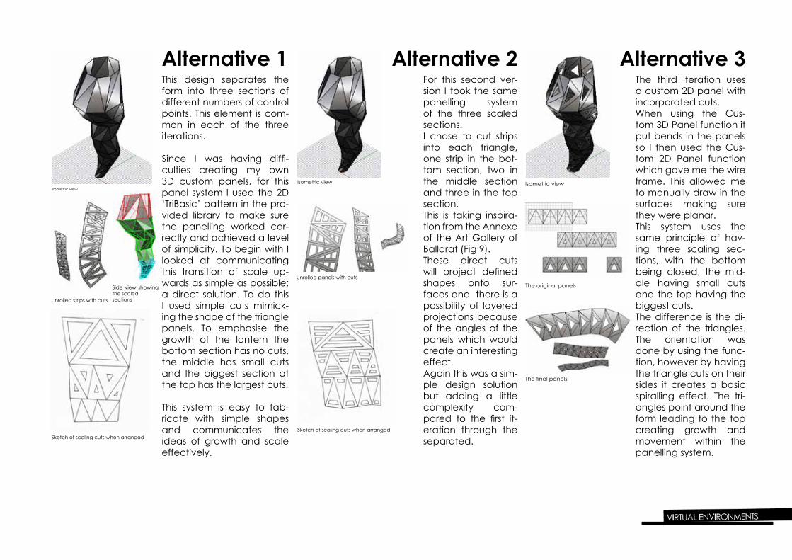
Alternative 1This design separates the form into three sections of different numbers of control points. This element is com-mon in each of the three iterations.
Since I was having diffi-culties creating my own 3D custom panels, for this panel system I used the 2D ‘TriBasic’ pattern in the pro-vided library to make sure the panelling worked cor-rectly and achieved a level of simplicity. To begin with I looked at communicating this transition of scale up-wards as simple as possible; a direct solution. To do this I used simple cuts mimick-ing the shape of the triangle panels. To emphasise the growth of the lantern the bottom section has no cuts, the middle has small cuts and the biggest section at the top has the largest cuts.
This system is easy to fab-ricate with simple shapes and communicates the ideas of growth and scale effectively.
Isometric view
Side view showing the scaled sectionsUnrolled strips with cuts
Sketch of scaling cuts when arranged
Alternative 2For this second ver-sion I took the same panelling system of the three scaled sections.I chose to cut strips into each triangle, one strip in the bot-tom section, two in the middle section and three in the top section.This is taking inspira-tion from the Annexe of the Art Gallery of Ballarat (Fig 9).These direct cuts will project defined shapes onto sur-faces and there is a possibility of layered projections because of the angles of the panels which would create an interesting effect. Again this was a sim-ple design solution but adding a little complexity com-pared to the first it-eration through the separated.
Isometric view
Unrolled panels with cuts
Sketch of scaling cuts when arranged
Alternative 3The third iteration uses a custom 2D panel with incorporated cuts. When using the Cus-tom 3D Panel function it put bends in the panels so I then used the Cus-tom 2D Panel function which gave me the wire frame. This allowed me to manually draw in the surfaces making sure they were planar.This system uses the same principle of hav-ing three scaling sec-tions, with the bottom being closed, the mid-dle having small cuts and the top having the biggest cuts.The difference is the di-rection of the triangles. The orientation was done by using the func-tion, however by having the triangle cuts on their sides it creates a basic spiralling effect. The tri-angles point around the form leading to the top creating growth and movement within the panelling system.
Isometric view
The original panels
The final panels

Paper ProtoypesTesting Material Properties and Lighting Effects
I decided to prototype a full ring rather than just the four panels to help with achieving some lighting ef-fects in a reduced context.I used 80gsm paper for these prototypes which made it light weight and delicate. The paper itself was not thick enough to block the light completely so the rings tend to glow, however in each case a clear projection of the cuts were produced.It is hard to see the scaling effect with just one ring but gives a sense of what the result of a full model may produce. Alternative 1 is straight forward with the triangles well defined.Alternative 2 creates a different feel with more separation in terms of the cuts but again defined shapes were produced.Alternative 3 was quite successful in able to pro-duce different sized triangles from the same scale by altering the angle of the ring. It suggests the spi-ral that is in the design.
Further Development
Each Alternative is rather simple so if I was to de-velop each system I would separate the form into more sections such as 5 or 7 different scales using different amount of control points in each. This would highlight the transition in sizes more and give a greater contrast between the top and the bottom sections.If I had to choose one to pursue though it would be Alternative 2 because of the scaling cuts inside each triangle relates back to the scaling triangles in the base pattern of the pineapple and has the potenetial to produsce layered lighting effects as discussed earlier.
Alternative 1
Alternative 2
Alternative 3
ReferencesFig 1& 2. John Gollings and Dianna Snape (2012) ‘Swanston Academic Building is th enew new addition to RMIT University’s collection of building along Swanston street, which form “a city within a city” ’. Architecture Australia Sept/Oct 2012, 28,31.Fig 3. Jon Linkins (2012) ‘The cieling recalls those of the former Regent Theatre, Brisbane, and the geometries of the Alhambra in Granada, Spain.’ Architecture Australia Jan/Feb 2012, 53.Fig 4.Brett Boardman (2012) ‘A series of chevrons built into the surface mantle accomodates track and accent lighting’. Architecture Australia Mar/April 2012, 26.Fig 5.Francisco Mangado (2012) ‘ The Archaeology Museum of Vitoria was the outcome of an international competitionwon by Mangado.’ Archi-tecture Australia Sept/Oct 2012, 15.Fig 6.Andrew Chung (2012) ‘The concourse accomodates the Chatswood Library, a thousand-seat concert hall, a five-hundred-seat theatre, per-formanceand exhibition spaces, and restaurants and shops.’ Architecture Australia Mar/April 2012, 49.Fig 7.Chris Bamborough, Nicholas Malyon, Leonardo Quinones, Oliver Petrie (2012) “ Bondi Hex Station proposes a new train line and station for a speculative Bondi of increased density, providing markets and civic functions for local residents and a new public square that creates an ad-ditional focal point to that of the iconic beach.’ Architecture Australia Mar/ April 2012, 16.Fig 8.Author unknown (2012) ‘Untitled’. Architecture Australia Sept/Oct 2012, 66.Fig 9.John Gollins (2012) ‘The project combines the programs of verandah, bandstand and public hall to become a new hybrid space.’ Architecture Australia Jan/Feb 2012, 20.Fig 10.John Gollins (2011) ‘A’Beckett Tower’. Architecture Australia Nov/Dec 2011, 51.