visual analytics in software engineering - vase 2009 · visual analytics in software ... and agile...
TRANSCRIPT

Visual Analytics in Software Engineering -
VASE 2009
Technical ReportECSTR10-11, July 2010
ISSN 1179-4259
School of Engineering and Computer ScienceVictoria University of Wellington, New Zealand
Craig Anslow and Stuart Marshall (Editors)Email: {craig, stuart}@ecs.vuw.ac.nz
1 Introduction
The fields of information visualisation and visual analytics have provided a rich source of techniquesand tools for exploring complex information spaces. Automated software engineering creates orinvolves the handling of complex information spaces, and this workshop looked at the role thatvisualisation and visual analytics has to play in supporting automated software engineering.
As an example of this, researchers are currently developing novel methods, algorithms, andtechniques to visualise multiple types and sets of artifacts. This goes beyond just looking at sourcecode, but also visualising and analysing other documents, meta-data, or repository data for diverse,complex, and large-scale software applications.
There are a number of challenges facing both information visualisation and visual analytics, andthis workshop provided an opportunity for researchers to come together and discuss the impact ofthese challenges on specifically supporting aspects of automated software engineering. Stemmingfrom this, the workshop provided the opportunity to propose and discuss a roadmap for futuresolutions to these challenges, and areas for collaboration.
Visual Analytics in Software Engineeirng (VASE)1 was a workshop that brought together re-searchers in the fields of software visualisation, information visualisation and visual analytics. Novelcontributions on any topics in advanced information visualisation techniques and visual analyticswas the technical scope of the workshop.
• Empirical software engineering
• Program understanding
• Software architecture and design
• Testing, verification, and validation
• Component-based systems
• Ontologies and methodologies
• Human-computer interaction
• Software metrics
VASE (Monday 16 November 2009) was a co-located workshop at the IEEE/ACM InternationalConference on Automated Software Engineering (ASE)2, Auckland, New Zealand (16-20 November2009).
1http://ecs.victoria.ac.nz/Events/VASE/2http://www.se.auckland.ac.nz/conferences/ase09/
1

2 Committees
The workshop was organised by members working on the New Zealand Software Process and Prod-uct Improvement (SPPI) Project. The program committee comprised of international reseaerchersfrom the areas of software visualization, software engineering, information visualization, and visualanalytics.
2.1 Organising Committee
• Craig Anslow - is a PhD student in the School of Engineering and Computer Science atVictoria University of Wellington, New Zealand. His PhD research focuses on multi-touchtable user interfaces for co-located collaborative software visualization.
• Stuart Charters - is a lecturer at Lincoln University, New Zealand. Stuart received his PhDin 2006 from the University of Durham in the area of software visualization. His researchinterests are software visualization, web technologies, and grid computing.
• Jens Dietrich - is a senior lecturer in the School of Engineering and Advanced Technologyat Massey University, New Zealand. Jens received his PhD in 1995 from the Universityof Leipzig. His research interests are design patterns formalisation and recognition, ruleprocessing and compilation, formal components between components, software architectureanalysis, applying ontologies in software engineering, and open source software development.
• Stuart Marshall - is a lecturer in the School of Engineering and Computer Science at VictoriaUniversity of Wellington, New Zealand. Stuart received his PhD in 2005 on test drivingreusable components. His research interests are information visualisation, mobile device userinterfaces, and agile software development.
2.2 Program Committee
We thank out program committee for reviewing the papers and giving valuable feedback on thedesign of our workshop.
• Craig Anslow - Victoria University of Wellington, New Zealand
• Stuart Charters - Lincoln University, New Zealand
• Stephan Diehl - University of Trier, Germany
• Jens Dietrich - Massey University, New Zealand
• Carsten Gorg - Georgia Institute of Technology, USA
• Michele Lanza - University of Lugano, Switzerland
• Claus Lewerentz - Brandenburg University of Technology, Cottbus, Germany
• Stuart Marshall - Victoria University of Wellington, New Zealand
• Malcolm Munro - Durham University, England
• James Noble - Victoria University of Wellington, New Zealand
• Alexandru Telea - University of Groningen, Netherlands
• Ewan Tempero - University of Auckland, New Zealand
• Jim Thomas - National Visualization Analytics Center, USA
• Chris Weaver - University of Oklahoma, USA
2

3 Software Process and Product Improvement (SPPI) Project
The workshop was sponsored by the New Zealand Foundation for Research Science and Technology(FRST) supported Software Process and Product Improvement project3. The objective of thisresearch is to develop and apply a range of software productivity techniques and tools to enhancethe performance of the New Zealand software industry. The key focus is software process andproduct improvement using advanced, model-based software visualisation methods and tools. Theaim of the research is to develop leading-edge software process and product improvement techniquesand tools for use by the NZ ICT industry to enhance the quality of their products and efficiencyof their development processes.
4 Workshop Program
The workshop began with a Welcome and Introduction by the organising committee. Jim Thomasthen gave an interesting keynote that outlined the area of visual analytics and then illustratedthis new area with a range of case studies. The talk also described how visual analytics could beapplied to the area of software visualization and what the main differences were between visualanalytics and information visualization.
Four papers were submitted and three papers were accepted for presentation. The paperscovered a framework for collecting empricial software engineering data to be analysed, understand-ing software models with domain specific meta-modelling tools, and a visualization technique forunderstanding software configuration management.
The afternoon sessions consisted of talks by members of the SPPI project. The talks rangedfrom Eclipse visualization plug-ins, empirical studies of Jave programs using visualization tech-niques, new interactive touch interfaces to visualize software, visual modelling of tests, Maramameta-modelling tool, and a new visualization metaphor for knowledge access and management.
Breaks and lunch provided a good opportunity for discussion at the workshop. An informalworkshop dinner followed the conclusion of the workshop at a nearby restaurant.
Table 1: VASE Workshop Program.
0900-0930 Session 1. Welcome and Introductions0930-1030 Keynote - Jim Thomas: Visual Analytics for Software Engineering: a Rich Opportunity
to Turn Complexity into Understanding.1030-1100 Morning Break1100-1230 Session 2. Presentation of Workshop papers
Maximilian Koegel, Yang Li, Helmut Naughton, Jonas Helming, and Bernd Bruegge.Towards a Framework for Empirical Project Analysis for Software Engineering Models.Karen Li, John Grundy, John Hosking, and Lei Li. Visualising Event-based InformationModels: Issues and Experiences.Amaia Aguirregoitia and J. Javier Dolado, and Concepcion Presedo,. Using the MagnetMetaphor for Multivariate Visualization in Software Management.
1230-1400 Lunch Break1400-1530 Session 3. SPPI Presentations and Discussion
Ewan Tempero. Visualising Inheritance.Craig Anslow, Stuart Marshall, and James Noble. Multi-touch Table User Interfaces forVisual Software Analytics.Jens Dietrich and Jevon Wright. Two Experiments: Barriers to Modularity andVerifying Eclipse.Neville Churcher and Warwick Irwin. In situ Software Visualization.
1530-1600 Afternoon Break1600-1730 Session 4. SPPI Presentations and Discussion Cont’d
Mark Utting. A Visual Designer for Model-Based Story-Tests.Karen Li, John Grundy, and John Hosking. Marama DSL.Jun Huh, John Grundy, and John Hosking. Marama meta-tool.Chrisitan Hirsch, John Grundy, and John Hosking. The Visual Wiki: a new metaphor forknowledge access and management.
3http://wiki.auckland.ac.nz/display/csisppi/
3

5 Keynote
The workshop had the privilege to hear from one of the founders of the visual analytics researcharea.
Speaker Jim Thomas. AAAS and PNNL Fellow, Founder and Science Advisor National Visu-alization Analytics Center (NVAC).
Title Visual Analytics for Software Engineering: a Rich Opportunity to Turn Complexity intoUnderstanding
Abstract Visual Analytics enables analyses, assessments and communications of results fromanalytics on large complex multi-source, multi-type information sources. It goes beyond traditionalinformation visualization for software engineering as seen in the recent special issue of Journal ofInformation Visualization Summer 2009 and at ACM SOFTVIZ 2008. This talk will providean introduction to this science of visual analytics, the history and unique rapid growth in visualanalytics, examples of early systems and technologies that demonstrate the value, and set the stagefor producing a roadmap for future solutions to these rich opportunities, and encourage areas forcollaboration.
Bio Jim Thomas, with over 30 years of experiences in the sciences of graphics and visualization,is a visionary and leader of teams to develop advanced visualization technologies for applicationsof security, health, finance, cyber, and many other applications. With over 150 publications, 11patents, 53 invited keynotes, 24 tutorials and workshops; he motivates highly interdisciplinaryteams receiving many national and international science awards for innovation through deploy-ments. Jim sits on several advisory boards for government, academia, and industry, sits on severaleditorial boards and leads special issues of Journals on new sciences of visualization. Jim is con-sidered the father of visual analytics setting the vision and building international science teams tobring the vision of visual analytics to reality.
4

Towards a Framework for Empirical Project Analysis forSoftware Engineering Models
Maximilian Koegel, Yang Li, Helmut Naughton, Jonas Helming, Bernd BrueggeTechnische Universität München, Institut für Informatik
Boltzmannstrasse 3, 87548 Garching, Germany[koegel, liya, naughton, helming, bruegge]@in.tum.de
ABSTRACTData collection and analysis are central issues in empiricalsoftware engineering. In particular, automating the gather-ing of data is highly relevant. Also the empirical evaluationof many research approaches requires a combination of datasources from various domains. Capturing and combining thespatial and temporal data from heterogeneous sources is anon-trivial and time-consuming task. In this paper, we pro-pose the Empirical Project Analysis Framework (EPAF), adata analysis framework using a uniform repository as datasource for empirical studies, based on our previous experi-ences with data mining for empirical studies. The repositorycontains artifacts from multiple domains, thus reducing theeffort of integration. In our approach we combine a uniformmodel repository with operation-based versioning and pro-vide an extensible analysis framework on top of them. Fur-thermore we illustrate the use of the proposed framework inthree real research projects and present its successful appli-cation in their empirical studies.
Categories and Subject DescriptorsD.2.7 [Software Engineering]: D.2.7 Distribution, Main-tenance, and Enhancement—Version control ; D.2.2 [SoftwareEngineering]: D.2.9 Management—Software configurationmanagement
General TermsExperimentation, Management, Design
Keywordsempirical, data analysis, unified model, versioning, operation-based
1. MOTIVATIONAlthough empirical software engineering has become in-
creasingly important over the last years [22], empirical stud-ies are not yet very common. This fact has been pointed out
This paper was published in the proceedings of the Workshop on VisualAnalytics in Software Engineering (VASE) at the IEEE/ACM InternationalConference on Automated Software Engineering (ASE). Copyright is heldby the author/owner(s). November, 2009. Auckland, New Zealand.
and was discussed in many articles. In 1995, Tichy et al.surveyed 400 articles published by the ACM and found that40% of the articles needing empirical evaluation had none[23]. Wainer et al. repeated the survey following Tichy’smethod with 147 articles published by the ACM in 2005 andstill found 33% of the papers classified as design and mod-eling papers lack empirical evaluation [26]. For the area oftool integration research, Wicks and Dewar [27] found thattool integration researchers do not perform an evaluation in71% of the 137 papers they surveyed. They also concludethat there is a growing need for empirical data to extract”specific and useful conclusions” from. Therefore one of thecore challenges in empirical software engineering is to gatherrelevant data in an effective way [19].
A common and effective way to gather empirical data areindependent techniques. Independent techniques of data col-lection do not disturb the software engineer’s work as datais automatically gathered [13]. The data collection in ex-isting studies is often built on the ability of version controlsystems to recreate snapshots of a certain state of an arti-fact, for example a piece of source code. A research teamfrom our group recently did a survey on tool-based research.They looked at 237 papers from the ICSE and FSE confer-ences in 2007 and 2008. They found 38 of these papers tobe supportable by a unified modeling approach. From thisselection 26% required versioning but it was not available tothem, 45% used existing versioning, and 29% implementedtheir own approach for versioning. This implies that a ma-jority of tool-based research concerned with modeling sub-mitted at these conferences produced not only spatial butalso temporal data. Other techniques instrument tools oranalyze work databases. However each of these data sourcesby itself only reflects a reduced subset of the project activi-ties and can therefore only provide a very limited view. Thisis an issue since useful results in empirical software engineer-ing require a variety of data to be collected [20]. In orderto validate hypotheses, different data sources often need tobe combined. This is a non-trivial task with heterogeneousmodels and repositories. Therefore it would be useful togather the data centralized in a unified way.
A second issue is the fact that different data sources pro-vide information in varying quality. Version control systemsfor source code usually allow recreating every state of themanaged artifacts and additionally provide diffing facilitiesto determine the changes that occurred from one version toanother. Other tools such as work databases or CASE toolsoften do not provide a comparable degree of detail. “Suchdata sources tend to produce tool specific patterns of missing

data [...]” [16]. Therefore missing functionality to capturedata often has to be implemented by the researcher [8]. Thishas to be completed in advance and for every specific datasource, resulting in high efforts, as many tools are not eas-ily modifiable and adaptable. Researchers also have to dealwith the risk of missing data, as instrumenting all appliedtools in advance is prohibitive in terms of cost. Therefore wepropose the Empirical Project Analysis Framework (EPAF),an integrated framework for empirical analysis on a unifiedmodel in a operation-based versioning system. We identifythe following three key advantages of our approach: (1) Thegathered data is more comprehensive, since it is not limitedto a certain domain. (2) Analyses can be run post-mortembecause of the ability to recreate project states and retracechanges in an exact way. (3) The provided framework sig-nificantly reduces the effort for data collection and analysis.Also it provides the data on the right level of abstraction,which is the model level.
2. RELATED WORKAs metioned before, the lack of empirical studies in the
field of software engineering has long been recognized [23]and discussed [24], but still remains valid nonetheless [26].Though this shows that the topic is still very relevant andhas not become a standard practice quite yet, there has beenprogress regarding the tools and techniques for empiricalevaluation in software engineering.
2.1 FrameworksThe Hackystat project [9] allows for instrumentation of
developer tools for the purposes of data collection. But thefocus of this approach is centered on the developer and doesnot take the whole project and process into account. Alsoevery tool which is to be monitored has to be instrumentedseparately, if this is even possible, since there is no compre-hensive approach available [8].
The Empirical Project Monitor (EPM) [18] is a data col-lection and analysis framework developed for applying em-pirical software engineering methods in industry practice.Data is gathered from multiple sources such as the sourcecode management system, the bug tracking system, the emailsystem and review report sheets. Different kinds of analysescan be run based on this data. But many sources of informa-tion, such as modeling artifacts, are not included and wouldhave to be analyzed in addition.
The Ginger2 system [25] also provides assistance for em-pirical software engineering. But in contrast to EPAF, Gin-ger2 takes a different approach, providing a physical envi-ronment to study the developers’ work in. While this setup,comprised of a/v recording, eye tracking, skin resistancemeasuring etc. in addition to development related data,allows for much closer observation of the developers them-selves and allows associations between the physical and dig-ital world, it is quite intrusive, expensive to set up and onlycertain studies really benefit from the physical data.
The PRO Metrics tools (PROM) [21] allows for collectionand analysis of software metrics and process related data.PROM also instruments applications by means of plug-insand collects the data from all developers in a database on acentral repository. This database is then used for analysis,the results being accessible using a web browser. While withPROM the need for instrumentation is still there, the toolis extensible and allows for offline work to be recorded and
considered as well.Based on their experience with case study centered around
VE, a version aware editing tool, Atkins et al. [1] rec-ommend a general framework for evaluating software toolsbased on a 3 step process: (1) non-intrusively monitor andrecord tool usage data (2) correlate this information to mod-ifications of software entities (3) use effort analysis to esti-mate how the tool affected the outcome.
Lethbridge et al. [13] provide a comprehensive taxonomyof techniques for data collection and also offer suggestionson how to choose among them and how to finally analyzethe data. The ideas presented in our paper fall into the cat-egory of second and third degree techniques, involving onlyindirect involvement of the developer (such as instrument-ing systems) or analysis of work artifacts (such as analysisof electronic databases of work performed).
Bratthall and Jørgensen [2] analyzed the effect of basingcase studies on multiple sources of evidence and concludethat this can lead to higher validity of the studies. It canalso lead to other findings, thus making it more trustworthyin comparison to one based on a single source.
The PAUSE framework [5] proposed by the authors andbuilt on the Sysiphus1 platform adresses similar issues. Thispaper expands on this, building on the lessons learnt in theprocess of developing and working with PAUSE.
Finally, there are also some commercial tools such as Data-Drill2 or ProjectConsole3, which provide extensive data col-lection on certain parts of a software engineering project,but are neither easily extendable nor available for free.
2.2 Individual effortsOther research projects have decided to implement their
own means of data collection and analysis. Since there havebeen many of these over the course of the last decade, welist typical representatives here to give an impression of thecurrent state of the art:
Herzig and Zeller [6] mined the repositories of the Jazz4
environment and extracted data they used for computingmetrics regarding work items in Jazz. Because of the highlytraceable nature of Jazz they were able to extract some in-teresting information about the project from the data, butwere forced to use the standard client API of Jazz and acustom written collection tool to accomplish this.
Masticola [14] proposes a lightweight risk mitigation ap-proach by using repository mining, but concludes that a datacollection and decision support system remains to be done.The sources he proposes to take into consideration are de-velopment artifacts, defect tracking, project planining andtracking and other project management artifacts.
Mockus et al. [17] used data collected from email, ver-sion control and bug databases from the Apache and Mozillaprojects for analysis in a study on various aspects of opensource software development. Based on these extensive datasources they were able to analyze e.g. developer participa-tion, productivity, defect density etc.
All of these studies required their own means of data col-lection and would have profited from a comprehensive datacollection and analysis framework.
1http://sysiphus.informatik.tu-muenchen.de/2http://www.distributive.com/3http://www.ibm.com/developerworks/rational/products/projectconsole/4http://jazz.net/

3. PREREQUISITESWe first introduce the prerequisites to our approach: UNI-
CASE, the unified model and operation-based versioning.
3.1 UNICASEWe implemented our approach for data collection and
analysis using UNICASE, a CASE tool based on a unifiedmodel [7]. It consists of a set of editors to manipulate in-stances of a unified model and a repository for storage ofand collaboration on the model. The model is essentially agraph, with nodes we will refer to as model elements andedges called model links. Model elements can either be partof the system model or the project model. In other wordssystem model elements such as requirements or UML ele-ments are part of the same unified model and stored in thesame repository as project model elements such as tasks orusers. Model elements from both these models can be di-rectly linked with each other. UNICASE therefore supportsa broad variety of models from different domains and is eas-ily extensible for new artifact types. UNICASE is basedon Eclipse technology, in particular the Eclipse ModelingFramework (EMF) and the Graphical Modeling Framework(GMF). The UNICASE client contains editors to manipu-late the model in text oriented editor, in graphical editors fordiagrams or tabular editors for lists and tables. UNICASEis open source, available under the Eclipse Public Licenseand can be downloaded from its project home page [7].
3.2 Operation-based Change TrackingFor versioning and distributed collaboration UNICASE
employs operation-based change-tracking, conflict detectionand merging [10].
ChangePackage
OperationModelState
VersioncreatedBy
0..1
revises
1 1
1
*{ordered}
1
1
Figure 1: Version Model (UML class diagram)
Figure 1 shows the version model of UNICASE. It is atree of versions with revision and variant links [12]. Everyversion contains a change package and can contain a fullversion state representation. A change package contains alloperations that transformed the previous version into thisversion along with administrative information such as theuser, a time stamp and the log message.
The operation-based change tracking approach, which isapplied in UNICASE, is an essential component of EPAF.We rely on the UNICASE Version Control (VC) system toretrieve a project state from any given point in time and forretracing changes. Operation-based change tracking recordsall changes on a model as operations [10]. Such an oper-ation can be applied to a project state, thereby executingthe change that was recorded by the operation. In con-trast to other versioning and change tracking approachesthe operation-based versioning, preserves the original time-order in which the changes occurred. Therefore it is possibleto also exactly reconstruct any state in between of two ver-sions by applying the operations of a versions change package
in sequence. Additionally operations can capture compositeinformation about changes and group changes from a simi-lar context, e.g. refactoring operations. Finally operation-based approaches do not rely on diffing to derive changesbetween versions, which would be costly in time and spacecomplexity, when analyzing large artifact histories.
4. EPAFIn this section we start with an application scenario using
the empirical project analysis framework(EPAF). We thenpresent the framework design and its technical details.
4.1 Application ScenarioWe start with this specific example to better illustrate
how to apply EPAF to process the analysis. The project weanalyze is called DOLLI2. All modeling of this project wasperformed in the UNICASE tool. More than 20 developersworked on the project for a period of five months. Thisresulted in a comprehensive model consisting of about 1000model elements and a history of over 600 versions.
We intend to prepare a burn down chart for the remainingnumber of open tasks, from Oct. 24 2008 until Apr. 07 2009.The following flow of events describes the procedure of howwe can obtain the burn down chart.
Flow of Events: (1) The researcher extends the analyzer
extension-point by supplying a specific CountAnalyzer thatimplements the DataAnalyzer interface. (2) The researchertriggers the analyzer framework UI. EPAF presents a checklist of all registered analyzers and the researcher selects therespective analyzers. (3) The researcher creates a projectIt-erator by choosing TimeIterator and setting the Step Lengthto 1, the Step Unit to Day, Start to 10/24/2008 and End to04/07/2009 (see Figure 2). (4) The researcher creates anexporter by setting the export’s file name. (5) EPAF per-forms the analysis and notifies the researcher on progressand completion. (6) The researcher receives the result as aCSV file and creates a chart representation (see Figure 3).
Listing 1 is part of the CountAnalyzer program and showsthe main effort for the researcher.
1 public c lass CountAnalyzer implements DataAnalyzer {. . .
3 public List<Object> getValue ( ProjectAnalys i sData data ) {List<Object> va lues = new ArrayList<Object >();
5 List<WorkItem> workItemList =data . g e tPro j e c tS ta t e ( ) . getAllWorkItems ( ) ;
7 List<WorkItem> openTaskList =new ArrayList<WorkItem>();
9 for (WorkItem wi : workItemList ) {i f ( wi . ge tState ( ) . equa l s ( State .OPEN)) {
11 openTaskList . add (wi ) ;}
13 }va lues . add ( openTaskList . s i z e ( ) ) ;
15 return va lues ;}
17 . . .}
Listing 1: CountAnalyzer program in Java
4.2 Framework DesignThe Empirical Project Analysis Framework (EPAF) pro-
vides a structured way to analyze projects for different re-search purposes. Iterators are used to run through all revi-sions of a model in a predefined way. Analyzers analyze andextract data per revision and exporters write the data tofiles. Researchers only need to focus on the implementationof analyzers for their research questions. Iterators and ex-porters as well as building blocks for analyzers are provided.

Figure 2: EPAF UI (ProjectIterator configuration)
Figure 3: Burn down chart of open tasks over time
This reduces the effort for empirical studies significantly.Figure 4 presents the object model of EPAF. The three
main modules are ProjectIterator, DataAnalyzer and Ex-porter. An AnalyzerController connects a selected Project-Iterator, a list of DataAnalyzers (a CompositeAnalyzer),and an Exporter. For future reference, we denote theseinstances as analyzerController, projectIterator, composite-Analyzer, and exporter, respectively.
The interface ProjectIterator represents a means of iter-ation which runs through the project history by connectingto the UNICASE server, and returning ProjectAnalysisDatainstances (denoted projectAnalysisData) for each version.ProjectAnalysisData contains the current project state atthe given version and a list of ChangePackages which repre-sents the changes made to transform the previous state tothe current state. Furthermore, ProjectAnalysisData alsocontains metadata, such as user, log message and time stampof the current version. EPAF provides two implementa-tions for the ProjectIterator interface, VersionIterator andTimeIterator. Additionally researchers can implement theirown ProjectIterator. A VersionIterator instance can be cre-ated for a given startVersion, endVersion, and stepLength n.The hasNext() method checks whether a next version exists,i.e. currentV ersionNumber + n ≤ endV ersionNumber,and next() returns the projectAnalysisData. In contrastTimeIterator returns versions at given time intervals. More-over, both iterators can traverse either forwardly or back-wardly according to the specified direction. Iterators aremeans to collect data along the timeline. This is importantsince many analyses do not only rely on the model at thetime of project completion but also require information atdifferent points in time [17, 15].
For any empirical study researchers are usually interestedin a certain aspect of the instances of ProjectAnalysisData inorder to answer the research questions. Instances of Data-Analyzer will extract data from a connected ProjectItera-tor by analyzing the projectAnalysisData objects it returns.The method getNames() of DataAnalyzer returns a list ofstrings assigning names to the respective data columns. Aline of data representing the analysis result for one project-AnalysisData object is returned by a call to the getValues()method. Moreover, the CompositeAnalyzer can combineseveral analyzers into an aggregate.
The Exporter can export the analyzed results providedby a DataAnalyzer into a file of a defined format, e.g. CSV(comma separated values). It is often convenient to exportto an external data format to perform statistical tests orother kinds of post-processing on the obtained results.
Figure 5 is a UML sequence diagram depicting the dy-namic behavior of EPAF. The analyzerController retrievesthe projectAnalysisData from the projectIterator by callingnext(). The analyzerController passes on the projectAnal-ysisData to the compositeAnalyzer. The compositeAnalyzerreturns the AnalyzedResult to the analyzerController. Inturn the analyzerController passes the data to the exporterto export the AnalyzedResult. The exporter returns when-ever exporting the current data set has succeeded. This pro-cess of retrieving the next ProjectAnalysisData, running theanalysis and exporting a data set can be repeated for a givenhistory interval. Finally the analyzerController notifies theresearcher once the analysis has been fully completed.
ProjectIteratorhasNext(): boolean
next(): ProjectAnalysisData
AnalyzerController
runAnalysis()
DataAnalyzergetNames(): List<String>getValues(): List<Object>
Exporter
export()
VersionIterator TimeIterator CSVExporterUserDefinedAnalyzer CompositeAnalyzer
Figure 4: EPAF (UML class diagram)
:Researcher
:ProjectIterator:CompositeAnalyzer :Exporter:AnalyzerController
runAnalysis()next()
analyze()
export()
ProjectAnalysisData
AnalyzedResult
finished FinishedExport
Figure 5: EPAF (UML sequence diagram)
5. APPLICATIONSWhen we designed empirical studies at our chair we quickly
came to realize that we reimplemented common parts overand over again. Therefore we developed EPAF to ease ourwork in analyzing data for empirical studies. To this datewe have successfully applied the framework to numerous re-search questions and a number of publications. To illustrateits applicability, in this section we present three examples ofrecent research at out chair where EPAF was applied. Wewill always give a short description of the research, presenthow EPAF was applied in the evaluation and show an ex-ample of the results obtained thereby.
5.1 Link RecommendationResearch description: The research in this application is
on recovering and recommending traceability links in soft-ware engineering models. Traceability is the ability to tracebetween artifacts in software engineering models [3]. Forthis purpose the artifacts are connected by traceability links.However the creation and maintenance of these links is costly.Tool support can be provided for two typical use cases: (1)

creating these links by providing recommendations for po-tential link targets while creating a link (2) maintaining thelinks by recovering traceability links in a batch fashion onrequest. The researchers evaluated the efficiency of differ-ent techniques for both the recommendation and recoveryuse case using EPAF. They performed state-based as wellas history-based evaluation. For the former, the latest ver-sion of the evaluation projects was assessed. For the latter,the evaluation was performed on the project history.
Evaluation with EPAF : Similar to the example we demon-strated in 4.1, they only needed to define their DataAna-lyzer to extract the projectAnalysisData. They created aLinkRecommendationAnalyzer which implements DataAn-alyzer. The LinkRecommendationAnalyzer looks into theoperations of each changePackage of the given projectAnal-ysisData. At every link creation operation, they create arecommendation based on the state, the project was at, andfinally compare the result of this recommendation with thechoice of the user.
Evaluation Result : Table 1 compares the recall ratio amongdifferent methods. Recall ratio is a measurement of com-pleteness: recall = |CorrectLinks∩SuggestLinks|
|CorrectLinks| . AI, FR and
UC are short for Action Item, Functional Requirement andUse Case. VSM, SRR and RAR denote the three methodsused, i.e. Vector Space Model, Shared Reference Recom-mendation and Related Assignment Recommendation.
Table 1: Recall ratio of History-based evaluationVSM Avg.: VSM+SRR Avg.: VSM+RAR
AI ↔ FR 0.58 0.57 0.61
FR ↔ UC 0.54 0.67 -
5.2 Semi-automatic Assignment of Work ItemsResearch description: In this application the research was
on (semi-)automatically assigning work items to developers.Many software development projects maintain repositorieswhich are managing work items such as bug reports or tasks.However at some point in time, it has to be decided whom awork item should best be assigned to. The researchers there-fore proposed a novel model-based approach to assign workitems to developers[4]. The main idea of the approach is tofind the relevant part of the system for the input work itemand extract a set of existing work items, which are pertainto this part of the system. Thereby they were able to findcandidate assignees by comparing the context of developerswith the context of the input work item.
To obtain a more realistic evaluation and to avoid biasedresults, they applied EPAF’s history-based evaluation be-sides state-based evaluation. The problem with evaluationbased on the current project state is that the system hasactually more information at hand as it would have had atthe time the work item was assigned. In contrast to suchstate-based evaluation, history-based evaluation simulatesthe actual use case of assignment.
Evaluation with EPAF : A subclass of DataAnalyzer, calledAssignmentAnalyzer, was created to look at the operationsin each changePackage of a given projectAnalysisData. When-ever a work item assignment operation appears, the Assign-mentAnalyzer stores the project copy which is also containedin the same projectAnalysisData as the changePackage. It
exactly recreates the project state before the changes wereapplied by using the supplied operations. On this state theresearchers apply different approaches and compared the re-sults of the recommendations with the assignment, whichwas actually chosen by the user.
Evaluation Result : Table 2 is the aggregated accuracy ofhistory-based evaluation on different methods. CC and SVMrepresent the two methods, Constant Classifier and SupportVector Machine.
Table 2: Accuracy of History-based evaluationUNICASE DOLLI2
CC 22% 7%
SVM 29% 27%
Model-based 75% 61%
5.3 State-based vs. Operation-based ChangeTracking
Research description: In this application research was ondifferent representations of changes in a software engineeringmodel. These models need to be managed in terms of changetracking and versioning. Existing methods for change track-ing can be categorized into two different classes: state-basedand operation-based. The researchers performed an empir-ical study comparing a state-based to an operation-basedapproach in the use case of reviewing and understandingchange[11]. They applied EPAF to extract data on changes,calculate different metrics on this data and categorize thedata for use in a questionnaire.
Evaluation with EPAF : A CategoryAnalyzer was createdto check the operations of each changePackage of the givenprojectAnalysisData and record the size, the complexity andthe category of the operations. Based on this data, theyrandomly sampled changes from different categories for pre-sentation to interviewees in either state-based or operation-based representation. The interviewees answered exam ques-tions related to the changes they were presented with andEPAF was used to export the results. This application alsoinspired us to add questionnaire support to EPAF which isnot yet publicly available.
Figure 6: Boxplot of the compare score distributionof state-based and operation-based representation
Evaluation Result : Figure 6 shows the test result of thecomparison of the two representation in a selected metric ina box plot.
6. CONCLUSIONS AND FUTURE WORK

In this paper we motivated the need for a framework tosupport data collection and analysis. We presented EPAF,an approach to collect and analyze data from various do-mains including system models and project management ar-tifacts in both a temporal and a spatial dimension. Weillustrated the applicability of our approach by presentingthree examples. We believe that EPAF can significantly re-duce the effort for data collection and analysis in empiricalstudies. EPAF is open source and available as part of theUNICASE application from its project website [7].In the future, we would also like to provide a tool supportto visualize analyzed results in a more comprehensible andinteractive manner.
7. REFERENCES[1] D. Atkins, T. Ball, T. Graves, and A. Mockus. Using
version control data to evaluate the impact of softwaretools. In ICSE ’99: Proceedings of the 21stinternational conference on Software engineering,pages 324–333, New York, NY, USA, 1999. ACM.
[2] L. Bratthall and M. Jørgensen. Can you trust a singledata source exploratory software engineering casestudy? Empirical Softw. Engg., 7(1):9–26, 2002.
[3] O. Gotel and A. Finkelstein. An analysis of therequirements traceability problem. In Proceedings ofthe First International Conference on RequirementsEngineering, pages 94–101, 1994.
[4] J. Helming, H. Arndt, Z. Hodaie, M. Koegel, andN. Narayan. Semi-automatic assignment of workitems. In Proceedings of the 5th InternationalConference on Evaluation of Novel Approaches toSoftware Engineering, 2010.
[5] J. Helming, M. Koegel, and H. Naughton. PAUSE: aproject analyzer for a unified software engineeringenvironment. In Workshop proceedings of ICGSE08,2008.
[6] K. Herzig and A. Zeller. Mining the jazz repository:Challenges and opportunities. In 2009 6th IEEEInternational Working Conference on Mining SoftwareRepositories, pages 159–162, Vancouver, Canada, 2009.
[7] J. Helming, M. Koegel. UNICASE.http://unicase.org.
[8] P. Johnson, H. Kou, J. Agustin, Q. Zhang, A. Kagawa,and T. Yamashita. Practical automated process andproduct metric collection and analysis in a classroomsetting: lessons learned from Hackystat-UH. InProceedings of International Symposium on EmpiricalSoftware Engineering, pages 136–144, 2004.
[9] P. M. Johnson, H. Kou, J. Agustin, C. Chan,C. Moore, J. Miglani, S. Zhen, and W. E. J. Doane.Beyond the personal software process: metricscollection and analysis for the differently disciplined.In Proceedings of the 25th International Conference onSoftware Engineering, pages 641–646, 2003.
[10] M. Koegel, J. Helming, and S. Seyboth.Operation-based conflict detection and resolution. InCVSM ’09, pages 43–48. IEEE, 2009.
[11] M. Koegel, M. Herrmannsdoerfer, Y. Li, J. Helming,and J. David. Comparing state- and operation-basedchange tracking on models. In Proceedings of the IEEEInternational EDOC Conference, 2010.
[12] M. Kogel. Towards software configuration
management for unified models. In CVSM ’08:Proceedings of the 2008 international workshop onComparison and versioning of software models, pages19–24, New York, NY, USA, 2008. ACM.
[13] T. C. Lethbridge, S. E. Sim, and J. Singer. Studyingsoftware engineers: Data collection techniques forsoftware field studies. Empirical Software Engineering,10(3):311–341, July 2005.
[14] S. P. Masticola. Lightweight risk mitigation forsoftware development projects using repositorymining. In Fourth International Workshop on MiningSoftware Repositories, pages 13–13, USA, 2007.
[15] Y. Mitani, N. Kikuchi, T. Matsumura, S. Iwamura,Y. Higo, K. Inoue, M. Barker, and K. ichi Matsumoto.Effects of software industry structure on a researchframework for empirical software engineering. InProceeding of the 28th international conference onSoftware engineering - ICSE ’06, page 616, 2006.
[16] A. Mockus. Missing data in software engineering. InGuide to Advanced Empirical Software Engineering,pages 185–200. 2008.
[17] A. Mockus, R. T. Fielding, and J. D. Herbsleb. Twocase studies of open source software development:Apache and mozilla. ACM Transactions on SoftwareEngineering and Methodology, 11(3):309–346, 2002.
[18] M. Ohira, R. Yokomori, M. Sakai, K. ichi Matsumoto,K. Inoue, and K. Torii. Empirical project monitor: Atool for mining multiple project data. Technicalreport, 2004.
[19] D. E. Perry, A. A. Porter, and L. G. Votta. Empiricalstudies of software engineering. In Proceedings of theconference on The future of Software engineering -ICSE ’00, pages 345–355, Limerick, Ireland, 2000.
[20] F. Shull and R. L. Feldmann. Building theories frommultiple evidence sources. In Guide to AdvancedEmpirical Software Engineering, pages 337–364. 2008.
[21] A. Sillitti, A. Janes, G. Succi, and T. Vernazza.Collecting, integrating and analyzing software metricsand personal software process data. In Procedding ofthe 29th Euromicro Conference, pages 336–342, 2003.
[22] D. I. K. Sjoberg, T. Dyba, and M. Jorgensen. Thefuture of empirical methods in software engineeringresearch. In Future of Software Engineering (FOSE’07), pages 358–378, Minneapolis, MN, USA, 2007.
[23] W. Tichy. Experimental evaluation in computerscience: A quantitative study. Journal of Systems andSoftware, 28(1):9–18, 1995.
[24] W. Tichy. Should computer scientists experimentmore? Computer, 31(5):32–40, 1998.
[25] K. Torii, K. Matsumoto, K. Nakakoji, Y. Takada, andK. Shima. Ginger2: an environment for computeraided empirical software engineering. IEEETransactions on Software Engineering, 25(4):474–492,1999.
[26] J. Wainer, C. G. N. Barsottini, D. Lacerda, Le, andro Rodrigues Magalhaes de Marco. Empiricalevaluation in computer science research published byACM. Information and Software Technology,51(6):1081–1085, 2009.
[27] M. Wicks and R. Dewar. A new research agenda fortool integration. Journal of Systems and Software,80(9):1569–1585, Sept. 2007.

Visualising Event-based Information Models: Issues and
Experiences
Karen Li, John Grundy, John Hosking, Lei Li Departments of Computer Science and Electrical and Computer Engineering,
University of Auckland, Private Bag 92019, Auckland, New Zealand
{karen, john-g, john, l.li}@cs.auckland.ac.nz
ABSTRACT
We describe challenges in visualising event-based system
specification and execution and illustrate how we address these
from our experience developing a set of notations and tools, the
Marama meta-tool platform.
Categories and Subject Descriptors
D.2.2 [Design Tools and Techniques]: Computer-aided software
engineering (CASE)
D.2.6 [Programming Environments]: Graphical environments
General Terms
Design, Human Factors
Keywords
Meta-tools, domain-specific visual languages
1. INTRODUCTION The event-driven software paradigm is widely used due to its
flexibility for constructing dynamic system interactions. Event-
driven systems feature publish/subscribe relationships between
software components and loosely-coupled system behaviours [10].
Such systems incorporate events, conditions (“filters”), and
action(s) which may modify system state. The OMG, Microsoft
and Sun all advocate event-driven systems in their architectures
and technologies. Some examples of event-driven systems are:
Workflow management systems, where process-related
events cause rules to fire the enactment of process stages;
Database systems, where events trigger relational queries to
execute and maintain integrity;
Distributed computing, where distributed user actions are
events to which the applications react;
Graphics and modelling frameworks, where event-based
interaction data are captured and event handlers are used to
realise model/view level constraints;
Software tools, where events support data mappings, import/
export/code generation, and tool integration/extension [26].
Despite their ubiquity specifying and understanding the execution
of event-driven systems can be very difficult due to their complex
behaviours. Appropriate visualisation support can help mitigate
abstraction and facilitate end user specifications. Approaches for
specifying event-handling include scripting, Event-Condition-
Action (ECA) rules, and spreadsheets. Current approaches require
users to master a programming language and API, which is
unsuitable for non-programmer end users. Visual event-based
authoring approaches minimise design and implementation effort
and improve understandability [2, 5, 7, 9, 11].
We have identified a set of issues from our research in specifying
and visualising event-based systems, particularly for non-
programmer end users. These include lack of: suitable visual
descriptions of event-based architectures; appropriate abstractions
and separation of concerns; context-aware navigation; and runtime
visualisation reusing design-level abstractions. We have used
several domain-specific visual languages with different visual
metaphors (Spreadsheet, Event-Query-Filter-Action (EQFA) and
Tool Abstraction (TA) [8]) to support event integration
specification and visualisation of event propagation. After
surveying key related work in the following section we elaborate
on each of our identified issues and illustrate our experience in
coping with them in a variety of ways.
2. RELATED WORK There has been much recent research looking at visualisation
support for event-based specifications. However many approaches
have focussed on visualising structures with few tackling the
visualisation of event-based dynamic behaviours.
Approaches to visualise event-based behaviours include
declarative rules (Rule Graph [20] and Reaction RuleML [22]),
functions (Haskell [12]) and constraints (MIC [16], MetaEdit+
[25]), states (Petri Net [19], Event and Time Graph [1], UML
State Diagram [21]) and flows (e.g. BPEL4WS[14], Biopera [23]
and UML Activity Diagram [21]), and program-by-demonstration
(PBD) (KidSim [24] and Alice [3]). Declarative semantics of rule
/constraint-based techniques allow users to ignore implementation
details and concentrate on high level relationships. Many such
approaches use textual rule-based languages unsuitable for end
users, and complex behaviour specification/visualisation is often
suppressed. State-based approaches allow easy analysis of runtime
changes, but sacrifice system structural details. State-based
approaches convey many low level details, but for highly
concurrent systems with many states raise scalability issues [15].
Flows can represent inter-state dependencies and activities based
on execution sequence or conditions supporting inter-component
communication, but suppress structural and behavioural details.
Also, “Cobweb and Labyrinth problems appear quickly” when
modelling a complex system. Users must “deal with very complex
diagrams or many cross-diagram implicit relationships” [18]. PBD
This paper was published in the proceedings of the Workshop on Visual
Analytics in Software Engineering (VASE) at the IEEE/ACM
International Conference on Automated Software Engineering (ASE).
Copyright is held by the author/owner(s). November, 2009. Auckland,
New Zealand.

approaches focus on dynamic behavioural changes and
visualisations; but are generally limited in specification power [6].
A hybrid visual/textual approach providing the advantages of the
above approaches could more effectively specify and visualise
event-based systems. We [10] have developed a toolset with such
a focus but this needs refinement and improvement. Several
outstanding issues exist in this domain are as yet unsolved.
3. ISSUES To facilitate better understanding, easier construction and
modification of event-based systems, the following issues in both
static and dynamic visualisation need to be addressed:
Suitable visual description of event-based architecture the
system metamodel) is needed, with the right level of
abstraction and separation of concerns.
Structural information can often be visualised using graphical
notations, but behavioural attempts usually fail due to an
inappropriate visual metaphor. An expressive visual language
mapping closely to the event-based domain is needed.
Event-based behaviour specifications can’t be isolated from
structure or cognitive dimensions [7] issues of consistency,
visibility, hidden dependency, or juxtaposability will arise.
Navigation mechanisms are needed to allow users to focus on
portions of the specification, but without losing global
context, and minimise diagram clutter and permit scalability.
Dynamic visualisation of behaviour execution should reuse
design-level abstractions annotated with runtime event
propagation, dataflow and invocation sequence.
We have explored these issues via the Marama meta-toolset, a set
of Eclipse-based plug-ins providing visual specification languages
for domain-specific visual language tools. These include
specification of metamodels, visual diagram elements and editors,
event handling behaviour specifications, code generation and
model transformation support, and design critic authoring [11].
Being highly event-based, it is a useful platform to explore issues
in event-based system visualisation. Marama target end-users
include non-programmers necessitating accessible metaphors and
tools.
4. VISUAL METAPHORS Appropriately chosen metaphors are important for mapping a
specification onto a user’s domain knowledge. In Marama we
chose a spreadsheet metaphor to specify model-level dependencies
and constraints, an ECA-based one for view-level event handlers,
and a TA (Tool Abstraction) metaphor to describe event-based
tool architecture and multi-view dependency and consistency. The
different metaphors are integrated via a common model and
unified user interface representation. Multiple specification views
can be navigated from one to another.
4.1 Formula construction metaphor Marama uses extended entity relationship (EER) notation for
metamodel specification comprising entities, relationships,
attributes, cardinalities. We extended this with declarative
constraint/dependency specifications. We were attracted to
formulae but wished to minimise cognitive dimensions tradeoffs
(hidden dependency and visibility issues between constraint and
metamodel specifications). We designed a spreadsheet-like
approach to visually construct formulae to specify model level
structural constraints. We chose OCL as the primary notation as
OCL expressions are relatively compact; OCL has primitives for
common constraint expression needs; OCL is a standardised
language; and the quality of OCL implementation is increasing.
Formula construction can be done textually, via the OCL view or
“visually” by direct manipulation of the metamodel view to
automatically construct entity, path, and attribute references and
function calls. Clicking on an attribute places an appropriate
reference to it into the formula. Clicking on a relationship and
then an attribute generates a path reference. Functions selected
from the OCL view are inserted as function calls in the formula. A
difference from the spreadsheet approach is that only certain
elements are semantically sensible at each stage of editing whereas
in spreadsheets, almost any cell may be referenced.
Figure 1 shows a Marama metamodel for a simple aggregate
system modeller, comprising Whole and Part entities (1), both
generalising to a Type entity and related by a Whole_Part
relationship (2). Entities have typed attributes, such “name”,
“area”, and “volume”. The formula construction view (3) allows
OCL formulae to be selected, viewed and edited. A list of
available OCL functions (4) is used for formula construction. The
formula shown “self.parts->collect(cost*(1.0+
markup))->sum()” specifies that the “price” of a whole is the
sum of the products of its parts’ “cost” and “markup” values.
5
4
1
2
3
6
Figure 1. Visual formula construction.
Also shown in the visual metamodel view are circular annotations
(5) on attributes where an OCL formula has been defined to
calculate a value or provide an invariant. Each attribute of Whole
has such a formula. Annotations are highlighted if formulae are
incorrect. Dependency link annotations provide more detail about
a selected formula by connecting it to other elements used in the
formula. For example the formula for “price” of a Whole is
selected. Dependency links show the price is dependent on the
“cost” and “markup” attributes of the Parts connected to the
Whole by the Whole_Part relationship. Entities and connection
paths directly accessible when constructing a formula (Whole,
Type, Whole_Part) have grey outline borders around them (6).
We have carefully defined interaction between the two views to
enhance visibility and mitigate hidden dependency issues:
OCL and EER editors are juxtaposed improving visibility.

Simple annotation of the model elements indicates formulae
related to them are present and semantically correct/incorrect.
Formulae can be selected from either view so constraints can
be readily navigated to/accessed.
The dependency links permit more detailed understanding of
a formula. The annotations are modified dynamically during
editing for consistency. Dependencies are made visible only
if a constraint is selected to minimise scalability issues and
support task focus. The approach is similar to spreadsheet
dependency links but applied to graphical modelling.
4.2 Event handler specification Marama provides a visual “Event-Query-Filter-Action (EQFA)”
notation to express event handling. Complex event handlers can
be built up in parts (via sub-views) and queries, filters and actions
parameterised and reused. End users select an event type of
interest; add queries on the event and Marama tool state (usually
diagram content or model objects that triggered the event); specify
conditional or iterative filtering of the event/tool state data; and
then state-changing actions to perform on target tool state objects.
The approach is based on our Serendipity [9] event language.
The language design focuses on modularity and explicitly
representing data propagation. We have avoided abstract control
structures and used a dataflow paradigm to reduce cognitive load.
Key visual constructs are events, filters, tool objects, queries on a
tool’s state, state changing actions plus iteration over collections
of objects, and dataflow input and output ports and connectors. A
single event or a set of events is the starting point. From this data
flows out (event type, affected object(s), property values changed
etc). Queries, filters and actions are parameterized via data
propagated through inputs. Queries retrieve elements from a
model repository and output data elements; filters apply pattern-
matching to input data, passing matching data on as outputs;
actions execute operations which may modify incoming data,
display information, or generate new events.
(a)
(b)
Figure 2. Event handler specification (a) and execution (b).
Queries and actions trigger when input data are available (data
push). If there are no input parameters, queries and actions trigger
when parameters to a subsequent flow element have values (pull).
We predefined a set of primitives for these constructs providing
operations useful for diagram manipulation. These involve
collecting, filtering, locating or creating elements, property
setting, relocating/alignment, and connection. Multiple flows are
supported. Concrete end user domain icons are also incorporated
into the visual specification of event handling as placeholders for
Marama tool state, to annotate and mitigate the abstraction,
making the language more readable. Figure 2 is an event handler
aligning diagram shapes (a) and its runtime execution (b). The
handler responds to a Marama “shapeAdded” event, filters on
“TableShape”, and aligns a new “TableShape” to existing ones
queried from the diagram. Event handlers register availability in
metamodels using annotations similar to formula icons.
As our target user group are inexperienced programmers, we have
chosen a low-to-medium abstraction gradient based on iconic
constructs and data flow between them. The abstractions support
query/action composition allowing users to specify Marama data
and state changing actions as discrete, linked building blocks. The
abstractions require hard mental operations but are mitigated by
concrete end user domain objects. We are experimenting with
elision techniques to allow concrete icons and abstract event
handler elements to be collapsed into a single meaningful icon.
The dataflow metaphor used to compose event specification
building blocks seems to map well onto users’ cognitive
perception of the metaphor. The current approach has reasonable
visibility and juxtaposability. Information for each element of an
event handler is readily accessible. The event handler
specification can be juxtaposed with the modelling view that
triggers its execution. However, it still has viscosity problems; the
user typically has to rearrange the diagram to insert elements.
4.3 Event-based architecture specification We chose to use the TA (Tool Abstraction) [8] metaphor, and
have provided a view, we call the “event propagation view”, to
describe event-based tool architecture. This aims to mitigate
multi-view dependency and consistency issue.
TA is a message propagation-centric metaphor describing
connections between “toolies” (behaviour encapsulations which
respond to events to carry out system functions) and “abstract data
structures” (ADSs: data encapsulations which respond to events to
store/retrieve/modify data) which are instances of “abstract data
types” (ADTs: typed operations/messages/events). Connection of
toolies to other toolies and ADSs is via typed ports. TA supports
data, control and event flow relationships in a homogeneous way,
allowing a focus on architecture level abstractions and describing
separated concerns include tool specific events, event generators
and receivers, and responding behaviours such as event handlers.
Figure 3 shows user-defined events and their notifications among
various Marama event handling toolies and structural components
defining that when an “ArchitectureDiagram” instance is deleted
from a model project, all mapped view data are deleted from other
views, and all mapped model data are deleted from the model, so
that the views and the model are still synchronised with consistent
data. Three Marama structural components are involved:
diagram – the deleted diagram of a model
views – all the views of the model
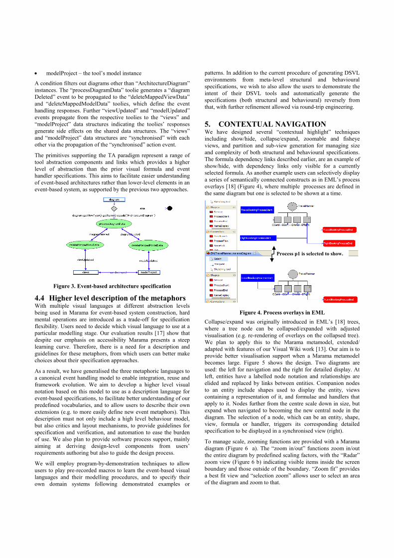
modelProject – the tool’s model instance
A condition filters out diagrams other than “ArchitectureDiagram”
instances. The “processDiagramData” toolie generates a “diagram
Deleted” event to be propagated to the “deleteMappedViewData”
and “deleteMappedModelData” toolies, which define the event
handling responses. Further “viewUpdated” and “modelUpdated”
events propagate from the respective toolies to the “views” and
“modelProject” data structures indicating the toolies’ responses
generate side effects on the shared data structures. The “views”
and “modelProject” data structures are “synchronised” with each
other via the propagation of the “synchronised” action event.
The primitives supporting the TA paradigm represent a range of
tool abstraction components and links which provides a higher
level of abstraction than the prior visual formula and event
handler specifications. This aims to facilitate easier understanding
of event-based architectures rather than lower-level elements in an
event-based system, as supported by the previous two approaches.
Figure 3. Event-based architecture specification
4.4 Higher level description of the metaphors With multiple visual languages at different abstraction levels
being used in Marama for event-based system construction, hard
mental operations are introduced as a trade-off for specification
flexibility. Users need to decide which visual language to use at a
particular modelling stage. Our evaluation results [17] show that
despite our emphasis on accessibility Marama presents a steep
learning curve. Therefore, there is a need for a description and
guidelines for these metaphors, from which users can better make
choices about their specification approaches.
As a result, we have generalised the three metaphoric languages to
a canonical event handling model to enable integration, reuse and
framework evolution. We aim to develop a higher level visual
notation based on this model to use as a description language for
event-based specifications, to facilitate better understanding of our
predefined vocabularies, and to allow users to describe their own
extensions (e.g. to more easily define new event metaphors). This
description must not only include a high level behaviour model,
but also critics and layout mechanisms, to provide guidelines for
specification and verification, and automation to ease the burden
of use. We also plan to provide software process support, mainly
aiming at deriving design-level components from users’
requirements authoring but also to guide the design process.
We will employ program-by-demonstration techniques to allow
users to play pre-recorded macros to learn the event-based visual
languages and their modelling procedures, and to specify their
own domain systems following demonstrated examples or
patterns. In addition to the current procedure of generating DSVL
environments from meta-level structural and behavioural
specifications, we wish to also allow the users to demonstrate the
intent of their DSVL tools and automatically generate the
specifications (both structural and behavioural) reversely from
that, with further refinement allowed via round-trip engineering.
5. CONTEXTUAL NAVIGATION We have designed several “contextual highlight” techniques
including show/hide, collapse/expand, zoomable and fisheye
views, and partition and sub-view generation for managing size
and complexity of both structural and behavioural specifications.
The formula dependency links described earlier, are an example of
show/hide, with dependency links only visible for a currently
selected formula. As another example users can selectively display
a series of semantically connected constructs as in EML’s process
overlays [18] (Figure 4), where multiple processes are defined in
the same diagram but one is selected to be shown at a time.
Figure 4. Process overlays in EML
Collapse/expand was originally introduced in EML’s [18] trees,
where a tree node can be collapsed/expanded with adjusted
visualisation (e.g. re-rendering of overlays on the collapsed tree).
We plan to apply this to the Marama metamodel, extended/
adapted with features of our Visual Wiki work [13]. Our aim is to
provide better visualisation support when a Marama metamodel
becomes large. Figure 5 shows the design. Two diagrams are
used: the left for navigation and the right for detailed display. At
left, entities have a labelled node notation and relationships are
elided and replaced by links between entities. Companion nodes
to an entity include shapes used to display the entity, views
containing a representation of it, and formulae and handlers that
apply to it. Nodes further from the centre scale down in size, but
expand when navigated to becoming the new central node in the
diagram. The selection of a node, which can be an entity, shape,
view, formula or handler, triggers its corresponding detailed
specification to be displayed in a synchronised view (right).
To manage scale, zooming functions are provided with a Marama
diagram (Figure 6 a). The “zoom in/out” functions zoom in/out
the entire diagram by predefined scaling factors, with the “Radar”
zoom view (Figure 6 b) indicating visible items inside the screen
boundary and those outside of the boundary. “Zoom fit” provides
a best fit view and “selection zoom” allows user to select an area
of the diagram and zoom to that.
Process p1 is selected to show.

Fisheye view or “distortion based display” functionality is also
supported. The benefit is that a local context is presented against a
global context, thus allowing the user’s point of interest to be
focused on without losing the extensive surrounding information.
Figure 6 c shows a fisheye view of an EML [18] tree structure.
The mouse pointer is the default Focal Point. The degree of
interest (DOI) of the certain part of the tree structure is based on
the Distance of Focus. A shorter distance will lead to higher value
of DOI, thus, the shape will be represented in a bigger size. The
longer distance brings lower value of DOI, which leads to the
smaller size of the shapes. As the mouse moves, the DOI value
and shape size of the tree nodes is recalculated dynamically.
Figure 5. Semantic navigation of tool specifications
Figure 6. Zoomable and fisheye views in Marama
Though various contextual navigations are supported in the base
diagram, users are also able to partition by element selection with
regeneration and display in a sub-view. Marama supports cohesive
consistency between multiple views, and the generated sub-view
can again function as a base view for further partitions.
We are experimenting with automatic layout techniques which
will be useful to improve the user’s ability to show/hide,
collapse/expand, or juxtapose parts of a specification, and thus to
manage size, complexity and visibility more effectively. These are
based on end user specifications at a high level, with the focus on
indicating which visual components are to be affected and how.
6. VISUAL DEBUGGING A consequence of introducing new visual languages to specify and
generate event handlers in Marama is the need to support
incremental development and debugging using these languages.
Event propagation can become very complex so tool support for
tracing and visualising event propagations and their effects is
needed. Such visualisations need to incorporate both the static
dependency structure and dynamic event handling behaviour.
Event-based system executions are highly time related, and many
phenomena may occur in a very short time making real-time
visualisations ineffective [4]. Step-by-step visualisation that is
interactively controlled by the user is thus required.
Marama’s visualisation of dynamic event handling behaviour uses
a model-view-controller approach which reuses event handler
specification views by dynamically annotating modelling elements
with colours and state information in response to events. A central
repository stores runtime information which can be retrieved and
manipulated by controller code for presentation in views. A
specialised debugging and inspection tool (visual debugger)
allows execution state of event-based systems to be queried,
visualised and dynamically modified. It provides a common user
interface connecting the model-level constraint and view-level
event handling specifications with an underlying debug model.
Figure 7. Visual debugging formulae (a) and event handler (b).
Figure 7 shows the visualisation of runtime interpreted formulae
(a) and an event handler (b) on a Marama model. The metamodel
view and the event handler specification views are respectively
juxtaposed with the runtime Marama model view for parallel
visualisation of dependency evaluation or event handling in the
running model instance’s context. A traditional “debug and step
into” metaphor is used for step-by-step visualisation. Affected
runtime model elements are annotated (yellow background) to
indicate application of the formula/handler (left), while the
formula/handler node and dependency links are annotated
similarly in the specifications showing invocation status (right).
Detailed information is presented in textual form (bottom). Run-
time monitoring of Marama for performance analysis could also
potentially be supported via the visual debugging sub-system.
We are currently working on representing visual debugging at a
higher abstraction level, to better enable users to query both the
Entity2
View2
Shape1
Entity1 View1
View1
View2
Entity1
Attribute1
Attribute2
Attribute3
Formula1 Handler1
Details View
Click to expand
related entities
Navigation View
(a)
(b)
(a)
(b)
(c)

static model and dynamic execution state. A visual query language
will provide users with a means to specify query intent and
generate results. Sensible display of queried results in a
diagrammatic form using layout mechanisms is also being
addressed. More advanced query support is being planned to
query of multiple end user tools for reusable specifications. From
that, a semantic knowledge base with structured metamodel,
model and transformation information is needed so that reasoning
and pattern mining can be effectively performed.
7. SUMMARY We have described general issues involved in visualising event-
based information models, including abstraction and visual
metaphor, hidden dependency, consistency and step-by-step
visualisation. We have addressed these from our own experience
in developing a set of notations and tools, from which we have
generalised a canonical representation to enable the specification
and visualisation of general purpose event-based systems. The
generalised framework includes the following components and
provides reuse via both inheritance and composition:
Structural components, e.g. entity, relationship, attribute,
role, cardinalities, event, model, view
Behavioural components, e.g. query, filter, action, formula,
and various event notification schemes such as broadcast,
subscribe-notify, listen-before and listen-after.
Layout, e.g. for shapes: containment, on border, enclosure,
horizontal/vertical alignment, show/hide, and
collapse/expand; for connectors: straight/curved/angled
routing and show/hide; and overall: horizontal/vertical tree,
top-down/left-right process start/end, zooming/fisheye and
view juxtaposition.
Runtime, e.g. focus/highlight
Our future work directions include a higher level description of
our visual event handling metaphors, automatic layout support
and query-based runtime visualisation.
8. REFERENCES [1] Berndtsson, B., J. Mellin, and U. Hogberg, Visualization of
the Composite Event Detection Process, in the 1999
International Workshop on User Interfaces to Data Intensive
Systems. 1999, IEEE CS Press. p. 118-127.
[2] Burnett, M., et al., Forms/3: A first-order visual language to
explore the boundaries of the spreadsheet paradigm. Journal
of Functional Programming, 2001. 11(2): p. 155-206.
[3] Conway, M., et al., Alice: Lessons Learned from Building a
3D System for Novices, in the SIGCHI conference on Human
factors in computing systems. 2000. p. 486-493.
[4] Coupaye, T., C.L. Roncancio, and C. Bruley, A Visualization
Service for Event-Based Systems, in 15emes Journees Bases
de Donnees Avancees, BDA. 1999.
[5] Cox, P.T., et al., Experiences with Visual Programming in a
Specific Domain - Visual Language Challenge ’96, in the
1997 IEEE Symposium on Visual Languages. 1997.
[6] Cypher, A., Watch What I Do: Programming by
Demonstration. 1993: The MIT Press.
[7] Green, T.R.G. and M. Petre, Usability analysis of visual
programming environments: a 'cognitive dimensions'
framework. JVLC, 1996. 7: p. 131-174.
[8] Grundy, J.C. and J.G. Hosking, ViTABaL: A Visual
Language Supporting Design by Tool Abstraction, in the
1995 IEEE Symposium on Visual Languages. 1995, IEEE
CS Press: Darmsdart, Germany. p. 53-60.
[9] Grundy, J.C. and J.G. Hosking, Serendipity: integrated
environment support for process modelling, enactment and
work coordination. Automated Software Engineering:
Special Issue on Process Technology, 1998. 5(1): p. 27-60.
[10] Grundy, J.C., J.G. Hosking, and W.B. Mugridge, Visualising
Event-based Software Systems: Issues and Experiences, in
SoftVis97. 1997: Adelaide, Australia.
[11] Grundy, J.C., et al., Generating Domain-Specific Visual
Language Editors from High-level Tool Specifications, in
the 21st IEEE/ACM International Conference on Automated
Software Engineering. 2006: Tokyo, Japan. p. 25-36.
[12] Haskell. [cited 2007]; Available from:
http://www.haskell.org/
[13] Hirsch, C., J. Hosking, and J. Grundy, Interactive
Visualization Tools for Exploring the Semantic Graph of
Large Knowledge Spaces, in Workshop on Visual Interfaces
to the Social and the Semantic Web (VISSW2009), IUI2009.
2009: Sanibel Island, Florida, USA.
[14] IBM. Specification: Business Process Execution Language
for Web Services Version 1.1. [cited 2003]; Available from:
http://www.ibm.com/developerworks/library/ws-bpel/.
[15] Kraemer, F.A. and P. Herrmann, Transforming
Collaborative Service Specifications into Efficiently
Executable State Machines, in GT-VMT 2007. 2007.
[16] Ledeczi, A., et al., Composing Domain-Specific Design
Environments. Computer, 2001: p. 44-51.
[17] Li, K.N.L., Visual languages for event integration
specification in Computer Science. 2007, University of
Auckland: Auckland.
[18] Li, L., J.C. Grundy, and J.G. Hosking, EML: A Tree
Overlay-based Visual Language for Business Process
Modelling, in ICEIS. 2007: Portugal.
[19] Li, X., W.B. Mugridge, and J.G. Hosking, A Petri Net-based
Visual Language for Specifying GUIs, in the 1997 IEEE
Symposium on Visual Languages. 1997: Isle of Capri, Italy.
[20] Matskin, M. and D. Montesi, Visual Rule Language for
Active Database Modelling. Information Modelling and
Knowledge Bases IX, 1998: p. 160-175.
[21] OMG. UML Superstructure. [cited 2009]; Available from:
http://www.omg.org/spec/UML/2.2/Superstructure/PDF.
[22] Paschke, A., ECA-LP / ECA-RuleML: A Homogeneous
Event-Condition-Action Logic Programming Language, in
RuleML’06. 2006: Athens, Georgia, USA.
[23] Pautasso, C. and G. Alonso, Visual Composition of Web
Services, in IEEE HCC’03. 2003: Auckland, New Zealand.
[24] Smith, D.C., A. Cypher, and J. Spohrer, KidSim:
programming agents without a programming language.
Communications of the ACM, 1995. 37(7): p. 54 - 67.
[25] Tolvanen, J., OOPSLA demonstrations chair's welcome:
MetaEdit+: integrated modeling and metamodeling
environment for domain-specific languages, Companion to
the 21st ACM. 2006.
[26] Zhu, N., et al., Pounamu: a meta-tool for exploratory
domain-specific visual language tool development. Journal
of Systems and Software, 2007. 80 (8).

Using the magnet metaphor for multivariate visualization
in Software management Amaia Aguirregoitia
University of the Basque Country La Casilla 3, 48012
Bilbao (Spain)
J. Javier Dolado University of the Basque Country Pº Manuel de Lardizabal 1, 20018
Donostia (Spain)
Concepción Presedo University of the Basque Country
La Casilla 3, 48012 Bilbao (Spain)
ABSTRACT
This paper presents SoftMagnet, a new multivariate analysis
model for controlling and managing the processes of software
project development. SoftMagnet uses metaphors and visual
representation techniques to explore several key indicators in
order to support problem detection and resolution. The resulting
visualization addresses diverse management tasks, such as
tracking of deviations from the plan, analysis of patterns of failure
detection and correction, overall assessment of change
management policies, and estimation of product quality. The
proposed visualization uses a metaphor with magnets along with
various interactive techniques to represent information concerning
the software development process and to deal efficiently with
multivariate visual queries. This paper shows the final
implementation of SoftMagnet in JavaFX with data of a real
project as well as the results of testing the tool with the
aforementioned data.
Categories and Subject Descriptors
H.5.2 [Information Interfaces and Presentation]: User
Interfaces - Graphical user interfaces (GUI)
General Terms
Management, Measurement.
Keywords
Information Visualization, Data visualization Software, Software
visualization, Visual knowledge discovery
1. INTRODUCTION Managing software development processes is a very difficult task.
Often projects are behind schedule and the resulting applications
lack quality. Managers require different types of data, for instance
written reports from project managers or software metrics like
productivity, quality, adherence to schedule and budget. To assist
in exploration and analysis of the high volumes of data required,
our research focuses on the design of a tool to efficiently process
visual queries on the key measures for software development
management.
Most of the data from software engineering science are
multivariate, containing more than three attributes. Therefore,
multivariate information visualization techniques should be
considered. The use of multivariate information visualization
techniques is intrinsically difficult because the multidimensional
nature of data cannot be effectively presented and understood on
real-world displays, which have limited dimensionalities [1].
However, these techniques are very useful and offer powerful
insights into the decision-making process.
The present paper describes SoftMagnet, which uses a metaphor
with magnets as well as various interactive techniques, and
applies the benefits of multivariate information visualization
techniques to the Software management field,. The magnet
metaphor is intuitive, which facilitates learning and interacting
with our multivariate information visualization.
The next section presents the related work. Then a description of
the tool is given. In the conclusion, we assess our work and
present the major benefits of the proposed visualization.
2. RELATED WORK Much work has been conducted on visually presenting
multidimensional data with the same underlying goal: to display
complex, multidimensional information using a lower (e.g., two-
or three-) dimensional space in a form suitable for understanding
[2]. There are a large number of techniques but we will now
mention just the few related to our work.
One of the more popular multivariate visualization techniques for
Statistics is the scatterplot matrix which presents multiple adjacent
scatterplots. Scatterplots are bivariate or trivariate plots of
variables against each other and the power of the scatterplot
matrix lies in its ability to show the internal connections of the
scatter diagrams [3].
The idea of pair wise adjacencies of variables is also a basis for
the Hyperbox [4] where all possible pairs of variables are plotted
against each other and any pair can be brought to front with
Cartesian axes with all others still visible. Some other related
visualizations are hierarchical axis [5, 6] and HyperSlice [7].
Parallel coordinates is another extended technique, which uses
parallel axes instead of perpendicular to represent dimensions of a
multidimensional data set [8, 9]. Star plots, star coordinates polar
charts, height maps, stacked displays, heat maps, table lens and
time wheels are more recent but quite widespread techniques.
This paper was published in the proceedings of the Workshop on Visual
Analytics in Software Engineering (VASE) at the IEEE/ACM
International Conference on Automated Software Engineering (ASE).
Copyright is held by the author/owner(s). November, 2009. Auckland,
New Zealand.
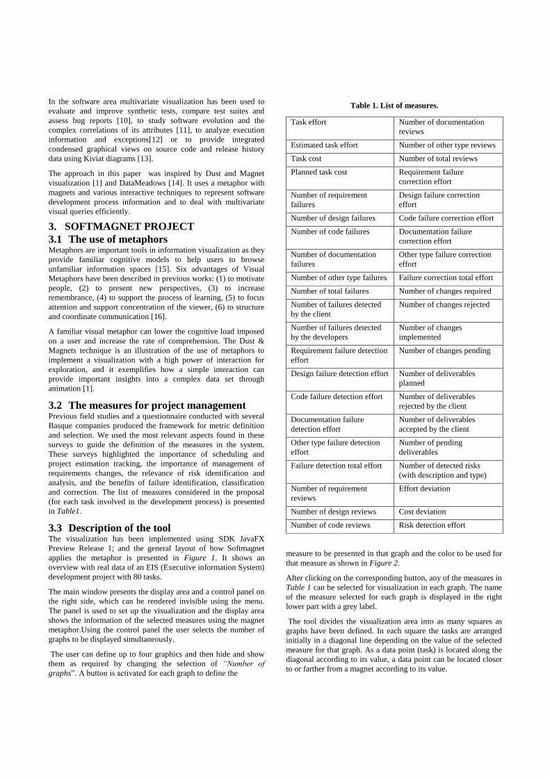
In the software area multivariate visualization has been used to
evaluate and improve synthetic tests, compare test suites and
assess bug reports [10], to study software evolution and the
complex correlations of its attributes [11], to analyze execution
information and exceptions[12] or to provide integrated
condensed graphical views on source code and release history
data using Kiviat diagrams [13].
The approach in this paper was inspired by Dust and Magnet
visualization [1] and DataMeadows [14]. It uses a metaphor with
magnets and various interactive techniques to represent software
development process information and to deal with multivariate
visual queries efficiently.
3. SOFTMAGNET PROJECT
3.1 The use of metaphors Metaphors are important tools in information visualization as they
provide familiar cognitive models to help users to browse
unfamiliar information spaces [15]. Six advantages of Visual
Metaphors have been described in previous works: (1) to motivate
people, (2) to present new perspectives, (3) to increase
remembrance, (4) to support the process of learning, (5) to focus
attention and support concentration of the viewer, (6) to structure
and coordinate communication [16].
A familiar visual metaphor can lower the cognitive load imposed
on a user and increase the rate of comprehension. The Dust &
Magnets technique is an illustration of the use of metaphors to
implement a visualization with a high power of interaction for
exploration, and it exemplifies how a simple interaction can
provide important insights into a complex data set through
animation [1].
3.2 The measures for project management Previous field studies and a questionnaire conducted with several
Basque companies produced the framework for metric definition
and selection. We used the most relevant aspects found in these
surveys to guide the definition of the measures in the system.
These surveys highlighted the importance of scheduling and
project estimation tracking, the importance of management of
requirements changes, the relevance of risk identification and
analysis, and the benefits of failure identification, classification
and correction. The list of measures considered in the proposal
(for each task involved in the development process) is presented
in Table1.
3.3 Description of the tool The visualization has been implemented using SDK JavaFX
Preview Release 1; and the general layout of how Softmagnet
applies the metaphor is presented in Figure 1. It shows an
overview with real data of an EIS (Executive information System)
development project with 80 tasks.
The main window presents the display area and a control panel on
the right side, which can be rendered invisible using the menu.
The panel is used to set up the visualization and the display area
shows the information of the selected measures using the magnet
metaphor.Using the control panel the user selects the number of
graphs to be displayed simultaneously.
The user can define up to four graphics and then hide and show
them as required by changing the selection of “Number of
graphs”. A button is activated for each graph to define the
Task effort Number of documentation
reviews
Estimated task effort Number of other type reviews
Task cost Number of total reviews
Planned task cost Requirement failure
correction effort
Number of requirement
failures
Design failure correction
effort
Number of design failures Code failure correction effort
Number of code failures Documentation failure
correction effort
Number of documentation
failures
Other type failure correction
effort
Number of other type failures Failure correction total effort
Number of total failures Number of changes required
Number of failures detected
by the client
Number of changes rejected
Number of failures detected
by the developers
Number of changes
implemented
Requirement failure detection
effort
Number of changes pending
Design failure detection effort Number of deliverables
planned
Code failure detection effort Number of deliverables
rejected by the client
Documentation failure
detection effort
Number of deliverables
accepted by the client
Other type failure detection
effort
Number of pending
deliverables
Failure detection total effort Number of detected risks
(with description and type)
Number of requirement
reviews
Effort deviation
Number of design reviews Cost deviation
Number of code reviews Risk detection effort
measure to be presented in that graph and the color to be used for
that measure as shown in Figure 2.
After clicking on the corresponding button, any of the measures in
Table 1 can be selected for visualization in each graph. The name
of the measure selected for each graph is displayed in the right
lower part with a grey label.
The tool divides the visualization area into as many squares as
graphs have been defined. In each square the tasks are arranged
initially in a diagonal line depending on the value of the selected
measure for that graph. As a data point (task) is located along the
diagonal according to its value, a data point can be located closer
to or farther from a magnet according to its value.
Table 1. List of measures.

Figure 1 shows four squares with four different graphs where the
user can analyze the four selected measures simultaneously (effort
deviation, total failure correction effort, number of changes
implemented and total number of errors). When the task with the
highest deviation (Second phase coding) is selected in graph 1 the
tool highlights that that same task is the one with the highest
number of errors and failure correction effort, which seems to
indicate that the deviation may be caused by failures and failure
correction in the codification phase.
By looking at the numbers in the axes the user finds that 87 hours
have been dedicated to error correction and that the deviation of
the task is 136. To further analyze the failures the user can
choose a concrete type of error, as “Code errors” instead of “Total
number of errors” from the indicator list and visually compare the
new results.
Figure 3 shows the same configuration of graphs and settings but
in this case, another phase (Coding of International Module) is
selected. When the user selects this task, the user can see in graph
2 (and using the data table if required) that only 28 hours have
been dedicated to error correction when the effort deviation for
the task is 92. The tool highlights in graph 3 (lower right) that that
task has the highest number of modifications implemented. This
information helps the user to detect a possible cause of the
deviation.
As the magnet is being dragged, the “particles” (tasks) are
attracted and move with the magnet. The user can use this feature
to easily compare the values for different measures by setting
magnets in a way that tasks are arranged in parallel lines. Scales
and axes are set automatically by the visualization and they are
independent for each square. There is highly valuable global
information contained in the positions of the tasks. Figure 4
shows two graphs where both magnets has been dragged from the
upper left corner to the upper left corner so that the tasks are
presented vertically.
An interesting feature is that when the user selects one of the
tasks, the visualization searches for that task in the rest of the
graphs. It indicates its position in all the graphs with a colored dot
and the user can visually analyze the data of the different
measures simultaneously (See Figure 4).
One of the disadvantages of the representation is that more than
one task can have the same value for a measure, which results in a
graph where a dot represents a set of tasks instead of a unique
task. This situation is indicated in the graph with the label “SET”
instead of a task description in the dot (See Figure 4). However,
the identification and descriptions of the selected tasks are always
visible in the square in the lower right part of the screen as shown
in Figure 5.
The visualization offers the information for all the tasks and all
the measures in the actual representation as text in a data table.
Figure 5 presents the table that can be accessed by clicking on
“Show graphs data”. The data table incorporates a final row with
the total for each column (measure) and the actual filters also
applied to the data table. The table presents the task identification,
description, and four columns with the data of the four actual
measures.
In order to find out more about a certain group of tasks the system
implements filters using different hierarchies or criteria or the
filter by value option.
Tasks of the project are classified according to different
hierarchies (type of task, development module, workgroup and
project phase) and for each hierarchy there are different groups.
For example “Requirement analysis” is a group or level of the
“Type of task” hierarchy. The tool includes a feature in the
“Filters” tab to apply a filter based on the stated groups.
Another interesting feature is the “Filter by value” option which
allows specifying a measure and a range of values to filter and to
display the set of tasks meeting that condition as shown in Figure
7 (in the figure only the tasks assigned to workgroup one with
pending deliverables will be displayed). It is very easy to filter,
for example, only those requirement analysis tasks with
modifications and then analyze the measures in the graphs: effort
deviation, modifications rejected, pending modifications and
number of total failures. The user can “set filters off” at any time
or apply multiple filters simultaneously. The axes for each graph
are recalculated and redrawn after applying a filter for the best
possible visibility.
3.4 Benefits of the visualization Each graph of the visualization allows for exploration of how the
different tasks contribute to the total value of a measure and its
distribution. This can be useful, for instance, for error distribution
analysis and error pattern detection. The visualization can present
up to four measures simultaneously. Therefore, if the user needs
to explore different variables simultaneously it is possible to
compare values and distribution of related measures in the same
visualization. An as example, if the users selects four graphs and
different types of failure as the selected measure for each graph, it
is possible to analyze error distribution by type as well as the
distribution and pattern for each error type. Multiple-variable
visualization can be useful for finding relationships between
variables. As an example, the user can examine the measures
“Failure detection effort” and “Number of errors detected” and
analyze the relationships between these measures.
The tool allows the user to identify problematic areas. When
measures such as “number of errors”, or “Effort deviation” are
selected, the user can detect very easily which tasks are
problematic. With a quick look at the right or lower (depending
on the position of the magnet) portion of the graphs, the user can
identify which tasks have the highest values of these metrics.
Another benefit is that when a task stands out from the others on
the graph of one measure, the tool searches and highlights the
value of that same task for a different measure on a separate
graph. As seen in the aforementioned example, if effort deviation
is presented in one square and number of changes implemented in
another square, when the user selects, let us say, the task with the
highest effort deviation in the first graph, the other graph will
highlight the position of that task for the “numbers of changes
implemented” variable. The user can easily detect if the high
values of effort deviation correspond to high values of approved
modifications to the software and analyze if those effort
deviations could have been caused by those modifications.
Furthermore, the user can move from an overall view to a detailed
view of a measure by clicking on one of the values.

Figure 1. Overview of the system.
Figure 2. Graph definition after clicking on Graph1.

Figure 3. Data Analysis by selection.
Figure 4. Dragging the magnets to position the tasks.

Figure 5. Descriptions of the selected tasks and data for the visible tasks and measures.
.
.
system.
.
Figure 6. Filtering options.
.
system.
.
Figure 7. Applying a filter by value.
.
When a circle in one of the graphs represents a set of tasks with
the same value the user can access a detailed list of tasks by
selecting the circle. In addition, the user can focus on a certain set
of tasks using the specified classifications. All the tasks are
classified according to different criteria which are used to filter
the information and facilitate analysis. The established
classification to analyze the tasks of our project is as shown in
Figure 8. The user can employ these classifications to apply filters
and perform actions such as: analyzing the errors of only the set of
tasks performed by a certain workgroup, visualizing the status of
the deliveries of only one of the modules or evaluating the cost
deviation of a certain type of task, like programming or
documentation, to assess if there have been estimation problems
with that type of task.
Additionally, the filter by value option lets the user specify a
measure and a range of values to limit the information presented.
With the tool, the user can apply a filter based on the value of a
certain measure and graphically explore up to four measures
different from the one used for the filter. The graphs will only
display the tasks with the value specified by the filter. This can be
useful, for example, when the user tries to focus on the tasks that
have more than two deliverables pending, or on those that have
received more than three modifications or on those that have been
associated with a risk.
Moreover, by selecting the “show data” option, the user can
examine the values for each of the tasks and see the total for the
visualized data in text format. If the user has previously applied a
filter, it applies not only to the graphs, but also to this total. Table
2 summarizes the benefits of the visualization.
4. CONCLUSION
This paper presents a representation for multivariate visualization
and reasoning about datasets from the software project
management area. It combines filtering and selection options and
visualizes multiple measures for comparison. The different
hierarchies and levels, the drag options, the task selection and
search capabilities, and the wide range of possibilities for analysis
are the most salient strengths of the project. In our future work,
we will perform user tests to further explore the visualization and
to improve it.
5. REFERENCES [1] J. Yi, R. Melton, J. Stasko et al., “Dust & Magnet:
multivariate information visualization using a magnet
metaphor,” Information Visualization, vol. 4, no. 4, pp. 239-
256, 2005.
The representation offers multiple possibilities of arranging
clusters of tasks and allows for visualization of certain chosen
subsets of tasks.
It integrates a high interaction level (multiple selections, mouse
functions, pop-up labels, ..) and includes features such as a general
view, additional information for a task on mouse click ( the
task is highlighted in the other graphs) or magnet drag facilities.
Softmagnet presents up to four measures in a single view. The
capability of showing multiple measures at a time is a central
feature because it lets the user analyze, detect patterns and draw a
conclusion from information of multiple variables. Softmagnet is
adept when the analysis includes different measures
simultaneously.
It includes a complete set of measures for analysis and offers the
possibility of filtering of the information according to the value of
a selected measure (filter by value). This feature, along with the
four graphs, allows consideration of five measures at the same
time.
The visualization presents visually, as well as and in a data table,
the numerical value of more than one measure for multiple tasks in
the current visualization. It is possible to study all the tasks in the
visualization simultaneously with the numerical information for
more than one measure in view.
The approach calculates and immediately presents the totals for all
the visible tasks and actual measures.
The proposal includes a “Filter by group” option for visualizing a
subset of tasks, which allows visualizing only the selected groups
of tasks simultaneously.
Softmagnet has drag options to position the magnets and tasks,
which is valuable when comparison between different measures is
required.
The axes are scaled according to the presented values. Therefore,
when the user wants to focus on a set of values (similar to a zoom
on an area) he can apply a filter to that measure and those values
and the graph will be automatically redrawn.
Softmagnet includes graphical and textual information to
complement the graph.
It concentrates on detecting problematic areas by focusing on
nonstandard or irregular values.
Figure 8. Task classification for an EIS development.
Table 2. Benefits of the visualization.
Table2. Benefits of the visualization.

[2] P. Wong, and R. Bergeron, "30 years of multidimensional
multivariate visualization," Scientific Visualization,Overviews,
Methodologies & Techniques, pp. 3-33: IEEE, 1997.
[3] W. Härdle, and L. Simar, Applied multivariate statistical
analysis: Springer, 2007.
[4] B. Alpern, L. Carter, I. Center et al., "The hyperbox," in
Proceedings of the Conference on Visualization, IEEE, pp.
133-139, 1991.
[5] T. Mihalisin, J. Timlin, and J. Schwegler, “Visualization and
analysis of multi-variate data: a technique for all fields,” in
Proceedings of the Conference on Visualization, IEEE, pp.
171-178, 1991.
[6] T. Mihalisin, J. Timlin, J. Schwegler et al., “Visualizing
multivariate functions, data, and distributions,” IEEE
Computer Graphics and Applications, vol. 11, no. 3, pp. 28-
35, 1991.
[7] J. van Wijk, and R. van Liere, “HyperSlice: visualization of
scalar functions of many variables,” in Proceedings of the
Conference on Visualization, IEEE, pp. 119-125, 1993.
[8] A. Inselberg, “The plane with parallel coordinates,” The
Visual Computer, vol. 1, no. 4, pp. 69-91, Springer, 1985.
[9] A. Inselberg, B. Dimsdale, I. Center et al., "Parallel
coordinates: a tool for visualizing multi-dimensional
geometry," in Proceedings of the Conference on
Visualization, IEEE, pp. 361-378, 1990.
[10] D. Leon, A. Podgurski, and L. White, "Multivariate
visualization in observation-based testing," in Proceedings
of the International Conference on Software Engineering,
ACM, pp. 116-125, 2000.
[11] L. Voinea, and A. Telea, “Multiscale and multivariate
visualizations of software evolution,” in Proceedings of the
Symposium on Software Visualization, ACM, pp. 115-124,
2006.
[12] A. Orso, J. Jones, and M. Harrold, "Visualization of
program-execution data for deployed software." pp. 67-76.
[13] M. Pinzger, H. Gall, M. Fischer et al., “Visualizing multiple
evolution metrics,” in Proceedings of the Symposium on
Software Visualization, ACM, pp. 67-75, 2005.
[14] N. Elmqvist, J. Stasko, and P. Tsigas, “DataMeadow: a
visual canvas for analysis of large-scale multivariate data,”
Information Visualization, vol. 7, no. 1, pp. 18-33, 2008.
[15] B. Shneiderman, S. Card, and J. Mackinlay, Readings in
Information Visualization: Using Vision to Think: Morgan
Kaufmann, 1999.
[16] M. Eppler, “The Image of Insight: The Use of Visual
Metaphors in the Communication of Knowledge,” in
Proceedings of I-KNOW, pp. 81-88, 2003.