visual communication 4(2) 76 77 visual communication...
TRANSCRIPT
77 visual communication 4(2)76visual communication 4(2)
HARTMUT STÖCKL is Senior Lecturer in the
Department of Applied Linguistics at the
Institute of Media Communication and
Intercultural Communication , Chemnitz
University, Germany. H is main research
areas are in multimodal media
communication , text l inguistics and
stylistics. H is most recent publication ,
Language in the Image – The Image in
Language (de Gruyter, 2 0 0 4) analyses the
numerous interrelations between language
and image in printed mass media texts
(journalism and advertising) and especially
emphasizes the pictorial nature of
language .
Address: Institut für Medienkommunikation
und Interkulturelle Kommunikation
Angewandte Sprachwissenschaft ,
Philosophische Fakultät , Technische
Universität Chemnitz , Thüringer Weg 1 1 ,
0 9 1 0 7 Chemnitz , Germany. [email:
hartmut .stoeckl@phil .tu-chemnitz .de]
HARTM
UT
STÖCKL
ABSTRACTThis study demonstrates how semiotictheories can be used to understandtypography. Starting from the assumptionthat typography represents a mode/code inits own right, which interacts with all othertextual signing modes, the article outlines a
typographic ‘grammar’ as a structured set of networked resources. The analytical toolkit isthen illustrated with the help of two sample texts. Based on some general semioticreflections about the nature and operations of the graphic sign, this article also attempts aconcise account of typographic meaning making and its communicative effects.
KEY WORDScommunicative effects ! domains of typographic work ! graphic sign ! language vs image! meaning making ! pictoriality ! semiotic layer
TYPOGRAPHY AND LINGUISTIC/SEMIOTIC THEORYWith respect to the history (Lechner, 1981; Raible, 1991) and practice (Willberg, 2002;Willberg and Forssman, 1999) of typography, ‘body’ and ‘dress’ are complementary and aptmetaphors for how graphic designers and typographers might look at their work. Whenapplied to possible stances of linguistics towards typography, however, these metaphorsserve to highlight two contrasting approaches. Those that view typography as the ‘body’assume that it is the material precondition of any text. Just as there is no speech withoutvoice qualities and intonation, there is no written document without (typo)-graphic qualities.In this sense, both typography and prosody are indispensable paraverbal qualities, whichwould seem inherently tied to various linguistic and pragmatic levels of an utterance. Whenwe look at typography as the ‘dress’ of a text, it merely forms its outer shell, its designablesurface, which can be thought of as further removed from the linguistics of a text. It wouldat best be the sociolinguist, then, who might share an interest in typography as it revealssomething about the nature of the text producer or says something about the kind of socialor aesthetic address (audience design, Bell, 2001) intended.
Not surprisingly, then, traditional linguists have tended not show much interest intypography or graphic design. In their view, writing is secondary to speech, merely aninstrument for encoding spoken language. Consequently, linguists have concentrated on thephoneme-grapheme correlations in different languages and on the nature of various writingsystems (Dürscheid, 2002), but have ignored the individual variability of sign tokens.Saussurean-style linguists have also erroneously focused on the sentence or smaller linearunits of language and thus failed to understand the spatial nature of text on the page and itsorganizing effects (Waller, 1991).
So it is only the more recent, semiotics-inspired trends in text linguistics and stylistics(Fix, 2001; Kress and Van Leeuwen, 2001; Stöckl, 2004), which have acknowledged thecrucial function of typography and text design. Following the dictum that meaning can bemade with the help of various sign systems and that language is mostly tied to non-verbalmodes in communicative practice, typography can be understood as a mode/code in itsown right. It contributes to textual meaning in numerous ways and must be seen as achallenge to linguistic and semiotic theories as its workings within the text are both
Typography: body and dress of a text –
a signing mode between language and image
79 visual communication 4(2)78visual communication 4(2)
inherently tied to language as well as relatively independent from it. What insight then does a semiotic take of typography reveal?
First of all, writing can be called a connotative sign system (in the sense of Barthes,1996) as it uses content-form combinations of a primary sign system (language) as signifiersin a secondary system (typography). Although this explains the relatively close connectionbetween graphic design and aspects of language, things are slightly more complicated.Berger (1979: 12) has shown that typographic elements are complex signs which comprisevarious semiotic layers, each capable of independently conveying meaning. First, typo-graphy, of course, serves to encode language. Whether writing substitutes for speech – astraditional linguists would have it – or whether graphic signs form an autonomous signsystem that takes elements of reality or mental concepts as its signifieds – as semioticians(Nöth, 1985: 264) and practitioners (Stötzner, 2003: 285) claim – this does not alter the factthat readers need to decode graphic signs in order to make linguistic meaning (graphemesinto phonemes or lexemes, etc.). Second, beyond this elementary and highly automatedlevel, literate users of typography will also notice various aspects of graphic and visualdetail which convey often subtle, never completely redundant and invariably connotative,meanings. Here, type faces may point to the nature of the document, carry emotional valuesor indicate the writer’s intended audience, and aspects of the layout may serve to reinforcethe thematic structure of a given text and facilitate access to its information. Finally, on yetanother level of typographic meaning making, the graphic signs of writing can assumepictorial qualities. Thus, letters may form visual shapes which stand for objects from reality,signal states-of-affairs or actions, and illustrate emotions. Materials and techniques ofgraphic sign making, too, may be made salient in text design and can thus convey some-thing about situation, genre and stylistic intent of a communicative occurrence – this is alsoa pictorial kind of communication.
It is this threefold semiotic nature of typography that provides its communicativeflexibility. As Gross (1994: 76) puts it, producers and recipients alike can shift betweendifferent ‘modes of signification’ (Signifikationsmodi ), whose readings intermingle andinterrelate. Interestingly, the three semiotic layers of typography correspond to the threegeneral types of signs (according to Peircean semiotics): reading is mainly symbolic, an actof deciphering conventional signs, but it can take on indexical and iconic qualities. In manyways, registering the connotative and pictorial aspects of typographic design can be seen tobe prior to the symbolic decoding in the process of reading as graphic shapes intrude uponour perception as gestalt properties of images.
GRAPHIC SIGNS BETWEEN LANGUAGE AND IMAGEThe German word Schriftbild (writing + picture) neatly epitomizes readers’ ability toabstract from the linguistic function of writing and focus on its pictorial qualities. Whenthey do this, they partly and temporarily ignore the symbolic nature of typography andperceive a written document as a designed surface, a layout of graphic elements in thespace of a page. Of course, texts differ as to the pictorial qualities of their typography andgraphic design. Although no text genre completely dispenses with the connotativeproperties of typography, some (e.g. advertising, Berger, 2001) are clearly more closelyallied to the use of pictorial effects than others (e.g. legal documents). In typographicpractice this division between normative, ‘merely’ symbolic typography and more norm-breaking, innovative, indexical and iconic typography is usually expressed in the terms
Gebrauchstypographie or Lesetypographie (typography for reading) versus Akzidenztypographieor Displaytypographie (typography for special occasions). While text types which adhere tothe former aim to keep to established typographic standards so as to be easily recognizableand highly functional, text types abiding by the latter practise a playful approach totypographic patterns, which seeks to use the pictorial potential of typography to the full(Gaede, 2002: 501ff.).
As image and pictoriality are many-faceted and somewhat vague terms in semiotics andlinguistics (Stöckl, 2004), it may be useful to briefly sketch out to what extent and in whatways typography can be attributed pictorial qualities. Generally, there is no difference inthe graphic sign’s affiliation with language or image. Stötzner (2003: 285) rightly points outthat it is mainly its higher degree of complexity and its figurative nature which mark thepictorial graphic sign off from the verbal graphic sign, although ‘a neat dividing line cannotbe drawn’. With recourse to Goodman’s (1976) theory of semiotic density, it is correct to saythat the more relevant the graphic aspects of a sign’s gestalt are to its meaning, the more itis likely to be pictorial in nature. Consequently, typography already starts assumingpictorial dimensions once recipients notice certain graphic qualities (font type, size, weight,contrast, tension, ending, colour, direction, position, etc.) over and above the type of theletter and bring it to bear on the meaning of the text. Another aspect of pictoriality comesinto play when we think of the non-linear aspects of typography. Thanks to its spatialarrangement of lines, text blocks and illustrations on the page and thanks to additional
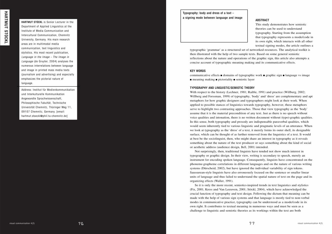
F igure 1 : EMI (The Guardian Unlimited – The Guide , 2 6 June–2 July 2 0 0 4).
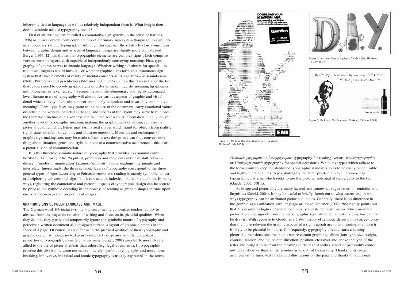
F igure 2 : Art from ‘Fear of diy-ing’ (The Guardian , Weekend , 1 7 July 2 0 0 4).
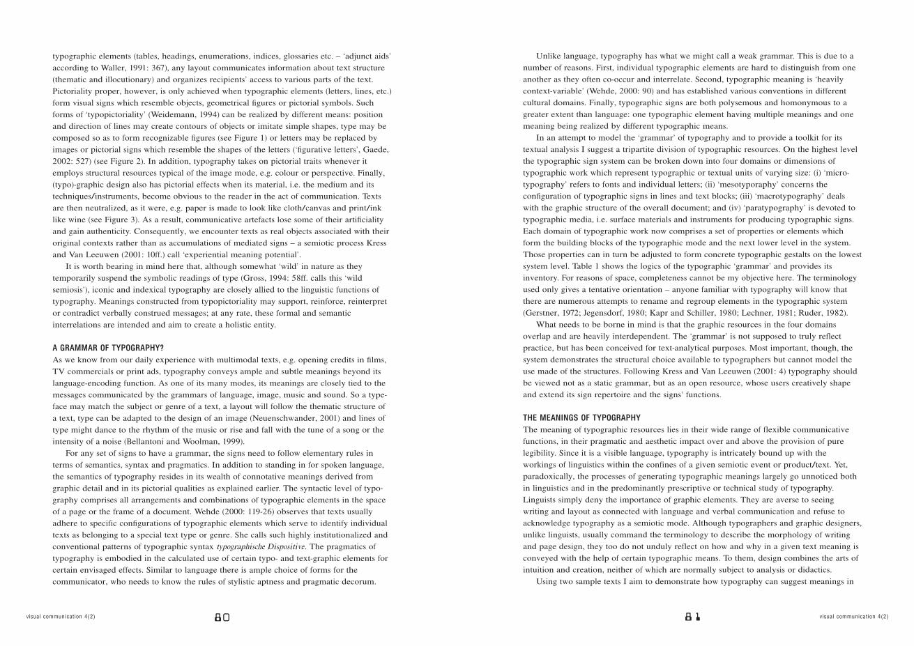
F igure 3 : Da Luca (The Guardian , Weekend , 1 9 June 2 0 0 4).
81 visual communication 4(2)80visual communication 4(2)
typographic elements (tables, headings, enumerations, indices, glossaries etc. – ‘adjunct aids’according to Waller, 1991: 367), any layout communicates information about text structure(thematic and illocutionary) and organizes recipients’ access to various parts of the text.Pictoriality proper, however, is only achieved when typographic elements (letters, lines, etc.)form visual signs which resemble objects, geometrical figures or pictorial symbols. Suchforms of ‘typopictoriality’ (Weidemann, 1994) can be realized by different means: positionand direction of lines may create contours of objects or imitate simple shapes, type may becomposed so as to form recognizable figures (see Figure 1) or letters may be replaced byimages or pictorial signs which resemble the shapes of the letters (‘figurative letters’, Gaede,2002: 527) (see Figure 2). In addition, typography takes on pictorial traits whenever itemploys structural resources typical of the image mode, e.g. colour or perspective. Finally,(typo)-graphic design also has pictorial effects when its material, i.e. the medium and itstechniques/instruments, become obvious to the reader in the act of communication. Textsare then neutralized, as it were, e.g. paper is made to look like cloth/canvas and print/inklike wine (see Figure 3). As a result, communicative artefacts lose some of their artificialityand gain authenticity. Consequently, we encounter texts as real objects associated with theiroriginal contexts rather than as accumulations of mediated signs – a semiotic process Kressand Van Leeuwen (2001: 10ff.) call ‘experiential meaning potential’.
It is worth bearing in mind here that, although somewhat ‘wild’ in nature as theytemporarily suspend the symbolic readings of type (Gross, 1994: 58ff. calls this ‘wildsemiosis’), iconic and indexical typography are closely allied to the linguistic functions oftypography. Meanings constructed from typopictoriality may support, reinforce, reinterpretor contradict verbally construed messages; at any rate, these formal and semanticinterrelations are intended and aim to create a holistic entity.
A GRAMMAR OF TYPOGRAPHY?As we know from our daily experience with multimodal texts, e.g. opening credits in films,TV commercials or print ads, typography conveys ample and subtle meanings beyond itslanguage-encoding function. As one of its many modes, its meanings are closely tied to themessages communicated by the grammars of language, image, music and sound. So a type-face may match the subject or genre of a text, a layout will follow the thematic structure ofa text, type can be adapted to the design of an image (Neuenschwander, 2001) and lines oftype might dance to the rhythm of the music or rise and fall with the tune of a song or theintensity of a noise (Bellantoni and Woolman, 1999).
For any set of signs to have a grammar, the signs need to follow elementary rules interms of semantics, syntax and pragmatics. In addition to standing in for spoken language,the semantics of typography resides in its wealth of connotative meanings derived fromgraphic detail and in its pictorial qualities as explained earlier. The syntactic level of typo-graphy comprises all arrangements and combinations of typographic elements in the spaceof a page or the frame of a document. Wehde (2000: 119-26) observes that texts usuallyadhere to specific configurations of typographic elements which serve to identify individualtexts as belonging to a special text type or genre. She calls such highly institutionalized andconventional patterns of typographic syntax typographische Dispositive. The pragmatics oftypography is embodied in the calculated use of certain typo- and text-graphic elements forcertain envisaged effects. Similar to language there is ample choice of forms for thecommunicator, who needs to know the rules of stylistic aptness and pragmatic decorum.
Unlike language, typography has what we might call a weak grammar. This is due to anumber of reasons. First, individual typographic elements are hard to distinguish from oneanother as they often co-occur and interrelate. Second, typographic meaning is ‘heavilycontext-variable’ (Wehde, 2000: 90) and has established various conventions in differentcultural domains. Finally, typographic signs are both polysemous and homonymous to agreater extent than language: one typographic element having multiple meanings and onemeaning being realized by different typographic means.
In an attempt to model the ‘grammar’ of typography and to provide a toolkit for itstextual analysis I suggest a tripartite division of typographic resources. On the highest levelthe typographic sign system can be broken down into four domains or dimensions oftypographic work which represent typographic or textual units of varying size: (i) ‘micro-typography’ refers to fonts and individual letters; (ii) ‘mesotyporaphy’ concerns theconfiguration of typographic signs in lines and text blocks; (iii) ‘macrotypography’ dealswith the graphic structure of the overall document; and (iv) ‘paratypography’ is devoted totypographic media, i.e. surface materials and instruments for producing typographic signs.Each domain of typographic work now comprises a set of properties or elements whichform the building blocks of the typographic mode and the next lower level in the system.Those properties can in turn be adjusted to form concrete typographic gestalts on the lowestsystem level. Table 1 shows the logics of the typographic ‘grammar’ and provides itsinventory. For reasons of space, completeness cannot be my objective here. The terminologyused only gives a tentative orientation – anyone familiar with typography will know thatthere are numerous attempts to rename and regroup elements in the typographic system(Gerstner, 1972; Jegensdorf, 1980; Kapr and Schiller, 1980; Lechner, 1981; Ruder, 1982).
What needs to be borne in mind is that the graphic resources in the four domainsoverlap and are heavily interdependent. The ‘grammar’ is not supposed to truly reflectpractice, but has been conceived for text-analytical purposes. Most important, though, thesystem demonstrates the structural choice available to typographers but cannot model theuse made of the structures. Following Kress and Van Leeuwen (2001: 4) typography shouldbe viewed not as a static grammar, but as an open resource, whose users creatively shapeand extend its sign repertoire and the signs’ functions.
THE MEANINGS OF TYPOGRAPHYThe meaning of typographic resources lies in their wide range of flexible communicativefunctions, in their pragmatic and aesthetic impact over and above the provision of purelegibility. Since it is a visible language, typography is intricately bound up with theworkings of linguistics within the confines of a given semiotic event or product/text. Yet,paradoxically, the processes of generating typographic meanings largely go unnoticed bothin linguistics and in the predominantly prescriptive or technical study of typography.Linguists simply deny the importance of graphic elements. They are averse to seeingwriting and layout as connected with language and verbal communication and refuse toacknowledge typography as a semiotic mode. Although typographers and graphic designers,unlike linguists, usually command the terminology to describe the morphology of writingand page design, they too do not unduly reflect on how and why in a given text meaning isconveyed with the help of certain typographic means. To them, design combines the arts ofintuition and creation, neither of which are normally subject to analysis or didactics.
Using two sample texts I aim to demonstrate how typography can suggest meanings in
83 visual communication 4(2)82visual communication 4(2)
! standard, spaced,
reduced, etc.
! narrow, wide, etc.
! double spacing,
single spacing
! signs/print per page
! left-/right-aligned/
centred
! horizontal, vertical,
diagonal, circular, etc.
! hand lettering plus type
Domains of typographic work Typographic building blocks Typographic proportions
MICROTYPOGRAPHY
relates to the design of
fonts and individual
graphic signs
! type face
! type size
! type style
! colour of type
! Garamond, Verdana etc.
! point size
! ‘graph’, ‘style’, ‘mode’
(Stötzner, 2003: 290ff.)
! black vs inverted or
coloured, etc.
MESOTYPOGRAPHY
relates to the configuration
of graphic signs in lines
and text blocks
MACROTYPOGRAPHY
relates to the graphic
structure of the overall
document
PARATYPOGRAPHY
relates to materials,
instruments and techniques
of graphic signs-making
! letter fit
! word spacing
! line spacing (leading)
! amount of print on page
! alignment of type
(type composition)
! position /direction
of lines
! mixing of fonts
! size of text blocks,
distance between blocks
! ornamented/coloured
! underlined, italics etc.
! headline hierarchies,
enumerations, tables,
charts, indices,
footnotes, marginalia, etc.
! image-caption-relations,
figurative letters.
‘typopictoriality’
! thickness, format,
surface, etc.
! graphing, making
characters, composing,
moulding
(Stötzner, 2003: 299)
! indentations and
paragraphing
! caps and initials
! typographic emphasis
! ornamentation devices
! assembling text and
graphics (image)
! material quality of
medium (paper quality)
! practices of signing
(Stötzner, 2003: 298ff.)
Table 1 : Typographic ‘grammar’ – a toolkit for analysis (exemplary section)
many subtle ways and how these individual strands of meaning can be combined andrelated to the verbal structure of the text. In order to do this, I follow the logic proposed forthe typographic mode in my ‘toolkit’ structural system (see Table 1). On a micro-level theDa Luca wine advertisement (Figure 3) uses a red, semi-bold, handwritten headline, whichhas connotations of individuality, builds analogies to the text’s content (ruby red colour,blackberries, ripe fruit ) and supports the stance of the verbal text: the winemaker relates hisvery private version of the commodity’s production. Apart from the type size, a number oftypographic means on the meso-level help to bring out the overall (graphic) structure of thetext. The headline and slogan visibly contrast with the body copy in terms of fonts(mixture: handwritten/print, sans serif/serif), leading, word spacing, right aligned vs centredjustification and position/direction of the lines (bent vs straight). The resulting gestaltcomplies with the typographic standard in advertising, whereby different functional parts ofthe text are usually clearly marked off from one another. On the next higher level (macro-typography), it becomes apparent that by grouping the headline with the painted portraitimage on the left and the body copy/slogan with the bottle on the right, symmetry andbalance are created as the format is divided into two halves of roughly equal weight. Thisalso has the effect of leaving some open space in the centre, which allows the reader tofocus on the graphic materiality of the text, which is the subject of analysis on the para-level. Here, the canvas-like qualities of the surface in conjunction with the paint-like qualityof the handwriting (note the splashes and splatters accompanying the headline) connote artand artistry, which are to rub off on the advertised product and its making. For goodmeasure, a quick look at another example.
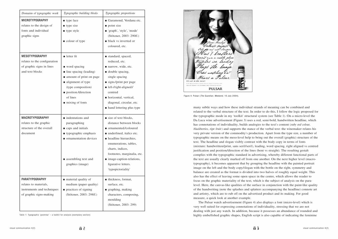
The Pulsar watch advertisement (Figure 4) also displays a font (micro-level) which isvery well suited for expressing connotations of individuality, stressing that we are notdealing with just any watch. In addition, because it possesses an abundance of rounded andhighly embellished graphic shapes, English script is also capable of indicating the feminine
F igure 4 : Pulsar (The Guardian , Weekend , 1 0 July 2 0 0 4).
85 visual communication 4(2)84visual communication 4(2)
quality of the product; moreover, thanks to its historical affiliation, it may well also conveyassociations of timeless beauty and classic value. On the meso-level the typographic designfeatures two semantically relevant aspects. First, varying measures of leading and wordspacing in combination with differing type-sizes underline the motley collection of personaldetails expressed in the words of the ad. Second, the two parts of the information structurein the ad (‘ideal’ and ‘real’, according to Kress and Van Leeuwen, 1996) are marked off byvery different fonts (English script, modern Antiqua). Unlike the Da Luca wine advertisement(Figure 3), where images and language are kept neatly apart, the watch advert integrateswriting into the pictorial part of the text because here the writing space is provided by animage element (dress). Thanks to this macro-level technique, the writing gains in pictorialityand the picture assumes a clear logic to the effect that everything stated relates to thewoman depicted. Finally, on the para-level the simultaneity of dress and page space can beperceived as a silhouette technique, whose black and white character enhances the aestheticdimensions of the ad and ideally brings out the English script.
COMMUNICATIVE EFFECTS OF TYPOGRAPHYJust as writers pick and choose from a stock of available words and phrases for stylisticeffect, typographers and graphic designers have choices to make concerning graphic shapesand their positioning on the page and are guided by considerations of optimum suitabilityand expressivity. As we have seen from just two samples, the ways in which typographyworks are varied. Invariably, though, it operates in close connection with the linguisticmessage and structure of the text. Mostly, the aim is some kind of paralleled harmonybetween verbal and graphic structures and meanings, although calculated contrasts andother more subtle semantic relations are also possible. Applying basic communication ortext theory, we can easily discern central modes of typographic operations. If typography is indeed a code, it should be capable of fulfilling the three Hallidayan ‘meta-functions’(Halliday, 1994). Our examples illustrate this aptly. First, typography works on the‘ideational’ level as it refers to, comments on or reinforces verbal messages of the text –pictorial typography can express ideas on its own by virtue of representing objects. Second,typography functions ‘inter-personally’: it says something about the nature or emotionalstate of the writer, anticipates the aesthetic inclinations of the addressees or indicates thenature of the communicative contact between writer and reader. Third, graphic design is‘textual’ when it serves to visually structure a verbal message and bring out its logical make-up.
Compared with Jakobson’s (1971) language functions we can see that the Hallidayanmeta-functions explain typography in terms of sender, recipient, subject and message of acommunicative event. Two more ways in which typography may work must be added byrecourse to Jakobson’s ‘medium’ and ‘code’. First, the medium of a semiotic product canbecome relevant when its materiality (the instruments, materials and actions applied in itsproduction) is emphasized, as illustrated in both examples analysed (Figures 3 and 4).Second, the coded nature of typography comes to the fore whenever production andinterpretation of typographic design hinge upon cultural, fashion or trend-related anddomain-specific connotations of graphic means. Clearly, typography can have numerousfunctions and it would be a rewarding venture to study the systematic relations between theuse of (typo)-graphic means and their communicative functions with respect to text andlinguistic structures. However detailed and intricate the workings and effects of typographymay be, they fall into the following four broad modes of operation, which highlight the
cognitive underpinnings and semiotic dynamics of graphic meaning making:(1) typography structures visual space and thus creates optical balance, shapes textual
order and guides readers’ attention by providing a page-map to navigate; (2) (typo)-graphicdesign has a strong pictorial potential as it can form visual signs acting like icons signifyingobjects, states-of-affairs or actions related in one way or another to the message of theverbal text. A reference to the graphic material and technological making of a text – as wehave seen – can be equally pictorial; (3) perhaps most important to linguists, typographicmeans refer to the pragmatics of linguistic structures in that they superimpose on, accompany,reinforce and accentuate syntactic, semantic, prosodic and speech-act structures of theverbal text; and (4) typography reproduces and reshapes cultural and media conventions,which designers and readers have negotiated in typographic practice over time. Any newgraphic design will be created and interpreted against the background of what users oftypography know about the code and its meanings, at the same time extending andenhancing typographic resources.
CONCLUSIONTwenty years ago semiotic and linguistic reflection on the nature of typography would havemerely been a theoretical game and a nuisance to the professional practitioner, because atthat time typography was firmly in the hands of a trained elite who composed handwrittenand typewriter manuscripts for print. Now, in an age when most societies are increasinglycomputerizing all kinds of writing, we have all become our own typographers as we handleour documents from start to finish, i.e. from microtypography to paratypography. In doingso we develop our own tastes, designs and rules, thus shaping a new domain of un- or semi-professional lay-typography, but more often than not we simply lack sound knowledge andmuch-needed skills. Systematic thinking about the semiotic nature of typography can helpto underpin and guide the didactic reworking and popularization of a body of knowledgewhich up to now has been used by professionals mainly as a prescriptive checklist and notas a tool for the enablement of the typographically semi-literate.
87visual communication 4(2)86 visual communication 4(2)
REFERENCES Barthes, R. (1996) ‘Connotation’, in P. Cobley (ed.)
The Communication Theory Reader , pp. 129-33. London:
Routledge.
Bell, A. (2001) ‘Back in Style: Reworking Audience Design’,
in P. Eckert and J.R. Rickford (eds) Style and Sociolinguistic
Variation , pp. 139-69. Cambridge: Cambridge University
Press.
Bellantoni, J. and Woolman, M. (1999) Type in Motion:
Innovative Digitale Gestaltung. Mainz: Hermann Schmidt.
Berger, C. (1979) ‘Semiotik und Design – Theorie und
Praxis’, Ars Semeiotica 2: 1-22.
Berger, W. (2001) Advertising Today. London: Phaidon.
Dürscheid, C. (2002) Einführung in die Schriftlinguistik.
Wiesbaden: Westdeutscher Verlag.
Fix, U. (2001) ‘Zugänge zu Stil als semiotisch komplexer
Einheit: Thesen, Erläuterungen und Beispiele’, in E.M.
Jakobs and A. Rothkegel (eds) Perspektiven auf Stil , pp. 113-
26. Tübingen: Niemeyer.
Gaede, W. (2002) Abweichen von der Norm: Enzyklopädie
kreativer Werbung. München: Langen Müller/Herbig.
Gerstner, K. (1972) Kompendium für Alphabeten: Eine
Systematik der Schrift. Teufen AR: Niggli.
Goodman, N. (1976) Languages of Art: An Approach to a
Theory of Symbols. Indianapolis: Bobbs Merrill.
Gross, S. (1994) Lesezeichen: Kognition, Medium und
Materialität im Leseprozess. Darmstadt: Wissenschaftliche
Buchgesellschaft.
Halliday, M.A.K. (1994) An Introduction to Functional
Grammar. London: Arnold.
Jakobson, R. (1971) Fundamentals of Language. The Hague:
Mouton.
Jegensdorf, L. (1980) Schriftgestaltung und Textanordnung:
Theorie und didaktische Praxis der visuellen Kommunikation
durch Schrift. Ravensburg: Maier.
Kapr, A. and Schiller, W. (1980) Gestalt und Funktion der
Typographie. Leipzig: Fachbuchverlag.
Kress, G. and Van Leeuwen, T. (1996) Reading Images.
The Grammar of Visual Design. London: Routledge.
Kress, G. and Van Leeuwen, T. (2001) Multimodal Discourse:
The Modes and Media of Contemporary Communication.
London: Arnold.
Lechner, H. (1981) Geschichte der modernen Typographie:
Von der Steglitzer Werkstatt zum Kathodenstrahl. München:
Thiemig.
Neuenschwander, B. (2001) Letterwork: Creative Letterforms
in Graphic Design. London: Phaidon.
Nöth, W. (1985) Handbuch der Semiotik. Stuttgart: Metzler.
Raible, W. (1991) Die Semiotik der Textgestalt:
Erscheinungsformen und Folgen eines kulturellen
Evolutionsprozesses. Heidelberg: Winter.
Ruder, E. (1982) Typographie: Ein Gestaltungslehrbuch.
Teufen AR: Niggli.
Stöckl, H. (2004) Die Sprache im Bild – Das Bild in der
Sprache: Zur Verknüpfung von Sprache und Bild im
massenmedialen Text: Konzepte, Theorien, Analysemethoden.
Berlin: de Gruyter.
Stöckl, H. (2004) ‘In Between Modes: Language and Image
in Printed Media’, in E. Ventola (ed.) Perspectives on Multi-
Modality. Amsterdam: Benjamins.
Stötzner, A. (2003) ‘Signography as a Subject in its Own
Right’, Visual Communication 2(3): 285-302.
Waller, R. (1991) ‘Typography and Discourse’, in R. Barr,
M.L. Kamil, P. Rosenthal and P.P. David (eds) Handbook of
Reading Research , Vol. 2, pp. 341-80. New York: Longman.
Wehde, S. (2000) Typographische Kultur: eine
zeichentheoretische und kulturgeschichtliche Studie zur
Typographie und ihrer Entwicklung. Tübingen: Niemeyer.
Weidemann, K. (1994) Wo der Buchstabe das Wort führt:
Ansichten über Schrift und Typographie. Ostfildern: Cantz.
Willberg, H.P. (2002) Wegweiser Schrift: Erste Hilfe im
Umgang mit Schriften. Was passt – was wirkt – was stört.
Mainz: Schmidt.
Willberg, H.P. and Forssman, F. (1999) Erste Hilfe
Typographie: Ratgeber für Gestaltung mit Schrift. Mainz:
Schmidt.
RYAN PESCATORE FRISK cofounded
Strange Attractors Design together with
CATELIJNE VAN MIDDELKOOP while
completing his MFA at Cranbrook Academy
of Art . Fascinated by subcultural type and
related treatments, this typographic
anthropologist is currently attending the
Post Graduate Type]Media program at
The Royal Academy of Art in The Hague ,
The Netherlands.
Address: www.strangeattractors.com
[email: [email protected]]
RYAN PESCATORE FRISK + CATELIJN
E VAN M
IDDELKOOP
89 visual communication 4(2)88visual communication 4(2)
91 visual communication 4(2)90visual communication 4(2)