visual elearning crash course1
TRANSCRIPT
8/12/2019 Visual eLearning Crash Course1
http://slidepdf.com/reader/full/visual-elearning-crash-course1 1/47

8/12/2019 Visual eLearning Crash Course1
http://slidepdf.com/reader/full/visual-elearning-crash-course1 2/47
Karla Gutiérrez is the Head ofInbound Marketing and OnlineManagement at AuraInteractiva, creators of SHIFT eLearning. She’s focused on
blogging and social mediacommunications in theeLearning industry.
AUTHOR PAGE:
A Crash Course in eLearning: WhyVisual Design Matters
By: Karla Gutiérrez
Connect with her inLinkedIn here.
www.shiftelearning.com SHARE THIS COURSE
8/12/2019 Visual eLearning Crash Course1
http://slidepdf.com/reader/full/visual-elearning-crash-course1 3/47
A Crash Course in eLearning: Why Visual Design Matters
IntroductionChapter 1: Why eLearning Professionals should consider the impactof good visual design.
Chapter 2: 10 Types of Visual Content to Create and Include inyour eLearning Courses.Chapter 3: First things first, Understand the 10 Principles ofGood eLearning Design.Chapter 4: The Rules for using Visuals in your eLearning CoursesChapter 5: Types of graphics.
Chapter 6: Visual Design Evaluation Checklist.Final Takeaways.
CONTENTS:
www.shiftelearning.com

8/12/2019 Visual eLearning Crash Course1
http://slidepdf.com/reader/full/visual-elearning-crash-course1 4/47
INTRODUCTION:Why Visual Communication Should
Matter More to eLearning professionals
When was the last time you got excited by taking a long and boring eLearning
course? If you’re like most people in today’s digital age, you’re turned off by dull and
typical content.
It’s a fact that visual content drives more engagement than just text. It makes sense,
not only are images it more appealing, but people process images 60,000 times faster
than text. Words get boring quickly and people don’t enjoy reading as much as they
used to. That’s why the perfect way to spice up your boring eLearning course is to
include visuals. They provide greater engagement than just text because they
combine other senses. Without doubt, eLearning courses that look great gain
attention right from the start.
www.shiftelearning.com

8/12/2019 Visual eLearning Crash Course1
http://slidepdf.com/reader/full/visual-elearning-crash-course1 5/47
Many people judge the quality of your
course by the quality of the design, so you'll
want to make sure you create something
impressive. So, if you want to create high-
quality eLearning courses get creative! Use
photos, charts, graphs, infographics, and
other visual representations of data learners
actually want to consume. Keep reading
to glean the tips. In this course you’ll find
ideas to help you get started in the visual
world we live in.
www.shiftelearning.com
Looks sell, so make sure you’re proudof your eLearning!

8/12/2019 Visual eLearning Crash Course1
http://slidepdf.com/reader/full/visual-elearning-crash-course1 6/47
“Any image, can enhance a course’squality because it helps to humanizethe concepts being covered. It helps a
course become more than justnameless, faceless chatter — it helpslearners view the content as arelatable, personal experience.”
www.shiftelearning.com

8/12/2019 Visual eLearning Crash Course1
http://slidepdf.com/reader/full/visual-elearning-crash-course1 7/47
Start creating visual content for
eLearning
8/12/2019 Visual eLearning Crash Course1
http://slidepdf.com/reader/full/visual-elearning-crash-course1 8/47
01WHY ELEARNING PROFESSIONALSSHOULD CONSIDER THE IMPACT OFGOOD VISUAL DESIGN.
Chapter

8/12/2019 Visual eLearning Crash Course1
http://slidepdf.com/reader/full/visual-elearning-crash-course1 9/47
Good eLearning design is related to visual design. People make snap judgements. It
takes one 1/10th
of a second to form a first impression about a person, and eLearningcourses are no different. So if you haven't, start considering you course’s visuals as a
powerful tool for engaging your audience.
www.shiftelearning.com
You'll have to learn the visual design principles that make for
more effective communication. Factors such as position,color, contrast, spacing, and alignment all meetto make a
successful visual design.
8/12/2019 Visual eLearning Crash Course1
http://slidepdf.com/reader/full/visual-elearning-crash-course1 10/47www.shiftelearning.com
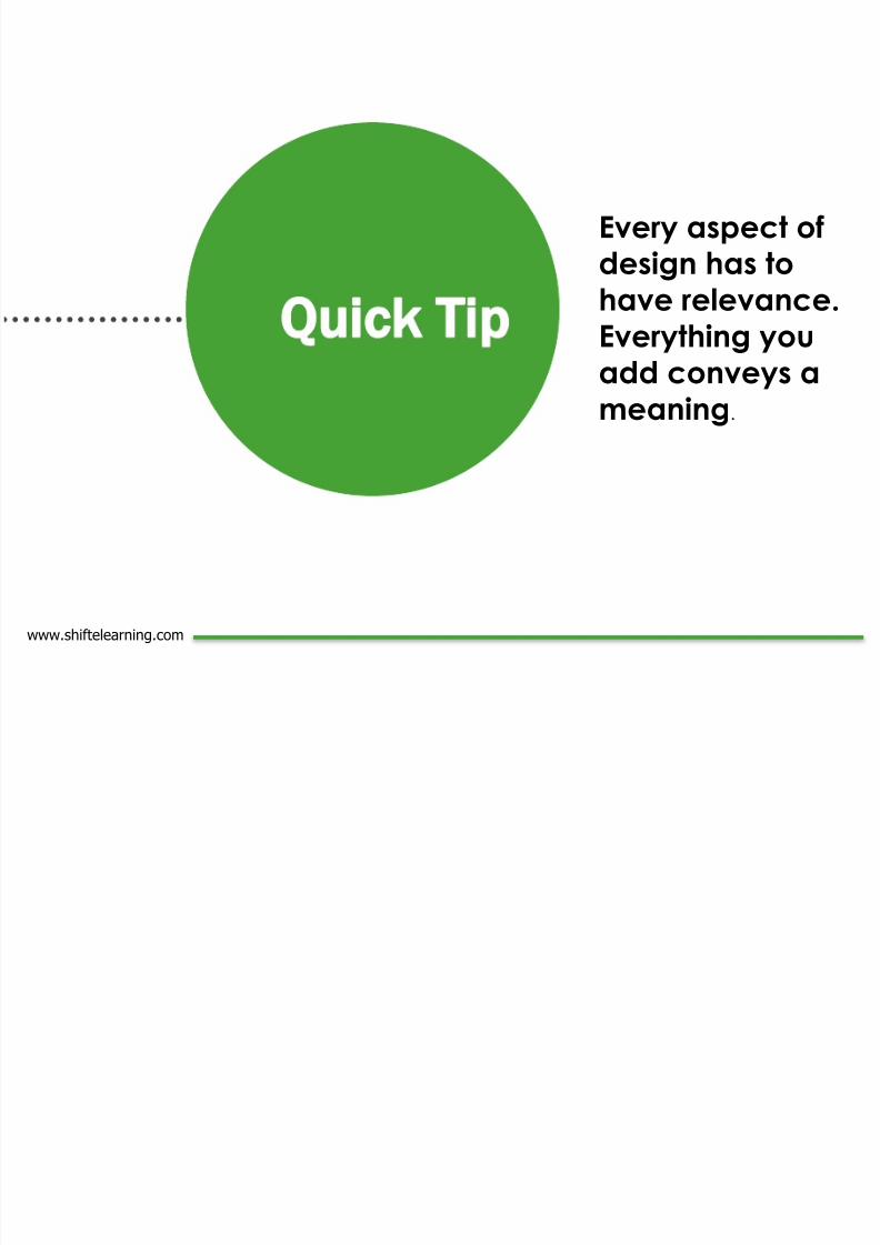
Every aspect ofdesign has to
have relevance.Everything you
add conveys a
meaning.
uick Tip

8/12/2019 Visual eLearning Crash Course1
http://slidepdf.com/reader/full/visual-elearning-crash-course1 11/47
0210 TYPES OF VISUAL CONTENT TOCREATE AND INCLUDE IN YOURELEARNING COURSES.
Chapter

8/12/2019 Visual eLearning Crash Course1
http://slidepdf.com/reader/full/visual-elearning-crash-course1 12/47

8/12/2019 Visual eLearning Crash Course1
http://slidepdf.com/reader/full/visual-elearning-crash-course1 13/47www.shiftelearning.com

8/12/2019 Visual eLearning Crash Course1
http://slidepdf.com/reader/full/visual-elearning-crash-course1 14/47
Pictures are nice but moving images are nicer. A lot of demos, tutorials and even landingpages make use of short videos to easily capture a viewer’s attention. Videos combine
texts, images and sounds in order to create an immersive learning environment, or one that
hooks your students while helping them learn more effectively. :
www.shiftelearning.com
2
.
Short Videos
Demonstrate how a product works…Make it more compelling with
video!
1
2
Avoid a complicated text explanation, and instead consider
creating a how-to video to describe it.
Include an interview. One of the most authentic ways to tell a
learning story is to let the experts tell it themselves.
3

8/12/2019 Visual eLearning Crash Course1
http://slidepdf.com/reader/full/visual-elearning-crash-course1 15/47
Animated graphic elements are great to use in your eLearning courses. They're
attractive, and can get a message across that words or audio many times can’t. Use
animations for things like step-by-step procedures, course navigation, simulations,
assessments or interactive material.
Animations 3
.
You can humanize and provide a realistic touch to course with characters. Even more
if you customize them to look like someone they know or other important figure thatthey might feel connected with. You Include them in your scenarios, or while explaining
and assessing the learning, just to name a few.
Characters or avatars4
.
www.shiftelearning.com

8/12/2019 Visual eLearning Crash Course1
http://slidepdf.com/reader/full/visual-elearning-crash-course1 16/47
www.shiftelearning.com

8/12/2019 Visual eLearning Crash Course1
http://slidepdf.com/reader/full/visual-elearning-crash-course1 17/47
www.shiftelearning.com
5
.
Infographics pack a ton of content. They make data more meaningful and beautiful
and, most importantly, they make learning more fun and less boring. With
infographics, you can insert colorful bars, pies, charts and graphs to visually represent
numbers and percentages. You can use it to group ideas together so that students
are able to absorb information faster and retain them easier.
We know creating infographics is a lot of work. So, if you don't have enough
information for an infographic, you can do something as simple as a table or chart,
with impacting colors and big numbers. Simple data visualization, like the example
below, can do wonders to improve an eLearning course.
Infographics and Images of Words and Numbers

8/12/2019 Visual eLearning Crash Course1
http://slidepdf.com/reader/full/visual-elearning-crash-course1 18/47

8/12/2019 Visual eLearning Crash Course1
http://slidepdf.com/reader/full/visual-elearning-crash-course1 19/47

8/12/2019 Visual eLearning Crash Course1
http://slidepdf.com/reader/full/visual-elearning-crash-course1 20/47
www.shiftelearning.com

8/12/2019 Visual eLearning Crash Course1
http://slidepdf.com/reader/full/visual-elearning-crash-course1 21/47

8/12/2019 Visual eLearning Crash Course1
http://slidepdf.com/reader/full/visual-elearning-crash-course1 22/47
Screen shots can be a great way to show examples and how a system or process
works. For you can use screen shots to demonstrate some of the new features that
came out in the latest version of their new operating software. Sometimes, showing is
far better than telling.
www.shiftelearning.com
10
.Use screen shots to show examples

8/12/2019 Visual eLearning Crash Course1
http://slidepdf.com/reader/full/visual-elearning-crash-course1 23/47

8/12/2019 Visual eLearning Crash Course1
http://slidepdf.com/reader/full/visual-elearning-crash-course1 24/47
If you’re going to try to get somewhere walking in the shoes of a designer, it’s helpful to have a compass.
That’s where the following 10 Principles of Good eLearning Design come in.
1.
Guide the viewer's eye.
The placement of the elements on each page should flow
naturally from one to the next in a progression that lends itself to
the content you're teaching. Images and graphics should be
oriented in a way that directs the reader's attention inward and
onward, never away from the screen or your content.
www.shiftelearning.com
Pride of place should to go the most important information. Learners from most Western
countries read left-to-right and top-to-bottom, so the most relevant pieces should be
placed in the upper left of the page, and anything important should be visible at the top
of the page without scrolling.
2
.
Let prominence inform position.

8/12/2019 Visual eLearning Crash Course1
http://slidepdf.com/reader/full/visual-elearning-crash-course1 25/47
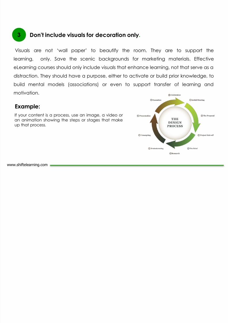
3 Control the clutter.
Many eLearning designers are tempted to overload their pages with content, because
the authors of the material for the course included an excess of details. Figure out what's
most important, provide the reader with an avenue to access the additional information,
and cut everything superfluous. An important part of eLearning best practices is
identifying the critical facts and concepts and keeping things simple.
It's easier to read a shorter line of text than a longer one; many readers feel daunted by
strings of words that stretch all the way across their screen. You can make your text
easier for the learner to take in by narrowing the width of your text box, or breaking a
longer piece into multiple columns, like a newspaper.
4 Shorten your columns.
www.shiftelearning.com

8/12/2019 Visual eLearning Crash Course1
http://slidepdf.com/reader/full/visual-elearning-crash-course1 26/47
www.shiftelearning.com
5 Proper usage of white space.
Don't fill every spot on the
screen with content or
graphics. The negative space
on the page can be useful to
guide the reader's attentionand eliminate distractions.
Note: It is important to note that
white space doesn’t need to
be white. It's recommended
that the body of the text should
occupy from 25 to 40% of the
total space of a page.

8/12/2019 Visual eLearning Crash Course1
http://slidepdf.com/reader/full/visual-elearning-crash-course1 27/47
6 Make smart font choices.
Your typography decisions should be informed by the needs of the content. Avoid
fancy fonts that are harder to read. Use size and color to emphasize or highlight
certain elements, but don't go overboard; less is more, especially in dramatic color
usage.
7 The visual theme of your eLearning course should carry through from page to page.
Getting too creative can end up distracting the reader from the content. Graphics in
your eLearning should match. Also watch out for heading sizes, font choices, color
scheme, button styles, and spacing. Everything must be in harmony.
Keep things consistent.
www.shiftelearning.com
8/12/2019 Visual eLearning Crash Course1
http://slidepdf.com/reader/full/visual-elearning-crash-course1 28/47
www.shiftelearning.com
8 Don't turn your eLearning course into a scavenger hunt. Any information that your reader
wants should be accessible in three clicks or fewer. Your learner may need to go back
and review a section, or skip ahead past content they already know, so navigation
should be simple and quick.
Offer easy access.
9 Watch your alignment. It should always be clear what text is associated with which
images, and any tables and charts should be easy to read at a
glance. Don't make your reader puzzle out what you intended to
go where.

8/12/2019 Visual eLearning Crash Course1
http://slidepdf.com/reader/full/visual-elearning-crash-course1 29/47
04

8/12/2019 Visual eLearning Crash Course1
http://slidepdf.com/reader/full/visual-elearning-crash-course1 30/47
04
THE RULES FOR USING VISUALS INYOUR ELEARNING COURSES.
Chapter

8/12/2019 Visual eLearning Crash Course1
http://slidepdf.com/reader/full/visual-elearning-crash-course1 31/47
When paired together, words and pictures communicate the same message in two
ways, allowing learners to link the words and phrases together in their minds. In this
way, you can get your message across even faster. With this practice you can easily
improve content retention by a 68%.
1 Use words and pictures together.
2 Don’t overload your courses with visual elements.
More visuals don't necessarily mean more learning. This makes a page become too cluttered
and a learner can't decipher what images matter ro the course and what images do not.
Only include critical images that promote learning. Before including any image in your course,
ask yourself: Would this image help explain the content better? If the answer to this question is
no, or even “maybe,” leave it out.
www.shiftelearning.com
8/12/2019 Visual eLearning Crash Course1
http://slidepdf.com/reader/full/visual-elearning-crash-course1 32/47

8/12/2019 Visual eLearning Crash Course1
http://slidepdf.com/reader/full/visual-elearning-crash-course1 33/47
This is a good graphic design principle as well. Consistency helps learners move from
one task to the next, knowing there are certain aspects of the design that won't
change. For examples, always use the same image to prompt discussion or show
where learners need to take a quiz.
4 Choose the right photo.
Select images that will resonate with your audience. They should reflect the
audience's culture, values and backgrounds so the audience will connect with and
respond to the photo rather than dismiss it.
5 Use a consistent image style throughout the course.
www.shiftelearning.com
8/12/2019 Visual eLearning Crash Course1
http://slidepdf.com/reader/full/visual-elearning-crash-course1 34/47
6 Don't copy and upload images from Google.
This violates copyright. So, before copying anything from a website check whether
permission is needed. In most cases it will. Instead, try to find images in other places. For
example, search the Creative-Commons search tool which searches a variety of sources
and returns images, videos and other forms of information from different sites.
No one wants to look at grainy, pixelated pictures. Images shouldn't be blurry or of poor
quality. If it looks unprofessional, learners will likely leave the course.
Hint: Ensure that visuals are always clear – it is better to not use them at all than ones of
poor quality.
Use the best quality settings you can to get the best imagequality.
7
www.shiftelearning.com

8/12/2019 Visual eLearning Crash Course1
http://slidepdf.com/reader/full/visual-elearning-crash-course1 35/47
This will only further complicate the image. Either use a less confusing image or place
your explanatory text on a different screen. Simple, straightforward visuals can say
much more than overly detailed, overly realistic images.
Don't use complex graphics.6
www.shiftelearning.com
Analyze the following points:
Put yourself in your audience's shoes: is this clear
and big? Is it interesting? Is it appealing?
Can the learner look at the image and understand
the graphic without reading the text?
05

8/12/2019 Visual eLearning Crash Course1
http://slidepdf.com/reader/full/visual-elearning-crash-course1 36/47
05
TYPES OF GRAPHICS.
Chapter

8/12/2019 Visual eLearning Crash Course1
http://slidepdf.com/reader/full/visual-elearning-crash-course1 37/47
Decorative Representational
Organizational Relational
Transformational Interpretative
www.shiftelearning.com
There are different types of images we can use, depending on the kind of information we have:

8/12/2019 Visual eLearning Crash Course1
http://slidepdf.com/reader/full/visual-elearning-crash-course1 38/47
www.shiftelearning.com
1 Decorative: While this type of graphics adds aesthetic appeal and humor to a material, you should
sparing use them in your eLearning materials. Decorative pictures are completely
ignored by learners. They don’t serve any instructional purpose. Used excessively, such
as when theming your course, they can depress learning rather than facilitate or
improve it.

8/12/2019 Visual eLearning Crash Course1
http://slidepdf.com/reader/full/visual-elearning-crash-course1 39/47

8/12/2019 Visual eLearning Crash Course1
http://slidepdf.com/reader/full/visual-elearning-crash-course1 40/47

8/12/2019 Visual eLearning Crash Course1
http://slidepdf.com/reader/full/visual-elearning-crash-course1 41/47
6 Interpretative: This type of graphics will help learners better understand abstract or invisible ideas.
The Biological Project, for instance, uses this to teach students the laws of genetics.
Examples: Use simulations, diagrams of equipment working, series of graphics
showing something working, animations or even simple line drawings.
www.shiftelearning.com
06

8/12/2019 Visual eLearning Crash Course1
http://slidepdf.com/reader/full/visual-elearning-crash-course1 42/47
06
VISUAL DESIGN
EVALUATION CHECKLIST.
Chapter

8/12/2019 Visual eLearning Crash Course1
http://slidepdf.com/reader/full/visual-elearning-crash-course1 43/47

8/12/2019 Visual eLearning Crash Course1
http://slidepdf.com/reader/full/visual-elearning-crash-course1 44/47
Take-aways
8/12/2019 Visual eLearning Crash Course1
http://slidepdf.com/reader/full/visual-elearning-crash-course1 45/47
Great design gets people to
trust you and to stick around.Poor design affects contentcredibility.
eLearning that looks greatenhances learner engagement;
it gains attention right from thestart.
www.shiftelearning.com

8/12/2019 Visual eLearning Crash Course1
http://slidepdf.com/reader/full/visual-elearning-crash-course1 46/47
Additional Resources:
• http://interactyx.com/social-learning-blog/visual-elements-enhance-elearning/
• http://www.astd.org/Publications/Blogs/Learning-Technologies-Blog/2013/04/Visual-Elements-in-Learning
• http://www.intechopen.com/books/advances-in-
learning-processes/visual-analytics-to-support-e-learning• http://elearningminds.com/v2/visual-appeal-in-
elearning/• http://www.easyauthoring.com/blog/?p=367• http://info.shiftelearning.com/blog/bid/286472/Creating-
a-Visual-Style-Guide-for-eLearning-What-Should-You-Include• http://info.shiftelearning.com/blog/bid/283050/6-
Creative-Ways-to-Make-Your-eLearning-Courses-More-Visual

8/12/2019 Visual eLearning Crash Course1
http://slidepdf.com/reader/full/visual-elearning-crash-course1 47/47
Start rocking eLearning with SHIFT.
Now that you know how to create all types of visuals for youreLearning courses, you’ve got start putting everything into practice!
Sign up for a 30-day trial of our eLearning authoring tool to create
awesome eLearning courses easily and quickly.
Start your free 30-day trial. http://buff.ly/15H8Jfg