visualisation of alphabet
DESCRIPTION
Research book to accompany university project which involved rethinking the alphabetTRANSCRIPT


History of the Alphabet. The history of writ-ing is vast and differs when discussing between different languages. The research I have done here is concerned with the development of the Roman alphabet only as this is the alphabet we
were asked to graphically visualise. As with all historical accounts that date back such a long way it is always open to debate but it is widely recognised that what we now use as our writ-ing system (the Roman alphabet) originated in Egypt through the form of heiroglyphs. The Egyptian hieroglyphs used 22 images that rep-resented the consonants. As it can be seen when looking at Egyptian hieroglyphs there was still a long way to go to create the Roman alphabet as hieroglyphs used symbols to represent words rather than letters.
These images display various inscriptions of Egyptian hieroglyphs.

The image above shows the Phoenician alpha-bets 22 symbols which were used as a writing system. When looking at these marks its clear to see the similarities with some of them for example the M and N we use in our language now can be seen in two of their symbols. The phoenician alphabet had began to move towards the marks which the Roman alphabet uses that western countries are used to. This is because it minimalised the marks used in the Egyptian hieroglyphs to a simple set of repeatable marks. It was a development from Proto-Canaanite al-phabet which owed much of its inspiration from the Egyptian hieroglyphs. One reason why the Phoenician alphabet became so popular and recognised, ultimately inspiring the Roman al-phabet was because of the Phoenician traders. The traders traveled from country to country spreading this writing system they used which eventually inspired a good proportion of the writing systems we use today.

Some pottery which displays early greek letterforms.
Greek inscription
The Greek alphabet is hugely important in re-lation to the Roman alphabet. This is largely because writing systems before such as the Phoenician alphabet and Egyptian heiroglyphs had symbols that represented only consonants. The Greeks created a set of symbols which could portray vowels which is extremely impor-tant when understanding the written language. As with all the alphabets devised it owed a lot to writing systems in use before it, the Greek alphabet used the Phoenician alphabet as a foundation to create the 24 letters in use in the Greek alphabet today. Herodotus explains his account of how the Greeks adopted the Phoe-nician alphabet “The Phoenicians who came with Cadmus—amongst whom were the Ge-phyraei—introduced into Greece, after their settlement in the country, a number of accom-plishments, of which the most important was writing, an art till then, I think, unknown to the Greeks. At first they used the same characters as all the other Phoenicians, but as time went on, and they changed their language, they also changed the shape of their letters. At that pe-riod most of the Greeks in the neighbourhood were Ionians; they were taught these letters by the Phoenicians and adopted them, with a few alterations, for their own use, continuing to refer to them as the Phoeni-cian characters—as was only right, as the Phoe-nicians had introduced them.”

This is the Duenos Inscription which was en-graved on a kernos, which can be seen by the drawing above, three vases attached by a center point.
The Roman alphabet is a development from the Etruscan alphabet that was developed in Italy. The two alphabets are very similar with the exception that the Roman alphabet introduced some more letters, the letter J being the last letter to be added to the alphabet. As it can be seen in the research it is clear that one alphabet could not have exsist-ed without the other and each alphabet has been developed in a unique way to work with the language of that nation. The alphabet is so deeply rooted that it is just accepted. After researching into the history and development I feel that experimentation with the alphabet is possible.

Aa
Bb
Cc
Ff
IiJj
Dd
Gg
Ee
Hh
Kk
Ll
The grid on the right shows the development of the alphabet through the simple marks used throughout history. From left to right is firstly Egyptian Heiro-glyphs, then the Proto-Canaanite alphabet, thirdly the Phoenician alphabet, followed by the Greek alphabet and finally the alphabet used in the english language, the Roman alphabet or Latin alpha-bet. Some boxes are left empty in certain areas, this is due to there being nothing in history that di-rectly corresponds with the Ro-man letters we use today. There is also some symbols such as the heiroglyphs or phoenician alpha-bet that are repeated, this is due to a number of factors. Firstly, both the Phoenician alphabet and Pro-to-Canaanite alphabet have only 22 symbols compared to the Ro-man alphabets 26 characters. Sec-ondly, there is a great difference in vowels and consonants used in each language. Then lastly, the Ro-man alphabet originally only had 21 letters, with J, K, U, Y, and Z being added at a later date.

Mm
Nn
Oo
PpQq
Rr
Ss
Tt
Uu
Vv
Ww
Xx

Zz
Yy


My initial reasoning for visiting the Wellcome Trust was I had remembered that the section with the collection was structured in a certain way. The mindframe for this was to go there and see how it had been ordered to then contem-plate on breaking up the modular order of the alphabet. At this point in the project I was un-sure of my direction, the only direction to take was that I wished to deconstruct the alphabet, to rethink what it represents and possibly what it could represent. Firstly I will discuss what I felt after studying the structure of the displays as this will take less to explain than to explain the ac-cidental and more important discovery I found. From observing the cases I didn’t learn much, it became apparent that things were grouped into cultural items which didn’t spark any thoughts of the reorganisation that I had hoped to think about for the alphabet. Onto the new discovery. Before walking to the gallery I had intended to enter I noticed a small room that was lit up. It was showcasing the Wellcome Image Awards 2009. This was a series of images entered in by various people from backgrounds spanning as vast as artists, photographers and scientists. My
fascination with this gallery was not with the photographs of important people/events, nor was it directed towards the 3d rendered imagery that was done by Bill McConkey (all the images can be found on the website.) it was with the microscopic photography that was apparent in most of the work on display. Before visiting this gallery I had very briefly scanned a book called Design Writing Research by Ellen Lupton and Abbott Miller, upon reading this very quickly in the first few pages it discusses how the written word is a poor representation of the spoken word. Quoted from the book they explain that “Speech draws on interior consciousness, but writing is dead and abstract. Writing sets lan-guage adrift, untethering it from the speaking subject. In the process of embodying language, writing steals its soul.” From reading this I had vague visions of abstracting the alphabet, how-ever, at this point how this would undergo was far from my grasp. Seeing these microscopic photographs began to spark ideas to do with approaching the alphabet from a biological point of view, again vague but slightly more re-fined. The abstract images that this process cre-ates interested me and surprised me, I was not aware that the images would be so polished and colourful when thinking back to what I thought of microscopic photography, which thinking, was very little.
This is a single cell of a cancer cell by Anne Weston
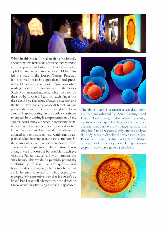
While in this room I tried to think realistically about how this technique could be incorporated into the project and what the link between the alphabet and biology or science could be. This led me back to the Design Writing Research book to read more in depth than I had previ-ously. The closest to an idea I found was when reading about the Papuan natives of the Torres Strait who assigned numeric values to parts of their body. It would begin on each finger but then extend to forearms, elbows, shoulders and the head. They would combine different parts to portray the values, basically it is a glorified ver-sion of finger counting. In the book it continues to explain how writing is a representation of the spoken word however when considering num-bers it says that numbers are organised in ten, known as base ten. Cultures all over the world counted in a structure of tens which can be ex-plained when looking at our hands and feet. So the argument is that numbers were devised from a non verbal expression. The question I was asking myself is would it be possible to achieve what the Papuan natives did with numbers but with letters. This would be possible, potentially confusing but feasible. The next question was how this idea of assigning a letter to a body part could be used in terms of microscopic pho-tography. My conclusion was that it couldn’t be linked but I was still adament that the direction I took would involve using a scientific approach.
The above image is a microparticle drug deliv-ery that was achieved by Annie Cavanagh and Dave McCarthy using a technique called scanning electron micrograph. The blue area is the outer coating which allows the orange section, the drug itself, to be released slowly into the body as the body needs to dissolve the outer section first.Below is In vitro fertilisation by Spike Walker achieved with a technique called a light micro-graph. It shows an egg being fertillised.

Video from the Wellcome Trust website explaining one of the techniques used in the Wellcome Image Awards.
The techniques used in the Wellcome Image Awards were all variations of microscopy. They were light microscopy, electron microscopy, confocal and multiphoton micros-copy, and high-resolution episcopic microscopy. The first mentioned here, light microscopy is the most common and probably the simplest to understand of the micro-scopic techniques listed above. This is the technique of having the specimen placed inbetween the microscopic lens and a light source. Electron microscopy, as the name suggests uses electrons to magnify an image. It can pro-duce an image with much more magnification than that of a light microscope. Confocal and multiphoton microscopy uses lasers to process the surface of the subject under the scope. It also has the ability to scan the image to enable a 3d sample to be produced. The newest of all the techniques listed is high-resolution episcopic microscopy is a develop-ment of the technique called histol-ogy, which is used to magnify tissue. Histology slices and dyes layers of tissue to then create a three dimen-sional image by layering the images back together, however this created problems as with each slice the im-ages would become distorted and would provide difficult to place back together. High-resolution episcopic microscopy eliminates this problem by scanning the block each time slic-ing a layer off therefore each layer will be perfectly alligned to enable the 3d visualisation.

From top left clockwise is an image of aspirin crystals using light microscopy by Spike Walker, an image of a mouse liver using the electron microscopy technique by Jackie Lewin, is a scan of the small intenstine using the multiphoton microscopy technique by Paul Appleton, and finally embryonic mouse head by Tim Mohun using the latest technique high-resolution epi-scopic microscopy.

here. This is an idea that could be used, using microscopes to create interesting results associ-ated with the letters. However after considering this I felt that this didn’t have enough substance and wasn’t using my initial idea of rethinking the alphabet, to perhaps look at the letterforms from a different angle. This idea would be using the pre-exsisting alphabetic forms. Not rethinking it.
These images display a section from Stefan Sag-meister’s ‘Things I have learned in my life so far’. It says Starting a charity is suprisingly easy. Af-ter studying into microscopic photography and trying to realise how this could relate into my project directed me towards this work which ei-ther simulates using microscopic photography or actually uses it to illustrate the words displayed


Ed Ruscha: 50 Years of Painting. The reason-ing for visiting this exhibition was through a rec-ommendation from a friend. I knew very little about Ed Ruscha, even discovering I was pro-nouncing his name wrong after speaking to the receptionist and reading the leaflet at the Hay-ward Gallery. All I knew to begin with was that the work created by Ruscha involved a lot of ty-pography. It would be hard to say this exhibition directly inspired me when discussing this project, however I feel it made a significant impact to be mentioned in my research. Typographically the paintings produced were interesting and beau-tiful and the approach to his work seemed to regularly involve something fimiliar taken from a different unusual angle. This is an approach that inspired me when created my alphabet.
Video of Ed Ruscha discussing the exhibition

These are part of a series of paintings by Ed Ruscha that display the titles of the work as blank white spaces rather than the words them-selves. This leaves the space open for interpreta-tion yet also implies what the words may be by being the correct width of each word. This is an idea that has been encorporated into the titles of my pdf pages. The brief required us to approach the alphabet in it’s raw essense, to rethink what each letter may mean to us. This idea of strip-ping down the alphabet and Ed Ruscha’s idea of blank spaces replacing the words themselves, I believe, go hand in hand.


Soundwaves and Cymatics. From the very start of this project I knew my direction would be quite abstract and gain inspiration from the quote “Speech draws on interior consciousness, but writing is dead and abstract. Writing sets language adrift, untethering it from the speaking subject. In the process of embodying language, writing steals its soul.” This idea led me in all directions, with the excitement of something interesting to embark on but just not being able to grasp what that may be yet. I’d become quite ex-cited with microscopic photog-raphy and the abstract images it could create but to continue through this project I feel that the excitement towards this process should be forgotten. For now atleast. Not knowing how biology and the alphabet would be encor-porated together led me to em-bark on some research involved with the spoken word rather than the typographical marks used in the written word. Initial research led me to the phonetic alphabet, this was something I wanted to completely avoid and forget about. This was because the alphabet created here used inspira-tion from the history of the alphabet to develop the marks, the direction I wanted to take was to involve more experimentation. Eventually I pondered on the idea of using sound waves and if these could produce interesting visuals of the alphabet. Immediately an image of Peter Sav-illes waste painting series appeared in my head. The idea behind these pieces was the shredding of finished work to suggest that nothing lasts for long and everything is constantly develop-ing and moving forward. It wasn’t the idea that I was interesting in when considering this A-Z

it was purely the visuals. Could soundwaves be produced in the way shown in these paintings? Each letter of the alphabet could stand as an in-dividual piece of design and would create diver-sity which would break the modular structure of the alphabet used now. More research was done into illustrating sound waves with more images being found on soundwavesart.com. Here the artist creates images that capture a song from specific bands. The images are created by lis-tening to the song hes created the painting for and decided from that what the shapes and co-lours will be used. The artist explains that each image tries to capture the essence of the song and hopefully viewers will see the resemblence from painting to music. Seeing these made me realise that this wasn’t the direction I wanted to take. Sound was something I certainly wished to explore, I’d come to realise that I wanted to portray the alphabet through sound but from perhaps something a little more interesting than merely illustrating the soundwaves the noise cre-ates. Perhaps looking at what else happens when each letter of the alphabet is spoken rather than jumping straight to soundwaves.
Various images created by soundwavesart por-traying a different song on each image. A
B
C
D
E
F
G
H
I
J
K
L
M
N
O

A
B
C
D
E
F
G
H
I
J
K
L
M
N
O
P
Q
R
S
T
U
V
W
X
Y
Z
Soundwaves of each letter being spoken and a word associated with that letter said immediately afterwards. The first third of the soundwave is each letter. One thing I noticed with comparing the soundwaves is there isn’t a huge difference between the first third of each one. This could create problems with my idea.

During the experiments in manipulating the al-phabet I researched into sound to see if there was anything interesting to be found there. Vi-sually, I played around with sounds and studied the soundwaves they created, this was further research into my earlier response to the brief considering using inspiration from Peter Sav-ille’s waste painting’s. Simply using soundwaves was dull but I soon came across spectographs. Spectographs produce spectograms which are a way to assess the spectral density of a signal over a period of time. This to anyone who doesn’t study spectographs is extremely abstract but then I began to realise that this could be very
familiar to certain individuals who have a knowl-edge into recording sound. It certainly opened a door in my research as before all I could think of using was the simple soundwaves shown above which is even more familiar than spectographs. Perhaps the foundation of my idea could be us-ing spectographs to then abstract into something new and interesting. Even though all this study into sound was creating new possibilities for the direction of this project it was also confusing me a lot. At this point in the project my research was dabbling into too many different areas rather than focusing on one thing. So to develop my idea I must find something to focus my idea on and stick by it and research thoroughly into it.
This is a segment of a spectograph showing a male voice saying “nineteenth century” which begins to show how interesting imagery display-ing the spoken work can be.

Something that caught my attention was Aphex Twin’s use of Metasynth to create a hidden mes-sage in one of their singles. The images are of Richard D James’ face, who is Aphex Twin. It is found at the end of his single ‘Windowlicker’, another interesting fact with this imagery is that the image wasn’t publicised and it wasn’t until another musician called Chaos Machine discovered the fact when fiddling around with the song on his computer. When seeing this it interested me immediately and I began to think if this could be related to the alphabet. As I said earlier that Metasynth can create sound from images, this made me think could the opposite
be done, new sounds created from the alphabetic forms rather than forms created from the alphabetic sounds. In all honesty I think this is a section of the project where I began to lose my momen-tum which in turn left me to research into, interesting, but perhaps not beneficial to the project.

Brief discussion from TED about Cymatics
With the new goal to focus on visualising sound I struggled to find an interesting way that sound could be visualised. The soundwave idea had been researched and dismissed and a develop-ment from this needed to be made. It wasn’t un-til a discussion at university that it arose there is an actual whole subject dedicated to visualising sound. Suprisingly it took longer than expected to discover these studies as I left the talk with a word which was written somewhere between semantics and cymatics, spelt sematics, and the instructions that there is a talk on ted about the subject conducted by a bald man. After scur-rying for a while on ted (theres alot of talks) I found the talk that was discussed at university. This gave me a whole new angle to this project as before I seemed to be heading towards a dead end. Discovering this whole new topic presented me with my initial flood of ideas that I got at the start of the project, but it also fustrated me. Only due to me not finding this before I did as Cymatics is literally the visualisation of sound. To my amazement there is a long history to Cy-matics dating as far back as 1600s.

Chladni Sound Figure11,381 Hertz
Chladni Sound Figure12,301 Hertz
Although it’s noted in history that experiments in the field of Cymatics started around the 1600s it’s not really until Ersnt Chladni in 1787 that what we know now as Cymatics started. Chladni experimented with visualising sound by placing sand on a flat plate and playing a violin bow on the side of the plate. This resulted in the sand creating different forms dependant on the pitch the bow created. He created a set of symbols known as the Chladni figures. These remarkable patterns created by this simple method stunned viewers and scientists were quick to begin researching into the subject to find an answer. Scientists came to the conclusion that the sound waves created vibrated certain areas of the plate while leaving other areas still, the still areas being where the sand would stay.

The images displayed here are the experiments Ersnt Chladni did with sand on a vibrating plate.

When studying cymatics, one man that must be considered is Hans Jenny who is known to have coined the term. He did very much the same as Chladni but furthered the experimentation with different substances, such as liquids. One development that Jenny was part of was the invention of the tonoscope. This invention enabled people to visualise sound through computer aided technology. The images above show Hans Jenny experimenting with droplets of water and sound to alter the form. There are some suprising and interesting results.

Some screenshots of a video showing various Hans Jenny experiments.

Another prominant figure in the field of Cymat-ics and certainly the most recent is Alexander Lauterwasser. His work has taken inspiration from both Ersnt Chladni and Hans Jenny. One aspect that Lauterwasser brings to Cymatics is his detailed work explaining the images created by sound vibrations takes on natural forms.

This video shows Alexander Lauterwasser visu-alising the sounds of a flute.

From looking at the work by Ernst Chladni, Hans Jenny and finally Alexander Lauterwasser I decided to set up a stage to experiment with sound and water. To set these experiments I first downloaded a program which allows you to manipulate pitches among other settings, this is Metasynth. After obtaining this I linked speakers to the computer and placed various liquids onto a plastic sheet which was placed directly ontop of the speaker. It sounds like a very simple pro-cess but to achieve any results there was lots of alterations that had to be done to do with the input and output of the speakers, the lighting to enable good photography and of course the camera to capture it all. It was also tricky to de-termine how much liquid to use as the speakers that were being used weren’t the greatest so the less liquid the better however this caused prob-lems with capturing the movement on camera as the movements were smaller. The experi-ments as a whole were successful in that they produced some results, crude ones at that, on the other hand they were also unsuccessful be-cause it made me realise how everything must be tweaked again and again to achieve worth while results and also that the equipment to my dis-posal i.e the speakers were possibly not capable of achieving the intricate results I had viewed in my research.
The images on the right are my experiments when trying to replicate the image on the left.

The images above are further experiments into submitting liquids to sound with varying pitches and volumes.

After experimenting with the idea of using sound with water I began to think of ways that I could perhaps make the liquid used go solid. The reason for this was because of the difficulty of capturing the changes in the waters move-ment, using a liquid that could go hard would eliminate this problem. The research took me to smart fluids. The term smart fluids refers to a fluid which changes its consistency whenever it becomes subject to a electric or magnetic pulse. This discovery was unexpected and the results that using this type of liquid produces was strange to say the least. So my idea had evolved to subjecting smart fluid to the sounds of each letter of the alphabet then using some sort of mag-netic charge to immediately harden the liquid. The sub-stance itself is quite expen-sive so I quickly researched into do it yourself versions. These seemed relatively easy, however from seeing the end results I was unsure of the quality of the product com-pared to the fluids I had seen in my research.
Below is a video of the smart fluid in action.

Above are two images and screenshots of one video showing the effect a magnetic or electric charge has on this liquid. It creates very strange effects.

When researching into smart fludis I stumbled across a Japanese artist who uses these liquids in her artwork. The woman in question is Sachiko Kodama. One of the key characteristics of her work is that it combines both science and art and it is not suprising that her work is said to have attracted both the art and science world due to the substance she uses in her work. She explains her work relates to fluidity and motion, smart fluids are what she believes is a perfect way to capture these themes. The work she cre-ates are very much interactive such as the liquid would magnetise whenever a passer by would make a substantial amount of noise. This is an interesting idea that could be altered to interact
The works shown below from top left clockwise are Equilibrium Point, Pulsate, and Waves and Sea Urchins.
with each letter of the alphabet, creating an in-teresting approach to the letterforms we use.

To the right are some screenshots of a video about Sachiko Kodama’s artwork.

In the previous experiments I was attempting to produce results with small drops of water hopefully altering its form to some degree. This in hindsight will not produce enough variation in its form to distinguish themselves from one another. There is numerous rea-sons for this but the main reason I believe is because I was using such a small drop of water it was exceedingly difficult to capture the minute details in the liquids alter-ing form. The image to the right is an example of the type of ex-periments I will be attempting to do. From reading the source of the picture it doesn’t detail how this was captured, however, it does appear to be a substantial amount of water in a container of some kind. So I be-lieve these experiments will be more success-ful because rather than changing the form of a drop of water it will be altering the surface and creating certain ripples that will also be easier to capture on camera. Another aspect that could be brought in is the idea of using colour to fur-ther enhance the attachment with each letter of the alphabet.
The above image is a photograph of water being subject to the sound of Tibetain Monks chant-ing. The below image is again a photograph with the sound of a Japanese flute being played into water.

The set up for these experiments was very amateur but to create a successful image the only main area to get right was the lighting. As can be seen in the two pictures, various lights were used throughout the experiment to see which created the best effect. Also to enhance the water light reflection I decided to dye it a dark blue colour almost appear-ing black.

Photographs of the experiments using a large quantity of water rather than a droplet.


to confirm it in the lab ever since. They used a piezoelectric material, whose intrinsic proper-ties allow it to convert electricity into sound, or movement into electricity, and which is used in speakers and sonar transducers on submarines. In the study, the researchers sent a very-high-frequency sound wave, with a frequency around 100 million times higher than what humans are capable of hearing, through the piezoelectric material, which converted it into electrical sig-nals. The electrical signals gave off radiation, or light waves, in the terahertz frequency.
According to Evan Reed, one of the authors of the study, converting sound to light itself is nov-el, because there is only a very narrow frequency range -- around 100 GHz to 10 THz -- where sound and light waves overlap.
After reading this I understandably became quite pessimistic in me being able to convert sound to colour. Another approach to associating colour with the letters of the alphabet had to be found.
Colour Research. One thing that I wanted to use aswell as the water vibration was to use co-lour in my images. This was because I felt that the water images by themselves did not have enough substance by themselves to begin to as-sociate them with the letters of the alphabet. I felt that applying a colour that could be linked with a letter of the alphabet would provide a more solid association with each letter. To be-gin the research for this was quite difficult as I wasn’t sure where to even start. My main idea at this point was to try to understand if there was a way to convert sound waves in light waves. This is when I discovered the article which discussed just this. A segment from the article is as follows:
The research team initially predicted that the conversion was possible around a year ago, us-ing computer modeling, and has been trying

The research hunt to find a link between colours and the letters of the alphabet was hopeless. I had researched into frequencies and attempted to see if there could be a link between sound-waves and lightwaves, unfortunately there is only a small frequency where light and sound overlap. this is around 100 GHz to 10 THz. After find-ing this piece of damaging information I was on the search for some sort of colour association such as a system to explain why for example A might be the colour orange. Eventually I found a system that could potentially be put in place. An artist called Christian Faur devised a logical system to assign a colour to each letter of the al-
phabet. Faur began his system by developing the colours that would be used. This was found by looking into research of Colin Ware who noted a set of 12 colours that are easilly distinguised from one another. The foundation to his system can be found in letter frequencies. He compared letter frequencies and decided to assign vowels with the most true colours, these were A=blue, E=orange, I=yellow, O=red, and U=green. This was then followed with the next set of fre-quently used words which were assigned with similar colours to the first just with a slightly different hue. These were T=cyan, S=purple, L=pink, and H=gray, followed by V, J, W, ans H with the same colours but light as T, S, L, H. The rest of the letters in the alphabet were the lower frequently used letters so therefore they were al-located colours which were mixes of the more frequent letters. This colour alphabet would al-low me to use each colour on each letter which would further enforce its association with that letter.

Broadway Boogie Woogie (1942-1943) by Piet Mondrian.
Another angle to take to select a colour for each letter of the alpha-bet would be synesthesia, particularly grapheme–color synesthesia which is an individuals ability to associate let-ters and numbers with colours. One problem with this however is that it is very rare that there is a universal colour for one letter. Perhaps re-searching into synesthesia as a whole could produce some results to create a link between colour and the alpha-bet. Artists throughout history have either used synesthesia as a basis to create colourful work or attempted to mimic or stimulate synesthesia through the colour used. Piet Mon-drian was an artist who wasn’t con-sidered to have synesthesia but was someone who liked to use this idea as the foundation for much of his work. He said himself “The essence of painting has actually always been to make it (the universal) plastically percep-tible through colour and line.” The famous painting Broadway Boogie Woogie is said to depict boogie woo-gie music through the bold use of co-lour as this style of music is known to be colourful.

Another artist who was heavilly involved in using synesthesia as inspiration in their artwork was Wassi-ly Kandinsky. Shown here is a painting by Kandinsky titled ‘Composition VIII’. I have decided to use a quote from someone who has synethesia to explain the impact this painting had when talking about synes-thesia “The jumbled mass of lines gave various tones, which changed as my eyes travelled round the picture. When looking at the large
multicoloured powerful circle at upper left, I get a pure tone which can be too much, so to relieve my mind of this I travel back to the cacopho-ny of jumbled lines and shapes. This painting therefore is a good balance of contrasting noise -- pure tones and cacophony -- which was a de-light to see. The more I looked at it, the more I came to appreciate the image and to like the ‘music’.” “It is clear that all I have said of these colours is very provisional and general, and so also are those feelings (joy, grief, etc) which have been quoted as parallels of the colours. For these feelings are only the material expres-sions of the soul. Shades of colour, like those of sound, are of a much finer texture and awake in the soul emotions to fine to be expressed in words.” The research into synesthesia was inter-esting but it also didn’t provide me with a sim-ple and understandable link that could be made between sound and colour. So after researching thoroughly I have come to the conclusion that I will use the colour alphabetic system that Chris-tian Faur devised.

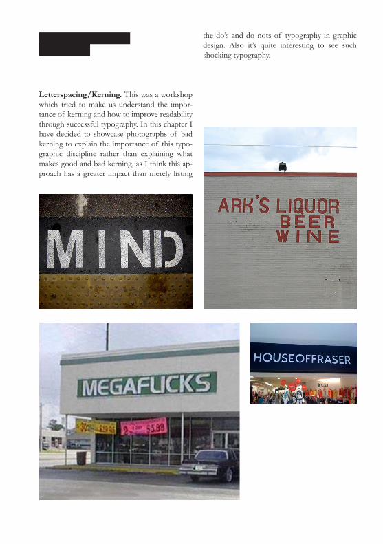
Letterspacing/Kerning. This was a workshop which tried to make us understand the impor-tance of kerning and how to improve readability through successful typography. In this chapter I have decided to showcase photographs of bad kerning to explain the importance of this typo-graphic discipline rather than explaining what makes good and bad kerning, as I think this ap-proach has a greater impact than merely listing
the do’s and do nots of typography in graphic design. Also it’s quite interesting to see such shocking typography.


Display Typography. This workshop focused on the detail of display typography. One of the key factors that was repeated numerous times is that there should be more care taken over dis-play typography as the details are more obvious. This includes being careful which typeface you use because some typefaces were designed for the sole purpose of bulk text. When increased in size the minute details of the design will become noticable and ugly. Another aspect is kerning. Much more care should be taken with kerning as an oversized space between two display typogra-phy words is more noticable than two bulk text words. Also the idea of using thinner weights of the type on punctuation was presented to us, something which I’d never thought about be-fore, but can really make a difference.
‘There’s nothing certain in man’s life except this: that he must lose it.’Aeschylus
Below is an example of display typography. The quote is using both bold and regular type de-signs. The apostrophe’s have been changed to regular instead of bold and the apostrophe and A on the left have been left to hang out of the text box. Also the leading, tracking, and kerning has been changed accordingly.
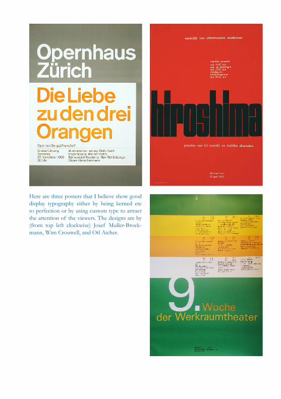
Here are three posters that I believe show good display typography either by being kerned etc to perfection or by using custom type to attract the attention of the viewers. The designs are by (from top left clockwise) Josef Muller-Brock-mann, Wim Crouwell, and Otl Aicher.

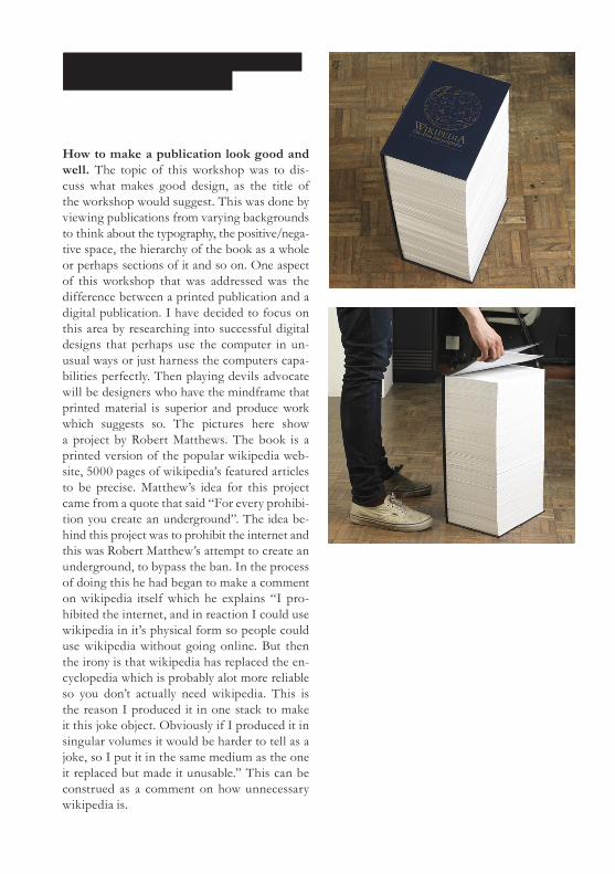
How to make a publication look good and well. The topic of this workshop was to dis-cuss what makes good design, as the title of the workshop would suggest. This was done by viewing publications from varying backgrounds to think about the typography, the positive/nega-tive space, the hierarchy of the book as a whole or perhaps sections of it and so on. One aspect of this workshop that was addressed was the difference between a printed publication and a digital publication. I have decided to focus on this area by researching into successful digital designs that perhaps use the computer in un-usual ways or just harness the computers capa-bilities perfectly. Then playing devils advocate will be designers who have the mindframe that printed material is superior and produce work which suggests so. The pictures here show a project by Robert Matthews. The book is a printed version of the popular wikipedia web-site, 5000 pages of wikipedia’s featured articles to be precise. Matthew’s idea for this project came from a quote that said “For every prohibi-tion you create an underground”. The idea be-hind this project was to prohibit the internet and this was Robert Matthew’s attempt to create an underground, to bypass the ban. In the process of doing this he had began to make a comment on wikipedia itself which he explains “I pro-hibited the internet, and in reaction I could use wikipedia in it’s physical form so people could use wikipedia without going online. But then the irony is that wikipedia has replaced the en-cyclopedia which is probably alot more reliable so you don’t actually need wikipedia. This is the reason I produced it in one stack to make it this joke object. Obviously if I produced it in singular volumes it would be harder to tell as a joke, so I put it in the same medium as the one it replaced but made it unusable.” This can be construed as a comment on how unnecessary wikipedia is.

The images shown here are a series of designs by Jasmine Razhanan which she describes as “A structural exploration into book forms, created as a response to the destructive method of book scanning advocated by google books.” This proj-ect is similar to Rob Matthews work in the way that it comments on the printed format being su-perior by trying to prevent books being scanned into the computer to be read digitally.

One piece of work that harnesses the computer is a music video for C-Mon & Kypski created by Roel Wouters. The idea behind this video is that viewers get to be in the video. This is done by creating a website that has a picture the viewer must mimic and send the photo into the website, the pictures are updated hourly and this creates a sort of stop motion animation with hundreds of people. It’s a very interesting idea and certainly utilises the internet. The link to this website is http://oneframeoffame.com/

The images shown here are screenshots of vid-eos for various bands created by Vincent Morri-set. The videos he created were a new direction on the traditional music video format. These music videos were on the internet and were ful-ly interactive. The two images on the left show a fully explorable environment where the view-er can zoom in and out to uncover new sections of the video, for example, the singer lying in his bed dancing to the music. The two right images show another interactive music video which shows the vocalist singing the lyrics. All the while the viewer is able to manipulate his actions through clicking on certain parts of the video. Both these ideas are very innovative and certainly ask questions of how music videos will be designed in the future.


Visualisation of Sound. Sound is something that has fascinated people from all professions whether it is for artistic interpretation or through linguistic study. When researching into artists experiments with sound it appears that there have been numerous artists who have played around with the concept of synesthesia. In its most simplistic term synesthesia is a neurological condition in which two or more senses are crossed so the individual will hear colours or see sound. There are various forms of synesthesia but the cross between sound and colour is the area most ex-plored by artists. The artists in question would either have the condition themselves or would experiment with the notion of synesthesia without actually having the condition themselves. One famous interpretation of this condition is Piet Mondrian’s Broadway Boogie Woogie painting. The painting depicts the boogie-woogie music through the bold use of colour, which is characteristic of this style of music. Mondrian wasn’t an individual who had synesthesia but this artwork portrayed the style of the music quite perfectly. Perhaps recognised more than Piet Mondrian for his work with art and synesthesia was Wassily Kandinsky. It is questionable whether or not Kandinsky had synesthesia but he is known to have said “I saw all my colours in spirit, before my eyes. Wild, almost crazy lines were sketched in front of me.”1 when talking about an opera in Moscow. In particular his painting Composition VIII (See figure 2) stands out among tthe rest of his work. To understand how he visualised sound through his paintings you can read a description by a synesthete as “The jumbled mass of lines gave various tones, which changed as my eyes traveled round the picture. When looking at the large multicoloured powerful circle at upper left, I get a pure tone, which can be too much, so to relieve my mind of this I travel back to the cacophony of jumbled lines and shapes. This painting therefore is a good balance of contrasting noise, pure tones and cacophony, which was a delight to see.”2
On the other end of the spectrum is linguistics, more specifically phonet-ics. Phonetics is the study of the spoken language and what physical prop-erties happen when certain words are spoken. The best way to understand this when put into practice would be to look into the IPA (International Phonetic Alphabet) which aims to attach a symbol to each sound made through speech rather than the standardized 26 letter Latin alphabet. The IPA is mainly used through teaching different languages, as it is applicable for more languages than the alphabet may be, due to it not following the constraints of individual languages, but that of the spoken word as a whole.
As mentioned above there are many uses for sound and how it can benefit individuals, but it’s the visualisation of sound that I see as truly interesting. There are many ways to approach visualising sound, most being through

digital means. One such example can be found in a computer program called Metasynth, which flips the ordinary by allowing the user to create sounds from visuals rather than visuals from sounds. However the par-ticular study into sound that fascinates me is the phenomena of literally making sound visible through sound waves, known as cymatics. Cymatics takes on its own notion of making the invisible visible by being somewhat hidden itself, but once the discovery is made there is a vast world to explore within this criteria. Another aspect of cymatics that is surprising is found when researching into the origins, which date back to Leonardo Da Vinci’s time when he wrote, “I say then that when a table is struck in different places the dust that is upon it is reduced to various shapes of mounds and tiny hillocks. The dust descends from the hypotenuse of these hillocks, enters beneath their base and raises itself again around the axis of the point of the hillock”3. There are many other individuals who noticed and experimented within this field, but for the purposes of understanding this subject Ersnt Chladni is the most important. He experimented with sound and most notably created the Chladni sound figures (See figure 1). These were metal plates that had a layer of salt poured on top, Chladni would then run a violin bow down the side of the plate and the salt would cre-ate patterns. The salt resting in an area that wasn’t vibrating formed these patterns, and the patterns would change according to what pitch the violin bow made. This is something that is common knowledge nowadays as we all know when music is played you can feel vibrations, however this was something that wasn’t identified in this period of time so was noted as quite extraordinary. Again there were many more individuals who experi-mented with cymatics but Hans Jenny is the next step to understanding this study. Hans Jenny is considered the creator of cymatics rather than his predecessors as he developed the field substantially, aided somewhat by the technology of his time. Also the reason why Jenny is reported as coining the term is because he said, “There is a similarity between cymatic pictures and quantum particles. In both cases that which appears to be a solid form is also a wave. They are both created and simultaneously organized by the principle of pulse (the principle of vibration). This is the great mystery with sound: there is no solidity! A form that appears solid is actually created by an underlying vibration.”4 This is the next stage to cymatics.
Rather than the study of cymatics being unexplainable experimentation Hans Jenny attached some meaning to this profession. He claimed that there was a similarity between the shapes created through his vibrations and that of the world around him. Thus suggesting that our world was cre-ated through vibrations. This is something that is documented in Cymatics: A Study of Wave Phenomena written by Hans Jenny himself. In this book he writes “The forms of snowflakes and faces of flowers may take on their

shape because they are responding to some sound in nature. Likewise, it is possible that crystals, plants, and human beings may be, in some way, music that has taken on visible form.”5 which is an interesting prospect if it is found to be true. This theory is continued further by Alexander Lauter-wasser who in his book Water Sound Images explains “The similarities of structure, design and pattern of many types of Chladni sound figures with those structures, designs and patterns of natural phenomena, is quite sur-prising and suggests a certain kinship, or commonality of origin.”6 Lauter-wasser writes that unexplainable biological characteristics can be explained through cymatics, or can at least provide the foundation to understanding. He makes comparisons between the scientifically unanswered patterns on a leopards fur to the pattern created in Chladni sound figures at 10,101 Hertz (See figure 3). These comparisons are made throughout the book with zebras patterns, turtles shells, plant life etc all with surprising accuracy.
Cymatics not only helps to formulate an idea to how this world was created but also helps us understand communicative tools through both humans and animals. Evan Grant, who is the founder of Seeper, an interactive arts group discusses how cymatics is beginning to help understand how animals communicate “In oceanography a lexicon of dolphin language is actually being created by basically visualizing the sonar beams that the dolphins omit and hopefully in the future we will be able to gain a deeper under-standing of how they communicate”7. As Grant continues to say “There’s still a lot to explore and its early days and there’s not many people working in this field”8 but it’s clear to see that there is potential within cymatics as it helps to understand sound in another dimension.
Whether it is determined that cymatics view of creation is correct, or if studying animals languages through vibrations is found to be beneficial or not, it is still an interesting field to study. As Evan Grant pointed out that it’s in the early stages of development so it is hard to see how cymat-ics might evolve. Regardless of these points I believe it will always have a place within the creative world as it serves as an interesting approach to visualisation.


A-Z. My representation of the alphabet has been shown through using sound and water. The initial plan was to record someone speaking the alphabet for it to then be played to vibrate water. However through my experiments I found that using this method there wasn’t enough variations between the visualisations, this was due to the quality of sound being played and also the ap-paratus I was using added to the problem. So this led me to using sounds associated with that letter, for example A is for aeroplane. Using this method the water would be played the sound of an aeroplane to then react to the vibrations. This isn’t ideally the approach I would of liked to take but was the only way that a distinction between each letter could be found. I have also decided to not label each visualisation with the sound used as I feel leaving it blank allows for imagina-tion when viewing the images and also because I didn’t want to create a “A is for Aeroplane” book, almost appearing like a childs educational alphabet book. So leaving it blank is my solution to avoiding this problem. The images shown are merely experimentations and this is something I will continue to experiment with as I’m fasci-nated by the prospect of visualising sound.


A B
C D
E F

G H
I

J K
L M
N O

P Q
R

S T
U V
W X

Y
Z

A B
C D
E F

G H
I

J K
L M
N O

P Q
R

S T
U V
W X

Y
Z
