visualization of large, time-dependent, abstract data...
TRANSCRIPT
Eurographics Conference on Visualization (EuroVis) (2012) Short PapersM. Meyer and T. Weinkauf (Editors)
Visualization of Large, Time-Dependent, Abstract Data withIntegrated Spherical and Parallel Coordinates
J. Walker1, Z. Geng1, M. W. Jones1, and R. S. Laramee1
1Department of Computer Science, Swansea University, Wales, UKEmail: {csjames, cszg, m.w.jones, r.s.laramee}@swansea.ac.uk
AbstractParallel coordinates is one of the most popular and widely used visualization techniques for large, high dimen-sional data. Often, data attributes are visualized on individual axes with polylines joining them. However, somedata attributes are more naturally represented with a spherical coordinate system. We present a novel coupling ofparallel coordinates with spherical coordinates, enabling the visualization of vector and multi-dimensional data.The spherical plot is integrated as if it is an axis in the parallel coordinate visualization. This hybrid visualizationbenefits from enhanced visual perception, representing vector data in a more natural spatial domain and alsoreducing the number of parallel axis within the parallel coordinates plot. This raises several challenges which wediscuss and provide solutions to, such as, visual clutter caused by over plotting and the computational complexityof visualizing large abstract, time-dependent data. We demonstrate the results of our work-in-progress visual-ization technique using biological animal tracking data of a large, multi-dimensional, time-dependent nature,consisting of tri-axial accelerometry samples as well as several additional attributes. In order to understand ma-rine wildlife behavior, the acceleration vector is reconstructed in spherical coordinates and visualized alongsidewith the other data attributes to enable exploration, analysis and presentation of marine wildlife behavior.
Categories and Subject Descriptors (according to ACM CCS): I.3.3 [Computer Graphics]: Picture/ImageGeneration—Line and curve generation
1. Introduction and Motivation
Parallel coordinates is a widely used visualization techniquefor large, multi-dimensional data. First introduced by Insel-berg [Ins85], each data attribute is represented by an indi-vidual axis, the combined set of all axis are aligned in par-allel with multiple polylines connecting them. Parallel coor-dinates is effective in the analysis of large high-dimensionaldata. However, when visualizing data which contains vectorattributes, it is necessary to cognitively integrate each corre-sponding vector axis to interpret direction, a demanding taskfor the user.
While parallel coordinates is good for displaying rela-tionships between scalar attributes, it is not as effective fordata containing vector (direction) attributes, in our case, tri-axial acceleration data. Instead, as demonstrated by Grundyet al. [GJL∗09] tri-axial accelerometer data is better repre-sented in three-dimensional spherical coordinates. This of-fers a compact representation, enabling visualization, aggre-gation, exploration and analysis of direction in space.
We join the advantages of spherical coordinates for visual-ization of tri-axial accelerometry data with those of parallelcoordinates for interrogating large time series multi-variatesensor data. The naive joining of the two leads to many prob-lems. Firstly, the computational complexity of parallel co-ordinates means rendering speeds can be slow, due to theamount of polylines rendered [GPL∗11]. Secondly, an oc-clusion problem occurs from rendering more polylines thanavailable pixels [GPL∗11]. It is important to create a visu-alization which is fast at rendering to enable interaction andexploration of the three-dimensional spherical plot, as wellas a visualization which displays a true representation of un-derlying patterns in the data set.
In this paper, we present a novel, work-in-progress so-lution, providing a hybrid visualization of integrated par-allel and spherical coordinates. Our solution features: asplit spherical coordinate sphere to reduce occlusion, curvedpolylines for enhancing visual perception, and spherical an-gular histograms for reducing overplotting and the compu-
c© The Eurographics Association 2012.
Submission: 134 / Integrated Spherical and Parallel Coordinates
tational complexity of parallel coordinates. This paper pro-vides the following contributions:
• an integrated spherical and parallel coordinates visualiza-tion,
• approaches to address over-plotting and occlusion,• application of our techniques to real-world time-
dependent, high-dimensional, abstract data.
The rest of the paper is organized as follows. In section2, we provide an overview of related work. In section 3,we present our user-options and associated visualizations,demonstrating the results on marine wildlife behavioral data.Finally, in section 4, we conclude our findings and outlinefuture work.
2. Related Work
The problem of visualizing high-dimensional vector datawas recognized by Qu et al. [QCX∗07], for weather datafrom Hong Kong. They proposed drawing polylines fromparallel coordinates to a two-dimensional polar axis, a morenatural domain for vector data. A simple solution for extend-ing this technique to utilize three-dimensional vector datacan be achieved by drawing lines from parallel coordinatesto a 3D spherical coordinate plot. However, this can causeocclusion and slower interaction.
We discuss two themes of related work. Firstly, existingmethods for visualizing tri-axial accelerometer data, to dis-cover methods of visually representing vector data and sec-ondly, clutter reduction methods to avoid over plotting andslow rendering speeds.
Visualization of Tri-axial Accelerometer Data Grundy etal. [GJL∗09] showed the visualization of tri-axial marinewildlife data using 3D spherical coordinates. Spherical scat-ter plots are used to show the geometric distribution of data,and spherical histograms show common animal movements.Their method is effective at enabling the exploration of tri-axial data, with two additional attributes forming part of thevisualization at any one time.
Blaas et al. [BBG∗09] visualize higher-order state tran-sitions between behavior labeled tri-axial data. Their visu-alization displays state transitions of behaviors within thecontext of the state they occur in. This is advantageous byproviding easy-to-follow transition paths as well as makingit possible to perceive common behavior transitions.
Clutter reduction Similar to other information visualiza-tion methods [FdOL03, ED07, KK96, UTH06, WB97], theparallel coordinate plot can suffer from overplotting. In thissection, we concentrate on previous work on parallel coor-dinates for large data sets. Generally, the clutter reductionmethods for large data sets can be categorized as: alpha-blending, clustering, focus+context and frequency and den-sity plots. We provide a brief overview of the literature.
Alpha Blending: Edward J. Wegman [Weg90,WL96] rep-resented the density of the plots with transparency. Thisworks well with small datasets, however, with large datasetsthe range of data is much greater and consequently it is moredifficult to fully represent the fidelity of complex datasets. Itis difficult to obtain a clear understanding of patterns andclusters, and outliers may get lost.
Clustering: Fua et al. define large data sets as contain-ing 106–109 data elements or more [FWR99]. They adoptBirch’s hierarchical clustering algorithm which builds a treeof nested clusters of lines based on proximity information.Proximity-based coloring is introduced to demonstrate clus-ters, and transparency to show the mean and the extentof each cluster. Johansson et al. [JLJC05] transform eachK-means-derived cluster into three high precision textures,namely an animation, outliers and structure texture, andcombine them into a polygon.
Focus+Context: Ellis et al. propose a focus+contextviewing technique that uses an automatic sampling algo-rithm and sampling lens for parallel coordinate visualiza-tion [ED06]. They investigate three ways to calculate the de-gree of occlusion from overlapping polylines and describe araster algorithm as the most efficient metric. Novotny andHauser develop another focus+context visualization usingbinned parallel coordinates [NH06]. Binned parallel coordi-nates provide context views while traditional polyline-basedparallel coordinates present focus information. Ruebel etal. [RPW∗08] extend Novotny and Hauser’s work, and pro-pose adaptive histogram bins which use a higher resolutionin areas with high data density.
Frequency and density plots: One of the ways to reducethe clutter in parallel coordinates is based on data frequency.With this approach, data is often aggregated and filtered bythe binning process [AdOL04,BBP08,Car91,NH06,JTJ03].In general, binning is the process of computing the numberof values falling in a given interval or bin and storing themin a bin map. The data frequency can then be visually repre-sented by the histogram.
Much previous work adopts bin maps which yields line-based histograms [BBP08,NH06,RPW∗08]. They are effec-tive at revealing clusters and outliers while further interac-tion support is needed to help the user select and brush inter-esting sub-sets of data and explore useful information. Wefind that the one-dimensional point-based histogram is ef-fective in revealing an overview of the data [HLD02,Wil96],but such a histogram fails to depict the relations between thedata axes. Geng et al. [GPL∗11] extend the point-based his-togram to a vector-based approach. They use the histogramsas the visual aggregation of both the frequency and the direc-tion of polyline-axis intersections. By introducing the angu-lar information from the polyline-axis intersections, angularhistograms and attribute curves are able to depict the rela-tionship between data attributes.
c© The Eurographics Association 2012.

Submission: 134 / Integrated Spherical and Parallel Coordinates
3. Hybrid, Multi-Dimensional Visualization
In this section we present our novel visualizations to addressocclusion, overplotting and the computational complexityassociated with a naive hybrid visualization approach.
3.1. Challenges of Large, Time Dependent, AbstractData
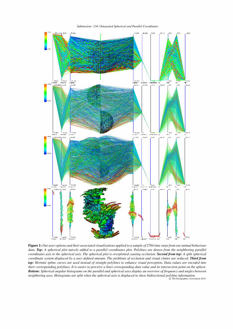
A naive coupling of parallel and spherical coordinates canbe achieved by connecting polylines from the parallel axisto the spherical axis. In the spherical coordinate system thex, y and z components of acceleration are normalized andmapped onto the surface of a 3D sphere. Figure 1 (top) dis-plays the result of this when applied to our time-dependentanimal behavior data set consisting of 1,073,053 data sam-ples and 13 attributes. The spherical axis suffers from over-plotting and occlusion. In addition, user interaction (rota-tion and zooming) with the spherical plot is slower due tothe large number of polylines. This provides the motivationbehind our work, we have incorporated the following user-options and associated visualizations to mitigate these prob-lems:
• sphere splitting to reduce occlusion on the spherical axes,• curved polylines to enhance visual perception between the
parallel and spherical axes.• spherical, angular histograms to address overplotting and
computational complexity on both the parallel and spher-ical axes,
We now discuss and display the results of these user-options.
3.2. Sphere splittng
We add a user-option to enable cutting the spherical coordi-nate system in half, displacing each sphere half by a user-defined distance. Our approach allows the user to change in-teractively the displacement size. This enables the user tospecify a split which reduces occlusion. Figure 1 shows theresults of a displaced coordinate system on our large dataset. As well as reducing occlusion, this method can also re-duce visual clutter. In addition, we provide the user with theability to change the alpha value used to blend the polylines.This helps to fine-tune the visualization.
3.3. Curved Polylines
To enhance visual perception we present a user-option to uti-lize spline curves instead of straight polylines. We replacestraight edges connected to the sphere with smooth curvesthat are orthogonal to the sphere’s surface. Figure 1 demon-strates this user-option. Polylines now display a curvedstructure connected to the acceleration vector value it repre-sents in the spherical coordinate system. This makes it easierto perceive a polyline’s corresponding data value and assistsin discovering a polyline’s intersection point on the referencesphere.
We utilize hermite spline curves [Fol93] in the followingway. The start point is on the parallel axis, its tangent vectoris orthogonal to the parallel axis, the endpoint is the coor-dinate of the normalized acceleration vector, and its tangentvector is orthogonal to the sphere at the endpoint. The usermay control the vector coefficients so they can modify thecurvature of the polylines to enhance their perception.
3.4. Spherical Angular Histograms
Angular histograms, introduced by Geng et al [GPL∗11]provide a method of displaying an overview of the trendsin a data set within a parallel coordinates visualization. Weadopt and extend angular histograms in order to address bothoverplotting and computational complexity. This techniqueis used as an overview to locate regions of interest with in thedata set, prior to using a polyline based visualization to showa detailed representation of the data. We modify the originalvisualization by splitting angular histograms on parallel co-ordinate axes neighboring the spherical coordinate plot whenthe spherical coordinate system is split, this encodes both up-ward and downward polyline information.
To incorporate both frequency and angular informationinto the spherical coordinate system, we extend the spheri-cal histogram technique presented by Grundy et al [GJL∗09]to encode angular information. Frequency is represented bybar height, and angular information through the bars cur-vature together with neighboring axes histograms. As seenin Figure 1 (bottom), the curve is effectively pulled towardsthe average angle. A playback function is used to representthe temporal component in our visualization. This is usedto show the evolution of histograms over time. Because eachcurved bin represents polyline intersection frequency, the vi-sualization is naturally suited for large data sets.
4. Conclusion and Future Work
In this paper we present work-in-progress solutions to inte-grated parallel coordinates with a spherical coordinate sys-tem. A naive approach suffers from multiple limitations in-cluding overplotting, computational complexity and occlu-sion. We presented the following user options to mitigatethese: split sphere, curved polylines and spherical angularhistograms. In future work we hope to investigate applyingmultiple spherical axis for data sets with multiple vector at-tributes, in addition to researching intuitive methods of inte-grating magnitude as well as direction into our visualizationtechnique.
5. Acknowledgments
This work is part-funded by the European Social Fund (ESF)through the European Union’s Convergence programme ad-ministered by the Welsh Assembly Government.
c© The Eurographics Association 2012.
Submission: 134 / Integrated Spherical and Parallel Coordinates
Figure 1: Our user-options and their associated visualizations applied to a sample of 2764 time steps from our animal behaviourdata. Top: A spherical plot naively added to a parallel coordinates plot. Polylines are drawn from the neighboring parallelcoordinates axis to the spherical axis. The spherical plot is overplotted causing occlusion. Second from top: A split sphericalcoordinate system displaced by a user defined amount. The problems of occlusion and visual clutter are reduced. Third fromtop: Hermite spline curves are used instead of straight polylines to enhance visual perception. Data values are encoded intotheir corresponding polylines. It is easier to perceive a lines corresponding data value and its intersection point on the sphere.Bottom: Spherical angular histograms on the parallel and spherical axes display an overview of frequency and angles betweenneighboring axes. Histograms are split when the spherical axis is displaced to show bidirectional polyline information.
c© The Eurographics Association 2012.
Submission: 134 / Integrated Spherical and Parallel Coordinates
References
[AdOL04] ARTERO A. O., DE OLIVEIRA M. C. F., LEVKOWITZH.: Uncovering clusters in crowded parallel coordinates visual-izations. In Proceedings of the IEEE Symposium on Informa-tion Visualization (Washington, DC, USA, 2004), IEEE Com-puter Society, pp. 81–88. 2
[BBG∗09] BLAAS J., BOTHA C. P., GRUNDY E., JONES M. W.,LARAMEE R. S., POST F. H.: Smooth graphs for visual explo-ration of higher-order state transitions. IEEE Transactions onVisualization and Computer Graphics 15, 6 (2009), 969–976. 2
[BBP08] BLAAS J., BOTHA C., POST F.: Extensions of parallelcoordinates for interactive exploration of large multi-timepointdata sets. IEEE Transactions on Visualization and ComputerGraphics 14 (2008), 1436–1451. 2
[Car91] CARR D. B.: Looking at large data sets using binneddata plots. Springer-Verlag New York, Inc., New York, NY, USA,1991, pp. 7–39. 2
[ED06] ELLIS G., DIX A.: Enabling automatic clutter reductionin parallel coordinate plots. IEEE Transactions on Visualizationand Computer Graphics 12, 5 (2006), 717 –724. 2
[ED07] ELLIS G., DIX A.: A taxonomy of clutter reduction forinformation visualisation. IEEE Transactions on Visualizationand Computer Graphics 13, 6 (2007), 1216 –1223. 2
[FdOL03] FERREIRA DE OLIVEIRA M., LEVKOWITZ H.: Fromvisual data exploration to visual data mining: a survey. IEEETransactions on Visualization and Computer Graphics 9, 3(2003), 378 – 394. 2
[Fol93] Introduction to Computer Graphics. Addison-WesleyProfessional, 1993. 3
[FWR99] FUA Y.-H., WARD M. O., RUNDENSTEINER E. A.:Hierarchical parallel coordinates for exploration of large datasets.In Proceedings of the conference on Visualization 1999 (LosAlamitos, CA, USA, 1999), VIS ’99, IEEE Computer SocietyPress, pp. 43–50. 2
[GJL∗09] GRUNDY E., JONES M. W., LARAMEE R. S., WIL-SON R. P., SHEPARD E. L. C.: Visualisation of sensor data fromanimal movement. Comput. Graph. Forum 28, 3 (2009), 815–822. 1, 2, 3
[GPL∗11] GENG Z., PENG Z., LARAMEE R., WALKER R.,ROBERTS J.: Angular histograms: Frequency-based visualiza-tions for large, high dimensional data. IEEE Transactions on Vi-sualization and Computer Graphics 17, 12 (2011), 2572 –2580.1, 2, 3
[HLD02] HAUSER H., LEDERMANN F., DOLEISCH H.: Angu-lar brushing of extended parallel coordinates. In Proceedings ofthe IEEE Symposium on Information Visualization (InfoVis 2002)(Washington, DC, USA, 2002), INFOVIS 2002, IEEE ComputerSociety, pp. 127–130. 2
[Ins85] INSELBERG A.: The plane with parallel coordinates. TheVisual Computer 1, 2 (1985), 69–91. 1
[JLJC05] JOHANSSON J., LJUNG P., JERN M., COOPER M.: Re-vealing structure within clustered parallel coordinates displays.In Information Visualization, 2005. InfoVis 2005. IEEE Sympo-sium on (2005), pp. 125 – 132. 2
[JTJ03] JR. J. F. R., TRAINA A. J. M., JR. C. T.: Frequency plotand relevance plot to enhance visual data exploration. Graphics,Patterns and Images, SIBGRAPI Conference on 0 (2003), 117. 2
[KK96] KEIM D., KRIEGEL H.-P.: Visualization techniques formining large databases: a comparison. IEEE Transactions onKnowledge and Data Engineering 8, 6 (1996), 923 –938. 2
[NH06] NOVOTNY M., HAUSER H.: Outlier-preserving fo-cus+context visualization in parallel coordinates. IEEE Trans-actions on Visualization and Computer Graphics 12, 5 (2006),893 –900. 2
[QCX∗07] QU H., CHAN W.-Y., XU A., CHUNG K.-L., LAUK.-H., GUO P.: Visual analysis of the air pollution problem inhong kong. IEEE Transactions on Visualization and ComputerGraphics 13, 6 (2007), 1408 –1415. 2
[RPW∗08] RÜBEL O., PRABHAT, WU K., CHILDS H., MERED-ITH J., GEDDES C. G. R., CORMIER-MICHEL E., AHERNS., WEBER G. H., MESSMER P., HAGEN H., HAMANN B.,BETHEL E. W.: High performance multivariate visual dataexploration for extremely large data. In Proceedings of the2008 ACM/IEEE conference on Supercomputing (Piscataway,NJ, USA, 2008), SC ’08, IEEE Press, pp. 51:1–51:12. 2
[UTH06] UNWIN A., THEUS M., HOFMANN H.: Graphics ofLarge Datasets: Visualizing a Million (Statistics and Comput-ing), 1 ed. Springer, July 2006. 2
[WB97] WONG P. C., BERGERON R. D.: 30 years of multidi-mensional multivariate visualization. In Scientific Visualization,Overviews, Methodologies, and Techniques (1997), IEEE Com-puter Society, pp. 3–33. 2
[Weg90] WEGMAN E. J.: Hyperdimensional data analysis usingparallel coordinates. Journal of the American Statistical Associ-ation 85, 411 (1990), 664–675. 2
[Wil96] WILLS G. J.: Selection: 524,288 ways to say "this isinteresting". In Proceedings of the 1996 IEEE Symposium onInformation Visualization (InfoVis 1996) (Washington, DC, USA,1996), INFOVIS 1996, IEEE Computer Society, pp. 54–. 2
[WL96] WEGMAN E. J., LUO Q.: High dimensional clusteringusing parallel coordinates and the grand tour. Computing ScienceAnd Statistics 28 (1996), 361–368. 2
c© The Eurographics Association 2012.