water painting-techniques
TRANSCRIPT

presents
Painting Techniques, Methods, and How to Paint
Water with Power & Rhythm
Paint the flow and MoveMent of water:

2 www.artistdaily.com
The Comber2010, watercolor, 18 x 24. Private collection.
Paint the flow and MoveMent of water
Capture the Movement of Water
Through Close Observation
This content has been abridged from an original article written by Linda S. Price. This premium has been published by Interweave Press, 201 E. Fourth St., Loveland, CO 80537-5655; (970) 669-7672. Copyright © 2009 by Interweave Press, a division of Aspire Media, all rights reserved. The contents of this publication may not be reproduced either in whole or in part without consent of the copyright owner.
NEw YOrk ArTIST Guy Corriero’S LOvE OF ThE OCEAN hAS LEd hIM TO PErFECT A TEChNIquE FOr PAINTINg wATEr ThAT gIvES ThE
SEA A SENSE OF FOrM ANd POwEr. by Linda S. Price
3 www.artistdaily.com
Paint the flow and MoveMent of water
uy Corriero doesn’t know the exact moment when he fell in love with the sea. Perhaps it was during one of the 12 summers he spent working as a lifeguard on Long Island, New York. He can, however,
pinpoint the moment he became fascinated with painting it. It was 1970, and he was looking at the work on view in Grand Central Gallery, in New York City. A marine painting by Fredrick Waugh (1861–1940) caught Corriero’s eye. “It took my breath away,” he says, “and I kept going back to see it until someone bought it.” Shortly thereafter, Corriero learned that Waugh
had painted on Monhegan Island, in Maine. “So,” he says with a slightly embarrassed chuckle, “I left my wife with two children and no car and made a trip to Monhegan.” Little did the artist know, he would go on to take this same trip every summer for the next 39 years. At first he painted the images that
most of the other artists were painting, such as fishing shacks, but then he turned his eyes toward the sea and hasn’t turned back since.
“Painting the sea is essentially painting from memory,” Corriero explains, “because the water is constantly moving and colors and light change with the time of day.” Fortunately for the artist, the form and movement of the ocean are predict-able. The same motion is repeated over and over; by observing closely, one can begin to understand the anatomy of the sea. “Water is volume,” he says. “It’s form—not just splashy stuff—and I treat it the same way I treat rocks.” Corriero has taught paint-ing extensively and shares his experiences with his students. He explains that the trick to painting waves is to think of them as being like receding
mountain ranges: Like a moun-tain, the profile of a wave is es-sentially an equilateral triangle. As it approaches the shore, the shallow bottom causes the shape
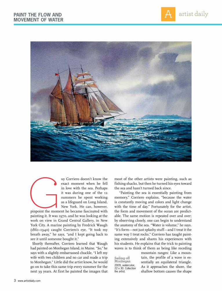
GSailing off Monhegan2009, watercolor, 22 x 30. Collection the artist.

4 www.artistdaily.com
Paint the flow and MoveMent of water
of the wave to change—the shore side grows smaller while the trailing edge becomes longer. Eventually the top breaks off in a cascading motion. Foam is created when water mixes with air. It moves in lay-ers and, as Corriero reminds his students, is three-dimensional, with halftones and shadow sides.
For the artist, foam is part of his illusionistic “bag of tricks.” It helps define the shape of the water beneath, it explains the way the sea is moving, it cre-ates rhythm within the painting, and, composition-ally, it leads the eye into the scene. The darkest part of each wave is at the top because it’s vertical and therefore reflects the least amount of light from the sky. As the wave curls there is a light streak at the top which helps separate it visually from the dark sea beyond and makes it pop. The troughs, or val-leys, are horizontal, so they reflect light and color from the sky. Between the dark peaks and the light troughs are the halftones. This is where, as in any form, the local color is found, because it’s an area affected neither by light nor shadow.
Much of Corriero’s painting is done on-site, where he can observe the sea firsthand. He uses a lightweight half-French easel and works on wa-tercolor blocks, preferably 18” x 24” so that he has space to swing his brush when he’s painting waves. His palette is a John Pike, and he prefers Winsor & Newton watercolors, with a few Holbein and Dan-iel Smith paints, as well. He squeezes out generous amounts of new paint on top of the old, letting the layers gradually mix. “Generous,” he stresses, add-ing that his students “sometimes think they can paint the huge sea with little piles of paint.”
His brushes are large, and although he was once devoted to flats, he now prefers rounds. “Flats, with their square-pattern stroke, are great for barns and boats,” he says, “but I found that everything was look-ing the same and somewhat labored. When I began painting the sea, flats didn’t give me the variety of strokes I wanted. Now I mainly use a large round, size 30. My favorite is an inexpensive Princeton acrylic brush. I also use sizes 26, 24, 10 and 8, going as small as a 5. Once in a while I use a rigger.” His old Marine Corps canteen is clipped to his easel, and paper towels are folded individually in his pocket so that he can easily pull one out to clean off his palette.
When choosing a painting location, the artist looks for a safe, comfortable area where the sun isn’t shining on his paper or palette. He seldom uses an umbrella, because it tends to shake his easel when
the wind blows. “You’ve also got to know the tides,” Corriero warns before telling a story about how he once ended up finishing a demonstration when the water had risen to his knees. “I know I’m too close to the water if I feel one drop of spray.”
Once he finds a subject that excites him, Corri-ero explores the scene from different points of view and checks to see if it can be reduced to a simple and effective value pattern. He squints to reduce de-tails and does a series of sketches using four values. Making value decisions in the middle of the paint-
above
Collecting Shells2009, watercolor, 18 x 24. Collection the artist.
toP
Black Duck, Monhegan2009, watercolor, 18 x 24. Courtesy Lupine gallery, Monhegan, Maine.

5 www.artistdaily.com
Paint the flow and MoveMent of water
ing process, he warns, is apt to lead to failure. He also advises creating quick gesture drawings to capture the rhythm of the water. Once he commits to a given scene he’s careful not to make changes, no matter what exciting and appealing things happen. “If you start chasing around after new effects, you’ll have a mess,” he cautions.
Corriero begins by drawing with an H pencil that is hard enough that it won’t dirty the paper. After wetting the entire sheet, he applies a light wash of Winsor yellow and Winsor red to warm up the white. Over the sky area he uses a drier and darker wash of the same color, adding more yellow for warmth as the sky moves closer to the sun. He finishes the sky with a wash of Winsor red, Winsor yellow, and cobalt blue, predominately the latter. When adding clouds he cautions that edg-es that are too hard can make them look like giant boxes, and edges that are too soft give them the appearance of cotton
balls. He instructs his students to model the forms of the clouds—be aware that there are halftones and shadow sides—but to use a light touch. For the shadow side he mixes a cool gray.
Waves must also have form, and Cor-riero notes that if an area looks flat, it’s because there isn’t enough variation in values. He uses a light blue-gray for the shadow side of the distant waves to pro-vide dimension, getting progressively darker for the splashing waves in the fore-ground. A touch of cobalt turquoise in the shadows offers contrast to the gray sky. He paints the sea with a mixture of cobalt blue and Winsor yellow, sometimes with a little red to gray it down. Or he uses An-twerp blue, aureolin yellow, and, if that’s too green, adds a hint of cadmium scarlet. He lays in the darkest colors last, with as few strokes as possible. Corriero explains that although people admire his colors, they are much less important to him than values. As long as the value is correct, he
feels comfortable using unusual colors—this is in part due to the fact that he has red/green color blindness. “Na-ture’s colors, are very
subtle,” he says. He calls them “ish col-ors.” That is, wet sand is reddish; tall weeds are greenish; sky is bluish. He paints most areas directly, achieving the desired colors and values initially and sel-dom layering colors.
When painting rocks, the artist ad-vises squinting to see the big shapes, then gradually breaking them down into smaller shapes. “Be brave with color and strokes on the rocks,” Corriero says, noting that he paints them with a com-bination of ultramarine blue and brown madder, adding a touch of yellow ochre to suggest seaweed and provide varia-tion. Although reflected light is usually warm, he points out that wet rocks often reflect the cooler sky and surrounding
Late Afternoon at Two Lights, Cape Elizabeth, Maine2008, watercolor, 18 x 24. Collection the artist.

6 www.artistdaily.com
Paint the flow and MoveMent of water
sea. Shadows on the rocks give them dimension, and drybrush gives them sparkle. The hardest edges in the painting are reserved for the rocks, thus mak-ing the surf look softer in comparison.
To ensure a variety of edges between breaking waves, water, sky, and rocks, he prewets select ar-eas or softens hard edges by rewetting and lifting color with a stiff brush. Except when painting the sky, he doesn’t work on wet paper.
Corriero depicts the sea largely through nega-tive space, carving it out from the rocks and waves. Dark, distant water carves out the white foam, and bold, dark rocks shape the foreground sea. If an area isn’t working, he sometimes paints over it with casein, perhaps applying watercolor over that. He also finds that casein—a medium he learned to use during his days as an illustrator—is good for creating the effect of sun shining on the water.
Drama in Corriero’s seascapes derives not only from contrasts in value, color, shape, and tem-perature but also from the difference between the churning water in the foreground and the soothing waves in the distance. The artist paints the sea at eye level to catch the ominous quality of a crest com-ing toward the viewer—a wave like those Corriero would dive into during his lifeguarding days. ■
Guy Corriero grew up on Long Island, New York, within sight and sound of the sea. After tak-ing classes at the School of visual Arts, in New York City, he majored in fine arts at Long Island university. he joined the united States Marine Corps after graduation and was assigned to the Marine Corps gazette magazine. After leaving the Marines, Corriero worked as a commercial artist for five years before beginning a long teaching career at the State university of New York at Farmingdale. he then moved to upstate New York, where he helped start an art program at herkimer County Community College. his teaching skills were recognized with The Chancel-lor’s Award for Excellence in Teaching. Since retiring, he has been painting full time, as well as teaching occasional workshops and producing instructional videos. he is a signature member of the American watercolor Society, Central New York watercolor Society, and knickerbocker Artists. he is represented by several galleries in Maine: Camden Falls gallery, in Camden; dowling walsh gallery, in rockland; Lupine gallery, on Monhegan Island; and the wiscasset Bay gallery, in wiscasset. For more information, visit his website at www.guycorriero.com.
about the artisttoP left
Black Duck, Monhegan2009, watercolor, 18 x 24. Courtesy Lupine gallery, Monhegan, Maine.
toP riGht
Gathering Mesquite Wood, Mexico2009, watercolor, 18 x 24. Collection the artist
turn the PaGe for two deMonstrations➥

7 www.artistdaily.com
Paint the flow and MoveMent of water
Step 5Corriero then added the lights of the fore-ground rocks, using various mixtures of brown madder, yellow ochre, and small touches of blue, all mixed directly on the paper. he painted dark shadows on top of the lights with ultramarine blue and brown madder, giving form to the rocks and empha-sizing the direction of the light. he added final touches of white and light-yellow water-color pencil to the highlights on the waves.
Step 1 & 2Corriero began with a value sketch of the scene, simplified to four values: white, light gray, dark gray, and black.
After soaking his rough-pressed 300-lb Arches paper for 40 minutes, the artist stapled it to a piece of sealed plywood and let it dry overnight. he then drew in the main shapes with a hard pencil.
Step 3 he wet the paper and then laid in the sky with a wash of cobalt blue and winsor yellow, to which he added a touch of winsor red. As he started on the waves, he was careful to leave a lot of white space for the foam.
Step 4 The artist next proceeded from the back-ground water to the less turbulent water in the foreground, using the same colors of cobalt blue, winsor Yellow, and very small touches of winsor red in areas that appeared too green. he then painted the rocks with combinations of brown madder and ultrama-rine blue. Corriero was careful to vary the edges between the water and the rocks.
deMonstration: PoundinG surf off Prout’s neCk
the CoMPleted PaintinG:
Pounding Surf Off Prout’s Neck, Maine2010, watercolor, 22 x 30. Collection the artist.

8 www.artistdaily.com
Paint the flow and MoveMent of water
Step 1with a soft 6B graphite pencil, Corriero drew a value sketch of the scene, simplifying it into four values—white, light gray, dark gray, and black.
Step 2After soaking his 300-lb, rough-pressed Arches paper for 40 minutes, the artist stapled it to a piece of plywood and let it dry overnight. he then drew in the large shapes with a hard pencil.
Step 3Corriero applied masking tape along the horizon line to make painting the sky easier. After wetting the paper, he laid in the sky with a wash of cobalt blue and winsor yellow, to which he added a touch of winsor red. he painted the sky darker along the horizon line to give a sense of light to the water.
deMonstration: rouGh seas at ChristMas Cove, MonheGan island
deMonstration Continued...
Step 4he then painted the shadows in the water with cobalt blue mixed with yellow. he wet the paper where the cool, distant cliffs met the sky so that the edges would be soft.
➥
9 www.artistdaily.com
Paint the flow and MoveMent of water
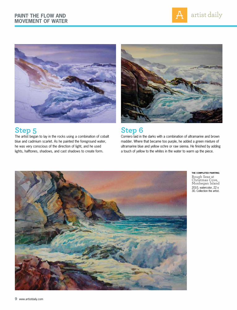
Step 5The artist began to lay in the rocks using a combination of cobalt blue and cadmium scarlet. As he painted the foreground water, he was very conscious of the direction of light, and he used lights, halftones, shadows, and cast shadows to create form.
Step 6Corriero laid in the darks with a combination of ultramarine and brown madder. where that became too purple, he added a green mixture of ultramarine blue and yellow ochre or raw sienna. he finished by adding a touch of yellow to the whites in the water to warm up the piece.
the CoMPleted PaintinG:
Rough Seas at Christmas Cove, Monhegan Island2010, watercolor, 22 x 30. Collection the artist.

10 www.artistdaily.com
Paint the flow and MoveMent of water
This content has been abridged from an original article written by wiliam h. hays. This premium has been published by Interweave Press, 201 E. Fourth St., Loveland, CO 80537-5655; (970) 669-7672. Copyright © 2009 by Interweave Press, a division of Aspire Media, all rights reserved. The contents of this publication may not be reproduced either in whole or in part without consent of the copyright owner.
Painting the Flow, Color, & Rhythm of Water
INTErESTINg ANd CONTrASTINg COLOrS ALLOw ME TO CrEATE ThE uNduLATIONS OF FLOw, rEFLECTION, ANd rEFrACTION ThAT MAkE ThE dEPICTION OF wATEr
SuCh A POTENT COMPOSITIONAL TOOL. by William H. Hays
Red Boat With Lobster Pots 2004, oil on panel, 11 x 24. Collection the Artist’s Loft gallery, Brattleboro, vermont.

11 www.artistdaily.com
Paint the flow and MoveMent of water
ne of the most beautiful and entrancing elements of land-scape scenes is light passing through and reflecting on water. Whether depicting the sea, a lake, or a stream, water
presents one of the most challenging aspects of a landscape for a painter to master. I have made the different “moods” of water an important part of my approach to landscape painting for more than 30
years. For me, there are three basic elements I con-sider when painting water: flow, color, and rhythm.
Let’s start with flow. Water is constantly mov-ing from the influence of wind, wave action, and its own mass responding to gravity. The flow of streams and rivers is subject to the terrain over which it courses. Starting in the early stages of the painting, I try to envision what is below the water’s surface. Deep water generally flows slower, with a smoother surface. Its reflections are marked by a
oStanding Up to the Sea 2004, oil, 28 x 38. Collection the Artist’s Loft gallery, Brattleboro, vermont. Note how the rocks beneath the waves shape the flow of the incoming sea in this image.

12 www.artistdaily.com
Paint the flow and MoveMent of water
gentle, repeating sweep, grabbing the colors of the sky and the immediate sur-roundings. Shallow waters ripple and course their way over stones, sand, and debris on the bottom. The result is a more complex swirling of broken reflec-tions—curling dashes and slashing strokes of paint. What happens below the surface creates both the reflective qualities of the surface and the refractive qualities within the water itself.
The next element I consider is color. In nature, water is almost never pure and
therefore has a tint that is greener than pure water. Additionally, the depth of the water creates its own color and is subject to the light of the day. A clear overhead light creates a dominant blue in clean water describable with ultramarine blue combined with other color notes. The clear water of the North Atlantic is pre-dominantly ultramarine blue and rather dark. A lake, river, or stream generally tends to be greener. Particles suspended in the water also reflect additional light, creating an overall lighter tone in shal-
low water. As depth increases, the value of the blue-green decreases, and the hue gets darker. In shallows, the bottom exhibits the higher and warmer notes of the palette. Yellows, oranges, and reds figure prominently in sunlit and shallow areas raising the values to within the higher range in the highlights. This is all underwater, not on the surface.
On the surface, shadow areas from objects immediately adjacent to the water tend not to reflect the object, but rather offer a window to what’s under
Pikes Falls 2004, oil, 38 x 28. Courtesy Elaine. Beckwith gallery, Jamaica, vermont. This painting took shape over the course of seven years. The final modification was the addition of the clear pool of water. Colors in the water were then carried into the landscape to unify the light in the painting.

13 www.artistdaily.com
Paint the flow and MoveMent of water
the surface. This effect occurs because the object is blocking the reflection of the sky. The sky’s reflec-tion dancing on the surface is mostly a deeper ver-sion of what is seen in the sky itself. If you assume that it is a clear, blue-sky day, the value of the blue must be at least a shade darker than the sky itself and should be more intense.
The value contrasts between the water and the reflection are the crucial elements that reveal the painted reflection as light bouncing off of water’s surface. The reflected light is usually much lighter than the refracted light within the water. For sky reflections, I will often choose a mixture of ultra-marine blue and cobalt blue—an exquisite combi-
nation with maximum intensity. The reflections of the sky define the rhythms of the surface.
Rhythm is the goal and regimentation is the pitfall when depicting water. Rhythm, through brushstrokes, adds texture and motion to the com-position. The rhythms of blades of grass in a field, for example, are a perfect demonstration of this process. A quick, thin stroke will define a blade of grass. The repetition of that stroke will define a field. But if the brushstrokes are done the same way again and again, the repetition becomes regi-mentation, and that takes the life out of a painting. Repeated strokes become a pattern rather than a rhythm. The trick is to find the descriptive stroke
Beach Meadows I2004, oil, 28 x 38. Courtesy Charter Oak gallery, Fairfield, Connecticut.

14 www.artistdaily.com
Paint the flow and MoveMent of water
and repeat it slightly differently each time to create interest within the rhythm.
When depicting the surface of water, remember that its rhythms can range from simple and elegant to very complicated and multilayered. In all cases, these rhythms should reflect and define the flow of the water. A calm day in deep water produces undu-lations that I often approach with a dry-brush tech-nique. I push the shadows and highlights around so that they flow into one another and gently take the viewer’s eye into another part of the composition.
Note that the reflection is broken up in water that ripples and flows over obstacles. The rippling surface picks up much less of the sky reflection; in fact, the sky and the reflections of objects defining the surface motion in rippling water may be shown with a few select daubs of color. I like to approach this type of reflection with a filbert or flat that is at least twice the size I would naturally choose. Turn or rock the brush while pushing it across the surface, letting the edges and the end of the brush do the work for you. Don’t get caught up in details; let the brushstrokes happen with confidence. See what they can accomplish when you don’t get caught up in specifics. Step back and let the paint-ing tell you what is working and then build on it.
Given the important role that surface reflections play—defining the flow and suggesting the physi-cal depth—it is important not to overwork them. When adding reflected light, apply strokes with economy. Step back frequently and note the effect of these strokes; by doing so you can minimize their use while maximizing their effect.
In summary, the relative success of depicting a landscape with water is dependent on a lively portrayal of that water. Lack of contrast, or an unin-spired use of color, can cause the most beautifully rendered surroundings to fall flat. Look below the surface of water while painting. The depth of a scene is strengthened when an artist includes this constantly moving and rich space. The undulations of flow, reflection, and refraction provide the artist with a rich compositional tool that embraces viewers and leads them through a painting. n
william h. hays lives and works in Brattleboro, vermont. he and his wife, Patricia Long, spend their summers in Liverpool, Nova Scotia, where hays paints maritime scenes. he is also an accomplished portrait painter. hays is represented by Elaine Beckwith gallery, in Jamaica, vermont; Charter Oak gallery, in Fairfield, Connecticut; golden door gallery, in New hope, Pennsylvania; Lambertville gallery of Fine Art, in Lambertville, New Jersey; and the Art gallery of Nova Scotia, in halifax, Canada. view more of the artist’s work at www.theartistsloft.com.
turn the PaGe for a deMonstration ➥
Carters Beach Rocks2004, oil, 38 x 28. Private collection. here, I concentrated on painting the transparent and reflective qualities of water.
about the artist

15 www.artistdaily.com
Paint the flow and MoveMent of water
Step 1The light and shadow areas of the painting were first blocked in to create the basic composition. I started with the sunlit areas, laying down a thin underpainting of yellow ochre. Shadow areas began with cobalt blue mixed with raw umber. Notes of terra rosa carried reflected light into the shadow areas. The bottom of the streambed was tinted with cerulean blue, perma-nent green, and raw umber. I used terra rosa for the brighter shadows in the water. I painted the dark fissures and ledges on the streambed with irregular strokes using a flat brush that I twisted and turned while drawing it across the canvas. I worked very fast, without paying much attention to details. The water flowing over the streambed breaks up any clearly defined structures below the surface.
Step 2 At this stage, the overall tonal quali-ties were taking shape. I fleshed out the shadow areas in the rocks with a warm and cool—primarily terra rosa and an ultramarine—and cobalt-blue mixture. The gray violets added life in the shadows on the rocks in the warm. Terra rosa and yellow ochre added depth and warmth to the downward slopes of underwater rocks.
Step 3 At this point, I was still painting the bottom and the depth of the water. I then depicted the churning of air in the water and the overall flow with a grayed-down tint of cerulean blue and permanent green light. In shadow areas I used a blue version of the same tint for the light-colored foam on the water. I continued to develop the shaded areas of stones with different tints of terra rosa and yellow ochre.
1
2
3
deMonstration: stiCkneybrook bridGe
deMonstration Continued...➥

16 www.artistdaily.com
Paint the flow and MoveMent of water
Step 4 The addition of foliage in the trees rounded out the mood of painting while bringing the landscape closer to the viewer. The warmer colors, and the layering of the middle ground and background colors, gave depth to the upper-left center by bringing the woods in the upper right closer to the viewer. The colors of the foliage were brought down onto the ground litter, unifying the scene.
Step 5 Finally, I added surface reflections, with a tint of yellow ochre for the brightest highlights. Churning white water in the shadow was tinted a gray-blue. For the reflections of the sky, I used a mix of ultramarine and cobalt blue dragged over the surface quickly in discreet strokes that followed the flow of the water. The addition of these combined highlights focused the composi-tion and gave the water depth.
4
5the CoMPleted PaintinG:
Stickneybrook Bridge2004, oil, 28 x 38. Private collection.
