watercolour - curry's art store · pdf filereeves set of 12 watercolour we’ve...
TRANSCRIPT

WatercolourLesson Book
Serving artists since 1911 www.currys.com

I know a lot of teachers shy away from “real art” – especially if their areas of expertise are outside
the traditional arts.
YOU CAN TOTALLY DO THIS. These lessons will provide you with a simple, step-by-step system to help you become comfortable
and successful with your work in watercolour.
Watercolour Lesson Book
For more visual learners - in addition to the Lesson book, we’ve recorded all the lessons and made
them available on our YouTube channel, click here https://www.youtube.com/CurrysArtStore
We’re committed to helping you bring creativity to the classroom.If you’d like to schedule a classroom workshop or gather 5 or more teachers together for a
free demo – please don’t hesitate to contact:
Lezley Davidson – Education Sales Rep. & Creative Arts Advocate 647.985.0338 / [email protected]
Welcome to the Watercolour Lessons!Learning the foundations of watercolour is a great way to
bring the arts into the classroom.
The best part is that once you’ve learned how – you can
use those skills in any subject and in any way you want!
Painting in watercolour is a deeply enriching activity.
Even for those less inclined to be creative – it’s hard not
be excited by the mingling and flow of vibrant colours
on paper.

Reeves Set of 12 WatercolourWe’ve specifically chosen a watercolour set that includes a split-primary palette* to give your stu-dents the best colour theory & mixing experience possible.
Reeves paints are a perfect choice for students new to watercolour.
*Split-primary means that there is a warm and a cold of each of yellow, red and blue.
We’ve used these paints with all my children’s classes – ages 6 -12. They’re great right up to high school and even for adult beginners – those that aren’t sure if water-colour is for them and they don’t want to invest that much in materials to start with. The paints have good intensity and transparency for the price.
Watercolour Lesson Book - Materials Intro & Image Transfer
Materials Intro & Image TransferIncluded in your kit are the essentials of what’s required to paint in watercolour:
Canson XL Pad140 lb. cold press paper is the standard for watercolour painting.
This 11” x 15” pad has an ample 30 sheets which can be cut in half to a roomy 7.5” x 11” sheet.
*The video shows me using a 9”x12” pad – your kit will include (2x) 11” x 15” pads.

Black Mungyo Oil PastelOil Pastels are a great addition to learning watercolours.
They provide the same “resist and containment” of water
media that a crayon does, but they’re juicier and more in-
tense.
Oil pastels are a great source of texture and depth, depend-
ing on how many “passes” or layers the student is willing to
make on their work.
For this kit we have included black pastels, however, don’t
hesitate to experiment with different coloured pastels for
new effects.
We’ve included watercolours, paper and oil pastels only in this kit as it’s been our experience that most
K-8’s already have a class set of brushes.
However, if you need a set specifically for watercolour – we recommend the Curry’s brand brushes. I’ll be
using them in all the demo videos.
The same is true of the palettes. Teachers have proven themselves adept at finding creative alternatives
to traditional palettes. I’ll be using the plastic round palette in all the videos as it’s an affordable, flexible
palette option.
Watercolour Lesson Book - Materials Intro & Image Transfer

Image TransferThis is a little tip to transfer your image to the water-colour paper quickly and cleanly. Once the watercolour has been taped down (the right way), you can create a transfer sheet with the line drawing sample that you’ll be painting.Using graphite sticks, or the edge of a pencil – cover the back-side of the line drawing with graphite – making sure all the lines are covered.
Once the back-side of the line drawing is covered with graphite, you’re ready to transfer the image to your watercolour paper!Using a ballpoint pen or some other hard-ended (but not so hard that it’ll rip the paper) stylus, with firm pressure, trace all the lines in the drawing. If you’re using a ballpoint colour other than black, you’ll see your trace lines and be able to tell if you’ve traced all your lines. It’s always a disappointment to miss lines, so advise your students to only lift up part of the line drawing to check first before tearing it all off. Ta dah! Complete and ready to paint.
Watercolour Lesson Book - Materials Intro & Image Transfer
the right waythe wrong way

We’ve decided to introduce you to the split-primary
palette colour theory right out of the gate.
It will give you a much better understanding of actual
paint mixing as opposed to an idealized version of
mixing “all” colours with 3 primaries. (Which isn’t ex-
actly true.)
First – you can draw out the colour wheel by hand –
or you can just print out the image and trace the lines.
Here are the steps for hand drawing:
1. Trace a round object – a palette or dinner plate or anything else that fits into the space of your paper is fine.
2. Split the circle into thirds.
Split-Primary Palette Colour Theory

Split-Primary Palette Colour Theory
3. Split each third into thirds.
5. Draw two boxes on the bottom of the sheet for additional colour mixes.
The last two images show where the colours will be placed for each mixture and the final imaged labeled.
4. Draw a box on the outside of each middle third section to allow for another secondary mix.

Mixing the Split-Primary Palette Colour Wheel
“Inside the pie is bright. Outside the pie is neutral.”
The split-primary colour wheel is divided into thirds: a green third, a purple third and an orange third – 3
pieces of pie.
The “true” or “bright” secondary is mixed using the 2 primaries from inside the section of pie. ie. “Bright
Purple” is mixed using Crimson and Ultramarine – primaries from inside the purple pie section.
The “neutral” secondary is mixed using the 2 primaries from outside the section of pie. ie. “Neutral Purple”
is mixed using Brilliant Red and Phthalo Blue – primaries from outside the purple pie section.
I had a mantra with my watercolour colour:
Split-Primary Palette Colour Theory

Split-Primary Palette Colour Theory
The Thing About BlackThe bottom left hand corner of the colour wheel is showing the results of black mixed with other colours.
Black can be an asset to a painting, but should be used mixed with another colour in your painting.
Black on its own is flat and dead.
Mixed with other colours it retains vibrancy and life.
Use this area to let the students mix black with other colours – including mixed secondaries.
Burnt Sienna & UltramarineOne of my favourite mixes (especially in landscapes) is mixing Burnt Sienna and Ultramarine Blue.
They mix together to make a neutral colour perfectly suited for bark and stones and dirt.
The Ultramarine is a heavy “sedementing” pigment and creates a natural texture that mimics a variety of
natural surfaces.
Experiment with different ratios of Burnt Sienna to Ultramarine. You could also see what happens when
adding an additional colour to create a secondary mix with the Burnt Sienna.

Flat Wash: “STAINED GLASS”:
• Simple shapes
• Very little detail
• Heavy, thick outlines in oil pastel
• Separates wet paint from bleeding
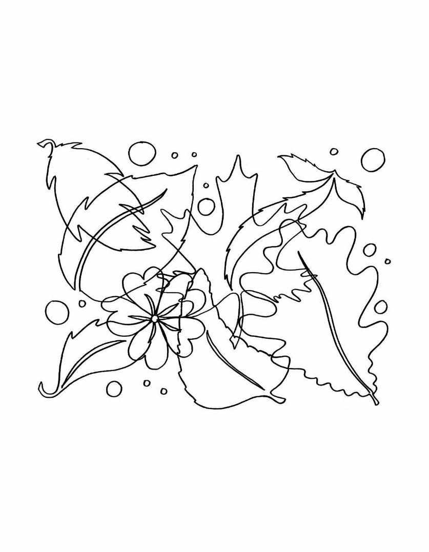
We’ve included all the line drawings to be copied and
traced where needed.
They’ve been sized to a half sheet of 11” x 15” or a 9” x 12”
piece of paper.
Understandably, the Ministry frowns upon copying tem-
plates and tracing and you may choose to use the tem-
plates as a teacher – for your own use while you learn
how to use watercolours.
The line drawings are an example of the kinds of visual
elements that will suit each of the different foundation
techniques in watercolour: flat wash, glazing, graduated
wash and wet in wet.
It’s been my experience that drawing is the biggest hin-
drance to learning how to paint in watercolours. Drawing
is a skill that requires dedicated discipline and effort to
realize – and most primary grade students aren’t at that level quite yet.
Using our line drawings as examples, the students can create their own original designs – based on simple
elements and principles designed to focus on the particular technique being learned.
A Note About the Line Drawings

A Note About the Line Drawings
Glazing: “OUTLINES”
• Overlapping & tracing found objects
• Items found in yard and home
• Interesting shapes important
• Interesting negative shapes created
Graduated Wash: “RAINY UMBRELLA”
• Simple subject matter
• Large area to add water and dilute
• Very little detail necessary
• Secondary areas to practice dilution
Wet in Wet: “CN TOWER”
• Simple silhouette of cityscape
• Identifiable building
• Interesting shapes
• Large area to allow paints to mix

Activating Watercolours
The default reaction to paint seems to be to think of it like
acrylic or oils… thick and opaque.
Watercolours are the total opposite of that.
When I teach watercolours – to children and adults alike
– I hear myself repeating over and over again:
“More Water! More Water!”
That’s the key – watercolours are watery and flowing. Less
is more with watercolours because applying them thick
and opaque completely negates their unique properties.
Adding WaterThere are 2 basic ways of adding water to your palette:
1. Fill your brush with water and “drip” it into the well by “scraping” it against the rim of the well.
2. Using an eye dropper.
They’re transparent and are eager to flow and
move across your paper and mingle with one an-
other. That has the best chance of happening if
you set them up correctly in your palette.
This is a split-primary palette, (warm and cold of
each primary colour), set up and ready to be ac-
tivated.
There is dime-sized dollop of paint in each well –
and that’s really all you need.
That amount of paint is enough for a student to
finish at least 3 projects.
And don’t wash them off when you’re done for
the day.
You can clean up the over-splash – but let the
paint dry out and store it for the next paint event.
The paint will activate again once water is added!

Activating Watercolours
There is a “bonus” option that several of my students have used. They soak paper towel in the water and
then squeeze it out into their paint wells.
I don’t know that I recommend this method. It’s hard to control and it made everything a little wet – but
they were proud of their creative invention and got the job done pretty quick!
One of the tricks of activating and mixing watercolours
is to not mix the whole paint dollop into a homogenous
mass.
Leave a portion of paint on the side, ready to be mixed in.
What this does is give you the option of adjusting the
intensity of the paint by mixing in more without having
to get new colour from the tube.
If you’ve ever had sushi – it’s the same idea when you’re
putting wasabi in your soya sauce:
Leave the dollop of wasabi on the side of your dish so
that you can add the spicy stuff a little bit at a time
instead of a giant rush of unbearable hotness that can
ruin your taste buds.

Activating Watercolours
Water ContainersIf possible, give every student at least 2 water containers.
One for dirty and one for clean water. It’s difficult to mix bright colours if the water is dirty.
You can use any kind of plastic containers from home, or if you’d like a more compact option, Curry’s has a
variety of containers available:

Flat Wash – “Stained Glass”
This is it. We’re going to paint a painting and…
It’s going to be awesome.The flat wash is the building block of watercolour. It’s basically
filling in an area with colour and avoiding streaky weird lines
and backwashes.
The key to this is liquid control.
Streaky lines happen when your brush has too little liq-
uid and the paint dries before you can finish the area,
so you over brush what you’ve already completed and
it makes it a darker streak.
The opposite happens with a backwash.
A backwash happens when an already dry area contin-
ues to suck up wet from a big puddle. It plumes and
spreads out and creates a noticeable craggy puddle
shape as it dries.
I enjoy backwashes for texture. They can be used to
create visual interest and add depth to a painting…
but first, you need to learn how to paint without them.
Flat Wash: “Stained Glass”

Flat Wash – “Stained Glass”
Let’s Paint!
Step 1. Transfer the image to the watercolour paper.
Step 2. Outline the image in black oil pastel.
This will create “buffer zones” to prevent the waterco-
lours from bleeding into each other and making a mud-
dy puddle.
Step 3. Lift excess pastel crumbs with tape.
This helps prevent the black oil pastel from making the
watercolour “dirty”. Encourage your students to avoid
excessive scrubbing along the edges of the oil pastel.
They can touch it a bit, but too much makes the colour
dirty.
Step 4. Paint in each section.
Students should be working at a steady pace. Stopping
in mid-section will result in the watercolour drying with
a streak or backwash. Finish the section with an equal
amount of water not allowing any area to dry before it’s
finished.
Use your new understanding of colour mixing to mix
secondary colours. I’ve chosen to paint the butterfly in
mostly warm colours, while reserving the background
for cool colours.
Warm colours come forward. Cold colours recede.
Step 5. Create shadows.
To add interest and depth, I added ultramarine shadows
to the object.

Flat Wash – “Stained Glass”
Further Study:“African Fabric”, “Intuitive Shapes” (and others!) are
available on the Curry’s YouTube channel.
Click here https://www.youtube.com/CurrysArtStore
if you would like to investigate flat wash further.
Determine which direction your light source is coming from, and paint the ultramarine shadow lines on
the opposite side of the object.
Experiment with the amount of water in your ultramarine mix so that it’s not too watery and doesn’t show
up, or it’s too intense and doesn’t look like shadows.
Liquid control is a big part of watercolour painting. Have toilet paper or paper towel handy to dab your
brush onto in case it’s too liquidy.

Glazing – “Overlapping Outlines”
Glazing is essentially a flat wash layered over another
dry flat wash. It’s important that the under layer is dry. If
it’s not, then it’s just wet in wet (which we’ll get to later).
Watercolours are transparent, so you can layer colour
over top of one another so they mix optically.
Instead of mixing yellow and blue on our palette and
applying it – we could layer yellow, let it dry and then
paint a glaze of blue overtop and it will “read” as green.
Step 1. Find interesting shapes in your
neighbourhood or house.
Step 2. Trace those items onto your paper,
overlapping them to create secondary images.
Pay attention to the negative shapes that are
created between the objects.
Step 3. Paint each underlying shape a dif-
ferent colour using what you learned in “Flat
Wash”.
Glazing – “Overlapping Outlines”

Glazing – “Overlapping Outlines”
Step 4. Allow the shapes to dry completely
before painting the overlapping shape.
Consider your colour choices and experiment
with primary and secondary colours as colour
choices – even painting a secondary colour over
another secondary colour.
Some students may end up with muddy brown
– but that’s okay. It’s an experiment in glazing
and some colours glaze better than others.
Step 5. To add visual interest, I added shadows to my objects.
Determine from where your light source is coming. Mix a light ultramarine to paint a line on the opposite
side of each object from the light source.
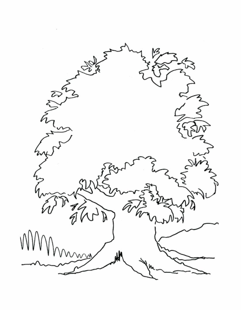
“Candle Flame” and “Tree” (and more!) are
available on the Curry’s Youtube Channel
https://www.youtube.com/CurrysArtStore
for those interested in further investigation
of Glazing.
Further Study:

Graduated Wash – “Rainy Umbrella”
The graduated wash is the “shading” of watercolour.
You take a dark wash and gradually turn it into a light wash
by adding water.
All the techniques that you learn in this course can be com-
bined with one another to produce the effect you need. The
graduated wash is a foundation of creating volume.
Step 1. Transfer image to watercolour paper. Tape down.
Step 2. Cover entire page with water.
This can be a tricky part for students. They need to add
enough water so it doesn’t dry out while they’re working,
but not too much that it’s pouring off the page.
It’s all about the liquid.
Using spray bottles and squeeze bottles can help with this
process.
Graduated Wash – “Rainy Umbrella”

Graduated Wash – “Rainy Umbrella”
Step 3. I used Phthalo blue – but you can use
whatever colour you like. Spread a line of rich, intense
colour along the top of the page.
Step 4. Clean your brush and pick up clean water
on your brush. Now run the water along the bottom
of your paint line – just barely touching the paint.
You will pick up the paint and it will flow down into
the water you’ve put down and it will lighten up
mixing with the water.
Step 5. Repeat Step 4 until you’ve brought the
blue all the way down the page, lightening it with
water every step.
Work quickly with this technique so that the page
doesn’t dry up and ruin the flow of your blue pigment
down the page.
The blue should continue to flow downward following
the water.
Don’t avoid the umbrella – paint right over it.
We’ll be adding more water to this, so make sure the initial strip along the top is concentrated and intense
– not washy and light.

Graduated Wash – “Rainy Umbrella”
Pro Tips: You can tell for sure that the paper is
dry because it is warm, or room temperature. If your
paper still feels cold – it’s still wet.
Test your paper with the back of your hand. There is
less oil than on your fingertips and skin oil will disco-
lour your paper over time.
Step 6. Go do something else for awhile and let
this dry.
You can dry it with a hair dryer. It’s a good second
choice when you’re in a pinch. It’s been my experi-
ence that the best results are when you can allow
the paint to dry on it’s own. It continues to move
and blend and create while it dries and the hair dry-
er interrupts that process.
Step 8. Paint graduated washes in each of the
umbrella sections. Working quickly while it’s wet.
If you want to deepen and intensive the colour, you
can drop in extra colour providing the section is still
wet and moving.
Step 7. When the paper is completely dry – outline the umbrella in oil pastel.

Graduated Wash – “Rainy Umbrella”
Step 9. Mix a bit of ultramarine and paint a
shadow underneath the umbrella.
I added purple into it while it was still wet.
I dropped in more colour to darken the shadow in
areas.

Graduated Wash – “Rainy Umbrella”
Great job!! You should totally sign this one.
Further Study:“Teddy Bear” and “Foggy Hills” are available on the Curry’s YouTube channel. Click here
https://www.youtube.com/CurrysArtStore if you would like to investigate Graduated Wash further.

Wet in Wet – CN Tower
Wet in Wet – “CN Tower”
Here we go… this is where the training wheels come off
and we get to let watercolour do its watercolour thing.
Wet in wet is probably my favourite part of watercolour
because nothing can replicate what the water and pig-
ment will do on their own.
With wet in wet techniques, you can’t control it , so it’s best
to just accept it’s free-wheeling ways and let it do its thing.
Here we go.
Step 1. Transfer your image and tape your
paper down.
Step 2. Pre-mix / activate the colours that
you’ll need.
Mix more than enough.
In our case we’ll be mixing 3 primaries: Crimson,
Medium Yellow & Phthalo or Ultramarine.
Mix your colour intensely. There’s a lot of water
on the paper that will dilute it – so go in strong.
Step 3. Get your paper completely wet with
water.
Grab a spray bottle or even the liquitip plastic
squeeze bottles (if it helps), each found at Curry’s.
Work steady – don’t let this dry up or it’ll be a
nightmare.
LOTS OF WATER. LOTS OF WATER.

Wet in Wet – CN Tower
Step 4. Apply yellow to the bottom third of the
paper in a ragged, sketchy style.
We’re trying to replicate a cloudy sunset sky, so
leave some white.
Step 5. Apply crimson to the middle third of
the paper in a similar sketchy, random style, mix-
ing into the yellow in places.
Step 6. Apply your choice of blue along the top
quarter of the painting allowing it to blend into
the red in places.

Wet in Wet – CN Tower
Step 7. Add clean water in places where the
paint is stuck and not moving. Be aware that the
direction you move the brush will impact the di-
rection of the “wind and clouds” in your sky. Move
your brush only horizontally for this exact reason.
Step 8. Use some toilet paper or paper towel to
gently mop up any giant puddles that will create
an odd-looking backwash in your sky.
Gently ‘dab’ the paper towel – do not scrub or
wipe! The ‘dabbing’ adds cloud texture to the sky.
Don’t dab everywhere, it’ll look too much – like a
faux finish.
This “painting” of wet in wet takes very little time
– it is a quick and intense dance with water and
pigment – then you let it do its own thing.
Don’t try and control the wash… let the water
work.
Step 9. Go make a sandwich because it’s got
to dry.

Further Study:We’ve included “Reflected Sky” and “Tree” on the Curry’s Youtube Channel. Click here
https://www.youtube.com/CurrysArtStore if interested in further investigation of the Wet in Wet technique.
Step 10. Go make a sandwich because it’s got to dry.
When dry – use your oil pastel to fill in the silhouette of the CN Tower skyline.
The first pass of the oil pastel will look weak and sketchy.
Encourage the students to go back in for a second and third pass with the oil pastel to create different
value areas of interest in the piece.
Let the water work.

For video lessons and more please click here www.currys.com/TeacherResources.html