wave analytics dashboard json guide - salesforce.com · wave analytics dashboard json guide...
TRANSCRIPT

Wave Analytics DashboardJSON Guide
Salesforce, Winter ’16
@salesforcedocsLast updated: December 8, 2015

© Copyright 2000–2015 salesforce.com, inc. All rights reserved. Salesforce is a registered trademark of salesforce.com, inc.,as are other names and marks. Other marks appearing herein may be trademarks of their respective owners.

CONTENTS
Wave Analytics Dashboard JSON Overview . . . . . . . . . . . . . . . . . . . . . . . . . . . . . . . . . 1
View or Modify a Dashboard JSON File . . . . . . . . . . . . . . . . . . . . . . . . . . . . . . . . . . . . 2
Dashboard JSON File Example . . . . . . . . . . . . . . . . . . . . . . . . . . . . . . . . . . . . . . . . . . . 3
Steps . . . . . . . . . . . . . . . . . . . . . . . . . . . . . . . . . . . . . . . . . . . . . . . . . . . . . . . . . . . . . 5
Static Steps . . . . . . . . . . . . . . . . . . . . . . . . . . . . . . . . . . . . . . . . . . . . . . . . . . . . . . . . . . 5
Widgets . . . . . . . . . . . . . . . . . . . . . . . . . . . . . . . . . . . . . . . . . . . . . . . . . . . . . . . . . . . 8
Widget Parameters Property Reference . . . . . . . . . . . . . . . . . . . . . . . . . . . . . . . . . . . . . . . 9
Query . . . . . . . . . . . . . . . . . . . . . . . . . . . . . . . . . . . . . . . . . . . . . . . . . . . . . . . . . . . . 23
Query Example . . . . . . . . . . . . . . . . . . . . . . . . . . . . . . . . . . . . . . . . . . . . . . . . . . . . . . 26Compare Table Example . . . . . . . . . . . . . . . . . . . . . . . . . . . . . . . . . . . . . . . . . . . . . . . . 29
Bindings . . . . . . . . . . . . . . . . . . . . . . . . . . . . . . . . . . . . . . . . . . . . . . . . . . . . . . . . . . 33
Selection Binding in a Static Step . . . . . . . . . . . . . . . . . . . . . . . . . . . . . . . . . . . . . . . . . . . 34Bind a Static Filter and Group Selector to a Query . . . . . . . . . . . . . . . . . . . . . . . . . . . . . . . 39Binding a Date Picker and Static Dates . . . . . . . . . . . . . . . . . . . . . . . . . . . . . . . . . . . . . . 42Binding Operations . . . . . . . . . . . . . . . . . . . . . . . . . . . . . . . . . . . . . . . . . . . . . . . . . . . 46
Layouts . . . . . . . . . . . . . . . . . . . . . . . . . . . . . . . . . . . . . . . . . . . . . . . . . . . . . . . . . . . 50
Use a Grid Layout for Your Dashboard . . . . . . . . . . . . . . . . . . . . . . . . . . . . . . . . . . . . . . . 52Understanding Column, Row, and Cell Sizing in Grid Layouts . . . . . . . . . . . . . . . . . . . . . . . 53Layouts Specification . . . . . . . . . . . . . . . . . . . . . . . . . . . . . . . . . . . . . . . . . . . . . . . . . . 55Layouts Attribute Reference . . . . . . . . . . . . . . . . . . . . . . . . . . . . . . . . . . . . . . . . . . . . . . 61


WAVE ANALYTICS DASHBOARD JSON OVERVIEW
Create advanced dashboards in Wave Analytics by modifying the JSON that defines a dashboard. The easiest way to design dashboardsis to use the designer. However, you can further customize dashboards by editing their JSON files.
Modify a dashboard’s JSON file for tasks such as:
• Specify a SAQL query, and specify relationships between the query and other steps.
• Populate a selector with a specified list of values instead of from a query.
• Use manual bindings to override the default faceting and manually specify the relationships between the steps.
• Set query limits.
• Specify columns for a values table.
• Change the layout of your dashboard from absolute to grid.
1

VIEW OR MODIFY A DASHBOARD JSON FILE
EDITIONS
Available in: SalesforceClassic and LightningExperience
Available in: DeveloperEdition
Available for an extra costin: Enterprise, Performance,and Unlimited Editions
USER PERMISSIONS
To modify the JSON file thatdefines a dashboard:• “Create and Edit Wave
Analytics Dashboards”
To create advanced dashboards, you typically modify the JSON file that defines a dashboard.
1. In your browser’s address bar, type the URL of the Create Lens page. For example, if yourSalesforce instance is na3.salesforce.com, typehttps://na3.salesforce.com/insights/web/lens.apexp in your browser’saddress bar.
2. In the list of lenses, click the lens to modify it.The JSON that defines that lens is displayed in the Lens text box. To increase the size of the textbox, click and drag the resizing handle in its bottom right corner.
3. Modify the JSON in the Lens text box. Optionally, cut and paste the text into a text editor orJSON editor, make your changes, and then paste it back into the text box.
4. Click Update Lens.The changes are saved.
2

DASHBOARD JSON FILE EXAMPLE
A dashboard JSON file defines the components that a dashboard contains and describes how they’re connected.
This sample JSON file defines a simple dashboard that uses a number widget to display the count of rows in a dataset. This sample JSONfile defines one lens, called "step_1", and one widget, called "number_1". The "edgemarts" section lists the datasets thatthe dashboard uses. The "layouts" section specifies a grid layout with one page, one row, and one column.
{"name_lc": "simple example dashboard","state": {
"widgets": {"number_1": {
"params": {"title": "","textColor": "#000","measureField": "count","fontSize": 36,"step": "step_1"
},"type": "NumberWidget","pos": {
"w": 300,"y": 40,"h": "auto","x": 40
}}
},"steps": {
"step_1": {"isFacet": true,"start": null,"query": {
"values": [],"order": [],"pigql": null,"dimensions": [],"measures": [
["count","*"
]],"aggregateFilters": [],"groups": [],"filters": [],"formula": null
},"extra": {
"chartType": "hbar"
3

},"selectMode": "single","useGlobal": true,"em": "0Fb400000004CH2CAM","type": "aggregate","isGlobal": false
}},"layouts": {
"default": {"page:0”: [
"number_1”]
}},"cards": {}
},"_uid": "0FK400000004CGOGA2","_createdBy": {
"_type": "user","profilePhotoUrl": "https://myorg/profilephoto/005/T","name": "Insights DashEditor","_uid": "00540000000Hew7AAC"
},"folder": {
"_type": "folder","_uid": "00540000000Hew7AAC"
},"_container": {
"_container": "0FK400000004CGOGA2","_type": "container"
},"_type": "dashboard","edgemarts": {
"emName": {"_type": "edgemart","_uid": "0Fb400000004CH2CAM"
}},"_createdDateTime": 1406060540,"_permissions": {
"modify": true,"view": true
},"description": "","_url": "/insights/internal_api/v1.0/esObject/lens/0FK400000004CGOGA2/json","name": "Simple example dashboard","_lastAccessed": 1406060541,"_files": {}
}
4
Dashboard JSON File Example

STEPS
The steps section contains the queries that you’ve clipped from the explorer.
Each step has a name that’s used to link it to a widget that’s defined elsewhere in the JSON file.
The properties of the steps section of a dashboard JSON file are:
DescriptionField Name
The alias of the dataset that this step uses.em
Extra information about the step.extra
Indicates that the step is connected to all other steps that are used in the dashboard and reference thesame dataset (true), or not (false).
isFacet
Note: Faceting works only for compact form queries (not SAQL).
Indicates whether the filter that’s specified in the query is used as a global filter (true) or not (false).A global filter filters all other steps in the dashboard that have their useGlobal property set to trueand that reference the same dataset.
isGlobal
Note: isGlobal works only for compact form queries (not SAQL).
The query that the step uses. It can be in SAQL or compact form.query
Determines the selection interaction. The options for charts are: none, single, andsingle_required. The options for list and toggle selectors are: single, single_required,multi, and multi_required.
selectMode isn’t available for number, raw data, compare, range, date, and global filter widgets.
selectMode
The default start value or values for a step. This value is used when a dashboard is initialized or refreshed.start
The type can be set to grain, aggregate, multi, or static.type
Indicates whether the step uses the dashboard’s global filter (true) or not (false).useGlobal
Note: useGlobal works only for compact form queries (not SAQL).
IN THIS SECTION:
Static Steps
You can also populate a selector from a specified list of static values, instead of from a query.
Static Steps
You can also populate a selector from a specified list of static values, instead of from a query.
5

A static step is shown in this example. This static step is used for filtering, but static steps can also be created for groups, measures, sortorder, and limits.
"steps": {"step_static_00null": {"type": "static","dim": "Stages","em": "opp","values": [{"display": "1","value": "1","measure": 100000
}, {"display": "2","value": "2","measure": 200000
}, {"display": "3","value": "3","measure": 300000
}, {"display": "4","value": "4","measure": 400000
}, {"display": "5","value": "5","measure": 500000
}
6
Static StepsSteps

],"selectMode": "single"
},
For more information, see Selection Binding in a Static Step.
7
Static StepsSteps

WIDGETS
The widgets section defines the widgets that appear in the dashboard. Each widget has a name.
The properties of the widgets section of a dashboard JSON file are:
DescriptionField Name
Widget parameters vary depending on the type of widget. The step that a widget is attached to is definedby its step element. For detailed information about different parameters, see Widget Parameters PropertyReference.
params
The top left corner of the widget is specified by x and y. Width is w, and height is h. Measurements are inpixels.
pos
The widget type specifies one of the other supported widget types.type
• NumberWidget
• ChartWidget
• ValuesTable
• CompareTable
• PillBox
• ListSelector
• TextWidget
• BoxWidget
• YoutubeWidget
• LinkWidget
• GlobalFiltersWidget
• RangeSelector
• DateSelector
IN THIS SECTION:
Widget Parameters Property Reference
The params property of the widgets section defines the attributes of a widget in a dashboard. Each widget has its own paramsproperty.
SEE ALSO:
Widget Parameters Property Reference
8

Widget Parameters Property Reference
The params property of the widgets section defines the attributes of a widget in a dashboard. Each widget has its own paramsproperty.
The parameters available for each widget depend on the widget’s type property. For example, a ChartWidget can have thelegend parameter, but a TextWidget can’t.
Some parameters are exposed and editable in the dashboard designer’s user interface as widget properties. Others are only editable viaJSON.
This example excerpt from a dashboard JSON file describes a dashboard with a single ChartWidget. The ChartWidget has fourparameters set: miniBars, chartType, sqrt, and step.
"widgets": {"chart_1": {"params": {“miniBars”: 14,“chartType”: “vbar”,“sqrt”: true,"step": "Customer_Name_1"
},"type": "ChartWidget","pos": {"w": 1000,"zIndex": 0,"y": 20,"h": 500,"x": 20
}}
}
The widget properties set by the params property are:
DetailsProperty Name
Typestring
backgroundColor
Available for This Widget
• BoxWidget
Exposed in the Dashboard Designer’s User InterfaceYes
DescriptionThe color of the background.
Specify the color in this format: rgb(a, b, c, d).
Using a number between zero and 255, a indicates how much red is in the color, b how much green,and c how much blue. A value of 0 indicates the absence of a color, and a value of 255 indicates the fullexpression of a color.
9
Widget Parameters Property ReferenceWidgets

DetailsProperty Name
Using a number between zero and one, d indicates the level of transparency. A value of 0 is invisibleand 1 is opaque.
For example, rgb(0, 0, 0, 0.93) sets the color to a nearly opaque black. rgb(255, 0,0, 0.14) sets the color to a nearly invisible red.
Alternatively, the color can be set using hexadecimal notation. When using hexadecimal notation,transparency can’t be set. All hexadecimal colors default to opaque. #000000 indicates black inhexadecimal. #ff0000 indicates red.
The default value is rgba(0, 140, 201, 0.35).
Typestring
borderColor
Available for This Widget
• BoxWidget
Exposed in the Dashboard Designer’s User InterfaceYes
DescriptionThe color of the border.
Specify the color in this format: rgb(a, b, c, d).
Using a number between zero and 255, a indicates how much red is in the color, b how much green,and c how much blue. A value of 0 indicates the absence of a color, and a value of 255 indicates the fullexpression of a color.
Using a number between zero and one, d indicates the level of transparency. A value of 0 is invisibleand 1 is opaque.
For example, rgb(0, 0, 0, 0.93) sets the color to a nearly opaque black. rgb(255, 0,0, 0.14) sets the color to a nearly invisible red.
Alternatively, the color can be set using hexadecimal notation. When using hexadecimal notation,transparency can’t be set. All hexadecimal colors default to opaque. #000000 indicates black inhexadecimal. #ff0000 indicates red.
The default value is rgba(0,0,0,0.25).
Typeboolean
compact
Available for These Widgets
• ListSelector
• NumberWidget
• PillBox
Exposed in the Dashboard Designer’s User InterfaceYes
DescriptionIndicates whether displayed numbers are abbreviated (true) or not (false).
10
Widget Parameters Property ReferenceWidgets

DetailsProperty Name
For example, if true, the number 48,081 appears as 48k. Although the number appears to be rounded,it is not. The value 48,081 is preserved when performing mathematics and in charts. If false, then48,081 appears as 48,081.
The default value is false.
TypeConnectWaveChartTypeEnum
chartType
Available for These Widgets
• ChartWidget
• LinkWidget
Exposed in the Dashboard Designer’s User InterfaceYes
DescriptionThe type of chart used to show data. Possible values are:
• calheatmap — calendar heat map
• hbar — horizontal bar
• hdot — horizontal dot plot
• heatmap — heat map
• matrix — matrix
• parallelcoords — parallel coordinates
• pie — donut
• pivottable — pivot table
• scatter — scatter plot
• stackhbar — stacked horizontal bar
• stackwaterfall — stacked waterfall
• time — time line
• hdot — vertical dot plot
• vbar — vertical bar
• waterfall — waterfall
TypeConnectWaveLinkWidgetDestTypeEnum
destType
Available for This Widget
• LinkWidget
Exposed in the Dashboard Designer’s User InterfaceYes
DescriptionThe destination type of a link. Possible values are:
• dashboard — a saved dashboard
11
Widget Parameters Property ReferenceWidgets

DetailsProperty Name
• explore — an unsaved, active exploration session of the lens
• lens — a saved lens
The default value is lens.
Typestring
destination
Available for This Widget
• LinkWidget
Exposed in the Dashboard Designer’s User InterfaceYes
DescriptionThe ID of the dashboard or lens.
The default value is null.
Typeboolean
expanded
Available for These Widgets
• DateSelector
• ListSelector
Exposed in the Dashboard Designer’s User InterfaceYes
DescriptionIndicates whether items in a list are displayed (true) or hidden (false).
If hidden (false), dashboard viewers can click the list widget to view and change list items.
The default value is true.
Typeboolean
exploreLink
Available for These Widgets
• ChartWidget
• CompareTable
• ListSelector
• PillBox
• ValuesTable
Exposed in the Dashboard Designer’s User InterfaceYes
DescriptionIndicates whether dashboard viewers can click a link to start exploring the widget as a lens (true) ornot (false).
12
Widget Parameters Property ReferenceWidgets
DetailsProperty Name
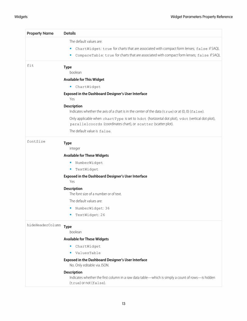
The default values are:
• ChartWidget: true for charts that are associated with compact form lenses; false if SAQL
• CompareTable: true for charts that are associated with compact form lenses; false if SAQL
Typeboolean
fit
Available for This Widget
• ChartWidget
Exposed in the Dashboard Designer’s User InterfaceYes
DescriptionIndicates whether the axis of a chart is in the center of the data (true) or at (0, 0) (false).
Only applicable when chartType is set to hdot (horizontal dot plot), vdot (vertical dot plot),parallelcoords (coordinates chart), or scatter (scatter plot).
The default value is false.
Typeinteger
fontSize
Available for These Widgets
• NumberWidget
• TextWidget
Exposed in the Dashboard Designer’s User InterfaceYes
DescriptionThe font size of a number or of text.
The default values are:
• NumberWidget: 36
• TextWidget: 26
Typeboolean
hideHeaderColumn
Available for These Widgets
• ChartWidget
• ValuesTable
Exposed in the Dashboard Designer’s User InterfaceNo. Only editable via JSON.
DescriptionIndicates whether the first column in a raw data table—which is simply a count of rows—is hidden(true) or not (false).
13
Widget Parameters Property ReferenceWidgets

DetailsProperty Name
The default value is false.
TypeConnectUri
imgUrl
Available for This Widget
• BoxWidget
Exposed in the Dashboard Designer’s User InterfaceYes
DescriptionThe document Id of the displayed image file. To ensure security, the image file must be uploaded toSalesforce as a document. If the document is not an image, or if there is no corresponding document,then nothing is displayed.
The default value is null.
Typeboolean
includeState
Available for This Widget
• LinkWidget
Exposed in the Dashboard Designer’s User InterfaceYes
DescriptionIndicates whether selections applied by a dashboard viewer are preserved in the destination afterthe viewer clicks the link (true) or not (false). If a selection is incompatible with the destinationor is null, then it isn’t preserved.
The default value is false.
Typeboolean
instant
Available for These Widgets
• DateSelector
• ListSelector
• RangeSelector
Exposed in the Dashboard Designer’s User InterfaceYes
DescriptionWhen a dashboard viewer interacts with a widget, indicates whether other faceted widgets immediatelyupdate (true) or not (false).
When false, dashboard viewers must click Update for their changes to cascade to faceted widgets.When true, the Update button is hidden.
The default values are:
14
Widget Parameters Property ReferenceWidgets

DetailsProperty Name
• DateSelector: false
• ListSelector: true
• RangeSelector: false
Typeboolean
legend
Available for This Widget
• ChartWidget
Exposed in the Dashboard Designer’s User InterfaceYes
DescriptionIndicates whether to display a legend (true), or not (false).
The default value is false for all chart types except pivot table.
Typeboolean
legendHideHeader
Available for This Widget
• ChartWidget
Exposed in the Dashboard Designer’s User InterfaceNo. Only editable via JSON.
DescriptionIndicates whether the legend has a title (true) or not (false). The title is always the name of thedimension that the legend describes.
The default value is false for all chart types except pivot table.
Typeinteger
legendWidth
Available for This Widget
• ChartWidget
Exposed in the Dashboard Designer’s User InterfaceNo. Only editable via JSON.
DescriptionThe width of the legend area in pixels.
The default value is 145 for all chart types except pivot table.
Typeinteger
maxColumnWidth
Available for These Widgets
• ChartWidget (only when chartType is hbar, heatmap, pivottable, scatter,stackhbar, stackvbar, or vbar)
15
Widget Parameters Property ReferenceWidgets

DetailsProperty Name
• CompareTable
• ValuesTable
Exposed in the Dashboard Designer’s User InterfaceNo. Only editable via JSON.
Description
The maximum display size (in pixels) of a dimension field on a web browser of a desktop or laptop.
Note: The grid layout for mobile devices doesn’t support the maxColumnWidth field.
The default value is 200, minumum value is 20, and maximum value is 200.
Typestring
measureField
Available for These Widgets
• ListSelector
• NumberWidget
• PillBox
Exposed in the Dashboard Designer’s User InterfaceYes
DescriptionThe mathematical function performed on data.
Specify the measureField in this format: <formula>_<field>.
<formula> must match one of the formulas specified in the measures step property. Possiblevalues for <formula> are:
• avg — calculate the mathematical average (mean)
• max — the maximum value
• min — the minimum value
• sum — add all the values
• unique — count the number of unique values
<field> must match the name of the dimension that is paired with the <formula> specified inmeasures.
For example, if the measures step property is:
"measures”: [["sum”,"Profit”
],["avg”,"Discount”
16
Widget Parameters Property ReferenceWidgets

DetailsProperty Name
]]
Then measureField must be sum_Profit or avg_Discount. The measureField can’tbe avg_Profit because avg and Profit aren’t paired together in the measures stepproperty.
The default value is null.
Typeinteger
minColumnWidth
Available for This Widget
• ChartWidget (only when chartType is hbar, heatmap, pivottable, scatter,stackhbar, stackvbar, or vbar)
• CompareTable
• ValuesTable
Exposed in the Dashboard Designer’s User InterfaceNo. Only editable via JSON.
DescriptionThe minimum display size of a dimension field in pixels.
The default value is 30.
Typeinteger
miniBars
Available for This Widget
• ChartWidget
Exposed in the Dashboard Designer’s User InterfaceYes
DescriptionThe display size in pixels of bars in bar charts.
The default value is 0 (available only for bar charts and column charts).
Typeboolean
multiMetrics
Available for This Widget
• ChartWidget
Exposed in the Dashboard Designer’s User InterfaceYes
DescriptionIndicates whether two or more measures are displayed as adjacent bars under each grouping (true)or as individual, adjacent graphs (false).
The default value is false (available only for bar charts and column charts).
17
Widget Parameters Property ReferenceWidgets

DetailsProperty Name
Typeboolean
normalize
Available for This Widget
• ChartWidget
Exposed in the Dashboard Designer’s User InterfaceYes
DescriptionIndicates whether charts are displayed using a logarithmic scale (true) or a linear scale (false).
The default value is false (available only for stackhbar and stackvbar).
Typeboolean
splitAxis
Available for This Widget
• ChartWidget
Exposed in the Dashboard Designer’s User InterfaceYes
DescriptionIndicates whether each dimension in a chart is measured on its own axis (true) or a shared axis (false).
Only applicable when multiMetrics is true.
The default value is false (available only for bar charts and column charts).
Typeboolean
sqrt
Available for This Widget
• ChartWidget
Exposed in the Dashboard Designer’s User InterfaceYes
DescriptionIndicates whether charts are displayed using a logarithmic scale (true) or a linear scale (false).
The default value is false (available only for bar charts, column charts, line charts, and time series).
Typestring
step
Available for These Widgets
• CompareTable
• DateSelector
• GlobalFiltersWidget
• ListSelector
• NumberWidget
18
Widget Parameters Property ReferenceWidgets

DetailsProperty Name
• PillBox
• RangeSelector
• ValuesTable
Exposed in the Dashboard Designer’s User InterfaceYes
DescriptionThe name of the lens that supplies data for the widget.
The default value is null.
Typeboolean
stretch
Available for This Widget
• BoxWidget
Exposed in the Dashboard Designer’s User InterfaceYes
DescriptionIndicates whether an image’s width and height are set to the same values of the widget’s width andheight (true) or not (false).
The default value is false.
Typestring
text
Available for This Widget
• TextWidget
Exposed in the Dashboard Designer’s User InterfaceYes
DescriptionThe message rendered in a text widget. For example, if text is assigned the value “Hello,World!”, then “Hello, World!” appears in the text widget.
The default value is null.
Typestring
textAlignment
Available for This Widget
• NumberWidget
• TextWidget
Exposed in the Dashboard Designer’s User InterfaceYes
19
Widget Parameters Property ReferenceWidgets

DetailsProperty Name
DescriptionThe alignment of text. Possible values include left, center, and right. If no value is specified, textalignment defaults to center.
The default values are:
• NumberWidget: right
• TextWidget: center
Typestring
textColor
Available for These Widgets
• NumberWidget
• TextWidget
Exposed in the Dashboard Designer’s User InterfaceYes
Description
The font color of text.
Specify the color in this format: rgb(a, b, c, d).
Using a number between zero and 255, a indicates how much red is in the color, b how much green,and c how much blue. A value of 0 indicates the absence of a color, and a value of 255 indicates the fullexpression of a color.
Using a number between zero and one, d indicates the level of transparency. A value of 0 is invisibleand 1 is opaque.
For example, rgb(0, 0, 0, 0.93) sets the color to a nearly opaque black. rgb(255, 0,0, 0.14) sets the color to a nearly invisible red.
Alternatively, the color can be set using hexadecimal notation. When using hexadecimal notation,transparency can’t be set. All hexadecimal colors default to opaque. #000000 indicates black inhexadecimal. #ff0000 indicates red.
The default value is #000.
Typestring
title
Available for These Widgets
• DateSelector
• ListSelector
• NumberWidget
• PillBox
• RangeSelector
Exposed in the Dashboard Designer’s User InterfaceYes
20
Widget Parameters Property ReferenceWidgets

DetailsProperty Name
DescriptionThe title of a widget.
The default value is null.
Typeboolean
totals
Available for These Widgets
• ChartWidget
• CompareTable
• ValuesTable
Exposed in the Dashboard Designer’s User InterfaceYes
DescriptionIndicates whether to include a row that displays the sum of all the values in each measure column (true)or not (false).
Always applicable to CompareTable and ValuesTable. Only applicable to ChartWidgetwhen ChartWidget is set to pivottable.
The default value for ChartWidget is false (available only for pivot table).
Typeboolean
trellis
Available for This Widget
• ChartWidget
Exposed in the Dashboard Designer’s User InterfaceYes
DescriptionWhen a lens has two or more groups and one measure, indicates whether the last grouping applied isdisplayed on its own axis (true) or on the same axis as the other groupings (false).
The default value for ChartWidget is false (available only for bar charts and column charts).
Typestring
videoSize
Available for This Widget
• YoutubeWidget
Exposed in the Dashboard Designer’s User InterfaceYes
DescriptionThe dimensions of a YouTube video. Possible values are:
• (4/3) 240 x 180
21
Widget Parameters Property ReferenceWidgets

DetailsProperty Name
• (4/3) 420 x 315
• (4/3) 480 x 360
• (4/3) 640 x 480
• (4/3) 960 x 720
• (16/9) 320 x 180
• (16/9) 560 x 315
• (16/9) 640 x 360
• (16/9) 853 x 480
• (16/9) 1280 x 720
The default value is (4/3) 240 x 180.
TypeConnectUri
youtubeUrl
Available for This Widget
• YoutubeWidget
Exposed in the Dashboard Designer’s User InterfaceYes
DescriptionThe URL of a YouTube video.
The default value is null.
SEE ALSO:
Widgets
22
Widget Parameters Property ReferenceWidgets

QUERY
The query section defines the query for that step.
The properties of the query section of a dashboard JSON file are:
DescriptionField Name
The SAQL query to use. The SAQL language is a real-time query language that uses data flow to align results.It enables on-demand analysis of data that’s stored in datasets.
pigql
The dimensions to use are specified this way:
"dimensions": [ "Department" ]
dimensions
The measures to use are specified this way:
"count", "*", null, {"display": "% of total flights"
}
measures
Specify for both compact and SAQL query formats. Specify for SAQL queries so that the associated chartwidget can render the correct projections. You can change the UI label of a measure by setting the displayoption.
Values are used with the grain step type in a step for a raw data table widget. Values list the columns toinclude in a grain or raw data table. For example:
"step_grain": {"type": "grain",
values
"em": "opp","query": {"values": ["Amount", "Owner-Name", "Name", "Account-Name",
"StageName", "ForecastCategory", "Current Age", "Time to Win"],}
}
Specify values for both compact and SAQL query formats.
The filter conditions to apply to the data. Here’s an example of a simple filter condition to include only rowsthat have the destination "SFO", "LAX", "ORD", or "DFW":
"filters": [["dest", ["SFO", "LAX", "ORD", "DFW"]]]
filters
The dimension to group by. For example, "groups": ["carrier"]. Specify groups for both compactand SAQL query formats.
groups
The sort order is specified this way:
"order": [[ -1, { "ascending": false } ]]
order
The value –1 indicates that the ordering is done for the first measure. To order the results in ascending order,set ascending to true. To order the results in descending order, set ascending to false. If you
23

DescriptionField Name
don’t want to impose a specific order, specify empty brackets this way: "order": []. Can be specifiedfor both compact and SAQL query formats.
The number of results to return. For example, "limit": 10. The results that the limit statement returnsaren’t automatically ordered, so use this statement only with data that has been ordered.
limit
Formula is used with the multi step type in a step for a compare table. A multi type step includesmultiple subqueries. You can use the basic mathematical operators *, /, -, +, (, and ) to create a formula
formula
to reference other subqueries in the step. To reference other subqueries, use the automatically assignednames: “A” is the first query, “B” is the second query, and so on.
"step_comptable": {"type": "multi","em": "opp","isFacet": true,"useGlobal": true,"query": {"columns": [{"header": "Opptys Won","query": {"pigql": null,"filters": [["StageName", ["5 - Closed-Won"]], ["Close
Date", [[["year", -1], ["year", 0]]]]],"measures": [["count", "*"]],"values": [],"groups": ["Owner-Name"],"formula": null,"order": []
}}, {"header": "Opptys Won ($)","query": {"pigql": null,"filters": [["StageName", ["5 - Closed-Won"]]],"measures": [["sum", "Amount"]],"values": [],"groups": ["Owner-Name"],"formula": null,"order": []
}}, {"sort": {"asc": false,"inner": false
},"header": "Opptys Won ($)","showBars": true,"query": {"pigql": null,"filters": [["StageName", ["5 - Closed-Won"]]],"measures": [["sum", "Amount"]],
24
Query

DescriptionField Name
"values": [],"groups": ["Owner-Name"],"formula": null,"order": []
}}, {"header": "Opptys Lost ($)","query": {"pigql": null,"filters": [["StageName", ["5 - Closed-Lost"]]],"measures": [["sum", "Amount"]],"values": [],"groups": ["Owner-Name"],"formula": null,"order": []
}}, {"header": "Opptys Lost ($)","showBars": true,"query": {"pigql": null,"filters": [["StageName", ["5 - Closed-Lost"]]],"measures": [["sum", "Amount"]],"values": [],"groups": ["Owner-Name"],"formula": null,"order": []
}}, {"header": "Win-Loss (%)","query": {"groups": ["Owner-Name"],"filters": [["StageName", ["5 - Closed-Lost"]]],"measures": [["sum", "Amount"]],"values": [],"pigql": null,"formula": "B/(B+D)*100","order": []
}}
]}
}},
Automatically generated. Don’t modify.aggregateFilters
Automatically generated. Don’t modify.facet_filters
25
Query

Within the query section of a step, you can manually insert bindings. To do so, use templates—expressions that are embedded in doublebraces ({{ }}) and that get replaced with the current state of the step that they’re attached to—as in the following example:
"filters": [["carrier", "{{ selection(step1) }}"], ["dest", "{{ filter(step1, 'dest') }}"],["origin", "{{ filter(step1, 'origin') }}"]]
IN THIS SECTION:
Query Example
This example shows a dashboard that contains two queries.
Compare Table Example
This example shows a single, unified SAQL query for creating a Compare Table.
Query Example
This example shows a dashboard that contains two queries.
The first bar chart is connected to a step ("step3") that contains a query that uses SAQL. The second bar chart is connected to a step("step2") that contains a compact form query. Both the compact and the SAQL steps have selection filters that are bound to "step1".Clicking one chart filters the others.
In "step3", the full SAQL query is placed within the "piqgl": reference. The SAQL query is used instead of the compact queryreferences. However, the compact form elements of "groups" and "measures" still need to be specified, so that the associatedchart widget can render the correct projections. (For a "grain" type query, "values" is always specified.) In this example, the'sum_miles' and 'count' projections in the SAQL query are then referenced in measures as [["sum", "miles"],["count", "*"]]. Measure projections in the SAQL always include the aggregation underscore (_) and the name of the measure('sum_miles') so that they can be referenced in the compact form "measures": [["sum", "miles"].
For more information about SAQL, see the SAQL Reference.
26
Query ExampleQuery

{"steps": {"step1": {"type": "aggregate","em": "airline","query": {"groups": ["carrier"],"filters": [["dest", ["SFO", "LAX", "ORD", "DFW"]]],"measures": [["count", "*"]],"order": [[-1, {"ascending": false
}]
],"limit": 3
}},"step2": {"type": "aggregate","em": "airline",
27
Query ExampleQuery

"query": {"groups": ["dest"],"filters": [["carrier", "{{ selection(step1) }}"], ["dest", "{{ filter(step1,
'dest') }}"], ["origin", "{{ filter(step1, 'origin') }}"]],"measures": [["sum", "miles"], ["count", "*"]],"order": [[-1, {"ascending": false
}]
]}
},"step3": {"type": "aggregate","em": "airline","query": {"pigql": "q = load \"airline\";\nq = filter q by 'carrier' in {{ selection(step1)
}};\nq = filter q by 'dest' in {{ filter(step1, 'dest') }};\nq = filter q by 'origin' in{{ filter(step1, 'origin') }};\nq = group q by 'dest';\nq = foreach q generate 'dest' as'dest', sum('miles') as 'sum_miles', count() as 'count';\nq = order q by 'count' desc;",
"groups": ["dest"],"measures": [["sum", "miles"], ["count", "*"]]
}}
},"widgets": {"barchart1": {"type": "ListSelector","pos": {"x": 10,"y": 10,"w": 270,"h": 180
},"params": {"step": "step1"
}},"text2": {"type": "TextWidget","pos": {"x": 310,"y": 10
},"params": {"text": "chart with pigql step:","textColor": "#f00"
}},"barchart2": {"type": "ChartWidget",
28
Query ExampleQuery

"pos": {"x": 310,"y": 30,"w": 400,"h": 280
},"params": {"step": "step2","chartType": "hbar"
}},"text3": {"type": "TextWidget","pos": {"x": 310,"y": 280
},"params": {"text": "chart with compact form step:","textColor": "#f00"
}},"barchart3": {"type": "ChartWidget","pos": {"x": 310,"y": 300,"w": 400,"h": 280
},"params": {"step": "step3","chartType": "hbar"
}}
}}
Compare Table Example
This example shows a single, unified SAQL query for creating a Compare Table.
This example uses a pigql definition at the root level (in the pigql field of the JSON) and shows a unified SAQL query for creating a simple,two-column Compare Table.
29
Compare Table ExampleQuery

{"_container": {
"_container": "0FKB00000000HDROA2","_type": "container"
},"lastRefresh": 1434733006,"_type": "lens","_createdDateTime": 1441046742,"_lastModifiedBy": {
"_type": "user","name": "Admin User","_uid": "005B00000017ahYIAQ","profilePhotoUrl": "https://c.notreal.content.force.com/profilephoto/005/notreal"
},"description": "Test compare table","visualizationType": "comparisontable","name_lc": "compare table backed by saql-test2","_createdBy": {
"_type": "user","name": "Admin User","_uid": "005B00000017ahYIAQ","profilePhotoUrl": "https://c.notreal.content.force.com/profilephoto/005/notreal"
},"assetPreviewAllow": true,"stateVersion": 1,"folder": {
"_type": "folder","name": "CompareTable","_uid": "00lB0000000hHMdIAM"
},"_files": {
"assetPreviewThumb": {"fileName": "assetPreviewThumb","fileSize": 3706,"lensId": "0FKB00000000HDROA2","_type": "lensfile","lastModified": 1441046778,
30
Compare Table ExampleQuery

"_url": "/insights/internal_api/v1.0/esObject/lens/0FKB00000000HDROA2/lensfile/0FJB00000004KbjOAE/data?lastModified=1441046778",
"_uid": "0FJB00000004KbjOAE","contentType": "image/png"
}},"name": "Compare Table backed by SAQL-Test","edgemart": {
"_type": "edgemart","_uid": "0FbB000000001CfKAI"
},"_permissions": {
"modify": true,"view": true
},"lastModified": 1441046742,"assetSharingUrl": "https://notreal.salesforce.com/analytics/wave/lens?
assetId=0FKB00000000HDROA2&orgId=00DB00000000P64&loginHost=notreal.salesforce.com&urlType=sharing",
"state": {"columns": [
{"query": {
"measures": [[
"sum","LeadScore"
]],"groups": [
"Industry"]
},"showBars": true,"sort": {
"asc": false,"inner": false
}},{
"query": {"measures": [
["avg","LeadScore"
]],"groups": [
"Industry"]
},"showBars": false,"sort": {
"asc": false,
31
Compare Table ExampleQuery

"inner": false}
}],
"pigql": "q = load \"Acme_Recent_Deals1\"; q = group q by 'Industry'; q =foreach q generate 'Industry' as 'Industry', avg('LeadScore') as 'avg_LeadScore',sum('LeadScore') as 'sum_LeadScore'; q = limit q 2000;",
"type": "comparisontable"},"_url": "/insights/internal_api/v1.0/esObject/lens/0FKB00000000HDROA2/json","_uid": "0FKB00000000HDROA2"
}
The Compare Table has the following limitations:
• Only these functions may be included: +, -, *, /, ( ).
• On mobile devices, SAQL may not be used at the column level. A global SAQL definition at the root level is supported, or the compactform may be used per column.
• On mobile devices, the Compare Table is read-only.
For more information about SAQL, see the SAQL Reference.
32
Compare Table ExampleQuery

BINDINGS
After you define steps, you bind them to the widgets.
The kinds of bindings are:
• Selection binding
• Results binding
Selection Binding
When a user makes a selection on a widget in a dashboard, that selection value can be used to update other steps and widgets to makethe dashboard interactive. This action is referred to as faceting.
When you build a dashboard with the dashboard builder UI, by default, everything is faceted. The “isFaceted” option for each step takescare of bidirectional selection bindings between steps of the same dataset. However, you can modify a dashboard JSON file directly tomanually specify the relationships between the various steps to achieve the following.
• Selection bindings between steps of different datasets
• Unidirectional selection binding
• Selection binding for a static step
Note: You can't configure selection binding on a multi-metric widget. If you do, an error occurs.
Results Binding
Results binding is used to filter a step by using the values that result from another step. This type of binding is typically used acrossmultiple datasets. An example of when results binding is useful is when you want to filter opportunities by top-selling products.
step_all_salesreps:type: "aggregate"em: "opp"query:groups: ["Owner-Name"]filters: [["StageName", ["5 - Closed-Won"]]["Products", "{{ results(step_top5_products) }}"]]measures: [ ["sum", "Amount"] ]
In the following example, the resulting sum of miles from the first step ("all_miles") is used in the second step to calculate theaverage.
"steps": {"all_miles": {"type": "aggregate","em": "airline","query": {"measures": [["sum", "miles"], ["count", "*"]]
33

}},"step_percent": {"type": "aggregate","em": "airline","query": {"pigql": "q = load \"airline\";\nq = group q by 'carrier';\nq =
foreach q generate 'carrier' as 'carrier', sum('miles')/{{value(results(all_miles, 'sum_miles')) }} * 100 as 'sum_miles',count()/{{ value(results(all_miles, 'count')) }} * 100 as 'count';\nq =order q by 'sum_miles' desc;",
"groups": ["carrier"],"order": [[["sum", "miles"], {"ascending": false
}]
],"measures": [["sum", "miles", null, {"display": "% of total miles"
}], ["count", "*", null, {"display": "% of total flights"
}]
]}
}
IN THIS SECTION:
Selection Binding in a Static Step
Almost all parts of a step can include a selection binding to the results of a prior query.
Bind a Static Filter and Group Selector to a Query
Static filters or group selectors can be bound to a query that’s written in SAQL.
Binding a Date Picker and Static Dates
You can use selection bindings to filter lenses for dates from a date picker lens or a static absolute or relative date step.
Binding Operations
You can use several more operations with results and selection bindings to extract the correct results.
Selection Binding in a Static Step
Almost all parts of a step can include a selection binding to the results of a prior query.
In an aggregate query, the fields that can be included in a selection binding are:
• Group
34
Selection Binding in a Static StepBindings

• Measure
• Filters
• Sort
• Limit
Use Static Steps for Binding Any Part of a QueryThis example shows a dashboard with static steps and selection bindings in multiple parts of a query.
In the following example:
• The static step step_filter_dim populates the "List of Products" list selector. It includes options that have multiplevalues.
• The static step step_group populates the group toggle selector. "Product" is the default value when the dashboard isinitialized, because the start value is "Product". The display values change the display name in the user interface.
• The static step step_measure populates the measure toggle selector.
• The static step step_order populates the order toggle selector.
• The static step step_limit populates the limit toggle selector.
• The aggregate step query step_quarterly_bookings is grouped by close-date year and quarter.
• The aggregate step query step_top_10 has groupings that are dependent on the selection option from the static step_group.The start value will be the "Product" grouping (based on step_group).
{"steps": {"step_filter_dim": {"type": "static","dim": "Product","em": "opp",
35
Selection Binding in a Static StepBindings

"selectMode": "single","values": [{"value": ["EKG Machine"]
}, {"value": ["Energist FRx"]
}, {"value": ["GE Mammography Machine", "GE HiSpeed DXi", "GE Stress System"]
}, {"value": ["HP MRI Machine", "HP Cardiac 64D"]
}, {"value": ["Hyfrecator"]
}, {"value": ["Siemens Dental System", "Siemens CR950"]
}, {"value": ["VolMED Ultrasound"]
}],"isFacet": true
},"step_group": {"type": "static","values": [{"display": "Owner","value": ["Owner-Name"]
}, {"display": "Product/Stage","value": ["Product", "StageName"]
}, {"display": "Product","value": ["Product"]
}, {"display": "Stage","value": ["StageName"]
}],"start": [["Product"]],"selectMode": "single"
},"step_measure": {"type": "static","values": [{"display": "$","value": [["sum", "Amount"]]
}, {"display": "#","value": [["count", "*"]]
}],"start": [[["sum", "Amount"]]],"selectMode": "single_required"
},
36
Selection Binding in a Static StepBindings

"step_order": {"type": "static","values": [{"display": "desc","value": false
}, {"display": "asc","value": true
}],"selectMode": "single_required"
},"step_limit": {"type": "static","values": [{"display": "top 5","value": 5
}, {"display": "top 10","value": 10
}, {"display": "top 100","value": 100
}],"start": [100],"selectMode": "single_required"
},"step_quarterly_bookings": {"type": "aggregate","em": "opp","query": {"groups": [["CloseDate_Year", "CloseDate_Quarter"]],"measures": [["sum", "Amount"]]
},"isFacet": true,"useGlobal": true
},"step_top_10": {"type": "aggregate","em": "opp","query": {"groups": "{{ selection(step_group) }}","measures": "{{ selection(step_measure) }}","order": [[-1, {"ascending": "{{ value(selection(step_order)) }}"
}]
],"limit": "{{ value(selection(step_limit)) }}"
37
Selection Binding in a Static StepBindings

},"isFacet": true
}},"widgets": {"sel_list_filter_dim": {"type": "ListSelector","pos": {"x": 860,"y": 90,"w": 290,"h": 288
},"params": {"step": "step_filter_dim","title": "List of Products","expanded": true,"instant": true
}},"sel_list_filter_compound_dim": {"type": "ListSelector","pos": {"x": 860,"y": 390,"w": 290,"h": 288
},"params": {"step": "step_quarterly_bookings","title": "List of Quarters","expanded": true,"instant": true
}},"sel_group": {"type": "PillBox","pos": {"x": 10,"y": 10
},"params": {"title": "group","step": "step_group"
}},"sel_measure": {"type": "PillBox","pos": {"x": 380,"y": 10
},"params": {"title": "mea",
38
Selection Binding in a Static StepBindings

"step": "step_measure"}
},"sel_order": {"type": "PillBox","pos": {"x": 480,"y": 10
},"params": {"title": "order","step": "step_order","start": true
}},"sel_limit": {"type": "PillBox","pos": {"x": 620,"y": 10
},"params": {"title": "limit","step": "step_limit"
}},"widget1": {"type": "ChartWidget","pos": {"x": 10,"y": 110,"w": 830,"h": 330
},"params": {"chartType": "hbar","step": "step_top_10"
}}
}}
Bind a Static Filter and Group Selector to a Query
Static filters or group selectors can be bound to a query that’s written in SAQL.
Templates are expressions, embedded in double braces ({{ }}), that get replaced with the current state of the step that they’re attachedto.
39
Bind a Static Filter and Group Selector to a QueryBindings

For example, this dashboard contains a static filter widget that contains a list of accounts. The dashboard also contains a group selectorwidget that lets users indicate whether to group by account or product. When a user makes a selection, the chart is updated accordingly.The part of the query that controls the filtering is:
q = filter q by 'Account-Name' in {{ selection(step_Account_Owner_Name_2) }};
The step that’s named step_Account_Owner_Name_2 is configured as a selection binding so that it picks up the current selectionstate. Because it’s within the double braces, the value of that selection is substituted and used in the query.
The part of the query that controls the grouping is:
q = group q by {{ single_quote(value(selection(step_StageName_3))) }};q = foreach q generate {{ single_quote(value(selection(step_StageName_3))) }} as {{value(selection(step_StageName_3)) }}, sum('Amount') as 'sum_Amount', count() as 'count'";
If a user selects Product in the group selector widget, the actual query that’s passed to the query engine contains:
q = group q by 'Product';q = foreach q generate 'Product' as "Product", sum('Amount') as 'sum_Amount', count() as'count';
Note: To view the query that’s used to update the chart, open your browser’s JavaScript console and typeedge.log.query=true. On the dashboard, select a different group. The new query appears in the console unless the queryis cached.
"steps": {"step_Account_Name_1": {"isFacet": false,"query": {"pigql": "q = load \"opp\";\nq = filter q by 'Account-Name' in {{
selection(step_Account_Owner_Name_2) }};\nq = group q by {{single_quote(value(selection(step_StageName_3))) }};\nq = foreach q generate {{single_quote(value(selection(step_StageName_3))) }} as {{ value(selection(step_StageName_3))}}, sum('Amount') as 'sum_Amount', count() as 'count'",
"groups": "{{ selection(step_StageName_3) }}","measures": [["sum", "Amount"]]
40
Bind a Static Filter and Group Selector to a QueryBindings

},"extra": {"chartType": "hbar"
},"selectMode": "none","useGlobal": true,"em": "opp","type": "aggregate","isGlobal": false
},"step_Account_Owner_Name_2": {"dim": "Account-Name","isFacet": false,"values": [{"value": ["Lakeside Med", "Hospital at Gulfport", "Hospital at Carbondale"],"display": "Arbuckle Laboratories, Arbuckle Laboratories - Austria, Arbuckle
Laboratories - France"}, {"value": ["Health University Med"],"display": "Health University Med"
}, {"value": ["Canson"],"display": "Canson"
}, {"value": ["ComputeWise"],"display": "ComputeWise"
}, {"value": ["Dixon Chemical", "Dixon Chemical - Spain"],"display": "Dixon Chemical, Dixon Chemical - Spain"
}, {"value": ["EarthNet"],"display": "EarthNet"
}, {"value": ["Ecotech - Germany", "Ecotech - HQ"],"display": "Ecotech - Germany, Ecotech - HQ"
}],"selectMode": "multi","useGlobal": true,"em": "opp","type": "static","isGlobal": false
},"step_StageName_3": {"isFacet": false,"values": [{"value": ["Account-Name"],"display": "Account"
}, {"value": ["Product"],"display": "Product"
}
41
Bind a Static Filter and Group Selector to a QueryBindings
],"useGlobal": true,"em": "opp","type": "static","selectMode": "single_required","isGlobal": false
}}
Binding a Date Picker and Static Dates
You can use selection bindings to filter lenses for dates from a date picker lens or a static absolute or relative date step.
These examples demonstrate how to bind a date picker lens to filter another query and a static relative date step to another query.
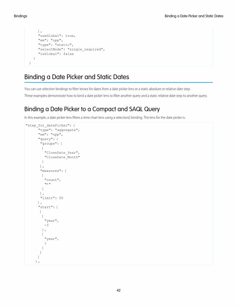
Binding a Date Picker to a Compact and SAQL QueryIn this example, a date picker lens filters a time chart lens using a selection() binding. The lens for the date picker is:
"step_for_datePicker": {"type": "aggregate","em": "opp","query": {"groups": [["CloseDate_Year","CloseDate_Month"]],"measures": [["count","*"]],"limit": 50},"start": [[["year",-3],["year",1]]]},
42
Binding a Date Picker and Static DatesBindings

To filter another lens by the selection in the date picker, add the following code into a compact or SAQL step.
{{selection(step_for_datePicker)}}
The compact form looks like the following.
"step_compact_filtered_by_date_saql": {"type": "aggregate","em": "OpportunityWithAccount","query": {"groups": [["CloseDate_Year","CloseDate_Month"]],"measures": [["count","*"]],"filters": [["CloseDate","{{ selection(step_for_datePicker) }}"]],"limit": 50}}
The SAQL looks like the following.
"step_date_saql_binding": {"type": "aggregate","query": {"pigql": "q = load \"OpportunityWithAccount\";\nq = filter q by date('CloseDate_Year',
'CloseDate_Month', 'CloseDate_Day') in {{selection(step_for_datePicker)}};\nq = group qby ('CloseDate_Year', 'CloseDate_Month');\nq = foreach q generate 'CloseDate_Year' + \"~~~\"+ 'CloseDate_Month' as 'CloseDate_Year~~~CloseDate_Month', count() as 'count';\nq = limitq 2000;",
"groups": [["CloseDate_Year","CloseDate_Month"]],"measures": [["count","*"]]},"isFacet": false,
43
Binding a Date Picker and Static DatesBindings

"useGlobal": true}}
Note: The date dimension that the selection is filtering (in this example, "CloseDate") must be the same dimension namethat’s used in "groups" in the date picker lens.
Binding a Static Date List Selector to Filter Other Compact or SAQL LensesIn this example, a selection from a list or toggle lens of predefined date ranges filters another lens in a dashboard. The following sampleshows a selection() binding from a static toggle button lens ("step_date_static_with_start") to a bar chart lens in compactform ("compact_step_faceted_by_static") or SAQL ("saql_step_faceted_by_static"). Each value is a relativedate range, for example, five years ago ("year", -5) until this year ("year", 0).
"step_date_static_with_start": {"type": "static","values": [{"display": "-6 years","value": [[["year",-6],["year",0]]]},{"display": "-5 years","value": [[["year",-5],["year",0]]]},{"display": "-4 years","value": [[["year",
44
Binding a Date Picker and Static DatesBindings

-4],["year",0]]]}],"selectMode": "single_required","start": [[[["year",-5],["year",0]]]]}
You can then use the previous sample to filter another compact or SAQL step on selection by using the selection() binding.
{{selection(step_date_static_with_start)}}
The compact form looks like the following.
"compact_step_faceted_by_static": {"type": "aggregate","em": "opp","query": {"groups": ["Product"],"filters": [["CreatedDate","{{selection(step_date_static_with_start)}}"]],"measures": [["sum","Amount"]],"limit": 2000},
45
Binding a Date Picker and Static DatesBindings

"isFacet": false}
The SAQL selection binding is:
"saql_step_faceted_by_static": {"type": "aggregate","query": {"pigql": "q = load \"opp\";\nq = filter q by date('CreatedDate_Year',
'CreatedDate_Month', 'CreatedDate_Day') in {{selection(step_date_static_with_start)}};\nq= group q by 'Product';\nq = foreach q generate 'Product' as 'Product', sum('Amount') as'sum_Amount', count() as 'count';\nq = limit q 2000;",
"groups": ["Product"],"measures": [["sum","Amount"]]},"isFacet": false,"useGlobal": true},
Binding Operations
You can use several more operations with results and selection bindings to extract the correct results.
value()The value() operation is used to get a selector array value and convert it to a single value. If the selector array value is empty, theoperation returns all values. Because the value() operation can return multiple values when the selector array value is empty, use in,not ==, like in this example:
q = filter q by 'Owner Name' in {{ value(selection(step_StageName_3))}}
single_quote()The single_quote() operation is typically used in selection bindings in a SAQL step to correctly format the "group" and "foreachgenerate" lines in the query. The single_quote() operation takes an array of values and converts double quotes into singlequotes and square brackets into parentheses. For example: "Owner-Name" converts to 'Owner-Name', and ["Owner-Name","Owner-Region"] converts to ('Owner-Name', 'Owner-Region').
Consider the following static selector, with the array values ["Account-Name"] and ["Product"]:
{"step_StageName_3": {
"isFacet": false,"values": [
{
46
Binding OperationsBindings

"value": ["Account-Name"
],"display": "Account"
},{
"value": ["Product"
],"display": "Product"
}],"useGlobal": true,"em": "opp","type": "static","selectMode": "single_required","isGlobal": false
}}
The following example binds the array values to a SAQL query that requires the "group by" and "foreach generate" valuesto use single quotes. Therefore single_quote() converts ["Account-Name"] to 'Account-Name'.
{"step_Account_Name_1": {
"isFacet": false,"query": {
"pigql": "q = load \"opp\";\nq = group q by{{ single_quote(value(selection(step_StageName_3))) }};\nq =foreach q generate {{ single_quote(value(selection(step_StageName_3)))}} as {{ single_quote(value(selection(step_StageName_3)) }},sum('Amount') as 'sum_Amount', count() as 'count'",
"groups": "{{ selection(step_StageName_3) }}","measures": [
["sum","Amount"
]]
},"extra": {
"chartType": "hbar"},"selectMode": "none","useGlobal": true,"em": "opp","type": "aggregate","isGlobal": false
}}
47
Binding OperationsBindings

The resulting query is:
q = load "opp";\nq = group q by 'Account-Name';\nq =foreach q generate 'Account-Name' as 'Account-Name', sum('Amount') as'sum_Amount', count() as 'count'
no_quote()The no_quote()operation is typically used in selection bindings in a SAQL step to correctly format the "order" line in a query.The no_quote() operation takes an array of values and converts double quotes and square brackets into no quotes. For example,["desc"] converts to desc.
Consider the ["desc"] and ["asc"] array values that are specified in the following static step:
{"step_order": {
"type": "static","values": [
{"display": "desc","value": [
"desc"]
},{
"display": "asc","value": [
"asc"]
}],"selectMode": "single_required"
}}
The following example binds the array values into a SAQL step:
q = order q by 'Amount' {{ no_quote(value(selection(step_order))) }}
The desc or asc value is inserted without any quotes:
q = order q by 'Amount' desc
field()The field() operation creates a field for each object in an array.
Three field values are assigned to the "$" and "#" options in this static step (step_measure): "compact", "alias", and"proj":
{"step_measure": {
"type": "static","values": [
{
48
Binding OperationsBindings

"display": "$","value": [
{"compact": [["sum", "Amount"]],"alias": "sum_Amount","proj": "sum('Amount')"
}],"display": "#","value": [
{"compact": [["count", "*"]],"alias": "count","proj": "count()"
}]
}],"selectMode": "single_required"
}}
After being assigned, each field value can be referenced in other step selection bindings by using the field() operation.
For example, when a dashboard user clicks # in the toggle selector that uses step_measure, the SAQL query in this aggregate step(step_top_10) references the "proj" field to insert a count() function, the "alias" field to insert "count" as a string,and the "compact" field to insert [["count", "*"]].
{"step_top_10": {"type": "aggregate","em": "opp","query": {"pigql":"q = load 'edgemarts/Opportunity/OpportunityEM';q = group q by 'Account_Name';q = foreach q generate'Account_Name' as 'Account_Name',{{ no_quote(value(field(selection(step_measure),'proj'))) }}as {{ single_quote(value(field(selection(step_measure), 'alias'))) }};
q = order q by {{ single_quote(value(field(selection(step_measure), 'alias'))) }}{{ no_quote(value(field(selection(step_order), 'pigql'))) }};
q = limit q {{ value(selection(step_limit)) }};","groups": ["Account_Name"],"measures": "{{ value(field(selection(step_measure), 'compact')) }}","order":[[ -1, { "ascending": "{{ value(field(selection(step_order), 'compact')) }}" } ]]
},"isFacet": true}
}
49
Binding OperationsBindings

LAYOUTS
Add a layouts section to your dashboard’s JSON definition to customize its appearance on mobile devices.
There are two types of dashboard layouts:
Absolute (default layout)If no layouts section is defined in your dashboard’s JSON, then the dashboard’s layout is absolute.
The absolute layout is optimized for display in a Web browser on a desktop or laptop computer.
GridIf a layouts section is present in your dashboard’s JSON, then the dashboard’s layout is grid.
The grid layout lets you optimize the position, order, and size of the widgets in your dashboard for display on mobile devices. Thegrid layout is made up of rows, columns, and cells, as well as pages. Each cell in the grid can contain zero or more widgets. Thenumber of rows, columns, and cells in your grid layout depend on the number of widgets and the number of pages.
A dashboard with an absolute layout looks great in a Web browser:
The same dashboard with an absolute layout may not render well on a smart phone:
50

By using a grid layout with two pages, the dashboard renders perfectly on a smart phone:
IN THIS SECTION:
Use a Grid Layout for Your Dashboard
Use a grid layout to customize your dashboard’s appearance on mobile devices.
51
Layouts

Understanding Column, Row, and Cell Sizing in Grid Layouts
Widgets size, row size, and the number of columns are determined dynamically, but can also be specified in the JSON.
Layouts Specification
The “layouts” section is used to customize how dashboards display on mobile devices.
Layouts Attribute Reference
Set attributes on widgets, rows, and cells to customize their height, width, padding, and more.
Use a Grid Layout for Your Dashboard
Use a grid layout to customize your dashboard’s appearance on mobile devices.
In a dashboard’s JSON file, the the layouts section is a child of the state section and a sister of the widgets and stepssections.
1. Find your dashboard’s JSON by following the instructions in View or Modify a Dashboard JSON File.
2. Add a layouts section to your dashboard’s JSON.
For example, this layouts section defines a grid layout with two pages, two rows of widgets on each page. The first page hasone widget on each row. The second page has two widgets on the first row, and one widget on the second row.
"layouts": {"default": {"page:0": ["buttongroup_2","chart_1"],"page:1": ["dimfilter_1 | dimfilter_3","chart_1"]}}
3. Optionally, customize the layout of your dashboard by setting attributes for each widget and row.
For example, the layouts from step two can be updated to include widget and row attributes. The first row on the first page hasa row height of 300 pixels. The chart widget on the second page has a width of two columns.
"layouts": {"default": {"page:0": ["buttongroup_2" | row:{height=300}”,"chart_1"],"page:1": ["dimfilter_1 | dimfilter_3","chart_1 {colspan=2}"]}}
4. Optionally, set device-specific and orientation-specific layouts for your dashboard. For available device and orientation options, seeLayouts Options in the Layouts Specification guide.
52
Use a Grid Layout for Your DashboardLayouts

For example, the layouts from step three can be updated to use only one page when viewed on an iPad in landscape mode:
"layouts": {"default": {"page:0": ["buttongroup_2","chart_1"],"page:1": ["dimfilter_1 | dimfilter_3","chart_1 {colspan=2}"]},“device:ipad, orientation:landscape”:{“page:0”: [“dimfilter_1 | dimfilter_3 | buttongroup_2”,“chart_1 {colspan=3}”]}}
5. From the dashboard JSON page, click update lens to save your dashboard’s edited JSON.
6. Test your dashboard’s new grid layout by viewing the dashboard on a mobile device.
SEE ALSO:
Layouts Specification
Layouts Attribute Reference
Layouts Specification
Understanding Column, Row, and Cell Sizing in Grid Layouts
Widgets size, row size, and the number of columns are determined dynamically, but can also be specified in the JSON.
How Column Number and Size Are SetThe number of columns in your grid layout is equivalent to the number of widgets in your rows. If there are three widgets in each row,then the dashboard has three columns. If your grid layout has two rows with four widgets in row one and five widgets in row two, thenthe dashboard has five columns. If the colspan attribute specifies a number of columns greater than the number of widgets in anyrow, then the dashboard adds columns to accommodate the colspan attribute.
For example, a dashboard with this layouts section has three columns on the first page and two columns on the second page:
"layouts": {"default": {"page:0": ["buttongroup_2","chart_1 {colspan=3}"],"page:1": ["dimfilter_1 | dimfilter_3","chart_1"
53
Understanding Column, Row, and Cell Sizing in Grid LayoutsLayouts

]}}
Remember these tips when determining how many columns are in your grid layout:
• All columns have the same width. If your dashboard has four columns, then each column is half the width of a dashboard with twocolumns.
• Each page of a dashboard independently determines how many columns appear. For example, a dashboard can have three columnson page one, and four columns and page two.
• Every dashboard has at least one column.
• There is no limit to the number of columns that a dashboard can have. If you add too many columns, then column width couldbecome impracticably small. Remember to test your layout for usability!
How Row Number and Height Are SetFor each row, here’s how height is calculated:
• If a row height is set using the height attribute, then the row’s height is equal to the specified value.
• If one or more widgets in the row has a preferred height, then the row’s height is equal to that of whichever preferred height istallest.
• If there is no height attribute and none of the row’s widgets have a preferred height, then the row’s height dynamically growsto occupy the available space. If multiple rows grow dynamically, then their heights are equal to one another. For example, if thereare 200 pixels of available space, and two rows with dynamically set heights, then each row has a height of 100 pixels.
How Widgets Are SizedSome widgets have absolute sizes, and some scale dynamically.
Height ScalingBehavior
Width ScalingBehavior
Has a Fixed Height?Has a Fixed Width?Widget
Don’t scaleDon’t scaleYesYesLink
Scale to fit textScale to fit textIf one line long, yes.
If more than one linelong, no.
NoText
Don’t scaleScaleYesNoPillButton
ScaleScaleNoNoBox
ScaleScaleNoNoChart
Don’t scaleScaleYesNoList
Don’t scaleScaleYesNoRange
Don’t scaleScaleYesNoNumber
54
Understanding Column, Row, and Cell Sizing in Grid LayoutsLayouts

Layouts Specification
The “layouts” section is used to customize how dashboards display on mobile devices.
In a dashboard’s JSON file, the “layouts” section is a child of the “state” section and a sister of the “widgets” and “steps”sections. Here is an example of a typical “layouts” section:
"layouts": {"default": {"page:0": ["widget_name_1","widget_name_2"],"page:1": ["widget_name_3 | widget_name_4","widget_name_2 {attribute=2}"]},“device:ipad, orientation:landscape”:{“page:0”: [“widget_name_1 | widget_name_3 | widget_name_4 | row: {attribute=300}”,“widget_name_2 {widget_name=3}”]}}
In the prior example, widget_name refers to a specific widget named in the “widgets” section of the JSON file. Attributerefers to one of the attributes listed in the Layouts Attribute Reference. Cells are delimited by the pipe character ( | ). A cell can containmultiple widgets separated by a comma ( , ). Rows are delimited by a comma ( , ) outside the quoted string (each quoted string is asingle row).
Simple Layouts SectionHere’s a simple “layouts” section that has four widgets on four rows in a single column on a single page:
"layouts": {"default": {"page:0": ["buttongroup_1","dimfilter_1",“dimfilter_2”,“chart_1”]}}
Complex Layouts SectionA more complex “layouts” section can be used to set device-specific and orientation-specific display rules. The following“layouts” section lays out the dashboard’s widgets on two pages. The first page’s first row has a height of 300 pixels. The secondpage has two rows and two columns. One of the cells in the first row contains two widgets. One of the box widgets has three attributes
55
Layouts SpecificationLayouts

set. The chart widget spans two columns. If the dashboard is viewed on an iPad in landscape mode, then only one page with two rowsis shown. The first row has three widgets and the second row has one widget that spans three columns.
"layouts":{"default": {"page:0": ["buttongroup_2 | row: {height=300}","chart_1"],"page:1": ["dimfilter_1, box_1 {colspan=2, rowspan=2, zIndex=-1, vpad=5, hpad=5} |
dimfilter_2”,"chart_1 {colspan=2}"]},“device:ipad, orientation:landscape”:{“page:0”: [“dimfilter_1, box_1 {colspan=2, rowspan=3, zIndex=-1, vpad=5, hpad=5} | dimfilter_2 |
buttongroup_2”,“chart_1 {colspan=3}”]}}
Layouts OptionsThe above example shows a layout specifically for an iPad in landscape mode (“device:ipad, orientation:landscape”).Layout device and orientation choices are as follows:
• “default”: For layouts not targetted to any specific device or orientation.
• “device:ipad, orientation:portrait”: For Apple iPad in portrait mode.
• “device:ipad, orientation:landscape”: For Apple iPad in landscape mode.
• “device:ipad”: For Apple iPad in either portrait or landscape mode.
• “device:iphone”: For Apple iPhone; portrait mode is implied.
• “device:external”: For displaying on an external device, for example if device is connected via HDMI cable to a projector ordisplay. To use external layout, select Presentation Mode in Settings.
• “device:applewatch”: For Apple Watch. Supports only a single, scrolling page.
• “orientation:portrait”: For either iPhone or iPad in portrait mode.
• “orientation:landscape”: For iPad in landscape mode.
Note: If the app is viewed on Apple Watch and “device:applewatch” layout is not present, the app first tries to reformatthe first page of the “device:iphone” layout. If “device:iphone” is not present, it then attempts to use the first pageof the “default” layout.
Note: If the app is viewed on an external device and “device:external” layout is not present, the app first tries to usethe first page of the “device:ipad” “orientation:landscape”. If “device:ipad”“orientation:landscape” is not present, it then attempts to use the first page of the “default” layout.
56
Layouts SpecificationLayouts
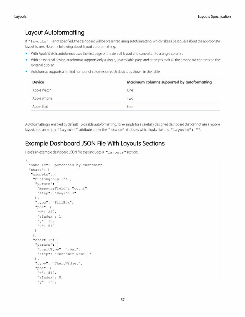
Layout AutoformattingIf “layouts” is not specified, the dashboard will be presented using autoformatting, which takes a best guess about the appropriatelayout to use. Note the following about layout autoformatting:
• With AppleWatch, autoformat uses the first page of the default layout and converts it to a single column.
• With an external device, autoformat supports only a single, unscrollable page and attempts to fit all the dashboard contents on theexternal display.
• Autoformat supports a limited number of columns on each device, as shown in the table.
Maximum columns supported by autoformattingDevice
OneApple Watch
TwoApple iPhone
FourApple iPad
Autoformatting is enabled by default. To disable autoformatting, for example for a carefully designed dashboard that cannot use a mobilelayout, add an empty “layouts” attribute under the “state” attribute, which looks like this: "layouts": "".
Example Dashboard JSON File With Layouts SectionsHere’s an example dashboard JSON file that includes a “layouts” section:
{"name_lc": "purchases by customer","state": {"widgets": {"buttongroup_1": {"params": {"measureField": "count","step": "Region_3"},"type": "PillBox","pos": {"w": 280,"zIndex": 1,"y": 30,"x": 540}},"chart_1": {"params": {"chartType": "vbar","step": "Customer_Name_1"},"type": "ChartWidget","pos": {"w": 810,"zIndex": 0,"y": 150,
57
Layouts SpecificationLayouts

"h": 470,"x": 10}},"dimfilter_1": {"params": {"measureField": "count","expanded": false,"step": "Customer_Name_1"},"type": "ListSelector","pos": {"w": 250,"zIndex": 100001,"y": 50,"h": 50,"x": 10}},"dimfilter_2": {"params": {"measureField": "count","expanded": false,"step": "Product_Name_2"},"type": "ListSelector","pos": {"w": 250,"zIndex": 100002,"y": 50,"h": 50,"x": 280}}},"steps": {"Region_3": {"isFacet": true,"start": null,"query": {"measures": [["count","*"]],"groups": ["Region"]},"extra": {"chartType": "hbar"},"selectMode": "single",
58
Layouts SpecificationLayouts

"useGlobal": true,"em": "SuperStoreSales","type": "aggregate","isGlobal": false},"Product_Name_2": {"isFacet": true,"start": null,"query": {"measures": [["count","*"]],"groups": ["Product_Name"]},"extra": {"chartType": "hbar"},"selectMode": "single","useGlobal": true,"em": "SuperStoreSales","type": "aggregate","isGlobal": false},"Customer_Name_1": {"isFacet": true,"start": null,"query": {"measures": [["count","*"]],"groups": ["Customer_Name"]},"extra": {"chartType": "hbar"},"selectMode": "single","useGlobal": true,"em": "SuperStoreSales","type": "aggregate","isGlobal": false}},"layouts": {"default": {
59
Layouts SpecificationLayouts

"page:0": ["buttongroup_1 | row: {height=300}" ,"chart_1"],"page:1": ["dimfilter_1 | dimfilter_2","chart_1 {colspan=2}"]},“device:ipad, orientation:landscape”:{“page:0”: [“dimfilter_1 | dimfilter_3 | buttongroup_2”,“chart_1 {colspan=3}”]}}},"lastRefresh": 1425493084,"_uid": "0FKD000000000BUOAY","_createdBy": {"_type": "user","profilePhotoUrl": "https://c. <myorg>/profilephoto/005/T","name": "Admin User","_uid": "005D0000001V97kIAC"},"folder": {"_type": "folder","_uid": "00lD00000013RRvIAM"},"edgemarts": {"emName": {"_type": "edgemart","_uid": "0FbD00000004CjcKAE"}},"_type": "dashboard","_container": {"_container": "0FKD000000000BUOAY","_type": "container"},"_createdDateTime": 1426201221,"assetSharingUrl": "https://<myorg>/analytics/wave/dashboard?assetId=0FKD000000000BUOAY&orgId=00DD00000007hUM&loginHost=<myorg>.com&urlType=sharing","_permissions": {"modify": true,"view": true},"description": "","_url": "/insights/internal_api/v1.0/esObject/lens/0FKD000000000BUOAY/json","name": "Purchases by Customer","_files": {"assetPreviewThumb": {"fileSize": 8666,
60
Layouts SpecificationLayouts

"_type": "lensfile","lastModified": 1426202487,"_url":
"/insights/internal_api/v1.0/esObject/lens/0FKD000000000BUOAY/lensfile/0FJD0000000008VOAQ/data?lastModified=1426202487",
"lensId": "0FKD000000000BUOAY","fileName": "assetPreviewThumb","contentType": "image/png","_uid": "0FJD0000000008VOAQ"}}}
SEE ALSO:
Use a Grid Layout for Your Dashboard
Use a Grid Layout for Your Dashboard
Layouts Attribute Reference
Layouts Attribute Reference
Set attributes on widgets, rows, and cells to customize their height, width, padding, and more.
Widget AttributesThese attributes can be set on widgets. Each widget can have zero or more attributes.
DetailsProperty Name
Typeinteger
colspan
Available for These Widgets
• all widgets
DescriptionThe width of the widget in columns. When setting a colspan attribute on a widget, the cell thatcontains the widget spans across columns. If there aren’t enough columns in the dashboard toaccommodate the width specified by colspan, then columns are added to the dashboard.
ExampleIn this example, the widget named “chart_1” spans three columns:
"layouts": {"default": {"page:0": [“dimfilter_1 | dimfilter_2 | dimfilter_3”,"chart_1 {colspan=3}"]}}
61
Layouts Attribute ReferenceLayouts

DetailsProperty Name
Typeinteger
rowspan
Available for These Widgets
• all widgets
DescriptionThe number of rows that a widget spans. When setting a rowspan attribute on a widget, the cellcontaining the widget spans across rows. If there aren’t enough rows in the dashboard, then rows areadded.
ExampleIn this example, the widget named “dimfilter1_1” spans two rows:
"layouts": {"default": {"page:0": [“dimfilter_1 {rowspan=2} | dimfilter_2”,"chart_1"]}}
Typeinteger
zIndex
Available for These Widgets
• all widgets
DescriptionThe position of a widget relative to other widgets in the dashboard. zIndex specifies whether a widgetis in front of or behind another widget. A smaller zIndex means that a widget appears further behindother widgets with larger zIndex values.
The default value of zIndex is 0.
ExampleIn this example, the widget named “box_1” appears behind the widget named “number_1”:
"layouts": {"default": {"page:0": [“box_1 {zIndex=1}, number_1 {zIndex=2} | chart_1”]}}
Typeinteger
vpad
Available for These Widgets
• all widgets
62
Layouts Attribute ReferenceLayouts

DetailsProperty Name
DescriptionThe padding added to the top and bottom sides of the widget’s cell in pixels. If vpad equals 10, then10 pixels are added to the top of the cell and 10 pixels are added to the bottom.
The default value of vpad is 0.
ExampleIn this example, the cell containing widget named “dimfilter_1” has 5 pixels of padding on itstop and bottom sides:
"layouts": {"default": {"page:0": [“dimfilter_1 {vpad=5}”]}}
Typeinteger
hpad
Available for These Widgets
• all widgets
DescriptionThe padding added to the left and right sides of the widget’s cell in pixels. If hpad equals 10, then 10pixels are added to the left side of the cell and 10 pixels are added to the right side. A negative value canbe assigned to
The default value of hpad is 0.
ExampleIn this example, the cell containing widget named “dimfilter_1” has 5 pixels of padding on itstop and bottom sides:
"layouts": {"default": {"page:0": [“dimfilter_1 {hpad=5}”]}}
Typeinteger
yAxisWidth
Available for These Widgets
• Chart Widget (ChartWidget)
DescriptionThe size of a chart widget’s x-axis in pixels. Use yAxisWidth to align multiple chart widgets.
63
Layouts Attribute ReferenceLayouts

DetailsProperty Name
ExampleIn this example, the widget named “chart_1” has an x-axis that is 250 pixels wide:
"layouts": {"default": {"page:0": [“chart_1 {yAxisWidth=250}”]}}
Typeinteger
hAxisHeight
Available for These Widgets
• Chart Widget (ChartWidget)
DescriptionThe size of a chart widget’s y-axis in pixels. Use hAxisHeight to align multiple chart widgets.
ExampleIn this example, the widget named “chart_1” has a y-axis that is 250 pixels tall:
"layouts": {"default": {"page:0": [“chart_1 {hAxisHeight=250}”]}}
Row AttributesThese attributes can be set on rows.
DetailsProperty Name
DescriptionIf height is set to a number, then height is the height of a row in pixels.
If height is set to preferred, then the row’s height is equal to the largest height
height
ExampleIn this example, the first row’s height is 300 pixels. The second row’s height is equal to the height of itstallest widget:
"layouts": {"default": {“page:0”: [“chart_1 {colspan=3} | row:{height=300}”,
64
Layouts Attribute ReferenceLayouts

DetailsProperty Name
“dimfilter_1 | buttongroup_1 | number_1 | row:{height=preferred}”]}}
SEE ALSO:
Use a Grid Layout for Your Dashboard
Layouts Specification
65
Layouts Attribute ReferenceLayouts

WATERFALL CHART TYPE EXAMPLE
Sample JSON and chart widget for waterfall chartType.
Sample JSON
"ng1":{"type": "Chart","position": {"x": 0,"y": 0,"w": 380,"h": 320},"parameters": {"step": "step_one_dim","totalColor": "rgb(163, 24, 147)","chartType": "waterfall"}}
66

Chart Widget
67
Waterfall Chart Type Example

STACKED WATERFALL CHART TYPE EXAMPLE
Sample JSON and chart widget for stackwaterfall chartType.
Sample JSON
"ng2":{"type": "Chart","position": {"x": 450,"y": 0,"w": 440,"h": 320},"parameters": {"step": "step_two_dims","chartType": "stackwaterfall",“computeTotal”: false,
“showValues”: false,“legend”: true
}}
68

Chart Widget
69
Stacked Waterfall Chart Type Example