web design principle
DESCRIPTION
web designing fallowed well instructionTRANSCRIPT

Web Design
Principles

Choosing a Color Scheme:
Different color schemes can evoke
different moods for visitors to your
website.
Generally, the more contrast between
colors, the more "energy" that the site
will convey.
Limit the number of colors on a
website to four main colors (excluding
black and white).
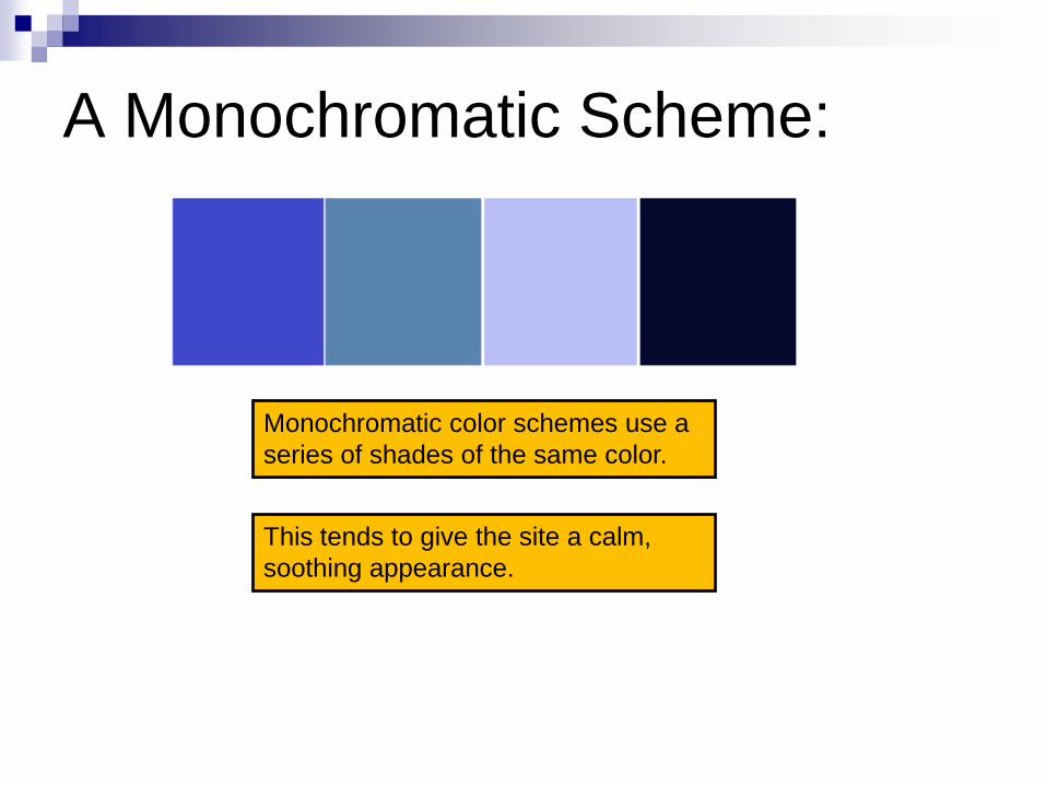
A Monochromatic Scheme:
Monochromatic color schemes use a
series of shades of the same color.
This tends to give the site a calm,
soothing appearance.
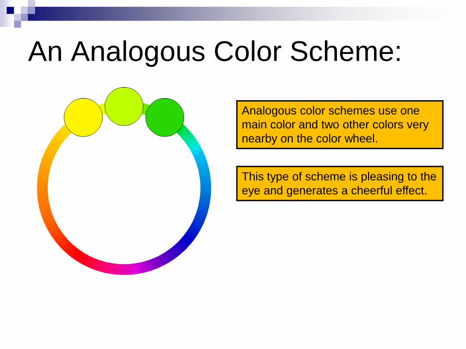
An Analogous Color Scheme:
Analogous color schemes use one
main color and two other colors very
nearby on the color wheel.
This type of scheme is pleasing to the
eye and generates a cheerful effect.

A Complementary Color Scheme:
Complementary colors are directly
across from each other on the color
wheel.
This contrast lends a more energetic
feeling to a site.
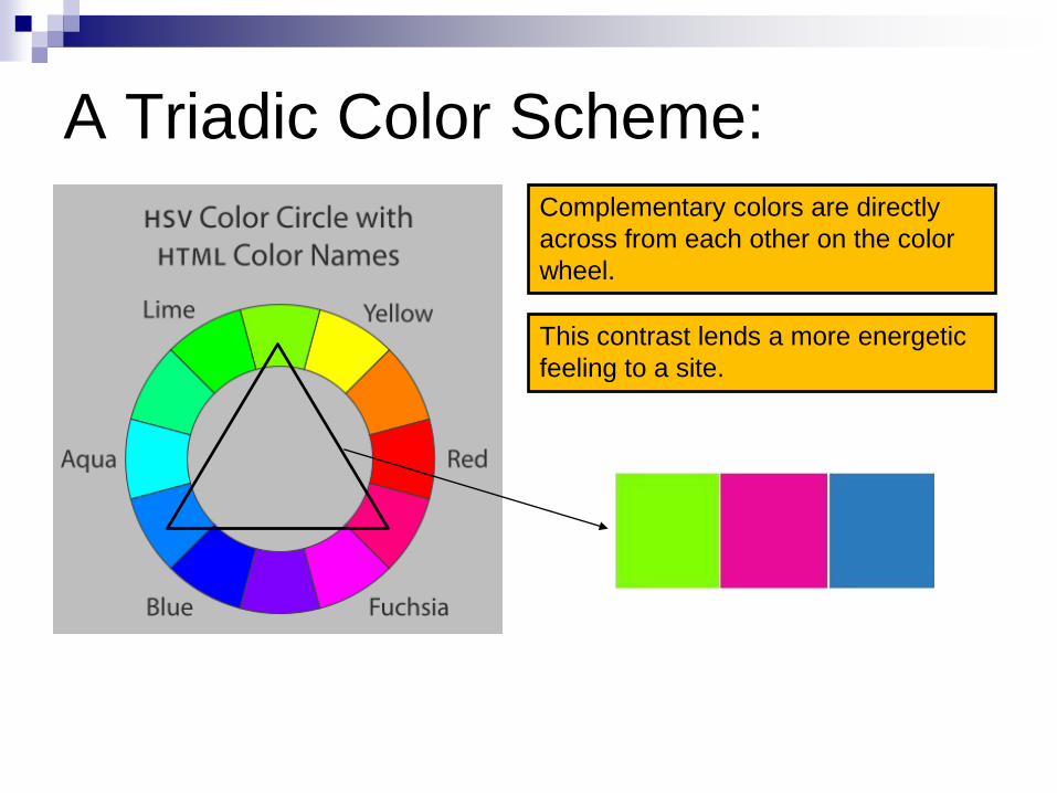
A Triadic Color Scheme:
Complementary colors are directly
across from each other on the color
wheel.
This contrast lends a more energetic
feeling to a site.
White Space:
White space is the space between the elements
of your web page. It does not literally have to be
white; it can be the color of your background.
Allowing plenty of white space in your page will
make for an uncluttered appearance which
makes reading and scanning much easier.
Avoid placing so many elements and so much
text on a page that a visitor becomes
overwhelmed when they first arrive.

Use of Screen Real Estate:
Use all of your web page space, both vertically
and horizontally.
Websites that center everything and run down
the middle are not visually appealing:

Width of Content: Most modern computers and browsers have at
least 1024 pixels of screen resolution in width.
Setting your web pages to be in the 900px-
1000px range in width should prevent users
from having to scroll left and right to see your
page.
Modern web designers make their websites
"fluid" in width. The content dynamically
expands out to fill the available screen
resolution, without breaking the page layout.
Navigation Menus:
Most websites have their navigation links
across the top or down the left side of the
screen.
Navigation menus should remain in the
same place consistently on all pages of a
site.
Every subpage should have a link to return
directly to the home page.

Text: Make intelligent choices when it comes to fonts and font
sizes.
Do not mix more than two fonts on the same page, as this detracts from the smoothness of the design.
Ensure that all text is large enough to read.
Use bright-colored text sparingly and always make sure there is enough contrast between the text and the background.
Avoid making text blue to emphasize it, as this can easily be mistaken for a link. The same applies to underlining text (bold or italics is preferred for emphasis).
Multiple Web Browsers: Don't forget that there are numerous web browsers
in use, including:
• Internet Explorer
• Firefox
• Safari (Macintosh)
• Google Chrome
• Opera
Different web browsers can display the same page very differently. Sometimes, a page will look great in one browser but broken in another.
Good web designers test their pages in multiple browsers before posting content live.