numberyes.files.wordpress.com€¦ · web viewwhat a graph can do for you?. information hidden in a...
TRANSCRIPT

What a graph can do for you?Information hidden in a visual graph
Nowadays there are many ways to find information. The internet is a huge source of news and data and it also provides many tools to do polls and research about any interesting question. If we want to succeed surfing the web, it is a good idea to learn how to analyze the data in a graph.
In this way, we could understand a lot of information by seeing a visual chard and we could organize our own data by using a graph. Fructuations, variations, dependence among variables... there is a lot of information hidden in a graph and we are ready to learn a lot about it!!

ContentsINTRODUCTION 310 GOALS OF THE UNIT 4FIRST STEPS IN THE DATA ANALYSIS 5
Step 1: Describing what we see 6 Interactive vocabulary to learn the vocabulary needed 6 Fill the tables searching information in the graphs given 6,7 Analysis of relationships 7
Step 2: A closer look. More specific information 8 Exelearning Interactive Activity (5 guided multichoice questions)
9
Lecture Comprehension 12 Discuss and find the correct sentences 13 Find the graph time-volume 13 Doing graphs by our selves 14
Let’s do a class survey 15 Construct a graph doing an easy survey 15
Step 3: Internet Research. Results in Catalonia and Spain 15
PROJECT: HOW TO BE AN STATISTIAN 16Step 1: Think about the next points 16
Uncompleted sentences to discuss in groups 16Step 2: Did you know that... (information given to students)
16
Step 3: Think and discuss 16 Decide an item to do a research about it 16
Step 4: Planning 17 Make decisions about the target population and
interactive tools to use17
Step 5: Designing the survey 17 List of most appropriate questions 17 Decide how, when and where to do the poll 17
Step 6: Carry out the survey (Get the information from the target group)
18
Step 7: Representing Data (Organize Data and do tales of calculations)
18
Step 8: The Most Apropriate Graph 18 Gap exercise to achive conclusions and design the
Graphs18
Step 9: Drawing Conslusions 19 Gap exercises to analyse the Graphs done 19
Step 10: Report the results of the survey 19 Points to follow when doing a good oral presentation 19 Interactive vocabulary activity to express correctly 19 Assessment to sum up (Questions and Grid Assessment) 20
PLANNING OF THE UNIT 21HOW TO ASSESS STUDENTS 22
2
Introduction This Unit has been created following CLIL principles (Content and Language Integrated Learning). CLIL is a term that describes that describes two things at the same time: learning another subject such as physics or geography through the medium of a foreign language and learning a foreign language by studying a content or subject.
Content subjects are taught and learnt in a language which is not the mother tongue of the learners. Knowledge of the language becomes the means of learning content and that’s why it’s very important to learn through increased motivation; when learners are interested in a topic they are motivated to acquire language to understand the content and to communicate.
The best texts, according to CLIL principles, are those accompanied by illustrations so learners can visualise what they are reading. It’s very important to design a good introduction to the Unit and provide the students the vocabulary needed to follow the content. This is known as construct the scaffolding the students will need to bear the content of the subject.
When designing a CLIL Unit of learning the teacher has to choose activities according to CLIL principles. After an introduction of the Unit, the first activities are focused on leading the students to recall and classify the concepts of the subject. The next step is to use the information recalled in a new way interpreting and employing the new concepts in different situations; this step requires analysis and experimentation. Finally, it’s important to design activities that require an evaluation or justification of the student’s answers to different activities that motivate the students to create new products about the subject studied or new points of view.
In this Unit there is a symbol before each activity that represents three different kind of activity:
The pencil symbol is attached to activities that require recall or classify concepts of the unit. The lens symbol refers to activities that require apply the concept to different situations and the burning cd symbol is attached to activities in which the students have to create new product about the subject. The forth symbol refers to activities that require a collaborative work.
This unit is aimed to students of 1rt curs of ESO in IES Itaca from Sant Boi in Barcelona. The students have low English level and some of them have been taught sciences in English when they were in Primary School.
10 goals of the Unit
3

1. You will analyze different facts studying numerical and graphical data.
2. You will practice a class survey about the media platforms used by the students of your class.
3. You will search for statistical studies on a given topic on the internet.4. You will contribute with your own ideas in the process of designing a
statistical study.5. You will use English in your team to discuss how to design and
conduct a survey and to report the results to the rest of the class with the aid of a Google presentation.
6. You will identify the different statistical terms and parameters to make frequency tables.
7. You will use Google questionnaire to represent data in different kinds of graphs.
8. You will decide the best graph for your oral presentation in order to avoid misleading first-sight conclusions.
9. You will help assess your classmates’ performance and outcomes.
Now that it’s clear which would be the 10 goals to succeed, we present all the activities that have been designed to acquire the contents of the Unit. After the description and presentation of the activities you will find a detailed time table that will guide the teacher in the learning process.
First steps in the Data Analysis Step 1: Describing what we see:
4

It is very common that journalists use statistical studies to support many kind of news such as scientific discoveries, political opinion polls, sports results; health care articles... the list could be infinite.
The following graphs have been found in different media webs:
PRIVATE COVERANCE IN EE UU
Source: http://www.cdc.gov/
Source: www.forbes.com
5

Source: www.adcorp.com.au
Interacting activity:
Find the words that you will need to follow this unit in this link: https://en.educaplay.com/en/learningresources/1274492/graphs_2.htm
1. Complete the table below searching the information in the graphs.
Graph
Source Sample or census bureau?
Objective of the data
Kind of graph
1
2
3
4
6

2. Now we will put the focus on the variables. Look the graphs and identify the statistical variables. Think about what they represent and the magnitudes that are involved.
Graph Statistical variable Magnitude 1 (horizontal) Magnitude 2 (vertical)
1
2
3
4
3.- Analyze any possible relationship between magnitudes 1 and 2 in each graph and decide if:
a) Magnitude 1 depends on magnitude 2.
b) Magnitude 2 depends on magnitude 1.
c) There is no relationship between magnitude 1 and 2.
Step 2: A closer look. More specific information.
Now it’s time to look for more information from the graphs.
1.- Around which percentage of population prefer private coverage?
2.- What percentage of population is not using any kind coverage?
3.- Around which percentage of population is using a public coverage?
4.- What does it show? Read the sentences and decide if the statement is true or false.
a) Most people prefer not to use private coverage.b) In 2010 there was a rise of the people that use private coverage.c) Most of people prefer to use public coverage.d) Around 1/3 of the population has not an insurance.
7

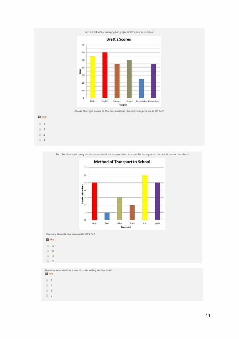
Exelearning interactive activityNow there is an interacting activity using eXeLearning
program. There are 5 guided multi choice questions with which the student is guided to understand all the information a graph bar can provide.
There are visual sources in every exercise, the activity is full of hints to guide the student and there is a feedback every time the student gives an answer. All these characteristics help to construct the “scaffolding” with which the student will implement the new mathematical concepts. In this way, and step by step, students will improve the autonomy in learning by their selves. The student’s autonomy is stimulated by the hints in the activities and by the answer’s feedback.
8

9

10
11

Lecture comprehensionWith the next lecture, and the exercises prepared from it, the student will learn vocabulary to describe the evolution of a graph and will learn to represent graphically events that happen in usual live.
Nina’s last graph
Tess is a girl of your age that has received very bad news when she has arrived home. Her parent’s friend, Nina, is death; her body has been found in the floor of the garage. Her body is next the car and the engine is on. It is supposed that she has committed suicide. But there is a shadow of doubt on Nina’s couple: Rob. Has Rob killed Nina?
Tess knows very little about what has happened, but she goes to her bedroom and starts to think mathematically about what has happened. Read now Tess’ thinking process:
When I entered into my room I tore off a sheet of graph paper and tried to draw Nina’s death. If she just breathed in the carbon monoxide, fell asleep, and never woke up, then I thought that the graph would dip slowly in a soft arc, like the one we drew of aluminium foil cooling. If point A is alive and point D is dead, then Nina started at the top of the y-axis, wide-awake at (0, 20). The garage door was closed, the motor was on, maybe she was even listening to music as she got dizzy and fell asleep. Little by little her breathing got slower until, at the coordinates of, say, (18, 0), she was dead.
But if Nina just took a whiff of the stuff and died, then the graph would clunk right down to the bottom of the y-axis, taking no time at all, like the graph we made of a book dropping.
If Rob killed Nina some other way and put her body in the car, then there wouldn’t be any graph at all, because Nina would be dead from the very beginning. Or maybe he put something like a sleeping pill in her food, then carried her into the car after she was asleep, turned on the motor, and snuck out of there. But I didn’t even try to draw that, because if you know Rob, that seems completely impossible.
A B
12

Discuss and find the correct sentence:
□ Graph A corresponds to the first Tess’ supposition.□ Graph B corresponds to the second Tess’ supposition.□ Graph A corresponds to the second Tess’ supposition.□ Graph B corresponds to the first Tess’ supposition.
Source: The Text is an adaptation of the Second Chapter of the book:Secrets, Lies and Algebra by W. Lichtman in Harper Collins e-books.
Observe the next bottles shapes and find its graph Time-Volume
Source:http://campus.almagro.ort.edu.ar/matematica/articulo/538663/interpretacion-de-graficos
Do it by yourself:
Now, you know how to do a time-volume graph, look the figures; In the first example we have drawn the first graph zone. Go on by your own and finish the first graph, after it, do the second one.
13

Source: http://www.iesarroyodelamiel.es/matematicas/materiales/3eso/funciones/pinterpretcionfunciones/interpretaciondegraficas.htm
Let’s do a Class Survey!!Let’s focus now on the Statistical Study about the 10
top social media platforms in Australia and New Zealand in July 2012.
a) Your team wants to design a survey similar to Australia and New Zealand one with the students in your class.
b) What questions would you like to ask to your mates?c) Organize all the class together to make turns and ask questions to the
whole class. The students can answer the questions by raising their hands. Two students will count the answers.
14

d) Once you have the data, represent the results in a suitable graph.e) Analyze the results and draw conclusions.f) Compare the percentages with the population in Australia and New
Zealand.
Hint: You can use one of the Google Applications to make the graphs.
Step 3: Internet Research. What would be the results in Catalonia or Spain?1.- Individually, search for similar statistical studies about social media in Catalonia or Spain. Every time you use a source found on the interned you have to mention the web that published the graph, the institution that make the study and the year; this is very important for any serious research.
2.- Share the results of your research with your team mates.
3.- Analyze the data you have found and draw conclusions.
4.- Compare the results in Catalonia or Spain with the data of the survey you have studied.
5.- Write an individual report with the analysis of the data you have found, comparing the data you have found on the internet with the data from New Zeeland .
Hint: You can visit http://www.idescat.cat for searching the data.
PROJECT: HOW TO BE A STATISTIANThe process of collecting, organizing and interpreting huge amounts of data is called statistics. In this project you will design a statistical study about one aspect of your school mates.
The students will have to produce new materials about the subject by their own in a major effort of summarise all the knowledge they have acquired. The Project finishes with an oral presentation about the result of the research and with a assess grid to evaluate their class mates.
Step1: Think about the next points.
15

The goal in a statistical study is.... A statistical variable is.... Average, mean and median is... The difference between absolute frequency and relative frequency is...
Step2: Did you know that...
When you buy a product sometimes, you are given a questionnaire with a little gift if you answer the questions.
People that conduct surveys stop you on the streets or call you at home and ask you some questions.
These examples are ways to obtain information for statistical purposes. Why do you think that enterprises take these statistical date into
account?
Step3: Think and discuss.
First of all, the most important is to decide what do you want to investigate and to define very clearly your research goals. In your team, discuss these questions and complete the table.
About what item would you like to do a research? What would be the question of your research? What is the sort of population you will target at? (age, social status....)
Survey Title:
Research Question
Population
Step 4: Planning.
It will be very difficult to interview all the students in your school or even in your class. That is why you have to work with a sample. You have now to decide what will be your target group or group of study and the sample has to be big enough.
How many students will answer your question? How will you choose the target group? How will you choose the sample?
Step 5. Designing the Survey.
The most important when you design the Survey is to decide what sort of question will you ask and how will you do it. You must think the questions you will ask and, if it is possible, you can provide a range of answers, that could be numerical or qualitative answers.
16
Make a list of the most appropriate questions to achieve the data you want.
How will you gather the answers?
To decide how will you obtain the data, think about the following questions:
How will you get the answers? (telephone, mail, on the street, at what moment of the day...)
Where? When?
Survey Title:
Target group
How? When? Where?
Question 1 and possible answersQuestion 2 and possible answersQuestion 3 and possible answers...
Hint: Nowadays there are a lot of survey tools that guarantee the anonymity of the participants. You can use those easy tools to collect the answers to your questions. Website like www.surveymonkey.com or Google Drive are an example of this.
Step 6. Carry out the Survey.
Once you have organize how will you carry out the survey, you have to get the information from your target group. Gather the results taking notes about any incident that may alter your plan,
Step 7. Representing data.
Now that you have collected the data you have to organize the information. Do the following work for each variable:
A table of frequencies (absolute and relative) Obtain the mode. If the variable is numerical calculate:
Its range. Its mean. Its median.
17

Hint: A spreadsheet will facilitate you all sorts of operations when you use large amounts of date
Step 8. The Most Appropriate graph.
Now you have to decide what will be the most appropriate graph for each variables in your study. Use different kinds of graphs, design an ideogram and be creative!
What kind of information would you like to highlight?
What kind of variable are you working with?
Are the variables numerical or qualitative?
If you want to show an evolution is better to use a lineal graph because...
If you want to compare different aspects is better to use an histogram because...
Is it necessary to distinguish between boys and girls?
ConclusionFor the statistical variable______________________________ it’s better to use a bar/sector/lineal _______________________ graph because____________________________.
Once you have made the decisions, each student of the team will be assigned a question and will make a graph with the data obtained.
Hint: There are many tools that can be used to create graphs easily and quickly. One example is Google Drive that again is a very useful tool.
Step 9. Drawing conclusions.
Once the graphs are made, you must interpret the information in them. Compare the results in order to see if the parameters have an influence on the results of the survey.
Make hypotheses based on the information you have. The next sentences can help you to write your conclusions:
As you can see in this graph,________ % of the students in ESO year__________ think/ like/ prefer/ use_____________.
On the one hand, ________% of the boys/girls in ESO year__________ think/ like/prefer/use______________.
On the other hand, ____________% of the girls of ESO year__________think/like/ prefer/ use____________.
Whereas.....
18
To draw conclusions, we can say that most/ half/ a quarter of the students_________________and only __________% of them______________.
To sum up________________.
Step 10. Report the Results of the Survey.
Design a Presentation to show your class the results of your research. Each member of the team have to participate by presenting the variable she/ he has studied commenting the data and the graphs.
You can follow the next points to do a good presentation:
Design a nice Opening Slide (title, members, class, date) Table of Contents. Introduction (explain the topic, research question, your motivations...) The Survey (target group, sample, questions, variables, how, when,
where...) Report the results (numerical data of each question, graphs and
comments) Conclusions ( of the research, the process, the experience, the
comparations...) Sources of information and tools you have used.
Interactive activity:
To improve your vocabulary when you need to speak about description of variables behaviour try to do the following activity:https://en.educaplay.com/en/learningresources/1859139/pro___a2m5__graphs_in_meetings.htm
assessment to sum up
Explanation for the student: Your research team is going to be assessed by other teams and your teacher. All of them will listen to your presentation and will ask you questions. Your team will also ask questions to the other research teams when they will present their research. The questions your team will ask are going to be assessed by the teacher.
Here are some questions you can ask:
About the appropriateness/ relevance/use of the graphs presentation. About possible manipulation/misunderstanding of the data. About the variables. About what you have found interesting in the research they have
presented. About the difficulties the team had faced. The advantages/difficulties of working in team.
In order to do a good assessment of your class mates teams you can use the next table:
19

Oral Presentation Assessment GridTitle:Team:a. Good introduction of the topic, goals, research question and population target.
1 2 3 4 5
b. Parameters of the survey ( sample, questions, variables) are relevant and important to answer the research question.
1 2 3 4 5
c. Decisions on when, where, and how the survey was conducted.
1 2 3 4 5
d. The graphs show the results clearly and are appropriate.
1 2 3 4 5
e. The student explanations are clear and points out the important facts.
1 2 3 4 5
f. The results of the survey are clearly shown. 1 2 3 4 5
g. General Conclusions are well exposed. 1 2 3 4 5
h. The team commented the process, the experience and problems.
1 2 3 4 5
i. The sources used are mentioned. 1 2 3 4 5
j. The English used is correct. 1 2 3 4 5
Observations: Total score____/10FINAL GRADE:
Planning of the UnitSession 1 1. Introduction of the Unit.
2. Vocabulary interactive exercises (2).3. Exercises about completing tables searching information in the graphs given to the
students.4. Students will do an interactive activity that consists in 5 multi choice questions .
The activity has been created using eXeLearning program.CC. BB. Comunicación Lingüística. Competencia Matemática.
Session 2 1. Lecture comprehension. The students will read in class group an adapted lecture with levels of questions increasingly difficult.
2. Exercise about answering questions by using information from the graphs. Conclusions are asked.
3. True or false statements.4. Organization of the research teams.5. Each team decides the question they will try to answer by doing a class survey.6. Each team question is asked to the whole class, the students answer by rising
hands.CC. BB. Comunicación Lingüística. Competencia Matemática. Sentido de iniciativa y Espiritu Emprendedor.
Session 3 1. The teams organize the data form the last session survey and represent them in a
20

graph.2. Use of the exel/drive tools to represent a graph.3. Analysis of the data and show the results to the class by a representative of the
each team.4. Each student has to start a individual internet research about social media in
Catalonia and/or Spain (www.ine.es).CC. BB. Comunicación Lingüística. Competencia Matemática. Aprender a aprender. Sentido de Iniciativa y Espirito Emprendedor. Competencia Digital.
Session 4 1. The individual research continues by comparing the data about social medina in Catalonia and/or Spain.
2. Each student has to compare the results of the data she/he has found on the internet with graphs from England and New Zeeland given to the students in the first session.
3. Each student will deliver a report in the next session with the conclusions. This report will be used as an assess tool.
CC. BB. Comunicación Lingüística. Competencia Matemática. Aprender a aprender. Sentido de Iniciativa y Espirito Emprendedor. Conciencia y expresiones Culturales. Competencia Digital.
Session 5 The team project starts:1. The team thinks about the goals of a statistical study by completing the exercises.2. The team decides the question they want to answer using a statistical study.3. They decide the target group and the sample.4. The team design the survey by doing a list of the most appropriate questions to
achieve data to answer the main question.5. Each student in the team is assigned a different question.6. The team uses internet tolls to do a poll www.surverymonkey.com7. Each student in the team has to do
a) her/his own poll about her/his question assigned. b) collect the data from the pollc) decide the most appropriate kind of graph to show the results.d) analyze the results and draw conclusions.
CC. BB. Comunicación Lingüística. Competencia Matemática. Aprender a aprender. Sentido de Iniciativa y Espirito Emprendedor. Competencia Digital.
Session 6 1. The individual statistical research continues.2. Each student does numerical calculations about the data from the poll they have
prepared. Individually, they will calculate range, mean, median and average.3. In the next session each student will deliver a report about the data analysis and
calculation, graph designed, analysis of the results and conclusions of her/his question assigned.
CC. BB. Comunicación Lingüística. Competencia Matemática. Aprender a aprender. Sentido de Iniciativa y Espirito Emprendedor. Competencia Digital.
Session 7 1. Each team prepares the oral presentation:2. They present each other the results of the question given.3. They gather all the conclusions and try to answer the main question by analyzing
the individual reports.CC. BB. Comunicación Lingüística. Competencia Matemática. Aprender a aprender. Sentido de Iniciativa y Espirito Emprendedor. Competencia Digital.
Session 8 1. Oral presentations and assessment table.2. Teacher will asses every oral presentation and the questions done by all the teams
in the class.CC. BB. Comunicación Lingüística. Competencia Matemática. Aprender a aprender.
21

Sentido de Iniciativa y Espirito Emprendedor. Competencia Digital.
How to assess the studentsEach student will be assessed using the next tools:
1. The two individual reports each student will have to deliver (10% the first report, 30% second report)
2. Oral presentations (50% of the total qualification).3. The questions and discussions after oral presentations (10% of the total
qualification).
22