website slideshare
TRANSCRIPT

How I matched conventions with
my website
ColourMy website links to my music video and digipak very clearly through colour. I used to colour scheme of red and yellow to link everything together and base it around the Ironman character that stars in the music video. The Ironman character stands out a lot throughout the music video and features throughout the website too. Another reason is used the colours red and yellow is because the colours are very appealing and eye catching to a young audience. These bright colours match the normal conventions of pop artists websites because there have been many studies to prove the fact that bright and many colours release dopamine in the brain, this is a chemical that results in a sense of happiness, therefore we used this understanding to our advantage so when people looked at our website they were instinctively enjoying themselves. To create a contrasting effect I made the background a dull grey, this makes the red and yellow writing more prominent.

The font used on a website can help convey the type of artist the person is and what genre music they produce. I used fun, big font to portray Connor. The font shows he’s a playful character while also quite cool. The writing is not classy or elegant in any way and portrays a boyish image, this shows that he isn’t a formal or serious person. The rest of the fot on the website is a basic bold, colourul font to guide people around the site easily. This makes it a simle and easy to use website.
Font

The layout of a website is extremely important to how the artist is portrayed. If there is a lot going on it an become confusing and over-complicated. If its plain it can be boring, these factors give people an idea of who the artist is therefore I went for a colourful yet simplistic look for my website. The colours are vibrant but there is mainly only the essentials on each page to reduce cluster and confusion. My website is similar to Ed Sheeran’s website in the sense that it follows a simple colour scheme that matches with his album cover etc. Also there is a clear representation of the newest music video and of Ed’s name.
Layout
The positioning of the artist on the website is very crucial, we are selling Connor as an artist but also for his looks and on screen personality, therefore we set the homepage as his music video with a thumbnail of a close up of Connor. The second page is a gallery of personal images of Connor and a photo-shoot of him. His name is positioned at the top right corner of ever page in big, bold, colourful writing.
Position of artist
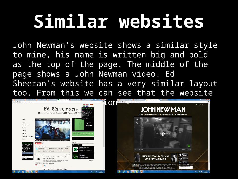
John Newman’s website shows a similar style to mine, his name is written big and bold as the top of the page. The middle of the page shows a John Newman video. Ed Sheeran’s website has a very similar layout too. From this we can see that the website matches the conventions of a website.
Similar websites