welcome to the three ring %circos: an example of creating ... … · welcome to the three ring...
TRANSCRIPT
1
PharmaSUG 2018 - Paper DV14
Welcome to the Three Ring %CIRCOS: An Example of Creating a Circular Graph without a Polar Axis
Jeffrey Meyers, Mayo Clinic
ABSTRACT
An internal graphics challenge between SAS and R programmers within Mayo Clinic led to the creation of a CIRCOS plot with the SAS 9.4M3 features. A CIRCOS plot is a circular visualization of the relationship between objects, positions and other time-point related data. The CIRCOS plot features a curved rectangle for each node or object around the perimeter of the circle, and a Bézier curve for each path between nodes that is pulled towards the center of the circle. Each rectangle and curve’s size is determined by their proportion of the total population. The primary challenge of creating this plot with the current SAS SG procedures is that these procedures do not include polar axes to simplify plotting circular or curved objects. The macro %CIRCOS is an example of overcoming these limitations creatively using trigonometry to prove that these types of graphs are still possible without polar axes.
INTRODUCTION
The Mayo Clinic Biomedical Statistics and Informatics division has programmers that use SAS, R and other statistical software. Many programmers primarily focus on one of the software packages, and periodically the division hosts a challenge between the programmers in the “Anything You Can Do I Can Do Better” theme. The most recent challenge was centered on utilizing and demonstrating the newest features available in both SAS and R graphics. It was during this challenge that one of the short comings of the newest SAS graphing software was made evident: the absence of polar axes to create round or circular plots. The task was to create a CIRCOS plot which is almost entirely based upon curved rectangles rotated in a circle around a center point.
Figure 1 is an example of a CIRCOS plot.
Figure 1. The CIRCOS plot displays connections between groups and is explained in more detail later in the paper.
01
02
03
04
05
06
07
08
09
10
1.92 paths per percent

Welcome to the Three Ring %CIRCOS: An Example of Creating a Circular Graph without Polar Axes, continued
2
In addition to the lack of polar axes, SAS does not include innate features for creating curved rectangles or a curved axis. This paper focuses on overcoming these limitations to meet the challenge and create a high-quality CIRCOS plot within a Cartesian axis environment, to inspire other programmers to find creative methods of producing graphs currently unavailable in the current environment, and to encourage SAS to consider adding another axis type to their repertoire.
THE CURRENT LIMITATIONS
The most straightforward method of plotting shapes around a circle is to use a polar axis which is not currently an option within the SAS graphics procedures. The following is a comparison of creating a curved rectangle in a polar axis versus linear axes.
DRAWING A CURVED RECTANGLE IN A POLAR AXIS
Polar axes revolve from an origin axis (P) and have two coordinates: a distance (d) and an angle (θ). The distance gives the radius of a circle drawn, and the angle gives the arc drawn from the origin axis.
Figure 2 is an example of a polar axis.
Figure 2. An arc is drawn by specifying a distance (d) and an angle (θ). The arc is drawn from the origin axis (P) to the current position.
The following illustrates the ease of drawing a curved rectangle on a polar axis:
Figure 3 is an example of drawing a curved rectangle on a polar axis.
Figure 3. A curved rectangle can be drawn with two distances and an arc between two angles. Drawing arcs from θ1 to θ2 at distances d1 and d2 and then connecting (d1, θ1), (d1, θ2), (d2, θ2), (d2, θ1) with reference to the origin axis (P) would yield a perfect curved rectangle for a CIRCOS plot. This would be an easy setup for a POLYGON plot statement if a polar axis was available.
(0,0) (d,0)P
θ
(d,θ)
d
(0,0) P
(d1,θ
1)
(d2,θ
1)
(d1,θ
2)
(d2,θ
2)

Welcome to the Three Ring %CIRCOS: An Example of Creating a Circular Graph without Polar Axes, continued
3
DRAWING A CURVED RECTANGLE IN LINEAR AXES
There are currently no functions or plot types in the SG graphics set to create an arc, but due to the freedom of linear axes the concept of an arc can be created by connecting enough points using straight line along the right curve.(i.e. using straight line to approximate the curve). The more points that are drawn the smoother the arc becomes.
Figure 4 is an example of drawing an arc within linear axes.
FIGURE 4. The more points that are used to draw the arc the smoother the arc becomes.
This is an inefficient method to create a curve, but one of the only methods to create an exact curved polygon with current available methods. With this method in mind and with the right equations SAS can be forced into drawing curved polygons within linear axes.
THE UNIT CIRCLE
The unit circle is a concept from trigonometry that bases a circle of radius 1 around the 0, 0 coordinates of Cartesian (linear) axes. Note that the notation (a, b) in the following figure stands for the position of the points.
Figure 5 is the unit circle.
Figure 5. The unit circle is centered at the Cartesian coordinates 0, 0 and has a radius of 1.
7 Points5 Points3 Points
(1,0)(-1,0)
(0,1)
(0,-1)
(0,0)

Welcome to the Three Ring %CIRCOS: An Example of Creating a Circular Graph without Polar Axes, continued
4
Tracing around the circle can be easily accomplished using the basic trigonometry equations sine and cosine with a specified angle. The following equation displays how to calculate the x and y coordinates for each provided angle:
)sin(
)cos(
dy
dx
The coordinates are simply the distance (radius of circle) multiplied by the function of the angle (Θ) where the angle is measured counter clockwise from the x-axis. The unit circle simplifies these equations by making d equal to 1. Arcs can be easily plotted around this circle by creating x and y coordinates from across an angle. A quarter circle arc can be created by plotting points from Θ equal to 0 degrees up to Θ equal to 90 degrees. Note that the SIN and COS functions in SAS use angles measured in radians which can be converted from degrees with the following equation.
2360
One complete circle is 360 degrees which is equivalent to two pi radians.
WHAT IS A CIRCOS PLOT?
A CIRCOS plot is a condensed circular visualization of the relationship between objects, positions and other time-point related data. They are built out of two primary components: the outer circle and the inner connecting curves. There are many optional add-ons depending on the software being used such as having multiple layers of outer circles and adding other distribution graphs such as histograms within the circle. The program highlighted with this paper creates CIRCOS plots with three primary pieces: the outer circle, an inner circle, and the connecting curves.
The following is the code used to create the randomly generated dataset and corresponding macro call:
data random;
call streaminit(123);
do i = 1 to 100;
u = rand("Uniform");
u2 = rand("Uniform");
before = 1 + floor(7*u);
after = 4 + floor(7*u2);
output;
end;
format before after z2.;
drop i u u2;
run;
%CIRCOS(DATA=random, BEFORE=before, AFTER=after, PLOTNAME=example1,
PLOTTYPE=emf, BORDER=1);
OUTER CIRCLE
The outer circle uses curved rectangles to visually convey the proportion of the total number of paths entering and leaving each group. The axis is printed on the outer border of the rectangles with each tick mark representing one percentage point of the total sample size. Each group is labeled with the label rotated to be perpendicular to the circle, and each group is colored differently.
Welcome to the Three Ring %CIRCOS: An Example of Creating a Circular Graph without Polar Axes, continued
5
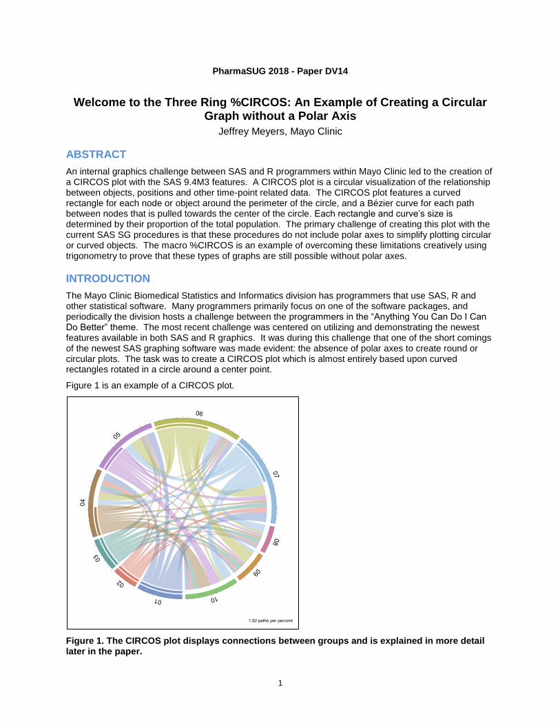
Figure 6 displays the Outer Circle of the CIRCOS plot with the unit circle overlayed.
Figure 6. Each group is colored differently within the Outer Circle, and the lengths are determined by the groups proportion of the total population. A percentage of the total circle (macro default of 5%) is used to provide a gap between the groups.
INNER CIRCLE
The inner circle visually represents what proportion of the group is leaving to another group (called path hereafter) versus what proportion of the group is arriving from another group. The more complete the inner circle bar is the more paths that are leaving to other groups. A blank bar means all paths are going to that group.
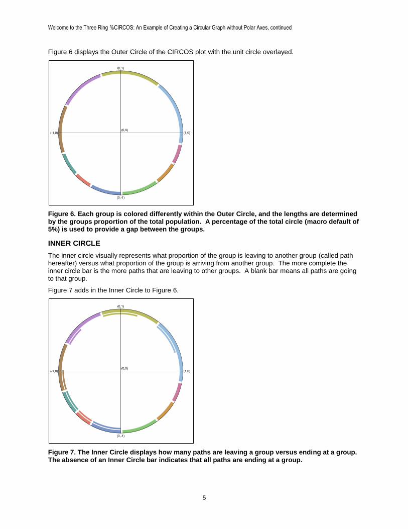
Figure 7 adds in the Inner Circle to Figure 6.
Figure 7. The Inner Circle displays how many paths are leaving a group versus ending at a group. The absence of an Inner Circle bar indicates that all paths are ending at a group.
(1,0)(-1,0)
(0,1)
(0,-1)
(0,0)
(1,0)(-1,0)
(0,1)
(0,-1)
(0,0)
Welcome to the Three Ring %CIRCOS: An Example of Creating a Circular Graph without Polar Axes, continued
6
CONNECTING CURVES
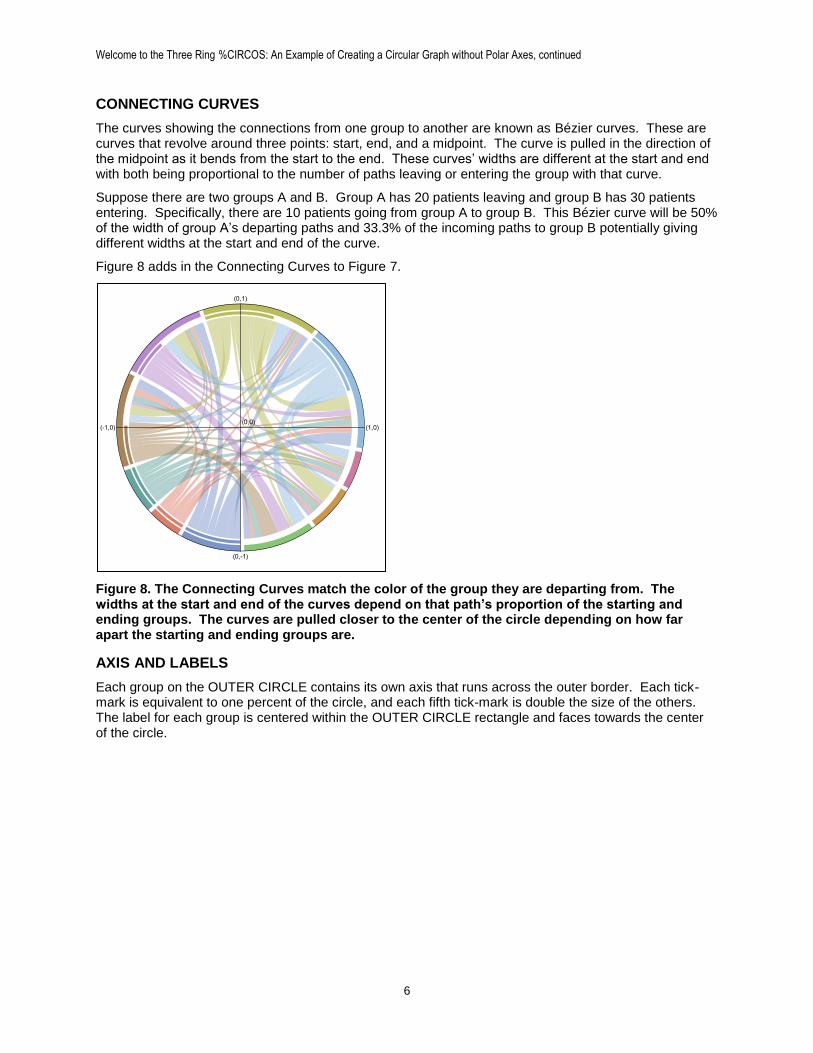
The curves showing the connections from one group to another are known as Bézier curves. These are curves that revolve around three points: start, end, and a midpoint. The curve is pulled in the direction of the midpoint as it bends from the start to the end. These curves’ widths are different at the start and end with both being proportional to the number of paths leaving or entering the group with that curve.
Suppose there are two groups A and B. Group A has 20 patients leaving and group B has 30 patients entering. Specifically, there are 10 patients going from group A to group B. This Bézier curve will be 50% of the width of group A’s departing paths and 33.3% of the incoming paths to group B potentially giving different widths at the start and end of the curve.
Figure 8 adds in the Connecting Curves to Figure 7.
Figure 8. The Connecting Curves match the color of the group they are departing from. The widths at the start and end of the curves depend on that path’s proportion of the starting and ending groups. The curves are pulled closer to the center of the circle depending on how far apart the starting and ending groups are.
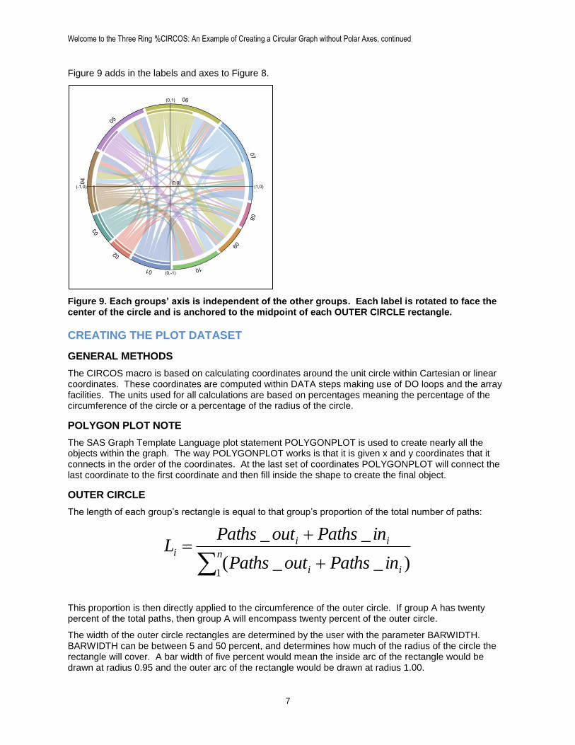
AXIS AND LABELS
Each group on the OUTER CIRCLE contains its own axis that runs across the outer border. Each tick-mark is equivalent to one percent of the circle, and each fifth tick-mark is double the size of the others. The label for each group is centered within the OUTER CIRCLE rectangle and faces towards the center of the circle.
(1,0)(-1,0)
(0,1)
(0,-1)
(0,0)
Welcome to the Three Ring %CIRCOS: An Example of Creating a Circular Graph without Polar Axes, continued
7
Figure 9 adds in the labels and axes to Figure 8.
Figure 9. Each groups’ axis is independent of the other groups. Each label is rotated to face the center of the circle and is anchored to the midpoint of each OUTER CIRCLE rectangle.
CREATING THE PLOT DATASET
GENERAL METHODS
The CIRCOS macro is based on calculating coordinates around the unit circle within Cartesian or linear coordinates. These coordinates are computed within DATA steps making use of DO loops and the array facilities. The units used for all calculations are based on percentages meaning the percentage of the circumference of the circle or a percentage of the radius of the circle.
POLYGON PLOT NOTE
The SAS Graph Template Language plot statement POLYGONPLOT is used to create nearly all the objects within the graph. The way POLYGONPLOT works is that it is given x and y coordinates that it connects in the order of the coordinates. At the last set of coordinates POLYGONPLOT will connect the last coordinate to the first coordinate and then fill inside the shape to create the final object.
OUTER CIRCLE
The length of each group’s rectangle is equal to that group’s proportion of the total number of paths:
n
ii
iii
inPathsoutPaths
inPathsoutPathsL
1)__(
__
This proportion is then directly applied to the circumference of the outer circle. If group A has twenty percent of the total paths, then group A will encompass twenty percent of the outer circle.
The width of the outer circle rectangles are determined by the user with the parameter BARWIDTH. BARWIDTH can be between 5 and 50 percent, and determines how much of the radius of the circle the rectangle will cover. A bar width of five percent would mean the inside arc of the rectangle would be drawn at radius 0.95 and the outer arc of the rectangle would be drawn at radius 1.00.
01
02
03
04
05
06
07
08
09
10
(1,0)(-1,0)
(0,1)
(0,-1)
(0,0)
Welcome to the Three Ring %CIRCOS: An Example of Creating a Circular Graph without Polar Axes, continued
8
The code to generate the coordinates for the outer circle rectangles is run within a DATA step. The code below relies on two macro variables and two variables calculated earlier in the macro:
1. POINTS: macro variable that determines how many x and y coordinates are computed for each arc. Default is 10.
2. BARWIDTH: macro variable that determines the width of the rectangle. Default is 0.05 (5% of the unit circle)
3. PERCENT: macro calculated variable for the current group’s proportion of the outer circle
4. _CUM: macro calculated variable that determines how far around the outer circle the graph has progressed
The actual DATA step code is the following:
/*Draws the outer part of the rectangle*/
do i=_cum*2 to (_cum+percent)*2 by percent/&points;
x=cos(constant("pi")*i);
y=sin(constant("pi")*i);
output;
end;
/*Draws the inner part of the rectangle.
Drawn at (1-&barwidth) of the distance from the center*/
do i=(_cum+percent)*2 to _cum *2 by -percent/&points;
x=(1-&barwidth)*cos(constant("pi")*i);
y=(1-&barwidth)*sin(constant("pi")*i);
output;
end;
The first DO loop draws the outer arc of the rectangle, and the second DO loop draws the same arc in the reverse direction closer to the center of the circle. The loop is multiplied by two to account for a full circle being 2*pi radians. The sides of the rectangles being separated and the change in direction that the coordinates are drawn is due to the nature of the POLYGON plot that is used to make the graph.
INNER CIRCLE
The length of each group’s inner rectangle is equal to that group’s proportion of paths leaving to total paths:
ii
ii
inPathsoutPaths
outPathsL
__
_
Very similar code is then used to create the coordinates for the inner rectangles. The only difference is changing the distance that the arcs are drawn at. Two new variables are added:
1. INNERGAP: macro variable determines how much space is between outer circle, inner circle, and Bézier curves.
2. PCT_START: Pre-calculated variable for the proportion of paths leaving the current group
The actual DATA step code is the following:
/*Draws the outer part of the rectangle*/
if pct_start>0 then do i=_cum*2 to (_cum+pct_start)*2 by pct_start/&points;
x=(1-&barwidth-&innergap/2)*cos(constant("pi")*i);
y=(1-&barwidth-&innergap/2)*sin(constant("pi")*i);
output;
end;
Welcome to the Three Ring %CIRCOS: An Example of Creating a Circular Graph without Polar Axes, continued
9
/*Draws the inner part of the rectangle.
Drawn at (1-&barwidth) of the distance from the center*/
if pct_start>0 then do
i=(_cum+pct_start)*2 to _cum*2 by -pct_start/&points;
x=(1-&barwidth-&innergap/2-&barwidth/2)*cos(constant("pi")*i);
y=(1-&barwidth-&innergap/2-&barwidth/2)*sin(constant("pi")*i);
output;
end;
BÉZIER CURVES
The curves that connect one group to another within the circle are known as quadratic Bézier curves which connect three points and are created with the following equation:
10,)1(2)1()( 2
2
10
2 tPttPtPttB
The definitions of the components are as follows:
P0: starting point
P1: mid-point
P2: end-point
t: represents the point between the start and end of the curve as a proportion
A benefit of using the unit circle to make this macro is that the mid-point is always the center of the circle which has coordinates of (0, 0). The result of this simplifies the equation to the following:
10,)1()( 2
2
0
2 tPtPttB
One Bézier curve is calculated for each side of the shape, and these curves are then connected with arcs using the same previous methods. This method gives the connecting curves the look of being wider at the start and ending points than it is in the middle and will pull the curves more towards the center of the circle the further away the starting point is from the ending point.
The DATA step code that calculates the coordinates for the Bézier curves is as follows:
/**Draw one side of connecting Bézier curve**/
do i = 0 to 1 by 1/&points;
x=(1-i)**2*bx1b + 2*(1-i)*i*0 + i**2*bx2a;
y=(1-i)**2*by1b + 2*(1-i)*i*0 + i**2*by2a;
output;
end;
The variables bx1b and by1b are the x and y coordinates for the start of the curve (P0), and the variables bx2a and by2a are the x and y coordinates for the end of the curve (P2). The mid-point (P1) in this case is 0 which is why the second sum is multiplied by 0.
Calculating the coordinates for all of the Bézier curves requires a number of pre-calculations and organization. Each curve has the following components:
Welcome to the Three Ring %CIRCOS: An Example of Creating a Circular Graph without Polar Axes, continued
10
1. Two points at the start of the curve to form the arc around the circle within the beginning group
2. Two points at the end of the curve to form the arc around the circle within the ending group
3. The proportion of paths leaving the beginning group each curve contains
4. The proportion of paths entering the ending group each curve contains
5. The order in which the curves are plotted to avoid overlapping curves from the same group
The CIRCOS macro computes the proportion each path takes up from the total circle, from the starting group, and from the ending group. These values are combined in a dataset that contains the starting points and total proportions for each group around the outer circle. The paths are ordered by how close each starting and ending group are to each other with conditional logic to weigh the direction curves will be going. Groups that are closer together clockwise will favor having a curve beginning to the left side of the starting group, and the reverse for groups that are closer together counter-clockwise.
CIRCULAR AXES
The circular axes are drawn in two pieces: the lines and the tick-marks. The lines are drawn with the same methods as the outside of the OUTER CIRCLE rectangles. The tick-marks are created by plotting one point at the outer edge of the OUTER CIRCLE and another further out on a line perpendicular to the circle. Every fifth tick-mark is twice the size of the others. The DATA step code to create the coordinates is the following:
/*Moves along OUTER CIRCLE border*/
do i=(_cum*2+0.02) to (_cum+percent)*2 by 0.02;
/*Each tick has its own identifier for plotting*/
tick+1;
/*x,y coordinates for the base of the tick-mark*/
xtick=cos(constant("pi")*i);
ytick=sin(constant("pi")*i);
output;
/*Every fifth tick-mark is longer*/
if mod(tick,5)=0 then do;
xtick=(1.025)*cos(constant("pi")*i);
ytick=(1.025)*sin(constant("pi")*i);
end;
/*Other tick-marks are shorter*/
else do;
xtick=(1.0125)*cos(constant("pi")*i);
ytick=(1.0125)*sin(constant("pi")*i);
end;
output;
end;

Welcome to the Three Ring %CIRCOS: An Example of Creating a Circular Graph without Polar Axes, continued
11
LABELS
Three variables are required to be calculated in order to plot the labels: the x-coordinate, the y-coordinate and the rotation required to face the label towards the center of the circle. The x and y coordinates are calculated at the center of each of the OUTER CIRCLE groups, and then the following hierarchical equation is used to calculate the rotation (R):
0,2
360*)arcsin(90
0,2
360*)arccos(
1,180
1,0
1,90
1,270
xy
xy
y
y
x
x
R
The value for rotation is calculated from the formula using the equation that first meets the coordinate’s conditions working from the top down. This is calculated within the macro using the SQL procedure and the following query:
/*Creates the dataset used for the text plot. Plots the labels half a
barwidth beyond circle*/
create table _text (drop=x y) as
select distinct _levels_ as text,_cum,percent,
cos(constant("pi")*2*(_cum+percent/2)) as x,
sin(constant("pi")*2*(_cum+percent/2)) as y,
(1+&barwidth/2)*calculated x as x_text,
(1+&barwidth/2)*calculated y as y_text,
case
when calculated x=1 then 270
when calculated x=-1 then 90
when calculated y=1 then 0
when calculated y=-1 then 180
when calculated x >0 then 0-arcos(calculated y)
*360/(2*constant("pi"))
when calculated x <0 then 90-arsin(calculated y)
*360/(2*constant("pi"))
else . end as rotate from _circle2;
The CALCULATED option in the SQL procedure allows a reference to a pre-calculated variable within the query. The X_TEXT and Y_TEXT coordinates add a buffer to push the label text outside the circle. The CASE statement acts as a series of IF-ELSE logic taking the first true condition.
GENERATING THE PLOT
Creating the plot is straightforward after all of the coordinates have been calculated. The macro uses the polygon plot along with the graphics SUBPIXEL option to create all of the shapes, and then uses a series plot to make the axes and tick-marks. The graph is designed in the TEMPLATE procedure using the Graph Template Language (GTL) and is rendered with the SGRENDER procedure.
Welcome to the Three Ring %CIRCOS: An Example of Creating a Circular Graph without Polar Axes, continued
12
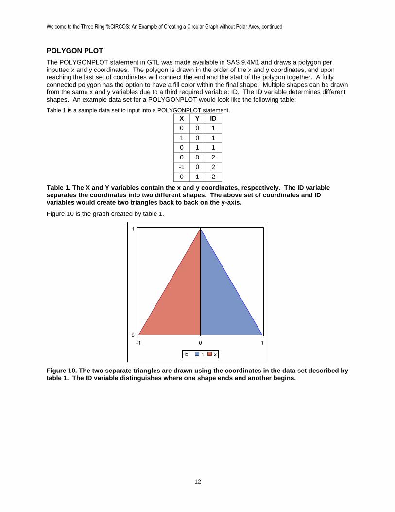
POLYGON PLOT
The POLYGONPLOT statement in GTL was made available in SAS 9.4M1 and draws a polygon per inputted x and y coordinates. The polygon is drawn in the order of the x and y coordinates, and upon reaching the last set of coordinates will connect the end and the start of the polygon together. A fully connected polygon has the option to have a fill color within the final shape. Multiple shapes can be drawn from the same x and y variables due to a third required variable: ID. The ID variable determines different shapes. An example data set for a POLYGONPLOT would look like the following table:
Table 1 is a sample data set to input into a POLYGONPLOT statement.
X Y ID
0 0 1
1 0 1
0 1 1
0 0 2
-1 0 2
0 1 2
Table 1. The X and Y variables contain the x and y coordinates, respectively. The ID variable separates the coordinates into two different shapes. The above set of coordinates and ID variables would create two triangles back to back on the y-axis.
Figure 10 is the graph created by table 1.
Figure 10. The two separate triangles are drawn using the coordinates in the data set described by table 1. The ID variable distinguishes where one shape ends and another begins.
-1 0 1
0
1
21id
Welcome to the Three Ring %CIRCOS: An Example of Creating a Circular Graph without Polar Axes, continued
13
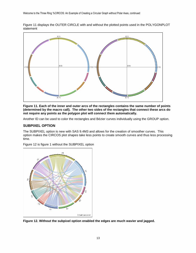
Figure 11 displays the OUTER CIRCLE with and without the plotted points used in the POLYGONPLOT statement
Figure 11. Each of the inner and outer arcs of the rectangles contains the same number of points (determined by the macro call). The other two sides of the rectangles that connect these arcs do not require any points as the polygon plot will connect them automatically.
Another ID can be used to color the rectangles and Bézier curves individually using the GROUP option.
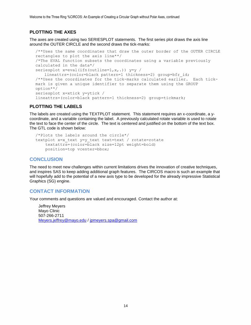
SUBPIXEL OPTION
The SUBPIXEL option is new with SAS 9.4M3 and allows for the creation of smoother curves. This option makes the CIRCOS plot shapes take less points to create smooth curves and thus less processing time.
Figure 12 is figure 1 without the SUBPIXEL option
Figure 12. Without the subpixel option enabled the edges are much wavier and jagged.
(1,0)(-1,0)
(0,1)
(0,-1)
(0,0)(1,0)(-1,0)
(0,1)
(0,-1)
(0,0)
Welcome to the Three Ring %CIRCOS: An Example of Creating a Circular Graph without Polar Axes, continued
14
PLOTTING THE AXES
The axes are created using two SERIESPLOT statements. The first series plot draws the axis line around the OUTER CIRCLE and the second draws the tick-marks:
/**Uses the same coordinates that draw the outer border of the OUTER CIRCLE
rectangles to plot the axis line**/
/*The EVAL function subsets the coordinates using a variable previously
calculated in the data*/
seriesplot x=eval(ifn(outline=1,x,.)) y=y /
lineattrs=(color=black pattern=1 thickness=2) group=bfr_id;
/**Uses the coordinates for the tick-marks calculated earlier. Each tick-
mark is given a unique identifier to separate them using the GROUP
option**/
seriesplot x=xtick y=ytick /
lineattrs=(color=black pattern=1 thickness=2) group=tickmark;
PLOTTING THE LABELS
The labels are created using the TEXTPLOT statement. This statement requires an x-coordinate, a y-coordinate, and a variable containing the label. A previously calculated rotate variable is used to rotate the text to face the center of the circle. The text is centered and justified on the bottom of the text box. The GTL code is shown below:
/*Plots the labels around the circle*/
textplot x=x_text y=y_text text=text / rotate=rotate
textattrs=(color=black size=12pt weight=bold)
position=top vcenter=bbox;
CONCLUSION
The need to meet new challenges within current limitations drives the innovation of creative techniques, and inspires SAS to keep adding additional graph features. The CIRCOS macro is such an example that will hopefully add to the potential of a new axis type to be developed for the already impressive Statistical Graphics (SG) engine.
CONTACT INFORMATION
Your comments and questions are valued and encouraged. Contact the author at:
Jeffrey Meyers Mayo Clinic 507-266-2711 [email protected] / [email protected]