“what have you done?!?” bobsmith
TRANSCRIPT

“WHATHAVE YOU
DONE?!?”bobsmith: life+works

I was born June 12th, 1963 at 2:46 AM, in Hollywood, California; the second of three children. I’ve been married for 13 years now to the patient and humble Christina Grucella. Chrissy’s a pediatrician, which is a good thing, because I also have two children: Owen, 10 and Daisy, 7
I am largely experience-educated (i.e. I didn’t go to a fancy design school) in graphic design and illustration through various occupation related activities which includes:
• Meier & Frank, Fred Meyer, Nordstrom - visual window display; 1985 - 1993• Wieden+Kennedy, adidas, Avia, Columbia Sportswear – freelance design and illustration; 1992 - 1995• Nike, Inc., Senior Graphic Designer; 1995-2006
After spending 11 years at Nike (after my wife, my second longest relationship), I made a decision to pull back a little and go back into business for myself as a freelance designer, which I’ve been doing since April of 2006. Ditching the long work hours and 40 minute commute left me more time to spend time with my family and to volunteer at my children’s school teaching art, among other things.
I like to read, write, travel and take pictures; study history, anthropology, and profoundly arcane trivia. I also enjoy telling fantastic lies to my children, just to see if they’ll believe me.
I play drums with “Blutonic,” a jazz trio that plays gigs around the Portland area, as well as with the worship band at the church my family attends. I also enjoy playing and following almost all sports, but especially tennis, basketball and running. I’ll have to admit that the sport of golf is still a bit of a mystery to me, especially watching it on television.
(Handsomely paid references available upon request.)
ROBERT HOWARD SMITH

O Portland: Wieden + Kennedy, adidas, Columbia, Avia, etc. During that time, I also paid a visit to Nike. I knew the apparel creative director at Nike from an old girlfriend who worked there, so when I ran into her out having dinner one evening, I asked if I could drop off my portfolio. In 1995, they offered me a full time position which I accepted thinking that if I hated it I would just go back to freelancing. I now know for certain that God has a sense of humor because, almost 11 years later to the day, that’s exactly what I did.
UR FAMILY LIVED IN L.A. until my dad took a job with Tektronix in Oregon when I was 10 years old. When I got
out of high school, I was pretty serious about playing music, whilst employed in all manner of arty “McJobs” to support myself. Over the next several years, I dressed mannequins, built department store window displays, painted signs, and even did a stint at Kinko’s among other things (i.e.: it’s how I learned to use a computer). Later I freelanced as a designer and illustrator for most of the usual suspects in
WHAT ABOUT BOB?
Left: Yours truly with parents and sister, Studio City California, 1966. Above: 4th grade.

ACASE STUDY: NIKE RE-ISSUE
NIKE USED TO BE COOL.nce upon a time, we used to not take ourselves so seriously. Imagine Phillip bustin’ loose like this today. What the hell is that on his head?
The thing is, Phil would tell you that he misses those days more than anyone, but for some reason, whenever we talk “heritage” around here, we dust the waffle
iron off and call Ken Burns. Waffle iron schmaffle iron. I humbly suggest that we tell Mr. Burns to go to hell, and get Spike Jonze on the phone right now.
O
through our clothing. Nike has always excelled at technically advanced performance garments, and we had a small White Label group in Europe doing a heritage-inspired fashion line, but there were some authentic product stories about our history as an American company that were being neglected. When Adidas launched their “Originals” line that Fall, it just solidified my resolve –– I was on a mis-sion from that point on. Over the years I’d seen lineart for apparel con-cepts dismissed out of hand, seemingly because the ideas had only been toner on paper. The con-cepts seemed disposable –– people couldn’t “feel” them. It struck me that the way to put this idea over the top was to build a full-blown merchandise concept room, samples and all; someplace you could walk into, close the door, and be completely immersed in a fully realized vision of a vintage Nike retail collection, all the way down to the music playing and the smell of the room.
FTER CUTTING MY TEETH in Nike’s Apparel group the next few years, I began to re-alize that Nike didn’t have a particularly
strong reputation for quality sportswear outside the company. We’d go on market trips and fawn all over the stuff other street brands were doing, but when we’d get back and try to create product at a similar level of execution, it was almost impos-sible to get it through our system. As a designer with a heart for the company, it got to be a little discouraging. Then in the fall of 2000, Nike trend advisor Amanda Briggs brought Karen Kimmel and James Bond of KBond in L.A. (now closed) out to Nike to brainstorm with a small group of designers around how to get some of these small, off-line projects to retail. I’ve always loved vintage cloth-ing, and had always wanted to do something with vintage Nike apparel. Up to that point I felt we had been missing a chance to talk about our history
Right: page from “The Rebirth of Cool” concept book showing a young Phil Knight at a 1970s company holiday party.

wood paneling and painted pegboard from the Home Depot down the street. I picked up old office furniture from around town, and a few other choice props to complete the story, and we were ready to roll. (The years of building displays for Fred Meyer and Nordstrom proved useful—all told, I wound up spending under $500 for everything.)
T THAT TIME THERE WAS A GROUP at Nike charged with bringing new product concepts to market. They put up some
seed money to make samples and build out a concept room and asked me to present my idea back to them when it was complete. During my research I had met the Campus Display Man-ager, who had access to the Nike Archive, and they were able to supply me with actual vintage apparel and footwear. Whatever we didn’t have we re-created using thrift store blanks that we then screenprinted and distressed, using old catalogs and videotapes for reference. The next challenge, of course, was to find a space where we could show all of this stuff without letting the secret out before it had a chance to be presented. As luck would have it just down the hall from where I sat, there was a vacant manager’s office. I wanted to create a space that felt like what the first Nike “Ath-letic Department” stores looked like in the early 1970s, so I built display walls using fake
A
I also put together a take-away book titled “The Rebirth of Cool” which summarized my market research, a few of the logos I wanted to use and a proposal of the concept as a retail collection.
THE BUILDING OF “THE ROOM”
Right: Nike Re:Issue concept room, built from home-improvment store materials for $500 in an vacant manger’s office.

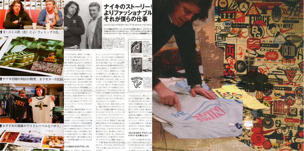
which detailed the significance of each garment or graphic. Every season we interviewed personalities connected to the stories to draw out the unique insights written into the hangtags. While doing research to write these stories I had the privilege to talk with people with deep roots to the company—from Phil Knight to Linda Prefon-taine to Walt McClure (Steve Prefontaine’s high school track coach!). It added significant labor to the process every season, but we felt that if we told the story right, the garment then became almost like a souvenir of your knowledge and experience of the brand.
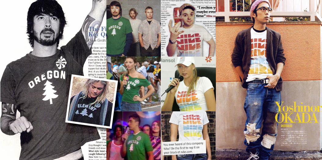
FTER OVER A YEAR OF FITS AND STARTS, the first Re-Issue collection was launched in the spring of 2004 to great success. To
our delight, the line started showing up in style and fashion magazines where Nike apparel had never been seen before, and we started getting phone calls from Nike executives who wanted per-sonal samples. The line grew and evolved over the next sev-eral seasons, but we endeavored to stay true to our personal mandate of storytelling. Eschewing the use of just a line of boilerplate history, each piece had its own specially written hangtag insert,
ATHEN WHAT?
Above: Re:Issue hangtag, using Nike Apparel Group’s original orange and navy colors, and ressurecting the “Sportswear” branding. Right and following: the first Re-Issue season, launched in the Spring of 2004.


This and following pages: Re-Issue press coverage and personal interviews in various international design, style and fashion publications.

O
WE NOW RETURN YOU TO OUR REGULARLY SCHEDULED PORTFOLIO
process overboard in tight deadline situations. Having said that –– which isn’t to say that none of these were rush jobs, because many of them were –– the balance of this book represents some of my favorite projects, both for Nike and for others, that I’m confident you’ll find literally bursting at the seams with profound meaning…
K, SO WE DID THAT — thank you for your indulgence. At any rate, I’m sure I’m not the first
person to say I find it difficult to do work that holds my interest for very long without it hav-ing some sort of storytelling element to it — a concept, a “big idea.” Sadly, there seems to be a trend of tossing this component of the creation
Small run poster for jazz trio “Blutonic.”

Nike “Ginga” campaign; collaboration with São Paulo Aprendiz School artists: used on apparel, footwear and bags.

2005 Prefontaine Memorial 10K Run promotional apparel graphic.Nike Apparel graphic featuring Steve Prefontaine and his coaches Walt McClure and Bill Bowerman. McClure was Pre’s Marshfield High School coach and Bowerman coached at the University of Oregon.

Designs for Nike Apparel group.

Derek Jeter retail poster, printed enitrely with metallic spot inks.llustration for Nike Apparel group.

Special project for Nike CEO Mark Parker; collected, redrew and catalogued more than 300 Nike sub-brand and product logos applied to Medicom “Be@rbrick” sculpture for Medicom’s 2005 Be@rbrick World Tour.

4-color hand-printed letterpress poster for Bob Dylan.

3-color screenprint poster for heavy rock group “Floater.”

Poster for Wayne Horvitz’s progressive music group “Zony Mash.”

Black & white office copier print with color copier “overprint” poster for blues/folk singer Kelly Joe Phelps.

CD package designs (clockwise from top left):Kelly Joe Phelps, Tom Grant, Reclinerland and Craig Carothers. CD package designs (clockwise from top left): Paul Mazzio, Jamey Hampton, Jack McMahon and Mark Alan.

Identity and website for R&B/funk band “Intervision.”

CD package design for Nashville singer/songwriter Craig Carothers
Clockwise from left: J. Christopher Wine, voted Sunset Magazine’s 2005 Best White Wine $15—$50, Pendelton Home 100 year celebration; Helping Hands; a cleaning and small repair service, Willamette Falls Pediatric Group, Oregon Denim Company; a fashion denim line.

[email protected] * 503.481.7034