what is color? color is an optical effect. our eyes need light to see color. colorcolor
TRANSCRIPT
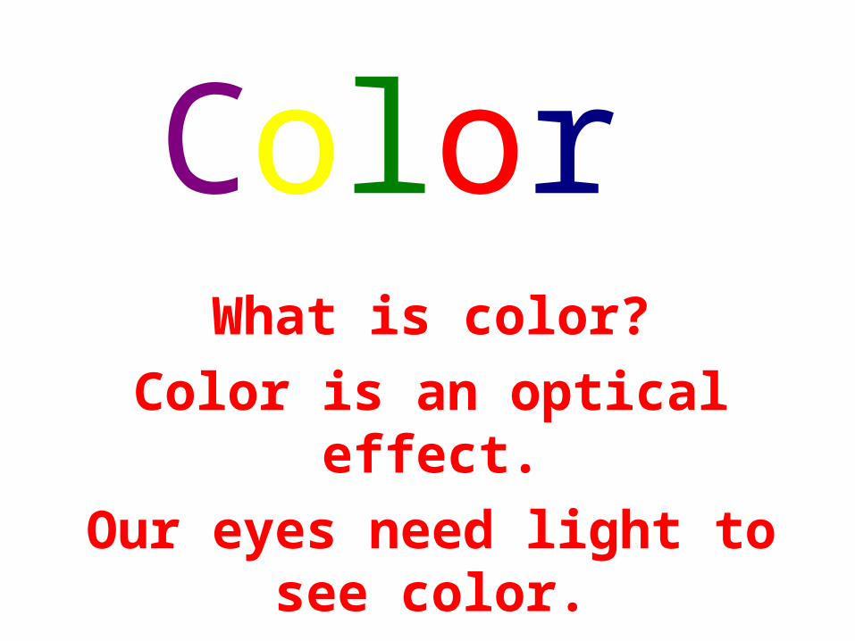
What is color?Color is an optical effect.Our eyes need light to see
color.
Color
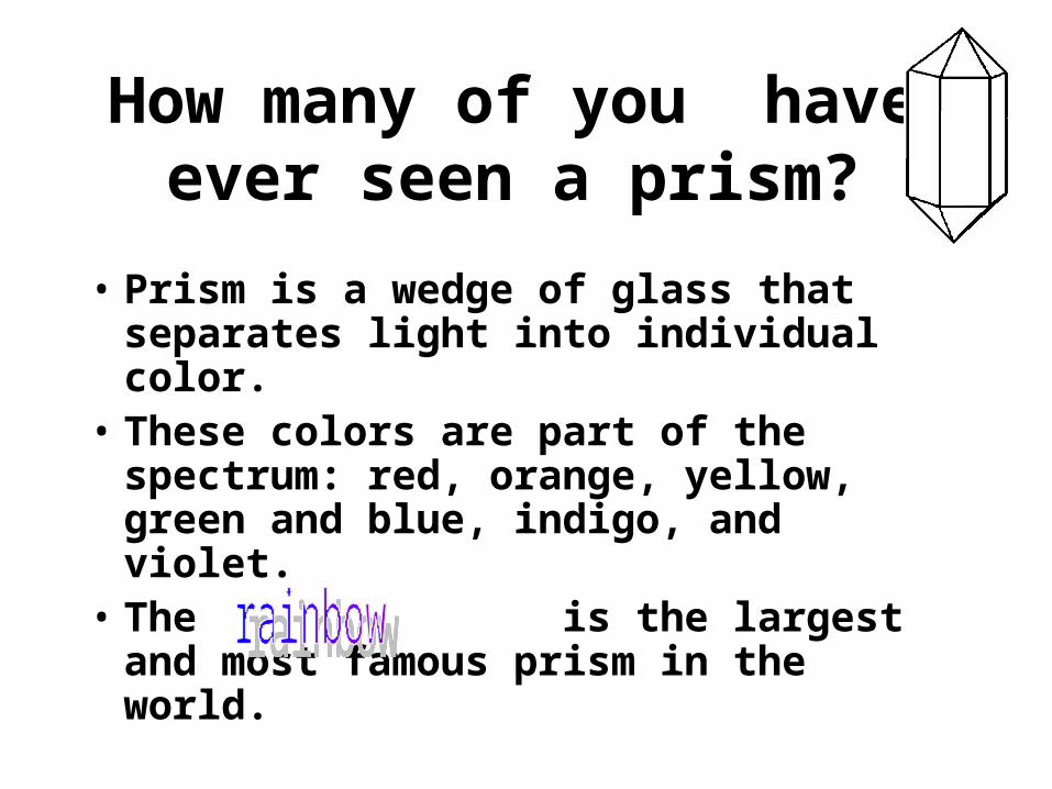
• Prism is a wedge of glass that separates light into individual color.
• These colors are part of the spectrum: red, orange, yellow, green and blue, indigo, and violet.
• The is the largest and most famous prism in the world.
How many of you have ever seen a prism?
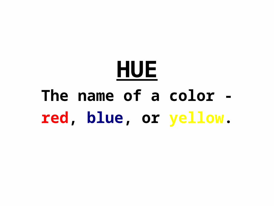
HUEThe name of a color -red, blue, or yellow.
Color is light and light is energy. Scientists have found that actual physiological changes take place in human beings when they are
exposed to certain colors. Colors can stimulate, excite, depress, tranquilize, increase appetite
and create a feeling of warmth or coolness. This is known as
chromodynamics.
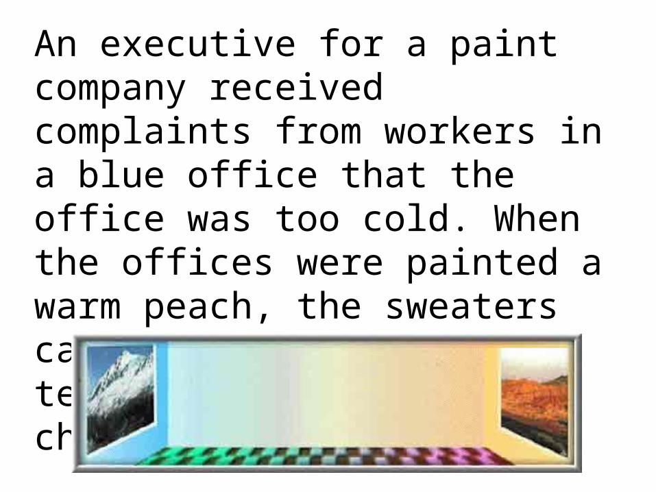
An executive for a paint company received complaints from workers in a blue office that the office was too cold. When the offices were painted a warm peach, the sweaters came off even though the temperature had not changed.
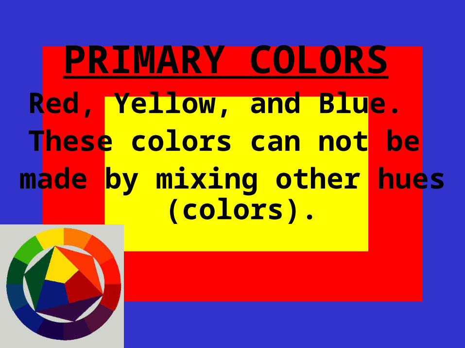
PRIMARY COLORS
Red, Yellow, and Blue. These colors can not be
made by mixing other hues (colors).
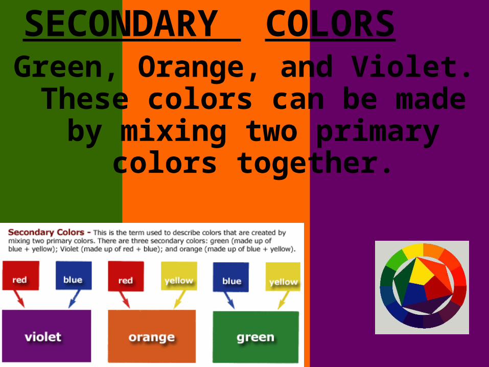
SECONDARY COLORS
Green, Orange, and Violet. These colors can be made
by mixing two primary colors together.
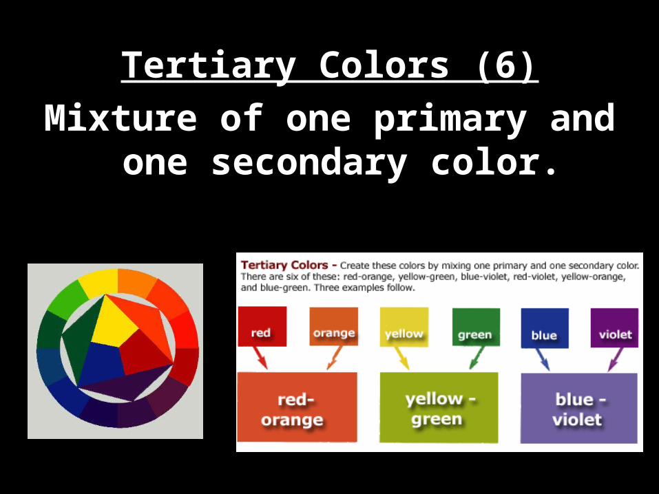
Tertiary Colors (6)Mixture of one primary and
one secondary color.
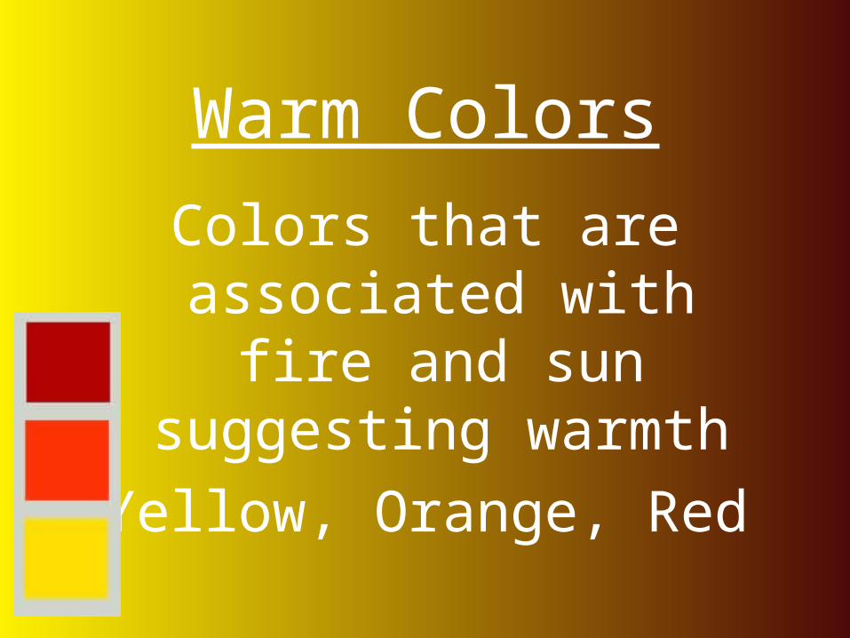
Warm Colors
Colors that are associated with fire and sun suggesting
warmthYellow, Orange, Red
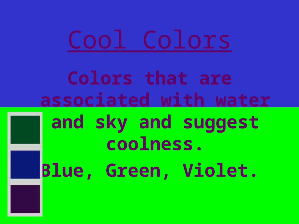
Cool ColorsColors that are
associated with water and sky and suggest
coolness.Blue, Green, Violet.
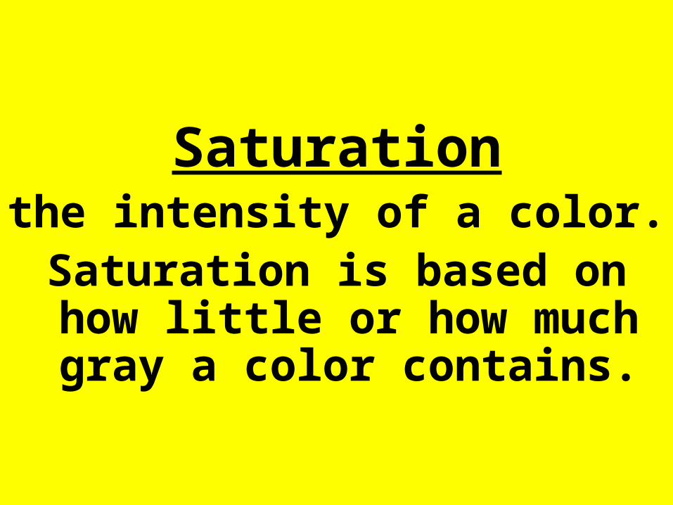
Saturationthe intensity of a color. Saturation is based on how little or how much gray a color contains.
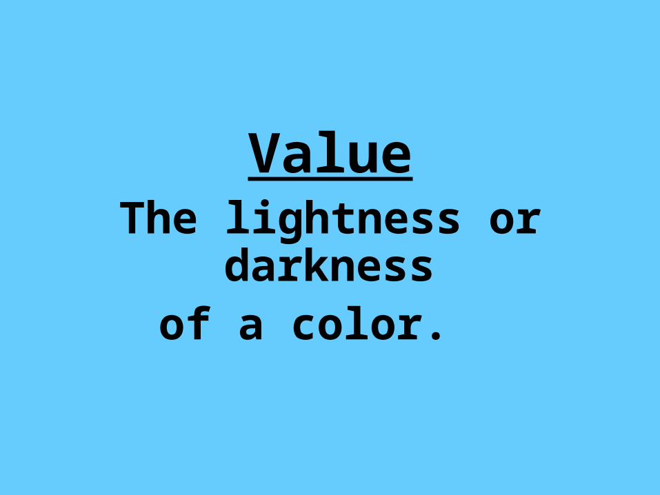
ValueThe lightness or darkness
of a color.
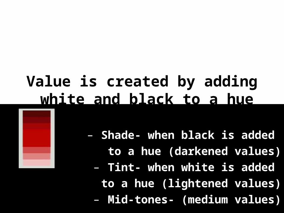
Value is created by adding white and black to a hue
(color).– Shade- when black is added
to a hue (darkened values)– Tint- when white is added to a hue (lightened values)
– Mid-tones- (medium values)
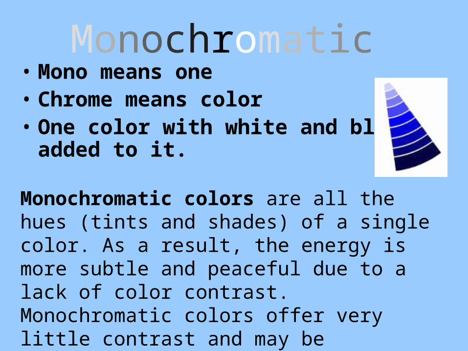
Monochromatic • Mono means one• Chrome means color• One color with white and black
added to it.
Monochromatic colors are all the hues (tints and shades) of a single color. As a result, the energy is more subtle and peaceful due to a lack of color contrast. Monochromatic colors offer very little contrast and may be considered boring unless there is diversity within the design.
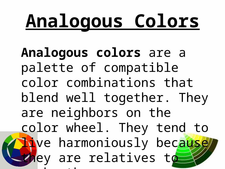
Analogous Colors
Analogous colors are a palette of compatible color combinations that blend well together. They are neighbors on the color wheel. They tend to live harmoniously because they are relatives to each other.
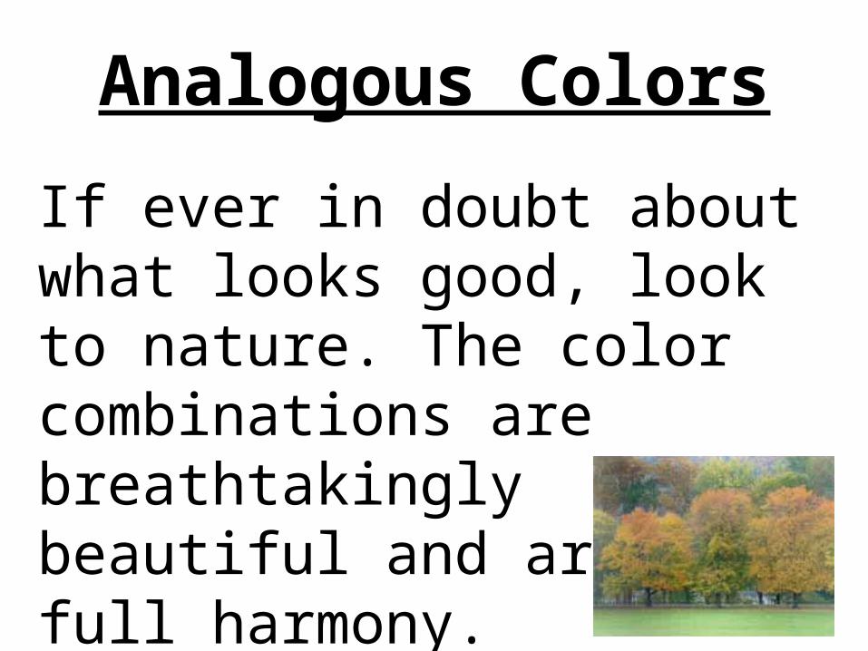
If ever in doubt about what looks good, look to nature. The color combinations are breathtakingly beautiful and are in full harmony.
Analogous Colors
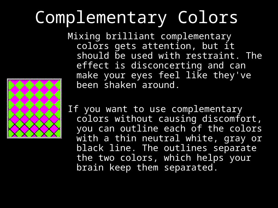
Complementary ColorsMixing brilliant complementary colors
gets attention, but it should be used with restraint. The effect is disconcerting and can make your eyes feel like they've been shaken around.
If you want to use complementary colors without causing discomfort, you can outline each of the colors with a thin neutral white, gray or black line. The outlines separate the two colors, which helps your brain keep them separated.
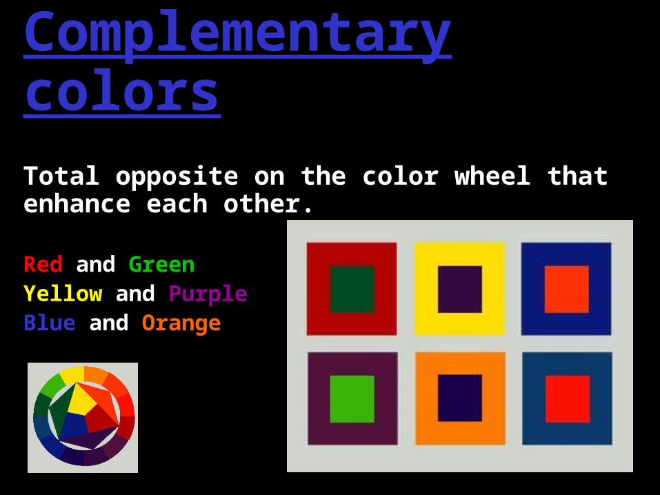
Complementary colorsTotal opposite on the color wheel that enhance each other.
Red and GreenYellow and PurpleBlue and Orange
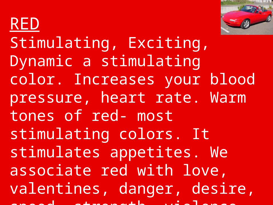
REDStimulating, Exciting, Dynamic a stimulating color. Increases your blood pressure, heart rate. Warm tones of red- most stimulating colors. It stimulates appetites. We associate red with love, valentines, danger, desire, speed, strength, violence, anger, emergency exit signs and stop signs.
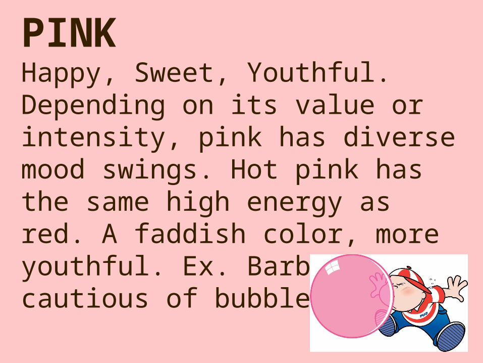
PINKHappy, Sweet, Youthful. Depending on its value or intensity, pink has diverse mood swings. Hot pink has the same high energy as red. A faddish color, more youthful. Ex. Barbie. Be cautious of bubblegum pink.
PINKVibrant pinks are more for the cosmetics. Magenta or fuchsia pinks are more grown up. Lighter less saturated pinks are more romantic. Dusty pinks and mauves are more soft and sentimental. Pink is perceived of as sweet tasting and sweet smelling.
ORANGE
Friendly, vital, tangy, inviting, energizing. Temperature wise orange is seen as the hottest of all colors. In its most vivid intensities, it is perceived as a color that shouldn’t be taken too seriously. It is seen as playful, happy, gregarious and childlike color. Children between the ages of three to six like this color. More outgoing people like that color. A fun color. A loud color to get your attention. All orange tones are not necessary loud or cheap. A warm color. Orange, along with red and yellow stimulate the appetite.
ORANGE
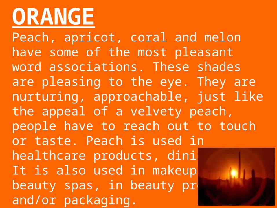
Peach, apricot, coral and melon have some of the most pleasant word associations. These shades are pleasing to the eye. They are nurturing, approachable, just like the appeal of a velvety peach, people have to reach out to touch or taste. Peach is used in healthcare products, dining areas. It is also used in makeup salons, beauty spas, in beauty products and/or packaging.

YELLOWLuminous, enlightened, sunny, cheerful, warming. In every society yellow is equated with the splendor and heat of the sun. Yellow emulates sunshine, light, and warmth. In the lightest variations, as seen as cheerful, mellow and soft to the touch. Bright yellows are cheerful but more energetic and eye catching. The eyes sees highly reflective yellow before it notices any other color.
YELLOWUnlike other hues that deepen with saturation, yellow becomes brighter when it is highly saturated. Also a happy color. Shades of yellow that can be described as delicious such as tasty shades like banana cream are best used in food service areas and food products. The lemon yellow is also a happy color associated with sweet somewhat citrusy tastes, but it is less sophisticated then the cream yellows. The most preferred yellow is the creamy and very warm or sunbaked.
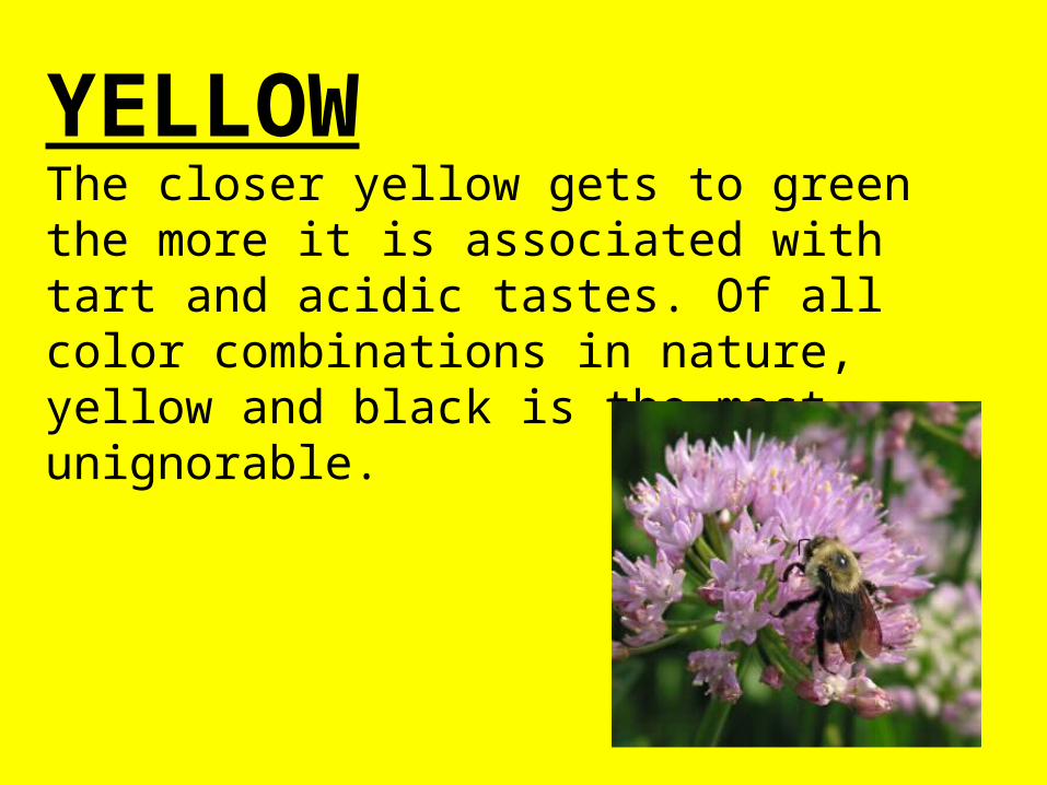
YELLOWThe closer yellow gets to green the more it is associated with tart and acidic tastes. Of all color combinations in nature, yellow and black is the most unignorable.
BROWNRich, wholesome, durable, rustic, sheltering. Brown is the ultimate earth color that is associated with home and stability. The various tones of brick, brown, tan, clay, and terracotta are seen as the most rooted, protective and secure of all shades because they are connected to the earth (come from the earth).
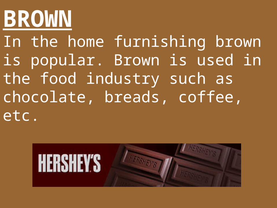
BROWNIn the home furnishing brown is popular. Brown is used in the food industry such as chocolate, breads, coffee, etc.
BLUEDependable, cool, serene, quiet, constant. As it is strongly associated with sky and water, blue is perceived as a constant in our lives. Relaxing. Blue is seen as reliable, dependable, committed and trustworthy. To convey these sentiments use blue on products. Restful. When you are in a blue environment you feel calm. Deep navy blue is most serious and powerful of all blues. Ex. Uniforms. Brilliant blues are dynamic and dramatic, add a whole new dimension. Ex. Electric blue.
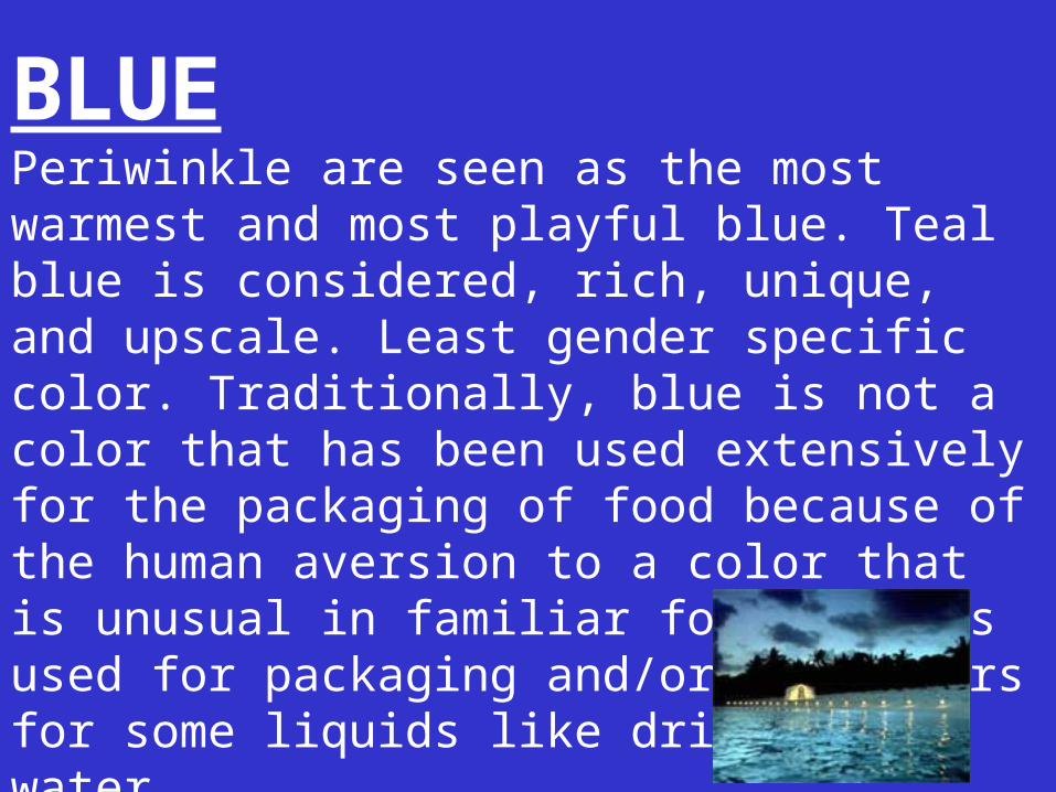
BLUEPeriwinkle are seen as the most warmest and most playful blue. Teal blue is considered, rich, unique, and upscale. Least gender specific color. Traditionally, blue is not a color that has been used extensively for the packaging of food because of the human aversion to a color that is unusual in familiar foods. It is used for packaging and/or containers for some liquids like drinking water.
GREENRefreshing, fresh, nature, soothing. Of all the colors in the spectrum, green offers the widest array of choices. Blue greens represent the best qualities of the nature colors. Thought of as cool clean colors, there is an underline element of warmth. Ex. Tropical waters. Blue greens and aqua’s are appropriate for packaging personal hygiene or beauty products (i.e. mouthwash). Green can be used as a neutral color. Deep greens are identified with money. Bright greens are associated with grass.
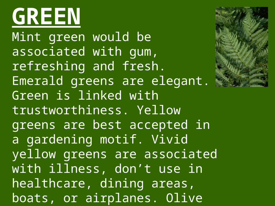
GREENMint green would be associated with gum, refreshing and fresh. Emerald greens are elegant. Green is linked with trustworthiness. Yellow greens are best accepted in a gardening motif. Vivid yellow greens are associated with illness, don’t use in healthcare, dining areas, boats, or airplanes. Olive is used well with other things, not used very commonly. Sea foam greens have calming effect.
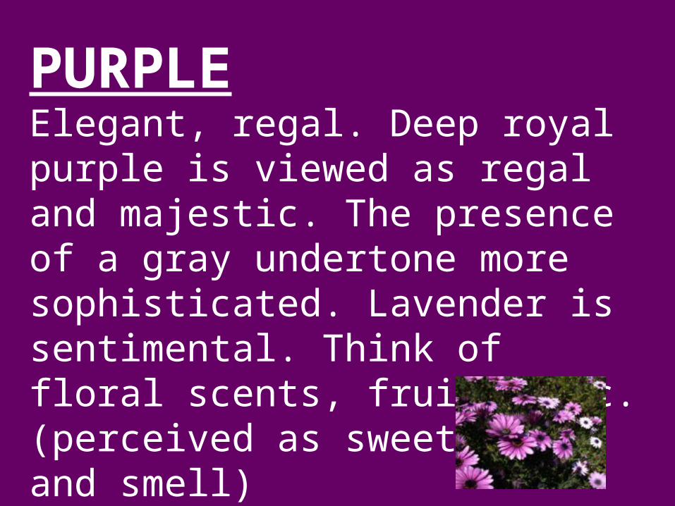
PURPLEElegant, regal. Deep royal purple is viewed as regal and majestic. The presence of a gray undertone more sophisticated. Lavender is sentimental. Think of floral scents, fruits, etc. (perceived as sweet taste and smell)
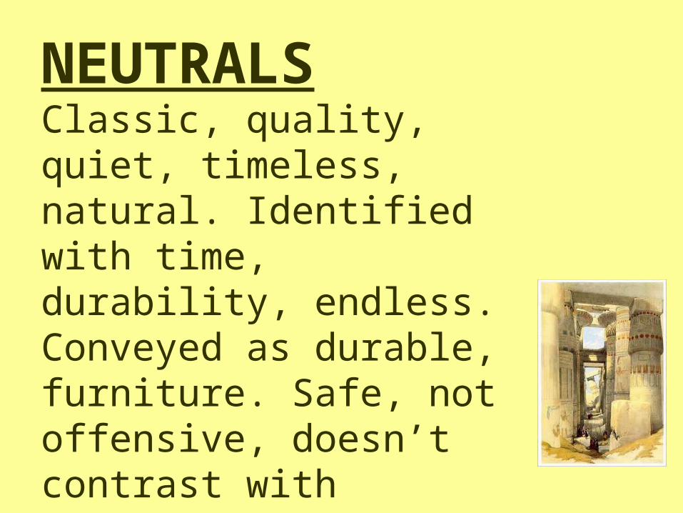
NEUTRALSClassic, quality, quiet, timeless, natural. Identified with time, durability, endless. Conveyed as durable, furniture. Safe, not offensive, doesn’t contrast with anything. May be described as monotones.
WHITEPurity and simplicity and bright. White imparts purity and simplicity. Used for baby products to impart a sense of clarity and cleanliness. Human eye sees white as a brilliant color. In terms of pigments and dyes, it is seen as the absence of color. In terms of light, it is the presence of all color.
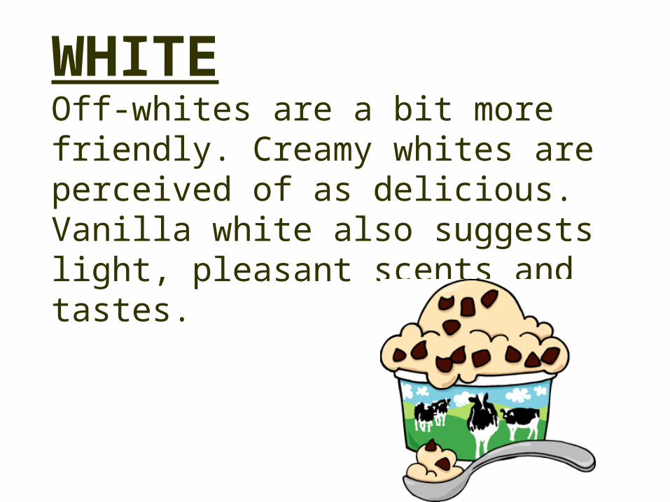
WHITEOff-whites are a bit more friendly. Creamy whites are perceived of as delicious. Vanilla white also suggests light, pleasant scents and tastes.
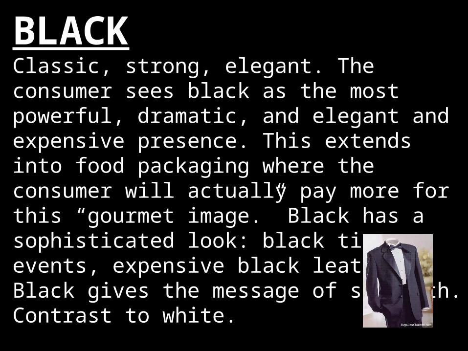
BLACKClassic, strong, elegant. The consumer sees black as the most powerful, dramatic, and elegant and expensive presence. This extends into food packaging where the consumer will actually pay more for this “gourmet image.” Black has a sophisticated look: black tie events, expensive black leather. Black gives the message of strength. Contrast to white.