why nobody fills out my forms
TRANSCRIPT
Why Nobody
Fills Out My
Forms
Andrew Malek http://malektips.com/@malekontheweb
Were We Always Concerned About
Web Forms?
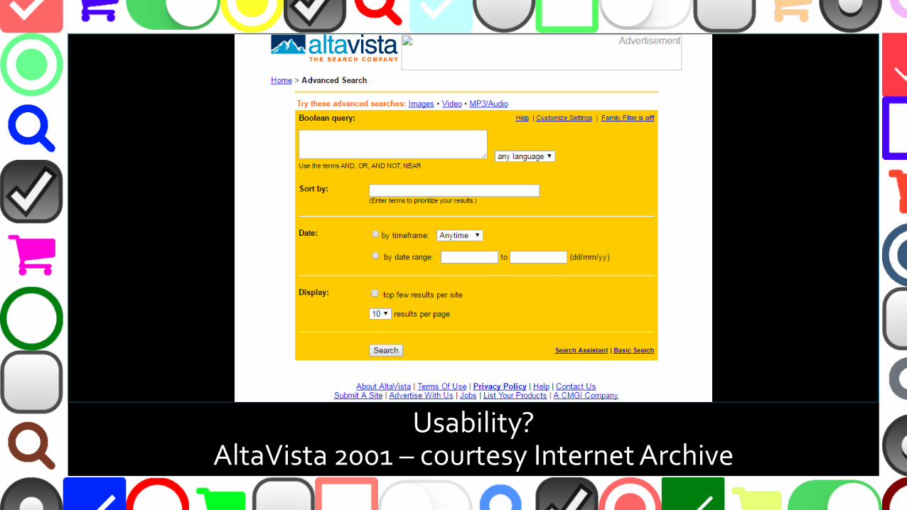
Usability?AltaVista 2001 – courtesy Internet Archive

Mobile devices?
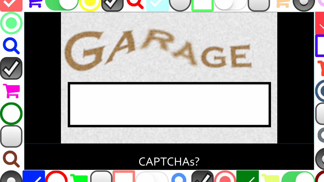
CAPTCHAs?
So…Why Don’t People Fill Out
Those Web Forms Now?
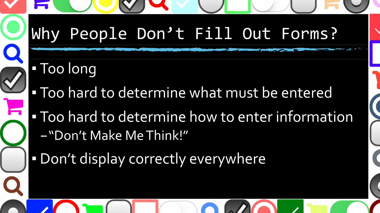
Why People Don’t Fill Out Forms?
▪ Too long
▪ Too hard to determine what must be entered
▪ Too hard to determine how to enter information–“Don’t Make Me Think!”
▪Don’t display correctly everywhere

Don’t Take My Word For Things Here…
TEST, TEST, TEST!!!
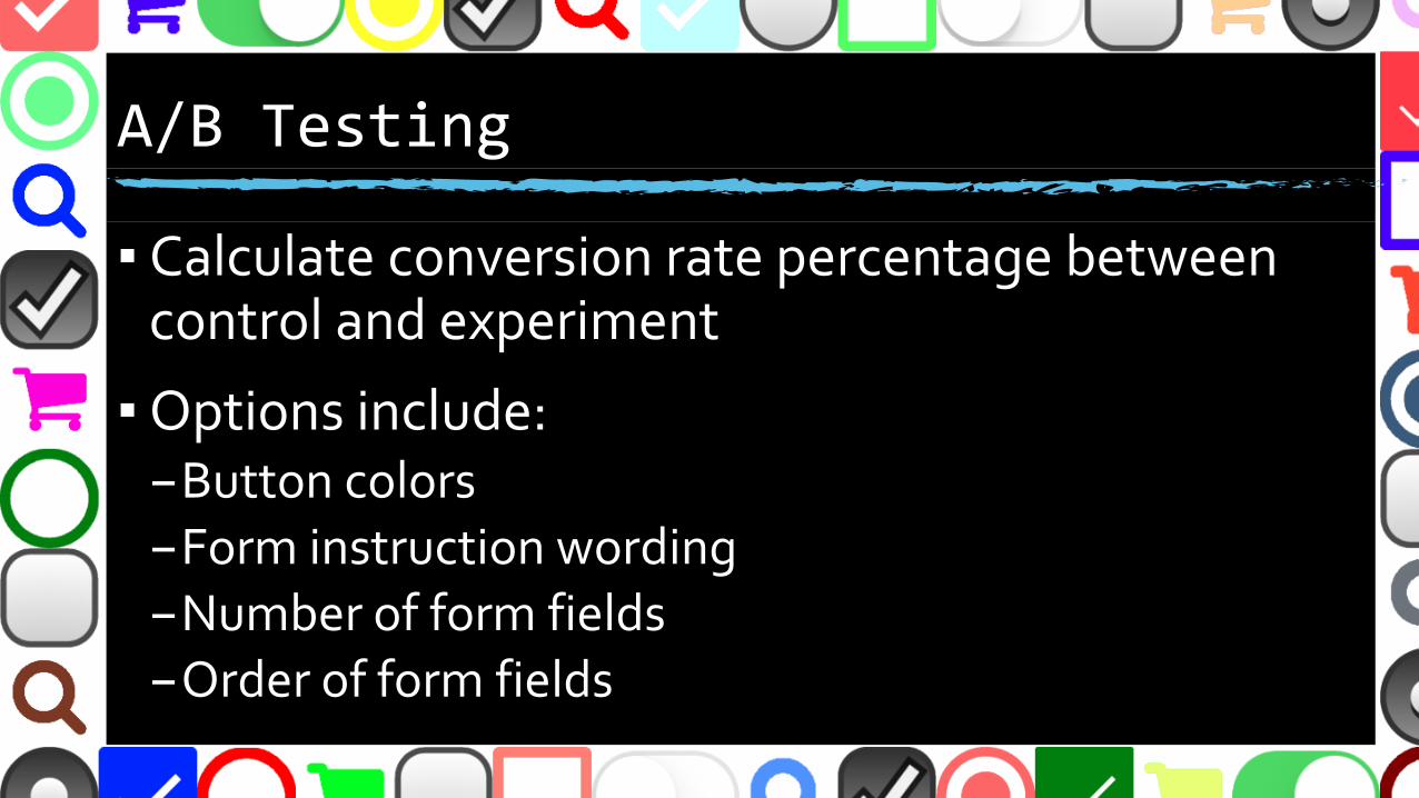
A/B Testing
▪ Calculate conversion rate percentage between control and experiment
▪Options include:–Button colors–Form instruction wording–Number of form fields–Order of form fields
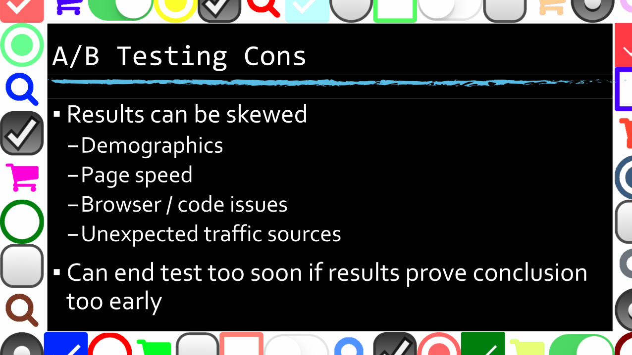
A/B Testing Cons
▪ Results can be skewed–Demographics–Page speed–Browser / code issues–Unexpected traffic sources
▪ Can end test too soon if results prove conclusion too early
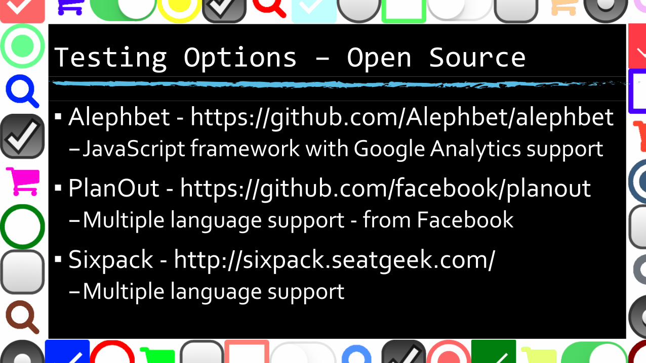
Testing Options – Open Source
▪Alephbet - https://github.com/Alephbet/alephbet–JavaScript framework with Google Analytics support
▪ PlanOut - https://github.com/facebook/planout–Multiple language support - from Facebook
▪ Sixpack - http://sixpack.seatgeek.com/–Multiple language support
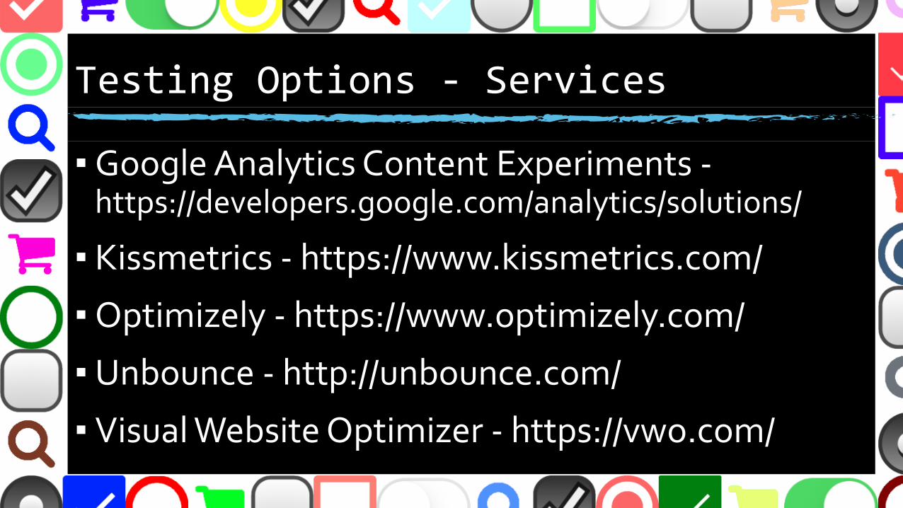
Testing Options - Services
▪Google Analytics Content Experiments -https://developers.google.com/analytics/solutions/
▪ Kissmetrics - https://www.kissmetrics.com/
▪Optimizely - https://www.optimizely.com/
▪Unbounce - http://unbounce.com/
▪ Visual Website Optimizer - https://vwo.com/
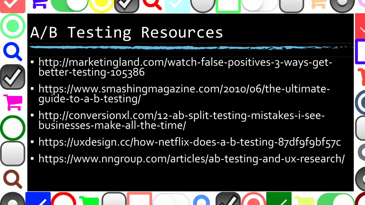
A/B Testing Resources
▪ http://marketingland.com/watch-false-positives-3-ways-get-better-testing-105386
▪ https://www.smashingmagazine.com/2010/06/the-ultimate-guide-to-a-b-testing/
▪ http://conversionxl.com/12-ab-split-testing-mistakes-i-see-businesses-make-all-the-time/
▪ https://uxdesign.cc/how-netflix-does-a-b-testing-87df9f9bf57c
▪ https://www.nngroup.com/articles/ab-testing-and-ux-research/
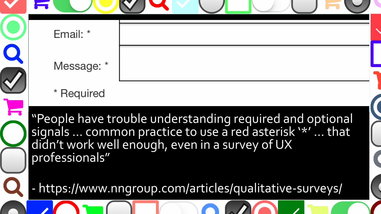
“People have trouble understanding required and optional signals … common practice to use a red asterisk ‘*’ … that didn’t work well enough, even in a survey of UX professionals”
- https://www.nngroup.com/articles/qualitative-surveys/
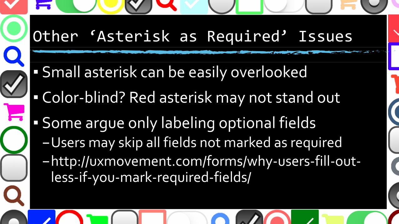
Other ‘Asterisk as Required’ Issues
▪ Small asterisk can be easily overlooked
▪ Color-blind? Red asterisk may not stand out
▪ Some argue only labeling optional fields–Users may skip all fields not marked as required–http://uxmovement.com/forms/why-users-fill-out-
less-if-you-mark-required-fields/
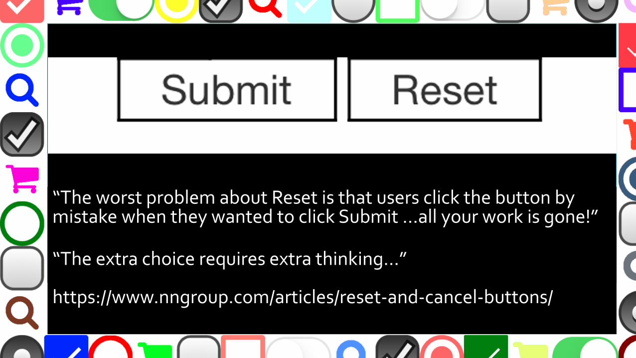
“The worst problem about Reset is that users click the button by mistake when they wanted to click Submit …all your work is gone!”
“The extra choice requires extra thinking…”
https://www.nngroup.com/articles/reset-and-cancel-buttons/

Other Issues with Reset Button
▪ “Reset”, “Clear”, etc. adds clutter
▪ If “Clear” needed, show confirmation dialog
▪Main CTA button should stand out
▪ “Submit” not clear – use verb or phrase–“Checkout”, “Join Now!”, “Send Comment”, “Post
Message”, “Download”, “Ask Question”–http://blog.wishpond.com/post/103290853633/
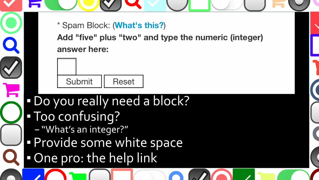
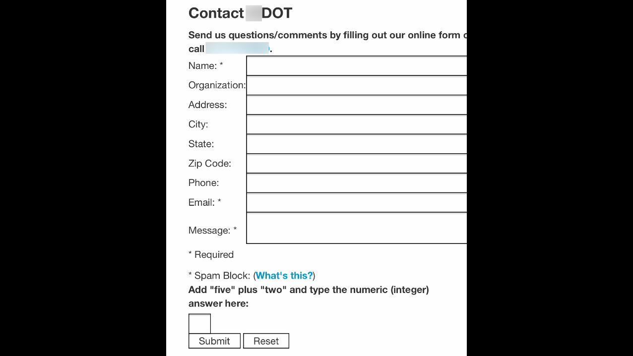
▪Do you really need a block?▪Too confusing?– “What’s an integer?”
▪Provide some white space▪One pro: the help link
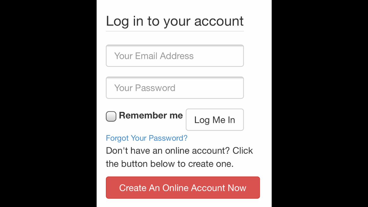
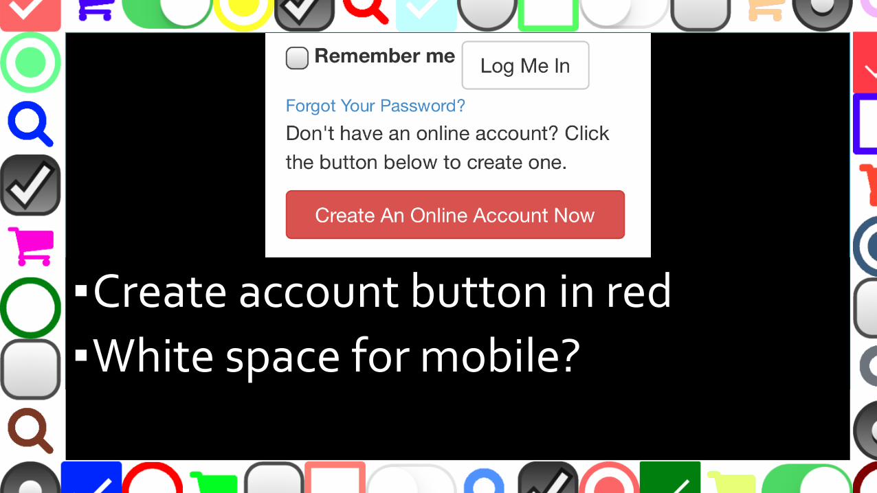
▪Create account button in red
▪White space for mobile?
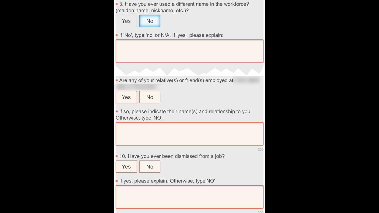
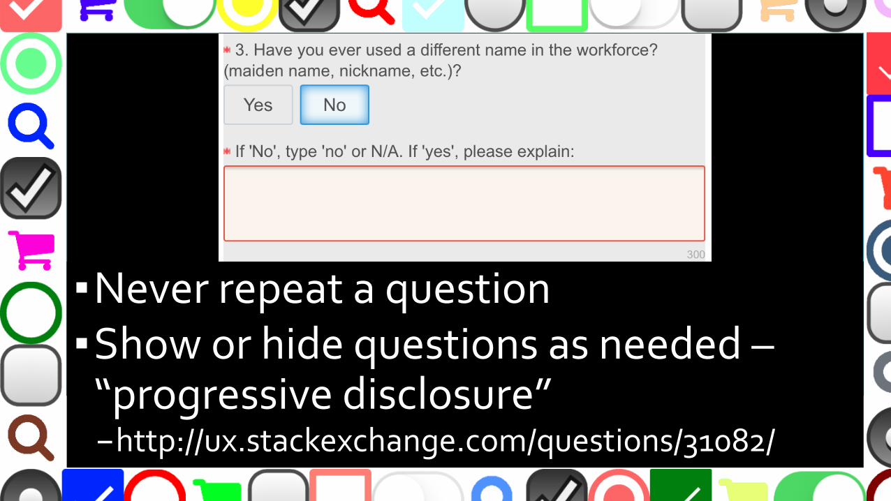
▪Never repeat a question▪Show or hide questions as needed –
“progressive disclosure”–http://ux.stackexchange.com/questions/31082/
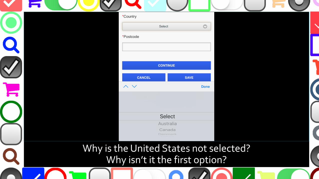
Why is the United States not selected?Why isn’t it the first option?
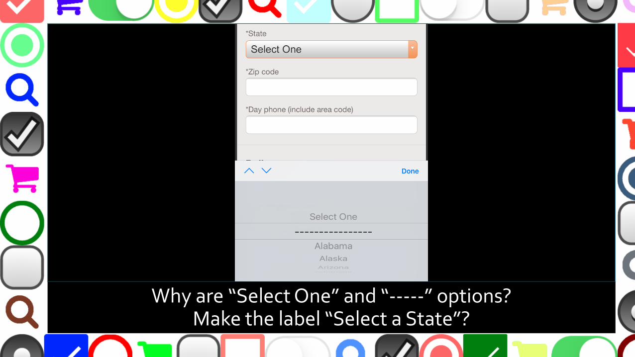
Why are “Select One” and “-----” options?Make the label “Select a State”?
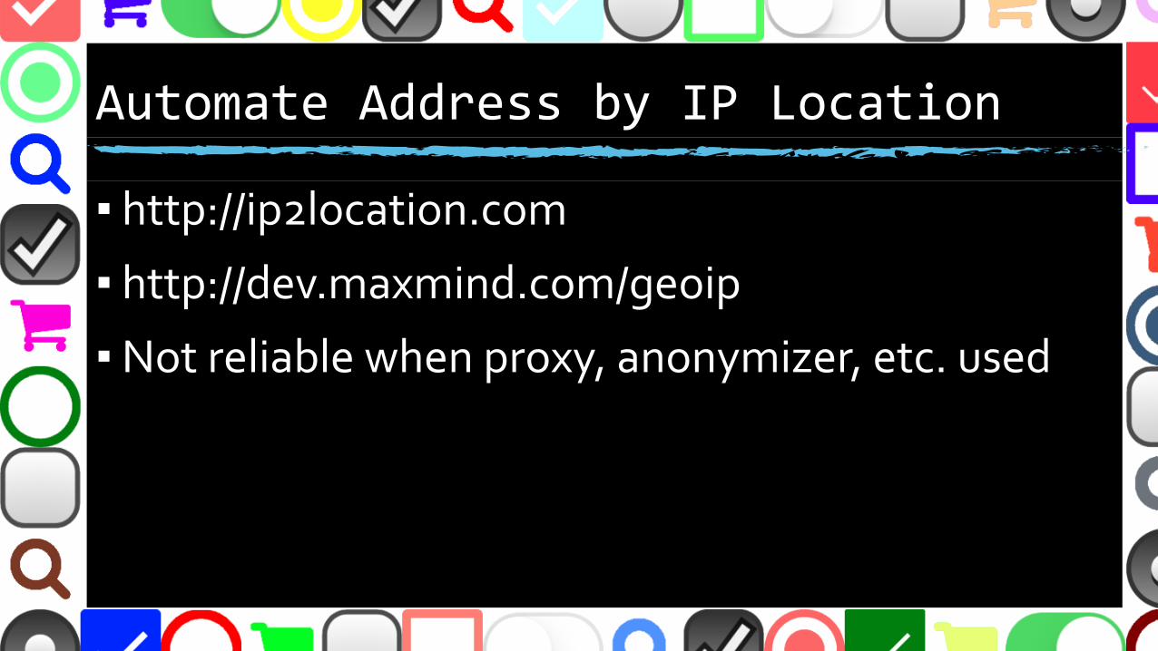
Automate Address by IP Location
▪ http://ip2location.com
▪ http://dev.maxmind.com/geoip
▪Not reliable when proxy, anonymizer, etc. used
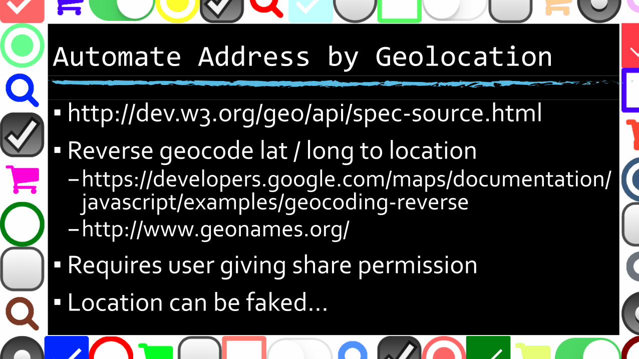
Automate Address by Geolocation
▪ http://dev.w3.org/geo/api/spec-source.html
▪ Reverse geocode lat / long to location–https://developers.google.com/maps/documentation/
javascript/examples/geocoding-reverse–http://www.geonames.org/
▪ Requires user giving share permission
▪ Location can be faked…
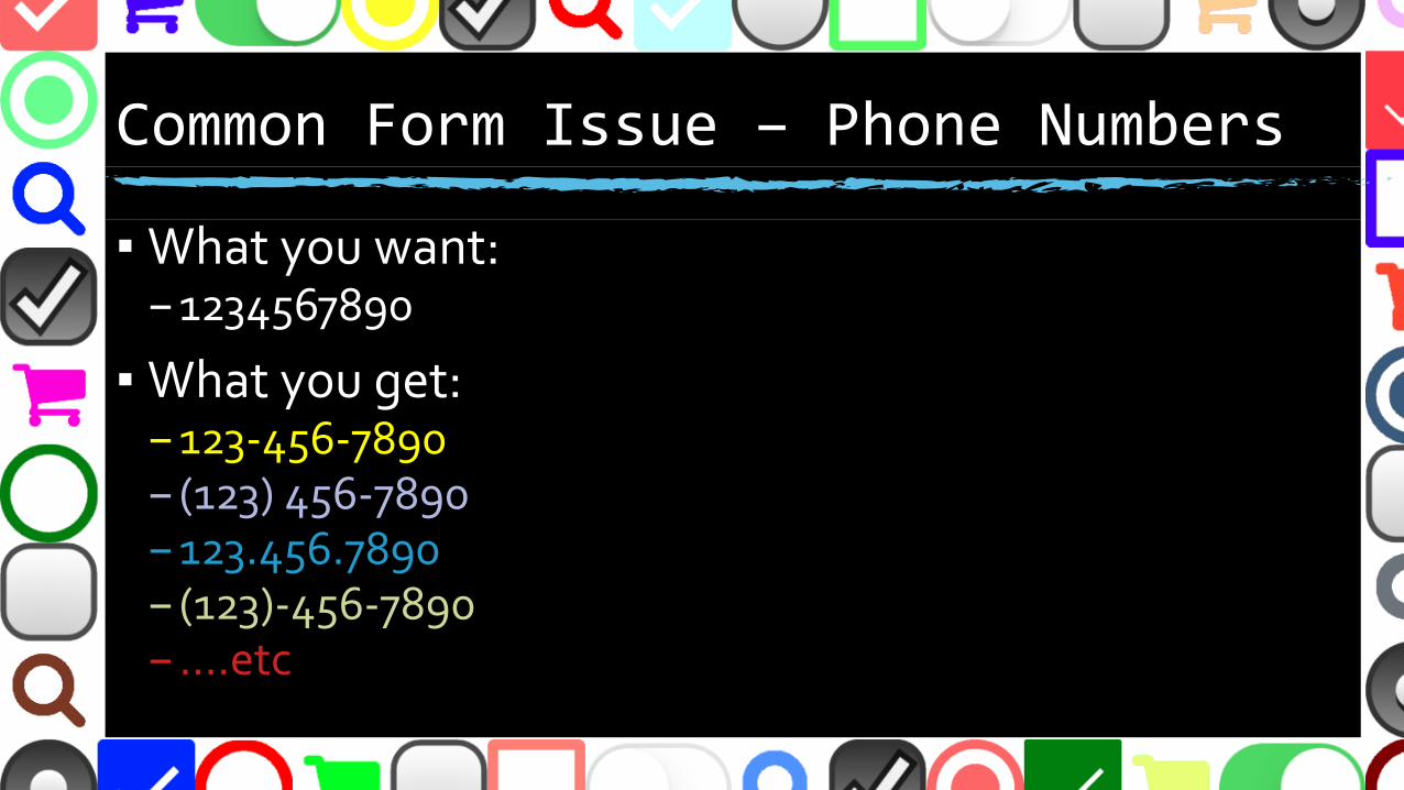
Common Form Issue – Phone Numbers
▪ What you want:–1234567890
▪ What you get:–123-456-7890– (123) 456-7890–123.456.7890– (123)-456-7890–….etc
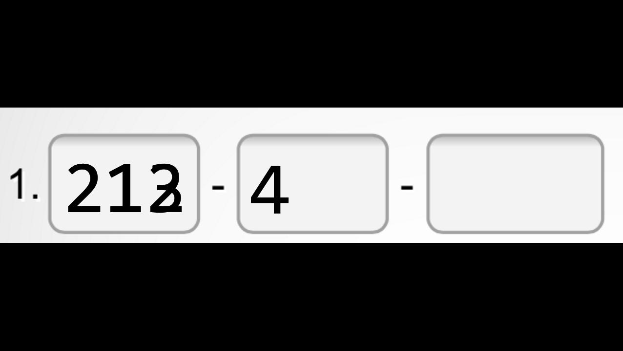
213 421212

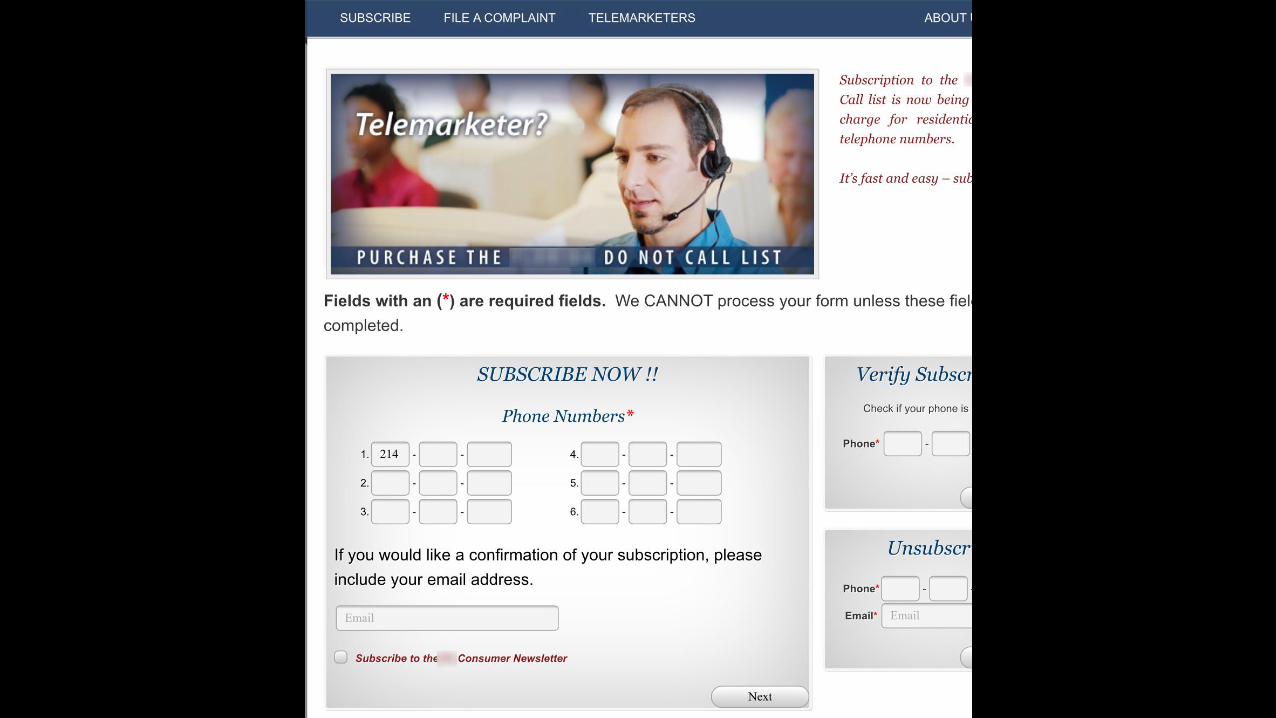
Other Split Phone Number Issues
▪User could use “Next” and “Previous” buttons on mobile phone keyboard to switch between parts–Few did in Baymard Institute e-commerce study
▪ Split fields make users question what is required if one part of multi-part input is labeled “Required”–http://baymard.com/blog/mobile-form-usability-
single-input-fields
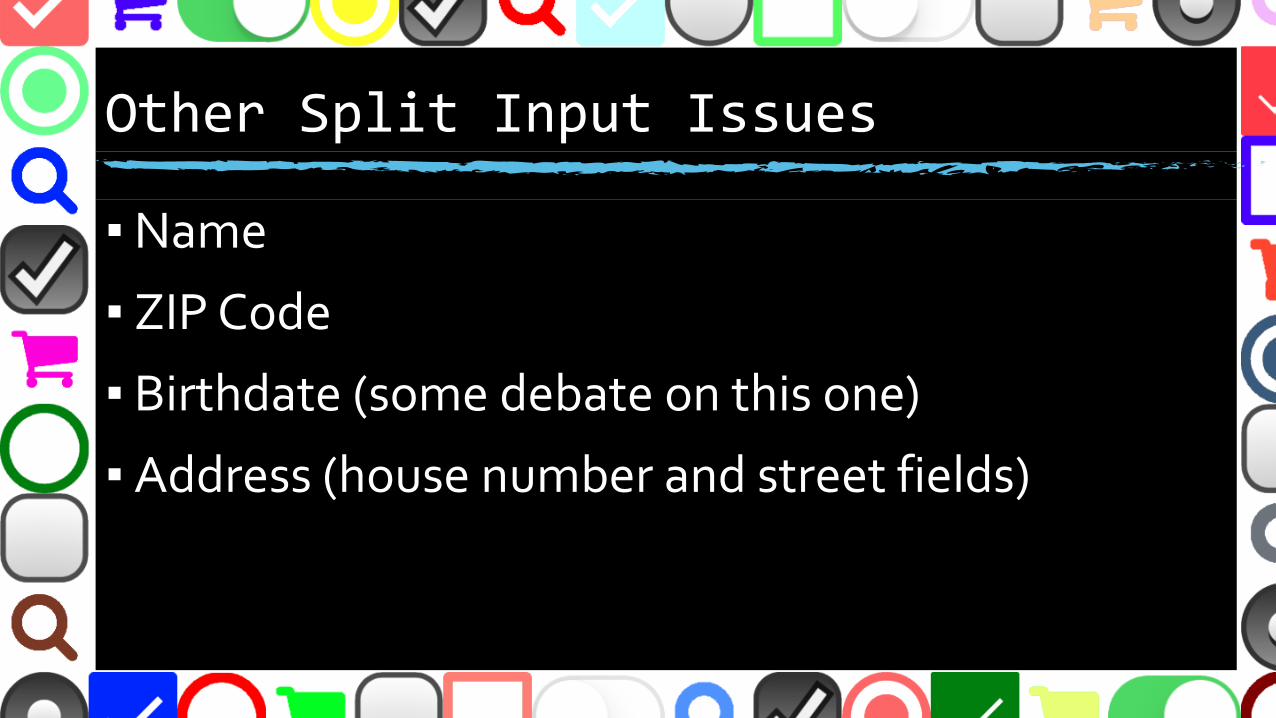
Other Split Input Issues
▪Name
▪ ZIP Code
▪ Birthdate (some debate on this one)
▪Address (house number and street fields)
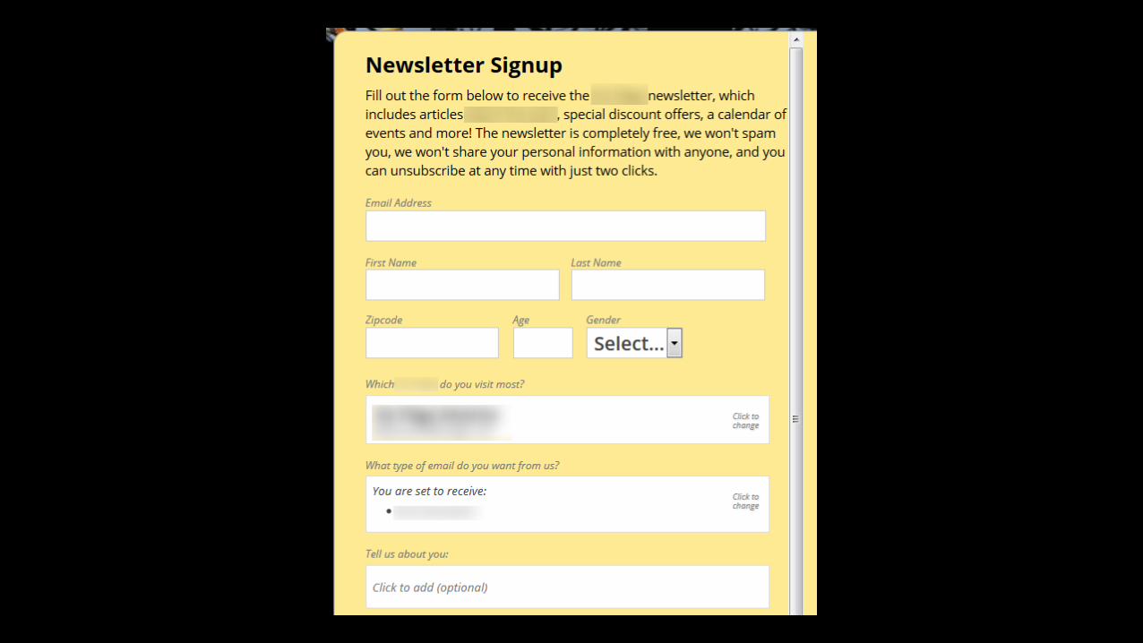
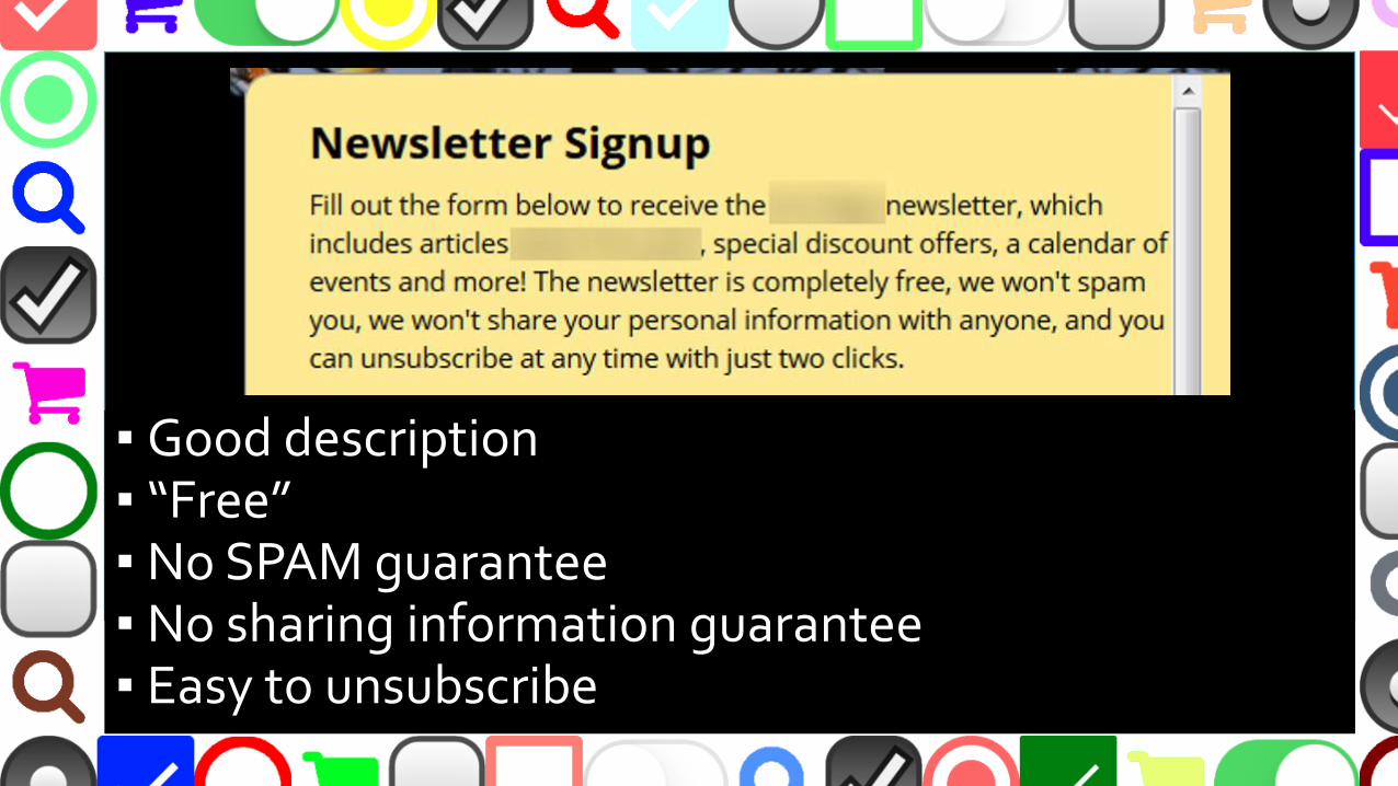
▪ Good description▪ “Free”▪ No SPAM guarantee▪ No sharing information guarantee▪ Easy to unsubscribe
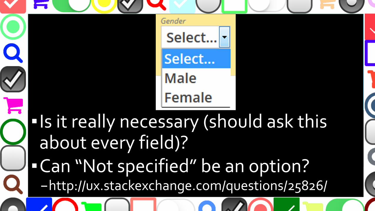
▪ Is it really necessary (should ask this about every field)?▪Can “Not specified” be an option?–http://ux.stackexchange.com/questions/25826/
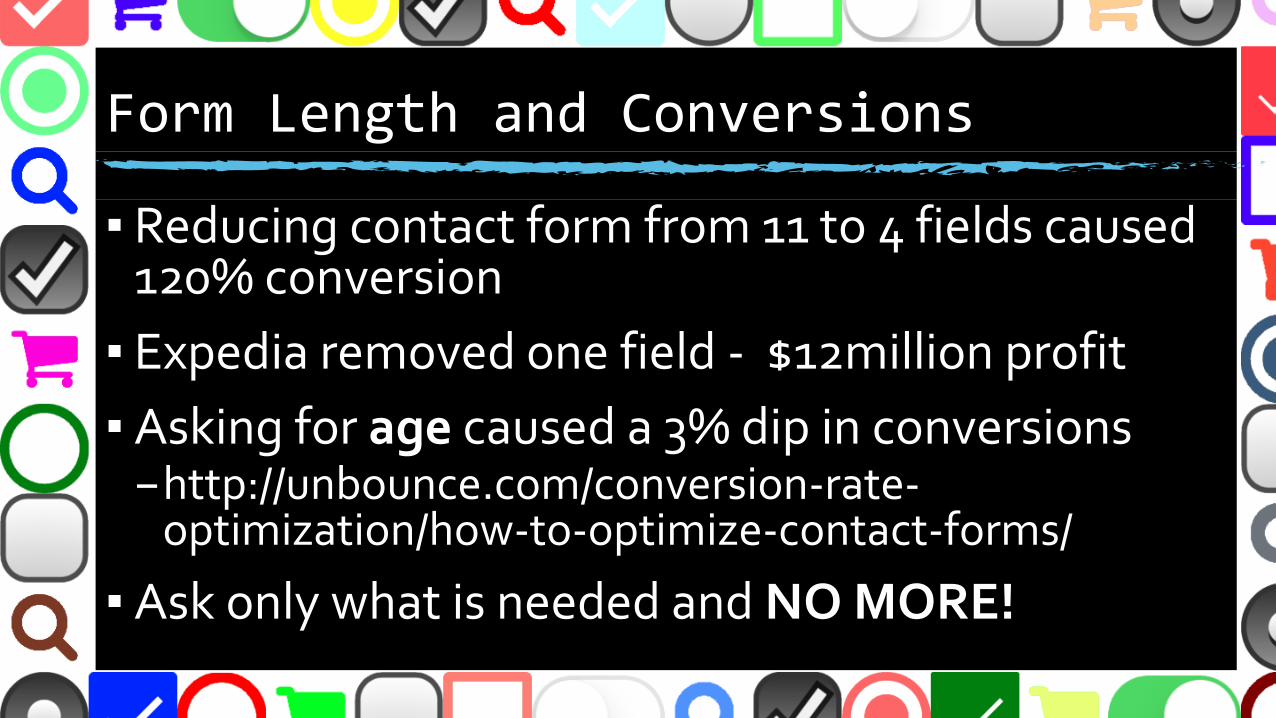
Form Length and Conversions
▪ Reducing contact form from 11 to 4 fields caused 120% conversion
▪ Expedia removed one field - $12million profit
▪Asking for age caused a 3% dip in conversions–http://unbounce.com/conversion-rate-
optimization/how-to-optimize-contact-forms/
▪Ask only what is needed and NO MORE!
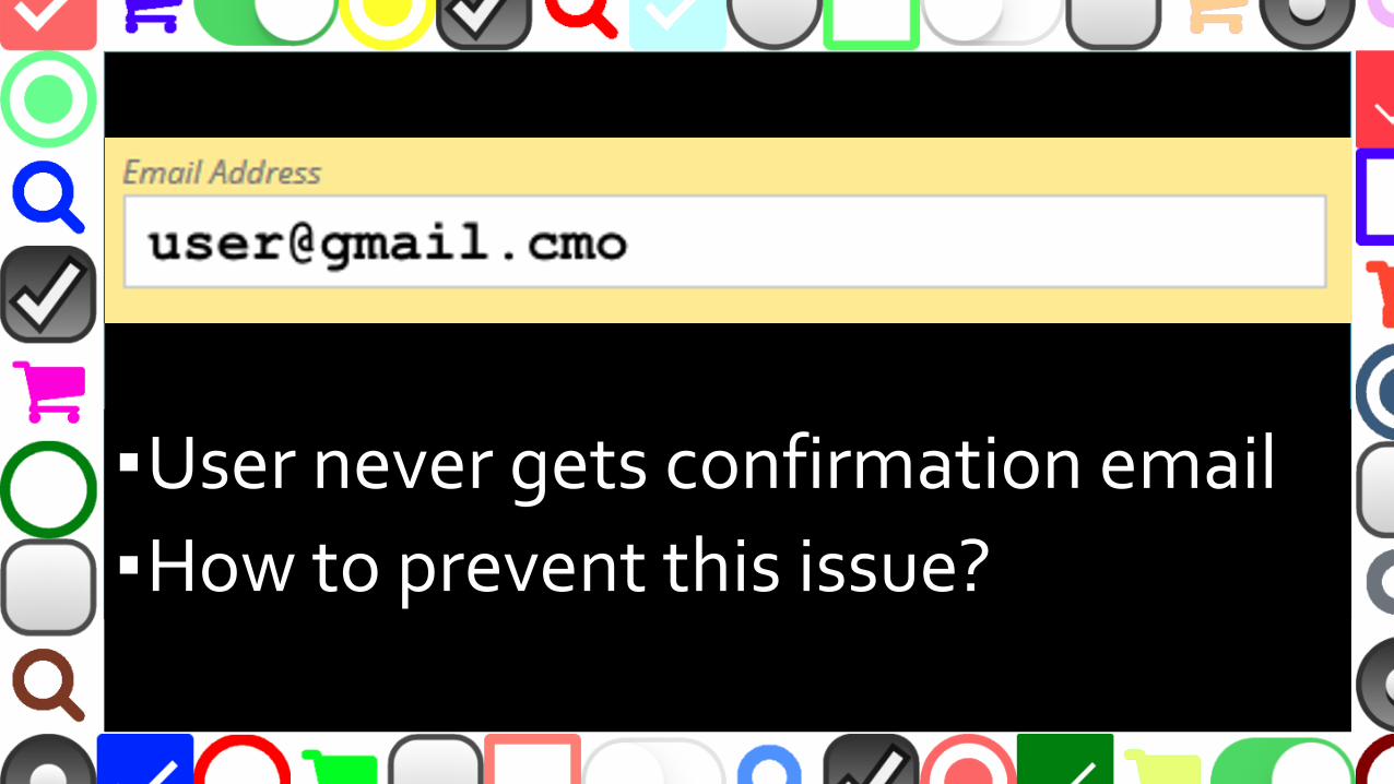
▪User never gets confirmation email
▪How to prevent this issue?

Validate Email Before User Submits
▪mailcheck.js – can suggest common domains if user misspells them–https://github.com/mailcheck/mailcheck
▪ Regular expression validation–http://stackoverflow.com/questions/46155/
▪ Could do MX record validation, but beware DoS–https://www.npmjs.com/package/legit
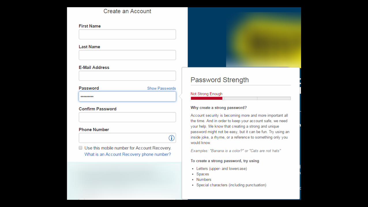
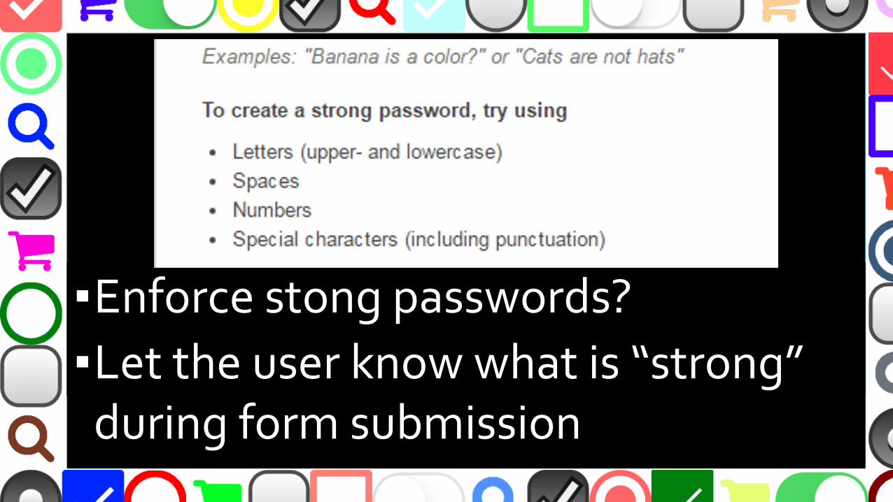
▪Enforce stong passwords?
▪Let the user know what is “strong” during form submission
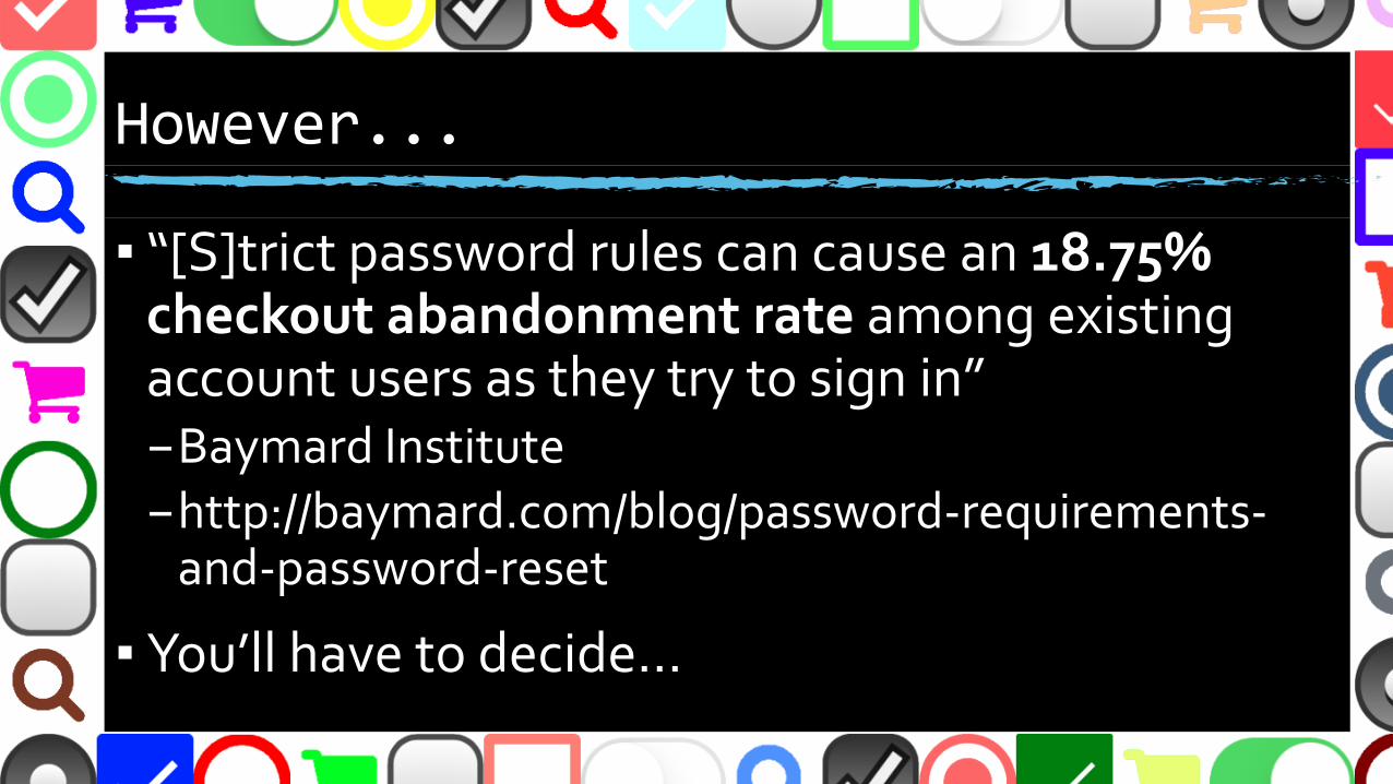
However...
▪ “[S]trict password rules can cause an 18.75% checkout abandonment rate among existing account users as they try to sign in”–Baymard Institute–http://baymard.com/blog/password-requirements-
and-password-reset
▪ You’ll have to decide…
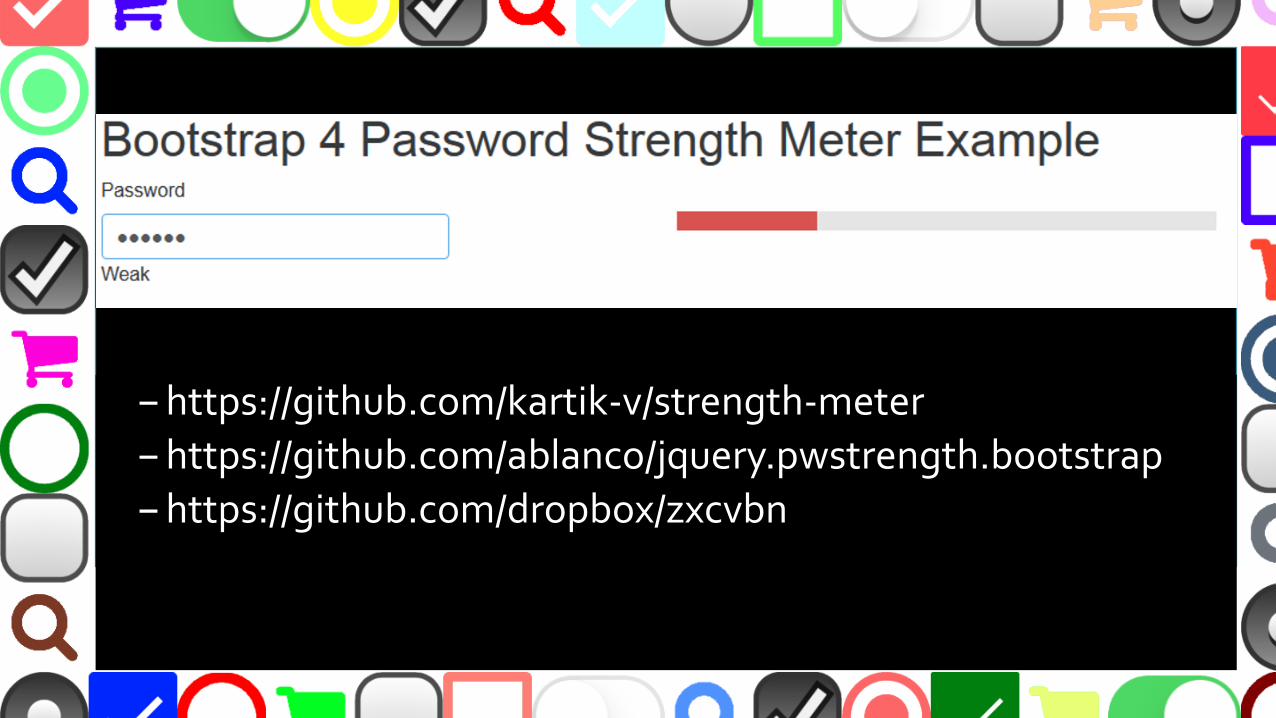
–https://github.com/kartik-v/strength-meter
–https://github.com/ablanco/jquery.pwstrength.bootstrap
–https://github.com/dropbox/zxcvbn
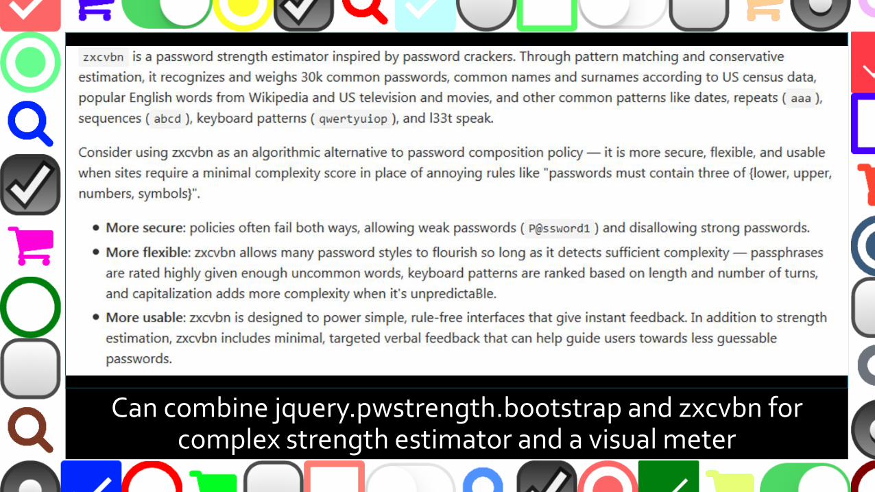
Can combine jquery.pwstrength.bootstrap and zxcvbn for complex strength estimator and a visual meter

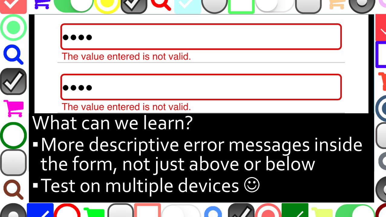
What can we learn?▪More descriptive error messages inside
the form, not just above or below▪Test on multiple devices
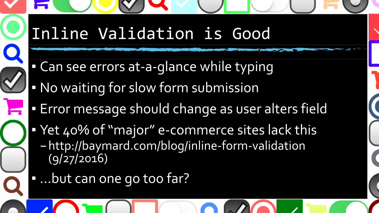
Inline Validation is Good
▪ Can see errors at-a-glance while typing
▪ No waiting for slow form submission
▪ Error message should change as user alters field
▪ Yet 40% of “major” e-commerce sites lack this–http://baymard.com/blog/inline-form-validation
(9/27/2016)
▪ …but can one go too far?
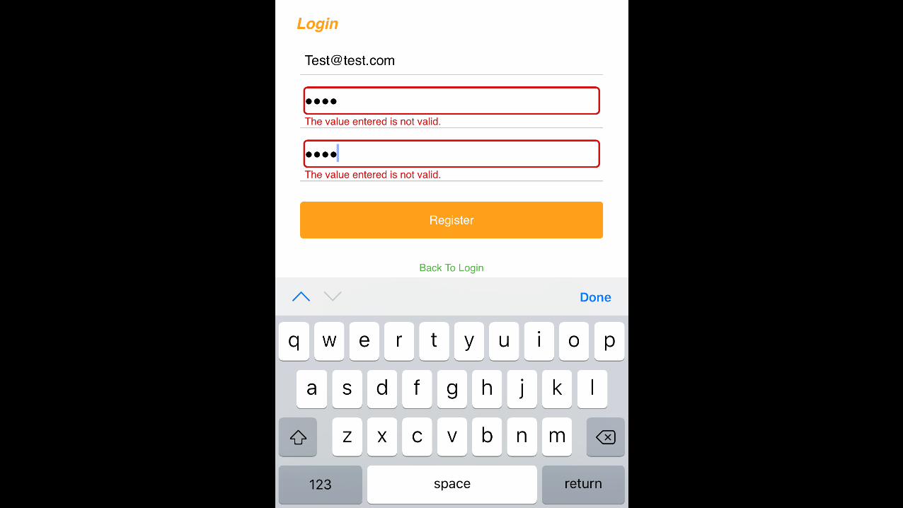
Invalid email address.
Invalid email address.
Your email addresses do not match.
Your email addresses do not match.
test@examt
[email protected]@examt
This field cannot be empty.
This field cannot be empty.
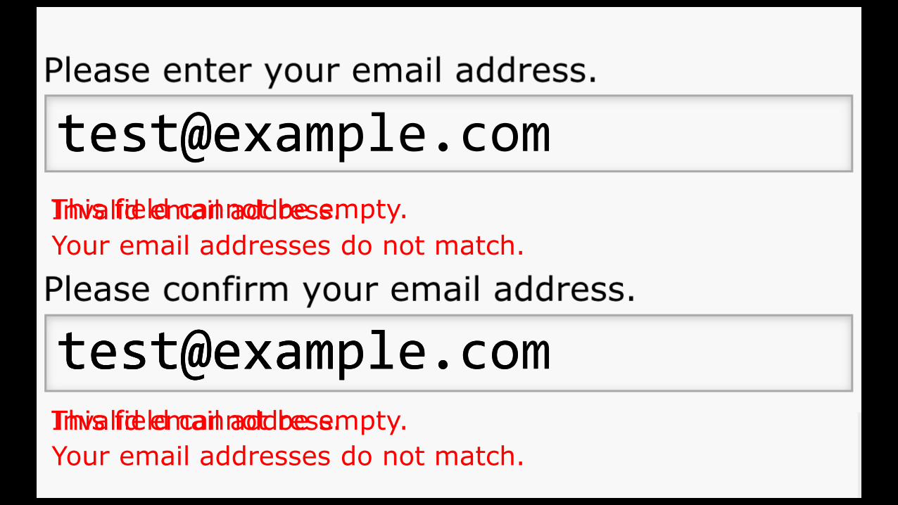
Showing Error Messages Prematurely
▪ Showing errors before user fills out fields
▪ Clutters up form
▪ Confusing and distracting
▪Users feel “scolded”, especially with red text
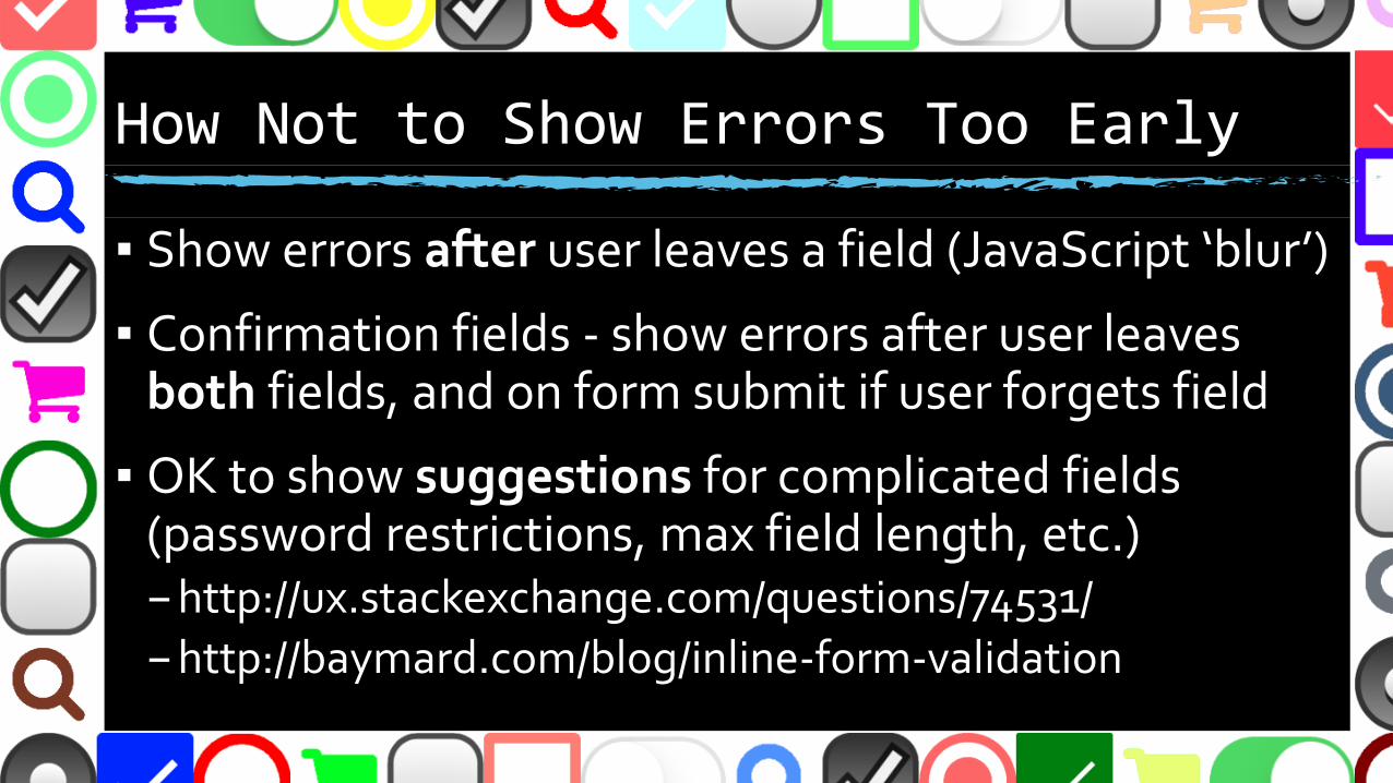
How Not to Show Errors Too Early
▪ Show errors after user leaves a field (JavaScript ‘blur’)
▪ Confirmation fields - show errors after user leaves both fields, and on form submit if user forgets field
▪ OK to show suggestions for complicated fields (password restrictions, max field length, etc.)–http://ux.stackexchange.com/questions/74531/
–http://baymard.com/blog/inline-form-validation
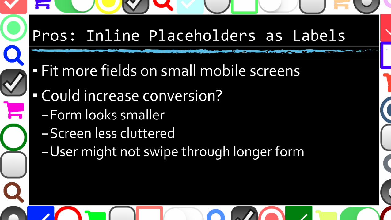
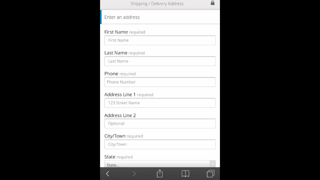
Pros: Inline Placeholders as Labels
▪ Fit more fields on small mobile screens
▪ Could increase conversion?–Form looks smaller–Screen less cluttered–User might not swipe through longer form
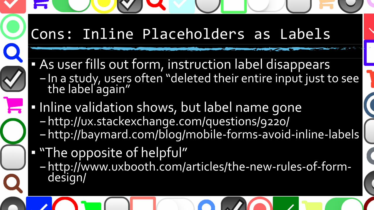
Cons: Inline Placeholders as Labels
▪ As user fills out form, instruction label disappears– In a study, users often “deleted their entire input just to see
the label again”
▪ Inline validation shows, but label name gone–http://ux.stackexchange.com/questions/9220/–http://baymard.com/blog/mobile-forms-avoid-inline-labels
▪ “The opposite of helpful”–http://www.uxbooth.com/articles/the-new-rules-of-form-
design/
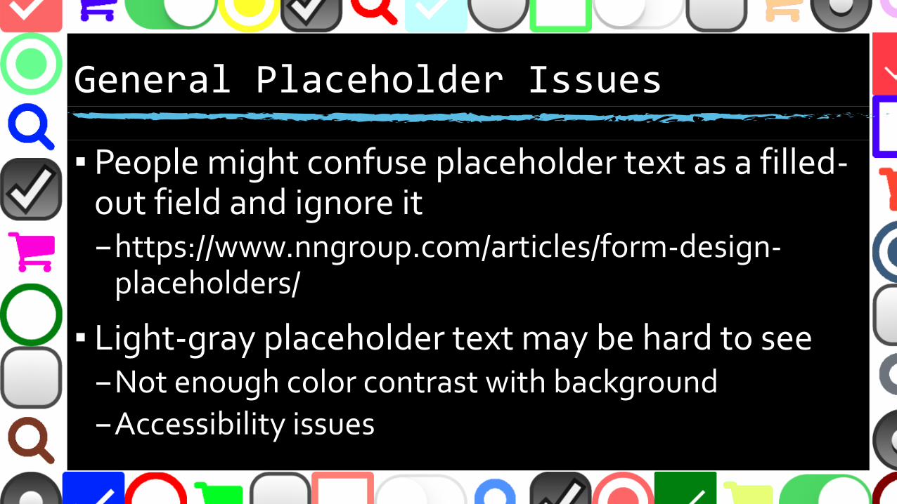
General Placeholder Issues
▪ People might confuse placeholder text as a filled-out field and ignore it–https://www.nngroup.com/articles/form-design-
placeholders/
▪ Light-gray placeholder text may be hard to see–Not enough color contrast with background–Accessibility issues
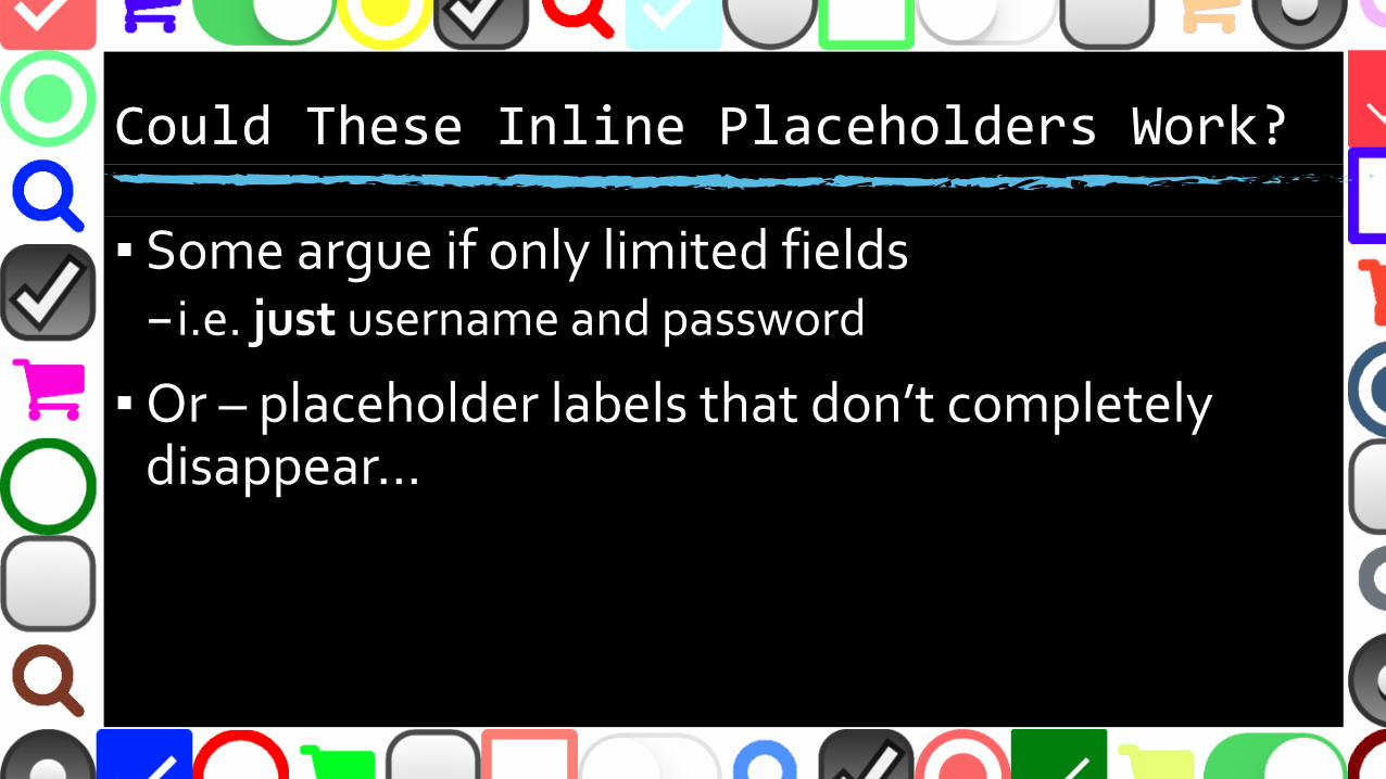
Could These Inline Placeholders Work?
▪ Some argue if only limited fields–i.e. just username and password
▪Or – placeholder labels that don’t completely disappear…
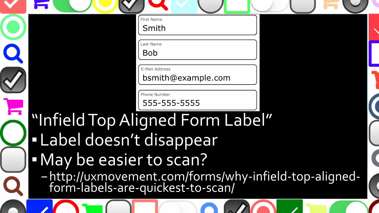
“Infield Top Aligned Form Label”▪Label doesn’t disappear▪May be easier to scan?–http://uxmovement.com/forms/why-infield-top-aligned-
form-labels-are-quickest-to-scan/
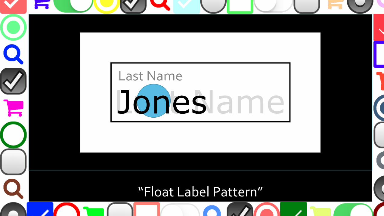
“Float Label Pattern”
Last NameLast Name
Jones

Float Label Pattern
▪ Inline form label moves around box when user selects field and starts typing–http://mds.is/float-label-pattern/–https://css-tricks.com/float-labels-css/–http://codepen.io/chriscoyier/pen/CiflJ–https://codepen.io/collection/IjFib/
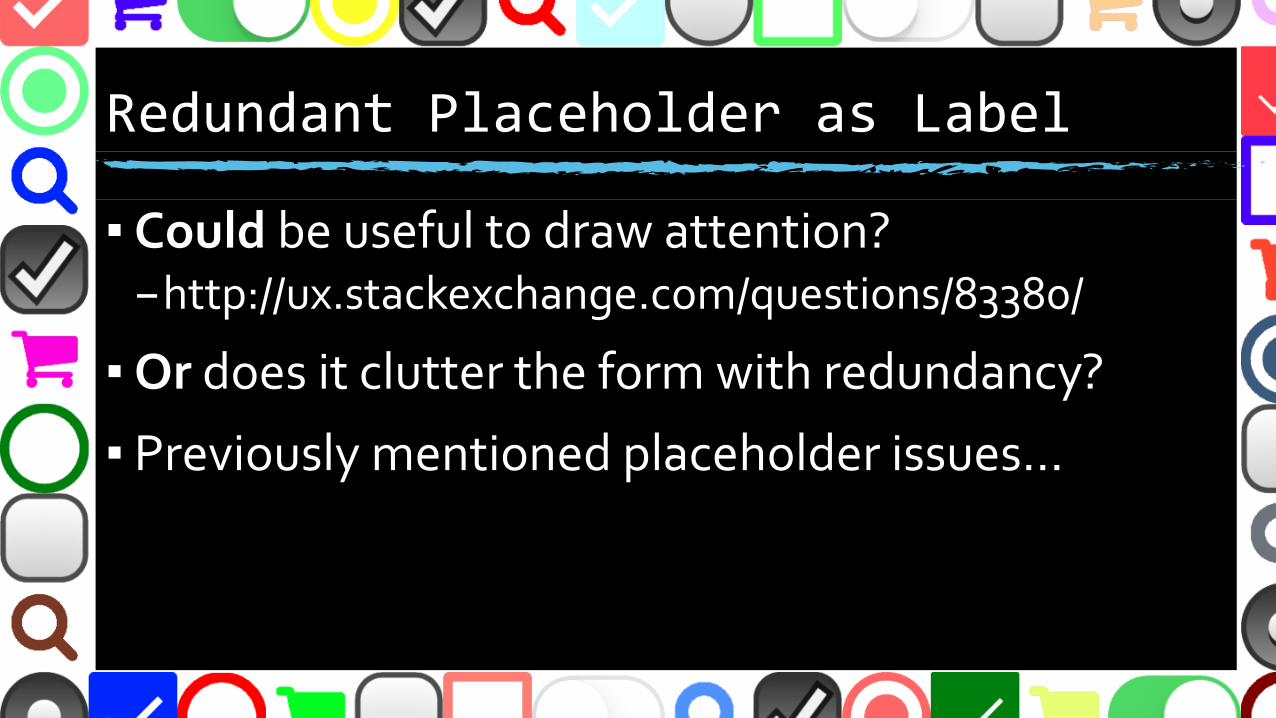
Redundant Placeholder as Label
▪ Could be useful to draw attention?–http://ux.stackexchange.com/questions/83380/
▪Or does it clutter the form with redundancy?
▪ Previously mentioned placeholder issues…
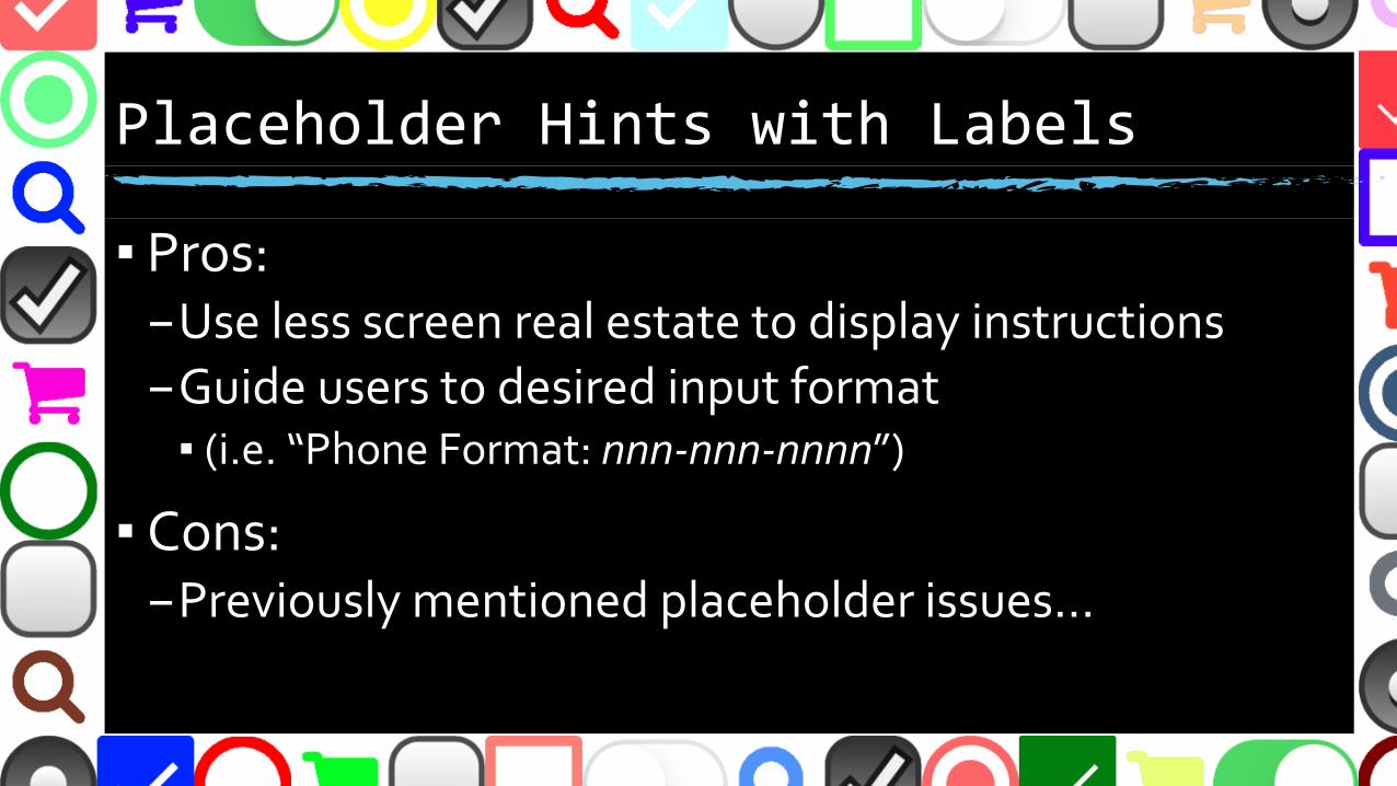
Placeholder Hints with Labels
▪ Pros:–Use less screen real estate to display instructions–Guide users to desired input format▪ (i.e. “Phone Format: nnn-nnn-nnnn”)
▪ Cons:–Previously mentioned placeholder issues…
A Matter of Trust
▪ LinkedIn lost 167 million account credentials in data breach–http://fortune.com/2016/05/18/linkedin-data-breach-
email-password/
▪ 360 million Myspace accounts breached–http://www.usatoday.com/story/tech/2016/05/31/360-
million-myspace-accounts-breached/85183200/
▪ Yahoo says 500 million accounts stolen–http://money.cnn.com/2016/09/22/technology/yahoo-
data-breach/
How to Increase Trust?
▪ Contact information–Phone and postal – not just email
▪Guest checkout option
▪No SPAM guarantees
▪ Shorter forms or progress indicators
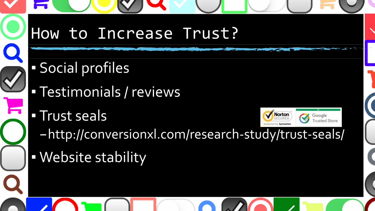
How to Increase Trust?
▪ Social profiles
▪ Testimonials / reviews
▪ Trust seals–http://conversionxl.com/research-study/trust-seals/
▪Website stability
User Trust Studies and Resources
▪ http://baymard.com/blog/perceived-security-of-payment-form
▪ https://blog.kissmetrics.com/first-step-of-checkout/
▪ https://designshack.net/articles/ux-design/create-a-ui-that-users-can-trust/
▪ https://www.koozai.com/blog/search-marketing/6-essential-trust-signals-for-your-website-to-follow/
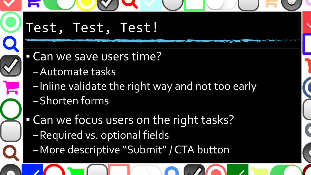
Test, Test, Test!
▪ Can we save users time?–Automate tasks–Inline validate the right way and not too early–Shorten forms
▪ Can we focus users on the right tasks?–Required vs. optional fields–More descriptive “Submit” / CTA button
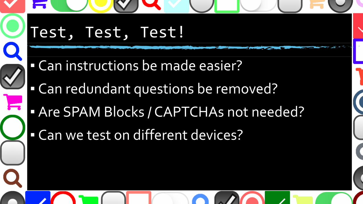
Test, Test, Test!
▪ Can instructions be made easier?
▪ Can redundant questions be removed?
▪Are SPAM Blocks / CAPTCHAs not needed?
▪ Can we test on different devices?


http://malektips.com
@malekontheweb