windows vista ux guide
TRANSCRIPT
Windows Vista User Experience Guidelines
The goals for these official Windows Vista® User Experience Guidelines (or “UX Guide” for short) are to:
● Establish a high quality and consistency baseline for all Windows Vista-based applications.
● Answer your specific user experience questions.
● Make your job easier!
Getting started with Windows Vista
If you are new to Windows Vista:
1. Start by checking What’s New in Windows Vista. These articles summarize the new core user interface (UI) features that you should use in your Windows Vista UI designs, and how they differ from Windows XP.
2. Next, proceed to the Top Rules article, which summarizes the top rules that the Windows Vista Design team suggests you follow to create high-quality, consistent Windows Vista UIs.
3. Check out the Top Guidelines Violations article, which summarizes the most common violations that the Windows Vista Design team found during design reviews, and offers guidelines for avoiding these violations.
4. Finally, read Designing with Windows Presentation Foundation, which gives you an overview of how to take advantage of this new UI development environment.
What’s new
The following new guidelines have been published since our July 2007 update:
● Error Messages
● Layout
UX Guide is downloadable and printable!
By popular demand, we have UX Guide in PDF format.
Feedback
We want your feedback. If you have specific questions, comments, or requests, contact us at [email protected].
For Windows Vista technical support, please check the Windows Vista Solution Center and Windows Help and How-to.
Last updated October 10, 2007
© 2005 – 2007, Microsoft Corporation. All rights reserved. Page 1 of 763
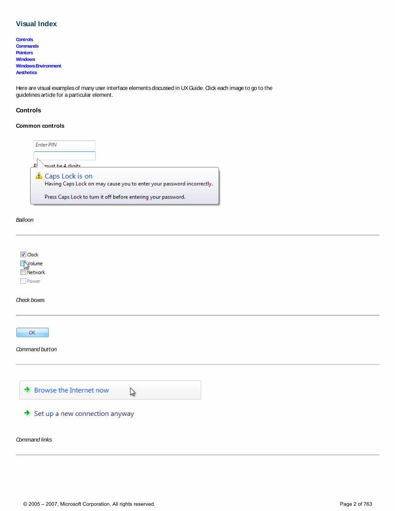
Visual Index
Controls Commands Pointers Windows Windows Environment Aesthetics
Here are visual examples of many user interface elements discussed in UX Guide. Click each image to go to the guidelines article for a particular element.
Controls
Common controls
Balloon
Check boxes
Command button
Command links
© 2005 – 2007, Microsoft Corporation. All rights reserved. Page 2 of 763
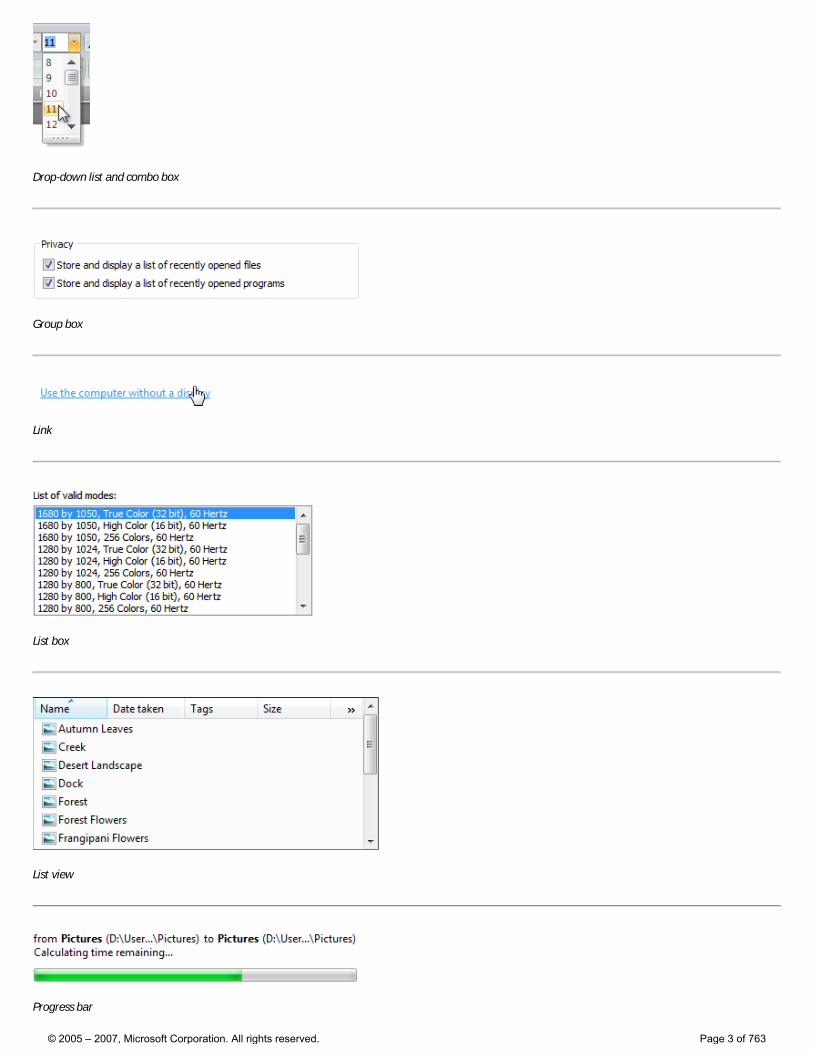
Drop-down list and combo box
Group box
Link
List box
List view
Progress bar
© 2005 – 2007, Microsoft Corporation. All rights reserved. Page 3 of 763
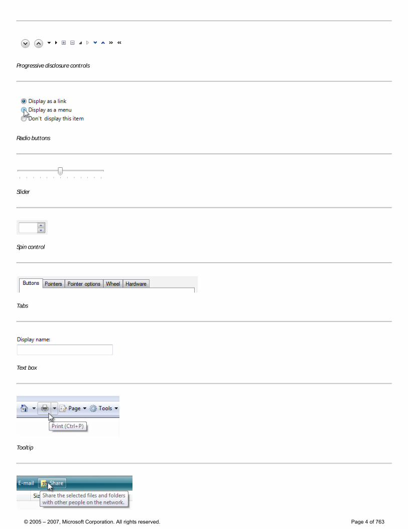
Progressive disclosure controls
Radio buttons
Slider
Spin control
Tabs
Text box
Tooltip
© 2005 – 2007, Microsoft Corporation. All rights reserved. Page 4 of 763
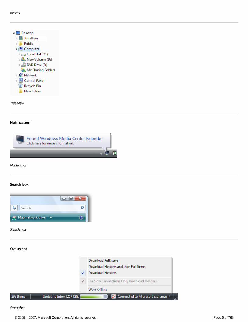
Infotip
Tree view
Notification
Notification
Search box
Search box
Status bar
Status bar
© 2005 – 2007, Microsoft Corporation. All rights reserved. Page 5 of 763
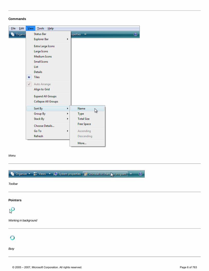
Commands
Menu
Toolbar
Pointers
Working in background
Busy
© 2005 – 2007, Microsoft Corporation. All rights reserved. Page 6 of 763
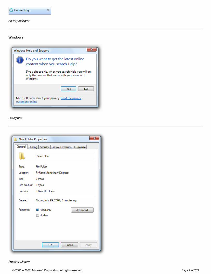
Activity indicator
Windows
Dialog box
Property window
© 2005 – 2007, Microsoft Corporation. All rights reserved. Page 7 of 763
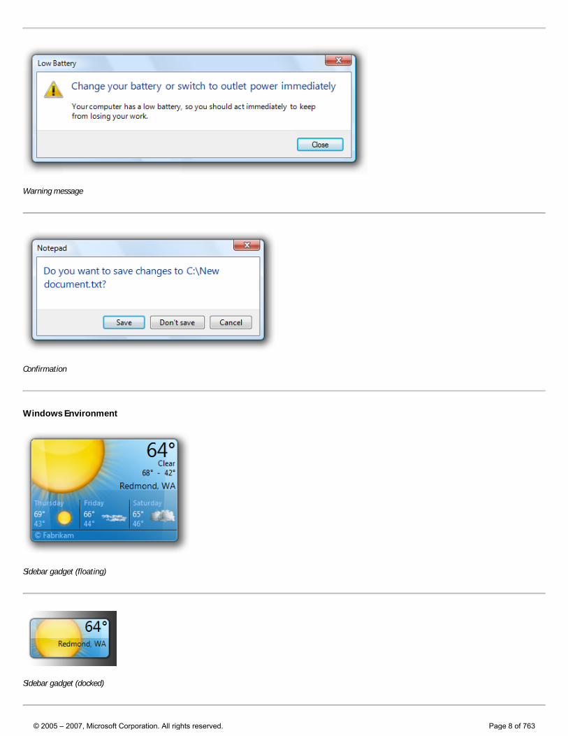
Warning message
Confirmation
Windows Environment
Sidebar gadget (floating)
Sidebar gadget (docked)
© 2005 – 2007, Microsoft Corporation. All rights reserved. Page 8 of 763
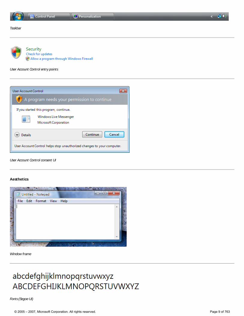
Taskbar
User Account Control entry points
User Account Control consent UI
Aesthetics
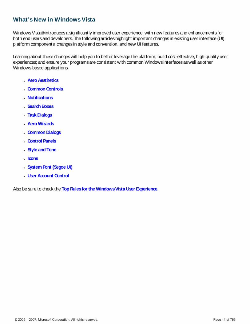
Window frame
Fonts (Segoe UI)
© 2005 – 2007, Microsoft Corporation. All rights reserved. Page 9 of 763
Standard icons
© 2005 – 2007, Microsoft Corporation. All rights reserved. Page 10 of 763
What’s New in Windows Vista
Windows Vista® introduces a significantly improved user experience, with new features and enhancements for both end users and developers. The following articles highlight important changes in existing user interface (UI) platform components, changes in style and convention, and new UI features.
Learning about these changes will help you to better leverage the platform; build cost-effective, high-quality user experiences; and ensure your programs are consistent with common Windows interfaces as well as other Windows-based applications.
● Aero Aesthetics
● Common Controls
● Notifications
● Search Boxes
● Task Dialogs
● Aero Wizards
● Common Dialogs
● Control Panels
● Style and Tone
● Icons
● System Font (Segoe UI)
● User Account Control
Also be sure to check the Top Rules for the Windows Vista User Experience.
© 2005 – 2007, Microsoft Corporation. All rights reserved. Page 11 of 763
Aero Aesthetics Aero is the new user experience in Windows Vista®, representing both the values embodied in the aesthetics and the vision behind the user interface (UI). Authentic, Energetic, Reflective and Open. Aero aims for a design that is both professional and beautiful.
The Aero UI for Windows Vista is clean and compelling at first sight, efficient and fast for frequent, familiar tasks, and easy to learn for infrequent tasks and initial experiences.
The Aero theme file and application programming interfaces (APIs) make it easy to bring the Aero design to your Windows Vista-based applications. Applications that use the Aero theme will be consistent with Windows Vista while providing the flexibility for application differentiation.
The new translucent glass window frames are an important part of the aesthetic—to be attractive and lightweight. Simply by running on Windows Vista, this aspect of Aero design is integrated with any application that uses the standard non-client window borders. If an application’s design calls for additional glass surfaces, developers can use this visual element through the glass API.
New in Windows Vista
● The Aero theme file makes it easy for developers to bring the Windows Vista user experience design into their applications. The design and functionality of Aero-themed applications will appear to be an extension of Windows Vista. This creates a consistency within the Windows Vista environment that puts users at ease and increases their confidence.
● Windows Vista delivers a new level of quality in glitch-free rendering, delivering great graphics, high dots per inch (DPI), rich 3-D, animations, transitions, and fades.
● Glass window borders and surfaces form a striking aspect of the new design of Windows Vista. These translucent surfaces make an open, less intrusive presentation of windows, displaying users’ content and functionality as the most important element on the screen.
For more information
● Aero aesthetics guidelines
© 2005 – 2007, Microsoft Corporation. All rights reserved. Page 12 of 763
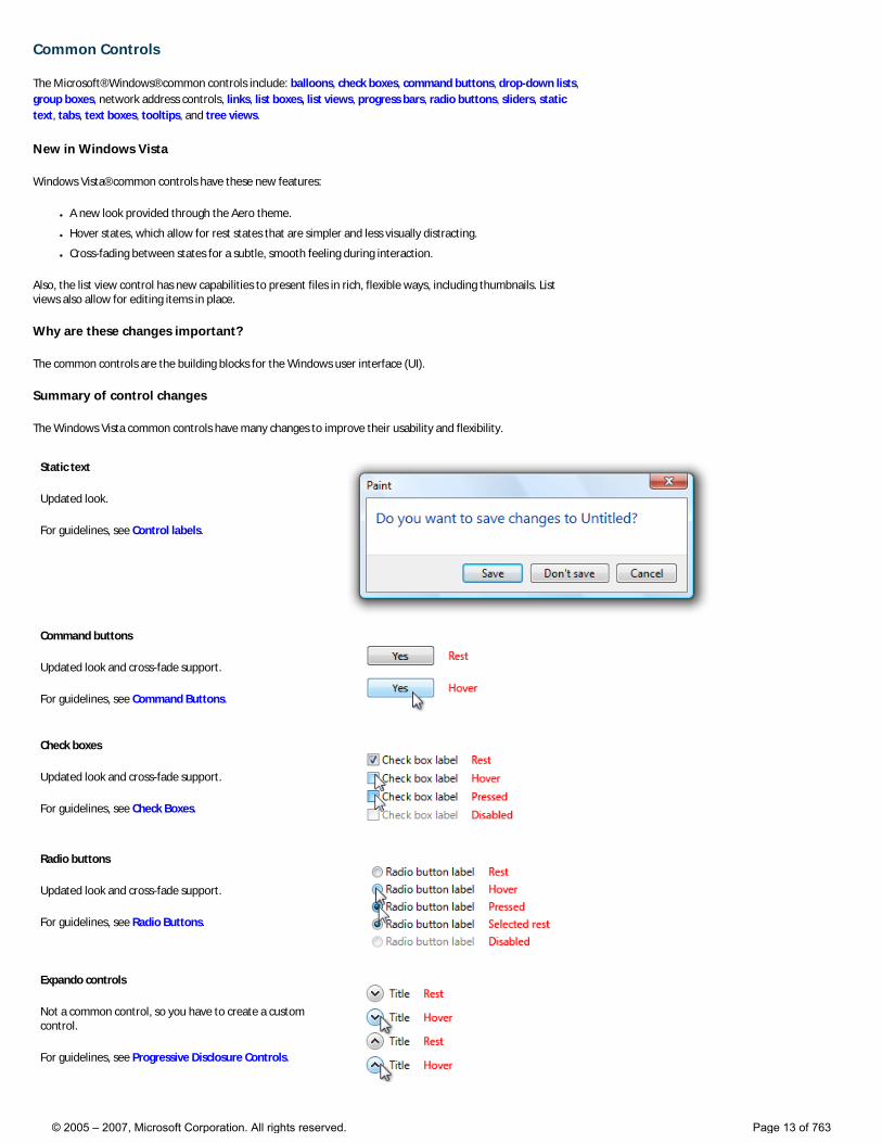
Common Controls
The Microsoft® Windows® common controls include: balloons, check boxes, command buttons, drop-down lists, group boxes, network address controls, links, list boxes, list views, progress bars, radio buttons, sliders, static text, tabs, text boxes, tooltips, and tree views.
New in Windows Vista
Windows Vista® common controls have these new features:
● A new look provided through the Aero theme.
● Hover states, which allow for rest states that are simpler and less visually distracting.
● Cross-fading between states for a subtle, smooth feeling during interaction.
Also, the list view control has new capabilities to present files in rich, flexible ways, including thumbnails. List views also allow for editing items in place.
Why are these changes important?
The common controls are the building blocks for the Windows user interface (UI).
Summary of control changes
The Windows Vista common controls have many changes to improve their usability and flexibility.
Static text
Updated look.
For guidelines, see Control labels.
Command buttons
Updated look and cross-fade support.
For guidelines, see Command Buttons.
Check boxes
Updated look and cross-fade support.
For guidelines, see Check Boxes.
Radio buttons
Updated look and cross-fade support.
For guidelines, see Radio Buttons.
Expando controls
Not a common control, so you have to create a custom control.
For guidelines, see Progressive Disclosure Controls.
© 2005 – 2007, Microsoft Corporation. All rights reserved. Page 13 of 763
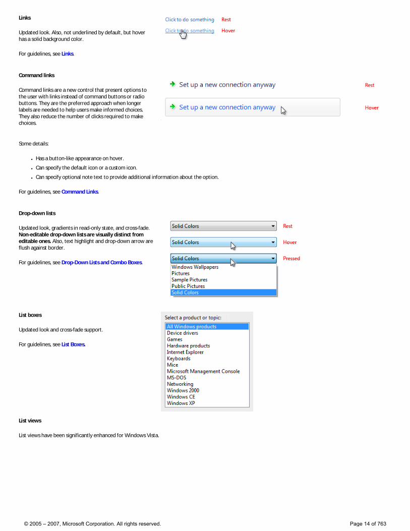
Links
Updated look. Also, not underlined by default, but hover has a solid background color.
For guidelines, see Links.
Command links
Command links are a new control that present options to the user with links instead of command buttons or radio buttons. They are the preferred approach when longer labels are needed to help users make informed choices. They also reduce the number of clicks required to make choices.
Some details:
● Has a button-like appearance on hover.
● Can specify the default icon or a custom icon.
● Can specify optional note text to provide additional information about the option.
For guidelines, see Command Links.
Drop-down lists
Updated look, gradients in read-only state, and cross-fade. Non-editable drop-down lists are visually distinct from editable ones. Also, text highlight and drop-down arrow are flush against border.
For guidelines, see Drop-Down Lists and Combo Boxes.
List boxes
Updated look and cross-fade support.
For guidelines, see List Boxes.
List views
List views have been significantly enhanced for Windows Vista.
© 2005 – 2007, Microsoft Corporation. All rights reserved. Page 14 of 763
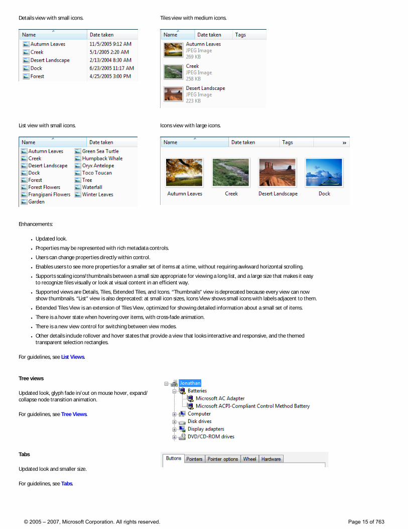
Details view with small icons. Tiles view with medium icons.
List view with small icons. Icons view with large icons.
Enhancements:
● Updated look.
● Properties may be represented with rich metadata controls.
● Users can change properties directly within control.
● Enables users to see more properties for a smaller set of items at a time, without requiring awkward horizontal scrolling.
● Supports scaling icons/thumbnails between a small size appropriate for viewing a long list, and a large size that makes it easy to recognize files visually or look at visual content in an efficient way.
● Supported views are Details, Tiles, Extended Tiles, and Icons. “Thumbnails” view is deprecated because every view can now show thumbnails. “List” view is also deprecated: at small icon sizes, Icons View shows small icons with labels adjacent to them.
● Extended Tiles View is an extension of Tiles View, optimized for showing detailed information about a small set of items.
● There is a hover state when hovering over items, with cross-fade animation.
● There is a new view control for switching between view modes.
● Other details include rollover and hover states that provide a view that looks interactive and responsive, and the themed transparent selection rectangles.
For guidelines, see List Views.
Tree views
Updated look, glyph fade in/out on mouse hover, expand/collapse node transition animation.
For guidelines, see Tree Views.
Tabs
Updated look and smaller size.
For guidelines, see Tabs.
© 2005 – 2007, Microsoft Corporation. All rights reserved. Page 15 of 763
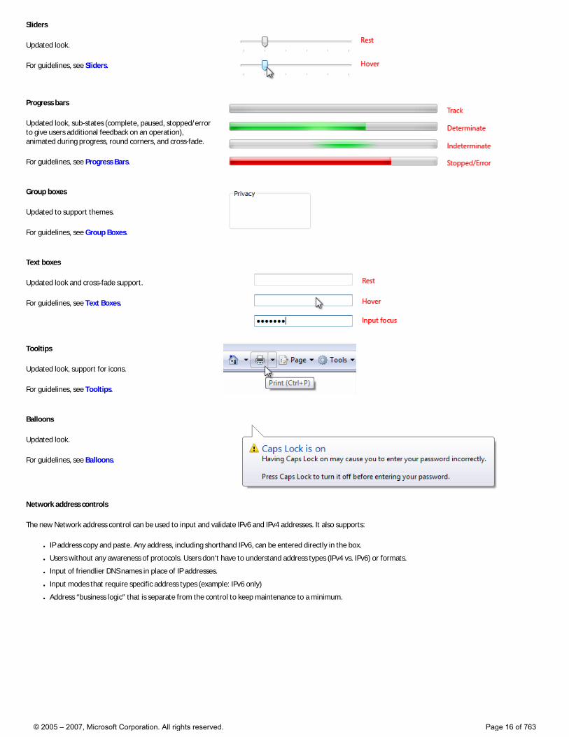
Sliders
Updated look.
For guidelines, see Sliders.
Progress bars
Updated look, sub-states (complete, paused, stopped/error to give users additional feedback on an operation), animated during progress, round corners, and cross-fade.
For guidelines, see Progress Bars.
Group boxes
Updated to support themes.
For guidelines, see Group Boxes.
Text boxes
Updated look and cross-fade support.
For guidelines, see Text Boxes.
Tooltips
Updated look, support for icons.
For guidelines, see Tooltips.
Balloons
Updated look.
For guidelines, see Balloons.
Network address controls
The new Network address control can be used to input and validate IPv6 and IPv4 addresses. It also supports:
● IP address copy and paste. Any address, including shorthand IPv6, can be entered directly in the box.
● Users without any awareness of protocols. Users don’t have to understand address types (IPv4 vs. IPv6) or formats.
● Input of friendlier DNS names in place of IP addresses.
● Input modes that require specific address types (example: IPv6 only)
● Address “business logic” that is separate from the control to keep maintenance to a minimum.
© 2005 – 2007, Microsoft Corporation. All rights reserved. Page 16 of 763
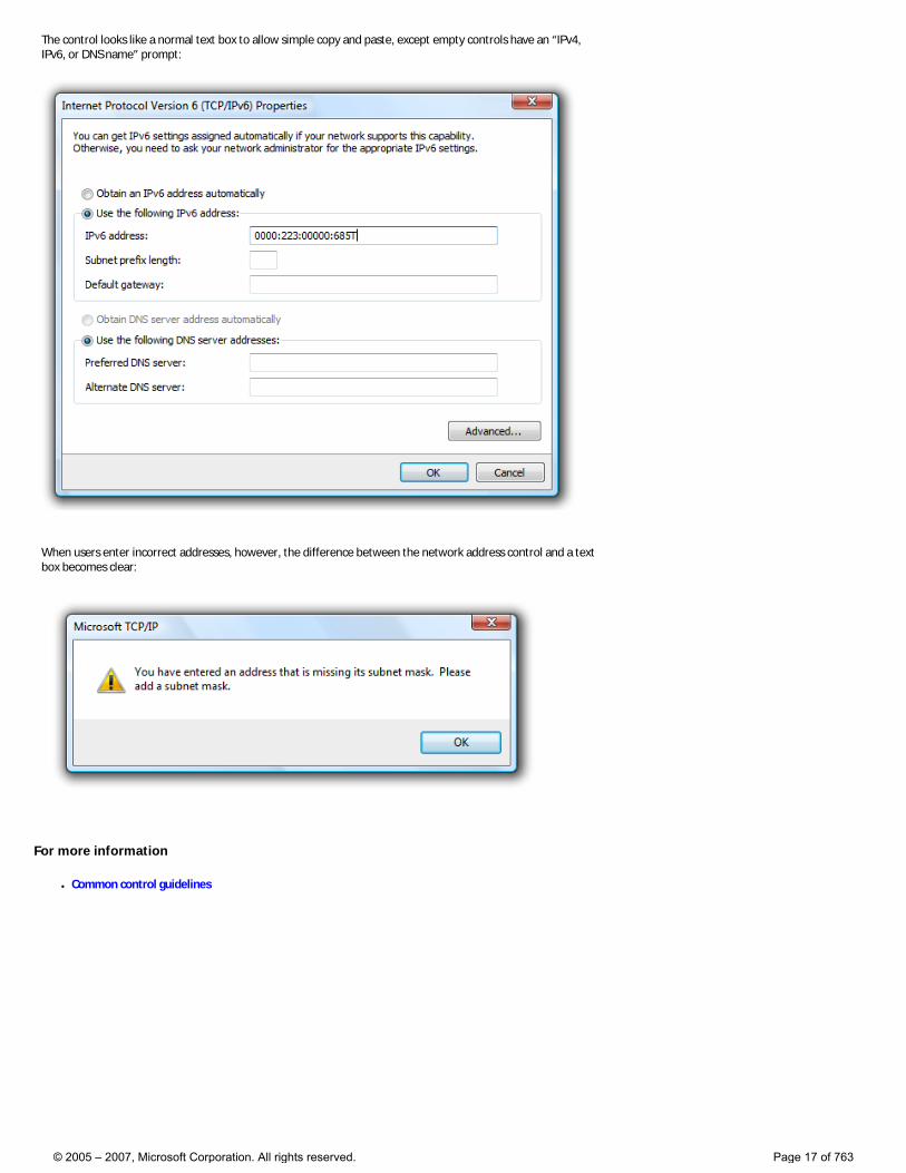
The control looks like a normal text box to allow simple copy and paste, except empty controls have an “IPv4, IPv6, or DNS name” prompt:
When users enter incorrect addresses, however, the difference between the network address control and a text box becomes clear:
For more information
● Common control guidelines
© 2005 – 2007, Microsoft Corporation. All rights reserved. Page 17 of 763
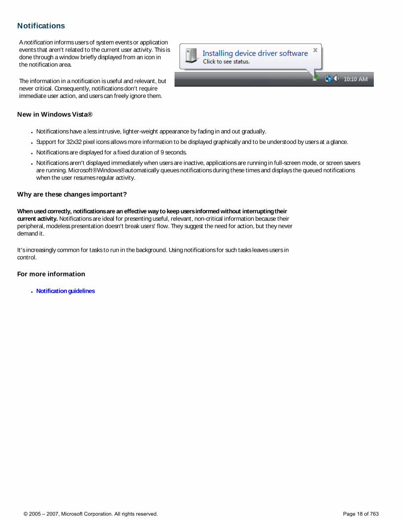
Notifications A notification informs users of system events or application events that aren’t related to the current user activity. This is done through a window briefly displayed from an icon in the notification area.
The information in a notification is useful and relevant, but never critical. Consequently, notifications don’t require immediate user action, and users can freely ignore them.
New in Windows Vista®
● Notifications have a less intrusive, lighter-weight appearance by fading in and out gradually.
● Support for 32x32 pixel icons allows more information to be displayed graphically and to be understood by users at a glance.
● Notifications are displayed for a fixed duration of 9 seconds.
● Notifications aren’t displayed immediately when users are inactive, applications are running in full-screen mode, or screen savers are running. Microsoft® Windows® automatically queues notifications during these times and displays the queued notifications when the user resumes regular activity.
Why are these changes important?
When used correctly, notifications are an effective way to keep users informed without interrupting their current activity. Notifications are ideal for presenting useful, relevant, non-critical information because their peripheral, modeless presentation doesn’t break users’ flow. They suggest the need for action, but they never demand it.
It’s increasingly common for tasks to run in the background. Using notifications for such tasks leaves users in control.
For more information
● Notification guidelines
© 2005 – 2007, Microsoft Corporation. All rights reserved. Page 18 of 763
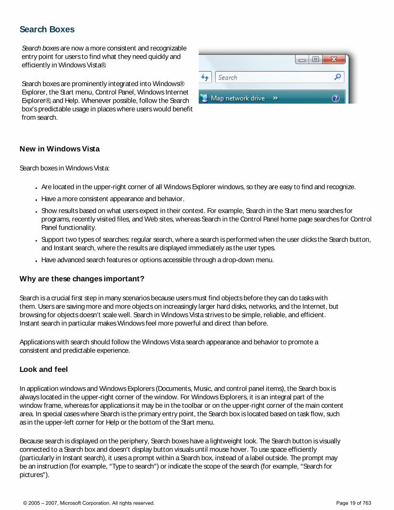
Search Boxes Search boxes are now a more consistent and recognizable entry point for users to find what they need quickly and efficiently in Windows Vista®.
Search boxes are prominently integrated into Windows® Explorer, the Start menu, Control Panel, Windows Internet Explorer®, and Help. Whenever possible, follow the Search box’s predictable usage in places where users would benefit from search.
New in Windows Vista
Search boxes in Windows Vista:
● Are located in the upper-right corner of all Windows Explorer windows, so they are easy to find and recognize.
● Have a more consistent appearance and behavior.
● Show results based on what users expect in their context. For example, Search in the Start menu searches for programs, recently visited files, and Web sites, whereas Search in the Control Panel home page searches for Control Panel functionality.
● Support two types of searches: regular search, where a search is performed when the user clicks the Search button, and Instant search, where the results are displayed immediately as the user types.
● Have advanced search features or options accessible through a drop-down menu.
Why are these changes important?
Search is a crucial first step in many scenarios because users must find objects before they can do tasks with them. Users are saving more and more objects on increasingly larger hard disks, networks, and the Internet, but browsing for objects doesn’t scale well. Search in Windows Vista strives to be simple, reliable, and efficient. Instant search in particular makes Windows feel more powerful and direct than before.
Applications with search should follow the Windows Vista search appearance and behavior to promote a consistent and predictable experience.
Look and feel
In application windows and Windows Explorers (Documents, Music, and control panel items), the Search box is always located in the upper-right corner of the window. For Windows Explorers, it is an integral part of the window frame, whereas for applications it may be in the toolbar or on the upper-right corner of the main content area. In special cases where Search is the primary entry point, the Search box is located based on task flow, such as in the upper-left corner for Help or the bottom of the Start menu.
Because search is displayed on the periphery, Search boxes have a lightweight look. The Search button is visually connected to a Search box and doesn’t display button visuals until mouse hover. To use space efficiently (particularly in Instant search), it uses a prompt within a Search box, instead of a label outside. The prompt may be an instruction (for example, “Type to search”) or indicate the scope of the search (for example, “Search for pictures”).
© 2005 – 2007, Microsoft Corporation. All rights reserved. Page 19 of 763
Performing a successful search creates a virtual page of the search results and adds it to the Back stack and Address bar. Clicking Back, clicking the original page in the Address bar, pressing the Esc key, or clearing a Search box restores the original page and clears the Search box.
For more information
● Search box guidelines
© 2005 – 2007, Microsoft Corporation. All rights reserved. Page 20 of 763
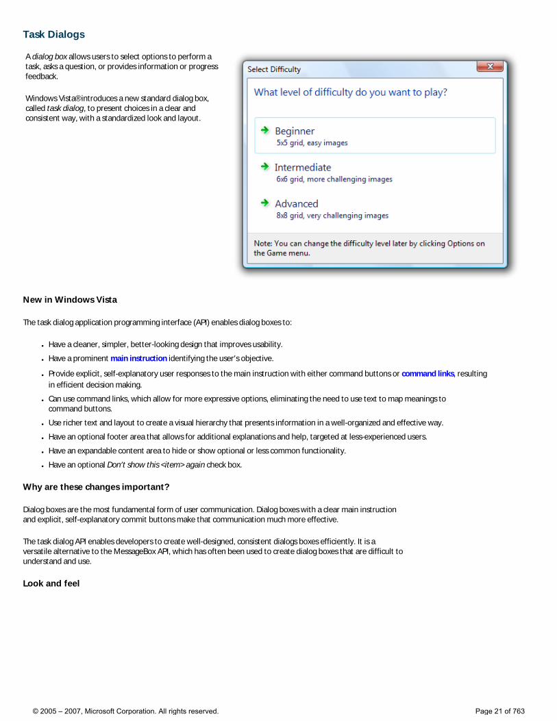
Task Dialogs A dialog box allows users to select options to perform a task, asks a question, or provides information or progress feedback.
Windows Vista® introduces a new standard dialog box, called task dialog, to present choices in a clear and consistent way, with a standardized look and layout.
New in Windows Vista
The task dialog application programming interface (API) enables dialog boxes to:
● Have a cleaner, simpler, better-looking design that improves usability.
● Have a prominent main instruction identifying the user’s objective.
● Provide explicit, self-explanatory user responses to the main instruction with either command buttons or command links, resulting in efficient decision making.
● Can use command links, which allow for more expressive options, eliminating the need to use text to map meanings to command buttons.
● Use richer text and layout to create a visual hierarchy that presents information in a well-organized and effective way.
● Have an optional footer area that allows for additional explanations and help, targeted at less-experienced users.
● Have an expandable content area to hide or show optional or less common functionality.
● Have an optional Don’t show this <item> again check box.
Why are these changes important?
Dialog boxes are the most fundamental form of user communication. Dialog boxes with a clear main instruction and explicit, self-explanatory commit buttons make that communication much more effective.
The task dialog API enables developers to create well-designed, consistent dialogs boxes efficiently. It is a versatile alternative to the MessageBox API, which has often been used to create dialog boxes that are difficult to understand and use.
Look and feel
© 2005 – 2007, Microsoft Corporation. All rights reserved. Page 21 of 763
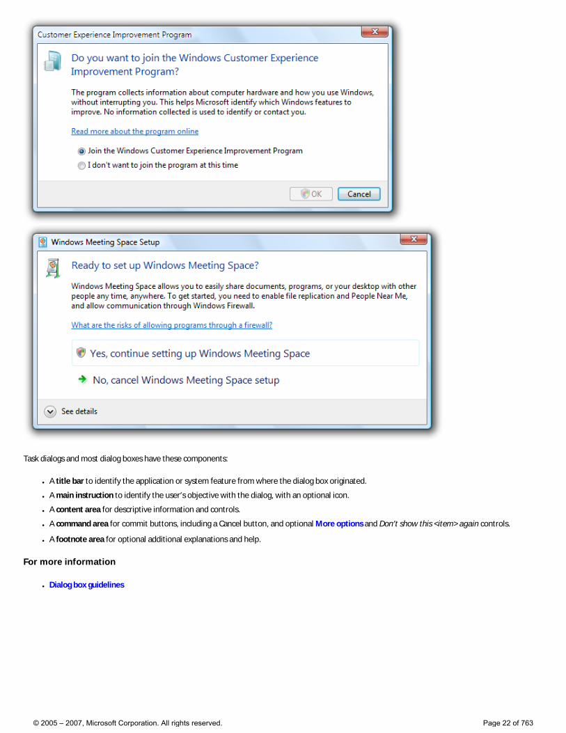
Task dialogs and most dialog boxes have these components:
● A title bar to identify the application or system feature from where the dialog box originated.
● A main instruction to identify the user’s objective with the dialog, with an optional icon.
● A content area for descriptive information and controls.
● A command area for commit buttons, including a Cancel button, and optional More options and Don’t show this <item> again controls.
● A footnote area for optional additional explanations and help.
For more information
● Dialog box guidelines
© 2005 – 2007, Microsoft Corporation. All rights reserved. Page 22 of 763
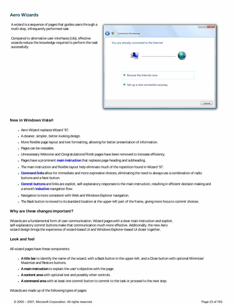
Aero Wizards A wizard is a sequence of pages that guides users through a multi-step, infrequently performed task.
Compared to alternative user interfaces (UIs), effective wizards reduce the knowledge required to perform the task successfully.
New in Windows Vista®
● Aero Wizard replaces Wizard '97.
● A cleaner, simpler, better-looking design.
● More flexible page layout and text formatting, allowing for better presentation of information.
● Pages can be resizable.
● Unnecessary Welcome and Congratulations/Finish pages have been removed to increase efficiency.
● Pages have a prominent main instruction that replaces page heading and subheading.
● The main instruction and flexible layout help eliminate much of the repetition found in Wizard '97.
● Command links allow for immediate and more expressive choices, eliminating the need to always use a combination of radio buttons and a Next button.
● Commit buttons and links are explicit, self-explanatory responses to the main instruction, resulting in efficient decision making and a smooth inductive navigation flow.
● Navigation is more consistent with Web and Windows Explorer navigation.
● The Back button is moved to its standard location at the upper-left part of the frame, giving more focus to commit choices.
Why are these changes important?
Wizards are a fundamental form of user communication. Wizard pages with a clear main instruction and explicit, self-explanatory commit buttons make that communication much more effective. Additionally, the new Aero wizard design brings the experience of wizard-based UI and Windows Explorer-based UI closer together.
Look and feel
All wizard pages have these components:
● A title bar to identify the name of the wizard, with a Back button in the upper-left, and a Close button with optional Minimize/Maximize and Restore buttons.
● A main instruction to explain the user’s objective with the page.
● A content area with optional text and possibly other controls.
● A command area with at least one commit button to commit to the task or proceed to the next step.
Wizards are made up of the following types of pages:
© 2005 – 2007, Microsoft Corporation. All rights reserved. Page 23 of 763
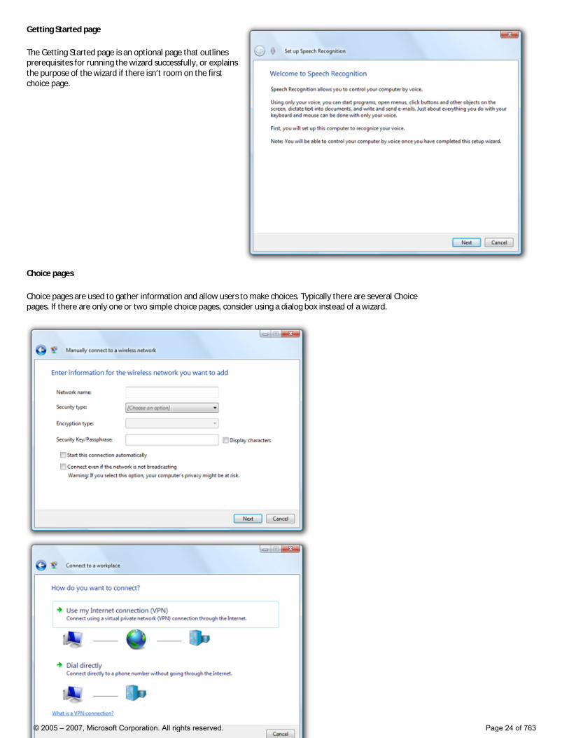
Getting Started page
The Getting Started page is an optional page that outlines prerequisites for running the wizard successfully, or explains the purpose of the wizard if there isn’t room on the first choice page.
Choice pages
Choice pages are used to gather information and allow users to make choices. Typically there are several Choice pages. If there are only one or two simple choice pages, consider using a dialog box instead of a wizard.
© 2005 – 2007, Microsoft Corporation. All rights reserved. Page 24 of 763
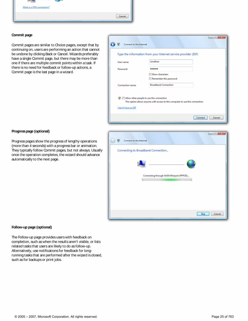
Commit page
Commit pages are similar to Choice pages, except that by continuing on, users are performing an action that cannot be undone by clicking Back or Cancel. Wizards preferably have a single Commit page, but there may be more than one if there are multiple commit points within a task. If there is no need for feedback or follow-up actions, a Commit page is the last page in a wizard.
Progress page (optional)
Progress pages show the progress of lengthy operations (more than 4 seconds) with a progress bar or animation. They typically follow Commit pages, but not always. Usually once the operation completes, the wizard should advance automatically to the next page.
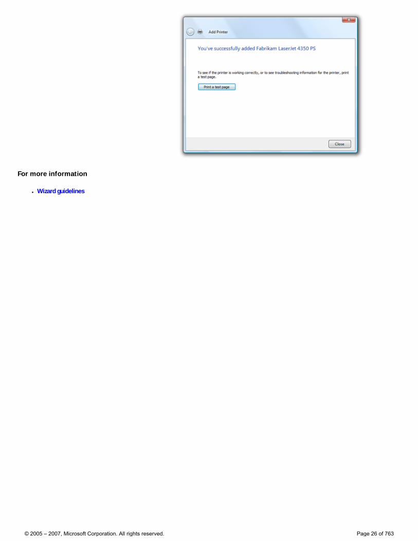
Follow-up page (optional)
The Follow-up page provides users with feedback on completion, such as when the results aren’t visible, or lists related tasks that users are likely to do as follow-up. Alternatively, use notifications for feedback for long-running tasks that are performed after the wizard is closed, such as for backups or print jobs.
© 2005 – 2007, Microsoft Corporation. All rights reserved. Page 25 of 763
For more information
● Wizard guidelines
© 2005 – 2007, Microsoft Corporation. All rights reserved. Page 26 of 763
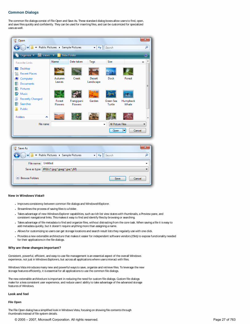
Common Dialogs
The common file dialogs consist of File Open and Save As. These standard dialog boxes allow users to find, open, and save files quickly and confidently. They can be used for inserting files, and can be customized for specialized uses as well.
New in Windows Vista®
● Improves consistency between common file dialogs and Windows® Explorer.
● Streamlines the process of saving files to a folder.
● Takes advantage of new Windows Explorer capabilities, such as rich list view states with thumbnails, a Preview pane, and consistent navigational links. This makes it easy to find and identify files by browsing or searching.
● Takes advantage of file metadata to find and organize files, without distracting from the core task. When saving a file it is easy to add metadata quickly, but it doesn’t require anything more than assigning a name.
● Allows for customizing so users can get storage locations and search result lists they regularly use with one click.
● Provides a new extensible architecture that makes it easier for independent software vendors (ISVs) to expose functionality needed for their applications in the file dialogs.
Why are these changes important?
Consistent, powerful, efficient, and easy-to-use file management is an essential aspect of the overall Windows experience, not just in Windows Explorers, but across all applications where users interact with files.
Windows Vista introduces many new and powerful ways to save, organize and retrieve files. To leverage the new storage features efficiently, it is essential for all applications to use the common file dialogs.
The new extensible architecture is important in reducing the need for custom file dialogs. Custom file dialogs make for a less consistent user experience, and reduce users' ability to take advantage of the advanced storage features of Windows.
Look and feel
File Open
The File Open dialog has a simplified look in Windows Vista, focusing on showing file contents through thumbnails instead of file system details.
© 2005 – 2007, Microsoft Corporation. All rights reserved. Page 27 of 763
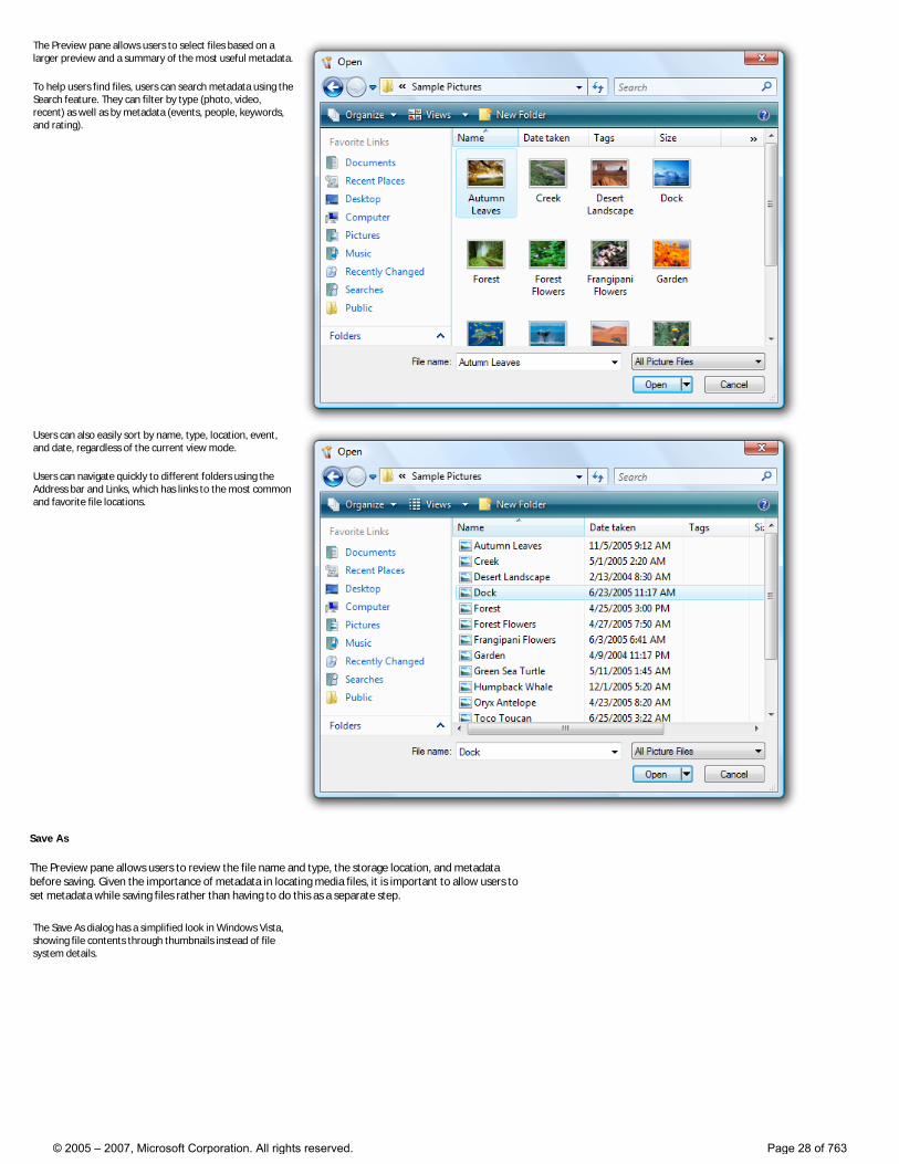
The Preview pane allows users to select files based on a larger preview and a summary of the most useful metadata.
To help users find files, users can search metadata using the Search feature. They can filter by type (photo, video, recent) as well as by metadata (events, people, keywords, and rating).
Users can also easily sort by name, type, location, event, and date, regardless of the current view mode.
Users can navigate quickly to different folders using the Address bar and Links, which has links to the most common and favorite file locations.
Save As
The Preview pane allows users to review the file name and type, the storage location, and metadata before saving. Given the importance of metadata in locating media files, it is important to allow users to set metadata while saving files rather than having to do this as a separate step.
The Save As dialog has a simplified look in Windows Vista, showing file contents through thumbnails instead of file system details.
© 2005 – 2007, Microsoft Corporation. All rights reserved. Page 28 of 763
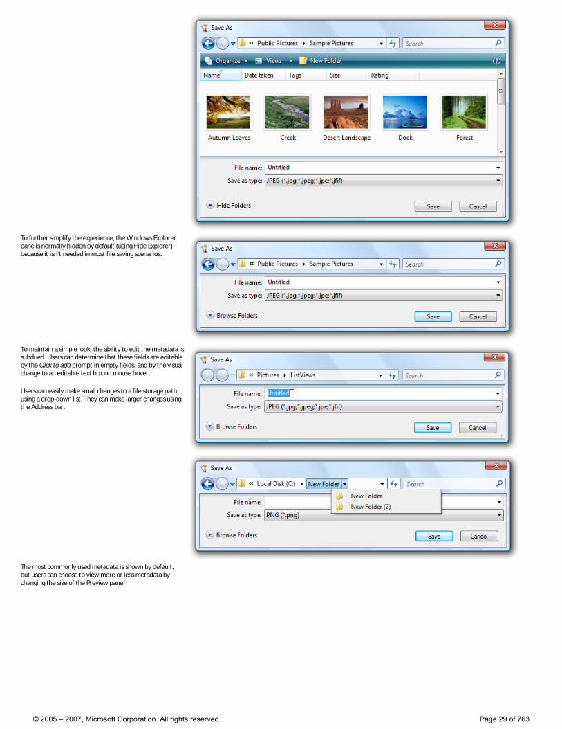
To further simplify the experience, the Windows Explorer pane is normally hidden by default (using Hide Explorer) because it isn’t needed in most file saving scenarios.
To maintain a simple look, the ability to edit the metadata is subdued. Users can determine that these fields are editable by the Click to add prompt in empty fields, and by the visual change to an editable text box on mouse hover.
Users can easily make small changes to a file storage path using a drop-down list. They can make larger changes using the Address bar.
The most commonly used metadata is shown by default, but users can choose to view more or less metadata by changing the size of the Preview pane.
© 2005 – 2007, Microsoft Corporation. All rights reserved. Page 29 of 763

For more information
● Common dialog guidelines
© 2005 – 2007, Microsoft Corporation. All rights reserved. Page 30 of 763
Control Panels
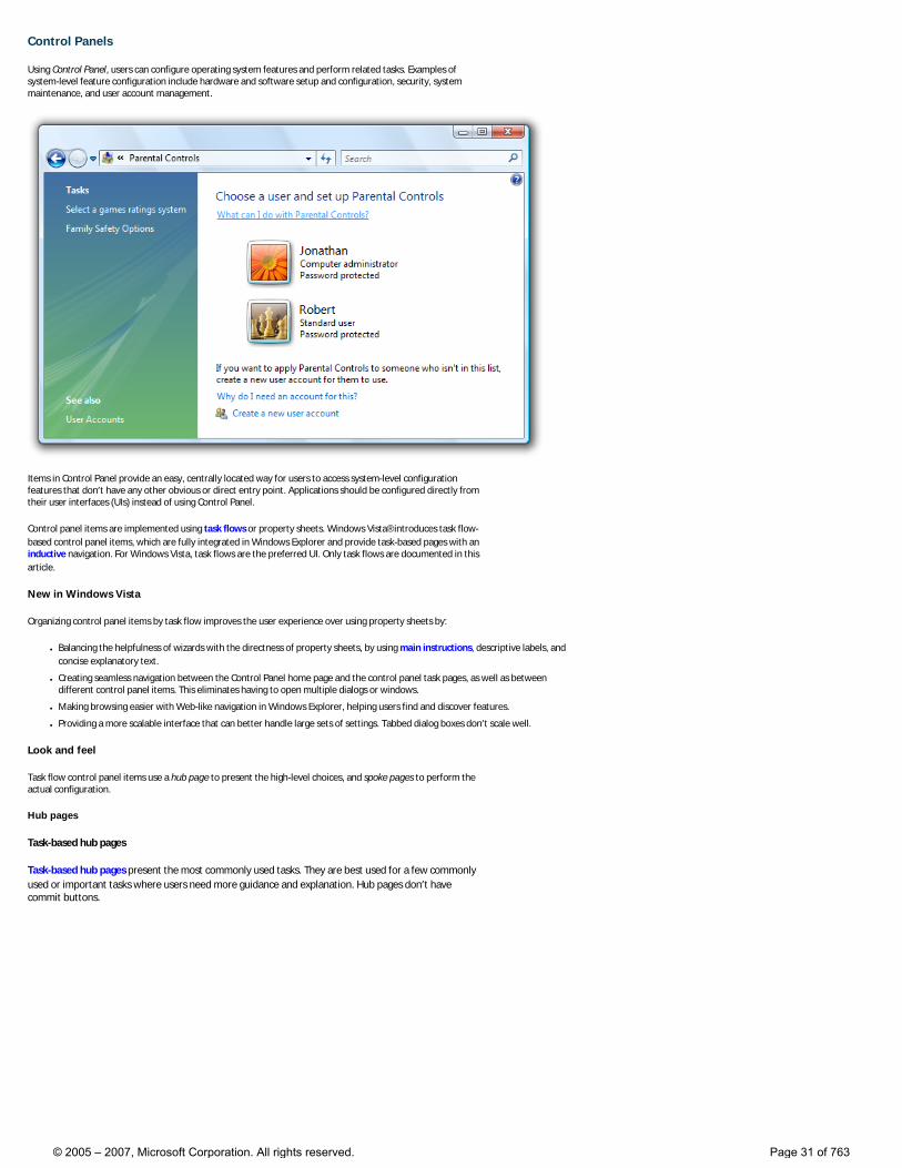
Using Control Panel, users can configure operating system features and perform related tasks. Examples of system-level feature configuration include hardware and software setup and configuration, security, system maintenance, and user account management.
Items in Control Panel provide an easy, centrally located way for users to access system-level configuration features that don’t have any other obvious or direct entry point. Applications should be configured directly from their user interfaces (UIs) instead of using Control Panel.
Control panel items are implemented using task flows or property sheets. Windows Vista® introduces task flow-based control panel items, which are fully integrated in Windows Explorer and provide task-based pages with an inductive navigation. For Windows Vista, task flows are the preferred UI. Only task flows are documented in this article.
New in Windows Vista
Organizing control panel items by task flow improves the user experience over using property sheets by:
● Balancing the helpfulness of wizards with the directness of property sheets, by using main instructions, descriptive labels, and concise explanatory text.
● Creating seamless navigation between the Control Panel home page and the control panel task pages, as well as between different control panel items. This eliminates having to open multiple dialogs or windows.
● Making browsing easier with Web-like navigation in Windows Explorer, helping users find and discover features.
● Providing a more scalable interface that can better handle large sets of settings. Tabbed dialog boxes don’t scale well.
Look and feel
Task flow control panel items use a hub page to present the high-level choices, and spoke pages to perform the actual configuration.
Hub pages
Task-based hub pages
Task-based hub pages present the most commonly used tasks. They are best used for a few commonly used or important tasks where users need more guidance and explanation. Hub pages don’t have commit buttons.
© 2005 – 2007, Microsoft Corporation. All rights reserved. Page 31 of 763
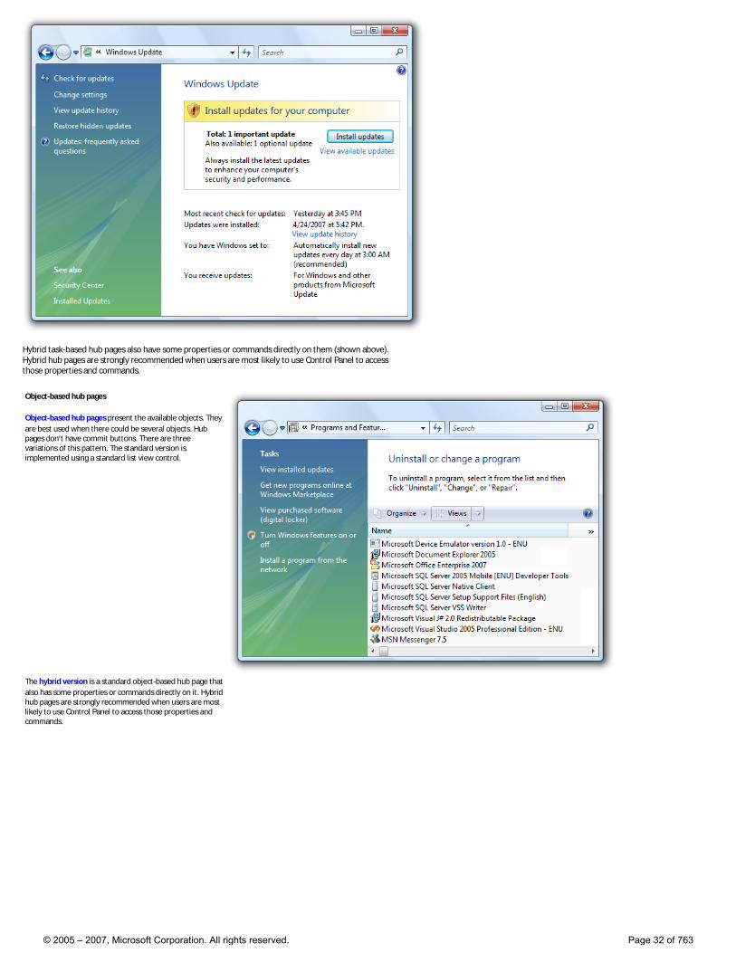
Hybrid task-based hub pages also have some properties or commands directly on them (shown above). Hybrid hub pages are strongly recommended when users are most likely to use Control Panel to access those properties and commands.
Object-based hub pages
Object-based hub pages present the available objects. They are best used when there could be several objects. Hub pages don’t have commit buttons. There are three variations of this pattern. The standard version is implemented using a standard list view control.
The hybrid version is a standard object-based hub page that also has some properties or commands directly on it. Hybrid hub pages are strongly recommended when users are most likely to use Control Panel to access those properties and commands.
© 2005 – 2007, Microsoft Corporation. All rights reserved. Page 32 of 763
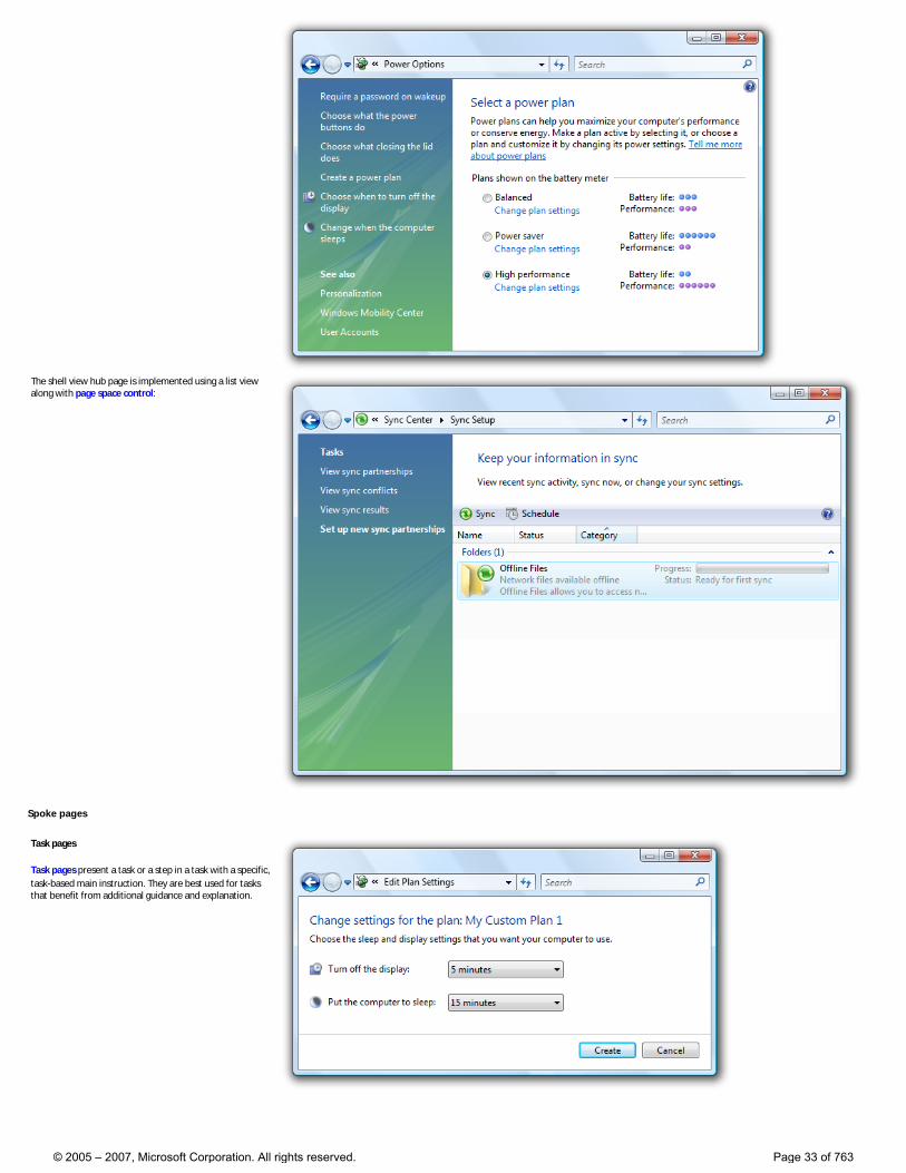
The shell view hub page is implemented using a list view along with page space control:
Spoke pages
Task pages
Task pages present a task or a step in a task with a specific, task-based main instruction. They are best used for tasks that benefit from additional guidance and explanation.
© 2005 – 2007, Microsoft Corporation. All rights reserved. Page 33 of 763
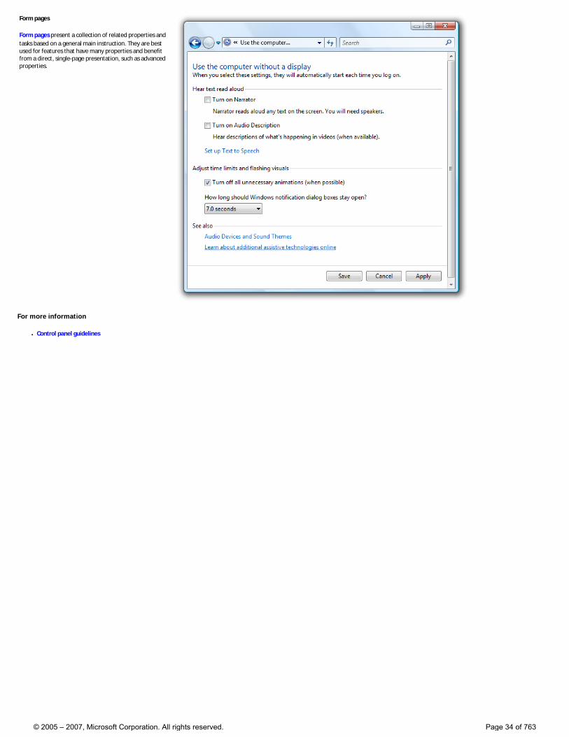
Form pages
Form pages present a collection of related properties and tasks based on a general main instruction. They are best used for features that have many properties and benefit from a direct, single-page presentation, such as advanced properties.
For more information
● Control panel guidelines
© 2005 – 2007, Microsoft Corporation. All rights reserved. Page 34 of 763
Style and Tone
User interface (UI) text is among the most influential contributors to the user experience. Users’ success or failure, especially with unfamiliar tasks, is impacted by the meaning, amount, and the tone of the language provided.
Tone in writing is the attitude that the writer conveys to the reader. It’s designed to create a specific response or emotion in the reader.
New in Windows Vista®
The Windows Vista Tone
● Inspire confidence by communicating to users on a personal level by being accurate, encouraging, insightful, objective, and user-focused.
● Don’t be distracting, condescending (example: “Just do this.”), or arrogant.
● Avoid the extremes of the “machine” voice (where the speaker is removed from the language) and the “sales rep” voice (where the writing tries to sell us something, to cajole us, to cheer us up, to gloss over everything as “simple.”)
Why are these changes important?
UI text tone helps create the personality of Windows programs and the overall user experience. It can instill confidence and a sense of accomplishment in users, or if incorrectly applied, it can confuse users, make them feel less empowered and without control.
How to write for Windows Vista
Use Windows Vista tone
Tone in your application should be:
● Accurate. Users should feel reassured that the information is technically accurate. If the information isn’t accurate, the user’s experience with that specific task is spoiled, and he loses faith in any other assistance he reads from that source.
● Encouraging. Use language that conveys that the software empowers users to do things, rather than allows them to do things. For example, use the phrase you can rather than Windows lets you or this feature allows you. (Exception: it’s okay to use allow when referring to features—such as security features—that permit or deny an action.)
● Insightful. Users should believe that you (and by extension your application) know when a certain task is complicated and that you will guide them through it. At the same time, treat users as intelligent people who happen to need help with a particular problem.
● Objective. Sometimes users want a richer explanation; often they want to know just what they need to move on. This requires objectivity—to recognize that the goal (productivity, curiosity, enjoyment) is the user’s goal, not the writer’s. It also requires that you shed any predisposed notions about the user.
● User-focused. Write from the user’s perspective and preferably from the perspective of what you can do for the user. Users should feel that they will find information that is relevant and accessible to them.
© 2005 – 2007, Microsoft Corporation. All rights reserved. Page 35 of 763
Use real-world language
● Use everyday words when you can, and avoid words you wouldn’t say to someone else in person. This is especially effective if you are explaining a complex technical concept or action. Imagine yourself looking over the user’s shoulder and explaining how to accomplish the task.
● Use short, plain words whenever possible. Shorter words are more conversational, save space on screen, and are easier to scan.
● Don’t invent words or apply new meanings to standard words. Assume that users are more familiar with a word’s established meaning than with a special meaning given it by the computer technology industry. When an industry term is required, provide an in-context definition. Avoid jargon, but remember that some expressions specific to computer usage—hacker, burn a CD, and so on—are already part of everyday speech.
Be precise
● Choose words with a clear meaning.
● Omit needless words—don’t use two or three words when one will do.
Person
● Address the user as you, directly or indirectly.
● Use first person (I, me, my) when the user is telling the application or a wizard what to do. Use second person (you, your) when the application, wizard, or UI is telling the user what to do.
● Use we judiciously. The first-person plural can suggest a daunting corporate presence. However, it can be preferable to using the name of your application. Use we recommend rather than it is recommended.
● Avoid third-person references (for example, the user) because they create a more formal, less personal tone.
Voice
● Use the active voice, which emphasizes the person or thing doing the action. It is more direct and personal than the passive voice, which can be confusing or sound formal.
● Use the passive voice only to avoid a wordy or awkward construction; when the action rather than the actor is the focus of the sentence; when the subject is unknown; or in error messages, when the user is the subject and might feel blamed for the error if the active voice were used.
Attitude toward the user
● Be polite, supportive, and encouraging. The user should never feel condescended to, blamed, or intimidated.
● Use the word please judiciously. Avoid it except in situations where the user is asked to do something inconvenient or the software is to blame for the situation.
● Use the word sorry only in error messages that result in serious problems for the user (for example, data loss, the user can’t continue to use the computer, or the user must get help from a technical representative). Don’t apologize if the issue occurred during the normal functioning of the application (for example, if the user needs to wait for a network connection to be found).
For more information
© 2005 – 2007, Microsoft Corporation. All rights reserved. Page 36 of 763
● Style and Tone guidelines
© 2005 – 2007, Microsoft Corporation. All rights reserved. Page 37 of 763
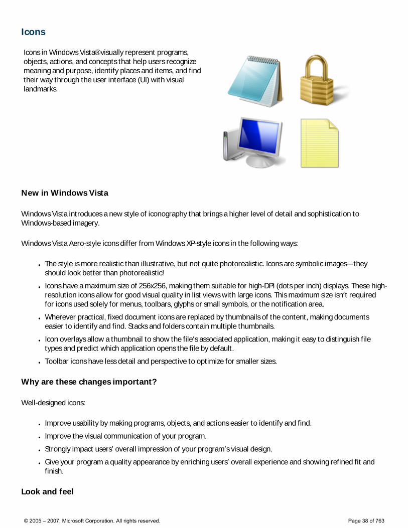
Icons Icons in Windows Vista® visually represent programs, objects, actions, and concepts that help users recognize meaning and purpose, identify places and items, and find their way through the user interface (UI) with visual landmarks.
New in Windows Vista
Windows Vista introduces a new style of iconography that brings a higher level of detail and sophistication to Windows-based imagery.
Windows Vista Aero-style icons differ from Windows XP-style icons in the following ways:
● The style is more realistic than illustrative, but not quite photorealistic. Icons are symbolic images—they should look better than photorealistic!
● Icons have a maximum size of 256x256, making them suitable for high-DPI (dots per inch) displays. These high-resolution icons allow for good visual quality in list views with large icons. This maximum size isn’t required for icons used solely for menus, toolbars, glyphs or small symbols, or the notification area.
● Wherever practical, fixed document icons are replaced by thumbnails of the content, making documents easier to identify and find. Stacks and folders contain multiple thumbnails.
● Icon overlays allow a thumbnail to show the file’s associated application, making it easy to distinguish file types and predict which application opens the file by default.
● Toolbar icons have less detail and perspective to optimize for smaller sizes.
Why are these changes important?
Well-designed icons:
● Improve usability by making programs, objects, and actions easier to identify and find.
● Improve the visual communication of your program.
● Strongly impact users’ overall impression of your program’s visual design.
● Give your program a quality appearance by enriching users’ overall experience and showing refined fit and finish.
Look and feel
© 2005 – 2007, Microsoft Corporation. All rights reserved. Page 38 of 763
To achieve the Windows Vista look, redesign your program’s most prominent icons to use the Aero style. Be sure to redesign any icons displayed on the Start menu or Windows® Explorer (such as file type icons). Don’t use any icons in Windows Vista-based programs from Windows 98 or earlier.
Aero-style icons have these characteristics:
● Realistic and symbolic in style; not photorealistic or illustrative.
● For perspective, use isometric icons for program icons and objects with 3-D volume. Use flat icons for files, flat objects, and 16x16 pixel icons.
● Required sizes are 256x256, 32x32, and 16x16 pixels. Optional supported sizes are 128x128, 96x96, 48x48, and 24x24 pixels. Windows Vista-style icons scale smoothly between 256x256 and 32x32 pixels. The 256x256 pixel icon size is required to support high-resolution monitors.
● 32-bit color (24-bit color plus 8-bit alpha channel).
● Use the .ico file format.
For more information
● Icon guidelines
© 2005 – 2007, Microsoft Corporation. All rights reserved. Page 39 of 763
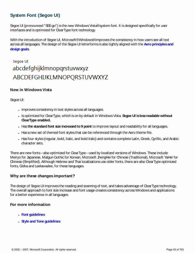
System Font (Segoe UI)
Segoe UI (pronounced "SEE-go") is the new Windows Vista® system font. It is designed specifically for user interfaces and is optimized for ClearType font technology.
With the introduction of Segoe UI, Microsoft® Windows® improves the consistency in how users see all text across all languages. The design of the Segoe UI letterforms is also tightly aligned with the Aero principles and design goals.
New in Windows Vista
Segoe UI:
● Improves consistency in text styles across all languages.
● Is optimized for ClearType, which is on by default in Windows Vista. Segoe UI is less readable without ClearType enabled.
● Has the standard font size increased to 9 point to improve layout and readability for all languages.
● Has a new set of themed font styles that can be referenced through the Aero theme file.
● Has four styles (regular, bold, italic, and bold italic) and contains complete Latin, Greek, Cyrillic, and Arabic character sets.
There are new fonts—also optimized for ClearType—used by localized versions of Windows. These include Meiryo for Japanese, Malgun Gothic for Korean, Microsoft JhengHei for Chinese (Traditional), Microsoft YaHei for Chinese (Simplified). Although Hebrew and Thai localizations use older fonts, there are also ClearType optimized fonts, Gisha and Leelawadee, for these languages.
Why are these changes important?
The design of Segoe UI improves the reading and scanning of text, and takes advantage of ClearType technology. The overall approach to font size increase and font usage creates consistency across Windows and applications for a better experience in all languages.
For more information
● Font guidelines
● Style and Tone guidelines
© 2005 – 2007, Microsoft Corporation. All rights reserved. Page 40 of 763

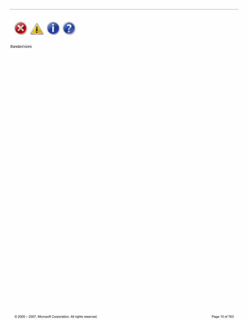
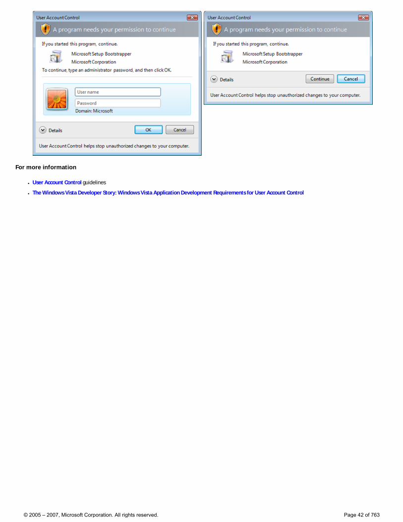
User Account Control With User Account Control (or UAC, formerly known as “Least-privileged User Account”, or “LUA”) enabled, users must elevate their privileges to perform administrative tasks.
New in Windows Vista
In Windows Vista®, interactive administrators normally run with least user privileges, but they can self-elevate to perform administrative tasks, using the Consent UI dialog box. Such administrative tasks include installing software and drivers, changing system-wide settings, viewing or changing other user accounts, and running administrative tools.
In their least-privileged state, administrators are referred to as Protected administrators. In their elevated state, they are referred to as Elevated administrators. In contrast, Standard users can’t elevate their privileges by themselves, but they can ask an administrator to elevate them using the Credential UI. The Built-in Administrator account doesn’t require elevation.
Why are these changes important?
User Account Control provides the following benefits:
● It reduces the potential impact of “malware” by requiring explicit consent to run with administrative privileges.
● For managed environments, it allows users to be more productive when running as Standard users by removing unnecessary restrictions.
● For home environments, it gives users better control over system-wide changes, including what software is installed.
● It gives Standard users the ability to ask administrators to give them permission to perform administrative tasks within their current session.
The goal is for users not to have to elevate and, if they must, elevate only once to complete a task. Users should have to elevate only to perform tasks that require administrative privileges. All other tasks should be designed to eliminate the need for elevation. Often legacy software requires administrator privileges unnecessarily by writing to the HKLM or HKCR registry sections, or the Program Files or Windows System folders.
Look and feel
When a task requires elevation, it has the following visible steps:
1. Entry point. Tasks that require elevation have entry points that are clearly marked with the security shield icon.
2. Elevation. For Protected Administrators, the task requests consent using the Consent UI. For Standard users, the task requests administrator credentials using the Credential UI.
© 2005 – 2007, Microsoft Corporation. All rights reserved. Page 41 of 763
For more information
● User Account Control guidelines
● The Windows Vista Developer Story: Windows Vista Application Development Requirements for User Account Control
© 2005 – 2007, Microsoft Corporation. All rights reserved. Page 42 of 763
Top Rules for the Windows Vista User Experience
This article summarizes the top rules for creating high-quality, consistent Windows Vista® user interfaces (UIs).
1. Use the Aero Theme and System Font (Segoe UI)
2. Use common controls and common dialogs
3. Use the standard window frame, use glass judiciously
4. Use icons and graphics consistent with the Windows Vista style and quality
5. Use task dialogs for new or frequently used dialog boxes and error messages
6. Use Aero Wizards
7. Use Windows Explorer-hosted, navigation-based user interfaces, provide a Back button
8. Use the Windows Search model
9. Use the Windows Vista tone in all UI text
10. Clean up the UI
11. Use notifications judiciously
12. Reserve time for “fit and finish”!
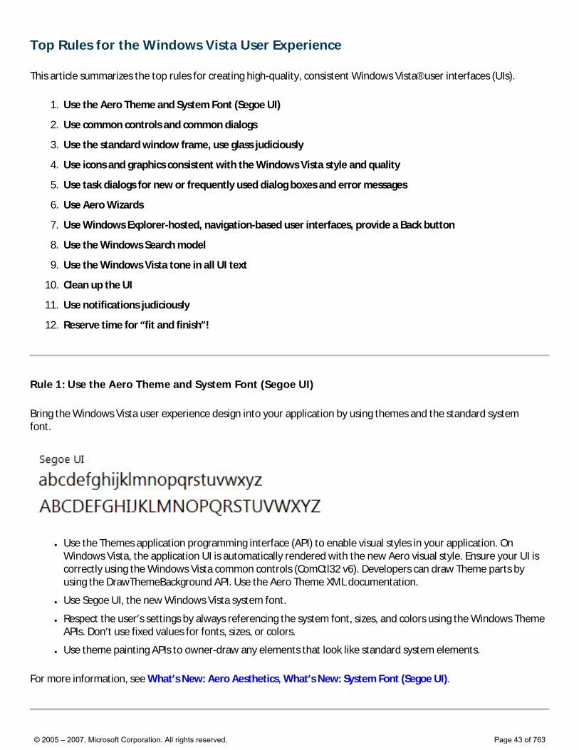
Rule 1: Use the Aero Theme and System Font (Segoe UI)
Bring the Windows Vista user experience design into your application by using themes and the standard system font.
● Use the Themes application programming interface (API) to enable visual styles in your application. On Windows Vista, the application UI is automatically rendered with the new Aero visual style. Ensure your UI is correctly using the Windows Vista common controls (ComCtl32 v6). Developers can draw Theme parts by using the DrawThemeBackground API. Use the Aero Theme XML documentation.
● Use Segoe UI, the new Windows Vista system font.
● Respect the user’s settings by always referencing the system font, sizes, and colors using the Windows Theme APIs. Don’t use fixed values for fonts, sizes, or colors.
● Use theme painting APIs to owner-draw any elements that look like standard system elements.
For more information, see What’s New: Aero Aesthetics, What’s New: System Font (Segoe UI).
© 2005 – 2007, Microsoft Corporation. All rights reserved. Page 43 of 763
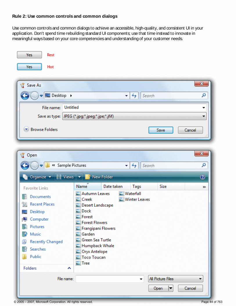
Rule 2: Use common controls and common dialogs
Use common controls and common dialogs to achieve an accessible, high-quality, and consistent UI in your application. Don’t spend time rebuilding standard UI components; use that time instead to innovate in meaningful ways based on your core competencies and understanding of your customer needs.
© 2005 – 2007, Microsoft Corporation. All rights reserved. Page 44 of 763
● Use the following Windows Vista common controls (ComCtl32 v6): balloons, check boxes, command buttons, drop-down lists, group boxes, network address controls, links, list boxes, list views, progress bars, radio buttons, sliders, static text, tabs, text boxes, tooltips, and tree views.
● Use the following Windows common dialogs: Color, Find and Replace, Font, Open File, Open Folder, Page Setup, Print, and Save File dialog boxes.
● Use custom controls and custom versions of the common dialogs only as a last resort. Make sure that all custom controls use the Aero Theme and are accessible.
For detailed guidelines, see Common Controls and Common Dialogs.
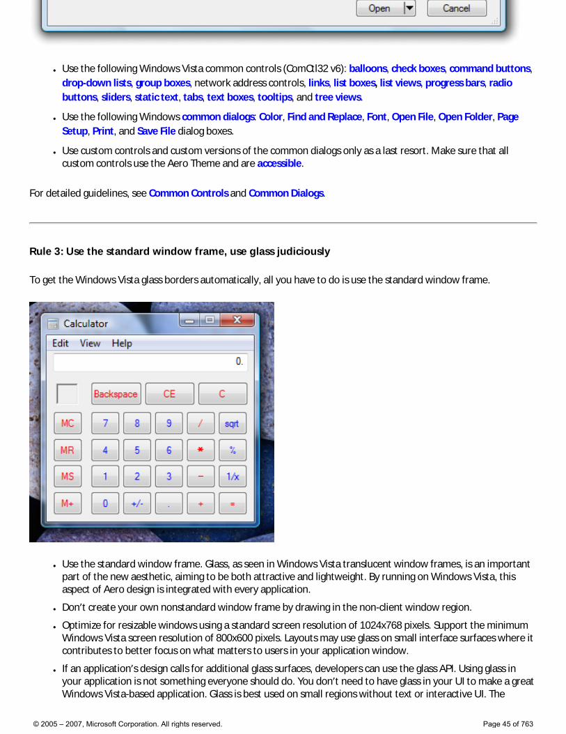
Rule 3: Use the standard window frame, use glass judiciously
To get the Windows Vista glass borders automatically, all you have to do is use the standard window frame.
● Use the standard window frame. Glass, as seen in Windows Vista translucent window frames, is an important part of the new aesthetic, aiming to be both attractive and lightweight. By running on Windows Vista, this aspect of Aero design is integrated with every application.
● Don’t create your own nonstandard window frame by drawing in the non-client window region.
● Optimize for resizable windows using a standard screen resolution of 1024x768 pixels. Support the minimum Windows Vista screen resolution of 800x600 pixels. Layouts may use glass on small interface surfaces where it contributes to better focus on what matters to users in your application window.
● If an application’s design calls for additional glass surfaces, developers can use the glass API. Using glass in your application is not something everyone should do. You don’t need to have glass in your UI to make a great Windows Vista-based application. Glass is best used on small regions without text or interactive UI. The
© 2005 – 2007, Microsoft Corporation. All rights reserved. Page 45 of 763
objective is to reduce the “weight” of the surface of the application to focus on the most important parts of the UI. Preferably use glass in surfaces touching the window frame, visually integrating your application with the window border for a more cohesive “look and feel.”
For detailed guidelines, see Window Frames, Window Management, and Layout.
Rule 4: Use icons and graphics consistent with the Windows Vista style and quality
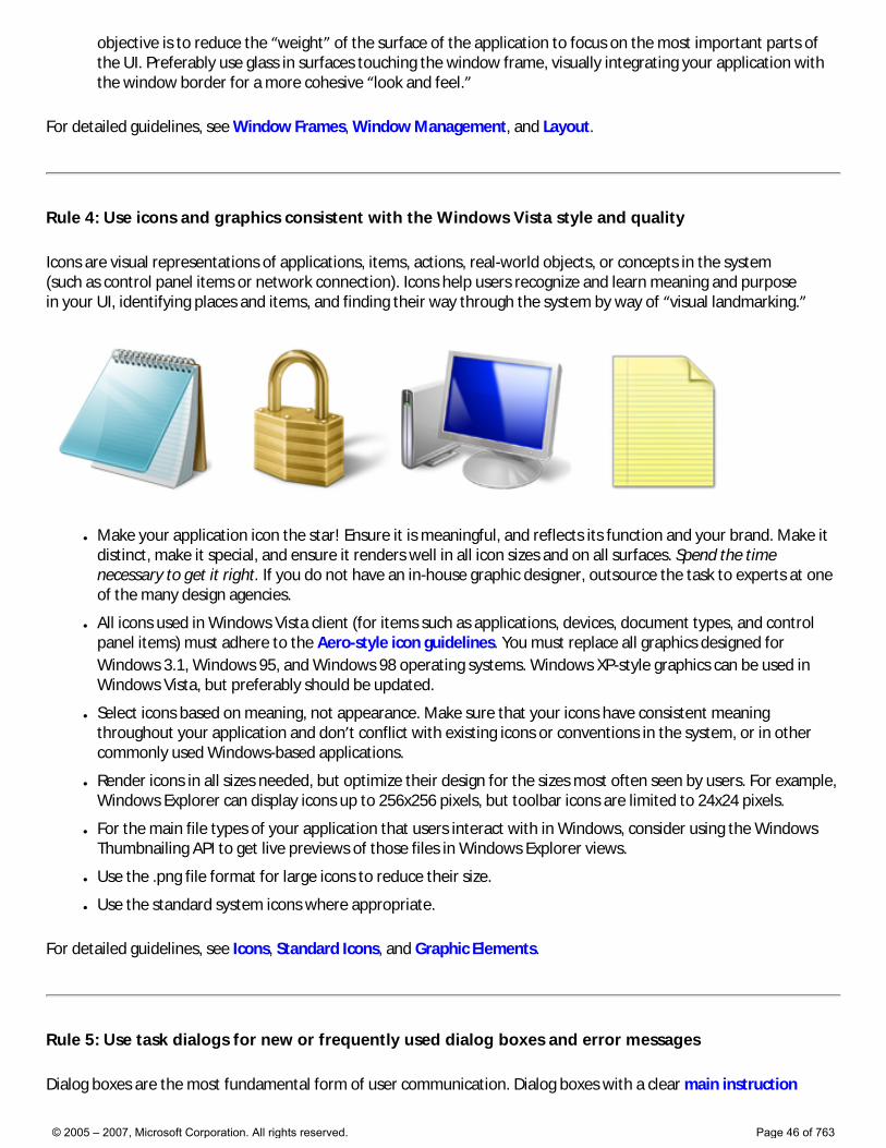
Icons are visual representations of applications, items, actions, real-world objects, or concepts in the system (such as control panel items or network connection). Icons help users recognize and learn meaning and purpose in your UI, identifying places and items, and finding their way through the system by way of “visual landmarking.”
● Make your application icon the star! Ensure it is meaningful, and reflects its function and your brand. Make it distinct, make it special, and ensure it renders well in all icon sizes and on all surfaces. Spend the time necessary to get it right. If you do not have an in-house graphic designer, outsource the task to experts at one of the many design agencies.
● All icons used in Windows Vista client (for items such as applications, devices, document types, and control panel items) must adhere to the Aero-style icon guidelines. You must replace all graphics designed for Windows 3.1, Windows 95, and Windows 98 operating systems. Windows XP-style graphics can be used in Windows Vista, but preferably should be updated.
● Select icons based on meaning, not appearance. Make sure that your icons have consistent meaning throughout your application and don’t conflict with existing icons or conventions in the system, or in other commonly used Windows-based applications.
● Render icons in all sizes needed, but optimize their design for the sizes most often seen by users. For example, Windows Explorer can display icons up to 256x256 pixels, but toolbar icons are limited to 24x24 pixels.
● For the main file types of your application that users interact with in Windows, consider using the Windows Thumbnailing API to get live previews of those files in Windows Explorer views.
● Use the .png file format for large icons to reduce their size.
● Use the standard system icons where appropriate.
For detailed guidelines, see Icons, Standard Icons, and Graphic Elements.
Rule 5: Use task dialogs for new or frequently used dialog boxes and error messages
Dialog boxes are the most fundamental form of user communication. Dialog boxes with a clear main instruction
© 2005 – 2007, Microsoft Corporation. All rights reserved. Page 46 of 763
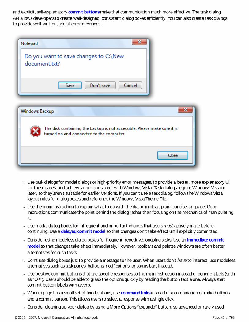
and explicit, self-explanatory commit buttons make that communication much more effective. The task dialog API allows developers to create well-designed, consistent dialog boxes efficiently. You can also create task dialogs to provide well-written, useful error messages.
● Use task dialogs for modal dialogs or high-priority error messages, to provide a better, more explanatory UI for these cases, and achieve a look consistent with Windows Vista. Task dialogs require Windows Vista or later, so they aren’t suitable for earlier versions. If you can’t use a task dialog, follow the Windows Vista layout rules for dialog boxes and reference the Windows Vista Theme File.
● Use the main instruction to explain what to do with the dialog in clear, plain, concise language. Good instructions communicate the point behind the dialog rather than focusing on the mechanics of manipulating it.
● Use modal dialog boxes for infrequent and important choices that users must actively make before continuing. Use a delayed commit model so that changes don’t take effect until explicitly committed.
● Consider using modeless dialog boxes for frequent, repetitive, ongoing tasks. Use an immediate commit model so that changes take effect immediately. However, toolbars and palette windows are often better alternatives for such tasks.
● Don’t use dialog boxes just to provide a message to the user. When users don’t have to interact, use modeless alternatives such as task panes, balloons, notifications, or status bars instead.
● Use positive commit buttons that are specific responses to the main instruction instead of generic labels (such as “OK”). Users should be able to grasp the options quickly by reading the button text alone. Always start commit button labels with a verb.
● When a page has a small set of fixed options, use command links instead of a combination of radio buttons and a commit button. This allows users to select a response with a single click.
● Consider cleaning up your dialog by using a More Options “expando” button, so advanced or rarely used
© 2005 – 2007, Microsoft Corporation. All rights reserved. Page 47 of 763
options remain hidden by default.
● Use notifications when an event is not related to the current user activity, doesn’t require immediate user action, and users can freely ignore it. Don’t use dialogs for these cases - they will be seen as highly interruptive.
● Don’t provide an error message at all if users aren’t likely to perform an action or change their behavior, or if the problem can be eliminated without causing confusion.
For detailed guidelines, see Dialog Boxes, Task Dialogs, Layout, and Error Messages.
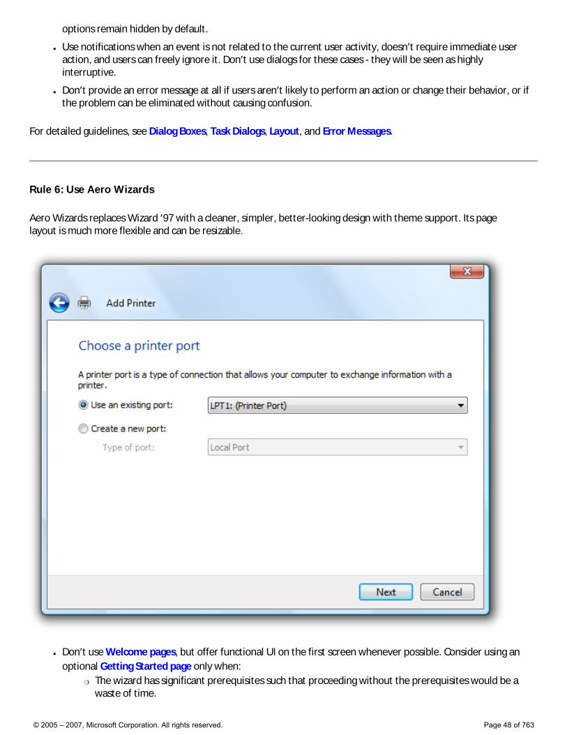
Rule 6: Use Aero Wizards
Aero Wizards replaces Wizard ’97 with a cleaner, simpler, better-looking design with theme support. Its page layout is much more flexible and can be resizable.
● Don’t use Welcome pages, but offer functional UI on the first screen whenever possible. Consider using an optional Getting Started page only when:
�❍ The wizard has significant prerequisites such that proceeding without the prerequisites would be a waste of time.
© 2005 – 2007, Microsoft Corporation. All rights reserved. Page 48 of 763
�❍ Users may have trouble determining the purpose of the wizard based on its first Choice page and there isn’t sufficient room for further explanation.
● Don’t use Congratulations pages at the end of the wizard. If the result of the wizard can be made apparent to users, close the wizard on the final commit and ensure the feedback on completion is clear to users. Consider using an optional Follow-up page only when:
�❍ There is no other way to provide users with feedback on completion, such as when the results aren’t visible.
�❍ There are related tasks that users are likely to do as follow-up. Avoid familiar follow-up tasks, such as “Send an e-mail.”
● Use the main instruction to explain explicitly what to do with the page in clear, plain, concise language. Good instructions communicate the user’s objective with the page rather than focusing purely on the mechanics of manipulating it. Don’t repeat the main instruction elsewhere with slightly different wording.
● For Commit pages, confirm tasks using commit buttons that are specific responses to the main instruction instead of generic labels like Finish. The labels on these commit buttons should make sense on their own. Always start commit button labels with a verb.
● For Follow-up pages, use Close to close the wizard. Don’t use Done or Finish commit buttons to close the Wizard window.
● Consider using command links to provide descriptive choices with supporting text and an icon, so that the user can efficiently navigate through the wizard.
● Make your wizard resizable if one of the steps involves presenting a view where a user might benefit from having control over the window size.
For detailed guidelines, see Wizards.
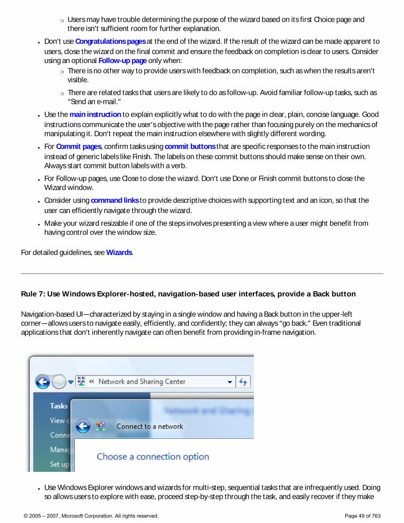
Rule 7: Use Windows Explorer-hosted, navigation-based user interfaces, provide a Back button
Navigation-based UI—characterized by staying in a single window and having a Back button in the upper-left corner—allows users to navigate easily, efficiently, and confidently; they can always “go back.” Even traditional applications that don’t inherently navigate can often benefit from providing in-frame navigation.
● Use Windows Explorer windows and wizards for multi-step, sequential tasks that are infrequently used. Doing so allows users to explore with ease, proceed step-by-step through the task, and easily recover if they make
© 2005 – 2007, Microsoft Corporation. All rights reserved. Page 49 of 763
mistakes.
● Provide a Back button to support easy navigation through your application, and to make it easy for people to switch between different views or states in your application.
● Use multiple windows when the task is likely to be performed in parallel with other tasks the original window provides.
For detailed guidelines, see Window Management and Wizards.
Rule 8: Use the Windows Search model
With the Windows Vista Search box, users can quickly locate specific objects or text within a large set of data by filtering or highlighting matches. In Windows Vista, Search is part of all Windows Explorer windows and appears and behaves consistently, making it easy to find and recognize.
There is no standard search control, but you should strive to make your program’s search features consistent with the Windows Search model.
● For application windows, locate the Search box in the upper right-hand corner.
● Use the standard Search button graphics. Don’t use a label, but do use a prompt within the Search box, such as Type to search.
● Support “Instant search” wherever possible to show instant results while the user is typing. Provide both regular search and “Instant search” if there are scenarios where regular searching is worth the extra wait time.
● Where possible, support Back navigation to return to a previous view from a search result list.
● Regular searches must return relevant results within five seconds and “Instant search” must return within two seconds. After this point, Search may continue to fill in less relevant results over time as long as the program is responsive and users can perform other tasks. Provide feedback on activity with a “busy” indicator, so users know the search is being performed.
For detailed guidelines, see Search Boxes.
Rule 9: Use the Windows Vista tone in all UI text
Use the Windows Vista “tone” to inspire confidence by communicating to users on a personal level by being accurate, encouraging, insightful, objective, and user focused. Don’t use a distracting, condescending (for example, “Just do this...”), or arrogant tone.
● Make sure that your text is clear, natural, concise, and not overly formal, and uses terminology that all users understand.
© 2005 – 2007, Microsoft Corporation. All rights reserved. Page 50 of 763
● Use everyday words when you can and avoid words you wouldn’t say to someone else in person. This is especially effective if you are explaining a complex technical concept or action. Imagine yourself looking over the user’s shoulder and explaining how to accomplish the task.
● Because users often scan text, make every word count. Simple, concise sentences (and paragraphs) not only save space on the screen but are the most effective means of conveying that an idea or action is important. Use your best judgment—make sentences tight, but not so tight that the tone seems abrupt and unfriendly.
● Avoid repetition. Review each window and eliminate duplicate words and statements. Don’t avoid important text—be explicit wherever necessary—but don’t be redundant and don’t explain the obvious.
For detailed guidelines, see Style and Tone.
Rule 10: Clean up the UI
Remove clutter, unify surfaces visually, and make the UI look well organized and thought through.
● Organize your commands into a simple, predictable, and easy to find presentation, using task-oriented categories and labels.
● For programs that create or view documents, use the standard menu categories such as File, Edit, View, Tools, and Help.
● For other types of programs, consider organizing your commands and options into more useful, natural categories based on your program’s purpose and the way users think about their tasks and goals. Don’t feel obligated to use the standard menu organization if it isn’t suitable for your program.
● Make the most common commands easy to find by putting them in the top level of the command presentation. Don’t put frequently used menu items in a submenu. Doing so would make using these commands inefficient. However, you can put frequently used commands in a submenu if they are normally accessed more directly, such as with a toolbar.
● Provide shortcut menus for all objects and window regions that benefit from a small set of contextual commands and options. Many users right-click regularly and expect to find shortcut menus anywhere.
● Consider hiding the menu bar if the toolbar or direct commands provide most of the commands needed by most users. Allow users to show or hide with a Menu bar check mark option in the toolbar.
● Provide menu item icons for the most commonly used menu items, menu items whose icon is standard and well known, and menu items whose icon well illustrates what the command does. However, if you use icons, don’t feel obligated to provide them for all menu items.
● To ensure keyboard accessibility, assign access keys to all menu items. No exceptions.
● Remove borders, separator lines, boxes, and other visual “noise” that isn’t necessary or functional.
● Remove unneeded text. Eliminate repetition in labels.
● Use hover states and just-in-time UI in context or on selection.
● Choose your default UI wisely; don’t optimize for unlikely and complicated cases. Instead, design for the most common user scenarios, ensuring they end up as the showcase experiences.
● Hide complexity in default states; simplify the visual design of elements where possible; show details and functionality on hover.
● Improve layout—align borders, text, and objects. Provide enough space so items are not touching each other or feel crammed.
● Ensure consistent use of common elements in your UI. Use standard components and controls unless being
© 2005 – 2007, Microsoft Corporation. All rights reserved. Page 51 of 763
nonstandard specifically benefits your customers’ or end users’ needs.
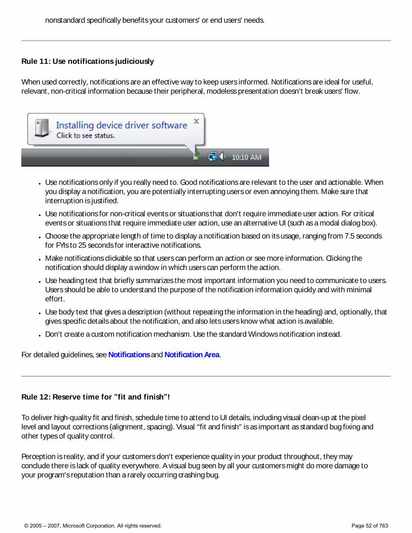
Rule 11: Use notifications judiciously
When used correctly, notifications are an effective way to keep users informed. Notifications are ideal for useful, relevant, non-critical information because their peripheral, modeless presentation doesn’t break users’ flow.
● Use notifications only if you really need to. Good notifications are relevant to the user and actionable. When you display a notification, you are potentially interrupting users or even annoying them. Make sure that interruption is justified.
● Use notifications for non-critical events or situations that don’t require immediate user action. For critical events or situations that require immediate user action, use an alternative UI (such as a modal dialog box).
● Choose the appropriate length of time to display a notification based on its usage, ranging from 7.5 seconds for FYIs to 25 seconds for interactive notifications.
● Make notifications clickable so that users can perform an action or see more information. Clicking the notification should display a window in which users can perform the action.
● Use heading text that briefly summarizes the most important information you need to communicate to users. Users should be able to understand the purpose of the notification information quickly and with minimal effort.
● Use body text that gives a description (without repeating the information in the heading) and, optionally, that gives specific details about the notification, and also lets users know what action is available.
● Don’t create a custom notification mechanism. Use the standard Windows notification instead.
For detailed guidelines, see Notifications and Notification Area.
Rule 12: Reserve time for “fit and finish”!
To deliver high-quality fit and finish, schedule time to attend to UI details, including visual clean-up at the pixel level and layout corrections (alignment, spacing). Visual “fit and finish” is as important as standard bug fixing and other types of quality control.
Perception is reality, and if your customers don’t experience quality in your product throughout, they may conclude there is lack of quality everywhere. A visual bug seen by all your customers might do more damage to your program’s reputation than a rarely occurring crashing bug.
© 2005 – 2007, Microsoft Corporation. All rights reserved. Page 52 of 763
Guidelines
These sections comprise the detailed user experience guidelines for Windows Vista®:
● Design Principles
● Controls
● Commands
● Text
● Interaction
● Windows
● Aesthetics
● Windows Environment
© 2005 – 2007, Microsoft Corporation. All rights reserved. Page 53 of 763
Design Principles
Refer to these principles to help you design the user experience for your Windows Vista® programs:
● Top Guidelines Violations. Some common mistakes and inconsistencies to watch out for in your user interface design.
● How to Design a Great User Experience. A list for inspiration.
● Powerful and Simple. Through carefully balanced feature selection and presentation, you can achieve both power and simplicity.
● Designing with Windows Presentation Foundation. Guidelines to help you take advantage of Windows Presentation Foundation (WPF).
● First Experience. Guidelines to design a more effective and elegant initial encounter between your users and your program.
© 2005 – 2007, Microsoft Corporation. All rights reserved. Page 54 of 763
Top Guidelines Violations
Controls Text Interaction Menus Windows Dialog boxes Wizards Property sheets Error messages Warning messages Confirmations Aesthetics Icons Software branding
This article summarizes the most common violations of the Windows Vista® User Experience Guidelines, and offers guidelines for avoiding these violations. Most of these violations relate to changes in Windows Vista, resulting either from new features or new ways of considering existing features. Several of these violations aren’t new to Windows Vista, but the guidelines were either missing, misunderstood, or not observed properly by Windows-based programs.
If you haven’t done so already, start by reading the Top Rules for the Windows Vista User Experience. That article summarizes the rules that the Windows Vista Design team suggests you follow to create high-quality, consistent Windows Vista UIs. After that, use this list of top guidelines violations and subsequent recommendations as a “cheat sheet” to get you up to speed on the UX Guide.
Controls
● For all controls, select the safest (to prevent loss of data or system access), most secure value by default. If safety and security aren’t factors, select the most likely or convenient value. For more information, see the specific control guidelines.
Command buttons
● Use sentence-style capitalization. Doing so is more appropriate for Windows Vista tone and the use of short phrases for command buttons.
�❍ Exception: For legacy applications, you may use title-style capitalization if necessary to avoid mixing capitalization styles.
● Indicate that additional information is needed by adding an ellipsis at the end of the button label. Don’t use an ellipsis whenever an action displays another window—only when additional information is required to perform the action. Consequently, any command button whose implied verb is to show another window doesn’t take an ellipsis, such as Advanced, Help, Options, Properties, or Settings.
● For more information, see Command Buttons.
Links
● Use command links to present a small set of fixed options, instead of a combination of radio buttons and a commit button. Doing so allows users to respond with a single click.
● Use command links to present a set of commands with lengthy labels instead of long command buttons. Doing so allows you to better explain the commands without using awkward buttons.
● For links used for commands, indicate that additional information is needed by adding an ellipsis at the end of the link label. Don’t use an ellipsis whenever an action displays another window. For example, Help links never take an ellipsis. When properly used, ellipses on links should be extremely rare.
● Links don’t take access keys. Links are accessed with the Tab key. Traditionally, hyperlinks are underlined, so the access keys aren’t visible, and often there are too many links on a page for access keys to have any value.
�❍ Exception: Command links take access keys and have a default command button state. While command links look like
© 2005 – 2007, Microsoft Corporation. All rights reserved. Page 55 of 763
links, they behave like command buttons.
● For Help links: �❍ Provide specific information about the Help topic content, using as much text as necessary. Users often ignore generic
Help links.
�❍ Phrase the Help link text in terms of the primary question answered by the Help content.
�❍ Don’t use the “Learn more about” phrasing.
�❍ Use the entire Help topic for the link text, not just the keywords.
�❍ Don’t use ending punctuation except for question marks.
�❍ Again, Help links never take an ellipsis.
● For more information, see Links.
Progressive disclosure
● Choose the glyph based on the control’s purpose. The glyph isn’t an arbitrary choice. �❍ Use chevrons to show or hide the remaining items in completely or partially hidden content. Single chevrons show in
place; double use a popup.
�❍ Use arrows to show additional options or commands in a pop-up menu.
�❍ Use plus/minus buttons to expand or collapse containers in place when navigating through a hierarchy.
�❍ Use rotating triangles to show or hide additional information in place for an individual item.
● For more information, see Progressive Disclosure.
Progress bars
● Prefer determinate progress bars over indeterminate ones to provide better feedback. Use determinate progress bars for operations that require a bounded amount of time, even if that amount of time cannot be accurately predicted. Use indeterminate progress bars only for operations whose overall progress cannot be determined. Don’t use an indeterminate progress bar based on the possible lack of accuracy alone.
● Don’t restart progress. A progress bar loses its value if it restarts (perhaps because a step in the operation completes) because users have no way of knowing when the entire operation will complete. If it resets, it’s not showing progress.
● Don’t provide unnecessary details. A well-labeled progress bar provides sufficient information, so provide additional progress information only if users can do something with it.
● For more information, see Progress Bars.
Tree views
● Reconsider using tree view controls. Trees are intended to organize data and make it easy to find, yet it’s difficult to make data within a tree easily discoverable. Having hierarchically arranged data doesn’t mean that you must use a tree view. Very often a list view is the better, simpler choice.
● For more information, see Tree Views.
Notifications
● Use notifications for events that are unrelated to the current user activity, don’t require immediate user action, and users can freely ignore.
● Don’t abuse notifications: �❍ Use notifications only if you need to. When you display a notification, you are potentially interrupting users or even
annoying them. Make sure that interruption is justified.
�❍ Use notifications for non-critical events or situations that don’t require immediate user action. For critical events or situations that require immediate user action, use an alternative UI element (such as a modal dialog box).
�❍ Don’t use notifications for feature advertisements! Exceptions can be made only when the feature is crucial, it applies to the user’s current activity, and there is no other way to make the user aware of the feature. If any of these factors don’t apply, use another way to make the feature discoverable or do nothing at all.
© 2005 – 2007, Microsoft Corporation. All rights reserved. Page 56 of 763
● Don’t try to force users to see your notifications. If users are so immersed in their work that they don’t see your notifications, your design is good.
● For more information, see Notifications.
Text
● Focus on what users really need to know. Don’t avoid important text—be explicit whenever necessary—but don’t be redundant or verbose. Because users often scan text, make every word count. Simple, concise text not only saves screen space, it most effectively conveys an important idea or action.
● Remove redundant text. Look for redundant text in window titles, main instructions, supplemental instructions, content areas, command links, and commit buttons. Generally, leave full text in instructions and interactive controls, and remove any redundancy from the other places.
● Use Help links for supplemental, detailed information.
● Choose object names and labels that clearly communicate and differentiate what the object does. Users shouldn’t have to figure out what the object really means or how it differs from other objects.
● If necessary, give controls further explanation using complete sentences and ending punctuation. However, add such explanations only when needed. Prefer to make controls labels self-explanatory. Don’t add explanations to all controls in a group just because some controls need them.
● Use one space between sentences. Not new, but many people don’t know this rule.
For more information, see Style and Tone.
Tone
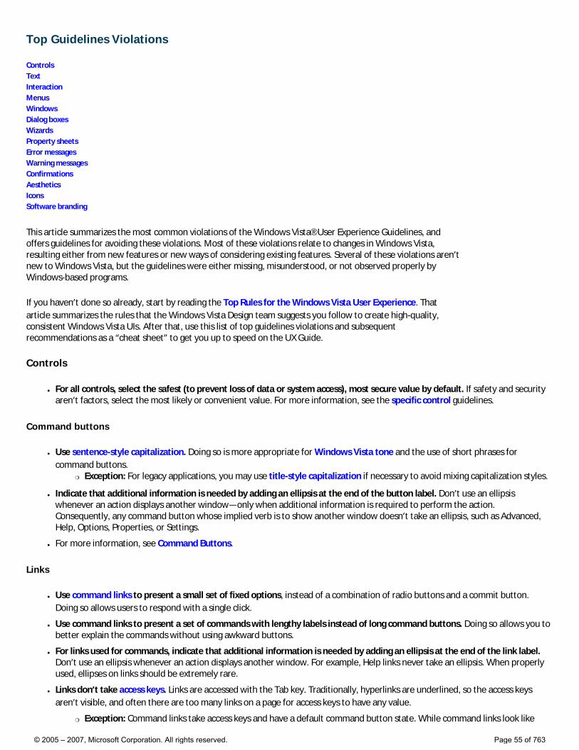
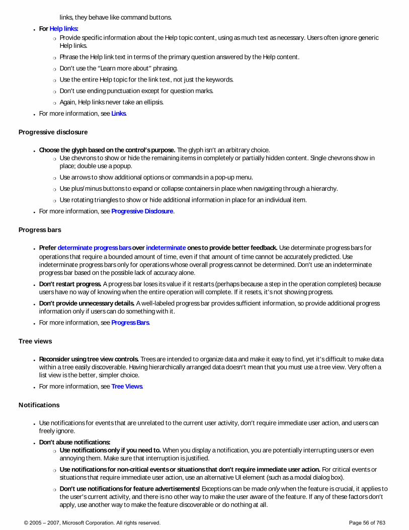
● Present choices and settings in terms of user goals, not technology. Use everyday words when you can. This is especially effective if you are explaining a complex technical concept or action. Imagine you are looking over the user’s shoulder and explaining how to accomplish the task.
Technology-based:
In these examples, properties are presented in terms of technology.
Goal-based:
In these examples, the same properties are presented in terms of user goals.
● Be polite, supportive, and encouraging. The user should never feel condescended to, blamed, or intimidated.
Acceptable: Cannot delete New Text Document: Access is denied.
Better: This file is protected and cannot be deleted without specific permission.
● Use the second person (you, your) to tell users what to do. Often the second person is implied.
Examples: Choose the pictures you want to print.
© 2005 – 2007, Microsoft Corporation. All rights reserved. Page 57 of 763
Choose an account (second person is implied).
● Use the first person (I, me, my) to let users tell the program what to do.
Examples: Print the photos on my camera.
● Avoid third-person references (the user) because they create a more formal, less personal tone.
For more information, see Style and Tone.
Main instructions
● Main instructions are prominent text that concisely explains what to do with a page or dialog box. The instruction should be a specific statement, imperative direction, or question. Good instructions communicate the user’s objective with the page or dialog box rather than focusing purely on the mechanics of manipulating it.
Incorrect: Pick a notification task
Correct: Indicate how to handle incoming information.
● Tip: You can evaluate a main instruction by imagining what you would say to a friend. If responding with the main instruction would be unnatural, unhelpful, or awkward, rework the instruction.
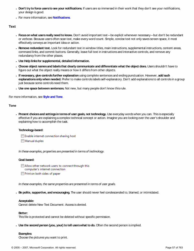
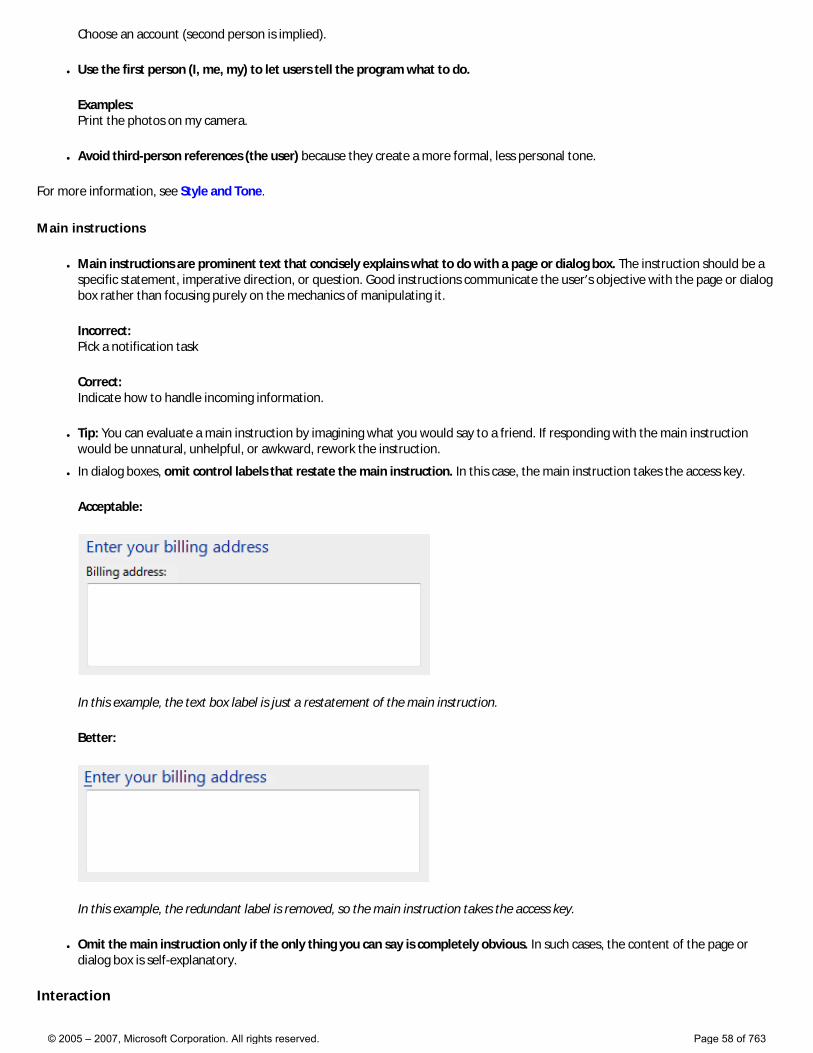
● In dialog boxes, omit control labels that restate the main instruction. In this case, the main instruction takes the access key.
Acceptable:
In this example, the text box label is just a restatement of the main instruction.
Better:
In this example, the redundant label is removed, so the main instruction takes the access key.
● Omit the main instruction only if the only thing you can say is completely obvious. In such cases, the content of the page or dialog box is self-explanatory.
Interaction
© 2005 – 2007, Microsoft Corporation. All rights reserved. Page 58 of 763
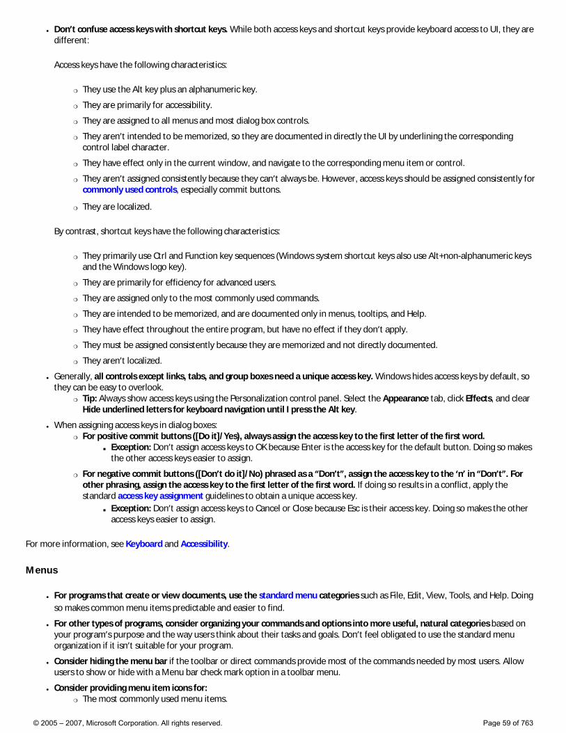
● Don’t confuse access keys with shortcut keys. While both access keys and shortcut keys provide keyboard access to UI, they are different:
Access keys have the following characteristics:
�❍ They use the Alt key plus an alphanumeric key.
�❍ They are primarily for accessibility.
�❍ They are assigned to all menus and most dialog box controls.
�❍ They aren’t intended to be memorized, so they are documented in directly the UI by underlining the corresponding control label character.
�❍ They have effect only in the current window, and navigate to the corresponding menu item or control.
�❍ They aren’t assigned consistently because they can’t always be. However, access keys should be assigned consistently for commonly used controls, especially commit buttons.
�❍ They are localized.
By contrast, shortcut keys have the following characteristics:
�❍ They primarily use Ctrl and Function key sequences (Windows system shortcut keys also use Alt+non-alphanumeric keys and the Windows logo key).
�❍ They are primarily for efficiency for advanced users.
�❍ They are assigned only to the most commonly used commands.
�❍ They are intended to be memorized, and are documented only in menus, tooltips, and Help.
�❍ They have effect throughout the entire program, but have no effect if they don’t apply.
�❍ They must be assigned consistently because they are memorized and not directly documented.
�❍ They aren’t localized.
● Generally, all controls except links, tabs, and group boxes need a unique access key. Windows hides access keys by default, so they can be easy to overlook.
�❍ Tip: Always show access keys using the Personalization control panel. Select the Appearance tab, click Effects, and clear Hide underlined letters for keyboard navigation until I press the Alt key.
● When assigning access keys in dialog boxes: �❍ For positive commit buttons ([Do it]/Yes), always assign the access key to the first letter of the first word.
■ Exception: Don’t assign access keys to OK because Enter is the access key for the default button. Doing so makes the other access keys easier to assign.
�❍ For negative commit buttons ([Don’t do it]/No) phrased as a “Don’t”, assign the access key to the ‘n’ in “Don’t”. For other phrasing, assign the access key to the first letter of the first word. If doing so results in a conflict, apply the standard access key assignment guidelines to obtain a unique access key.
■ Exception: Don’t assign access keys to Cancel or Close because Esc is their access key. Doing so makes the other access keys easier to assign.
For more information, see Keyboard and Accessibility.
Menus
● For programs that create or view documents, use the standard menu categories such as File, Edit, View, Tools, and Help. Doing so makes common menu items predictable and easier to find.
● For other types of programs, consider organizing your commands and options into more useful, natural categories based on your program’s purpose and the way users think about their tasks and goals. Don’t feel obligated to use the standard menu organization if it isn’t suitable for your program.
● Consider hiding the menu bar if the toolbar or direct commands provide most of the commands needed by most users. Allow users to show or hide with a Menu bar check mark option in a toolbar menu.
● Consider providing menu item icons for: �❍ The most commonly used menu items.
© 2005 – 2007, Microsoft Corporation. All rights reserved. Page 59 of 763
�❍ Menu items whose icon is standard and well known.
�❍ Menu items whose icon well illustrates what the command does.
● If you use icons, don’t feel obligated to provide them for all menu items. Cryptic icons aren’t helpful, create visual clutter, and prevent users from focusing on the important menu items.
● Use sentence-style capitalization.
For more information, see Menus.
Windows
● In Western cultures, we read from left to right, top to bottom, so task flow should start in the upper-left corner and end in the lower-right corner. Generally:
�❍ Place controls that start the task in the upper-left corner.
�❍ Place any controls that users must see at the top (preferably the upper-left corner) or window center.
�❍ Place commit buttons in the lower-right corner.
�❍ Place optional controls in the upper-right (such as Help icons) or lower-left (such as Help links or More options) corner.
● While the minimum Windows Vista screen resolution remains at 800 x 600 pixels, resizable window layouts should be optimized for 1024 x 768 pixels.
● Size controls and panes within a window to match their typical content. Avoid truncated text and their associated ellipses. Users should never have to interact with a window to view its typical content—reserve resizing and scrolling for unusually large content. Specifically check:
�❍ Control sizes Size controls to their typical content, making controls wider, taller, or multi-line if necessary. Size controls to eliminate or reduce scrolling in windows that have plenty of available space. Also, there should never be truncated labels, or truncated text within windows that have plenty of available space. However, to make text easier to read, consider limiting line widths to 65 characters.
�❍ Column widths Make sure list view columns have suitable default, minimum, and maximum sizing. Choose list views default column widths that don’t result in truncated text, especially if there is space available within the list view.
�❍ Layout balance The layout of a window should feel roughly balanced. If the layout feels left-heavy, consider making controls wider and moving some controls more to the right.
�❍ Layout resize When a window is resizable and data is truncated, make sure larger window sizes show more data. When data is truncated, users expect resizing windows to show more information.
● Consider the following factors when choosing window size and location: �❍ The context in which the window is displayed, especially the owner window.
�❍ The type of window.
�❍ The window’s contents.
�❍ The current screen resolution.
�❍ The presence of multiple monitors.
Choose a location that is convenient and predictable. With today’s high-resolution monitors and multiple monitors, it’s no longer sufficient to always center windows in the default monitor.
● Be sure to test your windows in both 96 and 120 DPI modes. Check for layout problems, control and window clipping, and icon and bitmap stretching.
For more information, see Layout and Window Management.
Dialog boxes
● Modal dialog boxes require interaction, so use them for things that users must respond to before continuing with their task. Make sure the interruption is justified, such as for critical or infrequent, one-off tasks that require completion. Otherwise, consider modeless alternatives.
● Modeless dialog boxes don’t require interaction, so use them when users need to switch between a dialog box and the owner window. They are best used for frequent, repetitive, or ongoing tasks. However, toolbars and palette windows are often better alternatives.
© 2005 – 2007, Microsoft Corporation. All rights reserved. Page 60 of 763
● Reconsider disabled controls. Disabled controls can be hard to use because users literally have to deduce why they are disabled. Disable a control when users expect it to apply and they can easily deduce why the control is disabled. Remove the control when there is no way for users to enable it or they don’t expect it to apply, or leave it enabled, but give an error message when it is used incorrectly.
�❍ Tip: If you aren’t sure whether you should disable a control or give an error message, start by composing the error message that you might give. If the error message contains helpful information that target users aren’t likely to quickly deduce, leave the control enabled and give the error. Otherwise, disable the control.
● Use modeless error handling for contextual, user input errors. �❍ Use balloons for non-critical user input problems detected while in a single text box control or immediately after a text
box loses focus. Display only a single balloon at a time. Balloons don’t require available screen space or dynamic layout that is required to display in-place messages. Balloons go away when clicked or the problem is resolved.
�❍ Use in-place text for delayed error detection, usually errors found by clicking a commit button. (Don’t use in-place errors for settings that are immediately committed.) There can be multiple in-place errors at a time. Use normal text and a 16x16 pixel error icon. In-place errors don’t go away unless the user commits and other errors are found.
● Don’t show this <item> again options �❍ Consider using a Don’t show this <item> again option to allow users to suppress a recurring dialog box only if there
isn’t a better alternative. It is better to always show the dialog if users really need it, or eliminate it all together if they don’t.
�❍ Replace <item> with the specific item. Example: Don’t show this reminder again. When referring to a dialog box in general, use Don’t show this message again.
�❍ Clearly indicate when user input will be used for future default values by adding “Your selections will be used by default in the future.” under the option.
● Use More/Fewer options progressive disclosure buttons to normally hide advanced or rarely used options that target users typically don’t need. Don’t hide commonly used options because users might not find them. Also, don’t use More Options to show Help, or anything else that isn’t an option.
Commit buttons
● Use positive commit buttons that are specific responses to the main instruction instead of generic labels such as OK or Yes/No. Users should be able to understand the options by reading the button text alone.
�❍ In modal dialogs, clicking OK means apply the values, perform the task, and close the window.
�❍ In modeless dialogs, use task-specific commit buttons such as Find. Don’t use an OK button.
● Use Cancel or Close for negative commit buttons instead of specific responses to the main instruction. Labeling Cancel and Close consistently always make them easy to find.
�❍ Clicking Cancel means abandon all changes, cancel the task, close the window, and return the environment to its previous state, leaving no side effects.
�❍ Clicking Close means close the dialog box window, leaving any existing side effects. Don’t use Done because it isn’t an imperative verb.
● Use Yes and No buttons only to respond to yes or no questions.
● For question dialogs using command links, always provide an explicit Cancel button. Don’t use a command link for this purpose.
● Don’t assign access keys to OK and Cancel buttons because Enter and Esc are their access keys. Doing so makes the other access keys easier to assign.
● Right-align commit buttons in a single row across the bottom of the dialog box, but above the footnote area. Do this even if there is a single commit button (such as OK).
Incorrect:
© 2005 – 2007, Microsoft Corporation. All rights reserved. Page 61 of 763
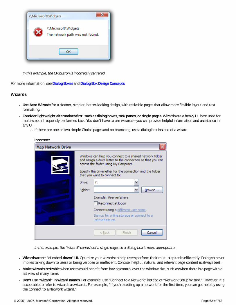
In this example, the OK button is incorrectly centered.
For more information, see Dialog Boxes and Dialog Box Design Concepts.
Wizards
● Use Aero Wizards for a cleaner, simpler, better-looking design, with resizable pages that allow more flexible layout and text formatting.
● Consider lightweight alternatives first, such as dialog boxes, task panes, or single pages. Wizards are a heavy UI, best used for multi-step, infrequently performed task. You don’t have to use wizards—you can provide helpful information and assistance in any UI.
�❍ If there are one or two simple Choice pages and no branching, use a dialog box instead of a wizard.
Incorrect:
In this example, the “wizard” consists of a single page, so a dialog box is more appropriate.
● Wizards aren’t “dumbed-down” UI. Optimize your wizards to help users perform their multi-step tasks efficiently. Doing so never implies talking down to users or being verbose or inefficient. Concise, helpful, natural, and relevant page content is always best.
● Make wizards resizable when users could benefit from having control over the window size, such as when there is a page with a list view of many items.
● Don’t use “wizard” in wizard names. For example, use “Connect to a Network” instead of “Network Setup Wizard.” However, it’s acceptable to refer to wizards as wizards. For example, “If you’re setting up a network for the first time, you can get help by using the Connect to a Network wizard.”
© 2005 – 2007, Microsoft Corporation. All rights reserved. Page 62 of 763
● Preserve user selections through navigation. For example, if the user makes changes, clicks Back, then Next, those changes should be preserved. Users don’t expect to have to reenter changes unless they explicitly chose to clear them.
Wizard pages
● Focus on efficient decision making. Reduce the number of pages to focus on essentials. Consolidate related pages, and take optional pages out of the main flow. Having users click Next completely through your wizard may seem like a good experience at first, but if users never need to change the defaults, the pages are probably unnecessary.
● Don’t use Welcome pages—make the first page functional whenever possible. Use an optional Getting Started page only when: �❍ The wizard has prerequisites that are necessary to complete the wizard successfully.
�❍ Users may not understand the purpose of the wizard based on its first Choice page and there isn’t room for further explanation.
�❍ The main instruction for Getting Started pages is “Before you begin:”.
● Optimize Choice pages for the most likely cases. Don’t have Choice pages without any real choices, such as having just instructions.
�❍ If you don’t use a Getting Started page, explain the purpose of the wizard at the top of the first Choice page.
● Use Commit pages to make it clear when users are committing to the task. Usually the Commit page is the last Choice page and the Next button is relabeled to indicate the task being committed.
�❍ Don’t use Summary pages that merely summarize the user’s previous selections, unless the task is risky (involving security, or loss of time or money) or there is a good chance that users might not understand their selections and need to review them.
● Don’t use Congratulations pages that do nothing but end the wizard. If the wizard results are clearly apparent to users, just close the wizard on the final commit button.
�❍ Use Follow-Up pages when there are related tasks that users are likely to do as follow-up. Avoid familiar follow-up tasks, such as “Send an e-mail message.”
�❍ Use Completion pages only when the results aren’t visible and there’s no better way to provide feedback for task completion.
�❍ Wizards that have Progress pages must use a Completion page or Follow-Up page to indicate task completion. For long-running tasks, close the wizard on the Commit page and use notifications to give feedback.
Commit buttons
● Use Next only when advancing to the next page without commitment. Advancing to the next page is considered a commitment when its effect can’t be undone by clicking Back.
● When users are committing to a task, use a commit button (examples: Print, Connect, Start) that is a specific response to the main instruction. Don’t use generic labels like Next (which doesn’t imply commitment) or Finish (which isn’t specific) for committing a task. The labels on these commit buttons should make sense on their own. Always start commit button labels with a verb. Exceptions:
�❍ Use Finish when the specific responses are still generic, such as Save, Select, Choose, or Get.
�❍ Use Finish to change a specific setting or a collection of settings.
● Use command links only for choices, not commitments. Users need to know when they’ve reached the point of no return. Specific commit buttons indicate commitment far better than command links in a wizard.
● When using command links, hide the Next button, but leave the Cancel button.
● Use Close for Follow-Up and Completion pages. Don’t use Cancel because closing the window won’t abandon any changes or actions done at this point. Don’t use Done because it isn’t an imperative verb.
● Don’t disable commit buttons. Otherwise, users have to deduce why the commit buttons are disabled and if they can’t, they aren’t able to proceed. It’s better to leave commit buttons enabled and give a helpful error message whenever there is a problem.
● Don’t confirm commit buttons (including Cancel). Doing so unnecessarily can be very annoying. Exceptions: �❍ The action has significant consequences and, if incorrect, not readily fixable.
�❍ The action may result in a significant loss of the user’s time or effort.
�❍ The action is clearly inconsistent with other actions.
For more information, see Wizards.
© 2005 – 2007, Microsoft Corporation. All rights reserved. Page 63 of 763
Property Sheets
● Make sure the properties are necessary. Don’t clutter your pages with unnecessary properties just to avoid making hard design decisions.
● Present properties in terms of user goals instead of technology. Just because a property configures a specific technology doesn’t mean that you must present the property in terms of that technology.
�❍ If you must present settings in terms of technology (perhaps because your users recognize the technology’s name), include a brief description of the user benefit.
● Make pages coherent by relating all properties on each page to a single, specific, task-based purpose.
● If space allows, explain the purpose of the property window at the top of the page if it isn’t obvious to your target users. If the page is used to perform only a single task, phrase the text as a clear instruction about how to perform that task. Use complete sentences ending with a period.
● Use specific, meaningful tab labels. Avoid generic tab labels that could apply to any tab, such as General, Advanced, or Settings.
● Avoid General pages. You aren’t required to have a General page. Use a General page only if: �❍ The properties apply to several tasks and are meaningful to most users. Don’t put specialized or advanced properties on a
General page, but you can make them accessible through a command button on the General page.
�❍ The properties don’t fit a more specific category. If they do, use that name for the page instead.
● Avoid Advanced pages. Use an Advanced page only if: �❍ The properties apply to uncommon tasks and are meaningful primarily to advanced users.
�❍ The properties don’t fit a more specific category. If they do, use that name for the page instead.
● Don’t use tabs if a property window has only a single tab and isn’t extensible. Use a regular dialog box with OK, Cancel, and an optional Apply button instead. Extensible property windows (which can be extended by third parties) always need to use tabs.
● Don’t put graphics on tabs. Graphics usually add unnecessary visual clutter, consume screen space, and often don’t improve user comprehension. Add only graphics that aid in comprehension, such as standard symbols. Otherwise, it can be extremely challenging to design meaningful graphics for all the tabs in a property window.
● Provide an Apply button only if the property sheet has settings (at least one) with effects that users can evaluate in a meaningful way. Typically, Apply buttons are used when settings make visible changes. Users should be able to apply a change, evaluate the change, and make further changes based on that evaluation. If not, remove the Apply button instead of disabling it.
For more information, see Property Windows.
Error Messages
● Use task dialogs whenever appropriate to achieve a consistent look and layout. Task dialogs require Windows Vista or later, so they aren’t suitable for earlier versions of Windows.
● Error messages describe a problem that has already happened.
● Don’t give error messages when users aren’t likely to perform an action or change their behavior as the result of the message. If there is no action users can take, or if the problem isn’t significant, suppress the error message.
● Use the main instruction to explain the problem in clear, plain, concise, specific language. The instruction should be a specific imperative direction. You can also propose a solution to the problem in the form of a question.
● Whenever possible, propose a solution so users can fix the problem. However, make sure the proposed solution is likely to solve the problem. Don’t waste users’ time by suggesting possible, but improbable, solutions.
● Don’t use OK for error messages. Users don’t view errors as being OK. If the error message has no direct action, use Close instead.
● Error icons: �❍ For critical problems, use the error icon.
�❍ For modal error messages and error balloons, don’t use any icon for insignificant problems, such as routine user input errors that users must fix anyway. Doing so is counter to the encouraging tone of Windows Vista. However, in-place error messages should use a small error icon to clearly identify them as error messages.
�❍ Never use the warning icon for errors to make it feel less severe. Errors aren’t warnings.
● Don’t accompany error messages with sound effects. Doing so is jarring and unnecessary.
© 2005 – 2007, Microsoft Corporation. All rights reserved. Page 64 of 763
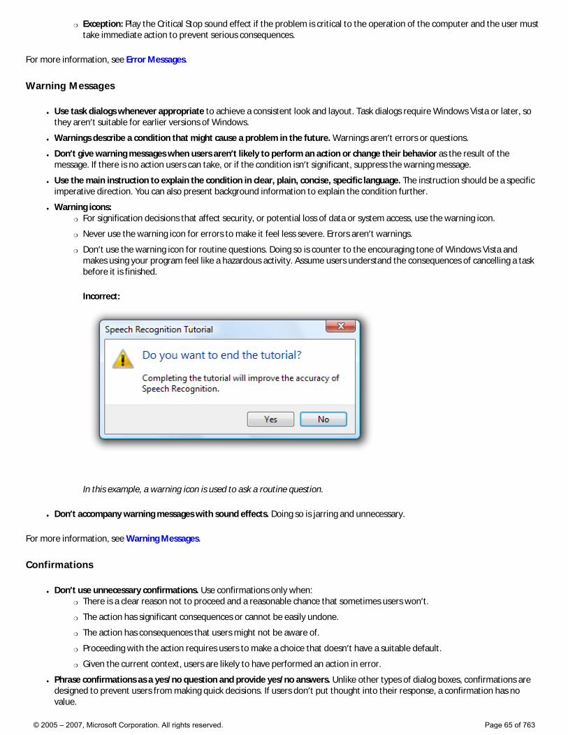
�❍ Exception: Play the Critical Stop sound effect if the problem is critical to the operation of the computer and the user must take immediate action to prevent serious consequences.
For more information, see Error Messages.
Warning Messages
● Use task dialogs whenever appropriate to achieve a consistent look and layout. Task dialogs require Windows Vista or later, so they aren’t suitable for earlier versions of Windows.
● Warnings describe a condition that might cause a problem in the future. Warnings aren’t errors or questions.
● Don’t give warning messages when users aren’t likely to perform an action or change their behavior as the result of the message. If there is no action users can take, or if the condition isn’t significant, suppress the warning message.
● Use the main instruction to explain the condition in clear, plain, concise, specific language. The instruction should be a specific imperative direction. You can also present background information to explain the condition further.
● Warning icons: �❍ For signification decisions that affect security, or potential loss of data or system access, use the warning icon.
�❍ Never use the warning icon for errors to make it feel less severe. Errors aren’t warnings.
�❍ Don’t use the warning icon for routine questions. Doing so is counter to the encouraging tone of Windows Vista and makes using your program feel like a hazardous activity. Assume users understand the consequences of cancelling a task before it is finished.
Incorrect:
In this example, a warning icon is used to ask a routine question.
● Don’t accompany warning messages with sound effects. Doing so is jarring and unnecessary.
For more information, see Warning Messages.
Confirmations
● Don’t use unnecessary confirmations. Use confirmations only when: �❍ There is a clear reason not to proceed and a reasonable chance that sometimes users won’t.
�❍ The action has significant consequences or cannot be easily undone.
�❍ The action has consequences that users might not be aware of.
�❍ Proceeding with the action requires users to make a choice that doesn’t have a suitable default.
�❍ Given the current context, users are likely to have performed an action in error.
● Phrase confirmations as a yes/no question and provide yes/no answers. Unlike other types of dialog boxes, confirmations are designed to prevent users from making quick decisions. If users don’t put thought into their response, a confirmation has no value.
© 2005 – 2007, Microsoft Corporation. All rights reserved. Page 65 of 763
For more guidelines and examples, see Confirmations.
Aesthetics
● Don’t hardcode theme-related values or system metrics, such as fonts, colors, or sizes. Respect the user’s settings by always obtaining font typefaces, sizes, and colors, Windows display element sizes, and system configuration settings from the Theme and GetSystemMetrics APIs. For more information, see Fonts and Accessibility.
● Don’t use large graphics that just fill space with eye candy. Keep the appearance simple.
● Use animations that improve usability, such as animations and transitions that show relationships, causes, and effects. Animations are best used to provide information that would require text to explain, or might otherwise be missed. The human eye is sensitive to motion, especially peripheral motion. If you use animation to draw attention to something, make sure that attention is deserved and worthy of interrupting the user.
For more information, see Aero Aesthetics.
Icons
● Make your program icon the star! Ensure it is meaningful, and reflects function and your brand. Make it distinct, make it special, and ensure it renders well in all icon sizes and on all surfaces. Spend the time necessary to get it right.
● All icons should adhere to the Aero-style icon guidelines. Replace all Win 9x and Win 3.1 style graphics. Windows XP-style graphics can be used in Windows Vista, but we recommend that you update them to the new Aero style and quality.
● Have your Aero-style icons designed and created by professional graphic artists.
● Select icons based on meaning, not appearance. Make sure that your icons have consistent meaning throughout your application and don’t conflict with existing icons or conventions in the system, or in other commonly used Windows-based applications.
● Render icons in all sizes needed but optimize their design for the sizes most often seen by users. For example, Explorer can display icons up to 256 x 256 pixels, but toolbar icons are limited to 24 x 24 pixels.
● For the main file types of your application that users will interact with in Windows Vista, consider using the Windows Thumbnailing API to get live previews of those files in Windows Explorer views.
For more information, see Icons.
Software branding
● Limit the use of product and company logos in the user interface. Don’t plaster company or product logos on every UI surface. �❍ Limit product and company logos to at most two different surfaces, such as the main window or home page and the
About box.
�❍ Limit product and company logos to at most twice on any single surface.
�❍ Limit product and company names to at most three times on any surface.
● Don’t use branding that is distracting or harms usability or performance.
● Don’t use custom controls for branding. Rather, use custom controls when necessary to create a special immersive experience or when special functionality is needed.
● Don’t use the Windows desktop for branding.
● Don’t use animated logos.
● Don’t use splash screens for branding. Avoid using splash screens because they may cause users to associate your program with poor performance. Use them only to give feedback and reduce the perception of time for programs that have unusually long load times.
For more information, see Branding.
© 2005 – 2007, Microsoft Corporation. All rights reserved. Page 66 of 763
How to Design a Great User Experience
While simply expressed, each of these ideas is profound. We could make each an article, but we’ll give a short explanation instead. Fill in any missing details with examples from your own experience.
1. Nail the basics The core scenarios—the primary reasons people use your Windows Vista® program—are far more important than the fringe scenarios—things people might do but probably won’t. Nail the basics! (And if you do, users will overlook fringe problems.)
2. Be great at something Think about how real users (not the marketing or PR departments) will describe your program. Identify your target users and make sure they can say “I love this program! It does A, B, and C super well!” If users can’t say that about your program, what’s the point? Today, “good enough” is no longer good enough—make your users love it.
3. Don’t be all things to all people Your program is going to be more successful by delighting its target users than attempting to satisfy everyone.
4. Make the hard decisions Do you really need that feature, command, or option? If so, do it well. If not, cut it! Don’t avoid difficult decisions by making everything optional or configurable.
5. Make the experience like a friendly conversation Think of your UI as a conversation between you and your target users. Suppose you’re looking over a user’s shoulder and he or she asks, “What do I do here?” Think about the explanation you would give...the steps, their order, the language you’d use, and the way you explain things. Also think about the things you don’t say. That’s what your UI should be—like a conversation between friends—rather than some arcane thing that users have to decipher.
6. Do the right thing by default Sure, you can pile on options to allow users to change things, but why? Choose safe, secure, convenient default values. Also, make the default experience the right experience for your target users. Don’t assume that they will configure their way out of a bad initial experience. They won’t.
7. Make it just work People want to use your program, not configure it or learn a bunch of things. Choose an initial configuration, make it obvious how to do the most common and important tasks, and get your program working right away.
8. Ask questions carefully Avoid asking unessential questions using modal dialogs—prefer modeless alternatives. If you must ask a question in your UI, express it in terms of users’ goals and tasks, not in terms of technology. Provide options that users understand (again, phrased in terms of goals and tasks, not technology) and clearly differentiate. Make sure to provide enough information for users to make informed decisions.
9. Make it a pleasure to use Make sure your program serves its purpose well. Have the right set of features and put the features in the right places. Pay attention to detail.
10. Make it a pleasure to see Use the standard Windows Vista look, including standard window frames, fonts, system colors, common controls and dialog boxes, and standard layout. Avoid custom UI and use branding with restraint. Use standard Windows Vista icons, graphics, and animations whenever possible (and legal!) For your own graphics and icons, use a professional designer. (If you can’t afford one, use a few simple graphics—or even none at all.) And don’t assume that providing skins will compensate for an unexciting look. Most users won’t bother with
© 2005 – 2007, Microsoft Corporation. All rights reserved. Page 67 of 763
them and having one great look makes a much better impression than having dozens of not-so-great ones.
11. Make it responsive Your program’s responsiveness is crucial to its overall experience—users find unnecessarily slow and unresponsive programs unusable. For every feature where performance is an issue, first understand your users’ goals and expectations, then choose the lightest weight design that achieves these goals. Generally, tasks that can take longer than 10 seconds need more informative feedback and the ability to cancel. Keep in mind that users’ perception of speed is just as important as the actual speed, and the perception of speed is primarily determined by how quickly a program becomes responsive.
12. Keep it simple Strive for the simplest design that does the job well. Expand the design beyond that only as required. Don’t have three ways to do something when one will do. Eliminate or reduce all that unnecessary junk!
13. Avoid bad experiences Easier said than done, but users’ overall perception of your program is more often determined by the quality of the bad experiences than of the good ones.
14. Design for common problems Is your design great—until the user makes a mistake or the network connection is lost? Anticipate and design for common problems, user mistakes, and other errors. Consider things like the network being slow or unavailable, devices being not installed or unavailable, and users giving incorrect input or skipping steps. At each step in your program, ask yourself: What are the worst likely things that could happen? Then see how well your program behaves when they do happen. Make sure all error messages clearly explain the problem and give an actionable solution.
15. Don’t be annoying Most likely, anything users routinely dismiss without performing any action should be redesigned or removed. This is especially true for anything users see repeatedly, such as error messages, warnings, confirmations, and notifications. Use sound with extreme restraint. UI related to security and legal issues (for example, consent or license terms) are possible exceptions.
16. Reduce effort, knowledge, and thought To reduce the effort, knowledge, and thought required to use your program:
�❍ Explicit is better than implicit. Put the information users need to know directly on the screen. Carefully craft the main instruction on windows and pages to clearly communicate the purpose of the UI.
�❍ Automatic is better than manual. Try to help users by doing things automatically whenever practical and desirable. A simple test: Close your program, then restart it and perform the most common task. How much manual effort can you eliminate?
�❍ Concise is better than verbose. Put it on the screen, but concisely. Get right to the point! Design text for scanning, not immersive reading. Use Help links for helpful, supplemental, but not essential information.
�❍ Constrained is better than unconstrained. When choosing controls, the control constrained to valid input is usually the best choice.
�❍ Enabled is better than disabled. Disabled controls are often confusing, so use them only when users can easily deduce why the control is disabled. Otherwise, remove the control if it doesn’t apply or leave it enabled and give helpful feedback.
�❍ Feedback is better than being clueless. Give clear feedback to indicate whether a task is being done or has failed. Don’t make the user guess.
17. Follow the guidelines Of course! Consider UX Guide to be the minimum quality and consistency bar for Windows Vista-based programs. Use it to follow best practices, make routine decisions, and to just make your job easier. Focus your creative energy on the important things—whatever your program is all about—not the routine. Don’t
© 2005 – 2007, Microsoft Corporation. All rights reserved. Page 68 of 763
create that weird program that nobody can figure out how to use. Follow the guidelines and make your experience stand out while fitting in.
18. Test your UI You won’t know if you’ve got it right until you’ve tested your program with real target users with a usability study. Most likely, you’ll be (unpleasantly) surprised by the results. Be glad to have your UI criticized—that’s required for you to do your best work. And be sure to collect feedback after your program ships.
© 2005 – 2007, Microsoft Corporation. All rights reserved. Page 69 of 763
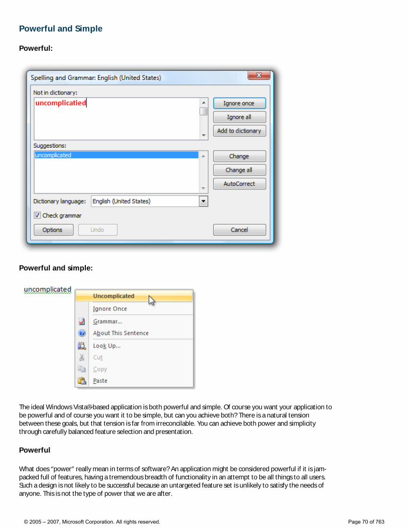
Powerful and Simple
Powerful:
Powerful and simple:
The ideal Windows Vista®-based application is both powerful and simple. Of course you want your application to be powerful and of course you want it to be simple, but can you achieve both? There is a natural tension between these goals, but that tension is far from irreconcilable. You can achieve both power and simplicity through carefully balanced feature selection and presentation.
Powerful
What does “power” really mean in terms of software? An application might be considered powerful if it is jam-packed full of features, having a tremendous breadth of functionality in an attempt to be all things to all users. Such a design is not likely to be successful because an untargeted feature set is unlikely to satisfy the needs of anyone. This is not the type of power that we are after.
© 2005 – 2007, Microsoft Corporation. All rights reserved. Page 70 of 763
An application is powerful when it has the right combination of these characteristics:
● Enabling. The application satisfies the needs of its target users, enabling them to perform tasks that they couldn’t otherwise do and achieve their goals effectively.
● Efficient. The application enables users to perform tasks with a level of productivity and scale that wasn’t possible before.
● Versatile. The application enables users to perform a wide range of tasks effectively in a variety of circumstances.
● Direct. The application feels like it is directly helping users achieve their goals, instead of getting in the way or requiring unnecessary steps. Features like shortcuts, keyboard access, and macros improve the sense of directness.
● Flexible. The application allows users complete, fine-grained control over their work.
● Integrated. The application is well integrated with Microsoft® Windows®, allowing it to share data with other applications.
● Advanced. The application has extraordinary, innovative, start-of-the-art features that are not found in competing solutions.
Some of these characteristics depend upon the perception of the user and are relative to users’ current capabilities. What is considered powerful may change over time, so today’s advanced search feature might be commonplace tomorrow.
All these characteristics can be combined into our definition of power:
An application is powerful when it enables its target users to realize their full potential efficiently.
Thus, the ultimate measure of power is productivity, not the number of features.
Different users need help in achieving their full potential in different ways. What is enabling to some users might harm versatility, directness, and control for others. Well-designed software must balance these characteristics appropriately. For example, a desktop publishing system designed for nonprofessionals might use wizards to walk users through complex tasks. Such wizards enable the target users to perform tasks that they otherwise wouldn’t be able to perform. By contrast, a desktop publishing system for professionals might focus on directness, efficiency, and complete control. For users of such an application, wizards may be limiting and frustrating.
If you do only one thing... Understand your target users’ goals and craft a feature set that enables them to achieve those goals productively.
Simple
We define simplicity as follows:
Simplicity is the reduction or elimination of an attribute of a design that target users are aware of and consider unessential.
In practice, simplicity is achieved by selecting the right feature set and presenting the features in the right way. This reduces the unessential, both real and perceived.
Simplicity is dependent upon the perception of users. Consider how the effect of an automatic transmission depends on a user’s perspective:
● For the typical driver (the target user), an automatic transmission eliminates the need for a manual gear shift and clutch, making a car much easier to drive. A manual gear shift and clutch are not essential to the task of driving, so they are removed to achieve simplicity.
● For a professional race car driver, having direct control over the transmission is essential to being competitive. An automatic transmission negatively affects the car’s performance, so it is not regarded as resulting in simplicity.
● For a mechanic, an automatic transmission is a more complex mechanism, and therefore isn’t easier to repair or maintain than a manual transmission. Unlike the mechanic, the target user is blissfully unaware of this internal complexity.
© 2005 – 2007, Microsoft Corporation. All rights reserved. Page 71 of 763
While different users regard the automatic transmission differently, it’s successful because it eliminates the need for unessential knowledge, skill, and effort from its target users. For the typical driver, automatic transmission is a great feature because it just works.
Simplicity vs. ease of use
Simplicity, when correctly applied, results in ease of use. But simplicity and ease of use are not the same concepts. Ease of use is achieved when users can perform a task successfully on their own without difficulty or confusion within a suitable amount of time. There are many ways to achieve ease of use, and simplicity—the reduction of the unessential—is just one of them.
All users, no matter how sophisticated, want to get their work done with a minimum amount of unnecessary effort. All users—even advanced users—are primarily motivated to get their work done, not to learn about computers or your application.
Simplicity is the most effective way to achieve ease of use, and ease of use equals use. Complex, hard-to-use features just don’t get used. By contrast, simple, elegant designs that perform their function well are a joy to use. They invoke a positive, emotional response.
For example, consider the wireless networking support in Microsoft Windows XP. Microsoft could have added a wizard to walk users through the configuration process. This approach would have resulted in ease of use but not simplicity, because an unessential feature (the wizard) would have been added. Instead, Microsoft designed wireless networking to configure itself automatically. Users ultimately don’t care about the configuration details, so long as it “just works” reliably and securely. This combination of power and simplicity in wireless networking technology has led to its popularity and rapid adoption.
If you do only one thing... Start your design process with the simplest designs that do the job well.
If you’re not satisfied with your current design, start by stripping away all the unessential elements. You will find that what remains is usually quite good.
Obtaining simplicity while maintaining power
Design principles
To obtain simplicity, always design for the probable, not the possible.
The possible
Design decisions based on what’s possible lead to complex user interfaces like the Registry Editor, where all actions are equally possible and as a result require equal effort. Since anything can happen, user goals aren’t considered in design decisions.
The probable
Design decisions based on the probable lead to simplified, goal- and task-based solutions, where the likely scenarios receive focus and require minimal effort to perform.
The simplicity design principle
To obtain simplicity, focus on what is likely; reduce, hide, or remove what is unlikely; and eliminate what is impossible.
What users will do is far more relevant to design than what they might do.
© 2005 – 2007, Microsoft Corporation. All rights reserved. Page 72 of 763

Design techniques
To obtain simplicity while maintaining power, choose the right set of features, locate the features in the right places, and reduce the effort to use them. This section gives some common techniques to achieve these goals.
Choosing the right feature set
“Perfection is achieved, not when there is nothing more to add, but when there is nothing left to take away.” —Antoine de Saint-Exupery
The following design techniques give your users the features they need while achieving simplicity through actual reduction or removal:
● Determine the features your users need. Understand your users’ needs through goal, scenario, and task analysis. Determine a set of features that realizes these objectives.
● Remove unnecessary elements. Remove elements that aren’t likely to be used or have preferable alternatives.
● Remove unnecessary redundancy. There might be several effective ways to perform a task. To achieve simplicity, make the hard decision and choose the best one for your target users instead of providing all of them and making the choice an option.
● Make it “just work” automatically. The element is necessary, but any user interaction to get it to work is not because there is an acceptable default behavior or configuration. To achieve simplicity, make it work automatically and either hide it from the user completely or reduce its exposure significantly.
Streamlining the presentation
“The ability to simplify means to eliminate the unnecessary so that the necessary may speak.” —Hans Hofmann
Use the following design techniques to preserve power, while achieving simplicity through the perception of reduction or removal:
● Combine what should be combined. Put the essential features that support a task together so that a task can be performed in one place. The task’s steps should have a unified, streamlined flow. Break down complex tasks into a set of easy, clear steps, so that “one” place might consist of several UI surfaces, such as a wizard.
● Separate what should be separated. Not everything can be presented in one place, so always have clear, well-chosen boundaries. Make features that support core scenarios central and obvious, and hide optional functionality or make it peripheral. Separate individual tasks and provide links to related tasks. For example, tasks related to manipulating photos should be clearly separated from tasks related to managing collections of photos, but they should be readily accessible from each other.
● Eliminate what can be eliminated. Take a printout of your design and highlight the elements used to perform the most important tasks. Even highlight the individual words in the UI text that communicate useful information. Now review what isn’t highlighted and consider removing it from the design. If you remove the item, would anything bad happen? If not, remove it! Consistency, configurability, and generalization are often desirable qualities, but they can lead to unnecessary complexity. Review your design for misguided efforts in consistency (such as having redundant text), generalization (such as having any number of time zones when two is sufficient), and configurability (such as options that users aren’t likely to change), and eliminate what can be eliminated.
● Put the elements in the right place. Within a window, an element’s location should follow its utility. Essential controls, instructions, and explanations should all be in context in logical order. If more options are needed, expose them in context by clicking a chevron or similar mechanism; if more information is needed, display an infotip on mouse hover. Place less important tasks, options, and Help information outside the main flow in a separate window or page. The technique of displaying additional detail as needed is called progressive disclosure.
● Use meaningful high-level combinations. It is often simpler and more scalable to select and manipulate groups of related elements than individual elements. Examples of high-level combinations include folders, themes, styles, and user groups. Such combinations often map to a user goal or intention that isn’t apparent from the individual elements. For example, the intention behind the High Contrast Black color scheme is far more apparent than that of a black window background.
© 2005 – 2007, Microsoft Corporation. All rights reserved. Page 73 of 763
● Select the right controls. Design elements are embodied by the controls you use to represent them, so selecting the right control is crucial to efficient presentation. For example, the font selection box used by Microsoft Word shows both a preview of the font as well as the most recently used fonts. Similarly, the way Word shows potential spelling and grammar errors in place is much simpler than the dialog box alternative, as shown in the beginning of this article.
Reducing effort
“Simple things should be simple. Complex things should be possible.”—Alan Kay
The following design techniques result in reduced effort for users:
● Make tasks discoverable and visible. All tasks, but especially frequent tasks, should be readily discoverable within the user interface. The steps required to perform tasks should be visible and should not rely on memorization.
● Present tasks in the user’s domain. Complex software requires users to map their problems to the technology. Simple software does that mapping for them by presenting what is natural. For example, a red-eye reduction feature maps directly to the problem space and doesn’t require users to think in terms of details like hues and gradients.
● Put domain knowledge into the program. Users shouldn’t be required to access external information to use your application successfully. Domain knowledge can range from complex data and algorithms to simply making it clear what type of input is valid.
● Use text that users understand. Well-crafted text is crucial to effective communication with users. Use concepts and terms familiar to your users. Fully explain what is being asked in plain language so that users can make intelligent, informed decisions.
● Use safe, secure, probable defaults. If a setting has a value that applies to most users in most circumstances, and that setting is both safe and secure, use it as the default value. Make users specify values only when necessary.
● Use constraints. If there are many ways to perform a task, but only some are correct, constrain the task to those correct ways. Users should not be allowed to make readily preventable mistakes.
Simplicity does not mean simplistic
“Everything should be made as simple as possible, but not simpler.”—Albert Einstein
We believe that simplicity is crucial to an effective, desirable user experience—but it is always possible to take a good thing too far. The essence of simplicity is the reduction or elimination of the unessential. Removal of the essential just produces a poor design. If your “simplification” results in users becoming frustrated, confused, unconfident, or unable to complete tasks successfully, you have removed too much.
Simplicity does mean more effort for you
“I have only made this letter longer because I have not the time to make it shorter.”—Blaise Pascal
Obtaining simplicity while preserving power often requires significant internal complexity. It is usually easier to design software that exposes all the technology plumbing than to design one that hides it—the latter requires an excellent understanding of your target users and their goals. Removing a feature requires discipline, as does deciding against adding that cool feature that really isn’t practical. Simplicity requires making hard design choices instead of making everything configurable. Complex software often results from a misconception about users: that they value unused features or overly complex features they can’t understand.
Powerful and simple
Power is all about enabling your users and making them productive. Simplicity is all about removing the unessential and presenting features the right way. By understanding your target users and achieving the right balance of features and presentation, you can design Windows Vista-based applications that do both.
© 2005 – 2007, Microsoft Corporation. All rights reserved. Page 74 of 763
Designing with Windows Presentation Foundation
Follow the UX Guide Use Windows Presentation Foundation appropriately Guidelines
Windows Presentation Foundation (WPF) is a user interface development environment that provides access to more advanced visuals, such as interfaces that incorporate documents, media, two- and three-dimensional graphics, animations, Web-like characteristics, and more. For a general overview, see Introducing Windows Presentation Foundation.
When used appropriately, the WPF in Windows Vista® can help you create an engaging, productive experience your target users will love. If misused, it could lead to programs that are frustrating and difficult to use. The guidelines that follow will help you understand the difference, and use this technology appropriately.
Follow the UX Guide
While the Windows Vista User Experience Guidelines (or “UX Guide”) were written specifically for Windows Vista, nearly all of these guidelines apply to programs using WPF as well. However, this shouldn’t be a surprise—the primary goal of these guidelines is to establish a high-quality, consistent baseline for all Windows Vista-based applications, no matter how they are implemented.
While Windows Presentation Foundation gives you the flexibility to create a broad range of user experiences—from traditional Microsoft® Windows® to highly customized—you should never feel that using WPF obligates you to abandon the Windows look and feel. In fact, WPF gives you the traditional Windows look and feel by default, and includes advanced versions of the Aero and Windows XP themes. Regardless of how your program looks, your WPF-based program can benefit from powerful capabilities such as a rich application model, dynamic layout, and data binding.
Use Windows Presentation Foundation appropriately
Among other things, WPF makes it possible to completely change your program’s look to match your corporate branding, or to use a custom interaction model to give your program a “unique” feel. You can even customize a drop-down list to look like a slider! But when are such changes from a traditional experience genuinely appropriate?
What is “cool”?
WPF offers an exciting set of advanced capabilities. With this step forward comes the desire to create better—or “cooler”—software. All too often these attempts don’t seem to hit the mark. To understand why, let’s make a distinction between what makes a program cool and what doesn’t.
A program really is “cool” when it has:
● Features appropriate for the program and its target users.
● Aesthetically pleasing look and feel, often in a subtle way.
● Improved usability and flow, without harming performance.
● A lasting good impression—it’s just as enjoyable the 100th time as the first.
© 2005 – 2007, Microsoft Corporation. All rights reserved. Page 75 of 763

A program fails to be “cool” when it has:
● Use or abuse of a technology just because it can.
● Features that detract from usability, flow, or performance.
● Is in the user’s face, constantly drawing unnecessary attention to itself.
● A fleeting good impression. It might have been fun the first time, but the enjoyment wears off quickly.
Just as in a painter’s palette there are no intrinsically good or bad colors, there aren’t intrinsically good or bad capabilities in WPF. Rather, for specific programs and their target users, we believe there are appropriate designs and inappropriate designs. Truly cool programs use technology because they should, not because they can.
To achieve coolness, start not by thinking about what the technology can do, but by focusing on what your target users really need. Before adding that “cool” feature, make sure there are clear user scenarios that support it.
Target users
Designing great software boils down to a series of decisions about what functionality you present to the user and how it is presented. For great software, those decisions must be made based on the goals of the software and its intended audience. A good design decision must be made for the benefit of the target users—never for yourself, or because the platform made it easy.
To understand your target users, make a list of their knowledge, their goals, and their preferences. You should understand their motivation in using your program, how often they will use it, and their work environment. Also, consider creating user personas, which are fictitious people designed from real data, intended to represent classes of real users.
Program types
The type of program you are creating also factors into your decisions. Here are the characteristics of some common program types:
Productivity applications
● Target users: Knowledge workers.
● Goals: Productivity, reduce costs.
● Usage: Used often for long periods of time, possibly all day.
● User expectation: Familiarity, consistency, immediate productivity.
● Appropriate use of WPF: Help users get their work done productively.
● Examples: Microsoft Office, line-of-business applications.
Consumer applications
● Target users: Consumers.
● Goals: For users, perform a specific set of tasks. For ISVs, to sell well.
● Usage: Used occasionally (perhaps weekly) for short periods of time.
© 2005 – 2007, Microsoft Corporation. All rights reserved. Page 76 of 763
● User expectation: An enjoyable experience that performs targeted tasks well.
● Appropriate use of WPF: Help users perform tasks; some branding.
● Examples: Multimedia reference apps, media players and tools, security tools.
Games
● Target users: Consumers.
● Goals: Entertainment.
● Usage: Used occasionally for moderate periods of time.
● User expectation: An immersive experience.
● Appropriate use of WPF: Custom look, possibly custom interaction.
● Examples: Simple games, online games.
Kiosks
● Target users: Walkup users.
● Goals: Perform a specific task, get information.
● Usage: Once.
● User expectation: Perform task immediately, without learning anything.
● Appropriate use of WPF: Custom look, possibly custom interaction (touch, drag-and-drop), animations for visual explanations.
● Examples: Airport kiosks, museum kiosks.
IT Pro utilities
● Target users: Developed and used by IT professionals.
● Goals: Perform a task or obtain information quickly.
● Usage: As needed, typically for short periods of time.
● User expectation: Get the job done.
● Appropriate use of WPF: Help IT pro develop and test UIs quickly.
Improving usability
Some design ideas are good simply because they improve usability. Here are some common ways to improve usability with WPF:
● Model the real world. You can use custom visuals and interactions to make specific controls look and behave like their real-world counterparts. This technique is best used when users are familiar with the real-world object, and the real-world approach is the best, most efficient way to perform the task. For example, simple utilities like calculators just work better when they model their real-world counterparts.
● Show instead of explain. You can use animations and transitions to show relationships, causes, and effects. This technique is best used to provide information that would otherwise require text to explain or might be missed by users. For example, a book for young children could animate page turns to show how the controls work. Normal page turns would be harder for a young child to understand.
© 2005 – 2007, Microsoft Corporation. All rights reserved. Page 77 of 763
● Improve affordance. Affordance is a property of an object that suggests how the object is used (as opposed to using a label to explain it). You can use custom control visuals and animations to suggest how nonstandard controls are used.
● Use natural mapping. Natural mapping is a clear relationship between what the user wants to do and how to do it. You can use custom appearances and interactions to create natural mappings when the standard common controls won’t do.
● Reduce knowledge. You can use custom interactions to limit the number of ways to perform an operation and the amount of knowledge required to perform a task.
● Improve feedback. You can use custom control visuals and animations to give feedback to show that something is being done correctly or incorrectly, or to show progress. For example, the Address bar in Windows Internet Explorer® shows the progress for loading the page in the background.
● Make objects easier to interact with. Fitts’ law states that the effort required to click on a target is proportional to its distance and inversely proportional to its size. For example, you can use animations to make objects larger when the pointer is near and smaller when the pointer is far. Doing so makes the objects easier to click. It also allows you to use screen space more efficiently, by making objects normally smaller.
● Focus. You can use rich layout and custom visuals to emphasize screen elements that are crucial to the task, and to de-emphasize secondary elements.
Making decisions
Now, let’s put all these factors together. Should you use that transition effect idea you have for your program? Don’t start by thinking about the fact that you can do it, or that it’s really clever or easy to do. Those factors don’t matter to your target users.
Instead, consider the usability of the feature itself. Does the feature benefit from the transition, perhaps because it clarifies an object’s source or destination? How quick is the transition? Would overall program performance be harmed?
Consider your target users. Do they perform the task only occasionally and do their time constraints make that transition annoying? And finally, are such transitions appropriate for your program type? Simple transitions that aid in usability are appropriate for nearly all programs, whereas complex animations that don’t aid in usability are—at best—suitable for programs intended to entertain users, such as games.
By asking yourself the right questions and giving thoughtful answers, you can use the power of the WPF appropriately to create a great user experience.
The bottom line
At Microsoft, the four tenets of design are that software should be useful, usable, desirable, and feasible. We believe that this is the right list, and that it’s in the right order. Appropriately applied, Windows Presentation Foundation helps you better satisfy all four of these tenets.
Guidelines
Theming
As a general rule, application theming is appropriate for programs where the overall experience is more important than productivity. Highly themed applications should be immersive, yet only used for short periods of time. This rule makes theming suitable for games and kiosk applications, but unsuitable for productivity
© 2005 – 2007, Microsoft Corporation. All rights reserved. Page 78 of 763
applications.
However, theming isn’t an all-or-nothing deal. You can use customized control visuals for specific controls to give them a custom look. For branded consumer applications, you can use simple, subtle application theming to create a sense of brand.
Do:
● Use the standard Windows theme for productivity applications.
● Consider using subtle, brand-related application theming for consumer applications.
● Games and kiosk applications may use heavy application theming to achieve an immersive experience.
● Theme selectively, subtly, and with restraint. Deciding to use a theme doesn’t mean that you have to theme everything or make everything appear radically different.
● If your program models real-world objects, consider using custom visuals to make controls look and behave like those real-world objects, but only if that real-world approach offers the best, most efficient way to perform tasks. (This is a very high bar.)
● Consider using theming to emphasize screen elements that are crucial to the task, and de-emphasize elements that are secondary.
● Have professional graphic artists create your themes. Successful themes require an understanding of color, focus, contrast, texture, and use of dimension.
Don’t:
● Don’t theme window non-client areas unless the application is an immersive experience, run at full screen with no other programs.
● When in doubt, don’t theme.
Software branding
In a competitive marketplace, companies brand their products to help differentiate them from the competition. However, having your programs look and act weird doesn’t make for a strong brand identity. Rather, your goal should be to create a program with character—a product that stands out while fitting in.
Ultimately, users are most impressed by high quality programs that serve their purpose well. They are unlikely to be impressed by branding that is distracting, or harms usability or performance.
Do:
● Choose good product names and logos, which are the foundation of your brand. Theming isn’t.
● Consider having a link to your product’s Web site from its About box and Help file. A product Web site is a far more effective way to sell your brand and support your product than branding within the product itself.
● If you must brand, consider low-impact branding:
�❍ Small, subtle company or product logos, placed out of workflow.
�❍ Small, subtle theme color changes that suggest your company or product colors.
Don’t:
© 2005 – 2007, Microsoft Corporation. All rights reserved. Page 79 of 763
● Don’t use branding that is distracting or harms usability or performance.
● Don’t use custom controls for branding. Rather, use custom controls when necessary to create a special immersive experience or when special functionality is needed.
● Don’t use animated splash screens for branding. In fact, don’t use any splash screens for programs that load quickly.
● Don’t use animated logos.
● Don’t plaster company or product logos on every UI surface. �❍ Limit product and company logos to at most two different surfaces, such as the main window or home
page and the About box.
�❍ Limit product and company logos to at most twice on any single surface.
�❍ Limit product and company names to at most three times on any surface.
For more guidelines and examples, see Branding.
Custom controls
The Windows common controls are familiar, consistent, flexible, and accessible. They require no learning from experienced Windows users and they are the right choice in almost all situations.
That said, common controls work best for the usage patterns they were designed for. For example, before the slider control became standard, scroll bars were sometimes used instead. But scroll bars are intended for scrolling documents, not choosing from a continuous range of values. Before the standard slider control, it was a good idea to use a custom control for this interaction.
Do:
● Use custom controls for unusual behaviors that aren’t supported by the common controls.
● Ensure custom controls support system metrics and colors and respect all user changes to these settings.
● Ensure custom controls conform to the Windows accessibility guidelines.
Don’t:
● Don’t assign nonstandard behaviors to the common controls. Use standard behaviors if you can, and custom controls only if you must.
● Don’t underestimate the work required to use custom controls correctly.
3-D
Do:
● Use 3-D graphics to help users visualize, examine, and interact with three-dimensional objects, charts, and graphics.
● Make sure there are clear user scenarios that support the need for 3-D graphics features.
Don’t:
© 2005 – 2007, Microsoft Corporation. All rights reserved. Page 80 of 763
● Don’t use 3-D graphics just because you can.
Animations
There are five basic types of animations:
● Illustration animations communicate information visually instead of verbally.
● Effect animations create interactions to model their real-world counterparts.
● Relationship animations show relationships between objects (where objects come from, went to).
● Transition animations show major UI state changes.
● Feedback animations show that something is being done correctly or incorrectly, or show processing progress.
The human eye is sensitive to motion, especially peripheral motion. If you use animation to draw attention to something, make sure that attention is well deserved and worthy of interrupting the user’s train of thought.
Animations don’t have to demand attention to be successful. In fact, many successful animations are so natural that users aren’t even aware of them.
Do:
Illustration animations
● Use illustration animations that have a single interpretation. They have little value if confusing.
● Show one thing at a time to avoid overwhelming users.
● Play at the optimal speed—not so fast they are difficult to understand, but not so slow they are tedious to watch.
● Gradually increase the speed of repeated animations. Viewers will already be familiar with the animation, so increasing speed slowly will feel right.
● Use timing to emphasize importance, such as slowing down for important parts.
Effect animations
● Use effect animations for objects that the user is currently interacting with. Such animations aren’t distracting because the user is already focused on the object.
● Minimize use of effect animations that show status. Make sure:
�❍ They have real value by providing additional information users can actually use. Examples include transient status changes and emergencies.
�❍ They are subtle.
�❍ They are short in duration and therefore not running most of the time.
�❍ They can be turned off.
● Keep effect animations low-key so they don’t draw too much attention to themselves. Avoid movement or use small movements, but prefer fades and changes in overlays.
Relationship animations
© 2005 – 2007, Microsoft Corporation. All rights reserved. Page 81 of 763
● Must start or end with the selected object. Don’t show relationships between objects the user isn’t currently interacting with.
● Must complete within a half-second or less.
Transition animations
● Use to show relationships between states. Animating state changes makes them easier to understand and appear smoother.
● Make sure transitions have natural mappings. For example, an opening window transition should be upward and expand; a closing window transition should be downward and contract.
● Must complete within a half-second or less.
Feedback animations
● Must have clearly identifiable completion and failure states.
● Must stop showing progress when the underlying process isn’t making progress.
Don’t:
● Don’t use animations that affect performance noticeably. Consider performance over slow network connections or when many objects are involved.
● Don’t draw attention to things that aren’t worthy of attention.
Dynamic behaviors
With WPF, you can use progressive disclosure to show or hide additional information. Progressive disclosure promotes simplicity by focusing on the essential, yet revealing additional detail as needed.
Progressive disclosure controls are usually displayed without direct labels that describe their behavior, so users must be able to do the following based solely on the control’s appearance:
● Recognize that the control provides progressive disclosure.
● Determine if the current state is expanded or collapsed.
● Determine if additional information, options, or commands are needed to perform the task.
● Determine how to restore the original state, if desired.
While users can determine the above by trial and error, try to make such experimentation unnecessary.
Do:
● Make sure the progressive disclosure mechanism is visible at all times.
● Use the appropriate glyph. Use double or single chevrons for surfaces that slide open to show the remaining items in hidden content.
● Point the glyph in the right direction. Chevrons point in the direction where the action will occur.
Don’t:
© 2005 – 2007, Microsoft Corporation. All rights reserved. Page 82 of 763
● Don’t depend upon mouse hover effects to reveal progressive disclosure.
Direct manipulation
With WPF, you can use direct manipulation to let users interact directly with objects using their mouse, instead of indirectly with the keyboard, dialog boxes, or menus.
Direct manipulation is a natural way to perform many tasks. It is easy to learn, and convenient to use. But there are many challenges, the most important being to prevent accidental manipulation of important data.
Do:
● Make direct manipulation visible by:
�❍ Changing the pointer to a hand on mouseover.
�❍ Showing drag handles on object selection.
�❍ Showing movement when an object is dragged, then show appropriate drop targets. Also, clearly show when an object is successfully dropped or when the drop is cancelled.
�❍ Showing an in-place text box on double selection for renaming.
�❍ Showing most useful properties with tooltips.
● Prevent accidental manipulation by:
�❍ Locking by default objects that are crucial or likely to be manipulated accidentally. Provide a way to unlock in the object’s shortcut menu.
�❍ Providing an obvious way to undo accidental manipulations.
● Make direct manipulation accessible by always providing alternatives.
Don’t:
● Don’t overuse direct manipulation by providing it where there is very little value. Overuse can lead to a UI so fragile that users are reluctant to interact with it.
Hosting in browser
You have the option of hosting your WPF-based program in a browser.
Do:
● Host your program in the browser to navigate from a Web page to your program.
Don’t:
● Don’t host your program in the browser when:
�❍ It is used to edit rich content (for example, a word processor).
�❍ It requires multiple windows.
�❍ It is a background task that would be broken or interrupted if users were to navigate away (for
© 2005 – 2007, Microsoft Corporation. All rights reserved. Page 83 of 763
example, a media player).
© 2005 – 2007, Microsoft Corporation. All rights reserved. Page 84 of 763
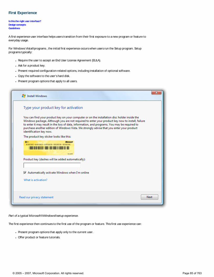
First Experience
Is this the right user interface? Design concepts Guidelines
A first experience user interface helps users transition from their first exposure to a new program or feature to everyday usage.
For Windows Vista® programs , the initial first experience occurs when users run the Setup program. Setup programs typically:
● Require the user to accept an End User License Agreement (EULA).
● Ask for a product key.
● Present required configuration-related options, including installation of optional software.
● Copy the software to the user’s hard disk.
● Present program options that apply to all users.
Part of a typical Microsoft® Windows® setup experience.
The first experience then continues to the first use of the program or feature. This first use experience can:
● Present program options that apply only to the current user.
● Offer product or feature tutorials.
© 2005 – 2007, Microsoft Corporation. All rights reserved. Page 85 of 763
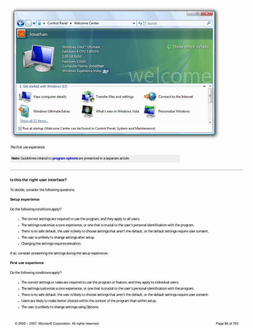
The first use experience.
Note: Guidelines related to program options are presented in a separate article.
Is this the right user interface?
To decide, consider the following questions.
Setup experience
Do the following conditions apply?
● The correct settings are required to use the program, and they apply to all users.
● The settings customize a core experience, or one that is crucial to the user’s personal identification with the program.
● There is no safe default, the user is likely to choose settings that aren’t the default, or the default settings require user consent.
● The user is unlikely to change settings after setup.
● Changing the settings requires elevation.
If so, consider presenting the settings during the setup experience.
First use experience
Do the following conditions apply?
● The correct settings or tasks are required to use the program or feature, and they apply to individual users.
● The settings customize a core experience, or one that is crucial to the user’s personal identification with the program.
● There is no safe default, the user is likely to choose settings that aren’t the default, or the default settings require user consent.
● Users are likely to make better choices within the context of the program than within setup.
● The user is unlikely to change settings using Options.
© 2005 – 2007, Microsoft Corporation. All rights reserved. Page 86 of 763
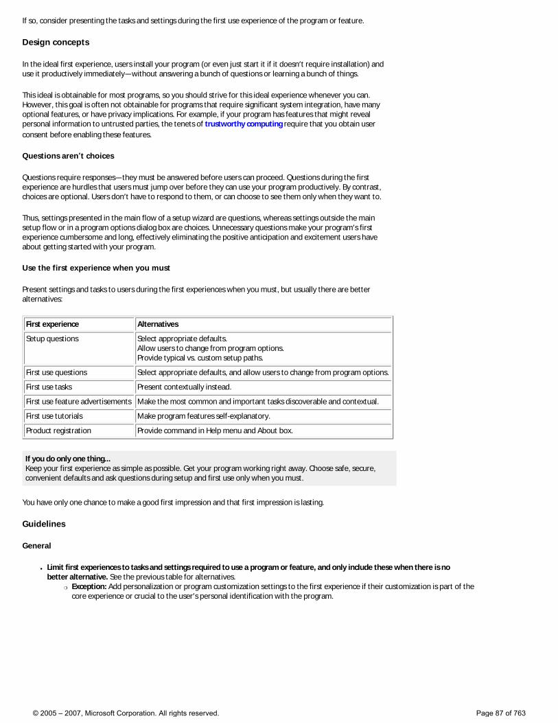
If so, consider presenting the tasks and settings during the first use experience of the program or feature.
Design concepts
In the ideal first experience, users install your program (or even just start it if it doesn’t require installation) and use it productively immediately—without answering a bunch of questions or learning a bunch of things.
This ideal is obtainable for most programs, so you should strive for this ideal experience whenever you can. However, this goal is often not obtainable for programs that require significant system integration, have many optional features, or have privacy implications. For example, if your program has features that might reveal personal information to untrusted parties, the tenets of trustworthy computing require that you obtain user consent before enabling these features.
Questions aren’t choices
Questions require responses—they must be answered before users can proceed. Questions during the first experience are hurdles that users must jump over before they can use your program productively. By contrast, choices are optional. Users don’t have to respond to them, or can choose to see them only when they want to.
Thus, settings presented in the main flow of a setup wizard are questions, whereas settings outside the main setup flow or in a program options dialog box are choices. Unnecessary questions make your program’s first experience cumbersome and long, effectively eliminating the positive anticipation and excitement users have about getting started with your program.
Use the first experience when you must
Present settings and tasks to users during the first experiences when you must, but usually there are better alternatives:
First experience Alternatives
Setup questions Select appropriate defaults. Allow users to change from program options. Provide typical vs. custom setup paths.
First use questions Select appropriate defaults, and allow users to change from program options.
First use tasks Present contextually instead.
First use feature advertisements Make the most common and important tasks discoverable and contextual.
First use tutorials Make program features self-explanatory.
Product registration Provide command in Help menu and About box.
If you do only one thing... Keep your first experience as simple as possible. Get your program working right away. Choose safe, secure, convenient defaults and ask questions during setup and first use only when you must.
You have only one chance to make a good first impression and that first impression is lasting.
Guidelines
General
● Limit first experiences to tasks and settings required to use a program or feature, and only include these when there is no better alternative. See the previous table for alternatives.
�❍ Exception: Add personalization or program customization settings to the first experience if their customization is part of the core experience or crucial to the user’s personal identification with the program.
© 2005 – 2007, Microsoft Corporation. All rights reserved. Page 87 of 763
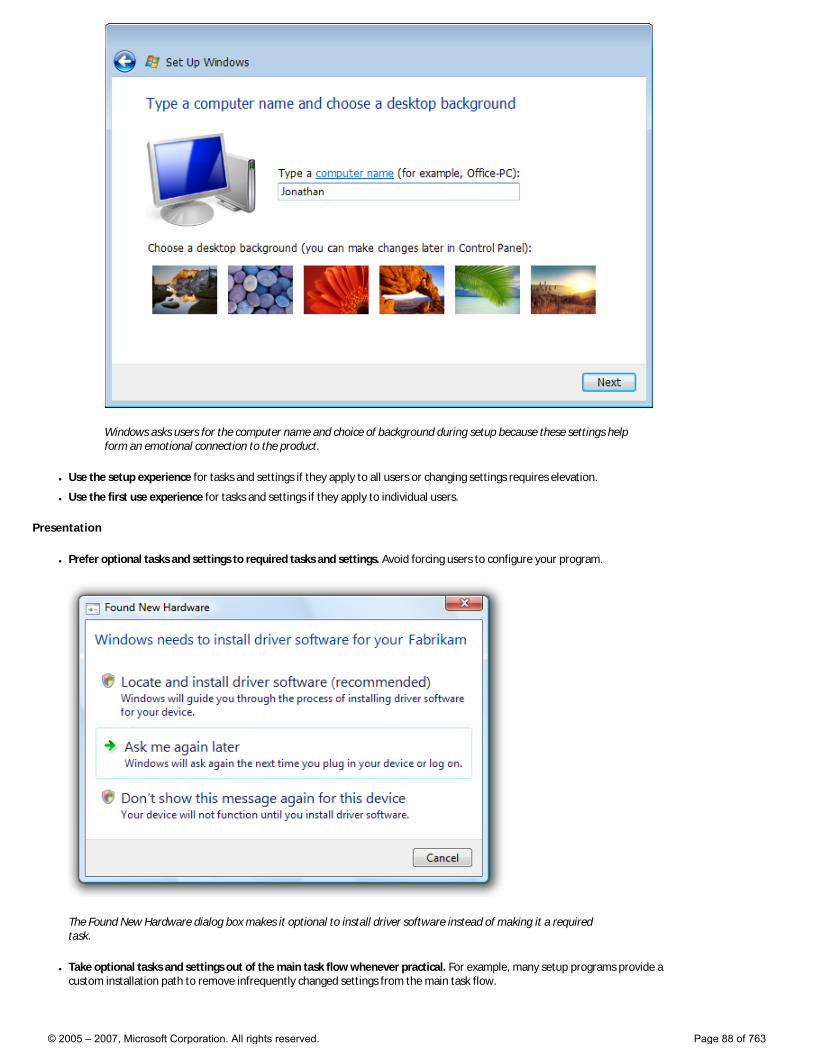
Windows asks users for the computer name and choice of background during setup because these settings help form an emotional connection to the product.
● Use the setup experience for tasks and settings if they apply to all users or changing settings requires elevation.
● Use the first use experience for tasks and settings if they apply to individual users.
Presentation
● Prefer optional tasks and settings to required tasks and settings. Avoid forcing users to configure your program.
The Found New Hardware dialog box makes it optional to install driver software instead of making it a required task.
● Take optional tasks and settings out of the main task flow whenever practical. For example, many setup programs provide a custom installation path to remove infrequently changed settings from the main task flow.
© 2005 – 2007, Microsoft Corporation. All rights reserved. Page 88 of 763
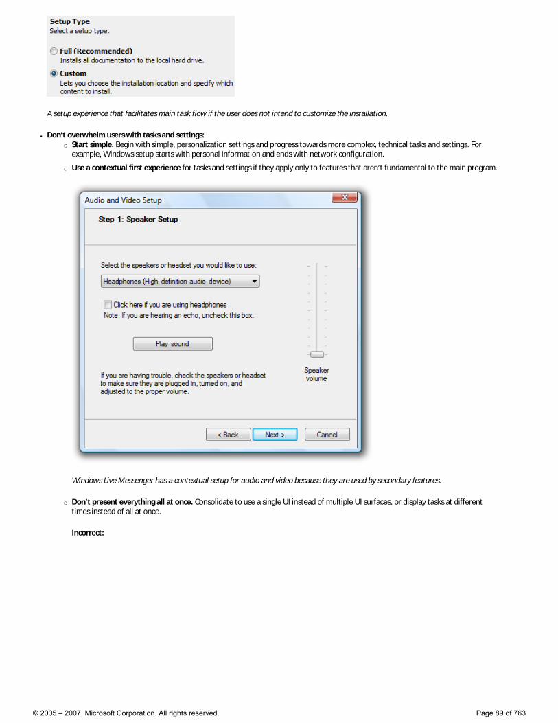
A setup experience that facilitates main task flow if the user does not intend to customize the installation.
● Don’t overwhelm users with tasks and settings: �❍ Start simple. Begin with simple, personalization settings and progress towards more complex, technical tasks and settings. For
example, Windows setup starts with personal information and ends with network configuration.
�❍ Use a contextual first experience for tasks and settings if they apply only to features that aren’t fundamental to the main program.
Windows Live Messenger has a contextual setup for audio and video because they are used by secondary features.
�❍ Don’t present everything all at once. Consolidate to use a single UI instead of multiple UI surfaces, or display tasks at different times instead of all at once.
Incorrect:
© 2005 – 2007, Microsoft Corporation. All rights reserved. Page 89 of 763
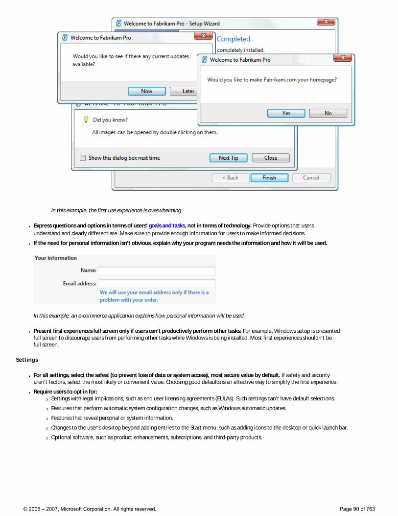
In this example, the first use experience is overwhelming.
● Express questions and options in terms of users’ goals and tasks, not in terms of technology. Provide options that users understand and clearly differentiate. Make sure to provide enough information for users to make informed decisions.
● If the need for personal information isn’t obvious, explain why your program needs the information and how it will be used.
In this example, an e-commerce application explains how personal information will be used.
● Present first experiences full screen only if users can’t productively perform other tasks. For example, Windows setup is presented full screen to discourage users from performing other tasks while Windows is being installed. Most first experiences shouldn’t be full screen.
Settings
● For all settings, select the safest (to prevent loss of data or system access), most secure value by default. If safety and security aren’t factors, select the most likely or convenient value. Choosing good defaults is an effective way to simplify the first experience.
● Require users to opt in for: �❍ Settings with legal implications, such as end user licensing agreements (EULAs). Such settings can’t have default selections.
�❍ Features that perform automatic system configuration changes, such as Windows automatic updates.
�❍ Features that reveal personal or system information.
�❍ Changes to the user’s desktop beyond adding entries to the Start menu, such as adding icons to the desktop or quick launch bar.
�❍ Optional software, such as product enhancements, subscriptions, and third-party products.
© 2005 – 2007, Microsoft Corporation. All rights reserved. Page 90 of 763
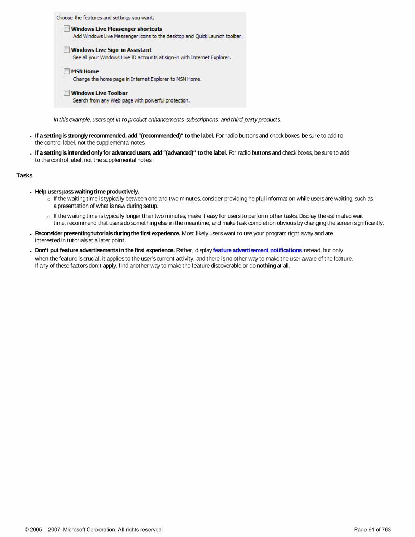
In this example, users opt in to product enhancements, subscriptions, and third-party products.
● If a setting is strongly recommended, add “(recommended)” to the label. For radio buttons and check boxes, be sure to add to the control label, not the supplemental notes.
● If a setting is intended only for advanced users, add “(advanced)” to the label. For radio buttons and check boxes, be sure to add to the control label, not the supplemental notes.
Tasks
● Help users pass waiting time productively. �❍ If the waiting time is typically between one and two minutes, consider providing helpful information while users are waiting, such as
a presentation of what is new during setup.
�❍ If the waiting time is typically longer than two minutes, make it easy for users to perform other tasks. Display the estimated wait time, recommend that users do something else in the meantime, and make task completion obvious by changing the screen significantly.
● Reconsider presenting tutorials during the first experience. Most likely users want to use your program right away and are interested in tutorials at a later point.
● Don’t put feature advertisements in the first experience. Rather, display feature advertisement notifications instead, but only when the feature is crucial, it applies to the user’s current activity, and there is no other way to make the user aware of the feature. If any of these factors don’t apply, find another way to make the feature discoverable or do nothing at all.
© 2005 – 2007, Microsoft Corporation. All rights reserved. Page 91 of 763
Controls
These articles provide guidelines for using controls in your Windows Vista®-based applications:
● Common Controls
● Notifications
● Search Boxes
● Status Bars
© 2005 – 2007, Microsoft Corporation. All rights reserved. Page 92 of 763
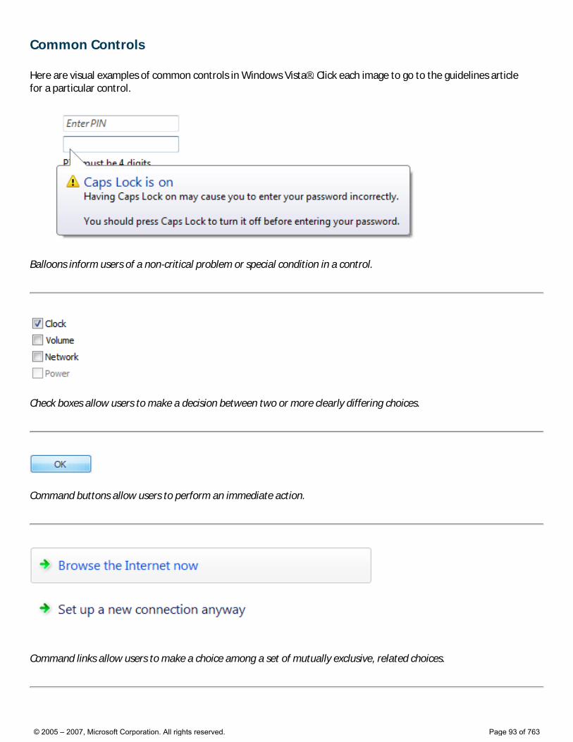
Common Controls
Here are visual examples of common controls in Windows Vista®. Click each image to go to the guidelines article for a particular control.
Balloons inform users of a non-critical problem or special condition in a control.
Check boxes allow users to make a decision between two or more clearly differing choices.
Command buttons allow users to perform an immediate action.
Command links allow users to make a choice among a set of mutually exclusive, related choices.
© 2005 – 2007, Microsoft Corporation. All rights reserved. Page 93 of 763
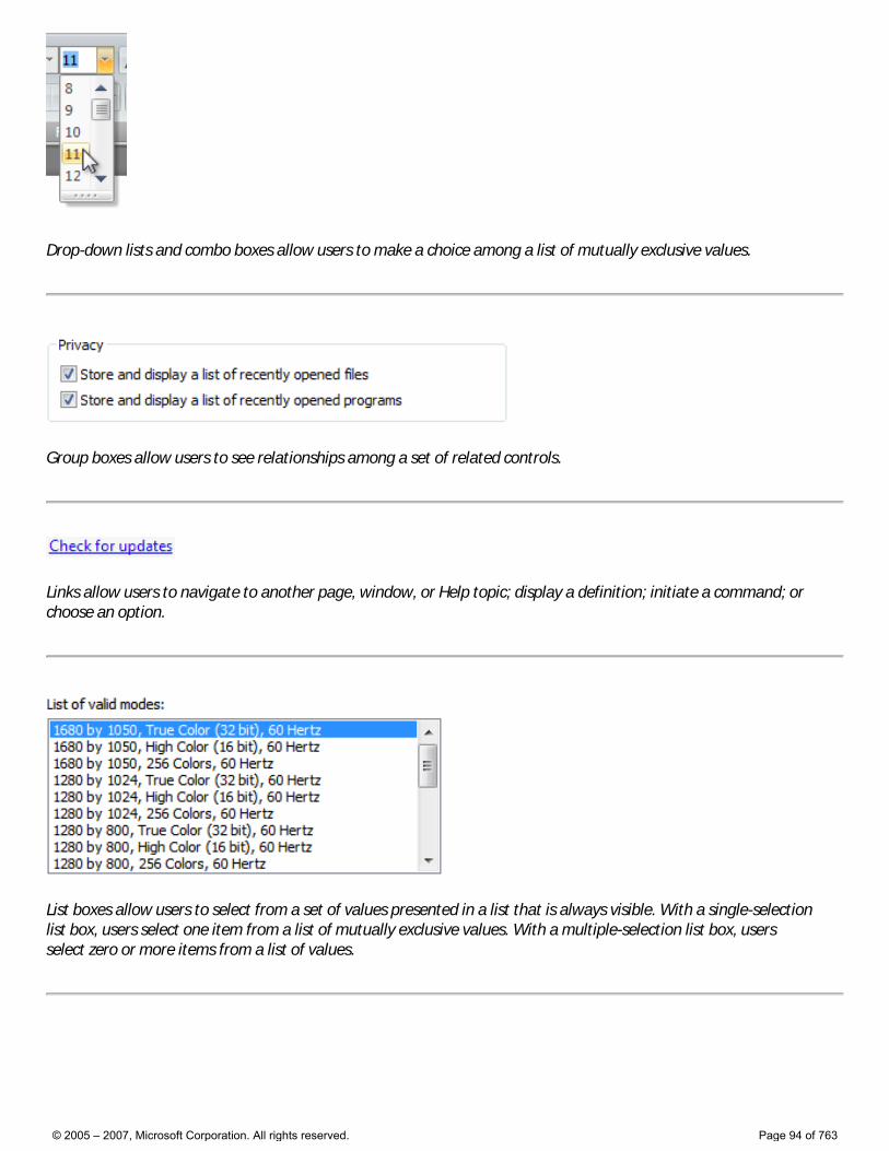
Drop-down lists and combo boxes allow users to make a choice among a list of mutually exclusive values.
Group boxes allow users to see relationships among a set of related controls.
Links allow users to navigate to another page, window, or Help topic; display a definition; initiate a command; or choose an option.
List boxes allow users to select from a set of values presented in a list that is always visible. With a single-selection list box, users select one item from a list of mutually exclusive values. With a multiple-selection list box, users select zero or more items from a list of values.
© 2005 – 2007, Microsoft Corporation. All rights reserved. Page 94 of 763
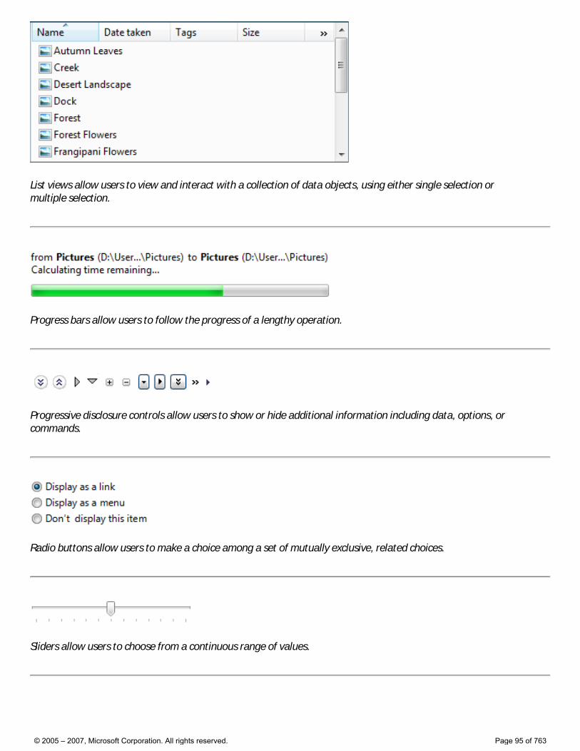
List views allow users to view and interact with a collection of data objects, using either single selection or multiple selection.
Progress bars allow users to follow the progress of a lengthy operation.
Progressive disclosure controls allow users to show or hide additional information including data, options, or commands.
Radio buttons allow users to make a choice among a set of mutually exclusive, related choices.
Sliders allow users to choose from a continuous range of values.
© 2005 – 2007, Microsoft Corporation. All rights reserved. Page 95 of 763
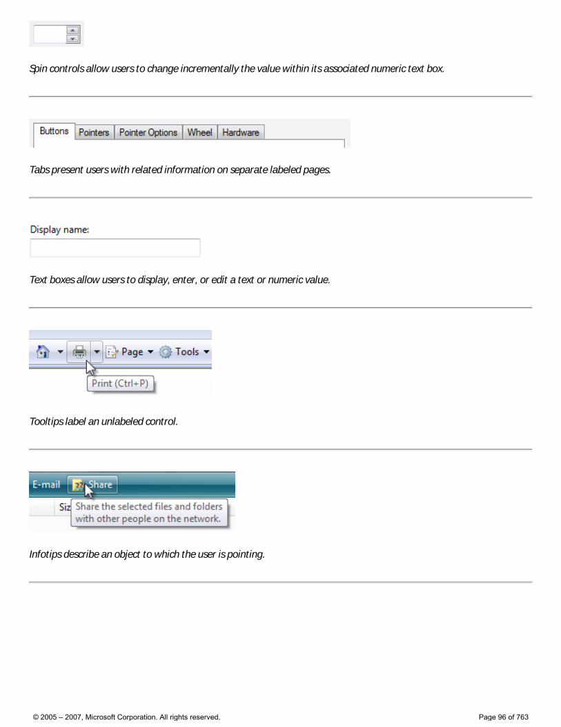
Spin controls allow users to change incrementally the value within its associated numeric text box.
Tabs present users with related information on separate labeled pages.
Text boxes allow users to display, enter, or edit a text or numeric value.
Tooltips label an unlabeled control.
Infotips describe an object to which the user is pointing.
© 2005 – 2007, Microsoft Corporation. All rights reserved. Page 96 of 763
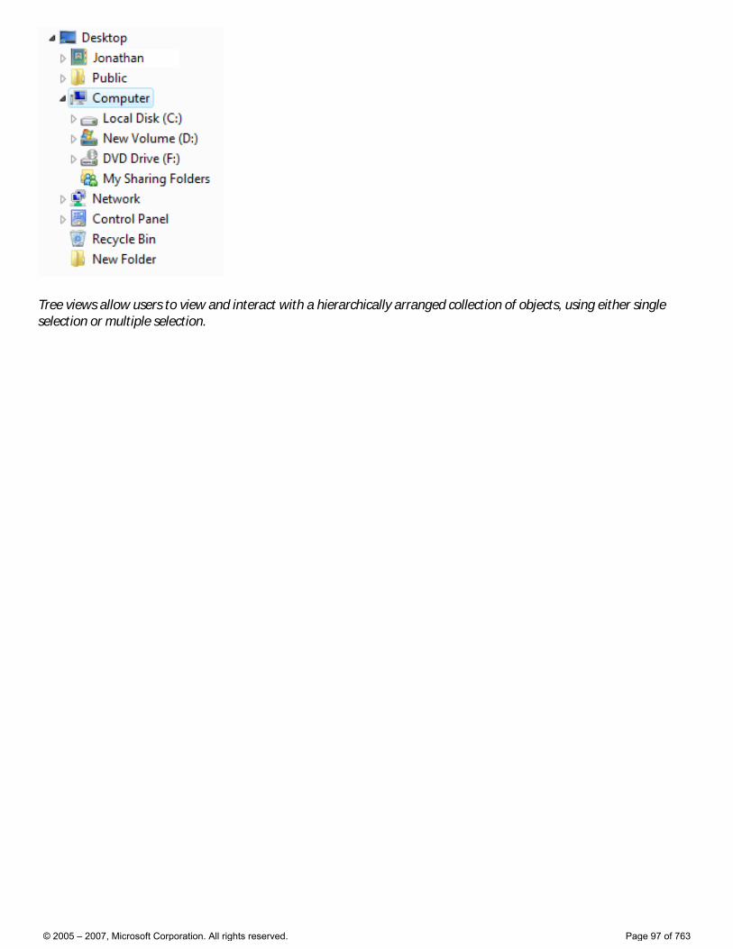
Tree views allow users to view and interact with a hierarchically arranged collection of objects, using either single selection or multiple selection.
© 2005 – 2007, Microsoft Corporation. All rights reserved. Page 97 of 763
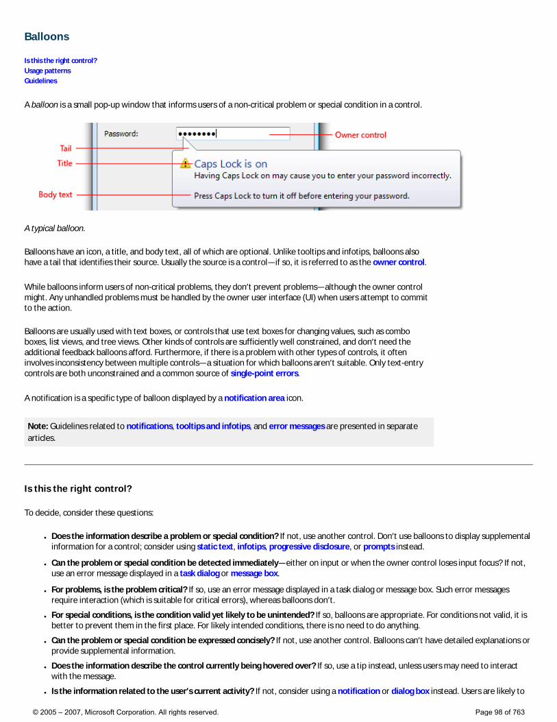
Balloons
Is this the right control? Usage patterns Guidelines
A balloon is a small pop-up window that informs users of a non-critical problem or special condition in a control.
A typical balloon.
Balloons have an icon, a title, and body text, all of which are optional. Unlike tooltips and infotips, balloons also have a tail that identifies their source. Usually the source is a control—if so, it is referred to as the owner control.
While balloons inform users of non-critical problems, they don’t prevent problems—although the owner control might. Any unhandled problems must be handled by the owner user interface (UI) when users attempt to commit to the action.
Balloons are usually used with text boxes, or controls that use text boxes for changing values, such as combo boxes, list views, and tree views. Other kinds of controls are sufficiently well constrained, and don’t need the additional feedback balloons afford. Furthermore, if there is a problem with other types of controls, it often involves inconsistency between multiple controls—a situation for which balloons aren’t suitable. Only text-entry controls are both unconstrained and a common source of single-point errors.
A notification is a specific type of balloon displayed by a notification area icon.
Note: Guidelines related to notifications, tooltips and infotips, and error messages are presented in separate articles.
Is this the right control?
To decide, consider these questions:
● Does the information describe a problem or special condition? If not, use another control. Don’t use balloons to display supplemental information for a control; consider using static text, infotips, progressive disclosure, or prompts instead.
● Can the problem or special condition be detected immediately—either on input or when the owner control loses input focus? If not, use an error message displayed in a task dialog or message box.
● For problems, is the problem critical? If so, use an error message displayed in a task dialog or message box. Such error messages require interaction (which is suitable for critical errors), whereas balloons don’t.
● For special conditions, is the condition valid yet likely to be unintended? If so, balloons are appropriate. For conditions not valid, it is better to prevent them in the first place. For likely intended conditions, there is no need to do anything.
● Can the problem or special condition be expressed concisely? If not, use another control. Balloons can’t have detailed explanations or provide supplemental information.
● Does the information describe the control currently being hovered over? If so, use a tip instead, unless users may need to interact with the message.
● Is the information related to the user’s current activity? If not, consider using a notification or dialog box instead. Users are likely to
© 2005 – 2007, Microsoft Corporation. All rights reserved. Page 98 of 763
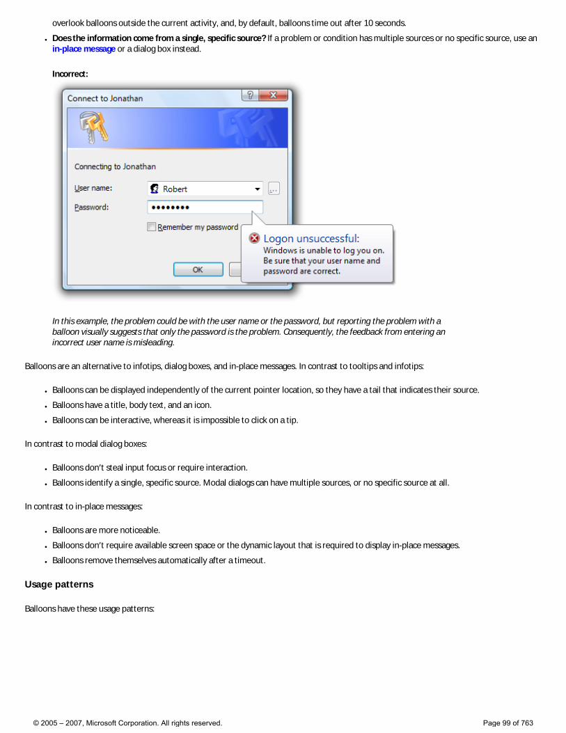
overlook balloons outside the current activity, and, by default, balloons time out after 10 seconds.
● Does the information come from a single, specific source? If a problem or condition has multiple sources or no specific source, use an in-place message or a dialog box instead.
Incorrect:
In this example, the problem could be with the user name or the password, but reporting the problem with a balloon visually suggests that only the password is the problem. Consequently, the feedback from entering an incorrect user name is misleading.
Balloons are an alternative to infotips, dialog boxes, and in-place messages. In contrast to tooltips and infotips:
● Balloons can be displayed independently of the current pointer location, so they have a tail that indicates their source.
● Balloons have a title, body text, and an icon.
● Balloons can be interactive, whereas it is impossible to click on a tip.
In contrast to modal dialog boxes:
● Balloons don’t steal input focus or require interaction.
● Balloons identify a single, specific source. Modal dialogs can have multiple sources, or no specific source at all.
In contrast to in-place messages:
● Balloons are more noticeable.
● Balloons don’t require available screen space or the dynamic layout that is required to display in-place messages.
● Balloons remove themselves automatically after a timeout.
Usage patterns
Balloons have these usage patterns:
© 2005 – 2007, Microsoft Corporation. All rights reserved. Page 99 of 763
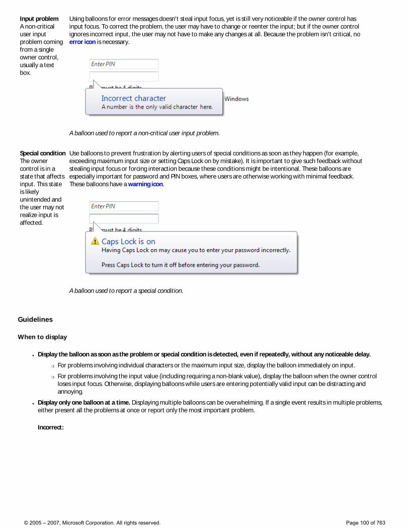
Input problem A non-critical user input problem coming from a single owner control, usually a text box.
Using balloons for error messages doesn’t steal input focus, yet is still very noticeable if the owner control has input focus. To correct the problem, the user may have to change or reenter the input; but if the owner control ignores incorrect input, the user may not have to make any changes at all. Because the problem isn’t critical, no error icon is necessary.
A balloon used to report a non-critical user input problem.
Special condition The owner control is in a state that affects input. This state is likely unintended and the user may not realize input is affected.
Use balloons to prevent frustration by alerting users of special conditions as soon as they happen (for example, exceeding maximum input size or setting Caps Lock on by mistake). It is important to give such feedback without stealing input focus or forcing interaction because these conditions might be intentional. These balloons are especially important for password and PIN boxes, where users are otherwise working with minimal feedback. These balloons have a warning icon.
A balloon used to report a special condition.
Guidelines
When to display
● Display the balloon as soon as the problem or special condition is detected, even if repeatedly, without any noticeable delay.
�❍ For problems involving individual characters or the maximum input size, display the balloon immediately on input.
�❍ For problems involving the input value (including requiring a non-blank value), display the balloon when the owner control loses input focus. Otherwise, displaying balloons while users are entering potentially valid input can be distracting and annoying.
● Display only one balloon at a time. Displaying multiple balloons can be overwhelming. If a single event results in multiple problems, either present all the problems at once or report only the most important problem.
Incorrect:
© 2005 – 2007, Microsoft Corporation. All rights reserved. Page 100 of 763
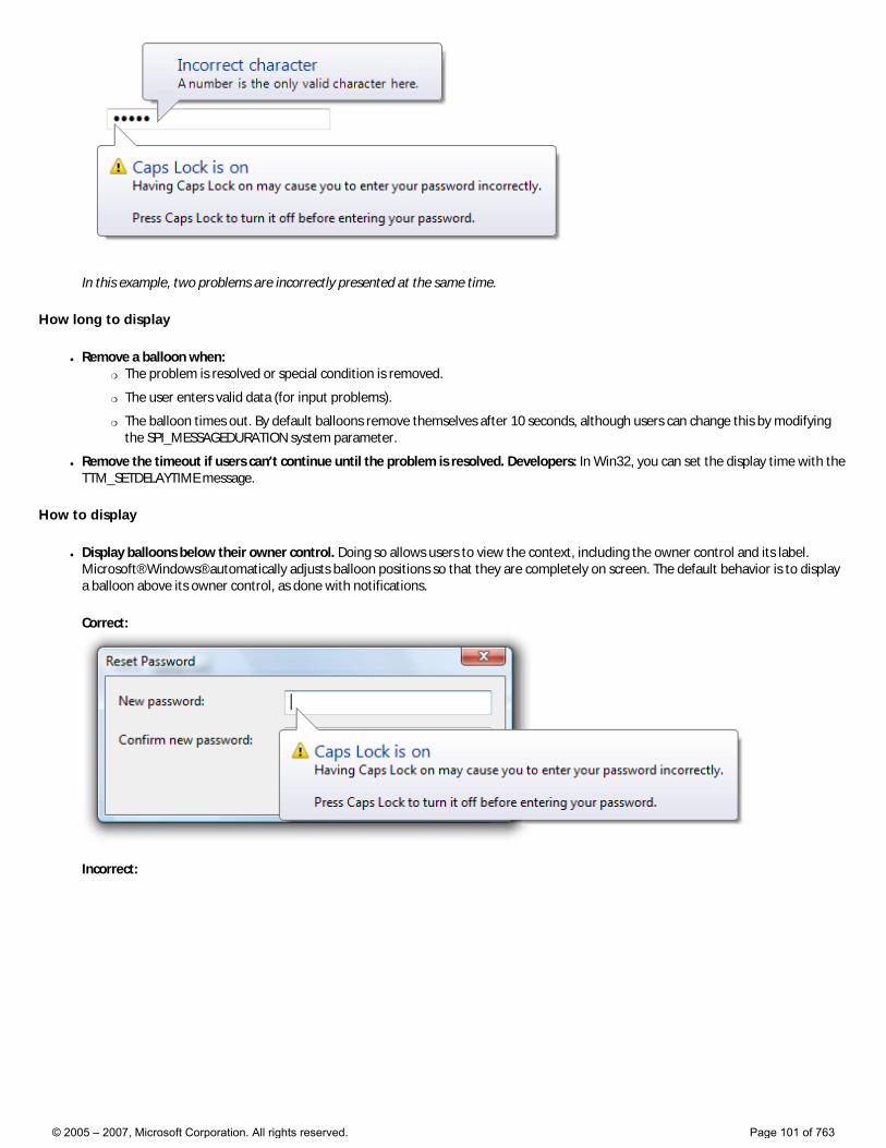
In this example, two problems are incorrectly presented at the same time.
How long to display
● Remove a balloon when: �❍ The problem is resolved or special condition is removed.
�❍ The user enters valid data (for input problems).
�❍ The balloon times out. By default balloons remove themselves after 10 seconds, although users can change this by modifying the SPI_MESSAGEDURATION system parameter.
● Remove the timeout if users can’t continue until the problem is resolved. Developers: In Win32, you can set the display time with the TTM_SETDELAYTIME message.
How to display
● Display balloons below their owner control. Doing so allows users to view the context, including the owner control and its label. Microsoft® Windows® automatically adjusts balloon positions so that they are completely on screen. The default behavior is to display a balloon above its owner control, as done with notifications.
Correct:
Incorrect:
© 2005 – 2007, Microsoft Corporation. All rights reserved. Page 101 of 763
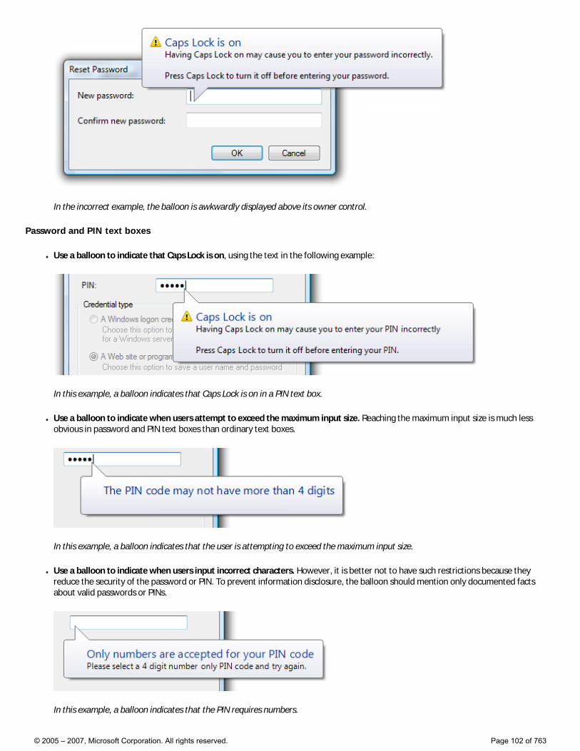
In the incorrect example, the balloon is awkwardly displayed above its owner control.
Password and PIN text boxes
● Use a balloon to indicate that Caps Lock is on, using the text in the following example:
In this example, a balloon indicates that Caps Lock is on in a PIN text box.
● Use a balloon to indicate when users attempt to exceed the maximum input size. Reaching the maximum input size is much less obvious in password and PIN text boxes than ordinary text boxes.
In this example, a balloon indicates that the user is attempting to exceed the maximum input size.
● Use a balloon to indicate when users input incorrect characters. However, it is better not to have such restrictions because they reduce the security of the password or PIN. To prevent information disclosure, the balloon should mention only documented facts about valid passwords or PINs.
In this example, a balloon indicates that the PIN requires numbers.
© 2005 – 2007, Microsoft Corporation. All rights reserved. Page 102 of 763
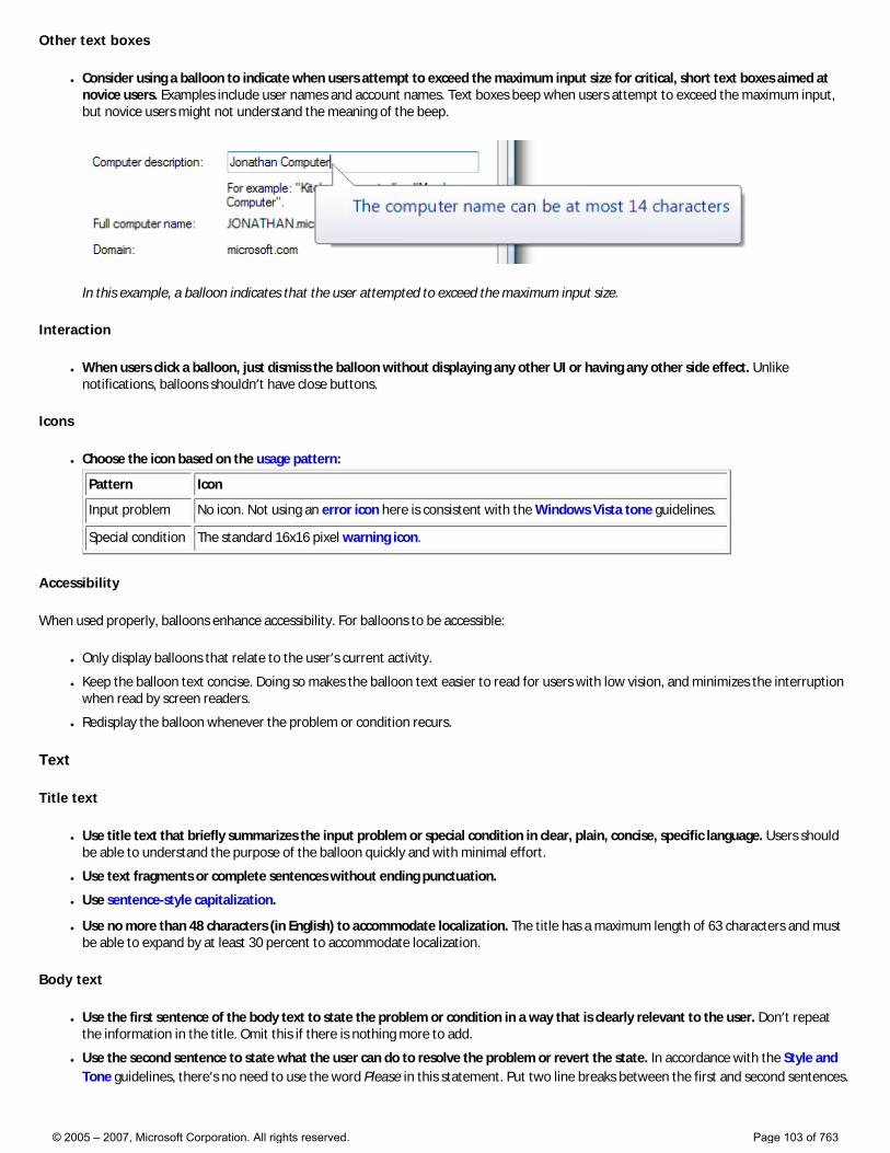
Other text boxes
● Consider using a balloon to indicate when users attempt to exceed the maximum input size for critical, short text boxes aimed at novice users. Examples include user names and account names. Text boxes beep when users attempt to exceed the maximum input, but novice users might not understand the meaning of the beep.
In this example, a balloon indicates that the user attempted to exceed the maximum input size.
Interaction
● When users click a balloon, just dismiss the balloon without displaying any other UI or having any other side effect. Unlike notifications, balloons shouldn’t have close buttons.
Icons
● Choose the icon based on the usage pattern:
Pattern Icon
Input problem No icon. Not using an error icon here is consistent with the Windows Vista tone guidelines.
Special condition The standard 16x16 pixel warning icon.
Accessibility
When used properly, balloons enhance accessibility. For balloons to be accessible:
● Only display balloons that relate to the user’s current activity.
● Keep the balloon text concise. Doing so makes the balloon text easier to read for users with low vision, and minimizes the interruption when read by screen readers.
● Redisplay the balloon whenever the problem or condition recurs.
Text
Title text
● Use title text that briefly summarizes the input problem or special condition in clear, plain, concise, specific language. Users should be able to understand the purpose of the balloon quickly and with minimal effort.
● Use text fragments or complete sentences without ending punctuation.
● Use sentence-style capitalization.
● Use no more than 48 characters (in English) to accommodate localization. The title has a maximum length of 63 characters and must be able to expand by at least 30 percent to accommodate localization.
Body text
● Use the first sentence of the body text to state the problem or condition in a way that is clearly relevant to the user. Don’t repeat the information in the title. Omit this if there is nothing more to add.
● Use the second sentence to state what the user can do to resolve the problem or revert the state. In accordance with the Style and Tone guidelines, there’s no need to use the word Please in this statement. Put two line breaks between the first and second sentences.
© 2005 – 2007, Microsoft Corporation. All rights reserved. Page 103 of 763
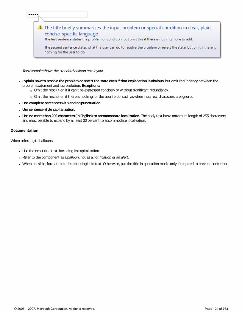
This example shows the standard balloon text layout.
● Explain how to resolve the problem or revert the state even if that explanation is obvious, but omit redundancy between the problem statement and its resolution. Exceptions:
�❍ Omit the resolution if it can’t be expressed concisely or without significant redundancy.
�❍ Omit the resolution if there is nothing for the user to do, such as when incorrect characters are ignored.
● Use complete sentences with ending punctuation.
● Use sentence-style capitalization.
● Use no more than 200 characters (in English) to accommodate localization. The body text has a maximum length of 255 characters and must be able to expand by at least 30 percent to accommodate localization.
Documentation
When referring to balloons:
● Use the exact title text, including its capitalization.
● Refer to the component as a balloon, not as a notification or an alert.
● When possible, format the title text using bold text. Otherwise, put the title in quotation marks only if required to prevent confusion.
© 2005 – 2007, Microsoft Corporation. All rights reserved. Page 104 of 763
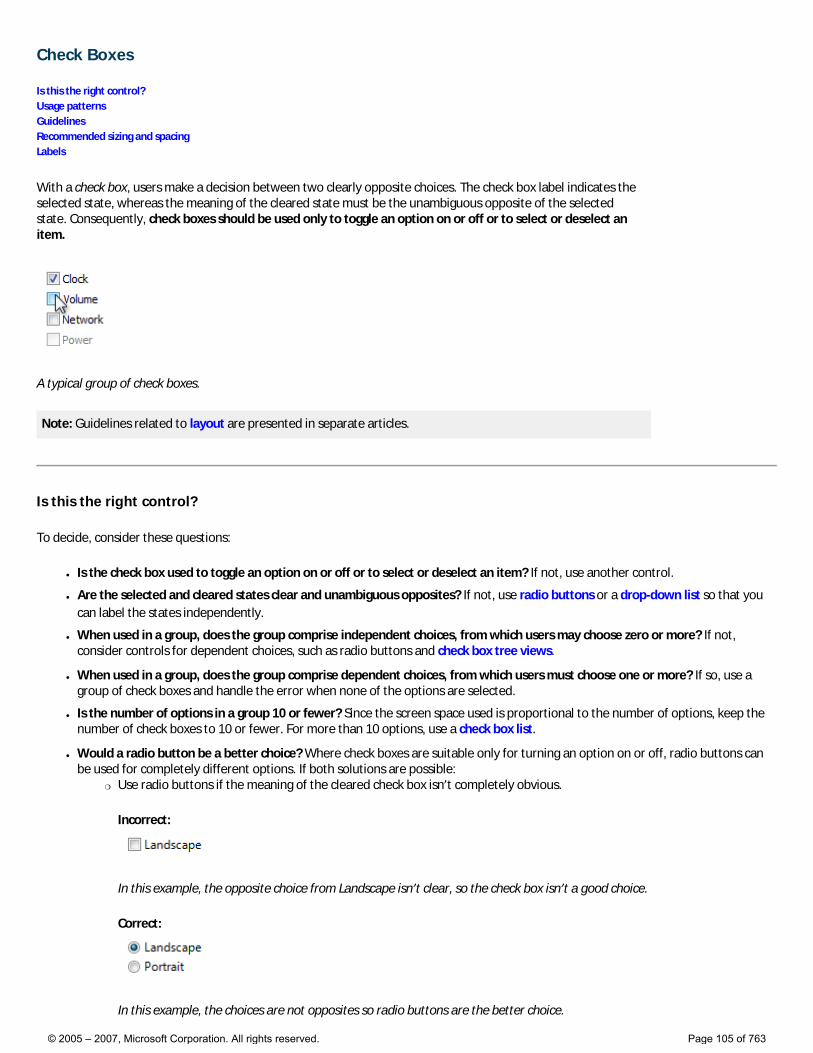
Check Boxes
Is this the right control? Usage patterns Guidelines Recommended sizing and spacing Labels
With a check box, users make a decision between two clearly opposite choices. The check box label indicates the selected state, whereas the meaning of the cleared state must be the unambiguous opposite of the selected state. Consequently, check boxes should be used only to toggle an option on or off or to select or deselect an item.
A typical group of check boxes.
Note: Guidelines related to layout are presented in separate articles.
Is this the right control?
To decide, consider these questions:
● Is the check box used to toggle an option on or off or to select or deselect an item? If not, use another control.
● Are the selected and cleared states clear and unambiguous opposites? If not, use radio buttons or a drop-down list so that you can label the states independently.
● When used in a group, does the group comprise independent choices, from which users may choose zero or more? If not, consider controls for dependent choices, such as radio buttons and check box tree views.
● When used in a group, does the group comprise dependent choices, from which users must choose one or more? If so, use a group of check boxes and handle the error when none of the options are selected.
● Is the number of options in a group 10 or fewer? Since the screen space used is proportional to the number of options, keep the number of check boxes to 10 or fewer. For more than 10 options, use a check box list.
● Would a radio button be a better choice? Where check boxes are suitable only for turning an option on or off, radio buttons can be used for completely different options. If both solutions are possible:
�❍ Use radio buttons if the meaning of the cleared check box isn’t completely obvious.
Incorrect:
In this example, the opposite choice from Landscape isn’t clear, so the check box isn’t a good choice.
Correct:
In this example, the choices are not opposites so radio buttons are the better choice.
© 2005 – 2007, Microsoft Corporation. All rights reserved. Page 105 of 763
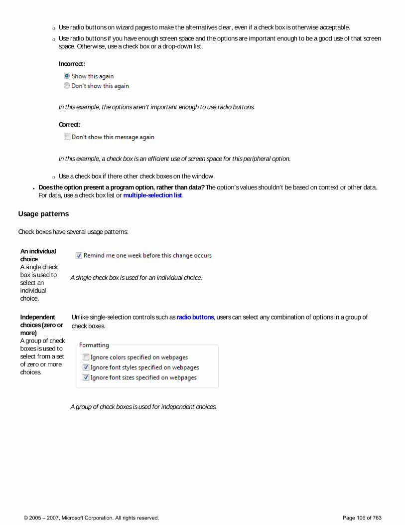
�❍ Use radio buttons on wizard pages to make the alternatives clear, even if a check box is otherwise acceptable.
�❍ Use radio buttons if you have enough screen space and the options are important enough to be a good use of that screen space. Otherwise, use a check box or a drop-down list.
Incorrect:
In this example, the options aren’t important enough to use radio buttons.
Correct:
In this example, a check box is an efficient use of screen space for this peripheral option.
�❍ Use a check box if there other check boxes on the window.
● Does the option present a program option, rather than data? The option’s values shouldn’t be based on context or other data. For data, use a check box list or multiple-selection list.
Usage patterns
Check boxes have several usage patterns:
An individual choice A single check box is used to select an individual choice.
A single check box is used for an individual choice.
Independent choices (zero or more) A group of check boxes is used to select from a set of zero or more choices.
Unlike single-selection controls such as radio buttons, users can select any combination of options in a group of check boxes.
A group of check boxes is used for independent choices.
© 2005 – 2007, Microsoft Corporation. All rights reserved. Page 106 of 763
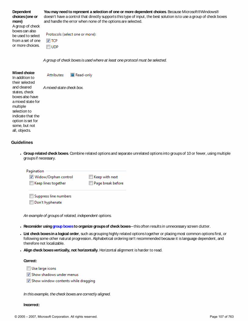
Dependent choices (one or more) A group of check boxes can also be used to select from a set of one or more choices.
You may need to represent a selection of one or more dependent choices. Because Microsoft® Windows® doesn’t have a control that directly supports this type of input, the best solution is to use a group of check boxes and handle the error when none of the options are selected.
A group of check boxes is used where at least one protocol must be selected.
Mixed choice In addition to their selected and cleared states, check boxes also have a mixed state for multiple selection to indicate that the option is set for some, but not all, objects.
A mixed-state check box.
Guidelines
● Group related check boxes. Combine related options and separate unrelated options into groups of 10 or fewer, using multiple groups if necessary.
An example of groups of related, independent options.
● Reconsider using group boxes to organize groups of check boxes—this often results in unnecessary screen clutter.
● List check boxes in a logical order, such as grouping highly related options together or placing most common options first, or following some other natural progression. Alphabetical ordering isn’t recommended because it is language dependent, and therefore not localizable.
● Align check boxes vertically, not horizontally. Horizontal alignment is harder to read.
Correct:
In this example, the check boxes are correctly aligned.
Incorrect:
© 2005 – 2007, Microsoft Corporation. All rights reserved. Page 107 of 763
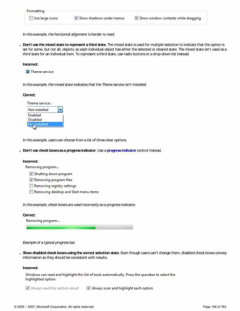
In this example, the horizontal alignment is harder to read.
● Don’t use the mixed state to represent a third state. The mixed state is used for multiple selection to indicate that the option is set for some, but not all, objects, so each individual object has either the selected or cleared state. The mixed state isn’t used as a third state for an individual item. To represent a third state, use radio buttons or a drop-down list instead.
Incorrect:
In this example, the mixed state indicates that the Theme service isn’t installed.
Correct:
In this example, users can choose from a list of three clear options.
● Don’t use check boxes as a progress indicator. Use a progress indicator control instead.
Incorrect:
In this example, check boxes are used incorrectly as a progress indicator.
Correct:
Example of a typical progress bar.
● Show disabled check boxes using the correct selection state. Even though users can’t change them, disabled check boxes convey information so they should be consistent with results.
Incorrect:
© 2005 – 2007, Microsoft Corporation. All rights reserved. Page 108 of 763
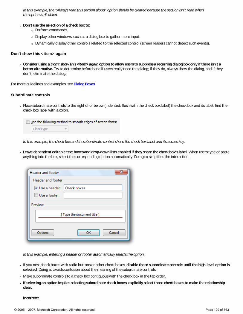
In this example, the “Always read this section aloud” option should be cleared because the section isn’t read when the option is disabled.
● Don’t use the selection of a check box to: �❍ Perform commands.
�❍ Display other windows, such as a dialog box to gather more input.
�❍ Dynamically display other controls related to the selected control (screen readers cannot detect such events).
Don’t show this <item> again
● Consider using a Don’t show this <item> again option to allow users to suppress a recurring dialog box only if there isn’t a better alternative. Try to determine beforehand if users really need the dialog; if they do, always show the dialog, and if they don’t, eliminate the dialog.
For more guidelines and examples, see Dialog Boxes.
Subordinate controls
● Place subordinate controls to the right of or below (indented, flush with the check box label) the check box and its label. End the check box label with a colon.
In this example, the check box and its subordinate control share the check box label and its access key.
● Leave dependent editable text boxes and drop-down lists enabled if they share the check box’s label. When users type or paste anything into the box, select the corresponding option automatically. Doing so simplifies the interaction.
In this example, entering a header or footer automatically selects the option.
● If you nest check boxes with radio buttons or other check boxes, disable these subordinate controls until the high-level option is selected. Doing so avoids confusion about the meaning of the subordinate controls.
● Make subordinate controls to a check box contiguous with the check box in the tab order.
● If selecting an option implies selecting subordinate check boxes, explicitly select those check boxes to make the relationship clear.
Incorrect:
© 2005 – 2007, Microsoft Corporation. All rights reserved. Page 109 of 763
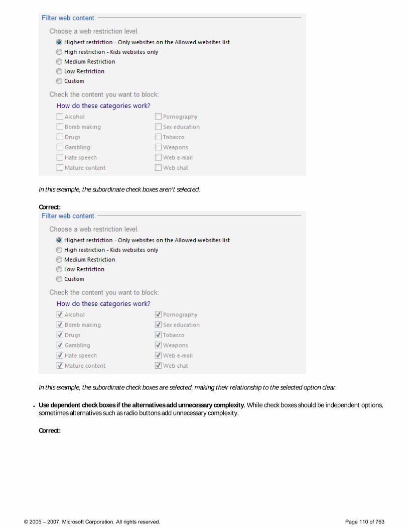
In this example, the subordinate check boxes aren’t selected.
Correct:
In this example, the subordinate check boxes are selected, making their relationship to the selected option clear.
● Use dependent check boxes if the alternatives add unnecessary complexity. While check boxes should be independent options, sometimes alternatives such as radio buttons add unnecessary complexity.
Correct:
© 2005 – 2007, Microsoft Corporation. All rights reserved. Page 110 of 763
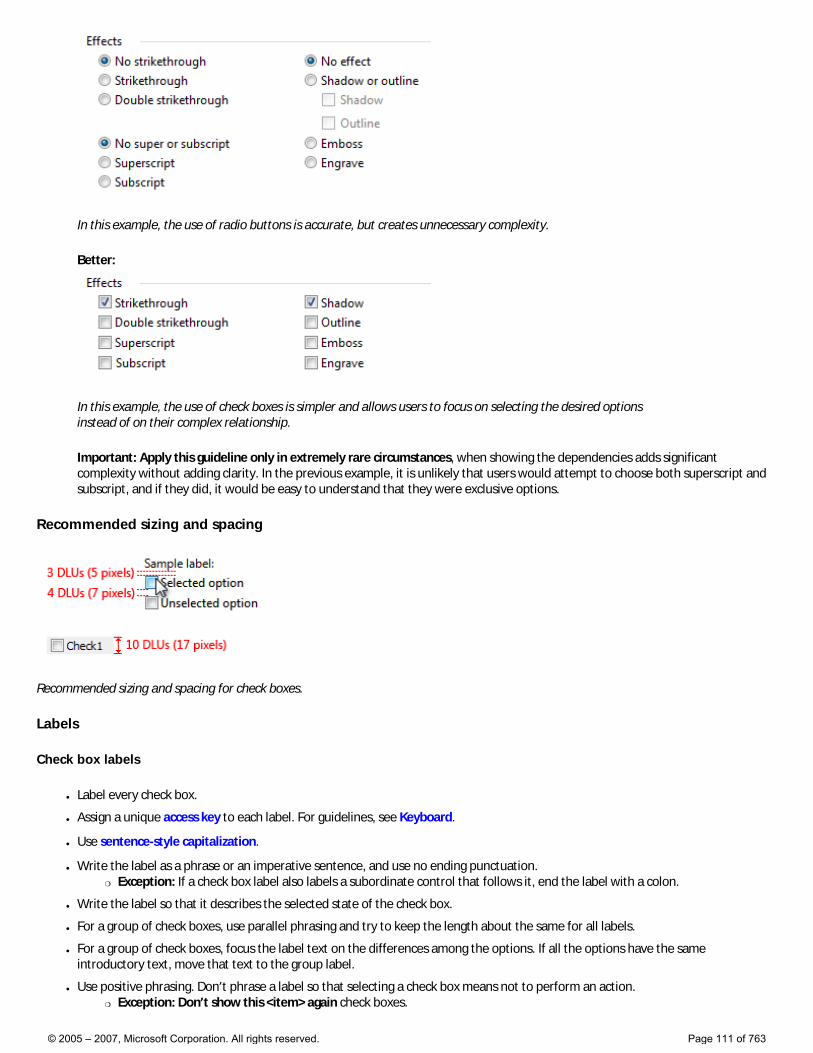
In this example, the use of radio buttons is accurate, but creates unnecessary complexity.
Better:
In this example, the use of check boxes is simpler and allows users to focus on selecting the desired options instead of on their complex relationship.
Important: Apply this guideline only in extremely rare circumstances, when showing the dependencies adds significant complexity without adding clarity. In the previous example, it is unlikely that users would attempt to choose both superscript and subscript, and if they did, it would be easy to understand that they were exclusive options.
Recommended sizing and spacing
Recommended sizing and spacing for check boxes.
Labels
Check box labels
● Label every check box.
● Assign a unique access key to each label. For guidelines, see Keyboard.
● Use sentence-style capitalization.
● Write the label as a phrase or an imperative sentence, and use no ending punctuation. �❍ Exception: If a check box label also labels a subordinate control that follows it, end the label with a colon.
● Write the label so that it describes the selected state of the check box.
● For a group of check boxes, use parallel phrasing and try to keep the length about the same for all labels.
● For a group of check boxes, focus the label text on the differences among the options. If all the options have the same introductory text, move that text to the group label.
● Use positive phrasing. Don’t phrase a label so that selecting a check box means not to perform an action. �❍ Exception: Don’t show this <item> again check boxes.
© 2005 – 2007, Microsoft Corporation. All rights reserved. Page 111 of 763
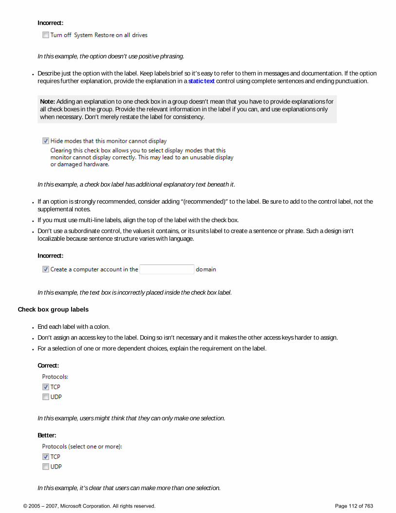
Incorrect:
In this example, the option doesn’t use positive phrasing.
● Describe just the option with the label. Keep labels brief so it’s easy to refer to them in messages and documentation. If the option requires further explanation, provide the explanation in a static text control using complete sentences and ending punctuation.
Note: Adding an explanation to one check box in a group doesn’t mean that you have to provide explanations for all check boxes in the group. Provide the relevant information in the label if you can, and use explanations only when necessary. Don’t merely restate the label for consistency.
In this example, a check box label has additional explanatory text beneath it.
● If an option is strongly recommended, consider adding “(recommended)” to the label. Be sure to add to the control label, not the supplemental notes.
● If you must use multi-line labels, align the top of the label with the check box.
● Don’t use a subordinate control, the values it contains, or its units label to create a sentence or phrase. Such a design isn’t localizable because sentence structure varies with language.
Incorrect:
In this example, the text box is incorrectly placed inside the check box label.
Check box group labels
● End each label with a colon.
● Don’t assign an access key to the label. Doing so isn’t necessary and it makes the other access keys harder to assign.
● For a selection of one or more dependent choices, explain the requirement on the label.
Correct:
In this example, users might think that they can only make one selection.
Better:
In this example, it’s clear that users can make more than one selection.
© 2005 – 2007, Microsoft Corporation. All rights reserved. Page 112 of 763
Documentation
When referring to check boxes:
● Use the exact label text, including its capitalization, but don’t include the access key underscore or colon. Include the word check box.
● Refer to a check box as a check box, not option, checkbox, or just box, because box alone is ambiguous for localizers.
● To describe user interaction, use select and clear.
● When possible, format the label using bold text. Otherwise, put the label in quotation marks only if required to prevent confusion.
Example: Select the Underline check box.
© 2005 – 2007, Microsoft Corporation. All rights reserved. Page 113 of 763
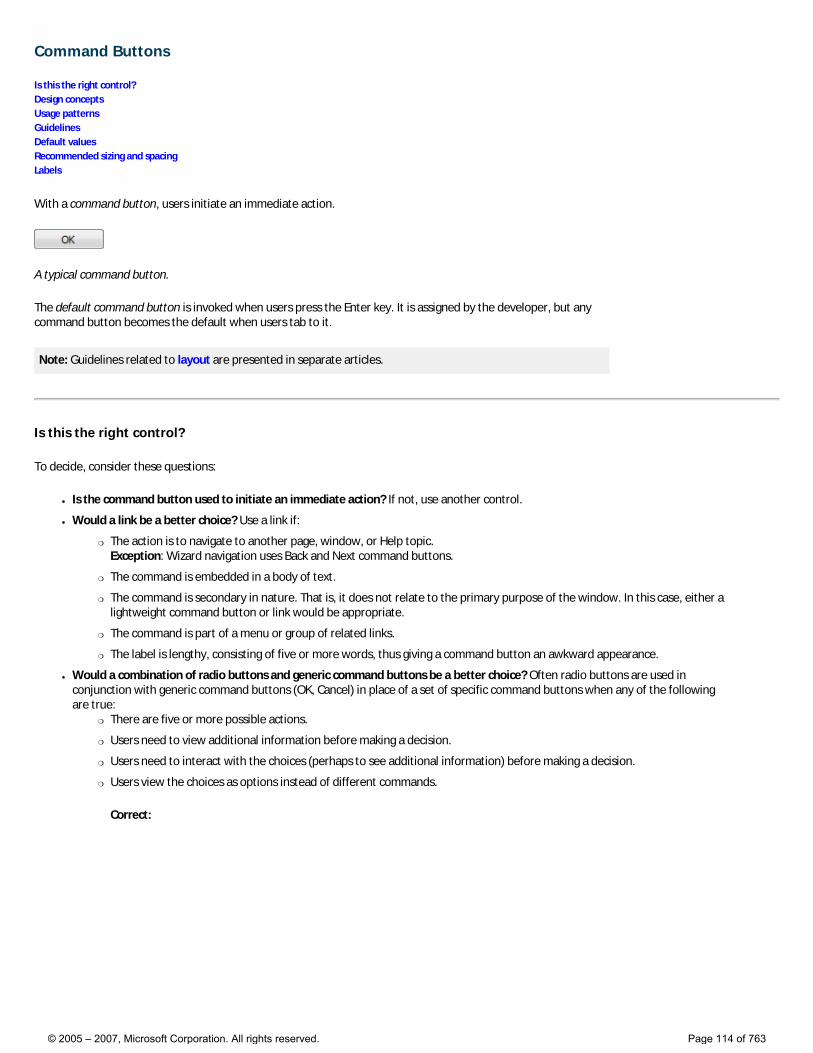
Command Buttons
Is this the right control? Design concepts Usage patterns Guidelines Default values Recommended sizing and spacing Labels
With a command button, users initiate an immediate action.
A typical command button.
The default command button is invoked when users press the Enter key. It is assigned by the developer, but any command button becomes the default when users tab to it.
Note: Guidelines related to layout are presented in separate articles.
Is this the right control?
To decide, consider these questions:
● Is the command button used to initiate an immediate action? If not, use another control.
● Would a link be a better choice? Use a link if:
�❍ The action is to navigate to another page, window, or Help topic. Exception: Wizard navigation uses Back and Next command buttons.
�❍ The command is embedded in a body of text.
�❍ The command is secondary in nature. That is, it does not relate to the primary purpose of the window. In this case, either a lightweight command button or link would be appropriate.
�❍ The command is part of a menu or group of related links.
�❍ The label is lengthy, consisting of five or more words, thus giving a command button an awkward appearance.
● Would a combination of radio buttons and generic command buttons be a better choice? Often radio buttons are used in conjunction with generic command buttons (OK, Cancel) in place of a set of specific command buttons when any of the following are true:
�❍ There are five or more possible actions.
�❍ Users need to view additional information before making a decision.
�❍ Users need to interact with the choices (perhaps to see additional information) before making a decision.
�❍ Users view the choices as options instead of different commands.
Correct:
© 2005 – 2007, Microsoft Corporation. All rights reserved. Page 114 of 763
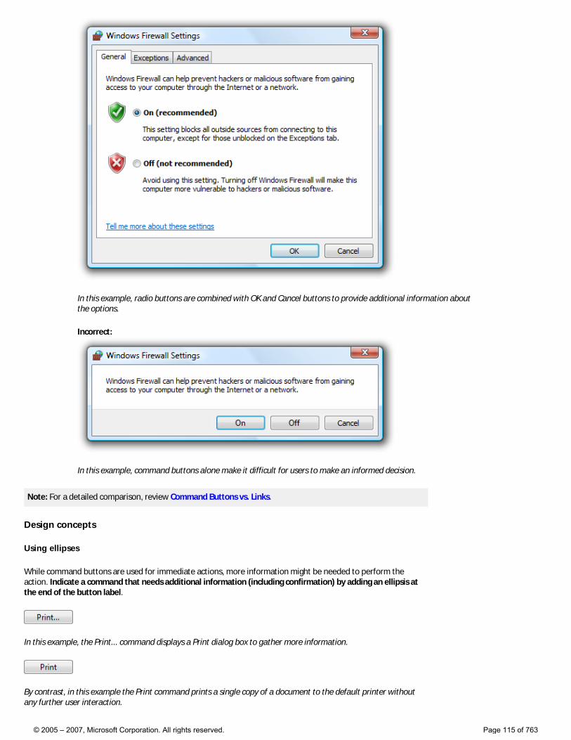
In this example, radio buttons are combined with OK and Cancel buttons to provide additional information about the options.
Incorrect:
In this example, command buttons alone make it difficult for users to make an informed decision.
Note: For a detailed comparison, review Command Buttons vs. Links.
Design concepts
Using ellipses
While command buttons are used for immediate actions, more information might be needed to perform the action. Indicate a command that needs additional information (including confirmation) by adding an ellipsis at the end of the button label.
In this example, the Print... command displays a Print dialog box to gather more information.
By contrast, in this example the Print command prints a single copy of a document to the default printer without any further user interaction.
© 2005 – 2007, Microsoft Corporation. All rights reserved. Page 115 of 763
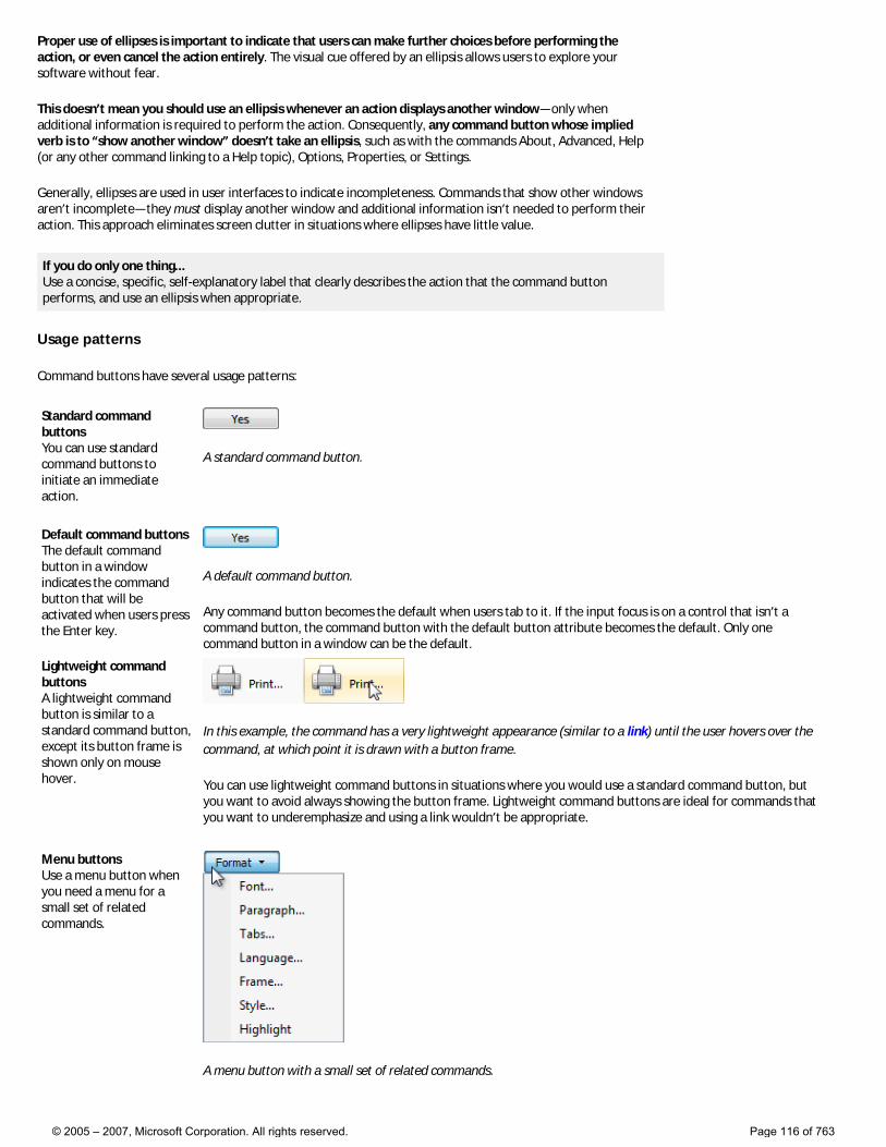
Proper use of ellipses is important to indicate that users can make further choices before performing the action, or even cancel the action entirely. The visual cue offered by an ellipsis allows users to explore your software without fear.
This doesn’t mean you should use an ellipsis whenever an action displays another window—only when additional information is required to perform the action. Consequently, any command button whose implied verb is to “show another window” doesn’t take an ellipsis, such as with the commands About, Advanced, Help (or any other command linking to a Help topic), Options, Properties, or Settings.
Generally, ellipses are used in user interfaces to indicate incompleteness. Commands that show other windows aren’t incomplete—they must display another window and additional information isn’t needed to perform their action. This approach eliminates screen clutter in situations where ellipses have little value.
If you do only one thing... Use a concise, specific, self-explanatory label that clearly describes the action that the command button performs, and use an ellipsis when appropriate.
Usage patterns
Command buttons have several usage patterns:
Standard command buttons You can use standard command buttons to initiate an immediate action.
A standard command button.
Default command buttons The default command button in a window indicates the command button that will be activated when users press the Enter key.
A default command button.
Any command button becomes the default when users tab to it. If the input focus is on a control that isn’t a command button, the command button with the default button attribute becomes the default. Only one command button in a window can be the default.
Lightweight command buttons A lightweight command button is similar to a standard command button, except its button frame is shown only on mouse hover.
In this example, the command has a very lightweight appearance (similar to a link) until the user hovers over the command, at which point it is drawn with a button frame.
You can use lightweight command buttons in situations where you would use a standard command button, but you want to avoid always showing the button frame. Lightweight command buttons are ideal for commands that you want to underemphasize and using a link wouldn’t be appropriate.
Menu buttons Use a menu button when you need a menu for a small set of related commands.
A menu button with a small set of related commands.
© 2005 – 2007, Microsoft Corporation. All rights reserved. Page 116 of 763
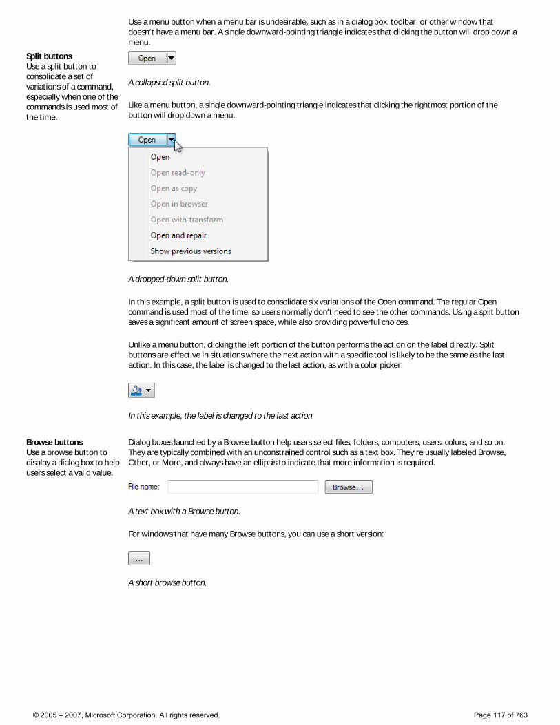
Use a menu button when a menu bar is undesirable, such as in a dialog box, toolbar, or other window that doesn’t have a menu bar. A single downward-pointing triangle indicates that clicking the button will drop down a menu.
Split buttons Use a split button to consolidate a set of variations of a command, especially when one of the commands is used most of the time.
A collapsed split button.
Like a menu button, a single downward-pointing triangle indicates that clicking the rightmost portion of the button will drop down a menu.
A dropped-down split button.
In this example, a split button is used to consolidate six variations of the Open command. The regular Open command is used most of the time, so users normally don’t need to see the other commands. Using a split button saves a significant amount of screen space, while also providing powerful choices.
Unlike a menu button, clicking the left portion of the button performs the action on the label directly. Split buttons are effective in situations where the next action with a specific tool is likely to be the same as the last action. In this case, the label is changed to the last action, as with a color picker:
In this example, the label is changed to the last action.
Browse buttons Use a browse button to display a dialog box to help users select a valid value.
Dialog boxes launched by a Browse button help users select files, folders, computers, users, colors, and so on. They are typically combined with an unconstrained control such as a text box. They’re usually labeled Browse, Other, or More, and always have an ellipsis to indicate that more information is required.
A text box with a Browse button.
For windows that have many Browse buttons, you can use a short version:
A short browse button.
© 2005 – 2007, Microsoft Corporation. All rights reserved. Page 117 of 763
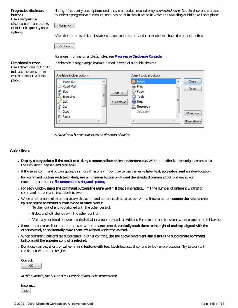
Progressive disclosure buttons Use a progressive disclosure button to show or hide infrequently used options.
Hiding infrequently used options until they are needed is called progressive disclosure. Double chevrons are used to indicate progressive disclosure, and they point in the direction in which the revealing or hiding will take place:
After the button is clicked, its label changes to indicate that the next click will have the opposite effect:
For more information and examples, see Progressive Disclosure Controls.
Directional buttons Use a directional button to indicate the direction in which an action will take place.
In this case, a single angle bracket is used instead of a double chevron:
A directional button indicates the direction of action.
Guidelines
● Display a busy pointer if the result of clicking a command button isn’t instantaneous. Without feedback, users might assume that the click didn’t happen and click again.
● If the same command button appears in more than one window, try to use the same label text, access key, and window location.
● For command buttons with text labels, use a minimum button width and the standard command button height. For more information, see Recommended sizing and spacing.
● For each window make the command buttons the same width. If that’s impractical, limit the number of different widths for command buttons with text labels to two.
● When another control interoperates with a command button, such as a text box with a Browse button, denote the relationship by placing the command button in one of three places:
�❍ To the right of and top-aligned with the other control.
�❍ Below and left-aligned with the other control.
�❍ Vertically centered between controls that interoperate (such as Add and Remove buttons between two interoperating list boxes).
● If multiple command buttons interoperate with the same control, vertically stack them to the right of and top-aligned with the other control, or horizontally place them left-aligned under the control.
● When command buttons are subordinate to other controls, use the above placement and disable the subordinate command button until the superior control is selected.
● Don’t use narrow, short, or tall command buttons with text labels because they tend to look unprofessional. Try to work with the default widths and heights.
Correct:
In this example, the button size is standard and looks professional.
Incorrect:
© 2005 – 2007, Microsoft Corporation. All rights reserved. Page 118 of 763
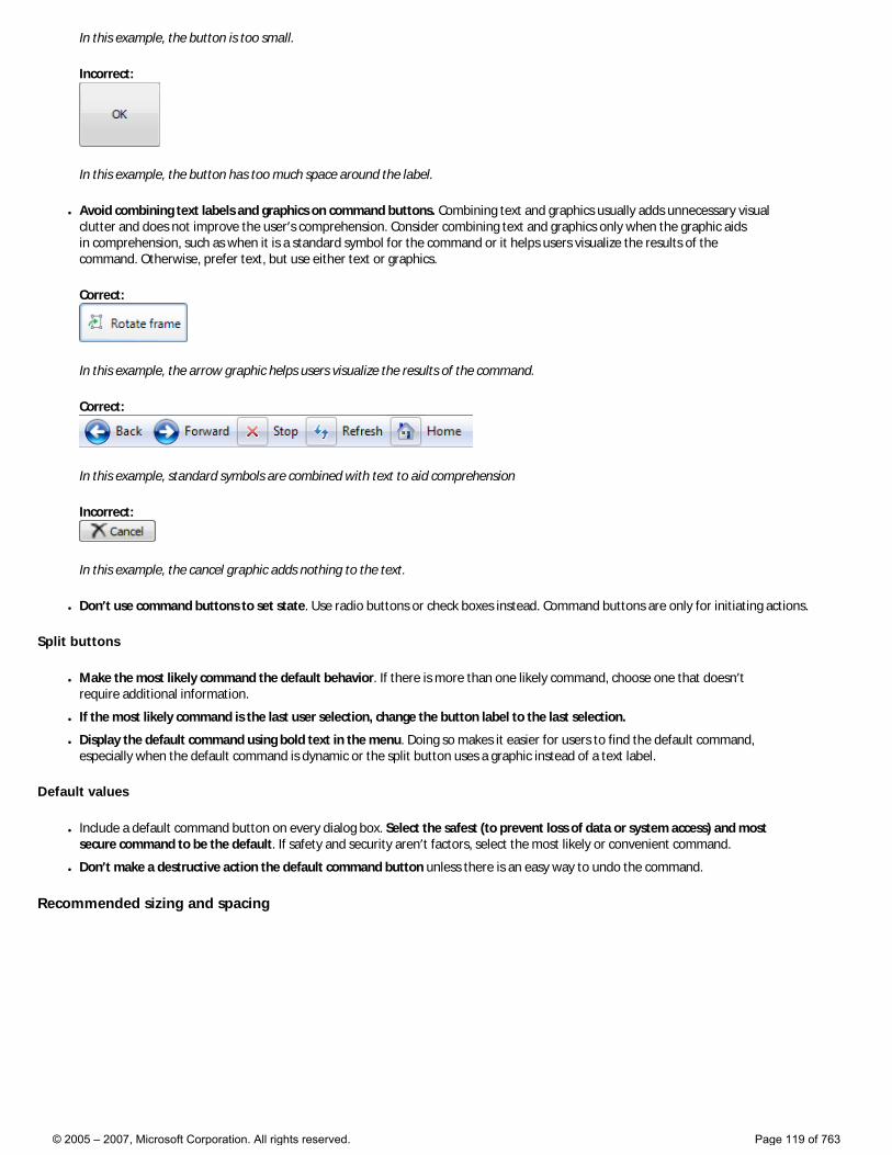
In this example, the button is too small.
Incorrect:
In this example, the button has too much space around the label.
● Avoid combining text labels and graphics on command buttons. Combining text and graphics usually adds unnecessary visual clutter and does not improve the user’s comprehension. Consider combining text and graphics only when the graphic aids in comprehension, such as when it is a standard symbol for the command or it helps users visualize the results of the command. Otherwise, prefer text, but use either text or graphics.
Correct:
In this example, the arrow graphic helps users visualize the results of the command.
Correct:
In this example, standard symbols are combined with text to aid comprehension
Incorrect:
In this example, the cancel graphic adds nothing to the text.
● Don’t use command buttons to set state. Use radio buttons or check boxes instead. Command buttons are only for initiating actions.
Split buttons
● Make the most likely command the default behavior. If there is more than one likely command, choose one that doesn’t require additional information.
● If the most likely command is the last user selection, change the button label to the last selection.
● Display the default command using bold text in the menu. Doing so makes it easier for users to find the default command, especially when the default command is dynamic or the split button uses a graphic instead of a text label.
Default values
● Include a default command button on every dialog box. Select the safest (to prevent loss of data or system access) and most secure command to be the default. If safety and security aren’t factors, select the most likely or convenient command.
● Don’t make a destructive action the default command button unless there is an easy way to undo the command.
Recommended sizing and spacing
© 2005 – 2007, Microsoft Corporation. All rights reserved. Page 119 of 763

Recommended sizing and spacing for command buttons.
Labels
● Label every command button.
● If the button has a graphic label only, assign its Name property to an appropriate text label. This enables assistive technology products such as screen readers to provide users with alternative information about the graphic.
This example shows graphic buttons; internally, these buttons are labeled Previous, Next, and Copy.
● For short browse buttons (labeled “...”), the internal label should be Browse.
● Assign a unique access key. For guidelines, see Keyboard.
Exceptions:
�❍ Don’t assign access keys to OK and Cancel buttons, because Enter is the access key for the default button (which is usually the OK button), and Esc is the access key for Cancel. Doing so makes the other access keys easier to assign.
�❍ Don’t assign access keys to short browse buttons (labeled “...”), because they can’t be assigned uniquely.
● While short labels are preferred, use enough text to explain the command sufficiently. Use a direct object (a noun after the verb) when the object is not apparent from context. Ideally users shouldn’t have to read anything else to understand the label.
Acceptable:
In this example, a short label is acceptable if its meaning in context is readily apparent.
Better: (if Add isn’t clear)
In this example, adding a noun to the verb aids users’ comprehension.
Best:
In this example, the label is self-explanatory.
● The label should start with an imperative verb and clearly describe the action that the button performs. Don’t use ending punctuation. �❍ Exception: The following standard labels are acceptable without verbs: Advanced, Back, Details, Forward, Less, More, New, Next, No,
OK, Options, Previous, Properties, Settings, and Yes.
© 2005 – 2007, Microsoft Corporation. All rights reserved. Page 120 of 763
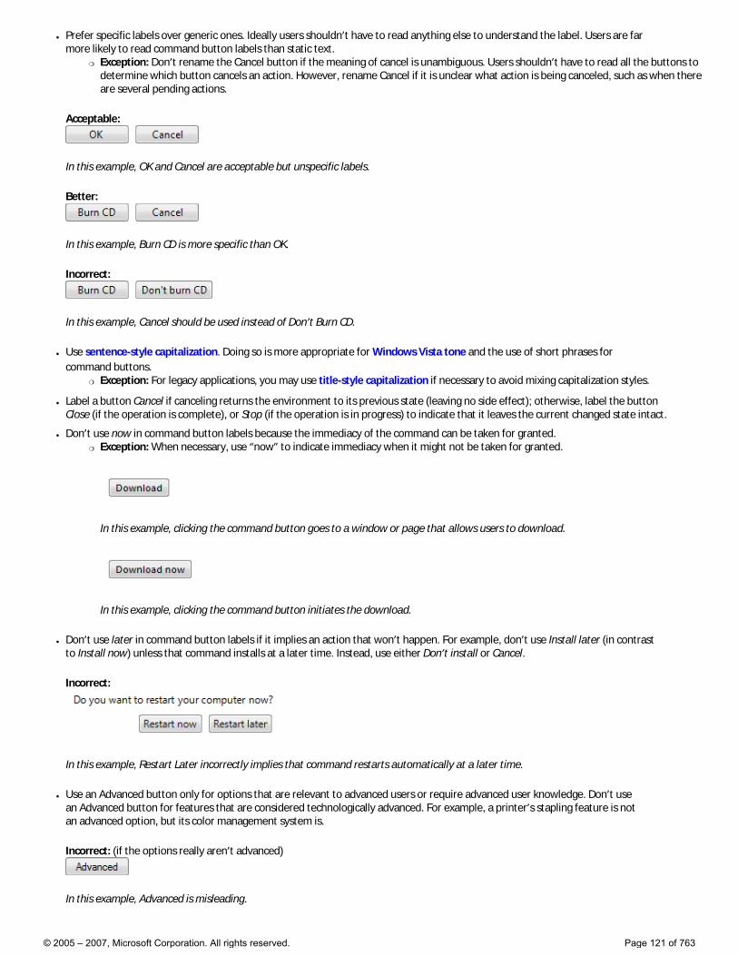
● Prefer specific labels over generic ones. Ideally users shouldn’t have to read anything else to understand the label. Users are far more likely to read command button labels than static text.
�❍ Exception: Don’t rename the Cancel button if the meaning of cancel is unambiguous. Users shouldn’t have to read all the buttons to determine which button cancels an action. However, rename Cancel if it is unclear what action is being canceled, such as when there are several pending actions.
Acceptable:
In this example, OK and Cancel are acceptable but unspecific labels.
Better:
In this example, Burn CD is more specific than OK.
Incorrect:
In this example, Cancel should be used instead of Don’t Burn CD.
● Use sentence-style capitalization. Doing so is more appropriate for Windows Vista tone and the use of short phrases for command buttons.
�❍ Exception: For legacy applications, you may use title-style capitalization if necessary to avoid mixing capitalization styles.
● Label a button Cancel if canceling returns the environment to its previous state (leaving no side effect); otherwise, label the button Close (if the operation is complete), or Stop (if the operation is in progress) to indicate that it leaves the current changed state intact.
● Don’t use now in command button labels because the immediacy of the command can be taken for granted. �❍ Exception: When necessary, use “now” to indicate immediacy when it might not be taken for granted.
In this example, clicking the command button goes to a window or page that allows users to download.
In this example, clicking the command button initiates the download.
● Don’t use later in command button labels if it implies an action that won’t happen. For example, don’t use Install later (in contrast to Install now) unless that command installs at a later time. Instead, use either Don’t install or Cancel.
Incorrect:
In this example, Restart Later incorrectly implies that command restarts automatically at a later time.
● Use an Advanced button only for options that are relevant to advanced users or require advanced user knowledge. Don’t use an Advanced button for features that are considered technologically advanced. For example, a printer’s stapling feature is not an advanced option, but its color management system is.
Incorrect: (if the options really aren’t advanced)
In this example, Advanced is misleading.
© 2005 – 2007, Microsoft Corporation. All rights reserved. Page 121 of 763

Correct:
In this example, the label is more specific and accurate.
● For command buttons that open other windows, choose a label that uses part or all of the secondary window’s title bar text. For example, a command button labeled Browse might open a dialog box entitled Browse for Folder. Using the same terminology throughout the task helps to keep users oriented.
● If users are being asked a question, use labels that match the question.
Correct:
In this example, the buttons answer the question.
Incorrect:
In this example, the buttons don’t answer the question.
● End the label with an ellipsis if the command requires additional information for successful completion. Don’t use an ellipsis when the successful completion of the action is simply to display another window, such as with commands like About, Advanced, Options, Properties, or Help.
�❍ Exception: Graphic labels don’t take an ellipsis.
Correct: (if a Print options dialog is displayed)
In this example, after the button is clicked, the Print options dialog is displayed and requires more information from the user.
Incorrect:
In this example, after the button is clicked, the Options dialog is displayed, but more information from the user is not required.
● For browse buttons, use short browse buttons (labeled “...”) when there are more than two browse buttons in a window. Always use the short version when you want to display a browse button in a grid.
● For directional buttons, use a single angle bracket and have it point in the direction where the action takes place.
Documentation
When referring to command buttons:
● Use the exact label text, including its capitalization, but don’t include the access key underscore or ellipsis. Don’t include the word button.
● To describe user interaction, use click.
● When possible, format the label using bold text. Otherwise, put the label in quotation marks only if required to prevent confusion.
Example: Click Print to print the document.
© 2005 – 2007, Microsoft Corporation. All rights reserved. Page 122 of 763
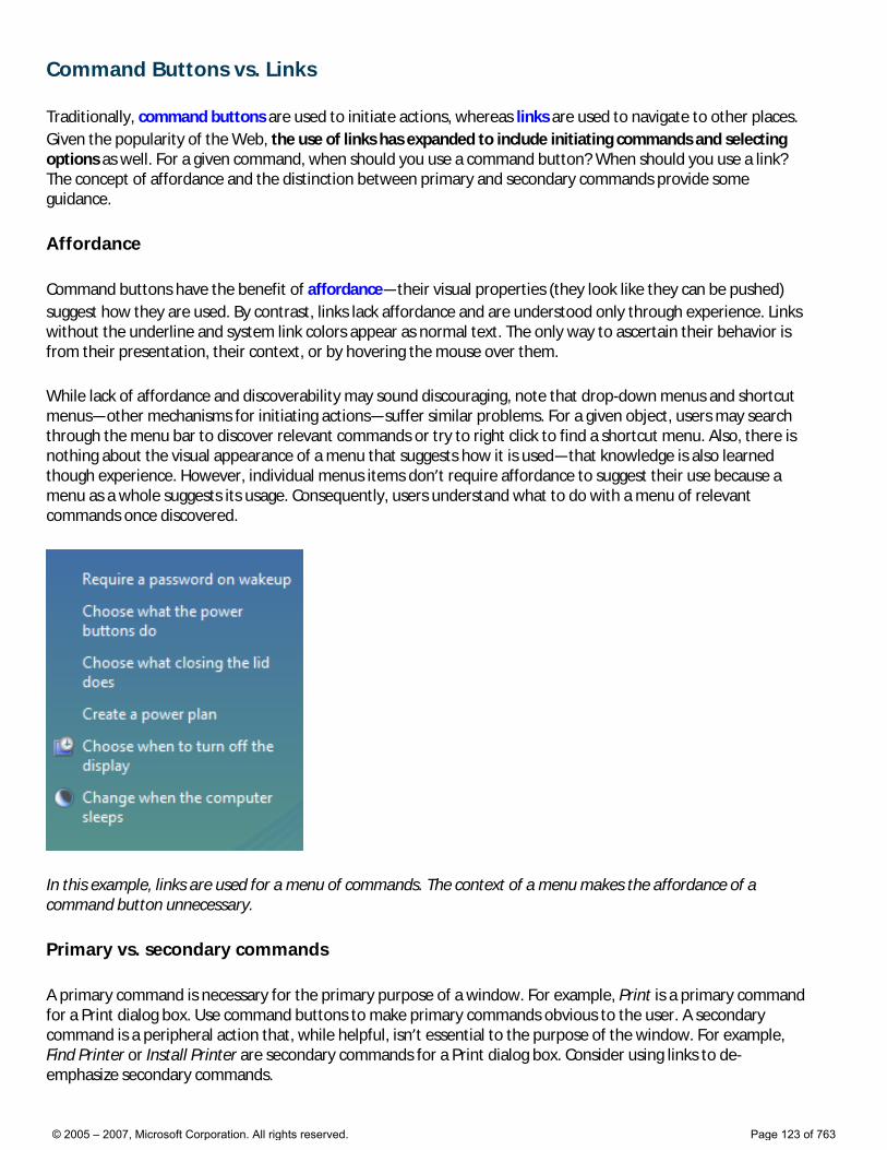
Command Buttons vs. Links
Traditionally, command buttons are used to initiate actions, whereas links are used to navigate to other places. Given the popularity of the Web, the use of links has expanded to include initiating commands and selecting options as well. For a given command, when should you use a command button? When should you use a link? The concept of affordance and the distinction between primary and secondary commands provide some guidance.
Affordance
Command buttons have the benefit of affordance—their visual properties (they look like they can be pushed) suggest how they are used. By contrast, links lack affordance and are understood only through experience. Links without the underline and system link colors appear as normal text. The only way to ascertain their behavior is from their presentation, their context, or by hovering the mouse over them.
While lack of affordance and discoverability may sound discouraging, note that drop-down menus and shortcut menus—other mechanisms for initiating actions—suffer similar problems. For a given object, users may search through the menu bar to discover relevant commands or try to right click to find a shortcut menu. Also, there is nothing about the visual appearance of a menu that suggests how it is used—that knowledge is also learned though experience. However, individual menus items don’t require affordance to suggest their use because a menu as a whole suggests its usage. Consequently, users understand what to do with a menu of relevant commands once discovered.
In this example, links are used for a menu of commands. The context of a menu makes the affordance of a command button unnecessary.
Primary vs. secondary commands
A primary command is necessary for the primary purpose of a window. For example, Print is a primary command for a Print dialog box. Use command buttons to make primary commands obvious to the user. A secondary command is a peripheral action that, while helpful, isn’t essential to the purpose of the window. For example, Find Printer or Install Printer are secondary commands for a Print dialog box. Consider using links to de-emphasize secondary commands.
© 2005 – 2007, Microsoft Corporation. All rights reserved. Page 123 of 763
Gathering input vs. displaying a related window
Use command buttons to display windows used to gather input or making choices for the task at hand. Such actions have command feel to them. By contrast, you can use links to display related, but independent windows. Such actions have a navigation feel.
Consequently, use command buttons, not links, for commands like Open, Save, and Browse, even if they are secondary commands. If unsure, use command buttons to display modal windows and links for independent windows.
Commitment and destruction vs. carefree navigation
Users associate links with Web navigation. This implies a level of safety—after all, in a browser users can always escape using the Back button. Furthermore, when browsing, most significant commitments are made with command buttons, not links.
To maintain these expectations, don’t use links for commands with significant consequences, such as actions that are destructive or irreversible. Similarly, in a wizard or task flow, use command buttons for commitment, and reserve links for making choices and navigating to the next step.
Label length
Simply put, command button frames look awkward and heavy when they are too big. Thus, command buttons look best when their labels are short—typically four or fewer words. To avoid conflict between factors, strive to label primary commands concisely.
The guidelines
● Use command buttons for: �❍ Primary commands.
�❍ Displaying windows used to gather input or making choices, even if they are secondary commands.
�❍ Destructive or irreversible actions, as well as commitment within wizards and page flows.
● Use links for navigation to another page, window, or Help topic; display definitions; and command menus.
● Consider using links to deemphasize secondary commands.
● Use short command button labels, consisting of four or fewer words. Links can have longer labels.
© 2005 – 2007, Microsoft Corporation. All rights reserved. Page 124 of 763
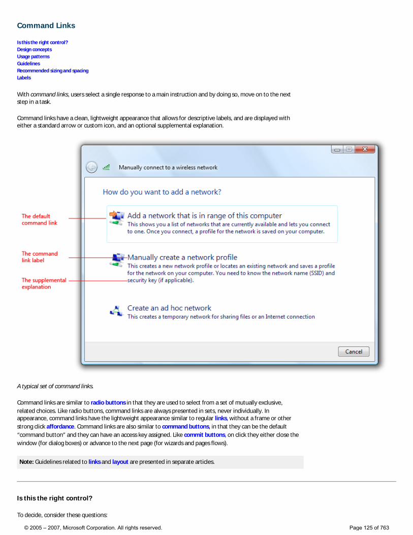
Command Links
Is this the right control? Design concepts Usage patterns Guidelines Recommended sizing and spacing Labels
With command links, users select a single response to a main instruction and by doing so, move on to the next step in a task.
Command links have a clean, lightweight appearance that allows for descriptive labels, and are displayed with either a standard arrow or custom icon, and an optional supplemental explanation.
A typical set of command links.
Command links are similar to radio buttons in that they are used to select from a set of mutually exclusive, related choices. Like radio buttons, command links are always presented in sets, never individually. In appearance, command links have the lightweight appearance similar to regular links, without a frame or other strong click affordance. Command links are also similar to command buttons, in that they can be the default “command button” and they can have an access key assigned. Like commit buttons, on click they either close the window (for dialog boxes) or advance to the next page (for wizards and pages flows).
Note: Guidelines related to links and layout are presented in separate articles.
Is this the right control?
To decide, consider these questions:
© 2005 – 2007, Microsoft Corporation. All rights reserved. Page 125 of 763
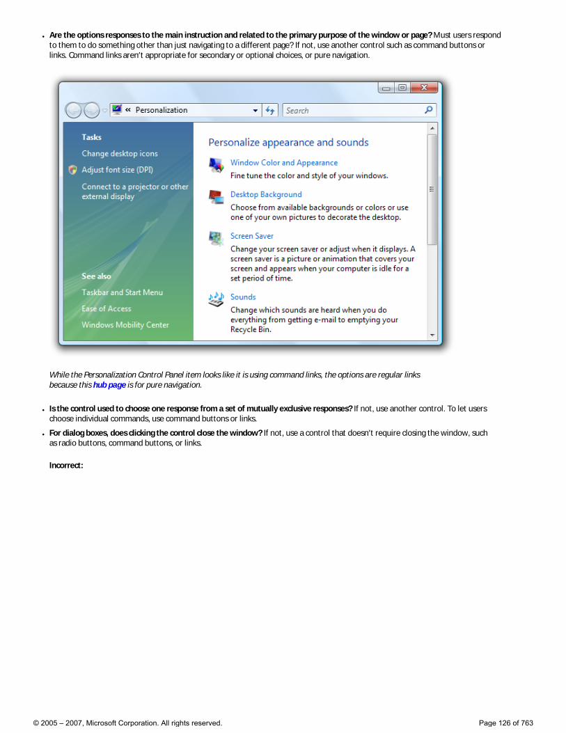
● Are the options responses to the main instruction and related to the primary purpose of the window or page? Must users respond to them to do something other than just navigating to a different page? If not, use another control such as command buttons or links. Command links aren’t appropriate for secondary or optional choices, or pure navigation.
While the Personalization Control Panel item looks like it is using command links, the options are regular links because this hub page is for pure navigation.
● Is the control used to choose one response from a set of mutually exclusive responses? If not, use another control. To let users choose individual commands, use command buttons or links.
● For dialog boxes, does clicking the control close the window? If not, use a control that doesn’t require closing the window, such as radio buttons, command buttons, or links.
Incorrect:
© 2005 – 2007, Microsoft Corporation. All rights reserved. Page 126 of 763
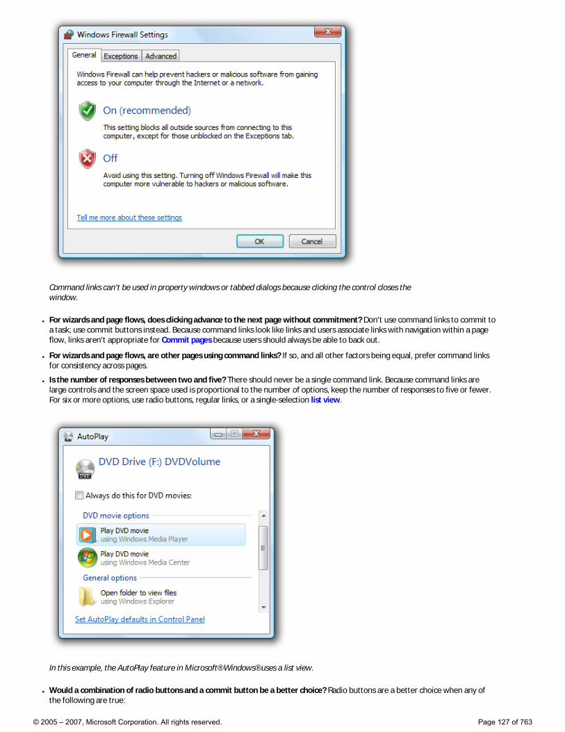
Command links can’t be used in property windows or tabbed dialogs because clicking the control closes the window.
● For wizards and page flows, does clicking advance to the next page without commitment? Don’t use command links to commit to a task; use commit buttons instead. Because command links look like links and users associate links with navigation within a page flow, links aren’t appropriate for Commit pages because users should always be able to back out.
● For wizards and page flows, are other pages using command links? If so, and all other factors being equal, prefer command links for consistency across pages.
● Is the number of responses between two and five? There should never be a single command link. Because command links are large controls and the screen space used is proportional to the number of options, keep the number of responses to five or fewer. For six or more options, use radio buttons, regular links, or a single-selection list view.
In this example, the AutoPlay feature in Microsoft® Windows® uses a list view.
● Would a combination of radio buttons and a commit button be a better choice? Radio buttons are a better choice when any of the following are true:
© 2005 – 2007, Microsoft Corporation. All rights reserved. Page 127 of 763
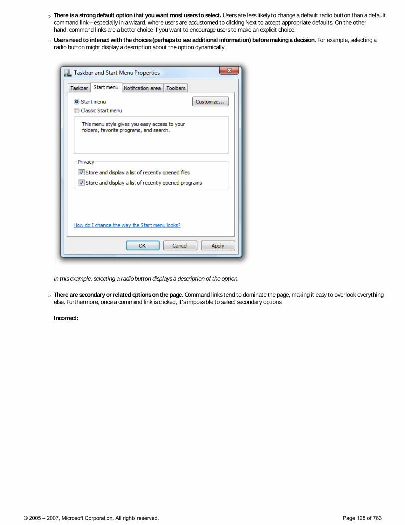
�❍ There is a strong default option that you want most users to select. Users are less likely to change a default radio button than a default command link—especially in a wizard, where users are accustomed to clicking Next to accept appropriate defaults. On the other hand, command links are a better choice if you want to encourage users to make an explicit choice.
�❍ Users need to interact with the choices (perhaps to see additional information) before making a decision. For example, selecting a radio button might display a description about the option dynamically.
In this example, selecting a radio button displays a description of the option.
�❍ There are secondary or related options on the page. Command links tend to dominate the page, making it easy to overlook everything else. Furthermore, once a command link is clicked, it’s impossible to select secondary options.
Incorrect:
© 2005 – 2007, Microsoft Corporation. All rights reserved. Page 128 of 763

In this example, there are two different ways to respond to the main instruction. A command link wasn’t used for the first response because it would be difficult to select secondary options.
Correct:
In this example, radio buttons make the responses clear, while allowing users to select secondary options.
● For dialog boxes, would a group of commit buttons be a better choice? Command links work better when the options require longer, more explanatory responses and supplemental explanations, but a group of commit buttons is a better choice if there are a few simple options.
Incorrect:
© 2005 – 2007, Microsoft Corporation. All rights reserved. Page 129 of 763
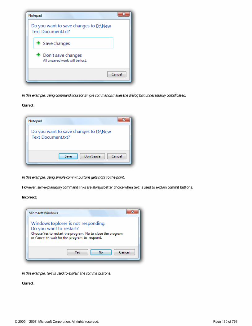
In this example, using command links for simple commands makes the dialog box unnecessarily complicated.
Correct:
In this example, using simple commit buttons gets right to the point.
However, self-explanatory command links are always better choice when text is used to explain commit buttons.
Incorrect:
In this example, text is used to explain the commit buttons.
Correct:
© 2005 – 2007, Microsoft Corporation. All rights reserved. Page 130 of 763
In this example, the command links are self-explanatory.
Note: Command links require Windows Vista® or later, so they aren’t suitable for earlier versions of Windows. You can use regular links as a substitute.
In this example, regular links with an icon and a supplemental explanation are used as a substitute for command links in Windows XP.
Design concepts
Just because command links allow you to use more descriptive labels and optional supplemental explanations doesn’t mean you should. Consider the following example:
Incorrect:
© 2005 – 2007, Microsoft Corporation. All rights reserved. Page 131 of 763
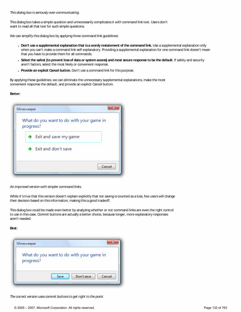
This dialog box is seriously over-communicating.
This dialog box takes a simple question and unnecessarily complicates it with command link text. Users don’t want to read all that text for such simple questions.
We can simplify this dialog box by applying three command link guidelines:
● Don’t use a supplemental explanation that is a wordy restatement of the command link. Use a supplemental explanation only when you can’t make a command link self-explanatory. Providing a supplemental explanation for one command link doesn’t mean that you have to provide them for all commands.
● Select the safest (to prevent loss of data or system access) and most secure response to be the default. If safety and security aren’t factors, select the most likely or convenient response.
● Provide an explicit Cancel button. Don’t use a command link for this purpose.
By applying these guidelines, we can eliminate the unnecessary supplemental explanations, make the most convenient response the default, and provide an explicit Cancel button.
Better:
An improved version with simpler command links.
While it’s true that this version doesn’t explain explicitly that not saving is counted as a loss, few users will change their decision based on this information, making this a good tradeoff.
This dialog box could be made even better by analyzing whether or not command links are even the right control to use in this case. Commit buttons are actually a better choice, because longer, more explanatory responses aren’t needed.
Best:
The correct version uses commit buttons to get right to the point.
© 2005 – 2007, Microsoft Corporation. All rights reserved. Page 132 of 763
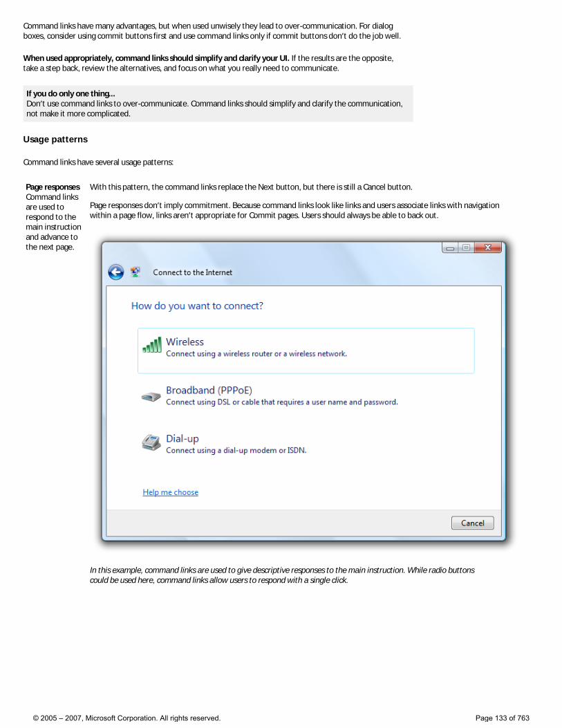
Command links have many advantages, but when used unwisely they lead to over-communication. For dialog boxes, consider using commit buttons first and use command links only if commit buttons don’t do the job well.
When used appropriately, command links should simplify and clarify your UI. If the results are the opposite, take a step back, review the alternatives, and focus on what you really need to communicate.
If you do only one thing... Don’t use command links to over-communicate. Command links should simplify and clarify the communication, not make it more complicated.
Usage patterns
Command links have several usage patterns:
Page responses Command links are used to respond to the main instruction and advance to the next page.
With this pattern, the command links replace the Next button, but there is still a Cancel button. Page responses don’t imply commitment. Because command links look like links and users associate links with navigation within a page flow, links aren’t appropriate for Commit pages. Users should always be able to back out.
In this example, command links are used to give descriptive responses to the main instruction. While radio buttons could be used here, command links allow users to respond with a single click.
© 2005 – 2007, Microsoft Corporation. All rights reserved. Page 133 of 763
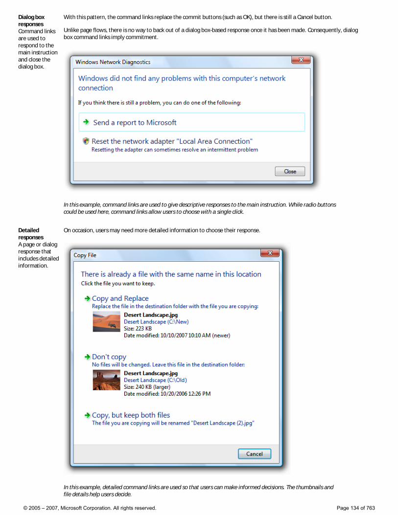
Dialog box responses Command links are used to respond to the main instruction and close the dialog box.
With this pattern, the command links replace the commit buttons (such as OK), but there is still a Cancel button. Unlike page flows, there is no way to back out of a dialog box-based response once it has been made. Consequently, dialog box command links imply commitment.
In this example, command links are used to give descriptive responses to the main instruction. While radio buttons could be used here, command links allow users to choose with a single click.
Detailed responses A page or dialog response that includes detailed information.
On occasion, users may need more detailed information to choose their response.
In this example, detailed command links are used so that users can make informed decisions. The thumbnails and file details help users decide.
© 2005 – 2007, Microsoft Corporation. All rights reserved. Page 134 of 763
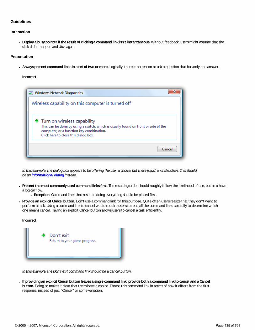
Guidelines
Interaction
● Display a busy pointer if the result of clicking a command link isn’t instantaneous. Without feedback, users might assume that the click didn’t happen and click again.
Presentation
● Always present command links in a set of two or more. Logically, there is no reason to ask a question that has only one answer.
Incorrect:
In this example, the dialog box appears to be offering the user a choice, but there is just an instruction. This should be an informational dialog instead.
● Present the most commonly used command links first. The resulting order should roughly follow the likelihood of use, but also have a logical flow.
�❍ Exception: Command links that result in doing everything should be placed first.
● Provide an explicit Cancel button. Don’t use a command link for this purpose. Quite often users realize that they don’t want to perform a task. Using a command link to cancel would require users to read all the command links carefully to determine which one means cancel. Having an explicit Cancel button allows users to cancel a task efficiently.
Incorrect:
In this example, the Don’t exit command link should be a Cancel button.
● If providing an explicit Cancel button leaves a single command link, provide both a command link to cancel and a Cancel button. Doing so makes it clear that users have a choice. Phrase this command link in terms of how it differs from the first response, instead of just “Cancel” or some variation.
© 2005 – 2007, Microsoft Corporation. All rights reserved. Page 135 of 763
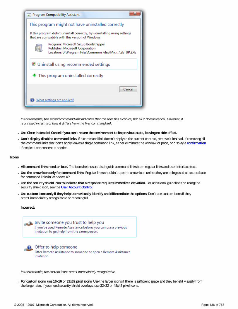
In this example, the second command link indicates that the user has a choice, but all it does is cancel. However, it is phrased in terms of how it differs from the first command link.
● Use Close instead of Cancel if you can’t return the environment to its previous state, leaving no side effect.
● Don’t display disabled command links. If a command link doesn’t apply to the current context, remove it instead. If removing all the command links that don’t apply leaves a single command link, either eliminate the window or page, or display a confirmation if explicit user consent is needed.
Icons
● All command links need an icon. The icons help users distinguish command links from regular links and user interface text.
● Use the arrow icon only for command links. Regular links shouldn’t use the arrow icon unless they are being used as a substitute for command links in Windows XP.
● Use the security shield icon to indicate that a response requires immediate elevation. For additional guidelines on using the security shield icon, see the User Account Control.
● Use custom icons only if they help users visually identify and differentiate the options. Don’t use custom icons if they aren’t immediately recognizable or meaningful.
Incorrect:
In this example, the custom icons aren’t immediately recognizable.
● For custom icons, use 16x16 or 32x32 pixel icons. Use the larger icons if there is sufficient space and they benefit visually from the larger size. If you need security shield overlays, use 32x32 or 48x48 pixel icons.
© 2005 – 2007, Microsoft Corporation. All rights reserved. Page 136 of 763
This example uses 32x32 pixel custom icons.
This example uses 48x48 pixel custom icons, with a security shield overlay.
● Avoid mixing custom icons with the standard arrow icon on a window or a page. If you use a custom icon on a surface, try to use all custom icons. However, prefer the standard arrow icon over meaningless custom icons.
Default values
● Select the safest (to prevent loss of data or system access) and most secure response to be the default. If safety and security aren’t factors, select the most likely or convenient response.
● When practical, make the first response the default option because users often expect that—unless that order isn’t logical.
● For dialog boxes, don’t make a destructive action the default command link unless there is an easy way to undo the action.
Recommended sizing and spacing
Labels
Note: Because command links are responses to a main instruction, you should craft a good main instruction before determining its responses.
Command link labels
● Choose a concise label that clearly communicates and differentiates what the command link does. It should be self-explanatory and correspond to the main instruction. Focus the labels on the differences among the responses. Users shouldn’t have to figure out what the command link really means or how it differs from other command links.
Incorrect:
© 2005 – 2007, Microsoft Corporation. All rights reserved. Page 137 of 763
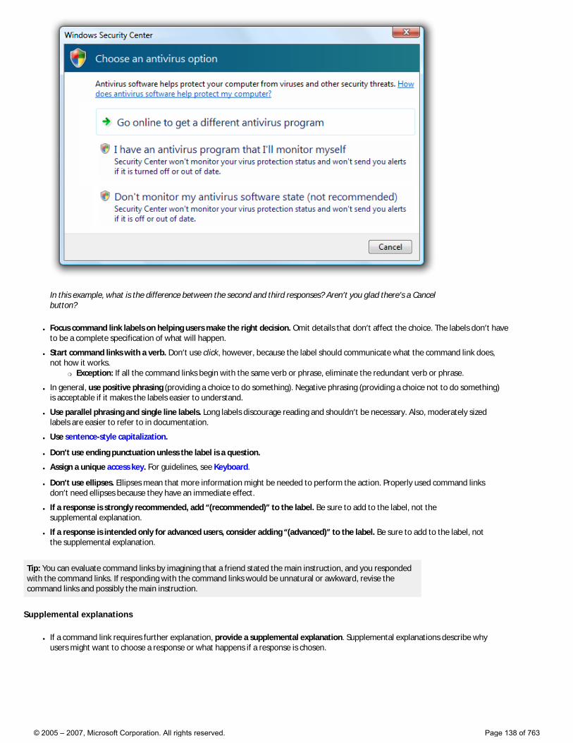
In this example, what is the difference between the second and third responses? Aren’t you glad there’s a Cancel button?
● Focus command link labels on helping users make the right decision. Omit details that don’t affect the choice. The labels don’t have to be a complete specification of what will happen.
● Start command links with a verb. Don’t use click, however, because the label should communicate what the command link does, not how it works.
�❍ Exception: If all the command links begin with the same verb or phrase, eliminate the redundant verb or phrase.
● In general, use positive phrasing (providing a choice to do something). Negative phrasing (providing a choice not to do something) is acceptable if it makes the labels easier to understand.
● Use parallel phrasing and single line labels. Long labels discourage reading and shouldn’t be necessary. Also, moderately sized labels are easier to refer to in documentation.
● Use sentence-style capitalization.
● Don’t use ending punctuation unless the label is a question.
● Assign a unique access key. For guidelines, see Keyboard.
● Don’t use ellipses. Ellipses mean that more information might be needed to perform the action. Properly used command links don’t need ellipses because they have an immediate effect.
● If a response is strongly recommended, add “(recommended)” to the label. Be sure to add to the label, not the supplemental explanation.
● If a response is intended only for advanced users, consider adding “(advanced)” to the label. Be sure to add to the label, not the supplemental explanation.
Tip: You can evaluate command links by imagining that a friend stated the main instruction, and you responded with the command links. If responding with the command links would be unnatural or awkward, revise the command links and possibly the main instruction.
Supplemental explanations
● If a command link requires further explanation, provide a supplemental explanation. Supplemental explanations describe why users might want to choose a response or what happens if a response is chosen.
© 2005 – 2007, Microsoft Corporation. All rights reserved. Page 138 of 763
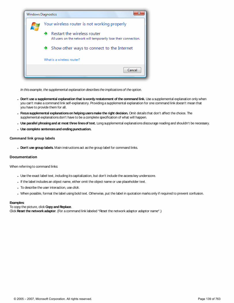
In this example, the supplemental explanation describes the implications of the option.
● Don’t use a supplemental explanation that is wordy restatement of the command link. Use a supplemental explanation only when you can’t make a command link self-explanatory. Providing a supplemental explanation for one command link doesn’t mean that you have to provide them for all.
● Focus supplemental explanations on helping users make the right decision. Omit details that don’t affect the choice. The supplemental explanations don’t have to be a complete specification of what will happen.
● Use parallel phrasing and at most three lines of text. Long supplemental explanations discourage reading and shouldn’t be necessary.
● Use complete sentences and ending punctuation.
Command link group labels
● Don’t use group labels. Main instructions act as the group label for command links.
Documentation
When referring to command links:
● Use the exact label text, including its capitalization, but don’t include the access key underscore.
● If the label includes an object name, either omit the object name or use placeholder text.
● To describe the user interaction, use click.
● When possible, format the label using bold text. Otherwise, put the label in quotation marks only if required to prevent confusion.
Examples: To copy the picture, click Copy and Replace. Click Reset the network adapter. (For a command link labeled “Reset the network adaptor adaptor name”.)
© 2005 – 2007, Microsoft Corporation. All rights reserved. Page 139 of 763
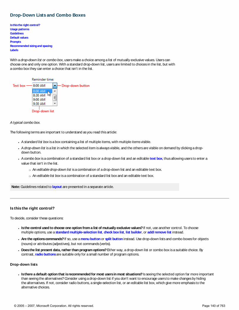
Drop-Down Lists and Combo Boxes
Is this the right control? Usage patterns Guidelines Default values Prompts Recommended sizing and spacing Labels
With a drop-down list or combo box, users make a choice among a list of mutually exclusive values. Users can choose one and only one option. With a standard drop-down list, users are limited to choices in the list, but with a combo box they can enter a choice that isn’t in the list.
A typical combo box.
The following terms are important to understand as you read this article:
● A standard list box is a box containing a list of multiple items, with multiple items visible.
● A drop-down list is a list in which the selected item is always visible, and the others are visible on demand by clicking a drop-down button.
● A combo box is a combination of a standard list box or a drop-down list and an editable text box, thus allowing users to enter a value that isn’t in the list.
�❍ An editable drop-down list is a combination of a drop-down list and an editable text box.
�❍ An editable list box is a combination of a standard list box and an editable text box.
Note: Guidelines related to layout are presented in a separate article.
Is this the right control?
To decide, consider these questions:
● Is the control used to choose one option from a list of mutually exclusive values? If not, use another control. To choose multiple options, use a standard multiple-selection list, check box list, list builder, or add/remove list instead.
● Are the options commands? If so, use a menu button or split button instead. Use drop-down lists and combo boxes for objects (nouns) or attributes (adjectives), but not commands (verbs).
● Does the list present data, rather than program options? Either way, a drop-down list or combo box is a suitable choice. By contrast, radio buttons are suitable only for a small number of program options.
Drop-down lists
● Is there a default option that is recommended for most users in most situations? Is seeing the selected option far more important than seeing the alternatives? Consider using a drop-down list if you don’t want to encourage users to make changes by hiding the alternatives. If not, consider radio buttons, a single-selection list, or an editable list box, which give more emphasis to the alternative choices.
© 2005 – 2007, Microsoft Corporation. All rights reserved. Page 140 of 763
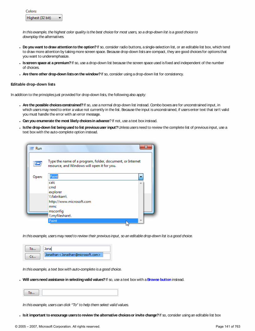
In this example, the highest color quality is the best choice for most users, so a drop-down list is a good choice to downplay the alternatives.
● Do you want to draw attention to the option? If so, consider radio buttons, a single-selection list, or an editable list box, which tend to draw more attention by taking more screen space. Because drop-down lists are compact, they are good choices for options that you want to underemphasize.
● Is screen space at a premium? If so, use a drop-down list because the screen space used is fixed and independent of the number of choices.
● Are there other drop-down lists on the window? If so, consider using a drop-down list for consistency.
Editable drop-down lists
In addition to the principles just provided for drop-down lists, the following also apply:
● Are the possible choices constrained? If so, use a normal drop-down list instead. Combo boxes are for unconstrained input, in which users may need to enter a value not currently in the list. Because the input is unconstrained, if users enter text that isn’t valid you must handle the error with an error message.
● Can you enumerate the most likely choices in advance? If not, use a text box instead.
● Is the drop-down list being used to list previous user input? Unless users need to review the complete list of previous input, use a text box with the auto-complete option instead.
In this example, users may need to review their previous input, so an editable drop-down list is a good choice.
In this example, a text box with auto-complete is a good choice.
● Will users need assistance in selecting valid values? If so, use a text box with a Browse button instead.
In this example, users can click “To” to help them select valid values.
● Is it important to encourage users to review the alternative choices or invite change? If so, consider using an editable list box
© 2005 – 2007, Microsoft Corporation. All rights reserved. Page 141 of 763
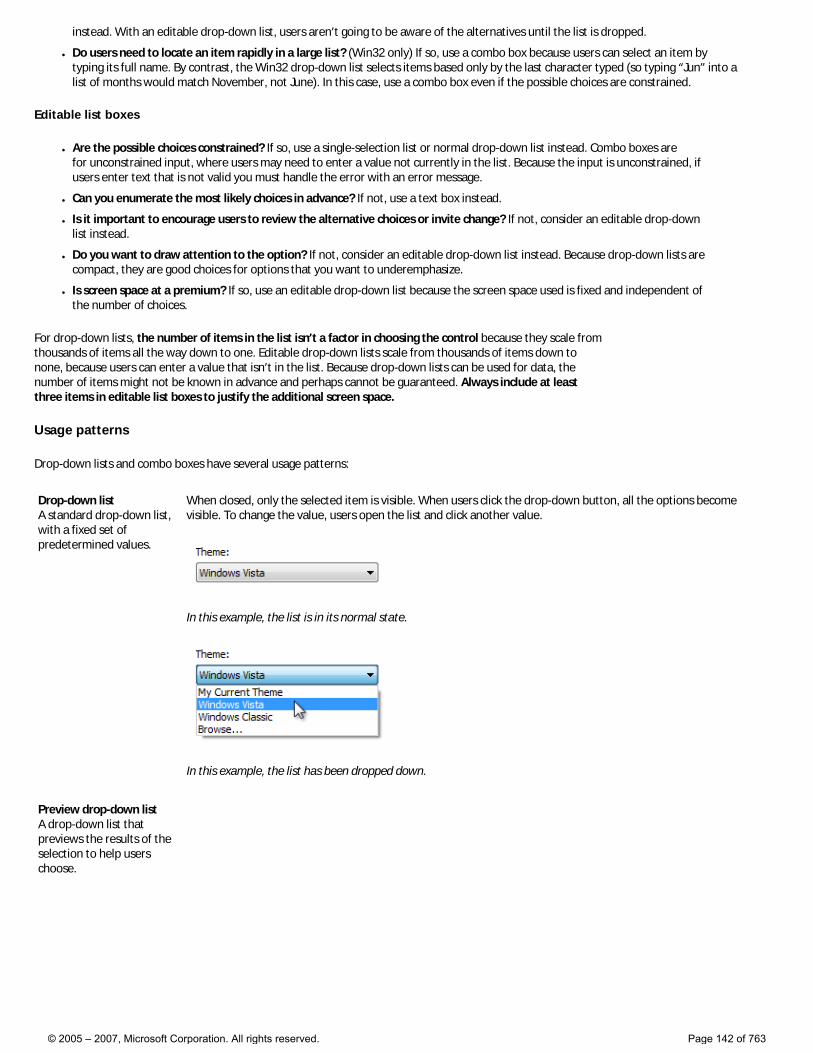
instead. With an editable drop-down list, users aren’t going to be aware of the alternatives until the list is dropped.
● Do users need to locate an item rapidly in a large list? (Win32 only) If so, use a combo box because users can select an item by typing its full name. By contrast, the Win32 drop-down list selects items based only by the last character typed (so typing “Jun” into a list of months would match November, not June). In this case, use a combo box even if the possible choices are constrained.
Editable list boxes
● Are the possible choices constrained? If so, use a single-selection list or normal drop-down list instead. Combo boxes are for unconstrained input, where users may need to enter a value not currently in the list. Because the input is unconstrained, if users enter text that is not valid you must handle the error with an error message.
● Can you enumerate the most likely choices in advance? If not, use a text box instead.
● Is it important to encourage users to review the alternative choices or invite change? If not, consider an editable drop-down list instead.
● Do you want to draw attention to the option? If not, consider an editable drop-down list instead. Because drop-down lists are compact, they are good choices for options that you want to underemphasize.
● Is screen space at a premium? If so, use an editable drop-down list because the screen space used is fixed and independent of the number of choices.
For drop-down lists, the number of items in the list isn’t a factor in choosing the control because they scale from thousands of items all the way down to one. Editable drop-down lists scale from thousands of items down to none, because users can enter a value that isn’t in the list. Because drop-down lists can be used for data, the number of items might not be known in advance and perhaps cannot be guaranteed. Always include at least three items in editable list boxes to justify the additional screen space.
Usage patterns
Drop-down lists and combo boxes have several usage patterns:
Drop-down list A standard drop-down list, with a fixed set of predetermined values.
When closed, only the selected item is visible. When users click the drop-down button, all the options become visible. To change the value, users open the list and click another value.
In this example, the list is in its normal state.
In this example, the list has been dropped down.
Preview drop-down list A drop-down list that previews the results of the selection to help users choose.
© 2005 – 2007, Microsoft Corporation. All rights reserved. Page 142 of 763
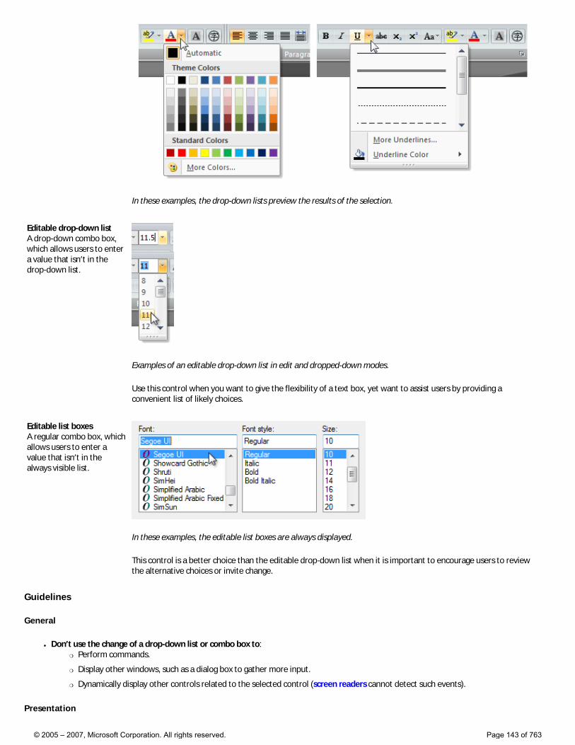
In these examples, the drop-down lists preview the results of the selection.
Editable drop-down list A drop-down combo box, which allows users to enter a value that isn’t in the drop-down list.
Examples of an editable drop-down list in edit and dropped-down modes.
Use this control when you want to give the flexibility of a text box, yet want to assist users by providing a convenient list of likely choices.
Editable list boxes A regular combo box, which allows users to enter a value that isn’t in the always visible list.
In these examples, the editable list boxes are always displayed.
This control is a better choice than the editable drop-down list when it is important to encourage users to review the alternative choices or invite change.
Guidelines
General
● Don’t use the change of a drop-down list or combo box to: �❍ Perform commands.
�❍ Display other windows, such as a dialog box to gather more input.
�❍ Dynamically display other controls related to the selected control (screen readers cannot detect such events).
Presentation
© 2005 – 2007, Microsoft Corporation. All rights reserved. Page 143 of 763
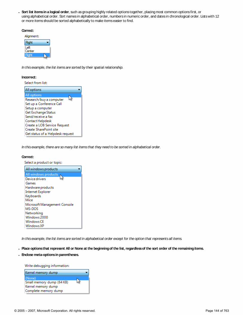
● Sort list items in a logical order, such as grouping highly related options together, placing most common options first, or using alphabetical order. Sort names in alphabetical order, numbers in numeric order, and dates in chronological order. Lists with 12 or more items should be sorted alphabetically to make items easier to find.
Correct:
In this example, the list items are sorted by their spatial relationship.
Incorrect:
In this example, there are so many list items that they need to be sorted in alphabetical order.
Correct:
In this example, the list items are sorted in alphabetical order except for the option that represents all items.
● Place options that represent All or None at the beginning of the list, regardless of the sort order of the remaining items.
● Enclose meta-options in parentheses.
© 2005 – 2007, Microsoft Corporation. All rights reserved. Page 144 of 763
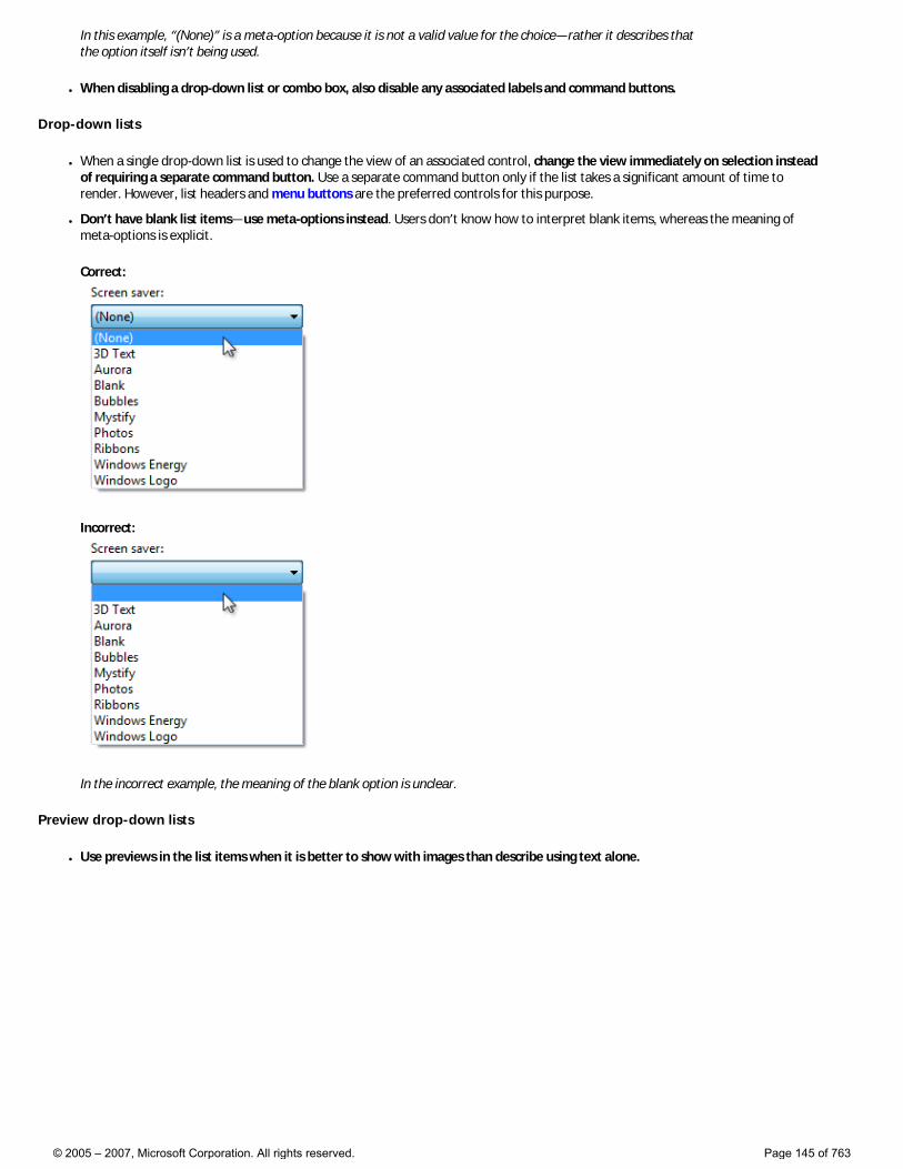
In this example, “(None)” is a meta-option because it is not a valid value for the choice—rather it describes that the option itself isn’t being used.
● When disabling a drop-down list or combo box, also disable any associated labels and command buttons.
Drop-down lists
● When a single drop-down list is used to change the view of an associated control, change the view immediately on selection instead of requiring a separate command button. Use a separate command button only if the list takes a significant amount of time to render. However, list headers and menu buttons are the preferred controls for this purpose.
● Don’t have blank list items—use meta-options instead. Users don’t know how to interpret blank items, whereas the meaning of meta-options is explicit.
Correct:
Incorrect:
In the incorrect example, the meaning of the blank option is unclear.
Preview drop-down lists
● Use previews in the list items when it is better to show with images than describe using text alone.
© 2005 – 2007, Microsoft Corporation. All rights reserved. Page 145 of 763
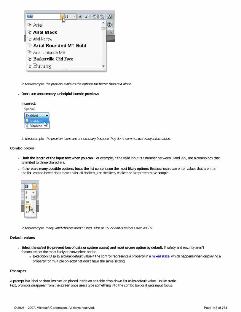
In this example, the preview explains the options far better than text alone.
● Don’t use unnecessary, unhelpful icons in previews.
Incorrect:
In this example, the preview icons are unnecessary because they don’t communicate any information.
Combo boxes
● Limit the length of the input text when you can. For example, if the valid input is a number between 0 and 999, use a combo box that is limited to three characters.
● If there are many possible options, focus the list contents on the most likely options. Because users can enter values that aren’t in the list, combo boxes don’t have to list all choices, just the likely choices or a representative sample.
In this example, many valid choices aren’t listed, such as 15, or half-size fonts such as 9.5.
Default values
● Select the safest (to prevent loss of data or system access) and most secure option by default. If safety and security aren’t factors, select the most likely or convenient option.
�❍ Exception: Display a blank default value if the control represents a property in a mixed state, which happens when displaying a property for multiple objects that don’t have the same setting.
Prompts
A prompt is a label or short instruction placed inside an editable drop-down list as its default value. Unlike static text, prompts disappear from the screen once users type something into the combo box or it gets input focus.
© 2005 – 2007, Microsoft Corporation. All rights reserved. Page 146 of 763
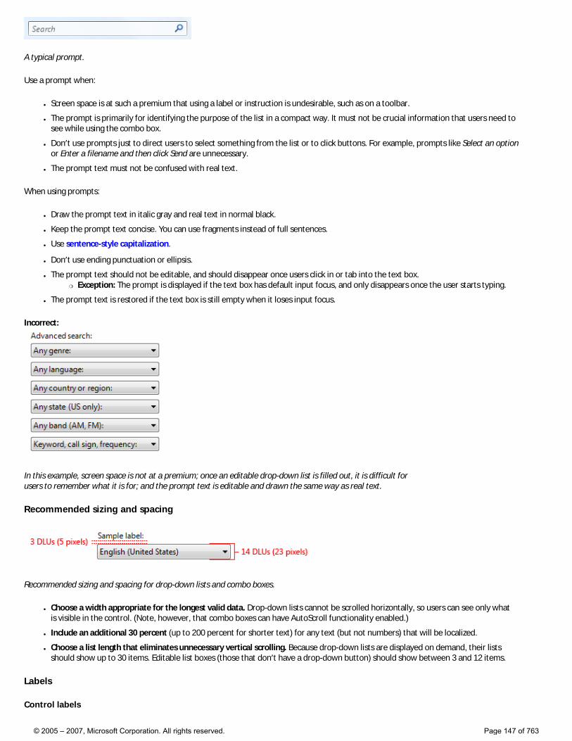
A typical prompt.
Use a prompt when:
● Screen space is at such a premium that using a label or instruction is undesirable, such as on a toolbar.
● The prompt is primarily for identifying the purpose of the list in a compact way. It must not be crucial information that users need to see while using the combo box.
● Don’t use prompts just to direct users to select something from the list or to click buttons. For example, prompts like Select an option or Enter a filename and then click Send are unnecessary.
● The prompt text must not be confused with real text.
When using prompts:
● Draw the prompt text in italic gray and real text in normal black.
● Keep the prompt text concise. You can use fragments instead of full sentences.
● Use sentence-style capitalization.
● Don’t use ending punctuation or ellipsis.
● The prompt text should not be editable, and should disappear once users click in or tab into the text box. �❍ Exception: The prompt is displayed if the text box has default input focus, and only disappears once the user starts typing.
● The prompt text is restored if the text box is still empty when it loses input focus.
Incorrect:
In this example, screen space is not at a premium; once an editable drop-down list is filled out, it is difficult for users to remember what it is for; and the prompt text is editable and drawn the same way as real text.
Recommended sizing and spacing
Recommended sizing and spacing for drop-down lists and combo boxes.
● Choose a width appropriate for the longest valid data. Drop-down lists cannot be scrolled horizontally, so users can see only what is visible in the control. (Note, however, that combo boxes can have AutoScroll functionality enabled.)
● Include an additional 30 percent (up to 200 percent for shorter text) for any text (but not numbers) that will be localized.
● Choose a list length that eliminates unnecessary vertical scrolling. Because drop-down lists are displayed on demand, their lists should show up to 30 items. Editable list boxes (those that don’t have a drop-down button) should show between 3 and 12 items.
Labels
Control labels
© 2005 – 2007, Microsoft Corporation. All rights reserved. Page 147 of 763
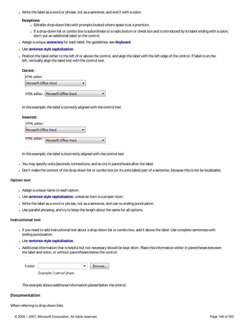
● Write the label as a word or phrase, not as a sentence, and end it with a colon. Exceptions:
�❍ Editable drop-down lists with prompts located where space is at a premium.
�❍ If a drop-down list or combo box is subordinate to a radio button or check box and is introduced by its label ending with a colon, don’t put an additional label on the control.
● Assign a unique access key for each label. For guidelines, see Keyboard.
● Use sentence-style capitalization.
● Position the label either to the left of or above the control, and align the label with the left edge of the control. If label is on the left, vertically align the label text with the control text.
Correct:
In this example, the label is correctly aligned with the control text.
Incorrect:
In this example, the label is incorrectly aligned with the control text.
● You may specify units (seconds, connections, and so on) in parentheses after the label.
● Don’t make the content of the drop-down list or combo box (or its units label) part of a sentence, because this is not be localizable.
Option text
● Assign a unique name to each option.
● Use sentence-style capitalization, unless an item is a proper noun.
● Write the label as a word or phrase, not as a sentence, and use no ending punctuation.
● Use parallel phrasing, and try to keep the length about the same for all options.
Instructional text
● If you need to add instructional text about a drop-down list or combo box, add it above the label. Use complete sentences with ending punctuation.
● Use sentence-style capitalization.
● Additional information that is helpful but not necessary should be kept short. Place this information either in parentheses between the label and colon, or without parentheses below the control.
This example shows additional information placed below the control.
Documentation
When referring to drop-down lists:
© 2005 – 2007, Microsoft Corporation. All rights reserved. Page 148 of 763
● Use the exact label text, including its capitalization, but don’t include the access key underscore or colon; include either list or box, whichever is clearer.
● For list options, use the exact option text, including its capitalization.
● In programming and other technical documentation, refer to drop-down lists as drop-down lists. Everywhere else, use either list or box, whichever is clearer.
● To describe user interaction, use click.
● When possible, format the label and list options using bold text. Otherwise, put the label and options in quotation marks only if required to prevent confusion.
Example: In the Font size list, click Large fonts.
When referring to combo boxes:
● Use the exact label text, including its capitalization, but don’t include the access key underscore or colon; include the word box.
● For list options, use the exact option text including its capitalization.
● In programming and other technical documentation, refer to combo boxes as combo boxes. Everywhere else, use box.
● To describe user interaction, use enter.
● When possible, format the label and list options using bold text. Otherwise, put the label and options in quotation marks only if required to prevent confusion.
Example: In the Font box, enter the font you want to use.
© 2005 – 2007, Microsoft Corporation. All rights reserved. Page 149 of 763
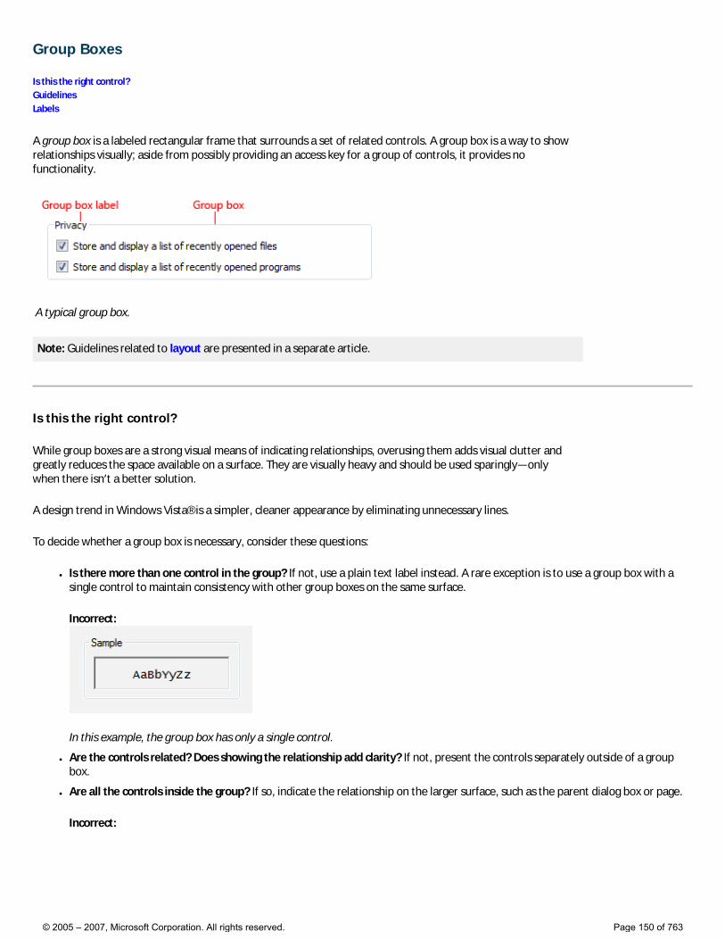
Group Boxes
Is this the right control? Guidelines Labels
A group box is a labeled rectangular frame that surrounds a set of related controls. A group box is a way to show relationships visually; aside from possibly providing an access key for a group of controls, it provides no functionality.
A typical group box.
Note: Guidelines related to layout are presented in a separate article.
Is this the right control?
While group boxes are a strong visual means of indicating relationships, overusing them adds visual clutter and greatly reduces the space available on a surface. They are visually heavy and should be used sparingly—only when there isn’t a better solution.
A design trend in Windows Vista® is a simpler, cleaner appearance by eliminating unnecessary lines.
To decide whether a group box is necessary, consider these questions:
● Is there more than one control in the group? If not, use a plain text label instead. A rare exception is to use a group box with a single control to maintain consistency with other group boxes on the same surface.
Incorrect:
In this example, the group box has only a single control.
● Are the controls related? Does showing the relationship add clarity? If not, present the controls separately outside of a group box.
● Are all the controls inside the group? If so, indicate the relationship on the larger surface, such as the parent dialog box or page.
Incorrect:
© 2005 – 2007, Microsoft Corporation. All rights reserved. Page 150 of 763
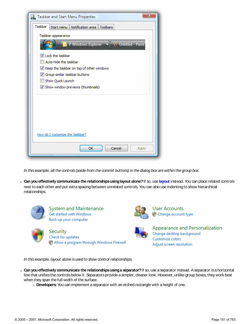
In this example, all the controls (aside from the commit buttons) in the dialog box are within the group box.
● Can you effectively communicate the relationships using layout alone? If so, use layout instead. You can place related controls next to each other and put extra spacing between unrelated controls. You can also use indenting to show hierarchical relationships.
In this example, layout alone is used to show control relationships.
● Can you effectively communicate the relationships using a separator? If so, use a separator instead. A separator is a horizontal line that unifies the controls below it. Separators provide a simpler, cleaner look. However, unlike group boxes, they work best when they span the full width of the surface.
�❍ Developers: You can implement a separator with an etched rectangle with a height of one.
© 2005 – 2007, Microsoft Corporation. All rights reserved. Page 151 of 763
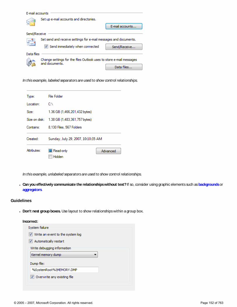
In this example, labeled separators are used to show control relationships.
In this example, unlabeled separators are used to show control relationships.
● Can you effectively communicate the relationships without text? If so, consider using graphic elements such as backgrounds or aggregators.
Guidelines
● Don’t nest group boxes. Use layout to show relationships within a group box.
Incorrect:
© 2005 – 2007, Microsoft Corporation. All rights reserved. Page 152 of 763
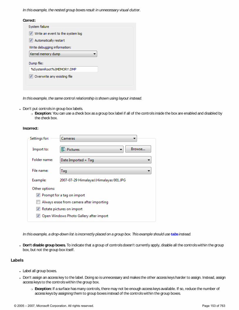
In this example, the nested group boxes result in unnecessary visual clutter.
Correct:
In this example, the same control relationship is shown using layout instead.
● Don’t put controls in group box labels. �❍ Exception: You can use a check box as a group box label if all of the controls inside the box are enabled and disabled by
the check box.
Incorrect:
In this example, a drop-down list is incorrectly placed on a group box. This example should use tabs instead.
● Don’t disable group boxes. To indicate that a group of controls doesn’t currently apply, disable all the controls within the group box, but not the group box itself.
Labels
● Label all group boxes.
● Don’t assign an access key to the label. Doing so is unnecessary and makes the other access keys harder to assign. Instead, assign access keys to the controls within the group box.
�❍ Exception: If a surface has many controls, there may not be enough access keys available. If so, reduce the number of access keys by assigning them to group boxes instead of the controls within the group boxes.
© 2005 – 2007, Microsoft Corporation. All rights reserved. Page 153 of 763
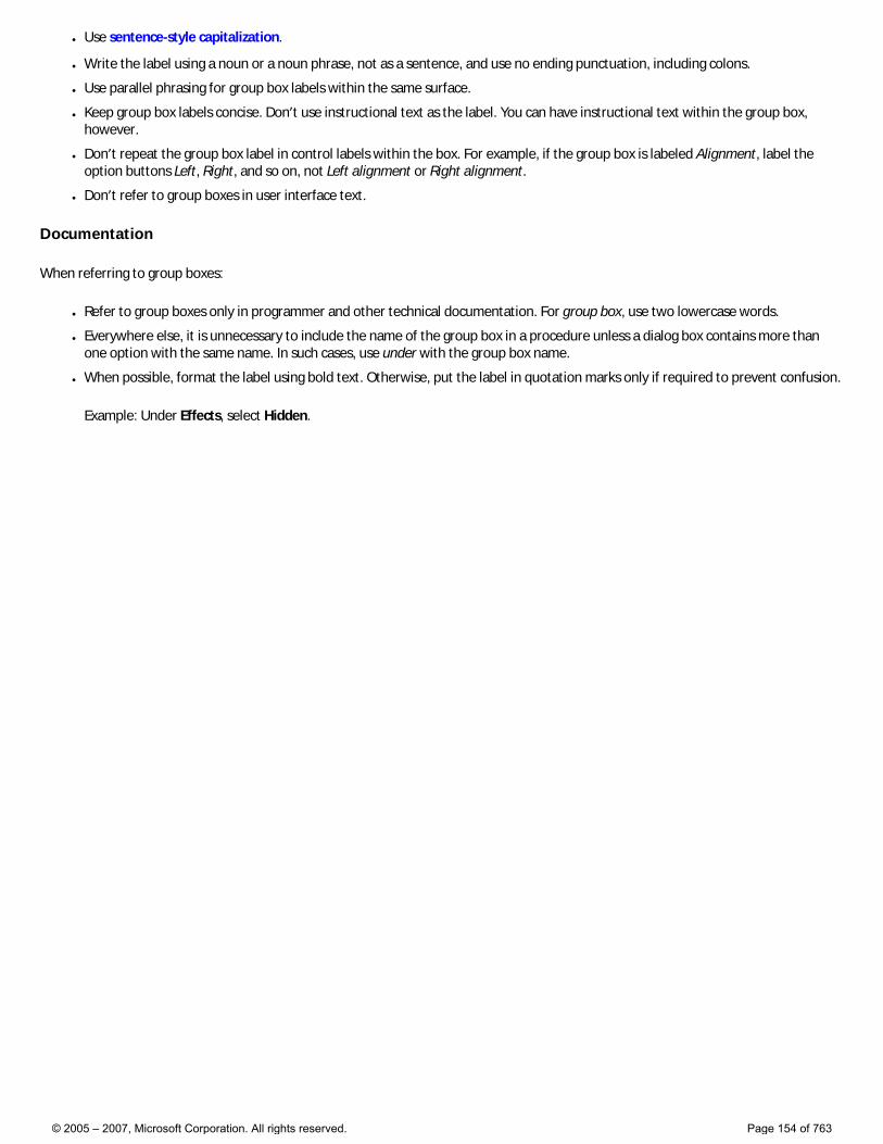
● Use sentence-style capitalization.
● Write the label using a noun or a noun phrase, not as a sentence, and use no ending punctuation, including colons.
● Use parallel phrasing for group box labels within the same surface.
● Keep group box labels concise. Don’t use instructional text as the label. You can have instructional text within the group box, however.
● Don’t repeat the group box label in control labels within the box. For example, if the group box is labeled Alignment, label the option buttons Left, Right, and so on, not Left alignment or Right alignment.
● Don’t refer to group boxes in user interface text.
Documentation
When referring to group boxes:
● Refer to group boxes only in programmer and other technical documentation. For group box, use two lowercase words.
● Everywhere else, it is unnecessary to include the name of the group box in a procedure unless a dialog box contains more than one option with the same name. In such cases, use under with the group box name.
● When possible, format the label using bold text. Otherwise, put the label in quotation marks only if required to prevent confusion.
Example: Under Effects, select Hidden.
© 2005 – 2007, Microsoft Corporation. All rights reserved. Page 154 of 763
Links
Is this the right control? Design concepts Usage patterns Guidelines Text
With a link, users can navigate to another page, window, or Help topic; display a definition; initiate a command; or choose an option. A link is text or a graphic that indicates that it can be clicked, typically by being displayed using the visited or unvisited link system colors. Traditionally, links are underlined as well, but that approach is often unnecessary and falling out of favor to reduce visual clutter.
Visited and unvisited links. Typical examples of link text.
When users hover over a link, the link text appears as underlined (if it wasn’t already) and the pointer shape changes to a hand.
A text link is the lightest weight clickable control, and is often used to reduce the visual complexity of a design.
Note: Guidelines related to command links and layout are presented in separate articles.
Is this the right control?
To decide, consider these questions:
● Is the link used to navigate to another page, window, or Help topic; display a definition; initiate a command; or choose an option? If not, use another control.
● Would a command button be a better choice? Use a command button if: �❍ The control initiates an immediate action, including displaying a window, and that command relates to the primary purpose of the
window.
�❍ A window is displayed to gather input or making choices, even if for a secondary command.
�❍ The label is short, consisting of four or fewer words, thus avoiding the awkward appearance of long buttons.
�❍ The command is not inline.
�❍ The control appears within a group of other related command buttons.
�❍ The action is destructive or irreversible. Because users associate links with navigation (and the ability to back out), links aren’t appropriate for commands with significant consequences.
�❍ Similarly, in a wizard or task flow, the command represents commitment. In such windows, command buttons suggest commitment whereas links suggest navigating to the next step.
For a detailed comparison, see Command Buttons vs. Links.
Design concepts
Making links recognizable
Links lack affordance, which means their visual properties don’t suggest how they are used and are understood only through experience. Links without an underline and link system colors appear as normal text; the only way to ascertain their behavior is from their presentation, their context, or by positioning the pointer over them.
Surprisingly, this lack of affordance is often a motivation for using links because they appear so lightweight, thereby reducing the visual complexity of a design. Links eliminate the visually heavy frame used by command buttons and border used by other controls. For example, while you might use command buttons to make primary commands obvious, you might choose links for secondary commands to de-emphasize them.
© 2005 – 2007, Microsoft Corporation. All rights reserved. Page 155 of 763
The challenge is then to keep enough visual clues so users can recognize the links. The fundamental guideline is users must be able to recognize links by visual inspection alone—they shouldn’t have to hover over an object or click it to determine if it is a link.
Users can recognize a link by visual inspection alone if the link uses the link system colors and at least one of the following visual clues:
● Underlined text.
● A graphic or bullet, such as with the text with icon link pattern.
● Placement within a standard navigation, option, or command location, such as the content area of a window, or in a navigation bar, menu bar, toolbar, or page footer.
Users can also recognize a link by visual inspection with the following visual clues, but these clues aren’t sufficient by themselves:
● Text that suggests clicking, such as a command starting with an imperative verb like Show, Print, Copy, or Delete.
● Placement within a block of normal text.
Of course, users can always determine a link through interaction—either hovering or clicking. If discovery of a link isn’t required for any significant tasks, you can de-emphasize such links.
In this example, Contact Us, Terms of Use, Trademarks, and Privacy Statement are links. They are intentionally de-emphasized because they aren’t required for any important tasks. The only clues that they are links are that they have a mouse pointer on hover and are positioned in a standard navigation area at the bottom of the window.
Making links specific, relevant, and predictable
Link text should indicate the result of clicking on the link.
Specific links are more compelling to users than general links, so use link labels that give specific descriptive information about the result of clicking on the link. However, make sure that your link text isn’t so specific that it is misleading and discourages proper use.
Concise links are more likely to be read than verbose links. Eliminate unnecessary text and detail. Link labels don’t have to be comprehensive.
To evaluate your link text:
● Make sure the link text reflects the scenarios that the link supports.
● Make sure the results of the link are predictable. Users shouldn’t be surprised by the results.
If you do only two things... 1. Make links discoverable by visual inspection alone. Users shouldn’t have to interact with your program to find links. 2. Use links that give specific descriptive information about the result of clicking on the link, using as much text as necessary. Users should be able to accurately predict the result of a link from its link text and optional infotip.
Usage patterns
Links have several functional patterns:
© 2005 – 2007, Microsoft Corporation. All rights reserved. Page 156 of 763
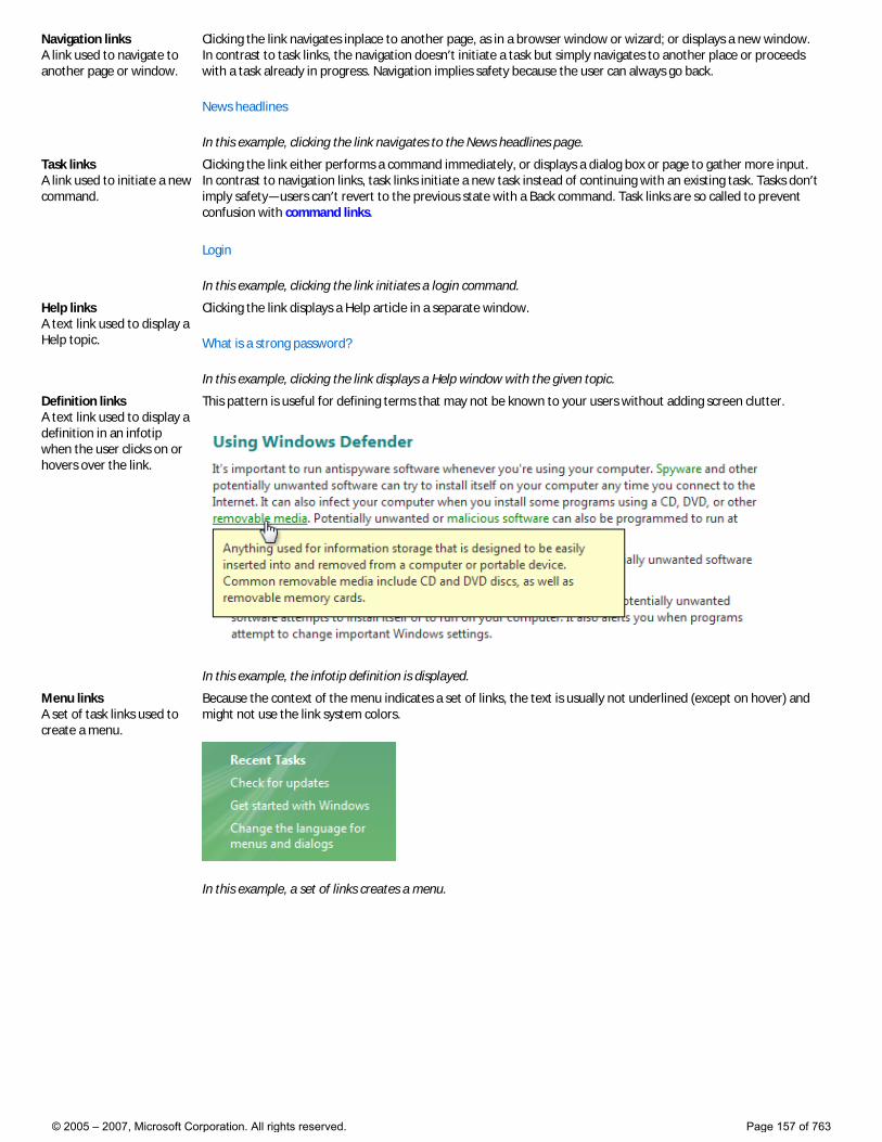
Navigation links A link used to navigate to another page or window.
Clicking the link navigates inplace to another page, as in a browser window or wizard; or displays a new window. In contrast to task links, the navigation doesn’t initiate a task but simply navigates to another place or proceeds with a task already in progress. Navigation implies safety because the user can always go back.
News headlines
In this example, clicking the link navigates to the News headlines page.
Task links A link used to initiate a new command.
Clicking the link either performs a command immediately, or displays a dialog box or page to gather more input. In contrast to navigation links, task links initiate a new task instead of continuing with an existing task. Tasks don’t imply safety—users can’t revert to the previous state with a Back command. Task links are so called to prevent confusion with command links.
Login
In this example, clicking the link initiates a login command.
Help links A text link used to display a Help topic.
Clicking the link displays a Help article in a separate window.
What is a strong password?
In this example, clicking the link displays a Help window with the given topic.
Definition links A text link used to display a definition in an infotip when the user clicks on or hovers over the link.
This pattern is useful for defining terms that may not be known to your users without adding screen clutter.
In this example, the infotip definition is displayed.
Menu links A set of task links used to create a menu.
Because the context of the menu indicates a set of links, the text is usually not underlined (except on hover) and might not use the link system colors.
In this example, a set of links creates a menu.
© 2005 – 2007, Microsoft Corporation. All rights reserved. Page 157 of 763
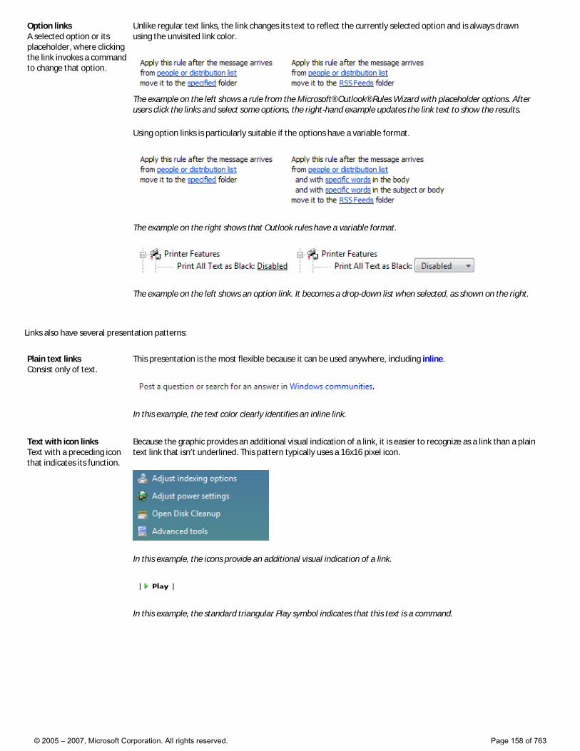
Option links A selected option or its placeholder, where clicking the link invokes a command to change that option.
Unlike regular text links, the link changes its text to reflect the currently selected option and is always drawn using the unvisited link color.
The example on the left shows a rule from the Microsoft® Outlook® Rules Wizard with placeholder options. After users click the links and select some options, the right-hand example updates the link text to show the results.
Using option links is particularly suitable if the options have a variable format.
The example on the right shows that Outlook rules have a variable format.
The example on the left shows an option link. It becomes a drop-down list when selected, as shown on the right.
Links also have several presentation patterns:
Plain text links Consist only of text.
This presentation is the most flexible because it can be used anywhere, including inline.
In this example, the text color clearly identifies an inline link.
Text with icon links Text with a preceding icon that indicates its function.
Because the graphic provides an additional visual indication of a link, it is easier to recognize as a link than a plain text link that isn’t underlined. This pattern typically uses a 16x16 pixel icon.
In this example, the icons provide an additional visual indication of a link.
In this example, the standard triangular Play symbol indicates that this text is a command.
© 2005 – 2007, Microsoft Corporation. All rights reserved. Page 158 of 763
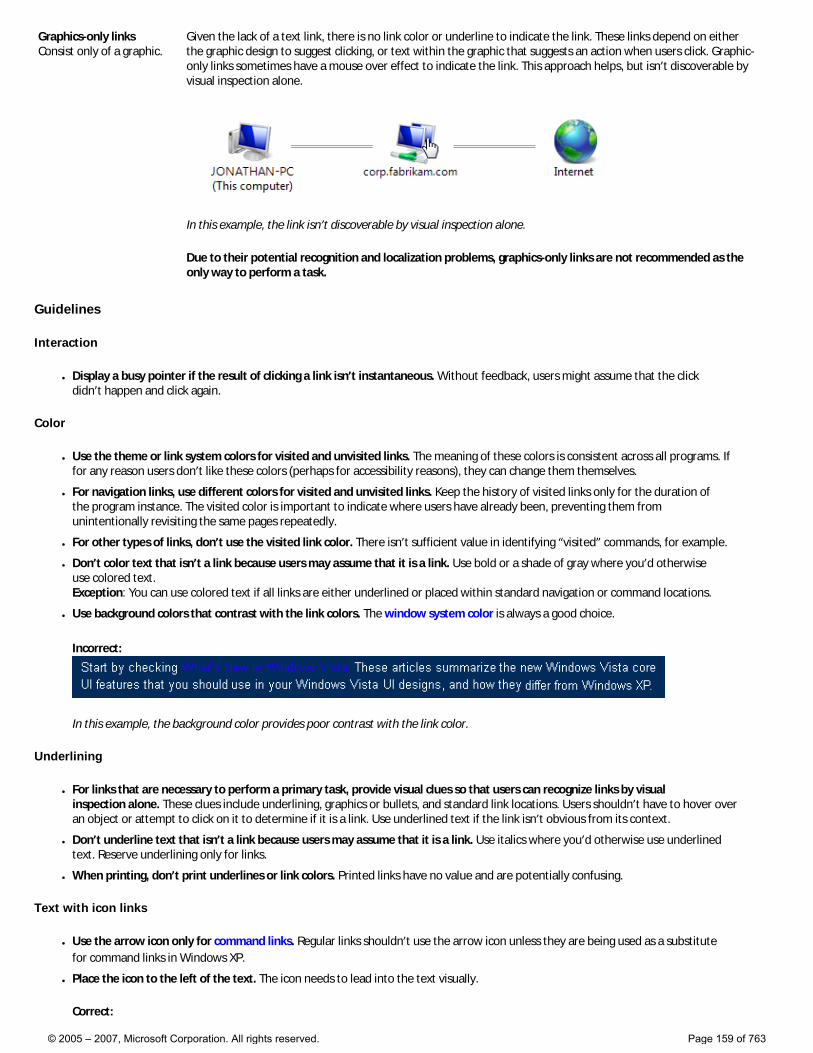
Graphics-only links Consist only of a graphic.
Given the lack of a text link, there is no link color or underline to indicate the link. These links depend on either the graphic design to suggest clicking, or text within the graphic that suggests an action when users click. Graphic-only links sometimes have a mouse over effect to indicate the link. This approach helps, but isn’t discoverable by visual inspection alone.
In this example, the link isn’t discoverable by visual inspection alone.
Due to their potential recognition and localization problems, graphics-only links are not recommended as the only way to perform a task.
Guidelines
Interaction
● Display a busy pointer if the result of clicking a link isn’t instantaneous. Without feedback, users might assume that the click didn’t happen and click again.
Color
● Use the theme or link system colors for visited and unvisited links. The meaning of these colors is consistent across all programs. If for any reason users don’t like these colors (perhaps for accessibility reasons), they can change them themselves.
● For navigation links, use different colors for visited and unvisited links. Keep the history of visited links only for the duration of the program instance. The visited color is important to indicate where users have already been, preventing them from unintentionally revisiting the same pages repeatedly.
● For other types of links, don’t use the visited link color. There isn’t sufficient value in identifying “visited” commands, for example.
● Don’t color text that isn’t a link because users may assume that it is a link. Use bold or a shade of gray where you’d otherwise use colored text. Exception: You can use colored text if all links are either underlined or placed within standard navigation or command locations.
● Use background colors that contrast with the link colors. The window system color is always a good choice.
Incorrect:
In this example, the background color provides poor contrast with the link color.
Underlining
● For links that are necessary to perform a primary task, provide visual clues so that users can recognize links by visual inspection alone. These clues include underlining, graphics or bullets, and standard link locations. Users shouldn’t have to hover over an object or attempt to click on it to determine if it is a link. Use underlined text if the link isn’t obvious from its context.
● Don’t underline text that isn’t a link because users may assume that it is a link. Use italics where you’d otherwise use underlined text. Reserve underlining only for links.
● When printing, don’t print underlines or link colors. Printed links have no value and are potentially confusing.
Text with icon links
● Use the arrow icon only for command links. Regular links shouldn’t use the arrow icon unless they are being used as a substitute for command links in Windows XP.
● Place the icon to the left of the text. The icon needs to lead into the text visually.
Correct:
© 2005 – 2007, Microsoft Corporation. All rights reserved. Page 159 of 763
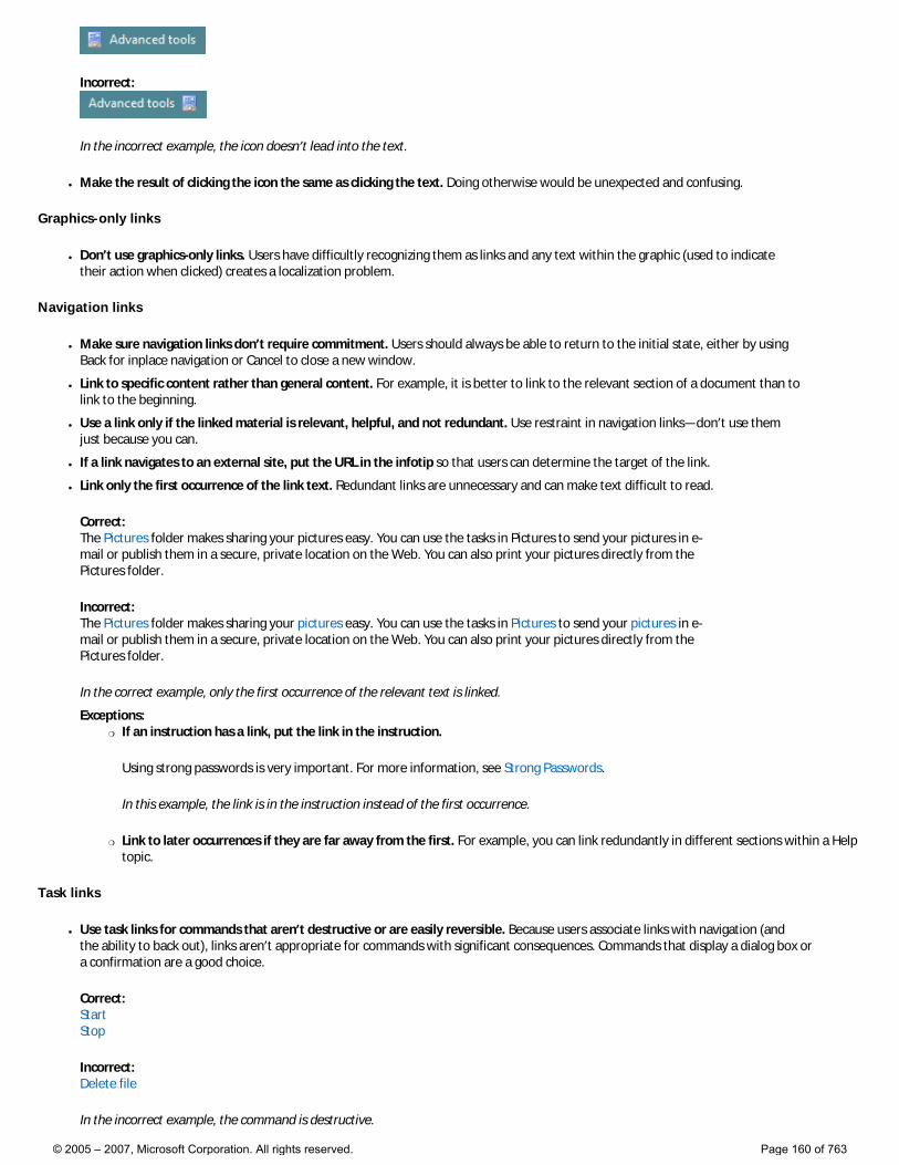
Incorrect:
In the incorrect example, the icon doesn’t lead into the text.
● Make the result of clicking the icon the same as clicking the text. Doing otherwise would be unexpected and confusing.
Graphics-only links
● Don’t use graphics-only links. Users have difficultly recognizing them as links and any text within the graphic (used to indicate their action when clicked) creates a localization problem.
Navigation links
● Make sure navigation links don’t require commitment. Users should always be able to return to the initial state, either by using Back for inplace navigation or Cancel to close a new window.
● Link to specific content rather than general content. For example, it is better to link to the relevant section of a document than to link to the beginning.
● Use a link only if the linked material is relevant, helpful, and not redundant. Use restraint in navigation links—don’t use them just because you can.
● If a link navigates to an external site, put the URL in the infotip so that users can determine the target of the link.
● Link only the first occurrence of the link text. Redundant links are unnecessary and can make text difficult to read.
Correct: The Pictures folder makes sharing your pictures easy. You can use the tasks in Pictures to send your pictures in e-mail or publish them in a secure, private location on the Web. You can also print your pictures directly from the Pictures folder.
Incorrect: The Pictures folder makes sharing your pictures easy. You can use the tasks in Pictures to send your pictures in e-mail or publish them in a secure, private location on the Web. You can also print your pictures directly from the Pictures folder.
In the correct example, only the first occurrence of the relevant text is linked.
Exceptions:�❍ If an instruction has a link, put the link in the instruction.
Using strong passwords is very important. For more information, see Strong Passwords.
In this example, the link is in the instruction instead of the first occurrence.
�❍ Link to later occurrences if they are far away from the first. For example, you can link redundantly in different sections within a Help topic.
Task links
● Use task links for commands that aren’t destructive or are easily reversible. Because users associate links with navigation (and the ability to back out), links aren’t appropriate for commands with significant consequences. Commands that display a dialog box or a confirmation are a good choice.
Correct: Start Stop
Incorrect: Delete file
In the incorrect example, the command is destructive.
© 2005 – 2007, Microsoft Corporation. All rights reserved. Page 160 of 763
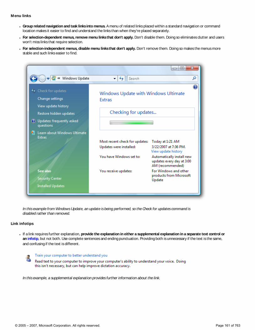
Menu links
● Group related navigation and task links into menus. A menu of related links placed within a standard navigation or command location makes it easier to find and understand the links than when they’re placed separately.
● For selection-dependent menus, remove menu links that don’t apply. Don’t disable them. Doing so eliminates clutter and users won’t miss links that require selection.
● For selection-independent menus, disable menu links that don’t apply. Don’t remove them. Doing so makes the menus more stable and such links easier to find.
In this example from Windows Update, an update is being performed, so the Check for updates command is disabled rather than removed.
Link infotips
● If a link requires further explanation, provide the explanation in either a supplemental explanation in a separate text control or an infotip, but not both. Use complete sentences and ending punctuation. Providing both is unnecessary if the text is the same, and confusing if the text is different.
In this example, a supplemental explanation provides further information about the link.
© 2005 – 2007, Microsoft Corporation. All rights reserved. Page 161 of 763
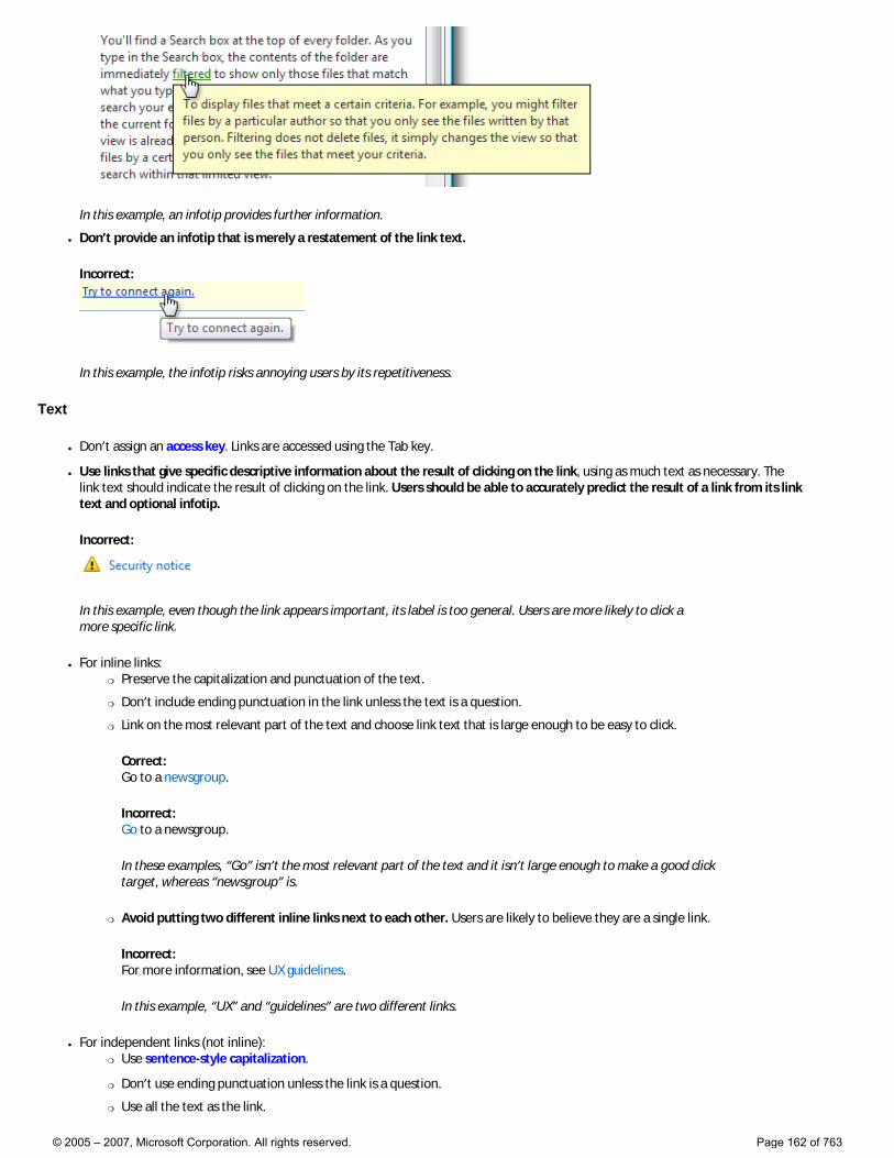
In this example, an infotip provides further information.
● Don’t provide an infotip that is merely a restatement of the link text.
Incorrect:
In this example, the infotip risks annoying users by its repetitiveness.
Text
● Don’t assign an access key. Links are accessed using the Tab key.
● Use links that give specific descriptive information about the result of clicking on the link, using as much text as necessary. The link text should indicate the result of clicking on the link. Users should be able to accurately predict the result of a link from its link text and optional infotip.
Incorrect:
In this example, even though the link appears important, its label is too general. Users are more likely to click a more specific link.
● For inline links: �❍ Preserve the capitalization and punctuation of the text.
�❍ Don’t include ending punctuation in the link unless the text is a question.
�❍ Link on the most relevant part of the text and choose link text that is large enough to be easy to click.
Correct: Go to a newsgroup.
Incorrect: Go to a newsgroup.
In these examples, “Go” isn’t the most relevant part of the text and it isn’t large enough to make a good click target, whereas “newsgroup” is.
�❍ Avoid putting two different inline links next to each other. Users are likely to believe they are a single link.
Incorrect: For more information, see UX guidelines.
In this example, “UX” and “guidelines” are two different links.
● For independent links (not inline): �❍ Use sentence-style capitalization.
�❍ Don’t use ending punctuation unless the link is a question.
�❍ Use all the text as the link.
© 2005 – 2007, Microsoft Corporation. All rights reserved. Page 162 of 763
● Use links that are clearly differentiated from the other links on the screen. Users should be able to accurately predict and differentiate between link targets.
Incorrect: Find antivirus software Get antivirus software
Correct: How to know if antivirus software is installed Install antivirus software
In the incorrect example, the distinction between the two links is unclear.
● Don’t add Click or Click here to the link text. It isn’t necessary because a link implies clicking. Also, Click here and here alone convey no information about the link when read by a screen reader.
Incorrect: Click here for description. Click here for description. Click here for description.
Correct: Description
In the incorrect examples, “click here” goes without saying and conveys no information about the link.
Navigation links
● Start the link with a noun and clearly describe where clicking the link will go. Don’t use ending punctuation. On occasion you may need to start navigation links with a verb, but don’t use verbs that reiterate navigation that is already implied by the fact of linking, such as View, Open, or Go to.
● Present a navigation link as a URL if it navigates to a Web page and you expect the target users to recall the URL and type it into a browser. If possible, design such URLs to be short and easy to remember.
● If the link includes a URL to a Web site starting with “www,” omit the http:// protocol name and use lowercase text.
Incorrect: http://www.microsoft.com www.microsoft.com
Correct: microsoft.com
In the incorrect examples, the “http://” and “www” go without saying.
Task links
● Start the link with an imperative verb and clearly describe the task that the link performs. Don’t use ending punctuation.
● End the link with an ellipsis if the command needs additional information (including a confirmation) for successful completion. Don’t use an ellipsis when the successful completion of the task is to display another window—only when additional information is needed to perform the task.
Print...
In this example, the Print... command link displays a Print dialog box to gather more information.
By contrast, in this example a Print command link prints a single copy of a document to the default printer without any further user interaction.
Proper use of ellipses is important to indicate that users can make further choices before performing the task, or can cancel the task entirely. The visual cue offered by an ellipsis allows users to explore your software without
© 2005 – 2007, Microsoft Corporation. All rights reserved. Page 163 of 763
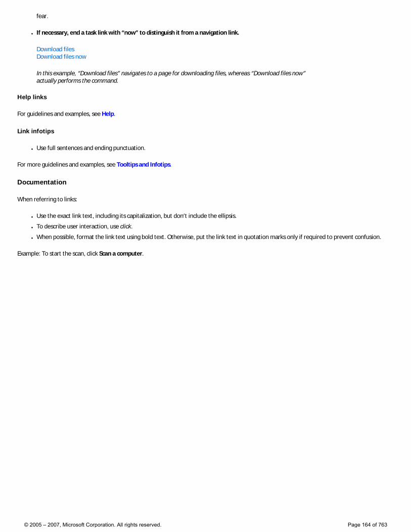
fear.
● If necessary, end a task link with “now” to distinguish it from a navigation link.
Download files Download files now
In this example, “Download files” navigates to a page for downloading files, whereas “Download files now” actually performs the command.
Help links
For guidelines and examples, see Help.
Link infotips
● Use full sentences and ending punctuation.
For more guidelines and examples, see Tooltips and Infotips.
Documentation
When referring to links:
● Use the exact link text, including its capitalization, but don’t include the ellipsis.
● To describe user interaction, use click.
● When possible, format the link text using bold text. Otherwise, put the link text in quotation marks only if required to prevent confusion.
Example: To start the scan, click Scan a computer.
© 2005 – 2007, Microsoft Corporation. All rights reserved. Page 164 of 763
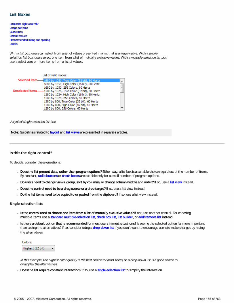
List Boxes
Is this the right control? Usage patterns Guidelines Default values Recommended sizing and spacing Labels
With a list box, users can select from a set of values presented in a list that is always visible. With a single-selection list box, users select one item from a list of mutually exclusive values. With a multiple-selection list box, users select zero or more items from a list of values.
A typical single-selection list box.
Note: Guidelines related to layout and list views are presented in separate articles.
Is this the right control?
To decide, consider these questions:
● Does the list present data, rather than program options? Either way, a list box is a suitable choice regardless of the number of items. By contrast, radio buttons or check boxes are suitable only for a small number of program options.
● Do users need to change views, group, sort by columns, or change column widths and order? If so, use a list view instead.
● Does the control need to be a drag source or a drop target? If so, use a list view instead.
● Do the list items need to be copied to or pasted from the clipboard? If so, use a list view instead.
Single-selection lists
● Is the control used to choose one item from a list of mutually exclusive values? If not, use another control. For choosing multiple items, use a standard multiple-selection list, check box list, list builder, or add/remove list instead.
● Is there a default option that is recommended for most users in most situations? Is seeing the selected option far more important than seeing the alternatives? If so, consider using a drop-down list if you don’t want to encourage users to make changes by hiding the alternatives.
In this example, the highest color quality is the best choice for most users, so a drop-down list is a good choice to downplay the alternatives.
● Does the list require constant interaction? If so, use a single-selection list to simplify the interaction.
© 2005 – 2007, Microsoft Corporation. All rights reserved. Page 165 of 763

In this example, users are constantly changing the selected item in the Display items list to set the foreground and background colors. Using a drop-down list in this case would be very tedious.
● Does the setting seem like a relative quantity? Would users benefit from instant feedback on the effect of setting changes? If so, consider using a slider instead.
● Is there a significant hierarchical relationship between the list items? If so, use a tree view control instead.
● Is screen space at a premium? If so, use a drop-down list instead because the screen space used is fixed and independent of the number of list items.
Standard multiple-selection lists and check box lists
● Is multiple selection essential to the task or commonly used? If so, use a check box list to make multiple selection obvious, especially if your target users aren’t advanced. Many users won’t realize that a standard multiple-selection list supports multiple selection. Use a standard multiple-selection list if the check boxes would draw too much attention to multiple selection or result in too much screen clutter.
● Is the stability of the multiple selection important? If so, use a check box list, list builder, or add/remove list because clicking changes only a single item at a time. With a standard multiple selection list, it’s very easy to clear all the selections—even by accident.
● Is the control used to choose zero or more items from a list of values? If not, use another control. For choosing one item, use a single-selection list instead.
Preview lists
● Are the options easier to select with images than with text alone? If so, use a preview list.
List builders and add/remove lists
● Is the control used to choose zero or more items from a list of values? If not, use another control. For choosing one item, use a single-selection list instead.
● Does the order of the selected items matter? If so, the list builder and add/remove list patterns support order, whereas the other multiple-selection patterns do not.
● Is it important for users to see a summary of all the selected items? If so, the list builder and add/remove list patterns display only the selected items, whereas the other multiple-selection patterns do not.
● Are the possible choices unconstrained? If so, use an add/remove list so that users can choose values not currently in the list.
● Does adding a value to the list require a specialized dialog box for choosing objects? If so, use an add/remove list and display the dialog box when users click Add.
● Is screen space at a premium? If so, use an add/remove list instead because it uses less screen space by not always showing the set of options.
For list boxes, the number of items in the list isn’t a factor in choosing the control because they scale from thousands of items all the way down to one for single-selection lists (and none for multiple-selection lists). Because list boxes can be used for data, the number of items might not be known in advance.
Note: Sometimes a control that looks like a list box is implemented using a list view and vice versa. In such cases, apply the guidelines based on usage, not implementation.
© 2005 – 2007, Microsoft Corporation. All rights reserved. Page 166 of 763
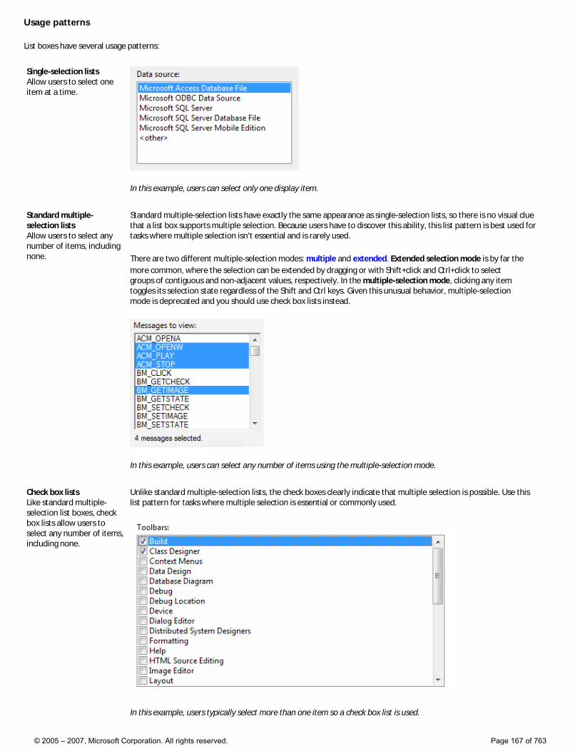
Usage patterns
List boxes have several usage patterns:
Single-selection lists Allow users to select one item at a time.
In this example, users can select only one display item.
Standard multiple-selection lists Allow users to select any number of items, including none.
Standard multiple-selection lists have exactly the same appearance as single-selection lists, so there is no visual clue that a list box supports multiple selection. Because users have to discover this ability, this list pattern is best used for tasks where multiple selection isn’t essential and is rarely used.
There are two different multiple-selection modes: multiple and extended. Extended selection mode is by far the more common, where the selection can be extended by dragging or with Shift+click and Ctrl+click to select groups of contiguous and non-adjacent values, respectively. In the multiple-selection mode, clicking any item toggles its selection state regardless of the Shift and Ctrl keys. Given this unusual behavior, multiple-selection mode is deprecated and you should use check box lists instead.
In this example, users can select any number of items using the multiple-selection mode.
Check box lists Like standard multiple-selection list boxes, check box lists allow users to select any number of items, including none.
Unlike standard multiple-selection lists, the check boxes clearly indicate that multiple selection is possible. Use this list pattern for tasks where multiple selection is essential or commonly used.
In this example, users typically select more than one item so a check box list is used.
© 2005 – 2007, Microsoft Corporation. All rights reserved. Page 167 of 763

Given this clear indication of multiple selection, you might assume that check box lists are preferable to standard multiple-selection lists. In practice, few tasks require multiple selection or use it heavily; using a check box list in such cases draws too much attention to selection. Consequently, standard multiple-selection lists are far more common.
Preview lists Can be single or multiple selection, but they show a preview of the effect of the selection rather than just text.
In this example, a preview of each option clearly shows the effect of the choice, which is more effective than using text alone.
List builders Allow users to create a list of choices by adding one item at a time, and optionally setting the list order.
A list builder consists of two single-selection lists: the list on the left is a fixed set of options and the list on the right is the list being built. There are two command buttons between the lists:
● An Add button that moves the currently selected option to the list being built, inserted before the selected item. (Double-clicking on an option item has the same effect.)
● A Remove button that removes the selected item from the built list and returns it to the option list. (Double-clicking on an item in the built list has the same effect.) The built list may optionally have Move Up and Move Down commands to order the list items.
In this example, a list builder is used to create a toolbar by selecting items from a set of available options and setting their order.
Add/remove lists Allow users to create a list of choices by adding one or more items at a time, and optionally setting the list order (like list builders).
Unlike a list builder, clicking Add displays a dialog box to select items to add to the list. Using a separate dialog box allows for significant flexibility in choosing items—you can use a specialized object picker or even a common dialog. Compared to the list builder, this variation is more compact but requires slightly effort to add items.
In this example, users can add or remove tools from a menu, as well as set order.
© 2005 – 2007, Microsoft Corporation. All rights reserved. Page 168 of 763
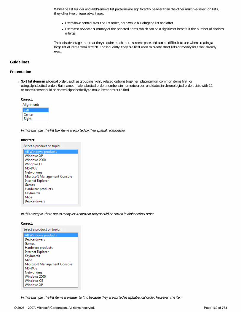
While the list builder and add/remove list patterns are significantly heavier than the other multiple-selection lists, they offer two unique advantages:
● Users have control over the list order, both while building the list and after.
● Users can review a summary of the selected items, which can be a significant benefit if the number of choices is large.
Their disadvantages are that they require much more screen space and can be difficult to use when creating a large list of items from scratch. Consequently, they are best used to create short lists or modify lists that already exist.
Guidelines
Presentation
● Sort list items in a logical order, such as grouping highly related options together, placing most common items first, or using alphabetical order. Sort names in alphabetical order, numbers in numeric order, and dates in chronological order. Lists with 12 or more items should be sorted alphabetically to make items easier to find.
Correct:
In this example, the list box items are sorted by their spatial relationship.
Incorrect:
In this example, there are so many list items that they should be sorted in alphabetical order.
Correct:
In this example, the list items are easier to find because they are sorted in alphabetical order. However, the item
© 2005 – 2007, Microsoft Corporation. All rights reserved. Page 169 of 763
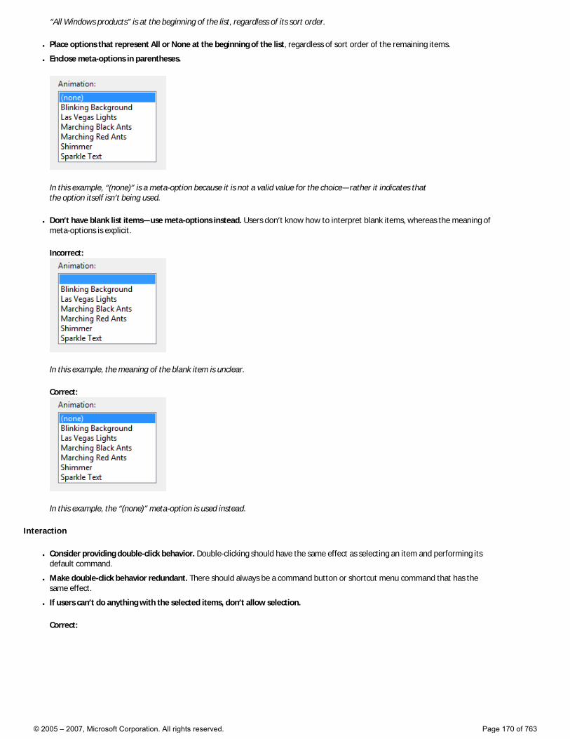
“All Windows products” is at the beginning of the list, regardless of its sort order.
● Place options that represent All or None at the beginning of the list, regardless of sort order of the remaining items.
● Enclose meta-options in parentheses.
In this example, “(none)” is a meta-option because it is not a valid value for the choice—rather it indicates that the option itself isn’t being used.
● Don’t have blank list items—use meta-options instead. Users don’t know how to interpret blank items, whereas the meaning of meta-options is explicit.
Incorrect:
In this example, the meaning of the blank item is unclear.
Correct:
In this example, the “(none)” meta-option is used instead.
Interaction
● Consider providing double-click behavior. Double-clicking should have the same effect as selecting an item and performing its default command.
● Make double-click behavior redundant. There should always be a command button or shortcut menu command that has the same effect.
● If users can’t do anything with the selected items, don’t allow selection.
Correct:
© 2005 – 2007, Microsoft Corporation. All rights reserved. Page 170 of 763
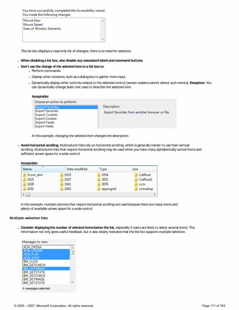
This list box displays a read-only list of changes; there is no need for selection.
● When disabling a list box, also disable any associated labels and command buttons.
● Don’t use the change of the selected item in a list box to: �❍ Perform commands.
�❍ Display other windows, such as a dialog box to gather more input.
�❍ Dynamically display other controls related to the selected control (screen readers cannot detect such events). Exception: You can dynamically change static text used to describe the selected item.
Acceptable:
In this example, changing the selected item changes the description.
● Avoid horizontal scrolling. Multicolumn lists rely on horizontal scrolling, which is generally harder to use than vertical scrolling. Multicolumn lists that require horizontal scrolling may be used when you have many alphabetically sorted items and sufficient screen space for a wide control.
Acceptable:
In this example, multiple columns that require horizontal scrolling are used because there are many items and plenty of available screen space for a wide control.
Multiple-selection lists
● Consider displaying the number of selected items below the list, especially if users are likely to select several items. This information not only gives useful feedback, but it also clearly indicates that the list box supports multiple selection.
© 2005 – 2007, Microsoft Corporation. All rights reserved. Page 171 of 763
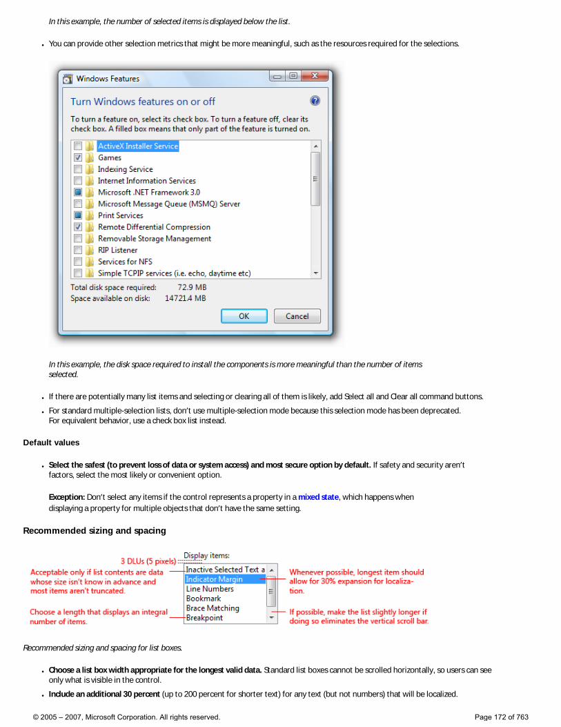
In this example, the number of selected items is displayed below the list.
● You can provide other selection metrics that might be more meaningful, such as the resources required for the selections.
In this example, the disk space required to install the components is more meaningful than the number of items selected.
● If there are potentially many list items and selecting or clearing all of them is likely, add Select all and Clear all command buttons.
● For standard multiple-selection lists, don’t use multiple-selection mode because this selection mode has been deprecated. For equivalent behavior, use a check box list instead.
Default values
● Select the safest (to prevent loss of data or system access) and most secure option by default. If safety and security aren’t factors, select the most likely or convenient option.
Exception: Don’t select any items if the control represents a property in a mixed state, which happens when displaying a property for multiple objects that don’t have the same setting.
Recommended sizing and spacing
Recommended sizing and spacing for list boxes.
● Choose a list box width appropriate for the longest valid data. Standard list boxes cannot be scrolled horizontally, so users can see only what is visible in the control.
● Include an additional 30 percent (up to 200 percent for shorter text) for any text (but not numbers) that will be localized.
© 2005 – 2007, Microsoft Corporation. All rights reserved. Page 172 of 763
● Choose a list box height that displays an integral number of items. Avoid truncating items vertically.
● Choose a list box height that eliminates unnecessary vertical scrolling. List boxes should display between 3 and 20 items. Consider making a list box slightly longer if doing so eliminates the vertical scroll bar. Lists with potentially many items should display at least five items to facilitate scrolling by showing more items at a time and making the scroll bar easier to position.
● If users benefit from making the list box larger, make the list box and its parent window resizable. Doing so allows users to adjust the list box size as needed. However, resizable list boxes should display no fewer than three items.
Labels
Control labels
● All list boxes need labels. Write the label as a word or phrase, not as a sentence; use a colon at the end of the label.
Exception: Omit the label if it is merely a restatement of a dialog box’s main instruction. In this case, the main instruction takes the colon (unless it’s a question) and access key.
Acceptable:
In this example, the list box label just restates the main instruction.
Better:
In this example, the redundant label is removed, so the main instruction takes the colon and access key.
● If a list box is subordinate to a radio button or check box and is introduced by that control’s label ending with a colon, don’t put an additional label on the list box control.
In this example, the list box is subordinate to a radio button and shares its label.
● Assign a unique access key. For guidelines, see Keyboard.
● Use sentence-style capitalization.
● Position the label either to the left of or above the control, and align the label with the left edge of the control. �❍ If label is on the left, vertically align the label text with the first line of text in the control.
Correct:
© 2005 – 2007, Microsoft Corporation. All rights reserved. Page 173 of 763
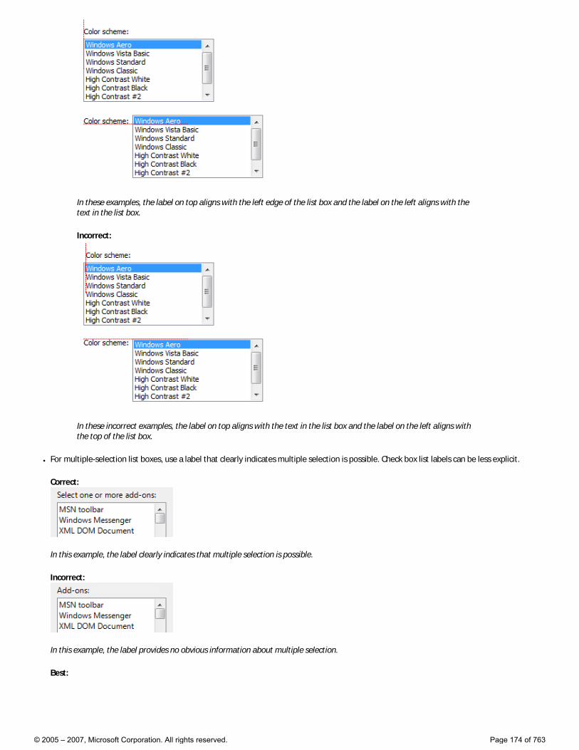
In these examples, the label on top aligns with the left edge of the list box and the label on the left aligns with the text in the list box.
Incorrect:
In these incorrect examples, the label on top aligns with the text in the list box and the label on the left aligns with the top of the list box.
● For multiple-selection list boxes, use a label that clearly indicates multiple selection is possible. Check box list labels can be less explicit.
Correct:
In this example, the label clearly indicates that multiple selection is possible.
Incorrect:
In this example, the label provides no obvious information about multiple selection.
Best:
© 2005 – 2007, Microsoft Corporation. All rights reserved. Page 174 of 763
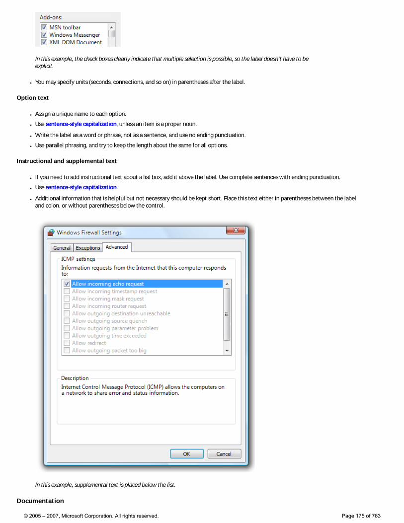
In this example, the check boxes clearly indicate that multiple selection is possible, so the label doesn’t have to be explicit.
● You may specify units (seconds, connections, and so on) in parentheses after the label.
Option text
● Assign a unique name to each option.
● Use sentence-style capitalization, unless an item is a proper noun.
● Write the label as a word or phrase, not as a sentence, and use no ending punctuation.
● Use parallel phrasing, and try to keep the length about the same for all options.
Instructional and supplemental text
● If you need to add instructional text about a list box, add it above the label. Use complete sentences with ending punctuation.
● Use sentence-style capitalization.
● Additional information that is helpful but not necessary should be kept short. Place this text either in parentheses between the label and colon, or without parentheses below the control.
In this example, supplemental text is placed below the list.
Documentation
© 2005 – 2007, Microsoft Corporation. All rights reserved. Page 175 of 763
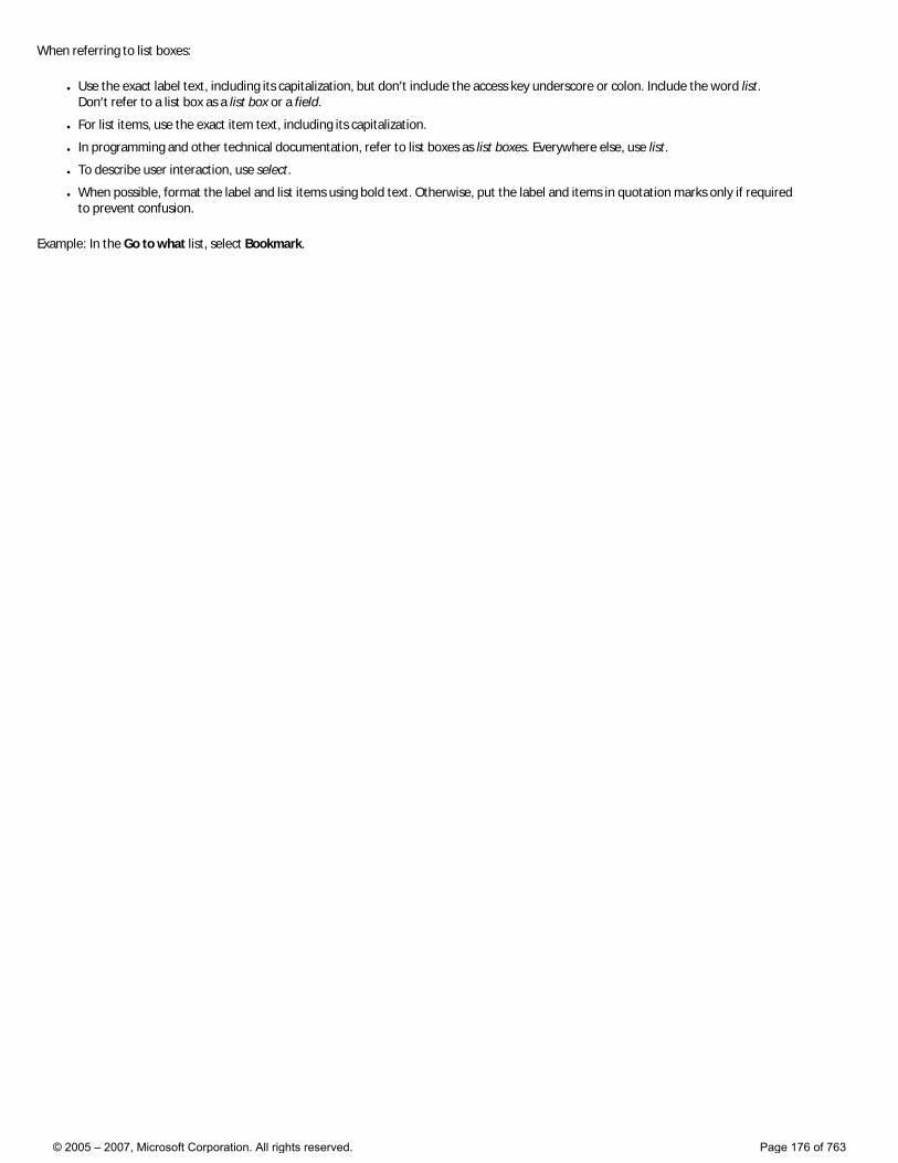
When referring to list boxes:
● Use the exact label text, including its capitalization, but don’t include the access key underscore or colon. Include the word list. Don’t refer to a list box as a list box or a field.
● For list items, use the exact item text, including its capitalization.
● In programming and other technical documentation, refer to list boxes as list boxes. Everywhere else, use list.
● To describe user interaction, use select.
● When possible, format the label and list items using bold text. Otherwise, put the label and items in quotation marks only if required to prevent confusion.
Example: In the Go to what list, select Bookmark.
© 2005 – 2007, Microsoft Corporation. All rights reserved. Page 176 of 763
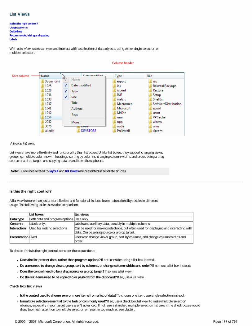
List Views
Is this the right control? Usage patterns Guidelines Recommended sizing and spacing Labels
With a list view, users can view and interact with a collection of data objects, using either single selection or multiple selection.
A typical list view.
List views have more flexibility and functionality than list boxes. Unlike list boxes, they support changing views, grouping, multiple columns with headings, sorting by columns, changing column widths and order, being a drag source or a drop target, and copying data to and from the clipboard.
Note: Guidelines related to layout and list boxes are presented in separate articles.
Is this the right control?
A list view is more than just a more flexible and functional list box: its extra functionality results in different usage. The following table shows the comparison.
List boxes List viewsData type Both data and program options. Data only.Contents Labels only. Labels and auxiliary data, possibly in multiple columns.Interaction Used for making selections. Can be used for making selections, but often used for displaying and interacting with
data. Can be a drag source or a drop target.Presentation Fixed. Users can change views, group, sort by columns, and change column widths and
order.
To decide if this is the right control, consider these questions:
● Does the list present data, rather than program options? If not, consider using a list box instead.
● Do users need to change views, group, sort by columns, or change column widths and order? If not, use a list box instead.
● Does the control need to be a drag source or a drop target? If so, use a list view.
● Do the list items need to be copied to or pasted from the clipboard? If so, use a list view.
Check box list views
● Is the control used to choose zero or more items from a list of data? To choose one item, use single selection instead.
● Is multiple selection essential to the task or commonly used? If so, use a check box list view to make multiple selection obvious, especially if your target users aren’t advanced. If not, use a standard multiple-selection list view if the check boxes would draw too much attention to multiple selection or result in too much screen clutter.
© 2005 – 2007, Microsoft Corporation. All rights reserved. Page 177 of 763
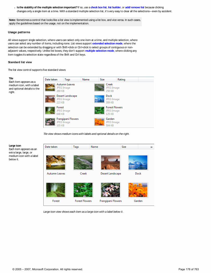
● Is the stability of the multiple selection important? If so, use a check box list, list builder, or add/remove list because clicking changes only a single item at a time. With a standard multiple selection list, it’s very easy to clear all the selections—even by accident.
Note: Sometimes a control that looks like a list view is implemented using a list box, and vice versa. In such cases, apply the guidelines based on the usage, not on the implementation.
Usage patterns
All views support single selection, where users can select only one item at a time, and multiple selection, where users can select any number of items, including none. List views support extended selection mode, where the selection can be extended by dragging or with Shift+click or Ctrl+click to select groups of contiguous or non-adjacent values, respectively. Unlike list boxes, they don’t support multiple selection mode, where clicking any item toggles its selection state regardless of the Shift and Ctrl keys.
Standard list view
The list view control supports five standard views:
Tile Each item appears as a medium icon, with a label and optional details to the right.
Tile view shows medium icons with labels and optional details on the right.
Large icon Each item appears as an extra large, large, or medium icon with a label below it.
Large Icon view shows each item as a large icon with a label below it.
© 2005 – 2007, Microsoft Corporation. All rights reserved. Page 178 of 763
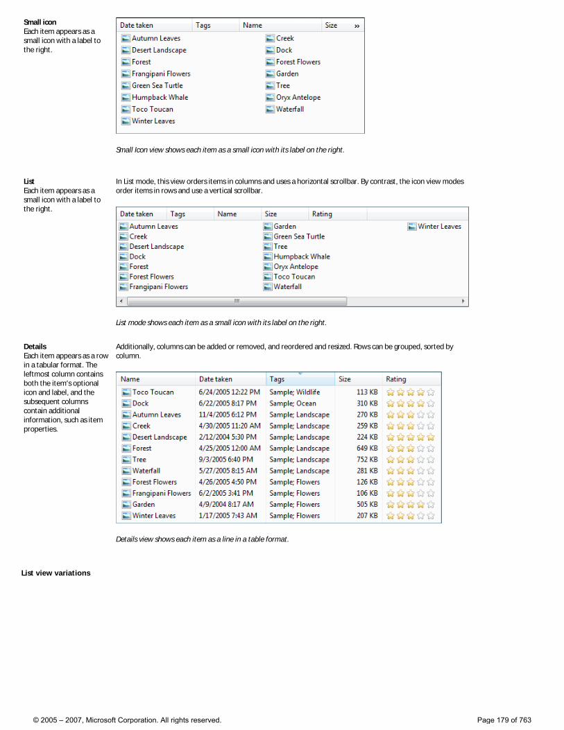
Small icon Each item appears as a small icon with a label to the right.
Small Icon view shows each item as a small icon with its label on the right.
List Each item appears as a small icon with a label to the right.
In List mode, this view orders items in columns and uses a horizontal scrollbar. By contrast, the icon view modes order items in rows and use a vertical scrollbar.
List mode shows each item as a small icon with its label on the right.
Details Each item appears as a row in a tabular format. The leftmost column contains both the item’s optional icon and label, and the subsequent columns contain additional information, such as item properties.
Additionally, columns can be added or removed, and reordered and resized. Rows can be grouped, sorted by column.
Details view shows each item as a line in a table format.
List view variations
© 2005 – 2007, Microsoft Corporation. All rights reserved. Page 179 of 763
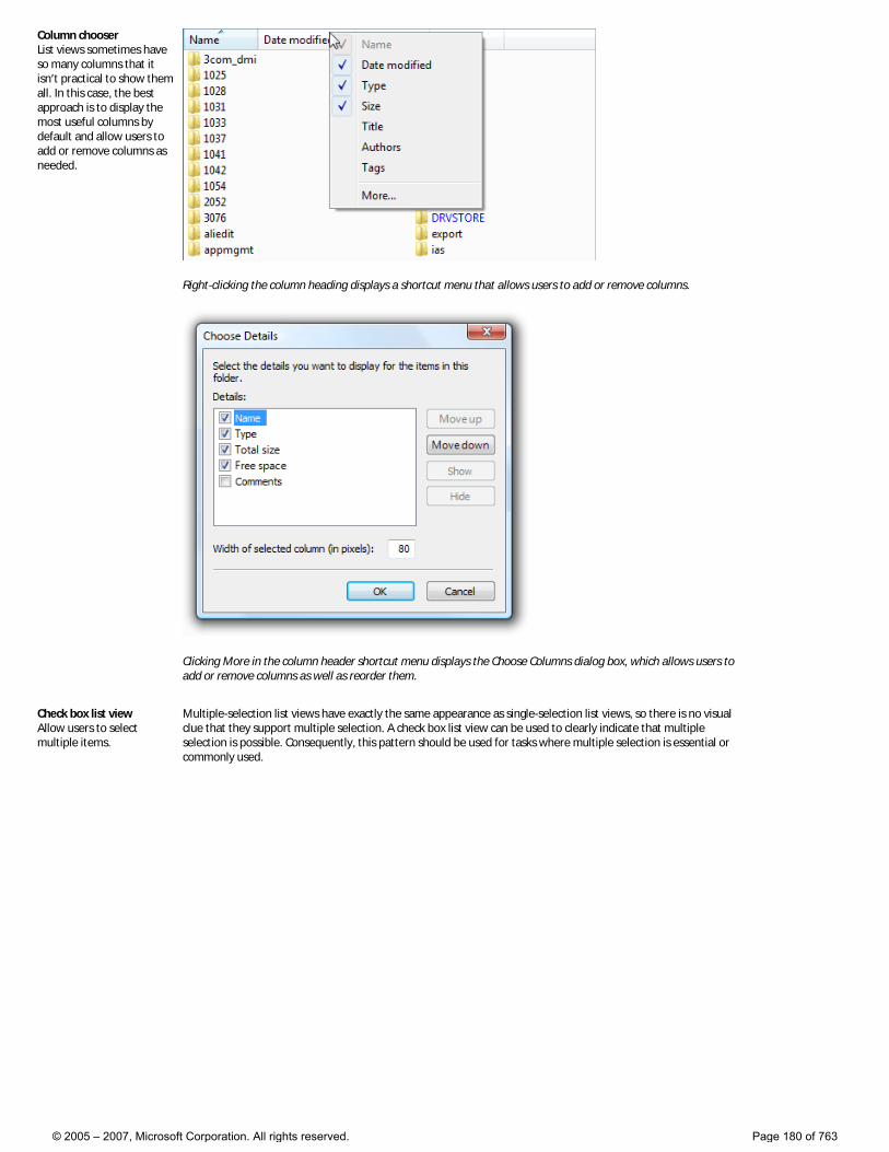
Column chooser List views sometimes have so many columns that it isn’t practical to show them all. In this case, the best approach is to display the most useful columns by default and allow users to add or remove columns as needed.
Right-clicking the column heading displays a shortcut menu that allows users to add or remove columns.
Clicking More in the column header shortcut menu displays the Choose Columns dialog box, which allows users to add or remove columns as well as reorder them.
Check box list view Allow users to select multiple items.
Multiple-selection list views have exactly the same appearance as single-selection list views, so there is no visual clue that they support multiple selection. A check box list view can be used to clearly indicate that multiple selection is possible. Consequently, this pattern should be used for tasks where multiple selection is essential or commonly used.
© 2005 – 2007, Microsoft Corporation. All rights reserved. Page 180 of 763
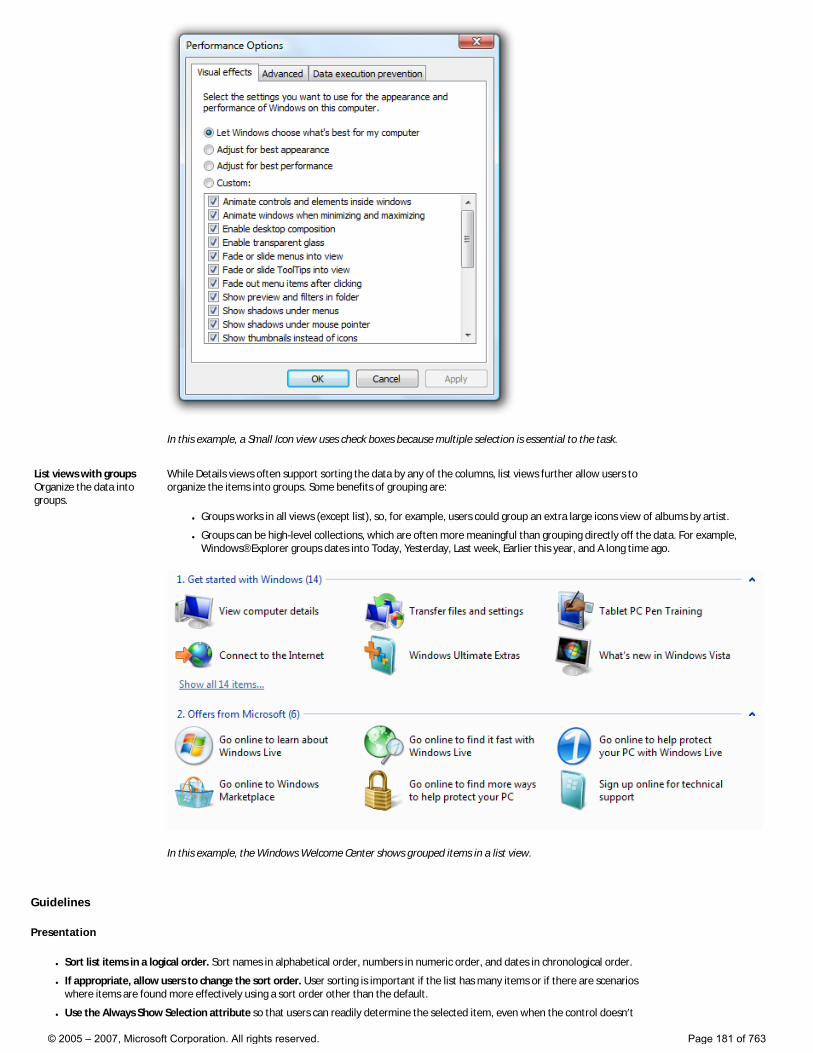
In this example, a Small Icon view uses check boxes because multiple selection is essential to the task.
List views with groups Organize the data into groups.
While Details views often support sorting the data by any of the columns, list views further allow users to organize the items into groups. Some benefits of grouping are:
● Groups works in all views (except list), so, for example, users could group an extra large icons view of albums by artist.
● Groups can be high-level collections, which are often more meaningful than grouping directly off the data. For example, Windows® Explorer groups dates into Today, Yesterday, Last week, Earlier this year, and A long time ago.
In this example, the Windows Welcome Center shows grouped items in a list view.
Guidelines
Presentation
● Sort list items in a logical order. Sort names in alphabetical order, numbers in numeric order, and dates in chronological order.
● If appropriate, allow users to change the sort order. User sorting is important if the list has many items or if there are scenarios where items are found more effectively using a sort order other than the default.
● Use the Always Show Selection attribute so that users can readily determine the selected item, even when the control doesn’t
© 2005 – 2007, Microsoft Corporation. All rights reserved. Page 181 of 763
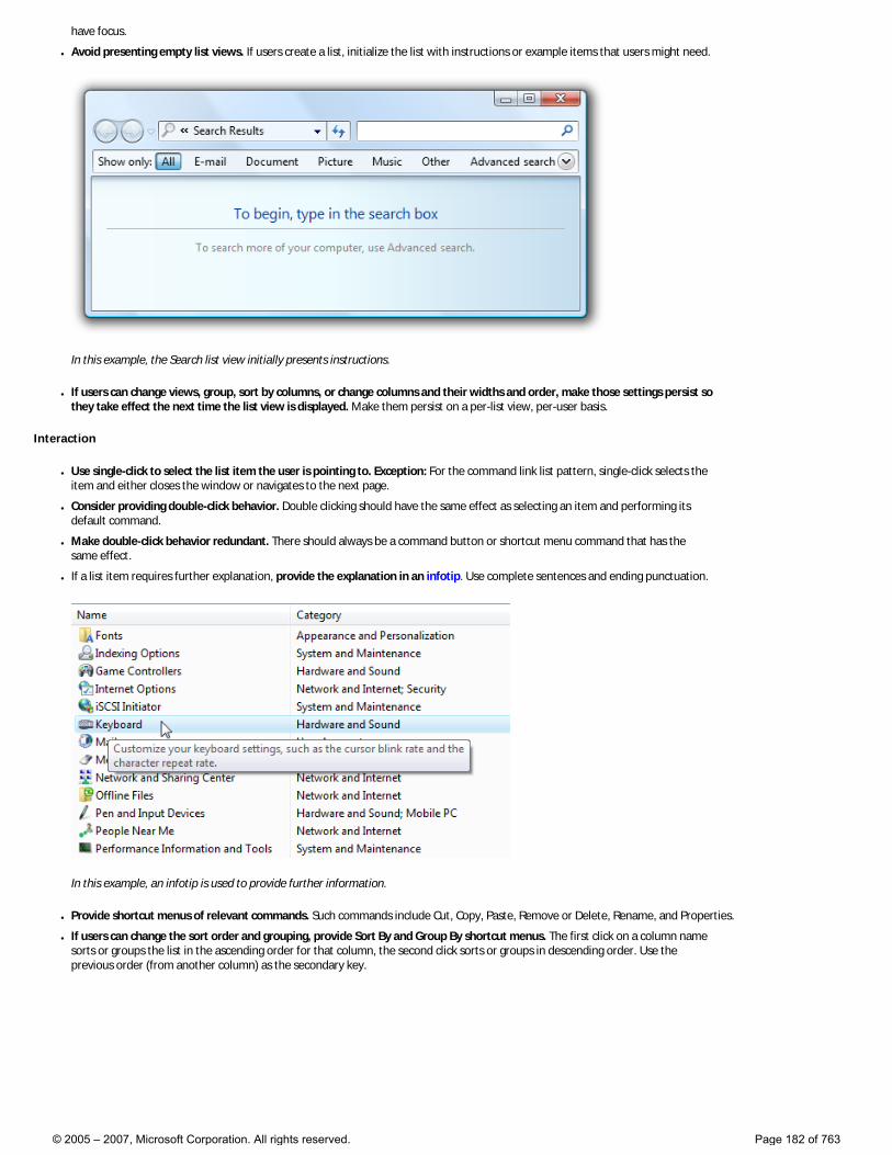
have focus.
● Avoid presenting empty list views. If users create a list, initialize the list with instructions or example items that users might need.
In this example, the Search list view initially presents instructions.
● If users can change views, group, sort by columns, or change columns and their widths and order, make those settings persist so they take effect the next time the list view is displayed. Make them persist on a per-list view, per-user basis.
Interaction
● Use single-click to select the list item the user is pointing to. Exception: For the command link list pattern, single-click selects the item and either closes the window or navigates to the next page.
● Consider providing double-click behavior. Double clicking should have the same effect as selecting an item and performing its default command.
● Make double-click behavior redundant. There should always be a command button or shortcut menu command that has the same effect.
● If a list item requires further explanation, provide the explanation in an infotip. Use complete sentences and ending punctuation.
In this example, an infotip is used to provide further information.
● Provide shortcut menus of relevant commands. Such commands include Cut, Copy, Paste, Remove or Delete, Rename, and Properties.
● If users can change the sort order and grouping, provide Sort By and Group By shortcut menus. The first click on a column name sorts or groups the list in the ascending order for that column, the second click sorts or groups in descending order. Use the previous order (from another column) as the secondary key.
© 2005 – 2007, Microsoft Corporation. All rights reserved. Page 182 of 763
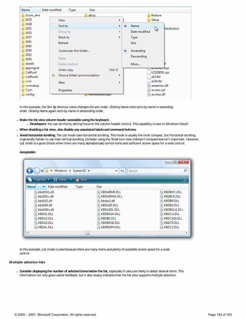
In this example, the Sort By shortcut menu changes the sort order. Clicking Name once sorts by name in ascending order. Clicking Name again sorts by name in descending order.
● Make the list view column header accessible using the keyboard. �❍ Developers: You can do this by setting focus on the column header control. This capability is new to Windows Vista®.
● When disabling a list view, also disable any associated labels and command buttons.
● Avoid horizontal scrolling. The List mode uses horizontal scrolling. This mode is usually the most compact, but horizontal scrolling is generally harder to use than vertical scrolling. Consider using the Small Icon view instead if compactness isn’t important. However, List mode is a good choice when there are many alphabetically sorted items and sufficient screen space for a wide control.
Acceptable:
In this example, List mode is used because there are many items and plenty of available screen space for a wide control.
Multiple-selection lists
● Consider displaying the number of selected items below the list, especially if users are likely to select several items. This information not only gives useful feedback, but it also clearly indicates that the list view supports multiple selection.
© 2005 – 2007, Microsoft Corporation. All rights reserved. Page 183 of 763
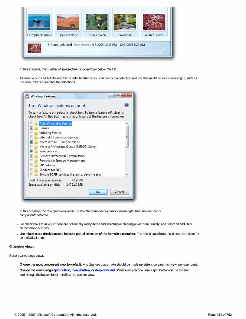
In this example, the number of selected items is displayed below the list.
● Alternatively instead of the number of selected items, you can give other selection metrics that might be more meaningful, such as the resources required for the selections.
In this example, the disk space required to install the components is more meaningful than the number of components selected.
● For check box list views, if there are potentially many items and selecting or clearing all of them is likely, add Select all and Clear all command buttons.
● Use mixed-state check boxes to indicate partial selection of the items in a container. The mixed state is not used as a third state for an individual item.
Changing views
If users can change views:
● Choose the most convenient view by default. Any changes users make should be made persistent on a per-list view, per-user basis.
● Change the view using a split button, menu button, or drop-down list. Whenever practical, use a split button on the toolbar and change the button label to reflect the current view.
© 2005 – 2007, Microsoft Corporation. All rights reserved. Page 184 of 763
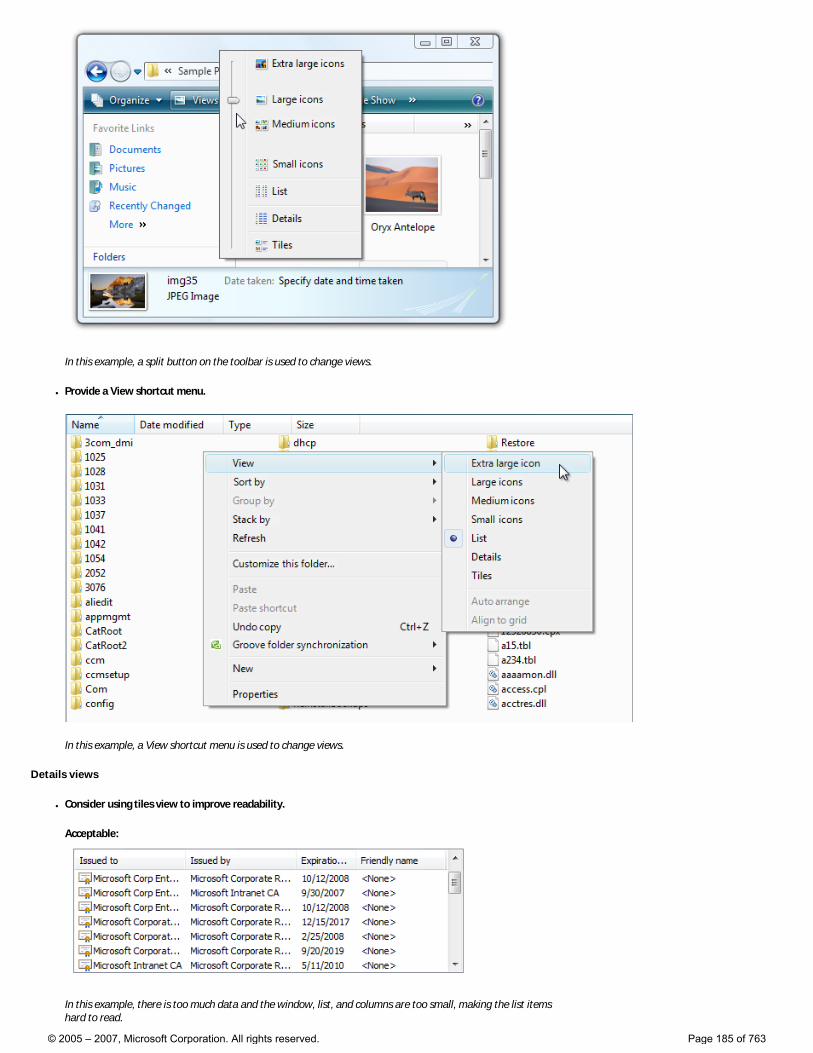
In this example, a split button on the toolbar is used to change views.
● Provide a View shortcut menu.
In this example, a View shortcut menu is used to change views.
Details views
● Consider using tiles view to improve readability.
Acceptable:
In this example, there is too much data and the window, list, and columns are too small, making the list items hard to read.
© 2005 – 2007, Microsoft Corporation. All rights reserved. Page 185 of 763
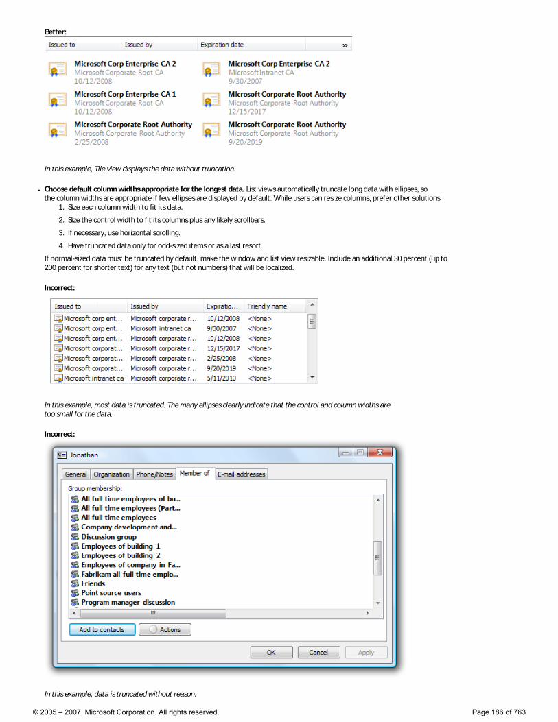
Better:
In this example, Tile view displays the data without truncation.
● Choose default column widths appropriate for the longest data. List views automatically truncate long data with ellipses, so the column widths are appropriate if few ellipses are displayed by default. While users can resize columns, prefer other solutions:
1. Size each column width to fit its data.
2. Size the control width to fit its columns plus any likely scrollbars.
3. If necessary, use horizontal scrolling.
4. Have truncated data only for odd-sized items or as a last resort.
If normal-sized data must be truncated by default, make the window and list view resizable. Include an additional 30 percent (up to 200 percent for shorter text) for any text (but not numbers) that will be localized.
Incorrect:
In this example, most data is truncated. The many ellipses clearly indicate that the control and column widths are too small for the data.
Incorrect:
In this example, data is truncated without reason.
© 2005 – 2007, Microsoft Corporation. All rights reserved. Page 186 of 763
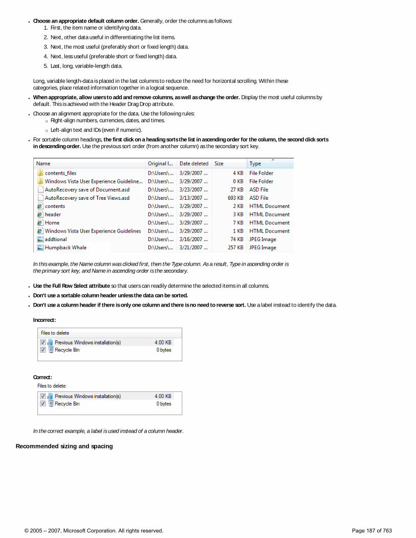
● Choose an appropriate default column order. Generally, order the columns as follows: 1. First, the item name or identifying data.
2. Next, other data useful in differentiating the list items.
3. Next, the most useful (preferably short or fixed length) data.
4. Next, less useful (preferable short or fixed length) data.
5. Last, long, variable-length data.
Long, variable length-data is placed in the last columns to reduce the need for horizontal scrolling. Within these categories, place related information together in a logical sequence.
● When appropriate, allow users to add and remove columns, as well as change the order. Display the most useful columns by default. This is achieved with the Header Drag Drop attribute.
● Choose an alignment appropriate for the data. Use the following rules: �❍ Right-align numbers, currencies, dates, and times.
�❍ Left-align text and IDs (even if numeric).
● For sortable column headings, the first click on a heading sorts the list in ascending order for the column, the second click sorts in descending order. Use the previous sort order (from another column) as the secondary sort key.
In this example, the Name column was clicked first, then the Type column. As a result, Type in ascending order is the primary sort key, and Name in ascending order is the secondary.
● Use the Full Row Select attribute so that users can readily determine the selected items in all columns.
● Don’t use a sortable column header unless the data can be sorted.
● Don’t use a column header if there is only one column and there is no need to reverse sort. Use a label instead to identify the data.
Incorrect:
Correct:
In the correct example, a label is used instead of a column header.
Recommended sizing and spacing
© 2005 – 2007, Microsoft Corporation. All rights reserved. Page 187 of 763
Recommended sizing and spacing for list views.
● Choose a list view height that displays an integral number of items. Avoid truncating items vertically.
● Choose a list view size that eliminates unnecessary vertical and horizontal scrolling in all supported views. List views should display between 3 and 20 items. Consider making a list view slightly larger if doing so eliminates a scroll bar. Lists with potentially many items should display at least five items to facilitate scrolling by showing more items at a time and making the scroll bar easier to position.
● If users benefit from making the list view larger, make the list view and its parent window resizable. Doing so allows users to adjust the list view size as needed. However, resizable list views should display no fewer than three items.
Labels
Control labels
● All list views need labels. Write the label as a word or phrase, not as a sentence, ending with a colon using static text.
● Assign a unique access key. See Keyboard for guidelines on assigning access keys.
● Use sentence-style capitalization.
● Position the label above the control and align the label with the left edge of the control.
● For multiple-selection list views, write the label that clearly indicates multiple selection is possible. Check box list view labels can be less explicit.
Correct:
In this example, the label clearly indicates that multiple selection is possible.
Incorrect:
In this example, the label provides no information about multiple selection.
Acceptable:
In this example, the check boxes clearly indicate that multiple selection is possible, so the label doesn’t have to be explicit.
● You may specify units (seconds, connections, and so on) in parentheses after the label.
Heading labels
● Keep the heading labels brief (three words or fewer).
● Use a single noun or noun phrase with no ending punctuation.
● Use sentence-style capitalization.
● Align the heading the same way as the data.
© 2005 – 2007, Microsoft Corporation. All rights reserved. Page 188 of 763
Group labels
● Use the following group labels for high-level collections: �❍ Names: Use first letter of name or letter ranges.
�❍ Sizes: Unspecified, 0 KB, 0-10 KB, 10-100 KB, 100 KB - 1 MB, 1-16 MB, 16-128 MB
�❍ Dates: Today, Yesterday, Last week, Earlier this year, and A long time ago.
● Otherwise, group labels use the exact text of the data being grouped, including capitalization and punctuation.
Data text
● Use sentence-style capitalization.
Instructional text
● If you need to add instructional text about a list view, add it above the label. Use complete sentences with ending punctuation.
● Use sentence-style capitalization.
● Additional information that is helpful but not necessary should be kept short. Place this information either in parentheses between the label and colon or without parentheses below the control.
Documentation
When referring to list views:
● Use the exact label text including its capitalization but don’t include the access key underscore or colon, and include the word list. Don’t refer to a list box as a list box, list view, or field.
● For list data, use the exact data text including its capitalization.
● Refer to list views as list views only in programming and other technical documentation. Everywhere else use list.
● To describe user interaction, use select for the data, and click for the headings.
● When possible, format the label and list options using bold text. Otherwise, put the label and options in quotation marks only if required to prevent confusion.
Example: In the Programs and services list, select File and printer sharing.
When referring to check boxes:
● Use the exact label text including its capitalization, and include the word check box. Don’t include the access key underscore.
● To describe user interaction, use select and clear.
● When possible, format the label using bold text. Otherwise, put the label in quotation marks only if required to prevent confusion.
Example: Select the Underline check box.
© 2005 – 2007, Microsoft Corporation. All rights reserved. Page 189 of 763
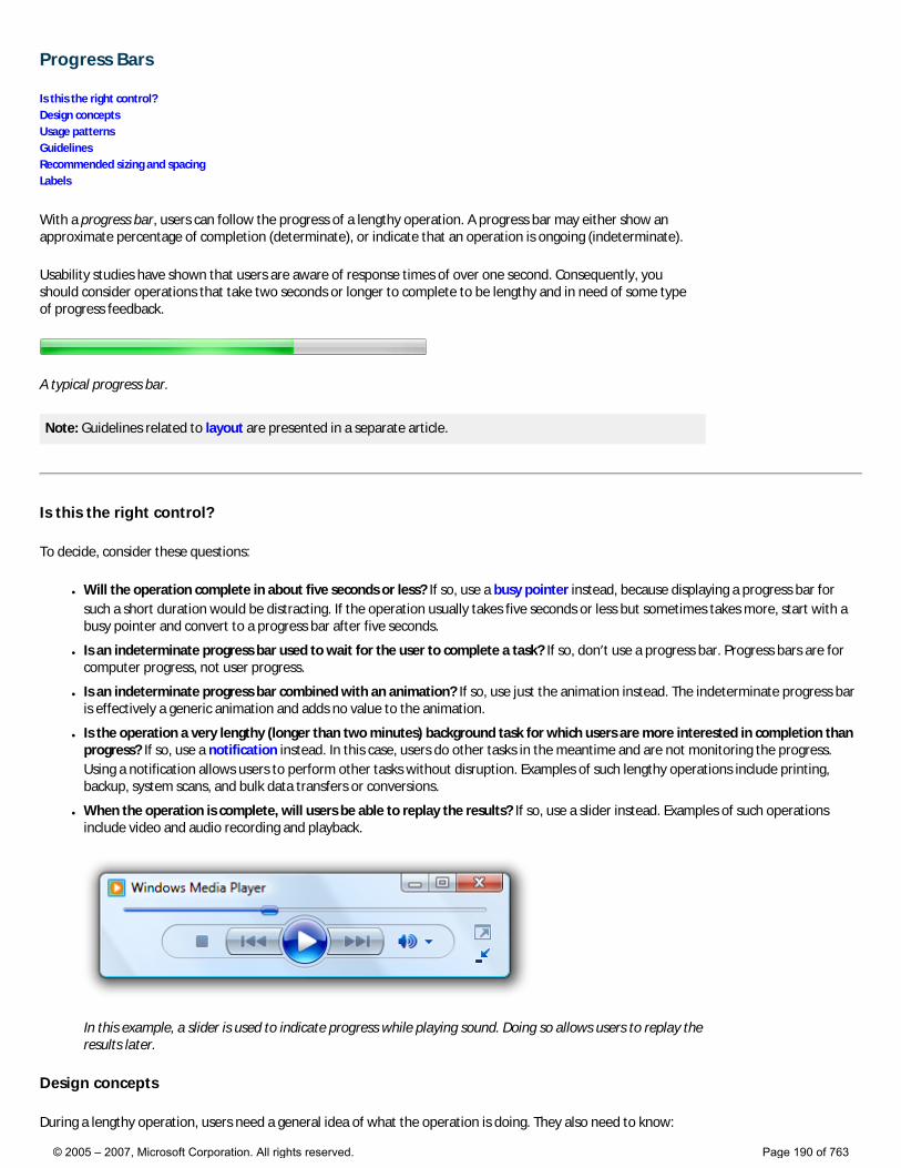
Progress Bars
Is this the right control? Design concepts Usage patterns Guidelines Recommended sizing and spacing Labels
With a progress bar, users can follow the progress of a lengthy operation. A progress bar may either show an approximate percentage of completion (determinate), or indicate that an operation is ongoing (indeterminate).
Usability studies have shown that users are aware of response times of over one second. Consequently, you should consider operations that take two seconds or longer to complete to be lengthy and in need of some type of progress feedback.
A typical progress bar.
Note: Guidelines related to layout are presented in a separate article.
Is this the right control?
To decide, consider these questions:
● Will the operation complete in about five seconds or less? If so, use a busy pointer instead, because displaying a progress bar for such a short duration would be distracting. If the operation usually takes five seconds or less but sometimes takes more, start with a busy pointer and convert to a progress bar after five seconds.
● Is an indeterminate progress bar used to wait for the user to complete a task? If so, don’t use a progress bar. Progress bars are for computer progress, not user progress.
● Is an indeterminate progress bar combined with an animation? If so, use just the animation instead. The indeterminate progress bar is effectively a generic animation and adds no value to the animation.
● Is the operation a very lengthy (longer than two minutes) background task for which users are more interested in completion than progress? If so, use a notification instead. In this case, users do other tasks in the meantime and are not monitoring the progress. Using a notification allows users to perform other tasks without disruption. Examples of such lengthy operations include printing, backup, system scans, and bulk data transfers or conversions.
● When the operation is complete, will users be able to replay the results? If so, use a slider instead. Examples of such operations include video and audio recording and playback.
In this example, a slider is used to indicate progress while playing sound. Doing so allows users to replay the results later.
Design concepts
During a lengthy operation, users need a general idea of what the operation is doing. They also need to know:
© 2005 – 2007, Microsoft Corporation. All rights reserved. Page 190 of 763
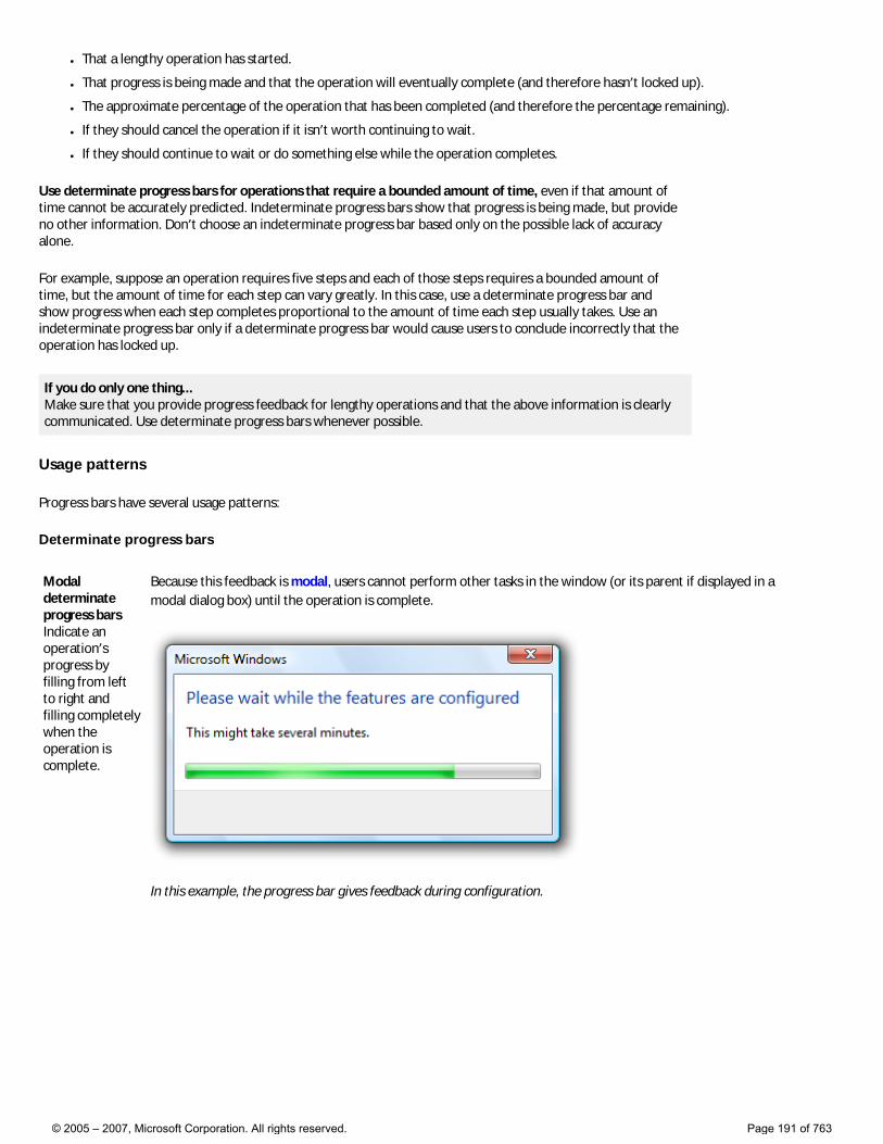
● That a lengthy operation has started.
● That progress is being made and that the operation will eventually complete (and therefore hasn’t locked up).
● The approximate percentage of the operation that has been completed (and therefore the percentage remaining).
● If they should cancel the operation if it isn’t worth continuing to wait.
● If they should continue to wait or do something else while the operation completes.
Use determinate progress bars for operations that require a bounded amount of time, even if that amount of time cannot be accurately predicted. Indeterminate progress bars show that progress is being made, but provide no other information. Don’t choose an indeterminate progress bar based only on the possible lack of accuracy alone.
For example, suppose an operation requires five steps and each of those steps requires a bounded amount of time, but the amount of time for each step can vary greatly. In this case, use a determinate progress bar and show progress when each step completes proportional to the amount of time each step usually takes. Use an indeterminate progress bar only if a determinate progress bar would cause users to conclude incorrectly that the operation has locked up.
If you do only one thing... Make sure that you provide progress feedback for lengthy operations and that the above information is clearly communicated. Use determinate progress bars whenever possible.
Usage patterns
Progress bars have several usage patterns:
Determinate progress bars
Modal determinate progress bars Indicate an operation’s progress by filling from left to right and filling completely when the operation is complete.
Because this feedback is modal, users cannot perform other tasks in the window (or its parent if displayed in a modal dialog box) until the operation is complete.
In this example, the progress bar gives feedback during configuration.
© 2005 – 2007, Microsoft Corporation. All rights reserved. Page 191 of 763
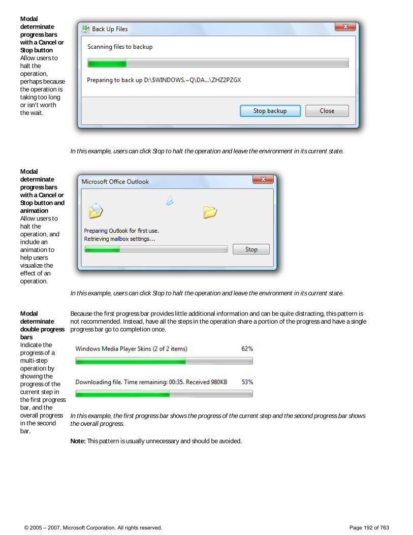
Modal determinate progress bars with a Cancel or Stop button Allow users to halt the operation, perhaps because the operation is taking too long or isn’t worth the wait.
In this example, users can click Stop to halt the operation and leave the environment in its current state.
Modal determinate progress bars with a Cancel or Stop button and animation Allow users to halt the operation, and include an animation to help users visualize the effect of an operation.
In this example, users can click Stop to halt the operation and leave the environment in its current state.
Modal determinate double progress bars Indicate the progress of a multi-step operation by showing the progress of the current step in the first progress bar, and the overall progress in the second bar.
Because the first progress bar provides little additional information and can be quite distracting, this pattern is not recommended. Instead, have all the steps in the operation share a portion of the progress and have a single progress bar go to completion once.
In this example, the first progress bar shows the progress of the current step and the second progress bar shows the overall progress.
Note: This pattern is usually unnecessary and should be avoided.
© 2005 – 2007, Microsoft Corporation. All rights reserved. Page 192 of 763
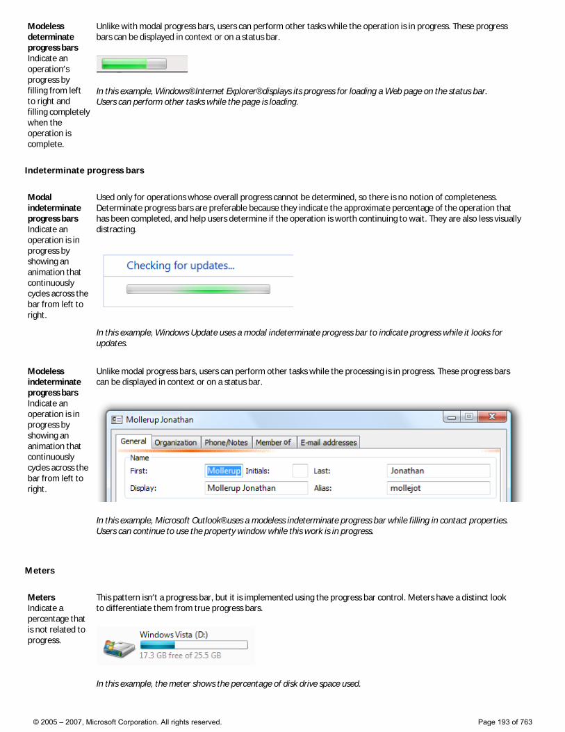
Modeless determinate progress bars Indicate an operation’s progress by filling from left to right and filling completely when the operation is complete.
Unlike with modal progress bars, users can perform other tasks while the operation is in progress. These progress bars can be displayed in context or on a status bar.
In this example, Windows® Internet Explorer® displays its progress for loading a Web page on the status bar. Users can perform other tasks while the page is loading.
Indeterminate progress bars
Modal indeterminate progress bars Indicate an operation is in progress by showing an animation that continuously cycles across the bar from left to right.
Used only for operations whose overall progress cannot be determined, so there is no notion of completeness. Determinate progress bars are preferable because they indicate the approximate percentage of the operation that has been completed, and help users determine if the operation is worth continuing to wait. They are also less visually distracting.
In this example, Windows Update uses a modal indeterminate progress bar to indicate progress while it looks for updates.
Modeless indeterminate progress bars Indicate an operation is in progress by showing an animation that continuously cycles across the bar from left to right.
Unlike modal progress bars, users can perform other tasks while the processing is in progress. These progress bars can be displayed in context or on a status bar.
In this example, Microsoft Outlook® uses a modeless indeterminate progress bar while filling in contact properties. Users can continue to use the property window while this work is in progress.
Meters
Meters Indicate a percentage that is not related to progress.
This pattern isn’t a progress bar, but it is implemented using the progress bar control. Meters have a distinct look to differentiate them from true progress bars.
In this example, the meter shows the percentage of disk drive space used.
© 2005 – 2007, Microsoft Corporation. All rights reserved. Page 193 of 763
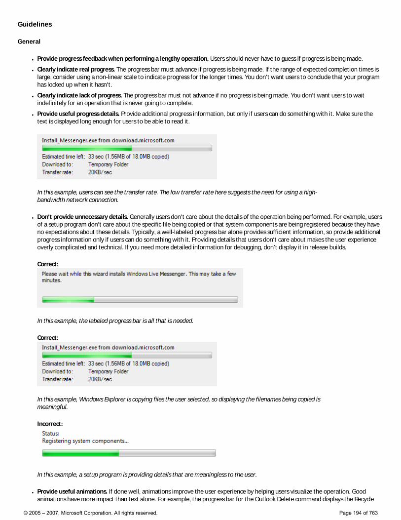
Guidelines
General
● Provide progress feedback when performing a lengthy operation. Users should never have to guess if progress is being made.
● Clearly indicate real progress. The progress bar must advance if progress is being made. If the range of expected completion times is large, consider using a non-linear scale to indicate progress for the longer times. You don’t want users to conclude that your program has locked up when it hasn’t.
● Clearly indicate lack of progress. The progress bar must not advance if no progress is being made. You don’t want users to wait indefinitely for an operation that is never going to complete.
● Provide useful progress details. Provide additional progress information, but only if users can do something with it. Make sure the text is displayed long enough for users to be able to read it.
In this example, users can see the transfer rate. The low transfer rate here suggests the need for using a high-bandwidth network connection.
● Don’t provide unnecessary details. Generally users don’t care about the details of the operation being performed. For example, users of a setup program don’t care about the specific file being copied or that system components are being registered because they have no expectations about these details. Typically, a well-labeled progress bar alone provides sufficient information, so provide additional progress information only if users can do something with it. Providing details that users don’t care about makes the user experience overly complicated and technical. If you need more detailed information for debugging, don’t display it in release builds.
Correct:
In this example, the labeled progress bar is all that is needed.
Correct:
In this example, Windows Explorer is copying files the user selected, so displaying the filenames being copied is meaningful.
Incorrect:
In this example, a setup program is providing details that are meaningless to the user.
● Provide useful animations. If done well, animations improve the user experience by helping users visualize the operation. Good animations have more impact than text alone. For example, the progress bar for the Outlook Delete command displays the Recycle
© 2005 – 2007, Microsoft Corporation. All rights reserved. Page 194 of 763
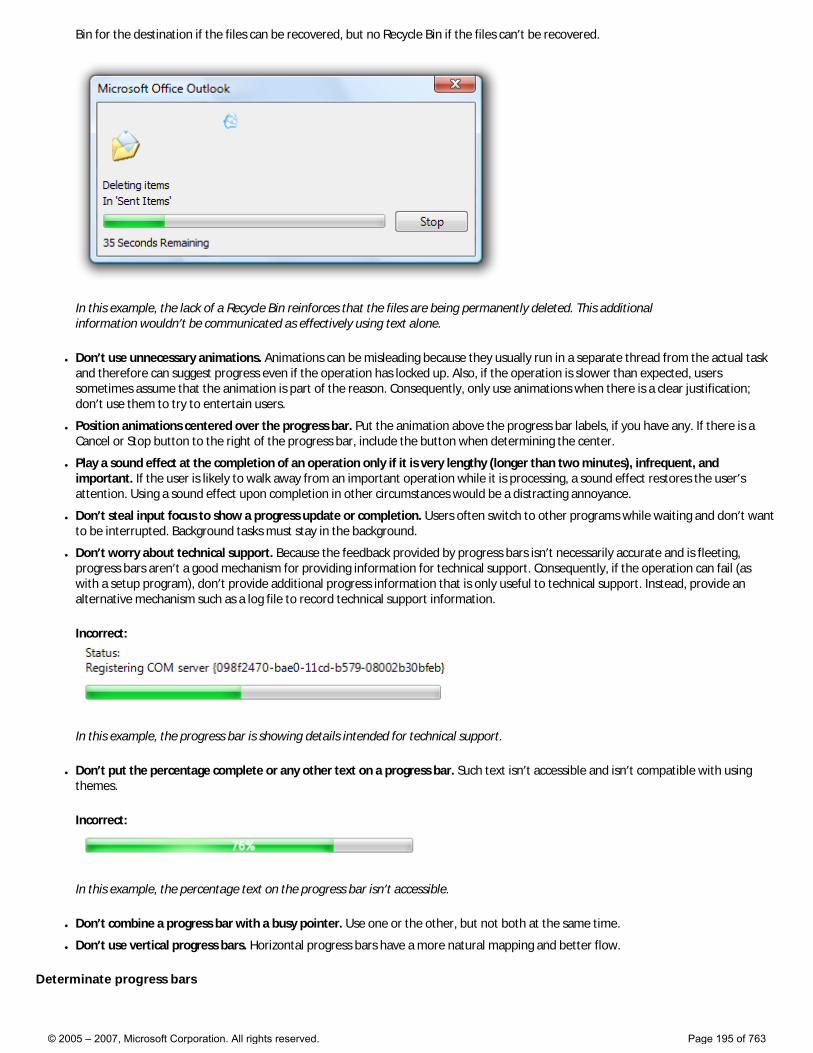
Bin for the destination if the files can be recovered, but no Recycle Bin if the files can’t be recovered.
In this example, the lack of a Recycle Bin reinforces that the files are being permanently deleted. This additional information wouldn’t be communicated as effectively using text alone.
● Don’t use unnecessary animations. Animations can be misleading because they usually run in a separate thread from the actual task and therefore can suggest progress even if the operation has locked up. Also, if the operation is slower than expected, users sometimes assume that the animation is part of the reason. Consequently, only use animations when there is a clear justification; don’t use them to try to entertain users.
● Position animations centered over the progress bar. Put the animation above the progress bar labels, if you have any. If there is a Cancel or Stop button to the right of the progress bar, include the button when determining the center.
● Play a sound effect at the completion of an operation only if it is very lengthy (longer than two minutes), infrequent, and important. If the user is likely to walk away from an important operation while it is processing, a sound effect restores the user’s attention. Using a sound effect upon completion in other circumstances would be a distracting annoyance.
● Don’t steal input focus to show a progress update or completion. Users often switch to other programs while waiting and don’t want to be interrupted. Background tasks must stay in the background.
● Don’t worry about technical support. Because the feedback provided by progress bars isn’t necessarily accurate and is fleeting, progress bars aren’t a good mechanism for providing information for technical support. Consequently, if the operation can fail (as with a setup program), don’t provide additional progress information that is only useful to technical support. Instead, provide an alternative mechanism such as a log file to record technical support information.
Incorrect:
In this example, the progress bar is showing details intended for technical support.
● Don’t put the percentage complete or any other text on a progress bar. Such text isn’t accessible and isn’t compatible with using themes.
Incorrect:
In this example, the percentage text on the progress bar isn’t accessible.
● Don’t combine a progress bar with a busy pointer. Use one or the other, but not both at the same time.
● Don’t use vertical progress bars. Horizontal progress bars have a more natural mapping and better flow.
Determinate progress bars
© 2005 – 2007, Microsoft Corporation. All rights reserved. Page 195 of 763
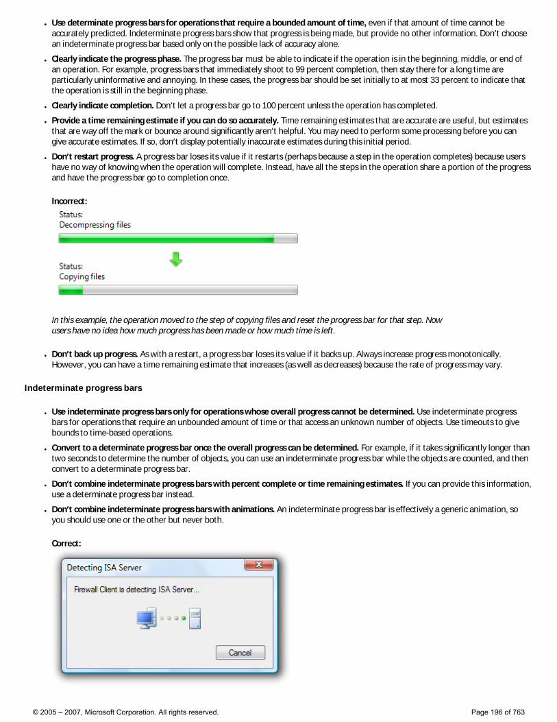
● Use determinate progress bars for operations that require a bounded amount of time, even if that amount of time cannot be accurately predicted. Indeterminate progress bars show that progress is being made, but provide no other information. Don’t choose an indeterminate progress bar based only on the possible lack of accuracy alone.
● Clearly indicate the progress phase. The progress bar must be able to indicate if the operation is in the beginning, middle, or end of an operation. For example, progress bars that immediately shoot to 99 percent completion, then stay there for a long time are particularly uninformative and annoying. In these cases, the progress bar should be set initially to at most 33 percent to indicate that the operation is still in the beginning phase.
● Clearly indicate completion. Don’t let a progress bar go to 100 percent unless the operation has completed.
● Provide a time remaining estimate if you can do so accurately. Time remaining estimates that are accurate are useful, but estimates that are way off the mark or bounce around significantly aren’t helpful. You may need to perform some processing before you can give accurate estimates. If so, don’t display potentially inaccurate estimates during this initial period.
● Don’t restart progress. A progress bar loses its value if it restarts (perhaps because a step in the operation completes) because users have no way of knowing when the operation will complete. Instead, have all the steps in the operation share a portion of the progress and have the progress bar go to completion once.
Incorrect:
In this example, the operation moved to the step of copying files and reset the progress bar for that step. Now users have no idea how much progress has been made or how much time is left.
● Don’t back up progress. As with a restart, a progress bar loses its value if it backs up. Always increase progress monotonically. However, you can have a time remaining estimate that increases (as well as decreases) because the rate of progress may vary.
Indeterminate progress bars
● Use indeterminate progress bars only for operations whose overall progress cannot be determined. Use indeterminate progress bars for operations that require an unbounded amount of time or that access an unknown number of objects. Use timeouts to give bounds to time-based operations.
● Convert to a determinate progress bar once the overall progress can be determined. For example, if it takes significantly longer than two seconds to determine the number of objects, you can use an indeterminate progress bar while the objects are counted, and then convert to a determinate progress bar.
● Don’t combine indeterminate progress bars with percent complete or time remaining estimates. If you can provide this information, use a determinate progress bar instead.
● Don’t combine indeterminate progress bars with animations. An indeterminate progress bar is effectively a generic animation, so you should use one or the other but never both.
Correct:
© 2005 – 2007, Microsoft Corporation. All rights reserved. Page 196 of 763
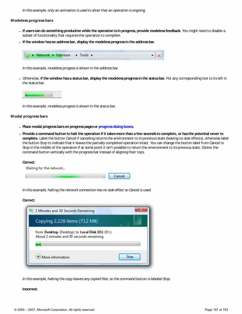
In this example, only an animation is used to show that an operation is ongoing.
Modeless progress bars
● If users can do something productive while the operation is in progress, provide modeless feedback. You might need to disable a subset of functionality that requires the operation to complete.
● If the window has an address bar, display the modeless progress in the address bar.
In this example, modeless progess is shown in the address bar.
● Otherwise, if the window has a status bar, display the modeless progress in the status bar. Put any corresponding text to its left in the status bar.
In this example, modeless progess is shown in the status bar.
Modal progress bars
● Place modal progress bars on progress pages or progress dialog boxes.
● Provide a command button to halt the operation if it takes more than a few seconds to complete, or has the potential never to complete. Label the button Cancel if canceling returns the environment to its previous state (leaving no side effects), otherwise label the button Stop to indicate that it leaves the partially completed operation intact. You can change the button label from Cancel to Stop in the middle of the operation if at some point it isn’t possible to return the environment to its previous state. Center the command button vertically with the progress bar instead of aligning their tops.
Correct:
In this example, halting the network connection has no side effect so Cancel is used.
Correct:
In this example, halting the copy leaves any copied files, so the command button is labeled Stop.
Incorrect:
© 2005 – 2007, Microsoft Corporation. All rights reserved. Page 197 of 763
In this example, halting the search leaves no side effect, so the command button should be labeled Cancel.
Time remaining
For determinate progress bars:
● Use the following time formats. Start with the first of the following formats where the largest time unit isn’t zero, and then change to the next format once the largest time unit becomes zero.
For progress bars:
If related information is shown in a colon format: Time remaining: h hours, m minutes Time remaining: m minutes, s seconds Time remaining: s seconds
If screen space is at a premium: h hrs, m mins remaining m mins, s secs remaining s seconds remaining
Otherwise: h hours, m minutes remaining m minutes, s seconds remaining s seconds remaining
For title bars:
hh:mm remaining mm:ss remaining 0:ss remaining
This compact format shows the most important information first so that it isn’t truncated on the taskbar.
● Make estimates accurate, but don’t give false precision. If largest unit is hours, give minutes (if meaningful) but not seconds.
Incorrect: hh hours, mm minutes, ss seconds
● Keep the estimate up-to-date. Update time remaining estimates at least every 5 seconds.
● Focus on the time remaining because that is the information users care about most. Give total elapsed time only when there are scenarios where elapsed time is helpful (such as when the task is likely to be repeated). If the time remaining estimate is associated with a progress bar, don’t have percent complete text because that information is conveyed by the progress bar itself.
● Be grammatically correct. Use singular units when the number is one.
Incorrect: 1 minutes, 1 seconds
● Use sentence-style capitalization.
Meters
● Use progress bars only for progress. Use meters to indicate percentages that aren’t related to progress.
© 2005 – 2007, Microsoft Corporation. All rights reserved. Page 198 of 763
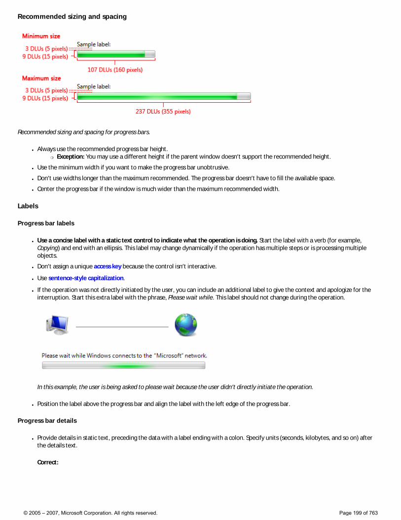
Recommended sizing and spacing
Recommended sizing and spacing for progress bars.
● Always use the recommended progress bar height. �❍ Exception: You may use a different height if the parent window doesn’t support the recommended height.
● Use the minimum width if you want to make the progress bar unobtrusive.
● Don’t use widths longer than the maximum recommended. The progress bar doesn’t have to fill the available space.
● Center the progress bar if the window is much wider than the maximum recommended width.
Labels
Progress bar labels
● Use a concise label with a static text control to indicate what the operation is doing. Start the label with a verb (for example, Copying) and end with an ellipsis. This label may change dynamically if the operation has multiple steps or is processing multiple objects.
● Don’t assign a unique access key because the control isn’t interactive.
● Use sentence-style capitalization.
● If the operation was not directly initiated by the user, you can include an additional label to give the context and apologize for the interruption. Start this extra label with the phrase, Please wait while. This label should not change during the operation.
In this example, the user is being asked to please wait because the user didn’t directly initiate the operation.
● Position the label above the progress bar and align the label with the left edge of the progress bar.
Progress bar details
● Provide details in static text, preceding the data with a label ending with a colon. Specify units (seconds, kilobytes, and so on) after the details text.
Correct:
© 2005 – 2007, Microsoft Corporation. All rights reserved. Page 199 of 763
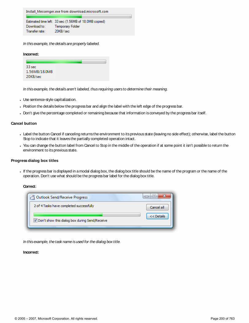
In this example, the details are properly labeled.
Incorrect:
In this example, the details aren’t labeled, thus requiring users to determine their meaning.
● Use sentence-style capitalization.
● Position the details below the progress bar and align the label with the left edge of the progress bar.
● Don’t give the percentage completed or remaining because that information is conveyed by the progress bar itself.
Cancel button
● Label the button Cancel if canceling returns the environment to its previous state (leaving no side effect); otherwise, label the button Stop to indicate that it leaves the partially completed operation intact.
● You can change the button label from Cancel to Stop in the middle of the operation if at some point it isn’t possible to return the environment to its previous state.
Progress dialog box titles
● If the progress bar is displayed in a modal dialog box, the dialog box title should be the name of the program or the name of the operation. Don’t use what should be the progress bar label for the dialog box title.
Correct:
In this example, the task name is used for the dialog box title.
Incorrect:
© 2005 – 2007, Microsoft Corporation. All rights reserved. Page 200 of 763
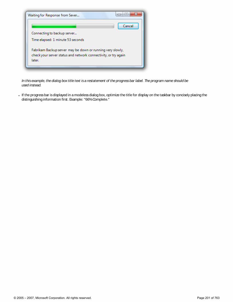
In this example, the dialog box title text is a restatement of the progress bar label. The program name should be used instead.
● If the progress bar is displayed in a modeless dialog box, optimize the title for display on the taskbar by concisely placing the distinguishing information first. Example: “66% Complete.”
© 2005 – 2007, Microsoft Corporation. All rights reserved. Page 201 of 763
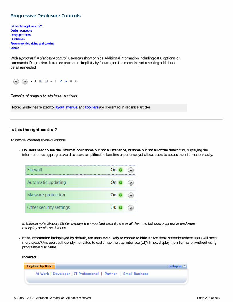
Progressive Disclosure Controls
Is this the right control? Design concepts Usage patterns Guidelines Recommended sizing and spacing Labels
With a progressive disclosure control, users can show or hide additional information including data, options, or commands. Progressive disclosure promotes simplicity by focusing on the essential, yet revealing additional detail as needed.
Examples of progressive disclosure controls.
Note: Guidelines related to layout, menus, and toolbars are presented in separate articles.
Is this the right control?
To decide, consider these questions:
● Do users need to see the information in some but not all scenarios, or some but not all of the time? If so, displaying the information using progressive disclosure simplifies the baseline experience, yet allows users to access the information easily.
In this example, Security Center displays the important security status all the time, but uses progressive disclosure to display details on demand.
● If the information is displayed by default, are users ever likely to choose to hide it? Are there scenarios where users will need more space? Are users sufficiently motivated to customize the user interface (UI)? If not, display the information without using progressive disclosure.
Incorrect:
© 2005 – 2007, Microsoft Corporation. All rights reserved. Page 202 of 763
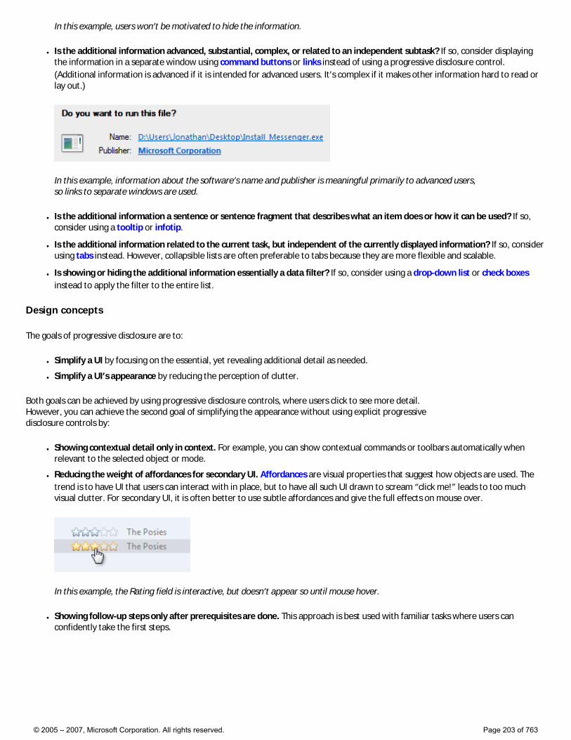
In this example, users won’t be motivated to hide the information.
● Is the additional information advanced, substantial, complex, or related to an independent subtask? If so, consider displaying the information in a separate window using command buttons or links instead of using a progressive disclosure control. (Additional information is advanced if it is intended for advanced users. It’s complex if it makes other information hard to read or lay out.)
In this example, information about the software’s name and publisher is meaningful primarily to advanced users, so links to separate windows are used.
● Is the additional information a sentence or sentence fragment that describes what an item does or how it can be used? If so, consider using a tooltip or infotip.
● Is the additional information related to the current task, but independent of the currently displayed information? If so, consider using tabs instead. However, collapsible lists are often preferable to tabs because they are more flexible and scalable.
● Is showing or hiding the additional information essentially a data filter? If so, consider using a drop-down list or check boxes instead to apply the filter to the entire list.
Design concepts
The goals of progressive disclosure are to:
● Simplify a UI by focusing on the essential, yet revealing additional detail as needed.
● Simplify a UI’s appearance by reducing the perception of clutter.
Both goals can be achieved by using progressive disclosure controls, where users click to see more detail. However, you can achieve the second goal of simplifying the appearance without using explicit progressive disclosure controls by:
● Showing contextual detail only in context. For example, you can show contextual commands or toolbars automatically when relevant to the selected object or mode.
● Reducing the weight of affordances for secondary UI. Affordances are visual properties that suggest how objects are used. The trend is to have UI that users can interact with in place, but to have all such UI drawn to scream “click me!” leads to too much visual clutter. For secondary UI, it is often better to use subtle affordances and give the full effects on mouse over.
In this example, the Rating field is interactive, but doesn’t appear so until mouse hover.
● Showing follow-up steps only after prerequisites are done. This approach is best used with familiar tasks where users can confidently take the first steps.
© 2005 – 2007, Microsoft Corporation. All rights reserved. Page 203 of 763
In this example, the user name and password page initially shows only the user name and optional password boxes. The confirmation and hint boxes are displayed after the user enters a password.
While progressive disclosure is a great way to simplify UIs, it has these risks:
● Lack of discoverability. Users may assume that if they can’t see something, it doesn’t exist. Users may not hover or click if they don’t see what they are looking for. There is always a chance that users might not click things like More options.
● Lack of stability. Progressive disclosure should be expected or at least feel natural. If controls unexpectedly appear and disappear, the resulting UI can feel unstable.
Progressive disclosure controls
Progressive disclosure controls are usually displayed without direct labels that describe their behavior, so users must be able to do the following based on the control’s visual appearance alone:
● Recognize that the control provides progressive disclosure.
● Determine if the current state is expanded or collapsed.
● Determine if additional information, options, or commands are needed to perform the task.
● Determine how to restore the original state, if desired.
While users can determine the above by trial and error, you should try to make such experimentation unnecessary.
Progressive disclosure controls have a fairly weak affordance, which means their visual properties suggest how they are used, albeit weakly. The following table compares the appearance of the common progressive disclosure controls:
Control Purpose Appearance Glyph indicates
Chevrons
Show all: Show or hide the remaining items in completely or partially hidden content. Items are either shown in place (using a single chevron) or in a pop-up menu (using a double chevron).
Chevrons point in the direction where the action will occur.
Future state
Arrows
Show options: Show a pop-up command menu.
Arrows point in the direction where the action will occur.
Future state
Plus and minus controls
Expand containers: Expand or collapse container content in place when navigating through a hierarchy.
Plus and minus symbols don’t point, but the action always occurs to their right.
Future state
© 2005 – 2007, Microsoft Corporation. All rights reserved. Page 204 of 763
Rotating triangles
Show details: Show or hide additional information in place for an individual item. They are also used to expand containers.
Rotating triangles somewhat resemble rotating levers, so they point in the direction where the action has occurred.
Present state
If you do only one thing... Users should be able to predict a progressive disclosure control’s behavior correctly by inspection alone. To achieve this, select the appropriate usage patterns and apply their appearance, location, and behavior consistently.
Usage patterns
Progressive disclosure controls have several usage patterns. Some of them are built into common controls.
Chevrons
Chevrons show or hide the remaining items in completely or partially hidden content. Usually the items are shown in place, but they can also be shown in a pop-up menu. When in place, the item stays expanded until the user collapses it.
Chevrons are used in the following ways:
In-place UI The associated object receives input focus and the single chevron is activated with the space bar.
In these examples, the in-place single chevrons are positioned to the right of their associated control.
Command buttons with external labels The command button receives input focus and the single chevron is activated with the space bar.
© 2005 – 2007, Microsoft Corporation. All rights reserved. Page 205 of 763
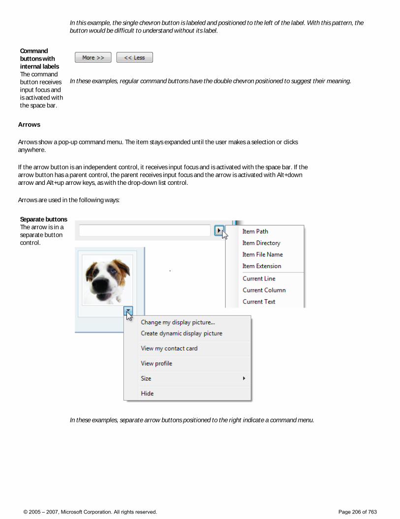
In this example, the single chevron button is labeled and positioned to the left of the label. With this pattern, the button would be difficult to understand without its label.
Command buttons with internal labels The command button receives input focus and is activated with the space bar.
In these examples, regular command buttons have the double chevron positioned to suggest their meaning.
Arrows
Arrows show a pop-up command menu. The item stays expanded until the user makes a selection or clicks anywhere.
If the arrow button is an independent control, it receives input focus and is activated with the space bar. If the arrow button has a parent control, the parent receives input focus and the arrow is activated with Alt+down arrow and Alt+up arrow keys, as with the drop-down list control.
Arrows are used in the following ways:
Separate buttons The arrow is in a separate button control.
In these examples, separate arrow buttons positioned to the right indicate a command menu.
© 2005 – 2007, Microsoft Corporation. All rights reserved. Page 206 of 763
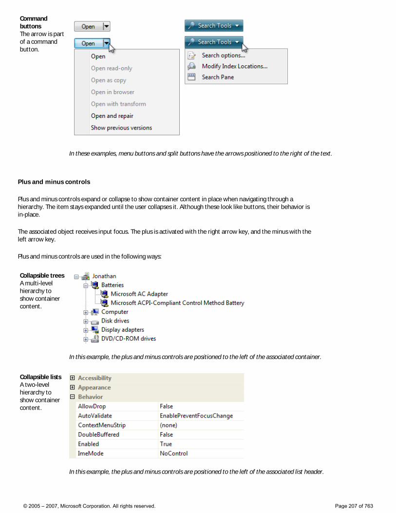
Command buttons The arrow is part of a command button.
In these examples, menu buttons and split buttons have the arrows positioned to the right of the text.
Plus and minus controls
Plus and minus controls expand or collapse to show container content in place when navigating through a hierarchy. The item stays expanded until the user collapses it. Although these look like buttons, their behavior is in-place.
The associated object receives input focus. The plus is activated with the right arrow key, and the minus with the left arrow key.
Plus and minus controls are used in the following ways:
Collapsible trees A multi-level hierarchy to show container content.
In this example, the plus and minus controls are positioned to the left of the associated container.
Collapsible lists A two-level hierarchy to show container content.
In this example, the plus and minus controls are positioned to the left of the associated list header.
© 2005 – 2007, Microsoft Corporation. All rights reserved. Page 207 of 763
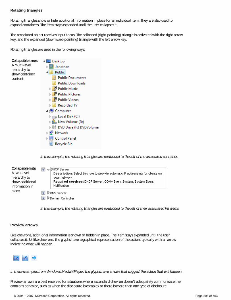
Rotating triangles
Rotating triangles show or hide additional information in place for an individual item. They are also used to expand containers. The item stays expanded until the user collapses it.
The associated object receives input focus. The collapsed (right-pointing) triangle is activated with the right arrow key, and the expanded (downward-pointing) triangle with the left arrow key.
Rotating triangles are used in the following ways:
Collapsible trees A multi-level hierarchy to show container content.
In this example, the rotating triangles are positioned to the left of the associated container.
Collapsible lists A two-level hierarchy to show additional information in place.
In this example, the rotating triangles are positioned to the left of their associated list items.
Preview arrows
Like chevrons, additional information is shown or hidden in place. The item stays expanded until the user collapses it. Unlike chevrons, the glyphs have a graphical representation of the action, typically with an arrow indicating what will happen.
In these examples from Windows Media® Player, the glyphs have arrows that suggest the action that will happen.
Preview arrows are best reserved for situations where a standard chevron doesn’t adequately communicate the control’s behavior, such as when the disclosure is complex or there is more than one type of disclosure.
© 2005 – 2007, Microsoft Corporation. All rights reserved. Page 208 of 763

Guidelines
General
● Select the progressive disclosure pattern based on its usage. For a description of each usage pattern, see the previous table.
● Don’t use links for progressive disclosure controls. Use only the progressive disclosure controls presented in the Usage patterns section. However, do use links to navigate to Help topics.
Correct:
Incorrect:
In the incorrect example, a link is used to show more options in place. This usage would be correct if the link navigated to another page or dialog box, or displayed a Help topic.
Interaction
● For chevrons and arrows that aren’t directly labeled, use tooltips to describe what they do.
In this example, the tooltip indicates the effect of an unlabeled chevron control.
● If a user expands or collapses an item, make the state persist so it takes effect the next time the window is displayed, unless users are likely to prefer starting in the default state. Make the state persist on a per-window, per-user basis.
● Make sure that all expanded content can be collapsed and vice versa, and that the inverse operation is obvious. Doing so encourages exploration and reduces frustration. The best way to make the inverse operation obvious is to keep the control in the same fixed location. If you need to move the control, keep it in the same relative location within a visually distinct area.
Incorrect:
In this example, clicking the Replace button with the chevron reveals the Replace with text box. Once this is done, the Replace expander becomes the Replace command, so there is no way to restore the original state.
● Use only the access keys appropriate for the progressive disclosure pattern, as listed in the Usage patterns section. Don’t use Enter to activate progressive disclosure.
Presentation
● Don’t use triangular-shaped arrowheads for a purpose other than progressive disclosure.
© 2005 – 2007, Microsoft Corporation. All rights reserved. Page 209 of 763
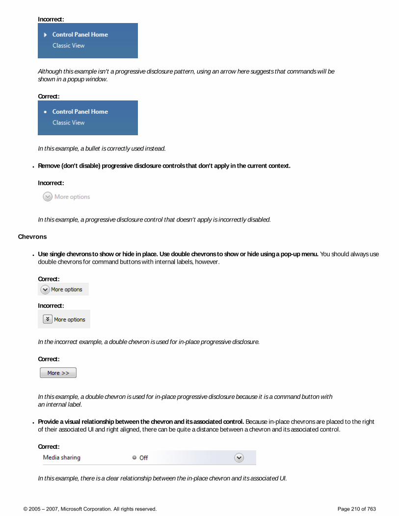
Incorrect:
Although this example isn’t a progressive disclosure pattern, using an arrow here suggests that commands will be shown in a popup window.
Correct:
In this example, a bullet is correctly used instead.
● Remove (don’t disable) progressive disclosure controls that don’t apply in the current context.
Incorrect:
In this example, a progressive disclosure control that doesn’t apply is incorrectly disabled.
Chevrons
● Use single chevrons to show or hide in place. Use double chevrons to show or hide using a pop-up menu. You should always use double chevrons for command buttons with internal labels, however.
Correct:
Incorrect:
In the incorrect example, a double chevron is used for in-place progressive disclosure.
Correct:
In this example, a double chevron is used for in-place progressive disclosure because it is a command button with an internal label.
● Provide a visual relationship between the chevron and its associated control. Because in-place chevrons are placed to the right of their associated UI and right aligned, there can be quite a distance between a chevron and its associated control.
Correct:
In this example, there is a clear relationship between the in-place chevron and its associated UI.
© 2005 – 2007, Microsoft Corporation. All rights reserved. Page 210 of 763
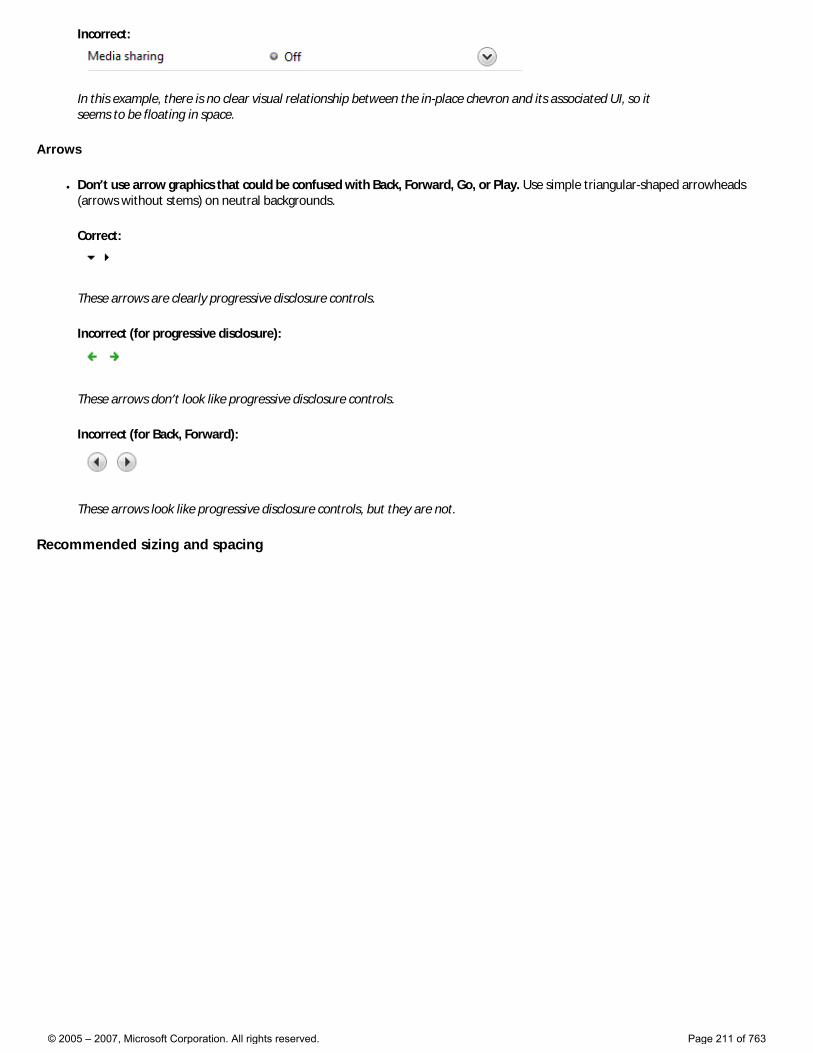
Incorrect:
In this example, there is no clear visual relationship between the in-place chevron and its associated UI, so it seems to be floating in space.
Arrows
● Don’t use arrow graphics that could be confused with Back, Forward, Go, or Play. Use simple triangular-shaped arrowheads (arrows without stems) on neutral backgrounds.
Correct:
These arrows are clearly progressive disclosure controls.
Incorrect (for progressive disclosure):
These arrows don’t look like progressive disclosure controls.
Incorrect (for Back, Forward):
These arrows look like progressive disclosure controls, but they are not.
Recommended sizing and spacing
© 2005 – 2007, Microsoft Corporation. All rights reserved. Page 211 of 763
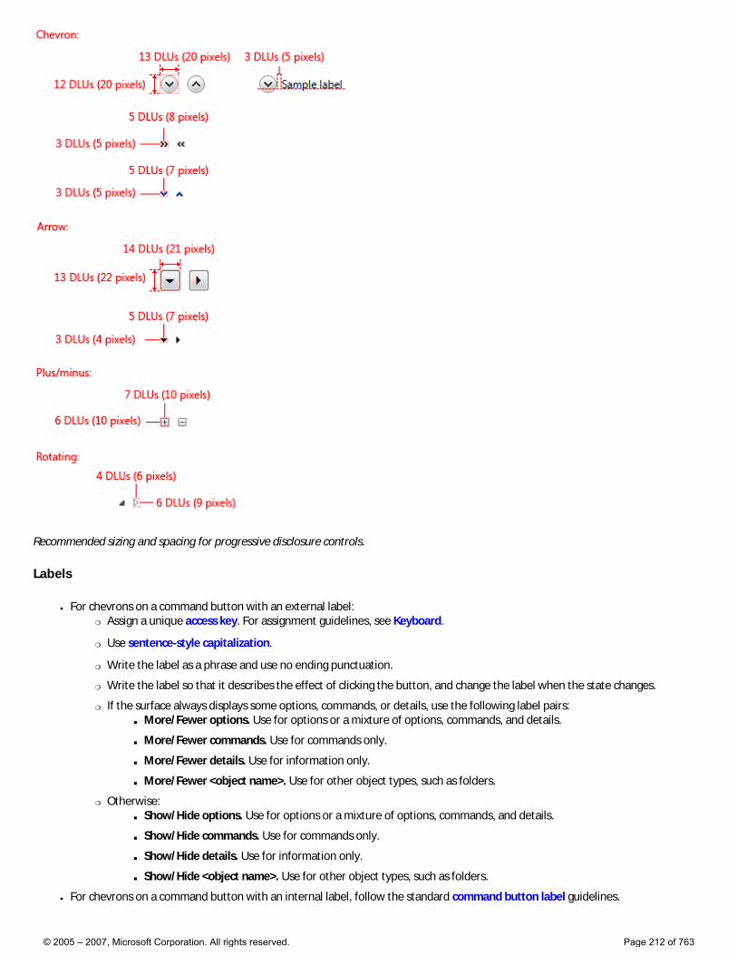
Recommended sizing and spacing for progressive disclosure controls.
Labels
● For chevrons on a command button with an external label: �❍ Assign a unique access key. For assignment guidelines, see Keyboard.
�❍ Use sentence-style capitalization.
�❍ Write the label as a phrase and use no ending punctuation.
�❍ Write the label so that it describes the effect of clicking the button, and change the label when the state changes.
�❍ If the surface always displays some options, commands, or details, use the following label pairs: ■ More/Fewer options. Use for options or a mixture of options, commands, and details.
■ More/Fewer commands. Use for commands only.
■ More/Fewer details. Use for information only.
■ More/Fewer <object name>. Use for other object types, such as folders.
�❍ Otherwise: ■ Show/Hide options. Use for options or a mixture of options, commands, and details.
■ Show/Hide commands. Use for commands only.
■ Show/Hide details. Use for information only.
■ Show/Hide <object name>. Use for other object types, such as folders.
● For chevrons on a command button with an internal label, follow the standard command button label guidelines.
© 2005 – 2007, Microsoft Corporation. All rights reserved. Page 212 of 763
Documentation
When referring to progressive disclosure controls:
● If the control has a fixed label, refer to the control by its label only; don’t try to describe the control. Use the exact label text, including its capitalization, but don’t include the access key underscore.
● If the control has no label or it isn’t fixed, refer to the control by its type: chevron, arrow, triangle, or plus/minus button. If necessary, also describe the control’s location. If the control appears dynamically, such as the page space control, start the reference by describing how to make the control appear.
Example: To display the files within a folder, move the pointer to the start of the folder name, and then click the triangle next to the folder.
● Don’t refer to the control as a button, unless to contrast with other progressive disclosure controls that aren’t buttons.
● To describe user interaction, use click for arrows and expand or collapse for the other control types.
● When possible, format the label using bold text. Otherwise, put the label in quotation marks only if required to prevent confusion.
Examples:
● (For a chevron) To determine the file size, expand Details.
● (For an arrow) To see all the options, click the arrow next to the Search box.
● (For plus/minus) To view your picture, expand Pictures.
© 2005 – 2007, Microsoft Corporation. All rights reserved. Page 213 of 763
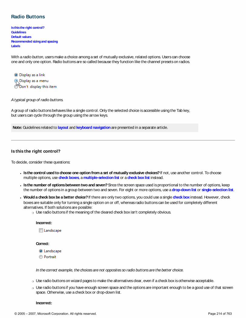
Radio Buttons
Is this the right control? Guidelines Default values Recommended sizing and spacing Labels
With a radio button, users make a choice among a set of mutually exclusive, related options. Users can choose one and only one option. Radio buttons are so called because they function like the channel presets on radios.
A typical group of radio buttons.
A group of radio buttons behaves like a single control. Only the selected choice is accessible using the Tab key, but users can cycle through the group using the arrow keys.
Note: Guidelines related to layout and keyboard navigation are presented in a separate article.
Is this the right control?
To decide, consider these questions:
● Is the control used to choose one option from a set of mutually exclusive choices? If not, use another control. To choose multiple options, use check boxes, a multiple-selection list or a check box list instead.
● Is the number of options between two and seven? Since the screen space used is proportional to the number of options, keep the number of options in a group between two and seven. For eight or more options, use a drop-down list or single-selection list.
● Would a check box be a better choice? If there are only two options, you could use a single check box instead. However, check boxes are suitable only for turning a single option on or off, whereas radio buttons can be used for completely different alternatives. If both solutions are possible:
�❍ Use radio buttons if the meaning of the cleared check box isn’t completely obvious.
Incorrect:
Correct:
In the correct example, the choices are not opposites so radio buttons are the better choice.
�❍ Use radio buttons on wizard pages to make the alternatives clear, even if a check box is otherwise acceptable.
�❍ Use radio buttons if you have enough screen space and the options are important enough to be a good use of that screen space. Otherwise, use a check box or drop-down list.
Incorrect:
© 2005 – 2007, Microsoft Corporation. All rights reserved. Page 214 of 763
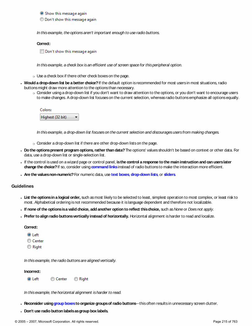
In this example, the options aren’t important enough to use radio buttons.
Correct:
In this example, a check box is an efficient use of screen space for this peripheral option.
�❍ Use a check box if there other check boxes on the page.
● Would a drop-down list be a better choice? If the default option is recommended for most users in most situations, radio buttons might draw more attention to the options than necessary.
�❍ Consider using a drop-down list if you don’t want to draw attention to the options, or you don’t want to encourage users to make changes. A drop-down list focuses on the current selection, whereas radio buttons emphasize all options equally.
In this example, a drop-down list focuses on the current selection and discourages users from making changes.
�❍ Consider a drop-down list if there are other drop-down lists on the page.
● Do the options present program options, rather than data? The options’ values shouldn’t be based on context or other data. For data, use a drop-down list or single-selection list.
● If the control is used on a wizard page or control panel, is the control a response to the main instruction and can users later change the choice? If so, consider using command links instead of radio buttons to make the interaction more efficient.
● Are the values non-numeric? For numeric data, use text boxes, drop-down lists, or sliders.
Guidelines
● List the options in a logical order, such as most likely to be selected to least, simplest operation to most complex, or least risk to most. Alphabetical ordering is not recommended because it is language dependent and therefore not localizable.
● If none of the options is a valid choice, add another option to reflect this choice, such as None or Does not apply.
● Prefer to align radio buttons vertically instead of horizontally. Horizontal alignment is harder to read and localize.
Correct:
In this example, the radio buttons are aligned vertically.
Incorrect:
In this example, the horizontal alignment is harder to read.
● Reconsider using group boxes to organize groups of radio buttons—this often results in unnecessary screen clutter.
● Don’t use radio button labels as group box labels.
© 2005 – 2007, Microsoft Corporation. All rights reserved. Page 215 of 763
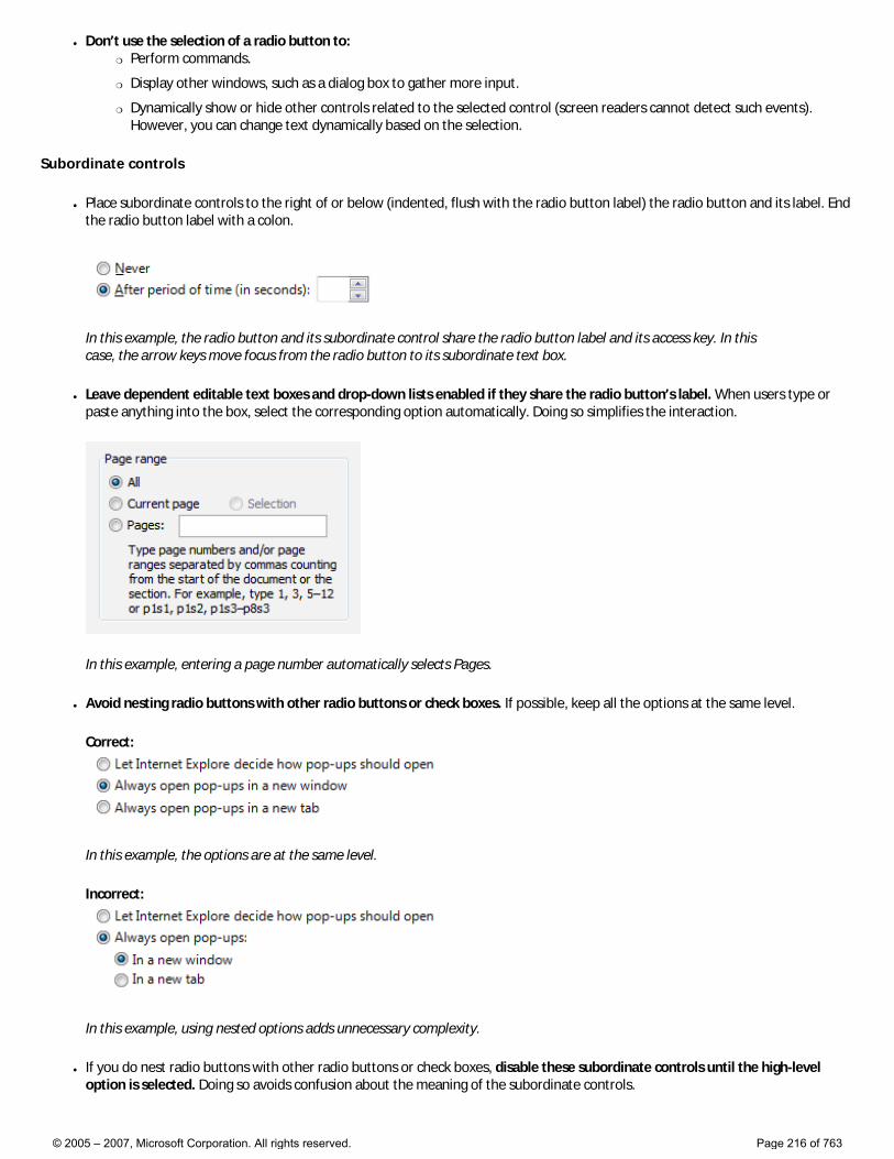
● Don’t use the selection of a radio button to: �❍ Perform commands.
�❍ Display other windows, such as a dialog box to gather more input.
�❍ Dynamically show or hide other controls related to the selected control (screen readers cannot detect such events). However, you can change text dynamically based on the selection.
Subordinate controls
● Place subordinate controls to the right of or below (indented, flush with the radio button label) the radio button and its label. End the radio button label with a colon.
In this example, the radio button and its subordinate control share the radio button label and its access key. In this case, the arrow keys move focus from the radio button to its subordinate text box.
● Leave dependent editable text boxes and drop-down lists enabled if they share the radio button’s label. When users type or paste anything into the box, select the corresponding option automatically. Doing so simplifies the interaction.
In this example, entering a page number automatically selects Pages.
● Avoid nesting radio buttons with other radio buttons or check boxes. If possible, keep all the options at the same level.
Correct:
In this example, the options are at the same level.
Incorrect:
In this example, using nested options adds unnecessary complexity.
● If you do nest radio buttons with other radio buttons or check boxes, disable these subordinate controls until the high-level option is selected. Doing so avoids confusion about the meaning of the subordinate controls.
© 2005 – 2007, Microsoft Corporation. All rights reserved. Page 216 of 763
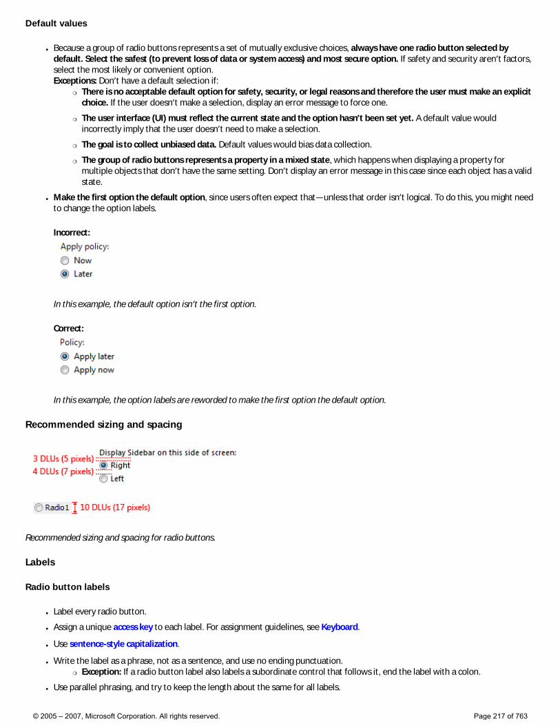
Default values
● Because a group of radio buttons represents a set of mutually exclusive choices, always have one radio button selected by default. Select the safest (to prevent loss of data or system access) and most secure option. If safety and security aren’t factors, select the most likely or convenient option. Exceptions: Don’t have a default selection if:
�❍ There is no acceptable default option for safety, security, or legal reasons and therefore the user must make an explicit choice. If the user doesn’t make a selection, display an error message to force one.
�❍ The user interface (UI) must reflect the current state and the option hasn’t been set yet. A default value would incorrectly imply that the user doesn’t need to make a selection.
�❍ The goal is to collect unbiased data. Default values would bias data collection.
�❍ The group of radio buttons represents a property in a mixed state, which happens when displaying a property for multiple objects that don’t have the same setting. Don’t display an error message in this case since each object has a valid state.
● Make the first option the default option, since users often expect that—unless that order isn’t logical. To do this, you might need to change the option labels.
Incorrect:
In this example, the default option isn’t the first option.
Correct:
In this example, the option labels are reworded to make the first option the default option.
Recommended sizing and spacing
Recommended sizing and spacing for radio buttons.
Labels
Radio button labels
● Label every radio button.
● Assign a unique access key to each label. For assignment guidelines, see Keyboard.
● Use sentence-style capitalization.
● Write the label as a phrase, not as a sentence, and use no ending punctuation. �❍ Exception: If a radio button label also labels a subordinate control that follows it, end the label with a colon.
● Use parallel phrasing, and try to keep the length about the same for all labels.
© 2005 – 2007, Microsoft Corporation. All rights reserved. Page 217 of 763
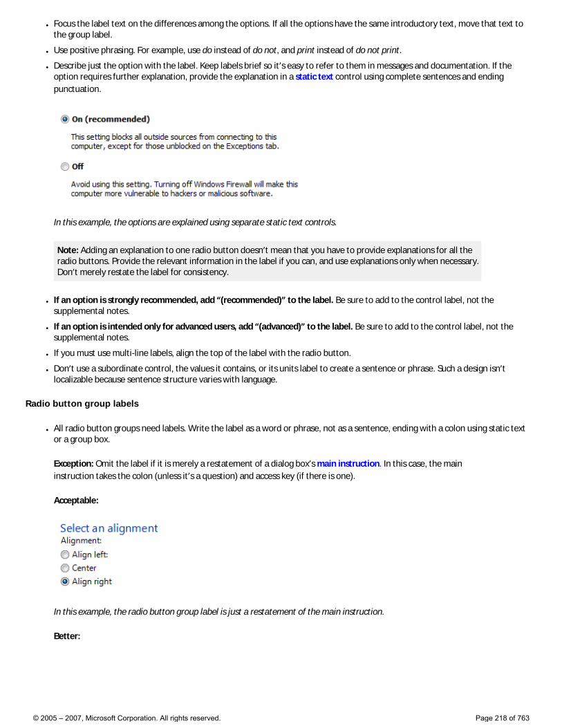
● Focus the label text on the differences among the options. If all the options have the same introductory text, move that text to the group label.
● Use positive phrasing. For example, use do instead of do not, and print instead of do not print.
● Describe just the option with the label. Keep labels brief so it’s easy to refer to them in messages and documentation. If the option requires further explanation, provide the explanation in a static text control using complete sentences and ending punctuation.
In this example, the options are explained using separate static text controls.
Note: Adding an explanation to one radio button doesn’t mean that you have to provide explanations for all the radio buttons. Provide the relevant information in the label if you can, and use explanations only when necessary. Don’t merely restate the label for consistency.
● If an option is strongly recommended, add “(recommended)” to the label. Be sure to add to the control label, not the supplemental notes.
● If an option is intended only for advanced users, add “(advanced)” to the label. Be sure to add to the control label, not the supplemental notes.
● If you must use multi-line labels, align the top of the label with the radio button.
● Don’t use a subordinate control, the values it contains, or its units label to create a sentence or phrase. Such a design isn’t localizable because sentence structure varies with language.
Radio button group labels
● All radio button groups need labels. Write the label as a word or phrase, not as a sentence, ending with a colon using static text or a group box.
Exception: Omit the label if it is merely a restatement of a dialog box’s main instruction. In this case, the main instruction takes the colon (unless it’s a question) and access key (if there is one).
Acceptable:
In this example, the radio button group label is just a restatement of the main instruction.
Better:
© 2005 – 2007, Microsoft Corporation. All rights reserved. Page 218 of 763
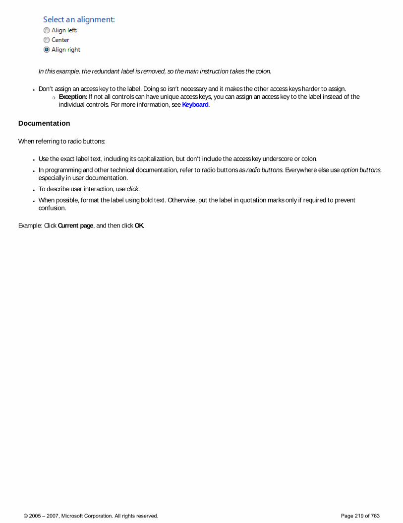
In this example, the redundant label is removed, so the main instruction takes the colon.
● Don’t assign an access key to the label. Doing so isn’t necessary and it makes the other access keys harder to assign. �❍ Exception: If not all controls can have unique access keys, you can assign an access key to the label instead of the
individual controls. For more information, see Keyboard.
Documentation
When referring to radio buttons:
● Use the exact label text, including its capitalization, but don’t include the access key underscore or colon.
● In programming and other technical documentation, refer to radio buttons as radio buttons. Everywhere else use option buttons, especially in user documentation.
● To describe user interaction, use click.
● When possible, format the label using bold text. Otherwise, put the label in quotation marks only if required to prevent confusion.
Example: Click Current page, and then click OK.
© 2005 – 2007, Microsoft Corporation. All rights reserved. Page 219 of 763
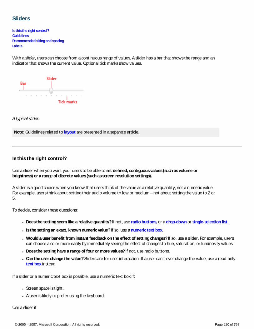
Sliders
Is this the right control? Guidelines Recommended sizing and spacing Labels
With a slider, users can choose from a continuous range of values. A slider has a bar that shows the range and an indicator that shows the current value. Optional tick marks show values.
A typical slider.
Note: Guidelines related to layout are presented in a separate article.
Is this the right control?
Use a slider when you want your users to be able to set defined, contiguous values (such as volume or brightness) or a range of discrete values (such as screen resolution settings).
A slider is a good choice when you know that users think of the value as a relative quantity, not a numeric value. For example, users think about setting their audio volume to low or medium—not about setting the value to 2 or 5.
To decide, consider these questions:
● Does the setting seem like a relative quantity? If not, use radio buttons, or a drop-down or single-selection list.
● Is the setting an exact, known numeric value? If so, use a numeric text box.
● Would a user benefit from instant feedback on the effect of setting changes? If so, use a slider. For example, users can choose a color more easily by immediately seeing the effect of changes to hue, saturation, or luminosity values.
● Does the setting have a range of four or more values? If not, use radio buttons.
● Can the user change the value? Sliders are for user interaction. If a user can’t ever change the value, use a read-only text box instead.
If a slider or a numeric text box is possible, use a numeric text box if:
● Screen space is tight.
● A user is likely to prefer using the keyboard.
Use a slider if:
© 2005 – 2007, Microsoft Corporation. All rights reserved. Page 220 of 763
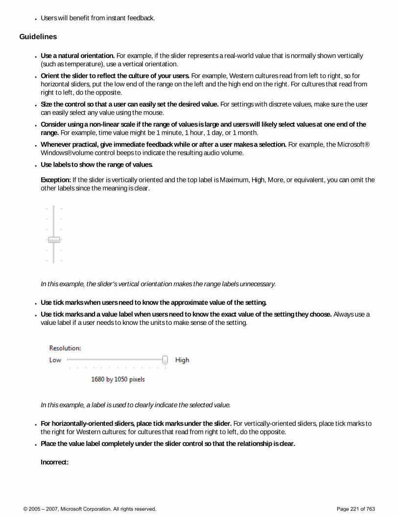
● Users will benefit from instant feedback.
Guidelines
● Use a natural orientation. For example, if the slider represents a real-world value that is normally shown vertically (such as temperature), use a vertical orientation.
● Orient the slider to reflect the culture of your users. For example, Western cultures read from left to right, so for horizontal sliders, put the low end of the range on the left and the high end on the right. For cultures that read from right to left, do the opposite.
● Size the control so that a user can easily set the desired value. For settings with discrete values, make sure the user can easily select any value using the mouse.
● Consider using a non-linear scale if the range of values is large and users will likely select values at one end of the range. For example, time value might be 1 minute, 1 hour, 1 day, or 1 month.
● Whenever practical, give immediate feedback while or after a user makes a selection. For example, the Microsoft® Windows® volume control beeps to indicate the resulting audio volume.
● Use labels to show the range of values. Exception: If the slider is vertically oriented and the top label is Maximum, High, More, or equivalent, you can omit the other labels since the meaning is clear.
In this example, the slider’s vertical orientation makes the range labels unnecessary.
● Use tick marks when users need to know the approximate value of the setting.
● Use tick marks and a value label when users need to know the exact value of the setting they choose. Always use a value label if a user needs to know the units to make sense of the setting.
In this example, a label is used to clearly indicate the selected value.
● For horizontally-oriented sliders, place tick marks under the slider. For vertically-oriented sliders, place tick marks to the right for Western cultures; for cultures that read from right to left, do the opposite.
● Place the value label completely under the slider control so that the relationship is clear.
Incorrect:
© 2005 – 2007, Microsoft Corporation. All rights reserved. Page 221 of 763
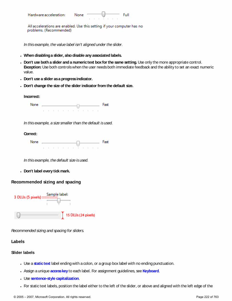
In this example, the value label isn’t aligned under the slider.
● When disabling a slider, also disable any associated labels.
● Don’t use both a slider and a numeric text box for the same setting. Use only the more appropriate control. Exception: Use both controls when the user needs both immediate feedback and the ability to set an exact numeric value.
● Don’t use a slider as a progress indicator.
● Don’t change the size of the slider indicator from the default size.
Incorrect:
In this example, a size smaller than the default is used.
Correct:
In this example, the default size is used.
● Don’t label every tick mark.
Recommended sizing and spacing
Recommended sizing and spacing for sliders.
Labels
Slider labels
● Use a static text label ending with a colon, or a group box label with no ending punctuation.
● Assign a unique access key to each label. For assignment guidelines, see Keyboard.
● Use sentence-style capitalization.
● For static text labels, position the label either to the left of the slider, or above and aligned with the left edge of the
© 2005 – 2007, Microsoft Corporation. All rights reserved. Page 222 of 763
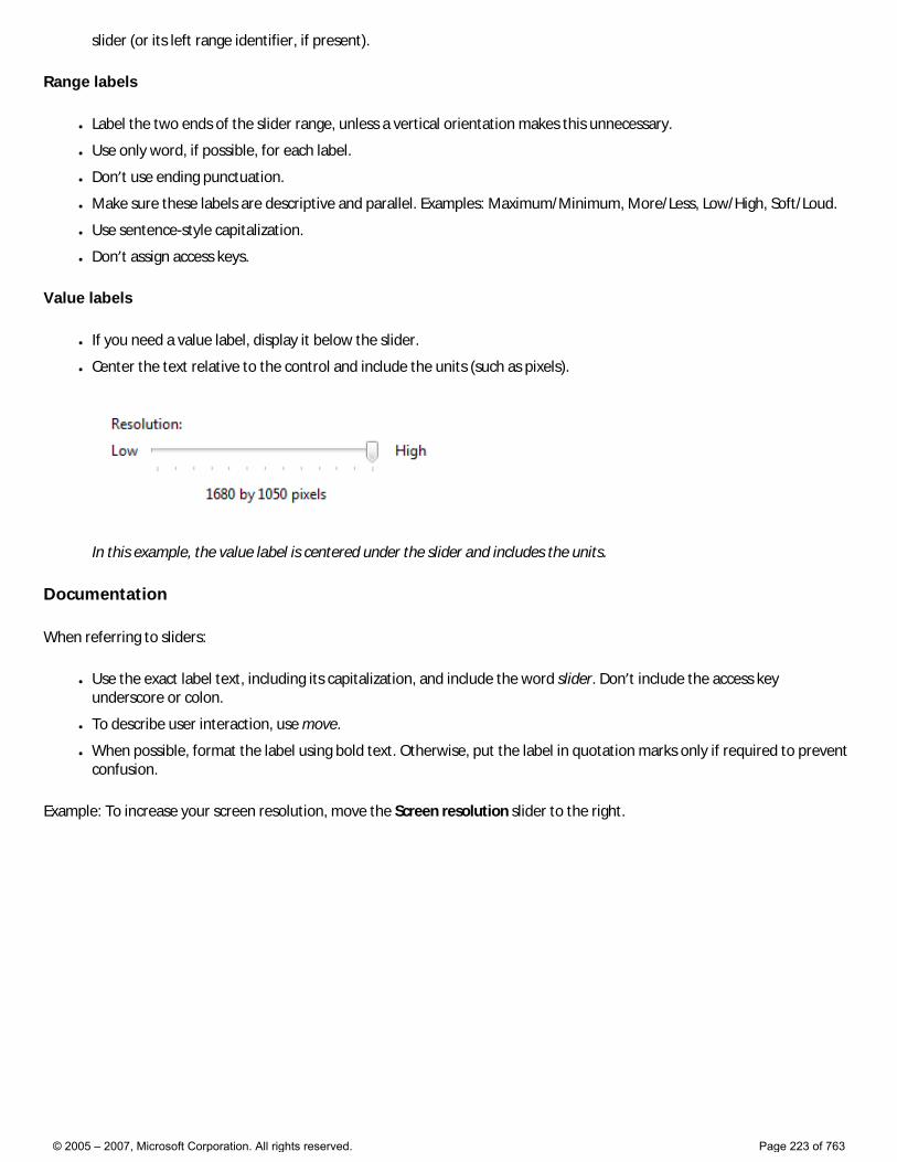
slider (or its left range identifier, if present).
Range labels
● Label the two ends of the slider range, unless a vertical orientation makes this unnecessary.
● Use only word, if possible, for each label.
● Don’t use ending punctuation.
● Make sure these labels are descriptive and parallel. Examples: Maximum/Minimum, More/Less, Low/High, Soft/Loud.
● Use sentence-style capitalization.
● Don’t assign access keys.
Value labels
● If you need a value label, display it below the slider.
● Center the text relative to the control and include the units (such as pixels).
In this example, the value label is centered under the slider and includes the units.
Documentation
When referring to sliders:
● Use the exact label text, including its capitalization, and include the word slider. Don’t include the access key underscore or colon.
● To describe user interaction, use move.
● When possible, format the label using bold text. Otherwise, put the label in quotation marks only if required to prevent confusion.
Example: To increase your screen resolution, move the Screen resolution slider to the right.
© 2005 – 2007, Microsoft Corporation. All rights reserved. Page 223 of 763
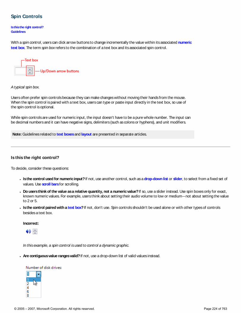
Spin Controls
Is this the right control? Guidelines
With a spin control, users can click arrow buttons to change incrementally the value within its associated numeric text box. The term spin box refers to the combination of a text box and its associated spin control.
A typical spin box.
Users often prefer spin controls because they can make changes without moving their hands from the mouse. When the spin control is paired with a text box, users can type or paste input directly in the text box, so use of the spin control is optional.
While spin controls are used for numeric input, the input doesn’t have to be a pure whole number. The input can be decimal numbers and it can have negative signs, delimiters (such as colons or hyphens), and unit modifiers.
Note: Guidelines related to text boxes and layout are presented in separate articles.
Is this the right control?
To decide, consider these questions:
● Is the control used for numeric input? If not, use another control, such as a drop-down list or slider, to select from a fixed set of values. Use scroll bars for scrolling.
● Do users think of the value as a relative quantity, not a numeric value? If so, use a slider instead. Use spin boxes only for exact, known numeric values. For example, users think about setting their audio volume to low or medium—not about setting the value to 2 or 5.
● Is the control paired with a text box? If not, don’t use. Spin controls shouldn’t be used alone or with other types of controls besides a text box.
Incorrect:
In this example, a spin control is used to control a dynamic graphic.
● Are contiguous value ranges valid? If not, use a drop-down list of valid values instead.
© 2005 – 2007, Microsoft Corporation. All rights reserved. Page 224 of 763
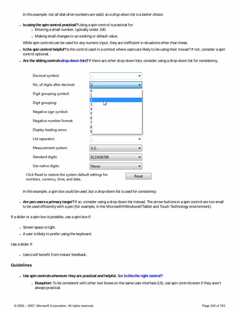
In this example, not all disk drive numbers are valid, so a drop-down list is a better choice.
● Is using the spin control practical? Using a spin control is practical for: �❍ Entering a small number, typically under 100.
�❍ Making small changes to an existing or default value.
While spin controls can be used for any numeric input, they are inefficient in situations other than these.
● Is the spin control helpful? Is the control used in a context where users are likely to be using their mouse? If not, consider a spin control optional.
● Are the sibling controls drop-down lists? If there are other drop-down lists, consider using a drop-down list for consistency.
In this example, a spin box could be used, but a drop-down list is used for consistency.
● Are pen users a primary target? If so, consider using a drop-down list instead. The arrow buttons in a spin control are too small to be used efficiently with a pen (for example, in the Microsoft® Windows® Tablet and Touch Technology environment).
If a slider or a spin box is possible, use a spin box if:
● Screen space is tight.
● A user is likely to prefer using the keyboard.
Use a slider if:
● Users will benefit from instant feedback.
Guidelines
● Use spin controls whenever they are practical and helpful. See Is this the right control?
�❍ Exception: To be consistent with other text boxes on the same user interface (UI), use spin controls even if they aren’t always practical.
© 2005 – 2007, Microsoft Corporation. All rights reserved. Page 225 of 763

Correct:
In this example, a spin control is used with the year control for consistency, even though it isn’t always practical.
Incorrect:
In this example, the spin control is unusable.
● Always make a spin control the “buddy” of the text box. Doing so places the spin control inside the text box.
Correct:
Incorrect:
In the correct example, the spin control is placed inside its associated text box.
● Disable a spin control when its associated text box is disabled. The spin control is a supplemental input method—never the only input method.
Values
● Define the top button to increase the value by one unit and the bottom button to decrease by one unit. Typically, the unit is one, but it should be the smallest common change in value. Ideally, the spin control should cover all valid values, and it should be more convenient than typing in the text.
In this example, clicking a spin control changes the values by .1, which is the smallest common change in value. Using a smaller unit would cover the range of valid values but make the spin controls unusable.
● Use the spin control to limit input to valid values. Using a spin control should never result in an incorrect value.
● At the end of a range of valid values, restart the range. The spin control metaphor is that the user is spinning a wheel of values, hence this wheel-like behavior.
�❍ Exception: Don’t restart the range if the resulting value is certain to be incorrect.
© 2005 – 2007, Microsoft Corporation. All rights reserved. Page 226 of 763
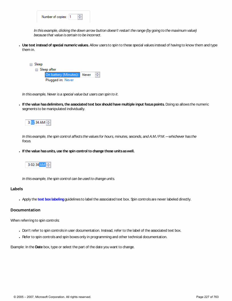
In this example, clicking the down arrow button doesn’t restart the range (by going to the maximum value) because that value is certain to be incorrect.
● Use text instead of special numeric values. Allow users to spin to these special values instead of having to know them and type them in.
In this example, Never is a special value but users can spin to it.
● If the value has delimiters, the associated text box should have multiple input focus points. Doing so allows the numeric segments to be manipulated individually.
In this example, the spin control affects the values for hours, minutes, seconds, and A.M./P.M.—whichever has the focus.
● If the value has units, use the spin control to change those units as well.
In this example, the spin control can be used to change units.
Labels
● Apply the text box labeling guidelines to label the associated text box. Spin controls are never labeled directly.
Documentation
When referring to spin controls:
● Don’t refer to spin controls in user documentation. Instead, refer to the label of the associated text box.
● Refer to spin controls and spin boxes only in programming and other technical documentation.
Example: In the Date box, type or select the part of the date you want to change.
© 2005 – 2007, Microsoft Corporation. All rights reserved. Page 227 of 763
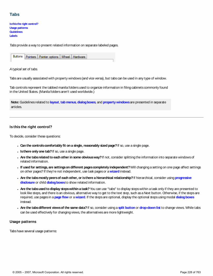
Tabs
Is this the right control? Usage patterns Guidelines Labels
Tabs provide a way to present related information on separate labeled pages.
A typical set of tabs.
Tabs are usually associated with property windows (and vice versa), but tabs can be used in any type of window.
Tab controls represent the tabbed manila folders used to organize information in filing cabinets commonly found in the United States. (Manila folders aren’t used worldwide.)
Note: Guidelines related to layout, tab menus, dialog boxes, and property windows are presented in separate articles.
Is this the right control?
To decide, consider these questions:
● Can the controls comfortably fit on a single, reasonably sized page? If so, use a single page.
● Is there only one tab? If so, use a single page.
● Are the tabs related to each other in some obvious way? If not, consider splitting the information into separate windows of related information.
● If used for settings, are settings on different pages completely independent? Will changing a setting on one page affect settings on other pages? If they’re not independent, use task pages or a wizard instead.
● Are the tabs mostly peers of each other, or is there a hierarchical relationship? If hierarchical, consider using progressive disclosure or child dialog boxes to show related information.
● Are the tabs used to display steps within a task? You can use “tabs” to display steps within a task only if they are presented to look like steps, and there is an obvious, alternative way to get to the text step, such as a Next button. Otherwise, if the steps are required, use pages in a page flow or a wizard. If the steps are optional, display the optional steps using modal dialog boxes instead.
● Are the tabs different views of the same data? If so, consider using a split button or drop-down list to change views. While tabs can be used effectively for changing views, the alternatives are more lightweight.
Usage patterns
Tabs have several usage patterns:
© 2005 – 2007, Microsoft Corporation. All rights reserved. Page 228 of 763
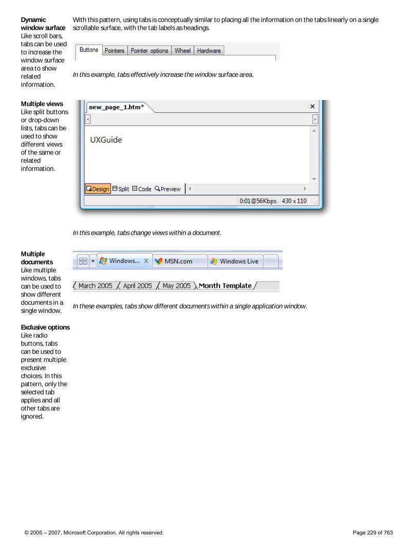
Dynamic window surface Like scroll bars, tabs can be used to increase the window surface area to show related information.
With this pattern, using tabs is conceptually similar to placing all the information on the tabs linearly on a single scrollable surface, with the tab labels as headings.
In this example, tabs effectively increase the window surface area.
Multiple views Like split buttons or drop-down lists, tabs can be used to show different views of the same or related information.
In this example, tabs change views within a document.
Multiple documents Like multiple windows, tabs can be used to show different documents in a single window.
In these examples, tabs show different documents within a single application window.
Exclusive options Like radio buttons, tabs can be used to present multiple exclusive choices. In this pattern, only the selected tab applies and all other tabs are ignored.
© 2005 – 2007, Microsoft Corporation. All rights reserved. Page 229 of 763
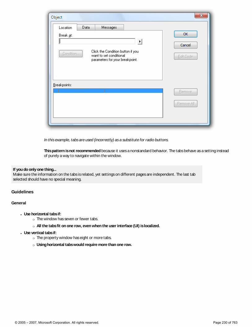
In this example, tabs are used (incorrectly) as a substitute for radio buttons.
This pattern is not recommended because it uses a nonstandard behavior. The tabs behave as a setting instead of purely a way to navigate within the window.
If you do only one thing... Make sure the information on the tabs is related, yet settings on different pages are independent. The last tab selected should have no special meaning.
Guidelines
General
● Use horizontal tabs if: �❍ The window has seven or fewer tabs.
�❍ All the tabs fit on one row, even when the user interface (UI) is localized.
● Use vertical tabs if: �❍ The property window has eight or more tabs.
�❍ Using horizontal tabs would require more than one row.
© 2005 – 2007, Microsoft Corporation. All rights reserved. Page 230 of 763
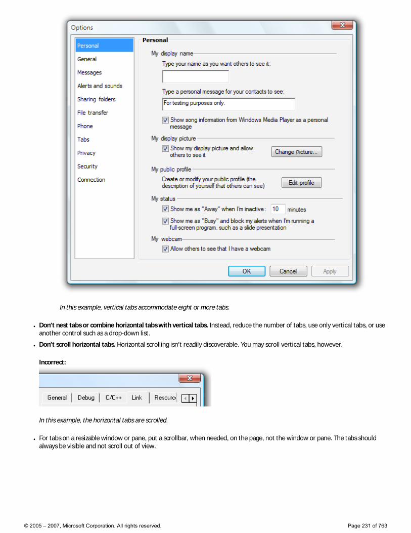
In this example, vertical tabs accommodate eight or more tabs.
● Don’t nest tabs or combine horizontal tabs with vertical tabs. Instead, reduce the number of tabs, use only vertical tabs, or use another control such as a drop-down list.
● Don’t scroll horizontal tabs. Horizontal scrolling isn’t readily discoverable. You may scroll vertical tabs, however.
Incorrect:
In this example, the horizontal tabs are scrolled.
● For tabs on a resizable window or pane, put a scrollbar, when needed, on the page, not the window or pane. The tabs should always be visible and not scroll out of view.
© 2005 – 2007, Microsoft Corporation. All rights reserved. Page 231 of 763
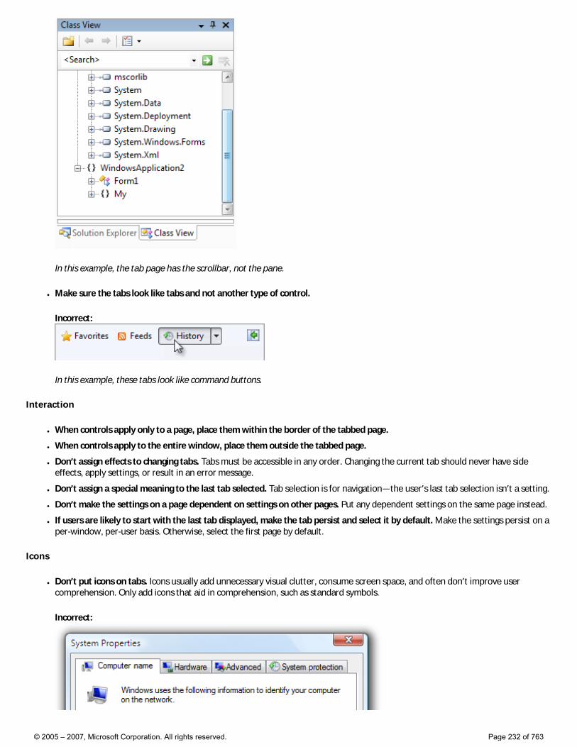
In this example, the tab page has the scrollbar, not the pane.
● Make sure the tabs look like tabs and not another type of control.
Incorrect:
In this example, these tabs look like command buttons.
Interaction
● When controls apply only to a page, place them within the border of the tabbed page.
● When controls apply to the entire window, place them outside the tabbed page.
● Don’t assign effects to changing tabs. Tabs must be accessible in any order. Changing the current tab should never have side effects, apply settings, or result in an error message.
● Don’t assign a special meaning to the last tab selected. Tab selection is for navigation—the user’s last tab selection isn’t a setting.
● Don’t make the settings on a page dependent on settings on other pages. Put any dependent settings on the same page instead.
● If users are likely to start with the last tab displayed, make the tab persist and select it by default. Make the settings persist on a per-window, per-user basis. Otherwise, select the first page by default.
Icons
● Don’t put icons on tabs. Icons usually add unnecessary visual clutter, consume screen space, and often don’t improve user comprehension. Only add icons that aid in comprehension, such as standard symbols.
Incorrect:
© 2005 – 2007, Microsoft Corporation. All rights reserved. Page 232 of 763
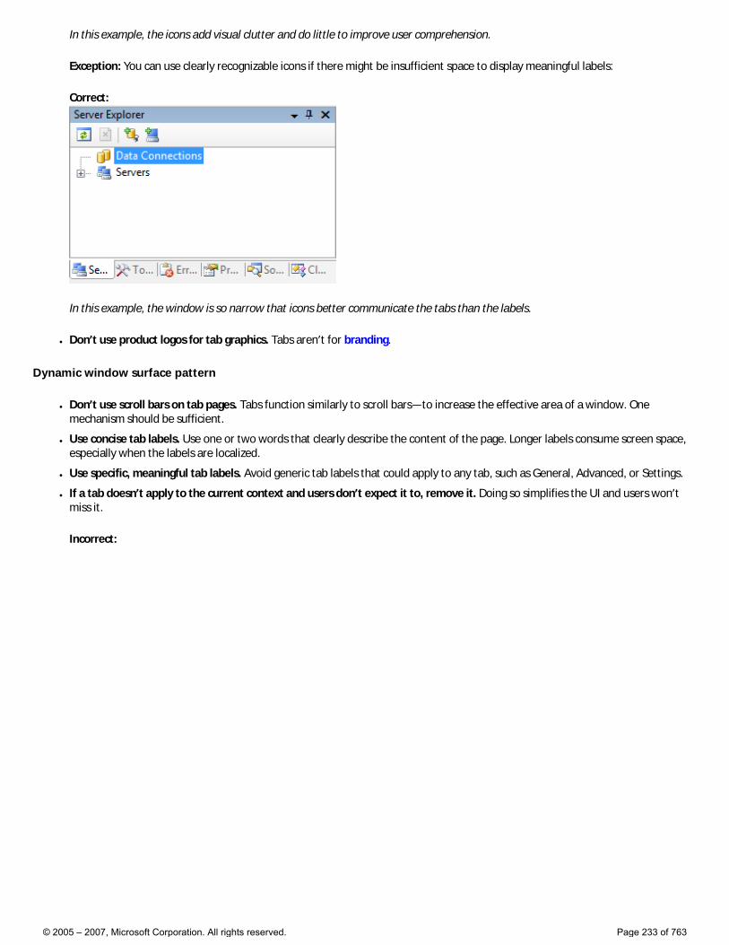
In this example, the icons add visual clutter and do little to improve user comprehension.
Exception: You can use clearly recognizable icons if there might be insufficient space to display meaningful labels:
Correct:
In this example, the window is so narrow that icons better communicate the tabs than the labels.
● Don’t use product logos for tab graphics. Tabs aren’t for branding.
Dynamic window surface pattern
● Don’t use scroll bars on tab pages. Tabs function similarly to scroll bars—to increase the effective area of a window. One mechanism should be sufficient.
● Use concise tab labels. Use one or two words that clearly describe the content of the page. Longer labels consume screen space, especially when the labels are localized.
● Use specific, meaningful tab labels. Avoid generic tab labels that could apply to any tab, such as General, Advanced, or Settings.
● If a tab doesn’t apply to the current context and users don’t expect it to, remove it. Doing so simplifies the UI and users won’t miss it.
Incorrect:
© 2005 – 2007, Microsoft Corporation. All rights reserved. Page 233 of 763
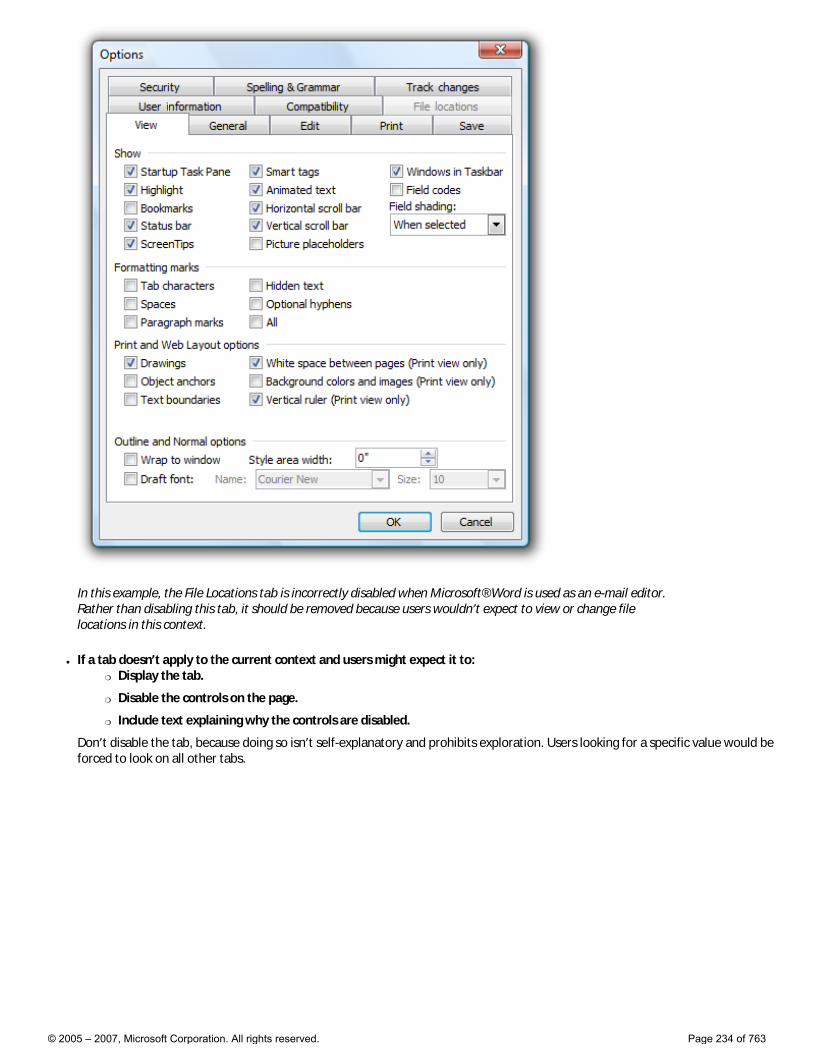
In this example, the File Locations tab is incorrectly disabled when Microsoft® Word is used as an e-mail editor. Rather than disabling this tab, it should be removed because users wouldn’t expect to view or change file locations in this context.
● If a tab doesn’t apply to the current context and users might expect it to: �❍ Display the tab.
�❍ Disable the controls on the page.
�❍ Include text explaining why the controls are disabled.
Don’t disable the tab, because doing so isn’t self-explanatory and prohibits exploration. Users looking for a specific value would be forced to look on all other tabs.
© 2005 – 2007, Microsoft Corporation. All rights reserved. Page 234 of 763
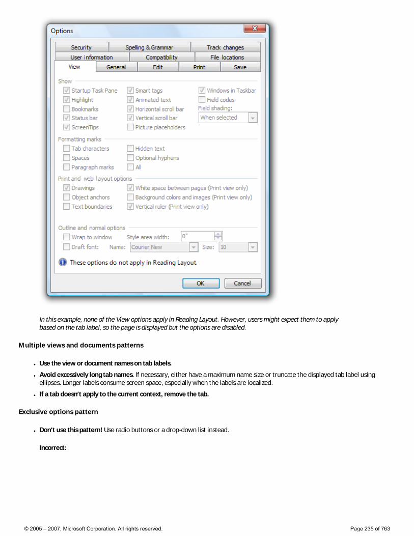
In this example, none of the View options apply in Reading Layout. However, users might expect them to apply based on the tab label, so the page is displayed but the options are disabled.
Multiple views and documents patterns
● Use the view or document names on tab labels.
● Avoid excessively long tab names. If necessary, either have a maximum name size or truncate the displayed tab label using ellipses. Longer labels consume screen space, especially when the labels are localized.
● If a tab doesn’t apply to the current context, remove the tab.
Exclusive options pattern
● Don’t use this pattern! Use radio buttons or a drop-down list instead.
Incorrect:
© 2005 – 2007, Microsoft Corporation. All rights reserved. Page 235 of 763
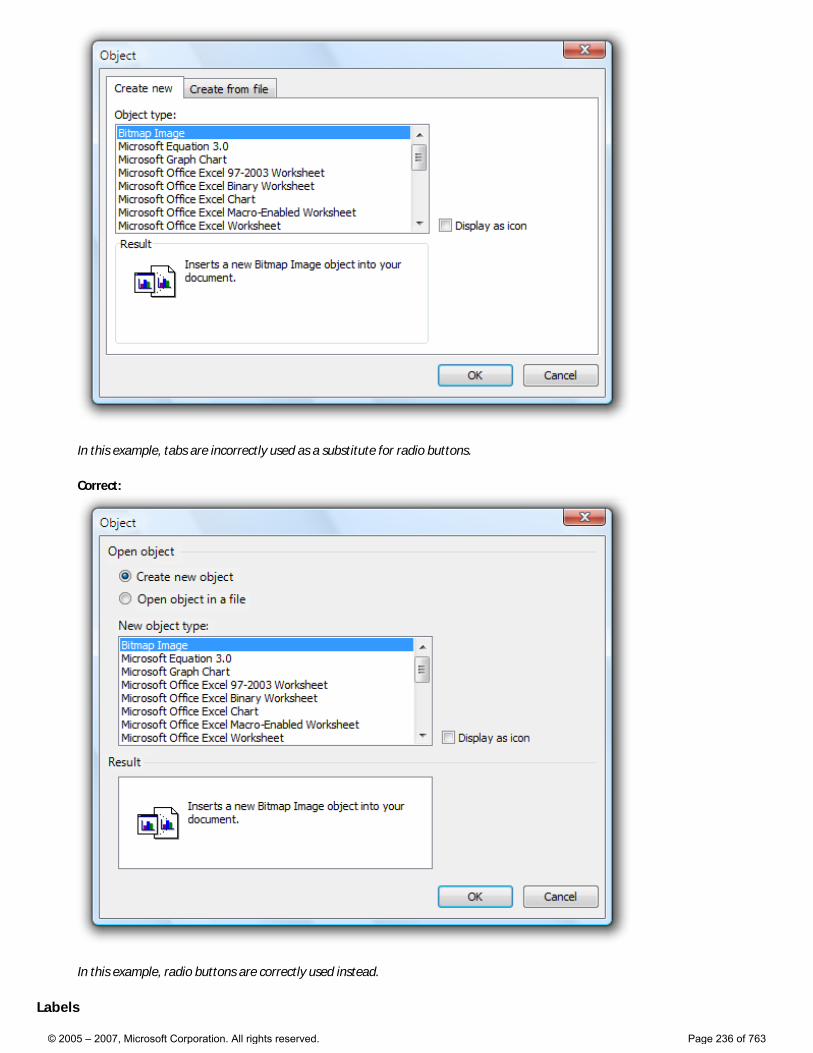
In this example, tabs are incorrectly used as a substitute for radio buttons.
Correct:
In this example, radio buttons are correctly used instead.
Labels
© 2005 – 2007, Microsoft Corporation. All rights reserved. Page 236 of 763
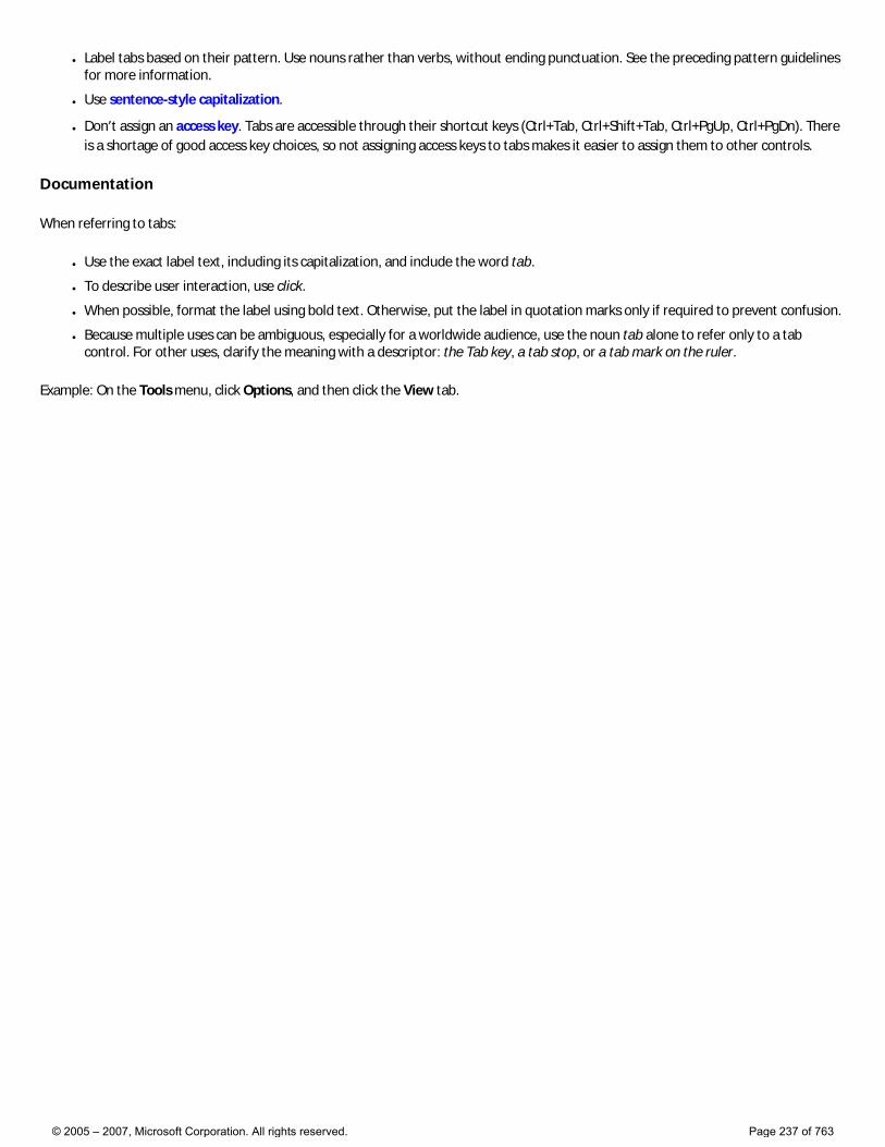
● Label tabs based on their pattern. Use nouns rather than verbs, without ending punctuation. See the preceding pattern guidelines for more information.
● Use sentence-style capitalization.
● Don’t assign an access key. Tabs are accessible through their shortcut keys (Ctrl+Tab, Ctrl+Shift+Tab, Ctrl+PgUp, Ctrl+PgDn). There is a shortage of good access key choices, so not assigning access keys to tabs makes it easier to assign them to other controls.
Documentation
When referring to tabs:
● Use the exact label text, including its capitalization, and include the word tab.
● To describe user interaction, use click.
● When possible, format the label using bold text. Otherwise, put the label in quotation marks only if required to prevent confusion.
● Because multiple uses can be ambiguous, especially for a worldwide audience, use the noun tab alone to refer only to a tab control. For other uses, clarify the meaning with a descriptor: the Tab key, a tab stop, or a tab mark on the ruler.
Example: On the Tools menu, click Options, and then click the View tab.
© 2005 – 2007, Microsoft Corporation. All rights reserved. Page 237 of 763
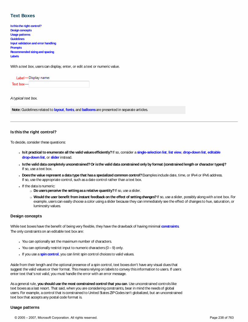
Text Boxes
Is this the right control? Design concepts Usage patterns Guidelines Input validation and error handling Prompts Recommended sizing and spacing Labels
With a text box, users can display, enter, or edit a text or numeric value.
A typical text box.
Note: Guidelines related to layout, fonts, and balloons are presented in separate articles.
Is this the right control?
To decide, consider these questions:
● Is it practical to enumerate all the valid values efficiently? If so, consider a single-selection list, list view, drop-down list, editable drop-down list, or slider instead.
● Is the valid data completely unconstrained? Or is the valid data constrained only by format (constrained length or character types)? If so, use a text box.
● Does the value represent a data type that has a specialized common control? Examples include date, time, or IPv4 or IPv6 address. If so, use the appropriate control, such as a date control rather than a text box.
● If the data is numeric: �❍ Do users perceive the setting as a relative quantity? If so, use a slider.
�❍ Would the user benefit from instant feedback on the effect of setting changes? If so, use a slider, possibly along with a text box. For example, users can easily choose a color using a slider because they can immediately see the effect of changes to hue, saturation, or luminosity values.
Design concepts
While text boxes have the benefit of being very flexible, they have the drawback of having minimal constraints. The only constraints on an editable text box are:
● You can optionally set the maximum number of characters.
● You can optionally restrict input to numeric characters (0 – 9) only.
● If you use a spin control, you can limit spin control choices to valid values.
Aside from their length and the optional presence of a spin control, text boxes don’t have any visual clues that suggest the valid values or their format. This means relying on labels to convey this information to users. If users enter text that’s not valid, you must handle the error with an error message.
As a general rule, you should use the most constrained control that you can. Use unconstrained controls like text boxes as a last resort. That said, when you are considering constraints, bear in mind the needs of global users. For example, a control that is constrained to United States ZIP Codes isn’t globalized, but an unconstrained text box that accepts any postal code format is.
Usage patterns
© 2005 – 2007, Microsoft Corporation. All rights reserved. Page 238 of 763
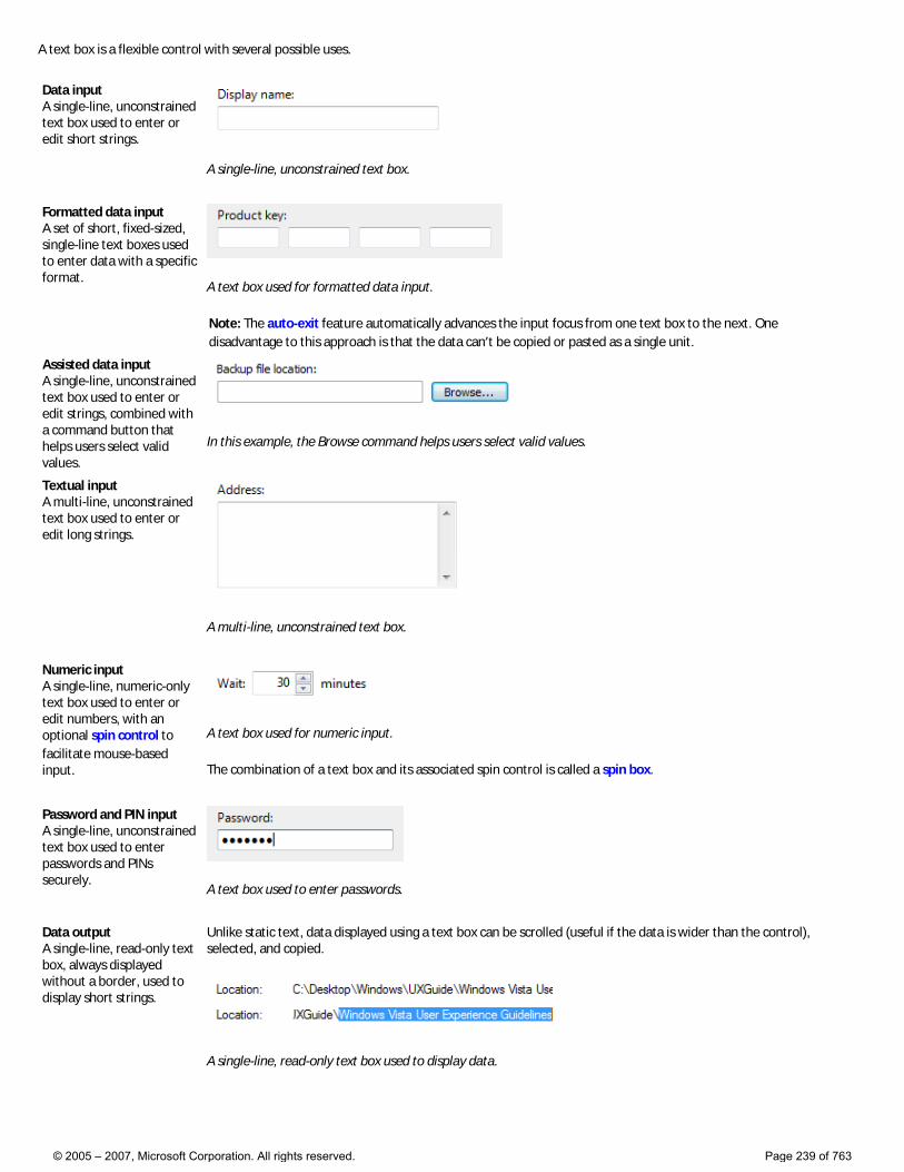
A text box is a flexible control with several possible uses.
Data input A single-line, unconstrained text box used to enter or edit short strings.
A single-line, unconstrained text box.
Formatted data input A set of short, fixed-sized, single-line text boxes used to enter data with a specific format.
A text box used for formatted data input.
Note: The auto-exit feature automatically advances the input focus from one text box to the next. One disadvantage to this approach is that the data can’t be copied or pasted as a single unit.
Assisted data input A single-line, unconstrained text box used to enter or edit strings, combined with a command button that helps users select valid values.
In this example, the Browse command helps users select valid values.
Textual input A multi-line, unconstrained text box used to enter or edit long strings.
A multi-line, unconstrained text box.
Numeric input A single-line, numeric-only text box used to enter or edit numbers, with an optional spin control to facilitate mouse-based input.
A text box used for numeric input.
The combination of a text box and its associated spin control is called a spin box.
Password and PIN input A single-line, unconstrained text box used to enter passwords and PINs securely.
A text box used to enter passwords.
Data output A single-line, read-only text box, always displayed without a border, used to display short strings.
Unlike static text, data displayed using a text box can be scrolled (useful if the data is wider than the control), selected, and copied.
A single-line, read-only text box used to display data.
© 2005 – 2007, Microsoft Corporation. All rights reserved. Page 239 of 763
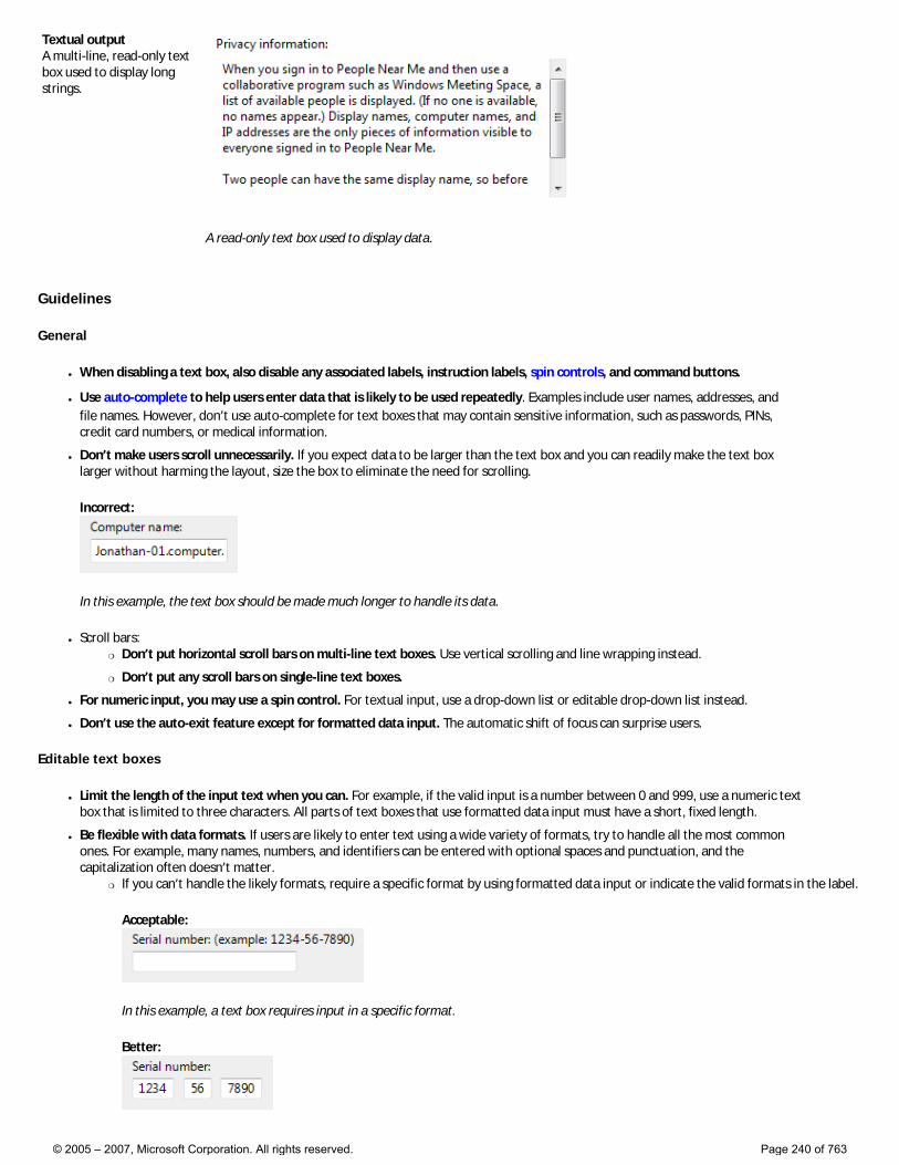
Textual output A multi-line, read-only text box used to display long strings.
A read-only text box used to display data.
Guidelines
General
● When disabling a text box, also disable any associated labels, instruction labels, spin controls, and command buttons.
● Use auto-complete to help users enter data that is likely to be used repeatedly. Examples include user names, addresses, and file names. However, don’t use auto-complete for text boxes that may contain sensitive information, such as passwords, PINs, credit card numbers, or medical information.
● Don’t make users scroll unnecessarily. If you expect data to be larger than the text box and you can readily make the text box larger without harming the layout, size the box to eliminate the need for scrolling.
Incorrect:
In this example, the text box should be made much longer to handle its data.
● Scroll bars: �❍ Don’t put horizontal scroll bars on multi-line text boxes. Use vertical scrolling and line wrapping instead.
�❍ Don’t put any scroll bars on single-line text boxes.
● For numeric input, you may use a spin control. For textual input, use a drop-down list or editable drop-down list instead.
● Don’t use the auto-exit feature except for formatted data input. The automatic shift of focus can surprise users.
Editable text boxes
● Limit the length of the input text when you can. For example, if the valid input is a number between 0 and 999, use a numeric text box that is limited to three characters. All parts of text boxes that use formatted data input must have a short, fixed length.
● Be flexible with data formats. If users are likely to enter text using a wide variety of formats, try to handle all the most common ones. For example, many names, numbers, and identifiers can be entered with optional spaces and punctuation, and the capitalization often doesn’t matter.
�❍ If you can’t handle the likely formats, require a specific format by using formatted data input or indicate the valid formats in the label.
Acceptable:
In this example, a text box requires input in a specific format.
Better:
© 2005 – 2007, Microsoft Corporation. All rights reserved. Page 240 of 763
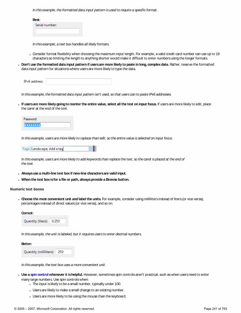
In this example, the formatted data input pattern is used to require a specific format.
Best:
In this example, a text box handles all likely formats.
�❍ Consider format flexibility when choosing the maximum input length. For example, a valid credit card number can use up to 19 characters so limiting the length to anything shorter would make it difficult to enter numbers using the longer formats.
● Don’t use the formatted data input pattern if users are more likely to paste in long, complex data. Rather, reserve the formatted data input pattern for situations where users are more likely to type the data.
In this example, the formatted data input pattern isn’t used, so that users can to paste IPv6 addresses.
● If users are more likely going to reenter the entire value, select all the text on input focus. If users are more likely to edit, place the caret at the end of the text.
In this example, users are more likely to replace than edit, so the entire value is selected on input focus.
In this example, users are more likely to add keywords than replace the text, so the caret is placed at the end of the text.
● Always use a multi-line text box if new-line characters are valid input.
● When the text box is for a file or path, always provide a Browse button.
Numeric text boxes
● Choose the most convenient unit and label the units. For example, consider using milliliters instead of liters (or vice versa), percentages instead of direct values (or vice versa), and so on.
Correct:
In this example, the unit is labeled, but it requires users to enter decimal numbers.
Better:
In this example, the text box uses a more convenient unit.
● Use a spin control whenever it is helpful. However, sometimes spin controls aren’t practical, such as when users need to enter many large numbers. Use spin controls when:
�❍ The input is likely to be a small number, typically under 100.
�❍ Users are likely to make a small change to an existing number.
�❍ Users are more likely to be using the mouse than the keyboard.
© 2005 – 2007, Microsoft Corporation. All rights reserved. Page 241 of 763
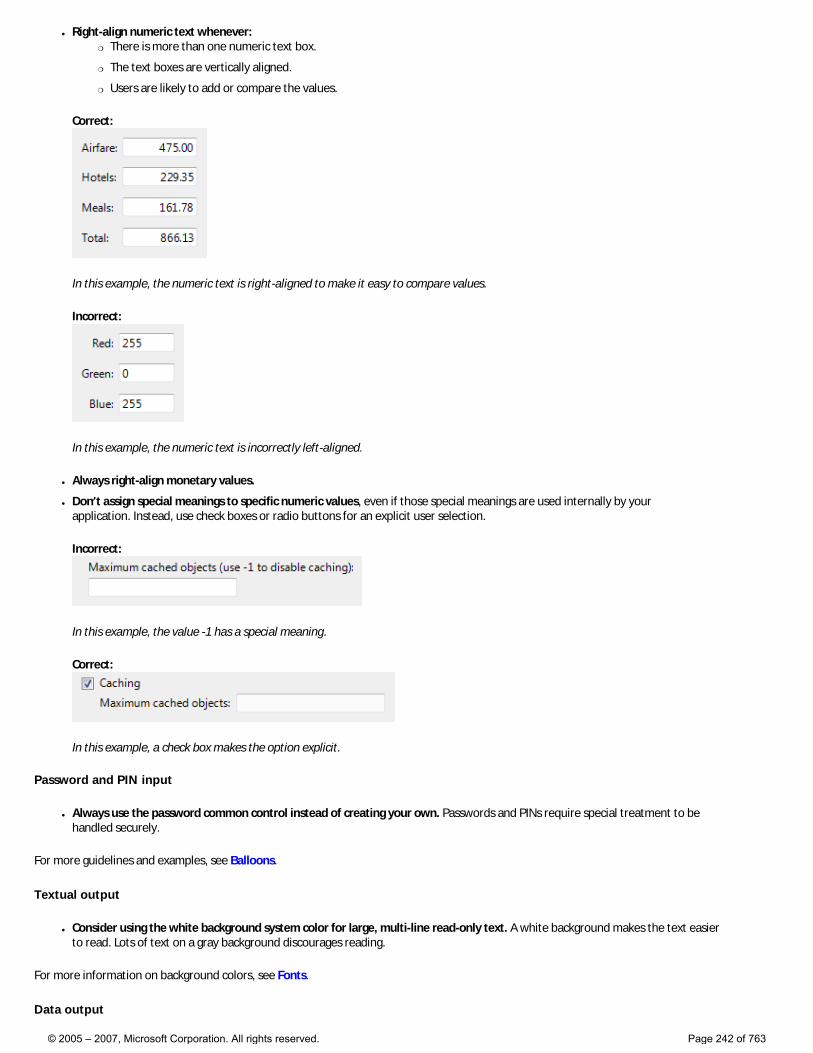
● Right-align numeric text whenever: �❍ There is more than one numeric text box.
�❍ The text boxes are vertically aligned.
�❍ Users are likely to add or compare the values.
Correct:
In this example, the numeric text is right-aligned to make it easy to compare values.
Incorrect:
In this example, the numeric text is incorrectly left-aligned.
● Always right-align monetary values.
● Don’t assign special meanings to specific numeric values, even if those special meanings are used internally by your application. Instead, use check boxes or radio buttons for an explicit user selection.
Incorrect:
In this example, the value -1 has a special meaning.
Correct:
In this example, a check box makes the option explicit.
Password and PIN input
● Always use the password common control instead of creating your own. Passwords and PINs require special treatment to be handled securely.
For more guidelines and examples, see Balloons.
Textual output
● Consider using the white background system color for large, multi-line read-only text. A white background makes the text easier to read. Lots of text on a gray background discourages reading.
For more information on background colors, see Fonts.
Data output
© 2005 – 2007, Microsoft Corporation. All rights reserved. Page 242 of 763
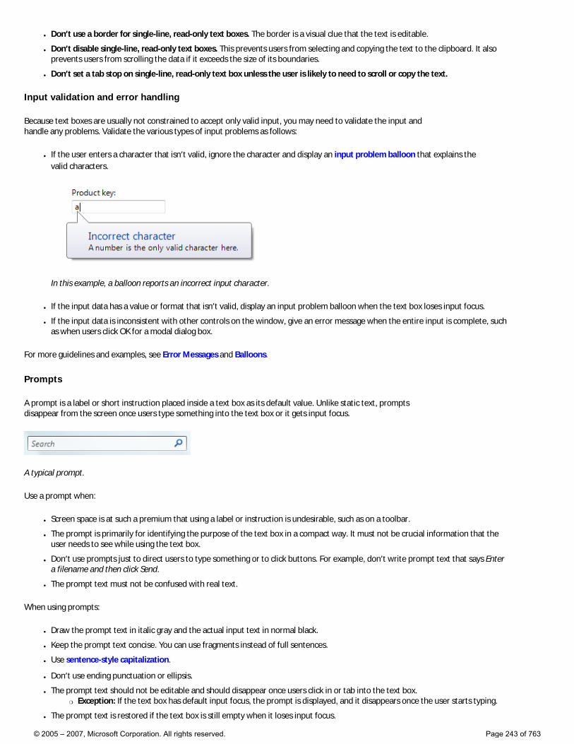
● Don’t use a border for single-line, read-only text boxes. The border is a visual clue that the text is editable.
● Don’t disable single-line, read-only text boxes. This prevents users from selecting and copying the text to the clipboard. It also prevents users from scrolling the data if it exceeds the size of its boundaries.
● Don’t set a tab stop on single-line, read-only text box unless the user is likely to need to scroll or copy the text.
Input validation and error handling
Because text boxes are usually not constrained to accept only valid input, you may need to validate the input and handle any problems. Validate the various types of input problems as follows:
● If the user enters a character that isn’t valid, ignore the character and display an input problem balloon that explains the valid characters.
In this example, a balloon reports an incorrect input character.
● If the input data has a value or format that isn’t valid, display an input problem balloon when the text box loses input focus.
● If the input data is inconsistent with other controls on the window, give an error message when the entire input is complete, such as when users click OK for a modal dialog box.
For more guidelines and examples, see Error Messages and Balloons.
Prompts
A prompt is a label or short instruction placed inside a text box as its default value. Unlike static text, prompts disappear from the screen once users type something into the text box or it gets input focus.
A typical prompt.
Use a prompt when:
● Screen space is at such a premium that using a label or instruction is undesirable, such as on a toolbar.
● The prompt is primarily for identifying the purpose of the text box in a compact way. It must not be crucial information that the user needs to see while using the text box.
● Don’t use prompts just to direct users to type something or to click buttons. For example, don’t write prompt text that says Enter a filename and then click Send.
● The prompt text must not be confused with real text.
When using prompts:
● Draw the prompt text in italic gray and the actual input text in normal black.
● Keep the prompt text concise. You can use fragments instead of full sentences.
● Use sentence-style capitalization.
● Don’t use ending punctuation or ellipsis.
● The prompt text should not be editable and should disappear once users click in or tab into the text box. �❍ Exception: If the text box has default input focus, the prompt is displayed, and it disappears once the user starts typing.
● The prompt text is restored if the text box is still empty when it loses input focus.
© 2005 – 2007, Microsoft Corporation. All rights reserved. Page 243 of 763
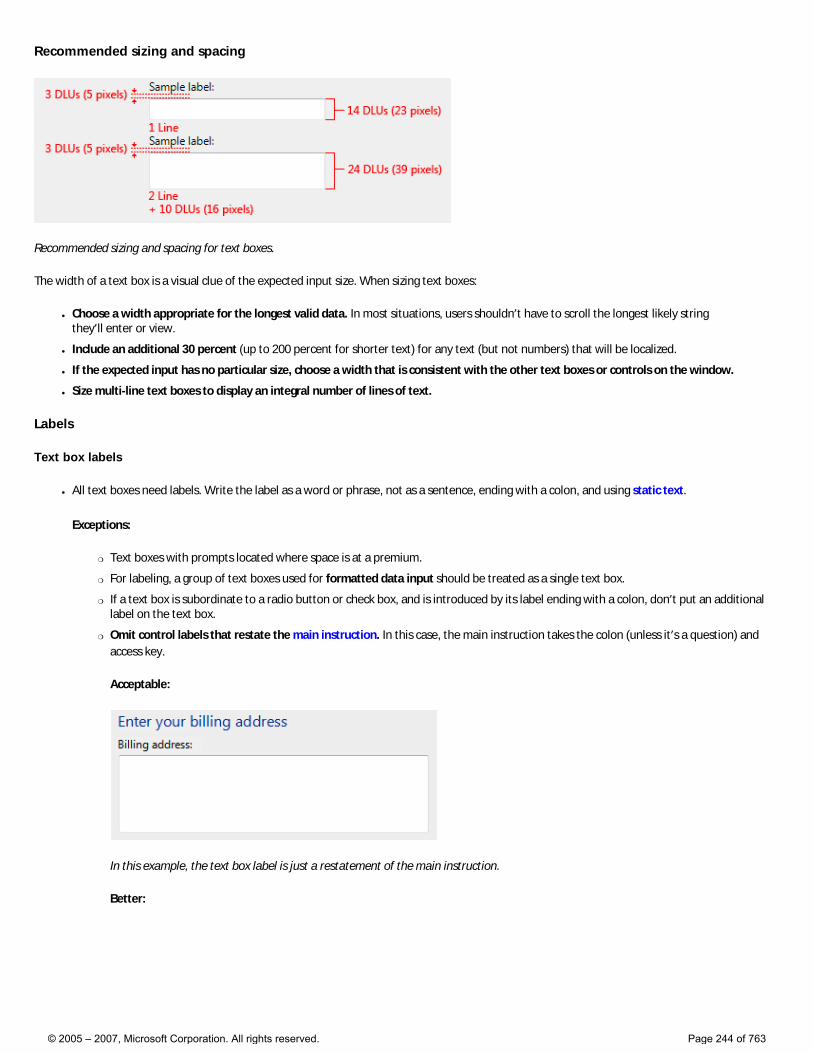
Recommended sizing and spacing
Recommended sizing and spacing for text boxes.
The width of a text box is a visual clue of the expected input size. When sizing text boxes:
● Choose a width appropriate for the longest valid data. In most situations, users shouldn’t have to scroll the longest likely string they’ll enter or view.
● Include an additional 30 percent (up to 200 percent for shorter text) for any text (but not numbers) that will be localized.
● If the expected input has no particular size, choose a width that is consistent with the other text boxes or controls on the window.
● Size multi-line text boxes to display an integral number of lines of text.
Labels
Text box labels
● All text boxes need labels. Write the label as a word or phrase, not as a sentence, ending with a colon, and using static text.
Exceptions:
�❍ Text boxes with prompts located where space is at a premium.
�❍ For labeling, a group of text boxes used for formatted data input should be treated as a single text box.
�❍ If a text box is subordinate to a radio button or check box, and is introduced by its label ending with a colon, don’t put an additional label on the text box.
�❍ Omit control labels that restate the main instruction. In this case, the main instruction takes the colon (unless it’s a question) and access key.
Acceptable:
In this example, the text box label is just a restatement of the main instruction.
Better:
© 2005 – 2007, Microsoft Corporation. All rights reserved. Page 244 of 763
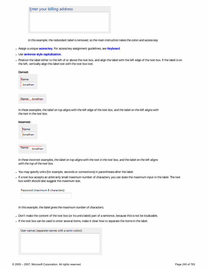
In this example, the redundant label is removed, so the main instruction takes the colon and access key.
● Assign a unique access key. For access key assignment guidelines, see Keyboard.
● Use sentence-style capitalization.
● Position the label either to the left of or above the text box, and align the label with the left edge of the text box. If the label is on the left, vertically align the label text with the text box text.
Correct:
In these examples, the label on top aligns with the left edge of the text box, and the label on the left aligns with the text in the text box.
Incorrect:
In these incorrect examples, the label on top aligns with the text in the text box, and the label on the left aligns with the top of the text box.
● You may specify units (for example, seconds or connections) in parentheses after the label.
● If a text box accepts an arbitrarily small maximum number of characters, you can state the maximum input in the label. The text box width should also suggest the maximum size.
In this example, the label gives the maximum number of characters.
● Don’t make the content of the text box (or its units label) part of a sentence, because this is not be localizable.
● If the text box can be used to enter several items, make it clear how to separate the items in the label.
© 2005 – 2007, Microsoft Corporation. All rights reserved. Page 245 of 763
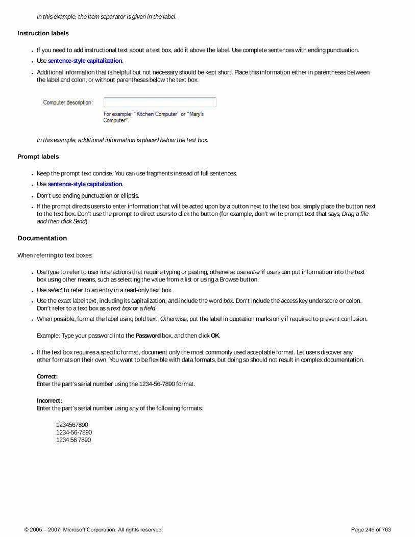
In this example, the item separator is given in the label.
Instruction labels
● If you need to add instructional text about a text box, add it above the label. Use complete sentences with ending punctuation.
● Use sentence-style capitalization.
● Additional information that is helpful but not necessary should be kept short. Place this information either in parentheses between the label and colon, or without parentheses below the text box.
In this example, additional information is placed below the text box.
Prompt labels
● Keep the prompt text concise. You can use fragments instead of full sentences.
● Use sentence-style capitalization.
● Don’t use ending punctuation or ellipsis.
● If the prompt directs users to enter information that will be acted upon by a button next to the text box, simply place the button next to the text box. Don’t use the prompt to direct users to click the button (for example, don’t write prompt text that says, Drag a file and then click Send).
Documentation
When referring to text boxes:
● Use type to refer to user interactions that require typing or pasting; otherwise use enter if users can put information into the text box using other means, such as selecting the value from a list or using a Browse button.
● Use select to refer to an entry in a read-only text box.
● Use the exact label text, including its capitalization, and include the word box. Don’t include the access key underscore or colon. Don’t refer to a text box as a text box or a field.
● When possible, format the label using bold text. Otherwise, put the label in quotation marks only if required to prevent confusion.
Example: Type your password into the Password box, and then click OK.
● If the text box requires a specific format, document only the most commonly used acceptable format. Let users discover any other formats on their own. You want to be flexible with data formats, but doing so should not result in complex documentation.
Correct: Enter the part’s serial number using the 1234-56-7890 format.
Incorrect: Enter the part’s serial number using any of the following formats:
1234567890 1234-56-7890 1234 56 7890
© 2005 – 2007, Microsoft Corporation. All rights reserved. Page 246 of 763
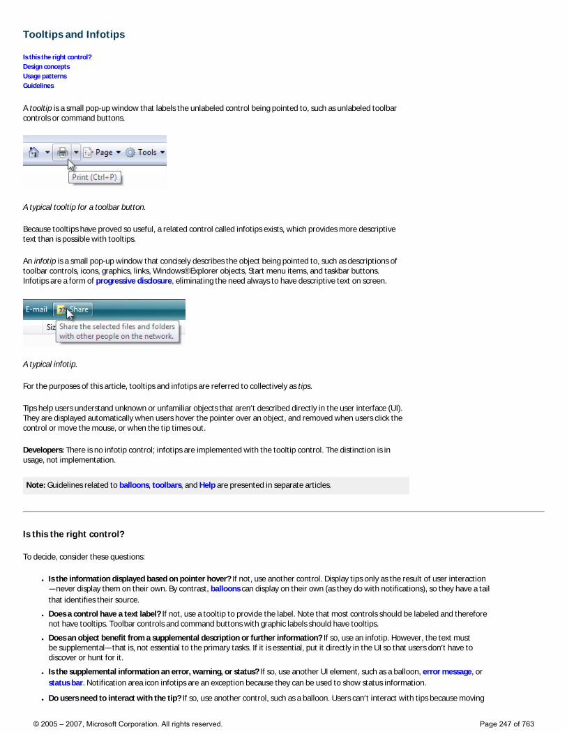
Tooltips and Infotips
Is this the right control? Design concepts Usage patterns Guidelines
A tooltip is a small pop-up window that labels the unlabeled control being pointed to, such as unlabeled toolbar controls or command buttons.
A typical tooltip for a toolbar button.
Because tooltips have proved so useful, a related control called infotips exists, which provides more descriptive text than is possible with tooltips.
An infotip is a small pop-up window that concisely describes the object being pointed to, such as descriptions of toolbar controls, icons, graphics, links, Windows® Explorer objects, Start menu items, and taskbar buttons. Infotips are a form of progressive disclosure, eliminating the need always to have descriptive text on screen.
A typical infotip.
For the purposes of this article, tooltips and infotips are referred to collectively as tips.
Tips help users understand unknown or unfamiliar objects that aren’t described directly in the user interface (UI). They are displayed automatically when users hover the pointer over an object, and removed when users click the control or move the mouse, or when the tip times out.
Developers: There is no infotip control; infotips are implemented with the tooltip control. The distinction is in usage, not implementation.
Note: Guidelines related to balloons, toolbars, and Help are presented in separate articles.
Is this the right control?
To decide, consider these questions:
● Is the information displayed based on pointer hover? If not, use another control. Display tips only as the result of user interaction—never display them on their own. By contrast, balloons can display on their own (as they do with notifications), so they have a tail that identifies their source.
● Does a control have a text label? If not, use a tooltip to provide the label. Note that most controls should be labeled and therefore not have tooltips. Toolbar controls and command buttons with graphic labels should have tooltips.
● Does an object benefit from a supplemental description or further information? If so, use an infotip. However, the text must be supplemental—that is, not essential to the primary tasks. If it is essential, put it directly in the UI so that users don’t have to discover or hunt for it.
● Is the supplemental information an error, warning, or status? If so, use another UI element, such as a balloon, error message, or status bar. Notification area icon infotips are an exception because they can be used to show status information.
● Do users need to interact with the tip? If so, use another control, such as a balloon. Users can’t interact with tips because moving
© 2005 – 2007, Microsoft Corporation. All rights reserved. Page 247 of 763
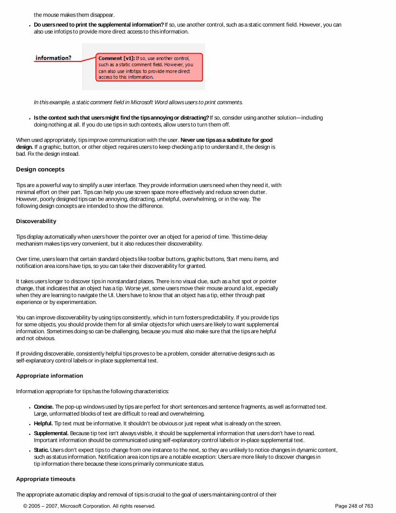
the mouse makes them disappear.
● Do users need to print the supplemental information? If so, use another control, such as a static comment field. However, you can also use infotips to provide more direct access to this information.
In this example, a static comment field in Microsoft Word allows users to print comments.
● Is the context such that users might find the tips annoying or distracting? If so, consider using another solution—including doing nothing at all. If you do use tips in such contexts, allow users to turn them off.
When used appropriately, tips improve communication with the user. Never use tips as a substitute for good design. If a graphic, button, or other object requires users to keep checking a tip to understand it, the design is bad. Fix the design instead.
Design concepts
Tips are a powerful way to simplify a user interface. They provide information users need when they need it, with minimal effort on their part. Tips can help you use screen space more effectively and reduce screen clutter. However, poorly designed tips can be annoying, distracting, unhelpful, overwhelming, or in the way. The following design concepts are intended to show the difference.
Discoverability
Tips display automatically when users hover the pointer over an object for a period of time. This time-delay mechanism makes tips very convenient, but it also reduces their discoverability.
Over time, users learn that certain standard objects like toolbar buttons, graphic buttons, Start menu items, and notification area icons have tips, so you can take their discoverability for granted.
It takes users longer to discover tips in nonstandard places. There is no visual clue, such as a hot spot or pointer change, that indicates that an object has a tip. Worse yet, some users move their mouse around a lot, especially when they are learning to navigate the UI. Users have to know that an object has a tip, either through past experience or by experimentation.
You can improve discoverability by using tips consistently, which in turn fosters predictability. If you provide tips for some objects, you should provide them for all similar objects for which users are likely to want supplemental information. Sometimes doing so can be challenging, because you must also make sure that the tips are helpful and not obvious.
If providing discoverable, consistently helpful tips proves to be a problem, consider alternative designs such as self-explanatory control labels or in-place supplemental text.
Appropriate information
Information appropriate for tips has the following characteristics:
● Concise. The pop-up windows used by tips are perfect for short sentences and sentence fragments, as well as formatted text. Large, unformatted blocks of text are difficult to read and overwhelming.
● Helpful. Tip text must be informative. It shouldn’t be obvious or just repeat what is already on the screen.
● Supplemental. Because tip text isn’t always visible, it should be supplemental information that users don’t have to read. Important information should be communicated using self-explanatory control labels or in-place supplemental text.
● Static. Users don’t expect tips to change from one instance to the next, so they are unlikely to notice changes in dynamic content, such as status information. Notification area icon tips are a notable exception: Users are more likely to discover changes in tip information there because these icons primarily communicate status.
Appropriate timeouts
The appropriate automatic display and removal of tips is crucial to the goal of users maintaining control of their
© 2005 – 2007, Microsoft Corporation. All rights reserved. Page 248 of 763
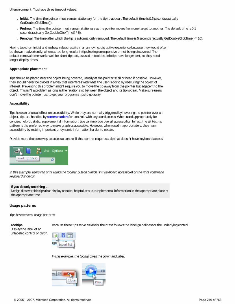
UI environment. Tips have three timeout values:
● Initial. The time the pointer must remain stationary for the tip to appear. The default time is 0.5 seconds (actually GetDoubleClickTime()).
● Reshow. The time the pointer must remain stationary as the pointer moves from one target to another. The default time is 0.1 seconds (actually GetDoubleClickTime() / 5).
● Removal. The time after which the tip is automatically removed. The default time is 5 seconds (actually GetDoubleClickTime() * 10).
Having too short initial and reshow values results in an annoying, disruptive experience because they would often be shown inadvertently, whereas too long results in tips feeling unresponsive or not being discovered. The default removal time works well for short tip text, as used in tooltips. Infotips have longer text, so they need longer display times.
Appropriate placement
Tips should be placed near the object being hovered, usually at the pointer’s tail or head if possible. However, they should never be placed in a way that interferes with what the user is doing by obscuring the object of interest. Preventing this problem might require you to move the tip away from the pointer but adjacent to the object. This isn’t a problem as long as the relationship between the object and its tip is clear. Make sure users don’t move the pointer just to get your program’s tips to go away.
Accessibility
Tips have an unusual effect on accessibility. While they are normally triggered by hovering the pointer over an object, tips are handled by screen readers for controls with keyboard access. When used appropriately for concise, helpful, static, supplemental information, tips can improve overall accessibility. In fact, the alt text tip pattern is the preferred way to make graphics accessible. However, when used inappropriately, they harm accessibility by making important or dynamic information harder to obtain.
Provide more than one way to access a control if that control requires a tip that doesn’t have keyboard access.
In this example, users can print using the toolbar button (which isn’t keyboard accessible) or the Print command keyboard shortcut.
If you do only one thing... Design discoverable tips that display concise, helpful, static, supplemental information in the appropriate place at the appropriate time.
Usage patterns
Tips have several usage patterns:
Tooltips Display the label of an unlabeled control or glyph.
Because these tips serve as labels, their text follows the label guidelines for the underlying control.
In this example, the tooltip gives the command label.
© 2005 – 2007, Microsoft Corporation. All rights reserved. Page 249 of 763
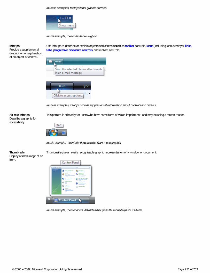
In these examples, tooltips label graphic buttons.
In this example, the tooltip labels a glyph.
Infotips Provide a supplemental description or explanation of an object or control.
Use infotips to describe or explain objects and controls such as toolbar controls, icons (including icon overlays), links, tabs, progressive disclosure controls, and custom controls.
In these examples, infotips provide supplemental information about controls and objects.
Alt text infotips Describe a graphic for accessibility.
This pattern is primarily for users who have some form of vision impairment, and may be using a screen reader.
In this example, the infotip describes the Start menu graphic.
Thumbnails Display a small image of an item.
Thumbnails give an easily recognizable graphic representation of a window or document.
In this example, the Windows Vista® taskbar gives thumbnail tips for its items.
© 2005 – 2007, Microsoft Corporation. All rights reserved. Page 250 of 763
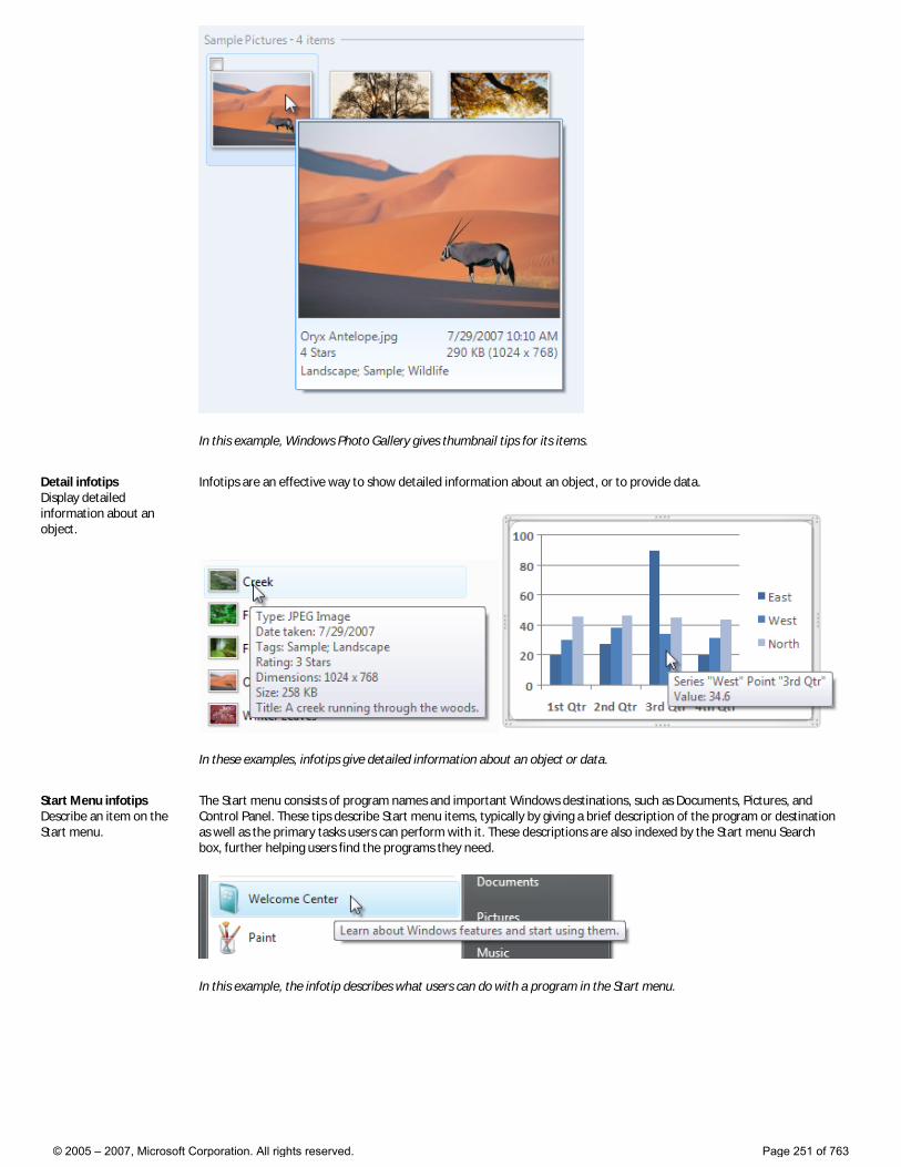
In this example, Windows Photo Gallery gives thumbnail tips for its items.
Detail infotips Display detailed information about an object.
Infotips are an effective way to show detailed information about an object, or to provide data.
In these examples, infotips give detailed information about an object or data.
Start Menu infotips Describe an item on the Start menu.
The Start menu consists of program names and important Windows destinations, such as Documents, Pictures, and Control Panel. These tips describe Start menu items, typically by giving a brief description of the program or destination as well as the primary tasks users can perform with it. These descriptions are also indexed by the Start menu Search box, further helping users find the programs they need.
In this example, the infotip describes what users can do with a program in the Start menu.
© 2005 – 2007, Microsoft Corporation. All rights reserved. Page 251 of 763
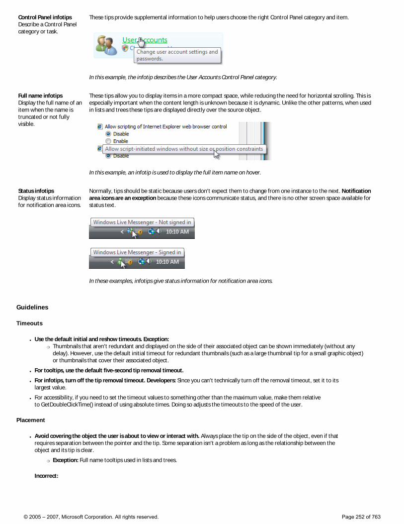
Control Panel infotips Describe a Control Panel category or task.
These tips provide supplemental information to help users choose the right Control Panel category and item.
In this example, the infotip describes the User Accounts Control Panel category.
Full name infotips Display the full name of an item when the name is truncated or not fully visible.
These tips allow you to display items in a more compact space, while reducing the need for horizontal scrolling. This is especially important when the content length is unknown because it is dynamic. Unlike the other patterns, when used in lists and trees these tips are displayed directly over the source object.
In this example, an infotip is used to display the full item name on hover.
Status infotips Display status information for notification area icons.
Normally, tips should be static because users don’t expect them to change from one instance to the next. Notification area icons are an exception because these icons communicate status, and there is no other screen space available for status text.
In these examples, infotips give status information for notification area icons.
Guidelines
Timeouts
● Use the default initial and reshow timeouts. Exception: �❍ Thumbnails that aren’t redundant and displayed on the side of their associated object can be shown immediately (without any
delay). However, use the default initial timeout for redundant thumbnails (such as a large thumbnail tip for a small graphic object) or thumbnails that cover their associated object.
● For tooltips, use the default five-second tip removal timeout.
● For infotips, turn off the tip removal timeout. Developers: Since you can’t technically turn off the removal timeout, set it to its largest value.
● For accessibility, if you need to set the timeout values to something other than the maximum value, make them relative to GetDoubleClickTime() instead of using absolute times. Doing so adjusts the timeouts to the speed of the user.
Placement
● Avoid covering the object the user is about to view or interact with. Always place the tip on the side of the object, even if that requires separation between the pointer and the tip. Some separation isn’t a problem as long as the relationship between the object and its tip is clear.
�❍ Exception: Full name tooltips used in lists and trees.
Incorrect:
© 2005 – 2007, Microsoft Corporation. All rights reserved. Page 252 of 763
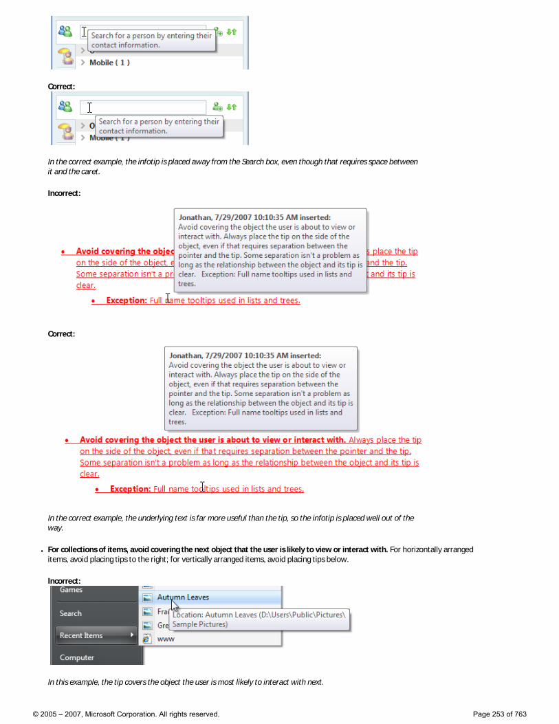
Correct:
In the correct example, the infotip is placed away from the Search box, even though that requires space between it and the caret.
Incorrect:
Correct:
In the correct example, the underlying text is far more useful than the tip, so the infotip is placed well out of the way.
● For collections of items, avoid covering the next object that the user is likely to view or interact with. For horizontally arranged items, avoid placing tips to the right; for vertically arranged items, avoid placing tips below.
Incorrect:
In this example, the tip covers the object the user is most likely to interact with next.
© 2005 – 2007, Microsoft Corporation. All rights reserved. Page 253 of 763
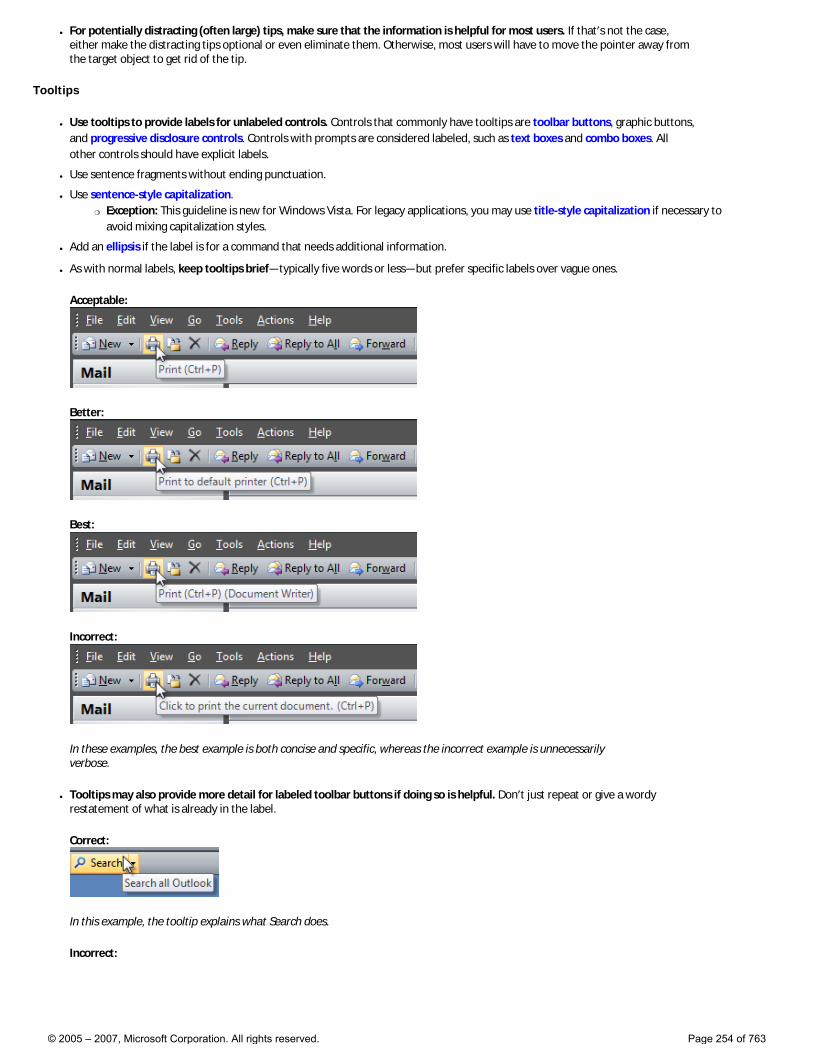
● For potentially distracting (often large) tips, make sure that the information is helpful for most users. If that’s not the case, either make the distracting tips optional or even eliminate them. Otherwise, most users will have to move the pointer away from the target object to get rid of the tip.
Tooltips
● Use tooltips to provide labels for unlabeled controls. Controls that commonly have tooltips are toolbar buttons, graphic buttons, and progressive disclosure controls. Controls with prompts are considered labeled, such as text boxes and combo boxes. All other controls should have explicit labels.
● Use sentence fragments without ending punctuation.
● Use sentence-style capitalization. �❍ Exception: This guideline is new for Windows Vista. For legacy applications, you may use title-style capitalization if necessary to
avoid mixing capitalization styles.
● Add an ellipsis if the label is for a command that needs additional information.
● As with normal labels, keep tooltips brief—typically five words or less—but prefer specific labels over vague ones.
Acceptable:
Better:
Best:
Incorrect:
In these examples, the best example is both concise and specific, whereas the incorrect example is unnecessarily verbose.
● Tooltips may also provide more detail for labeled toolbar buttons if doing so is helpful. Don’t just repeat or give a wordy restatement of what is already in the label.
Correct:
In this example, the tooltip explains what Search does.
Incorrect:
© 2005 – 2007, Microsoft Corporation. All rights reserved. Page 254 of 763
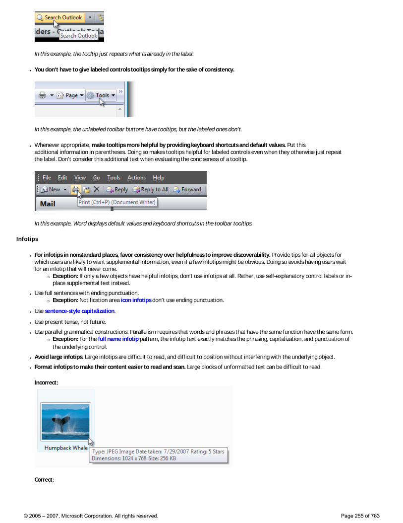
In this example, the tooltip just repeats what is already in the label.
● You don’t have to give labeled controls tooltips simply for the sake of consistency.
In this example, the unlabeled toolbar buttons have tooltips, but the labeled ones don’t.
● Whenever appropriate, make tooltips more helpful by providing keyboard shortcuts and default values. Put this additional information in parentheses. Doing so makes tooltips helpful for labeled controls even when they otherwise just repeat the label. Don’t consider this additional text when evaluating the conciseness of a tooltip.
In this example, Word displays default values and keyboard shortcuts in the toolbar tooltips.
Infotips
● For infotips in nonstandard places, favor consistency over helpfulness to improve discoverability. Provide tips for all objects for which users are likely to want supplemental information, even if a few infotips might be obvious. Doing so avoids having users wait for an infotip that will never come.
�❍ Exception: If only a few objects have helpful infotips, don’t use infotips at all. Rather, use self-explanatory control labels or in-place supplemental text instead.
● Use full sentences with ending punctuation. �❍ Exception: Notification area icon infotips don’t use ending punctuation.
● Use sentence-style capitalization.
● Use present tense, not future.
● Use parallel grammatical constructions. Parallelism requires that words and phrases that have the same function have the same form. �❍ Exception: For the full name infotip pattern, the infotip text exactly matches the phrasing, capitalization, and punctuation of
the underlying control.
● Avoid large infotips. Large infotips are difficult to read, and difficult to position without interfering with the underlying object.
● Format infotips to make their content easier to read and scan. Large blocks of unformatted text can be difficult to read.
Incorrect:
Correct:
© 2005 – 2007, Microsoft Corporation. All rights reserved. Page 255 of 763
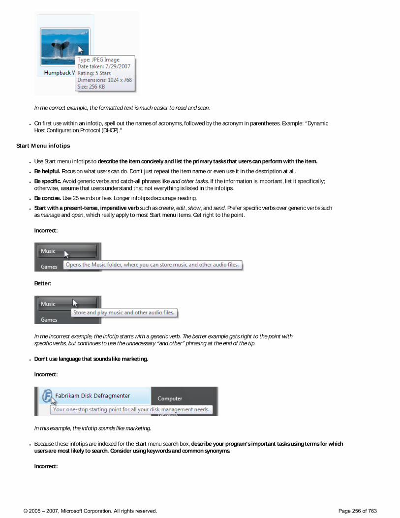
In the correct example, the formatted text is much easier to read and scan.
● On first use within an infotip, spell out the names of acronyms, followed by the acronym in parentheses. Example: “Dynamic Host Configuration Protocol (DHCP).”
Start Menu infotips
● Use Start menu infotips to describe the item concisely and list the primary tasks that users can perform with the item.
● Be helpful. Focus on what users can do. Don’t just repeat the item name or even use it in the description at all.
● Be specific. Avoid generic verbs and catch-all phrases like and other tasks. If the information is important, list it specifically; otherwise, assume that users understand that not everything is listed in the infotips.
● Be concise. Use 25 words or less. Longer infotips discourage reading.
● Start with a present-tense, imperative verb such as create, edit, show, and send. Prefer specific verbs over generic verbs such as manage and open, which really apply to most Start menu items. Get right to the point.
Incorrect:
Better:
In the incorrect example, the infotip starts with a generic verb. The better example gets right to the point with specific verbs, but continues to use the unnecessary “and other” phrasing at the end of the tip.
● Don’t use language that sounds like marketing.
Incorrect:
In this example, the infotip sounds like marketing.
● Because these infotips are indexed for the Start menu search box, describe your program’s important tasks using terms for which users are most likely to search. Consider using keywords and common synonyms.
Incorrect:
© 2005 – 2007, Microsoft Corporation. All rights reserved. Page 256 of 763
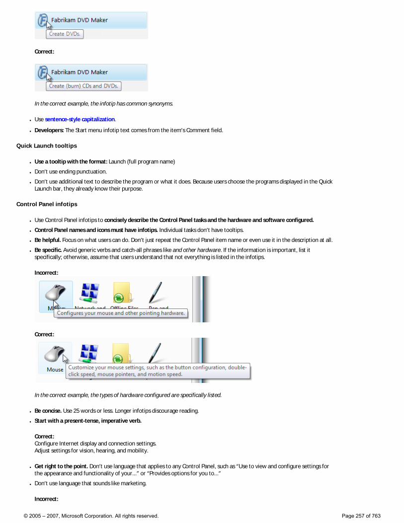
Correct:
In the correct example, the infotip has common synonyms.
● Use sentence-style capitalization.
● Developers: The Start menu infotip text comes from the item’s Comment field.
Quick Launch tooltips
● Use a tooltip with the format: Launch (full program name)
● Don’t use ending punctuation.
● Don’t use additional text to describe the program or what it does. Because users choose the programs displayed in the Quick Launch bar, they already know their purpose.
Control Panel infotips
● Use Control Panel infotips to concisely describe the Control Panel tasks and the hardware and software configured.
● Control Panel names and icons must have infotips. Individual tasks don’t have tooltips.
● Be helpful. Focus on what users can do. Don’t just repeat the Control Panel item name or even use it in the description at all.
● Be specific. Avoid generic verbs and catch-all phrases like and other hardware. If the information is important, list it specifically; otherwise, assume that users understand that not everything is listed in the infotips.
Incorrect:
Correct:
In the correct example, the types of hardware configured are specifically listed.
● Be concise. Use 25 words or less. Longer infotips discourage reading.
● Start with a present-tense, imperative verb.
Correct: Configure Internet display and connection settings. Adjust settings for vision, hearing, and mobility.
● Get right to the point. Don’t use language that applies to any Control Panel, such as “Use to view and configure settings for the appearance and functionality of your...” or “Provides options for you to...”
● Don’t use language that sounds like marketing.
Incorrect:
© 2005 – 2007, Microsoft Corporation. All rights reserved. Page 257 of 763
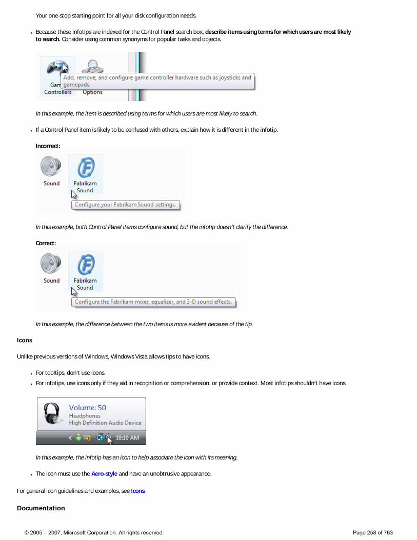
Your one-stop starting point for all your disk configuration needs.
● Because these infotips are indexed for the Control Panel search box, describe items using terms for which users are most likely to search. Consider using common synonyms for popular tasks and objects.
In this example, the item is described using terms for which users are most likely to search.
● If a Control Panel item is likely to be confused with others, explain how it is different in the infotip.
Incorrect:
In this example, both Control Panel items configure sound, but the infotip doesn’t clarify the difference.
Correct:
In this example, the difference between the two items is more evident because of the tip.
Icons
Unlike previous versions of Windows, Windows Vista allows tips to have icons.
● For tooltips, don’t use icons.
● For infotips, use icons only if they aid in recognition or comprehension, or provide context. Most infotips shouldn’t have icons.
In this example, the infotip has an icon to help associate the icon with its meaning.
● The icon must use the Aero-style and have an unobtrusive appearance.
For general icon guidelines and examples, see Icons.
Documentation
© 2005 – 2007, Microsoft Corporation. All rights reserved. Page 258 of 763
When referring to tips:
● In programming and other technical documentation, refer to the type of tip (tooltip or infotip). Everywhere else, simply call it a tip.
● The following variations are incorrect: tool tip, Tooltip, and ToolTip.
● To describe user interaction, use hover.
© 2005 – 2007, Microsoft Corporation. All rights reserved. Page 259 of 763
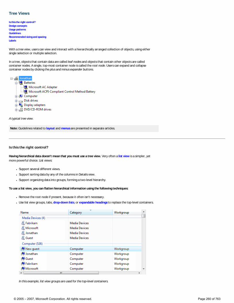
Tree Views
Is this the right control? Design concepts Usage patterns Guidelines Recommended sizing and spacing Labels
With a tree view, users can view and interact with a hierarchically arranged collection of objects, using either single selection or multiple selection.
In a tree, objects that contain data are called leaf nodes and objects that contain other objects are called container nodes. A single, top-most container node is called the root node. Users can expand and collapse container nodes by clicking the plus and minus expander buttons.
A typical tree view.
Note: Guidelines related to layout and menus are presented in separate articles.
Is this the right control?
Having hierarchical data doesn’t mean that you must use a tree view. Very often a list view is a simpler, yet more powerful choice. List views:
● Support several different views.
● Support sorting data by any of the columns in Details view.
● Support organizing data into groups, forming a two-level hierarchy.
To use a list view, you can flatten hierarchical information using the following techniques:
● Remove the root node if present, because it often isn’t necessary.
● Use list view groups, tabs, drop-down lists, or expandable headings to replace the top-level containers.
In this example, list view groups are used for the top-level containers.
© 2005 – 2007, Microsoft Corporation. All rights reserved. Page 260 of 763
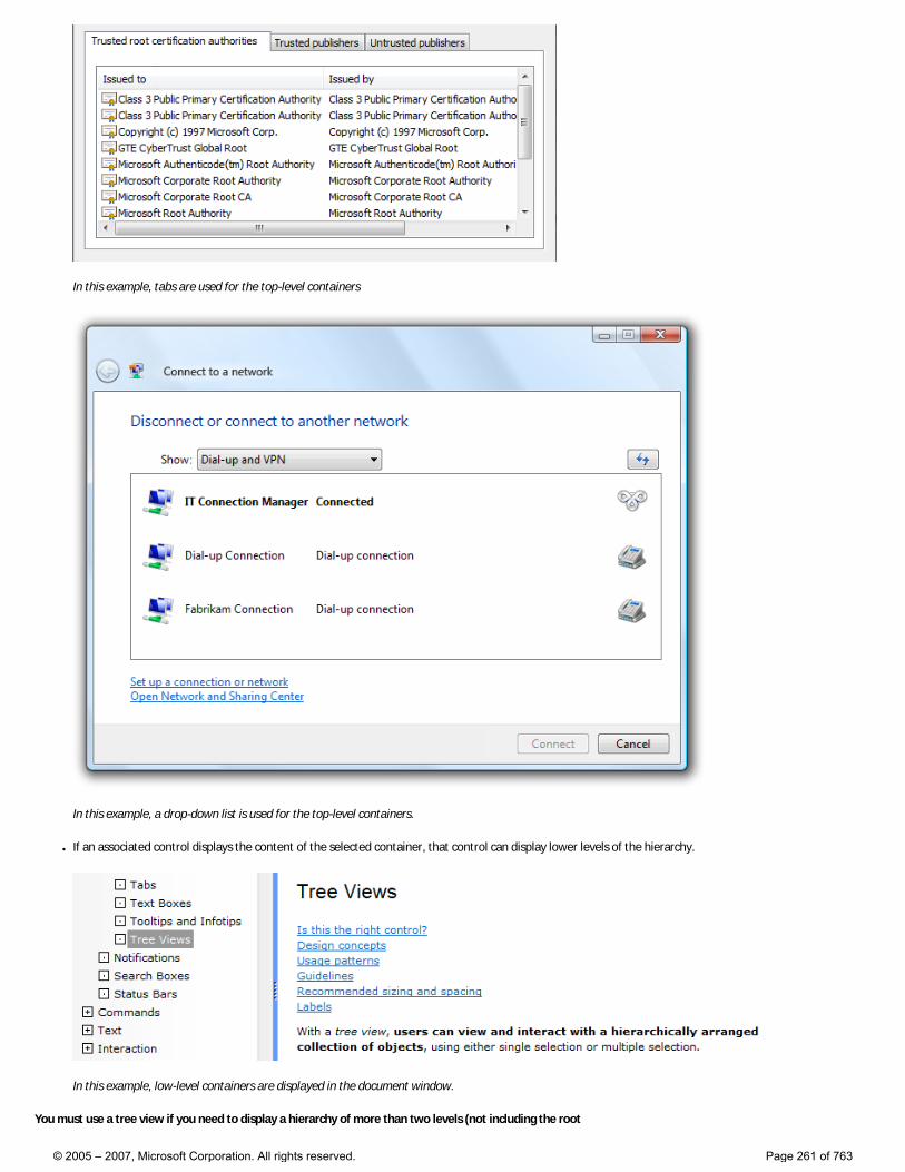
In this example, tabs are used for the top-level containers
In this example, a drop-down list is used for the top-level containers.
● If an associated control displays the content of the selected container, that control can display lower levels of the hierarchy.
In this example, low-level containers are displayed in the document window.
You must use a tree view if you need to display a hierarchy of more than two levels (not including the root
© 2005 – 2007, Microsoft Corporation. All rights reserved. Page 261 of 763
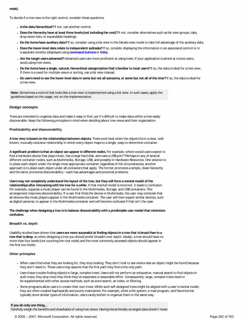
node).
To decide if a tree view is the right control, consider these questions:
● Is the data hierarchical? If not, use another control.
● Does the hierarchy have at least three levels (not including the root)? If not, consider alternatives such as list view groups, tabs, drop-down lists, or expandable headings.
● Do the items have auxiliary data? If so, consider using a list view in the Details view mode to take full advantage of the auxiliary data.
● Does the lower-level data relate to independent subtasks? If so, consider displaying the information in an associated control or in a separate window (displayed using command buttons or links).
● Are the target users advanced? Advanced users are more proficient at using trees. If your application is aimed at novice users, avoid using tree views.
● Do the items have a single, natural, hierarchical categorization that’s familiar to most users? If so, the data is ideal for a tree view. If there is a need for multiple views or sorting, use a list view instead.
● Do users need to see the lower-level data in some but not all scenarios, or some but not all of the time? If so, the data is ideal for a tree view.
Note: Sometimes a control that looks like a tree view is implemented using a list view. In such cases, apply the guidelines based on the usage, not on the implementation.
Design concepts
Trees are intended to organize data and make it easy to find, yet it’s difficult to make data within a tree easily discoverable. Keep the following principles in mind when deciding about tree views and their organization.
Predictability and discoverability
A tree view is based on the relationships between objects. Trees work best when the objects form a clear, well known, mutually exclusive relationship in which every object maps to a single, easy-to-determine container.
A significant problem is that an object can appear in different nodes. For example, where would users expect to find a hardware device that plays music, has a large hard disk, and uses a USB port? Perhaps in any of several different container nodes, such as Multimedia, Storage, USB, and possibly in Hardware Resources. One solution is to place each object under the single most appropriate container regardless of the circumstances; another approach is to place each object under all containers that apply. The former promotes a simple, clean hierarchy and the latter promotes discoverability—each has advantages and potential problems.
Users may not completely understand the layout of the tree, but they will form a mental model of the relationships after interacting with the tree for a while. If that mental model is incorrect, it leads to confusion. For example, suppose a music player can be found in the Multimedia, Storage, and USB containers. This arrangement improves discoverability. If a user first finds the device in Multimedia, the user may conclude that all devices like music players appear in the Multimedia container. The user will then expect similar devices, such as digital cameras, to appear in the Multimedia container and will become confused if that isn’t the case.
The challenge when designing a tree is to balance discoverability with a predictable user model that minimizes confusion.
Breadth vs. depth
Usability studies have shown that users are more successful at finding objects in a tree that is broad than in a tree that is deep, so when designing a tree you should prefer breadth over depth. Ideally, a tree should have no more than four levels (not counting the root node) and the most commonly accessed objects should appear in the first two levels.
Other principles
● When users find what they are looking for, they stop looking. They don’t look to see where else an object might be found because they don’t need to. Those users may assume that the first path they find is the only path.
● Users have trouble finding objects in large, complex trees. Users will not perform an exhaustive, manual search to find objects in such trees; they stop once they think they’ve expended a reasonable effort. Consequently, large, complex trees need to be supplemented with other access methods, such as word search, an index, or filtering.
● Some programs allow users to create their own trees. While such self-designed trees might be aligned with a user’s mental model, they are often created haphazardly and poorly maintained. For example, while a file system, e-mail program, and Favorites list typically store similar types of information, users rarely bother to organize them in the same way.
If you do only one thing... Carefully weigh the benefits and drawbacks of using tree views. Having hierarchically arranged data doesn’t mean
© 2005 – 2007, Microsoft Corporation. All rights reserved. Page 262 of 763
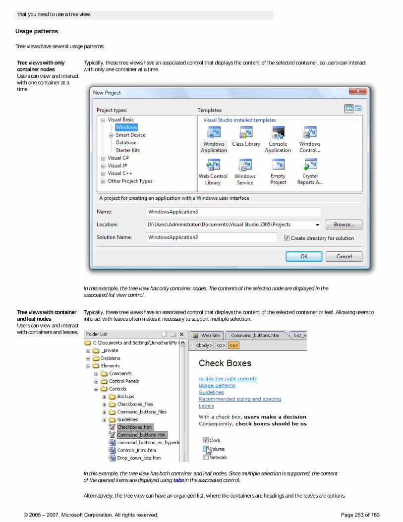
that you need to use a tree view.
Usage patterns
Tree views have several usage patterns:
Tree views with only container nodes Users can view and interact with one container at a time.
Typically, these tree views have an associated control that displays the content of the selected container, so users can interact with only one container at a time.
In this example, the tree view has only container nodes. The contents of the selected node are displayed in the associated list view control.
Tree views with container and leaf nodes Users can view and interact with containers and leaves.
Typically, these tree views have an associated control that displays the content of the selected container or leaf. Allowing users to interact with leaves often makes it necessary to support multiple selection.
In this example, the tree view has both container and leaf nodes. Since multiple selection is supported, the content of the opened items are displayed using tabs in the associated control.
Alternatively, the tree view can have an organized list, where the containers are headings and the leaves are options.
© 2005 – 2007, Microsoft Corporation. All rights reserved. Page 263 of 763
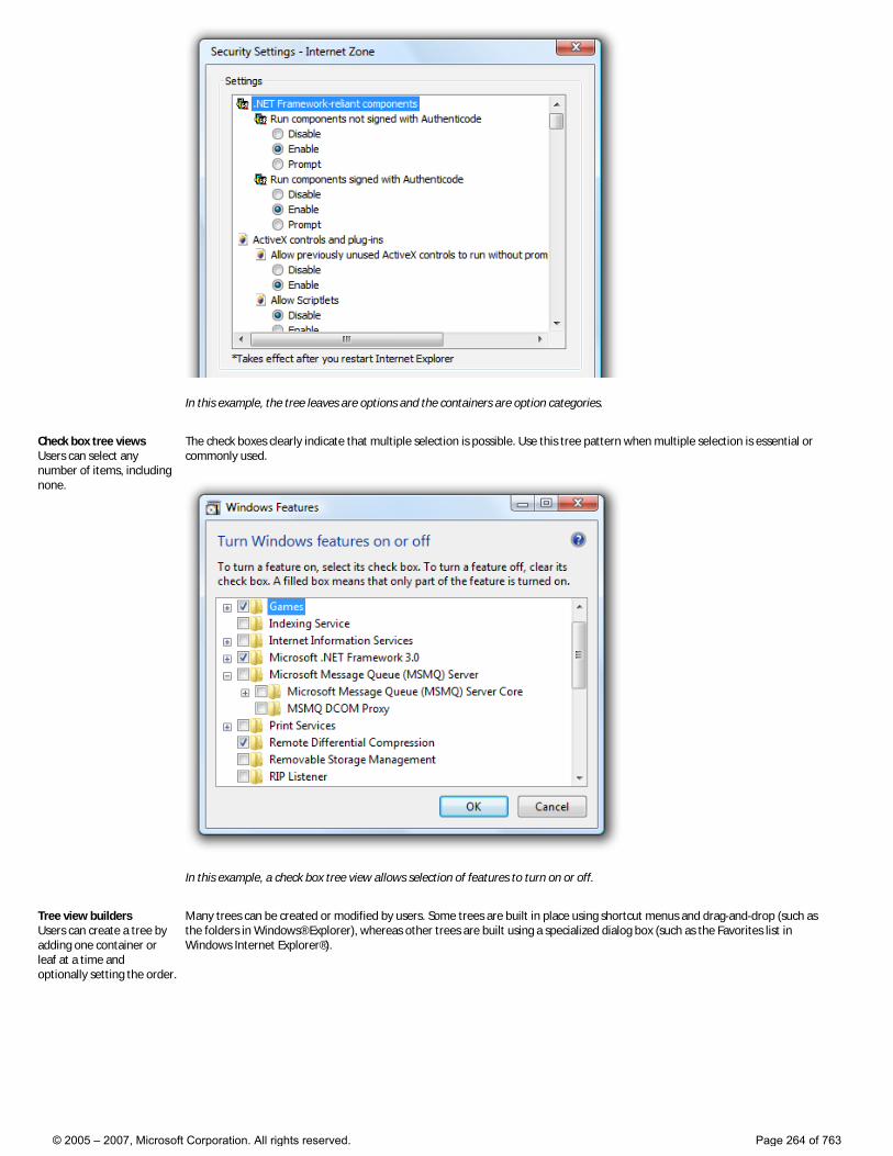
In this example, the tree leaves are options and the containers are option categories.
Check box tree views Users can select any number of items, including none.
The check boxes clearly indicate that multiple selection is possible. Use this tree pattern when multiple selection is essential or commonly used.
In this example, a check box tree view allows selection of features to turn on or off.
Tree view builders Users can create a tree by adding one container or leaf at a time and optionally setting the order.
Many trees can be created or modified by users. Some trees are built in place using shortcut menus and drag-and-drop (such as the folders in Windows® Explorer), whereas other trees are built using a specialized dialog box (such as the Favorites list in Windows Internet Explorer®).
© 2005 – 2007, Microsoft Corporation. All rights reserved. Page 264 of 763
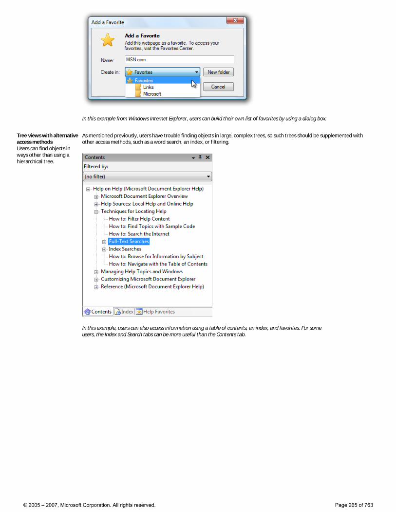
In this example from Windows Internet Explorer, users can build their own list of favorites by using a dialog box.
Tree views with alternative access methods Users can find objects in ways other than using a hierarchical tree.
As mentioned previously, users have trouble finding objects in large, complex trees, so such trees should be supplemented with other access methods, such as a word search, an index, or filtering.
In this example, users can also access information using a table of contents, an index, and favorites. For some users, the Index and Search tabs can be more useful than the Contents tab.
© 2005 – 2007, Microsoft Corporation. All rights reserved. Page 265 of 763
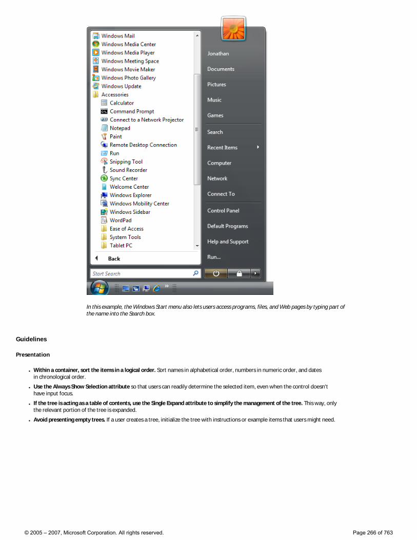
In this example, the Windows Start menu also lets users access programs, files, and Web pages by typing part of the name into the Search box.
Guidelines
Presentation
● Within a container, sort the items in a logical order. Sort names in alphabetical order, numbers in numeric order, and dates in chronological order.
● Use the Always Show Selection attribute so that users can readily determine the selected item, even when the control doesn’t have input focus.
● If the tree is acting as a table of contents, use the Single Expand attribute to simplify the management of the tree. This way, only the relevant portion of the tree is expanded.
● Avoid presenting empty trees. If a user creates a tree, initialize the tree with instructions or example items that users might need.
© 2005 – 2007, Microsoft Corporation. All rights reserved. Page 266 of 763

In this example, the list is initially presented with examples.
● Don’t make the container nodes collapsible if users have no reason to collapse them. Doing so adds unnecessary complexity.
● If load performance is a problem, display only the first and second level containers of the tree by default. You can then load additional data on demand when a user expands branches in the tree.
● If users expand or collapse a container, make that state persist so it takes effect the next time the tree view is displayed, unless users are likely to prefer starting in the default state. Persistence should be on a per-tree view, per-user basis.
● If high-level containers have similar contents, consider using visual clues to differentiate them.
Incorrect:
In this example, the Mailbox and Archive Folders have similar contents. Once the trees are further expanded, it is very difficult for users to know where they are in the tree, leading to confusion. Using slightly different icons in the different sections would address this problem.
● Reconsider connecting lines. Although these lines clearly show relationships between container and leaf nodes, they add visual clutter without aiding comprehension significantly. Specifically, they don’t help when nodes are close together, nor do they help when nodes are so far apart that scrolling is required.
Correct:
© 2005 – 2007, Microsoft Corporation. All rights reserved. Page 267 of 763
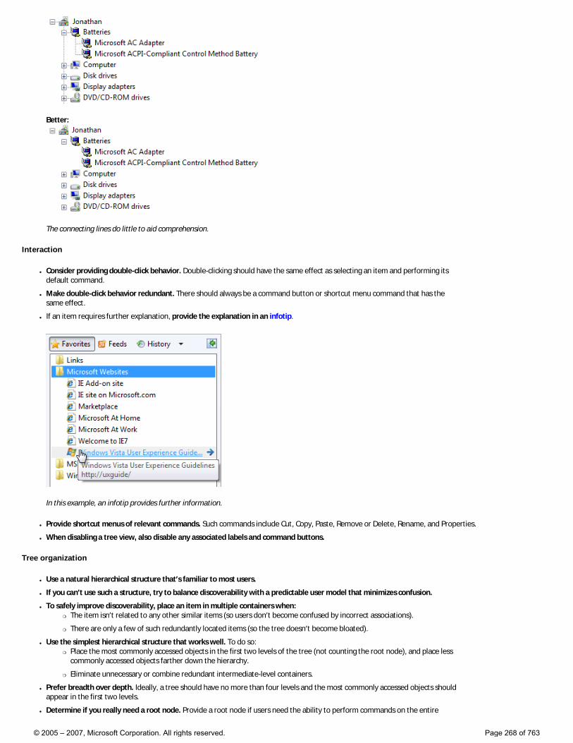
Better:
The connecting lines do little to aid comprehension.
Interaction
● Consider providing double-click behavior. Double-clicking should have the same effect as selecting an item and performing its default command.
● Make double-click behavior redundant. There should always be a command button or shortcut menu command that has the same effect.
● If an item requires further explanation, provide the explanation in an infotip.
In this example, an infotip provides further information.
● Provide shortcut menus of relevant commands. Such commands include Cut, Copy, Paste, Remove or Delete, Rename, and Properties.
● When disabling a tree view, also disable any associated labels and command buttons.
Tree organization
● Use a natural hierarchical structure that’s familiar to most users.
● If you can’t use such a structure, try to balance discoverability with a predictable user model that minimizes confusion.
● To safely improve discoverability, place an item in multiple containers when: �❍ The item isn’t related to any other similar items (so users don’t become confused by incorrect associations).
�❍ There are only a few of such redundantly located items (so the tree doesn’t become bloated).
● Use the simplest hierarchical structure that works well. To do so: �❍ Place the most commonly accessed objects in the first two levels of the tree (not counting the root node), and place less
commonly accessed objects farther down the hierarchy.
�❍ Eliminate unnecessary or combine redundant intermediate-level containers.
● Prefer breadth over depth. Ideally, a tree should have no more than four levels and the most commonly accessed objects should appear in the first two levels.
● Determine if you really need a root node. Provide a root node if users need the ability to perform commands on the entire
© 2005 – 2007, Microsoft Corporation. All rights reserved. Page 268 of 763
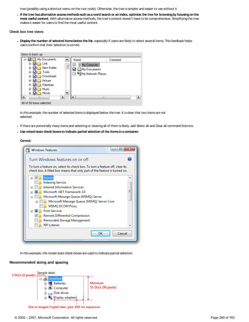
tree (possibly using a shortcut menu on the root node). Otherwise, the tree is simpler and easier to use without it.
● If the tree has alternative access methods such as a word search or an index, optimize the tree for browsing by focusing on the most useful content. With alternative access methods, the tree’s content doesn’t have to be comprehensive. Simplifying the tree makes it easier for users to find the most useful content.
Check box tree views
● Display the number of selected items below the list, especially if users are likely to select several items. This feedback helps users confirm that their selection is correct.
In this example, the number of selected items is displayed below the tree. It is clear that two items are not selected.
● If there are potentially many items and selecting or clearing all of them is likely, add Select all and Clear all command buttons.
● Use mixed-state check boxes to indicate partial selection of the items in a container.
Correct:
In this example, the mixed-state check boxes are used to indicate partial selection.
Recommended sizing and spacing
© 2005 – 2007, Microsoft Corporation. All rights reserved. Page 269 of 763

Recommended sizing and spacing for tree view controls.
● Choose a tree view width that avoids the need for horizontal scrolling for most items when the tree is fully expanded.
● Include an additional 30 percent to accommodate localization.
● Choose a tree view height that eliminates unnecessary vertical scrolling. Consider making a tree view slightly longer (or even more so if there is available space) if doing so reduces the need for a vertical scroll bar.
Incorrect:
In this example, making the tree view slightly wider and longer would eliminate the scroll bars in most cases. In this particular tree, only one container can be opened at a time.
● If users benefit from making the tree view larger, make the tree view and its parent window resizable. Doing so allows users to adjust the tree view size as needed.
Labels
Control labels
● All tree views need labels. Write the label as a word or phrase, not as a sentence, ending with a colon, and using static text.
● Assign a unique access key. For assignment guidelines, see Keyboard.
● Use sentence-style capitalization.
● Position the label above the control, and align the label with the left edge of the control.
● For multiple-selection tree views, write the label so that it’s clear that multiple selection is possible. Check box tree view labels can be less explicit.
Incorrect:
In this example, the label provides no information about multiple selection.
Better:
In this example, the label clearly indicates that multiple selection is possible.
© 2005 – 2007, Microsoft Corporation. All rights reserved. Page 270 of 763
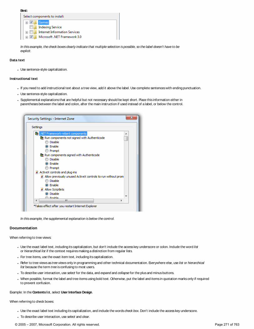
Best:
In this example, the check boxes clearly indicate that multiple selection is possible, so the label doesn’t have to be explicit.
Data text
● Use sentence-style capitalization.
Instructional text
● If you need to add instructional text about a tree view, add it above the label. Use complete sentences with ending punctuation.
● Use sentence-style capitalization.
● Supplemental explanations that are helpful but not necessary should be kept short. Place this information either in parentheses between the label and colon, after the main instruction if used instead of a label, or below the control.
In this example, the supplemental explanation is below the control.
Documentation
When referring to tree views:
● Use the exact label text, including its capitalization, but don’t include the access key underscore or colon. Include the word list or hierarchical list if the context requires making a distinction from regular lists.
● For tree items, use the exact item text, including its capitalization.
● Refer to tree views as tree views only in programming and other technical documentation. Everywhere else, use list or hierarchical list because the term tree is confusing to most users.
● To describe user interaction, use select for the data, and expand and collapse for the plus and minus buttons.
● When possible, format the label and tree items using bold text. Otherwise, put the label and items in quotation marks only if required to prevent confusion.
Example: In the Contents list, select User Interface Design.
When referring to check boxes:
● Use the exact label text including its capitalization, and include the words check box. Don’t include the access key underscore.
● To describe user interaction, use select and clear.
© 2005 – 2007, Microsoft Corporation. All rights reserved. Page 271 of 763
● When possible, format the label using bold text. Otherwise, put the label in quotation marks only if required to prevent confusion.
Example: In the Items to back up list, select the My Documents check box.
© 2005 – 2007, Microsoft Corporation. All rights reserved. Page 272 of 763
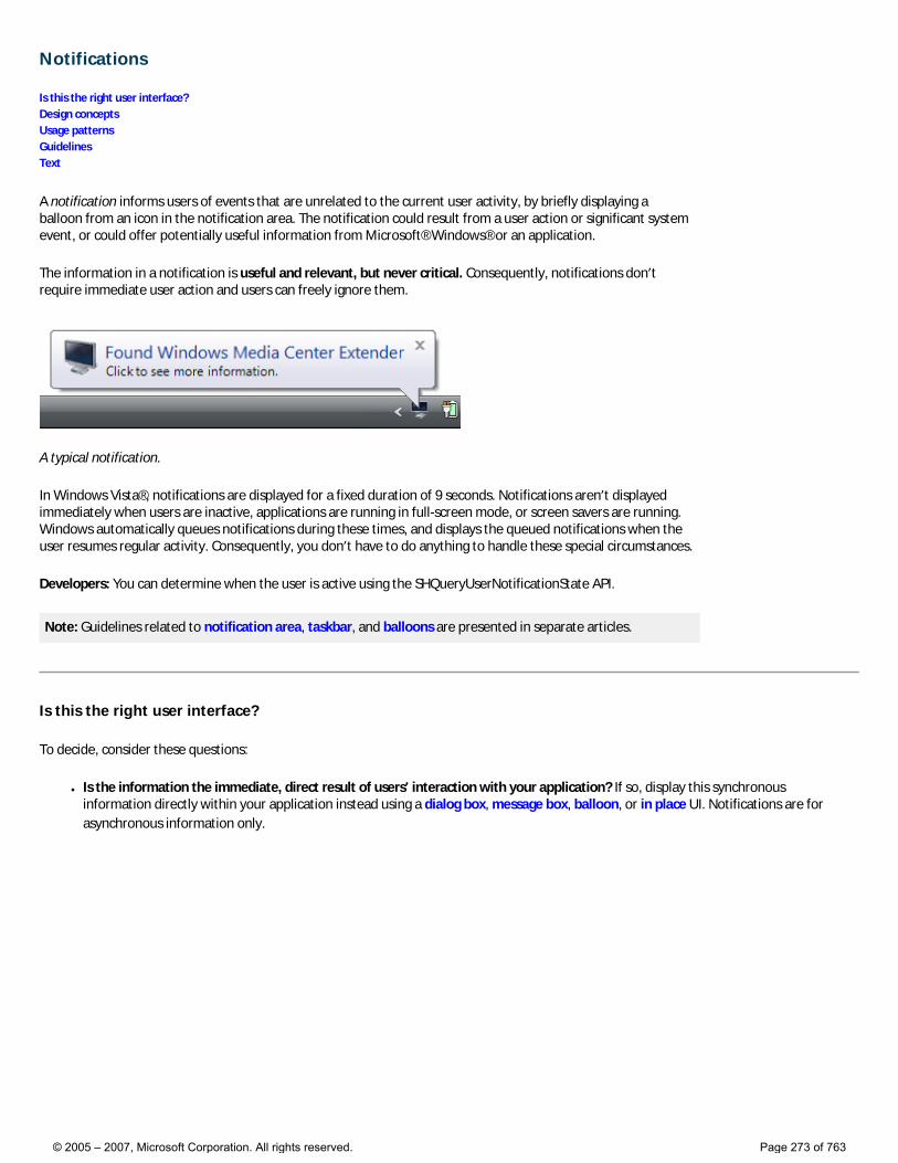
Notifications
Is this the right user interface? Design concepts Usage patterns Guidelines Text
A notification informs users of events that are unrelated to the current user activity, by briefly displaying a balloon from an icon in the notification area. The notification could result from a user action or significant system event, or could offer potentially useful information from Microsoft® Windows® or an application.
The information in a notification is useful and relevant, but never critical. Consequently, notifications don’t require immediate user action and users can freely ignore them.
A typical notification.
In Windows Vista®, notifications are displayed for a fixed duration of 9 seconds. Notifications aren’t displayed immediately when users are inactive, applications are running in full-screen mode, or screen savers are running. Windows automatically queues notifications during these times, and displays the queued notifications when the user resumes regular activity. Consequently, you don’t have to do anything to handle these special circumstances.
Developers: You can determine when the user is active using the SHQueryUserNotificationState API.
Note: Guidelines related to notification area, taskbar, and balloons are presented in separate articles.
Is this the right user interface?
To decide, consider these questions:
● Is the information the immediate, direct result of users’ interaction with your application? If so, display this synchronous information directly within your application instead using a dialog box, message box, balloon, or in place UI. Notifications are for asynchronous information only.
© 2005 – 2007, Microsoft Corporation. All rights reserved. Page 273 of 763
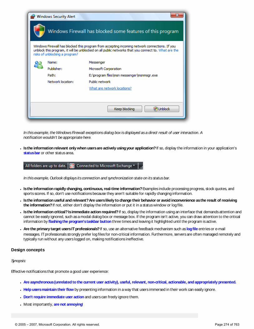
In this example, the Windows Firewall exceptions dialog box is displayed as a direct result of user interaction. A notification wouldn’t be appropriate here.
● Is the information relevant only when users are actively using your application? If so, display the information in your application’s status bar or other status area.
In this example, Outlook displays its connection and synchronization state on its status bar.
● Is the information rapidly changing, continuous, real-time information? Examples include processing progress, stock quotes, and sports scores. If so, don’t use notifications because they aren’t suitable for rapidly changing information.
● Is the information useful and relevant? Are users likely to change their behavior or avoid inconvenience as the result of receiving the information? If not, either don’t display the information or put it in a status window or log file.
● Is the information critical? Is immediate action required? If so, display the information using an interface that demands attention and cannot be easily ignored, such as a modal dialog box or message box. If the program isn’t active, you can draw attention to the critical information by flashing the program’s taskbar button three times and leaving it highlighted until the program is active.
● Are the primary target users IT professionals? If so, use an alternative feedback mechanism such as log file entries or e-mail messages. IT professionals strongly prefer log files for non-critical information. Furthermore, servers are often managed remotely and typically run without any users logged on, making notifications ineffective.
Design concepts
Synopsis:
Effective notifications that promote a good user experience:
● Are asynchronous (unrelated to the current user activity), useful, relevant, non-critical, actionable, and appropriately presented.
● Help users maintain their flow by presenting information in a way that users immersed in their work can easily ignore.
● Don’t require immediate user action and users can freely ignore them.
● Most importantly, are not annoying!
© 2005 – 2007, Microsoft Corporation. All rights reserved. Page 274 of 763
If you do only three things... 1. Use notifications only if you really need to. When you display a notification, you are potentially interrupting users or even annoying them. Make sure that interruption is justified. 2. Use notifications for non-critical events or situations that don’t require immediate user action. For critical events or situations that require immediate user action, use an alternative UI (such as a modal dialog box). 3. If you use notifications, make it a good user experience. Don’t try to force users to see your notifications. If users are so immersed in their work that they don’t see your notifications, your design is good.
For more information and examples, see Notification Design Concepts.
Usage patterns
Notifications have several usage patterns:
Action success Notifies users when an asynchronous, user initiated action completes successfully.
Correct:
In this example, Windows Update notifies users when their computer has been updated successfully.
Incorrect:
In this example, Microsoft Outlook® notifies users when a data file check is complete. What are users supposed to do now? And why warn users about successful completion?
Show when: Upon completion of an asynchronous task. Notify users of successful actions only if they are likely to be waiting for completion, or after recent failures. Show how: Use the real-time option so that these notifications aren’t queued when users are running a full-screen application or aren’t actively using their computer. Show how often: Once. Annoyance factor: Low if success isn’t expected due to recent failures, success is after a critical or highly unusual failure so user needs additional feedback, or user is waiting for completion; high if not. Alternatives: Give feedback “on demand” by displaying an icon (or changing an existing icon) in the notification area while the operation is being performed; remove the icon (or restore the previous icon) when the operation is complete.
© 2005 – 2007, Microsoft Corporation. All rights reserved. Page 275 of 763
Action failure Notifies users when an asynchronous, user initiated action fails.
Correct:
In this example, Windows activation notifies users of failure.
Incorrect:
In this example, Microsoft Outlook notifies users of a failure that they are unlikely to care about.
Show when: Upon failure of an asynchronous task. Show how often: Once. Annoyance factor: Low if useful and relevant; high if the problem will immediately resolve itself or users otherwise don’t care. Alternatives: Use a modal dialog box if users must address the failure immediately.
Non-critical system event Notifies users of significant system events or status that can be safely ignored, at least temporarily.
In this example, Windows informs users that it can’t connect to a wireless network.
In this example, Windows warns users of low battery power, but there is still plenty of time before they have take action.
Show when: When an event occurs and the user is active, or a condition continues to exist. If resulting from a problem, remove currently displayed notifications immediately once the problem is resolved. As with action notifications, notify users of successful system events only if users are likely to be waiting for the event, or after recent failures. Show how often: Once when the event first occurs. If resulting from a problem that users can solve, redisplay once every 10 minutes if users must resolve within an hour, once every hour if users must resolve within a day. Annoyance factor: Low, as long as the notification isn’t displayed too often. Alternatives: If users must eventually resolve a problem, use progressive escalation by ultimately displaying a
© 2005 – 2007, Microsoft Corporation. All rights reserved. Page 276 of 763
modal dialog box when resolution becomes mandatory.
Optional user task Notifies users of asynchronous tasks they should perform. Whether optional or required, the task can be safely postponed.
In this example, Windows Update is notifying users of a new security update.
Show when: When the need to perform a task is determined and the user is active. Show how often: For security-related tasks, once an hour. For all others, once a day for a maximum of three times. Annoyance factor: Low, as long as users consider the task important and the notification isn’t displayed too often. Alternatives: If users must eventually perform the task, use progressive escalation by ultimately displaying a modal dialog box when the task becomes mandatory.
FYI Notifies users of potentially useful, relevant information. You can notify users of information of marginal relevance if it is optional and users opt-in.
Correct:
In this example, users are notified when a new e-mail message is received.
Correct:
In this example, users are notified when contacts come online and they chose to receive this optional information.
Incorrect:
In this example, the information is useful only if the user already has high-speed USB ports installed. Otherwise, the user isn’t likely to do anything different as the result of it.
Show when: When the triggering event occurs. Show how: Use the real-time option so that these notifications aren’t queued when users are running a full-screen application or aren’t actively using their computer. Show how often: Once. Annoyance factor: Medium to high, depending upon users’ perception of usefulness and relevance. Not recommended if there is a low probability of user interest.
© 2005 – 2007, Microsoft Corporation. All rights reserved. Page 277 of 763
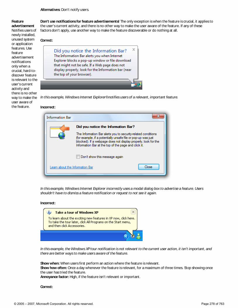
Alternatives: Don’t notify users.
Feature advertisement Notifies users of newly installed, unused system or application features. Use feature advertisement notifications only when a crucial, hard-to-discover feature is relevant to the user’s current activity and there is no other way to make the user aware of the feature.
Don’t use notifications for feature advertisements! The only exception is when the feature is crucial, it applies to the user’s current activity, and there is no other way to make the user aware of the feature. If any of these factors don’t apply, use another way to make the feature discoverable or do nothing at all.
Correct:
In this example, Windows Internet Explorer® notifies users of a relevant, important feature.
Incorrect:
In this example, Windows Internet Explorer incorrectly uses a modal dialog box to advertise a feature. Users shouldn’t have to dismiss a feature notification or request to not see it again.
Incorrect:
In this example, the Windows XP tour notification is not relevant to the current user action, it isn’t important, and there are better ways to make users aware of the feature.
Show when: When users first perform an action where the feature is relevant. Show how often: Once a day whenever the feature is relevant, for a maximum of three times. Stop showing once the user has tried the feature. Annoyance factor: High, if the feature isn’t relevant or important.
Correct:
© 2005 – 2007, Microsoft Corporation. All rights reserved. Page 278 of 763
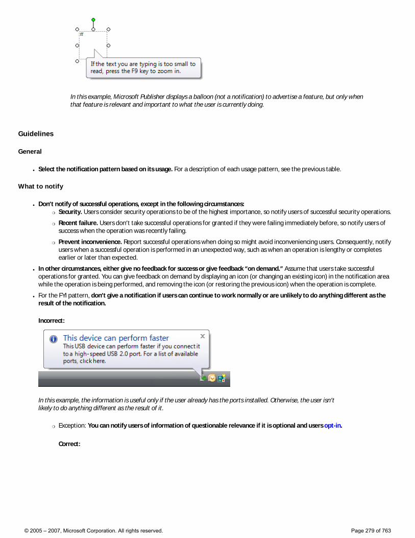
In this example, Microsoft Publisher displays a balloon (not a notification) to advertise a feature, but only when that feature is relevant and important to what the user is currently doing.
Guidelines
General
● Select the notification pattern based on its usage. For a description of each usage pattern, see the previous table.
What to notify
● Don’t notify of successful operations, except in the following circumstances: �❍ Security. Users consider security operations to be of the highest importance, so notify users of successful security operations.
�❍ Recent failure. Users don’t take successful operations for granted if they were failing immediately before, so notify users of success when the operation was recently failing.
�❍ Prevent inconvenience. Report successful operations when doing so might avoid inconveniencing users. Consequently, notify users when a successful operation is performed in an unexpected way, such as when an operation is lengthy or completes earlier or later than expected.
● In other circumstances, either give no feedback for success or give feedback “on demand.” Assume that users take successful operations for granted. You can give feedback on demand by displaying an icon (or changing an existing icon) in the notification area while the operation is being performed, and removing the icon (or restoring the previous icon) when the operation is complete.
● For the FYI pattern, don’t give a notification if users can continue to work normally or are unlikely to do anything different as the result of the notification.
Incorrect:
In this example, the information is useful only if the user already has the ports installed. Otherwise, the user isn’t likely to do anything different as the result of it.
�❍ Exception: You can notify users of information of questionable relevance if it is optional and users opt-in.
Correct:
© 2005 – 2007, Microsoft Corporation. All rights reserved. Page 279 of 763
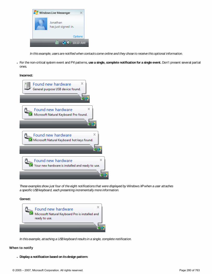
In this example, users are notified when contacts come online and they chose to receive this optional information.
● For the non-critical system event and FYI patterns, use a single, complete notification for a single event. Don’t present several partial ones.
Incorrect:
These examples show just four of the eight notifications that were displayed by Windows XP when a user attaches a specific USB keyboard, each presenting incrementally more information.
Correct:
In this example, attaching a USB keyboard results in a single, complete notification.
When to notify
● Display a notification based on its design pattern:
© 2005 – 2007, Microsoft Corporation. All rights reserved. Page 280 of 763
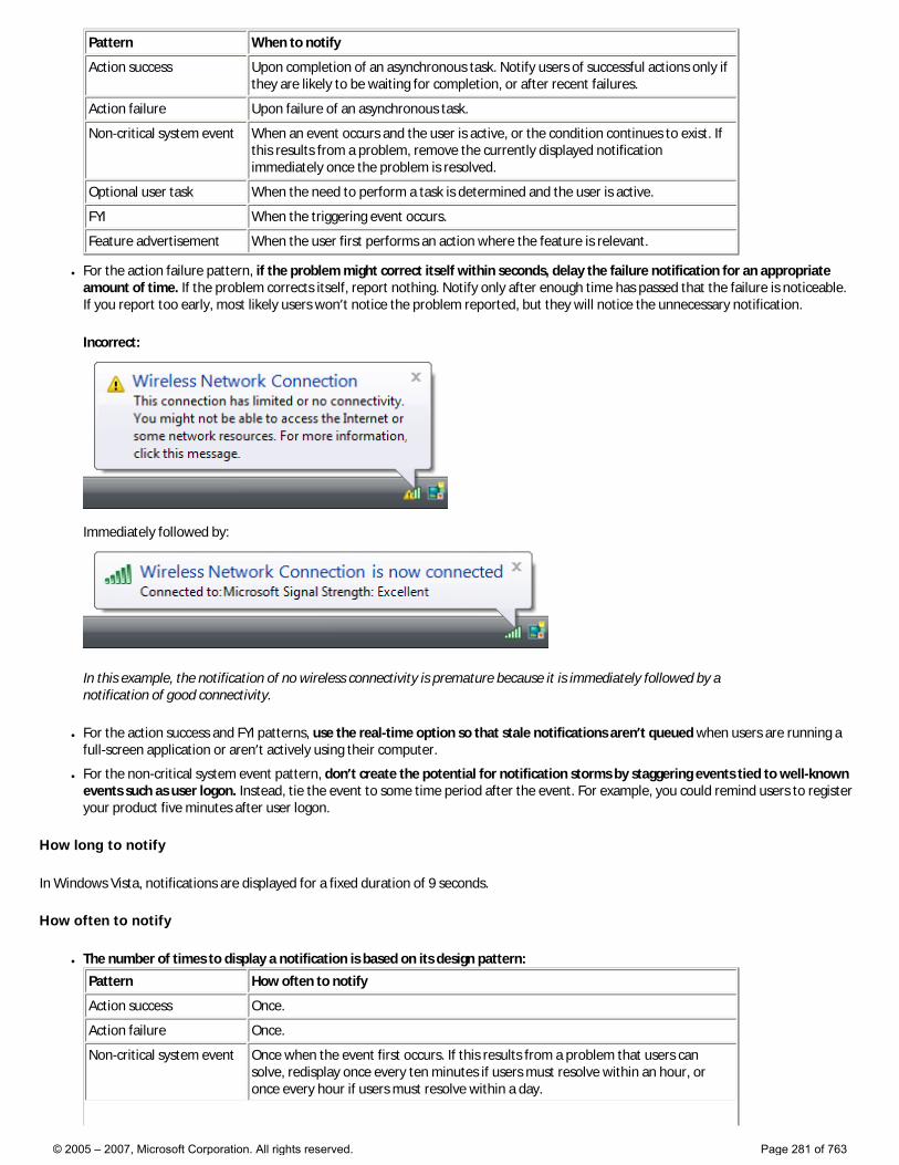
Pattern When to notify
Action success Upon completion of an asynchronous task. Notify users of successful actions only if they are likely to be waiting for completion, or after recent failures.
Action failure Upon failure of an asynchronous task.
Non-critical system event When an event occurs and the user is active, or the condition continues to exist. If this results from a problem, remove the currently displayed notification immediately once the problem is resolved.
Optional user task When the need to perform a task is determined and the user is active.
FYI When the triggering event occurs.
Feature advertisement When the user first performs an action where the feature is relevant.
● For the action failure pattern, if the problem might correct itself within seconds, delay the failure notification for an appropriate amount of time. If the problem corrects itself, report nothing. Notify only after enough time has passed that the failure is noticeable. If you report too early, most likely users won’t notice the problem reported, but they will notice the unnecessary notification.
Incorrect:
Immediately followed by:
In this example, the notification of no wireless connectivity is premature because it is immediately followed by a notification of good connectivity.
● For the action success and FYI patterns, use the real-time option so that stale notifications aren’t queued when users are running a full-screen application or aren’t actively using their computer.
● For the non-critical system event pattern, don’t create the potential for notification storms by staggering events tied to well-known events such as user logon. Instead, tie the event to some time period after the event. For example, you could remind users to register your product five minutes after user logon.
How long to notify
In Windows Vista, notifications are displayed for a fixed duration of 9 seconds.
How often to notify
● The number of times to display a notification is based on its design pattern:
Pattern How often to notify
Action success Once.
Action failure Once.
Non-critical system event Once when the event first occurs. If this results from a problem that users can solve, redisplay once every ten minutes if users must resolve within an hour, or once every hour if users must resolve within a day.
© 2005 – 2007, Microsoft Corporation. All rights reserved. Page 281 of 763
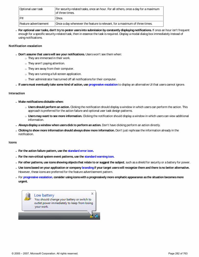
Optional user task For security-related tasks, once an hour. For all others, once a day for a maximum of three times.
FYI Once.
Feature advertisement Once a day whenever the feature is relevant, for a maximum of three times.
● For optional user tasks, don’t try to pester users into submission by constantly displaying notifications. If once an hour isn’t frequent enough for a specific security-related task, then in essence the task is required. Display a modal dialog box immediately instead of using notifications.
Notification escalation
● Don’t assume that users will see your notifications. Users won’t see them when: �❍ They are immersed in their work.
�❍ They aren’t paying attention.
�❍ They are away from their computer.
�❍ They are running a full-screen application.
�❍ Their administrator has turned off all notifications for their computer.
● If users must eventually take some kind of action, use progressive escalation to display an alternative UI that users cannot ignore.
Interaction
● Make notifications clickable when:
�❍ Users should perform an action. Clicking the notification should display a window in which users can perform the action. This approach is preferred for the action failure and optional user task design patterns.
�❍ Users may want to see more information. Clicking the notification should display a window in which users can view additional information.
● Always display a window when users click to perform an action. Don’t have clicking perform an action directly.
● Clicking to show more information should always show more information. Don’t just rephrase the information already in the notification.
Icons
● For the action failure pattern, use the standard error icon.
● For the non-critical system event patterns, use the standard warning icon.
● For other patterns, use icons showing objects that relate to or suggest the subject, such as a shield for security or a battery for power.
● Use icons based on your application or company branding if your target users will recognize them and there is no better alternative. However, these icons are preferred for the feature advertisement pattern.
● For progressive escalation, consider using icons with a progressively more emphatic appearance as the situation becomes more urgent.
© 2005 – 2007, Microsoft Corporation. All rights reserved. Page 282 of 763
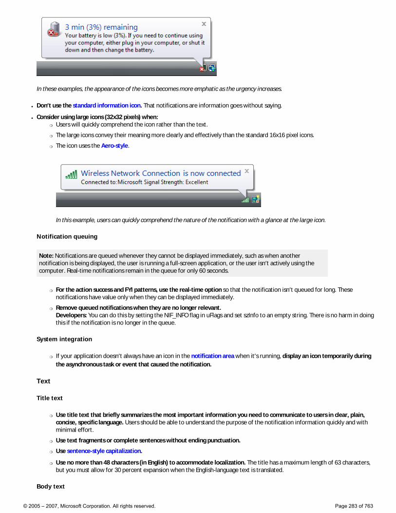
In these examples, the appearance of the icons becomes more emphatic as the urgency increases.
● Don’t use the standard information icon. That notifications are information goes without saying.
● Consider using large icons (32x32 pixels) when: �❍ Users will quickly comprehend the icon rather than the text.
�❍ The large icons convey their meaning more clearly and effectively than the standard 16x16 pixel icons.
�❍ The icon uses the Aero-style.
In this example, users can quickly comprehend the nature of the notification with a glance at the large icon.
Notification queuing
Note: Notifications are queued whenever they cannot be displayed immediately, such as when another notification is being displayed, the user is running a full-screen application, or the user isn’t actively using the computer. Real-time notifications remain in the queue for only 60 seconds.
�❍ For the action success and FYI patterns, use the real-time option so that the notification isn’t queued for long. These notifications have value only when they can be displayed immediately.
�❍ Remove queued notifications when they are no longer relevant. Developers: You can do this by setting the NIF_INFO flag in uFlags and set szInfo to an empty string. There is no harm in doing this if the notification is no longer in the queue.
System integration
�❍ If your application doesn’t always have an icon in the notification area when it’s running, display an icon temporarily during the asynchronous task or event that caused the notification.
Text
Title text
�❍ Use title text that briefly summarizes the most important information you need to communicate to users in clear, plain, concise, specific language. Users should be able to understand the purpose of the notification information quickly and with minimal effort.
�❍ Use text fragments or complete sentences without ending punctuation.
�❍ Use sentence-style capitalization.
�❍ Use no more than 48 characters (in English) to accommodate localization. The title has a maximum length of 63 characters, but you must allow for 30 percent expansion when the English-language text is translated.
Body text
© 2005 – 2007, Microsoft Corporation. All rights reserved. Page 283 of 763
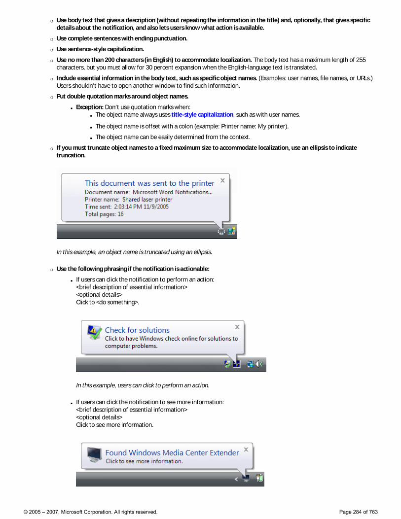
�❍ Use body text that gives a description (without repeating the information in the title) and, optionally, that gives specific details about the notification, and also lets users know what action is available.
�❍ Use complete sentences with ending punctuation.
�❍ Use sentence-style capitalization.
�❍ Use no more than 200 characters (in English) to accommodate localization. The body text has a maximum length of 255 characters, but you must allow for 30 percent expansion when the English-language text is translated.
�❍ Include essential information in the body text, such as specific object names. (Examples: user names, file names, or URLs.) Users shouldn’t have to open another window to find such information.
�❍ Put double quotation marks around object names.
■ Exception: Don’t use quotation marks when: ■ The object name always uses title-style capitalization, such as with user names.
■ The object name is offset with a colon (example: Printer name: My printer).
■ The object name can be easily determined from the context.
�❍ If you must truncate object names to a fixed maximum size to accommodate localization, use an ellipsis to indicate truncation.
In this example, an object name is truncated using an ellipsis.
�❍ Use the following phrasing if the notification is actionable:
■ If users can click the notification to perform an action: <brief description of essential information> <optional details> Click to <do something>.
In this example, users can click to perform an action.
■ If users can click the notification to see more information: <brief description of essential information> <optional details> Click to see more information.
© 2005 – 2007, Microsoft Corporation. All rights reserved. Page 284 of 763
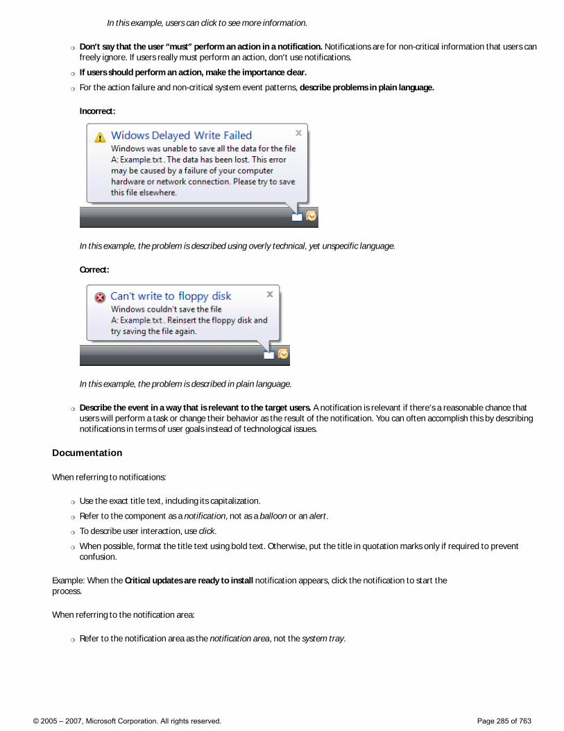
In this example, users can click to see more information.
�❍ Don’t say that the user “must” perform an action in a notification. Notifications are for non-critical information that users can freely ignore. If users really must perform an action, don’t use notifications.
�❍ If users should perform an action, make the importance clear.
�❍ For the action failure and non-critical system event patterns, describe problems in plain language.
Incorrect:
In this example, the problem is described using overly technical, yet unspecific language.
Correct:
In this example, the problem is described in plain language.
�❍ Describe the event in a way that is relevant to the target users. A notification is relevant if there’s a reasonable chance that users will perform a task or change their behavior as the result of the notification. You can often accomplish this by describing notifications in terms of user goals instead of technological issues.
Documentation
When referring to notifications:
�❍ Use the exact title text, including its capitalization.
�❍ Refer to the component as a notification, not as a balloon or an alert.
�❍ To describe user interaction, use click.
�❍ When possible, format the title text using bold text. Otherwise, put the title in quotation marks only if required to prevent confusion.
Example: When the Critical updates are ready to install notification appears, click the notification to start the process.
When referring to the notification area:
�❍ Refer to the notification area as the notification area, not the system tray.
© 2005 – 2007, Microsoft Corporation. All rights reserved. Page 285 of 763
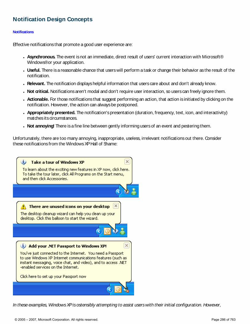
Notification Design Concepts
Notifications
Effective notifications that promote a good user experience are:
● Asynchronous. The event is not an immediate, direct result of users’ current interaction with Microsoft® Windows® or your application.
● Useful. There is a reasonable chance that users will perform a task or change their behavior as the result of the notification.
● Relevant. The notification displays helpful information that users care about and don’t already know.
● Not critical. Notifications aren’t modal and don’t require user interaction, so users can freely ignore them.
● Actionable. For those notifications that suggest performing an action, that action is initiated by clicking on the notification. However, the action can always be postponed.
● Appropriately presented. The notification’s presentation (duration, frequency, text, icon, and interactivity) matches its circumstances.
● Not annoying! There is a fine line between gently informing users of an event and pestering them.
Unfortunately, there are too many annoying, inappropriate, useless, irrelevant notifications out there. Consider these notifications from the Windows XP Hall of Shame:
In these examples, Windows XP is ostensibly attempting to assist users with their initial configuration. However,
© 2005 – 2007, Microsoft Corporation. All rights reserved. Page 286 of 763
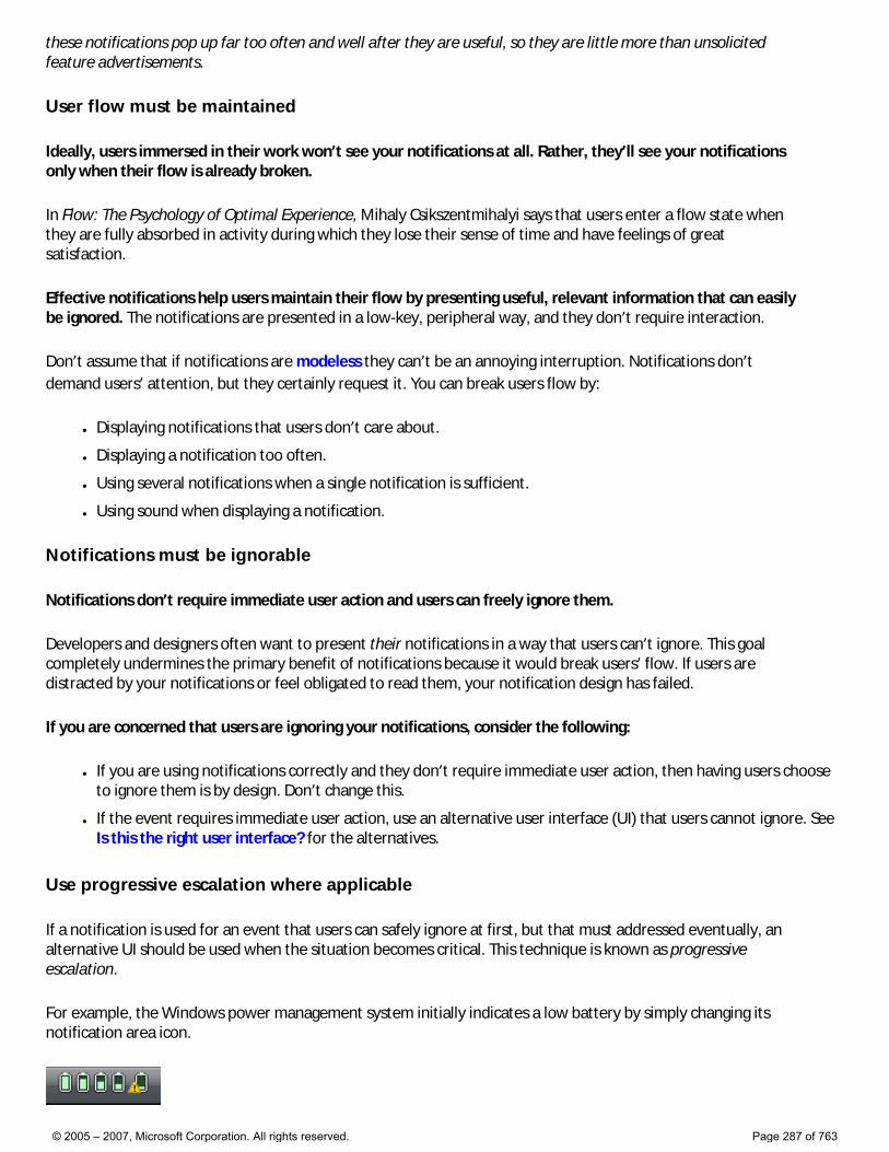
these notifications pop up far too often and well after they are useful, so they are little more than unsolicited feature advertisements.
User flow must be maintained
Ideally, users immersed in their work won’t see your notifications at all. Rather, they’ll see your notifications only when their flow is already broken.
In Flow: The Psychology of Optimal Experience, Mihaly Csikszentmihalyi says that users enter a flow state when they are fully absorbed in activity during which they lose their sense of time and have feelings of great satisfaction.
Effective notifications help users maintain their flow by presenting useful, relevant information that can easily be ignored. The notifications are presented in a low-key, peripheral way, and they don’t require interaction.
Don’t assume that if notifications are modeless they can’t be an annoying interruption. Notifications don’t demand users’ attention, but they certainly request it. You can break users flow by:
● Displaying notifications that users don’t care about.
● Displaying a notification too often.
● Using several notifications when a single notification is sufficient.
● Using sound when displaying a notification.
Notifications must be ignorable
Notifications don’t require immediate user action and users can freely ignore them.
Developers and designers often want to present their notifications in a way that users can’t ignore. This goal completely undermines the primary benefit of notifications because it would break users’ flow. If users are distracted by your notifications or feel obligated to read them, your notification design has failed.
If you are concerned that users are ignoring your notifications, consider the following:
● If you are using notifications correctly and they don’t require immediate user action, then having users choose to ignore them is by design. Don’t change this.
● If the event requires immediate user action, use an alternative user interface (UI) that users cannot ignore. See Is this the right user interface? for the alternatives.
Use progressive escalation where applicable
If a notification is used for an event that users can safely ignore at first, but that must addressed eventually, an alternative UI should be used when the situation becomes critical. This technique is known as progressive escalation.
For example, the Windows power management system initially indicates a low battery by simply changing its notification area icon.
© 2005 – 2007, Microsoft Corporation. All rights reserved. Page 287 of 763
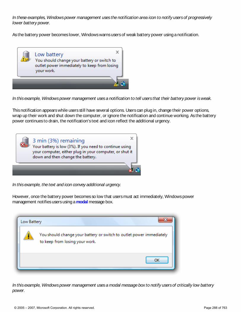
In these examples, Windows power management uses the notification area icon to notify users of progressively lower battery power.
As the battery power becomes lower, Windows warns users of weak battery power using a notification.
In this example, Windows power management uses a notification to tell users that their battery power is weak.
This notification appears while users still have several options. Users can plug in, change their power options, wrap up their work and shut down the computer, or ignore the notification and continue working. As the battery power continues to drain, the notification’s text and icon reflect the additional urgency.
In this example, the text and icon convey additional urgency.
However, once the battery power becomes so low that users must act immediately, Windows power management notifies users using a modal message box.
In this example, Windows power management uses a modal message box to notify users of critically low battery power.
© 2005 – 2007, Microsoft Corporation. All rights reserved. Page 288 of 763
If you do only three things... 1. Use notifications only if you really need to. When you display a notification, you are potentially interrupting users or even annoying them. Make sure that interruption is justified. 2. Use notifications for non-critical events or situations that don’t require immediate user action. For critical events or situations that require immediate user action, use an alternative UI (such as a modal dialog box). 3. If you use notifications, make it a good user experience. Don’t try to force users to see your notifications. If users are so immersed in their work that they don’t see your notifications, your design is good.
© 2005 – 2007, Microsoft Corporation. All rights reserved. Page 289 of 763
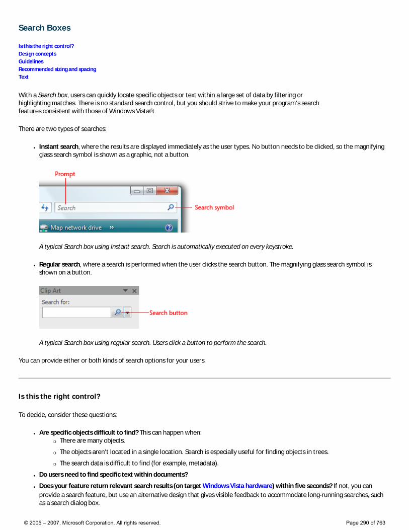
Search Boxes
Is this the right control? Design concepts Guidelines Recommended sizing and spacing Text
With a Search box, users can quickly locate specific objects or text within a large set of data by filtering or highlighting matches. There is no standard search control, but you should strive to make your program’s search features consistent with those of Windows Vista®.
There are two types of searches:
● Instant search, where the results are displayed immediately as the user types. No button needs to be clicked, so the magnifying glass search symbol is shown as a graphic, not a button.
A typical Search box using Instant search. Search is automatically executed on every keystroke.
● Regular search, where a search is performed when the user clicks the search button. The magnifying glass search symbol is shown on a button.
A typical Search box using regular search. Users click a button to perform the search.
You can provide either or both kinds of search options for your users.
Is this the right control?
To decide, consider these questions:
● Are specific objects difficult to find? This can happen when: �❍ There are many objects.
�❍ The objects aren’t located in a single location. Search is especially useful for finding objects in trees.
�❍ The search data is difficult to find (for example, metadata).
● Do users need to find specific text within documents?
● Does your feature return relevant search results (on target Windows Vista hardware) within five seconds? If not, you can provide a search feature, but use an alternative design that gives visible feedback to accommodate long-running searches, such as a search dialog box.
© 2005 – 2007, Microsoft Corporation. All rights reserved. Page 290 of 763
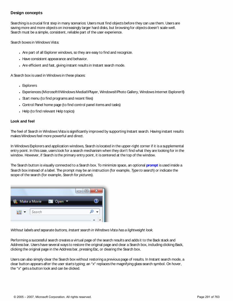
Design concepts
Searching is a crucial first step in many scenarios: Users must find objects before they can use them. Users are saving more and more objects on increasingly larger hard disks, but browsing for objects doesn’t scale well. Search must be a simple, consistent, reliable part of the user experience.
Search boxes in Windows Vista:
● Are part of all Explorer windows, so they are easy to find and recognize.
● Have consistent appearance and behavior.
● Are efficient and fast, giving instant results in Instant search mode.
A Search box is used in Windows in these places:
● Explorers
● Experiences (Microsoft® Windows Media® Player, Windows® Photo Gallery, Windows Internet Explorer®)
● Start menu (to find programs and recent files)
● Control Panel home page (to find control panel items and tasks)
● Help (to find relevant Help topics)
Look and feel
The feel of Search in Windows Vista is significantly improved by supporting Instant search. Having instant results makes Windows feel more powerful and direct.
In Windows Explorers and application windows, Search is located in the upper-right corner if it is a supplemental entry point. In this case, users look for a search mechanism when they don’t find what they are looking for in the window. However, if Search is the primary entry point, it is centered at the top of the window.
The Search button is visually connected to a Search box. To minimize space, an optional prompt is used inside a Search box instead of a label. The prompt may be an instruction (for example, Type to search) or indicate the scope of the search (for example, Search for pictures).
Without labels and separate buttons, Instant search in Windows Vista has a lightweight look.
Performing a successful search creates a virtual page of the search results and adds it to the Back stack and Address bar. Users have several ways to restore the original page and clear a Search box, including clicking Back, clicking the original page in the Address bar, pressing Esc, or clearing the Search box.
Users can also simply clear the Search box without restoring a previous page of results. In Instant search mode, a clear button appears after the user starts typing; an “x” replaces the magnifying glass search symbol. On hover, the “x” gets a button look and can be clicked.
© 2005 – 2007, Microsoft Corporation. All rights reserved. Page 291 of 763
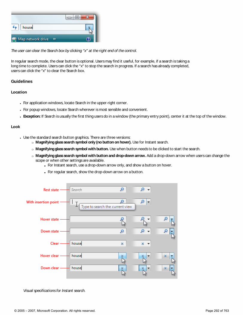
The user can clear the Search box by clicking “x” at the right end of the control.
In regular search mode, the clear button is optional. Users may find it useful, for example, if a search is taking a long time to complete. Users can click the “x” to stop the search in progress. If a search has already completed, users can click the “x” to clear the Search box.
Guidelines
Location
● For application windows, locate Search in the upper-right corner.
● For popup windows, locate Search wherever is most sensible and convenient.
● Exception: If Search is usually the first thing users do in a window (the primary entry point), center it at the top of the window.
Look
● Use the standard search button graphics. There are three versions: �❍ Magnifying glass search symbol only (no button on hover). Use for Instant search.
�❍ Magnifying glass search symbol with button. Use when button needs to be clicked to start the search.
�❍ Magnifying glass search symbol with button and drop-down arrow. Add a drop-down arrow when users can change the scope or when other settings are available.
■ For Instant search, use a drop-down arrow only, and show a button on hover.
■ For regular search, show the drop-down arrow on a button.
Visual specifications for Instant search.
© 2005 – 2007, Microsoft Corporation. All rights reserved. Page 292 of 763
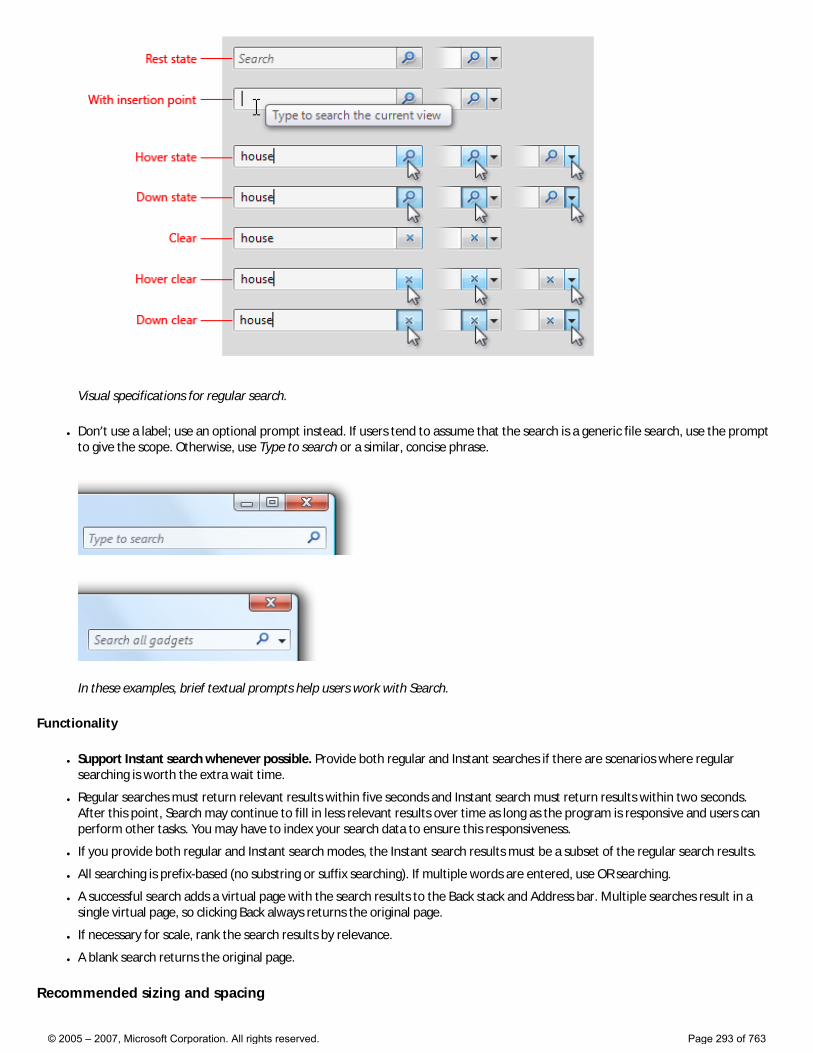
Visual specifications for regular search.
● Don’t use a label; use an optional prompt instead. If users tend to assume that the search is a generic file search, use the prompt to give the scope. Otherwise, use Type to search or a similar, concise phrase.
In these examples, brief textual prompts help users work with Search.
Functionality
● Support Instant search whenever possible. Provide both regular and Instant searches if there are scenarios where regular searching is worth the extra wait time.
● Regular searches must return relevant results within five seconds and Instant search must return results within two seconds. After this point, Search may continue to fill in less relevant results over time as long as the program is responsive and users can perform other tasks. You may have to index your search data to ensure this responsiveness.
● If you provide both regular and Instant search modes, the Instant search results must be a subset of the regular search results.
● All searching is prefix-based (no substring or suffix searching). If multiple words are entered, use OR searching.
● A successful search adds a virtual page with the search results to the Back stack and Address bar. Multiple searches result in a single virtual page, so clicking Back always returns the original page.
● If necessary for scale, rank the search results by relevance.
● A blank search returns the original page.
Recommended sizing and spacing
© 2005 – 2007, Microsoft Corporation. All rights reserved. Page 293 of 763
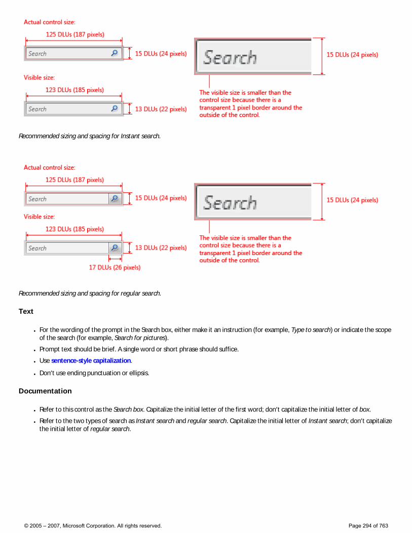
Recommended sizing and spacing for Instant search.
Recommended sizing and spacing for regular search.
Text
● For the wording of the prompt in the Search box, either make it an instruction (for example, Type to search) or indicate the scope of the search (for example, Search for pictures).
● Prompt text should be brief. A single word or short phrase should suffice.
● Use sentence-style capitalization.
● Don’t use ending punctuation or ellipsis.
Documentation
● Refer to this control as the Search box. Capitalize the initial letter of the first word; don’t capitalize the initial letter of box.
● Refer to the two types of search as Instant search and regular search. Capitalize the initial letter of Instant search; don’t capitalize the initial letter of regular search.
© 2005 – 2007, Microsoft Corporation. All rights reserved. Page 294 of 763
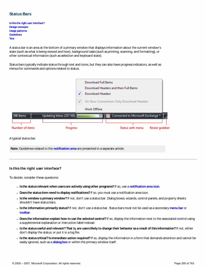
Status Bars
Is this the right user interface? Design concepts Usage patterns Guidelines Text
A status bar is an area at the bottom of a primary window that displays information about the current window’s state (such as what is being viewed and how), background tasks (such as printing, scanning, and formatting), or other contextual information (such as selection and keyboard state).
Status bars typically indicate status through text and icons, but they can also have progress indicators, as well as menus for commands and options related to status.
A typical status bar.
Note: Guidelines related to the notification area are presented in a separate article.
Is this the right user interface?
To decide, consider these questions:
● Is the status relevant when users are actively using other programs? If so, use a notification area icon.
● Does the status item need to display notifications? If so, you must use a notification area icon.
● Is the window a primary window? If not, don’t use a status bar. Dialog boxes, wizards, control panels, and property sheets shouldn’t have status bars.
● Is the information primarily status? If not, don’t use a status bar. Status bars must not be used as a secondary menu bar or toolbar.
● Does the information explain how to use the selected control? If so, display the information next to the associated control using a supplemental explanation or instruction label instead.
● Is the status useful and relevant? That is, are users likely to change their behavior as a result of this information? If not, either don’t display the status, or put it in a log file.
● Is the status critical? Is immediate action required? If so, display the information in a form that demands attention and cannot be easily ignored, such as a dialog box or within the primary window itself.
© 2005 – 2007, Microsoft Corporation. All rights reserved. Page 295 of 763
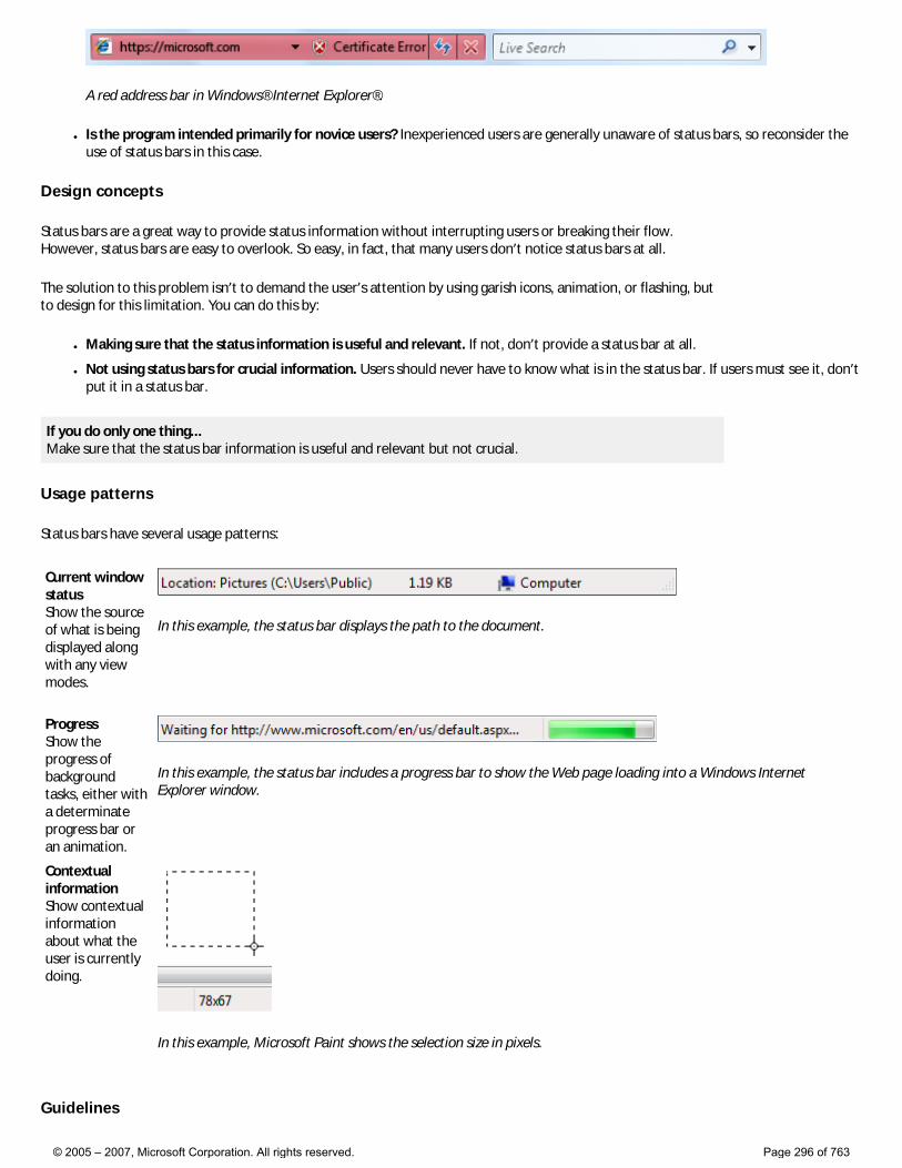
A red address bar in Windows® Internet Explorer®.
● Is the program intended primarily for novice users? Inexperienced users are generally unaware of status bars, so reconsider the use of status bars in this case.
Design concepts
Status bars are a great way to provide status information without interrupting users or breaking their flow. However, status bars are easy to overlook. So easy, in fact, that many users don’t notice status bars at all.
The solution to this problem isn’t to demand the user’s attention by using garish icons, animation, or flashing, but to design for this limitation. You can do this by:
● Making sure that the status information is useful and relevant. If not, don’t provide a status bar at all.
● Not using status bars for crucial information. Users should never have to know what is in the status bar. If users must see it, don’t put it in a status bar.
If you do only one thing... Make sure that the status bar information is useful and relevant but not crucial.
Usage patterns
Status bars have several usage patterns:
Current window status Show the source of what is being displayed along with any view modes.
In this example, the status bar displays the path to the document.
Progress Show the progress of background tasks, either with a determinate progress bar or an animation.
In this example, the status bar includes a progress bar to show the Web page loading into a Windows Internet Explorer window.
Contextual information Show contextual information about what the user is currently doing.
In this example, Microsoft Paint shows the selection size in pixels.
Guidelines
© 2005 – 2007, Microsoft Corporation. All rights reserved. Page 296 of 763
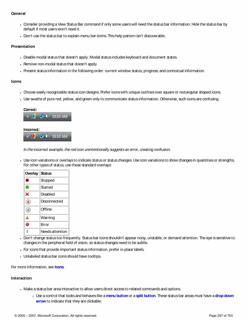
General
● Consider providing a View Status Bar command if only some users will need the status bar information. Hide the status bar by default if most users won’t need it.
● Don’t use the status bar to explain menu bar items. This help pattern isn’t discoverable.
Presentation
● Disable modal status that doesn’t apply. Modal status includes keyboard and document states.
● Remove non-modal status that doesn’t apply.
● Present status information in the following order: current window status; progress; and contextual information.
Icons
● Choose easily recognizable status icon designs. Prefer icons with unique outlines over square or rectangular shaped icons.
● Use swaths of pure red, yellow, and green only to communicate status information. Otherwise, such icons are confusing.
Correct:
Incorrect:
In the incorrect example, the red icon unintentionally suggests an error, creating confusion.
● Use icon variations or overlays to indicate status or status changes. Use icon variations to show changes in quantities or strengths. For other types of status, use these standard overlays:
Overlay Status
Stopped
Started
Disabled
Disconnected
Offline
Warning
Error
Needs attention
● Don’t change status too frequently. Status bar icons shouldn’t appear noisy, unstable, or demand attention. The eye is sensitive to changes in the peripheral field of vision, so status changes need to be subtle.
● For icons that provide important status information, prefer in-place labels.
● Unlabeled status bar icons should have tooltips.
For more information, see Icons.
Interaction
● Make a status bar area interactive to allow users direct access to related commands and options.
�❍ Use a control that looks and behaves like a menu button or a split button. These status bar areas must have a drop-down arrow to indicate that they are clickable.
© 2005 – 2007, Microsoft Corporation. All rights reserved. Page 297 of 763
�❍ Display the menu on left-click on mouse down, not mouse up.
�❍ Don’t support right-clicking or double-clicking. Users don’t expect such interactions in a status bar, so they aren’t likely to attempt them.
● Display tooltips on hover.
Text
● Generally, use concise labels. Cut any text that can be eliminated.
● Prefer sentence fragments, without ending punctuation. Use full sentences (with ending punctuation) only when sentence fragments aren’t significantly shorter.
● For optional progress labels, indicate what the operation is doing with a label that starts with a verb (gerund form) and ends with an ellipsis. For example: “Copying...”. This label may change dynamically if the operation has multiple steps or is processing multiple objects.
● Don’t use color, bold, or italic to emphasize status bar text.
● For tooltip phrasing guidelines, see Tooltips and Infotips.
Documentation
Refer to status bars as status bars, not status lines or other variations. Example: “The current page number is displayed on the status bar.”
© 2005 – 2007, Microsoft Corporation. All rights reserved. Page 298 of 763
Commands
These articles provide guidelines for using commands in your Windows Vista®-based applications:
● Menus
● Toolbars
© 2005 – 2007, Microsoft Corporation. All rights reserved. Page 299 of 763
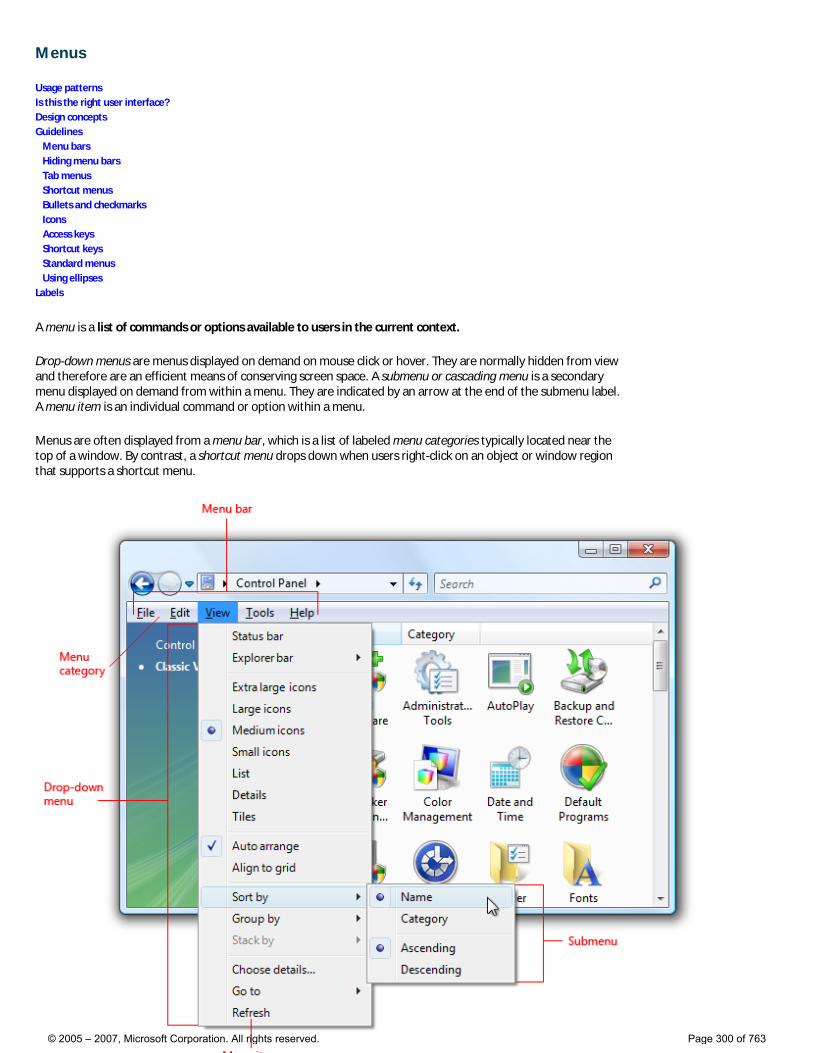
Menus
Usage patterns Is this the right user interface? Design concepts Guidelines Menu bars Hiding menu bars Tab menus Shortcut menus Bullets and checkmarks Icons Access keys Shortcut keys Standard menus Using ellipses Labels
A menu is a list of commands or options available to users in the current context.
Drop-down menus are menus displayed on demand on mouse click or hover. They are normally hidden from view and therefore are an efficient means of conserving screen space. A submenu or cascading menu is a secondary menu displayed on demand from within a menu. They are indicated by an arrow at the end of the submenu label. A menu item is an individual command or option within a menu.
Menus are often displayed from a menu bar, which is a list of labeled menu categories typically located near the top of a window. By contrast, a shortcut menu drops down when users right-click on an object or window region that supports a shortcut menu.
© 2005 – 2007, Microsoft Corporation. All rights reserved. Page 300 of 763
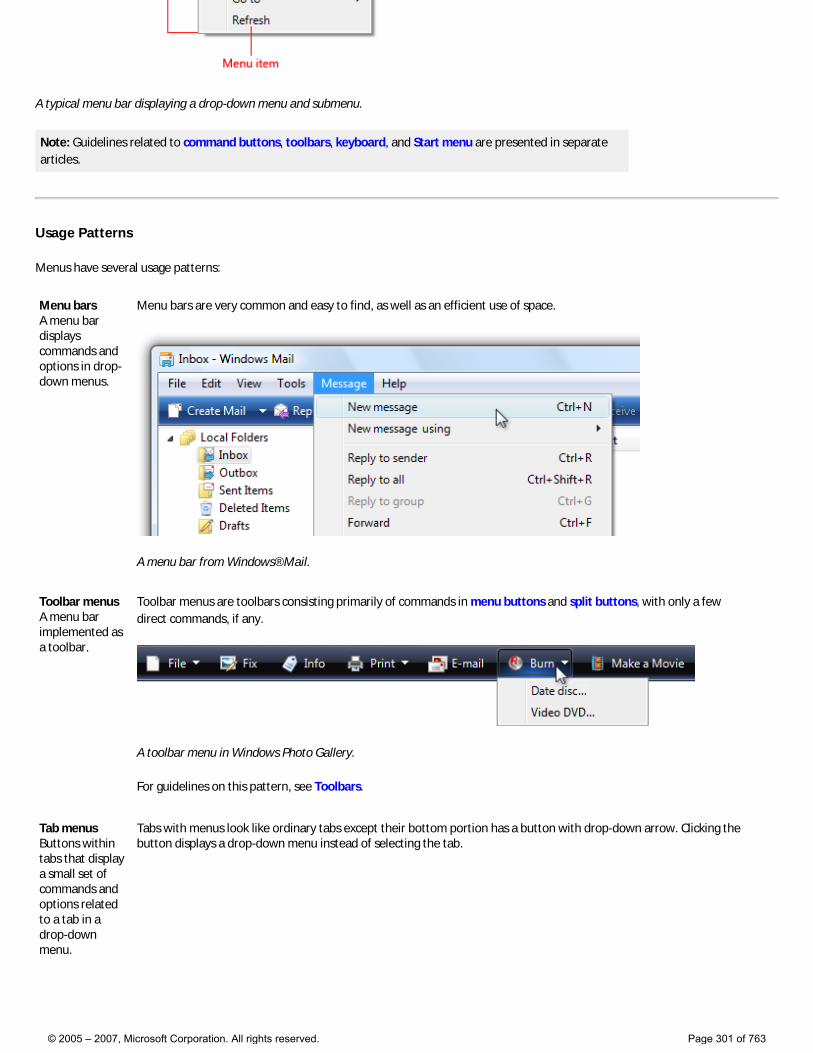
A typical menu bar displaying a drop-down menu and submenu.
Note: Guidelines related to command buttons, toolbars, keyboard, and Start menu are presented in separate articles.
Usage Patterns
Menus have several usage patterns:
Menu bars A menu bar displays commands and options in drop-down menus.
Menu bars are very common and easy to find, as well as an efficient use of space.
A menu bar from Windows® Mail.
Toolbar menus A menu bar implemented as a toolbar.
Toolbar menus are toolbars consisting primarily of commands in menu buttons and split buttons, with only a few direct commands, if any.
A toolbar menu in Windows Photo Gallery.
For guidelines on this pattern, see Toolbars.
Tab menus Buttons within tabs that display a small set of commands and options related to a tab in a drop-down menu.
Tabs with menus look like ordinary tabs except their bottom portion has a button with drop-down arrow. Clicking the button displays a drop-down menu instead of selecting the tab.
© 2005 – 2007, Microsoft Corporation. All rights reserved. Page 301 of 763
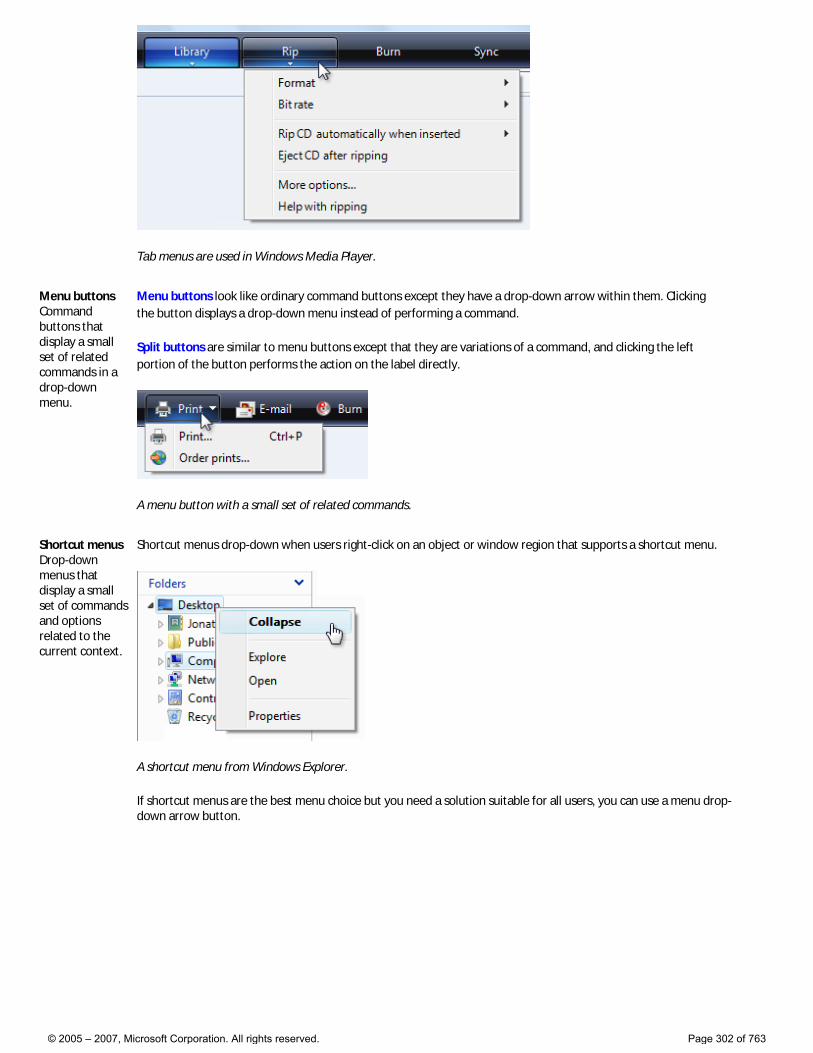
Tab menus are used in Windows Media Player.
Menu buttons Command buttons that display a small set of related commands in a drop-down menu.
Menu buttons look like ordinary command buttons except they have a drop-down arrow within them. Clicking the button displays a drop-down menu instead of performing a command.
Split buttons are similar to menu buttons except that they are variations of a command, and clicking the left portion of the button performs the action on the label directly.
A menu button with a small set of related commands.
Shortcut menus Drop-down menus that display a small set of commands and options related to the current context.
Shortcut menus drop-down when users right-click on an object or window region that supports a shortcut menu.
A shortcut menu from Windows Explorer.
If shortcut menus are the best menu choice but you need a solution suitable for all users, you can use a menu drop-down arrow button.
© 2005 – 2007, Microsoft Corporation. All rights reserved. Page 302 of 763
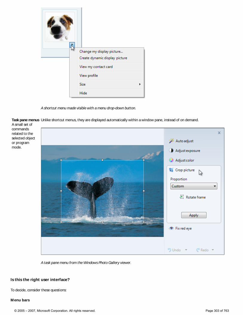
A shortcut menu made visible with a menu drop-down button.
Task pane menus A small set of commands related to the selected object or program mode.
Unlike shortcut menus, they are displayed automatically within a window pane, instead of on demand.
A task pane menu from the Windows Photo Gallery viewer.
Is this the right user interface?
To decide, consider these questions:
Menu bars
© 2005 – 2007, Microsoft Corporation. All rights reserved. Page 303 of 763
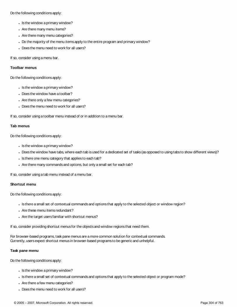
Do the following conditions apply:
● Is the window a primary window?
● Are there many menu items?
● Are there many menu categories?
● Do the majority of the menu items apply to the entire program and primary window?
● Does the menu need to work for all users?
If so, consider using a menu bar.
Toolbar menus
Do the following conditions apply:
● Is the window a primary window?
● Does the window have a toolbar?
● Are there only a few menu categories?
● Does the menu need to work for all users?
If so, consider using a toolbar menu instead of or in addition to a menu bar.
Tab menus
Do the following conditions apply:
● Is the window a primary window?
● Does the window have tabs, where each tab is used for a dedicated set of tasks (as opposed to using tabs to show different views)?
● Is there one menu category that applies to each tab?
● Are there many commands and options, but only a small set for each tab?
If so, consider using a tab menu instead of a menu bar.
Shortcut menu
Do the following conditions apply:
● Is there a small set of contextual commands and options that apply to the selected object or window region?
● Are these menu items redundant?
● Are the target users familiar with shortcut menus?
If so, consider providing shortcut menus for the objects and window regions that need them.
For browser-based programs, task pane menus are a more common solution for contextual commands. Currently, users expect shortcut menus in browser-based programs to be generic and unhelpful.
Task pane menu
Do the following conditions apply:
● Is the window a primary window?
● Is there a small set of contextual commands and options that apply to the selected object or program mode?
● Are there a few menu categories?
● Does the menu need to work for all users?
© 2005 – 2007, Microsoft Corporation. All rights reserved. Page 304 of 763
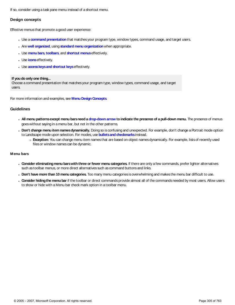
If so, consider using a task pane menu instead of a shortcut menu.
Design concepts
Effective menus that promote a good user experience:
● Use a command presentation that matches your program type, window types, command usage, and target users.
● Are well organized, using standard menu organization when appropriate.
● Use menu bars, toolbars, and shortcut menus effectively.
● Use icons effectively.
● Use access keys and shortcut keys effectively.
If you do only one thing... Choose a command presentation that matches your program type, window types, command usage, and target users.
For more information and examples, see Menu Design Concepts.
Guidelines
● All menu patterns except menu bars need a drop-down arrow to indicate the presence of a pull-down menu. The presence of menus goes without saying in a menu bar, but not in the other patterns.
● Don’t change menu item names dynamically. Doing so is confusing and unexpected. For example, don’t change a Portrait mode option to Landscape mode upon selection. For modes, use bullets and checkmarks instead.
�❍ Exception: You can change menu item names that are based on object names dynamically. For example, lists of recently used files or window names can be dynamic.
Menu bars
● Consider eliminating menu bars with three or fewer menu categories. If there are only a few commands, prefer lighter alternatives such as toolbar menus, or more direct alternatives such as command buttons and links.
● Don’t have more than 10 menu categories. Too many menu categories is overwhelming and makes the menu bar difficult to use.
● Consider hiding the menu bar if the toolbar or direct commands provide almost all of the commands needed by most users. Allow users to show or hide with a Menu bar check mark option in a toolbar menu.
© 2005 – 2007, Microsoft Corporation. All rights reserved. Page 305 of 763
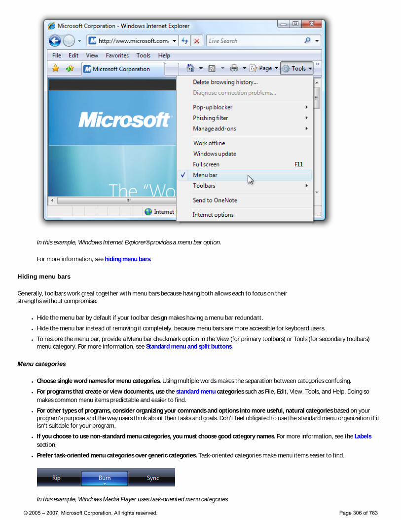
In this example, Windows Internet Explorer® provides a menu bar option.
For more information, see hiding menu bars.
Hiding menu bars
Generally, toolbars work great together with menu bars because having both allows each to focus on their strengths without compromise.
● Hide the menu bar by default if your toolbar design makes having a menu bar redundant.
● Hide the menu bar instead of removing it completely, because menu bars are more accessible for keyboard users.
● To restore the menu bar, provide a Menu bar checkmark option in the View (for primary toolbars) or Tools (for secondary toolbars) menu category. For more information, see Standard menu and split buttons.
Menu categories
● Choose single word names for menu categories. Using multiple words makes the separation between categories confusing.
● For programs that create or view documents, use the standard menu categories such as File, Edit, View, Tools, and Help. Doing so makes common menu items predictable and easier to find.
● For other types of programs, consider organizing your commands and options into more useful, natural categories based on your program’s purpose and the way users think about their tasks and goals. Don’t feel obligated to use the standard menu organization if it isn’t suitable for your program.
● If you choose to use non-standard menu categories, you must choose good category names. For more information, see the Labels section.
● Prefer task-oriented menu categories over generic categories. Task-oriented categories make menu items easier to find.
In this example, Windows Media Player uses task-oriented menu categories.
© 2005 – 2007, Microsoft Corporation. All rights reserved. Page 306 of 763
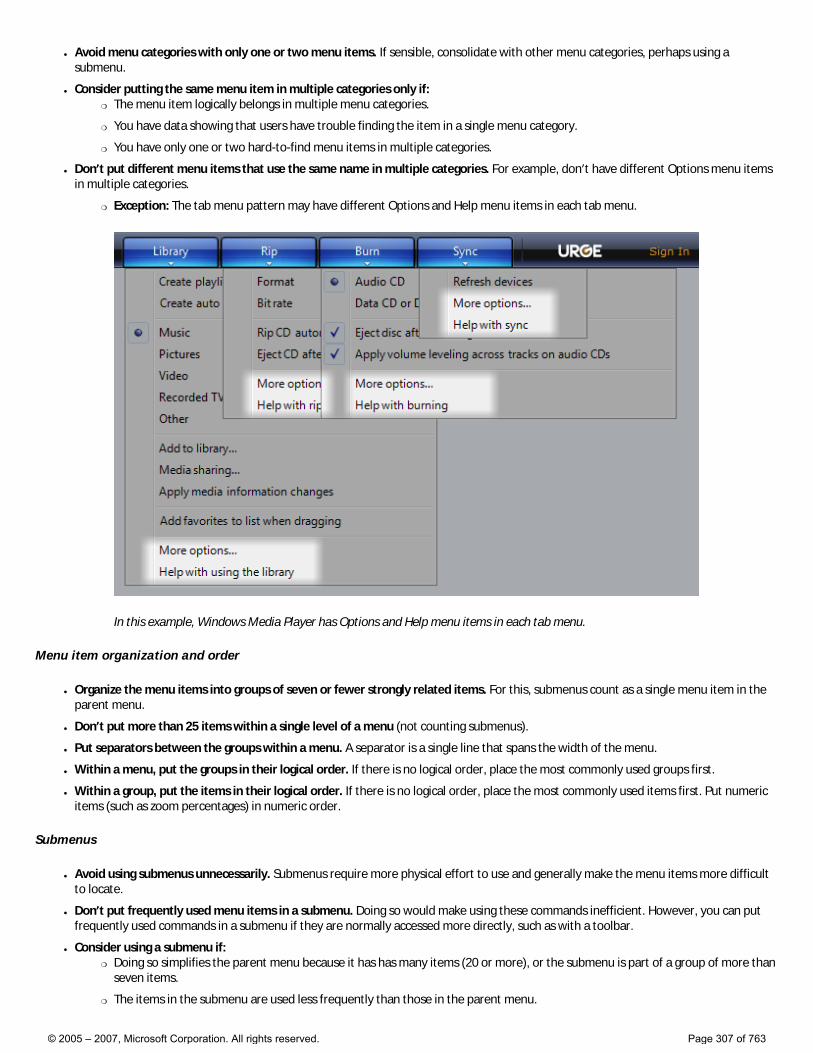
● Avoid menu categories with only one or two menu items. If sensible, consolidate with other menu categories, perhaps using a submenu.
● Consider putting the same menu item in multiple categories only if: �❍ The menu item logically belongs in multiple menu categories.
�❍ You have data showing that users have trouble finding the item in a single menu category.
�❍ You have only one or two hard-to-find menu items in multiple categories.
● Don’t put different menu items that use the same name in multiple categories. For example, don’t have different Options menu items in multiple categories.
�❍ Exception: The tab menu pattern may have different Options and Help menu items in each tab menu.
In this example, Windows Media Player has Options and Help menu items in each tab menu.
Menu item organization and order
● Organize the menu items into groups of seven or fewer strongly related items. For this, submenus count as a single menu item in the parent menu.
● Don’t put more than 25 items within a single level of a menu (not counting submenus).
● Put separators between the groups within a menu. A separator is a single line that spans the width of the menu.
● Within a menu, put the groups in their logical order. If there is no logical order, place the most commonly used groups first.
● Within a group, put the items in their logical order. If there is no logical order, place the most commonly used items first. Put numeric items (such as zoom percentages) in numeric order.
Submenus
● Avoid using submenus unnecessarily. Submenus require more physical effort to use and generally make the menu items more difficult to locate.
● Don’t put frequently used menu items in a submenu. Doing so would make using these commands inefficient. However, you can put frequently used commands in a submenu if they are normally accessed more directly, such as with a toolbar.
● Consider using a submenu if: �❍ Doing so simplifies the parent menu because it has has many items (20 or more), or the submenu is part of a group of more than
seven items.
�❍ The items in the submenu are used less frequently than those in the parent menu.
© 2005 – 2007, Microsoft Corporation. All rights reserved. Page 307 of 763
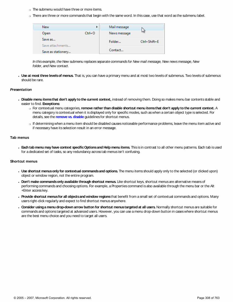
�❍ The submenu would have three or more items.
�❍ There are three or more commands that begin with the same word. In this case, use that word as the submenu label.
In this example, the New submenu replaces separate commands for New mail message, New news message, New folder, and New contact.
● Use at most three levels of menus. That is, you can have a primary menu and at most two levels of submenus. Two levels of submenus should be rare.
Presentation
● Disable menu items that don’t apply to the current context, instead of removing them. Doing so makes menu bar contents stable and easier to find. Exceptions:
�❍ For contextual menu categories, remove rather than disable shortcut menu items that don’t apply to the current context. A menu category is contextual when it is displayed only for specific modes, such as when a certain object type is selected. For details, see the remove vs. disable guidelines for shortcut menus.
�❍ If determining when a menu item should be disabled causes noticeable performance problems, leave the menu item active and if necessary have its selection result in an error message.
Tab menus
● Each tab menu may have context specific Options and Help menu items. This is in contrast to all other menu patterns. Each tab is used for a dedicated set of tasks, so any redundancy across tab menus isn’t confusing.
Shortcut menus
● Use shortcut menus only for contextual commands and options. The menu items should apply only to the selected (or clicked upon) object or window region, not the entire program.
● Don’t make commands only available through shortcut menus. Like shortcut keys, shortcut menus are alternative means of performing commands and choosing options. For example, a Properties command is also available through the menu bar or the Alt+Enter access key.
● Provide shortcut menus for all objects and window regions that benefit from a small set of contextual commands and options. Many users right-click regularly and expect to find shortcut menus anywhere.
● Consider using a menu drop-down arrow button for shortcut menus targeted at all users. Normally shortcut menus are suitable for commands and options targeted at advanced users. However, you can use a menu drop-down button in cases where shortcut menus are the best menu choice and you need to target all users.
© 2005 – 2007, Microsoft Corporation. All rights reserved. Page 308 of 763
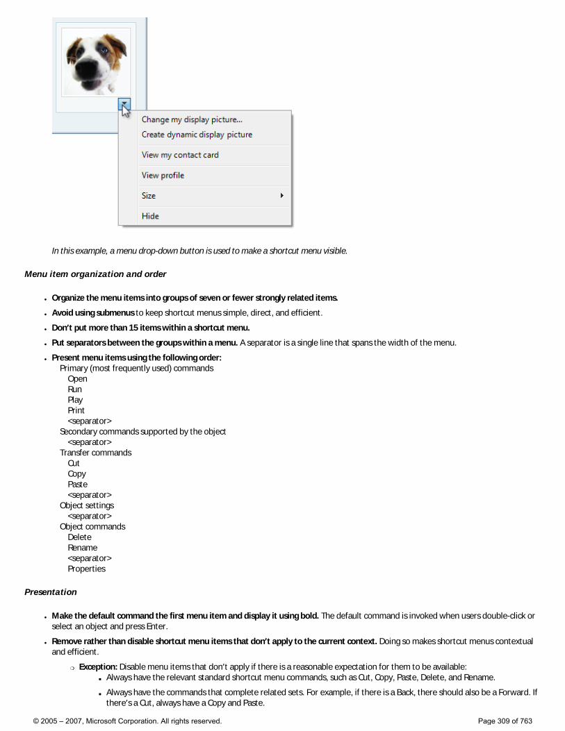
In this example, a menu drop-down button is used to make a shortcut menu visible.
Menu item organization and order
● Organize the menu items into groups of seven or fewer strongly related items.
● Avoid using submenus to keep shortcut menus simple, direct, and efficient.
● Don’t put more than 15 items within a shortcut menu.
● Put separators between the groups within a menu. A separator is a single line that spans the width of the menu.
● Present menu items using the following order: Primary (most frequently used) commands Open Run Play Print <separator> Secondary commands supported by the object <separator> Transfer commands Cut Copy Paste <separator> Object settings <separator> Object commands Delete Rename <separator> Properties
Presentation
● Make the default command the first menu item and display it using bold. The default command is invoked when users double-click or select an object and press Enter.
● Remove rather than disable shortcut menu items that don’t apply to the current context. Doing so makes shortcut menus contextual and efficient.
�❍ Exception: Disable menu items that don’t apply if there is a reasonable expectation for them to be available: ■ Always have the relevant standard shortcut menu commands, such as Cut, Copy, Paste, Delete, and Rename.
■ Always have the commands that complete related sets. For example, if there is a Back, there should also be a Forward. If there’s a Cut, always have a Copy and Paste.
© 2005 – 2007, Microsoft Corporation. All rights reserved. Page 309 of 763
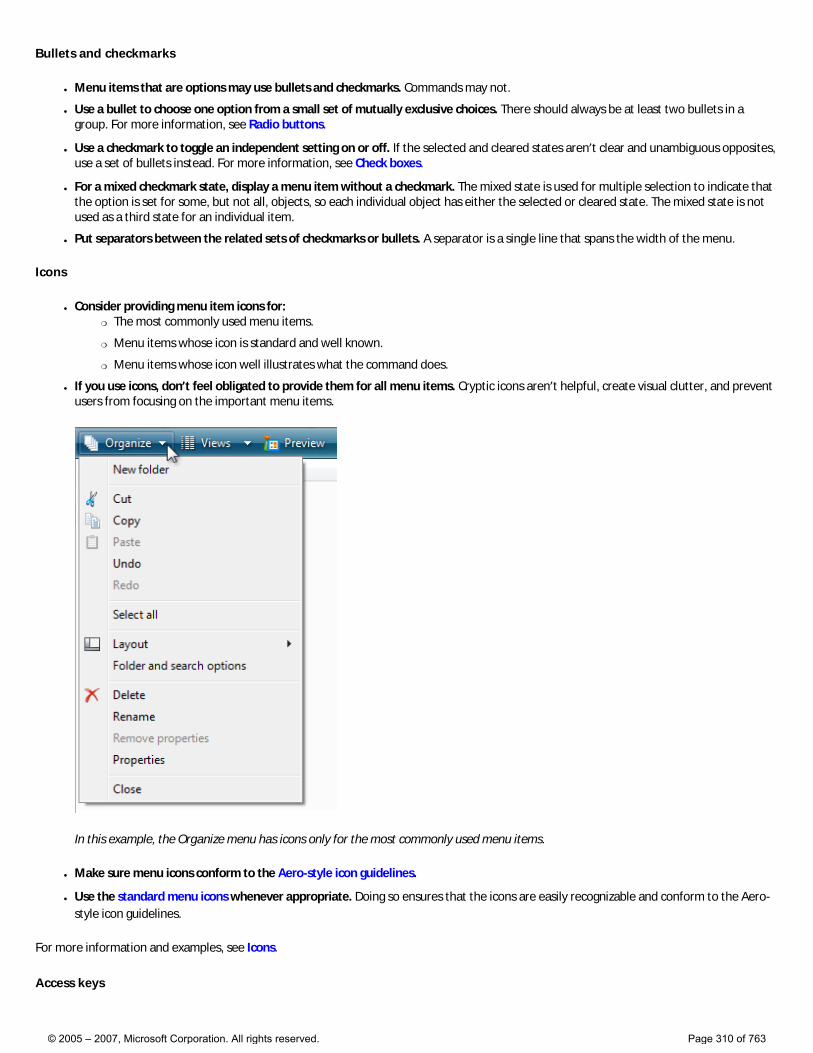
Bullets and checkmarks
● Menu items that are options may use bullets and checkmarks. Commands may not.
● Use a bullet to choose one option from a small set of mutually exclusive choices. There should always be at least two bullets in a group. For more information, see Radio buttons.
● Use a checkmark to toggle an independent setting on or off. If the selected and cleared states aren’t clear and unambiguous opposites, use a set of bullets instead. For more information, see Check boxes.
● For a mixed checkmark state, display a menu item without a checkmark. The mixed state is used for multiple selection to indicate that the option is set for some, but not all, objects, so each individual object has either the selected or cleared state. The mixed state is not used as a third state for an individual item.
● Put separators between the related sets of checkmarks or bullets. A separator is a single line that spans the width of the menu.
Icons
● Consider providing menu item icons for: �❍ The most commonly used menu items.
�❍ Menu items whose icon is standard and well known.
�❍ Menu items whose icon well illustrates what the command does.
● If you use icons, don’t feel obligated to provide them for all menu items. Cryptic icons aren’t helpful, create visual clutter, and prevent users from focusing on the important menu items.
In this example, the Organize menu has icons only for the most commonly used menu items.
● Make sure menu icons conform to the Aero-style icon guidelines.
● Use the standard menu icons whenever appropriate. Doing so ensures that the icons are easily recognizable and conform to the Aero-style icon guidelines.
For more information and examples, see Icons.
Access keys
© 2005 – 2007, Microsoft Corporation. All rights reserved. Page 310 of 763
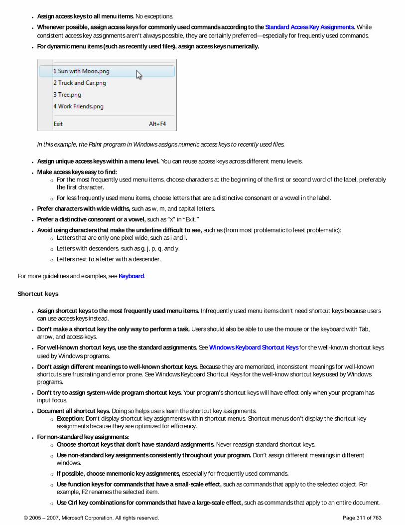
● Assign access keys to all menu items. No exceptions.
● Whenever possible, assign access keys for commonly used commands according to the Standard Access Key Assignments. While consistent access key assignments aren’t always possible, they are certainly preferred—especially for frequently used commands.
● For dynamic menu items (such as recently used files), assign access keys numerically.
In this example, the Paint program in Windows assigns numeric access keys to recently used files.
● Assign unique access keys within a menu level. You can reuse access keys across different menu levels.
● Make access keys easy to find: �❍ For the most frequently used menu items, choose characters at the beginning of the first or second word of the label, preferably
the first character.
�❍ For less frequently used menu items, choose letters that are a distinctive consonant or a vowel in the label.
● Prefer characters with wide widths, such as w, m, and capital letters.
● Prefer a distinctive consonant or a vowel, such as “x” in “Exit.”
● Avoid using characters that make the underline difficult to see, such as (from most problematic to least problematic): �❍ Letters that are only one pixel wide, such as i and l.
�❍ Letters with descenders, such as g, j, p, q, and y.
�❍ Letters next to a letter with a descender.
For more guidelines and examples, see Keyboard.
Shortcut keys
● Assign shortcut keys to the most frequently used menu items. Infrequently used menu items don’t need shortcut keys because users can use access keys instead.
● Don’t make a shortcut key the only way to perform a task. Users should also be able to use the mouse or the keyboard with Tab, arrow, and access keys.
● For well-known shortcut keys, use the standard assignments. See Windows Keyboard Shortcut Keys for the well-known shortcut keys used by Windows programs.
● Don’t assign different meanings to well-known shortcut keys. Because they are memorized, inconsistent meanings for well-known shortcuts are frustrating and error prone. See Windows Keyboard Shortcut Keys for the well-know shortcut keys used by Windows programs.
● Don’t try to assign system-wide program shortcut keys. Your program’s shortcut keys will have effect only when your program has input focus.
● Document all shortcut keys. Doing so helps users learn the shortcut key assignments. �❍ Exception: Don’t display shortcut key assignments within shortcut menus. Shortcut menus don’t display the shortcut key
assignments because they are optimized for efficiency.
● For non-standard key assignments: �❍ Choose shortcut keys that don’t have standard assignments. Never reassign standard shortcut keys.
�❍ Use non-standard key assignments consistently throughout your program. Don’t assign different meanings in different windows.
�❍ If possible, choose mnemonic key assignments, especially for frequently used commands.
�❍ Use function keys for commands that have a small-scale effect, such as commands that apply to the selected object. For example, F2 renames the selected item.
�❍ Use Ctrl key combinations for commands that have a large-scale effect, such as commands that apply to an entire document.
© 2005 – 2007, Microsoft Corporation. All rights reserved. Page 311 of 763
For example, Ctrl+S saves the current document.
�❍ Use Shift key combinations for commands that extend or complement the actions of the standard shortcut key. For example, the Alt+Tab shortcut key cycles through open primary windows, whereas Alt+Shift+Tab cycles in the reverse order. Similarly, F1 displays Help, whereas Shift+F1 display context-sensitive Help.
�❍ Don’t use the following characters for shortcut keys: @ £ $ {} [] \ ~ | ^ ' < >. These characters require different key combinations across languages or are locale specific.
�❍ Don’t use Ctrl+Alt combinations, because Windows interprets this combination in some language versions as an AltGR key, which generates alphanumeric characters.
● If your program assigns many shortcut keys, provide the ability to customize the assignments. Doing so allows users to reassign conflicting shortcut keys and migrate from other products. Most programs don’t assign enough shortcut keys to need this feature.
For more guidelines and standard shortcut key assignments, see Keyboard.
Standard menus
● Use the standard menu organization for programs that create or view documents. The standard menu organization makes common menu items predictable and easier to find.
● For other types of programs, use the standard menu organization only when it makes sense to. Consider organizing your commands and options into more useful, natural categories based on your program’s purpose and the way users think about their tasks and goals.
Standard menu bars
The standard menu bar structure is as follows. This list shows the menu category and item labels, their order with separators, their access and shortcut keys, and their ellipses.
File New Ctrl+N Open... Ctrl+O Close <separator> Save Ctrl+S Save as... <separator> Send to <separator> Print... Ctrl+P Print preview Page setup <separator> 1 <filename> 2 <filename> 3 <filename> ... <separator> Exit Alt+F4 (shortcut usually not given) Edit Undo Ctrl+Z Redo Ctrl+Y <separator> Cut Ctrl+X Copy Ctrl+C Paste Ctrl+V <separator> Select all Ctrl+A <separator> Delete Del (shortcut usually not given) <separator> Find... Ctrl+F Find next F3 (command usually not given) Replace... Ctrl+H Go to... Ctrl+G
© 2005 – 2007, Microsoft Corporation. All rights reserved. Page 312 of 763
View Toolbars Status bar <separator> Zoom Zoom in Ctrl++ Zoom out Ctrl+- <separator> Full screen F11 Refresh F5 Tools ... <separator> Options Help <program name> help F1 <separator> About <program name>
Standard toolbar menu buttons
The standard toolbar menu buttons are as follows. This list shows the menu category and item labels, their order with separators, their shortcut keys, and their ellipses.
Tools Full screen F11 (Reassign access key if Find is also used.) Toolbars (Note that the Menu bar command goes here.) <separator> Print... Find... <separator> Zoom Text size <separator> Options Organize New folder Ctrl+N <separator> Cut Ctrl+X Copy Ctrl+C Paste Ctrl+V <separator> Select all Ctrl+A <separator> Delete Del (shortcut usually not given) Rename <separator> Options Page New window Ctrl+N <separator> Zoom Text size
Standard shortcut menus
The standard shortcut menu contents are as follows. This list shows the menu item labels, their order with separators, their access keys, and their ellipses. Shortcut menus don’t show shortcut keys.
© 2005 – 2007, Microsoft Corporation. All rights reserved. Page 313 of 763

Open Run Play Edit Print... <separator> Cut Copy Paste <separator> Delete Rename <separator> Lock the <object name> (checkmark) Properties
Using ellipses
While menu commands are used for immediate actions, more information might be needed to perform the action. Indicate a command that needs additional information (including a confirmation) by adding an ellipsis at the end of the label.
In this example, the Print... command displays a Print dialog box to gather more information.
Proper use of ellipses is important to indicate that users can make further choices before performing the action, or even cancel the action entirely. The visual cue offered by an ellipsis allows users to explore your software without fear.
This doesn’t mean you should use an ellipsis whenever an action displays another window—only when additional information is required to perform the action. For example, the commands About, Advanced, Help, Options, Properties, and Settings must display another window when clicked, but don’t require additional information from the user. Therefore they don’t need ellipses.
Note: When determining if a menu command needs an ellipsis, don’t use the need to elevate privileges as a
© 2005 – 2007, Microsoft Corporation. All rights reserved. Page 314 of 763
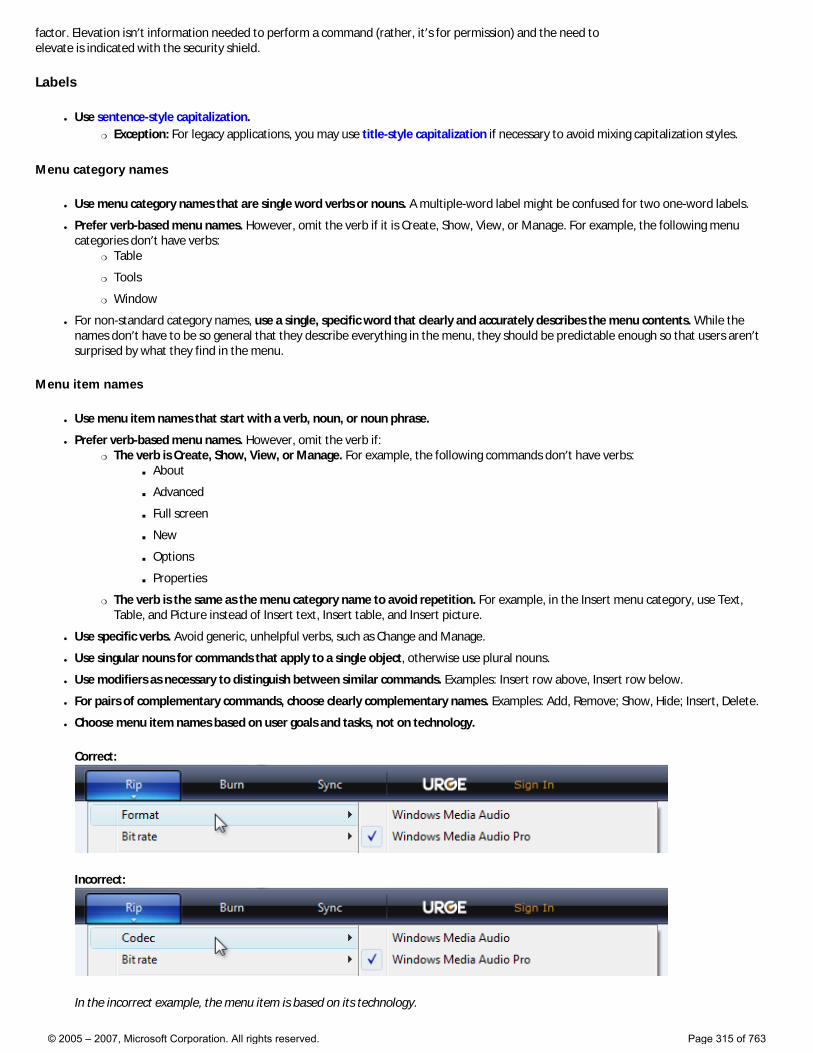
factor. Elevation isn’t information needed to perform a command (rather, it’s for permission) and the need to elevate is indicated with the security shield.
Labels
● Use sentence-style capitalization. �❍ Exception: For legacy applications, you may use title-style capitalization if necessary to avoid mixing capitalization styles.
Menu category names
● Use menu category names that are single word verbs or nouns. A multiple-word label might be confused for two one-word labels.
● Prefer verb-based menu names. However, omit the verb if it is Create, Show, View, or Manage. For example, the following menu categories don’t have verbs:
�❍ Table
�❍ Tools
�❍ Window
● For non-standard category names, use a single, specific word that clearly and accurately describes the menu contents. While the names don’t have to be so general that they describe everything in the menu, they should be predictable enough so that users aren’t surprised by what they find in the menu.
Menu item names
● Use menu item names that start with a verb, noun, or noun phrase.
● Prefer verb-based menu names. However, omit the verb if: �❍ The verb is Create, Show, View, or Manage. For example, the following commands don’t have verbs:
■ About
■ Advanced
■ Full screen
■ New
■ Options
■ Properties
�❍ The verb is the same as the menu category name to avoid repetition. For example, in the Insert menu category, use Text, Table, and Picture instead of Insert text, Insert table, and Insert picture.
● Use specific verbs. Avoid generic, unhelpful verbs, such as Change and Manage.
● Use singular nouns for commands that apply to a single object, otherwise use plural nouns.
● Use modifiers as necessary to distinguish between similar commands. Examples: Insert row above, Insert row below.
● For pairs of complementary commands, choose clearly complementary names. Examples: Add, Remove; Show, Hide; Insert, Delete.
● Choose menu item names based on user goals and tasks, not on technology.
Correct:
Incorrect:
In the incorrect example, the menu item is based on its technology.
© 2005 – 2007, Microsoft Corporation. All rights reserved. Page 315 of 763
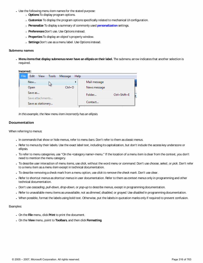
● Use the following menu item names for the stated purpose: �❍ Options To display program options.
�❍ Customize To display the program options specifically related to mechanical UI configuration.
�❍ Personalize To display a summary of commonly used personalization settings.
�❍ Preferences Don’t use. Use Options instead.
�❍ Properties To display an object’s property window.
�❍ Settings Don’t use as a menu label. Use Options instead.
Submenu names
● Menu items that display submenus never have an ellipsis on their label. The submenu arrow indicates that another selection is required.
Incorrect:
In this example, the New menu item incorrectly has an ellipsis.
Documentation
When referring to menus:
● In commands that show or hide menus, refer to menu bars. Don’t refer to them as classic menus.
● Refer to menus by their labels. Use the exact label text, including its capitalization, but don’t include the access key underscore or ellipsis.
● To refer to menu categories, use “On the <category name> menu.” If the location of a menu item is clear from the context, you don’t need to mention the menu category.
● To describe user interaction of menu items, use click, without the word menu or command. Don’t use choose, select, or pick. Don’t refer to a menu item as a menu item except in technical documentation.
● To describe removing a check mark from a menu option, use click to remove the check mark. Don’t use clear.
● Refer to shortcut menus as shortcut menus in user documentation. Refer to them as context menus only in programming and other technical documentation.
● Don’t use cascading, pull-down, drop-down, or pop-up to describe menus, except in programming documentation.
● Refer to unavailable menu items as unavailable, not as dimmed, disabled, or grayed. Use disabled in programming documentation.
● When possible, format the labels using bold text. Otherwise, put the labels in quotation marks only if required to prevent confusion.
Examples:
● On the File menu, click Print to print the document.
● On the View menu, point to Toolbars, and then click Formatting.
© 2005 – 2007, Microsoft Corporation. All rights reserved. Page 316 of 763

Menu Design Concepts
Menus
Command Presentation
To use menus effectively, it helps to understand the characteristics of the various command presentations:
● Menu bars. A menu bar is best used to catalog all the available top-level commands within a program. New users of your program are likely to review all the commands in the menu bar to answer questions like:
�❍ What can the program do?
�❍ What commands does the program have?
�❍ What are the shortcut keys for the common commands?
Effective menu bars are comprehensive, well organized, and self-explanatory. Efficiency is desirable, but not crucial (and often not possible). Consider menu bars to be primarily a learning and discovery tool, especially for new users.
● Toolbars. A toolbar is best used for quick, convenient access to frequently used, immediate commands. They don’t have to be comprehensive or even self-explanatory—just direct and efficient.
● Command buttons. Command buttons are a simple, visible, direct way to expose a small number of primary commands. However, they don’t scale well, so you should use menus in primary windows for more than a few commands.
● Shortcut menus. Shortcut menus are simple, direct, and contextual. They are also efficient because they display only the commands and options that apply to the current context. Because they are displayed at the pointer’s current location, they eliminate the need to move the mouse to display a menu. However, they normally have no visible presence on the screen. Consider shortcut menus appropriate only for redundant contextual commands and options targeted at advanced users.
Because of these various tradeoffs, your program may need to use a combination of command presentations. For example, full-featured applications often use menu bars, taskbars, and shortcut menus, whereas simple programs typically just use command buttons and standard shortcut menus.
If you do only one thing... Choose a command presentation that matches your program type, window types, command usage, and target users.
Effective menu bars
While menu bars are the most traditional menu type, they aren’t suitable for all types of programs or windows. Here are some of the factors in using them effectively.
Keeping simple things simple
Menu bars aren’t used in dialog boxes and should be avoided in simple programs like utilities. The commands in such windows should be kept simple, direct, and readily apparent. Menu bars are primarily a learning and discovery tool, and simple windows shouldn’t require learning or discovery. For dialog boxes, use command buttons (including menu buttons and split buttons), command links, and shortcut menus.
© 2005 – 2007, Microsoft Corporation. All rights reserved. Page 317 of 763
Using screen space efficiently
While menu bars use screen space efficiently, they are sufficiently heavy that you should consider alternatives if there aren’t many commands or they aren’t used frequently. For example, toolbar menus are a better choice if a program already has a toolbar and needs only a few drop-down menus.
Making menus stable
Given the need for learning and discoverability, users expect menu bars to be stable. That is, users expect to see the same menu items as they did the last time they used the menu. The menu items can be enabled or disabled based on the current context, but menu items or submenus shouldn’t be added or removed. However, you may add or remove entire menu categories based on obvious changes in program state (such as a document being loaded).
That said, disabled menu items can be confusing because users have to determine why the item is disabled. If the reason isn’t obvious, users have to determine the problem through experimentation and deductive logic. In such cases, it’s better to leave the item enabled and give a helpful error message to explain the problem explicitly.
Menu bar organization
Menu bars organize menu items into a tree structure. However, there is a dilemma when using trees: Trees are intended to organize menu items and make them easy to find, yet it’s difficult to make all menu items within a menu tree easily discoverable. Menu items that aren’t well known or could belong in multiple menu categories are especially difficult to find. For example, suppose a menu has Debug and Window categories. Where should users look for a Debug window command?
Using the standard menu categories helps address this dilemma. For example, users know to look for an Exit command in the File menu because that is standard. If you know that users are having trouble finding non-standard menu items because they could belong in multiple categories, put a small number (one or two) of hard-to-find menu items in multiple categories. Anything more harms the overall menu bar usability.
Standard menu organization
The standard menu organization makes common menu items predictable and easier to find. However, these categories were designed when most applications were used to create or view document files, thus the File, Edit, View, Tools, and Help menu categories. This standard organization has little value for other types of programs, such as Windows Explorer.
Don’t feel obligated to use the standard menu organization if it isn’t suitable for your program. Instead, consider organizing your menu items into more useful, natural categories based on your program’s purpose and the way users think about their tasks and goals.
© 2005 – 2007, Microsoft Corporation. All rights reserved. Page 318 of 763
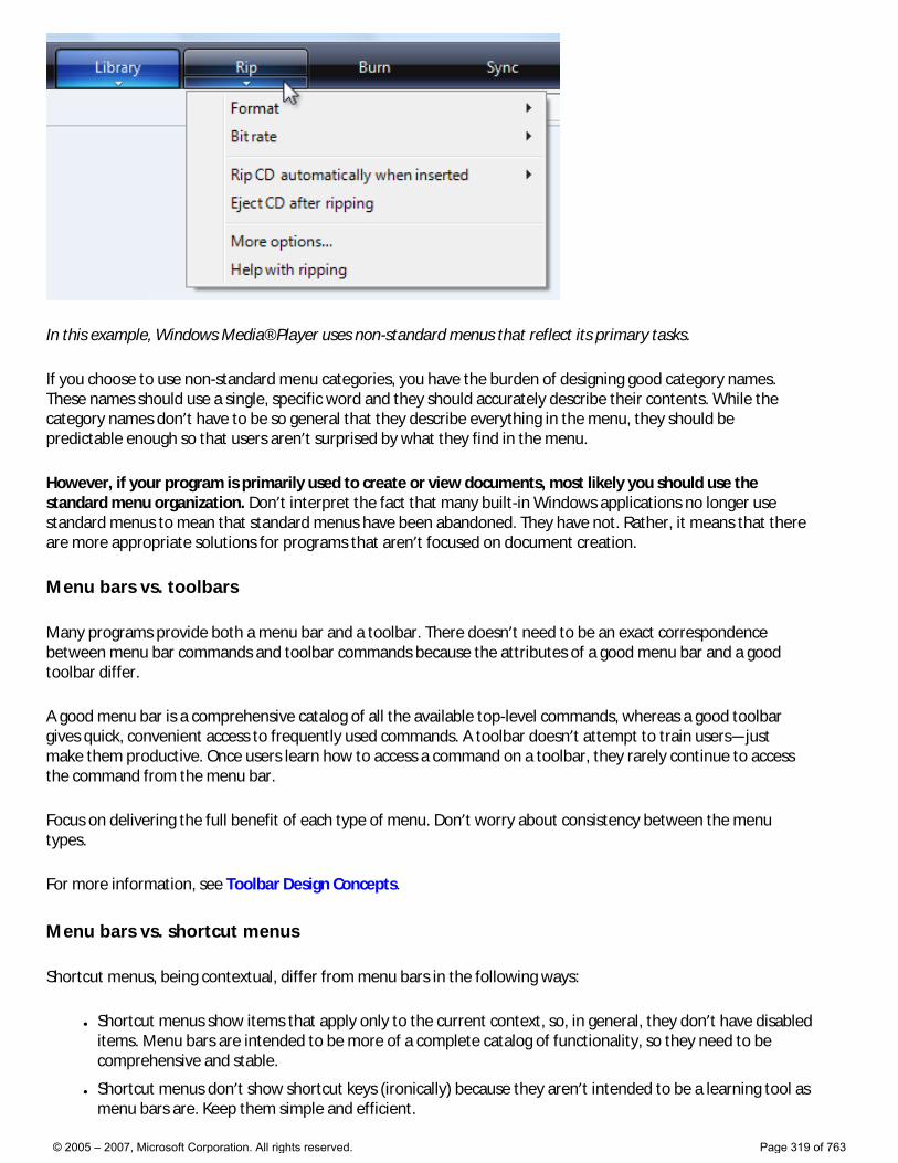
In this example, Windows Media® Player uses non-standard menus that reflect its primary tasks.
If you choose to use non-standard menu categories, you have the burden of designing good category names. These names should use a single, specific word and they should accurately describe their contents. While the category names don’t have to be so general that they describe everything in the menu, they should be predictable enough so that users aren’t surprised by what they find in the menu.
However, if your program is primarily used to create or view documents, most likely you should use the standard menu organization. Don’t interpret the fact that many built-in Windows applications no longer use standard menus to mean that standard menus have been abandoned. They have not. Rather, it means that there are more appropriate solutions for programs that aren’t focused on document creation.
Menu bars vs. toolbars
Many programs provide both a menu bar and a toolbar. There doesn’t need to be an exact correspondence between menu bar commands and toolbar commands because the attributes of a good menu bar and a good toolbar differ.
A good menu bar is a comprehensive catalog of all the available top-level commands, whereas a good toolbar gives quick, convenient access to frequently used commands. A toolbar doesn’t attempt to train users—just make them productive. Once users learn how to access a command on a toolbar, they rarely continue to access the command from the menu bar.
Focus on delivering the full benefit of each type of menu. Don’t worry about consistency between the menu types.
For more information, see Toolbar Design Concepts.
Menu bars vs. shortcut menus
Shortcut menus, being contextual, differ from menu bars in the following ways:
● Shortcut menus show items that apply only to the current context, so, in general, they don’t have disabled items. Menu bars are intended to be more of a complete catalog of functionality, so they need to be comprehensive and stable.
● Shortcut menus don’t show shortcut keys (ironically) because they aren’t intended to be a learning tool as menu bars are. Keep them simple and efficient.
© 2005 – 2007, Microsoft Corporation. All rights reserved. Page 319 of 763
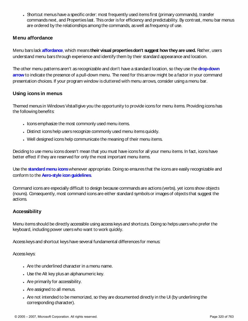
● Shortcut menus have a specific order: most frequently used items first (primary commands), transfer commands next, and Properties last. This order is for efficiency and predictability. By contrast, menu bar menus are ordered by the relationships among the commands, as well as frequency of use.
Menu affordance
Menu bars lack affordance, which means their visual properties don’t suggest how they are used. Rather, users understand menu bars through experience and identify them by their standard appearance and location.
The other menu patterns aren’t as recognizable and don’t have a standard location, so they use the drop-down arrow to indicate the presence of a pull-down menu. The need for this arrow might be a factor in your command presentation choices. If your program window is cluttered with menu arrows, consider using a menu bar.
Using icons in menus
Themed menus in Windows Vista® give you the opportunity to provide icons for menu items. Providing icons has the following benefits:
● Icons emphasize the most commonly used menu items.
● Distinct icons help users recognize commonly used menu items quickly.
● Well designed icons help communicate the meaning of their menu items.
Deciding to use menu icons doesn’t mean that you must have icons for all your menu items. In fact, icons have better effect if they are reserved for only the most important menu items.
Use the standard menu icons whenever appropriate. Doing so ensures that the icons are easily recognizable and conform to the Aero-style icon guidelines.
Command icons are especially difficult to design because commands are actions (verbs), yet icons show objects (nouns). Consequently, most command icons are either standard symbols or images of objects that suggest the actions.
Accessibility
Menu items should be directly accessible using access keys and shortcuts. Doing so helps users who prefer the keyboard, including power users who want to work quickly.
Access keys and shortcut keys have several fundamental differences for menus:
Access keys:
● Are the underlined character in a menu name.
● Use the Alt key plus an alphanumeric key.
● Are primarily for accessibility.
● Are assigned to all menus.
● Are not intended to be memorized, so they are documented directly in the UI (by underlining the corresponding character).
© 2005 – 2007, Microsoft Corporation. All rights reserved. Page 320 of 763
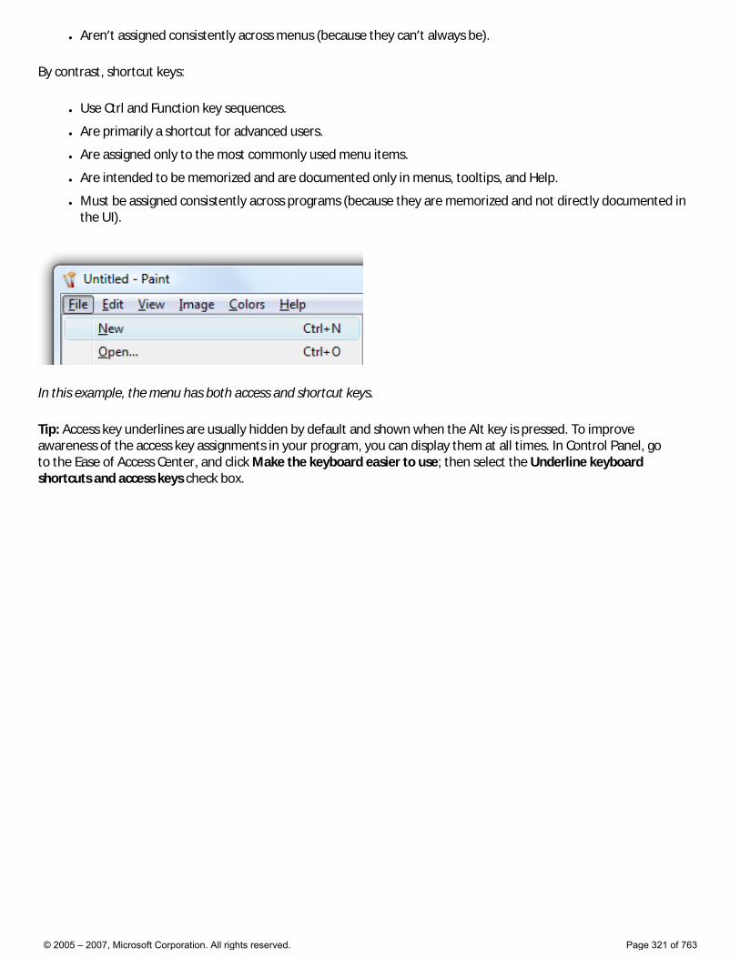
● Aren’t assigned consistently across menus (because they can’t always be).
By contrast, shortcut keys:
● Use Ctrl and Function key sequences.
● Are primarily a shortcut for advanced users.
● Are assigned only to the most commonly used menu items.
● Are intended to be memorized and are documented only in menus, tooltips, and Help.
● Must be assigned consistently across programs (because they are memorized and not directly documented in the UI).
In this example, the menu has both access and shortcut keys.
Tip: Access key underlines are usually hidden by default and shown when the Alt key is pressed. To improve awareness of the access key assignments in your program, you can display them at all times. In Control Panel, go to the Ease of Access Center, and click Make the keyboard easier to use; then select the Underline keyboard shortcuts and access keys check box.
© 2005 – 2007, Microsoft Corporation. All rights reserved. Page 321 of 763
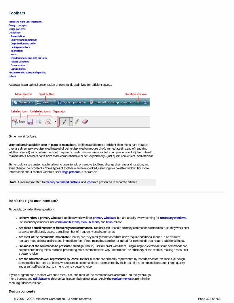
Toolbars
Is this the right user interface? Design concepts Usage patterns Guidelines Presentation Controls and commands Organization and order Hiding menu bars Interaction Icons Standard menu and split buttons Palette windows Customization Using ellipses Recommended sizing and spacing Labels
A toolbar is a graphical presentation of commands optimized for efficient access.
Some typical toolbars.
Use toolbars in addition to or in place of menu bars. Toolbars can be more efficient than menu bars because they are direct (always displayed instead of being displayed on mouse click), immediate (instead of requiring additional input) and contain the most frequently used commands (instead of a comprehensive list). In contrast to menu bars, toolbars don’t have to be comprehensive or self-explanatory—just quick, convenient, and efficient.
Some toolbars are customizable, allowing users to add or remove toolbars, change their size and location, and even change their contents. Some types of toolbars can be undocked, resulting in a palette window. For more information about toolbar varieties, see Usage patterns in this article.
Note: Guidelines related to menus, command buttons, and icons are presented in separate articles.
Is this the right user interface?
To decide, consider these questions:
● Is the window a primary window? Toolbars work well for primary windows, but are usually overwhelming for secondary windows. For secondary windows, use command buttons, menu buttons, and links instead.
● Are there a small number of frequently used commands? Toolbars can’t handle as many commands as menu bars, so they work best as a way to efficiently access a small number of frequently used commands.
● Are most of the commands immediate? That is, are they mostly commands that don’t require additional input? To be efficient, toolbars need to have a direct and immediate feel. If not, menu bars are better suited for commands that require additional input.
● Can most of the commands be presented directly? That is, users interact with them using a single click? While some commands can be presented using menu buttons, presenting most commands this way undermines the efficiency of the toolbar, making a menu bar a better choice.
● Are the commands well represented by icons? Toolbar buttons are primarily represented by icons instead of text labels (although some toolbar buttons use both), whereas menu commands are represented by their text. If the command icons aren’t high quality and aren’t self-explanatory, a menu bar is a better choice.
If your program has a toolbar without a menu bar, and most of the commands are accessible indirectly through menu buttons and split buttons, this toolbar is essentially a menu bar. Apply the toolbar menus pattern in the Menus guidelines instead.
Design concepts
© 2005 – 2007, Microsoft Corporation. All rights reserved. Page 322 of 763
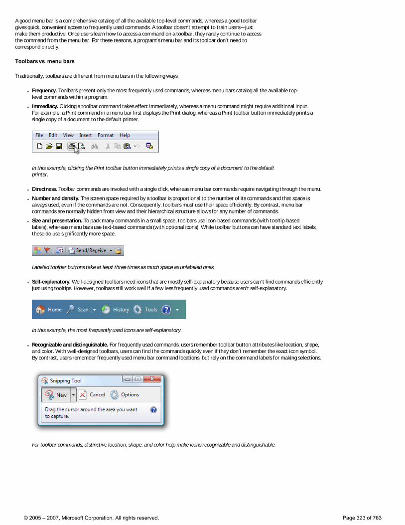
A good menu bar is a comprehensive catalog of all the available top-level commands, whereas a good toolbar gives quick, convenient access to frequently used commands. A toolbar doesn’t attempt to train users—just make them productive. Once users learn how to access a command on a toolbar, they rarely continue to access the command from the menu bar. For these reasons, a program’s menu bar and its toolbar don’t need to correspond directly.
Toolbars vs. menu bars
Traditionally, toolbars are different from menu bars in the following ways:
● Frequency. Toolbars present only the most frequently used commands, whereas menu bars catalog all the available top-level commands within a program.
● Immediacy. Clicking a toolbar command takes effect immediately, whereas a menu command might require additional input. For example, a Print command in a menu bar first displays the Print dialog, whereas a Print toolbar button immediately prints a single copy of a document to the default printer.
In this example, clicking the Print toolbar button immediately prints a single copy of a document to the default printer.
● Directness. Toolbar commands are invoked with a single click, whereas menu bar commands require navigating through the menu.
● Number and density. The screen space required by a toolbar is proportional to the number of its commands and that space is always used, even if the commands are not. Consequently, toolbars must use their space efficiently. By contrast, menu bar commands are normally hidden from view and their hierarchical structure allows for any number of commands.
● Size and presentation. To pack many commands in a small space, toolbars use icon-based commands (with tooltip-based labels), whereas menu bars use text-based commands (with optional icons). While toolbar buttons can have standard text labels, these do use significantly more space.
Labeled toolbar buttons take at least three times as much space as unlabeled ones.
● Self-explanatory. Well-designed toolbars need icons that are mostly self-explanatory because users can’t find commands efficiently just using tooltips. However, toolbars still work well if a few less frequently used commands aren’t self-explanatory.
In this example, the most frequently used icons are self-explanatory.
● Recognizable and distinguishable. For frequently used commands, users remember toolbar button attributes like location, shape, and color. With well-designed toolbars, users can find the commands quickly even if they don’t remember the exact icon symbol. By contrast, users remember frequently used menu bar command locations, but rely on the command labels for making selections.
For toolbar commands, distinctive location, shape, and color help make icons recognizable and distinguishable.
© 2005 – 2007, Microsoft Corporation. All rights reserved. Page 323 of 763
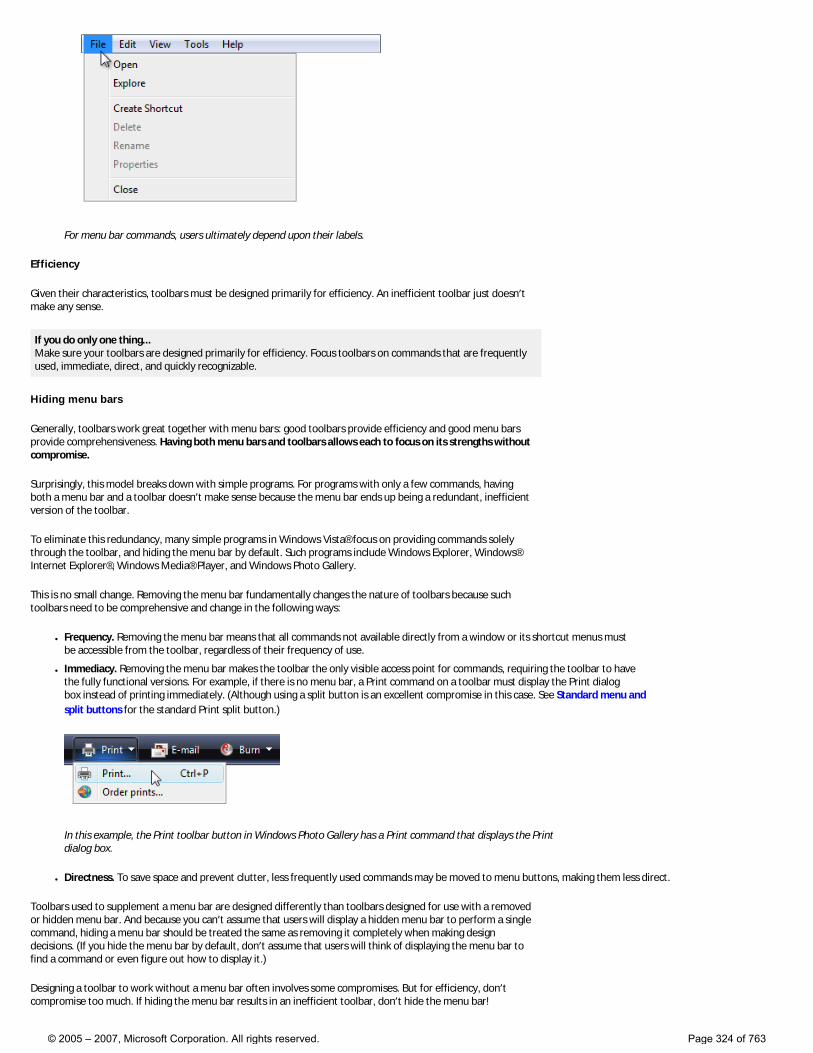
For menu bar commands, users ultimately depend upon their labels.
Efficiency
Given their characteristics, toolbars must be designed primarily for efficiency. An inefficient toolbar just doesn’t make any sense.
If you do only one thing... Make sure your toolbars are designed primarily for efficiency. Focus toolbars on commands that are frequently used, immediate, direct, and quickly recognizable.
Hiding menu bars
Generally, toolbars work great together with menu bars: good toolbars provide efficiency and good menu bars provide comprehensiveness. Having both menu bars and toolbars allows each to focus on its strengths without compromise.
Surprisingly, this model breaks down with simple programs. For programs with only a few commands, having both a menu bar and a toolbar doesn’t make sense because the menu bar ends up being a redundant, inefficient version of the toolbar.
To eliminate this redundancy, many simple programs in Windows Vista® focus on providing commands solely through the toolbar, and hiding the menu bar by default. Such programs include Windows Explorer, Windows® Internet Explorer®, Windows Media® Player, and Windows Photo Gallery.
This is no small change. Removing the menu bar fundamentally changes the nature of toolbars because such toolbars need to be comprehensive and change in the following ways:
● Frequency. Removing the menu bar means that all commands not available directly from a window or its shortcut menus must be accessible from the toolbar, regardless of their frequency of use.
● Immediacy. Removing the menu bar makes the toolbar the only visible access point for commands, requiring the toolbar to have the fully functional versions. For example, if there is no menu bar, a Print command on a toolbar must display the Print dialog box instead of printing immediately. (Although using a split button is an excellent compromise in this case. See Standard menu and split buttons for the standard Print split button.)
In this example, the Print toolbar button in Windows Photo Gallery has a Print command that displays the Print dialog box.
● Directness. To save space and prevent clutter, less frequently used commands may be moved to menu buttons, making them less direct.
Toolbars used to supplement a menu bar are designed differently than toolbars designed for use with a removed or hidden menu bar. And because you can’t assume that users will display a hidden menu bar to perform a single command, hiding a menu bar should be treated the same as removing it completely when making design decisions. (If you hide the menu bar by default, don’t assume that users will think of displaying the menu bar to find a command or even figure out how to display it.)
Designing a toolbar to work without a menu bar often involves some compromises. But for efficiency, don’t compromise too much. If hiding the menu bar results in an inefficient toolbar, don’t hide the menu bar!
© 2005 – 2007, Microsoft Corporation. All rights reserved. Page 324 of 763
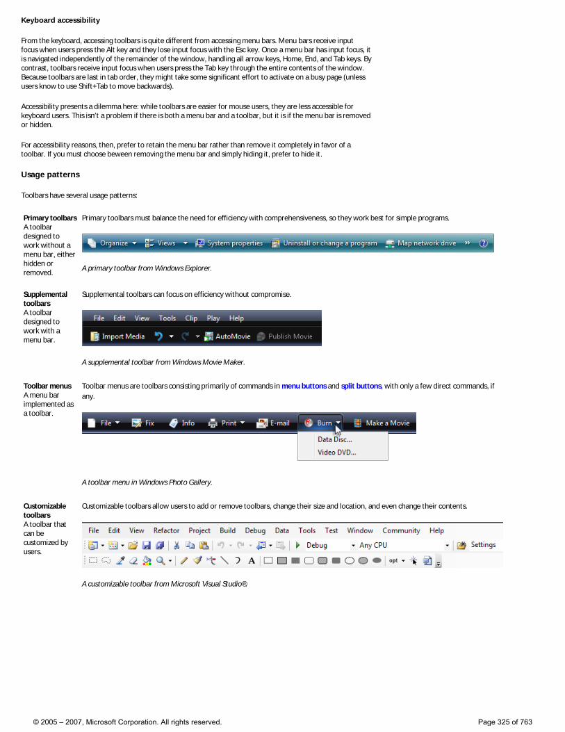
Keyboard accessibility
From the keyboard, accessing toolbars is quite different from accessing menu bars. Menu bars receive input focus when users press the Alt key and they lose input focus with the Esc key. Once a menu bar has input focus, it is navigated independently of the remainder of the window, handling all arrow keys, Home, End, and Tab keys. By contrast, toolbars receive input focus when users press the Tab key through the entire contents of the window. Because toolbars are last in tab order, they might take some significant effort to activate on a busy page (unless users know to use Shift+Tab to move backwards).
Accessibility presents a dilemma here: while toolbars are easier for mouse users, they are less accessible for keyboard users. This isn’t a problem if there is both a menu bar and a toolbar, but it is if the menu bar is removed or hidden.
For accessibility reasons, then, prefer to retain the menu bar rather than remove it completely in favor of a toolbar. If you must choose beween removing the menu bar and simply hiding it, prefer to hide it.
Usage patterns
Toolbars have several usage patterns:
Primary toolbars A toolbar designed to work without a menu bar, either hidden or removed.
Primary toolbars must balance the need for efficiency with comprehensiveness, so they work best for simple programs.
A primary toolbar from Windows Explorer.
Supplemental toolbars A toolbar designed to work with a menu bar.
Supplemental toolbars can focus on efficiency without compromise.
A supplemental toolbar from Windows Movie Maker.
Toolbar menus A menu bar implemented as a toolbar.
Toolbar menus are toolbars consisting primarily of commands in menu buttons and split buttons, with only a few direct commands, if any.
A toolbar menu in Windows Photo Gallery.
Customizable toolbars A toolbar that can be customized by users.
Customizable toolbars allow users to add or remove toolbars, change their size and location, and even change their contents.
A customizable toolbar from Microsoft Visual Studio®.
© 2005 – 2007, Microsoft Corporation. All rights reserved. Page 325 of 763
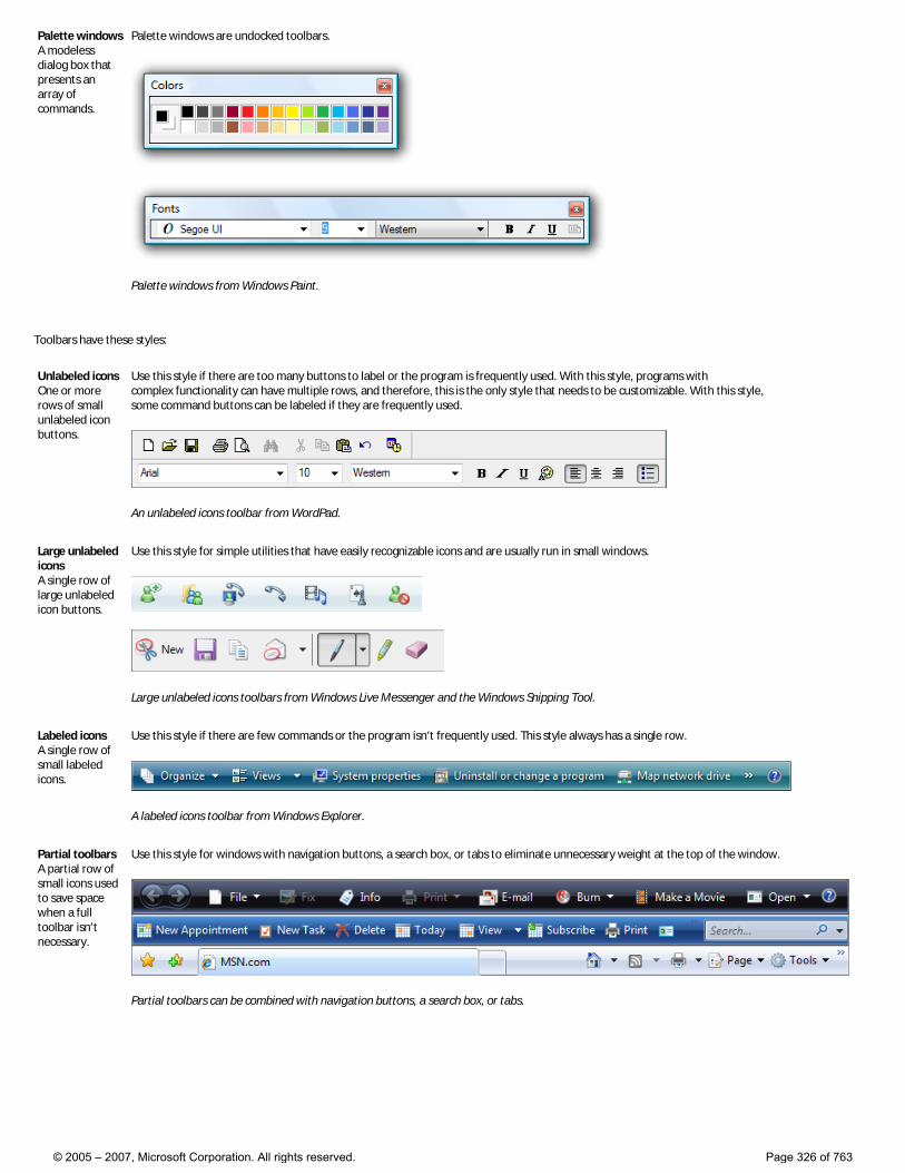
Palette windows A modeless dialog box that presents an array of commands.
Palette windows are undocked toolbars.
Palette windows from Windows Paint.
Toolbars have these styles:
Unlabeled icons One or more rows of small unlabeled icon buttons.
Use this style if there are too many buttons to label or the program is frequently used. With this style, programs with complex functionality can have multiple rows, and therefore, this is the only style that needs to be customizable. With this style, some command buttons can be labeled if they are frequently used.
An unlabeled icons toolbar from WordPad.
Large unlabeled icons A single row of large unlabeled icon buttons.
Use this style for simple utilities that have easily recognizable icons and are usually run in small windows.
Large unlabeled icons toolbars from Windows Live Messenger and the Windows Snipping Tool.
Labeled icons A single row of small labeled icons.
Use this style if there are few commands or the program isn’t frequently used. This style always has a single row.
A labeled icons toolbar from Windows Explorer.
Partial toolbars A partial row of small icons used to save space when a full toolbar isn’t necessary.
Use this style for windows with navigation buttons, a search box, or tabs to eliminate unnecessary weight at the top of the window.
Partial toolbars can be combined with navigation buttons, a search box, or tabs.
© 2005 – 2007, Microsoft Corporation. All rights reserved. Page 326 of 763
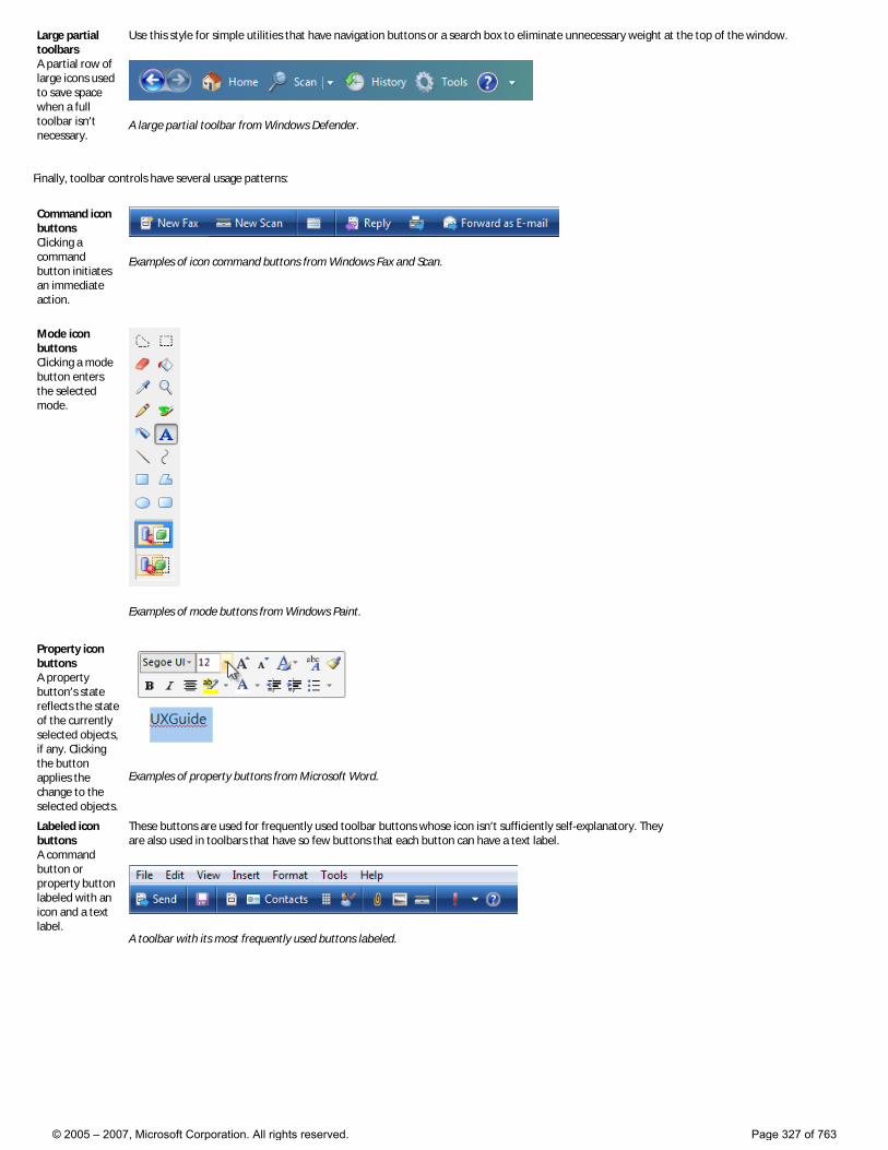
Large partial toolbars A partial row of large icons used to save space when a full toolbar isn’t necessary.
Use this style for simple utilities that have navigation buttons or a search box to eliminate unnecessary weight at the top of the window.
A large partial toolbar from Windows Defender.
Finally, toolbar controls have several usage patterns:
Command icon buttons Clicking a command button initiates an immediate action.
Examples of icon command buttons from Windows Fax and Scan.
Mode icon buttons Clicking a mode button enters the selected mode.
Examples of mode buttons from Windows Paint.
Property icon buttons A property button’s state reflects the state of the currently selected objects, if any. Clicking the button applies the change to the selected objects.
Examples of property buttons from Microsoft Word.
Labeled icon buttons A command button or property button labeled with an icon and a text label.
These buttons are used for frequently used toolbar buttons whose icon isn’t sufficiently self-explanatory. They are also used in toolbars that have so few buttons that each button can have a text label.
A toolbar with its most frequently used buttons labeled.
© 2005 – 2007, Microsoft Corporation. All rights reserved. Page 327 of 763
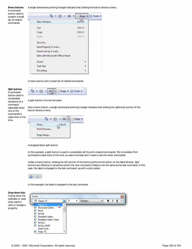
Menu buttons A command button used to present a small set of related commands.
A single downward-pointing triangle indicates that clicking the button shows a menu.
A menu button with a small set of related commands.
Split buttons A command button used to consolidate variations of a command, especially when one of the commands is used most of the time.
A split button in its normal state.
Like a menu button, a single downward-pointing triangle indicates that clicking the rightmost portion of the button shows a menu.
A dropped down split button.
In this example, a split button is used to consolidate all the print-related commands. The immediate Print command is used most of the time, so users normally don’t need to see the other commands.
Unlike a menu button, clicking the left portion of the button performs the action on the label directly. Split buttons are effective in situations where the next command is likely to be the same as the last command. In this case, the label is changed to the last command, as with a color picker:
In this example, the label is changed to the last command.
Drop-down lists A drop-down list (editable or read-only) used to view or change a property.
© 2005 – 2007, Microsoft Corporation. All rights reserved. Page 328 of 763
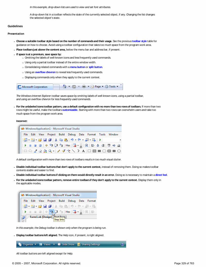
In this example, drop-down lists are used to view and set font attributes.
A drop-down list in a toolbar reflects the state of the currently selected object, if any. Changing the list changes the selected object’s state.
Guidelines
Presentation
● Choose a suitable toolbar style based on the number of commands and their usage. See the previous toolbar style table for guidance on how to choose. Avoid using a toolbar configuration that takes too much space from the program work area.
● Place toolbars just above the content area, below the menu bar and address bar, if present.
● If space is at a premium, save space by: �❍ Omitting the labels of well-known icons and less frequently used commands.
�❍ Using only a partial toolbar instead of the entire window width.
�❍ Consolidating related commands with a menu button or split button.
�❍ Using an overflow chevron to reveal less frequently used commands.
�❍ Displaying commands only when they apply to the current context.
The Windows Internet Explorer toolbar saves space by omitting labels of well-known icons, using a partial toolbar, and using an overflow chevron for less frequently used commands.
● For the unlabeled icons toolbar pattern, use a default configuration with no more than two rows of toolbars. If more than two rows might be useful, make the toolbars customizable. Starting with more than two rows can overwhelm users and take too much space from the program work area.
Incorrect:
A default configuration with more than two rows of toolbars results in too much visual clutter.
● Disable individual toolbar buttons that don’t apply to the current context, instead of removing them. Doing so makes toolbar contents stable and easier to find.
● Disable individual toolbar buttons if clicking on them would directly result in an error. Doing so is necessary to maintain a direct feel.
● For the unlabeled icons toolbar pattern, remove entire toolbars if they don’t apply to the current context. Display them only in the applicable modes.
In this example, the Debug toolbar is shown only when the program is being run.
● Display toolbar buttons left aligned. The Help icon, if present, is right aligned.
All toolbar buttons are left aligned except for Help.
© 2005 – 2007, Microsoft Corporation. All rights reserved. Page 329 of 763
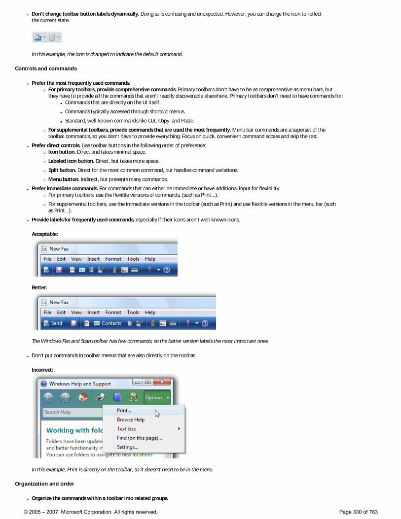
● Don’t change toolbar button labels dynamically. Doing so is confusing and unexpected. However, you can change the icon to reflect the current state.
In this example, the icon is changed to indicate the default command.
Controls and commands
● Prefer the most frequently used commands. �❍ For primary toolbars, provide comprehensive commands. Primary toolbars don’t have to be as comprehensive as menu bars, but
they have to provide all the commands that aren’t readily discoverable elsewhere. Primary toolbars don’t need to have commands for: ■ Commands that are directly on the UI itself.
■ Commands typically accessed through shortcut menus.
■ Standard, well-known commands like Cut, Copy, and Paste.
�❍ For supplemental toolbars, provide commands that are used the most frequently. Menu bar commands are a superset of the toolbar commands, so you don’t have to provide everything. Focus on quick, convenient command access and skip the rest.
● Prefer direct controls. Use toolbar buttons in the following order of preference: �❍ Icon button. Direct and takes minimal space.
�❍ Labeled icon button. Direct, but takes more space.
�❍ Split button. Direct for the most common command, but handles command variations.
�❍ Menu button. Indirect, but presents many commands.
● Prefer immediate commands. For commands that can either be immediate or have additional input for flexibility: �❍ For primary toolbars, use the flexible versions of commands, (such as Print...).
�❍ For supplemental toolbars, use the immediate versions in the toolbar (such as Print) and use flexible versions in the menu bar (such as Print...).
● Provide labels for frequently used commands, especially if their icons aren’t well-known icons.
Acceptable:
Better:
The Windows Fax and Scan toolbar has few commands, so the better version labels the most important ones.
● Don’t put commands in toolbar menus that are also directly on the toolbar.
Incorrect:
In this example, Print is directly on the toolbar, so it doesn’t need to be in the menu.
Organization and order
● Organize the commands within a toolbar into related groups.
© 2005 – 2007, Microsoft Corporation. All rights reserved. Page 330 of 763
● Place the most frequently used groups first. Within a group, put the commands in their logical order. Overall, the commands should have a logical flow to make them easy to find, while still having the most frequently used commands appear first. Doing so is most efficient, especially if there is overflow.
● Use group dividers only if the commands across groups are weakly coupled. Doing so makes the groupings obvious and the commands easier to find.
Examples of grouped toolbars from Windows Mail.
● Avoid placing destructive commands next to frequently used commands. Use either order or grouping to get separation. Also, consider not placing destructive commands in the toolbar, but only in the menu bar or shortcut menus instead.
Acceptable:
Better:
In the better example, the Delete command is physically separated from Print.
● Use the overflow chevron to indicate that not all commands can be displayed. But use overflow only if there isn’t sufficient room to display all the commands.
Incorrect:
The overflow chevron indicates that not all commands are displayed, but more of them could be with a better layout.
● Make sure that the most frequently used commands are directly accessible from the toolbar (that is, not in overflow) in small window sizes. If necessary, reorder the commands, move less frequently used commands to menu buttons or split buttons, or even remove them completely from the toolbar. If this remains a problem, reconsider your choice of toolbar style.
Hiding menu bars
Generally, toolbars work great together with menu bars because having both allows each to focus on their strengths without compromise.
● Hide the menu bar by default if your toolbar design makes having a menu bar redundant.
● Hide the menu bar instead of removing it completely, because menu bars are more accessible for keyboard users.
● To restore the menu bar, provide a Menu bar checkmark option in the View (for primary toolbars) or Tools (for secondary toolbars) menu category. For more information, see Standard menu and split buttons.
● Display the menu bar when users press the Alt key, and set input focus on the first menu category.
Interaction
● On hover, display the button affordance to indicate that the icon is clickable. After the tooltip timeout, display the tooltip or infotip.
This example shows the various display states.
● On left single-click:
© 2005 – 2007, Microsoft Corporation. All rights reserved. Page 331 of 763
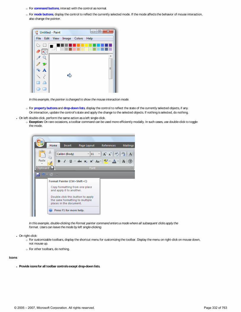
�❍ For command buttons, interact with the control as normal.
�❍ For mode buttons, display the control to reflect the currently selected mode. If the mode affects the behavior of mouse interaction, also change the pointer.
In this example, the pointer is changed to show the mouse interaction mode.
�❍ For property buttons and drop-down lists, display the control to reflect the state of the currently selected objects, if any. On interaction, update the control’s state and apply the change to the selected objects. If nothing is selected, do nothing.
● On left double-click, perform the same action as a left single-click. �❍ Exception: On rare occasions, a toolbar command can be used more efficiently modally. In such cases, use double-click to toggle
the mode.
In this example, double-clicking the Format painter command enters a mode where all subsequent clicks apply the format. Users can leave the mode by left single-clicking.
● On right-click: �❍ For customizable toolbars, display the shortcut menu for customizing the toolbar. Display the menu on right-click on mouse down,
not mouse up.
�❍ For other toolbars, do nothing.
Icons
● Provide icons for all toolbar controls except drop-down lists.
© 2005 – 2007, Microsoft Corporation. All rights reserved. Page 332 of 763
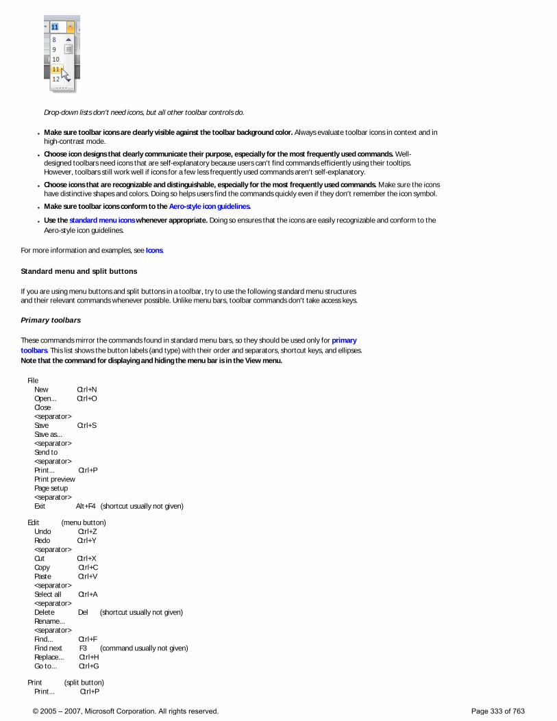
Drop-down lists don’t need icons, but all other toolbar controls do.
● Make sure toolbar icons are clearly visible against the toolbar background color. Always evaluate toolbar icons in context and in high-contrast mode.
● Choose icon designs that clearly communicate their purpose, especially for the most frequently used commands. Well-designed toolbars need icons that are self-explanatory because users can’t find commands efficiently using their tooltips. However, toolbars still work well if icons for a few less frequently used commands aren’t self-explanatory.
● Choose icons that are recognizable and distinguishable, especially for the most frequently used commands. Make sure the icons have distinctive shapes and colors. Doing so helps users find the commands quickly even if they don’t remember the icon symbol.
● Make sure toolbar icons conform to the Aero-style icon guidelines.
● Use the standard menu icons whenever appropriate. Doing so ensures that the icons are easily recognizable and conform to the Aero-style icon guidelines.
For more information and examples, see Icons.
Standard menu and split buttons
If you are using menu buttons and split buttons in a toolbar, try to use the following standard menu structures and their relevant commands whenever possible. Unlike menu bars, toolbar commands don’t take access keys.
Primary toolbars
These commands mirror the commands found in standard menu bars, so they should be used only for primary toolbars. This list shows the button labels (and type) with their order and separators, shortcut keys, and ellipses. Note that the command for displaying and hiding the menu bar is in the View menu.
File New Ctrl+N Open... Ctrl+O Close <separator> Save Ctrl+S Save as... <separator> Send to <separator> Print... Ctrl+P Print preview Page setup <separator> Exit Alt+F4 (shortcut usually not given) Edit (menu button) Undo Ctrl+Z Redo Ctrl+Y <separator> Cut Ctrl+X Copy Ctrl+C Paste Ctrl+V <separator> Select all Ctrl+A <separator> Delete Del (shortcut usually not given) Rename... <separator> Find... Ctrl+F Find next F3 (command usually not given) Replace... Ctrl+H Go to... Ctrl+G Print (split button) Print... Ctrl+P
© 2005 – 2007, Microsoft Corporation. All rights reserved. Page 333 of 763
Print preview <separator> Page setup View (menu button) Menu bar (check if visible) Details pane (check if visible) Preview pane (check if visible) Status bar (check if visible) <separator> Zoom Zoom in Ctrl++ Zoom out Ctrl+- <separator> Text size (selected setting has bullet) Largest Larger Medium Smaller Smallest <separator> Full screen F11 Refresh F5 Tools (menu button) ... <separator> Options Help (split button, use the Help icon) <program name> help F1 <separator> About <program name>
Supplemental toolbars
These commands supplement standard menu bars. This list shows the button labels (and type) with their order and separators, shortcut keys, and ellipses. Note that the command for displaying and hiding the menu bar is in the Tools menu.
Print (split button) Print... Ctrl+P Print preview <separator> Page setup Tools (menu button) Menu bar (check if visible) Details pane (check if visible) Preview pane (check if visible) Status bar (check if visible) <separator> Print... (if not elsewhere) Find... <separator> Full screen F11 Refresh F5 <separator> Zoom Zoom in Ctrl++ Zoom out Ctrl+- <separator> Text size (selected setting has bullet) Largest Larger Medium Smaller Smallest <separator> Options Organize (menu button) New folder Ctrl+N <separator> Cut Ctrl+X Copy Ctrl+C
© 2005 – 2007, Microsoft Corporation. All rights reserved. Page 334 of 763
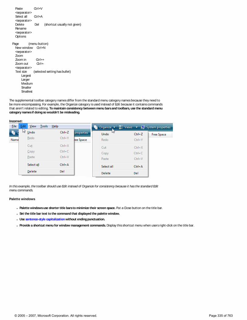
Paste Ctrl+V <separator> Select all Ctrl+A <separator> Delete Del (shortcut usually not given) Rename <separator> Options Page (menu button) New window Ctrl+N <separator> Zoom Zoom in Ctrl++ Zoom out Ctrl+- <separator> Text size (selected setting has bullet) Largest Larger Medium Smaller Smallest
The supplemental toolbar category names differ from the standard menu category names because they need to be more encompassing. For example, the Organize category is used instead of Edit because it contains commands that aren’t related to editing. To maintain consistency between menu bars and toolbars, use the standard menu category names if doing so wouldn’t be misleading.
Incorrect:
In this example, the toolbar should use Edit instead of Organize for consistency because it has the standard Edit menu commands.
Palette windows
● Palette windows use shorter title bars to minimize their screen space. Put a Close button on the title bar.
● Set the title bar text to the command that displayed the palette window.
● Use sentence-style capitalization without ending punctuation.
● Provide a shortcut menu for window management commands. Display this shortcut menu when users right-click on the title bar.
© 2005 – 2007, Microsoft Corporation. All rights reserved. Page 335 of 763
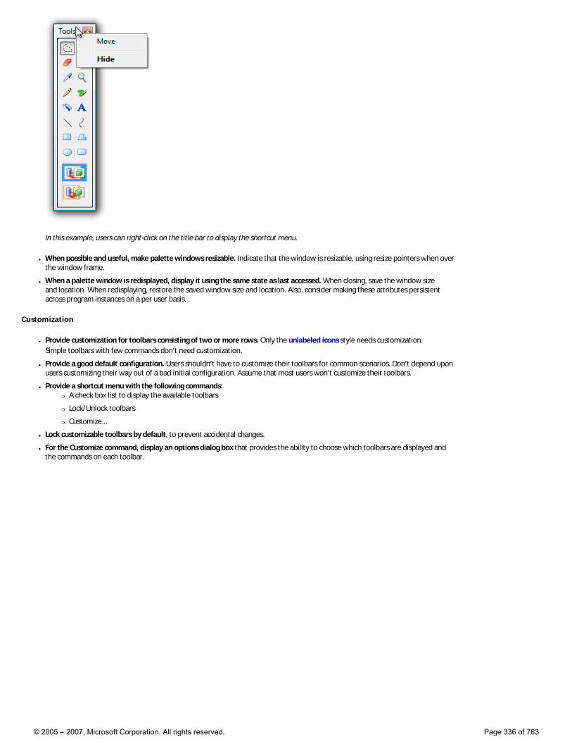
In this example, users can right-click on the title bar to display the shortcut menu.
● When possible and useful, make palette windows resizable. Indicate that the window is resizable, using resize pointers when over the window frame.
● When a palette window is redisplayed, display it using the same state as last accessed. When closing, save the window size and location. When redisplaying, restore the saved window size and location. Also, consider making these attributes persistent across program instances on a per user basis.
Customization
● Provide customization for toolbars consisting of two or more rows. Only the unlabeled icons style needs customization. Simple toolbars with few commands don’t need customization.
● Provide a good default configuration. Users shouldn’t have to customize their toolbars for common scenarios. Don’t depend upon users customizing their way out of a bad initial configuration. Assume that most users won’t customize their toolbars.
● Provide a shortcut menu with the following commands: �❍ A check box list to display the available toolbars
�❍ Lock/Unlock toolbars
�❍ Customize...
● Lock customizable toolbars by default, to prevent accidental changes.
● For the Customize command, display an options dialog box that provides the ability to choose which toolbars are displayed and the commands on each toolbar.
© 2005 – 2007, Microsoft Corporation. All rights reserved. Page 336 of 763
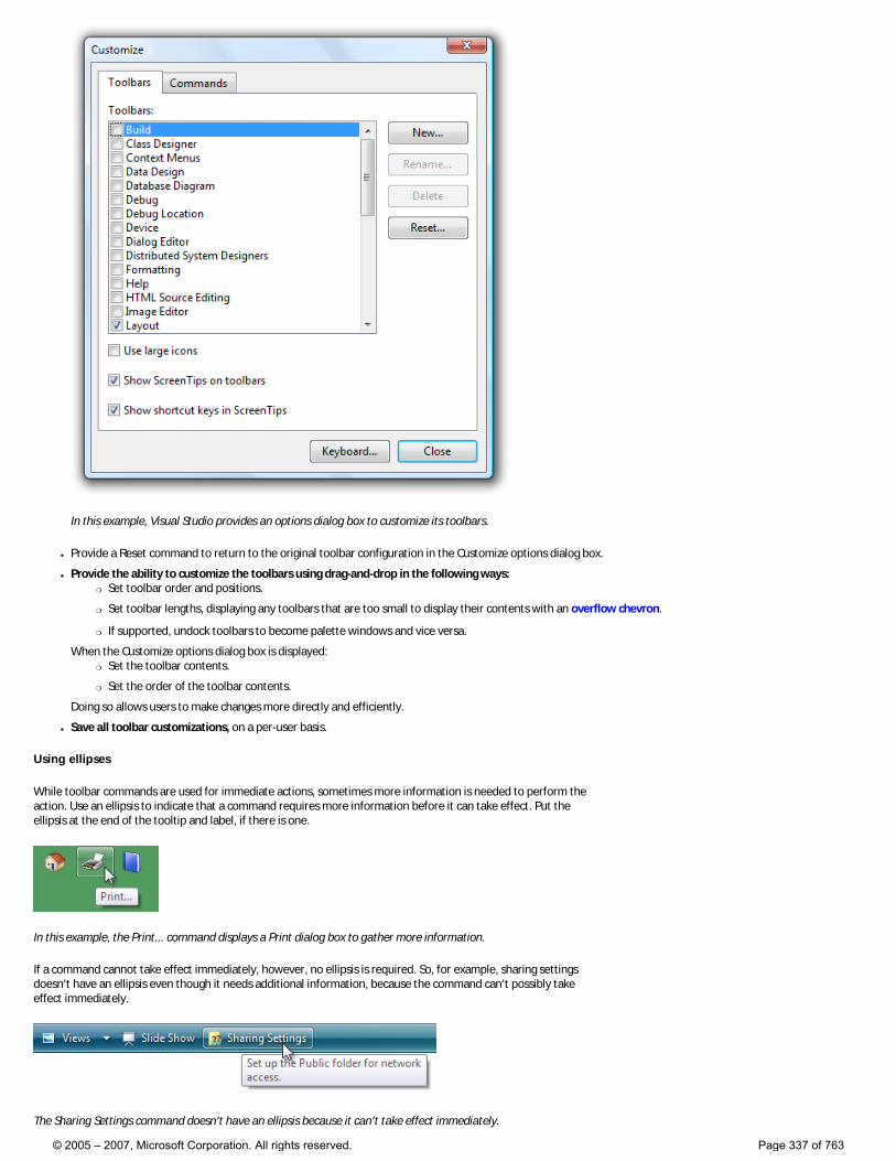
In this example, Visual Studio provides an options dialog box to customize its toolbars.
● Provide a Reset command to return to the original toolbar configuration in the Customize options dialog box.
● Provide the ability to customize the toolbars using drag-and-drop in the following ways: �❍ Set toolbar order and positions.
�❍ Set toolbar lengths, displaying any toolbars that are too small to display their contents with an overflow chevron.
�❍ If supported, undock toolbars to become palette windows and vice versa.
When the Customize options dialog box is displayed: �❍ Set the toolbar contents.
�❍ Set the order of the toolbar contents.
Doing so allows users to make changes more directly and efficiently.
● Save all toolbar customizations, on a per-user basis.
Using ellipses
While toolbar commands are used for immediate actions, sometimes more information is needed to perform the action. Use an ellipsis to indicate that a command requires more information before it can take effect. Put the ellipsis at the end of the tooltip and label, if there is one.
In this example, the Print... command displays a Print dialog box to gather more information.
If a command cannot take effect immediately, however, no ellipsis is required. So, for example, sharing settings doesn’t have an ellipsis even though it needs additional information, because the command can’t possibly take effect immediately.
The Sharing Settings command doesn’t have an ellipsis because it can’t take effect immediately.
© 2005 – 2007, Microsoft Corporation. All rights reserved. Page 337 of 763
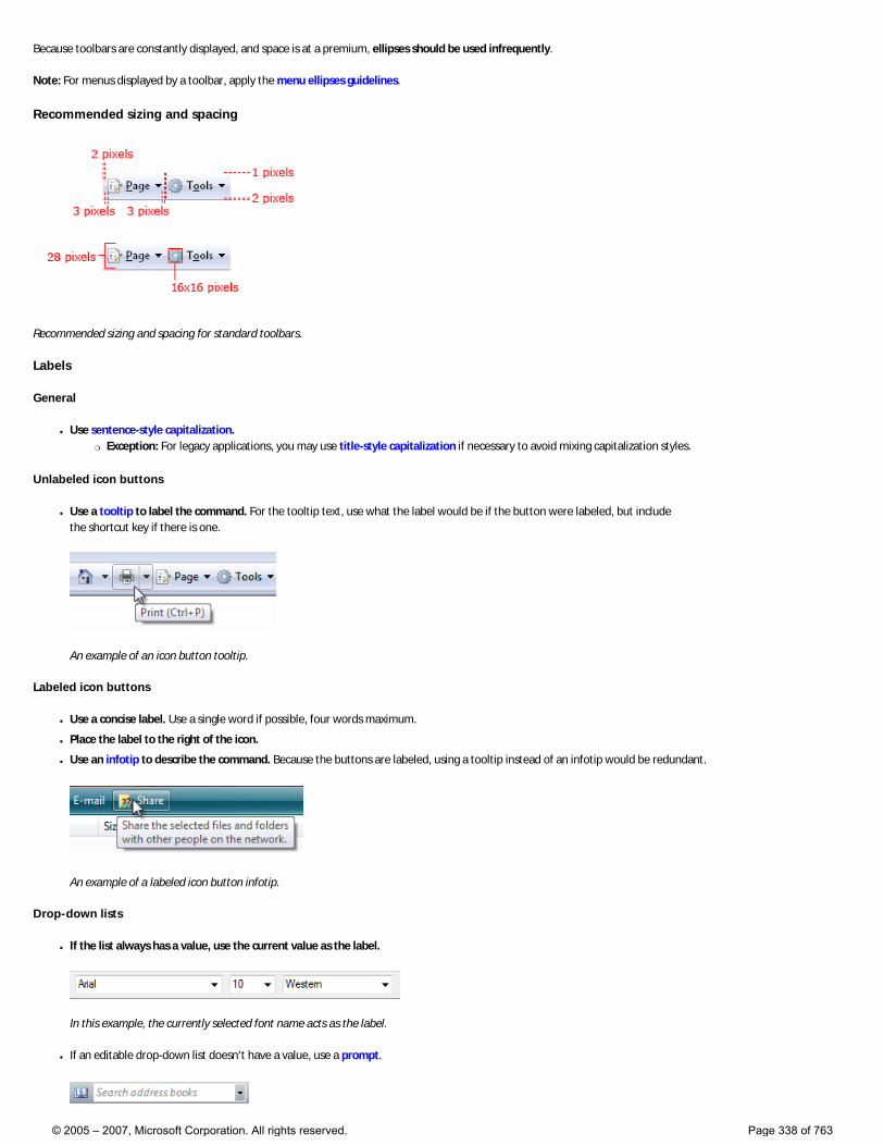
Because toolbars are constantly displayed, and space is at a premium, ellipses should be used infrequently.
Note: For menus displayed by a toolbar, apply the menu ellipses guidelines.
Recommended sizing and spacing
Recommended sizing and spacing for standard toolbars.
Labels
General
● Use sentence-style capitalization. �❍ Exception: For legacy applications, you may use title-style capitalization if necessary to avoid mixing capitalization styles.
Unlabeled icon buttons
● Use a tooltip to label the command. For the tooltip text, use what the label would be if the button were labeled, but include the shortcut key if there is one.
An example of an icon button tooltip.
Labeled icon buttons
● Use a concise label. Use a single word if possible, four words maximum.
● Place the label to the right of the icon.
● Use an infotip to describe the command. Because the buttons are labeled, using a tooltip instead of an infotip would be redundant.
An example of a labeled icon button infotip.
Drop-down lists
● If the list always has a value, use the current value as the label.
In this example, the currently selected font name acts as the label.
● If an editable drop-down list doesn’t have a value, use a prompt.
© 2005 – 2007, Microsoft Corporation. All rights reserved. Page 338 of 763
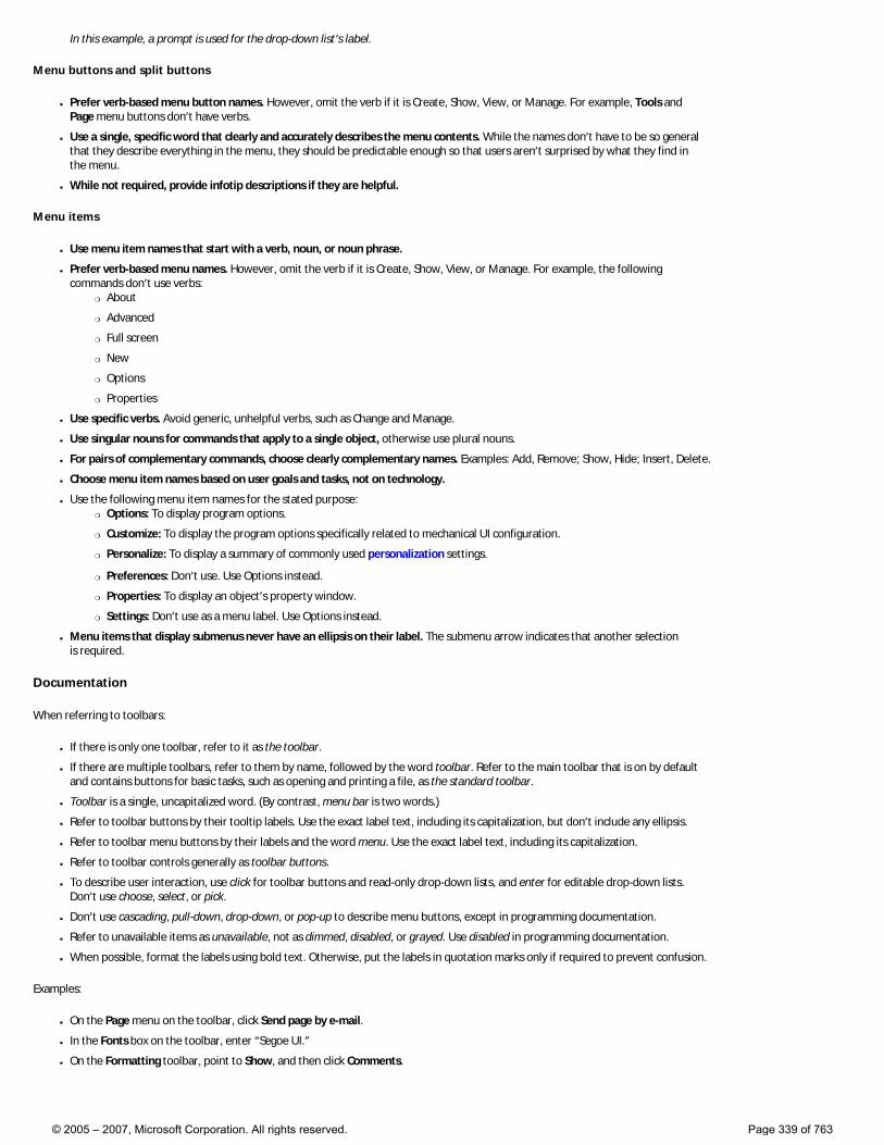
In this example, a prompt is used for the drop-down list’s label.
Menu buttons and split buttons
● Prefer verb-based menu button names. However, omit the verb if it is Create, Show, View, or Manage. For example, Tools and Page menu buttons don’t have verbs.
● Use a single, specific word that clearly and accurately describes the menu contents. While the names don’t have to be so general that they describe everything in the menu, they should be predictable enough so that users aren’t surprised by what they find in the menu.
● While not required, provide infotip descriptions if they are helpful.
Menu items
● Use menu item names that start with a verb, noun, or noun phrase.
● Prefer verb-based menu names. However, omit the verb if it is Create, Show, View, or Manage. For example, the following commands don’t use verbs:
�❍ About
�❍ Advanced
�❍ Full screen
�❍ New
�❍ Options
�❍ Properties
● Use specific verbs. Avoid generic, unhelpful verbs, such as Change and Manage.
● Use singular nouns for commands that apply to a single object, otherwise use plural nouns.
● For pairs of complementary commands, choose clearly complementary names. Examples: Add, Remove; Show, Hide; Insert, Delete.
● Choose menu item names based on user goals and tasks, not on technology.
● Use the following menu item names for the stated purpose: �❍ Options: To display program options.
�❍ Customize: To display the program options specifically related to mechanical UI configuration.
�❍ Personalize: To display a summary of commonly used personalization settings.
�❍ Preferences: Don’t use. Use Options instead.
�❍ Properties: To display an object’s property window.
�❍ Settings: Don’t use as a menu label. Use Options instead.
● Menu items that display submenus never have an ellipsis on their label. The submenu arrow indicates that another selection is required.
Documentation
When referring to toolbars:
● If there is only one toolbar, refer to it as the toolbar.
● If there are multiple toolbars, refer to them by name, followed by the word toolbar. Refer to the main toolbar that is on by default and contains buttons for basic tasks, such as opening and printing a file, as the standard toolbar.
● Toolbar is a single, uncapitalized word. (By contrast, menu bar is two words.)
● Refer to toolbar buttons by their tooltip labels. Use the exact label text, including its capitalization, but don’t include any ellipsis.
● Refer to toolbar menu buttons by their labels and the word menu. Use the exact label text, including its capitalization.
● Refer to toolbar controls generally as toolbar buttons.
● To describe user interaction, use click for toolbar buttons and read-only drop-down lists, and enter for editable drop-down lists. Don’t use choose, select, or pick.
● Don’t use cascading, pull-down, drop-down, or pop-up to describe menu buttons, except in programming documentation.
● Refer to unavailable items as unavailable, not as dimmed, disabled, or grayed. Use disabled in programming documentation.
● When possible, format the labels using bold text. Otherwise, put the labels in quotation marks only if required to prevent confusion.
Examples:
● On the Page menu on the toolbar, click Send page by e-mail.
● In the Fonts box on the toolbar, enter “Segoe UI.”
● On the Formatting toolbar, point to Show, and then click Comments.
© 2005 – 2007, Microsoft Corporation. All rights reserved. Page 339 of 763
Text
These articles provide guidelines for using text in your Windows Vista®-based applications:
● User Interface Text
● Style and Tone
You can also find specific text guidelines in the Text or Labels sections for Controls and Windows.
© 2005 – 2007, Microsoft Corporation. All rights reserved. Page 340 of 763
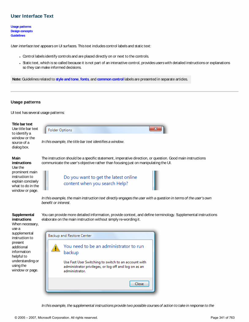
User Interface Text
Usage patterns Design concepts Guidelines
User interface text appears on UI surfaces. This text includes control labels and static text:
● Control labels identify controls and are placed directly on or next to the controls.
● Static text, which is so called because it is not part of an interactive control, provides users with detailed instructions or explanations so they can make informed decisions.
Note: Guidelines related to style and tone, fonts, and common control labels are presented in separate articles.
Usage patterns
UI text has several usage patterns:
Title bar text Use title bar text to identify a window or the source of a dialog box.
In this example, the title bar text identifies a window.
Main instructions Use the prominent main instruction to explain concisely what to do in the window or page.
The instruction should be a specific statement, imperative direction, or question. Good main instructions communicate the user’s objective rather than focusing just on manipulating the UI.
In this example, the main instruction text directly engages the user with a question in terms of the user’s own benefit or interest.
Supplemental instructions When necessary, use a supplemental instruction to present additional information helpful to understanding or using the window or page.
You can provide more detailed information, provide context, and define terminology. Supplemental instructions elaborate on the main instruction without simply re-wording it.
In this example, the supplemental instructions provide two possible courses of action to take in response to the
© 2005 – 2007, Microsoft Corporation. All rights reserved. Page 341 of 763
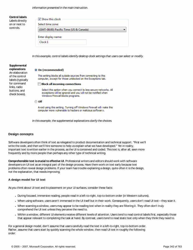
information presented in the main instruction.
Control labels Labels directly on or next to controls.
In this example, control labels identify desktop clock settings that users can select or modify.
Supplemental explanations An elaboration of the control labels (typically for command links, radio buttons, and check boxes).
In this example, the supplemental explanations clarify the choices.
Design concepts
Software developers often think of text as relegated to product documentation and technical support. “First we’ll write the code, and then we’ll hire someone to help us explain what we have developed.” Yet in reality, important text is written earlier in the process, as the UI is conceived and coded. This text is, after all, seen more frequently and by more people than perhaps any other type of technical writing.
Comprehensible text is crucial to effective UI. Professional writers and editors should work with software developers on UI text as an integral part of the design process. Have them work on text early because text problems often reveal design problems. If your team has trouble explaining a design, quite often it is the design, not the explanation, that needs improving.
A design model for UI text
As you think about UI text and its placement on your UI surfaces, consider these facts:
● During focused, immersive reading, people read in a left-to-right, top-to-bottom order (in Western cultures).
● When using software, users aren’t immersed in the UI itself but in their work. Consequently, users don’t read UI text—they scan it.
● When scanning a window, users may appear to be reading text when in reality they are filtering it. They often don’t truly comprehend the UI text unless they perceive the need to.
● Within a window, different UI elements receive different levels of attention. Users tend to read control labels first, especially those that appear relevant to completing the task at hand. By contrast, users tend to read static text only when they think they need to.
For a general design model, don’t assume that users carefully read the text in a left-to-right, top-to-bottom order. Rather, assume that users start by quickly scanning the whole window, then read UI text in roughly the following order:
© 2005 – 2007, Microsoft Corporation. All rights reserved. Page 342 of 763
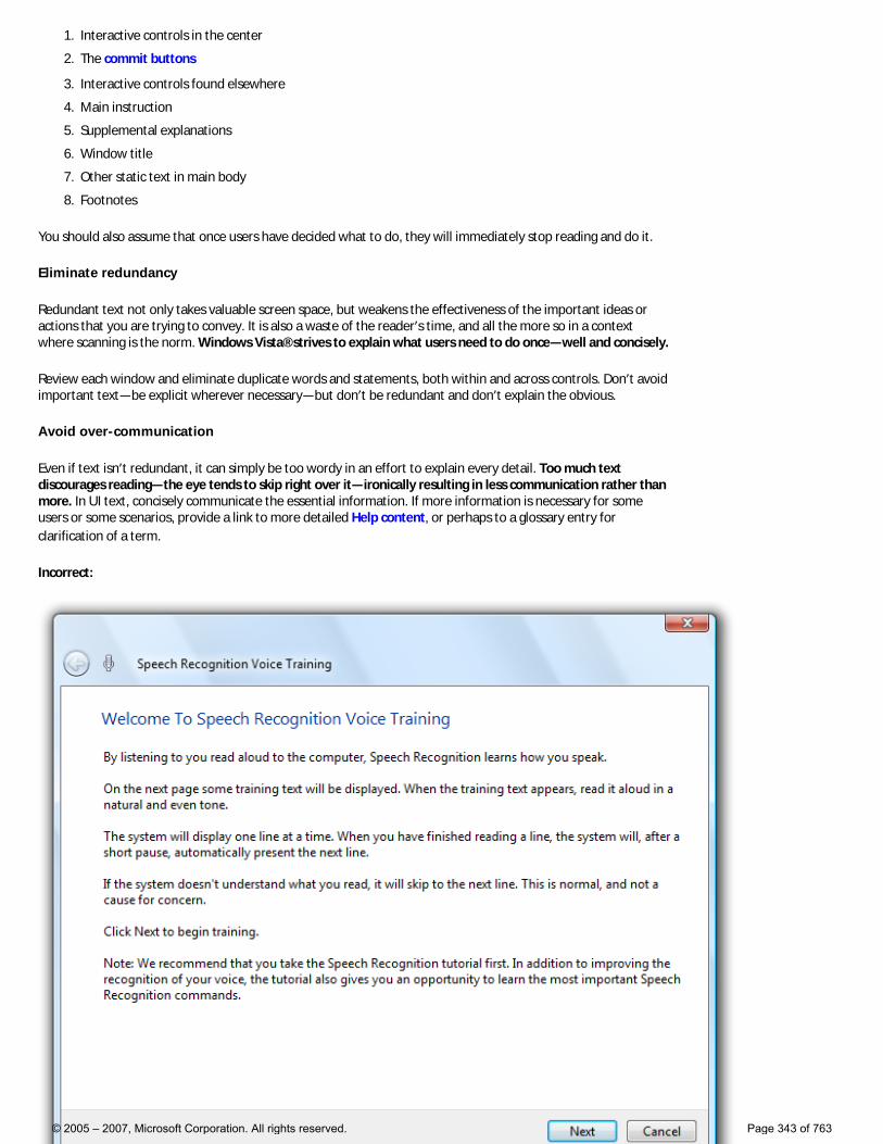
1. Interactive controls in the center
2. The commit buttons
3. Interactive controls found elsewhere
4. Main instruction
5. Supplemental explanations
6. Window title
7. Other static text in main body
8. Footnotes
You should also assume that once users have decided what to do, they will immediately stop reading and do it.
Eliminate redundancy
Redundant text not only takes valuable screen space, but weakens the effectiveness of the important ideas or actions that you are trying to convey. It is also a waste of the reader’s time, and all the more so in a context where scanning is the norm. Windows Vista® strives to explain what users need to do once—well and concisely.
Review each window and eliminate duplicate words and statements, both within and across controls. Don’t avoid important text—be explicit wherever necessary—but don’t be redundant and don’t explain the obvious.
Avoid over-communication
Even if text isn’t redundant, it can simply be too wordy in an effort to explain every detail. Too much text discourages reading—the eye tends to skip right over it—ironically resulting in less communication rather than more. In UI text, concisely communicate the essential information. If more information is necessary for some users or some scenarios, provide a link to more detailed Help content, or perhaps to a glossary entry for clarification of a term.
Incorrect:
© 2005 – 2007, Microsoft Corporation. All rights reserved. Page 343 of 763
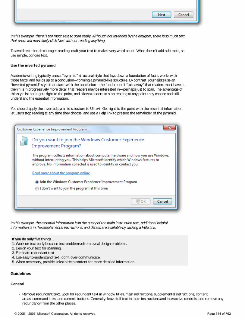
In this example, there is too much text to scan easily. Although not intended by the designer, there is so much text that users will most likely click Next without reading anything.
To avoid text that discourages reading, craft your text to make every word count. What doesn’t add subtracts, so use simple, concise text.
Use the inverted pyramid
Academic writing typically uses a “pyramid” structural style that lays down a foundation of facts, works with those facts, and builds up to a conclusion—forming a pyramid-like structure. By contrast, journalists use an “inverted pyramid” style that starts with the conclusion—the fundamental “takeaway” that readers must have. It then fills in progressively more detail that readers may be interested in—perhaps just to scan. The advantage of this style is that it gets right to the point, and allows readers to stop reading at any point they choose and still understand the essential information.
You should apply the inverted pyramid structure to UI text. Get right to the point with the essential information, let users stop reading at any time they choose, and use a Help link to present the remainder of the pyramid.
In this example, the essential information is in the query of the main instruction text, additional helpful information is in the supplemental instructions, and details are available by clicking a Help link.
If you do only five things... 1. Work on text early because text problems often reveal design problems. 2. Design your text for scanning. 3. Eliminate redundant text. 4. Use easy-to-understand text; don’t over-communicate. 5. When necessary, provide links to Help content for more detailed information.
Guidelines
General
● Remove redundant text. Look for redundant text in window titles, main instructions, supplemental instructions, content areas, command links, and commit buttons. Generally, leave full text in main instructions and interactive controls, and remove any redundancy from the other places.
© 2005 – 2007, Microsoft Corporation. All rights reserved. Page 344 of 763
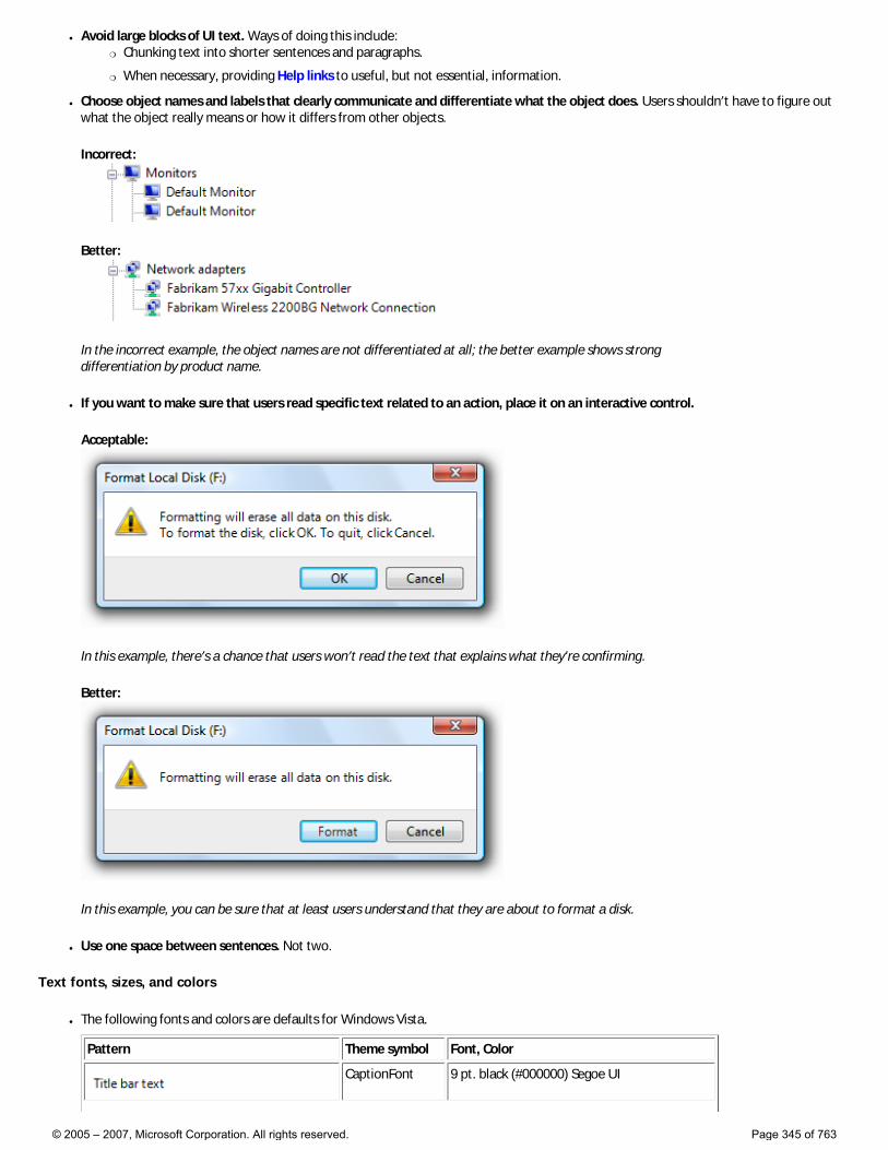
● Avoid large blocks of UI text. Ways of doing this include: �❍ Chunking text into shorter sentences and paragraphs.
�❍ When necessary, providing Help links to useful, but not essential, information.
● Choose object names and labels that clearly communicate and differentiate what the object does. Users shouldn’t have to figure out what the object really means or how it differs from other objects.
Incorrect:
Better:
In the incorrect example, the object names are not differentiated at all; the better example shows strong differentiation by product name.
● If you want to make sure that users read specific text related to an action, place it on an interactive control.
Acceptable:
In this example, there’s a chance that users won’t read the text that explains what they're confirming.
Better:
In this example, you can be sure that at least users understand that they are about to format a disk.
● Use one space between sentences. Not two.
Text fonts, sizes, and colors
● The following fonts and colors are defaults for Windows Vista.
Pattern Theme symbol Font, Color
CaptionFont 9 pt. black (#000000) Segoe UI
© 2005 – 2007, Microsoft Corporation. All rights reserved. Page 345 of 763
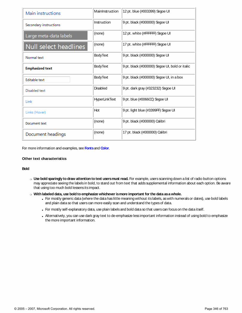
MainInstruction 12 pt. blue (#003399) Segoe UI
Instruction 9 pt. black (#000000) Segoe UI
(none) 12 pt. white (#FFFFFF) Segoe UI
(none) 17 pt. white (#FFFFFF) Segoe UI
BodyText 9 pt. black (#000000) Segoe UI
BodyText 9 pt. black (#000000) Segoe UI, bold or italic
BodyText 9 pt. black (#000000) Segoe UI, in a box
Disabled 9 pt. dark gray (#323232) Segoe UI
HyperLinkText 9 pt. blue (#0066CC) Segoe UI
Hot 9 pt. light blue (#3399FF) Segoe UI
(none) 9 pt. black (#000000) Calibri
(none) 17 pt. black (#000000) Calibri
For more information and examples, see Fonts and Color.
Other text characteristics
Bold
�❍ Use bold sparingly to draw attention to text users must read. For example, users scanning down a list of radio button options may appreciate seeing the labels in bold, to stand out from text that adds supplemental information about each option. Be aware that using too much bold lessens its impact.
�❍ With labeled data, use bold to emphasize whichever is more important for the data as a whole. ■ For mostly generic data (where the data has little meaning without its labels, as with numerals or dates), use bold labels
and plain data so that users can more easily scan and understand the types of data.
■ For mostly self-explanatory data, use plain labels and bold data so that users can focus on the data itself.
■ Alternatively, you can use dark gray text to de-emphasize less important information instead of using bold to emphasize the more important information.
© 2005 – 2007, Microsoft Corporation. All rights reserved. Page 346 of 763
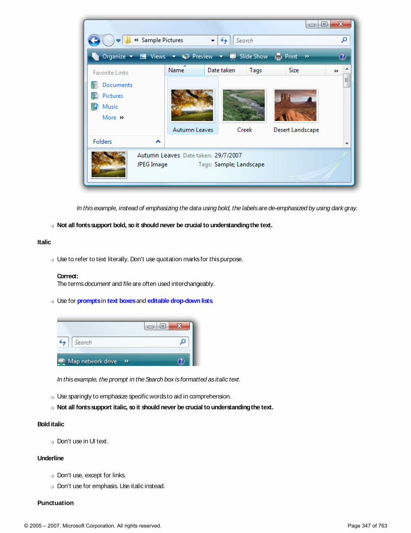
In this example, instead of emphasizing the data using bold, the labels are de-emphasized by using dark gray.
�❍ Not all fonts support bold, so it should never be crucial to understanding the text.
Italic
�❍ Use to refer to text literally. Don’t use quotation marks for this purpose.
Correct: The terms document and file are often used interchangeably.
�❍ Use for prompts in text boxes and editable drop-down lists.
In this example, the prompt in the Search box is formatted as italic text.
�❍ Use sparingly to emphasize specific words to aid in comprehension.
�❍ Not all fonts support italic, so it should never be crucial to understanding the text.
Bold italic
�❍ Don’t use in UI text.
Underline
�❍ Don’t use, except for links.
�❍ Don’t use for emphasis. Use italic instead.
Punctuation
© 2005 – 2007, Microsoft Corporation. All rights reserved. Page 347 of 763

Periods
�❍ Don’t place at the end of control labels or main instructions.
�❍ Place at the end of supplemental instructions, supplemental explanations, or any other static text that forms a complete sentence.
Question marks
�❍ Place at the end of all questions. Unlike periods, question marks are used for all types of text.
Exclamation points
�❍ In business applications, avoid. ■ Exceptions: Exclamation points are sometimes used in the context of download completion (“Done!”) and to call
attention to Web content (“New!”).
Commas
�❍ In a list of three or more items, always put a comma after the next-to-last item in the list.
Colons
�❍ Use colons at the end of external control labels. This is particularly important for accessibility because some assistive technologies look for colons to identify control labels.
�❍ Use a colon to introduce a list of items.
Ellipses
�❍ Ellipses mean incompleteness. Use ellipses in UI text as follows: ■ Commands: Indicate that a command needs additional information. Don’t use an ellipsis whenever an action displays
another window—only when additional information is required. For more information, see Command Buttons.
■ Data: Indicate that text is truncated.
■ Labels: Indicate that a task is in progress (for example, “Searching...”).
Tip: Truncated text in a window or page with unused space indicates poor layout or a default window size that is too small. Strive for layouts and default window sizes that eliminate or reduce the amount of truncated text. For more information, see Layout.
Quotation marks and apostrophes
�❍ To refer to text literally, use italic formatting rather than quotation marks.
�❍ Put window titles and control labels in quotation marks only if required to prevent confusion and you can’t format using bold instead.
�❍ When possible, use curved quotation marks and apostrophes instead of straight ones.
�❍ For quotation marks, prefer double-quotation marks (“ ”); avoid single-quotation marks (‘ ’).
Correct: Are you sure you want to delete “Sparky’s cat folder”?
Incorrect: Are you sure you want to delete ‘Sparky’s cat folder’?
Capitalization
�❍ Use title-style capitalization for titles, sentence-style capitalization for all other UI elements. Doing so is more appropriate for the Windows Vista tone and its more descriptive use of text.
■ Exception: For legacy applications, you may use title-style capitalization for command buttons, menus, and column headings if necessary to avoid mixing capitalization styles.
© 2005 – 2007, Microsoft Corporation. All rights reserved. Page 348 of 763
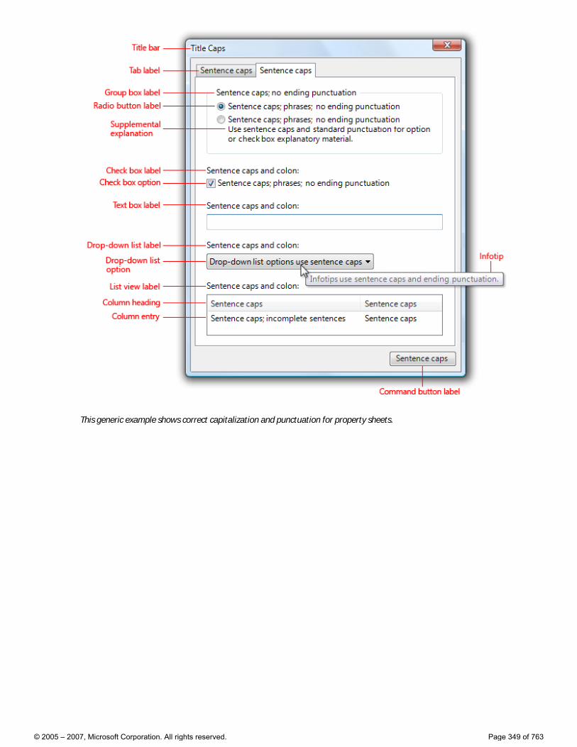
This generic example shows correct capitalization and punctuation for property sheets.
© 2005 – 2007, Microsoft Corporation. All rights reserved. Page 349 of 763
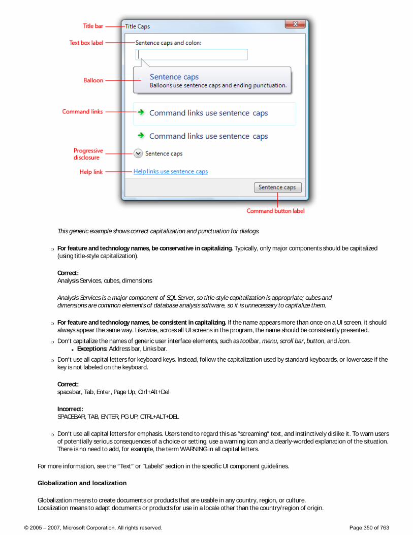
This generic example shows correct capitalization and punctuation for dialogs.
�❍ For feature and technology names, be conservative in capitalizing. Typically, only major components should be capitalized (using title-style capitalization).
Correct: Analysis Services, cubes, dimensions
Analysis Services is a major component of SQL Server, so title-style capitalization is appropriate; cubes and dimensions are common elements of database analysis software, so it is unnecessary to capitalize them.
�❍ For feature and technology names, be consistent in capitalizing. If the name appears more than once on a UI screen, it should always appear the same way. Likewise, across all UI screens in the program, the name should be consistently presented.
�❍ Don’t capitalize the names of generic user interface elements, such as toolbar, menu, scroll bar, button, and icon. ■ Exceptions: Address bar, Links bar.
�❍ Don’t use all capital letters for keyboard keys. Instead, follow the capitalization used by standard keyboards, or lowercase if the key is not labeled on the keyboard.
Correct: spacebar, Tab, Enter, Page Up, Ctrl+Alt+Del
Incorrect: SPACEBAR, TAB, ENTER, PG UP, CTRL+ALT+DEL
�❍ Don’t use all capital letters for emphasis. Users tend to regard this as “screaming” text, and instinctively dislike it. To warn users of potentially serious consequences of a choice or setting, use a warning icon and a clearly-worded explanation of the situation. There is no need to add, for example, the term WARNING in all capital letters.
For more information, see the “Text” or “Labels” section in the specific UI component guidelines.
Globalization and localization
Globalization means to create documents or products that are usable in any country, region, or culture. Localization means to adapt documents or products for use in a locale other than the country/region of origin.
© 2005 – 2007, Microsoft Corporation. All rights reserved. Page 350 of 763

Consider globalization and localization when writing UI text. Your program may be translated into other languages and used in cultures very different from your own.
�❍ For controls with variable contents (such as list views and tree views), choose a width appropriate for the longest valid data.
�❍ Include space enough in the UI surface for an additional 30 percent (up to 200 percent for shorter text) for any text (but not numbers) that will be localized. Translation from one language to another often changes line length of text.
�❍ Don’t compose strings from substrings at run time. Instead, use complete sentences so that there is no ambiguity for the translator.
�❍ Don’t use a subordinate control, the values it contains, or its units label to create a sentence or phrase. Such a design is not localizable because sentence structure varies with language.
Incorrect:
Correct:
In the incorrect example, the text box is placed inside the check box label.
�❍ Don’t make only part of a sentence a link, because when translated, that text might not remain together. Link text should therefore form a complete sentence by itself.
■ Exception: Glossary links can be inserted inline, as part of a sentence.
For more information, see the Microsoft Global Development and Computing Portal.
Title bar text
�❍ Choose the title bar text based on the type of window: ■ Top-level, document-centric program windows: Use a “document name – program name” format. Document names are
displayed first to give a document-centric feel.
■ Top-level program windows that are not document-centric: Display the program name only.
■ Dialog boxes: Display the command, feature, or program from which the dialog box came. Don’t use the title to explain the dialog box’s purpose—that’s the purpose of the main instructions. For more guidelines, see Dialog Boxes.
�❍ For top-level program windows, if the title bar caption and icon are displayed prominently near the top of the window, you can hide the title bar caption and icon to avoid redundancy. However, you still have to set a suitable title internally for use by Windows.
�❍ For dialog boxes, don’t include the words “dialog” or “progress” in the titles. These concepts are implied and leaving these words off makes the titles easier for users to scan.
Main instructions
�❍ Use the main instruction to explain concisely what users should do in a given window or page. Good main instructions communicate the user’s objective rather than focusing just on manipulating the UI.
�❍ Express the main instruction in the form of an imperative direction or specific question.
Incorrect:
© 2005 – 2007, Microsoft Corporation. All rights reserved. Page 351 of 763
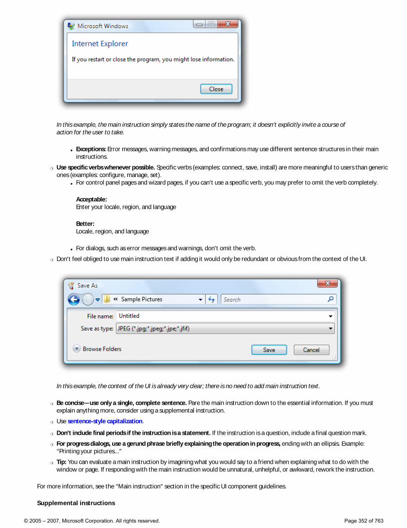
In this example, the main instruction simply states the name of the program; it doesn’t explicitly invite a course of action for the user to take.
■ Exceptions: Error messages, warning messages, and confirmations may use different sentence structures in their main instructions.
�❍ Use specific verbs whenever possible. Specific verbs (examples: connect, save, install) are more meaningful to users than generic ones (examples: configure, manage, set).
■ For control panel pages and wizard pages, if you can’t use a specific verb, you may prefer to omit the verb completely.
Acceptable: Enter your locale, region, and language
Better: Locale, region, and language
■ For dialogs, such as error messages and warnings, don’t omit the verb.
�❍ Don’t feel obliged to use main instruction text if adding it would only be redundant or obvious from the context of the UI.
In this example, the context of the UI is already very clear; there is no need to add main instruction text.
�❍ Be concise—use only a single, complete sentence. Pare the main instruction down to the essential information. If you must explain anything more, consider using a supplemental instruction.
�❍ Use sentence-style capitalization.
�❍ Don’t include final periods if the instruction is a statement. If the instruction is a question, include a final question mark.
�❍ For progress dialogs, use a gerund phrase briefly explaining the operation in progress, ending with an ellipsis. Example: “Printing your pictures...”
�❍ Tip: You can evaluate a main instruction by imagining what you would say to a friend when explaining what to do with the window or page. If responding with the main instruction would be unnatural, unhelpful, or awkward, rework the instruction.
For more information, see the “Main instruction” section in the specific UI component guidelines.
Supplemental instructions
© 2005 – 2007, Microsoft Corporation. All rights reserved. Page 352 of 763

�❍ When necessary, use a supplemental instruction to present additional information helpful to understanding or using the window or page, such as:
■ Providing context to explain why the window is being displayed if it is program or system initiated.
■ Qualifying information that helps users decide how to act on the main instruction.
■ Defining important terminology.
�❍ Don’t use a supplemental instruction if one isn’t necessary. Prefer to communicate everything with the main instruction if you can do so concisely.
�❍ Don’t repeat the main instruction with slightly different wording. Instead, omit the supplemental instruction if there is nothing more to add.
�❍ Use complete sentences and sentence-style capitalization.
Control labels
�❍ Label every control or group of controls. Exceptions: ■ Text boxes and drop-down lists can be labeled using prompts.
■ Progressive disclosure controls are generally unlabeled.
■ Subordinate controls use the label of their associated control. Spin controls are always subordinate controls.
■ Omit control labels that restate the main instruction. In this case, the main instruction takes the access key.
Acceptable:
In this example, the text box label is just a restatement of the main instruction.
Better:
In this example, the redundant label is removed, so the main instruction takes the access key.
�❍ Label placement: ■ Balloons, check boxes, command buttons, group boxes, links, tabs, and tips are labeled directly by the control itself.
■ Drop-down lists, list boxes, list views, progress bars, sliders, text boxes, and tree views are labeled above, flush left, or to the left.
■ Progressive disclosure controls are usually unlabeled. Chevron buttons are labeled to the right.
�❍ Assign a unique access key for each interactive control except for links. For more information, see Keyboard.
�❍ Keep labels brief. Note, however, that adding a word or two to a label can help clarity, and sometimes eliminates the need for supplemental explanations.
�❍ Prefer specific labels over generic ones. Ideally users shouldn’t have to read anything else to understand the label.
Incorrect:
© 2005 – 2007, Microsoft Corporation. All rights reserved. Page 353 of 763
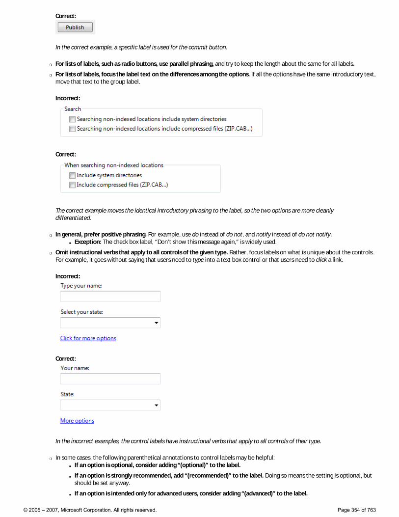
Correct:
In the correct example, a specific label is used for the commit button.
�❍ For lists of labels, such as radio buttons, use parallel phrasing, and try to keep the length about the same for all labels.
�❍ For lists of labels, focus the label text on the differences among the options. If all the options have the same introductory text, move that text to the group label.
Incorrect:
Correct:
The correct example moves the identical introductory phrasing to the label, so the two options are more cleanly differentiated.
�❍ In general, prefer positive phrasing. For example, use do instead of do not, and notify instead of do not notify. ■ Exception: The check box label, “Don’t show this message again,” is widely used.
�❍ Omit instructional verbs that apply to all controls of the given type. Rather, focus labels on what is unique about the controls. For example, it goes without saying that users need to type into a text box control or that users need to click a link.
Incorrect:
Correct:
In the incorrect examples, the control labels have instructional verbs that apply to all controls of their type.
�❍ In some cases, the following parenthetical annotations to control labels may be helpful: ■ If an option is optional, consider adding “(optional)” to the label.
■ If an option is strongly recommended, add “(recommended)” to the label. Doing so means the setting is optional, but should be set anyway.
■ If an option is intended only for advanced users, consider adding “(advanced)” to the label.
© 2005 – 2007, Microsoft Corporation. All rights reserved. Page 354 of 763
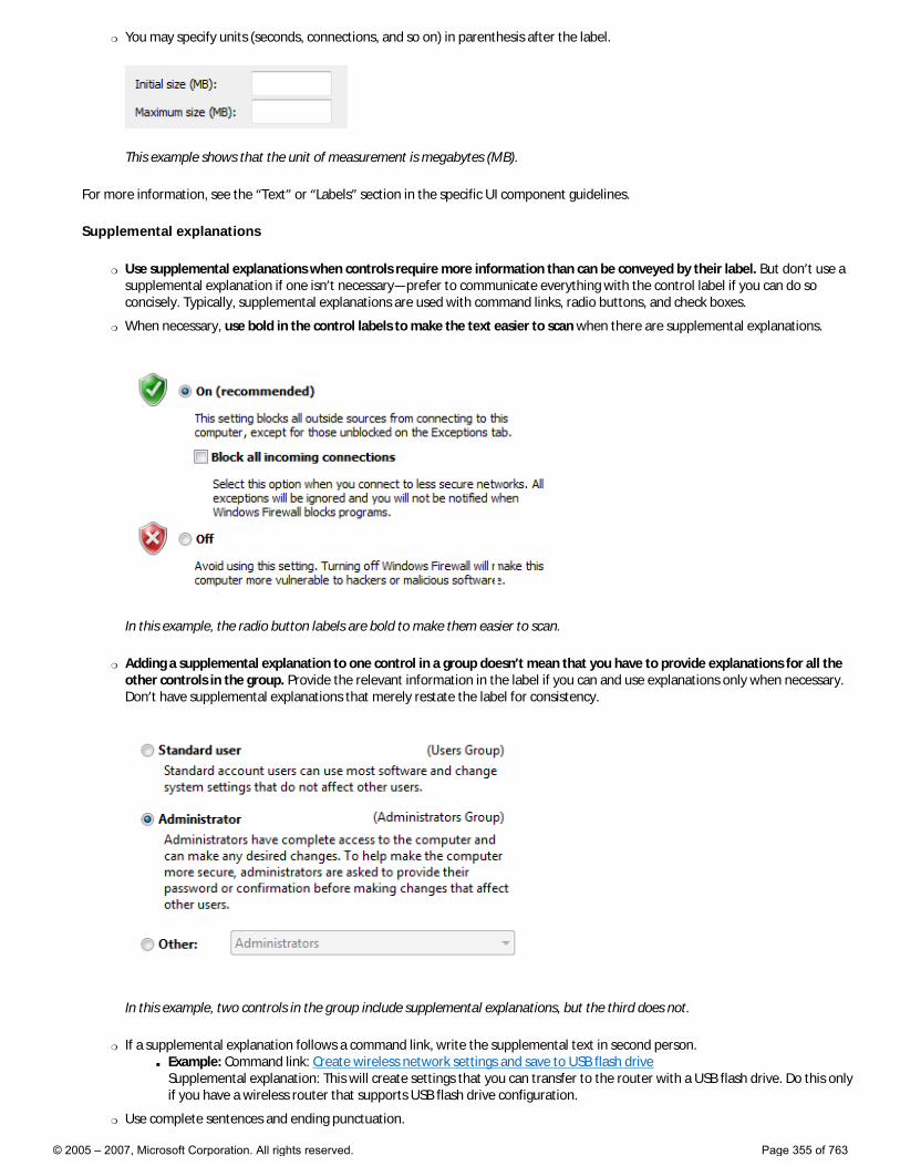
�❍ You may specify units (seconds, connections, and so on) in parenthesis after the label.
This example shows that the unit of measurement is megabytes (MB).
For more information, see the “Text” or “Labels” section in the specific UI component guidelines.
Supplemental explanations
�❍ Use supplemental explanations when controls require more information than can be conveyed by their label. But don’t use a supplemental explanation if one isn’t necessary—prefer to communicate everything with the control label if you can do so concisely. Typically, supplemental explanations are used with command links, radio buttons, and check boxes.
�❍ When necessary, use bold in the control labels to make the text easier to scan when there are supplemental explanations.
In this example, the radio button labels are bold to make them easier to scan.
�❍ Adding a supplemental explanation to one control in a group doesn’t mean that you have to provide explanations for all the other controls in the group. Provide the relevant information in the label if you can and use explanations only when necessary. Don’t have supplemental explanations that merely restate the label for consistency.
In this example, two controls in the group include supplemental explanations, but the third does not.
�❍ If a supplemental explanation follows a command link, write the supplemental text in second person. ■ Example: Command link: Create wireless network settings and save to USB flash drive
Supplemental explanation: This will create settings that you can transfer to the router with a USB flash drive. Do this only if you have a wireless router that supports USB flash drive configuration.
�❍ Use complete sentences and ending punctuation.
© 2005 – 2007, Microsoft Corporation. All rights reserved. Page 355 of 763
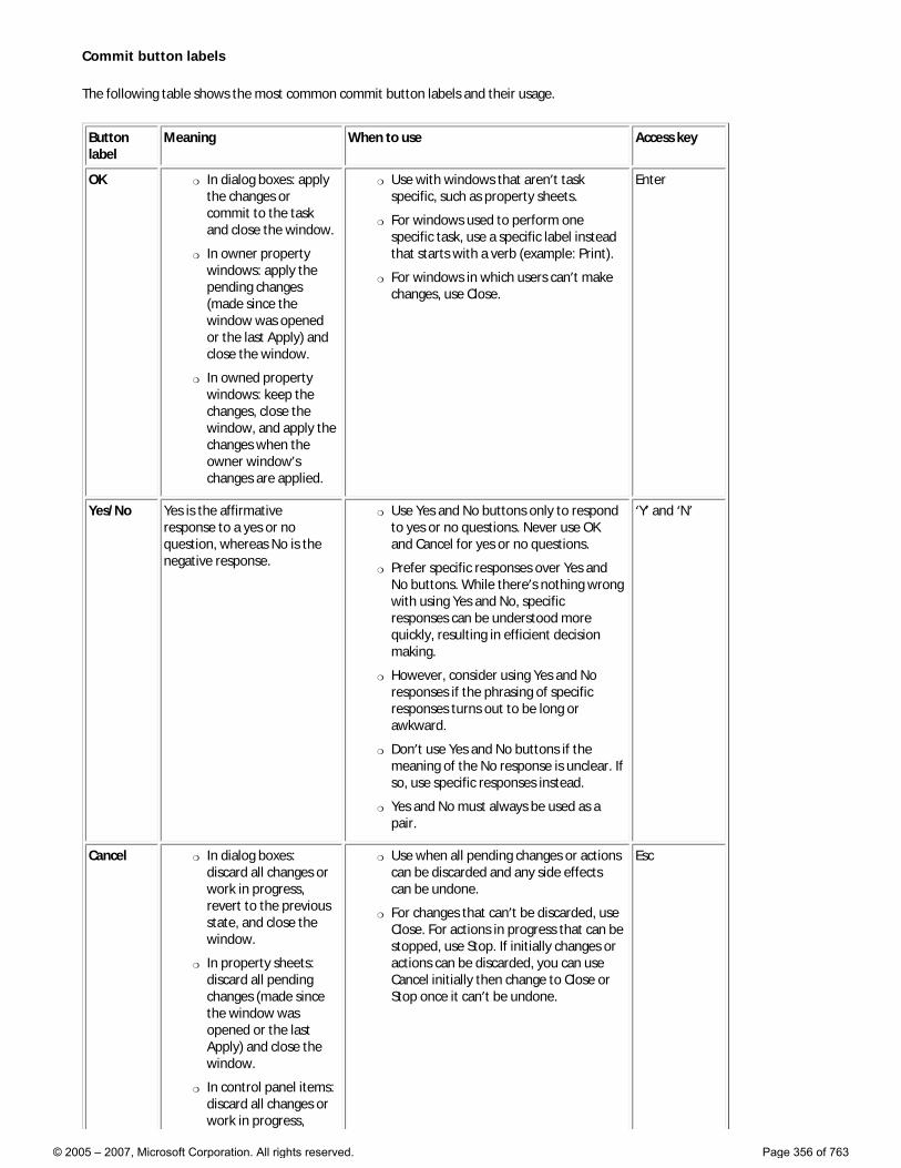
Commit button labels
The following table shows the most common commit button labels and their usage.
Button label
Meaning When to use Access key
OK �❍ In dialog boxes: apply the changes or commit to the task and close the window.
�❍ In owner property windows: apply the pending changes (made since the window was opened or the last Apply) and close the window.
�❍ In owned property windows: keep the changes, close the window, and apply the changes when the owner window’s changes are applied.
�❍ Use with windows that aren’t task specific, such as property sheets.
�❍ For windows used to perform one specific task, use a specific label instead that starts with a verb (example: Print).
�❍ For windows in which users can’t make changes, use Close.
Enter
Yes/No Yes is the affirmative response to a yes or no question, whereas No is the negative response.
�❍ Use Yes and No buttons only to respond to yes or no questions. Never use OK and Cancel for yes or no questions.
�❍ Prefer specific responses over Yes and No buttons. While there’s nothing wrong with using Yes and No, specific responses can be understood more quickly, resulting in efficient decision making.
�❍ However, consider using Yes and No responses if the phrasing of specific responses turns out to be long or awkward.
�❍ Don’t use Yes and No buttons if the meaning of the No response is unclear. If so, use specific responses instead.
�❍ Yes and No must always be used as a pair.
‘Y’ and ‘N’
Cancel �❍ In dialog boxes: discard all changes or work in progress, revert to the previous state, and close the window.
�❍ In property sheets: discard all pending changes (made since the window was opened or the last Apply) and close the window.
�❍ In control panel items: discard all changes or work in progress,
�❍ Use when all pending changes or actions can be discarded and any side effects can be undone.
�❍ For changes that can’t be discarded, use Close. For actions in progress that can be stopped, use Stop. If initially changes or actions can be discarded, you can use Cancel initially then change to Close or Stop once it can’t be undone.
Esc
© 2005 – 2007, Microsoft Corporation. All rights reserved. Page 356 of 763
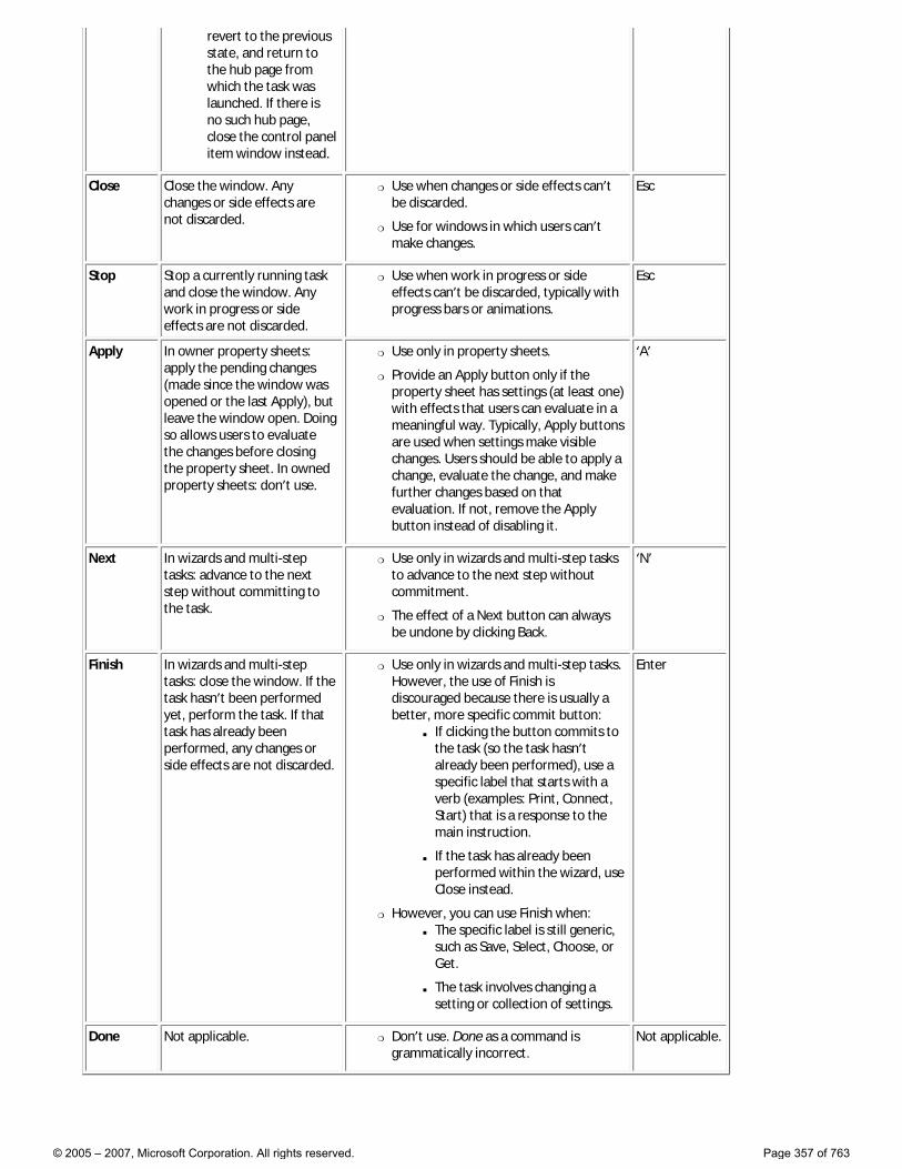
revert to the previous state, and return to the hub page from which the task was launched. If there is no such hub page, close the control panel item window instead.
Close Close the window. Any changes or side effects are not discarded.
�❍ Use when changes or side effects can’t be discarded.
�❍ Use for windows in which users can’t make changes.
Esc
Stop Stop a currently running task and close the window. Any work in progress or side effects are not discarded.
�❍ Use when work in progress or side effects can’t be discarded, typically with progress bars or animations.
Esc
Apply In owner property sheets: apply the pending changes (made since the window was opened or the last Apply), but leave the window open. Doing so allows users to evaluate the changes before closing the property sheet. In owned property sheets: don’t use.
�❍ Use only in property sheets.
�❍ Provide an Apply button only if the property sheet has settings (at least one) with effects that users can evaluate in a meaningful way. Typically, Apply buttons are used when settings make visible changes. Users should be able to apply a change, evaluate the change, and make further changes based on that evaluation. If not, remove the Apply button instead of disabling it.
‘A’
Next In wizards and multi-step tasks: advance to the next step without committing to the task.
�❍ Use only in wizards and multi-step tasks to advance to the next step without commitment.
�❍ The effect of a Next button can always be undone by clicking Back.
‘N’
Finish In wizards and multi-step tasks: close the window. If the task hasn’t been performed yet, perform the task. If that task has already been performed, any changes or side effects are not discarded.
�❍ Use only in wizards and multi-step tasks. However, the use of Finish is discouraged because there is usually a better, more specific commit button:
■ If clicking the button commits to the task (so the task hasn’t already been performed), use a specific label that starts with a verb (examples: Print, Connect, Start) that is a response to the main instruction.
■ If the task has already been performed within the wizard, use Close instead.
�❍ However, you can use Finish when: ■ The specific label is still generic,
such as Save, Select, Choose, or Get.
■ The task involves changing a setting or collection of settings.
Enter
Done Not applicable. �❍ Don’t use. Done as a command is grammatically incorrect.
Not applicable.
© 2005 – 2007, Microsoft Corporation. All rights reserved. Page 357 of 763
Style and Tone
Design concepts Guidelines
Tone in writing is the attitude that the writer conveys to the reader. It’s designed to create a specific response or emotion in the reader. Tone creates a personality that can either engage or repel users.
Note: Guidelines related to user interface text are presented in a separate article.
Design concepts
The Windows Vista® tone
Use the Windows Vista tone to inspire confidence by communicating to users on a personal level by being accurate, encouraging, insightful, objective, and user focused. Don’t use a distracting, condescending (example: “Just do this...”), or arrogant tone.
Avoid the extremes of the “machine” voice (where the speaker is removed from the language) and the “sales rep” voice (where the writing tries to sell us something, to cajole us, to cheer us up, to gloss over everything as “simple.”)
Content leveling
Support users with different levels of technical knowledge, especially novice users, to take advantage of all the things Microsoft® Windows® can do.
Why a new tone?
Research from Microsoft shows:
● Overuse of computer terminology and jargon, which many users don’t understand or misinterpret.
● Inconsistent use of terminology.
● Impenetrable, often unintentionally patronizing messages, which users struggle to decipher.
These problems make users feel confused, unintelligent, disheartened, and ultimately disengaged from their experience with software.
The software industry has been “focusing too much on the technology that delivers online messages, and spending too little time on the quality of the messages themselves.” The underlying premise is that language is a key lever for customer satisfaction.
If you do only one thing... Make sure that your text is clear, natural, concise, and not overly formal, and uses terminology that all users understand.
Guidelines
© 2005 – 2007, Microsoft Corporation. All rights reserved. Page 358 of 763
Use Windows Vista tone
Tone in your application should be:
● Accurate. Users should feel reassured that the information is technically accurate. If the information isn’t accurate, the user’s experience with that specific task is spoiled, and he loses faith in any other assistance he reads from that source.
● Encouraging. Use language that conveys that the software empowers users to do things, rather than allows them to do things. For example, use “you can” rather than “Windows lets you” or “this feature allows you.” (Exception: it’s okay to use “allow” when referring to features—such as security features—that permit or deny an action.)
● Insightful. Users should believe that you (and by extension your application) know when a certain task is complicated and that you will guide them through it. At the same time, treat users as intelligent people who happen to need help with a particular problem.
● Objective. Sometimes users want a richer explanation; often though they just want to know what they need to move on. This requires objectivity—to recognize that the goal (productivity, curiosity, enjoyment) is the user’s goal, not the writer’s. It also requires that you shed any predisposed notions about the user.
● User-focused. Write from the user’s perspective and preferably from the perspective of what you can do for the user. Users should feel that they will find information that is relevant and accessible to them.
Use real-world language
● Use everyday words when you can and avoid words you wouldn’t say to someone else in person. This is especially effective if you are explaining a complex technical concept or action. Imagine yourself looking over the user’s shoulder and explaining how to accomplish the task.
Acceptable: Use this procedure to change your password.
Better: Follow these steps to change your password.
● Use short, plain words whenever possible. Shorter words are more conversational, save space on screen, and are easier to scan.
Acceptable: In addition, this section shows you... Digital cameras employ tiny microchips... Digital cameras utilize tiny microchips...
Better: This section also shows you... Digital cameras use tiny microchips...
● Don’t invent words or apply new meanings to standard words. Assume that users are more familiar with a word’s established meaning than with a special meaning given it by the technology industry. When an industry term is required, provide an in-context definition. Avoid jargon, but remember that some expressions specific to computer usage—hacker, burn a CD, and so on—are already part of everyday speech.
Incorrect: You can use folders to bucketize your favorites.
Correct: You can use folders to categorize your favorites.
© 2005 – 2007, Microsoft Corporation. All rights reserved. Page 359 of 763
● Don’t use symbols as a substitute for simple words.
Incorrect: users & computers users + computers domain / workgroup # of users
Correct: users and computers domain or workgroup number of users
Be precise
● Choose words with a clear meaning.
Acceptable: Since you created the table, you can make changes to it. Keep your firewall turned on, as turning it off could create a security risk.
Better: Because you created the table, you can make changes to it. Keep your firewall turned on, because turning it off could create a security risk.
● Omit needless words—don’t use two or three words when one will do.
Acceptable: Follow these steps in order to change your password.
Better: Follow these steps to change your password.
● Avoid unnecessary adverbs.
Incorrect: It isn’t terribly hard to change your password.
Correct: It isn’t hard to change your password.
● Choose single-word verbs over multi-word verbs.
Acceptable: When you lock down your computer, ...
Better: When you lock your computer, ...
● Don’t convert verbs to nouns and nouns to verbs.
Incorrect: To password-protect your computer... To establish connectivity...
© 2005 – 2007, Microsoft Corporation. All rights reserved. Page 360 of 763
Correct: To protect your computer with a password... To connect...
Be consistent
● Consistent terminology promotes learning and a better understanding of technical concepts. Inconsistency forces users to figure out whether different words and actions mean the same thing. Examples: switch, toggle start, run, launch, boot, execute enable, activate, turn on burn, copy
● Consistent syntax helps set users' expectations. Once these expectations are set, users can more quickly parse text that uses consistent syntax. For example, if instructions are always written in the imperative form, users will learn to pay closer attention to imperative sentences.
Contractions
● Contractions lend a shorter, snappier, more conversational rhythm to writing. Use them as appropriate and in context. Don’t use contractions with product names or other proper nouns.
Person
● Address the user as you, directly or indirectly.
● Use the second person (you, your) to tell users what to do. Often the second person is implied.
Examples: Choose the pictures you want to print. Choose an account. (implied)
● Use the first person (I, me, my) to let users tell the program what to do.
Examples: Print the photos on my camera.
● Use we judiciously. The first-person plural can suggest a daunting corporate presence. However, it can be preferable to using the name of your application. Use we recommend rather than it is recommended.
● Avoid third-person references (the user) because they create a more formal, less personal tone.
Voice
● Use the active voice, which emphasizes the person or thing doing the action. It is more direct and personal than the passive voice, which can be confusing or sound formal.
Acceptable: Icons can be arranged by name in alphabetical order. When a Personal Digital Assistant (PDA) or laptop is plugged in...
Better: You can arrange icons in alphabetical order by the icon name. When you plug in any Personal Digital Assistant (PDA) or laptop...
© 2005 – 2007, Microsoft Corporation. All rights reserved. Page 361 of 763
● Use the passive voice only to avoid a wordy or awkward construction; when the action rather than the doer is the focus of the sentence; when the subject is unknown; or in error messages, when the user is the subject and might feel blamed for the error if the active voice were used.
Correct: The new icon should appear in the upper-left corner. Updates must be downloaded and installed before they can work.
● Phrase statements in the positive form, and emphasize what users can accomplish, rather than what they can’t.
Attitude toward the user
● Be polite, supportive, and encouraging. The user should never feel condescended to, blamed, or intimidated.
Acceptable: Cannot delete New Text Document: Access is denied.
Better: This file is protected and cannot be deleted without specific permission.
● Strike the right balance: be warm toward the user without being too intimate or too business-like. Imagine that you are helping a friend use the product for the first time. This person is not your best friend or significant other, but instead, a neighbor or family friend. Users should feel comfortable and at home when using Windows, but the language should not feel presumptuous or too familiar.
● Avoid slang. Slang terms can seem forced and unnatural, are difficult to localize, and may not make sense to a broader audience.
● Use please judiciously. Avoid please except in situations where the user is asked to do something inconvenient or the software is to blame for the situation.
Correct: Please wait while Windows copies the files to your computer. Please refer to the documentation for your device.
● Use sorry only in error messages that result in serious problems for the user (for example, data loss, the user can’t continue to use the computer, or the user must get help from a technical representative). Don’t apologize if the issue occurred during the normal functioning of the application (for example, if the user needs to wait for a network connection to be found).
Correct: We’re sorry, but Fabrikam Backup detected an unrecoverable problem and was shut down to protect files and other data on your computer.
Sentence structure and length
● Because users often scan text, make every word count. Simple, concise sentences (and paragraphs) not only save space on the screen but are the most effective means of conveying that an idea or action is important. Use your best judgment—make sentences tight, but not so tight that the tone seems abrupt and unfriendly.
● Avoid repetition. Review each window and eliminate duplicate words and statements. Don’t avoid important text—be explicit whenever necessary—but don’t be redundant and don’t explain things that go without saying.
● Use sentence fragments if appropriate. Sentence fragments are short and punchy—and, as they typically take the interrogative form, they are a good way of directly engaging the user.
Correct:
© 2005 – 2007, Microsoft Corporation. All rights reserved. Page 362 of 763
Save changes to “My Photos”? Ever saved a file and then not remembered where you saved it?
● Start sentences with conjunctions (and, but, or) if you need to.
● Substitute lists and tables for complex sentences. Lists (whether numbered or bulleted) and tables are clearer and easier to scan.
● Use parallel grammatical constructions. Parallelism requires that words and phrases that have the same function have the same form. Use parallel language whenever you express ideas of equal weight, and for UI elements that are parallel in function (such as headings, labels, lists, or page titles).
Correct: Listen Watch Share Collect
These items are parallel because they are all single-word, imperative verbs.
Incorrect: Music Video Share Listen
These items are not parallel because Music and Video are nouns, but Share and Listen are verbs.
© 2005 – 2007, Microsoft Corporation. All rights reserved. Page 363 of 763
Interaction
These articles provide guidelines for user interaction with your Windows Vista®-based applications:
● Keyboard
● Mouse and Pointers
● Accessibility
© 2005 – 2007, Microsoft Corporation. All rights reserved. Page 364 of 763
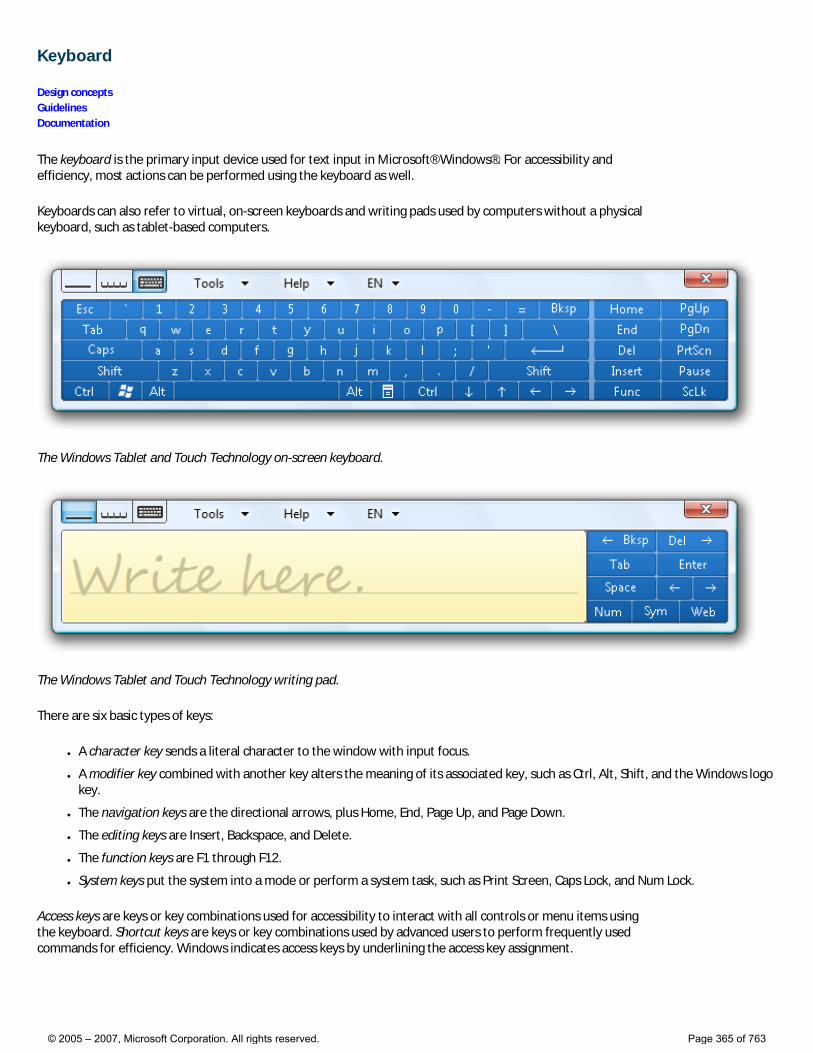
Keyboard
Design concepts Guidelines Documentation
The keyboard is the primary input device used for text input in Microsoft® Windows®. For accessibility and efficiency, most actions can be performed using the keyboard as well.
Keyboards can also refer to virtual, on-screen keyboards and writing pads used by computers without a physical keyboard, such as tablet-based computers.
The Windows Tablet and Touch Technology on-screen keyboard.
The Windows Tablet and Touch Technology writing pad.
There are six basic types of keys:
● A character key sends a literal character to the window with input focus.
● A modifier key combined with another key alters the meaning of its associated key, such as Ctrl, Alt, Shift, and the Windows logo key.
● The navigation keys are the directional arrows, plus Home, End, Page Up, and Page Down.
● The editing keys are Insert, Backspace, and Delete.
● The function keys are F1 through F12.
● System keys put the system into a mode or perform a system task, such as Print Screen, Caps Lock, and Num Lock.
Access keys are keys or key combinations used for accessibility to interact with all controls or menu items using the keyboard. Shortcut keys are keys or key combinations used by advanced users to perform frequently used commands for efficiency. Windows indicates access keys by underlining the access key assignment.
© 2005 – 2007, Microsoft Corporation. All rights reserved. Page 365 of 763
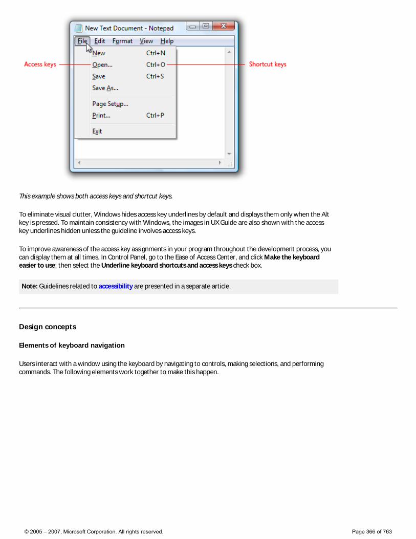
This example shows both access keys and shortcut keys.
To eliminate visual clutter, Windows hides access key underlines by default and displays them only when the Alt key is pressed. To maintain consistency with Windows, the images in UX Guide are also shown with the access key underlines hidden unless the guideline involves access keys.
To improve awareness of the access key assignments in your program throughout the development process, you can display them at all times. In Control Panel, go to the Ease of Access Center, and click Make the keyboard easier to use; then select the Underline keyboard shortcuts and access keys check box.
Note: Guidelines related to accessibility are presented in a separate article.
Design concepts
Elements of keyboard navigation
Users interact with a window using the keyboard by navigating to controls, making selections, and performing commands. The following elements work together to make this happen.
© 2005 – 2007, Microsoft Corporation. All rights reserved. Page 366 of 763
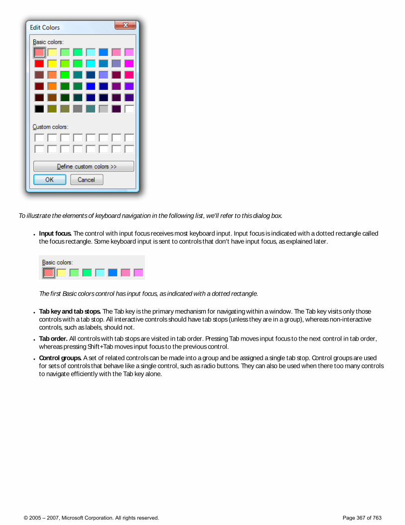
To illustrate the elements of keyboard navigation in the following list, we'll refer to this dialog box.
● Input focus. The control with input focus receives most keyboard input. Input focus is indicated with a dotted rectangle called the focus rectangle. Some keyboard input is sent to controls that don’t have input focus, as explained later.
The first Basic colors control has input focus, as indicated with a dotted rectangle.
● Tab key and tab stops. The Tab key is the primary mechanism for navigating within a window. The Tab key visits only those controls with a tab stop. All interactive controls should have tab stops (unless they are in a group), whereas non-interactive controls, such as labels, should not.
● Tab order. All controls with tab stops are visited in tab order. Pressing Tab moves input focus to the next control in tab order, whereas pressing Shift+Tab moves input focus to the previous control.
● Control groups. A set of related controls can be made into a group and be assigned a single tab stop. Control groups are used for sets of controls that behave like a single control, such as radio buttons. They can also be used when there too many controls to navigate efficiently with the Tab key alone.
© 2005 – 2007, Microsoft Corporation. All rights reserved. Page 367 of 763

Basic colors and Custom colors are control groups, giving this dialog box five tab stops. There are so many controls that navigation would be inefficient without using control groups.
● Arrow keys. The arrow keys move input focus among the controls within a group. Pressing the right arrow key moves input focus to the next control in tab order, whereas pressing the left arrow moves input focus to the previous control. Home, End, Up, and Down also have their expected behavior within a group. Users can’t navigate out of a control group using arrow keys.
● Default buttons. Windows with command buttons and command links have a single default button indicated by a highlighted border, which is the button that is clicked when the Enter key is pressed. There is a single default command button or command link assigned by default. However, the default button moves when the user tabs to another command button or command link. Consequently, any command button or command link with input focus is also always the default button.
The OK button is normally the default button, as indicated by its highlighted border. However, if the user were to tab to the Cancel button, it would become the default button and would be activated with the Enter key.
● Spacebar, Enter, and Esc keys. The spacebar activates the control with input focus, whereas the Enter key activates the default button. Pressing the Esc key cancels or closes the window.
● Access keys. Access keys are used to interact with controls directly instead of navigating with Tab. They are combined with the Alt key and indicated with an underlined letter in their label.
● Access key labels. While some controls contain their own labels, such as command buttons, check boxes, and radio buttons, other controls have external labels, such as list boxes and tree views. For external labels, the access key is assigned to the label, and if invoked, navigates to the next control in tab order. Buttons labeled OK, Cancel, and Close aren’t assigned access keys because they are invoked with Enter and Esc.
Pressing Alt+B navigates to the selected basic color, pressing Alt+D clicks the Define Custom Colors button, Enter invokes the OK button, and Esc invokes Cancel.
● Access key behavior. When an access key is invoked and it is assigned uniquely, the associated control is clicked. If the assignment isn’t unique, the associated control is given input focus. If the user types the same access key again, the next control in tab order with the same assignment is given input focus.
While this mechanism is fairly complicated, it is also fairly intuitive. Users pick up most these details right away, even though few can explain exactly how they work.
© 2005 – 2007, Microsoft Corporation. All rights reserved. Page 368 of 763
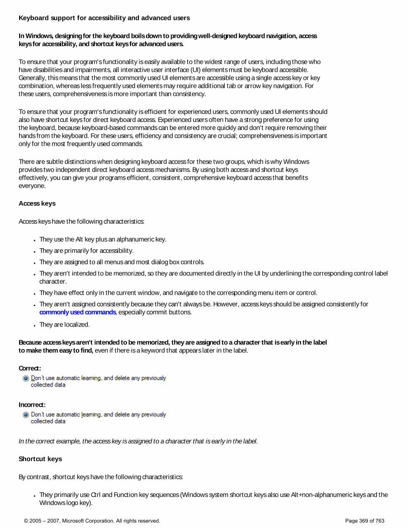
Keyboard support for accessibility and advanced users
In Windows, designing for the keyboard boils down to providing well-designed keyboard navigation, access keys for accessibility, and shortcut keys for advanced users.
To ensure that your program’s functionality is easily available to the widest range of users, including those who have disabilities and impairments, all interactive user interface (UI) elements must be keyboard accessible. Generally, this means that the most commonly used UI elements are accessible using a single access key or key combination, whereas less frequently used elements may require additional tab or arrow key navigation. For these users, comprehensiveness is more important than consistency.
To ensure that your program’s functionality is efficient for experienced users, commonly used UI elements should also have shortcut keys for direct keyboard access. Experienced users often have a strong preference for using the keyboard, because keyboard-based commands can be entered more quickly and don’t require removing their hands from the keyboard. For these users, efficiency and consistency are crucial; comprehensiveness is important only for the most frequently used commands.
There are subtle distinctions when designing keyboard access for these two groups, which is why Windows provides two independent direct keyboard access mechanisms. By using both access and shortcut keys effectively, you can give your programs efficient, consistent, comprehensive keyboard access that benefits everyone.
Access keys
Access keys have the following characteristics:
● They use the Alt key plus an alphanumeric key.
● They are primarily for accessibility.
● They are assigned to all menus and most dialog box controls.
● They aren’t intended to be memorized, so they are documented directly in the UI by underlining the corresponding control label character.
● They have effect only in the current window, and navigate to the corresponding menu item or control.
● They aren’t assigned consistently because they can’t always be. However, access keys should be assigned consistently for commonly used commands, especially commit buttons.
● They are localized.
Because access keys aren’t intended to be memorized, they are assigned to a character that is early in the label to make them easy to find, even if there is a keyword that appears later in the label.
Correct:
Incorrect:
In the correct example, the access key is assigned to a character that is early in the label.
Shortcut keys
By contrast, shortcut keys have the following characteristics:
● They primarily use Ctrl and Function key sequences (Windows system shortcut keys also use Alt+non-alphanumeric keys and the Windows logo key).
© 2005 – 2007, Microsoft Corporation. All rights reserved. Page 369 of 763
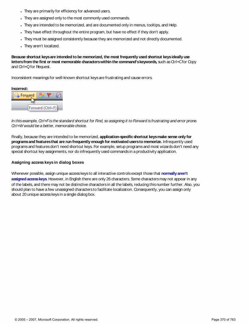
● They are primarily for efficiency for advanced users.
● They are assigned only to the most commonly used commands.
● They are intended to be memorized, and are documented only in menus, tooltips, and Help.
● They have effect throughout the entire program, but have no effect if they don’t apply.
● They must be assigned consistently because they are memorized and not directly documented.
● They aren’t localized.
Because shortcut keys are intended to be memorized, the most frequently used shortcut keys ideally use letters from the first or most memorable characters within the command’s keywords, such as Ctrl+C for Copy and Ctrl+Q for Request.
Inconsistent meanings for well-known shortcut keys are frustrating and cause errors.
Incorrect:
In this example, Ctrl+F is the standard shortcut for Find, so assigning it to Forward is frustrating and error prone. Ctrl+W would be a better, memorable choice.
Finally, because they are intended to be memorized, application-specific shortcut keys make sense only for programs and features that are run frequently enough for motivated users to memorize. Infrequently used programs and features don’t need shortcut keys. For example, setup programs and most wizards don’t need any special shortcut key assignments, nor do infrequently used commands in a productivity application.
Assigning access keys in dialog boxes
Whenever possible, assign unique access keys to all interactive controls except those that normally aren’t assigned access keys. However, in English there are only 26 characters. Some characters may not appear in any of the labels, and there may not be distinctive characters in all the labels, reducing this number further. Also, you should plan to have a few unassigned characters to facilitate localization. Consequently, you can assign only about 20 unique access keys in a single dialog box.
© 2005 – 2007, Microsoft Corporation. All rights reserved. Page 370 of 763
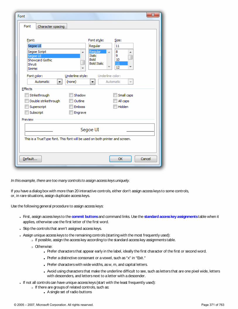
In this example, there are too many controls to assign access keys uniquely.
If you have a dialog box with more than 20 interactive controls, either don’t assign access keys to some controls, or, in rare situations, assign duplicate access keys.
Use the following general procedure to assign access keys:
● First, assign access keys to the commit buttons and command links. Use the standard access key assignments table when it applies, otherwise use the first letter of the first word.
● Skip the controls that aren’t assigned access keys.
● Assign unique access keys to the remaining controls (starting with the most frequently used): �❍ If possible, assign the access key according to the standard access key assignments table.
�❍ Otherwise: ■ Prefer characters that appear early in the label, ideally the first character of the first or second word.
■ Prefer a distinctive consonant or a vowel, such as “x” in “Exit.”
■ Prefer characters with wide widths, as w, m, and capital letters.
■ Avoid using characters that make the underline difficult to see, such as letters that are one pixel wide, letters with descenders, and letters next to a letter with a descender.
● If not all controls can have unique access keys (start with the least frequently used): �❍ If there are groups of related controls, such as:
■ A single set of radio buttons
© 2005 – 2007, Microsoft Corporation. All rights reserved. Page 371 of 763
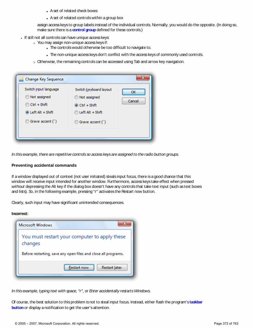
■ A set of related check boxes
■ A set of related controls within a group box
assign access keys to group labels instead of the individual controls. Normally, you would do the opposite. (In doing so, make sure there is a control group defined for these controls.)
● If still not all controls can have unique access keys: �❍ You may assign non-unique access keys if:
■ The controls would otherwise be too difficult to navigate to.
■ The non-unique access keys don’t conflict with the access keys of commonly used controls.
�❍ Otherwise, the remaining controls can be accessed using Tab and arrow key navigation.
In this example, there are repetitive controls so access keys are assigned to the radio button groups.
Preventing accidental commands
If a window displayed out of context (not user initiated) steals input focus, there is a good chance that this window will receive input intended for another window. Furthermore, access keys take effect when pressed without depressing the Alt key if the dialog box doesn’t have any controls that take text input (such as text boxes and lists). So, in the following example, pressing “r” activates the Restart now button.
Clearly, such input may have significant unintended consequences.
Incorrect:
In this example, typing text with space, “r”, or Enter accidentally restarts Windows.
Of course, the best solution to this problem is not to steal input focus. Instead, either flash the program’s taskbar button or display a notification to get the user’s attention.
© 2005 – 2007, Microsoft Corporation. All rights reserved. Page 372 of 763
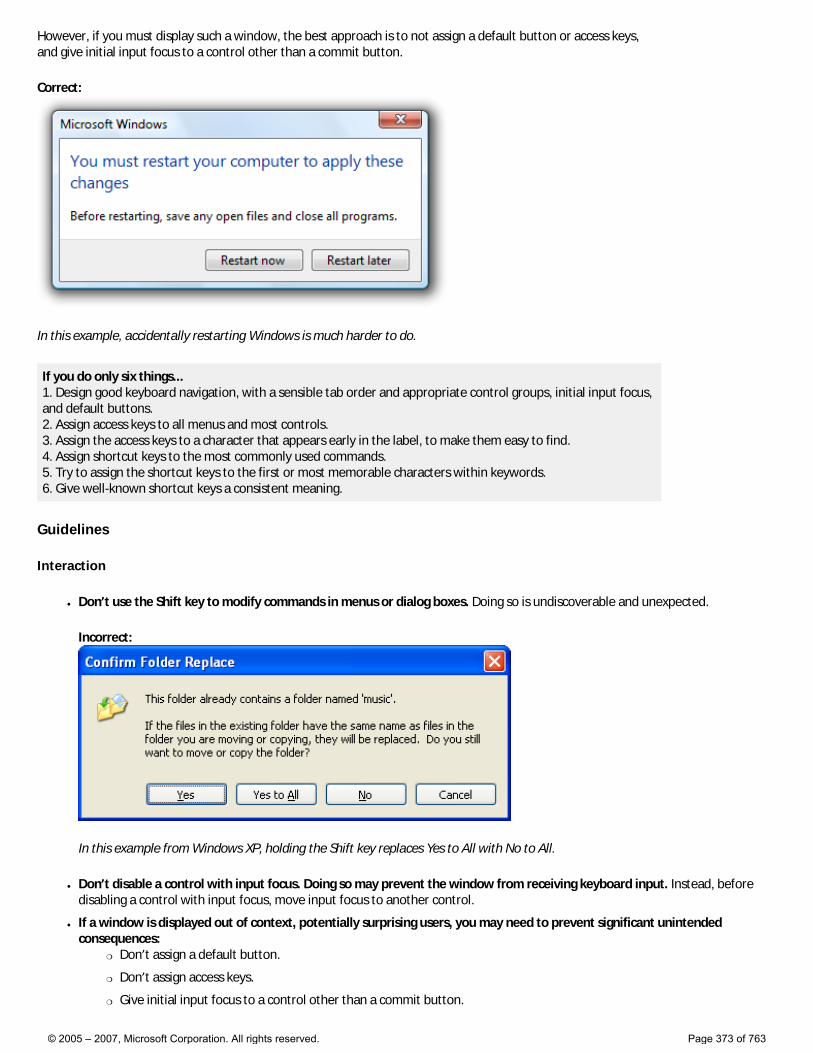
However, if you must display such a window, the best approach is to not assign a default button or access keys, and give initial input focus to a control other than a commit button.
Correct:
In this example, accidentally restarting Windows is much harder to do.
If you do only six things... 1. Design good keyboard navigation, with a sensible tab order and appropriate control groups, initial input focus, and default buttons. 2. Assign access keys to all menus and most controls. 3. Assign the access keys to a character that appears early in the label, to make them easy to find. 4. Assign shortcut keys to the most commonly used commands. 5. Try to assign the shortcut keys to the first or most memorable characters within keywords. 6. Give well-known shortcut keys a consistent meaning.
Guidelines
Interaction
● Don’t use the Shift key to modify commands in menus or dialog boxes. Doing so is undiscoverable and unexpected.
Incorrect:
In this example from Windows XP, holding the Shift key replaces Yes to All with No to All.
● Don’t disable a control with input focus. Doing so may prevent the window from receiving keyboard input. Instead, before disabling a control with input focus, move input focus to another control.
● If a window is displayed out of context, potentially surprising users, you may need to prevent significant unintended consequences:
�❍ Don’t assign a default button.
�❍ Don’t assign access keys.
�❍ Give initial input focus to a control other than a commit button.
© 2005 – 2007, Microsoft Corporation. All rights reserved. Page 373 of 763
Keyboard navigation
● Assign initial input focus to the control that users are most likely to interact with first, which is often the first interactive control. If the first interactive control isn’t a good choice, consider changing the window’s layout.
● Assign tabs stops to all interactive controls, including read-only edit boxes. Exceptions: �❍ Group sets of related controls that behave as a single control, such as radio buttons. Such groups have a single tab stop.
�❍ Properly contain groups so that the arrow keys cycle both forward and backward within the group and stay within the group.
● Tab order should flow from left to right, top to bottom. Generally, tab order should follow reading order. Consider making exceptions for commonly used controls by putting them earlier in the tab order. Tab should cycle through all the tab stops in both directions without stopping. Within a group, tab order should be in sequential order, without exceptions.
● Within a tab stop, the arrow key order should flow from left to right, top to bottom, without exceptions. The arrow keys should cycle through all items in both directions without stopping.
● Present the commit buttons in the following order: �❍ OK/[Do it]/Yes
�❍ [Don’t do it]/No
�❍ Cancel
�❍ Apply (if present)
where [Do it] and [Don’t do it] are specific responses to the main instruction.
● Select the safest (to prevent loss of data or system access) and most secure command button or command link to be the default. If safety and security aren’t factors, select the most likely or convenient response.
● Keyboard navigation shouldn’t change control values or result in an error message. Never require users to change a control’s initial value during navigation. Instead, initialize controls that validate on exit with valid values, and validate a control’s value only when it has changed.
Access keys
● Whenever possible, assign access keys for commonly used commands according to the following table. While consistent access key assignments aren’t always possible, they are certainly preferred—especially for frequently used commands.
About File Next Resume
Always on top Find No Retry
Apply Find next Open Run
Back Font Open with Save
Bold Forward Options Save as
Browse or Browse Help Page setup Select all
Close Help topics Paste Send to
Copy Hide Paste link Show
Copy here Insert Paste shortcut Size
Create shortcut Insert object Paste special Split
Create shortcut here Italic Pause Stop
Cut Link here Play Tools
Delete Maximize Print Underline
Don’t show this [item] again Minimize Print here Undo
Edit More Properties View
Exit Move Redo Window
Explore Move here Repeat Yes
© 2005 – 2007, Microsoft Corporation. All rights reserved. Page 374 of 763
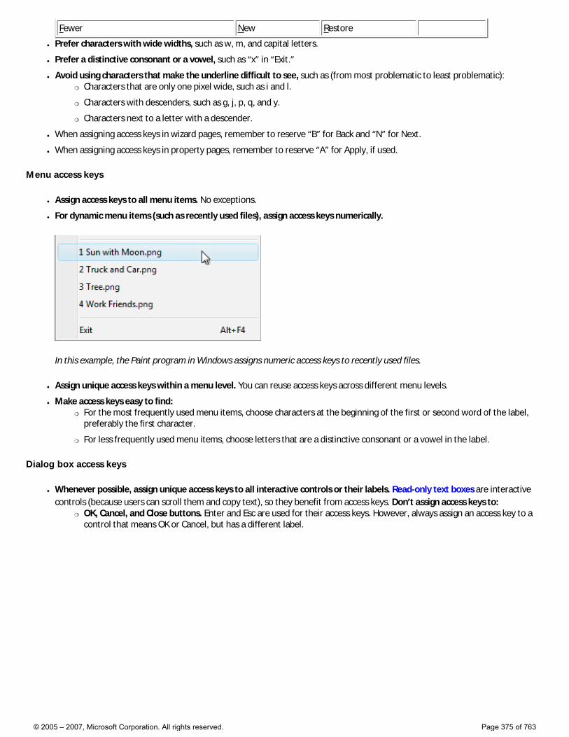
Fewer New Restore
● Prefer characters with wide widths, such as w, m, and capital letters.
● Prefer a distinctive consonant or a vowel, such as “x” in “Exit.”
● Avoid using characters that make the underline difficult to see, such as (from most problematic to least problematic): �❍ Characters that are only one pixel wide, such as i and l.
�❍ Characters with descenders, such as g, j, p, q, and y.
�❍ Characters next to a letter with a descender.
● When assigning access keys in wizard pages, remember to reserve “B” for Back and “N” for Next.
● When assigning access keys in property pages, remember to reserve “A” for Apply, if used.
Menu access keys
● Assign access keys to all menu items. No exceptions.
● For dynamic menu items (such as recently used files), assign access keys numerically.
In this example, the Paint program in Windows assigns numeric access keys to recently used files.
● Assign unique access keys within a menu level. You can reuse access keys across different menu levels.
● Make access keys easy to find: �❍ For the most frequently used menu items, choose characters at the beginning of the first or second word of the label,
preferably the first character.
�❍ For less frequently used menu items, choose letters that are a distinctive consonant or a vowel in the label.
Dialog box access keys
● Whenever possible, assign unique access keys to all interactive controls or their labels. Read-only text boxes are interactive controls (because users can scroll them and copy text), so they benefit from access keys. Don’t assign access keys to:
�❍ OK, Cancel, and Close buttons. Enter and Esc are used for their access keys. However, always assign an access key to a control that means OK or Cancel, but has a different label.
© 2005 – 2007, Microsoft Corporation. All rights reserved. Page 375 of 763

In this example, the positive commit button has an access key assigned.
�❍ Group labels. Normally, the individual controls within a group are assigned access keys, so the group label doesn’t need one. However, assign an access key to the group label and not the individual controls if there is a shortage of access keys.
�❍ Generic Help buttons, which are accessed with F1.
�❍ Link labels. There are often too many links to assign unique access keys, and link underscores hide the access key underscores. Have users access links with the Tab key instead.
�❍ Tab names. Tabs are cycled using Ctrl+Tab and Ctrl+Shift+Tab.
�❍ Browse buttons labeled “...”. These can’t be assigned access keys uniquely.
�❍ Unlabeled controls, such as spin controls, graphic command buttons, and unlabeled progressive disclosure controls.
�❍ Non-label static text or labels for controls that aren’t interactive, such as progress bars.
● Assign commit button access keys first to ensure that they have the standard key assignments. If there isn’t a standard key assignment, use the first letter of the first word. For example, the access key for Yes and No commit buttons should always be “Y” and “N”, regardless of the other controls in the dialog box.
● For negative commit buttons (other than Cancel) phrased as a “Don’t”, assign the access key to the “n” in “Don’t”. If not phrased as a “Don’t”, use the standard access key assignment or assign the first letter of the first word. By doing so, all Don’ts and No’s have a consistent access key.
● To make access keys easy to find, assign the access keys to a character that appears early in the label, ideally the first character, even if there is a keyword that appears later in the label.
● Assign at most 20 access keys, so you have a few unassigned characters to facilitate localization.
● If there are too many interactive controls to assign unique access keys, you may assign non-unique access keys if: �❍ The controls would otherwise be too difficult to navigate to.
�❍ The non-unique access keys don’t conflict with the access keys of commonly used controls.
● Don’t use menu bars in dialog boxes. It’s difficult to assign unique access keys in this case, because the dialog box controls and menu items share the same characters.
Shortcut keys
● Assign shortcut keys to the most commonly used commands. Infrequently used programs and features don’t need shortcut keys because users can use access keys instead.
● Don’t make a shortcut key the only way to perform a task. Users should also be able to use the mouse or the keyboard with Tab, arrow, and access keys.
● Don’t assign different meanings to well-known shortcut keys. Because they are memorized, inconsistent meanings for well-known shortcuts are frustrating and error prone. For the well-known shortcut keys used by Windows programs, see Windows Keyboard Shortcut Keys.
© 2005 – 2007, Microsoft Corporation. All rights reserved. Page 376 of 763
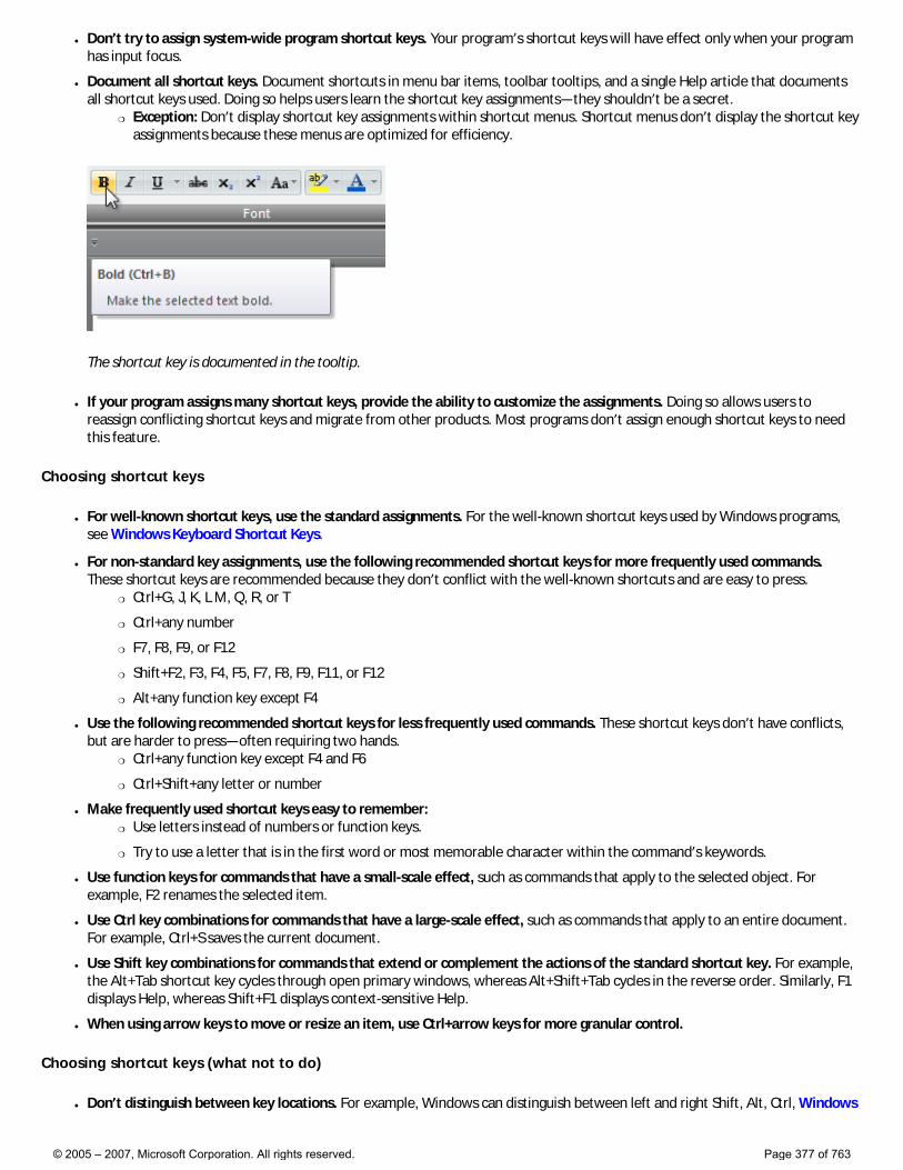
● Don’t try to assign system-wide program shortcut keys. Your program’s shortcut keys will have effect only when your program has input focus.
● Document all shortcut keys. Document shortcuts in menu bar items, toolbar tooltips, and a single Help article that documents all shortcut keys used. Doing so helps users learn the shortcut key assignments—they shouldn’t be a secret.
�❍ Exception: Don’t display shortcut key assignments within shortcut menus. Shortcut menus don’t display the shortcut key assignments because these menus are optimized for efficiency.
The shortcut key is documented in the tooltip.
● If your program assigns many shortcut keys, provide the ability to customize the assignments. Doing so allows users to reassign conflicting shortcut keys and migrate from other products. Most programs don’t assign enough shortcut keys to need this feature.
Choosing shortcut keys
● For well-known shortcut keys, use the standard assignments. For the well-known shortcut keys used by Windows programs, see Windows Keyboard Shortcut Keys.
● For non-standard key assignments, use the following recommended shortcut keys for more frequently used commands. These shortcut keys are recommended because they don’t conflict with the well-known shortcuts and are easy to press.
�❍ Ctrl+G, J, K, L M, Q, R, or T
�❍ Ctrl+any number
�❍ F7, F8, F9, or F12
�❍ Shift+F2, F3, F4, F5, F7, F8, F9, F11, or F12
�❍ Alt+any function key except F4
● Use the following recommended shortcut keys for less frequently used commands. These shortcut keys don’t have conflicts, but are harder to press—often requiring two hands.
�❍ Ctrl+any function key except F4 and F6
�❍ Ctrl+Shift+any letter or number
● Make frequently used shortcut keys easy to remember: �❍ Use letters instead of numbers or function keys.
�❍ Try to use a letter that is in the first word or most memorable character within the command’s keywords.
● Use function keys for commands that have a small-scale effect, such as commands that apply to the selected object. For example, F2 renames the selected item.
● Use Ctrl key combinations for commands that have a large-scale effect, such as commands that apply to an entire document. For example, Ctrl+S saves the current document.
● Use Shift key combinations for commands that extend or complement the actions of the standard shortcut key. For example, the Alt+Tab shortcut key cycles through open primary windows, whereas Alt+Shift+Tab cycles in the reverse order. Similarly, F1 displays Help, whereas Shift+F1 displays context-sensitive Help.
● When using arrow keys to move or resize an item, use Ctrl+arrow keys for more granular control.
Choosing shortcut keys (what not to do)
● Don’t distinguish between key locations. For example, Windows can distinguish between left and right Shift, Alt, Ctrl, Windows
© 2005 – 2007, Microsoft Corporation. All rights reserved. Page 377 of 763
logo, and Application keys, as well as keys on the numeric keypad. Assigning behavior to only one key location is confusing and unexpected.
● Don’t use the Windows logo modifier key for program shortcut keys. Windows logo key is reserved for Windows use. Even if a Windows logo key combination isn’t being used by Windows now, it may be in the future.
● Don’t use the Application key as a shortcut key modifier. Use Ctrl, Alt, and Shift instead.
● Don’t use shortcut keys used by Windows for program shortcut keys. Doing so will conflict with the Windows system shortcut keys when your program has input focus. For the shortcut keys used by Windows Vista, see Windows Keyboard Shortcut Keys.
● Don’t use Alt+alphanumeric key combinations for shortcut keys. Such shortcut keys may conflict with access keys.
● Don’t use the following characters for shortcut keys: @ £ $ {} [] \ ~ | ^ ' < >. These characters require different key combinations across languages or are locale specific.
● Avoid complex key combinations, such as three or more keys together (example: Ctrl+Alt+spacebar) or keys that are far apart on the keyboard (example: Ctrl+F5). Use simple shortcut keys for frequently used commands.
● Don’t use Ctrl+Alt combinations, because Windows interprets this combination in some language versions as an AltGR key, which generates alphanumeric characters.
Keyboard and mouse combinations
● For links, use Shift+click to navigate using a new window and Ctrl+click to navigate using a new tab. This approach is consistent with Windows Internet Explorer®.
Documentation
When referring to the keyboard:
● Use on-screen keyboard to refer to a keyboard representation on the screen that the user touches to input characters.
● Give keyboard combinations starting with the modifier key. Present modifier keys in the following order: Windows logo, Application, Ctrl, Alt, Shift. If the Numpad modifier is used, put that just before the key it modifies.
● Don’t use all capital letters for keyboard keys. Instead, follow the capitalization used by standard keyboards, or lowercase if the key is not labeled on the keyboard.
�❍ For alphabetical key combinations, use an uppercase letter.
�❍ Spell out Page Up, Page Down, Print Screen, and Scroll Lock.
�❍ Spell out plus sign, minus sign, hyphen, period, and comma.
�❍ For arrow keys, use left arrow, right arrow, up arrow, and down arrow. Don’t use graphic labels for the arrow keys.
�❍ Use Windows logo key and Application key to refer to the keys labeled with icons. Don’t use graphic labels for these keys.
Correct: spacebar, Tab, Enter, Page Up, Ctrl+Alt+Del, Alt+W, Ctrl+plus sign
Incorrect: SPACEBAR, TAB, ENTER, PG UP, Ctrl+Alt+DEL, Alt+w, Ctrl++
● Indicate key combinations with a plus sign, without spaces.
Correct: Ctrl+A, Shift+F5
Incorrect: Ctrl-A, Shift + F5
● To show a key combination that includes punctuation that requires use of the Shift key, such as the question mark, add Shift to the combination and give the name or symbol of the shifted key. Using the name of the unshifted key, such as 4 rather than $, could be confusing to users or even wrong; for instance, the ? and / characters are not always shifted keys on every keyboard.
© 2005 – 2007, Microsoft Corporation. All rights reserved. Page 378 of 763
Correct: Ctrl+Shift+?, Ctrl+Shift+*, Ctrl+Shift+comma
Incorrect: Ctrl+Shift+/, Ctrl+?, Ctrl+Shift+8, Ctrl+*
● At first mention, use the and key with the key name if necessary for clarity—for example, the F1 key. At all subsequent references, refer to the key only by its name—for example, press F1.
● Refer specifically to access keys and shortcut keys in programming and other technical documentation. Don’t use accelerator, mnemonic, or hot keys. Everywhere else use keyboard shortcut, especially in user documentation.
When referring to interaction:
● Use press, not depress, strike, hit, or type, when pressing and immediately releasing a key initiates an action within the program or navigates within a document or UI.
● Use type, not enter, to direct users to type text.
● Use use in situations when press might be confusing, such as when referring to a type of key such as the arrow keys or function keys. In such cases, press might make users think they need to press all the keys simultaneously.
● Use hold when pressing and holding a key, such as a modifier key.
● Don’t use press as a synonym for click.
Examples:
● Type your name, and then press Enter.
● Press Ctrl+F, and then type the text you want to search for.
● To save your file, press Y.
● To move the insertion point, use the arrow keys.
© 2005 – 2007, Microsoft Corporation. All rights reserved. Page 379 of 763
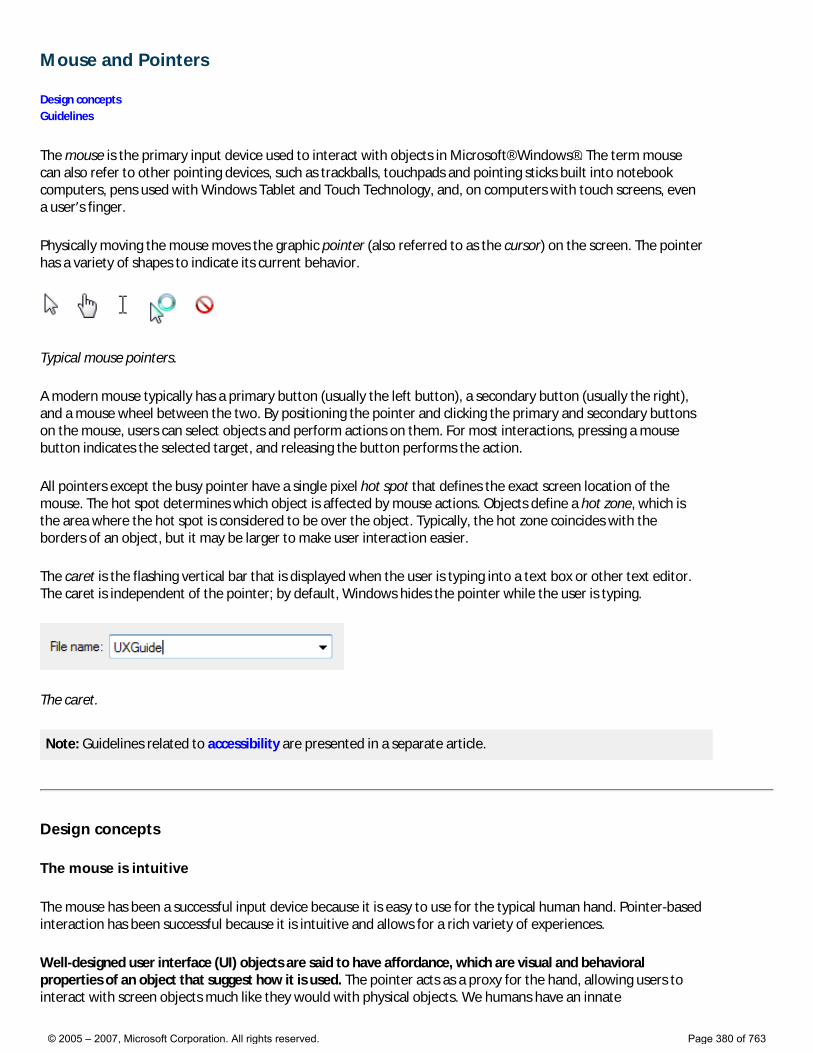
Mouse and Pointers
Design concepts Guidelines
The mouse is the primary input device used to interact with objects in Microsoft® Windows®. The term mouse can also refer to other pointing devices, such as trackballs, touchpads and pointing sticks built into notebook computers, pens used with Windows Tablet and Touch Technology, and, on computers with touch screens, even a user’s finger.
Physically moving the mouse moves the graphic pointer (also referred to as the cursor) on the screen. The pointer has a variety of shapes to indicate its current behavior.
Typical mouse pointers.
A modern mouse typically has a primary button (usually the left button), a secondary button (usually the right), and a mouse wheel between the two. By positioning the pointer and clicking the primary and secondary buttons on the mouse, users can select objects and perform actions on them. For most interactions, pressing a mouse button indicates the selected target, and releasing the button performs the action.
All pointers except the busy pointer have a single pixel hot spot that defines the exact screen location of the mouse. The hot spot determines which object is affected by mouse actions. Objects define a hot zone, which is the area where the hot spot is considered to be over the object. Typically, the hot zone coincides with the borders of an object, but it may be larger to make user interaction easier.
The caret is the flashing vertical bar that is displayed when the user is typing into a text box or other text editor. The caret is independent of the pointer; by default, Windows hides the pointer while the user is typing.
The caret.
Note: Guidelines related to accessibility are presented in a separate article.
Design concepts
The mouse is intuitive
The mouse has been a successful input device because it is easy to use for the typical human hand. Pointer-based interaction has been successful because it is intuitive and allows for a rich variety of experiences.
Well-designed user interface (UI) objects are said to have affordance, which are visual and behavioral properties of an object that suggest how it is used. The pointer acts as a proxy for the hand, allowing users to interact with screen objects much like they would with physical objects. We humans have an innate
© 2005 – 2007, Microsoft Corporation. All rights reserved. Page 380 of 763
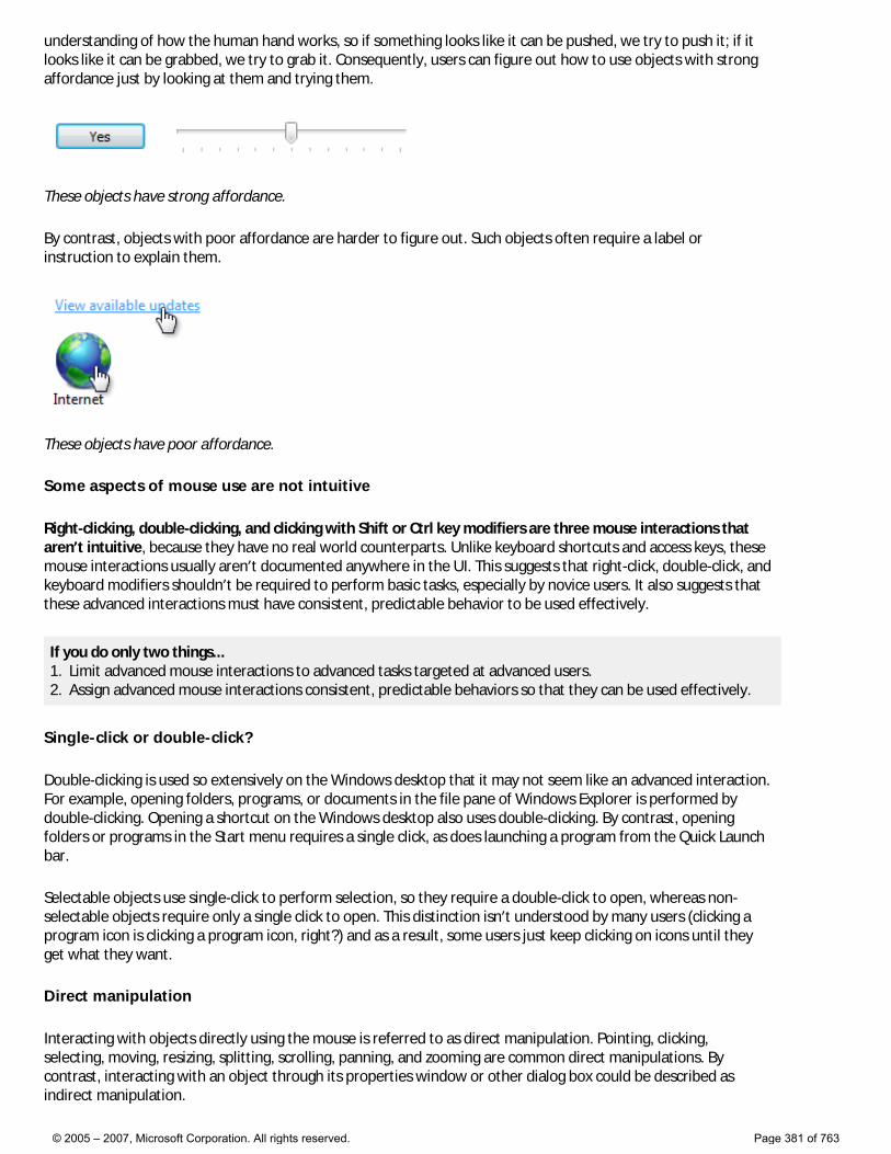
understanding of how the human hand works, so if something looks like it can be pushed, we try to push it; if it looks like it can be grabbed, we try to grab it. Consequently, users can figure out how to use objects with strong affordance just by looking at them and trying them.
These objects have strong affordance.
By contrast, objects with poor affordance are harder to figure out. Such objects often require a label or instruction to explain them.
These objects have poor affordance.
Some aspects of mouse use are not intuitive
Right-clicking, double-clicking, and clicking with Shift or Ctrl key modifiers are three mouse interactions that aren’t intuitive, because they have no real world counterparts. Unlike keyboard shortcuts and access keys, these mouse interactions usually aren’t documented anywhere in the UI. This suggests that right-click, double-click, and keyboard modifiers shouldn’t be required to perform basic tasks, especially by novice users. It also suggests that these advanced interactions must have consistent, predictable behavior to be used effectively.
If you do only two things... 1. Limit advanced mouse interactions to advanced tasks targeted at advanced users. 2. Assign advanced mouse interactions consistent, predictable behaviors so that they can be used effectively.
Single-click or double-click?
Double-clicking is used so extensively on the Windows desktop that it may not seem like an advanced interaction. For example, opening folders, programs, or documents in the file pane of Windows Explorer is performed by double-clicking. Opening a shortcut on the Windows desktop also uses double-clicking. By contrast, opening folders or programs in the Start menu requires a single click, as does launching a program from the Quick Launch bar.
Selectable objects use single-click to perform selection, so they require a double-click to open, whereas non-selectable objects require only a single click to open. This distinction isn’t understood by many users (clicking a program icon is clicking a program icon, right?) and as a result, some users just keep clicking on icons until they get what they want.
Direct manipulation
Interacting with objects directly using the mouse is referred to as direct manipulation. Pointing, clicking, selecting, moving, resizing, splitting, scrolling, panning, and zooming are common direct manipulations. By contrast, interacting with an object through its properties window or other dialog box could be described as indirect manipulation.
© 2005 – 2007, Microsoft Corporation. All rights reserved. Page 381 of 763
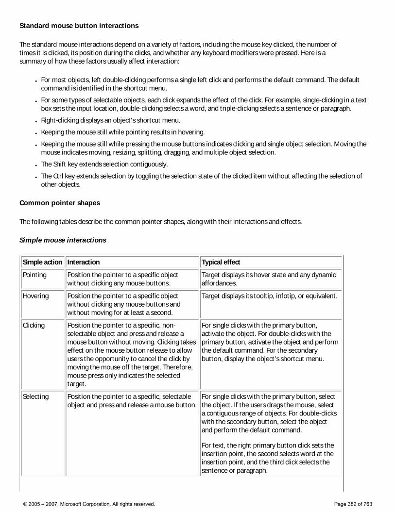
Standard mouse button interactions
The standard mouse interactions depend on a variety of factors, including the mouse key clicked, the number of times it is clicked, its position during the clicks, and whether any keyboard modifiers were pressed. Here is a summary of how these factors usually affect interaction:
● For most objects, left double-clicking performs a single left click and performs the default command. The default command is identified in the shortcut menu.
● For some types of selectable objects, each click expands the effect of the click. For example, single-clicking in a text box sets the input location, double-clicking selects a word, and triple-clicking selects a sentence or paragraph.
● Right-clicking displays an object’s shortcut menu.
● Keeping the mouse still while pointing results in hovering.
● Keeping the mouse still while pressing the mouse buttons indicates clicking and single object selection. Moving the mouse indicates moving, resizing, splitting, dragging, and multiple object selection.
● The Shift key extends selection contiguously.
● The Ctrl key extends selection by toggling the selection state of the clicked item without affecting the selection of other objects.
Common pointer shapes
The following tables describe the common pointer shapes, along with their interactions and effects.
Simple mouse interactions
Simple action Interaction Typical effect
Pointing Position the pointer to a specific object without clicking any mouse buttons.
Target displays its hover state and any dynamic affordances.
Hovering Position the pointer to a specific object without clicking any mouse buttons and without moving for at least a second.
Target displays its tooltip, infotip, or equivalent.
Clicking Position the pointer to a specific, non-selectable object and press and release a mouse button without moving. Clicking takes effect on the mouse button release to allow users the opportunity to cancel the click by moving the mouse off the target. Therefore, mouse press only indicates the selected target.
For single clicks with the primary button, activate the object. For double-clicks with the primary button, activate the object and perform the default command. For the secondary button, display the object’s shortcut menu.
Selecting Position the pointer to a specific, selectable object and press and release a mouse button.
For single clicks with the primary button, select the object. If the users drags the mouse, select a contiguous range of objects. For double-clicks with the secondary button, select the object and perform the default command. For text, the right primary button click sets the insertion point, the second selects word at the insertion point, and the third click selects the sentence or paragraph.
© 2005 – 2007, Microsoft Corporation. All rights reserved. Page 382 of 763
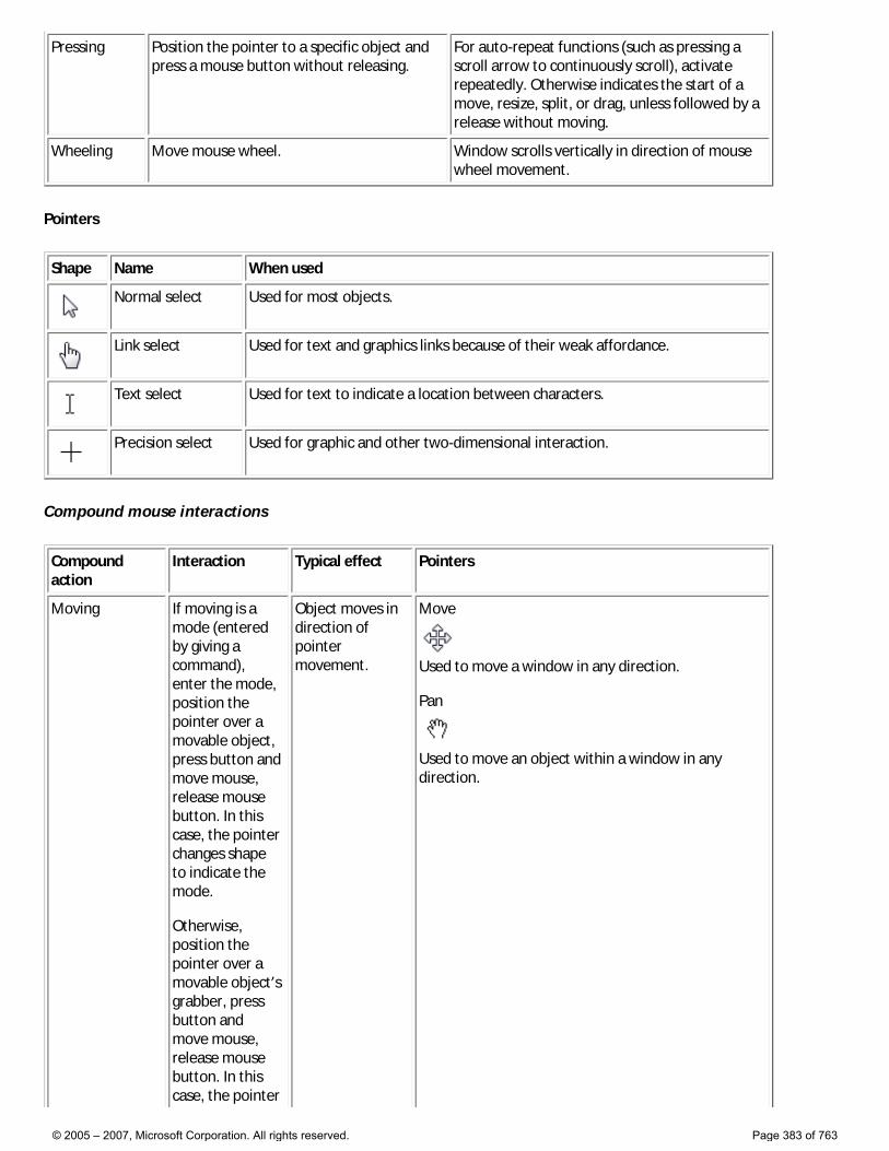
Pressing Position the pointer to a specific object and press a mouse button without releasing.
For auto-repeat functions (such as pressing a scroll arrow to continuously scroll), activate repeatedly. Otherwise indicates the start of a move, resize, split, or drag, unless followed by a release without moving.
Wheeling Move mouse wheel. Window scrolls vertically in direction of mouse wheel movement.
Pointers
Shape Name When used
Normal select Used for most objects.
Link select Used for text and graphics links because of their weak affordance.
Text select Used for text to indicate a location between characters.
Precision select Used for graphic and other two-dimensional interaction.
Compound mouse interactions
Compound action
Interaction Typical effect Pointers
Moving If moving is a mode (entered by giving a command), enter the mode, position the pointer over a movable object, press button and move mouse, release mouse button. In this case, the pointer changes shape to indicate the mode. Otherwise, position the pointer over a movable object’s grabber, press button and move mouse, release mouse button. In this case, the pointer
Object moves in direction of pointer movement.
Move
Used to move a window in any direction. Pan
Used to move an object within a window in any direction.
© 2005 – 2007, Microsoft Corporation. All rights reserved. Page 383 of 763
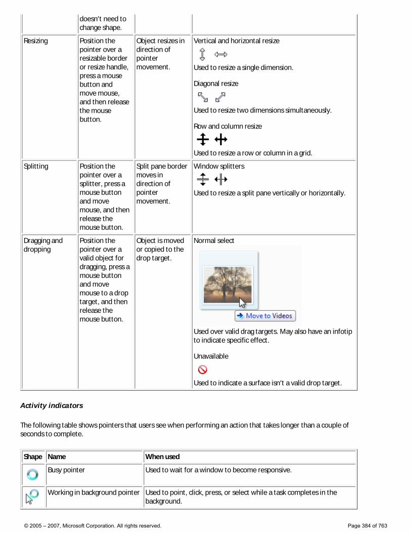
doesn’t need to change shape.
Resizing Position the pointer over a resizable border or resize handle, press a mouse button and move mouse, and then release the mouse button.
Object resizes in direction of pointer movement.
Vertical and horizontal resize
Used to resize a single dimension. Diagonal resize
Used to resize two dimensions simultaneously. Row and column resize
Used to resize a row or column in a grid.
Splitting Position the pointer over a splitter, press a mouse button and move mouse, and then release the mouse button.
Split pane border moves in direction of pointer movement.
Window splitters
Used to resize a split pane vertically or horizontally.
Dragging and dropping
Position the pointer over a valid object for dragging, press a mouse button and move mouse to a drop target, and then release the mouse button.
Object is moved or copied to the drop target.
Normal select
Used over valid drag targets. May also have an infotip to indicate specific effect. Unavailable
Used to indicate a surface isn’t a valid drop target.
Activity indicators
The following table shows pointers that users see when performing an action that takes longer than a couple of seconds to complete.
Shape Name When used
Busy pointer Used to wait for a window to become responsive.
Working in background pointer Used to point, click, press, or select while a task completes in the background.
© 2005 – 2007, Microsoft Corporation. All rights reserved. Page 384 of 763
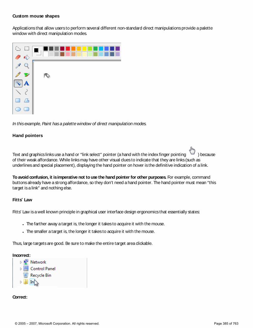
Custom mouse shapes
Applications that allow users to perform several different non-standard direct manipulations provide a palette window with direct manipulation modes.
In this example, Paint has a palette window of direct manipulation modes.
Hand pointers
Text and graphics links use a hand or “link select” pointer (a hand with the index finger pointing ) because of their weak affordance. While links may have other visual clues to indicate that they are links (such as underlines and special placement), displaying the hand pointer on hover is the definitive indication of a link.
To avoid confusion, it is imperative not to use the hand pointer for other purposes. For example, command buttons already have a strong affordance, so they don’t need a hand pointer. The hand pointer must mean “this target is a link” and nothing else.
Fitts’ Law
Fitts’ Law is a well known principle in graphical user interface design ergonomics that essentially states:
● The farther away a target is, the longer it takes to acquire it with the mouse.
● The smaller a target is, the longer it takes to acquire it with the mouse.
Thus, large targets are good. Be sure to make the entire target area clickable.
Incorrect:
Correct:
© 2005 – 2007, Microsoft Corporation. All rights reserved. Page 385 of 763
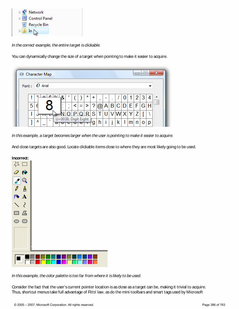
In the correct example, the entire target is clickable.
You can dynamically change the size of a target when pointing to make it easier to acquire.
In this example, a target becomes larger when the user is pointing to make it easier to acquire.
And close targets are also good. Locate clickable items close to where they are most likely going to be used.
Incorrect:
In this example, the color palette is too far from where it is likely to be used.
Consider the fact that the user’s current pointer location is as close as a target can be, making it trivial to acquire. Thus, shortcut menus take full advantage of Fitts’ law, as do the mini toolbars and smart tags used by Microsoft
© 2005 – 2007, Microsoft Corporation. All rights reserved. Page 386 of 763
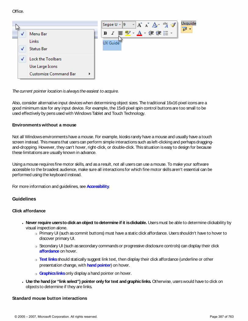
Office.
The current pointer location is always the easiest to acquire.
Also, consider alternative input devices when determining object sizes. The traditional 16x16 pixel icons are a good minimum size for any input device. For example, the 15x9 pixel spin control buttons are too small to be used effectively by pens used with Windows Tablet and Touch Technology.
Environments without a mouse
Not all Windows environments have a mouse. For example, kiosks rarely have a mouse and usually have a touch screen instead. This means that users can perform simple interactions such as left-clicking and perhaps dragging-and-dropping. However, they can’t hover, right-click, or double-click. This situation is easy to design for because these limitations are usually known in advance.
Using a mouse requires fine motor skills, and as a result, not all users can use a mouse. To make your software accessible to the broadest audience, make sure all interactions for which fine motor skills aren’t essential can be performed using the keyboard instead.
For more information and guidelines, see Accessibility.
Guidelines
Click affordance
● Never require users to click an object to determine if it is clickable. Users must be able to determine clickability by visual inspection alone.
�❍ Primary UI (such as commit buttons) must have a static click affordance. Users shouldn’t have to hover to discover primary UI.
�❍ Secondary UI (such as secondary commands or progressive disclosure controls) can display their click affordance on hover.
�❍ Text links should statically suggest link text, then display their click affordance (underline or other presentation change, with hand pointer) on hover.
�❍ Graphics links only display a hand pointer on hover.
● Use the hand (or “link select”) pointer only for text and graphic links. Otherwise, users would have to click on objects to determine if they are links.
Standard mouse button interactions
© 2005 – 2007, Microsoft Corporation. All rights reserved. Page 387 of 763
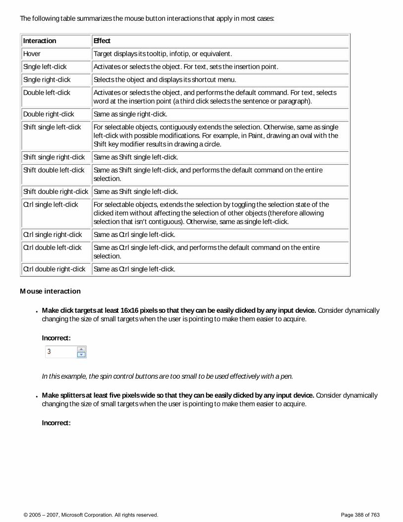
The following table summarizes the mouse button interactions that apply in most cases:
Interaction Effect
Hover Target displays its tooltip, infotip, or equivalent.
Single left-click Activates or selects the object. For text, sets the insertion point.
Single right-click Selects the object and displays its shortcut menu.
Double left-click Activates or selects the object, and performs the default command. For text, selects word at the insertion point (a third click selects the sentence or paragraph).
Double right-click Same as single right-click.
Shift single left-click For selectable objects, contiguously extends the selection. Otherwise, same as single left-click with possible modifications. For example, in Paint, drawing an oval with the Shift key modifier results in drawing a circle.
Shift single right-click Same as Shift single left-click.
Shift double left-click Same as Shift single left-click, and performs the default command on the entire selection.
Shift double right-click Same as Shift single left-click.
Ctrl single left-click For selectable objects, extends the selection by toggling the selection state of the clicked item without affecting the selection of other objects (therefore allowing selection that isn’t contiguous). Otherwise, same as single left-click.
Ctrl single right-click Same as Ctrl single left-click.
Ctrl double left-click Same as Ctrl single left-click, and performs the default command on the entire selection.
Ctrl double right-click Same as Ctrl single left-click.
Mouse interaction
● Make click targets at least 16x16 pixels so that they can be easily clicked by any input device. Consider dynamically changing the size of small targets when the user is pointing to make them easier to acquire.
Incorrect:
In this example, the spin control buttons are too small to be used effectively with a pen.
● Make splitters at least five pixels wide so that they can be easily clicked by any input device. Consider dynamically changing the size of small targets when the user is pointing to make them easier to acquire.
Incorrect:
© 2005 – 2007, Microsoft Corporation. All rights reserved. Page 388 of 763
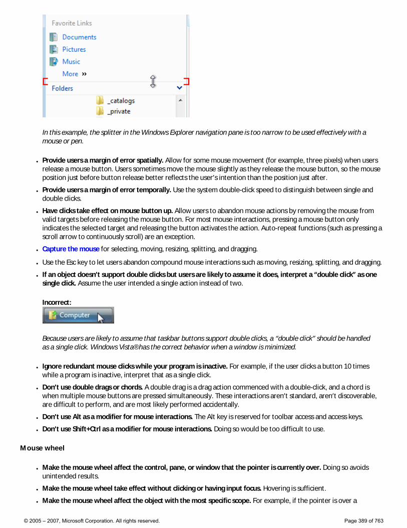
In this example, the splitter in the Windows Explorer navigation pane is too narrow to be used effectively with a mouse or pen.
● Provide users a margin of error spatially. Allow for some mouse movement (for example, three pixels) when users release a mouse button. Users sometimes move the mouse slightly as they release the mouse button, so the mouse position just before button release better reflects the user’s intention than the position just after.
● Provide users a margin of error temporally. Use the system double-click speed to distinguish between single and double clicks.
● Have clicks take effect on mouse button up. Allow users to abandon mouse actions by removing the mouse from valid targets before releasing the mouse button. For most mouse interactions, pressing a mouse button only indicates the selected target and releasing the button activates the action. Auto-repeat functions (such as pressing a scroll arrow to continuously scroll) are an exception.
● Capture the mouse for selecting, moving, resizing, splitting, and dragging.
● Use the Esc key to let users abandon compound mouse interactions such as moving, resizing, splitting, and dragging.
● If an object doesn’t support double clicks but users are likely to assume it does, interpret a “double click” as one single click. Assume the user intended a single action instead of two.
Incorrect:
Because users are likely to assume that taskbar buttons support double clicks, a “double click” should be handled as a single click. Windows Vista® has the correct behavior when a window is minimized.
● Ignore redundant mouse clicks while your program is inactive. For example, if the user clicks a button 10 times while a program is inactive, interpret that as a single click.
● Don’t use double drags or chords. A double drag is a drag action commenced with a double-click, and a chord is when multiple mouse buttons are pressed simultaneously. These interactions aren’t standard, aren’t discoverable, are difficult to perform, and are most likely performed accidentally.
● Don’t use Alt as a modifier for mouse interactions. The Alt key is reserved for toolbar access and access keys.
● Don’t use Shift+Ctrl as a modifier for mouse interactions. Doing so would be too difficult to use.
Mouse wheel
● Make the mouse wheel affect the control, pane, or window that the pointer is currently over. Doing so avoids unintended results.
● Make the mouse wheel take effect without clicking or having input focus. Hovering is sufficient.
● Make the mouse wheel affect the object with the most specific scope. For example, if the pointer is over a
© 2005 – 2007, Microsoft Corporation. All rights reserved. Page 389 of 763
scrollable list box control in a scrollable pane within a scrollable window, the mouse wheel affects the list box control.
● Don’t change the input focus when using the mouse wheel.
● Give the mouse wheel the following effects: �❍ For scrollable windows, panes, and controls:
■ Rotating the mouse wheel scrolls the object vertically, where rotating up scrolls up. For the wheel to have natural mapping, rotating the mouse wheel should never scroll horizontally because doing so is disorienting and unexpected.
■ If the Ctrl key is pressed, rotating the mouse wheel zooms the object, where rotating up zooms in and rotating down zooms out.
■ Tilting the mouse wheel scrolls the object horizontally.
�❍ For zoomable windows and panes (without scrollbars): ■ Rotating the mouse wheel zooms the object, where rotating up zooms in and rotating down zooms
out.
■ Tilting the mouse wheel has no effect.
�❍ For tabs: ■ Rotating the mouse wheel can change the current tab, regardless of the orientation of the tabs.
■ Tilting the mouse wheel has no effect.
�❍ If the Shift and Alt keys are depressed, the mouse wheel has no effect.
● Use the Windows system settings for the vertical scroll size (for rotating) and horizontal scroll size (for tilting). These settings are configurable through the Mouse control panel item.
● Make rotating the mouse wheel more rapidly result in scrolling more rapidly. Doing so allows users to scroll large documents more efficiently.
● For scrollable windows, consider having clicking the mouse wheel button put the window in “reader mode.” Reader mode plants a special scroll origin icon and scrolls the window in a direction and speed relative to the scroll origin.
© 2005 – 2007, Microsoft Corporation. All rights reserved. Page 390 of 763
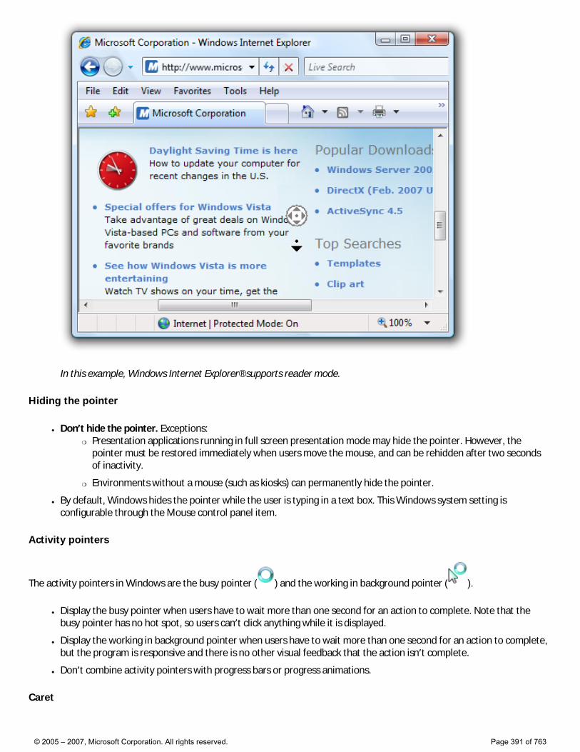
In this example, Windows Internet Explorer® supports reader mode.
Hiding the pointer
● Don’t hide the pointer. Exceptions: �❍ Presentation applications running in full screen presentation mode may hide the pointer. However, the
pointer must be restored immediately when users move the mouse, and can be rehidden after two seconds of inactivity.
�❍ Environments without a mouse (such as kiosks) can permanently hide the pointer.
● By default, Windows hides the pointer while the user is typing in a text box. This Windows system setting is configurable through the Mouse control panel item.
Activity pointers
The activity pointers in Windows are the busy pointer ( ) and the working in background pointer ( ).
● Display the busy pointer when users have to wait more than one second for an action to complete. Note that the busy pointer has no hot spot, so users can’t click anything while it is displayed.
● Display the working in background pointer when users have to wait more than one second for an action to complete, but the program is responsive and there is no other visual feedback that the action isn’t complete.
● Don’t combine activity pointers with progress bars or progress animations.
Caret
© 2005 – 2007, Microsoft Corporation. All rights reserved. Page 391 of 763

● Don’t display the caret until the text input window or control has input focus. The caret suggests input focus to users, but a window or control can display the caret without input focus. Of course, don’t steal input focus so that an out-of-context dialog box can display the caret.
Incorrect:
The Windows Credential Manager is displayed out of context with the caret but without input focus. As a result, users end up typing their password in unexpected places.
● Place the caret where users are most likely to type first. Usually this is either the last place the user was typing or at the end of the text.
Accessibility
● For users who can’t use the mouse at all, make the mouse redundant with the keyboard. �❍ Users should be able to do everything with the keyboard that they can with the mouse, except actions for
which fine motor skills are essential, such as drawing and game playing.
�❍ Users should be able to do everything with the mouse that they can with the keyboard, except efficient text entry.
● For users with limited ability to use the mouse: �❍ Don’t make double-clicking and dragging the only way to perform an action.
For more information and guidelines, see Accessibility.
Documentation
When referring to the mouse:
● Avoid using the plural mice; if you need to refer to more than one mouse, use mouse devices.
● Use mouse button to indicate the left mouse button. Don’t use primary mouse button. Similarly, use right mouse button instead of secondary mouse button. Regardless of accuracy, users understand these terms and users who
© 2005 – 2007, Microsoft Corporation. All rights reserved. Page 392 of 763
reprogram their buttons make the mental shift.
● Use wheel for the rotating part of the mouse wheel, and wheel button to refer to the clickable part.
● Use verbs such as click, point, and drag to refer to mouse actions. Users rotate the wheel vertically, tilt it horizontally, and click the wheel button.
● Use drag, not drag and drop, for the action of moving a document or folder. It is acceptable to use drag-and-drop as an adjective, as in “moving the folder is a drag-and-drop operation.”
● Always hyphenate double-click and right-click as verbs.
● Use click, not click on. Click in (as in “click in the window”) is acceptable.
When referring to mouse pointers:
● Refer to the mouse pointer as the pointer. Use cursor only in technical documentation.
● For pointers with activity indicators, use busy pointer for the pointer consisting of only an activity indicator, and working in background pointer for the combination pointer and activity indicator.
● For the other types of pointers, don’t use descriptive labels to refer to the pointer. If necessary, use a graphic to describe how the mouse pointer can appear on the screen.
Examples:
● Point to the window border.
● Using the mouse, click the Minimize button.
● Hold down Shift and click the right mouse button.
● When the pointer becomes a , drag the pointer to move the split line.
© 2005 – 2007, Microsoft Corporation. All rights reserved. Page 393 of 763
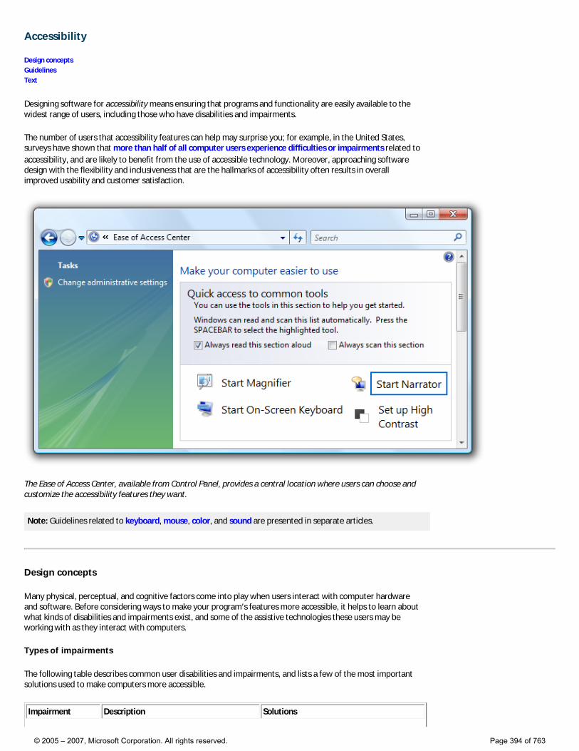
Accessibility
Design concepts Guidelines Text
Designing software for accessibility means ensuring that programs and functionality are easily available to the widest range of users, including those who have disabilities and impairments.
The number of users that accessibility features can help may surprise you; for example, in the United States, surveys have shown that more than half of all computer users experience difficulties or impairments related to accessibility, and are likely to benefit from the use of accessible technology. Moreover, approaching software design with the flexibility and inclusiveness that are the hallmarks of accessibility often results in overall improved usability and customer satisfaction.
The Ease of Access Center, available from Control Panel, provides a central location where users can choose and customize the accessibility features they want.
Note: Guidelines related to keyboard, mouse, color, and sound are presented in separate articles.
Design concepts
Many physical, perceptual, and cognitive factors come into play when users interact with computer hardware and software. Before considering ways to make your program’s features more accessible, it helps to learn about what kinds of disabilities and impairments exist, and some of the assistive technologies these users may be working with as they interact with computers.
Types of impairments
The following table describes common user disabilities and impairments, and lists a few of the most important solutions used to make computers more accessible.
Impairment Description Solutions
© 2005 – 2007, Microsoft Corporation. All rights reserved. Page 394 of 763
Visual Ranges from mild (affecting 17 percent of users) to severe (affecting 9 percent of users).
Customizable magnification, colors, and contrast; Braille utilities; screen readers.
Hearing Ranges from mild (affecting 18 percent of users) to severe (affecting 2 percent of users).
Information redundancy: sound used only as supplement to text or visual communication.
Dexterity Ranges from mild (affecting 19 percent of users) to severe (affecting 5 percent of users). This impairment often involves difficulty performing certain motor skills with keyboard or mouse.
Input method redundancy: program features accessed by mouse or keyboard equivalents.
Cognitive Includes memory impairments and perceptual differences. Affects 16 percent of users.
Highly-customizable user interface (UI); use of progressive disclosure to hide complexity; use of icons and other visual aids.
Seizure Includes visual sensitivity to movement and flashing.
Conservative approach to modulating interfaces, such as the use of animations; avoiding screen flicker in the range between 2 Hertz (Hz) and 55 Hz.
Speech or language Includes dyslexia and oral communication difficulties.
Spell-check and grammar-check utilities; speech recognition and text-to-speech technology.
For more guidelines about helping users with these impairments, see Addressing particular impairments later in this article.
Types of assistive technologies and accessibility features
Screen readers
A screen reader enables users with visual disabilities or impairments to navigate a UI by transforming visuals to audio. Thus, UI text, controls, menus, toolbars, graphics, and other screen elements are spoken by the computerized voice of the screen reader. To create a program optimized for screen reader assistive technology, you must plan for how the screen reader will identify each UI element.
Each UI element that the user can interact with must be keyboard accessible, as well as be exposed through an accessibility application programming interface (API). We recommend using Microsoft® UI Automation, the new accessibility framework for all versions of Microsoft Windows® that support Windows Presentation Foundation (WPF). UI Automation provides programmatic access to most elements on the desktop, enabling assistive technology products such as screen readers to provide information about the UI to users and to manipulate the UI by means other than standard input (for example, by speaking rather than or in addition to manipulating the mouse or keyboard). For more information, see the UI Automation Overview.
Be aware that although screen readers are a very important assistive technology, there are others as well. For more information about the range of technologies available, see Types of Assistive Technology Products.
Speech recognition
Speech recognition is an accessibility feature in Windows Vista® that allows users to interact with their computers by voice, reducing the need for motor interaction with the mouse or keyboard. Users can dictate documents and e-mail, use voice commands to start and switch between programs, control the operating system, and even fill out forms on the Web.
Magnifier
Magnification helps users with low vision by enlarging items on screen anywhere from 2 to 16 times the original. Users can set this feature to track the mouse (to see an enlarged version of what the mouse is pointing to), the keyboard (to see the area where the pointer moves when tabbing), or text editing (to see what they are typing).
Visual settings and color schemes
© 2005 – 2007, Microsoft Corporation. All rights reserved. Page 395 of 763
In addition to making things on the screen larger, users with visual impairment may benefit from system settings such as high-contrast mode or the ability to customize background and foreground color schemes.
Narrator
Narrator is a scaled-down screen reader in Windows that allows users to hear on-screen text and UI elements read aloud, even including some events (including error messages) that happen spontaneously. The user can hear the Narrator menus without leaving the active window.
Users can customize the extent to which Microsoft Narrator is used.
On-screen keyboard
For users who have difficulty with physical keyboards, and need to use an alternative input device such as a switch, on-screen keyboards are a necessity. Users can select keys using the mouse or another pointing device, a small group of keys, or just one key, depending on how you set up On-Screen Keyboard.
Mouse keys
With Mouse Keys enabled, users who prefer the keyboard can use the arrow keys on the numeric keypad to move the mouse pointer.
For a complete list of accessibility features, see Accessibility in Windows Vista on the Microsoft Web site.
Keyboard-based navigation
The Tab key, arrow keys, space bar, and Enter key are important for keyboard-based navigation. Pressing Tab cycles input focus through the different control groups, and pressing the arrow keys moves within a control or among controls within a group. Pressing space bar is the same as clicking the control with input focus, whereas pressing Enter is the same as clicking the default command button or command link, regardless of input focus.
© 2005 – 2007, Microsoft Corporation. All rights reserved. Page 396 of 763
In this example, users can press Tab until the desired option has input focus, then press space bar to select the option.
Access keys
Access keys allow users to choose options and initiate commands directly without having to navigate to the control first. Access keys are indicated by underlining one of the characters in each control’s label. Users then activate the option or command by pressing the Alt key along with the underlined character. Access keys aren’t case sensitive.
© 2005 – 2007, Microsoft Corporation. All rights reserved. Page 397 of 763
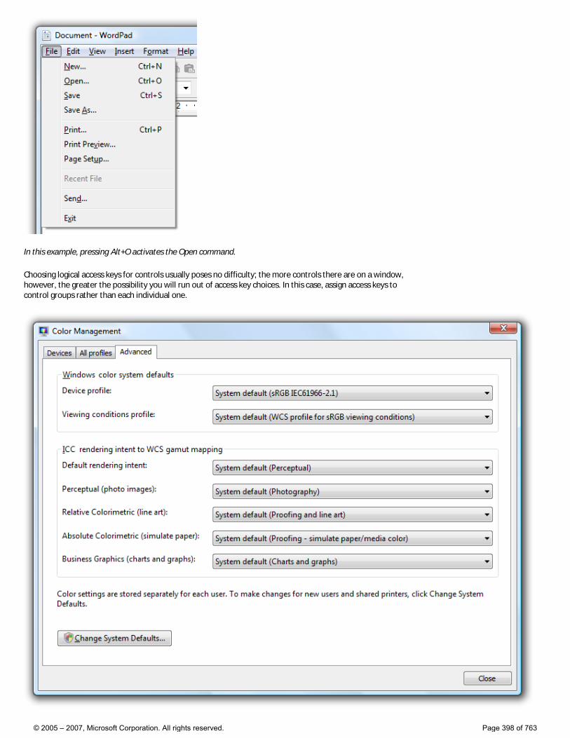
In this example, pressing Alt+O activates the Open command.
Choosing logical access keys for controls usually poses no difficulty; the more controls there are on a window, however, the greater the possibility you will run out of access key choices. In this case, assign access keys to control groups rather than each individual one.
© 2005 – 2007, Microsoft Corporation. All rights reserved. Page 398 of 763

In this example, access keys are assigned to control groups, rather than individual controls.
Access keys are often confused with shortcut keys, but shortcut keys are assigned differently from access keys and have different goals. For example, shortcut keys use Ctrl and Function key sequences and are intended primarily as a shortcut for advanced users instead of for accessibility.
For more information, see Keyboard.
Designing for accessibility: three fundamental practices
Accessible programs help all users in some way because the objectives of accessibility and usability overlap. For example, features designed to make advanced users as efficient as possible also benefit users who prefer using the keyboard because of dexterity impairment.
Three fundamental practices will help you with accessible design: allow for a degree of flexibility in your UI, let respect for user needs and preferences play a major role in design decisions, and provide programmatic access to your UI.
Providing flexible UI
Accessible design is, at least in part, about giving users choices. Not a frustrating, dizzying array of choices, but a limited number of choices that smartly anticipates user needs. “Don’t like navigating by way of the mouse? Here, you can do the very same things using only the keyboard. Don’t like physical keyboards? Here’s a virtual one you can use on-screen.”
For example, provide flexibility by:
● Providing user-selectable equivalents for non-text elements (for example, alt text for graphics and captions for audio).
Users who have chosen not to render graphics should see alt text instead, describing what the control does and how to interact with it.
● Providing alternatives to color (for example, icon differentiation or the use of sounds).
In this example, the standard icons are readily distinguishable based on their designs.
● Ensuring keyboard access (for example, a tab stop for every interactive control) so that users can accomplish the same things in your program with either the mouse or the keyboard.
● Ensuring that your program offers good color contrast options for users. Windows provides a high contrast option, but that’s really designed to be a solution for severe visual impairment. Other contrast options best serve users with mild impairment, such as low vision and color blindness. To determine if your program’s use of color is accessible and not used as a primary method of communication, we recommend using the Fujitsu ColorDoctor or the Vischeck utilities.
● Ensuring that users have a way to adjust the size of text in your program’s UI (for example, through a slider control or drop-down box for font size). If possible, support high dots per inch (dpi) mode.
● Ensuring that your program is multimodal, meaning that if the primary mode of the program is inaccessible for some, these users have a way to work around the problem. For example, when animation is displayed, the information should be displayable in at least one non-animated presentation mode at the option of the user.
© 2005 – 2007, Microsoft Corporation. All rights reserved. Page 399 of 763
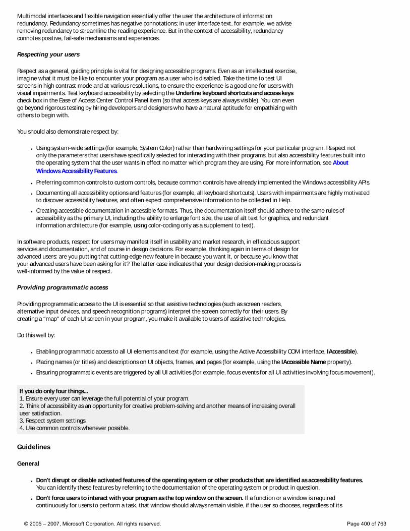
Multimodal interfaces and flexible navigation essentially offer the user the architecture of information redundancy. Redundancy sometimes has negative connotations; in user interface text, for example, we advise removing redundancy to streamline the reading experience. But in the context of accessibility, redundancy connotes positive, fail-safe mechanisms and experiences.
Respecting your users
Respect as a general, guiding principle is vital for designing accessible programs. Even as an intellectual exercise, imagine what it must be like to encounter your program as a user who is disabled. Take the time to test UI screens in high contrast mode and at various resolutions, to ensure the experience is a good one for users with visual impairments. Test keyboard accessibility by selecting the Underline keyboard shortcuts and access keys check box in the Ease of Access Center Control Panel item (so that access keys are always visible). You can even go beyond rigorous testing by hiring developers and designers who have a natural aptitude for empathizing with others to begin with.
You should also demonstrate respect by:
● Using system-wide settings (for example, System Color) rather than hardwiring settings for your particular program. Respect not only the parameters that users have specifically selected for interacting with their programs, but also accessibility features built into the operating system that the user wants in effect no matter which program they are using. For more information, see About Windows Accessibility Features.
● Preferring common controls to custom controls, because common controls have already implemented the Windows accessibility APIs.
● Documenting all accessibility options and features (for example, all keyboard shortcuts). Users with impairments are highly motivated to discover accessibility features, and often expect comprehensive information to be collected in Help.
● Creating accessible documentation in accessible formats. Thus, the documentation itself should adhere to the same rules of accessibility as the primary UI, including the ability to enlarge font size, the use of alt text for graphics, and redundant information architecture (for example, using color-coding only as a supplement to text).
In software products, respect for users may manifest itself in usability and market research, in efficacious support services and documentation, and of course in design decisions. For example, thinking again in terms of design for advanced users: are you putting that cutting-edge new feature in because you want it, or because you know that your advanced users have been asking for it? The latter case indicates that your design decision-making process is well-informed by the value of respect.
Providing programmatic access
Providing programmatic access to the UI is essential so that assistive technologies (such as screen readers, alternative input devices, and speech recognition programs) interpret the screen correctly for their users. By creating a “map” of each UI screen in your program, you make it available to users of assistive technologies.
Do this well by:
● Enabling programmatic access to all UI elements and text (for example, using the Active Accessibility COM interface, IAccessible).
● Placing names (or titles) and descriptions on UI objects, frames, and pages (for example, using the IAccessible Name property).
● Ensuring programmatic events are triggered by all UI activities (for example, focus events for all UI activities involving focus movement).
If you do only four things... 1. Ensure every user can leverage the full potential of your program. 2. Think of accessibility as an opportunity for creative problem-solving and another means of increasing overall user satisfaction. 3. Respect system settings. 4. Use common controls whenever possible.
Guidelines
General
● Don’t disrupt or disable activated features of the operating system or other products that are identified as accessibility features. You can identify these features by referring to the documentation of the operating system or product in question.
● Don’t force users to interact with your program as the top window on the screen. If a function or a window is required continuously for users to perform a task, that window should always remain visible, if the user so chooses, regardless of its
© 2005 – 2007, Microsoft Corporation. All rights reserved. Page 400 of 763

position relative to other windows. For example, if the user has a movable on-screen keyboard that is on top of all other windows so that it is visible at all times, your program should never obscure it by mandatory placement at the top of the Z order.
● Use system colors, fonts, and common controls whenever possible. By doing so, you significantly reduce the number of accessibility issues users encounter.
Addressing particular impairments
Visual
● Never rely on color alone to convey meaning. Use color only as a means of reinforcing the meaning provided by text, design, location, or sound.
The primary method of communication in this example is the concise tooltip text. The use of color assists in communicating the meaning, but is secondary.
● Use alt text infotips to describe graphics.
● Don’t use text in graphics. Users with visual impairments may have graphics turned off (for example, in a Web browser), or may simply not see or look for text placed in graphics.
● Ensure that dialog boxes and windows have meaningful names, so that a user who is hearing rather than seeing the screen (for example, using a screen reader) gets appropriate contextual information.
● Respect the user’s settings for visual display by always obtaining font typefaces, sizes, and colors, Windows display element sizes, and system configuration settings from the Theme and GetSystemMetrics APIs.
● Keep balloon text concise so that it is easier to read and minimizes disruption to screen readers.
Although balloons may use additional body text if necessary, this example shows that sometimes title text alone achieves the same goal in a more economical and accessible way.
Hearing
● Never rely on sound alone to convey meaning. Use sound only as a means of reinforcing the meaning provided by text, design, location, or color.
● Enable users to control the volume of audio output. Use the Windows Volume Mixer for this purpose. For more information, see Sound.
● Target your program’s sound to occur in a range between 500 Hz and 3000 Hz or be easily adjustable by the user into that range. Sounds in this range are most likely to be detectable by people with hearing impairment.
● Position captions in such a way that they don’t block visual content.
© 2005 – 2007, Microsoft Corporation. All rights reserved. Page 401 of 763
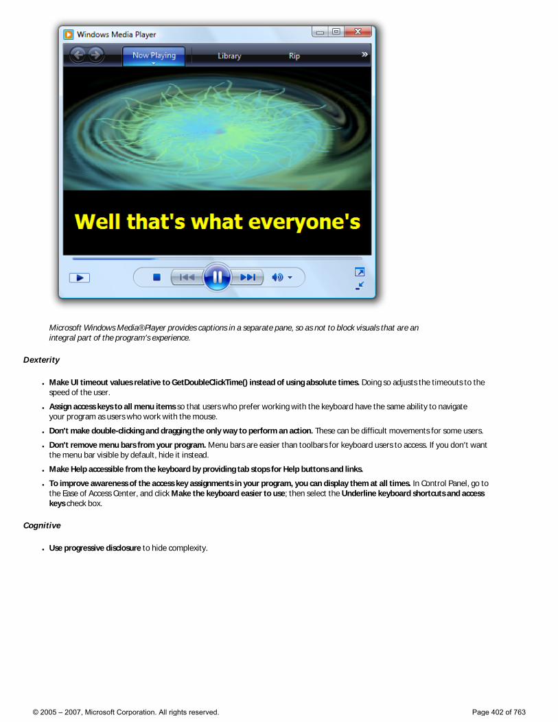
Microsoft Windows Media® Player provides captions in a separate pane, so as not to block visuals that are an integral part of the program’s experience.
Dexterity
● Make UI timeout values relative to GetDoubleClickTime() instead of using absolute times. Doing so adjusts the timeouts to the speed of the user.
● Assign access keys to all menu items so that users who prefer working with the keyboard have the same ability to navigate your program as users who work with the mouse.
● Don’t make double-clicking and dragging the only way to perform an action. These can be difficult movements for some users.
● Don’t remove menu bars from your program. Menu bars are easier than toolbars for keyboard users to access. If you don’t want the menu bar visible by default, hide it instead.
● Make Help accessible from the keyboard by providing tab stops for Help buttons and links.
● To improve awareness of the access key assignments in your program, you can display them at all times. In Control Panel, go to the Ease of Access Center, and click Make the keyboard easier to use; then select the Underline keyboard shortcuts and access keys check box.
Cognitive
● Use progressive disclosure to hide complexity.
© 2005 – 2007, Microsoft Corporation. All rights reserved. Page 402 of 763
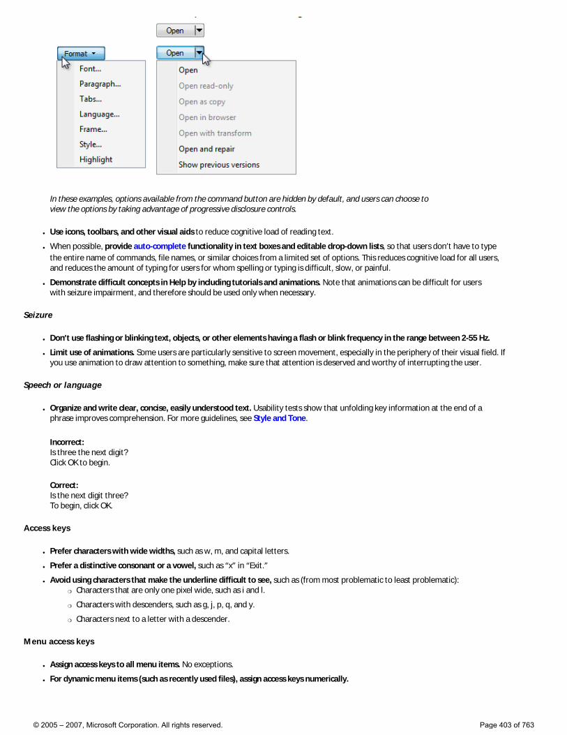
In these examples, options available from the command button are hidden by default, and users can choose to view the options by taking advantage of progressive disclosure controls.
● Use icons, toolbars, and other visual aids to reduce cognitive load of reading text.
● When possible, provide auto-complete functionality in text boxes and editable drop-down lists, so that users don’t have to type the entire name of commands, file names, or similar choices from a limited set of options. This reduces cognitive load for all users, and reduces the amount of typing for users for whom spelling or typing is difficult, slow, or painful.
● Demonstrate difficult concepts in Help by including tutorials and animations. Note that animations can be difficult for users with seizure impairment, and therefore should be used only when necessary.
Seizure
● Don’t use flashing or blinking text, objects, or other elements having a flash or blink frequency in the range between 2-55 Hz.
● Limit use of animations. Some users are particularly sensitive to screen movement, especially in the periphery of their visual field. If you use animation to draw attention to something, make sure that attention is deserved and worthy of interrupting the user.
Speech or language
● Organize and write clear, concise, easily understood text. Usability tests show that unfolding key information at the end of a phrase improves comprehension. For more guidelines, see Style and Tone.
Incorrect: Is three the next digit? Click OK to begin.
Correct: Is the next digit three? To begin, click OK.
Access keys
● Prefer characters with wide widths, such as w, m, and capital letters.
● Prefer a distinctive consonant or a vowel, such as “x” in “Exit.”
● Avoid using characters that make the underline difficult to see, such as (from most problematic to least problematic): �❍ Characters that are only one pixel wide, such as i and l.
�❍ Characters with descenders, such as g, j, p, q, and y.
�❍ Characters next to a letter with a descender.
Menu access keys
● Assign access keys to all menu items. No exceptions.
● For dynamic menu items (such as recently used files), assign access keys numerically.
© 2005 – 2007, Microsoft Corporation. All rights reserved. Page 403 of 763
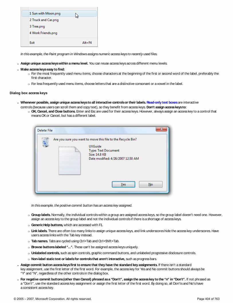
In this example, the Paint program in Windows assigns numeric access keys to recently used files.
● Assign unique access keys within a menu level. You can reuse access keys across different menu levels.
● Make access keys easy to find: �❍ For the most frequently used menu items, choose characters at the beginning of the first or second word of the label, preferably the
first character.
�❍ For less frequently used menu items, choose letters that are a distinctive consonant or a vowel in the label.
Dialog box access keys
● Whenever possible, assign unique access keys to all interactive controls or their labels. Read-only text boxes are interactive controls (because users can scroll them and copy text), so they benefit from access keys. Don’t assign access keys to:
�❍ OK, Cancel, and Close buttons. Enter and Esc are used for their access keys. However, always assign an access key to a control that means OK or Cancel, but has a different label.
In this example, the positive commit button has an access key assigned.
�❍ Group labels. Normally, the individual controls within a group are assigned access keys, so the group label doesn’t need one. However, assign an access key to the group label and not the individual controls if there is a shortage of access keys.
�❍ Generic Help buttons, which are accessed with F1.
�❍ Link labels. There are often too many links to assign unique access keys, and link underscores hide the access key underscores. Have users access links with the Tab key instead.
�❍ Tab names. Tabs are cycled using Ctrl+Tab and Ctrl+Shift+Tab.
�❍ Browse buttons labeled “...”. These can’t be assigned access keys uniquely.
�❍ Unlabeled controls, such as spin controls, graphic command buttons, and unlabeled progressive disclosure controls.
�❍ Non-label static text or labels for controls that aren’t interactive, such as progress bars.
● Assign commit button access keys first to ensure that they have the standard key assignments. If there isn’t a standard key assignment, use the first letter of the first word. For example, the access key for Yes and No commit buttons should always be “Y” and “N”, regardless of the other controls in the dialog box.
● For negative commit buttons (other than Cancel) phrased as a “Don’t”, assign the access key to the “n” in “Don’t”. If not phrased as a “Don’t”, use the standard access key assignment or assign the first letter of the first word. By doing so, all Don’ts and No’s have a consistent access key.
© 2005 – 2007, Microsoft Corporation. All rights reserved. Page 404 of 763
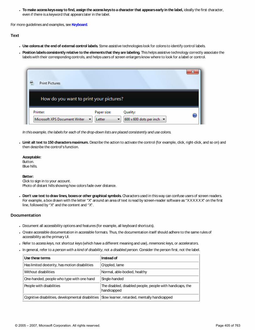
● To make access keys easy to find, assign the access keys to a character that appears early in the label, ideally the first character, even if there is a keyword that appears later in the label.
For more guidelines and examples, see Keyboard.
Text
● Use colons at the end of external control labels. Some assistive technologies look for colons to identify control labels.
● Position labels consistently relative to the elements that they are labeling. This helps assistive technology correctly associate the labels with their corresponding controls, and helps users of screen enlargers know where to look for a label or control.
In this example, the labels for each of the drop-down lists are placed consistently and use colons.
● Limit alt text to 150 characters maximum. Describe the action to activate the control (for example, click, right-click, and so on) and then describe the control’s function.
Acceptable: Button. Blue hills.
Better: Click to sign in to your account. Photo of distant hills showing how colors fade over distance.
● Don’t use text to draw lines, boxes or other graphical symbols. Characters used in this way can confuse users of screen readers. For example, a box drawn with the letter “X” around an area of text is read by screen-reader software as “X X X X X X” on the first line, followed by “X” and the content and “X”.
Documentation
● Document all accessibility options and features (for example, all keyboard shortcuts).
● Create accessible documentation in accessible formats. Thus, the documentation itself should adhere to the same rules of accessibility as the primary UI.
● Refer to access keys, not shortcut keys (which have a different meaning and use), mnemonic keys, or accelerators.
● In general, refer to a person with a kind of disability, not a disabled person. Consider the person first, not the label.
Use these terms Instead of
Has limited dexterity, has motion disabilities Crippled, lame
Without disabilities Normal, able-bodied, healthy
One-handed, people who type with one hand Single-handed
People with disabilities The disabled, disabled people, people with handicaps, the handicapped
Cognitive disabilities, developmental disabilities Slow learner, retarded, mentally handicapped
© 2005 – 2007, Microsoft Corporation. All rights reserved. Page 405 of 763
Windows
These articles provide guidelines for the different types of windows to use in your Windows Vista®-based applications:
● Window Management
● Dialog Boxes
● Common Dialogs
● Wizards
● Property Windows
● Control Panels
● Error Messages
● Warning Messages
● Confirmations
© 2005 – 2007, Microsoft Corporation. All rights reserved. Page 406 of 763
Window Management
Design concepts Guidelines
This article covers default placement of windows when initially displayed on the screen, their stacking order relative to other windows (Z order), their initial size, and how their display affects input focus.
For the following guidelines:
● A top-level window has no owner window and is displayed on the taskbar. Examples: application windows. In Windows Vista®, dialog boxes without owner windows and property sheets are also considered top-level.
● An owned window has an owner window and isn’t displayed on the taskbar. Examples: modal dialog boxes, modeless dialog boxes.
● A user-initiated window is displayed as the direct result of a user’s action. Otherwise, it is program initiated if initiated by a program, or system initiated if initiated by Microsoft® Windows®. For example, an Options dialog box is user initiated, but a meeting reminder is program initiated.
● A contextual window is a user-initiated window that has a strong relationship to the object from which it was launched. For example, windows displayed by shortcut menus or notification area icons are contextual, but windows displayed by menu bars are not.
● The active monitor is the monitor where the active program is running.
● The default monitor is the one with the Start menu, taskbar, and notification area.
Design concepts
Window management is one of the most fundamental user activities. In Windows XP, windows were often given small default sizes and placed in the middle of the screen. That approach works well for older single, low-resolution monitors, but not for modern video hardware.
Windows Vista is designed to support modern video hardware, which often runs at resolutions significantly higher than the minimum supported screen resolution and may have multiple monitors. Doing so:
● Allows users to benefit fully from their advanced hardware.
● Requires less effort from users to move their mouse across greater distances.
● Makes window placement more predictable and therefore easier to find.
Guidelines
General
● Support the minimum Windows Vista screen resolution of 800 x 600 pixels. For critical user interfaces (UIs) that must work in safe mode, or on ultra-mobile PCs (UMPCs), and Windows Media Center PCs, support a screen resolution of 640 x 480 pixels.
�❍ To support these environments, always display some UI even if the current screen resolution is below the minimum supported by your program. This UI may have limited functionality.
● Optimize resizable window layouts for a screen resolution of 1024 x 768 pixels.
● Resizable windows no longer must show the resize glyph in the lower-right corner, because: �❍ All sides and edges of a window are resizable, not just the lower-right corner.
�❍ The glyph requires a status bar to display, yet many resizable windows don’t provide status bars.
�❍ The resizable window borders and resize pointers are more effective at communicating that a window is resizable than the resize glyph.
● Be sure to test your windows in both 96 and 120 DPI modes. Check for layout problems, control and window clipping, and icon
© 2005 – 2007, Microsoft Corporation. All rights reserved. Page 407 of 763

and bitmap stretching. �❍ For programs with mobile use scenarios, optimize for 120 DPI. High DPI screens are currently prevalent on mobile PCs.
Window size
● Choose a default window size appropriate for its contents. Don’t be afraid to use larger initial window sizes if you can use the space effectively.
● Use resizable windows whenever practical to avoid scroll bars and truncated data. Windows with dynamic content and lists benefit the most from resizable windows.
● For text documents, consider a maximum line length of 65 characters to make the text easy to read. (Characters include letters, punctuation, and spaces.)
● Fixed-sized windows: �❍ Must be entirely visible and sized to fit within the work area.
● Resizable windows: �❍ May be optimized for higher resolutions, but sized down as needed at display time to the actual screen resolution.
�❍ Progressively larger window sizes must show progressively more information. Make sure that at least one window portion or control has resizable content.
�❍ Set a minimum window size if there is a size below which the content is no longer usable. For resizable controls, set minimum resizable element sizes to their smallest functional sizes, such as minimum functional column widths in list views.
�❍ Consider altering the presentation to make the content usable at smaller sizes.
In this example, Windows Media® Player changes its format when the window becomes too small for the standard format.
Window location
● For the following guidelines, “centering” means to bias vertical placement slightly towards the top of the monitor, instead of placing exactly in the middle. Put 45 percent of the space between the top of the monitor/owner and the window top, and 55 percent between the bottom of the monitor/owner and the window bottom. Do this because the eye is naturally biased towards the top of the screen.
© 2005 – 2007, Microsoft Corporation. All rights reserved. Page 408 of 763
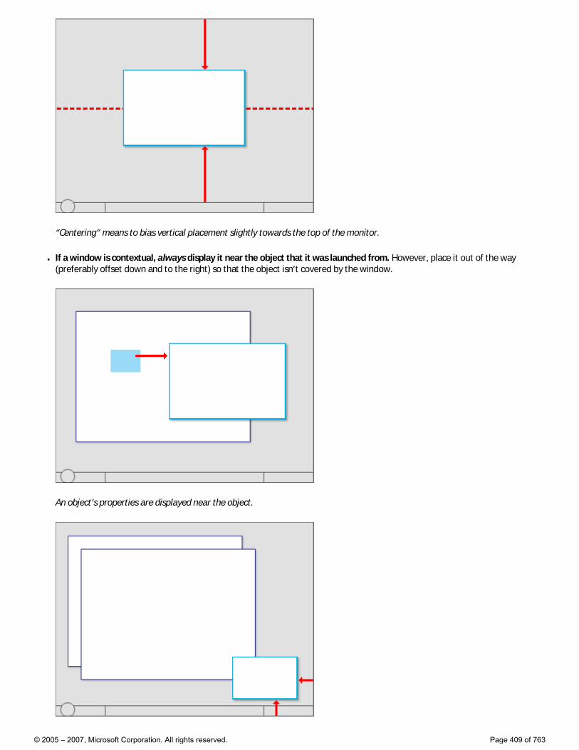
“Centering” means to bias vertical placement slightly towards the top of the monitor.
● If a window is contextual, always display it near the object that it was launched from. However, place it out of the way (preferably offset down and to the right) so that the object isn’t covered by the window.
An object’s properties are displayed near the object.
© 2005 – 2007, Microsoft Corporation. All rights reserved. Page 409 of 763
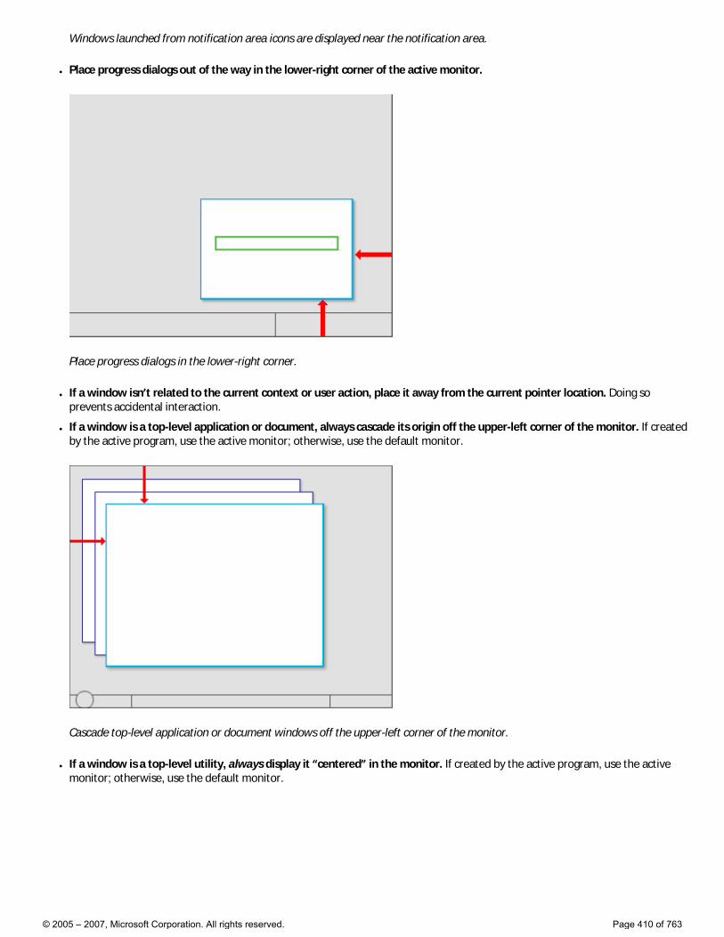
Windows launched from notification area icons are displayed near the notification area.
● Place progress dialogs out of the way in the lower-right corner of the active monitor.
Place progress dialogs in the lower-right corner.
● If a window isn’t related to the current context or user action, place it away from the current pointer location. Doing so prevents accidental interaction.
● If a window is a top-level application or document, always cascade its origin off the upper-left corner of the monitor. If created by the active program, use the active monitor; otherwise, use the default monitor.
Cascade top-level application or document windows off the upper-left corner of the monitor.
● If a window is a top-level utility, always display it “centered” in the monitor. If created by the active program, use the active monitor; otherwise, use the default monitor.
© 2005 – 2007, Microsoft Corporation. All rights reserved. Page 410 of 763
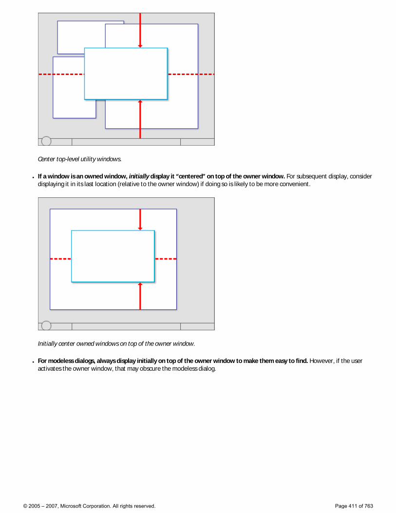
Center top-level utility windows.
● If a window is an owned window, initially display it “centered” on top of the owner window. For subsequent display, consider displaying it in its last location (relative to the owner window) if doing so is likely to be more convenient.
Initially center owned windows on top of the owner window.
● For modeless dialogs, always display initially on top of the owner window to make them easy to find. However, if the user activates the owner window, that may obscure the modeless dialog.
© 2005 – 2007, Microsoft Corporation. All rights reserved. Page 411 of 763
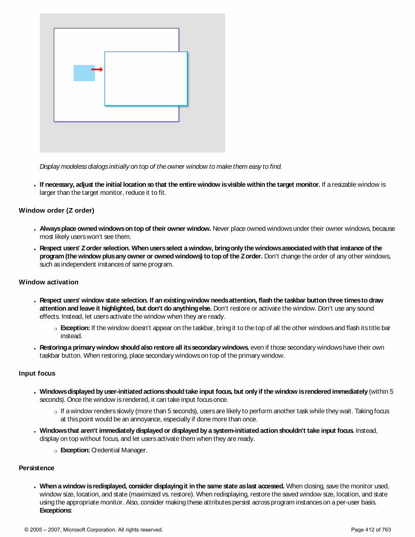
Display modeless dialogs initially on top of the owner window to make them easy to find.
● If necessary, adjust the initial location so that the entire window is visible within the target monitor. If a resizable window is larger than the target monitor, reduce it to fit.
Window order (Z order)
● Always place owned windows on top of their owner window. Never place owned windows under their owner windows, because most likely users won’t see them.
● Respect users’ Z order selection. When users select a window, bring only the windows associated with that instance of the program (the window plus any owner or owned windows) to top of the Z order. Don’t change the order of any other windows, such as independent instances of same program.
Window activation
● Respect users’ window state selection. If an existing window needs attention, flash the taskbar button three times to draw attention and leave it highlighted, but don’t do anything else. Don’t restore or activate the window. Don’t use any sound effects. Instead, let users activate the window when they are ready.
�❍ Exception: If the window doesn’t appear on the taskbar, bring it to the top of all the other windows and flash its title bar instead.
● Restoring a primary window should also restore all its secondary windows, even if those secondary windows have their own taskbar button. When restoring, place secondary windows on top of the primary window.
Input focus
● Windows displayed by user-initiated actions should take input focus, but only if the window is rendered immediately (within 5 seconds). Once the window is rendered, it can take input focus once.
�❍ If a window renders slowly (more than 5 seconds), users are likely to perform another task while they wait. Taking focus at this point would be an annoyance, especially if done more than once.
● Windows that aren’t immediately displayed or displayed by a system-initiated action shouldn’t take input focus. Instead, display on top without focus, and let users activate them when they are ready.
�❍ Exception: Credential Manager.
Persistence
● When a window is redisplayed, consider displaying it in the same state as last accessed. When closing, save the monitor used, window size, location, and state (maximized vs. restore). When redisplaying, restore the saved window size, location, and state using the appropriate monitor. Also, consider making these attributes persist across program instances on a per-user basis. Exceptions:
© 2005 – 2007, Microsoft Corporation. All rights reserved. Page 412 of 763
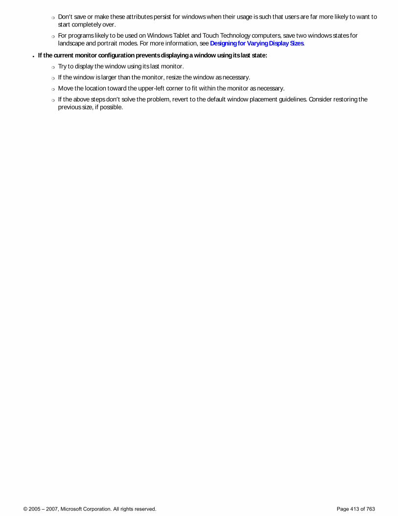
�❍ Don’t save or make these attributes persist for windows when their usage is such that users are far more likely to want to start completely over.
�❍ For programs likely to be used on Windows Tablet and Touch Technology computers, save two windows states for landscape and portrait modes. For more information, see Designing for Varying Display Sizes.
● If the current monitor configuration prevents displaying a window using its last state:
�❍ Try to display the window using its last monitor.
�❍ If the window is larger than the monitor, resize the window as necessary.
�❍ Move the location toward the upper-left corner to fit within the monitor as necessary.
�❍ If the above steps don’t solve the problem, revert to the default window placement guidelines. Consider restoring the previous size, if possible.
© 2005 – 2007, Microsoft Corporation. All rights reserved. Page 413 of 763
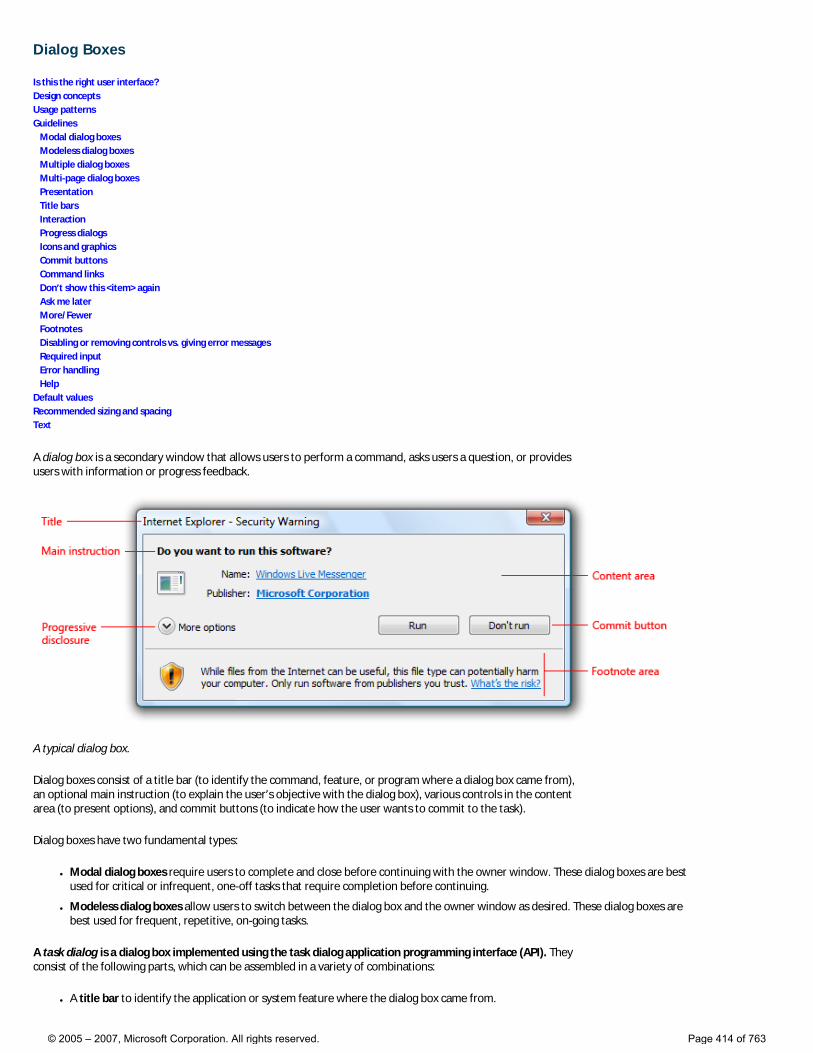
Dialog Boxes
Is this the right user interface? Design concepts Usage patterns Guidelines Modal dialog boxes Modeless dialog boxes Multiple dialog boxes Multi-page dialog boxes Presentation Title bars Interaction Progress dialogs Icons and graphics Commit buttons Command links Don’t show this <item> again Ask me later More/Fewer Footnotes Disabling or removing controls vs. giving error messages Required input Error handling Help Default values Recommended sizing and spacing Text
A dialog box is a secondary window that allows users to perform a command, asks users a question, or provides users with information or progress feedback.
A typical dialog box.
Dialog boxes consist of a title bar (to identify the command, feature, or program where a dialog box came from), an optional main instruction (to explain the user’s objective with the dialog box), various controls in the content area (to present options), and commit buttons (to indicate how the user wants to commit to the task).
Dialog boxes have two fundamental types:
● Modal dialog boxes require users to complete and close before continuing with the owner window. These dialog boxes are best used for critical or infrequent, one-off tasks that require completion before continuing.
● Modeless dialog boxes allow users to switch between the dialog box and the owner window as desired. These dialog boxes are best used for frequent, repetitive, on-going tasks.
A task dialog is a dialog box implemented using the task dialog application programming interface (API). They consist of the following parts, which can be assembled in a variety of combinations:
● A title bar to identify the application or system feature where the dialog box came from.
© 2005 – 2007, Microsoft Corporation. All rights reserved. Page 414 of 763
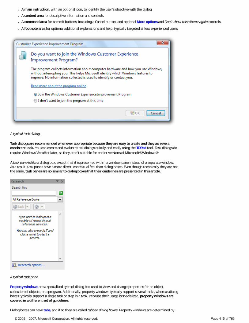
● A main instruction, with an optional icon, to identify the user’s objective with the dialog.
● A content area for descriptive information and controls.
● A command area for commit buttons, including a Cancel button, and optional More options and Don’t show this <item> again controls.
● A footnote area for optional additional explanations and help, typically targeted at less experienced users.
A typical task dialog.
Task dialogs are recommended whenever appropriate because they are easy to create and they achieve a consistent look. You can create and evaluate task dialogs quickly and easily using the TDPad tool. Task dialogs do require Windows Vista® or later, so they aren’t suitable for earlier versions of Microsoft® Windows®.
A task pane is like a dialog box, except that it is presented within a window pane instead of a separate window. As a result, task panes have a more direct, contextual feel than dialog boxes. Even though technically they are not the same, task panes are so similar to dialog boxes that their guidelines are presented in this article.
A typical task pane.
Property windows are a specialized type of dialog box used to view and change properties for an object, collection of objects, or a program. Additionally, property windows typically support several tasks, whereas dialog boxes typically support a single task or step in a task. Because their usage is specialized, property windows are covered in a different set of guidelines.
Dialog boxes can have tabs, and if so they are called tabbed dialog boxes. Property windows are determined by
© 2005 – 2007, Microsoft Corporation. All rights reserved. Page 415 of 763
their presentation of properties, not by the use of tabs.
Note: Guidelines related to layout, window management, common dialog boxes, property windows, wizards, confirmations, error messages, and warning messages are presented in separate articles.
Is this the right user interface?
To decide, consider these questions:
● Is the purpose to provide users with information, ask users a question, or allow users to select options to perform a command or task? If not, use another user interface (UI).
● Is the purpose to view and change properties for an object, collection of objects, or a program? If so, use a property window or toolbar instead.
● Is the purpose to present a collection of commands or tools? If so, use a toolbar or palette window.
● Is the purpose to verify that the user wants to proceed with an action? Is there a clear reason not to proceed and a reasonable chance that sometimes users won’t? If so, use a confirmation.
● Is the purpose to give an error or warning message? If so, use an error message or warning message.
● Is the purpose to: �❍ Open files
�❍ Save files
�❍ Open folders
�❍ Find or replace text
�❍ Print a document
�❍ Select attributes of a printed page
�❍ Select a font
�❍ Choose a color
�❍ Browse for a file, folder, computer, or printer
�❍ Search for users, computers, or groups in Microsoft Active Directory®
�❍ Prompt for a user name and password?
If so, use the appropriate common dialog instead. Many of these common dialogs are extensible.
● Is the purpose to perform a multi-step task that requires more than a single window? If so, use a task flow or wizard instead.
● Is the purpose to inform users of a system or program event that isn’t related to the current user activity, that doesn’t require immediate user action, and users can freely ignore? If so, use a notification instead.
● Is the purpose to show program status? If so, use a status bar instead.
● Would it be preferable to use in-place UI? Dialog boxes can break the user’s flow by demanding attention. Sometimes that break in flow is justified, such as when the user must perform an action that is outside the current context. In other cases, a better approach is to present the UI in context, either directly with in-place UI (such as a task pane), or on demand using progressive disclosure.
● Is the purpose to display a non-critical user input problem or special condition? If so, use a balloon instead.
● For task flows, would it be preferable to use another page? Generally you want a task to flow from page to page within a single window. Use dialog boxes to confirm in-place commands, to get input for in-place commands, and to perform secondary, stand-alone tasks that are best done independently and outside the main task flow.
● For selecting options, are users likely to change the options? If not, consider alternatives, such as: �❍ Using the default options without asking, but allowing users to make changes later.
�❍ Providing a version with options (for example, Print... in a menu) as well as a version without options (for example, Print in the toolbar). Generally, toolbar commands should be immediate and avoid displaying dialog boxes.
● For selecting options, is there a simpler, more direct way to present the options? If so, consider alternatives, such as: �❍ Using a split button to select variations of a command.
�❍ Using a submenu for commands, check boxes, radio buttons and simple lists.
© 2005 – 2007, Microsoft Corporation. All rights reserved. Page 416 of 763
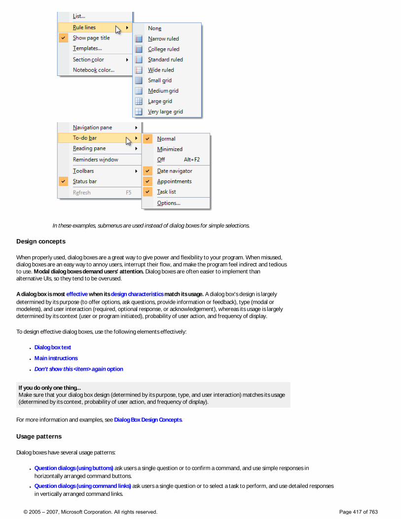
In these examples, submenus are used instead of dialog boxes for simple selections.
Design concepts
When properly used, dialog boxes are a great way to give power and flexibility to your program. When misused, dialog boxes are an easy way to annoy users, interrupt their flow, and make the program feel indirect and tedious to use. Modal dialog boxes demand users’ attention. Dialog boxes are often easier to implement than alternative UIs, so they tend to be overused.
A dialog box is most effective when its design characteristics match its usage. A dialog box’s design is largely determined by its purpose (to offer options, ask questions, provide information or feedback), type (modal or modeless), and user interaction (required, optional response, or acknowledgement), whereas its usage is largely determined by its context (user or program initiated), probability of user action, and frequency of display.
To design effective dialog boxes, use the following elements effectively:
● Dialog box text
● Main instructions
● Don’t show this <item> again option
If you do only one thing... Make sure that your dialog box design (determined by its purpose, type, and user interaction) matches its usage (determined by its context, probability of user action, and frequency of display).
For more information and examples, see Dialog Box Design Concepts.
Usage patterns
Dialog boxes have several usage patterns:
● Question dialogs (using buttons) ask users a single question or to confirm a command, and use simple responses in horizontally arranged command buttons.
● Question dialogs (using command links) ask users a single question or to select a task to perform, and use detailed responses in vertically arranged command links.
© 2005 – 2007, Microsoft Corporation. All rights reserved. Page 417 of 763
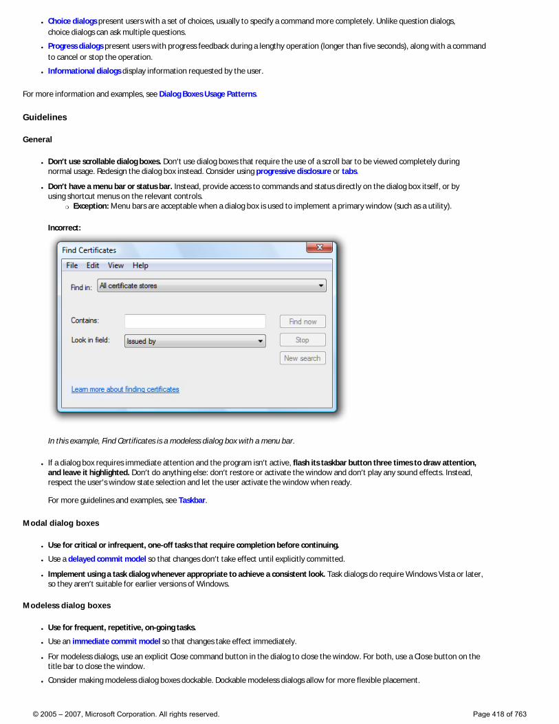
● Choice dialogs present users with a set of choices, usually to specify a command more completely. Unlike question dialogs, choice dialogs can ask multiple questions.
● Progress dialogs present users with progress feedback during a lengthy operation (longer than five seconds), along with a command to cancel or stop the operation.
● Informational dialogs display information requested by the user.
For more information and examples, see Dialog Boxes Usage Patterns.
Guidelines
General
● Don’t use scrollable dialog boxes. Don’t use dialog boxes that require the use of a scroll bar to be viewed completely during normal usage. Redesign the dialog box instead. Consider using progressive disclosure or tabs.
● Don’t have a menu bar or status bar. Instead, provide access to commands and status directly on the dialog box itself, or by using shortcut menus on the relevant controls.
�❍ Exception: Menu bars are acceptable when a dialog box is used to implement a primary window (such as a utility).
Incorrect:
In this example, Find Certificates is a modeless dialog box with a menu bar.
● If a dialog box requires immediate attention and the program isn’t active, flash its taskbar button three times to draw attention, and leave it highlighted. Don’t do anything else: don’t restore or activate the window and don’t play any sound effects. Instead, respect the user’s window state selection and let the user activate the window when ready. For more guidelines and examples, see Taskbar.
Modal dialog boxes
● Use for critical or infrequent, one-off tasks that require completion before continuing.
● Use a delayed commit model so that changes don’t take effect until explicitly committed.
● Implement using a task dialog whenever appropriate to achieve a consistent look. Task dialogs do require Windows Vista or later, so they aren’t suitable for earlier versions of Windows.
Modeless dialog boxes
● Use for frequent, repetitive, on-going tasks.
● Use an immediate commit model so that changes take effect immediately.
● For modeless dialogs, use an explicit Close command button in the dialog to close the window. For both, use a Close button on the title bar to close the window.
● Consider making modeless dialog boxes dockable. Dockable modeless dialogs allow for more flexible placement.
© 2005 – 2007, Microsoft Corporation. All rights reserved. Page 418 of 763
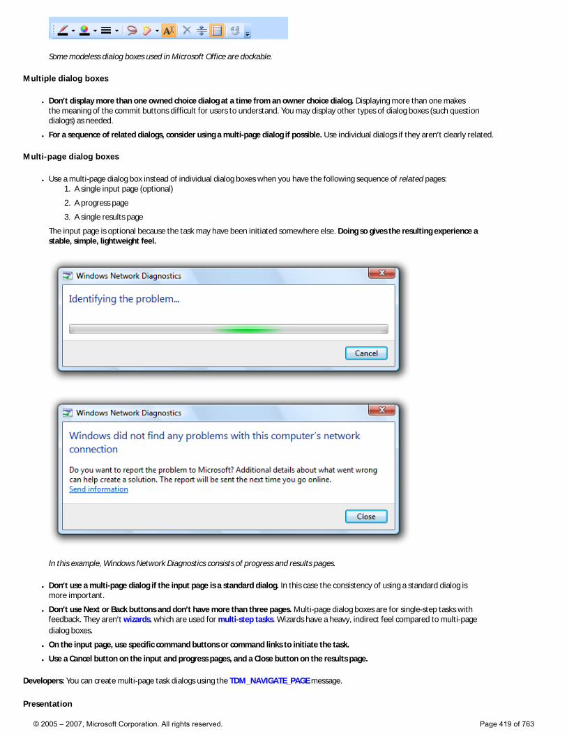
Some modeless dialog boxes used in Microsoft Office are dockable.
Multiple dialog boxes
● Don’t display more than one owned choice dialog at a time from an owner choice dialog. Displaying more than one makes the meaning of the commit buttons difficult for users to understand. You may display other types of dialog boxes (such question dialogs) as needed.
● For a sequence of related dialogs, consider using a multi-page dialog if possible. Use individual dialogs if they aren’t clearly related.
Multi-page dialog boxes
● Use a multi-page dialog box instead of individual dialog boxes when you have the following sequence of related pages: 1. A single input page (optional)
2. A progress page
3. A single results page
The input page is optional because the task may have been initiated somewhere else. Doing so gives the resulting experience a stable, simple, lightweight feel.
In this example, Windows Network Diagnostics consists of progress and results pages.
● Don’t use a multi-page dialog if the input page is a standard dialog. In this case the consistency of using a standard dialog is more important.
● Don’t use Next or Back buttons and don’t have more than three pages. Multi-page dialog boxes are for single-step tasks with feedback. They aren’t wizards, which are used for multi-step tasks. Wizards have a heavy, indirect feel compared to multi-page dialog boxes.
● On the input page, use specific command buttons or command links to initiate the task.
● Use a Cancel button on the input and progress pages, and a Close button on the results page.
Developers: You can create multi-page task dialogs using the TDM_NAVIGATE_PAGE message.
Presentation
© 2005 – 2007, Microsoft Corporation. All rights reserved. Page 419 of 763
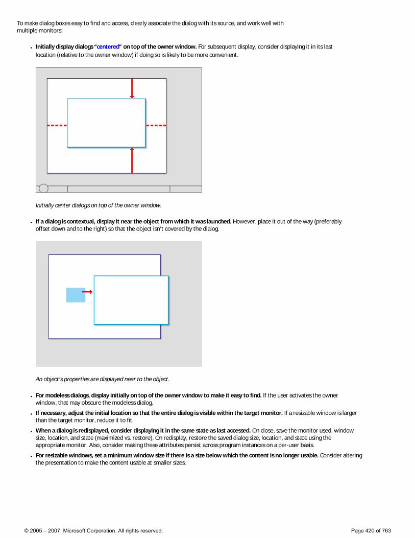
To make dialog boxes easy to find and access, clearly associate the dialog with its source, and work well with multiple monitors:
● Initially display dialogs “centered” on top of the owner window. For subsequent display, consider displaying it in its last location (relative to the owner window) if doing so is likely to be more convenient.
Initially center dialogs on top of the owner window.
● If a dialog is contextual, display it near the object from which it was launched. However, place it out of the way (preferably offset down and to the right) so that the object isn’t covered by the dialog.
An object’s properties are displayed near to the object.
● For modeless dialogs, display initially on top of the owner window to make it easy to find. If the user activates the owner window, that may obscure the modeless dialog.
● If necessary, adjust the initial location so that the entire dialog is visible within the target monitor. If a resizable window is larger than the target monitor, reduce it to fit.
● When a dialog is redisplayed, consider displaying it in the same state as last accessed. On close, save the monitor used, window size, location, and state (maximized vs. restore). On redisplay, restore the saved dialog size, location, and state using the appropriate monitor. Also, consider making these attributes persist across program instances on a per-user basis.
● For resizable windows, set a minimum window size if there is a size below which the content is no longer usable. Consider altering the presentation to make the content usable at smaller sizes.
© 2005 – 2007, Microsoft Corporation. All rights reserved. Page 420 of 763
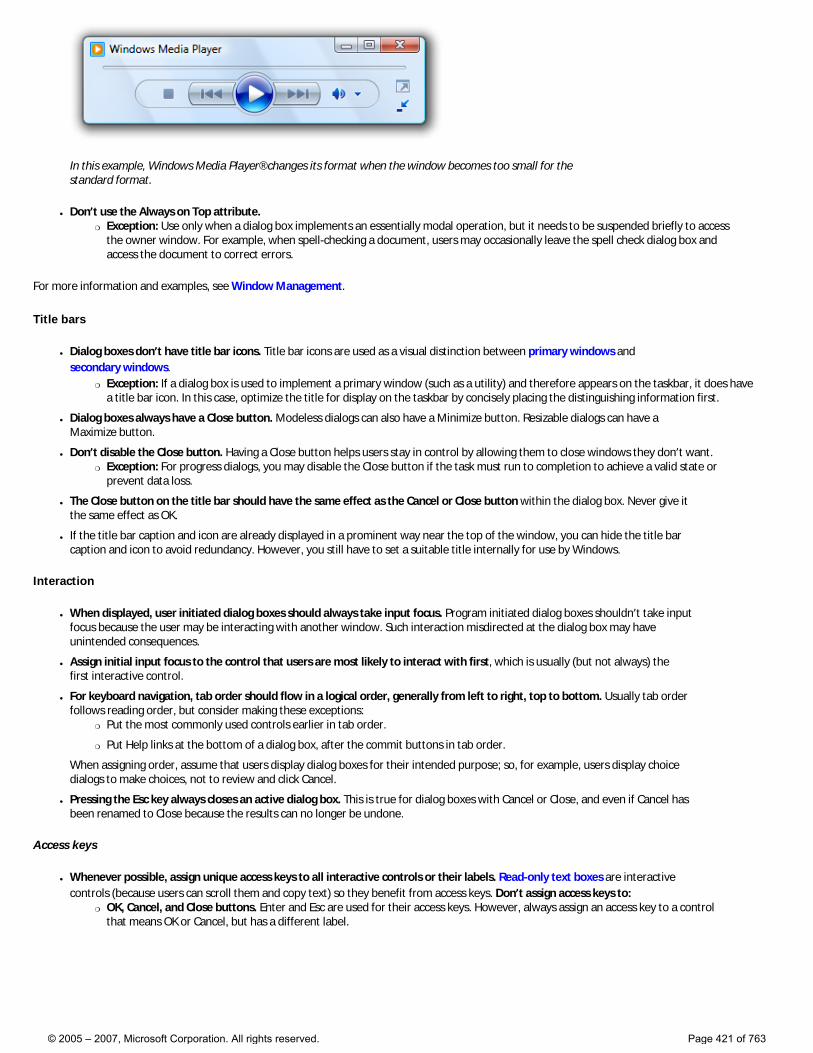
In this example, Windows Media Player® changes its format when the window becomes too small for the standard format.
● Don’t use the Always on Top attribute. �❍ Exception: Use only when a dialog box implements an essentially modal operation, but it needs to be suspended briefly to access
the owner window. For example, when spell-checking a document, users may occasionally leave the spell check dialog box and access the document to correct errors.
For more information and examples, see Window Management.
Title bars
● Dialog boxes don’t have title bar icons. Title bar icons are used as a visual distinction between primary windows and secondary windows.
�❍ Exception: If a dialog box is used to implement a primary window (such as a utility) and therefore appears on the taskbar, it does have a title bar icon. In this case, optimize the title for display on the taskbar by concisely placing the distinguishing information first.
● Dialog boxes always have a Close button. Modeless dialogs can also have a Minimize button. Resizable dialogs can have a Maximize button.
● Don’t disable the Close button. Having a Close button helps users stay in control by allowing them to close windows they don’t want. �❍ Exception: For progress dialogs, you may disable the Close button if the task must run to completion to achieve a valid state or
prevent data loss.
● The Close button on the title bar should have the same effect as the Cancel or Close button within the dialog box. Never give it the same effect as OK.
● If the title bar caption and icon are already displayed in a prominent way near the top of the window, you can hide the title bar caption and icon to avoid redundancy. However, you still have to set a suitable title internally for use by Windows.
Interaction
● When displayed, user initiated dialog boxes should always take input focus. Program initiated dialog boxes shouldn’t take input focus because the user may be interacting with another window. Such interaction misdirected at the dialog box may have unintended consequences.
● Assign initial input focus to the control that users are most likely to interact with first, which is usually (but not always) the first interactive control.
● For keyboard navigation, tab order should flow in a logical order, generally from left to right, top to bottom. Usually tab order follows reading order, but consider making these exceptions:
�❍ Put the most commonly used controls earlier in tab order.
�❍ Put Help links at the bottom of a dialog box, after the commit buttons in tab order.
When assigning order, assume that users display dialog boxes for their intended purpose; so, for example, users display choice dialogs to make choices, not to review and click Cancel.
● Pressing the Esc key always closes an active dialog box. This is true for dialog boxes with Cancel or Close, and even if Cancel has been renamed to Close because the results can no longer be undone.
Access keys
● Whenever possible, assign unique access keys to all interactive controls or their labels. Read-only text boxes are interactive controls (because users can scroll them and copy text) so they benefit from access keys. Don’t assign access keys to:
�❍ OK, Cancel, and Close buttons. Enter and Esc are used for their access keys. However, always assign an access key to a control that means OK or Cancel, but has a different label.
© 2005 – 2007, Microsoft Corporation. All rights reserved. Page 421 of 763
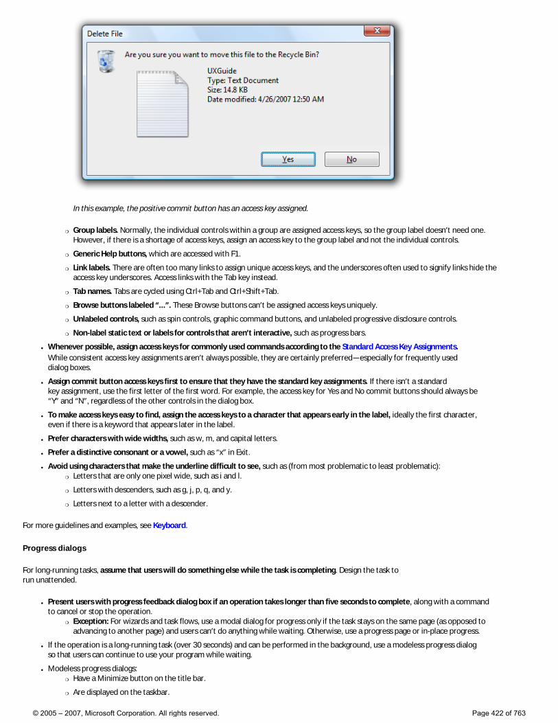
In this example, the positive commit button has an access key assigned.
�❍ Group labels. Normally, the individual controls within a group are assigned access keys, so the group label doesn’t need one. However, if there is a shortage of access keys, assign an access key to the group label and not the individual controls.
�❍ Generic Help buttons, which are accessed with F1.
�❍ Link labels. There are often too many links to assign unique access keys, and the underscores often used to signify links hide the access key underscores. Access links with the Tab key instead.
�❍ Tab names. Tabs are cycled using Ctrl+Tab and Ctrl+Shift+Tab.
�❍ Browse buttons labeled “...”. These Browse buttons can’t be assigned access keys uniquely.
�❍ Unlabeled controls, such as spin controls, graphic command buttons, and unlabeled progressive disclosure controls.
�❍ Non-label static text or labels for controls that aren’t interactive, such as progress bars.
● Whenever possible, assign access keys for commonly used commands according to the Standard Access Key Assignments. While consistent access key assignments aren’t always possible, they are certainly preferred—especially for frequently used dialog boxes.
● Assign commit button access keys first to ensure that they have the standard key assignments. If there isn’t a standard key assignment, use the first letter of the first word. For example, the access key for Yes and No commit buttons should always be “Y” and “N”, regardless of the other controls in the dialog box.
● To make access keys easy to find, assign the access keys to a character that appears early in the label, ideally the first character, even if there is a keyword that appears later in the label.
● Prefer characters with wide widths, such as w, m, and capital letters.
● Prefer a distinctive consonant or a vowel, such as “x” in Exit.
● Avoid using characters that make the underline difficult to see, such as (from most problematic to least problematic): �❍ Letters that are only one pixel wide, such as i and l.
�❍ Letters with descenders, such as g, j, p, q, and y.
�❍ Letters next to a letter with a descender.
For more guidelines and examples, see Keyboard.
Progress dialogs
For long-running tasks, assume that users will do something else while the task is completing. Design the task to run unattended.
● Present users with progress feedback dialog box if an operation takes longer than five seconds to complete, along with a command to cancel or stop the operation.
�❍ Exception: For wizards and task flows, use a modal dialog for progress only if the task stays on the same page (as opposed to advancing to another page) and users can’t do anything while waiting. Otherwise, use a progress page or in-place progress.
● If the operation is a long-running task (over 30 seconds) and can be performed in the background, use a modeless progress dialog so that users can continue to use your program while waiting.
● Modeless progress dialogs: �❍ Have a Minimize button on the title bar.
�❍ Are displayed on the taskbar.
© 2005 – 2007, Microsoft Corporation. All rights reserved. Page 422 of 763
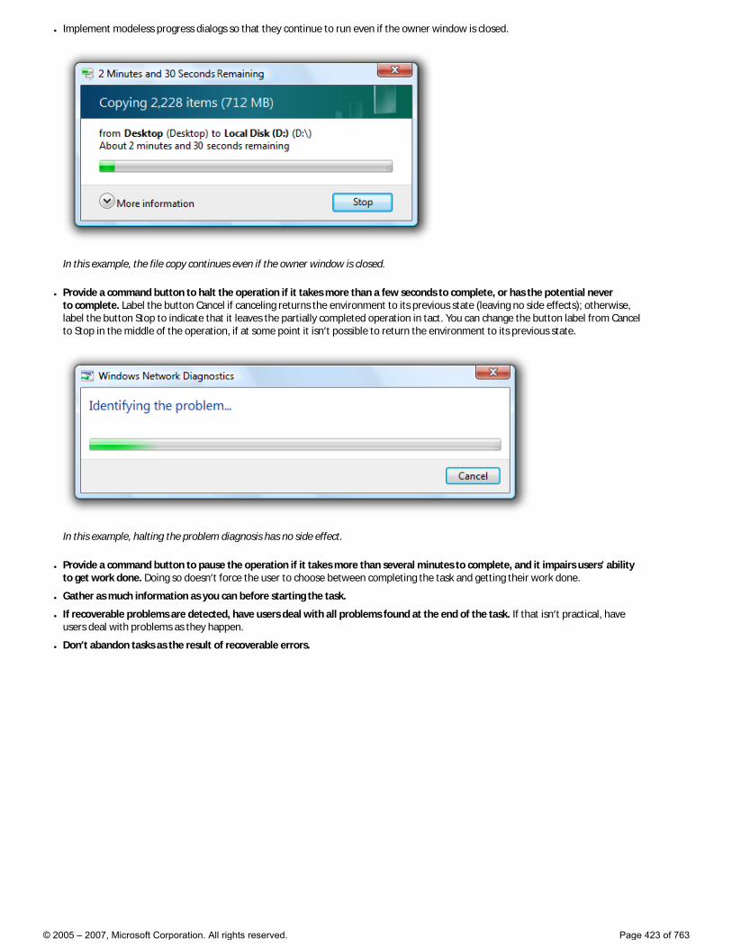
● Implement modeless progress dialogs so that they continue to run even if the owner window is closed.
In this example, the file copy continues even if the owner window is closed.
● Provide a command button to halt the operation if it takes more than a few seconds to complete, or has the potential never to complete. Label the button Cancel if canceling returns the environment to its previous state (leaving no side effects); otherwise, label the button Stop to indicate that it leaves the partially completed operation in tact. You can change the button label from Cancel to Stop in the middle of the operation, if at some point it isn’t possible to return the environment to its previous state.
In this example, halting the problem diagnosis has no side effect.
● Provide a command button to pause the operation if it takes more than several minutes to complete, and it impairs users’ ability to get work done. Doing so doesn’t force the user to choose between completing the task and getting their work done.
● Gather as much information as you can before starting the task.
● If recoverable problems are detected, have users deal with all problems found at the end of the task. If that isn’t practical, have users deal with problems as they happen.
● Don’t abandon tasks as the result of recoverable errors.
© 2005 – 2007, Microsoft Corporation. All rights reserved. Page 423 of 763
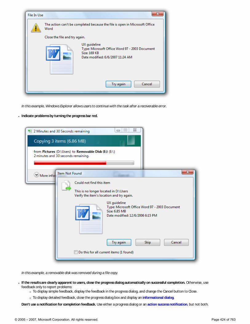
In this example, Windows Explorer allows users to continue with the task after a recoverable error.
● Indicate problems by turning the progress bar red.
In this example, a removable disk was removed during a file copy.
● If the results are clearly apparent to users, close the progress dialog automatically on successful completion. Otherwise, use feedback only to report problems:
�❍ To display simple feedback, display the feedback in the progress dialog, and change the Cancel button to Close.
�❍ To display detailed feedback, close the progress dialog box and display an informational dialog.
Don’t use a notification for completion feedback. Use either a progress dialog or an action success notification, but not both.
© 2005 – 2007, Microsoft Corporation. All rights reserved. Page 424 of 763
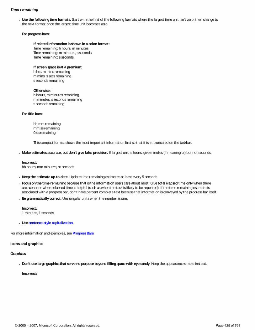
Time remaining
● Use the following time formats. Start with the first of the following formats where the largest time unit isn’t zero, then change to the next format once the largest time unit becomes zero.
For progress bars:
If related information is shown in a colon format: Time remaining: h hours, m minutes Time remaining: m minutes, s seconds Time remaining: s seconds
If screen space is at a premium: h hrs, m mins remaining m mins, s secs remaining s seconds remaining
Otherwise: h hours, m minutes remaining m minutes, s seconds remaining s seconds remaining
For title bars:
hh:mm remaining mm:ss remaining 0:ss remaining
This compact format shows the most important information first so that it isn’t truncated on the taskbar.
● Make estimates accurate, but don’t give false precision. If largest unit is hours, give minutes (if meaningful) but not seconds.
Incorrect: hh hours, mm minutes, ss seconds
● Keep the estimate up-to-date. Update time remaining estimates at least every 5 seconds.
● Focus on the time remaining because that is the information users care about most. Give total elapsed time only when there are scenarios where elapsed time is helpful (such as when the task is likely to be repeated). If the time remaining estimate is associated with a progress bar, don’t have percent complete text because that information is conveyed by the progress bar itself.
● Be grammatically correct. Use singular units when the number is one.
Incorrect: 1 minutes, 1 seconds
● Use sentence-style capitalization.
For more information and examples, see Progress Bars.
Icons and graphics
Graphics
● Don’t use large graphics that serve no purpose beyond filling space with eye candy. Keep the appearance simple instead.
Incorrect:
© 2005 – 2007, Microsoft Corporation. All rights reserved. Page 425 of 763
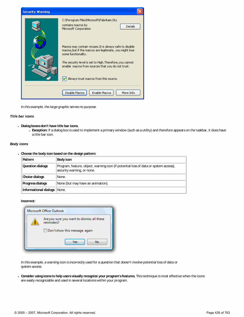
In this example, the large graphic serves no purpose.
Title bar icons
● Dialog boxes don’t have title bar icons. �❍ Exception: If a dialog box is used to implement a primary window (such as a utility) and therefore appears on the taskbar, it does have
a title bar icon.
Body icons
● Choose the body icon based on the design pattern:
Pattern Body icon
Question dialogs Program, feature, object, warning icon (if potential loss of data or system access), security warning, or none.
Choice dialogs None.
Progress dialogs None (but may have an animation).
Informational dialogs None.
Incorrect:
In this example, a warning icon is incorrectly used for a question that doesn’t involve potential loss of data or system access.
● Consider using icons to help users visually recognize your program’s features. This technique is most effective when the icons are easily recognizable and used in several locations within your program.
© 2005 – 2007, Microsoft Corporation. All rights reserved. Page 426 of 763
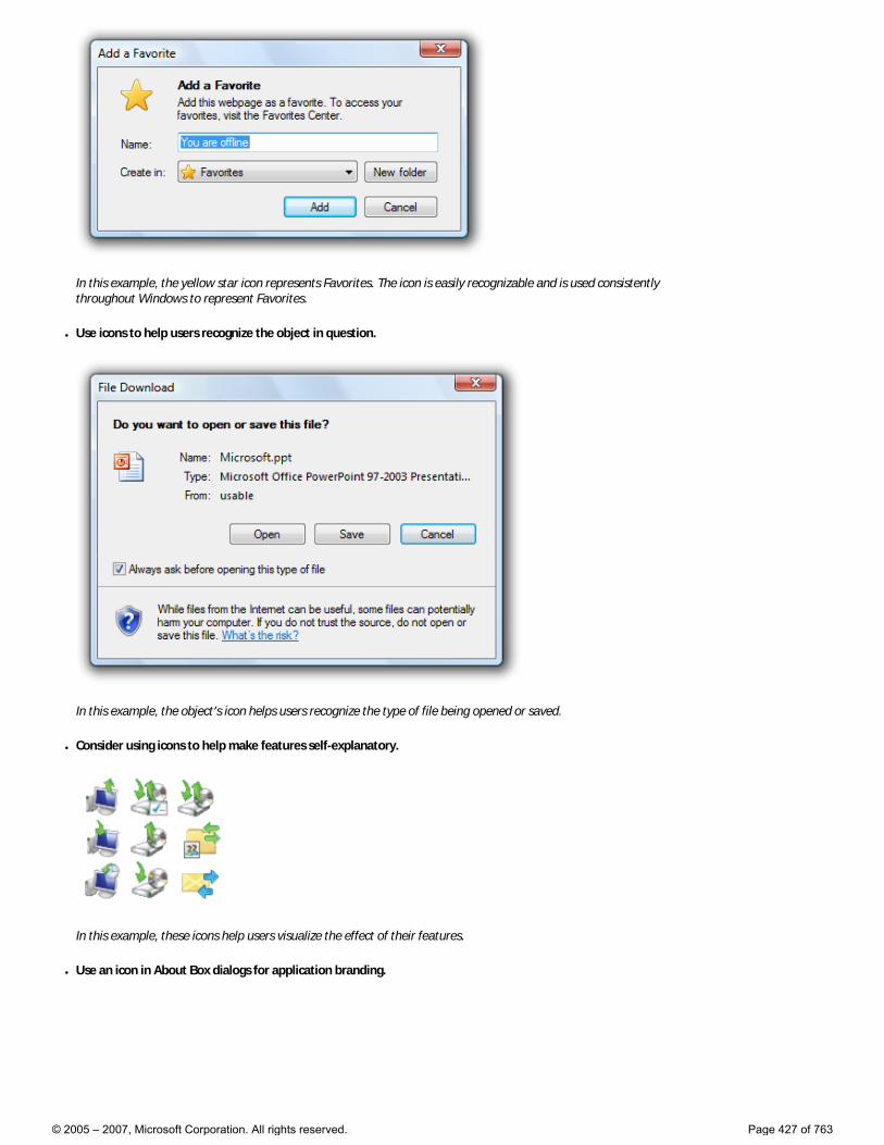
In this example, the yellow star icon represents Favorites. The icon is easily recognizable and is used consistently throughout Windows to represent Favorites.
● Use icons to help users recognize the object in question.
In this example, the object’s icon helps users recognize the type of file being opened or saved.
● Consider using icons to help make features self-explanatory.
In this example, these icons help users visualize the effect of their features.
● Use an icon in About Box dialogs for application branding.
© 2005 – 2007, Microsoft Corporation. All rights reserved. Page 427 of 763
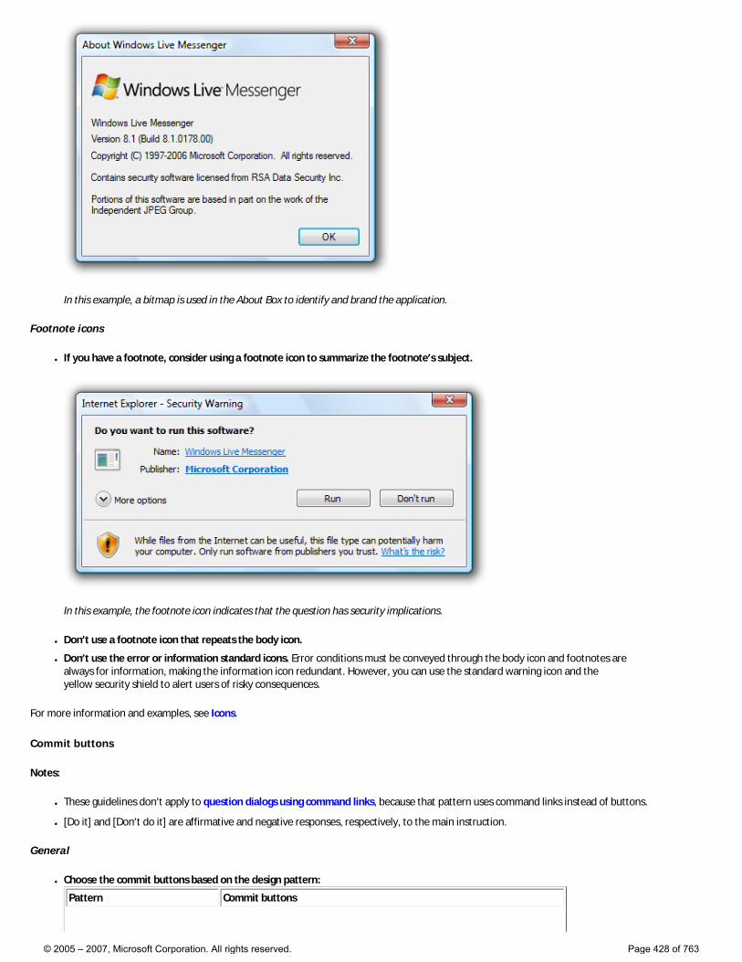
In this example, a bitmap is used in the About Box to identify and brand the application.
Footnote icons
● If you have a footnote, consider using a footnote icon to summarize the footnote’s subject.
In this example, the footnote icon indicates that the question has security implications.
● Don’t use a footnote icon that repeats the body icon.
● Don’t use the error or information standard icons. Error conditions must be conveyed through the body icon and footnotes are always for information, making the information icon redundant. However, you can use the standard warning icon and the yellow security shield to alert users of risky consequences.
For more information and examples, see Icons.
Commit buttons
Notes:
● These guidelines don’t apply to question dialogs using command links, because that pattern uses command links instead of buttons.
● [Do it] and [Don’t do it] are affirmative and negative responses, respectively, to the main instruction.
General
● Choose the commit buttons based on the design pattern:
Pattern Commit buttons
© 2005 – 2007, Microsoft Corporation. All rights reserved. Page 428 of 763
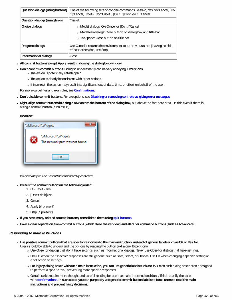
Question dialogs (using buttons) One of the following sets of concise commands: Yes/No, Yes/No/Cancel, [Do it]/Cancel, [Do it]/[Don’t do it], [Do it]/[Don’t do it]/Cancel.
Question dialogs (using links) Cancel.
Choice dialogs �❍ Modal dialogs: OK/Cancel or [Do it]/Cancel
�❍ Modeless dialogs: Close button on dialog box and title bar
�❍ Task pane: Close button on title bar
Progress dialogs Use Cancel if returns the environment to its previous state (leaving no side effect); otherwise, use Stop.
Informational dialogs Close.
● All commit buttons except Apply result in closing the dialog box window.
● Don’t confirm commit buttons. Doing so unnecessarily can be very annoying. Exceptions: �❍ The action is potentially catastrophic.
�❍ The action is clearly inconsistent with other actions.
�❍ If incorrect, the action may result in a significant loss of data, time, or effort on behalf of the user.
For more guidelines and examples, see Confirmations.
● Don’t disable commit buttons. For exceptions, see Disabling or removing controls vs. giving error messages.
● Right-align commit buttons in a single row across the bottom of the dialog box, but above the footnote area. Do this even if there is a single commit button (such as OK).
Incorrect:
In this example, the OK button is incorrectly centered.
● Present the commit buttons in the following order: 1. OK/[Do it]/Yes
2. [Don’t do it]/No
3. Cancel
4. Apply (if present)
5. Help (if present)
● If you have many related commit buttons, consolidate them using split buttons.
● Have a clear separation from commit buttons (which close the window) and all other command buttons (such as Advanced).
Responding to main instructions
● Use positive commit buttons that are specific responses to the main instruction, instead of generic labels such as OK or Yes/No. Users should be able to understand the options by reading the button text alone. Exceptions:
�❍ Use Close for dialogs that don’t have settings, such as informational dialogs. Never use Close for dialogs that have settings.
�❍ Use OK when the “specific” responses are still generic, such as Save, Select, or Choose. Use OK when changing a specific setting or a collection of settings.
�❍ For legacy dialog boxes without a main instruction, you can use generic labels such as OK. Often such dialog boxes aren’t designed to perform a specific task, preventing more specific responses.
�❍ Certain tasks require more thought and careful reading for users to make informed decisions. This is usually the case with confirmations. In such cases, you can purposely use generic commit button labels to force users to read the main instructions and prevent hasty decisions.
© 2005 – 2007, Microsoft Corporation. All rights reserved. Page 429 of 763
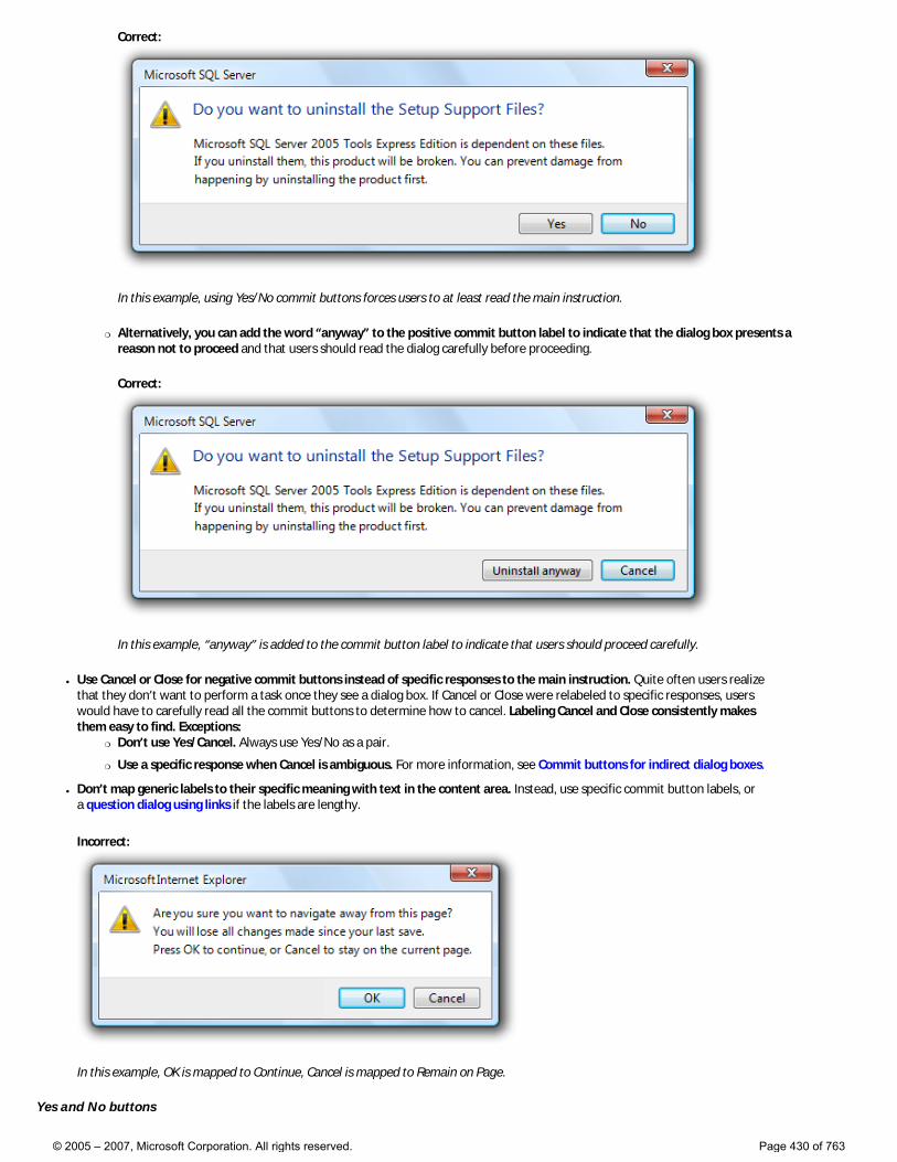
Correct:
In this example, using Yes/No commit buttons forces users to at least read the main instruction.
�❍ Alternatively, you can add the word “anyway” to the positive commit button label to indicate that the dialog box presents a reason not to proceed and that users should read the dialog carefully before proceeding.
Correct:
In this example, “anyway” is added to the commit button label to indicate that users should proceed carefully.
● Use Cancel or Close for negative commit buttons instead of specific responses to the main instruction. Quite often users realize that they don’t want to perform a task once they see a dialog box. If Cancel or Close were relabeled to specific responses, users would have to carefully read all the commit buttons to determine how to cancel. Labeling Cancel and Close consistently makes them easy to find. Exceptions:
�❍ Don’t use Yes/Cancel. Always use Yes/No as a pair.
�❍ Use a specific response when Cancel is ambiguous. For more information, see Commit buttons for indirect dialog boxes.
● Don’t map generic labels to their specific meaning with text in the content area. Instead, use specific commit button labels, or a question dialog using links if the labels are lengthy.
Incorrect:
In this example, OK is mapped to Continue, Cancel is mapped to Remain on Page.
Yes and No buttons
© 2005 – 2007, Microsoft Corporation. All rights reserved. Page 430 of 763
● Prefer specific responses to Yes and No buttons. While there’s nothing wrong with using Yes and No, specific responses can be understood more quickly, resulting in efficient decision making. However, confirmations usually have Yes and No buttons to make users give the confirmation some thought before responding.
● Use Yes and No buttons only to respond to yes or no questions. The main instruction should be naturally expressed as a yes or no question. Never use OK and Cancel for yes or no questions.
Incorrect:
Correct:
Better:
In these examples, Yes and No are good responses to yes and no questions, but specific responses are even better.
● Consider phrasing the main instruction as a yes or no question if commit buttons with specific phrasing turn out to be long or awkward. Alternatively, you can use command links for longer responses (five words or more) to the main instruction.
Incorrect:
Correct:
© 2005 – 2007, Microsoft Corporation. All rights reserved. Page 431 of 763
The specific phrasing in the incorrect example is too long, so the correct example uses Yes and No.
● Don’t use Yes and No buttons if the meaning of the No response is unclear. If so, use specific responses instead.
OK buttons
● In modal dialogs, clicking OK means apply the values, perform the task, and close the window.
● Don’t use OK buttons to respond to questions.
● Don’t assign access keys to OK, because Enter is the access key for the default button. Doing so makes the other access keys easier to assign.
● Label OK buttons correctly. The OK button should be labeled OK, not Ok or Okay.
● Don’t use OK buttons for errors or warnings. Problems are never OK. Use Close instead.
Incorrect:
In this example, Close should be used instead of OK.
● Don’t use OK buttons in modeless dialog boxes. Rather, modeless dialogs should use task-specific commit buttons (for example, Find). However, some modeless dialog boxes require only a Close button.
Cancel buttons
● Clicking Cancel means abandon all changes, cancel the task, close the window, and return the environment to its previous state, leaving no side effect. For nested choice dialog boxes, clicking Cancel in the owner choice dialog means any changes made by owned choice dialogs are also abandoned.
● Provide a Cancel button to let users explicitly abandon changes. Dialog boxes need a clear exit point. Don’t depend on users finding the Close button on the title bar.
�❍ Exception: Don’t provide a Cancel button for dialog boxes without settings. The OK and Close buttons have the same effect as Cancel in this case.
Incorrect:
© 2005 – 2007, Microsoft Corporation. All rights reserved. Page 432 of 763
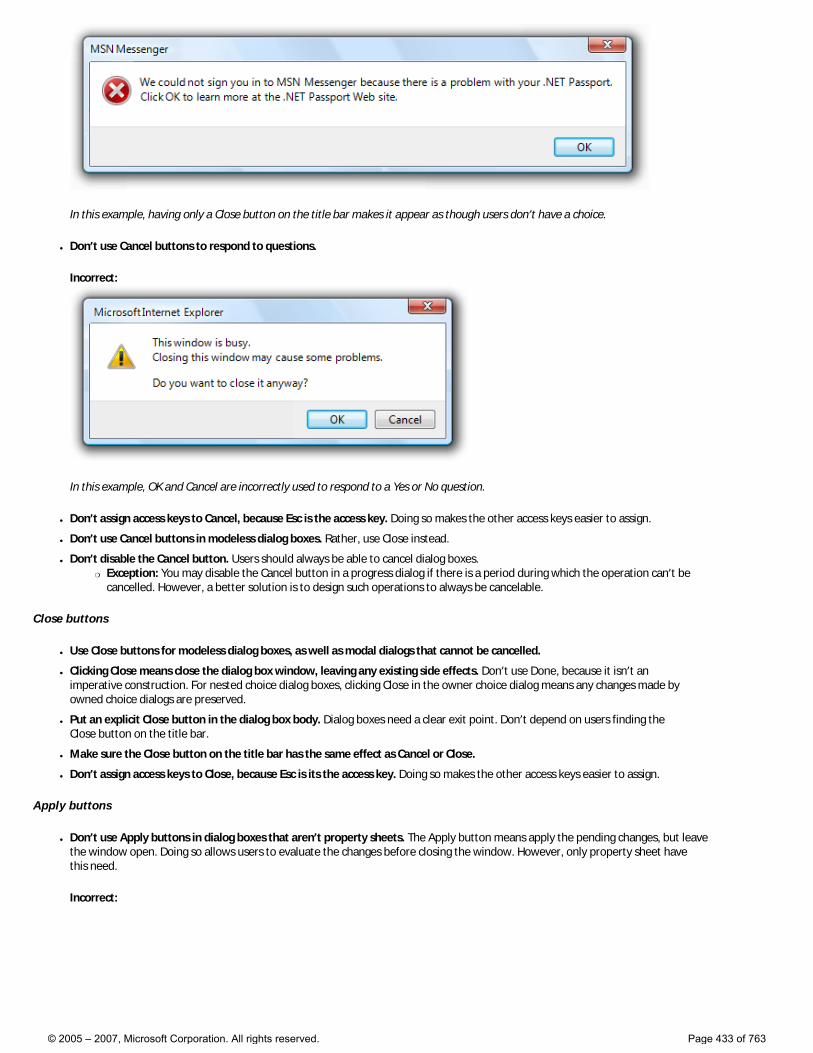
In this example, having only a Close button on the title bar makes it appear as though users don’t have a choice.
● Don’t use Cancel buttons to respond to questions.
Incorrect:
In this example, OK and Cancel are incorrectly used to respond to a Yes or No question.
● Don’t assign access keys to Cancel, because Esc is the access key. Doing so makes the other access keys easier to assign.
● Don’t use Cancel buttons in modeless dialog boxes. Rather, use Close instead.
● Don’t disable the Cancel button. Users should always be able to cancel dialog boxes. �❍ Exception: You may disable the Cancel button in a progress dialog if there is a period during which the operation can’t be
cancelled. However, a better solution is to design such operations to always be cancelable.
Close buttons
● Use Close buttons for modeless dialog boxes, as well as modal dialogs that cannot be cancelled.
● Clicking Close means close the dialog box window, leaving any existing side effects. Don’t use Done, because it isn’t an imperative construction. For nested choice dialog boxes, clicking Close in the owner choice dialog means any changes made by owned choice dialogs are preserved.
● Put an explicit Close button in the dialog box body. Dialog boxes need a clear exit point. Don’t depend on users finding the Close button on the title bar.
● Make sure the Close button on the title bar has the same effect as Cancel or Close.
● Don’t assign access keys to Close, because Esc is its the access key. Doing so makes the other access keys easier to assign.
Apply buttons
● Don’t use Apply buttons in dialog boxes that aren’t property sheets. The Apply button means apply the pending changes, but leave the window open. Doing so allows users to evaluate the changes before closing the window. However, only property sheet have this need.
Incorrect:
© 2005 – 2007, Microsoft Corporation. All rights reserved. Page 433 of 763
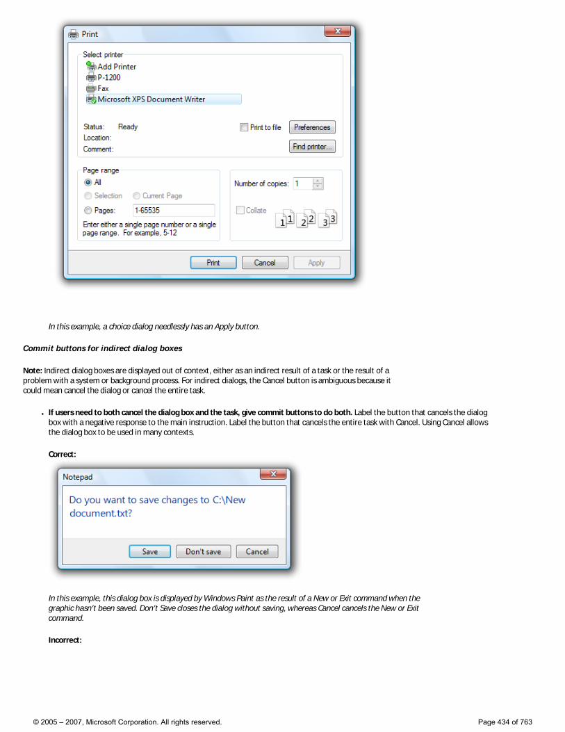
In this example, a choice dialog needlessly has an Apply button.
Commit buttons for indirect dialog boxes
Note: Indirect dialog boxes are displayed out of context, either as an indirect result of a task or the result of a problem with a system or background process. For indirect dialogs, the Cancel button is ambiguous because it could mean cancel the dialog or cancel the entire task.
● If users need to both cancel the dialog box and the task, give commit buttons to do both. Label the button that cancels the dialog box with a negative response to the main instruction. Label the button that cancels the entire task with Cancel. Using Cancel allows the dialog box to be used in many contexts.
Correct:
In this example, this dialog box is displayed by Windows Paint as the result of a New or Exit command when the graphic hasn’t been saved. Don’t Save closes the dialog without saving, whereas Cancel cancels the New or Exit command.
Incorrect:
© 2005 – 2007, Microsoft Corporation. All rights reserved. Page 434 of 763
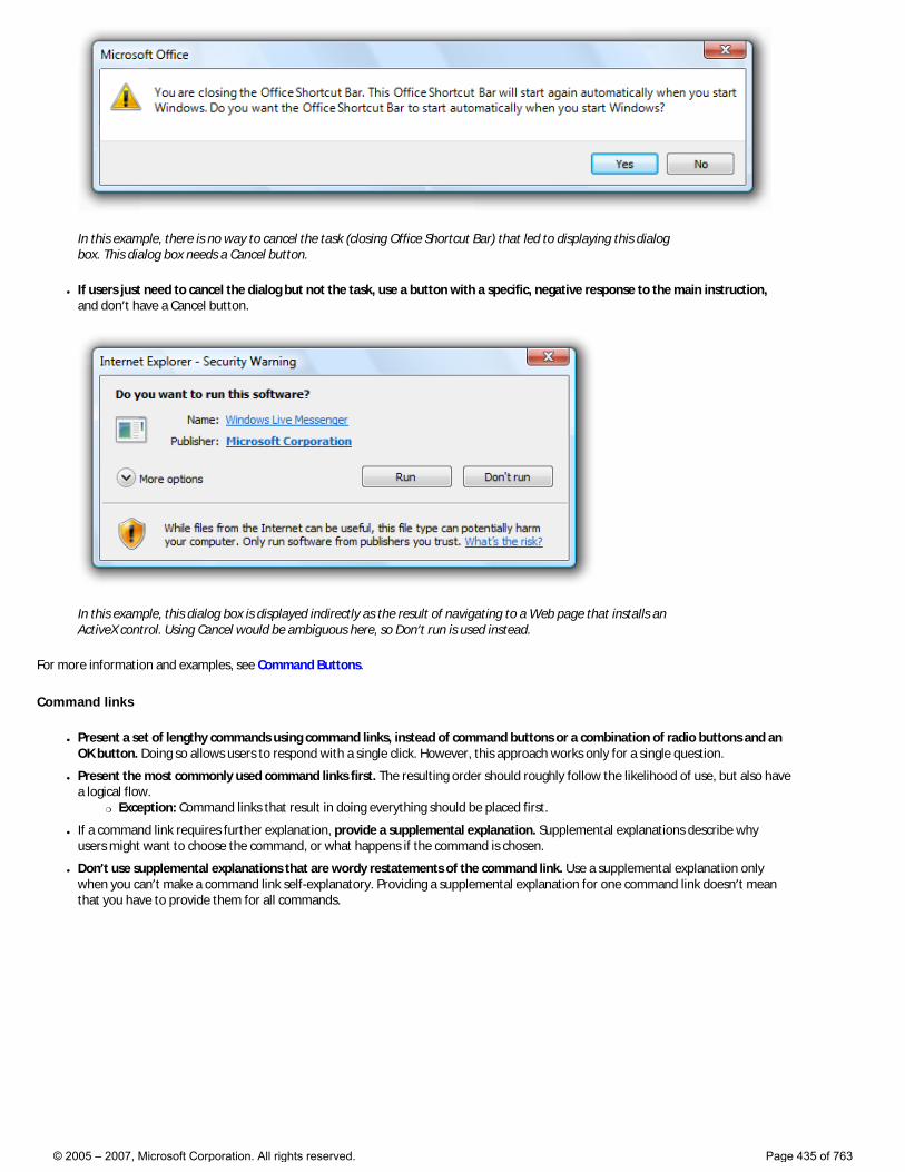
In this example, there is no way to cancel the task (closing Office Shortcut Bar) that led to displaying this dialog box. This dialog box needs a Cancel button.
● If users just need to cancel the dialog but not the task, use a button with a specific, negative response to the main instruction, and don’t have a Cancel button.
In this example, this dialog box is displayed indirectly as the result of navigating to a Web page that installs an ActiveX control. Using Cancel would be ambiguous here, so Don’t run is used instead.
For more information and examples, see Command Buttons.
Command links
● Present a set of lengthy commands using command links, instead of command buttons or a combination of radio buttons and an OK button. Doing so allows users to respond with a single click. However, this approach works only for a single question.
● Present the most commonly used command links first. The resulting order should roughly follow the likelihood of use, but also have a logical flow.
�❍ Exception: Command links that result in doing everything should be placed first.
● If a command link requires further explanation, provide a supplemental explanation. Supplemental explanations describe why users might want to choose the command, or what happens if the command is chosen.
● Don’t use supplemental explanations that are wordy restatements of the command link. Use a supplemental explanation only when you can’t make a command link self-explanatory. Providing a supplemental explanation for one command link doesn’t mean that you have to provide them for all commands.
© 2005 – 2007, Microsoft Corporation. All rights reserved. Page 435 of 763
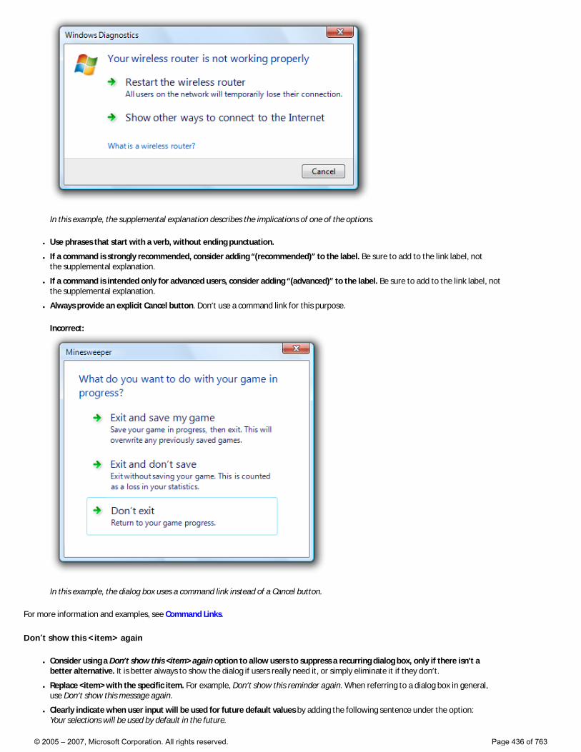
In this example, the supplemental explanation describes the implications of one of the options.
● Use phrases that start with a verb, without ending punctuation.
● If a command is strongly recommended, consider adding “(recommended)” to the label. Be sure to add to the link label, not the supplemental explanation.
● If a command is intended only for advanced users, consider adding “(advanced)” to the label. Be sure to add to the link label, not the supplemental explanation.
● Always provide an explicit Cancel button. Don’t use a command link for this purpose.
Incorrect:
In this example, the dialog box uses a command link instead of a Cancel button.
For more information and examples, see Command Links.
Don’t show this <item> again
● Consider using a Don’t show this <item> again option to allow users to suppress a recurring dialog box, only if there isn’t a better alternative. It is better always to show the dialog if users really need it, or simply eliminate it if they don’t.
● Replace <item> with the specific item. For example, Don’t show this reminder again. When referring to a dialog box in general, use Don’t show this message again.
● Clearly indicate when user input will be used for future default values by adding the following sentence under the option: Your selections will be used by default in the future.
© 2005 – 2007, Microsoft Corporation. All rights reserved. Page 436 of 763
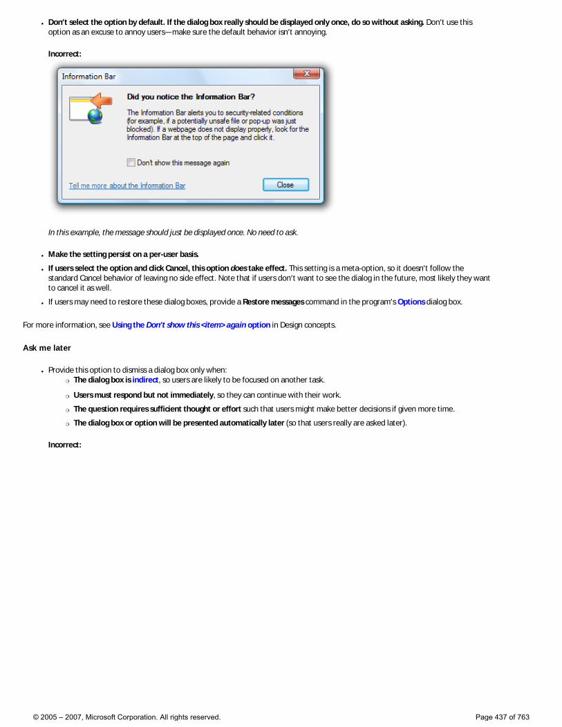
● Don’t select the option by default. If the dialog box really should be displayed only once, do so without asking. Don’t use this option as an excuse to annoy users—make sure the default behavior isn’t annoying.
Incorrect:
In this example, the message should just be displayed once. No need to ask.
● Make the setting persist on a per-user basis.
● If users select the option and click Cancel, this option does take effect. This setting is a meta-option, so it doesn’t follow the standard Cancel behavior of leaving no side effect. Note that if users don’t want to see the dialog in the future, most likely they want to cancel it as well.
● If users may need to restore these dialog boxes, provide a Restore messages command in the program’s Options dialog box.
For more information, see Using the Don’t show this <item> again option in Design concepts.
Ask me later
● Provide this option to dismiss a dialog box only when: �❍ The dialog box is indirect, so users are likely to be focused on another task.
�❍ Users must respond but not immediately, so they can continue with their work.
�❍ The question requires sufficient thought or effort such that users might make better decisions if given more time.
�❍ The dialog box or option will be presented automatically later (so that users really are asked later).
Incorrect:
© 2005 – 2007, Microsoft Corporation. All rights reserved. Page 437 of 763
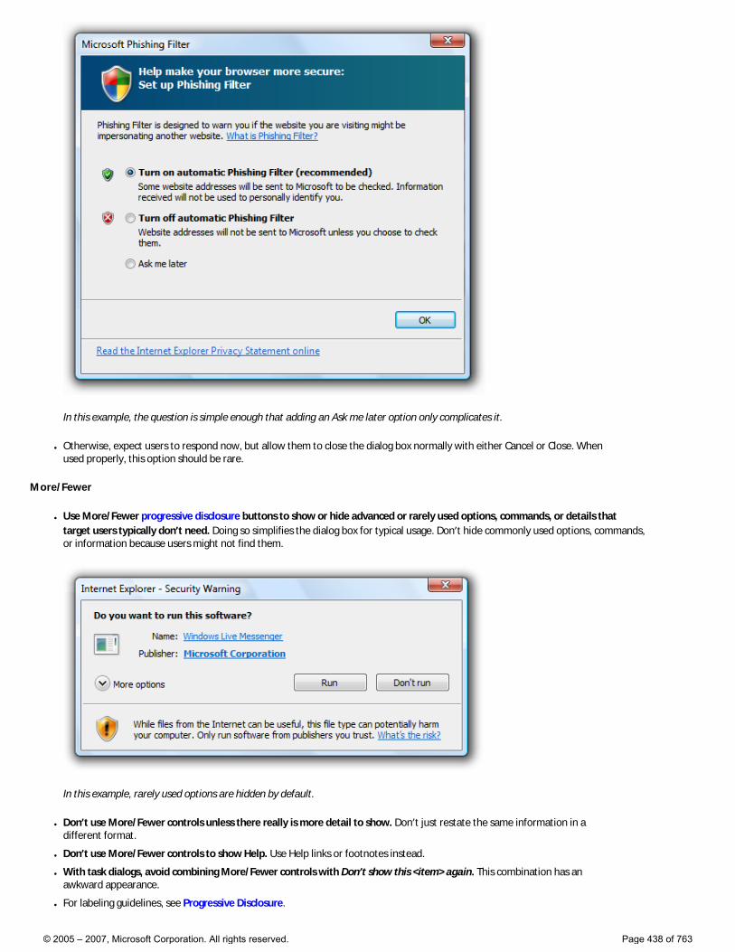
In this example, the question is simple enough that adding an Ask me later option only complicates it.
● Otherwise, expect users to respond now, but allow them to close the dialog box normally with either Cancel or Close. When used properly, this option should be rare.
More/Fewer
● Use More/Fewer progressive disclosure buttons to show or hide advanced or rarely used options, commands, or details that target users typically don’t need. Doing so simplifies the dialog box for typical usage. Don’t hide commonly used options, commands, or information because users might not find them.
In this example, rarely used options are hidden by default.
● Don’t use More/Fewer controls unless there really is more detail to show. Don’t just restate the same information in a different format.
● Don’t use More/Fewer controls to show Help. Use Help links or footnotes instead.
● With task dialogs, avoid combining More/Fewer controls with Don’t show this <item> again. This combination has an awkward appearance.
● For labeling guidelines, see Progressive Disclosure.
© 2005 – 2007, Microsoft Corporation. All rights reserved. Page 438 of 763
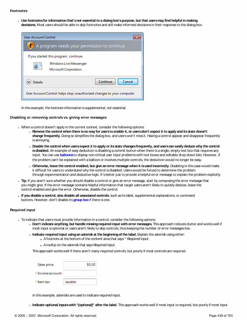
Footnotes
● Use footnotes for information that’s not essential to a dialog box’s purpose, but that users may find helpful in making decisions. Most users should be able to skip footnotes and still make informed decisions in their response to the dialog box.
In this example, the footnote information is supplemental, not essential.
Disabling or removing controls vs. giving error messages
● When a control doesn’t apply in the current context, consider the following options: �❍ Remove the control when there is no way for users to enable it, or users don’t expect it to apply and its state doesn’t
change frequently. Doing so simplifies the dialog box, and users won’t miss it. Having a control appear and disappear frequently is annoying.
�❍ Disable the control when users expect it to apply or its state changes frequently, and users can easily deduce why the control is disabled. An example of easy deduction is disabling a commit button when there is a single, empty text box that requires any input. You can use balloons to display non-critical user input problems with text boxes and editable drop-down lists. However, if the problem can’t be explained with a balloon or involves multiple controls, the deduction would no longer be easy.
�❍ Otherwise, leave the control enabled, but give an error message when it is used incorrectly. Disabling in this case would make it difficult for users to understand why the control is disabled. Users would be forced to determine the problem through experimentation and deductive logic. It’s better just to provide a helpful error message to explain the problem explicitly.
● Tip: If you aren’t sure whether you should disable a control or give an error message, start by composing the error message that you might give. If the error message contains helpful information that target users aren’t likely to quickly deduce, leave the control enabled and give the error. Otherwise, disable the control.
● If you disable a control, also disable all associated controls, such as its label, supplemental explanations, or command buttons. However, don’t disable its group box if there is one.
Required input
● To indicate that users must provide information in a control, consider the following options: �❍ Don’t indicate anything, but handle missing required input with error messages. This approach reduces clutter and works well if
most input is optional or users aren’t likely to skip controls, thus keeping the number of error messages low.
�❍ Indicate required input using an asterisk at the beginning of the label. Explain the asterisk using either: ■ A footnote at the bottom of the content area that says * Required input.
■ A tooltip on the asterisk that says Required input.
This approach works well if there aren’t many required controls, but poorly if most controls are required.
In this example, asterisks are used to indicate required input.
�❍ Indicate optional inputs with “(optional)” after the label. This approach works well if most input is required, but poorly if most input
© 2005 – 2007, Microsoft Corporation. All rights reserved. Page 439 of 763
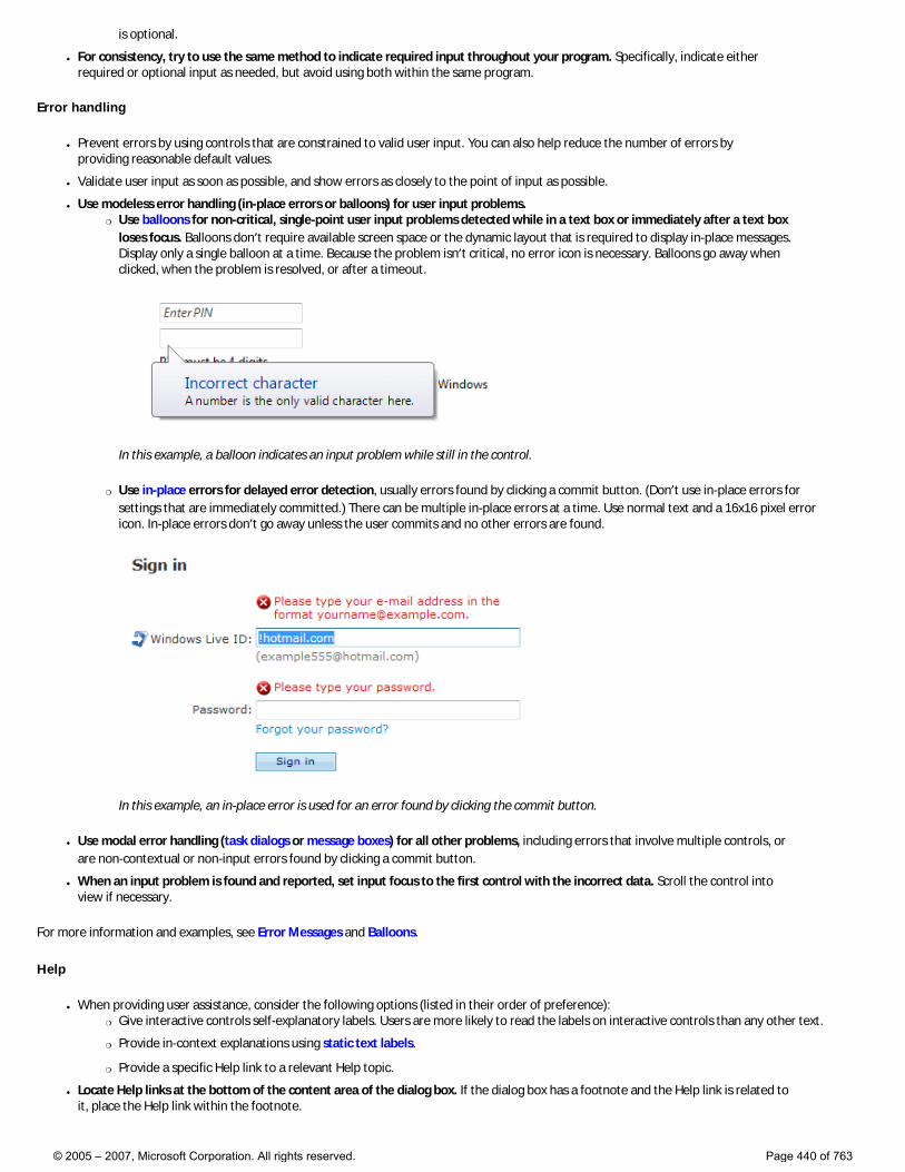
is optional.
● For consistency, try to use the same method to indicate required input throughout your program. Specifically, indicate either required or optional input as needed, but avoid using both within the same program.
Error handling
● Prevent errors by using controls that are constrained to valid user input. You can also help reduce the number of errors by providing reasonable default values.
● Validate user input as soon as possible, and show errors as closely to the point of input as possible.
● Use modeless error handling (in-place errors or balloons) for user input problems. �❍ Use balloons for non-critical, single-point user input problems detected while in a text box or immediately after a text box
loses focus. Balloons don’t require available screen space or the dynamic layout that is required to display in-place messages. Display only a single balloon at a time. Because the problem isn’t critical, no error icon is necessary. Balloons go away when clicked, when the problem is resolved, or after a timeout.
In this example, a balloon indicates an input problem while still in the control.
�❍ Use in-place errors for delayed error detection, usually errors found by clicking a commit button. (Don’t use in-place errors for settings that are immediately committed.) There can be multiple in-place errors at a time. Use normal text and a 16x16 pixel error icon. In-place errors don’t go away unless the user commits and no other errors are found.
In this example, an in-place error is used for an error found by clicking the commit button.
● Use modal error handling (task dialogs or message boxes) for all other problems, including errors that involve multiple controls, or are non-contextual or non-input errors found by clicking a commit button.
● When an input problem is found and reported, set input focus to the first control with the incorrect data. Scroll the control into view if necessary.
For more information and examples, see Error Messages and Balloons.
Help
● When providing user assistance, consider the following options (listed in their order of preference): �❍ Give interactive controls self-explanatory labels. Users are more likely to read the labels on interactive controls than any other text.
�❍ Provide in-context explanations using static text labels.
�❍ Provide a specific Help link to a relevant Help topic.
● Locate Help links at the bottom of the content area of the dialog box. If the dialog box has a footnote and the Help link is related to it, place the Help link within the footnote.
© 2005 – 2007, Microsoft Corporation. All rights reserved. Page 440 of 763
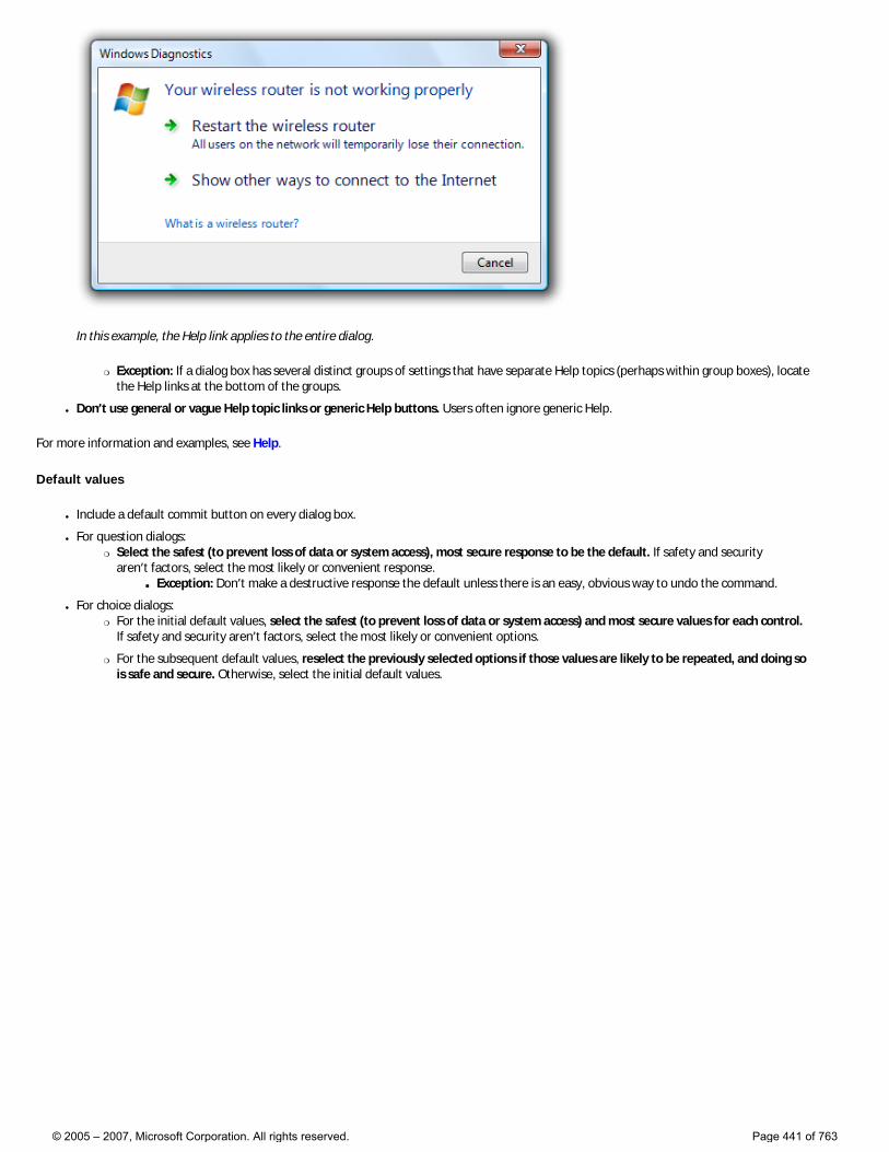
In this example, the Help link applies to the entire dialog.
�❍ Exception: If a dialog box has several distinct groups of settings that have separate Help topics (perhaps within group boxes), locate the Help links at the bottom of the groups.
● Don’t use general or vague Help topic links or generic Help buttons. Users often ignore generic Help.
For more information and examples, see Help.
Default values
● Include a default commit button on every dialog box.
● For question dialogs: �❍ Select the safest (to prevent loss of data or system access), most secure response to be the default. If safety and security
aren’t factors, select the most likely or convenient response. ■ Exception: Don’t make a destructive response the default unless there is an easy, obvious way to undo the command.
● For choice dialogs: �❍ For the initial default values, select the safest (to prevent loss of data or system access) and most secure values for each control.
If safety and security aren’t factors, select the most likely or convenient options.
�❍ For the subsequent default values, reselect the previously selected options if those values are likely to be repeated, and doing so is safe and secure. Otherwise, select the initial default values.
© 2005 – 2007, Microsoft Corporation. All rights reserved. Page 441 of 763
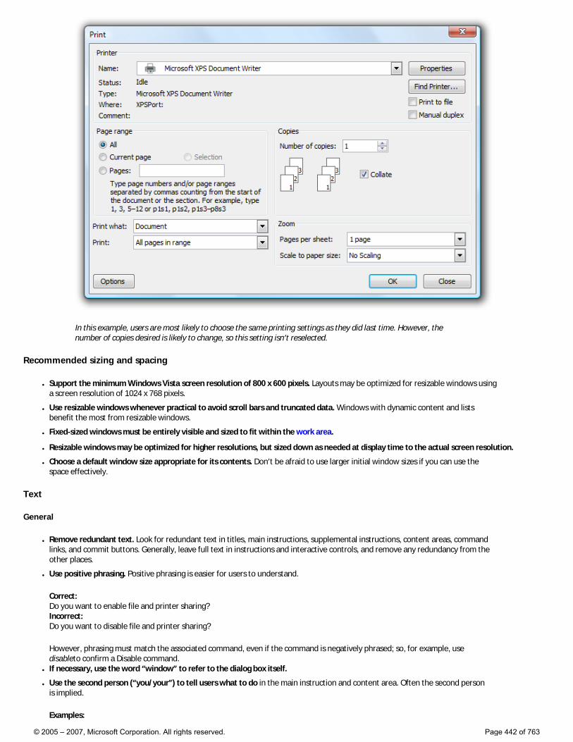
In this example, users are most likely to choose the same printing settings as they did last time. However, the number of copies desired is likely to change, so this setting isn’t reselected.
Recommended sizing and spacing
● Support the minimum Windows Vista screen resolution of 800 x 600 pixels. Layouts may be optimized for resizable windows using a screen resolution of 1024 x 768 pixels.
● Use resizable windows whenever practical to avoid scroll bars and truncated data. Windows with dynamic content and lists benefit the most from resizable windows.
● Fixed-sized windows must be entirely visible and sized to fit within the work area.
● Resizable windows may be optimized for higher resolutions, but sized down as needed at display time to the actual screen resolution.
● Choose a default window size appropriate for its contents. Don’t be afraid to use larger initial window sizes if you can use the space effectively.
Text
General
● Remove redundant text. Look for redundant text in titles, main instructions, supplemental instructions, content areas, command links, and commit buttons. Generally, leave full text in instructions and interactive controls, and remove any redundancy from the other places.
● Use positive phrasing. Positive phrasing is easier for users to understand.
Correct: Do you want to enable file and printer sharing? Incorrect: Do you want to disable file and printer sharing?
However, phrasing must match the associated command, even if the command is negatively phrased; so, for example, use disableto confirm a Disable command.
● If necessary, use the word “window” to refer to the dialog box itself.
● Use the second person (“you/your”) to tell users what to do in the main instruction and content area. Often the second person is implied.
Examples:
© 2005 – 2007, Microsoft Corporation. All rights reserved. Page 442 of 763

Choose the pictures you want to print Choose an account
● Use the first person (“I/me/my”) to let users tell the program what to do in controls in the content area that respond to the main instruction.
Example: Print the photos on my camera.
Dialog box titles
● Use the title to identify the command, feature, or program where a dialog box came from. �❍ If dialog is user initiated, identify it using the command or feature name. Exceptions:
■ If a dialog box is displayed by many different commands, consider using the program name instead.
■ If that title would be redundant with the main instruction, use the program name instead.
�❍ If it is program or system initiated (and therefore out of context), identify it using the program or feature name to give context.
�❍ Don’t use the title to explain what to do in the dialog—that’s the purpose of the main instruction.
● Use the exact command name for command-based names, but don’t include the ellipsis if there is one. You can include the command’s menu title if necessary to compose a good title. Example: for an Object... command in an Insert menu, use the title Insert Object.
● If a modeless dialog box appears on the taskbar, optimize the title for display on the taskbar by concisely placing the distinguishing information first. Examples: “66% Complete,” and “3 Reminders.”
● Don’t include the words “dialog” or “progress” in the title. This is implied, and leaving it off makes it easier for users to scan.
● Use title-style capitalization, without ending punctuation.
Main instructions
● Use the main instruction to explain concisely what to do in the dialog. The instruction should be a specific statement, imperative direction, or question. Good instructions communicate the user’s objective with the dialog rather than focusing purely on the mechanics of manipulating it.
● Omit the main instruction when the only thing you can say is obvious. In such cases, the content of the dialog box is self-explanatory. For example, the File Open and File Save common dialogs don’t need a main instruction because their context and design make their purpose obvious.
● Omit control labels that restate the main instruction. In this case, the main instruction takes the access key.
Acceptable:
In this example, the text box label is just a restatement of the main instruction.
Better:
In this example, the redundant label is removed, so the main instruction takes the access key.
● Be concise—use only a single, complete sentence. Pare the main instruction down to the essential information. If you must explain anything more, use supplemental instruction.
● Use specific verbs whenever possible. Specific verbs (examples: connect, save, install) are more meaningful to users than generic ones (examples: configure, manage, set).
© 2005 – 2007, Microsoft Corporation. All rights reserved. Page 443 of 763
● Use sentence-style capitalization.
● Don’t include final periods if the instruction is a statement. If the instruction is a question, include a final question mark.
● For progress dialogs, use a gerund phrase briefly explaining the operation in progress, ending with an ellipsis. Example: Printing your pictures...
● Tip: You can evaluate a main instruction by imagining what you would say to a friend. If responding with the main instruction would be unnatural, unhelpful, or awkward, rework the instruction.
Supplemental instructions
● When necessary, use an optional supplemental instruction to present additional information helpful to understanding or using the page. You can provide more detailed information and define terminology.
● If the appearance of the dialog box is program or system initiated (and therefore out of context), use the supplemental instruction to explain why the dialog has appeared. For such dialogs, the context is usually not obvious.
● Don’t repeat the main instruction with slightly different wording. Instead, omit the supplemental instruction if there is not more to add.
● Use complete sentences, sentence-style capitalization, and ending punctuation.
Command links
● Choose concise link text that clearly communicates and differentiates what the command link does. It should be self-explanatory and correspond to the main instruction. Users shouldn’t have to figure out what the link really means or how it differs from other links.
● Always start command links with a verb.
● Use sentence-style capitalization.
● Don’t use ending punctuation.
● If necessary, provide any further explanation using complete sentences and ending punctuation. However, add such explanations only when needed—don’t add explanations to all command links just because one command link needs one.
For more information and examples, see Command Link guidelines.
Commit buttons
● Use specific commit button labels that make sense on their own and are a response to the main instruction. Ideally users shouldn’t have to read anything else to understand the label. Users are far more likely to read command button labels than static text.
● Start commit button labels with a verb. Exceptions are OK, Yes, and No.
● Use sentence-style capitalization.
● Don’t use ending punctuation.
● Assign a unique access key. �❍ Exception: Don’t assign access keys to OK and Cancel buttons because Enter and Esc are their access keys. Doing so makes the
other access keys easier to assign.
Documentation
When referring to dialog boxes:
● In programming and other technical documentation, refer to dialog boxes as dialog boxes. Everywhere else, refer to dialog boxes by their title. If the title bar is hidden, refer to the dialog using the main instruction.
● If you must refer to a dialog box in general, use window in user documentation. You can refer to a simple question dialog or confirmation as a message.
● Use the exact title or main instruction text, including its capitalization.
● When possible, format the title using bold text. Otherwise, put the title in quotation marks only if required to prevent confusion.
Example: In Windows Security, click More Options.
© 2005 – 2007, Microsoft Corporation. All rights reserved. Page 444 of 763
Dialog Box Design Concepts
Dialog Boxes Dialog Box Usage Patterns
When properly used, dialog boxes are a great way to give power and flexibility to your program. When misused, dialog boxes are an easy way to annoy users, interrupt their flow, and make the program feel indirect and tedious to use. Modal dialog boxes demand users’ attention. Dialog boxes are often easier to implement than alternative user interfaces (UIs), so they tend to be overused.
Designing effective dialog boxes
A dialog box is most effective when its design characteristics match its usage. A dialog box’s design is largely determined by its purpose (to offer options, ask questions, provide information or feedback), type (modal or modeless), and user interaction (required, optional response, or acknowledgement). Its usage is largely determined by the context (user or program initiated), probability of user action, and frequency of display.
Dialog box characteristics
Modal dialog boxes have these characteristics:
● Are displayed in a window that is separate from the user’s current activity.
● Require interaction—users must close before continuing with the owner window.
● Can break users’ flow.
● Use a delayed commit model; changes aren’t made until explicitly committed.
● Have command buttons that commit to task.
● Best used for critical or infrequent, one-off tasks that require completion before continuing.
Modeless dialog boxes have these characteristics:
● Can be displayed in context using a task pane or with an independent window.
● Don’t require interaction—users can switch between the dialog box or pane and the calling window as desired.
● Can use an immediate commit model; changes are made immediately.
● Have command buttons that close the window.
● Best used for frequent, repetitive, or on-going tasks.
Dialog box interactions
Dialog boxes also have different types of user interaction:
● Response required. Users must respond to provide required input. For example, a Replace command requires displaying a dialog box so users can specify the Find and Replace strings.
● Response optional. Users might respond to provide optional input, but the default values are usually acceptable. For example, while users might make changes in a Print dialog box, they usually accept the default options.
● Acknowledgement only. Users’ only interaction is to acknowledge the dialog box by reading and closing it.
Dialog box contexts
Dialog boxes are displayed in different contexts:
● User initiated. A dialog box is displayed as the direct or indirect result of a user interaction.
● System or program initiated. A dialog box is displayed independently of any user interaction.
© 2005 – 2007, Microsoft Corporation. All rights reserved. Page 445 of 763
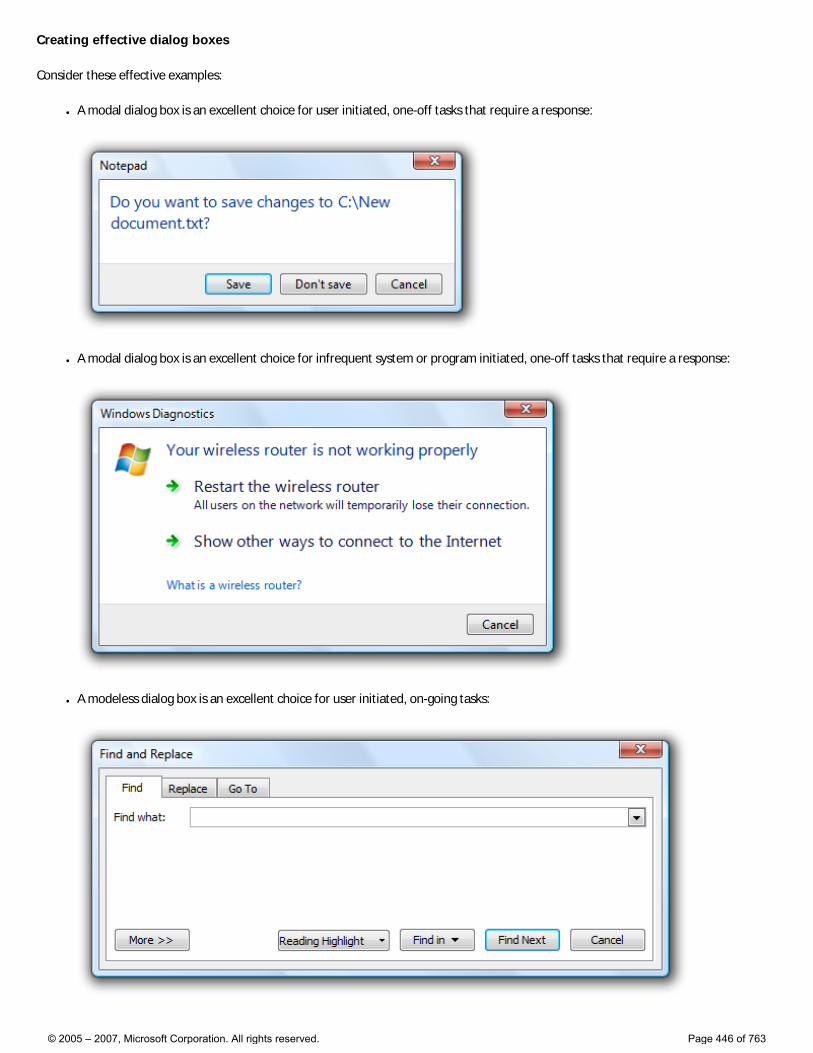
Creating effective dialog boxes
Consider these effective examples:
● A modal dialog box is an excellent choice for user initiated, one-off tasks that require a response:
● A modal dialog box is an excellent choice for infrequent system or program initiated, one-off tasks that require a response:
● A modeless dialog box is an excellent choice for user initiated, on-going tasks:
© 2005 – 2007, Microsoft Corporation. All rights reserved. Page 446 of 763
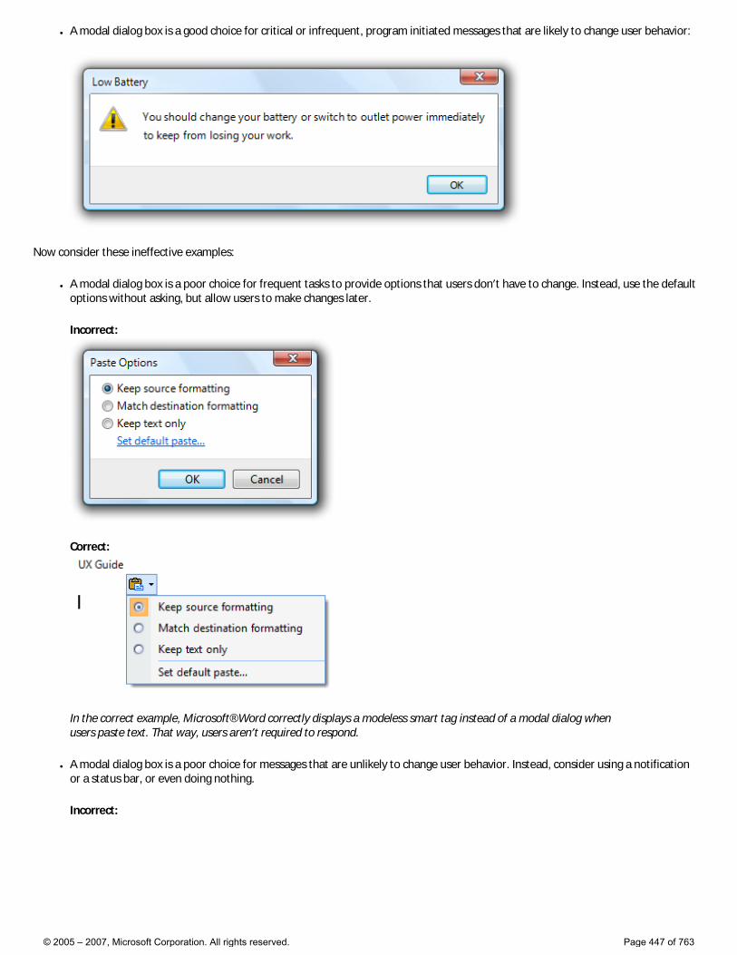
● A modal dialog box is a good choice for critical or infrequent, program initiated messages that are likely to change user behavior:
Now consider these ineffective examples:
● A modal dialog box is a poor choice for frequent tasks to provide options that users don’t have to change. Instead, use the default options without asking, but allow users to make changes later.
Incorrect:
Correct:
In the correct example, Microsoft® Word correctly displays a modeless smart tag instead of a modal dialog when users paste text. That way, users aren’t required to respond.
● A modal dialog box is a poor choice for messages that are unlikely to change user behavior. Instead, consider using a notification or a status bar, or even doing nothing.
Incorrect:
© 2005 – 2007, Microsoft Corporation. All rights reserved. Page 447 of 763
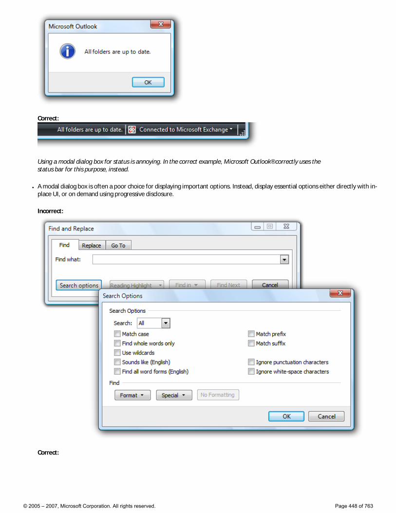
Correct:
Using a modal dialog box for status is annoying. In the correct example, Microsoft Outlook® correctly uses the status bar for this purpose, instead.
● A modal dialog box is often a poor choice for displaying important options. Instead, display essential options either directly with in-place UI, or on demand using progressive disclosure.
Incorrect:
Correct:
© 2005 – 2007, Microsoft Corporation. All rights reserved. Page 448 of 763
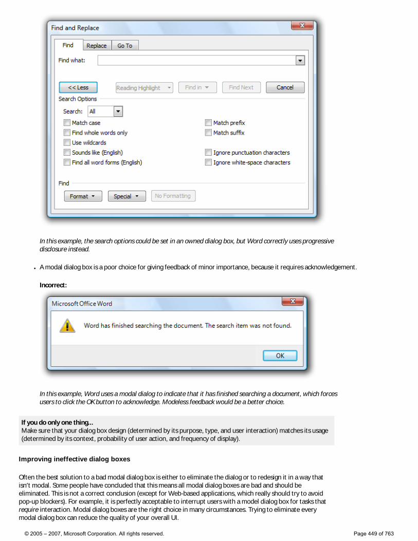
In this example, the search options could be set in an owned dialog box, but Word correctly uses progressive disclosure instead.
● A modal dialog box is a poor choice for giving feedback of minor importance, because it requires acknowledgement.
Incorrect:
In this example, Word uses a modal dialog to indicate that it has finished searching a document, which forces users to click the OK button to acknowledge. Modeless feedback would be a better choice.
If you do only one thing... Make sure that your dialog box design (determined by its purpose, type, and user interaction) matches its usage (determined by its context, probability of user action, and frequency of display).
Improving ineffective dialog boxes
Often the best solution to a bad modal dialog box is either to eliminate the dialog or to redesign it in a way that isn’t modal. Some people have concluded that this means all modal dialog boxes are bad and should be eliminated. This is not a correct conclusion (except for Web-based applications, which really should try to avoid pop-up blockers). For example, it is perfectly acceptable to interrupt users with a model dialog box for tasks that require interaction. Modal dialog boxes are the right choice in many circumstances. Trying to eliminate every modal dialog box can reduce the quality of your overall UI.
© 2005 – 2007, Microsoft Corporation. All rights reserved. Page 449 of 763
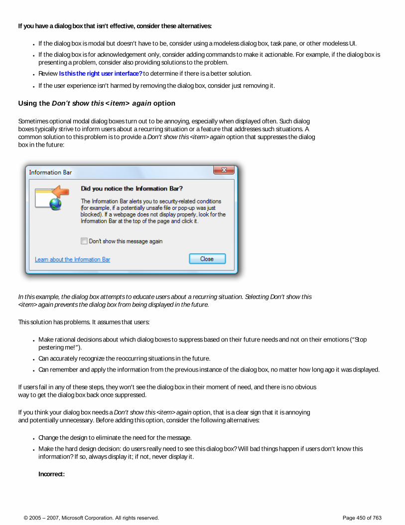
If you have a dialog box that isn’t effective, consider these alternatives:
● If the dialog box is modal but doesn’t have to be, consider using a modeless dialog box, task pane, or other modeless UI.
● If the dialog box is for acknowledgement only, consider adding commands to make it actionable. For example, if the dialog box is presenting a problem, consider also providing solutions to the problem.
● Review Is this the right user interface? to determine if there is a better solution.
● If the user experience isn’t harmed by removing the dialog box, consider just removing it.
Using the Don’t show this <item> again option
Sometimes optional modal dialog boxes turn out to be annoying, especially when displayed often. Such dialog boxes typically strive to inform users about a recurring situation or a feature that addresses such situations. A common solution to this problem is to provide a Don’t show this <item> again option that suppresses the dialog box in the future:
In this example, the dialog box attempts to educate users about a recurring situation. Selecting Don’t show this <item> again prevents the dialog box from being displayed in the future.
This solution has problems. It assumes that users:
● Make rational decisions about which dialog boxes to suppress based on their future needs and not on their emotions (“Stop pestering me!”).
● Can accurately recognize the reoccurring situations in the future.
● Can remember and apply the information from the previous instance of the dialog box, no matter how long ago it was displayed.
If users fail in any of these steps, they won’t see the dialog box in their moment of need, and there is no obvious way to get the dialog box back once suppressed.
If you think your dialog box needs a Don’t show this <item> again option, that is a clear sign that it is annoying and potentially unnecessary. Before adding this option, consider the following alternatives:
● Change the design to eliminate the need for the message.
● Make the hard design decision: do users really need to see this dialog box? Will bad things happen if users don’t know this information? If so, always display it; if not, never display it.
Incorrect:
© 2005 – 2007, Microsoft Corporation. All rights reserved. Page 450 of 763
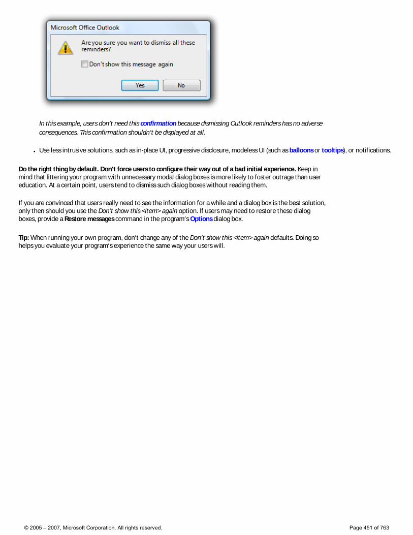
In this example, users don’t need this confirmation because dismissing Outlook reminders has no adverse consequences. This confirmation shouldn’t be displayed at all.
● Use less intrusive solutions, such as in-place UI, progressive disclosure, modeless UI (such as balloons or tooltips), or notifications.
Do the right thing by default. Don’t force users to configure their way out of a bad initial experience. Keep in mind that littering your program with unnecessary modal dialog boxes is more likely to foster outrage than user education. At a certain point, users tend to dismiss such dialog boxes without reading them.
If you are convinced that users really need to see the information for a while and a dialog box is the best solution, only then should you use the Don’t show this <item> again option. If users may need to restore these dialog boxes, provide a Restore messages command in the program’s Options dialog box.
Tip: When running your own program, don’t change any of the Don’t show this <item> again defaults. Doing so helps you evaluate your program’s experience the same way your users will.
© 2005 – 2007, Microsoft Corporation. All rights reserved. Page 451 of 763
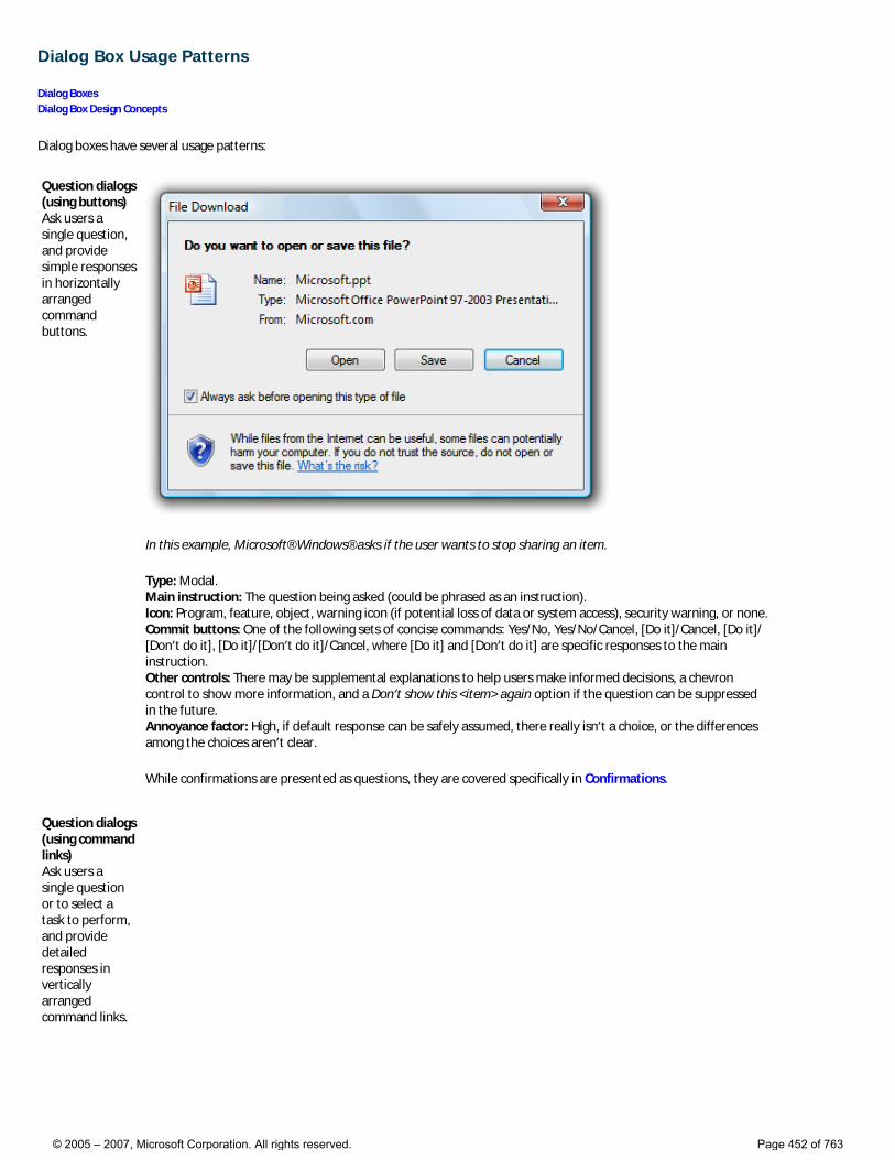
Dialog Box Usage Patterns
Dialog Boxes Dialog Box Design Concepts
Dialog boxes have several usage patterns:
Question dialogs (using buttons) Ask users a single question, and provide simple responses in horizontally arranged command buttons.
In this example, Microsoft® Windows® asks if the user wants to stop sharing an item.
Type: Modal. Main instruction: The question being asked (could be phrased as an instruction). Icon: Program, feature, object, warning icon (if potential loss of data or system access), security warning, or none. Commit buttons: One of the following sets of concise commands: Yes/No, Yes/No/Cancel, [Do it]/Cancel, [Do it]/[Don’t do it], [Do it]/[Don’t do it]/Cancel, where [Do it] and [Don’t do it] are specific responses to the main instruction. Other controls: There may be supplemental explanations to help users make informed decisions, a chevron control to show more information, and a Don’t show this <item> again option if the question can be suppressed in the future. Annoyance factor: High, if default response can be safely assumed, there really isn’t a choice, or the differences among the choices aren’t clear.
While confirmations are presented as questions, they are covered specifically in Confirmations.
Question dialogs (using command links) Ask users a single question or to select a task to perform, and provide detailed responses in vertically arranged command links.
© 2005 – 2007, Microsoft Corporation. All rights reserved. Page 452 of 763
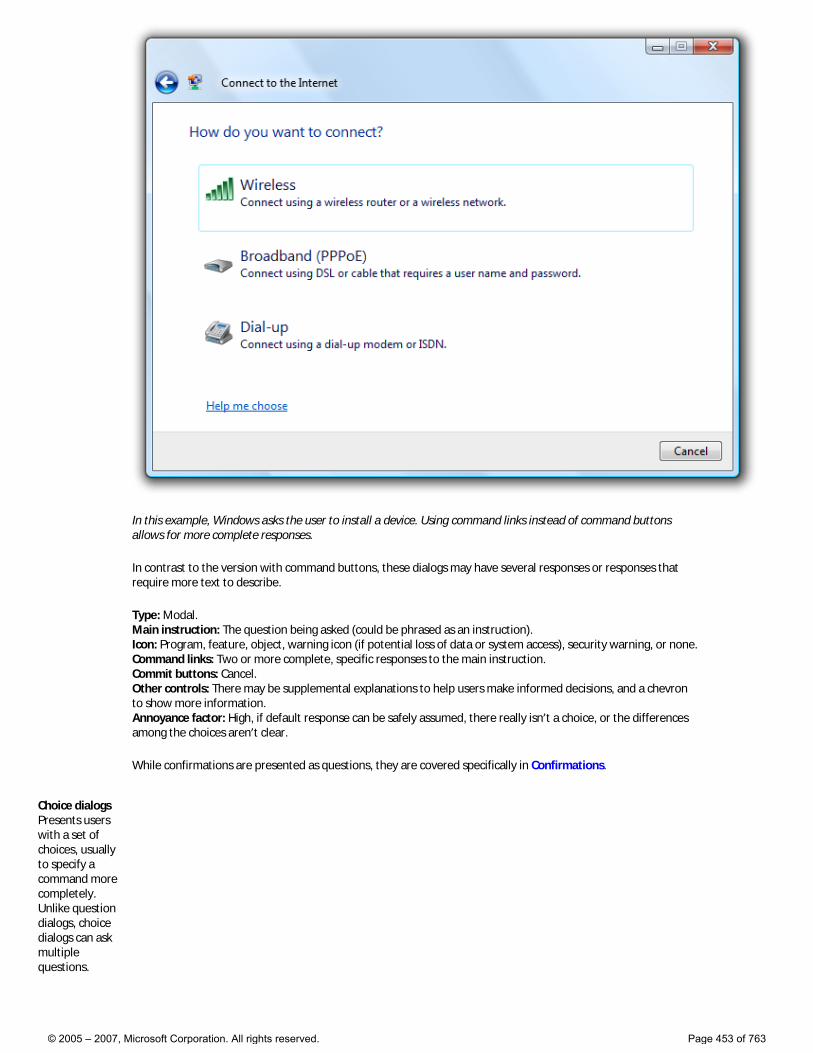
In this example, Windows asks the user to install a device. Using command links instead of command buttons allows for more complete responses.
In contrast to the version with command buttons, these dialogs may have several responses or responses that require more text to describe.
Type: Modal. Main instruction: The question being asked (could be phrased as an instruction). Icon: Program, feature, object, warning icon (if potential loss of data or system access), security warning, or none. Command links: Two or more complete, specific responses to the main instruction. Commit buttons: Cancel. Other controls: There may be supplemental explanations to help users make informed decisions, and a chevron to show more information. Annoyance factor: High, if default response can be safely assumed, there really isn’t a choice, or the differences among the choices aren’t clear.
While confirmations are presented as questions, they are covered specifically in Confirmations.
Choice dialogs Presents users with a set of choices, usually to specify a command more completely. Unlike question dialogs, choice dialogs can ask multiple questions.
© 2005 – 2007, Microsoft Corporation. All rights reserved. Page 453 of 763
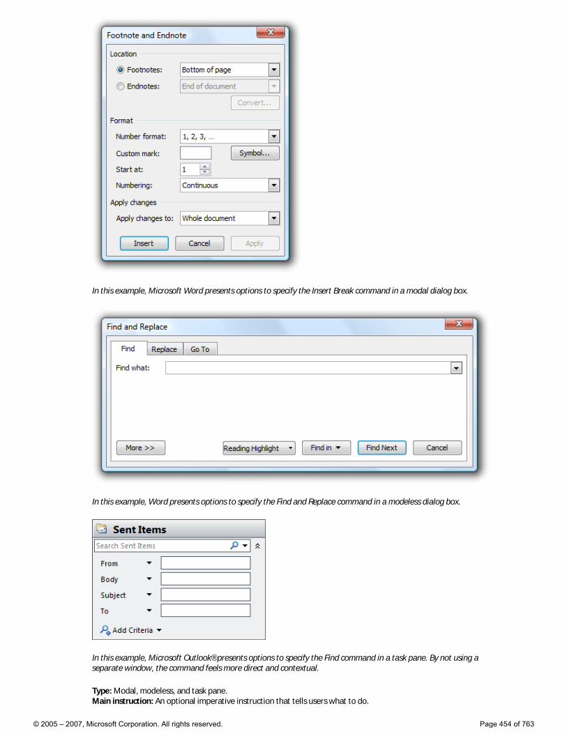
In this example, Microsoft Word presents options to specify the Insert Break command in a modal dialog box.
In this example, Word presents options to specify the Find and Replace command in a modeless dialog box.
In this example, Microsoft Outlook® presents options to specify the Find command in a task pane. By not using a separate window, the command feels more direct and contextual.
Type: Modal, modeless, and task pane. Main instruction: An optional imperative instruction that tells users what to do.
© 2005 – 2007, Microsoft Corporation. All rights reserved. Page 454 of 763
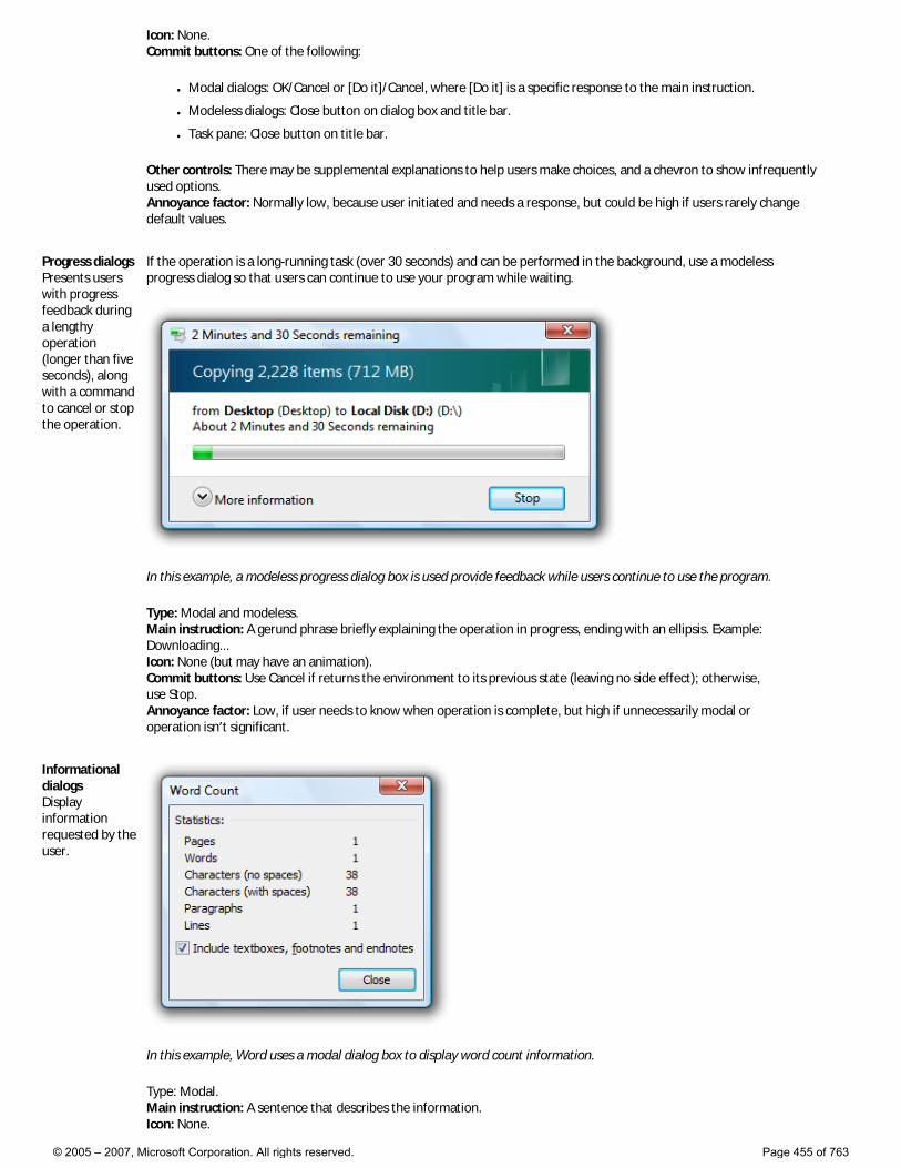
Icon: None. Commit buttons: One of the following:
● Modal dialogs: OK/Cancel or [Do it]/Cancel, where [Do it] is a specific response to the main instruction.
● Modeless dialogs: Close button on dialog box and title bar.
● Task pane: Close button on title bar.
Other controls: There may be supplemental explanations to help users make choices, and a chevron to show infrequently used options. Annoyance factor: Normally low, because user initiated and needs a response, but could be high if users rarely change default values.
Progress dialogs Presents users with progress feedback during a lengthy operation (longer than five seconds), along with a command to cancel or stop the operation.
If the operation is a long-running task (over 30 seconds) and can be performed in the background, use a modeless progress dialog so that users can continue to use your program while waiting.
In this example, a modeless progress dialog box is used provide feedback while users continue to use the program.
Type: Modal and modeless. Main instruction: A gerund phrase briefly explaining the operation in progress, ending with an ellipsis. Example: Downloading... Icon: None (but may have an animation). Commit buttons: Use Cancel if returns the environment to its previous state (leaving no side effect); otherwise, use Stop. Annoyance factor: Low, if user needs to know when operation is complete, but high if unnecessarily modal or operation isn’t significant.
Informational dialogs Display information requested by the user.
In this example, Word uses a modal dialog box to display word count information.
Type: Modal. Main instruction: A sentence that describes the information. Icon: None.
© 2005 – 2007, Microsoft Corporation. All rights reserved. Page 455 of 763
Commit buttons: Close Other controls: There may be a chevron to show more information. Annoyance factor: Low, if information is relevant and requested by the user.
© 2005 – 2007, Microsoft Corporation. All rights reserved. Page 456 of 763
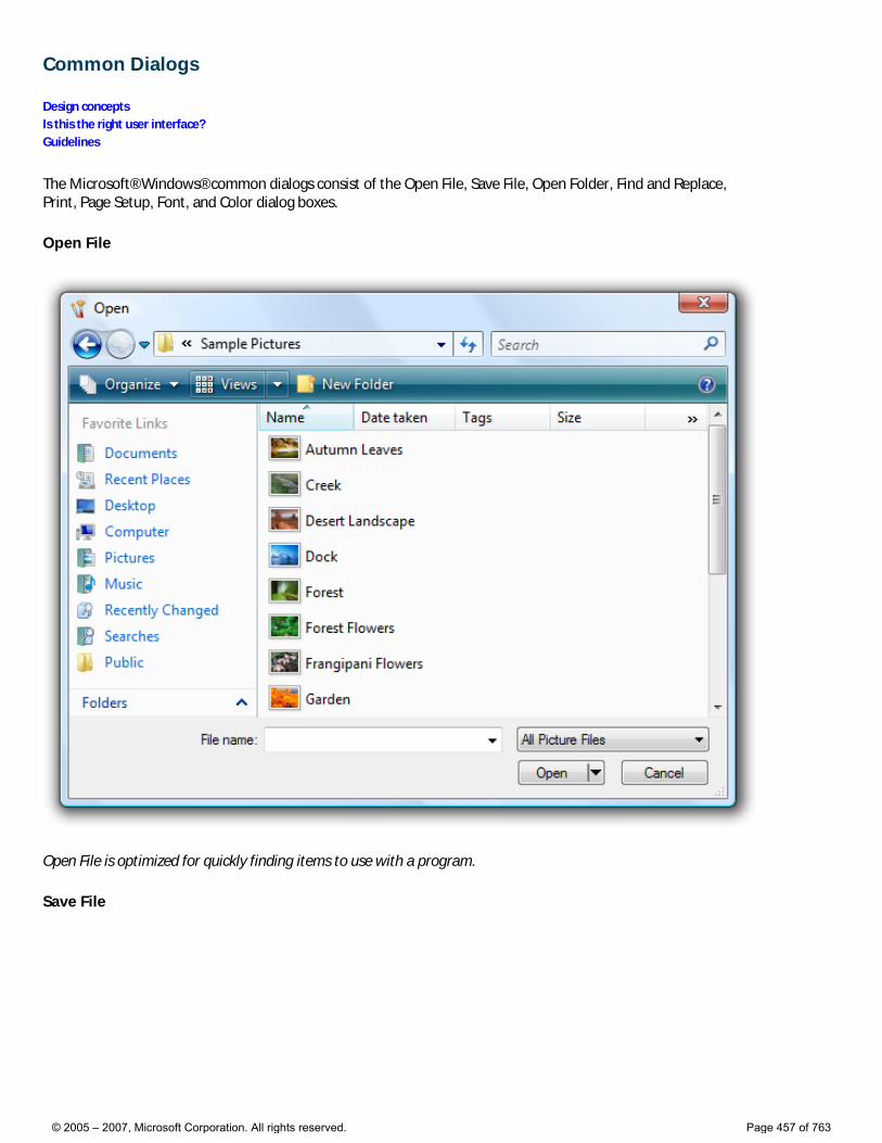
Common Dialogs
Design concepts Is this the right user interface? Guidelines
The Microsoft® Windows® common dialogs consist of the Open File, Save File, Open Folder, Find and Replace, Print, Page Setup, Font, and Color dialog boxes.
Open File
Open File is optimized for quickly finding items to use with a program.
Save File
© 2005 – 2007, Microsoft Corporation. All rights reserved. Page 457 of 763
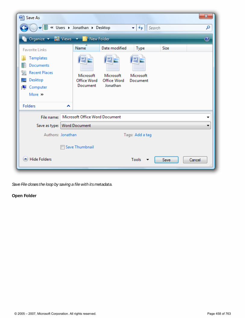
Save File closes the loop by saving a file with its metadata.
Open Folder
© 2005 – 2007, Microsoft Corporation. All rights reserved. Page 458 of 763
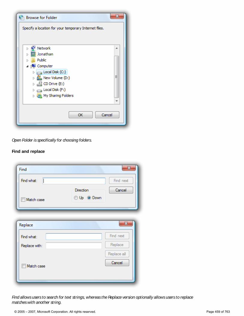
Open Folder is specifically for choosing folders.
Find and replace
Find allows users to search for text strings, whereas the Replace version optionally allows users to replace matches with another string.
© 2005 – 2007, Microsoft Corporation. All rights reserved. Page 459 of 763
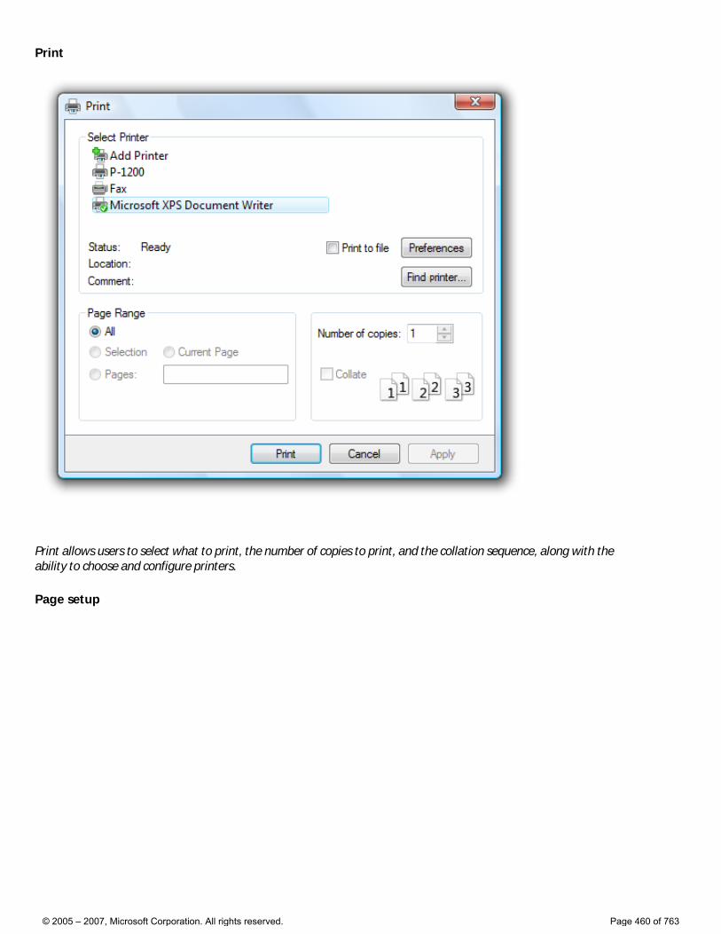
Print allows users to select what to print, the number of copies to print, and the collation sequence, along with the ability to choose and configure printers.
Page setup
© 2005 – 2007, Microsoft Corporation. All rights reserved. Page 460 of 763
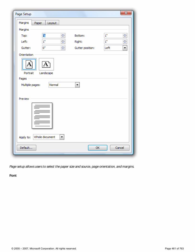
Page setup allows users to select the paper size and source, page orientation, and margins.
Font
© 2005 – 2007, Microsoft Corporation. All rights reserved. Page 461 of 763
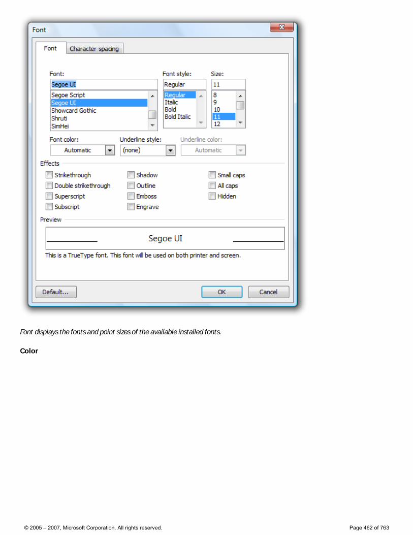
Font displays the fonts and point sizes of the available installed fonts.
Color
© 2005 – 2007, Microsoft Corporation. All rights reserved. Page 462 of 763
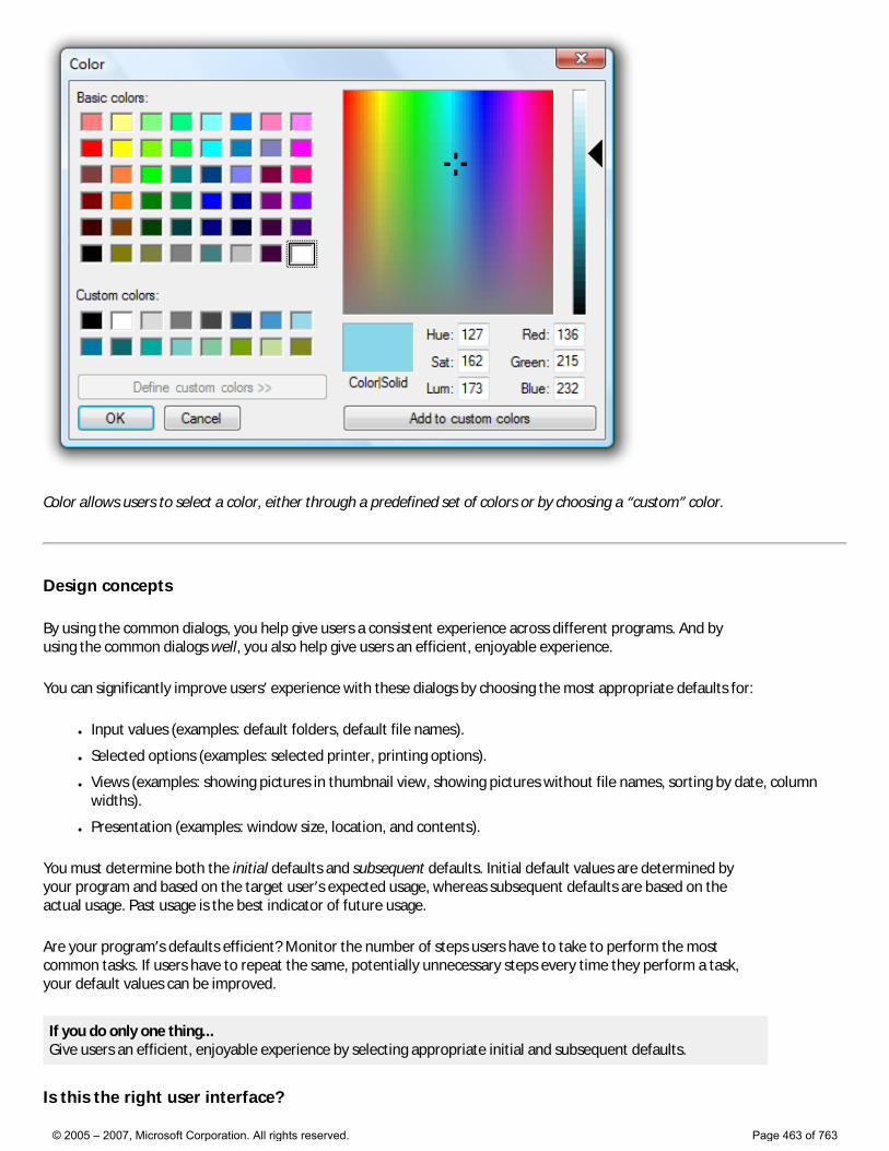
Color allows users to select a color, either through a predefined set of colors or by choosing a “custom” color.
Design concepts
By using the common dialogs, you help give users a consistent experience across different programs. And by using the common dialogs well, you also help give users an efficient, enjoyable experience.
You can significantly improve users’ experience with these dialogs by choosing the most appropriate defaults for:
● Input values (examples: default folders, default file names).
● Selected options (examples: selected printer, printing options).
● Views (examples: showing pictures in thumbnail view, showing pictures without file names, sorting by date, column widths).
● Presentation (examples: window size, location, and contents).
You must determine both the initial defaults and subsequent defaults. Initial default values are determined by your program and based on the target user’s expected usage, whereas subsequent defaults are based on the actual usage. Past usage is the best indicator of future usage.
Are your program’s defaults efficient? Monitor the number of steps users have to take to perform the most common tasks. If users have to repeat the same, potentially unnecessary steps every time they perform a task, your default values can be improved.
If you do only one thing... Give users an efficient, enjoyable experience by selecting appropriate initial and subsequent defaults.
Is this the right user interface?
© 2005 – 2007, Microsoft Corporation. All rights reserved. Page 463 of 763
Yes! Use the common dialogs for a consistent user experience. Don’t create your own. It is especially difficult to create custom UIs that navigate the namespace correctly and securely. Note that you can customize the common dialogs if necessary.
For Windows Vista®, the Open File and Save File have a new extensible architecture to make it easier to expose additional functionality. This mechanism is flexible enough to meet the minimum requirements of major independent software vendors (ISVs), but not be broken by future releases of Windows.
Guidelines
General
● When appropriate, provide more direct or modeless alternatives. Allow users to: �❍ Open files by dropping them on your program.
�❍ Save files using their current name and location with a Save command.
�❍ Find the next occurrence of a string using the F3 key.
�❍ Print one copy of an entire document to the default printer with a Print command.
�❍ Change fonts and font attributes using a toolbar or palette window.
�❍ Change colors using a toolbar or palette window.
● Use the following commands to display common dialogs (given along with their preferred access keys):
Common dialog Command
Open File Open...
Save File Save as...
Open Folder Open folder... or Choose folder...
Find and Replace Find... or Replace...
Print Print...
Page Setup Page setup...
Font Font... or Choose font...
Color Color... or Choose color...
● You can use more specific commands, as appropriate. Example: for exporting a file, use the command Export file instead of Save as.
● Set the dialog box title to reflect the command that launched it. Example: If Save File is launched from an Export file command, rename the dialog box to Export File.
Open File
● For the initial default folder, use a specialized folder (Pictures, Music, Videos) as appropriate, otherwise use Documents.
● For subsequent default folders, use the last folder opened by the user using the program.
● When opening photo files, suppress file names by default. Photos are usually identified by their thumbnails and their names typically aren’t meaningful.
Save File
● For the initial default folder (if a new file is being saved for the first time), use the specialized folder (Pictures, Music, Videos) as appropriate, otherwise use Documents.
© 2005 – 2007, Microsoft Corporation. All rights reserved. Page 464 of 763
● For temporary files, use the current user’s temporary folder. Choose plain, but unique file names. Example: Use File0001.tmp instead of ~DF1A92.tmp.
�❍ Developers: You can get the current user’s temporary folder using the GetTempPath API function.
● For the initial default file name, use a unique default name based on: 1. The file’s contents, if known. Example: The first words in a document.
2. A pattern chosen by the user. Example: If the previous file was named “Hawaii 1.jpg”, choose “Hawaii 2.jpg” as the next file.
3. A generic pattern based on the file type. Example: “Photo1.jpg”.
● For subsequent defaults (if the file already exists), use the file’s current folder and name.
● When saving a file, preserve its creation date. If your program saves files by creating a temporary file, deletes the original, and renames the temporary file to the original file name, be sure to copy the creation date from the original file.
● Use Save File if the user selects the Save command without specifying a file name.
File types lists
Note: File types lists are used by Open File and Save File to determine the types of files displayed and the default file extension.
● If the file types list is short (five or fewer), order the list by likelihood of usage. If the list is long (six or more), use an alphabetical order to make the types easy to find.
● For Save File, include all variations of the supported file extensions, even if uncommon, and put the most common extension first. The file handling logic looks at this list to determine if the user supplied a supported file extension. Example: If a JPEG file types list includes only .jpg and .jpeg, the file test.jpe might be saved as test.jpe.jpg.
● For Save File, the initial default file type is the most likely chosen by the target user. The subsequent default is the file’s current type.
● For Open File, the initial default file type is the most likely chosen by the target user. The subsequent default should be the last file type used.
● For Open File, include an “All files” entry as the first item if users can open any file type, or may need to see all files in a folder at the same time. Consider providing other meta filters, such as “All pictures,” “All music,” and “All videos.” Place these immediately after “All files.”
● Use the format “File type name (*.ext1; *.ext2).” The file type name should be the registered file type name, which you can view in the Folder Options control panel item. Example: “HTML document (*.htm; *.html).”
�❍ Exception: For meta-filters, remove the file extension list to eliminate clutter. Examples: “All files,” “All pictures,” “All music,” and “All videos.”
● Use sentence-style capitalization for the file type names, and lowercase for the file type extensions.
Open Folder
● For new programs, use the Open Files dialog in the “pick folders” mode. Doing so requires Windows Vista or later, so use the Open Folder dialog for programs that run in earlier versions of Windows.
�❍ Developers: You can use the Open Files dialog in the “pick folders” mode by using the FOS_PICKFOLDERS flag.
Font
● If necessary, you can filter the font list to show only the fonts available to your program.
Persistence
● Consider making the following values persistent to use as subsequent defaults: �❍ Input values (examples: default folders, default file names).
© 2005 – 2007, Microsoft Corporation. All rights reserved. Page 465 of 763

�❍ Selected options (examples: selected printer, printing options).
�❍ Views (examples: showing pictures in thumbnail view, showing pictures without file names, sorting by date, column widths).
�❍ Presentation (examples: window size, location, and contents).
Exception: Don’t make these values persist for common dialogs when their usage is such that users are far more likely to want to start completely over.
● When determining default values, consider what target users are most likely to want based on the important scenarios. Also, consider scenarios within a program instance, across multiple instances (both consecutive or concurrent), and across multiple documents. Don’t make values persist in circumstances that aren’t likely to be helpful.
�❍ Example: For a typical document-based application, it’s helpful to use persistent Open File and Save File settings within a program instance and across consecutive instances, but keep concurrent instances independent. That way, users can work efficiently with several documents at a time.
● Make the settings persist on a per-program, per-user basis.
© 2005 – 2007, Microsoft Corporation. All rights reserved. Page 466 of 763
Wizards
This content hasn’t been written yet, but here is some information to help you in the meantime.
What’s New in Windows Vista
The following design changes have been made to wizards in Microsoft Windows Vista:
● More flexible page layout and text formatting, allowing for better presentation of information.
● Pages can be resizable.
● Unnecessary Welcome and Congratulations/Finish pages have been removed to increase efficiency.
● Pages have a prominent main instruction that replaces page heading and subheading.
● The main instruction and flexible layout help eliminate much of the repetition found in Wizard '97.
● Command links allow for immediate and more expressive choices, eliminating the need to always use a combination of radio buttons and a Next button.
● Commit buttons and links are explicit, self-explanatory responses to the main instruction, resulting in efficient decision making and a smooth inductive navigation flow.
● Navigation is more consistent with Web and Windows Explorer navigation.
● The Back button is moved to its standard location at upper left frame, giving more focus to commit choices.
For more information, see What’s New in Windows Vista.
Top Violations
For the most common wizard guidelines violations, see Top Violations.
Other Relevant Guidelines
The following new Windows Vista guidelines contain material that applies to wizards:
● Dialog Boxes
● Control Panels
● Layout
● Window Management
Earlier Version of Guidelines
The wizard guidelines from Windows User Experience have some sections that still apply. Use these guidelines with discretion and only if they are consistent with the previously mentioned guidelines.
© 2005 – 2007, Microsoft Corporation. All rights reserved. Page 467 of 763
Property Windows
Is this the right user interface? Design concepts Usage patterns Guidelines Property sheets Property pages Owned property windows Tabs Command buttons Commit buttons Page contents Help Standard users and Protected administrators Default values Text
Property window is the collective name for the following types of user interfaces (UIs):
● Property sheet: used to view and change properties for an object or collection of objects in a dialog box.
● Property inspector: used to view and change properties for an object or collection of objects in a pane.
● Options dialog box: used to view and change options for an application.
A property for an object is either of the following:
● A setting that users can change (such as a file’s name and read-only attribute).
● An attribute of an object that users cannot directly change (such as a file’s size and creation date).
Unlike dialog boxes (other than options dialogs) and wizards, property windows typically support several tasks instead of a single task.
Property windows are usually organized into pages, which are accessed through tabs. Property windows are often associated with tabs (and vice versa), but tabs are not essential to property windows.
© 2005 – 2007, Microsoft Corporation. All rights reserved. Page 468 of 763
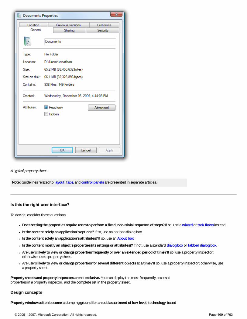
A typical property sheet.
Note: Guidelines related to layout, tabs, and control panels are presented in separate articles.
Is this the right user interface?
To decide, consider these questions:
● Does setting the properties require users to perform a fixed, non-trivial sequence of steps? If so, use a wizard or task flows instead.
● Is the content solely an application’s options? If so, use an options dialog box.
● Is the content solely an application’s attributes? If so, use an About box.
● Is the content mostly an object’s properties (its settings or attributes)? If not, use a standard dialog box or tabbed dialog box.
● Are users likely to view or change properties frequently or over an extended period of time? If so, use a property inspector; otherwise, use a property sheet.
● Are users likely to view or change properties for several different objects at a time? If so, use a property inspector; otherwise, use a property sheet.
Property sheets and property inspectors aren’t exclusive. You can display the most frequently accessed properties in a property inspector, and the complete set in the property sheet.
Design concepts
Property windows often become a dumping ground for an odd assortment of low-level, technology-based
© 2005 – 2007, Microsoft Corporation. All rights reserved. Page 469 of 763
settings. Too often, these properties are organized into tabs, but beyond that not designed for any particular tasks or users. As a result, when users are faced with a task in a property window, they often don’t know what to do.
To ensure that your property windows are useful and usable, follow these steps:
● Make sure the properties are necessary.
● Present properties in terms of user goals, not technology.
● Present properties at the right level.
● Design pages for specific tasks.
● Design pages for specific users, especially limited users (non-administrators).
● Organize the property pages efficiently.
If you do only one thing... Present properties in terms of user goals, not technology. Pretend that you are explaining the property and why it is useful to a friend. How would you explain it? What language would you use? That’s the language to use in your property pages.
For more information and examples, see Property Window Design Concepts.
Usage patterns
Property windows have several usage patterns.
● Property sheets. Properties for a single object are displayed in a modeless dialog box.
● Multiple-object property sheets. Properties for multiple objects are displayed in a modeless dialog box.
● Effective settings property sheets. The effective properties for a single object are displayed in a modeless dialog box.
● Options dialog boxes. Properties for an application are displayed in a modal dialog box.
● Property inspectors. Properties for the current selection (a single object or group of objects) are displayed in a modeless window pane or undocked window.
All property window patterns except property inspectors use a delayed commit, meaning that changes take effect only when users click OK or Apply. Property inspectors use an immediate commit (properties are changed as soon as users make changes), so there is no need for OK, Cancel, and Apply buttons.
For more information and examples, see Property Window Usage Patterns.
Guidelines
Property sheets
● Display a property sheet when users:
�❍ Select the Properties command for an object.
�❍ Set input focus on an object and press Alt+Enter.
Multiple-object property sheets
● Display the common properties of all the selected objects. Where the property values differ, display the controls associated with those values using a mixed state. (See the respective control guidelines for using mixed-state values.)
● If the selected object is a collection of multiple discrete objects (such as a file folder), display the properties of the single grouped object instead of a multiple-object property sheet for the discrete objects.
Options dialog boxes
● Don’t separate options from customization. That is, don’t have both an Options command and a Customize command. Users are
© 2005 – 2007, Microsoft Corporation. All rights reserved. Page 470 of 763
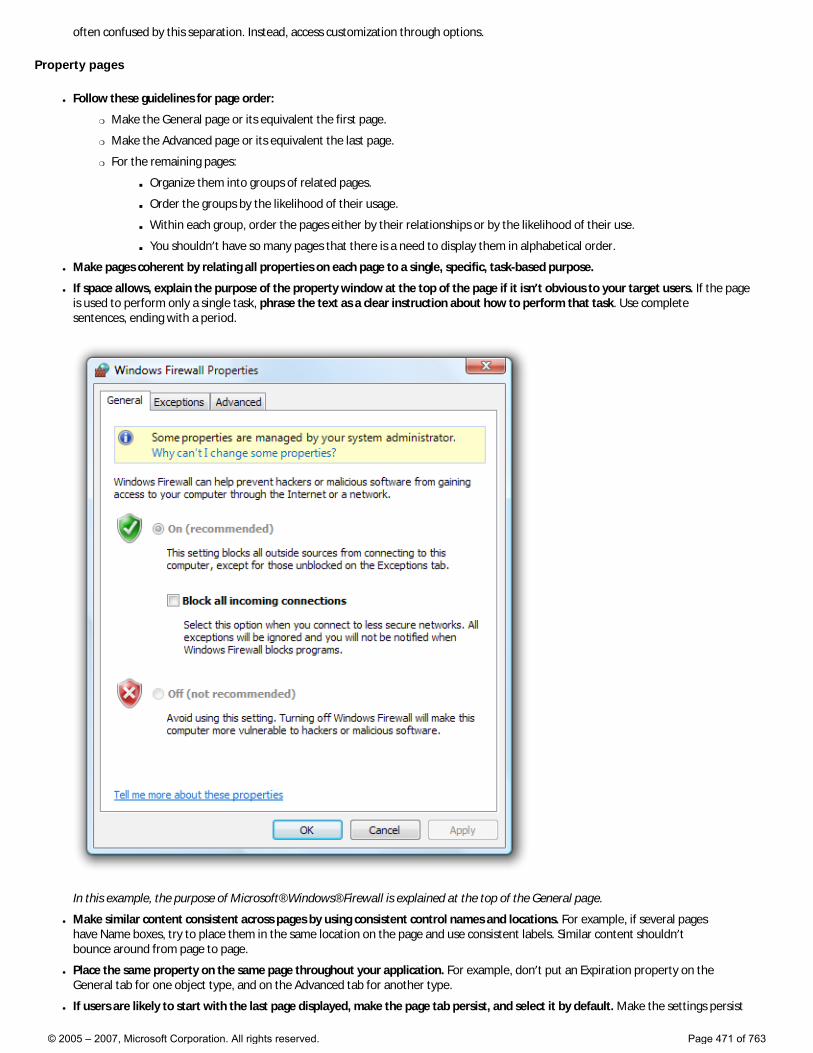
often confused by this separation. Instead, access customization through options.
Property pages
● Follow these guidelines for page order:
�❍ Make the General page or its equivalent the first page.
�❍ Make the Advanced page or its equivalent the last page.
�❍ For the remaining pages:
■ Organize them into groups of related pages.
■ Order the groups by the likelihood of their usage.
■ Within each group, order the pages either by their relationships or by the likelihood of their use.
■ You shouldn’t have so many pages that there is a need to display them in alphabetical order.
● Make pages coherent by relating all properties on each page to a single, specific, task-based purpose.
● If space allows, explain the purpose of the property window at the top of the page if it isn’t obvious to your target users. If the page is used to perform only a single task, phrase the text as a clear instruction about how to perform that task. Use complete sentences, ending with a period.
In this example, the purpose of Microsoft® Windows® Firewall is explained at the top of the General page.
● Make similar content consistent across pages by using consistent control names and locations. For example, if several pages have Name boxes, try to place them in the same location on the page and use consistent labels. Similar content shouldn’t bounce around from page to page.
● Place the same property on the same page throughout your application. For example, don’t put an Expiration property on the General tab for one object type, and on the Advanced tab for another type.
● If users are likely to start with the last page displayed, make the page tab persist, and select it by default. Make the settings persist
© 2005 – 2007, Microsoft Corporation. All rights reserved. Page 471 of 763

on a per-property window, per-user basis. Otherwise, select the first page by default.
● Don’t make the settings on a page dependent upon settings on other pages. Put the dependent settings on a single page instead. Changing a setting on one page should never automatically change settings on other pages.
�❍ Exception: If the dependent settings are in two different property windows, use static text labels to explain this relationship in both locations.
● Don’t scroll property pages. Both tabs and scrollbars are used to increase the effective area of a window, but one mechanism should be sufficient. Instead of using scrollbars, make the property pages larger and lay out the pages efficiently.
First pages
● For object properties, put the object’s name on the first page.
● If you are associating (optional) icons with your objects, display the appropriate icon in the upper-left corner of the first page.
General pages
● Avoid General pages. You aren’t required to have a General page. Use a General page only if: �❍ The properties apply to several tasks and are meaningful to most users. Don’t put specialized or advanced properties on a General
page, but you can make them accessible through a command button on the General page.
�❍ The properties don’t fit a more specific category. If they do, use that name for the page instead.
Advanced pages
● Avoid Advanced pages. Use an Advanced page only if: �❍ The properties apply to uncommon tasks and are meaningful primarily to advanced users.
�❍ The properties don’t fit a more specific category. If they do, use that name for the page instead.
● Don’t call properties advanced based solely on technological measures. For example, a printer stapling option may be an advanced printer feature, but it is meaningful to all users, so it shouldn’t be on an Advanced page.
Owned property windows
● Don’t display more than one owned property window from a property window. Displaying more than one makes the meaning of the OK and Cancel buttons difficult to understand. You can display other types of auxiliary dialog boxes (such as object pickers) as needed.
Incorrect:
© 2005 – 2007, Microsoft Corporation. All rights reserved. Page 472 of 763
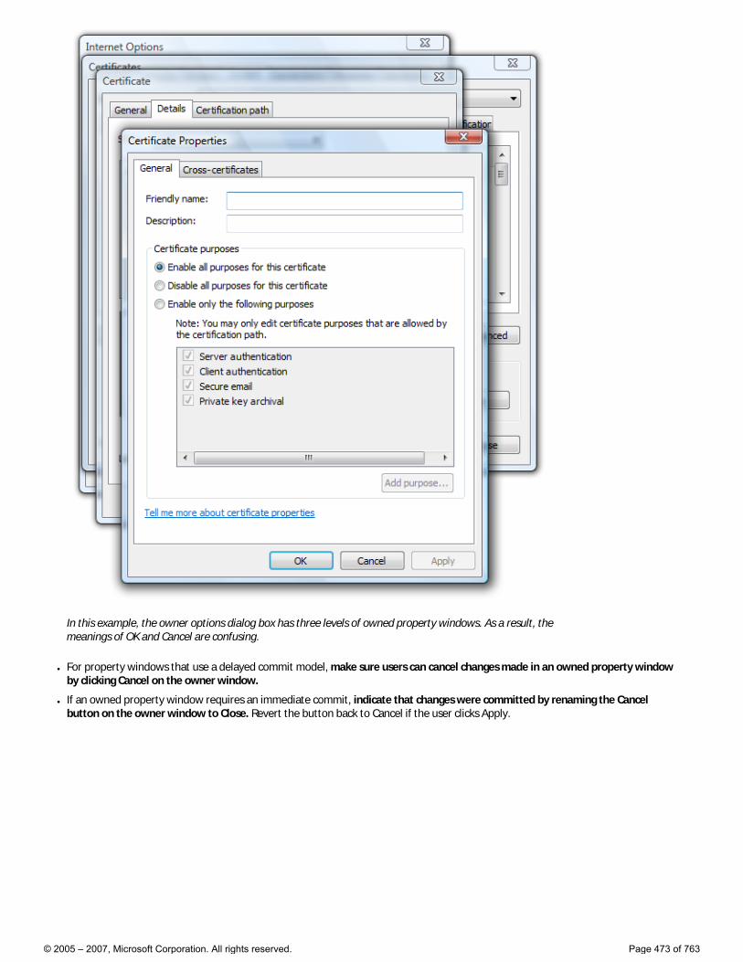
In this example, the owner options dialog box has three levels of owned property windows. As a result, the meanings of OK and Cancel are confusing.
● For property windows that use a delayed commit model, make sure users can cancel changes made in an owned property window by clicking Cancel on the owner window.
● If an owned property window requires an immediate commit, indicate that changes were committed by renaming the Cancel button on the owner window to Close. Revert the button back to Cancel if the user clicks Apply.
© 2005 – 2007, Microsoft Corporation. All rights reserved. Page 473 of 763
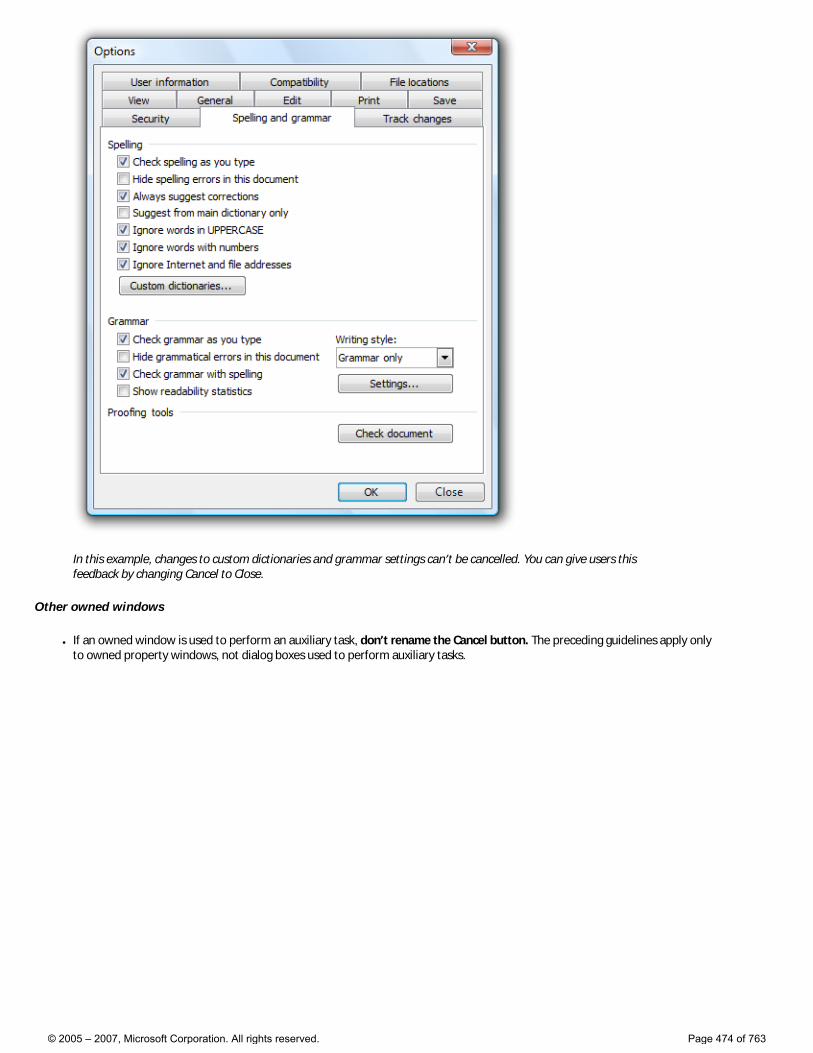
In this example, changes to custom dictionaries and grammar settings can’t be cancelled. You can give users this feedback by changing Cancel to Close.
Other owned windows
● If an owned window is used to perform an auxiliary task, don’t rename the Cancel button. The preceding guidelines apply only to owned property windows, not dialog boxes used to perform auxiliary tasks.
© 2005 – 2007, Microsoft Corporation. All rights reserved. Page 474 of 763
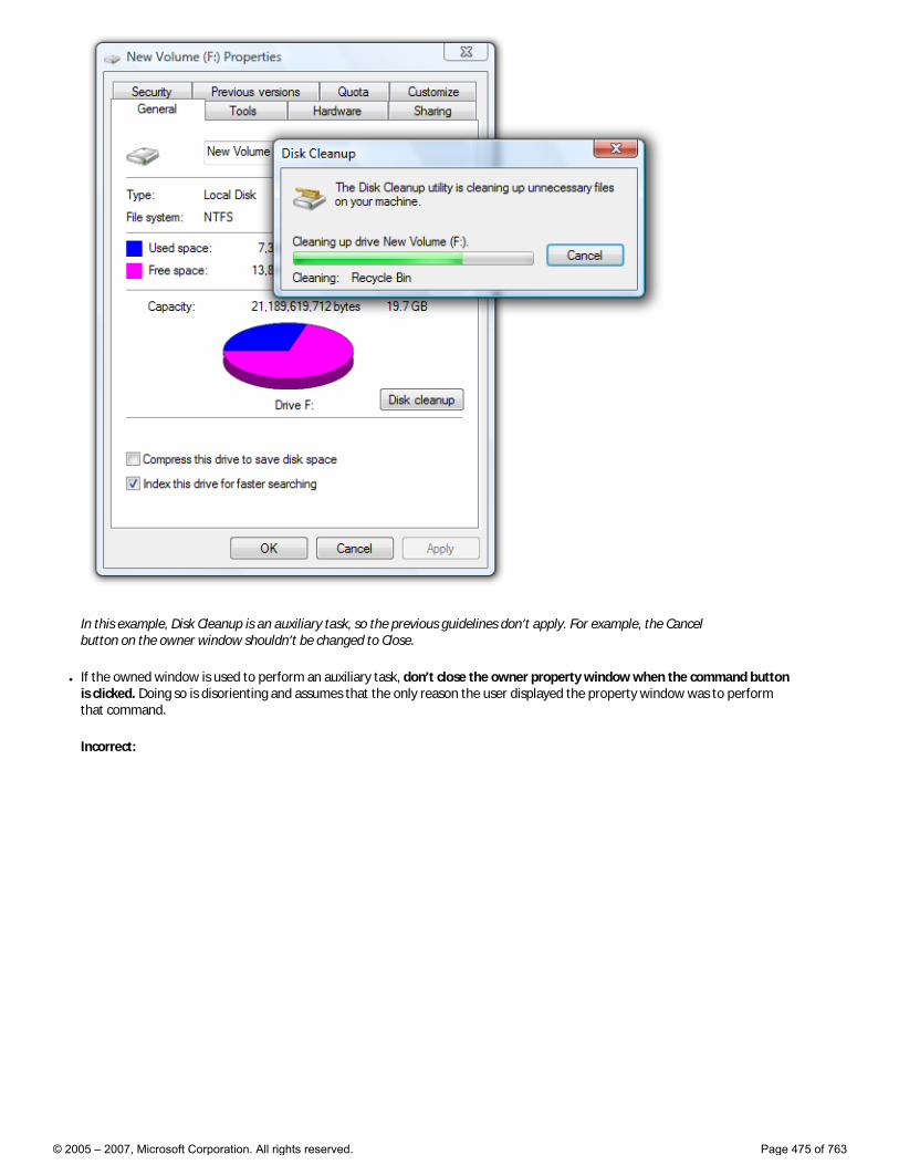
In this example, Disk Cleanup is an auxiliary task, so the previous guidelines don’t apply. For example, the Cancel button on the owner window shouldn’t be changed to Close.
● If the owned window is used to perform an auxiliary task, don’t close the owner property window when the command button is clicked. Doing so is disorienting and assumes that the only reason the user displayed the property window was to perform that command.
Incorrect:
© 2005 – 2007, Microsoft Corporation. All rights reserved. Page 475 of 763
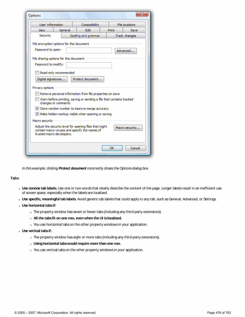
In this example, clicking Protect document incorrectly closes the Options dialog box.
Tabs
● Use concise tab labels. Use one or two words that clearly describe the content of the page. Longer labels result in an inefficient use of screen space, especially when the labels are localized.
● Use specific, meaningful tab labels. Avoid generic tab labels that could apply to any tab, such as General, Advanced, or Settings.
● Use horizontal tabs if:
�❍ The property window has seven or fewer tabs (including any third-party extensions).
�❍ All the tabs fit on one row, even when the UI is localized.
�❍ You use horizontal tabs on the other property windows in your application.
● Use vertical tabs if:
�❍ The property window has eight or more tabs (including any third-party extensions).
�❍ Using horizontal tabs would require more than one row.
�❍ You use vertical tabs on the other property windows in your application.
© 2005 – 2007, Microsoft Corporation. All rights reserved. Page 476 of 763
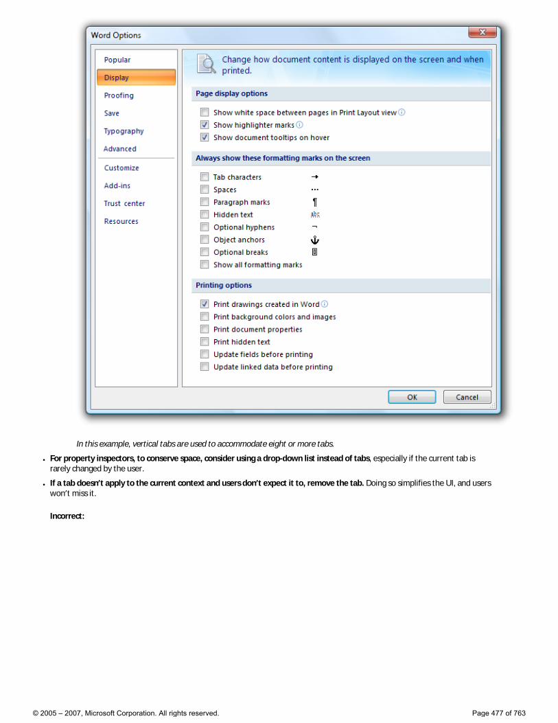
In this example, vertical tabs are used to accommodate eight or more tabs.
● For property inspectors, to conserve space, consider using a drop-down list instead of tabs, especially if the current tab is rarely changed by the user.
● If a tab doesn’t apply to the current context and users don’t expect it to, remove the tab. Doing so simplifies the UI, and users won’t miss it.
Incorrect:
© 2005 – 2007, Microsoft Corporation. All rights reserved. Page 477 of 763
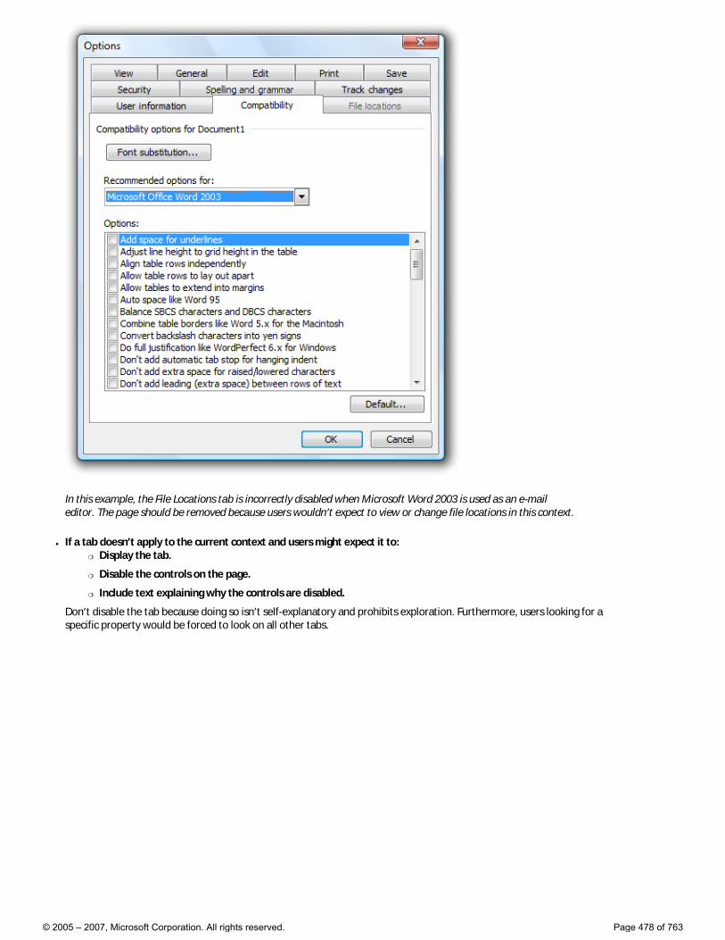
In this example, the File Locations tab is incorrectly disabled when Microsoft Word 2003 is used as an e-mail editor. The page should be removed because users wouldn’t expect to view or change file locations in this context.
● If a tab doesn’t apply to the current context and users might expect it to: �❍ Display the tab.
�❍ Disable the controls on the page.
�❍ Include text explaining why the controls are disabled.
Don’t disable the tab because doing so isn’t self-explanatory and prohibits exploration. Furthermore, users looking for a specific property would be forced to look on all other tabs.
© 2005 – 2007, Microsoft Corporation. All rights reserved. Page 478 of 763
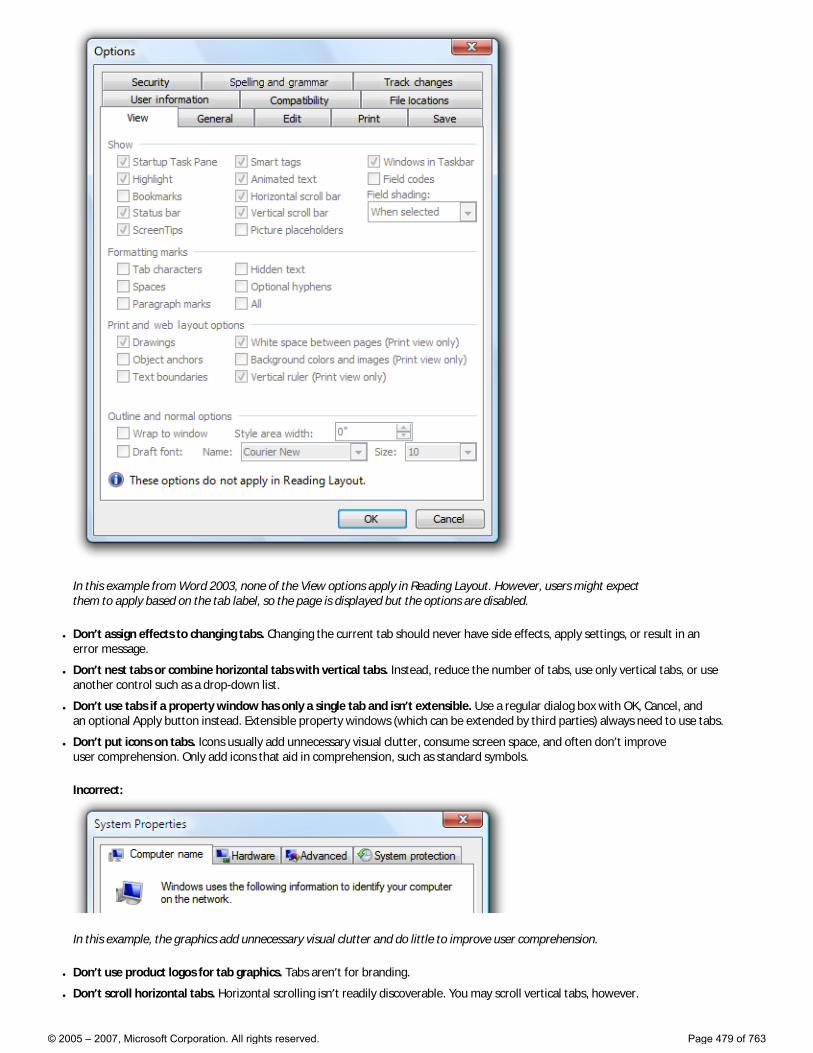
In this example from Word 2003, none of the View options apply in Reading Layout. However, users might expect them to apply based on the tab label, so the page is displayed but the options are disabled.
● Don’t assign effects to changing tabs. Changing the current tab should never have side effects, apply settings, or result in an error message.
● Don’t nest tabs or combine horizontal tabs with vertical tabs. Instead, reduce the number of tabs, use only vertical tabs, or use another control such as a drop-down list.
● Don’t use tabs if a property window has only a single tab and isn’t extensible. Use a regular dialog box with OK, Cancel, and an optional Apply button instead. Extensible property windows (which can be extended by third parties) always need to use tabs.
● Don’t put icons on tabs. Icons usually add unnecessary visual clutter, consume screen space, and often don’t improve user comprehension. Only add icons that aid in comprehension, such as standard symbols.
Incorrect:
In this example, the graphics add unnecessary visual clutter and do little to improve user comprehension.
● Don’t use product logos for tab graphics. Tabs aren’t for branding.
● Don’t scroll horizontal tabs. Horizontal scrolling isn’t readily discoverable. You may scroll vertical tabs, however.
© 2005 – 2007, Microsoft Corporation. All rights reserved. Page 479 of 763
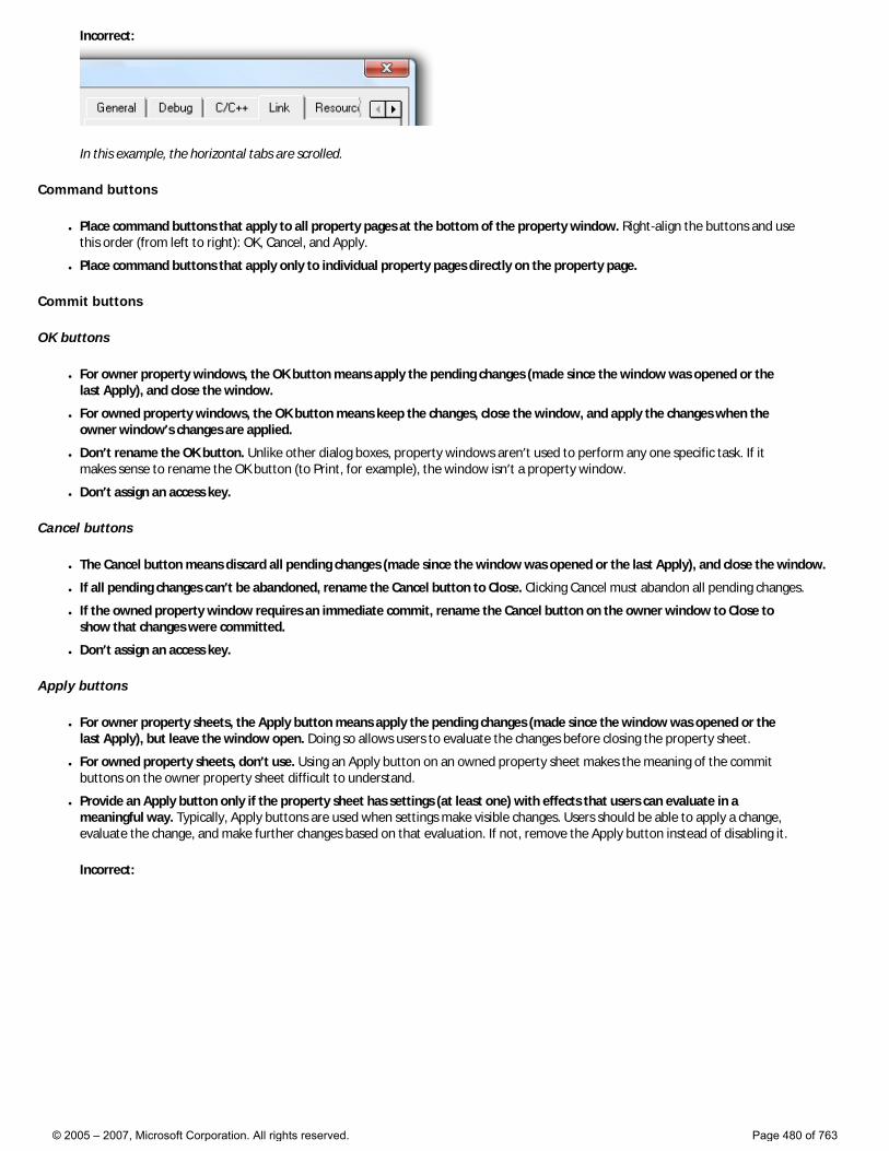
Incorrect:
In this example, the horizontal tabs are scrolled.
Command buttons
● Place command buttons that apply to all property pages at the bottom of the property window. Right-align the buttons and use this order (from left to right): OK, Cancel, and Apply.
● Place command buttons that apply only to individual property pages directly on the property page.
Commit buttons
OK buttons
● For owner property windows, the OK button means apply the pending changes (made since the window was opened or the last Apply), and close the window.
● For owned property windows, the OK button means keep the changes, close the window, and apply the changes when the owner window’s changes are applied.
● Don’t rename the OK button. Unlike other dialog boxes, property windows aren’t used to perform any one specific task. If it makes sense to rename the OK button (to Print, for example), the window isn’t a property window.
● Don’t assign an access key.
Cancel buttons
● The Cancel button means discard all pending changes (made since the window was opened or the last Apply), and close the window.
● If all pending changes can’t be abandoned, rename the Cancel button to Close. Clicking Cancel must abandon all pending changes.
● If the owned property window requires an immediate commit, rename the Cancel button on the owner window to Close to show that changes were committed.
● Don’t assign an access key.
Apply buttons
● For owner property sheets, the Apply button means apply the pending changes (made since the window was opened or the last Apply), but leave the window open. Doing so allows users to evaluate the changes before closing the property sheet.
● For owned property sheets, don’t use. Using an Apply button on an owned property sheet makes the meaning of the commit buttons on the owner property sheet difficult to understand.
● Provide an Apply button only if the property sheet has settings (at least one) with effects that users can evaluate in a meaningful way. Typically, Apply buttons are used when settings make visible changes. Users should be able to apply a change, evaluate the change, and make further changes based on that evaluation. If not, remove the Apply button instead of disabling it.
Incorrect:
© 2005 – 2007, Microsoft Corporation. All rights reserved. Page 480 of 763
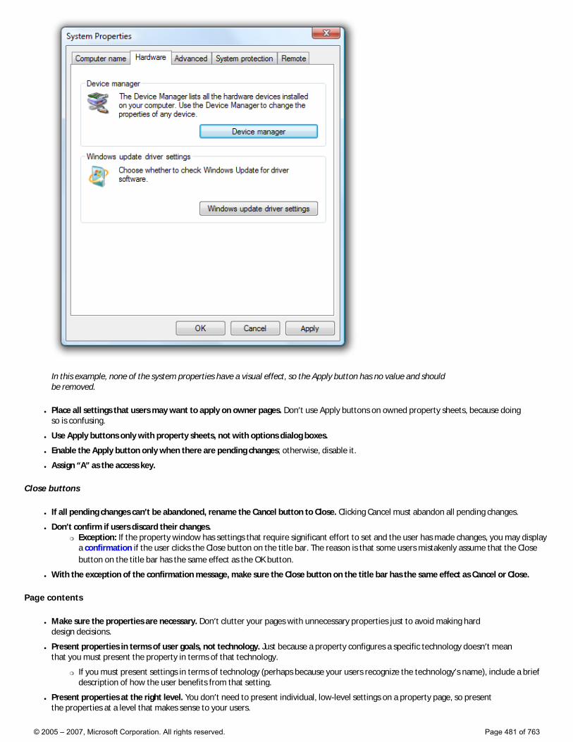
In this example, none of the system properties have a visual effect, so the Apply button has no value and should be removed.
● Place all settings that users may want to apply on owner pages. Don’t use Apply buttons on owned property sheets, because doing so is confusing.
● Use Apply buttons only with property sheets, not with options dialog boxes.
● Enable the Apply button only when there are pending changes; otherwise, disable it.
● Assign “A” as the access key.
Close buttons
● If all pending changes can’t be abandoned, rename the Cancel button to Close. Clicking Cancel must abandon all pending changes.
● Don’t confirm if users discard their changes. �❍ Exception: If the property window has settings that require significant effort to set and the user has made changes, you may display
a confirmation if the user clicks the Close button on the title bar. The reason is that some users mistakenly assume that the Close button on the title bar has the same effect as the OK button.
● With the exception of the confirmation message, make sure the Close button on the title bar has the same effect as Cancel or Close.
Page contents
● Make sure the properties are necessary. Don’t clutter your pages with unnecessary properties just to avoid making hard design decisions.
● Present properties in terms of user goals, not technology. Just because a property configures a specific technology doesn’t mean that you must present the property in terms of that technology.
�❍ If you must present settings in terms of technology (perhaps because your users recognize the technology’s name), include a brief description of how the user benefits from that setting.
● Present properties at the right level. You don’t need to present individual, low-level settings on a property page, so present the properties at a level that makes sense to your users.
© 2005 – 2007, Microsoft Corporation. All rights reserved. Page 481 of 763
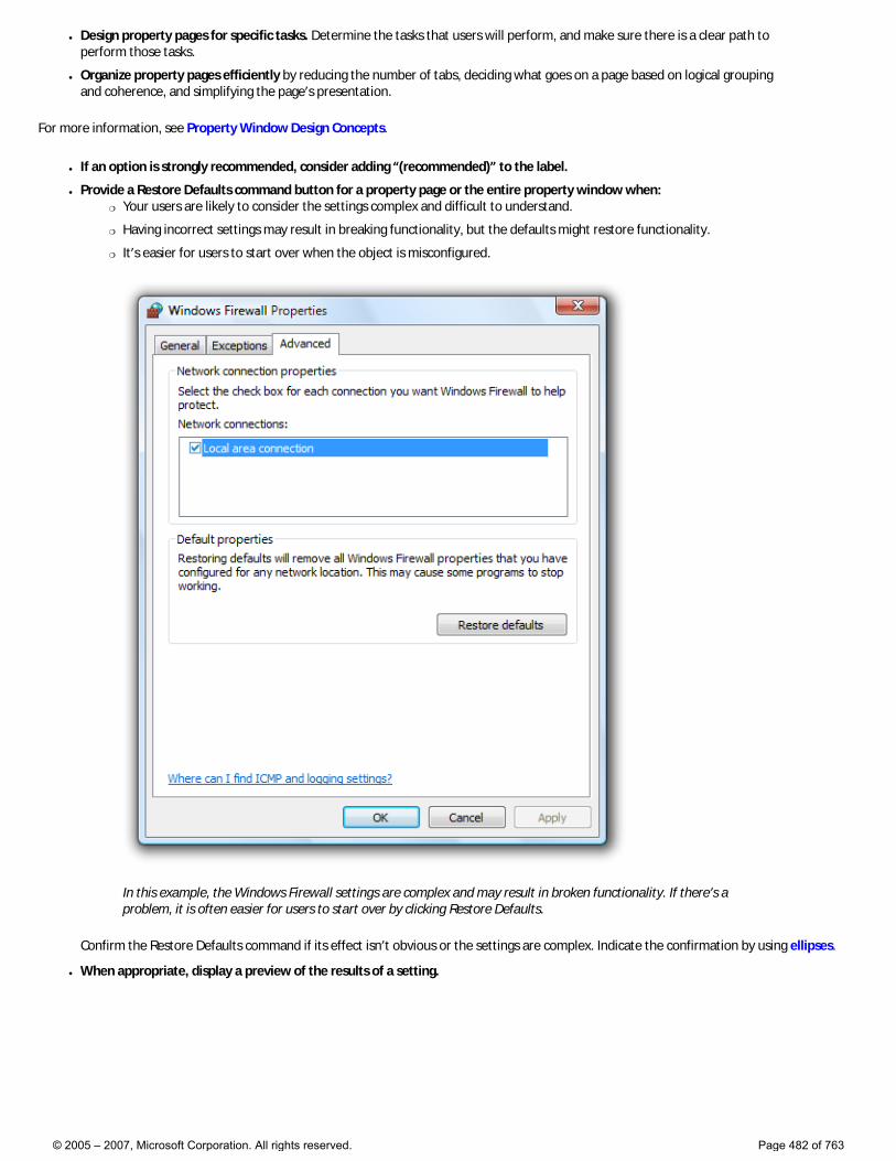
● Design property pages for specific tasks. Determine the tasks that users will perform, and make sure there is a clear path to perform those tasks.
● Organize property pages efficiently by reducing the number of tabs, deciding what goes on a page based on logical grouping and coherence, and simplifying the page’s presentation.
For more information, see Property Window Design Concepts.
● If an option is strongly recommended, consider adding “(recommended)” to the label.
● Provide a Restore Defaults command button for a property page or the entire property window when: �❍ Your users are likely to consider the settings complex and difficult to understand.
�❍ Having incorrect settings may result in breaking functionality, but the defaults might restore functionality.
�❍ It’s easier for users to start over when the object is misconfigured.
In this example, the Windows Firewall settings are complex and may result in broken functionality. If there’s a problem, it is often easier for users to start over by clicking Restore Defaults.
Confirm the Restore Defaults command if its effect isn’t obvious or the settings are complex. Indicate the confirmation by using ellipses.
● When appropriate, display a preview of the results of a setting.
© 2005 – 2007, Microsoft Corporation. All rights reserved. Page 482 of 763
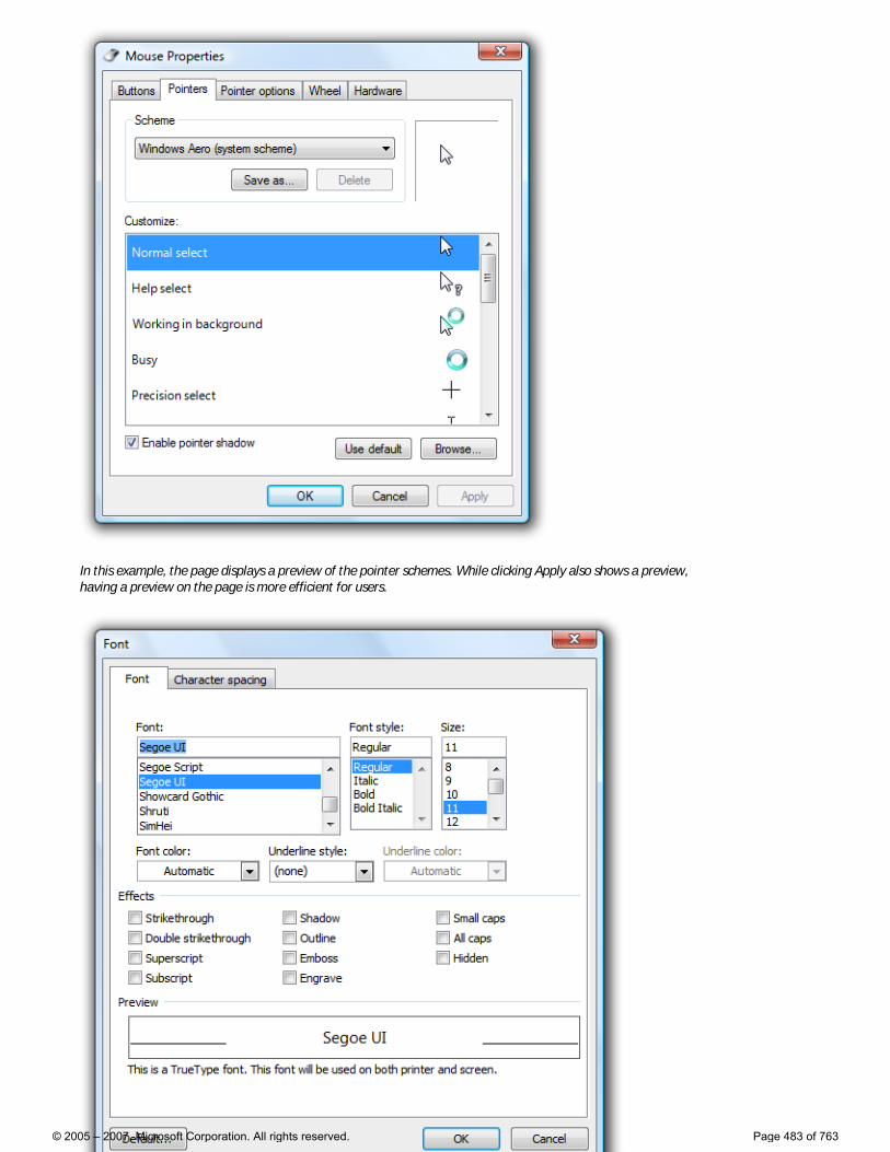
In this example, the page displays a preview of the pointer schemes. While clicking Apply also shows a preview, having a preview on the page is more efficient for users.
© 2005 – 2007, Microsoft Corporation. All rights reserved. Page 483 of 763
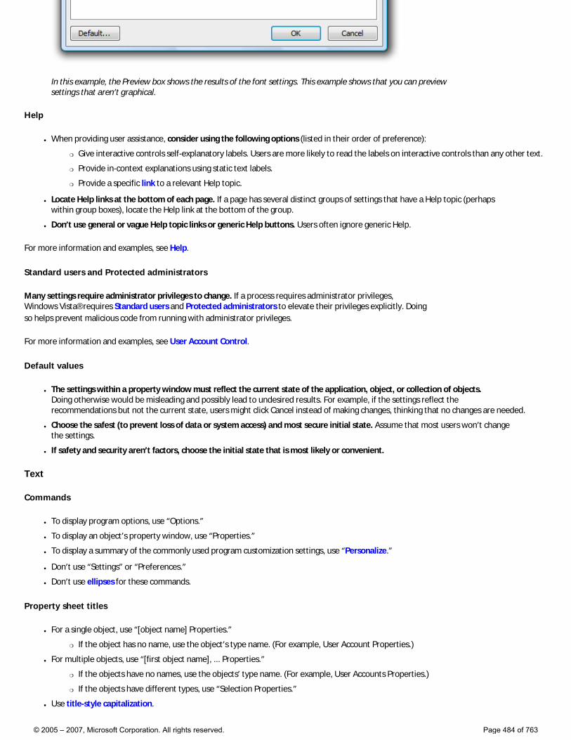
In this example, the Preview box shows the results of the font settings. This example shows that you can preview settings that aren’t graphical.
Help
● When providing user assistance, consider using the following options (listed in their order of preference):
�❍ Give interactive controls self-explanatory labels. Users are more likely to read the labels on interactive controls than any other text.
�❍ Provide in-context explanations using static text labels.
�❍ Provide a specific link to a relevant Help topic.
● Locate Help links at the bottom of each page. If a page has several distinct groups of settings that have a Help topic (perhaps within group boxes), locate the Help link at the bottom of the group.
● Don’t use general or vague Help topic links or generic Help buttons. Users often ignore generic Help.
For more information and examples, see Help.
Standard users and Protected administrators
Many settings require administrator privileges to change. If a process requires administrator privileges, Windows Vista® requires Standard users and Protected administrators to elevate their privileges explicitly. Doing so helps prevent malicious code from running with administrator privileges.
For more information and examples, see User Account Control.
Default values
● The settings within a property window must reflect the current state of the application, object, or collection of objects. Doing otherwise would be misleading and possibly lead to undesired results. For example, if the settings reflect the recommendations but not the current state, users might click Cancel instead of making changes, thinking that no changes are needed.
● Choose the safest (to prevent loss of data or system access) and most secure initial state. Assume that most users won’t change the settings.
● If safety and security aren’t factors, choose the initial state that is most likely or convenient.
Text
Commands
● To display program options, use “Options.”
● To display an object’s property window, use “Properties.”
● To display a summary of the commonly used program customization settings, use “Personalize.”
● Don’t use “Settings” or “Preferences.”
● Don’t use ellipses for these commands.
Property sheet titles
● For a single object, use “[object name] Properties.”
�❍ If the object has no name, use the object’s type name. (For example, User Account Properties.)
● For multiple objects, use “[first object name], ... Properties.”
�❍ If the objects have no names, use the objects’ type name. (For example, User Accounts Properties.)
�❍ If the objects have different types, use “Selection Properties.”
● Use title-style capitalization.
© 2005 – 2007, Microsoft Corporation. All rights reserved. Page 484 of 763
● Don’t use ending punctuation.
● Don’t use hyphens, such as “[object name] - Properties.”
Property inspector titles
● Use “Properties.”
● Use title-style capitalization.
● Don’t use ending punctuation.
Options dialog box titles
● Use “Options.”
● Use title-style capitalization.
● Don’t use ending punctuation.
Property page tab names
● Use concise tab labels. Use one or two words that clearly describe the content of the page. Using longer tab names results in an inefficient use of screen space, especially when the tab names are localized.
● Use specific, meaningful tab labels. Avoid generic tab labels that could apply to any tab, such as General, Advanced, or Settings.
● Write the label as a one- or two-word phrase and use no ending punctuation.
● Use sentence-style capitalization.
● Don’t assign a unique access key.
Property page text
● Avoid large blocks of text.
● Provide enough room for the text to expand 30 percent if it will be localized.
● Don’t use text phrased as a command on property windows. Because users might want to simply view settings, you don’t want to prompt them to change settings.
● Use sentence-style capitalization and ending punctuation.
Documentation
When referring to property windows:
● In programming and other technical documentation, refer to property sheets and options dialog boxes as property sheets. Everywhere else, use dialog box, especially in user documentation.
● Use the exact title text, including its capitalization.
● To describe user interaction, use open and close.
● When possible, format the title using bold text. Otherwise, put the title in quotation marks only if required to prevent confusion.
When referring to property pages:
● In programming and other technical documentation, refer to property pages as property pages. Everywhere else, use tab, especially in user documentation.
● Use the exact title text, including its capitalization.
● To describe user interaction, use click to refer to clicking a tab.
● When possible, format the name using bold text. Otherwise, put the name in quotation marks only if required to prevent confusion.
© 2005 – 2007, Microsoft Corporation. All rights reserved. Page 485 of 763

Property Window Design Concepts
Property Windows Property Window Usage Patterns
Note: This section applies primarily to property sheets and options dialog boxes, but also applies to property inspectors to a lesser degree.
Make property windows usable
Developers often simplify their program’s user interfaces (UIs) by focusing on the primary 80 percent of the program, and giving users a way to handle the remaining 20 percent through property windows. This can be an excellent approach, but if not done carefully, it may result in poorly designed property windows.
Property windows often become a dumping ground for an odd assortment of low-level, technology-based settings. Too often, these properties are organized into tabs, but beyond that not designed for any particular tasks or users. As a result, when users are faced with a task in a property window, they often don’t know what to do.
To ensure that your property windows are useful and usable, follow these steps:
● Make sure the properties are necessary.
● Present properties in terms of user goals, not technology.
● Present properties at the right level.
● Design pages for specific tasks.
● Design pages for Standard users and Protected administrators.
● Organize the property pages efficiently.
Make sure the properties are necessary
Of course you want your program to be powerful and flexible, but too much choice can be overwhelming for users. Review all the properties in your property windows and do the following:
● Identify a task that requires the property.
● Identify a target user for the property.
● Assign a probability that the target user will actually use the property.
If the probability is low (perhaps because doing so violates a best practice), consider removing the property. Don’t clutter your property pages with unnecessary properties just to avoid making hard design decisions. Focus on the probable, not the possible.
Present properties in terms of user goals, not technology
Although a property configures a specific technology, you don’t have to present it in terms of that technology. Compare the following settings:
© 2005 – 2007, Microsoft Corporation. All rights reserved. Page 486 of 763

Technology-based:
In these examples, properties are presented in terms of technology.
Goal-based:
In these examples, the same properties are presented in terms of user goals.
A simple way to evaluate property page text is to pretend that you are explaining the property and why it is useful to a friend. How would you explain it? What language would you use? Most likely you would explain the setting using plain language in terms of the user’s goals (such as printing on both sides of paper) instead of obscure technology (such as manual duplex). That’s the language to use in your property pages.
If you must present properties in terms of technology (perhaps because your target users recognize the technology’s name), also include a brief description of the actual benefit to the user of the property.
If you do only one thing... Present properties in terms of user goals, not technology. Pretend that you are explaining the property and why it is useful to the target user in person. How would you explain it? What language would you use? That’s the language to use in your property pages.
Present properties at the right level
Sometimes individual low-level settings don’t correlate to users’ goals. You don’t have to present individual, low-level settings in a property page, so present the properties at a level that makes sense to the target user.
Consider this sample of the low-level, technology-based security settings in Windows® Internet Explorer®:
Too low level:
© 2005 – 2007, Microsoft Corporation. All rights reserved. Page 487 of 763

This example shows a small portion (about 15 percent) of the low-level Windows Internet Explorer security settings.
Few users know if they want to enable or disable these settings, but they do know their high-level goals, such as wanting to browse the Internet safely while still maintaining most functionality. Consequently, the Windows Internet Explorer security settings are presented in terms of goal-based levels:
Better:
© 2005 – 2007, Microsoft Corporation. All rights reserved. Page 488 of 763
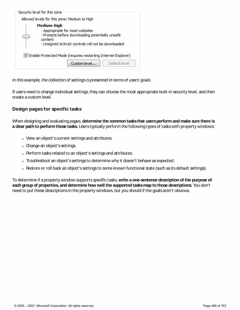
In this example, the collection of settings is presented in terms of users’ goals.
If users need to change individual settings, they can choose the most appropriate built-in security level, and then create a custom level.
Design pages for specific tasks
When designing and evaluating pages, determine the common tasks that users perform and make sure there is a clear path to perform those tasks. Users typically perform the following types of tasks with property windows:
● View an object’s current settings and attributes.
● Change an object’s settings.
● Perform tasks related to an object’s settings and attributes.
● Troubleshoot an object’s settings to determine why it doesn’t behave as expected.
● Restore or roll back an object’s settings to some known functional state (such as its default settings).
To determine if a property window supports specific tasks, write a one-sentence description of the purpose of each group of properties, and determine how well the supported tasks map to those descriptions. You don’t need to put these descriptions in the property windows, but you should if the goals aren’t obvious.
© 2005 – 2007, Microsoft Corporation. All rights reserved. Page 489 of 763
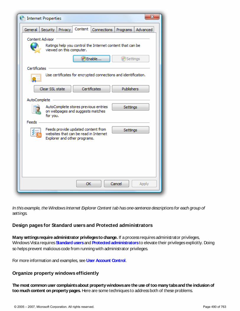
In this example, the Windows Internet Explorer Content tab has one-sentence descriptions for each group of settings.
Design pages for Standard users and Protected administrators
Many settings require administrator privileges to change. If a process requires administrator privileges, Windows Vista requires Standard users and Protected administrators to elevate their privileges explicitly. Doing so helps prevent malicious code from running with administrator privileges.
For more information and examples, see User Account Control.
Organize property windows efficiently
The most common user complaints about property windows are the use of too many tabs and the inclusion of too much content on property pages. Here are some techniques to address both of these problems.
© 2005 – 2007, Microsoft Corporation. All rights reserved. Page 490 of 763
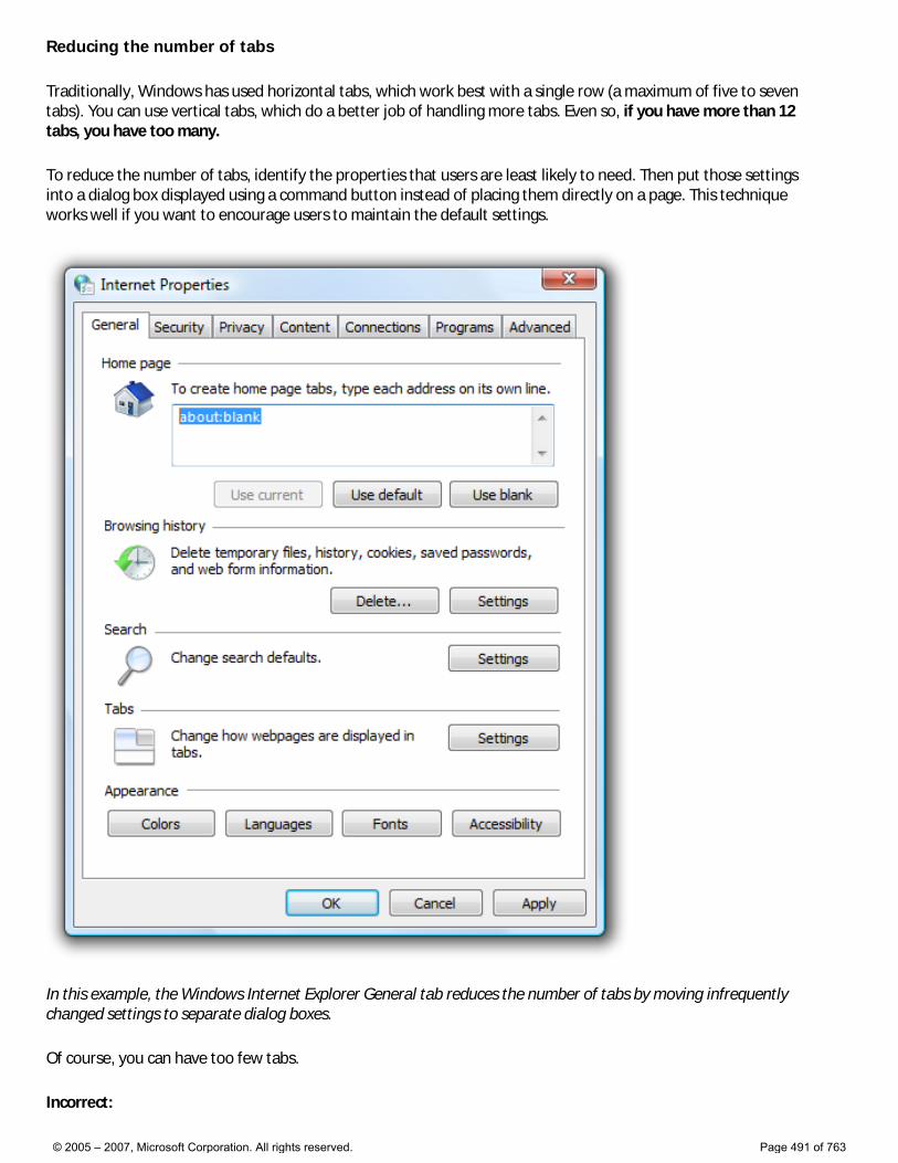
Reducing the number of tabs
Traditionally, Windows has used horizontal tabs, which work best with a single row (a maximum of five to seven tabs). You can use vertical tabs, which do a better job of handling more tabs. Even so, if you have more than 12 tabs, you have too many.
To reduce the number of tabs, identify the properties that users are least likely to need. Then put those settings into a dialog box displayed using a command button instead of placing them directly on a page. This technique works well if you want to encourage users to maintain the default settings.
In this example, the Windows Internet Explorer General tab reduces the number of tabs by moving infrequently changed settings to separate dialog boxes.
Of course, you can have too few tabs.
Incorrect:
© 2005 – 2007, Microsoft Corporation. All rights reserved. Page 491 of 763
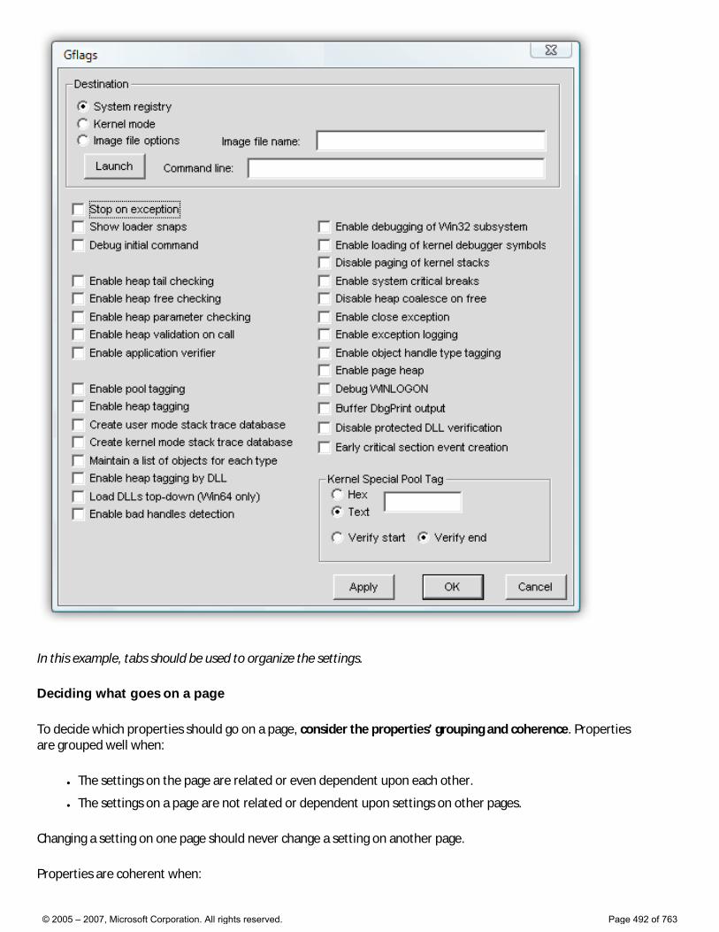
In this example, tabs should be used to organize the settings.
Deciding what goes on a page
To decide which properties should go on a page, consider the properties’ grouping and coherence. Properties are grouped well when:
● The settings on the page are related or even dependent upon each other.
● The settings on a page are not related or dependent upon settings on other pages.
Changing a setting on one page should never change a setting on another page.
Properties are coherent when:
© 2005 – 2007, Microsoft Corporation. All rights reserved. Page 492 of 763
● All the properties on the page relate to a single concept.
● The concept is specific.
● The concept is based on tasks or goals, not technology.
You can determine coherence by reviewing the tab labels. Specific labels are a strong sign of coherence; generic labels like General and Advanced are not.
Simplifying a page
Beyond making sure the properties are necessary and presented at the right level, you can simplify a property page’s presentation using these techniques:
● Use larger property pages. Don’t be afraid to use screen space.
● Use more compact controls:
�❍ Group controls with separators instead of group boxes.
�❍ Use list boxes instead of many individual radio buttons.
�❍ Use check box lists instead of many individual check boxes.
�❍ Use drop-down lists instead of list boxes.
�❍ Use split buttons for a group of related controls instead of individual command buttons.
● Move advanced or infrequently used settings to a separate dialog box, displayed using a command button.
● If the page has weak grouping and coherence, split up the page and move the properties to a new page or a generic page, such as General or Advanced.
© 2005 – 2007, Microsoft Corporation. All rights reserved. Page 493 of 763
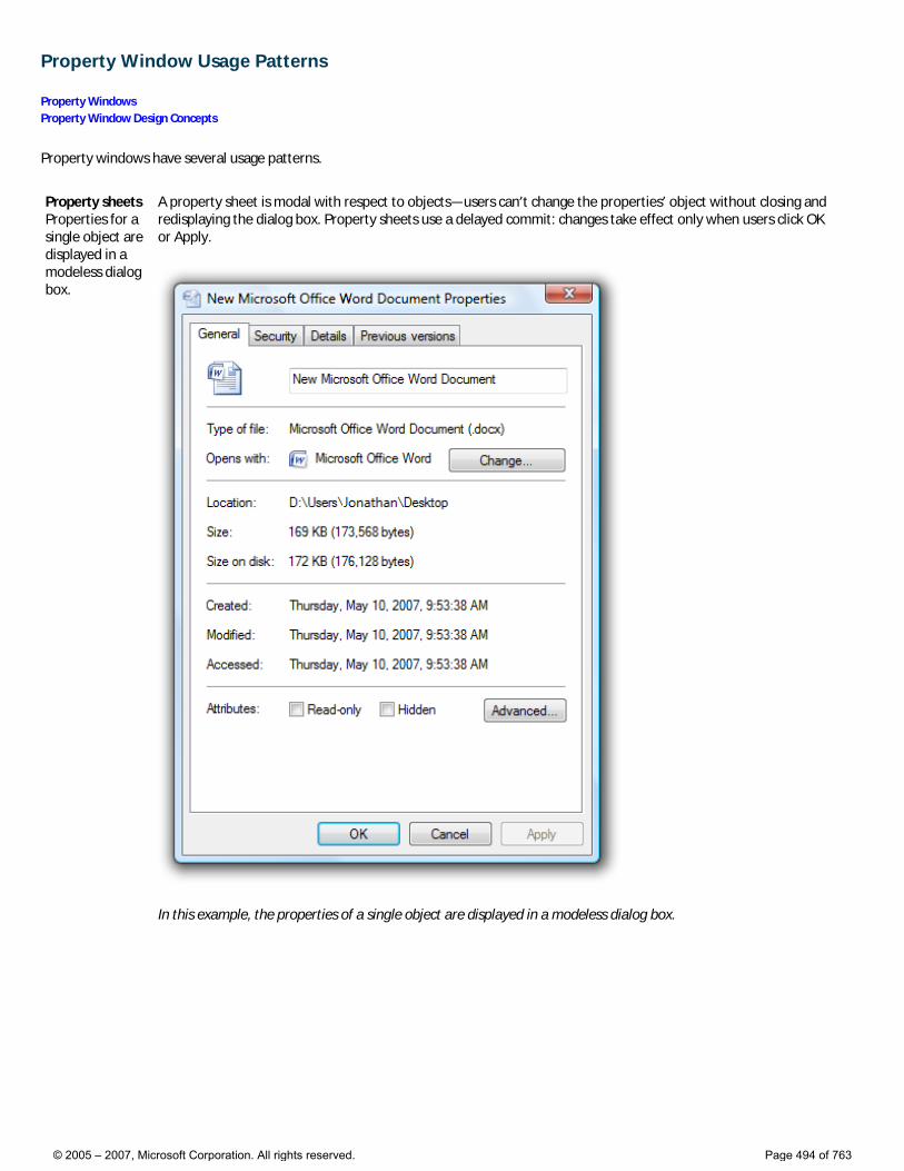
Property Window Usage Patterns
Property Windows Property Window Design Concepts
Property windows have several usage patterns.
Property sheets Properties for a single object are displayed in a modeless dialog box.
A property sheet is modal with respect to objects—users can’t change the properties’ object without closing and redisplaying the dialog box. Property sheets use a delayed commit: changes take effect only when users click OK or Apply.
In this example, the properties of a single object are displayed in a modeless dialog box.
© 2005 – 2007, Microsoft Corporation. All rights reserved. Page 494 of 763
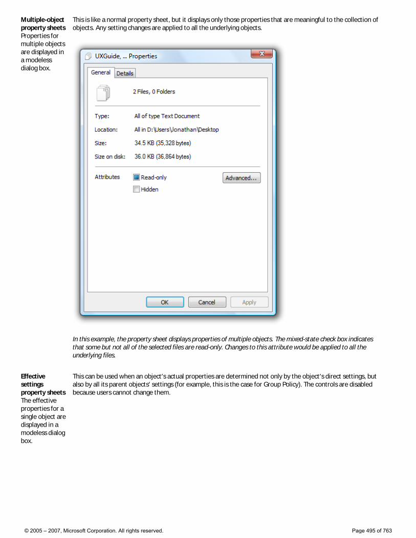
Multiple-object property sheets Properties for multiple objects are displayed in a modeless dialog box.
This is like a normal property sheet, but it displays only those properties that are meaningful to the collection of objects. Any setting changes are applied to all the underlying objects.
In this example, the property sheet displays properties of multiple objects. The mixed-state check box indicates that some but not all of the selected files are read-only. Changes to this attribute would be applied to all the underlying files.
Effective settings property sheets The effective properties for a single object are displayed in a modeless dialog box.
This can be used when an object’s actual properties are determined not only by the object’s direct settings, but also by all its parent objects’ settings (for example, this is the case for Group Policy). The controls are disabled because users cannot change them.
© 2005 – 2007, Microsoft Corporation. All rights reserved. Page 495 of 763
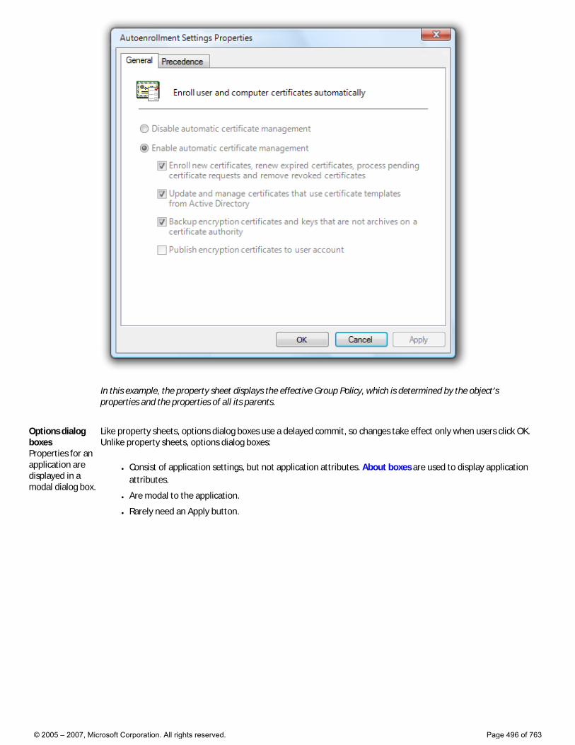
In this example, the property sheet displays the effective Group Policy, which is determined by the object’s properties and the properties of all its parents.
Options dialog boxes Properties for an application are displayed in a modal dialog box.
Like property sheets, options dialog boxes use a delayed commit, so changes take effect only when users click OK. Unlike property sheets, options dialog boxes:
● Consist of application settings, but not application attributes. About boxes are used to display application attributes.
● Are modal to the application.
● Rarely need an Apply button.
© 2005 – 2007, Microsoft Corporation. All rights reserved. Page 496 of 763
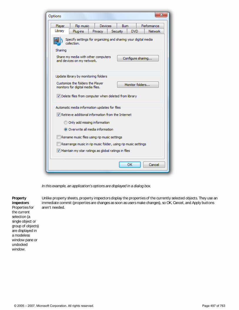
In this example, an application’s options are displayed in a dialog box.
Property inspectors Properties for the current selection (a single object or group of objects) are displayed in a modeless window pane or undocked window.
Unlike property sheets, property inspectors display the properties of the currently selected objects. They use an immediate commit (properties are changes as soon as users make changes), so OK, Cancel, and Apply buttons aren’t needed.
© 2005 – 2007, Microsoft Corporation. All rights reserved. Page 497 of 763
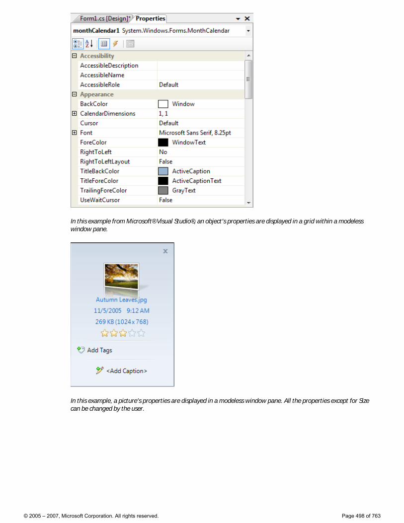
In this example from Microsoft® Visual Studio®, an object’s properties are displayed in a grid within a modeless window pane.
In this example, a picture’s properties are displayed in a modeless window pane. All the properties except for Size can be changed by the user.
© 2005 – 2007, Microsoft Corporation. All rights reserved. Page 498 of 763
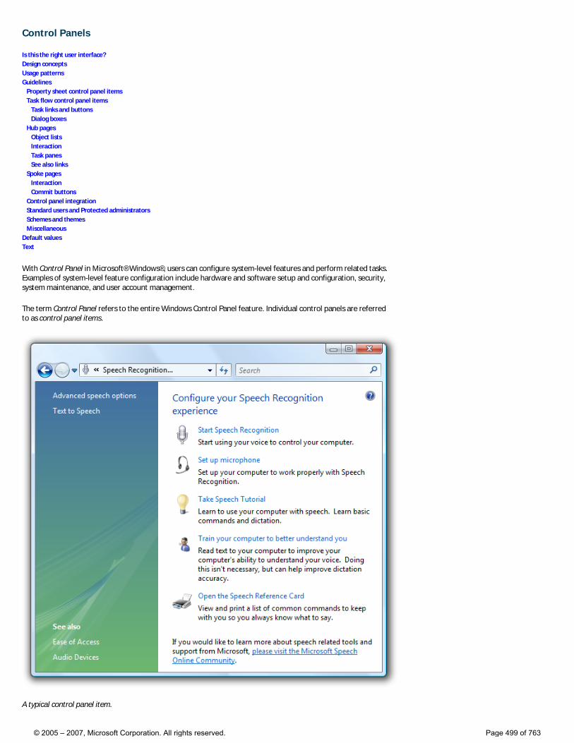
Control Panels
Is this the right user interface? Design concepts Usage patterns Guidelines Property sheet control panel items Task flow control panel items Task links and buttons Dialog boxes Hub pages Object lists Interaction Task panes See also links Spoke pages Interaction Commit buttons Control panel integration Standard users and Protected administrators Schemes and themes Miscellaneous Default values Text
With Control Panel in Microsoft® Windows®, users can configure system-level features and perform related tasks. Examples of system-level feature configuration include hardware and software setup and configuration, security, system maintenance, and user account management.
The term Control Panel refers to the entire Windows Control Panel feature. Individual control panels are referred to as control panel items.
A typical control panel item.
© 2005 – 2007, Microsoft Corporation. All rights reserved. Page 499 of 763
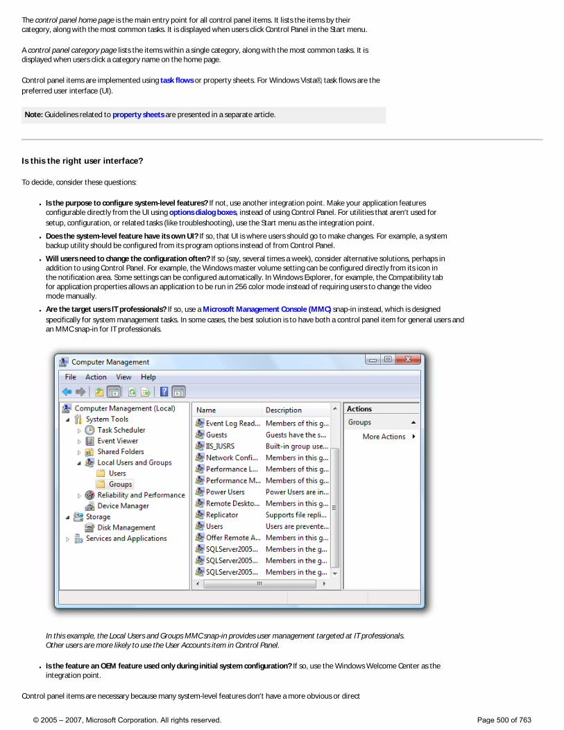
The control panel home page is the main entry point for all control panel items. It lists the items by their category, along with the most common tasks. It is displayed when users click Control Panel in the Start menu.
A control panel category page lists the items within a single category, along with the most common tasks. It is displayed when users click a category name on the home page.
Control panel items are implemented using task flows or property sheets. For Windows Vista®, task flows are the preferred user interface (UI).
Note: Guidelines related to property sheets are presented in a separate article.
Is this the right user interface?
To decide, consider these questions:
● Is the purpose to configure system-level features? If not, use another integration point. Make your application features configurable directly from the UI using options dialog boxes, instead of using Control Panel. For utilities that aren’t used for setup, configuration, or related tasks (like troubleshooting), use the Start menu as the integration point.
● Does the system-level feature have its own UI? If so, that UI is where users should go to make changes. For example, a system backup utility should be configured from its program options instead of from Control Panel.
● Will users need to change the configuration often? If so (say, several times a week), consider alternative solutions, perhaps in addition to using Control Panel. For example, the Windows master volume setting can be configured directly from its icon in the notification area. Some settings can be configured automatically. In Windows Explorer, for example, the Compatibility tab for application properties allows an application to be run in 256 color mode instead of requiring users to change the video mode manually.
● Are the target users IT professionals? If so, use a Microsoft Management Console (MMC) snap-in instead, which is designed specifically for system management tasks. In some cases, the best solution is to have both a control panel item for general users and an MMC snap-in for IT professionals.
In this example, the Local Users and Groups MMC snap-in provides user management targeted at IT professionals. Other users are more likely to use the User Accounts item in Control Panel.
● Is the feature an OEM feature used only during initial system configuration? If so, use the Windows Welcome Center as the integration point.
Control panel items are necessary because many system-level features don’t have a more obvious or direct
© 2005 – 2007, Microsoft Corporation. All rights reserved. Page 500 of 763
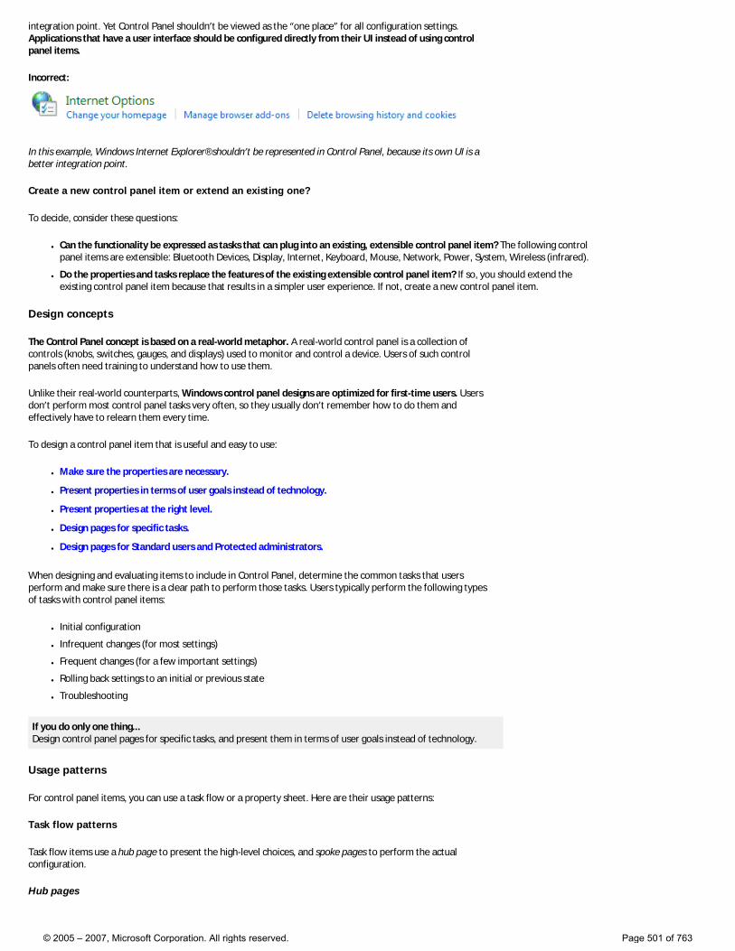
integration point. Yet Control Panel shouldn’t be viewed as the “one place” for all configuration settings. Applications that have a user interface should be configured directly from their UI instead of using control panel items.
Incorrect:
In this example, Windows Internet Explorer® shouldn’t be represented in Control Panel, because its own UI is a better integration point.
Create a new control panel item or extend an existing one?
To decide, consider these questions:
● Can the functionality be expressed as tasks that can plug into an existing, extensible control panel item? The following control panel items are extensible: Bluetooth Devices, Display, Internet, Keyboard, Mouse, Network, Power, System, Wireless (infrared).
● Do the properties and tasks replace the features of the existing extensible control panel item? If so, you should extend the existing control panel item because that results in a simpler user experience. If not, create a new control panel item.
Design concepts
The Control Panel concept is based on a real-world metaphor. A real-world control panel is a collection of controls (knobs, switches, gauges, and displays) used to monitor and control a device. Users of such control panels often need training to understand how to use them.
Unlike their real-world counterparts, Windows control panel designs are optimized for first-time users. Users don’t perform most control panel tasks very often, so they usually don’t remember how to do them and effectively have to relearn them every time.
To design a control panel item that is useful and easy to use:
● Make sure the properties are necessary.
● Present properties in terms of user goals instead of technology.
● Present properties at the right level.
● Design pages for specific tasks.
● Design pages for Standard users and Protected administrators.
When designing and evaluating items to include in Control Panel, determine the common tasks that users perform and make sure there is a clear path to perform those tasks. Users typically perform the following types of tasks with control panel items:
● Initial configuration
● Infrequent changes (for most settings)
● Frequent changes (for a few important settings)
● Rolling back settings to an initial or previous state
● Troubleshooting
If you do only one thing... Design control panel pages for specific tasks, and present them in terms of user goals instead of technology.
Usage patterns
For control panel items, you can use a task flow or a property sheet. Here are their usage patterns:
Task flow patterns
Task flow items use a hub page to present the high-level choices, and spoke pages to perform the actual configuration.
Hub pages
© 2005 – 2007, Microsoft Corporation. All rights reserved. Page 501 of 763
● Task-based hub pages. These hub pages present the most commonly used tasks. They are best used for a few commonly used or important tasks where users need more guidance and explanation. Hub pages don’t have commit buttons. Hybrid task-based hub pages also have some properties or commands directly on them. Hybrid hub pages are strongly recommended when users are most likely to use Control Panel to access those properties and commands.
● Object-based hub pages. These hub pages present the available objects. They are best used when there could be several objects. Hub pages don’t have commit buttons. There are two variations of this pattern:
�❍ The standard version is implemented using a standard list view control.
�❍ The hybrid version is an object-based hub page that also has some properties or commands directly on it. Hybrid hub pages are strongly recommended when users are most likely to use Control Panel to access those properties and commands.
Spoke pages
● Task pages. These spoke pages present a task or a step in a task with a specific, task-based main instruction. They are best used for tasks that benefit from additional guidance and explanation.
● Form pages. These spoke pages present a collection of related properties and tasks based on a general main instruction. They are best used for features that have many properties and benefit from a direct, single-page presentation, such as advanced properties.
Property sheet patterns
● Property sheets are best used in legacy items with many settings targeted at advanced users. New items can achieve the same effect with a task flow using the form page pattern.
For more information and examples, see Control Panel Patterns.
Guidelines
Property sheet control panel items
● Don’t use property sheets for new control panel items. Instead, use task flows to create a seamless experience and make full use of the categorization and search functionality of the control panel home page.
Task flow control panel items
General
● Keep the most important content and controls visible without scrolling. Users won’t scroll to see page content unless they have a reason to. You can make commit buttons always visible by placing them in a command area instead of the content area. Don’t break up pages just to avoid scrolling.
�❍ You can vertically scroll long pages, as long as the most important controls are visible without scrolling.
�❍ Don’t use horizontal scrolling. Instead, redesign the page content and use vertical scrolling. Pages may have horizontal scrollbars only when made very narrow.
● To navigate between pages: �❍ Use task links to start a task.
�❍ Use task links or a Next button to navigate to the next page in a multi-step task.
�❍ Use commit buttons to complete a task.
�❍ Use the Back button in the menu bar to return to previously viewed pages. Do not add a Back button to the command area.
�❍ Use the Address bar to return directly to the control panel home page.
�❍ Use See also links in the task pane to navigate to pages in other control panel items. Otherwise, navigation should stay within a single control panel item.
● Put only the control panel home page in the Address bar. Clicking that link returns to the control panel home page, abandoning any work in progress without a confirmation.
● Don’t put a Close command button on control panel pages. Users can close a control panel window using the Close button on the title bar.
Task links and buttons
● When a page has a small set of fixed options, use task links instead of a combination of radio buttons and a Next button. This allows users to select a response with a single click.
● You can put task links and buttons in the following places (in order of discoverability): �❍ The command area (for command buttons on spoke pages only).
�❍ The content area:
■ Command buttons
© 2005 – 2007, Microsoft Corporation. All rights reserved. Page 502 of 763
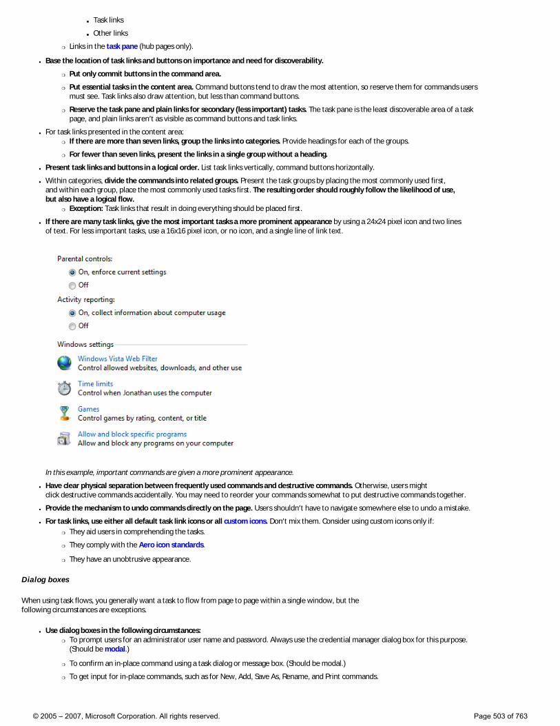
■ Task links
■ Other links
�❍ Links in the task pane (hub pages only).
● Base the location of task links and buttons on importance and need for discoverability.
�❍ Put only commit buttons in the command area.
�❍ Put essential tasks in the content area. Command buttons tend to draw the most attention, so reserve them for commands users must see. Task links also draw attention, but less than command buttons.
�❍ Reserve the task pane and plain links for secondary (less important) tasks. The task pane is the least discoverable area of a task page, and plain links aren’t as visible as command buttons and task links.
● For task links presented in the content area: �❍ If there are more than seven links, group the links into categories. Provide headings for each of the groups.
�❍ For fewer than seven links, present the links in a single group without a heading.
● Present task links and buttons in a logical order. List task links vertically, command buttons horizontally.
● Within categories, divide the commands into related groups. Present the task groups by placing the most commonly used first, and within each group, place the most commonly used tasks first. The resulting order should roughly follow the likelihood of use, but also have a logical flow.
�❍ Exception: Task links that result in doing everything should be placed first.
● If there are many task links, give the most important tasks a more prominent appearance by using a 24x24 pixel icon and two lines of text. For less important tasks, use a 16x16 pixel icon, or no icon, and a single line of link text.
In this example, important commands are given a more prominent appearance.
● Have clear physical separation between frequently used commands and destructive commands. Otherwise, users might click destructive commands accidentally. You may need to reorder your commands somewhat to put destructive commands together.
● Provide the mechanism to undo commands directly on the page. Users shouldn’t have to navigate somewhere else to undo a mistake.
● For task links, use either all default task link icons or all custom icons. Don’t mix them. Consider using custom icons only if: �❍ They aid users in comprehending the tasks.
�❍ They comply with the Aero icon standards.
�❍ They have an unobtrusive appearance.
Dialog boxes
When using task flows, you generally want a task to flow from page to page within a single window, but the following circumstances are exceptions.
● Use dialog boxes in the following circumstances: �❍ To prompt users for an administrator user name and password. Always use the credential manager dialog box for this purpose.
(Should be modal.)
�❍ To confirm an in-place command using a task dialog or message box. (Should be modal.)
�❍ To get input for in-place commands, such as for New, Add, Save As, Rename, and Print commands.
© 2005 – 2007, Microsoft Corporation. All rights reserved. Page 503 of 763
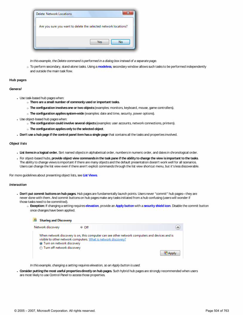
In this example, the Delete command is performed in a dialog box instead of a separate page.
�❍ To perform secondary, stand-alone tasks. Using a modeless, secondary window allows such tasks to be performed independently and outside the main task flow.
Hub pages
General
● Use task-based hub pages when: �❍ There are a small number of commonly used or important tasks.
�❍ The configuration involves one or two objects (examples: monitors, keyboard, mouse, game controllers).
�❍ The configuration applies system-wide (examples: date and time, security, power options).
● Use object-based hub pages when: �❍ The configuration could involve several objects (examples: user accounts, network connections, printers).
�❍ The configuration applies only to the selected object.
● Don’t use a hub page if the control panel item has a single page that contains all the tasks and properties involved.
Object lists
● List items in a logical order. Sort named objects in alphabetical order, numbers in numeric order, and dates in chronological order.
● For object-based hubs, provide object view commands in the task pane if the ability to change the view is important to the tasks. The ability to change views is important if there are many objects and the default presentation doesn’t work well for all scenarios. Users can change the list view even if there aren’t explicit commands through the list view shortcut menu, but it’s less discoverable.
For more guidelines about presenting object lists, see List Views.
Interaction
● Don’t put commit buttons on hub pages. Hub pages are fundamentally launch points. Users never “commit” hub pages—they are never done with them. And commit buttons on hub pages make any tasks initiated from a hub confusing (users will wonder if those tasks need to be committed).
�❍ Exception: If changing a setting requires elevation, provide an Apply button with a security shield icon. Disable the commit button once changes have been applied.
In this example, changing a setting requires elevation, so an Apply button is used.
● Consider putting the most useful properties directly on hub pages. Such hybrid hub pages are strongly recommended when users are most likely to use Control Panel to access those properties.
© 2005 – 2007, Microsoft Corporation. All rights reserved. Page 504 of 763
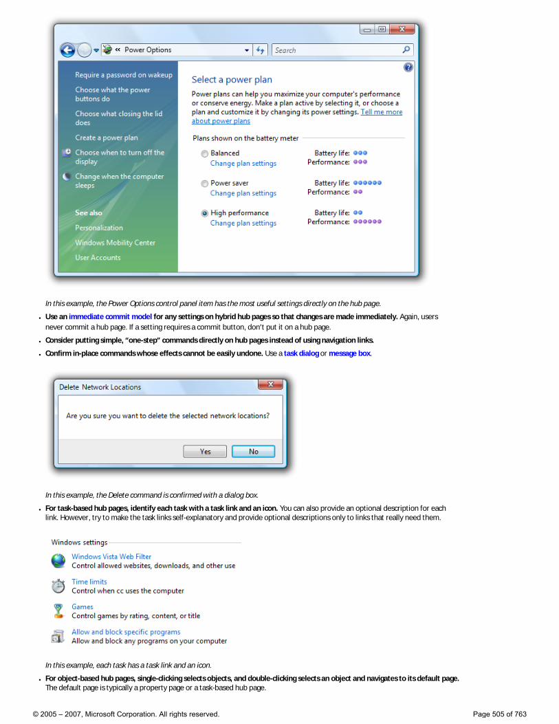
In this example, the Power Options control panel item has the most useful settings directly on the hub page.
● Use an immediate commit model for any settings on hybrid hub pages so that changes are made immediately. Again, users never commit a hub page. If a setting requires a commit button, don’t put it on a hub page.
● Consider putting simple, “one-step” commands directly on hub pages instead of using navigation links.
● Confirm in-place commands whose effects cannot be easily undone. Use a task dialog or message box.
In this example, the Delete command is confirmed with a dialog box.
● For task-based hub pages, identify each task with a task link and an icon. You can also provide an optional description for each link. However, try to make the task links self-explanatory and provide optional descriptions only to links that really need them.
In this example, each task has a task link and an icon.
● For object-based hub pages, single-clicking selects objects, and double-clicking selects an object and navigates to its default page. The default page is typically a property page or a task-based hub page.
© 2005 – 2007, Microsoft Corporation. All rights reserved. Page 505 of 763
● An object-based hub page may navigate to a task-based hub for the selected objects. However, such secondary hubs should be avoided because they make a control panel item feel too indirect.
Task panes
Use task panes to present links to commands, views, and related control panel items.
● For task panes in task-based hubs, present links in the following order: 1. Secondary commands. Present primary tasks only in the content area. Use the task pane for secondary, optional tasks. Consider a
task primary if users must discover it in important scenarios; secondary if it’s acceptable for users not to discover it.
2. See also. The optional links that navigate to related control panel items.
● For task panes in object-based hubs, present links in the following order: 1. Object views. The optional links used to control the presentation of the objects.
2. Fixed commands. The commands that are independent of the currently selected objects.
3. Contextual commands. The commands that depend on the currently selected objects, and are therefore not always displayed.
4. See also. The optional links that navigate to related control panel items.
● Don’t use task panes in spoke pages. Unlike hub pages, spoke pages should be focused on completing the task. You don’t want to encourage users to navigate away before completion.
See also links
● Provide See also links in the task pane to help users find related control panel items, or the right control panel item if they have the wrong one. Link to items users are likely to associate with your control panel item.
In this example, the Performance control panel item links to the Security Center and Problem Reports and Solutions items, because users are likely to want to perform tasks from those control panel items.
● Link to a specific task page if that is what users are more likely to recognize. Otherwise, link to the entire control panel item. Use the control panel name without adding the phrase, control panel.
Spoke pages
General
● Use task pages for commonly used or important tasks where users need more guidance and explanation.
● Use form pages for features that have many settings and benefit from a direct, single-page presentation. The ideal tasks for such pages typically involve obvious changes to a few simple properties.
● Don’t use task panes in spoke pages.
Interaction
● Try to limit main tasks to a single page. If more than one page is required, you can: �❍ Use intermediate spoke pages for additional or optional steps. Intermediate spoke pages are committed by the final spoke page.
�❍ Use independent windows for independent auxiliary tasks. Independent windows are committed on their own, and independently of the main task.
Doing so keeps the meaning of the commit buttons for the main task clear and unambiguous. Users should always be confident in understanding what they are committing to.
● Don’t use See Also links within a task flow. These link to related, but different, control panel items. Although navigating to a different item is acceptable in hub pages, it is not in spoke pages, because doing so interrupts the task.
● Don’t use spoke pages for simple input or confirmations. Use modal dialog boxes instead.
Interaction (intermediate spoke pages)
● Use task links or a Next button to navigate to the next page. The way to proceed to the next step should always be obvious.
● You can have navigation links to optional task steps. To avoid confusion when users commit to the task, those extra pages should be intermediate pages within the same control panel item. They shouldn’t have commit buttons, but should be committed when the main task is committed.
© 2005 – 2007, Microsoft Corporation. All rights reserved. Page 506 of 763
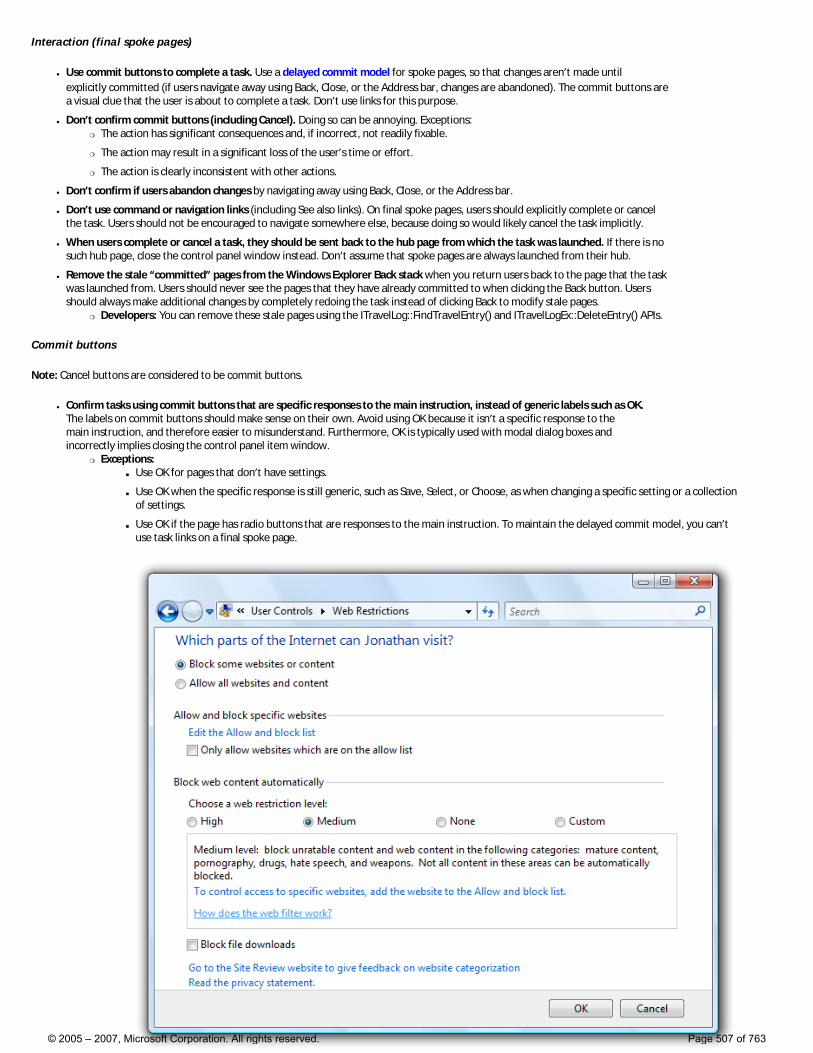
Interaction (final spoke pages)
● Use commit buttons to complete a task. Use a delayed commit model for spoke pages, so that changes aren’t made until explicitly committed (if users navigate away using Back, Close, or the Address bar, changes are abandoned). The commit buttons are a visual clue that the user is about to complete a task. Don’t use links for this purpose.
● Don’t confirm commit buttons (including Cancel). Doing so can be annoying. Exceptions: �❍ The action has significant consequences and, if incorrect, not readily fixable.
�❍ The action may result in a significant loss of the user’s time or effort.
�❍ The action is clearly inconsistent with other actions.
● Don’t confirm if users abandon changes by navigating away using Back, Close, or the Address bar.
● Don’t use command or navigation links (including See also links). On final spoke pages, users should explicitly complete or cancel the task. Users should not be encouraged to navigate somewhere else, because doing so would likely cancel the task implicitly.
● When users complete or cancel a task, they should be sent back to the hub page from which the task was launched. If there is no such hub page, close the control panel window instead. Don’t assume that spoke pages are always launched from their hub.
● Remove the stale “committed” pages from the Windows Explorer Back stack when you return users back to the page that the task was launched from. Users should never see the pages that they have already committed to when clicking the Back button. Users should always make additional changes by completely redoing the task instead of clicking Back to modify stale pages.
�❍ Developers: You can remove these stale pages using the ITravelLog::FindTravelEntry() and ITravelLogEx::DeleteEntry() APIs.
Commit buttons
Note: Cancel buttons are considered to be commit buttons.
● Confirm tasks using commit buttons that are specific responses to the main instruction, instead of generic labels such as OK. The labels on commit buttons should make sense on their own. Avoid using OK because it isn’t a specific response to the main instruction, and therefore easier to misunderstand. Furthermore, OK is typically used with modal dialog boxes and incorrectly implies closing the control panel item window.
�❍ Exceptions: ■ Use OK for pages that don’t have settings.
■ Use OK when the specific response is still generic, such as Save, Select, or Choose, as when changing a specific setting or a collection of settings.
■ Use OK if the page has radio buttons that are responses to the main instruction. To maintain the delayed commit model, you can’t use task links on a final spoke page.
© 2005 – 2007, Microsoft Corporation. All rights reserved. Page 507 of 763
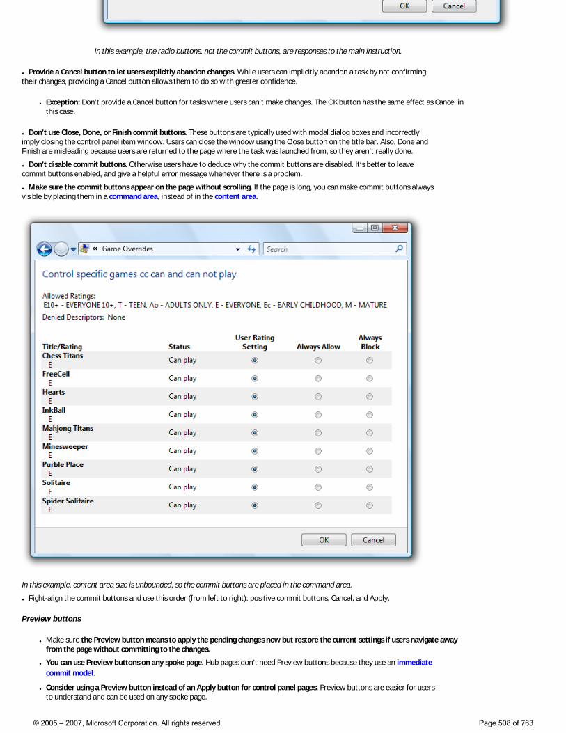
In this example, the radio buttons, not the commit buttons, are responses to the main instruction.
● Provide a Cancel button to let users explicitly abandon changes. While users can implicitly abandon a task by not confirming their changes, providing a Cancel button allows them to do so with greater confidence.
● Exception: Don’t provide a Cancel button for tasks where users can’t make changes. The OK button has the same effect as Cancel in this case.
● Don’t use Close, Done, or Finish commit buttons. These buttons are typically used with modal dialog boxes and incorrectly imply closing the control panel item window. Users can close the window using the Close button on the title bar. Also, Done and Finish are misleading because users are returned to the page where the task was launched from, so they aren’t really done.
● Don’t disable commit buttons. Otherwise users have to deduce why the commit buttons are disabled. It’s better to leave commit buttons enabled, and give a helpful error message whenever there is a problem.
● Make sure the commit buttons appear on the page without scrolling. If the page is long, you can make commit buttons always visible by placing them in a command area, instead of in the content area.
In this example, content area size is unbounded, so the commit buttons are placed in the command area.
● Right-align the commit buttons and use this order (from left to right): positive commit buttons, Cancel, and Apply.
Preview buttons
● Make sure the Preview button means to apply the pending changes now but restore the current settings if users navigate away from the page without committing to the changes.
● You can use Preview buttons on any spoke page. Hub pages don’t need Preview buttons because they use an immediate commit model.
● Consider using a Preview button instead of an Apply button for control panel pages. Preview buttons are easier for users to understand and can be used on any spoke page.
© 2005 – 2007, Microsoft Corporation. All rights reserved. Page 508 of 763
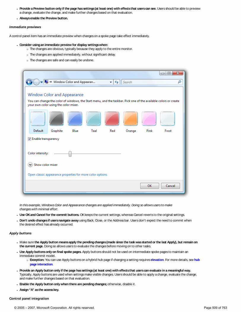
● Provide a Preview button only if the page has settings (at least one) with effects that users can see. Users should be able to preview a change, evaluate the change, and make further changes based on that evaluation.
● Always enable the Preview button.
Immediate previews
A control panel item has an immediate preview when changes on a spoke page take effect immediately.
● Consider using an immediate preview for display settings when: �❍ The changes are obvious, typically because they apply to the entire monitor.
�❍ The changes are applied immediately, without significant delay.
�❍ The changes are safe and can easily be undone.
In this example, Windows Color and Appearance changes are applied immediately. Doing so allows users to make changes with minimal effort.
● Use OK and Cancel for the commit buttons. OK keeps the current settings, whereas Cancel reverts to the original settings.
● Don’t undo changes if users navigate away using Back, Close, or the Address bar. Users don’t expect the need to commit when the desired effect has already occurred.
Apply buttons
● Make sure the Apply button means apply the pending changes (made since the task was started or the last Apply), but remain on the current page. Doing so allows users to evaluate the changes before moving on to other tasks.
● Use Apply buttons only on final spoke pages. Apply buttons should not be used on intermediate spoke pages to maintain an immediate commit model.
�❍ Exception: You can use Apply buttons on a hybrid hub page if changing a setting requires elevation. For more details, see hub page interaction.
● Provide an Apply button only if the page has settings (at least one) with effects that users can evaluate in a meaningful way. Typically, Apply buttons are used when settings make visible changes. Users should be able to apply a change, evaluate the change, and make further changes based on that evaluation.
● Enable the Apply button only when there are pending changes; otherwise, disable it.
● Assign “A” as the access key.
Control panel integration
© 2005 – 2007, Microsoft Corporation. All rights reserved. Page 509 of 763

To integrate your control panel item with Windows, you can:
● Register your control panel item (including its name, description, and icon), so that Windows is aware of it.
● Associate your control panel item with home page categories.
● Provide task links (including their name, description, keywords, and command line) to indicate primary tasks and allow users to navigate directly to them.
● Provide search terms to help users find your task links using the Control Panel Home Page search feature.
Note that you can provide this information only for new control panel items—you can’t add or change this information for control panel items that you extend.
Home page categories
● Associate your control panel item with the category under which users are most likely to look for it. This decision should be based on user testing. The following categories are available:
�❍ System and Maintenance
�❍ Security
�❍ Ease of Access
�❍ Network and Internet
�❍ Hardware and Sound
�❍ Programs
�❍ Mobile PC (visible only on mobile PCs)
�❍ User Accounts and Family Safety (or just User Accounts when parental controls isn’t available)
�❍ Appearance and Personalization
�❍ Clock, Language, and Region
�❍ Additional Options (if your item doesn’t logically fit anywhere else)
● Consider associating your control panel item with the second most likely category as well. You should associate a control panel item with two categories if users are likely to look for its main tasks in more than one place.
● Don’t associate your control panel item with more than two categories. The value of the categorization is undermined if control panel items appear in several categories.
Task links
● Associate your control panel item with its primary tasks. You can display up to five tasks on a Category page, but additional tasks are used for control panel searching. Use the same phrasing as you do for task links, possibly removing some words to make the task links more succinct.
● Prefer to have task links lead to different places in your control panel item. Having multiple links to the same place can be confusing.
Search terms
● Register search terms for your control panel item that users are most likely to use to describe it. These search terms should include: �❍ The features or objects configured.
�❍ The primary tasks.
These search terms should be based on user testing.
● Also include common synonyms for these search terms. For example, monitor and display are synonyms, so both words should be included.
● Include alternative spellings or word breaks. For example, users might search for either web site and website. Consider providing common misspellings as well.
● Consider singular vs. plural noun forms. The control panel search feature doesn’t automatically search for both forms; supply the forms for which users are likely to search.
● Use simple present tense verbs. If you register connect as a search term, the search feature won’t automatically look for connects, connecting, and connected.
● Don’t worry about case. The search feature is not case-sensitive.
Standard users and Protected administrators
Many settings require administrator privileges to change. If a process requires administrator privileges, Windows Vista requires Standard users and Protected administrators to elevate their privileges explicitly. Doing so helps prevent malicious code from running with administrator privileges.
For more information and examples, see User Account Control.
© 2005 – 2007, Microsoft Corporation. All rights reserved. Page 510 of 763
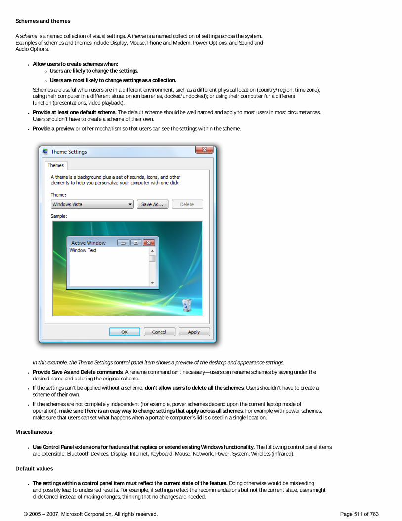
Schemes and themes
A scheme is a named collection of visual settings. A theme is a named collection of settings across the system. Examples of schemes and themes include Display, Mouse, Phone and Modem, Power Options, and Sound and Audio Options.
● Allow users to create schemes when: �❍ Users are likely to change the settings.
�❍ Users are most likely to change settings as a collection.
Schemes are useful when users are in a different environment, such as a different physical location (country/region, time zone); using their computer in a different situation (on batteries, docked/undocked); or using their computer for a different function (presentations, video playback).
● Provide at least one default scheme. The default scheme should be well named and apply to most users in most circumstances. Users shouldn’t have to create a scheme of their own.
● Provide a preview or other mechanism so that users can see the settings within the scheme.
In this example, the Theme Settings control panel item shows a preview of the desktop and appearance settings.
● Provide Save As and Delete commands. A rename command isn’t necessary—users can rename schemes by saving under the desired name and deleting the original scheme.
● If the settings can’t be applied without a scheme, don’t allow users to delete all the schemes. Users shouldn’t have to create a scheme of their own.
● If the schemes are not completely independent (for example, power schemes depend upon the current laptop mode of operation), make sure there is an easy way to change settings that apply across all schemes. For example with power schemes, make sure that users can set what happens when a portable computer’s lid is closed in a single location.
Miscellaneous
● Use Control Panel extensions for features that replace or extend existing Windows functionality. The following control panel items are extensible: Bluetooth Devices, Display, Internet, Keyboard, Mouse, Network, Power, System, Wireless (infrared).
Default values
● The settings within a control panel item must reflect the current state of the feature. Doing otherwise would be misleading and possibly lead to undesired results. For example, if settings reflect the recommendations but not the current state, users might click Cancel instead of making changes, thinking that no changes are needed.
© 2005 – 2007, Microsoft Corporation. All rights reserved. Page 511 of 763
● Choose the safest (to prevent loss of data or system access) and most secure initial state. Assume that most users won’t change the settings.
● If safety and security aren’t factors, choose the initial state that is most likely or convenient.
Text
Item names
● Choose a descriptive name that clearly communicates and differentiates what the control panel item does. Most names describe the Windows feature or object being configured, and are displayed in the Classic View of the control panel home page.
● Don’t include the words “Settings,” “Options,” “Properties,” or “Configuration” in the name. This is implied, and leaving it off makes it easier for users to scan.
Incorrect: Accessibility Options Modem Settings Power Options Regional and Language Options Correct: Accessibility Modem Power Regional Formats and Languages
In the correct examples, unnecessary words are removed.
● If the control panel item configures related features, list only those features required to identify the item, and list the features the most likely to be recognized or used first.
Incorrect: Folder Options Phone and Modem Options Correct: Files and Folders Modem
In the correct examples, the primary control panel item features are given emphasis.
● Use title-style capitalization.
Title page
● Use the control panel item name for the title.
Task link text
The following guidelines apply to links to task pages, such as Category page task links and See also links.
● Choose concise task names that clearly communicate and differentiate the task. Users shouldn’t have to figure out what the task really means or how it differs from other tasks.
Incorrect: Adjust display settings Correct: Screen resolution
In the correct example, the wording conveys more precision.
● Retain similar language between task links and the pages they point to. Users shouldn’t be surprised by the page that is displayed by a link.
● For task pages, design the main instruction, commit buttons, and task links as a related set of text.
Examples:
Task link: Connect to a wireless network
Main instruction: Choose a network to connect to
Commit button: Connect
© 2005 – 2007, Microsoft Corporation. All rights reserved. Page 512 of 763

Task link: Set up parental controls
Main instruction: Choose a user and set up parental controls
Commit button: Apply parental control
Task link: Resolve your sync conflicts
Main instruction: How do you want to resolve this conflict?
Commit button: Resolve
These examples show the relationship of the task link text, main instruction, and commit button text.
● While tasks often start with verbs, consider omitting the verb on Category pages if it is a generic, configuration-related verb that doesn’t help communicate the task.
Specific, helpful verbs: Add Check Connect Copy Create Delete Disconnect Install Remove Set up Start Stop Troubleshoot Generic, unhelpful verbs: Adjust Change Choose Configure Edit Manage Open Pick Set Select Show View
● If the task configures several related features, list only the features that are representative of the set. Omit details that can be readily inferred.
Incorrect: Speaker volume, mute, volume icon Speakers, microphones, MIDI, and sound schemes Correct: Speaker volume Speakers and microphones
In the correct examples, only the representative features are given in the task link.
● You should phrase tasks in terms of technology only if target users would do so as well.
Incorrect: Connectoids Pixel depth DPI Correct: Printers Scanners Mouse
The correct examples are technology-based terms that target users are likely to use, whereas the incorrect examples are not.
● Use plural nouns only if the system can support more than one.
● Use sentence-style capitalization.
● Don’t use ending punctuation.
© 2005 – 2007, Microsoft Corporation. All rights reserved. Page 513 of 763
Main instructions
● For the hub page, use the main instruction to explain the user’s objective with the control panel item. The main instruction should help users determine if they have selected the right control panel item. Keep in mind that users might have selected your control panel item in error and are actually looking for settings that are part of another control panel item.
Examples: Keep your computer secure and up-to-date Optimize your computer so it’s easier to see, hear, and control
● For spoke pages, use the main instruction to explain what to do on the page. The instruction should be a specific statement, imperative direction, or question. Good instructions communicate the user’s objective with the page rather than focusing purely on the mechanics of manipulating it.
Incorrect: Pick a notification task Correct: Indicate how to handle incoming information
The correct version better communicates the goal achieved by the page.
● Use specific verbs whenever possible. Specific verbs are more meaningful to users than generic ones.
● Use sentence-style capitalization.
● Don’t include final periods if the instruction is a statement. If the instruction is a question, include a final question mark.
Supplemental instructions
● For the hub page, use the optional supplemental instruction to further explain the purpose of the control panel item.
● For spoke pages, use the optional supplemental instruction to present additional information helpful to understanding or using the page. You can provide more detailed information and define terminology.
● Use complete sentences and sentence-style capitalization.
Page text
● Don’t restate the main instruction in the content area.
● Use the word “page” to refer to the page itself.
● Use the second person (you, your) to tell users what to do in the main instruction and content area. Often the second person is implied.
Example: Choose the pictures you want to print.
● Use the first person (I, me, my) to let users tell the control panel item what to do in the content area that responds to the main instruction.
Example: Print the photos on my camera.
Task links
● Choose concise link text that clearly communicates and differentiates what the task link does. It should be self-explanatory and correspond to the main instruction. Users shouldn’t have to figure out what the link really means or how it differs from other links.
● Always start task links with a verb.
● Use sentence-style capitalization.
● Don’t use ending punctuation.
● If the task link requires further explanation, provide the explanation in a separate text control using complete sentences and ending punctuation. However, add such explanations only when needed—don’t add explanations to all task links because another task link needs one.
For more information and examples, see Links.
Commit buttons
● Use specific commit button labels that make sense on their own and match the main instruction. Ideally users shouldn’t have to read anything else to understand the label. Users are far more likely to read command button labels than static text.
© 2005 – 2007, Microsoft Corporation. All rights reserved. Page 514 of 763
● Always start commit button labels with a verb.
● Don’t use Close, Done, or Finish. These button labels are better suited for other types of windows.
● Use sentence-style capitalization.
● Don’t use ending punctuation.
● Assign a unique access key. �❍ Exception: Don’t assign access keys to Cancel buttons, because Esc is its access key. Doing so makes the other access keys easier
to assign.
Documentation
When referring to the control panel home page or category pages:
● In user documentation, refer to Control Panel, using title-style capitalization and omitting a preceding definite article the.
Example: In Control Panel, open Security Center.
● In programming and other technical documentation, refer to control panel home page and control panel category page, without capitalizing any of the words. A preceding definite article is optional.
For control panel items:
● When referring to an individual control panel item, use “[control panel item name] in Control Panel” or generally “Control Panel item” in user documentation. Don’t use applet, program, or control panel to refer to individual control panel items.
● When referring to a control panel item’s hub page, use “main [control panel item name] page.”
● When possible, format the control panel name using bold text. Otherwise, put the name in quotation marks only if required to prevent confusion.
Examples:
● In Control Panel, open Parental Controls.
● Return to the main Parental Controls page.
© 2005 – 2007, Microsoft Corporation. All rights reserved. Page 515 of 763
Control Panel Usage Patterns
Control Panels
For items in Control Panel, you can use a task flow or a property sheet. Here are their usage patterns:
Task flow patterns
Task flow items use a hub page to present the high-level choices, and spoke pages to perform the actual configuration. There are several possible hub and spoke combinations:
A hub with task-based spoke pages In this case, the item is composed completely of individual tasks.
A hub with task-based and form-based spoke pages In this case, the task-based spoke pages are used for the most common and important tasks, and the form-based spoke page is used to configure the less common, less important, more advanced properties.
Note: Using only task-based spoke pages might make an item bloated and tedious to use; consider using form-based pages when task-based spokes don’t work well for all of your properties.
An object-based hub without spokes In this case, an object-based hub page has all the properties and tasks in place (perhaps using dialog boxes for simple input), so no spoke pages are required.
A form-based spoke page without a hub In this case, the form contains all the tasks and properties involved, so no hub page is required.
Task-based hub pages
These hub pages present the most commonly used tasks. Clicking a task link navigates users to a spoke page to configure system features and perform related tasks. They are best used for a few common or important tasks, where users need more guidance and explanation. The configuration should be system wide (examples: date and time, security, power options), and there should typically be one or two objects involved (examples: monitors, keyboard, mouse, game controllers). Hub pages don’t have commit buttons.
The hybrid version is a task-based hub page that also has some properties or commands directly on it. Hybrid hub pages are strongly recommended when users are most likely to use the item to access those properties and commands.
© 2005 – 2007, Microsoft Corporation. All rights reserved. Page 516 of 763
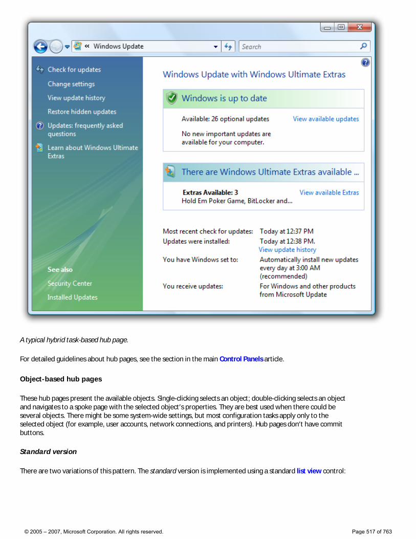
A typical hybrid task-based hub page.
For detailed guidelines about hub pages, see the section in the main Control Panels article.
Object-based hub pages
These hub pages present the available objects. Single-clicking selects an object; double-clicking selects an object and navigates to a spoke page with the selected object’s properties. They are best used when there could be several objects. There might be some system-wide settings, but most configuration tasks apply only to the selected object (for example, user accounts, network connections, and printers). Hub pages don’t have commit buttons.
Standard version
There are two variations of this pattern. The standard version is implemented using a standard list view control:
© 2005 – 2007, Microsoft Corporation. All rights reserved. Page 517 of 763
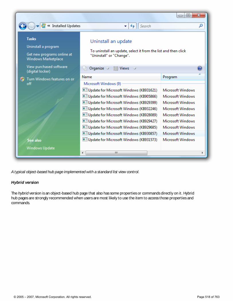
A typical object-based hub page implemented with a standard list view control.
Hybrid version
The hybrid version is an object-based hub page that also has some properties or commands directly on it. Hybrid hub pages are strongly recommended when users are most likely to use the item to access those properties and commands.
© 2005 – 2007, Microsoft Corporation. All rights reserved. Page 518 of 763
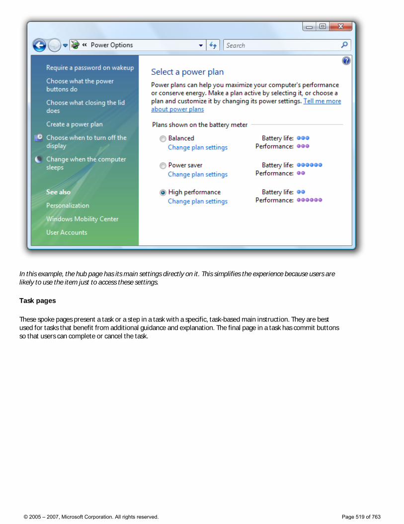
In this example, the hub page has its main settings directly on it. This simplifies the experience because users are likely to use the item just to access these settings.
Task pages
These spoke pages present a task or a step in a task with a specific, task-based main instruction. They are best used for tasks that benefit from additional guidance and explanation. The final page in a task has commit buttons so that users can complete or cancel the task.
© 2005 – 2007, Microsoft Corporation. All rights reserved. Page 519 of 763
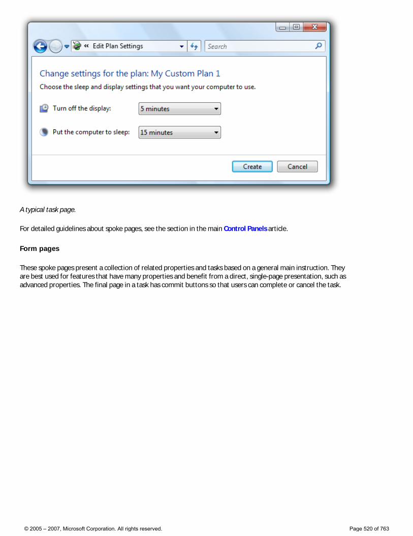
A typical task page.
For detailed guidelines about spoke pages, see the section in the main Control Panels article.
Form pages
These spoke pages present a collection of related properties and tasks based on a general main instruction. They are best used for features that have many properties and benefit from a direct, single-page presentation, such as advanced properties. The final page in a task has commit buttons so that users can complete or cancel the task.
© 2005 – 2007, Microsoft Corporation. All rights reserved. Page 520 of 763
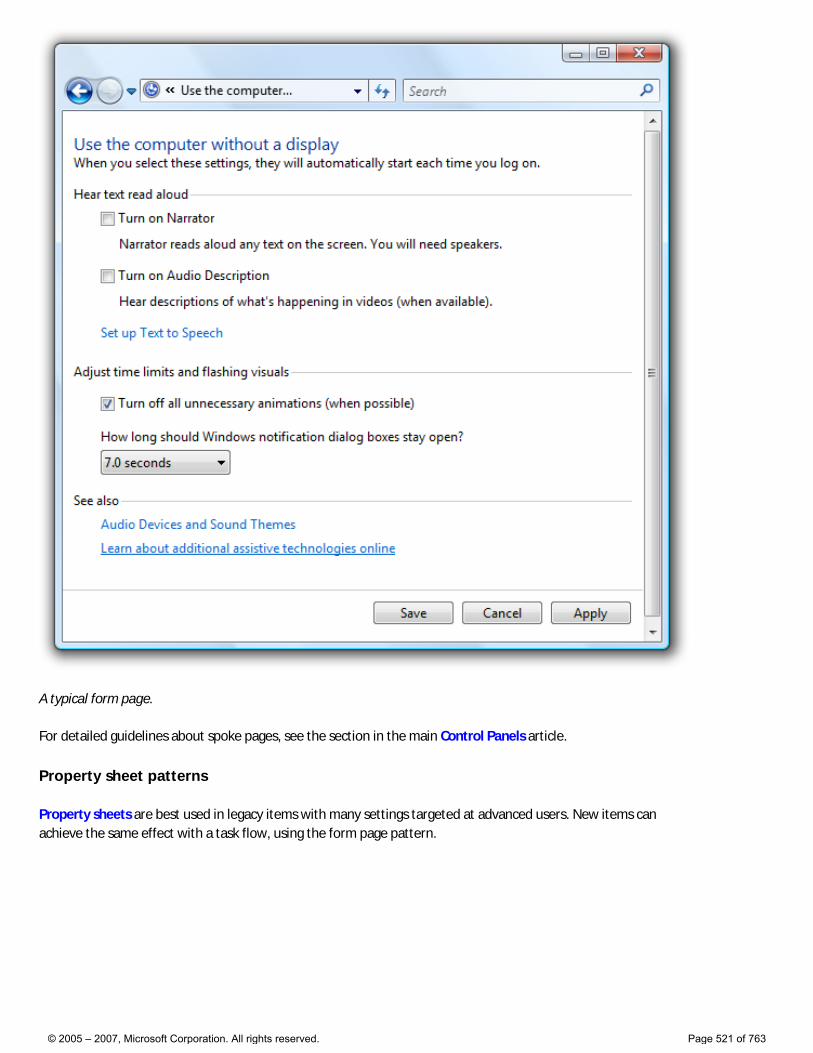
A typical form page.
For detailed guidelines about spoke pages, see the section in the main Control Panels article.
Property sheet patterns
Property sheets are best used in legacy items with many settings targeted at advanced users. New items can achieve the same effect with a task flow, using the form page pattern.
© 2005 – 2007, Microsoft Corporation. All rights reserved. Page 521 of 763
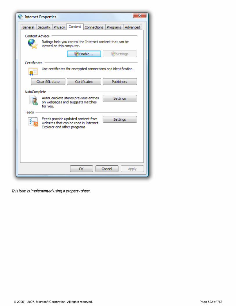
This item is implemented using a property sheet.
© 2005 – 2007, Microsoft Corporation. All rights reserved. Page 522 of 763
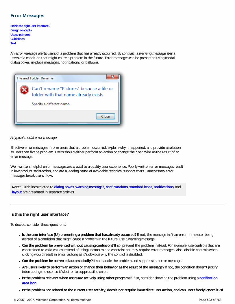
Error Messages
Is this the right user interface? Design concepts Usage patterns Guidelines Text
An error message alerts users of a problem that has already occurred. By contrast, a warning message alerts users of a condition that might cause a problem in the future. Error messages can be presented using modal dialog boxes, in-place messages, notifications, or balloons.
A typical modal error message.
Effective error messages inform users that a problem occurred, explain why it happened, and provide a solution so users can fix the problem. Users should either perform an action or change their behavior as the result of an error message.
Well-written, helpful error messages are crucial to a quality user experience. Poorly written error messages result in low product satisfaction, and are a leading cause of avoidable technical support costs. Unnecessary error messages break users’ flow.
Note: Guidelines related to dialog boxes, warning messages, confirmations, standard icons, notifications, and layout are presented in separate articles.
Is this the right user interface?
To decide, consider these questions:
● Is the user interface (UI) presenting a problem that has already occurred? If not, the message isn’t an error. If the user being alerted of a condition that might cause a problem in the future, use a warning message.
● Can the problem be prevented without causing confusion? If so, prevent the problem instead. For example, use controls that are constrained to valid values instead of using unconstrained controls that may require error messages. Also, disable controls when clicking would result in error, as long as it’s obvious why the control is disabled.
● Can the problem be corrected automatically? If so, handle the problem and suppress the error message.
● Are users likely to perform an action or change their behavior as the result of the message? If not, the condition doesn’t justify interrupting the user so it’s better to suppress the error.
● Is the problem relevant when users are actively using other programs? If so, consider showing the problem using a notification area icon.
● Is the problem not related to the current user activity, does it not require immediate user action, and can users freely ignore it? If
© 2005 – 2007, Microsoft Corporation. All rights reserved. Page 523 of 763
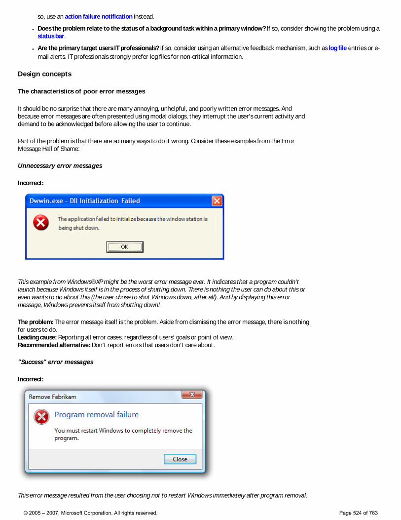
so, use an action failure notification instead.
● Does the problem relate to the status of a background task within a primary window? If so, consider showing the problem using a status bar.
● Are the primary target users IT professionals? If so, consider using an alternative feedback mechanism, such as log file entries or e-mail alerts. IT professionals strongly prefer log files for non-critical information.
Design concepts
The characteristics of poor error messages
It should be no surprise that there are many annoying, unhelpful, and poorly written error messages. And because error messages are often presented using modal dialogs, they interrupt the user’s current activity and demand to be acknowledged before allowing the user to continue.
Part of the problem is that there are so many ways to do it wrong. Consider these examples from the Error Message Hall of Shame:
Unnecessary error messages
Incorrect:
This example from Windows® XP might be the worst error message ever. It indicates that a program couldn’t launch because Windows itself is in the process of shutting down. There is nothing the user can do about this or even wants to do about this (the user chose to shut Windows down, after all). And by displaying this error message, Windows prevents itself from shutting down!
The problem: The error message itself is the problem. Aside from dismissing the error message, there is nothing for users to do. Leading cause: Reporting all error cases, regardless of users’ goals or point of view. Recommended alternative: Don’t report errors that users don’t care about.
“Success” error messages
Incorrect:
This error message resulted from the user choosing not to restart Windows immediately after program removal.
© 2005 – 2007, Microsoft Corporation. All rights reserved. Page 524 of 763

The program removal was successful from the user’s point of view.
The problem: There’s no error from the user’s point of view. Aside from dismissing the error message, there is nothing for users to do. Leading cause: The task completed successfully from the user’s point of view, but failed from the uninstall program’s point of view. Recommended alternative: Don’t report errors for conditions that users consider acceptable.
Completely useless error messages
Incorrect:
Users learn that there was an error, but have no idea what the error was or what to do about it. And no, it’s not OK!
The problem: The error message doesn’t give a specific problem and there is nothing users can do about it. Leading cause: Most likely, the program has poor error handling. Recommended alternative: Design good error handling into the program.
Incomprehensible error messages
Incorrect:
In this example, the problem statement is clear, but the supplemental explanation is utterly baffling.
The problem: The problem statement or solution is incomprehensible. Leading cause: Explaining the problem from the code’s point of view instead of the user’s. Recommended alternative: Write error message text that your target users can easily understand. Provide solutions that users can actually perform. Design your program’s error message experience—don’t have
© 2005 – 2007, Microsoft Corporation. All rights reserved. Page 525 of 763
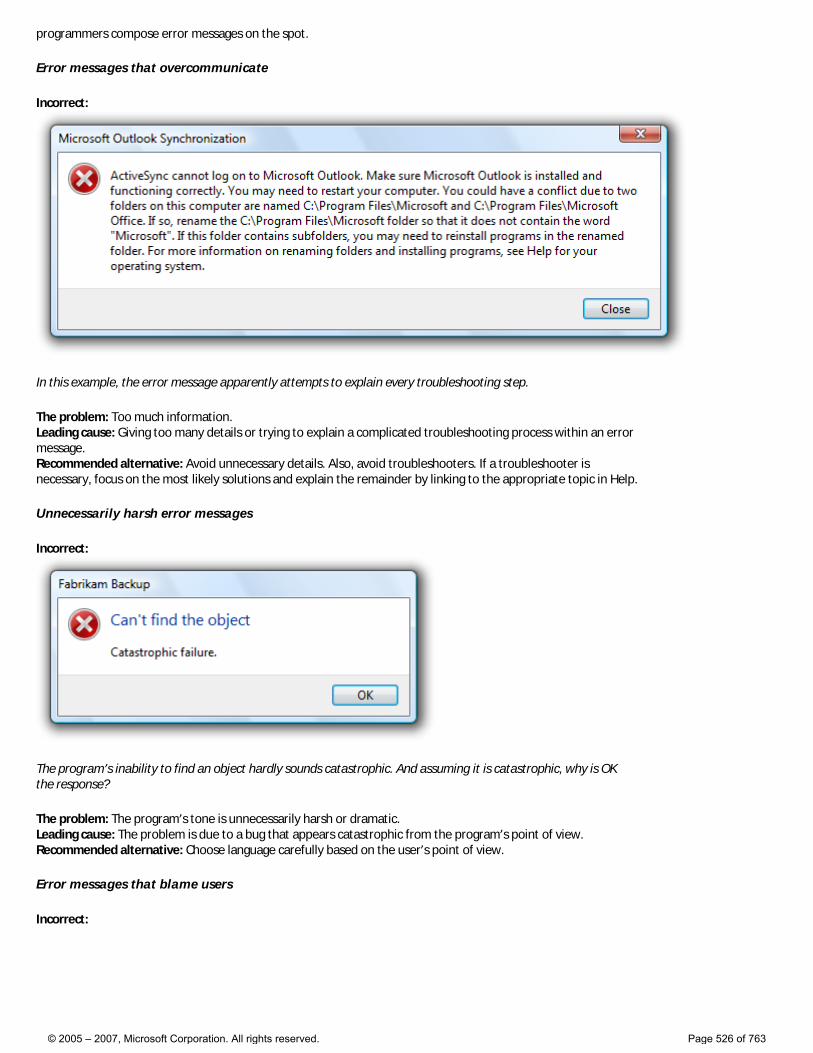
programmers compose error messages on the spot.
Error messages that overcommunicate
Incorrect:
In this example, the error message apparently attempts to explain every troubleshooting step.
The problem: Too much information. Leading cause: Giving too many details or trying to explain a complicated troubleshooting process within an error message. Recommended alternative: Avoid unnecessary details. Also, avoid troubleshooters. If a troubleshooter is necessary, focus on the most likely solutions and explain the remainder by linking to the appropriate topic in Help.
Unnecessarily harsh error messages
Incorrect:
The program’s inability to find an object hardly sounds catastrophic. And assuming it is catastrophic, why is OK the response?
The problem: The program’s tone is unnecessarily harsh or dramatic. Leading cause: The problem is due to a bug that appears catastrophic from the program’s point of view. Recommended alternative: Choose language carefully based on the user’s point of view.
Error messages that blame users
Incorrect:
© 2005 – 2007, Microsoft Corporation. All rights reserved. Page 526 of 763
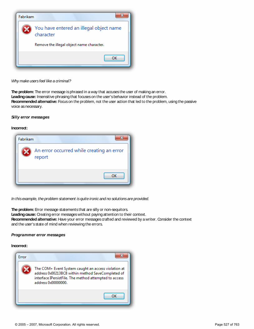
Why make users feel like a criminal?
The problem: The error message is phrased in a way that accuses the user of making an error. Leading cause: Insensitive phrasing that focuses on the user’s behavior instead of the problem. Recommended alternative: Focus on the problem, not the user action that led to the problem, using the passive voice as necessary.
Silly error messages
Incorrect:
In this example, the problem statement is quite ironic and no solutions are provided.
The problem: Error message statements that are silly or non-sequitors. Leading cause: Creating error messages without paying attention to their context. Recommended alternative: Have your error messages crafted and reviewed by a writer. Consider the context and the user’s state of mind when reviewing the errors.
Programmer error messages
Incorrect:
© 2005 – 2007, Microsoft Corporation. All rights reserved. Page 527 of 763
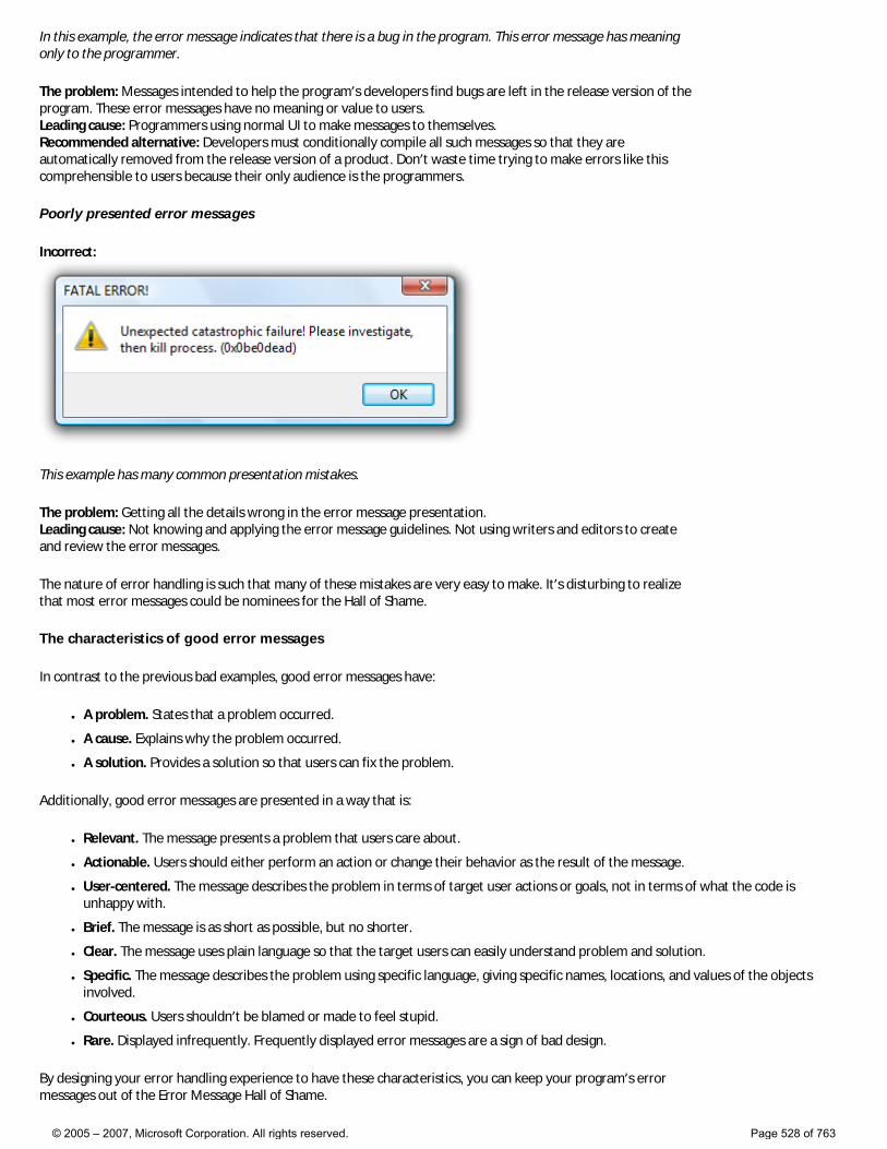
In this example, the error message indicates that there is a bug in the program. This error message has meaning only to the programmer.
The problem: Messages intended to help the program’s developers find bugs are left in the release version of the program. These error messages have no meaning or value to users. Leading cause: Programmers using normal UI to make messages to themselves. Recommended alternative: Developers must conditionally compile all such messages so that they are automatically removed from the release version of a product. Don’t waste time trying to make errors like this comprehensible to users because their only audience is the programmers.
Poorly presented error messages
Incorrect:
This example has many common presentation mistakes.
The problem: Getting all the details wrong in the error message presentation. Leading cause: Not knowing and applying the error message guidelines. Not using writers and editors to create and review the error messages.
The nature of error handling is such that many of these mistakes are very easy to make. It’s disturbing to realize that most error messages could be nominees for the Hall of Shame.
The characteristics of good error messages
In contrast to the previous bad examples, good error messages have:
● A problem. States that a problem occurred.
● A cause. Explains why the problem occurred.
● A solution. Provides a solution so that users can fix the problem.
Additionally, good error messages are presented in a way that is:
● Relevant. The message presents a problem that users care about.
● Actionable. Users should either perform an action or change their behavior as the result of the message.
● User-centered. The message describes the problem in terms of target user actions or goals, not in terms of what the code is unhappy with.
● Brief. The message is as short as possible, but no shorter.
● Clear. The message uses plain language so that the target users can easily understand problem and solution.
● Specific. The message describes the problem using specific language, giving specific names, locations, and values of the objects involved.
● Courteous. Users shouldn’t be blamed or made to feel stupid.
● Rare. Displayed infrequently. Frequently displayed error messages are a sign of bad design.
By designing your error handling experience to have these characteristics, you can keep your program’s error messages out of the Error Message Hall of Shame.
© 2005 – 2007, Microsoft Corporation. All rights reserved. Page 528 of 763
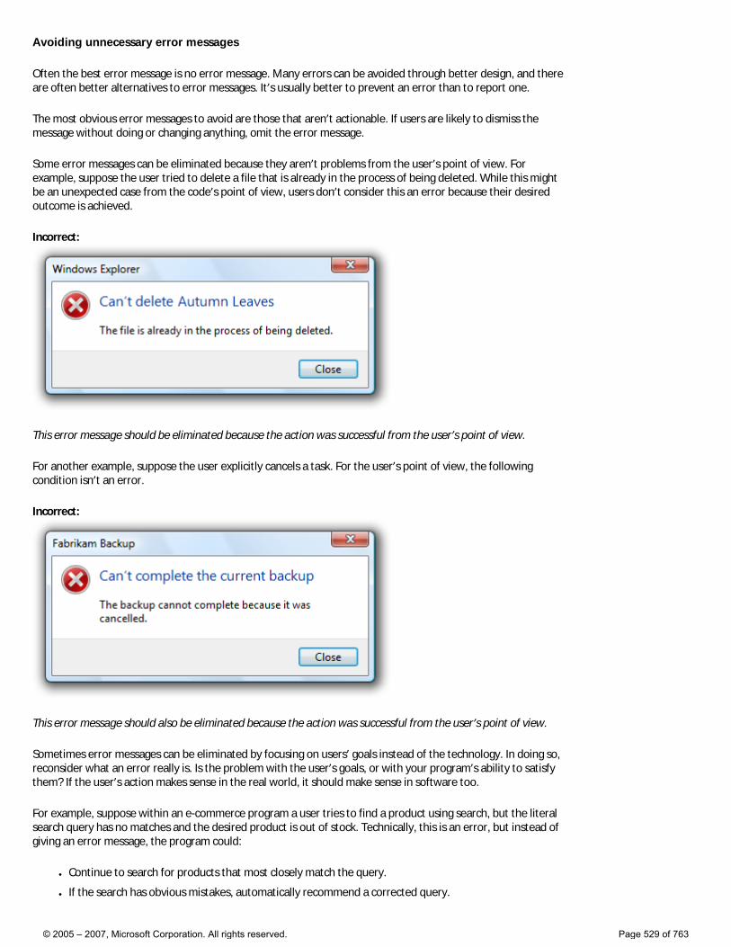
Avoiding unnecessary error messages
Often the best error message is no error message. Many errors can be avoided through better design, and there are often better alternatives to error messages. It’s usually better to prevent an error than to report one.
The most obvious error messages to avoid are those that aren’t actionable. If users are likely to dismiss the message without doing or changing anything, omit the error message.
Some error messages can be eliminated because they aren’t problems from the user’s point of view. For example, suppose the user tried to delete a file that is already in the process of being deleted. While this might be an unexpected case from the code’s point of view, users don’t consider this an error because their desired outcome is achieved.
Incorrect:
This error message should be eliminated because the action was successful from the user’s point of view.
For another example, suppose the user explicitly cancels a task. For the user’s point of view, the following condition isn’t an error.
Incorrect:
This error message should also be eliminated because the action was successful from the user’s point of view.
Sometimes error messages can be eliminated by focusing on users’ goals instead of the technology. In doing so, reconsider what an error really is. Is the problem with the user’s goals, or with your program’s ability to satisfy them? If the user’s action makes sense in the real world, it should make sense in software too.
For example, suppose within an e-commerce program a user tries to find a product using search, but the literal search query has no matches and the desired product is out of stock. Technically, this is an error, but instead of giving an error message, the program could:
● Continue to search for products that most closely match the query.
● If the search has obvious mistakes, automatically recommend a corrected query.
© 2005 – 2007, Microsoft Corporation. All rights reserved. Page 529 of 763
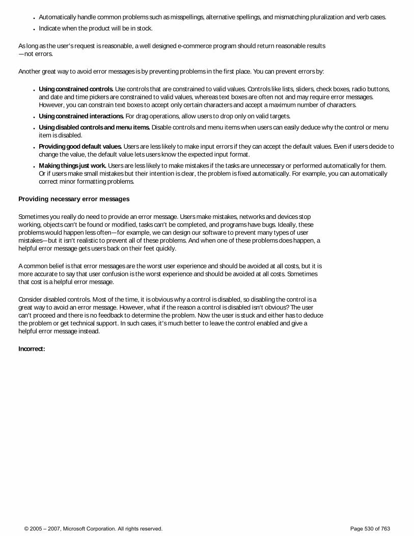
● Automatically handle common problems such as misspellings, alternative spellings, and mismatching pluralization and verb cases.
● Indicate when the product will be in stock.
As long as the user’s request is reasonable, a well designed e-commerce program should return reasonable results—not errors.
Another great way to avoid error messages is by preventing problems in the first place. You can prevent errors by:
● Using constrained controls. Use controls that are constrained to valid values. Controls like lists, sliders, check boxes, radio buttons, and date and time pickers are constrained to valid values, whereas text boxes are often not and may require error messages. However, you can constrain text boxes to accept only certain characters and accept a maximum number of characters.
● Using constrained interactions. For drag operations, allow users to drop only on valid targets.
● Using disabled controls and menu items. Disable controls and menu items when users can easily deduce why the control or menu item is disabled.
● Providing good default values. Users are less likely to make input errors if they can accept the default values. Even if users decide to change the value, the default value lets users know the expected input format.
● Making things just work. Users are less likely to make mistakes if the tasks are unnecessary or performed automatically for them. Or if users make small mistakes but their intention is clear, the problem is fixed automatically. For example, you can automatically correct minor formatting problems.
Providing necessary error messages
Sometimes you really do need to provide an error message. Users make mistakes, networks and devices stop working, objects can’t be found or modified, tasks can’t be completed, and programs have bugs. Ideally, these problems would happen less often—for example, we can design our software to prevent many types of user mistakes—but it isn’t realistic to prevent all of these problems. And when one of these problems does happen, a helpful error message gets users back on their feet quickly.
A common belief is that error messages are the worst user experience and should be avoided at all costs, but it is more accurate to say that user confusion is the worst experience and should be avoided at all costs. Sometimes that cost is a helpful error message.
Consider disabled controls. Most of the time, it is obvious why a control is disabled, so disabling the control is a great way to avoid an error message. However, what if the reason a control is disabled isn’t obvious? The user can’t proceed and there is no feedback to determine the problem. Now the user is stuck and either has to deduce the problem or get technical support. In such cases, it’s much better to leave the control enabled and give a helpful error message instead.
Incorrect:
© 2005 – 2007, Microsoft Corporation. All rights reserved. Page 530 of 763
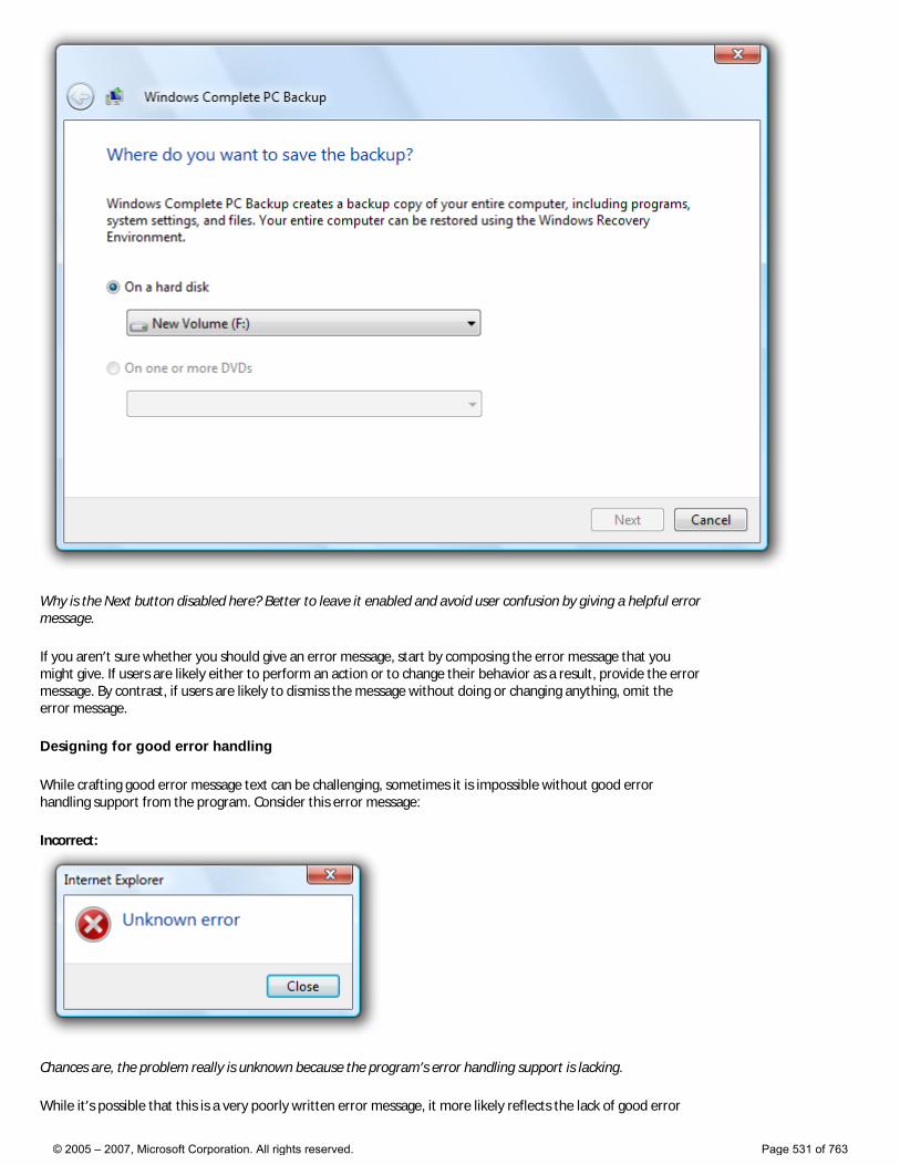
Why is the Next button disabled here? Better to leave it enabled and avoid user confusion by giving a helpful error message.
If you aren’t sure whether you should give an error message, start by composing the error message that you might give. If users are likely either to perform an action or to change their behavior as a result, provide the error message. By contrast, if users are likely to dismiss the message without doing or changing anything, omit the error message.
Designing for good error handling
While crafting good error message text can be challenging, sometimes it is impossible without good error handling support from the program. Consider this error message:
Incorrect:
Chances are, the problem really is unknown because the program’s error handling support is lacking.
While it’s possible that this is a very poorly written error message, it more likely reflects the lack of good error
© 2005 – 2007, Microsoft Corporation. All rights reserved. Page 531 of 763
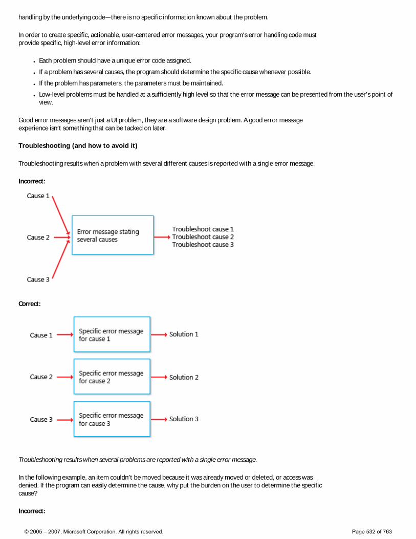
handling by the underlying code—there is no specific information known about the problem.
In order to create specific, actionable, user-centered error messages, your program’s error handling code must provide specific, high-level error information:
● Each problem should have a unique error code assigned.
● If a problem has several causes, the program should determine the specific cause whenever possible.
● If the problem has parameters, the parameters must be maintained.
● Low-level problems must be handled at a sufficiently high level so that the error message can be presented from the user’s point of view.
Good error messages aren’t just a UI problem, they are a software design problem. A good error message experience isn’t something that can be tacked on later.
Troubleshooting (and how to avoid it)
Troubleshooting results when a problem with several different causes is reported with a single error message.
Incorrect:
Correct:
Troubleshooting results when several problems are reported with a single error message.
In the following example, an item couldn’t be moved because it was already moved or deleted, or access was denied. If the program can easily determine the cause, why put the burden on the user to determine the specific cause?
Incorrect:
© 2005 – 2007, Microsoft Corporation. All rights reserved. Page 532 of 763
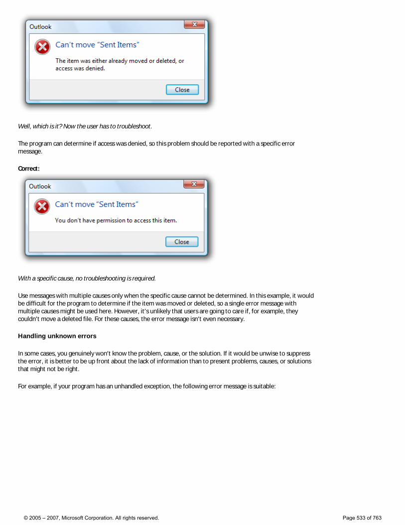
Well, which is it? Now the user has to troubleshoot.
The program can determine if access was denied, so this problem should be reported with a specific error message.
Correct:
With a specific cause, no troubleshooting is required.
Use messages with multiple causes only when the specific cause cannot be determined. In this example, it would be difficult for the program to determine if the item was moved or deleted, so a single error message with multiple causes might be used here. However, it’s unlikely that users are going to care if, for example, they couldn’t move a deleted file. For these causes, the error message isn’t even necessary.
Handling unknown errors
In some cases, you genuinely won’t know the problem, cause, or the solution. If it would be unwise to suppress the error, it is better to be up front about the lack of information than to present problems, causes, or solutions that might not be right.
For example, if your program has an unhandled exception, the following error message is suitable:
© 2005 – 2007, Microsoft Corporation. All rights reserved. Page 533 of 763
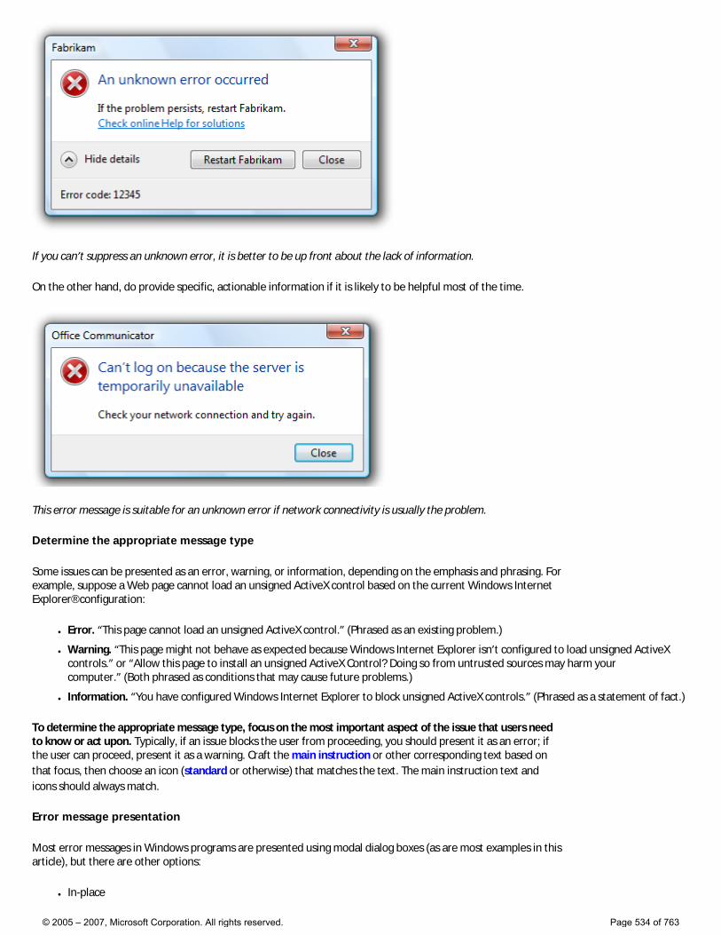
If you can’t suppress an unknown error, it is better to be up front about the lack of information.
On the other hand, do provide specific, actionable information if it is likely to be helpful most of the time.
This error message is suitable for an unknown error if network connectivity is usually the problem.
Determine the appropriate message type
Some issues can be presented as an error, warning, or information, depending on the emphasis and phrasing. For example, suppose a Web page cannot load an unsigned ActiveX control based on the current Windows Internet Explorer® configuration:
● Error. “This page cannot load an unsigned ActiveX control.” (Phrased as an existing problem.)
● Warning. “This page might not behave as expected because Windows Internet Explorer isn’t configured to load unsigned ActiveX controls.” or “Allow this page to install an unsigned ActiveX Control? Doing so from untrusted sources may harm your computer.” (Both phrased as conditions that may cause future problems.)
● Information. “You have configured Windows Internet Explorer to block unsigned ActiveX controls.” (Phrased as a statement of fact.)
To determine the appropriate message type, focus on the most important aspect of the issue that users need to know or act upon. Typically, if an issue blocks the user from proceeding, you should present it as an error; if the user can proceed, present it as a warning. Craft the main instruction or other corresponding text based on that focus, then choose an icon (standard or otherwise) that matches the text. The main instruction text and icons should always match.
Error message presentation
Most error messages in Windows programs are presented using modal dialog boxes (as are most examples in this article), but there are other options:
● In-place
© 2005 – 2007, Microsoft Corporation. All rights reserved. Page 534 of 763
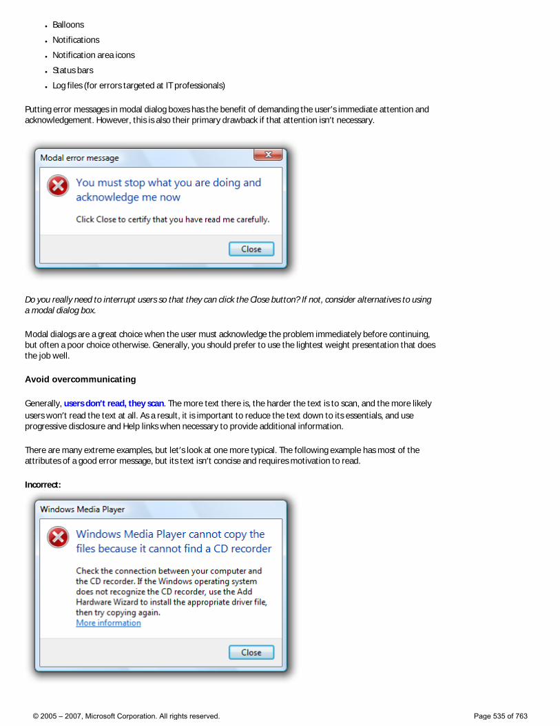
● Balloons
● Notifications
● Notification area icons
● Status bars
● Log files (for errors targeted at IT professionals)
Putting error messages in modal dialog boxes has the benefit of demanding the user’s immediate attention and acknowledgement. However, this is also their primary drawback if that attention isn’t necessary.
Do you really need to interrupt users so that they can click the Close button? If not, consider alternatives to using a modal dialog box.
Modal dialogs are a great choice when the user must acknowledge the problem immediately before continuing, but often a poor choice otherwise. Generally, you should prefer to use the lightest weight presentation that does the job well.
Avoid overcommunicating
Generally, users don’t read, they scan. The more text there is, the harder the text is to scan, and the more likely users won’t read the text at all. As a result, it is important to reduce the text down to its essentials, and use progressive disclosure and Help links when necessary to provide additional information.
There are many extreme examples, but let’s look at one more typical. The following example has most of the attributes of a good error message, but its text isn’t concise and requires motivation to read.
Incorrect:
© 2005 – 2007, Microsoft Corporation. All rights reserved. Page 535 of 763
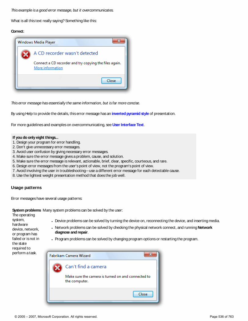
This example is a good error message, but it overcommunicates.
What is all this text really saying? Something like this:
Correct:
This error message has essentially the same information, but is far more concise.
By using Help to provide the details, this error message has an inverted pyramid style of presentation.
For more guidelines and examples on overcommunicating, see User Interface Text.
If you do only eight things... 1. Design your program for error handling. 2. Don’t give unnecessary error messages. 3. Avoid user confusion by giving necessary error messages. 4. Make sure the error message gives a problem, cause, and solution. 5. Make sure the error message is relevant, actionable, brief, clear, specific, courteous, and rare. 6. Design error messages from the user’s point of view, not the program’s point of view. 7. Avoid involving the user in troubleshooting—use a different error message for each detectable cause. 8. Use the lightest weight presentation method that does the job well.
Usage patterns
Error messages have several usage patterns:
System problems The operating system, hardware device, network, or program has failed or is not in the state required to perform a task.
Many system problems can be solved by the user:
● Device problems can be solved by turning the device on, reconnecting the device, and inserting media.
● Network problems can be solved by checking the physical network connect, and running Network diagnose and repair.
● Program problems can be solved by changing program options or restarting the program.
© 2005 – 2007, Microsoft Corporation. All rights reserved. Page 536 of 763
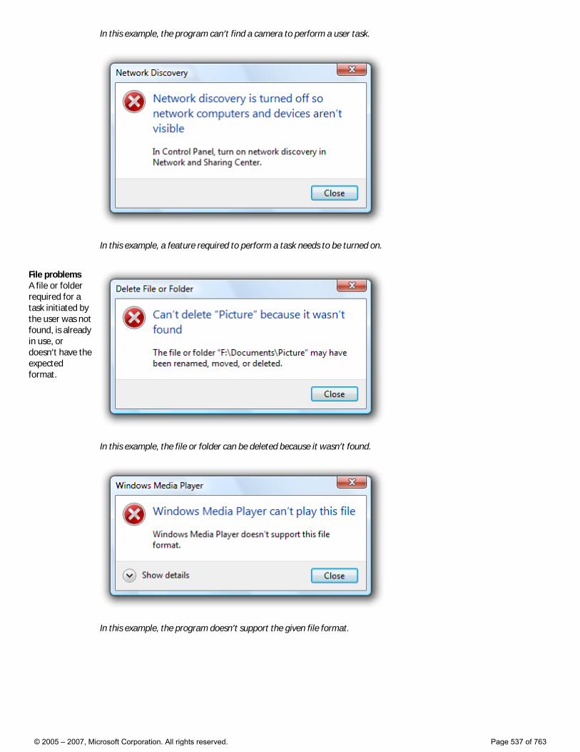
In this example, the program can’t find a camera to perform a user task.
In this example, a feature required to perform a task needs to be turned on.
File problems A file or folder required for a task initiated by the user was not found, is already in use, or doesn’t have the expected format.
In this example, the file or folder can be deleted because it wasn’t found.
In this example, the program doesn’t support the given file format.
© 2005 – 2007, Microsoft Corporation. All rights reserved. Page 537 of 763
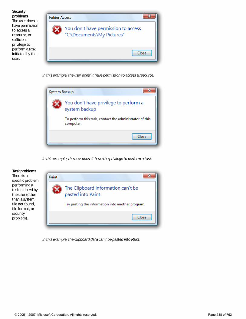
Security problems The user doesn’t have permission to access a resource, or sufficient privilege to perform a task initiated by the user.
In this example, the user doesn’t have permission to access a resource.
In this example, the user doesn’t have the privilege to perform a task.
Task problems There is a specific problem performing a task initiated by the user (other than a system, file not found, file format, or security problem).
In this example, the Clipboard data can’t be pasted into Paint.
© 2005 – 2007, Microsoft Corporation. All rights reserved. Page 538 of 763
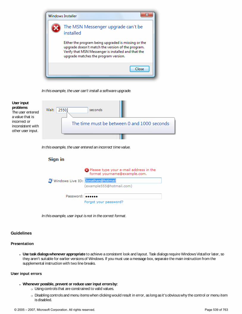
In this example, the user can’t install a software upgrade.
User input problems The user entered a value that is incorrect or inconsistent with other user input.
In this example, the user entered an incorrect time value.
In this example, user input is not in the correct format.
Guidelines
Presentation
● Use task dialogs whenever appropriate to achieve a consistent look and layout. Task dialogs require Windows Vista® or later, so they aren’t suitable for earlier versions of Windows. If you must use a message box, separate the main instruction from the supplemental instruction with two line breaks.
User input errors
● Whenever possible, prevent or reduce user input errors by: �❍ Using controls that are constrained to valid values.
�❍ Disabling controls and menu items when clicking would result in error, as long as it’s obvious why the control or menu item is disabled.
© 2005 – 2007, Microsoft Corporation. All rights reserved. Page 539 of 763

�❍ Providing good default values.
Incorrect:
In this example, an unconstrained text box is used for constrained input. Use a slider instead.
● Use modeless error handling (in-place errors or balloons) for contextual user input problems.
● Use balloons for non-critical, single-point user input problems detected while in a text box or immediately after a text box loses focus. Balloons don’t require available screen space or the dynamic layout that is required to display in-place messages. Display only a single balloon at a time. Because the problem isn’t critical, no error icon is necessary. Balloons go away when clicked, when the problem is resolved, or after a timeout.
In this example, a balloon indicates an input problem while still in the control.
● Use in-place errors for delayed error detection, usually errors found by clicking a commit button. (Don’t use in-place errors for settings that are immediately committed.) There can be multiple in-place errors at a time. Use normal text and a 16x16 pixel error icon. In-place errors don’t go away unless the user commits and no other errors are found.
In this example, an in-place error is used for an error found by clicking the commit button.
● Use modal error handling (task dialogs or message boxes) for all other problems, including errors that involve multiple controls or are non-contextual or non-input errors found by clicking a commit button.
● When a user input problem is reported, set input focus to the first control with the incorrect data. Scroll the control into view if necessary. If the control is a text box, select the entire contents. It should always be obvious what the error message is referring to.
● Don’t clear incorrect input. Instead, leave it so that the user can see and correct the problem without starting over. �❍ Exception: Clear incorrect password and PIN text boxes because users can’t correct masked input effectively.
Troubleshooting
● Avoid creating troubleshooting problems. Don’t rely on a single error message to report a problem with several different detectable causes.
● Use a different error message (typically a different supplemental instruction) for each detectable cause. For example, if a file
© 2005 – 2007, Microsoft Corporation. All rights reserved. Page 540 of 763
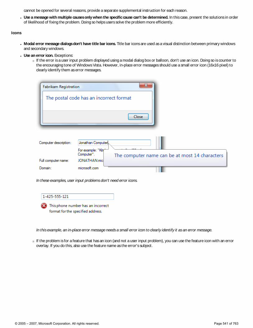
cannot be opened for several reasons, provide a separate supplemental instruction for each reason.
● Use a message with multiple causes only when the specific cause can’t be determined. In this case, present the solutions in order of likelihood of fixing the problem. Doing so helps users solve the problem more efficiently.
Icons
● Modal error message dialogs don’t have title bar icons. Title bar icons are used as a visual distinction between primary windows and secondary windows.
● Use an error icon. Exceptions: �❍ If the error is a user input problem displayed using a modal dialog box or balloon, don’t use an icon. Doing so is counter to
the encouraging tone of Windows Vista. However, in-place error messages should use a small error icon (16x16 pixel) to clearly identify them as error messages.
In these examples, user input problems don’t need error icons.
In this example, an in-place error message needs a small error icon to clearly identify it as an error message.
�❍ If the problem is for a feature that has an icon (and not a user input problem), you can use the feature icon with an error overlay. If you do this, also use the feature name as the error’s subject.
© 2005 – 2007, Microsoft Corporation. All rights reserved. Page 541 of 763
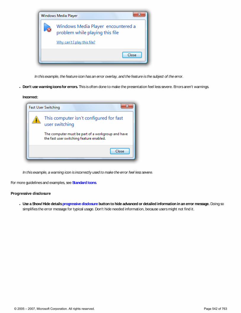
In this example, the feature icon has an error overlay, and the feature is the subject of the error.
● Don’t use warning icons for errors. This is often done to make the presentation feel less severe. Errors aren’t warnings.
Incorrect:
In this example, a warning icon is incorrectly used to make the error feel less severe.
For more guidelines and examples, see Standard Icons.
Progressive disclosure
● Use a Show/Hide details progressive disclosure button to hide advanced or detailed information in an error message. Doing so simplifies the error message for typical usage. Don’t hide needed information, because users might not find it.
© 2005 – 2007, Microsoft Corporation. All rights reserved. Page 542 of 763
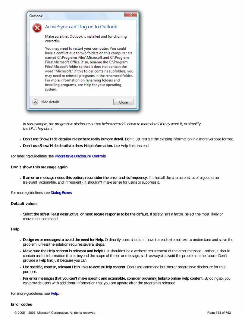
In this example, the progressive disclosure button helps users drill down to more detail if they want it, or simplify the UI if they don’t.
● Don’t use Show/Hide details unless there really is more detail. Don’t just restate the existing information in a more verbose format.
● Don’t use Show/Hide details to show Help information. Use Help links instead.
For labeling guidelines, see Progressive Disclosure Controls.
Don’t show this message again
● If an error message needs this option, reconsider the error and its frequency. If it has all the characteristics of a good error (relevant, actionable, and infrequent), it shouldn’t make sense for users to suppress it.
For more guidelines, see Dialog Boxes.
Default values
● Select the safest, least destructive, or most secure response to be the default. If safety isn’t a factor, select the most likely or convenient command.
Help
● Design error messages to avoid the need for Help. Ordinarily users shouldn’t have to read external text to understand and solve the problem, unless the solution requires several steps.
● Make sure the Help content is relevant and helpful. It shouldn’t be a verbose restatement of the error message—rather, it should contain useful information that is beyond the scope of the error message, such as ways to avoid the problem in the future. Don’t provide a Help link just because you can.
● Use specific, concise, relevant Help links to access Help content. Don’t use command buttons or progressive disclosure for this purpose.
● For error messages that you can’t make specific and actionable, consider providing links to online Help content. By doing so, you can provide users with additional information that you can update after the program is released.
For more guidelines, see Help.
Error codes
© 2005 – 2007, Microsoft Corporation. All rights reserved. Page 543 of 763
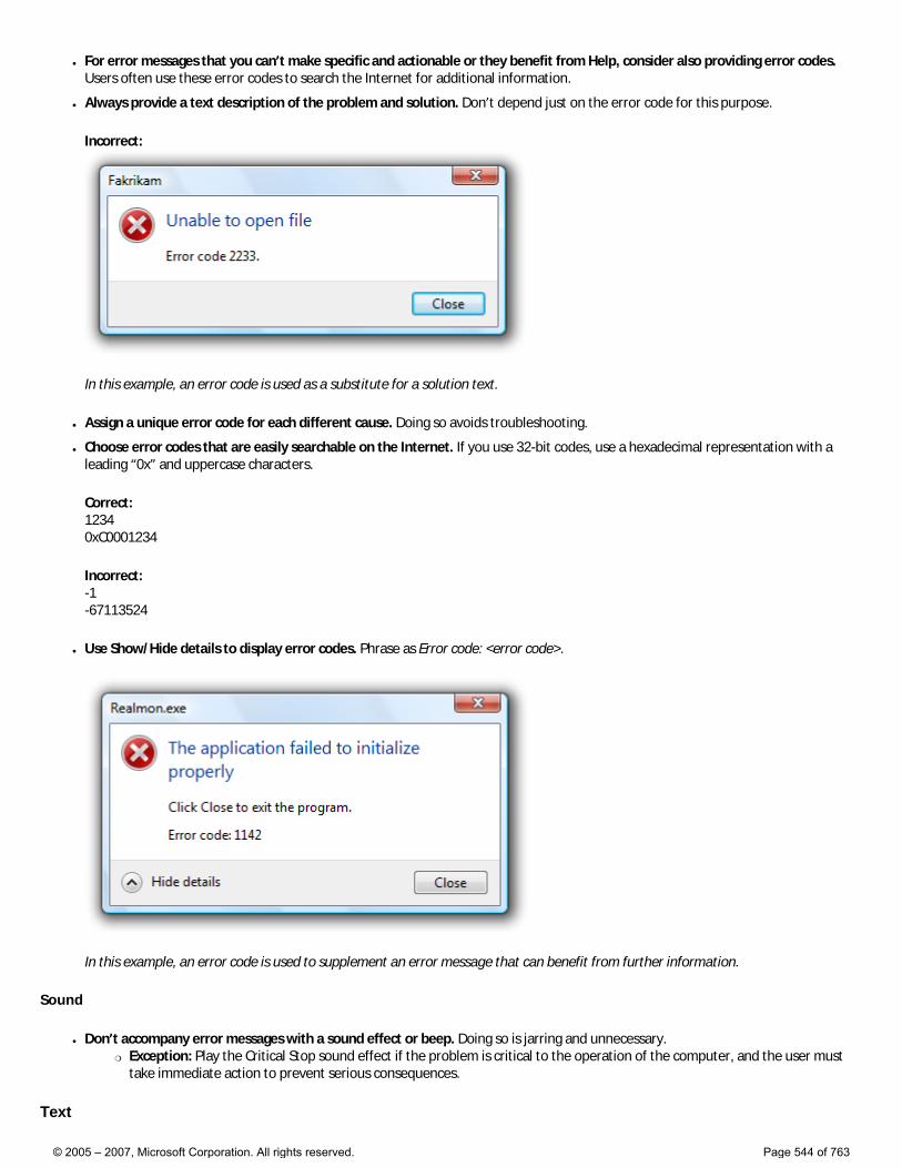
● For error messages that you can’t make specific and actionable or they benefit from Help, consider also providing error codes. Users often use these error codes to search the Internet for additional information.
● Always provide a text description of the problem and solution. Don’t depend just on the error code for this purpose.
Incorrect:
In this example, an error code is used as a substitute for a solution text.
● Assign a unique error code for each different cause. Doing so avoids troubleshooting.
● Choose error codes that are easily searchable on the Internet. If you use 32-bit codes, use a hexadecimal representation with a leading “0x” and uppercase characters.
Correct: 1234 0xC0001234
Incorrect: -1 -67113524
● Use Show/Hide details to display error codes. Phrase as Error code: <error code>.
In this example, an error code is used to supplement an error message that can benefit from further information.
Sound
● Don’t accompany error messages with a sound effect or beep. Doing so is jarring and unnecessary. �❍ Exception: Play the Critical Stop sound effect if the problem is critical to the operation of the computer, and the user must
take immediate action to prevent serious consequences.
Text
© 2005 – 2007, Microsoft Corporation. All rights reserved. Page 544 of 763

General
● Remove redundant text. Look for it in titles, main instructions, supplemental instructions, command links, and commit buttons. Generally, leave full text in instructions and interactive controls, and remove any redundancy from the other places.
● Use user-centered explanations. Describe the problem in terms of user actions or goals, not in terms of what the software is unhappy with. Use language that the target users understand and use. Avoid technical jargon.
Incorrect:
Correct:
In these examples, the correct version speaks the user’s language whereas the incorrect version is overly technical.
● Don’t use the following words: �❍ Error, failure (use problem instead)
�❍ Failed to (use unable to instead)
�❍ Illegal, invalid, bad (use incorrect instead)
�❍ Fatal (use program termination instead)
�❍ Abort, kill, terminate (use stop instead)
�❍ Catastrophic (use serious instead)
These terms are unnecessary and contrary to the encouraging tone of Windows Vista. When used correctly, the error icon sufficiently communicates that there is a problem.
Incorrect:
© 2005 – 2007, Microsoft Corporation. All rights reserved. Page 545 of 763
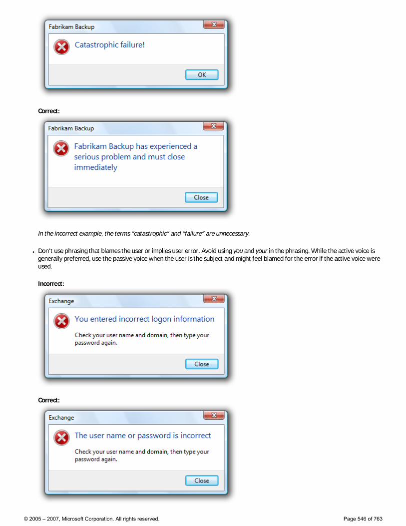
Correct:
In the incorrect example, the terms “catastrophic” and “failure” are unnecessary.
● Don’t use phrasing that blames the user or implies user error. Avoid using you and your in the phrasing. While the active voice is generally preferred, use the passive voice when the user is the subject and might feel blamed for the error if the active voice were used.
Incorrect:
Correct:
© 2005 – 2007, Microsoft Corporation. All rights reserved. Page 546 of 763
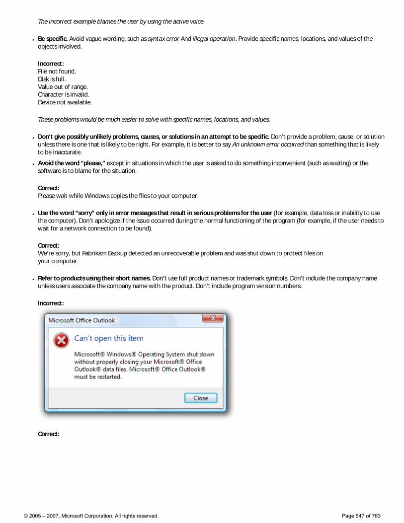
The incorrect example blames the user by using the active voice.
● Be specific. Avoid vague wording, such as syntax error And illegal operation. Provide specific names, locations, and values of the objects involved.
Incorrect: File not found. Disk is full. Value out of range. Character is invalid. Device not available.
These problems would be much easier to solve with specific names, locations, and values.
● Don’t give possibly unlikely problems, causes, or solutions in an attempt to be specific. Don’t provide a problem, cause, or solution unless there is one that is likely to be right. For example, it is better to say An unknown error occurred than something that is likely to be inaccurate.
● Avoid the word “please,” except in situations in which the user is asked to do something inconvenient (such as waiting) or the software is to blame for the situation.
Correct: Please wait while Windows copies the files to your computer.
● Use the word “sorry” only in error messages that result in serious problems for the user (for example, data loss or inability to use the computer). Don’t apologize if the issue occurred during the normal functioning of the program (for example, if the user needs to wait for a network connection to be found).
Correct: We’re sorry, but Fabrikam Backup detected an unrecoverable problem and was shut down to protect files on your computer.
● Refer to products using their short names. Don’t use full product names or trademark symbols. Don’t include the company name unless users associate the company name with the product. Don’t include program version numbers.
Incorrect:
Correct:
© 2005 – 2007, Microsoft Corporation. All rights reserved. Page 547 of 763
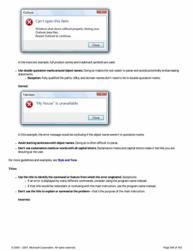
In the incorrect example, full product names and trademark symbols are used.
● Use double quotation marks around object names. Doing so makes the text easier to parse and avoids potentially embarrassing statements.
�❍ Exception: Fully qualified file paths, URLs, and domain names don’t need to be in double quotation marks.
Correct:
In this example, the error message would be confusing if the object name weren’t in quotation marks.
● Avoid starting sentences with object names. Doing so is often difficult to parse.
● Don’t use exclamation marks or words with all capital letters. Exclamation marks and capital letters make it feel like you are shouting at the user.
For more guidelines and examples, see Style and Tone.
Titles
● Use the title to identify the command or feature from which the error originated. Exceptions: �❍ If an error is displayed by many different commands, consider using the program name instead.
�❍ If that title would be redundant or confusing with the main instruction, use the program name instead.
● Don’t use the title to explain or summarize the problem—that’s the purpose of the main instruction.
Incorrect:
© 2005 – 2007, Microsoft Corporation. All rights reserved. Page 548 of 763
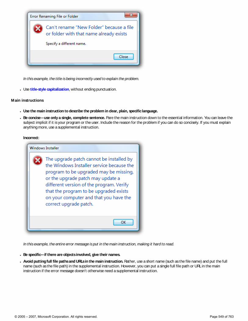
In this example, the title is being incorrectly used to explain the problem.
● Use title-style capitalization, without ending punctuation.
Main instructions
● Use the main instruction to describe the problem in clear, plain, specific language.
● Be concise—use only a single, complete sentence. Pare the main instruction down to the essential information. You can leave the subject implicit if it is your program or the user. Include the reason for the problem if you can do so concisely. If you must explain anything more, use a supplemental instruction.
Incorrect:
In this example, the entire error message is put in the main instruction, making it hard to read.
● Be specific—if there are objects involved, give their names.
● Avoid putting full file paths and URLs in the main instruction. Rather, use a short name (such as the file name) and put the full name (such as the file path) in the supplemental instruction. However, you can put a single full file path or URL in the main instruction if the error message doesn’t otherwise need a supplemental instruction.
© 2005 – 2007, Microsoft Corporation. All rights reserved. Page 549 of 763
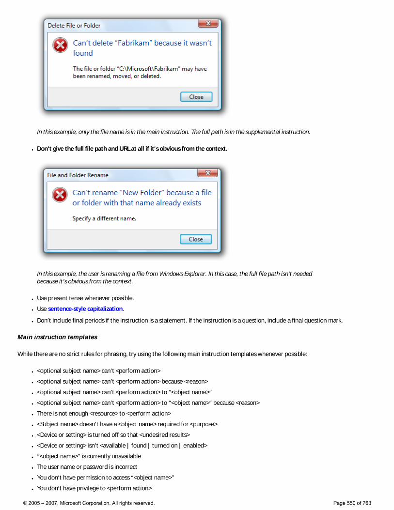
In this example, only the file name is in the main instruction. The full path is in the supplemental instruction.
● Don’t give the full file path and URL at all if it’s obvious from the context.
In this example, the user is renaming a file from Windows Explorer. In this case, the full file path isn’t needed because it’s obvious from the context.
● Use present tense whenever possible.
● Use sentence-style capitalization.
● Don’t include final periods if the instruction is a statement. If the instruction is a question, include a final question mark.
Main instruction templates
While there are no strict rules for phrasing, try using the following main instruction templates whenever possible:
● <optional subject name> can’t <perform action>
● <optional subject name> can’t <perform action> because <reason>
● <optional subject name> can’t <perform action> to “<object name>”
● <optional subject name> can’t <perform action> to “<object name>” because <reason>
● There is not enough <resource> to <perform action>
● <Subject name> doesn’t have a <object name> required for <purpose>
● <Device or setting> is turned off so that <undesired results>
● <Device or setting> isn’t <available | found | turned on | enabled>
● “<object name>” is currently unavailable
● The user name or password is incorrect
● You don’t have permission to access “<object name>”
● You don’t have privilege to <perform action>
© 2005 – 2007, Microsoft Corporation. All rights reserved. Page 550 of 763
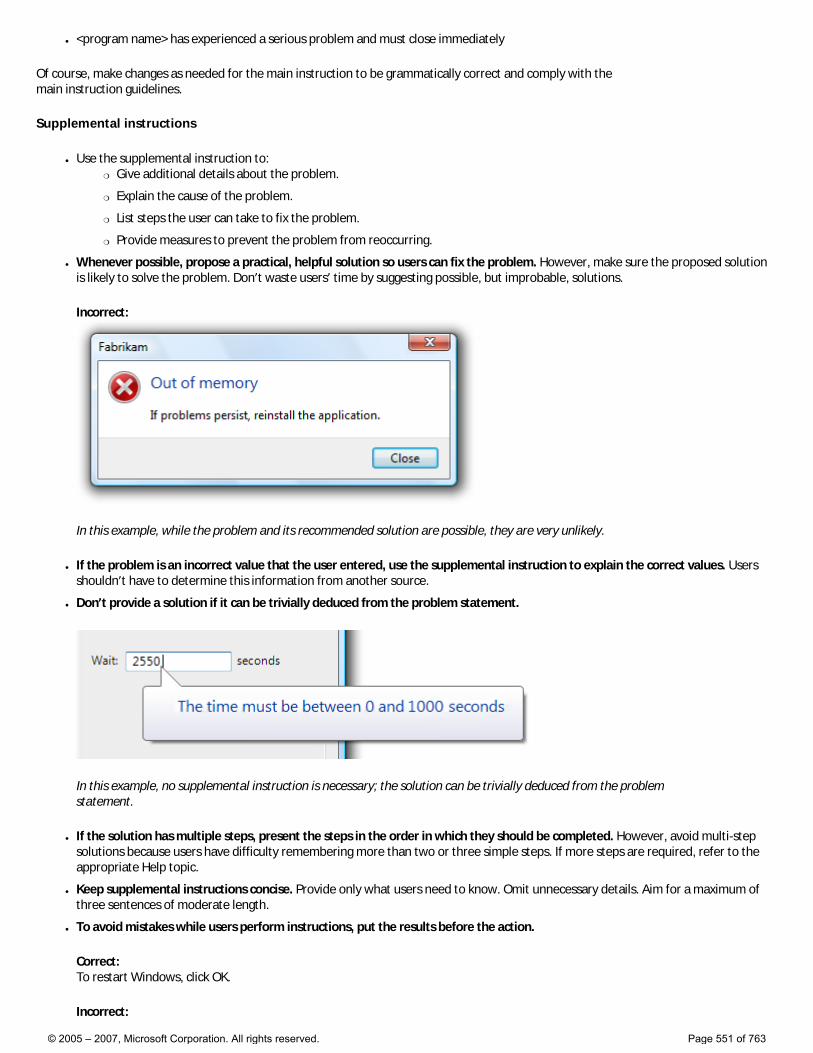
● <program name> has experienced a serious problem and must close immediately
Of course, make changes as needed for the main instruction to be grammatically correct and comply with the main instruction guidelines.
Supplemental instructions
● Use the supplemental instruction to: �❍ Give additional details about the problem.
�❍ Explain the cause of the problem.
�❍ List steps the user can take to fix the problem.
�❍ Provide measures to prevent the problem from reoccurring.
● Whenever possible, propose a practical, helpful solution so users can fix the problem. However, make sure the proposed solution is likely to solve the problem. Don’t waste users’ time by suggesting possible, but improbable, solutions.
Incorrect:
In this example, while the problem and its recommended solution are possible, they are very unlikely.
● If the problem is an incorrect value that the user entered, use the supplemental instruction to explain the correct values. Users shouldn’t have to determine this information from another source.
● Don’t provide a solution if it can be trivially deduced from the problem statement.
In this example, no supplemental instruction is necessary; the solution can be trivially deduced from the problem statement.
● If the solution has multiple steps, present the steps in the order in which they should be completed. However, avoid multi-step solutions because users have difficulty remembering more than two or three simple steps. If more steps are required, refer to the appropriate Help topic.
● Keep supplemental instructions concise. Provide only what users need to know. Omit unnecessary details. Aim for a maximum of three sentences of moderate length.
● To avoid mistakes while users perform instructions, put the results before the action.
Correct: To restart Windows, click OK.
Incorrect:
© 2005 – 2007, Microsoft Corporation. All rights reserved. Page 551 of 763

Click OK to restart Windows.
In the incorrect example, users are more likely to click OK by accident.
● Don’t recommend contacting an administrator unless doing so is among the most likely solutions to the problem. Reserve such solutions for problems that really can only be solved by an administrator.
Incorrect:
In this example, most likely the problem is with the user’s network connection, so it’s not worth contacting an administrator.
● Don’t recommend contacting technical support. The option to contact technical support to solve a problem is always available, and doesn’t need to be promoted through error messages. Instead, focus on writing helpful error messages so that users can solve problems without contacting technical support.
Incorrect:
In this example, the error message incorrectly recommends contacting technical support.
● Use complete sentences, sentence-style capitalization, and ending punctuation.
Commit buttons
● If the error message provides command buttons or command links that solve the problem, follow their respective guidelines in Dialog Boxes.
● Otherwise, provide a Close button. Don’t use OK for error messages, because this wording implies that problems are OK.
● Don’t provide a debug command unless the program is specifically targeted at the developer of the program.
Incorrect:
© 2005 – 2007, Microsoft Corporation. All rights reserved. Page 552 of 763
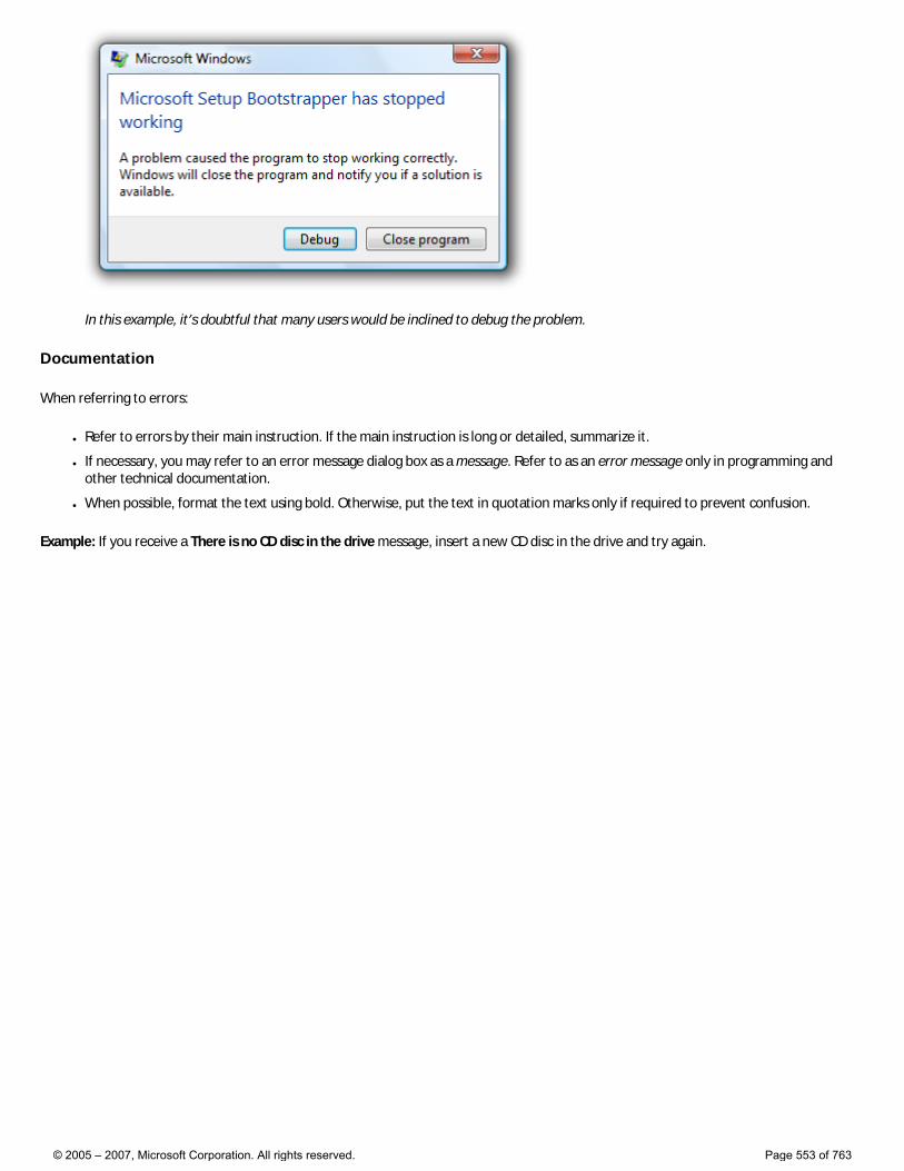
In this example, it’s doubtful that many users would be inclined to debug the problem.
Documentation
When referring to errors:
● Refer to errors by their main instruction. If the main instruction is long or detailed, summarize it.
● If necessary, you may refer to an error message dialog box as a message. Refer to as an error message only in programming and other technical documentation.
● When possible, format the text using bold. Otherwise, put the text in quotation marks only if required to prevent confusion.
Example: If you receive a There is no CD disc in the drive message, insert a new CD disc in the drive and try again.
© 2005 – 2007, Microsoft Corporation. All rights reserved. Page 553 of 763
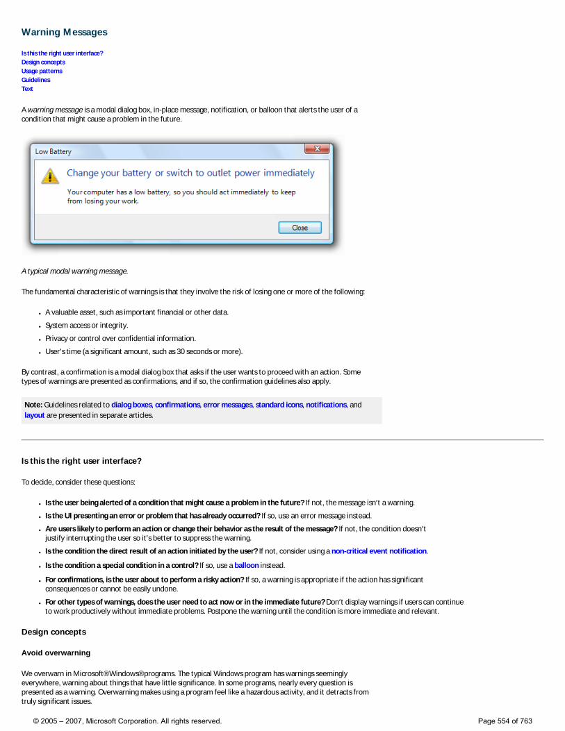
Warning Messages
Is this the right user interface? Design concepts Usage patterns Guidelines Text
A warning message is a modal dialog box, in-place message, notification, or balloon that alerts the user of a condition that might cause a problem in the future.
A typical modal warning message.
The fundamental characteristic of warnings is that they involve the risk of losing one or more of the following:
● A valuable asset, such as important financial or other data.
● System access or integrity.
● Privacy or control over confidential information.
● User’s time (a significant amount, such as 30 seconds or more).
By contrast, a confirmation is a modal dialog box that asks if the user wants to proceed with an action. Some types of warnings are presented as confirmations, and if so, the confirmation guidelines also apply.
Note: Guidelines related to dialog boxes, confirmations, error messages, standard icons, notifications, and layout are presented in separate articles.
Is this the right user interface?
To decide, consider these questions:
● Is the user being alerted of a condition that might cause a problem in the future? If not, the message isn’t a warning.
● Is the UI presenting an error or problem that has already occurred? If so, use an error message instead.
● Are users likely to perform an action or change their behavior as the result of the message? If not, the condition doesn’t justify interrupting the user so it’s better to suppress the warning.
● Is the condition the direct result of an action initiated by the user? If not, consider using a non-critical event notification.
● Is the condition a special condition in a control? If so, use a balloon instead.
● For confirmations, is the user about to perform a risky action? If so, a warning is appropriate if the action has significant consequences or cannot be easily undone.
● For other types of warnings, does the user need to act now or in the immediate future? Don’t display warnings if users can continue to work productively without immediate problems. Postpone the warning until the condition is more immediate and relevant.
Design concepts
Avoid overwarning
We overwarn in Microsoft® Windows® programs. The typical Windows program has warnings seemingly everywhere, warning about things that have little significance. In some programs, nearly every question is presented as a warning. Overwarning makes using a program feel like a hazardous activity, and it detracts from truly significant issues.
© 2005 – 2007, Microsoft Corporation. All rights reserved. Page 554 of 763
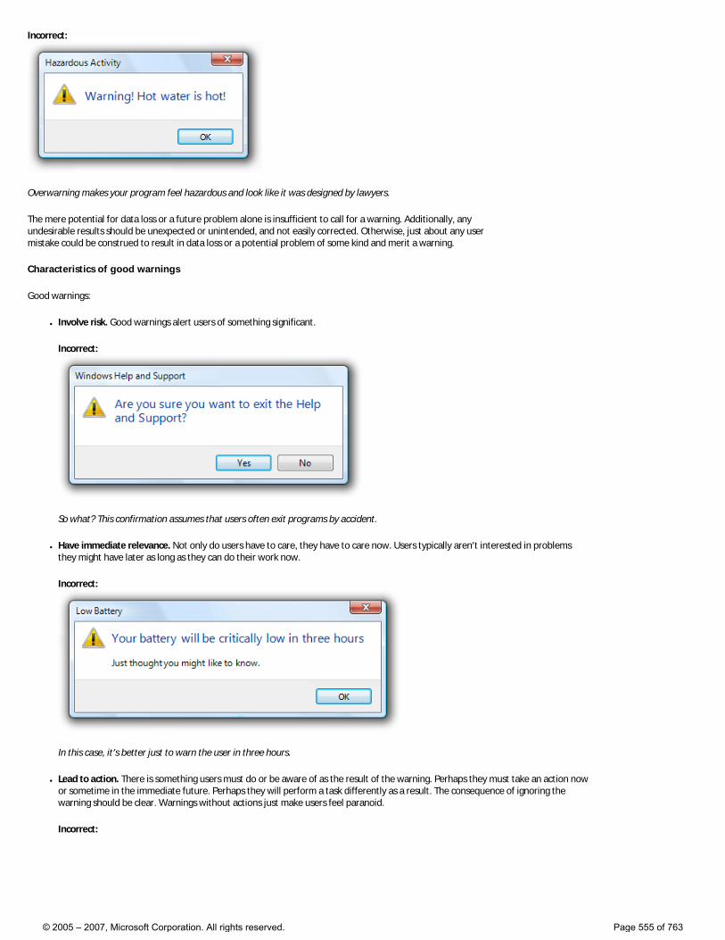
Incorrect:
Overwarning makes your program feel hazardous and look like it was designed by lawyers.
The mere potential for data loss or a future problem alone is insufficient to call for a warning. Additionally, any undesirable results should be unexpected or unintended, and not easily corrected. Otherwise, just about any user mistake could be construed to result in data loss or a potential problem of some kind and merit a warning.
Characteristics of good warnings
Good warnings:
● Involve risk. Good warnings alert users of something significant.
Incorrect:
So what? This confirmation assumes that users often exit programs by accident.
● Have immediate relevance. Not only do users have to care, they have to care now. Users typically aren’t interested in problems they might have later as long as they can do their work now.
Incorrect:
In this case, it’s better just to warn the user in three hours.
● Lead to action. There is something users must do or be aware of as the result of the warning. Perhaps they must take an action now or sometime in the immediate future. Perhaps they will perform a task differently as a result. The consequence of ignoring the warning should be clear. Warnings without actions just make users feel paranoid.
Incorrect:
© 2005 – 2007, Microsoft Corporation. All rights reserved. Page 555 of 763
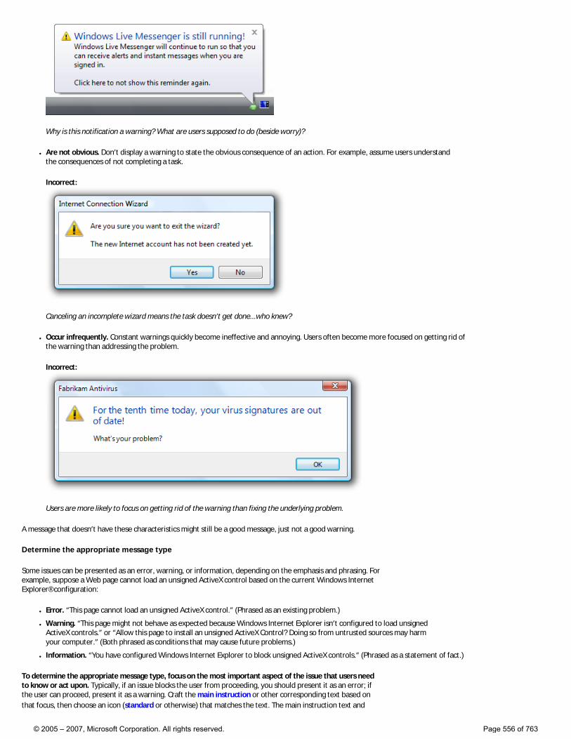
Why is this notification a warning? What are users supposed to do (beside worry)?
● Are not obvious. Don’t display a warning to state the obvious consequence of an action. For example, assume users understand the consequences of not completing a task.
Incorrect:
Canceling an incomplete wizard means the task doesn’t get done...who knew?
● Occur infrequently. Constant warnings quickly become ineffective and annoying. Users often become more focused on getting rid of the warning than addressing the problem.
Incorrect:
Users are more likely to focus on getting rid of the warning than fixing the underlying problem.
A message that doesn’t have these characteristics might still be a good message, just not a good warning.
Determine the appropriate message type
Some issues can be presented as an error, warning, or information, depending on the emphasis and phrasing. For example, suppose a Web page cannot load an unsigned ActiveX control based on the current Windows Internet Explorer® configuration:
● Error. “This page cannot load an unsigned ActiveX control.” (Phrased as an existing problem.)
● Warning. “This page might not behave as expected because Windows Internet Explorer isn’t configured to load unsigned ActiveX controls.” or “Allow this page to install an unsigned ActiveX Control? Doing so from untrusted sources may harm your computer.” (Both phrased as conditions that may cause future problems.)
● Information. “You have configured Windows Internet Explorer to block unsigned ActiveX controls.” (Phrased as a statement of fact.)
To determine the appropriate message type, focus on the most important aspect of the issue that users need to know or act upon. Typically, if an issue blocks the user from proceeding, you should present it as an error; if the user can proceed, present it as a warning. Craft the main instruction or other corresponding text based on that focus, then choose an icon (standard or otherwise) that matches the text. The main instruction text and
© 2005 – 2007, Microsoft Corporation. All rights reserved. Page 556 of 763
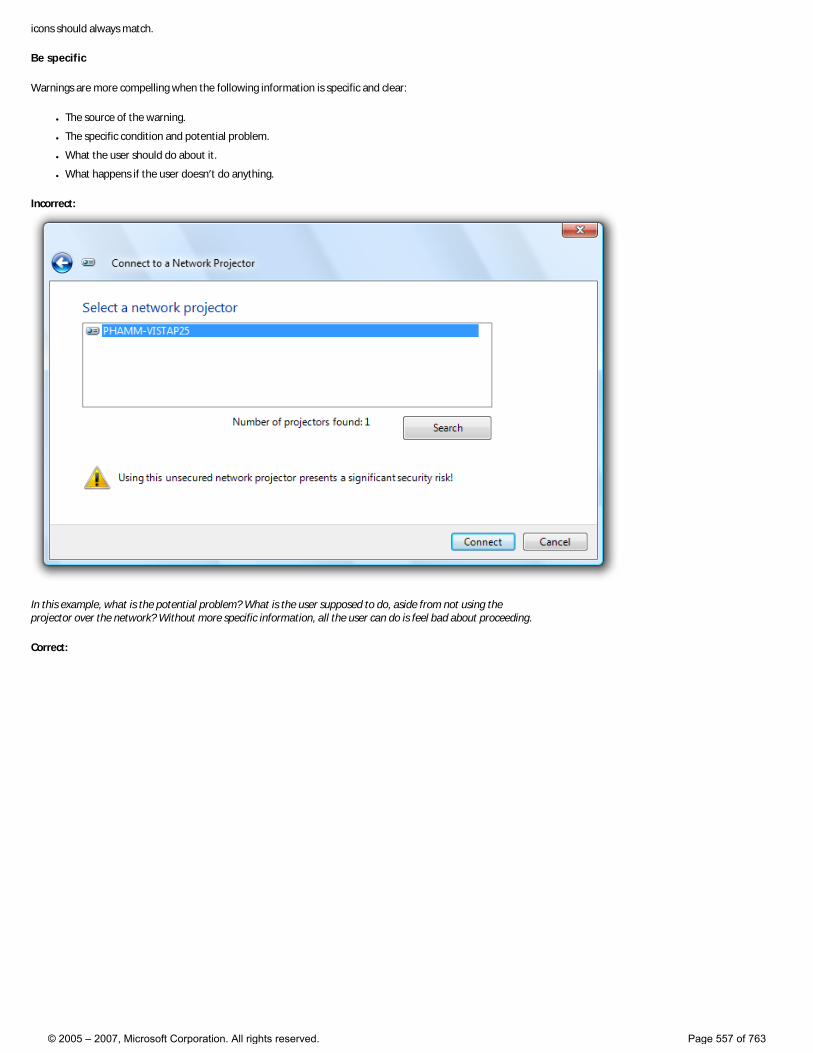
icons should always match.
Be specific
Warnings are more compelling when the following information is specific and clear:
● The source of the warning.
● The specific condition and potential problem.
● What the user should do about it.
● What happens if the user doesn’t do anything.
Incorrect:
In this example, what is the potential problem? What is the user supposed to do, aside from not using the projector over the network? Without more specific information, all the user can do is feel bad about proceeding.
Correct:
© 2005 – 2007, Microsoft Corporation. All rights reserved. Page 557 of 763
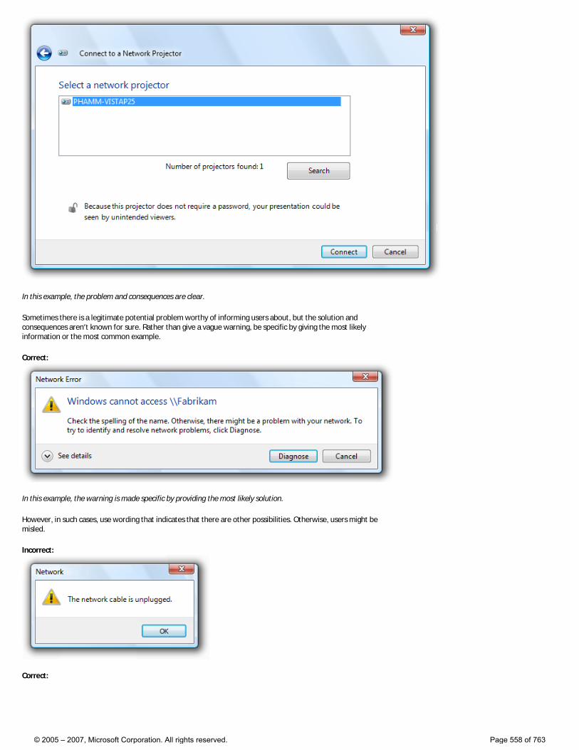
In this example, the problem and consequences are clear.
Sometimes there is a legitimate potential problem worthy of informing users about, but the solution and consequences aren’t known for sure. Rather than give a vague warning, be specific by giving the most likely information or the most common example.
Correct:
In this example, the warning is made specific by providing the most likely solution.
However, in such cases, use wording that indicates that there are other possibilities. Otherwise, users might be misled.
Incorrect:
Correct:
© 2005 – 2007, Microsoft Corporation. All rights reserved. Page 558 of 763
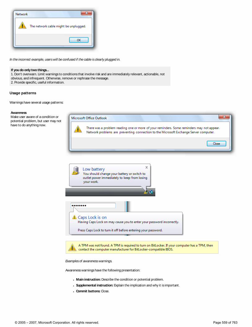
In the incorrect example, users will be confused if the cable is clearly plugged in.
If you do only two things... 1. Don’t overwarn. Limit warnings to conditions that involve risk and are immediately relevant, actionable, not obvious, and infrequent. Otherwise, remove or rephrase the message. 2. Provide specific, useful information.
Usage patterns
Warnings have several usage patterns:
Awareness Make user aware of a condition or potential problem, but user may not have to do anything now.
Examples of awareness warnings.
Awareness warnings have the following presentation:
● Main instruction: Describe the condition or potential problem.
● Supplemental instruction: Explain the implication and why it is important.
● Commit buttons: Close.
© 2005 – 2007, Microsoft Corporation. All rights reserved. Page 559 of 763
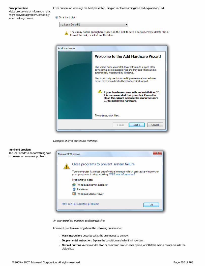
Error prevention Make user aware of information that might prevent a problem, especially when making choices.
Error prevention warnings are best presented using an in-place warning icon and explanatory text.
Examples of error prevention warnings.
Imminent problem The user needs to do something now to prevent an imminent problem.
An example of an imminent problem warning.
Imminent problem warnings have the following presentation:
● Main instruction: Describe what the user needs to do now.
● Supplemental instruction: Explain the condition and why it is important.
● Commit buttons: A command button or command link for each option, or OK if the action occurs outside the dialog box.
© 2005 – 2007, Microsoft Corporation. All rights reserved. Page 560 of 763
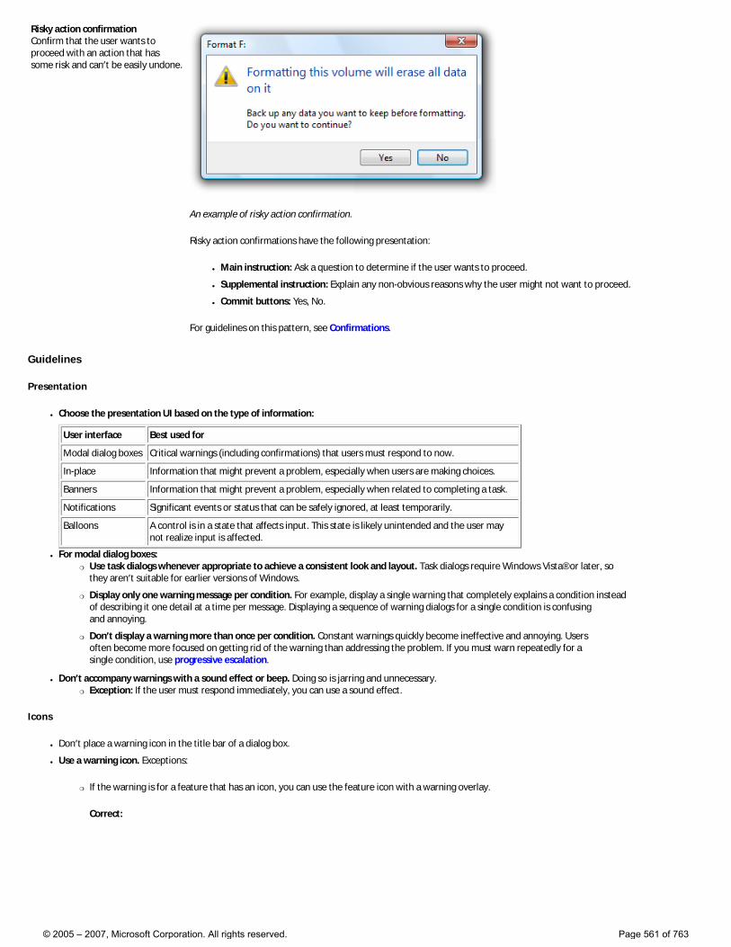
Risky action confirmation Confirm that the user wants to proceed with an action that has some risk and can’t be easily undone.
An example of risky action confirmation.
Risky action confirmations have the following presentation:
● Main instruction: Ask a question to determine if the user wants to proceed.
● Supplemental instruction: Explain any non-obvious reasons why the user might not want to proceed.
● Commit buttons: Yes, No.
For guidelines on this pattern, see Confirmations.
Guidelines
Presentation
● Choose the presentation UI based on the type of information:
User interface Best used for
Modal dialog boxes Critical warnings (including confirmations) that users must respond to now.
In-place Information that might prevent a problem, especially when users are making choices.
Banners Information that might prevent a problem, especially when related to completing a task.
Notifications Significant events or status that can be safely ignored, at least temporarily.
Balloons A control is in a state that affects input. This state is likely unintended and the user may not realize input is affected.
● For modal dialog boxes: �❍ Use task dialogs whenever appropriate to achieve a consistent look and layout. Task dialogs require Windows Vista® or later, so
they aren’t suitable for earlier versions of Windows.
�❍ Display only one warning message per condition. For example, display a single warning that completely explains a condition instead of describing it one detail at a time per message. Displaying a sequence of warning dialogs for a single condition is confusing and annoying.
�❍ Don’t display a warning more than once per condition. Constant warnings quickly become ineffective and annoying. Users often become more focused on getting rid of the warning than addressing the problem. If you must warn repeatedly for a single condition, use progressive escalation.
● Don’t accompany warnings with a sound effect or beep. Doing so is jarring and unnecessary. �❍ Exception: If the user must respond immediately, you can use a sound effect.
Icons
● Don’t place a warning icon in the title bar of a dialog box.
● Use a warning icon. Exceptions:
�❍ If the warning is for a feature that has an icon, you can use the feature icon with a warning overlay.
Correct:
© 2005 – 2007, Microsoft Corporation. All rights reserved. Page 561 of 763
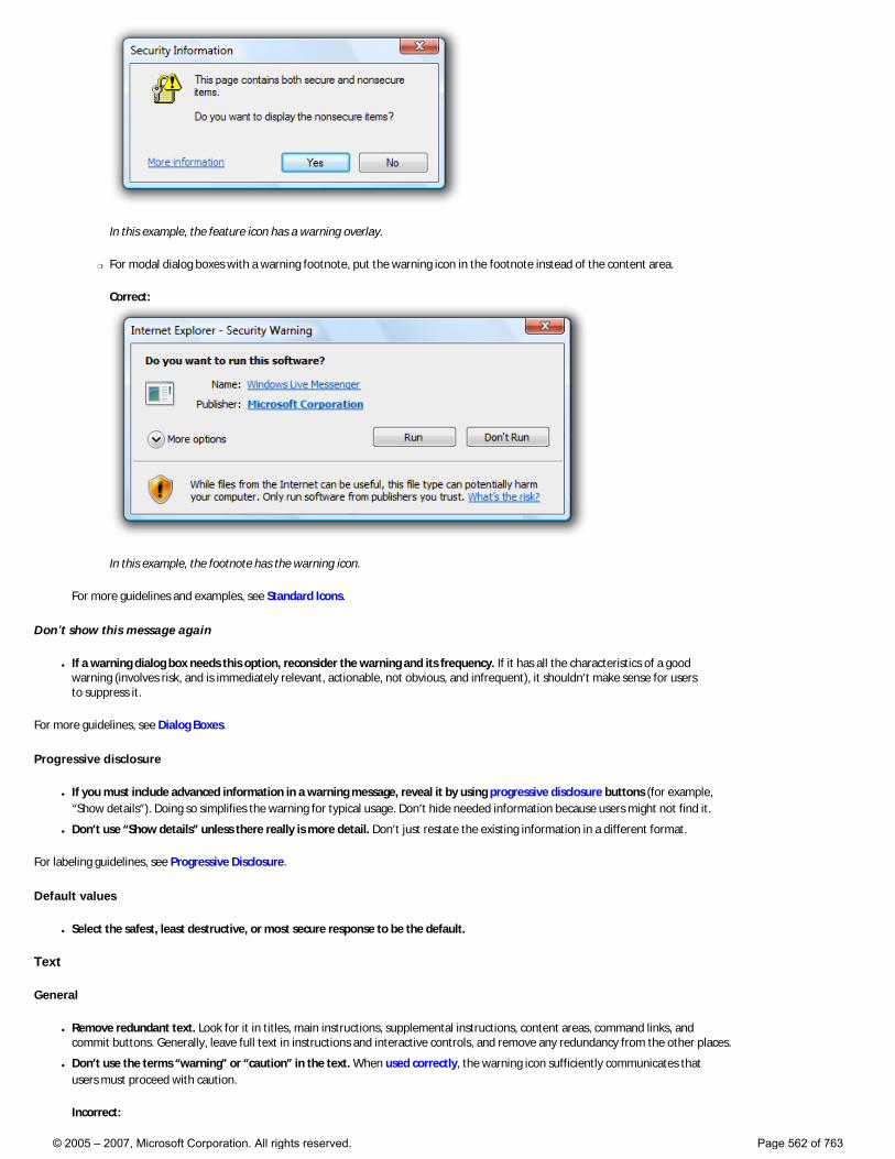
In this example, the feature icon has a warning overlay.
�❍ For modal dialog boxes with a warning footnote, put the warning icon in the footnote instead of the content area.
Correct:
In this example, the footnote has the warning icon.
For more guidelines and examples, see Standard Icons.
Don’t show this message again
● If a warning dialog box needs this option, reconsider the warning and its frequency. If it has all the characteristics of a good warning (involves risk, and is immediately relevant, actionable, not obvious, and infrequent), it shouldn’t make sense for users to suppress it.
For more guidelines, see Dialog Boxes.
Progressive disclosure
● If you must include advanced information in a warning message, reveal it by using progressive disclosure buttons (for example, “Show details”). Doing so simplifies the warning for typical usage. Don’t hide needed information because users might not find it.
● Don’t use “Show details” unless there really is more detail. Don’t just restate the existing information in a different format.
For labeling guidelines, see Progressive Disclosure.
Default values
● Select the safest, least destructive, or most secure response to be the default.
Text
General
● Remove redundant text. Look for it in titles, main instructions, supplemental instructions, content areas, command links, and commit buttons. Generally, leave full text in instructions and interactive controls, and remove any redundancy from the other places.
● Don’t use the terms “warning” or “caution” in the text. When used correctly, the warning icon sufficiently communicates that users must proceed with caution.
Incorrect:
© 2005 – 2007, Microsoft Corporation. All rights reserved. Page 562 of 763
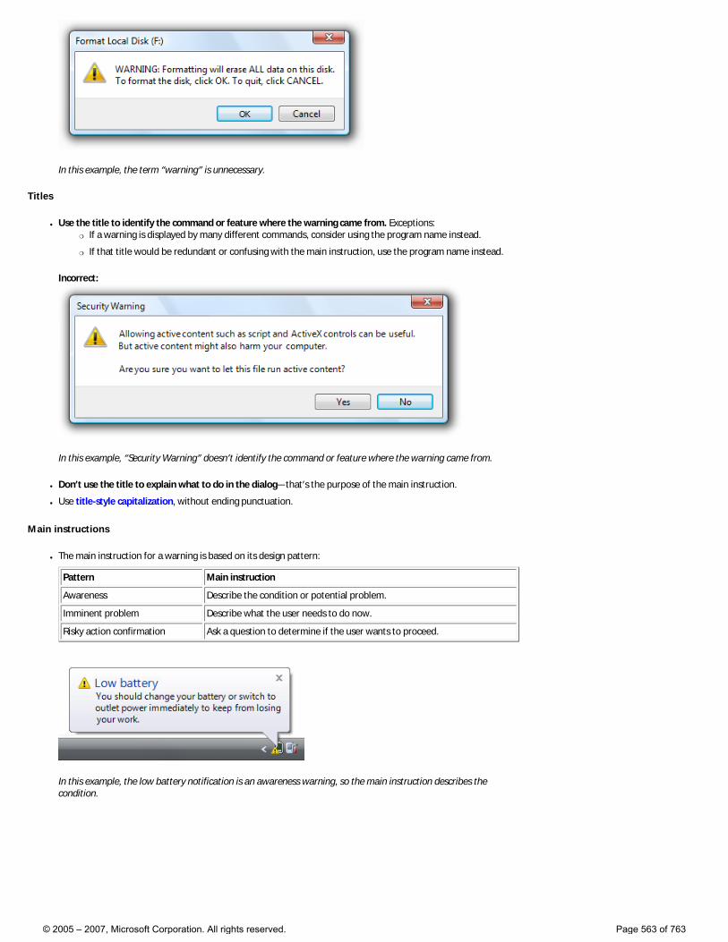
In this example, the term “warning” is unnecessary.
Titles
● Use the title to identify the command or feature where the warning came from. Exceptions: �❍ If a warning is displayed by many different commands, consider using the program name instead.
�❍ If that title would be redundant or confusing with the main instruction, use the program name instead.
Incorrect:
In this example, “Security Warning” doesn’t identify the command or feature where the warning came from.
● Don’t use the title to explain what to do in the dialog—that’s the purpose of the main instruction.
● Use title-style capitalization, without ending punctuation.
Main instructions
● The main instruction for a warning is based on its design pattern:
Pattern Main instruction
Awareness Describe the condition or potential problem.
Imminent problem Describe what the user needs to do now.
Risky action confirmation Ask a question to determine if the user wants to proceed.
In this example, the low battery notification is an awareness warning, so the main instruction describes the condition.
© 2005 – 2007, Microsoft Corporation. All rights reserved. Page 563 of 763
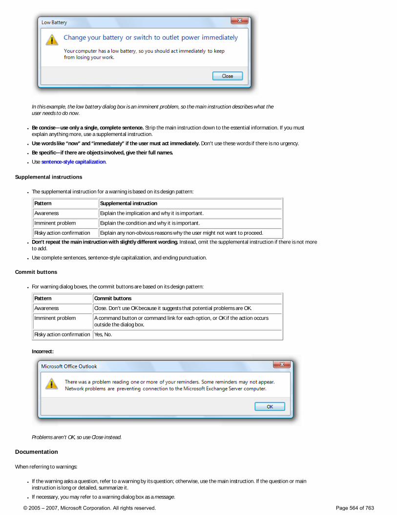
In this example, the low battery dialog box is an imminent problem, so the main instruction describes what the user needs to do now.
● Be concise—use only a single, complete sentence. Strip the main instruction down to the essential information. If you must explain anything more, use a supplemental instruction.
● Use words like “now” and “immediately” if the user must act immediately. Don’t use these words if there is no urgency.
● Be specific—if there are objects involved, give their full names.
● Use sentence-style capitalization.
Supplemental instructions
● The supplemental instruction for a warning is based on its design pattern:
Pattern Supplemental instruction
Awareness Explain the implication and why it is important.
Imminent problem Explain the condition and why it is important.
Risky action confirmation Explain any non-obvious reasons why the user might not want to proceed.
● Don’t repeat the main instruction with slightly different wording. Instead, omit the supplemental instruction if there is not more to add.
● Use complete sentences, sentence-style capitalization, and ending punctuation.
Commit buttons
● For warning dialog boxes, the commit buttons are based on its design pattern:
Pattern Commit buttons
Awareness Close. Don’t use OK because it suggests that potential problems are OK.
Imminent problem A command button or command link for each option, or OK if the action occurs outside the dialog box.
Risky action confirmation Yes, No.
Incorrect:
Problems aren’t OK, so use Close instead.
Documentation
When referring to warnings:
● If the warning asks a question, refer to a warning by its question; otherwise, use the main instruction. If the question or main instruction is long or detailed, summarize it.
● If necessary, you may refer to a warning dialog box as a message.
© 2005 – 2007, Microsoft Corporation. All rights reserved. Page 564 of 763
● When possible, format the text using bold. Otherwise, put the text in quotation marks only if required to prevent confusion.
Example: In the Do you want to continue? message, click Yes.
© 2005 – 2007, Microsoft Corporation. All rights reserved. Page 565 of 763
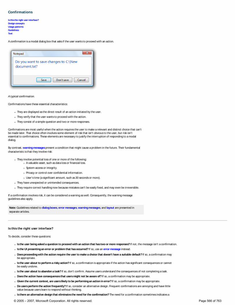
Confirmations
Is this the right user interface? Design concepts Usage patterns Guidelines Text
A confirmation is a modal dialog box that asks if the user wants to proceed with an action.
A typical confirmation.
Confirmations have these essential characteristics:
● They are displayed as the direct result of an action initiated by the user.
● They verify that the user wants to proceed with the action.
● They consist of a simple question and two or more responses.
Confirmations are most useful when the action requires the user to make a relevant and distinct choice that can’t be made later. That choice often involves some element of risk that isn’t obvious to the user, but risk isn’t essential to confirmations. These elements are necessary to justify the interruption of responding to a modal dialog.
By contrast, warning messages present a condition that might cause a problem in the future. Their fundamental characteristic is that they involve risk:
● They involve potential loss of one or more of the following: �❍ A valuable asset, such as data loss or financial loss.
�❍ System access or integrity.
�❍ Privacy or control over confidential information.
�❍ User’s time (a significant amount, such as 30 seconds or more).
● They have unexpected or unintended consequences.
● They require correct handling now because mistakes can’t be easily fixed, and may even be irreversible.
If a confirmation involves risk, it can be considered a warning as well. Consequently, the warning message guidelines also apply.
Note: Guidelines related to dialog boxes, error messages, warning messages, and layout are presented in separate articles.
Is this the right user interface?
To decide, consider these questions:
● Is the user being asked a question to proceed with an action that has two or more responses? If not, the message isn’t a confirmation.
● Is the UI presenting an error or problem that has occurred? If so, use an error message instead.
● Does proceeding with the action require the user to make a choice that doesn’t have a suitable default? If so, a confirmation may be appropriate.
● Is the user about to perform a risky action? If so, a confirmation is appropriate if the action has significant consequences or cannot be easily undone.
● Is the user about to abandon a task? If so, don’t confirm. Assume users understand the consequences of not completing a task.
● Does the action have consequences that users might not be aware of? If so, a confirmation may be appropriate.
● Given the current context, are users likely to be performing an action in error? If so, a confirmation may be appropriate.
● Do users perform the action frequently? If so, consider an alternative design. Frequent confirmations are annoying and have little value because users learn to respond without thinking.
● Is there an alternative design that eliminates the need for the confirmation? The need for a confirmation sometimes indicates a
© 2005 – 2007, Microsoft Corporation. All rights reserved. Page 566 of 763
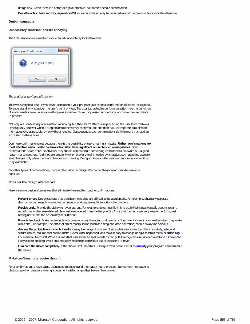
design flaw. Often there is a better design alternative that doesn’t need a confirmation.
● Does the action have security implications? If so, a confirmation may be required even if the previous tests indicate otherwise.
Design concepts
Unnecessary confirmations are annoying
The first Windows confirmation ever created undoubtedly looked like this:
The original annoying confirmation.
This was a very bad start. If you want users to hate your program, just sprinkle confirmations like this throughout. To understand why, consider the user’s point of view. The user just asked to perform an action—by the definition of a confirmation—so unless something was somehow clicked or pressed accidentally, of course the user wants to proceed.
Not only are unnecessary confirmations annoying, but they aren’t effective in protecting the user from mistakes. Users quickly discover when a program has unnecessary confirmations and their natural response is to dismiss them as quickly as possible, often without reading. Consequently, such confirmations do little more than add an extra step to these tasks.
Don’t use confirmations just because there is the possibility of users making a mistake. Rather, confirmations are most effective when used to confirm actions that have significant or unintended consequences. Good confirmations never state the obvious; they should communicate something users need to be aware of—a good reason not to continue. And they are used only when they are really needed by an action, such as asking users to save changes only when there are changes worth saving. Doing so demands the user’s attention only when it is truly warranted.
For other types of confirmations, there is often a better design alternative than forcing users to answer a question.
Consider the design alternatives
Here are some design alternatives that eliminate the need for routine confirmations:
● Prevent errors. Design tasks so that significant mistakes are difficult to do accidentally. For example, physically separate destructive commands from other commands, and require multiple actions to complete.
● Provide undo. Provide the ability to revert actions. For example, deleting a file in Microsoft® Windows® usually doesn’t require a confirmation because deleted files can be recovered from the Recycle Bin. Note that if an action is very easy to perform, just having users redo the action may be sufficient.
● Provide feedback. Make undesirable outcomes obvious. Providing undo alone isn’t sufficient if users don’t realize when they make a mistake. For example, the effect of direct manipulation (such as a drag-and-drop operation) should always be obvious.
● Assume the probable outcome, but make it easy to change. If you aren’t sure what users want but there is a likely, safe, and secure choice, assume that choice, make it clear what happened, and make it easy to change using a shortcut menu or smart tag. For example, Microsoft Word assumes that users want to spell words correctly. If it recognizes a misspelled word and it knows the likely correct spelling, Word automatically makes the correction but allows users to revert.
● Eliminate the choice completely. If the choice isn’t important, users just won’t care. Better to simplify your program and eliminate the choice.
Make confirmations require thought
For a confirmation to have value, users need to understand the reason not to proceed. Sometimes the reason is obvious, as when users are closing a document with changes that haven’t been saved:
© 2005 – 2007, Microsoft Corporation. All rights reserved. Page 567 of 763
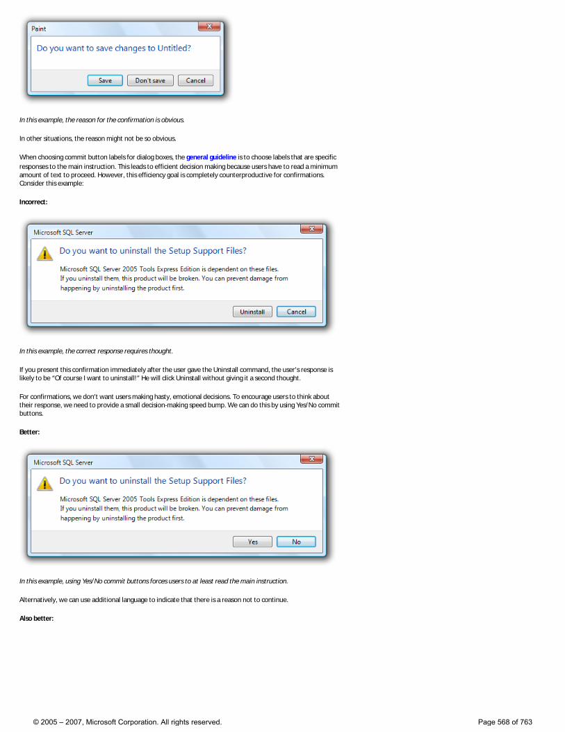
In this example, the reason for the confirmation is obvious.
In other situations, the reason might not be so obvious.
When choosing commit button labels for dialog boxes, the general guideline is to choose labels that are specific responses to the main instruction. This leads to efficient decision making because users have to read a minimum amount of text to proceed. However, this efficiency goal is completely counterproductive for confirmations. Consider this example:
Incorrect:
In this example, the correct response requires thought.
If you present this confirmation immediately after the user gave the Uninstall command, the user’s response is likely to be “Of course I want to uninstall!” He will click Uninstall without giving it a second thought.
For confirmations, we don’t want users making hasty, emotional decisions. To encourage users to think about their response, we need to provide a small decision-making speed bump. We can do this by using Yes/No commit buttons.
Better:
In this example, using Yes/No commit buttons forces users to at least read the main instruction.
Alternatively, we can use additional language to indicate that there is a reason not to continue.
Also better:
© 2005 – 2007, Microsoft Corporation. All rights reserved. Page 568 of 763
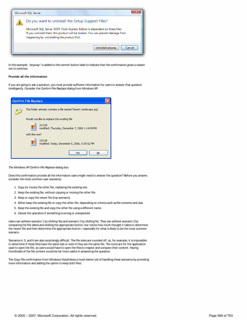
In this example, “anyway” is added to the commit button label to indicate that the confirmation gives a reason not to continue.
Provide all the information
If you are going to ask a question, you must provide sufficient information for users to answer that question intelligently. Consider the Confirm File Replace dialog from Windows XP:
The Windows XP Confirm File Replace dialog box.
Does this confirmation provide all the information users might need to answer the question? Before you answer, consider the most common user scenarios:
1. Copy (or move) the other file, replacing the existing one.
2. Keep the existing file, without copying or moving the other file.
3. Keep or copy the newer file (top scenario).
4. Either keep the existing file or copy the other file, depending on criteria such as file contents and size.
5. Keep the existing file and copy the other file using a different name.
6. Cancel the operation if something is wrong or unexpected.
Users can achieve scenario 1 by clicking Yes and scenario 2 by clicking No. They can achieve scenario 3 by comparing the file dates and clicking the appropriate button, but notice how much thought it takes to determine the newer file and then determine the appropriate button—especially for what is likely to be the most common scenario.
Scenarios 4, 5, and 6 are also surprisingly difficult. The file sizes are rounded off, so, for example, it is impossible to determine if these files have the same size or even if they are the same file. The icons are for the application used to open the file, so users would have to open the files to inspect and compare their content. Having thumbnails of the file content would be far more useful in answering the question.
The Copy File confirmation from Windows Vista® does a much better job of handling these scenarios by providing more information and adding the option to keep both files:
© 2005 – 2007, Microsoft Corporation. All rights reserved. Page 569 of 763
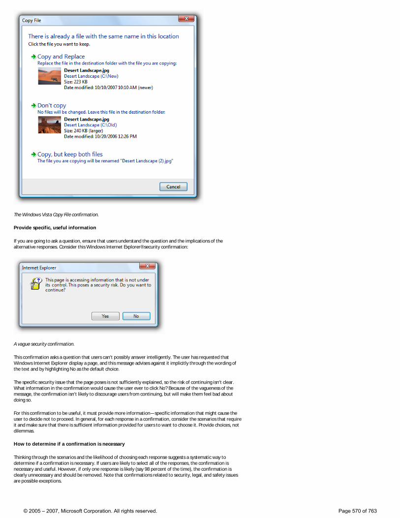
The Windows Vista Copy File confirmation.
Provide specific, useful information
If you are going to ask a question, ensure that users understand the question and the implications of the alternative responses. Consider this Windows Internet Explorer® security confirmation:
A vague security confirmation.
This confirmation asks a question that users can’t possibly answer intelligently. The user has requested that Windows Internet Explorer display a page, and this message advises against it implicitly through the wording of the text and by highlighting No as the default choice.
The specific security issue that the page poses is not sufficiently explained, so the risk of continuing isn’t clear. What information in the confirmation would cause the user ever to click No? Because of the vagueness of the message, the confirmation isn’t likely to discourage users from continuing, but will make them feel bad about doing so.
For this confirmation to be useful, it must provide more information—specific information that might cause the user to decide not to proceed. In general, for each response in a confirmation, consider the scenarios that require it and make sure that there is sufficient information provided for users to want to choose it. Provide choices, not dilemmas.
How to determine if a confirmation is necessary
Thinking through the scenarios and the likelihood of choosing each response suggests a systematic way to determine if a confirmation is necessary. If users are likely to select all of the responses, the confirmation is necessary and useful. However, if only one response is likely (say 98 percent of the time), the confirmation is clearly unnecessary and should be removed. Note that confirmations related to security, legal, and safety issues are possible exceptions.
© 2005 – 2007, Microsoft Corporation. All rights reserved. Page 570 of 763
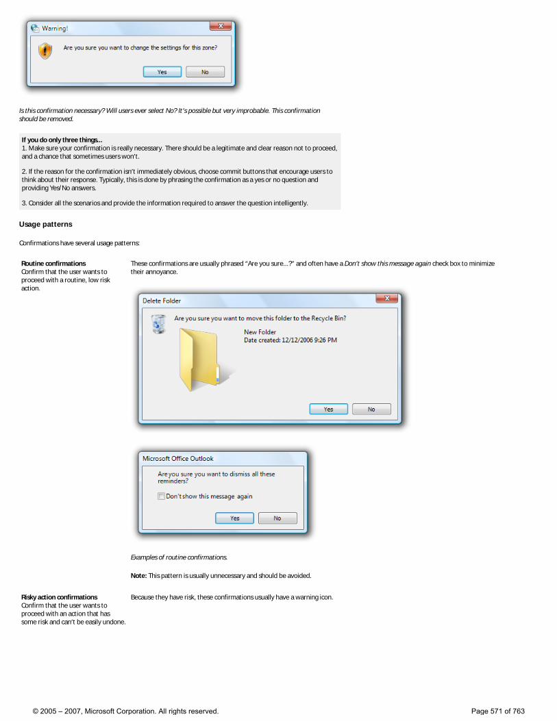
Is this confirmation necessary? Will users ever select No? It’s possible but very improbable. This confirmation should be removed.
If you do only three things... 1. Make sure your confirmation is really necessary. There should be a legitimate and clear reason not to proceed, and a chance that sometimes users won’t. 2. If the reason for the confirmation isn’t immediately obvious, choose commit buttons that encourage users to think about their response. Typically, this is done by phrasing the confirmation as a yes or no question and providing Yes/No answers. 3. Consider all the scenarios and provide the information required to answer the question intelligently.
Usage patterns
Confirmations have several usage patterns:
Routine confirmations Confirm that the user wants to proceed with a routine, low risk action.
These confirmations are usually phrased “Are you sure...?” and often have a Don’t show this message again check box to minimize their annoyance.
Examples of routine confirmations.
Note: This pattern is usually unnecessary and should be avoided.
Risky action confirmations Confirm that the user wants to proceed with an action that has some risk and can’t be easily undone.
Because they have risk, these confirmations usually have a warning icon.
© 2005 – 2007, Microsoft Corporation. All rights reserved. Page 571 of 763
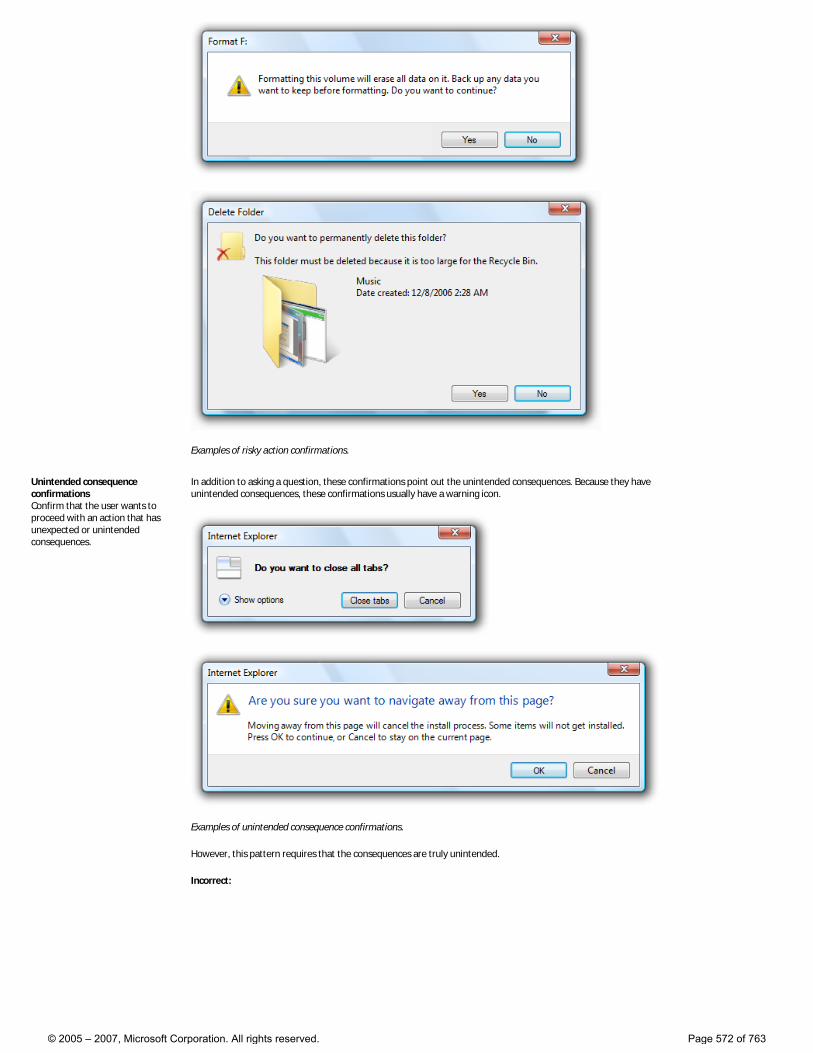
Examples of risky action confirmations.
Unintended consequence confirmations Confirm that the user wants to proceed with an action that has unexpected or unintended consequences.
In addition to asking a question, these confirmations point out the unintended consequences. Because they have unintended consequences, these confirmations usually have a warning icon.
Examples of unintended consequence confirmations.
However, this pattern requires that the consequences are truly unintended.
Incorrect:
© 2005 – 2007, Microsoft Corporation. All rights reserved. Page 572 of 763
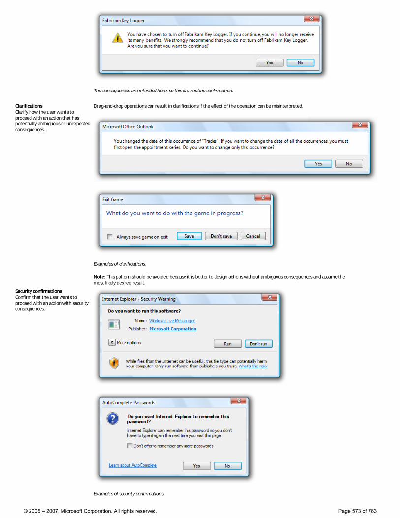
The consequences are intended here, so this is a routine confirmation.
Clarifications Clarify how the user wants to proceed with an action that has potentially ambiguous or unexpected consequences.
Drag-and-drop operations can result in clarifications if the effect of the operation can be misinterpreted.
Examples of clarifications.
Note: This pattern should be avoided because it is better to design actions without ambiguous consequences and assume the most likely desired result.
Security confirmations Confirm that the user wants to proceed with an action with security consequences.
Examples of security confirmations.
© 2005 – 2007, Microsoft Corporation. All rights reserved. Page 573 of 763
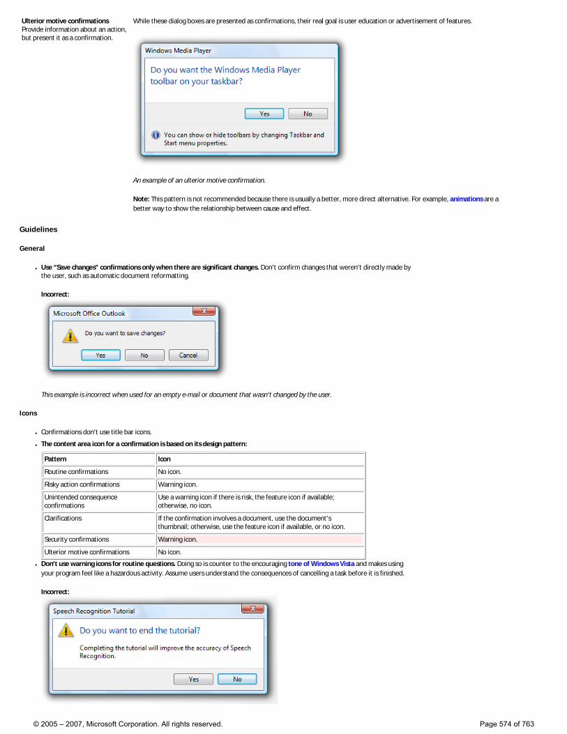
Ulterior motive confirmations Provide information about an action, but present it as a confirmation.
While these dialog boxes are presented as confirmations, their real goal is user education or advertisement of features.
An example of an ulterior motive confirmation.
Note: This pattern is not recommended because there is usually a better, more direct alternative. For example, animations are a better way to show the relationship between cause and effect.
Guidelines
General
● Use “Save changes” confirmations only when there are significant changes. Don’t confirm changes that weren’t directly made by the user, such as automatic document reformatting.
Incorrect:
This example is incorrect when used for an empty e-mail or document that wasn’t changed by the user.
Icons
● Confirmations don’t use title bar icons.
● The content area icon for a confirmation is based on its design pattern:
Pattern Icon
Routine confirmations No icon.
Risky action confirmations Warning icon.
Unintended consequence confirmations
Use a warning icon if there is risk, the feature icon if available; otherwise, no icon.
Clarifications If the confirmation involves a document, use the document’s thumbnail; otherwise, use the feature icon if available, or no icon.
Security confirmations Warning icon.
Ulterior motive confirmations No icon.
● Don’t use warning icons for routine questions. Doing so is counter to the encouraging tone of Windows Vista and makes using your program feel like a hazardous activity. Assume users understand the consequences of cancelling a task before it is finished.
Incorrect:
© 2005 – 2007, Microsoft Corporation. All rights reserved. Page 574 of 763
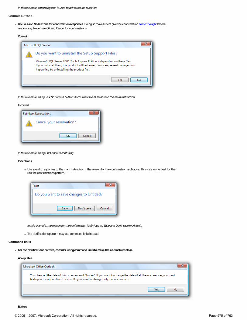
In this example, a warning icon is used to ask a routine question.
Commit buttons
● Use Yes and No buttons for confirmation responses. Doing so makes users give the confirmation some thought before responding. Never use OK and Cancel for confirmations.
Correct:
In this example, using Yes/No commit buttons forces users to at least read the main instruction.
Incorrect:
In this example, using OK/Cancel is confusing.
Exceptions:
�❍ Use specific responses to the main instruction if the reason for the confirmation is obvious. This style works best for the routine confirmations pattern.
In this example, the reason for the confirmation is obvious, so Save and Don’t save work well.
�❍ The clarifications pattern may use command links instead.
Command links
● For the clarifications pattern, consider using command links to make the alternatives clear.
Acceptable:
Better:
© 2005 – 2007, Microsoft Corporation. All rights reserved. Page 575 of 763
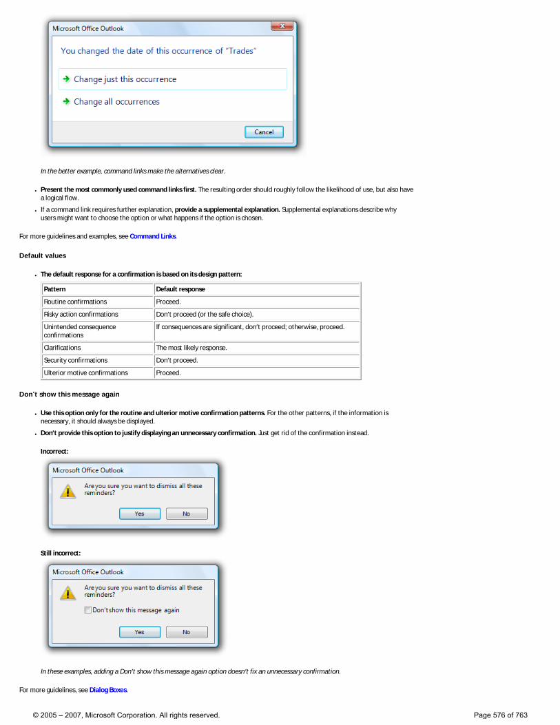
In the better example, command links make the alternatives clear.
● Present the most commonly used command links first. The resulting order should roughly follow the likelihood of use, but also have a logical flow.
● If a command link requires further explanation, provide a supplemental explanation. Supplemental explanations describe why users might want to choose the option or what happens if the option is chosen.
For more guidelines and examples, see Command Links.
Default values
● The default response for a confirmation is based on its design pattern:
Pattern Default response
Routine confirmations Proceed.
Risky action confirmations Don’t proceed (or the safe choice).
Unintended consequence confirmations
If consequences are significant, don’t proceed; otherwise, proceed.
Clarifications The most likely response.
Security confirmations Don’t proceed.
Ulterior motive confirmations Proceed.
Don’t show this message again
● Use this option only for the routine and ulterior motive confirmation patterns. For the other patterns, if the information is necessary, it should always be displayed.
● Don’t provide this option to justify displaying an unnecessary confirmation. Just get rid of the confirmation instead.
Incorrect:
Still incorrect:
In these examples, adding a Don’t show this message again option doesn’t fix an unnecessary confirmation.
For more guidelines, see Dialog Boxes.
© 2005 – 2007, Microsoft Corporation. All rights reserved. Page 576 of 763
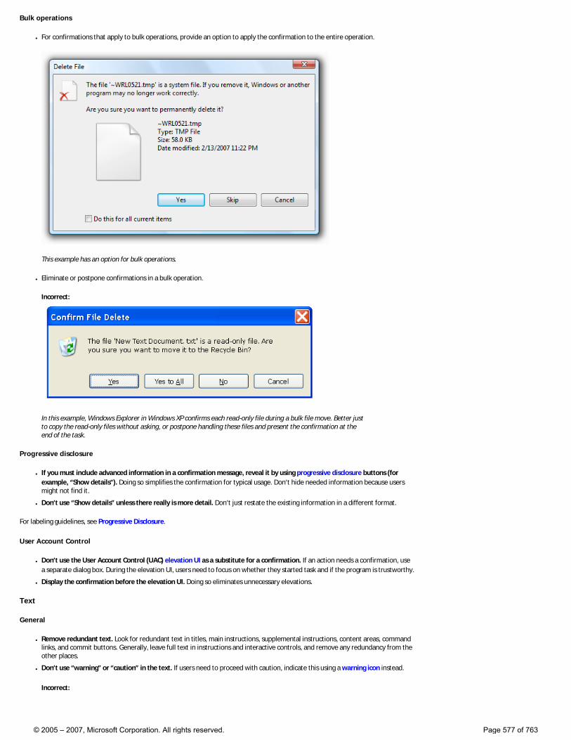
Bulk operations
● For confirmations that apply to bulk operations, provide an option to apply the confirmation to the entire operation.
This example has an option for bulk operations.
● Eliminate or postpone confirmations in a bulk operation.
Incorrect:
In this example, Windows Explorer in Windows XP confirms each read-only file during a bulk file move. Better just to copy the read-only files without asking, or postpone handling these files and present the confirmation at the end of the task.
Progressive disclosure
● If you must include advanced information in a confirmation message, reveal it by using progressive disclosure buttons (for example, “Show details”). Doing so simplifies the confirmation for typical usage. Don’t hide needed information because users might not find it.
● Don’t use “Show details” unless there really is more detail. Don’t just restate the existing information in a different format.
For labeling guidelines, see Progressive Disclosure.
User Account Control
● Don’t use the User Account Control (UAC) elevation UI as a substitute for a confirmation. If an action needs a confirmation, use a separate dialog box. During the elevation UI, users need to focus on whether they started task and if the program is trustworthy.
● Display the confirmation before the elevation UI. Doing so eliminates unnecessary elevations.
Text
General
● Remove redundant text. Look for redundant text in titles, main instructions, supplemental instructions, content areas, command links, and commit buttons. Generally, leave full text in instructions and interactive controls, and remove any redundancy from the other places.
● Don’t use “warning” or “caution” in the text. If users need to proceed with caution, indicate this using a warning icon instead.
Incorrect:
© 2005 – 2007, Microsoft Corporation. All rights reserved. Page 577 of 763
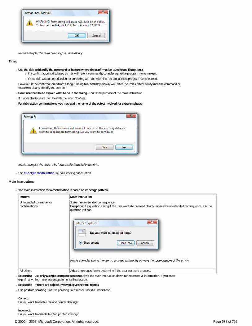
In this example, the term “warning” is unnecessary.
Titles
● Use the title to identify the command or feature where the confirmation came from. Exceptions: �❍ If a confirmation is displayed by many different commands, consider using the program name instead.
�❍ If that title would be redundant or confusing with the main instruction, use the program name instead.
However, if the confirmation is from a long-running task and may display well after the task started, always use the command or feature to clearly identify the context.
● Don’t use the title to explain what to do in the dialog—that’s the purpose of the main instruction.
● If it adds clarity, start the title with the word Confirm.
● For risky action confirmations, you may add the name of the object involved for extra emphasis.
In this example, the drive to be formatted is included in the title.
● Use title-style capitalization, without ending punctuation.
Main instructions
● The main instruction for a confirmation is based on its design pattern:
Pattern Main instruction
Unintended consequence confirmations
State the unintended consequence. Exception: If a question asking if the user wants to proceed clearly implies the unintended consequence, ask the question instead.
In this example, asking the user to proceed sufficiently conveys the consequences of the action.
All others Ask a single question to determine if the user wants to proceed.
● Be concise—use only a single, complete sentence. Strip the main instruction down to the essential information. If you must explain anything more, use a supplemental instruction.
● Be specific—if there are objects involved, give their full names.
● Use positive phrasing. Positive phrasing is easier for users to understand.
Correct: Do you want to enable file and printer sharing?
Incorrect: Do you want to disable file and printer sharing?
© 2005 – 2007, Microsoft Corporation. All rights reserved. Page 578 of 763
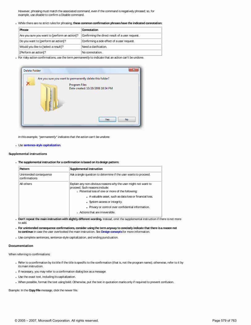
However, phrasing must match the associated command, even if the command is negatively phrased; so, for example, use disable to confirm a Disable command.
● While there are no strict rules for phrasing, these common confirmation phrases have the indicated connotation:
Phrase Connotation
Are you sure you want to [perform an action]? Confirming the direct result of a user request.
Do you want to [perform an action]? Confirming a side effect of a user request.
Would you like to [select a result]? Need a clarification.
[Perform an action]? No connotation.
● For risky action confirmations, use the term permanently to indicate that an action can’t be undone.
In this example, “permanently” indicates that the action can’t be undone.
● Use sentence-style capitalization.
Supplemental instructions
● The supplemental instruction for a confirmation is based on its design pattern:
Pattern Supplemental instruction
Unintended consequence confirmations
Ask a single question to determine if the user wants to proceed.
All others Explain any non-obvious reasons why the user might not want to proceed. Such reasons include:
�❍ Potential loss of one or more of the following:
■ A valuable asset, such as data loss or financial loss.
■ System access or integrity.
■ Privacy or control over confidential information.
�❍ Actions that are irreversible.
● Don’t repeat the main instruction with slightly different wording. Instead, omit the supplemental instruction if there is not more to add.
● For unintended consequence confirmations, consider using the term anyway to concisely indicate that there is a reason not to continue in case the user overlooked the main instruction. See Design concepts for more information.
● Use complete sentences, sentence-style capitalization, and ending punctuation.
Documentation
When referring to confirmations:
● Refer to a confirmation by its title if the title is specific to the confirmation (that is, not the program name); otherwise, refer to it by its main instruction.
● If necessary, you may refer to a confirmation dialog box as a message.
● Use the exact text, including its capitalization.
● When possible, format the text using bold. Otherwise, put the text in quotation marks only if required to prevent confusion.
Example: In the Copy File message, click the newer file.
© 2005 – 2007, Microsoft Corporation. All rights reserved. Page 579 of 763
Aesthetics
These articles discuss the aesthetic issues you’ll need to consider as you design the user experience for your Windows Vista®-based applications:
● Layout
● Window Frames
● Fonts (Segoe UI)
● Color
● Icons
● Standard Icons
● Graphic Elements
● Sound
● Software Branding
© 2005 – 2007, Microsoft Corporation. All rights reserved. Page 580 of 763
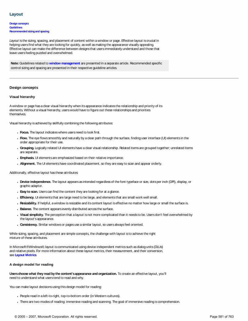
Layout
Design concepts Guidelines Recommended sizing and spacing
Layout is the sizing, spacing, and placement of content within a window or page. Effective layout is crucial in helping users find what they are looking for quickly, as well as making the appearance visually appealing. Effective layout can make the difference between designs that users immediately understand and those that leave users feeling puzzled and overwhelmed.
Note: Guidelines related to window management are presented in a separate article. Recommended specific control sizing and spacing are presented in their respective guideline articles.
Design concepts
Visual hierarchy
A window or page has a clear visual hierarchy when its appearance indicates the relationship and priority of its elements. Without a visual hierarchy, users would have to figure out these relationships and priorities themselves.
Visual hierarchy is achieved by skillfully combining the following attributes:
● Focus. The layout indicates where users need to look first.
● Flow. The eye flows smoothly and naturally by a clear path through the surface, finding user interface (UI) elements in the order appropriate for their use.
● Grouping. Logically related UI elements have a clear visual relationship. Related items are grouped together; unrelated items are separate.
● Emphasis. UI elements are emphasized based on their relative importance.
● Alignment. The UI elements have coordinated placement, so they are easy to scan and appear orderly.
Additionally, effective layout has these attributes:
● Device independence. The layout appears as intended regardless of the font typeface or size, dots per inch (DPI), display, or graphic adaptor.
● Easy to scan. Users can find the content they are looking for at a glance.
● Efficiency. UI elements that are large need to be large, and elements that are small work well small.
● Resizability. If helpful, a window is resizable and its content layout is effective no matter how large or small the surface is.
● Balance. The content appears evenly distributed across the surface.
● Visual simplicity. The perception that a layout is not more complicated than it needs to be. Users don’t feel overwhelmed by the layout’s appearance.
● Consistency. Similar windows or pages use a similar layout, so users always feel oriented.
While sizing, spacing, and placement are simple concepts, the challenge with layout is to achieve the right mixture of these attributes.
In Microsoft® Windows®, layout is communicated using device independent metrics such as dialog units (DLUs) and relative pixels. For more information about these layout metrics, their measurement, and their conversion, see Layout Metrics.
A design model for reading
Users choose what they read by the content’s appearance and organization. To create an effective layout, you’ll need to understand what users tend to read and why.
You can make layout decisions using this design model for reading:
● People read in a left-to-right, top-to-bottom order (in Western cultures).
● There are two modes of reading: immersive reading and scanning. The goal of immersive reading is comprehension.
© 2005 – 2007, Microsoft Corporation. All rights reserved. Page 581 of 763
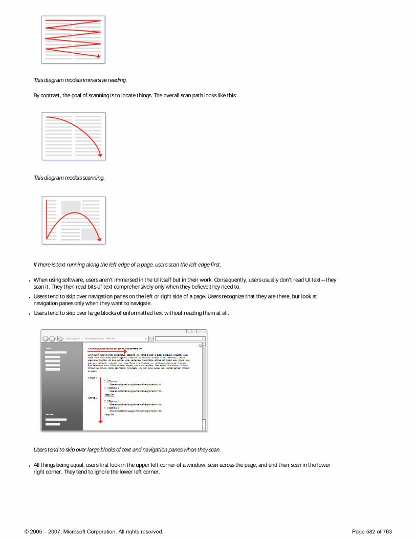
This diagram models immersive reading.
By contrast, the goal of scanning is to locate things. The overall scan path looks like this:
This diagram models scanning.
If there is text running along the left edge of a page, users scan the left edge first.
● When using software, users aren’t immersed in the UI itself but in their work. Consequently, users usually don’t read UI text—they scan it. They then read bits of text comprehensively only when they believe they need to.
● Users tend to skip over navigation panes on the left or right side of a page. Users recognize that they are there, but look at navigation panes only when they want to navigate.
● Users tend to skip over large blocks of unformatted text without reading them at all.
Users tend to skip over large blocks of text and navigation panes when they scan.
● All things being equal, users first look in the upper left corner of a window, scan across the page, and end their scan in the lower right corner. They tend to ignore the lower left corner.
© 2005 – 2007, Microsoft Corporation. All rights reserved. Page 582 of 763
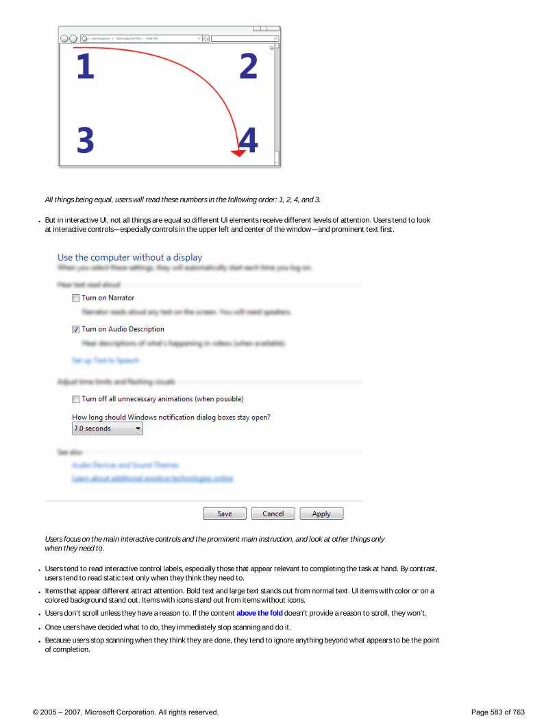
All things being equal, users will read these numbers in the following order: 1, 2, 4, and 3.
● But in interactive UI, not all things are equal so different UI elements receive different levels of attention. Users tend to look at interactive controls—especially controls in the upper left and center of the window—and prominent text first.
Users focus on the main interactive controls and the prominent main instruction, and look at other things only when they need to.
● Users tend to read interactive control labels, especially those that appear relevant to completing the task at hand. By contrast, users tend to read static text only when they think they need to.
● Items that appear different attract attention. Bold text and large text stands out from normal text. UI items with color or on a colored background stand out. Items with icons stand out from items without icons.
● Users don’t scroll unless they have a reason to. If the content above the fold doesn’t provide a reason to scroll, they won’t.
● Once users have decided what to do, they immediately stop scanning and do it.
● Because users stop scanning when they think they are done, they tend to ignore anything beyond what appears to be the point of completion.
© 2005 – 2007, Microsoft Corporation. All rights reserved. Page 583 of 763
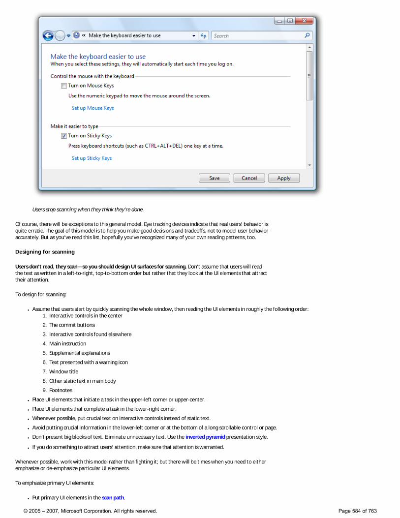
Users stop scanning when they think they’re done.
Of course, there will be exceptions to this general model. Eye tracking devices indicate that real users’ behavior is quite erratic. The goal of this model is to help you make good decisions and tradeoffs, not to model user behavior accurately. But as you’ve read this list, hopefully you’ve recognized many of your own reading patterns, too.
Designing for scanning
Users don’t read, they scan—so you should design UI surfaces for scanning. Don’t assume that users will read the text as written in a left-to-right, top-to-bottom order but rather that they look at the UI elements that attract their attention.
To design for scanning:
● Assume that users start by quickly scanning the whole window, then reading the UI elements in roughly the following order: 1. Interactive controls in the center
2. The commit buttons
3. Interactive controls found elsewhere
4. Main instruction
5. Supplemental explanations
6. Text presented with a warning icon
7. Window title
8. Other static text in main body
9. Footnotes
● Place UI elements that initiate a task in the upper-left corner or upper-center.
● Place UI elements that complete a task in the lower-right corner.
● Whenever possible, put crucial text on interactive controls instead of static text.
● Avoid putting crucial information in the lower-left corner or at the bottom of a long scrollable control or page.
● Don’t present big blocks of text. Eliminate unnecessary text. Use the inverted pyramid presentation style.
● If you do something to attract users’ attention, make sure that attention is warranted.
Whenever possible, work with this model rather than fighting it; but there will be times when you need to either emphasize or de-emphasize particular UI elements.
To emphasize primary UI elements:
● Put primary UI elements in the scan path.
© 2005 – 2007, Microsoft Corporation. All rights reserved. Page 584 of 763
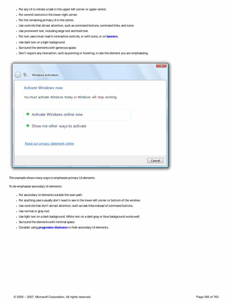
● Put any UI to initiate a task in the upper-left corner or upper-center.
● Put commit buttons in the lower-right corner.
● Put the remaining primary UI in the center.
● Use controls that attract attention, such as command buttons, command links, and icons.
● Use prominent text, including large text and bold text.
● Put text users must read in interactive controls, or with icons, or on banners.
● Use dark text on a light background.
● Surround the elements with generous space.
● Don’t require any interaction, such as pointing or hovering, to see the element you are emphasizing.
This example shows many ways to emphasize primary UI elements.
To de-emphasize secondary UI elements:
● Put secondary UI elements outside the scan path.
● Put anything users usually don’t need to see in the lower-left corner or bottom of the window.
● Use controls that don’t attract attention, such as task links instead of command buttons.
● Use normal or gray text.
● Use light text on a dark background. White text on a dark gray or blue background works well.
● Surround the elements with minimal space.
● Consider using progressive disclosure to hide secondary UI elements.
© 2005 – 2007, Microsoft Corporation. All rights reserved. Page 585 of 763
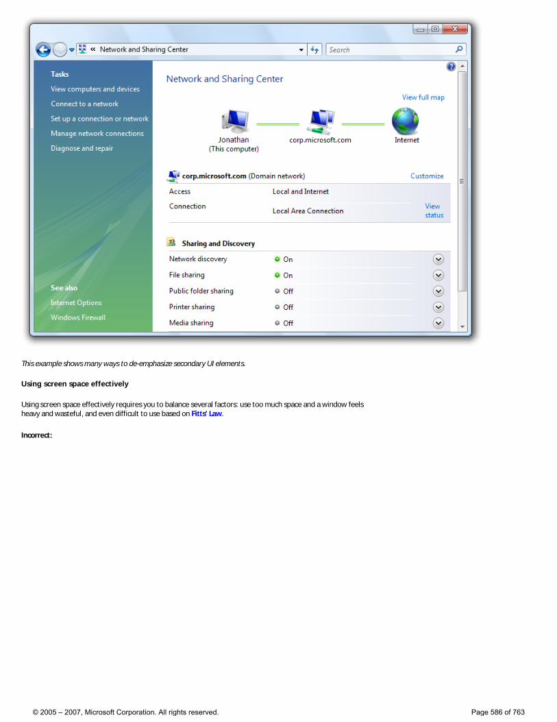
This example shows many ways to de-emphasize secondary UI elements.
Using screen space effectively
Using screen space effectively requires you to balance several factors: use too much space and a window feels heavy and wasteful, and even difficult to use based on Fitts’ Law.
Incorrect:
© 2005 – 2007, Microsoft Corporation. All rights reserved. Page 586 of 763
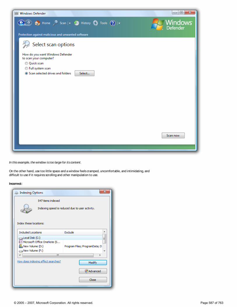
In this example, the window is too large for its content.
On the other hand, use too little space and a window feels cramped, uncomfortable, and intimidating, and difficult to use if it requires scrolling and other manipulation to use.
Incorrect:
© 2005 – 2007, Microsoft Corporation. All rights reserved. Page 587 of 763
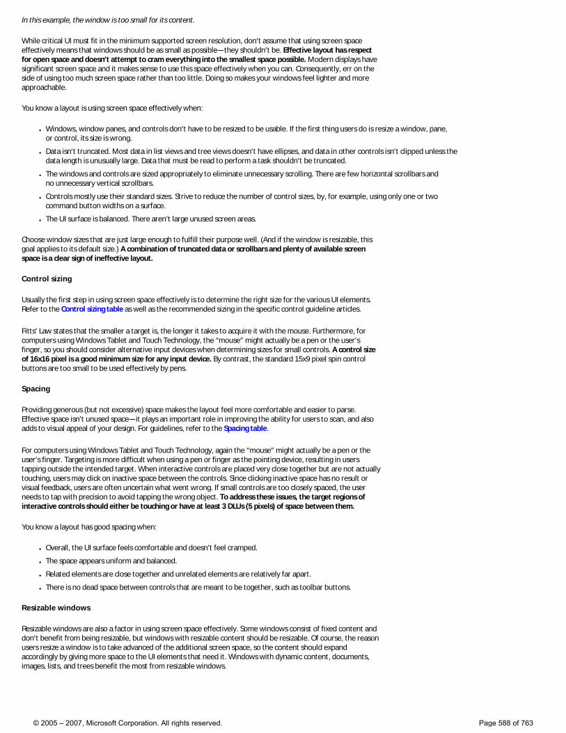
In this example, the window is too small for its content.
While critical UI must fit in the minimum supported screen resolution, don’t assume that using screen space effectively means that windows should be as small as possible—they shouldn’t be. Effective layout has respect for open space and doesn’t attempt to cram everything into the smallest space possible. Modern displays have significant screen space and it makes sense to use this space effectively when you can. Consequently, err on the side of using too much screen space rather than too little. Doing so makes your windows feel lighter and more approachable.
You know a layout is using screen space effectively when:
● Windows, window panes, and controls don’t have to be resized to be usable. If the first thing users do is resize a window, pane, or control, its size is wrong.
● Data isn’t truncated. Most data in list views and tree views doesn’t have ellipses, and data in other controls isn’t clipped unless the data length is unusually large. Data that must be read to perform a task shouldn’t be truncated.
● The windows and controls are sized appropriately to eliminate unnecessary scrolling. There are few horizontal scrollbars and no unnecessary vertical scrollbars.
● Controls mostly use their standard sizes. Strive to reduce the number of control sizes, by, for example, using only one or two command button widths on a surface.
● The UI surface is balanced. There aren’t large unused screen areas.
Choose window sizes that are just large enough to fulfill their purpose well. (And if the window is resizable, this goal applies to its default size.) A combination of truncated data or scrollbars and plenty of available screen space is a clear sign of ineffective layout.
Control sizing
Usually the first step in using screen space effectively is to determine the right size for the various UI elements. Refer to the Control sizing table as well as the recommended sizing in the specific control guideline articles.
Fitts’ Law states that the smaller a target is, the longer it takes to acquire it with the mouse. Furthermore, for computers using Windows Tablet and Touch Technology, the “mouse” might actually be a pen or the user’s finger, so you should consider alternative input devices when determining sizes for small controls. A control size of 16x16 pixel is a good minimum size for any input device. By contrast, the standard 15x9 pixel spin control buttons are too small to be used effectively by pens.
Spacing
Providing generous (but not excessive) space makes the layout feel more comfortable and easier to parse. Effective space isn’t unused space—it plays an important role in improving the ability for users to scan, and also adds to visual appeal of your design. For guidelines, refer to the Spacing table.
For computers using Windows Tablet and Touch Technology, again the “mouse” might actually be a pen or the user’s finger. Targeting is more difficult when using a pen or finger as the pointing device, resulting in users tapping outside the intended target. When interactive controls are placed very close together but are not actually touching, users may click on inactive space between the controls. Since clicking inactive space has no result or visual feedback, users are often uncertain what went wrong. If small controls are too closely spaced, the user needs to tap with precision to avoid tapping the wrong object. To address these issues, the target regions of interactive controls should either be touching or have at least 3 DLUs (5 pixels) of space between them.
You know a layout has good spacing when:
● Overall, the UI surface feels comfortable and doesn’t feel cramped.
● The space appears uniform and balanced.
● Related elements are close together and unrelated elements are relatively far apart.
● There is no dead space between controls that are meant to be together, such as toolbar buttons.
Resizable windows
Resizable windows are also a factor in using screen space effectively. Some windows consist of fixed content and don’t benefit from being resizable, but windows with resizable content should be resizable. Of course, the reason users resize a window is to take advanced of the additional screen space, so the content should expand accordingly by giving more space to the UI elements that need it. Windows with dynamic content, documents, images, lists, and trees benefit the most from resizable windows.
© 2005 – 2007, Microsoft Corporation. All rights reserved. Page 588 of 763
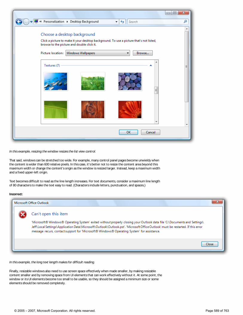
In this example, resizing the window resizes the list view control.
That said, windows can be stretched too wide. For example, many control panel pages become unwieldy when the content is wider than 600 relative pixels. In this case, it’s better not to resize the content area beyond this maximum width or change the content’s origin as the window is resized larger. Instead, keep a maximum width and a fixed upper-left origin.
Text becomes difficult to read as the line length increases. For text documents, consider a maximum line length of 80 characters to make the text easy to read. (Characters include letters, punctuation, and spaces.)
Incorrect:
In this example, the long text length makes for difficult reading.
Finally, resizable windows also need to use screen space effectively when made smaller, by making resizable content smaller and by removing space from UI elements that can work effectively without it. At some point, the window or its UI elements become too small to be usable, so they should be assigned a minimum size or some elements should be removed completely.
© 2005 – 2007, Microsoft Corporation. All rights reserved. Page 589 of 763

In this example, the pane has a minimum size.
Some programs benefit from using a completely different presentation to make the content usable at smaller sizes.
In this example, Windows Media Player® changes its format when the window becomes too small for the standard format.
Focus
A layout has focus when there is one obvious place to look first. Focus is important to show users where to start scanning your window or page. Without clear focus, the user’s eye will wander aimlessly. The focal point should be something important that users need to find and understand quickly, and should have the greatest visual emphasis. The upper-left corner is the natural focal point for most windows.
There should be only one focal point. Just as in real life, the eye can focus on only one thing at a time, users can’t focus on multiple places simultaneously.
To make a UI element the focal point, you can give it visual emphasis by:
● Placing it in the upper-left or upper-center portion of the surface.
● Using interactive controls that are important and readily comprehensible.
● Using prominent text, such as a main instruction.
© 2005 – 2007, Microsoft Corporation. All rights reserved. Page 590 of 763
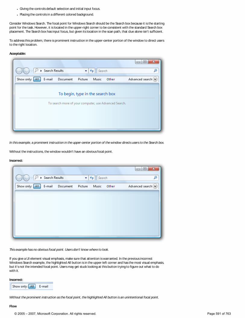
● Giving the controls default selection and initial input focus.
● Placing the controls in a different colored background.
Consider Windows Search. The focal point for Windows Search should be the Search box because it is the starting point for the task. However, it is located in the upper-right corner to be consistent with the standard Search box placement. The Search box has input focus, but given its location in the scan path, that clue alone isn’t sufficient.
To address this problem, there is prominent instruction in the upper-center portion of the window to direct users to the right location.
Acceptable:
In this example, a prominent instruction in the upper-center portion of the window directs users to the Search box.
Without the instructions, the window wouldn’t have an obvious focal point.
Incorrect:
This example has no obvious focal point. Users don’t know where to look.
If you give a UI element visual emphasis, make sure that attention is warranted. In the previous incorrect Windows Search example, the highlighted All button is in the upper-left corner and has the most visual emphasis, but it’s not the intended focal point. Users may get stuck looking at this button trying to figure out what to do with it.
Incorrect:
Without the prominent instruction as the focal point, the highlighted All button is an unintentional focal point.
Flow
© 2005 – 2007, Microsoft Corporation. All rights reserved. Page 591 of 763
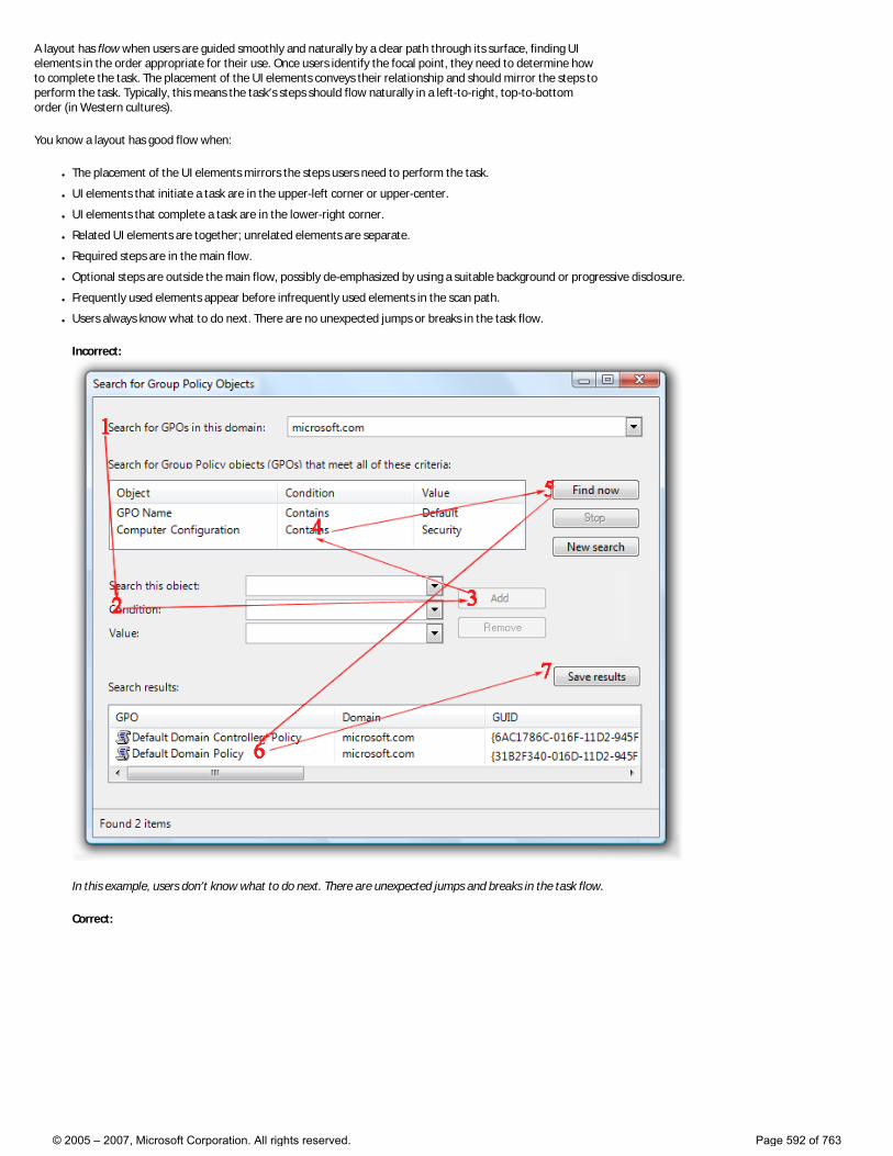
A layout has flow when users are guided smoothly and naturally by a clear path through its surface, finding UI elements in the order appropriate for their use. Once users identify the focal point, they need to determine how to complete the task. The placement of the UI elements conveys their relationship and should mirror the steps to perform the task. Typically, this means the task’s steps should flow naturally in a left-to-right, top-to-bottom order (in Western cultures).
You know a layout has good flow when:
● The placement of the UI elements mirrors the steps users need to perform the task.
● UI elements that initiate a task are in the upper-left corner or upper-center.
● UI elements that complete a task are in the lower-right corner.
● Related UI elements are together; unrelated elements are separate.
● Required steps are in the main flow.
● Optional steps are outside the main flow, possibly de-emphasized by using a suitable background or progressive disclosure.
● Frequently used elements appear before infrequently used elements in the scan path.
● Users always know what to do next. There are no unexpected jumps or breaks in the task flow.
Incorrect:
In this example, users don’t know what to do next. There are unexpected jumps and breaks in the task flow.
Correct:
© 2005 – 2007, Microsoft Corporation. All rights reserved. Page 592 of 763
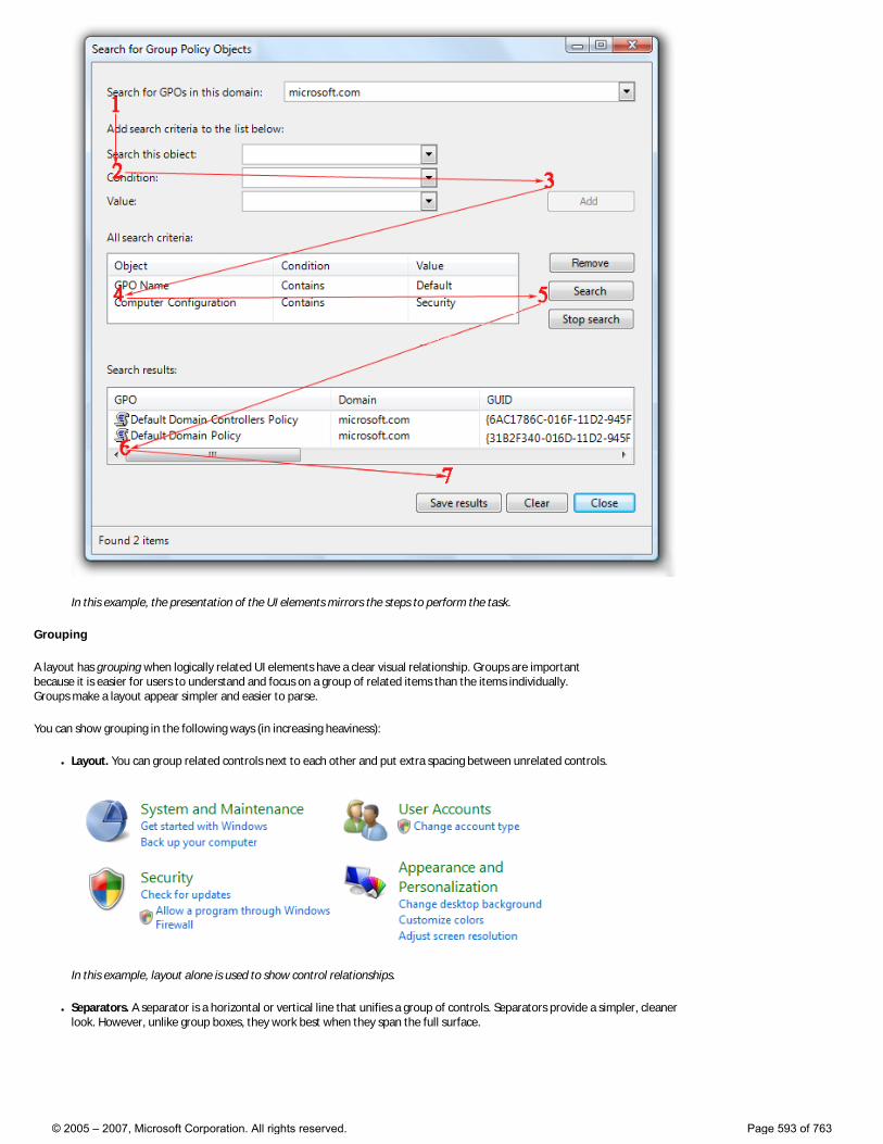
In this example, the presentation of the UI elements mirrors the steps to perform the task.
Grouping
A layout has grouping when logically related UI elements have a clear visual relationship. Groups are important because it is easier for users to understand and focus on a group of related items than the items individually. Groups make a layout appear simpler and easier to parse.
You can show grouping in the following ways (in increasing heaviness):
● Layout. You can group related controls next to each other and put extra spacing between unrelated controls.
In this example, layout alone is used to show control relationships.
● Separators. A separator is a horizontal or vertical line that unifies a group of controls. Separators provide a simpler, cleaner look. However, unlike group boxes, they work best when they span the full surface.
© 2005 – 2007, Microsoft Corporation. All rights reserved. Page 593 of 763
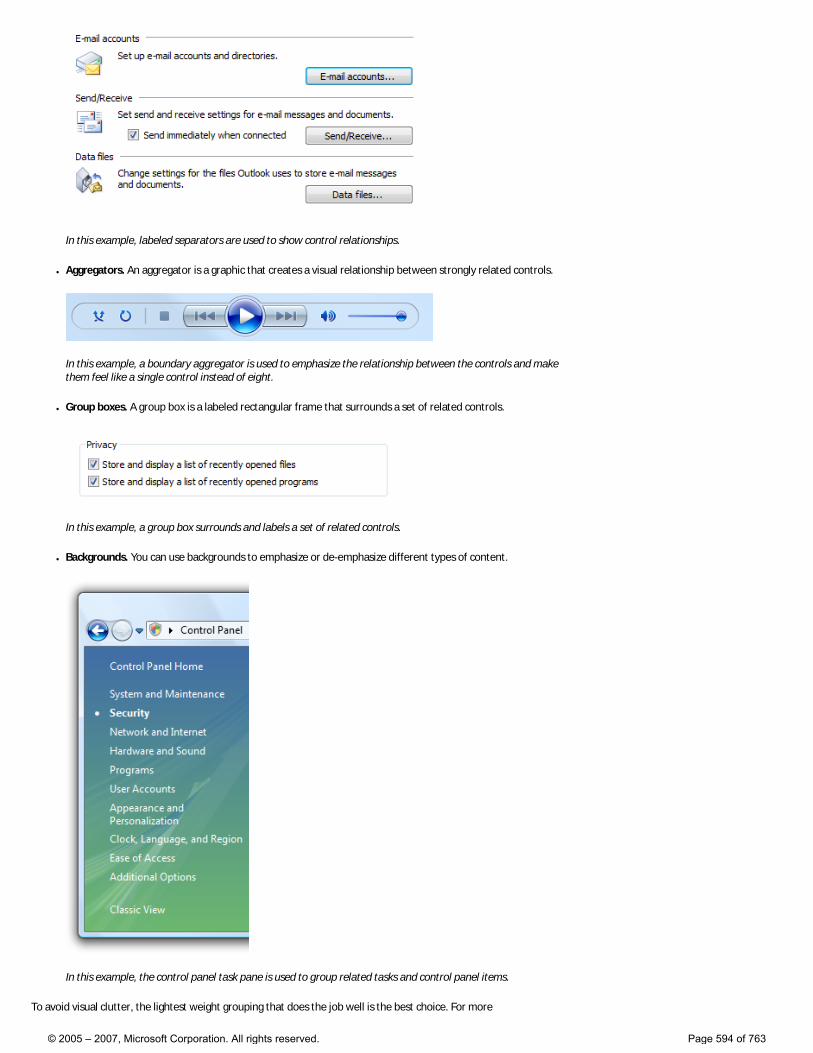
In this example, labeled separators are used to show control relationships.
● Aggregators. An aggregator is a graphic that creates a visual relationship between strongly related controls.
In this example, a boundary aggregator is used to emphasize the relationship between the controls and make them feel like a single control instead of eight.
● Group boxes. A group box is a labeled rectangular frame that surrounds a set of related controls.
In this example, a group box surrounds and labels a set of related controls.
● Backgrounds. You can use backgrounds to emphasize or de-emphasize different types of content.
In this example, the control panel task pane is used to group related tasks and control panel items.
To avoid visual clutter, the lightest weight grouping that does the job well is the best choice. For more
© 2005 – 2007, Microsoft Corporation. All rights reserved. Page 594 of 763
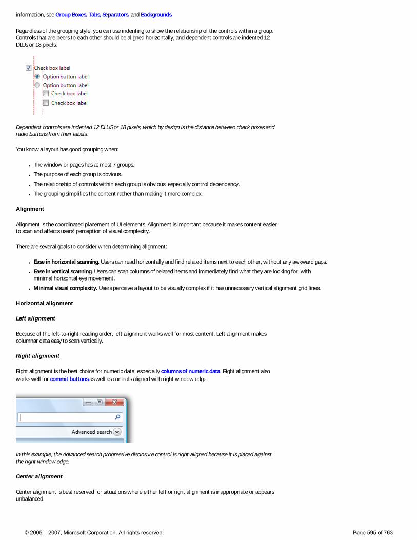
information, see Group Boxes, Tabs, Separators, and Backgrounds.
Regardless of the grouping style, you can use indenting to show the relationship of the controls within a group. Controls that are peers to each other should be aligned horizontally, and dependent controls are indented 12 DLUs or 18 pixels.
Dependent controls are indented 12 DLUS or 18 pixels, which by design is the distance between check boxes and radio buttons from their labels.
You know a layout has good grouping when:
● The window or pages has at most 7 groups.
● The purpose of each group is obvious.
● The relationship of controls within each group is obvious, especially control dependency.
● The grouping simplifies the content rather than making it more complex.
Alignment
Alignment is the coordinated placement of UI elements. Alignment is important because it makes content easier to scan and affects users’ perception of visual complexity.
There are several goals to consider when determining alignment:
● Ease in horizontal scanning. Users can read horizontally and find related items next to each other, without any awkward gaps.
● Ease in vertical scanning. Users can scan columns of related items and immediately find what they are looking for, with minimal horizontal eye movement.
● Minimal visual complexity. Users perceive a layout to be visually complex if it has unnecessary vertical alignment grid lines.
Horizontal alignment
Left alignment
Because of the left-to-right reading order, left alignment works well for most content. Left alignment makes columnar data easy to scan vertically.
Right alignment
Right alignment is the best choice for numeric data, especially columns of numeric data. Right alignment also works well for commit buttons as well as controls aligned with right window edge.
In this example, the Advanced search progressive disclosure control is right aligned because it is placed against the right window edge.
Center alignment
Center alignment is best reserved for situations where either left or right alignment is inappropriate or appears unbalanced.
© 2005 – 2007, Microsoft Corporation. All rights reserved. Page 595 of 763
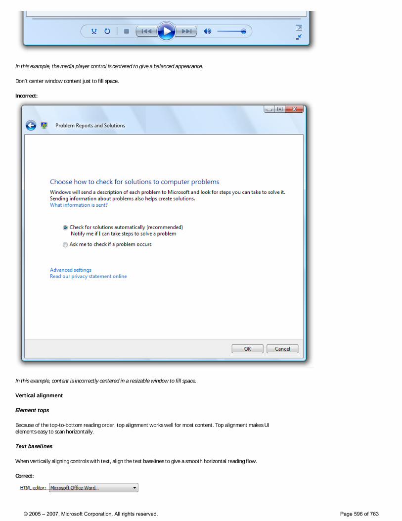
In this example, the media player control is centered to give a balanced appearance.
Don’t center window content just to fill space.
Incorrect:
In this example, content is incorrectly centered in a resizable window to fill space.
Vertical alignment
Element tops
Because of the top-to-bottom reading order, top alignment works well for most content. Top alignment makes UI elements easy to scan horizontally.
Text baselines
When vertically aligning controls with text, align the text baselines to give a smooth horizontal reading flow.
Correct:
© 2005 – 2007, Microsoft Corporation. All rights reserved. Page 596 of 763
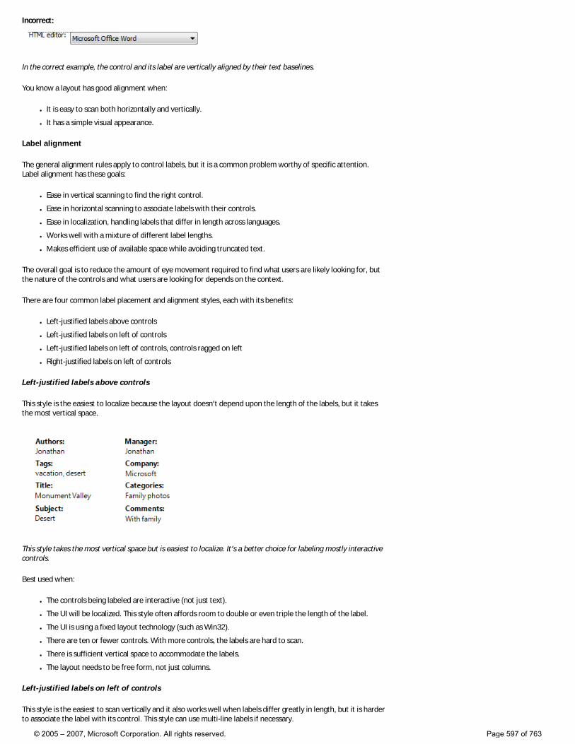
Incorrect:
In the correct example, the control and its label are vertically aligned by their text baselines.
You know a layout has good alignment when:
● It is easy to scan both horizontally and vertically.
● It has a simple visual appearance.
Label alignment
The general alignment rules apply to control labels, but it is a common problem worthy of specific attention. Label alignment has these goals:
● Ease in vertical scanning to find the right control.
● Ease in horizontal scanning to associate labels with their controls.
● Ease in localization, handling labels that differ in length across languages.
● Works well with a mixture of different label lengths.
● Makes efficient use of available space while avoiding truncated text.
The overall goal is to reduce the amount of eye movement required to find what users are likely looking for, but the nature of the controls and what users are looking for depends on the context.
There are four common label placement and alignment styles, each with its benefits:
● Left-justified labels above controls
● Left-justified labels on left of controls
● Left-justified labels on left of controls, controls ragged on left
● Right-justified labels on left of controls
Left-justified labels above controls
This style is the easiest to localize because the layout doesn’t depend upon the length of the labels, but it takes the most vertical space.
This style takes the most vertical space but is easiest to localize. It’s a better choice for labeling mostly interactive controls.
Best used when:
● The controls being labeled are interactive (not just text).
● The UI will be localized. This style often affords room to double or even triple the length of the label.
● The UI is using a fixed layout technology (such as Win32).
● There are ten or fewer controls. With more controls, the labels are hard to scan.
● There is sufficient vertical space to accommodate the labels.
● The layout needs to be free form, not just columns.
Left-justified labels on left of controls
This style is the easiest to scan vertically and it also works well when labels differ greatly in length, but it is harder to associate the label with its control. This style can use multi-line labels if necessary.
© 2005 – 2007, Microsoft Corporation. All rights reserved. Page 597 of 763
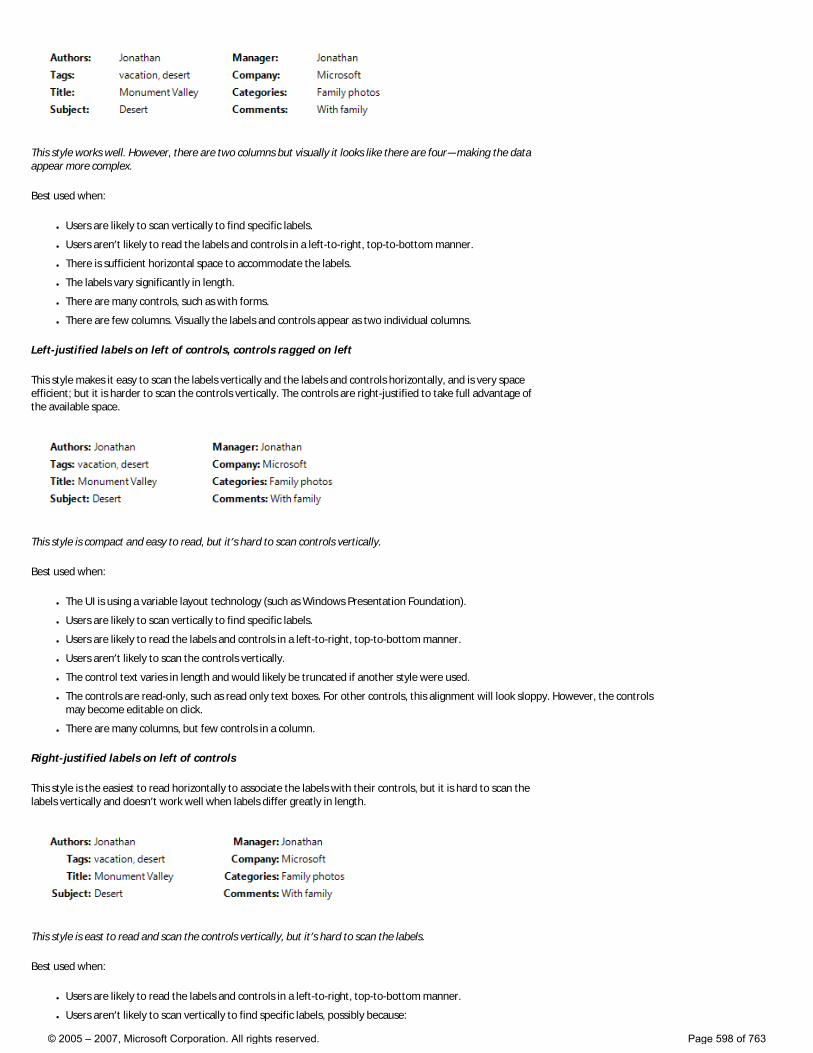
This style works well. However, there are two columns but visually it looks like there are four—making the data appear more complex.
Best used when:
● Users are likely to scan vertically to find specific labels.
● Users aren’t likely to read the labels and controls in a left-to-right, top-to-bottom manner.
● There is sufficient horizontal space to accommodate the labels.
● The labels vary significantly in length.
● There are many controls, such as with forms.
● There are few columns. Visually the labels and controls appear as two individual columns.
Left-justified labels on left of controls, controls ragged on left
This style makes it easy to scan the labels vertically and the labels and controls horizontally, and is very space efficient; but it is harder to scan the controls vertically. The controls are right-justified to take full advantage of the available space.
This style is compact and easy to read, but it’s hard to scan controls vertically.
Best used when:
● The UI is using a variable layout technology (such as Windows Presentation Foundation).
● Users are likely to scan vertically to find specific labels.
● Users are likely to read the labels and controls in a left-to-right, top-to-bottom manner.
● Users aren’t likely to scan the controls vertically.
● The control text varies in length and would likely be truncated if another style were used.
● The controls are read-only, such as read only text boxes. For other controls, this alignment will look sloppy. However, the controls may become editable on click.
● There are many columns, but few controls in a column.
Right-justified labels on left of controls
This style is the easiest to read horizontally to associate the labels with their controls, but it is hard to scan the labels vertically and doesn’t work well when labels differ greatly in length.
This style is east to read and scan the controls vertically, but it’s hard to scan the labels.
Best used when:
● Users are likely to read the labels and controls in a left-to-right, top-to-bottom manner.
● Users aren’t likely to scan vertically to find specific labels, possibly because:
© 2005 – 2007, Microsoft Corporation. All rights reserved. Page 598 of 763
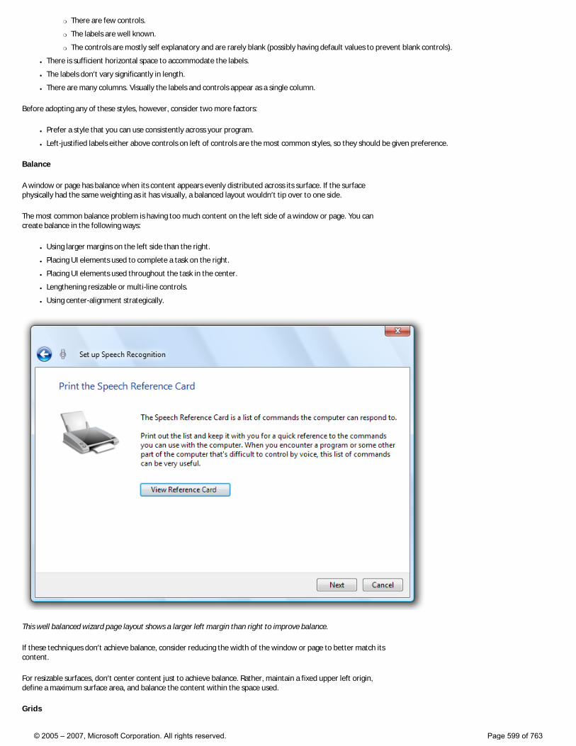
�❍ There are few controls.
�❍ The labels are well known.
�❍ The controls are mostly self explanatory and are rarely blank (possibly having default values to prevent blank controls).
● There is sufficient horizontal space to accommodate the labels.
● The labels don’t vary significantly in length.
● There are many columns. Visually the labels and controls appear as a single column.
Before adopting any of these styles, however, consider two more factors:
● Prefer a style that you can use consistently across your program.
● Left-justified labels either above controls on left of controls are the most common styles, so they should be given preference.
Balance
A window or page has balance when its content appears evenly distributed across its surface. If the surface physically had the same weighting as it has visually, a balanced layout wouldn’t tip over to one side.
The most common balance problem is having too much content on the left side of a window or page. You can create balance in the following ways:
● Using larger margins on the left side than the right.
● Placing UI elements used to complete a task on the right.
● Placing UI elements used throughout the task in the center.
● Lengthening resizable or multi-line controls.
● Using center-alignment strategically.
This well balanced wizard page layout shows a larger left margin than right to improve balance.
If these techniques don’t achieve balance, consider reducing the width of the window or page to better match its content.
For resizable surfaces, don’t center content just to achieve balance. Rather, maintain a fixed upper left origin, define a maximum surface area, and balance the content within the space used.
Grids
© 2005 – 2007, Microsoft Corporation. All rights reserved. Page 599 of 763
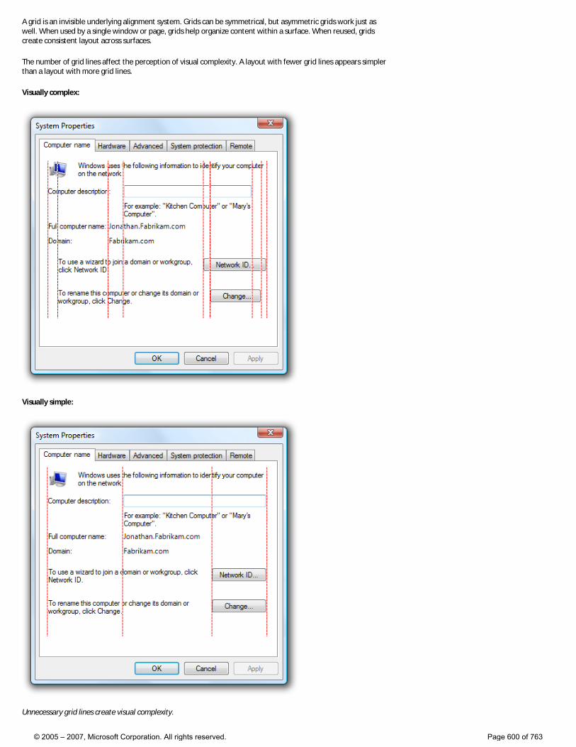
A grid is an invisible underlying alignment system. Grids can be symmetrical, but asymmetric grids work just as well. When used by a single window or page, grids help organize content within a surface. When reused, grids create consistent layout across surfaces.
The number of grid lines affect the perception of visual complexity. A layout with fewer grid lines appears simpler than a layout with more grid lines.
Visually complex:
Visually simple:
Unnecessary grid lines create visual complexity.
© 2005 – 2007, Microsoft Corporation. All rights reserved. Page 600 of 763
You know a layout is using grids effectively when:
● Windows or pages with similar content or function have similar layout.
● Repeated design elements appear in similar locations across windows and pages.
● There are no unnecessary vertical and horizontal alignment grid lines.
Visual simplicity
Visual simplicity is the perception that a layout is not more complicated than it needs to be.
You know a layout has visual simplicity when it:
● Eliminates unnecessary layers of window chrome.
● Presents the content using at most seven easily identifiable groups.
● Uses lightweight grouping, such as layout and separators instead of group boxes.
● Uses lightweight controls, such as links instead of command buttons for secondary commands, and drop-down lists instead of lists for choices.
● Reduces the number of vertical and horizontal alignment grid lines.
● Reduces the number of control sizes, by, for example, using only one or two command button widths on a surface.
● Uses progressive disclosure to hide UI elements until they are needed.
● Uses sufficient space so that the window or page doesn’t feel cramped.
● Sizes windows and controls appropriately to eliminate unnecessary scrolling.
● Uses a single font with a small number of sizes and text colors.
As a general rule, if a layout element can be eliminated without harming the effectiveness of the UI, it probably should be.
Guidelines
Screen resolution and DPI
● Support the minimum Windows Vista screen resolution of 800 x 600 pixels. For critical UIs that must work in safe mode, or on ultra-mobile PCs (UMPCs), and Windows Media Center PCs, support a screen resolution of 640 x 480 pixels. Be sure to account for the space used by the taskbar by reserving 30 vertical pixels for windows displayed with the taskbar.
● To support these low resolution environments, always display some UI even if the current screen resolution is below the minimum supported by your program. This UI may have limited functionality or impaired usability.
● Optimize resizable window layouts for a screen resolution of 1024 x 768 pixels. Automatically resize these windows for lower screen resolutions.
● Be sure to test your windows in both 96 and 120 DPI modes. Check for layout problems, such as control, text, and window clipping, and icon and bitmap stretching.
● For programs with mobile use scenarios, optimize for 120 DPI. High DPI screens are currently prevalent on mobile PCs.
Window size
● Choose a default window size appropriate for its contents. Don’t be afraid to use larger initial window sizes if you can use the space effectively.
● Use a balanced height to width aspect ratio. An aspect ratio between 3:5 and 5:3 is preferred, although an aspect ratio of 1:3 can be used for message dialog boxes (such as errors and warnings).
● Use resizable windows whenever practical to avoid scroll bars and truncated data. Windows with dynamic content, documents, images, lists, and trees benefit the most from resizable windows.
● For text documents, consider a maximum line length of 80 characters to make the text easy to read. (Characters include letters, punctuation, and spaces.)
● Fixed-sized windows: �❍ Fixed-sized windows must be entirely visible and sized to fit within the work area.
● Resizable windows: �❍ Resizable windows may be optimized for higher resolutions, but sized down as needed at display time to the actual screen resolution.
�❍ Progressively larger window sizes must show progressively more information. Make sure that at least one window portion or control has resizable content.
�❍ Keep the upper-left origin of the content fixed as the window is resized. Don’t move the origin to balance the content as the window size changes.
�❍ Set a maximum content size if the content can be too stretched too wide. If the content because unwieldy, don’t resize the content area beyond its maximum width or change the content’s origin as the window is resized larger. Instead, keep a maximum
© 2005 – 2007, Microsoft Corporation. All rights reserved. Page 601 of 763
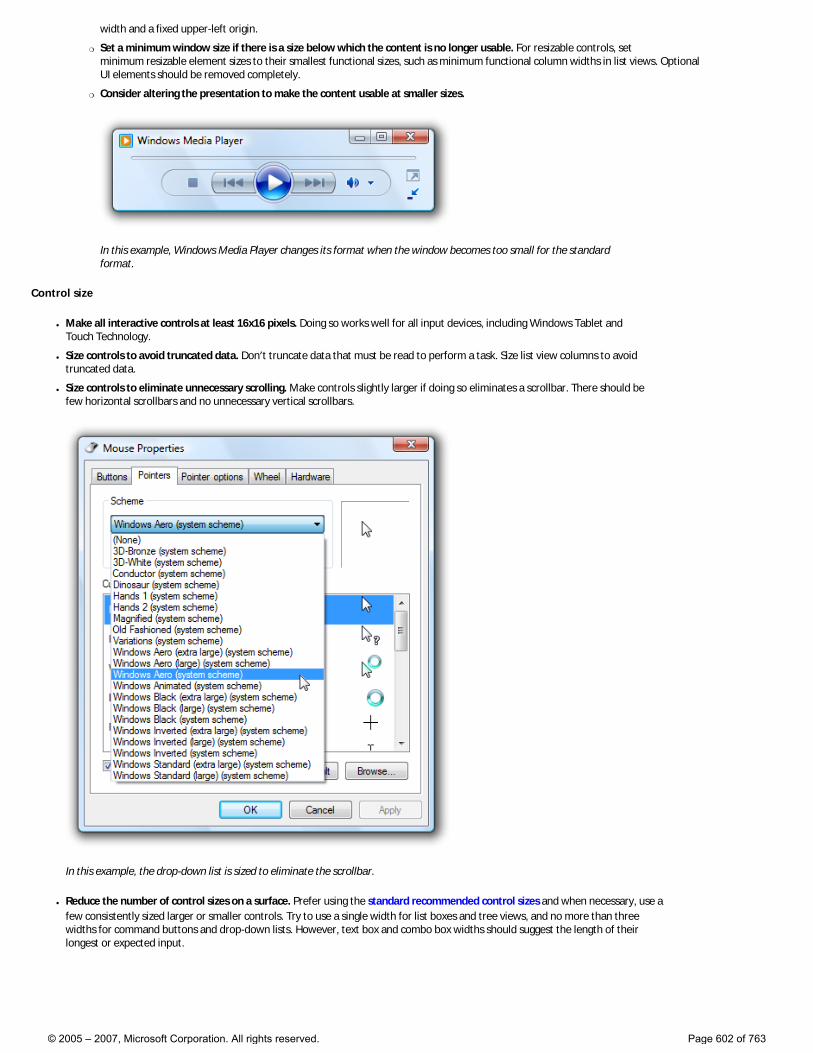
width and a fixed upper-left origin.
�❍ Set a minimum window size if there is a size below which the content is no longer usable. For resizable controls, set minimum resizable element sizes to their smallest functional sizes, such as minimum functional column widths in list views. Optional UI elements should be removed completely.
�❍ Consider altering the presentation to make the content usable at smaller sizes.
In this example, Windows Media Player changes its format when the window becomes too small for the standard format.
Control size
● Make all interactive controls at least 16x16 pixels. Doing so works well for all input devices, including Windows Tablet and Touch Technology.
● Size controls to avoid truncated data. Don’t truncate data that must be read to perform a task. Size list view columns to avoid truncated data.
● Size controls to eliminate unnecessary scrolling. Make controls slightly larger if doing so eliminates a scrollbar. There should be few horizontal scrollbars and no unnecessary vertical scrollbars.
In this example, the drop-down list is sized to eliminate the scrollbar.
● Reduce the number of control sizes on a surface. Prefer using the standard recommended control sizes and when necessary, use a few consistently sized larger or smaller controls. Try to use a single width for list boxes and tree views, and no more than three widths for command buttons and drop-down lists. However, text box and combo box widths should suggest the length of their longest or expected input.
© 2005 – 2007, Microsoft Corporation. All rights reserved. Page 602 of 763
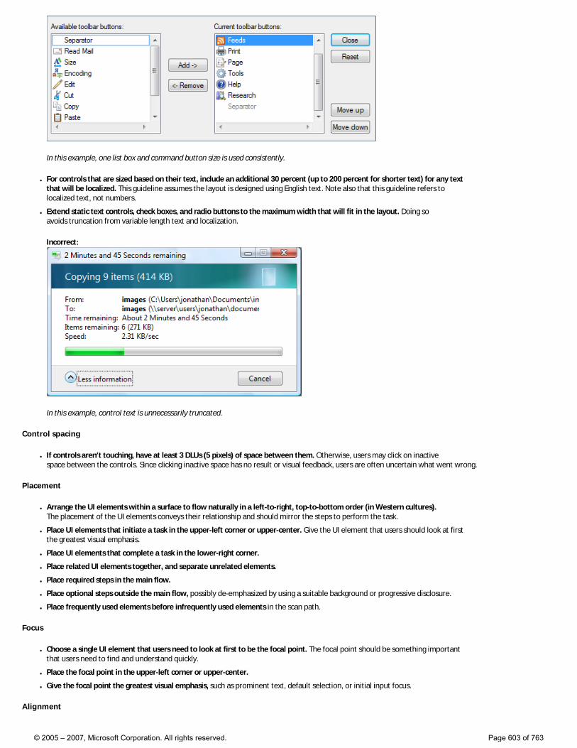
In this example, one list box and command button size is used consistently.
● For controls that are sized based on their text, include an additional 30 percent (up to 200 percent for shorter text) for any text that will be localized. This guideline assumes the layout is designed using English text. Note also that this guideline refers to localized text, not numbers.
● Extend static text controls, check boxes, and radio buttons to the maximum width that will fit in the layout. Doing so avoids truncation from variable length text and localization.
Incorrect:
In this example, control text is unnecessarily truncated.
Control spacing
● If controls aren’t touching, have at least 3 DLUs (5 pixels) of space between them. Otherwise, users may click on inactive space between the controls. Since clicking inactive space has no result or visual feedback, users are often uncertain what went wrong.
Placement
● Arrange the UI elements within a surface to flow naturally in a left-to-right, top-to-bottom order (in Western cultures). The placement of the UI elements conveys their relationship and should mirror the steps to perform the task.
● Place UI elements that initiate a task in the upper-left corner or upper-center. Give the UI element that users should look at first the greatest visual emphasis.
● Place UI elements that complete a task in the lower-right corner.
● Place related UI elements together, and separate unrelated elements.
● Place required steps in the main flow.
● Place optional steps outside the main flow, possibly de-emphasized by using a suitable background or progressive disclosure.
● Place frequently used elements before infrequently used elements in the scan path.
Focus
● Choose a single UI element that users need to look at first to be the focal point. The focal point should be something important that users need to find and understand quickly.
● Place the focal point in the upper-left corner or upper-center.
● Give the focal point the greatest visual emphasis, such as prominent text, default selection, or initial input focus.
Alignment
© 2005 – 2007, Microsoft Corporation. All rights reserved. Page 603 of 763
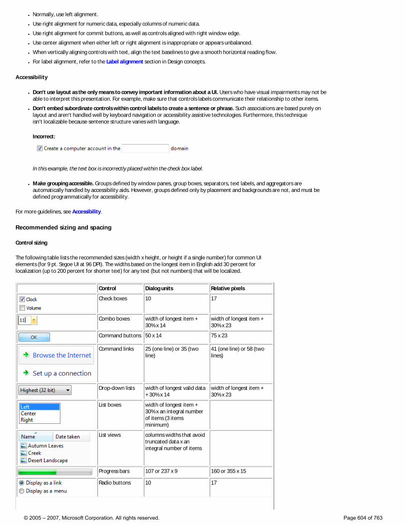
● Normally, use left alignment.
● Use right alignment for numeric data, especially columns of numeric data.
● Use right alignment for commit buttons, as well as controls aligned with right window edge.
● Use center alignment when either left or right alignment is inappropriate or appears unbalanced.
● When vertically aligning controls with text, align the text baselines to give a smooth horizontal reading flow.
● For label alignment, refer to the Label alignment section in Design concepts.
Accessibility
● Don’t use layout as the only means to convey important information about a UI. Users who have visual impairments may not be able to interpret this presentation. For example, make sure that controls labels communicate their relationship to other items.
● Don’t embed subordinate controls within control labels to create a sentence or phrase. Such associations are based purely on layout and aren’t handled well by keyboard navigation or accessibility assistive technologies. Furthermore, this technique isn’t localizable because sentence structure varies with language.
Incorrect:
In this example, the text box is incorrectly placed within the check box label.
● Make grouping accessible. Groups defined by window panes, group boxes, separators, text labels, and aggregators are automatically handled by accessibility aids. However, groups defined only by placement and backgrounds are not, and must be defined programmatically for accessibility.
For more guidelines, see Accessibility.
Recommended sizing and spacing
Control sizing
The following table lists the recommended sizes (width x height, or height if a single number) for common UI elements (for 9 pt. Segoe UI at 96 DPI). The widths based on the longest item in English add 30 percent for localization (up to 200 percent for shorter text) for any text (but not numbers) that will be localized.
Control Dialog units Relative pixels
Check boxes 10 17
Combo boxes width of longest item + 30% x 14
width of longest item + 30% x 23
Command buttons 50 x 14 75 x 23
Command links 25 (one line) or 35 (two line)
41 (one line) or 58 (two lines)
Drop-down lists width of longest valid data + 30% x 14
width of longest item + 30% x 23
List boxes width of longest item + 30% x an integral number of items (3 items minimum)
List views columns widths that avoid truncated data x an integral number of items
Progress bars 107 or 237 x 9 160 or 355 x 15
Radio buttons 10 17
© 2005 – 2007, Microsoft Corporation. All rights reserved. Page 604 of 763
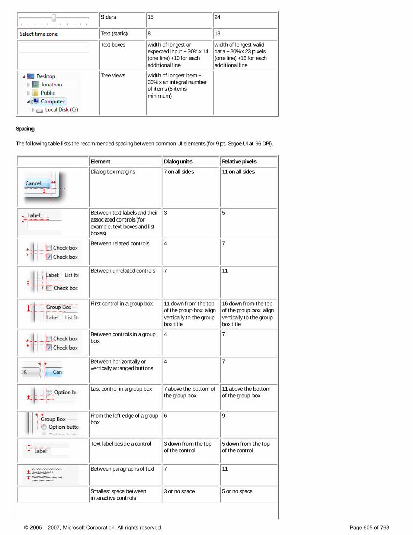
Sliders 15 24
Text (static) 8 13
Text boxes width of longest or expected input + 30% x 14 (one line) +10 for each additional line
width of longest valid data + 30% x 23 pixels (one line) +16 for each additional line
Tree views width of longest item + 30% x an integral number of items (5 items minimum)
Spacing
The following table lists the recommended spacing between common UI elements (for 9 pt. Segoe UI at 96 DPI).
Element Dialog units Relative pixels
Dialog box margins 7 on all sides 11 on all sides
Between text labels and their associated controls (for example, text boxes and list boxes)
3 5
Between related controls 4 7
Between unrelated controls 7 11
First control in a group box 11 down from the top of the group box; align vertically to the group box title
16 down from the top of the group box; align vertically to the group box title
Between controls in a group box
4 7
Between horizontally or vertically arranged buttons
4 7
Last control in a group box 7 above the bottom of the group box
11 above the bottom of the group box
From the left edge of a group box
6 9
Text label beside a control 3 down from the top of the control
5 down from the top of the control
Between paragraphs of text 7 11
Smallest space between interactive controls
3 or no space 5 or no space
© 2005 – 2007, Microsoft Corporation. All rights reserved. Page 605 of 763
Smallest space between a non-interactive control and any other control
2 3
© 2005 – 2007, Microsoft Corporation. All rights reserved. Page 606 of 763
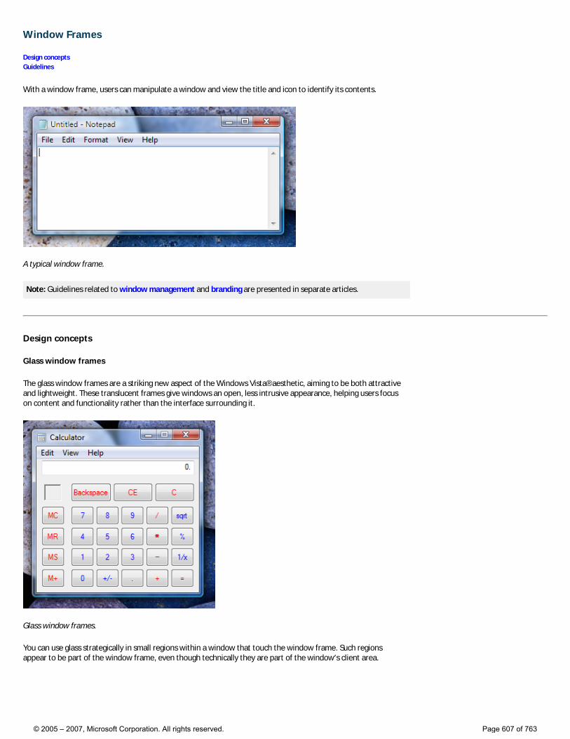
Window Frames
Design concepts Guidelines
With a window frame, users can manipulate a window and view the title and icon to identify its contents.
A typical window frame.
Note: Guidelines related to window management and branding are presented in separate articles.
Design concepts
Glass window frames
The glass window frames are a striking new aspect of the Windows Vista® aesthetic, aiming to be both attractive and lightweight. These translucent frames give windows an open, less intrusive appearance, helping users focus on content and functionality rather than the interface surrounding it.
Glass window frames.
You can use glass strategically in small regions within a window that touch the window frame. Such regions appear to be part of the window frame, even though technically they are part of the window’s client area.
© 2005 – 2007, Microsoft Corporation. All rights reserved. Page 607 of 763

In this example, glass is used in the client area to make it look like part of the frame.
Maximized frames
Maximized frames have a different look. Instead of using glass, they have white text on an opaque background that is black by default. The different appearance is used because glass isn’t needed when a window covers the whole screen. Furthermore, because maximized windows behave differently than normal windows (that is, you can’t move or resize them), having a different look helps users recognize when a window is maximized.
© 2005 – 2007, Microsoft Corporation. All rights reserved. Page 608 of 763
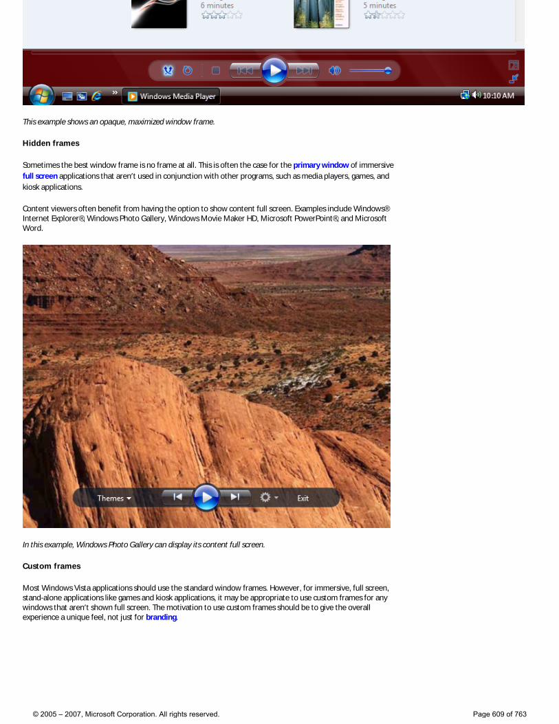
This example shows an opaque, maximized window frame.
Hidden frames
Sometimes the best window frame is no frame at all. This is often the case for the primary window of immersive full screen applications that aren’t used in conjunction with other programs, such as media players, games, and kiosk applications.
Content viewers often benefit from having the option to show content full screen. Examples include Windows® Internet Explorer®, Windows Photo Gallery, Windows Movie Maker HD, Microsoft PowerPoint®, and Microsoft Word.
In this example, Windows Photo Gallery can display its content full screen.
Custom frames
Most Windows Vista applications should use the standard window frames. However, for immersive, full screen, stand-alone applications like games and kiosk applications, it may be appropriate to use custom frames for any windows that aren’t shown full screen. The motivation to use custom frames should be to give the overall experience a unique feel, not just for branding.
© 2005 – 2007, Microsoft Corporation. All rights reserved. Page 609 of 763
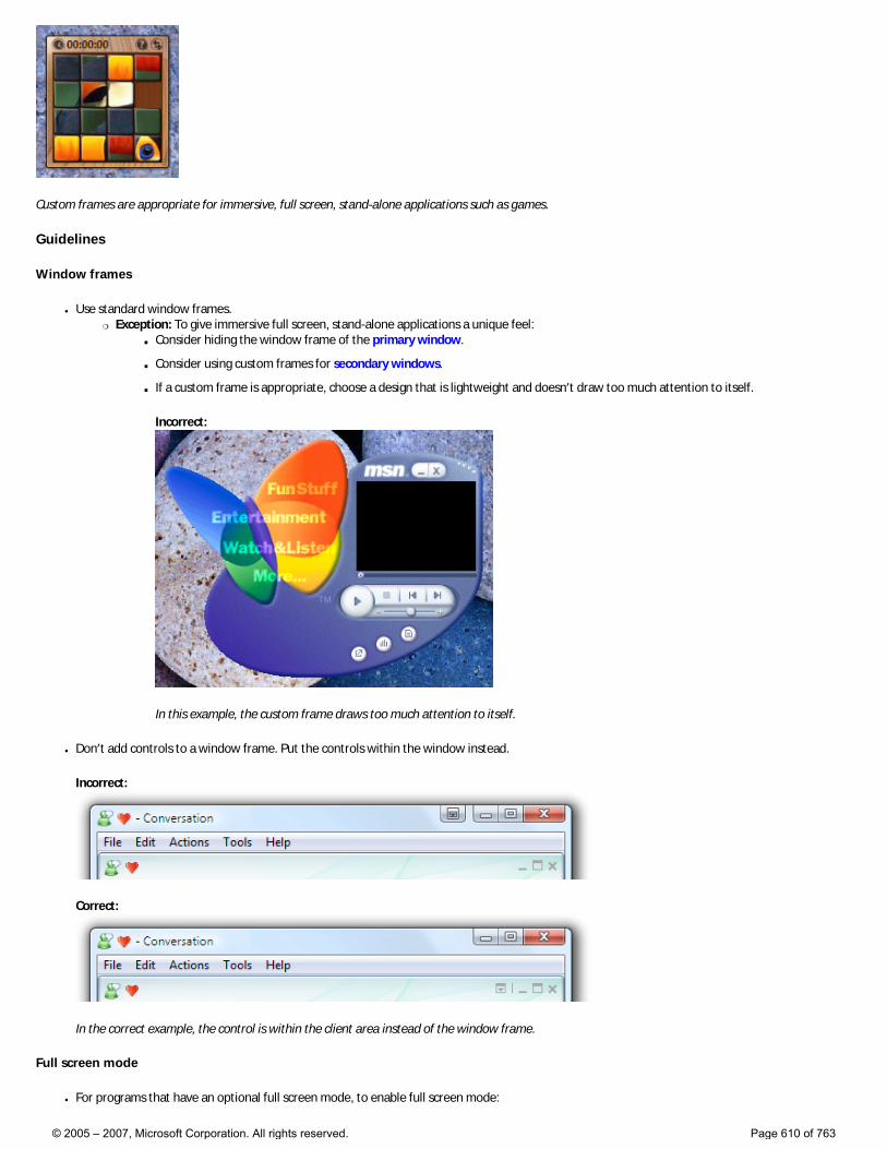
Custom frames are appropriate for immersive, full screen, stand-alone applications such as games.
Guidelines
Window frames
● Use standard window frames. �❍ Exception: To give immersive full screen, stand-alone applications a unique feel:
■ Consider hiding the window frame of the primary window.
■ Consider using custom frames for secondary windows.
■ If a custom frame is appropriate, choose a design that is lightweight and doesn’t draw too much attention to itself.
Incorrect:
In this example, the custom frame draws too much attention to itself.
● Don’t add controls to a window frame. Put the controls within the window instead.
Incorrect:
Correct:
In the correct example, the control is within the client area instead of the window frame.
Full screen mode
● For programs that have an optional full screen mode, to enable full screen mode:
© 2005 – 2007, Microsoft Corporation. All rights reserved. Page 610 of 763

�❍ Have a modal full screen command in the menu bar or toolbar. When the user clicks the command, show the command in its selected state.
This example shows the full screen command along with its standard shortcut key.
�❍ Use F11 for the full screen shortcut key.
�❍ If there is a toolbar and full screen mode is commonly used, also have a graphic toolbar button with a Full screen tooltip.
Examples of full screen toolbar buttons.
● To revert back from full screen mode: �❍ Have a modal full screen command in the menu bar or toolbar. When the user clicks the command, show the command in its
cleared state.
�❍ Use F11 for the full screen shortcut key. If not already assigned, Esc can also be used for this purpose.
Glass
Standard window frames use glass automatically in Windows Vista, but you can also use glass in regions that touch the window frame.
● Consider using glass strategically in small regions touching the window frame without text. Doing so can give a program a simpler, lighter, more cohesive look by making the region appear to be part of the frame.
© 2005 – 2007, Microsoft Corporation. All rights reserved. Page 611 of 763

In this example, glass focuses the user’s attention on the content instead of the controls.
● Don’t use glass in situations where a plain window background would be more attractive or easier to use.
Correct:
In this example, glass is used to give the Alt+Tab window a lightweight appearance. Glass works for this window because it consists of graphics and a single, strong text label.
Incorrect:
© 2005 – 2007, Microsoft Corporation. All rights reserved. Page 612 of 763
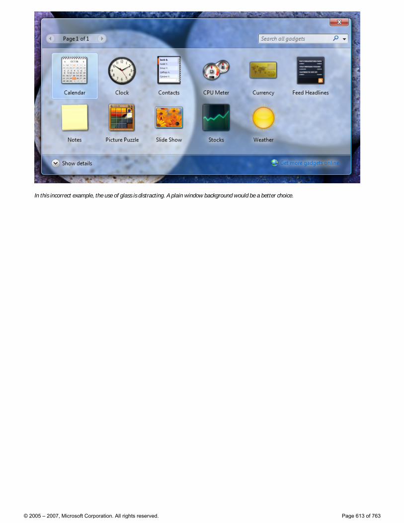
In this incorrect example, the use of glass is distracting. A plain window background would be a better choice.
© 2005 – 2007, Microsoft Corporation. All rights reserved. Page 613 of 763
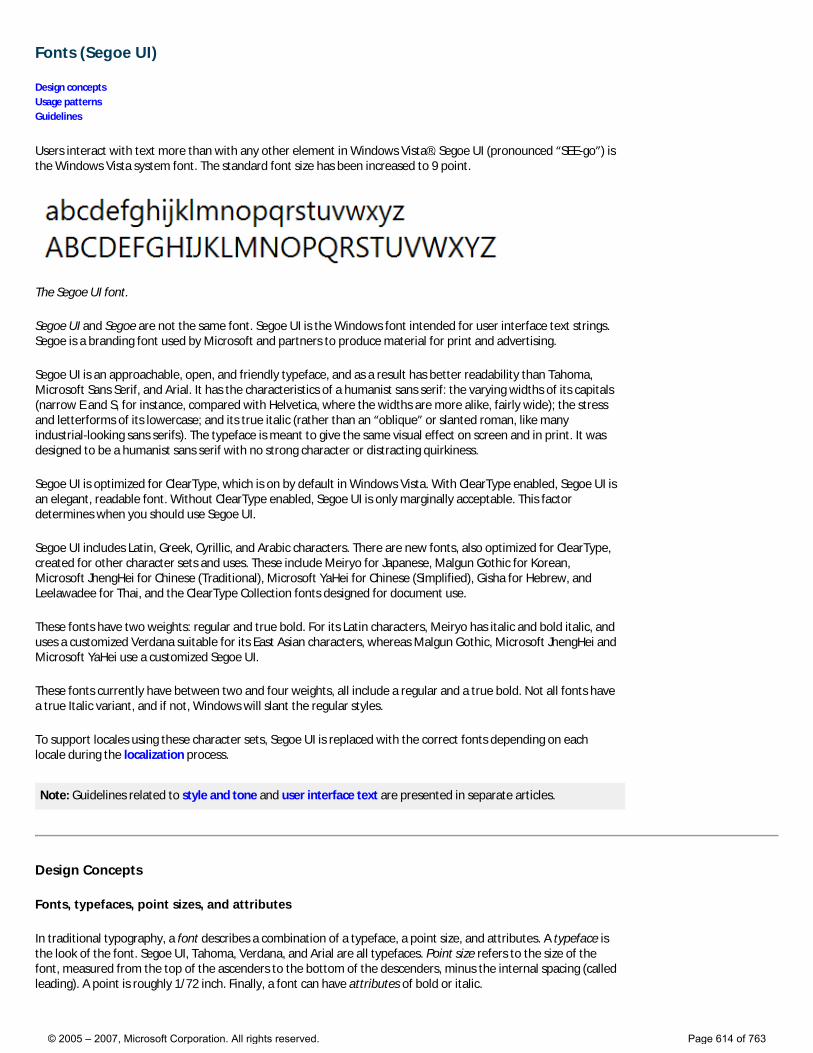
Fonts (Segoe UI)
Design concepts Usage patterns Guidelines
Users interact with text more than with any other element in Windows Vista®. Segoe UI (pronounced “SEE-go”) is the Windows Vista system font. The standard font size has been increased to 9 point.
The Segoe UI font.
Segoe UI and Segoe are not the same font. Segoe UI is the Windows font intended for user interface text strings. Segoe is a branding font used by Microsoft and partners to produce material for print and advertising.
Segoe UI is an approachable, open, and friendly typeface, and as a result has better readability than Tahoma, Microsoft Sans Serif, and Arial. It has the characteristics of a humanist sans serif: the varying widths of its capitals (narrow E and S, for instance, compared with Helvetica, where the widths are more alike, fairly wide); the stress and letterforms of its lowercase; and its true italic (rather than an “oblique” or slanted roman, like many industrial-looking sans serifs). The typeface is meant to give the same visual effect on screen and in print. It was designed to be a humanist sans serif with no strong character or distracting quirkiness.
Segoe UI is optimized for ClearType, which is on by default in Windows Vista. With ClearType enabled, Segoe UI is an elegant, readable font. Without ClearType enabled, Segoe UI is only marginally acceptable. This factor determines when you should use Segoe UI.
Segoe UI includes Latin, Greek, Cyrillic, and Arabic characters. There are new fonts, also optimized for ClearType, created for other character sets and uses. These include Meiryo for Japanese, Malgun Gothic for Korean, Microsoft JhengHei for Chinese (Traditional), Microsoft YaHei for Chinese (Simplified), Gisha for Hebrew, and Leelawadee for Thai, and the ClearType Collection fonts designed for document use.
These fonts have two weights: regular and true bold. For its Latin characters, Meiryo has italic and bold italic, and uses a customized Verdana suitable for its East Asian characters, whereas Malgun Gothic, Microsoft JhengHei and Microsoft YaHei use a customized Segoe UI.
These fonts currently have between two and four weights, all include a regular and a true bold. Not all fonts have a true Italic variant, and if not, Windows will slant the regular styles.
To support locales using these character sets, Segoe UI is replaced with the correct fonts depending on each locale during the localization process.
Note: Guidelines related to style and tone and user interface text are presented in separate articles.
Design Concepts
Fonts, typefaces, point sizes, and attributes
In traditional typography, a font describes a combination of a typeface, a point size, and attributes. A typeface is the look of the font. Segoe UI, Tahoma, Verdana, and Arial are all typefaces. Point size refers to the size of the font, measured from the top of the ascenders to the bottom of the descenders, minus the internal spacing (called leading). A point is roughly 1/72 inch. Finally, a font can have attributes of bold or italic.
© 2005 – 2007, Microsoft Corporation. All rights reserved. Page 614 of 763
Informally, people often use font in place of typeface—as done in this article—but technically, Segoe UI is a typeface, not a font. Each combination of attributes is a unique font (for example, 9 point Segoe UI regular, 10 point Segoe UI bold, and so on).
Serif and sans serif
Typefaces are either serif or sans serif. Serif refers to small turns that often finish the strokes of letters in a font. A sans serif typeface doesn’t have serifs.
Readers generally prefer serif fonts used as body text within a document. The serifs provide a feeling of formality and elegance to a document. For UI text, the need for a clean appearance and the lower resolution of computer monitors makes sans serif typefaces the better choice.
Contrast
Text is easiest to read when there is a large difference between the luminance of the text and the background. Black text on a white background gives the highest contrast—dark text on a very light background can provide high contrast as well. This combination is best for primary UI surfaces.
Light text on a dark background offers good contrast, but not as good as dark text on a light background. This combination works well for secondary UI surfaces, such as Explorer task panes, that you want to de-emphasize relative to the primary UI surfaces.
If you want to make sure users read your text, use dark text on a light background.
Affordances
Text can use the following affordances to indicate how it is used:
● Pointer. The I-bar (“text select”) pointer indicates that the text is selectable, whereas the left-pointing arrow (“normal select”) pointer indicates that text isn’t.
● Caret. When text has input focus, the caret is the flashing vertical bar that indicates the insertion/selection point in selectable or editable text.
● Box. A box around text that indicates that it’s editable. To reduce the weight of the presentation, the box may be displayed dynamically only when the editable text is selected.
● Foreground color. Light gray indicates that text is disabled. Non-gray colors, especially blue and purple, indicate that text is a link.
● Background color. A light gray background weakly suggests that text is read-only, but in practice read-only text can have any color background.
These affordances are combined for the following meanings:
● Editable. Text displayed in a box, with a text select pointer, a caret (on input focus), and usually on a white background.
● Read-only, selectable. Text with a select pointer and a caret (on input focus).
● Read-only, non-selectable. Text with an arrow pointer.
● Disabled. Light gray text with an arrow pointer, sometimes on a gray background.
Read-only text traditionally has a gray background, but a gray background isn’t necessary. In fact, a gray background can be undesirable, especially for large blocks of text, because it suggests that the text is disabled and discourages reading.
Accessibility and the system font, sizes, and colors
The guidelines for making text accessible to users with disabilities or impairments can be boiled down to one simple rule: Respect the user’s settings by always using the system font, sizes, and colors.
If you do only one thing... Respect the user’s settings by always using the system font, sizes, and colors.
© 2005 – 2007, Microsoft Corporation. All rights reserved. Page 615 of 763
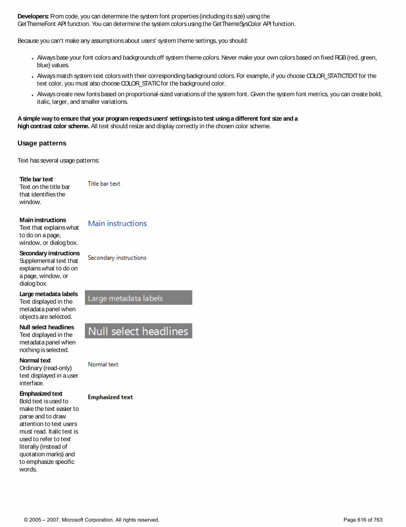
Developers: From code, you can determine the system font properties (including its size) using the GetThemeFont API function. You can determine the system colors using the GetThemeSysColor API function.
Because you can’t make any assumptions about users’ system theme settings, you should:
● Always base your font colors and backgrounds off system theme colors. Never make your own colors based on fixed RGB (red, green, blue) values.
● Always match system text colors with their corresponding background colors. For example, if you choose COLOR_STATICTEXT for the text color, you must also choose COLOR_STATIC for the background color.
● Always create new fonts based on proportional-sized variations of the system font. Given the system font metrics, you can create bold, italic, larger, and smaller variations.
A simple way to ensure that your program respects users’ settings is to test using a different font size and a high contrast color scheme. All text should resize and display correctly in the chosen color scheme.
Usage patterns
Text has several usage patterns:
Title bar text Text on the title bar that identifies the window.
Main instructions Text that explains what to do on a page, window, or dialog box.
Secondary instructions Supplemental text that explains what to do on a page, window, or dialog box.
Large metadata labels Text displayed in the metadata panel when objects are selected.
Null select headlines Text displayed in the metadata panel when nothing is selected.
Normal text Ordinary (read-only) text displayed in a user interface.
Emphasized text Bold text is used to make the text easier to parse and to draw attention to text users must read. Italic text is used to refer to text literally (instead of quotation marks) and to emphasize specific words.
© 2005 – 2007, Microsoft Corporation. All rights reserved. Page 616 of 763
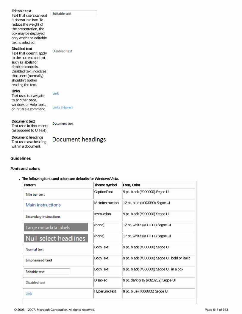
Editable text Text that users can edit is shown in a box. To reduce the weight of the presentation, the box may be displayed only when the editable text is selected.
Disabled text Text that doesn’t apply to the current context, such as labels for disabled controls. Disabled text indicates that users (normally) shouldn’t bother reading the text.
Links Text used to navigate to another page, window, or Help topic, or initiate a command.
Document text Text used in documents (as opposed to UI text).
Document headings Text used as a heading within a document.
Guidelines
Fonts and colors
● The following fonts and colors are defaults for Windows Vista.
Pattern Theme symbol Font, Color
CaptionFont 9 pt. black (#000000) Segoe UI
MainInstruction 12 pt. blue (#003399) Segoe UI
Instruction 9 pt. black (#000000) Segoe UI
(none) 12 pt. white (#FFFFFF) Segoe UI
(none) 17 pt. white (#FFFFFF) Segoe UI
BodyText 9 pt. black (#000000) Segoe UI
BodyText 9 pt. black (#000000) Segoe UI, bold or italic
BodyText 9 pt. black (#000000) Segoe UI, in a box
Disabled 9 pt. dark gray (#323232) Segoe UI
HyperLinkText 9 pt. blue (#0066CC) Segoe UI
© 2005 – 2007, Microsoft Corporation. All rights reserved. Page 617 of 763
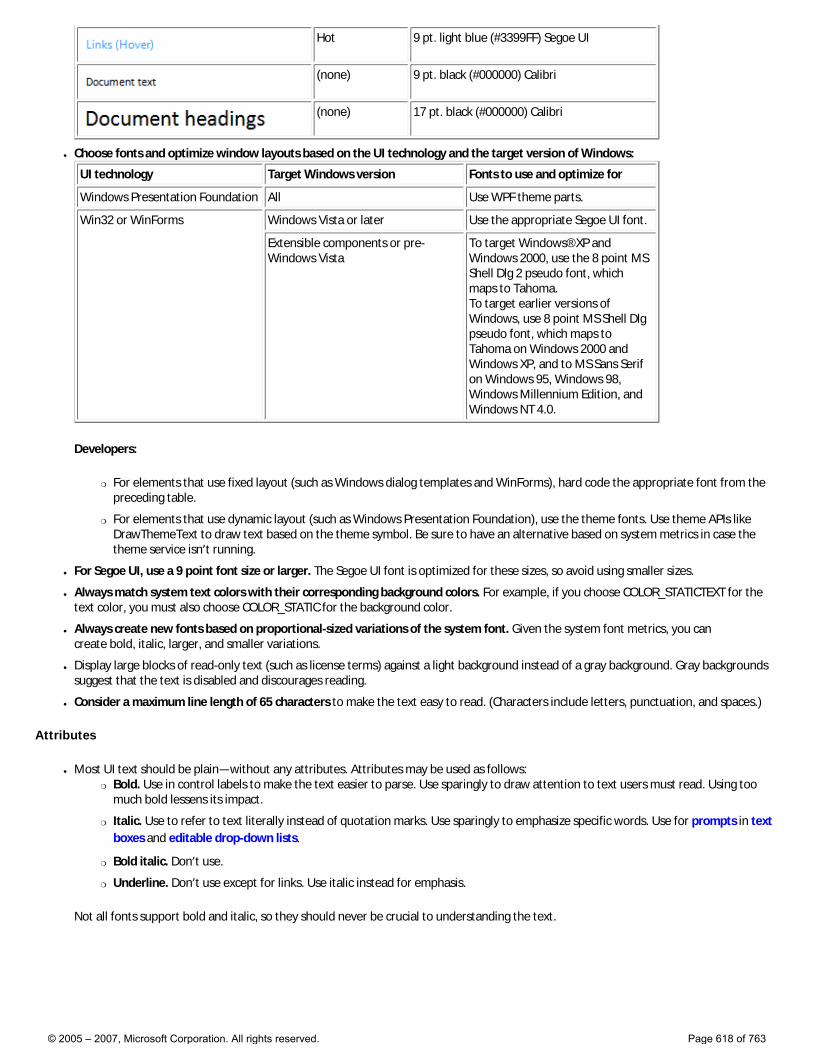
Hot 9 pt. light blue (#3399FF) Segoe UI
(none) 9 pt. black (#000000) Calibri
(none) 17 pt. black (#000000) Calibri
● Choose fonts and optimize window layouts based on the UI technology and the target version of Windows:
UI technology Target Windows version Fonts to use and optimize for
Windows Presentation Foundation All Use WPF theme parts.
Win32 or WinForms Windows Vista or later Use the appropriate Segoe UI font.
Extensible components or pre-Windows Vista
To target Windows® XP and Windows 2000, use the 8 point MS Shell Dlg 2 pseudo font, which maps to Tahoma. To target earlier versions of Windows, use 8 point MS Shell Dlg pseudo font, which maps to Tahoma on Windows 2000 and Windows XP, and to MS Sans Serif on Windows 95, Windows 98, Windows Millennium Edition, and Windows NT 4.0.
Developers:
�❍ For elements that use fixed layout (such as Windows dialog templates and WinForms), hard code the appropriate font from the preceding table.
�❍ For elements that use dynamic layout (such as Windows Presentation Foundation), use the theme fonts. Use theme APIs like DrawThemeText to draw text based on the theme symbol. Be sure to have an alternative based on system metrics in case the theme service isn’t running.
● For Segoe UI, use a 9 point font size or larger. The Segoe UI font is optimized for these sizes, so avoid using smaller sizes.
● Always match system text colors with their corresponding background colors. For example, if you choose COLOR_STATICTEXT for the text color, you must also choose COLOR_STATIC for the background color.
● Always create new fonts based on proportional-sized variations of the system font. Given the system font metrics, you can create bold, italic, larger, and smaller variations.
● Display large blocks of read-only text (such as license terms) against a light background instead of a gray background. Gray backgrounds suggest that the text is disabled and discourages reading.
● Consider a maximum line length of 65 characters to make the text easy to read. (Characters include letters, punctuation, and spaces.)
Attributes
● Most UI text should be plain—without any attributes. Attributes may be used as follows: �❍ Bold. Use in control labels to make the text easier to parse. Use sparingly to draw attention to text users must read. Using too
much bold lessens its impact.
�❍ Italic. Use to refer to text literally instead of quotation marks. Use sparingly to emphasize specific words. Use for prompts in text boxes and editable drop-down lists.
�❍ Bold italic. Don’t use.
�❍ Underline. Don’t use except for links. Use italic instead for emphasis.
Not all fonts support bold and italic, so they should never be crucial to understanding the text.
© 2005 – 2007, Microsoft Corporation. All rights reserved. Page 618 of 763
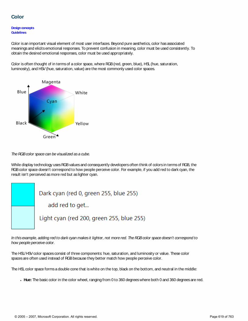
Color
Design concepts Guidelines
Color is an important visual element of most user interfaces. Beyond pure aesthetics, color has associated meanings and elicits emotional responses. To prevent confusion in meaning, color must be used consistently. To obtain the desired emotional responses, color must be used appropriately.
Color is often thought of in terms of a color space, where RGB (red, green, blue), HSL (hue, saturation, luminosity), and HSV (hue, saturation, value) are the most commonly used color spaces.
The RGB color space can be visualized as a cube.
While display technology uses RGB values and consequently developers often think of colors in terms of RGB, the RGB color space doesn’t correspond to how people perceive color. For example, if you add red to dark cyan, the result isn’t perceived as more red but as lighter cyan.
In this example, adding red to dark cyan makes it lighter, not more red. The RGB color space doesn’t correspond to how people perceive color.
The HSL/HSV color spaces consist of three components: hue, saturation, and luminosity or value. These color spaces are often used instead of RGB because they better match how people perceive color.
The HSL color space forms a double cone that is white on the top, black on the bottom, and neutral in the middle:
● Hue: The basic color in the color wheel, ranging from 0 to 360 degrees where both 0 and 360 degrees are red.
© 2005 – 2007, Microsoft Corporation. All rights reserved. Page 619 of 763

The color wheel, where red is 0 degrees, yellow is 60 degrees, green is 120 degrees, cyan is 180 degrees, blue is 240 degrees, and magenta is 300 degrees.
● Saturation: How pure (vs. dull) the color is, ranging from 0 to 100, where 100 is fully saturated and 0 is gray.
● Luminosity: How light the color is, ranging from 0 to 100, where 100 is as light as possible (white, regardless of the hue and saturation) and 0 is as dark as possible (black).
The HSL color space can be visualized as a double cone.
The HSV color space is similar, except that its space forms a single cone:
● Hue: The basic color in the color wheel, ranging from 0 to 360 degrees where both 0 and 360 degrees are red.
● Saturation: How pure (vs. dull) the color is, ranging from 0 to 100, where 100 is fully saturated and 0 is gray.
● Value: How bright the color is, ranging from 0 to 100, where 100 is as bright as possible (which is half luminosity in the HSL space) and 0 is as dark as possible (black).
© 2005 – 2007, Microsoft Corporation. All rights reserved. Page 620 of 763
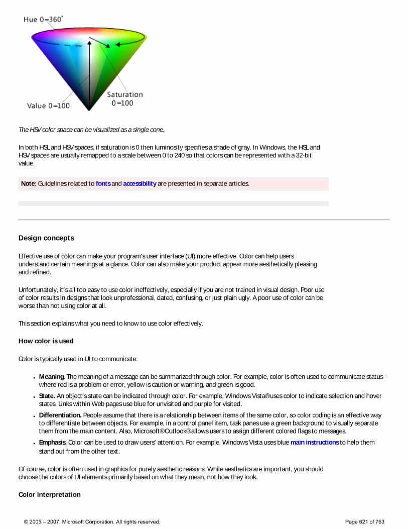
The HSV color space can be visualized as a single cone.
In both HSL and HSV spaces, if saturation is 0 then luminosity specifies a shade of gray. In Windows, the HSL and HSV spaces are usually remapped to a scale between 0 to 240 so that colors can be represented with a 32-bit value.
Note: Guidelines related to fonts and accessibility are presented in separate articles.
Design concepts
Effective use of color can make your program’s user interface (UI) more effective. Color can help users understand certain meanings at a glance. Color can also make your product appear more aesthetically pleasing and refined.
Unfortunately, it’s all too easy to use color ineffectively, especially if you are not trained in visual design. Poor use of color results in designs that look unprofessional, dated, confusing, or just plain ugly. A poor use of color can be worse than not using color at all.
This section explains what you need to know to use color effectively.
How color is used
Color is typically used in UI to communicate:
● Meaning. The meaning of a message can be summarized through color. For example, color is often used to communicate status—where red is a problem or error, yellow is caution or warning, and green is good.
● State. An object’s state can be indicated through color. For example, Windows Vista® uses color to indicate selection and hover states. Links within Web pages use blue for unvisited and purple for visited.
● Differentiation. People assume that there is a relationship between items of the same color, so color coding is an effective way to differentiate between objects. For example, in a control panel item, task panes use a green background to visually separate them from the main content. Also, Microsoft® Outlook® allows users to assign different colored flags to messages.
● Emphasis. Color can be used to draw users’ attention. For example, Windows Vista uses blue main instructions to help them stand out from the other text.
Of course, color is often used in graphics for purely aesthetic reasons. While aesthetics are important, you should choose the colors of UI elements primarily based on what they mean, not how they look.
Color interpretation
© 2005 – 2007, Microsoft Corporation. All rights reserved. Page 621 of 763
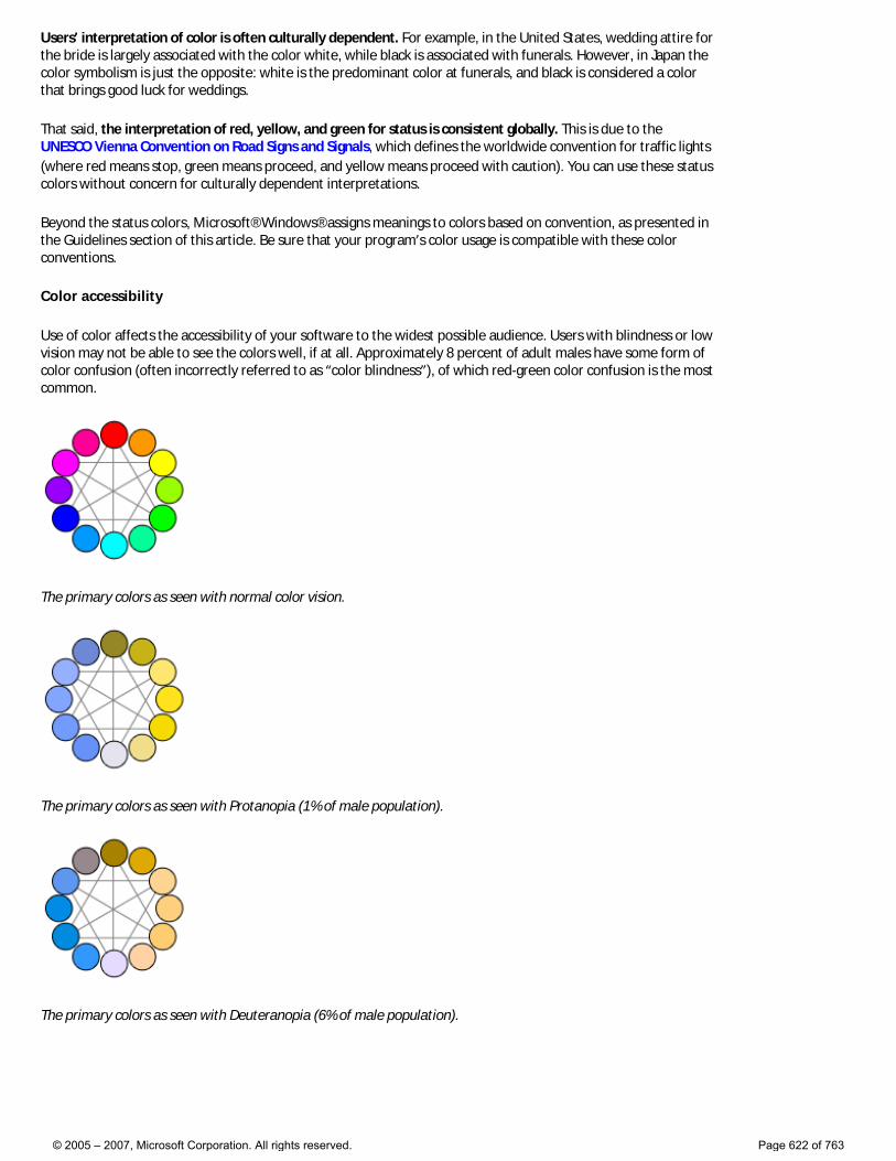
Users’ interpretation of color is often culturally dependent. For example, in the United States, wedding attire for the bride is largely associated with the color white, while black is associated with funerals. However, in Japan the color symbolism is just the opposite: white is the predominant color at funerals, and black is considered a color that brings good luck for weddings.
That said, the interpretation of red, yellow, and green for status is consistent globally. This is due to the UNESCO Vienna Convention on Road Signs and Signals, which defines the worldwide convention for traffic lights (where red means stop, green means proceed, and yellow means proceed with caution). You can use these status colors without concern for culturally dependent interpretations.
Beyond the status colors, Microsoft® Windows® assigns meanings to colors based on convention, as presented in the Guidelines section of this article. Be sure that your program’s color usage is compatible with these color conventions.
Color accessibility
Use of color affects the accessibility of your software to the widest possible audience. Users with blindness or low vision may not be able to see the colors well, if at all. Approximately 8 percent of adult males have some form of color confusion (often incorrectly referred to as “color blindness”), of which red-green color confusion is the most common.
The primary colors as seen with normal color vision.
The primary colors as seen with Protanopia (1% of male population).
The primary colors as seen with Deuteranopia (6% of male population).
© 2005 – 2007, Microsoft Corporation. All rights reserved. Page 622 of 763
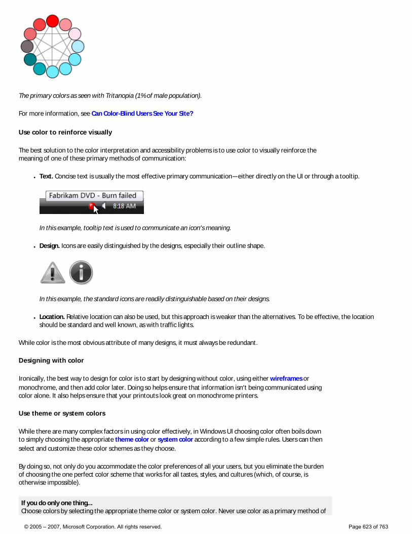
The primary colors as seen with Tritanopia (1% of male population).
For more information, see Can Color-Blind Users See Your Site?
Use color to reinforce visually
The best solution to the color interpretation and accessibility problems is to use color to visually reinforce the meaning of one of these primary methods of communication:
● Text. Concise text is usually the most effective primary communication—either directly on the UI or through a tooltip.
In this example, tooltip text is used to communicate an icon’s meaning.
● Design. Icons are easily distinguished by the designs, especially their outline shape.
In this example, the standard icons are readily distinguishable based on their designs.
● Location. Relative location can also be used, but this approach is weaker than the alternatives. To be effective, the location should be standard and well known, as with traffic lights.
While color is the most obvious attribute of many designs, it must always be redundant.
Designing with color
Ironically, the best way to design for color is to start by designing without color, using either wireframes or monochrome, and then add color later. Doing so helps ensure that information isn’t being communicated using color alone. It also helps ensure that your printouts look great on monochrome printers.
Use theme or system colors
While there are many complex factors in using color effectively, in Windows UI choosing color often boils down to simply choosing the appropriate theme color or system color according to a few simple rules. Users can then select and customize these color schemes as they choose.
By doing so, not only do you accommodate the color preferences of all your users, but you eliminate the burden of choosing the one perfect color scheme that works for all tastes, styles, and cultures (which, of course, is otherwise impossible).
If you do only one thing... Choose colors by selecting the appropriate theme color or system color. Never use color as a primary method of
© 2005 – 2007, Microsoft Corporation. All rights reserved. Page 623 of 763

communication, but as a secondary method to reinforce meaning visually. Design using wireframes or monochrome to help ensure that color is secondary.
Use theme or system colors correctly
Assume that users choose theme or system colors based on their personal needs and that the theme or system colors are constructed appropriately. Based on this assumption, if you always choose theme or system colors based on their intended purpose and pair foregrounds with their associated backgrounds, the colors are guaranteed to be legible and respect users’ wishes in all video modes, including high-contrast mode. For example, the window text system color is guaranteed to be legible against the window background system color.
Specifically, always:
● Choose colors based on their purpose. Don’t choose colors based on their current appearance because that appearance can be changed by the user or future versions of Windows.
● Match foreground colors with their associated background colors. Foreground colors are guaranteed to be legible only against their associated background colors. Don’t mix and match foreground colors with other background colors, or worse yet, other foreground colors.
● Don’t mix color types. That is, always match theme colors with their associated theme colors, system colors with their associated system colors, and hardwired colors with other hardwired colors. For example, a theme text color isn’t guaranteed to be legible against a hardwired background.
● If you must hardwire colors, handle high-contrast mode as a special case.
If you do only one thing... Always choose theme or system colors based on their intended purpose, and pair foregrounds with their associated backgrounds.
Using other colors
While the Windows Vista theme defines a comprehensive set of theme parts, you may find that your program needs colors that aren’t defined in the theme file. While you could hardwire such colors, a better approach is to derive colors from the theme or system colors. Strategically using this approach gives you all the benefits of using theme and system colors, but with much more flexibility.
For example, suppose you need a window background that is darker than the theme window background color. In the HSL color space, having a darker color means a color with a lower luminosity. Thus, you can derive a darker window background color using the following steps:
1. Obtain the window background theme color RGB.
2. Convert the RGB to its HSL value.
3. Reduce the luminosity value (by, say, 20 percent).
4. Convert back to RGB values.
Using this approach, the derived color is guaranteed to be perceived as a darker shade of the original color (unless the original color was very dark to begin with.)
In this example, a darker window background color is derived from the theme color.
© 2005 – 2007, Microsoft Corporation. All rights reserved. Page 624 of 763
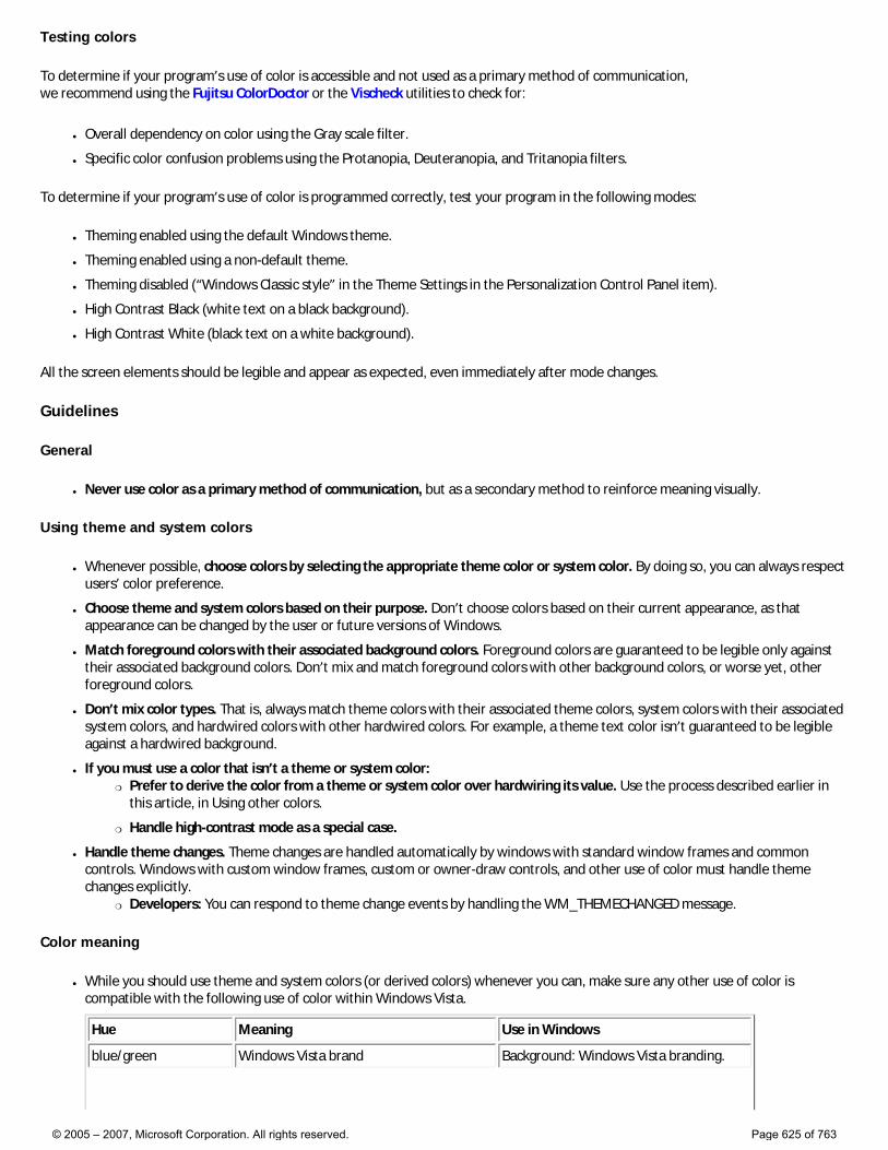
Testing colors
To determine if your program’s use of color is accessible and not used as a primary method of communication, we recommend using the Fujitsu ColorDoctor or the Vischeck utilities to check for:
● Overall dependency on color using the Gray scale filter.
● Specific color confusion problems using the Protanopia, Deuteranopia, and Tritanopia filters.
To determine if your program’s use of color is programmed correctly, test your program in the following modes:
● Theming enabled using the default Windows theme.
● Theming enabled using a non-default theme.
● Theming disabled (“Windows Classic style” in the Theme Settings in the Personalization Control Panel item).
● High Contrast Black (white text on a black background).
● High Contrast White (black text on a white background).
All the screen elements should be legible and appear as expected, even immediately after mode changes.
Guidelines
General
● Never use color as a primary method of communication, but as a secondary method to reinforce meaning visually.
Using theme and system colors
● Whenever possible, choose colors by selecting the appropriate theme color or system color. By doing so, you can always respect users’ color preference.
● Choose theme and system colors based on their purpose. Don’t choose colors based on their current appearance, as that appearance can be changed by the user or future versions of Windows.
● Match foreground colors with their associated background colors. Foreground colors are guaranteed to be legible only against their associated background colors. Don’t mix and match foreground colors with other background colors, or worse yet, other foreground colors.
● Don’t mix color types. That is, always match theme colors with their associated theme colors, system colors with their associated system colors, and hardwired colors with other hardwired colors. For example, a theme text color isn’t guaranteed to be legible against a hardwired background.
● If you must use a color that isn’t a theme or system color: �❍ Prefer to derive the color from a theme or system color over hardwiring its value. Use the process described earlier in
this article, in Using other colors.
�❍ Handle high-contrast mode as a special case.
● Handle theme changes. Theme changes are handled automatically by windows with standard window frames and common controls. Windows with custom window frames, custom or owner-draw controls, and other use of color must handle theme changes explicitly.
�❍ Developers: You can respond to theme change events by handling the WM_THEMECHANGED message.
Color meaning
● While you should use theme and system colors (or derived colors) whenever you can, make sure any other use of color is compatible with the following use of color within Windows Vista.
Hue Meaning Use in Windows
blue/green Windows Vista brand Background: Windows Vista branding.
© 2005 – 2007, Microsoft Corporation. All rights reserved. Page 625 of 763
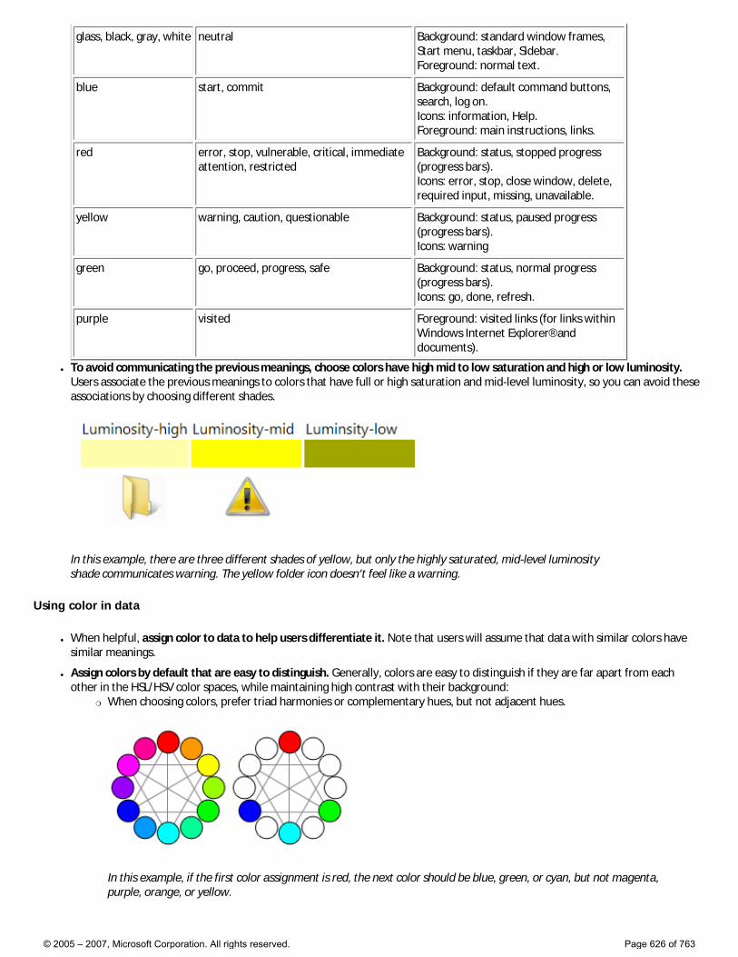
glass, black, gray, white neutral Background: standard window frames, Start menu, taskbar, Sidebar. Foreground: normal text.
blue start, commit Background: default command buttons, search, log on. Icons: information, Help. Foreground: main instructions, links.
red error, stop, vulnerable, critical, immediate attention, restricted
Background: status, stopped progress (progress bars). Icons: error, stop, close window, delete, required input, missing, unavailable.
yellow warning, caution, questionable Background: status, paused progress (progress bars). Icons: warning
green go, proceed, progress, safe Background: status, normal progress (progress bars). Icons: go, done, refresh.
purple visited Foreground: visited links (for links within Windows Internet Explorer® and documents).
● To avoid communicating the previous meanings, choose colors have high mid to low saturation and high or low luminosity. Users associate the previous meanings to colors that have full or high saturation and mid-level luminosity, so you can avoid these associations by choosing different shades.
In this example, there are three different shades of yellow, but only the highly saturated, mid-level luminosity shade communicates warning. The yellow folder icon doesn’t feel like a warning.
Using color in data
● When helpful, assign color to data to help users differentiate it. Note that users will assume that data with similar colors have similar meanings.
● Assign colors by default that are easy to distinguish. Generally, colors are easy to distinguish if they are far apart from each other in the HSL/HSV color spaces, while maintaining high contrast with their background:
�❍ When choosing colors, prefer triad harmonies or complementary hues, but not adjacent hues.
In this example, if the first color assignment is red, the next color should be blue, green, or cyan, but not magenta, purple, orange, or yellow.
© 2005 – 2007, Microsoft Corporation. All rights reserved. Page 626 of 763
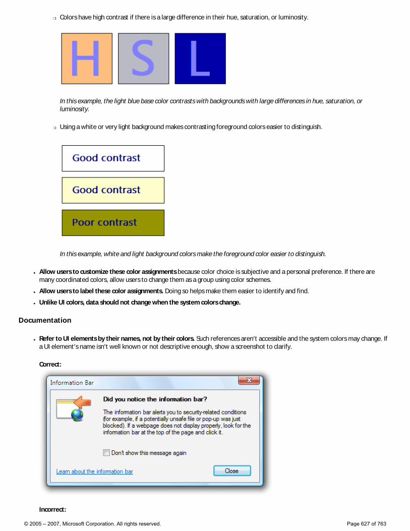
�❍ Colors have high contrast if there is a large difference in their hue, saturation, or luminosity.
In this example, the light blue base color contrasts with backgrounds with large differences in hue, saturation, or luminosity.
�❍ Using a white or very light background makes contrasting foreground colors easier to distinguish.
In this example, white and light background colors make the foreground color easier to distinguish.
● Allow users to customize these color assignments because color choice is subjective and a personal preference. If there are many coordinated colors, allow users to change them as a group using color schemes.
● Allow users to label these color assignments. Doing so helps make them easier to identify and find.
● Unlike UI colors, data should not change when the system colors change.
Documentation
● Refer to UI elements by their names, not by their colors. Such references aren’t accessible and the system colors may change. If a UI element’s name isn’t well known or not descriptive enough, show a screenshot to clarify.
Correct:
Incorrect:
© 2005 – 2007, Microsoft Corporation. All rights reserved. Page 627 of 763
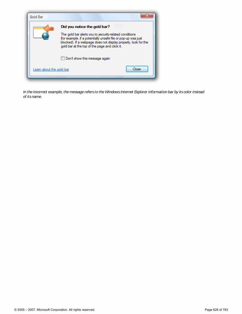
In the incorrect example, the message refers to the Windows Internet Explorer information bar by its color instead of its name.
© 2005 – 2007, Microsoft Corporation. All rights reserved. Page 628 of 763
Icons
Design concepts Guidelines
Icons are pictorial representations of objects, important not only for aesthetic reasons as part of the visual identity of a program, but also for utilitarian reasons as shorthand for conveying meaning that users perceive almost instantaneously. Windows Vista® introduces a new style of iconography that brings a higher level of detail and sophistication to Windows.
Note: Guidelines related to standard icons are presented in a separate article.
Design concepts
Aero is the name for the user experience of Windows Vista, representing both the values embodied in the design of the aesthetics, as well as the vision behind the user interface (UI). Aero stands for: authentic, energetic, reflective, and open. Aero aims to establish a design that is both professional and beautiful. The Aero aesthetic creates a high quality and elegant experience that facilitates user productivity and even drives an emotional response.
Windows Vista icons differ from Windows® XP-style icons in the following ways:
● The style is more realistic than illustrative, but not quite photorealistic. Icons are symbolic images—they should look better than photorealistic!
● Icons have a maximum size of 256x256 pixels, making them suitable for high-dpi (dots per inch) displays. These high-resolution icons allow for high visual quality in list views with large icons.
● Wherever practical, fixed document icons are replaced by thumbnails of the content, making documents easier to identify and find.
● Toolbar icons have less detail and no perspective, to optimize for smaller sizes and visual distinctiveness.
Well-designed icons:
● Improve the visual communication of your program.
● Strongly impact users’ overall impression of your program’s visual design, and appreciation for its fit-and-finish.
● Improve usability by making programs, objects, and actions easier to identify, learn, and find.
The following images depict what makes the Aero style of iconography in Windows Vista different from that used in Windows XP.
© 2005 – 2007, Microsoft Corporation. All rights reserved. Page 629 of 763
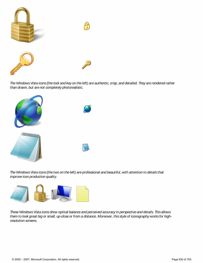
The Windows Vista icons (the lock and key on the left) are authentic, crisp, and detailed. They are rendered rather than drawn, but are not completely photorealistic.
The Windows Vista icons (the two on the left) are professional and beautiful, with attention to details that improve icon production quality.
These Windows Vista icons show optical balance and perceived accuracy in perspective and details. This allows them to look great big or small, up-close or from a distance. Moreover, this style of iconography works for high-resolution screens.
© 2005 – 2007, Microsoft Corporation. All rights reserved. Page 630 of 763
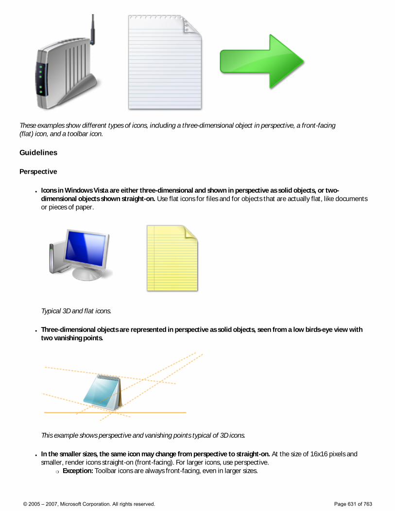
These examples show different types of icons, including a three-dimensional object in perspective, a front-facing (flat) icon, and a toolbar icon.
Guidelines
Perspective
● Icons in Windows Vista are either three-dimensional and shown in perspective as solid objects, or two-dimensional objects shown straight-on. Use flat icons for files and for objects that are actually flat, like documents or pieces of paper.
Typical 3D and flat icons.
● Three-dimensional objects are represented in perspective as solid objects, seen from a low birds-eye view with two vanishing points.
This example shows perspective and vanishing points typical of 3D icons.
● In the smaller sizes, the same icon may change from perspective to straight-on. At the size of 16x16 pixels and smaller, render icons straight-on (front-facing). For larger icons, use perspective.
�❍ Exception: Toolbar icons are always front-facing, even in larger sizes.
© 2005 – 2007, Microsoft Corporation. All rights reserved. Page 631 of 763
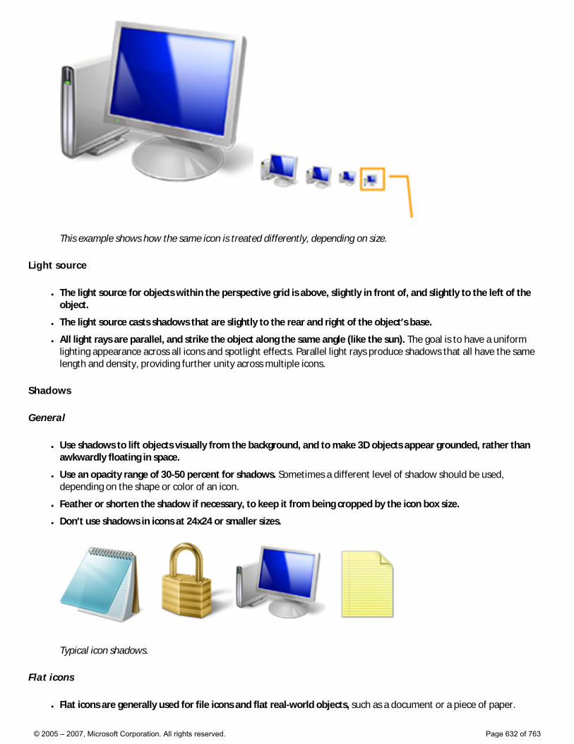
This example shows how the same icon is treated differently, depending on size.
Light source
● The light source for objects within the perspective grid is above, slightly in front of, and slightly to the left of the object.
● The light source casts shadows that are slightly to the rear and right of the object’s base.
● All light rays are parallel, and strike the object along the same angle (like the sun). The goal is to have a uniform lighting appearance across all icons and spotlight effects. Parallel light rays produce shadows that all have the same length and density, providing further unity across multiple icons.
Shadows
General
● Use shadows to lift objects visually from the background, and to make 3D objects appear grounded, rather than awkwardly floating in space.
● Use an opacity range of 30-50 percent for shadows. Sometimes a different level of shadow should be used, depending on the shape or color of an icon.
● Feather or shorten the shadow if necessary, to keep it from being cropped by the icon box size.
● Don’t use shadows in icons at 24x24 or smaller sizes.
Typical icon shadows.
Flat icons
● Flat icons are generally used for file icons and flat real-world objects, such as a document or a piece of paper.
© 2005 – 2007, Microsoft Corporation. All rights reserved. Page 632 of 763
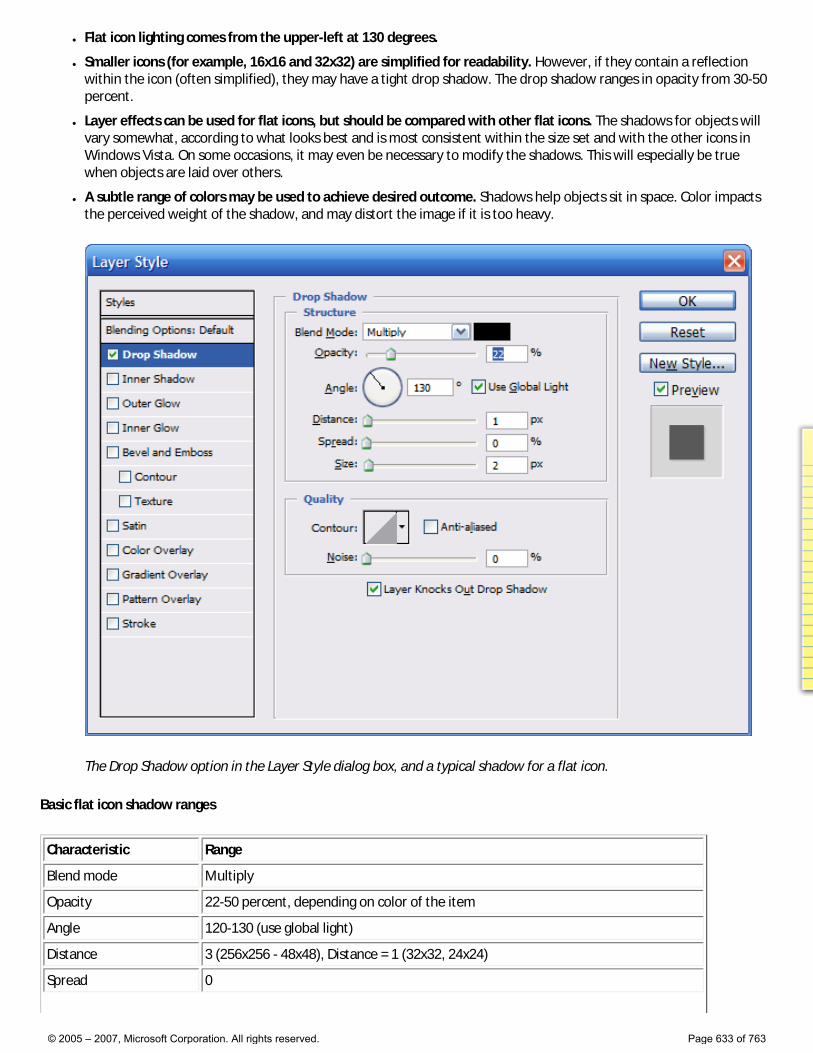
● Flat icon lighting comes from the upper-left at 130 degrees.
● Smaller icons (for example, 16x16 and 32x32) are simplified for readability. However, if they contain a reflection within the icon (often simplified), they may have a tight drop shadow. The drop shadow ranges in opacity from 30-50 percent.
● Layer effects can be used for flat icons, but should be compared with other flat icons. The shadows for objects will vary somewhat, according to what looks best and is most consistent within the size set and with the other icons in Windows Vista. On some occasions, it may even be necessary to modify the shadows. This will especially be true when objects are laid over others.
● A subtle range of colors may be used to achieve desired outcome. Shadows help objects sit in space. Color impacts the perceived weight of the shadow, and may distort the image if it is too heavy.
The Drop Shadow option in the Layer Style dialog box, and a typical shadow for a flat icon.
Basic flat icon shadow ranges
Characteristic Range
Blend mode Multiply
Opacity 22-50 percent, depending on color of the item
Angle 120-130 (use global light)
Distance 3 (256x256 - 48x48), Distance = 1 (32x32, 24x24)
Spread 0
© 2005 – 2007, Microsoft Corporation. All rights reserved. Page 633 of 763
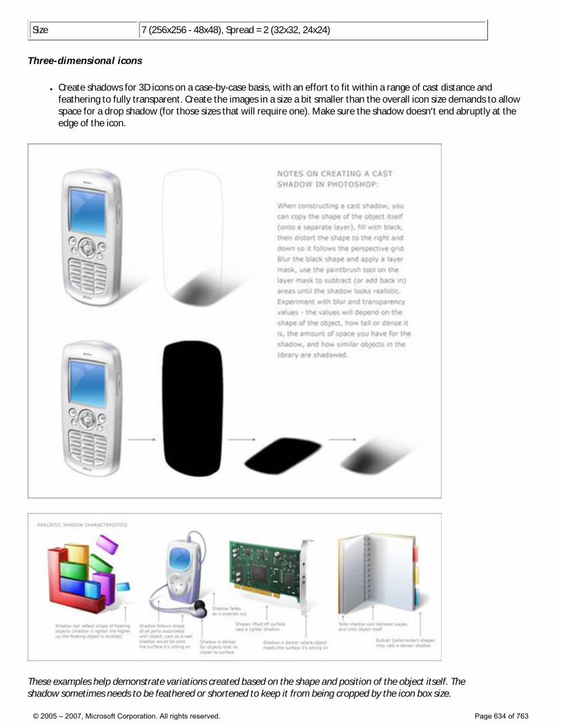
Size 7 (256x256 - 48x48), Spread = 2 (32x32, 24x24)
Three-dimensional icons
● Create shadows for 3D icons on a case-by-case basis, with an effort to fit within a range of cast distance and feathering to fully transparent. Create the images in a size a bit smaller than the overall icon size demands to allow space for a drop shadow (for those sizes that will require one). Make sure the shadow doesn’t end abruptly at the edge of the icon.
These examples help demonstrate variations created based on the shape and position of the object itself. The shadow sometimes needs to be feathered or shortened to keep it from being cropped by the icon box size.
© 2005 – 2007, Microsoft Corporation. All rights reserved. Page 634 of 763
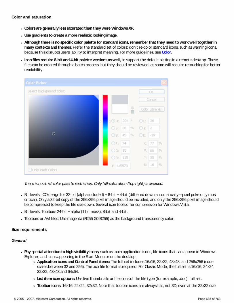
Color and saturation
● Colors are generally less saturated than they were Windows XP.
● Use gradients to create a more realistic looking image.
● Although there is no specific color palette for standard icons, remember that they need to work well together in many contexts and themes. Prefer the standard set of colors; don’t re-color standard icons, such as warning icons, because this disrupts users’ ability to interpret meaning. For more guidelines, see Color.
● Icon files require 8-bit and 4-bit palette versions as well, to support the default setting in a remote desktop. These files can be created through a batch process, but they should be reviewed, as some will require retouching for better readability.
There is no strict color palette restriction. Only full-saturation (top right) is avoided.
● Bit levels: ICO design for 32-bit (alpha included) + 8-bit + 4-bit (dithered down automatically—pixel poke only most critical). Only a 32-bit copy of the 256x256 pixel image should be included, and only the 256x256 pixel image should be compressed to keep the file size down. Several icon tools offer compression for Windows Vista.
● Bit levels: Toolbars 24-bit + alpha (1 bit mask), 8-bit and 4-bit.
● Toolbars or AVI files: Use magenta (R255 G0 B255) as the background transparency color.
Size requirements
General
● Pay special attention to high visibility icons, such as main application icons, file icons that can appear in Windows Explorer, and icons appearing in the Start Menu or on the desktop.
�❍ Application icons and Control Panel items: The full set includes 16x16, 32x32, 48x48, and 256x256 (code scales between 32 and 256). The .ico file format is required. For Classic Mode, the full set is 16x16, 24x24, 32x32, 48x48 and 64x64.
�❍ List item icon options: Use live thumbnails or file icons of the file type (for example, .doc); full set.
�❍ Toolbar icons: 16x16, 24x24, 32x32. Note that toolbar icons are always flat, not 3D, even at the 32x32 size.
© 2005 – 2007, Microsoft Corporation. All rights reserved. Page 635 of 763
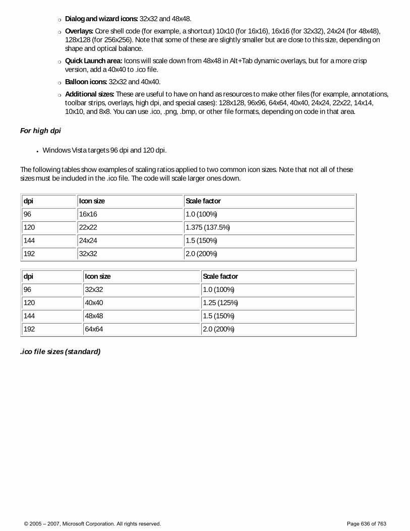
�❍ Dialog and wizard icons: 32x32 and 48x48.
�❍ Overlays: Core shell code (for example, a shortcut) 10x10 (for 16x16), 16x16 (for 32x32), 24x24 (for 48x48), 128x128 (for 256x256). Note that some of these are slightly smaller but are close to this size, depending on shape and optical balance.
�❍ Quick Launch area: Icons will scale down from 48x48 in Alt+Tab dynamic overlays, but for a more crisp version, add a 40x40 to .ico file.
�❍ Balloon icons: 32x32 and 40x40.
�❍ Additional sizes: These are useful to have on hand as resources to make other files (for example, annotations, toolbar strips, overlays, high dpi, and special cases): 128x128, 96x96, 64x64, 40x40, 24x24, 22x22, 14x14, 10x10, and 8x8. You can use .ico, .png, .bmp, or other file formats, depending on code in that area.
For high dpi
● Windows Vista targets 96 dpi and 120 dpi.
The following tables show examples of scaling ratios applied to two common icon sizes. Note that not all of these sizes must be included in the .ico file. The code will scale larger ones down.
dpi Icon size Scale factor
96 16x16 1.0 (100%)
120 22x22 1.375 (137.5%)
144 24x24 1.5 (150%)
192 32x32 2.0 (200%)
dpi Icon size Scale factor
96 32x32 1.0 (100%)
120 40x40 1.25 (125%)
144 48x48 1.5 (150%)
192 64x64 2.0 (200%)
.ico file sizes (standard)
© 2005 – 2007, Microsoft Corporation. All rights reserved. Page 636 of 763
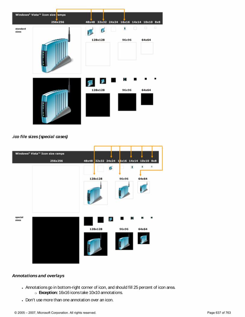
.ico file sizes (special cases)
Annotations and overlays
● Annotations go in bottom-right corner of icon, and should fill 25 percent of icon area. �❍ Exception: 16x16 icons take 10x10 annotations.
● Don’t use more than one annotation over an icon.
© 2005 – 2007, Microsoft Corporation. All rights reserved. Page 637 of 763
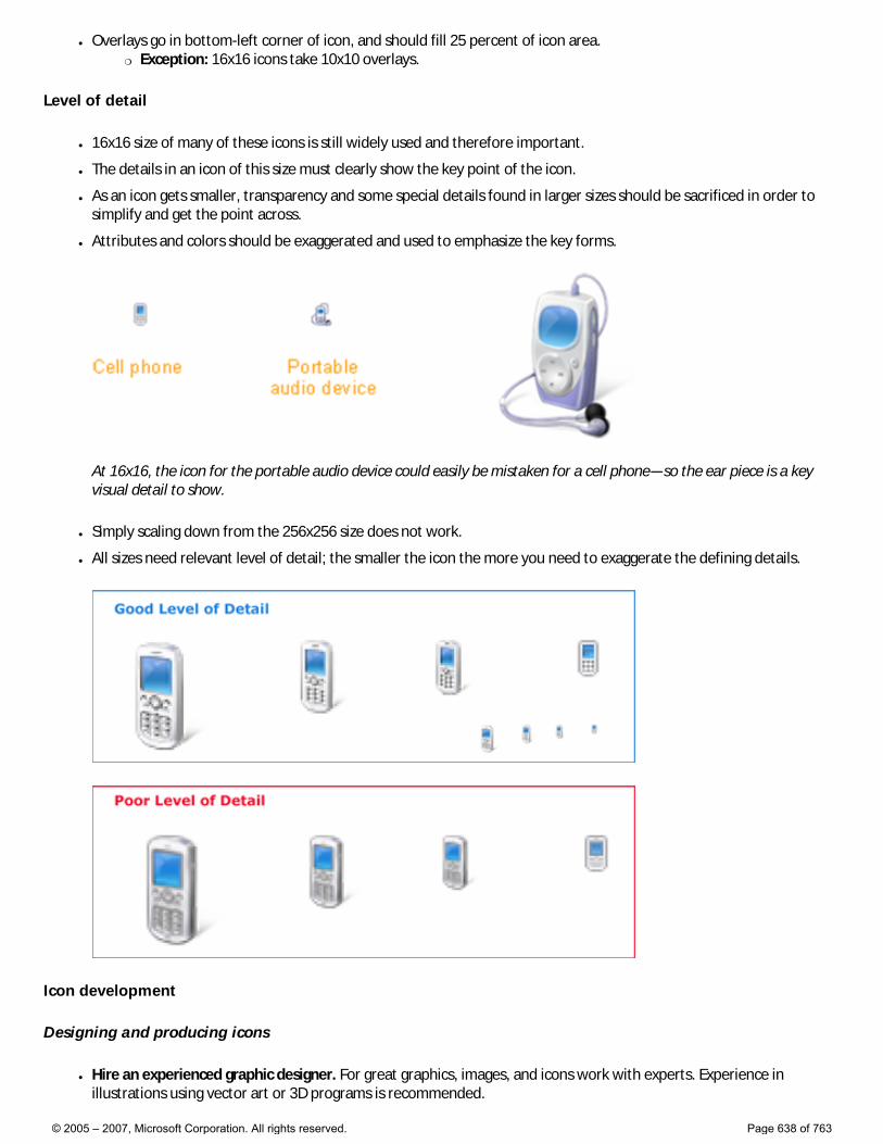
● Overlays go in bottom-left corner of icon, and should fill 25 percent of icon area. �❍ Exception: 16x16 icons take 10x10 overlays.
Level of detail
● 16x16 size of many of these icons is still widely used and therefore important.
● The details in an icon of this size must clearly show the key point of the icon.
● As an icon gets smaller, transparency and some special details found in larger sizes should be sacrificed in order to simplify and get the point across.
● Attributes and colors should be exaggerated and used to emphasize the key forms.
At 16x16, the icon for the portable audio device could easily be mistaken for a cell phone—so the ear piece is a key visual detail to show.
● Simply scaling down from the 256x256 size does not work.
● All sizes need relevant level of detail; the smaller the icon the more you need to exaggerate the defining details.
Icon development
Designing and producing icons
● Hire an experienced graphic designer. For great graphics, images, and icons work with experts. Experience in illustrations using vector art or 3D programs is recommended.
© 2005 – 2007, Microsoft Corporation. All rights reserved. Page 638 of 763
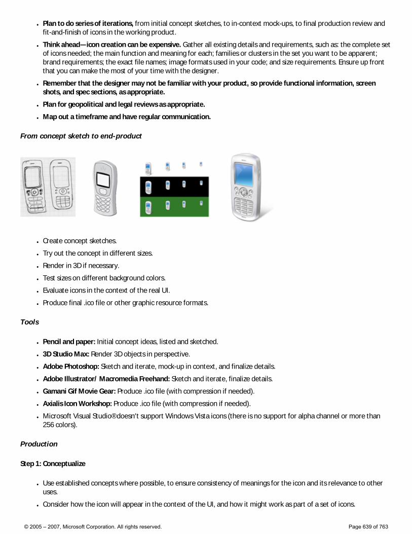
● Plan to do series of iterations, from initial concept sketches, to in-context mock-ups, to final production review and fit-and-finish of icons in the working product.
● Think ahead—icon creation can be expensive. Gather all existing details and requirements, such as: the complete set of icons needed; the main function and meaning for each; families or clusters in the set you want to be apparent; brand requirements; the exact file names; image formats used in your code; and size requirements. Ensure up front that you can make the most of your time with the designer.
● Remember that the designer may not be familiar with your product, so provide functional information, screen shots, and spec sections, as appropriate.
● Plan for geopolitical and legal reviews as appropriate.
● Map out a timeframe and have regular communication.
From concept sketch to end-product
● Create concept sketches.
● Try out the concept in different sizes.
● Render in 3D if necessary.
● Test sizes on different background colors.
● Evaluate icons in the context of the real UI.
● Produce final .ico file or other graphic resource formats.
Tools
● Pencil and paper: Initial concept ideas, listed and sketched.
● 3D Studio Max: Render 3D objects in perspective.
● Adobe Photoshop: Sketch and iterate, mock-up in context, and finalize details.
● Adobe Illustrator/ Macromedia Freehand: Sketch and iterate, finalize details.
● Gamani Gif Movie Gear: Produce .ico file (with compression if needed).
● Axialis Icon Workshop: Produce .ico file (with compression if needed).
● Microsoft Visual Studio® doesn’t support Windows Vista icons (there is no support for alpha channel or more than 256 colors).
Production
Step 1: Conceptualize
● Use established concepts where possible, to ensure consistency of meanings for the icon and its relevance to other uses.
● Consider how the icon will appear in the context of the UI, and how it might work as part of a set of icons.
© 2005 – 2007, Microsoft Corporation. All rights reserved. Page 639 of 763
● If revising an existing icon, consider whether complexity can be reduced.
● Consider the cultural impact of your graphics. Avoid using letters, words, hands, or faces in icons. Depict representations of people or users as generically as possible, if needed.
● If combining multiple objects into a single image in an icon, consider how the image will scale to smaller sizes. Use no more than three objects in an icon (two is preferred). For the 16x16 size, consider removing objects or simplifying the image to improve recognition.
● Do not use the Windows flag in icons.
Step 2: Illustrate
● To illustrate Windows Aero style icons, use a vector tool such as Macromedia Freehand or Adobe Illustrator. Use the palette and style characteristics as outlined earlier in this article.
● Illustrate image using Freehand or Illustrator. Copy and paste the vector images into Adobe Photoshop.
● Make and use a template layer in Photoshop to make sure that work is done within square regions of the regulated sizes.
● Create the images in a size a bit smaller than the overall icon size demands to allow space for a drop shadow (for those sizes that require one).
● Place images at the bottom of the squares, so that all icons in a directory are positioned consistently. Avoid cutting off shadows.
● If you are adding another object to an image or a series, keep the main object in a fixed position, and place flat smaller sized images in a fixed position, such as the lower-left or upper-right depending on the case.
Step 3: Create the 24-bit images
● Once you’ve pasted sizes in Photoshop, check the readability of images, especially at 16x16 and smaller sizes. Pixel-poking using percentages of colors may be required. Reduction of transparency may also be needed. It is common to exaggerate aspects at smaller sizes and to eliminate aspects as well, in order to focus on the key point.
● The 8-bit icons will be displayed in any color mode lower than 32-bit and will not have the 8-bit alpha channel, so they may need to have their edges or more cleaned up because there’s no anti-aliasing (edges may be jagged and image may be hard to read).
● In Photoshop, duplicate the 24-bit image layer and rename the layer to 4-bit images. Index 4-bit images to the Windows 16 color palette.
● Clean up images using only the colors from the 16 color palette. Outlines made from darker or lighter versions of the object’s colors are usually preferable to grey or black.
● If working on a bitmap, be sure that the background color isn’t used in the image itself, because that color that will be the transparent color. Magenta (R255 G0 B255) is often used as the background transparency color.
Step 4: Create the 8-bit and 4-bit images
● Now that the 24-bit images are ready to be made into 32-bit icons, 8-bit versions need to be created.
● This is a great time to test contextual screen shots. It’s amazing what can be discovered by viewing other icons or a family of icons in context. This step can save time and money. It is much better to catch issues before files go through production and are handed off.
● Add the drop shadow to your images in sizes that require them.
● Merge the drop shadow and the 24-bit images together.
● Create a new Photoshop file for each size. Copy and paste the appropriate image. Save each file as a .psd file.
● Do not merge the image layer with the background layer. It’s helpful to include the size and color depth in the file name while working, but the file may ultimately need to be renamed.
© 2005 – 2007, Microsoft Corporation. All rights reserved. Page 640 of 763
Step 5: Create the .ico file
● Choose the application that best meets needs and skills of artists. Remember that icons to be used in a shipping product must be created in a tool that has been purchased or licensed. This means that trial versions cannot be used.
● Both of the products listed below have been used by designers who have produced icons for Windows Vista, and each offers the ability to export to Adobe Photoshop CS.
�❍ Gamani Gif Movie Gear: Produce .ico file
�❍ Axialis Icon Workshop: Produce .ico file
● Visual Studio doesn’t support Windows Vista icons (there is no support for alpha channel or more than 256 colors), so its use is not recommended.
● Icon (.ico format) files must contain the 4- and 8-bit versions, as well as the 24-bit + alpha.
● Save files as a “Windows icon (.ico)” no matter which icon creation program you choose to use.
● Some iconographic assets may actually be bitmap strips, which also require an alpha channel (for example, for toolbars), or .png files saved with transparency. Not all are necessarily .ico format; check for what format is supported in code.
Step 6: Evaluate
● Look at all sizes.
● Look at the family together to evaluate family resemblance, optical balance, and distinction.
● Look at in context to evaluate relative weights and visibility (make sure that one doesn’t dominate).
● Consider cases that may not be used now, but could be in the near future. Could this icon ever be annotated or have an overlay?
● Look at in code.
Icons in the context of list views, toolbars, and tree views
List views
● For Windows Vista, use thumbnails for files holding content that is visually distinct at small scale, such that users can directly recognize the file they are looking for. (Use the Windows Thumbnailing application programming interface for this.)
© 2005 – 2007, Microsoft Corporation. All rights reserved. Page 641 of 763
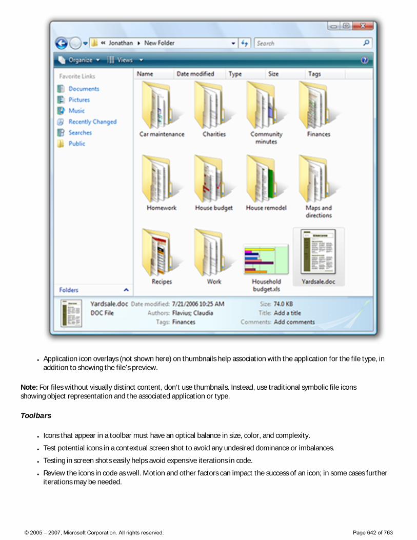
● Application icon overlays (not shown here) on thumbnails help association with the application for the file type, in addition to showing the file’s preview.
Note: For files without visually distinct content, don’t use thumbnails. Instead, use traditional symbolic file icons showing object representation and the associated application or type.
Toolbars
● Icons that appear in a toolbar must have an optical balance in size, color, and complexity.
● Test potential icons in a contextual screen shot to avoid any undesired dominance or imbalances.
● Testing in screen shots easily helps avoid expensive iterations in code.
● Review the icons in code as well. Motion and other factors can impact the success of an icon; in some cases further iterations may be needed.
© 2005 – 2007, Microsoft Corporation. All rights reserved. Page 642 of 763
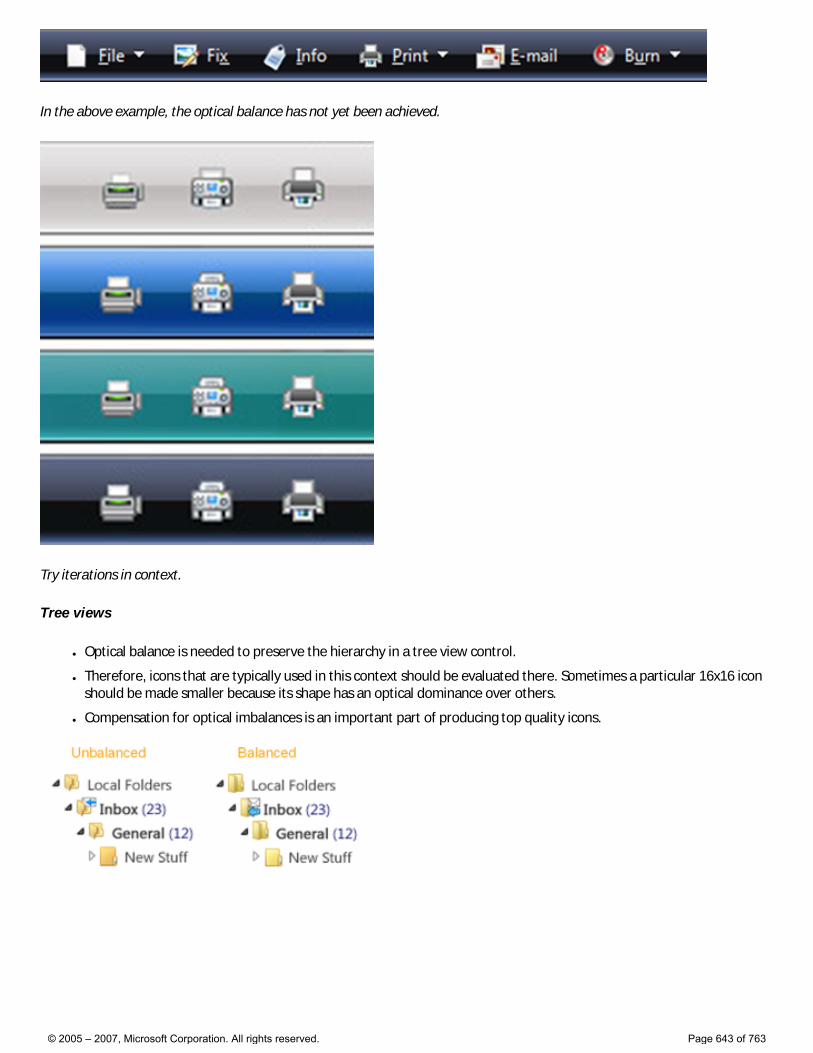
In the above example, the optical balance has not yet been achieved.
Try iterations in context.
Tree views
● Optical balance is needed to preserve the hierarchy in a tree view control.
● Therefore, icons that are typically used in this context should be evaluated there. Sometimes a particular 16x16 icon should be made smaller because its shape has an optical dominance over others.
● Compensation for optical imbalances is an important part of producing top quality icons.
© 2005 – 2007, Microsoft Corporation. All rights reserved. Page 643 of 763
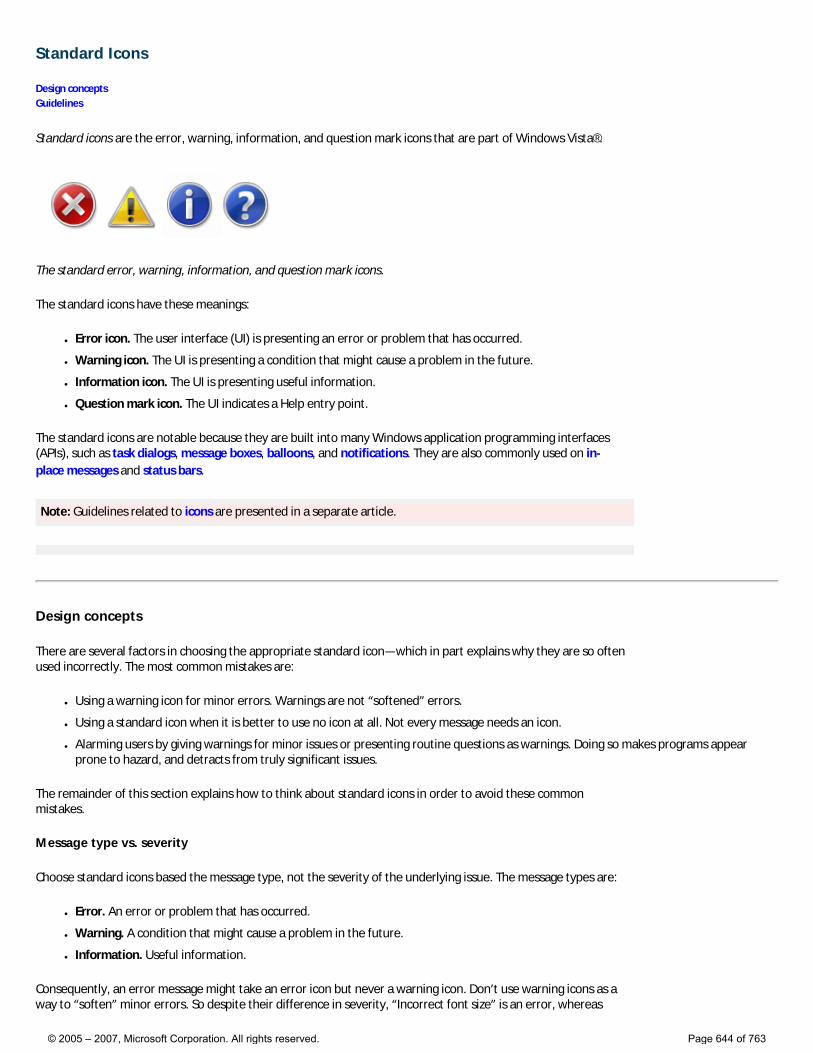
Standard Icons
Design concepts Guidelines
Standard icons are the error, warning, information, and question mark icons that are part of Windows Vista®.
The standard error, warning, information, and question mark icons.
The standard icons have these meanings:
● Error icon. The user interface (UI) is presenting an error or problem that has occurred.
● Warning icon. The UI is presenting a condition that might cause a problem in the future.
● Information icon. The UI is presenting useful information.
● Question mark icon. The UI indicates a Help entry point.
The standard icons are notable because they are built into many Windows application programming interfaces (APIs), such as task dialogs, message boxes, balloons, and notifications. They are also commonly used on in-place messages and status bars.
Note: Guidelines related to icons are presented in a separate article.
Design concepts
There are several factors in choosing the appropriate standard icon—which in part explains why they are so often used incorrectly. The most common mistakes are:
● Using a warning icon for minor errors. Warnings are not “softened” errors.
● Using a standard icon when it is better to use no icon at all. Not every message needs an icon.
● Alarming users by giving warnings for minor issues or presenting routine questions as warnings. Doing so makes programs appear prone to hazard, and detracts from truly significant issues.
The remainder of this section explains how to think about standard icons in order to avoid these common mistakes.
Message type vs. severity
Choose standard icons based the message type, not the severity of the underlying issue. The message types are:
● Error. An error or problem that has occurred.
● Warning. A condition that might cause a problem in the future.
● Information. Useful information.
Consequently, an error message might take an error icon but never a warning icon. Don’t use warning icons as a way to “soften” minor errors. So despite their difference in severity, “Incorrect font size” is an error, whereas
© 2005 – 2007, Microsoft Corporation. All rights reserved. Page 644 of 763
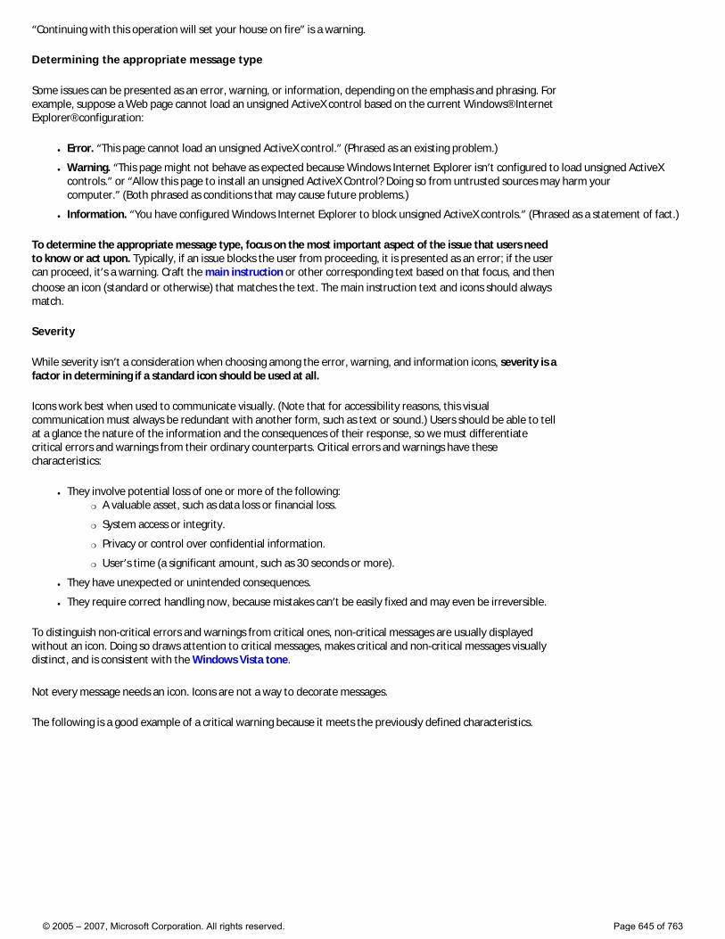
“Continuing with this operation will set your house on fire” is a warning.
Determining the appropriate message type
Some issues can be presented as an error, warning, or information, depending on the emphasis and phrasing. For example, suppose a Web page cannot load an unsigned ActiveX control based on the current Windows® Internet Explorer® configuration:
● Error. “This page cannot load an unsigned ActiveX control.” (Phrased as an existing problem.)
● Warning. “This page might not behave as expected because Windows Internet Explorer isn’t configured to load unsigned ActiveX controls.” or “Allow this page to install an unsigned ActiveX Control? Doing so from untrusted sources may harm your computer.” (Both phrased as conditions that may cause future problems.)
● Information. “You have configured Windows Internet Explorer to block unsigned ActiveX controls.” (Phrased as a statement of fact.)
To determine the appropriate message type, focus on the most important aspect of the issue that users need to know or act upon. Typically, if an issue blocks the user from proceeding, it is presented as an error; if the user can proceed, it’s a warning. Craft the main instruction or other corresponding text based on that focus, and then choose an icon (standard or otherwise) that matches the text. The main instruction text and icons should always match.
Severity
While severity isn’t a consideration when choosing among the error, warning, and information icons, severity is a factor in determining if a standard icon should be used at all.
Icons work best when used to communicate visually. (Note that for accessibility reasons, this visual communication must always be redundant with another form, such as text or sound.) Users should be able to tell at a glance the nature of the information and the consequences of their response, so we must differentiate critical errors and warnings from their ordinary counterparts. Critical errors and warnings have these characteristics:
● They involve potential loss of one or more of the following: �❍ A valuable asset, such as data loss or financial loss.
�❍ System access or integrity.
�❍ Privacy or control over confidential information.
�❍ User’s time (a significant amount, such as 30 seconds or more).
● They have unexpected or unintended consequences.
● They require correct handling now, because mistakes can’t be easily fixed and may even be irreversible.
To distinguish non-critical errors and warnings from critical ones, non-critical messages are usually displayed without an icon. Doing so draws attention to critical messages, makes critical and non-critical messages visually distinct, and is consistent with the Windows Vista tone.
Not every message needs an icon. Icons are not a way to decorate messages.
The following is a good example of a critical warning because it meets the previously defined characteristics.
© 2005 – 2007, Microsoft Corporation. All rights reserved. Page 645 of 763
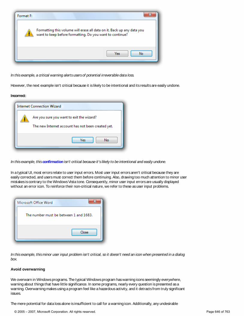
In this example, a critical warning alerts users of potential irreversible data loss.
However, the next example isn’t critical because it is likely to be intentional and its results are easily undone.
Incorrect:
In this example, this confirmation isn’t critical because it’s likely to be intentional and easily undone.
In a typical UI, most errors relate to user input errors. Most user input errors aren’t critical because they are easily corrected, and users must correct them before continuing. Also, drawing too much attention to minor user mistakes is contrary to the Windows Vista tone. Consequently, minor user input errors are usually displayed without an error icon. To reinforce their non-critical nature, we refer to these as user input problems.
In this example, this minor user input problem isn’t critical, so it doesn’t need an icon when presented in a dialog box.
Avoid overwarning
We overwarn in Windows programs. The typical Windows program has warning icons seemingly everywhere, warning about things that have little significance. In some programs, nearly every question is presented as a warning. Overwarning makes using a program feel like a hazardous activity, and it detracts from truly significant issues.
The mere potential for data loss alone is insufficient to call for a warning icon. Additionally, any undesirable
© 2005 – 2007, Microsoft Corporation. All rights reserved. Page 646 of 763
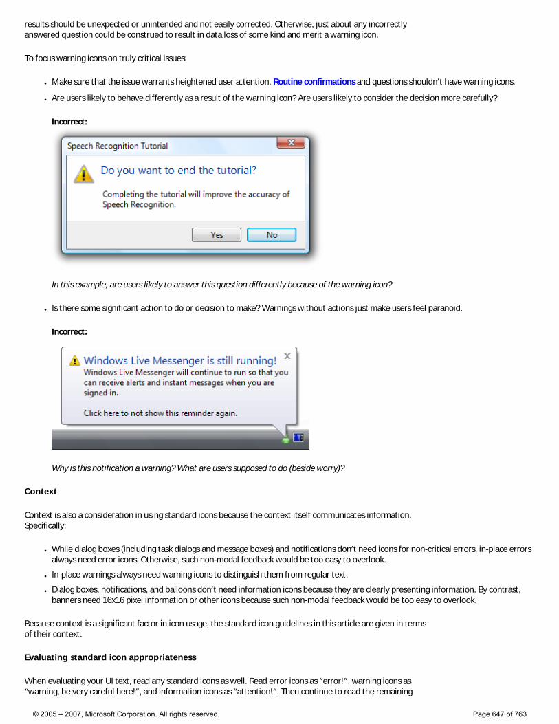
results should be unexpected or unintended and not easily corrected. Otherwise, just about any incorrectly answered question could be construed to result in data loss of some kind and merit a warning icon.
To focus warning icons on truly critical issues:
● Make sure that the issue warrants heightened user attention. Routine confirmations and questions shouldn’t have warning icons.
● Are users likely to behave differently as a result of the warning icon? Are users likely to consider the decision more carefully?
Incorrect:
In this example, are users likely to answer this question differently because of the warning icon?
● Is there some significant action to do or decision to make? Warnings without actions just make users feel paranoid.
Incorrect:
Why is this notification a warning? What are users supposed to do (beside worry)?
Context
Context is also a consideration in using standard icons because the context itself communicates information. Specifically:
● While dialog boxes (including task dialogs and message boxes) and notifications don’t need icons for non-critical errors, in-place errors always need error icons. Otherwise, such non-modal feedback would be too easy to overlook.
● In-place warnings always need warning icons to distinguish them from regular text.
● Dialog boxes, notifications, and balloons don’t need information icons because they are clearly presenting information. By contrast, banners need 16x16 pixel information or other icons because such non-modal feedback would be too easy to overlook.
Because context is a significant factor in icon usage, the standard icon guidelines in this article are given in terms of their context.
Evaluating standard icon appropriateness
When evaluating your UI text, read any standard icons as well. Read error icons as “error!”, warning icons as “warning, be very careful here!”, and information icons as “attention!”. Then continue to read the remaining
© 2005 – 2007, Microsoft Corporation. All rights reserved. Page 647 of 763
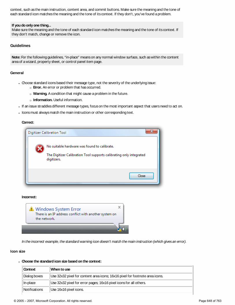
context, such as the main instruction, content area, and commit buttons. Make sure the meaning and the tone of each standard icon matches the meaning and the tone of its context. If they don’t, you’ve found a problem.
If you do only one thing... Make sure the meaning and the tone of each standard icon matches the meaning and the tone of its context. If they don’t match, change or remove the icon.
Guidelines
Note: For the following guidelines, “in-place” means on any normal window surface, such as within the content area of a wizard, property sheet, or control panel item page.
General
● Choose standard icons based their message type, not the severity of the underlying issue: �❍ Error. An error or problem that has occurred.
�❍ Warning. A condition that might cause a problem in the future.
�❍ Information. Useful information.
● If an issue straddles different message types, focus on the most important aspect that users need to act on.
● Icons must always match the main instruction or other corresponding text.
Correct:
Incorrect:
In the incorrect example, the standard warning icon doesn’t match the main instruction (which gives an error).
Icon size
● Choose the standard icon size based on the context:
Context When to use
Dialog boxes Use 32x32 pixel for content area icons; 16x16 pixel for footnote area icons.
In-place Use 32x32 pixel for error pages; 16x16 pixel icons for all others.
Notifications Use 16x16 pixel icons.
© 2005 – 2007, Microsoft Corporation. All rights reserved. Page 648 of 763
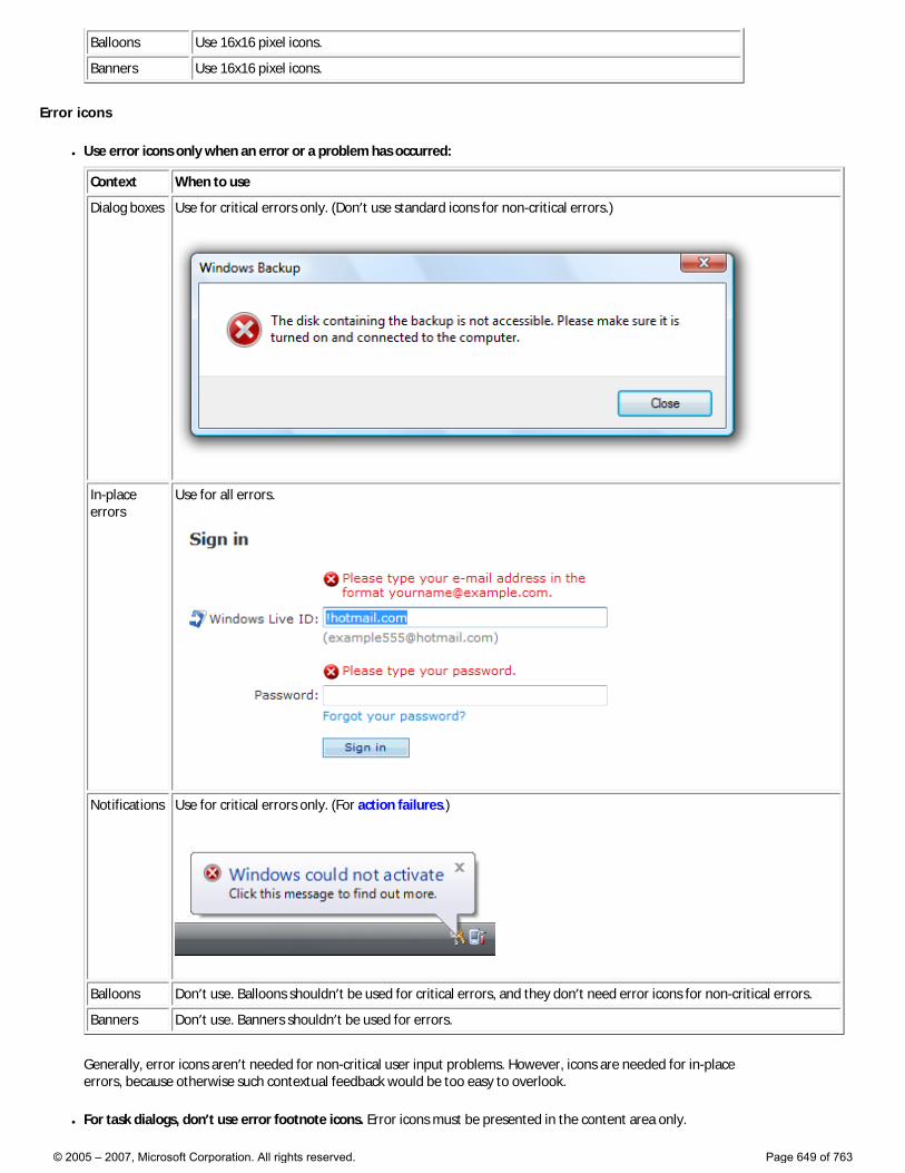
Balloons Use 16x16 pixel icons.
Banners Use 16x16 pixel icons.
Error icons
● Use error icons only when an error or a problem has occurred:
Context When to use
Dialog boxes Use for critical errors only. (Don’t use standard icons for non-critical errors.)
In-place errors
Use for all errors.
Notifications Use for critical errors only. (For action failures.)
Balloons Don’t use. Balloons shouldn’t be used for critical errors, and they don’t need error icons for non-critical errors.
Banners Don’t use. Banners shouldn’t be used for errors.
Generally, error icons aren’t needed for non-critical user input problems. However, icons are needed for in-place errors, because otherwise such contextual feedback would be too easy to overlook.
● For task dialogs, don’t use error footnote icons. Error icons must be presented in the content area only.
© 2005 – 2007, Microsoft Corporation. All rights reserved. Page 649 of 763
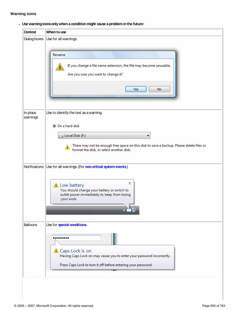
Warning icons
● Use warning icons only when a condition might cause a problem in the future:
Context When to use
Dialog boxes Use for all warnings.
In-place warnings
Use to identify the text as a warning.
Notifications Use for all warnings. (For non-critical system events.)
Balloons Use for special conditions.
© 2005 – 2007, Microsoft Corporation. All rights reserved. Page 650 of 763
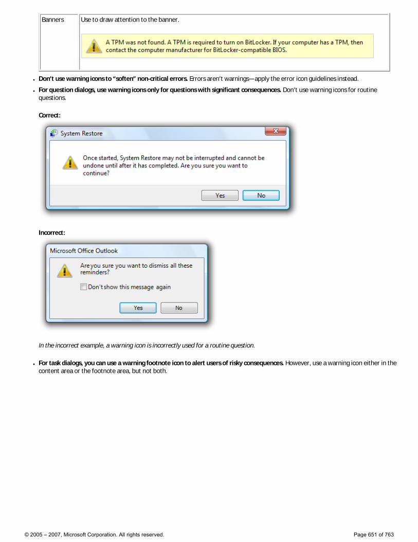
Banners Use to draw attention to the banner.
● Don’t use warning icons to “soften” non-critical errors. Errors aren’t warnings—apply the error icon guidelines instead.
● For question dialogs, use warning icons only for questions with significant consequences. Don’t use warning icons for routine questions.
Correct:
Incorrect:
In the incorrect example, a warning icon is incorrectly used for a routine question.
● For task dialogs, you can use a warning footnote icon to alert users of risky consequences. However, use a warning icon either in the content area or the footnote area, but not both.
© 2005 – 2007, Microsoft Corporation. All rights reserved. Page 651 of 763
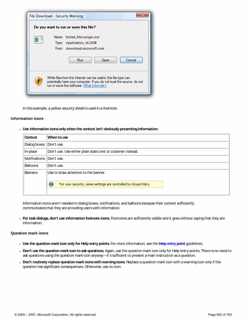
In this example, a yellow security shield is used in a footnote.
Information icons
● Use information icons only when the context isn’t obviously presenting information:
Context When to use
Dialog boxes Don’t use.
In-place Don’t use. Use either plain static text or a banner instead.
Notifications Don’t use.
Balloons Don’t use.
Banners Use to draw attention to the banner.
Information icons aren’t needed in dialog boxes, notifications, and balloons because their context sufficiently communicates that they are providing users with information.
● For task dialogs, don’t use information footnote icons. Footnotes are sufficiently visible and it goes without saying that they are information.
Question mark icons
● Use the question mark icon only for Help entry points. For more information, see the Help entry point guidelines.
● Don’t use the question mark icon to ask questions. Again, use the question mark icon only for Help entry points. There is no need to ask questions using the question mark icon anyway—it’s sufficient to present a main instruction as a question.
● Don’t routinely replace question mark icons with warning icons. Replace a question mark icon with a warning icon only if the question has significant consequences. Otherwise, use no icon.
© 2005 – 2007, Microsoft Corporation. All rights reserved. Page 652 of 763
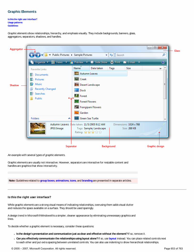
Graphic Elements
Is this the right user interface? Usage patterns Guidelines
Graphic elements show relationships, hierarchy, and emphasis visually. They include backgrounds, banners, glass, aggregators, separators, shadows, and handles.
An example with several types of graphic elements.
Graphic elements are usually not interactive. However, separators are interactive for resizable content and handles are graphics that show interactivity.
Note: Guidelines related to group boxes, animations, icons, and branding are presented in separate articles.
Is this the right user interface?
While graphic elements are a strong visual means of indicating relationships, overusing them adds visual clutter and reduces the space available on a surface. They should be used sparingly.
A design trend in Microsoft® Windows® is a simpler, cleaner appearance by eliminating unnecessary graphics and lines.
To decide whether a graphic element is necessary, consider these questions:
● Is the design’s presentation and communication just as clear and effective without the element? If so, remove it.
● Can you effectively communicate the relationships using layout alone? If so, use layout instead. You can place related controls next to each other and put extra spacing between unrelated controls. You can also use indenting to show hierarchical relationships.
© 2005 – 2007, Microsoft Corporation. All rights reserved. Page 653 of 763
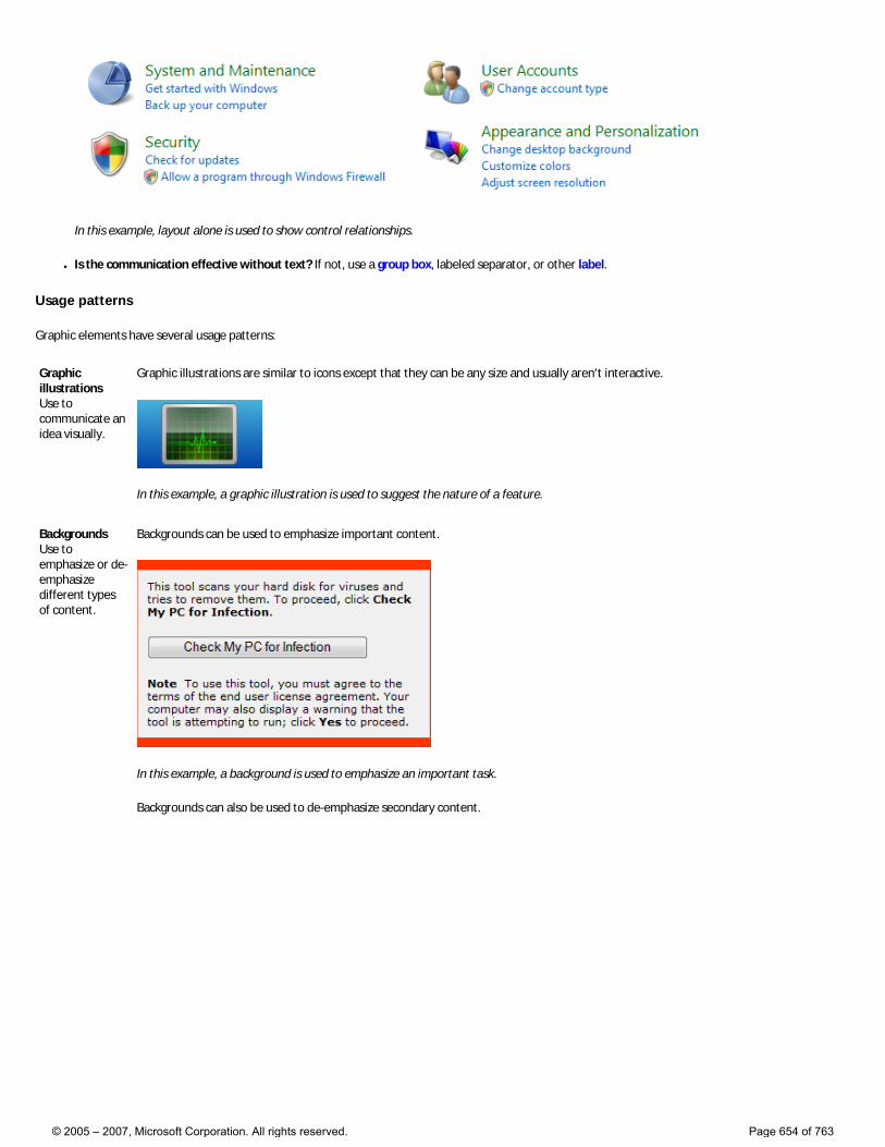
In this example, layout alone is used to show control relationships.
● Is the communication effective without text? If not, use a group box, labeled separator, or other label.
Usage patterns
Graphic elements have several usage patterns:
Graphic illustrations Use to communicate an idea visually.
Graphic illustrations are similar to icons except that they can be any size and usually aren’t interactive.
In this example, a graphic illustration is used to suggest the nature of a feature.
Backgrounds Use to emphasize or de-emphasize different types of content.
Backgrounds can be used to emphasize important content.
In this example, a background is used to emphasize an important task.
Backgrounds can also be used to de-emphasize secondary content.
© 2005 – 2007, Microsoft Corporation. All rights reserved. Page 654 of 763
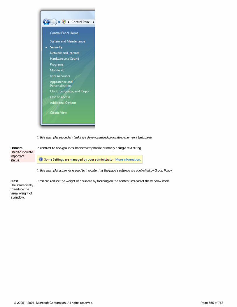
In this example, secondary tasks are de-emphasized by locating them in a task pane.
Banners Used to indicate important status.
In contrast to backgrounds, banners emphasize primarily a single text string.
In this example, a banner is used to indicate that the page’s settings are controlled by Group Policy.
Glass Use strategically to reduce the visual weight of a window.
Glass can reduce the weight of a surface by focusing on the content instead of the window itself.
© 2005 – 2007, Microsoft Corporation. All rights reserved. Page 655 of 763
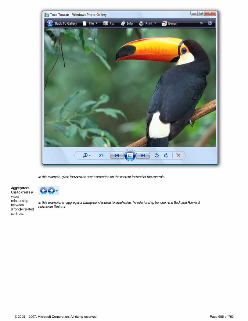
In this example, glass focuses the user’s attention on the content instead of the controls.
Aggregators Use to create a visual relationship between strongly related controls.
In this example, an aggregator background is used to emphasize the relationship between the Back and Forward buttons in Explorer.
© 2005 – 2007, Microsoft Corporation. All rights reserved. Page 656 of 763
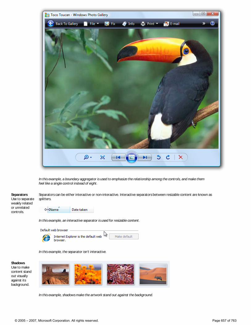
In this example, a boundary aggregator is used to emphasize the relationship among the controls, and make them feel like a single control instead of eight.
Separators Use to separate weakly related or unrelated controls.
Separators can be either interactive or non-interactive. Interactive separators between resizable content are known as splitters.
In this example, an interactive separator is used for resizable content.
In this example, the separator isn’t interactive.
Shadows Use to make content stand out visually against its background.
In this example, shadows make the artwork stand out against the background.
© 2005 – 2007, Microsoft Corporation. All rights reserved. Page 657 of 763
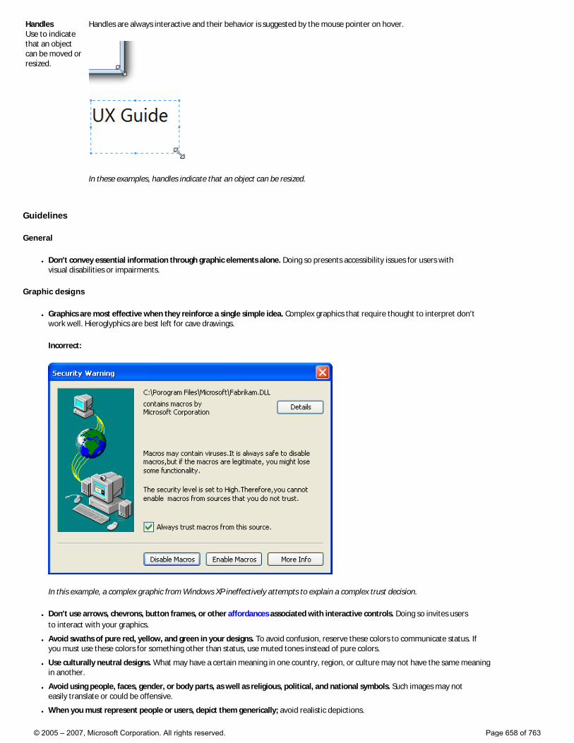
Handles Use to indicate that an object can be moved or resized.
Handles are always interactive and their behavior is suggested by the mouse pointer on hover.
In these examples, handles indicate that an object can be resized.
Guidelines
General
● Don’t convey essential information through graphic elements alone. Doing so presents accessibility issues for users with visual disabilities or impairments.
Graphic designs
● Graphics are most effective when they reinforce a single simple idea. Complex graphics that require thought to interpret don’t work well. Hieroglyphics are best left for cave drawings.
Incorrect:
In this example, a complex graphic from Windows XP ineffectively attempts to explain a complex trust decision.
● Don’t use arrows, chevrons, button frames, or other affordances associated with interactive controls. Doing so invites users to interact with your graphics.
● Avoid swaths of pure red, yellow, and green in your designs. To avoid confusion, reserve these colors to communicate status. If you must use these colors for something other than status, use muted tones instead of pure colors.
● Use culturally neutral designs. What may have a certain meaning in one country, region, or culture may not have the same meaning in another.
● Avoid using people, faces, gender, or body parts, as well as religious, political, and national symbols. Such images may not easily translate or could be offensive.
● When you must represent people or users, depict them generically; avoid realistic depictions.
© 2005 – 2007, Microsoft Corporation. All rights reserved. Page 658 of 763
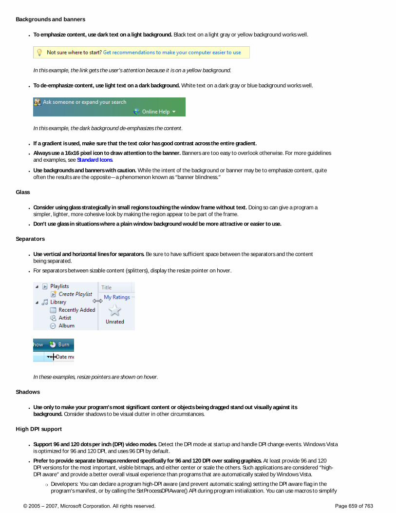
Backgrounds and banners
● To emphasize content, use dark text on a light background. Black text on a light gray or yellow background works well.
In this example, the link gets the user’s attention because it is on a yellow background.
● To de-emphasize content, use light text on a dark background. White text on a dark gray or blue background works well.
In this example, the dark background de-emphasizes the content.
● If a gradient is used, make sure that the text color has good contrast across the entire gradient.
● Always use a 16x16 pixel icon to draw attention to the banner. Banners are too easy to overlook otherwise. For more guidelines and examples, see Standard Icons.
● Use backgrounds and banners with caution. While the intent of the background or banner may be to emphasize content, quite often the results are the opposite—a phenomenon known as “banner blindness.”
Glass
● Consider using glass strategically in small regions touching the window frame without text. Doing so can give a program a simpler, lighter, more cohesive look by making the region appear to be part of the frame.
● Don’t use glass in situations where a plain window background would be more attractive or easier to use.
Separators
● Use vertical and horizontal lines for separators. Be sure to have sufficient space between the separators and the content being separated.
● For separators between sizable content (splitters), display the resize pointer on hover.
In these examples, resize pointers are shown on hover.
Shadows
● Use only to make your program’s most significant content or objects being dragged stand out visually against its background. Consider shadows to be visual clutter in other circumstances.
High DPI support
● Support 96 and 120 dots per inch (DPI) video modes. Detect the DPI mode at startup and handle DPI change events. Windows Vista is optimized for 96 and 120 DPI, and uses 96 DPI by default.
● Prefer to provide separate bitmaps rendered specifically for 96 and 120 DPI over scaling graphics. At least provide 96 and 120 DPI versions for the most important, visible bitmaps, and either center or scale the others. Such applications are considered “high-DPI aware” and provide a better overall visual experience than programs that are automatically scaled by Windows Vista.
�❍ Developers: You can declare a program high-DPI aware (and prevent automatic scaling) setting the DPI aware flag in the program’s manifest, or by calling the SetProcessDPIAware() API during program initialization. You can use macros to simplify
© 2005 – 2007, Microsoft Corporation. All rights reserved. Page 659 of 763
selecting the right graphics. For Win32 bitmaps, you can use SS_CENTERIMAGE to center or SS_REALSIZECONTROL to scale.
● Check your program in both 96 and 120 DPI for:
�❍ Graphics that are too small or too large.
�❍ Graphics being clipped, overlapped, or otherwise not fitting properly.
�❍ Graphics that are poorly stretched (“pixilated”).
�❍ Text that is clipped or not fitting in graphic backgrounds.
Text
● For accessibility and localization, don’t use any text in graphics. Make exceptions only to represent branding and text as an abstract concept.
© 2005 – 2007, Microsoft Corporation. All rights reserved. Page 660 of 763
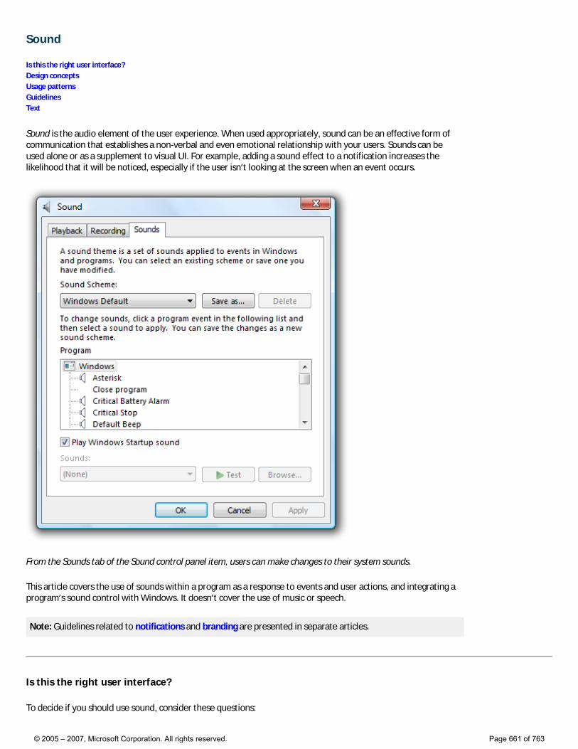
Sound
Is this the right user interface? Design concepts Usage patterns Guidelines Text
Sound is the audio element of the user experience. When used appropriately, sound can be an effective form of communication that establishes a non-verbal and even emotional relationship with your users. Sounds can be used alone or as a supplement to visual UI. For example, adding a sound effect to a notification increases the likelihood that it will be noticed, especially if the user isn’t looking at the screen when an event occurs.
From the Sounds tab of the Sound control panel item, users can make changes to their system sounds.
This article covers the use of sounds within a program as a response to events and user actions, and integrating a program’s sound control with Windows. It doesn’t cover the use of music or speech.
Note: Guidelines related to notifications and branding are presented in separate articles.
Is this the right user interface?
To decide if you should use sound, consider these questions:
© 2005 – 2007, Microsoft Corporation. All rights reserved. Page 661 of 763
● Is there a clear user benefit to using sound? Because the drawbacks of using sound can easily outweigh the benefits, use sound only when there is a clear advantage.
● Is the use of sound appropriate? Does the use of sound draw attention to things that are worthy of attention? Would users miss the sound if it were absent? Focus on sounds that keep users informed, are likely to change their behavior, or provide useful feedback.
● Is the use of sound distracting? Are there frequent, loud, jarring sounds? Are users likely to reduce the system volume or your program’s volume as the result of your use of sound?
● Are you using sound as a primary form of communication? In many cases, such as for users who have some level of hearing loss, sound should not be used as the primary means of communication. Sound is more effective as a supplement to other means of communication (such as text or visuals).
● Are the primary target users IT professionals? Sound is usually ineffective for tasks targeted at IT professionals because many of their tasks run unattended. Furthermore, sound doesn’t scale for them—imagine running hundreds of tasks at a time and getting sounds when they complete or fail.
Design concepts
Typically sound achieves any or all of the following purposes:
● Notification. Sound can be associated with specific events. For example, a “new mail” sound tells users when mail arrives without disrupting their current task.
● Feedback. Sound can provide feedback for specific user actions. For example, a subtle sound that plays when you release the slider on the volume control provides feedback about the level of the current setting.
● Branding. Sound can be associated with specific content to brand your product, application, or service. Windows Vista® uses sound in this way for the startup of the operating system.
● Entertainment. Sound is commonly used to enhance entertainment products and to make any product more engaging. For example, most games, training applications, and consumer products use sound to entertain users and enhance their experience.
Certain sounds can fulfill several of these purposes at once. The Windows Vista Startup sound, for example, indicates that the startup process has completed and the desktop is ready for use. It also provides a powerful form of product branding and even momentarily engages users.
Sounds that fulfill none of these purposes should likely be eliminated.
Inappropriate use of sound
Despite the benefits of sound, appropriate use of sound requires significant restraint—to do otherwise can make a program annoying and distracting. Users will turn off their sound completely if they become annoyed by frequent, repetitive, jarring, disrupting, poorly designed sounds; in part this is because by its very nature, sound demands attention and is hard to ignore. For tips on finding a reasonable balance, see the Sound design guidelines.
Because the drawbacks of using sound can easily outweigh the benefits, use sound only when there is a clear advantage. When in doubt, don’t use sound.
Make sound supplemental
Even if the sound is used appropriately, there are many situations where sound might not be effective for all users:
● Some users may work in a noisy environment where the sounds cannot be heard.
● Some users may work in a quiet environment that requires sound to be turned off or set at a low volume.
● Some users may have hearing impairments or loss.
● The computer may not have speakers.
For these reasons, sound used for notifications and feedback should never be the only method of
© 2005 – 2007, Microsoft Corporation. All rights reserved. Page 662 of 763
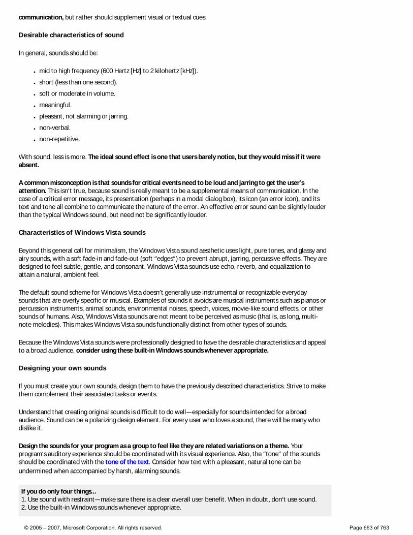
communication, but rather should supplement visual or textual cues.
Desirable characteristics of sound
In general, sounds should be:
● mid to high frequency (600 Hertz [Hz] to 2 kilohertz [kHz]).
● short (less than one second).
● soft or moderate in volume.
● meaningful.
● pleasant, not alarming or jarring.
● non-verbal.
● non-repetitive.
With sound, less is more. The ideal sound effect is one that users barely notice, but they would miss if it were absent.
A common misconception is that sounds for critical events need to be loud and jarring to get the user’s attention. This isn’t true, because sound is really meant to be a supplemental means of communication. In the case of a critical error message, its presentation (perhaps in a modal dialog box), its icon (an error icon), and its text and tone all combine to communicate the nature of the error. An effective error sound can be slightly louder than the typical Windows sound, but need not be significantly louder.
Characteristics of Windows Vista sounds
Beyond this general call for minimalism, the Windows Vista sound aesthetic uses light, pure tones, and glassy and airy sounds, with a soft fade-in and fade-out (soft “edges”) to prevent abrupt, jarring, percussive effects. They are designed to feel subtle, gentle, and consonant. Windows Vista sounds use echo, reverb, and equalization to attain a natural, ambient feel.
The default sound scheme for Windows Vista doesn’t generally use instrumental or recognizable everyday sounds that are overly specific or musical. Examples of sounds it avoids are musical instruments such as pianos or percussion instruments, animal sounds, environmental noises, speech, voices, movie-like sound effects, or other sounds of humans. Also, Windows Vista sounds are not meant to be perceived as music (that is, as long, multi-note melodies). This makes Windows Vista sounds functionally distinct from other types of sounds.
Because the Windows Vista sounds were professionally designed to have the desirable characteristics and appeal to a broad audience, consider using these built-in Windows sounds whenever appropriate.
Designing your own sounds
If you must create your own sounds, design them to have the previously described characteristics. Strive to make them complement their associated tasks or events.
Understand that creating original sounds is difficult to do well—especially for sounds intended for a broad audience. Sound can be a polarizing design element. For every user who loves a sound, there will be many who dislike it.
Design the sounds for your program as a group to feel like they are related variations on a theme. Your program’s auditory experience should be coordinated with its visual experience. Also, the “tone” of the sounds should be coordinated with the tone of the text. Consider how text with a pleasant, natural tone can be undermined when accompanied by harsh, alarming sounds.
If you do only four things... 1. Use sound with restraint—make sure there is a clear overall user benefit. When in doubt, don’t use sound. 2. Use the built-in Windows sounds whenever appropriate.
© 2005 – 2007, Microsoft Corporation. All rights reserved. Page 663 of 763
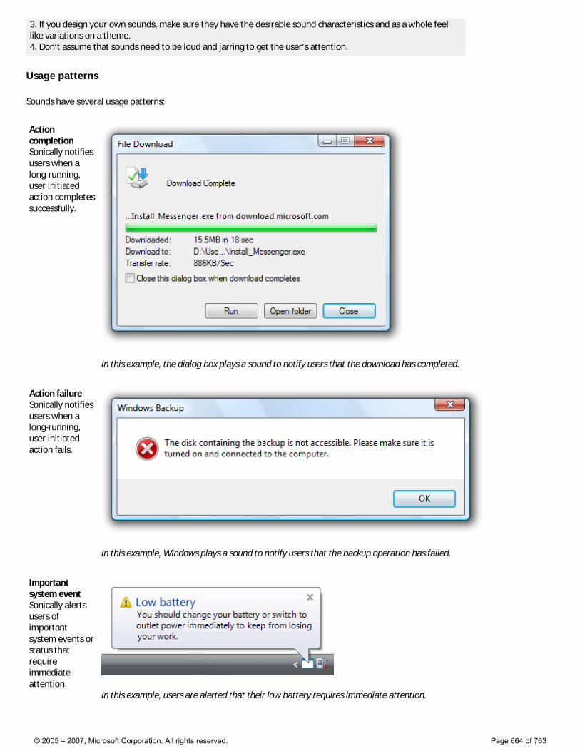
3. If you design your own sounds, make sure they have the desirable sound characteristics and as a whole feel like variations on a theme. 4. Don’t assume that sounds need to be loud and jarring to get the user’s attention.
Usage patterns
Sounds have several usage patterns:
Action completion Sonically notifies users when a long-running, user initiated action completes successfully.
In this example, the dialog box plays a sound to notify users that the download has completed.
Action failure Sonically notifies users when a long-running, user initiated action fails.
In this example, Windows plays a sound to notify users that the backup operation has failed.
Important system event Sonically alerts users of important system events or status that require immediate attention.
In this example, users are alerted that their low battery requires immediate attention.
© 2005 – 2007, Microsoft Corporation. All rights reserved. Page 664 of 763
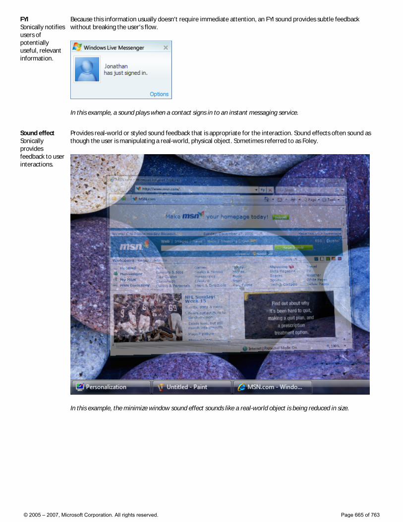
FYI Sonically notifies users of potentially useful, relevant information.
Because this information usually doesn’t require immediate attention, an FYI sound provides subtle feedback without breaking the user’s flow.
In this example, a sound plays when a contact signs in to an instant messaging service.
Sound effect Sonically provides feedback to user interactions.
Provides real-world or styled sound feedback that is appropriate for the interaction. Sound effects often sound as though the user is manipulating a real-world, physical object. Sometimes referred to as Foley.
In this example, the minimize window sound effect sounds like a real-world object is being reduced in size.
© 2005 – 2007, Microsoft Corporation. All rights reserved. Page 665 of 763
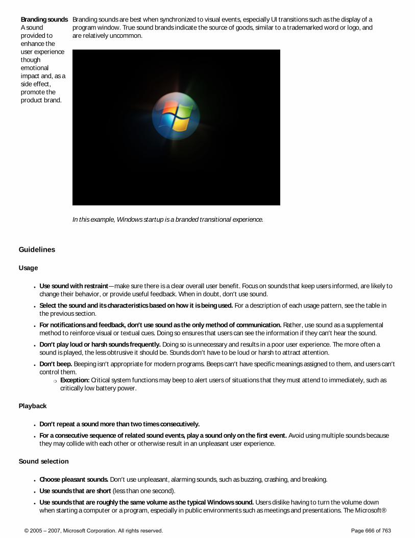
Branding sounds A sound provided to enhance the user experience though emotional impact and, as a side effect, promote the product brand.
Branding sounds are best when synchronized to visual events, especially UI transitions such as the display of a program window. True sound brands indicate the source of goods, similar to a trademarked word or logo, and are relatively uncommon.
In this example, Windows startup is a branded transitional experience.
Guidelines
Usage
● Use sound with restraint—make sure there is a clear overall user benefit. Focus on sounds that keep users informed, are likely to change their behavior, or provide useful feedback. When in doubt, don’t use sound.
● Select the sound and its characteristics based on how it is being used. For a description of each usage pattern, see the table in the previous section.
● For notifications and feedback, don’t use sound as the only method of communication. Rather, use sound as a supplemental method to reinforce visual or textual cues. Doing so ensures that users can see the information if they can’t hear the sound.
● Don’t play loud or harsh sounds frequently. Doing so is unnecessary and results in a poor user experience. The more often a sound is played, the less obtrusive it should be. Sounds don’t have to be loud or harsh to attract attention.
● Don’t beep. Beeping isn’t appropriate for modern programs. Beeps can’t have specific meanings assigned to them, and users can’t control them.
�❍ Exception: Critical system functions may beep to alert users of situations that they must attend to immediately, such as critically low battery power.
Playback
● Don’t repeat a sound more than two times consecutively.
● For a consecutive sequence of related sound events, play a sound only on the first event. Avoid using multiple sounds because they may collide with each other or otherwise result in an unpleasant user experience.
Sound selection
● Choose pleasant sounds. Don’t use unpleasant, alarming sounds, such as buzzing, crashing, and breaking.
● Use sounds that are short (less than one second).
● Use sounds that are roughly the same volume as the typical Windows sound. Users dislike having to turn the volume down when starting a computer or a program, especially in public environments such as meetings and presentations. The Microsoft®
© 2005 – 2007, Microsoft Corporation. All rights reserved. Page 666 of 763
Windows® sound files are located in the Media folder within the Windows folder.
● Don’t choose sounds that require localization. You can achieve this by using sounds that don’t use speech or have culturally-dependent meanings or connotations.
Windows system sounds
● Use the built-in Windows system sounds whenever appropriate.
● Choose to use system sounds based on their associated meaning, not just on the sound itself. System sounds must be used consistently.
Sound design
When creating your own sounds:
● Create sounds with the desirable sound characteristics.
● Compose sounds with mostly mid-range to high frequencies (600 Hz to 2 kHz). Don’t use low frequencies because they travel farther, are harder to locate, and can be alarming.
● Set the relative amplitude of normal sounds to the level of the typical Windows sound. The Windows Vista sounds have been appropriately leveled for home and work environments. Using different levels for your sounds will force users to make volume adjustments.
�❍ Set important sounds to be slightly louder. Such sounds include action completions, action failures, and important system events.
�❍ Set frequently occurring sounds to be slightly softer. These include FYIs, branding sounds, and sound effects.
● Choose sounds consistent with the meaning of the Windows Vista sounds. To create a custom version of a Windows Vista sound, preserve the same pitch and interval, but change the orchestration or timbre. Don’t assign different meanings to sounds with similar pitches and intervals as Windows Vista sounds.
● Design the sounds for your program to feel like they are related variations on a theme. Your program’s auditory experience should be coordinated with its visual experience.
● Sounds must be in .wav file format. The 16-bit, 44.1 kHz stereo uncompressed pulse code modulation (PCM) format is recommended. If file size is important, use compressed or monaural (mono) formats, but be aware that there is an easily discernable quality loss that could reflect badly on your application.
Mixing
● Don’t have volume or mute controls in your program. Instead, let users control relative volume settings among applications with the Windows Vista volume mixer. If your program has a volume control, there will be multiple places where users adjust their settings, which may lead to confusion.
© 2005 – 2007, Microsoft Corporation. All rights reserved. Page 667 of 763
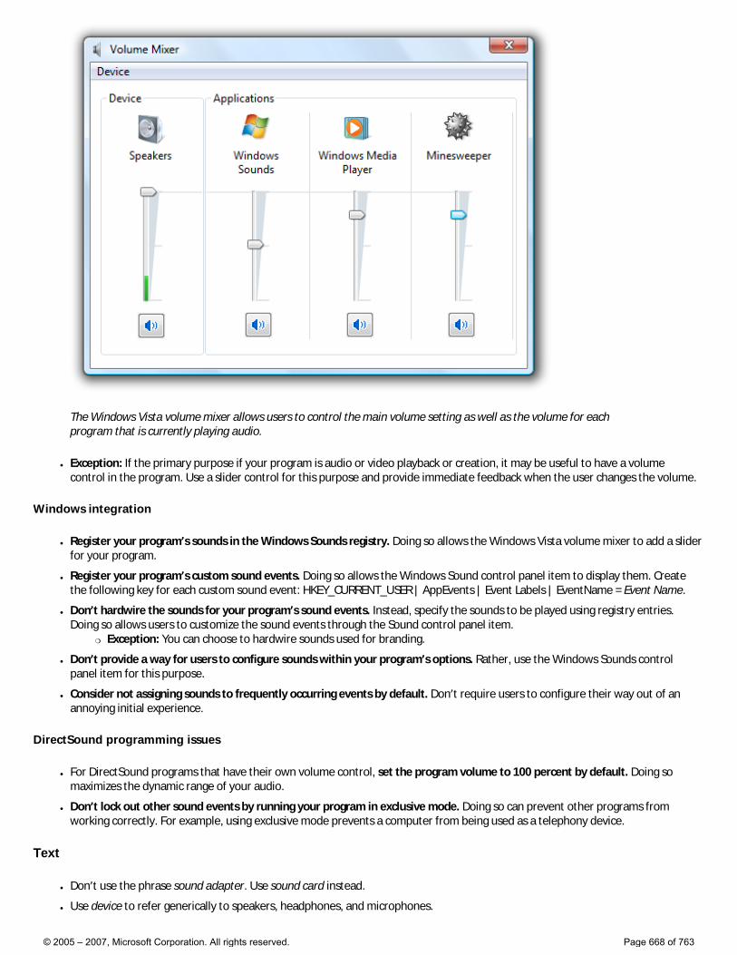
The Windows Vista volume mixer allows users to control the main volume setting as well as the volume for each program that is currently playing audio.
● Exception: If the primary purpose if your program is audio or video playback or creation, it may be useful to have a volume control in the program. Use a slider control for this purpose and provide immediate feedback when the user changes the volume.
Windows integration
● Register your program’s sounds in the Windows Sounds registry. Doing so allows the Windows Vista volume mixer to add a slider for your program.
● Register your program’s custom sound events. Doing so allows the Windows Sound control panel item to display them. Create the following key for each custom sound event: HKEY_CURRENT_USER | AppEvents | Event Labels | EventName = Event Name.
● Don’t hardwire the sounds for your program’s sound events. Instead, specify the sounds to be played using registry entries. Doing so allows users to customize the sound events through the Sound control panel item.
�❍ Exception: You can choose to hardwire sounds used for branding.
● Don’t provide a way for users to configure sounds within your program’s options. Rather, use the Windows Sounds control panel item for this purpose.
● Consider not assigning sounds to frequently occurring events by default. Don’t require users to configure their way out of an annoying initial experience.
DirectSound programming issues
● For DirectSound programs that have their own volume control, set the program volume to 100 percent by default. Doing so maximizes the dynamic range of your audio.
● Don’t lock out other sound events by running your program in exclusive mode. Doing so can prevent other programs from working correctly. For example, using exclusive mode prevents a computer from being used as a telephony device.
Text
● Don’t use the phrase sound adapter. Use sound card instead.
● Use device to refer generically to speakers, headphones, and microphones.
© 2005 – 2007, Microsoft Corporation. All rights reserved. Page 668 of 763
● Use controller to refer to audio hardware that controls devices, such as sound cards and chipsets.
● Use the phrase sound scheme to describe a collection of sounds for common program events, such as logging on or receiving new e-mail. Use the phrase desktop theme to describe a collection of visual elements and sounds for your computer desktop.
● Use the term audio to refer broadly to speech, music, and sounds. Use the term sound to refer more narrowly to the program and Windows sounds described in this article.
© 2005 – 2007, Microsoft Corporation. All rights reserved. Page 669 of 763
Software Branding
Design concepts Guidelines
Branding is the emotional positioning of a product as perceived by its customers. Product branding is achieved through a combination of factors, including the product name and logo, use of color, text, graphics, and sound, the style of various other design elements, marketing, and most importantly, the attributes of the product experience itself.
Successful branding requires skillful crafting of a product image, and is not achieved simply by plastering a product logo on every surface and using the product’s color scheme at every opportunity. Rather, meaningful and high-quality branding that enhances users’ experience will be much more successful.
Note: Guidelines related to icons, fonts, color, animation, sound, and window frames are presented in separate articles.
Design concepts
In a competitive marketplace, companies brand their products to help differentiate them from the competition. It would be naïve to suggest that product branding in general is wrong or should be avoided, but it is fair to say that software branding is too often executed poorly. The goal of software branding is to associate the brand with the style and quality of the product and its experience. Too often, developers attempt to achieve this by drawing attention to the program itself. The result is to distract users instead of delight them.
Attributes of good software branding
When well done, software branding has these attributes:
● Establishes a clear, distinct style and personality.
● Creates an emotional connection.
● Has high quality.
● Is strategically placed and consistently executed.
● Aligns to the overall brand strategy.
● Is long lasting...as enjoyable the thousandth time as it was the first.
By contrast, poor attempts at software branding have these attributes:
● Has no obvious theme or point.
● Is in the user’s face.
● Is annoying.
● Is everywhere.
● Has a custom look and feel without any user benefit.
● Becomes quickly tiresome.
Start with the product itself
Successful software branding starts with the design of product itself. A well-designed program has carefully crafted functionality aimed at an appropriate target audience. Unique functionality and extraordinary attention to detail make powerful branding statements. For more information, see How to Design a Great User Experience.
Carefully choose the product’s name
Great product names drive strong brands. A great software product name is memorable and concisely conveys the benefit of the product, providing distinction in a crowded market. Hire a branding professional to help you choose the right product name. In the long term, a well-chosen name is far more important to your branding effort than details like logos, color schemes, and control theming.
What to brand
Software branding elements can be categorized as follows:
© 2005 – 2007, Microsoft Corporation. All rights reserved. Page 670 of 763
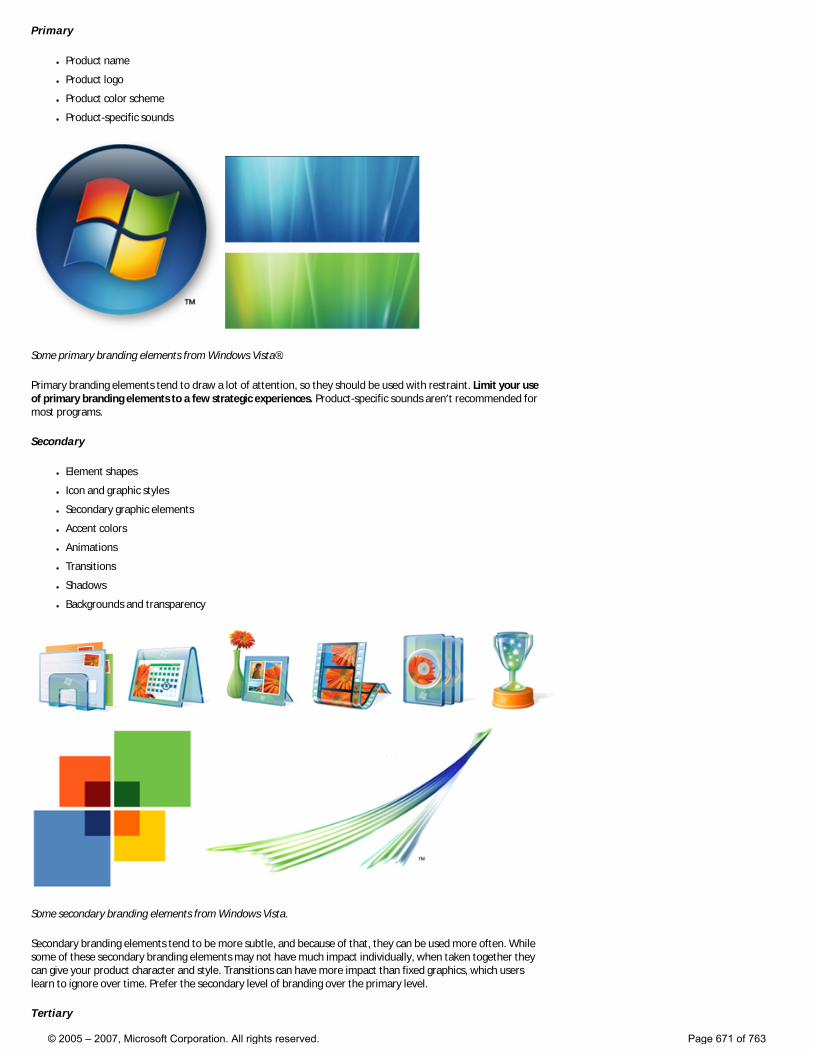
Primary
● Product name
● Product logo
● Product color scheme
● Product-specific sounds
Some primary branding elements from Windows Vista®.
Primary branding elements tend to draw a lot of attention, so they should be used with restraint. Limit your use of primary branding elements to a few strategic experiences. Product-specific sounds aren’t recommended for most programs.
Secondary
● Element shapes
● Icon and graphic styles
● Secondary graphic elements
● Accent colors
● Animations
● Transitions
● Shadows
● Backgrounds and transparency
Some secondary branding elements from Windows Vista.
Secondary branding elements tend to be more subtle, and because of that, they can be used more often. While some of these secondary branding elements may not have much impact individually, when taken together they can give your product character and style. Transitions can have more impact than fixed graphics, which users learn to ignore over time. Prefer the secondary level of branding over the primary level.
Tertiary
© 2005 – 2007, Microsoft Corporation. All rights reserved. Page 671 of 763
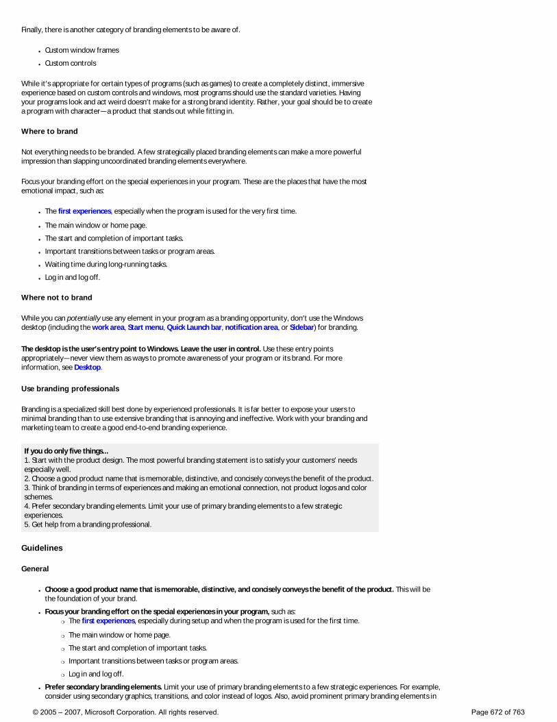
Finally, there is another category of branding elements to be aware of.
● Custom window frames
● Custom controls
While it’s appropriate for certain types of programs (such as games) to create a completely distinct, immersive experience based on custom controls and windows, most programs should use the standard varieties. Having your programs look and act weird doesn’t make for a strong brand identity. Rather, your goal should be to create a program with character—a product that stands out while fitting in.
Where to brand
Not everything needs to be branded. A few strategically placed branding elements can make a more powerful impression than slapping uncoordinated branding elements everywhere.
Focus your branding effort on the special experiences in your program. These are the places that have the most emotional impact, such as:
● The first experiences, especially when the program is used for the very first time.
● The main window or home page.
● The start and completion of important tasks.
● Important transitions between tasks or program areas.
● Waiting time during long-running tasks.
● Log in and log off.
Where not to brand
While you can potentially use any element in your program as a branding opportunity, don’t use the Windows desktop (including the work area, Start menu, Quick Launch bar, notification area, or Sidebar) for branding.
The desktop is the user’s entry point to Windows. Leave the user in control. Use these entry points appropriately—never view them as ways to promote awareness of your program or its brand. For more information, see Desktop.
Use branding professionals
Branding is a specialized skill best done by experienced professionals. It is far better to expose your users to minimal branding than to use extensive branding that is annoying and ineffective. Work with your branding and marketing team to create a good end-to-end branding experience.
If you do only five things... 1. Start with the product design. The most powerful branding statement is to satisfy your customers’ needs especially well. 2. Choose a good product name that is memorable, distinctive, and concisely conveys the benefit of the product. 3. Think of branding in terms of experiences and making an emotional connection, not product logos and color schemes. 4. Prefer secondary branding elements. Limit your use of primary branding elements to a few strategic experiences. 5. Get help from a branding professional.
Guidelines
General
● Choose a good product name that is memorable, distinctive, and concisely conveys the benefit of the product. This will be the foundation of your brand.
● Focus your branding effort on the special experiences in your program, such as: �❍ The first experiences, especially during setup and when the program is used for the first time.
�❍ The main window or home page.
�❍ The start and completion of important tasks.
�❍ Important transitions between tasks or program areas.
�❍ Log in and log off.
● Prefer secondary branding elements. Limit your use of primary branding elements to a few strategic experiences. For example, consider using secondary graphics, transitions, and color instead of logos. Also, avoid prominent primary branding elements in
© 2005 – 2007, Microsoft Corporation. All rights reserved. Page 672 of 763
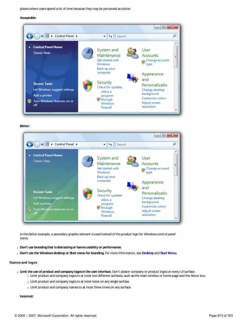
places where users spend a lot of time because they may be perceived as clutter.
Acceptable:
Better:
In the better example, a secondary graphic element is used instead of the product logo for Windows control panel items.
● Don’t use branding that is distracting or harms usability or performance.
● Don’t use the Windows desktop or Start menu for branding. For more information, see Desktop and Start Menu.
Names and logos
● Limit the use of product and company logos in the user interface. Don’t plaster company or product logos on every UI surface. �❍ Limit product and company logos to at most two different surfaces, such as the main window or home page and the About box.
�❍ Limit product and company logos to at most twice on any single surface.
�❍ Limit product and company names to at most three times on any surface.
Incorrect:
© 2005 – 2007, Microsoft Corporation. All rights reserved. Page 673 of 763
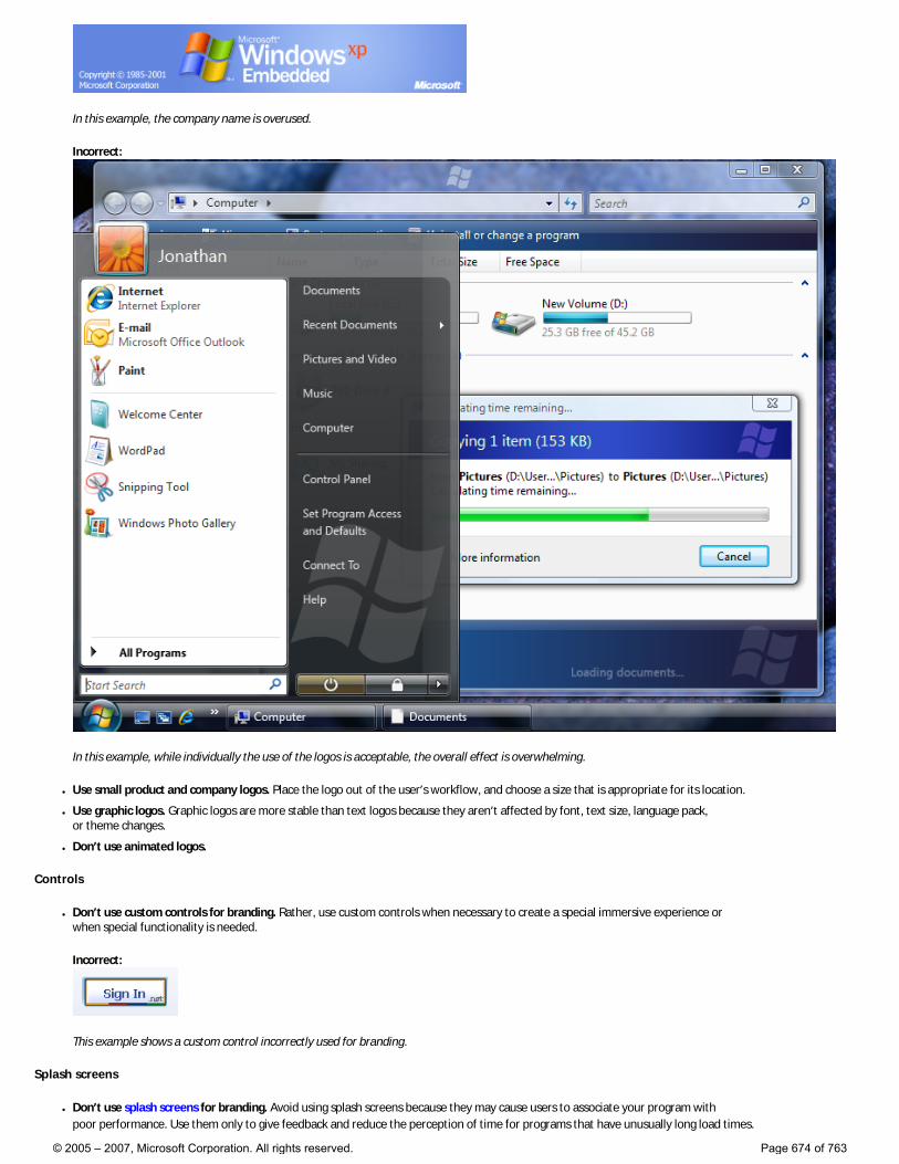
In this example, the company name is overused.
Incorrect:
In this example, while individually the use of the logos is acceptable, the overall effect is overwhelming.
● Use small product and company logos. Place the logo out of the user’s workflow, and choose a size that is appropriate for its location.
● Use graphic logos. Graphic logos are more stable than text logos because they aren’t affected by font, text size, language pack, or theme changes.
● Don’t use animated logos.
Controls
● Don’t use custom controls for branding. Rather, use custom controls when necessary to create a special immersive experience or when special functionality is needed.
Incorrect:
This example shows a custom control incorrectly used for branding.
Splash screens
● Don’t use splash screens for branding. Avoid using splash screens because they may cause users to associate your program with poor performance. Use them only to give feedback and reduce the perception of time for programs that have unusually long load times.
© 2005 – 2007, Microsoft Corporation. All rights reserved. Page 674 of 763
● Don’t use animated splash screens. Users often assume that the animated splash screen is the reason for a long load time. Too often, that assumption is correct.
Sound
● Generally, sound is not recommended just for branding. If you do use sound for branding:
�❍ Play a sound only at program startup, but only if the program was launched by the user.
�❍ Synchronize the sound to a visual event, such as a UI transition like the display of a program window.
For more information, see Sound.
© 2005 – 2007, Microsoft Corporation. All rights reserved. Page 675 of 763
Windows Environment
These articles provide guidelines for the various places within the Microsoft® Windows® environment:
● Desktop
● Start Menu
● Taskbar
● Notification Area
● Sidebar Gadgets
● Help
● User Account Control
© 2005 – 2007, Microsoft Corporation. All rights reserved. Page 676 of 763
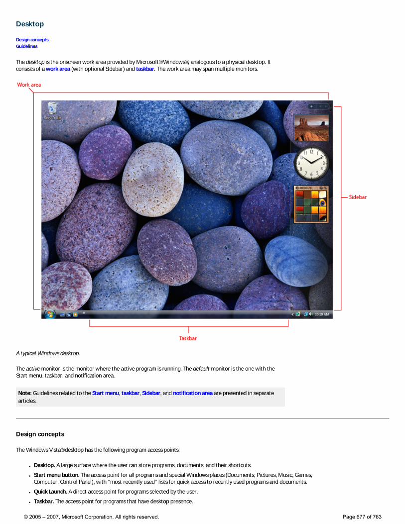
Desktop
Design concepts Guidelines
The desktop is the onscreen work area provided by Microsoft® Windows®, analogous to a physical desktop. It consists of a work area (with optional Sidebar) and taskbar. The work area may span multiple monitors.
A typical Windows desktop.
The active monitor is the monitor where the active program is running. The default monitor is the one with the Start menu, taskbar, and notification area.
Note: Guidelines related to the Start menu, taskbar, Sidebar, and notification area are presented in separate articles.
Design concepts
The Windows Vista® desktop has the following program access points:
● Desktop. A large surface where the user can store programs, documents, and their shortcuts.
● Start menu button. The access point for all programs and special Windows places (Documents, Pictures, Music, Games, Computer, Control Panel), with “most recently used” lists for quick access to recently used programs and documents.
● Quick Launch. A direct access point for programs selected by the user.
● Taskbar. The access point for programs that have desktop presence.
© 2005 – 2007, Microsoft Corporation. All rights reserved. Page 677 of 763
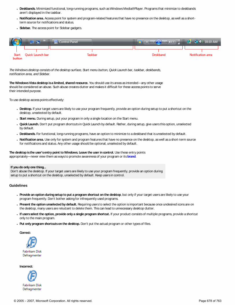
● Deskbands. Minimized functional, long-running programs, such as Windows Media® Player. Programs that minimize to deskbands aren’t displayed in the taskbar.
● Notification area. Access point for system and program-related features that have no presence on the desktop, as well as a short-term source for notifications and status.
● Sidebar. The access point for Sidebar gadgets.
The Windows desktop consists of the desktop surface, Start menu button, Quick Launch bar, taskbar, deskbands, notification area, and Sidebar.
The Windows Vista desktop is a limited, shared resource. You should use its areas as intended—any other usage should be considered an abuse. Such abuse creates clutter and makes it difficult for these access points to serve their intended purpose.
To use desktop access points effectively:
● Desktop. If your target users are likely to use your program frequently, provide an option during setup to put a shortcut on the desktop, unselected by default.
● Start menu. During setup, put your program in only a single location on the Start menu.
● Quick Launch. Don’t put program shortcuts in Quick Launch by default. Rather, during setup, give users this option, unselected by default.
● Deskbands. For functional, long-running programs, have an option to minimize to a deskband that is unselected by default.
● Notification area. Use only for system and program features that have no presence on the desktop, as well as a short-term source for notifications and status. Any other usage should be optional, unselected by default.
The desktop is the user’s entry point to Windows. Leave the user in control. Use these entry points appropriately—never view them as ways to promote awareness of your program or its brand.
If you do only one thing... Don’t abuse the desktop. If your target users are likely to use your program frequently, provide an option during setup to put a shortcut on the desktop, unselected by default. Keep users in control.
Guidelines
● Provide an option during setup to put a program shortcut on the desktop, but only if your target users are likely to use your program frequently. Don’t bother asking for infrequently used programs.
● Present the option unselected by default. Requiring users to select the option is important because once undesired icons are on the desktop, many users are reluctant to delete them. This can lead to unnecessary desktop clutter.
● If users select the option, provide only a single program shortcut. If your product consists of multiple programs, provide a shortcut only to the main program.
● Put only program shortcuts on the desktop. Don’t put the actual program or other types of files.
Correct:
Incorrect:
© 2005 – 2007, Microsoft Corporation. All rights reserved. Page 678 of 763
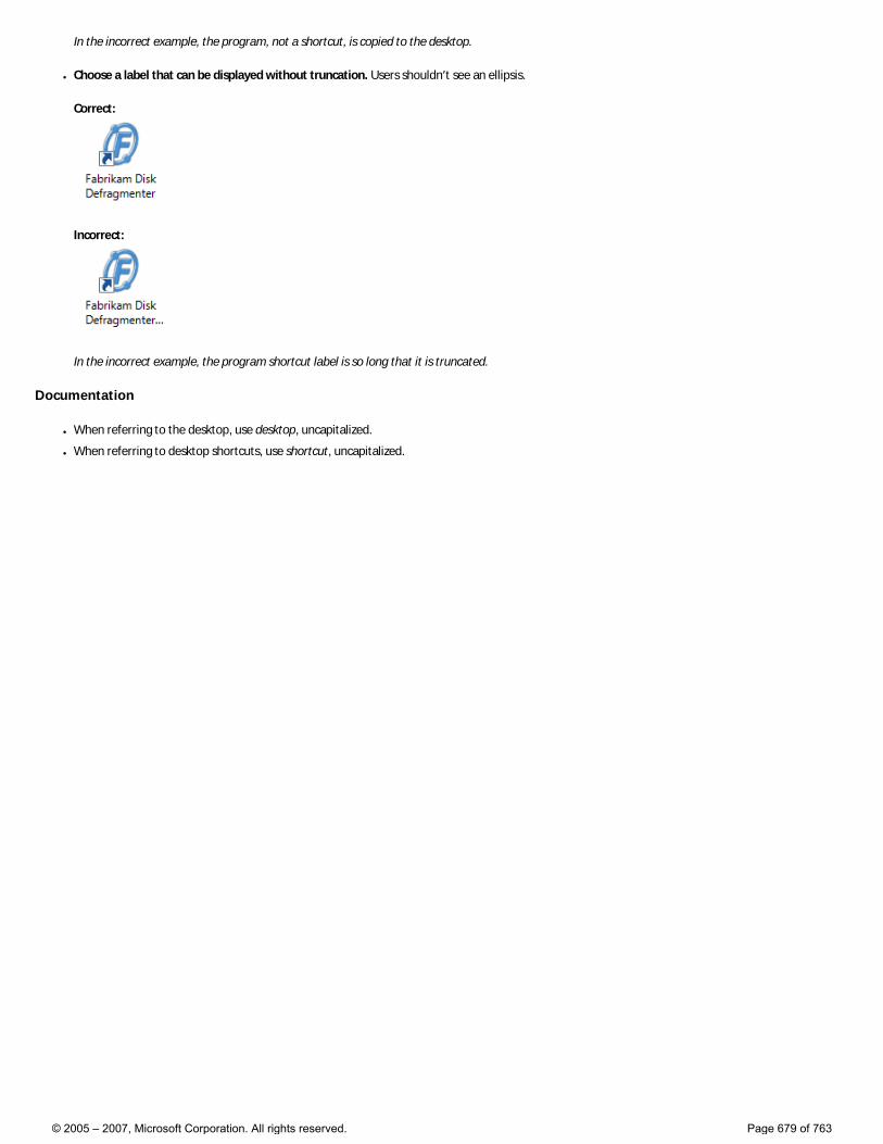
In the incorrect example, the program, not a shortcut, is copied to the desktop.
● Choose a label that can be displayed without truncation. Users shouldn’t see an ellipsis.
Correct:
Incorrect:
In the incorrect example, the program shortcut label is so long that it is truncated.
Documentation
● When referring to the desktop, use desktop, uncapitalized.
● When referring to desktop shortcuts, use shortcut, uncapitalized.
© 2005 – 2007, Microsoft Corporation. All rights reserved. Page 679 of 763
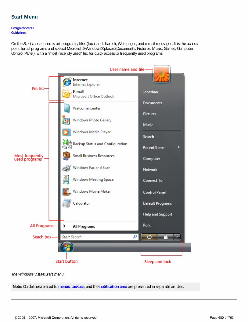
Start Menu
Design concepts Guidelines
On the Start menu, users start programs, files (local and shared), Web pages, and e-mail messages. It is the access point for all programs and special Microsoft® Windows® places (Documents, Pictures, Music, Games, Computer, Control Panel), with a “most recently used” list for quick access to frequently used programs.
The Windows Vista® Start menu.
Note: Guidelines related to menus, taskbar, and the notification area are presented in separate articles.
© 2005 – 2007, Microsoft Corporation. All rights reserved. Page 680 of 763
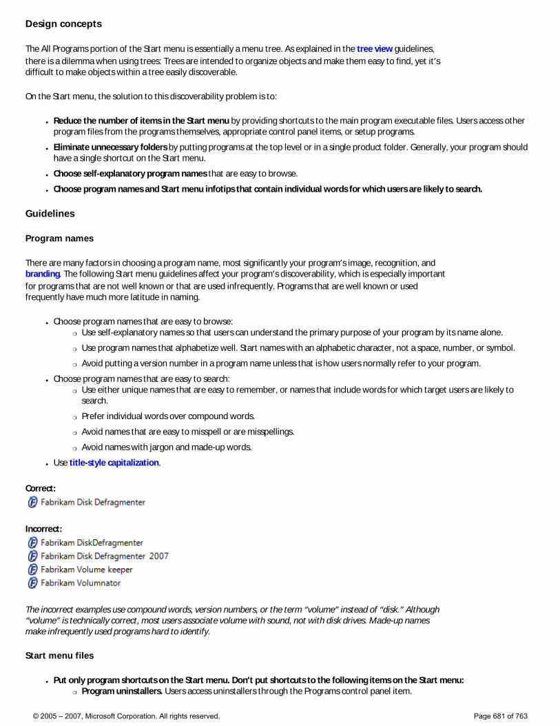
Design concepts
The All Programs portion of the Start menu is essentially a menu tree. As explained in the tree view guidelines, there is a dilemma when using trees: Trees are intended to organize objects and make them easy to find, yet it’s difficult to make objects within a tree easily discoverable.
On the Start menu, the solution to this discoverability problem is to:
● Reduce the number of items in the Start menu by providing shortcuts to the main program executable files. Users access other program files from the programs themselves, appropriate control panel items, or setup programs.
● Eliminate unnecessary folders by putting programs at the top level or in a single product folder. Generally, your program should have a single shortcut on the Start menu.
● Choose self-explanatory program names that are easy to browse.
● Choose program names and Start menu infotips that contain individual words for which users are likely to search.
Guidelines
Program names
There are many factors in choosing a program name, most significantly your program’s image, recognition, and branding. The following Start menu guidelines affect your program’s discoverability, which is especially important for programs that are not well known or that are used infrequently. Programs that are well known or used frequently have much more latitude in naming.
● Choose program names that are easy to browse: �❍ Use self-explanatory names so that users can understand the primary purpose of your program by its name alone.
�❍ Use program names that alphabetize well. Start names with an alphabetic character, not a space, number, or symbol.
�❍ Avoid putting a version number in a program name unless that is how users normally refer to your program.
● Choose program names that are easy to search: �❍ Use either unique names that are easy to remember, or names that include words for which target users are likely to
search.
�❍ Prefer individual words over compound words.
�❍ Avoid names that are easy to misspell or are misspellings.
�❍ Avoid names with jargon and made-up words.
● Use title-style capitalization.
Correct:
Incorrect:
The incorrect examples use compound words, version numbers, or the term “volume” instead of “disk.” Although “volume” is technically correct, most users associate volume with sound, not with disk drives. Made-up names make infrequently used programs hard to identify.
Start menu files
● Put only program shortcuts on the Start menu. Don’t put shortcuts to the following items on the Start menu: �❍ Program uninstallers. Users access uninstallers through the Programs control panel item.
© 2005 – 2007, Microsoft Corporation. All rights reserved. Page 681 of 763
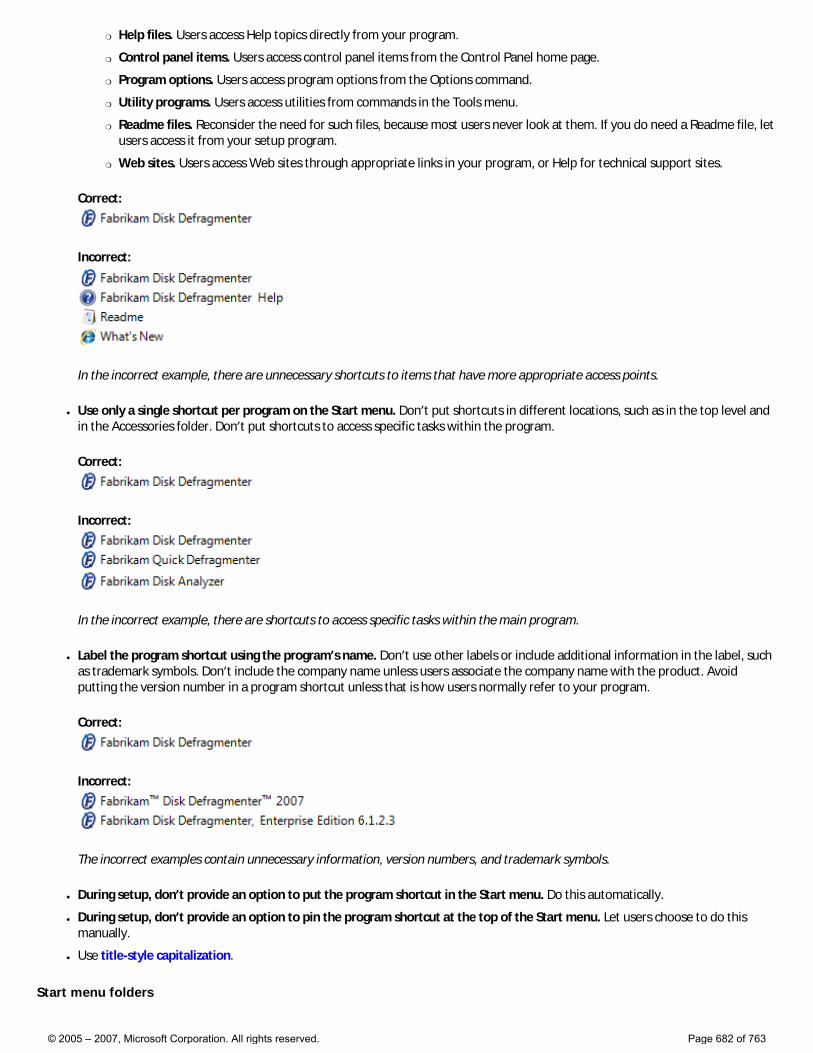
�❍ Help files. Users access Help topics directly from your program.
�❍ Control panel items. Users access control panel items from the Control Panel home page.
�❍ Program options. Users access program options from the Options command.
�❍ Utility programs. Users access utilities from commands in the Tools menu.
�❍ Readme files. Reconsider the need for such files, because most users never look at them. If you do need a Readme file, let users access it from your setup program.
�❍ Web sites. Users access Web sites through appropriate links in your program, or Help for technical support sites.
Correct:
Incorrect:
In the incorrect example, there are unnecessary shortcuts to items that have more appropriate access points.
● Use only a single shortcut per program on the Start menu. Don’t put shortcuts in different locations, such as in the top level and in the Accessories folder. Don’t put shortcuts to access specific tasks within the program.
Correct:
Incorrect:
In the incorrect example, there are shortcuts to access specific tasks within the main program.
● Label the program shortcut using the program’s name. Don’t use other labels or include additional information in the label, such as trademark symbols. Don’t include the company name unless users associate the company name with the product. Avoid putting the version number in a program shortcut unless that is how users normally refer to your program.
Correct:
Incorrect:
The incorrect examples contain unnecessary information, version numbers, and trademark symbols.
● During setup, don’t provide an option to put the program shortcut in the Start menu. Do this automatically.
● During setup, don’t provide an option to pin the program shortcut at the top of the Start menu. Let users choose to do this manually.
● Use title-style capitalization.
Start menu folders
© 2005 – 2007, Microsoft Corporation. All rights reserved. Page 682 of 763
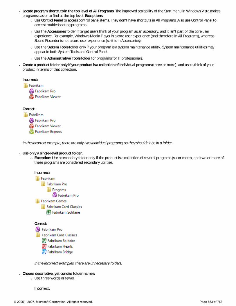
● Locate program shortcuts in the top level of All Programs. The improved scalability of the Start menu in Windows Vista makes programs easier to find at the top level. Exceptions:
�❍ Use Control Panel to access control panel items. They don’t have shortcuts in All Programs. Also use Control Panel to access troubleshooting programs.
�❍ Use the Accessories folder if target users think of your program as an accessory, and it isn’t part of the core user experience. For example, Windows Media Player is a core user experience (and therefore in All Programs), whereas Sound Recorder is not a core user experience (so it is in Accessories).
�❍ Use the System Tools folder only if your program is a system maintenance utility. System maintenance utilities may appear in both System Tools and Control Panel.
�❍ Use the Administrative Tools folder for programs for IT professionals.
● Create a product folder only if your product is a collection of individual programs (three or more), and users think of your product in terms of that collection.
Incorrect:
Correct:
In the incorrect example, there are only two individual programs, so they shouldn’t be in a folder.
● Use only a single-level product folder. �❍ Exception: Use a secondary folder only if the product is a collection of several programs (six or more), and two or more of
these programs are considered secondary utilities.
Incorrect:
Correct:
In the incorrect examples, there are unnecessary folders.
● Choose descriptive, yet concise folder names: �❍ Use three words or fewer.
Incorrect:
© 2005 – 2007, Microsoft Corporation. All rights reserved. Page 683 of 763
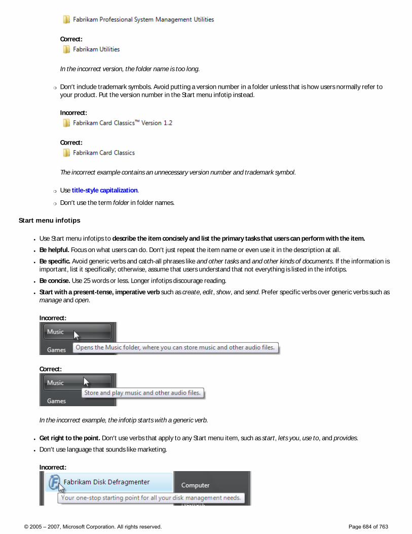
Correct:
In the incorrect version, the folder name is too long.
�❍ Don’t include trademark symbols. Avoid putting a version number in a folder unless that is how users normally refer to your product. Put the version number in the Start menu infotip instead.
Incorrect:
Correct:
The incorrect example contains an unnecessary version number and trademark symbol.
�❍ Use title-style capitalization.
�❍ Don’t use the term folder in folder names.
Start menu infotips
● Use Start menu infotips to describe the item concisely and list the primary tasks that users can perform with the item.
● Be helpful. Focus on what users can do. Don’t just repeat the item name or even use it in the description at all.
● Be specific. Avoid generic verbs and catch-all phrases like and other tasks and and other kinds of documents. If the information is important, list it specifically; otherwise, assume that users understand that not everything is listed in the infotips.
● Be concise. Use 25 words or less. Longer infotips discourage reading.
● Start with a present-tense, imperative verb such as create, edit, show, and send. Prefer specific verbs over generic verbs such as manage and open.
Incorrect:
Correct:
In the incorrect example, the infotip starts with a generic verb.
● Get right to the point. Don’t use verbs that apply to any Start menu item, such as start, lets you, use to, and provides.
● Don’t use language that sounds like marketing.
Incorrect:
© 2005 – 2007, Microsoft Corporation. All rights reserved. Page 684 of 763

In this example, the infotip sounds like marketing.
● Because these infotips are indexed for the Start menu search box, describe your program’s important tasks using terms for which users are most likely to search. Consider using keywords and common synonyms.
Incorrect:
Correct:
In the correct example, the infotip has common synonyms.
● Use sentence-style capitalization.
● Developers: The Start menu infotip text comes from the item’s Comment field.
Documentation
When referring to the Start menu, capitalize Start but don’t capitalize menu.
© 2005 – 2007, Microsoft Corporation. All rights reserved. Page 685 of 763
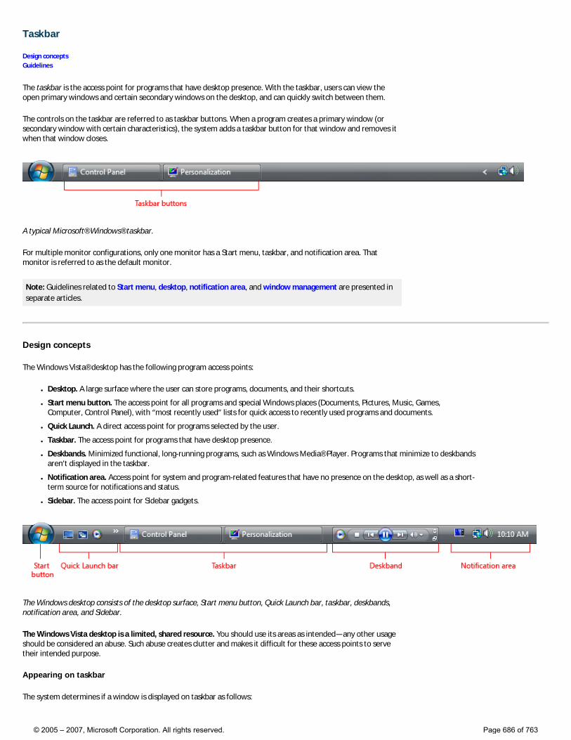
Taskbar
Design concepts Guidelines
The taskbar is the access point for programs that have desktop presence. With the taskbar, users can view the open primary windows and certain secondary windows on the desktop, and can quickly switch between them.
The controls on the taskbar are referred to as taskbar buttons. When a program creates a primary window (or secondary window with certain characteristics), the system adds a taskbar button for that window and removes it when that window closes.
A typical Microsoft® Windows® taskbar.
For multiple monitor configurations, only one monitor has a Start menu, taskbar, and notification area. That monitor is referred to as the default monitor.
Note: Guidelines related to Start menu, desktop, notification area, and window management are presented in separate articles.
Design concepts
The Windows Vista® desktop has the following program access points:
● Desktop. A large surface where the user can store programs, documents, and their shortcuts.
● Start menu button. The access point for all programs and special Windows places (Documents, Pictures, Music, Games, Computer, Control Panel), with “most recently used” lists for quick access to recently used programs and documents.
● Quick Launch. A direct access point for programs selected by the user.
● Taskbar. The access point for programs that have desktop presence.
● Deskbands. Minimized functional, long-running programs, such as Windows Media® Player. Programs that minimize to deskbands aren’t displayed in the taskbar.
● Notification area. Access point for system and program-related features that have no presence on the desktop, as well as a short-term source for notifications and status.
● Sidebar. The access point for Sidebar gadgets.
The Windows desktop consists of the desktop surface, Start menu button, Quick Launch bar, taskbar, deskbands, notification area, and Sidebar.
The Windows Vista desktop is a limited, shared resource. You should use its areas as intended—any other usage should be considered an abuse. Such abuse creates clutter and makes it difficult for these access points to serve their intended purpose.
Appearing on taskbar
The system determines if a window is displayed on taskbar as follows:
© 2005 – 2007, Microsoft Corporation. All rights reserved. Page 686 of 763
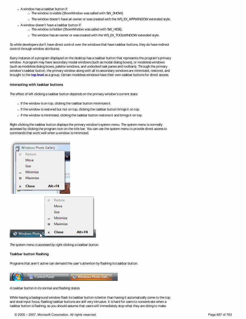
● A window has a taskbar button if: �❍ The window is visible (ShowWindow was called with SW_SHOW).
�❍ The window doesn’t have an owner or was created with the WS_EX_APPWINDOW extended style.
● A window doesn’t have a taskbar button if: �❍ The window is hidden (ShowWindow was called with SW_HIDE).
�❍ The window has an owner or was created with the WS_EX_TOOLWINDOW extended style.
So while developers don’t have direct control over the windows that have taskbar buttons, they do have indirect control through window attributes.
Every instance of a program displayed on the desktop has a taskbar button that represents the program’s primary window. A program may have secondary modal windows (such as modal dialog boxes), or modeless windows (such as modeless dialog boxes, palette windows, and undocked task panes and toolbars). Through the primary window’s taskbar button, the primary window along with all its secondary windows are minimized, restored, and brought to the top level as a group. Certain modeless windows have their own taskbar buttons for direct access.
Interacting with taskbar buttons
The effect of left-clicking a taskbar button depends on the primary window’s current state:
● If the window is on top, clicking the taskbar button minimizes it.
● If the window is restored but not on top, clicking the taskbar button brings it on top.
● If the window is minimized, clicking the taskbar button restores it and brings it on top.
Right-clicking the taskbar button displays the primary window’s system menu. The system menu is normally accessed by clicking the program icon on the title bar. You can use the system menu to provide direct access to commands that work well when a window is minimized.
The system menu is accessed by right-clicking a taskbar button.
Taskbar button flashing
Programs that aren’t active can demand the user’s attention by flashing its taskbar button.
A taskbar button in its normal and flashing states.
While having a background window flash its taskbar button is better than having it automatically come to the top and steal input focus, flashing taskbar buttons are still very intrusive. It is hard for users to concentrate when a taskbar button is flashing, so you should assume that users will immediately stop what they are doing to make
© 2005 – 2007, Microsoft Corporation. All rights reserved. Page 687 of 763
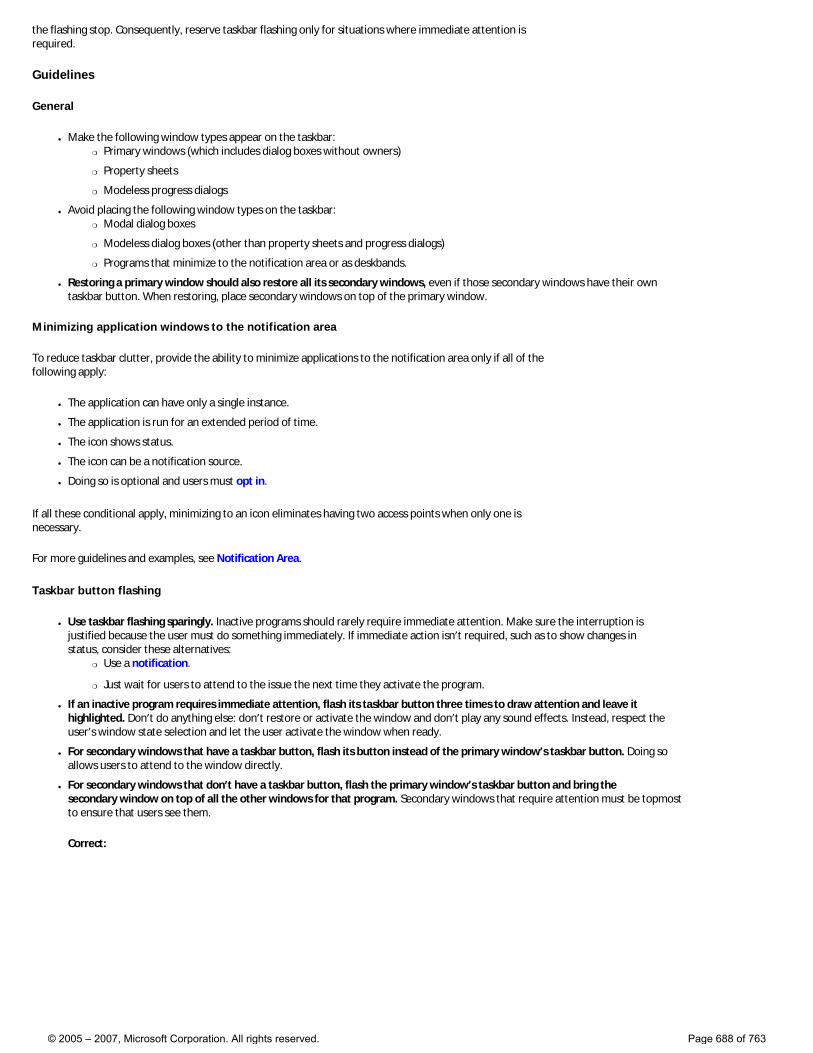
the flashing stop. Consequently, reserve taskbar flashing only for situations where immediate attention is required.
Guidelines
General
● Make the following window types appear on the taskbar: �❍ Primary windows (which includes dialog boxes without owners)
�❍ Property sheets
�❍ Modeless progress dialogs
● Avoid placing the following window types on the taskbar: �❍ Modal dialog boxes
�❍ Modeless dialog boxes (other than property sheets and progress dialogs)
�❍ Programs that minimize to the notification area or as deskbands.
● Restoring a primary window should also restore all its secondary windows, even if those secondary windows have their own taskbar button. When restoring, place secondary windows on top of the primary window.
Minimizing application windows to the notification area
To reduce taskbar clutter, provide the ability to minimize applications to the notification area only if all of the following apply:
● The application can have only a single instance.
● The application is run for an extended period of time.
● The icon shows status.
● The icon can be a notification source.
● Doing so is optional and users must opt in.
If all these conditional apply, minimizing to an icon eliminates having two access points when only one is necessary.
For more guidelines and examples, see Notification Area.
Taskbar button flashing
● Use taskbar flashing sparingly. Inactive programs should rarely require immediate attention. Make sure the interruption is justified because the user must do something immediately. If immediate action isn’t required, such as to show changes in status, consider these alternatives:
�❍ Use a notification.
�❍ Just wait for users to attend to the issue the next time they activate the program.
● If an inactive program requires immediate attention, flash its taskbar button three times to draw attention and leave it highlighted. Don’t do anything else: don’t restore or activate the window and don’t play any sound effects. Instead, respect the user’s window state selection and let the user activate the window when ready.
● For secondary windows that have a taskbar button, flash its button instead of the primary window’s taskbar button. Doing so allows users to attend to the window directly.
● For secondary windows that don’t have a taskbar button, flash the primary window’s taskbar button and bring the secondary window on top of all the other windows for that program. Secondary windows that require attention must be topmost to ensure that users see them.
Correct:
© 2005 – 2007, Microsoft Corporation. All rights reserved. Page 688 of 763
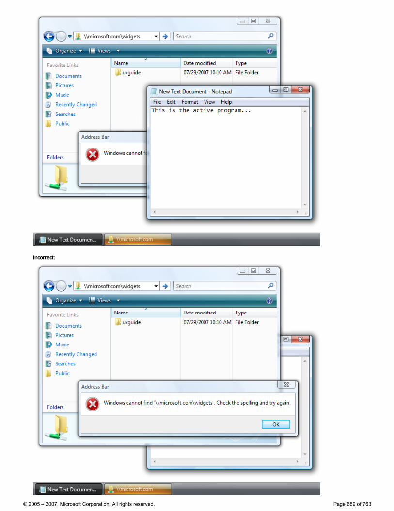
Incorrect:
© 2005 – 2007, Microsoft Corporation. All rights reserved. Page 689 of 763
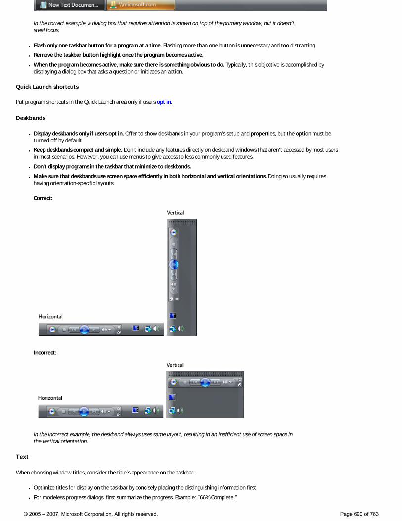
In the correct example, a dialog box that requires attention is shown on top of the primary window, but it doesn’t steal focus.
● Flash only one taskbar button for a program at a time. Flashing more than one button is unnecessary and too distracting.
● Remove the taskbar button highlight once the program becomes active.
● When the program becomes active, make sure there is something obvious to do. Typically, this objective is accomplished by displaying a dialog box that asks a question or initiates an action.
Quick Launch shortcuts
Put program shortcuts in the Quick Launch area only if users opt in.
Deskbands
● Display deskbands only if users opt in. Offer to show deskbands in your program’s setup and properties, but the option must be turned off by default.
● Keep deskbands compact and simple. Don’t include any features directly on deskband windows that aren’t accessed by most users in most scenarios. However, you can use menus to give access to less commonly used features.
● Don’t display programs in the taskbar that minimize to deskbands.
● Make sure that deskbands use screen space efficiently in both horizontal and vertical orientations. Doing so usually requires having orientation-specific layouts.
Correct:
Incorrect:
In the incorrect example, the deskband always uses same layout, resulting in an inefficient use of screen space in the vertical orientation.
Text
When choosing window titles, consider the title’s appearance on the taskbar:
● Optimize titles for display on the taskbar by concisely placing the distinguishing information first.
● For modeless progress dialogs, first summarize the progress. Example: “66% Complete.”
© 2005 – 2007, Microsoft Corporation. All rights reserved. Page 690 of 763
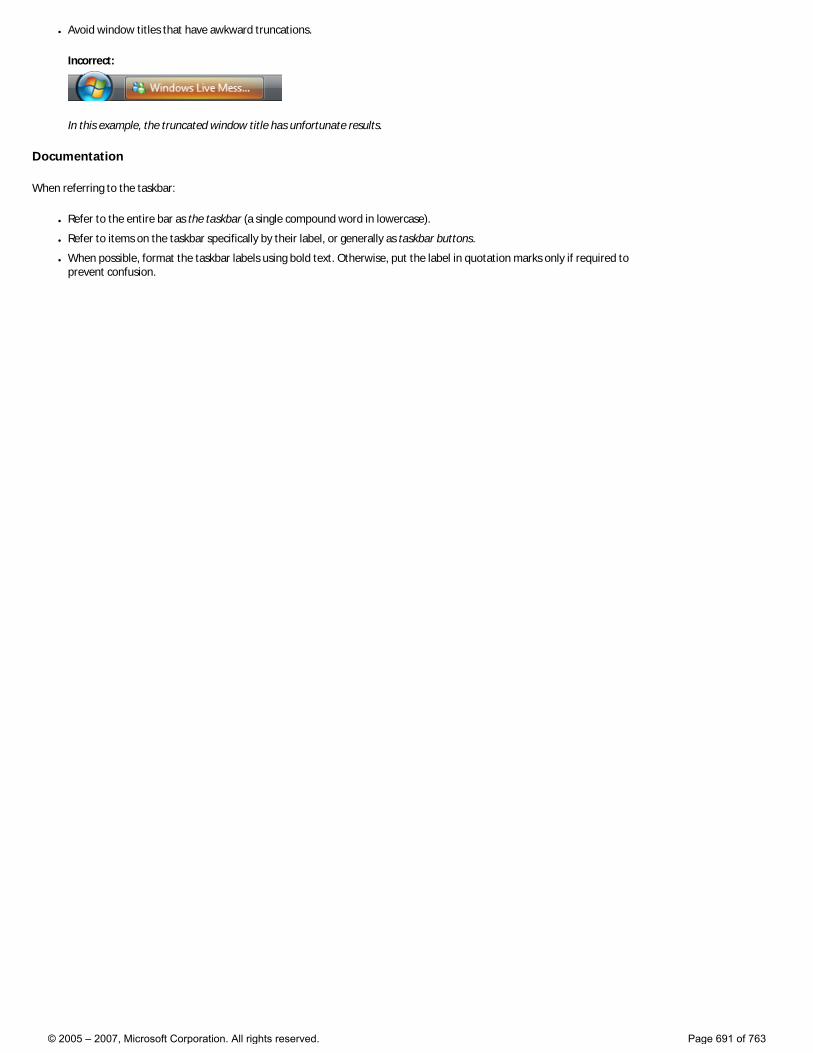
● Avoid window titles that have awkward truncations.
Incorrect:
In this example, the truncated window title has unfortunate results.
Documentation
When referring to the taskbar:
● Refer to the entire bar as the taskbar (a single compound word in lowercase).
● Refer to items on the taskbar specifically by their label, or generally as taskbar buttons.
● When possible, format the taskbar labels using bold text. Otherwise, put the label in quotation marks only if required to prevent confusion.
© 2005 – 2007, Microsoft Corporation. All rights reserved. Page 691 of 763
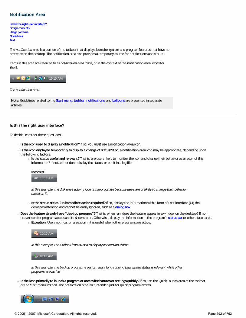
Notification Area
Is this the right user interface? Design concepts Usage patterns Guidelines Text
The notification area is a portion of the taskbar that displays icons for system and program features that have no presence on the desktop. The notification area also provides a temporary source for notifications and status.
Items in this area are referred to as notification area icons, or in the context of the notification area, icons for short.
The notification area.
Note: Guidelines related to the Start menu, taskbar, notifications, and balloons are presented in separate articles.
Is this the right user interface?
To decide, consider these questions:
● Is the icon used to display a notification? If so, you must use a notification area icon.
● Is the icon displayed temporarily to display a change of status? If so, a notification area icon may be appropriate, depending upon the following factors:
�❍ Is the status useful and relevant? That is, are users likely to monitor the icon and change their behavior as a result of this information? If not, either don’t display the status, or put it in a log file.
Incorrect:
In this example, the disk drive activity icon is inappropriate because users are unlikely to change their behavior based on it.
�❍ Is the status critical? Is immediate action required? If so, display the information with a form of user interface (UI) that demands attention and cannot be easily ignored, such as a dialog box.
● Does the feature already have “desktop presence”? That is, when run, does the feature appear in a window on the desktop? If not, use an icon for program access and to show status. Otherwise, display the information in the program’s status bar or other status area.
�❍ Exception: Use a notification area icon if it is useful when other programs are active.
In this example, the Outlook icon is used to display connection status.
In this example, the backup program is performing a long-running task whose status is relevant while other programs are active.
● Is the icon primarily to launch a program or access its features or settings quickly? If so, use the Quick Launch area of the taskbar or the Start menu instead. The notification area isn’t intended just for quick program access.
© 2005 – 2007, Microsoft Corporation. All rights reserved. Page 692 of 763
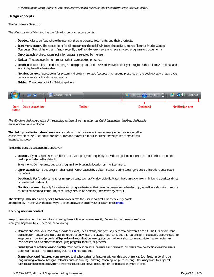
In this example, Quick Launch is used to launch Windows® Explorer and Windows Internet Explorer quickly.
Design concepts
The Windows Desktop
The Windows Vista® desktop has the following program access points:
● Desktop. A large surface where the user can store programs, documents, and their shortcuts.
● Start menu button. The access point for all programs and special Windows places (Documents, Pictures, Music, Games, Computer, Control Panel), with “most recently used” lists for quick access to recently used programs and documents.
● Quick Launch. A direct access point for programs selected by the user.
● Taskbar. The access point for programs that have desktop presence.
● Deskbands. Minimized functional, long-running programs, such as Windows Media® Player. Programs that minimize to deskbands aren’t displayed in the taskbar.
● Notification area. Access point for system and program-related features that have no presence on the desktop, as well as a short-term source for notifications and status.
● Sidebar. The access point for Sidebar gadgets.
The Windows desktop consists of the desktop surface, Start menu button, Quick Launch bar, taskbar, deskbands, notification area, and Sidebar.
The desktop is a limited, shared resource. You should use its areas as intended—any other usage should be considered an abuse. Such abuse creates clutter and makes it difficult for these access points to serve their intended purpose.
To use the desktop access points effectively:
● Desktop. If your target users are likely to use your program frequently, provide an option during setup to put a shortcut on the desktop, unselected by default.
● Start menu. During setup, put your program in only a single location on the Start menu.
● Quick Launch. Don’t put program shortcuts in Quick Launch by default. Rather, during setup, give users this option, unselected by default.
● Deskbands. For functional, long-running programs, such as Windows Media Player, have an option to minimize to a deskband that is unselected by default.
● Notification area. Use only for system and program features that have no presence on the desktop, as well as a short-term source for notifications and status. Any other usage should be optional, unselected by default.
The desktop is the user’s entry point to Windows. Leave the user in control. Use these entry points appropriately—never view them as ways to promote awareness of your program or its brand.
Keeping users in control
Keeping users in control extends beyond using the notification area correctly. Depending on the nature of your icon, you may want to let users do the following:
● Remove the icon. Your icon may provide relevant, useful status, but even so, users may not want to see it. The Customize Icons dialog box in Taskbar and Start Menu Properties allow users to always hide icons, but this feature isn’t necessarily discoverable. To keep users in control, provide a Display icon in notification area option on the icon’s shortcut menu. Note that removing an icon doesn’t have to affect the underlying program, feature, or process.
● Select types of notifications to display. Your notification must be useful and relevant, but there may be notifications that users don’t want to see. This is especially true for FYI notifications.
● Suspend optional features. Icons are used to display status for features without desktop presence. Such features tend to be long-running, optional background tasks, such as printing, indexing, scanning, or synchronizing. Users may want to suspend such features to increase system performance, reduce power consumption, or because they are offline.
© 2005 – 2007, Microsoft Corporation. All rights reserved. Page 693 of 763
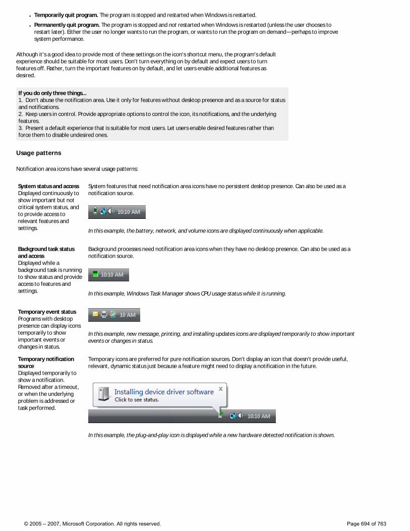
● Temporarily quit program. The program is stopped and restarted when Windows is restarted.
● Permanently quit program. The program is stopped and not restarted when Windows is restarted (unless the user chooses to restart later). Either the user no longer wants to run the program, or wants to run the program on demand—perhaps to improve system performance.
Although it’s a good idea to provide most of these settings on the icon’s shortcut menu, the program’s default experience should be suitable for most users. Don’t turn everything on by default and expect users to turn features off. Rather, turn the important features on by default, and let users enable additional features as desired.
If you do only three things... 1. Don’t abuse the notification area. Use it only for features without desktop presence and as a source for status and notifications. 2. Keep users in control. Provide appropriate options to control the icon, its notifications, and the underlying features. 3. Present a default experience that is suitable for most users. Let users enable desired features rather than force them to disable undesired ones.
Usage patterns
Notification area icons have several usage patterns:
System status and access Displayed continuously to show important but not critical system status, and to provide access to relevant features and settings.
System features that need notification area icons have no persistent desktop presence. Can also be used as a notification source.
In this example, the battery, network, and volume icons are displayed continuously when applicable.
Background task status and access Displayed while a background task is running to show status and provide access to features and settings.
Background processes need notification area icons when they have no desktop presence. Can also be used as a notification source.
In this example, Windows Task Manager shows CPU usage status while it is running.
Temporary event status Programs with desktop presence can display icons temporarily to show important events or changes in status.
In this example, new message, printing, and installing updates icons are displayed temporarily to show important events or changes in status.
Temporary notification source Displayed temporarily to show a notification. Removed after a timeout, or when the underlying problem is addressed or task performed.
Temporary icons are preferred for pure notification sources. Don’t display an icon that doesn’t provide useful, relevant, dynamic status just because a feature might need to display a notification in the future.
In this example, the plug-and-play icon is displayed while a new hardware detected notification is shown.
© 2005 – 2007, Microsoft Corporation. All rights reserved. Page 694 of 763
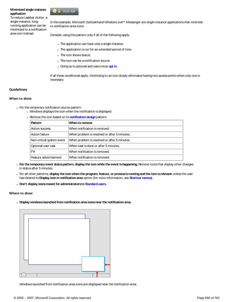
Minimized single-instance application To reduce taskbar clutter, a single-instance, long-running application can be minimized to a notification area icon instead.
In this example, Microsoft Outlook® and Windows Live™ Messenger are single-instance applications that minimize to notification area icons.
Consider using this pattern only if all of the following apply:
● The application can have only a single instance.
● The application is run for an extended period of time.
● The icon shows status.
● The icon can be a notification source.
● Doing so is optional and users must opt in.
If all these conditional apply, minimizing to an icon simply eliminates having two access points when only one is necessary.
Guidelines
When to show
● For the temporary notification source pattern: �❍ Windows displays the icon when the notification is displayed.
�❍ Remove the icon based on its notification design pattern:
Pattern When to remove
Action success When notification is removed.
Action failure When problem is resolved or after 5 minutes.
Non-critical system event When problem is resolved or after 5 minutes.
Optional user task When task is done or after 5 minutes.
FYI When notification is removed.
Feature advertisement When notification is removed.
● For the temporary event status pattern, display the icon while the event is happening. Remove icons that display other changes in status after 5 minutes.
● For all other patterns, display the icon when the program, feature, or process is running and the icon is relevant unless the user has cleared its Display icon in notification area option (for more information, see Shortcut menus).
● Don’t display icons meant for administrators to Standard users.
Where to show
● Display windows launched from notification area icons near the notification area.
Windows launched from notification area icons are displayed near the notification area.
© 2005 – 2007, Microsoft Corporation. All rights reserved. Page 695 of 763
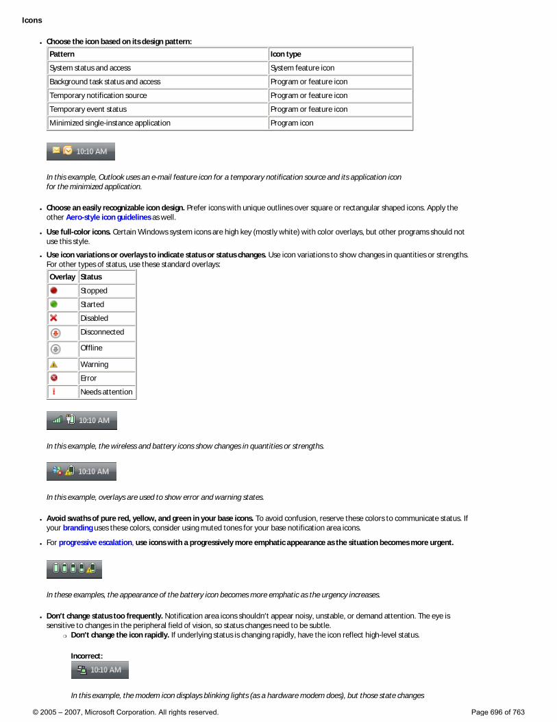
Icons
● Choose the icon based on its design pattern:
Pattern Icon type
System status and access System feature icon
Background task status and access Program or feature icon
Temporary notification source Program or feature icon
Temporary event status Program or feature icon
Minimized single-instance application Program icon
In this example, Outlook uses an e-mail feature icon for a temporary notification source and its application icon for the minimized application.
● Choose an easily recognizable icon design. Prefer icons with unique outlines over square or rectangular shaped icons. Apply the other Aero-style icon guidelines as well.
● Use full-color icons. Certain Windows system icons are high key (mostly white) with color overlays, but other programs should not use this style.
● Use icon variations or overlays to indicate status or status changes. Use icon variations to show changes in quantities or strengths. For other types of status, use these standard overlays:
Overlay Status
Stopped
Started
Disabled
Disconnected
Offline
Warning
Error
Needs attention
In this example, the wireless and battery icons show changes in quantities or strengths.
In this example, overlays are used to show error and warning states.
● Avoid swaths of pure red, yellow, and green in your base icons. To avoid confusion, reserve these colors to communicate status. If your branding uses these colors, consider using muted tones for your base notification area icons.
● For progressive escalation, use icons with a progressively more emphatic appearance as the situation becomes more urgent.
In these examples, the appearance of the battery icon becomes more emphatic as the urgency increases.
● Don’t change status too frequently. Notification area icons shouldn’t appear noisy, unstable, or demand attention. The eye is sensitive to changes in the peripheral field of vision, so status changes need to be subtle.
�❍ Don’t change the icon rapidly. If underlying status is changing rapidly, have the icon reflect high-level status.
Incorrect:
In this example, the modem icon displays blinking lights (as a hardware modem does), but those state changes
© 2005 – 2007, Microsoft Corporation. All rights reserved. Page 696 of 763
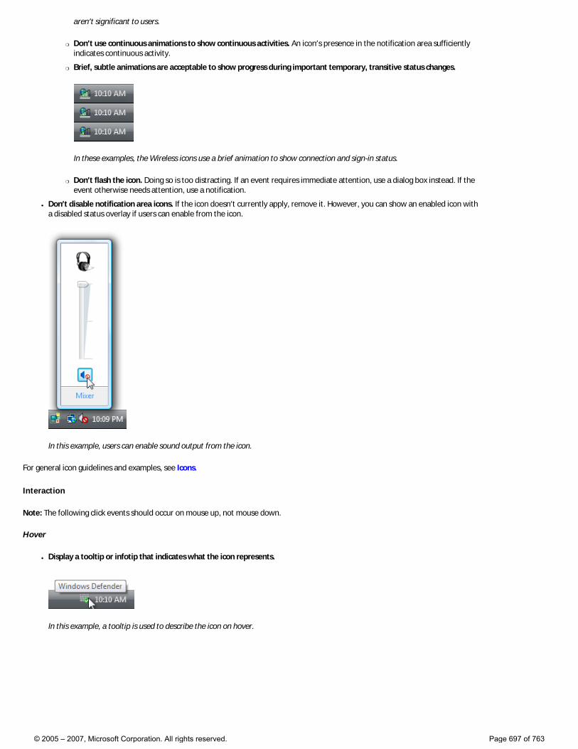
aren’t significant to users.
�❍ Don’t use continuous animations to show continuous activities. An icon’s presence in the notification area sufficiently indicates continuous activity.
�❍ Brief, subtle animations are acceptable to show progress during important temporary, transitive status changes.
In these examples, the Wireless icons use a brief animation to show connection and sign-in status.
�❍ Don’t flash the icon. Doing so is too distracting. If an event requires immediate attention, use a dialog box instead. If the event otherwise needs attention, use a notification.
● Don’t disable notification area icons. If the icon doesn’t currently apply, remove it. However, you can show an enabled icon with a disabled status overlay if users can enable from the icon.
In this example, users can enable sound output from the icon.
For general icon guidelines and examples, see Icons.
Interaction
Note: The following click events should occur on mouse up, not mouse down.
Hover
● Display a tooltip or infotip that indicates what the icon represents.
In this example, a tooltip is used to describe the icon on hover.
© 2005 – 2007, Microsoft Corporation. All rights reserved. Page 697 of 763
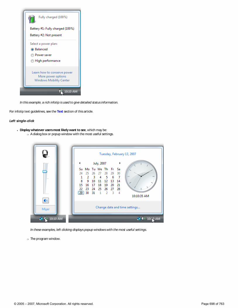
In this example, a rich infotip is used to give detailed status information.
For infotip text guidelines, see the Text section of this article.
Left single-click
● Display whatever users most likely want to see, which may be: �❍ A dialog box or popup window with the most useful settings.
In these examples, left clicking displays popup windows with the most useful settings.
�❍ The program window.
© 2005 – 2007, Microsoft Corporation. All rights reserved. Page 698 of 763
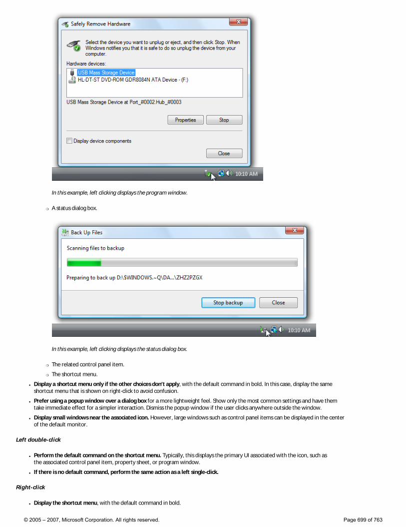
In this example, left clicking displays the program window.
�❍ A status dialog box.
In this example, left clicking displays the status dialog box.
�❍ The related control panel item.
�❍ The shortcut menu.
● Display a shortcut menu only if the other choices don’t apply, with the default command in bold. In this case, display the same shortcut menu that is shown on right-click to avoid confusion.
● Prefer using a popup window over a dialog box for a more lightweight feel. Show only the most common settings and have them take immediate effect for a simpler interaction. Dismiss the popup window if the user clicks anywhere outside the window.
● Display small windows near the associated icon. However, large windows such as control panel items can be displayed in the center of the default monitor.
Left double-click
● Perform the default command on the shortcut menu. Typically, this displays the primary UI associated with the icon, such as the associated control panel item, property sheet, or program window.
● If there is no default command, perform the same action as a left single-click.
Right-click
● Display the shortcut menu, with the default command in bold.
© 2005 – 2007, Microsoft Corporation. All rights reserved. Page 699 of 763
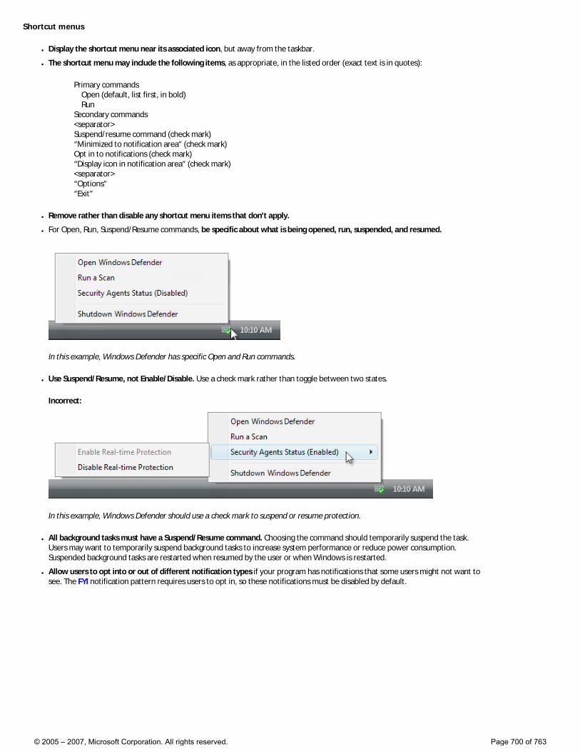
Shortcut menus
● Display the shortcut menu near its associated icon, but away from the taskbar.
● The shortcut menu may include the following items, as appropriate, in the listed order (exact text is in quotes):
Primary commands Open (default, list first, in bold) Run Secondary commands <separator> Suspend/resume command (check mark) “Minimized to notification area” (check mark) Opt in to notifications (check mark) “Display icon in notification area” (check mark) <separator> “Options” “Exit”
● Remove rather than disable any shortcut menu items that don’t apply.
● For Open, Run, Suspend/Resume commands, be specific about what is being opened, run, suspended, and resumed.
In this example, Windows Defender has specific Open and Run commands.
● Use Suspend/Resume, not Enable/Disable. Use a check mark rather than toggle between two states.
Incorrect:
In this example, Windows Defender should use a check mark to suspend or resume protection.
● All background tasks must have a Suspend/Resume command. Choosing the command should temporarily suspend the task. Users may want to temporarily suspend background tasks to increase system performance or reduce power consumption. Suspended background tasks are restarted when resumed by the user or when Windows is restarted.
● Allow users to opt into or out of different notification types if your program has notifications that some users might not want to see. The FYI notification pattern requires users to opt in, so these notifications must be disabled by default.
© 2005 – 2007, Microsoft Corporation. All rights reserved. Page 700 of 763
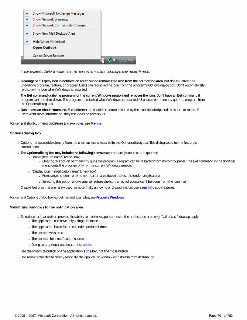
In this example, Outlook allows users to choose the notifications they receive from the icon.
● Clearing the “Display icon in notification area” option removes the icon from the notification area, but doesn’t affect the underlying program, feature, or process. Users can redisplay the icon from the program’s Options dialog box. Don’t automatically re-display the icon when Windows is restarted.
● The Exit command quits the program for the current Windows session and removes the icon. Don’t have an Exit command if program can’t be shut down. The program is restarted when Windows is restarted. Users can permanently quit the program from the Options dialog box.
● Don’t have an About command. Such information should be communicated by the icon, its infotip, and the shortcut menu. If users want more information, they can view the primary UI.
For general shortcut menu guidelines and examples, see Menus.
Options dialog box
● Options not accessible directly from the shortcut menu must be in the Options dialog box. This dialog could be the feature’s control panel.
● The Options dialog box may include the following items as appropriate (exact text is in quotes): �❍ Enable [feature name] (check box)
■ Clearing this option permanently quits the program. Program can be restarted from its control panel. The Exit command in the shortcut menu quits the program only for the current Windows session.
�❍ “Display icon in notification area” (check box) ■ Removing the icon from the notification area doesn’t affect the underlying feature.
■ Selecting this option allows user to restore the icon, which of course can’t be done from the icon itself.
● Disable features that are rarely used, or potentially annoying or distracting. Let users opt in to such features.
For general Options dialog box guidelines and examples, see Property Windows.
Minimizing windows to the notification area
● To reduce taskbar clutter, provide the ability to minimize applications to the notification area only if all of the following apply: �❍ The application can have only a single instance.
�❍ The application is run for an extended period of time.
�❍ The icon shows status.
�❍ The icon can be a notification source.
�❍ Doing so is optional and users must opt in.
● Use the Minimize button on the application’s title bar, not the Close button.
● Use zoom rectangles to clearly associate the application window with its minimize destination.
© 2005 – 2007, Microsoft Corporation. All rights reserved. Page 701 of 763
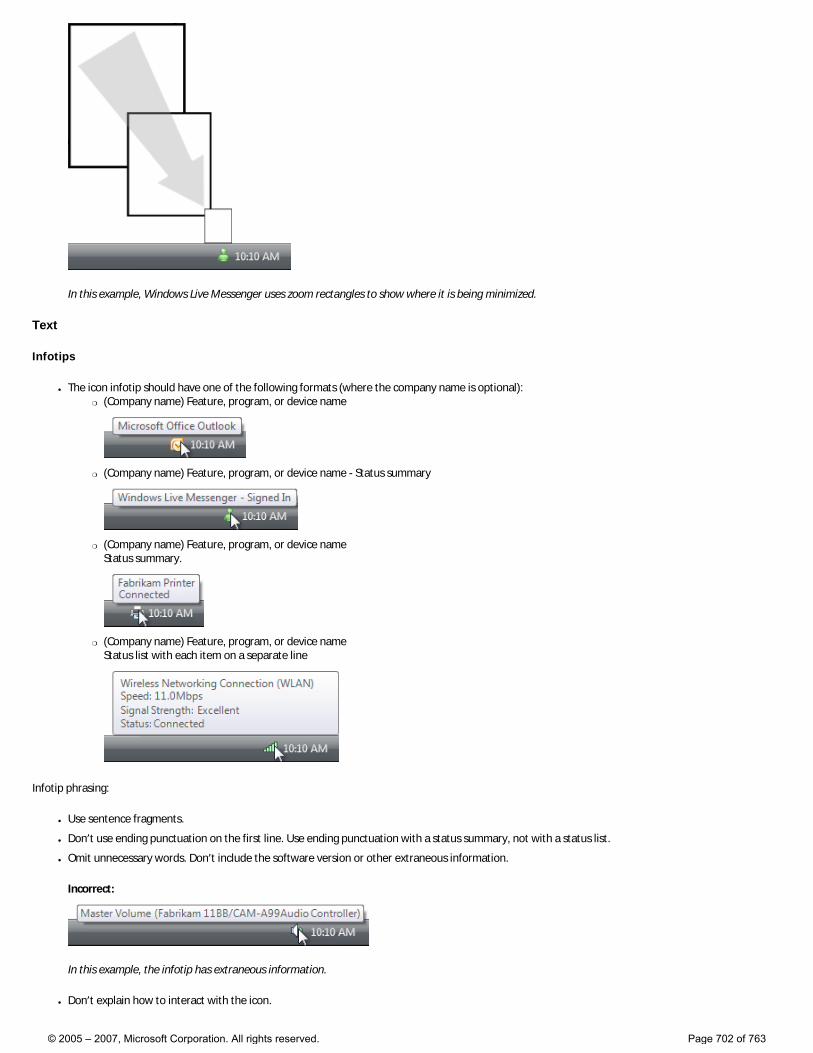
In this example, Windows Live Messenger uses zoom rectangles to show where it is being minimized.
Text
Infotips
● The icon infotip should have one of the following formats (where the company name is optional): �❍ (Company name) Feature, program, or device name
�❍ (Company name) Feature, program, or device name - Status summary
�❍ (Company name) Feature, program, or device name Status summary.
�❍ (Company name) Feature, program, or device name Status list with each item on a separate line
Infotip phrasing:
● Use sentence fragments.
● Don’t use ending punctuation on the first line. Use ending punctuation with a status summary, not with a status list.
● Omit unnecessary words. Don’t include the software version or other extraneous information.
Incorrect:
In this example, the infotip has extraneous information.
● Don’t explain how to interact with the icon.
© 2005 – 2007, Microsoft Corporation. All rights reserved. Page 702 of 763
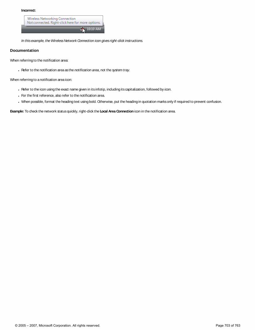
Incorrect:
In this example, the Wireless Network Connection icon gives right-click instructions.
Documentation
When referring to the notification area:
● Refer to the notification area as the notification area, not the system tray.
When referring to a notification area icon:
● Refer to the icon using the exact name given in its infotip, including its capitalization, followed by icon.
● For the first reference, also refer to the notification area.
● When possible, format the heading text using bold. Otherwise, put the heading in quotation marks only if required to prevent confusion.
Example: To check the network status quickly, right-click the Local Area Connection icon in the notification area.
© 2005 – 2007, Microsoft Corporation. All rights reserved. Page 703 of 763
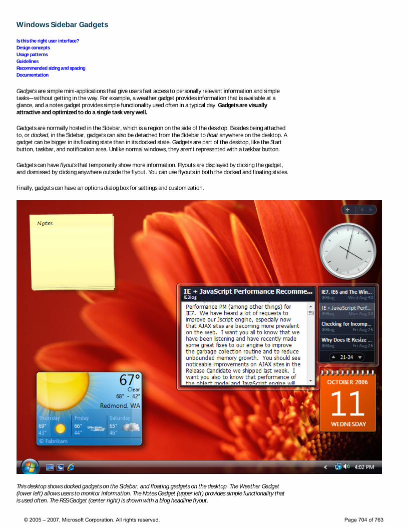
Windows Sidebar Gadgets
Is this the right user interface? Design concepts Usage patterns Guidelines Recommended sizing and spacing Documentation
Gadgets are simple mini-applications that give users fast access to personally relevant information and simple tasks—without getting in the way. For example, a weather gadget provides information that is available at a glance, and a notes gadget provides simple functionality used often in a typical day. Gadgets are visually attractive and optimized to do a single task very well.
Gadgets are normally hosted in the Sidebar, which is a region on the side of the desktop. Besides being attached to, or docked, in the Sidebar, gadgets can also be detached from the Sidebar to float anywhere on the desktop. A gadget can be bigger in its floating state than in its docked state. Gadgets are part of the desktop, like the Start button, taskbar, and notification area. Unlike normal windows, they aren’t represented with a taskbar button.
Gadgets can have flyouts that temporarily show more information. Flyouts are displayed by clicking the gadget, and dismissed by clicking anywhere outside the flyout. You can use flyouts in both the docked and floating states.
Finally, gadgets can have an options dialog box for settings and customization.
This desktop shows docked gadgets on the Sidebar, and floating gadgets on the desktop. The Weather Gadget (lower left) allows users to monitor information. The Notes Gadget (upper left) provides simple functionality that is used often. The RSS Gadget (center right) is shown with a blog headline flyout.
© 2005 – 2007, Microsoft Corporation. All rights reserved. Page 704 of 763
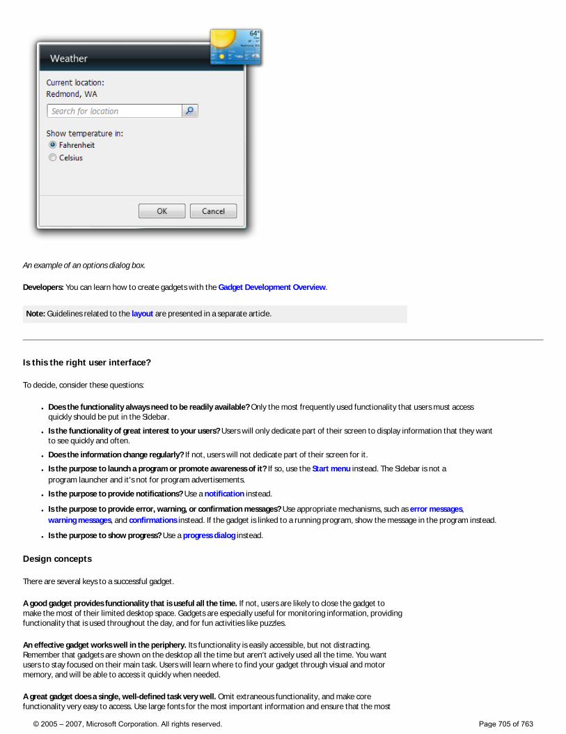
An example of an options dialog box.
Developers: You can learn how to create gadgets with the Gadget Development Overview.
Note: Guidelines related to the layout are presented in a separate article.
Is this the right user interface?
To decide, consider these questions:
● Does the functionality always need to be readily available? Only the most frequently used functionality that users must access quickly should be put in the Sidebar.
● Is the functionality of great interest to your users? Users will only dedicate part of their screen to display information that they want to see quickly and often.
● Does the information change regularly? If not, users will not dedicate part of their screen for it.
● Is the purpose to launch a program or promote awareness of it? If so, use the Start menu instead. The Sidebar is not a program launcher and it’s not for program advertisements.
● Is the purpose to provide notifications? Use a notification instead.
● Is the purpose to provide error, warning, or confirmation messages? Use appropriate mechanisms, such as error messages, warning messages, and confirmations instead. If the gadget is linked to a running program, show the message in the program instead.
● Is the purpose to show progress? Use a progress dialog instead.
Design concepts
There are several keys to a successful gadget.
A good gadget provides functionality that is useful all the time. If not, users are likely to close the gadget to make the most of their limited desktop space. Gadgets are especially useful for monitoring information, providing functionality that is used throughout the day, and for fun activities like puzzles.
An effective gadget works well in the periphery. Its functionality is easily accessible, but not distracting. Remember that gadgets are shown on the desktop all the time but aren’t actively used all the time. You want users to stay focused on their main task. Users will learn where to find your gadget through visual and motor memory, and will be able to access it quickly when needed.
A great gadget does a single, well-defined task very well. Omit extraneous functionality, and make core functionality very easy to access. Use large fonts for the most important information and ensure that the most
© 2005 – 2007, Microsoft Corporation. All rights reserved. Page 705 of 763
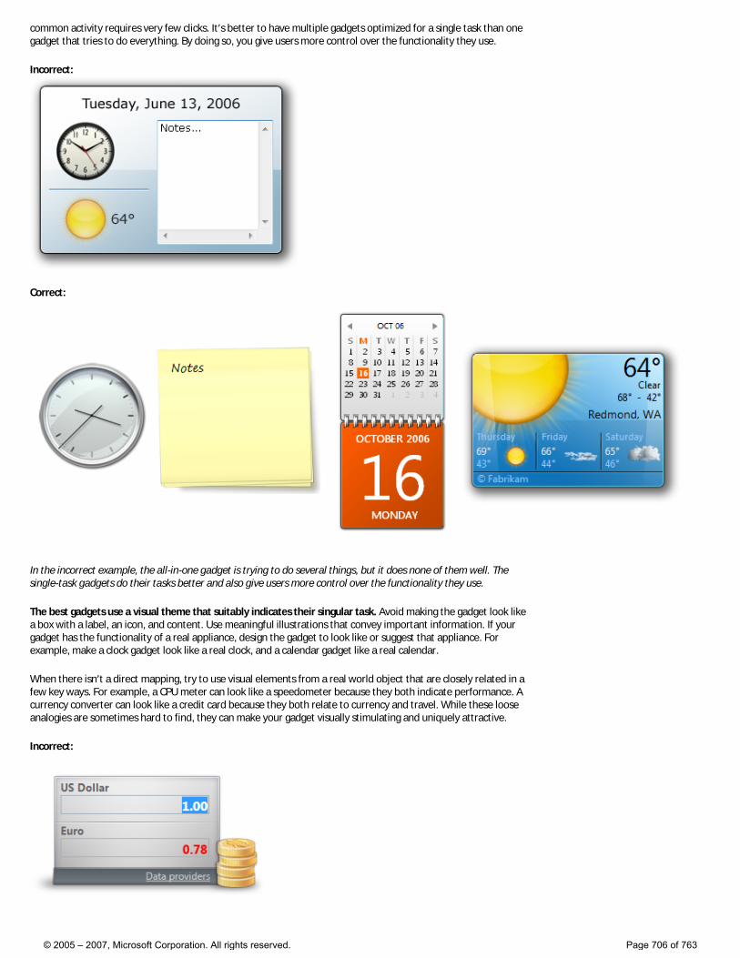
common activity requires very few clicks. It’s better to have multiple gadgets optimized for a single task than one gadget that tries to do everything. By doing so, you give users more control over the functionality they use.
Incorrect:
Correct:
In the incorrect example, the all-in-one gadget is trying to do several things, but it does none of them well. The single-task gadgets do their tasks better and also give users more control over the functionality they use.
The best gadgets use a visual theme that suitably indicates their singular task. Avoid making the gadget look like a box with a label, an icon, and content. Use meaningful illustrations that convey important information. If your gadget has the functionality of a real appliance, design the gadget to look like or suggest that appliance. For example, make a clock gadget look like a real clock, and a calendar gadget like a real calendar.
When there isn’t a direct mapping, try to use visual elements from a real world object that are closely related in a few key ways. For example, a CPU meter can look like a speedometer because they both indicate performance. A currency converter can look like a credit card because they both relate to currency and travel. While these loose analogies are sometimes hard to find, they can make your gadget visually stimulating and uniquely attractive.
Incorrect:
© 2005 – 2007, Microsoft Corporation. All rights reserved. Page 706 of 763
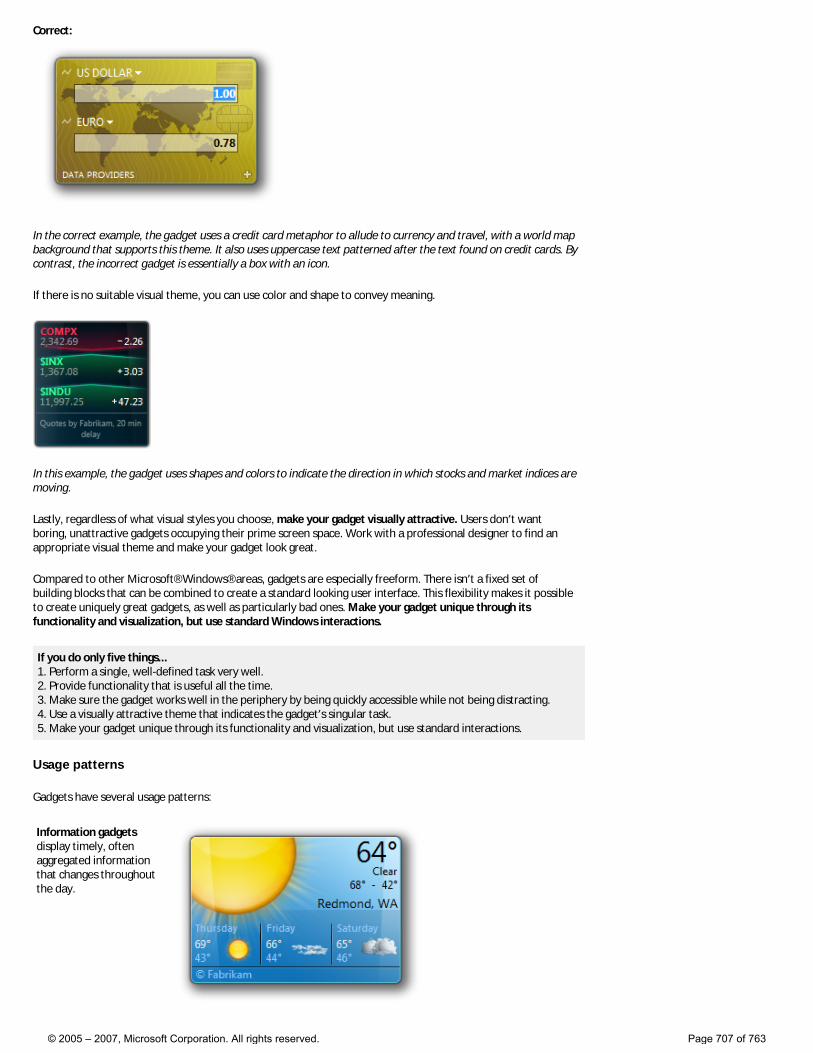
Correct:
In the correct example, the gadget uses a credit card metaphor to allude to currency and travel, with a world map background that supports this theme. It also uses uppercase text patterned after the text found on credit cards. By contrast, the incorrect gadget is essentially a box with an icon.
If there is no suitable visual theme, you can use color and shape to convey meaning.
In this example, the gadget uses shapes and colors to indicate the direction in which stocks and market indices are moving.
Lastly, regardless of what visual styles you choose, make your gadget visually attractive. Users don’t want boring, unattractive gadgets occupying their prime screen space. Work with a professional designer to find an appropriate visual theme and make your gadget look great.
Compared to other Microsoft® Windows® areas, gadgets are especially freeform. There isn’t a fixed set of building blocks that can be combined to create a standard looking user interface. This flexibility makes it possible to create uniquely great gadgets, as well as particularly bad ones. Make your gadget unique through its functionality and visualization, but use standard Windows interactions.
If you do only five things... 1. Perform a single, well-defined task very well. 2. Provide functionality that is useful all the time. 3. Make sure the gadget works well in the periphery by being quickly accessible while not being distracting. 4. Use a visually attractive theme that indicates the gadget’s singular task. 5. Make your gadget unique through its functionality and visualization, but use standard interactions.
Usage patterns
Gadgets have several usage patterns:
Information gadgets display timely, often aggregated information that changes throughout the day.
© 2005 – 2007, Microsoft Corporation. All rights reserved. Page 707 of 763
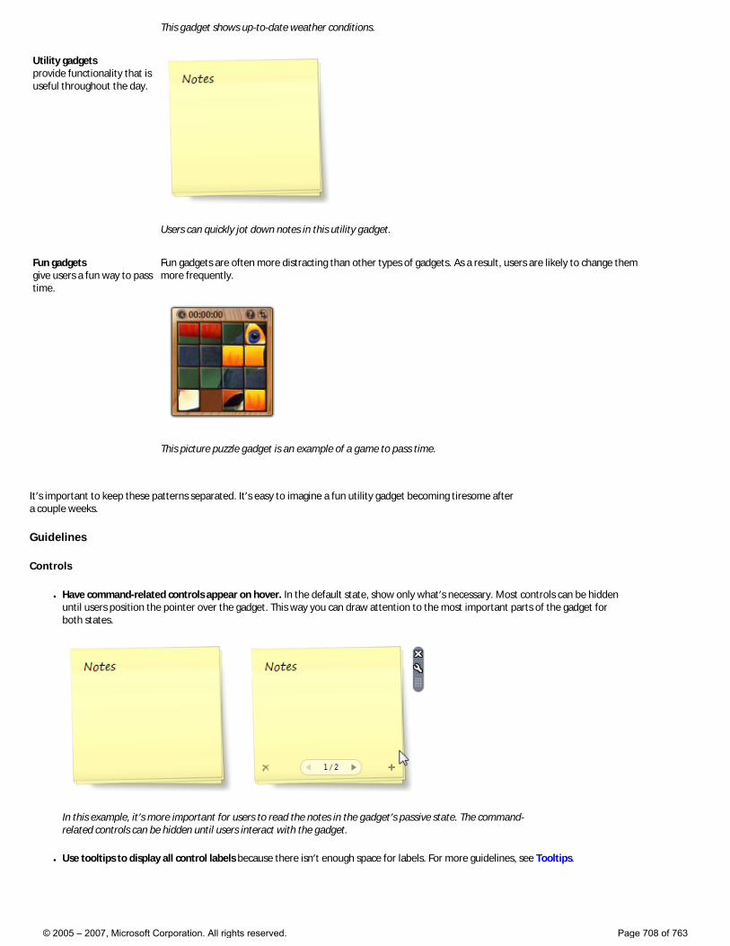
This gadget shows up-to-date weather conditions.
Utility gadgets provide functionality that is useful throughout the day.
Users can quickly jot down notes in this utility gadget.
Fun gadgets give users a fun way to pass time.
Fun gadgets are often more distracting than other types of gadgets. As a result, users are likely to change them more frequently.
This picture puzzle gadget is an example of a game to pass time.
It’s important to keep these patterns separated. It’s easy to imagine a fun utility gadget becoming tiresome after a couple weeks.
Guidelines
Controls
● Have command-related controls appear on hover. In the default state, show only what’s necessary. Most controls can be hidden until users position the pointer over the gadget. This way you can draw attention to the most important parts of the gadget for both states.
In this example, it’s more important for users to read the notes in the gadget’s passive state. The command-related controls can be hidden until users interact with the gadget.
● Use tooltips to display all control labels because there isn’t enough space for labels. For more guidelines, see Tooltips.
© 2005 – 2007, Microsoft Corporation. All rights reserved. Page 708 of 763
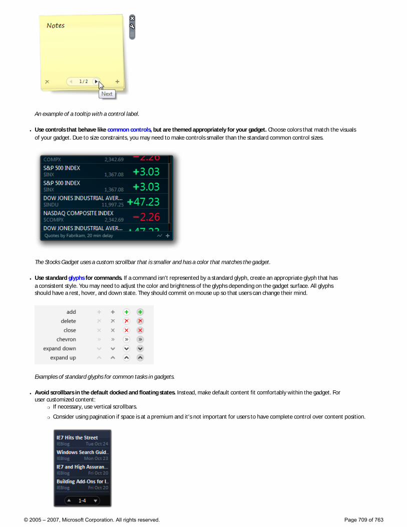
An example of a tooltip with a control label.
● Use controls that behave like common controls, but are themed appropriately for your gadget. Choose colors that match the visuals of your gadget. Due to size constraints, you may need to make controls smaller than the standard common control sizes.
The Stocks Gadget uses a custom scrollbar that is smaller and has a color that matches the gadget.
● Use standard glyphs for commands. If a command isn’t represented by a standard glyph, create an appropriate glyph that has a consistent style. You may need to adjust the color and brightness of the glyphs depending on the gadget surface. All glyphs should have a rest, hover, and down state. They should commit on mouse up so that users can change their mind.
Examples of standard glyphs for common tasks in gadgets.
● Avoid scrollbars in the default docked and floating states. Instead, make default content fit comfortably within the gadget. For user customized content:
�❍ If necessary, use vertical scrollbars.
�❍ Consider using pagination if space is at a premium and it’s not important for users to have complete control over content position.
© 2005 – 2007, Microsoft Corporation. All rights reserved. Page 709 of 763

In this gadget, users can page through four headlines at a time.
�❍ Consider truncating content if doing so still provides useful information, such as the first few lines of an e-mail message. Show the complete content in a flyout or link to the associated application.
● Use Segoe UI, the Windows Vista® system font, for gadget text.
States
● Expose core functionality in the docked state. Design gadgets assuming that they are never detached from the Sidebar. Consider the target audience, key scenarios, space constraints, and simplicity when determining core functionality.
● Use the floating state to provide extra functionality, but don’t do so gratuitously. Link to your application or Web site for complex tasks that require full attention or are more time intensive, instead of trying to embed them in your gadget. If there is no need to add extra functionality, make the docked and floating states the same.
In this example, the docked and floating gadgets have the same functionality, but the floating gadget shows more content.
● Make the drop shadow stronger for the floating state to emphasize that it is floating. Use the same style drop shadow as inactive windows.
● Use flyouts to display secondary information and functionality transiently. If the information and functionality always needs to be available, put it directly on the gadget—don’t put it in a flyout. Also, don’t use flyouts for options; use an options dialog box instead.
The following table compares the appropriate functionality for docked gadgets, floating gadgets, flyouts, and full applications:
State Appropriate functionality
Docked Core functionality that is always useful.
Floating Additional functionality that is always useful.
Flyout Secondary functionality that is sometimes useful.
Full application Complex functionality that requires full attention or is more time intensive.
● Use similar appearance and interaction for the docked and floating states. Users may be confused if the docked and floating gadgets look and behave very differently. While the space constraints for the docked state may require a more compact layout, try to keep the interactive components in roughly the same place. In both states, the same actions should have the same results.
● On installation, consider having the gadget perform an action that explains its purpose. Doing so will make the gadget feel alive. For example, a calendar gadget could turn the pages to today’s date.
● Avoid initial gadget configuration. Choose the most likely or convenient default options. Requiring an initial configuration will make a gadget feel too heavy.
● Provide feedback for the loading and offline states. Let users know that your gadget is offline or loading. �❍ For the loading state, use an activity indicator with text that explains what is loading, such as “Getting data...”.
�❍ For the offline state, use a 16x16 pixel information icon with “Service not available” or other appropriate text. If necessary, make the gadget recognizable by showing faded placeholder content or cached data. Gadgets should activate automatically when a connection becomes available.
While gadgets may reflect loss of connectivity, they don’t have to draw attention to it because users are likely to discover connectivity loss through traditional means, such as the network notification area icon or their Web
© 2005 – 2007, Microsoft Corporation. All rights reserved. Page 710 of 763
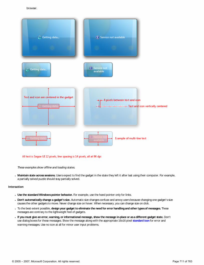
browser.
These examples show offline and loading states.
● Maintain state across sessions. Users expect to find the gadget in the state they left it after last using their computer. For example, a partially solved puzzle should stay partially solved.
Interaction
● Use the standard Windows pointer behavior. For example, use the hand pointer only for links.
● Don’t automatically change a gadget’s size. Automatic size changes confuse and annoy users because changing one gadget’s size causes the other gadgets to move. Never change size on hover. When necessary, you can change size on click.
● To the best extent possible, design your gadget to eliminate the need for error handling and other types of messages. These messages are contrary to the lightweight feel of gadgets.
● If you must give an error, warning, or informational message, show the message in-place or as a different gadget state. Don’t use dialog boxes for these messages. Show the message along with the appropriate 16x16 pixel standard icon for error and warning messages. Use no icon at all for minor user input problems.
© 2005 – 2007, Microsoft Corporation. All rights reserved. Page 711 of 763
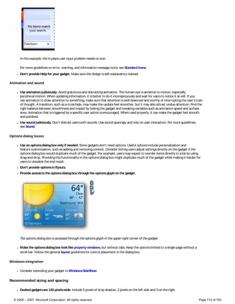
In this example, the in-place user input problem needs no icon.
For more guidelines on error, warning, and information message icons, see Standard Icons.
● Don’t provide Help for your gadget. Make sure the design is self-explanatory instead.
Animation and sound
● Use animation judiciously. Avoid gratuitous and distracting animation. The human eye is sensitive to motion, especially peripheral motion. When updating information, it is better to do it inconspicuously and wait for users to notice it at will. If you use animation to draw attention to something, make sure that attention is well deserved and worthy of interrupting the user’s train of thought. A transition, such as a cross fade, may make the update feel smoother, but it may also attract undue attention. Find the right balance between smoothness and impact by testing the gadget and tweaking variables such as animation speed and surface area. Animation that is triggered by a specific user action is encouraged. When used properly, it can make the gadget feel smooth and polished.
● Use sound judiciously. Don’t distract users with sounds. Use sound sparingly and only on user interaction. For more guidelines, see Sound.
Options dialog boxes
● Use an options dialog box only if needed. Some gadgets don’t need options. Useful options include personalization and feature customization, such as adding and removing content. Consider letting users adjust settings directly on the gadget if the options dialog box would duplicate much of the gadget. For example, users may expect to reorder items directly in a list by using drag-and-drop. Providing this functionality in the options dialog box might duplicate much of the gadget while making it harder for users to visualize the end result.
● Don’t provide options in flyouts.
● Provide access to the options dialog box through the options glyph on the gadget.
The options dialog box is accessed through the options glyph in the upper-right corner of the gadget.
● Make the options dialog box look like property windows, but without tabs. Keep the options limited to a single page without a scroll bar. Follow the general layout guidelines for control placement in the dialog box.
Windows integration
● Consider extending your gadget to Windows SideShow.
Recommended sizing and spacing
● Docked gadgets are 130 pixels wide. Include 5 pixels of drop shadow, 2 pixels on the left side and 3 on the right.
© 2005 – 2007, Microsoft Corporation. All rights reserved. Page 712 of 763
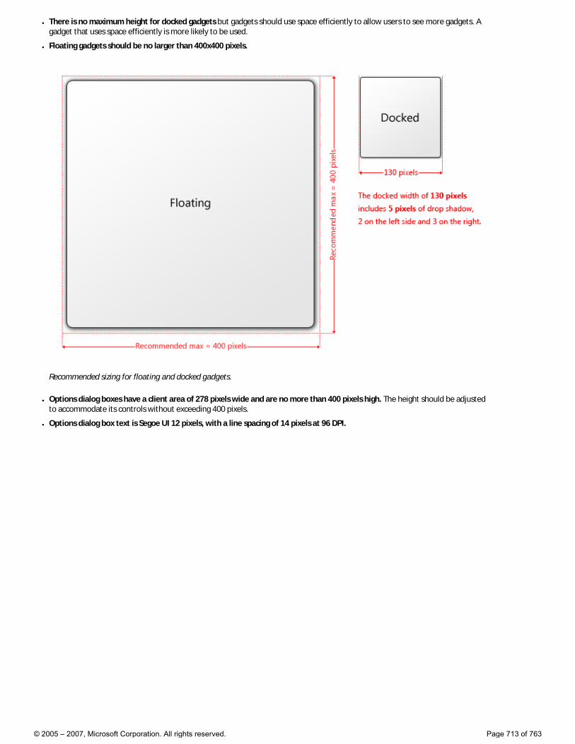
● There is no maximum height for docked gadgets but gadgets should use space efficiently to allow users to see more gadgets. A gadget that uses space efficiently is more likely to be used.
● Floating gadgets should be no larger than 400x400 pixels.
Recommended sizing for floating and docked gadgets.
● Options dialog boxes have a client area of 278 pixels wide and are no more than 400 pixels high. The height should be adjusted to accommodate its controls without exceeding 400 pixels.
● Options dialog box text is Segoe UI 12 pixels, with a line spacing of 14 pixels at 96 DPI.
© 2005 – 2007, Microsoft Corporation. All rights reserved. Page 713 of 763
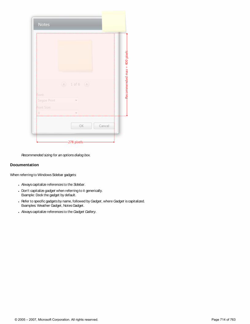
Recommended sizing for an options dialog box.
Documentation
When referring to Windows Sidebar gadgets:
● Always capitalize references to the Sidebar.
● Don’t capitalize gadget when referring to it generically. Example: Dock the gadget by default.
● Refer to specific gadgets by name, followed by Gadget, where Gadget is capitalized. Examples: Weather Gadget, Notes Gadget.
● Always capitalize references to the Gadget Gallery.
© 2005 – 2007, Microsoft Corporation. All rights reserved. Page 714 of 763
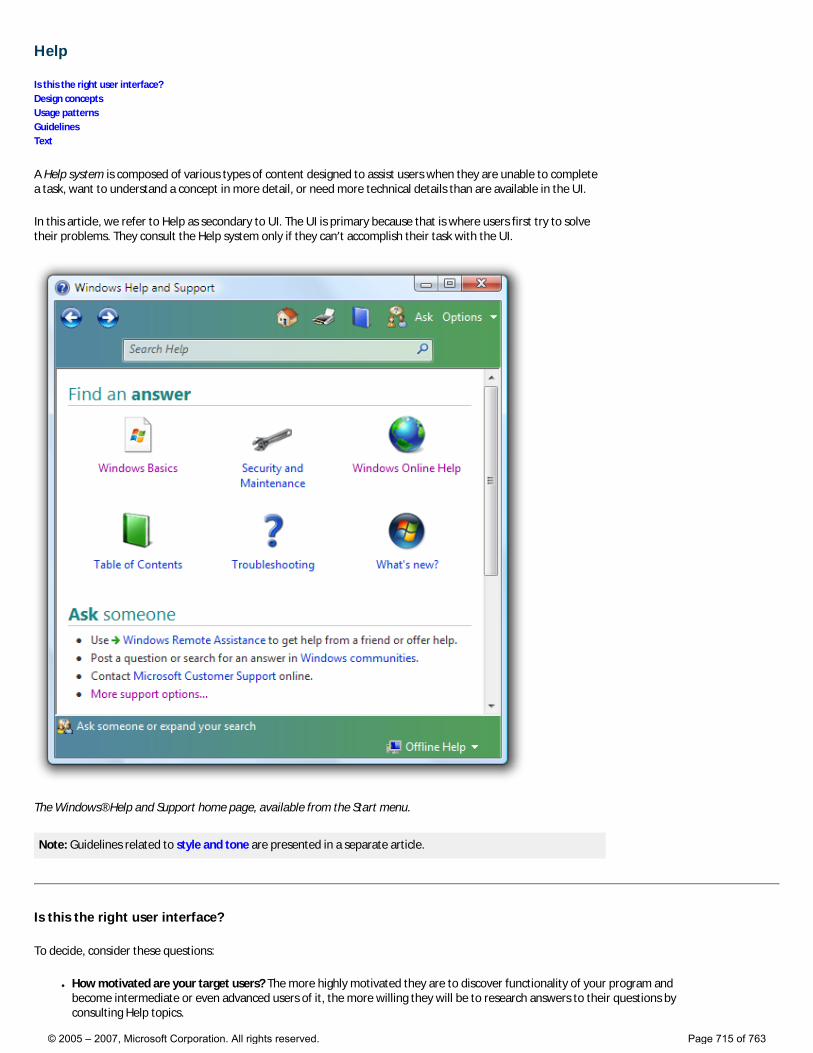
Help
Is this the right user interface? Design concepts Usage patterns Guidelines Text
A Help system is composed of various types of content designed to assist users when they are unable to complete a task, want to understand a concept in more detail, or need more technical details than are available in the UI.
In this article, we refer to Help as secondary to UI. The UI is primary because that is where users first try to solve their problems. They consult the Help system only if they can’t accomplish their task with the UI.
The Windows® Help and Support home page, available from the Start menu.
Note: Guidelines related to style and tone are presented in a separate article.
Is this the right user interface?
To decide, consider these questions:
● How motivated are your target users? The more highly motivated they are to discover functionality of your program and become intermediate or even advanced users of it, the more willing they will be to research answers to their questions by consulting Help topics.
© 2005 – 2007, Microsoft Corporation. All rights reserved. Page 715 of 763
● Are you using Help to fix a bad UI? The better your UI, the less users will seek additional help. If your program has very clear, helpful primary UI (such as jargon-free error messages, well-written wizards, and unambiguous dialog boxes), you may not need a secondary Help system at all.
● Is your program relatively simple? If so, consider incorporating all necessary assistance content into your primary UI surfaces. Users are more likely to seek additional help in programs that perform complex tasks.
● Is your application intended for developers, IT professionals, or other software experts? These users tend to expect reference Help for programming language conventions and in-depth conceptual Help for mastery of features.
Design concepts
If you decide to include Help in your program, integrate it into your overall design. The Help interface should be simple, efficient, and relevant; it should enable users to get help easily and then return to their task. Think of your Help system in terms of users’ time: minimize disruption first by anticipating where they will encounter problems in your program, then solving those problems by incorporating fundamental assistance directly into your UI, and creating clear and consistent entry points into your more detailed Help.
Windows Vista® assistance was designed according to these principles. Here are some of the design changes to the Windows Vista Help user experience:
● More discoverable entry points to Help from the primary UI (especially new Help links from UI surfaces such as dialog boxes, error messages, and wizards). Help links take you directly to the pertinent topic in Help.
● A Help button icon is available in the upper-right corner of most Control Panel hub pages, as well as shell folders.
● Users can choose to get the most up-to-date Help content from Windows Online Help and Support when they’re online.
● Help topics are now task-based rather than feature-focused, so that users can accomplish their tasks quickly and efficiently.
● Help topics are now largely based on known top user scenarios.
● Help topics have a more relaxed and informal tone, using real-world language.
● Help topics are designed for effective scanning, as users rarely read the content word-for-word.
An analogy for Help
To think in greater depth about designing your Help system, consider an analogy from everyday life. You are lost in an unfamiliar city. What do you do? Many would react like this:
1. Get oriented; look for landmarks, street signs (names and pointers to places).
2. Look for maps.
3. Finally, as a last resort, ask for directions or call a friend.
The design of the city’s “interface” affects your need for assistance. Well-labeled streets, explicit directions (pointers to hospitals, airports, museums, and the post office), and clear landmarks such as prominent geographical features or buildings help you find your way.
You ask for help as a last resort. It’s an indication that the city’s “interface” has failed by being poorly designed and confusing. You are more likely to ask for help in place that has a specific label that suggests helpfulness. For example, you are more likely to ask for help in a place labeled “Directions” or “Information” than a general place like the City Hall—even though just about anyone at City Hall could give you directions.
When you ask for help, chances are you are frustrated and just want to get to your intended destination. You probably aren’t in the mood to spend time taking a tour of the city or learning about its history. Further, your motivation depends on the importance of the task. If you are trying to find your hotel room, you will do whatever it takes. However, if your goal is to find a place of minor importance, most likely you will just give up after a modest effort.
All of these aspects of finding your way in real space correspond to how users typically find their way in the virtual space of your program. Seeking help beyond the primary UI is by its very nature disorienting; do your best to mitigate such an experience by well-designed UI and intelligent “street signs” to direct users to the answers they need.
Designing UI so that Help is unnecessary
Try to make Help unnecessary in the first place, by:
© 2005 – 2007, Microsoft Corporation. All rights reserved. Page 716 of 763

● Making common tasks easy to discover and perform.
● Providing clear main instructions.
● Providing clear, concise control labels that are goal- and task-oriented.
● Providing supplemental instructions and explanations where needed.
● Anticipating avoidable problems by using controls constrained to valid choices, providing suitable default values, handling all input formats, and preventing errors.
● Writing error messages that provide a clear solution or action for the user to take.
● Avoiding confusing UI designs, such as tasks with poor flow or using controls that are disabled for no apparent reason.
● Working with writers and editors early in the development cycle to create high-quality, consistent UI text throughout your program.
Users shouldn’t have to go somewhere else to figure out how to use your UI. Add essential information directly into the primary UI, rather than forcing users out of their immediate context and into the Help pane. If important information exists only in a Help topic, there’s a good chance that users won’t see it. For information that is optional and more explanatory, use Help links from the primary UI to the relevant Help topic for supplemental assistance.
Considering user motivation
For most users, speed and efficiency are among the paramount virtues of good programs. Users want to get their work done. Generally, they are not interested in learning about the program and the technology for its own sake; their patience extends only insofar as that program serves their own interests and solves problems at hand.
Design your Help system to match your users’ motivation. For example, consider a user who has strolled up to a kiosk at a museum. If she cannot figure out how to perform the task quickly, she is likely just to give up and walk away. She is unlikely to spend time using Help. Alternatively, a highly-motivated user has a higher tolerance for time spent researching your Help system for answers. A business user who must balance the books, for example, is probably willing to consult Help content to get the most out of that new accounting application.
Writing content for scanning
Write Help topics knowing that they will be scanned for specific information, not read word-for-word. Write concisely, getting to the point quickly, and providing information that users can act on.
● Write “how-to” topics using numbered steps in a consistent format so that users recognize they are getting procedural assistance.
● Write reference topics with ease-of-scanning in mind, using tables, for example, to present UI options or language syntax.
● Write conceptual topics that are logically organized by subheadings, so that the user can skip whole sections of lesser interest.
In all Help content, it is easier to scan bulleted lists than standard paragraph blocks of text; use bullet lists judiciously, though, not as a crutch for unorganized material.
Creating content that matters
Given that no Help system can anticipate every question that every user might have, focus most of the content on answering the top questions in the top scenarios for your target users. For example, effective searching and how to establish network connectivity (among other tasks) may be highly sought-after topics. Also, focus on tasks within your top user scenarios, rather than documenting a feature or technology exhaustively for its own sake.
Tip: Technical support is a good source for Help content. Help desks often keep records of frequently asked questions about particular programs or tasks that users are trying (and failing) to accomplish.
It isn’t necessary to provide help for every feature in the UI. Quite often, unhelpful Help results from trying to create Help for everything. If the UI is well designed, most of these Help topics won’t be very helpful; they will just restate the obvious.
If there is more than one way to perform a task, in most cases you can just document the most common way used by inexperienced users. Exceptions to this include accessibility considerations (documenting keyboard equivalents of mouse actions, for example), and platform considerations (documenting for the tablet form factor, for example, or for server environments in which the command line can substitute for the graphical user interface).
© 2005 – 2007, Microsoft Corporation. All rights reserved. Page 717 of 763
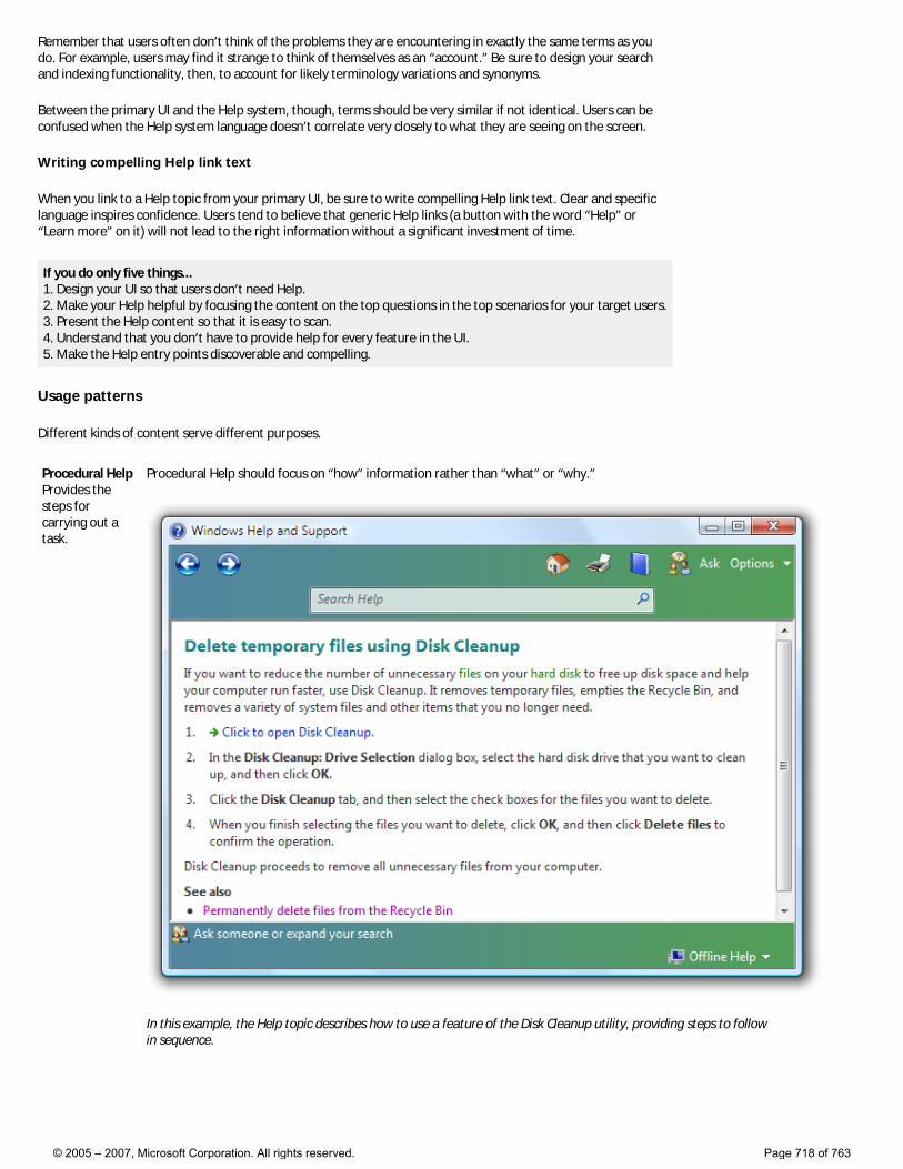
Remember that users often don’t think of the problems they are encountering in exactly the same terms as you do. For example, users may find it strange to think of themselves as an “account.” Be sure to design your search and indexing functionality, then, to account for likely terminology variations and synonyms.
Between the primary UI and the Help system, though, terms should be very similar if not identical. Users can be confused when the Help system language doesn’t correlate very closely to what they are seeing on the screen.
Writing compelling Help link text
When you link to a Help topic from your primary UI, be sure to write compelling Help link text. Clear and specific language inspires confidence. Users tend to believe that generic Help links (a button with the word “Help” or “Learn more” on it) will not lead to the right information without a significant investment of time.
If you do only five things... 1. Design your UI so that users don’t need Help. 2. Make your Help helpful by focusing the content on the top questions in the top scenarios for your target users. 3. Present the Help content so that it is easy to scan. 4. Understand that you don’t have to provide help for every feature in the UI. 5. Make the Help entry points discoverable and compelling.
Usage patterns
Different kinds of content serve different purposes.
Procedural Help Provides the steps for carrying out a task.
Procedural Help should focus on “how” information rather than “what” or “why.”
In this example, the Help topic describes how to use a feature of the Disk Cleanup utility, providing steps to follow in sequence.
© 2005 – 2007, Microsoft Corporation. All rights reserved. Page 718 of 763
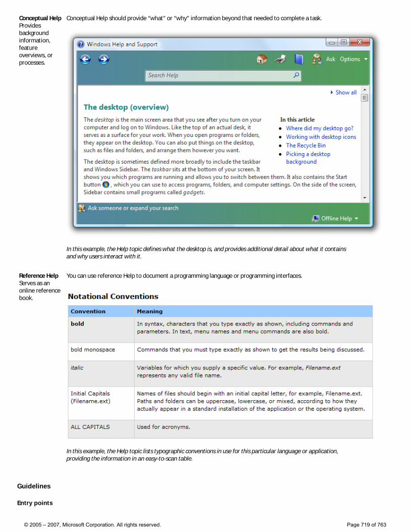
Conceptual Help Provides background information, feature overviews, or processes.
Conceptual Help should provide “what” or “why” information beyond that needed to complete a task.
In this example, the Help topic defines what the desktop is, and provides additional detail about what it contains and why users interact with it.
Reference Help Serves as an online reference book.
You can use reference Help to document a programming language or programming interfaces.
In this example, the Help topic lists typographic conventions in use for this particular language or application, providing the information in an easy-to-scan table.
Guidelines
Entry points
© 2005 – 2007, Microsoft Corporation. All rights reserved. Page 719 of 763
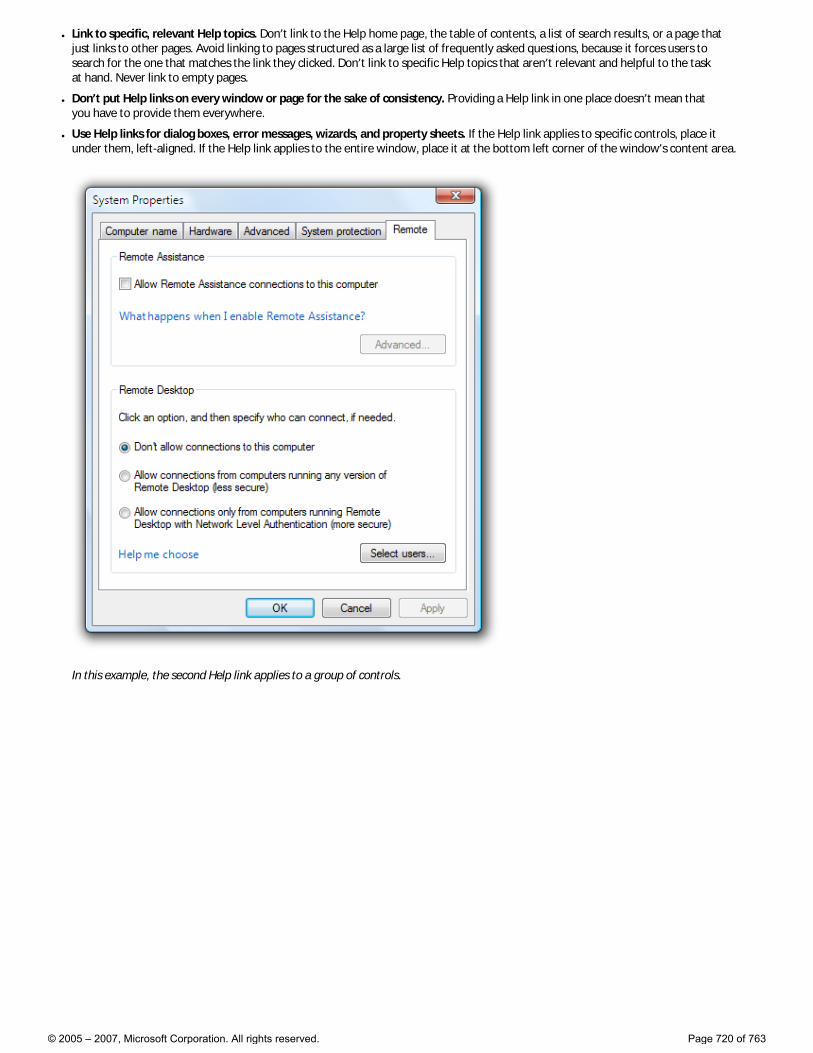
● Link to specific, relevant Help topics. Don’t link to the Help home page, the table of contents, a list of search results, or a page that just links to other pages. Avoid linking to pages structured as a large list of frequently asked questions, because it forces users to search for the one that matches the link they clicked. Don’t link to specific Help topics that aren’t relevant and helpful to the task at hand. Never link to empty pages.
● Don’t put Help links on every window or page for the sake of consistency. Providing a Help link in one place doesn’t mean that you have to provide them everywhere.
● Use Help links for dialog boxes, error messages, wizards, and property sheets. If the Help link applies to specific controls, place it under them, left-aligned. If the Help link applies to the entire window, place it at the bottom left corner of the window’s content area.
In this example, the second Help link applies to a group of controls.
© 2005 – 2007, Microsoft Corporation. All rights reserved. Page 720 of 763
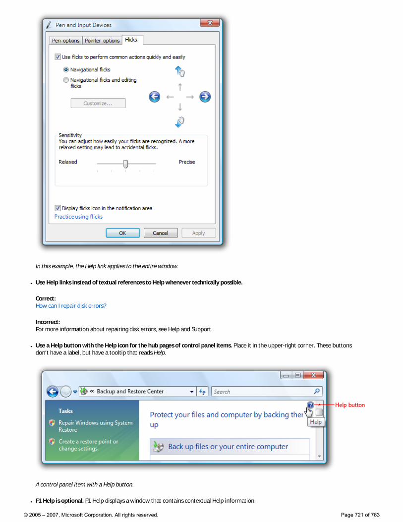
In this example, the Help link applies to the entire window.
● Use Help links instead of textual references to Help whenever technically possible.
Correct: How can I repair disk errors?
Incorrect: For more information about repairing disk errors, see Help and Support.
● Use a Help button with the Help icon for the hub pages of control panel items. Place it in the upper-right corner. These buttons don’t have a label, but have a tooltip that reads Help.
A control panel item with a Help button.
● F1 Help is optional. F1 Help displays a window that contains contextual Help information.
© 2005 – 2007, Microsoft Corporation. All rights reserved. Page 721 of 763
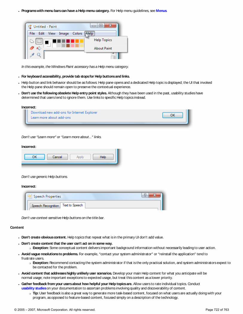
● Programs with menu bars can have a Help menu category. For Help menu guidelines, see Menus.
In this example, the Windows Paint accessory has a Help menu category.
● For keyboard accessibility, provide tab stops for Help buttons and links.
● Help button and link behavior should be as follows: Help pane opens and a dedicated Help topic is displayed; the UI that invoked the Help pane should remain open to preserve the contextual experience.
● Don’t use the following obsolete Help entry point styles. Although they have been used in the past, usability studies have determined that users tend to ignore them. Use links to specific Help topics instead.
Incorrect:
Don’t use “Learn more” or “Learn more about...” links.
Incorrect:
Don’t use generic Help buttons.
Incorrect:
Don’t use context-sensitive Help buttons on the title bar.
Content
● Don’t create obvious content. Help topics that repeat what is in the primary UI don’t add value.
● Don’t create content that the user can’t act on in some way. �❍ Exception: Some conceptual content delivers important background information without necessarily leading to user action.
● Avoid vague resolutions to problems. For example, “contact your system administrator” or “reinstall the application” tend to frustrate users.
�❍ Exception: Recommend contacting the system administrator if that is the only practical solution, and system administrators expect to be contacted for the problem.
● Avoid content that addresses highly unlikely user scenarios. Develop your main Help content for what you anticipate will be normal usage; note important exceptions to expected usage, but treat this content as a lower priority.
● Gather feedback from your users about how helpful your Help topics are. Allow users to rate individual topics. Conduct usability studies on your documentation to ascertain problems involving quality and discoverability of content.
�❍ Tip: User feedback is also a great way to generate more task-based content, focused on what users are actually doing with your program, as opposed to feature-based content, focused simply on a description of the technology.
© 2005 – 2007, Microsoft Corporation. All rights reserved. Page 722 of 763
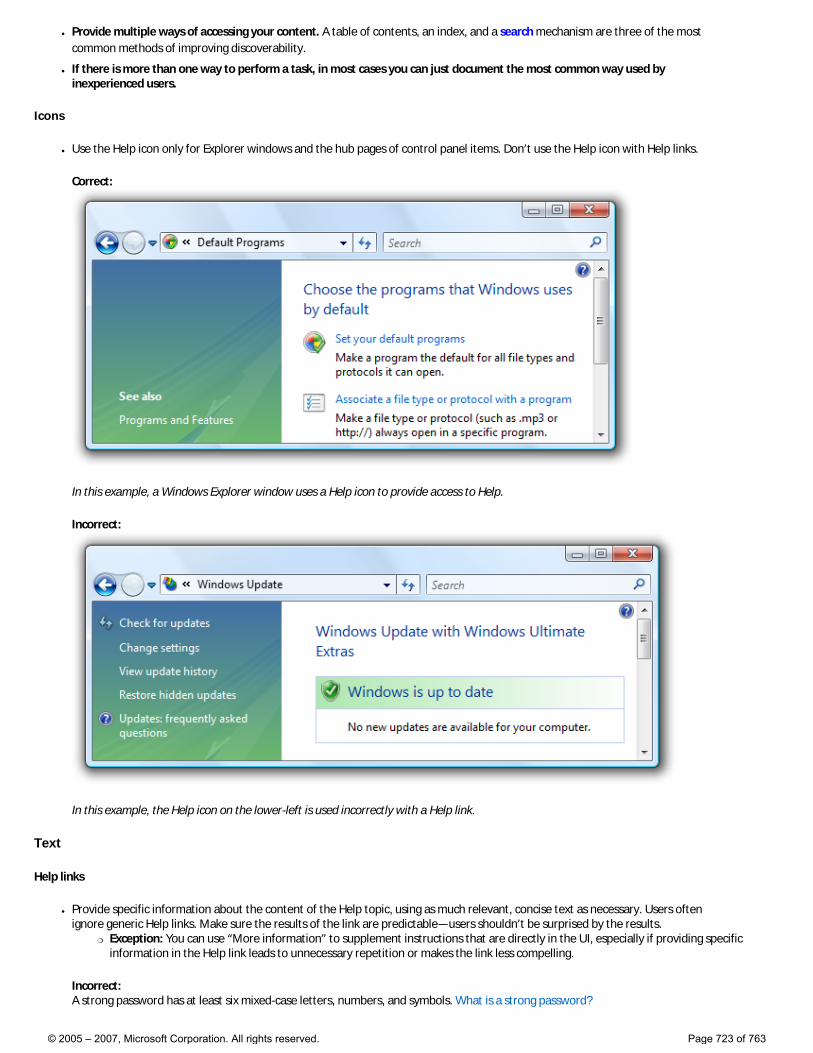
● Provide multiple ways of accessing your content. A table of contents, an index, and a search mechanism are three of the most common methods of improving discoverability.
● If there is more than one way to perform a task, in most cases you can just document the most common way used by inexperienced users.
Icons
● Use the Help icon only for Explorer windows and the hub pages of control panel items. Don’t use the Help icon with Help links.
Correct:
In this example, a Windows Explorer window uses a Help icon to provide access to Help.
Incorrect:
In this example, the Help icon on the lower-left is used incorrectly with a Help link.
Text
Help links
● Provide specific information about the content of the Help topic, using as much relevant, concise text as necessary. Users often ignore generic Help links. Make sure the results of the link are predictable—users shouldn’t be surprised by the results.
�❍ Exception: You can use “More information” to supplement instructions that are directly in the UI, especially if providing specific information in the Help link leads to unnecessary repetition or makes the link less compelling.
Incorrect: A strong password has at least six mixed-case letters, numbers, and symbols. What is a strong password?
© 2005 – 2007, Microsoft Corporation. All rights reserved. Page 723 of 763
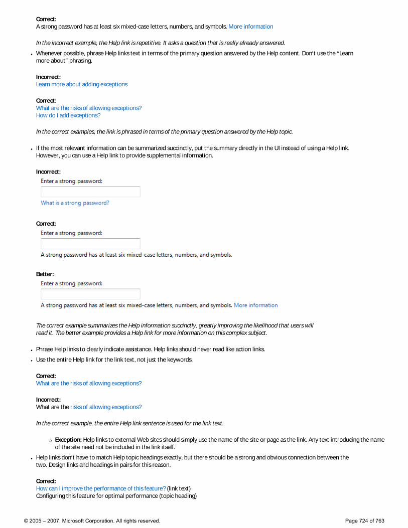
Correct: A strong password has at least six mixed-case letters, numbers, and symbols. More information
In the incorrect example, the Help link is repetitive. It asks a question that is really already answered.
● Whenever possible, phrase Help links text in terms of the primary question answered by the Help content. Don’t use the “Learn more about” phrasing.
Incorrect: Learn more about adding exceptions
Correct: What are the risks of allowing exceptions? How do I add exceptions?
In the correct examples, the link is phrased in terms of the primary question answered by the Help topic.
● If the most relevant information can be summarized succinctly, put the summary directly in the UI instead of using a Help link. However, you can use a Help link to provide supplemental information.
Incorrect:
Correct:
Better:
The correct example summarizes the Help information succinctly, greatly improving the likelihood that users will read it. The better example provides a Help link for more information on this complex subject.
● Phrase Help links to clearly indicate assistance. Help links should never read like action links.
● Use the entire Help link for the link text, not just the keywords.
Correct: What are the risks of allowing exceptions?
Incorrect: What are the risks of allowing exceptions?
In the correct example, the entire Help link sentence is used for the link text.
�❍ Exception: Help links to external Web sites should simply use the name of the site or page as the link. Any text introducing the name of the site need not be included in the link itself.
● Help links don’t have to match Help topic headings exactly, but there should be a strong and obvious connection between the two. Design links and headings in pairs for this reason.
Correct: How can I improve the performance of this feature? (link text) Configuring this feature for optimal performance (topic heading)
© 2005 – 2007, Microsoft Corporation. All rights reserved. Page 724 of 763
Incorrect: How can I improve the performance of this feature? (link text) Complete overview of this feature (topic heading)
In the incorrect example, the Help topic heading substantially differs in scope from the Help link text, and could be disorienting.
● If the Help content is online, make that clear in the link text. Doing so helps make the result of the links predictable.
Correct: For additional formats and tools, go to the Microsoft Web site.
Incorrect: Where can I find additional formats and tools?
● Use complete sentences.
● Don’t use ending punctuation, except for question marks.
● Don’t use ellipses for Help links or commands.
Help content
● Format UI elements using bold to make them easy to identify. This is especially useful for procedural Help topics, allowing users to scan through procedures and quickly see pertinent UI elements.
● Format captions using italic. This applies to tables, art, screenshots, and other graphic elements that benefit from brief textual explanation.
● Refer to Help simply as Help. Generally, don’t use the phrase online Help unless you are in fact referring to content on your Web site.
© 2005 – 2007, Microsoft Corporation. All rights reserved. Page 725 of 763
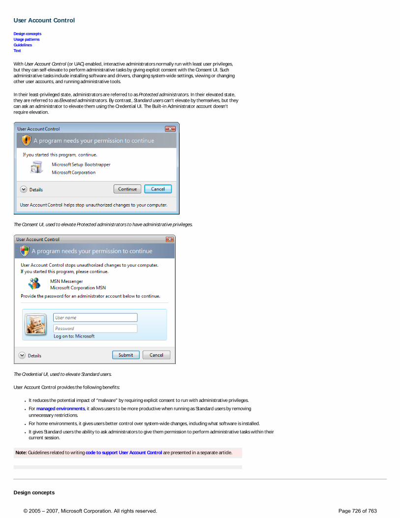
User Account Control
Design concepts Usage patterns Guidelines Text
With User Account Control (or UAC) enabled, interactive administrators normally run with least user privileges, but they can self-elevate to perform administrative tasks by giving explicit consent with the Consent UI. Such administrative tasks include installing software and drivers, changing system-wide settings, viewing or changing other user accounts, and running administrative tools.
In their least-privileged state, administrators are referred to as Protected administrators. In their elevated state, they are referred to as Elevated administrators. By contrast, Standard users can’t elevate by themselves, but they can ask an administrator to elevate them using the Credential UI. The Built-in Administrator account doesn’t require elevation.
The Consent UI, used to elevate Protected administrators to have administrative privileges.
The Credential UI, used to elevate Standard users.
User Account Control provides the following benefits:
● It reduces the potential impact of “malware” by requiring explicit consent to run with administrative privileges.
● For managed environments, it allows users to be more productive when running as Standard users by removing unnecessary restrictions.
● For home environments, it gives users better control over system-wide changes, including what software is installed.
● It gives Standard users the ability to ask administrators to give them permission to perform administrative tasks within their current session.
Note: Guidelines related to writing code to support User Account Control are presented in a separate article.
Design concepts
© 2005 – 2007, Microsoft Corporation. All rights reserved. Page 726 of 763
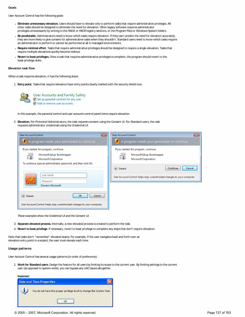
Goals
User Account Control has the following goals:
● Eliminate unnecessary elevation. Users should have to elevate only to perform tasks that require administrative privileges. All other tasks should be designed to eliminate the need for elevation. Often legacy software requires administrator privileges unnecessarily by writing to the HKLM or HKCR registry sections, or the Program Files or Windows System folders.
● Be predictable. Administrators need to know which tasks require elevation. If they can’t predict the need for elevation accurately, they are more likely to give consent for administrative tasks when they shouldn’t. Standard users need to know which tasks require an administrator to perform or cannot be performed at all in managed environments.
● Require minimal effort. Tasks that require administrative privileges should be designed to require a single elevation. Tasks that require multiple elevations quickly become tedious.
● Revert to least privileges. Once a task that requires administrative privileges is complete, the program should revert to the least privilege state.
Elevation task flow
When a task requires elevation, it has the following steps:
1. Entry point. Tasks that require elevation have entry points clearly marked with the security shield icon.
In this example, the parental control and user accounts control panel items require elevation.
2. Elevation. For Protected Administrators, the task requests consent using the Consent UI. For Standard users, the task requests administrator credentials using the Credential UI.
These examples show the Credential UI and the Consent UI.
3. Separate elevated process. Internally, a new elevated process is created to perform the task.
4. Revert to least privilege. If necessary, revert to least privilege to complete any steps that don’t require elevation.
Note that tasks don’t “remember” elevated states. For example, if the user navigates back and forth over an elevation entry point in a wizard, the user must elevate each time.
Usage patterns
User Account Control has several usage patterns (in order of preference):
1. Work for Standard users. Design the feature for all users by limiting its scope to the current user. By limiting settings to the current user (as opposed to system-wide), you can bypass any UAC issues altogether.
Incorrect:
© 2005 – 2007, Microsoft Corporation. All rights reserved. Page 727 of 763
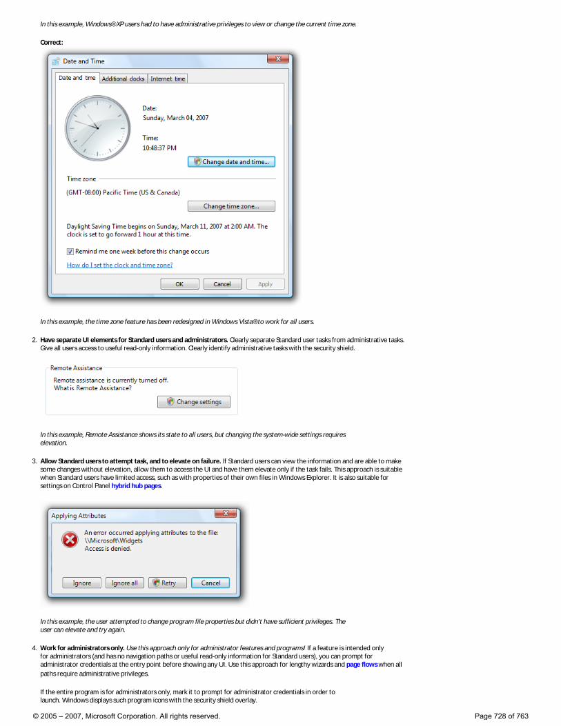
In this example, Windows® XP users had to have administrative privileges to view or change the current time zone.
Correct:
In this example, the time zone feature has been redesigned in Windows Vista® to work for all users.
2. Have separate UI elements for Standard users and administrators. Clearly separate Standard user tasks from administrative tasks. Give all users access to useful read-only information. Clearly identify administrative tasks with the security shield.
In this example, Remote Assistance shows its state to all users, but changing the system-wide settings requires elevation.
3. Allow Standard users to attempt task, and to elevate on failure. If Standard users can view the information and are able to make some changes without elevation, allow them to access the UI and have them elevate only if the task fails. This approach is suitable when Standard users have limited access, such as with properties of their own files in Windows Explorer. It is also suitable for settings on Control Panel hybrid hub pages.
In this example, the user attempted to change program file properties but didn’t have sufficient privileges. The user can elevate and try again.
4. Work for administrators only. Use this approach only for administrator features and programs! If a feature is intended only for administrators (and has no navigation paths or useful read-only information for Standard users), you can prompt for administrator credentials at the entry point before showing any UI. Use this approach for lengthy wizards and page flows when all paths require administrative privileges.
If the entire program is for administrators only, mark it to prompt for administrator credentials in order to launch. Windows displays such program icons with the security shield overlay.
© 2005 – 2007, Microsoft Corporation. All rights reserved. Page 728 of 763
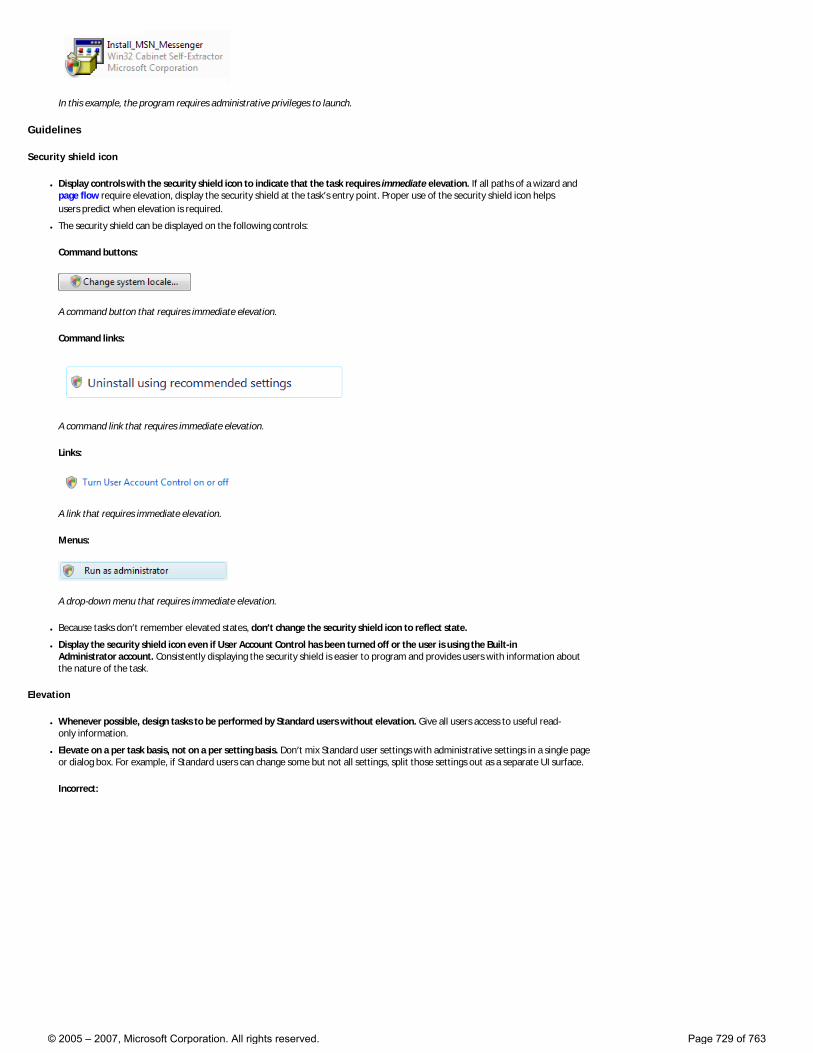
In this example, the program requires administrative privileges to launch.
Guidelines
Security shield icon
● Display controls with the security shield icon to indicate that the task requires immediate elevation. If all paths of a wizard and page flow require elevation, display the security shield at the task’s entry point. Proper use of the security shield icon helps users predict when elevation is required.
● The security shield can be displayed on the following controls:
Command buttons:
A command button that requires immediate elevation.
Command links:
A command link that requires immediate elevation.
Links:
A link that requires immediate elevation.
Menus:
A drop-down menu that requires immediate elevation.
● Because tasks don’t remember elevated states, don’t change the security shield icon to reflect state.
● Display the security shield icon even if User Account Control has been turned off or the user is using the Built-in Administrator account. Consistently displaying the security shield is easier to program and provides users with information about the nature of the task.
Elevation
● Whenever possible, design tasks to be performed by Standard users without elevation. Give all users access to useful read-only information.
● Elevate on a per task basis, not on a per setting basis. Don’t mix Standard user settings with administrative settings in a single page or dialog box. For example, if Standard users can change some but not all settings, split those settings out as a separate UI surface.
Incorrect:
© 2005 – 2007, Microsoft Corporation. All rights reserved. Page 729 of 763

In this example, Standard user settings are incorrectly mixed with administrative settings.
Correct:
In this example, the settings for changing the date and time are in a separate dialog box, available only to administrators. The time zone settings are available to Standard users, and are not mixed with administrative settings.
● Don’t consider the need to elevate when determining if a control should be displayed or disabled. This is because: �❍ In unmanaged environments, assume that Standard users could elevate by asking an administrator. Disabling controls that
require elevation would prevent users from having administrators elevate.
�❍ In managed environments, assume that Standard users can’t elevate at all. Removing controls that require elevation would prevent users from knowing when to stop looking.
● To eliminate unnecessary elevation: �❍ If a task might require elevation, elevate as late as possible. If a task needs a confirmation, display the elevation UI only after the
user has confirmed. If a task always requires elevation, elevate at its entry point.
�❍ Once elevated, stay elevated until elevated privileges are no longer necessary. Users shouldn’t have to elevate multiple times to perform a single task.
�❍ If users must elevate to make a change, disable the positive commit buttons until the user makes a change. Doing so prevents users from elevating just to close a window by forcing them to click Cancel.
● Don’t display warnings to explain that users might need to elevate their privileges to perform tasks. Let users discover this fact
© 2005 – 2007, Microsoft Corporation. All rights reserved. Page 730 of 763
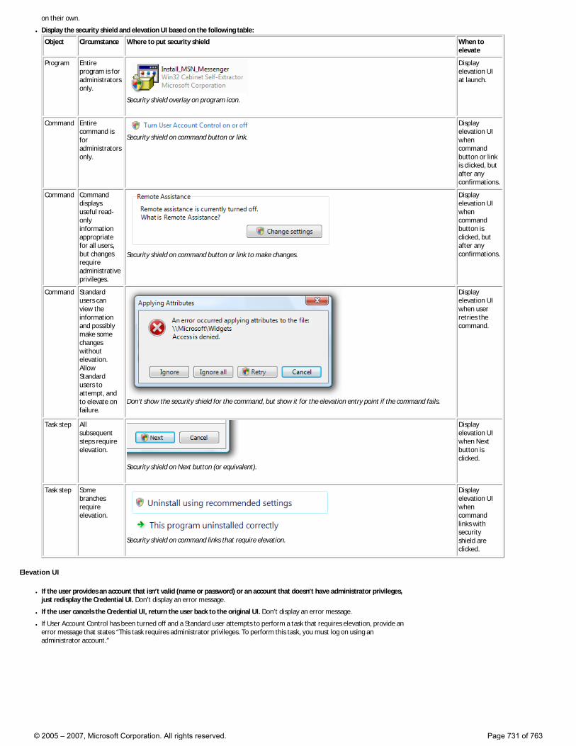
on their own.
● Display the security shield and elevation UI based on the following table:
Object Circumstance Where to put security shield When to elevate
Program Entire program is for administrators only.
Security shield overlay on program icon.
Display elevation UI at launch.
Command Entire command is for administrators only.
Security shield on command button or link.
Display elevation UI when command button or link is clicked, but after any confirmations.
Command Command displays useful read-only information appropriate for all users, but changes require administrative privileges.
Security shield on command button or link to make changes.
Display elevation UI when command button is clicked, but after any confirmations.
Command Standard users can view the information and possibly make some changes without elevation. Allow Standard users to attempt, and to elevate on failure.
Don’t show the security shield for the command, but show it for the elevation entry point if the command fails.
Display elevation UI when user retries the command.
Task step All subsequent steps require elevation.
Security shield on Next button (or equivalent).
Display elevation UI when Next button is clicked.
Task step Some branches require elevation.
Security shield on command links that require elevation.
Display elevation UI when command links with security shield are clicked.
Elevation UI
● If the user provides an account that isn’t valid (name or password) or an account that doesn’t have administrator privileges, just redisplay the Credential UI. Don’t display an error message.
● If the user cancels the Credential UI, return the user back to the original UI. Don’t display an error message.
● If User Account Control has been turned off and a Standard user attempts to perform a task that requires elevation, provide an error message that states “This task requires administrator privileges. To perform this task, you must log on using an administrator account.”
© 2005 – 2007, Microsoft Corporation. All rights reserved. Page 731 of 763
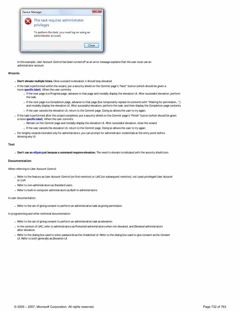
In this example, User Account Control has been turned off so an error message explains that the user must use an administrator account.
Wizards
● Don’t elevate multiple times. Once a wizard is elevated, it should stay elevated.
● If the task is performed within the wizard, put a security shield on the Commit page’s “Next” button (which should be given a more specific label). When the user commits:
�❍ If the next page is a Progress page, advance to that page and modally display the elevation UI. After successful elevation, perform the task.
�❍ If the next page is a Completion page, advance to that page (but temporarily replace its contents with “Waiting for permission...”) and modally display the elevation UI. After successful elevation, perform the task, and then display the Completion page contents.
�❍ If the user cancels the elevation UI, return to the Commit page. Doing so allows the user to try again.
● If the task is performed after the wizard completes, put a security shield on the Commit page’s “Finish” button (which should be given a more specific label). When the user commits:
�❍ Remain on the Commit page and modally display the elevation UI. After successful elevation, close the wizard.
�❍ If the user cancels the elevation UI, return to the Commit page. Doing so allows the user to try again.
● For lengthy wizards intended only for administrators, you can prompt for administrator credentials at the entry point before showing any UI.
Text
● Don’t use an ellipsis just because a command requires elevation. The need to elevate is indicated with the security shield icon.
Documentation
When referring to User Account Control:
● Refer to the feature as User Account Control (on first mention) or UAC (on subsequent mention), not Least-privileged User Account or LUA.
● Refer to non-administrators as Standard users.
● Refer to built-in computer administrators as Built-in administrators.
In user documentation:
● Refer to the act of giving consent to perform an administrative task as giving permission.
In programming and other technical documentation:
● Refer to the act of giving consent to perform an administrative task as elevation.
● In the context of UAC, refer to administrators as Protected administrators when not elevated, and Elevated administrators after elevation.
● Refer to the dialog box used to enter passwords as the Credential UI. Refer to the dialog box used to give consent as the Consent UI. Refer to both generally as Elevation UI.
© 2005 – 2007, Microsoft Corporation. All rights reserved. Page 732 of 763
Glossary
A | B | C | D | E | F | G | H | I | J | K | L | M N | O | P | Q | R | S | T | U | V | W | X | Y | Z
A
About box
A dialog box providing general program information, such as version identification, copyright, licensing agreements, and ways to access technical support.
Above the fold
A screen layout metaphor taken from newspaper journalism. The content above the fold of the newspaper must be particularly engaging to spur sales. Similarly, in screen layout, the most important content must be visible without scrolling. Users must be motivated to take the time to scroll past the content they encounter initially “above the fold.”
Access key
An alphanumeric key that, when combined with the Alt key, activates a control. Access keys are indicated by underlining one of the characters in the control’s label. For example, pressing Alt+O activates a control whose label is “Open” and whose assigned access key is “O”. Access keys aren’t case sensitive. The effect of activating a control depends on the type of control.
In contrast to shortcut keys, which are intended mostly for advanced users, access keys are designed to improve accessibility. Because they are documented directly within the user interface (UI) itself, they can’t always be assigned consistently and they aren’t intended to be memorized.
Active monitor
The monitor where the active program is running.
Affordance
Visual properties of an object that indicate how it can be used or acted on. For example, command buttons have the visual appearance of real-world buttons, suggesting pushing or clicking.
Application
A program used to perform a related set of user tasks; often relatively complex and sophisticated. See also: Program.
Application key
Displays the shortcut menu for the current selection (the same as pressing Shift+F10).
© 2005 – 2007, Microsoft Corporation. All rights reserved. Page 733 of 763
Application theming
Using related visual techniques, such as customized controls, to create a unique look or branding for an application.
Auto-exit
A text box in which the input focus automatically moves to the next related text box as soon as a user types the last character.
Auto-complete
A type of list used in text boxes and editable drop-down lists in which the likely input can be extrapolated and populated automatically from having been entered previously. Users type a minimal amount of text to populate the auto-complete list.
B
Balloon
A common Windows control that informs users of a non-critical problem or special condition.
C
Check box
A common Windows control that allows users to decide between clearly differing choices, such as toggling an option on or off.
Chevron
A small control or button that indicates there are more items than can be displayed in the allotted space. Users click the chevron to see the additional items.
Child window
A window, such as a control or pane, that is contained completely within another window, referred to as the parent window. See also: Parent window, Owned window.
Cleared
In a check box, indicates that the option is not set. See also: Selected, Mixed state.
Combo box
A common Windows control that combines the characteristics of a drop-down list or standard list box, and an editable text box. See also: List box, Drop-down list.
© 2005 – 2007, Microsoft Corporation. All rights reserved. Page 734 of 763
Command area
The area in a window where the commit buttons are located. Typically, dialog boxes and wizards have a command area. See also: Commit button.
Command button
A common Windows control that allows users to initiate an action immediately.
Command link
A control used to make a choice among a set of mutually exclusive, related choices. In their normal state, command links have a lightweight appearance similar to hyperlinks, but their behavior is more similar to command buttons.
Commit button
A command button used to commit to a task, proceed to the next step in a multi-step task, or cancel a task. See also: Command area.
Commit page
A type of wizard page in which users commit to performing the task. After doing so, the task cannot be undone by clicking Back or Cancel buttons.
Completion page
A wizard page used to indicate the end of a wizard. Sometimes used instead of Congratulations pages. See also: Congratulations page.
Congratulations page
A wizard page used to indicate the end of a wizard. These pages are no longer recommended. Wizards conclude more efficiently with a commit page or, if necessary, a follow-up or completion page. See also: Commit page, Completion page, Follow-up page.
Consent UI
A dialog box used by User Account Control (UAC) that allows protected administrators to elevate their privileges temporarily.
Constraint
In controls that involve user input, such as text boxes, input constraints are a valuable way to prevent errors. For example, if the only valid input for a particular control is numeric, the control can use appropriate value constraints to enforce this requirement.
Content area
© 2005 – 2007, Microsoft Corporation. All rights reserved. Page 735 of 763
The portion of UI surfaces, such as dialog boxes, control panel items, and wizards, devoted to presenting options, providing information, and describing controls. Distinguished from the command area, task pane, and navigation area.
Control Panel
A Windows program that collects and displays for users the system-level features of the computer, including hardware and software setup and configuration. From Control Panel, users can click individual items to configure system-level features and perform related tasks. See also: Control panel item.
Control panel item
An individual feature available from Control Panel. For example, Programs and Ease of Access are two control panel items.
Credential UI
A dialog box used by User Account Control (UAC) that allows standard users to request temporary elevation of their privileges.
Critical
The highest degree of severity. For example, in error and warning messages, critical circumstances might involve data loss, loss of privacy, or loss of system integrity.
Custom icon
A pictorial representation unique to a program (as opposed to a Windows system icon).
Custom visuals
Graphics, animations, icons, and other visual elements specially developed for a program.
D
Default command button or link
The command button or link that is invoked when users press the Enter key. The default command button or link is assigned by the developer, but any command button or link becomes the default when users tab to it.
Default monitor
The monitor with the Start menu, taskbar, and notification area.
Delayed commit model
The commit model used by control panel item spoke pages where changes aren’t made until explicitly committed by users clicking a commit button. Thus, users can abandon a task, navigating away using the Back button, Close, or the Address bar. See also: Immediate commit model.
© 2005 – 2007, Microsoft Corporation. All rights reserved. Page 736 of 763
Desktop
The onscreen work area provided by Windows, analogous to a physical desktop.
Details pane
The pane at the bottom of a Windows Explorer window that displays details (if any) about the selected items; otherwise, it displays details about the folder. For example, Windows Photo Gallery displays the picture name, file type, date taken, tags, rating, dimensions, and file size. See also: Preview pane.
Dialog box
A secondary window that allows users to perform a command, asks users a question, or provides users with information or progress feedback.
Dialog unit
A dialog unit (DLU) is the device-independent measure to use for layout based on the current system font.
Direct manipulation
Direct interaction between the user and the objects in the UI (such as icons, controls, and navigational elements). In desktop systems, the mouse is the prevalent tool for direct manipulation.
Docked window
A window that appears at a fixed location on the edge of its owner window. See also: Floating window.
Drop-down arrow
The arrow associated with drop-down lists, combo boxes, split buttons, and menu buttons, indicating that users can view the associated list by clicking the arrow.
Drop-down list
A common Windows control that allows users to select among a list of mutually exclusive values. Unlike a list box, this list of available choices is normally hidden.
E
Elevated administrator
In User Account Control, elevated administrators have their administrator privileges. Without elevating, administrators run in their least-privileged state. The Consent UI dialog is used to elevate administrators to elevated status only when necessary. See also: Protected administrator, Standard user.
Error
© 2005 – 2007, Microsoft Corporation. All rights reserved. Page 737 of 763
A state in which a problem has occurred. See also: Warning.
Expandable headings
A progressive disclosure chevron pattern where a heading can be expanded or collapsed to reveal or hide a group of items. See also: Progressive disclosure.
Extended selection
In list views and list boxes, a multiple selection mode where selection of a single item can be extended by dragging or with Shift+click or Ctrl+click to select groups of contiguous or non-adjacent values, respectively. See also: Multiple selection.
F
Floating window
A window that can appear anywhere on the screen the user wants. See also: Docked window.
Flyout
A popup window that temporarily shows more information. On the Windows desktop, flyouts are displayed by clicking on a Sidebar gadget, and dismissed by clicking anywhere outside the flyout. You can use flyouts in both the docked and floating states.
Follow-up page
A wizard page used to present related tasks that users are likely to do as follow-up. Sometimes used instead of Congratulations pages.
Font
A set of attributes for text characters.
Full screen
A maximized window that does not have a frame.
G
Gadget
A simple mini-application hosted in the Sidebar of the user’s desktop. Can be docked or float freely. See also: Sidebar.
Getting started page
An optional wizard page that outlines prerequisites for running the wizard successfully or explains the purpose of
© 2005 – 2007, Microsoft Corporation. All rights reserved. Page 738 of 763
the wizard.
Glass
A window frame option characterized by translucence, helping users focus on content and functionality rather than the interface surrounding it.
Glyph
A generic term used to refer to any graph or symbolic image. Arrows, chevrons, and bullets are glyphs commonly used in Windows.
Group box
A common Windows control that shows relationships among a set of related controls.
H
Help
User assistance of a more detailed nature than is available in the primary UI. Typically accessed from a menu or by clicking a Help link or icon, this content may take a variety of forms, including step-by-step procedures, conceptual text, or more visually-based, guided tutorials.
High-contrast mode
A special display setting that provides extreme contrast for foreground and background visual elements (either black on white or white on black). Particularly helpful for accessibility.
Hub page
In control panel items, a hub page presents high-level choices, such as the most commonly used tasks (as with task-based hub pages) or the available objects (as with object-based hub pages). Users can navigate to spoke pages to perform specific tasks. See also: Spoke page.
Hybrid hub page
In control panel items, a hybrid hub page is a hub page that also has some properties or commands directly on it. Hybrid hub pages are strongly recommended when users are most likely to use the control panel item to access those properties and commands.
I
Immediate commit model
The commit model used by hybrid hub pages where changes take effect as soon as users make them. Commit buttons aren’t used in this model. See also: Delayed commit model.
Immediate preview
© 2005 – 2007, Microsoft Corporation. All rights reserved. Page 739 of 763
The ability for users to see the effect of a selection without delay or any explicit act of commission (such as clicking a commit button). Allows users to make certain types of changes with minimal effort.
In-place message
A message that appears in the context of the current UI surface, instead of a separate window. Unlike separate windows, in-place messages require either available screen space or dynamic layout.
Indirect dialog box
A dialog box displayed out of context, either as an indirect result of a task or as the result of a problem with a system or background process.
Inductive user interface
A UI that breaks a complex task down into simple, easily explained, clearly stated steps with a clear purpose.
Infotip
A small pop-up window that concisely describes the object being pointed to, such as descriptions of toolbar controls, icons, graphics, links, Windows Explorer objects, Start menu items, and taskbar buttons. Infotips are a form of progressive disclosure, eliminating the need to have descriptive text on screen at all times.
Inline
Placement of links or messages directly in the context of its related UI. For example, an inline link occurs within other text instead of separately.
Input focus
The location where the user is currently directing input. Note that just because a location in the UI is highlighted does not necessarily mean this location has input focus.
J K L
Least-privilege user account
A user account that normally runs with minimal privileges. See also: User Account Control.
List box
A common Windows control that allows users to select from a set of values presented in a list, which, unlike a drop-down list, is always visible. Supports single or multiple selections.
List view
© 2005 – 2007, Microsoft Corporation. All rights reserved. Page 740 of 763
A common Windows control that allows users to view and interact with a collection of data objects, using either single selection or multiple selection.
Localization
The process of adapting software for different countries, languages, cultures, or markets.
Log file
A file-based repository for information of various kinds about activity on a computer system. Administrators often consult log files; ordinary users generally do not.
M
Main instruction
Prominently displayed text that concisely explains what to do in the window or page. The instruction should be a specific statement, imperative direction, or question. Good main instructions communicate the user’s objective rather than focusing just on manipulating the UI.
Managed environment
A networked computer environment managed by an IT department or third-party provider, instead of by individual users. Administrators may optimize performance and apply operating system and application updates, among other tasks.
Maximize
To display a window at its largest size. See also: Minimize, Restored window.
Menu
A list of commands or options available to users in the current context.
Message box
A secondary window that is displayed to inform a user about a particular condition.
Minimize
To hide a window. See also: Maximize, Restored window.
Mixed state
For check boxes that apply to a group of items, a mixed state indicates that some of the items are selected and others are cleared.
Modal
© 2005 – 2007, Microsoft Corporation. All rights reserved. Page 741 of 763
Restrictive or limited interaction due to operating in a mode. Modal often describes a secondary window that restricts a user’s interaction with the owner window. See also: Modeless.
Modeless
Non-restrictive or non-limited interaction. Modeless often describes a secondary window that does not restrict a user’s interaction with the owner window. See also: Modal.
Multiple selection
The ability for users to choose more than one object in a list or tree.
N
Non-critical system event
A type of system event that does not require immediate attention, often pertaining to system status. See also: Critical.
Notification
Information of a non-critical nature that is displayed briefly to the user; a notification takes the form of a balloon from an icon in the notification area of the taskbar.
O
Opt in
The ability for users to select optional features explicitly. Less intrusive to users than opt-out, especially for privacy and marketing related features, because there is no presumption of users’ wishes. See also: Opt out, Options.
Opt out
The ability for users to remove features they don’t want by clearing their selection. More intrusive to users than opt-in, especially for privacy and marketing related features, because there is an assumption of users’ wishes. See also: Opt in, Options.
Options
Choices available to users for customizing a program. For example, an Options dialog box allows users to view and change program options. See also: Properties.
Out-of-context UI
Any UI displayed in a pop-up window that isn’t directly related to the user’s current activity. For example, notifications and the Consent UI for User Access Control are out-of-context UI.
© 2005 – 2007, Microsoft Corporation. All rights reserved. Page 742 of 763
Owned window
A secondary window used to perform an auxiliary task. It is not a top-level window (so it isn’t displayed on the taskbar); rather, it is “owned” by its owner window. For example, most dialog boxes are owned windows. See also: Child window, Owner window.
Owner control
The source of a tip, balloon, or flyout. For example, a text box that has input constraints might display a balloon to let the user know of these limitations. In this case, the text box is considered the owner control.
Owner window
A window from which an owned window originates. Appears beneath the owned window in Z order. See also: Owned window, Parent window, Z order.
P
Page
A basic unit of navigation for task-based UI, such as wizards, property sheets, control panel items, and Web sites. Users perform tasks by navigating from page to page within a single host window. See also: Page flow, Window.
Page flow
A collection of pages in which users perform a task. See also: Page, Task, Wizard, Control Panel.
Page space control
Allows users to view and interact with a hierarchically arranged collection of objects. Page space controls are like tree controls, but they have a slightly different visual appearance. They are used primarily by Windows Explorer.
Palette window
A modeless secondary window that displays a toolbar or other choices, such as colors, patterns, fonts, or font attributes.
Pane
A separate area in a split or single window. For example, folder names may appear in one pane of a window, and the content of a selected folder in the other pane.
Parent window
The container of child windows (such as controls or panes). See also: Owner window.
Personalization
© 2005 – 2007, Microsoft Corporation. All rights reserved. Page 743 of 763
Customizing a core experience that is crucial to the user’s personal identification with a program. By contrast, ordinary options and properties aren’t crucial to the user’s personal identification with a program.
Personas
Detailed descriptions of imaginary people. Personas are constructed out of well-understood, highly specified data about real people.
Preferences
Don’t use. Use options or properties instead.
Preview
A representation of what users will see when they select an option. Previews can be displayed statically as part of the option, or upon request with a Preview or Apply button.
Preview pane
A window pane used to show previews and other data about selected objects.
Primary command
A central action that fulfills the primary purpose of a window. For example, Print is a primary command for a Print dialog box. See also: Secondary command.
Primary toolbar
A collection of commands designed to be comprehensive enough to preclude the use of a menu bar. See also: Supplemental toolbar.
Primary window
A primary window has no owner window and is displayed on the taskbar. See also: Secondary window.
Program
A sequence of instructions that can be executed by a computer. Common types of programs include productivity applications, consumer applications, games, kiosks, and utilities.
Progress bar
A common Windows control that displays the progress of a particular operation as a graphical bar.
Progressive disclosure
A technique of allowing users to display less commonly used information (typically, data, options, or commands) as needed. For example, if more options are sometimes needed, users can expose them in context by clicking a
© 2005 – 2007, Microsoft Corporation. All rights reserved. Page 744 of 763
chevron button.
Progressive escalation
A sequence in which the UI used to inform users becomes progressively more obtrusive as the event becomes more critical. For example, a notification can be used for an event that users can safely ignore at first. As the situation becomes critical, a more obtrusive UI such as a modal dialog should be used.
Prompt
A label or short instruction placed inside a text box or editable drop-down list as its default value. Unlike static text, prompts disappear once users type something into the control or it gets input focus.
Properties
Settings of an object that users can change, such as a file’s name and read-only status, as well as attributes of an object that users can’t directly change, such as a file’s size and creation date. Typically properties define the state, value, or appearance of an object.
Protected administrator
In User Account Control, an administrator running in their least-privileged state. See also: Elevated administrator, Standard user.
Q
Quick Launch bar
A direct access point on the Windows desktop, located next to the Start button, populated with icons for programs of the user’s choosing.
R
Radio button
A common Windows control that allow users to select from among a set of mutually exclusive, related choices.
Restored window
A visible, partial-screen window, neither maximized nor minimized. See also: Maximize, Minimize.
Risky action
A quality of user action that can have negative consequences and can’t be easily undone. Risky actions include actions that can harm the security of a computer, affect access to a computer, or result in unintended loss of data.
S
Scan path
© 2005 – 2007, Microsoft Corporation. All rights reserved. Page 745 of 763
The route users are likely to take as they scan to locate things in a window. Particularly important if users are not engaged in immersive reading of text.
Screen reader
An assistive technology that enables users with visual impairments to interpret and navigate a user interface by transforming visuals to audio. Thus, text, controls, menus, toolbars, graphics, and other screen elements are spoken by the computerized voice of the screen reader.
Scroll bar
A control that allows users to scroll the content of a window, either vertically or horizontally.
Secondary command
A peripheral action that, while helpful, isn’t essential to the purpose of the window. For example, Find Printer or Install Printer are secondary commands for a Print dialog box. See also: Primary command.
Secondary window
A window that has an owner window and consequently is not displayed on the taskbar. See also: Primary window.
Selected
Chosen by the user in order to perform an operation; highlighted.
Sentence-style capitalization
For sentence-style capitalization:
● Always capitalize the first word of a new sentence.
● Don’t capitalize the word following a colon unless the word is a proper noun, or the text following the colon is a complete sentence.
● Don’t capitalize the word following an em-dash unless it is a proper noun, even if the text following the dash is a complete sentence.
● Always capitalize the first word of a new sentence following any end punctuation. Rewrite sentences that start with a case-sensitive lowercase word.
Settings
Specific values that have been chosen (either by the user or by default) to configure a program or object.
Shortcut key
Keys or key combinations that users can press for quick access to actions they perform frequently. Ctrl+letter combinations and function keys (F1 through F12) are usually the best choices for shortcut keys. By definition, a
© 2005 – 2007, Microsoft Corporation. All rights reserved. Page 746 of 763
shortcut key is the keyboard equivalent of functionality that is supported adequately elsewhere in the interface. Therefore, avoid using a shortcut key as the only way to access a particular operation.
In contrast to access keys, which are designed to improve accessibility, shortcut keys are designed primarily for advanced users. Because they aren’t documented directly within the UI itself (although they might be documented in menus and toolbar tooltips), they are intended to be memorized and therefore they must be assigned consistently within applications and across different applications.
Sidebar
A region on the side of the user’s desktop. Used to display gadgets. See also: Gadget.
Single-point error
A user input error relating to a single control. For example, entering an incorrect credit card number is a single-point error, whereas an incorrect logon is a double-point error, because either the user name or password could be the problem.
Slider
A common Windows control that displays and sets a value from a continuous range of possible values, such as brightness or volume.
Smart tag
A button (usually a split button) that appears temporarily in context when appropriate. For example, Microsoft Word displays a smart tag with paste options immediately after the user pastes something.
Spin box
The combination of a text box and its associated spin control. Users click the up or down arrow of a spin box to increase or decrease a numeric value. Unlike slider controls, which are used for relative quantities, spin boxes are used only for exact, known numeric values.
Spin control
A control that users click to change values. Spin controls use up and down arrows to increase or decrease the value.
Splash screen
Transitional screen image that appears as a program is in the process of launching.
Split button
A bipartite command button that includes a small button with a downward pointing triangle on the rightmost portion of the main button. Users click the triangle to display variations of a command in a drop-down menu. See also: Command button.
© 2005 – 2007, Microsoft Corporation. All rights reserved. Page 747 of 763
Spoke page
In control panel items, spoke pages are the place in which users perform tasks. Two types of spoke pages are task pages and form pages: task pages present a task or a step in a task with a specific, task-based main instruction; form pages present a collection of related properties and tasks based on a general main instruction. See also: Hub page.
Standard user
In User Account Control, standard users have the least privileges on the computer, and must request permission from an administrator on the computer in order to perform administrative tasks. In contrast with protected administrators, standard users can’t elevate themselves. See also: Elevated administrator, Protected administrator.
Static text
User interface text that is not part of an interactive control. Includes labels, main instructions, supplemental instructions, and supplemental explanations.
Supplemental instructions
An optional form of user interface text that adds information, detail, or context to the main instruction. See also: Main instruction.
Supplemental toolbar
A collection of commands designed to work in conjunction with a menu bar. See also: Primary toolbar.
System color
A color defined by Windows for a specific purpose, accessed using the GetSysColor application programming interface (API). For example, COLOR_WINDOW defines the window background color and COLOR_WINDOWTEXT defines the window text color. System colors are not as rich as theme colors. See also: Theme color.
System menu
A collection of basic window commands, such as move, size, maximize, minimize, and close, available from the program icon on the title bar, or by right-clicking a taskbar button.
T
Tabbed dialog
A dialog box that contains related information on separate labeled pages (tabs). Unlike property sheets, which also often contain tabs, tabbed dialog boxes are not used to display an object’s properties. See also: Properties.
Task
© 2005 – 2007, Microsoft Corporation. All rights reserved. Page 748 of 763
A unit of user activity, often represented by a single UI surface (such as a dialog box), or a sequence of pages (such as a wizard).
Task dialog
A dialog box implemented using the task dialog API. Requires Windows Vista® or later.
Task flow
A sequence of pages that helps users perform a task, either in a wizard, explorer, or browser.
Task link
A link used to initiate a task, in contrast to links that navigate to other pages or windows, choose options, or display Help.
Task pane
A type of UI similar to a dialog box, except that it is presented within a window pane instead of a separate window. As a result, task panes have a more direct, contextual feel than dialog boxes. A task pane can contain a menu to provide the user with a small set of commands related to the selected object or program mode.
Taskbar
The access point for programs that have a desktop presence. Users interact with controls called taskbar buttons to show, hide, and minimize program windows.
Text box
A control specifically designed for textual input; allows users to view, enter, or edit text or numbers.
Theme color
A color defined by Windows for a specific purpose, accessed using the GetThemeColor API along with parts, states, and colors. For example, the windows part defines a FillColor and a TextColor. Theme colors are richer than system colors, but require the theme service to be running. See also: System color.
Title-style capitalization
For title-style capitalization:
● Capitalize all nouns, verbs (including is and other forms of to be), adverbs (including than and when), adjectives (including this and that), and pronouns (including its).
● Capitalize the first and last words, regardless of their parts of speech (for example, The Text to Look For).
● Capitalize prepositions that are part of a verb phrase (for example, Backing Up Your Disk).
● Don’t capitalize articles (a, an, the), unless the article is the first word in the title.
● Don’t capitalize coordinate conjunctions (and, but, for, nor, or), unless the conjunction is the first word in the title.
© 2005 – 2007, Microsoft Corporation. All rights reserved. Page 749 of 763
● Don’t capitalize prepositions of four or fewer letters, unless the preposition is the first word in the title.
● Don’t capitalize to in an infinitive phrase (for example, How to Format Your Hard Disk), unless the phrase is the first word in the title.
● Capitalize the second word in compound words if it is a noun or proper adjective, an "e-word," or the words have equal weight (for example, E-Commerce, Cross-Reference, Pre-Microsoft Software, Read/Write Access, Run-Time). Do not capitalize the second word if it is another part of speech or a participle that modifies the first word (for example, Add-in, How-to, Take-off).
● Capitalize user interface and application programming interface terms that you would not ordinarily capitalize, unless they are case-sensitive (for example, The fdisk Command). Follow the traditional capitalization of keywords and other special terms in programming languages (for example, The printf Function, Using the EVEN and ALIGN Directives).
● Capitalize only the first word of each column heading.
Toolbar
A graphical presentation of commands optimized for efficient access.
Tooltip
A small pop-up window that labels the unlabeled control being pointed to, such as unlabeled toolbar controls or command buttons.
U
Usability study
A research technique that helps you improve your user experience by testing your UI design and gathering feedback from real target users. Usability studies can range from formal techniques in settings such as usability labs, to informal techniques in settings such as the user’s own office. But the constants of such studies are: capturing information from the participants; evaluating that information for meaningful trends and patterns; and finally implementing logical changes that address the problems identified in the study.
User Account Control
With User Account Control (or UAC, formerly known as “Least-privilege User Account,” or LUA) enabled, interactive administrators normally run with least user privileges, but they can self-elevate to perform administrative tasks by giving explicit consent with the Consent UI. Such administrative tasks include installing software and drivers, changing system-wide settings, viewing or changing other user accounts, and running administrative tools.
User input problem
An error resulting from user input. User input problems are usually non-critical because they must be corrected before proceeding.
User scenario
A description of a user goal, problem, or task in a specific set of circumstances.
© 2005 – 2007, Microsoft Corporation. All rights reserved. Page 750 of 763
V W
Warning
A message that describes a condition that might cause a problem in the future. Warnings aren’t errors or questions. In Windows Vista, warning messages are typically displayed in task dialogs, include a clear, concise main instruction, and usually include a standard warning icon for visual reinforcement of the text.
Welcome page
The first page of a wizard, used to explain the purpose of the wizard. Welcome pages are no longer recommended. Users have a more efficient experience without such pages.
Window
A standard Windows object that is a separately controllable area of the screen; typically it has a rectangular border.
Windows logo key
A modifier key with the Windows logo on it. This key is used for a number of Windows shortcuts, and is reserved for Windows use. For example, pressing the Windows logo key displays or hides the Windows Start menu.
Wireframes
A UI mockup that shows a window’s functionality and layout, but not its finished appearance. A wireframe uses only line segments, controls, and text, without color, complex graphics, or the use of themes.
Wizard
A sequence of pages that guides users through a multi-step, infrequently performed task. Effective wizards reduce the knowledge required to perform the task compared to alternative UIs.
Work area
For Windows, the work area refers to the area of the desktop in which a user interacts, minus the taskbar. For programs, the work area refers to the area within the program window in which a user interacts, minus the title bar, menu bar, toolbars, and status bar.
X Y Z
Z order
The layered relationship of windows on the display.
© 2005 – 2007, Microsoft Corporation. All rights reserved. Page 751 of 763
Animations
This content hasn’t been written yet, but here is some information to help you in the meantime.
Top Violations
For the most common animations guidelines violations, see Top Violations.
Other Relevant Guidelines
The following new Windows Vista guidelines contain material related to animations:
● Designing with WPF
© 2005 – 2007, Microsoft Corporation. All rights reserved. Page 752 of 763
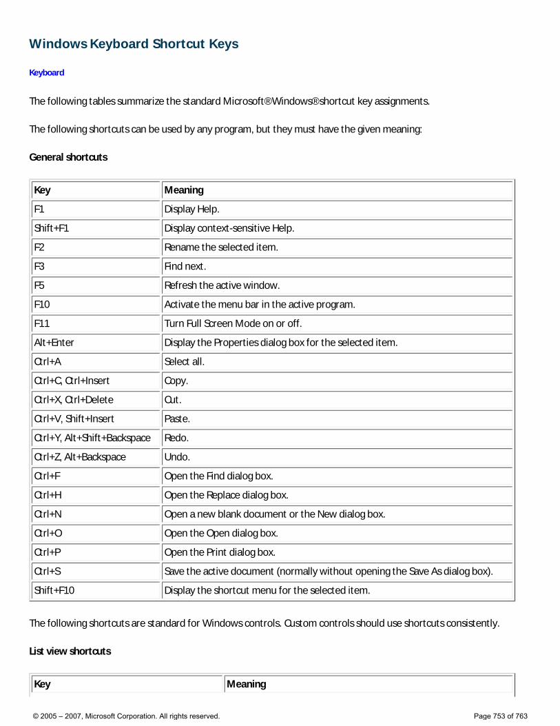
Windows Keyboard Shortcut Keys
Keyboard
The following tables summarize the standard Microsoft® Windows® shortcut key assignments.
The following shortcuts can be used by any program, but they must have the given meaning:
General shortcuts
Key Meaning
F1 Display Help.
Shift+F1 Display context-sensitive Help.
F2 Rename the selected item.
F3 Find next.
F5 Refresh the active window.
F10 Activate the menu bar in the active program.
F11 Turn Full Screen Mode on or off.
Alt+Enter Display the Properties dialog box for the selected item.
Ctrl+A Select all.
Ctrl+C, Ctrl+Insert Copy.
Ctrl+X, Ctrl+Delete Cut.
Ctrl+V, Shift+Insert Paste.
Ctrl+Y, Alt+Shift+Backspace Redo.
Ctrl+Z, Alt+Backspace Undo.
Ctrl+F Open the Find dialog box.
Ctrl+H Open the Replace dialog box.
Ctrl+N Open a new blank document or the New dialog box.
Ctrl+O Open the Open dialog box.
Ctrl+P Open the Print dialog box.
Ctrl+S Save the active document (normally without opening the Save As dialog box).
Shift+F10 Display the shortcut menu for the selected item.
The following shortcuts are standard for Windows controls. Custom controls should use shortcuts consistently.
List view shortcuts
Key Meaning
© 2005 – 2007, Microsoft Corporation. All rights reserved. Page 753 of 763
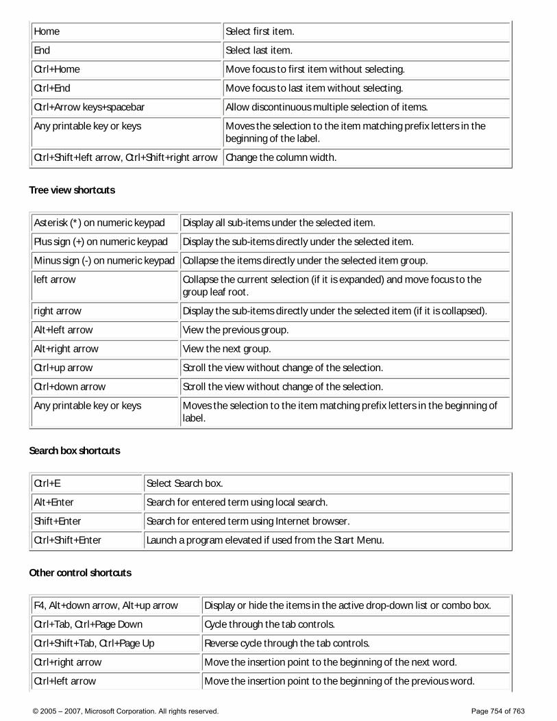
Home Select first item.
End Select last item.
Ctrl+Home Move focus to first item without selecting.
Ctrl+End Move focus to last item without selecting.
Ctrl+Arrow keys+spacebar Allow discontinuous multiple selection of items.
Any printable key or keys Moves the selection to the item matching prefix letters in the beginning of the label.
Ctrl+Shift+left arrow, Ctrl+Shift+right arrow Change the column width.
Tree view shortcuts
Asterisk (*) on numeric keypad Display all sub-items under the selected item.
Plus sign (+) on numeric keypad Display the sub-items directly under the selected item.
Minus sign (-) on numeric keypad Collapse the items directly under the selected item group.
left arrow Collapse the current selection (if it is expanded) and move focus to the group leaf root.
right arrow Display the sub-items directly under the selected item (if it is collapsed).
Alt+left arrow View the previous group.
Alt+right arrow View the next group.
Ctrl+up arrow Scroll the view without change of the selection.
Ctrl+down arrow Scroll the view without change of the selection.
Any printable key or keys Moves the selection to the item matching prefix letters in the beginning of label.
Search box shortcuts
Ctrl+E Select Search box.
Alt+Enter Search for entered term using local search.
Shift+Enter Search for entered term using Internet browser.
Ctrl+Shift+Enter Launch a program elevated if used from the Start Menu.
Other control shortcuts
F4, Alt+down arrow, Alt+up arrow Display or hide the items in the active drop-down list or combo box.
Ctrl+Tab, Ctrl+Page Down Cycle through the tab controls.
Ctrl+Shift+Tab, Ctrl+Page Up Reverse cycle through the tab controls.
Ctrl+right arrow Move the insertion point to the beginning of the next word.
Ctrl+left arrow Move the insertion point to the beginning of the previous word.
© 2005 – 2007, Microsoft Corporation. All rights reserved. Page 754 of 763
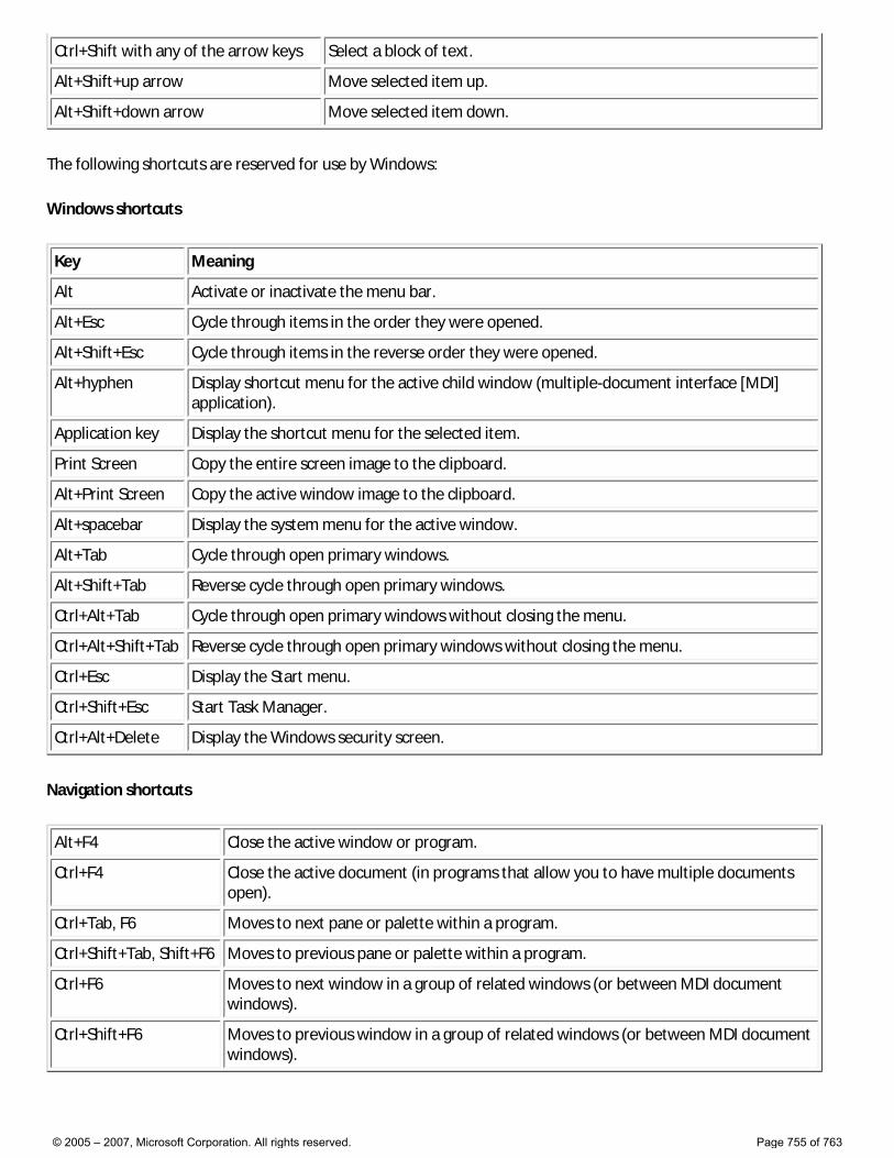
Ctrl+Shift with any of the arrow keys Select a block of text.
Alt+Shift+up arrow Move selected item up.
Alt+Shift+down arrow Move selected item down.
The following shortcuts are reserved for use by Windows:
Windows shortcuts
Key Meaning
Alt Activate or inactivate the menu bar.
Alt+Esc Cycle through items in the order they were opened.
Alt+Shift+Esc Cycle through items in the reverse order they were opened.
Alt+hyphen Display shortcut menu for the active child window (multiple-document interface [MDI] application).
Application key Display the shortcut menu for the selected item.
Print Screen Copy the entire screen image to the clipboard.
Alt+Print Screen Copy the active window image to the clipboard.
Alt+spacebar Display the system menu for the active window.
Alt+Tab Cycle through open primary windows.
Alt+Shift+Tab Reverse cycle through open primary windows.
Ctrl+Alt+Tab Cycle through open primary windows without closing the menu.
Ctrl+Alt+Shift+Tab Reverse cycle through open primary windows without closing the menu.
Ctrl+Esc Display the Start menu.
Ctrl+Shift+Esc Start Task Manager.
Ctrl+Alt+Delete Display the Windows security screen.
Navigation shortcuts
Alt+F4 Close the active window or program.
Ctrl+F4 Close the active document (in programs that allow you to have multiple documents open).
Ctrl+Tab, F6 Moves to next pane or palette within a program.
Ctrl+Shift+Tab, Shift+F6 Moves to previous pane or palette within a program.
Ctrl+F6 Moves to next window in a group of related windows (or between MDI document windows).
Ctrl+Shift+F6 Moves to previous window in a group of related windows (or between MDI document windows).
© 2005 – 2007, Microsoft Corporation. All rights reserved. Page 755 of 763
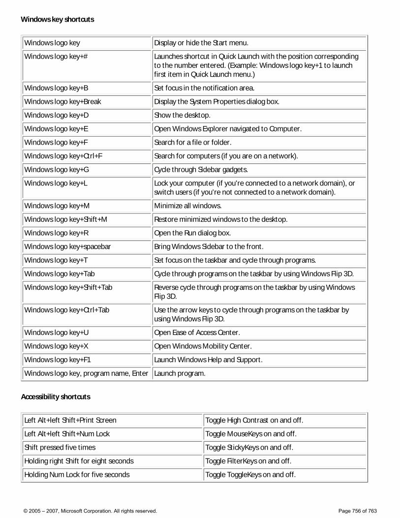
Windows key shortcuts
Windows logo key Display or hide the Start menu.
Windows logo key+# Launches shortcut in Quick Launch with the position corresponding to the number entered. (Example: Windows logo key+1 to launch first item in Quick Launch menu.)
Windows logo key+B Set focus in the notification area.
Windows logo key+Break Display the System Properties dialog box.
Windows logo key+D Show the desktop.
Windows logo key+E Open Windows Explorer navigated to Computer.
Windows logo key+F Search for a file or folder.
Windows logo key+Ctrl+F Search for computers (if you are on a network).
Windows logo key+G Cycle through Sidebar gadgets.
Windows logo key+L Lock your computer (if you're connected to a network domain), or switch users (if you're not connected to a network domain).
Windows logo key+M Minimize all windows.
Windows logo key+Shift+M Restore minimized windows to the desktop.
Windows logo key+R Open the Run dialog box.
Windows logo key+spacebar Bring Windows Sidebar to the front.
Windows logo key+T Set focus on the taskbar and cycle through programs.
Windows logo key+Tab Cycle through programs on the taskbar by using Windows Flip 3D.
Windows logo key+Shift+Tab Reverse cycle through programs on the taskbar by using Windows Flip 3D.
Windows logo key+Ctrl+Tab Use the arrow keys to cycle through programs on the taskbar by using Windows Flip 3D.
Windows logo key+U Open Ease of Access Center.
Windows logo key+X Open Windows Mobility Center.
Windows logo key+F1 Launch Windows Help and Support.
Windows logo key, program name, Enter Launch program.
Accessibility shortcuts
Left Alt+left Shift+Print Screen Toggle High Contrast on and off.
Left Alt+left Shift+Num Lock Toggle MouseKeys on and off.
Shift pressed five times Toggle StickyKeys on and off.
Holding right Shift for eight seconds Toggle FilterKeys on and off.
Holding Num Lock for five seconds Toggle ToggleKeys on and off.
© 2005 – 2007, Microsoft Corporation. All rights reserved. Page 756 of 763
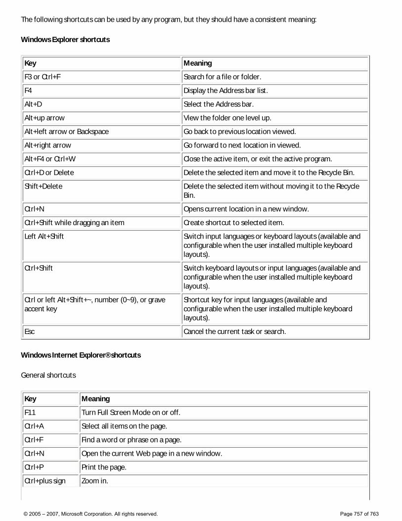
The following shortcuts can be used by any program, but they should have a consistent meaning:
Windows Explorer shortcuts
Key Meaning
F3 or Ctrl+F Search for a file or folder.
F4 Display the Address bar list.
Alt+D Select the Address bar.
Alt+up arrow View the folder one level up.
Alt+left arrow or Backspace Go back to previous location viewed.
Alt+right arrow Go forward to next location in viewed.
Alt+F4 or Ctrl+W Close the active item, or exit the active program.
Ctrl+D or Delete Delete the selected item and move it to the Recycle Bin.
Shift+Delete Delete the selected item without moving it to the Recycle Bin.
Ctrl+N Opens current location in a new window.
Ctrl+Shift while dragging an item Create shortcut to selected item.
Left Alt+Shift Switch input languages or keyboard layouts (available and configurable when the user installed multiple keyboard layouts).
Ctrl+Shift Switch keyboard layouts or input languages (available and configurable when the user installed multiple keyboard layouts).
Ctrl or left Alt+Shift+~, number (0~9), or grave accent key
Shortcut key for input languages (available and configurable when the user installed multiple keyboard layouts).
Esc Cancel the current task or search.
Windows Internet Explorer® shortcuts
General shortcuts
Key Meaning
F11 Turn Full Screen Mode on or off.
Ctrl+A Select all items on the page.
Ctrl+F Find a word or phrase on a page.
Ctrl+N Open the current Web page in a new window.
Ctrl+P Print the page.
Ctrl+plus sign Zoom in.
© 2005 – 2007, Microsoft Corporation. All rights reserved. Page 757 of 763
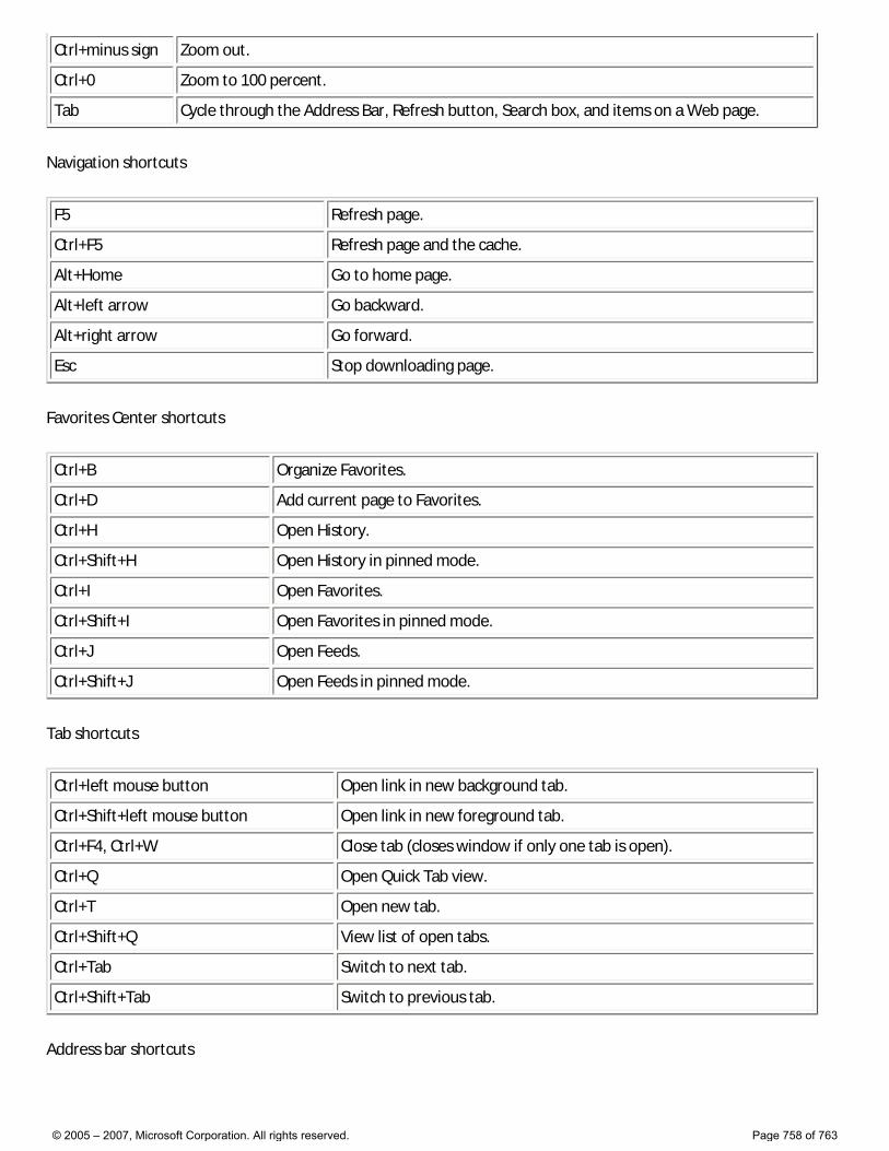
Ctrl+minus sign Zoom out.
Ctrl+0 Zoom to 100 percent.
Tab Cycle through the Address Bar, Refresh button, Search box, and items on a Web page.
Navigation shortcuts
F5 Refresh page.
Ctrl+F5 Refresh page and the cache.
Alt+Home Go to home page.
Alt+left arrow Go backward.
Alt+right arrow Go forward.
Esc Stop downloading page.
Favorites Center shortcuts
Ctrl+B Organize Favorites.
Ctrl+D Add current page to Favorites.
Ctrl+H Open History.
Ctrl+Shift+H Open History in pinned mode.
Ctrl+I Open Favorites.
Ctrl+Shift+I Open Favorites in pinned mode.
Ctrl+J Open Feeds.
Ctrl+Shift+J Open Feeds in pinned mode.
Tab shortcuts
Ctrl+left mouse button Open link in new background tab.
Ctrl+Shift+left mouse button Open link in new foreground tab.
Ctrl+F4, Ctrl+W Close tab (closes window if only one tab is open).
Ctrl+Q Open Quick Tab view.
Ctrl+T Open new tab.
Ctrl+Shift+Q View list of open tabs.
Ctrl+Tab Switch to next tab.
Ctrl+Shift+Tab Switch to previous tab.
Address bar shortcuts
© 2005 – 2007, Microsoft Corporation. All rights reserved. Page 758 of 763
F4 View list of previously typed addresses.
Alt+D Select the Address bar.
Alt+Enter Open the Web site address that is typed in the Address bar in new tab.
Ctrl+Enter Add “http://www.” to the beginning and “.com” to the end of text in Address bar.
Ctrl+Shift+Enter Add “http://www.” to the beginning and the Web site address suffix you have specified to the end of text in the Address bar.
Search bar shortcuts
Alt+Enter Open search results in new tab.
Ctrl+down arrow View list of search providers.
© 2005 – 2007, Microsoft Corporation. All rights reserved. Page 759 of 763
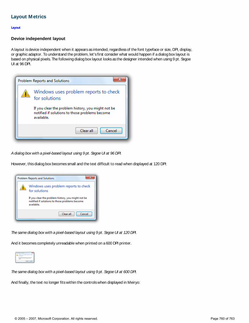
Layout Metrics
Layout
Device independent layout
A layout is device independent when it appears as intended, regardless of the font typeface or size, DPI, display, or graphic adaptor. To understand the problem, let’s first consider what would happen if a dialog box layout is based on physical pixels. The following dialog box layout looks as the designer intended when using 9 pt. Segoe UI at 96 DPI.
A dialog box with a pixel-based layout using 9 pt. Segoe UI at 96 DPI.
However, this dialog box becomes small and the text difficult to read when displayed at 120 DPI:
The same dialog box with a pixel-based layout using 9 pt. Segoe UI at 120 DPI.
And it becomes completely unreadable when printed on a 600 DPI printer.
The same dialog box with a pixel-based layout using 9 pt. Segoe UI at 600 DPI.
And finally, the text no longer fits within the controls when displayed in Meiryo:
© 2005 – 2007, Microsoft Corporation. All rights reserved. Page 760 of 763
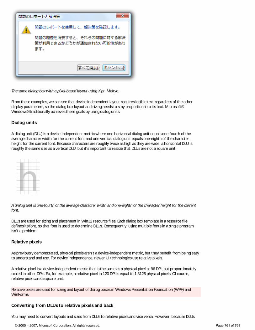
The same dialog box with a pixel-based layout using X pt. Meiryo.
From these examples, we can see that device independent layout requires legible text regardless of the other display parameters, so the dialog box layout and sizing needs to stay proportional to its text. Microsoft® Windows® traditionally achieves these goals by using dialog units.
Dialog units
A dialog unit (DLU) is a device-independent metric where one horizontal dialog unit equals one-fourth of the average character width for the current font and one vertical dialog unit equals one-eighth of the character height for the current font. Because characters are roughly twice as high as they are wide, a horizontal DLU is roughly the same size as a vertical DLU, but it’s important to realize that DLUs are not a square unit.
A dialog unit is one-fourth of the average character width and one-eighth of the character height for the current font.
DLUs are used for sizing and placement in Win32 resource files. Each dialog box template in a resource file defines its font, so that font is used to determine DLUs. Consequently, using multiple fonts in a single program isn’t a problem.
Relative pixels
As previously demonstrated, physical pixels aren’t a device-independent metric, but they benefit from being easy to understand and use. For device independence, newer UI technologies use relative pixels.
A relative pixel is a device-independent metric that is the same as a physical pixel at 96 DPI, but proportionately scaled in other DPIs. So, for example, a relative pixel in 120 DPI is equal to 1.3125 physical pixels. Of course, relative pixels are a square unit.
Relative pixels are used for sizing and layout of dialog boxes in Windows Presentation Foundation (WPF) and WinForms.
Converting from DLUs to relative pixels and back
You may need to convert layouts and sizes from DLUs to relative pixels and vice versa. However, because DLUs
© 2005 – 2007, Microsoft Corporation. All rights reserved. Page 761 of 763
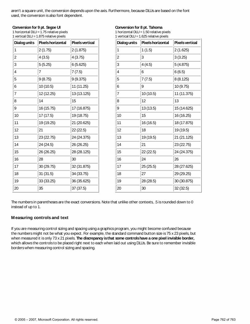
aren’t a square unit, the conversion depends upon the axis. Furthermore, because DLUs are based on the font used, the conversion is also font dependent.
Conversion for 9 pt. Segoe UI1 horizontal DLU = 1.75 relative pixels 1 vertical DLU = 1.875 relative pixels
Dialog units Pixels horizontal Pixels vertical
1 2 (1.75) 2 (1.875)
2 4 (3.5) 4 (3.75)
3 5 (5.25) 6 (5.625)
4 7 7 (7.5)
5 9 (8.75) 9 (9.375)
6 10 (10.5) 11 (11.25)
7 12 (12.25) 13 (13.125)
8 14 15
9 16 (15.75) 17 (16.875)
10 17 (17.5) 19 (18.75)
11 19 (19.25) 21 (20.625)
12 21 22 (22.5)
13 23 (22.75) 24 (24.375)
14 24 (24.5) 26 (26.25)
15 26 (26.25) 28 (28.125)
16 28 30
17 30 (29.75) 32 (31.875)
18 31 (31.5) 34 (33.75)
19 33 (33.25) 36 (35.625)
20 35 37 (37.5)
Conversion for 8 pt. Tahoma1 horizontal DLU = 1.50 relative pixels 1 vertical DLU = 1.625 relative pixels
Dialog units Pixels horizontal Pixels vertical
1 1 (1.5) 2 (1.625)
2 3 3 (3.25)
3 4 (4.5) 5 (4.875)
4 6 6 (6.5)
5 7 (7.5) 8 (8.125)
6 9 10 (9.75)
7 10 (10.5) 11 (11.375)
8 12 13
9 13 (13.5) 15 (14.625)
10 15 16 (16.25)
11 16 (16.5) 18 (17.875)
12 18 19 (19.5)
13 19 (19.5) 21 (21.125)
14 21 23 (22.75)
15 22 (22.5) 24 (24.375)
16 24 26
17 25 (25.5) 28 (27.625)
18 27 29 (29.25)
19 28 (28.5) 30 (30.875)
20 30 32 (32.5)
The numbers in parentheses are the exact conversions. Note that unlike other contexts, .5 is rounded down to 0 instead of up to 1.
Measuring controls and text
If you are measuring control sizing and spacing using a graphics program, you might become confused because the numbers might not be what you expect. For example, the standard command button size is 75 x 23 pixels, but when measured it is only 73 x 21 pixels. The discrepancy is that some controls have a one pixel invisible border, which allows the controls to be placed right next to each when laid out using DLUs. Be sure to remember invisible borders when measuring control sizing and spacing.
© 2005 – 2007, Microsoft Corporation. All rights reserved. Page 762 of 763
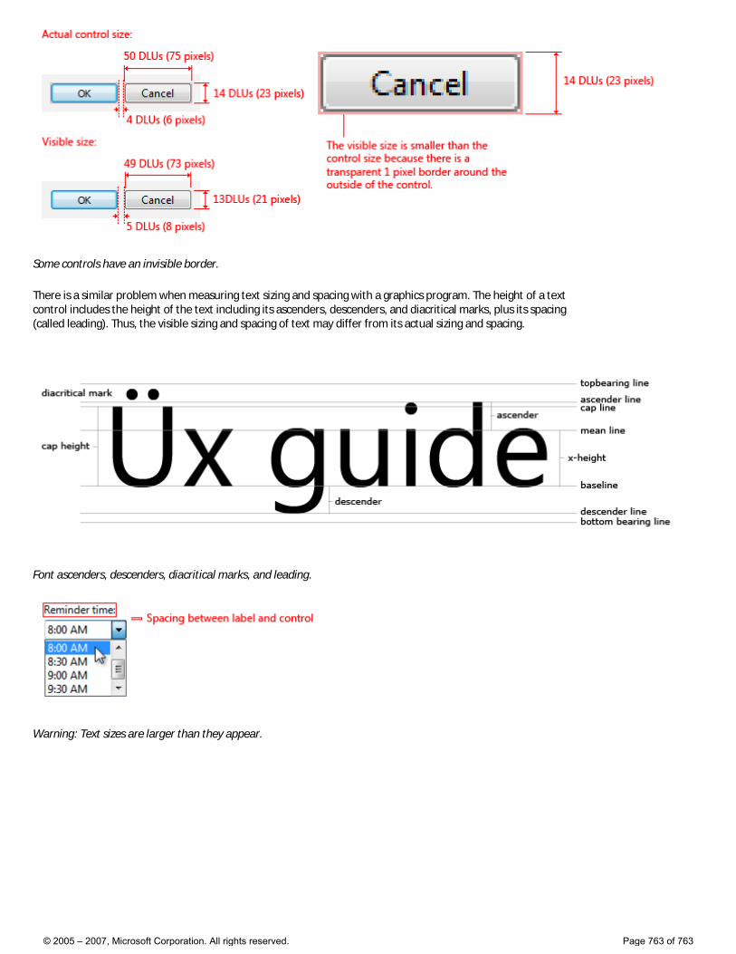
Some controls have an invisible border.
There is a similar problem when measuring text sizing and spacing with a graphics program. The height of a text control includes the height of the text including its ascenders, descenders, and diacritical marks, plus its spacing (called leading). Thus, the visible sizing and spacing of text may differ from its actual sizing and spacing.
Font ascenders, descenders, diacritical marks, and leading.
Warning: Text sizes are larger than they appear.
© 2005 – 2007, Microsoft Corporation. All rights reserved. Page 763 of 763