writing about architecture
DESCRIPTION
Extraordinary architecture addresses so much more than mere practical considerations. It inspires and provokes while creating a seamless experience of the physical world for its users. It is the rare writer that can frame the discussion of a building in a way that allows the reader to see it with new eyes. Writing About Architecture is a handbook on writing effectively and critically about buildings and cities. Each chapter opens with a reprint of a significant essay written by a renowned architecture critic, followed by a close reading and discussion of the writer's strategies. Lange offers her own analysis using contemporary examples as well as a checklist of questions at the end of each chapter to help guide the writer.TRANSCRIPT
W r i t i n g
A b o u t
A r c h i t e c t u r e
m A s t e r i n g t h e l A n g u A g e o F b u i l D i n g s A n D c i t i e s
Alexandra Lange
With photographs by Jeremy M. Lange
P r i n c e t o n A r c h i t e c t u r A l P r e s s , n e W y o r K
P u b l i s h e D b y
P r i n c e t o n A r c h i t e c t u r A l P r e s s
3 7 e A s t s e v e n t h s t r e e t
n e W y o r K , n e W y o r K 1 0 0 0 3
F o r A F r e e c At A l o g o F b o o K s , c A l l
1 - 8 0 0 - 7 2 2 - 6 6 5 7 . v i s i t o u r W e b s i t e At
W W W . P A P r e s s . c o m .
© 2 0 1 2 A l e x A n D r A l A n g e
A l l r i g h t s r e s e r v e D
P r i n t e D A n D b o u n D i n c h i n A
1 5 1 4 1 3 1 2 4 3 2 1 F i r s t e D i t i o n
n o P A r t o F t h i s b o o K m Ay b e u s e D
o r r e P r o D u c e D i n A n y m A n n e r
W i t h o u t W r i t t e n P e r m i s s i o n F r o m
t h e P u b l i s h e r , e x c e P t i n t h e c o n t e x t
o F r e v i e W s .
e v e r y r e A s o n A b l e At t e m P t h A s
b e e n m A D e t o i D e n t i F y o W n e r s o F
c o P y r i g h t. e r r o r s o r o m i s s i o n s W i l l
b e c o r r e c t e D i n s u b s e q u e n t e D i t i o n s .
A l l i m A g e s © J e r e m y m . l A n g e
excePt PAge 44 © FreestocKPhotos.es.
P A g e s 2 1 – 2 8 . “ h o u s e o F g l A s s ”
r e P r i n t e D b y P e r m i s s i o n o F t h e
g i n A m A c c o b y l i t e r A r y A g e n c y.
c o P y r i g h t © 1 9 5 2 b y e l i z A b e t h m .
m o r s s A n D J A m e s g . m o r s s . t h i s
e s s Ay W A s F i r s t P u b l i s h e D i n t h e
N e w Y o r k e r .
P A g e s 1 4 7 – 5 8 . F r o m T h e D e aT h a N D
L i f e o f G r e aT a m e r i c a N c i T i e s b y J A n e
J A c o b s , c o P y r i g h t © 1 9 6 1 , 1 9 8 9 b y
J A n e J A c o b s . u s e D b y P e r m i s s i o n o F
r A n D o m h o u s e , i n c .
e D i t o r : l i n D A l e e
D e s i g n e r : D e b W o o D
s P e c i A l t h A n K s t o : b r e e A n n e
A P P e r l e y, s A r A b A D e r , n i c K b e At t y,
n i c o l A b e D n A r e K b r o W e r , J A n e t
b e h n i n g , F A n n i e b u s h i n , m e g A n
c A r e y, c A r i n A c h A , r u s s e l l
F e r n A n D e z , J A n h A u x , D i A n e
l e v i n s o n , J e n n i F e r l i P P e r t, g i n A
m o r r o W , J o h n m y e r s , K At h A r i n e
m y e r s , m A r g A r e t r o g A l s K i , D A n
s i m o n , A n D r e W s t e P A n i A n , P A u l
W A g n e r , A n D J o s e P h W e s t o n o F
P r i n c e t o n A r c h i t e c t u r A l P r e s s
— K e v i n c . l i P P e r t, P u b l i s h e r
l i b r A r y o F c o n g r e s s c At A l o g i n g - i n -
P u b l i c At i o n D At A
l A n g e , A l e x A n D r A .
W r i t i n g A b o u t A r c h i t e c t u r e :
m A s t e r i n g t h e l A n g u A g e o F
b u i l D i n g s A n D c i t i e s / A l e x A n D r A
l A n g e ; W i t h P h o t o g r A P h s b y J e r e m y
m . l A n g e . — 1 s t e D .
P. c m . — ( A r c h i t e c t u r e b r i e F
s e r i e s )
i s b n 9 7 8 - 1 - 6 1 6 8 9 - 0 5 3 - 7 ( P b K . : A l K .
P A P e r )
1 . A r c h i t e c t u r A l c r i t i c i s m . i .
l A n g e , J e r e m y m . i i . t i t l e . i i i .
t i t l e : m A s t e r i n g t h e l A n g u A g e o F
b u i l D i n g s A n D c i t i e s .
n A 2 5 9 9 . 5 . l 3 6 2 0 1 2
7 2 0 . 1 — D c 2 3
2 0 1 1 0 3 2 7 5 0
i n t r o D u c t i o n : h o W t o b e A n A r c h i t e c t u r e c r i t i c 7
c h A P t e r 1 : s K y s c r A P e r s l e W i s m u m F o r D : “ h o u s e o F g l A s s ” 2 1
Skyscrapers as Superlatives 2 9
c h A P t e r 2 : m u s e u m s h e r b e r t m u s c h A m P : “ t h e m i r A c l e i n b i l b A o ” 4 5
What Should A Museum Be? 5 8
c h A P t e r 3 : l A n D m A r K s m i c h A e l s o r K i n : “ s A v e t h e W h i t n e y ” 7 1
What’s Worth Preserving 7 7
c h A P t e r 4 : m o n u m e n t s c h A r l e s W . m o o r e : “ y o u h A v e t o P Ay F o r
t h e P u b l i c l i F e ” [ e x c e r P t ] 9 3
Searching for a Center 1 0 5
c h A P t e r 5 : P A r K s F r e D e r i c K l A W o l m s t e D : “ P u b l i c P A r K s A n D
t h e e n l A r g e m e n t o F t o W n s ” [ e x c e r P t ] 1 2 1
Landscape is More Than a Lawn 1 3 4
c h A P t e r 6 : c i t i e s J A n e J A c o b s : t h e D e At h A n D l i F e o F g r e At
A m e r i c A n c i t i e s [ e x c e r P t ] 1 4 7
Criticism from the Ground Up 1 5 9
c o n c l u s i o n : m o r e t h A n o n e W Ay t o s K i n A b u i l D i n g 1 7 5
A c K n o W l e D g m e n t s 1 8 1
i m A g e K e y 1 8 3
s o u r c e s 1 8 7
i n D e x 1 9 2

House of GlassL e w i s M u M f o r d
New Yorker, AuGust 8, 1952
For a long time after Lever House opened its doors, throngs of people,
waiting patiently in great queues in the lobby, demanded admission so
insistently that the elevator system, designed to handle only Lever Broth ers’
office staff of twelve hundred employees and a normal complement of
visitors, was severely over taxed. People acted as if this was the eighth
wonder of the world, this house of glass approached through an open
forecourt that is paneled with glistening mar ble, punctuated by columns
encased in stainless steel, and embellished by a vast bed of flowers and—last
touch of elegance against the greenish-blue windows and the bluish-green
spandrels of the glassy building that rises above it—a weeping-willow tree.
in many ways, this popular curiosity, which in a sense is also popular
judgment, is justified. Lever House is a building of outstanding qualities,
mechani cal, aesthetic, human, and it breaks with traditional office buildings
in two remarkable respects—it has been designed not for maximum rentability
but for maximum efficiency in the dispatch of business, and it has used to the
full all the means now available for making a building comfortable, gracious,
and hand some. This whole structure is chastely free of adver tisement; the
minuscule glass cases showing life-size packages of Lever products in the
glass-enclosed re ception chamber on the ground floor would hardly be
noticed in the lobby of a good hotel. But the building itself is a showcase
and an advertisement; in its very avoidance of vulgar forms of publicity, it
has become one of the most valuable pieces of advertising a big commercial
21
pAGe 34
pAGe 35

L e w i s M u M f o r d22
enterprise could conceive. For years, busi nessmen vied with each other in
the attempt to put up the tallest building in the city; thus the Metropolitan
Life capped the Singer and the Empire State capped the Chrysler in the
effort to make the sky the limit. In keeping with this now deplorably old-
fashioned spirit, there have lately been rumors of a hundred-story sky scraper.
Possibly Lever House has pointed the way for a new kind of competition—a
competition to provide open spaces and a return to the human scale. At
all events, it is definitely not an example of the “swagger ing in specious
dimensions” that [German historian and philosopher] oswald spengler called a
sign of a decadent civilization.
To understand what the architects of Lever House—skidmore, owings
& Merrill, whose Gordon Bunshaft was chief designer—have achieved, one
must go back to some of the buildings put up on midtown Madison Avenue
in the early ‘twenties. They are only twelve stories high, without setbacks, and
they cover the entire site, providing not so much as an air shaft in the center.
But though they have resulted in a heav ier density of population than a wise
zoning law would permit, they are immensely superior to the extravagant
thirty- and forty-story buildings that followed them. so valuable have these
older ones proved that one of them, 383 and 385 Madison Avenue, has now
been completely renovated and given new elevators, an air-conditioning
system, and numerous other embellish ments at a cost as great as that of the
building itself. Lever House returns to the more modest density achieved in
this twelve-story structure. By not quite doubling that number of floors in the
main part of their building, however, the architects of Lever House have been
able to house those twelve hundred em ployees comfortably while providing
an unusual amount of open space that is secure against encroach ment. for
the main structure, though it runs the cross-town length of the site and abuts
the structure next door on the west, is set back a hundred feet from the south
building line and forty from the north and has the generous width of Park
Avenue to the east. The result of this self-discipline is that this shaft, or “slab,”
which is less than sixty feet wide, is open to the light on three sides, and few
desks are more than twenty-five feet from the continuous windows. even
the least-favored worker on the premises may enjoy the psy chological lift of
pAGe 35

H o u s e o f G L A s s 23
raising her eyes to the clouds or the skyscape of not too near-at-hand adjoining
buildings. i know no other private or public edifice in the city that provides
space of such quality for every worker.
The layout of this building is itself transparent. The tall, narrow,
oblong slab, which houses the firm’s offices, is set off-center on a roughly
square pedestal, only two stories high, that covers the whole plot, the western
block front along Park Avenue between fifty-third and fifty-fourth. This
irregularly shaped site runs a hundred and fifty-five feet west on fifty-third and
a hundred and ninety feet west on fifty-fourth. The pedestal is a hollow one,
for there is a court open to the sky in the middle of it, just to the south of the
slab. To the north of the court, on the ground floor, is the glass-walled main
lobby, and to the west of the court are an auditorium and a kitchen laboratory.
The court, and the lobby, can be reached from almost any direction, for the
ground floor is completely open on three sides—north, south, and east—to the
streets; there is no vestige of wall, or even of shop-front win dow, to shut out
the passer-by. The second floor con tains, among other things, an employees’
lounge, hand somely done in dark green and mustard yellow, and a spacious
room that houses the stenographers’ pool. The third story, the beginning of
the slab, contains a kitchen and cafeteria, which can feed all hands in two
and a half hours; this dining room, with its reddish-brown drapes and modern
furniture, is able to hold its own in elegance with any restaurant on Park
Avenue, and it has something that no restaurant in the city has offered since
the old beer gardens disappeared—a thickly planted open-air roof garden that
flanks it (and, of course, the slab) on both north and south. if it weren’t for its
almost hepatic sound, the word “Leverish” might well take the place of “ritzy”
as a syno nym for the last word in luxury. This floor of the slab is indented a
whole bay along the Park Avenue side, so the rest of the slab seems to hover
over the base of the structure. The indentation permits the bed of plants that
borders the roof garden to be carried with out interruption along this entire
frontage of the building. unfortunately, the bay is not deep enough to per mit
people as well as plants to make this journey from south to north. Thus no one
can take a full turn on the roof-garden deck, and the architects’ sacrifice of
free promenade space to the unbroken bed of greenery must be set down as a
pAGe 36

L e w i s M u M f o r d24
piece of empty formalism—all the worse aesthetically because the movement
of peo ple across the front of the building would have given an extra touch of
life to a somewhat glacial, if not oversimplified, composition. This seems to me
a blem ish, but it is not beyond remedy.
The office building proper ends with the execu tives’ offices, on the
twenty-first floor. Above them are three floors, outwardly punctuated by the
horizontal louvers of the air intakes, behind which are the ele vator machinery
and a cooling tank. All this is sur rounded by a shell strong enough to support
the elabo rate machine that moves around the perimeter of the roof to
raise and lower the window cleaners’ platform. This piece of apparatus was
necessitated by the fact that the entire slab, windows and spandrels alike, is—
except, as has already been pointed out, on the west side—sheathed in glass,
and the windows are all sealed. The windows are four and a half feet wide, and
even the smallest private office has two of them. For a company whose main
products are soap and deter gents, that little handicap of the sealed windows is
a heaven-sent opportunity, for what could better drama tize its business than a
squad of cleaners operating in their chariot, like the deus ex machina of Greek
trag edy, and capturing the eye of the passer-by as they per form their daily
duties? This perfect bit of symbolism alone almost justifies the all-glass facade.
The slab is the traditional steel-framed skyscraper, with one or two
special features. The outer columns are set back a little from the outer walls,
so the win dows are a continuous glassy envelope, and the me chanical core of
the building—the passenger elevators, the conveyor that delivers outgoing
mail to the postal department and incoming mail to the proper floors, the coat
racks for the office force, the fire stairs—is con centrated in the west end of the
slab. if necessary, therefore, a wing could be built south from this end, parallel
to Park Avenue, without taking away any day light from the existing working
quarters. The only opaque feature in this house of glass is that demanded
by prudence and the fire ordinances of New York—the fire stairs, which are
enclosed in a shaft of light-gray brick at the west side of the site and connected
with the slab by open passages at each floor level. At the base of the fire tower
is the entrance to the fifty-five-car underground garage for the staff.
Aesthetically, the exterior of this building has a sober elegance; the
stainless-steel window frames and spandrel frames are repeated without
pAGe 37
H o u s e o f G L A s s 25
variation over the whole facade. The darker bands of the spandrels give
horizontal emphasis, while the gleam of the ver tical metal framing, sometimes
reinforced by the col umns behind, provides a delicate counterpoise. The
effect is of alternating bands of dark-green and light-green glass, and, as is
true of all glass buildings, this surface looks far darker than it would if an
opaque covering, such as white brick, had been used. Paradoxically, a whole
city of such buildings, so open to light, would be somber, since a transparent
glass wall is mostly light-absorbing, not light-reflecting. when the framing
of Lever House was put up, it was pro tected by a coating of brilliant chrome-
yellow paint, and though the cost of maintaining this brilliance might have
been prohibitive, that chrome yellow, playing against the green, would have
given the building a gaiety it lacks. Standing by itself, reflect ing the nearby
buildings in its mirror surface, Lever House presents a startling contrast to the
old-fashioned buildings of Park Avenue. But if its plan ning innovations prove
sound, it may become just one unit in a repeating pattern of buildings and
open spaces.
The uniformity and the severity of the exterior glass-and-metal envelope do
not characterize the interior of the building, for in its decoration this severity
has been richly humanized. This decor was designed and executed by raymond
Loewy Associates. Just as a sensible farmer designs his cow stalls around his
cow, the fundamental unit around which Lever House’s hundred and thirty
thousand square feet of floor space was designed was the desk. The desks in
the working quarters are of adjustable height and have rounded corners, to
reduce the number of nylon snags. To offset the bluish light from the exterior,
a grayish beige was chosen as the basic color for desks and floors. (even the
elevator boys are dressed in dark beige.) But against that background a great
va riety of colors has been introduced. each floor has its own color scheme, from
brisk yellows and delicate blues to a combination—on the floor devoted to the
firm’s cosmetics—of boudoir pink and eyeshadow lavender. i don’t know any
other building in the city in which so much color has been used with such skill
and charm over such a large area. Both our school architects and our equally
timid hospital ar chitects have something to learn from this.
pAGe 35
pAGe 37

L e w i s M u M f o r d26
There is only one dismal flaw in the excellence of the interior
decoration; this occurs on the topmost floor, sacred to the chief executives.
Here nothing has been spared to achieve an air of expensiveness, and as a
result nothing more stuffy and depressing could be imagined. Instead of the
clean, shapely clocks that tell the time on the lower floors, there is a fussy,
ornamented clock, set in a frame of golden rays; instead of bright-colored
hangings and cover ings, a drab plushiness, doubtless intended to symbol ize
solidity, power, and wealth, has the effect of expressing timidity and the spirit
of retreat—in con trast to the forthright confidence and gaiety of the rest of
the building. Why this descent from the era of stainless steel and glass to the
nether regions of the Brown Decades? is this a last desperate gesture toward
the good old days, when income and corpora tion taxes and unemployment
insurance and welfare plans did not exist? The clean logic of the whole
building is denied by this executives’ floor. The way to symbolize leadership and
responsibility is not to give executives a duller kind of decoration than their
subordinates but to give them precisely the same kind, if on a more generous
scale of space.
Because Lever House has many points in common with the united
Nations secretariat, it is inevitable that the buildings should be compared. on
almost every point, it seems to me, Lever House is superior. To begin with, it is
correctly oriented, with its wide facades facing north and south, and though
this means that no direct sunlight ever enters the north ern windows, it also
means that there is no need to cut light and view on that side by drawing
Venetian blinds. since there are three air-conditioning systems—for the north
side, the south side, and the middle—in the winter, warm air can be introduced
on the cool side of the building while cooler air is circulated on the sunny side.
The united Nations cafeteria for employees is good, but the one in Lever House
ranks with the quarters provided not for the u.N. staff but for the executives
and delegates. And there is no open space around the secretariat that
compares in charm and comfort with Lever House’s courtyard and roof garden,
enclosed as these are on two sides.
few of the features that make Lever House supe rior are the result of
its having a more generous budget to draw on. Though they are superficially
pAGe 37

H o u s e o f G L A s s 27
similar, one may say of these buildings that the united Nations is the last of
the old-fashioned sky scrapers, in which importance was symbolized by height,
while Lever House is the first of the new of fice buildings, in which the human
needs and purposes modify cold calculations of profit and nullify any urge to
tower above rival buildings. in Lever House, quality of space takes precedence
over mere quantity.
The building that Lever House really invites com parison with is quite a
different structure, though equally bold and even more striking architecturally
in its own day—frank Lloyd wright’s now demol ished Larkin Building, in
Buffalo, the paragon of of fice buildings at the time, though set in the midst
of an industrial slum it never succeeded in dominating or even modifying. it,
too, was a by-product of the soap industry. in that building, as in this one,
every possible innovation was made—new desks, new chairs, new office
equipment of every kind, all of it specially designed. The Larkin Building was
a shal low structure, built about a great skylighted interior court, with natural
light coming down through the roof. wright’s creation was a masterpiece of
beautiful masonry—more monumental, in fact, than most public buildings,
whether churches or city halls, that have sought to be. Lever House lacks the
massive sculp tural qualities of wright’s inspired masonry; it is, rather, in its
proud transparency, “a construction in space.” it says all that can be said,
delicately, accu rately, elegantly, with surfaces of glass, with ribs of steel, with
an occasional contrast in slabs of marble or in beds of growing plants, but its
special virtues are most visible not in the envelope but in the interior that this
envelope brings into existence, in which light and space and color constitute
both form and decora tion. in terms of what it set out to do, this building—
excluding the deplorable executives’ floor and the wall encrusted with golden
mosaic that faces one in approaching the elevators on the ground floor—is an
impeccable achievement. Lever Brothers and skidmore, owings & Merrill, and
above all Gordon Bunshaft, are entitled to a civic vote of thanks for taking
this important step toward sane planning and building. Lever House is not,
of course, the first all-glass build ing; the famous Crystal Palace, and the more
recent daily express Building, on fleet street, in London, antedate it. But it
is the first office building in which modern materials, modern construction,
L e w i s M u M f o r d28
modern functions have been combined with a modern plan. in a sense, it picks
up the thread where the architects of the Monadnock Building in Chicago, the
last of the ail-masonry skyscrapers, dropped it two generations ago.
on the surface, this seems about the best that cur rent architecture
can provide when limitations of cost do not, in any substantial way, enter into
the picture. it will be a little while before one can make a final appraisal of
this building; that will depend partly upon how comfortable the quarters have
been in the summer and how expensive it has been to keep them comfortable,
likewise on how satisfactory this building will be in very cold weather. it is a
show place and an advertisement, and costs that can here be written off to
publicity might prove too high for more workaday business quarters. Though
the uni form facade of Lever House is aesthetically consist ent, a different
system of fenestration on the south side, with or without sun screens, might
not merely produce better summer temperatures within but might also reduce
the need for shutting off the view with Venetian blinds, a necessity that
makes non sense of the windows. it may be, too, that a more flex ible system
of ventilation, which depended more frequently on untreated air and would
use air-condi tioning only to counteract extreme temperatures, would prove
more satisfactory as well as cheaper. And in that event Lever House’s closed-
in glass face, along with its amusing window-cleaning apparatus, could be
discarded in newer designs. surely no building so open to the direct rays of
the sun—particularly the valuable ultraviolet rays of morning—should nullify
that advantage by “windows” that do not let these rays in. But Lever House,
by reason of the internal con sistency in its design, is at the very least a highly
use ful experiment. Fragile, exquisite, undaunted by the threat of being melted
into a puddle by an atomic bomb, this building is a laughing refutation of
“im perialist warmongering,” and so it becomes an implicit symbol of hope for
a peaceful world. In the kind of quarters it provides for its staff, Lever House
even anticipates the “Century of the Common Man.” I don’t know whether
that is what the corporation had in mind when it built this structure, but that,
it seems to me, is what Lever House itself says.
pAGe 38
29
C H A P T e r 1
SkyScr aperS aS Superl at iveS
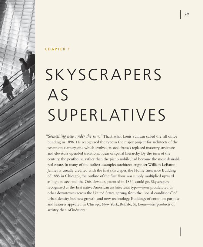
“Something new under the sun.” that’s what Louis sullivan called the tall office building in 1896. He recognized the type as the major project for architects of the twentieth century, one which evolved as steel frames replaced masonry structure and elevators upended traditional ideas of spatial hierarchy. By the turn of the century, the penthouse, rather than the piano nobile, had become the most desirable real estate. In many of the earliest examples (architect-engineer William LeBaron Jenney is usually credited with the first skyscraper, the Home Insurance Building of 1885 in Chicago), the outline of the first floor was simply multiplied upward as high as steel and the Otis elevator, patented in 1854, could go. skyscrapers—recognized as the first native American architectural type—soon proliferated in other downtowns across the united states, sprung from the “social conditions” of urban density, business growth, and new technology. Buildings of common purpose and features appeared in Chicago, New York, Buffalo, st. Louis—less products of artistry than of industry.
A L e x A N d r A L A N G e30
From the beginning the skyscraper was defined by superlatives. As business propositions each building had to sell itself to prospective tenants in the language of advertising: the type was new, but each speculative tower was the newest, the tallest, the largest. As the number of skyscrapers increased, the means of distinguishing one from the next also needed to grow in an arms race to garner publicity and appeal to the best tenants. By the turn of the century, and the publication of Louis sullivan’s essay “the tall Office Building Artistically Considered” (1896), that arms race needed to add “most beautiful” to the arsenal. sullivan saw that square footage was no longer enough and cities were suffering from blocks put up merely to achieve real-estate goals. He was one of the first to identify what could make one skyscraper aesthetically superior to the next and in doing so created a basic checklist for any criticism (beyond price) of the type. Mumford’s “House of Glass” did the same for the first important innovation for American skyscrapers since 1896: the curtain wall, which swept aside historical ornament and traditional layout with glass and open-plan offices, respectively.
today the competition of superlatives continues. the primary focus of this chapter is “House of Glass,” longtime New Yorker architecture critic Lewis Mumford’s 1952 review of Lever House, the first all-glass skyscraper built in New York City after World War II. But the larger lesson is the continuity in criticism, from 1896 to the present day, of the search for something new in architecture via the skyscraper. sullivan anatomized the parts of the tall office building, showing us the structure beneath the stone or glass or metal skins. Mumford shows us how Lever House rewrites those rules, setting a different sort of standard than the race for the sky epitomized by the Chrysler and empire state buildings. sullivan’s ideal skyscrapers are freestanding sculptures, while Mumford’s have to work on specific sites, offer public open spaces and daylit offices, and be symbols of American optimism. so powerful was Lever’s example that when, in 2006, the Hearst tower by Foster + partners opened on eighth Avenue in New York City, paul Goldberger harked back to a descendent of Lever House to amplify his praise in “triangulation” (New Yorker, December 19, 2005). Hearst also offered an open base, a brand-new transparent facade, and a new beginning after a wounding event (the destruction of the World trade Center on september 11, 2001). But it also added the latest –est: greenest.
s k Y s C r A P e r s A s s u P e r L AT i V e s 31
superlatives are the theme of this chapter—tallest, friendliest, greenest—illustrating the importance of choosing a stance as well as a subject. In analyzing Mumford’s review, I discuss his organization and the path of the sidewalk critic. Finally, in the contrast between the prose of sullivan, Mumford, and Goldberger—the words they use, the emphasis they give to the architect and to other buildings—there is a clear differentiation in approach to the whole matter of architectural criticism.
Among the first to write about the cultural meaning of the skyscraper was sullivan, in his justly famous “the tall Office Building Artistically Considered.” sullivan wrote from the perspective of a designer, having completed two short, almost-cubic buildings, in Buffalo and st. Louis, that then qualified as skyscrapers: “problem: How shall we impart to this sterile pile, this crude, harsh, brutal agglomeration, this stark, staring exclamation of eternal strife, the graciousness of those higher forms of sensibility and culture that rest on the lower and fiercer passions?”
His question has still not been entirely answered. since sullivan the advances of technology and commerce have pushed the inventiveness of architects onward and upward, with the balance between crudity and sensibility always changing. Races to the top occurred in 1931, when the brutal empire state Building topped the elegant Chrysler Building; in 1974 when the agglomerative sears tower topped the stark World trade Center; and, the timeline speeding up, the petronas towers in 1998 in Kuala Lumpur, taipei 101 in 2004, the shanghai World Financial Center in 2008, and the Burj Khalifa in 2010 in Dubai. even as sullivan defined the tall office building by its height, he sought means to make it speak visually of its function and to create a replicable, recognizable framework for its form. What’s particularly interesting about this essay is sullivan’s struggle to find a language for the skyscraper both as a critic and as an architect.
sullivan was motivated by the belief that architects follow rather than lead. the process of building towers was driven, then as it is now, by speculators (developers), engineers, and builders—the architect asked to dress a box created by others. sullivan wanted architects to take control of the process, creating integrated works of art rather than applying a wallpaper of outdated architectural styles.
A L e x A N d r A L A N G e32
previous types, like churches, courthouses, schools, and palaces, had developed distinct architectural language over centuries. In a new town, the building with a bell tower was always a church; the building with columns, the town hall (or the post office). It was a grammar with which most were familiar.
skyscrapers threw that grammar into confusion. Were the new buildings “cathedrals of commerce” that should be clad in Gothic ornament? If they included banks, should they take on the prominent colonnades? Or were they more like industrial plants, space enclosed cheaply and with minimal decoration? What was (and is) the essence of the skyscraper as a type? the answer to sullivan was immediately obvious: “It is lofty. this loftiness is to the artist-nature its thrilling aspect. It is the very open organ-tone in its appeal. It must be in turn the dominant chord in the expression of it, the true excitant of his imagination. It must be tall, every inch of it tall.”
sullivan could have stopped right there. this idea of tallness was, in 1896, something new. the first skyscrapers were not tall, in reality or in concept. Jenney’s Home Insurance Building, for example, is divided horizontally into a grid of one- to three-story sections, each one resembling a small, solid, and vaguely classical office building of old. this was precisely, in sullivan’s view, what a tall office building should not look like, as they were not meant to be a display of all previous architectural knowledge: “A sixteen story building must not consist of sixteen separate, distinct and unrelated buildings piled one upon the other until the top of the pile is reached.” sullivan’s own earlier designs, the Wainwright Building (1891) in st. Louis and the Guaranty Building (1895) in Buffalo, verge on tallness. the body of the Guaranty Building, above the first two commercial floors, is striated with vertical terra-cotta mullions set in front of the horizontal spandrels below the windows. these strips emphasize the height of the building and end in a series of graceful arches just below the building’s heavy cap. to the contemporary eye, this cap robs the building of upward momentum.
Looking at skyscraper examples of the previous thirty years, sullivan examines them for signs of a common language. He finds that every building has a basement, unseen and below ground, containing boilers, the steam plant, and other building systems. Above that, a first floor with an entrance for all tenants, made

s k Y s C r A P e r s A s s u P e r L AT i V e s 33
attractive with a large opening and public access to stores and banks. Above that “an indefinite number of offices piled tier upon tier, one tier just like another tier, one office just like all the other offices.” sullivan’s revelation of the replicability of the office floors—that they did not need to be distinguished one from another—is one of the most modern insights in his essay. the idea of the sameness of the program of most floors of office buildings, expressed in his design for Guaranty, was interpreted over and over during the twentieth century—from the sheer glass walls of Mies van der Rohe’s slabs to the saw-toothed diagrid of Hearst tower. Atop these innumerable floors of office cells was the attic, a space occupied with the mechanics of heating, cooling, and lighting. Because the attic is visible, however, sullivan gave it symbolic weight, broadness, prominence in order to say “that the series of office tiers has come definitely to an end.” He adds that from these programmatic divisions “results, naturally, spontaneously, unwittingly, a three-part division, not from any theory, symbol, or fancied logic.”
earlier in the essay, sullivan pointed out a number of theories others had applied to the skyscraper: it should be treated as a column, divided into base, shaft, and capital; it should be treated as a logical statement, with beginning, middle, and end; it should be treated as a mystical symbol that always come in threes (for example, morning, noon, night). that trees, the basis for any organic design, are divided into roots, trunk, and limbs. (In 1931, sullivan’s protégé Frank Lloyd Wright would design a skyscraper based structurally on a tree, with a long taproot, a pinwheeling shaft of identical apartments, and flaring top foliage.) But to sullivan these philosophical explanations are unnecessary: “All things in nature have a shape, that is to say, a form, an outward semblance, that tells them what they are, that distinguishes them from ourselves and from each other. unfailing in nature these shapes express the inner life, the native quality of animal, tree, bird, fish, that they present to us; they are so characteristic, so recognizable, that we say, simply, it is ‘natural’ it should be so.” For sullivan the same is true of the building and his utilitarian diagram is enough of an underpinning for art. He writes, in words that would be echoed by modern architects in the century to come: “Form ever follows function.” sullivan provided the basic template by which all subsequent skyscrapers would need to be evaluated. When you critique a skyscraper today, you could

A L e x A N d r A L A N G e34
do much worse than to ask sullivan’s questions: Is it tall? Does it differentiate its functions visually? Does it have an inner life, a personality, character? the answers to these questions help to zero in on a theme, what’s special to know and discuss about your particular skyscraper.
While sullivan sits at his drafting board, Mumford stands across the street from the building. He has no tools beyond his eyes, no access beyond that of the interested citizen. What is important to Mumford is what is important to his readers: What does it look like? How does it introduce itself? What does it mean? sullivan’s essay on the skyscraper sets up a checklist for the architect; Mumford puts that checklist into practice. His review discusses the building from lobby to top, its presence on the skyline and its presence on the street, but he adds the element of physical experience. the skyscraper for Mumford is not a piece of sculpture but part of the urban organism, changing pedestrian patterns, changing the weather on a given street, changing the way a city sees itself.
Mumford’s approach was self-invented, just as his education in architecture was self-determined. Mumford went to stuyvesant High school in Manhattan, then started at City College in philosophy. During the 1910s he spent time on the streets of New York, drawing and noting the change in the city during its first skyscraper boom. He was asked to take over the sky Line column in the New Yorker in 1931 after writing an essay for the New Republic in which he called Rockefeller Center, just completed, “the sorriest failure of imagination and intelligence in modern American architecture.” (One of the pleasures of reading historical architecture critiques is finding that universally beloved buildings weren’t so popular the first time around.) Mumford always thought of himself as a social critic and philosopher. Architecture was part of that research, but Mumford perceived it as a limited field. In “House of Glass,” however, the philosopher and the man on the street came together. the review is about much more than a skyscraper, and he approaches the building not from above but from the ground, and not as an expert but as part of the excited crowd: “people acted as if this was the eighth wonder of the world.”
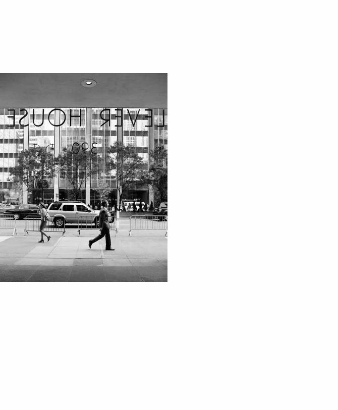
Lever House is a slim, 24-story slab, 306 feet high, whose shaft—shifted to the north side of the block—begins at the second floor. It was designed by Gordon

s k Y s C r A P e r s A s s u P e r L AT i V e s 35
Bunshaft of skidmore, Owings & Merrill (sOM), the firm that would become synonymous with tall office buildings that came after Lever House. the second floor is the only one to fill the block from sidewalk to sidewalk, and consists of a pizza box–like form, with a hole cut out of the center. poking out over the top of the box are hedges that border the employees’ garden adjacent to the cafeteria. the whole building is covered in a skin of green-tinted glass, clear at window height, opaque below it, and shiny stainless-steel mullions divide the panes. the ground level is open, except for the transparent glass–enclosed lobby directly under the tower.
In a 1957 article titled “the park Avenue school of Architecture,” Ada Louise Huxtable named Lever House the original of this school of building: “Lever Brothers’ trend-setting green glass tower. . .established the vogue for glass walled buildings and was soon flanked by imitations.” the revolution Lever offered was threefold: it brought european modernism to New York; it created a new, public-spirited office type; and it transformed an outmoded street into a cohesive urban experience. Mumford predicted this transformative aspect right away: “If its planning innovations prove sound, it may become just one unit in a repeating pattern of buildings and open spaces.”
the space notched out of the skyscrapers built on park and sixth avenues makes it possible for a pedestrian to get out of the flow and actually look at the buildings. the curtain walls became the part of the building that expressed its message. the open court, the weeping willow in a planter box, the fishbowl lobby suggest to Mumford the beginning of “a new competition to provide open spaces and a return to the human scale.” the word competition is key to Mumford’s critique: Lever House changed the rules of the skyscraper game. “For years, businessmen vied with each other in the attempt to put up the tallest building in the city,” he writes, and loftiness was all. that competition was really a form of advertising: being the tallest provoking the repetition of the company name, provoking free publicity at the opening. In Lever’s case, such decadent and antiurban showmanship was unnecessary. It didn’t need to be the tallest, because it was the best: “the building itself is a showcase and an advertisement; in its very avoidance of vulgar forms of publicity, it has become one of the most valuable pieces of advertising a big commercial enterprise could conceive.”
A L e x A N d r A L A N G e36
Mumford does a lot in the space of two paragraphs. the opening welcomes the reader as part of the crowd and positions him or her next to Mumford on the crowded sidewalk. this begins his organizational strategy, to walk the reader through the building, step by step, describing as he goes. the second paragraph speaks to his big-picture theme, Lever House as a new form of skyscraper, perfect for that moment. He is examining this building but also all previous buildings of this type. Lever both acknowledges and dispenses with the tripartite division. It replaces the grand entrance and public shops with a modest revolving door. In the lobby the functions are reduced to the essential: door, desk, elevator. Above that open plaza, the change in function to the second-floor cafeteria is expressed in the shape of the broad box. Above that, the office cells repeat in the simplest possible form: the rectangle. On top, there is no crown. Lever House was not going to enter that competition. Its innovation, its –est, was in the curtain wall: its transparency and simplicity was its billboard, its advertisement.
Mumford’s reviews were never accompanied by photographs, so he had to provide the entire architectural experience with words. this is a worthwhile exercise even today, as photography is not an unmediated experience—it can exalt and distort three-dimensional space—and you never know where a piece of writing will end up. to allow the reader to “see” the building your way is one of the strengths of a written critique. photographs offer the vision of the photographer and/or the editor who makes the selection. Words are the critic’s own. By calling attention, as Huxtable does, to the historical architecture around the Marine Midland Building or by stressing, as Mumford does, the accessibility of the court, the critic can emphasize what he or she thinks are the most important elements. “the court, and the lobby, can be reached from almost any direction, for the ground floor is completely open on three sides—north, south, and east—to the streets; there is no vestige of wall, or even of shop-front window, to shut out the passer-by.”
Mumford has already called the building “this house of glass” and the layout “transparent.” this description of the way one enters the building is factual but also emphasizes these qualities. the building is open, which is important in ways he discusses later on, but it is also literally commercial-free. unlike other companies that built bigger than their needs—and rented out floors to other enterprises or filled
s k Y s C r A P e r s A s s u P e r L AT i V e s 37
their lobbies with shops—Lever has decided to leave itself alone. the then-startling starkness of the all-glass facade was not compromised by advertising, and neither was its first floor. Mumford notes with regret that none of the windows are operable (as the rise of the skyscraper paralleled the invention of the elevator, so the rise of the all-glass skyscraper paralleled the invention of air-conditioning) and remarks on some drama resulting from the exterior’s “uniformity and severity”: the deus ex machina of the window-washing gondola, cleaning the glass with fine Lever Brothers products.
Inside Lever House, Mumford’s standards change. He continues the walking tour but considers the inside as a place to work rather than a public and symbolic statement. His focus shrinks in scale from the curtain wall to the desk. Again, his narrative organization controls what the reader “sees” of Lever House’s 130,000 square feet designed around the desk.
Mumford’s one harsh critique is of the executive floors, where the modernity of the exterior and of the employee floors has been abandoned, “and as a result nothing more stuffy and depressing could be imagined.” executives continued to wall themselves up with wood paneling while their employees got linoleum, glass partitions, plastics. they had the will to restructure their companies, rebuild their headquarters, but quailed at the idea that they might have to remake themselves. the paragraph about the topmost floor gives Mumford a chance to try some dry humor and acts as a tonic for the overwhelmingly positive tone of the review.
unrelenting praise can be dull and hard to believe without the many specifics details and comparisons Mumford includes. Words like beautiful and elegant don’t register without an explanation of why this curtain wall is more elegant than that one, this stone pavement more beautiful because of its texture, or pattern, or something else. Writers need to include some pepper along with the sugar of praise. Mentioning what he does not like assures the reader that Mumford has not been lulled into a false sense of comfort. His eye is still sharp, even when it likes what it sees.
In the final paragraphs of “House of Glass” Mumford returns to the historical precedents he raised in the first. Mumford mourns the lack of monumentality in Lever House, too light to be compared to a cathedral, but sees that transparency is the future of architecture. transparency serves as an up-to-
A L e x A N d r A L A N G e38
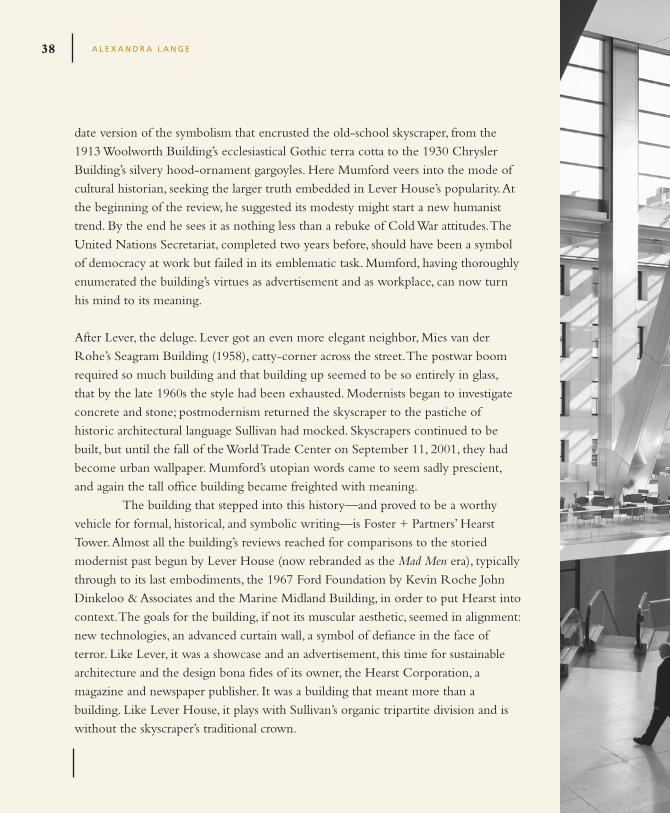
date version of the symbolism that encrusted the old-school skyscraper, from the 1913 Woolworth Building’s ecclesiastical Gothic terra cotta to the 1930 Chrysler Building’s silvery hood-ornament gargoyles. Here Mumford veers into the mode of cultural historian, seeking the larger truth embedded in Lever House’s popularity. At the beginning of the review, he suggested its modesty might start a new humanist trend. By the end he sees it as nothing less than a rebuke of Cold War attitudes. the united Nations secretariat, completed two years before, should have been a symbol of democracy at work but failed in its emblematic task. Mumford, having thoroughly enumerated the building’s virtues as advertisement and as workplace, can now turn his mind to its meaning.
After Lever, the deluge. Lever got an even more elegant neighbor, Mies van der Rohe’s seagram Building (1958), catty-corner across the street. the postwar boom required so much building and that building up seemed to be so entirely in glass, that by the late 1960s the style had been exhausted. Modernists began to investigate concrete and stone; postmodernism returned the skyscraper to the pastiche of historic architectural language sullivan had mocked. skyscrapers continued to be built, but until the fall of the World trade Center on september 11, 2001, they had become urban wallpaper. Mumford’s utopian words came to seem sadly prescient, and again the tall office building became freighted with meaning.
the building that stepped into this history—and proved to be a worthy vehicle for formal, historical, and symbolic writing—is Foster + partners’ Hearst tower. Almost all the building’s reviews reached for comparisons to the storied modernist past begun by Lever House (now rebranded as the Mad Men era), typically through to its last embodiments, the 1967 Ford Foundation by Kevin Roche John Dinkeloo & Associates and the Marine Midland Building, in order to put Hearst into context. the goals for the building, if not its muscular aesthetic, seemed in alignment: new technologies, an advanced curtain wall, a symbol of defiance in the face of terror. Like Lever, it was a showcase and an advertisement, this time for sustainable architecture and the design bona fides of its owner, the Hearst Corporation, a magazine and newspaper publisher. It was a building that meant more than a building. Like Lever House, it plays with sullivan’s organic tripartite division and is without the skyscraper’s traditional crown.
s k Y s C r A P e r s A s s u P e r L AT i V e s 39
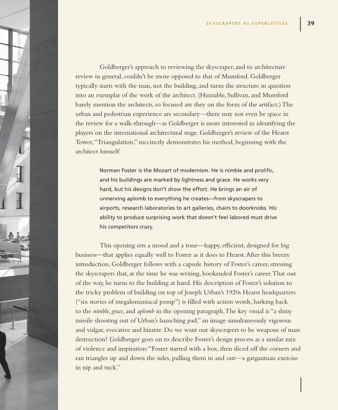
Goldberger’s approach to reviewing the skyscraper, and to architecture review in general, couldn’t be more opposed to that of Mumford. Goldberger typically starts with the man, not the building, and turns the structure in question into an exemplar of the work of the architect. (Huxtable, sullivan, and Mumford barely mention the architects, so focused are they on the form of the artifact.) the urban and pedestrian experience are secondary—there may not even be space in the review for a walk-through—as Goldberger is more interested in identifying the players on the international architectural stage. Goldberger’s review of the Hearst tower, “triangulation,” succinctly demonstrates his method, beginning with the architect himself:
Norman foster is the Mozart of modernism. He is nimble and prolific,
and his buildings are marked by lightness and grace. He works very
hard, but his designs don’t show the effort. He brings an air of
unnerving aplomb to everything he creates—from skyscrapers to
airports, research laboratories to art galleries, chairs to doorknobs. His
ability to produce surprising work that doesn’t feel labored must drive
his competitors crazy.
this opening sets a mood and a tone—happy, efficient, designed for big business—that applies equally well to Foster as it does to Hearst. After this breezy introduction, Goldberger follows with a capsule history of Foster’s career, stressing the skyscrapers that, at the time he was writing, bookended Foster’s career. that out of the way, he turns to the building at hand. His description of Foster’s solution to the tricky problem of building on top of Joseph urban’s 1920s Hearst headquarters (“six stories of megalomaniacal pomp”) is filled with action words, harking back to the nimble, grace, and aplomb in the opening paragraph. the key visual is “a shiny missile shooting out of urban’s launching pad,” an image simultaneously vigorous and vulgar, evocative and bizarre. Do we want our skyscrapers to be weapons of mass destruction? Goldberger goes on to describe Foster’s design process as a similar mix of violence and inspiration: “Foster started with a box, then sliced off the corners and ran triangles up and down the sides, pulling them in and out—a gargantuan exercise in nip and tuck.”

A L e x A N d r A L A N G e40
What is clear is that the shaft of the building, those identical offices, are the design’s singular statement. As at Lever House, its offspring, the once-plain center of the tripartite composition, now bears the weight of symbolism and superlatives. But is Goldberger really describing here? Without the photo, could you visualize the Hearst building? He sketches the process of design in cinematic (rather than realistic) terms and anthropomorphizes the building. But he doesn’t really tell you what, how, where with Mumford’s slow pace.
the original urban building was meant as the base—grand entrance, shops, street identity—for a shaft and crown to be completed later. the plan to build up was halted by the Great Depression, and in the seventy years that followed, Hearst simply grew the company in rented, noncontiguous spaces. urban’s early career had been in stage design, and his building looks as if he had tried to invent a classical order for a fictional king out of whole cloth (which makes sense, given that his client was William Randolph Hearst, who had a kingly castle at san simeon in California). For the historicist architect there would be no way to “match” the original. the crusading modern architect would have insisted it be torn down. the safe option would have been an undistinguished tower in a similar beige stone. But contemporary theories of preservation, which seek to emphasize the difference between old buildings and new ones, suggest Foster’s solution: a new building, every inch of it new, which preserves the DNA of the old without any form of imitation. As Goldberger writes,
Joseph urban’s goal in the original Hearst Building was to create a
respectable form of flamboyance, and foster has figured out how to
do the same thing with his tower, in unquestionably modern terms,
and without compromising his commitment to structural innovation.
foster is at his best when solving puzzles like this one; unlike most elite
architects, he isn’t obsessed with creating his own pure forms.
Goldberger puts Foster’s own structural flamboyance in historical context: Foster is not the only one with the idea of external, diamond-pattern structure, and Goldberger theorizes that he has “matched” urban in spirit. then Goldberger
s k Y s C r A P e r s A s s u P e r L AT i V e s 41
writes, “Indeed, the Hearst tower is the most beautiful skyscraper to go up in New York since 1967, when sOM completed the stunningly serene 140 Broadway, in Lower Manhattan.” this big comparison (most beautiful in almost forty years!) is accompanied by another when, in the last column of the review, Goldberger finally takes us inside. up until now, he has told us a lot about Foster, some about the site history and design idea, and described in emotional terms the look of the tower. user experience is secondary, despite the fact that Goldberger has further history-minded praise for what Foster has done with the interior: “What comes next is an explosive surprise such as has not been seen in the city since Frank Lloyd Wright led people through a low, tight lobby into the rotunda of the Guggenheim. the escalators deposit you in a vast atrium that contains the upper floors of the old urban building, which Foster has carved out and roofed over with glass.”
More action words, more illustrious forbearers. Goldberger is selling us Foster as the contemporary king of the tower—the details don’t matter much. sullivan tried to demystify the design process of the skyscraper, but Goldberger reapplies the fairy dust.
Along with his cursory look at the building’s interior and exterior, Goldberger also glosses over the Hearst tower’s other superlative: greenest. Hearst was eventually LeeD Gold-certified. By the end of the 2000s, this level of sustainability was necessary for any large office complex, and rivals like the Bank of America tower at One Bryant park (2009) by Cook + Fox aimed for platinum certification. In 2006 Hearst was the first in the former category and received a lot of media attention for the way green design and great design had been woven together. Foster’s diagrid uses 20 percent less steel than a comparable orthogonal design, and 90 percent of the steel in the building is recycled material, including waste from the interior demolition of the urban building. today the occupied building is attempting to produce zero waste. the waterfall sculpture in the lobby—the secure equivalent of Lever’s open plaza—is fed by rainwater and humidifies that vast space.
Goldberger’s review shows that Hearst is a worthy successor to Lever in the design department but fails to address the ways in which Foster and his clients have also taken up its ideological slant, standing up to terror and acting as an instruction manual for enlightened corporatism. the loss of public plaza is a function of that
A L e x A N d r A L A N G e42
terror environment. perhaps the elimination of open space is made up for by the building’s conservation. Hearst too requires specially designed window-washing gondolas, but their promotional potential is limited by the fact that Hearst does not make soap. Hearst’s product is publicity, and given the continuing level of interest in the building and its critical reputation above those of rival media companies like Condé Nast and the New York times (who also built green office towers in Manhattan in the 2000s), it too succeeds as an advertisement without words.
the skyscraper’s identity has always been wrapped up with symbolism. It is the building type with the most obvious literary qualities and the possibility for use of the most experimental language. Remember how sullivan searched simultaneously for a written and a built language for the tall building? When we think of architects and buildings, it is often of skyscrapers we first think.
this chapter presented three exemplary approaches to the skyscraper: as design problem, as symbol, and as personification. each of the reviews discussed literally approaches the building from a different angle: sullivan from within, Mumford from without, Goldberger from biography. But each critic makes his theme clear from the outset and pursues it to the end, organizing his critique as an argument, asking and answering questions introduced in the first paragraphs. sullivan’s analytical approach may take him from the building’s utilities to the ideal classical column, but the idea of the tall building, the expression of loftiness, is present from start to finish. Mumford makes it clear that he is evaluating Lever House for two publics, its client (and the client’s employees) and the general public, and methodically pursues its excellence from the sidewalk to the executive suite, telling us what he sees as he walks. Goldberger conflates tower and architect, telling (if not always showing) why Hearst is a building worthy of the skyscraper pantheon and Foster an architect to be classed with sullivan and sOM. each approach is equally valid and capable of adaptation. But each also builds on the history of the skyscraper, one that begins with sullivan’s words and work.
A L e x A N d r A L A N G e42
s k Y s C r A P e r s A s s u P e r L AT i V e s 43
C H e C k L i s T
1. know your history. To evaluate a skyscraper without a sense of the past
will make choosing your superlative extremely difficult. Think about how
Goldberger discusses history and makes Hearst seem ready to join the greats.
2. Consider your opening paragraphs in physical terms. what’s the image you
want to start with? where is your reader positioned in relation to the building,
literally or figuratively?
3. Choose your path. will you walk the reader through the spaces inside to
outside? Vice versa? will you focus on the architect’s career or his/her work?
Be selective.
4. return to sullivan: is there something new here under the sun?
s k Y s C r A P e r s A s s u P e r L AT i V e s 43