z0053 i p1-17 - wetcanvas · mingling yellows yellow lights up a subject like no other color. it...
TRANSCRIPT

Mingling YellowsYellow lights up a subject like no other color. It attracts the eye like a magnet and has been used successfully for years in advertising (think of how yel-low signs jump out at you). However, yellow is also one of the most diffi cult colors to paint with, as it muddies easily and is not easy to darken.
By painting warmer yellows next to cooler ones, you can get wonderful eff ects that can help you defi ne one area from another and add excitement to any passage. I primarily use New Gamboge, a warm yellow, next to Aure-olin Yellow, a cool yellow. Yellow Ochre, a warm yellow, is perfect for dropping a bit of sunshine into a shadow.
Yellow is a potent color. You can create a glow by underpainting with yellow or dropping it into other pigments. Yellow can easily lose its integrity, though, when mixed on the palette with other colors. It’s best to use the yellows as brilliantly and as cleanly as possible—one yellow hue next to the other.
Characteristics of Yellows1 Aureolin Yellow—a cool, lemony yellow that’s very easy to lighten.
2 New Gamboge—a warm, intense yellow. It’s great to use as an underpainting for reds. It’s my favorite yellow to use when I want give an object a sunlit appearance.
3 Naples Yellow—this is the only opaque yellow I use. Dilute it with lots of water or it will look very heavy on the paper.
4 Yellow Ochre—this pigment stays where it’s dropped. A little is all you need to add glow to any color.
5 Quinacridone Gold—a very powerful yellow that is great for dark-ening other yellows without muddying them.
LIGHTENING AND DARKENING YELLOWS
add water
add water
add water
add water
Naples Yellow
Aureolin Yellow
New Gamboge
Yellow Ochre
add New Gamboge
add New Gamboge
add Yellow Ochre
add Quinacridone Gold
T O L I G H T E N T U B E C O L O R T O D A R K E N
1 2 3
4 5
Mingled YellowsThese swatches show how diff erent yellows look when dropped and mingled into each other. Use less water and less Aureolin Yellow to make mingled yellows look darker.
23
41
21
3
45
2
1
1. Quinacridone Gold 2. Yellow Ochre 3. Naples Yellow 4. New Gamboge
1. Yellow Ochre 2. Aureolin Yellow3. New Gamboge 4. Quinacridone Gold 5. Naples Yellow
30
Z0053 I P26-51.indd 30Z0053 I P26-51.indd 30 2/23/07 2:38:04 PM2/23/07 2:38:04 PM

ERASING PENCIL LINES
I fi nd that graphite disappears under most pigments except yellow. Carefully lift
pencil lines with a soft eraser before you lay down that yellow pigment!
Mingle Warm Yellows Next to Cool YellowsThis sunny yellow fl ower is a perfect example of mingling all of the yellows on my palette. I created yellow-green shadows to indicate the refl ections from the surrounding leaves.
Knowing how to use warm next to cool is an important technique. In these yellow fl owers I have used warms and cools across the petals. It makes for lively, interesting passages. When you have petals side by side and close in value, use a warm against a cool to diff erentiate between the petals without a great value change.
OFF GULF OF MEXICO DRIVE16" × 20" (41cm × 51cm)Transparent watercolor on cold-pressed paperCollection of Marcelle Forbes
SUGGESTIONS FOR USING YELLOWS
• Mingle Aureolin Yellow or Yellow Ochre with Brown Mad-der and Mineral Violet for yellowish dirt, wood, concrete or dead grass in sunlight .
• Mingle Aureolin Yellow with Verditer Blue and Mineral Violet or Permanent Rose for foliage or grass in shadow.
• Mingle Naples Yellow and New Gamboge with Greenish Yellow for yellow objects in strong sunlight such as build-ings or marsh grass in autumn.
• Mingle Yellow Ochre with New Gamboge and Mineral Violet for brilliant yellow-brown objects in foregrounds .
• Mingle New Gamboge with Antwerp Blue for midground foliage.
31
Z0053 I P26-51.indd 31Z0053 I P26-51.indd 31 3/22/07 4:37:51 PM3/22/07 4:37:51 PM
2
1
3
5
3
3
2
3
41
3
5
2
451
Mingling RedsFor centuries, bold, bright red has been an important color on artists’ palettes. It’s one of the most exuberant colors an artist can add to a painting, creating excitement and warmth.
There is an amazing variety of reds. Just think about common vegetables and fruits: Say cherry or onion, and you instantly conjure up a certain red. Try this: Line up all the red vegetables and fruits you can fi nd and paint a study. Try rhubarb, tomatoes, apples, raspberries, red onions, peppers, peaches, pears, cherries, strawberries—capturing all of the subtle distinctions among the reds will really challenge you!
Warm reds come forward and cool reds recede. For instance, using a warm red on the petal of a fl ower will make that petal appear closer than a petal painted with a cool magenta. The magenta will recede. This concept is a great help when composing any painting.
Red is a very important color in painting fl esh tones as it adds pink tones. I use both Permanent Rose and Brown Madder in my skin tones. Lighten some reds with water to change the color somewhat when you use another pigment.
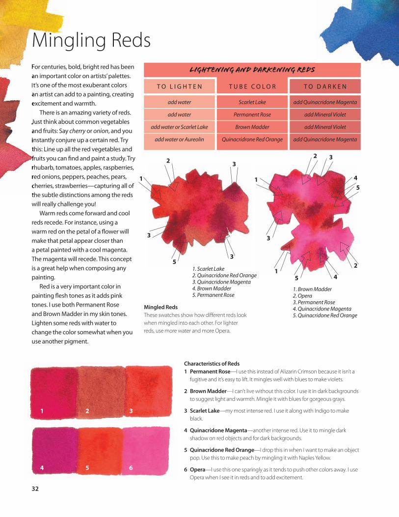
Mingled RedsThese swatches show how diff erent reds look when mingled into each other. For lighter reds, use more water and more Opera.
LIGHTENING AND DARKENING REDS
add water
add water
add water or Scarlet Lake
add water or Aureolin
Scarlet Lake
Permanent Rose
Brown Madder
Quinacridrone Red Orange
add Quinacridone Magenta
add Mineral Violet
add Mineral Violet
add Quinacridone Magenta
T O L I G H T E N T U B E C O L O R T O D A R K E N
Characteristics of Reds1 Permanent Rose—I use this instead of Alizarin Crimson because it isn’t a
fugitive and it’s easy to lift. It mingles well with blues to make violets.
2 Brown Madder—I can’t live without this color. I use it in dark backgrounds to suggest light and warmth. Mingle it with blues for gorgeous grays.
3 Scarlet Lake—my most intense red. I use it along with Indigo to make black.
4 Quinacridone Magenta—another intense red. Use it to mingle dark shadow on red objects and for dark backgrounds.
5 Quinacridone Red Orange—I drop this in when I want to make an object pop. Use this to make peach by mingling it with Naples Yellow.
6 Opera—I use this one sparingly as it tends to push other colors away. I use Opera when I see it in reds and to add excitement.
1. Brown Madder 2. Opera 3. Permanent Rose 4. Quinacridone Magenta 5. Quinacridone Red Orange
1. Scarlet Lake 2. Quinacridone Red Orange 3. Quinacridone Magenta 4. Brown Madder 5. Permanent Rose
1 2 3
4 5 6
32
Z0053 I P26-51.indd 32Z0053 I P26-51.indd 32 2/23/07 2:13:28 PM2/23/07 2:13:28 PM

SUGGESTIONS FOR USING REDS
• Mingle Scarlet Lake with Mineral Violet for red roofs in shadow or the side of brickwork.
• Mingle Brown Madder with Yellow Ochre or New Gamboge for light, warm-colored buildings in late afternoon sun or for autumn foliage.
• Mingle Brown Madder with Ultramarine Blue for rocks or old buildings.
• Mingle Permanent Rose with Cobalt Blue for clouds or shadows on objects light in color.
• Use Quinacridone Red Orange for bright, glowing beaks on birds.
A Yellow Underpainting Adds Vibrancy to Mingled RedsMingling my palette’s reds and yellows was essential for this painting of pears. I used all of the reds on my palette. The red pears were underpainted in some areas with New Gam-boge. These areas appear closer to the viewer. I used Scarlet Lake and Quinacridone Red Orange over the yellow, and the cooler reds, Permanent Rose and Quinacridone Magenta, in the areas that recede.
NOT FOR SALE11" × 24" (28cm × 61cm)Transparent watercolor on cold-pressed paperCollection of Mr. and Mrs. L. McGaughy
33
Z0053 I P26-51.indd 33Z0053 I P26-51.indd 33 2/23/07 2:13:30 PM2/23/07 2:13:30 PM

Mingling BluesBlue surrounds us: It is the sky and the water. I think of blue as a strong yet peaceful color. Blue is essential for mingling grays (which we’ll talk about on page 45).
When I lived in the northeastern United States near the Great Lakes, Ultramarine Blue was a very important color on my palette because it seemed a suitable color in the cool climate. Since I moved to the warm south, I use it less and have added diff erent blues to my palette, such as Cobalt Teal Blue and Verditer Blue, to capture the spectacu-lar warm and cool blues of the water where I live. I still use Ultramarine Blue for mingling and painting rocks, tree bark and stone.
Verditer Blue has replaced Cerulean on my palette. It is the color I used most and “cannot do without.” I fi nd it more transparent than Cerulean; it has much less white in it. Verditer Blue is the num-ber one essential color on my palette.
LIGHTENING AND DARKENING BLUES
add water & P. Rose
add water
add water
add water
Verditer Blue
Cobalt Teal Blue
Cobalt Blue
Antwerp Blue
add Cobalt Blue
add Antwerp Blue
add Ultramarine Blue
add Brown Madder
T O L I G H T E N T U B E C O L O R T O D A R K E N
Characteristics of Blues1 Verditer Blue—I use this instead of Cerulean Blue because it’s a better
mingler. It can push back entire areas of a painting and you can adjust its value without losing any of the integrity of the painting beneath.
2 Cobalt Teal Blue—this is highly opaque but I water it down and drop it into wet mingled pigment to create excitement.
3 Cobalt Blue—an essential blue for painting shadows. Drop it along the edges of wet mingled pigments and watch it creep into the other paints.
4 Transparent Turquoise—my favorite color to use when painting water.
5 Ultramarine Blue—a granular pigment that I use with Burnt Sienna to create wood.
6 Indigo—use this for dark backgrounds or mingle it with Scarlet Lake for an intense black.
1
3
2
2
1
2 3
1
5
4
2
1
31. Ultramarine Blue 2. Transparent Turquoise3. Indigo
1. Cobalt Teal Blue 2. Verditer Blue 3. Cobalt Blue 4. Transparent Turquoise 5. Ultramarine Blue
1 2 3
4 5 6
Mingled BluesHere you can see how diff erent blues look when mingled into each other. Use more water with your pigments for lighter blues.
34
Z0053 I P26-51.indd 34Z0053 I P26-51.indd 34 2/23/07 2:13:33 PM2/23/07 2:13:33 PM

Mingled Blues Lightened With WaterI used several of my blues in this iris painting: Verditer Blue, Cobalt Blue and Cobalt Teal Blue. The upper far-right petal is Cobalt Teal Blue. I mingled Verditer Blue and Cobalt Blue with some light Cobalt Teal Blue for the other petals. I used lots of water as I mingled the colors to give the blues a light and airy feeling.
HEAVEN AT THE GATE16" × 20" (41cm × 51cm)Transparent watercolor on cold-pressed paperCollection of Mr. and Mrs. Russell Beckwith
SUGGESTIONS FOR USING BLUES
• Mingle Verditer Blue with Cobalt Blue for skies and shadows.
• Mingle Antwerp Blue with New Gamboge for orangish green foliage in the midground of autumn scenes.
• Mingle Cobalt Blue with Yellow Ochre to create pale greenish blue areas.
• Mingle Indigo with Scarlet Lake for dark blacks.
• Mingle Ultramarine Blue with Brown Madder for a black with a hint of warmth.
35
Z0053 I P26-51.indd 35Z0053 I P26-51.indd 35 3/22/07 4:37:55 PM3/22/07 4:37:55 PM

The color green is everywhere in the environment. It’s truly “nature’s color.” Greens can be dazzling or deadly. There are “tube greens,” detested by some and loved by others because they can be bright and overpowering. I often tell my students that they would be better off mingling yellow and blues to get the greens that they want. But you can have it both ways. You can learn how to control tube greens by using the chart on this page.
Mingled GreensThese swatches show how diff erent greens look when mingled into each other. Using more water with your greens make them signifi cantly lighter.
LIGHTENING AND DARKENING GREENS
add water and Aureolin
add water and Aureolin
add water
add water
Permanent Sap Green
Olive Green
Undersea Green
Greenish Yellow
add Antwerp Blue
add Ultramarine Blue
add Indigo
add Permanent Sap Green
T O L I G H T E N T U B E C O L O R T O D A R K E N
23
1
1
5
1
4
5
41. Permanent Sap Green 2. Undersea Green 3. Olive Green 4. Greenish Yellow 5. Verditer Blue 1. Greenish Yellow
2. Olive Green 3. Permanent Sap Green4. Verditer Blue 5. Undersea Green
2
1
34
5
314
MINGLE PERMANENT SAP GREEN WITH
OTHER COLORS FOR A RANGE OF GREENS
Mingle Permanent Sap Green with other colors and you will be able to cre-
ate almost any green in nature. Here I’ve taken Permanent Sap Green out of the tube and mingled it with diff erent colors to create yellowish greens, red-
dish greens and bluish greens.
1 2 3 4
Characteristics of Greens1 Olive Green—a quiet green that’s less jarring on the paper than Permanent Sap Green
can be.
2 Permanent Sap Green—a warm green but can be garish on the page. However, it mingles well with other colors to create interesting greens.
3 Greenish Yellow—very warm and pushes away other colors, so use it sparingly.
4 Undersea Green—a deep, intense green that mingles well with almost all colors. Use this to darken the value of other tube greens.
Sap Green
36
Mingling Greens
Z0053 I P26-51.indd 36Z0053 I P26-51.indd 36 3/1/07 8:14:47 AM3/1/07 8:14:47 AM

37
SUGGESTIONS FOR USING GREENS
• Mingle Permanent Sap Green with Antwerp Blue for middle value foliage or foliage in shadow.
• Mingle Permanent Sap Green with Permanent Rose to gray down foliage.
• Mingle Olive Green with Verditer Blue for grass in sunlight.
• Mingle Undersea Green with Indigo for an intense dark green.
• Mingle Compose Green 1 with Verditer Blue and a lot of water for a gray green.
Mingling Tube Greens Can Create Brilliant ResultsIn this painting of parrots, I mingled all of the greens on my palette. I used Compose Green 1 in a few places; it’s a lovely green but very opaque, so I use it sparingly and water it down a great deal.
BUSY BODIES15" × 22" (38cm × 56cm)Transparent watercolor on cold-pressed paperCollection of Mr. and Mrs. S. Gregory
Z0053 I P26-51.indd 37Z0053 I P26-51.indd 37 3/22/07 4:37:56 PM3/22/07 4:37:56 PM

2
1
3
4
5
3
?
Mingling Violets
Mingled VioletsThese swatches show how diff erent violets look when mingled into each other. For darker violets, use less water with your pigments.
Violet is the preferred name for colors composed of any red or blue; however, I don’t like the way mixed violets look once dry—they’re too dull. I prefer to use violets from the tube because they seem to radiate joy and lift the spirit—even when dry.
Winter scenes provide a great opportunity to use violets. Shadows on snow have shades of pinks and blues in them, depending on the time of day. A rainy day can have a blue-violet tinge—even a sky can look purple.
Of all the violets on my palette, Mineral Violet is the one I use the most. It’s an unobtrusive color that I use for all shadows and for darkening reds.
LIGHTENING AND DARKENING VIOLETS
add water
add water
add water
add water
add water
Cobalt Violet
Cobalt Violet Light
Mineral Violet
Permanent Violet Reddish
Permanent Violet
add Quinacridone Magenta
add Mineral Violet
add Scarlet Lake
add Permanent Rose
add Alizarin Crimson
T O L I G H T E N T U B E C O L O R T O D A R K E N
2
34
1
1
5
1. Cobalt Violet 2. Cobalt Violet Light 3. Mineral Violet 4. Permanent Violet Reddish 5. Permanent Violet
1. Mineral Violet 2. Permanent Violet 3. Permanent Violet Reddish 4. Cobalt Violet 5. Cobalt Violet Light
Characteristics of Violets1 Cobalt Violet—a warm, nongranular violet (the only one I can fi nd).
It’s very useful in skin tones.
2 Cobalt Violet Light—a cool violet.
3 Mineral Violet—one of my “can’t do without” colors—somewhat granular; adds tension to greens; good in all shadows and darkens all reds.
4 Permanent Violet Reddish—an intense dark purple that mingles well in dark backgrounds using Permanent Sap Green and Mineral Violet.
5 Permanent Violet—another intense dark purple good for mingling dark passages.
1 2 3
4 5
38
Z0053 I P26-51.indd 38Z0053 I P26-51.indd 38 3/22/07 4:37:58 PM3/22/07 4:37:58 PM
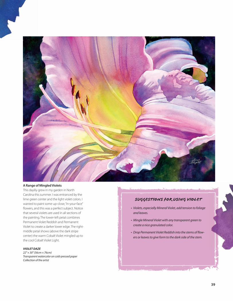
A Range of Mingled VioletsThis daylily grew in my garden in North Carolina this summer. I was entranced by the lime green center and the light violet colors. I wanted to paint some up-close, “in-your-face” fl owers, and this was a perfect subject. Notice that several violets are used in all sections of the painting. The lower-left petal combines Permanent Violet Reddish and Permanent Violet to create a darker lower edge. The right-middle petal shows (above the dark stripe center) the warm Cobalt Violet mingled up to the cool Cobalt Violet Light.
VIOLET DAZE22" × 30" (56cm × 76cm)Transparent watercolor on cold-pressed paperCollection of the artist
SUGGESTIONS FOR USING VIOLET
• Violets, especially Mineral Violet, add tension to foliage and leaves.
• Mingle Mineral Violet with any transparent green to create a nice granulated color.
• Drop Permanent Violet Reddish into the stems of fl ow-ers or leaves to give form to the dark side of the stem.
39
Z0053 I P26-51.indd 39Z0053 I P26-51.indd 39 2/23/07 2:13:43 PM2/23/07 2:13:43 PM