zk devguide
TRANSCRIPT

SIMPLY RICH
ZKTM
The Developer's GuideVersion 3.0.4
March 2008
Potix Corporation
Revision 209
ZK: Developer's Guide Page 1 of 258 Potix Corporation

Copyright © Potix Corporation. All rights reserved.
The material in this document is for information only and is subject to change without notice. While reasonable efforts have been made to assure its accuracy, Potix Corporation assumes no liability resulting from errors or omissions in this document, or from the use of the information contained herein.
Potix Corporation may have patents, patent applications, copyright or other intellectual property rights covering the subject matter of this document. The furnishing of this document does not give you any license to these patents, copyrights or other intellectual property.
Potix Corporation reserves the right to make changes in the product design without reservation and without notification to its users.
The Potix logo and ZK are trademarks of Potix Corporation.
All other product names are trademarks, registered trademarks, or trade names of their respective owners.
ZK: Developer's Guide Page 2 of 258 Potix Corporation

Table of Contents
1. Introduction...............................................................................................................17
Traditional Web Applications...........................................................................................17
Ad-hoc AJAX Applications...............................................................................................17
ZK: What It Is ..............................................................................................................18
ZK: What It Is Not.........................................................................................................19
ZK: Limitations.............................................................................................................20
2. Getting Started.......................................................................................................... 21
Hello World!.................................................................................................................21
Interactivity..................................................................................................................21
The zscript Element.......................................................................................................22
The Scripting Language..............................................................................................23
The Scripting Codes in a Separate File.........................................................................23
The attribute Element....................................................................................................23
The EL Expressions........................................................................................................24
The id Attribute.............................................................................................................25
The if and unless Attributes............................................................................................25
The forEach Attribute.....................................................................................................26
The use and apply Attribute............................................................................................26
The use Attribute......................................................................................................27
The apply Attribute....................................................................................................27
Used with the forward Attribute...................................................................................28
Implement Java Classes in zscript...............................................................................29
Create Components Manually..........................................................................................29
Developing ZK Applications without ZUML....................................................................30
Define New Components for a Particular Page...................................................................31
3. The Basics..................................................................................................................32
Architecture Overview....................................................................................................32
The Execution Flow....................................................................................................33
Components, Pages and Desktops...................................................................................33
Components.............................................................................................................33
Pages......................................................................................................................33
Page Title.............................................................................................................34
ZK: Developer's Guide Page 3 of 258 Potix Corporation

Desktops..................................................................................................................34
The createComponents Method...............................................................................34
Forest of Trees of Components....................................................................................34
Component: a Visual Presentation and a Java Object.....................................................34
Identifiers................................................................................................................35
UUID.......................................................................................................................35
The ID Space................................................................................................................36
Namespace and ID Space...........................................................................................37
Variable and Functions Defined in zscript......................................................................37
zscript and EL Expressions......................................................................................38Multi-Scope Interpreters.........................................................................................39Single-Scope Interpreters.......................................................................................40Multiple scripting Languages in One Page.................................................................41getVariable versus getZScriptVariable......................................................................41
Events.........................................................................................................................41
Desktops and Event Processing.......................................................................................42
Desktops and the Creation of Components....................................................................42
ZUML and XML Namespaces............................................................................................42
4. The Component Lifecycle........................................................................................... 44
The Lifecycle of Loading Pages........................................................................................44
The Page Initial Phase................................................................................................44
The Component Creation Phase...................................................................................44
The Event Processing Phase........................................................................................45
The Rendering Phase.................................................................................................45
The Lifecycle of Updating Pages......................................................................................45
The Request Processing Phase....................................................................................45
The Event Processing Phase........................................................................................46
The Rendering Phase.................................................................................................46
The Molds.....................................................................................................................46
Component Garbage Collection.......................................................................................47
5. Event Listening and Processing..................................................................................48
Add Event Listeners by Markup Languages.......................................................................48
Add and Remove Event Listeners by Program....................................................................48
Declare a Member.....................................................................................................48
Add and Remove Event Listeners Dynamically...............................................................49
Deferrable Event Listeners..........................................................................................49
ZK: Developer's Guide Page 4 of 258 Potix Corporation

Add and Remove Event Listeners to Pages Dynamically..................................................50
The Invocation Sequence...........................................................................................51
Abort the Invocation Sequence....................................................................................51
Send, Post and Echo Events from an Event Listener...........................................................51
Post Events..............................................................................................................52
Send Events.............................................................................................................52
Echo Events..............................................................................................................52
Thread Model................................................................................................................53
Suspend and Resume................................................................................................53
Long Operations........................................................................................................54
Alternative 1: Server Push......................................................................................54Alternative 2: Thread Suspend and Resume..............................................................56Alternative 3: Timer (No Suspend/Resume)..............................................................58Alternative 4: Piggyback (No Suspend/Resume, No Timer)......................................... 59
Initialization and Cleanup of Event Processing Thread........................................................60
Initialization Before Processing Each Event...................................................................60
Cleanup After Processed Each Event............................................................................61
6. The ZK User Interface Markup Language....................................................................62
XML.............................................................................................................................62
Elements Must Be Well-formed....................................................................................62
Special Character Must Be Replaced.............................................................................63
Attribute Values Must Be Specified and Quoted.............................................................63
Comments................................................................................................................63
Character Encoding...................................................................................................64
Namespace...............................................................................................................64
Auto-completion with Schema.................................................................................65
Conditional Evaluation...................................................................................................65
Iterative Evaluation.......................................................................................................65
The each Variable......................................................................................................66
The forEachStatus Variable.........................................................................................66
How to Use each and forEachStatus Variables in Event Listeners..................................... 67
A Solution: custom-attributes.................................................................................67
Load on Demand...........................................................................................................68
Load-on-Demand with the fulfill Attribute.....................................................................68
Load-on-Demand with an Event Listener......................................................................69
Implicit Objects.............................................................................................................69
List of Implicit Objects...............................................................................................69
ZK: Developer's Guide Page 5 of 258 Potix Corporation
Information about Request and Execution.................................................................... 71
Processing Instructions..................................................................................................71
The page Directive....................................................................................................72
The component Directive............................................................................................72
The by-macro Format............................................................................................72The by-class Format..............................................................................................72
The init Directive.......................................................................................................73
The variable-resolver Directive....................................................................................74
The import Directive..................................................................................................74
ZK Attributes................................................................................................................75
The apply Attribute....................................................................................................75
The use Attribute......................................................................................................76
The if Attribute..........................................................................................................76
The unless Attribute..................................................................................................76
The forEach Attribute.................................................................................................76
The forEachBegin Attribute.........................................................................................76
The forEachEnd Attribute............................................................................................77
The fulfill Attribute....................................................................................................77
The forward Attribute.................................................................................................77
ZK Elements.................................................................................................................78
The zk Element.........................................................................................................78
Multiple Root Elements in a Page.............................................................................79Iteration Over Versatile Components........................................................................79
The zscript Element...................................................................................................80
How to Defer the Evaluation...................................................................................81How to Select a Different Scripting Language............................................................82How to Support More Scripting Languages................................................................82
The attribute Element................................................................................................82
The variables element................................................................................................83
The null Value.......................................................................................................84
The custom-attributes element...................................................................................84
Component Sets and XML Namespaces............................................................................85
Standard Namespaces................................................................................................85
7. ZUML with the XUL Component Set............................................................................ 88
Basic Components.........................................................................................................88
Label.......................................................................................................................88
The pre, hyphen, maxlength and multiline Properties.................................................88
Buttons....................................................................................................................89
ZK: Developer's Guide Page 6 of 258 Potix Corporation

The onClick Event and href Property........................................................................89The sendRedirect Method of the org.zkoss.zk.ui.Execution Interface.............................90
Radio and Radio Group..............................................................................................90
Versatile Layouts...................................................................................................90
Image......................................................................................................................91
Locale Dependent Image........................................................................................91
Imagemap................................................................................................................92
Area....................................................................................................................93The shape Property................................................................................................94
Audio.......................................................................................................................94
Input Controls...........................................................................................................94
The type Property..................................................................................................95The format Property...............................................................................................95Constraints...........................................................................................................95Constraints for Datebox..........................................................................................96Custom Constraints...............................................................................................97The onChange Event..............................................................................................99The onChanging event...........................................................................................99
Calendar..................................................................................................................99
The value Property and the onChange Event...........................................................100The compact Property..........................................................................................100
Progressmeter.........................................................................................................100
Slider.....................................................................................................................100
Timer.....................................................................................................................100
Paging...................................................................................................................101
Paging with List Boxes and Grids...........................................................................101
Windows....................................................................................................................101
Titles and Captions..................................................................................................102
The closable Property...............................................................................................102
The sizable Property.................................................................................................103
The onSize Event.................................................................................................103
The Style Class (sclass)............................................................................................103
The contentStyle Property.........................................................................................104
Scrollable Window...............................................................................................104
Borders..................................................................................................................104
Overlapped, Popup, Modal, Highlighted and Embedded.................................................105
Embedded..........................................................................................................105Overlapped.........................................................................................................105Popup................................................................................................................105Modal.................................................................................................................106Highlighted.........................................................................................................106
ZK: Developer's Guide Page 7 of 258 Potix Corporation

Modal Windows and Event Listeners.......................................................................106
The position Property...............................................................................................108
Common Dialogs.....................................................................................................108
The Message Box.................................................................................................109The File Upload Dialog..........................................................................................109The fileupload Component....................................................................................110The File Download Dialog......................................................................................111
The Layout Components...............................................................................................111
A Nested borderlayout Component.............................................................................112
The size and border Properties..................................................................................113
The splittable and collapsible Properties....................................................................114
The maxsize and minisize Properties......................................................................114
The flex property.....................................................................................................114
The open Property...................................................................................................114
The onOpen Event...................................................................................................115
The Box Model............................................................................................................115
The spacing Property...............................................................................................116
The widths and heights Properties.............................................................................116
Splitters.................................................................................................................117
The collapse Property...........................................................................................117The open Property...............................................................................................118The onOpen Event...............................................................................................118
Tab Boxes..................................................................................................................118
Nested Tab Boxes....................................................................................................119
The Accordion Tab Boxes..........................................................................................120
The orient Property..................................................................................................120
The align Property of Tabs........................................................................................120
The closable Property...............................................................................................121
The disabled Property...............................................................................................121
Load-on-Demand for Tab Panels................................................................................121
Grids..........................................................................................................................122
Scrollable Grid........................................................................................................123
Sizable Columns......................................................................................................124
The onColSize Event............................................................................................125
Grids with Paging....................................................................................................125
The pageSize Property..........................................................................................125The paginal Property............................................................................................126The paging Property.............................................................................................127The onPaging Event and Method............................................................................127
ZK: Developer's Guide Page 8 of 258 Potix Corporation

Sorting...................................................................................................................127
The sortDirection Property....................................................................................128The onSort Event.................................................................................................128The sort Method..................................................................................................128
Live Data................................................................................................................129
Sorting with Live Data..........................................................................................130
Auxiliary Headers....................................................................................................130
Special Properties....................................................................................................131
The spans Property..............................................................................................131
More Layout Components.............................................................................................132
Separators and Spaces.............................................................................................132
Group boxes...........................................................................................................133
The contentStyle Property and Scrollable Groupbox................................................. 133
Toolbars.................................................................................................................134
Menu bars..................................................................................................................134
Execute a Menu Command........................................................................................135
Use Menu Items as Check Boxes................................................................................136
The autodrop Property..............................................................................................136
The onOpen Event...................................................................................................136
More Menu Features.................................................................................................136
Context Menus............................................................................................................136
Customizable Tooltip and Popup Menus......................................................................137
The onOpen Event...................................................................................................138
List Boxes...................................................................................................................139
Multi-Column List Boxes...........................................................................................140
Column Headers......................................................................................................140
Column Footers.......................................................................................................140
Drop-Down List.......................................................................................................141
Multiple Selection....................................................................................................141
Scrollable List Boxes................................................................................................141
The rows Property................................................................................................142
Sizable List Headers.................................................................................................142
List Boxes with Paging..............................................................................................142
Sorting...................................................................................................................142
The sortAscending and sortDescending Properties....................................................143The sortDirection Property....................................................................................144The onSort Event.................................................................................................144The sort Method..................................................................................................144
Special Properties....................................................................................................145
ZK: Developer's Guide Page 9 of 258 Potix Corporation

The checkmark Property.......................................................................................145The vflex Property...............................................................................................146The maxlength Property.......................................................................................146
Live Data................................................................................................................146
Sorting with Live Data..........................................................................................147
List Boxes Contain Buttons.......................................................................................148
Tree Controls..............................................................................................................148
The open Property and the onOpen Event...................................................................150
Multiple Selection....................................................................................................151
Paging...................................................................................................................151
The onPaging and onPageSize Event......................................................................151
Special Properties....................................................................................................151
The rows Property................................................................................................151The checkmark Property.......................................................................................151The vflex Property...............................................................................................152The maxlength Property.......................................................................................152Sizable Columns..................................................................................................152
Create-on-Open for Tree Controls..............................................................................152
Comboboxes...............................................................................................................153
The autodrop Property..............................................................................................153
The description Property...........................................................................................153
The onOpen Event...................................................................................................154
The onChanging Event.............................................................................................154
Bandboxes..................................................................................................................155
The closeDropdown Method......................................................................................156
The autodrop Property..............................................................................................156
The onOpen Event...................................................................................................156
The onChanging Event.............................................................................................156
Chart.........................................................................................................................157
Live Data................................................................................................................157
Drill Down (The onClick Event)..................................................................................158
Manipulate Areas.....................................................................................................159
Drag and Drop............................................................................................................159
The draggable and droppable Properties.....................................................................159
The onDrop Event....................................................................................................160
Dragging with Multiple Selections..............................................................................161
Multiple Types of Draggable Components....................................................................161
Work with HTML Tags...................................................................................................162
The html Component...............................................................................................162
ZK: Developer's Guide Page 10 of 258 Potix Corporation

The Native Namespace, http://www.zkoss.org/2005/zk/native......................................164
Output Another Namespace with the Native Namespace...........................................164
The XHTML Namespace, http://www.w3.org/1999/xhtml..............................................165
The include Component............................................................................................166
Pass Values to the Included Page...........................................................................166Including ZUML Pages..........................................................................................167
The style Component...............................................................................................167
The script Component..............................................................................................168
The iframe Component.............................................................................................168
Work with HTML FORM and Java Servlets.......................................................................170
The name Property..................................................................................................170
Components that Support the name Property..............................................................170
Rich User Interfaces.................................................................................................171
Client Side Actions.......................................................................................................171
Reference to a Component........................................................................................172
An onfocus and onblur Example.............................................................................173Coercion Rules....................................................................................................173
The onshow and onhide Actions.................................................................................173
An Example to Change How a Window Appears....................................................... 173
CSA JavaScript Utilities............................................................................................174
The action Object................................................................................................174The anima Object................................................................................................174
Events.......................................................................................................................176
Mouse Events..........................................................................................................176
Keystroke Events.....................................................................................................177
The ctrlKeys Property...........................................................................................177
Input Events...........................................................................................................178
List and Tree Events................................................................................................179
Slider and Scroll Events............................................................................................180
Other Events...........................................................................................................180
The Event Flow of radio and radiogroup..................................................................181
8. ZUML with the XHTML Component Set......................................................................183
The Goal....................................................................................................................183
A XHTML Page Is A Valid ZUML Page..........................................................................183
Server-Centric Interactivity.......................................................................................184
Servlets Work As Usual............................................................................................185
The Differences...........................................................................................................185
A Component Created for Each Tag............................................................................185
ZK: Developer's Guide Page 11 of 258 Potix Corporation

UUID Is ID..............................................................................................................185
Side Effects.........................................................................................................186
All Tags Are Valid....................................................................................................186
Case Insensitive......................................................................................................186
No Mold Support......................................................................................................187
The DOM Tree at the Browser........................................................................................187
The TABLE and TBODY Tags......................................................................................187
Events.......................................................................................................................187
Integrate with JSF, JSP and Others................................................................................188
Work with Existent Servlets......................................................................................188
Enrich by Inclusion..................................................................................................188
Enrich Static HTML Pages..........................................................................................188
Use of ZK JSP Tags..................................................................................................189
Use of ZK JSF Components.......................................................................................190
Enrich a Dynamically Generated Page with ZK Filter.....................................................190
9. Macro Components...................................................................................................192
Three Steps to Use Macro Components...........................................................................192
Step 1. The Implementation......................................................................................192
Step 2. The Declaration............................................................................................193
Other Properties..................................................................................................193
Step 3. The Use.......................................................................................................193
Pass Properties....................................................................................................193arg.includer........................................................................................................194
Inline Macros..............................................................................................................194
An Example............................................................................................................195
Regular Macros...........................................................................................................196
Macro Components and The ID Space........................................................................196
Access Child Components From the Outside............................................................197Access Variables Defined in the Ancestors...............................................................197Change macroURI At the Runtime..........................................................................197
Provide Additional Methods.......................................................................................197
Provide Additional Methods in Java........................................................................198Provide Additional Methods in zscript.....................................................................199Override the Implementation Class When Instantiation.............................................199Create a Macro Component Manually......................................................................200
10. Advanced Features.................................................................................................201
Identify Pages.............................................................................................................201
ZK: Developer's Guide Page 12 of 258 Potix Corporation

Identify Components....................................................................................................201
The Component Path................................................................................................201
Sorting.......................................................................................................................202
Browser's Information and Controls...............................................................................203
The onClientInfo Event.............................................................................................203
The org.zkoss.ui.util.Clients Class..............................................................................204
Prevent User From Closing a Window.........................................................................204
Browser's History Management......................................................................................205
Add the Appropriate States to Browser's History..........................................................205
Listen to the onBookmarkChanged Event and Manipulate the Desktop Accordingly...........206
A Simple Example....................................................................................................207
Component Cloning.....................................................................................................208
Component Serialization...............................................................................................208
Serializable Sessions................................................................................................209
Serialization Listeners..............................................................................................210
Inter-Page Communication...........................................................................................210
Post and Send Events...............................................................................................210
Attributes...............................................................................................................210
Inter-Web-Application Communication...........................................................................211
Web Resources from Classpath..................................................................................211
Annotations................................................................................................................211
Annotate ZUML Pages..............................................................................................212
The Classic Way to annotate the Component Declarations.........................................212The Classic Way to Annotate the Property Declarations.............................................212The Simple Way to Annotate the Property Declarations.............................................213The Simple Way to Annotate the Component Declarations........................................ 214
Annotate Components Created Manually.....................................................................214
Retrieve Annotations................................................................................................214
Richlets......................................................................................................................214
Implement the org.zkoss.zk.ui.Richlet interface...........................................................215
One Richlet per URL.............................................................................................216
Configure web.xml and zk.xml..................................................................................216
Session Timeout Management.......................................................................................217
Error Handling.............................................................................................................218
Error Handling When Loading Pages...........................................................................218
ZK Mobile Error Handling......................................................................................219
Error Handing When Updating Pages..........................................................................219
ZK: Developer's Guide Page 13 of 258 Potix Corporation

ZK Mobile Error When Updating Pages....................................................................221
Miscellaneous..............................................................................................................221
Configure the ZK Loader Not to Compress the Output...................................................221
11. Performance Tips...................................................................................................223
Use Compiled Java Codes.............................................................................................223
Use the deferred Attribute........................................................................................223
The deferred Attribute and the onCreate Event............................................................223
Use the forward Attribute.........................................................................................224
Use the Servlet Thread to Process Events.......................................................................224
Modal Windows.......................................................................................................225
Message Boxes........................................................................................................225
File Upload.............................................................................................................226
Use the Native Namespace instead of the XHTML Namespace............................................226
Prolong the Period to Check Whether a File Is Modified.....................................................227
Defer the Creation of Child Components.........................................................................227
Use Live Data and Paging for Large List Boxes.................................................................228
Use ZK JSP Tags or ZK JSF Components instead of ZK Filter............................................. 228
12. Other Devices and Output Formats.........................................................................230
ZK Mobile...................................................................................................................230
The Mobile Component Set, http://www.zkoss.org/2007/mil.........................................230
XML Output................................................................................................................231
Three Steps to Generate XML Output with a ZUML Page............................................... 231
Use the XML Component Set, http://www.zkoss.org/2007/xml..................................231Maps the File Extension to ZK Loader.....................................................................232Maps the File Extension to the XML Component Set..................................................232
The XML Component Set..........................................................................................233
The XML Transformer...........................................................................................233
13. Internationalization...............................................................................................235
Locale........................................................................................................................235
The px_preferred_locale Session Attribute..................................................................235
The Request Interceptor...........................................................................................235
Time Zone..................................................................................................................236
The px_preferred_time_zone Session Attribute............................................................237
The Request Interceptor...........................................................................................237
Labels........................................................................................................................237
ZK: Developer's Guide Page 14 of 258 Potix Corporation

Locale-Dependent Files................................................................................................238
Browser and Locale-Dependent URI...........................................................................238
Locating Browser and Locale Dependent Resources in Java...........................................239
Messages...................................................................................................................240
Themes......................................................................................................................240
Use the Theme with Smaller Fonts.............................................................................240
Use the Theme with Larger Fonts...............................................................................240
Use the Theme that Depends on Locale......................................................................240
Use Your Own Theme...............................................................................................241
The Theme Provider.................................................................................................241
14. Database Connectivity............................................................................................242
ZK Is Presentation-Tier Only.........................................................................................242
Simplest Way to Use JDBC (but not recommended).........................................................242
Use with Connection Pooling.........................................................................................243
Connect and Close a Connection................................................................................244
Configure Connection Pooling....................................................................................245
Tomcat 5.5 + MySQL...........................................................................................245JBoss + MySQL...................................................................................................246JBoss + PostgreSQL.............................................................................................247
ZK Features Applicable to Database Access.....................................................................247
The org.zkoss.zk.ui.event.EventThreadCleanup Interface..............................................247
Access Database in EL Expressions............................................................................248
Read all and Copy to a LinkedList..........................................................................248Implement the org.zkoss.zk.ui.util.Initiator Interface...............................................249
Transaction and org.zkoss.zk.util.Initiator...................................................................250
J2EE Transaction and Initiator...............................................................................250Web Containers and Initiator.................................................................................250
15. Portal Integration.................................................................................................. 252
Configuration..............................................................................................................252
WEB-INF/portlet.xml................................................................................................252
WEB-INF/web.xml...................................................................................................252
The Usage..................................................................................................................253
The zk_page and zk_richlet Parameter and Attribute....................................................253
Examples................................................................................................................253
16. Beyond ZK..............................................................................................................255
Logger.......................................................................................................................255
ZK: Developer's Guide Page 15 of 258 Potix Corporation
How to Configure Log Levels with ZK.........................................................................255
Content of i3-log.conf..............................................................................................256
Allowed Levels....................................................................................................256
Location of i3-log.conf..............................................................................................257
Disable All Logs.......................................................................................................257
DSP...........................................................................................................................257
iDOM.........................................................................................................................258
ZK: Developer's Guide Page 16 of 258 Potix Corporation

1. Introduction
Welcome to ZK, the simplest way to make Rich Web Applications.
The Developer's Guide describes the concepts and features of ZK. For installation refer to the Quick Start Guide. For a full description of component properties and methods refer to the Developer's Reference.
This chapter describes the historical background of Web programming, AJAX technologies and the ZK project. You may skip this chapter if you prefer to familiarize yourself with the ZK features right away.
Traditional Web Applications
Aimed at simply and effectively exchanging documents Web technologies such as, HTTP and HTML are originated from the page-based stateless-communication model. In this model a page is self-contained and is a minimal unit that communicates between clients and servers.
Since the Web has emerged as the default platform for application development this model faces a substantial challenge: the inability to visually represent the complexities in today's applications. For example, to give a customer a quotation, you might have to open another page to search his trading records, another page for the recent prices, and another page for current stocking. Users are forced to leave the page they are working in, and navigate among several pages. It is easy to get lost and confused resulting in unhappy customers, lost sales and low productivities.
The challenge to develop a modern application upon this page-based model is also substantial. In this model, applications running at the server have to take care of everything: from parsing the request, rendering the response, routing processes that link users from one page to another, and handling versatile errors made by users. Many different frameworks such as: Struts, Tapestry and JSF have emerged to simplify this development process. Due to the huge gap between the page-based model and modern applications learning and using these frameworks is never a pleasant process, not to mention intuitive or simplistic.
Ad-hoc AJAX Applications
Over a decade of evolution, Web applications have evolved from static HTML pages to Dynamic
ZK: Developer's Guide Page 17 of 258 Potix Corporation

HTML pages, from applets to Flash, and finally to AJAX1 technologies (Asynchronous JavaScript and XML). Illustrated by Google Maps and Suggest, AJAX breaths new life into Web applications by delivering the same level of interactivity and responsiveness as desktop applications do. Unlike applets or Flash, AJAX is based on the standard browser and JavaScript with no proprietary plugins required.
AJAX is a kind of new generation DHTML. Like DHTML, it heavily relies on JavaScript to listen to events triggered by user's activity, and then manipulate visual presentation of a page (aka. DOM) in the browser dynamically. Moreover, it takes a step further by enabling communication with the server asynchronously without leaving or rendering the whole page again. It breaks the page-based model by introducing light-weight communication between clients and servers. With proper design AJAX could bring rich components, common to desktop applications, to life in Web applications allowing dynamic updates and more control over the application.
When providing the interactivity that users demand, AJAX adds more complexities and skill prerequisites to the already costly development of Web applications. Developers have to manipulate DOM in the browser and communicate with the server via incompatible and even buggy JavaScript APIs. For better interactivity developers have to replicate application data and business logic in the browser, increasing maintenance costs and the challenge of synchronizing data between the server and the client.
The bottom line is that ad hoc AJAX applications are no different from traditional Web applications in regards to the way processes are requested. Developers still have to fill the gap caused by the page-based and stateless model.
ZK: What It Is
ZK is an event-driven, component-based framework to enable rich user interfaces for Web applications. ZK includes an AJAX-based event-driven engine, a rich set of XUL and XHTML components and a markup language called ZUML (ZK User Interface Markup Language).
With ZK, you represent your application in feature-rich XUL and XHTML components and manipulate them upon events triggered by user's activity, similar to what is done in desktop applications. Unlike most of other AJAX frameworks, as far as ZK is concerned, AJAX is a behind-the-scene technology. The synchronization of component content and the pipelining of events are done automatically by the ZK engine.
1 AJAX is coined by Jesse James Garrett in Ajax: A New Approach to Web Applications.
ZK: Developer's Guide Page 18 of 258 Potix Corporation

Your users get the same engaging interactivity and responsiveness of the desktop application, while your development retains the simplicity of developing desktop applications.
In addition to a simple model and rich components ZK also supports a markup language called ZUML. ZUML, like XHTML, enables developers to design user interfaces without programming. With XML namespaces, ZUML seamlessly integrates different set of tags2 into the same page. Currently ZUML supports two set of tags, XUL and HTML.
For fast prototyping and customization ZUML allows developers to embed EL expressions, and scripting codes in your favorite languages including but not limited to: Java3, JavaScript4, Ruby5 and Groovy6. Developers could choose not to embed any scripting codes at all if they prefer a more rigid discipline. Unlike JavaScript embedded in HTML, ZK executes all embedded scripting code on the server.
It is interesting to note that everything running at the server is from the viewpoint of the application developers. Component developers have to balance the interactivity and simplicity by deciding what tasks will done at the browser and what tasks will be done at the server.
ZK: What It Is Not
ZK assumes nothing about persistence or inter-server communication. ZK is designed to be as thin as possible. It is only aimed at the presentation tier. It does not require or suggest any other back-end technologies. All of your favorite middleware technologies such as: JDBC, Hibernate, Java Mail, EJB or JMS work as they used to.
ZK doesn't provide a tunnel, RMI or other API for developers to communicate between clients and servers. This is because all code runs at the server within the same JVM.
ZK doesn't enforce developers to use MVC or other design patterns. Whether to use them is the developer's choice.
ZK is not a framework aiming to bring XUL to Web applications. It is aimed to bring the desktop programming model to Web applications. Currently, it supports XUL and XHTML, in future it might support XAML, XQuery and others.
ZK embeds AJAX in the current implementation but it doesn't end in where AJAX does. With ZK API for Mobile devices, your applications could reach any devices that support J2ME such as: PDA, mobiles and game consoles. Moreover, you don't need to modify your application at all7.
2 A tag is an XML element. When a ZUML page is interpreted, a corresponding component is created.
3 The Java interpreter is based on BeanShell (http://www.beanshell.org).
4 The JavaScript interpreter is based on Rhino (http://www.mozilla.org/rhino).
5 The Ruby interpreter is based on JRuby (http://jruby.codehaus.org/).
6 The Groovy interpreter is based on Groovy (http://groovy.codehaus.org/).
7 For devices with small screen, you usually have to adjust the presentation pages.
ZK: Developer's Guide Page 19 of 258 Potix Corporation

ZK: Limitations
ZK is not for applications that run most of tasks at the clients, such as 3D action games.
Unless you write a special component, ZK is not for applications that want to leverage the computing power at the clients.
ZK: Developer's Guide Page 20 of 258 Potix Corporation

2. Getting Started
This chapter describes how to write your first ZUML page. It is suggested to read at least this chapter, if you are in hurry.
This chapter uses XUL to illustrate ZK features, but it is usually applicable to other markup languages that ZK supports.
Hello World!
After ZK is installed into your favorite Web server8, writing applications is straight forward. Just create a file, say hello.zul, as follows9 under a proper directory.
<window title="Hello" border="normal">Hello World!
</window>
Then, browse to the right URL, say http://localhost/myapp/hello.zul, and you got it.
In a ZUML page, a XML element describes what component to create. In this example, it is a
window (org.zkoss.zul.Window). The XML attributes are used to assign values to properties of
the window component. In this example, it creates a window with a title and border, which is done
by setting the title and border properties to "Hello" and "normal", respectively.
The text enclosed in the XML elements is also interpreted as a special component called label (org.zkoss.zul.Label). Thus, the above example is equivalent to the following.
<window title="Hello" border="normal"><label value="Hello World!"/>
</window>
Also, it is equivalent to
<window title="Hello" border="normal"><label>Hello World!"</label>
</window>
Interactivity
Let us put some interactivity into it.
8 Refer to the Quick Start Guide.
9 The other way to try examples depicted here is to use the live demo to run them.
ZK: Developer's Guide Page 21 of 258 Potix Corporation

<window title="Hello" border="normal"><button label="Say Hello" onClick="alert("Hello World!")"/>
</window>
Then, when you click the button, you see as follows.
The onClick attribute is a special attribute used to add an event listener to the component. The
attribute value could be any legal Java codes. Notice that we use " to denote the double
quot (") to make it a legal XML document. If you are not familiar with XML, you might take a look at the XML section in the ZK User Interface Markup Language chapter.
The alert function is a global function to display a message dialog box. It is a shortcut to one of
the show methods of the org.zkoss.zul.Messagebox class.
<button label="Say Hello" onClick="Messagebox.show("Hello World!")"/>
Notes:
• The scripts embedded in ZUML pages can be written in different languages, including but not limited to Java, JavaScript, Ruby and Groovy. Moreover, they are running at the server.
• ZK uses BeanShell to interpret Java at run time, so you could declare global functions,
such as alert, for it. Similarly, almost all scripting language provides a simple way to
define global functions, and, sometimes, classes.
• All classes in the java.lang, java.util, org.zkoss.zk.ui, org.zkoss.zk.ui.event and
org.zkoss.zul package are imported before evaluating the scripting codes embedded in
ZUML pages.
The zscript Element
The zscript element is a special element to define the scripting codes that will be evaluated
when a ZUML page is rendered. Typical use includes initialization and declaring global variables and methods.
Note: You cannot use EL expressions in zscript codes.
For example, the following example displays a different message each time the button is pressed.
<window title="Hello" border="normal"><button label="Say Hello" onClick="sayHello()"/><zscript>
ZK: Developer's Guide Page 22 of 258 Potix Corporation

int count = 0;void sayHello() { //declare a global function
alert("Hello World! "+ ++count);}</zscript>
</window>
Note: zscript is evaluated only once when the page is loaded. It is usually used to
define methods and initial variables.
The Scripting Language
By default, the scripting language is assumed to be Java. However, you can select different
language by specifying the language attribute as follows. The language attribute is case
insensitive.
<zscript language="javascript">alert('Say Hi in JavaScript');new Label("Hi, JavaScript!").setParent(win);
</zscript>
To specify the scripting language for an event handler, you can prefix with, say,
javascript: as follows. Notice: don't put whitespace before or after the language name.
<button onClick="javascript: do_something_in_js();"/>
You may have the script codes writing in different scripting languages in the same page.
The Scripting Codes in a Separate File
To separate codes and views, developers could put the scripting codes in a separated file,
say sayHello.zs, and then use the src attribute to reference it.
<window title="Hello" border="normal"><button label="Say Hello" onClick="sayHello()"/><zscript src="sayHello.zs"/>
</window>
which assumes the content of sayHello.zs is as follows.
int count = 0;void sayHello() { //declare a global function
alert("Hello World! "+ ++count);}
The attribute Element
The attribute element is a special element to define a XML attribute of the enclosing element.
With proper use, it makes the page more readable. The following is equivalent to hello.zul
ZK: Developer's Guide Page 23 of 258 Potix Corporation

described above.
<button label="Say Hello"> <attribute name="onClick">alert("Hello World!");</attribute>
</button>
You can control whether to omit the leading and trailing whitespaces of the attribute value by use
of the trim attribute as follows. By default, no trim at all.
<button><attribute name="label" trim="true">
The leading and trailing whitespaces will be omitted.</attribute>
</button>
The EL Expressions
Like JSP, you could use EL expressions in any part of ZUML pages, except the names of attributes, elements and processing instructions.
EL expressions use the syntax ${expr}. For example,
<element attr1=”${bean.property}”.../>${map[entry]}<another-element>${3+counter} is ${empty map}</another-element>
Tip: empty is an operator used to test whether a map, a collection, an array or a string is
null or empty.
Tip: map[entry] is a way to access an element of a map. In other words, it is the same
as map.get(entry) in Java.
When an EL expression is used as an attribute value, it could return any kind of objects as long as the component accepts it. For example, the following expression will be evaluated to a Boolean object.
<window if="${some > 10}">
Tip: The + operator in EL is arithmetic. It doesn't handle string catenations. If you want
to catenate strings, simple use "${expr1} is added with ${expr2}".
Standard implicit objects, such as param and requestScope, and ZK implicit objects, such as self and page, are supported to simplify the use.
<textbox value="${param.who} does ${param.what}"/>
To import a method, you can use a processing instruction called the xel-method as follows.
<?xel-method prefix="c" name="forName"class="java.lang.Class"signature="java.lang.Class forName(java.lang.String)"?>
ZK: Developer's Guide Page 24 of 258 Potix Corporation

<textbox value="${c:forName('java.util.List')}"/>
To import EL functions from TLD files, you could use a processing instruction called taglib as
follows.
<?taglib uri="http://www.zkoss.org/dsp/web/core" prefix="c" ?>
The Developer's Reference provides more details on EL expressions. Or, you might refer to JSP 2.0 tutorials or guides for more information about EL expressions.
The id Attribute
To access a component in Java codes and EL expressions, you could assign an identifier to it by
use of the id attribute. In the following example, we set an identifier to a label such that we could
manipulate its value when one of the buttons is pressed.
<window title="Vote" border="normal">Do you like ZK? <label id="label"/><separator/><button label="Yes" onClick="label.value = self.label"/><button label="No" onClick="label.value = self.label"/>
</window>
After pressing the Yes button, you will see the following.
The following is any example for referencing a component in an EL expression.
<textbox id="source" value="ABC"/><label value="${source.value}"/>
The if and unless Attributes
The if and unless attributes are used to control whether to create a component. In the following
examples, both labels are created only if the request has a parameter called vote.
<label value="Vote 1" if="${param.vote}"/><label value="Vote 2" unless="${!param.vote}"/>
If both attributes are specified, the component won't be created unless they are both evaluated to true.
ZK: Developer's Guide Page 25 of 258 Potix Corporation

The forEach Attribute
The forEach attribute is used to control how many components shall be created. If you specify a
collection of objects to this attribute, ZK Loader will create a component for each item of the
specified collection. For example, in the following ZUML page, the listitem element will
evaluated three times (for "Monday", "Tuesday" and "Wednesday") and then generate three list items.
<zscript>contacts = new String[] {"Monday", "Tuesday", "Wednesday"};</zscript><listbox width="100px"> <listitem label="${each}" forEach="${contacts}"/></listbox>
When evaluating the element with the forEach attribute, the each variable is assigned one-by-
one with objects from the collection, i.e., contacts in the previous example. Thus, the above
ZUML page is the same as follows.
<listbox> <listitem label="Monday"/> <listitem label="Tuesday"/> <listitem label="Wednesday"/></listbox>
In additions to forEach, you can control the iteration with forEachBegin and forEachEnd. Refer
to the ZK Attributes section in the ZK User Interface Markup Language chapter for details.
The use and apply Attribute
Embedding codes improperly in pages might cause maintenance headache. There are several ways to separate codes from views.
First, you could listen to events you care, and then invoke the proper methods accordingly. For
example, you could invoke your methods to initialize, process and cancel upon the onCreate10,
onOK11 and onCancel12 events.
<window onCreate="MyManager.init(main)"onOK="MyManager.process(main)" onCancel="MyManager.cancel(main)"/>
In addition, you must have a Java class called MyManager shown as follows.
import org.zkoss.zul.Window;
public class MyManager {public static void init(Window main) { //does initialization}
10 The onCreate event is sent when a window defined in a ZUML page is created.
11 The onOK event is sent when user pressed the ENTER key.
12 The onCancel event is sent when user pressed the ESC key.
ZK: Developer's Guide Page 26 of 258 Potix Corporation

public static void save(Window main) { //saves the result}public static void cancel(Window main) { //cancel any changes}
}
However, the above approach requires you to embed some codes in the ZUML pages. The advantage of embedding codes in UI is easy to change the behavior dynamically (particularly in the prototype phase), but it still reveals some maintenance codes and the performance is bit slower13.
The use Attribute
If you prefer not to use any Java codes in the ZUML pages, you can extend the implementation of a component to handle the events as follows.
import org.zkoss.zul.Window;
public class MyWindow extends Window {public void onCreate() { //does initialization}public void onOK() { //save the result}public void onCancel() { //cancel any changes}
}
Then, specify the class with the use attribute as shown below.
<window use="MyWindow">...
</window>
The apply Attribute
If you prefer the MVC (Model-View-Controller) approach, i.e., you prefer not to embed the handling codes in the window (the view), you can implement a class to initialize the window.
The class must implement the org.zkoss.zk.ui.util.Composer interface.
import org.zkoss.zk.ui.util.Composer;import org.zkoss.zul.Window;public class MyComposer implements Composer {
public void doAfterCompose(Component comp) {((Window)comp).setTitle("My Title"); //do whatever initialization you want
//comp is Window since we will specify it to a window later}
}
where assumes you have three event listeners, MyCreate, MyOK, and MyCancel. Refer to the
13 The codes specified in ZUML pages are interpreted a the run time by the Java interpreter.
ZK: Developer's Guide Page 27 of 258 Potix Corporation

Event section below for the explanation of event listeners.
Then, specify the class with the apply attribute as shown below.
<window apply="MyComposer">...</window>
The window is still created as an instance of org.zkoss.zul.Window, and it will be passed to
the doAfterCompose method as the comp argument. Then, you can do any initialization you
want.
If you want to apply multiple composers, separate them with comma. In addition, you can
use an EL expression to return the class, its name, an instance of Composer, or a collection
of Composer instances.
<window apply="MyComposer, AnotherComposer"><textbox apply="${c:mycomposer()}"/>
</window>
Used with the forward Attribute
A window usually consists of several buttons, menu items and other controls. For example,
<window use="MyWindow">...<button label="OK"/><button label="Cancel"/>
</window>
When the user clicks the button, the onClick event is sent to the button itself. However,
these events are better to process in the window rather than scattering around these buttons. To do that, you can use the forward attribute as follows.
<window use="MyWindow">...<button label="OK" forward="onOK"/><button label="Cancel" forward="onCancel"/>
</window>
where the forward attribute of the OK button specifies that the onClick event, if received,
shall be forwarded to the space owner (i.e., the window) as the onOK event. Similarly, the
onClick event targeting the Cancel button is forwarded as the onCancel event. Thus, you
can handle the onOK and onCancel events in the space owner, MyWindow, as follows.
public class MyWindow extends Window {public void onOK() {
//called when the OK button is clicked (or the ENTER button is pressed)}public void onCancel() {
//called when the Cancel button is clicked (or the ESC button is pressed)
ZK: Developer's Guide Page 28 of 258 Potix Corporation

}}
In addition to forward the onClick event to the space owner, you can forward any event to
any component with the forward attribute. Refer to the forward Attribute section in the ZK
User Interface Markup Language chapter for more details.
Implement Java Classes in zscriptThanks to the power of BeanShell14, the implementation of Java classes can be done in
zscript as follows.
<zscript>public class MyWindow extends Window {}
</zscript><window use="MyWindow"/>
Tip: Many scripting languages, e.g., JRuby, also allow developers to define classes that
are accessible by JVM. Please consult the corresponding manuals for details.
To separate codes from the view, you can put all zscript codes in a separated file, say
mywnd.zs, and then,
<zscript src="/zs/mywnd.zs"/><window use="MyWindow"/>
Tip: You can use the init directive to specify a zscript file, too. The difference is the
init directive is evaluated before any component is created (in the Page Initial phase).
For more information, refer to the init Directive section in the ZK User Interface
Markup Language chapter.
Create Components Manually
In addition to describe what components to create in ZUML pages, developers could create them manually. All component classes are concrete. You create them directly15 with their constructors.
<window id="main"><button label="Add Item">
<attribute name="onClick">new Label("Added at "+new Date()).setParent(main);new Separator().setParent(main);
</attribute></button><separator bar="true"/>
</window>
14 http://www.beanshell.org
15 To make things simpler, the factory design pattern is not used.
ZK: Developer's Guide Page 29 of 258 Potix Corporation

When a component is created manually, it won't be added to any page automatically. In other
words, it doesn't appear at user's browser. To add it to a page, you could invoke the setParent,
appendChild or insertBefore method to assign a parent to it, and it becomes a part of a page if
the parent is a part of a page.
There is no destroy or close method for components16. A component is removed from the browser as soon as it is detached from the page. It is shown as soon as it is attached to the page.
<window id="main"><zscript>Component detached = null;</zscript><button id="btn" label="Detach">
<attribute name="onClick">if(detached != null) {
detached.setParent(main);detached = null;btn.label = "Detach";
} else {(detached = target).setParent(null);btn.label = "Attach";
}</attribute>
</button><separator bar="true"/><label id="target" value="You see this if it is attached."/>
</window>
In the above example, you could use the setVisible method to have a similar effect. However,
setVisible(false) doesn't remove the component from the browser. It just makes a component
(and all its children) invisible.
After a component is detached from a page, the memory it occupies is release by JVM's garbage collector if the application has no reference to it.
Developing ZK Applications without ZUML
For developers who preferred not to use ZUML at all, they can use the so-called richlet to create all components manually.
import org.zkoss.zul.*;public class TestRichlet extends org.zkoss.zk.ui.GenericRichlet {
public void service(Page page) {page.setTitle("Richlet Test");
final Window w = new Window("Richlet Test", "normal", false);new Label("Hello World!").setParent(w);final Label l = new Label();l.setParent(w);//...
16 The concept is similar to W3C DOM. On the other hand, Windows API required developers to manage the
lifecycle.
ZK: Developer's Guide Page 30 of 258 Potix Corporation

w.setPage(page);}
}
Refer to the Richlets section in the Advanced Features chapter.
Define New Components for a Particular Page
As illustrated, it is simple to assign properties to a component by use of XML attributes.
<button label="OK" style="border:1px solid blue"/>
ZK provides a powerful yet simple way to let developers define new components for a particular pages. It is useful if most components of the same type share a set of properties.
First, you use the component directive to define a new component.
<?component name="bluebutton" extends="button" style="border:1px solid blue" label="OK"?>
<bluebutton/><bluebutton label="Cancel"/>
is equivalent to
<bluebutton style="border:1px solid blue" label="OK"/><bluebutton style="border:1px solid blue" label="Cancel"/>
Moreover, you can override the definition of button altogether as follows. Of course, it won't affect
any other pages.
<?component name="button" extends="button" style="border:1px solid blue" label="OK"?>
<button/><button label="Cancel"/>
For more information, refer to the component Directive section in the ZK User Interface
Markup Language chapter.
ZK: Developer's Guide Page 31 of 258 Potix Corporation

3. The Basics
This chapter describes the basics of ZK. It uses XUL to illustrate ZK features, but it is usually applicable to other markup languages that ZK supports.
Architecture Overview
ZK includes an AJAX-based mechanism to automate interactivity, a rich set of XUL-based components to enrich usability, and a markup language to simplify development.
The AJAX-based mechanism consists of three parts as depicted below: ZK loader, ZK AU Engine17 and ZK Client Engine.
Based on the user's request, the ZK Loader loads a ZK page, interprets it, and renders the result into HTML pages in response to URL requests. A ZK page is written in a markup language called ZUML. ZUML, like HTML, is used to describe what components to create and how to represent them visually. These components, once created, remain available until the session is timeout.
The ZK AU18 Engine and the ZK Client Engine then work together as pitcher and catcher. They deliver events happening in the browser to the application running at the server, and update the DOM tree at the browser based on how components are manipulated by the application. This is so-called event-driven programming model.
17 Also known as ZK Update Engine.
18 AU stands for Asynchronous Update.
ZK: Developer's Guide Page 32 of 258 Potix Corporation

The Execution Flow
1. When a user types an URL or clicks an hyperlink at the browser, a request is sent to the Web server. ZK loader is then invoked to serve this request, if the URL matches which ZK is configured for19.
2. ZK loader loads the specified page and interprets it to create proper components accordingly.
3. After interpreting the whole page, ZK loader renders the result into a HTML page. The HTML page is then sent back to the browser accompanied with ZK Client Engine20.
4. ZK Client engine sits at the browser to detect any event triggered by user's activity such as moving mouse or changing a value. Once detected, it notifies ZK AU Engine by sending a ZK request21.
5. Upon receiving ZK requests from Client Engine, AU Engine updates the content of corresponding component, if necessary. And then, AU Engine notifies the application by invoking relevant event handlers, if any.
6. If the application chooses to change content of components, add or move components, AU Engine send the new content of altered components to Client Engine by use of ZK responses.
7. These ZK responses are actually commands to instruct Client Engine how to update the DOM tree accordingly.
Components, Pages and Desktops
Components
A component is an UI object, such as a label, a button and a tree. It defines the visual presentation and behaviors of a particular user interface. By manipulating them, developers control how to represent an application visually in the client.
A component must implement the org.zkoss.zk.ui.Component interface.
Pages
A page (org.zkoss.zk.ui.Page) is a collection of components. A page confines components
belonging to it, such that they will be displayed in a certain portion of the browser. A page is automatically created when ZK loader interprets a ZUML page.
19 Refer to Appendix A in the Developer's Reference.
20 ZK Client Engine is written in JavaScript. Browsers cache ZK Client engine, so the engine is usually sent
only once at the first visit.
21 ZK requests are special AJAX requests. However, for the mobile edition, ZK requests are special HTTP
requests.
ZK: Developer's Guide Page 33 of 258 Potix Corporation

Page Title
Each page could have a title that will be displayed as part of the browser's window caption. Refer to the Processing Instructions section in the ZK User Interface Markup Language chapter for details.
<?page title="My Page Title"?>
Desktops
A ZUML page might include another ZUML pages directly or indirectly. Since these pages are created for serving the same URL request, they are collectively called a desktop
(org.zkoss.zk.ui.Desktop). In other
word, a desktop is a collection of pages for serving the same URL request.
As a ZK application interacts with user, more pages might be added to a desktop and some might be removed from a desktop. Similarly, a component might be added to or removed from a page.
The createComponents Method
Notice that both pages and desktops are created and remove implicitly. There are no API to create or remove them. A page is create each time ZUML loads a page. A page is removed when ZK finds it is no longer referenced. A desktop is created when the first ZUML page is loaded. A desktop is removed if too many desktops are created for the specific session.
The createComponents method in the org.zkoss.zk.ui.Executions class creates only
components, not page, even though it loads a ZUML file (aka., page).
Forest of Trees of Components
A component has at most one parent. A component might have multiple children. Some components accept only certain types of components as children. Some must be a child of certain type of components. Some don't allow any child at all. For example, Listbox in XUL accepts Listcols and Listitem only. Refer to Javadoc or XUL tutorials for details.
A component without any parent is called a root component. A page might have multiple
root components, which could be retrieved by the getRoots method.
Component: a Visual Presentation and a Java Object
Besides being a Java object in the server, a component has a visual part22 in the browser, if
22 If the client is a browser, the visual presentation is a DOM element or a set of DOM elements.
ZK: Developer's Guide Page 34 of 258 Potix Corporation

and only if it belongs to a page. When a component is attached to a page, its visual part is created23. When a component is detached from a page, its visual part is removed.
There are two ways to attach a component into a page. First, you could call the setPage method to make a component to become a root component of the specified page. Second,
you could call the setParent, insertBefore or appendChild method to make it to become a
child of another component. Then, the child component belongs to the same page as to which the parent belongs.
Similarly, you could detach a root component from a page by calling setPage with null. A
child is detached if it is detached from a parent or its parent is detached from a page.
Identifiers
Each component has an identifier (the getId method). It is created automatically when a
component is created. Developers could change it anytime. There is no limitation about how an identifier shall be named. However, if an alphabetical identifier is assigned, developers could access it directly in Java codes and EL expression embedded in the ZUML page.
<window title="Vote" border="normal">Do you like ZK? <label id="label"/><separator/><button label="Yes" onClick="label.value = self.label"/><button label="No" onClick="label.value = self.label"/>
</window>
UUID
A component has another identifier called UUID (Universal Unique ID), which application developers rarely need.
UUID is used by components and Client Engine to manipulate DOM at the browser and to communicate with the server. More precisely, the id attribute of a DOM element at the client is UUID.
UUID is generated automatically when a component is created. It is immutable, except the identifiers of components for representing HTML tags.
HTML relevant components handle UUID different from other set of components: UUID is the same as ID. If you change ID of a HTML relevant component, UUID will be changed accordingly. Therefore, old JavaScript codes and servlets will remain to work without any modification.
23 The visual part is created, updated and removed automatically. Application developers rarely need to
notice its existence. Rather, they manipulate the object part in the server.
ZK: Developer's Guide Page 35 of 258 Potix Corporation
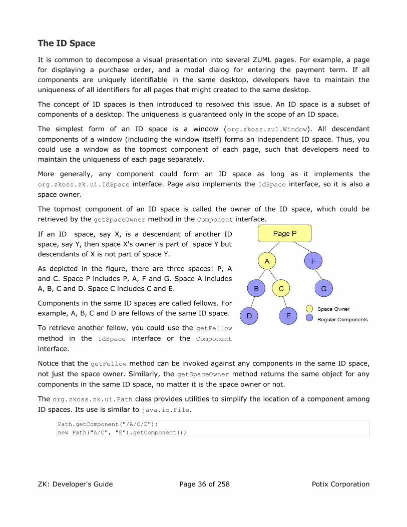
The ID Space
It is common to decompose a visual presentation into several ZUML pages. For example, a page for displaying a purchase order, and a modal dialog for entering the payment term. If all components are uniquely identifiable in the same desktop, developers have to maintain the uniqueness of all identifiers for all pages that might created to the same desktop.
The concept of ID spaces is then introduced to resolved this issue. An ID space is a subset of components of a desktop. The uniqueness is guaranteed only in the scope of an ID space.
The simplest form of an ID space is a window (org.zkoss.zul.Window). All descendant
components of a window (including the window itself) forms an independent ID space. Thus, you could use a window as the topmost component of each page, such that developers need to maintain the uniqueness of each page separately.
More generally, any component could form an ID space as long as it implements the
org.zkoss.zk.ui.IdSpace interface. Page also implements the IdSpace interface, so it is also a
space owner.
The topmost component of an ID space is called the owner of the ID space, which could be
retrieved by the getSpaceOwner method in the Component interface.
If an ID space, say X, is a descendant of another ID space, say Y, then space X's owner is part of space Y but descendants of X is not part of space Y.
As depicted in the figure, there are three spaces: P, A and C. Space P includes P, A, F and G. Space A includes A, B, C and D. Space C includes C and E.
Components in the same ID spaces are called fellows. For example, A, B, C and D are fellows of the same ID space.
To retrieve another fellow, you could use the getFellow method in the IdSpace interface or the Component interface.
Notice that the getFellow method can be invoked against any components in the same ID space,
not just the space owner. Similarly, the getSpaceOwner method returns the same object for any
components in the same ID space, no matter it is the space owner or not.
The org.zkoss.zk.ui.Path class provides utilities to simplify the location of a component among
ID spaces. Its use is similar to java.io.File.
Path.getComponent("/A/C/E");new Path("A/C", "E").getComponent();
ZK: Developer's Guide Page 36 of 258 Potix Corporation

Namespace and ID Space
To let the interpreter able to access the components directly, the namespace concept
(org.zkoss.scripting.Namespace) is introduced. First, each ID space has exactly one
namespace. Second, variables defined in a namespace are visible to the scripting codes and EL expressions that belong to the same namespace.
<window border="normal"><label id="l" value="hi"/><zscript>
l.value = "Hi, namespace";</zscript>${l.value}
</window>
In the following example, there are two namspaces. One belongs to window w1 and the other
to window w224. Thus, the b1 button's onClick script refers to the label defined in window
w1, while the b2 button's onClick script refers to the checkbox defined in window w2.
<window id="w1"><window id="w2">
<label id="c"/><button id="b1" onClick="c.value = "OK""/>
</window><checkbox id="c"/><button id="b2" onClick="c.label = "OK""/>
</window>
Notice the namespace is hierarchical. In other words, zscript in window w2 can see
components in window w1, unless it is overridden in window w2. Thus, clicking button b1 will
change label c in the following example.
<window id="w1"><window id="w2">
<button id="b1" onClick="c.value = "OK""/></window><label id="c"/>
</window>
In addition to ZK's assigning components to the namespace, you can assign your variables
to them by use of the setVariable method, such that zscript can reference them directly.
Variable and Functions Defined in zscript
In addition to executing codes, you could define variables and functions in the zscript element directly as depicted below.
24 A window implements org.zkoss.zk.ui.IdSpace, so it forms an independent ID space and namespace.
ZK: Developer's Guide Page 37 of 258 Potix Corporation
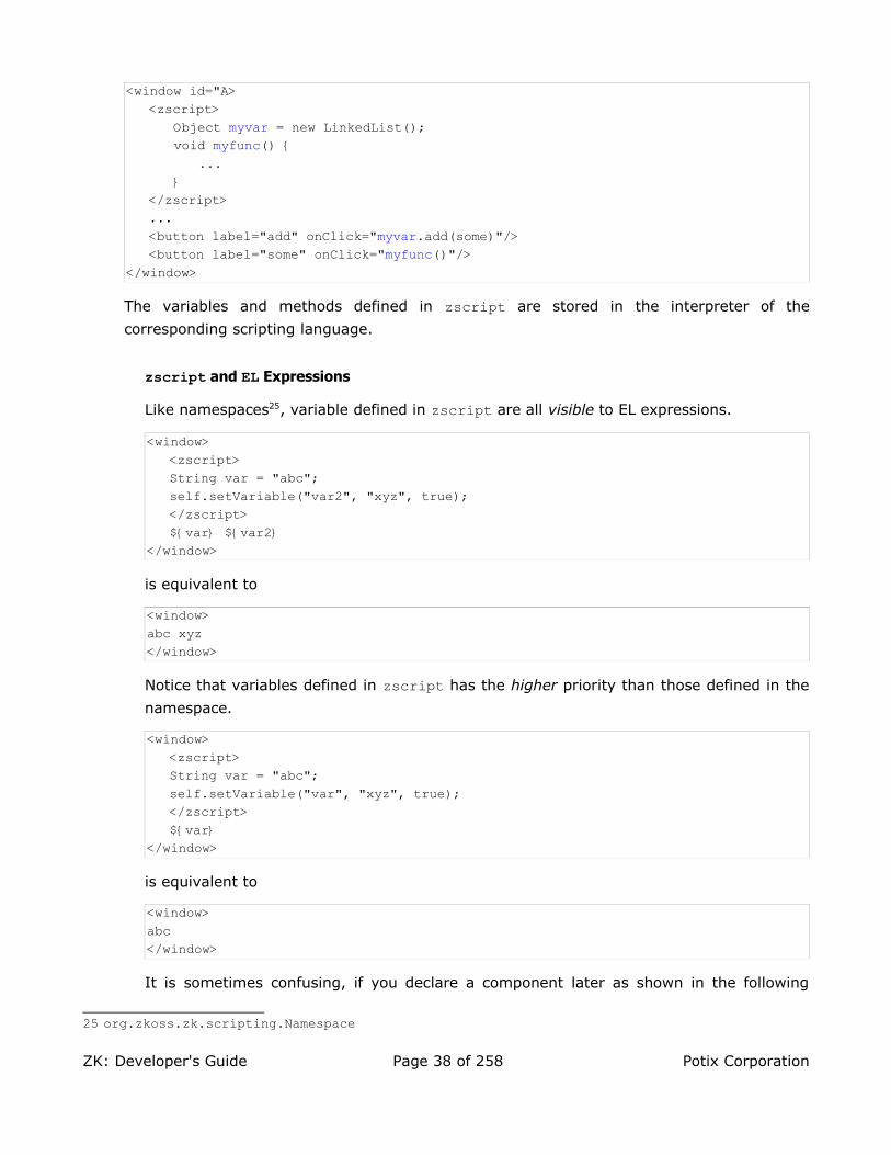
<window id="A><zscript>
Object myvar = new LinkedList();void myfunc() {
...}
</zscript>...<button label="add" onClick="myvar.add(some)"/><button label="some" onClick="myfunc()"/>
</window>
The variables and methods defined in zscript are stored in the interpreter of the
corresponding scripting language.
zscript and EL Expressions
Like namespaces25, variable defined in zscript are all visible to EL expressions.
<window><zscript>String var = "abc";self.setVariable("var2", "xyz", true);</zscript>${var} ${var2}
</window>
is equivalent to
<window>abc xyz</window>
Notice that variables defined in zscript has the higher priority than those defined in the
namespace.
<window><zscript>String var = "abc";self.setVariable("var", "xyz", true);</zscript>${var}
</window>
is equivalent to
<window>abc</window>
It is sometimes confusing, if you declare a component later as shown in the following
25 org.zkoss.zk.scripting.Namespace
ZK: Developer's Guide Page 38 of 258 Potix Corporation

example.
<window><zscript>String var = "abc";</zscript><label id="var" value="A label"/>${var.value} <!-- Wrong! var is "abc", not the label -->
</window>
Therefore, it is suggested to use some naming pattern to avoid the confusion. For
example, you can prefix all interpreter variables with zs_.
In additions, you shall use local variables if possible. A local variable is declared with the
class name, and it is visible only to a particular scope of zscript codes.
<zscript>Date now = new Date();</zscript>
Furthermore, you can make a local variable invisible to EL expressions by enclosing it with curly braces as follows.
<zscript>{ //create a new logic scope
String var = "abc"; //visible only inside of the enclosing curly brace}</zscript>
Multi-Scope Interpreters
Depending on the implementation, an interpreter might have exactly one logical scope, or one logic scope per ID space to store these variables and methods. For sake of description, we call them the single-scope and multi-scope interpreters, respectively.
Java interpreter (BeanShell) is a typical multi-scope interpreter26. It creates an interpreter-dependent scope for each ID space. For example, two logical scopes are
created for window A and B, respectively in the following example. Therefore, var2 is
visible only to window B, while var1 is visible to both window A and B in the following
example.
<window id="A"><zscript>var1 = "abc";</zscript><window id="B">
<zscript>var2 = "def";</zscript></window>
</window>
26 Java interpreter supports multi-scope after 2.3.1 (included) and before 2.2.1 (included).
ZK: Developer's Guide Page 39 of 258 Potix Corporation

Java Interpreter (BeanShell)
With Java Interpreter (BeanShell), you can declare an interpreter variable local to the logical scope of the nearest ID space (i.e., a window) by specifying the class name as below,
<window id="A"><window id="B">
<zscript>String b = "local to window B";
</zscript></window>
</window>
The following is a more sophisticated example which will generate abc def.
<window id="A"><zscript>var1 = var2 = "abc";</zscript><window id="B">
<zscript>Object var1 = "123";var2 = "def";var3 = "xyz";
</zscript></window>${var1} ${var2} ${var3}
</window>
where Object var1 = "123" actually creates a variable local to window B since the
class name, Object, is specified. On the other hand, var2 = "def" causes the
interpreter to look up any variable called var2 defined in the current scope or any
scope in the upper layers. Since var2 was defined in window A, the variable is
overridden. In the case of var3 = "xyz", a variable local to window B is created, since
window A doesn't define any variable called var3.
Single-Scope Interpreters
Ruby, Groovy and JavaScript interpreters don't support multi-scope yet27. It means all variables defined in, say, Ruby are stored in one logical scope (per interpreter). Thus, the interpreter variables defined in one window override those defined in another window if they are in the same page. To avoid confusion, you could prefix the variable names with special prefix denoting the window.
Tip: Each page has its own interpreter to evaluate zscript codes. If a desktop has
multiple pages, then it might have multiple instances of the interpreters (per scripting
language).
27 We may support it in the near future.
ZK: Developer's Guide Page 40 of 258 Potix Corporation

Multiple scripting Languages in One Page
Each scripting language is associated with one interpreter. Thus, variables and methods
defined in one language are not visible to another language. For example, var1 and var2 belong to two different interpreters in the following example.
<zscript language="Java">var1 = 123;
</zscript><zscript language="JavaScript">
var2 = 234;</zscript>
getVariable versus getZScriptVariableVariables defined in the namespace can be retrieved by use of the getVariable method.
On the other hand, variables defined in zscript is part of the interpret that interprets it.
They are not a part of any namespace. In other words, you can not retrieve them by use
of the getVariable method.
<zscript>var1 = 123; //var1 belongs to the interpreter, not any namespacepage.getVariable("var1"); //returns null
</zscript>
Instead, you have to use getZScriptVariable to retrieve variables defined in zscript.
Similarly, you can use getZScriptClass to retrieve classes and getZScriptMethod to
retrieve methods defined in zscript. These methods will iterate through all loaded
interpreters until the specified one is found.
If you want to search a particular interpreter, you can use the getInterpreter method to
retrieve the interpreter first, as follows.
page.getInterpreter("JavaScript").getVariable("some"); //interpreter for JavaScriptpage.getInterpreter(null).getVariable("some"); //interpreter for default language
Events
An event (org.zkoss.zk.ui.event.Event) is used to notify application what happens. Each type
of event is represented by a distinct class. For example, org.zkoss.zk.ui.event.MouseEvent denotes a mouse activity, such as clicking.
To response to an event, an application must register one or more event listeners to it. There are
two ways to register an event listener. One is by specifying the onXxx attribute in the markup
language. The other is by calling the addEventListener method for the component or the page
you want to listen.
ZK: Developer's Guide Page 41 of 258 Potix Corporation

In addition to event triggered by user's activity at the browser, an application could fire events by
use of the sendEvent, postEvent and echoEvent methods from the
org.zkoss.zk.ui.event.Events class.
Desktops and Event Processing
As mentioned above, a desktop is a collection of pages for serving the same URL request. A desktop is also the scope that an event listener could access.
When an event is fired, it is associate with a desktop. ZK separates events based on the associated desktops, and pipelines events into separated queues. Therefore, events for the same desktop are processed sequentially. On the other hand, events for different desktops are processed in parallel.
An event listener is allowed to access any components of any pages of the desktop associated with the event. It is also allowed to moving components from one page to another as long as they are in the same desktop. On the other hand, it cannot access components belonging to other desktops.
Note: Developers can detach a component from one desktop in one event listener, and
then attach it to another desktop in other event listener.
Desktops and the Creation of Components
When a component is created in an event listener, it is assigned automatically to the associated desktop of the event being processed. This assignment happens even if the component is not attached to a page. It means that any component you created in an event listener can be used in the same desktop that the listener is handling.
When a component is created in a thread other than any event listener, it doesn't belong to any desktop. In this case, you could attach to any desktop you want as long as the attachment occurs in a proper event listener. Of course, once the component is attached to a desktop, it belongs to the desktop forever.
For most applications, it is rarely necessary to create components in a thread other than event listeners. However, if you have a long operation, you might want to execute it in a background thread. Then, you could prepare the component tree at the background and then add it to a desktop when a proper event is received. Refer to the Long Operations section in the Event Listening and Processing chapter.
ZUML and XML Namespaces
The ZK User Interface Markup Language (ZUML) is a XML-based language used by developers to describe the visual presentation. ZUML is aimed to separate the dependency of the set of
ZK: Developer's Guide Page 42 of 258 Potix Corporation

components to use. In other words, different set of components28, such as XUL and XHTML, could be used simultaneously in the same ZUML page. Different markup languages could be added transparently. If two or more set of components are used in the same page, developers have to use the XML namespaces to distinguish them. Refer to the Component Sets and XML Namespaces section in the ZK User Interface Markup Language chapter if you want to mix multiple component sets, say XUL and XHTML, in the same page.
Tip: Using XML namespaces in ZUML is optional. You need it only if you want to mix two
or more.
28 Also known as tags. There is one-to-one mapping between components and tags.
ZK: Developer's Guide Page 43 of 258 Potix Corporation

4. The Component Lifecycle
This chapter describes the lifecycles of loading pages and updating pages.
The Lifecycle of Loading Pages
It takes four phases for ZK loaders to load and interpret a ZUML page: the Page Initial Phase, the Component Creation Phase, the Event Processing Phase, and the Rendering Phase.
The Page Initial Phase
In this phase, ZK processes the processing instructions, called init. If none of such
processing instructions are defined, this phase is skipped.
For each init processing instruction with the class attribute, an instance of the specified
class is constructed, and then its doInit method is called. What the class will do, of course,
depends on your application requirements.
<?init class="MyInit"?>
Another form of the init processing instruction is to specify a file containing the scripting
codes with the zscript attribute, as follows. Then, the file will be interpreted at the Page
Initial phase.
<?init zscript="/my/init.zs"?>
Notice that the page is not yet attached to the desktop when the Page Initial phase executes.
The Component Creation Phase
In this phase, ZK loader interprets an ZUML page. It creates and initializes components accordingly. It takes several steps as follows.
1. For each element, it examines the if and unless attribute to decide whether it is
effective. If not, the element and all of its child elements are ignored.
2. If the forEach attribute is specified with a collection of items, ZK repeats the following
steps for each item in the collection.
3. Creates a component based on the element name, or by use of the class specified in the
use attribute, if any.
4. Initializes the members one-by-one based on the order that attributes are specified in the ZUML page.
ZK: Developer's Guide Page 44 of 258 Potix Corporation
5. Interprets the nested elements and repeat the whole procedure.
6. Invokes the afterCompose method if the component implements the
org.zkoss.zk.ui.ext.AfterCompose interface29.
7. After all children are created, the onCreate event is sent to this component, such that
application could initialize the content of some elements later. Notice that the onCreate events are posted for child components first.
Note: an developer can perform some application-specific initialization by listening to
the onCreate event or implementing AfterCompose. AfterCompose is called in the
Component Creation Phase, while the onCreate event is handled by an event listener.
An event listener is free to suspend and resume the execution (such as creating modal
dialogs), while AfterCompose is a bit faster since no need to fork another thread.
The Event Processing Phase
In this phase, ZK invokes each listener for each event queued for this desktop one-by-one.
An independent thread is started to invoke each listener, so it could be suspended without affecting the processing of other events.
During the processing, an event listener might fire other events. Refer to the Event Listening and Processing chapter for details.
The Rendering Phase
After all events are processed, ZK renders these components into a regular HTML page and sends this page to the browser.
To render a component, the redraw method is called. The implementation of a component
shall not alter any content of the component in this method.
The Lifecycle of Updating Pages
It takes three phases for ZK AU Engine to process the ZK requests sent from the clients: the Request Processing Phase, the Event Processing Phase, and the Rendering Phase.
ZK AU Engine pipelines ZK requests into queues on a basis of one queue per desktop. Therefore, requests for the same desktop are processed sequentially. Requests for different desktops are processed in parallel.
The Request Processing Phase
Depending on the request, ZK AU Engine might update the content of affected components
29 The step 3-5 is so-called composing. That is why AfterCompose is named.
ZK: Developer's Guide Page 45 of 258 Potix Corporation

such that their content are the same as what are shown at the client.
Then, it posts corresponding events to the queue.
The Event Processing Phase
This phase is the same as the Event Processing Phase in the Component Creation Phase. It processes events one-by-one in an independent thread.
The Rendering Phase
After all events are processed, ZK renders affected components, generates corresponding ZK responses, and sends these responses back to the client. Then, Client Engine updates the DOM tree at the browser based on the responses.
Whether to redraw the whole visual presentation of a component or to update an attribute at the browser all depend on the implementation of components. It is the job of component developers to balance between interactivity and simplicity.
The Molds
A component could have different appearance even at the same page. The concept is called mold
(aka., template). Developers could dynamically change the mold by use of the setMold method in
the Component interface. All components support a mold called default, which is the default
value. Some components might have support two or more molds For example, tabbox supports
both default and accordion molds.
<tabbox><!-- if not specified, the default mold is assumed. --><tabs>
<tab label="Default"/></tabs><tabpanels>
<tabpanel><tabbox mold="accordion">
<tabs><tab label="First Accordion"/><tab label="Second Accordion"/>
</tabs><tabpanels>
<tabpanel>The first panel.</tabpanel><tabpanel>The second panel.</tabpanel>
</tabpanels></tabbox></tabpanel>
</tabpanels></tabbox>
ZK: Developer's Guide Page 46 of 258 Potix Corporation

Component Garbage Collection
Unlike many component-based GUI, ZK has no destroy or close method for components. Like W3C DOM, a component is removed from the browser as soon as it is detached from the page. It is shown as soon as it is attached to the page.
More precisely, once a component is detached from a page, it is no longer managed by ZK. If the application doesn't have any reference to it. The memory occupied by the component will be released by JVM's Garbage Collector.
ZK: Developer's Guide Page 47 of 258 Potix Corporation

5. Event Listening and Processing
This chapter describes how an event is processed.
Add Event Listeners by Markup Languages
The simplest way to add an event listener is to declare an attribute in a ZUML page. The value of the attribute for listening an event is any Java codes that could be interpreted by BeanShell.
<window title="Hello" border="normal"><button label="Say Hello" onClick="alert("Hello World!")"/>
</window>
Add and Remove Event Listeners by Program
There are two ways to add event listeners by program.
Declare a Member
When overriding a component by use of your own class, you could declare a member function to be an event listener as follows.
In a ZUML page, you declare the use attribute to specify what class you want to use instead
of the default one. As illustrated below, it asks ZK to use the MyWindow class instead of
org.zkoss.zul.Window30.
<window use="MyWindow">...</window>
Then, you implement MyWindow.java by extending from the default class as follows.
public class MyWindow extends org.zkoss.zul.Window {public void onOK() { //add an event listener
...//handles the onOK event (sent when ENTER is pressed)}
}
If you want to retrieve more information about the event, you could declare as follows.
public void onOK(org.zkoss.zk.ui.event.KeyEvent event) {...}
or
30 The default class is defined in lang.xml embedded in zul.jar.
ZK: Developer's Guide Page 48 of 258 Potix Corporation

public void onOK(org.zkoss.zk.ui.event.Event event) {...}
Different events might be associated with different event objects. Refer to Append C for more details.
Add and Remove Event Listeners Dynamically
Developers could use the addEventListener and removeEventListener methods of the
org.zkoss.zk.ui.Component interface to dynamically add or remove an event listener. As
illustrated below, the event listener to be added dynamically must implement the
org.zkoss.zk.ui.event.EventListener interface.
void init(Component comp) {...comp.addEventListener("onClick", new MyListener());...
}class MyListener implements org.zkoss.zk.ui.event.EventListener {
public void onEvent(Event event) throws UiException {...//processing the event
}}
Deferrable Event Listeners
By default, events are sent the server when it is fired at the client. However, many event listeners are just used to maintain the status at the server, rather than providing visual response to the user. In other words, the events for these listeners have no need to be sent immediately. Rather, they shall be sent at once to minimize the traffic between the client and the server, and then to improve the server's performance. For the sake of the description convenience, we call them the deferrable event listeners.
To make an event listener deferrable, you have to implement the
org.zkoss.zk.ui.event.Deferrable interface (with EventListener) and return true for
the isDeferrable method as follows.
public class DeferrableListener implements EventListener, Deferrable {private boolean _modified;public void onEvent(Event event) {
_modified = true;}public boolean isDeferrable() {
return true;}
}
When an event is fired at the client (e.g., the user selects a list item), ZK won't send the
ZK: Developer's Guide Page 49 of 258 Potix Corporation

event if no event listener is registered for it or only deferrable listeners are registered. instead, the event is queued at the client.
On the hand, if at least one non-deferrable listener is registered, the event are sent immediately with all queued events to the server at once. No event is lost and the arriving order is preserved.
Tip: Use the deferrable listeners for maintaining the server status, while the non-
deferrable listeners for providing the visual responses for the user.
Add and Remove Event Listeners to Pages Dynamically
Developers could add event listeners to a page (org.zkoss.zk.ui.Page) dynamically. Once
added, all events of the specified name the are sent to any components of the specified page will be sent to the listener.
All page-level event listeners are non-ASAP. In other words, the isArap method is ignored.
A typical example is to use a page-level event listener to maintain the modification flag as follows.
public class ModificationListener implements EventListener, Deferrable {private final Window _owner;private final Page _page;private boolean _modified;
public ModificationListener(Window owner) {//Note: we have to remember the page because unregister might//be called after the owner is detached_owner = owner;_page = owner.getPage();_page.addEventListener("onChange", this);_page.addEventListener("onSelect", this);_page.addEventListener("onCheck", this);
}/** Called to unregister the event listener. */public void unregister() {
_page.removeEventListener("onChange", this);_page.removeEventListener("onSelect", this);_page.removeEventListener("onCheck", this);
}/** Returns whether the modified flag is set. */public boolean isModified() {
return _modified;}//-- EventListener --//public void onEvent(Event event) throws UiException {
_modified = true;}
ZK: Developer's Guide Page 50 of 258 Potix Corporation

//-- Deferrable --//public boolean isDeferrable() {
return true;}
}
Note: Whether to implement the Deferrable interface is optional in this example,
because the page's event listeners are always assumed to be deferrable, no matter
Deferrable is implemented or not.
The Invocation Sequence
The sequence of invoking event listeners is as follows. Let us assume the onClick event is
received.
1. Invoke event listeners for the onClick event one-by-one that are added to the targeting
component, if the listeners also implement the org.zkoss.zk.ui.event.Express interface. The first added, the first called.
2. Invoke the script specified in the onClick attribute of the targeting component, if any.
3. Invoke event listeners for the onClick event one-by-one that are added to the targeting
component, if the listeners don't implement the org.zkoss.zk.ui.event.Express interface. The first added, the first called.
4. Invoke the onClick member method of the targeting component, if any.
5. Invoke event listeners for the onClick event one-by-one that are added to the page that
the targeting component belongs. The first added, the first called.
The org.zkoss.zk.ui.event.Express interface is a decorative interface used to alter the
invocation priority of an event listener. Notice that it is meaningless if the event listener is added to pages, instead of components.
Abort the Invocation Sequence
You could abort the calling sequence by calling the stopPropagation method in the
org.zkoss.zk.ui.event.Event class. Once one of the event listeners invokes this method,
all following event listeners are ignored.
Send, Post and Echo Events from an Event Listener
In addition to receiving events, an application could communicate among event listeners by posting or sending events to them.
ZK: Developer's Guide Page 51 of 258 Potix Corporation

Post Events
By use of the postEvent method in the org.zkoss.zk.ui.event.Events class, the
application could post an event to the end of the event queue. This method returns immediately after placing the event into the queue. The event will be processed later after all events preceding it have been processed.
Send Events
By use of the sendEvent method in the org.zkoss.zk.ui.event.Events class, the
application could ask ZK to process the specified event immediately. This method won't return until all event listeners of the specified event has been processed. The event is processed at the same thread.
Echo Events
By use of the echoEvent method in the org.zkoss.zk.ui.event.Events class, the
application could ask the client to echo back the event for processing later. This method returned immediately after queuing the response asking the client to echo back the event.
Notice that, unlike sendEvent and postEvent, the event won't be processed in the current
execution. Rather, it is processed later after the client echoes back the event. In other words, the event is processed later after the client has updated its user interfaces. Thus, it is useful to prompt the user before starting a long operation.
For example, you can open a highlighted window and then invoke echoEvent to do the long
operation after the client shows the window (and echoes back the event).
For example, we can use the org.zkoss.zk.ui.util.Clients.showBusy method to show
the busy message such that the user knows the system is busy. So, the end user will see "Execute..." first and then, after two seconds, "Done." in the following example. If you use
postEvent, the end user will see "Execute..." and "Done" at the same time after two
seconds.
<window id="w" title="Test echoEvent"><attribute name="onLater">Thread.sleep(2000);Clients.showBusy(null, false);new Label("Done.").setParent(w);</attribute>
<button label="echo"><attribute name="onClick">Clients.showBusy("Execute...", true);Events.echoEvent("onLater", w, null);</attribute></button>
</window>
ZK: Developer's Guide Page 52 of 258 Potix Corporation

Thread Model
For each desktop, events are processed sequentially, so thread model is simple. Like developing desktop applications, you don't need to worry about racing and multi-threading. All you need to do is to register an event listener and process the event when invoked.
Tip: Each event listener executes in an independent thread called event processing
thread, while the ZUML page is evaluated in the servlet thread.
Tip: The use of the event processing thread can be disabled such that all events are
processed in the Servlet threads. It has a little bit better performance and less
integration issues. However, you can not suspend the execution. Refer to the Use the
Servlet Thread to Process Events section in the Advanced Features chapter.
Suspend and Resume
For advanced applications, you might have to suspend an execution until some condition is
satisfied. The wait, notify and notifyAll methods of the org.zkoss.zk.ui.Executions class are designed for such purpose.
When an event listener want to suspend itself, it could invoke wait. Another thread could
then wake it up by use of notify or notifyAll, if the application-specific condition is
satisfied. The modal dialog is an typical example of using this mechanism.
public void doModal() throws InterruptedException {...
Executions.wait(_mutex); //suspend this thread, an event processing thread}public void endModal() {...
Executions.notify(_mutex); //resume the suspended event processing thread}
Their use is similar to the wait, notify and notifyAll methods of the java.lang.Object class. However, you cannot use the methods of java.lang.Object for suspending and
resuming event listeners. Otherwise, all event processing will be stalled for the associated desktop.
Notice that, unlike Java Object's wait and notify, whether to use the synchronized block
to enclose Executions' wait and notify is optional. In the above case, we don't have to,
because no racing condition is possible. However, if there is an racing condition, you can use
the synchronized block as what you do with Java Object's wait and notify.
//Thread 1public void request() {
...synchronized (mutex) {
...//start another threadExecutions.wait(mutex); //wait for its completion
ZK: Developer's Guide Page 53 of 258 Potix Corporation

}}
//Thread 2public void process() {
... //process it asynchronouslysynchronized (mutex) {
Executions.notify(mutex);}
}
Long Operations
Events for the same desktop are processed sequentially. In other words, an event handler will block any following handlers. Worse of all, the user, due to the limitation of HTTP, got no hint but the small processing dialog shown at the left-top corner on the browser.
With the echo event and the showBusy method as described in the Echo Events section
above, you can provide a more descriptive message and prevent the user from, say, clicking other buttons to slow down the performance further for long operations.
However, blocking users from access might not be acceptable for your applications. To prevent the blocking, you have to, like desktop applications, process the long operation in another working thread. Then, report the processing status back the client continuously.
With ZK, you have four options: server push, suspend and resume, timer, and piggyback.
Alternative 1: Server Push
Server push is so-called reverse-Ajax which allows the server to send content to the client actively. With the help of server push, you could send or update the content to the client in the working thread when your pre-defined condition is satisfied. To use server push is simple,and it requires only three steps as follows,
1. Enable server push for the desktop
Invoke Desktop.enableServerPush(boolean bool) to enable server push
2. Passing components required to be update into the working thread
3. Invoke the working thread in the desktop
Note: You need to install zkex.jar or zkmax.jar to have the server push, unless you
have your own implementation of org.zkoss.zk.ui.sys.ServerPush.
Let’s take a look at a real example below. If you want to update the number of client using server push, first of all, you have to enable server push for the desktop and then to invoke the thread as follows,
ZK: Developer's Guide Page 54 of 258 Potix Corporation

<window title="Demo of Server Push"><zscript>
import test.WorkingThread;WorkingThread thread;void startServerpush(){
//enable server pushdesktop.enableServerPush(true);
//invoke working thread and passing required component as parameterthread= new WorkingThread(info);
thread.start();}void stopServerpush(){
//stop the threadthread.setDone();//disable server pushdesktop.enableServerPush(false);
}</zscript>
<vbox><button label="Start Server Push" onClick="startServerpush()"/><button label="Stop Server Push" onClick="stopServerpush()"/>
<label id="info"/></vbox>
</window>
Security Issue
One thing to notice is that the problem of synchronization which happens when a desktop is accessed by multiple threads at the same time Thus, before accessing the
desktop, you have to invoke Executions.activate(Desktop desktop) to get full
control of the desktop to avoid this problem, and then release the control of the
desktop by invoking Executions.deactivate(Desktop desktop) after the thread
finishing its job as follows,
package test;
publicclass WorkingThread extends Thread{private final Desktop _desktop;private final Label _info;private int _cnt;private boolean _ceased;publicWorkingThread(Label info){
_desktop = info.getDesktop();_info = info;
}publicvoid run(){
try{while (!_ceased){
Threads.sleep(2000); //Update each two secondsExecutions.activate(_desktop); //get full control of desktop
ZK: Developer's Guide Page 55 of 258 Potix Corporation

try{_info.setValue(Integer.toString(++_cnt));
}catch(RuntimeException ex) {throw ex;
}catch(Error ex){throw ex;
}finally{Executions.deactivate(_desktop);
//release full control of desktop}
}} catch(InterruptedException ex){
}}publicvoid setDone(){
_ceased = true;}
}
Behind the Scene
The mechanism of server push is implemented using client-polling technique which the client will query the server repetitively to invoke the working thread to do its job, and the frequency of query could be adjusted manually by invoking
Executions.setDelay(int min, int max, int factor).
• min, the minimal delay to poll the server for any pending server-push threads.
• max, the maximum delay to poll the server for any pending server-push threads.
• factor, The real delay is the processing time multiplies the delay factor.
Last, one thing to notice is that the frequency will be adjusted automatically depending on the loading of the server
Alternative 2: Thread Suspend and Resume
With the help of server push, you don't have to take care about the problem of multi threads. However, if you would like to handle this job by yourself, you have to conform with the following rules due to the limitations of HTTP.
• Use the wait method in the org.zkoss.zk.ui.Executions class to suspend the event
handler itself, after creating a working thread.
• Because the working thread is not an event listener, it cannot access any components, unless the components don't belong to any desktop. Thus, you might have to pass necessary information manually before starting the working thread.
• Then, the working thread could crush the information and create components as necessary. Just don't reference any component that belongs to any desktop.
ZK: Developer's Guide Page 56 of 258 Potix Corporation

• Use the notify(Desktop desktop, Object flag) or notifyAll(Desktop desktop, Object flag) method in the org.zkoss.zk.ui.Executions class in the working
thread to resume the event handler, after the working thread finishes.
• The resumed event handler won't be executed immediately until another event is sent from the client. To enforce an event to be sent, you could use a timer component
(org.zkoss.zul.Timer) to fire an event a moment later or periodically. This event
listener for this timer could do nothing or update the progress status.
Example: A Working Thread Generates Labels Asynchronously
Assume we want create a label asynchronously. Of course, it is non-sense to do such a little job by applying multi-threading, but you can replace the task with sophisticated one.
//WorkingThreadpackage test;public class WorkingThread extends Thread {
private static int _cnt;private Desktop _desktop;private Label _label;private final Object _mutex = new Integer(0);
/** Called by thread.zul to create a label asynchronously.*To create a label, it start a thread, and wait for its completion.*/public static final Label asyncCreate(Desktop desktop)
throws InterruptedException {final WorkingThread worker = new WorkingThread(desktop);synchronized (worker._mutex) { //to avoid racing
worker.start();Executions.wait(worker._mutex);return worker._label;
}}public WorkingThread(Desktop desktop) {
_desktop = desktop;}public void run() {
_label = new Label("Execute "+ ++_cnt);synchronized (_mutex) { //to avoid racingExecutions.notify(_desktop, _mutex);
}}
}
Then, we have a ZUML page to invoke this working thread in an event listener, say
onClick.
<window id="main" title="Working Thread"><button label="Start Working Thread">
ZK: Developer's Guide Page 57 of 258 Potix Corporation

<attribute name="onClick">timer.start();Label label = test.WorkingThread.asyncCreate(desktop);main.appendChild(label);timer.stop()</attribute>
</button><timer id="timer" running="false" delay="1000" repeats="true"/>
</window>
Notice that we have to use a timer to really resume the suspended the event listener
(onClick). It looks odd, but it is a must due to the HTTP limitation: to keep Web page
alive at the browser, we have to return the response when the event processing is suspended. Then, when the working thread completes its job and notifies the even listener, the HTTP request was already gone. Therefore, we need a way to 'piggyback' the result, which the timer is used for.
More precisely, when the working thread notifies the event listener to resume, ZK only adds it to a waiting list. And, the listener is really resumed when another HTTP request
arrives (in the above example, it is the onTimer event)
In this simple example, we do nothing for the onTimer event. For a sophisticated
application, you can use it to send back the progressing status.
Alternative 3: Timer (No Suspend/Resume)
It is possible to implement a long operation without suspend and resume. It is useful if the synchronization codes are going too complex to debug.
The idea is simple. The working thread save the result in a temporary space, and then the
onTimer event listener pops the result to the desktop.
//WorkingThread2package test;public class WorkingThread2 extends Thread {
private static int _cnt;private final Desktop _desktop;private final List _result;
public WorkingThread2(Desktop desktop, List result) {_desktop = desktop;_result = result;
}public void run() {
_result.add(new Label("Execute "+ ++_cnt));}
}
Then, you append the labels in the onTimer event listener.
<window id="main" title="Working Thread2">
ZK: Developer's Guide Page 58 of 258 Potix Corporation

<zscript>int numPending = 0;List result = Collections.synchronizedList(new LinkedList());
</zscript><button label="Start Working Thread">
<attribute name="onClick">++numPending;timer.start();new test.WorkingThread2(desktop, result).start();
</attribute></button><timer id="timer" running="false" delay="1000" repeats="true">
<attribute name="onTimer">while (!result.isEmpty()) {main.appendChild(result.remove(0));--numPending;}if (numPending == 0) timer.stop();
</attribute></timer>
</window>
Alternative 4: Piggyback (No Suspend/Resume, No Timer)
Instead of checking the results periodically, you can piggyback them to the client when the user, say, clicks a button or enters something.
To piggyback, all you need to do is to register an event listener for the onPiggyback event to one of the root components. Then, the listener will be invoked each time ZK Update Engine has processed the events. For example, you can rewrite the codes as follows.
<window id="main" title="Working Thread3" onPiggyback="checkResult()"><zscript>List result = Collections.synchronizedList(new LinkedList());
void checkResult() {while (!result.isEmpty())
main.appendChild(result.remove(0));}</zscript><button label="Start Working Thread">
<attribute name="onClick">timer.start();new test.WorkingThread2(desktop, result).start();
</attribute></button>
</window>
The advantage of the piggyback is no extra traffic between the client and the server. However, the user sees no updates if he doesn't have any activity, such as clicking or
ZK: Developer's Guide Page 59 of 258 Potix Corporation

typing. Whether it is proper is really up to the application requirements.
Note: A deferrable event won't be sent to the client immediately, so the onPiggyback event is triggered only if a non-deferrable event is fired. Refer to the Deferrable Event
Listeners section.
Initialization and Cleanup of Event Processing Thread
Initialization Before Processing Each Event
An event listener is executed in an event processing thread. Sometimes, you have to initialize the thread before processing any event.
A typical example is to initialize the thread for the authentication. Some J2EE or Web containers store authentication information in the thread local storage, such that they could re-authenticate automatically when needed.
To initialize the event processing threads, you have to register a class, that implements the
org.zkoss.zk.ui.event.EventThreadInit interface, to the listener element in the WEB-INF/zk.xml file31.
Once registered, an instance of the specified class is constructed in the main thread (aka.,
the servlet thread), before starting an event processing thread. Then, the init method of
the instance is called at the context of the event processing thread before doing anything else.
Notice that the constructor and the init method are invoked at different thread such that
developers could retrieve thread-dependent data from one thread and pass to anther.
Here is an example for the authentication mechanism of JBoss32. In this example, we retrieve the information stored in the servlet thread in the constructor. Then, we initialize the event
processing thread when the init method is called.
import java.security.Principal;import org.jboss.security.SecurityAssociation;import org.zkoss.zk.ui.Component;import org.zkoss.zk.ui.event.Event;import org.zkoss.zk.ui.event.EventThreadInit;
public class JBossEventThreadInit implements EventThreadInit {private final Principal _principal;private final Object _credential;/** Retrieve info at the constructor, which runs at the servlet thread. */public JBossEventThreadInit() {
_principal = SecurityAssociation.getPrincipal();
31 It is described more detailedly in Appendix B in the Developer's Reference.
32 http://www.jboss.org
ZK: Developer's Guide Page 60 of 258 Potix Corporation

_credential = SecurityAssociation.getCredential();}//-- EventThreadInit --///** Initial the event processing thread at this method. */public void init(Component comp, Event evt) {
SecurityAssociation.setPrincipal(_principal);SecurityAssociation.setCredential(_credential);
}}
Then, in WEB-INF/zk.xml, you have to specify as follows.
<zk><listener>
<listener-class>JBossEventThreadInit</listener-class></listener>
</zk>
Cleanup After Processed Each Event
Similarly, you might have to clean up an event processing thread after it has processed an event.
A typical example is to close the transaction, if it is not closed properly.
To cleanup the event processing threads, you have to register a listener class, that
implements the org.zkoss.zk.ui.event.EventThreadCleanup interface, to the listener element in the WEB-INF/zk.xml file.
<zk><listener>
<listener-class>my.MyEventThreadCleanup</listener-class><listener>
</zk>
ZK: Developer's Guide Page 61 of 258 Potix Corporation

6. The ZK User Interface Markup Language
The ZK User Interface Markup Language (ZUML) is based on XML. Each XML element describes what component to create. A XML attribute describes an initial values to be assigned to the created component. An XML processing instruction describes how to process the whole page, such as the page title.
Different sets of components are distinguished by XML namespaces. For example, the namespace
of XUL is http://www.zkoss.org/2005/zul,33 and that of XHTML is
http://www.w3.org/1999/xhtml.
XML
This section provides the most basic concepts of XML to work with ZK. If you are familiar with XML, you could skip this section. If you want to learn more, there are a lot of resources on
Internet, such as http://www.w3schools.com/xml/xml_whatis.asp and
http://www.xml.com/pub/a/98/10/guide0.html.
XML is a markup language much like HTML but with stricter and cleaner syntax. It has several characteristics worth to notice.
Elements Must Be Well-formed
First, each element must be closed. They are two ways to close an element as depicted below. They are equivalent.
Description Code
Close by an end tag: <window></window>
Close without an end tag: <window/>
Second, elements must be properly nested.
Result Code
Correct: <window> <groupbox> Hello World! </groupbox></window>
Wrong: <window> <groupbox> Hello World!
33 It was called http://www.mozilla.org/keymaster/gatekeeper/there.is.only.xul. However ,
many non-XUL features are added, so it is better to use an independent namespace.
ZK: Developer's Guide Page 62 of 258 Potix Corporation

Result Code
</window></groupbox>
Special Character Must Be Replaced
XML use <element-name> to denote an element, so you have to replace special characters.
For example, you have to use < to represent the < character.
Special Character Replaced With
< <> >& &" "' '
Alternatively, you could ask XML parser not to interpret a piece of text by use of CDATA as
follows.
<zscript><![CDATA[void myfunc(int a, int b) {
if (a < 0 && b > 0) {//do something
}]]></zscript>
It is interesting to notice that backslash (\) is not a special character, so you don't need to escape it at all.
Attribute Values Must Be Specified and Quoted
Result Code
Correct: width="100%"checked="true"
Wrong: width=100%checked
Comments
A comment is used to leave a note or to temporarily edit out a portion of XML code. To add a comment to XML, use <!-- and --> to escape them.
<window><!-- this is a comment and ignored by ZK --></window>
ZK: Developer's Guide Page 63 of 258 Potix Corporation

Character Encoding
It is, though optional, a good idea to specify the encoding in your XML such that the XML parser can interprets it correctly. Note: it must be the first line of the file.
<?xml version="1.0" encoding="UTF-8"?>
In addition to specify the correct encoding, you have to make sure your XML editor supports it as well.
Namespace
Namespaces are a simple and straightforward way to distinguish names used in XML documents. ZK uses XML namespaces to distinguish the component name, such that it is OK to have two components with the same name as long as they are in different namespace. In other words, ZK uses a XML namespace to represent a component set, such that developers could mix two or more component sets in the same page, as depicted below.
<html xmlns="http://www.w3.org/1999/xhtml"xmlns:x="http://www.zkoss.org/2005/zul"xmlns:zk="http://www.zkoss.org/2005/zk">
<head><title>ZHTML Demo</title>
</head><body>
<h1>ZHTML Demo</h1><table><tr>
<td><x:textbox/></td><td><x:button label="Now" zk:onClick="addItem()"/></td>
</tr></table><zk:zscript>
void addItem() {}</zk:zscript>
</body></html>
where
• xmlns:x="http://www.zkoss.org/2005/zul" specifies a namespace called
http://www.zkoss.org/2005/zul, and use x to represent this namespace.
• xmlns="http://www.w3.org/1999/xhtml" specifies a namespace called
http://www.w3.org/1999/xhtml, and use it as the default namespace.
• <html> specifies an element called html from the default namespace, i.e.,
http://www.w3.org/1999/xhtml in this example.
ZK: Developer's Guide Page 64 of 258 Potix Corporation

• <x:textbox/> specifies an element called textbox from the name space called
http://www.zkoss.org/2005/zul.
Auto-completion with Schema
Many IDEs, such Eclipse, supports auto-completion if XML schema is specified as follows.
<window xmlns="http://www.zkoss.org/2005/zul"xmlns:xsi="http://www.w3.org/2001/XMLSchema-instance"xsi:schemaLocation="http://www.zkoss.org/2005/zul http://www.zkoss.org/2005/zul/zul.xsd">
In addition to downloading from http://www.zkoss.org/2005/zul/zul.xsd, you can find
zul.xsd under the dist/xsd directory in the ZK binary distribution.
Conditional Evaluation
The evaluation of an element could be conditional. By specifying the if or unless attribute or
both, developers could control whether to evaluate the associated element.
In the following example, the window component is created only if a is 1 and b is not 2. If an element is ignored, all of its child elements are ignored, too.
<window if="${a==1}" unless="${b==2}">...
</window>
The following example controls when to interpret a piece of Java codes.
<textbox id="contributor"/><zscript if="${param.contributor}">
contributor.label = Executions.getCurrent().getParameter("contributor");</zscript>
Iterative Evaluation
The evaluation of an element could be iterative. By specifying a collection of objects to the
forEach Attribute, developers could control how many time of the associated element shall be
evaluated. For sake of description, we call an element is an iterative element if it is assigned with
the forEach attribute.
In the following example, the list item is created three times. Notice that you have to use EL expression to specify the collection.
<listbox> <zscript> grades = new String[] {"Best", "Better", "Good"};
ZK: Developer's Guide Page 65 of 258 Potix Corporation

</zscript> <listitem label="${each}" forEach="${grades}"/></listbox>
The iteration depends on the type of the specified value of the forEach attribute.
• If java.util.Collection, it iterates each element of the collection.
• If java.util.Map, it iterates each Map.Entry of the map.
• If java.util.Iterator, it iterates each element from the iterator.
• If java.util.Enumeration, it iterates each element from the enumeration.
• If Object[], int[], short[], byte[], char[], float[] or double[] is specified, it iterates
each element from the array.
• If null, nothing is generated (it is ignored).
• If neither of above types is specified, the associated element will be evaluated once as if a collection with a single item is specified.
<listbox> <listitem label="${each}" forEach="grades"/></listbox>
The each Variable
During the evaluation, a variable called each is created and assigned with the item from the
specified collection. In the above example, each is assigned with "Best" in the first iteration,
then "Better" and finally "Good".
Notice that the each variable is accessible both in EL expression and in zscript. ZK will
preserve the value of the each variable if it is defined before, and restore it after the
evaluation of the associated element.
The forEachStatus Variable
The forEachStatus variable is an instance of org.zkoss.ui.util.ForEachStatus. It holds
the information about the current iteration. It is mainly used to get the item of the enclosing
element that is also assigned with the forEach attribute.
In the following example, we use nested iterative elements to generate two listboxes.
<hbox> <zscript>classes = new String[] {"College", "Graduate"};grades = new Object[] { new String[] {"Best", "Better"}, new String[] {"A++", "A+", "A"}}; </zscript>
ZK: Developer's Guide Page 66 of 258 Potix Corporation

<listbox width="200px" forEach="${classes}"> <listhead> <listheader label="${each}"/> </listhead> <listitem label="${forEachStatus.previous.each}: ${each}" forEach="${grades[forEachStatus.previous.index]}"/> </listbox></hbox>
Notice that the forEachStatus variable is accessible both in EL expression and in zscript.
How to Use each and forEachStatus Variables in Event Listeners
It is a bit tricky to use the forEach and forEachStatus variables in event listeners, because
they are available only in the Component Creation Phase34. Thus, the following sample is
incorrect: when the onClick listener is called, the each variable is no longer available.
<window title="Countries" border="normal" width="100%"><zscript><![CDATA[String[] countries = {
"China", "France", "Germany", "United Kindom", "United States"};]]></zscript>
<hbox><button label="${each}" forEach="${countries}"
onClick="alert(each)"/> <!-- incorrect!! --></hbox>
</window>
Notice that the button's label is assigned correctly because it is done at the same phase – the Component Creation Phase.
Also notice that you cannot use EL expressions in the event listener. For example, the
following codes fail to execute because the onClick listener is not a legal Java codes (i.e.,
EL expressions are ignored in zscript).
<button label="${each}" forEach="${countries}"onClick="alert(${each})"/> <!-- incorrect!! -->
A Solution: custom-attributesThe solution is that we have to store the content of each (and forEachStatus)
somewhere such that its content is still available when the listener executes. You can store its content anywhere, but there is a simple way to do it as follows.
34 Refer to the Component Lifecycle chapter for more details.
ZK: Developer's Guide Page 67 of 258 Potix Corporation

<window title="Countries" border="normal" width="100%"><zscript><![CDATA[String[] countries = {
"China", "France", "Germany", "United Kindom", "United States"};]]></zscript>
<hbox><button label="${each}" forEach="${countries}"onClick="alert(self.getAttribute("country"))">
<custom-attributes country="${each}"/></button>
</hbox></window>
Like button's label, the properties of custom attributes are evaluated in the Component
Creation Phase, so you can use each there. Then, it is stored to a custom attribute which
will last as long as the component exists (or until being removed programmingly).
Load on Demand
By default, ZK creates a component based on what are defined in a ZUML page one-by-one, when loading the page. However, we can defer the creation of a portion of components, until they become visible. This feature is called load-on-demand. It improves the performance, if there are a lot of invisible components at the beginning.
Load-on-Demand with the fulfill Attribute
The simplest way to defer the creation of the child components is to use the fulfill attribute. For example, the comboitem component in the following code snippet will not be
created, until the combobox component receives the onOpen event, indicating comboitem is
becoming visible.
<combobox fulfill="onOpen"><comboitem label="First Option"/>
</combobox>
In other words, if a ZUML element is specified with the fulfill attribute, its child elements
won't be processed until the event specified as the value of the fulfill attribute is
received.
If the event to trigger the creation of children is targeted to another component, you can specify the target component's identifier after colon as depicted below.
<button id="btn" label="show" onClick="content.visible = true"/><div id="content" fulfill="btn.onClick">
Any content created automaticall when btn is clicked</div>
ZK: Developer's Guide Page 68 of 258 Potix Corporation

If the components belong to different ID space, you can specify a path after the event name as follows.
<button id="btn" label="show" onClick="content.visible = true"/><window id="content" fulfill="../btn.onClick">
Any content created automaticall when btn is clicked</window>
Load-on-Demand with an Event Listener
If you prefer to create the children manually or you need to alter them dynamically, you can listen to the event indicating the children are becoming visible, and then manipulate them in the listener. For example,
<combobox id="combo" onOpen="prepare()"/><zscript><![CDATA[
void prepare() {if (event.isOpen() && combo.getItemCount() == 0) {
combo.appendItem("First Option");}
}]]></zscript>
Implicit Objects
For scripts embedded in a ZUML page, there are a set of implicit objects that enable developers to access components more efficiently. These objects are available to the Java codes included by the
zscript element and the attributes for specifying event listeners. They are also available to EL
expressions.
For example, self is an instance of org.zkoss.zk.ui.Component to represent the component
being processing. In the following example, you could identify the component in an event listener
by self.
<button label="Try" onClick="alert(self.label)"/>
Similarly, event is the current event being processed by an event listener. Thus, the above
statement is equivalent to
<button label="Try" onClick="alert(event.target.label)"/>
List of Implicit Objects
Object Name Description
self org.zkoss.zk.ui.Component
The component itself.
ZK: Developer's Guide Page 69 of 258 Potix Corporation

Object Name Description
spaceOwner org.zkoss.zk.ui.IdSpace
The space owner of this component. It is the same as
self.spaceOwner.
page org.zkoss.zk.ui.Page
The page. It is the same as self.page.
desktop org.zkoss.zk.ui.Desktop
The desktop. It is the same as self.desktop.
session org.zkoss.zk.ui.Session
The session.
application org.zkoss.zk.ui.WebApp
The Web application.
componentScope java.util.Map
A map of attributes defined in the component. It is the same as the
getAttributes method in the org.zkoss.zk.ui.Component interface.
spaceScope java.util.Map
A map of attributes defined in the ID space containing this component.
pageScope java.util.Map
A map of attributes defined in the page. It is the same as the
getAttributes method in the org.zkoss.zk.ui.Page interface.
desktopScope java.util.Map
A map of attributes defined in the desktop. It is the same as the
getAttributes method in the org.zkoss.zk.ui.Desktop interface.
sessionScope java.util.Map
A map of attributes defined in the session. It is the same as the
getAttributes method in the org.zkoss.zk.ui.Session interface.
applicationScope java.util.Map
A map of attributes defined in the web application. It is the same as
the getAttributes method in the org.zkoss.zk.ui.WebApp interface.
ZK: Developer's Guide Page 70 of 258 Potix Corporation

Object Name Description
requestScope java.util.Map
A map of attributes defined in the request. It is the same as the
getAttributes method in the org.zkoss.zk.ui.Execution interface.
arg java.util.Map
The arg argument passed to the createComponents method in the
org.zkoss.zk.ui.Executions class. It is never null.
Notice that arg is available only when creating the components for
the included page (the first argument of createComponents). On
the other hand, all events, including onCreate, are processed later.
Thus, if you want to access arg in the onCreate's listener, use the
getArg method of the org.zkoss.zk.ui.event.CreateEvent class.
It is the same as self.desktop.execution.arg.
each java.lang.Object
The current item of the collection being iterated, when ZK evaluates an iterative element. An iterative element is an element with the
forEach attribute.
forEachStatus org.zkoss.zk.ui.util.ForEachStatus
The status of an iteration. ZK exposes the information relative to the iteration taking place when evaluating the iterative element.
event org.zkoss.zk.ui.event.Event or derived
The current event. Available for the event listener only.
Information about Request and Execution
The org.zkoss.zk.ui.Execution interface provides information about the current execution, such as the request parameters. To get the current execution, you could do one of follows.
• If you are in a component, use getDesktop().getExecution().
• If you don't have any reference to component, page or desktop, use the getCurrent method in the org.zkoss.zk.ui.Executions class.
Processing Instructions
The XML processing instructions describe how to process the ZUML page. Here we list the most common directives. For the complete list of all directives, please refer to the Developer's Reference.
ZK: Developer's Guide Page 71 of 258 Potix Corporation

The page Directive
<?page [id="..."] [title="..."] [style="..."] [language="xul/html"] [zscriptLanguage="Java"]?>
It describes attributes of a page.
Note: You can place the page directive in any location of a XML document, but the
language attribute is meaningful only if the directive is located at the topmost level, i.e.,
at the the same level as the root element.
For more available options and descriptions, refer to the Developer's Reference.
The component Directive
<?component name="myName" macroURI="/mypath/my.zul" [prop1="value1"] [prop2="value2"]...?><?component name="myName" [class="myPackage.myClass"] [extends="existentName"] [moldName="myMoldName"] [moldURI="/myMoldURI"] [prop1="value1"] [prop2="value2"]...?>
Defines a new component for a particular page. Components defined in this directive is visible only to the page with this directive. To define components that can be used in any page, use the language addon, which is a XML file defining components for all pages in a Web application35.
There are two formats: by-macro and by-class.
The by-macro Format
<?component name="myName" macroURI="/mypath/my.zul" [inline="true|false"] [class="myPackage.myClass"] [prop1="value1"] [prop2="value2"]...?>
Defines a new component based on a ZUML page. It is called a macro component. In other words, once an instance of the new component is created, it creates child
components based on the specified ZUML page (the macroURI attribute). For more details,
refer to the Macro Components chapter.
The by-class Format
<?component name="myName" [class="myPackage.myClass"] [extends="existentName"] [moldName="myMoldName"] [moldURI="/myMoldURI"] [prop1="value1"] [prop2="value2"]...?>
Defines a new component, if the extends attribute is not specified, based on a class. It is
called a primitive component. The class must implement the
org.zkoss.zk.ui.Component interface.
35 Language addon is described in the Component Development Guide.
ZK: Developer's Guide Page 72 of 258 Potix Corporation

To define a new component, you have to specify at least the class attribute, which is
used by ZK to instantiate a new instance of the component.
In addition to defining a brand-new component, you can override properties of existent
components by specifying extends="existentName". In other words, if extends is
specified, the definition of the specified component is loaded as the default value and then override only properties that are specified in this directive.
For example, assume you want to define a new component called mywindow by use of
MyWindow instead of the default window, org.zkoss.zul.Window in a ZUML page. Then,
you can declare it as follows.
<?component name="mywindow" extends="window" class="MyWindow"?>...<mywindow>...</mywindow>
It is equivalent to the following codes.
<window use="MyWindow">...</window>
Similarly, you could use the following definition to use OK as the default label and a blue border for all buttons specified in this page.
<?component name="okbutton" extends="button" label="OK" style="border:1px solid blue"?>
Notice the new component name can be the same as the existent one. In this case, all instances of the specified type of component will use the initial properties you assigned, as if it hides the existent definition. For example, the following codes make all buttons to have a blue border as default.
<?button name="button" extends="button" style="border:1px solid blue"?><button/> <!-- with blue border -->
For more information, refer to the Developer's Reference.
The init Directive
<?init class="..." [arg0="..."] [arg1="..."] [arg2="..."] [arg3="..."]?><?init zscript="..." [arg0="..."] [arg1="..."] [arg2="..."] [arg3="..."]?>
There are two formats. The first format is to specify a class that is used to do the
application-specific initialization. The second format is to specify a zscript file to do the
application-specific initialization.
The initialization takes place before the page is evaluated and attached to a desktop. Thus,
ZK: Developer's Guide Page 73 of 258 Potix Corporation

the getDesktop, getId and getTitle method will return null, when initializing. To retrieve
the current desktop, you could use the org.zkoss.zk.ui.Execution interface.
You could specify any number of the init directive. If you choose the first format, the
specified class must implement the org.zkoss.zk.ui.util.Initator interface. Once
specified, an instance of the class is constructed and its doInit method is called, before the
page is evaluated.
In addition, the doFinally method is called, after the page has been evaluated. The
doCatch method is called if an exception occurs. Thus, this directive is not limited to
initialization. You could use it for cleanup and error handling.
If you choose the second format, the zscript file is evaluated and the arguments (arg0,
arg1,...) will be passed as a variable called args whose type is Object[].
For more information, refer to the Developer's Reference.
The variable-resolver Directive
<?variable-resolver class="..."?>
Specifies the variable resolver that will be used by the zscript interpreter to resolve
unknown variables. The specified class must implement the
org.zkoss.xel.VariableResolver interface.
You can specify multiple variable resolvers with multiple variable-resolver directives. The
later declared one has higher priority.
The following is an example when using ZK with the Spring framework. It resolves Java Beans declared in the Spring framework, such that you access them directly.
<?variable-resolver class="org.zkoss.zkplus.spring.DelegatingVariableResolver"?>
Refer to Small Talk: ZK with Spring DAO and JDBC, Part II for more details.
For more information about the attributes, refer to the Developer's Reference.
The import Directive
<?import uri="..."?><?import uri="..." directives="..."?>
It imports the directives, such as component definitions (<?component?>) and initiators
(<?init?>), defined in another ZUML page.
If the directives attribute is omitted, only the component and init directives are imported.
If you want to import particular directives, you can specify a list of the names of the directives separated by comma. For example,
<?import uri="/template/taglibs.zul" directives="taglib, xel-method"?>
ZK: Developer's Guide Page 74 of 258 Potix Corporation

The directives that can be imported include component, init, meta, taglib, variable-resolver, and xel-method. If you want to import them all, specify * to the directives attribute. Notice that meta implies both the meta and link directives.
A typical use is that you put a set of component definitions in one ZUML page, and then import it in other ZUML pages, such that they share the same set of component definitions, additional to the system default.
<!-- special.zul: Common Definitions --><?init zscript="/WEB-INF/macros/special.zs"?><?component name="special" macroURI="/macros/special.zuml" class="Special"?><?component name="another" macroURI="/WEB-INF/macros/another.zuml"?>
where the Special class is assumed to be defined in /WEB-INF/macros/special.zs.
Then, other ZUML pages can share the same set of component definitions as follows.
<?import uri="special.zul"?>...<special/><!-- you can use the component defined in special.zul -->
Unlike other directives, the import directives must be at the topmost level, i.e., at the the
same level as the root element.
For more information, refer to the Developer's Reference.
ZK Attributes
ZK attributes are used to control the associated element, other than initializing the data member.
The apply Attribute
apply="a-class-name"apply="class1, class2,..."apply="${EL_returns_a_class_or_a_collection_of_classes}"apply="${EL_returns_an_instance_or_a_collection_of_Composer_instances}"
It specifies a class, a collection of classes that are used to initialize the component. The class
must implement the org.zkoss.zk.util.Composer interface. And then, you can do the
initialization in the doAfterCompose method, since it is called after the component and all its
children are instantiated.
<window apply="MyComposer"/>
In addition, you specify a Composer instance, or a collection of Composer instances by use of
EL expressions.
ZK: Developer's Guide Page 75 of 258 Potix Corporation

Note: the EL expressions are, if specified, evaluated before the component is
instantiated. So you cannot reference to the component. Moreover, the self variable
references to the parent component, if any, or the current page, if no parent component,
in the EL expressions specified in this attribute.
If you want more control such as handling the exception, you can also implement the
org.zkoss.zk.util.ComposerExt interface.
The use Attribute
use="a-class-name"use="${EL_returns_a_class_or_a_class_name}"
It specifies a class to create a component instead of the default one. In the following
example, MyWindow is used instead of the default class, org.zkoss.zul.Window.
<window use="MyWindow"/>
The if Attribute
if="${an-EL-expr}"
It specified the condition to evaluate the associated element. In other words, the associated element and all its child elements are ignored, if the condition is evaluated to false.
The unless Attribute
unless="${an-EL-expr}"
It specified the condition not to evaluate the associated element. In other words, the associated element and all its child elements are ignored, if the condition is evaluated to true.
The forEach Attribute
forEach="${an-EL-expr}"
It specifies a collection of objects, such that the associated element will be evaluated repeatedly against each object in the collection. If not specified or empty, this attribute is ignored. If non-collection object is specified, it is evaluated only once as if a single-element collection is specified.
The forEachBegin Attribute
forEachBegin="${an-EL-expr}"
It is used with the forEach attribute to specify the index (starting from 0) that the iteration
shall begin at. If not specified, the iteration begins at the first element, i.e., 0 is assumed.
ZK: Developer's Guide Page 76 of 258 Potix Corporation

If forEachBegin is greater than or equals to the number of elements, no iteration is
performed.
Note: forEachStatus.index is absolute with respect to the underlying collection, array or
other type. For example, if forEachBegin is 5, then the first value of forEachStatus.index with be 5.
The forEachEnd Attribute
forEachEnd="${an-EL-expr}"
It is used with the forEach attribute to specify the index (starting from 0) the iteration shall
ends at (inclusive). If not specified, the iterations ends at the last element.
If forEachEnd is greater than or equals to the number of elements, the iteration ends at the
last element.
The fulfill Attribute
fulfill="event-expr"fulfill="event-expr1, event-expr2, event-expr3"
where event-expr, event-expr1 and others are called event expressions. An event
expression is used to identify a component. It can be one of the following formats:
event-name
target-id.event-name
id1/id2/id3.event-name
${el-expr}.event-name
It is used to specify when to create the child components. By default (i.e., fulfill is not
specified), the child components are created right after its parent component, at the time the ZUML page is loaded.
If you want to defer the creation of the child components, you can specify the condition with
the fulfill attribute. The condition consists of the event name and, optionally, the target
component's identifier or path. It means that the child elements won't be processed, until the event is received by, if specified, the target component. If the identifier is omitted, the same component is assumed.
If an EL expression is specified, it must return a component, an identifier or a path.
Refer to the Load on Demand section for more details.
The forward Attribute
forward="orginalEvent=targetId1/targetId2,targetEvent"forward="originalEvent=${el-expr},targetEvent"
ZK: Developer's Guide Page 77 of 258 Potix Corporation

forward="targetEvent"
It is used to forward an event, that is targeting a specific component, to another component in another event name. It is called the forward condition.
For example, you can forward the onClick event targeting a button to the window as
follows:
<window id="w" use="MyWindow">...<button lable="Submit" forward="onClick=w.onOK"/>
</window>
Then, you can handle the submission in the MyWindow class as follows:
public class MyWindow extends Window {public void onOK() {
//handle the submission}
}
The original event is optional. If it is omitted, onClick is assumed. Similarly, the target ID is
also optional. If omitted, the space owner is assumed. Thus, the above codes can be simplified to the following:
<window id="w" use="MyWindow">...<button lable="Submit" forward="onOK"/>
</window>
If you want to forward several events, you can specify these conditions in the forward attribute by separating them with the comma (,):
<textbox forward="onChanging=onUpdating, onChange=some.onUpdate"/>
ZK Elements
ZK elements are used to control ZUML pages other than creating components.
The zk Element
<zk>...</zk>
It is a special element used to aggregate other components. Unlike a real component (say,
hbox or div), it is not part of the component tree being created. In other words, it doesn't
represent any component. For example,
<window><zk>
<textbox/>
ZK: Developer's Guide Page 78 of 258 Potix Corporation

<textbox/></zk>
</window>
is equivalent to
<window><textbox/><textbox/>
</window>
Then, what is it used for?
Multiple Root Elements in a Page
Due to XML's syntax limitation, we can only specify one document root. Thus, if you have
multiple root components, you must use zk as the document root to group these root
components.
<?page title="Multiple Root"?><zk>
<window title="First">...</window><window title="Second" if="${param.secondRequired}">...</window>
</zk>
Iteration Over Versatile Components
The zk element, like components, supports the forEach attribute. Thus, you could use it
to generate different type of components depending on the conditions. In the following
example, we assume mycols is a collection of objects that have several members,
isUseText(), isUseDate() and isUseCombo().
<window><zk forEach="${mycols}">
<textbox if="${each.useText}"/><datebox if="${each.useDate}"/><combobox if="${each.useCombo}"/>
</zk></window>Attribute Name Description
if [Optional][Default: true]
Specifies the condition to evaluate this element.
unless [Optional][Default: false]
Specifies the condition not to evaluate this element.
ZK: Developer's Guide Page 79 of 258 Potix Corporation

Attribute Name Description
forEach [Optional][Default: ignored]
It specifies a collection of objects, such that the zk element will be
evaluated repeatedly against each object in the collection. If not specified or empty, this attribute is ignored. If non-collection object is specified, it is evaluated only once as if a single-element collection is specified.
The zscript Element
<zscript [language="Java"]>Scripting codes</zscript><zscript src="uri" [language="Java"]/>
It defines a piece of the scripting codes, say the Java codes, that will be interpreted when the page is evaluated. The language of the scripting codes is, by default, Java (see below).
You can select a different language by use the language attribute.
The zscript element has two formats as shown above. The first format is used to embed
the scripting codes directly in the page. The second format is used to reference an external file that contains the scripting codes.
Attribute Name Description
src [Optional][Default: none]
Specifies the URI of the file containing the scripting codes. If specified, the scripting codes will be loaded as if they are embedded directly.
The src attribute supports browser and locale dependent URI. In
other words, you can specify ~ or * to denote different context path, browser and locale-dependent information. Refer to the Internationalization chapter for details.
Note: the file shall contain the source codes of the selected language that can be interpreted directly. The encoding must be UTF-8. Don't specify a class file (aka. byte codes).
language [Optional][Default: Java or as specified in the page directive]
[Allowed Values: Java | JavaScript | Ruby | Groovy]
It specifies the scripting language in which the scripting codes are written.
ZK: Developer's Guide Page 80 of 258 Potix Corporation

Attribute Name Description
deferred [Optional][Default: false]
Whether to defer the evaluation of this element until the first non-
deferred zscript codes of the same language need to be
evaluated. Refer to the How to Defer the Evaluation section below.
if [Optional][Default: true]
Specifies the condition to evaluate this element.
unless [Optional][Default: false]
Specifies the condition not to evaluate this element.
How to Defer the Evaluation
ZK loads the interpreter before it is going to evaluate the first zscript codes. For
example, the Java interpreter is loaded when the user clicks the button in the following example.
<button onClick="alert("Hi")"/>
On the other hand, the interpreter is loaded when loading the following ZUML page, since
the zscript element needs to be evaluated when loading the page.
<window><zscript>void add() {}</zscript><button onClick="add()"/>
</window>
If you prefer to defer the loading of the interpreter, you can specify the deferred option
with true. Then, the interpreter won't be loaded, until the user clicks the button.
<window><zscript deferred="true">void add() {}</zscript><button onClick="add()"/>
</window>
Note: The evaluation of EL expressions specified in the if, unless and src attributes
are also deferred.
ZK: Developer's Guide Page 81 of 258 Potix Corporation

Note: If the component is detached from the page by the time the interpreter is loaded,
the zscript codes are ignored. For example, if the window in the previous example no
longer belongs to the page, the deferred zscript won't be interpreted.
How to Select a Different Scripting Language
A page could have scripts in multiple different scripting language.
<button onClick="javascript:do_something_in_js()"/><zscript language="groovy">do_something_in_Groovy();</zscript>
If the scripting language is omitted, Java is assumed. If you'd like to change the default
scripting language, use the page directive as follows.
<?page zscriptLanguage="Groovy"?>
<zscript>def name = "Hello World!";</zscript>
How to Support More Scripting Languages
Currently ZK supports Java, JavaScript, Ruby and Groovy. However, it is easy to extend:
1. Provides a class that implements the org.zkoss.zk.scripting.Interpreter interface. Instead of implementing it directly, you can derive from the
org.zkoss.zk.scripting.util.GenericInterpreter class, if you'd like to handle
namespaces directly. Or, you can derive from the
org.zkoss.scripting.bsh.BSFInterpreter class, if the interpreter supports BSF
(Bean Scripting Framework).
2. Declares the scripting language in either WEB-INF/zk.xml, or zk/config.xml.
<zscript-config><language-name>SuperJava</language-name><!-- case insensitive --><interpreter-class>my.MySuperJavaInterpreter</interpreter-class>
</zscript-config>
Refer to the Developer's Reference for the details about WEB-INF/zk.xml. Refer to the
Component Development Guide for the details about zk/config.xml.
The attribute Element
It defines a XML attribute of the enclosing element. The content of the element is the
attribute value, while the name attribute specifies the attribute name. It is useful if the value
of an attribute is sophisticated, or the attribute is conditional.
ZK: Developer's Guide Page 82 of 258 Potix Corporation

Attribute Name Description
name [Required]
Specifies the attribute name.
trim [Optional][Default: false]
Specifies whether to omit the leading and trailing whitespaces of the attribute value.
if [Optional][Default: none]
Specifies the condition to evaluate this element.
unless [Optional][Default: none]
Specifies the condition not to evaluate this element.
The variables element
It defines a set of variables. It is equivalent to the setVariable method of Component, if it
has a parent component, and Page, if it is declared at the page level.
As depicted below, variables is convenient to assign variables without programming.
<window><variables rich="simple" simple="intuitive"/>
</window>
It is equivalent to
<window><zscript>
self.setVariable("rich", "simple", false);self.setVariable("simple", "intuitive", false);
</zscript></window>
Of course, you can specify EL expressions for the values.
<window><window id="w" title="Test">
<variables title="${w.title}"/>1: ${title}
</window>2: ${title}
</window>
Like Component's setVariable, you can control whether to declare variables local to the
current ID space as follows. If not specified, local="false" is assumed.
<variables simple="rich" local="true"/>
ZK: Developer's Guide Page 83 of 258 Potix Corporation

The null Value
In the following example, var is an empty string.
<variables var=""/>
To define a variable with the null value, use the following statement.
<variables var="${null}"/>
The custom-attributes element
It defines a set of custom attributes. Custom attributes are objects associated with a particular scope. Acceptable scopes include component, space, page, desktop, session and application.
As depicted below, custom-attributes is convenient to assign custom attributes without
programming.
<window><custom-attributes main.rich="simple" very-simple="intuitive"/>
</window>
It is equivalent to
<window><zscript>
self.setAttribute("main.rich", "simple");self.setAttribute("very-simple", "intuitive");
</zscript></window>
Moreover, you could specify what scope to assign the custom attributes to.
<window id="main" title="Welcome"><custom-attributes scope="desktop" shared="${main.title}"/>
</window>
It is equivalent to
<window id="main"><zscript>
desktop.setAttribute("shared", main.title);</zscript>
</window>
Notice that EL expression is evaluated against the component being created. Sometime it is
subtle to notice. For example, ${componentScope.simple} is evaluated to null, in the
following codes. Why? It is a shortcut of <label value="${componentScope.simple}"/>. In
other words, the component, self, is the label rather than the window, when the EL is
evaluated.
<window>
ZK: Developer's Guide Page 84 of 258 Potix Corporation
<custom-attributes simple="intuitive"/>${componentScope.simple}
</window>
is equivalent to
<window><custom-attributes simple="intuitive"/><label value="${componentScope.simple}"/><!-- self is label not window -->
</window>
Tip: Don't confuse <attribute> with <custom-attributes>. They are irrelevant. The
attribute element is a way to define a XML attribute of the enclosing element, while the
custom-attributes element is used to assign custom attributes to particular scopes.
Attribute Name Description
scope [Optional][Default: component]
Specifies what scope to associate the custom attributes to.
if [Optional][Default: none]
Specifies the condition to evaluate this element.
unless [Optional][Default: none]
Specifies the condition not to evaluate this element.
Component Sets and XML Namespaces
To allow mix two or more component sets in the same ZUML page, ZK uses XML namespaces to distinguish different sets of components. For example, the namespace of XUL is
http://www.zkoss.org/2005/zul, and that of XHTML is http://www.w3.org/1999/xhtml.
On the other hand, most pages uses only one component set. To make such pages easier to write,
ZK determines the default namespace based on the extension. For example, the xul and zul extensions imply the XUL namespace. Therefore, developers need only to associate ZUML pages with a proper extension, and then don't need to worry about XML namespace any more.
Standard Namespaces
As stated before, each set of components is associated with an unique namespace. However, developers might develop or use additional components from 3rd party, so here we list only the namespaces that are shipped with the ZK distribution.
Namespaces
http://www.zkoss.org/2005/zul
The namespace of the XUL component set.
ZK: Developer's Guide Page 85 of 258 Potix Corporation

Namespaces
http://www.w3.org/1999/xhtml
The namespace of the XHTML component set.
http://www.zkoss.org/2005/zk
The ZK namespace. It is the reserved namespace for specifying ZK specific elements and attributes.
http://www.zkoss.org/2005/zk/native
The Native namespace. It is the reserved namespace for specifying inline elements.
Refer to the Work with HTML Tags section for details.
native:URI-of-another-namespace
Alternative way to specify the Native namespace. In addition to identifying a tag
belonging to the Native namespace, the namespace following native: is generated
to the output sent to the client.
Refer to the Work with HTML Tags section for details.http://www.zkoss.org/2005/zk/annotation
The Annotation namespace. It is the reserved namespace for specifying the annotations.
Refer to the Annotations section for details
It is optional to specify namespaces in ZUML pages, until there are conflicts. ZK determined
which namespace to use by examining the extension of a ZUML page. For the .zul and .xul extensions, the namespace of XUL is assumed. For html, xhtml and zhtml, the namespace
of XHTML is assumed.
To mix with another markup language, you have to use xmlns to specify the correct
namespace.
<window xmlns:h="http://www.w3.org/1999/xhtml"><h:div>
<button/></h:div>
</window>
For the XHTML components, the onClick and onChange attributes are conflicts with ZK's
attributes. To resolve, you have to use the reserved namespace,
http://www.zkoss.org/2005/zk, as follows.
<html xmlns:x="http://www.zkoss.org/2005/zul" xmlns:zk="http://www.zkoss.org/2005/zk"><head><title>ZHTML Demo</title></head>
ZK: Developer's Guide Page 86 of 258 Potix Corporation

<body><script type="text/javascript">function woo() { //running at the browser}</script><zk:zscript>void addItem() { //running at the server}</zk:zscript>
<x:window title="HTML App"> <input type="button" value="Add Item" onClick="woo()" zk:onClick="addItem()"/>
</x:window></body>
In this example, the onClick attribute is a ZHTML's attribute to specify JavaScript codes to
run at the browser. On the other hand, the zk:onClick is a reserved attribute for specify a
ZK event handler.
Notice that the namespace prefix, zk, is optional for the zscript element, because ZHTML
has no such element and ZK has enough information to determine it.
Also notice that you have to specify the XML namespace for the window component, because
it is from a different component set.
ZK: Developer's Guide Page 87 of 258 Potix Corporation

7. ZUML with the XUL Component Set
This chapter describes the set of XUL components. Unlike other implementation, XUL components of ZK is optimized for co-operating across Internet. Some components might not be totally compliant with XUL standards. For sake of convenience, we sometimes refer them as ZUL components.
Basic Components
Label
A label component represents a piece of text.
<window border="normal">Hello World
</window>
If you want to specify attribute to a label, you have to specify <label> explicitly as follows.
<window border="normal"><label style="color: red" value="Hello World"/>
</window>
Tip: ZUML is XML, not HTML, so it doesn't accept . However, you can use   instead.
The pre, hyphen, maxlength and multiline Properties
You can control how a label is displayed with the pre, hyphen , and maxlength Properties.
For example, if you specify pre to be true, all white spaces, such as new line, space and
tab, are preserved.
hyphen pre maxlenth Description
false false positive Truncated the characters that exceeds the specified
maxlength.
true any positive If the length of a line exceeds maxlength, the line is
hyphenated.
false true any maxlength is ignored.
any any 0 pyphen is ignored.
<window border="normal" width="100px">
ZK: Developer's Guide Page 88 of 258 Potix Corporation

<vbox id="result"></vbox>
<zscript><![CDATA[String[] s = {"this is 9", "this is ten more to show","this framework", "performance is everything"};for (int j = 0; j < s.length; ++j) {
Label l = new Label(s[j]);l.maxlength = 9;l.hyphen = true;l.parent = result;
}]]></zscript>
</window>
The multiline property is similar to the pre property, except it preserves only the new
lines and the white spaces at the beginning of each line.
Buttons
There are two types of buttons: button and toolbarbutton. They behave similar except the
appearance is different. The button component uses HTML BUTTON tag, while the
toolbarbutton component uses HTML A tag.
You could assign a label and an image to a button by the label and image properties. If
both are specified, the dir property control which is displayed up front, and the orient property controls whether the layout is horizontal or vertical.
<button label="Left" image="/img/folder.gif" width="125px"/><button label="Right" image="/img/folder.gif" dir="reverse" width="125px"/><button label="Above" image="/img/folder.gif" orient="vertical" width="125px"/><button label="Below" image="/img/folder.gif" orient="vertical" dir="reverse" width="125px"/>
In addition to identifying images by URL, you could assign a dynamically generated image to
a button by use of the setImageContent method. Refer to the following section for details.
Tip: The setImageContent method is supplied by all components that has the image property. Simplicity put, setImageContent is used for dynamically generated images,
while image is used for images identifiable by URL.
The onClick Event and href Property
There are two ways to add behaviors to button and toolbarbutton. First, you could
specify a listener for the onClick event. Second, you could specify an URL for the href property. If both are specified, the href property has the higher priority, i.e., the onClick
event won't be sent.
ZK: Developer's Guide Page 89 of 258 Potix Corporation

<button onClick="do_something_in_Java()"/><button href="/another_page.zul"/>
The sendRedirect Method of the org.zkoss.zk.ui.Execution Interface
When processing an event, you could decide to stop processing the current desktop and
redirect to anther page by use of the sendRedirect method. In other words, the following
two buttons are equivalent (from user's viewpoint).
<button onClick="Executions.sendRedirect("another.zul")"/><button href="another.zul"/>
Since the onClick event is sent to the server for processing, you could add more logic
before invoking sendRedirect, such as redirecting to another page only if certain
condition is satisfied.
On the other hand, the href property is processed completely at the client side. Your
application won't be noticed, when users clicks on the button.
Radio and Radio Group
A radio button is a component that can be turned on and off. Radio buttons are grouped
together in a group, called radiogroup. Only one radio button with the same group may be
selected at a time.
<radiogroup onCheck="alert(self.selectedItem.label)"><radio label="Apple"/><radio label="Orange"/><radio label="Banana"/>
</radiogroup>
Versatile Layouts
You can mix radiogroup and radio to have the layout you want, as illustrated below.
<radiogroup><grid><rows>
<row><radio label="Apple" selected="true"/> Fruit, music or computer</row><row><radio label="Orange"/><textbox/></row><row><radio label="Banana"/><datebox/></row>
</rows></grid>
</radiogroup>
The radio button belongs to the nearest
ancestor radiogroup. You can even nest one radio group to another as follow. Each of
them operate independently, though there might be some sort of visual overlap.
<radiogroup>
ZK: Developer's Guide Page 90 of 258 Potix Corporation

<grid><rows>
<row><radio label="Apple" selected="true"/> Fruit, music or computer</row><row><radio label="Orange"/>
<radiogroup><radio label="Small"/><radio label="Large" selected="true"/></radiogroup>
</row><row><radio label="Banana"/><datebox/></row>
</rows></grid>
</radiogroup>
Image
An image component is used to display an image at the browser. There are two ways to
assign an image to an image component. First, you could use the src property to specify a
URI where the image is located. This approach is similar to what HTML supports. It is useful if you want to display a static image, or any image that can be identified by URL.
<image src="/some/my.jpg"/>
Locale Dependent Image
Like using any other properties that accept an URI, you could specify "*" for identifying a Locale dependent image. For example, if you have different image for different Locales, you could use as follows.
<image src="/my*.png"
Then, assume one of your users is visiting your page with de_DE as the preferred Locale.
Zk will try to locate the image file called /my_de_DE.png. If not found, it will try
/my_de.png and finally /my.png.
Refer to the Browser and Locale Dependent URI section in the Internationalization chapter for details.
Second, you could use the setContent method to assign the content of an image into an
image component directly. Once assigned, the image displayed at the browser is updated
automatically. This approach is useful if an image is generated dynamically.
For example, you could generate a map for the location specified by a user as below.
Location: <textbox onChange="updateMap(self.value)"/>Map: <image id="image"/><zscript>
void updateMap(String location) {if (location.length() > 0)
image.setContent(new MapImage(location));
ZK: Developer's Guide Page 91 of 258 Potix Corporation

}</zscript>
In the above example, we assume you have a class called MapImage for generating a map of
the specified location, which is so-called business logic.
Notice that the image component accepts the content only in the org.zkoss.image.Image interface. If the image generated by your tool is not in this format, you could use the
org.zkoss.image.AImage class to wrap a binary array of data, a file or an input stream into
the Image interface.
In traditional Web applications, caching a dynamically generated image is complicate. With
the image component, you don't need to worry about it. Once the content of an image is
assigned, it belongs to the image component, and the memory it occupies will be released
automatically after the image component is no long used.
Tip: If you want to display the contents, say PDF, other than image and audio, you could
use the iframe component. Refer to the relevant section for details.
Imagemap
A imagemap component is a special image. It accepts whatever properties an image component accepts. However, unlike image, if a user clicks on the image, an onClick event
is sent back to the server with the coordinates of the mouse position. In contrast, the
onClick event sent by image doesn't contain the coordinates.
The coordinates of the mouse position are screen pixels counted from the upper-left corner of the image beginning with (0, 0). It is stored as instance of
org.zkoss.zk.ui.event.MouseEvent. Once the application receives the onClick event, it
could examine the coordinates of the mouse position from the getX and getY methods.
For example, if a user clicks 208 pixels over and 205 pixels down from the upper-left corner of the image displayed from the following statement.
<imagemap src="/img/sun.jpg" onClick="alert(event.x + ", " +event.y)"/>
Then, the user gets the result as depicted below.
ZK: Developer's Guide Page 92 of 258 Potix Corporation
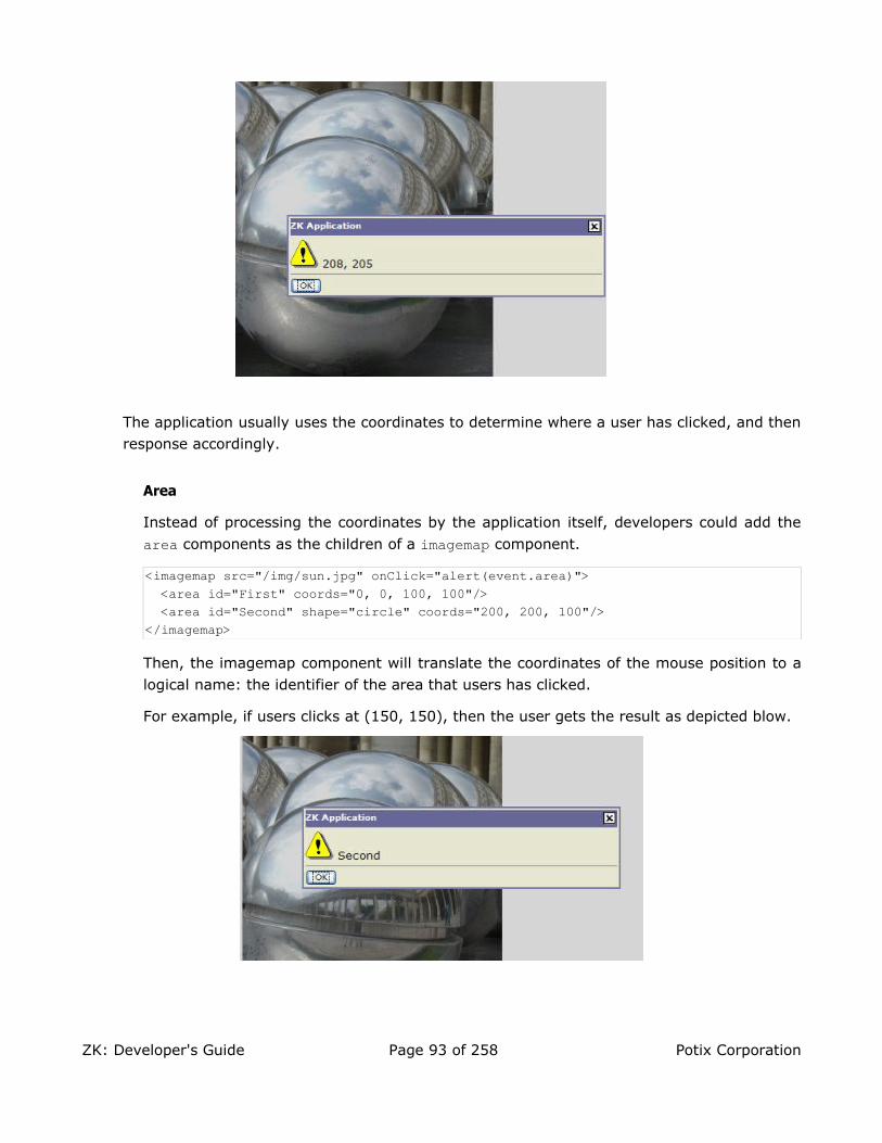
The application usually uses the coordinates to determine where a user has clicked, and then response accordingly.
Area
Instead of processing the coordinates by the application itself, developers could add the
area components as the children of a imagemap component.
<imagemap src="/img/sun.jpg" onClick="alert(event.area)"> <area id="First" coords="0, 0, 100, 100"/> <area id="Second" shape="circle" coords="200, 200, 100"/></imagemap>
Then, the imagemap component will translate the coordinates of the mouse position to a logical name: the identifier of the area that users has clicked.
For example, if users clicks at (150, 150), then the user gets the result as depicted blow.
ZK: Developer's Guide Page 93 of 258 Potix Corporation

The shape Property
An area component supports three kinds of shapes: circle, polygon and rectangle. The coordinates of the mouse position are screen pixels counted from the upper-left corner of the image beginning with (0, 0).
Shape Coordinates / Description
circle coords="x, y, r"
where x and y define the position of the center of the circle and
r is its radius in pixels.
polygon coords="x1, y1, x2, y2, x3, y3..."
where each pair of x and y define a vertex of the polygon. At
least thee pairs of coordinates are required to defined a triangle. The polygon is automatically closed, so it is not necessary to repeat the first coordinate at the end of the list to close the region.
rectangle coords="x1, y1, x2, y2"
where the first coordinate pair is one corner of the rectangle and the other pair is the corner diagonally opposite. A rectangle is just a shortened way of specifying a polygon with four vertices.
If the coordinates in one area component overlap with another, the first one takes
precedence.
Audio
An audio component is used to play the audio at the browser. Like image, you could use the
src property to specify an URL of an audio resource, or the setContent method to specify a
dynamically generated audio.
Depending on the browser and the audio plugin, developers might be able to control the play
of an audio by the play, stop and pause methods. Currently, Internet Explorer with Media
Player is capable of such controls.
Input Controls
A set of input controls are supported in the XUL component set: textbox, intbox, decimalbox, doublebox, datebox, combobox, and bandbox. They are used to let users input
different types of data.
ZK: Developer's Guide Page 94 of 258 Potix Corporation

<zk><textbox/><datebox/>
</zk>
Tip: combobox and bandbox are special input boxes. They shares the common
properties described here. Their unique features will be discussed later in the
Comboboxes and Bandboxes section.
The type Property
You could specify the type property with password for the textbox components, such
that what user has entered won't be shown.
Username: <textbox/>Password: <textbox type="password"/>
The format Property
You could control the format of an input control by the format filed. The default is null.
For datebox, it means yyyy/MM/dd. For intbox and decimalbox, it means no formating at
all.
<datebox format="MM/dd/yyyy"/><decimalbox format="#,##0.##"/>
Like any other properties, you could change the format dynamically, as depicted below.
<datebox id="db"/><button label="set MM-dd-yyyy" onClick="db.setFormat("MM-dd-yyyy")"/>
Mouseless Entry datebox• Alt+DOWN to pop up the calendar.
• LEFT, RIGHT, UP and DOWN to change the selected day from the calendar.
• ENTER to activate the selection by copying the selected day to the datebox control.
• Alt+UP or ESC to give up the selection and close the calendar.
Constraints
You could specify what value to accept for input controls by use of the constraint property. It could a combination of no positive, no negative, no zero, no empty, no
ZK: Developer's Guide Page 95 of 258 Potix Corporation

future, no past, no today, and a regular expression. The first three constraints are
applicable only to intbox and decimalbox. The constraints of no future, no past, and
no today are applicable only to datebox. The constraint of no empty is applicable to any
type of components. The constraint of regular expressions is applicable only to String-
type input components, such as textbox., combobox and bandbox.
To specify two or more constraints, use comma to separate them as follows.
<intbox constraint="no negative,no zero"/>
To specify a regular expression, you could have to use / to enclose the regular expression
as follows.
<textbox constraint="/.+@.+\.[a-z]+/"/>
Notes:
• The above statement is XML, so do not use \\ to specify a backslash. On the other
hand, it is necessary, if writing in Java.
new Textbox().setContraint("/.+@.+\\.[a-z]+/");
• It is allowed to mix regular expression with other constraints by separating them with comma.
You prefer to display an application dependent message instead of default one, you could append the constraint with colon and the message you want to display when failed.
<textbox constraint="/.+@.+\.[a-z]+/: e-mail address only"/><datebox constraint="no empty, no future: now or never"/>
Notes:
• The error message, if specified, must be the last element and start with colon.
• To support multilingual, you could use the l function as depicted in the Internationalization chapter.
<textbox constraint="/.+@.+\.[a-z]+/: ${c:l('err.email.required')}"/>
Constraints for Datebox
In addition to the constraints described in the above section (such as no future and
regular expressions), datebox supports a range of dates. For example,
<datebox constraint="between 20071225 and 20071203"/><datebox constraint="before 20071225"/><datebox constraint="after 20071225"/>
Notices
1. The format of the date in the constraint is yyyMMdd. It is independent of the locale.
ZK: Developer's Guide Page 96 of 258 Potix Corporation

2. The date specified in the constraint is included. For example, "before 20071225" includes December 25, 2007 and every days before it.
3. The constraint is actually represented with an instance of the
org.zkoss.zul.SimpleDateConstraint class. You can retrieve the parsed
beginning and ending date with the getBeginDate and getEndDate methods.
((SimpleDateConstraint)datebox.getConstraint()).getBeginDate();
Custom Constraints
If you want more sophisticated constraint, you could specify an object which implements
the org.zkoss.zul.Constraint interface.
<window title="Custom Constraint"><zscript><![CDATA[
Constraint ctt = new Constraint() {public void validate(Component comp, Object value) throws WrongValueException {
if (value =e= null || ((Integer)value).intValue() < 100)throw new WrongValueException(comp, "At least 100 must be specified");
}}
]]></zscript><intbox constraint="${ctt}"/>
</window>
You could implement your constraint into a Java class, say my.EmailValidator, then:
<?taglib uri="http://www.zkoss.org/dsp/web/core" prefix="c"?><textbox constraint="${c:new('my.EmailValidator')}"/>
org.zkoss.zk.ui.WrongValueException
In the above example, we use org.zkoss.zk.ui.WrongValueException to denote an
error. As depicted, you have to specify the first argument with the component that causes the error, and then the second argument with the error message.
You could throw this exception anytime, such as when an onChange event is received
as follows.
<textbox><attribute name="onChange">
if (!self.value.equals("good")) {self.value = "try again";throw new WrongValueException(self, "Not a good answer!");
}</attribute>
</textbox>
ZK: Developer's Guide Page 97 of 258 Potix Corporation

Custom Way to Display the Error Messages
Instead of the default error box as shown in the previous example, you can provide a
custom look by implementing the org.zkoss.zul.CustomConstraint interface with
Constraint. CustomConstraint has one method, showCustomError, which is called
when an exception is thrown or when the validation is correct. Here is an example,
<window title="Custom Constraint" border="normal"><zscript><![CDATA[
class MyConst implements Constraint, CustomConstraint {//Constraint//public void validate(Component comp, Object value) {
if (value == null || ((Integer)value).intValue() < 100)throw new WrongValueException(comp, "At least 100 must be specified");
}//CustomConstraint//public void showCustomError(Component comp, WrongValueException ex) {
errmsg.setValue(ex != null ? ex.getMessage(): "");}
}Constraint ctt = new MyConst();
]]></zscript><hbox>
Enter a number at least 100:<intbox constraint="${ctt}"/><label id="errmsg"/>
</hbox></window>
Improve Responsiveness
The responsiveness can be improved by validating more constraints at the client. To do
this, you have to implement the org.zkoss.zul.ClientConstraint interface with
Constraint. If you have done all validations at the client, you can return true for the
isClientComplete method, and then there will be no server callback at all.
You can also customize the display of the error message with pure JavaScript codes a
the client by providing a function called Validate_errorbox. For example,
<script type="text/javascript"><![CDATA[//Running at the browserwindow.Validate_errorbox = function (id, boxid, msg) {
var html = '<div style="display:none;position:absolute" id="'+boxid+'">'+zk.encodeXML(msg, true)+'</div>';document.body.insertAdjacentHTML("afterbegin", html);return $e(boxid);
}]]></script>
Note: script specifies the script codes running at the browser, while zscript specifies
codes running at the server.
ZK: Developer's Guide Page 98 of 258 Potix Corporation

Note: If CustomConstraint is also implemented, ClientConstraint will be ignored
since all validations are done at the server. In other words, if you want to use
ClientConstraint to improve responsiveness, overriding Validate_errorbox is the
only way to customize the display of the error messsage.
The onChange Event
An input control notifies the application with the onChange event if its content is changed
by the user.
Notice that, when the onChange's event listener is invoked, the value has been set. Thus,
it is too late if you want to reject illegal value in the onChange's event listener, unless you
restore the value properly. Rather, it is recommended to use a constraint as described in the Custom Constraints section.
The onChanging event
An input control also notifies the application with the onChanging event, when user is
changing the content.
Notice that, when the onChanging's listener is invoked, the value is not set yet. In other
worlds, the value property still remain in the old value. To retrieve what the user is
entering, you have to access the value property of the event as follows.
<grid><rows>
<row>The onChanging textbox: <textbox onChanging="copy.value = event.value"/></row>
<row>Instant copy:<textbox id="copy" readonly="true"/></row>
</rows></grid>
It is too early if you want to reject illegal value in the onChanging's event listener,
because user may not complete the change yet. Rather, it is recommended to use a constraint as described in the Custom Constraints section.
Calendar
A calendar displays a 'flat' calendar and allows user to select a day from it.
ZK: Developer's Guide Page 99 of 258 Potix Corporation

<hbox><calendar id="cal" onChange="in.value = cal.value"/><datebox id="in" onChange="cal.value = in.value"/>
</hbox>
The value Property and the onChange Event
Like input controls, calendar supports the value property to let developers set and
retrieve the selected day. In addition, developers could listen to the onChange event to
process it immediately, if necessary.
The compact Property
A calendar supports two different layouts and you can control it by use of the compact property.
<calendar compact="true"/>
The default value depends on the current Locale.
Progressmeter
A progress meter is a bar that indicates how much of a task has been completed. The value property must be in the range between 0 and 100.
<progressmeter value="10"/>
Slider
A slider is used to let user specifying a value by scrolling.
<slider id="slider" onScroll="Audio.setVolume(slider.curpos)"/>
A slider accepts a range of value starting from 0 to 100. You could change the maximal
allowed value by the maxpos property.
Timer
A timer is an invisible component used to send the onTimer event to the server at the
specified time or period. You could control a timer by the start and stop methods.
<window title="Timer demo" border="normal"><label id="now"/><timer id="timer" delay="1000" repeats="true"
onTimer="now.setValue(new Date().toString())"/><separator bar="true"/><button label="Stops timer" onClick="timer.stop()"/><button label="Starts timer" onClick="timer.start()"/>
</window>
ZK: Developer's Guide Page 100 of 258 Potix Corporation

Paging
A paging component is used to separate long content into multiple pages. For example, assume that you have 100 items and prefer to show 20 items at a time, then you can use the paging components as follows.
<paging totalSize="100" pageSize="20"/>
Then, when a user clicks on the hyperlinks, the onPaging event is sent with an instance of
org.zkoss.zul.event.PagingEvent to the paging component. To decide which portion of
your 100 items are visible, you shall add a listener to the paging component.
<paging id="paging"/><zscript>
List result = new SearchEngine().find("ZK");//assume SearchEngine.find() will return a list of items.paging.setTotalSize(result.size());paging.addEventListener("onPaging", new EventListener() {
public void onEvent(Event event) {int pgno = event.getPaginal().getActivePage();int ofs = pgno * event.getPaginal().getPageSize();new Viewer().redraw(result, ofs, ofs + event.getPaginal().getPageSize() - 1);//assume redraw(List result, int b, int e) will display//from the b-th item to the e-th item
}});
</zscript>
Paging with List Boxes and Grids
The listbox and grid component support the paging intrinsically, so you don't need to
specify a paging component explicitly as above, unless you want to have different visual
layout or to control multiple listbox and grid with one paging component.
Refer to the Grids section for more details.
Windows
A window is, like HTML DIV tag, used to group components. Unlike other components, a window has the following characteristics.
• A window is an owner of an ID space. Any component contained in a window, including
itself, could be found by use of the getFellow method, if it is assigned with an identifier.
• A window could be overlapped, popup, and embedded.
• A window could be a modal dialog.
ZK: Developer's Guide Page 101 of 258 Potix Corporation

Titles and Captions
A window might have a title, a caption and a border. The title is specified by the title property. The caption is specified by declaring a child component called caption. All children
of the caption component will appear to the right side of the title.
<window title="Demo" border="normal" width="350px"><caption>
<toolbarbutton label="More"/><toolbarbutton label="Help"/>
</caption><toolbar>
<toolbarbutton label="Save"/><toolbarbutton label="Cancel"/>
</toolbar>What is your favorite framework?<radiogroup>
<radio label="ZK"/><radio label="JSF"/>
</radiogroup></window>
You could also specify a label and an image to a caption, and then the appearance is as follows.
<window id="win" title="Main" border="normal" width="200px"><caption image="/img/coffee.gif" label="Hi there!"/><checkbox label="Hello, World!"/>
</window>
The closable Property
By setting the closable property to true, a close button is shown for the window, such that
user could close the window by clicking the button. Once user clicks on the close button, an
onClose event is sent to the window. It is processed by the onClose method of Window.
Then, onClose, by default, detaches the window itself.
You can override it to do whatever you want. Or, you registered a listener to change the default behavior. For example, you might choose to hide rather than close.
<window closable="true" title="Detach on Close" border="normal" width="200px"onClose="self.visible = false; event.stopPropagation();">
In this example, this window hides itself when the close button is clicked.</window>
Notice that event.stopPropagation() must be called to prevent
Window.onClose() being called.
ZK: Developer's Guide Page 102 of 258 Potix Corporation

Tip: If the window is a popup, the onOpen event will be sent to the window with
open=false, when the popup is closed due to user's clicking outside of the window, or
pressing ESC.
It is a bit confusing but onClose is sent to ask the server to detach or to hide the
window. By default, the window is detached. Of course, the application can override it
and do whatever it wants as described above.
On the other hand, onOpen is a notification. It is sent to notify the application that the
client has hidden the window. The application cannot prevent it from be hidden, or
change the behavior to be detached.
The sizable Property
If you allow users to resize the window, you can specify true to the sizable property as
follows. Once allowed, users can resize the window by dragging the borders.
<window id="win" title="Sizable Window" border="normal" width="200px" sizable="true">This is a sizable window.<button label="Change Sizable" onClick="win.sizable = !win.sizable"/>
</window>
The onSize Event
Once a user resizes the window, the onSize event is sent with an instance of
org.zkoss.zul.event.SizeEvent. Notice that the window is resized before the onSize event is sent. In other word, the event serves as a notification that you generally ignore. Of course, you can do whatever you want in the event listener.
Note: If the user drags the upper or left border, the onMove event is also sent since the
position is changed, too.
The Style Class (sclass)
ZK supports four different style classes for window: embedded, overlapped, popup and
wndcyan. Of course, you can add more if you want.
By default, the sclass property is the same as the window mode, so windows in different
modes appear differently. To change the appearance, simply assign a value to the sclass property as illustrated in the following example.
<hbox><window title="Embedded Style" border="normal" width="200px">
Hello, Embedded!</window><window title="Cyan Style" sclass="wndcyan" border="normal" width="200px">
Hello, Cyan!</window>
ZK: Developer's Guide Page 103 of 258 Potix Corporation

<window title="Popup Style" sclass="popup" border="normal" width="200px">Hello, Popup!
</window><window title="Modal Style" sclass="modal" border="normal" width="200px">
Hello, Modal!</window>
</hbox>
The contentStyle Property
You can customize the look and feel of the content block of the window by specifying the
contentStyle property.
<window title="My Window" border="normal" width="200px" contentStyle="background:yellow">
Hello, World!</window>
Scrollable Window
A typical use of contentStyle is to make a window scrollable as follows.
<window id="win" title="Hi" width="150px" height="100px" contentStyle="overflow:auto" border="normal">This is a long line to spead over several lines, and more content to display.Finally, the scrollbar becomes visible.This is another line.</window>
Borders
The border property specifies whether to display a border for window. The default style
sheets support only normal and none. The default value is none.
Of course, you can provide additional style class. For example,
<zk><style>div.wc-embedded-dash {padding: 2px; border: 3px dashed #aab;}</style><window title="My Window" border="dash" width="200px">Hello, World!</window>
ZK: Developer's Guide Page 104 of 258 Potix Corporation

</zk>
where wc-embedded-dash defines the style of the inner box of the window. The style class is
named by concatenating wc36, the sclass property and the border property together and
separating them with dash (-). In this example, sclass is embedded since it is an embedded
window and no explicit sclass is assigned (so the default sclass is used).
Overlapped, Popup, Modal, Highlighted and Embedded
A window could be in one of four different modes: overlapped, popup, modal, highlighted and embedded. By default, it is in the embedded mode. You could change the mode by use
of the doOverlapped, doPopup, doModal, doHighlighted, and doEmbedded methods,
depicted as follows.
<zk><window id="win" title="Hi!" border="normal" width="200px">
<caption><toolbarbutton label="Close" onClick="win.setVisible(false)"/>
</caption><checkbox label="Hello, Wolrd!"/>
</window>
<button label="Overlap" onClick="win.doOverlapped();"/><button label="Popup" onClick="win.doPopup();"/><button label="Modal" onClick="win.doModal();"/><button label="Embed" onClick="win.doEmbedded();"/><button label="Highlighted" onClick="win.doHighlighed();"/>
</zk>
Embedded
An embedded window is placed inline with other components. In this mode, you cannot change its position, since the position is decided by the browser.
Overlapped
An overlapped window is overlapped with other components, such that users could drag it
around and developer could set its position by the setLeft and setTop methods.
In addition to doOverlapped, you can use the mode property as follows.
<window title="My Overlapped" width="300px" mode="overlapped"></window>
Popup
A popup window is similar to overlapped windows, except it is automatically closed when
36 wc for window content, while wt for window title.
ZK: Developer's Guide Page 105 of 258 Potix Corporation

user clicks on any component other than the popup window itself or any of its descendants. As its name suggested, it is designed to implement popup windows.
Modal
A modal window (aka., a modal dialog) is similar to the overlapped windows, except it
suspends the execution until one of the endModal, doEmbedded, doOverlapped,
doHighlighted, and doPopup methods is called.
In addition to suspending the execution, it disables components not belonging to the modal window.
A modal window is positioned automatically at the center of the browser, so you cannot control its position.
Highlighted
A highlighted window is similar to the overlapped windows, except the visual effect is the same as the modal windows. In other words, a highlighted window is positioned at the center of the browsers, and components not belonging to the highlighted window are disabled.
However, it does not suspend the execution. Like the overlapped windows, the execution
continues to the next statement once the mode is changed. For example, f1() is called
only after win1 is closed, while g() is called immediately after win2 becomes highlighted.
win1.doModal(); //the execution is suspended until win1 is closedf1();
win2.doHighlighted(); //the execution won't be suspendedg1()
The highlighted window is aimed to substitute the modal window, if you prefer not to use or suspend the event processing thread. Refer to the Use the Servlet Thread to Process Events section in the Advanced Features chapter.
Modal Windows and Event Listeners
Unlike other modes, you can only put a window into the modal mode in an event listener.
In other words, you can invoke doModal() or setMode("modal") in an event listener.
<zk><window id="wnd" title="My Modal" visible="false" width="300px">
<button label="close" onClick="wnd.visible = false"/></window><button label="do it" onClick="wnd.doModal()"/>
</zk>
ZK: Developer's Guide Page 106 of 258 Potix Corporation

On the other hand, the following is wrong if it executes in the Component Creation Phase37.
//t1.zul<window title="My Modal" width="300px" closable="true" mode="modal"></window>
It will cause the following result38 if you browse it directly.
The following codes will cause the same result.
//t2.zul<window title="My Modal" width="300px" closable="true">
<zscript>self.doModal();
</zscript></window>
If you need to create a modal window in page loading, you can post the onModal event as
follows.
//t3.zul<window title="My Modal" width="300px" closable="true">
<zscript>Events.postEvent("onModal", self, null);</zscript>
</window>
Note: the following codes execute correctly even if t1.zul sets the window's mode to
37 Refer to the Component Lifecycle chapter.
38 Assume Tomcat is used.
ZK: Developer's Guide Page 107 of 258 Potix Corporation

modal directly (as shown above). Why? It executes in an event listener (for onClick).
<button label="do it"><attribute name="onClick">Executions.createComponents("t1.zul", null, null);
//it loads t1.zul in this event listener for onClick</attribute>
</button>
The position Property
In addition to the left and top properties, you can control the position of an
overlapped/popup/modal window by use of the position property. For example, the
following code snippet positions the window to the right-bottom corner.
<window width="300px" mode="overlapped" position="right,bottom">...
The value of the position property can be a combination of the following constants by
separating them with comma (,).
Constant Description
center Position the window at the center. If left or right is also specified, it
means the vertical center. If top or bottom is also specified, it means the
horizontal center. If none of left, right, top and bottom is specified, it
means the center in both directions.
Both the left and top property are ignored.
left Position the window at the left edge.
The left property is ignored.
right Position the window at the right edge.
The left property is ignored.
top Position the window at the top.
The top property is ignored.
bottom Position the window at the bottom.
The top property is ignored.
By default, its value is null. That is, the overlapped and popup window is positioned by the
left and top properties, while the modal window is positioned at the center.
Common Dialogs
The XUL component set supports the following common dialogs to simplify some common tasks.
ZK: Developer's Guide Page 108 of 258 Potix Corporation
The Message Box
The org.zkoss.zul.Messagebox class provides a set of utilities to show message boxes.
It is typically used to alert user when an error occurs, or to prompt user for an decision.
if (Messagebox.show("Remove this file?", "Remove?", Messagebox.YES | Messagebox.NO, Messagebox.QUESTION) == Messagebox.YES) {
...//remove the file}
Since it is common to alert user for an error, a global function called alert is added for
zscript. The alert function is a shortcut of the show method in the Messagebox class. In
other words, The following two statements are equivalent.
alert("Wrong");Messagebox.show("Wrong");
Notice that Messagebox is a modal window so it shares the same constraint: executable
only in an event listener. Thus, the following codes will fail. Refer to the Modal Windows and Event Listeners section above for more descriptions.
<window title="Messagebox not allowed in paging loading"><zscript>//failed since show cannot be called in paging loadingif (Messagebox.show("Redirect?", "Redirect?",Messagebox.YES | Messagebox.NO, Messagebox.QUESTION) == Messagebox.YES)
Executions.sendRedirect("another.zul");</zscript>
</window>
The File Upload Dialog
The org.zkoss.zul.Fileupload class provides a set of utilities to prompt a user for
uploading file(s) from the client to the server. Once of the get methods is called, a file
upload dialog is shown at the browser to prompt the user for specifying file(s) for uploading. It won't return until user has uploaded a file or presses the cancel button.
<window title="Fileupload Demo" border="normal"><image id="image"/><button label="Upload">
<attribute name="onClick">{Object media = Fileupload.get();if (media instanceof org.zkoss.image.Image)
image.setContent(media);else if (media != null)
Messagebox.show("Not an image: "+media, "Error",Messagebox.OK, Messagebox.ERROR);
}</attribute></button>
</window>
ZK: Developer's Guide Page 109 of 258 Potix Corporation

Upload Multiple Files at Once
If you allow users to upload multiple files at once, you can specify the maximal allowed number as follows.
<window title="fileupload demo" border="normal"><button label="Upload">
<attribute name="onClick"><![CDATA[{Object media = Fileupload.get(5);if (media != null)
for (int j = 0; j < media.length; ++j) {if (media[j] instanceof org.zkoss.image.Image) {
Image image = new Image();image.setContent(media[j]);image.setParent(pics);
} else if (media[j] != null) {Messagebox.show("Not an image: "+media[j], "Error",
Messagebox.OK, Messagebox.ERROR);}
}}]]></attribute>
</button><vbox id="pics"/>
</window>
The fileupload Component
The fileupload component is not a modal dialog. Rather, it is a component, so it is placed inline with other components.
Note: In addition to providing the static get methods for opening the file upload dialogs,
org.zkoss.zul.Fileupload itself is a component. It is the so-called fileuplod component.
For example,
<image id="img"/>Upload your hot shot:<fileupload onUpload="img.setContent(event.media)"/>
ZK: Developer's Guide Page 110 of 258 Potix Corporation

The onUpload Event
When the Upload button is pressed, the onUpload event is sent with an instance of the
org.zkoss.zk.ui.event.UploadEvent event. You can then retreive the content of the
upload files by use of the getMedia or getMedias methods.
Notice that getMedia and getMedias return null to indicate that no file is specified but
the Upload button is pressed.
The onClose Event
In addition to onUpload, the onClose event is sent to notify that either the Upload
button or the Cancel button is pressed. By default, it simply invalidates the
fileupload component, i.e., all fields are cleaned up and redrawn. If you listen to this
event to have the custom behavior.
The File Download Dialog
The org.zkoss.zul.Filedownload class provides a set of utilities to prompt a user for
downloading a file from the server to the client. Unlike the iframe component that
displays the file in the browser window, a file download dialog is shown at the browser if
one of the save methods is called. Then, the user can specify the location in his local file
system to save the file.
<button label="Download download.html"><attribute name="onClick">{java.io.InputStream is =
desktop.getWebApp().getResourceAsStream("/test/download.html");if (is != null)
Filedownload.save(is, "text/html", "download.html");else
alert("/test/download.html not found");}</attribute>
</button>
The Layout Components
Components: borderlayout, north, south, center,west,east
The layout component is a nested component. The parent component is borderlayout, and its
children components include north, south, center, west, and east. The combination of children
components of borderlayout is free. For example, if you want to divide the area into three
ZK: Developer's Guide Page 111 of 258 Potix Corporation

regions (veritically), you could try the following combination,
<borderlayout height="500px"><east> The East</east><center>
The Center</center><west>
The West</west>
</borderlayout>
or, you could divide the area into three regions(horizontally) as follows,
<borderlayour height="500px"><north>
The North</north><center>
The Center</center><south>
The South</south>
</borderlayour>
And you could embed any kind of ZK components into each of these regions according to your requirement.
A Nested borderlayout Component
Moreover, you could embed one layout component into another to divide the area into more regions as follows,
<borderlayout height="500px"><north size="30%">
<borderlayout height="250px"><west border="normal">
Inner West</west><center>
Inner Center</center><east size="50%" border="normal">
Inner East</east>
</borderlayout>
ZK: Developer's Guide Page 112 of 258 Potix Corporation

</north><center border="normal">
<borderlayout><west border="normal">
Inner West</west><center border="normal">
Inner Center</center><east size="30%" border="normal"></east>
</borderlayout></center>
</borderlayout>
The size and border Properties
You could specify the size property of the following children components
(north,south,east,west) to determine their sizes. However, the function of size property
depends on the type of children components (vertically or horizontally). For horizontal
components (north, and south), the size property determines their height. As for vertically
components (east, and west), the size property determines their width.
The border property determines whether there exists border for these layout components,
including all children components of borderlayout. The following table specifies values of
border property.
Value Description
none (default) Without border
normal With border
Here is an example.
<borderlayout height="500px"><north size="30%" border="normal">
The North</north><east size="30%" border="normal"> The East</east>
<center border="normal">The Center
</center><west border="normal">
The West</west><south border="normal">
The South
ZK: Developer's Guide Page 113 of 258 Potix Corporation

</south></borderlayout>
The splittable and collapsible Properties
If you would like to make your layout components splittable, you could assign the
splittable property to be true.
In addition, you could make a layout component collapsible by specifying the collapsible property to be true.
<borderlayout height="500px"><north size="20%" splittable="true" collapsible="true"/>
<east size="20%" splittable="true" collapsible="true"/><center border="normal"/>
<west size="20%" splittable="true" collapsible="true"/> <south size="30%" border="normal" splittable="true" collapsible="true"/></borderlayout>
The maxsize and minisize Properties
When you make a layout component splittable, maxsize and minisize are two properties
to determine the re-resizing range of it.
<north splittable="true" maxsize="500" minisize="200"/>
The flex property
If the size of browser has been changed, the layout components will re-size themselves automatically to fit the size of the browser. If you would like those ZK components embedded within these layout components to be auto-resized also, you could specify the
flex property of the layout component to be true.
The open Property
To know whether a layout is collapsed, you can check the value of the open property (i.e.,
the isOpen method). To open or collapse programmingly, you can set the value of the open
ZK: Developer's Guide Page 114 of 258 Potix Corporation

property (i.e., the setOpen method).
The onOpen Event
When a layout is collapsed or opened by a user, the onOpen event is sent to the application.
The Box Model
Components: vbox, hbox and box.
The box model of XUL is used to divide a portion of the display into a series of boxes. Components inside of a box will orient themselves horizontally or vertically. By combining a series of boxes and separators, you can control the layout of the visual presentation.
A box can lay out its children in one of two orientations, either horizontally or vertically. A horizontal box lines up its components horizontally and a vertical box orients its components vertically. You can think of a box as one row or one column from an HTML table.
Some examples are shown as follows.
<zk><vbox>
<button label="Button 1"/><button label="Button 2"/>
</vbox><hbox>
<button label="Button 3"/><button label="Button 4"/>
</hbox></zk>
The hbox component is used to create a horizontally oriented box. Each component placed in the
hbox will be placed horizontally in a row. The vbox component is used to create a vertically
oriented box. Added components will be placed underneath each other in a column.
There is also a generic box component which defaults to horizontal orientation, meaning that it is
equivalent to the hbox. However, you can use the orient property to control the orientation of the
box. You can set this property to the value horizontal to create a horizontal box and vertical to
create a vertical box.
Thus, the two lines below are equivalent:
<vbox><box orient="vertical">
You can add as many components as you want inside a box, including other boxes. In the case of a horizontal box, each additional component will be placed to the right of the previous one. The components will not wrap at all so the more components you add, the wider the window will be. Similarly, each element added to a vertical box will be placed underneath the previous one.
ZK: Developer's Guide Page 115 of 258 Potix Corporation

The spacing Property
You could control the spacing among children of the box control. For example, the following
example puts 5em at both the upper margin and the lower margin. Notice: the total space
between two input fields is 10em.
<vbox spacing="5em"><textbox/><datebox/>
</vbox>
Another example illustrated an interesting layout by use of zero spacing.
<window title="Box Layout Demo" border="normal"><hbox spacing="0">
<window border="normal">0</window><vbox spacing="0">
<hbox spacing="0"><window border="normal">1</window><window border="normal">2</window><vbox spacing="0">
<window border="normal">3</window><window border="normal">4</window>
</vbox></hbox><hbox spacing="0">
<vbox spacing="0"><window border="normal">5</window> <window border="normal">6</window>
</vbox><window border="normal">7</window><window border="normal">8</window><window border="normal">9</window>
</hbox></vbox>
</hbox></window>
The widths and heights Properties
You can specify the width for each cell of hbox with the widths property as follows.
<hbox width="100%" widths="10%,20%,30%,40%"><label value="10%"/><label value="20%"/><label value="30%"/><label value="40%"/>
</hbox>
The value is a list of widths separated by comma. If any value is missed, no width is generated for the corresponding cell and the real width is up to the browser.
ZK: Developer's Guide Page 116 of 258 Potix Corporation

Similarly, you can specify the heights for each cell of vbox with the heights property.
Actually, these two properties are the same since the orientation of a box can be horizontal
or vertical depending on the orient property.
Splitters
Components: splitter.
There may be times when you want to have two sections of a window where the user can resize the sections. This feature is accomplished by using a component called a splitter. It creates a skinny bar between two sections which allows either side to be resized.
A splitter must be put inside a box. When a splitter is placed inside a horizontal box (hbox),
it will allow resizing horizontally. When a splitter is placed inside a vertical box (vbox), it will
allow resizing vertically. For example,
Note: If you would like to use the original “os” CSS, you could specify the class name of
splitter with “splitter-os”.
And, the codes are as follows.
<hbox spacing="0" style="border: 1px solid grey" width="100%"><vbox height="200px">
Column 1-1: The left-top box. To know whether a splitteris collapsed, you can listen to the onOpen event.<splitter collapse="after"/>Column 1-2: You can enforce to open or collapse programmingby calling setOpen method.
</vbox><splitter collapse="before"/>Column 2: Whether a splitter allows users to open or collapsedepending on the collapse attribue.
</hbox>
The collapse Property
It specifies which side of the splitter is collapsed when its grippy (aka., button) is clicked. If this property is not specified, the splitter will not cause a collapse (and the grippy won't appear).
ZK: Developer's Guide Page 117 of 258 Potix Corporation

Allowed values and their meaning are as follows.
Value Description
none No collpasing occurs.
before When the grippy is clicked, the element immediately before the splitter in the same parent is collapsed so that its width or height is 0.
after When the grippy is clicked, the element immediately after the splitter in the same parent is collapsed so that its width or height is 0.
The open Property
To know whether a splitter is collapsed, you can check the value of the open property
(i.e., the isOpen method). To open or collapse programmingly, you can set the value of
the open property (i.e., the setOpen method).
The onOpen Event
When a splitter is collapsed or opened by a user, the onOpen event is sent to the
application.
Tab Boxes
Components: tabbox, tabs, tab, tabpanels and tabpanel.
A tab box allows developers to separate a large number of components into several groups, and show one group each time, such that the user interface won't be too complicate to read. There is only one group (aka., a panel) is visible at the same time. Once the tab of an invisible group is clicked, it becomes visible and the previous visible group becomes invisible.
The generic syntax of tab boxes is as follows.
<tabbox><tabs>
<tab label="First"/><tab label="Second"/>
</tabs><tabpanels>
<tabpanel>The first panel.</tabpanel><tabpanel>The second panel</tabpanel>
</tabpanels></tabbox>
• tabbox: The outer box that contains the tabs and tab panels.
• tabs: The container for the tabs, i.e., a collection of tab components.
• tab: A specific tab. Clicking on the tab brings the tab panel to the front. You could put a
ZK: Developer's Guide Page 118 of 258 Potix Corporation

label and an image on it.
• tabpanels: The container for the tab panels, i.e., a collection of tabpanel components.
• tabpanel: The body of a single tab panel. You would place the content for a group of
components within a tab panel. The first tabpanel corresponds to the first tab, the second
tabpanel corresponds to the second tab and so on.
The currently selected tab component is given an additional selected property which is set to
true. This is used to give the currently selected tab a different appearance so that it will look
selected. Only one tab will have a true value for this property at a time.
There are two way to change the selected tab by Java codes. They are equivalent as shown below.tab1.setSelected(true);tabbox.setSelectedTab(tab1);
Of course, you can assign true to the selected property directly.
<tab label="My Tab" selected="true"/>
If none of tabs are selected, the first one is selected automatically.
Nested Tab Boxes
A tab panel could contain anything including another tab boxes.
<tabbox><tabs>
<tab label="First"/><tab label="Second"/>
</tabs><tabpanels>
<tabpanel>The first panel.<tabbox>
<tabs><tab label="Nested 1"/><tab label="Nested 2"/><tab label="Nested 3"/>
</tabs><tabpanels>
<tabpanel>The first nested panel</tabpanel><tabpanel>The second nested panel</tabpanel><tabpanel>The third nested panel</tabpanel>
</tabpanels></tabbox></tabpanel><tabpanel>The second panel</tabpanel>
</tabpanels></tabbox>
ZK: Developer's Guide Page 119 of 258 Potix Corporation

The Accordion Tab Boxes
Tab boxes supports two molds: default and accordion. The effect of the accordion mold is
as follows.
<tabbox mold="accordion"><tabs>
<tab label="First"/><tab label="Second"/>
</tabs><tabpanels>
<tabpanel>The first panel.</tabpanel><tabpanel>The second panel</tabpanel>
</tabpanels></tabbox>
The orient Property
Developers can control whether the tabs are located by use of the orient property. By
default, it is horizontal. You can change it to vertical, and the effect is as follows.
<tabbox width="400px" orient="vertical"><tabs>
<tab label="A"/><tab label="B"/><tab label="C"/><tab label="D"/><tab label="E"/>
</tabs><tabpanels>
<tabpanel>This is panel A</tabpanel><tabpanel>This is panel B</tabpanel><tabpanel>This is panel C</tabpanel><tabpanel>This is panel D</tabpanel><tabpanel>This is panel E</tabpanel>
</tabpanels></tabbox>
The align Property of Tabs
Developers can control the alignment of tab by use the align property of tabs. By default, it
is start (leftmost or uppermost). You can change it to center or end (rightmost or
bottommost), and the effect is as follows.
<tabbox width="250px"><tabs align="end">
<tab label="Tab 1"/><tab label="Tab 2"/>
</tabs><tabpanels>
ZK: Developer's Guide Page 120 of 258 Potix Corporation

<tabpanel>This is panel 1</tabpanel><tabpanel>This is panel 2</tabpanel>
</tabpanels></tabbox>
The closable Property
By setting the closable property to true, a close button is shown for the tab, such that user
could close the tab and the corresponding tab panel by clicking the button. Once user clicks
on the close button, an onClose event is sent to the tab. It is processed by the onClose method of Tab. Then, onClose, by default, detaches the tab itself and the corresponding tab
panel.
See also window's closable property.
The disabled Property
By setting the disabled property of tab to be true, the user could not select or close the
corresponding tab by clicking the tab or close button. But, Developers can still control the selection or close of tab by program.
<tabbox width="300px" id="tbx"><tabs>
<tab label="Step 1" id="tb1" disabled="true"/><tab label="Step 2" id="tb2" disabled="true"/><tab label="Step 3" id="tb3" disabled="true"/>
</tabs><tabpanels>
<tabpanel><button label="to Step2" onClick="tbx.selectedTab=tb2"/></tabpanel><tabpanel><button label="to Step3" onClick="tbx.selectedTab=tb3"/></tabpanel><tabpanel>This is panel 3</tabpanel>
</tabpanels></tabbox>
Load-on-Demand for Tab Panels
Like many other components, you can load the content of the tab panel only when it
becomes visible. The simplest way is to use the fulfill attribute to defer the creation of
the children of a tab panel.
<tabbox><tabs>
<tab label="Preload" selected="true"/><tab id="tab2" label="OnDemand"/>
</tabs><tabpanels>
<tabpanel>This panel is pre-loaded since no fulfill specified
</tabpanel>
ZK: Developer's Guide Page 121 of 258 Potix Corporation
<tabpanel fulfill="tab2.onSelect">This panel is loaded only tab2 receives the onSelect event
</tabpanel></tabpanels>
</tabbox>
If you prefer to create the children manually or manipulate the panel dynamically, you could
listen to the onSelect event, and then fulfill the content of the panel when it is selected, as
depicted below.
<tabbox id="tabbox" width="400" mold="accordion"><tabs>
<tab label="Preload"/><tab label="OnDemand" onSelect="load(self.linkedPanel)"/>
</tabs><tabpanels>
<tabpanel>This panel is pre-loaded.
</tabpanel><tabpanel></tabpanel>
</tabpanels><zscript><![CDATA[void load(Tabpanel panel) {
if (panel != null && panel.getChildren().isEmpty())new Label("Second panel is loaded").setParent(panel);
}]]></zscript>
</tabbox>
Grids
Components: grid, columns, column, rows and row.
A grid contains components that are aligned in rows like tables. Inside a grid, you declare two things, the columns, that define the header and column attributes, and the rows, that provide the content.
To declare a set of rows, use the rows component, which should be a child element of grid. Inside
that you should add row components, which are used for each row. Inside the row element, you
should place the content that you want inside that row. Each child is a column of the specific row.
Similarly, the columns are declared with the columns component, which should be placed as a
child element of the grid. Unlike row is used to hold the content of each row, column declares the
common attributes of each column, such as the width and alignment, and and optional headers, i.e., label and/or image.
<grid>
ZK: Developer's Guide Page 122 of 258 Potix Corporation

<columns><column label="Type"/><column label="Content"/>
</columns><rows>
<row><label value="File:"/><textbox width="99%"/>
</row><row>
<label value="Type:"/><hbox>
<listbox rows="1" mold="select"><listitem label="Java Files,(*.java)"/><listitem label="All Files,(*.*)"/>
</listbox><button label="Browse..."/>
</hbox></row>
</rows></grid>
Scrollable Grid
A grid could be scrollable if you specify
the height property and there is not
enough space to show all data.
<grid width="500px" height="130px"><columns>
<column label="Head 1"/><column label="Head 2" align="center"/><column label="Head 3" align="right"/>
</columns><rows>
<row><listbox mold="select">
<listitem label="Faster"/><listitem label="Fast"/><listitem label="Average"/>
</listbox><datebox/><textbox rows="2"/>
</row><row>
<checkbox checked="true" label="Option 1"/><checkbox label="Option 2"/><radiogroup>
<radio label="Apple"/><radio label="Orange" checked="true"/><radio label="Lemon"/>
ZK: Developer's Guide Page 123 of 258 Potix Corporation

</radiogroup></row><row>
<checkbox checked="true" label="Option 1"/><checkbox label="Option 2"/><radiogroup orient="vertical">
<radio label="Apple"/><radio label="Orange" checked="true"/><radio label="Lemon"/>
</radiogroup></row>
</rows></grid>
Sizable Columns
If you allow users to resize the widths of columns, you can specify true to the sizable property of columns as follows. Once allowed, users can resize the widths of columns by
dragging the border between adjacent column components.
<window><grid>
<columns id="cs" sizable="true"><column label="AA"/><column label="BB"/><column label="CC"/>
</columns><rows>
<row><label value="AA01"/><label value="BB01"/><label value="CC01"/>
</row><row>
<label value="AA01"/><label value="BB01"/><label value="CC01"/>
</row><row>
<label value="AA01"/><label value="BB01"/><label value="CC01"/>
</row></rows>
</grid><checkbox label="sizeable" checked="true" onCheck="cs.sizeable = self.checked"/>
</window>
ZK: Developer's Guide Page 124 of 258 Potix Corporation

The onColSize Event
Once a user resizes the widths, the onColSize event is sent with an instance of
org.zkoss.zul.event.ColSizeEvent. Notice that the column's width is adjusted before
the onColSize event is sent. In other word, the event serves as a notification that you
can ignore. Of course, you can do whatever you want in the event listener.
Grids with Paging
There are two ways to handle long content in a grid: scrolling and paging. The scrolling is
enabled by specifying the height property as discussed in the previous section. The paging
is enabled by specifying paging to the mold property. Once paging is enable, the grid
separates the content into several pages and displays one page at a time as depicted below.
<grid width="300px" mold="paging" pageSize="4"><columns>
<column label="Left"/><column label="Right"/>
</columns><rows>
<row><label value="Item 1.1"/><label value="Item 1.2"/>
</row><row>
<label value="Item 2.1"/><label value="Item 2.2"/></row><row>
<label value="Item 3.1"/><label value="Item 3.2"/></row><row>
<label value="Item 4.1"/><label value="Item 4.2"/></row><row>
<label value="Item 5.1"/><label value="Item 5.2"/></row><row>
<label value="Item 6.1"/><label value="Item 6.2"/></row><row>
<label value="Item 7.1"/><label value="Item 7.2"/></row>
</rows></grid>
Once the paging mold is set, the grid creates an instance of the paging component as the
child of the grid. It then takes care of paging for the grid it belongs to.
The pageSize Property
Once setting the paging mold, you can specify how many rows are visible at a time (i.e.,
ZK: Developer's Guide Page 125 of 258 Potix Corporation
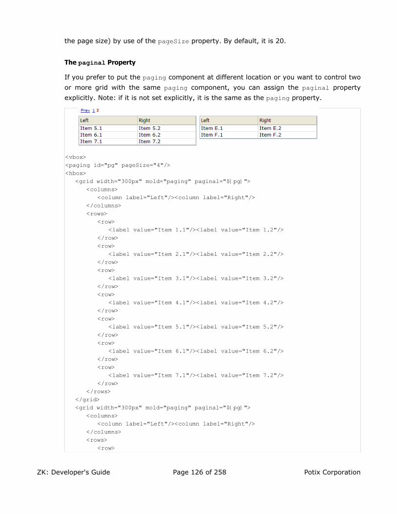
the page size) by use of the pageSize property. By default, it is 20.
The paginal Property
If you prefer to put the paging component at different location or you want to control two
or more grid with the same paging component, you can assign the paginal property
explicitly. Note: if it is not set explicitly, it is the same as the paging property.
<vbox><paging id="pg" pageSize="4"/><hbox>
<grid width="300px" mold="paging" paginal="${pg}"><columns>
<column label="Left"/><column label="Right"/></columns><rows>
<row><label value="Item 1.1"/><label value="Item 1.2"/>
</row><row>
<label value="Item 2.1"/><label value="Item 2.2"/></row><row>
<label value="Item 3.1"/><label value="Item 3.2"/></row><row>
<label value="Item 4.1"/><label value="Item 4.2"/></row><row>
<label value="Item 5.1"/><label value="Item 5.2"/></row><row>
<label value="Item 6.1"/><label value="Item 6.2"/></row><row>
<label value="Item 7.1"/><label value="Item 7.2"/></row>
</rows></grid><grid width="300px" mold="paging" paginal="${pg}">
<columns><column label="Left"/><column label="Right"/>
</columns><rows>
<row>
ZK: Developer's Guide Page 126 of 258 Potix Corporation

<label value="Item A.1"/><label value="Item A.2"/></row><row>
<label value="Item B.1"/><label value="Item B.2"/></row><row>
<label value="Item C.1"/><label value="Item C.2"/></row><row>
<label value="Item D.1"/><label value="Item D.2"/></row><row>
<label value="Item E.1"/><label value="Item E.2"/></row><row>
<label value="Item F.1"/><label value="Item F.2"/></row>
</rows></grid>
</hbox></vbox>
The paging Property
It is a readonly property representing the child paging component that is created
automatically to handling paging. It is null if you assign an external paging by the
paginal property. You rarely need to access this property. Rather, use the paginal property.
The onPaging Event and Method
Once a user clicks the page number of the paging component, an onPaging event is sent
the grid. It is then processed by the onPaging method. By default, the method
invalidates, i.e., redraws, the content of rows.
If you want to implement "create-on-demand" feature, you can add a event listener to the
grid for the onPaging event.
grid.addEventListener(org.zkoss.zul.event.ZulEvents.ON_PAGING, new MyListener());
Sorting
Grids support the sorting of rows directly. To enable the ascending order for a particular
column, you assign a java.util.Comparator instance to the sortAscending property of the
column. Similarly, you assign a comparator to the sortDescending property to enable the
descending order.
As illustrated below, you first implement a comparator that compares any two rows of the
ZK: Developer's Guide Page 127 of 258 Potix Corporation

grid, and then assign its instances to the sortAscending and sortDescending properties.
Notice: the compare method is called with two org.zkoss.zul.Row instance.
<zk><zscript>
class MyRowComparator implements Comparator {public MyRowComparator(boolean ascending) {...}public int compare(Object o1, Object o2) {
Row r1 = (Row)o1, r2 = (Row)o2;....
}}Comparator asc = new MyRowComparator(true);Comparator dsc = new MyRowComparator(false);
</zscript><grid>
<columns><column sortAscending="${asc}" sortDescending="${dsc}"/>
...
The sortDirection Property
The sortDirection property controls whether to show an icon at the client to indicate the
order of a particular column. If rows are sorted before adding to the grid, you shall set this property explicitly.
<column sortDirection="ascending"/>
Then, it is maintained automatically by grids as long as you assign the comparators to the corresponding column.
The onSort Event
When you assign at least one comparator to a column, an onSort event is sent to the
server if user clicks on it. The column component implements a listener to automatically
sort rows based on the assigned comparator.
If you prefer to handle it manually, you can add your own listener to the column for the
onSort event. To prevent the default listener to invoke the sort method, you have to
call the stopPropagation method against the event being received. Alternatively, you
can override the sort method, see below.
The sort Method
The sort method is the underlying implementation of the default onSort event listener. It
is also useful if you wan to sort the rows by Java codes. For example, you might have to call this method after adding rows (assuming not in the proper order).
ZK: Developer's Guide Page 128 of 258 Potix Corporation

Row row = new Row();row.setParent(rows);row.appendChild(...);...if (!"natural".column.getSortDirection())
column.sort("ascending".equals(column.getSortDirection()));
The default sorting algorithm is quick-sort (by use of the sort method from the
org.zkoss.zk.ui.Components class). You might override it with your own
implementation.
Note: the sort method checks the sort direction (by calling getSortDirection). It sorts
the rows only if the sort direction is different. To enforce the sorting, do as follows.
column.setSortDirection("natural");sort(myorder);
The above codes are equivalent to the following.
sort(myorder, true);
Live Data
Like list boxes, grids support the live data. With live data, developers could separate the data from the view. In other words, developers needs only to provide the data by
implementing the org.zkoss.zul.ListModel interface. Rather than manipulating the grid
directly. The benefits are two folds.
• It is easier to use different views to show the same set of data.
• The grid sends the data to the client only if it is visible. It saves a lot of network traffic if the amount of data is huge.
There are three steps to use the live data.
1. Prepare the data in the form of ListModel. ZK has a concrete implementation called
org.zkoss.zul.SimpleListModel. for representing an array of objects.
2. Implement the org.zkoss.zul.RowRenderer interface for rendering a row of data
into the grid.
• This is optional. If not specified, the default renderer is used to render the data into the first column.
• You could implement different renderers for represent the same data in different views.
3. Specify the data in the model property, and, optionally, the renderer in the
rowRenderer property.
In the following example, we prepared a list model called strset, assigned it to a grid
ZK: Developer's Guide Page 129 of 258 Potix Corporation

through the model property. Then, the grid will do the rest.
<window title="Live Grid" border="normal"><zscript>
String[] data = new String[30];for(int j=0; j < data.length; ++j) {
data[j] = "option "+j;}ListModel strset = new SimpleListModel(data);
</zscript><grid width="100px" height="100px" model="${strset}">
<columns><column label="options"/>
</columns></grid>
</window>
Sorting with Live Data
If you allow users to sort a grid provided with live data, you have to implement an
interface, org.zkoss.zul.ListModelExt, in addition to org.zkoss.zul.ListModel.
class MyListModel implements ListModel, ListModelExt {public void sort(Comparator cmpr, boolean ascending) {
//do the real sorting//notify the grid (or listbox) that data is changed by use of ListDataEvent
}}
When a user requests the grid to sort, the grid will invoke the sort method of
ListModelExt to sort the data. In other words, the sorting is done by the list model,
rather than the grid.
After sorted, the list model shall notify the grid by invoking the onChange method of the
org.zkoss.zul.event.ListDataListener instances that are registered to the grid (by
the addListDataListener method). In most cases, all data are usually changed, so the
list model usually sends the following event:
new ListDataEvent(this, ListDataEvent.CONTENTS_CHANGED, -1, -1)
Auxiliary Headers
In addition to columns, you can specify auxiliary headers with the auxhead and auxheader components as follows.
<grid><auxhead>
<auxheader label="H1'07" colspan="6"/><auxheader label="H2'07" colspan="6"/>
</auxhead>
ZK: Developer's Guide Page 130 of 258 Potix Corporation

<auxhead><auxheader label="Q1" colspan="3"/><auxheader label="Q2" colspan="3"/><auxheader label="Q3" colspan="3"/><auxheader label="Q4" colspan="3"/>
</auxhead><columns>
<column label="Jan"/><column label="Feb"/><column label="Mar"/><column label="Apr"/><column label="May"/><column label="Jun"/><column label="Jul"/><column label="Aug"/><column label="Sep"/><column label="Oct"/><column label="Nov"/><column label="Dec"/>
</columns><rows>
<row><label value="1,000"/><label value="1,100"/><label value="1,200"/><label value="1,300"/><label value="1,400"/><label value="1,500"/><label value="1,600"/><label value="1,700"/><label value="1,800"/><label value="1,900"/><label value="2,000"/><label value="2,100"/></row>
</rows></grid>
The auxiliary headers support the colspan and rowsspan properties that the column header
don't. However, as its name suggested, the auxiliary headers must be used with column.
Unlike column/columns, which can used only with grid, auhead/auxheader can be used with
grid, listbox and tree.
Special Properties
The spans Property
It is a list of integers, separated by coma, to control whether to span a cell over several columns. The first number in the list denotes the number of columns the first cell shall span. The second number denotes that of the second cell and so on. If the number is omitted, 1 is assumed.
For example,
<grid><columns>
<column label="Left" align="left"/><column label="Center" align="center"/><column label="Right" align="right"/><column label="Column 4"/><column label="Column 5"/><column label="Column 6"/>
</columns><rows>
ZK: Developer's Guide Page 131 of 258 Potix Corporation

<row><label value="Item A.1"/><label value="Item A.2"/><label value="Item A.3"/><label value="Item A.4"/><label value="Item A.5"/><label value="Item A.6"/>
</row><row spans="1,2,2">
<label value="Item B.1"/><label value="Item B.2"/><label value="Item B.4"/><label value="Item B.6"/>
</row><row spans="3">
<label value="Item C.1"/><label value="Item C.4"/><label value="Item C.5"/><label value="Item C.6"/>
</row><row spans=",,2,2">
<label value="Item D.1"/><label value="Item D.2"/><label value="Item D.3"/><label value="Item D.5"/>
</row></rows>
</grid>
More Layout Components
Separators and Spaces
Components: separator and space.
A separator is used to insert a space between two components. There are several ways to customize the separator.
1. By use of the orient property, you could specify a vertical separator or a horizontal
separator. By default, it is a horizontal separator, which inserts a line break. On the
other hand, a vertical separator inserts a white space. In addition, space is a variant
of separator whose default orientation is vertical.
2. By use of the bar property, you could control whether to show a horizontal or vertical
line between component.
3. By use of the spacing property, you could control the size of spacing.
ZK: Developer's Guide Page 132 of 258 Potix Corporation

<window>line 1 by separator<separator/>line 2 by separator<separator/>line 3 by separator<space bar="true"/>another
piece<separator spacing="20px"/>line 4 by separator<space bar="true" spacing="20px"/>another piece
</window>
Group boxes
Components: groupbox.
A group box is used to group components together. A border is typically drawn around the components to show that they are related.
The label across the top of the group box can be created by using the caption component. It
works much like the HTML legend element.
Unlike windows, a group box is not an owner of the ID space. It cannot be overlapped or
popup.
<groupbox width="250px"><caption label="Fruits"/><radiogroup>
<radio label="Apple"/><radio label="Orange"/><radio label="Banana"/>
</radiogroup></groupbox>
In addition to the default mold, the group box also supports the 3d mold. If the 3d mold is
used, it works similar to a simple-tab tab box. First, you could control whether its content is
visible by the open property. Similarly, you could create the content of a group box when the
onOpen event is received.
<groupbox mold="3d" open="true" width="250px"><caption label="fruits"/><radiogroup>
<radio label="Apple"/><radio label="Orange"/><radio label="Banana"/>
</radiogroup></groupbox>
The contentStyle Property and Scrollable Groupbox
The contentStyle property is used to specify the CSS style for the content block of the
ZK: Developer's Guide Page 133 of 258 Potix Corporation
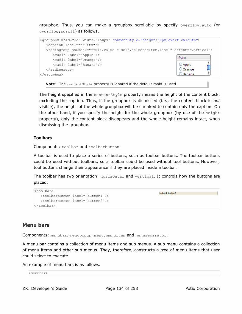
groupbox. Thus, you can make a groupbox scrollable by specify overflow:auto (or
overflow:scroll) as follows.
<groupbox mold="3d" width="150px" contentStyle="height:50px;overflow:auto"><caption label="fruits"/><radiogroup onCheck="fruit.value = self.selectedItem.label" orient="vertical">
<radio label="Apple"/><radio label="Orange"/><radio label="Banana"/>
</radiogroup></groupbox>
Note: The contentStyle property is ignored if the default mold is used.
The height specified in the contentStyle property means the height of the content block,
excluding the caption. Thus, if the groupbox is dismissed (i.e., the content block is not visible), the height of the whole groupbox will be shrinked to contain only the caption. On
the other hand, if you specify the height for the whole groupbox (by use of the height property), only the content block disappears and the whole height remains intact, when dismissing the groupbox.
Toolbars
Components: toolbar and toolbarbutton.
A toolbar is used to place a series of buttons, such as toolbar buttons. The toolbar buttons could be used without toolbars, so a toolbar could be used without tool buttons. However, tool buttons change their appearance if they are placed inside a toolbar.
The toolbar has two orientation: horizontal and vertical. It controls how the buttons are
placed.
<toolbar><toolbarbutton label="button1"/><toolbarbutton label="button2"/>
</toolbar>
Menu bars
Components: menubar, menupopup, menu, menuitem and menuseparator.
A menu bar contains a collection of menu items and sub menus. A sub menu contains a collection of menu items and other sub menus. They, therefore, constructs a tree of menu items that user could select to execute.
An example of menu bars is as follows.
<menubar>
ZK: Developer's Guide Page 134 of 258 Potix Corporation

<menu label="File"><menupopup>
<menuitem label="New"/><menuitem label="Open"/><menuseparator/><menuitem label="Exit"/>
</menupopup></menu><menu label="Help">
<menupopup><menuitem label="Index"/><menu label="About">
<menupopup><menuitem label="About ZK"/><menuitem label="About Potix"/>
</menupopup></menu>
</menupopup></menu>
</menubar>
• menubar: The topmost container for a collection of menu items (menuitem) and menus
(menu).
• menu: The container of a popup menu. It also defines the label to be displayed at part of its
parent. When user clicks on the label, the popup menu appears.
• menupopup: A container for a collection of menu items (menuitem) and menus (menu). It is
a child of menu and appears when the label of menu is clicked.
• menuitem: An individual command on a menu. This could be placed in a menu bar, or a
popup menu.
• menuseparator: A separator bar on a menu. This would be placed in a popup menu.
Execute a Menu Command
A menu command is associated with a menu item. There are two ways to associate a
command to it: the onClick event and the href property. If a event listener is added for a
menu item for the onClick event, the listener is invoked when the item is clicked.
<menuitem onClick="draft.save()"/>
On the other hand, you could specify the href property to hyperlink to the specified URL
when a menu item is clicked.
<menuitem href="/edit"/><menuitem href="http://zk1.sourceforge.net"/>
If both of the event listener and href are specified, they will be executed. However, when
the event listener get executed in the server, the browser might already change the current
ZK: Developer's Guide Page 135 of 258 Potix Corporation

URL to the specified one. Thus, all responses generated by the event listener will be ignored.
Use Menu Items as Check Boxes
A menu item could be used as a check box. The checked property denotes whether this
menu item is checked. If checked, a check icon is appeared in front of the menu item.
In addition to programming the checked property, you could specify the autocheck property
to be true, such that the checked property is toggled automatically when user clicks the
menu item.
<menuitem label="" autocheck="true"/>
The autodrop Property
By default, the popup menu is opened when user clicks on it. You might change this to automatically popup menu when the mouse moves over it. This is done by setting the
autodrop property to true.
<menubar autodrop="true">...
</menubar>
The onOpen Event
When a menupopup is going to appear (or hide), an onOpen event is sent to the menupopup
for notification. For sophisticated applications, you can defer the creation of the content of
the menupopup or manipulate the content dynamically, until the onOpen event is received.
Refer to the Load on Demand section in th ZK User Interface Markup Language chapter for details.
More Menu Features
Like box, you could control the orientation of a menu by use of the orient property. By
default, the orientation is horizontal.
Like other components, you could change the menu dynamically, including properties and
creating sub menus. Refer to menu.zul under the test directory in zkdemo.
Context Menus
Components: popup and menupopup.
You can assign the ID of a popup or menupopup component to the context property of any XUL
component, such that the popup or menupopup component is opened when a user right-clicks on it.
ZK: Developer's Guide Page 136 of 258 Potix Corporation

As depicted below, a context menu is enabled by simply assigning the ID to the context property.
Of course, you can assign the same ID to multiple components.
<label value="Right Click Me!" context="editPopup"/><separator bar="true"/><label value="Right Click Me!" onRightClick="alert(self.value)"/>
<menupopup id="editPopup"> <menuitem label="Undo"/> <menuitem label="Redo"/> <menu label="Sort">
<menupopup> <menuitem label="Sort by Name" autocheck="true"/> <menuitem label="Sort by Date" autocheck="true"/>
</menupopup> </menu></menupopup>
Notice that menupopup is not visible until a user right-clicks on a component associated with its ID.
Trick: If you just want to disable browser's default context menu, you can specify non-
existent ID to the context property.
The popup component is a more generic popup than menupopup. You can place any kind of
components inside of popup. For example,
<label value="Right Click Me!" context="any"/>
<popup id="any" width="300px"><vbox>
It can be anything.<toolbarbutton label="ZK" href="http://zk1.sourceforge.net"/>
</vbox></popup>
Customizable Tooltip and Popup Menus
In addition to open a popup when user right-clicks a component, ZK can open a popup under other circumstances.
Property Description
context When user right clicks a component with the context property, the
popup or menupopup component with the specified id is shown.
tooltip When user move the mouse pointer over a component with the
tooltip property, the popup or menupopup component with the
specified id is shown.
popup When user clicks a component with the popup property, the popup or
menupopup component with the specified id is shown.
ZK: Developer's Guide Page 137 of 258 Potix Corporation

For example,
<window title="Context Menu and Right Click" border="normal" width="360px"><label value="Move Mouse Over Me!" tooltip="editPopup"/><separator bar="true"/><label value="Tooptip for Another Popup" tooltip="any"/><separator bar="true"/><label value="Click Me!" popup="editPopup"/>
<menupopup id="editPopup"><menuitem label="Undo"/><menuitem label="Redo"/><menu label="Sort">
<menupopup><menuitem label="Sort by Name" autocheck="true"/><menuitem label="Sort by Date" autocheck="true"/>
</menupopup></menu>
</menupopup><popup id="any" width="300px">
<vbox>ZK simply rich.<toolbarbutton label="ZK your killer Web application now!"href="http://zk1.sourceforge.net"/>
</vbox></popup></window>
Notice that you can specify any identifier in the popup, tooltip and context properties, as
long as they are in the same page. In other words, it is not confined by the ID space.
The onOpen Event
When a context menu, a tooltip or a popup is going to appear (or hide), an onOpen event is
sent to the context, tooltip or poup menu for notification. The event is an instance of the
org.zkoss.zk.ui.event.OpenEvent class, and you can retrieve the component that causes
the context menu, tooltip or popup to appear by calling the getReference method.
To improve the performance, you defer the creation of the content until it becomes visible –
i.e., until the onOpen event is received.
The simplest way to defer the creation of the content is to use the fulfill attribute as
shown below.
<popup id="any" width="300px" fulfill="onOpen"> <button label="Hi"/><!-- whatever content --></popup>
Then, the content (the Hi button) won't be created when the page is loaded. Rather, the
content is created when the onOpen event is received at the first time.
ZK: Developer's Guide Page 138 of 258 Potix Corporation

If you prefer to dynamically manipulate the content in Java, you can listen to the onOpen event as depicted below.
<popup id="any" width="300px"><attribute name="onOpen">if (event.isOpen()) {
if (self.getChildren().isEmpty()) {new Button("Hi").seParent(self);...
}if (event.getReference() instanceof Textbox) {
//you can do component-dependent manipulation here...
}}</attribute>
</popup>
List Boxes
Components: listbox, listitem, listcell, listhead and listheader.
A list box is used to display a number of items in a list. The user may select an item from the list.
The simplest format is as follows. It is a single-column and single-selection list box.
<listbox><listitem label="Butter Pecan"/><listitem label="Chocolate Chip"/><listitem label="Raspberry Ripple"/>
</listbox>
Listbox has two molds: default and select. If the select mold is used, the HTML's SELECT tag is
generated instead.
<listbox mold="select">...</listbox>
Notice: if mold is "select", rows is "1", and none of items is marked as selected, the
browser displays the listbox as if the first item is selected. Worse of all, if user selects
the first item in this case, no onSelect event is sent. To avoid this confusion, developers
shall select at least one item for mold="select" and rows="1".
In addition to label, you can assign an application-specific value to each item using the setValue method.
Mouseless Entry listbox• UP and DOWN to move the selection up and down one list item.
• PgUp and PgDn to move the selection up and down in a step of one page.
• HOME to move the selection to the first item, and END to the last item.
ZK: Developer's Guide Page 139 of 258 Potix Corporation

• Ctrl+UP and Ctrl+DOWN to move the focus up and down one list item without
changing the selection.
• SPACE to select the item of the focus.
Multi-Column List Boxes
The list box also supports multiple columns. When user selects an item, the entire row is selected.
To specify a multi-column list, you need to specify the listcell components as collumns of each listitem (as a row).
<listbox width="200px"><listitem>
<listcell label="George"/><listcell label="House Painter"/>
</listitem><listitem>
<listcell label="Mary Ellen"/><listcell label="Candle Maker"/>
</listitem><listitem>
<listcell label="Roger"/><listcell label="Swashbuckler"/>
</listitem></listbox>
Column Headers
You could specify the column headers by use of listhead and listheader as follows39. In
addition to label, you could specify an image as the header by use of the image property.
<listbox width="200px"><listhead>
<listheader label="Name"/><listheader label="Occupation"/>
</listhead>...</listbox>
Column Footers
You could specify the column footers by use of listfoot and listfooter as follows. Notice
that the order of listhead and listfoot doesn't matter. Each time a listhead instance is
added to a list box, it must be the first child, and a listfoot instance the last child.
<listbox width="200px">
39 This feature is a bit different from XUL, where listhead and listheader are used.
ZK: Developer's Guide Page 140 of 258 Potix Corporation

<listhead><listheader label="Population"/><listheader align="right" label="%"/>
</listhead><listitem id="a" value="A">
<listcell label="A. Graduate"/><listcell label="20%"/>
</listitem><listitem id="b" value="B">
<listcell label="B. College"/><listcell label="23%"/>
</listitem><listitem id="c" value="C">
<listcell label="C. High School"/><listcell label="40%"/>
</listitem><listitem id="d" value="D">
<listcell label="D. Others"/><listcell label="17%"/>
</listitem><listfoot>
<listfooter label="More or less"/><listfooter label="100%"/>
</listfoot></listbox>
Drop-Down List
You could create a drop-down list by specifying the select mold and single row. Notice you cannot use multi-column for the drop-down list.
<listbox mold="select" rows="1"><listitem label="Car"/><listitem label="Taxi"/><listitem label="Bus" selected="true"/><listitem label="Train"/>
</listbox>
Multiple Selection
When user clicks on a list item, the whole item is selected and the onSelect event is sent
back to the server to notify the application. You could control whether a list box allows
multiple selections by setting the multiple property to true. The default value is false.
Scrollable List Boxes
A list box is scrollable if you specify the rows property or the height property, and there is
no enough to show all list items.
ZK: Developer's Guide Page 141 of 258 Potix Corporation

<listbox width="250px" rows="4"><listhead>
<listheader label="Name" sort="auto"/><listheader label="Gender" sort="auto"/>
</listhead><listitem>
<listcell label="Mary"/><listcell label="FEMALE"/>
</listitem><listitem>
<listcell label="John"/><listcell label="MALE"/>
</listitem><listitem>
<listcell label="Jane"/><listcell label="FEMALE"/>
</listitem><listitem>
<listcell label="Henry"/><listcell label="MALE"/>
</listitem><listitem>
<listcell label="Michelle"/><listcell label="FEMALE"/>
</listitem></listbox>
The rows Property
The rows property is used to control how many rows are visible. By setting it to zero, the
list box will resize itself to hold as many as items if possible.
Sizable List Headers
Like columns, you can set the sizable property of listhead to true to allow users to resize
the width of list headers. Similarly, the onColSize event is sent when a user resized the
widths.
List Boxes with Paging
Like grids, you can use multiple pages to represent long content for list boxes by specifying
the paging mold. Similarly, you can control how many items for each page to display,
whether to use an external paging component and whether to customize the behavior when a page is selected. Refer to the Grids section for more details.
Sorting
List boxes support sorting of list items directly. There are a few ways to enable the sorting of
ZK: Developer's Guide Page 142 of 258 Potix Corporation

a particular column. The simplest way is to set the sort property of the list header to auto as follows. Then, the column that the list header is associated with is sortable based on the label of each list cell of the specified column.
<zk><listbox width="200px">
<listhead><listheader label="name" sort="auto"/><listheader label="gender" sort="auto"/>
</listhead><listitem>
<listcell label="Mary"/><listcell label="FEMALE"/>
</listitem><listitem>
<listcell label="John"/><listcell label="MALE"/>
</listitem><listitem>
<listcell label="Jane"/><listcell label="FEMALE"/>
</listitem><listitem>
<listcell label="Henry"/><listcell label="MALE"/>
</listitem></listbox>
</zk>
The sortAscending and sortDescending Properties
If you prefer to sort list items in different ways, you can assign a java.util.Comparator instance to the sortAscending and/or sortDescending property. Once assigned, the list
items can be sorted in the ascending and/or descending order with the comparator you assigned.
The invocation of the sort property with auto actually assign two comparators to the
sortAsceding and sortDescending automatically. You can override any of them by
assigning another comparator to it.
For example, assume you want to sort based on the value of list items, rather than list
cell's label, then you assign an instance of ListitemComparator to these properties as
follows.
<zscript>Comparator asc = new ListitemComarator(-1, true, true);Comparator dsc = new ListitemComarator(-1, false, true);
</zscript><listbox>
<listhead>
ZK: Developer's Guide Page 143 of 258 Potix Corporation

<listheader sortAscending="${asc}" sortDescending="${dsc}"/>...
The sortDirection Property
The sortDirection property controls whether to show an icon at the client to indicate the
order of the particular column. If list items are sorted before adding to the list box, you shall set this property explicitly.
<listheader sortDirection="ascending"/>
Then, it is maintained automatically by list boxes as long as you assign the comparator to the corresponding list header.
The onSort Event
When you assign at least one comparator to a list header, an onSort event is sent to the
server if user clicks on it. The list header implements a listener to handle the sorting automatically.
If you prefer to handle it manually, you can add your listener to the list header for the
onSort event. To prevent the default listener to invoke the sort method, you have to call
the stopPropagation method against the event being received. Alternatively, you can
override the sort method, see below.
The sort Method
The sort method is the underlying implementation of the default onSort event listener. It
is also useful if you wan to sort the list items by Java codes. For example, you might have to call this method after adding items (assuming not in the proper order).
new Listem("New Stuff").setParent(listbox);if (!"natural".header.getSortDirection())
header.sort("ascending".equals(header.getSortDirection()));
The default sorting algorithm is quick-sort (by use of the sort method from the
org.zkoss.zk.ui.Components class). You might override it with your own
implementation, or listen to the onSort event as described in the previous section.
Tip: Sorting huge number of live data might degrade the performance significantly. It is
better to intercept the onSort event or the sort method to handle it effectively. Refer to
the Sort Live Data section below.
ZK: Developer's Guide Page 144 of 258 Potix Corporation

Special Properties
The checkmark Property
The checkmark property controls whether to display a checkbox or a radio button in front
of each list item.
In the following example, you will see how a checkbox is added automatically, when you move a list item from the left list box to the right one. The checkbox is removed when you move a list item from right to left.
<hbox><listbox id="src" rows="0" multiple="true" width="200px">
<listhead><listheader label="Population"/><listheader label="Percentage"/>
</listhead><listitem id="a" value="A">
<listcell label="A. Graduate"/><listcell label="20%"/>
</listitem><listitem id="b" value="B">
<listcell label="B. College"/><listcell label="23%"/>
</listitem><listitem id="c" value="C">
<listcell label="C. High School"/><listcell label="40%"/>
</listitem><listitem id="d" value="D">
<listcell label="D. Others"/><listcell label="17%"/>
</listitem></listbox><vbox>
<button label="=>" onClick="move(src, dst)"/><button label="<=" onClick="move(dst, src)"/>
</vbox><listbox id="dst" checkmark="true" rows="0" multiple="true" width="200px">
<listhead><listheader label="Population"/><listheader label="Percentage"/>
</listhead><listitem id="e" value="E">
<listcell label="E. Supermen"/><listcell label="21%"/>
</listitem></listbox><zscript>
ZK: Developer's Guide Page 145 of 258 Potix Corporation

void move(Listbox src, Listbox dst) {Listitem s = src.getSelectedItem();if (s == null)
Messagebox.show("Select an item first");else
s.setParent(dst);}
</zscript></hbox>
Notice that if the multiple property is false, the radio buttons
are displayed instead, as depicted at the right.
The vflex Property
The vflex property controls whether to grow and shrink vertical to fit their given space. It
is so-called vertical flexibility. For example, if the list is too big to fit in the browser window, it will shrink its height to make the whole list control visible in the browser window.
This property is ignored if the rows property is specified.
The maxlength Property
The maxlength property defines the maximal allowed characters being visible at the
browser. By setting this property, you could make a narrower list box.
Live Data
Like grids40, list boxes support the live data. With live data, developers could separate the data from the view. In other words, developers needs only to provide the data by
implementing the org.zkoss.zul.ListModel interface. Rather than manipulating the list
box directly. The benefits are two folds.
• It is easier to use different views to show the same set of data.
• The list box sends the data to the client only if it is visible. It saves a lot of network traffic if the amount of data is huge.
There are three steps to use the live data.
1. Prepare the data in the form of ListModel. ZK has a concrete implementation called
org.zkoss.zul.SimpleListModel. for representing an array of objects.
2. Implement the org.zkoss.zul.ListitemRenderer interface for rendering an item of
data into a list item of the list box.
• This is optional. If not specified, the default renderer is used to render the data
40 The concept is similar to Swing (javax.swing.ListModel).
ZK: Developer's Guide Page 146 of 258 Potix Corporation

into the first column.
• You could implement different renderers for represent the same data in different views.
3. Specify the data in the model property, and, optionally, the renderer in the
itemRenderer property.
In the following example, we prepared a list model called strset, assigned it to a list box
through the model property. Then, the list box will do the rest.
<window title="Livedata Demo" border="normal"><zscript>
String[] data = new String[30];for(int j=0; j < data.length; ++j) {
data[j] = "option "+j;}ListModel strset = new SimpleListModel(data);
</zscript><listbox width="200px" rows="10" model="${strset}">
<listhead><listheader label="Load on demend"/>
</listhead></listbox>
</window>
Sorting with Live Data
If you allow users to sort a list box provided with live data, you have to implement an
interface, org.zkoss.zul.ListModelExt, in addition to org.zkoss.zul.ListModel.
class MyListModel implements ListModel, ListModelExt {public void sort(Comparator cmpr, boolean ascending) {
//do the real sorting//notify the listbox (or grid) that data is changed by use of ListDataEvent
}}
When a user requests the list box to sort, the list box will invoke the sort method of
ListModelExt to sort the data. In other words, the sorting is done by the list model,
rather than the list box.
After sorted, the list model shall notify the list box by invoking the onChange method of
the org.zkoss.zul.event.ListDataListener instances that are registered to the list
box (by the addListDataListener method). In most cases, all data are usually changed,
so the list model usually sends the following event:
new ListDataEvent(this, ListDataEvent.CONTENTS_CHANGED, -1, -1)
ZK: Developer's Guide Page 147 of 258 Potix Corporation

Note: the implementation of ListModel and ListModelExt is independent of the visual
presentation. In other words, it can be used with grids, list boxes and any other
components supporting ListModel.
In other words, to have the maximal flexibility, you shall not assume the component to
used. Rather, use ListDataEvent to communicate with.
List Boxes Contain Buttons
In theory, a list cell could contain any other components, as depicted below.
<listbox width="250px"><listhead>
<listheader label="Population"/><listheader label="Percentage"/>
</listhead><listitem value="A">
<listcell><textbox value="A. Graduate"/></listcell><listcell label="20%"/>
</listitem><listitem value="B">
<listcell><checkbox label="B. College"/></listcell><listcell><button label="23%"/></listcell>
</listitem><listitem value="C">
<listcell label="C. High School"/><listcell><textbox cols="8" value="40%"/></listcell>
</listitem></listbox>
Notes:
1. Don't use a list box, when a grid is a better choice. The appearances of list boxes and grids are similar, but the list box shall be used only to represent a list of selectable items.
2. Users are usually confused if a list box contains editable components, such as
textbox and checkbox. A common question is what the text, that a user entered in a
unselected item, means.
3. Due to the limitation of the browsers, users cannot select a piece of characters from the text boxes.
Tree Controls
Components: tree, treechildren, treeitem, treerow, treecell, treecols and treecol.
A tree consists of two parts, the set of columns, and the tree body. The set of columns is defined
by a number of treecol components, one for each column. Each column will appear as a header
ZK: Developer's Guide Page 148 of 258 Potix Corporation

at the top of the tree. The second part, the tree body, contains the data to appear in the tree and
is created with a treechildren component.
An example of a tree control is as follows.
<tree id="tree" rows="5"><treecols>
<treecol label="Name"/><treecol label="Description"/>
</treecols><treechildren>
<treeitem><treerow>
<treecell label="Item 1"/><treecell label="Item 1 description"/>
</treerow></treeitem><treeitem>
<treerow><treecell label="Item 2"/><treecell label="Item 2 description"/>
</treerow><treechildren>
<treeitem><treerow>
<treecell label="Item 2.1"/></treerow><treechildren>
<treeitem><treerow>
<treecell label="Item 2.1.1"/></treerow></treeitem><treeitem><treerow>
<treecell label="Item 2.1.2"/></treerow></treeitem>
</treechildren></treeitem><treeitem>
<treerow><treecell label="Item 2.2"/><treecell label="Item 2.2 is something who cares"/>
</treerow></treeitem>
</treechildren></treeitem><treeitem label="Item 3"/>
</treechildren></tree>
ZK: Developer's Guide Page 149 of 258 Potix Corporation

• tree: This is the outer component of a tree control.
• treecols: This component is a placeholder for a collection of treecol components.
• treecol: This is used to declare a column of the tree. By using this comlumn, you can
specify additional information such as the column header.
• treechildren: This contains the main body of the tree, which contain a collection of
treeitem components.
• treeitem: This component contains a row of data (treerow), and an optional
treechildren.
○ If the component doesn't contain a treechildren, it is a leaf node that doesn't accept
any child items.
○ If it contains a treechildren, it is a branch node that might contain other items.
○ For a branch node, an +/- button will appear at the beginning of the row, such that user could open and close the item by clicking on the +/- button.
• treerow: A single row in the tree, which should be placed inside a treeitem component.
• treecell: A single cell in a tree row. This element would go inside a treerow component.
Mouseless Entry tree• UP and DOWN to move the selection up and down one tree item.
• PgUp and PgDn to move the selection up and down in a step of one page.
• HOME to move the selection to the first item, and END to the last item.
• RIGHT to open a tree item, and LEFT to close a tree item.
• Ctrl+UP and Ctrl+DOWN to move the focus up and down one tree item without
changing the selection.
• SPACE to select the item of the focus.
The open Property and the onOpen Event
Each tree item has the open property used to control whether to display its child items. The
default value is true. By setting this property to false, you could control what part of the tree is invisible.
<treeitem open="false">
When a user clicks on the +/- button, he opens the tree item and makes its children visible.
The onOpen event is then sent to the server to notify the application.
For sophisticated applications, you can defer the creation of the content of the tree item or
manipulate its content dynamically, until the onOpen event is received. Refer to the Load on
Demand section in th ZK User Interface Markup Language chapter for details.
ZK: Developer's Guide Page 150 of 258 Potix Corporation

Multiple Selection
When user clicks on a tree item, the whole item is selected and the onSelect event is sent
back to the server to notify the application. You could control whether a tree control allows
multiple selections by setting the multiple property to true. The default value is false.
Paging
The pageSize property controls the number of tree items to display at
once. By default, it is 10. That is, at most 10 tree items are displayed at the client for each level as depicted in the right figure.
A user can click to see more tree items (i.e., enlarge pageSize), or click
or to scroll up and down.
If you want to display all tree items, simply set pageSize to -1. However,
it is not recommended if the tree control is huge, since the browser is too slow to handle a tree with huge number of items.
In addition to the pageSize property of a tree control, you can change
the page size of each treechildren instance by modifying the pageSize property of the corresponding treechildren instance.
The onPaging and onPageSize Event
When a user clicks or to scroll up and down the page, the onPaging event is sent with
an org.zkoss.zul.event.PagingEvent instance. Similarly, the onPageSize event is sent
with an org.zkoss.zul.event.PageSize instance when a user clicks .
Special Properties
The rows Property
The rows property is used to control how many rows are visible. By setting it to zero, the
tree control will resize itself to hold as many as items if possible.
The checkmark Property
The checkmark property controls whether to display a checkbox or a radio button in front
of each tree item.
ZK: Developer's Guide Page 151 of 258 Potix Corporation

The vflex Property
The vflex property controls whether to grow and shrink vertical to fit their given space. It
is so-called vertical flexibility. For example, if the tree is too big to fit in the browser window, it will shrink the height to make the whole tree visible in the browser window.
This property is ignored if the rows property is specified.
The maxlength Property
The maxlength property defines the maximal allowed characters being visible at the
browser. By setting this property, you could make a narrower tree control.
Sizable Columns
Like columns, you can set the sizable property of treecols to true to allow users to
resize the width of tree headers. Similarly, the onColSize event is sent when a user
resized the widths.
Create-on-Open for Tree Controls
As illustrated below, you could listen to the onOpen event, and then load the children of an
tree item. Similarly, you could do create-on-open for group boxes.
<tree width="200px"><treecols>
<treecol label="Subject"/><treecol label="From"/>
</treecols><treechildren>
<treeitem open="false" onOpen="load()"><treerow>
<treecell label="Intel Snares XML"/><treecell label="David Needle"/>
</treerow><treechildren/>
</treeitem></treechildren><zscript>void load() {
Treechildren tc = self.getTreechildren();if (tc.getChildren().isEmpty()) {
Treeitem ti = new Treeitem();ti.setLabel("New added");ti.setParent(tc);
}}</zscript>
</tree>
ZK: Developer's Guide Page 152 of 258 Potix Corporation

Comboboxes
Components: combobox and comboitem.
A combobox is a special text box that embeds a drop-down list. With comboboxes, users are allowed to select from a drop-down list, in addition to entering the text manually.
<combobox><comboitem label="Simple and Rich"/><comboitem label="Cool!"/><comboitem label="Ajax and RIA"/>
</combobox>Mouseless Entry combobox• Alt+DOWN to pop up the list.
• Alt+UP or ESC to close the list.
• UP and DOWN to change the selection of the items from the list.
The autodrop Property
By default, the drop-down list won't be opened until user clicks the button, or press
Alt+DOWN. However, you could set the autodrop property to true, such that the drop-down
list is opened as soon as user types any character. This is helpful for novice users, but it might be annoying for experienced users.
<combobox autodrop="true"/>
The description Property
You could add a description to each combo item to make it more descriptive. In addition, you could assign an image to each combo item.
<combobox><comboitem label="Simple and Rich" image="/img/coffee.gif"description="The simplest way to make Web applications rich"/><comboitem label="Cool!" image="/img/corner.gif"description="The coolest technology"/><comboitem label="Ajax and RIA" image="/img/cubfirs.gif"description="Rich Internet Application by Ajax"/>
</combobox>
Like other components that support images, you could
use the setImageContent method to assign the content
of a dynamically generated image to the comboitem component. Refer to the Image section for details.
The onOpen Event
The onOpen event is sent to the application, when user opens the drop-down list. To defer
ZK: Developer's Guide Page 153 of 258 Potix Corporation

the creation of combo items, you can use the fulfill attribute as shown below.
<combobox fulfill="onOpen"><comboitem label="Simple and Rich"/><comboitem label="Cool!"/><comboitem label="Ajax and RIA"/>
</combobox>
Alternatively, you can listen to the onOpen event, and then prepare the drop-down list or
change it dynamically in the listener as shown below.
<combobox id="combo" onOpen="prepare()"/><zscript>
void prepare() {if (event.isOpen() && combo.getItemCount() == 0) {
combo.appendItem("Simple and Rich");combo.appendItem("Cool!");combo.appendItem("Ajax and RIA");
}}
</zscript>
The appendItem method is equivalent to create a combo item and then assign its parent to
the comobox.
The onChanging Event
Since a combobox is also a text box, the onChanging event will be sent if you add a listener
for it. By listening to this event, you could manipulate the drop-down list as the Google Suggests41 does. This feature is sometimes called autocomplete.
As illustrated below, you could fill the drop-down list based on what user is entering.
<combobox id="combo" autodrop="true" onChanging="suggest()"/><zscript>
void suggest() {combo.getItems().clear();if (event.value.startsWith("A")) {
combo.appendItem("Ace");combo.appendItem("Ajax");combo.appendItem("Apple");
} else if (event.value.startsWith("B")) {combo.appendItem("Best");combo.appendItem("Blog");
}}
</zscript>
Notice that, when the onChanging event is received, the content of the combobox is not
changed yet. Thus, you cannot use the value property of the combobox. Rather, you shall
41 http://www.google.com/webhp?complete=1&hl=en
ZK: Developer's Guide Page 154 of 258 Potix Corporation

use the value property of the event (org.zkoss.zk.ui.event.InputEvent).
Bandboxes
Components: bandbox and bandpopup.
A bandbox is a special text box that embeds a customizable popup window (aka., a dropdown window). Like comboboxes, a bandbox consists of an input box and a popup window. The popup
window is opened automatically, when users presses Alt+DOWN or clicks the button.
Unlike comboboxes, the popup window of a bandbox could be anything. It is designed to give developers the maximal flexibility. A typical use is to represent the popup window as a search dialog.
<bandbox id="bd"><bandpopup><vbox><hbox>Search <textbox/></hbox><listbox width="200px"onSelect="bd.value=self.selectedItem.label; bd.closeDropdown();">
<listhead><listheader label="Name"/><listheader label="Description"/>
</listhead><listitem>
<listcell label="John"/><listcell label="CEO"/>
</listitem><listitem>
<listcell label="Joe"/><listcell label="Engineer"/>
</listitem><listitem>
<listcell label="Mary"/><listcell label="Supervisor"/>
</listitem></listbox></vbox></bandpopup>
</bandbox>Mouseless Entry bandbox• Alt+DOWN to pop up the list.
• Alt+UP or ESC to close the list.
• UP and DOWN to change the selection of the items from the list.
ZK: Developer's Guide Page 155 of 258 Potix Corporation
The closeDropdown Method
A popup window could contain any kind of components, so it is developer's job to copy the value from and close the popup if one of item is selected.
In the above example, we copy the selected item's label to the bandbox, and then close the popup by the following statement.
<listbox width="200px" onSelect="bd.value=self.selectedItem.label; bd.closeDropdown();">
The autodrop Property
By default, the popup window won't be opened until user clicks the button, or press
Alt+DOWN. However, you could set the autodrop property to true, such that the popup is
opened as soon as user types any character. This is helpful for novice users, but it might be annoying for experienced users.
<bandbox autodrop="true"/>
The onOpen Event
The onOpen event is sent to the application if the user opens the popup window. By use of
the fulfill attribute with the onOpen value as shown below, you can defer the creation of
the popup window.
<bandbox fulfill="onOpen"><bandpopup>...</bandpopup>
</bandbox>
Alternatively, you could prepare the popup window in Java by listening to the onOpen event,
as depicted below.
<bandbox id="band" onOpen="prepare()"/><zscript>
void prepare() {if (event.isOpen() && band.getPopup() == null) {
...//create child elements}
}</zscript>
The onChanging Event
Since a bandbox is also a text box, the onChanging event will be sent if you add a listener
for it. By listening to this event, you could manipulate the popup window any way you like.
As illustrated below, you could fill the drop-down list based on what user is entering.
ZK: Developer's Guide Page 156 of 258 Potix Corporation

<bandbox id="band" autodrop="true" onChanging="suggest()"/><zscript>
void suggest() {if (event.value.startsWith("A")) {
...//do something} else if (event.value.startsWith("B")) {
...//do another}
}</zscript>
Notice that, when the onChanging event is received, the content of the bandbox is not
changed yet. Thus, you cannot use the value property of the bandbox. Rather, you shall use
the value property of the event (org.zkoss.zk.ui.event.InputEvent).
Chart
Components: chart
A chart is used to show a set of data as a graph. It helps users to judge things with a snapshot.
The usage of chart component is straightforward. Prepare suitable data model and feed it into the
chart . The following is an example of pie chart.
<chart id="mychart" type="pie" width="400" height="200" threeD="true" fgAlpha="128"> <zscript><![CDATA[ PieModel model = new SimplePieModel(); model.setValue("C/C++", new Double(17.5)); model.setValue("PHP", new Double(32.5)); model.setValue("Java", new Double(43.2)); model.setValue("VB", new Double(10.0)); mychart.setModel(model); ]]></zscript></chart>
Different kind of chart is used to demonstrate different kind of data; therefore, chart has to be provided suitable data model. For a pie chart, developers must provide PieModel as their data model while bar chart, line chart, area chart, and waterfall chart needs CategoryModel and XYModel.
Live Data
The above example is somehow a little bit misleading. In fact, developers don't have to
prepare the real data before feed it into a chart because chart components support live
data mechanism. With live data, developers could separate the data from the view. In other
words, developer can add, change, and remove data from the data model and the chart
ZK: Developer's Guide Page 157 of 258 Potix Corporation
would be redrawn accordingly. For some advanced implementation, developers can even
provide their own chart model by implementing the org.zkoss.zul.ChartModel interface.
Drill Down (The onClick Event)
When a user views a chart and finds something interesting, it is natural that the user would like to see the detail information regarding that interesting point. It is usually a pie in a pie chart, a bar in a bar chart or a point in a line chart. Chart components support such drill
down facility by automatically cutting a chart into area components and users can then
click on the chart to fire an onClick MouseEvent. Developers then locate the area component and do whatever appropriate drill down.
In the area component's componentScope there are some useful information that developers
can use them.
name description
entity Entity type of the area. (e.g. TITLE, DATA, CATEGORY, LEGEND)
series Series name of the associated data (CategoryModel, XYModel, or HiLoModel).
category Category name of the associated data (PieModel or CategoryModel).
url An url in string that can be used to drill down to a legacy page.
value Numeric value of the associated data ( PieModel or CategoryModel).
x x value of the associated data (XYModel).
y y value of the associated data (XYModel).
date date value of the associated data (HiLoModel).
open open value of the associated data (HiLoModel).
high high value of the associated data (HiLoModel).
low low value of the associated data (HiLoModel).
close close value of the associated data (HiLoModel).
volume volume value of the associated data (HiLoModel).
In the following example, we provide an onClick event listener on the chart. It locates the
associated area component and show the category of that area (i.e. the pie).
<chart id="mychart" type="pie" width="400" height="250"> <attribute name="onClick"> alert(self.getFellow(event.getArea()).getAttribute("category")); </attribute> <zscript><
]]></zscript></chart>
Manipulate Areas
Chart components also provide a area renderer mechanism that developers can manipulate
the cutting area components of the chart.
Only two steps needed to use the area renderer.
1. Implement the org.zkoss.zul.event.ChartAreaListener interface for manipulating
the area components. e.g. Change the tooltiptext of the area.
2. Set the listener object or listener class name to the chart's areaListener property.
So developers get a chance to change the area component's properties or insert more
information into the area component's componentScope property and thus be passed
through to the onClick event listener.
Drag and Drop
ZK allows a user to drag particular components around within the user interface. For example, dragging files to other directories, or dragging an item to the shopping cart to purchase.
A component is draggable if it can be dragged around. A component is droppable, if a user could drop a draggable component to it.
Note: ZK does not assume any behavior about what shall take place after dropping. It is
up to application developers by writing the onDrop event listener.
If an application doesn't nothing, the dragged component is simply moved back where it
is originated from.
The draggable and droppable Properties
With ZK, you could make a component draggable by assigning any value, other than
"false", to the draggable property. To disable it, assign it with "false".
<image draggable="true"/>
Similarly, you could make a component droppable by assigning "true" to the droppable
property.
<hbox droppable="true"/>
Then, user could drag a draggable component, and then drop it to a droppable component.
ZK: Developer's Guide Page 159 of 258 Potix Corporation

The onDrop Event
Once user has dragged a component and dropped it to another component, the component
that the user dropped the component to will be notified by the onDrop event. The onDrop event is an instance of org.zkoss.ui.event.DropEvent. By calling the getDragged method,
you could retrieve what has been dragged (and dropped).
Notice that the target of the onDrop event is the droppable component, not the component
being dragged.
The following is a simple example that allows users to reorder list items by drag-and-drop.
<window title="Reorder by Drag-and-Drop" border="normal">Unique Visitors of ZK:<listbox id="src" multiple="true" width="300px">
<listhead><listheader label="Country/Area"/><listheader align="right" label="Visits"/><listheader align="right" label="%"/>
</listhead><listitem draggable="true" droppable="true" onDrop="move(event.dragged)">
<listcell label="United States"/><listcell label="5,093"/><listcell label="19.39%"/>
</listitem><listitem draggable="true" droppable="true" onDrop="move(event.dragged)">
<listcell label="China"/><listcell label="4,274"/><listcell label="16.27%"/>
</listitem><listitem draggable="true" droppable="true" onDrop="move(event.dragged)">
<listcell label="France"/><listcell label="1,892"/><listcell label="7.20%"/>
</listitem><listitem draggable="true" droppable="true" onDrop="move(event.dragged)">
<listcell label="Germany"/><listcell label="1,846"/><listcell label="7.03%"/>
</listitem><listitem draggable="true" droppable="true" onDrop="move(event.dragged)">
<listcell label="(other)"/>
ZK: Developer's Guide Page 160 of 258 Potix Corporation

<listcell label="13,162"/><listcell label="50.01%"/>
</listitem><listfoot>
<listfooter label="Total 132"/><listfooter label="26,267"/><listfooter label="100.00%"/>
</listfoot></listbox><zscript>void move(Component dragged) {
self.parent.insertBefore(dragged, self);}</zscript>
</window>
Dragging with Multiple Selections
When a user drag-and-drops a list item or a tree item, the selection status of these items won't be changed. Visually only the dragged item is moved, but you can handle all selected items at once by looking up the set of all selected items as depicted below.
public void onDrop(DropEvent evt) {Set selected = ((Listitem)evt.getDragged()).getListbox().getSelectedItems();//then, you can handle the whole set at once
}
Notice that the dragged item may not be selected. Thus, you may prefer to change the selection to the dragged item for this case, as shown below.
Listitem li = (Listitem)evt.getDragged();if (li.isSelected()) {
Set selected = ((Listitem)evt.getDragged()).getListbox().getSelectedItems();//then, you can handle the whole set at once
} else {li.setSelected(true);//handle li only
}
Multiple Types of Draggable Components
It is common that a droppable component doesn't accept all draggable components. For example, an e-mail folder accepts only e-mails and it rejects contacts or others. You could
silently ignore non-acceptable components or alert an message, when onDrop is invoked.
To have better visual effect, you could identify each type of draggable components with an
identifier, and then assign the identifier to the draggable property.
<listitem draggable="email"/>...
ZK: Developer's Guide Page 161 of 258 Potix Corporation
<listitem draggable="contact"/>
Then, you could specify a list of identifiers to the droppable property to limit what can be
dropped. For example, the following image accepts only email and contact.
<image src="/img/send.png" droppable="email, contact" onDrop="send(event.dragged)"/>
To accept any kind of draggable components, you could specify "true" to the droppable property. For example, the following image accepts any kind of draggable components.
<image src="/img/trash.png" droppable="true" onDrop="remove(event.dragged)"/>
On the other hand, if the draggable property is "true", it means the component belongs to
anonymous type. Furthermore, only components with the droppable property assigned to
"true" could accept it.
Work with HTML Tags
There are several ways to use HTML tags with XUL components in the same ZUML page. You can chose any of them based on your requirement.
First, you can use the html component to embed HTML tags. With this approach, the HTML tags
are simply the content of the html component. They are sent to the client directly. They don't
have any specify meaning to ZK.
Second, you can use the XHTML namespace (http://www.w3.org/1999/xhtml) to specify a
component from the XHTML component set. In othere words, the XHTML namespace denotes the associate XML element is a component from the XHTML component set. Like the ZUL component
set (http://www.zkoss.org/2005/zul), ZK creates an instance for each XML element in a ZUML
page.
Third, you can use the Native namespace (http://www.zkoss.org/2005/zk/native) to represent
a HTML tag that shall be sent directly to the client instead of creating a ZK component for each of them. When It is more efficient, but not dynamically changeable.
Last but not least, you can use inclusion (include) and inline frames (iframe) to embed another
into a ZUL page with, theoretically, any kind of content (not limited to HTML tags
The html Component
The simplest way is to use a XUL component called html42 to embed whatever HTML tags you
want to send directly to the browser. To avoid ZK from interpreting the HTML tags, you
usually enclose them with <![CDATA[ and ]]>. In other words, they are not the child
42 The text within the html element is actually assigned to the html component's content property (rather
than becoming a label child).
ZK: Developer's Guide Page 162 of 258 Potix Corporation

component. Rather, they are stored in the content property43. Notice you can use EL
expressions in it.
<window title="Html Demo"><html><![CDATA[
<h4>Hi, ${parent.title}</h4><p>It is the content of the html component.</p>
]]></html></window>
where <h4>...</p> will become the content of the html element (see also the getContent method of the org.zkoss.zul.Html class).
The html component generates the HTML SPAN tag to enclose the content. In other words, it
generates the following HTML tags when rendered to the browser.
<span id="z_4a_3"><h4>Hi, Html Demo</h4><p>It is the content of the html component.</p>
</span>
The html component is no different to other XUL components. For example, you specify the
CSS style and change its content dynamically.
<html id="h" style="border: 1px solid blue;background: yellow"><![CDATA[<ul>
<li>Native browser content</li></ul>
]]></html><button label="change" onClick="l.setContent("Hi, Update")"/>
Notice that, since SPAN is used to enclose the embedded HTML tags, the following code
snippet is incorrect.
<html><![CDATA[<ul>
<li> <!-- incorrect since <ul><li> is inside <span> -->]]></html>
<textbox/>
<html><![CDATA[</li>
</ul>]]</html>
If you need to generate the embedded HTML tags directly without the enclosing SPAN tag,
you can use the Native namespace as described in the following section.
43 Refer to the XML section in the ZK User Interface Markup Language chapter if you are not familiar
with XML.
ZK: Developer's Guide Page 163 of 258 Potix Corporation

The Native Namespace, http://www.zkoss.org/2005/zk/native
With the Native namespace, a XML element in a ZUML page denotes that it shall be sent to the browser directly rather than becoming a ZK component. For example,
<n:ul xmlns:n="http://www.zkoss.org/2005/zk/native"><n:li><textbox/></n:li><n:li><textbox/></n:li>
</n:ul>
will generate the following HTML tags to the browser:
<ul><li><input id="z_a3_2"/></li><li><input id="z_a3_5"/></li>
</ul
where <input> is the HTML tag(s) generated by the textbox component. Unlike textbox in
the example above, ZK Loader doesn't really create a component for each of ul and li.44
Rather, they are sent to the client directly. Of course, they must be recognizable by the client. For HTML browsers, they must be the valid HTML tags.
Since the elements associated with the Native namespace are sent directly to the client, they are not ZK components, and they don't have the counterpart at the client. The advantage is the better performance in term of both memory and processing time. On the other hand, the disadvantage is you cannot access or change them dynamically. For example, the following
code snippet is incorrect, since there is no component called x.
<n:ul id="x" xmlns:n="http://www.zkoss.org/2005/zk/native"/><button label="add" onClick="new Li().setParent(x)"/>
If you want to change them dynamically, you can specify the XHTML namespace as described in the following section.
Output Another Namespace with the Native Namespace
If you want to generate another namespace to the output, you can use another format as the URI of the Native namespace:
native:URI-of-another-namespace
44 ZK ZK actually creates a special component to represent as many XML elements with the Native
namespace as possible.
ZK: Developer's Guide Page 164 of 258 Potix Corporation

For example, if you want to output the SVG tags directly to the client, you can specify
native:native:http://www.w3.org/2000/svg as follows.
<window><svg width="100%" height="100%" version="1.1"xmlns="native:http://www.w3.org/2000/svg">
<ellipse cx="240" cy="100" rx="220" ry="30" style="fill:purple"/></svg>
</window>
Then, the client will receive the following:
<div id="z_lx_0c" z.type="zul.wnd.Wnd">45
<svg width="100%" height="100%" version="1.1"xmlns="http://www.w3.org/2000/svg">
<ellipse cx="240" cy="100" rx="220" ry="30" style="fill:purple"/></svg>
</div>
The XHTML Namespace, http://www.w3.org/1999/xhtmlThe XHTML namespace represents the XHTML component set, just like the ZUL namespace
(http://www.zkoss.org/2005/zul) represents the ZUL component set. Thus, a XML
element specified with the XHTML namespace simply denotes a component that shall be created based on the component definition from the XHTML component set. For example, the statement blow specifies a component that shall be created as an instance of the component
definition called ul, and ul belongs to the XHTML component set:
<h:ul xmlns:h="http://www.w3.org/1999/xhtml">
In other words, ZK loader will search the XHTML component set for the component definition
called ul , and then create an instance based on it.
The following is another yet more complete example.
<window title="mix HTML demo" xmlns:h="http://www.w3.org/1999/xhtml"><h:table border="1">
<h:tr id="row1"><h:td>column 1</h:td><h:td>
<listbox id="list" mold="select"><listitem label="AA"/><listitem label="BB"/>
</listbox></h:td>
</h:tr></h:table><button label="add" onClick="new org.zkoss.zhtml.Td().append(row1)"/>
</window>
45 The real HTML output of window depends on its implementation. Here is only a simplified version.
ZK: Developer's Guide Page 165 of 258 Potix Corporation

Unlike the html components, where HTML tags are stored in the content property, ZK loader
creates one component for each of them. The advantage is that you can manipulate each
individual HTML tag dynamically, as depicted in the above example (the add button). The
disadvantage is that they take longer to process and more space to maintain.
Tip: Unlike the XHTML namespace, the Native namespace doesn't represent another
component set. It is a reserved namespace to tell ZK Loader to send them directly to the
client for better performance.
The include Component
The include component is used to include the output generated by another servlet. The
servlet could be anything including JSF, JSP and even another ZUML page.
<window title="include demo" border="normal" width="300px">Hello, World!<include src="/userguide/misc/includedHello.zul"/><include src="/html/frag.html"/>
</window>
Like all other properties, you could dynamically change the src attribute to include the
output from a different servlet at the run time.
If the included output is another ZUML, developers are allowed to access components in the included page as if they are part of the containing page.
Pass Values to the Included Page
There are two ways to pass values to the included page. First, you can pass them with the query string.
<include src="mypage?some=something"/>
Then, in the included page, you can access them with the getParameter method of the
Execution interface or the ServletRequest interface. In EL expressions (of the included
page), you can use the param variable to access them. However, you can only pass
String-typed values with the query string.
${param.some}
Alternatively, we can pass any kind of values with the so-called dynamic properties by use
of the setDynamicProperty method or, in ZUL, a dynamic property as follows:
<include src="mypage" some="something" another="${expr}"/>
With the dynamic properties, you can pass non-String-typed values. In the included page,
you can access them with the getAttribute method of the Execution interface or the
ServletRequest interface. In EL expressions (of the included page), you can use the
requestScope variable to access them.
ZK: Developer's Guide Page 166 of 258 Potix Corporation

${requestScope.some}
Including ZUML Pages
If the include component is used to include a ZUML page, the included page will become
part of the desktop. However, the included page is not visible until the request is processed completely. In other words, it is visible only in the following events, triggered by user or timer.
The reason is that the include component includes a page as late as the Rendering phase46. On the other hand, zscript takes place at the Component Creation phase, and onCreate takes place at the Event Processing Phase. They both execute before the inclusion.
<window onCreate="desktop.getPages()"> <!-- the included page not available --><include src="/my.zul"/><zscript>
desktop.getPages(); //the included page not available yet</zscript><button label="Hit" onClick="desktop.getPages()"/>
<!-- Yes, the included page is available when onClick is received --></window>
If you want to look into the component of an included page, macro components are usually a better option. Refer to the Macro Components section in the ZK User Interface Markup Language chapter.
The style Component
The style component is used to specify CSS styles in a ZUML page. The simplest format is
as follows.
<style>.blue { color: white; background-color: blue;}</style><button label="OK" sclass="blue"/>
Tip: To configure a style sheet for the whole application, specify theme-uri in zk.xml,
refer to Appendix B in the Developer's Reference for details. To configure a style
sheet for a language, use the language addon, refer to the Component Development
Guide.
Sometimes it is better to store all CSS definitions in an independent file, say my.css. Then,
we could reference it by use of the style component as follows.
<style src="/my.css"/>
46 Refer to the Component Lifecycle chapter for more details.
ZK: Developer's Guide Page 167 of 258 Potix Corporation

The above statement actually sends the following HTML tags47 to the browser, so the specified file must be accessible by the browser.
<link rel="stylesheet" href="/css/mystyles.css"/>
In other words, you cannot specify "/WEB-INF/xx" or "C:/xx/yy".
Like other URI, it accepts "*" for loading browser and Locale dependent style sheet. Refer to the Browser and Locale Dependent URI section in the Internationalization chapter for details.
The script Component
The script component is used to specify the script codes running at the browser. Notice
that, unlike zscript, the script codes are running at the browser. They are usually written in
JavaScript which is supported by the most of browsers. The simplest format is as follows.
<script type="text/javascript">function myfunc() {
$e("${win.uuid}").style.backgroundColor = "blue";}</script>
As shown above, you can use EL expressions (${win.uuid}) in script codes.
Of course, you can reference to an external JavaScript file with the src property as follows.
<script src="/js/super.js" type="text/javascript"/>
With ZK, developers rarely need to specify JavaScript codes to execute, since the ZK applications are running at the server (and execute in your favorite language). They are usually to customize the behavior of ZK Client Engine, or to run the legacy JavaScript libraries.
The iframe Component
The iframe component uses the HTML IFRAME tag to delegate a portion of the display to
another URL. Though the appearance looks similar to the include component. The concept
and meaning of the iframe component is different.
The content included by the include component is a fragment of the whole HTML page.
Because the content is part of the HTML page, the content is part of the desktop and you
could access any components, if any, inside of the include component. The inclusion is
done at the server, and the browser knows nothing about it. It means the URL specified by
the src property could be any internal resource.
The content of the iframe component is loaded by the browser as a separate page. Because
it is loaded as a separate page, the format of the content could be different from HTML. For
47 The real result depends on how your Web application is configured.
ZK: Developer's Guide Page 168 of 258 Potix Corporation
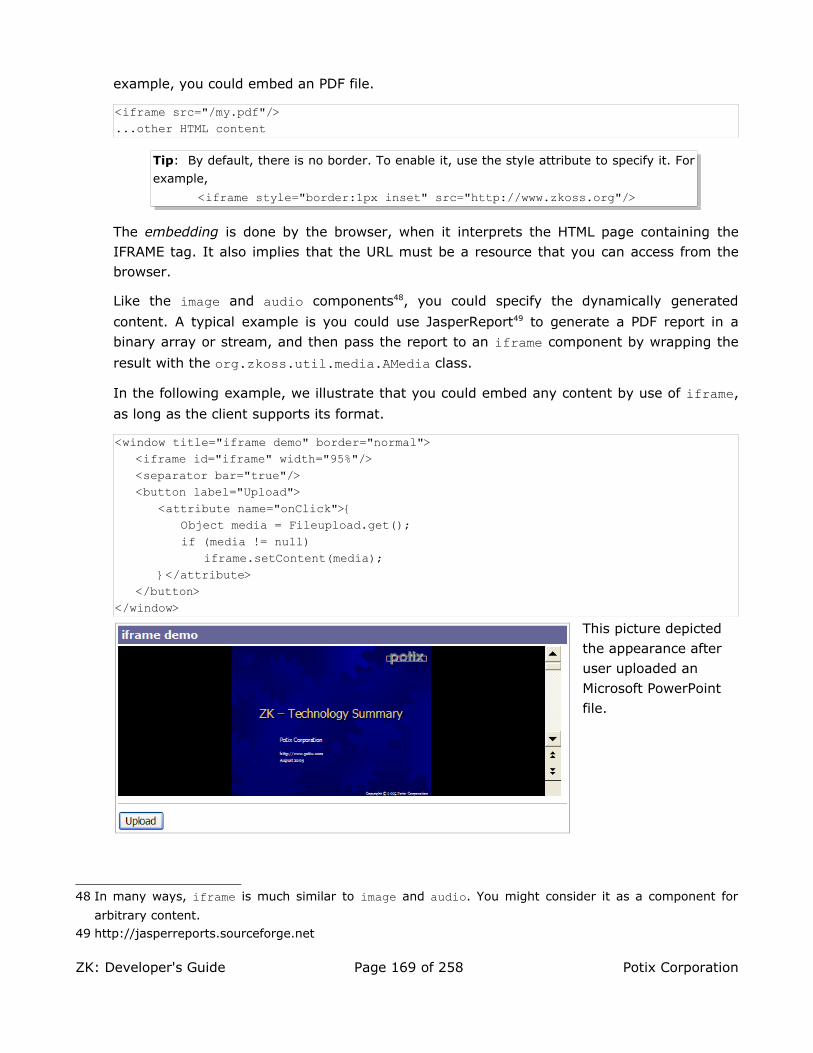
example, you could embed an PDF file.
<iframe src="/my.pdf"/>...other HTML content
Tip: By default, there is no border. To enable it, use the style attribute to specify it. For
example,
<iframe style="border:1px inset" src="http://www.zkoss.org"/>
The embedding is done by the browser, when it interprets the HTML page containing the IFRAME tag. It also implies that the URL must be a resource that you can access from the browser.
Like the image and audio components48, you could specify the dynamically generated
content. A typical example is you could use JasperReport49 to generate a PDF report in a
binary array or stream, and then pass the report to an iframe component by wrapping the
result with the org.zkoss.util.media.AMedia class.
In the following example, we illustrate that you could embed any content by use of iframe,
as long as the client supports its format.
<window title="iframe demo" border="normal"><iframe id="iframe" width="95%"/><separator bar="true"/><button label="Upload">
<attribute name="onClick">{Object media = Fileupload.get();if (media != null)
iframe.setContent(media);}</attribute>
</button></window>
This picture depicted the appearance after user uploaded an Microsoft PowerPoint file.
48 In many ways, iframe is much similar to image and audio. You might consider it as a component for
arbitrary content.
49 http://jasperreports.sourceforge.net
ZK: Developer's Guide Page 169 of 258 Potix Corporation

Work with HTML FORM and Java Servlets
The event-driven model is simple and powerful, but it might not be practical to rewrite all servlets to replace with event listeners.
The name Property
To work with legacy Web applications, you could specify the name property as you did for
HTML pages. For example,
<window xmlns:h="http://www.w3.org/1999/xhtml"> <h:form method="post" action="/my-old-servlet"> <grid> <rows> <row>When <datebox name="when"/> Name <textbox name="name"/> Department <combobox name="department"> <comboitem label="RD"/> <comboitem label="Manufactory"/> <comboitem label="Logistics"/> </combobox> </row> <row> <h:input type="submit" value="Submit"/> </row> </rows> </grid> </h:form></window>
Once users press the submit button, a request is posted to the my-old-servlet servlet with
the query string as follows.
/my-old-servlet?when=2006%2F03%2F01&name=Bill+Gates&department=Manufactory
Thus, as long as you maintain the proper associations between name and value, your servlet could work as usual without any modification.
Components that Support the name Property
All input-types components support the name property, such as textbox, datebox,
decimalbox, intbox, combobox, bandbox, slider and calendar.
In addition, list boxes and tree controls are also support the name property. If the multiple property is true and users select multiple items, then multiple name/value pairs are posted.
<listbox name="who" multiple="true" width="200px"><listhead>
ZK: Developer's Guide Page 170 of 258 Potix Corporation

<listheader label="name"/><listheader label="gender"/>
</listhead><listitem value="mary>
<listcell label="Mary"/><listcell label="FEMALE"/>
</listitem><listitem value="john">
<listcell label="John"/><listcell label="MALE"/>
</listitem><listitem value="jane">
<listcell label="Jane"/><listcell label="FEMALE"/>
</listitem><listitem value="henry">
<listcell label="Henry"/><listcell label="MALE"/>
</listitem></listbox>
If both John and Henry are selected, then the query string will contain:
who=john&who=henry
Notice that, to use list boxes and tree controls with the name property, you have to specify
the value property for listitem and treeitem, respectively. They are the values being
posted to the servlets.
Rich User Interfaces
Because a form component could contain any kind of components, the rich user interfaces
could be implemented independent of the existent servlets. For example, you could listen to
the onOpen event and fulfill a tab panel as illustrated in the previous sections. Yet another
example, you could dynamically add more rows to a grid control, where each row might
control input boxes with the name property. Once user submits the form, the most updated
content will be posted to the servlet.
Client Side Actions
Some behaviors are better to be done at the client side with JavaScript codes, such as animations and image rollovers. In order to execute JavaScript codes at the client, ZK introduces the concept of Client Side Actions (CSA). With CSA, developers could listen to any JavaScript event and executes JavaScript codes at the client.
A CSA is similar to an event listener, except an action is is written in JavaScript and executes at
the client. ZK allows developers to specify actions for any JavaScript events, such as onfocus,
ZK: Developer's Guide Page 171 of 258 Potix Corporation

onblur, onmouseover and onmouseout, as long as your targeting browsers support them.
The syntax of a client-side action is as follows.
action="[onfocus|onblur|onmouseover|onmouseout|onclick|onshow|onhide...]: javascript;"
Notice that CSA is totally independent of ZK event listeners, though they might have the same
name, such as onFocus. The differences include:
• CSA executes at the client side and takes place, before ZK event listener is called at the server.
• CSA codes are written in JavaScript, while ZK event listeners are written in Java.
• CSA could register to any event that your targeting browsers allow, while ZK supports events only list in the Events section.
Reference to a Component
In the JavaScript codes, you can reference to a component or other objects with the late-
binding EL expression. The late-binding EL expression starts with #{ and ending with } as
depicted below.
<button action="onmouseover: action.show(#{parent.tip})"/>
The late-binding EL expressions are evaluated as late as the Rendering Phase. On the other
hand, if you assign an EL expression starting with ${, it will be evaluated at the Component
Creation Phase, before assigning to the action property. For example,
<button action="onfocus: action.show(${tip}); onblur: action.hide(${tip})"/><div id="tip" visible="false">...</div>
will be evaluated to
<button action="onfocus: action.show(); onblur: action.hide()"/><div id="tip" visible="false">...</div>
since the tip component is not created when assigning the action property.
Even if the referenced component was created before action is assigned, it is still incorrect,
since the ZUML loader has no knowledge of CSA, and it converts the component to a string
by invoking the toString method.
Of course, it doesn't prevent you from using ${} in an action, as depicted below. Just
remember it is evaluated before assigning the action property.
<variables myaction="onfocus: action.show(#{tip}); onblur: action.hide(#{tip});"<button action="${myaction} onmouseover: action.show(#{parent.parent.tip})"/>
An onfocus and onblur Example
In the following example, we demonstrated how to use client-side actions to provide on-
ZK: Developer's Guide Page 172 of 258 Potix Corporation

line help. When user change the focus to any of the text boxes, a help message is displayed accordingly.
<grid><columns>
<column/><column/><column/>
</columns><rows>
<row><label value="text1: "/><textbox action="onfocus: action.show(#{help1}); onblur: action.hide(#{help1})"/><label id="help1" visible="false" value="This is help for text1."/>
</row><row>
<label value="text2: "/><textbox action="onfocus: action.show(#{help2}); onblur: action.hide(#{help2})"/><label id="help2" visible="false" value="This is help for text2."/>
</row></rows>
</grid>
Coercion Rules
A ZUL component actually converts an EL expression (#{}) to proper JavaScript codes
based on the class of the result object.
1. If result is null, it is replaced with null.
2. If result is a component, it is replaced with $e('uuid'), where $e is a JavaScript
function to return a reference to a HTML tag and uuid is the component's UUID.
3. If result is a Date object, it is replaced with new Date(milliseconds).
4. Otherwise, the result is converted to a string by calling the toString method, and
then replaced with 'result in string'.
The onshow and onhide Actions
The onshow and onhide actions are used to control the visual effect of displaying and hiding
a component.
An Example to Change How a Window Appears
<zk><button label="Show Overlapped" onClick="win.doOverlapped();"/><window id="win" border="normal" width="200px" mode="overlapped"
action="onshow:anima.appear(#{self});onhide:anima.fade(#{self})" visible="false"><caption image="/img/inet.png" label="Hi there!"/>
ZK: Developer's Guide Page 173 of 258 Potix Corporation

<checkbox label="Hello, Effect!"/></window>
</zk>
CSA JavaScript Utilities
To simplify the CSA programming, ZK provides a few utilities objects that you can utilize.
The action Object
Basic utilities that can be applied to any object.
Function Description
action.show(cmp) Make a component visible.
cmp – the component. Use #{EL-expr} to identify it.
action.hide(cmp) Make a component invisible.
cmp – the component. Use #{EL-expr} to identify it.
Tip: For JavaScript programmers, it is common to manipulate style.display directly for
visibility. However, it is not a good idea. Rather, use action.show and action.hide instead, since ZK Client Engine has to handle visual effects, bug workaround, and so on.
The anima Object
Animation-like visual effects. It is based on the Effect class provided by script.aculo.us50.
The API is simplified. If you'd like more visual effects or controls, you can access Effect directly.
Note: Effect requires the component to be enclosed with the DIV tag. Not all ZUL
components are implemented in this way. If you have any doubt, you can nest it with the
div component as follows.
<window><div id="t" visible="false"action="onshow: anima.slideDown(#{self}); onhide: anima.slideUp(#{self})">
<div><!-- the 2nd div is optional but sometimes it looks better with it --><groupbox>
<caption label="slide down"/>Hi <textbox/>
</groupbox>When? <datebox/>
</div></div><button label="toggle" onClick="t.visible = !t.visible"/>
</window>
50 http://script.aculo.us provides easy-to-use, cross-browser user interface JavaScript libraries
ZK: Developer's Guide Page 174 of 258 Potix Corporation

Of course, you load other libraries that do not have this limitation.
Function Description
anima.appear(cmp)anima.appear(cmp, dur)
Make a component visible by increasing the opacity.
cmp – the component. Use #{EL-expr} to identify it.
dur – the duration in milliseconds. Default: 800.
anima.slideDown(cmp)anima.slideDown(cmp, dur)
Make a component visible with the slide-down effect.
cmp – the component. Use #{EL-expr} to identify it.
dur – the duration in milliseconds. Default: 400.
anima.slideUp(cmp)anima.slideUp(cmp, dur)
Make a component invisible with the slide-up effect.
cmp – the component. Use #{EL-expr} to identify it.
dur – the duration in milliseconds. Default: 400.
anima.fade(cmp)anima.fade(cmp, dur)
Make a component invisible by fading it out.
cmp – the component. Use #{EL-expr} to identify it.
dur – the duration in milliseconds. Default: 550.
anima.puff(cmp)anima.puff(cmp, dur)
Make a component invisible by puffing it out.
cmp – the component. Use #{EL-expr} to identify it.
dur – the duration in milliseconds. Default: 700.
anima.dropOut(cmp)anima.dropOut(cmp, dur)
Make a component invisible by fading and dropping it out.
cmp – the component. Use #{EL-expr} to identify it.
dur – the duration in milliseconds. Default: 700.
For example,
<window title="Animation Effects"><style>.ctl{
border: 1px outset #777; background:#ddeecc;margin: 2px; margin-right: 10px; padding-left: 2px; padding-right: 2px;
}</style>
<labelvalue="Slide" sclass="ctl" action="onmouseover:anima.slideDown(#{t});onmouseout:anima.slideUp(#{t})"/><labelvalue="Fade" sclass="ctl" action="onmouseover:anima.appear(#{t});onmouseout:anima.fade(#{t})"/><labelvalue="Puff" sclass="ctl" action="onmouseover:anima.appear(#{t});onmouseout:anima.puff(#{t})"/><labelvalue="Drop Out" sclass="ctl" action="onmouseover:anima.appear(#{t});onmouseout:anima.dropOut(#{t})"/>
<div id="t" visible="false">
ZK: Developer's Guide Page 175 of 258 Potix Corporation

<div><groupbox>
<caption label="Dynamic Content"/>Content to show and hide dynamically.<datebox/>
</groupbox>Description <textbox/></div>
</div></window>
Events
Notice that whether an event is supported depends on a component. In addition, an event is sent after the component's content is updated.
Mouse Events
Event Name Components/Description
onClick button caption column div groupbox image imagemap label listcell listfooter listheader menuitem tab tabpanel toolbar toolbarbutton treecell treecol window Event: org.zkoss.zk.ui.event.MouseEventDenotes user has clicked the component.
onRightClick button caption checkbox column div groupbox image imagemap label listcell listfooter listheader listitem radio slider tab tabbox tabpanel toolbar toolbarbutton treecell treecol treeitem window Event: org.zkoss.zk.ui.event.MouseEventDenotes user has right-clicked the component.
onDoubleClick button caption checkbox column div groupbox image label listcell listfooter listheader listitem tab tabpanel toolbar treecell treecol treerow window Event: org.zkoss.zk.ui.event.MouseEventDenotes user has double-clicked the component.
Keystroke Events
Event Name Components Description
onOK window Event: org.zkoss.zk.ui.event.KeyEvent
Denotes user has pressed the ENTER key.
ZK: Developer's Guide Page 176 of 258 Potix Corporation
Event Name Components Description
onCancel window Event: org.zkoss.zk.ui.event.KeyEvent
Denotes user has pressed the ESC key.
onCtrlKey window Event: org.zkoss.zk.ui.event.KeyEvent
Denotes user has pressed a special key, such as PgUp,
Home and a key combined with the Ctrl or Alt key.
Refer to the ctrlKeys Property section below for
details.
The keystroke events are sent to the nearest window that has registered an event listener for the specified events. It is designed to implement the submit, cancel and shortcut functions.
As illustrated below, doA() is invoked if user pressed ENTER when T1 got the focus, and
doB() is invoked if user pressed ENTER when T2 got the focus.
<window id="A" onOK="doA()"><window id="B" onOK="doB()">
<textbox id="T1"/></window><textbox id="T2"/>
</window
Notice that a window doesn't receive the keystroke events that are sent for the inner window, unless you post them manually. In the above example, the event won't be sent to
window A, if T1 got the focus, no matter whether the onOK handler is declared for window B
or not.
The ctrlKeys Property
To receive the onCtrlKey event, you must specify what key strokes to intercept by the
ctrlKeys property. In other words, only key strokes specified in the ctrlKeys property is
sent back to the server. For example, the onCtrlKey event is sent if a user clicks Alt+C,
Ctrl+A, F10, or Ctrl+F3.
<window ctrlKeys="@c^a#10^#3">...
The following is the syntax of th ctrlKeys property.
Key Description
^k A control key, i.e., Ctrl+k, where k could be a~z, 0~9, #n and ~n.
@k A alt key, i.e., Alt+k, where k could be a~z, 0~9, #n and ~n.
$k A shift key, i.e., Shift+k, where k could be #n and ~n.
ZK: Developer's Guide Page 177 of 258 Potix Corporation

#n A special key as follows.
#home Home #end End #ins Insert#del Delete #left ← #right →#up ↑ #down ↓ #pgup PgUp#pgdn PgDn#fn A function key. #f1, #f2, ... #f12 for F1, F2,... F12.
Input Events
Event Name Components Description
onChange textbox datebox decimalboxdoublebox intbox combobox bandbox
Event: org.zkoss.zk.ui.event.InputEvent
Denotes the content of an input component has been modified by the user.
onChanging textbox datebox decimalboxdoubleboxintbox combobox bandbox
Event: org.zkoss.zk.ui.event.InputEvent
Denotes that user is changing the content of an input component. Notice that the component's content (at the
server) won't be changed until onChange is received.
Thus, you have to invoke the getValue method in the
InputEvent class to retrieve the temporary value.
onSelection textbox datebox decimalbox doublebox intbox combobox bandbox
Event: org.zkoss.zk.ui.event.SelectionEvent
Denotes that user is selecting a portion of the text of an input component. You can retrieve the start and end
position of the selected text by use of the getStart and
getEnd methods.
onFocus textbox datebox decimalbox doublebox intbox combobox bandboxbutton toolbarbutton checkboxradio
Event: org.zkoss.zk.ui.event.Event
Denotes when a component gets the focus.
Remember event listeners execute at the server, so the focus at the client might be changed when the event
listener for onFocus got executed.
ZK: Developer's Guide Page 178 of 258 Potix Corporation

Event Name Components Description
onBlur textbox datebox decimalbox doublebox intbox combobox bandboxbutton toolbarbutton checkboxradio
Event: org.zkoss.zk.ui.event.Event
Denotes when a component loses the focus.
Remember event listeners execute at the server, so the focus at the client might be changed when the event
listener for onBlur got executed.
List and Tree Events
Event Name Components Description
onSelect listboxtabboxtabtreecombobox
Event: org.zkoss.zk.ui.event.SelectEvent
Denotes user has selected one or multiple child
components. For listbox, it is a set of listitem. For
tree, it is a set of treeitem. For tabbox, it is a tab.
Note: onSelect is sent to both tab and tabbox.
onOpen northeastwestsouthgroupbox treeitem combobox bandboxmenupopupwindow
Event: org.zkoss.zk.ui.event.OpenEvent
Denotes user has opened or closed a component. Note:
unlike onClose, this event is only a notification. The
client sends this event after opening or closing the component.
It is useful to implement load-on-demand by listening to
the onOpen event, and creating components when the
first time the component is opened.
Slider and Scroll Events
Event Name Components Description
onScroll slider Event: org.zkoss.zk.ui.event.ScrollEvent
Denotes the content of a scrollable component has been scrolled by the user.
ZK: Developer's Guide Page 179 of 258 Potix Corporation
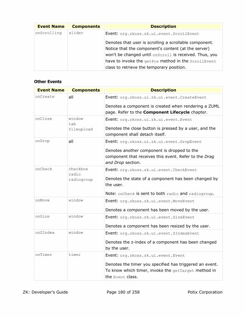
Event Name Components Description
onScrolling slider Event: org.zkoss.zk.ui.event.ScrollEvent
Denotes that user is scrolling a scrollable component. Notice that the component's content (at the server)
won't be changed until onScroll is received. Thus, you
have to invoke the getPos method in the ScrollEvent class to retrieve the temporary position.
Other Events
Event Name Components Description
onCreate all Event: org.zkoss.ui.zk.ui.event.CreateEvent
Denotes a component is created when rendering a ZUML page. Refer to the Component Lifecycle chapter.
onClose windowtabfileupload
Event: org.zkoss.ui.zk.ui.event.Event
Denotes the close button is pressed by a user, and the component shall detach itself.
onDrop all Event: org.zkoss.ui.zk.ui.event.DropEvent
Denotes another component is dropped to the component that receives this event. Refer to the Drag and Drop section.
onCheck checkboxradio radiogroup
Event: org.zkoss.zk.ui.event.CheckEvent
Denotes the state of a component has been changed by the user.
Note: onCheck is sent to both radio and radiogroup.
onMove window Event: org.zkoss.zk.ui.event.MoveEvent
Denotes a component has been moved by the user.
onSize window Event: org.zkoss.zk.ui.event.SizeEvent
Denotes a component has been resized by the user.
onZIndex window Event: org.zkoss.zk.ui.event.ZIndexEvent
Denotes the z-index of a component has been changed by the user.
onTimer timer Event: org.zkoss.zk.ui.event.Event
Denotes the timer you specified has triggered an event.
To know which timer, invoke the getTarget method in
the Event class.
ZK: Developer's Guide Page 180 of 258 Potix Corporation

Event Name Components Description
onNotify any Event: org.zkoss.zk.ui.event.Event
Denotes a application-dependent event. Its meaning depends on applications. Currently, no component will send this event.
onClientInfo root Event: org.zkoss.zk.ui.event.ClientInfoEvent
Notifies a root component about the client's information, such as time zone and resolutions.
onPiggyback root Event: org.zkoss.zk.ui.event.Event
Notifies a root component that the client has sent a request to the server. It is usually used to piggyback non-emergent UI updates to the client.
onBookmarkChanged
root Event: org.zkoss.zk.ui.event.BookmarkEvent
Notifies that the user pressed BACK, FORWARD or others that causes the bookmark changed.
onColSize columns listhead treecols
Event: org.zkoss.zul.event.ColSizeEvent
Notifies the parent of a group of headers that the widths of two of its children are changed by the user.
onPaging gridlistboxpaging
Event: org.zkoss.zul.event.PagingEvent
Notifies one of the pages of a multi-page component is selected by the user.
onUpload fileupload Event: org.zkoss.zul.event.UploadEvent
Notifies that file(s) is uploaded, and the application can
retrieve the uploaded files(s) by use of the getMedia or
getMedias methods.
The Event Flow of radio and radiogroup
For developer's convenience, the onCheck event is sent to raido first and then to
radiogroup51. Thus, you could add listener either to the radio group or to each radio
button.
<radiogroup onCheck="fruit.value = self.selectedItem.label"><radio label="Apple"/><radio label="Orange"/>
</radiogroup>You have selected : <label id="fruit"/>
The above sample has the same effect as follows.
51 The internal implementation is done by adding a listener when a radio is added to a radiogroup.
ZK: Developer's Guide Page 181 of 258 Potix Corporation

<radiogroup><radio label="Apple" onCheck="fruit.value = self.label"/><radio label="Orange" onCheck="fruit.value = self.label"/>
</radiogroup>You have selected : <label id="fruit"/>
ZK: Developer's Guide Page 182 of 258 Potix Corporation

8. ZUML with the XHTML Component Set
This chapter describes the set of XHTML components.
The Goal
The introduction of the XHTML component set is aimed to make it easy to port existent Web pages to ZUML. The ultima goal is that all valid XHTML pages are valid ZUML pages. All Servlets handling the submitted form work as usual.
Therefore, existent XHTML pages could share the most powerful advantage that ZUML pages have: rich user interfaces. The richness could be achieved in two ways. First, you could embed Java codes to manipulate XHTML components dynamically. Second, you could add off-of-shelf XUL components into existent pages, just like you add XHTML into XUL pages.
Performance Consideration: If a portion of HTML tags are static, it is better to use the
Native namespace as described in the Performance Tips chapter.
A XHTML Page Is A Valid ZUML Page
The Web page illustrated below is a simple but typical example.
<html><head><title>ZHTML Demo</title></head><body>
<h1>ZHTML Demo</h1><ulid="ul">
<li>The first item.</li><li>The second item.</li>
</ul><inputtype="button" value="Add Item""/><br/><inputid="inp0" type="text"/> +<inputid="inp1" type="text"/> =<text id="out"/>
</body></html>
By naming it with the zhtml extension52, it will be interpreted as a ZUML page by ZK loader.
Then, instances of org.zkoss.zhtml.Html, org.zkoss.zhtml.Head and others are created
accordingly. In other words, we created a tree of XHTML components at the server. Then, ZK renders them into a regular XHTML page and sends it back to the browser, like what we did
52 If you want every HTML pages to be ZUML pages, you could map the .html extension to
DHtmlLayoutServlet. Refer to Appendix A in the Developer's Reference for details.
ZK: Developer's Guide Page 183 of 258 Potix Corporation

for any ZUML pages.
Server-Centric Interactivity
As being a ZUML page, it could embed any Java codes and execute them in the server as follows.
<html xmlns:zk="http://www.zkoss.org/2005/zk"><head>
<title>ZHTML Demo</title></head><body>
<h1>ZHTML Demo</h1><ul id="ul">
<li>The first item.</li><li>The second item.</li>
</ul><input type="button" value="Add Item" zk:onClick="addItem()"/><br/><input id="inp0" type="text" zk:onChange="add()"/> +<input id="inp1" type="text" zk:onChange="add()"/> =<text id="out"/><zscript>void addItem() {
Component li = new Raw("li");li.setParent(ul);new Text("Item "+ul.getChildren().size()).setParent(li);
}void add(){
out.setValue(inp0.getValue() + inp1.getValue());}</zscript>
</body></html>
In the above example, we use the ZK namespace to specify the onClick property. It is
necessary because XHTML itself has a property with the same name.
It is interesting to note that all Java codes are running at the server. Thus, unlike JavaScript you are used to embed in HTML pages, you could access any resource at the server directly. For example, you could open a connection to a database and retrieve the data to fill in certain components.
<zscript>import java.sql.*;void addItem() {
Class.forName("sun.jdbc.odbc.JdbcOdbcDriver");String url = "jdbc:odbc:Fred";Connection conn = DriverManager.getConnection(url,"myLogin", "myPassword");...conn.close();
ZK: Developer's Guide Page 184 of 258 Potix Corporation

}</zscript>
Servlets Work As Usual
In traditional Web applications, a XHTML page usually submits a form to a specific servlet for processing. You don't need to modify them to port the page to ZK.
The Differences
Besides being ZK components, the implementation of the XHTML component set has some differences from other component sets53, such that it would be easier to port traditional XHTML pages to ZK.
A Component Created for Each Tag
ZK Loaders creates a ZK component for Each tag declared in a ZUML page. For example,
there are four components are created for the following ZUML page (html, body, p and a
label).
<html><body>
<p>Hi</p></body>
</html>
The advantage is that you can change the content of any component dynamically:
<p id="info">Hi</p><z:button onClick="info.detach()" xmlns:z="http://www.zkoss.org/2005/zk"/>
However, it takes more time to process and memory to hold these components, so, if a portion of the page is static, you can use the Native namespace as follows.
<n:html xmlns:n="http://www.zkoss.org/2005/zk/native"><n:body>
<p id="info">Hi</p><z:button onClick="info.detach()" xmlns:z="http://www.zkoss.org/2005/zk"/>
</n:body></n:html>
Refer to the Performance Tips chapter for more information.
UUID Is ID
Traditional servlets and JavaScript codes usually depend on the id attribute, so UUID of
53 These differences are made by implementing particular interfaces, so you could apply similar effects to
your own components if you like.
ZK: Developer's Guide Page 185 of 258 Potix Corporation

XHTML components are made to be the same as ID. Therefore, developers need not to change their existent codes to adapt ZK, as shown below.
<img id="which"/><script type="text/javascript"><![CDATA[//JavaScript and running at the browser
function change() {var el = document.getElementById("which");el.src = "something.gif";
}]]></script><zscript><!-- Java and running at the server -->
void change() {which.src = "another.gif";
}</zscript>
Notice that UUID is immutable and nothing to do with ID for components other than XHTML. Thus, the above example will fail if XUL components are used. If you really want to reference a XUL component in JavaScript, you have to use EL expression to get the correct UUID.
<input id="which"/><script type="text/javascript">//Running at the browser
var el = document.getElementById("${which.uuid}");el = $e("${which.uuid}"); //$e() is an utility of ZK Client Engine
</script>
Side Effects
Since UUID is ID, you cannot use the same ID for any two components in the same desktop.
All Tags Are Valid
Unlike XUL or other component sets, there is no invalid XML element in the XHTML
component set. ZK uses the org.zkoss.zhtml.Raw class for constructing any unrecognized
XML element54. Therefore, developers could use any tags that the target browser supports, no matter whether they are implemented as ZK components.
Similarly, you could use the Raw component to create any component not defined in the
XHTML component set as follows.
new Raw("object"); //object could be any tag name the target browser supports
Case Insensitive
Unlike XUL or other component sets, the component name of XHTML is case-insensitive. The
following XML elements are all mapped to the org.zkoss.zhtml.Br component.
54 Note: this is done by implementing the org.zkoss.zk.ui.ext.DynamicTag interface.
ZK: Developer's Guide Page 186 of 258 Potix Corporation

<br/><BR/><bR/>
No Mold Support
XHTML components outputs its content directly. They don't support molds. In other words,
the mold property is ignored.
The DOM Tree at the Browser
After porting XHMTL pages to ZK, you don't need to manipulate the DOM tree at the browser with JavaScript, though ZK doesn't prevent you from doing that. Rather, you manipulate XHTML components at the server, and then ZK engines updates the DOM tree at the browser for you.
It is convenient but there is a catch. ZK assumes the DOM tree at the browser is the same as the component tree at the server. In most cases, it is true. However, it is not always true.
The TABLE and TBODY Tags
The browser always creates TBODY between TABLE and TR. Thus, the following two tables have the same structure.
<table><tr><td>Hi</td></tr>
</table><table>
<tbody><tr><td>Hi</td></tr>
</tbody></table>
Unfortunately, their component trees are not the same in ZK. Thus, if you want to dynamically manipulate a table, you have to declare TBODY between TABLE and TR. Of course, you don't need to worry this for static tables.
Events
All XHTML components support the following events, but whether it is applicable still depends on
the browsers. For example, onChange is meaningless to non-input components, say body and div.
You have to consult the HTML standard55
55 http/www.w3c.org
ZK: Developer's Guide Page 187 of 258 Potix Corporation

Event Name Components Description
onChange all Event: org.zkoss.zk.ui.event.InputEvent
Denotes the content of an input component has been modified by the user.
onClick all Event: org.zkoss.zk.ui.event.MouseEvent
Denotes user has clicked the component.
Integrate with JSF, JSP and Others
When integrating with existent Web pages, you might have to ask yourself a few questions.
• Is the existent page static or dynamically generated?
• Is it a minor enhancement, if you want to enrich an existent page? Or, you prefer to rewrite a portion of it?
• Do you prefer to use XUL as the default component set when adding a new page?
Depending your requirements, there are several approaches to take.
Work with Existent Servlets
By enclosing ZUL components with FORM, you could post the content of ZUML components as the request parameters to an existent servlet. Refer to the Work with HTML FORM and Java Servlets section in the ZUML with the XUL Component Set chapter for details.
With this approach, you could design rich user interfaces without modifying the existent servlet by simply replacing some of them with ZUL components.
Enrich by Inclusion
If you prefer to rewrite a portion of an existent page, it might be better to put the rewritten portion in a separate ZUML file. Then, you include the ZUML file from the existent page. For example, you could use jsp:include if JSP technology is used.
<jsp:include page="/my/ria.zul"/>
Enrich Static HTML Pages
If you prefer to modify a static HTML page directly by adding the rich content, you could use
the Native namespace (http://www.zkoss.org/2005/native) to specify the static content,
and then use the XUL or XHTML component sets (http://www.zkoss.org/2005/zul and
http://www.w3.org/1999/xhtml) for the content that are changed dynamically.
<!-- test.zhtml -->
ZK: Developer's Guide Page 188 of 258 Potix Corporation

<html xmlns="http://www.zkoss.org/2005/native" xmlns:h="http://www.w3.org/1999/xhtml" xmlns:z="http://www.zkoss.org/2005/zul">
<head><title>Hi ZK</title>
</head><body>
<h:ul id="list"><!-- dynamically changeable --><h:li><z:textbox/></h:li>
</h:ul><p>Static content</p>
</body></html>
Use of ZK JSP Tags
ZK provides an equivalent JSP tags for each ZUL component. If you'd like to use them in your JSP pages, simply following the following steps.
1. Specify http://www.zkoss.org/jsp/zul as the URI of the TLD file in the JSP pages
with the taglib directive.
2. Though optional, it is better to specify DOCTYPE as XHTML 1.0 Transitional, since
ZK Client Engine assumes it.
3. The top of ZK JSP tags must be the page tag (ZK's org.zkoss.zul.jsp.PageTag),
which represents a ZK page.
The following is a simple example.
<!DOCTYPE html PUBLIC "-//W3C//DTD XHTML 1.0 Transitional//EN""http://www.w3.org/TR/xhtml1/DTD/xhtml1-transitional.dtd"><%@ taglib uri="http://www.zkoss.org/jsp/zul" prefix="z" %><html>
<head><title>Test of ZUL on JSP</title>
</head><body>
<h1>1. Header outside z:page</h1><z:page><h2>2. Header in z:page</h2><z:window id="win" title="Test" border="normal"><p>3. Content in z:window</p>
<z:button label="Overlap" onClick="win.doOverlapped()"/></z:window><p>4. Content in z:page after z:window</h2></z:page><p>5. Content after z:page</p></body>
</html>
ZK: Developer's Guide Page 189 of 258 Potix Corporation

Each ZUL component is wrapped with a JSP tag and each property is wrapped with an attribute the JSP tag. Furthermore, you are free to mix ZK JSP tags with other tags. Thus, the use of ZK JSP tags is straightforward.
Use of ZK JSF Components
ZK provides an equivalent JSF component for each ZUL component. The use is similar to ZK
JSP Tags, except the taglib URI is http://www.zkoss.org/jsf/zul.
<!DOCTYPE html PUBLIC "-//W3C//DTD XHTML 1.0 Transitional//EN" "http://www.w3.org/TR/xhtml1/DTD/xhtml1-transitional.dtd"><html><head><title>Validator Example</title></head><%@ taglib uri="http://java.sun.com/jsf/html" prefix="h"%><%@ taglib uri="http://java.sun.com/jsf/core" prefix="f"%><%@ taglib uri="http://www.zkoss.org/jsf/zul" prefix="z"%><body><f:view>
<h:form id="helloForm"><z:page>
<z:window z:title="Validator Example" width="500px" border="normal">--Validate input day must in weekend--<br/><z:datebox id="dbox" format="yyyy/MM/dd"
f:value="#{ValidatorBean.value}"f:validator="#{ValidatorBean.validateDate}"/>
<h:messagestyle="color: red; font-style: oblique;"
for="dbox" /><br/><h:commandButton id="submit" action="#{ValidatorBean.doSubmit}"
value="Submit" /></z:window><h:messages/>
</z:page></h:form><a href="../index.html">Back</a>
</f:view></body></html>
Enrich a Dynamically Generated Page with ZK Filter
If you prefer to ajax-ize a dynamically generated HTML page (e.g., the output of a Velocity Servlet), you could use the ZK Filter to process the generated page. To enable the ZK filter,
you have to configure web.xml, as shown below.
<filter><filter-name>zkFilter</filter-name>
ZK: Developer's Guide Page 190 of 258 Potix Corporation

<filter-class>org.zkoss.zk.ui.http.DHtmlLayoutFilter</filter-class><init-param>
<param-name>extension</param-name><param-value>html</param-value>
</init-param></filter><filter-mapping>
<filter-name>zkFilter</filter-name><url-pattern>/my/dyna.jsp</url-pattern>
</filter-mapping><filter-mapping>
<filter-name>zkFilter</filter-name><url-pattern>/my/dyna/*</url-pattern>
</filter-mapping>
where url-pattern is application dependent. The extension parameter (init-param)
defines the language of the dynamical output. By default, it is html. If it is xul/html, specify
zul as the extension.
Tip: In most cases, ZK JSP tags are easier to use and consume less memory than the ZK
filter. Refer to the Performance Tips section in the Advance Features chapter.
Notice that, if you want to filter the output from include and/or forward, remember to specify the dispatcher element with REQUEST and/or INCLUDE. Consult the Java Servlet Specification for details. For example,
<filter-mapping><filter-name>zkFilter</filter-name><url-pattern>/my/dyna/*</url-pattern><dispatcher>REQUEST</dispatcher><dispatcher>INCLUDE</dispatcher><dispatcher>FORWARD</dispatcher><dispatcher>ERROR</dispatcher>
</filter-mapping>
ZK: Developer's Guide Page 191 of 258 Potix Corporation

9. Macro Components
There are two ways to implement a component. One is to implement a class deriving from the
org.zkoss.zk.ui.AbstractComponent class. The other is to implement it by use of other
components.
The former one is more flexible. It requires deeper understanding of ZK, so it is usually done by component developers. It is discussed in the Component Development Guide.
On the other hand, implementing a new component by use of other components is straightforward. It works like composition, macro expansion, or inline replacement. For sake of convenience, we call this kind of components as macro components., while the others are called primitive components.
Tip: a macro component is no different from a primitive component from application
developer's viewpoint, except how it is implemented.
Three Steps to Use Macro Components
It takes three steps to use macro components as follows.
1. Implements a macro component by a ZUML page.
2. Declare the macro component in the page that is going to use it.
3. Use the macro components, which is no difference that other components.
Tip: In addition to define a macro component in page, you can put its definition into a
language addon such all pages are able to access the macro component.
Step 1. The Implementation
All you need to do is to prepare a ZUML page that describes what the component consists of. In other words, the page is a template of the macro.
For example, assume we want to pack a label and a text box as a macro component. Then
we could create page, say /WEB-INF/macros/username.zul, as follows.
<hbox>Username: <textbox/>
</hbox>
It is done!
The ZUML page implementing a macro component is the same as any other pages, so any ZUML page can be used as a macro component.
ZK: Developer's Guide Page 192 of 258 Potix Corporation

Step 2. The Declaration
Before instantiating a macro component, you have to declare first. One of simplest way to declare is to use the component directives.
<?component name="username" macroURI="/WEB-INF/macros/username.zul"?>
As shown, you have to declare the name (the name attribute) and the URI of the page (the
macroURI attribute).
Other Properties
In additions to the name, macroURI and class56 attributes, you can specify a list of initial
properties that will be used to initialize a component when it is instantiated.
<?component name="mycomp" macroURI="/macros/mycomp.zul" myprop="myval" another="anotherval"?>
Therefore,
<mycomp/>
is equivalent to
<mycomp myprop="myval1" another="anotherval"/>
Step 3. The Use
The use of a macro component is no different than others.
<window><username/>
</window>
Pass Properties
Like an ordinary component, you can specify properties (aka., attributes) when using a macro component as follows.
<?component name="username" macroURI="/WEB-INF/macros/username.zul"?><window>
<username who="John"/></window>
All these properties specified are stored in a map that is then passed to the template via a
variable called arg. Then, in the template, you could access these properties as follows.
<hbox>Username: <textbox value="${arg.who}"/>
</hbox>
56 The class attribute will be discussed later.
ZK: Developer's Guide Page 193 of 258 Potix Corporation

Note: arg is available only when rendering the macro page. To access in the event
listener, you have to use getDynamicProperty instead. Refer to the Provide Additional
Methods section for more details.
arg.includer
In additions to the specified properties (aka., attributes), a property called arg.includer is always passed to represent the parent of the components defined in a macro template.
If a regular macro is created, arg.includer is the macro component itself. If an inline
macro is created, arg.includer is the parent component, if any. Refer to the Inline
Macros section for more information.
In the above example, arg.includer represents the regular macro component,
<username who="John"/>, and is the parent of <hbox> (defined in username.zul).
Inline Macros
There are two kinds of macro components: inline57 and regular. By default, regular macros are
assumed. To specify inline macros, you have to specify inline="true" in the component
directive.
An inline macro behaves like inline-expansion. ZK doesn't create a macro component if an inline macro is encountered. Rather, it inline-expands the components defined in the macro URI. In other words, it works as if you type the content of the inline macro directly to the target page.
use.zul: (target page)
<?component name="username" inline="true" macroURI="username.zul"?><grid>
<rows><username id="ua" name="John"/>
</rows></grid>
username.zul: (macro definition)
<row>Username<textbox id="${arg.id}" value="${arg.name}"/>
</row>
Equivalent page:
<grid><rows>
57 Inline macro components are added since ZK 2.3.
ZK: Developer's Guide Page 194 of 258 Potix Corporation

<row>Username<textbox id="ua" value="John"/>
</row></rows>
</grid>
All properties, including id, are passed to the inline macro.
On the other hand, ZK will create a real component (called a macro component) to represent the regular macro. That is, the macro component is created as the parent of the components that are defined in the macro.
Inline macros are easier to integrate into sophisticated pages. For example, you cannot use
regular components in the previous example since rows accepts only row, not macro components.
It is easier to access to all components defined in a macro since they are in the same ID space. It also means the developers must be aware of the implementation to avoid name conflicts.
Regular macros allow the component developers to provide additional API and hide the implementation from the component users. Each regular macro component is an ID space owner, so there is no name conflicts. The users of regular macros usually assume nothing about the implementation. Rather, they access via the well-defined API.
An Example
inline.zul: (the macro definition)
<row><textbox value="${arg.col1}"/><textbox value="${arg.col2}"/>
</row>
useinline.zul: (the target page)
<?component name="myrow" macroURI="inline.zul" inline="true"?><window title="Test of inline macros" border="normal">
<zscript><![CDATA[importorg.zkoss.util.Pair;
List infos = new LinkedList();for(int j = 0;j<10;++j){
infos.add(new Pair("A" + j, "B" +j));}]]></zscript><grid>
<rows><myrowcol1="${each.x}" col2="${each.y}" forEach="${infos}"/>
</rows></grid>
</window>
ZK: Developer's Guide Page 195 of 258 Potix Corporation

Regular Macros
ZK created a real component (called a macro component) to represent the regular macro as described in the previous section.
For sake of convenience, when we talk about macro components in this section, we mean the regular macro components.
Macro Components and The ID Space
Like window, a macro component is an ID space owner. In other words, it is free to use
whatever identifiers to identify components inside the page implementing a macro component (aka., child components of the macro component). They won't conflict with components defined in the same page with the macro component.
For example, assume we have a macro defined as follows.
<hbox>Username: <textbox id="who" value="${arg.who}"/>
</hbox>
Then, the following codes work correctly.
<?component name="username" macroURI="/WEB-INF/macros/username.zul"?><zk>
<username/><button id="who"/> <!-- no conflict because it is in a different ID space -->
</zk>
However, the following codes don't work.
<?component name="username" macroURI="/WEB-INF/macros/username.zul"?><username id="who"/>
Why? Like any ID space owner, the macro component itself is in the same ID space with its child components. There are two alternative solutions:
1. Use a special prefix for the identifiers of child components of a macro component. For
example, "mc_who" instead of "who".
<hbox>Username: <textbox id="mc_who" value="${arg.who}"/>
</hbox>
2. Use the window component to create an additional ID space.
<window><hbox>
Username: <textbox id="who" value="${arg.who}"/></hbox>
</window>
The first solution is suggested, if applicable, due to the simplicity.
ZK: Developer's Guide Page 196 of 258 Potix Corporation

Access Child Components From the Outside
Like other ID space owner, you can access its child component by use of two getFellow method invocations or org.zkoss.zk.ui.Path.
For example, assume you have a macro component whose ID is called "username", and
then you can access the textbox as follows.
comp.getFellow("username").getFellow("mc_who");new Path("/username/mc_who");
Access Variables Defined in the Ancestors
Macro components work as inline-expansion. Thus, like other components, a child component (of a macro component) can access any variable defined in the parent's ID space.
For example, username's child component can access v directly.
<zscript>String v = "something";
</zscript><username/>
However, it is not recommended to utilize such visibility because it might limit where a macro can be used.
Change macroURI At the Runtime
You can change the macro URI dynamically as follows.
<username id="ua"/><button onClick="ua.setMacroURI("another.zul")"/>
Provide Additional Methods
A macro component implements the org.zkoss.zk.ui.ext.DynamicPropertied interface,
so you can access its properties by use of the getDynamicProperty methods as follows.
<username id="ua" who="John"/><button label="what?" onClick="alert(ua.getDynamicProperty("who"))"/>
Obviously, using DynamicPropertied is tedious. Worse of all, the macro's child components
won't be changed if you use setDynamicProperty to change a property. For example, the
following codes still show John as the username, not Mary.
<username id="ua" who="John"/><zscript> ua.setDynamicProperty("who", "Mary");</zscript>
ZK: Developer's Guide Page 197 of 258 Potix Corporation

Why? All child components of a macro component are created when the macro component is created, and they won't be changed unless you manipulate them manually58. Thus, the
invocation to setDynamicProperty affects only the properties stored in a macro component
(which you can retrieve with getDynamicProperties). The content of textbox remains
intact.
Thus, it is better to provide a method, say setWho, to manipulate the macro component
directly. To provide your own methods, you have to implement a class for the macro
components, and then specify it in the class attribute of the component directive.
Tip: To recreate child components with the current properties, you can use the recreate method. It actually detaches all child components, and then create them again.
There are two ways to implement a class. The details are described in the following sections.
Provide Additional Methods in Java
It takes two steps to provide additional methods for a macro component.
1. Implement a class by extending from the org.zkoss.zk.ui.HtmlMacroComponent class.
//Username.javapackage mypack;public class Username extends HtmlMacroComponent {
public void setWho(String name) {setDynamicProperty("who", name); //arg.who requires itfinal Textbox tb = (Textbox)getFellow("mc_who");if (tb != null) tb.setValue(name); //correct the child if available
}public String getWho() {
return (String)getDynamicaProperty("who");}
}
• As depicted above, you have to call setDynamicProperty in setWho, because
${arg.who} is referenced in the macro page (${arg.who}), which is used when a
macro component are creating its child components.
• Since the setWho method might be called before a macro component creates its
children, you have to check whether mc_who exists.
• Since mc_who's setValue is called, both the content and the visual presentation at
the client are updated automatically, when setWho is called.
2. Declare the class in the macro declaration with the class attribute.
58 On the other hand, the child components included by the include component is created in the rendering
phase. In addition, all child components are removed and created each time the include component is
invalidated.
ZK: Developer's Guide Page 198 of 258 Potix Corporation

<?component name="username" macroURI="/WEB-INF/macros/username.zul" class="mypack.Username"?>
Provide Additional Methods in zscriptIn addition to implementing with a Java file, you can implement the Java class(es) in
zscript. The advantage is that no compilation is required and you can modify its content
dynamically (without re-deploying the Web application). The disadvantage is the performance downgrade and prone to typos.
It takes a few steps to implement a Java class in zscript.
1. You have to prepare a zscript file, say /zs/username.zs, for the class to implement.
Notice that you can put any number of classes and functions in the same zscript file.
//username.zspackage mypack;public class Username extends HtmlMacroComponent {
public void setWho(String name) {setDynamicProperty("who", name);Textbox tb = getFellow("mc_who");if (tb != null) tb.setValue(name);
}public String getWho() {
return getDynamicProperty("who");}
}
2. Use the init directive to load the zscript file, and then declare the component
<?init zscript="/zs/username.zs"?><?component name="username" macroURI="/WEB-INF/macros/username.zul" class="mypack.Username"?>
The implementation class (mypack.Username in the previous example) is resolved as late
as the macro component is really used, so it is also OK to use the zscript element to
evaluate the zscript file.
<?component name="username" macroURI="/WEB-INF/macros/username.zul" class="mypack.Username"?><zk>
<zscript src="/zs/username.zs"/><username/>
</zk>
Though subjective, the init directive is more readable.
Override the Implementation Class When Instantiation
Like any other component, you can use the use attribute to override the class used to
implement a macro component for any particular instance.
ZK: Developer's Guide Page 199 of 258 Potix Corporation

<?component name="username" macroURI="/WEB-INF/macros/username.zul" class="mypack.Username?>
<username use="another.MyAnotherUsername/>
Of course, you have to provide the implementation of another.MyAnohterUsername in the
above example. Once again the class can be implemented with separate Java file, or by
use of zscript.
Create a Macro Component Manually
To create a macro component manually, you have to invoke the afterCompose method
after all the initialization as follows.
HtmlMacroComponent ua = (HtmlMacroComponent)page.getComponentDefinition("username", false).newInstance(page);
ua.setParent(wnd);ua.applyProperties(); //apply properties defined in the component definitionua.setDynamicProperty("who", "Joe");ua.afterCompose(); //then the ZUML page is loaded and child components are created
Note: The getComponentDefinition method is used to look up the component
definitions defined in a page.
If you implement a class, say Username, for the macro, then you can do as follow.
Username ua = new Username();ua.setWho("Joe");ua.setParent(wnd);ua.afterCompose();
ZK: Developer's Guide Page 200 of 258 Potix Corporation

10. Advanced Features
This chapter describes the advance topics about components and pages.
Identify Pages
All pages in the same desktop could be accessed in an event listener. For the current page of a
component, you could use the getPage method in the org.zkoss.zk.ui.Component interface.
To get a reference to another page, you first have to assign an identifier to the page being looked for.
<?page id="another"?>...
Then, you could use the getPage method in the org.zkoss.zk.ui.Desktop interface as follows.
<zscript>Page another = self.getDesktop().getPage("another");
</zscript>
Identify Components
Components are grouped by the ID spaces. The page itself is an ID space. The window component
is another ID space. Assume you have a page called P, the page have a window called A, and the window A has a child window B. Then, if you want to retrieve a child component, say C, in the window B. Then, you could do as follows.
comp.getDesktop().getPage("P").getFellow("A").getFellow("B").getFellow("C");
The getFellow method is used to retrieve any fellow in the same ID space. Refer to the ID Space
section in the Basics chapter for the concept of ID spaces.
The Component Path
Like a path in a file system, a component path is a catenation of IDs of components along ID spaces. In the above example, the path will be "/A/B/C". In other words, the root of a component path is the current page. If you want to identity another page, you have to use "//". In the above example, the path can also be expressed as "//P/A/B/C".
The org.zkoss.zk.ui.Path class is, like java.io.File, provided to simplify the
manipulation of component paths. Thus, the following statement is equivalent to the above example.
Path.getComponent("/A/B/C"); //assume the current page is P
ZK: Developer's Guide Page 201 of 258 Potix Corporation

Path.getComponent("//P/A/B/C");
In addition to static methods, you could instantiate a Path instance.
Path parent = new Path("//P/A");new Path(parent, "B/C").getComponent();
Tip: Path.getComponent("//xyz") always returns null, since the identifier following // is the page's ID. And, page is not component.
Sorting
The list returned from the getChildren method of the org.zkoss.zk.ui.Component interface is
live. So is the getItems method of the org.zkoss.zul.Listbox interface and others. In other
words, you can manipulate it content directly. For example, the following statements are equivalent:
comp.getChildren().remove(0);((Component)comp.getChildren().get(0)).setParent(null);
However, you cannot use the sort method of the java.util.Collections class to sort them. The
reason is subtle: the list of children automatically removes a child from the original position, when you add it to another position. For example, the following statement actually moves the second child in front of the first child.
comp.getChildren().add(0, comp.getChildren().get(1));
It behaves differently from a normal list (such as LinkedList), so the sort method of Collections won't work.
To simplify the sorting of components, we therefore provide the sort method in the
org.zkoss.zk.ui.Components class that works with the list of children.
In the following example, we utilize the sort method and the
org.zkoss.zul.ListitemComparator to provide the sorting for a list box.
Notice that this is only for illustration because list boxes support sorting of list items directly. Refer to the Sorting subsection of the List Boxes section in the ZUML with the XUL Component Set chapter.
<window title="Sort Listbox" border="normal" width="200px"><vbox>
<listbox id="l"><listhead>
<listheader label="name"/><listheader label="gender"/>
</listhead><listitem>
<listcell label="Mary"/>
ZK: Developer's Guide Page 202 of 258 Potix Corporation

<listcell label="FEMALE"/></listitem><listitem>
<listcell label="John"/><listcell label="MALE"/>
</listitem><listitem>
<listcell label="Jane"/><listcell label="FEMALE"/>
</listitem><listitem>
<listcell label="Henry"/><listcell label="MALE"/>
</listitem></listbox><hbox>
<button label="Sort 1" onClick="sort(l, 0)"/><button label="Sort 2" onClick="sort(l, 1)"/>
</hbox></vbox><zscript>void sort(Listbox l, int j) {
Components.sort(l.getItems(), new ListitemComparator(j));}</zscript>
</window>
Browser's Information and Controls
To retrieve the information about the client, you can register an event listener for the
onClientInfo event at a root component. To control the behavior of the client, you can use the
utilities in the org.zkoss.zk.ui.util.Clients class.
The onClientInfo Event
Sometimes an application needs to know the client's information, such as time zone. Then,
you can add an event listener for the onClientInfo event. Once the event is added, the
client will send back an instance of the org.zkoss.zk.ui.event.ClientInfoEvent class,
from which you can retrieve the information of the client.
<grid onClientInfo="onClientInfo(event)"><rows>
<row>Time Zone <label id="tm"/></row><row>Screen <label id="scrn"/></row>
</rows>
<zscript>void onClientInfo(ClientInfoEvent evt) {
ZK: Developer's Guide Page 203 of 258 Potix Corporation

tm.setValue(evt.getTimeZone().toString());scrn.setValue(
evt.getScreenWidth()+"x"+evt.getScreenHeight()+"x"+evt.getColorDepth());}</zscript>
</grid>
Note: The onClientInfo event is meaningful only to the root component (aka., a
component without any parent).
The client information is not stored by ZK, so you have to store it manually if necessary. Since a session is associated with the same client, you can store the client info in the session's attribute.
session.setAttribute("px_preferred_time_zone", event.getTimeZone());
Notice that, if you store a time zone as a session variable called px_preferred_time_zone,
then its value will be used as the default time zone thereafter. Refer to the Time Zone section in the Internationalization chapter.
Notice that the onClientInfo event is sent from the client after the page is rendered (and
sent to the client). Thus, if some of your component's data depends on the client's info, say, time zone, you might have to ask the client to re-send the request as follows.
import org.zkoss.util.TimeZones;...if (!TimeZones.getCurrent().equals(event.getTimeZone())
Executions.sendRedirect(null);
The org.zkoss.ui.util.Clients Class
Utilities to control the client's visual presentation (more precisely, the browser window) are
put in org.zkoss.ui.util.Clients collectively. For example, you can scroll the browser
window (aka., the desktop) as follows.
Clients.scrollBy(100, 0);
Prevent User From Closing a Window
In some situation, you might want to prevent or, at least, alert a user when he tries to close the window or browse to another URL. For example, when a user is composing a mail that is not saved yet.
if (mail.isDirty()) {Clients.confirmClose("Your message has not been sent.\nDiscard your message?");
} else {Clients.confirmClose(null);
}
Once the confirmClose method is called with a non-empty string, a confirmation dialog is
ZK: Developer's Guide Page 204 of 258 Potix Corporation

shown up when the user tries to close the browser window, reload, or browse to another URL:
Browser's History Management
In traditional multi-page Web applications, user usually use the BACK and FORWARD button to surf around multiple pages, and bookmark them for later use. With ZK, you still can use multiple pages to represent different set of features and information, as you did in traditional Web applications.
However, it is common for ZK applications to represent a lot of features in one desktop, which usually take multiple Web pages in a traditional Web application. To make user's surfing easier, ZK supports the browser's history management that enables ZK applications to manage browser's history simply in the server.
The concept is simple. You add items for appropriate states of a desktop to the browser's history, and then users can use the BACK and FORWARD button to surf around different states of the same
ZK desktop. When users surf around these states, an event called onBookmarkChanged is sent to
notify the application.
From application's viewpoint, it takes two steps to manage the browser's history:
1. Add an item to the browser's history for each of the appropriate states of your desktop.
2. Listen to the onBookmarkChanged event and manipulate the desktop accordingly.
Add the Appropriate States to Browser's History
Your application has to decide what are the appropriate states to add to the browser's history. For example, in a multi-step operation, each state is a good candidate to add to browser's history, such that users can jump over these states or bookmark them for later use.
Once you decide when to add a state to the browser's history, you can simply invoke the
ZK: Developer's Guide Page 205 of 258 Potix Corporation
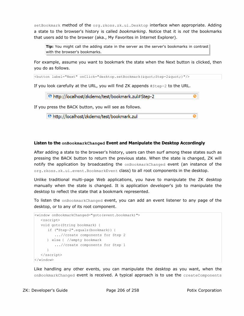
setBookmark method of the org.zkoss.zk.ui.Desktop interface when appropriate. Adding
a state to the browser's history is called bookmarking. Notice that it is not the bookmarks that users add to the browser (aka., My Favorites in Internet Explorer).
Tip: You might call the adding state in the server as the server's bookmarks in contrast
with the browser's bookmarks.
For example, assume you want to bookmark the state when the Next button is clicked, then you do as follows.
<button label="Next" onClick="desktop.setBookmark("Step-2")"/>
If you look carefully at the URL, you will find ZK appends #Step-2 to the URL.
If you press the BACK button, you will see as follows.
Listen to the onBookmarkChanged Event and Manipulate the Desktop Accordingly
After adding a state to the browser's history, users can then surf among these states such as pressing the BACK button to return the previous state. When the state is changed, ZK will
notify the application by broadcasting the onBookmarkChanged event (an instance of the
org.zkoss.zk.ui.event.BookmarkEvent class) to all root components in the desktop.
Unlike traditional multi-page Web applications, you have to manipulate the ZK desktop manually when the state is changed. It is application developer's job to manipulate the desktop to reflect the state that a bookmark represented.
To listen the onBookmarkChanged event, you can add an event listener to any page of the
desktop, or to any of its root component.
<window onBookmarkChanged="goto(event.bookmark)"><zscript>void goto(String bookmark) {
if ("Step-2".equals(bookmark)) {...//create components for Step 2
} else { //empty bookmark...//create components for Step 1
}</zscript>
</window>
Like handling any other events, you can manipulate the desktop as you want, when the
onBookmarkChanged event is received. A typical approach is to use the createComponents
ZK: Developer's Guide Page 206 of 258 Potix Corporation

method of the org.zkoss.zk.ui.Executions class. In other words, you can represent each
state with one ZUML page, and then use createComponents to create all components in it
when onBookmarkChanged is received.
if ("Step-2".equals(bookmark)) {//1. Remove components, if any, representing the previous statetry {
self.getFellow("replacable").detach();} catch (ComponentNotFoundException ex) {
//not created yet}
//2. Creates components belonging to Step 2Executions.createComponents("/bk/step2.zul", self, null);
}
A Simple Example
In this example, we bookmarks each tab selection.
<window id="wnd" title="Bookmark Demo" width="400px" border="normal"><zscript>page.addEventListener("onBookmarkChanged",
new EventListener() {public void onEvent(Event event) throws UiException {
try {wnd.getFellow(wnd.desktop.bookmark).setSelected(true);
} catch (ComponentNotFoundException ex) {tab1.setSelected(true);
}}
});</zscript>
<tabbox id="tbox" width="100%" onSelect="desktop.bookmark = self.selectedTab.id"><tabs>
<tab id="tab1" label="Tab 1"/><tab id="tab2" label="Tab 2"/><tab id="tab3" label="Tab 3"/>
</tabs><tabpanels>
<tabpanel>This is panel 1</tabpanel><tabpanel>This is panel 2</tabpanel><tabpanel>This is panel 3</tabpanel>
</tabpanels></tabbox>
</window>
ZK: Developer's Guide Page 207 of 258 Potix Corporation

Component Cloning
All components are cloneable. In other words, they are implemented java.lang.Cloneable. Thus,
it is simple to replicate components as follows.
<vbox id="vb"><listbox id="src" multiple="true" width="200px">
<listhead><listheader label="Population"/><listheader align="right" label="%"/>
</listhead><listitem value="A">
<listcell label="A. Graduate"/><listcell label="20%"/>
</listitem><listitem value="B">
<listcell label="B. College"/><listcell label="23%"/>
</listitem><listitem value="C">
<listcell label="C. High School"/><listcell label="40%"/>
</listitem></listbox>
<zscript>int cnt = 0;</zscript><button label="Clone">
<attribute name="onClick">Listbox l = src.clone();l.setId("dst" + ++cnt);vb.insertBefore(l, self);
</attribute></button>
</vbox>
● Once a component is cloned, all its children and descendants are cloned, too.
● The cloned component doesn't belong to any page and parent. In other words,
src.clone().getParent() returns null.
● ID is not changed, so you remember to change ID if you want to add it back to the same ID space.
Component Serialization
All components are serializable, so you can serialize components to the memory or other storage and de-serialize them later. Like cloning, the de-serialized components don't belong to another page (and desktop). They are also independent of the one being serialized. As illustrated below,
ZK: Developer's Guide Page 208 of 258 Potix Corporation

serialization can be used to implement the similar cloning function.
<vbox id="vb"><listbox id="src" multiple="true" width="200px">
<listhead><listheader label="Population"/><listheader align="right" label="%"/>
</listhead><listitem value="A">
<listcell label="A. Graduate"/><listcell label="20%"/>
</listitem><listitem value="B">
<listcell label="B. College"/><listcell label="23%"/>
</listitem><listitem value="C">
<listcell label="C. High School"/><listcell label="40%"/>
</listitem></listbox>
<zscript>int cnt = 0;</zscript><button label="Clone">
<attribute name="onClick">import java.io.*;ByteArrayOutputStream boa = new ByteArrayOutputStream();new ObjectOutputStream(boa).writeObject(src);Listbox l = new ObjectInputStream(
new ByteArrayInputStream(boa.toByteArray())).readObject();l.setId("dst" + ++cnt);vb.insertBefore(l, self);
</attribute></button>
</vbox>
Of course, cloning with the clone method has much better performance, while serialized
components can be used crossing different machines.
Serializable Sessions
By default, a non-serializable implementation is used to represent a session
(org.zkoss.zk.ui.Session). The benefit of using non-serializable implementation is that
application developers need to worry whether the value stored in a component, say,
Listitem's setValue, is serializable.
However, if you are sure all values stored in components are serializable, you can use a serializable implementation to represent a session.
ZK: Developer's Guide Page 209 of 258 Potix Corporation

To configure ZK to use the serializable implementation, you have to configure the ui-factory-class element in WEB-INF/zk.xml, refer to Appendix B in the Developer's
Reference for more details.
Serialization Listeners
The attributes, variables, and listeners stored in a component, a page, a desktop or a session are also serialized if they are serializable (and the corresponding component, page, desktop or session is serialized).
To simplify the implementation of serializable objects, ZK invokes the serialization listener before serialization and after de-serialization, if the special interface is implemented. For example, you can implement an event listener for a component as follows.
public MyListenerimplements EventListener, java.io.Serializable, ComponentSerializationListener {
private transient Component _target; //no need to serialize it
//ComponentSerializationListener//public willSerialize(Component comp) {}public didDeserialize(Component comp) {
_target = comp; //restore it back}
}
The org.zkoss.zk.ui.util.ComponentSerializationListener interface is used when
serializing a component. Similarly, PageSerializationListener,
DesktopSerializationListener and SessionSerializationListener are used when
serializing a page, desktop and session, respectively.
Inter-Page Communication
Communications among pages in the same desktop is straightforward. First, you can use event to notify each other. Second, you can use attributes to share data.
Post and Send Events
You could communicate among pages in the same desktop. The way to communicate is to
use the postEvent or sendEvent to notify a component in the target page.
Events.postEvent(new Event("SomethingHappens",comp.getDesktop().getPage("another").getFellow("main"));
Attributes
Each component, page, desktop, session and Web application has an independent map of
ZK: Developer's Guide Page 210 of 258 Potix Corporation

attributes. It is a good place to share data among components, pages, desktops and even sessions.
In zscript and EL expressions, you could use the implicit objects: componentScope,
pageScope, desktopScope, sessionScope, requestScope and applicationoScope.
In a Java class, you could use the attribute-relevant methods in corresponding classes to access them. You could also use the scope argument to identify which scope you want to access. The following two statements are equivalent, assuming comp is a component.
comp.getAttribute("some", comp.DESKTOP_SCOPE);comp.getDesktop().getAttribute("some");
Inter-Web-Application Communication
An EAR file could have multiple WAR files. Each of them is a Web application. There are no standard way to communicate between two Web applications.
However, ZK supports a way to reference the resource from another Web applications. For
example, assume you want to include a resource, say /foreign.zul, from another Web
application, say app2. Then, you could do as follows.
<include src="~app2/foreign.zul"/>
Similarly, you could reference a style sheet from another Web application.
<style src="~app2/foreign.css"/>
Note: Whether you can access a resource located in another Web application depends on
the configuration of the Web server. For example, you have to specify
crossContext="true" in conf/context.xml, if you are using Tomcat.
Web Resources from Classpath
With ZK, you could reference a resource that is locatable by the classpath. The advantage is that you could embed Web resources in a JAR file, which simplifies the deployment.
<img src="~./my/jar.gif"/>
Then, it tries to locate the resource, /my/jar.gif, at the /web directory by searching
resources from the classpath.
Annotations
Annotations provide data about a component that is not part of the component itself. They have no direct effect on the operation of the component they annotate. Rather, they are mainly used by a tool or a manager to examine at runtime. The content and meanings of annotations totally
ZK: Developer's Guide Page 211 of 258 Potix Corporation

depend on the tool or the manager the developer uses. For example, a data-binding manager might examine annotations to know the data source that the value of a component will be stored.
Annotate ZUML Pages
Annotations can be applied to declarations of components and properties in ZUML pages. There are two way to annotate them: the classic way and the simple way. Which one to use depends on your favorite. You can mix them in the same page if you like.
The Classic Way to annotate the Component Declarations
The annotation appears before the declaration of the element that you want to annotate:
<window xmlns:a="http://www.zkoss.org/2005/zk/annotation"><vbox>
<a:author name="John Magic" date="3/17/2006"/><listbox></listbox>
...
The annotation is an element in the http://www.zkoss.org/2005/zk/annotation namespace. The element name and attributes can be anything depending on the tool you use. You can annotate the same component declaration with several annotations:
<a:author name="John Magic"/><a:editor name="Mary White" date="4/11/2006"/><listbox/>
where author and editor are the annotation names, while name and date are the attribute names. In other words, an annotation consists of a name and a map of attributes.
If the annotations annotating a declaration have the same name, they are merged as a single annotation. For example,
<a:define var1="auto"/><a:define var2="123"/><listbox/>
is equivalent to
<a:define var1="auto" var2="123"/><listbox/>
Note: Annotations don't support EL expressions.
The Classic Way to Annotate the Property Declarations
To annotation a property declaration, you can put the annotation in front of the declaration of a property as shown below.
<listitem a:bind="datasource='author',name='name'" value="${author.name}"/>
ZK: Developer's Guide Page 212 of 258 Potix Corporation

Alternatively, you can use the attribute element and annotate the declaration of a
property similar to the component declaration. In other words, the above annotation is equivalent to the following:
<listitem><a:bind datasource="author" name="name"/><attribute name="value">${author.name}</attribute>
</listitem>
Note: if the attribute name of a annotation is omitted, the name is assumed to be value.
For example,
<listitem a:bind="value='selected'" value=""/>
is equivalent to
<listitem a:bind="selected" value=""/>
The Simple Way to Annotate the Property Declarations
In addition to annotating with the special XML namespace as described above, there is a simple way to annotate properties: specify a value with an annotation expression for the property to annotate, as show below.
<listitem label="@{bind(datasource='author',selected)}"/>
The format of the annotation expression is @{annot-name(attr-name1=attr-value1, attr-name2=attr-value2)}. In other words, if the value of the property is an anntation
expression, it is considered as the annotation for the corresponding property, rather than
its value. In the above example, an annotation called bind is annotated to the label property. Thus, it is equivalent to
<listitem a:bind=" datasource='author',selected" label=""/>
If the annotation name is not specified, the name is assumed to be default. For example,
the following code snippet annotates the label property with an annotation named
default, and the annotation has one attribute whose name and value are value and
selected.name, respectively.
<listitem label="@{selected.name}"/>
In other words, it is equivalent to the following code snippet.
<listitem label="@{default(value='selected.name')}"/>
Note: you can annotate the same property with multiple annotations, as shown below.
<listitem label="@{ann1(selected.name) ann2(attr2a='attr2a',attr2b)}"/>
ZK: Developer's Guide Page 213 of 258 Potix Corporation

The Simple Way to Annotate the Component Declarations
Similarly, you can annotate a component by specifying the annotation expression to a
specific attribute called self as shown below.
<listitem self="@{bind(each=person)}"/>
where self is a keyword to denote the annotation is used to annotate the component
declaration, rather than any property. In other words, it is equivalent to
<a:bind each="person"/><listitem/>
Annotate Components Created Manually
You can annotate a component at the run time by use of the addAnnotation method of the
org.zkoss.zk.ui.sys.ComponentCtrl interface.
Listbox listbox = new Listbox();listbox.addAnnotation("some", null);
Retrieve Annotations
The annotations can be retrieved back at the runtime. They are usually retrieved by tools, such as the data-binding manager, rather than applications. In other words, applications annotate a ZUML page to tell the tools how to handle components for a particular purpose.
The following is an example to dump all annotations of a component:
void dump(StringBuffer sb, Component comp) { ComponentCtrl compCtrl = (ComponentCtrl)comp;
sb.append(comp.getId()).append(": ") .append(compCtrl .getAnnotations()).append('\n');
for (Iterator it = compCtrl.getAnnotatedProperties().iterator(); it.hasNext();) {String prop = it.next();sb.append(" with ").append(prop).append(": ")
.append(compCtrl .getAnnotations(prop)).append('\n');}
}
Richlets
A richlet is a small Java program that creates all necessary components in response to user's request.
When a user requests the content of an URL, the ZK loader checks if the resource of the specified URL is a ZUML page or a richlet. If it is a ZUML page, then the ZK loader creates components automatically based on the ZUML page's content as we described in the previous chapters.
ZK: Developer's Guide Page 214 of 258 Potix Corporation

If the resource is a richlet, the ZK loader hands over the processing to the richlet. What and how to create components are all handled by the richlet. In other words, it is the developer's job to create all necessary components programmingly in response to the request.
The choice between ZUML pages and richlets depends on your preference. For most developers, ZUML pages are better for the readability and simplicity.
It is straightforward to implement a richlet. First, implement the org.zkoss.zk.ui.Richlet interface and then declare the association of the richlet with an URL.
Implement the org.zkoss.zk.ui.Richlet interface
All richlets must implement the org.zkoss.zk.ui.Richlet interface. To minimize the
effects of implementing all methods, can extend the org.zkoss.zk.ui.GenericRichlet class instead. Then, when the specified URL is requested, the service method is called, and
you can create the user interface then.
package org.zkoss.zkdemo;
import org.zkoss.zk.ui.Page;import org.zkoss.zk.ui.GenericRichlet;import org.zkoss.zk.ui.event.*;import org.zkoss.zul.*;
public class TestRichlet extends GenericRichlet {//Richlet//public void service(Page page) {
page.setTitle("Richlet Test");
final Window w = new Window("Richlet Test", "normal", false);new Label("Hello World!").setParent(w);final Label l = new Label();l.setParent(w);
final Button b = new Button("Change");b.addEventListener(Events.ON_CLICK,
new EventListener() {int count;public void onEvent(Event evt) {
l.setValue("" + ++count);}
});b.setParent(w);
w.setPage(page);}
}
Like servlets, you can implement the init and destroy methods to initialize and to destroy
the richlet when it is loaded. Like servlet, a richlet is loaded once and serves all requests for
ZK: Developer's Guide Page 215 of 258 Potix Corporation

the URL it is associated with.
One Richlet per URL
Like servlets, a richlet is created and shared for the same URL. In other words, the richlet
(at least the service method) must be thread-safe. On the other hands, components are
not shareable. Each desktop has an independent set of components. Therefore, it is generally not a good idea to store components as a data member of a richlet.
There are many ways to solve this issue. A typical one is to use another class for holding the components for each desktop, as illustrated below.
class MyApp { //one per desktopWindow _main;MyApp(Page page) {
_main = new Window();_main.setPage(page);
}}
class MyRichlet extends GenericRichlet {public void service(Page page) {
new MyApp(page); //create and forget}
}
Configure web.xml and zk.xmlAfter implementing the richlet, you can define the richlet in zk.xml with the following
statement.
<richlet><richlet-name>Test</richlet-name><richlet-class>org.zkoss.zkdemo.TestRichlet</richlet-class>
</richlet>
Once declaring a richlet, you can map it to any number of URL by use of richlet-mapping as depicted below.
<richlet-mapping><richlet-name>Test</richlet-name><url-pattern>/test</url-pattern>
</richlet-mapping><richlet-mapping>
<richlet-name>Test</richlet-name><url-pattern>/some/more/*</url-pattern>
</richlet-mapping>
By default, richlets is disabled. To enable richlets, you have to add the following declaration
to web.xml. Once enabled, you can add as many as richlets you want without modifying
ZK: Developer's Guide Page 216 of 258 Potix Corporation

web.xml anymore.
<servlet-mapping><servlet-name>zkLoader</servlet-name><url-pattern>/zk/*</url-pattern>
</servlet-mapping>
Then, you can visit http://localhost/zk/test to request the richlet.
The URL specified in the url-pattern element must start with /. If the URI ends with /*,
then it is matched to all request with the same prefix. To retrieve the real request, you can
check the value returned by the getRequestPath method of the current page.
public void service(Page page) {if ("/some/more/hi".equals(page.getRequestPath()) {
...}
}
Tip: By specifying /* to url-pattern, you can map all unmatched URL to the mapped
richlet.
Session Timeout Management
After a session is timeout, all desktops it belongs are removed. If a user keeps accessing the desktop that no longer exists, an error message will be shown at the browser to prompt user for the situation.
Sometimes it is better to redirect to another page that gives users more complete description and guides they to the other resources, or asks them to login again. You can specify the target URI,
that you want to redirect users to when timeout, in zk.xml under WEB-INF directory. For example,
the target URI is /timeout.zul and then you can add the following lines to zk.xml.
<device-config><device-type>ajax</device-type><timeout-uri>/timeout.zul</timeout-uri>
</device-config>
Tip: Each device has exactly one timeout URI. For more information about zk.xml, refer
to Appendix B in the Developer's Reference
In addition to zk.xml, you can change the redirect URI manually as follows.
Devices.setTimeoutURI("ajax", "/timeout.zul");
About Device: A device represents the client device. Each desktop is associated with
one device, and vice versa.
If you prefer to reload the page instead of redirecting to other URI, you can specify an empty URI
ZK: Developer's Guide Page 217 of 258 Potix Corporation

as follows.
<device-config><device-type>ajax</device-type><timeout-uri></timeout-uri>
</device-config>
Error Handling
A ZK Web application can specify what to do when errors occur. An error is caused an exception that is not caught by the application.
An exception might be thrown in two kinds of situations: loading pages and updating pages59.
Error Handling When Loading Pages
If an un-caught exception is thrown when loading a ZUML page, it is handled directly by the Web server. In other words, its handling is no different from other pages, such as JSP.
By default, the Web server displays an error page showing the error message and stack trace.
You can customize the error handling by specifying the error page in WEB-INF/web.xml as
follows. Refer to Java Servlet Specification for more details.
<!-- web.xml --><error-page>
<exception-type>java.lang.Throwable</exception-type><location>/WEB-INF/sys/error.zul</location>
</error-page>
Then, when an error occurs in loading a page, the Web server forwards the error page you
specified, /error/error.zul. Upon forwarding, the Web server passes a set of request
attributes to the error page to describe what happens. These attributes are as follows.
Request Attribute Type
javax.servlet.error.status_code java.lang.Integer
59Refer to the Component Lifecycle for more details.
ZK: Developer's Guide Page 218 of 258 Potix Corporation

Request Attribute Type
javax.servlet.error.exception_type java.lang.Classjavax.servlet.error.message java.lang.Stringjavax.servlet.error.exception java.lang.Throwablejavax.servlet.error.request_uri java.lang.Stringjavax.servlet.error.servlet_name java.lang.String
Then, in the error page, you can display your custom information by use of these attributes. For example,
<window title="Error ${requestScope['javax.servlet.error.status_code']}">Cause: ${requestScope['javax.servlet.error.message']}
</window>
Tip: The error page can be any kind of servlets. In addition to ZUL, you can use JSP or
whatever you preferred.
Tip: After forwarded, the error page is displayed as the main page, so you don't need to
specify the modal or overlapped mode for the main window, if any.
ZK Mobile Error Handling
Servlet 2.x (web.xml) doesn't have the concept of device types. Thus, you have to
forward to correct page if you want to support the Ajax browser and mobile devices at the same server. Here is an example:
//error.zul<zk>
<zscript>if (Executions.getCurrent().isMilDevice())
Executions.forward("error.mil");</zscript><window>....error message in ZUL</window>
</zk>
Error Handing When Updating Pages
If an uncaught exception is thrown when updating a ZUML page (aka., when an event listener is executing), it is handled by the ZK Update Engine. By default, it simply asks the browser to show up an alert dialog to tell the user.
ZK: Developer's Guide Page 219 of 258 Potix Corporation

You can customize the error handling by specifying the error page in WEB-INF/zk.xml as
follows. Refer to Appendix B in the Developer's Reference.
<!-- zk.xml --><error-page>
<exception-type>java.lang.Throwable</exception-type><location>/WEB-INF/sys/error.zul</location>
</error-page>
Then, when an error occurs in an event listener, the ZK Update Engine creates a dialog by
use of the error page you specified, /error/error.zul.
Like error handling in loading a ZUML page, you can specify multiple <error-page> elements. Each of them is associated with a different exception type (the value of
<exception-type> element). When an error occurs, ZK will search the error pages one-by-
one until the exception type matches.
In addition, ZK passes a set of request attributes to the error page to describe what happens. These attribute are as follows.
Request Attribute Type
javax.servlet.error.exception_type java.lang.Classjavax.servlet.error.message java.lang.Stringjavax.servlet.error.exception java.lang.Throwable
For example, you can specify the following content as the error page.
<window title="Error ${requestScope['javax.servlet.error.status_code']}"width="400px" border="normal" mode="modal">
<vbox>KillerApp encounters a fatal error, ${requestScope['javax.servlet.error.message']}. The error is recorded and we will look at it and fix it soon.
<hbox style="margin-left:auto; margin-right:auto"><button label="Continue" onClick="spaceOwner.detach()"/><button label="Reload" onClick="Executions.sendRedirect(null)"/>
</hbox></vbox><zscript>org.zkoss.util.logging.Log.lookup("Fatal").log(
requestScope.get("javax.servlet.error.exception"));</zscript>
ZK: Developer's Guide Page 220 of 258 Potix Corporation
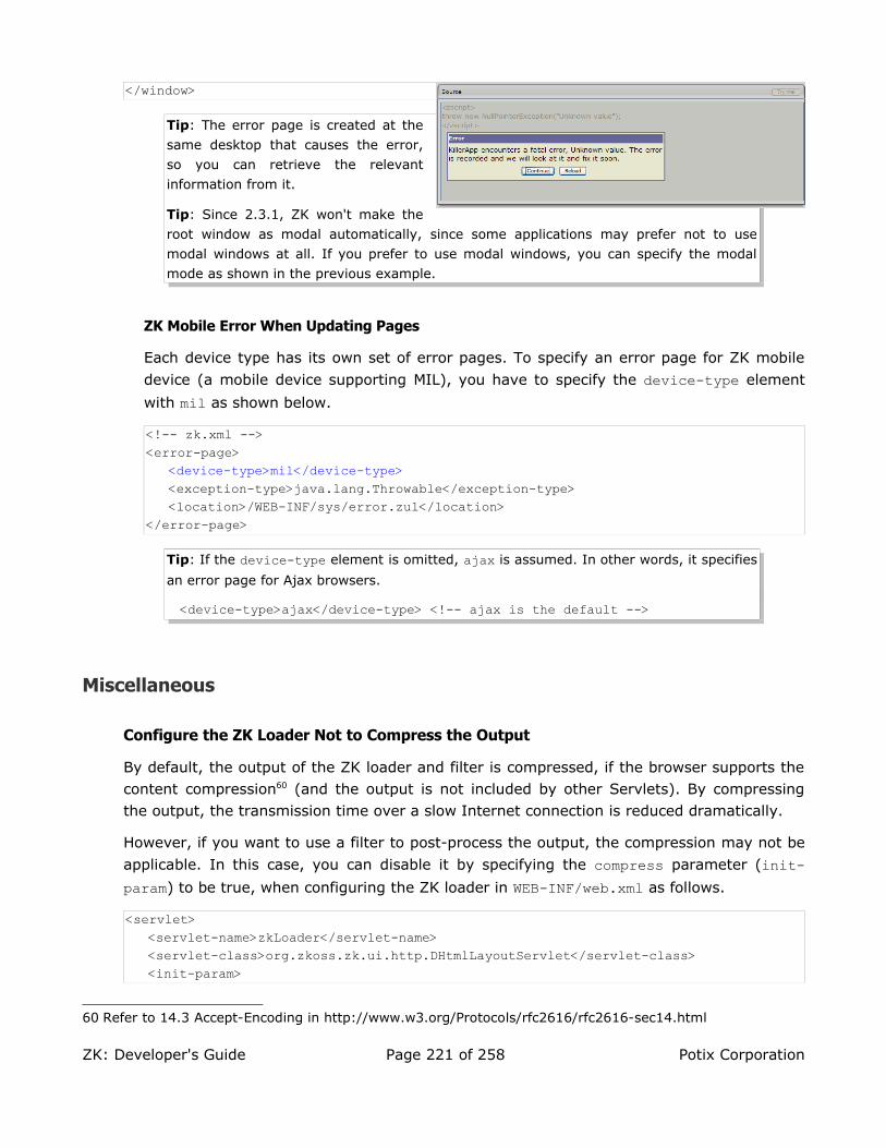
</window>
Tip: The error page is created at the
same desktop that causes the error,
so you can retrieve the relevant
information from it.
Tip: Since 2.3.1, ZK won't make the
root window as modal automatically, since some applications may prefer not to use
modal windows at all. If you prefer to use modal windows, you can specify the modal
mode as shown in the previous example.
ZK Mobile Error When Updating Pages
Each device type has its own set of error pages. To specify an error page for ZK mobile
device (a mobile device supporting MIL), you have to specify the device-type element
with mil as shown below.
<!-- zk.xml --><error-page>
<device-type>mil</device-type><exception-type>java.lang.Throwable</exception-type><location>/WEB-INF/sys/error.zul</location>
</error-page>
Tip: If the device-type element is omitted, ajax is assumed. In other words, it specifies
an error page for Ajax browsers.
<device-type>ajax</device-type> <!-- ajax is the default -->
Miscellaneous
Configure the ZK Loader Not to Compress the Output
By default, the output of the ZK loader and filter is compressed, if the browser supports the content compression60 (and the output is not included by other Servlets). By compressing the output, the transmission time over a slow Internet connection is reduced dramatically.
However, if you want to use a filter to post-process the output, the compression may not be
applicable. In this case, you can disable it by specifying the compress parameter (init-param) to be true, when configuring the ZK loader in WEB-INF/web.xml as follows.
<servlet><servlet-name>zkLoader</servlet-name><servlet-class>org.zkoss.zk.ui.http.DHtmlLayoutServlet</servlet-class><init-param>
60 Refer to 14.3 Accept-Encoding in http://www.w3.org/Protocols/rfc2616/rfc2616-sec14.html
ZK: Developer's Guide Page 221 of 258 Potix Corporation
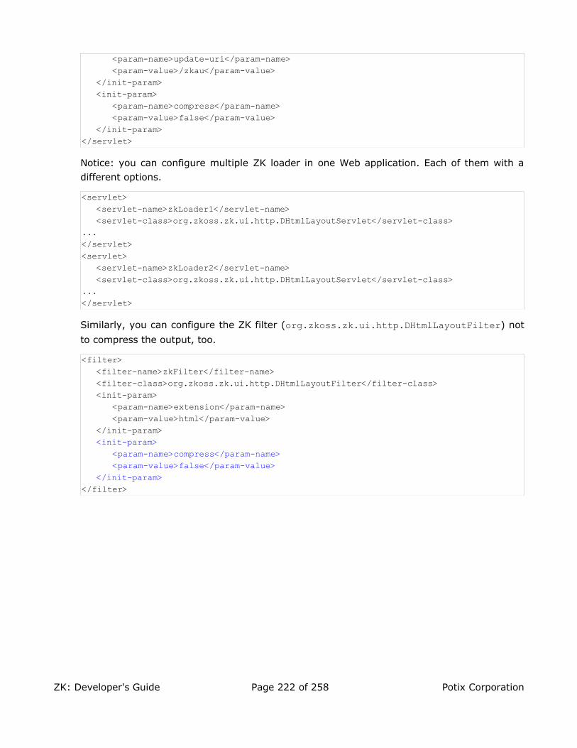
<param-name>update-uri</param-name><param-value>/zkau</param-value>
</init-param><init-param>
<param-name>compress</param-name><param-value>false</param-value>
</init-param></servlet>
Notice: you can configure multiple ZK loader in one Web application. Each of them with a different options.
<servlet><servlet-name>zkLoader1</servlet-name><servlet-class>org.zkoss.zk.ui.http.DHtmlLayoutServlet</servlet-class>
...</servlet><servlet>
<servlet-name>zkLoader2</servlet-name><servlet-class>org.zkoss.zk.ui.http.DHtmlLayoutServlet</servlet-class>
...</servlet>
Similarly, you can configure the ZK filter (org.zkoss.zk.ui.http.DHtmlLayoutFilter) not
to compress the output, too.
<filter><filter-name>zkFilter</filter-name><filter-class>org.zkoss.zk.ui.http.DHtmlLayoutFilter</filter-class><init-param>
<param-name>extension</param-name><param-value>html</param-value>
</init-param><init-param>
<param-name>compress</param-name><param-value>false</param-value>
</init-param></filter>
ZK: Developer's Guide Page 222 of 258 Potix Corporation

11. Performance Tips
This chapter describes the tips to make your ZK application running faster.
Use Compiled Java Codes
It is convenient to use zscript in ZUML, but it comes with a price: slower performance. The degradation varies from one application from another. For large website, it is suggested not to use zscript if possible.
Use the deferred Attribute
If you still need to write zscript codes, you can specify the deferred attribute to defer the
evaluation of zscript codes as follows.
<zscript deferred="true">...
By specifying the deferred attribute, the zscript codes it contains will not be evaluated
when ZK renders a pags. It means the interpreter won't be loaded when ZK renders a page. It saves memory and speeds up the page rendering.
In the following example, the interpreter is loaded only when the button is clicked:
<window id="w"><zscript deferred="true">void addMore() {
new Label("More").setParent(w);}</zscript><button label="Add" onClick="addMore()"/>
</window>
The deferred Attribute and the onCreate Event
It is worth to notice that, if the onCreate event listener is written in zscript, the deferred
option mentioned in the previous second becomes useless. It is because the onCreate event
is sent when the page is loaded. In other words, all deferred zscript will be evaluated when
the page is loaded if the onCreate event listener is written in zscript as shown below.
<window onCreate="init()">...
Rather, it is better to rewrite it as
<window use="my.MyWindow">
ZK: Developer's Guide Page 223 of 258 Potix Corporation

...
Then, prepare MyWindow.java as shown below.
package my;public class MyWindow extends Window {
public void onCreate() { //to process the onCreate event...
If you prefer to do the initialization right after the component (and all its children) is
created, you can implement the org.zkoss.zk.ui.ext.AfterCompose interface as shown
below. Note: the afterCompose method of the AfterCompose interface is evaluated at the
Component Creation phase, while the onCreate event is evaluated in the Event Processing
Phase.
package my;public class MyWindow extends Window implements org.zkoss.zk.ui.ext.AfterCompose {
public void afterCompose() { //to initialize the window...
Use the forward Attribute
To simplify the event flow, ZK components usually send the events to the component itself, rather than the parent or other targets. For example, when an user clicks a button, the
onClick event is sent to the button. Developers usually forward the event to the window by
use of the onClick event listener as follows.
<window id="w"><button label="OK" onClick="w.onOK"/>
As suggested in the previous sections, the performance can be improved by not using zscript
at all. Thus, you can rewrite the above code snippet either with EventListener or by
specifying the forward attribute as follows.
<window><button label="OK" forward="onOK"/>
Use the Servlet Thread to Process Events
By default, ZK processes an event in an independent thread called the event processing thread. Thus, the developer can suspend and resume the execution at any time, without blocking the servlet thread from sending back the responses to the browser.
However, it consumes more memory, especially if there are a lot suspended threads, and it may cause some challenge to integrate with other systems that storing information at the Servlet thread's local storage.
ZK provides an option to let you disable the use of the event processing threads. In other words,
ZK: Developer's Guide Page 224 of 258 Potix Corporation

you can force ZK to process events all in the Servlet threads like other conventional frameworks. Of course, you cannot suspend the execution if the Servlet thread is used.
To disable the use of the event processing threads, you have to specify the following content in
WEB-INF/zk.xml.
<system-config><disable-event-thread/>
</system-config>
Here is the advantages and limitations about using the Servlet thread to process events. In the following sections we will talk more about the limitations and workarounds when using the Servlet thread.
Using Servlet Thread Using Event Processing Thread
Integration Less integration issues.
Many containers assume the HTTP request is handled in the servlet thread.
You may have to implement
EventThreadInit and/or
EventThreadCleanup to solve the integration
issue.
ZK and the community keep providing versatile implementations to solve the integration issue.
Suspend
ResumeNo way to suspend the execution of the event listener.
For example, you cannot create a modal window.
No limitation at all.
Modal Windows
You can not use the modal window anymore. You can create the same visual effect with the highlighted mode. However, at the server side, it works just like the overlapped mode – it returns immediately without waiting for user's response.
win.doHighlighted(); //returns once the mode is changed; not suspended
Message Boxes
The message boxes returns immediately so it always returns Messagebox.OK. Thus, it is
meaningless to show buttons other than the OK button. For example, the if clause in the
following example is never true.
if (Messagebox.show("Delete?", "Prompt", Messagebox.YES|Messagebox.NO,Messagebox.QUESTION) == Messagebox.YES) {this_never_executes();
}
ZK: Developer's Guide Page 225 of 258 Potix Corporation

Rather, you have to provide an event listener as follows.
Messagebox.show("Delete?", "Prompt", Messagebox.YES|Messagebox.NO,Messagebox.QUESTION,new EventListener() {
public void onEvent(Event evt) {switch (((Integer)evt.getData()).intValue()) {case Messagebox.YES: doYes(); break; //the Yes button is pressedcase Messagebox.NO: doNo(); break; //the No button is pressed}
}}
);
The event listener you provided is invoked when the user clicks one of the buttons. Then,
you can identify which button is clicked by examining the data (Event's getData). The data
is an integer whose value is the button's identifier, such as Messagebox.YES.
Alternatively, you can examine the event name:
public void onEvent(Event evt) {if ("onYes".equals(evt.getName())) {
doYes(); //the Yes button is pressed} else if ("onNo".equals(evt.getName())) {
doNo(); //the No button is pressed}
}
Note: The event name for the OK button is onOK, not onOk.
File Upload
The file upload dialog is no longer applicable. Rather, you shall use the fileupload component instead. The fileupload component is not a modal dialog. Rather, it is placed
inline with other components. Refer to the fileupload Component section for more
information.
<fileupload onUpload="handle(event)"/>
Use the Native Namespace instead of the XHTML Namespace
As described in the Work with HTML Tags section of the ZUML with the XUL Component Set chapter, ZK creates a ZK component for each XML element specified with the XHTML namespace. In other words, ZK has to maintain their states at the server. Since the number of HTML tags are usually large, the performance will be improved dramatically if you use the Native namespace instead.
For example, the following code snippet creates five components (one table, tr, textbox and two
ZK: Developer's Guide Page 226 of 258 Potix Corporation

td).
<h:table xmlns:h="http://www.w3.org/1999/xhtml"><h:tr>
<h:td>Name</h:td><h:td><textbox/></h:td>
</h:tr></h:table>
On the other hand, the following code snippet creates two components (one special component to
generate table, tr and td to the client, and one textbox).
<n:table xmlns:n="http://www.zkoss.org/2005/zk/native"><n:tr>
<n:td>Name</n:td><n:td><textbox/></n:td>
</n:tr></n:table>
Notice that table, tr and td are generated directly to the client, so they don't have no
counterpart at the client. Thus, you can not change it dynamically. For example, the following code snippet is incorrect.
<n:ul id="x" xmlns:n="http://www.zkoss.org/2005/zk/native"/><button label="add" onClick="new Li().setParent(x)"/>
Rather, you have to use the html component or the XHTML namespace, if you want to change
dynamically.
Prolong the Period to Check Whether a File Is Modified
ZK caches the parsed result of a ZUML page and re-compiles it only if it is modified. In a production system, ZUML pages are rarely modified so you can prolong the period to check
whether a page is modified by specifying file-check-period in WEB-INF/zk.xml as shown below.
By default, it is 5 seconds.
<desktop-config><file-check-period>600</file-check-period><!-- unit: seconds -->
</desktop-config>
Defer the Creation of Child Components
For sophisticated pages, the performance can be improved if we defer the creation of child
components until they are becoming visible. The simplest way to do it is by use of the fulfill
ZK: Developer's Guide Page 227 of 258 Potix Corporation

attribute. In the following example, the children of the second tab panel are created only if it becomes visible. Refer to the Load on Demand section in the ZK User Interface Markup Language chapter.
<tabbox><tabs>
<tab label="Preload" selected="true"/><tab id="tab2" label="OnDemand"/>
</tabs><tabpanels>
<tabpanel>This panel is pre-loaded since no fulfill specified
</tabpanel><tabpanel fulfill="tab2.onSelect">
This panel is loaded only tab2 receives the onSelect event</tabpanel>
</tabpanels></tabbox>
Use Live Data and Paging for Large List Boxes
Sending out a list box with a lot of items to the client is expensive. In addition, the JavaScript engine of the browser is not good for initializing a list box with a lot of items. A better solution is to use the live data, i.e., by assigning a list model to it. Then, the list items are sent to the client only if they become visible.
The performance will be improved more if you also use the paging mold.
Refer to the List Boxes section in the ZUML with the XUL Component Set chapter for more details.
Use ZK JSP Tags or ZK JSF Components instead of ZK Filter
The ZK filter actually maps each HTML tag to the corresponding XHTML components. As described in the previous section, it consumes more memory than necessary since ZK has to maintain the states of all ZK components (including XUL and XHTML components).
ZK JSP tags are introduced to eliminate the need of the ZK filter for JSP pages. With ZK JSP tags, a ZUL component is created for each ZK JSP tag. All other HTML tags are encapsulated as a special component.
<!-- a JSP page --><z:page>
<table><tr>
<td>Name</td><td><z:textbox/></td>
ZK: Developer's Guide Page 228 of 258 Potix Corporation

</tr></table>
</z:page>
is equivalent to the following code snippet, if a ZUL page is used,
<!-- a ZUL page --><n:table xmlns:n="http://www.zkoss.org/2005/zk/native">
<n:tr><n:td>Name</n:td><n:td><textbox/></n:td>
</n:tr></n:table>
ZK: Developer's Guide Page 229 of 258 Potix Corporation

12. Other Devices and Output Formats
In addition to Ajax browsers, mobile devices and XML output are also supported by ZK. This chapter describes them briefly. For detailed information, you have to reference the corresponding documents.
ZK Mobile
The ZK Mobile Computing is the ZK extension that enables reach of ZK applications to mobile devices with little programming.
The ZK Mobile Computing is composed of two parts. In the mobile device side it is the ZK Mobile, a JavaMe Midlet thin client, that interacts with the ZK server and works as the client side user interface. In the server side it is a set of MIL (Mobile Interactive Language) components that you can control and manipulate when end users trigger actions from the mobile device.
It is straightforward to develop ZK Mobile applications. Just download the ZK Mobile release and follow the ZK Mobile Quick Start Guide and you are ready to go.
The Mobile Component Set, http://www.zkoss.org/2007/mil
You can write your ZK Mobile applications the same way as you have done with ZUL and ZHTML components. Only that this time you have to use the MIL components instead. Following is the classic Hello World example (hello.mil).
<frame title="My First Window" visible="true"> Hello World!</frame>
This is almost the same as the ZUL "Hello World" example. The <frame> tag indicates the frame of the mobile display and the "Hello World!" is the text inside the frame.
You can apply all your programming experiences with ZUL components on MIL components without problem. The only difference is that the former (ZUL components) is designed for showing on web Ajax browser while the latter (MIL components) is for showing on the ZK Mobile client. You can still use the ZK template attributes such as if, unless, forEach, each, etc. You can use multiple script languages in <zscript> tag. You can use EL expression and the annotated data binding. You can also choose coding with ZUML page or pure Java Richlet way.
In general, you will probably not just write a "pure" ZK Mobile application. Rather you might write an application with both a desktop web browser view and a mobile device view. It is quite natural to write different view for different client while all views can still share the
ZK: Developer's Guide Page 230 of 258 Potix Corporation

same backend business logic and database models.
XML Output
Nowadays XML have become the standard format of many devices and protocols, such as RSS and SVG. It is straightforward to output XML with ZK.
Three Steps to Generate XML Output with a ZUML Page
1. Uses the XML component set (http://www.zkoss.org/2007/xml).
2. Maps the file extension to ZK Loader
3. Maps the file extension to the XML component set
Use the XML Component Set, http://www.zkoss.org/2007/xmlThe XML component set (aka., the XML language, in ZK terminology) is used to generate XML output. Unlike the XUL or XHTML component sets, all unknown61 tags in a ZUML page
are assumed to belong the Native namespace (http://www.zkoss.org/2005/native)
rather than throwing an exception. ZK generates them directly to the output without instantiating a ZK component for each of them.
The following is an example that generates the SVG output. It looks very similar to the XML output you want to generate, except you can use zscript, EL expressions, macro components and other ZK features.
<?page contentType="image/svg+xml;charset=UTF-8"?>
<svg width="100%" height="100%" version="1.1" xmlns="http://www.w3.org/2000/svg"xmlns:z="http://www.zkoss.org/2005/zk">
<z:zscript><![CDATA[String[] bgnds = {"purple", "blue", "yellow"};int[] rads = {30, 25, 20};]]></z:zscript><circle style="fill:${each}" z:forEach="${bgnds}"
cx="${50+rads[forEachStatus.index]}"cy="${20+rads[forEachStatus.index]}"r="${rads[forEachStatus.index]}"/>
</svg>
The generated output will be
<svg xmlns="http://www.w3.org/2000/svg" width="100%" height="100%" version="1.1">
61 By the unknown tag we mean a tag that is not associated with a namespace, or the namespace is
unknown.
ZK: Developer's Guide Page 231 of 258 Potix Corporation

<circle style="fill:purple" cx="80" cy="50" r="30"></circle><circle style="fill:blue" cx="75" cy="45" r="25"></circle><circle style="fill:yellow" cx="70" cy="40" r="20"></circle></svg>
where
● The content type is specified with the page directive. For SVG, it is
image/svg+xml. The xml processing instruction (<?xml?>) and DOCTYPE of the
output are also specified in the page directive. Refer to the Developer's
Reference for more about the page directive.
● All tags in this example, such as svg and circle, are associated with a namespace
(http://www.w3.org/2000/svg) that is unknown to ZK Loader. Thus, they are
assumed to belong the Native namespace. They are output directly rather than instantiating a ZK component for each of them. Refer to the Native Namespace section int the ZUML with the XUL Component Set chapter for more about the Native namespace.
● To use zscript, forEach and other ZK specific features, you have to specify the
ZK namespace (http://www.zkoss.org/2005/zk).
Maps the File Extension to ZK Loader
To let ZK Loader process the file, you have to associate it with the ZK Loader in WEB-INF/web.xml. In this example, we map all files with the .svg extension to ZK Loader62:
<servlet-mapping><servlet-name>zkLoader</servlet-name><url-pattern>*.svg</url-pattern>
</servlet-mapping>
Maps the File Extension to the XML Component Set
Unless the file extension is .xml, you have to associate it with the XML component set
(aka., the XML language) explicitly in WEB-INF/zk.xml. In this example, we map .svg to
the XML component set:
<language-mapping><language-name>xml</language-name><extension>svg</extension>
</language-mapping>
where xml is the language name of the XML component set
(http://www.zkoss.org/2007/xml). Thus, when ZK Loader parses a file with the .svg 62 We assume ZK Loader (zkLoader) is mapped to org.zkoss.zk.ui.http.DHtmlLayoutServlet.
ZK: Developer's Guide Page 232 of 258 Potix Corporation

extension, it knows the default language is the XML component set.
The XML Component Set
In addition to generating XML tags directly to the output, the XML component set provides a few components to simplify sophisticated tasks, such as XSLT.
The XML Transformer
To translate a XML document to another, you can use the transformer component as
follows.
<?page contentType="text/html;charset=UTF-8"?><x:transformer xsl="book.xsl" xmlns:x="http://www.zkoss.org/2007/xml">
<book><title>ZK - Ajax without the JavaScript Framework</title><for-who>Web application designers and programmers who wish to implement rich
Ajax web applications in the simplest way.</for-who><author>Henri Chen and Robbie Cheng</author>
</book></x:transformer>
where transformer is a component of the XML component set, so we have to specify the namespace. Otherwise, the Native namespace is assumed.
Then, let us assume the content of book.xsl is as follows.
<xsl:stylesheet version="1.0"xmlns:xsl="http://www.w3.org/1999/XSL/Transform">
<xsl:template match="/"><html>
<head><title>Book Info</title>
</head><body>
<h1>Book Info</h1><xsl:apply-templates select="book"/>
</body></html>
</xsl:template><xsl:template match="book">
<dl><dt>Title:</dt><dd><xsl:value-of select="title"/></dd><dt>Who is this book for:</dt><dd><xsl:value-of select="for-who"/></dd><dt>Authors</dt><dd><xsl:value-of select="author"/></dd>
</dl></xsl:template>
</xsl:stylesheet>
ZK: Developer's Guide Page 233 of 258 Potix Corporation

Then, the generated XML output will be XHTML as follows.
<html><head><META http-equiv="Content-Type" content="text/html; charset=UTF-8"><title>Book Info</title></head><body><h1>Book Info</h1><dl>
<dt>Title:</dt><dd>ZK - Ajax without the JavaScript Framework</dd><dt>Who is this book for:</dt><dd>Web application designers and programmers who wish to implement rich Ajax web applications in the simplest way.</dd><dt>Authors</dt><dd>Henri Chen and Robbie Cheng</dd></dl></body></html>
ZK: Developer's Guide Page 234 of 258 Potix Corporation

13. Internationalization
This chapter describes how to make ZK applications flexible enough to run in any locale.
First of all, ZK enables developers to embed Java codes and EL expressions any way you like. You could use any Internationalization method you want, such as java.util.ResourceBundle.
However, ZK has some built-in support of internationalization that you might find them useful.
Locale
The locale used to process requests and events is, by default, determined by the browser's
preferences (by use of the getLocale method of javax.servlet.ServletRequest).
However, it is configurable. For example, you might want to use the same Locale for all users no matter how the browser is configured. Another example is that you might want to use the preferred locale that a user specified in his or her profile, if you maintain the user profiles in the server.
The px_preferred_locale Session Attribute
Before checking the browser's preferences, ZK will check if a session attribute called
px_preferred_locale is defined. If defined, ZK uses it as the default locale for the session
instead of the browser's preferences. Thus, you can control the locale of a session by storing the preferred locale in this attribute.
For example, you can do this when a user logins.
void login(String username, String password) {//check password...Locale preferredLocale = ...; //decide the locale (from, say, database)session.setAttribute("px_preferred_locale", preferredLocale);...
}
Tip: To avoid typo, you can use the constant called PREFERRED_LOCALE defined in the
org.zkoss.web.Attributes class.
The Request Interceptor
Deciding the locale after the user logins may be a bit late for some applications. For example, you might want to use the same Locale that was used in the previous session, before the user logins. For a Web application, it is usually done by use of cookies. With ZK, you can register a request interceptor and manipulates the cookies when the interceptor is
ZK: Developer's Guide Page 235 of 258 Potix Corporation

called.
A request interceptor is used to intercept each request processed by ZK Loader and ZK
Update Engine. It must implements the org.zkoss.zk.ui.util.RequestInterceptor interface. For example,
public class MyLocaleProvider implements org.zkoss.zk.ui.util.RequestInterceptor {public void request(org.zkoss.zk.ui.Session sess,Object request, Object response) {
final Cookie[] cookies = ((HttpServletRequest)request).getCookies();if (cookies != null) {
for (int j = cookies.length; --j >= 0;) {if (cookies[j].getName().equals("my.locale")) {
//determine the localeString val = cookies[j].getValue();Locale locale = org.zkoss.util.Locales.getLocale(val);sess.setAttribute(Attributes.PREFERRED_LOCALE, locale);return;
}}
}}
}
To make it effective, you have to register it in WEB-INF/zk.xml as follows. Once registered, the request method is called each time ZK Loader or ZK Update Engine receives a request. Refer to Appendix B in the Developer's Reference for more information about configuration.
<listener><listener-class>MyLocaleProvider</listener-class>
</listener>
Note: An instance of the interceptor is instantiated when it is registered. It is then
shared among all requests in the same application. Thus, you have to make sure it can
be accessed concurrently (i.e., thread-safe).
Note: The request method is called at very early stage, before the request parameters
are parsed. Thus, it is recommended to access them in this method, unless you
configured the locale and character encoding properly for the request.
Time Zone
The time zone used to process requests and events is, by default, determined by the JVM's
preferences (by use of the getDefault method of java.util.TimeZone).
Note: Unlike locale, there is no standard way to determine the time zone for each
browser.
ZK: Developer's Guide Page 236 of 258 Potix Corporation

Like Locale, the time zone for a given session is configurable. For example, you might want to use the preferred time zone that a user specified in his or her profile, if you maintain user profiles in the server.
The px_preferred_time_zone Session Attribute
ZK will check if a session attribute called px_preferred_time_zone is defined. If defined, it
uses as the default time zone for the session instead of the system default. Thus, you can control the time zone of a session by storing the preferred locale in this attribute, after, say, a user logins as depicted in the previous section.
Tip: To avoid typo, you can use the constant called PREFERRED_TIME_ZONE defined in the
org.zkoss.web.Attributes class.
The Request Interceptor
Like Locale, you can prepare the time zone for the given session with the
px_preferred_time_zone attribute by use of the request interceptor.
Labels
Developers could separate Locale-dependent data from the ZUML pages (and JSP pages) by
storing them in i3-label_lang_CNTY.properties under the WEB-INF directory, where lang is the
language such as en and fr, and CNTY is the country, such as US and FR.
To get a Locale-dependent property, you could use org.zkoss.util.resource.Labels in Java, or
${c:l('key')} in EL expression. To use it in EL, you have to specify the TLD file with the taglib directive in your page as follows.
<?taglib uri="http://www.zkoss.org/dsp/web/core" prefix="c"?>
<window title="${c:l('app.title')}">...</window>
File Location: core.dsp.tld is distributed under the dist/WEB-INF directory. You do
not need to copy it to your Web application.
When a Locale-dependent label is about to retrieved, one of i3-label_lang_CNTY.properties will be
loaded. For example, if the Locale is de_DE, then WEB-INF/i3-label_de_DE.properties will be
loaded. If no such file, ZK will try to load WEB-INF/i3-label_de.properties and WEB-INF/i3-label.properties in turn.
To access labels in Java codes (including zscript), use the getLabel method of the
org.zkoss.util.resource.Labels class.
ZK: Developer's Guide Page 237 of 258 Potix Corporation

In addition, you could extend the label loader to load labels from other locations, say database, by
registering a locator, which must implement the org.zkoss.util.resource.LabelLocator interface. Then, invoke the register method of the org.zkoss.util.resource.Labels class.
Locale-Dependent Files
Browser and Locale-Dependent URI
Many resources depend on the Locale and, sometimes, the browser that a user is used to visit the Web page. For example, you need to use a larger font for Chinese characters to have better readability.
ZK can handle this for you automatically, if you specify the URL of the style sheet with "*". The algorithm is as follows.
1. If there is one "*" is specified in an URI such as /my*.css, then "*" will be replaced
with a proper Locale depending on the preferences of user's browser.
For example, user's preferences is de_DE, then ZK searches /my_de_DE.css,
/my_de.css, and /my.css one-by-one from your Web site, until any of them is found.
If none of them is found, /my.css is still used.
2. If two or more "*" are specified in an URI such as "/my*/lang*.css", then the first "*" will be replaced with "ie" for Internet Explorer, "saf" for Safari, and "moz" for other
browsers63. Moreover, the last asterisk will be replaced with a proper Locale as described in the above step.
In summary, the last asterisk represents the Locale, while the first asterisk represents the browser type.
3. All other "*" are ignored.
Note: The lat asterisk that represents the Locale must be placed right before the first
dot ("."), or at the end if no dot at all. Furthermore, no following slash (/) is allowed, i.e.,
it must be part of the filename, rather than a directory. If the last asterisk doesn't fulfill
this constraint, it will be eliminated (not ignored).
For example, "/my/lang.css*" is equivalent to "/my/lang.css".
In other words, you can consider it as neutral to the Locale.
Tip: We can apply this rule to specify an URI depending on the browser type, but not
depending on the Locale. For example, "/my/lang*.css*" will be replaced with
"/my/langie.css" if Internet Explorer is the current user's browser.
63 In the future editions, we will use different codes for browsers other than Internet Explorer, Firefox and
Safari.
ZK: Developer's Guide Page 238 of 258 Potix Corporation

In the following examples, we assume the preferred Locale is de_DE and the browser is
Internet Explorer.
URI Resources that are searched
/css/norm*.css 1. /norm_de_DE.css
2. /norm_de.css
3. /norm.css
/css-*/norm*.css 1. /css-ie/norm_de_DE.css
2. /css-ie/norm_de.css
3. /css-ie/norm.css
/img*/pic*/lang*.png 1. /imgie/pic*/lang_de_DE.png
2. /imgie/pic*/lang_de.png
3. /imgie/pic*/lang.png
/img*/lang.gif 1. /img/lang.gif
/img/lang*.gif* 1. /img/langie.gif
/img*/lang*.gif* 1. /imgie/lang*.gif
Locating Browser and Locale Dependent Resources in Java
In additions to component attributes and ZUML attributes, you could handle browser and Locale dependent resource programmingly in Java. Here are a list of methods that you could use.
• The encodeURL, forward, and include methods in org.zkoss.zk.ui.Exection for
encoding URL, forwarding to another page and including a page. In most cases, these methods are all you need.
• The locate, forward, and include method in org.zkoss.web.servlet.Servlets for
locating Web resouces. You rarely need them when developing ZK applications, but useful for writing a servlet, portlet or filter.
• The encodeURL method in org.zkoss.web.servlet.http.Encodes for encoding URL. You
rarely need them when developing ZK applications, but useful for writing a servlet, portlet or filter.
• The locate method in org.zkoss.util.resource.Locators for locating class resources.
ZK: Developer's Guide Page 239 of 258 Potix Corporation

Messages
Messages are stored in properties files which are located at the /metainfo/mesg directory of the
classpath. Each module is associated with an unique name. In addition, the Locale is appended to
the property file, too. For example, the message file of zk.jar for Germany messages is
msgzk_de_DN.properties or msgzk_de.properties. Currently, zk.jar is only shipped with
English and Chinese versions. You could add your own property files for different Locales by
placing them at the /metainfo/mesg directory of the classpath.
Themes
The XUL component set provides several sets of style sheet files for each browser type: smaller,
larger and normal. By default, the normal set is used. You can configure WEB-INF/zk.xml to
choose a different theme.
Use the Theme with Smaller Fonts
The theme with smaller fonts is called normsm*.css.dsp. You can configure WEB-INF/zk.xml to use it as follows.
<desktop-config><disable-theme-uri>~./zul/css/norm*.css.dsp*</disable-theme-uri><theme-uri>~./zul/css/normsm*.css.dsp*</theme-uri>
</desktop-config>
Refer to the Developer's Reference for more about how to configure with WEB-INF/zk.xml.
Use the Theme with Larger Fonts
The theme with smaller fonts is called normlg*.css.dsp. You can configure WEB-INF/zk.xml to use it as follows.
<desktop-config><disable-theme-uri>~./zul/css/norm*.css.dsp*</disable-theme-uri><theme-uri>~./zul/css/normlg*.css.dsp*</theme-uri>
</desktop-config>
Use the Theme that Depends on Locale
It is common to use the larger font only for Chinese locales. You can configure WEB-INF/zk.xml to use it as follows.
<desktop-config><disable-theme-uri>~./zul/css/norm*.css.dsp*</disable-theme-uri><theme-uri>~./zul/css/norm**.css.dsp</theme-uri>
</desktop-config>
ZK: Developer's Guide Page 240 of 258 Potix Corporation

Use Your Own Theme
It is easy to customize the look and feel of the ZK XUL components by providing your own
style sheets (CSS). You can refer to norm.css.dsp and normie.css.dsp in the zul project
for examples. If you just want to change the font size, you can reference normsm.css.dsp.
<desktop-config><theme-uri>/css/my-fine-font.css</theme-uri>
</desktop-config>
The Theme Provider
If you prefer to decide the theme at the run time depending on the current user, cookie, locale or others, you can implement a theme provider. A theme provider is a class that
implements the org.zkoss.zk.ui.util.ThemeProvider interface.
package my;public class MyThemeProvider implements ThemeProvder {
public Collection getThemeURIs(Execution exec, List uris) {for (Iterator it = uris.iterator(); it.hasNext();) {
if ("~./zul/css/norm*.css.dsp*".equals(it.next()))it.remove(); //remove the default theme
}HttpServletRequest req = (HttpServletRequest)exec.getNativeRequest();uris.add(getMyThemeURI(req));return uris;
}}
Then, you configure WEB-INF/zk.xml by adding the following lines.
<desktop-config><theme-provider-class>my.MyThemeProvider</theme-provider-class>
</desktop-config>
ZK: Developer's Guide Page 241 of 258 Potix Corporation

14. Database Connectivity
This chapter describes how to make connections to database.
ZK Is Presentation-Tier Only
ZK is aimed to be as thin as the presentation tier. In addition, with the server-centric approach, it executes all codes at the server, so connecting database is no different from any desktop applications. In other words, ZK doesn't change the way you access the database, no matter you use JDBC or other persistence framework, such as Hibernate64.
Simplest Way to Use JDBC (but not recommended)
The simplest way to use JDBC, like any JDBC tutorial might suggest, is to use
java.sql.DriverManager. Here is an example to store the name and email into a MySQL65
database.
<window title="JDBC demo" border="normal"><zscript><
}if (conn != null) {
try {conn.close();
} catch (SQLException ex) {log.error(ex); //log and ignore
}}
}}
]]></zscript><vbox>
<hbox>Name : <textbox id="name"/></hbox><hbox>Email: <textbox id="email"/></hbox><button label="submit" onClick="submit()"/>
</vbox></window>
Though simple, it is not recommended. After all, ZK applications are Web-based applications, where loading is unpredictable and treasurable resources such as database connections have to be managed effectively.
Luckily, all J2EE frameworks and Web servers support a utility called connection pooling. It is straightforward to use, while managing the database connections well. We will discuss more in the next section.
Tip: Unlike other Web applications, it is possible to use DriverManager with ZK, though
not recommended.
First, you could cache the connection in the desktop, reuse it for each event, and close it
when the desktop becomes invalid. It works just like traditional Client/Server
applications. Like Client/Server applications, it works efficiently only if there are at most
tens concurrent users.
To know when a desktop becomes invalid, you have to implement a listener by use of
org.zkoss.zk.ui.util.DesktopCleanup.
Use with Connection Pooling
Connection pooling is a technique of creating and managing a pool of connections that are ready for use by any thread that needs them. Instead of closing a connection immediately, it keeps them in a pool such that the next connect request could be served very efficiently. Connection pooling, in addition, has a lot of benefits, such as control resource usage.
There is no reason not to use connection pooling when developing Web-based applications, including ZK applications.
The concept of using connection pooling is simple: configure, connect and close. The way to
ZK: Developer's Guide Page 243 of 258 Potix Corporation

connect and close a connection is very similar the ad-hoc approach, while configuration depends on what Web server and database server are in use.
Connect and Close a Connection
After configuring connection pooling (which will be discussed in the following section), you could use JNDI to retrieve an connection as follows.
import java.sql.Connection;import java.sql.SQLException;import java.sql.Statement;
import javax.naming.InitialContext;import javax.sql.DataSource;
import org.zkoss.zul.Window;
public class MyWindows extends Window {private Textbox name, email;public void onCreate() {
//initial name and emailname = getFellow("name");email = getFellow("email");
}public void onOK() throws Exception {
DataSource ds = (DataSource)new InitialContext().lookup("java:comp/env/jdbc/MyDB");//Assumes your database is configured and//named as "java:comp/env/jdbc/MyDB"
Connection conn = null;Statement stmt = null;try {
conn = ds.getConnection();stmt = conn.prepareStatement("INSERT INTO user values(?, ?)");
//insert what end user entered into database tablestmt.set(1, name.value);stmt.set(2, email.value);
//execute the statementstmt.executeUpdate();stmt.close(); stmt = null;
//optional because the finally clause will close it//However, it is a good habit to close it as soon as done, especially //you might have to create a lot of statement to complete a job
} finally { //cleanupif (stmt != null) {
try {stmt.close();
} catch (SQLException ex) {
ZK: Developer's Guide Page 244 of 258 Potix Corporation

//(optional log and) ignore}
}if (conn != null) {
try {conn.close();
} catch (SQLException ex) {//(optional log and) ignore
}}
}}
}
Notes:
• It is important to close the statement and connection after use.
• You could access multiple database at the same time by use of multiple connections. Depending on the configuration and J2EE/Web servers, these connections could even form a distributed transaction.
Configure Connection Pooling
The configuration of connection pooling varies from one J2EE/Web/Database server to another. Here we illustrated some of them. You have to consult the document of the server you are using.
Tomcat 5.5 + MySQL
To configure connection pooling for Tomcat 5.5, you have to edit
$TOMCAT_DIR/conf/context.xml66, and add the following content under the <Context> element. The information that depends on your installation and usually need to be changed is marked in the blue color.
<!-- The name you used above, must match _exactly_ here!The connection pool will be bound into JNDI with the name"java:/comp/env/jdbc/MyDB"
--><Resource name="jdbc/MyDB" username="someuser" password="somepass"
url="jdbc:mysql://localhost:3306/test" auth="Container" defaultAutoCommit="false" driverClassName="com.mysql.jdbc.Driver" maxActive="20" timeBetweenEvictionRunsMillis="60000" type="javax.sql.DataSource" />
66 Thanks Thomas Muller (http://asconet.org:8000/antville/oberinspector) for correction.
See also http://tomcat.apache.org/tomcat-5.5-doc/jndi-resources-howto.html and
http://en.wikibooks.org/wiki/ZK/How-Tos/HowToHandleHibernateSessions#Working_with_the_Hibernate_session for more details.
ZK: Developer's Guide Page 245 of 258 Potix Corporation

</ResourceParams>
Then, in web.xml, you have to add the following content under the <web-app> element as
follows.
<resource-ref> <res-ref-name>jdbc/MyDB</res-ref-name> <res-type>javax.sql.DataSource</res-type> <res-auth>Container</res-auth></resource-ref>
JBoss + MySQL
The following instructions is based on section 23.3.4.3 of the reference manual of MySQL 5.0.
To configure connection pooling for JBoss, you have to add a new file to the directory
called deploy ($JBOSS_DIR/server/default/deploy). The file name must end with "-ds.xml", which tells JBoss to deploy this file as JDBC Datasource. The file must have the
following contents. The information that depends on your installation and usually need to be changed is marked in the blue color.
<datasources> <local-tx-datasource> <!-- This connection pool will be bound into JNDI with the name "java:/MyDB" --> <jndi-name>MyDB</jndi-name> <connection-url>jdbc:mysql://localhost:3306/test</connection-url> <driver-class>com.mysql.jdbc.Driver</driver-class> <user-name>someser</user-name> <password>somepass</password>
<min-pool-size>5</min-pool-size>
<!-- Don't set this any higher than max_connections on your MySQL server, usually this should be a 10 or a few 10's of connections, not hundreds or thousands -->
<max-pool-size>20</max-pool-size>
<!-- Don't allow connections to hang out idle too long, never longer than what wait_timeout is set to on the server...A few minutes is usually okay here, it depends on your application and how much spikey load it will see -->
<idle-timeout-minutes>5</idle-timeout-minutes>
<!-- If you're using Connector/J 3.1.8 or newer, you can use our implementation of these to increase the robustness of the connection pool. -->
ZK: Developer's Guide Page 246 of 258 Potix Corporation

<exception-sorter-class-name>com.mysql.jdbc.integration.jboss.ExtendedMysqlExceptionSorter</exception-sorter-class-name> <valid-connection-checker-class-name>com.mysql.jdbc.integration.jboss.MysqlValidConnectionChecker</valid-connection-checker-class-name>
</local-tx-datasource></datasources>
JBoss + PostgreSQL
<datasources><local-tx-datasource><!-- This connection pool will be bound into JNDI with the name "java:/MyDB" --><jndi-name>MyDB</jndi-name>
<!-- jdbc:postgresql://[servername]:[port]/[database name] --><connection-url>jdbc:postgresql://localhost/test</connection-url>
<driver-class>org.postgresql.Driver</driver-class><user-name>someuser</user-name><password>somepass</password><min-pool-size>5</min-pool-size><max-pool-size>20</max-pool-size><track-statements>false</track-statements></local-tx-datasource>
</datasources>
ZK Features Applicable to Database Access
The org.zkoss.zk.ui.event.EventThreadCleanup Interface
As emphasized before, it is important to close the connection in the finally clause, such
that every connection will be returned to connection pool correctly.
To make your application more robust, you could implement the org.zkoss.zk.ui.event.EventThreadCleanup interface to close any pending
connections and statements, in case that some of your application codes might
forget to close them in the finally clause.However, how to close pending connection and statements really depend on the server you are using. You have to consult the document of the server for how to write one.
ZK: Developer's Guide Page 247 of 258 Potix Corporation

Tip: In many cases, it is not necessary (and not easy) to provide such method, because
most implementation of connection pooling be recycled a connection if its finalized method is called.
Access Database in EL Expressions
In additions to access database in an event listener, it is common to access database to fulfill an attribute by use of an EL expression. In the following example, we fetch the data
from database and represent them with listbox by use of EL expressions.
<zscript> import my.CustomerManager;
customers = new CustomerManager().findAll(); //load from database</zscript><listbox id="personList" width="800px" rows="5">
<listhead><listheader label="Name"/><listheader label="Surname"/><listheader label="Due Amount"/>
</listhead><listitem value="${each.id}" forEach="${customers}">
<listcell label="${each.name}"/><listcell label="${each.surname}"/><listcell label="${each.due}"/>
</listitem></listbox>
There are several way to implement the findAll method.
Read all and Copy to a LinkedList
The simplest way is to retrieve all data in the findAll method, copy them into a list and
then close the connection.
public class CustomerManager {public List findAll() throws Exception {
DataSource ds = (DataSource)new InitialContext().lookup("java:comp/env/jdbc/MyDB");
Connection conn = null;Statement stmt = null;ResultSet rs = null;List results = new LinkedList();try {
conn = ds.getConnection();stmt = conn.createStatement();rs = stmt.executeQuery("SELECT id, name, surname FROM customers");while (rs.next()) {
long id = rs.getInt("id");String name = rs.getString("name");
ZK: Developer's Guide Page 248 of 258 Potix Corporation

String surname = rs.getString("surname");results.add(new Customer(id, name, surname));
}return results;
} finally {if (rs != null) try { rs.close(); } catch (SQLException ex) [}if (stmt != null) try { stmt.close(); } catch (SQLException ex) [}if (conn != null) try { conn.close(); } catch (SQLException ex) [}
}}
}
Implement the org.zkoss.zk.ui.util.Initiator Interface
Instead of mixing Java codes with the view, you could use the init Directive to load the
data.
<?init class="my.AllCustomerFinder" arg0="customers"?>
<listbox id="personList" width="800px" rows="5"><listhead>
<listheader label="Name"/><listheader label="Surname"/><listheader label="Due Amount"/>
</listhead><listitem value="${each.id}" forEach="${customers}">
<listcell label="${each.name}"/><listcell label="${each.surname}"/><listcell label="${each.due}"/>
</listitem></listbox>
Then, implement the my.CustomerFindAll class with the
org.zkoss.zk.ui.util.Initiator interface.
import org.zkoss.zk.ui.Page;import org.zkoss.zk.ui.util.Initiator;
public class AllCustomerFinder implements Initiator {public void doInit(Page page, Object[] args) {
try {page.setVariable((String)args[0], new CustomerManager().findAll());
//Use setVariable to pass the result back to the page} catch (Exception ex) {
throw UiException.Aide.wrap(ex);}
}public void doCatch(Throwable ex) { //ignore}public void doFinally() { //ignore}
ZK: Developer's Guide Page 249 of 258 Potix Corporation

}
Transaction and org.zkoss.zk.util.Initiator
For sophisticated application (such as distributed transaction), you might have to control the lifecyle of a transaction explicitly. If all database access is done in event listeners, there is nothing to change to make it work under ZK. You start, commit or rollback a transaction the same way as suggested in the document of your J2EE/Web server.
However, if you want the evaluation of the whole ZUML page (the Component Creation Phases) is done in the same transaction, then you, as described in the above section, could
implement the org.zkoss.zk.util.Initiator interface to control the transaction lifecycle
for a given page.
The skeletal implementation is illustrated as follows.
import org.zkoss.zk.ui.Page;import org.zkoss.zk.ui.util.Initiator;
public class TransInitiator implements Initiator {private boolean _err;public void doInit(Page page, Object[] args) {
startTrans(); //depending the container, see below}public void doCatch(Throwable ex) {
_err = true;rollbackTrans(); //depending the container, see below
}public void doFinally() {
if (!_err)commitTrans(); //depending the container, see below
}}
As depicted, the transaction starts in the doInit method, and ends in the doFinally method of the org.zkoss.zk.util.Initiator interface.
How to start, commit and rollback an transaction depends on the container you use.
J2EE Transaction and Initiator
If you are using a J2EE container, you could look up the transaction manager
(javax.transaction.TransactionManager), and then invoke its begin method to start
an transaction. To rollback, invoke its rollback method. To commit, invoke its commit method.
Web Containers and Initiator
If you are using a Web container without transaction managers, you could start a
ZK: Developer's Guide Page 250 of 258 Potix Corporation

transaction by constructing a database connection. Then, invoke its commit and rollback methods accordingly.
import java.sql.*;import javax.sql.DataSource;import javax.naming.InitContext;import org.zkoss.util.logging.Log;import org.zkoss.zk.ui.Page;import org.zkoss.zk.ui.util.Initiator;
public class TransInitiator implements Initiator {private static final Log log = Log.lookup(TransInitiator.class);private Connection _conn;private boolean _err;
public void doInit(Page page, Object[] args) {try {
DataSource ds = (DataSource)new InitialContext().lookup("java:comp/env/jdbc/MyDB");
_conn = ds.getConnection();} catch (Throwable ex) {
throw UiException.Aide.wrap(ex);}
}public void doCatch(Throwable t) {
if (_conn != null) {try {
_err = true;_conn.rollback();
} catch (SQLException ex) {log.warning("Unable to roll back", ex);
}}
}public void doFinally() {
if (_conn != null) {try {
if (!_err)_conn.commit();
} catch (SQLException ex) {log.warning("Failed to commit", ex);
} finally {try {
_conn.close();} catch (SQLException ex) {
log.warning("Unable to close transaction", ex);}
}}
}}
ZK: Developer's Guide Page 251 of 258 Potix Corporation

15. Portal Integration
ZK provides a portlet to load ZUML pages for JSR 168 compliant portal. This portlet is called ZK
portlet loader, and it is implemented as org.zkoss.zk.ui.http.DHtmlLayoutPortlet.
Configuration
WEB-INF/portlet.xml
To use it, you first have to add the following definition into WEB-INF/portlet.xml. Notice
that expiration-cache must be set to zero to prevent portals from caching the result.
<portlet><description>ZK loader for ZUML pages</description><portlet-name>zkPortletLoader</portlet-name><display-name>ZK Portlet Loader</display-name>
<portlet-class>org.zkoss.zk.ui.http.DHtmlLayoutPortlet</portlet-class>
<expiration-cache>0</expiration-cache>
<supports><mime-type>text/html</mime-type><portlet-mode>VIEW</portlet-mode>
</supports>
<supported-locale>en</supported-locale>
<portlet-info><title>ZK</title><short-title>ZK</short-title><keywords>ZK,ZUML</keywords>
</portlet-info></portlet>
WEB-INF/web.xml
ZK portlet loader actually delegates the loading of ZUML pages to ZK loader
(org.zkoss.zk.ui.http.DHtmlLayoutServlet). Thus, you have to configure WEB-INF/web.xml as specified in Appendix A in the Developer's Reference, even if you want
to use only portlets.
ZK: Developer's Guide Page 252 of 258 Potix Corporation

The Usage
The zk_page and zk_richlet Parameter and Attribute
ZK portlet loader is a generic loader. To load a particular ZUML page, you have to specify
either a request parameter, a portlet attribute or a portlet preference called zk_page, if you
want to load a ZUML page, or zk_richlet, if you want to load a richlet.
More precisely, ZK portlet loader first checks the following locations for the path of the ZUML page or the richlet. The lower the number, the higher the priority.
1. The request parameter (RenderRequest's getParameter) called zk_page. If found, it
is the path of the ZUML page.
2. The request attribute (RenderRequest's getAttribute) called zk_page. If found, it is
the path of the ZUML page.
3. The request preference (RenderRequest's getPortletPreferences's getValue)
called zk_page. If found, it is the path of the ZUML page.
4. The request parameter (RenderRequest's getParameter) called zk_richlet. If
found, it is the path of the richlet.
5. The request attribute (RenderRequest's getAttribute) called zk_richlet. If found,
it is the path of the richlet.
6. The request preference (RenderRequest's getPortletPreferences's getValue)
called zk_richlet. If found, it is the path of the richlet.
7. The initial parameter (PortletConfig's getInitParameter) called zk_page. If found,
it is the path of the ZUML page.
Examples
How to pass a request parameter or attribute to a portlet depends on the portal. You have to consult the user's guide of your favorite portal for details. The following is an example that uses Potix Portal.
<layout contentType="text/html"><title>ZK Porlet Demo</title><header name="Cache-Control" value="no-cache"/><header name="Pragma" value="no-cache"/>
<vbox><hbox>
<servlet page="sample1.zul"/><portlet name="zkdemo.zkLoader">
<attribute name="zk_page" value="/test/sample2.zul"/></portlet>
</hbox>
ZK: Developer's Guide Page 253 of 258 Potix Corporation

</vbox>
<molds uri="~./pxp/html/molds.xml"/></layout>
ZK: Developer's Guide Page 254 of 258 Potix Corporation
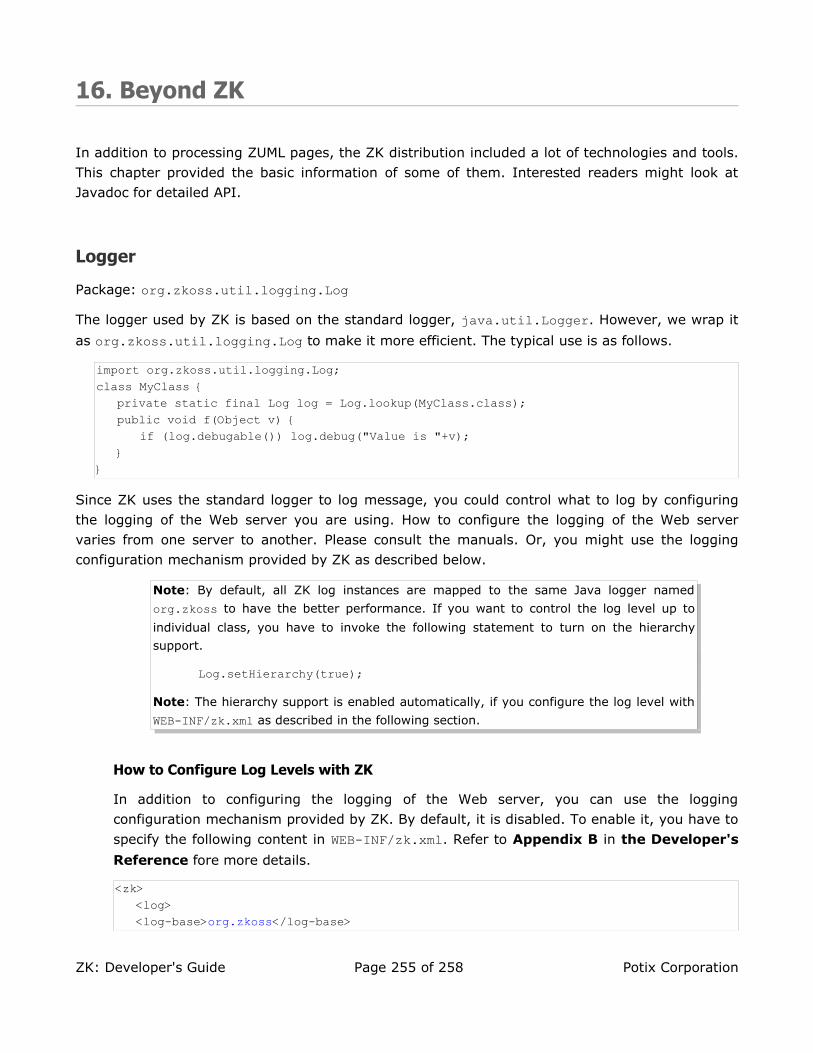
16. Beyond ZK
In addition to processing ZUML pages, the ZK distribution included a lot of technologies and tools. This chapter provided the basic information of some of them. Interested readers might look at Javadoc for detailed API.
Logger
Package: org.zkoss.util.logging.Log
The logger used by ZK is based on the standard logger, java.util.Logger. However, we wrap it
as org.zkoss.util.logging.Log to make it more efficient. The typical use is as follows.
import org.zkoss.util.logging.Log;class MyClass {
private static final Log log = Log.lookup(MyClass.class);public void f(Object v) {
if (log.debugable()) log.debug("Value is "+v);}
}
Since ZK uses the standard logger to log message, you could control what to log by configuring the logging of the Web server you are using. How to configure the logging of the Web server varies from one server to another. Please consult the manuals. Or, you might use the logging configuration mechanism provided by ZK as described below.
Note: By default, all ZK log instances are mapped to the same Java logger named
org.zkoss to have the better performance. If you want to control the log level up to
individual class, you have to invoke the following statement to turn on the hierarchy
support.
Log.setHierarchy(true);
Note: The hierarchy support is enabled automatically, if you configure the log level with
WEB-INF/zk.xml as described in the following section.
How to Configure Log Levels with ZK
In addition to configuring the logging of the Web server, you can use the logging configuration mechanism provided by ZK. By default, it is disabled. To enable it, you have to
specify the following content in WEB-INF/zk.xml. Refer to Appendix B in the Developer's
Reference fore more details.
<zk><log><log-base>org.zkoss</log-base>
ZK: Developer's Guide Page 255 of 258 Potix Corporation

</log></zk>
Alternatively, you can enable the logging configuration mechanism manually by invoking the
init method of LogService as follows.
org.zkoss.util.logging.LogService.init("org.zkoss");
If you want to log not just org.zkoss but everything, you could specify an empty log-base.
Once the mechanism is enabled, ZK looks for i3-log.conf by searching the classpath at
startup. If found, ZK loads its content to initialize the log levels. Then, ZK keeps watching this file, and reloads its content if the file is modified.
Content of i3-log.confAn example of i3-log.conf is as follows.
org.zkoss.zk.ui.impl.UiEngineImpl=FINER#Make the log level of the specified class to FINER
org.zkoss.zk.ui.http=DEBUG#Make the log level of the specified package to DEBUG
org.zkoss.zk.au.http.DHtmlUpdateServlet=INHERIT#Clear the log level of a specified class such that it inherits what#has been defined above (Default: INFO)
org.zkoss.zk.ui=OFF#Turn off the log for the specified package
org.zkoss=WARNING#Make all log levels of ZK classes to WARNING except those specified here
Allowed Levels
Level Description
OFF Indicates no message at all.
ERROR Indicates providing error messages.
WARNING Indicates providing warning messages. It also implies ERROR.
INFO Indicates providing informational messages. It also implies ERROR and WARNING.
DEBUG Indicates providing tracing information for debugging purpose. It also implies ERROR, WARNING and INFO.
FINER Indicates providing fairly detailed tracing information for debugging purpose. It also implies ERROR, WARNING, INFO and DEBUG
INHERIT Indicates to clear any level being set to the specified package or class. In other words, the log level will be the same as its parent node.
ZK: Developer's Guide Page 256 of 258 Potix Corporation

Location of i3-log.confAt first, ZK looks for this file in the classpath. If not found, it looks for the conf directory.
Application Server Location
Tomcat Place i3-log.conf under the $TOMCAT_HOME/conf directory
Others Try the conf directory first. If not working, you could set the
system property called the org.zkoss.io.conf.dir directory to be
the directory where i3-log.conf resides.
Disable All Logs
Some logs are generated before loading i3-log.conf. If you want to disable all logs
completely, you have to either configure the logging of the Web server67, or specify log-level when configuring DHtmlLayoutServlet in WEB-INF/web.xml. Refer to the
Developer's Reference for details.
<servlet><servlet-name>zkLoader</servlet-name><servlet-class>org.zkoss.zk.ui.http.DHtmlLayoutServlet</servlet-class>
<init-param><param-name>log-level</param-name><param-value>OFF</param-value>
</init-param>...
DSP
Package: org.zkoss.web.servlet.dsp
A JSP-like template technology. It takes the same syntax as that of JSP. Unlike JSP, DSP is interpreted at the run time, so it is easy to deploy DSP pages. No Java compiler is required in your run-time environment. In addition, you could distribute DSP pages in jar files. This is the way ZK is distributed.
However, you cannot embed Java codes in DSP pages. Actions of DSP, though extensible through TLD files, are different from JSP tags.
If you want to use DSP in your Web applications, you have to set up WEB-INF/web.xml to add the
following lines.
<!-- ///////////// --><!-- DSP (optional) --><servlet>
<description><
The servlet loads the DSP pages.]]></description><servlet-name>dspLoader</servlet-name><servlet-class>org.zkoss.web.servlet.dsp.InterpreterServlet</servlet-class>
<!-- Specify class-resource, if you want to access TLD defined in jar files --><init-param>
<param-name>class-resource</param-name><param-value>true</param-value>
</init-param></servlet><servlet-mapping>
<servlet-name>dspLoader</servlet-name><url-pattern>*.dsp</url-pattern>
</servlet-mapping>
Note: The mapping of the DSP loader is optional. Specify it only if you want to write Web
pages in DSP syntax.
Though standard components of ZK use DSP as a template technology, they are handled
directly by ZK loader.
Refer to the Developer's Reference for more information.
iDOM
Package: org.zkoss.idom
An implementation of W3C DOM. It is inspired by JDOM68 to have concrete classes for all XML objects, such as Element and Attribute. However, iDOM implements the W3C API, such as org.w3c.dom.Element. Thus, you could use iDOM seamlessly with XML utilities that only accept the W3C DOM.
A typical example is XSLT and XPath. You could use any of favorite XSL processor and XPath utilities with iDOM.
68 http://www.jdom.org
ZK: Developer's Guide Page 258 of 258 Potix Corporation