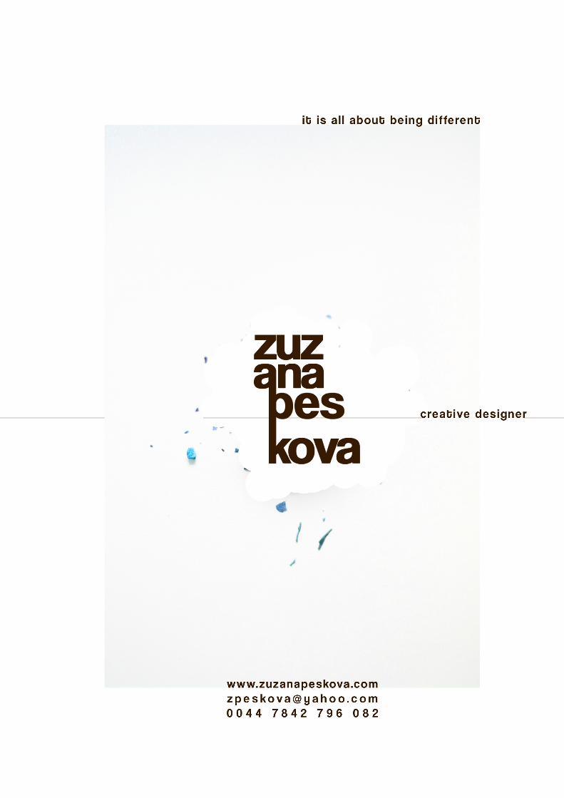
zuzana peskova portfolio
TRANSCRIPT
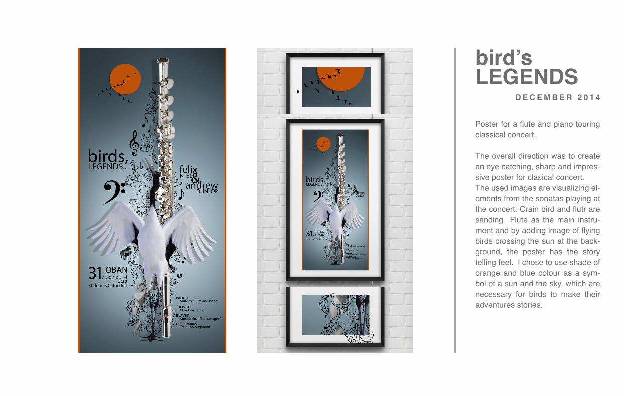
bird’sLEGENDS
D E C E M B E R 2 0 1 4
Poster for a flute and piano touring classical concert.
The overall direction was to create an eye catching, sharp and impres-sive poster for clasical concert.The used images are visualizing el-ements from the sonatas playing at the concert. Crain bird and flutr are sanding Flute as the main instru-ment and by adding image of flying birds crossing the sun at the back-ground, the poster has the story telling feel. I chose to use shade of orange and blue colour as a sym-bol of a sun and the sky, which are necessary for birds to make their adventures stories.
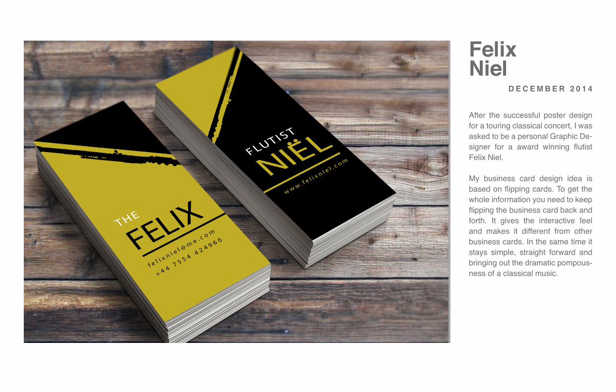
FelixNiel
D E C E M B E R 2 0 1 4
After the successful poster design for a touring classical concert, I was asked to be a personal Graphic De-signer for a award winning flutist Felix Niel.
My business card design idea is based on flipping cards. To get the whole information you need to keep flipping the business card back and forth. It gives the interactive feel and makes it different from other business cards. In the same time it stays simple, straight forward and bringing out the dramatic pompous-ness of a classical music.
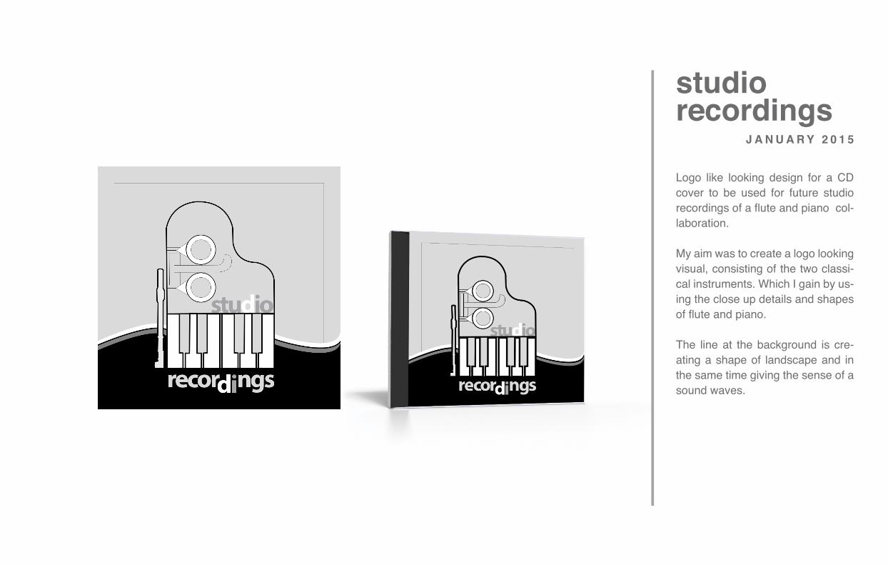
studiorecordings
J A N U A R Y 2 0 1 5
Logo like looking design for a CD cover to be used for future studio recordings of a flute and piano col-laboration.
My aim was to create a logo looking visual, consisting of the two classi-cal instruments. Which I gain by us-ing the close up details and shapes of flute and piano.
The line at the background is cre-ating a shape of landscape and in the same time giving the sense of a sound waves.
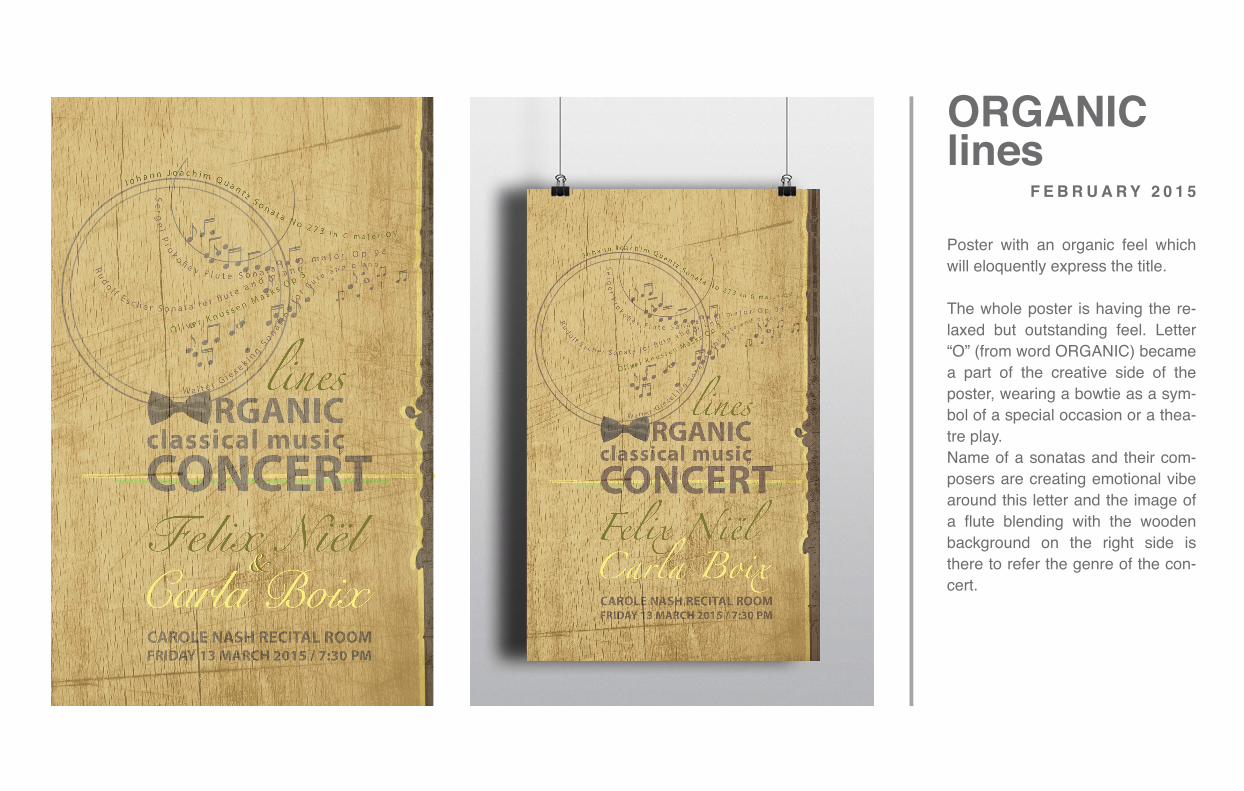
ORGANIClines
F E B R U A R Y 2 0 1 5
Poster with an organic feel which will eloquently express the title.
The whole poster is having the re-laxed but outstanding feel. Letter “O” (from word ORGANIC) became a part of the creative side of the poster, wearing a bowtie as a sym-bol of a special occasion or a thea-tre play. Name of a sonatas and their com-posers are creating emotional vibe around this letter and the image of a flute blending with the wooden background on the right side is there to refer the genre of the con-cert.
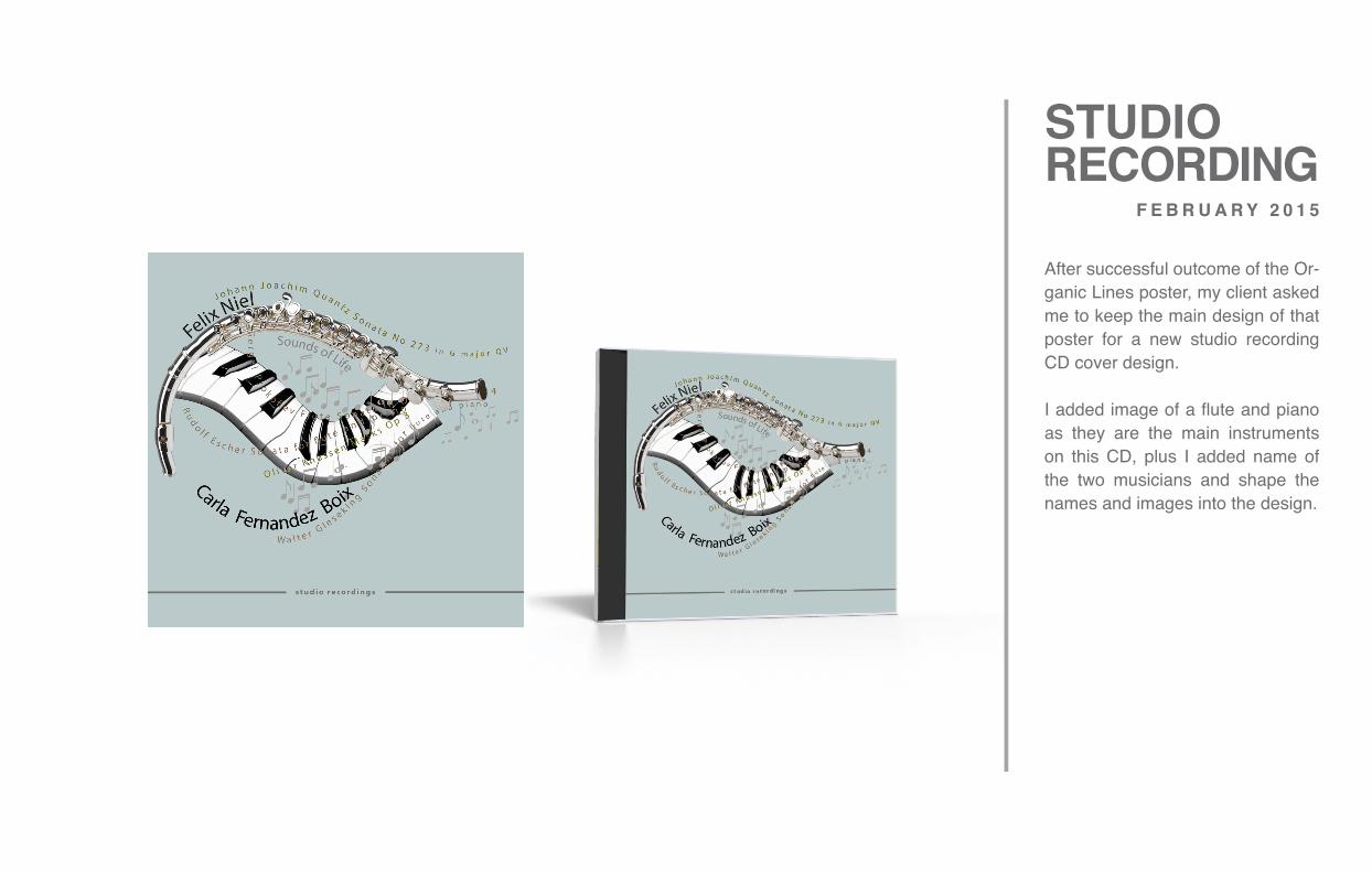
STUDIORECORDING
F E B R U A R Y 2 0 1 5
After successful outcome of the Or-ganic Lines poster, my client asked me to keep the main design of that poster for a new studio recording CD cover design.
I added image of a flute and piano as they are the main instruments on this CD, plus I added name of the two musicians and shape the names and images into the design.
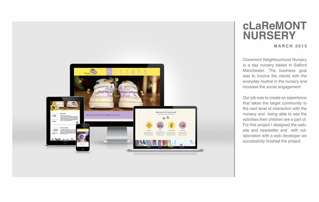
cLaReMONTNURSERY
M A R C H 2 0 1 5
Claremont Neighbourhood Nursery is a day nursery based in Salford Manchester. The business goal was to involve the clients with the everyday routine in the nursery and increase the social engagement.
Our job was to create an experience that takes the target community to the next level of interaction with the nursery and being able to see the activities their children are a part of. For this project I designed the web-site and newsletter and with col-laboration with a web developer we successfully finished the project.
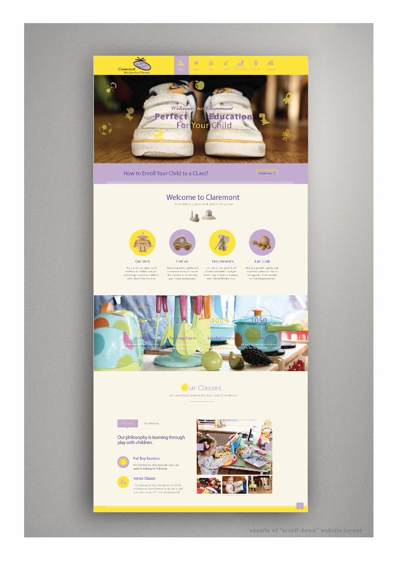
examle of “scrol l down” website layout
PH MEDIAGROUP
M A R C H 2 0 1 5
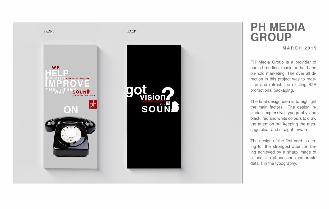
PH Media Group is a provider of audio branding, music on hold and on-hold marketing. The over all di-rection in this project was to rede-sign and refresh the existing B2B promotional packaging. The final design idea is to highlight the main factors . The design in-cludes expressive typography and black, red and white colours to draw the attention but keeping the mes-sage clear and straight forward.
The design of the first card is aim-ing for the strongest attention be-ing achieved by a sharp image of a land line phone and memorable details in the typography.
FRONT BACK
FRONT BACK
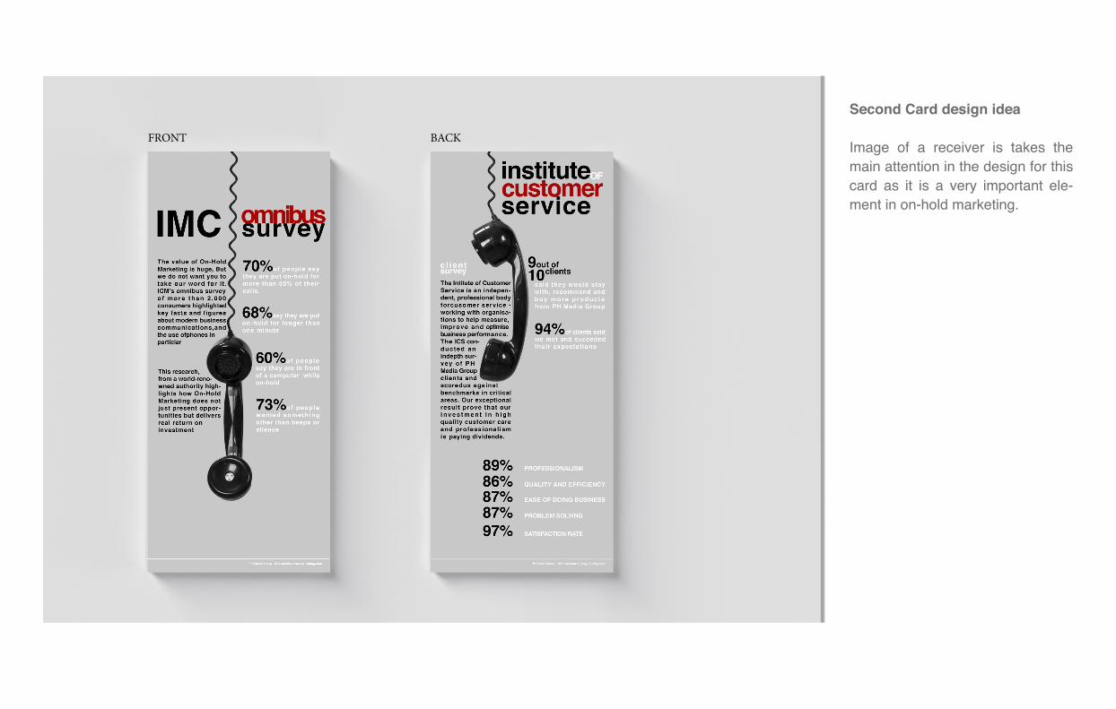
Second Card design idea
Image of a receiver is takes the main attention in the design for this card as it is a very important ele-ment in on-hold marketing.
FRONT BACK
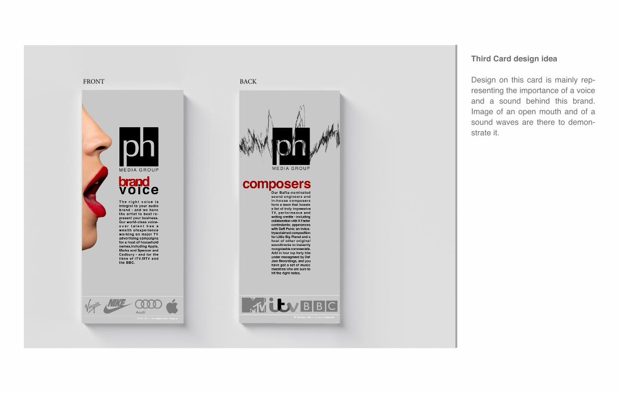
Third Card design idea
Design on this card is mainly rep-resenting the importance of a voice and a sound behind this brand. Image of an open mouth and of a sound waves are there to demon-strate it.
THERAPYFIRST
J A N U A R Y 2 0 1 5
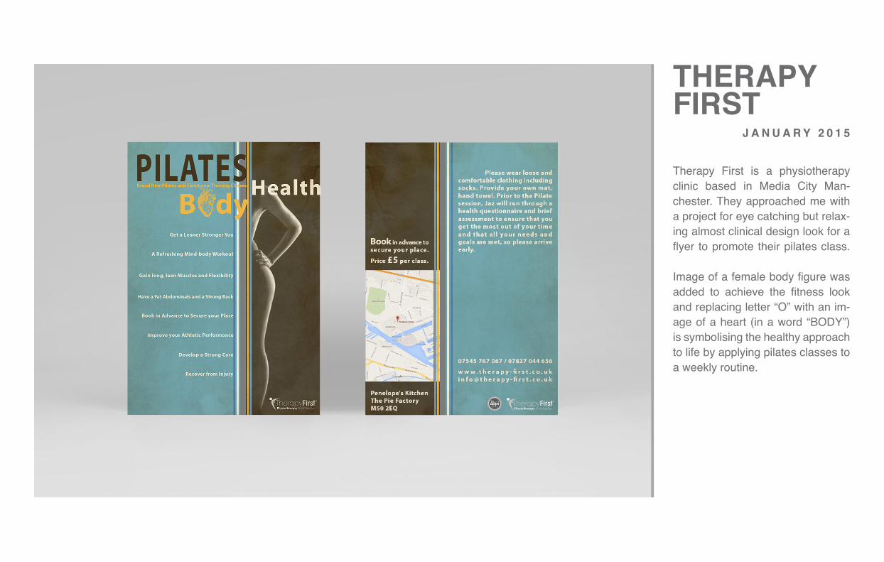
Therapy First is a physiotherapy clinic based in Media City Man-chester. They approached me with a project for eye catching but relax-ing almost clinical design look for a flyer to promote their pilates class. Image of a female body figure was added to achieve the fitness look and replacing letter “O” with an im-age of a heart (in a word “BODY”) is symbolising the healthy approach to life by applying pilates classes to a weekly routine.

bionicPETSS E P T E M E R 2 0 1 6
Logo design idea for company man-ufacturig fake limbs for mailny dogs but also any other kind of animals.
Used image of a dog having fake limb on his leg as a obvious sign of the business idea. Added font is layed out creating the harmony between each letters and used words to creat great logo.
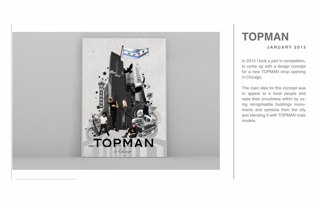
TOPMANJ A N U A R Y 2 0 1 3
In 2013 I took a part in competition, to come up with a design concept for a new TOPMAN shop opening in Chicago.
The main idea for this concept was to appeal to a local people and raise their proudness within by us-ing recognisable buildings monu-ments and symbols from the city and blending it with TOPMAN male models.
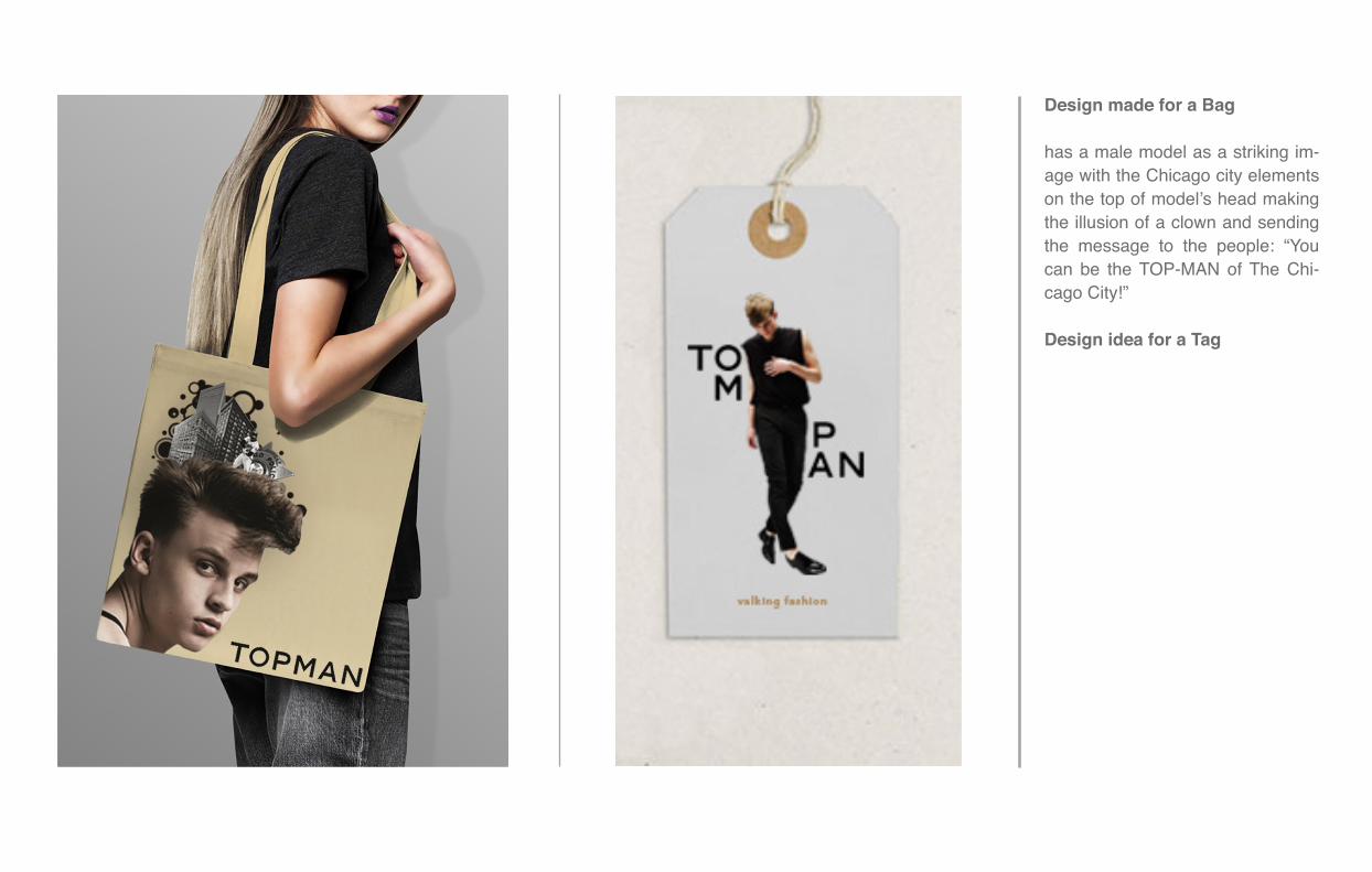
Design made for a Bag
has a male model as a striking im-age with the Chicago city elements on the top of model’s head making the illusion of a clown and sending the message to the people: “You can be the TOP-MAN of The Chi-cago City!”
Design idea for a Tag
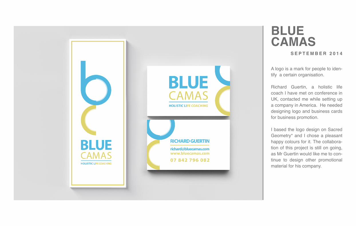
BLUECAMAS
S E P T E M B E R 2 0 1 4
A logo is a mark for people to iden-tify a certain organisation.
Richard Guertin, a holistic life coach I have met on conference in UK, contacted me while setting up a company in America. He needed designing logo and business cards for business promotion.
I based the logo design on Sacred Geometry* and I chose a pleasant happy colours for it. The collabora-tion of this project is still on going, as Mr Guertin would like me to con-tinue to design other promotional material for his company.
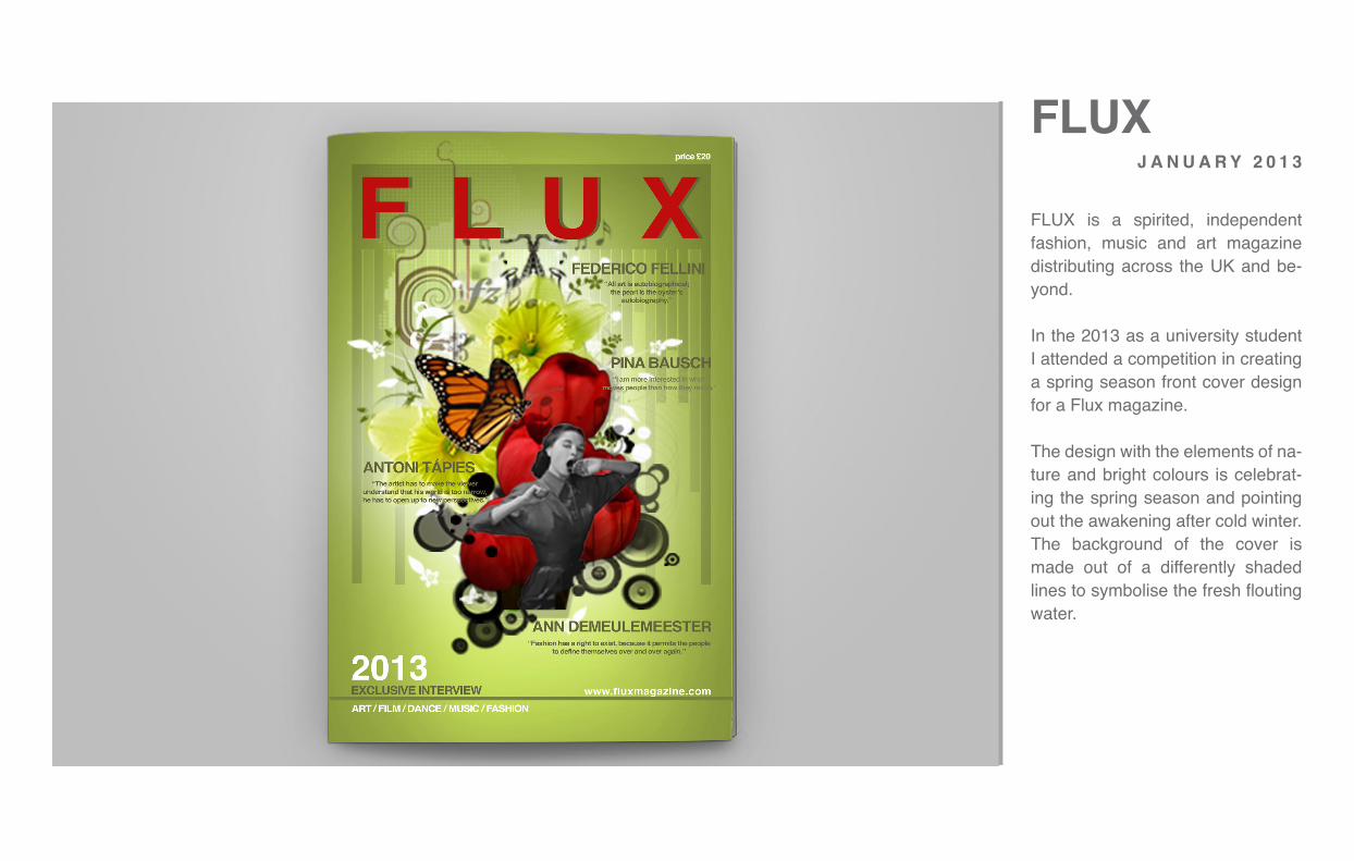
FLUXJ A N U A R Y 2 0 1 3
FLUX is a spirited, independent fashion, music and art magazine distributing across the UK and be-yond.
In the 2013 as a university student I attended a competition in creating a spring season front cover design for a Flux magazine.
The design with the elements of na-ture and bright colours is celebrat-ing the spring season and pointing out the awakening after cold winter. The background of the cover is made out of a differently shaded lines to symbolise the fresh flouting water.
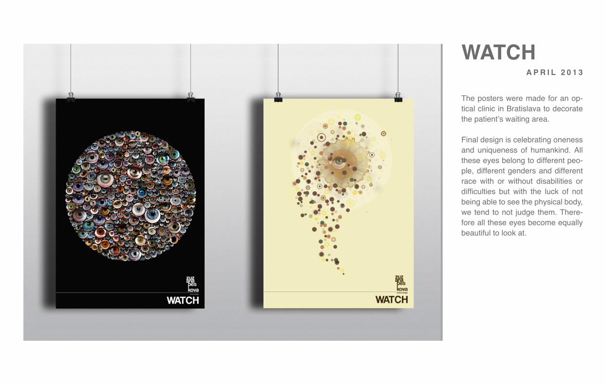
WATCHA P R I L 2 0 1 3
The posters were made for an op-tical clinic in Bratislava to decorate the patient’s waiting area.
Final design is celebrating oneness and uniqueness of humankind. All these eyes belong to different peo-ple, different genders and different race with or without disabilities or difficulties but with the luck of not being able to see the physical body, we tend to not judge them. There-fore all these eyes become equally beautiful to look at.
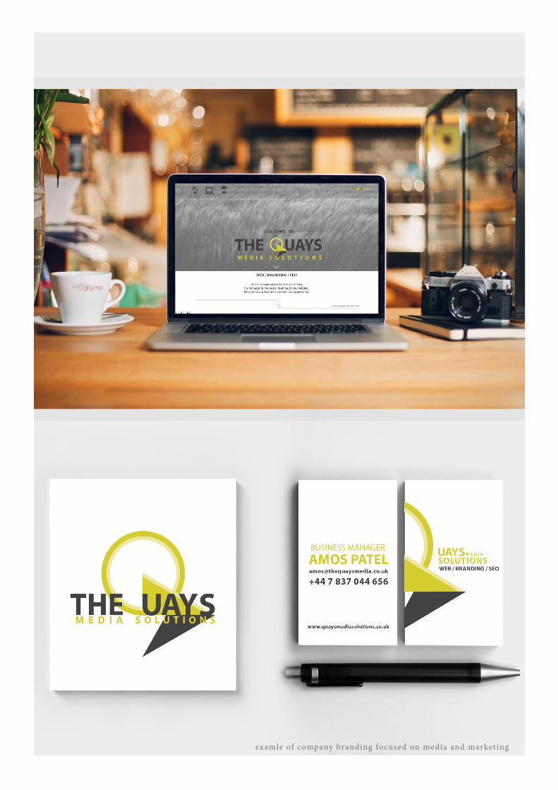
examle of company branding focused on media and marketing

personalbusiness cards
D E C E M B E R 2 0 1 4
I based the design on an idea of a pait being exhibited on a wall and having (pretended to be) a small self description on the bottom right side. The typography is strongly express-ing and promoting the profeshion of the business card ovner.
size 1.4 x 3.6 inches