© 2015 k. s. suslick the 35 th annual seminar on seminars professor kenneth s. suslick school of...
TRANSCRIPT

© 2015 K. S. Suslick
The 35th Annual
Seminar on SeminarsProfessor Kenneth S. Suslick
School of Chemical SciencesUniversity of Illinois at Urbana-Champaign
www.scs.uiuc.edu/suslick/seminaronseminars.html
Coping & Managing
Planning & Organization
Slide Format
Slide Content
The Presentation

© 2015 K. S. Suslick
Use and Redistribution Restrictions
This "Seminar on Seminars“, its contents and pptx file, in any media or format, are copyrighted.
The author grants license for use under the Creative Commons "Attribution-NonCommercial-NoDerivatives" conditions, as per http://creativecommons.org/licenses/by-nc-nd/4.0/
The terms of this license are (1) attribution with appropriate credit must be given, (2) the material must be used only for non-commercial purposes, (3) the material may be shared or redistributed in its original form as per
conditions (1) and (2), but modifications or adaptations of the material may not be distributed on the publicly accessible web or in print without prior approval, and finally
(4) I would appreciate receiving your suggestions and modifications at [email protected]

© 2015 K. S. Suslick
Caveats
Do as I say, not as I do. This presentation, of necessity, is word-heavy and graphics-light.
De gustibus non disputandum est.(There is no arguing about tastes.) These are my opinions. I could be wrong, but I’m not.
Snepscheut’s Law: In theory, there is no difference between theory and practice. But in practice, there is.
Monk’s Commentary: You’ll thank me later.

© 2015 K. S. Suslick
Coping and Managing
Public speaking:very scary for most students.
The Literature Seminar: a (relatively) safe place to develop your skills.
This “Seminar on Seminars” helps on both the big picture and the devil of the details.
© 2015 K. S. Suslick
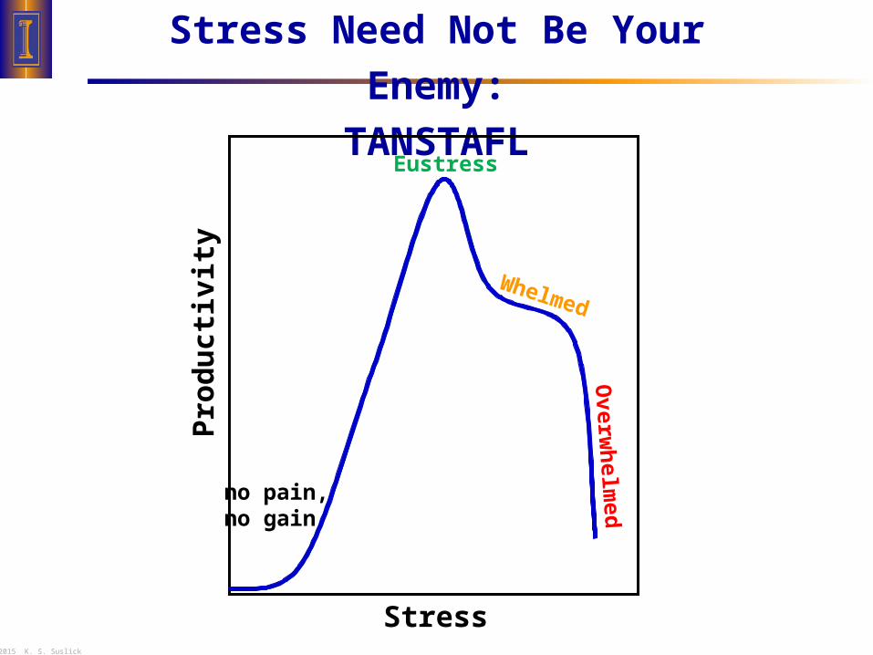
Stress Need Not Be Your Enemy:
TANSTAFLEustress
no pain,no gain
Stress
Pro
du
ctiv
ity
Overw
helm
edWhelmed

© 2015 K. S. Suslick
Managing Time
If it isn’t worth doing, it isn’t worth doing right! – KSS
Big jobs are like eating an elephant — you do it one bite at a time: Break the job into small tasks.
Make a to-do list and the list will remember for you.
Do the crappy jobs first thing and quickly.
Last daily chore: 5 min. to plan tomorrow’s day.

© 2015 K. S. Suslick
Starting and Stopping
Starting is hard due to inertia:Static friction is greater than dynamic friction.
To overcome procrastination:Do something, anything! Do your favorite part, futz with format, just type …
Distractions are tempting due to rate of change.We’re much more sensitive to slope than position.
Initiative vs. Finishitive: know when to walk away, know when to run.

© 2015 K. S. Suslick
Planning and Organization
© 2015 K. S. Suslick
Planning the Talk for Your AUDIENCE
Always keep the audience in mind.
What is THE point of your seminar?
Don’t try to tell two stories at the same time!
Why will your audience be interested?
Gear your talk at the right level.
Better to aim just a little low than too high.
© 2015 K. S. Suslick
Planning the Organization of the Talk
You are telling a story.
Tell it so they understand.
To organize your talk:
Graphics & figures first, then words.
Verbal comprehension is limited:
Tell them what you are going to tell them,
then tell them,
then tell them what you told them.

© 2015 K. S. Suslick
Outlining the Plan
YOU may need a detailed outline of the talk,
BUT your audience needs only a broad outline.
Number of sub-divisions MUST NOT be 1!
Best if >2 and <5.
Think about the logic of the flow.
You should be telling only one story, but slides
for explicit transitions between “chapters” are OK.

© 2015 K. S. Suslick
Title and Introduction
Short titles are best:
It’s a title, NOT an abstract!
1st slide:
Give the title, your name & brief outline.
2nd slide:
set the background —
Why should we care about this topic?

© 2015 K. S. Suslick
How Many Slides?
It depends on your slides!
Use low content slides and lots of them.
Present only ONE main idea per slide.
Most people plan on ~2 min/slide,
but can be <1 min/slide for images.
Be kind to the old fogeys: eyesight declines after 40.
Use big text, high contrast.
Rapid changes in light intensity become painful.

© 2015 K. S. Suslick
Who and What Are Slides For?
Slides are “visual aids” — human beings are visual, not auditory, creatures.
Slides are BOTH for you and for your audience.Complementary, but different, needs.
You need less information than you think:brief prompts will trigger detailed verbiage.
Bring your own computer, if at all possible!NEVER change from PC to Mac or vice versa.
ALWAYS, ALWAYS have your talk backed-upon a USB memory stick.

© 2015 K. S. Suslick
KIS: Keep It Simple!
A talk is NOT a full research paper.
Your job is to convince and inform,
NOT to archive.
Present enough data to establish the point,
NOT all the data possibly available.
Simplify graphics whenever possible.

© 2015 K. S. Suslick
Slide Format

© 2015 K. S. Suslick
General Format
Landscape format is standard.
Use page effectively: Fill the page, but don’t overfill.
Consider carefully your blank space. Use it to improve separation of topics, ideas, etc.
The natural tendency is to cram things too close together so that they’ll fit in the space rather than to edit the text to the bare minimum needed;
most people tend to be much too wordy and detailed in their slides, and they then go on and on
and on and on, when what they really should do is just shut up!
Avoid going to the very bottom of the slide: often not visible to audience. Last few lines may not be seen. Last few lines may not be seen.

© 2015 K. S. Suslick
Font Format: Titles 32 pt. Arial Bold
Or 36 pt., but be consistent. Avoid serif fonts: don’t use Cambria, Times New Roman, …
Use sans serif fonts: Arial, Calibra, Tahoma…
Don’t change fonts often: it’s distracting!
Major Divisions: Arial, 28 pt. bold or 26 pt. bold.Minor Divisions: Arial, 24 or 22 pt., bold usually best.Avoid text below 20 pt., generally, especially un-bolded. e.g., 16 pt.
CAPS ARE HARD TO READ FAST: avoid them.
DON’T get cute.

© 2015 K. S. Suslick
Keywords
DON’T type long, complete sentences.Avoid “read along with the bouncing ball…”
Use keywords, shorten text.
Make it easy to read: One idea per line.
Don’t break idea or phrase at end of theline.
© 2015 K. S. Suslick
Line, Paragraph Format
Leave extra line spacing between divisions.I like 1.1 line spacing with 0.5 after paragraph.
Spell-Check !!
Be consistent with punctuation at line ends.
Hanging indents are generally more readable than 1st line indentations.
1st line indentations are less readable than hanging indents.

© 2015 K. S. Suslick
Backgrounds
Avoid distracting backgrounds with graphics.
NEVER use backgrounds with ‘ghost’ text.
Avoid colored backgrounds: they reduce contrast.
Clear, unshaded backgrounds usually best.

© 2015 K. S. Suslick
Kill Bill, part 1: Microsoft Defaults
Microsoft assumes that all users are morons.
If you are not a moron, then turn off or change ALL Microsoft defaults.
Turn OFF WordWrap in Text Box. Manually break lines yourself (shift-enter).
Do resize text box to fit text! But for objects w/o text, turn off resizing.
Don’t have selection by whole words!
Show status bar, ruler, file endings….
Save your own defaults. For this template: www.scs.illinois.edu/~suslick/seminars.html
Avoid all Microsoft Design Templates! Keep logos simple and relevant.

© 2015 K. S. Suslick
Kill Bill, part 2: Graphics Overkill
Avoid over-use of bullets:
Use Solid and simple bullets. Never use “ – ” !!
Use on major level only! Indents are enough.
© Don’t distract your audience from your content.
Avoid ‘clip-art’,
especially the stupid Microsoft stuff.
DON’T get cute.

© 2015 K. S. Suslick
Color should be used judiciously for emphasis!Use vivid, readable colors with limited shades.Design artists are partial to pastels: I’m not.
Use of color is very desirable for graphs, etc.
Avoid overusing color for MOST text.Watch out for bad contrast: e.g., yellow on white, or black, red, green, etc. on dark backgrounds
DON’T GET CUTE.
Color

© 2015 K. S. Suslick
MolecularBiology
Biochem
ChemicalEngineering
Organic Physical
Analytical Inorganic
PhysOrg
Organo-met
Materials&
NanosciBioorg
Bioinorg
Chemistry in the 21st Century
Animation can be useful, but...

© 2015 K. S. Suslick
MolecularBiology
Biochem
ChemicalEngineering
Organic Physical
Analytical Inorganic
PhysOrg
Organo-met
Materials&
NanosciBioorg
Bioinorg
Chemistry in the 21st Century
Animation can be useful, but DON’T get cute.

© 2015 K. S. Suslick
Suslick’s Rule of Fist
You’re always too close to the computer monitor. Strong tendency to over-stuff slides.
Much better to have less per slide with more slides.
Get far enough away from the screenso that, with your arm fully extended,your fist blocks the whole slide.
*or make the magnification small enough: ~33%
Slides legible at that distance will be visible even at back of the hall.
*
© 2015 K. S. Suslick
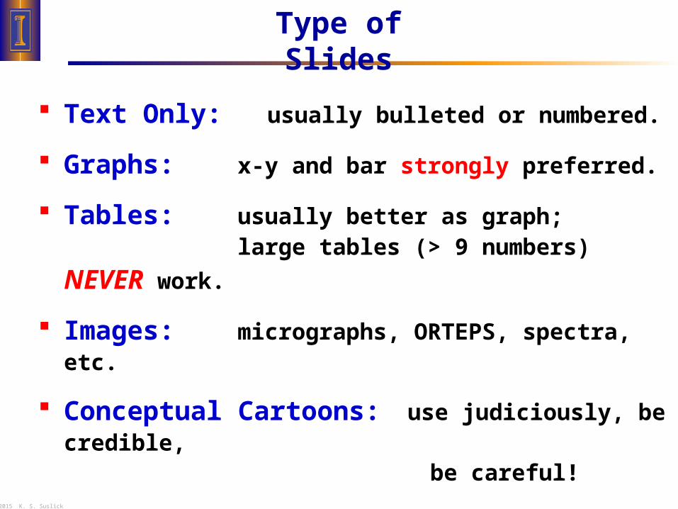
Type of Slides
Text Only: usually bulleted or numbered.
Graphs: x-y and bar strongly preferred.
Tables: usually better as graph;
large tables (> 9 numbers) NEVER work.
Images: micrographs, ORTEPS, spectra, etc.
Conceptual Cartoons: use judiciously, be credible, be careful!

© 2015 K. S. Suslick
Type of Graphs and Tables
ALWAYS label axes! ALWAYS show units!
Use Strong Colors. Avoid complex hatch markings.
Keep it Simple: 3-D graphs usually don’t work well. Avoid novel graph forms.
1st Qtr 2nd Qtr 3rd Qtr 4th Qtr0
20
40
60
80
100
X-axis Title
Y-a
xis
Tit
le (
un
its
)
Eas
t
Wes
t
Nor
th
1st Qtr2nd Qtr
3rd Qtr4th Qtr
0102030405060708090
East
West
North
X-axis Title
Y-a
xis
Tit
le

© 2015 K. S. Suslick
Format of Graphs
Add a conclusions statement below: Give the Bottom Line.
East
West
North
0
10
20
30
40
50
60
70
80
90
100
0 {16 point} 2 3 4 5
X-axis Title (units) {20 point font}
Y T
itle
Bo
d (
un
its)
North
West
East
(avoid “key” boxes when
possible)
TURN OFF autoscale. Fill slide well; use empty space cleverly.
ALWAYS usethick lines (3 pt)& strong colors.
© 2015 K. S. Suslick
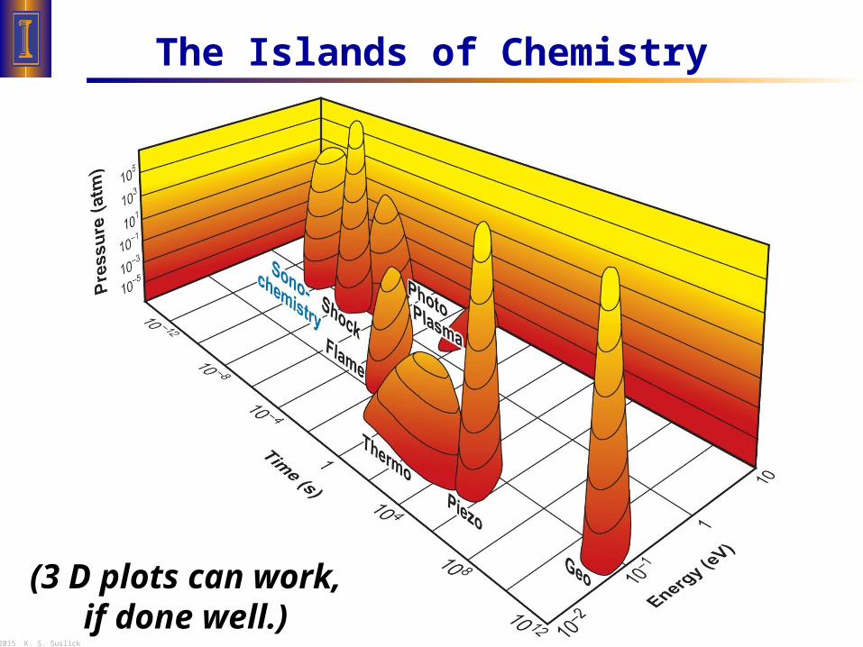
The Islands of Chemistry
(3 D plots can work,if done well.)

© 2015 K. S. Suslick
Micrographs Can Project Well
Give information with image:
Amorphous Fe Sonicated Fe(CO)5
in C16H34, under Ar,
25oC, 20 KHz, 80 W
ALWAYS provide size scale.
Too high resolution imageswill slow slide changing! Use medium quality jpeg or png(not tiff), at 200 dpi(unless copying from a very small original).
100 nm

© 2015 K. S. Suslick
Slide Content

© 2015 K. S. Suslick
Spectra & Raw Data
Spectroscopic data can provide credibility. Spectra must be well labeled (units!).
Label important assignments. Highlight with color.
Provide chemical structure with spectrum.
BE SURE your spectrum means what you say it
does!
ORTEPs vs. computer models. Designate x-ray structures vs. computer models.
Give the chemical structure or formula.
Don’t overdo it. Too many spectra will obscure the big issues.

© 2015 K. S. Suslick
Jargon & Abbreviations
Avoid jargon – you’ll lose your audience.
Use rational abbreviations, sparingly.
Watch out for TLA’s
and FOLA’s
If there are lots of abbreviations,
use a separate slide for them.
Consider using a second projector (or overhead)
or even a separate handout.
(three letter abbreviations)
(four letter acronyms)

© 2015 K. S. Suslick
Equations
Keep them simple.Remember, your goal is to convince, not ‘prove’.
Proofs belong in written work, not in presentation.
Only show the important equations, limit details.
Define all symbols:Always keep in mind your audience’s ignorance!
Make the equations big enough.Sub- and superscripts are often too small.

© 2015 K. S. Suslick
References
If you use someone else’s data or figure,
you MUST provide the citation.*
It’s always nice to point your audience
to lead references, especially if they are yours.
Don’t cluster references on a single slide.Give them one or two per slide when relevant,
so the audience can jot them down.
*14 point or 16 point at the bottom of the slide is OK. Smith et al., Nature, 2014, 133, 1451.

© 2015 K. S. Suslick
Humor
Be very, very careful.
Many scientists are badly humor impaired. (A defect not covered by the Americans with Disabilities Act.)
Visual humor often best,
especially for an international audience.
Rank has its privileges:
The more senior you are,
the more you can get away with.(i.e., the boss’s jokes always get more laughs.)
© 2015 K. S. Suslick
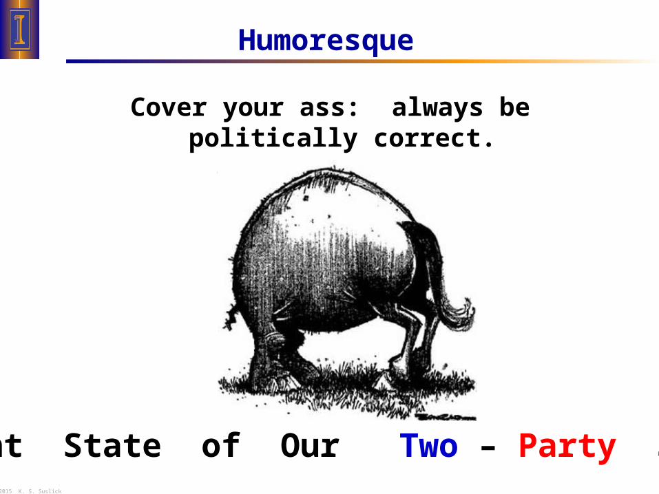
Humoresque
Cover your ass: always be politically correct.(Well, almost always.)
Current State of Our Two – Party System

© 2015 K. S. Suslick
Humor
Make sure it’s appropriate for the occasion.

© 2015 K. S. Suslick
The Presentation

© 2015 K. S. Suslick
How Long?
Practice talks are always s l o w e rthan real presentations: adrenaline rush!
DON’T go more than 50 min. (After 55 min., your audience stops listening and starts wondering about their bus, bladders, …)
At meetings, KEEP to the schedule!
Don’t worry if your audience starts leaving —worry when they start coming at you!

© 2015 K. S. Suslick
Practice Talks
“Be prepared.” It’s hard to practice too much.
Your goal is to communicate naturally.Stream of consciousness doesn’t work.A written script won’t work, either – too boring.
Get some friends to hear the talk, AFTER you’ve already practiced a little bit.
Listen to their feedback. Don’t be defensive:if they’re confused, your real audience will be too.
Watch out for “um”, “O.K.”, “you know”, and other distracting habits.

© 2015 K. S. Suslick
Pointers for Pointers
Bring your own laser pointer.
Green is great. Red ok if 640 nm, NOT 670 nm.
DON’T keep the laser on all the time.Push the button only sparingly!
Don’t get the shakes. Use two hands if needed.
Always carry an extra set of batteries.Tygon tube connector prevents shorts.

© 2015 K. S. Suslick
The Room
Know your room in advance.
Figure out the best lighting BEFORE the talk!
Think about where to stand.
Don’t block out screen from audience.
Best to be in the open, away from podium.
With a tablet (or transparencies), point at the screen,
NOT at the tablet! Audiences look where you do.
© 2015 K. S. Suslick
Presenting
Slow down!
Modulate the voice: don’t drone in MONOTONE.
Be loud enough to be heard, even in the back.(This may seem to you to be TOO LOUD!)
Speak towards audience, not towards screen!
Keep eye contact with all of audience.

© 2015 K. S. Suslick
Attitude
Relax and be modestly confident. Remember: You know more than they do about your talk.
Don’t be defensive.
Don’t be condescending.
Don’t try to impress, try to INFORM.An informed audience will BE impressed. Audiences can smell bullshit.
Don’t share your anxiety – it’s contagious!
Do show enthusiasm – it’s contagious!

© 2015 K. S. Suslick
Coming to Conclusions: Knowledge
“Knowledge is the small part of ignorance that we arrange and classify.” — Ambrose Bierce
Knowledge is not memorization of facts, it is the organization of the facts.
Knowledge is not the data, it is the structure that connects the data.

© 2015 K. S. Suslick
The Conclusions Slide
The conclusions slide should present knowledge.
Verbal comprehension is limited: The Conclusions Slide should tell them what you told them.
Present only the TAKE-HOME messages: i.e., what they should remember in 1 month.
Keywords, NOT long sentences.

© 2015 K. S. Suslick
Don’t be defensive!
Make your answers as short and to the point as you can.
If you don’t understand a question, ask for rephrasing.
“I was gratified to be able to answer promptly. I said I didn't know.” — Mark Twain
Q and A: Managing Ignorance

© 2015 K. S. Suslick
Acknowledgments and Ending
Note American spelling of “acknowledgments”.
Make it brief and to the point.
Let the audience know when you are done!
Best closing line:
“And finally, I’d like to thank you for your very kind attention.”
( Then, shut up and wait for the applause! )