· web viewearth 104 activity: global energy consumption, carbon emissions, and climate in this...
TRANSCRIPT

Earth 104 Activity: Global Energy Consumption, Carbon Emissions, and Climate
In this activity, we will explore the relationships between global population, energy consumption, carbon emissions, and the future of climate. The primary goal is to understand what it will take to get us to a sustainable future. We will see that there is a chain of causality here — the future of climate depends on the future of carbon emissions, which depends on the global demand for energy, which in turn depends on the global population. Obviously, controlling global population is one way to limit carbon emissions and thus avoid dangerous climate change, but there are other options too — we can affect the carbon emissions by limiting the per capita (per person) demand for energy through improved efficiencies and by producing more of our energy from “greener” sources. By exploring these relationships in a computer model, we can learn what kinds of changes are needed to limit the amount of global warming in the next few centuries.
Review of Energy Units
Before going ahead, we need to make sure we all have a clear picture of the various units we use to measure energy.
Joule — the joule (J) is the basic unit of energy, work done, or heat in the SI system of units; it is defined as the amount of energy, or work done, in applying a force of one Newton over a distance of one meter. One way to think of this is as the energy needed to lift a small apple (about 100 g) one meter. An average person gives off about 60 J per second in the form of heat. We are going to be talking about very large amounts of energy, so we need to know about some terms that are used to describe larger sums of energy:
103 J 1e3 J kJ kilojoule106 J 1e6 J MJ megajoule109 J 1e9 J GJ gigajoule1012 J 1e12 J TJ terajoule1015 J 1e15 J PJ petajoule1018 J 1e18 J EJ exajoule1021 J 1e21 J ZJ zettajoule1024 J 1e24 J YJ yottajoule
In recent years, we humans have consumed about 518 EJ of energy per year, which is something like 74 GJ per person per year.
British Thermal Unit — the btu is another unit of energy that you might run into. One btu is the amount of energy needed to warm one pound of water one °F. One btu is equal to about 1055 joules of energy. Oddly, some branches of our government still use the btu as a measure of energy.
Watt — the watt (W) is a measure of power and is closely related to the Joule; it is the rate of energy flow, or joules/second. For instance, a 40 W light bulb uses 40 joules of energy per second, and the average sunlight on the surface of Earth delivers 343 W over every square meter of the surface.
Kilowatthours — when you (or you parents maybe for now) pay the electric bill each month, you get charged according to how much energy you used, and they express this in the form of kilowatthours — kWh. This is really a unit of energy, not power:
1 [kWh ]=1000 [W ]×1 [hr ]=1000[ Js ]×3600 [s ]=3,600,000 [J ]
In other words, one kilowatthour is 1000 joules per second (kW) summed up over one hour (3600 seconds), which is the same as 3.6 MJ or 3.6 x 10⁶ J or 3.6e6 J.
Global Energy Sources
The energy we use to support the whole range of human activities comes from a variety of sources, but as you all know, fossil fuels (coal, oil, and natural gas) currently provide the majority of our energy on a global basis, supplying about 81% of the energy we use:
Oil34%
Coal27%
Gas21%
Nuclear6%
Hydro2%
Solar, Wind, Other11%
Sources of Global Energy
Figure 1. The current contributions to our global energy from different sources shows that fossil fuels account for 81% of our energy . Data from International Energy Agency (iea.org)
Credit: David Bice

The non-fossil fuel sources include nuclear, hydro (dams with electrical turbines attached to the outflow), solar (both photovoltaic and solar thermal), and a variety of other sources. These non-fossil fuel sources currently supply about 19% of the total energy.
The percentages of our energy provided by these different sources has clearly changed over time and will certainly change in the future as well. The graph below gives us some sense of how dramatically things have changed over the past 210 years:
1800 1850 1900 1950 20000
20
40
60
80
100
120
140
160
Global Energy Consumption by Source
Biofuels
Coal
Crude Oil
Natural Gas
Hydro Electricity
Nuclear Electricity
Year
Ener
gy (
EJ)
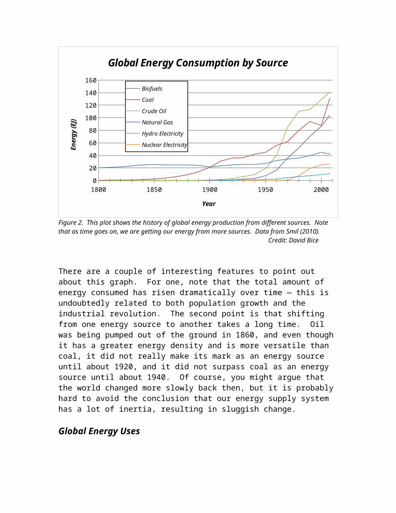
Figure 2. This plot shows the history of global energy production from different sources. Note that as time goes on, we are getting our energy from more sources. Data from Smil (2010).
Credit: David Bice
There are a couple of interesting features to point out about this graph. For one, note that the total amount of energy consumed has risen dramatically over time — this is undoubtedly related to both population growth and the industrial revolution. The second point is that shifting from one energy source to another takes a long time. Oil was being pumped out of the ground in 1860, and even though it has a greater energy density and is more versatile than coal, it did not really make its mark as an energy source until about 1920, and it did not surpass coal as an energy source until about 1940. Of course, you might argue that the world changed more slowly back then, but it is probably hard to avoid the conclusion that our energy supply system has a lot of inertia, resulting in sluggish change.
Global Energy Uses
We are all aware of some of the ways we use energy — heating and cooling our homes, transporting ourselves via car, bus, train, or plane — but there are many other uses of energy that we tend not to think about. For instance, growing food and getting it onto your plate uses energy — think of the farming equipment, the food processing plant, the transportation to your local store. Or, think of manufactured items — to make something like a car requires energy to extract the raw materials from the earth and then assembling them requires a great deal of energy. So, when you consider all of the different uses of energy, we see a dominance of industrial uses:
Industry52%
Transport26%
Commerical8%
Residential14%
Global Energy End Use
Figure 3. Most of our energy is used in industrial applications, mainly in the form of electricity. We are generally the most aware of our use of energy in transportation because we pay for it on a regular basis. Data from International Energy Agency (iea.org)
Credit: David Bice
Global Energy Consumption
Since we are going to be modeling the future of global energy consumption, we should first familiarize ourselves with the recent history of energy consumption.

18001820
18401860
18801900
19201940
19601980
20000
50
100
150
200
250
300
350
400
450
500
History of Global Energy Consumption
Nuclear ElectricityHydro ElectricityNatural GasCrude OilCoalBiofuels
Year
Exaj
oule
s (1
e18
J)
Figure 4. This plot shows the history of global energy production from different sources. Note that as time goes on, we are getting our energy from more sources. Data from Smil (2010).
Credit: David Bice
Question: Why has our energy consumption increased over this time period?
Here, we will explore a few possibilities, the first of which is global population increase — more people on the planet leads to more total energy consumption. To evaluate this, we need to plot the global population and the total energy consumption on the same graph to see if the rise in population matches the rise in energy consumption.

1800 1850 1900 1950 20000
50
100
150
200
250
300
350
400
450
500
0.800
1.800
2.800
3.800
4.800
5.800
6.800
Energy Consumption and Population
Year
Ener
gy C
onsu
mpt
ion
(EJ)
Pop
ulat
ion
in B
illi
ons
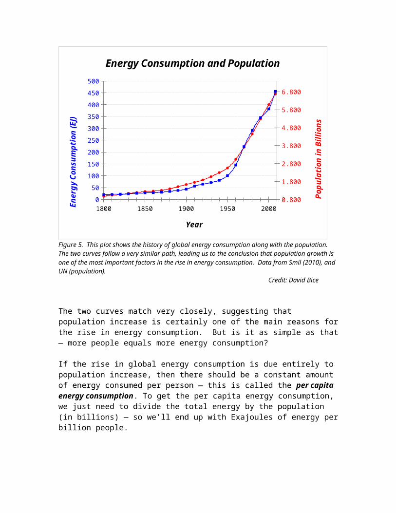
Figure 5. This plot shows the history of global energy consumption along with the population. The two curves follow a very similar path, leading us to the conclusion that population growth is one of the most important factors in the rise in energy consumption. Data from Smil (2010), and UN (population).
Credit: David Bice
The two curves match very closely, suggesting that population increase is certainly one of the main reasons for the rise in energy consumption. But is it as simple as that — more people equals more energy consumption?
If the rise in global energy consumption is due entirely to population increase, then there should be a constant amount of energy consumed per person — this is called the per capita energy consumption. To get the per capita energy consumption, we just need to divide the total energy by the population (in billions) — so we’ll end up with Exajoules of energy per billion people.
18001810
18201830
18401850
18601870
18801890
19001910
19201930
19401950
19601970
19801990
20002008
0
10
20
30
40
50
60
70
80
BiofuelsBiofuelsBiofuelsBiofuelsBiofuelsBiofuelsBiofuelsBiofuelsBiofuelsBiofuelsBiofuelsBiofuelsBiofuelsBiofuelsBiofuelsBiofuelsBiofuelsBiofuelsBiofuelsBiofuelsBiofuelsBiofuels
CoalCoalCoalCoalCoalCoalCoalCoalCoalCoalCoalCoalCoalCoalCoalCoalCoalCoalCoalCoalCoalCoal
Crude Oil
Crude OilCrude OilCrude OilCrude OilCrude OilCrude OilCrude OilCrude OilCrude OilCrude OilCrude OilCrude OilCrude OilCrude OilCrude Oil
Crude OilCrude OilCrude OilCrude Oil
Crude OilCrude Oil
Natural Gas
Natural GasNatural GasNatural GasNatural GasNatural GasNatural GasNatural GasNatural GasNatural GasNatural GasNatural GasNatural GasNatural GasNatural Gas
Natural Gas
Natural Gas
Natural GasNatural Gas
Natural GasNatural Gas
Natural GasHydro
Hydro ElectricityHydro ElectricityHydro ElectricityHydro ElectricityHydro ElectricityHydro ElectricityHydro ElectricityHydro ElectricityHydro ElectricityHydro ElectricityHydro ElectricityHydro ElectricityHydro ElectricityHydro Electricity
Hydro Electricity
Hydro Electricity
Hydro ElectricityHydro ElectricityHydro Electricity
Hydro ElectricityHydro Electricity
Nuclear Electricity
Nuclear ElectricityNuclear ElectricityNuclear ElectricityNuclear ElectricityNuclear ElectricityNuclear ElectricityNuclear ElectricityNuclear ElectricityNuclear ElectricityNuclear ElectricityNuclear ElectricityNuclear ElectricityNuclear ElectricityNuclear Electricity
Nuclear Electricity
Nuclear Electricity
Nuclear ElectricityNuclear ElectricityNuclear Electricity
Nuclear ElectricityNuclear Electricity
History of Per Capita Energy Consumption
Year
Exaj
oule
s pe
r B
illi
on
Figure 6. The globally averaged per capita energy consumption, broken down by energy source. The big rise starts in the 1940s, following WWII. The per capita consumption levels off for a bit during the 1980s and 1990s, but then rises again more recently. Data from Smil (2010), and UN (population).
Credit: David Bice
Today, we use about 3 times as much energy per person than in 1900, which is not such a surprise if you consider that we have many more sources of energy available to us now compared to 1900. Note that at the same time that the population really takes off (see Fig. 5), the per capita energy consumption also begins to rise. This means that the total global energy consumption rises due to both the population and the demand per person for more energy.
Let’s try to understand this per capita energy consumption a bit better. We know that the global average is 74 EJ per billion people, but how does this value change from place to place? There are some huge variations across the globe — Afghans use about 4 GJ per person per year, which Icelanders use 709 GJ per person. Why does it vary so much? Is it due to the level of economic development, or the availability of energy, or the culture, or the climate? You can come up with reasons why each of these factors (and others) might be important, but let’s examine one in more detail — the economic development, expressed as the GDP (the gross domestic product, which reflects the size of the economy) per capita.
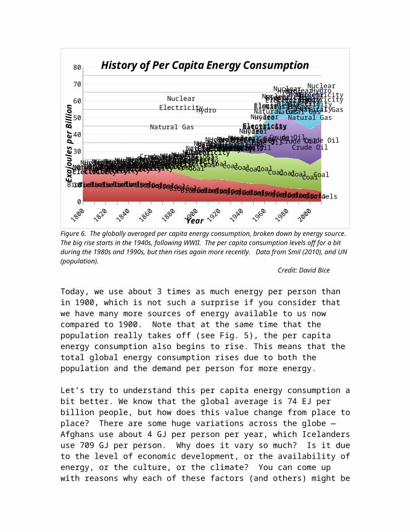
Figure 7. The per capita energy as a function of the per capita GDP. The axes of this plot are not linear, but logarithmic in order to show more clearly what is going on at the lower values. If you plot this with linear axes, the data mostly form a big cloud in the lower left. The red squares show the global averages in 2013 and about 1950. Data World Bank.
Credit: David Bice
The obvious linear trend to these data suggest that per capita energy consumption is a function of GDP, while the fact that it is not a tight line tells us that GDP is not the whole story in terms of explaining the differences in energy consumption. Not surprisingly, we are near the upper right of this plot, consuming more than 300 GJ per person per year. Iceland’s economy is not as big per person as ours and yet they consume vast amounts of energy per person, partly because it is cold and they have big heating demands, but also because they have abundant, inexpensive geothermal energy, thanks to the fact that they live on a huge volcano. Many European countries with strong economies (e.g., Germany) use far less energy per person than we do (168 GJ compared to our 301 GJ), in part because they are more efficient than us and in part because they are smaller, which cuts down on their transportation. A big part of the reason they are more efficient than us is that energy costs more over there — for instance, a gallon of gas in Italy is about $8. Our neighbor, Mexico, has a per capita energy consumption that is just about the global average.
Pay attention to the two red squares in Fig. 7 — these show the global averages in terms of GDP and energy consumption per person for two points in time. The trend is most definitely towards increasing GDP (meaning increasing economic development) and increasing energy consumption per person. Economic development is definitely a good thing because it is tied to all sorts of indicators of a

higher quality of life — better education, better health care, better diet, increased life expectancy, and lower birth rates. But, economic growth has historically come with higher energy consumption, and that means higher carbon emissions.
Now that we’ve seen what some of the patterns and trends are, we are ready to think about the future.
Creating an Emissions Scenario
There are many ways to meet our energy demands for the future, and each way could include different choices about how much of each energy source we will need. We’re going to refer to these “ways” as scenarios — hypothetical descriptions of our energy future. Each scenario could also include assumptions about how the population will change, how the economy will grow, how much effort we put into developing new technologies and conservation strategies. Each scenario can be used to generate a history of emissions of CO2, and then we can plug that into a climate model to see the consequences of each scenario.
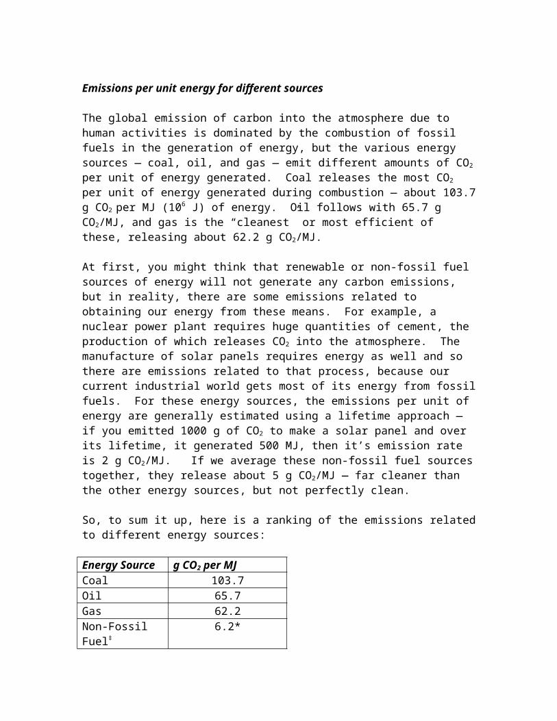
Emissions per unit energy for different sources
The global emission of carbon into the atmosphere due to human activities is dominated by the combustion of fossil fuels in the generation of energy, but the various energy sources — coal, oil, and gas — emit different amounts of CO2 per unit of energy generated. Coal releases the most CO2 per unit of energy generated during combustion — about 103.7 g CO2 per MJ (106 J) of energy. Oil follows with 65.7 g CO2/MJ, and gas is the “cleanest” or most efficient of these, releasing about 62.2 g CO2/MJ.
At first, you might think that renewable or non-fossil fuel sources of energy will not generate any carbon emissions, but in reality, there are some emissions related to obtaining our energy from these means. For example, a nuclear power plant requires huge quantities of cement, the production of which releases CO2 into the atmosphere. The manufacture of solar panels requires energy as well and so there are emissions related to that process, because our current industrial world gets most of its energy from fossil fuels. For these energy sources, the emissions per unit of energy are generally estimated using a lifetime approach — if you emitted 1000 g of CO2 to make a solar panel and over its lifetime, it generated 500 MJ, then it’s emission rate is 2 g CO2/MJ. If we average these non-fossil fuel sources together, they release about 5 g CO2/MJ — far cleaner than the other energy sources, but not perfectly clean.
So, to sum it up, here is a ranking of the emissions related to different energy sources:
Energy Source g CO2 per MJCoal 103.7Oil 65.7Gas 62.2Non-Fossil Fuel‡ 6.2*‡: Hydro, Nuclear, Wind, Solar*: this will decrease as the non-fossil fuel fraction increases
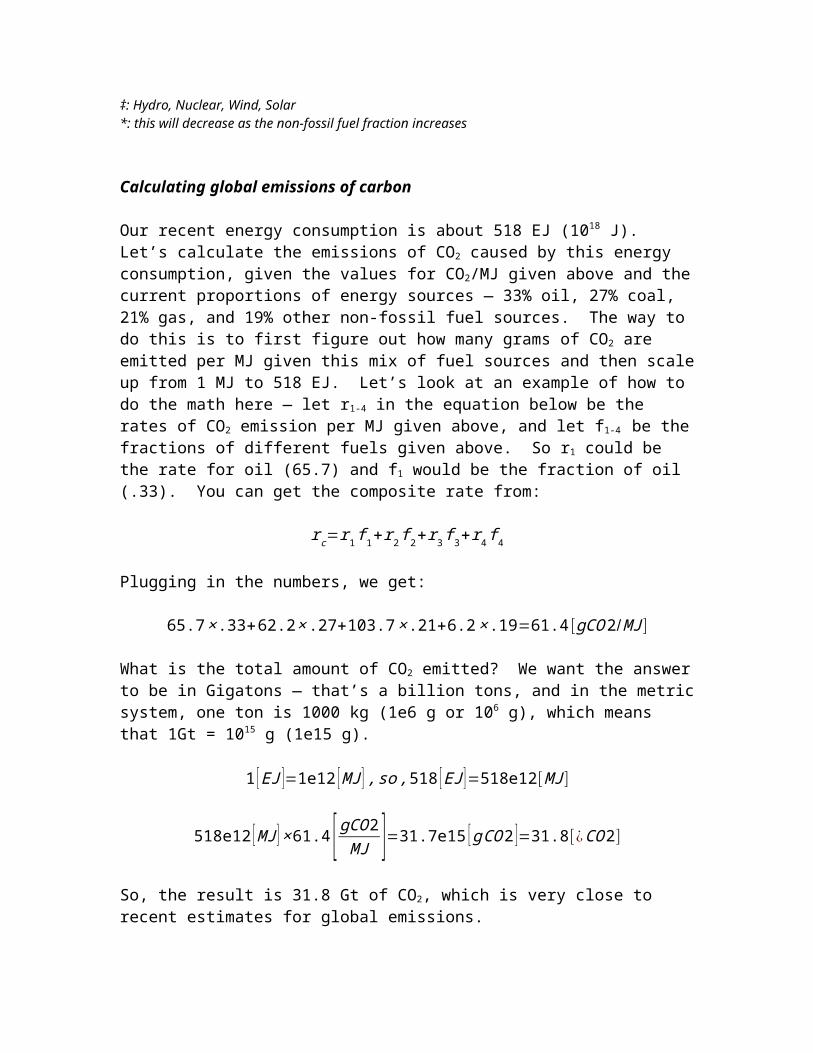
Calculating global emissions of carbon
Our recent energy consumption is about 518 EJ (1018 J). Let’s calculate the emissions of CO2 caused by this energy consumption, given the values for CO2/MJ given above and the current proportions of energy sources — 33% oil, 27% coal, 21% gas, and 19% other non-fossil fuel sources. The way to do this is to first figure out how many grams of CO2 are emitted per MJ given this mix of fuel sources and then scale up from 1 MJ to 518 EJ. Let’s look at an example of how to do the math here — let r1-4 in the equation below be the rates of CO2 emission per MJ given above, and let f1-4 be the fractions of different fuels given above. So r1 could be the rate for oil (65.7) and f1 would be the fraction of oil (.33). You can get the composite rate from:
rc=r1 f 1+r2 f 2+r3 f 3+r 4 f 4
Plugging in the numbers, we get:
65.7× .33+62.2× .27+103.7× .21+6.2× .19=61.4[ gCO2/MJ ]
What is the total amount of CO2 emitted? We want the answer to be in Gigatons — that’s a billion tons, and in the metric system, one ton is 1000 kg (1e6 g or 106 g), which means that 1Gt = 1015 g (1e15 g).
1 [EJ ]=1e12 [MJ ] , so ,518 [EJ ]=518e12[MJ ]
518e12 [MJ ]×61.4 [ gCO2MJ ]=31.7e15 [ gCO 2 ]=31.8[¿CO2]
So, the result is 31.8 Gt of CO2, which is very close to recent estimates for global emissions.
It is more common to see the emissions expressed as Gt of just C, not CO2, and we can easily convert the above by multiplying it by the atomic weight of carbon divided by the molecular weight of CO2, as follows:
31.8 [¿CO2 ]× 12[gC ]44[ gCO2]
=8.7 [¿C ]
And remember that this is the annual rate of emission.
Let’s quickly review what went into this calculation. We started with the annual global energy consumption at the present, which we can think of as being the product of the global population times the per capita energy consumption. Then we calculated the amount of CO2 emitted per MJ of energy, based on different fractions of coal, oil, gas, and non-fossil energy sources — this is the emissions rate. Multiplying the emissions rate times the total energy consumed then gives us the global emissions of either CO2 or just C.
We now see what is required to create an emissions scenario:1) A projection of global population2) A projection of the per capita energy demand3) A projection of the fractions of our energy provided by different sources4) Emissions rates for the various energy sources
In this list, the first three are variables — the 4th is just a matter of chemistry. So, the first three constitute the three principal controls on carbon emissions.
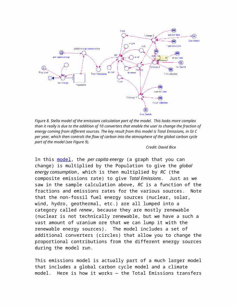
Here is a diagram of a simple model that will allow us to set up emissions scenarios for the future:
Figure 8. Stella model of the emissions calculation part of the model. This looks more complex than it really is due to the addition of 10 converters that enable the user to change the fraction of energy
coming from different sources. The key result from this model is Total Emissions, in Gt C per year, which then controls the flow of carbon into the atmosphere of the global carbon cycle part of the model (see Figure 9).
Credit: David Bice
In this model, the per capita energy (a graph that you can change) is multiplied by the Population to give the global energy consumption, which is then multiplied by RC (the composite emissions rate) to give Total Emissions. Just as we saw in the sample calculation above, RC is a function of the fractions and emissions rates for the various sources. Note that the non-fossil fuel energy sources (nuclear, solar, wind, hydro, geothermal, etc.) are all lumped into a category called renew, because they are mostly renewable (nuclear is not technically renewable, but we have a such a vast amount of uranium ore that we can lump it with the renewable energy sources). The model includes a set of additional converters (circles) that allow you to change the proportional contributions from the different energy sources during the model run.
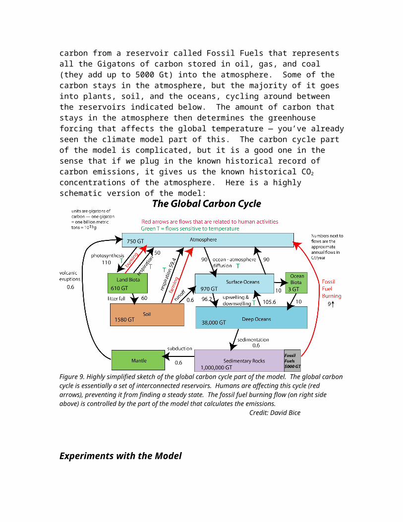
This emissions model is actually part of a much larger model that includes a global carbon cycle model and a climate model. Here is how it works — the Total Emissions transfers carbon from a reservoir called Fossil Fuels that represents all the Gigatons of carbon stored in oil, gas, and coal (they add up to 5000 Gt) into the atmosphere. Some of the carbon stays in the atmosphere, but the majority of it goes into plants, soil, and the oceans, cycling around between the reservoirs indicated below. The amount of carbon that stays in the atmosphere then determines the greenhouse forcing that affects the global temperature — you’ve already seen the climate model part of this. The carbon cycle part of the model is complicated, but it is a good one in the sense that if we plug in the known historical record of carbon emissions, it gives us the known historical CO2 concentrations of the atmosphere. Here is a highly schematic version of the model:

Figure 9. Highly simplified sketch of the global carbon cycle part of the model. The global carbon cycle is essentially a set of interconnected reservoirs. Humans are affecting this cycle (red arrows), preventing it from finding a steady state. The fossil fuel burning flow (on right side above) is controlled by the part of the model that calculates the emissions.
Credit: David Bice
Experiments with the Model
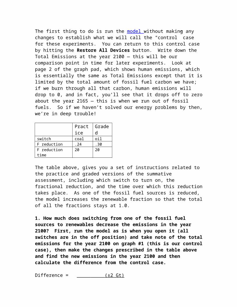
The first thing to do is run the model without making any changes to establish what we will call the “control” case for these experiments. You can return to this control case by hitting the Restore All Devices button. Write down the Total Emissions at the year 2100 — this will be our comparison point in time for later experiments. Look at page 2 of the graph pad, which shows human emissions, which is essentially the same as Total Emissions except that it is limited by the total amount of fossil fuel carbon we have; if we burn through all that carbon, human emissions will drop to 0, and in fact, you’ll see that it drops off to zero about the year 2165 — this is when we run out of fossil fuels. So if we haven’t solved our energy problems by then, we’re in deep trouble!
Practice Gradedswitch coal oilF reduction .24 .30F reduction time 20 20
The table above, gives you a set of instructions related to the practice and graded versions of the summative assessment, including which switch to turn on, the
fractional reduction, and the time over which this reduction takes place. As one of the fossil fuel sources is reduced, the model increases the renewable fraction so that the total of all the fractions stays at 1.0.
1. How much does switching from one of the fossil fuel sources to renewables decrease the emissions in the year 2100? First, run the model as is when you open it (all switches are in the off position) and take note of the total emissions for the year 2100 on graph #1 (this is our control case), then make the changes prescribed in the table above and find the new emissions in the year 2100 and then calculate the difference from the control case.
Difference = (±2 Gt)
Practice Answer = 11.3
2. Does this change lead to a leveling off of emissions, or do they continue to climb?
a) Levels off b) Continues to climb[correct answer for practice version]
3. Which has a bigger impact in reducing emissions — limiting population growth to 10 billion, or reducing your fossil fuel fractions as prescribed? Here, make sure all the switches are turned off, and then set the Pop Limit to 10.
a) Population limitationb) Fossil fuel reduction [correct answer for practice version]
Reset the Pop Limit to 12 when you are done with this one.
4. How much does reducing all of the fossil fuel sources to a fraction of 0.05 decrease the emissions in the year 2100 compared to the control case (set all switches to the off position for the control)? Set the start time to 2020, then turn on all the switches, and set the f reductions so that each fossil fuel source ends up at 0.05 after 20 years. You can check to make sure you’ve done this correctly by looking at the fractions on page 4 of the graph pad.Set all of the reduction times to 20 years. For the graded version, lower the fossil fuel sources to a fraction of 0.1; leave everything else the same as the practice version.
Difference = (±2 Gt)
Practice Answer = 23.8Follow these steps:1. Run the control case (don’t make any changes to the model)
2.Turn on all the switches3. Set all the reduction times to 204. Set f coal reduction to 0.22; f oil reduction to 0.28; f gas reduction to 0.165. Run the model again — you should now see a blue curve from the control run and a
pink curve from the modified run (looking at graph #1)6. Run the cursor along the control case curve until you get to the year 2100 and write
down the total emissions at that point — it should be 29.57 (the units are Gt C/yr).7. Run the cursor along the modified case curve (pink one) until you get to the year
2100 and write down the total emissions at that point — it should be 5.74.8. The question is asking for the difference in emissions, so subtract 5.74 from 29.57
and you get 23.83 Gt C/yr — this is the reduction in emissions we would achieve if we lowered all of the fossil fuels to just 5% of our total energy consumption.
5. Which has the bigger impact in reducing emissions — halting the rise in per capita energy use, or reducing our fossil fuel fractions? For this one, you’ll use your answer to the above question (#4) and compare to one in which you turn off all the switches, and then change the per capita energy graph so that it is more or less a straight line all the way across. You can check to see how well you’ve done this by looking at page 8 of the graph pad after you run the model. So, which has a bigger impact in reducing emissions?
a) Fossil fuel reduction [correct answer for practice version]b) Per capita energy change (i.e., conservation + efficiency)
Note: These are pretty drastic changes that we’ve just imposed — they would require nearly miraculous social, political, and technological feats. But, it is good to get a sense of what the limits are.
Reset the model after this question.
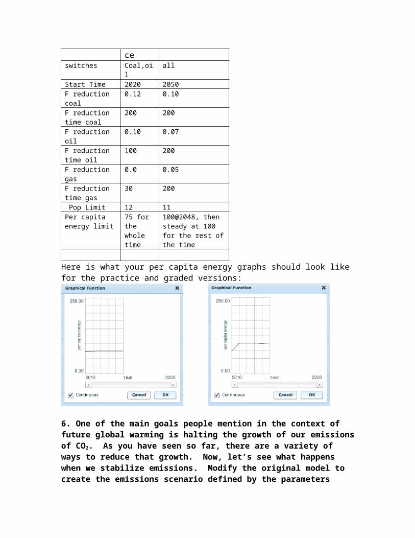
This table refers to the question below — it provides a set of model settings that lead to stabilization of emissions.
Practice Gradedswitches Coal,oil allStart Time 2020 2050F reduction coal 0.12 0.10F reduction time coal
200 200
F reduction oil 0.10 0.07F reduction time oil
100 200
F reduction gas 0.0 0.05F reduction time gas
30 200
Pop Limit 12 11Per capita energy limit
75 for the whole
100@2048, then steady at 100 for the
time rest of the time
Here is what your per capita energy graphs should look like for the practice and graded versions:
6. One of the main goals people mention in the context of future global warming is halting the growth of our emissions of CO2. As you have seen so far, there are a variety of ways to reduce that growth. Now, let’s see what happens when we stabilize emissions. Modify the original model to create the emissions scenario defined by the parameters supplied in the table above — this should result in an emissions history that more or less stabilizes. Then find the emissions at the year 2100.
Total Emissions in 2100 = ±2.0 Gt C/yr
Practice version — 11.3 Gt C/yr
7. Now that you have an emissions scenario that stabilizes (the human emissions of carbon remain more or less constant over most of the time), let’s look at temperature (page 9 of the graph pad). Remember that global temperature change in this model is the warming relative to the pre-industrial world, which is already about 1°C in 2010, the starting time for our model. What is the global temperature change in the year 2100?
Global temperature change = ±0.5 °C
Practice version — 2.6°C
8. Now study the temperature change (graph#9) and the pCO2 atm (the atmospheric concentration of CO2 in ppm or parts per million — page 10 of the graph pad) for the time period following the stabilization of emissions. Does
the stabilization of emissions lead to a stabilization of temperature or atmospheric CO2 concentration.
a) both stabilizeb) neither stabilizes — both increase [correct answer for practice]c) neither stabilizes — both decreased) CO2 goes up; temperature goes downe) CO2 goes down; temperature goes up
Reset the model before going to the next question.
9. Now, let’s say we want to keep the warming to less than 2°C, which the IPCC recently decided was a good target — warming more than that will result in damages that would be difficult to manage (we would survive, but it might not be pretty). We have seen by now that it is simply not enough to stabilize emissions at a level similar to or greater than today’s — that leads to continued warming. So we need to reduce emissions relative to our present level, which will be hard with a growing population and economy (and thus a growing per capita energy demand).
So, let’s see what is necessary to stay under that 2° limit, given some constraints. In all cases, we’ll assume that we can get our oil and gas fractions down to 0.1 (i.e., 10% each) over a time period of 30 years with a start time of 2020. We’ll leave population out of it (keep the limit at 12 billion), and for the practice version, we’ll make the assumption that per capita energy demand remains constant at a level of 75 for the whole time period (modify the graph so that it is a horizontal line at a level of 75 on the y-axis). This leaves f coal reduction as our main variable. The time period for reducing coal will be 30 years. You can change four scenarios for coal reduction as follows:
A: Keep the coal fraction unchanged (switch off)B: Reduce the coal fraction to 10% (so f coal reduction would be .17) C: Reduce the coal fraction to 5% (set f coal reduction to .22)D: Reduce the coal fraction to 0% (set f coal reduction to .27)
For the graded version, we will change the per capita energy demand graph so that it looks like this:
Find the coal fraction that keeps the temperature closest to 2°C by the year 2200.
Coal reduction scenario (A,B,C, or D):
Practice version: D is the correct answer
We’re done with this model for now, but you will be coming back to it later on when you do your capstone projects. You’ll use this model to design an emissions and energy consumption scenario for the future for which you’ll also explore the social and economic consequences.
The following questions encourage you to step back and think about what you’ve learned here. Short answers will suffice here.
10. What are the three principal variables that determine how much carbon is emitted from our production of energy? (Hint: look at page 11 of this worksheet)
11. What is the relationship between economic development (growth) and per capita energy consumption? (Hint: look at figure 7 of this worksheet)
12. Among the various sources of our energy, which has the highest rate of CO2
emitted per unit of energy? (Hint: look at table on page 10 of this worksheet)
13. What happens to the atmospheric concentration of CO2, and thus the global temperature, if we stabilize (hold constant) the emissions rate? (refer to question #8 above)
14. Can we stay under the 2°C warming limit in the year 2200 by completely eliminating our reliance on fossil fuel energy sources alone (reducing coal, oil, and gas to 0% of our energy supply), or do we also need to reduce our energy consumption per capita? (run the model to figure this out)